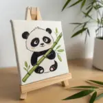
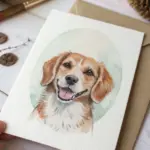
Sometimes you want to draw something adorable, but you also want it to actually challenge you in the best way. These cute hard drawing ideas are my favorite mix of sweet subjects and seriously satisfying details—shading, texture, and tricky little moments that make you slow down and level up.
Manga-Style Sparkly Eyes With Glossy Highlights
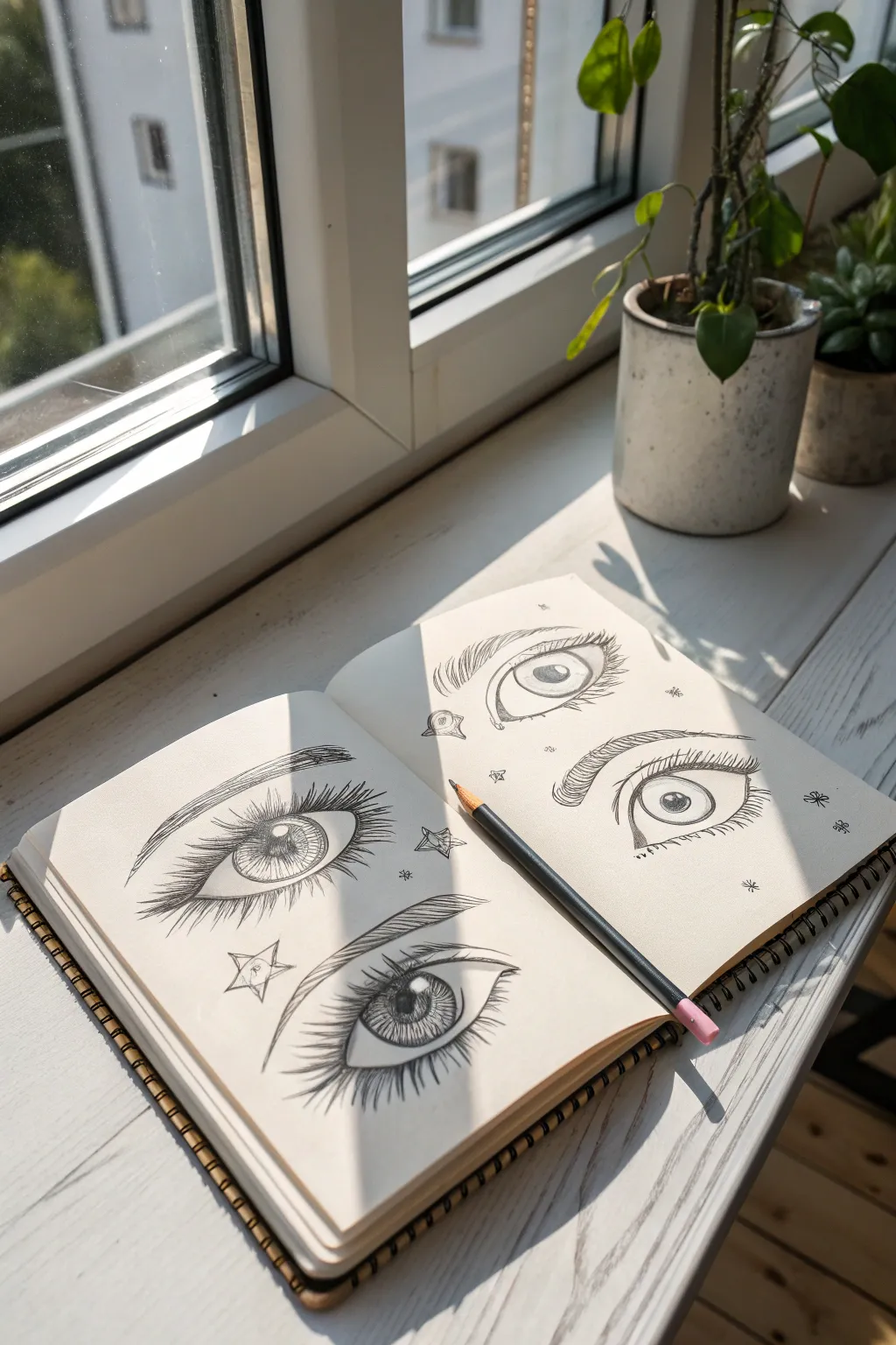
Capture the emotion and depth of anime-inspired character design with these detailed eye studies. This project focuses on achieving that signature glossy look through careful shading, dramatic lash lines, and deliberate negative space for highlights.
Detailed Instructions
Materials
- Spiral-bound sketchbook (heavyweight paper preferred)
- Graphite pencil (HB or 2B for initial lines)
- Softer graphite pencil (4B or 6B for dark pupils and lashes)
- Fine-point mechanical pencil (for precise details)
- Fine-tip black fineliner (optional, for final inking)
- Kneaded eraser
- Precision eraser or eraser pencil
Step 1: Conceptualizing the Shapes
-
Lightly Map Positioning:
Begin by lightly sketching the general placement of four eyes across your two-page spread. Keep your pressure extremely light so these marks can be erased later. -
Outline the Upper Lash Line:
For the first eye, draw a thick, arched curve for the upper eyelid. In manga styles, this line is significantly thicker than the bottom line to represent dense lashes. -
Draft the Lower Lash Line:
Sketch a much thinner, slightly curved line for the bottom lid. Leave a small gap at the outer corner where the top and bottom lines would meet; this open style adds an airy, stylized feel. -
Define the Iris Shape:
Draw a large circle or oval for the iris. The top of the circle should be slightly cut off by the upper lash line, which makes the eye look relaxed rather than surprised.
Pro Tip: Sharp Highlights
If your eraser isn’t precise enough for the tiny highlights, use a white gel pen or a dab of white gouache at the very end to make those reflections pop.
Step 2: Adding the Sparkle & Depth
-
Map the Highlights:
Before adding any shading, draw small circles or ovals inside the iris to represent light reflections. I like to place a large main highlight near the top and a smaller secondary reflection near the bottom. -
Draw the Pupil:
Sketch a smaller dark circle in the center of the iris, working around your mapped highlights. Ensure this is centered relative to the iris, not the whole eye. -
Fill the Pupil:
Using your softer 4B or 6B pencil, fill in the pupil completely solid black. This intense dark point anchors the drawing. -
Gradient Shading on the Iris:
Start shading the iris from the top down. Press firmly near the upper lash line to create a shadow cast by the eyelid, then gradually lighten your pressure as you move toward the bottom of the iris. -
Add Iris Texture:
Draw tiny, radiating lines extending from the pupil outward, like spokes on a wheel. These striated lines mimic the muscle fibers of the iris and add realistic detail. -
Enhance the Pupil Ring:
Darken the outer ring of the iris slightly to give it a defined border, blending it softly inward so it doesn’t look like a harsh cartoon outline.
Step 3: Lashes and Finishing Touches
-
Draft the Lashes:
Flick your pencil outward from the upper lash line to create long, distinct eyelashes. The lashes should curve upward and cluster together slightly at the tips. -
Thicken the Lash Base:
Go back over the roots of the eyelashes, thickening them where they connect to the eyelid. This creates that classic bold manga eyeliner look. -
Add Lower Lashes:
Draw shorter, more delicate lashes on the lower lid. Space them out more than the top lashes to keep the look delicate. -
Sketch the Eyelid Fold:
Draw a thin, floating line a few millimeters above the upper lashes to indicate the crease of the eyelid. This adds dimension to the eye socket. -
Draw the Eyebrow:
Sketch the eyebrow using short, hair-like strokes adhering to a gentle arch. Keep the strokes angled in the direction of hair growth. -
Clean Up Highlights:
Use your precision eraser to ensure the white highlight bubbles inside the iris remain purely paper-white. If you smudged graphite into them, lift it out now. -
Add Decorative Elements:
Surround the eyes with small doodles like stars, sparkles, or tiny floating geometric shapes to emphasize the ‘shoujo’ aesthetic.
Fix It: Muddy Shading
Graphite smearing? Place a clean sheet of scrap paper under your drawing hand as a barrier. This prevents your palm from dragging sketch lines across the page.
Now you have a page of expressive eyes ready to anchor your next character portrait
Cute Portrait With Windblown Hair Strands
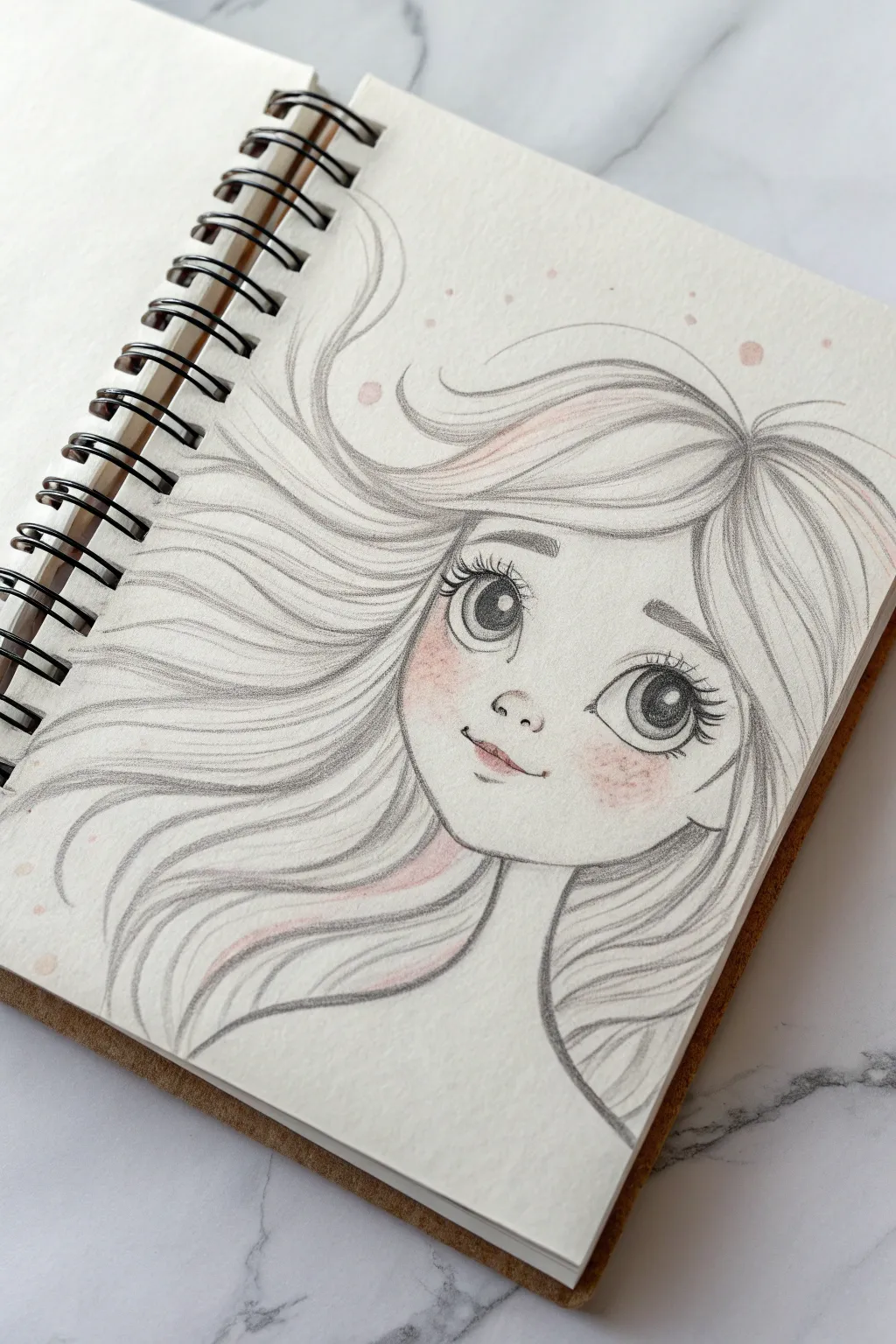
Capture the feeling of a gentle breeze with this charming graphite sketch featuring flowing hair and expressive doe eyes. Delicate touches of blush add a warm, lively spirit to the otherwise monochromatic piece.
Step-by-Step Guide
Materials
- Spiral-bound sketchbook (heavyweight paper preferred)
- Graphite pencils (HB for sketching, 4B for depth)
- Pink colored pencil or pastel chalk
- Kneaded eraser
- Blending stump or cotton swab
- Fine-point mechanical pencil (optional)
Step 1: Laying the Foundations
-
Draft the head shape:
Start with a light, loose circle for the cranial mass. Drop a gentle, curved line hanging from the circle to define the jawline and chin, positioning the chin slightly off-center to suggest a subtle head tilt. -
Map facial features:
Lightly draw a vertical centerline and a horizontal eye line. The eyes should sit relatively low on the face to enhance the ‘cute’ factor, leaving plenty of forehead space. -
Sketch the eye outlines:
Draw two large, almond shapes for the eyes. Space them wider than a single eye-width apart. Don’t press hard yet; keep your graphite grip loose. -
Indicate nose and mouth:
Place a tiny, soft ‘C’ shape for the nose button just below the eye line. Below that, sketch a small, upturned mouth line that suggests a gentle smile.
Step 2: Creating the Flowing Hair
-
Establish the hairline:
Draw the hairline starting high on the forehead, curving down towards the ears. Creating a slight ‘widow’s peak’ shape adds character. -
Define the main flow:
Using long, sweeping strokes, map out the major clumps of hair. Imagine the wind is blowing from the right, pushing the hair toward the left side of the page. -
Sweep strands outward:
Extend the hair lines far beyond the head. Let some strands whip dramatically upward and others curve gently around the neck and shoulders. -
Refine hair volume:
Add secondary lines within the main shapes to suggest volume and layers. Keep your wrist fluid so the lines don’t look stiff or wire-like.
Loose Wrist Trick
For flowing hair, hold the pencil further back on the shaft. This forces you to draw with your shoulder, not your fingers, creating much smoother, longer curves.
Step 3: Developing the Features
-
Detail the irises:
Draw large circles inside the almond eye shapes. Inside these, draw pupil circles and add a smaller circle near the top right of each pupil for the light reflection. -
Shade the eyes:
Fill in the pupils with your darkest pencil (4B). Shade the upper part of the irises darker, fading to a lighter grey at the bottom. This creates depth and sparkle. -
Add lashes and brows:
Flick your pencil quickly outward from the upper eyelid line to create long, distinct eyelashes. Draw simple, slightly thick eyebrows that arch gently above the eyes. -
Define the nose and lips:
Darken the nostrils slightly. Add a small shadow beneath the bottom lip and define the upper lip line with a bit more pressure.
Sparkle Upgrade
Use a white gel pen to add tiny dots of pure white to the highlight in the eyes and the tip of the nose. It makes the character instantly look more alive and glossy.
Step 4: Shading and Color
-
Add facial shading:
Use an HB pencil to lightly shade under the hair bangs on the forehead and under the chin. Smooth this out with a blending stump for a soft skin texture. -
Texturize the hair:
Go back over your hair strands with the 4B pencil. Darken the areas where hair overlaps (behind the neck, under the bangs) to separate the layers visually. -
Apply the blush:
Take your pink colored pencil or pastel chalk and gently scribble circular motions on the cheeks. Don’t overdo it—just a soft flush is all you need. -
Highlight with pink:
I like to add faint touches of pink to the lips and occasionally a stray streak in the hair for artistic flair. -
Add freckles and final touches:
Dot a few tiny freckles across the nose and cheeks within the pink blush area. Finely erase any stray construction lines to clean up the finished sketch.
Now you have a sweet, wind-swept character gazing back at you from your notebook

Cozy Sweater Puppy With Knit Texture
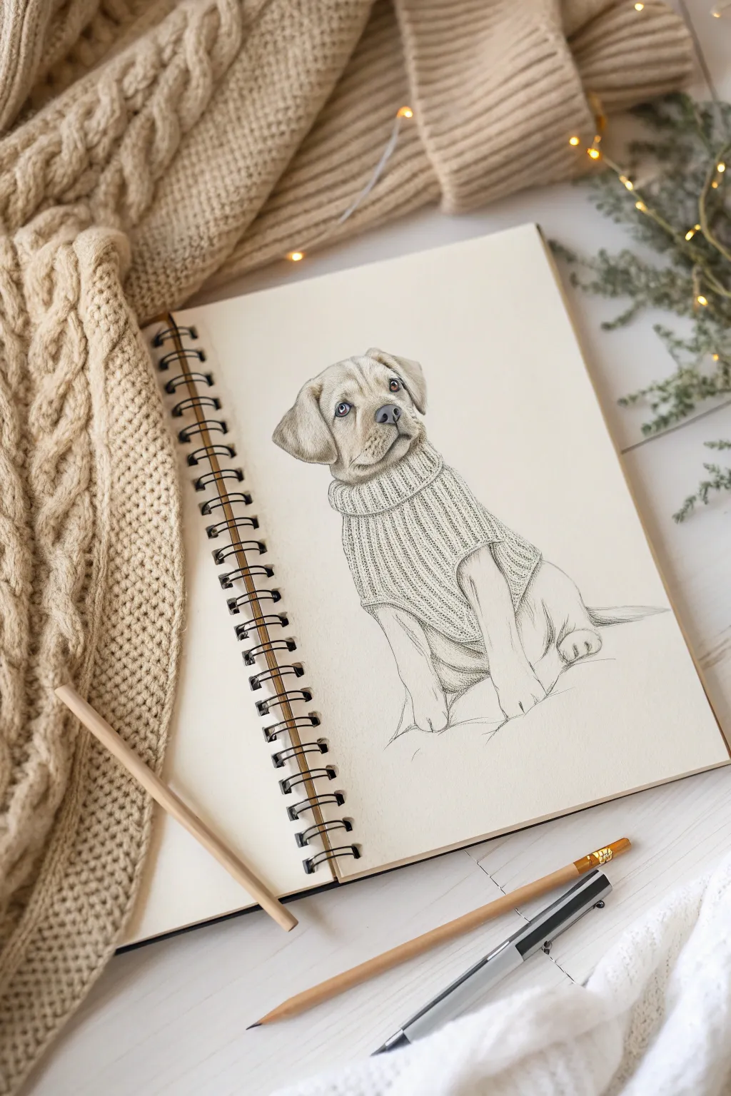
Capture the warmth of the season with this adorable sketch of a Labrador puppy nestled in a chunky knit sweater. This project focuses on contrasting textures, teaching you how to render soft fur against the structured patterns of knitted wool.
Step-by-Step
Materials
- Sketchbook with smooth or medium-tooth paper
- Mechanical pencil (0.5mm HB or B lead)
- Standard graphite pencil (2B or 4B for shading)
- Kneaded eraser
- Blending stump (tortillon) or cotton swab
- Fine liner pen (optional for final details)
Step 1: Constructing the Framework
-
Establish the head shape:
Start lightly with your mechanical pencil. Draw a rounded square shape for the head, keeping the corners very soft. Add a vertical centerline and a horizontal eye line slightly below the middle to guide facial placement. -
Block in the body:
Below the head, sketch a simple oval that angles slightly downward to the right. This will become the puppy’s seated body. Don’t worry about the sweater shape yet; just get the dog’s mass down. -
Add the limbs:
Draw two tubular shapes extending down from the chest area for the front legs. Keep the paws large and rounded—classic puppy proportions. Sketch the suggestion of a rear leg tucked in on the right side. -
Define the features:
Place two almond shapes for the eyes on your horizontal guide line. Sketch a soft triangular nose and the mouth muzzle below. Add the floppy triangular ears on either side of the head, letting them hang naturally.
Knit Looks Flat?
Make sure your knit lines curve! If you draw straight lines, the sweater looks like a flat board. Curve the rows to mimic the puppy’s round body underneath.
Step 2: Drafting the Sweater
-
Outline the collar:
Draw a thick, rolled collar around the neck. Think of it like a donut shape wrapping around the puppy’s neck. It should sit slightly loose, creating a gap between the fabric and the fur. -
Shape the sweater body:
Extend lines from the collar down over the puppy’s chest and back. Let the sweater bulk out slightly more than the dog’s actual skin to show the thickness of the material. Curve the bottom hem upwards around the mid-chest. -
Map the knit direction:
Using very faint lines, draw curved vertical guidelines down the length of the sweater. These will act as tracks for your knitting pattern later, ensuring the texture wraps around the form rather than looking flat.
Step 3: Refining and Shading
-
Detail the eyes:
Switch to your 2B pencil. Darken the pupils, leaving a small, crisp white circle for the highlight in each eye. This spark of life is crucial. Shade the iris lightly, getting darker toward the top. -
Render the nose and muzzle:
Shade the nose with a stippling motion (tiny dots) to create a leather-like texture. Darken the nostrils significantly. Use short, flicking strokes to add whiskers and muzzle fur. -
Create fur texture:
On the head and paws, use short, directional pencil strokes that follow the bone structure. Keep the strokes light on the forehead and darker around the ears to create depth. -
Texturize the collar:
Draw vertical ribbing lines on the collar. Between these lines, add tiny ‘v’ or ‘u’ shapes to simulate the loops of yarn. I find that varying the pressure here helps make the wool look soft rather than rigid. -
Knit the body pattern:
Follow your vertical guidelines on the main sweater body. Draw rows of interlocking ‘braid’ shapes or simple cable knit patterns. The lines should curve with the puppy’s posture. -
Add deep shadows:
Use your 4B pencil to add deep shadows where the collar casts a shadow on the neck, and where the sweater sleeves bunch up around the front legs. This separation is key for realism.
Make it Wintery
Add a few loose strands of yarn unraveling from the hem, or sketch a faint pattern of snowflakes on the sweater’s chest for extra festive charm.
Step 4: Final Polish
-
Clean up edges:
Use a kneaded eraser to lift away any stray construction lines or smudges outside the drawing. Tap the eraser on the highlighted areas of the fur to brighten them up. -
Refine the paws:
Add small, curved lines to define the toes on the front paws. Add tiny, darker accents for the nails, but keep them subtle so they don’t look like claws. -
Enhance the contrast:
Go back over the darkest areas—the eyes, nostrils, and deep sweater creases—one last time with your darkest pencil to make the drawing pop off the page. -
Ground the subject:
Lightly sketch a few horizontal scribbles under the puppy to imply a surface or blanket, so the figure isn’t floating in whitespace.
Now you have a charming, textured companion ready to warm up your sketchbook pages
Fluffy Kitten With Realistic Fur Layering
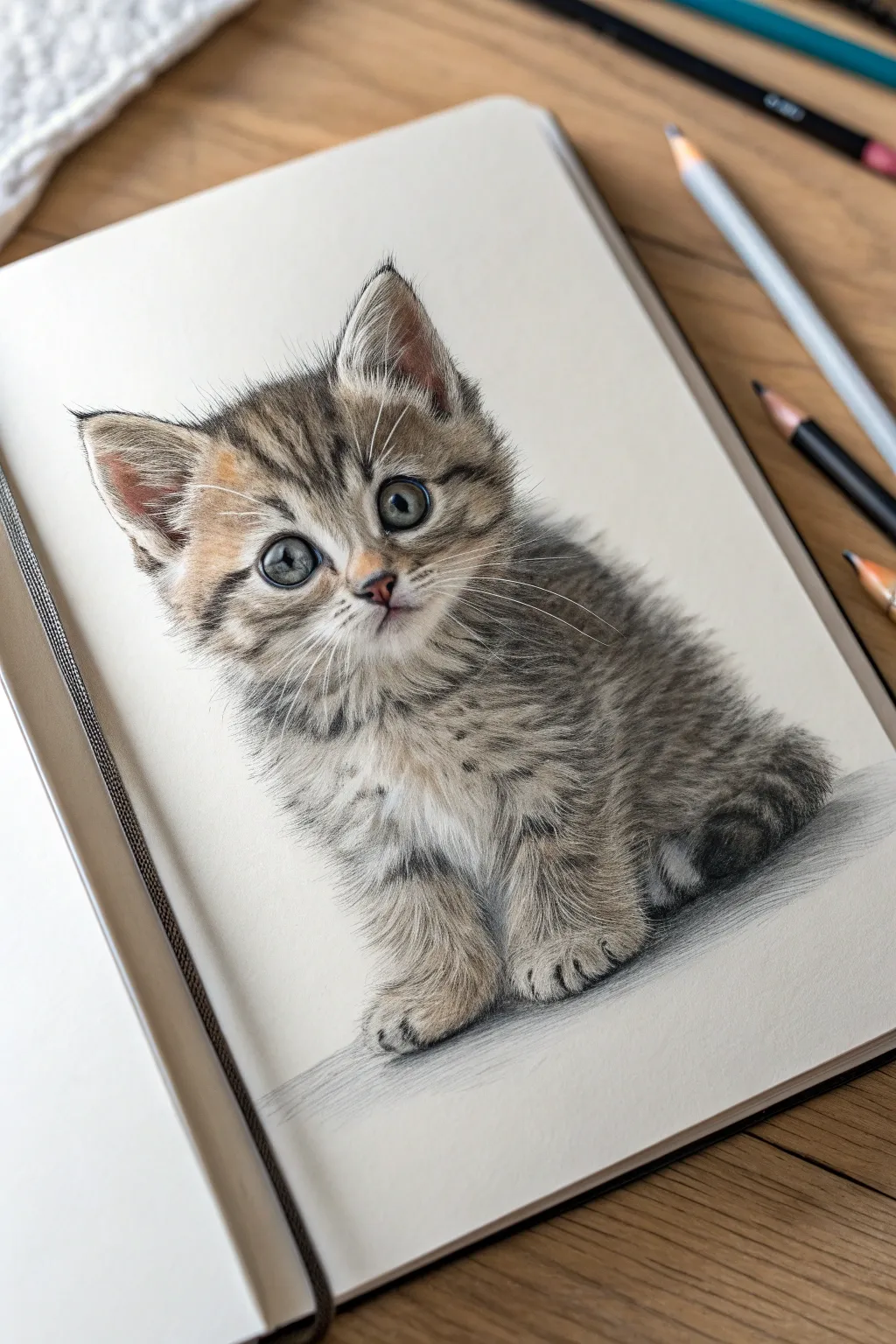
Master the art of texture with this adorable, wide-eyed kitten study that focuses heavily on fur layering techniques. You will build up depth using colored pencils to create a soft, touchable appearance that mimics real tabby markings.
Detailed Instructions
Materials
- High-quality sketchbook paper (smooth or vellum finish)
- HB graphite pencil
- Kneaded eraser
- Set of wax or oil-based colored pencils (greys, browns, ochre, black, white)
- Electric eraser or fine-point eraser pen
- Colorless blender pencil (optional)
- Detail brush (to sweep away crumbs)
Step 1: Structural Sketch
-
Establish the head shape:
Start with a light HB pencil. Draw a softly rounded circle for the head, slightly flattening the top where the ears will sit. -
Add the body form:
Attach a simple, curved oval shape beneath the head for the body. This kitten is sitting, so the body shape should feel weighted at the bottom, like a small pear. -
Position the features:
Draw faint guidelines across the face. Place two large circles for the eyes just below the horizontal center line. Add a small triangle for the nose and a distinct ‘W’ shape for the mouth. -
Outline the ears and paws:
Sketch two triangles for the ears, ensuring the outer lines curve slightly inward. Block in the paws at the base of the body, indicating the toes with simple rounded shapes.
Step 2: Eyes and Facial Details
-
Lay the eye base:
Using a pale grey-blue pencil, fill in the iris area. Keep a small, clean circle of white paper preserved near the top right of each pupil for the highlight. -
Deepen the pupils:
Fill the pupils with sharp black. Carefully outline the iris with a dark charcoal grey, blending slightly inward to create dimension. -
Add eye details:
Layer a subtle teal or sage green over the lower iris to create that glassy look. I find adding a tiny touch of brown near the pupil adds realism. -
Detail the nose and mouth:
Use a dusty pink for the nose leather, darkening the nostrils with brown. Trace the mouth line with a dark brown pencil, not black, to wish it look softer.
Muddy Fur?
If colors are blending into a muddy mess, you’re layering too heavily too soon. Keep initial layers light and crisp, only pressing hard for final details.
Step 3: Fur Layering: The Head
-
Start the tabby M:
Using a warm grey pencil, map out the classic tabby ‘M’ marking on the forehead. Use short, flicking strokes that follow the direction of hair growth. -
Build the ear fur:
Inside the ears, use very light, feathery strokes with a cream or white pencil. Use distinct pinkish-brown strokes for the inner ear skin and darker fur on the outer edges. -
Create the cheek fluff:
Using a mix of ochre, light brown, and cream, build up the fur on the cheeks. Ensure your strokes radiate outward from the nose area to simulate the natural growth pattern. -
Deepen the facial markings:
Go back over the dark stripes near the eyes and forehead with a dark sepia or black pencil. Keep the lines broken and distinct to look like hair, not solid lines.
Level Up: Texture
Use an X-Acto knife to very gently scratch through top layers of pencil to reveal the white paper underneath for ultra-fine, realistic stray hairs.
Step 4: Fur Layering: The Body
-
Undercoat shading:
Lightly shade the chest and belly area with a cool grey to establish the shadows beneath the white fur. -
Chest fur texture:
Layer white pencil heavily over the grey shading on the chest. Use firm pressure to create opacity and a fluffy texture. -
Define the paws:
Use short, curved strokes to create the fur on the paws. Darken the spaces between the toes to separate them visually. -
Body stripes:
Draw the darker tabby stripes wrapping around the side of the body and the tail. These strokes should be longer and slightly shaggier than the face fur.
Step 5: Final Touches
-
Whiskers and fine hairs:
Use a very sharp white pencil or an electric eraser to lift out long, sweeping whiskers from the muzzle and above the eyes. -
Grounding shadow:
Sketch a soft, horizontal shadow underneath the kitten using cool grey. Fade it out gently as it moves away from the body to anchor the drawing. -
Final contrast check:
Deepen the darkest areas of the stripes one last time and brighten the eye highlights with a white gel pen or opaque white pencil if needed.
Now you have a permanently fluffy companion captured right on the page

PENCIL GUIDE
Understanding Pencil Grades from H to B
From first sketch to finished drawing — learn pencil grades, line control, and shading techniques.
Explore the Full Guide
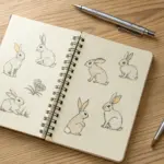
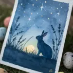
Bunny With a Flower Crown of Layered Petals
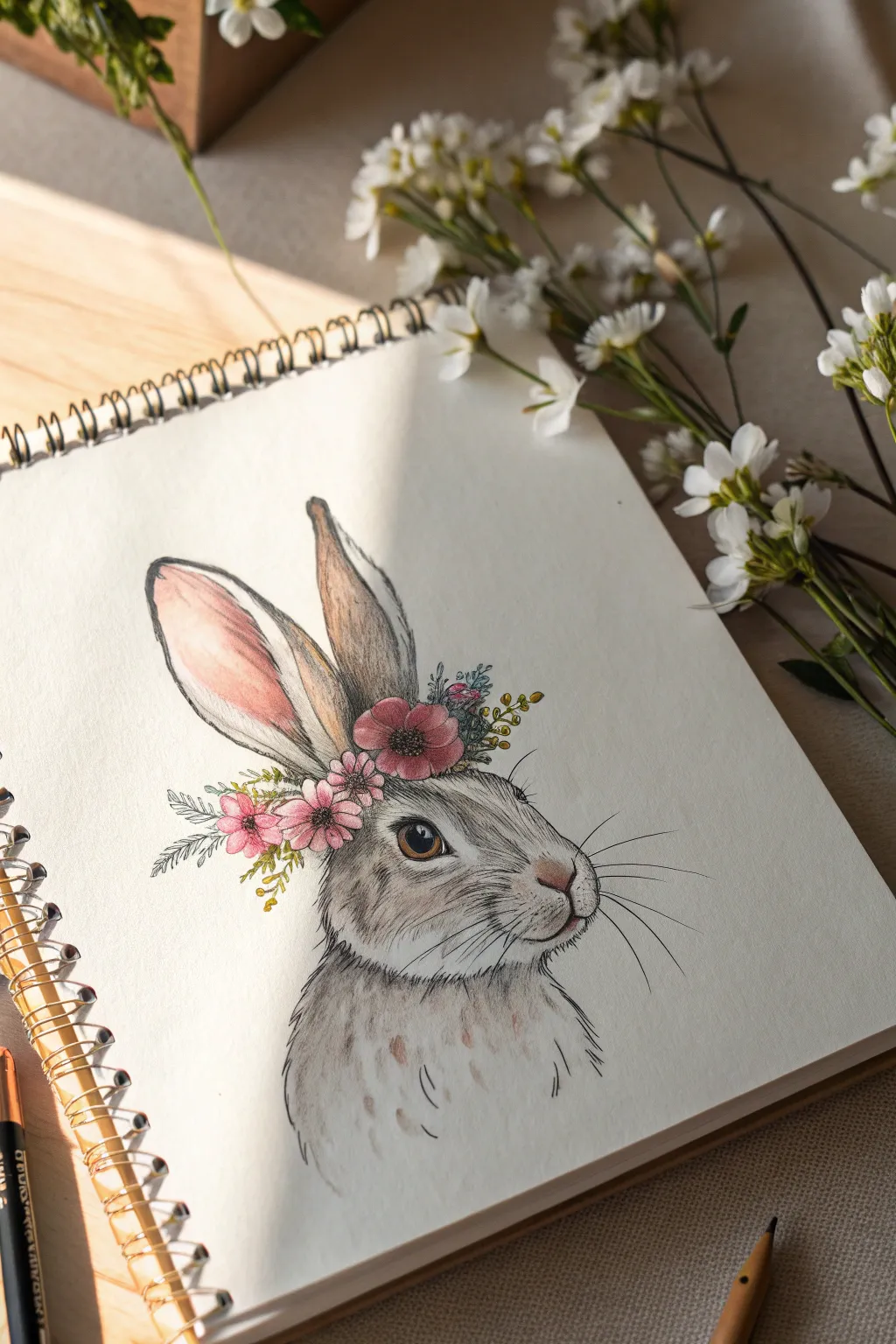
This charming project combines the softness of colored pencil with the precise lines of ink to create a realistic yet whimsical rabbit. The layered petals of the flower crown add a lovely pop of color against the bunny’s neutral fur tones.
How-To Guide
Materials
- Heavyweight sketch paper or mixed media paper
- Graphite pencil (HB or 2B) for sketching
- Fine liner pens (black, 0.1mm and 0.3mm)
- Colored pencils (browns, greys, pinks, greens)
- Kneaded eraser
- White gel pen (optional for highlights)
Step 1: Basic Structure & Sketching
-
Head Shape:
Start by lightly sketching a rounded oval for the head. Add a smaller circle attached to the lower right side for the muzzle/nose area to establish the profile view. -
Ear Placement:
Draw two long, oblong shapes extending upwards from the top left of the head. The front ear should be slightly wider and open, while the back ear is narrower and tucked slightly behind. -
Facial Features:
Mark the position of the eye—a large almond shape midway down the head. Sketch a small Y-shape for the nose and mouth area on the muzzle. -
Crown Foundation:
Lightly draw a curved line resting across the forehead, right at the base of the ears. This will serve as the anchor line for your flowers.
Step 2: Drawing the Flower Crown
-
Central Blooms:
Sketch three main flowers along your anchor line. Start with a large, open bloom on top of the head using scalloped edges for petals, and add two smaller blossoms cascading down the side. -
Adding Foliage:
Tuck small leaves and fern-like fronds behind and between the flowers. I find that varying the leaf shapes adds a lot of visual interest here. -
Detailing the Centers:
Draw tiny circles in the center of your flowers to create pollen textures. Add small berry clusters sticking out from the top of the arrangement.
Fixing Stiffness
If the fur looks too stiff or jagged, soften the texture by gently curving your pen strokes slightly at the ends, following the roundness of the face.
Step 3: Inking & Line Art
-
Outline the Rabbit:
Using a 0.1mm fine liner, carefully trace your pencil lines. Use short, broken strokes for the fur to simulate texture, rather than a solid continuous line. -
Inking the Crown:
Switch to a slightly bolder 0.3mm pen for the flowers if you want them to stand out, or keep it delicate. Be precise with the petal edges. -
Fur Texture:
Add directional hatching marks on the cheeks, neck, and ears. Follow the natural curve of the animal’s face to suggest volume and softness. -
Whiskers:
With a quick, confident flick of the wrist, draw long, sweeping whiskers extending from the muzzle area. Do this quickly to keep the lines smooth. -
Erasure:
Once the ink is completely dry, gently erase all underlying graphite sketches with your kneaded eraser.
Add Seasonal Flair
Change the crown’s vibe by swapping flowers! Draw holly berries for winter, tiny mushrooms for autumn, or daisies for a fresh spring look.
Step 4: coloring & Shading
-
Base Tone for Fur:
Lightly layer a soft grey or beige colored pencil over the shadowed areas of the face—mostly around the eye, under the chin, and inside the back ear. -
Fur Details:
Use a darker brown pencil to add short strokes over your ink lines, deepening the texture. Focus on the tips of the ears and the bridge of the nose. -
The Inner Ear:
Blend a soft pink into the inner part of the large ear. Fade it out gently as it moves toward the outer edge to look natural. -
Coloring the Flowers:
Fill the petals with a rosy pink, pressing harder near the centers for depth and lighter at the tips. Use a yellow-green for the leaves and stems. -
The Eye:
Color the iris with a rich brown, leaving a tiny pure white spot for the catchlight. Go over the pupil area with black ink or pencil to make it sharp. -
Final Touches:
Add tiny spots or flecks on the chest fur with your brown pencil for a speckled look. If desired, use a white gel pen to accentuate the eye highlight or add dew to petals.
Now you have a sweet floral companion ready to brighten up your sketchbook page
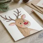
Tiny Bear Holding a Glass Jar of Fireflies
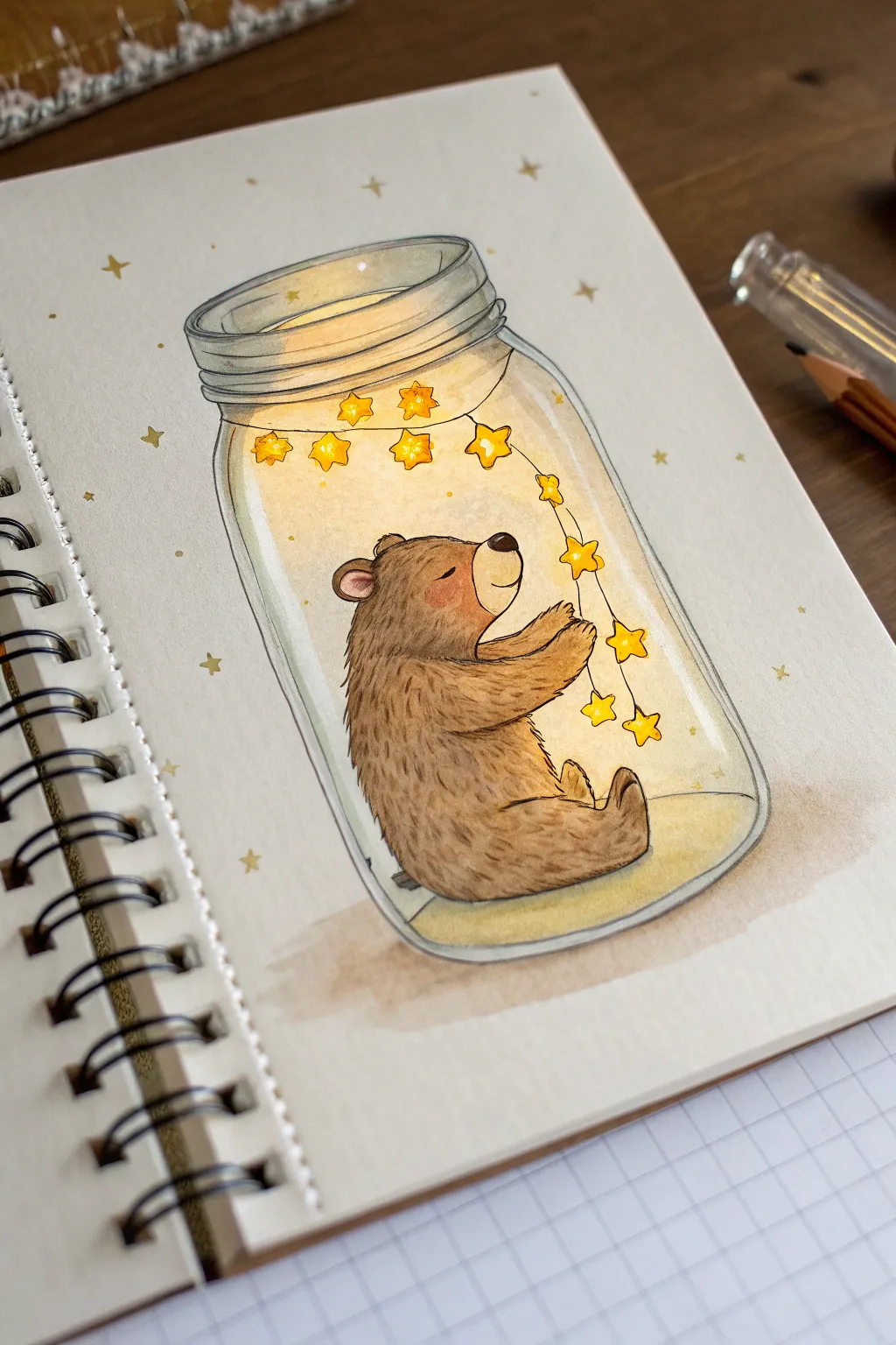
Capture the cozy magic of a tiny bear safe inside a glowing mason jar with this whimsical illustration. Using soft shading and warm tones, you’ll create a comforting scene where suspended stars light up the night.
Detailed Instructions
Materials
- Spiral-bound sketchbook (mixed media paper preferred)
- Mechanical pencil (HB or 2B)
- Fine liner pens (0.1mm and 0.3mm in dark grey or black)
- Watercolor paints or watercolor pencils (browns, yellows, greys)
- Small round brushes (size 2 and 4)
- White gel pen
- Eraser
Step 1: Drafting the Shapes
-
Outline the jar:
Begin by sketching the glass jar lightly with your pencil. Draw an ellipse for the opening at the top, followed by the threaded neck, and then pull down two curved vertical lines that connect at a rounded bottom. -
Sketch the bear:
Inside the lower half of the jar, lightly block out the bear’s shape. Use a rounded bean shape for the body and a circle for the head, tilting the face upward slightly. -
Add bear details:
Refine the bear’s sketch by adding small, rounded ears and a snout. Draw the arms reaching up and forward as if holding something, and tuck the legs in a sitting position. -
Draw the star string:
Sketch a swooping line originating from behind the bear’s back and curving down into its paws. Draw small five-pointed stars hanging from this line, scattering a few more near the top of the jar.
Keep the jar distinct
Don’t outline the bear where it touches the glass jar bottom. Let the glass outline define the boundary to make the bear look truly inside.
Step 2: Inking the Scene
-
Ink the bear:
Using a 0.1mm fine liner, carefully trace the bear’s outline. Use short, flicking strokes along the back and arms to suggest a furry texture rather than a solid line. -
Ink the jar:
Switch to a steadier hand for the jar. Outline the glass rim and sides, keeping the lines relatively thin to make the glass look delicate. Add the threading rings on the jar’s neck. -
Ink the stars:
Outline the stars and the string with your finest pen. Be very precise here, as the stars are small and focal points. -
Clean up:
Once the ink is completely dry, thoroughly erase all the underlying pencil graphite to prepare for coloring.
Muddy glow effects?
If your yellow glow looks dirty, wait for the brown fur to be 100% dry before adding the yellow wash nearby, or the colors will mix into a murky grey.
Step 3: Adding Color & Glow
-
Base coat for the bear:
Mix a diluted warm brown watercolor wash. Paint the entire bear, avoiding the snout area which should remain lighter. -
Define fur texture:
While the first layer is slightly damp, drop in a darker brown on the bear’s back, bottom, and under the arms to create shadow and volume. I like to use small dabs here to mimic fur. -
Paint the stars:
Use a bright, saturated yellow to fill in the stars. Let the color bleed slightly outside the lines on a few stars to create a glowing effect. -
Create the jar’s glow:
Wash a very pale, watery yellow over the background inside the jar, concentrating the color around the star string and fading it out as you get closer to the glass walls. -
Glass reflections:
Mix a very watery grey-blue. Paint thin vertical streaks along the sides of the jar and curved strokes on the rim to represent glass reflections, leaving plenty of white paper for highlights. -
Grounding shadow:
Add a wash of soft brown or grey underneath the jar on the outside to ground the object so it doesn’t look like it’s floating.
Step 4: Final Details
-
Deepen contrast:
Once dry, use a darker brown pencil or detail brush to add the deepest shadows in the fur crevices, the nose, and the inner ear. -
Highlight the eyes:
Draw the sleeping eye shape clearly with a dark pen if it got lost during painting. -
Enhance the sparkle:
Use a white gel pen to add tiny highlights to the bear’s nose, the brightest points on the stars, and the sharpest reflections on the glass jar rim. -
Background magic:
Finish by drawing tiny, simple stars or dots in the background outside the jar with a yellow pencil or gold pen to extend the magical atmosphere.
Now you have a gentle, illuminated friend to keep you company on your page
BRUSH GUIDE
The Right Brush for Every Stroke
From clean lines to bold texture — master brush choice, stroke control, and essential techniques.
Explore the Full Guide
Mermaid Tail With Iridescent Scales
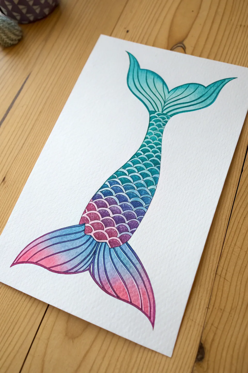
Capture the magic of the ocean with this vibrant watercolor mermaid tail. This project features a beautiful gradient transition from teal to pink, using simple layering techniques to create depth and a stunning iridescent effect.
Detailed Instructions
Materials
- Cold press watercolor paper (300 gsm)
- Pencil (HB or H)
- Fine liner pen (waterproof, black or dark purple)
- Watercolor paints (Turquoise, Cerulean Blue, Purple, Magenta/Pink)
- Round watercolor brushes (Size 4 and Size 0 or 1 for details)
- White gel pen (optional)
- Masking tape
- Paper towels
- Jar of clean water
Step 1: Sketching the Outline
-
Light pencil sketch:
Start by lightly sketching the general S-curve shape of the tail on your watercolor paper. It should look fluid and tapered. -
Adding the fins:
Sketch the top caudal fin, giving it a playful curve, and then the larger bottom fin with flowing, ribbon-like edges. -
Drawing the scales:
Begin adding the scale pattern. Start from the waist area with larger U-shapes and gradually make them smaller as you move down the tapered part of the tail. -
Refining the sketch:
Go over your pencil lines to ensure the scales are uniform and the fins have the flow you want. Erase any unnecessary stray marks gently.
Muddy colors?
Wait for each section to dry completely before glazing over it. If the paper is wet, colors will run together and turn brown.
Step 2: Painting the Gradient Base
-
Preparing the palette:
Mix your colors on a palette. You’ll need a watery teal, a medium blue, a rich purple, and a bright pink. -
Wet-on-wet technique:
Lightly wet the interior of the tail shape with clean water, being careful not to go outside the lines. -
Applying the top teal:
While the paper is damp, drop teal paint into the top fin and the upper section of the scales. Let it bloom naturally. -
Transitioning to blue:
Introduce the blue paint below the teal, blending the edges softly where they meet to create a seamless gradient. -
Adding purple and pink:
Continue down the tail, adding purple next, and finally transitioning into the bright pink at the very bottom fin. -
Let it dry completely:
Allow this base wash to dry fully. I usually wait until the paper is flat and cool to the touch before moving on.
Step 3: Defining the Scales and Details
-
Darkening the scale outlines:
Using a smaller brush (size 0 or 1) and slightly more concentrated paint, carefully outline the bottom curve of each scale. -
Creating dimension:
Enhance the iridescent look by adding a second layer of deeper color to the bottom half of each individual scale, fading it upward. -
Painting the fin details:
Use long, sweeping strokes to add the striations (lines) within the top and bottom fins. Match the color to the section (teal for top, pink/purple for bottom). -
Blending the fin shading:
Soften the lines in the fins with a barely damp brush so they look like soft folds in the fabric or fin structure.
Add Real Shimmer
Mix a small amount of iridescent medium or metallic silver watercolor into your paints for a finish that actually glitters.
Step 4: Final Touches
-
Inking the outline (Optional):
For a stylized look like the reference, use a waterproof fine liner to outline the entire tail and define the scale shapes crisply. -
Highlighting:
If you want extra sparkle, use a white gel pen to add tiny dots or lines on the top curve of the scales where the light would hit. -
Review and refine:
Step back and check your gradients. If any area looks too pale, add a light glaze of color over the dry paint to boost vibrancy.
Now you have a stunning piece of underwater art to display or frame
Betta Fish With Translucent Fins
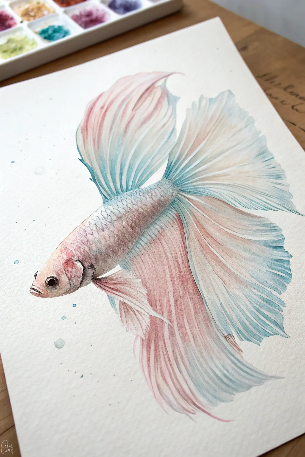
Capture the delicate beauty of a Siamese fighting fish with this watercolor tutorial, focusing on translucent layers and flowing movement. You will build up soft washes of rose and teal to create light, airy fins that look like they are floating in water.
Step-by-Step Tutorial
Materials
- Cold press watercolor paper (300 gsm)
- Watercolor paints (Alizarin Crimson, Cerulean Blue, Indigo, Burnt Sienna)
- Round brushes (flats for washes, fine liners for detail)
- HB pencil and kneaded eraser
- Two jars of water
- Paper towels
- Masking fluid (optional)
Step 1: Sketch and Base Washes
-
Outline the form:
Begin with a very light pencil sketch of the betta fish. Focus on the main torpedo shape of the body and the large flourishing curves of the fins. Keep your pencil pressure minimal so the graphite doesn’t show through the transparent paint later. -
Refine the fins:
Use sweeping lines to map out the direction of the fin folds. Think of them like draped fabric; you need to mark where the major pleats and overlaps occur. -
Lighten the sketch:
Before painting, roll a kneaded eraser over the entire drawing to lift excess graphite, leaving just a faint ghost of the image to guide you. -
Wet-on-wet body wash:
Wet the body area with clean water. Drop in a very dilute mix of Alizarin Crimson near the head and a soft Cerulean Blue towards the tail, letting them bleed gently into each other in the middle. -
Initial fin wash:
While the body dries, wet the large tail fin area. Apply a pale wash of rose pink near the body connection, fading it out into clear water towards the tips. -
Add teal accents:
While the fin wash is still damp, introduce a watery teal blue at the outer edges of the fins, allowing it to wick back slightly towards the pink areas for a soft gradient.
Don’t Overwork The Wet Paper
Let each layer dry completely before adding crisp lines on top. If the paper is cool to the touch, it’s still damp inside and lines will fuzzy out.
Step 2: Building Scale and Texture
-
Define the head:
Once the base is dry, use a smaller brush to paint the eye using a dark mix of Indigo and Burnt Sienna, leaving a tiny speck of white paper for the highlight. -
Gill details:
Deepen the color around the gill plate with a stronger mix of crimson and a touch of brown to create shadow and dimension behind the head. -
Suggesting scales:
Mix a slightly darker, grayish-blue tone. Using the tip of your brush, paint tiny ‘U’ shapes in a diamond pattern along the top ridge of the fish’s back. Fade these out as you move down the side so the belly remains smooth. -
Glazing the scales:
I like to wash a very thin glaze of warm pink over the scales once they are dry to unify the colors and make the skin look iridescent.
Fixing “Cauliflower” Blooms
If unwanted water blooms appear, wait for the spot to dry, then gently scrub it with a damp stiff brush (like a scrubber brush) to lift and smooth the pigment.
Step 3: Refining the Fins
-
Defining fin rays:
Switch to a fine liner brush. Mix a color slightly darker than your base fin wash and paint long, thin lines following the curves of the fins. -
Layering for transparency:
Where the fins fold over themselves, apply a second glaze of blue or pink. The overlapping color creates a darker value, instantly suggesting translucency physically. -
Deepening the shadows:
Add contrast where the fins attach to the body. Use a concentrated mix of teal and indigo in the deep creases to push those areas back. -
Softening edges:
If any fin ray lines look too harsh, run a damp, clean brush along one edge of the line to soften it into the background wash. -
Outer edge details:
Use your finest brush to add delicate, jagged edges to the tips of the fins. These shouldn’t be perfect; a few splits and tatters make the fish look natural. -
Adding bubbles:
Paint a few small circles around the fish using a very pale blue wash. Blot the centers with a tissue while wet to create a spherical highlight effect. -
Final splatter:
Load a brush with watery blue paint and tap it against your finger to create tiny speckles around the composition, giving the impression of suspended particles in the water.
Step back and admire the fluid motion you’ve captured in the fins.


Frog on a Lily Pad With Water Ripples
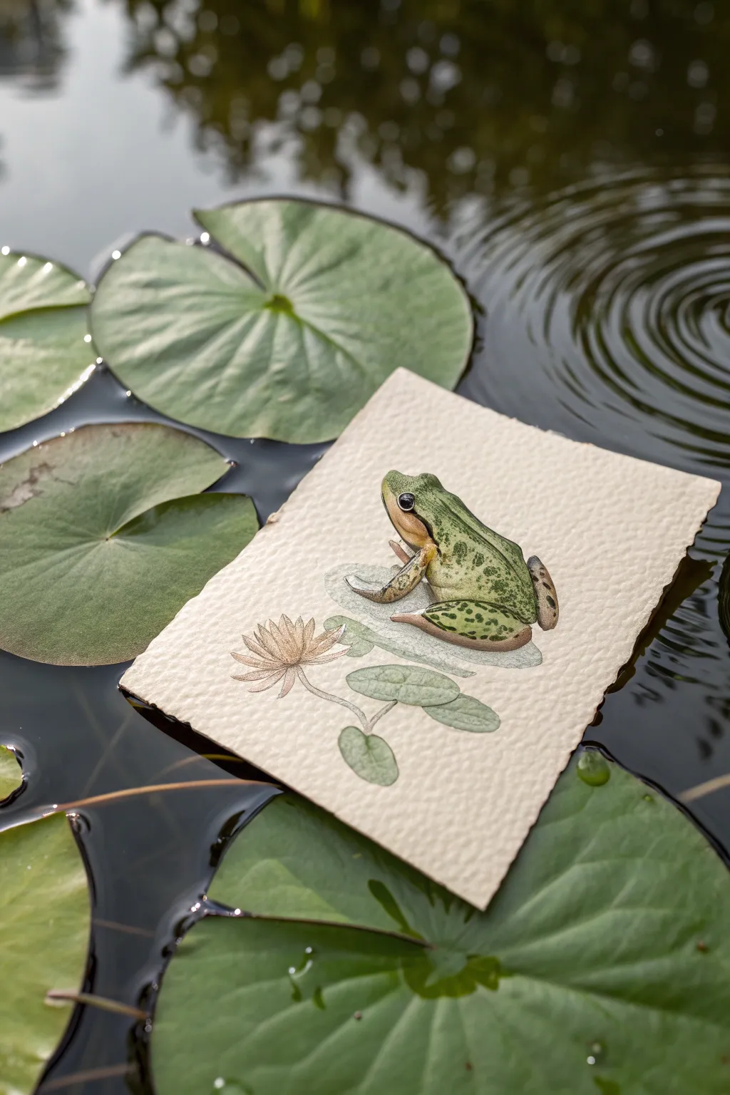
This charming project combines realistic watercolor illustration with a touch of optical illusion, creating a lifelike frog that seems ready to leap right off the page. The use of heavy textured paper adds a lovely tactile quality that mimics the organic feel of a lily pad.
Step-by-Step
Materials
- Heavyweight cold-press watercolor paper (300gsm or higher)
- Watercolor paints (sap green, olive green, yellow ochre, burnt umber, sepia, faint pink)
- Fine liner brushes (sizes 00, 0, and 2)
- White gouache or white gel pen
- HB pencil and kneaded eraser
- Small mixing palette
- Water cups and paper towels
- Scissors or a deckle edge ruler (optional for edges)
Step 1: Sketching and Preparation
-
Paper Preparation:
Begin by tearing or cutting a small rectangle of watercolor paper, roughly 4×5 inches. If you want that rustic, handmade look shown in the photo, tearing the paper against a ruler creates a beautiful deckled edge. -
Basic Frog Outline:
Lightly sketch the frog’s body shape in the center of the paper using your HB pencil. Focus on the triangular head, the arched back, and the folded rear legs tucked close to the body. Keep the pressure very light so graphite doesn’t smudge later. -
Adding the Environment:
Sketch a simple, faint oval underneath the frog to represent its lily pad. Off to the side, draw a small, multi-petaled water lily flower and a connecting stem that loops under the pad.
Step 2: Base Layers
-
First Wash – The Frog:
Mix a watery Sap Green with a touch of Yellow Ochre. Apply this pale wash over the entire frog body, leaving the belly area and throat unpainted (white paper) for now. Let this layer dry completely. -
First Wash – The Flora:
Using a very diluted gray-green mix, wash in the lily pad beneath the frog. For the flower, use a whisper-thin wash of faint pink or peach, keeping it delicate. -
Definingform:
Once the first layer is dry, mix a slightly stronger Olive Green. Paint the sides of the frog and the folds of the legs to start building a 3D rounded form. Soften the edges with a clean, damp brush to avoid harsh lines.
Muddy Colors?
Wait for each layer to be bone-dry before adding the next. If the paper feels cool to the touch, it’s still wet. Patience prevents the greens and browns from bleeding into a gray mess.
Step 3: Detailing and Texture
-
Deepening Shadows:
Mix Burnt Umber with your green to create a shadow tone. Apply this right where the legs meet the body and under the chin to create separation and depth. -
Adding Spots:
Using a size 0 brush and a concentrated dark green or sepia mixture, carefully dab irregular spots onto the frog’s back and legs. Vary the size of the spots for realism—larger on the back, tiny speckles on the legs. -
The Eye:
Paint the eye utilizing pitch black or dark Sepia. Leave a tiny speck of white paper for the highlight, or add it later with gouache. Paint a golden ring around the black pupil. -
Throat and Belly:
Wash a warm, golden-tan color (Yellow Ochre mixed with a tiny drop of pink) onto the throat and visible belly area, blending it softly into the green upper body. -
Flower Details:
Use a fine liner to outline the individual petals of the water lily with a delicate sepia ink or paint. Add a slightly darker pink to the center of the flower to give it depth.
Paper Styling
To mimic the photo perfectly, float your finished dry drawing on actual water or place it on a large leaf for a photo op. Just be quick so your artwork doesn’t soak through
Step 4: Finishing Touches
-
Cast Shadows:
To make the frog look like it’s sitting *on* the paper, paint a subtle, cool gray shadow directly underneath the frog’s belly and feet on the painted lily pad surface. -
Highlights:
Using white gouache or a gel pen, add tiny, sharp highlights to the moist skin of the frog—specifically on the top of the head, the curve of the back, and the knee joints. This ‘wet’ look is crucial for realism. -
Stem Definition:
Clarify the stem connecting the flower to the pad with a solid green line, ensuring it passes convincingly ‘under’ the floating pad. -
Final Assessment:
Step back and check the contrast. If the frog looks flat, deepen the darkest shadows in the creases of the legs one last time.
Enjoy your miniature masterpiece and the peaceful vibe it brings to your collection
Mushroom Cottage With Tiny Details
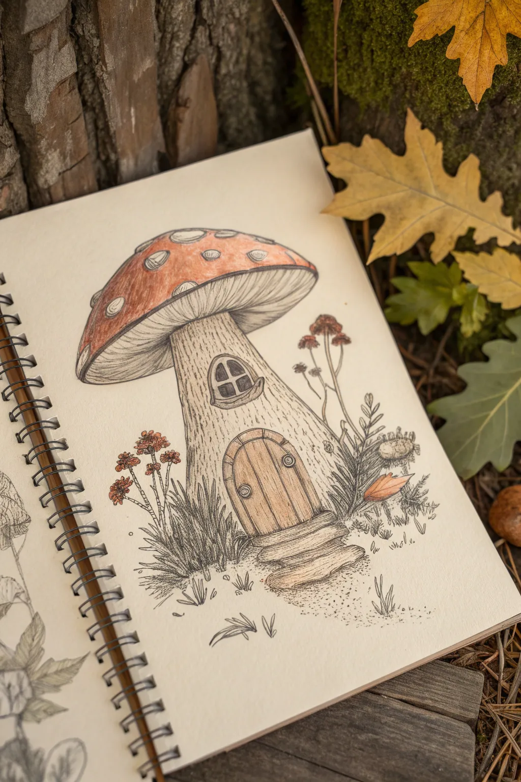
Step into a fairytale world with this charming illustration of a tiny mushroom dwelling nestled in nature. Combining delicate ink linework with soft washes of color, this project captures the rustic texture of bark and the vibrant pop of a toadstool cap.
Step-by-Step Tutorial
Materials
- Spiral-bound mixed media or watercolor sketchbook
- HB graphite pencil
- Kneaded eraser
- Fine liner pens (sizes 0.1, 0.3, and 0.5, black waterproof ink)
- Watercolor pencils or light wash markers (Red, Brown, Ochre, Green)
- Small round paintbrush (size 2 or 4)
- Cup of water and paper towel
Step 1: Sketching the Structure
-
Outline the cap:
Begin by lightly sketching a large, rounded dome shape for the mushroom cap. Leave the bottom edge slightly curved upward to show the gills underneath. -
Draw the stalk:
Extend a thick, sturdy stalk downwards from the center of the cap. Widen the base slightly where it meets the ground to give the cottage a planted, stable look. -
Add architectural features:
Sketch a small, arched door with a stone step at the base of the stalk. halfway up the stalk, draw a small, rounded window with a protruding sill. -
Details and surroundings:
Mark uneven circles on the cap for the classic toadstool spots. Lightly indicate clusters of grass at the base and a few tall, spindly flowers on either side.
Uneven Wash?
If your watercolor pencil strokes look scratchy after wetting, add a tiny bit more water to your brush and scrub gently to dissolve the pigment fully.
Step 2: Inking the Lines
-
Refine the outline:
Using a 0.3 pen, trace over your pencil lines. Keep the lines slightly shaky or organic rather than ruler-straight to emphasize natural textures. -
Detail the gills:
With a finer 0.1 pen, draw thin, closely spaced lines curving from the stalk outward to the edge of the cap to create the gill texture. -
Texture the stalk:
Use vertical, broken lines down the length to mimic wood grain or bark. Curve these lines around the window and door frame to show how the wood flows. -
Inking the door and window:
Draw vertical planks on the door. Add tiny circles for hinges and a handle. For the window, darken the panes to suggest depth. -
Grass and flowers:
Use quick, upward flicking motions to ink the grass blades at the base. Outline the tiny flower heads on the tall stems using small stippling dots.
Step 3: Adding Color & Shading
-
Base layer for the cap:
Using a red watercolor pencil, gently shade the mushroom cap, avoiding the white spots. Press harder near the edges and the top for natural shadowing. -
Base layer for the stalk:
Lightly shade the stalk with a pale brown or ochre, leaving the center slightly lighter to create a rounded, highlighted effect. -
Color the door:
Use a darker brown/ochre mix for the door planks and the window sill. This differentiates the wood of the door from the mushroom stalk. -
Activate the watercolor:
Dip your damp brush into water and gently go over the colored pencil areas. Blend the red pigment smoothly, but be careful not to drag red into the white spots. -
Adding shadow under the cap:
Use a very light wash of gray or diluted brown on the gills to suggest shadow cast by the cap, keeping the center nearest the stalk lighter.
Pro Tip: Volume
Keep the center of the stalk and the very top of the red cap lighter in color. This central highlight makes the mushroom look round and 3D.
Step 4: Final Textures
-
Enhancing the ground:
Add touches of desaturated red to the flower heads. Once dry use fine stippling (dots) on the ground to simulate dirt and sand texture. -
Deepen the shadows:
I like to go back in with the 0.5 pen to darken the deepest crevices—specifically underneath the mushroom cap rim and the bottom of the door step. -
Bark details:
Add a few more jagged, thin vertical lines on the stalk with the finest pen to enhance the dry, wood-like texture over the watercolor wash. -
Highlight the spots:
If your white spots got dingy, use a white gel pen or opaque white paint to make them pop again. Add tiny dots on the red cap for extra texture. -
Clean up:
Wait until the paper is completely bone-dry, then gently erase any remaining visible pencil sketch lines.
Now you have a cozy little forest home ready for a tiny inhabitant to move in
Hands Making a Heart Around a Tiny Character
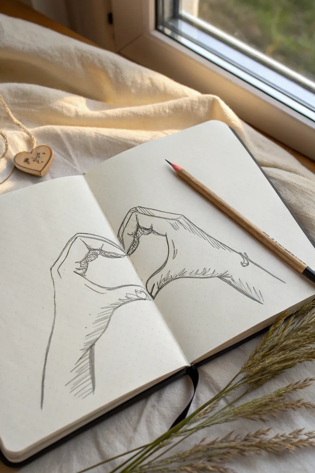
Capture a moment of connection with this touching pencil sketch of two hands coming together to form a heart shape across the crease of your notebook. The line work is expressive and slightly rough, giving it a raw, authentic artistic feel.
Detailed Instructions
Materials
- Dotted or blank sketchbook
- HB or 2B graphite pencil
- Fine-point mechanical pencil (optional for details)
- Kneadable eraser
- Blending stump (optional)
Step 1: Planning Composition
-
Mark geometric boundaries:
Visualize the center binding of your sketchbook as the central axis of the heart. On the left page, lightly sketch a boxy shape where the left hand will be, and do the same on the right page for the right hand, ensuring they align horizontally. -
Establish the heart curve:
Very faintly draw the ideal heart shape you want the negative space to form. This will act as your guide for where the thumbs and index fingers need to meet. -
Block in finger segments:
Instead of drawing fingers immediately, break the fingers down into three rectangular segments each. The index fingers should arch down to meet in the middle, while the thumbs curve upward to close the bottom of the heart.
Step 2: Drafting the Hands
-
Outline the left hand:
Refine the blocky shapes on the left page. Draw the contour of the wrist moving up into the thumb joint. Curve the index finger so the tip touches the center line. -
Outline the right hand:
Mirror the process on the right page. Be careful with proportions here; the wrist should be roughly the same width as the left one. Bring the right index finger down to meet the left one’s tip. -
Shape the thumbs:
I find the thumbs are often the hardest part. Ensure the knuckles bulge slightly outward before the thumb curves inward. The tips of the thumbs should meet at the bottom point of your heart shape guide. -
Adding the secondary fingers:
Sketch the suggestion of the middle, ring, and pinky fingers folded behind the index fingers. You only need to show the top curve of the knuckles and the tips of the fingers tucked into the palm.
Angle Check
Use your own hands as a reference! Snap a photo of your hands making this shape to see exactly how the knuckles align.
Step 3: Refining and Shading
-
Define the silhouettes:
Go over your initial light schematic lines with a darker, more confident stroke. Don’t worry about keeping the line perfectly smooth; a slightly jittery line adds character. -
Add knuckle details:
Draw small, curved lines at the joints of the index fingers and thumbs to indicate skin folding. Use short, scratchy strokes to suggest wrinkles. -
Hatching the shadows:
Use directional hatching (parallel lines) to create shadows. Focus on the underside of the wrists and the area where the fingers curl into the palms. -
Texture the wrist:
Add longer hatch marks running down the length of the forearm to suggest the tendons and shadows of the wrist. -
Refine the contact points:
Darken the specific points where the fingers touch each other. This contact shadow adds weight and realism to the gesture. -
Erase guidelines:
Gently roll your kneadable eraser over the drawing to lift away the initial geometric box lines and heart guide, leaving only your finished sketch. -
Final contrast check:
Step back and squint at the drawing. If it looks too flat, deepen the darkest shadows within the palm area to make the hands pop.
Level Up
Draw a tiny character, like a silhouette of a cat or a little person swinging, hanging from the top arch of the heart.
This simple yet emotive sketch is a perfect reminder of connection to keep in your journal
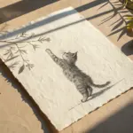
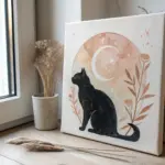
Cat on a Paper Airplane Flying to the Moon
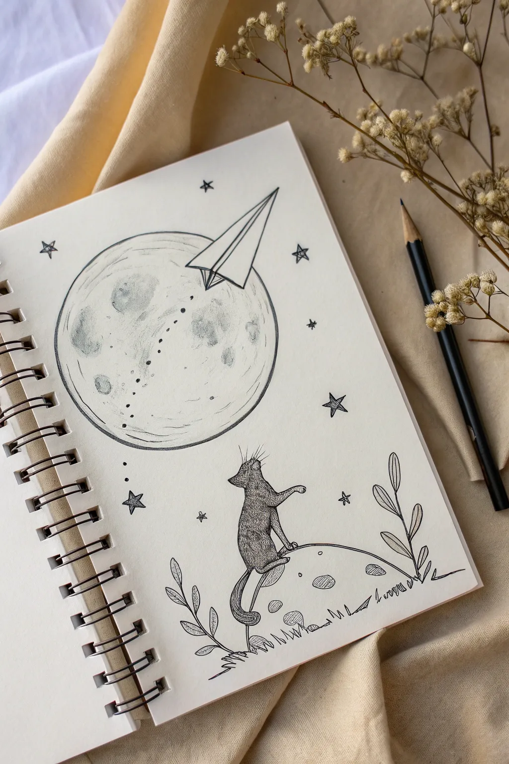
This charming ink drawing captures a sense of wonder with a cat gazing up at a large, textured moon and a soaring paper airplane. It combines precise stippling techniques with clean line work to create a dreamy, celestial scene in your sketchbook.
Step-by-Step
Materials
- Spiral-bound sketchbook (heavyweight paper preferred)
- HB graphite pencil
- Fine liner pen (size 01 or 03)
- Fine liner pen (size 005 for details)
- Eraser
- Compass or circular object (for the moon)
Step 1: Penciling the Layout
-
Map the main moon:
Start by lightly drawing a large circle in the upper-left quadrant of your page. A compass works best for a perfect shape, but tracing a cup works too. -
Draft the foreground mound:
In the bottom right, sketch a gentle curve representing the hill or smaller planetoid where the cat will sit. -
Sketch the cat silhouette:
Draw the basic outline of a cat seated on the mound, facing left. Use simple shapes: an oval body, a smaller circle for the head, and triangular ears. One paw should be slightly raised. -
Add the paper plane:
Position a paper airplane overlapping the top right edge of the large moon. The nose should point downwards toward the moon’s center. -
Plan the flight path:
Lightly sketch a dotted trail curving from the plane’s tail down across the face of the moon.
Step 2: Inking Major Outlines
-
Outline the moons:
Using your 01 or 03 fine liner, carefully trace the large moon circle. Go around the paper airplane shape so you don’t draw the moon line through it. -
Define the paper airplane:
Ink the sharp, geometric lines of the paper plane. Make the corners crisp to contrast with the organic shapes elsewhere. -
Ink the foreground:
Trace the curve of the ground and the cat’s outline. I like to use slightly broken or textured lines here to suggest fur and terrain rather than a solid, heavy wire. -
Draw the botanical elements:
Add simple, leafy branches on either side of the foreground mound. Keep the leaves open and simple.
Smudge Control
Place a scrap piece of paper under your drawing hand. This prevents oils from your skin transferring to the paper and stops you from dragging wet ink across the clean white page.
Step 3: Shading and Texturing
-
Texture the large moon:
Switch to your 005 fine liner. Instead of coloring solid grey, use stippling (lots of small dots) and light scribbling to create craters and ‘seas’ on the moon surface. -
Concentrate the shadows:
Add more dots on the left side of the moon and inside the crater shapes to give spherical volume. -
Fur texture on the cat:
Fill in the cat using short, directional hatching strokes. Cross-hatch slightly in the darker areas like the lower back and tail to separate the limbs. -
Detail the foreground mound:
Add small oval ‘craters’ to the ground the cat sits on, shading them with simple hatching lines. -
Grass and ground:
Draw small tufts of grass along the bottom contour of the mound to ground the scene.
Make it Sparkle
Use a white gel pen to add tiny highlights back into main moon’s darkest craters or to add a glint to the cat’s eye after all the black ink has dried.
Step 4: Final Celestial Details
-
Ink the flight trail:
Go over the dotted path of the airplane. Variate the size of the dots slightly—start small near the plane and get slightly larger further away. -
Add scattered stars:
Draw several five-pointed stars around the moon. Keep them open (unfilled) and varying in size. -
Tiny dot details:
Sprinkle single ink dots randomly around the sky area to represent distant stardust. -
Erase pencil marks:
Wait at least 15 minutes to ensure the ink is totally dry, then gently erase all your underlying graphite sketches. -
Final contrast check:
Look at the drawing as a whole. Determine if the cat needs darker shading to stand out against the white background and add clearer definition if needed.
Now you have a peaceful, dreamlike sketch ready to be admired
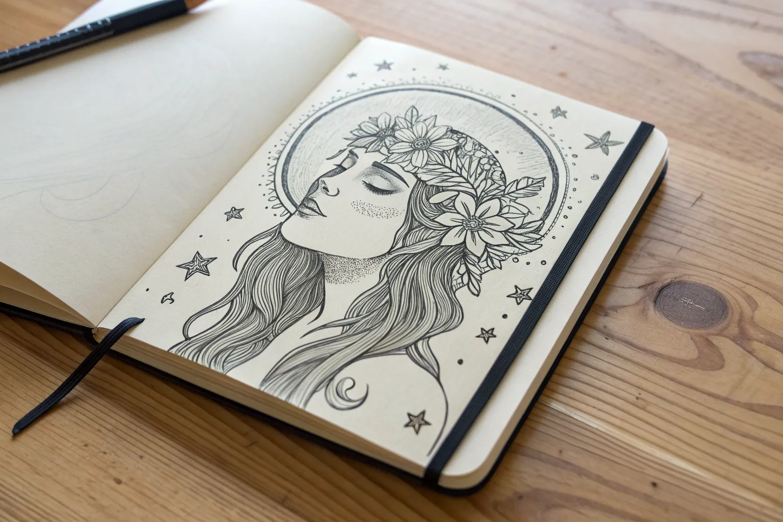
Girl With Orbiting Planets and Floating Stars
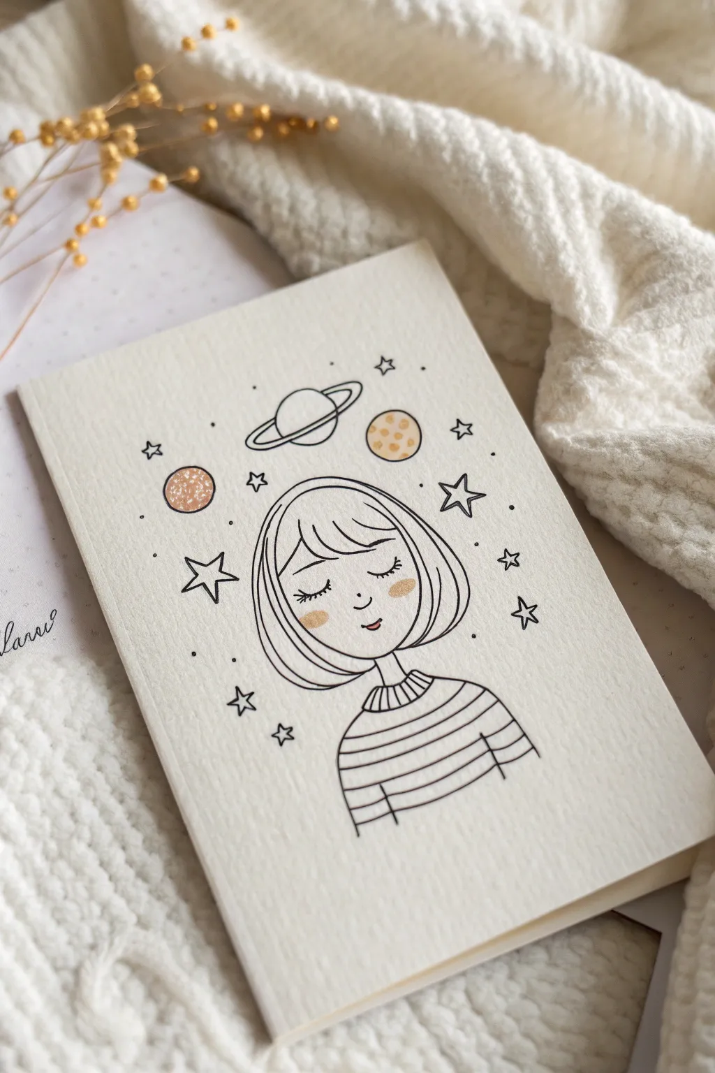
This whimsical journaling card features a serene girl daydreaming among the stars and planets. The minimalist black line work pairs beautifully with subtle touches of gold and blush for a cozy, celestial vibe.
Detailed Instructions
Materials
- Acid-free watercolor paper or mixed media cardstock (approx. 4×6 inches)
- Fine liner pen (0.3mm or 0.5mm, waterproof archival ink)
- Pencil (HB or H for light sketching)
- Kneaded eraser
- Gold metallic marker or gel pen
- Blush pink or coral marker (alcohol or water-based)
- Ruler (optional)
Step 1: Sketching the Foundations
-
Paper selection:
Begin by cutting your mixed media paper to size if you aren’t using a pre-cut journaling card. The textured surface shown in the reference adds a nice tactile quality. -
Head shape:
Lightly sketch a U-shape for the jawline in the lower-center of your paper. Keep the lines very faint so they can be easily erased later. -
Neck and shoulders:
Draw two short, vertical lines descending from the jaw for the neck. Extend these into a curved shoulder line that anchors the figure at the bottom of the page. -
Hair outline:
Sketch a bob hairstyle. The hair should frame the face closely, curving in at the jawline. Add bangs that sweep slightly across the forehead.
Smudge Prevention
Wait at least 5-10 minutes before erasing pencil lines. If your eraser streaks graphite, knead it to reveal a clean surface or switch to a polymer eraser.
Step 2: Inking the Character
-
Face details:
Switch to your fine liner. Draw two downward-curving arcs for the closed eyes, adding small lashes at the outer corners. Place a tiny ‘u’ for the nose and a small curve for the smile. -
Hair definition:
Ink the outline of the hair. Inside the hair shape, add a few sweeping lines to suggest strands and volume, keeping the look clean and simple. -
Neckline collar:
Draw a ribbed collar at the base of the neck using small vertical tick marks contained within a curved band. -
Striped sweater:
Ink the shoulder lines. Carefully draw horizontal stripes across the shirt area. I find drawing them slightly imperfect adds to the hand-drawn charm.
Step 3: Adding the Celestial Elements
-
Saturn ring:
Directly above the head, sketch a planet with a ring (Saturn). Start with the central circle, then draw an ellipse around it, erasing the back line where the planet body obstructs the ring. -
Planetary companions:
Draw two circular planets on either side of the head—one slightly lower on the left, one higher on the right. -
Star cluster:
Scatter five-pointed stars around the figure. Vary their sizes, placing larger outline stars near the head and smaller solid stars or dots further out. -
Planetary texture:
Ink the outline of the planets. For the planet on the right, add small circular craters inside. -
Erase pencil:
Once the ink is completely dry (give it a few minutes to be safe), gently use the kneaded eraser to lift all visible pencil guidelines.
Make It 3D
Use foam tape to mount cut-out stars or planets on top of the drawing for dimension, or use glitter glue on the planet rings for extra texture.
Step 4: Finishing Touches
-
Rosy cheeks:
Take your blush or coral marker and dab small oval patches on the girl’s cheeks. If the marker is too saturated, blot it on scrap paper first. -
Planet color:
Color in the planet on the left with the same blush tone you used for the cheeks to create color harmony. -
Gold accents:
Using the gold metallic pen, color in the cheeks over the pink and fill in the planet on the right. -
Stardust sparkles:
Add tiny gold dots or micro-stars in the empty spaces to give the composition a magical shimmer.
Now you have a peaceful piece of art perfect for the front of a greeting card or a bullet journal cover
Floating Island Castle With Perspective Challenges
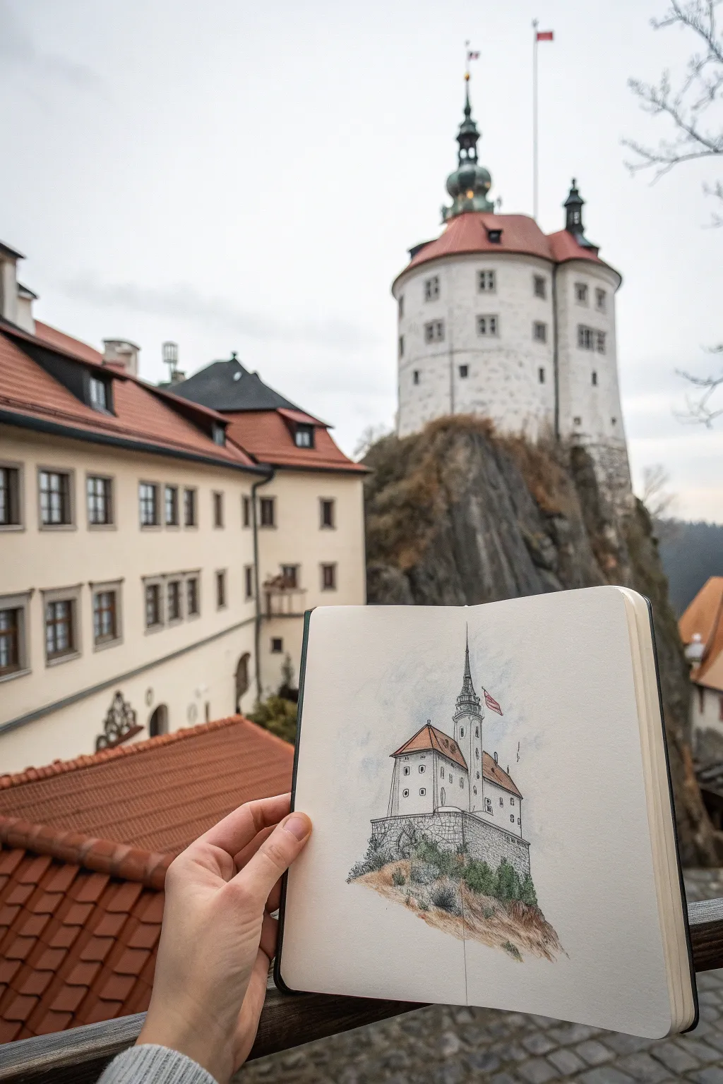
Capture the magic of an architectural landmark by reimagining it as a fantasy floating island. This project combines precise ink lines with loose, atmospheric watercolor washes to create a charming sketchbook spread.
How-To Guide
Materials
- Sketchbook with heavy paper (mixed media or watercolor)
- Pencil (HB or 2B)
- Kneadable eraser
- Fine liner pens (waterproof, sizes 0.1 and 0.3)
- Watercolor set (pan or tube)
- Round watercolor brush (size 4 or 6)
- Water cup and paper towels
Step 1: Penciling the Perspective
-
Establish the horizon:
Begin by lightly sketching a simple vertical line to act as the central axis for your castle tower. This helps keep the structure upright and not leaning. -
Block in the main volumes:
Using simple geometric shapes, rough in the main body of the castle. Draw a wide rectangular prism for the base building and a cylinder or narrower rectangle for the main tower. -
Add the rooflines:
Sketch triangles or cones for the roofs. Pay attention to the angle of the eaves; since we are looking up at the castle in this composition, the roof lines will angle slightly downward towards vanishing points. -
Create the rocky base:
Instead of drawing the ground or hill, sketch a jagged, irregular shape beneath the castle foundation to form the ‘floating island’ look. Keep the bottom loose and organic. -
Refine architectural details:
Lightly mark the placement of windows in rows. Ensure they follow the perspective lines of the walls. Add small rectangles for the chimney and the flag.
Step 2: Inking the Structure
-
Outline the main silhouette:
Switch to your waterproof 0.3 fine liner. Carefully trace the outer edges of the roof and walls. Don’t worry if lines aren’t ruler-straight; a little wobble adds character. -
Detail the windows:
Use the finer 0.1 pen for the windows. Instead of drawing perfect squares, try leaving small gaps or using dots to suggest the frames, which keeps the sketch feeling light. -
Texture the stone foundation:
At the base of the building, draw small, irregular brick patterns. You don’t need to fill the whole area; imply the texture with clusters of bricks near the corners and edges. -
Render the vegetation:
Using a scribbling motion with the 0.1 pen, add bushes and small trees around the base of the castle where it meets the rock. This creates a soft contrast to the hard architectural lines. -
Detail the floating rock:
Use broken, angular lines to define the floating rock mass. Add some vertical hatching lines to suggest shadows and the rough texture of the cliff face. -
Erase pencil marks:
Wait a moment for the ink to fully set, then gently erase all your initial pencil guidelines so the page is clean for painting.
Ink Tip
Test your pen on a scrap piece of the same paper first. If it bleeds when you apply water, switch to a specific pigment liner or do the watercolor washes first.
Step 3: Watercolor Washes
-
Paint the rock base:
Mix a diluted wash of Burnt Sienna and a touch of gray. Apply this loosely to the rock area, letting the color pool slightly at the bottom edge for a natural gradient. -
Greenery accents:
While the rock area is drying, dab a muted Sap Green onto the scribbled bush areas. I like to keep this very loose, letting the white of the paper show through for highlights. -
Roof terracotta:
Use a warm terracotta or light orange mix for the roofs. Paint the side of the roof that would be in shadow with a slightly more saturated version of the same color to add dimension. -
Shadows on the building:
Mix a very watery pale blue-gray. Apply this to the shadowed side of the white castle walls (usually the right side if light comes from the left) to make the structure look 3D. -
Atmospheric sky:
Using clean water, wet the area around the tower tip loosely. Drop in a very faint blue wash to suggest the sky, fading it out to white as you move away from the drawing. -
Final drybrush details:
Once everything is bone dry, take a slightly damp brush with darker brown paint and add a few texture scuffs to the dirt and rock area for a gritty earth feel.
Level Up
Add tiny dangling roots or falling pebbles beneath the floating rock to emphasize that the island is hovering in mid-air.
Now you have a charming pocket-sized castle captured forever in your sketchbook
Have a question or want to share your own experience? I'd love to hear from you in the comments below!