If you’ve been staring at blank walls and thinking, “I could paint something that actually feels like my space,” you’re in the right mindset. These home decor painting ideas are all about creating art (or painting walls) that ties your room together or becomes the bold focal point you build the whole vibe around.
Big Abstract Statement Canvas
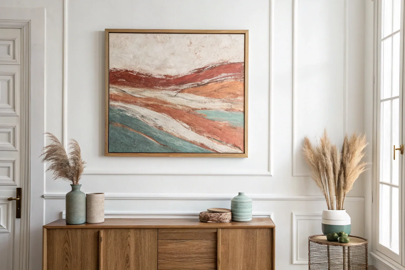
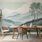
Bring the serene warmth of a desert landscape into your home with this large-scale abstract canvas. Using layers of earthy acrylics and simple scraping techniques, you’ll build a rich, weathered surface that feels both modern and timeless.
Step-by-Step Tutorial
Materials
- Large canvas (24×36 inches or larger)
- Acrylic paints: Titanium White, Unbleached Titanium (cream), Yellow Ochre, Burnt Sienna, Raw Umber
- Gesso (white)
- Wide flat paintbrush (2-3 inch)
- Palette knife or plastic scraper
- Spray bottle with water
- Old credit card or painting wedge
- Paper towels or rags
- Fine-grit sandpaper (optional)
Step 1: Building the Foundation
-
Prime the Surface:
Begin by applying a generous coat of white gesso to your entire canvas. This seals the fabric and provides a slight tooth for the subsequent layers to grab onto. -
Create a Neutral Base:
While the gesso is still slightly tacky, mix Titanium White with a touch of Unbleached Titanium. Brush this creamy mixture loosely over the top two-thirds of the canvas, leaving the texture visible. -
Establish the Horizon:
Mix Yellow Ochre with a bit of Burnt Sienna to create a warm, sandy tone. Apply this horizontally across the middle of the canvas using a wide brush, roughly defining where your horizon line will sit. -
Layer the Bottom Section:
For the bottom third, use a mix of Unbleached Titanium and a tiny drop of Raw Umber. Paint this area with vertical strokes initially, then smooth it out horizontally to blend slightly with the ochre section above. -
Scrape and Distressed:
Before the paint fully dries, take your plastic scraper or old credit card and drag it horizontally across the canvas. This pulls paint off the high points of the canvas weave, creating an instant weathered look. -
First Drying Phase:
Allow this base layer to dry completely. This is crucial so your next layers sit on top rather than turning into mud.
Step 2: Adding Depth and Structure
-
Intensify the Horizon:
Mix a rich Burnt Sienna with a little Raw Umber. Using your palette knife, apply a thick, bold horizontal band across the middle ochre section. Don’t try to be perfect; let the knife skip and break for organic texture. -
Add Upper Atmosphere:
Dilute some Titanium White with water until it’s milky. Use a rag to rub this wash into the upper third of the painting, softening the transition between the sky area and the horizon band. -
Introduce Texture Spatters:
Load a wet brush with watered-down Raw Umber. Hold it over the top right corner and tap the handle to create fine splatters that mimic grit or distant birds. -
Create Vertical Bleeds:
Mix a very watery wash of Raw Umber. Using a small brush, touch the wet paint to the bottom edge of your dark horizon line. Mist it immediately with your spray bottle so the paint drips vertically down the bottom half of the canvas. -
Enhance the Drips:
If the drips are too faint, re-trace a few of them with a fine liner brush and dark brown paint. Keep the lines shaky and uneven to maintain the natural, organic feel. -
Dry Brushing Highlights:
Take a dry wide brush with a tiny amount of pure Titanium White. Lightly drag it horizontally over the darkest parts of the horizon to highlight the texture and add a ‘frosted’ look.
Too Muddy?
If colors are blending into grey, stop immediately. Let the canvas dry fully (use a hair dryer to speed it up) before adding the next layer on top.
Step 3: Final Distressing and Unifying
-
Sanding Back:
Once everything is bone dry, lightly sand specific areas where the paint looks too heavy or opaque. I find this creates a ghostly, worn effect that mimics aged plaster. -
Glazing the Bottom:
Mix a transparent glaze using water and a tiny bit of Yellow Ochre. Brush this over the bottom third of the painting to unify the vertical drips and the background color. -
Final White Washes:
Apply patches of white paint with a palette knife in the negative spaces of the lower section, scraping it thin so the dark drips still show through underneath. -
Detail Check:
Step back five feet. Look for any areas that feel too empty or too busy. Add small scratches with the edge of your palette knife to break up solid blocks of color. -
Seal the Work:
Finish with a matte varnish spray to protect the painting without adding unwanted shine, preserving that raw, earthy aesthetic.
Add Dimension
Mix modeling paste into your white acrylic for the final top layers. This adds physical relief that catches the light and deepens shadows.
Hang your new masterpiece in a well-lit spot to let the natural textures cast their own subtle shadows
Three-Panel Triptych Over the Sofa
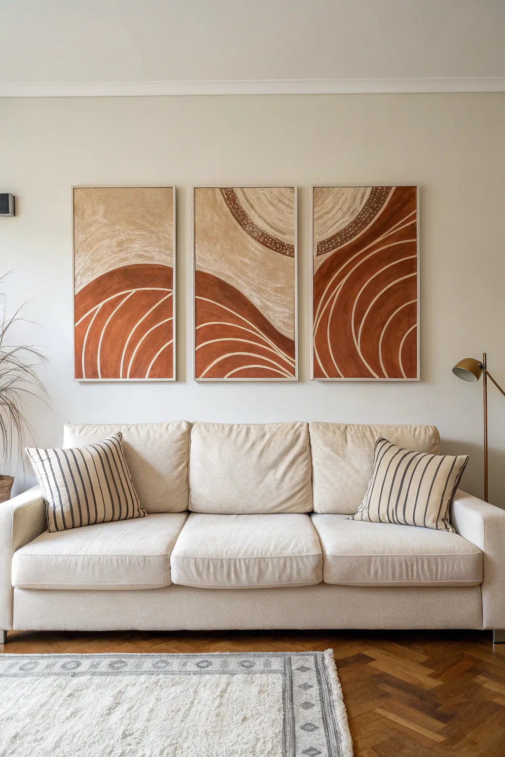
Bring warmth and structure to your living space with this striking three-panel abstract painting featuring flowing arches and rich terracotta tones. This project plays with texture and warm neutrals to create a cohesive, gallery-worthy statement piece.
Step-by-Step
Materials
- Three large rectangular canvases (approx. 24×36 or similar)
- Acrylic paints: Burnt Sienna, Raw Sienna, Unbleached Titanium, White
- Modeling paste or texture medium
- Large flat brush (2-3 inch)
- Medium round brush
- Detail liner brush
- Palette knife
- Masking tape or painter’s tape
- Charcoal pencil or chalk
- Ruler or straight edge
- Mixing palette/plate
- Water cup and rags
Step 1: Preparation and Sketching
-
Arrange the canvases:
Lay your three canvases side-by-side on the floor or a large table, leaving a small gap between them to simulate how they will hang on the wall. This ensures your lines flow continuously across the panels. -
Map the horizon:
Using a charcoal pencil or chalk, lightly sketch the main dividing lines. Notice how the design swoops: start low on the left panel, rise to a peak in the middle panel, and curve back down on the right. -
Sketch the arches:
Draft the concentric curved lines within the lower terracotta sections. These don’t need to be perfect circles; organic, hand-drawn curves add to the natural aesthetic. -
Define the upper textures:
Outline the circular motif in the upper section, which spans across all three canvases, creating a large, interrupted sun or moon shape near the top.
Flow Control
If your thin lines feel shaky or the paint drags, mix in a few drops of water or acrylic flow improver. The paint should brave the consistency of heavy cream for long, smooth strokes.
Step 2: Texturing and Background
-
Mix the texture base:
Combine a dollop of modeling paste with a small amount of Unbleached Titanium acrylic paint to create a thick, creamy textured mix. -
Apply upper background:
Using a palette knife or a coarse brush, apply this textured mix to the upper sections of the canvas (the sky area). Use cross-hatching motions to build up physical depth. -
Create the granular ring:
For the darker textured band in the upper circle (visible on the right two panels), mix modeling paste with a touch of Burnt Sienna. Dab this on with a stiff brush to create a stippled, dot-like effect. -
Let it cure:
Allow the texture paste to dry completely. This usually takes several hours or overnight depending on thickness; I like to use this downtime to clean my brushes thoroughly.
Step 3: Blocking in Color
-
Mix the terracotta:
Create your main rust color by mixing Burnt Sienna with a tiny touch of Red Oxide or just using pure Burnt Sienna depending on your brand’s richness. -
Paint the lower forms:
Fill in the large mound shapes at the bottom of the canvases with the terracotta mix. Use a large flat brush for smooth, sweeping strokes that follow the curve of the hill. -
Refine the upper neutral:
Once the texture is dry, apply a wash of watered-down Raw Sienna and White over the textured areas to highlight the peaks and valleys of the paste. -
Add the dark accent:
Paint the curved band in the upper right section with a darker brown mix (Burnt Sienna plus a dot of Black or Umber) to create contrast against the lighter textured sky.
Metallic Accent
For a luxe upgrade, paint the thin arch lines with metallic copper or gold leaf paint instead of cream. It catches the light beautifully in the evening.
Step 4: Detailing the Arches
-
Prepare the line color:
Mix a light cream color using White and a drop of Unbleached Titanium. You want this paint visually distinct but not harsh white. Adding a flow medium can help lines glide smoother. -
Paint the primary curves:
Using a medium round brush, paint the thickest curved lines inside the terracotta sections. Start from the bottom edge and sweep upward, letting your arm guide the motion. -
Add secondary lines:
Switch to a detailed liner brush to add thinner, parallel curves between your main lines. Varying the line weight adds visual interest. -
Detail the texture band:
Return to the upper textured band (the dark brown arc). Use your small brush to add tiny clusters of cream dots over the dark paint, mimicking the stippled texture underneath. -
Clean up edges:
Check the sides of your canvases. Paint the edges to match the adjacent front color for a professional, frameless look. -
Final assessment:
Step back and look at all three panels together. If any lines don’t quite meet up across the gaps, make small adjustments now while the paint is still workable.
Hang your new masterpiece with consistent spacing to let the design flow seamlessly across your wall.
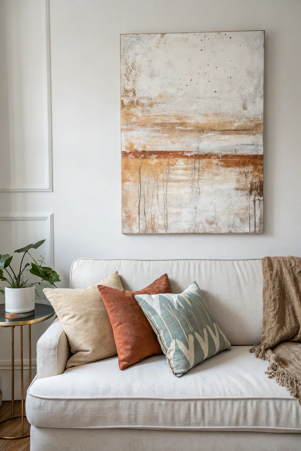
Cohesive Color-Palette Anchor Art
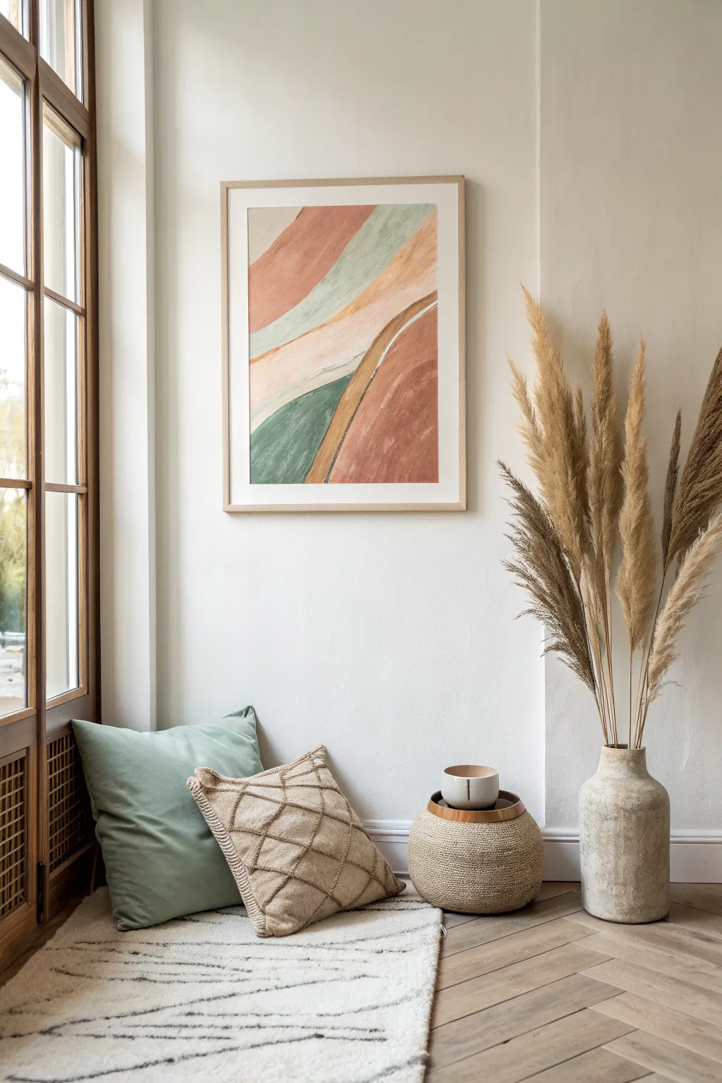
Anchor your room’s color story with this serene, organic abstract piece featuring sweeping curves of sage, terracotta, and soft beige. The matte finish and soft edges give it a sophisticated, calming presence perfect for a cozy corner.
Step-by-Step Tutorial
Materials
- Heavyweight mixed media paper or watercolor paper (18×24 inches)
- Acrylic paints (Burnt Sienna, Unbleached Titanium, Sap Green, White, Mars Black)
- Matte medium or flow improver
- Large flat brush (1-2 inch)
- Medium filbert brush
- Pencil for sketching
- Palette or mixing plate
- Paper towels
- Jar of water
- Wide masking tape (optional for borders)
Step 1: Planning and Sketching
-
Prepare your surface:
If you want a clean white border around your art like the reference image, tape down the edges of your paper to your work surface. This also helps keep the paper flat while you paint. -
Establish the composition:
Using a pencil, very lightly sketch the flowing, curved sections. Start from the top left corner and swoop down toward the bottom right. Think of these as rolling hills or strata of earth. -
Create the diagonal flow:
Draw three main diagonal bands. The top band occupies the upper left, the middle band cuts through the center, and the bottom section fills the lower right. Keep your lines loose and organic rather than perfectly straight.
Paint Lifting?
If acrylic lifts when you paint over it, let the first layer cure longer. Use a soft brush for second coats to avoid scrubbing up the drying paint underneath.
Step 2: Mixing the Color Palette
-
Mix the Sage Green:
Combine Sap Green with a significant amount of White and a tiny dot of Mars Black or Burnt Sienna to distract the vividness. You want a muted, dusty green tone. -
Create the Terracotta Rust:
Take your Burnt Sienna and mix in a little Unbleached Titanium. For the darker rust section at the bottom, add the tiniest touch of black or blue to deepen it without losing the warmth. -
Prepare the Sand Beige:
Mix Unbleached Titanium with White. You want this to be very pale and creamy, serving as the calm negative space between the bolder colors. -
Thin the paints:
I like to mix a bit of matte medium or water into all these colors. You want the paint to flow smoothly and have a slightly translucent, gouache-like quality rather than a thick, plastic acrylic look.
Pro Tip: Color Harmony
Mix a tiny amount of your beige into every single other color on your palette. This ensures all the tones relate to each other for that cohesive designer look.
Step 3: Applying the Block Colors
-
Paint the top band:
Start with your Terracotta Rust mixture. Use the large flat brush to fill in the uppermost curved section. Use long, sweeping strokes that follow the curve of your pencil line. -
Add the green stripe:
Below the top rust section, paint a thinner band of the Sage Green. Let this color touch the wet edge of the rust slightly if you want a softer transition, or wait for the rust to dry for a crisp line. -
Fill the center:
Using your Sand Beige mixture, fill the wide central swooping area. This is the lightest part of the painting and acts as a separator between the top and bottom visual weights. -
Paint the bottom section:
Fill the large bottom-right corner with the darker version of your Terracotta Rust. Paint confidently right off the edge of the paper (or onto the tape). -
Add the lower green accent:
Paint the triangle-like shape in the bottom left corner with your Sage Green. This balances the green band at the top.
Step 4: Adding Texture and Detail
-
Create the dividing line:
Mix a darker, muddier beige using Unbleached Titanium and a touch of Burnt Sienna. Use the filbert brush to paint a distinct strip separating the central beige area from the bottom rust section. -
Dry brush texture:
Once the base layers are dry, take a nearly dry brush with a slightly lighter version of the rust color. Gently drag it over the bottom rust section to create a weathered, stony texture. -
Refine the edges:
Go back with a smaller brush and tidy up the boundaries where colors meet. The lines shouldn’t be ruler-straight; a little wobble adds to the organic feel. -
Add subtle variation:
Glaze a very watered-down white over the center of the green sections to make them look dimensional and less flat. -
Final assessment:
Step back and check the balance. If any color feels too heavy, you can lightly sand it down after drying to expose some paper tooth, or glaze a unifying color over top.
Peel off your tape to reveal crisp edges and frame your new calm, earthy masterpiece
Soft Modern Botanical Paintings
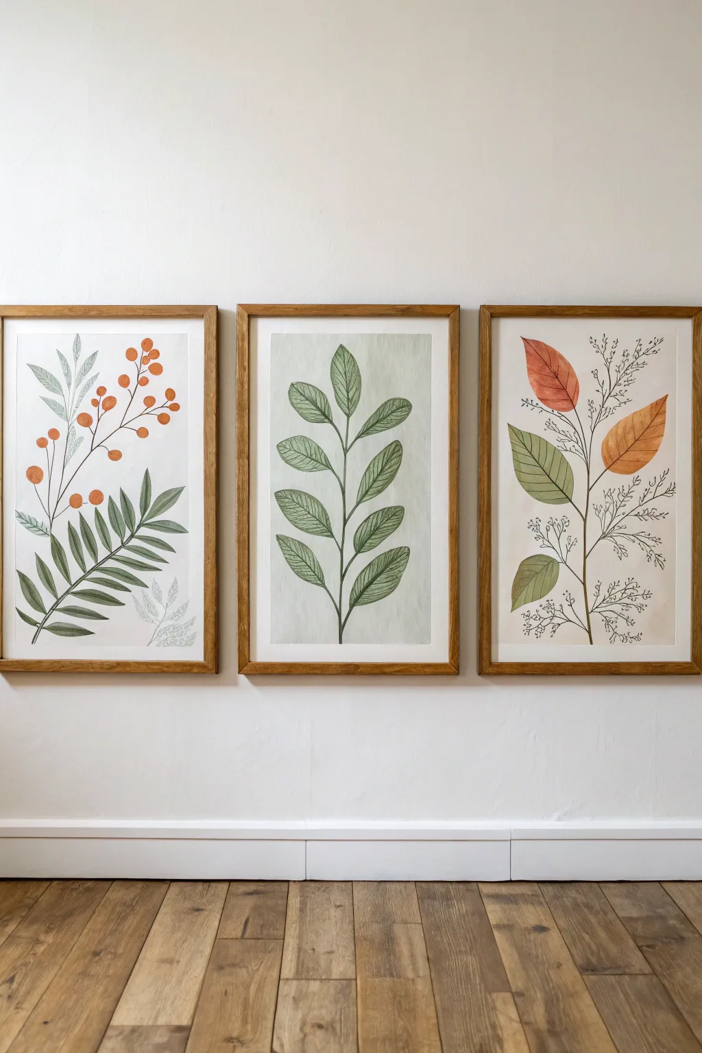
Achieve a sophisticated gallery wall look with this trio of soft botanical watercolors that balances earthy greens with touches of rust and orange. This project uses simple leaf shapes and fine line work to create a cohesive modern art set perfect for any living space.
Step-by-Step Guide
Materials
- 3 sheets of heavy watercolor paper (hot press for smoothness)
- Set of watercolor paints (sap green, olive green, burnt sienna, orange ochre)
- Fine liner pens (black, 0.3mm and 0.5mm)
- Round watercolor brushes (sizes 4 and 8)
- Fine detail brush (size 0 or 1)
- Pencil (HB or 2H)
- Kneaded eraser
- Ruler
- 3 wooden frames (natural oak finish)
- Masking tape
Step 1: Preparation and Sketching
-
Prepare the paper:
Cut your three watercolor sheets to match the size of your frames. Tape the edges of each sheet down to your workspace or a drawing board using masking tape to prevent buckling when the paper gets wet. -
Plan the composition:
Lightly sketch the main stems for each piece using a ruler for guidance if you want perfect verticality, though freehand curves look more organic. For the left piece, draw arching stems; for the middle, a single strong vertical stem; and for the right, a gentle curve branching outward. -
Draft the leaf shapes:
With a very light hand, pencil in the basic oval and lanceolate shapes of the leaves. Don’t worry about the tiny details yet—just get the placement and size relationship right for all three pages so they feel balanced as a set.
Ink Confidence
Jittery hand? Practice drawing long, smooth curves on scrap paper first. Use your whole arm, not just your wrist, for smoother stem lines.
Step 2: Painting the Base Layers
-
Mix your greens:
Create a watery mix of olive green and a touch of sap green. You want a semi-translucent consistency, not thick opaque paint. Test the color on a scrap piece of paper first. -
Paint the middle leaf stalk:
Start with the center artwork. Fill in the leaf shapes with your green mix. I like to keep the wash fairly even, but allow slight pooling at the bottom of the leaves for natural variation. -
Add warm tones:
For the right-hand piece, mix burnt sienna with a little orange ochre. Paint the large upper leaves with this warm, autumnal shade, transitioning to your green mix for the lower leaves to create visual interest. -
Detail the berries:
On the left-hand piece, use a pure orange ochre or a diluted cadmium orange to paint the small circular berries. Keep them simple and flat. Paint the fern-like fronds below them in a deeper, more saturated green. -
Let it dry completely:
This is crucial—wait until the paper is bone dry and cool to the touch. If you start the pen work too soon, the ink will bleed into the damp paper.
Go Digital
Scan your line drawings before painting. You can then print them onto watercolor paper multiple times to experiment with different color palettes.
Step 3: Fine Line Work
-
Outline the main stems:
Using your 0.5mm black fineliner, carefully trace over your pencil lines for the main stems. Use confident, single strokes rather than sketching back and forth. -
Veining the leaves:
Switch to the finer 0.3mm pen. Inside the dried watercolor shapes, draw the central vein of each leaf, then add delicate diagonal hatching lines to represent the secondary veins. This gives the art that distinctive illustration style. -
Add wispy details:
On the right and left pieces, use the pen to draw additional filler foliage that doesn’t have paint underneath. Draw tiny, branching twigs with miniature buds or leaves directly onto the white paper for a light, airy texture. -
Enhance the shadows:
Go back to the painted leaves and add a second, darker line on the shadowed side of the stems or the bottom edge of the leaves to give them a subtle 3D pop without adding more paint.
Step 4: Finishing Touches
-
Erase guidelines:
Once the ink is 100% dry (give it an extra 10 minutes to be safe), gently run a kneaded eraser over the artwork to pick up any visible pencil marks. -
Add background wash (optional):
If you want the middle piece to have that subtle background tint seen in the photo, apply an extremely diluted wash of cool gray or pale sage around the leaves, fading it out toward the edges. -
Frame the trio:
Place your finished artworks into the wooden frames. Ensure the glass is clean on the inside before sealing the back.
Hang these beauties side-by-side to bring a calming, organic rhythm to your wall
BRUSH GUIDE
The Right Brush for Every Stroke
From clean lines to bold texture — master brush choice, stroke control, and essential techniques.
Explore the Full Guide
Minimal Line Art in Painted Wash
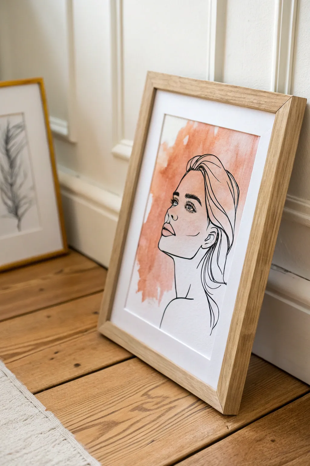
Embrace the effortless elegance of modern minimalism with this stunning line art project. By combining a loose, unstructured watercolor wash with precise ink contours, you’ll create a piece that feels both organic and intentional, perfect for a contemporary gallery wall.
Detailed Instructions
Materials
- Cold press watercolor paper (A3 or A4 size)
- Wide flat wash brush (1 inch or larger)
- Terracotta or burnt sienna watercolor paint
- Fine liner pen (size 05 or 08), waterproof ink
- Pencil (HB)
- Kneaded eraser
- Palette or mixing tray
- Jar of clean water
- Natural wood frame with mat
Step 1: Creating the Abstract Base
-
Prepare your space:
Tape down your watercolor paper to a board or table to prevent buckling. Ensure your workspace is flat and clean before you begin. -
Mix the color:
In your palette, mix a generous amount of terracotta or burnt sienna paint with water. You want a watery consistency—think tea, not heavy cream—to achieve that translucent look. -
Wet the paper:
Using your large wash brush, dampen the center area of the paper with clean water first. Don’t soak the whole page; just target the rough area where the color will go. -
Apply the first wash:
Load your brush with the terracotta mix and sweep it onto the damp paper. Use broad, uneven strokes. Don’t try to make it a perfect square; let the edges be ragged and organic. -
Add texture:
While the paper is still wet, dab a slightly more concentrated pigment into random spots, especially near the top. This creates the beautiful blooming effect seen in the background. -
Lift pigment:
If a section feels too heavy or dark, lightly dab it with a clean paper towel to lift some color. This adds varying depth to the wash. -
Let it dry completely:
This is crucial. The paper must be bone-dry before you start drawing. I usually give it at least an hour or use a hair dryer on a low, cool setting if I’m impatient.
Uneven Wash?
If your watercolor dries with hard ‘cauliflower’ edges, don’t worry—that’s part of the charm! If you dislike them, create a wetter surface next time before adding pigment.
Step 2: Drawing the Line Art
-
Sketch the basics:
Using your HB pencil, very lightly sketch the outline of the face. Start with an oval for the head and a gentle curve for the neck. Keep your pencil pressure minimal. -
Refine the profile:
Map out the upturned nose, the full lips, and the jawline. The subject is looking upward, so angle the features diagonally toward the top corner. -
Add the hair volume:
Sketch broad curves to indicate the hair swept back. Don’t draw every strand; focus on the main shapes and the volume at the top of the head. -
Check placement:
Step back and ensure the face sits comfortably within the colored wash area. It looks best if the lines interact with the color but aren’t totally confined by it. -
Begin inking the profile:
Switch to your waterproof fine liner. Start with the profile itself—forehead, nose, lips, and chin. Use a single, continuous line where possible for smoothness. -
Detail the features:
Ink the eye, adding emphasis to the lashes. Draw the nostril and the partition line of the lips carefully. These small details anchor the expression. -
Ink the hair:
Use loose, sweeping motions for the hair strands. Allow some lines to be thicker and some thinner. Let a few stray lines trail down the neck for a natural feel. -
Add the neck and shoulder:
Draw the curve of the neck extending down into the shoulder line. Keep this line simple and clean to balance the detail in the face.
Step 3: Finishing Touches
-
Erase pencil marks:
Wait until the ink is 100% dry to avoid smearing. Gently rub the kneaded eraser over the drawing to lift all graphite guidelines. -
Final assessment:
Look for any gaps in your line work that need connecting, or if you need to add one or two more hair strands for balance. -
Frame the piece:
Place your artwork behind a mat and secure it in a light oak or natural wood frame to complement the warm tones of the paint.
Pro Tip: Line Confidence
Practice your sweeping hair lines on scrap paper first. Move your whole arm, not just your wrist, to get those smooth, confident curves without shaky wobbles.
Hang your new minimalist masterpiece where it catches the light and enjoy the calm vibe it brings to your room
Geometric Color-Block Accent Wall
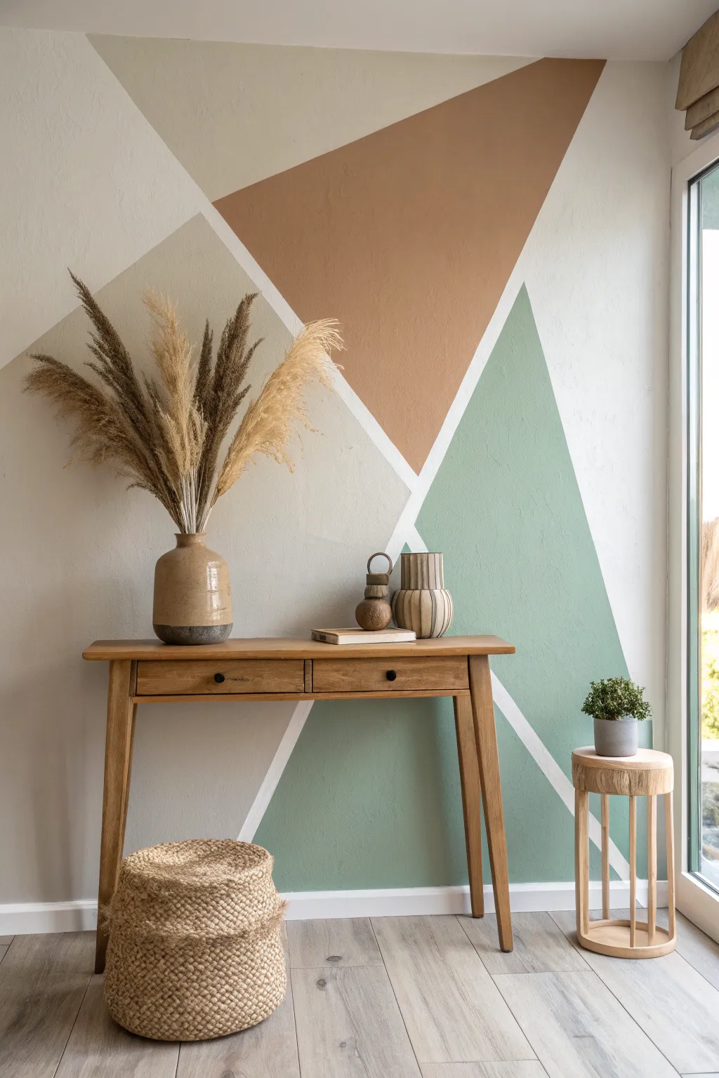
Transform a plain white wall into a modern art piece with this geometric color-blocking technique. The soothing palette of sage green, terracotta, and beige brings warmth and structure to any entryway or living space.
Step-by-Step Guide
Materials
- Painter’s tape (1.5 inch or 2 inch width)
- Interior latex paint (Eggshell finish)
- Colors: Sage Green, Terracotta/Rust, Greige/Beige
- Base wall color paint (White)
- Small roller covers (4-inch)
- Small roller handle
- Angled sash brush (2-inch)
- Paint tray and liners
- Drop cloths
- Pencil
- Level or straight edge
- Rags for cleanup
- Stepladder
Step 1: Planning and Preparation
-
Clean the surface:
Begin by wiping down your wall with a damp cloth to remove dust and grease, which ensures the tape adheres properly. -
Protect the area:
Lay down drop cloths to protect your flooring and tape off the skirting boards, ceiling line, and adjacent walls. -
Visualize the design:
Sketch your geometric design lightly on the wall with a pencil. Focus on creating large triangles that intersection and overlap. For this specific look, aim for a large inverted triangle centerpiece flanked by rising triangles on either side. -
Create the lines:
Apply painter’s tape firmly over your pencil lines. The thickness of the tape will determine the width of the white borders between your colors, so keep that in mind when choosing your tape width. -
Seal the tape edges:
I always take a moment to run a credit card or putty knife firmly along the edges of the tape to prevent paint bleed.
Step 2: Sealing and Painting
-
The sealing trick:
Paint a thin layer of your base wall color (likely white) over the edges of the tape. This seals the tape so any bleed that happens is the same color as the lines, keeping your final edges crisp. -
Let the seal dry:
Allow this sealing layer to dry completely according to the manufacturer’s instructions, usually about 30 to 60 minutes. -
Start with Beige:
Begin with the lightest color, the beige/greige tone. Use your angled brush to cut in along the tape edges of the designated beige sections, then fill the center with the small roller. -
Apply the Terracotta:
Move on to the upper terracotta section. Carefully cut in near the tape and ceiling line before rolling out the rest of the shape to ensure even coverage. -
Finish with Sage:
Paint the large sage green sections last. These earthy greens often require two coats to get that rich, opaque finish seen in the photo. -
Check for coverage:
Inspect the wall for any patchy areas. Apply a second coat to all colors if necessary, waiting for the first coat to be touch-dry.
Bleed-Through Blues?
If paint bleeds under the tape, wait for it to fully dry. Then, place a fresh piece of tape over the colored shape perfectly along the edge and touch up the white line carefully.
Step 3: The Reveal
-
Partial drying:
Wait until the final coat of paint is tacky but not completely cured—usually about an hour after painting. -
Remove the tape:
Slowly peel the tape away at a 45-degree angle. Pulling while the paint is slightly damp helps prevent the dried film from ripping away with the tape. -
Touch up:
Inspect the white lines. If any paint managed to sneak under, use a tiny artist’s brush and your base white paint to correct the lines. -
Clean edges:
Remove the tape from the skirting boards and ceiling once the wall is fully dry.
Add Metallic Flair
For a luxe twist, apply thin gold leaf tape or paint a metallic gold stripe directly over the white negative space lines after everything is dry.
Enjoy the calm, structured beauty your new feature wall brings to the room

PENCIL GUIDE
Understanding Pencil Grades from H to B
From first sketch to finished drawing — learn pencil grades, line control, and shading techniques.
Explore the Full Guide
Painted Arch Nook Behind Furniture
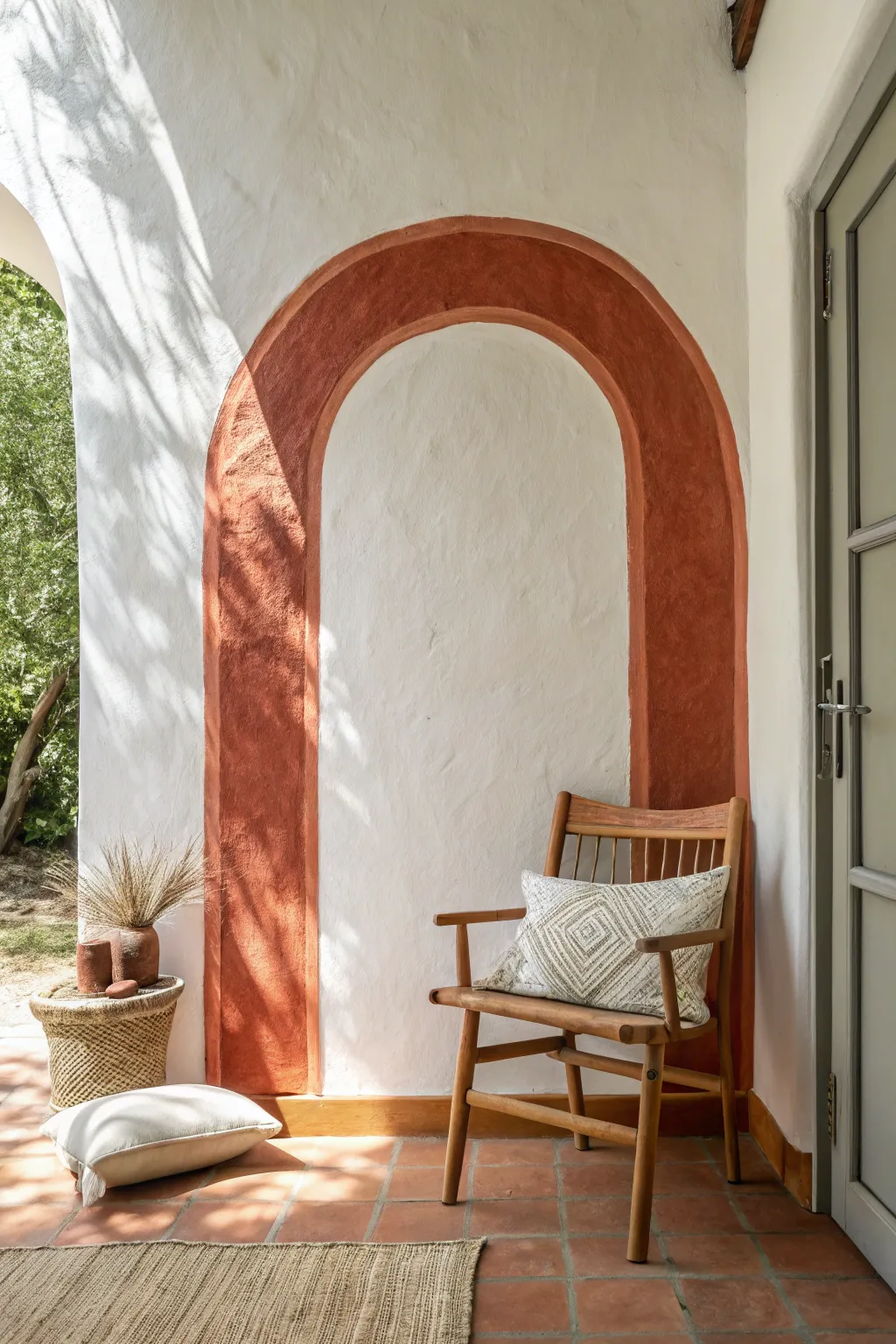
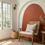
Transform a plain white wall into a Mediterranean-inspired retreat with this simple painted arch detail. The warm, rustic color adds immediate depth and acts as a perfect visual frame for your favorite accent chair or plant display.
Step-by-Step
Materials
- Terracotta or rust-colored interior latex paint
- Painter’s tape (high quality)
- Pencil
- String/twine
- Tape measure
- Small angled sash brush (1.5 – 2 inch)
- Small foam roller
- Level
- Drop cloth
- Damp rag
Step 1: Preparation & Mapping
-
Clean the surface:
Begin by wiping down the wall where you intend to paint. A simple solution of warm water and mild soap removes dust and oils, ensuring better paint adhesion. -
Measure the center:
Decide on the width of your arch. Find the center point on the floor (or baseboard) and mark it pencil. Use your level to draw a faint vertical line straight up from this center point to your desired peak height. -
Mark the sides:
Measure outward from your center line to define the outer edges of the arch legs. Mark these vertical lines lightly with a pencil and long level to ensure they are perfectly plumb. -
Determine the arch curve:
Decide where the straight legs stop and the curve begins. Mark a horizontal line across your verticals at this height. -
Create a compass:
Tie a piece of non-stretchy string to a pencil. Measure the string length to match the radius of your arch (half the total width). -
Draw the outer curve:
Secure the free end of the string at the center point on your horizontal line. Pull the string taut and swing the pencil in a smooth semi-circle to connect your vertical leg lines.
Wobbly Curve?
If freehand painting the curve is too hard, use flexible masking tape specifically designed for curves, available at auto body supply or specialty paint shops.
Step 2: Creating the Border
-
Define the inner edge:
Decide how thick you want the painted border to be—the example uses a wide band, about 6-8 inches. Mark this distance inward from your outer lines. -
Draw the inner curve:
Shorten your string by the width of the border. Place the anchor point back at the same center spot and draw a second, smaller semi-circle inside the first one. -
Tape the straight edges:
Apply painter’s tape along the straight vertical lines of both the inner and outer legs. Press the edges down firmly with a credit card or your fingernail to prevent bleed-under. -
Hand-paint the curves:
Tape often struggles with curves. Instead, I find it best to use a high-quality angled sash brush to carefully cut in the curved outlines by hand. Go slow and steady here.
Step 3: Painting & Finishing
-
Cut in the edges:
Using your angled brush, paint inward from your tape lines and hand-drawn curves about two inches to create a border for the roller. -
Roll the fill:
Use a small foam roller to fill in the space between your cut-in lines. A foam roller helps achieve a smooth finish without heavy texture, though for a rustic look, a standard nap works too. -
Check for coverage:
Allow the first coat to dry to the touch. Terracotta colors often need two or even three coats to look rich and opaque. -
Apply second coat:
Apply your second coat of paint, repeating the cut-in process first and then rolling the center. -
Remove tape:
While the final coat is still slightly damp (not soaking wet, but tacky), carefully peel off the painter’s tape at a 45-degree angle. This keeps the dry paint film from ripping. -
Touch up edges:
Inspect the lines, especially around the curve. Use a tiny artist’s brush and your wall’s original white paint to neaten up any slips or wobbles. -
Style the nook:
Wait 24 hours for the paint to cure fully before placing furniture against it. Style with a wooden chair and textured pillows to complete the look.
Add Texture
To mimic the stucco look in the photo, mix a paint additive like sand or baking soda into your paint for a gritty, old-world plaster effect.
Step back and admire how a simple shape and splash of color completely redefine the architectural feel of your room
Easy Ombré Wall Gradient
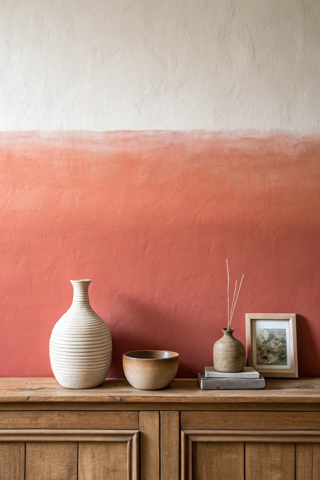
Transform a plain wall into a warm, sunset-inspired focal point with this simple ombré technique. By blending a creamy neutral into a rich terra cotta, you create a sophisticated yet earthy gradient that adds instant depth and texture to any room.
Step-by-Step Guide
Materials
- Matte interior wall paint (Cream/Off-White)
- Matte interior wall paint (Terra Cotta/Rust)
- Painter’s tape
- Drop cloth
- Two 9-inch paint rollers and trays
- Large blending brush (4-inch dry brush or specialized blending brush)
- Wide putty knife (optional for texture)
- Water spray bottle (misting setting)
- Step ladder
- Clean rags
Step 1: Preparation and Base Layer
-
Prepare the space:
Clear the area of furniture and lay down a drop cloth to protect your flooring. Apply painter’s tape along the baseboards, adjacent walls, and ceiling edges to ensure crisp lines. -
Clean the surface:
Wipe the wall down with a damp rag to remove dust or grime. A clean surface is crucial for the blended paint to adhere smoothly without catching debris. -
Apply the top color:
Start by painting the upper portion of the wall with your creamy off-white color. Use a roller to cover the top third of the wall, ensuring you get right up to the ceiling line. -
Extend the light tone:
Bring the cream paint down slightly lower than where you want the fade to begin. In this design, that means painting down to about eye level or slightly above the halfway mark. -
Let the top dry:
Allow this upper section to dry completely. Since we want a smooth transition later, having a stable base for the top section helps prevent muddying the colors too early.
Uneven Blending?
If the paint dries too fast and creates a hard line, lightly mist the area with water and add a tiny amount of new paint to re-activate the blend.
Step 2: Applying the Accent Color
-
Roll the bottom color:
Pour your terra cotta paint into a fresh tray. Start rolling from the bottom (baseboards) upward, covering the lower section of the wall thoroughly. -
Create the meeting point:
Roll the orange paint upwards until you are about 6 to 8 inches away from the bottom edge of your dried cream section. -
Add a wet edge:
Quickly refresh your roller with more terra cotta paint and roll that gap, slightly overlapping onto the dry cream section. I like to work in 3-foot wide vertical sections so the paint stays wet for blending. -
Apply wet cream paint:
Using a clean brush or a second small roller, apply a fresh, wet strip of the cream paint right above the wet terra cotta line. You need both colors wet simultaneously to blend them effectively.
Step 3: Creating the Ombré Blend
-
Mist the transition:
Lightly spritz the area where the two colors meet with your water spray bottle. You want it damp, not dripping, to keep the acrylic paint workable. -
Initial cross-hatching:
Take your large, dry blending brush and use rapid ‘X’ motions across the transition line. This physically pushes the two wet colors into each other. -
Soften the gradient:
Once the colors are roughly mixed, switch to long, horizontal sweeping strokes with the brush. Use a very light hand, barely grazing the surface to smooth out brush marks. -
Clean and repeat:
Wipe your blending brush on a rag frequently. If the brush gets overloaded with paint, it stops blending and starts dragging color where you don’t want it. -
Assess the fade:
Step back to look at the gradient. If the line looks too harsh, mist lightly again and use a clean brush to feather the edges upward into the cream and downward into the rust. -
Add subtle texture (optional):
For the slightly plastered look seen in the inspiration image, you can gently drag a wide putty knife over the blended area while it’s tacky to create slight irregularities.
Go Limewash Style
Mix a glazing medium into your paints before starting. This increases transparency and drying time, creating a clouded, old-world plaster effect.
Step 4: Finishing Up
-
Check for holidays:
Look for any spots you might have missed on the solid color sections (bottom or top) and touch them up with your rollers while avoiding the blended center. -
Remove tape:
Once the wall is fully dry to the touch, carefully peel away the painter’s tape at a 45-degree angle to reveal your clean edges. -
Clean up:
Wash your brushes and rollers immediately with warm soapy water, as blended acrylics can be tough to remove once cured.
Enjoy the warm, sunset glow your new feature wall brings to the space


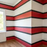
Classic Painted Stripes for Height
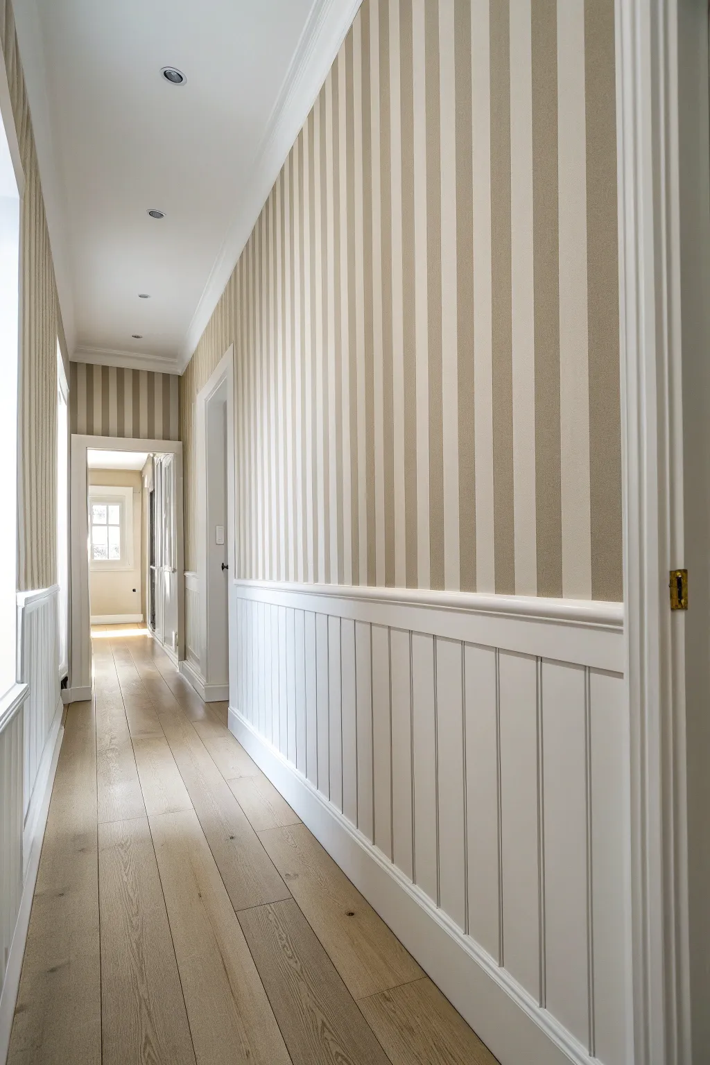
This project transforms a standard hallway into a seemingly endless corridor by pairing crisp, vertical painted stripes with classic wainscoting. The subtle taupe and cream combination draws the eye upward, creating an airy, sophisticated atmosphere that feels both traditional and fresh.
Detailed Instructions
Materials
- Interior latex paint (Cream/Off-White base coat)
- Interior latex paint (Taupe/Beige stripe color)
- High-quality painters tape (1.5 to 2 inch width)
- Laser level or 4-foot bubble level
- Measuring tape and pencil
- Paint rollers (9-inch for base, 4-inch for stripes)
- Angled sash brush (2.5 inch)
- Drop cloths
- Credit card or putty knife
- White semi-gloss paint (for wainscoting/trim)
Step 1: Preparation and Base Coat
-
Clear and Clean:
Remove any existing wall art, nails, or switch plate covers from the hallway. Wipe down the walls with a damp cloth and a mild detergent to remove dust and oils, ensuring the new paint adheres perfectly. -
Protect the Trim:
If you already have wainscoting or baseboards installed, tape off the top edge carefully. Cover the beautiful wood floors with drop cloths to catch any stray splatter. -
Apply the Base Color:
Roll on two coats of your lighter cream or off-white paint over the entire upper wall section. Painting the whole wall this lighter shade first is much easier than trying to fill in stripes later. -
Allow Proper Curing:
Let the base coat dry completely. This is critical—I recommend waiting at least 24 to 48 hours before applying tape, otherwise, the tape might pull up your fresh base coat.
Step 2: Measuring and Taping
-
Calculate Stripe Width:
Measure the total width of your wall and decide on your stripe width (usually 4-6 inches). Divide the wall width by your desired stripe size to see if you end up with a partial stripe; adjust slightly so the pattern ends cleanly at the corners. -
Establish the First Line:
Starting in the least visible corner, measure out your first stripe width. Use a laser level to project a perfectly vertical line from the ceiling to the wainscoting, or draw a faint vertical line using a long bubble level. -
Apply the First Tape Strip:
Place the edge of your painter’s tape exactly along your guideline. Remember to place the tape on the ‘outside’ of the area you intend to paint, preserving the stripe space. -
Continue Marking:
Move across the wall, measuring and taping. To avoid confusion, I like to place a small piece of tape or a light ‘X’ made of tape inside the zones that need to stay cream, so I don’t accidentally paint the wrong stripe. -
Seal the Edges:
Once all vertical tape lines are up, run a credit card or a putty knife firmly along the edges of the tape. This pressure activates the adhesive and prevents paint bleed. -
The Sealing Trick:
Brush a very light layer of your *base* cream color over the edge of the tape that faces the stripe area. This seals the tape edge; if any paint bleeds under, it will be the base color and won’t show.
Pro Tip: Odd Numbers
Aim for an odd number of stripes on main walls. Starting and ending with a darker stripe in the corners makes the wall look framed and purposeful.
Step 3: Painting the Stripes
-
Cut In the Edges:
Using your angled sash brush and the taupe paint, carefully cut in at the ceiling line and the top of the wainscoting within the stripe zones. -
Roll the Stripes:
Use a 4-inch roller to fill in the stripes with the taupe color. A smaller roller gives you better control and keeps the texture consistent without accidentally rolling over the taped areas. -
Second Coat:
Allow the first coat of taupe to dry to the touch, then apply a second coat for solid coverage and rich color depth. -
Remove Tape While Damp:
This is the moment of truth. Carefully peel off the painter’s tape while the second coat is still slightly tacky. Pull the tape slowly at a 45-degree angle away from the painted edge for the crispest line.
Troubleshooting: Bleeding
If paint bled under the tape, don’t panic. Wait for it to dry completely, then use a straight edge and a small artist brush with the base color to carefully erase the mistake.
Step 4: Paneling Refresh
-
Tape the New Stripes:
Once your wall stripes are fully cured (wait at least a day), run a line of delicate-surface tape along the bottom edge of the wall where it meets the chair rail or wainscoting cap. -
Freshen the Wainscoting:
Apply a fresh coat of semi-gloss white paint to the beadboard paneling heavily featured in this look. The semi-gloss finish adds durability and contrasts beautifully with the matte wall stripes. -
Final Retouches:
Inspect your work for any tiny bleeds or imperfections. Use a small artist’s brush to touch up lines if necessary, then reinstall your switch plates.
Enjoy the dramatic height and structured elegance your new hallway brings to the home.
Ceiling Painted Like a Fifth Wall
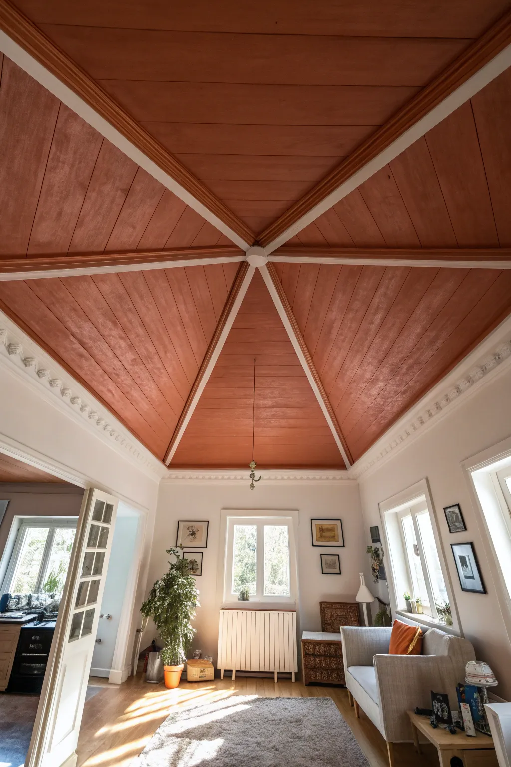
Transform a standard vaulted or paneled ceiling into a stunning architectural focal point by treating it as a ‘fifth wall.’ This project uses masking techniques and warm terracotta tones to highlight the geometric structure of the beams, creating a cozy yet dramatic atmosphere.
Step-by-Step Guide
Materials
- High-quality painter’s tape (multi-surface)
- Interior ceiling paint (Terracotta/Copper shade)
- Interior ceiling paint (Bright White for trim)
- Angled sash brush (2.5 inch)
- Small artist brush for touch-ups
- Paint roller with extension pole
- Roller covers (3/8 inch nap for smooth wood)
- Drop cloths
- Ladder
- Sanding sponge (fine grit)
- Tack cloth
- Primer (stain-blocking if painting over raw wood)
Step 1: Preparation and Priming
-
Clear the room:
Remove all furniture from the room or cluster it in the center and cover completely with drop cloths. This is crucial for ceiling work as drips are inevitable. -
Prep the surface:
If your ceiling has existing wood paneling like the example, lightly sand the surfaces with a fine-grit sanding sponge to help the paint adhere. Wipe away all dust with a tack cloth. -
Prime the wood:
Apply a stain-blocking primer to the entire ceiling, encompassing both the beams and the flat panels. This prevents wood tannins from bleeding through your new colors. -
Inspect for gaps:
Check the seams where the paneling meets the beams. If there are large gaps, fill them with a paintable caulk and smooth it out with a damp finger.
Step 2: Defining the Structure
-
Paint the beams first:
Start by painting the intersecting beams and the crown molding in your Bright White shade. Don’t worry about getting paint on the panels yet; just focus on getting solid coverage on the structural elements. -
Apply second coat:
Let the first coat dry completely, usually about 4 hours, then apply a second coat of white to ensure a crisp, opaque finish. -
Allow extensive drying:
I prefer to let the structural white paint cure for at least 24 to 48 hours before applying any tape. This prevents the tape from pulling up your fresh work. -
Tape the beams:
Carefully apply painter’s tape along the edges of the white beams where they meet the ceiling panels. Press the edge of the tape down firmly with a putty knife or your fingernail to seal it.
Bleeding Lines?
If paint seeps under the tape, wait for it to dry fully. Then, create a new straight edge with tape over the color and touch up with the original white beam color.
Step 3: Applying the Terracotta
-
Cut in the edges:
Using your angled sash brush, ‘cut in’ the terracotta paint along the taped edges of the beams. Paint a border about 2 to 3 inches wide onto the panels. -
Seal the tape line:
For razor-sharp lines, I like to lightly brush the tape edge with a tiny amount of the *white* base color first, then apply the terracotta over it. This seals the gap. -
Roll the panels:
Use a roller on an extension pole to fill in the large triangular sections of the ceiling panels. Work in W-patterns to distribute the paint evenly across the wood grain. -
Follow the grain:
On your final pass with the roller, roll in the direction of the wood planks (if applicable) to minimize texture marks. -
Apply second coat:
Allow the first coat to dry according to the manufacturer’s instructions, then apply a second coat for rich, deep color saturation.
Add Metallic Flair
Mix a glaze with copper metallic paint and apply a very sheer wash over the terracotta sections to catch the light and add dimension to the wood grain.
Step 4: Finishing Touches
-
Remove tape while damp:
Carefully peel away the painter’s tape while the final coat of terracotta paint is still slightly tacky. Pull the tape at a 45-degree angle away from the painted edge. -
Check for bleed:
Inspect your lines. If any terracotta bled onto the white beams, let it dry completely, then use a small artist brush and white paint to touch up the mistakes. -
Reinstall fixtures:
Once the ceiling is fully cured, reinstall any pendant lights or ceiling fixtures at the central junction point.
Step back and admire how the warm hue draws the eye upward, making the room feel both expansive and intimately grounded
Color-Drenched Room for Drama
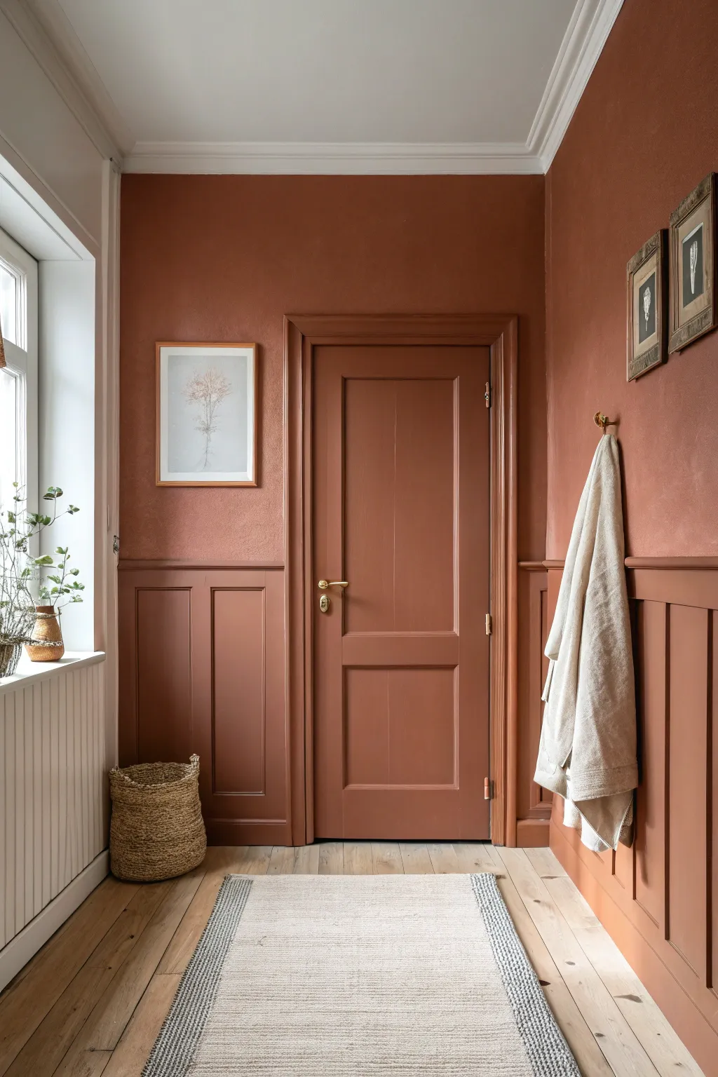
Transform a standard hallway into a warm, enveloping embrace by using a single, rich terracotta hue across walls, woodwork, and doors. This ‘color-drenching’ technique creates instant drama and architectural interest, making even small transitional spaces feel intentional and cozy.
Step-by-Step
Materials
- High-quality interior paint in a terracotta/rust shade (two finishes: matte/eggshell for walls, satin/semi-gloss for trim)
- Painter’s tape (high adhesion)
- Drop cloths
- Sanding block (medium grid)
- Sugar soap or TSP cleaner
- Spackle and putty knife
- Angled sash brush (2-inch)
- Mini foam roller (for doors/paneling)
- Standard roller and extension pole
- Paint tray and liners
- Screwdriver (for hardware removal)
Step 1: Preparation & Surface Work
-
Clear the space:
Remove all furniture, rugs, and wall art from the hallway. Take down coats and hooks; essentially, strip the room back to its bones. -
Remove hardware:
Using your screwdriver, carefully remove the door handle, lock mechanisms, and any existing coat hooks. Store these screws in a labeled baggie so they don’t get lost. -
Clean thoroughly:
Color drenching highlights textures, so grime is the enemy. Wash the walls, baseboards, door, and wainscoting with sugar soap or a TSP solution to remove oils and dust. -
Fill and repair:
Inspect the wainscoting and walls for dents or nail holes. Fill them with spackle, let dry, and sand flush. If your door has existing gloss paint, lightly sand it all over to help the new paint adhere.
Step 2: Painting the Woodwork
-
Tape boundaries:
Apply painter’s tape to the floor edges and where the wall meets the ceiling cornice (if you are keeping the ceiling white, as shown). Press the tape edges down firmly to prevent bleed. -
Baseboards and wainscoting first:
Stir your satin or semi-gloss finish paint. Using the angled sash brush, cut in along the floor and the intricate corners of the wainscoting panels. -
Roll the panels:
Switch to your mini foam roller. Roll the flat surfaces of the wainscoting and baseboards. The foam roller helps achieve a smooth, spray-like finish on woodwork. -
Paint the door frame:
Continue using the satin finish to paint the entire door casing and frame. Being thorough here is key because any missed white spots will break the monochrome illusion. -
Tackle the door:
Paint the door itself, starting with the recessed panels using a brush, then rolling the vertical stiles and horizontal rails. I prefer painting the door while it’s still on the hinges for easier access to both sides.
Sheen Strategy
Even though the color is identical, use semi-gloss for trim/doors and matte for walls. The subtle light reflection difference prevents the room from feeling flat.
Step 3: Walls & Final Touches
-
Switch paint finishes:
Now, open your matte or eggshell finish paint in the exact same terracotta shade. This slight change in sheen adds depth without breaking the color block. -
Cut in the walls:
Use a clean angled brush to paint the perimeter of the upper walls, cutting in carefully against the ceiling line and around the window frame. -
Roll the walls:
Use the standard roller on an extension pole to fill in the large wall sections above the wainscoting. Apply a consistent, even pressure to avoid roller marks. -
Apply second coats:
Once the first coat is dry (check your can aimed drying times), repeat the process for both the woodwork (satin) and walls (matte). This rich color usually demands two coats for full opacity. -
Remove tape:
Peel off the painter’s tape while the paint is still slightly tacky to ensure a crisp line. Pull the tape away from the paint edge at a 45-degree angle. -
Reinstall hardware:
Once the paint is fully cured (give it at least 24 hours to avoid tackiness), reattach your gold or brass door handle and coat hooks. -
Style the space:
Bring in natural textures to complement the earthy walls. A woven basket, a simple linen towel, and botanical artwork in light wood frames complete the look.
Ceiling Drama
For a truly cave-like, cozy effect, don’t stop at the cornices—paint the ceiling in the same terracotta shade to completely envelop the viewer.
Enjoy the incredible warmth and sophisticated atmosphere this bold color choice brings to your home
Painted Door Frame Border Detail
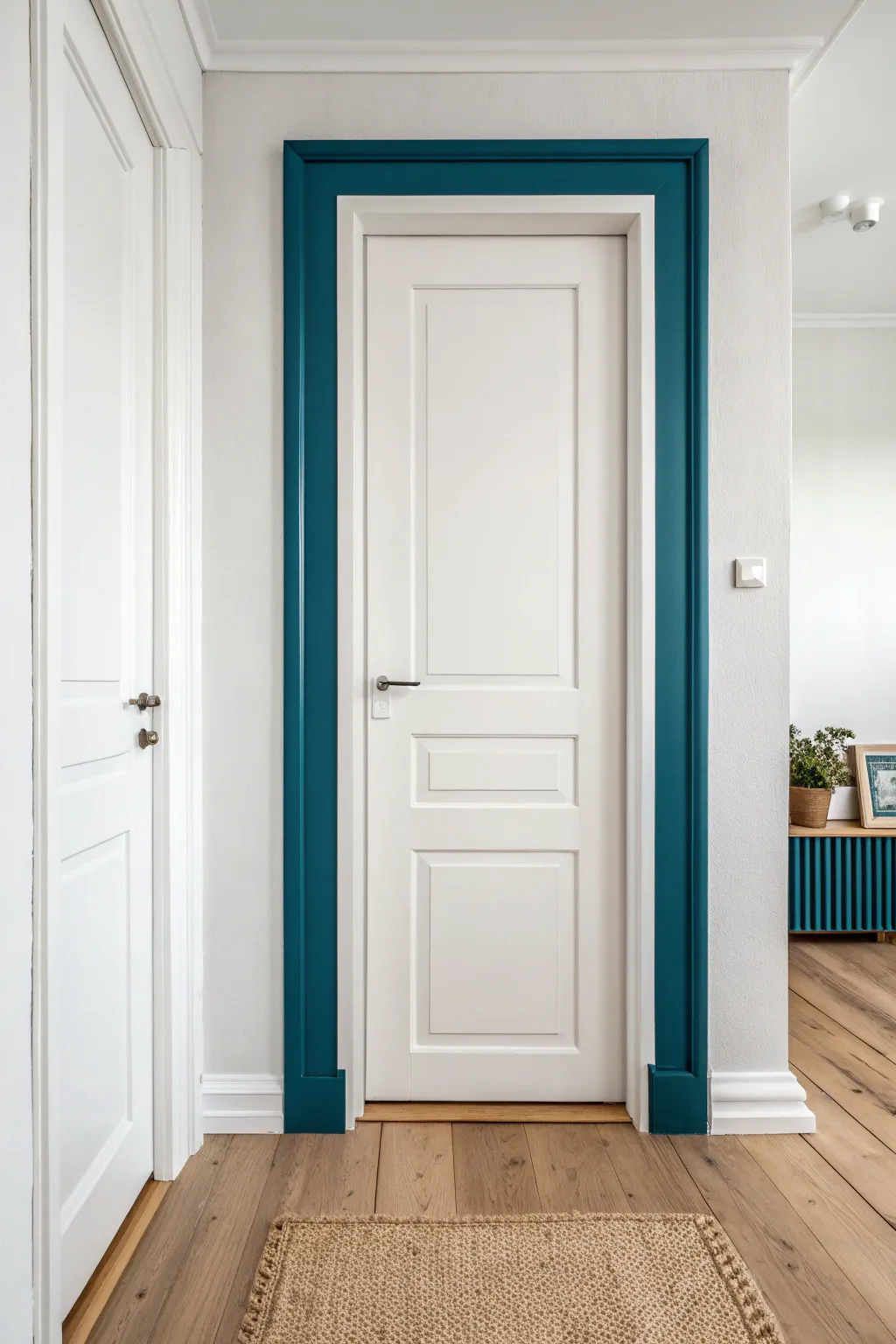
Transform a standard white door into an architectural feature by adding a bold, painted surround that extends beyond the existing trim. This clever painting hack creates the illusion of grander, custom molding without installing a single piece of wood.
Step-by-Step Tutorial
Materials
- High-quality painter’s tape (multi-surface)
- Measuring tape
- Pencil
- Laser level or long spirit level
- Sanding block (fine grit)
- Damp cloth or tack cloth
- Primer (bonding primer if painting over glossy paint)
- Interior semi-gloss or satin paint (deep teal color)
- 2-inch angled sash brush
- 4-inch foam roller or mini microfiber roller
- Roller tray
- Drop cloth
- Utility knife
Step 1: Preparation & Mapping
-
Clean the surface:
Begin by thoroughly cleaning the wall area around the existing door, as well as the outer edge of the door casing itself. Use a mild degreaser or TSP substitute to remove oils and dust that could compromise adhesion. -
Light sanding:
Using a fine-grit sanding block, gently scuff the outer edge of the existing white casing where the new paint will meet it. Wipe away all dust with a damp cloth or tack cloth. -
Determine the width:
Decide on the width of your new painted ‘frame.’ Looking at the inspiration image, a width of roughly 4 to 5 inches works well to create a substantial border. Measure outward from the edge of the existing trim. -
Mark the perimeter:
Use your tape measure to make small pencil marks at your chosen width every few inches around the top and both sides of the door frame. -
Connect the lines:
Use a laser level or a long spirit level to connect your pencil marks, drawing a light, straight line that defines the outer boundary of your new painted section.
Step 2: Taping Off
-
Tape the outer line:
Apply painter’s tape along the outer pencil line you just drew. Ensure the tape is placed on the ‘outside’ of the line so that when you paint, your border is the exact width you measured. -
Tape the inner edge:
This is crucial: carefully tape over the face of the existing white door casing, leaving only the side edge (the return) exposed if you want that painted, or tape right up to the wall-casing seam if you want the casing to remain entirely white. -
Seal the tape:
Run your thumb or a plastic putty knife firmly over the tape edges. I like to do this twice to ensure no paint seeps underneath, which is vital for those crisp lines. -
Protect the floor:
Lay down your drop cloth and tape it right up to the baseboard to catch any splatters.
Tape Sealing Trick
To get zero bleed paint lines on textured walls, seal your tape edge with a clear matte medium or the base wall color before applying the teal paint.
Step 3: Painting the Border
-
Painting the ‘seal’ coat:
For razor-sharp lines, brush a very thin layer of your existing wall color (usually white or light gray) along the edge of the tape first. This seals the tape edge so any bleed-through matches the wall, not the teal paint. -
Cutting in the edges:
Once the seal coat is dry, dip your angled sash brush into the deep teal paint. Carefully cut in along the tape lines and the junction with the baseboard. -
Rolling the middle:
Use the mini roller to fill in the flat section of the wall between your tape lines. This provides a smoother texture than brushing the entire area. -
Observe drying time:
Let the first coat dry completely according to the manufacturer’s instructions. Dark colors often look patchy after one coat, so don’t worry if coverage isn’t perfect yet. -
Apply second coat:
Repeat the cutting and rolling process for a second coat to ensure a rich, opaque finish. A third coat might be necessary for very deep pigments.
Architectural Illusion
Add a thin wooden trim piece to the outer edge of your painted border for a 3D effect that makes the door frame look even more substantial.
Step 4: Finishing Touches
-
Remove tape while damp:
The best moment to remove tape is when the final coat is tacky but not fully dry. Pull the tape slowly at a 45-degree angle away from the painted edge. -
Score if necessary:
If the paint has dried fully, lightly score the edge of the tape with a sharp utility knife before pulling to prevent peeling the paint off the wall. -
Touch-ups:
Inspect your lines. If any tiny bits of paint bled through, use a small artist’s brush and your original wall color to tidy them up. -
Clean baseboards:
Check the baseboards where the vertical stripes meet the floor. Ensure the line is crisp and clean off any stray drops.
Step back and admire how a simple band of color completely redefines the architectural weight of your doorway
Gallery Wall With Hand-Painted Frames
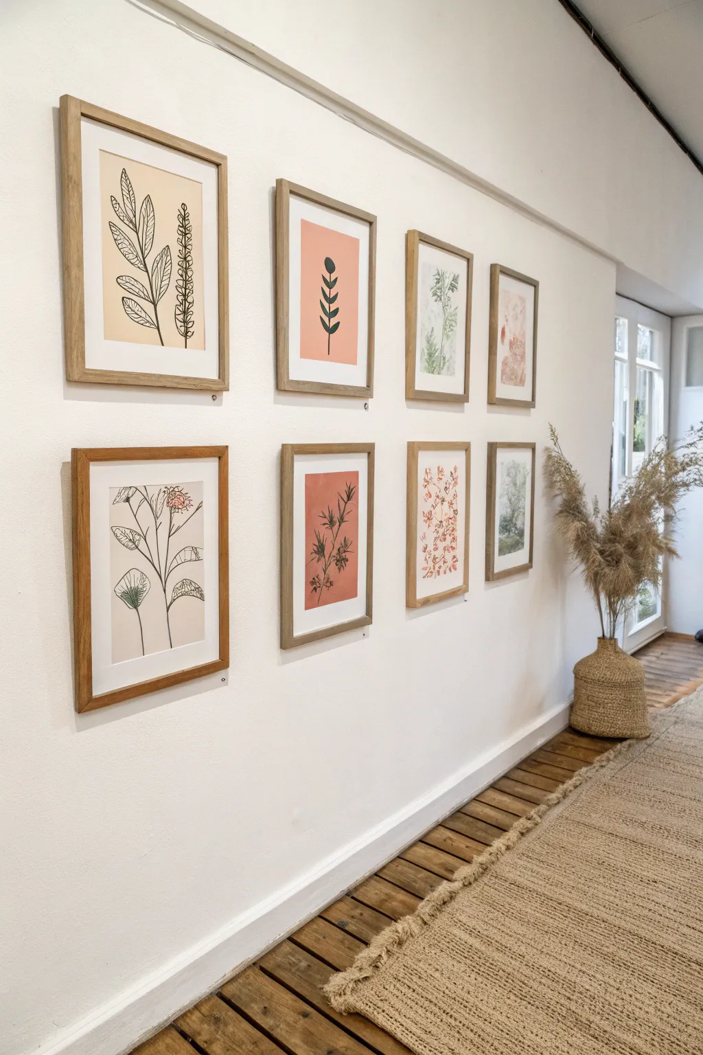
Transform a blank hallway into an elegant gallery with this set of eight DIY botanical artworks. Combining minimalist line drawings with soft watercolor washes creates a cohesive, organic look that feels both modern and timeless.
Step-by-Step
Materials
- 8 light wood frames (various sizes, e.g., 11×14 and 8×10)
- Heavyweight watercolor paper or mixed media paper
- Pencil and eraser
- Fine liner pens (black, sizes 0.5 and 0.8)
- Watercolor paints (sage green, terracotta, muted pink)
- Round watercolor brushes (size 4 and size 8)
- Ruler
- Cutting mat and craft knife
- Framing mats (white)
Step 1: Planning and Preparation
-
Measure and Cut Paper:
Begin by removing the backing and factory inserts from your frames. Measure the openings of your mats and cut your watercolor paper about 1/2 inch larger than these dimensions on all sides so you have room to tape it down. -
Design the Layout:
Sketch out a rough plan for your eight pieces. Aim for a balance: 2-3 detailed black line drawings, 2-3 solid color block pieces, and 2 soft watercolor wash pieces. This variety is key to the gallery wall aesthetic. -
Lightly Pencil Sketch:
On your cut paper, lightly sketch your botanical designs. For the line art pieces, focus on elongated stems and leaves. For the color blocked pieces, draw simple, organic leaf shapes.
Step 2: Creating the Line Art Pieces
-
Outline the Stems:
Using your 0.5 fine liner, trace over your pencil lines for the main stems. Keep your hand relaxed to allow for natural, slightly imperfect organic lines. -
Add Leaf Details:
Switch to the 0.8 pen for the leaves to give them slightly more weight. Draw the veins inside the leaves with the finer 0.5 pen for delicate contrast. -
Erase Pencil Guidelines:
Wait at least 15 minutes for the ink to fully cure, then gently erase all visible pencil marks. Be careful not to smudge the ink or damage the paper surface.
Fixing Smudges
If you smudge ink, don’t panic. Turn the mistake into a deliberate ‘shadow’ by stippling tiny dots over the smudge, or cover it with a darker leaf element.
Step 3: Painting the Color Block Botanicals
-
Mix Custom Colors:
Mix a muted terracotta and a soft sage green. I like to add a tiny dot of brown to my greens to make them feel more earthy and less artificial. -
Apply the Base Wash:
For the solid background pieces (like the pink artwork), wet the entire rectangular area with clean water first, then drop in your terracotta paint for a smooth, even wash. Let this dry completely. -
Paint Overlay Shapes:
Once the colored background is bone dry, paint a simple botanical silhouette on top using a darker, contrasting color (like deep green or black gouache mixed with watercolor). -
Create Watercolor Sketches:
For the looser, soft pieces, dip your size 8 brush in watery paint and create ‘blooms’ by lightly pressing the belly of the brush onto the paper to form petal shapes.
Add Texture
For a mixed-media look, glue actual pressed flowers or leaves onto one of the papers instead of painting them. It adds incredible depth.
Step 4: Assembly and Hanging
-
Flatten Artwork:
If your paper has buckled from the watercolor, place the dry artwork under heavy books overnight to flatten it before framing. -
Mount to Mats:
Use acid-free tape to secure the artwork to the back of the mat board. Ensure the image is perfectly centered within the window. -
Clean the Glass:
Wipe both sides of the frame glass with glass cleaner and a microfiber cloth to remove dust and fingerprints. -
Assemble Frames:
Place the glass, matted artwork, and backing board into the frame. Secure the metal tabs or clips on the back. -
Arrange on Floor:
Lay your framed pieces on the floor to visualize the spacing. Aim for a 2-inch gap between frames, keeping the centerline consistent. -
Hang the Collection:
Transfer your floor layout to the wall. Using a level is crucial here to keep the grid looking sharp and intentional.
Enjoy the serene and natural atmosphere your new botanical gallery art brings to your space
Textured Impasto for Real Dimension
Bring the warmth of desert sands into your home with this stunning abstract impasto painting. By building layers of modeling paste and earthy acrylics, you’ll create a surface so dimensional it begs to be touched.
How-To Guide
Materials
- Large stretched canvas (at least 24×30 inches)
- Heavy body acrylic paints (Golden Ochre, Burnt Sienna, Raw Umber, Titanium White, Unbleached Titanium)
- Thick modeling paste or texture medium
- Large palette knives (various shapes: trowel, flat edge)
- Plastic drop cloth
- Gesso (optional, for priming)
- Mixing palette or large disposable plates
- Matte varnish spray
Step 1: Preparation and Base Layering
-
Set the Stage:
Prepare your workspace by laying down a plastic drop cloth, as texture paste can be messy. If your canvas isn’t pre-primed, apply two coats of gesso and let fully dry. -
Map the Composition:
Lightly sketch diagonal, wavy bands across the canvas using a pencil or a diluted wash of Burnt Sienna. These don’t need to be perfect lines; they are just guides for where your color transitions will happen. -
Mix the Texture Medium:
Scoop a generous amount of modeling paste onto your palette. Separate it into four distinct piles, one for each main color zone representing the bands in the artwork. -
Create the Ochre Mix:
Mix Golden Ochre with a touch of Raw Umber into the first pile of paste. Aim for a rich, honey-mustard tone that isn’t fully blended, leaving some streaks of pure color. -
Create the Cream Mix:
For the second pile, mix Unbleached Titanium and a little Titanium White. This should be your lightest, sandiest color. -
Create the Blush Mix:
Add a small amount of Burnt Sienna and a lot of Titanium White to the third pile to create a soft, dusty pink or terracotta shade. -
Create the Deep Earth Mix:
Mix Burnt Sienna and Raw Umber into the final pile for the darkest, anchoring section at the bottom.
Cracking Paste?
Thick paste can crack if it dries too fast. Let it dry slowly in a cool room away from direct heaters or fans to keep surfaces smooth.
Step 2: Applying the Impasto
-
Start at the Top:
Using a large trowel-shaped palette knife, scoop up the Ochre mix. Apply it to the top left corner of the canvas in a diagonal swath. -
Build the Ridges:
Don’t smooth the paste down flat. I find that pressing the flat side of the knife into the paste and pulling it away quickly creates those wonderful, organic peaks and ridges. -
Add the Cream Section:
Clean your knife and pick up the Cream mix. Apply this in a wide band beneath the Ochre, allowing the edges of the two colors to touch and overlap slightly. -
Blend the Transition:
Use a clean knife to gently drag some of the Ochre down into the Cream and vice versa. You want a jagged, natural transition rather than a straight line. -
Apply the Blush Band:
Continuing diagonally downwards, apply the soft terracotta/pink mix. Keep your knife strokes varied—some long and sweeping, others short and stippled. -
Anchor with Dark Earth:
Fill the bottom right corner with the Deep Earth mix. Apply this layer thickly to give the painting visual weight at the bottom. -
Refine the Texture:
Step back and look at the overall flow. If any area looks too flat, add more plain modeling paste on top and lightly mix it directly on the canvas.
Step 3: Detailing and Finishing
-
Create Directional Flow:
Take a clean, dry palette knife (or even an old credit card) and scrape shallow diagonal lines through the wet paste to emphasize the movement of the ‘waves’. -
Add Pure White Highlights:
Dip just the tip of your knife into pure Titanium White paint (no paste). Lightly skim it over the highest ridges of the Cream and Blush sections to catch the light. -
Deepen the Shadows:
similarly, take a tiny bit of Raw Umber on your knife and gently dab it into the deepest crevices of the bottom section to exaggerate the depth. -
The Long Wait:
Let the painting dry flat. Because the impasto is thick, this can take 24 to 48 hours. Do not touch it until the thickest peaks are firm. -
Seal the Work:
Once fully cured, take the canvas outside and apply two light coats of matte varnish spray to protect the texture from dust and UV light.
Pro Tip: Sand Mix
Mix actual fine sand or coffee grounds into your bottom brown layer for gritty, hyper-realistic earth texture that contrasts with the smooth creams.
Hang your textured masterpiece in a spot where natural light hits it from the side to really make those shadows pop
Metallic Accents for a Luxe Pop
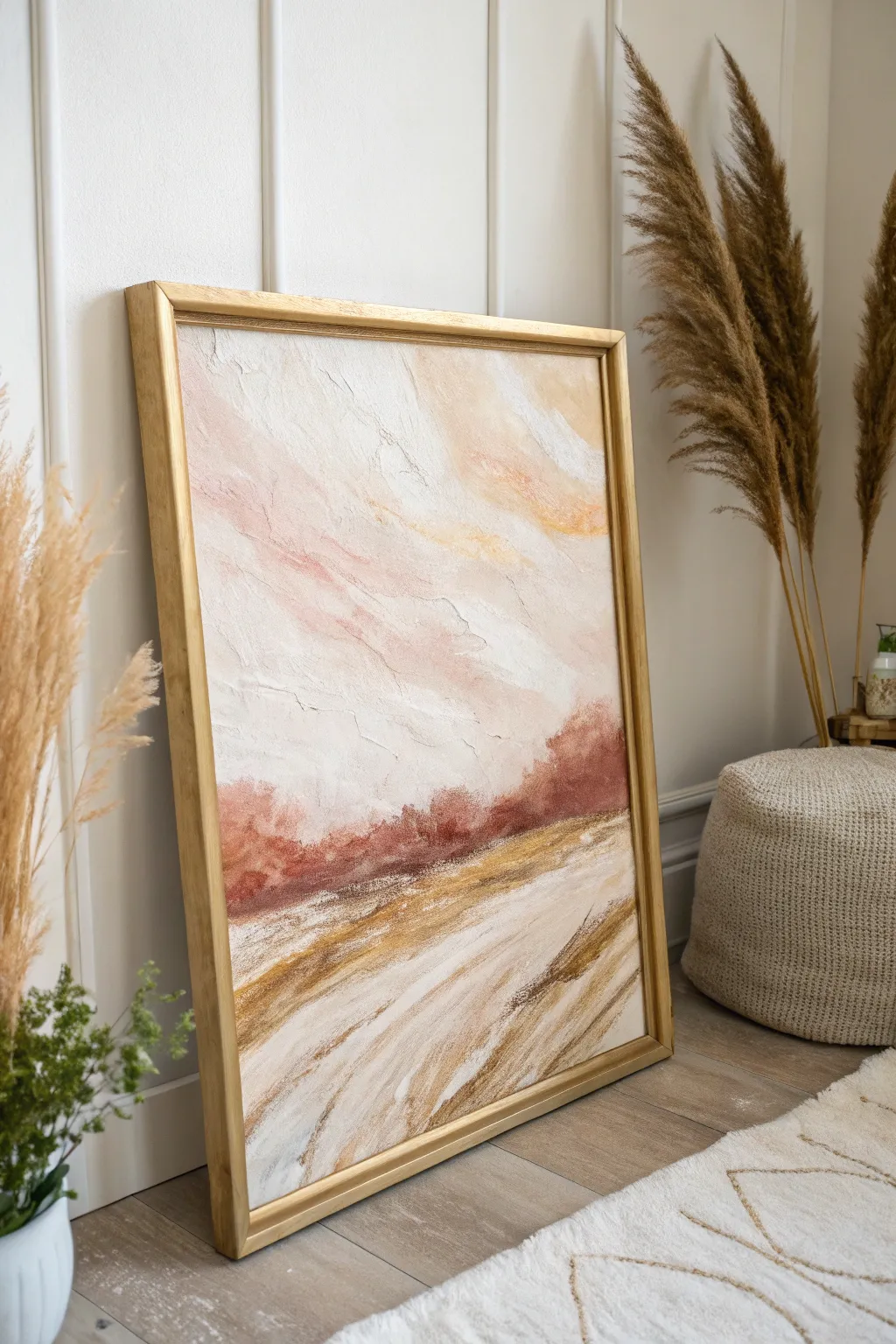
Capture the serene warmth of a sunset with this textured abstract landscape, featuring soft washes of pink and ochre grounded by earthy tones. The piece is elevated with subtle metallic gold accents that catch the light, adding a touch of sophisticated luxury to any room.
Step-by-Step Guide
Materials
- Large canvas (e.g., 24×36 inches)
- Acrylic modeling paste or heavy texture gel
- Palette knife variety pack (large trowel and small diamond shapes)
- Acrylic paints: Titanium White, Burnt Sienna, Yellow Ochre, Alizarin Crimson, Raw Umber
- Metallic gold acrylic paint
- Large flat brush (2-3 inch)
- Medium round brush
- Gold floating frame (or gold spray paint for existing frame)
- Water spray bottle
- Paper towels
Step 1: Building the Texture
-
Prepare the canvas:
Lay your canvas on a flat, protected surface. If it isn’t pre-primed, apply two coats of gesso, letting it dry completely between layers. -
Map out the horizon:
Using a pencil or a diluted wash of Raw Umber, lightly sketch a low horizon line about one-third of the way up from the bottom. It doesn’t need to be perfectly straight; a slight organic curve looks more natural. -
Apply modeling paste:
Scoop out a generous amount of modeling paste with your palette knife. Spread it across the canvas, focusing on creating sweeping, directional strokes. -
Create sky texture:
For the upper two-thirds (the sky), use upward and diagonal knife strokes to mimic drifting clouds. Leave some areas flatter and build others up for contrast. -
Texture the ground:
Below the horizon line, change your stroke direction. Use horizontal or slightly angled swipes to suggest the lay of the land or calm water. Let the paste dry completely, ideally overnight, as thick areas take time to set.
Muddy Colors?
If your sky colors turn muddy or gray, let the layer dry completely before adding a new color. Clean your brush water often to keep pastels bright.
Step 2: Painting the Sky
-
Mix soft sky tones:
On your palette, mix a large amount of Titanium White with a tiny dot of Alizarin Crimson and Yellow Ochre to create a very pale, warm peach color. -
Apply base wash:
Using a damp large flat brush, apply this peach mixture loosely across the entire sky area, working texture into the crevices of the dried paste. -
Add blush accents:
While the base is still slightly damp, mix a slightly stronger pink using more Alizarin Crimson and White. Apply this in diagonal drifts, following the texture ridges you created earlier. -
Introduce light:
Mix Titanium White with a touches of Yellow Ochre. Blend this into the upper right areas where the sun might be hitting the clouds, softening the edges with a dry brush. -
Soften edges:
Use a clean, dry brush to gently feather the transition between the pinks, whites, and creamy yellows so there are no harsh lines.
Step 3: Grounding the Landscape
-
Establish the horizon:
Mix Burnt Sienna with a touch of Alizarin Crimson to get a rusty red-brown. Using a palette knife or brush, apply this along the horizon line, creating a concentration of dark value. -
Create distant foliage:
Dab the rusty mixture upwards slightly into the sky area along the horizon to suggest distant trees or hills. Keep the top edges soft and undefined. -
Paint the foreground:
For the bottom third, mix Yellow Ochre, Titan White, and a bit of Raw Umber. Apply this in sweeping, angled strokes moving from the bottom corners toward the center horizon. -
Add depth:
Introduce streaks of heavily diluted Raw Umber into the foreground to create shadows and movement in the field. -
Blend the transition:
Where the rusty horizon meets the ochre foreground, lightly blend the wet paints together so the ground feels connected to the distance.
Level Up: Gold Leaf
For an ultra-luxe finish, swap the metallic paint for genuine gold leaf on the highest texture points using gilding size for incredible shine.
Step 4: The Metallic Finish
-
Dry brush gold highlights:
Once the paint is dry to the touch, dip a dry flat brush into the metallic gold paint. Offload most of the paint onto a paper towel. -
Gild the texture:
Lightly drag the brush over the raised ridges of the texture paste in the sky area. The gold should only catch the high points, not fill the valleys. -
Enhance the ground:
Add slightly heavier gold accents to the foreground strokes, mimicking sunlight reflecting off tall grass or water. -
Frame the piece:
Finish by placing your artwork in a gold floating frame to complement the metallic accents within the painting.
Hang your new masterpiece in a well-lit spot to watch the metallic accents shift throughout the day
Painted Wall Mural With Floating Shapes
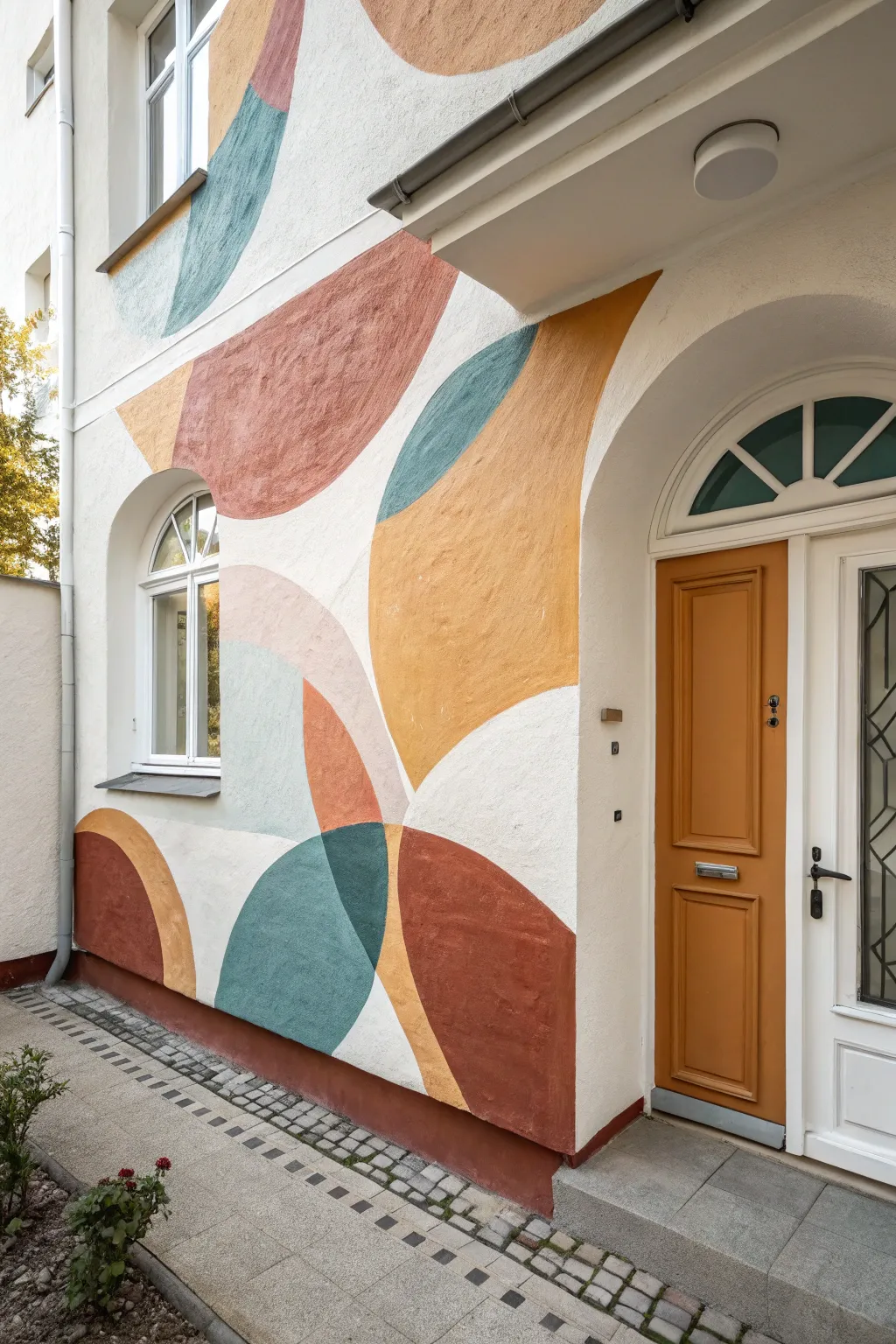
Transform a plain exterior or interior wall into a work of modern art with this large-scale mural featuring overlapping organic shapes in a warm, earthy palette. The design uses soft curves and muted tones like terracotta, teal, and ochre to create a welcoming and architectural focal point.
Step-by-Step Tutorial
Materials
- Exterior masonry paint (white base + 5-6 accent colors)
- Small paint rollers with smooth nap
- Assorted angled sash brushes (1.5 inch and 2.5 inch)
- Chalk or pencil for sketching
- String and push pin (for compass technique)
- Painter’s tape
- Drop cloths
- Ladder or step stool
- Small trays or paint cups for each color
- Cleaning rags
Step 1: Preparation and Planning
-
Clean the surface:
Begin by thoroughly cleaning the wall surface to remove dust, dirt, or loose debris. A stiff bristle brush works well for textured masonry, followed by a rinse if outdoors. Let it dry completely. -
Protect the area:
Lay down drop cloths to protect the flooring or pavement. tape off any architectural elements you want to keep paint-free, such as window sills, door frames, or gutters. -
Visualizing the layout:
Take a moment to look at your wall’s unique features. Notice how the shapes in the reference image curve around the arch of the door and the window. Plan your biggest shapes to hug these architectural details.
Step 2: Sketching the Design
-
Drafting large curves:
For the largest circular sections, use a ‘string compass.’ Tie a piece of chalk to one end of a string and have a helper hold the other end fixed at a center point. Swing the chalk to create perfect, sweeping arcs. -
Sketching freehand shapes:
Connect your large arcs with freehand curves. The beauty of this style is in the ‘wobbly’ imperfection, so don’t worry about mathematical precision. Overlap shapes intentionally to create areas for color interaction. -
Marking color zones:
Once your outline is on the wall, lightly write a code (like ‘T’ for teal, ‘O’ for ochre) inside each shape so you don’t lose track of your color plan while painting.
Fixing Wobbly Arcs
If your curve looks uneven, don’t try to correct it with a huge brush stroke. Use a small flat brush and the background wall color to ‘cut back’ into the shape and refine the edge.
Step 3: Painting the Shapes
-
Cutting in edges:
Start with one color at a time to minimize brush washing. Use an angled sash brush to carefully paint the outline of your shape, creating a crisp edge against the white background or adjacent shapes. -
Handling corners:
Pay special attention where the mural meets the door frame or window arch. Use a smaller artist’s brush here if your sash brush feels too clumsy for the tight corners. -
Filling the centers:
Once the edges are defined, switch to a small roller to fill in the main body of the shape. This ensures an even coat on textured masonry that a brush might miss. -
Applying the Ochre:
Paint the large, central yellow-ochre section. It acts as an anchor for the design, so ensure the coverage is solid and opaque. -
Adding Terracotta tones:
Move on to the rusty red and lighter terracotta shapes. I find it helpful to paint non-touching shapes first to avoid smudging wet paint edges. -
Introduce the Cool Tones:
Paint the teal and slate blue sections. These cool colors provide necessary contrast to the warm earth tones and make the design pop.
Pro Tip: Texture Control
On rough stucco or masonry, use a high-nap roller (3/4 inch) to get into the crevices, but keep a dry brush handy to stipple paint into deep pits the roller misses.
Step 4: Refinement and Overlaps
-
Creating transparency effects:
In the reference, some overlapping shapes create a third, darker color. You can achieve this by mixing your two overlapping colors together in a cup and painting that specific intersection a unique, ‘blended’ shade. -
Reviewing opacity:
Exterior masonry often soaks up the first coat. Step back and check for patchy areas. Apply a second coat where needed to get that rich, saturated look. -
Tidying lines:
Inspect your curved lines. If any edges look jagged or nervous, use your smallest brush with the adjacent color (or white background paint) to smooth out the curve. -
Cleaning up:
Remove the painter’s tape while the final coat is still slightly tacky to prevent peeling the paint film. Clean up any drips on the floor immediately.
Step back and admire how the organic forms soften the architecture and bring a warm, modern personality to your entryway

Have a question or want to share your own experience? I'd love to hear from you in the comments below!