When you’re choosing living room colors, you’re really choosing a mood—soft and airy, warm and cozy, or deep and dramatic. I’m going to share color ideas I’d actually use in a real space, with the kind of palette pairing that makes furniture, trim, and light all play nicely together.
Warm White for Cozy Glow
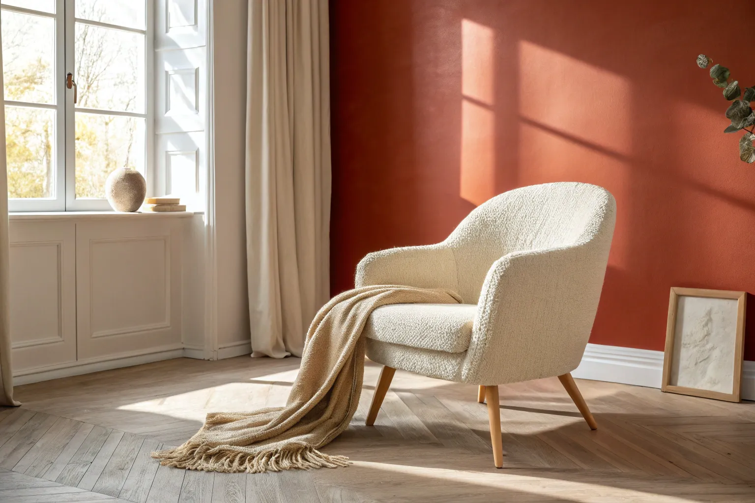
Capture the serene warmth of a sun-drenched reading nook with this acrylic painting tutorial. You will learn to render soft fabric textures, dramatic lighting, and weathered wood grains to create an inviting, peaceful scene.
Step-by-Step Guide
Materials
- Canvas board or stretched canvas (11×14 inches recommended)
- Acrylic paints: Titanium White, Unbleached Titanium, Yellow Ochre, Burnt Umber, Raw Sienna, Mars Black
- Flat brushes (sizes 8 and 12)
- Round brushes (sizes 2 and 4)
- Fan brush or soft blending brush
- Palette knife
- Water cup and paper towels
- Pencil for sketching
- Slow-drying medium (optional)
Step 1: Sketch and Underpainting
-
Outline the composition:
Begin by lightly sketching the armchair’s shape, placing it slightly off-center to the left. Mark the position of the throw pillow and the cascading blanket. Sketch vertical lines for the curtains on the right and horizontal guidelines for the floorboards. -
Block in background tones:
Mix Titanium White with a tiny touch of Burnt Umber to create a warm, creamy off-white base for the walls. Paint the entire wall area, keeping the strokes loose. -
Establish the floor base:
Mix Raw Sienna and White to create a light wood tone. Fill in the floor area with horizontal strokes, allowing some brush texture to remain.
Highlight Trouble?
If your bright highlights look chalky instead of glowing, try mixing in a tiny dot of yellow or glazing over dried white paint with a very thin wash of yellow ochre.
Step 2: Painting the Armchair and Accessories
-
Base coat the chair:
Use Unbleached Titanium to block in the main body of the armchair. This warm, neutral tone serves as the shadow color for the lit areas we will add later. -
Add deep shadows:
Mix Unbleached Titanium with a little Burnt Umber. Paint the shadowed side of the chair (the left side and under the seat cushion) to establish form and dimension early on. -
Paint the pillow base:
Mix Yellow Ochre with a touch of Burnt Umber. Apply this to the rectangular pillow shape. While wet, stipple slightly with a dry brush to suggest a rougher fabric texture. -
Define the throw blanket shape:
Using a mix of Titanium White and a drop of Raw Sienna, paint the flowing shape of the throw blanket draped over the arm and front of the chair.
Fabric Softness Tip
To make the chair fabric look soft and linen-like, use a dry brush technique to feather the edges of your shadows into the highlights, avoiding hard lines.
Step 3: Detailed Lighting and Textures
-
Create sunbeams on the chair:
Mix Titanium White with a tiny amount of Yellow Ochre for a warm highlight. Paint the bright, sunlit patches on the top of the backrest and the left armrest where the light hits directly. -
Render the curtain folds:
For the sheer curtains, use pure Titanium White thinned with water or medium. Paint long, vertical strokes over the wall color on the right, layering them to create opacity where folds gather and keeping them translucent elsewhere. -
Detail the pillow texture:
Using a small round brush and pure Yellow Ochre, make tiny, short hatching marks across the pillow surface to mimic the ribbed fabric weave. Add darker accents with Burnt Umber in the crevices. -
Build the knitting texture:
For the chunky knit blanket, use a size 2 round brush with thick Unbleached Titanium paint. Paint small interlocking loop shapes or ‘V’ patterns in rows. I find it helpful to work one row at a time to keep the pattern consistent. -
Enhance the throw blanket fringe:
Mix a lighter cream shade. With the tip of your smallest round brush, pull long, thin strokes downward from the edge of the blanket to create the hanging fringe tassels. -
Darken the fringe shadows:
Add a tiny amount of Raw Sienna to your mix and paint thin lines between the fringe strands to create separation and depth.
Step 4: Refining the Atmosphere
-
Add cast shadows:
Mix a glaze of Burnt Umber and water. Apply this transparently on the floor under the chair and to the right of the curtains to ground the objects. -
Define floorboards:
Use a liner brush with thinned Burnt Umber to draw the gaps between floorboards. Vary the line thickness to make the wood look aged and natural. -
Intensify sunlight contrast:
Go back over the brightest highlights on the chair arm and top cushion with pure White to make the sunlight look blindingly bright and realistic. -
Final adjustments:
Step back and check your values. Soften any shadow edges on the wall with a dry brush to mimic diffused light.
Now you have a tranquil, sun-kissed artwork ready to bring warmth to any room
Crisp White With Graphic Contrast
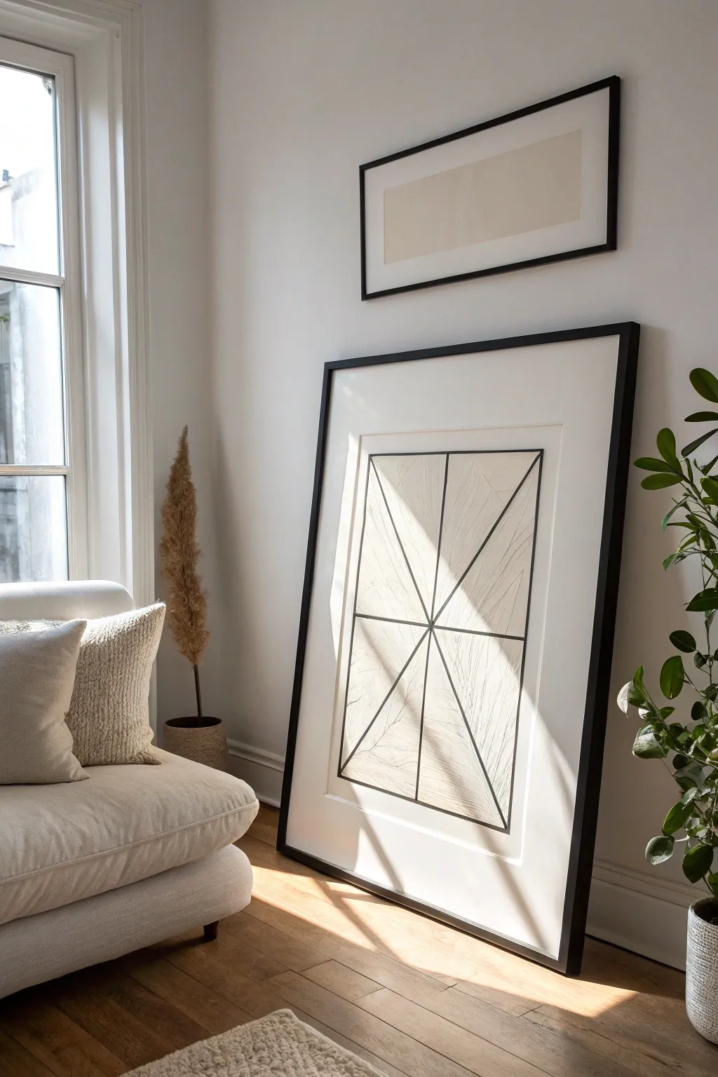
Embrace the beauty of sharp lines and negative space with this large-scale geometric artwork. The subtle texture within the triangular forms adds depth while the bold black frame creates a striking graphic contrast perfect for a crisp white living room.
Step-by-Step Tutorial
Materials
- Large sheet of heavyweight drawing paper (Cold Press or Mixed Media, approx. 24×36 inches)
- Graphite pencils (HB for sketching, 4B or 6B for shading)
- Black fineliner pens (0.5mm and 0.8mm)
- Large clear acrylic ruler or T-square
- Kneaded eraser
- Blending stump or tortillion
- Large black gallery frame with white matting
- Masking tape or painter’s tape
Step 1: Planning and Layout
-
Prepare your surface:
Lay your large drawing paper on a clean, flat surface. Secure the corners with low-tack masking tape to prevent it from shifting while you work. -
Mark the center point:
Using your large ruler, measure the width and height of the paper to find the exact center. Mark a very faint dot here with your HB pencil. -
Define the outer boundary:
Create a large rectangle centered on your paper, leaving a generous margin of about 3-4 inches from the paper’s edge. This negative space is crucial for the modern look. -
Establish the vertical axis:
Draw a straight vertical line running directly through your center point, connecting the top and bottom of your boundary rectangle. -
Draw the horizontal axis:
Draw a horizontal line crossing through the center point, but place it slightly below the true vertical center to give the composition visual weight.
Step 2: Creating the Geometry
-
Form the main diagonals:
Place your ruler at the center intersection point. Draw diagonal lines extending outward to the corners of your boundary rectangle, creating four large triangular sections. -
Subdivide the sections:
Within each of the four main sections, add additional radiating lines from the center point. Aim for symmetry, creating a starburst effect. -
Connect the perimeter:
Review your outer boundary rectangle. Darken these perimeter lines slightly to clearly define the box containing the geometric pattern. -
Ink the primary lines:
Switch to your 0.8mm black fineliner. Carefully trace over your main structural lines—the center cross, the diagonals, and the outer box. Use the ruler to ensure they are razor-straight. -
Erase guidelines:
Once the ink is completely dry, gently use the kneaded eraser to lift away any stray pencil marks or original construction dots.
Smudge Prevention
Place a scrap piece of clean paper under your drawing hand while adding texture. This protects the pristine white paper from transferring oils or graphite from your skin.
Step 3: Adding Texture and Detail
-
Start the textural fill:
Using a sharp HB pencil, begin filling inside the triangles. Instead of solid shading, draw very fine, faint lines that mimic wood grain or natural fibers. -
Vary line direction:
Change the direction of your texture lines for each adjacent triangle. This multidirectional shading creates a facet-like appearance. -
Enhance depth with shading:
Switch to a softer 4B pencil. Lightly shade the corners of the triangles where they meet the black ink lines to create a subtle vignette effect. -
Blend for softness:
Take your blending stump and gently smudge the shading you just applied. This softens the transition between the paper white and the graphite texture. -
Intensify select lines:
Go back over specific internal geometry lines with the 0.5mm pen to create a hierarchy of line thickness, making the main structural beams stand out more.
Go Digital
For an alternate look, design the geometry in vector software like Illustrator, print it on high-quality archival paper, and then add hand-drawn texture on top.
Step 4: Framing and Finishing
-
Clean the paper:
Do a final pass with your eraser to remove smudges from the white margins. The contrast relies on the paper being pristine. -
Mount the artwork:
Center your drawing behind the mat board of your frame. Tape it securely to the back of the mat using acid-free tape. -
Clean the glass:
Ensure the inside of the frame glass is perfectly clean and dust-free before assembly. -
Final assembly:
Place the matted artwork into the frame, secure the backing clips, and your piece is ready to be leaned or hung.
Step back and admire how this simple graphic statement anchors the room while keeping the atmosphere light and airy
Greige for Easy, Flexible Style
Recreate the soft, ethereal beauty of aged plaster with this DIY limewash-style paint technique. By layering translucent glazes over a base coat, you can achieve that sought-after cloudy, greige texture that adds incredible depth and history to a plain living room wall.
Detailed Instructions
Materials
- High-quality matte latex paint (Base color: creamy off-white)
- Latex glaze medium
- Tinting paint (Color 1: warm beige/greige)
- Tinting paint (Color 2: slightly darker taupe)
- Wide block brush or limewash brush (4-6 inches)
- Painter’s tape
- Drop cloths
- Mixing buckets
- Water spray bottle
- Lint-free rags
Step 1: Preparation and Base Coat
-
Protect the area:
Clear the furniture away from the wall you intend to transform. Lay down drop cloths to protect your flooring, as this technique involves rapid brushwork that can create splatters. Tape off the baseboards and ceiling edges meticulously with painter’s tape. -
Prepare the surface:
Ensure the wall is clean, dry, and free of dust. If the current wall color is dark, apply a stain-blocking primer first. -
Apply base color:
Roll on two coats of your creamy off-white matte base paint. This layer provides the ‘light’ that will shine through your subsequent glaze layers. Allow this base to dry completely, ideally overnight, to prevent lifting during the glazing process.
Step 2: Mixing the Glazes
-
Create Mix A:
In the first mixing bucket, combine 1 part of your warm beige paint with 4 parts glaze medium. Add a splash of water to loosen the mixture; you want a consistency similar to heavy cream but translucent. -
Create Mix B:
In the second bucket, repeat the process with the darker taupe paint: 1 part paint to 4 parts glaze medium, thinned slightly with water. This darker tone will create the deeper shadows in your faux plaster effect. -
Test your transparency:
Find a scrap piece of cardboard or drywall. Brush a little of Mix A over it. It should be sheer enough to see the surface underneath. If it’s too opaque, add more glaze liquid.
Keep it Organic
Avoid repeating patterns. Rotate your wrist constantly while brushing to ensure your X-strokes vary in angle and size, preventing a wallpaper-like repeat.
Step 3: Applying the Cloud Technique
-
Wet the brush:
Dip your wide block brush into clear water and shake off the excess. A slightly damp brush helps move the glaze more fluidly across the wall. -
Apply the first layer:
Dip just the tips of the brush into Mix A (warm beige). Starting in a top corner, apply the glaze in large, random ‘X’ motions. Work in organic cloud-like sections about 3 feet wide. -
Soften the edges:
Before the glaze starts to tack up, use a dry rag or a clean dry brush to feather out the edges of your working section so you don’t get hard lines where sections meet. -
Introduce the second tone:
While Mix A is still slightly wet on the wall, dip a corner of your brush into Mix B (taupe). Apply this randomly into the wet glaze, focusing on areas where you want more ‘shadow’ or depth. -
Blend the colors:
Using large, sweeping crisscross strokes, blend the two wet glazes together on the wall. The goal is a mottled, smoky look, not distinct stripes. -
Work across the wall:
Continue this process across the entire wall, maintaining a ‘wet edge’ at all times. If an edge starts to dry, mist it lightly with your water spray bottle to reactivate it. -
Step back and assess:
Every few feet, step back to look at the overall pattern. I like to squint my eyes to check the balance of light and dark areas; if a spot looks too heavy, blot it gently with a damp rag.
Drying Too Fast?
If the glaze is drying before you can blend it, your room might be too warm. Increase the humidity or add a retarder agent to your glaze mix to extend open time.
Step 4: Refining the Texture
-
Dry brushing details:
Once the first layer is touch-dry (about an hour), take a mostly dry brush with a tiny amount of Mix B. Lightly scumble over random areas to create the illusion of surface texture and patina. -
Add highlights:
If the wall feels too dark, mix a small amount of the original base coat with glaze (50/50 ratio). brush this ‘highlight’ glaze sporadically over the darkest areas to bring back luminosity. -
Create subtle dripping (optional):
For a very aged, organic look, spray water directly onto a wet section of glaze and let a few tiny drips run down, then immediately blot them with a rag. This mimics water stains on old plaster. -
Final cure:
Allow the wall to dry for a full 24 hours. The glaze will look different when fully cured compared to when it is wet. Remove tape only after everything is completely dry to ensure clean lines.
Enjoy the calm, sophisticated atmosphere your new walls bring to the space
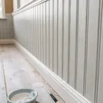
Soft Beige With Natural Textures
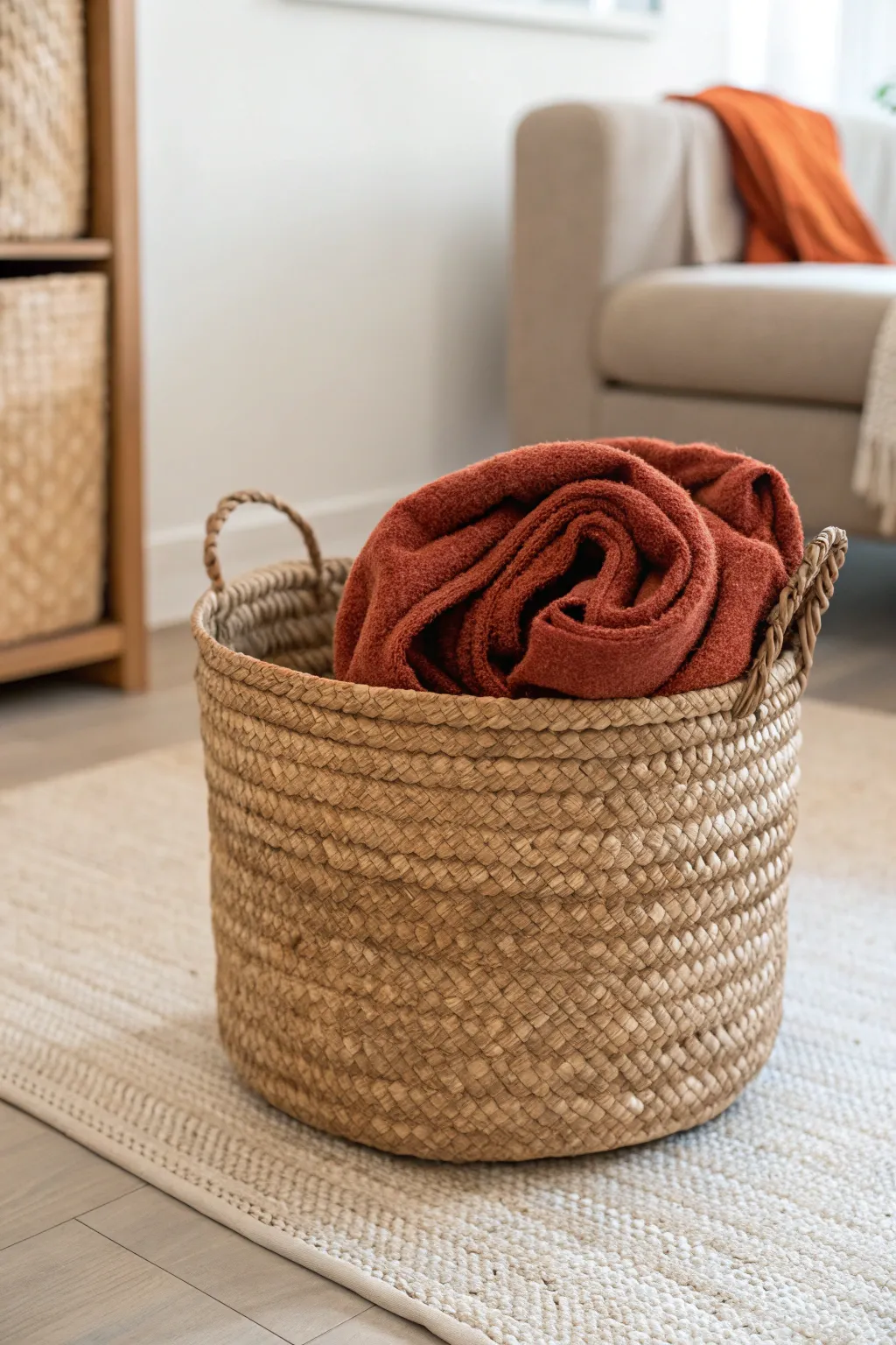
Bring natural warmth into your space by crafting this sturdy, texture-rich storage basket from humble seagrass rope. Its classic round shape and integrated handles make it a functional masterpiece perfect for holding cozy throws.
Step-by-Step
Materials
- Coiled seagrass rope (approx. 5-6mm thickness)
- Thick cotton or jute twine (natural beige color)
- Large-eye tapestry needle
- Hot glue gun and glue sticks (optional, for starting coil)
- Scissors
- Measuring tape
- Round plastic bucket or wastebasket (to use as a mold)
Step 1: Forming the Base
-
Create the center coil:
Start by tightly curling the end of your seagrass rope into a small spiral. Apply a tiny dot of hot glue to the very center to hold the first turn securely in place, creating a solid anchor for your stitching. -
Begin the stitching pattern:
Once the spiral is about an inch wide, thread your tapestry needle with a long length of twine. Insert the needle through the center of the coil and wrap it around the outer rope, spacing stitches about a quarter-inch apart. -
Build the flat bottom:
Continue coiling the rope flat on your work surface. As you add each new round, stitch firmly by passing the needle under the rope of the previous row and over the new rope, locking them together. -
Check the diameter:
Keep coiling and stitching until the flat base matches the bottom diameter of your chosen bucket mold. Ensure the disc remains perfectly flat by occasionally pressing it down with your palm.
Step 2: Building the Walls
-
Transition to vertical:
Place your woven base at the bottom of your bucket mold. For the next coil, instead of placing the rope beside the previous row, stack it directly on top of the outer edge of the base to obscure the transition. -
Establish the curve:
Continue coiling upwards, using the bucket as a guide to maintain straight, even walls. Your stitching should now wrap vertically, connecting the new top rope to the row immediately beneath it. -
Maintain tension:
Create a pattern by grouping stitches closer together or keeping a consistent gap. I find that pulling the twine tight after every few stitches prevents gaps and adds structural integrity to the walls. -
Weave upwards:
Build up the height of the basket row by row. If you run out of twine, simply tie a knot on the inside of the basket, rethread, and hide the tail ends between the coils. -
Check height uniformity:
Periodically step back or measure the height around the circumference to ensure your rows aren’t listing to one side. Gently push or pull the rope into alignment if needed.
Uneven Walls?
If walls start bowing out, tighten your twine tension. If they cave in, loosen it slightly. Using a rigid mold inside solves most shaping issues instantly.
Step 3: Detailing and Finishing
-
Plan the handles:
Decide where you want your two handles to be. Mark these spots on opposite sides of the rim, leaving a gap of about 4-5 inches for each handhold. -
Create the handle loops:
When you reach a handle mark, stop stitching the rope to the row below. Instead, arch the seagrass rope upwards to form a loop, measuring it to be comfortable for gripping, then re-attach it at the next mark. -
Reinforce the loops:
Wrap the handle loops entirely with your twine or continue the stitching pattern around the floating rope to make it rigid and durable. This wrapping adds a nice decorative touch and prevents fraying. -
Finish the rim:
Continue coiling and stitching until you complete the final row around the rim, integrating the handle attachment points smoothly. -
Taper the end:
To finish, cut the seagrass rope at a steep angle to taper the thickness. Stitch this tapered end tightly to the rim so it disappears seamlessly into the coil. -
Secure loose ends:
Weave any remaining twine tails back into the basket structure using your needle. Trim any excess fibers or stray bits of seagrass for a clean, professional look. -
Remove the mold:
Gently slide your new basket off the bucket mold. If it feels a bit stiff, you can lightly mist it with water and reshape it with your hands before letting it dry completely.
Add Color
For a two-tone look like the photo’s vibe, dip-dye the bottom third of your finished basket in a diluted fabric dye for a subtle, modern ombre effect.
Now you have a charming, handmade vessel ready to store your favorite blankets in style
BRUSH GUIDE
The Right Brush for Every Stroke
From clean lines to bold texture — master brush choice, stroke control, and essential techniques.
Explore the Full Guide
Dusty Blue for Relaxed Balance
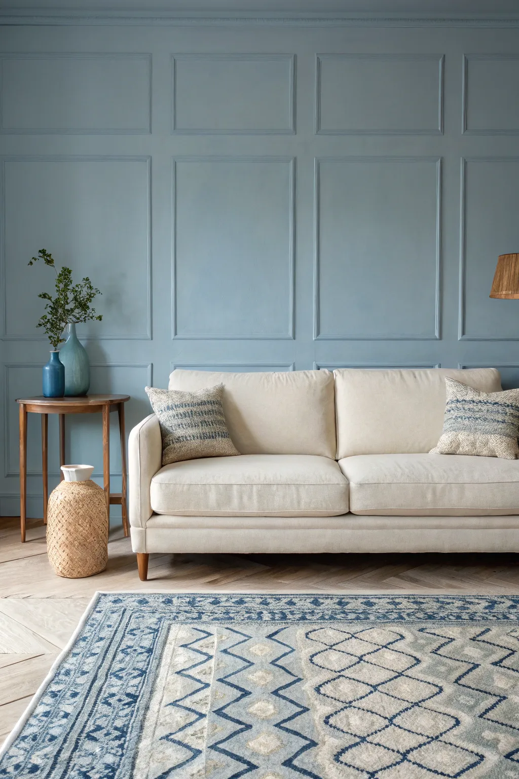
Transform a plain wall into a sophisticated focal point with this classic grid paneling project bathed in a serene dusty blue hue. The result is a timeless, textured backdrop that adds architectural depth and a relaxed, balanced atmosphere to any living space.
Step-by-Step Guide
Materials
- Pre-primed pine molding strips or MDF boards (approx. 2-3 inches wide)
- Dusty blue paint (eggshell or satin finish)
- Primer (if wood is unprimed)
- Construction adhesive (e.g., Liquid Nails)
- Finishing nails or brad nails
- Wood filler or spackle
- Paintable caulk
- Sandpaper (medium and fine grit)
- Tape measure
- Spirit level or laser level
- Painter’s tape
- Miter saw or hand saw with miter box
- Hammer or nail gun
- Paint rollers and good quality angled trim brushes
- Drop cloths
Step 1: Planning and Preparation
-
Measure and Design:
Begin by measuring your wall’s total width and height. Sketch a grid layout on paper to determine how many boxes you want; aim for squares or rectangles that feel proportional to your ceiling height. -
Calculate Spacing:
Subtract the total width of your vertical stile pieces from the wall width, then divide the remaining space by the number of desired boxes to find the exact horizontal spacing between verticals. -
Prep the Surface:
Clear the room and lay down drop cloths to protect your flooring. Remove any existing baseboards if you plan to replace them with a flat board to match the grid, though keeping the original baseboard is also an option. -
Mark the Wall:
Using a pencil and a long level (or laser level), lightly draw the grid onto the wall itself. This step is crucial for visualizing the final look before cutting any wood.
Uneven Walls?
Walls are rarely perfectly flat. If your molding bows out, use a little extra adhesive and cross-nail (nail at opposing angles) to pull the board tight against the drywall.
Step 2: Installing the Grid
-
Frame the Border:
Start by installing the horizontal top rail near the ceiling and the bottom rail along the floor (or above the existing baseboard). Secure these with construction adhesive and nails into the studs where possible. -
Install Vertical Stiles:
Cut your vertical boards to fit snugly between the top and bottom rails. Apply adhesive to the back of each board. -
Secure Verticals:
Place the vertical boards over your marked lines, double-checking for plumb with your level before nailing them into place. Don’t worry if the wall isn’t perfectly flat; the caulk will hide gaps later. -
Cut Horizontal Rails:
Measure the distance between each vertical stile individually. Cuts must be precise, so measuring each section separately is safer than cutting all pieces to one standard length. -
Install Horizontal Rails:
Apply adhesive and nail the horizontal pieces into place to complete the grid boxes. Using a spacer block cut to the exact height of your design can speed up this process and ensure uniformity.
Step 3: Finishing and Painting
-
Fill Nail Holes:
Go over every nail hole with wood filler. Overfill them slightly to account for shrinkage, and let them dry completely according to package instructions. -
Sand Smooth:
Once dry, sand the filled holes flush with the wood surface. I usually run my hand over the joints to ensure everything feels seamless. -
Caulk the Seams:
Apply a thin bead of paintable caulk to every seam where the wood meets the wall and where boards meet each other. Smooth the bead with a damp finger to create a seamless transition. -
Prime the Wood:
If your wood wasn’t pre-primed, apply a coat of high-quality primer to the new molding. If the wall paint color is changing drastically, prime the wall sections inside the boxes too. -
Cut In Edges:
Open your dusty blue paint. Use an angled sash brush to ‘cut in’ the corners, the edges of the molding, and the hard-to-reach spots inside the grid boxes. -
Roll the Flat Surfaces:
Use a small foam roller or a short-nap roller to paint the flat faces of the molding and the wall sections inside the boxes. This ensures a consistent texture across the whole wall. -
Apply Second Coat:
Allow the first coat to dry fully. Apply a second coat for full, rich color coverage, checking for any drips in the corners of the molding before the paint sets. -
Remove Tape:
If you taped off the ceiling or adjacent walls, carefully peel the tape away while the final coat is still slightly tacky to get a crisp, clean line.
Add Dimension
For a more formal look, install small base cap molding inside each grid square. This extra layer of detail catches the light beautifully and adds a historic feel to the paneling.
Step back and admire how the calming blue tones interact with the new architectural shadows of your room
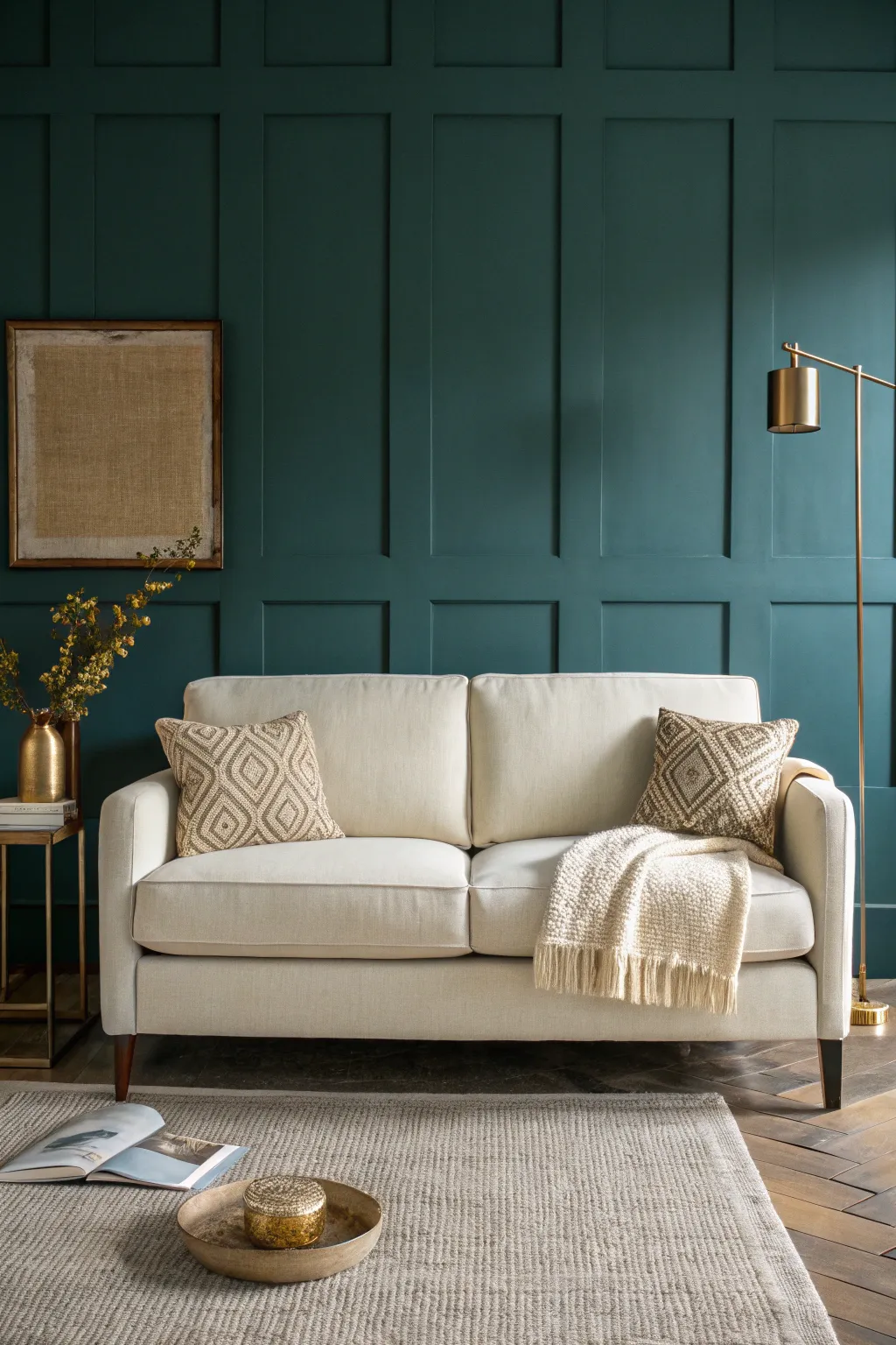
Blue-on-Blue for Tonal Depth
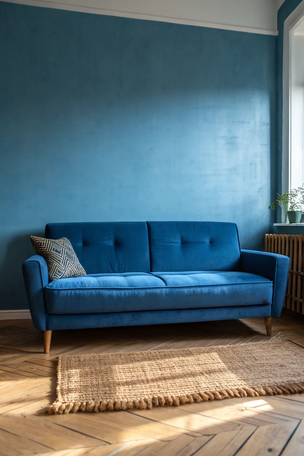
Embrace the moody sophistication of a monochromatic scheme by enveloping your living space in rich, tonal blues. This project involves painting both the walls and sourcing complementary furniture to create a cohesive, deep atmosphere that feels cozy yet expansive.
How-To Guide
Materials
- Matte finish interior paint (Deep Ocean Blue or similar teal-blue shade)
- Painter’s tape
- Drop cloths or plastic sheeting
- Sandpaper (120-grit)
- Spackle and putty knife
- Microfiber rollers and roller handle
- Angled sash brush (2-inch)
- Paint tray and liners
- Stir sticks
- Extension pole
- Blue velvet sofa (to match or darker tone)
- Natural jute rug
- Accent pillow with geometric pattern
Step 1: Preparation
-
Clear the room:
Begin by removing all furniture, including the sofa and rug, from the area. If items are too heavy, move them to the center and cover completely with drop cloths. -
Protect surfaces:
Lay down drop cloths to protect your beautiful herringbone wood floors. Use painter’s tape to mask off the floor trim, window sills, and any other molding you want to keep white. -
Prep the walls:
Inspect the walls for nail holes or imperfections. Fill them with spackle, let dry, and sand smooth with 120-grit sandpaper for a flawless finish. -
Wipe down:
Use a slightly damp cloth to wipe away sanding dust. Paint adheres best to clean, dust-free walls.
Pro Tip: Lighting Matters
Dark blue walls absorb light. Verify your paint swatch in morning, noon, and evening light to ensure the blue doesn’t turn too grey or too purple before committing.
Step 2: Painting the Walls
-
Cut in edges:
Open your matte blue paint and stir thoroughly. Using the angled sash brush, ‘cut in’ a border of paint around the ceiling line, corners, baseboards, and window frames. -
Feather the edges:
Before the cut-in line dries, feather the edges slightly outward to prevent a harsh ridge when you start rolling. -
Load the roller:
Pour paint into the tray. Load your microfiber roller evenly, ensuring it’s saturated but not dripping. -
Roll the first coat:
Apply the paint in ‘W’ or ‘M’ shapes, filling in the gaps as you go. Work in 3×3 foot sections to maintain a wet edge. -
Achieve texture:
For that slightly sueded, textured look visible in the image, avoid over-rolling. I like to let the roller nap leave a subtle stipple pattern rather than smoothing it out perfectly. -
Dry and assess:
Allow the first coat to dry for at least 4 hours. Assess if a second coat is needed for depth—usually, darker colors require two coats for true richness. -
Apply second coat:
If needed, repeat the rolling process. A second coat will deepen the blue and ensure the coverage is opaque and velvety. -
Remove tape:
Carefully peel off the painter’s tape while the paint is still slightly tacky to ensure crisp, clean lines.
Troubleshooting: Blotchy Walls?
If the matte paint looks uneven after drying, you likely over-rolled semi-dry paint. Apply one more light coat, maintaining a wet edge, and don’t back-roll over drying areas.
Step 3: Styling the Tonal Look
-
Position the rug:
Once walls are fully cured (ideally 24 hours), unroll your natural jute rug. Place it so it anchors the main seating area, leaving some wood floor visible. -
Place the sofa:
Bring in the blue velvet sofa. Position it against the blue wall. The velvet texture against the matte wall creates the crucial ‘tone-on-tone’ depth. -
Arrange accents:
Add the geometric patterned pillow to one side for a pop of visual texture. -
Add greenery:
Place a potted plant on the window sill or a side table. The fresh green contrasts beautifully with the blue monochrome. -
Final check:
Adjust the sofa alignment and rug placement to ensure the composition feels balanced and inviting in the natural light.
Now you have a serene, monochromatic sanctuary perfect for relaxation

PENCIL GUIDE
Understanding Pencil Grades from H to B
From first sketch to finished drawing — learn pencil grades, line control, and shading techniques.
Explore the Full Guide
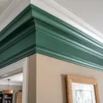
Navy Walls With Bright White Trim
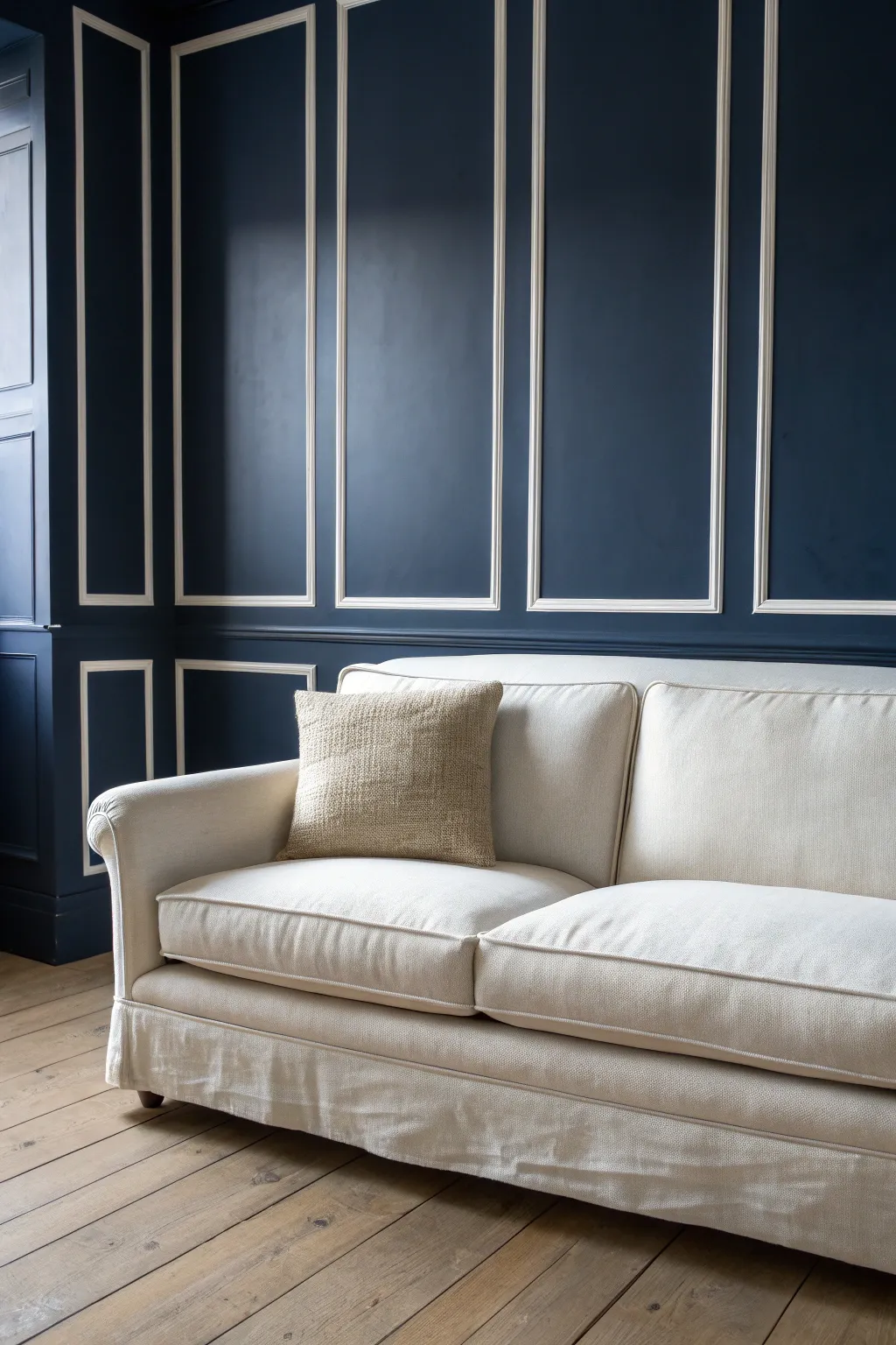
Transform a plain wall into a stately architectural feature with this classic picture frame molding technique. The deep navy blue matched with crisp white trim creates a dramatic, high-contrast backdrop that instantly elevates any living space.
Step-by-Step Tutorial
Materials
- Baseboard molding
- Chair rail molding
- Picture frame molding (or panel molding)
- Measuring tape
- Pencil
- Laser level (or 4-foot bubble level)
- Painter’s tape
- Miter saw
- Construction adhesive (Liquid Nails)
- Brad nailer and 1-inch nails
- Wood filler
- Fine-grit sandpaper (220-grit)
- Caulk and caulk gun
- Deep navy interior paint (matte or eggshell finish)
- Bright white semi-gloss trim paint
- Paint rollers and angled sash brushes
- Primer
Step 1: Preparation and Planning
-
Measure the Wall expanse:
Begin by measuring the total width and height of the wall space you intend to panel. Sketch out your design on paper first to determine the number of boxes; odd numbers of boxes often look more visually balanced. Aim for consistent spacing between boxes, typically 3 to 4 inches. -
Mark the Layout:
Using a laser level or a long bubble level, mark the horizontal line for your chair rail first. This generally sits about one-third of the way up the wall—around 32 to 36 inches from the floor is standard. -
Draw the Boxes:
Lightly draw the outlines of your upper and lower boxes directly onto the wall with a pencil. Double-check your measurements between boxes to ensure the spacing is perfectly uniform across the entire wall span.
Pro Tip: Spacer Block
Cut a scrap piece of wood to the exact width of your desired spacing (e.g., 4 inches). Use this as a guide block between boxes to avoid measuring constantly.
Step 2: Installing the Molding
-
Cut the Chair Rail:
Measure and cut your chair rail molding to fit the length of the wall. Use miter cuts for any corners if you are wrapping the design around multiple walls. -
Attach the Chair Rail:
Apply a bead of construction adhesive to the back of the chair rail, then position it on your level line. Secure it firmly into place using a brad nailer, driving nails into the wall studs where possible. -
Cut the Picture Frame Molding:
Set your miter saw to a 45-degree angle. Carefully cut the four sides for your first box. I always recommend cutting just one box first and dry-fitting the pieces on the floor to ensure the corners meet perfectly square. -
Install the Box Molding:
Apply construction adhesive to the back of your molding pieces. Align them with your pencil marks on the wall and secure them with brad nails. Repeat this process for all upper and lower boxes. -
Add Baseboards (If Needed):
If you are replacing old baseboards, install the new, taller baseboard molding now to anchor the bottom of the design, securing it with adhesive and nails.
Step 3: Finishing and Painting
-
Fill the Nail Holes:
Go over every piece of molding and fill the small brad nail holes with wood filler. Overfill them slightly to account for shrinkage as it dries. -
Sand Smooth:
Once the filler is dry, sand it flush with the wood using 220-grit sandpaper. Run your hand over the detailed areas to make sure everything feels smooth to the touch. -
Caulk the Seams:
Apply a thin bead of paintable caulk along every edge where the molding meets the wall, and at the mitred corners of the frames. Smooth it out with a wet finger for a seamless look. -
Prime the Surface:
Before painting, apply a coat of primer over the molding and the wall, especially if your wall was previously a dark color or extremely glossy. -
Paint the Wall Navy:
Using a roller, apply your deep navy paint to the flat wall sections inside and outside the boxes. Cut in carefully around the outside edges of the molding frames with a high-quality angled brush. -
Detail the Trim:
Switch to your bright white semi-gloss paint. Carefully paint the chair rail, the picture frame molding, and the baseboards. I find a small angled sash brush works best for keeping the white paint strictly on the raised trim profiles. -
Clean Up Lines:
If any navy paint strayed onto the trim or vice versa, do touch-ups with a small artist’s brush for a crisp, professional finish. -
Final Coat:
Assess the coverage once dry. Navy blue often requires two or even three coats to achieve that rich, velvety depth shown in the photo. Apply additional coats as needed.
Troubleshooting: Gaps
If your mitered corners have small gaps, don’t panic. Rub a little wood filler into the gap with your finger and sand it once dry. The paint will hide it perfectly.
Enjoy the refined atmosphere your new statement wall brings to the room
Charcoal Gray for a Cozy Mood
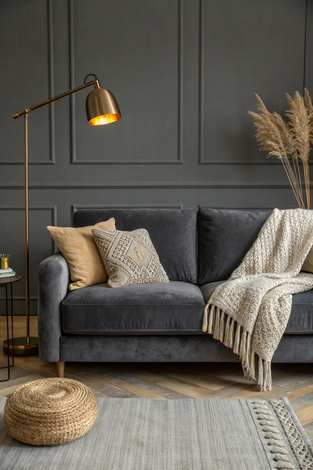
Capture the sophisticated elegance of a moody living room interior using graphite, charcoal, and metallic accents on toned paper. This drawing project focuses on soft shading techniques and texture rendering to evoke velvety fabrics and gleaming brass details.
Step-by-Step Guide
Materials
- Gray or dark beige toned drawing paper (A3 size recommended)
- Graphite pencils (HB, 2B, 4B, 6B, 8B)
- White pastel or white charcoal pencil
- Gold metallic paint marker or gold drawing ink (fine tip)
- Kneaded eraser
- Paper stump or blending tortillon
- Ruler
- Fixative spray
Step 1: Drafting the Foundations
-
Establish the background structure:
Begin by lightly sketching the wall molding using your ruler and an HB pencil. Draw two large vertical rectangles on the wall, leaving space for the floor and ceiling lines. Keep your lines faint so they can be defined later. -
Outline the furniture:
In the lower half, sketch the basic geometric shape of the sofa. It’s roughly a long rectangle with softer, rounded edges for the cushions. Add the thin, angled lines of the floor lamp to the left, paying attention to the triangle joint near the top. -
Position the accessories:
Sketch the silhouette of the side table on the far left and the prominent jute pouf on the floor. Add the organic, flowing shape of the throw blanket draped over the right side of the couch and the tall pampas grass arrangement on the right.
Step 2: Building Tone and Shadow
-
Base shading for the wall:
Using a 2B pencil, lightly shade the entire wall area. Use the side of the lead to create a uniform, smooth gray tone. Since we are using toned paper, you don’t need to go too dark yet; just establish a difference from the lighter elements. -
Deepen the charcoal tones:
Switch to a 4B or 6B pencil to darken the sofa. The velvet texture requires soft, gradient shading. Press harder in the creases between cushions and under the throw blanket to create deep shadows. -
Define the wall molding:
Sharpen your 4B pencil and draw the shadow lines inside the wall molding rectangles. Shadowing the bottom and right inner edges gives the paneling depth and dimension. -
Rendering the floor:
Sketch the herringbone wood pattern on the floor using diagonal strokes. Vary your pressure slightly with a 2B pencil to suggest different wood grain tones, but keep it subtle so it doesn’t distract from the sofa.
Velvet texture tip
To make the sofa look like velvet, blend the graphite smoothly with a paper stump, then use a kneaded eraser to blot out soft, irregular highlights.
Step 3: Refining Textures
-
Drawing the throw blanket:
Detailed texture is key here. Use small, circular scumbling motions with an HB pencil to mimic the knitted fabric of the throw. I find it helpful to vary the density of these marks to show folds. -
Highlighting the fabric:
Take your white pastel or white charcoal pencil and add highlights to the tops of the blanket folds and the edges of the patterned pillow. This contrast makes the fabric pop against the dark sofa. -
Creating the jute pouf:
For the round pouf on the floor, use concentric curved strokes. Layer 2B graphite with touches of white pastel to simulate the rough, braided rope texture. -
Pampas grass softness:
Use quick, feathery strokes with a 2B pencil for the pampas grass. Keep the lines loose and upward-sweeping. Smudge gently with your finger to give them a fluffy, out-of-focus appearance. -
Rug details:
Draw the fringe of the rug in the foreground using short, vertical strokes. Add faint horizontal lines across the rug body to suggest the weave.
Warm up the scene
Add a touch of sepia or burnt umber colored pencil into the wood floor and jute pouf areas to bring subtle warmth to the predominantly gray palette.
Step 4: Final Touches and Metallics
-
Adding the brass lamp:
Carefully outline the lamp stand and shade. Fill in the dark exterior of the shade with your 8B pencil for a solid, matte look. -
Applying gold accents:
This is the magic step. Use your gold metallic marker or ink to fill in the interior of the lamp shade. Add thin gold highlights along the lamp stand and the legs of the side table to capture the brass finish. -
Enhancing the light source:
Use the white pastel heavily inside the lamp shade, right over or next to the gold, to simulate the intense glow of the light bulb reflecting on the metal. -
Deepening final contrasts:
Do a final pass with your darkest (8B) pencil. Darken the deepest shadows under the sofa, the pouf, and inside the molding corners to ensure the lighting looks dramatic and cozy. -
Clean up edges:
Use your kneaded eraser to lift off any smudges from the wall area or highlight points that became muddy. Crisp edges on the molding are essential for that architectural look. -
Seal the artwork:
Once you are satisfied with the contrast and the metallic shine, spray a light coat of fixative to prevent the heavy graphite layers from smearing.
Step back and admire how the metallic accents bring your moody interior sketch to life


Brown Leather and Cool Walls
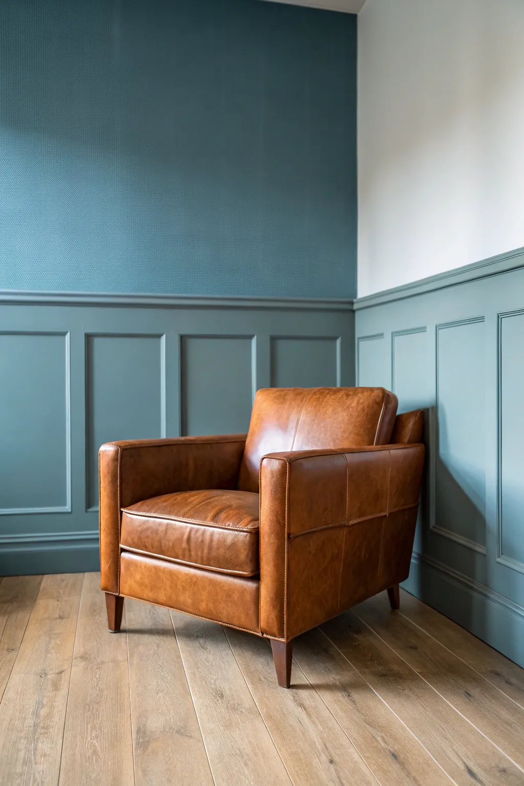
Capture the elegant contrast between warm leather and cool architectural tones in this realistic acrylic painting project. You will focus on rendering the subtle textures of aged leather and the structured play of light and shadow on paneled walls.
Detailed Instructions
Materials
- Canvas or primed panel (12×16 inches or 16×20 inches recommended)
- Acrylic paints: Burnt Sienna, Raw Umber, Yellow Ochre, Burnt Umber, Titanium White, Phthalo Blue (Green Shade), Mars Black
- Synthetic brushes: flat (1 inch, 1/2 inch), filbert (size 6, 8), round (size 2, 4)
- Glazing medium or slow-drying medium
- Palette knife for mixing
- Water container and paper towels
- Graphite pencil (HB) and eraser
- Ruler
Step 1: Planning the Composition
-
Establish the horizon:
Begin by lightly drawing your horizon line and the corner of the room. This vertical corner line should be placed roughly one-third of the way from the right edge to create an asymmetrical balance. -
Map the paneling:
Using a ruler, sketch the geometric grid of the wall paneling. Pay attention to perspective; the horizontal lines on the right wall should angle slightly toward a vanishing point off-canvas to the left. -
Outline the chair:
Block in the armchair’s shape in the foreground. Focus on the large masses first: the seat cushion, the backrest, and the armrests, ensuring the chair sits firmly on the floor plane defined by your paneling lines.
Muddy Colors?
If your teal wall shadows look dirty, you may be using too much brown to darken them. Instead, darken the teal with Phthalo Blue and a tiny touch of black or purple to keep the shadows cool and clean.
Step 2: Blocking in the Base Colors
-
Mix the wall color:
Create a cool, muted teal by mixing Phthalo Blue with a touch of Raw Umber to desaturate it, then adding Titanium White until you reach a mid-tone value. I find adding a tiny speck of black helps ground this color. -
Paint the upper walls:
Apply this teal mixture to the upper wall sections. Use a large flat brush for smooth, even coverage, keeping your strokes horizontal and vertical to mimic the architectural structure. -
Paint the paneling base:
Add a bit more Phthalo Blue and a touch of black to your existing teal mix to darken it slightly. Use this for the wainscoting and paneling areas, establishing the base tone before adding shadows. -
Underpaint the floor:
Mix Yellow Ochre, Burnt Sienna, and White to create a light wood tone. Wash this over the floor area loosely; don’t worry about wood grain details yet. -
Base coat the chair:
Mix Burnt Sienna with a little Yellow Ochre for a warm, medium-leather tone. Paint the entire chair shape with this solid color to serve as a foundation for the leather texture.
Level Up: Worn Leather
To make the chair look well-loved, create ‘cracks’ by painting tiny, erratic dark lines in high-stress areas (like the seat center), then highlight the bottom edge of each crack with a thin line of light tan.
Step 3: Developing Form and Light
-
Define wall shadows:
Mix a darker version of your teal using more Black and Phthalo Blue. With a smaller flat brush, paint the recessed areas of the paneling and the cast shadow behind the chair to give the wall depth. -
Highlight the molding:
Add more White to your original wall color. Carefully paint the top edges of the molding and the raised trim of the panels where the light hits from the left. -
Add floor planks:
Using a ruler and a thin round brush with a darker brown mix, draw the lines between the floorboards. Keep these lines broken and varied so they don’t look artificial. -
Deepen floor shadows:
Glaze a transparent layer of Burnt Umber under the chair and near the walls to anchor the furniture to the ground.
Step 4: Rendering the Leather Texture
-
Establish chair shadows:
Mix Burnt Umber with a touch of Purple (or Blue and Red) for a rich, deep shadow tone. Paint the dark sides of the armrest, the deep crease where the seat meets the back, and the underside of the cushion. -
Mid-tone variation:
Sponge or dab a mix of Burnt Sienna and Raw Umber onto the leather surface to create a mottled, uneven look. This imitates the natural wear and patina of aged leather. -
Detailed stitching:
Mix a light tan color. Using your finest round brush (size 2), carefully paint the dashed lines of stitching along the seams of the cushions and arms. Keep the paint fluid for smooth lines. -
Create soft highlights:
Blend Titanium White into your base leather color. Apply broad, soft highlights to the rounded tops of the armrests and the center of the seat cushion where the light naturally falls. -
Intense specular highlights:
For the shiny, taught areas of leather, use almost pure White. Apply small, sharp dabs on the corners of the cushions and the highest point of the backrest to make the material look polished.
Step 5: Refining and Finishing
-
Enhance the wall texture:
If you want the textured wallpaper look on the upper wall, dab a dry sponge lightly with a slightly darker teal over the dry base coat to create a subtle stippled effect. -
Chair legs:
Paint the wooden legs with a dark Burnt Umber. Add a sliver of light gray-brown on the left edge of each leg to show cylindrical form. -
Final shadow check:
Deepen the contact shadows right where the chair legs touch the floor using Mars Black mixed with brown. This is crucial for weight. -
Overall glaze:
Once fully dry, apply a very thin glazing medium over the chair area to unify the leather tones and give it a slight sheen, mimicking the finish of real leather.
Step back and admire the sophisticated atmosphere you have captured on your canvas.
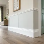
Forest Green for a Grounded Look
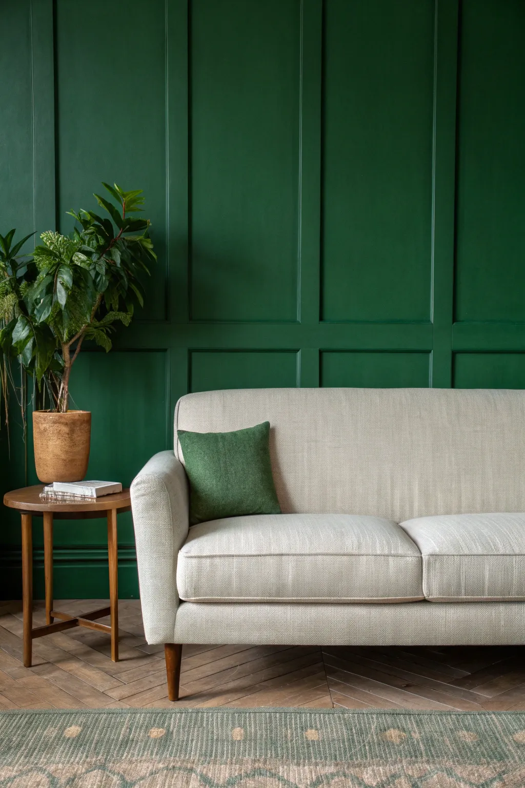
Transform a plain wall into a stunning focal point with this forest green board-and-batten accent wall. The deep, rich color creates a sophisticated and grounded atmosphere, perfectly framing your living room furniture.
Step-by-Step Tutorial
Materials
- 1×3 MDF or primed pine boards
- Construction adhesive (Liquid Nails)
- Painter’s tape
- Spackle or wood filler
- Caulk and caulking gun
- Sandpaper (120 and 220 grit)
- Interior paint (Forest Green, eggshell or satin finish)
- Paint roller (microfiber) and tray
- Angled sash brush
- Level (4-foot or laser level)
- Tape measure
- Pencil
- Brad nailer (optional but recommended) and nails
- Saw (miter saw or hand saw)
Step 1: Planning and Preparation
-
Measure the Wall:
Start by measuring the total width and height of your wall. This is crucial for calculating how many vertical and horizontal ‘battens’ (the strips of wood) you will need to create the grid pattern. -
Design the Grid:
Sketch out your grid design on paper. For the look in the photo, aim for large rectangular panels. Divide your wall width evenly to determine the spacing between vertical boards, likely around 24-30 inches apart. -
Mark the Studs:
Use a stud finder to locate the studs behind your drywall. Mark their locations with a pencil near the ceiling and floor, so you know where you have solid backing for nailing. -
Draw the Layout:
Using your level and pencil, draw the actual grid lines directly onto the wall. This helps visualize the final look and ensures your boards will be perfectly straight before you cut anything.
Uneven Wall Woes?
If your wall bows and gaps appear behind boards, don’t force the wood back. Use extra caulk to fill the gaps for a visual fix, keeping the board straight.
Step 2: Installing the Battens
-
Install the Frame:
Begin by installing the horizontal top board (header) along the ceiling line and the bottom board directly above your existing baseboard. Use construction adhesive and nails to secure them. -
Place Vertical Boards:
Measure and cut your vertical boards to fit snugly between the top and bottom headers. Install the two outermost vertical boards first, flush with the adjacent walls. -
Install Remaining Verticals:
Install the remaining vertical strips over your pencil lines. Apply construction adhesive to the back of each board, press it onto the wall, check for plumb with your level, and secure with brad nails. -
Add Horizontal Cross-Pieces:
Measure the distance between your vertical boards carefully. Cut horizontal pieces to fit these gaps to create the grid. I like to cut one test piece first to check the fit before cutting the rest. -
Secure Cross-Pieces:
Install these horizontal pieces at your predetermined heights. Use a level or a spacer block to ensure every horizontal row is perfectly aligned across the wall.
Level Up: Picture Ledge
Add a slightly deeper board (1×2 or 1×3) on one of the horizontal rows to create a functional picture ledge for displaying art or small plants.
Step 3: Finishing and Painting
-
Fill Nail Holes:
Go over every board and fill the small nail holes with wood filler or spackle. Overfill them slightly as the filler shrinks when it dries. -
Caulk the Seams:
Run a thin bead of paintable caulk along every edge where the boards meet the wall and where boards meet each other. Smooth the bead with a wet finger or a damp rag for a seamless look. -
Sand Smooth:
Once the filler is dry, sand the patched holes flush with the wood using 220-grit sandpaper. Lightly sand any rough edges on the boards as well. -
Clean the Surface:
Wipe down the entire wall and the new woodwork with a tack cloth or damp rag to remove dust. Paint will not adhere properly to a dusty surface. -
Cut In Edges:
Using your angled sash brush and the forest green paint, ‘cut in’ the grid first. Paint all the corners, edges, and the sides of the battens where a roller can’t reach. -
Roll the Paint:
Pour your paint into the tray. Use a microfiber roller to paint the flat wall sections and the faces of the boards. Apply the paint in ‘W’ shapes for even coverage. -
Designated Drying Time:
Let the first coat dry completely according to the can’s instructions, usually 2-4 hours. The dark green color will likely look patchy after just one coat, so don’t worry. -
Apply Second Coat:
Repeat the cutting-in and rolling process for a second coat. This deep green shade is rich, so a second coat is essential for true depth and opacity.
Enjoy the calm and grounded feeling this rich green feature wall brings to your space
Dark Teal for Bold Elegance
Embrace the rustic charm of organic textures with this minimalist framed wall art. By layering joint compound and paint over burlap, you create a sophisticated, tactile piece that perfectly complements bold wall colors like deep teal.
How-To Guide
Materials
- Large wooden picture frame (approx. 24×30 inches)
- Plywood backing board or heavy-duty cardboard (cut to frame size)
- Rough-weave burlap fabric (natural beige)
- Staple gun and staples
- Matte Mod Podge or heavy gel medium
- White gesso or primer
- Joint compound or modeling paste
- Wide putty knife or palette knife
- Acrylic paints: Raw Umber, Yellow Ochre, Titanium White
- Large chip brush or stiff bristle brush
- Natural sponge
- Sandpaper (medium grit)
- Dark wood stain (for the frame, optional)
Step 1: Preparing the Base
-
Prepare the backing board:
Cut your plywood or heavy cardboard to fit snugly inside your chosen frame. Ensure the surface is clean and free of dust. -
Secure the burlap:
Cut a piece of burlap about 2 inches larger than your backing board on all sides. Wrap the fabric around the board, pulling it taut but not so tight that it warps the board. -
Staple the fabric:
Using a staple gun, secure the burlap to the back of the board. Start in the center of each side and work your way out to the corners to ensure even tension. -
Prime the surface:
Apply a generous coat of Mod Podge or gel medium over the entire front surface of the burlap. This seals the fibers and prevents them from soaking up too much paint later. Let it dry completely.
Cracking Up?
If the joint compound cracks significantly while drying, don’t panic. Mix a little white glue into fresh compound and fill the cracks, or leave them for extra character.
Step 2: Building Texture
-
Apply the first texture layer:
Using a wide putty knife, spread a thin, uneven layer of joint compound over the center of the burlap, leaving a 2-3 inch border of raw burlap exposed around the edges. -
Create organic movement:
While the compound is wet, drag the putty knife lightly across surface in horizontal and vertical motions to create a distressed, plaster-like look. -
Soften the edges:
Feather the edges of the compound so it blends somewhat naturally into the exposed burlap border, rather than stopping abruptly. -
Dry and distress:
Allow the compound to dry for at least 4-6 hours or overnight. Once hard, use medium-grit sandpaper to knock down any overly sharp peaks and reveal bits of the texture underneath.
Go Botanical
Before the joint compound dries, press dried leaves or stems into the surface, then remove them to leave a subtle fossil-like impression in the texture.
Step 3: Painting and Antiquing
-
Base coat application:
Mix a wash of Titanium White and a touch of Yellow Ochre with water. Brush this liberally over the textured area, letting it settle into the crevices. -
Add depth with Umber:
While the base is still damp, dip your stiff brush into a very small amount of Raw Umber. Offload most of the paint on a paper towel. -
Dry brushing:
Lightly drag the nearly dry brush over the raised areas of the texture. This highlights the ridges and mimics an aged wall surface. -
Sponge application:
Dampen a natural sponge and dab it into a mix of diluted Raw Umber and water. Gently press it randomly onto the canvas to add organic mottling. -
Define the border:
With a small brush, lightly apply a darker wash of Raw Umber right where the texture meets the raw burlap border to create a subtle shadow box effect. -
Final blending:
Take a clean, dry chip brush and gently sweep over the entire surface to soften any harsh brushstrokes and blend the color transitions.
Step 4: Assembly
-
Prepare the frame:
If your frame needs refreshing, lightly sand it and apply a dark wood stain to match the vintage aesthetic. Wipe away excess stain and let dry. -
Mount the artwork:
Place your dried, textured board into the frame. I find using glazier points or small nails hammered sideways works best to hold the thick board in place. -
Secure the back:
If necessary, cover the back of the frame with kraft paper or simply tape the edges to protect the wall and keep dust out.
Hang your new textured masterpiece and enjoy the earthy warmth it brings to your space
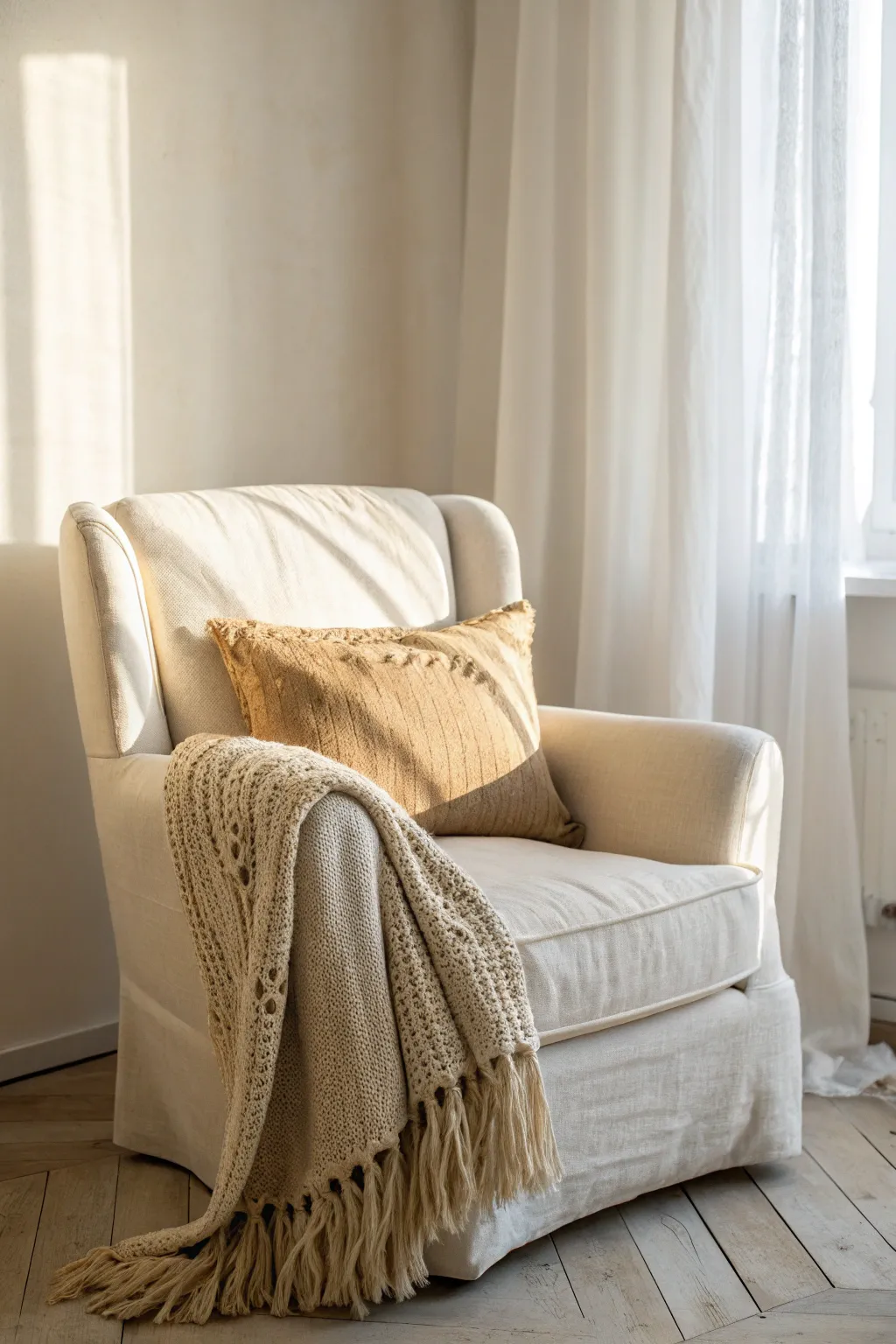
Lavender Gray for a Quiet Twist
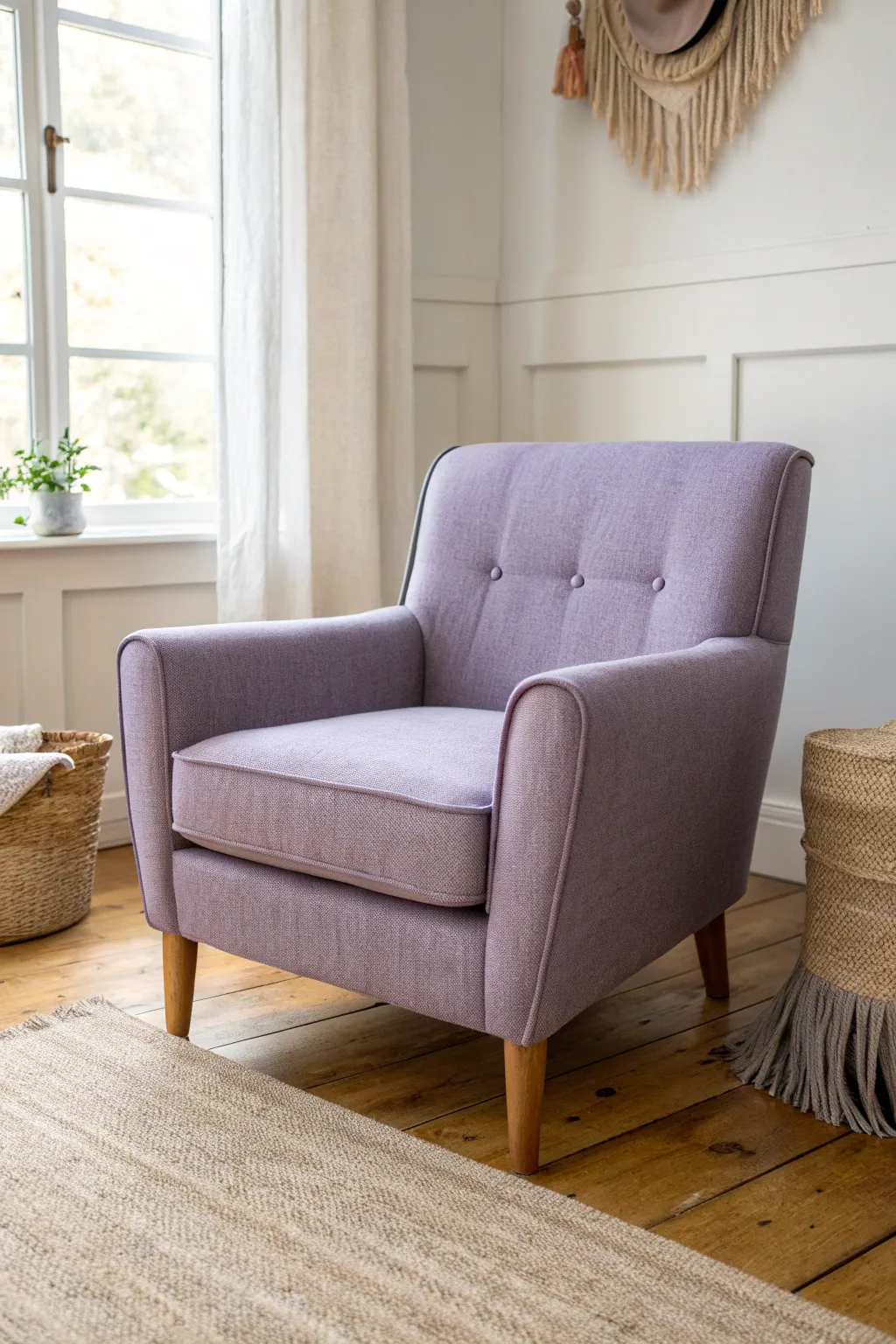
Transform a tired, dated armchair into a serene statement piece with this lavender gray upholstery project. The soft, muted fabric paired with natural wood legs creates a calming aesthetic perfect for a quiet reading nook.
Step-by-Step Guide
Materials
- Vintage armchair with good bones
- Lavender gray upholstery fabric (heavyweight linen or chenille blend)
- Upholstery batting and foam (if replacement is needed)
- Upholstery tack strips
- Cardboard tack strips
- Heavy-duty staple gun and staples (1/2 inch)
- Needle nose pliers and staple remover
- Fabric scissors
- Sewing machine and heavy-duty thread
- Upholstery buttons and twine (for tufting)
- Tufting needle
- Measuring tape
- Chalk or fabric marker
- Dust cover fabric (cambric)
Step 1: Preparation and Deconstruction
-
Assess and clean:
Begin by inspecting the chair’s frame for stability. Tighten any loose screws or joints. Vacuum the old chair thoroughly to minimize dust before you start stripping it. -
Remove the old fabric:
Carefully remove the existing fabric using a staple remover and needle-nose pliers. Take your time here; I like to label each piece of old fabric with a marker as I remove it (e.g., ‘inside arm’, ‘outside back’) to use as a pattern later. -
Inspect padding:
Check the condition of the foam and batting. If the foam is crumbling or smells musty, remove it down to the springs or webbing. If it’s in good shape, you can simply add a fresh layer of batting over the top. -
Sand and refinish legs:
If the wooden legs need attention, now is the easier time to do it. Sand them lightly to remove old varnish and apply a clear matte sealer or stain to achieve that warm, honey-toned wood look.
Wrinkle Rescue
If fabric puckers around curves, cut small V-shaped notches in the excess fabric allowance. This releases tension and allows the material to smooth out.
Step 2: Cutting and Sewing
-
Create your pattern:
Lay out your new lavender gray fabric on a large flat surface. Place the old fabric pieces on top as templates. Trace around them with chalk, adding an extra 1-2 inches of allowance on all sides for pulling and stapling. -
Sew the cushion cover:
For the seat cushion, cut new top, bottom, and boxing (side) strips. If you want piping, sew fabric strips around cord to create it now. Sew the boxing strips together, attach the piping, and then sew the top and bottom panels, leaving the back edge open for the zipper or hand-stitching. -
Sew the arm panels:
If your chair design requires the inside arm fabric to be sewn to the front arm panel before attaching, do this now on your machine. Double-stitch seams for durability.
Step 3: Upholstering the Interior
-
Inside back installation:
Position the fabric for the inside back. Find the center of the chair and the center of your fabric to align them. Smooth the fabric upwards and staple lightly at the very top center to hold it in place. -
Tufting the back:
Mark the spots for your three buttons on the fabric. Thread your tufting needle with twine, pass it through the pre-covered button, then through the fabric and foam to the back of the chair frame. Pull tight and secure the twine to the frame or webbing with staples in a zig-zag pattern. -
Secure the inside back:
Once tufted, pull the fabric taut downwards through the gap between the seat and back. Staple securely to the rear frame rail. Then pull the sides taut and staple, constantly checking for wrinkles. -
Upholster the seat deck:
Cover the seat deck (the part under the cushion). You can use a less expensive lining fabric for the center and the main lavender fabric for the front nose. Pull tightly and staple to the frame rails. -
Inside arms:
Drape the fabric over the inside arms. Feed the bottom edge through the side gaps and staple to the frame. Pull the fabric up and over the top of the arm. Create neat pleats or folds at the front curve of the arm if necessary, stapling underneath where they will be hidden.
Piping Pop
For a custom designer look, make your piping/welting out of a slightly darker shade of purple or a contrasting charcoal gray to outline the chair’s silhouette.
Step 4: Finishing the Exterior
-
Outside arms:
Attach metal tack strips to the top edge of the outside arm frame. Place your cardboard tack strip along the top edge of your fabric (face in), and staple through the strip into the frame. Flip the fabric down to create a crisp, blind-tacked edge. -
Secure sides and bottom:
Pull the outside arm fabric down firmly and staple to the underside of the frame. Fold the back vertical edge inward and secure it, either with another tack strip or by hand-sewing with a curved needle for a seamless look. -
Outside back:
Repeat the blind-tacking process for the top of the outside back panel. Let the fabric hang down, pull it taut to the bottom frame, and staple underneath. Fold the side edges in and invisibly stitch or tack them close. -
Dust cover:
Flip the chair over. Cut a piece of black cambric dust cover slightly larger than the base. Fold the edges under and staple it to the bottom of the frame to hide all the raw wood and internal cut edges. -
Final steam:
Use a handheld steamer to gently release any creases from the handling process and plump up the foam.
Enjoy the comfort and pride of relaxing in a chair you restored yourself.
Blush and Clay for Soft Warmth
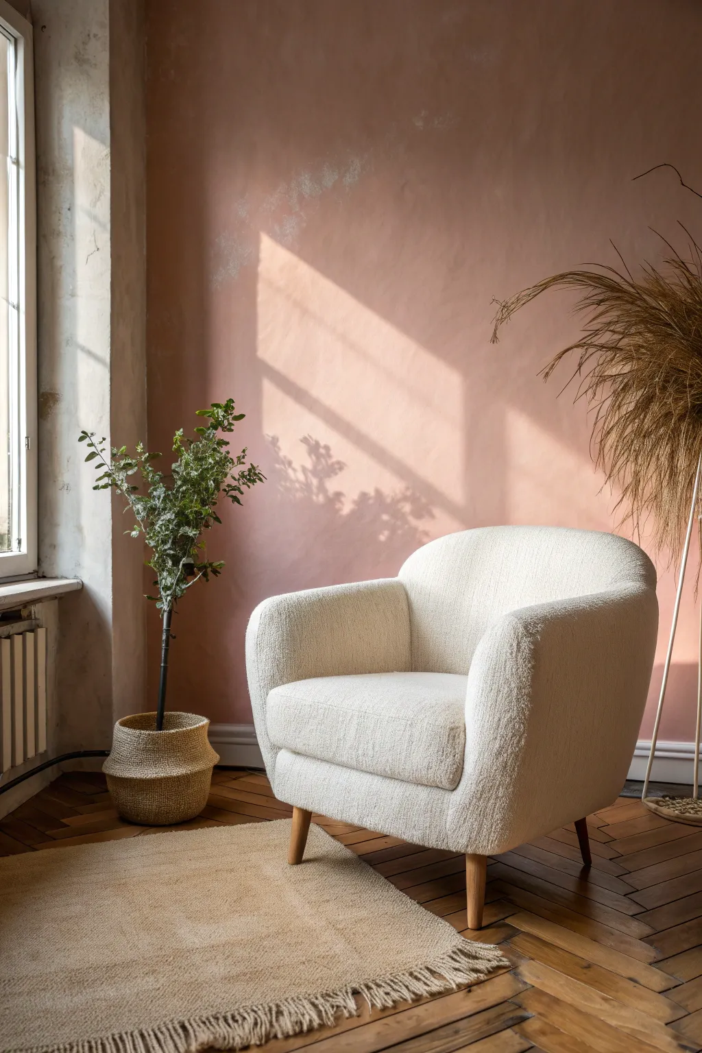
Transform a plain wall or canvas backdrop into a stunning, painterly scene featuring soft blush tones and realistic light play. This project focuses on recreating the textured pink wall and arranging the minimalist vignette to achieve that warm, high-end interior photography look.
Step-by-Step Tutorial
Materials
- Large canvas backdrop or primed MDF panel (at least 6ft by 8ft)
- Interior latex paint (soft blush pink)
- Glaze medium or limewash paint specialty finish
- Wide block paintbrush (4-6 inches)
- Sea sponge or rag
- Drop cloth
- Painter’s tape
- Matte white acrylic paint (for window frame illusion)
- Cardboard or stencil acetate (for shadow effect)
- Dark grey acrylic paint (sheer wash for shadows)
Step 1: Preparing the Base
-
Surface Prep:
Begin by laying your large canvas or panel on a flat surface or mounting it vertically against a wall. Ensure the surface is clean and free of dust. If you are using raw wood or MDF, apply a coat of white primer first to ensure the pink tones pop correctly. -
Base Color Application:
Apply a solid base coat of your soft blush pink latex paint using a standard roller. This doesn’t need to be perfect, but aim for full coverage. I like to let this dry completely overnight to establish a stable foundation for the texture work.
Too Streaky?
If your limewash texture looks too messy or brush-heavy, use a damp lint-free rag to buff the surface in circular motions while the glaze is still tacky. This blends the strokes for a cloudier look.
Step 2: Creating the Limewash Texture
-
Mixing the Glaze:
Mix a small amount of the same blush pink paint with a glaze medium (usually a 1:4 ratio of paint to glaze) or use a dedicated limewash product. -
Cross-Hatch Application:
Dip your wide block brush into the mixture. Apply it to the backdrop using large, random X-shaped strokes (cross-hatching). This creates that cloudy, directional movement seen in the photo. -
Building Depth:
While the glaze is still wet, use a clean, dry brush to feather out harsh edges. This softens the transition between the base coat and the textured layer. -
Adding Variation:
For areas where you want more ‘plaster’ texture, dab a slightly lighter shade of pink (mix white into your base) using a sea sponge. Focus on the upper areas where light would naturally hit.
Add Realistic Grime
To age the wall authentically, mix a tiny drop of raw umber acrylic into your glaze and apply it very subtly near the floorboards and corners, mimicking natural patina accumulation.
Step 3: Painting the Light and Shadow
-
Mapping the Light:
Observe the reference image. The defining feature is the sharp, angled rectangle of light. Use painter’s tape to outline this ‘window light’ shape on the wall, creating a large diagonal rectangle. -
Simulating Illumination:
Inside the taped area, apply a very thin, translucent wash of lighter pink or white. You aren’t painting it white; you are just brightening the existing pink to make it look illuminated. Remove the tape immediately while wet to avoid peeling. -
Softening Edges:
Use a dry brush to very gently blur the edges of your ‘light’ rectangle. Real sunlight diffuses slightly, so the lines shouldn’t be razor-sharp like a graphic design. -
Plant Shadow Stencil:
Cut vague, organic leaf shapes out of cardboard to act as a gobo (a stencil for blocking light). These don’t need to be detailed—just jagged, leafy outlines. -
Applying Shadows:
Mix a very watery, transparent grey wash. Hold your cardboard stencil slightly away from the wall (not flush) and lightly spray or dry-brush the grey wash through it onto the ‘lit’ area of the wall to create soft, diffused plant shadows.
Step 4: Styling the Vignette
-
Floor Selection:
Unroll a vinyl floor backdrop with a herringbone wood pattern at the base of your painted wall, or assemble real click-lock wood planks if creating a permanent set. -
Placing the Chair:
Position a white bouclé or textured armchair slightly off-center. Angle it inward so it looks inviting. -
Adding Greenery:
Place a tall, sparse green plant in a woven belly basket to the left of the chair. The height should balance the shadow/light play on the wall. -
Textures and Tones:
Lay down a small, fringed beige jute rug under the front legs of the chair to ground the scene. -
Final Touches:
Add a dried grass arrangement or pampas grass on the right side to echo the warm, earthy tones of the floor and basket.
Step back and admire the serene, sun-drenched atmosphere you have created with just paint and light techniques
Terracotta for Sunbaked Comfort
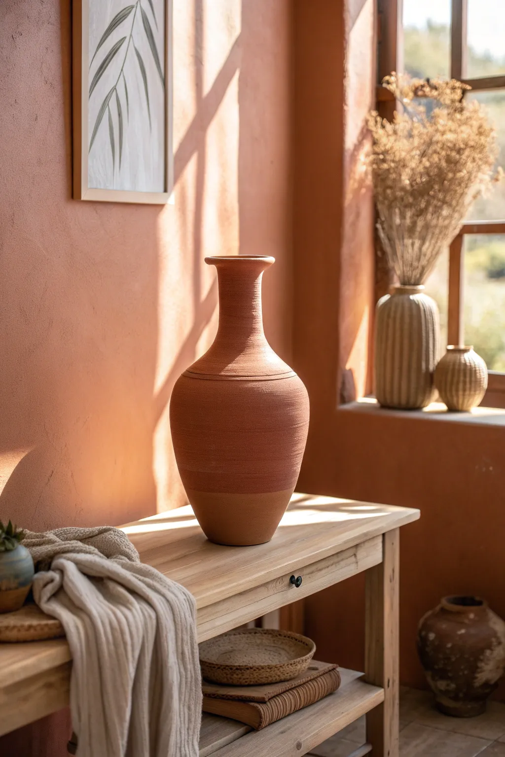
Bring the warmth of sunbaked earth into your home with this textured vase transformation. Using a simple mixture of paint and baking powder, you can turn any plain glass or ceramic vessel into a piece that looks like authentic, aged pottery.
Step-by-Step Guide
Materials
- Large glass or ceramic vase (thrifted is fine)
- Acrylic paint (burnt orange, terracotta, and brown shades)
- Baking powder
- Small mixing bowl or cup
- Medium-sized paintbrush
- Sponge brush or sea sponge
- Sandpaper (medium grit)
- Matte clear sealer spray
Step 1: Preparation & Mixing
-
Clean surface:
Begin by thoroughly cleaning your chosen vase with warm soapy water to remove any grease or dust. Dry it completely with a lint-free cloth. -
Sand the base:
If your vase is very glossy, lightly scuff the surface with medium-grit sandpaper. This helps the textured paint adhere better to slick ceramics or glass. -
Create base color:
In your mixing container, squeeze out a generous amount of your primary terracotta-colored acrylic paint. It’s better to mix a little more than you think you need. -
Add texture agent:
Sprinkle baking powder into the paint. Start with a ratio of about 1 teaspoon of baking powder to 1/2 cup of paint. If you want a very rough, stony texture like the one in the photo, add a bit more. -
Mix thoroughly:
Stir the mixture immediately. I like to watch for the reaction here—the paint will fluff up and become mousse-like. This is exactly the consistency you want.
Step 2: Applying the Texture
-
Initial coat:
Using your medium paintbrush, apply the first layer of the textured paint. Don’t worry about smooth brushstrokes; dab and stipple the paint on to build up a tactile surface. -
Cover completely:
Work your way around the vase, ensuring you cover the rim and just inside the neck for a finished look. Let this first coat dry for about 30-45 minutes until it’s touch-dry. -
Inspect coverage:
Check for any bald spots where the glass shines through. The baking powder mixture can shrink slightly as it dries. -
Second coat:
Apply a second coat of the same mixture. This time, focus on building up horizontal ridges around the neck and body to mimic wheel-thrown pottery lines.
Fixing “Muddy” Texture
If the texture looks too clumpy or falls off, you used too much baking powder. Scrape it off while wet, add more plain paint to your mix, and reapply.
Step 3: Creating Depth & Aging
-
Mix darker shade:
Take a small amount of your leftover texture mix and blend in a drop of dark brown or burnt umber paint to create a slightly shadowed tone. -
Sponge application:
Using a sponge, lightly dab this darker mixture onto the lower third of the vase and sporadically around the neck. This creates the natural color variation seen in fired clay. -
Blend naturally:
While the paint is still damp, use a dry, clean brush to feather the edges of the darker areas so there are no harsh lines, just subtle gradients. -
Add “scoring”:
While the second coat is tacky but not wet, gently drag a stiff-bristled brush horizontally around the vase’s belly to create faint striations. -
Full dry:
Allow the vase to dry completely, preferably overnight. The baking powder paint is thick and needs time to harden fully.
Make it Waterproof
This finish isn’t water-safe. Place a smaller glass jar inside the finished vase to hold fresh flowers and water without ruining the paint.
Step 4: Sealing & Finishing
-
Dust off:
Once dry, gently brush the surface with a dry hand to knock off any loose crumbs of baking powder. -
Seal the work:
Take the vase to a well-ventilated area and spray it with a matte clear sealer. Two light coats are better than one heavy coat to prevent drips. -
Final cure:
Let the sealer cure according to the can’s instructions before engaging with the vase or filling it with dried floral arrangements.
Now you have a stunning, heavy-looking vessel that adds instant history to your shelf without the weight or cost of real antique clay
Black Accent Wall for Instant Drama
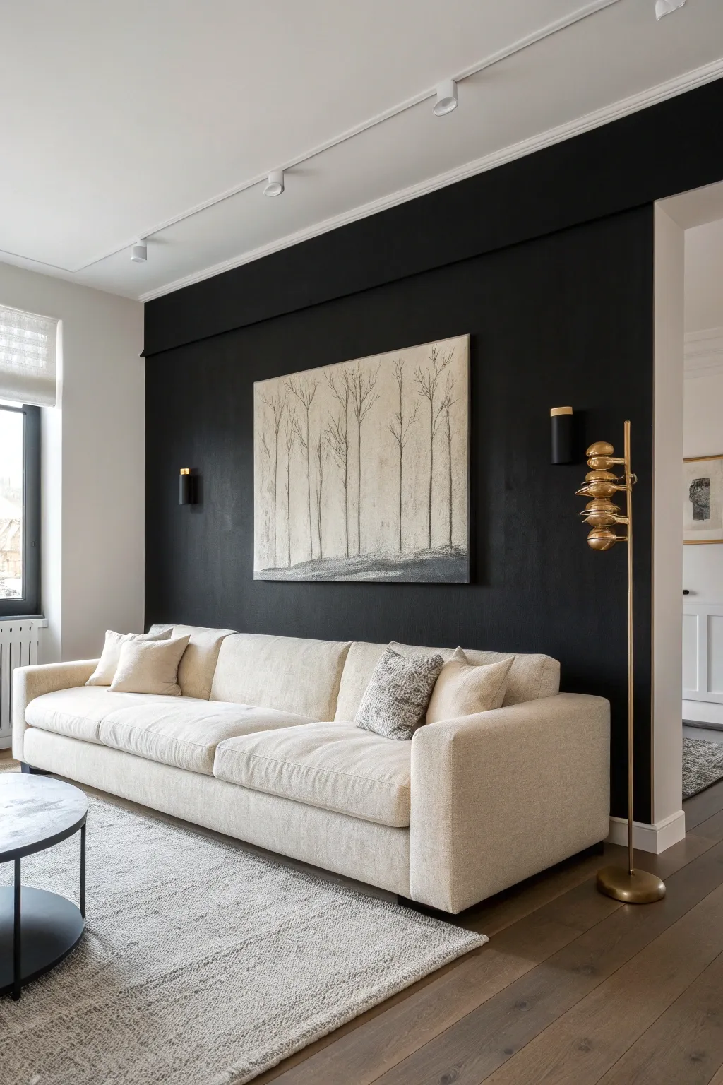
Create a serene focal point for your living space with this large-scale, minimalist forest painting. Using a restricted palette of creams, greys, and charcoal, you will capture the quiet elegance of bare winter trees against a soft, textured sky.
How-To Guide
Materials
- Large canvas (approx. 48” x 36”)
- Acrylic paints: Titanium White, Unbleached Titanium (Cream), Mars Black, Raw Umber
- Gesso (white)
- Wide mottler brush or 3-inch chip brush
- Medium flat brush
- Fine liner brush or rigger brush
- Kitchen sponge or sea sponge
- Palette knife
- Spray bottle with water
- Charcoal pencil (optional)
Step 1: Preparing the Background
-
Prime the Surface:
Begin by applying a coat of white gesso over the entire canvas to ensure a smooth, receptive surface. If you want extra texture appropriate for a winter scene, you can dab the gesso slightly with a sponge while it’s wet. -
Mix the Base Tone:
On your palette, mix a large amount of Titanium White with a small dollop of Unbleached Titanium. You want a very pale, warm off-white color that mimics an overcast winter sky. -
Apply the Sky Layer:
Using the wide brush, cover the top 85% of the canvas with your off-white mixture. Use horizontal strokes but allow some brush marks to remain evident for visual interest. -
Create the Horizon:
Mix a small amount of Raw Umber and Mars Black into your leftover off-white paint to create a soft, light grey. Apply this to the bottom 15% of the canvas where the ground will be, blending the transition line slightly with the sky so it isn’t too sharp. -
Add Subtle Texture:
While the paint is still tacky, lightly mist the canvas with water. Take a damp sponge and gently blot random areas of the sky and ground to create a weathered, organic look.
Pro Tip: The Rigger Brush
For the finest branches, use a ‘rigger’ brush. Its long bristles hold more paint, allowing you to drag long, uninterrupted lines without reloading constantly.
Step 2: Establishing the Ground
-
Darken the Earth:
Mix a darker charcoal grey using Mars Black and a touch of Raw Umber. Using a palette knife, apply this mixture to the bottom edge of the canvas, scraping the paint upwards to simulate tufts of grass or uneven terrain. -
Layering the Soil:
Add a second, slightly lighter grey layer over the dark ground using the side of a dry brush. This scumbling technique helps suggest frost or light snow cover on the dark earth. -
Define the Horizon Line:
Use a small amount of thinned black paint to darken the very specific line where the trees will stand. This anchors the composition and gives the trees a solid base.
Level Up: Gallery Wrap
Paint the edges of your canvas black before framing or hanging. This creates a built-in frame effect that makes the artwork pop against a dark wall.
Step 3: Painting the Trees
-
Map Out Tree Placement:
Using a charcoal pencil or a brush with very diluted grey paint, faintly mark vertical lines where your main tree trunks will go. Vary the spacing—cluster two or three together, then leave a gap—to look natural. -
Paint Main Trunks:
Load a medium flat brush with a dark grey mixture (Black + White). Paint the trunks starting from the ground and pulling upward. As you move up, twist the brush to the narrow edge to taper the trunk. -
Vary Tone and Opacity:
I find it helpful to mix a slightly transparent, lighter grey wash and glaze over some of the trunks once dry. This pushes some trees into the background, creating depth. -
Create Branch Structure:
Switch to your fine liner or rigger brush. Mix wetter, inky black paint. Extending from the trunks, pull long, delicate lines upward and outward. Use a shaky hand intentionally to mimic the organic growth of twigs. -
Add Fine Details:
Focus on the very tops of the trees. The branches should become extremely fine, almost fading into the sky color. You can achieve this by lifting the pressure on your brush as you end the stroke. -
Ground the Trunks:
Return to the base of the trees. Use a small, stiff brush to stipple a bit of the dark ground color over the very bottom of the trunks, making them look like they are emerging from the earth rather than floating on top. -
Final Adjustments:
Step back and view the canvas from a distance. If any area feels too heavy, dry brush a little of the original off-white sky color over the branches to soften them.
Now hang your masterpiece and enjoy the quiet sophistication it brings to the room
Paint the Ceiling for a Color Cocoon
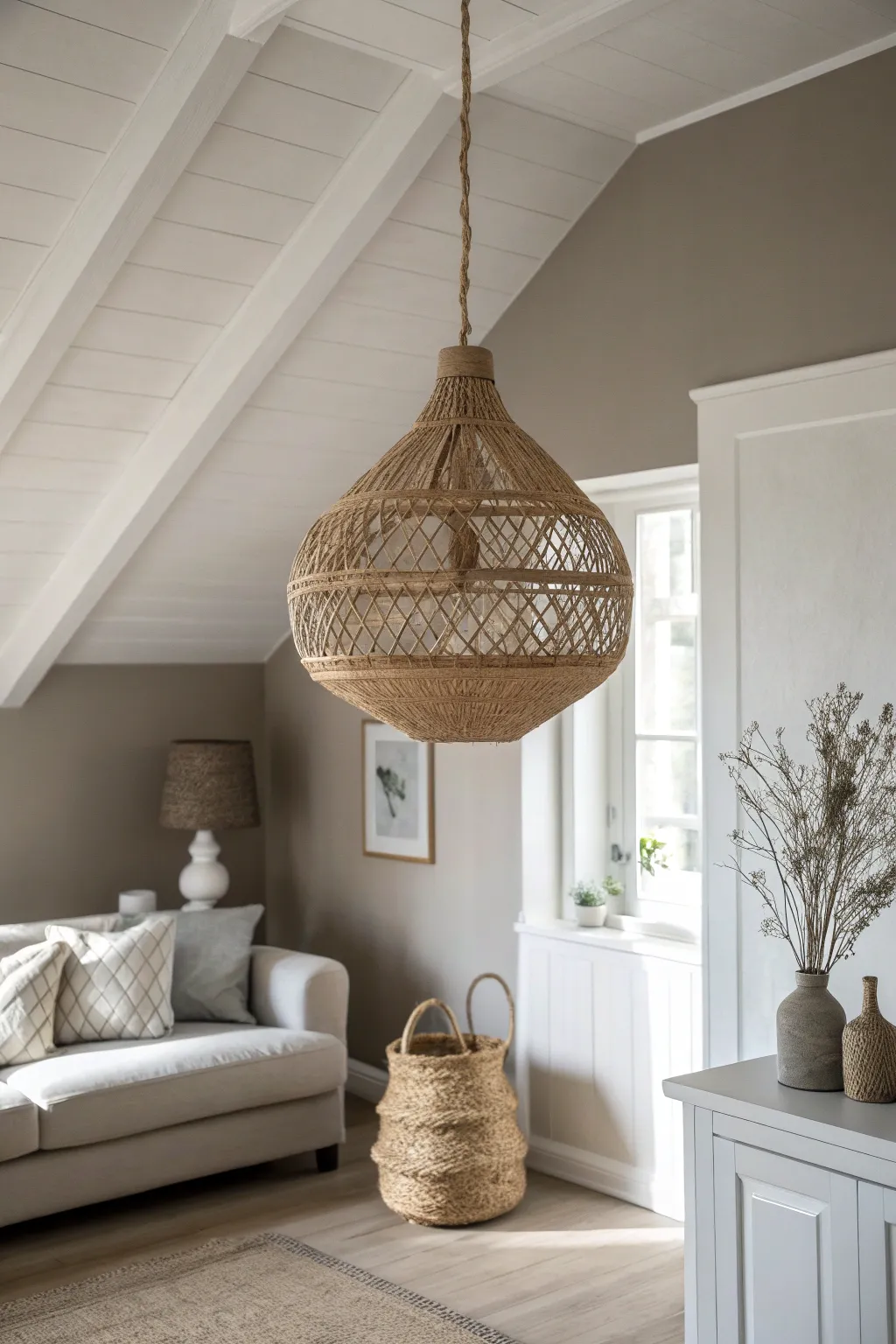
Transform humble jute twine into a stunning, organic light fixture that adds instant texture and warmth to any room. This sculptural pendant mimics the look of high-end bohemian decor using little more than glue, string, and a simple frame.
Step-by-Step Tutorial
Materials
- Large round balloon or inflatable beach ball (approx. 18-24 inches)
- Roll of natural jute twine (medium thickness, approx. 3-4mm)
- White school glue or clear craft glue (large bottle)
- Cornstarch
- Water
- Mixing bowl
- Petroleum jelly or cooking oil spray
- Scissors
- Small plastic cup (for creating top and bottom openings)
- Permanent marker
- Light cord kit with socket
- Structure wire (optional, for reinforcement)
Step 1: Preparation & Base
-
Prepare the form:
Inflate your balloon or beach ball to your desired size. It needs to be firm but not ready to pop. Find a bowl or bucket smaller than the balloon to rest it on while you work so it doesn’t roll away. -
Mark the openings:
Using a permanent marker, trace a circle at the top (where the cord enters) and a larger circle at the bottom (where the light shines out). I find using a small bowl or cup as a template ensures a perfect circle for the bottom opening. -
Create a non-stick barrier:
Generously coat the entire surface of the balloon with petroleum jelly or cooking spray. Do not skip this step, or the glue-soaked twine will permanently bond to the plastic form. -
Mix the stiffening solution:
In your mixing bowl, combine ½ cup of cornstarch, ¼ cup of warm water, and a standard 4oz bottle of white glue. Mix thoroughly until smooth and lump-free. The cornstarch adds rigidity that glue alone cannot provide.
Step 2: Weaving & Wrapping
-
Create the structural rings:
Cut several lengths of twine. Dip them into the glue mixture, run them through your fingers to remove excess, and lay them directly over your marker lines at the top and bottom. Repeat this 3-4 times to create thick, sturdy rims. -
Anchor vertical lines:
Cut long strands of twine, soak them, and stretch them vertically from the top rim to the bottom rim. Space these out evenly, perhaps every 2 inches, to act as the ‘warp’ threads of your structure. -
Begin the horizontal wrap:
Take a very long length of twine and submerge it in the glue. Tie one end to a vertical strand near the top rim. Begin wrapping horizontally around the balloon. -
Form the diamond pattern:
Instead of simple circles, guide the twine diagonally down to the next vertical string, wrap once around it to secure, then diagonally up to the next. Continue this zigzag motion to create the open diamond lattice seen in the center. -
Create dense bands:
To mimic the design in the photo, alternate your open lattice work with sections of tight, horizontal wrapping. Wrap the twine closely together for about 2 inches near the top and bottom to create solid bands of texture. -
Refine the shape:
As you wrap, ensure the twine is taut against the balloon surface. Loose strings will result in a saggy lamp once the form is removed. -
Reinforce connections:
Dab a little extra undiluted glue on the points where the vertical and horizontal strings intersect. This intersection is the weak point of structure, so a little extra bond here helps immensely.
Sticky Situation?
Wear disposable gloves while wrapping to keep your hands clean, but be sure to wet the gloves with water occasionally so the tacky twine doesn’t stick to your fingers as you work.
Step 3: Finishing Touches
-
Drying time:
Leave the project to dry completely in a warm, dry area. This usually takes 24 to 48 hours. I like to rotate the balloon every few hours so the gravity doesn’t pull all the glue to the bottom. -
Deflate the form:
Once the twine is hard as a rock, gently press on the balloon through the gaps to separate it from the twine. Slowly deflate the balloon or beach ball and carefully extract it through the bottom opening. -
Clean up edges:
Inspect the top and bottom rims. If there are stray glue flakes or sharp dried edges, use fine-grit sandpaper or small scissors to clean them up for a professional finish. -
Add the cord wrapping:
Take your electrical cord kit and wrap the visible portion of the wire with dry jute twine. Use a dot of hot glue every few inches to secure the twine to the cord, giving the hardware a matching rustic look. -
Install hardware:
Thread the socket through the top opening of your shade. Use the screw ring provided with most pendant kits to clamp the shade frame onto the socket securely.
Ombre Effect
For a unique twist, dip-dye the bottom third of the finished shade into a diluted fabric dye or paint mixture after it’s fully dried to create a subtle color gradient.
Hang your new handcrafted pendant and enjoy the intricate shadows it casts around your cozy space
Two-Tone Walls With a Painted Divider
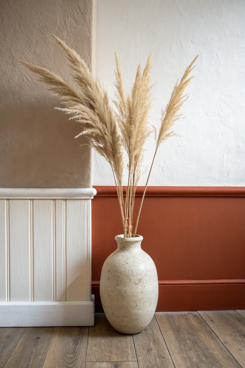
Transform a plain corner into a sophisticated feature by combining crisp wainscoting with warm, earthy tones. This project creates a striking contrast between traditional paneling and modern color-blocking, anchored by a rich terracotta hue.
How-To Guide
Materials
- Satin finish interior paint (white)
- Matte or eggshell interior paint (terracotta/rust orange)
- Textured wall paint or limewash (beige/sand)
- Painter’s tape (high quality)
- Drop cloth
- Spackle or wood filler
- Fine-grit sandpaper (220 grit)
- Paint roller with medium nap sleeve
- Small angled sash brush (2 inch)
- Wooden wainscoting panels or beadboard kit
- Panel adhesive or brad nailer
- Caulk and caulking gun
- Spirit level
Step 1: Wall Prep & Panel Installation
-
Clear and clean:
Begin by removing any existing baseboards in the area you plan to panel. Wipe down the walls with a damp cloth to remove dust and let them dry completely. -
Measure and mark:
Decide on the height of your wainscoting line. Use a spirit level and a pencil to draw a faint, straight horizontal line across the wall where the top of the colored section will be. -
Install the wood paneling:
If you are using beadboard or paneling on one side (as shown on the left), measure and cut your panels to fit below your marked line. Attach them using construction adhesive or a brad nailer. -
Add the top trim:
Install a chair rail or molding strip along the top edge of your wood paneling to create a finished shelf-like ledge. -
Fill and sand:
Use wood filler to cover any nail holes in the paneling. Once dry, sand these spots smooth with fine-grit sandpaper for a seamless finish. -
Caulk the gaps:
Run a thin bead of finish caulk where the paneling meets the wall, inside corners, and where the molding meets the paneling. Smooth it with a wet finger and let it cure.
Bleeding Lines?
If paint bleeds under tape, wait for it to dry fully. Carefully place new tape over the good side and touch up the error with a small artist’s brush.
Step 2: Painting the Texture & Color Block
-
Apply the white base:
Paint the wooden paneling and the trim using a satin white paint. I prefer two light coats here for better durability against scuffs. -
Create the textured upper wall:
On the upper section of the wall above the paneling, apply your beige textured paint or limewash depending on the look you want. Brush in random X-strokes to build depth. -
Tape the horizon line:
Once the paneling and upper wall are completely dry (give it 24 hours), apply painter’s tape along the top edge where you want the terracotta color to start. -
Seal the tape edge:
Lightly brush a tiny amount of the *base* color (the beige or white, depending on your overlap) along the tape edge first. This seals the tape and prevents the bold orange from bleeding under. -
Cut in the color:
Using your angled sash brush, carefully paint the edges and corners of the lower wall section with your rust orange paint. -
Roll the bold color:
Use a roller to fill in the rest of the terracotta section. Ensure you maintain a wet edge to avoid roller marks. -
Second coat:
Allow the first coat of orange to dry for the time recommended on the can, then apply a second coat for full opacity and richness. -
Remove tape:
Pull the painter’s tape off slowly at a 45-degree angle while the paint is still slightly tacky to ensure a razor-sharp line.
Step 3: Styling the Space
-
Clean and reset:
Remove drop cloths and do a final sweep of the floor. Ensure the new baseboards (if you reinstalled them) are painted to match the wall sections. -
Add the focal point:
Place a large, sculptural ceramic vase in front of the color-blocked wall. The light stone texture works beautifully against the deep orange. -
Arrange the botanicals:
Fill the vase with tall, dried pampas grass. Fluff the plumes gently to create volume that reaches up into the lighter, textured wall section.
Clean Texture
When painting the upper textured section, keep a damp rag handy to immediately wipe any beige paint off the white trim before it sets.
Your new two-tone wall creates a warm, architectural focal point perfect for cozy living spaces
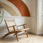
Have a question or want to share your own experience? I'd love to hear from you in the comments below!