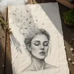
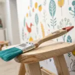
Some days you don’t need a plan—you need paint, room to move, and permission to make a little mess. These freestyle painting ideas are my favorite prompts for slipping into that intuitive, no-rules flow where “mistakes” turn into style.
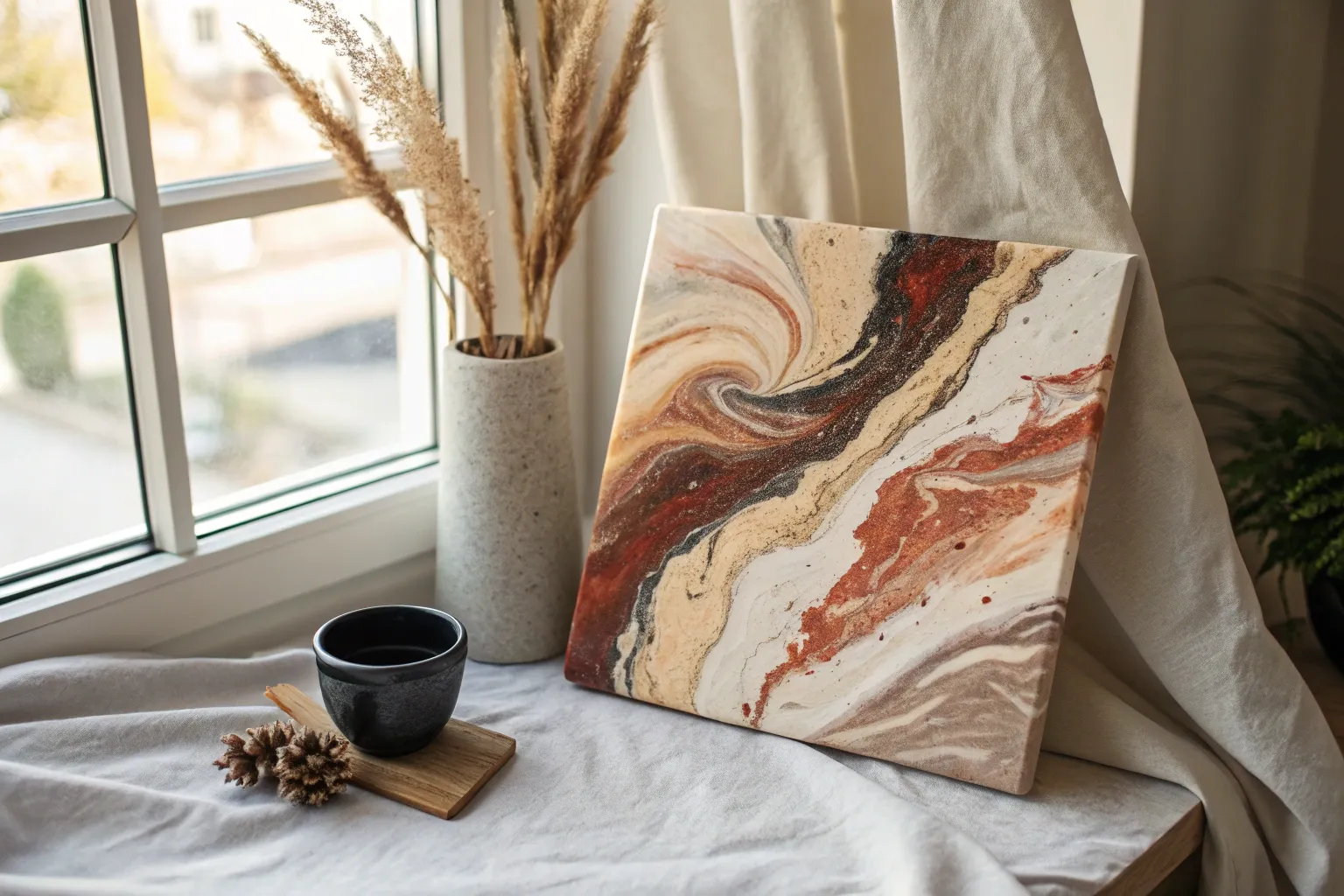
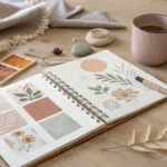
Abstract Color Swirl Warm-Up
This abstract piece utilizes soothing terra cotta and neutral tones to create organic, flowing arches that feel modern yet grounded. It’s perfect for exploring brush control and color harmony without the pressure of realism.
Step-by-Step Guide
Materials
- Canvas or thick watercolor paper (A3 or similar size)
- Acrylic paints (White, Burnt Sienna, Yellow Ochre, Black, Raw Umber)
- Flat shader brushes (medium and large)
- Round synthetic brush (for edges)
- Palette or mixing plate
- Cup of water
- Paper towels
- Pencil (optional for sketching)
- Simple wooden frame
Step 1: Planning the Flow
-
Analyze the Composition:
Before you begin, observe the flow of the artwork. Notice how the largest set of arches sweeps up from the bottom right corner, while a solitary, fainter curve balances it in the top left. Keeping this balance in mind will help your composition feel right. -
Pre-mix Your Palette:
Mixing your colors beforehand ensures consistency. You’ll need a range of earth tones: a deep rust (Burnt Sienna + a touch of Black), a sandy beige (White + Yellow Ochre + tiny dot of Raw Umber), a soft blush pink (White + Burnt Sienna), and a muted charcoal (Black + White). Leave plenty of pure White available. -
Light Sketching:
This step is optional, but helpful. lightly sketch the main boundary lines where your color blocks will go. Don’t worry about perfect arcs; a slightly wobbly hand adds to the organic, boho feel.
Keep it Fluid
Mix a tiny drop of water into your acrylics. This improves ‘flow’ so you can paint long, uninterrupted curves without the brush dragging or skipping.
Step 2: Painting the Base Arches
-
Start with the Deepest Tone:
Load your medium flat brush with the deep rust color. Paint the wide, central band in the main arch formation on the right side. Use long, confident strokes to maintain a smooth texture, following the curve. -
Add the Muted Brown:
Next to your rust band, moving inward, paint the darker brown strip using Raw Umber mixed with a little Burnt Sienna. Let the brushstrokes show slightly—this visible texture adds character to the piece. -
Create the Outer Glow:
Above the rust band, paint a lighter, golden-tan strip. I like to blend the edge very slightly while the paint is still tacky if I want a softer transition, though blocky edges look great too. -
The Dark Charcoal Arch:
Moving toward the bottom right corner, paint the semi-circle band in your dark charcoal gray. This high-contrast element anchors the bottom of the composition. -
Fill the Inner Corner:
Fill the very bottom right corner arc with a medium terracotta shade (a mix of your rust and beige). This completes the ‘rainbow’ shape emerging from the corner.
Step 3: Refining and Balancing
-
Establishing the Negative Space:
Using your large flat brush and pure white paint (or a very subtle off-white), fill in the large background area in the center and top right. Paint carefully around your colored arches. -
Defining White Separators:
Use a smaller brush with white paint to clean up the spaces *between* your colored bands. These distinct white lines act as negative space that separates the colors and makes them pop. -
Painting the Ghost Arch:
Now for the upper left corner. Use your very pale blush pink mix (mostly white with a tint of red/brown). Paint a soft, lone curve echoing the shape of the main arches below. -
Softening the Ghost Arch:
This top arch should look almost transparent or distant. If the color is too strong, paint over it with a watered-down white wash to push it visually into the background. -
Texture Check:
Look closely at your colored bands. If they look too flat, dry-brush a little white or a lighter variation of the base color over the top to create a weathered, worn look. -
Clean Up Edges:
Use your round brush with white paint to sharpen any wavering edges on your arches. The contrast between the organic curves and clean edges is key to the style.
Wobbly Lines?
Don’t stress over perfect curves! If a line gets too shaky, wait for it to dry, then use the background white color to ‘cut in’ and reshape the edge.
Step 4: Determining the Finish
-
Speckling (Optional):
For a subtle vintage pottery vibe, you can flick a tiny amount of watered-down white paint onto the darker rust sections using an old toothbrush. Keep it minimal. -
Final Drying:
Let the entire piece dry completely flat to avoid any drips disrupting your smooth curves. -
Framing:
Place your artwork into a simple, light-colored wooden frame to complement the warm, earthy palette without overpowering it.
Now stepping back, you’ll see how those simple earth tones create a wonderfully balanced and calming piece of art.
Loose Floral Burst Painting
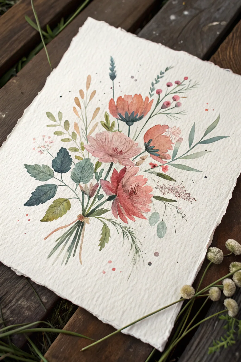
Capture the delicate charm of a hand-picked meadow bouquet with this loose watercolor tutorial. The composition features a relaxed, gathered feel with muted pinks, earthy greens, and subtle splatter details on beautifully textured paper.
How-To Guide
Materials
- Cold-pressed watercolor paper (heavy texture/rough grain preferred)
- Watercolor paints (Coral Pink, Burnt Sienna, Sap Green, Indigo, Yellow Ochre, Paynes Gray)
- Round watercolor brushes (sizes 2, 6, and 8)
- Pencil (HB or 2H)
- Two jars of water
- Paper towels
- Optional: Masking tape
Step 1: Preparation and Sketching
-
Deckle the Edges:
To mimic the handmade look in the photo, create a deckle edge on your paper. You can do this by carefully tearing the edges against a ruler or using a deckle-edge ruler if you have one. -
Light Guidelines:
Using an HB pencil, extremely lightly sketch the general ‘cone’ shape of the bouquet. Mark the center point where the stems will cross, but don’t draw every single petal. Just indicate where the three main large blooms will sit.
Muddy Color Fix
If your greens bloom into your pinks and turn brown, wait for one section to dry completely before painting an adjacent shape. Patience preserves the colors.
Step 2: Painting the Main Blooms
-
First Coral Bloom:
Start with the top-center flower. Mix a watery wash of Coral Pink with a touch of Burnt Sienna. Paint loose, upward-curving petals, leaving white space between them for definition. -
The Central Rose:
For the light pink flower in the middle, dilute your mix further to a pale blush. Paint concentric, C-shaped strokes starting from the center and working outward, letting the water soften the edges. -
Lower Bloom:
Create the large, bottom-right coral bloom. Use a Size 8 brush to press down and lift up, creating petal shapes that point towards the center of the flower. Drop a slightly darker red into the base of the petals while wet. -
Adding Contrast:
While the top and bottom flowers are still slightly damp (but not soaking), drop a mix of Indigo and high-concentration Coral into the base of the flower heads to create depth. -
The Side Profile:
Paint the flower on the far right in a side-profile view, using curved strokes that cup upwards. Add a small, detailed center with the tip of your brush.
Step 3: Foliage and Filler
-
Dark Green Leaves:
Mix Sapphire Green and Indigo for a moody, blue-green hue. Paint the serrated leaves on the left side. Use the tip of the brush to draw the outline, then fill it in, leaving a tiny vein line unpainted if you can. -
Soft Ferns:
Switch to a lighter mix of Sap Green and Yellow Ochre. Paint long, sweeping stems extending to the top right. Add small, tear-shaped leaves along these stems. -
Golden Sprigs:
Using a Yellow Ochre or light brown mix, add the wheat-like sprigs tucked behind the main flowers. Keep these strokes singular and confident. -
Eucalyptus Accents:
Mix a very pale, milky blue-green (Sapphire Green with lots of water). Paint the round, coin-shaped eucalyptus leaves near the bottom right of the bouquet. -
Berry Clusters:
Using a size 2 brush and concentrated pink or red paint, dot small berries on thin stems at the top right. Connect them with hairline stems using a liner brush or the very tip of your round brush. -
Tiny Pink Filler:
On the left side, dab tiny, irregular clusters of pale pink dots to represent baby’s breath or similar filler flowers. Connect them with faint green stems.
Tea Stain Finish
For an antique botanical look, lightly mist the finished (dry) painting with strong black tea or create a beige wash for the background.
Step 4: Stems and Details
-
Gathering Point:
Paint the stems converging at the bottom. Use a mix of greens and browns. Ensure the lines aren’t perfectly straight; let them curve slightly to look natural and organic. -
Crossing Stems:
Where the stems meet, paint a small horizontal band of brown to suggest twine or a tie holding the bouquet together. -
Bottom Foliage:
Add a few loose, wispy fern leaves drooping downwards from the bouquet tie. This balances the composition. -
Splatter Effect:
Load a small brush with watery paint (pink or green). Tap the handle against another brush over the paper to create fine splatters around the bouquet. This gives it that loose, artistic energy. -
Final Contrast:
Once everything is bone dry, mix a very dark green or Payne’s Gray. Add tiny definition lines to the centers of the flowers and the darkest shadows of the leaves.
Allow your painting to dry flat completely before framing or displaying your new botanical art
Silhouette Sunset Moodscape
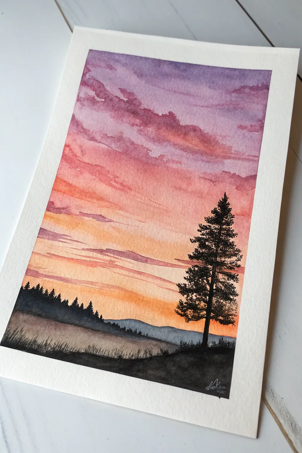
Capture the serene transition from day to night with this vibrant watercolor landscape featuring a glowing gradient sky and stark pine silhouettes. This project focuses on wet-on-wet blending techniques to create soft, dreamy clouds against a crisp, black foreground.
Step-by-Step Guide
Materials
- Cold press watercolor paper (300 gsm)
- Masking tape
- Watercolor paints (Violet, Alizarin Crimson, Cadmium Red, Cadmium Orange, Indigo, Black)
- Flat wash brush (large)
- Round brush (size 6 or 8)
- Detail brush (size 0 or 1)
- Jar of clean water
- Paper towels
- Mixing palette
Step 1: Painting the Sky Gradient
-
Secure the paper:
Tape down all four edges of your watercolor paper to a board or table. This creates a clean white border and prevents buckling when the paper gets wet. -
Prepare the wash:
Using your large flat brush, apply a clean water wash over the entire sky area, stopping about a third of the way up from the bottom where the land will be. The paper should be glistening but not forming puddles. -
Apply the violet top:
Load your round brush with a watery mix of violet. Dab and streak it across the very top of the paper, allowing the wet surface to naturally diffuse the pigment downwards. -
Introduce pink tones:
While the violet is still wet, mix Alizarin Crimson with a touch of water. Apply this below the violet, letting the edges touch and bleed together softly. -
Warm up the horizon:
Transition into Cadmium Red and then Cadmium Orange as you move lower down the paper. Keep your strokes horizontal but loose to suggest cloud formations. -
Create cloud textures:
While the sky is damp, use a thirsty brush (a clean, slightly dried brush) or a crumpled tissue to lift out distinct horizontal streaks in the purple and pink sections to suggest drifting clouds. -
Add lower cloud shadows:
Mix a diluted purple-grey tone. Carefully paint thin, horizontal cloud lines across the lower orange section. Because the paper is drying, these lines will hold their shape better but still have soft edges. -
Let it dry completely:
This is crucial. Wait until the paper is bone dry and flat before moving on to the landscape elements to prevent the sharp silhouettes from bleeding into the sky.
Pro Tip: Lifting Color
If your sky gets too dark, lift pigment while wet with a clean, damp brush. This creates soft ‘negative space’ clouds that glow with light.
Step 2: Layering the Landscape
-
Paint the distant hills:
Mix a watery grey-blue using Indigo and a lot of water. Paint a low, rolling hill shape horizontally across the lower third of the paper. This should look faint and distant. -
Add the middle ground trees:
Thicken your paint mixture to a creamy consistency using Indigo and a touch of black. With a round brush, paint a jagged treeline of small fir trees on top of the left side of your distant hills. -
Darken the foreground base:
Using pure black watercolor (or black gouache for opacity), paint the immediate foreground hill. Make this layer solid and opaque, swooping upwards slightly to the right. -
Add grassy details:
Switch to your smallest detail brush. Using the black paint, flick quick, upward strokes along the top edge of the foreground hill to create the texture of tall wild grasses. -
Start the main tree trunk:
On the right side of the composition, use the detail brush to paint a straight, thin vertical line for the trunk of the large pine tree. It should extend well into the pink section of the sky. -
Stipple the foliage:
Using the tip of your round brush with thick black paint, start at the top of the tree. Use a stippling or dabbing motion to create pine boughs, keeping them narrow at the top and widening as you move down. -
refine the tree shape:
Ensure the branches look organic by leaving gaps between the boughs so the sunset shows through. I like to make the branches slightly asymmetrical so it doesn’t look too perfect. -
Sign and unmask:
Allow the black ink to dry fully. Carefully peel away the masking tape at a 45-degree angle to reveal your crisp white border.
Troubleshooting: Bloom Marks
Cauliflower-like blooms happen if you add water to semi-dry paint. Wait for the layer to fully dry, then glaze over or cover the error with silhouette details.
Step back and enjoy the peaceful warmth radiating from your newly created sunset landscape

Watercolor Bleed With Ink Scribbles
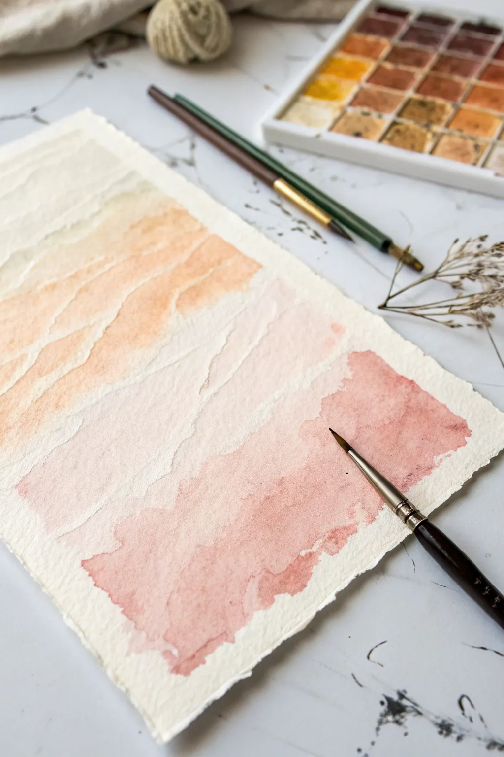
Embrace the gentle side of abstraction with this serene watercolor project that focuses on soft transitions and organic texture. You’ll create horizontal drifts of warm, earthy colors that bleed naturally into one another, mimicking the hazy layers of a desert sunset or sedimentary rock.
Detailed Instructions
Materials
- Cold press watercolor paper (deckle edge preferred)
- Watercolor paints (burnt sienna, yellow ochre, dusty rose)
- Round watercolor brush (size 6 or 8)
- Small fine-point brush or dip pen (optional, for details)
- Jar of clean water
- Paper towel
- Washi tape or masking tape (optional to secure paper)
Step 1: Preparation and Base Layers
-
Prepare your palette:
Begin by activating your watercolor pans with a drop of water each. For this piece, you want to mix three distinct puddles on your palette: a very pale yellow ochre, a medium-strength dusty peach (mix burnt sienna with a touch of white or water down heavily), and a richer terra cotta rose. -
Wet the paper:
Using your clean round brush, lightly dampen the top third of your paper with clear water. You don’t want pools of water, just a gentle sheen to help the pigment travel. -
Apply the first wash:
Load your brush with the pale yellow ochre mixture. Starting near the top left, drag the brush horizontally across the wet paper in a wavy, uneven line. Let the color bloom naturally into the damp surface. -
Soften the edges:
While the ochre is still wet, rinse your brush and leave it slightly damp. Run this clean brush along the bottom edge of your yellow stripe to feather it out, preventing hard lines from forming too early.
Uneven Bleeding?
If colors merge too much creating a muddy blob, your paper is too wet. Let it dry completely, then add the next layer on top (glazing) for distinct shapes.
Step 2: Building the Gradient
-
Introduce the peach tone:
While the first section is tacky but not fully dry, pick up your medium peach color. Paint a second horizontal band below the first, allowing the top of this new stroke to touch the bottom of the yellow wash so they bleed together slightly. -
Create texture with negative space:
As you paint this second band, intentionally skip small patches of paper or lift your brush pressure to leave jagged white spaces. This separation mimics the natural breaks seen in sediment layers. -
Deepen the color:
Move lower down the page and switch to your richer terra cotta or dusty rose mix. Apply this color in a bolder, more saturated patch on the bottom right/center area. -
Encourage backruns:
If you want that lovely cauliflower texture, drop a tiny amount of clean water or a slightly different pigment concentration into the drying wash of the terra cotta section. Watch as it pushes the pigment outward. -
Form the ragged edge:
When painting the bottom-most shape, don’t smooth it out. Use the tip of your brush to create a jagged, uneven perimeter that looks torn or weathered, rather than a perfect square.
Step 3: Refining and Drying
-
Connect the layers:
Assess the gap between your peach section and the darker rose section. If the gap feels too wide, use a very watery, pale wash of pink to bridge them, keeping the touch light to maintain the distinct zones. -
Lift excess pigment:
If any area looks too heavy or dark, dab it gently with a clean, dry tissue or a thirsty brush to lift color back up, revealing the texture of the paper underneath. -
Optional detailing:
Though the main image is soft, you can use a fine liner brush or dip pen with slightly darker paint to add tiny, scratchy marks near the edges of the color bands for added definition. -
Initial drying phase:
Let the paper sit flat for at least 10 minutes. Resist the urge to use a heat tool immediately, as moving air can push the wet pigment into unwanted shapes. -
Flattening the artwork:
Once the paper is bone dry, if it has buckled slightly, you can place it under a heavy book overnight to flatten it out before framing or displaying.
Pro Tip: Deckle Edges
Can’t find deckle-edge paper? Fold standard watercolor paper deeply, wet the fold with a brush, and carefully tear it to mimic that raw, handmade look.
This calming exercise in color control results in a piece that feels both modern and organically timeless
BRUSH GUIDE
The Right Brush for Every Stroke
From clean lines to bold texture — master brush choice, stroke control, and essential techniques.
Explore the Full Guide
Non-Dominant Hand Freedom Session
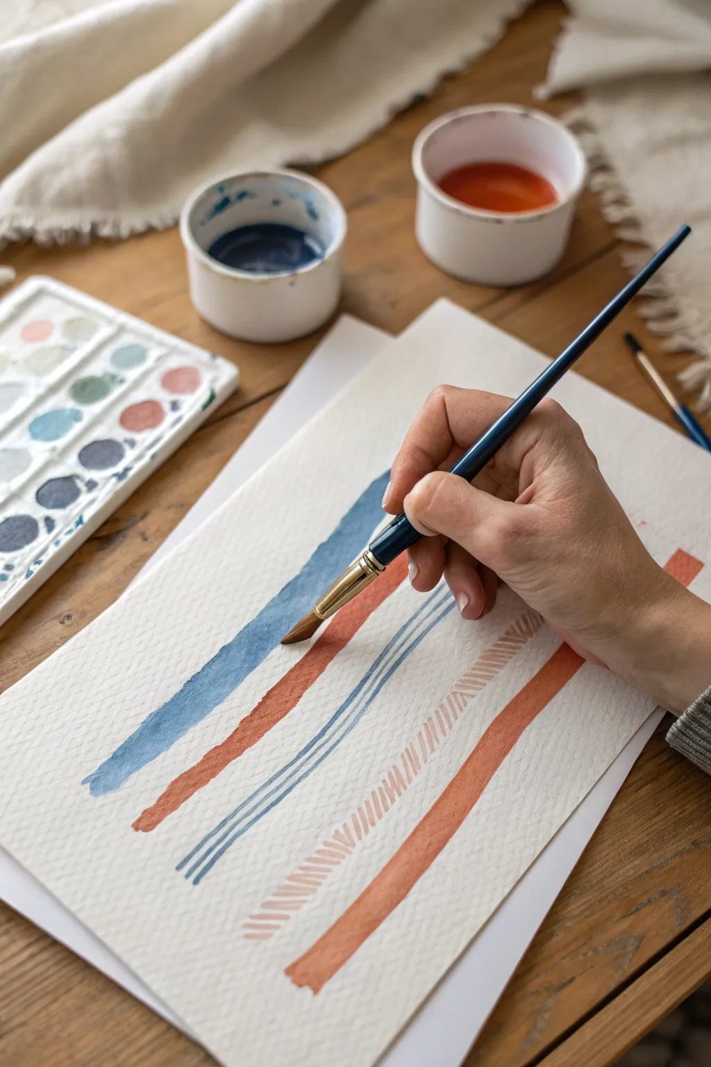
Embrace the wobble and release perfectionism with this simple yet striking watercolor linear study. By alternating fluid strokes with repetitive patterns using earthy blue and terracotta tones, you’ll create a soothing abstract composition that celebrates natural variation.
How-To Guide
Materials
- Cold press watercolor paper (300 gsm recommended)
- Round watercolor brush (size 6 or 8)
- Watercolor paints (Payne’s Grey or Indigo, Burnt Sienna or Terra Cotta)
- Two jars of water (one for warm colors, one for cool)
- Paint palette or mixing surface
- Paper towels
- Masking tape (optional, to secure paper)
Step 1: Preparation and Palette
-
Set up your workspace:
Clear a flat surface and secure your watercolor paper. If you are using a block, leave it attached. If distinct sheets are used, consider taping the corners to prevent buckling. -
Mix the cool tone:
Load your brush with water and pick up a deep blue pigment like Indigo or a mix of Payne’s Grey and a touch of blue. Create a puddle on your palette that is milky in consistency—not too thick, but opaque enough to show texture. -
Mix the warm tone:
Clean your brush thoroughly. In a separate area of your palette, mix a warm, earthy terracotta color. Burnt Sienna is a great base for this; you can add a tiny drop of red to warm it up further. -
Switch hands:
This is the crucial step for this freedom session: place the brush into your non-dominant hand. It will feel awkward, but that lack of control is exactly what gives this piece its organic character.
Uneven Paint Flow?
If your long strokes are pooling too much water at the end, dab the excess gently with a corner of a paper towel, or tilt the paper slightly to distribute the pigment back up the line.
Step 2: Linear Composition
-
First broad stroke:
Dip into the blue mixture. Starting from the upper left area, drag the brush diagonally down toward the center. Apply firm pressure to flatten the bristles slightly, creating a wide, confident band of color. -
Observe the texture:
Allow the texture of the cold press paper to show through. If the stroke breaks or looks ‘dry brush’ at the end, leave it; these imperfections add visual interest. -
Add the contrasting line:
Rinse the brush and load it with the terracotta paint. Paint a second broad line parallel to the first blue one, leaving about an inch of white space between them. -
Create fine lines:
Go back to your blue mix. Using just the very tip of the brush held vertically, paint two thin, parallel lines running alongside the broad terracotta stroke. Don’t worry if they waver or touch slightly. -
Let it settle:
Take a brief pause here. I like to let these initial main structural lines dry for about two minutes so I don’t accidentally smudge them while working on the next section.
Step 3: Pattern and Repetition
-
Start the hatch marks:
Load the brush with a slightly more diluted terracotta mix. Between the thin blue lines and the next open space, begin painting a series of short, diagonal hatch marks. -
Maintain rhythm:
Focus on the rhythm of the movement rather than spacing. Make each dash quickly with your non-dominant hand, moving down the length of the imaginary line. -
Fade the pattern:
As you work down the line of hatch marks, don’t reload your brush immediately. Let the paint run out naturally so the marks become fainter and more transparent toward the bottom. -
Anchor with a final stroke:
Reload the brush with a saturated terracotta mix. Paint one final, heavy broad stroke at the bottom right of the composition, parallel to all previous elements. -
Review contrast:
Look at the balance of the piece. If your blue lines look too pale after drying (watercolor always dries lighter), you can carefully layer a second pass over the broadest blue stroke. -
Dry completely:
Allow the entire piece to dry flat. Resist the urge to fix any wobbles, as they stand as a record of your non-dominant hand practice.
Brush Control Hack
Even with your non-dominant hand, holding the brush higher up on the handle (away from the ferrule) encourages looser, more expressive strokes and prevents over-thinking the movement.
Enjoy the relaxed, organic feel of your new linear artwork
Found-Object Stamp Chaos
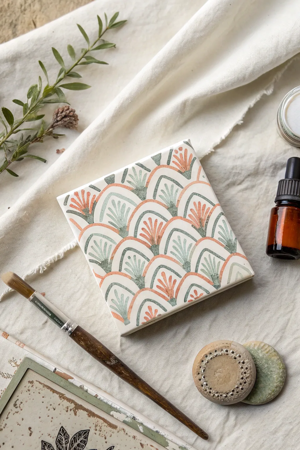
This project transforms a simple ceramic tile or canvas into a mesmerizing work of art using found-object stamping techniques to create ordered chaos. The repeating scalloped arches, filled with botanical-inspired fan motifs in soft terracotta and sage green, evoke a calming, Art Deco feel.
Detailed Instructions
Materials
- Square ceramic bisqueware tile (approx. 4×4 or 6×6 inches) or small square canvas
- Matte acrylic paints (terracotta/muted orange, sage green/blue-grey, off-white)
- Small round sponge dobbers or carved potato/eraser stamps
- Fine liner brush (size 0 or 00)
- Small angled shader brush
- Palette or mixing plate
- Pencil
- Ruler
- Paper towels
- Matte spray varnish
Step 1: Preparation & Base Coat
-
Surface Prep:
Begin by wiping down your ceramic tile with a damp cloth to remove any dust or oils. If you are using a canvas, ensure it is clean and taut. Let it dry completely before applying any paint. -
Base Layer:
Mix a small amount of off-white acrylic paint with a drop of water to improve flow. Apply an even base coat across the entire surface using a wide flat brush or sponge. This creates a uniform background for your pattern. -
Drying Time:
Allow the base coat to dry fully. Depending on the humidity, this might take 15-20 minutes. It needs to be dry to the touch so your pencil marks won’t gouge the paint. -
Grid Layout:
Using a ruler and a pencil with very light pressure, mark a faint grid on your surface. You want to create horizontal guidelines where the peaks of your arches will sit. Space these rows evenly, perhaps 1 inch apart depending on your stamp size.
Stamp Smearing?
If your stamped arches are sliding or smearing, you likely have too much paint on the tool. Blot your stamp on a paper towel once before pressing it to the tile to remove excess pigment.
Step 2: Stamping the Arches
-
Tool Selection:
For the ‘found object’ aspect, find a circular cap, a cut potato, or a foam pouncer that matches the width of the arches you want. Cut it in half tailored to creating a semi-circle shape. -
Mixing Terracotta:
Prepare your terracotta paint on the palette. If it feels too thick, thin it slightly with water so it stamps cleanly without leaving distinct ridges. -
Stamping Orange Arches:
Load your semi-circle stamp with terracotta paint. Press it onto the surface to create the alternating rows of arches. I suggest stamping every *other* spot in a checkerboard fashion, leaving gaps for the green arches. -
Cleaning & Switching:
Clean your stamp thoroughly or prepare a second identical stamp. Mix your sage green or blue-grey acrylic paint. Test the color on a scrap paper to ensure it harmonizes with the terracotta. -
Stamping Green Arches:
Stamp the green arches into the empty spaces you left previously. The feet of the green arches should rest near the curve of the orange ones below them, creating an interlocking scale effect. -
Touch Ups:
Inspect your stamped shapes. If the edges are too ragged or the paint was too thin, use the small angled shader brush to carefully refine the outline of each arch for a crisp finish.
Step 3: Adding Botanical Details
-
Planning the Fan:
Now, you will hand-paint the floral ‘fans’ inside each arch. Switch to your fine liner brush (size 0). Ensure your hand is steady by resting your pinky on a dry section of the tile. -
Painting the Center Stem:
Start inside a terracotta arch. Paint a central vertical stroke using the terracotta paint, starting from the base of the arch and reaching about halfway up. -
Radiating Petals:
Add two strokes on either side of the center stem, fanning them out slightly like palm leaves. They should follow the curve of the arch but not touch the outline. -
Filling the Pattern:
Repeat this process for all terracotta arches. The repetition can be quite meditative once you find your rhythm. -
The Green Fans:
Rinse your brush and switch to the sage green paint. Repeat the fanning process inside all the green arches. Try to keep the stroke width consistent with the orange ones. -
Adding Contrast Dots:
For a bit of detail, dip the non-brush end (the handle tip) of your paintbrush into the terracotta paint. Dot a tiny speck of orange at the top of the center stem inside the *green* arches.
Pro Tip: Consistency
To keep your fan lines super crisp, add a tiny drop of flow improver or water to your acrylics. Inky paint flows off a liner brush much smoother than thick tube paint.
Step 4: Finishing Touches
-
Erasure:
Once the paint is 100% bone dry (give it an hour to be safe), very gently erase any visible pencil grid lines that haven’t been covered by paint. -
Distressing (Optional):
If you want that slightly weathered, ceramic look shown in the image, you can lightly dry-brush a tiny bit of white paint over the highest points of the texture, or scuff edges very gently with fine-grit sandpaper. -
Sealing:
Take your project to a well-ventilated area. Apply the matte spray varnish in light, even coats. This seals the acrylic and gives the piece a professional, finished ceramic look.
Display your beautiful hand-painted tile as a coaster or mount it in a shadow box for a touch of handmade elegance

PENCIL GUIDE
Understanding Pencil Grades from H to B
From first sketch to finished drawing — learn pencil grades, line control, and shading techniques.
Explore the Full Guide
Collaborative Freestyle Mural Night
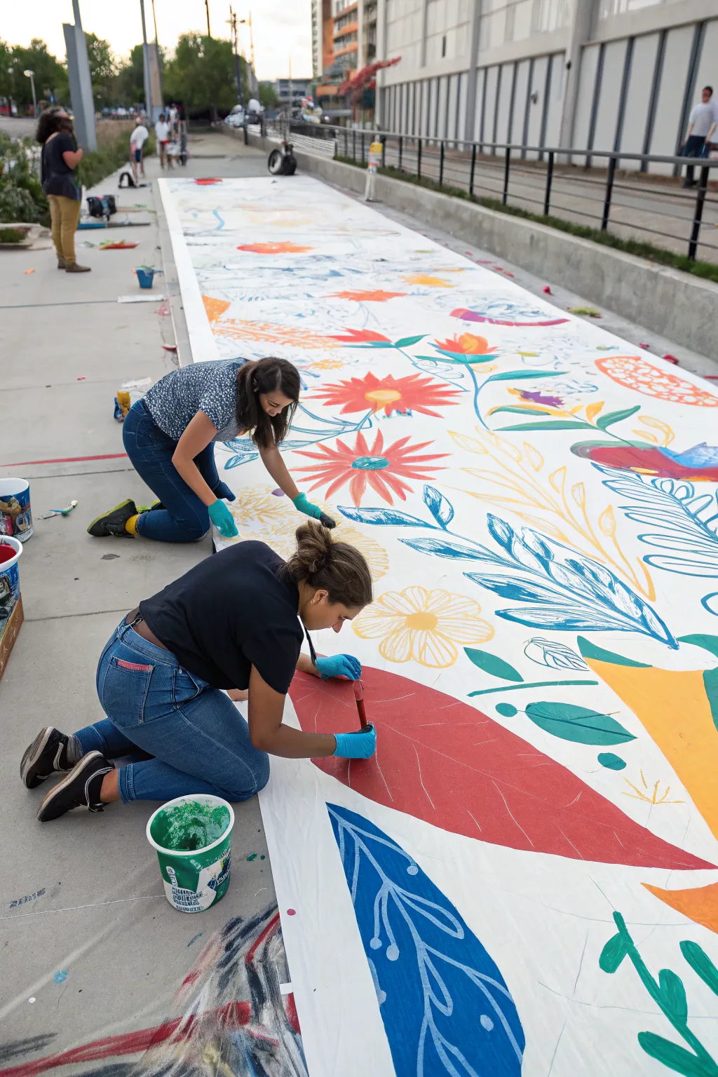
Transform a sidewalk or community space into a vibrant garden with this large-scale collaborative mural project. Using a long roll of canvas and bold acrylics, you’ll create a seamless tapestry of oversized floral and botanical motifs perfect for group participation.
How-To Guide
Materials
- Heavyweight canvas roll (primed) or mural paper roll
- Exterior acrylic latex paints (various bright colors)
- Wide flat brushes (2-3 inch)
- Medium round brushes (for outlining)
- Chalk or charcoal sticks
- Paint buckets or trays
- Drop cloth or tarps
- Painter’s tape or weights
- Nitrile gloves
Step 1: Preparation & Layout
-
Prepare the Surface:
Find a long, flat stretch of pavement to roll out your canvas or paper. Secure the corners and edges with heavy weights or strong painter’s tape to prevent the wind from lifting the material while you work. -
Background Check:
If your canvas isn’t pre-primed, roll on a layer of gesso or white exterior primer. Let this dry completely to ensure your colors pop against a bright white background. -
Map the Flow:
Step back and visualize the composition. Unlike a framed painting, this is a continuous stream. I find it helpful to imagine a ‘river’ of vines connecting the different sections to keep the eye moving down the length of the mural. -
Sketch Basic Shapes:
Using light charcoal or chalk, sketch large, sweeping curves for stems and big circles or ovals for flower heads. Keep the scale large—think oversized leaves that are feet long, not inches. -
Refine the Botanicals:
Go back over your rough shapes to define specific petals, leaf veins, and floral centers. Leave plenty of negative white space between elements so the design doesn’t feel cluttered.
Uneven Coverage?
If the pavement texture is showing through your brushstrokes, don’t press harder. Instead, load your brush with more paint and lay it on gently, floating the pigment over the texture.
Step 2: Painting the Elements
-
Color Strategy:
Decide on a limited but bold color palette—primary reds, blues, and yellows, plus greens and oranges work well for this folk-art style. Pour paints into easily accessible buckets or large trays. -
Block in Large Areas:
Start with the biggest elements first. Use wide flat brushes (2-3 inch) to fill in the main body of the largest leaves and flower petals. Apply the paint thickly and evenly for solid, opaque coverage. -
Edge Control:
As you fill shapes, carefully cut in the edges to keep them crisp against the white background. A steady hand here eliminates the need for heavy outlining later. -
Add Secondary Colors:
Once the primary shapes are blocked in, move to the secondary elements like smaller buds or contrasting petals. For example, paint the center of a red flower bright yellow or add orange details. -
Layering Details:
Wait for the base laters to be touch-dry. Then, using a slightly smaller brush, paint patterns directly on top of the dry shapes—add white veins to blue leaves or red dots to orange petals. -
Line Work:
Incorporating ‘negative’ lines is a great technique here. When painting a large leaf, leave a thin unpainted strip down the middle to represent the vein, letting the white canvas show through.
Step 3: Finishing Touches
-
Inspect the Flow:
Walk the length of the mural. Look for large gaps that disrupt the visual rhythm. Fill these empty white spaces with smaller floating leaves, dots, or simple geometric dashes. -
Clean Up Edges:
Check for any paint drips or smudges on the white background. You can touch these up with a bit of white primer to keep the background looking pristine. -
Final Drying:
Allow the entire mural to cure in the sun for several hours before attempting to move or roll it up. If using acrylics, the surface touch-dries quickly, but thick areas need more time.
Knee Saver
Since you are painting on the ground for an extended period, grab a gardening knee pad or a folded piece of cardboard. It makes reaching the center of the canvas much more comfortable.
Roll up your colorful masterpiece to display at your next community event or hallway exhibition

Have a question or want to share your own experience? I'd love to hear from you in the comments below!