Green is one of my favorite colors to paint because it can feel fresh and bright, or deep and moody, all on the same canvas. If you’re craving relaxing, beginner-friendly projects that still look impressive, these green painting ideas will keep your brush moving and your creativity flowing.
Simple Green Gradient Background
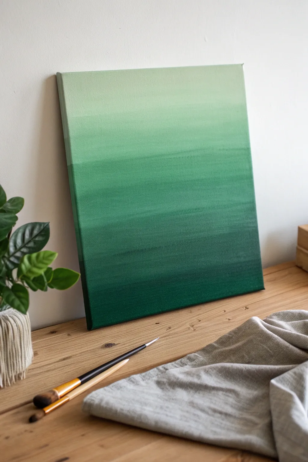
Achieve a peaceful, modern aesthetic with this monochromatic gradient painting that transitions from deep forest green to a whisper of pale mint. This project is perfect for beginners looking to practice blending techniques and creating smooth color transitions on canvas.
Step-by-Step Tutorial
Materials
- Stretched canvas (e.g., 16×20 inches)
- Acrylic paints: Dark Green (Phthalo or Forest), White, and a medium Sap Green
- Large flat brush or wash brush (2-inch)
- Medium flat brush (1-inch)
- Palette or disposable mixing plate
- Cup of water
- Paper towels
- Spray bottle with water (optional)
Step 1: Preparation and Base Colors
-
Set up your workspace:
Lay down newspaper or a drop cloth to protect your table. Place your canvas flat or on an easel, ensuring it is stable. -
Prepare the palette:
Squeeze out a generous amount of your darkest green, a medium green, and a large dollop of white paint onto your palette. Keep them separate for now. -
Deepen the darks:
If your dark green isn’t deep enough, mix in a tiny touch of black or dark blue to create a shadow tone. This will be the very bottom of your gradient.
Uneven Blending?
If paint dries too fast creating hard lines, use a ‘slow drying medium’ or retarder mixed into your acrylics to keep them wet and blendable longer.
Step 2: Painting the Gradient
-
Apply the bottom layer:
Load your large flat brush with the darkest green mix. Paint a horizontal band across the bottom 2 inches of the canvas, ensuring you paint the bottom edge of the canvas as well. -
Start the transition:
Without cleaning your brush fully, pick up some of the medium sap green. Mix it slightly on the canvas with the wet dark edge above your first band. -
Work upwards:
Continue painting horizontal strokes, moving upward. As you go, gradually add more medium green to your brush to lighten the tone. -
Create the mid-tone:
When you reach the lower middle section, your color should be a true vibrant green. Paint back and forth with long, sweeping strokes to smooth out texture. -
Introduce white:
Once you pass the halfway point, start picking up small amounts of white on your brush, mixing it directly with the green on the canvas. -
Blend the middle:
Use the brush to actively blend the lighter green section into the mid-tone section below it. If the paint feels dry, a quick mist from a spray bottle helps re-wet it for smoother blending. -
Lighten the upper section:
As you move into the top third of the canvas, clean your brush or switch to the medium flat brush. Load it with mostly white and just a hint of green. -
Paint the top band:
Apply this very pale mint color to the top edge of the canvas. Don’t forget to paint the top physical edge of the frame too. -
Refine the blend:
With a clean, slightly damp brush, gently sweep back and forth over the ‘seams’ where colors meet to soften distinct lines.
Add Texture
Before painting, apply modeling paste with a palette knife to create ridges. The gradient will settle into the texture for a unique 3D effect.
Step 3: Finishing Touches
-
Check the edges:
Inspect the sides of the canvas. Wrap the corresponding color around the sides (dark at bottom, light at top) for a professional, frameless look. -
Smooth out brushstrokes:
I like to take a dry, soft brush and very lightly whisk across the entire surface horizontally while it’s still tacky to unify the texture. -
Assess the gradient:
Step back five feet. If any section looks too abrupt, mix an intermediate color and gently glaze over that specific area. -
Let it dry completely:
Allow the painting to dry undisturbed for at least 24 hours before handling or hanging.
Now you have a calming, beautifully blended piece of art ready to bring a touch of nature indoors

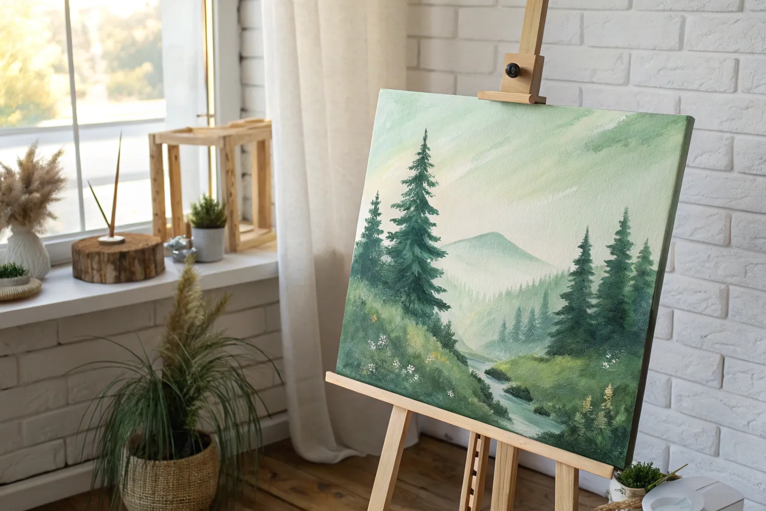
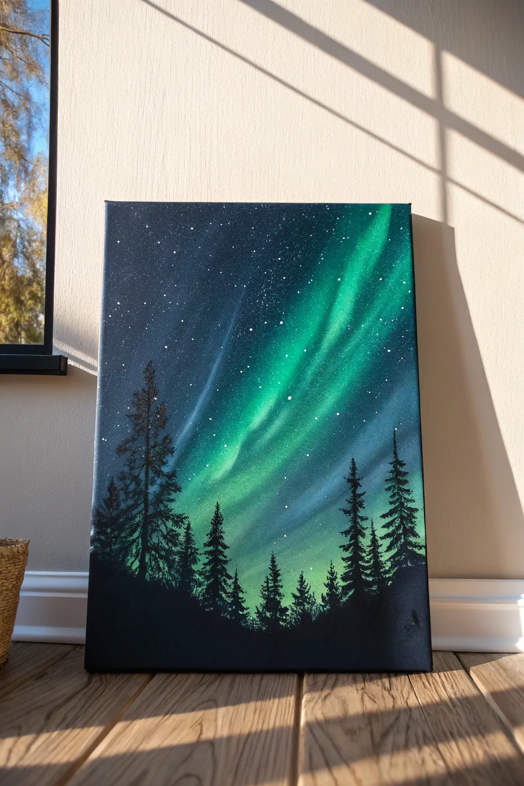
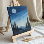
Lone Tree on a Green Sky
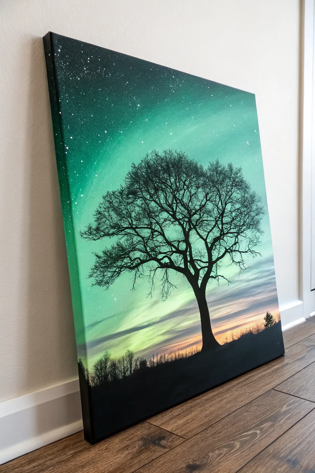
This striking canvas captures the ethereal beauty of a green night sky, blending the magic of the northern lights with the stark elegance of a silhouetted tree. The glowing emerald gradient creates a perfect backdrop for the detailed branch work, making for a dramatic piece of wall art.
Detailed Instructions
Materials
- Stretched canvas (e.g., 16×20 inches)
- Acrylic paints (Black, White, Phthalo Green, Viridian, touches of Yellow/Orange)
- Wide flat brush or blending sponge
- Small round detail brush (size 0 or 00)
- Old toothbrush or stiff bristle brush
- Palette
- Cup of water and paper towels
Step 1: Creating the Ethereal Sky
-
Prime the background:
Begin by deciding if you want a fully opaque finish or a smoother blend. If your canvas is rough, a quick coat of gesso or white paint provides a smoother surface for blending the sky later. -
Mix your base greens:
On your palette, prepare a few shades of green. You’ll need a deep, dark forest green (mix Phthalo Green with a tiny touch of black), a vibrant mid-tone emerald, and a pale minty green (mix Viridian with plenty of white). -
Apply the dark corners:
Starting at the top left and right corners, apply the darkest green mixture using a wide flat brush. Bring this down the sides slightly to create a vignette effect, framing the center light. -
Blend the mid-tones:
While the dark paint is still wet, introduce the vibrant mid-tone emerald. Brush this into the area below the dark corners, using long, sweeping horizontal strokes to seamlessly merge the colors. -
Add the central glow:
Load your brush with the pale minty green mixture. Paint the center of the sky, blending outwards into the darker greens. The transition should be soft, mimicking the diffuse light of an aurora. -
Create the horizon light:
Towards the very bottom quarter of the canvas, clean your brush and pick up a tiny bit of white mixed with a hint of yellow or orange. Blend this softly just above where the ground will be, suggesting a distant sunset or dawn breaking through the green. -
Add cloud wisps:
Using a dry brush technique with very little white paint, lightly drag horizontal streaks across the lower sky. These should look like faint, misty clouds catching the fading light. -
Splatter the stars:
protect your workspace. Dip an old toothbrush or stiff brush into watered-down white paint. Run your thumb across the bristles to flick tiny specks onto the upper, darker portions of the canvas to create stars. Let the background dry completely.
Starry Night Fix
Did a paint splatter blob onto your canvas instead of misting like a star? Quickly dampen a Q-Tip and lift the blob off while wet, or wait for it to dry and paint over it with the background green.
Step 2: Painting the Silhouette
-
Paint the ground line:
With pure black paint and a flat brush, block in the ground at the very bottom. Make the horizon line slightly uneven to simulate natural terrain rather than a perfect ruler-straight line. -
Draft the trunk:
Switch to a smaller round brush. Position your tree slightly off-center for better composition. Paint the trunk, making it wider at the base and tapering as it moves upward into the green sky. -
Establish main branches:
Paint the primary thick branches extending from the trunk. Imagine a ‘Y’ shape branching out, keeping the lines fluid and organic rather than stiff and angular. -
Add secondary branches:
From each main branch, paint smaller limbs reaching outward. Gently twist your brush as you pull the paint to create the knobby, natural look of wood. -
Fill in the canopy:
Now for the patience game. Using your finest detail brush (size 0 or 00), add hundreds of tiny twigs. These should be very thin lines at the ends of the branches, crossing over each other to create a dense, intricate network. -
Detail the horizon:
Returning to the ground line, use the small brush to dab tiny, vertical strokes along the horizon. This simulates distant grass or scrub brush. -
Add distant foliage:
On the far right or left edge of the horizon, paint a small, indistinct bush or tiny tree silhouette. This helps give the painting a sense of scale and depth. -
Final touches:
Step back and look at the tree’s density. If any area looks too open, add a few more twig clusters. Ensure the black is opaque; apply a second coat to the trunk if the green background is showing through.
Aurora Effect
To make the sky look more like moving aurora borealis, use a dry mop brush to gently pull the wet green paint in upward, vertical strokes rather than just horizontal blending.
Hang your new masterpiece in a spot where it can catch the light and show off those subtle green transitions


Green Aurora Night Sky
Capture the ethereal beauty of the northern lights with this vibrant acrylic painting tutorial. By blending deep blues into neon greens and finishing with crisp black silhouettes, you’ll create a striking celestial scene that glows on your wall.
Step-by-Step Guide
Materials
- Stretched canvas (e.g., 16×20 inches)
- Acrylic paints: Phthalo Blue, Mars Black, Titanium White, Hooker’s Green, and Neon/Fluorescent Green
- Large flat wash brush (2-inch)
- Medium flat brush (1-inch)
- Fan brush (optional, for blending)
- Small round detail brush
- Old toothbrush or stiff bristle brush
- Cup of water and paper towels
- Palette or paper plate
Step 1: Creating the Galaxy Background
-
Prepare the gradient base:
Begin by squeezing Phthalo Blue and Mars Black onto your palette. Using your large wash brush, start at the top left and bottom right corners of the canvas, painting them with a mix that is almost purely black with just a hint of blue. This creates a deep, dark frame for your sky. -
Blend inward with blue:
As you move toward the center of the canvas, gradually add more Phthalo Blue to your brush without washing it. Blend this vibrant dark blue into the black corners while the paint is still wet to ensure a smooth transition without harsh lines. -
Establish the light path:
Mix a small amount of Titanium White with your blue to create a lighter, milky blue tone. Paint a diagonal swath roughly down the center of the canvas—this will serve as the background glow for your aurora. -
Smooth the transition:
Use a clean, dry brush (a fan brush works wonders here) to gently sweep back and forth over where the colors meet. This softens the edges, making the sky look hazy and atmospheric rather than striped. -
Dry the base layer:
Let this first layer dry completely. Acrylics dry darker, so this waiting period ensures your background is solid before adding the bright lights.
Step 2: Painting the Aurora Borealis
-
Apply the first green layer:
Mix Hooker’s Green with a touch of White. Using a medium flat brush, paint streaky, diagonal strokes over your light blue path. Keep your wrist loose and flick the brush upward to mimic dancing light. -
Add intensity:
While the previous layer is still slightly tacky, load your brush with Neon or Fluorescent Green mixed with a tiny bit of White. focus this color in the center of the aurora band where the light would be strongest. -
Blend the light beams:
Use a dry brush to gently pull the wet green paint upward and downward into the darker blue areas. You want these edges to fade out into transparency, creating that ghostly, shimmering effect. -
Highlight the core:
For the brightest part of the aurora, use almost pure White with just a hint of Neon Green. Apply this only in the very center of your green band to make it look like it’s glowing intensely. -
Create the stars:
Dilute a small dollop of Titanium White with water until it has an inky consistency. Dip an old toothbrush or stiff brush into it. -
Splatter the stars:
Hold the brush over the canvas and run your thumb across the bristles to flick tiny specks of paint onto the dark blue areas. I like to concentrate more stars in the darker corners and fewer near the bright aurora.
Starry Night Secret
Test your star splatter technique on a piece of cardboard first. If the paint is too thick, you get blobs; too thin, and it runs. Aim for a fine mist consistency.
Step 3: Adding the Forest Silhouette
-
Paint the ground line:
Switch to straight Mars Black. Paint an uneven, rolling hill across the very bottom of the canvas. It doesn’t need to be flat; slight bumps make the landscape look more natural. -
Draft the tree trunks:
Using a small round brush and black paint, draw vertical lines of varying heights rising from the ground. Place taller trees on the sides to frame the composition and shorter ones toward the middle. -
Start the pine branches:
Starting at the top of a tree line, use just the tip of your brush to tap small, horizontal dashes. Keep the top very narrow, barely wider than the trunk. -
Flesh out the trees:
As you move down the trunk, make your horizontal tapping strokes wider. Zig-zag back and forth, allowing some of the background sky to peek through the branches. Real trees aren’t solid blocks, so leave gaps. -
Vary the tree shapes:
Make each tree slightly different—some can be fuller, others scraggly. For the trees closest to the foreground (the bottom corners), gently press harder to create denser branches. -
Anchor the forest:
Once all trees are painted, go back to the bottom ground layer and blend the base of the trunks into the hill so they look rooted rather than floating. Let the entire canvas dry completely.
Dimension Boost
Mix a tiny drop of Phthalo Blue into your black for the trees. It’s subtle, but it makes the shadows look richer than flat black paint against the night sky.
Hang your masterpiece in a spot where it can catch a bit of light to show off those neon highlights

Serene Green Lake Reflection
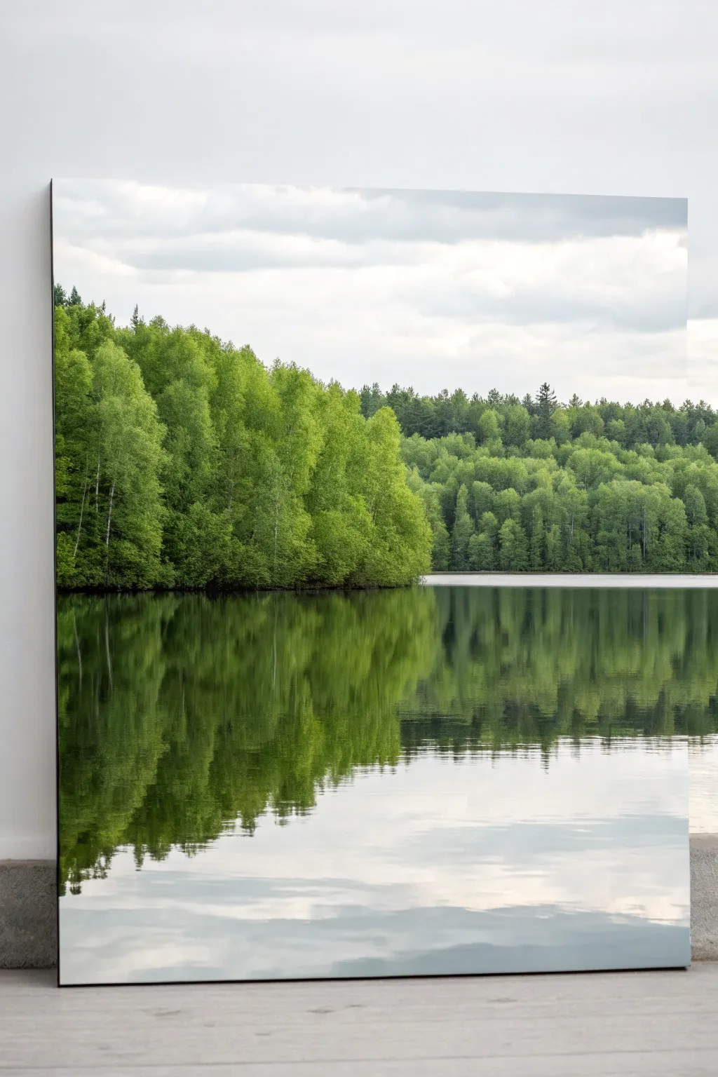
Capture the tranquil beauty of a lakeside forest with this realistic acrylic painting tutorial. You will learn to build depth through layers of foliage and master the art of painting convincing water reflections.
Step-by-Step
Materials
- Large rectangular canvas (24×36 inches or similar)
- Acrylic paints: Phthalo Green, Sap Green, Cadmium Yellow, Ultramarine Blue, Burnt Umber, Titanium White, Mars Black
- Gesso (if canvas is unprimed)
- Large flat brush (2-inch)
- Medium filbert brush
- Small round detail brush
- Fan brush
- Palette knife
- Water container and paper towels
- Slow-drying medium (optional but helpful for blending clouds)
Step 1: Setting the Scene
-
Prime the Surface:
Ensure your canvas is clean and ready. Apply a thin coat of gesso if needed to create a smooth, consistent surface for the sky and water gradients. -
Map the Horizon:
Using a ruler and a very light pencil touch or thinned Burnt Umber paint, draw a straight horizon line about one-third of the way up from the bottom. This separates the dense forest from the water reflection. -
Sky Gradient:
Mix Titanium White with a tiny touch of Ultramarine Blue and Mars Black to create a soft, cloudy grey-white. Paint the entire sky area, keeping it lighter near the horizon and slightly darker at the very top edge. -
Adding Clouds:
While the sky layer is still slightly wet, use a clean, dry brush to feather in subtle horizontal streaks of darker grey to suggest soft stratus clouds. Keep the edges blurry and indistinct.
Muddy Reflections?
If your water reflections look messy, ensure you clean your brush completely between vertical strokes. Use a horizontal blending pass only once; over-blending creates mud.
Step 2: Building the Forest
-
Blocking in Darks:
Mix Sap Green with a little Black and Burnt Umber to make a deep, dark forest green. Use your filbert brush to block in the shape of the tree line, focusing on the shadows and the areas where the trees meet the water. -
Establishing the Water Base:
Using the same dark green mixture, pull the color downwards from the horizon into the water area. Use vertical strokes to mimic the reflection, letting the color fade slightly as it moves toward the bottom of the canvas. -
Mid-Tone Foliage:
Mix Sap Green with a little Cadmium Yellow. Switch to a fan brush or an old, splayed bristle brush. Stipple this color over the dark base of the trees to create the main body of leaves, leaving dark pockets visible for depth. -
Highlighting the Trees:
Add more Cadmium Yellow and a touch of White to your green mix. Lightly dab this onto the top-left edges of the tree clusters where the light would naturally hit, creating volume and individual tree shapes. -
Distant Trees:
For the trees further back on the right side, mix a cooler, greyer green by adding a touch of the sky color to your green mix. Paint these with less detail to simulate atmospheric perspective.
Step 3: Reflections & Details
-
Mirroring the Greens:
Recreate the tree colors in the water. Paint vertical strokes of your mid-tone and highlight greens directly below the corresponding trees, pulling the paint straight down. -
Blurring the Reflection:
While the water paint is wet, use a clean, dry large flat brush to very gently sweep horizontally across the vertical reflection strokes. This simple action disrupts the lines just enough to look like water. -
Sky Reflection:
Paint the bottom section of the canvas with the same grey-white mix used for the sky. Blend this upward into the green reflection area so the transition is soft and seamless. -
Shoreline Definition:
Use a small round brush with dark brownish-black paint to add a very thin, broken line right at the water’s edge. This grounds the trees and separates the land from the liquid reflection. -
Tree Trunks:
With your smallest detail brush and thinned white or light grey paint, add tiny vertical lines within the green foliage to suggest birch trunks peeking through the leaves. -
Ripples and Movement:
Mix a glaze of Titanium White with plenty of water. Drag a few very long, thin horizontal lines across the water surface to suggest subtle ripples breaking the reflection.
Deepen the Realism
Before the final varnish, add a very thin glaze of Phthalo Blue over the deepest shadow areas of the water to make the lake look colder and deeper.
Step back and admire the stillness of your painted landscape.
BRUSH GUIDE
The Right Brush for Every Stroke
From clean lines to bold texture — master brush choice, stroke control, and essential techniques.
Explore the Full Guide
Bamboo Stalks in a Zen Palette
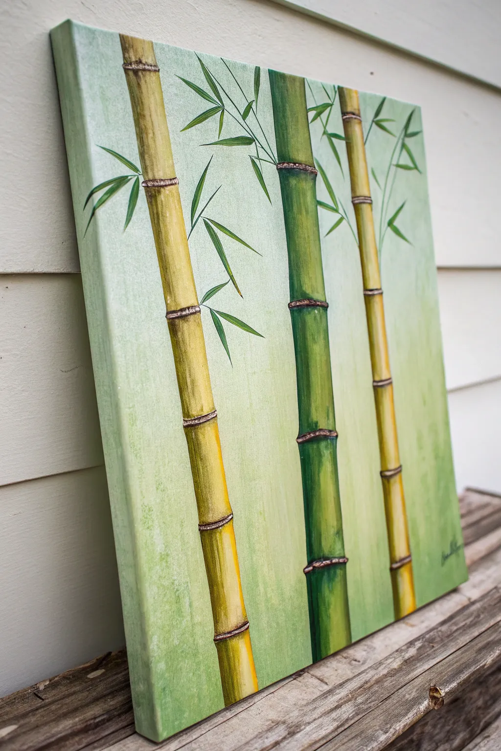
Capture the peaceful essence of nature with this structured yet organic acrylic painting of bamboo stalks. The composition features a soothing gradient background that allows the vibrant gold and green stalks to truly pop, creating a modern Zen-inspired feature piece for any room.
Detailed Instructions
Materials
- Rectangular stretched canvas (around 16×20 or 18×24 inches)
- Acrylic paints: Titanium White, Sap Green, Phthalo Green, Yellow Ochre, Burnt Umber, Cadmium Yellow Medium
- Large flat brush (1-2 inch) for background
- Medium flat brush (1/2 inch) for stalks
- Small round or liner brush (size 1-2) for details
- Painter’s tape or masking tape (optional for straight lines)
- Palette and water cup
- Paper towels
- Pencil/Chalk/Charcoal for sketching
Step 1: Prepared Background
-
Mix the base color:
Start by mixing a very generous amount of Titanium White with a tiny dot of Sap Green. You want a very pale, minty green tone that is almost white but has warmth. -
Apply the first layer:
Using your large flat brush, cover the entire canvas with this pale mix. Don’t worry about being perfectly smooth; a little texture in the brushstrokes adds to the organic feel. -
Create the gradient:
While the paint is still slightly wet, mix a slightly darker version of your pale green. Feather this color from the bottom right corner up towards the center, blending gently so there are no hard lines. -
Dry completely:
Let this background layer dry thoroughly before moving on. I like to check if it’s cool to the touch—if it is, it’s still wet.
Straight Edges Pro Tip
For perfectly straight bamboo edges, place strips of painter’s tape vertically on the canvas. Paint your base coats inside the tape, let it dry, peel it off, and then add your shading and details freely.
Step 2: Drafting the Stalks
-
Mark the positions:
Using a pencil or a piece of white chalk, lightly sketch three vertical lines to serve as the center guides for your bamboo. Place one stalk centrally and the others slightly offset to the sides. -
Outline the width:
Draw the parallel sides of the bamboo stalks. Vary the widths slightly; make the central green stalk and the left yellow stalk thicker, while the right yellow stalk can be a bit more slender. -
Segment the bamboo:
Mark horizontal curved lines across the stalks to indicate the nodes (the joints). Space these out unevenly for a natural look, usually about 4-6 inches apart.
Step 3: Painting the Gold Stalks
-
Base coat yellow:
Mix Yellow Ochre with a touch of Titanium White. Fill in the left and right stalks completely with this flat color using the medium flat brush. -
Add shadows:
Mix Yellow Ochre with a tiny bit of Burnt Umber. Paint along the left and right edges of the yellow stalks to start creating a cylindrical 3D effect. Keep the center of the stalk lighter. -
Add highlights:
Mix Cadmium Yellow with White. Paint a vertical highlight strip down the center of each segment, blending the edges into your shadow color while the paint is workable. -
Detail the nodes:
Using a small round brush and Burnt Umber properly thinned with water, paint the thin horizontal rings at each node. Thicken the line slightly at the joints. -
Stipple texture:
Take a dry brush with a tiny amount of Burnt Umber and gently stipple/dab darkness just above and below the node rings to stain the bamboo for realism.
Level-Up: Texture Paste
Mix molding paste or heavy gel medium into your paint for the node rings (the horizontals). This will create a physically raised ridge on the canvas, adding tactile realism to the bamboo joints.
Step 4: Painting the Green Stalk
-
Base coat green:
Mix Sap Green with a little Yellow Ochre. Fill in the center bamboo stalk completely. -
Green shadows:
Mix Phthalo Green with a touch of Burnt Umber for a deep shadow color. Paint the left and right outer edges of the green stalk segments. -
Green highlights:
Add more White and Yellow to your base green mix. Paint the center of the cylinder to make it look round and glossy. -
Green nodes:
Paint the node rings on the green stalk using dark Burnt Umber, just like you did with the yellow stalks. Add slight ‘bruising’ marks near the joints for texture.
Step 5: Leaves and Finishes
-
Branch structure:
Using your thin liner brush and the brown paint mix, draw very fine, twig-like lines extending from the nodes. -
Paint leaf shapes:
Load a small round brush with dark green paint. Press down and flick outward quickly to create tapered, pointed leaf shapes attached to the twigs. -
Highlight the leaves:
Mix a lighter lime green. Add a single stroke of this lighter color on the upper side of each leaf to catch the imaginary light source. -
Final touches:
Assess your shadows. If the stalks don’t look round enough, glaze a very thin layer of watery dark paint along the very edges to deepen the curve.
Hang your serene creation in a space where you need a moment of calm and enjoy the tranquility it brings
Daisy Field on Bright Green
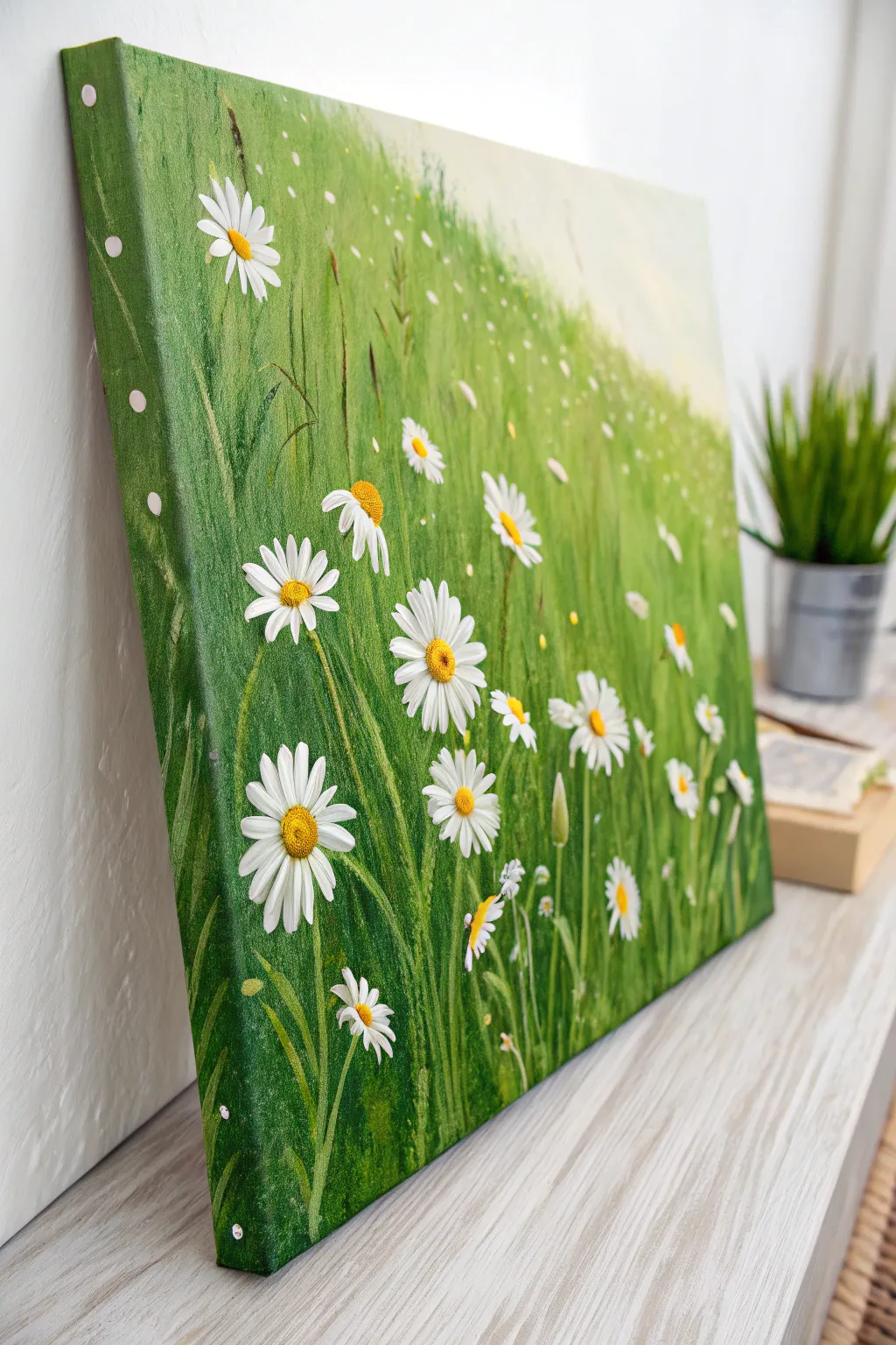
Capture the fresh, uplifting energy of a summer meadow with this vibrant canvas project. You’ll layer rich greens to create depth before dotting your grass with cheerful, textured white daisies that seem to pop right off the surface.
Step-by-Step Tutorial
Materials
- Rectangular stretched canvas (e.g., 16×20 inches)
- Acrylic paints: Sap Green, Phthalo Green, Yellow Ochre, Cadmium Yellow, Titanium White, Raw Umber
- Large flat brush (1-2 inch)
- Medium filbert brush
- Small round brush or rigger brush
- Palette knife
- Cup of water and paper towels
- Easel or flat workspace
Step 1: Setting the Scene
-
Mix your base greens:
Start by preparing two main pools of green on your palette. For the deep shadows, mix Phthalo Green with a touch of Raw Umber. For the mid-tones, use straight Sap Green. -
Establish the background gradient:
Using your large flat brush, paint the entire canvas. Apply the darker mixture at the bottom left corner and gradually blend into the Sap Green as you move diagonally upward toward the top right. -
Lighten the upper field:
While the paint is still wet, mix a little Titanium White and Yellow Ochre into your Sap Green. Blend this lighter, hazy green into the top right corner to suggest distance and sunlight hitting the far field. -
Add vertical grass texture:
Once the base layer is tacky but not fully dry, use a dry medium brush with a small amount of dark green paint. Use quick, vertical flicking motions to start suggesting the direction of grass blades, especially in the foreground. -
Let it dry completely:
Allow this background layer to dry fully before moving on. This prevents your crisp grass blades from turning into a muddy mess.
Petal Perfect Pro Tip
For sharper petals, load your brush with white paint, then wipe both sides on your palette to create a chisel edge. This gives you crisp lines without needing a tiny brush.
Step 2: Growing the Grass
-
Paint individual blades:
Switch to a small round brush or a rigger brush. Mix Sap Green with a pinch of yellow to create a fresh spring green. Paint distinct, long blades of grass reaching up from the bottom, varying their lengths and slight curves. -
Layer with darker grasses:
Go back in with your Phthalo Green/Umber mix. Add dark, thin shadows between the lighter blades to create density and depth in the foliage. -
Add distant texture:
For the upper right section, use smaller, fainter strokes. The grass here should look less detailed to enhance the sense of perspective. -
Highlight the tips:
Mix a very pale lime green using mostly White and a touch of Yellow. carefully highlight just the tips of a few foreground grass blades where the sun would catch them.
Level Up: Texture Gel
Mix heavy body gel or modeling paste into your white paint for the petals. This creates 3D impasto daisies that actually stand out physically from the canvas.
Step 3: Blooming the Daisies
-
Map out flower placement:
Visualize where your main flowers will go. Place the largest ones in the bottom left foreground and make them progressively smaller as they recede toward the top right. -
Paint the petals:
Using a clean filbert brush loaded with pure Titanium White, press and pull to create the tear-drop shape of daisy petals. I find it easiest to paint the petals at the 12, 6, 3, and 9 o’clock positions first, then fill in the gaps. -
Review petal opacity:
Acrylic white can be translucent. If your green background shows through too much, let the first layer of petals dry and apply a second coat for bright, crisp white flowers. -
Add the centers:
Mix Cadmium Yellow with a tiny speck of Yellow Ochre. Using a small round brush, dab a textured center into the middle of each daisy. -
Texture the centers:
To make the centers look fuzzy and realistic, stipple a tiny bit of darker orange or brown onto the lower shadow side of each yellow center. -
Paint fading flowers:
For the distant field in the top right, use simple white dabs or dots rather than detailed petals. This mimics how the eye perceives detail at a distance.
Step 4: Final Details
-
Intertwine grass and flowers:
Take your rigger brush with light green paint and paint a few stray grass blades overlapping some of the lower flower stems or petals. This makes the flowers look like they are sitting *in* the grass, not just floating on top. -
Paint the stems:
Connect your flower heads to the ground with thin, slightly curved stems using a mix of Sap Green and White. Don’t worry if the grass obscures parts of them. -
Side canvas check:
Don’t forget to extend your grass strokes and background colors around the edges of the canvas for a professional, frameless finish.
Hang your new masterpiece in a bright room to enjoy a field of flowers year-round

PENCIL GUIDE
Understanding Pencil Grades from H to B
From first sketch to finished drawing — learn pencil grades, line control, and shading techniques.
Explore the Full Guide
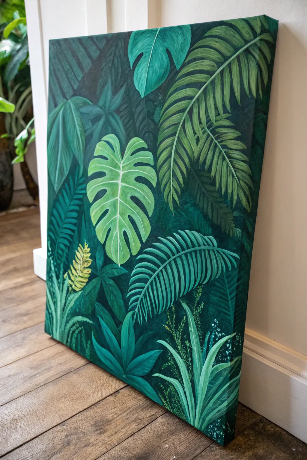
Monochrome Leaf Study
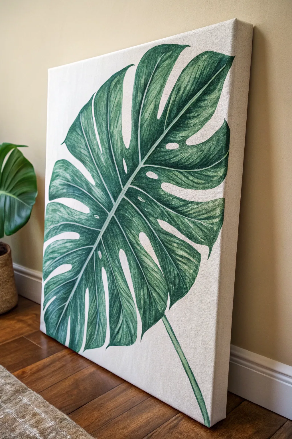
Bring the calming vibes of a tropical greenhouse into your home with this striking, large-scale Monstera leaf painting. Using a limited palette of greens, you will create a realistic yet stylized botanical study that focuses on light, shadow, and organic texture.
How-To Guide
Materials
- Large stretched canvas (square or rectangular)
- Acrylic paints: Hookers Green, Sap Green, Titanium White, Raw Umber, Yellow Ochre
- Gesso (if canvas isn’t pre-primed)
- Pencil and large eraser
- Assorted brushes: 1-inch flat brush, #6 round brush, #0 or #1 liner brush
- Palette for mixing
- Jar of water and paper towels
- Reference photo of a Monstera leaf
Step 1: Preparation & Sketching
-
Prime the Surface:
Begin by applying a fresh coat of white gesso to your canvas if it isn’t already primed. This ensures a smooth, bright surface which helps the green hues pop later. Let this dry completely. -
Establish the Central Vein:
Using a pencil, lightly draw a long, slightly curved line diagonally across the canvas. This will be the main stem and midrib of your leaf, anchoring the entire composition. -
Outline the Leaf Shape:
Sketch a large heart-shaped perimeter around your central line. Don’t worry about the holes or splits yet; just get the overall size and placement right. The leaf should fill almost the entire canvas. -
Add Fenestrations:
Draw the characteristic deep splits (sinuses) extending from the outer edge toward the center. Then, add the iconic oval holes (fenestrations) near the midrib. -
Refine the Edges:
Go over your sketch to clean up the lines. Erase the original perimeter lines where the splits occur, leaving only the final shape of the leaf segments. -
Mask the Veins (Optional):
If you want crisp white veins, lightly sketch the secondary veins branching off the center. You can paint around these carefully or use a thin line of masking fluid.
Keep it Fluid
Add a drop of flow improver or water to your liner brush paint. This helps the paint glide smoothly for long, uninterrupted vein lines.
Step 2: Base Layers & Color Blocking
-
Mix Your Mid-Tone Green:
Combine Hookers Green with a touch of Yellow Ochre and White to create a natural, medium-green base tone. This will be the primary color of the leaf. -
Apply the Base Coat:
Using your 1-inch flat brush, paint the entire leaf shape with your mid-tone mix. The coverage doesn’t need to be perfectly opaque yet, but ensure you fill the shape. Avoid painting over your main vein lines if possible. -
Create a Shadow Tone:
Mix a darker shade using Hookers Green and a tiny bit of Raw Umber or even a speck of black. You want a deep, forest green color. -
Block in Shadows:
While the base is still slightly tacky or just dry, identify where the leaf curves away from the light. Paint these darker areas, typically near the center vein and on the underside of the leaf segments. -
Create a Highlight Tone:
Mix Sap Green with more Titanium White and Yellow Ochre to create a pale, fresh green. This will represent the light hitting the ridges of the leaf. -
Apply initial Highlights:
Paint broad strokes of this lighter green on the parts of the leaf that would catch the light—usually the ‘hills’ between the secondary veins.
Golden Glow
Once the painting is dry, dry-brush a tiny amount of metallic gold paint over the lightest highlights for a chic, modern finish.
Step 3: Detailing & Texture
-
Define Secondary Veins:
Switch to your #6 round brush. Using a very pale green or off-white mixture, paint thin lines for the secondary veins radiating from the center midrib out to the edges. -
Feather the Light:
Using a dry-brush technique, gently feather lighter green paint outwards from the secondary veins. This creates the ribbed, directional texture characteristic of Monstera leaves. -
Deepen Contrast:
Go back in with your darkest green mix and a smaller brush. Strengthen the shadows right next to the pale veins. High contrast between the vein and the leaf flesh creates realism. -
Refine the Midrib:
Paint the central stem and midrib a solid, pale whitish-green. Ensure the edges are clean and sharp against the darker leaf background. -
Clean Up Background:
Use pure Titanium White (or an off-white/cream if you prefer a warmer look) to carefully paint the negative space around the leaf. This sharpens the outer edges and covers any errant green smudges. -
Final Polish:
With your #0 liner brush, add tiny, subtle highlights to the very tips of the leaf segments and check that your holes (fenestrations) have clean, curved edges.
Hang your botanical masterpiece in a well-lit spot to admire those fresh, evergreen details year-round
Sunlit Canopy From Below
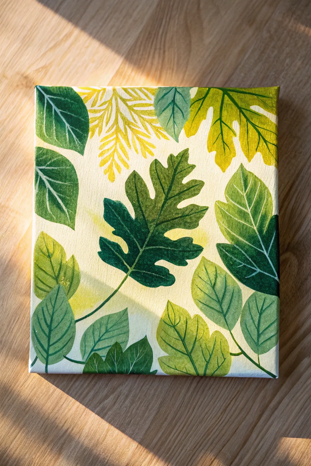
Capture the calm beauty of a forest floor with this stylized leaf study on canvas. Using layers of acrylics and fine line work, you’ll build a composition celebrating the diverse shapes and shades of green found in nature.
Step-by-Step Guide
Materials
- Stretched canvas (e.g., 8×10 or 11×14 inches)
- Acrylic paints: Sap Green, Phthalo Green, Yellow Ochre, Cadmium Yellow, Titanium White, and Burnt Umber
- Flat shader brushes (sizes 6 and 10)
- Round detail brush (size 0 or 1)
- Palette or paper plate
- Pencil and eraser
- Cup of water and paper towels
Step 1: Planning and Background
-
Prepare the Base:
Mix a large amount of Titanium White with a tiny dot of Yellow Ochre to create a warm, creamy off-white. Cover the entire canvas with this mixture using your largest flat brush to establish a smooth, uniform background. -
Let it Dry:
Allow the background layer to dry completely. This is crucial because a wet background will muddy your leaf colors later. -
Sketch the Composition:
Lightly sketch your leaf outlines with a pencil. Start with the central, large serrated leaf to anchor the design. -
Fill the Space:
Draw surrounding leaves of varying shapes—broad rounded ones, fern-like sprays, and pointed ovate leaves. Aim for a balance where leaves point inward from the edges, creating a natural frame.
Opacity Secret
If your yellow or light green leaves look too transparent, mix a tiny bit of white into the color. White adds body to acrylics and helps lighter colors cover the canvas better.
Step 2: Blocking in Color
-
Mix Your Palette:
Create several shades of green. Mix Sap Green with White for a soft sage, Phthalo Green with a touch of Burnt Umber for deep forest tones, and Yellow Ochre with Green for bright, sunlit hues. -
Paint the Central Leaf:
Using a medium flat brush, fill in the central serrated leaf with a deep, rich green. Ensure the edges are crisp. -
Golden Fern Accent:
For the feathery, fern-like leaf at the top center, mix Cadmium Yellow with a tiny bit of Green and White. I like to use the tip of a smaller brush to dab these delicate shapes rather than long strokes. -
Varied Greenery:
Fill in the remaining leaves, alternating your mixed green shades. Paint lighter, yellow-green leaves next to darker ones to create contrast and visual separation. -
Second Coats:
Acrylics can be translucent. Once the first layer is dry, apply a second coat to any leaves that look streaky or uneven to get that solid, illustrative look.
Step 3: Adding Details and Texture
-
Mix Vein Colors:
Prepare lighter versions of your base colors by adding more White or Yellow. For dark leaves, you want a pale minty green vein; for light leaves, use a darker green for contrast. -
Central Veins:
With your size 0 round brush, paint the primary central vein down the middle of each leaf. Keep the pressure light so the line tapers naturally. -
Side Veins:
Branch out from the center line with smaller side veins. Curve them slightly toward the leaf tip to mimic natural growth rather than drawing straight sticks. -
Dry Brushing Texture:
To add the subtle, faded texture seen on the larger broad leaves, wipe most of the paint off a flat brush. Gently drag it across the leaf surface to create faint, scratchy highlights that mimic sunlight. -
Refining Edges:
Go back with your background cream color and tidy up any spots where the green paint might have strayed outside the leaf outlines. -
Final Stems:
Connect any floating leaves to the edge of the canvas with thin stem lines, anchoring the composition.
Shaky Hands?
If painting fine veins is difficult, thin your paint with a drop of water until it’s inky. This helps the paint flow off the brush smoothly without needing heavy pressure.
Step back and admire your fresh, botanical artwork that brings a touch of eternal spring into your home


Green Meadow Path Perspective
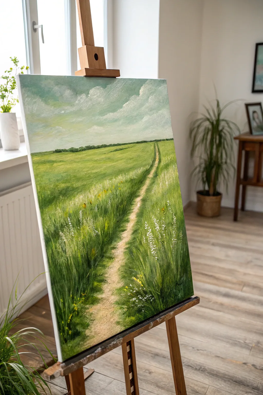
Capture the peaceful essence of a summer day with this serene landscape painting featuring a winding dirt path cutting through lush, tall grasses. The perspective draws the viewer deep into the scene, making it a perfect exercise for practicing depth and texture in greens.
Detailed Instructions
Materials
- Stretched canvas (e.g., 16×20 inches)
- Acrylic paints (Titanium White, Ultramarine Blue, Hooker’s Green, Sap Green, Yellow Ochre, Cadmium Yellow, Burnt Umber)
- Large flat brush (1-inch)
- Medium filbert brush
- Small round detail brush
- Fan brush (optional)
- Palette knife
- Water container and paper towels
- Easle (tabletop or standing)
Step 1: Sky and Horizon Foundation
-
Prime the sky:
Begin by mixing Titanium White with a tiny touch of Ultramarine Blue and a hint of Yellow Ochre to create a pale, warm atmospheric sky color. Apply this to the top third of your canvas using your large flat brush. -
Add cloud structures:
While the sky base is still slightly wet, load your brush with pure Titanium White. Use a scumbling motion—circular, scrubbing strokes—to create fluffy cumulus clouds that drift diagonally from the upper right toward the left. -
Define the horizon line:
Mix a dark green using Hooker’s Green and a touch of Burnt Umber. With the edge of your flat brush, paint a straight horizon line about one-third of the way down the canvas. -
Paint the distant trees:
Using the same dark green mix, dab small, irregular shapes along the horizon line to suggest a distant forest. Keep these shapes small and connected to maintain the illusion of distance. -
Establish the ground base:
Cover the remaining bottom two-thirds of the canvas with a mid-tone green. Mix Sap Green with a little Yellow Ochre and apply it broadly. This doesn’t need to be perfect; it’s just an underpainting for the grass.
Muddy Greens?
If your greens look dull or muddy, stop mixing too many colors together. Let the layers dry between applications, or try mixing yellow into blue directly on the canvas for vibrancy.
Step 2: The Path and Perspective
-
Map the path:
Mix Titanium White, Yellow Ochre, and a small amount of Burnt Umber to create a sandy beige color. Paint the path starting wide at the bottom center-right and tapering to a vanishing point on the horizon line. -
Refine the path edges:
The path shouldn’t have straight, sharp lines. Use jagged strokes along the edges where the grass meets the dirt to mimic vegetation overgrowth. -
Add path shadows:
Mix a slightly darker beige (add more Burnt Umber) and gently glaze the left side of the path or create irregular blotches to suggest shadows cast by the tall grass. -
Build distant grass layers:
Switch to a medium filbert brush. Mix a lighter, yellowish green using Sap Green and Cadmium Yellow. Paint horizontal strokes in the middle ground (just below the horizon) to simulate flat, distant fields.
Add Life
To elevate the scene, use a tiny liner brush to paint a few distinct silhouettes of birds in the distance or a wooden fence post peeking out from the tall grass.
Step 3: Foreground Texture and Details
-
Start the foreground grass:
In the immediate foreground (bottom of the canvas), use darker greens (Hooker’s Green + Blue). Use upward, flicking strokes to create the base of the tall grass blades. -
Build grass volume:
Wait for the dark layer to dry. I find this helps keep the colors crisp. Then, mix a mid-tone green and add a second layer of upward flicking strokes, overlapping the dark base but leaving some gaps. -
Highlight the sunlit blades:
Mix Cadmium Yellow with a little White and Sap Green for a bright highlight color. Use a small round brush or the edge of a fan brush to flick in thin, bright blades of grass, concentrating on the areas where the sun would hit. -
Create depth near the path:
Ensure the grass leans slightly over the path edges. Use your detail brush to paint individual distinct blades encroaching on the sandy area to integrate the two elements. -
Add wildflowers:
Load a small detail brush with pure Titanium White. Dot small clusters of white flowers onto the tall grass tips, mainly on the right side of the path. -
Include yellow variety:
Add small touches of Cadmium Yellow or Yellow Ochre among the green blades to represent different species of wildflowers or drying grass tips. -
Final adjustments:
Step back and assess the composition. If the path looks too bright, lightly glaze it with a watered-down brown. Add a few more bright white highlights to the clouds to balance the foreground.
Allow your painting to dry completely before displaying it to bring a breath of fresh air into your room
Palm Frond Shadow Play in Green
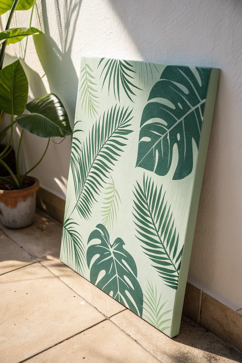
Bring the calming vibes of a lush rainforest into your home with this graphic tropical leaf painting. By layering different leaf shapes in varying shades of green, you’ll create a modern, botanical statement piece that brightens any corner.
Step-by-Step Guide
Materials
- Rectangular stretched canvas (16×20 or similar)
- Acrylic paints: Titanium White, Phthalo Green, Hooker’s Green, Yellow Ochre
- Flat shader brushes (medium and large)
- Fine liner brush (for details)
- Pencil
- Leaf templates or stencils (Monstera and Areca Palm)
- Painter’s palette or paper plate
- Water cup and paper towels
Step 1: Preparation and Background
-
Mix the base color:
Start by creating a very pale, minty green hue. Mix a large amount of Titanium White with a tiny dot of Phthalo Green and a touch of Yellow Ochre to warm it up. You want a color that is almost white but has a distinct leafy undertone. -
Apply the base coat:
Using your largest flat brush, cover the entire canvas with your pale mint mixture. Don’t forget to paint the sides of the canvas for a professional, gallery-wrapped look. -
Ensure even coverage:
If the canvas texture is showing through too much or the coverage looks streaky, let the first coat dry completely and apply a second coat. A solid, opaque background is crucial for the leaves to pop. -
Plan your composition:
Once the background is bone dry, lightly sketch your leaf placement with a pencil. aim for a pattern that feels balanced but natural, alternating between the large, broad Monstera leaves and the feathery Palm fronds. Let some leaves run off the edge of the canvas.
Clean Lines Hack
For the crispest edges on those Monstera leaves, use clear matte medium to seal your pencil sketch lines before painting the green. It prevents the paint from bleeding.
Step 2: Painting the Dark Foliage
-
Mix the dark green:
Create a deep, rich jungle green by mixing Hooker’s Green with a little Phthalo Green. If it feels too bright, tone it down with a tiny bit of red or brown (opposites on the color wheel darken without dulling as much as black). -
Paint the Monstera outlines:
Using a medium flat brush, carefully fill in the large Monstera leaf shapes with your dark green mixture. Focus on getting clean, sharp edges, particularly around the characteristic split-leaf notches. -
Add the stem details:
While the paint is wet on the brush, add the sturdy stems for the Monstera leaves. Keep the strokes smooth and confident. I find it helps to pull the brush toward yourself for better control. -
Detail the veins:
To give the Monstera leaves their graphic look, use a fine liner brush and your pale background color (or a mix slightly lighter than the leaf) to paint thin vein lines after the dark green has dried. This creates that specific illustrative style seen in the reference.
Go Metallic
Add a touch of luxury by painting the thin veins inside the Monstera leaves with gold leaf paint or a metallic gold marker instead of light green.
Step 3: Adding the Palm Fronds
-
Mix the mid-tone green:
Create a medium olive tone for the palm leaves. Mix your Hooker’s Green with more Yellow Ochre and a bit of White. You want this to stand out against the background but look distinct from the dark Monstera leaves. -
Paint the palm spines:
Using a liner brush or the edge of a flat brush, paint the central spine of the palm fronds first. This gives you a guide for where the leaflets will attach. -
Create the leaflets:
Switch to a small flat brush or angle brush. Paint the individual leaflets extending from the spine. Press down at the spine and lift as you flick outward to create a majestic, tapered point for each leaf segment. -
Vary the density:
Make some palm fronds dense and others slightly sparser. Overlap a few leaflets over the background, but try to avoid painting directly over the dark Monstera leaves unless you want a very layered look. -
Add ghost leaves:
Mix a color that is just one shade darker than your background (lots of white, tiny bit of green). Paint a few faint, ‘ghost’ palm fronds in the background spaces. This adds incredible depth without cluttering the design.
Step 4: Refining and Sealing
-
Clean up edges:
Take a step back and look for any wobbly lines. Use your original background color on a small brush to cut back into the leaf shapes and tidy up any messy edges. -
Check opacity:
If your dark greens look a bit streaky or transparent, apply a second coat to the leaves. A solid, flat color application makes the graphic style more effective. -
Erase pencil marks:
Once you are absolutely certain the paint is 100% dry, gently erase any visible pencil sketch lines that weren’t covered by paint. -
Apply varnish:
Finish the piece with a coat of matte or satin varnish. This unifies the sheen of the different paint mixtures and protects your tropical masterpiece from dust.
Hang your new botanical artwork in a bright spot to enjoy fresh, maintenance-free greenery all year round
Green Mountains With Fog Bands
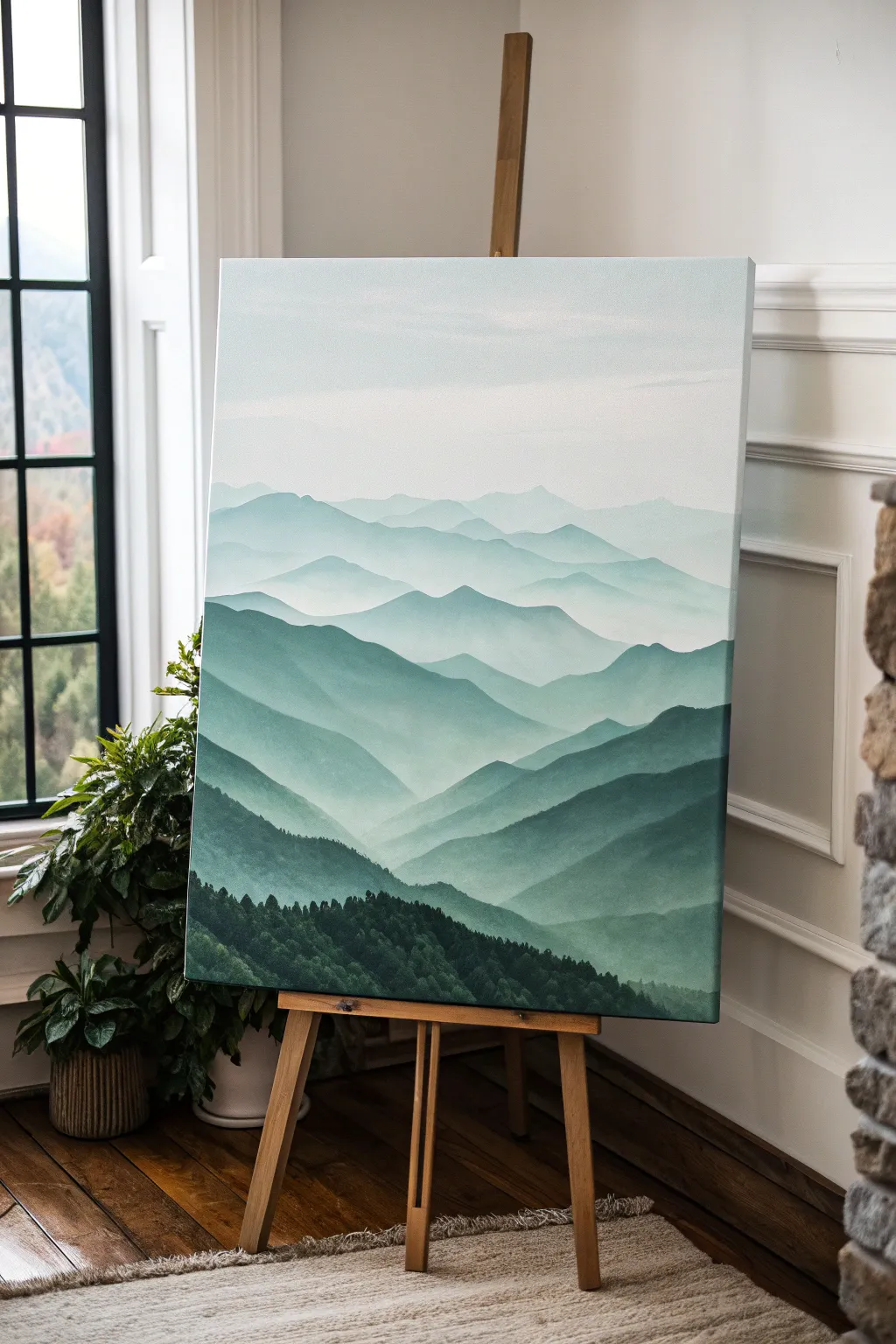
Capture the serene beauty of distant peaks with this atmospheric landscape painting. By layering shades of green and utilizing the natural fade of atmospheric perspective, you’ll create a sense of vast depth right on your canvas.
How-To Guide
Materials
- Large stretched canvas (e.g., 24×36 inches)
- Acrylic paints: Phthalo Green, Mars Black, Titanium White, and a touch of Ultramarine Blue
- Gesso (optional, for priming)
- Large flat brush (2-3 inch)
- Medium filbert brush (size 8-10)
- Small round brush (size 2-4) for foreground details
- Palette knife for mixing
- Water cups and paper towels
- Slow-drying medium or retarder (crucial for blending)
Step 1: Setting the Atmosphere
-
Prime the Surface:
Ensure your canvas is clean. If it’s raw canvas, apply a coat of gesso. If pre-primed, you can start straight away, but a thin coat of white paint helps the subsequent layers glide more smoothly. -
Mix the Sky Shade:
Create the lightest color first. Mix a large amount of Titanium White with a tiny speck of Phthalo Green and the smallest hint of Ultramarine Blue. The goal is a very pale, almost white, cool tint. -
Paint the Sky Gradient:
Using your large flat brush, paint the top third of the canvas. Start with pure white at the very top edge and blend down into your pale blue-green mix. Keep the strokes horizontal and smooth to mimic a calm sky. -
Establish the Furthest Peaks:
While the sky is still slightly tacky but mostly dry, use the pale blue-green mix to paint the outline of the most distant mountain range. These shapes should be simple and barely darker than the sky itself to push them far into the distance.
Paint drying too fast?
Acrylics can dry before you finish blending the fog. Keep a spray bottle of water nearby to mist your canvas lightly, or mix a slow-drying retarder medium into your paint piles.
Step 2: Layering the Mid-Ground
-
Darken the Mix Slightly:
Add a little more Phthalo Green and a touch of gray (mix black and white) to your pile. You want a color that is visibly darker than the first range but still very desaturated and hazy. I like to test the color on a scrap paper first to ensure the transition is subtle. -
Paint the Second Range:
Paint a new undulating mountain line overlapping the bottom of the previous one. Fill it in solid down to where the next range will start. -
Create the Fog Effect:
Before the paint dries, take a clean, slightly damp brush and gently glaze the bottom edge of this mountain shape, fading it out into transparency. This creates the illusion of mist settling in the valleys. -
Introduce More Green:
For the next layer down, mix less white and more Phthalo Green. The color should be becoming more saturated and darker as you move forward. Paint the next ridge line, making the peaks slightly sharper and more defined. -
Build Detail in Valleys:
Use your filbert brush to add subtle variations within the solid color of this new layer. A slightly darker sweep on the right side of a peak suggests a shadow side, adding volume to the flat shape.
Step 3: Defining the Foreground
-
Deepen the Palette:
Mix a rich, dark forest green using Phthalo Green and a small amount of Mars Black. It should be significantly darker than the previous layers. -
Paint the Near Mountains:
Create a large, dominant mountain shape in the lower third of the canvas. Because this is closer to the viewer, the edges should be crisp, not fuzzy. -
Add Texture:
While the paint is wet, use a dry brush to stipple slightly along the ridges of this dark layer. This mimics the rough texture of tree lines seen from a distance. -
Prepare the Darkest Tone:
For the absolute foreground at the bottom edge, mix Phthalo Green with a heavy amount of Mars Black. It should look nearly black but retain a green undertone in the light. -
Paint Individual Trees:
Switch to your small round brush or a fan brush. Using the darkest mix, tap in tiny vertical strokes along the very bottom ridge to suggest the tops of a dense pine forest. -
Fill the Bottom Edge:
Fill the remaining space at the bottom of the canvas with solid dark paint, blending it up into the textures you just created.
Level Up: Morning Glow
Add a localized warm tint to the mist. Glaze a tiny amount of diluted yellow ochre or pale pink just above the tree line in one valley to simulate sunrise breaking through.
Step 4: Final Touches
-
Enhance the Mist:
Once all layers are dry, mix a translucent glaze of water and Titanium White. Lightly brush this between the mountain layers if you feel they need more separation or if the atmosphere needs to look thicker. -
Check Contrast:
Step back and squint at your painting. The foreground should be dark and heavy, anchoring the image, while the background fades into nothing. If the foreground looks too light, add another coat of the black-green mix.
Now step back and enjoy the calming depth of your mountain landscape
Deep Green Jungle Layers
Bring the calming depths of the jungle into your home with this layered botanical study. By building up various shades of green, from near-black shadows to vibrant lime highlights, you’ll create a sense of density and life that feels like looking through a dense rainforest clearing.
Step-by-Step
Materials
- Rectangular stretched canvas (e.g., 16×20 or 18×24 inches)
- Acrylic paints: Phthalo Green, Hooker’s Green, Sap Green, Yellow Ochre, Cadmium Yellow, Mars Black, Titanium White, and Burnt Umber
- Assorted synthetic brushes: 1 inch flat wash, medium filbert, #4 round, and #0 liner brush
- Palette and palette knife for mixing
- Cup of water and paper towels
- Chalk or a soft pencil (HB)
Step 1: Setting the Mood
-
Base layer:
Begin by covering the entire canvas with a dark, moody base tone. Mix Phthalo Green with a touch of Mars Black and a tiny bit of Burnt Umber. Use your large flat wash brush to apply this mixture evenly. This dark background is crucial because it will peek through the leaves later, creating depth. -
Rough sketching:
Once the base is completely dry and cool to the touch, use white chalk or a very light pencil touch to sketch the placement of your main leaves. Don’t worry about tiny details yet; just map out the large Monstera leaf in the center, the drooping palm fronds on the right, and the smaller ferns near the bottom. -
Background foliage:
Mix a dark forest green using Hooker’s Green and a touch of black. Using a medium filbert brush, paint the silhouette shapes of leaves that sit furthest back in the composition. These shapes should be indistinct and shadowy, receding into that dark background you painted first.
Opacity Check
Yellow and light green acrylics are often translucent. If your Monstera looks streaky against the dark background, wait for the first layer to dry and apply a second coat for solid, pop-off-the-canvas color.
Step 2: Mid-Ground Vegetation
-
Blocking in shapes:
Create a mid-tone green by mixing Sap Green with a little Phthalo Green. Use this color to block in the large palm fronds on the right side and the large fern fronds curving near the bottom center. Paint the main stems first, then pull the brush outward to create the individual leaflets. -
Adding variety:
For the leaves on the left side, mix a cooler, bluer green by leaning heavily on Phthalo Green causing it to recede slightly. Block in those broad, flat leaves that sit behind the main Monstera. -
Layering shadows:
While your mid-tone greens are still slightly workable, take a smaller brush with a darker version of your green mix and paint thin lines down the center of the palm fronds to suggest the central vein structure. -
Defining edges:
Use your background color to carefully ‘cut back’ into your leaf shapes if they became too bulky. This negative painting technique sharpens the edges of your palms and ferns.
Jungle Dew
For a fresh rainforest look, add tiny dots of unmixed Titanium White on the flattest parts of the largest leaves to mimic water droplets catching the light.
Step 3: The Hero Leaves
-
Monstera base:
Mix a vibrant, light green using Sap Green, Cadmium Yellow, and a touch of White. Paint the large Monstera leaf in the center-left. Because this pigment is lighter, you may need two coats to ensure the dark background doesn’t dull the color. -
Spiky fern accents:
Using a slightly yellower mix (heavy on Yellow Ochre), paint the small, spiky fern fronds at the very bottom right and the upright textured plant on the bottom left. These lighter colors act as visual anchors. -
Top highlight layer:
It is time for the brightest details. Mix your lightest green yet—almost a lime sorbet color—using White and Cadmium Yellow with just a hint of green. Use this for the prominent veins on the Monstera leaf. -
Veining details:
Switch to your #0 liner brush and thin your paint slightly with water. Carefully paint the fine veins on the large palm fronds and the broad leaves on the left. I find that holding the breath slightly helps keep the hand steady for these long lines. -
Pop of yellow:
Identify the bright, yellowish budding plant on the lower left. Use pure Yellow Ochre mixed with white to dab in these small, textured leafy shapes, making them stand out against the dark ferns behind them.
Step 4: Refining and Finishing
-
Correcting overlaps:
Check where leaves overlap. If a front leaf looks flat against a back leaf, add a thin glaze of dark green/black shadow right underneath the edge of the top leaf to separate them. -
Texture dabs:
Use an old, scruffy brush to dab some small dots and textures in the bottom corners to simulate moss or indistinct ground cover. -
Final highlights:
Add pure white highlights sparingly to the tips of the spikiest plants at the bottom to make them look glossy and wet. -
Side check:
Since this is a gallery-wrapped canvas, extend your main leaf shapes and dark background color around the edges of the canvas for a professional, frameless finish.
Step back and admire your personal slice of the tropics, now ready to bring life to any wall
Green Abstract Color Blocks
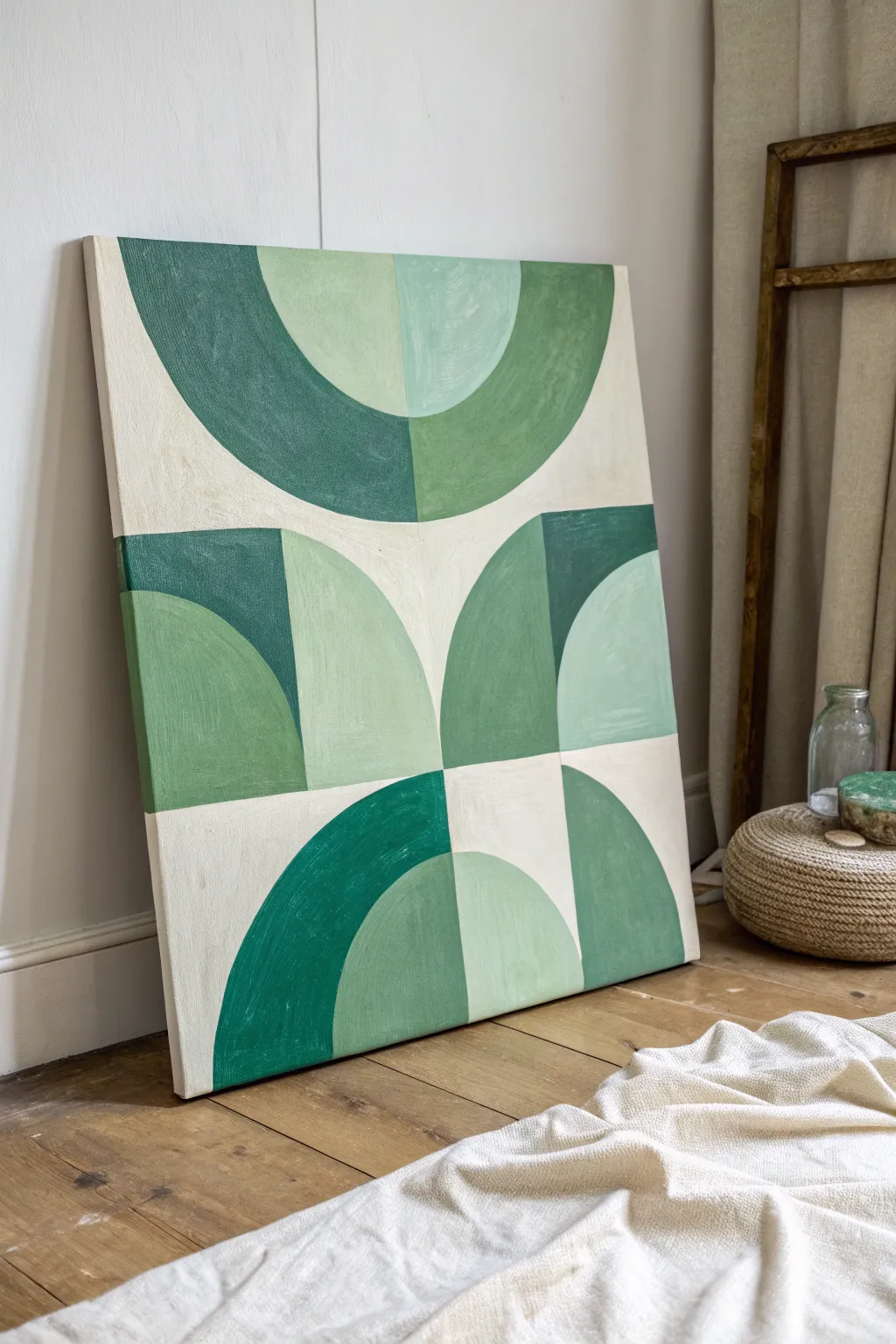
Embrace the calming influence of nature with this mid-century inspired abstract piece, featuring interlocking semicircles in a soothing gradient of greens. Its structured yet organic composition brings a modern, sophisticated touch to any blank wall.
Step-by-Step
Materials
- Large rectangular stretched canvas (approx. 24×30 inches)
- Acrylic paints (Titanium White, Hooker’s Green, Chromium Oxide Green, Sage Green)
- Flat shader brushes (1-inch and 1/2-inch)
- Pencil
- Ruler or straight edge
- Compass or round objects for tracing (dinner plate, small bowl)
- Painter’s tape (optional but helpful)
- Palette for mixing
- Cup of water and paper towels
Step 1: Planning the Layout
-
Prime the surface:
Begin by applying a base coat of Titanium White mixed with a very tiny drop of yellow or ochre to create a warm, creamy off-white background. Cover the entire canvas and let it dry completely. -
Divide the canvas:
Using a pencil and ruler, lightly mark the vertical center line of the canvas. Then, divide the height into three equal horizontal sections. You should now have a faint 2×3 grid. -
Sketch the top arches:
In the top two quadrants, use your compass or a large round object to draw a large semicircle spanning across both sections. Inside that, draw a smaller, concentric semicircle. -
Draft the middle section:
For the middle row, draw two quarter-circles meeting at the center line. They should look like two hills rising from the bottom line of this section. -
Outline the bottom shapes:
In the bottom row, replicate the top design but inverted, drawing a large semicircle arching upward from the bottom edge, with a smaller concentric one inside it. -
Add angular details:
Referencing the image, sketch the vertical separation lines and the square ‘block’ shapes that encase the curves, particularly noting the dark green steps in the middle section.
Clean Curve Trick
Struggling with steady curves? Use painter’s tape for the straight lines, but for curves, lean your pinky finger on a dry part of the canvas to stabilize your hand while painting.
Step 2: Color Filling & Painting
-
Mix your palette:
Prepare four distinct shades of green. You’ll need a deep forest green, a medium grassy green, a soft sage, and a very pale mint. Use white to lighten your greens for the paler shades. -
Paint the darkest blocks:
Start with your deepest forest green. Fill in the specific geometric sections shown in the reference: the outer ring of the bottom-left arch, the top-right block of the middle row, and parts of the top arch. -
Apply the medium green:
Switch to the grassy or olive green tone. Carefully paint the large outer curve of the top-right section and the prominent arch shape on the left side of the middle row. -
Fill the sage areas:
Using the soft sage color, fill in the central semi-circle of the top section and the middle arch of the bottom section. I find using the 1/2-inch flat brush helps keep these curved edges crisp. -
Add the pale mint accents:
Apply the lightest mint green to the remaining curved sections, specifically the inner part of the middle-right arch and the top-left inner curve. -
Refine the background:
Use your cream base color to touch up the negative spaces between the green shapes, ensuring the separation lines are sharp and clean.
Texture Twist
Mix a small amount of modeling paste into your acrylics before painting. This adds a subtle, tactile texture that mimics the look of vintage heavy-body oil paintings.
Step 3: Finishing Touches
-
Check opacity:
Acrylics often dry a bit darker and more transparent. Once the first layer is dry, assess if any of the lighter greens need a second coat for solid, opaque coverage. -
Clean up edges:
Use a small, slightly damp brush to gently tidy up any wobbly lines where colors meet. If you used tape, peel it away carefully at a 45-degree angle. -
Paint the sides:
Don’t forget the edges of the canvas. Extend the design around the sides for a gallery wrap look, or simply paint them the solid cream color for a neat finish. -
Seal the work:
Allow the painting to cure for at least 24 hours. Once fully dry, apply a matte varnish to protect the surface and unify the sheen of the different paint mixes.
Hang your new geometric masterpiece in a bright corner to let those verdant greens breathe life into the room
Malachite-Inspired Green Swirls
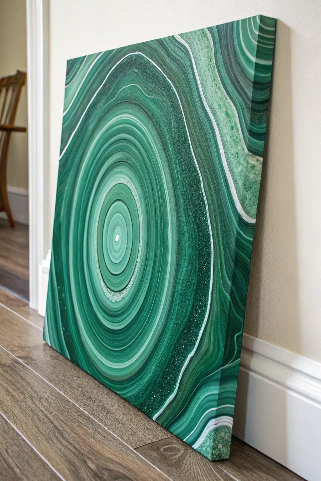
Capture the hypnotic beauty of polished malachite stone with this striking acrylic pour project. Using a specific “tree ring” layering technique, you’ll create organic concentric bands of emerald, forest green, and white for a luxurious, geological look.
Step-by-Step Guide
Materials
- Stretched canvas (e.g., 16×20 inches)
- Acrylic fluid paints (Emerald Green, Phthalo Green, Hookers Green, Titanium White, and a Metallic Green or Gold)
- Pouring medium (Floetrol or Liquitex)
- Water (distilled is best)
- Plastic cups (one for each color, plus one large “dirty pour” cup)
- Stirring sticks
- Painter’s tape (for canvas back)
- Push pins (4 large ones)
- Small torch or heat gun (optional)
- Gloss varnish or resin (for finishing)
Step 1: Preparation
-
Tape the back:
Flip your canvas over and apply painter’s tape along the underside of the wooden frame and the edges of the canvas back. This prevents messy drips from drying on your frame. -
Install riser pins:
Insert four large push pins into the corners of the wooden frame on the back. This elevates your canvas off the table, allowing paint to flow freely over the edges. -
Mix your paints:
In individual cups, mix each paint color with your pouring medium. A standard ratio is 2 parts medium to 1 part paint, but check your brand’s instructions. You want a consistency like warm honey—it should flow off the stick in a steady stream but leave a tiny mound before disappearing. -
Add water sparingly:
If your mixtures are too thick, I like to add a few drops of water at a time to thin them. Be careful not to make them too watery, or the colors will muddy together.
Stone Texture Tip
Add a few drops of silicone oil to just the metallic paint cup. This creates small ‘cells’ or pits that mimic natural imperfections found in raw malachite stone.
Step 2: The Pour
-
Layer the dirty cup:
Take your large empty cup. Tilt it slightly and slowly pour a small amount of dark green down the side. Follow with a medium green, then a splash of white, then a metallic. -
Repeat the layering:
Continue layering your paints in the same order until the cup is full. Do not stir. The goal is to stack the colors so they release in rings. -
Begin the ring pour:
Place the canvas face up. Position the cup directly over the center of the canvas. Start pouring a slow, steady stream onto the middle of the canvas. -
Create the motion:
As you pour, make tiny, very tight circular motions with your hand. You aren’t moving the stream around the canvas; you are just wiggling your wrist to encourage the paint to release in circular bands. -
Empty the cup:
Continue pouring until the cup is empty. You should see a bullseye pattern of concentric rings forming in the center of your canvas.
Step 3: Manipulation
-
Tilt to stretch:
Gently lift the canvas and slowly tilt it toward one corner. Watch how the rings stretch and distort. Do not let the paint run off the edge just yet. -
Center the paint:
Bring the weight of the paint back to the middle before tilting toward the next corner. This helps maintain the circular malachite structure without it becoming too oval or warped. -
Cover the corners:
Continue tilting in a circular motion until the paint reaches all four corners and flows over the sides. The rings will expand dramatically. -
Check the edges:
Ensure the sides of the canvas are fully coated. You can use your finger to dab dripped paint onto any bare patches on the corners. -
Pop air bubbles:
If present, quickly pass a torch or heat gun briefly over the surface to pop air bubbles. Keep it moving to avoid scorching the paint.
Go for Gold
Once your piece is fully dry, execute the Kintsugi technique by painting thin lines of gold leaf or gold paint along the darkest veins to add luxurious contrast.
Step 4: Finishing
-
Let it cure:
Allow the painting to dry on a level surface essentially undisturbed for at least 2-3 days. Fluid art takes a long time to cure fully. -
Clean the back:
Once dry to the touch, peel off the painter’s tape from the back to remove the dried drips for a professional finish. -
Apply varnish:
To get that polished stone look, apply two to three coats of high-gloss varnish or a layer of art resin. This deepens the greens and makes the white bands pop.
Now you have a stunning, gem-like centerpiece that looks like a slice of the earth itself
Green Night Fireflies Over Grass
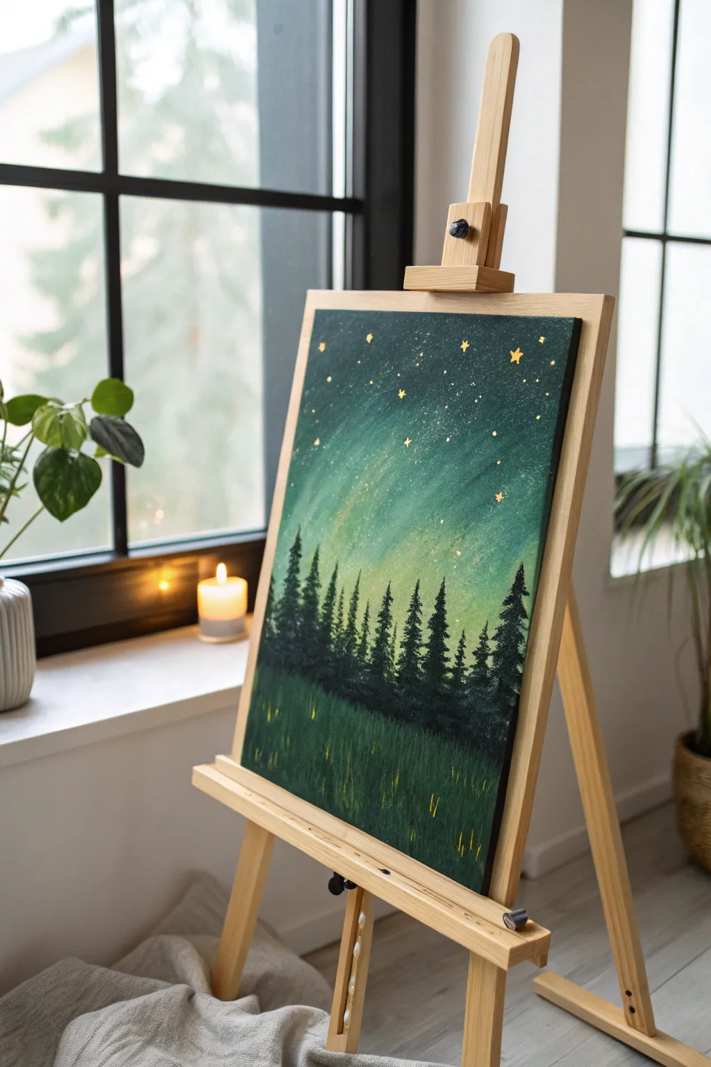
Capture the magic of a serene forest night with this atmospheric acrylic painting, featuring a glowing emerald sky and golden fireflies dancing in the tall grass. This project combines smooth blending techniques with crisp silhouetting for a striking, dreamy result.
How-To Guide
Materials
- Stretched canvas (e.g., 16×20 inches)
- Acrylic paints (Phthalo Green, Sap Green, Cobalt Blue, Black, Titanium White, Lemon Yellow)
- Gold metallic paint (or gold leaf flakes)
- Small round brush (size 0 or 1)
- Medium flat brush (size 6 or 8)
- Large flat brush (1-inch) or sponge brush
- Fan brush
- Palette and container for water
- Paper towels
Step 1: Painting the Aurora Sky
-
Base gradient:
Begin by dampening your large flat brush slightly. Mix Phthalo Green with a touch of Black to create a deep forest green. Apply this to the top third of the canvas using long, horizontal strokes. -
Mid-sky transition:
While the top is still wet, mix pure Phthalo Green with a little White to lighten the value. Blend this into the lower edge of your dark green section, working your way down to the middle of the canvas. -
Horizon glow:
For the area just above where the trees will sit, mix a generous amount of Titanium White with a tiny dot of Lemon Yellow and a hint of Sap Green. Paint this light, glowing band across the center, blending upward into the mid-green tone to create a soft, radiant horizon. -
Adding texture:
Before the sky dries completely, use a dry, clean brush to gently sweep vertically in a few spots. This pulls the lighter paint upward slightly, mimicking the vertical pillars of northern lights.
Step 2: Creating the Forest Silhouette
-
Mixing black-green:
Create a very dark mixture using mostly Black with a touch of Phthalo Green. We want this to look like a silhouette but still have a hint of color richness. -
Tree placement:
Using a medium flat brush, tap a horizontal line across the canvas about one-third of the way up from the bottom. This establishes the uneven ground where the forest stands. -
Central tree lines:
Switch to a small round brush. Paint vertical lines of varying heights sticking up from your ground line. These will be the trunks of your pine trees. -
Forming pine branches:
Using the corner of a flat brush or a fan brush, tap horizontally starting from the top of each trunk line. Widen your strokes as you move down the tree to create the classic triangular pine shape. -
Filing gaps:
Go back with your dark mixture and fill in the spaces between the trees at the bottom to create a dense, shadowy forest floor.
Muddy colors?
If your greens turn murky when blending the sky, execute the blend quickly while paints are wet. If it dries, wait and glaze a thin layer of color over top instead of scrubbing.
Step 3: The Grass and Details
-
Applying the foreground base:
Paint the entire bottom section below the trees with a solid coat of dark green (mix Phthalo Green and Black). Let this dry for a few minutes. -
Painting texture:
Load a fan brush or an old, frayed flat brush with a slightly lighter Sap Green. Use quick, upward flickering motions to create the illusion of tall grass blades rising from the bottom edge. -
Adding dimension:
Repeat the grass flicking technique with an even lighter green mix sparingly to highlight just the tips of the grass where the moonlight would catch. -
Painting larger stars:
Dip the handle end of a small brush into gold metallic paint. Dot several larger stars into the dark upper sky. -
Star details:
Use your finest detail brush to gently pull five tiny points outward from each gold dot to create twinkling star shapes. -
Scattered stardust:
Dip a stiff brush (like a toothbrush or bristle brush) into watered-down white or gold paint. Run your thumb across the bristles to splatter a fine mist of tiny stars across the upper sky. -
Adding fireflies:
Using a small round brush and bright yellow or gold paint, apply short, vertical dashes in the grass area. Keep these strokes minimal and random to represent hovering fireflies.
Make it sparkle
For a truly magical effect, mix a pinch of fine iridescent glitter into your final gold paint for the stars, or adhere tiny gold star confetti while the paint is tacky.
Step back and admire the peaceful glow of your handcrafted forest night scene
Negative Space Botanical in Green
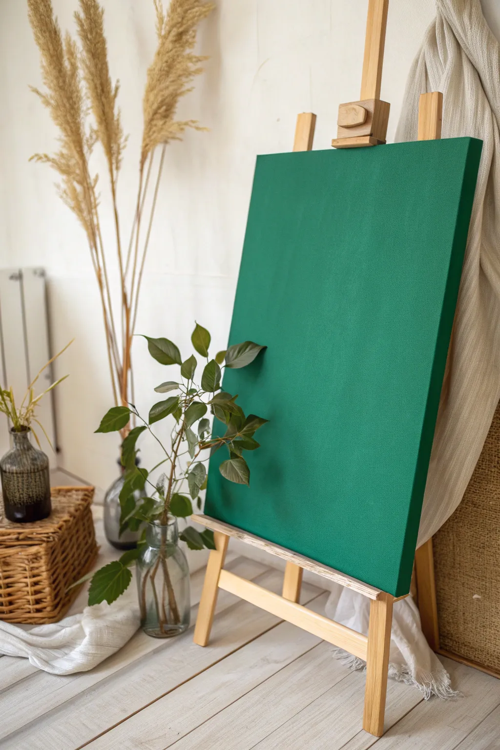
This project focuses on creating a high-impact, minimalist statement piece using a singular, rich shade of forest green. By mastering smooth, opaque application, you transform a simple canvas into a bold block of color that brings instant tranquility to any space.
Detailed Instructions
Materials
- Stretched canvas (rectangular, medium grain)
- High-quality acrylic paint (Deep Forest Green or Chromium Oxide Green)
- White Gesso (optional, for priming)
- Wide flat synthetic brush (2-3 inches)
- Medium flat synthetic brush
- Palette or mixing tray
- Cup of water
- Paper towels
- Fine-grit sandpaper (optional)
Step 1: Preparation & Priming
-
Assess the canvas:
Begin by inspecting your stretched service. If the texture is very rough, you may want to lightly sand it to ensure your final color block looks sleek and modern. -
Apply gesso:
Even if your canvas is pre-primed, adding a fresh coat of white gesso creates a brighter, smoother surface for the green pigment. Use your wide brush to apply a thin, even layer. -
Smooth the surface:
Once the gesso is fully dry, run your hand over the canvas. If there are distinct brush ridges, give it a very light sanding with fine-grit sandpaper and wipe away the dust.
Cross-Hatch Method
Alternating stroke direction (horizontal for coat 1, vertical for coat 2) is the secret to a streak-free solid color block.
Step 2: Base Application
-
Prepare your green:
Squeeze a generous amount of your Deep Forest Green onto the palette. I like to add a tiny drop of water or glazing medium to improve flow, but don’t over-dilute it or you’ll lose opacity. -
Paint the edges first:
Using the medium flat brush, carefully paint the sides (depth) of the canvas. This gallery-wrap style ensures the artwork looks finished from every angle without needing a frame. -
Check the corners:
Pay special attention to the folded canvas corners. Dab paint into the crevices to ensure no white canvas shows through. -
Begin the main face:
Switch to your wide flat brush. Dip it fully into the paint and start applying color to the front of the canvas using long, horizontal strokes from one edge to the other. -
maintain a wet edge:
Work somewhat quickly to ensure the paint doesn’t dry mid-stroke. Keeping a ‘wet edge’ helps prevent visible seam lines where brush strokes overlap.
Step 3: Building Intensity
-
Let the first coat dry:
Allow the first layer to dry completely. This usually takes about 20-30 minutes for acrylics. Don’t rush this, or the next layer might lift the previous one. -
Assess opacity:
Look at the canvas in good light. You likely see some streaks or lighter patches. This is normal for the first coat. -
Apply the second coat:
Repeat the painting process with the wide brush. This time, apply your strokes vertically (perpendicular to the first layer). This cross-hatching technique creates a solid, woven weave of color. -
Feather the edges:
As you reach the edges of the front face, lift pressure on the brush slightly to blend the fresh paint seamlessly into the dried edge-work you did earlier. -
Check for texture:
If you want a very flat, modern look, smooth out any heavy ridges immediately. If you prefer painterly texture, you can intentionally leave brush marks visible now.
Streaky Finish?
If the finish looks uneven, you likely used too little paint or a dry brush. Reload frequently and don’t “stretch” the paint too far.
Step 4: Final Touches
-
Inspect the third coat necessity:
For some transparent pigments, a third coat might be necessary. If so, return to horizontal strokes. Otherwise, let the second coat dry fully. -
Clean up imperfections:
Check the back of the canvas. If any green paint dripped onto the back stretching wood or fabric, wipe it off with a damp cloth or paint over it with white for a professional finish. -
Optional varnish:
To deepen the color saturation and protect the surface from dust, apply a coat of matte or satin varnish once the paint has cured for at least 24 hours.
Place your finished canvas on a wooden easel to let the deep green tone bring a sense of nature indoors


Have a question or want to share your own experience? I'd love to hear from you in the comments below!