
If you’ve been itching to make your space feel more like you, hand-painted walls are such a satisfying way to do it. I’m sharing my favorite hand painted wall ideas—from classic murals to playful patterns you can totally make your own.
Scenic Landscape Mural
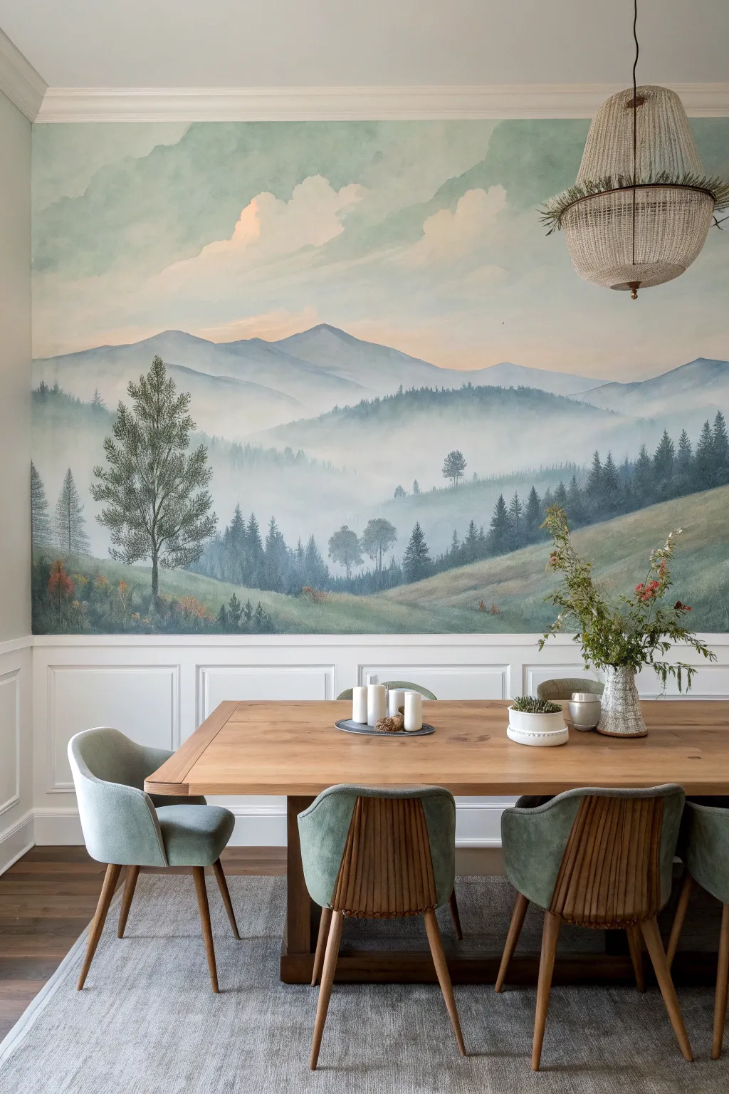
Transform a plain wall into a breathtaking window onto nature with this serene landscape mural. Featuring soft atmospheric perspective, rolling hills, and majestic pines, this large-scale painting brings a calm, expansive feeling to any dining room or living space.
Step-by-Step Guide
Materials
- Interior latex paint (Eggshell or Matte): White (base), Deep Forest Green, Slate Blue, Teal, Sage Green, Gray, Peach/Soft Pink
- Glaze medium or extender
- Assorted brushes: 2-3 inch angle sash brushes (for blocking), 1-inch flat brushes, round detail brushes
- Sea sponge or large natural sponge
- Painters tape
- Drop cloth
- Step ladder
- Pencil and eraser
- Mixing cups or trays
- Rags or paper towels
Step 1: Preparation & Sky
-
Prepare the workspace:
Begin by clearing furniture away from the wall and laying down drop cloths. Mask off the ceiling line, adjacent walls, and the top edge of your wainscoting with painter’s tape to ensure crisp edges. -
Prime the surface:
If the wall isn’t already white or light neutral, apply a coat of white primer. This helps the subtle pastel colors of the sky pop without fighting a dark undertone. -
Mix the sky gradient:
Create three mixtures for the sky: a pale peach/pink, a very light airy blue, and a slightly deeper cyan-blue. Mix a generous amount of glaze medium into each; this extends drying time and allows for smoother blending. -
Paint the upper sky:
Starting at the top corners, brush on patches of the cyan-blue. While still wet, work in the lighter airy blue towards the center, using a large brush in cross-hatch motions to soften transitions. -
Add sunrise warmth:
Near the horizon line (roughly the middle of the wall space), blend in the pale peach color. Use a clean, dry brush to feather the peach upwards into the blue, creating that soft, early-morning glow. -
Create soft clouds:
Dip a sea sponge or a scrunched rag into white paint mixed with a tiny drop of peach. Lightly dbl onto the sky area to suggest fluffy clouds, keeping edges incredibly soft and undefined.
Fixing Hard Lines
If your blend dries too fast and leaves a stripe, dampen a clean sponge with water or glaze medium and gently rub the drying edge to reactivate and soften it.
Step 2: Distant Mountains
-
Sketch the layout:
Once the sky is dry, lightly sketch the contour lines of the mountain ranges with a pencil. Plan for 3-4 distinct layers of depth, with the highest peaks in the back. -
Mix the background color:
Mix a very pale, hazy blue-gray. The rule of atmospheric perspective dictates that objects furthest away are lightest and bluest. -
Paint the furthest peaks:
Fill in the most distant mountain range silhouette with your pale blue-gray. Use a horizontal sweeping motion with your brush. -
Add the middle ground:
Mix a slightly darker, more tealed version of your mountain color. Paint the next range of hills below the first one. While the paint is wet, adding a little glaze helps create a ‘mist’ effect near the bottom of this layer.
Depth Perception
To maximize depth, remember: things get cooler (bluer) and lighter as they get further away. Only use your darkest greens and browns in the immediate foreground.
Step 3: Foreground & Trees
-
Establish the rolling hills:
For the closest grassy hills, mix sage green with a touch of ochre or brown. Paint the bottom section of the mural, using long curving strokes to mimic the slope of the land. -
Layering the hill texture:
While the green hill base is tacky, streak in slightly darker greens and browns to suggest contour and shadow in the grass. -
Paint distant tree lines:
Using a smaller flat brush and a slate-green color, tap vertical dashes along the ridges of the middle-ground mountains. These tiny vertical marks read as distant forests. -
Block in foreground pines:
Using deep forest green, paint the straight vertical trunks of the prominent foreground trees. I find it helpful to vary the heights and spacing so it doesn’t look like a picket fence. -
Detail the pine boughs:
With a round detail brush or fan brush, switch to a stippling motion to add branches. Start narrow at the top of the tree and widen toward the bottom. Leave gaps between branches to let the sky show through for realism. -
Add lower foliage:
Dab pops of burnt orange, yellow, and darker green near the bottom wainscoting edge to represent bushes and undergrowth. -
Final touch-ups:
Step back and look for hard edges that shouldn’t be there. If a distant mountain looks too sharp, lightly dry-brush a bit of white glaze over it to push it back into the mist.
Remove the tape slowly to reveal your framed masterpiece and enjoy dining with a view

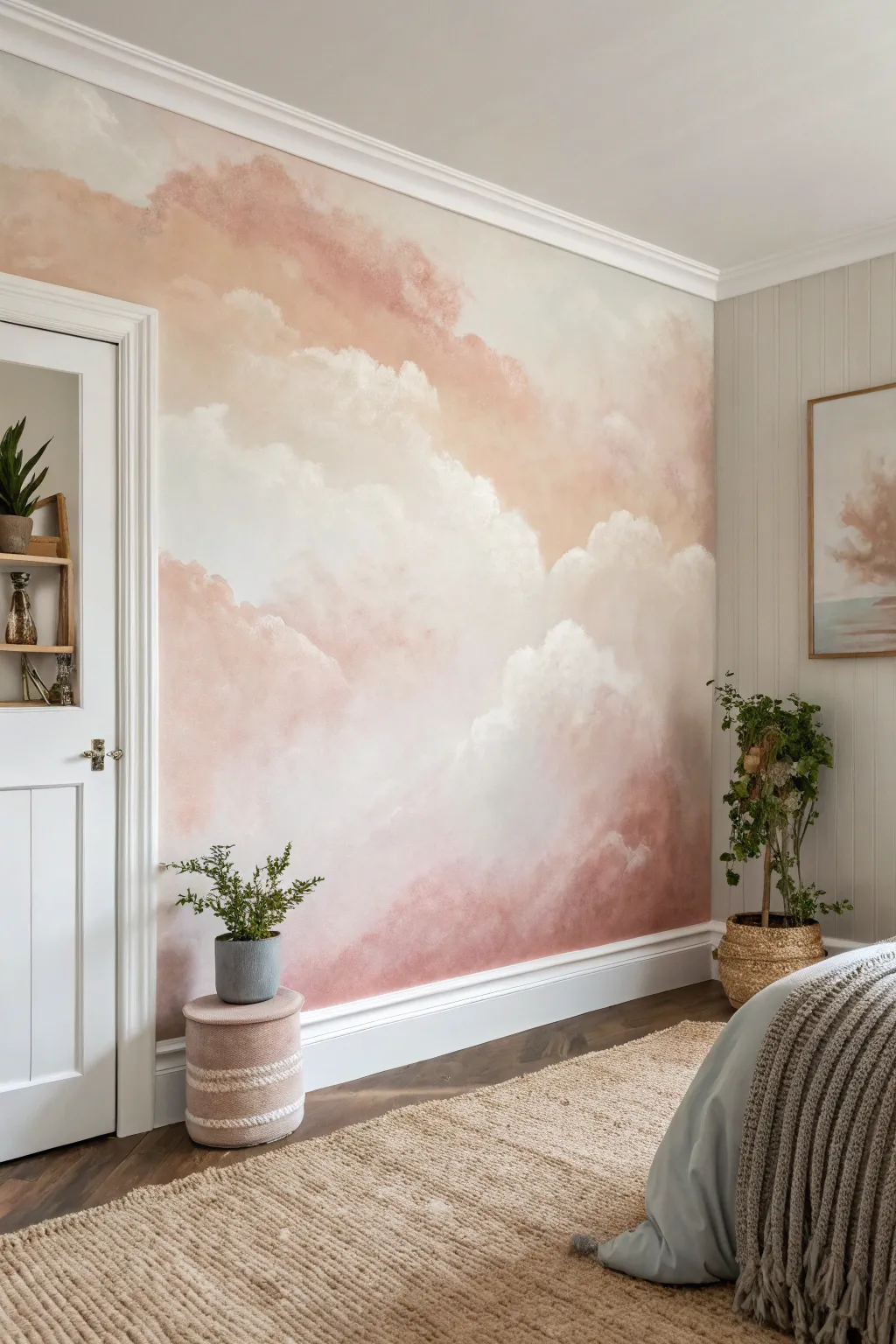
Ombre Mountain Mural
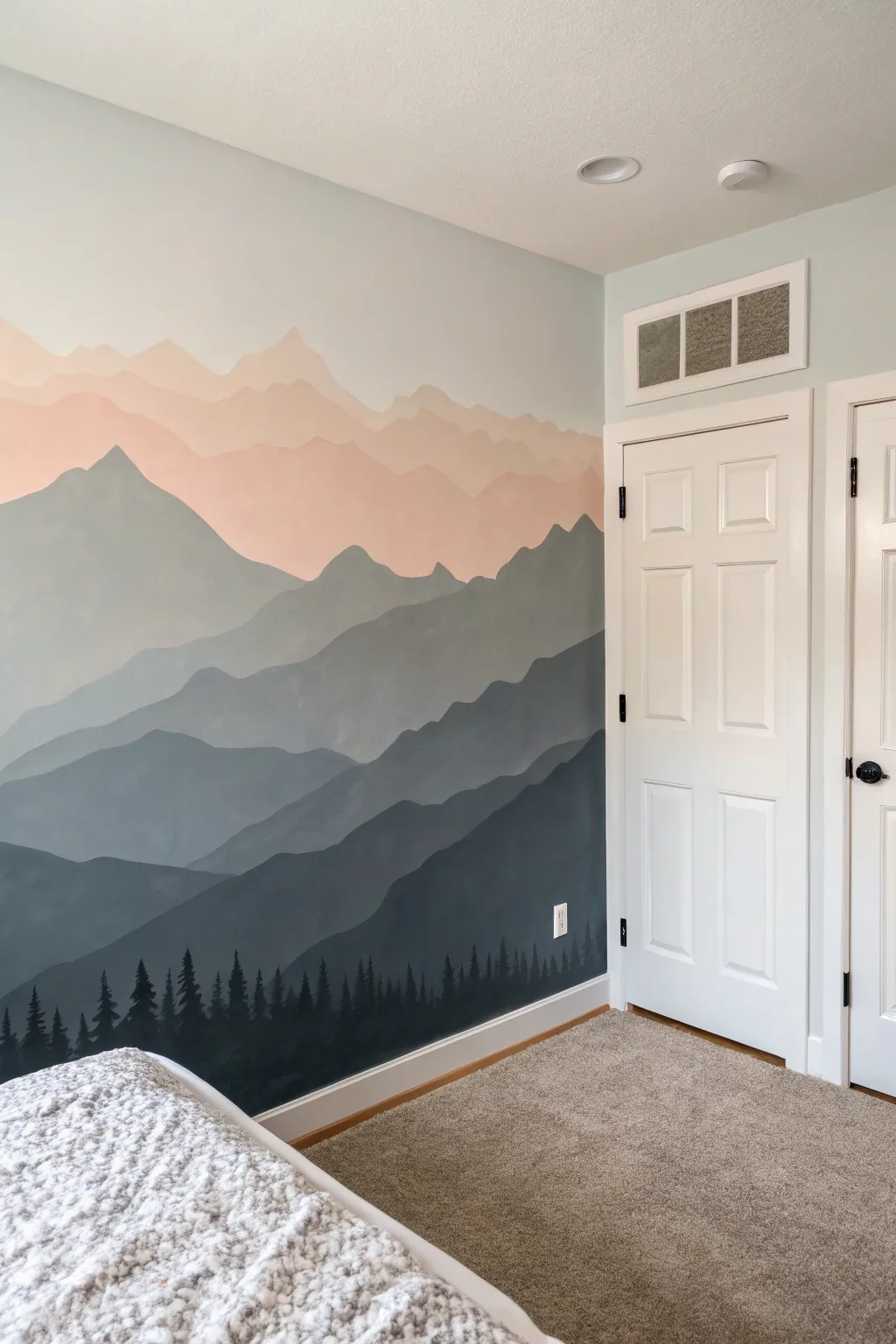
Transform a plain bedroom wall into a serene vista with this layered mountain mural. By using a gradient of colors from soft peach to deep charcoal, you’ll create a stunning sense of depth and atmospheric perspective.
How-To Guide
Materials
- Interior latex paint (white base)
- Interior latex paint (black or charcoal base)
- Sample pots of peach or blush pink paint
- 2-inch angled sash brush
- Small round artist brush (size 4 or 6)
- Paint roller and tray
- Pencil
- Painter’s tape
- Plastic cups or containers for mixing
- Drop cloth
Step 1: Preparation and Planning
-
Prepare the workspace:
Clear the area against the wall and lay down a drop cloth to protect your carpet or flooring. Apply painter’s tape to the baseboards, ceiling line, and any adjacent walls or door frames to ensure crisp edges. -
Base coat application:
If your wall isn’t already a light neutral color, roll on a fresh coat of white or very light gray paint. This will serve as the sky and the background for your highest mountain peaks. -
Sketch the layers:
Lightly sketch organic, wavy lines across the wall using a pencil to map out your mountain ranges. Aim for 5-6 distinct layers, starting high on the wall and working down. Make the peaks jagged and random rather than uniform triangles for a natural look.
Uneven Coverage?
If the darker greys look streaky after one coat, don’t overwork the wet paint. Let it dry completely, then apply a second thin coat for a solid, opaque matte finish.
Step 2: Painting the Gradient
-
Mix the sky color:
Pour a small amount of your peach or blush pink paint into a mixing cup. Add a significant amount of white to create a very pale, airy pastel tone for the highest mountain range. -
Paint the first range:
Using your angled sash brush, cut in along the top pencil line of your highest mountain layer. Fill in the rest of this section down to the next pencil line using a small roller or the brush. -
Create the transition shade:
For the second layer down, take your original peach mixture and add a drop of grey or a tiny bit of blue to desaturate it slightly. You want this layer to look a bit further away and ‘mistier’ than the warmth of the top layer. -
Apply the second layer:
Paint the second mountain range just like the first, carefully cutting in along the top edge so it overlaps the bottom of the previous layer cleanly. -
Shift to cool tones:
As you move to the third layer, stop using the pink tones. Mix a light grey-blue color. It should be darker than the previous layer but still quite soft. Paint this middle section, ensuring full coverage. -
Deepen the grey:
For the fourth layer, mix a medium steel grey. The contrast should be noticeable now. I find it helpful to step back to the other side of the room to check that the jump in darkness feels balanced compared to the layers above. -
Paint the foreground mountains:
Mix a dark charcoal grey for the second-to-last layer. Paint this large section, which typically sits lower on the wall, creating the heavy base for your landscape.
Step 3: The Forest Detail
-
Base the bottom layer:
For the final, bottom-most layer, use your darkest paint color—either a true black or an ultra-deep charcoal. Use a roller to fill in the entire bottom section down to the baseboard. -
Start the tree line:
Switch to your small round artist brush. Along the top ridge of this dark bottom layer, start painting vertical lines of varying heights to represent tree trunks. -
Add evergreen texture:
Using quick, downward-flicking strokes, paint branches coming off the trunks. Start narrow at the top and get wider toward the bottom of each tree to create that classic pine silhouette. -
Vary the density:
Group some trees closely together so their branches overlap into a solid mass, while leaving others standing solo. Variety in spacing and height makes the forest look organic. -
Final touches:
Once the paint is dry, carefully peel away the painter’s tape at a 45-degree angle. Touch up any spots where paint might have bled using a small brush.
Level Up: Birds
Use your smallest brush with the black paint to add tiny, simple ‘V’ shapes or silhouettes of birds flying near the lighter peach peaks for added life and scale.
Now you have a breathtaking vista to wake up to every morning.
Hand-Painted Polka Dots
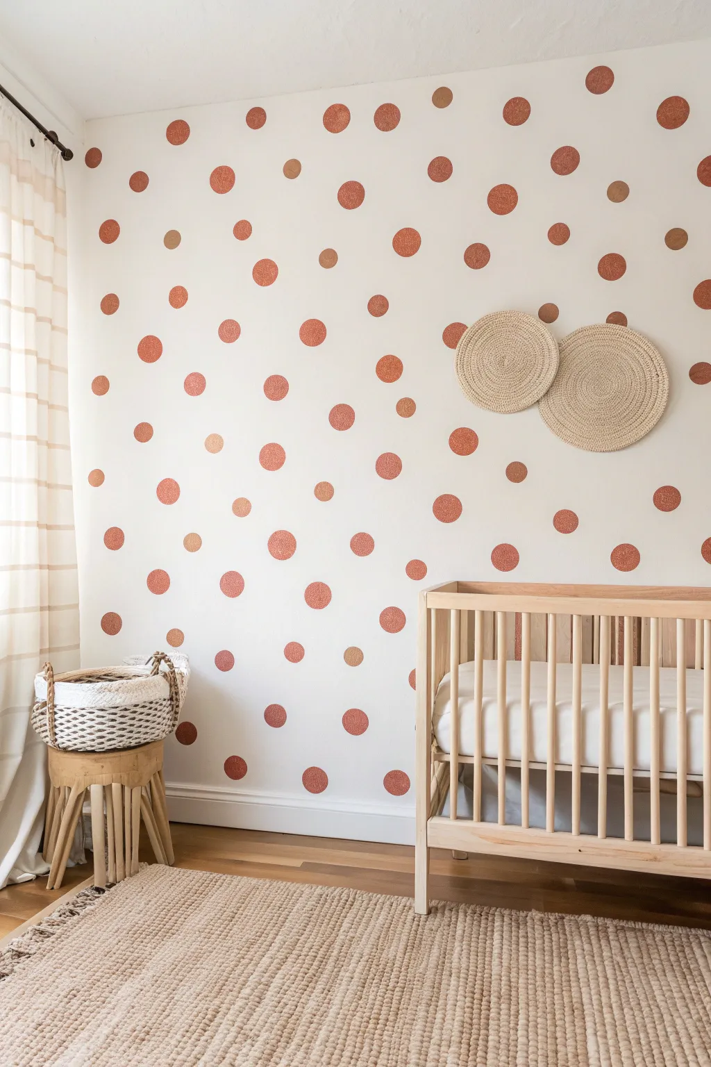
Transform a plain white wall into a warm, bohemian focal point with these freehand painted polka dots. The organic, imperfect shape of each dot gives the room a relaxed, playful texture that feels much more custom than wallpaper.
Step-by-Step Tutorial
Materials
- Latex wall paint (rust/terracotta color)
- Latex wall paint (gold/mustard accent color)
- Small circular sponge applicators (2 sizes)
- Small angled artist brush
- Paper plate or paint tray
- Painter’s tape
- Drop cloth
- Ladder or step stool
- Clean rag
- Pencil (optional)
Step 1: Preparation
-
Prepare the space:
Clear the area in front of the wall you intend to paint. Lay down a drop cloth to protect your flooring from any accidental drips or sponge fallout. -
Clean the surface:
Wipe down the wall with a damp cloth to remove any dust or oils. Paint adheres best to a clean surface, so ensure it is dry before proceeding. -
Protect trim:
Apply painter’s tape along the baseboards and any adjacent walls or ceiling lines to ensure crisp edges where the wall meets other surfaces.
Step 2: Painting the Dots
-
Load the sponge:
Pour a small amount of your main rust-colored paint onto a paper plate. Dip your larger round sponge into the paint, ensuring the surface is covered but not dripping. -
Practice the technique:
Before hitting the wall, press the sponge onto a piece of cardboard or paper. Practice rotating your wrist slightly as you press to get a full, round shape without too much paint build-up at the edges. -
Start loosely:
Begin applying the larger dots on the wall in a random, scattered pattern. Avoid creating rows or grids; the beauty is in the irregularity. -
Spacing methodology:
I find it helpful to step back frequently to check the spacing. Aim for roughly 6-10 inches between dots, maintaining a consistent density without measuring. -
Refine edges:
If a sponge print looks too patchy or faint, use the small angled artist brush to fill in the center or smooth out a rough edge while the paint is still wet. -
Add size variation:
Switch to the smaller sponge applicator. Dip it into the rust paint and place smaller dots in some of the larger gaps between the big dots to add visual depth. -
Introduce accent color:
Clean your brush or grab a fresh sponge. Dip it into the gold or mustard accent paint. Add a few sparse dots in this lighter shade to break up the monotony of the single color. -
Review the composition:
Step all the way back to the other side of the room. Look for any ‘bald spots’ or areas where the dots feel too cluttered. -
Fill the gaps:
Use your brush or sponge to add final dots in those empty spaces, ensuring the pattern extends all the way to the corners and baseboards for a wallpaper-like effect.
Sponge selection tip
Use synthetic craft sponges rather than natural sea sponges. Synthetic ones are denser and hold a perfect circle shape, making the stamping process much cleaner.
Step 3: Finishing Touches
-
Touch up texture:
Inspect the dots up close. If you want a more solid look, apply a second coat to individual dots using the artist brush once the first coat is dry to the touch. -
Remove tape:
Carefully peel off the painter’s tape while the paint is still slightly tacky to prevent peeling. -
Clean up:
Wash your sponges and brushes immediately with warm soapy water so they can be reused for future projects. -
Final cure:
Allow the wall to dry fully for at least 24 hours before pushing furniture like cribs or changing tables back against the surface.
Try a potato stamp
For a truly organic, budget-friendly texture, cut a potato in half and use it as your stamp. The potato’s moisture creates a beautiful, uneven vintage finish.
Enjoy the inviting warmth this custom pattern brings to your space


Two-Tone Half Wall
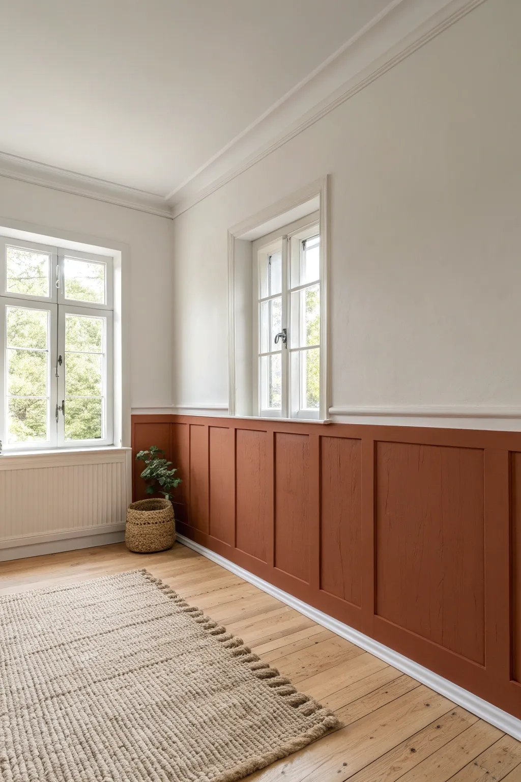
Bring warmth and character to any room with this classic half-wall paneling project. By combining crisp white upper walls with a rich terracotta hue on wainscoting-style molding, you create a sophisticated yet grounded atmosphere.
Detailed Instructions
Materials
- 1×3 or 1×4 MDF or wood trim boards (for battens/rails)
- Chair rail molding (optional cap piece)
- Baseboard molding
- Construction adhesive (e.g., Liquid Nails)
- Brad nailer and 1.5-inch brad nails
- Wood filler
- Caulk gun and paintable caulk
- Fine-grit sandpaper (220-grit)
- Painter’s tape
- Level (2-foot or 4-foot)
- Tape measure
- Primer (if using bare wood)
- White wall paint (eggshell or satin finish)
- Terracotta/Rust colored paint (satin or semi-gloss finish)
- Paint rollers and angled brushes
Step 1: Planning and Wall Prep
-
Prepare the surface:
Start by clearing the area and cleaning the walls thoroughly to remove dust or grease. If your existing baseboards are not flat or compatible with adding vertical battens, carefully pry them off with a pry bar. -
Determine the height:
Decide how high you want your paneling to go. A common height is around 32 to 36 inches from the floor, roughly one-third of the wall height, but measure against your windowsills to find a visually pleasing line. -
Mark the horizontal rail:
Use a level and a pencil to draw a straight horizontal line around the room at your chosen height. This line marks where the top of your horizontal rail will sit. -
Plan the spacing:
Measure the total length of the wall and divide it to determine the spacing for your vertical battens. A gap of 16 to 24 inches usually looks balanced. Mark these vertical positions on the wall lightly with a pencil.
Step 2: Installing the Trim
-
Install baseboards:
If you removed the old baseboards, install new flat-stock baseboard molding first. Apply construction adhesive to the back, press it into place, and secure it with a brad nailer into the studs. -
Attach the top rail:
Cut your horizontal top rail lumber to length. Apply adhesive to the back and align the top edge with your pencil line. Nail it into the studs along the wall. -
Cut vertical battens:
Measure the distance between the top of the baseboard and the bottom of the top rail. Cut your vertical batten strips to fit this space exactly. Measure individually for each spot, as floors are rarely perfectly level. -
Install the battens:
Place each vertical batten over your penciled marks. Use your level to ensure they are perfectly plumb before nailing them into place with adhesive and brad nails. -
Add the cap molding:
For a finished look, install a small chair rail or projecting cap piece on top of the horizontal top rail. This creates a nice ledge and visual transition to the upper wall.
Spacer Block Method
Cut a scrap piece of wood to the exact width you want between battens. Use this as a physical spacer tool instead of measuring every single gap.
Step 3: Finishing and Painting
-
Fill the holes:
Go over every nail hole with wood filler. Overfill slightly, as the filler will shrink when it dries. Let this dry completely before moving on. -
Sand smooth:
Once dry, sand the wood filler flush with the trim using fine-grit sandpaper. I also like to lightly sand any sharp edges on the wood cuts to soften them. -
Caulk the seams:
Run a thin bead of paintable caulk along every seam where the wood meets the wall, and where the battens meet the rails. Use a wet finger or a damp rag to smooth the caulk for a seamless, built-in look. -
Prime the paneling:
If you are using bare wood or MDF, apply a coat of primer to seal the material, paying special attention to cut edges which absorb more paint. -
Paint the upper wall:
Paint the upper portion of the wall first with your chosen white shade. It makes things easier if you paint slightly down past the top rail, so you don’t have to cut in perfectly yet. -
Apply the darker color:
Once the white paint is dry, use painter’s tape to protect the wall just above the cap molding. Paint the paneling, baseboards, and the wall space inside the ‘boxes’ with your terracotta color. -
Second coat:
Apply a second coat of the terracotta paint to ensure rich, opaque coverage. Remove the painter’s tape while the paint is still slightly tacky to keep the edge crisp.
Add Visual Depth
Install small cove molding inside the squares created by the battens for a more traditional, picture-frame wainscoting appearance.
Step back and admire how this simple architectural detail transforms the geometry of your space
BRUSH GUIDE
The Right Brush for Every Stroke
From clean lines to bold texture — master brush choice, stroke control, and essential techniques.
Explore the Full Guide
Painted Arch Feature
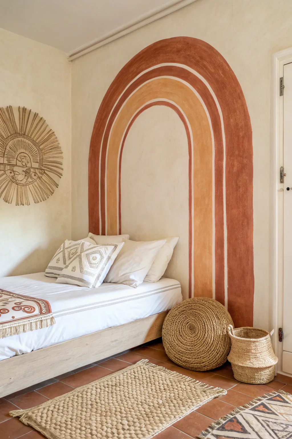
Transform a blank corner into a cozy, sun-drenched sanctuary with this earthy rainbow arch mural. Featuring warm terracotta and ochre tones painted directly on a cream background, it brings instant organic character and architectural interest to any space.
How-To Guide
Materials
- Interior latex paint (Terracotta/Burnt Sienna)
- Interior latex paint (Mustard/Ochre)
- Interior latex paint (Cream/Off-white for base)
- Painter’s tape
- Measuring tape
- Pencil
- String or twine
- Push pin or small nail
- 2-inch sash brush (angled)
- 1-inch flat artist brush
- Clean rag
- Level
- Drop cloth
Step 1: Planning & Base Prep
-
Assess the wall:
Begin by cleaning your wall surface thoroughly to remove any dust or grease, ensuring the best possible paint adhesion. If your current wall color is dark or uneven, apply a fresh coat of warm cream paint as your base and let it dry completely. -
Measure the width:
Decide on the total width of your outer arch. For a headboard effect like the one shown, measure slightly wider than your bedframe or the furniture piece it will anchor. -
Find the center:
Mark the exact center point on the wall where the peak of your arch will be. Use a level to draw a very faint vertical line down from this point to the floor to guide your symmetry. -
Establish the arch height:
Determine where the straight vertical lines will stop, and the curved arch will begin. Mark this transition ‘horizon line’ lightly on your wall on both the left and right sides.
Wobbly Lines?
Don’t panic! Use a flat artist brush dipped in the wall’s base color to “erase” and reshape wobbly edges. This acts like a correction pen for your wall.
Step 2: Drafting the Outline
-
Create a compass tool:
Tie a piece of non-stretchy string to a pencil. Measure the string length to match the radius of your largest outer arch (half the total width). -
Anchor the pivot point:
Secure the free end of the string at your center point on the ‘horizon line’ using a thumb tack or by having a helper hold it firmly in place. -
Draw the outer curve:
Keeping the string taut but not pulling too hard, swing the pencil upward to draw a clean semi-circle connecting your left and right height markers. -
Draft the inner bands:
Shorten the string by roughly 4-5 inches (depending on your desired stripe width) and draw the next inner arch. Repeat this process until you have outlined three distinct arched bands. -
Draw the vertical legs:
Using a long level or a straightedge, extend straight vertical lines down from the ends of each arch curve all the way to the floor (or baseboard). -
Assess the spacing:
Step back and look at your pencil lines. The charm of this mural is its hand-painted feel, so don’t worry if the spacing isn’t mathematically perfect, but make adjustments now if anything looks visibly crooked.
Step 3: Painting the Design
-
Start with the darkest color:
Dip your 2-inch angled sash brush into the terracotta paint. Begin painting the outermost arch band, cutting in carefully along your pencil lines. -
Master the curve:
When painting the curved top, use long, sweeping strokes rather than short chop marks to keep the edge fluid. I find it helpful to exhale while making these longer curves to keep my hand steady. -
Fill the vertical sides:
Once the curve is defined, pull the paint down the straight vertical legs. Ensure the paint is opaque; you may need a second coat later. -
Paint the inner accent:
Skip the middle space for now and paint the smallest, innermost arch using the same terracotta color. Follow the same technique: define the curve, then pull the lines down. -
Prepare the middle band:
Switch to a clean brush for the ochre/mustard color. Painting the middle stripe requires a steady hand since it sits between two other shapes. -
Apply the ochre tone:
Carefully paint the middle arch. Leave a deliberate gap of exposed wall color between this yellow band and the red bands roughly the thickness of a finger. -
Refine the negative space:
The negative white space between the colored bands is just as important as the color. Use a 1-inch flat artist brush with your wall base color to clean up these gaps if they became too narrow or messy. -
Create the texture:
To achieve the aged, fresco-like look seen in the photo, allow the first coat to dry, then dry-brush a small amount of paint over the top in random, cross-hatch motions. -
Final touch-ups:
Inspect your edges. If you want a crisp look, use a small angle brush to sharpen lines. For a softer, organic vibe, leave the edges slightly feathered. -
Clean up:
Remove any painter’s tape you might have used on baseboards while the paint is still slightly tacky to prevent peeling.
Add Dimension
Mix a little baking soda into a small cup of your paint for the final coat. This adds a subtle sandy texture that enhances the rustic, plaster-style aesthetic.
Step back and admire how this simple geometric addition warms up the entire room.
Freehand Stripes for Texture
Transform a plain wall into a textural woven masterpiece with this freehand stripe technique that mimics the imperfect beauty of raw linen. By skipping the painter’s tape and embracing the natural bristles of your brush, you achieve a soft, organic finish that adds height and warmth to any room without feeling rigid.
Detailed Instructions
Materials
- Creamy off-white latex wall paint (base coat, eggshell finish)
- Warm tan or biscuit-colored glaze or latex paint (thinned slightly)
- Water or acrylic glazing medium
- 2-inch to 3-inch synthetic bristle paint brush (flat or angled)
- Pencil
- Level (2-foot to 4-foot length)
- Tape measure
- Standard paint roller and tray
- Drop cloths
- Clean rags or painter’s rags
Step 1: Preparation & Base Coat
-
Prep the workspace:
Clear the area of furniture, including chairs and lamps, to give yourself plenty of room to move along the wall. Lay down drop cloths to protect your flooring from drips. -
Clean the walls:
Wipe down the wall surface with a damp cloth to remove dust and oils. This ensures your paint adheres properly and the finish looks clean. -
Apply the base coat:
Roll on two coats of your creamy off-white base color using a standard roller. Allow the paint to dry completely between coats and let the final coat cure for at least 24 hours before starting the decorative work.
Wobbly Lines?
Don’t panic! The beauty of this technique is imperfection. If a line goes too crooked, widen it slightly or add a thin parallel line next to it to distract the eye. It helps the organic look.
Step 2: Planning the Pattern
-
Determine stripe width:
Decide on the spacing for your stripes. For the look in the photo, aim for irregular spacing where the stripes are roughly 2-3 inches wide with varying gaps between them. -
Mark vertical guides:
Using your tape measure and pencil, make small tick marks along the top of the wall where you want the center of each stripe to be. -
Draw faint guidelines:
Use a level and a pencil to draw very faint vertical lines down the wall from your tick marks. These don’t need to be solid lines; dashed lines work well as a general guide to keep your freehand painting relatively straight.
Glazing Pro Tip
For a truly dimensional woven effect, use a clear glazing liquid instead of water to thin your paint. It keeps the paint ‘open’ (wet) longer, allowing for smoother dragging marks.
Step 3: Painting the Stripes
-
Prepare the paint mix:
Mix your warm tan paint with a little glazing medium or water. You want a consistency slightly thinner than standard wall paint to allow for translucency and brush texture, roughly 4 parts paint to 1 part medium. -
Load the brush:
Dip your 2-inch brush into the mixture, but don’t overload it. Tap off excess paint on the side of the container; a ‘dry brush’ approach is key to getting those visible bristle marks. -
Start the first stroke:
Starting at the very top of the wall, place your brush on one of your pencil guidelines. Pull the brush straight down with steady, moderate pressure. -
Create the texture:
As you pull down, vary your pressure slightly. Let the brush run out of paint naturally before reloading; this creates the faded, vintage linen effect seen in the image. -
Reload and continue:
Reload the brush and pick up where the previous stroke faded, overlapping slightly to blend the sections. Continue until you reach the floor. -
Add width and variation:
For thicker stripes, run a second stroke immediately next to the first one while the paint is still wet. Don’t worry about perfect blending; the separation lines add to the woven look. -
Correcting heavy spots:
If you accidentally apply a blob of paint, quickly blot it with a dry rag to lift the excess color, then lightly feather over it with your brush. -
Work across the wall:
Move to the next guideline and repeat the process. I like to step back every few stripes to ensure the overall rhythm of the pattern feels balanced, even if the individual lines are imperfect. -
Add accent thin stripes:
Go back and add very thin, impulsive lines between some of the wider stripes using the narrow edge of your brush. This mimics the irregular threads found in natural fabrics. -
Soften edges (optional):
If any edges look too sharp or harsh, take a clean, dry brush and lightly whisk the wet edges vertically to soften them into the background.
Step 4: Finishing Touches
-
Check for gaps:
Inspect the wall for any areas where the paint coverage is too sparse. Lightly dry-brush a little more color into these spots if needed, but remember that negative space is part of the charm. -
Erase guidelines:
Once the paint is fully dry (give it a few hours), gently erase any visible pencil marks that weren’t covered by the paint.
Enjoy the relaxed sophistication this custom texture brings to your space

PENCIL GUIDE
Understanding Pencil Grades from H to B
From first sketch to finished drawing — learn pencil grades, line control, and shading techniques.
Explore the Full Guide
Simple Border at the Ceiling
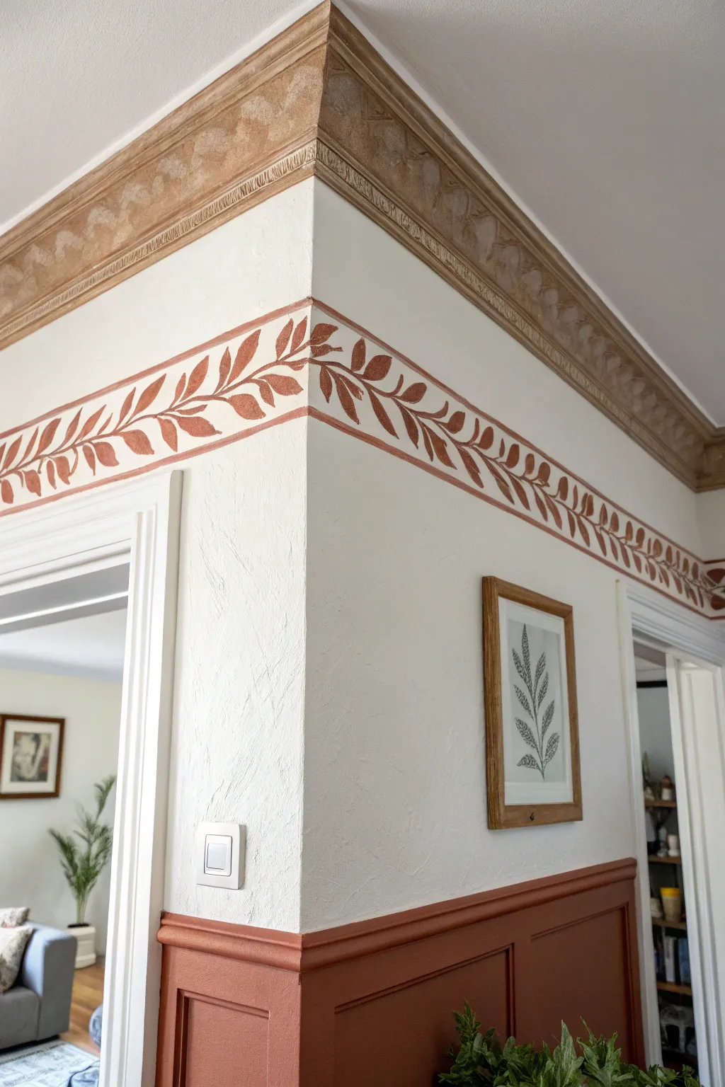
Bring warmth and classical charm to a room by combining a structured wainscoting with a delicate, freehand-style leaf border. This project mimics the look of ancient frescoes with its earthy tones and organic motifs, transforming a plain corner into an architectural statement.
Step-by-Step Guide
Materials
- Painter’s tape (1-inch and 2-inch widths)
- Terracotta or reddish-brown latex wall paint (satin or eggshell finish)
- Base wall paint (creamy white or off-white)
- Small angled sash brush (1.5 inch)
- Medium round artist’s brush (size 6 or 8)
- Small flat artist’s brush (size 4)
- Ruler or measuring tape
- Pencil
- Spirit level or laser level
- Drop cloth
- Paint tray and liners
- Damp rag for mistakes
Step 1: Preparation and Mapping
-
Clean the surface:
Before you begin, ensure your walls are clean and free of dust. Wipe down the area where you will be painting the border and the wainscoting with a damp cloth and let it dry completely. -
Establish the wainscoting line:
Decide on the height for your wainscoting. A standard chair rail height is around 32 to 36 inches from the floor, but you can go higher for a modern look. Use a tape measure to mark this height at several points along the wall. -
Level the line:
Connect your marks using a long spirit level or a laser level to create a perfectly straight horizontal line across the wall. Draw this line lightly with a pencil. -
Mark the upper border:
Move your attention to the ceiling area. Measure down approximately 6 to 8 inches from the bottom of your crown molding (or ceiling line) to determine where the leaf border will sit. Mark this starting point. -
Create the border guide:
Draw two parallel pencil lines around the perimeter of the room to define the top and bottom of your leaf vine border. Keep the width between lines consistent, about 3 to 4 inches wide.
Natural Variation
Don’t aim for factory perfection. Slight variances in leaf size and spacing make the hand-painted vine look authentic and charming, like a vintage fresco.
Step 2: Painting the Wainscoting
-
Tape the divider:
Apply painter’s tape just above your pencil line for the wainscoting. Press the edge of the tape down firmly to prevent paint bleed. -
Cut in edges:
Using your angled sash brush and the terracotta paint, cut in along the bottom of the tape line, the corners, and the baseboards. -
Fill the field:
Fill in the rest of the wainscoting area. If you have panel molding installed (as seen in the photo), take care to paint inside the recessed squares first before rolling or brushing the flat surfaces. -
Apply second coat:
Allow the first coat to dry according to the paint can instructions, then apply a second coat for a rich, opaque color. -
Remove tape:
I like to peel off the tape while the second coat is still slightly tacky to ensure a crisp, clean edge.
Shaky Hands?
If painting freehand lines is difficult, use a stencil for the recurring leaf pattern, then hand-paint the connecting stems to connect the look.
Step 3: Painting the Leaf Border
-
Define the rails:
Using your small artist brush and the terracotta paint, carefully paint two thin, solid lines over your upper and lower pencil guides. These act as the ‘rails’ that contain the vine pattern. -
Sketch the vine:
Lightly sketch a flowing, sinusoidal (S-curve) line through the center of your two painted rails with a pencil. This will be the main stem of your vine. -
Paint the stem:
Go over your pencil sketch with the medium round brush and terracotta paint. Vary the pressure slightly to give the stem a natural, organic thickness. -
Block in leaves:
Starting from the corners and working outward, paint simple almond-shaped leaves branching off the main stem. Alternate the direction of the leaves—one pointing up, the next pointing down. -
Use the brush shape:
For the leaves, press the belly of the round brush against the wall and pull up as you lift off to create a tapered point naturally without having to ‘draw’ the outline. -
Add connecting stems:
Connect each leaf to the main central vine with a thin, short stroke. Ensure the flow of the leaves follows the direction of the vine’s curve. -
Refine the details:
Once the main leaves are down, use the small flat brush to touch up any transparent areas or sharpen the tips of the leaves if they look too rounded. -
Create corner interest:
At the corner of the wall, ensure the leaves fan out slightly to bridge the gap between the two walls, making the pattern feel continuous rather than disjointed. -
Clean pencil marks:
Allow the paint to cure completely (at least 24 hours), then gently erase any visible pencil marks remaining between the leaves.
Step back and admire the classic elegance you’ve added to your room with just a touch of paint and patience
Climbing Botanical Vine
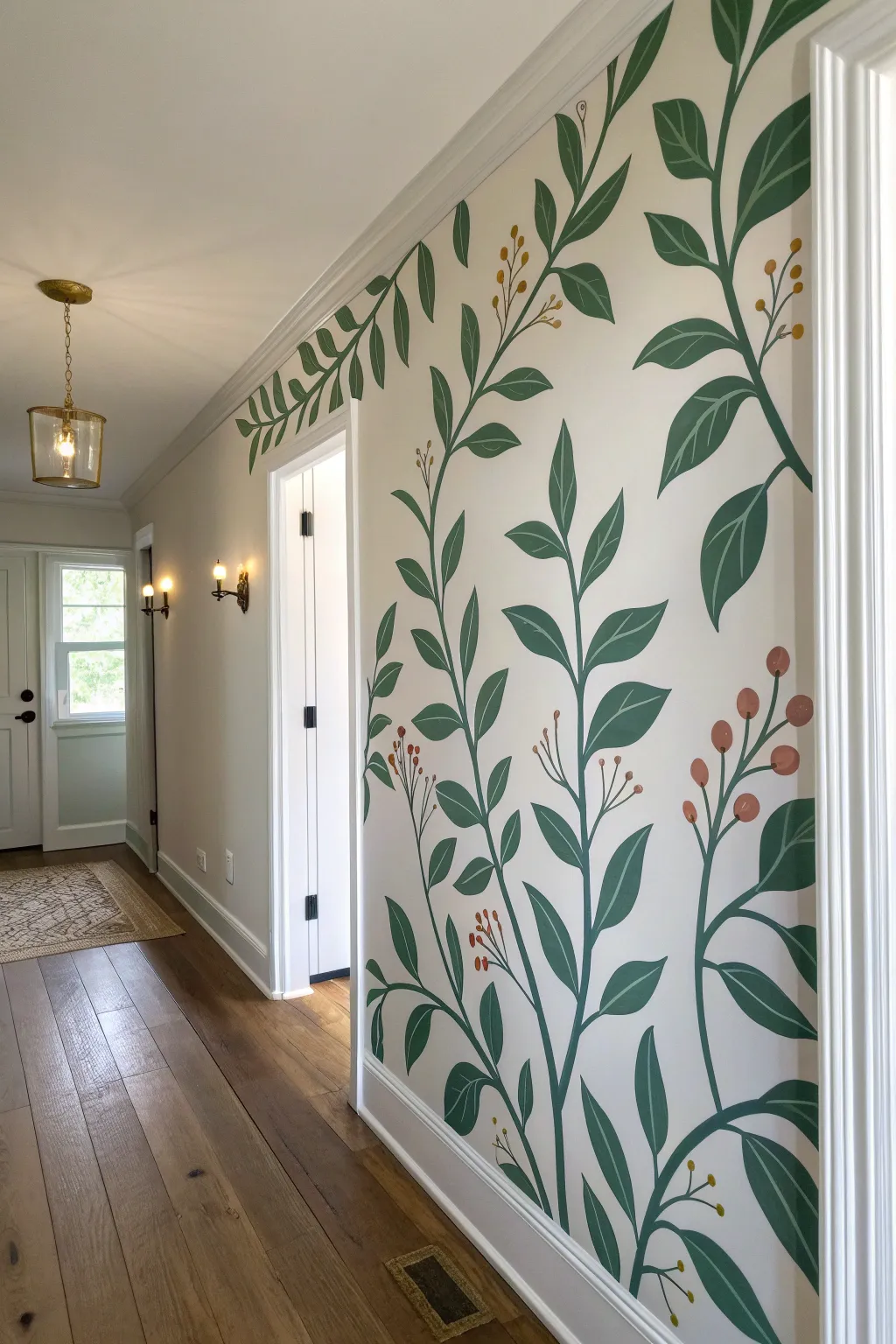
Transform a plain hallway or accent wall into a lush, illustrated garden with this charming climbing vine mural. The design features sweeping organic curves and stylized leaves that create a sense of height and movement without feeling cluttered.
Step-by-Step Tutorial
Materials
- Interior latex paint (matte or eggshell finish) in Sage Green
- Interior latex paint in Deep Forest Green
- Acrylic craft paint in Terra Cotta and Goldenrod (for berries)
- Pencil and eraser
- Level and measuring tape
- Round synthetic brushes (sizes 4, 8, and 10)
- Fine liner brush (size 1)
- Painter’s tape
- Step ladder
- Paper plates or palette
Step 1: Preparation & Planning
-
Prep the surface:
Ensure your wall is clean, dry, and free of dust. If you are painting over a dark color, prime the wall first with a white or cream base coat to match the airy background shown in the photo. -
Protect the trim:
Apply painter’s tape along the baseboards, door casing, and crown molding to ensure crisp lines where your mural meets the woodwork. -
Map out the vines:
Using a pencil, lightly sketch the main vertical stems of your vines. Aim for gentle S-curves that wander upward from the baseboard to the ceiling, varying the height and direction slightly for a natural look. -
Add secondary branches:
Sketch smaller offshoot branches coming from your main stems. I like to stagger these so they aren’t perfectly symmetrical, mimicking how plants actually grow. -
Outline leaf placements:
Lightly draw the basic shapes of the leaves along the stems. Don’t worry about perfect detailing yet; just mark the size and direction to ensure the composition feels balanced.
Step 2: Painting the Foliage
-
Paint the stems:
Load a size 8 round brush with your Deep Forest Green paint. Carefully trace over your pencil lines for the main stems, keeping the stroke smooth and consistent in width. -
Connect the branches:
Use the same green to paint the secondary branches, tapering the brush pressure slightly as you reach the tips to make them thinner than the main stalk. -
Block in base leaves:
Switch to a size 10 brush. Fill in the leaf shapes using the lighter Sage Green. Paint confidently with long strokes to fill the shape, rather than sketching with the brush. -
Add dimension:
While the Sage Green is still slightly tacky or just after it dries, use the Deep Forest Green to paint one half of select leaves, or add a shadow vein down the center for a stylized, two-tone effect. -
Refine the edges:
Go back with your Deep Forest Green and a size 4 brush to clean up the connections where the leaf stems meet the main vine, ensuring everything looks attached and sturdy.
Pro Tip: Practice Stroke
Before touching the wall, practice your leaf shapes on a piece of cardboard. Press down for the wide part of the leaf and lift up as you drag to create a sharp point.
Step 3: Adding Details & Berries
-
Paint berry clusters:
Identify spots where the composition looks a bit empty. Using the Terra Cotta paint and a size 4 brush, dab small circles to create clusters of berries hanging from thin stems. -
Add golden accents:
Repeat the previous step with Goldenrod paint, adding smaller clusters or single buds near the tops of the vines for variety. -
Connect the fruit:
Use your fine liner brush and the Deep Forest Green to draw very thin, delicate lines connecting these floating berries back to the main branches. -
Add leaf veining:
For the larger leaves that are solid Sage Green, use the liner brush and the darker green to paint a simple center line or V-shaped veins to give them character. -
Review and touch up:
Step back from the wall to look for any pencil marks that are still visible. Erase them gently once the paint is fully bone dry. Use your wall color paint to fix any accidental drips or smudges.
Troubleshooting: Shaky Hands
If your lines are uniform, use a “mauk stick” or simply rest your pinky finger against the dry wall to stabilize your hand while painting long stems.
Remove the tape to reveal your custom, hand-painted indoor garden that brings life to the space


Wildflower Confetti Wall
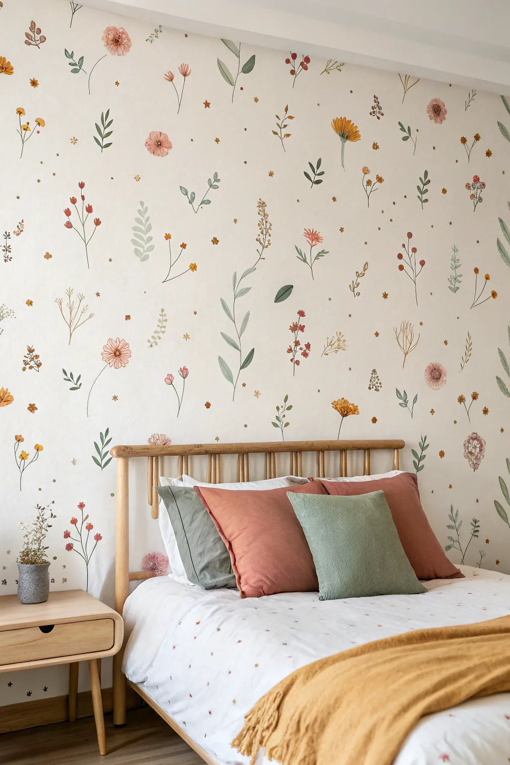
Bring the charm of a meadow indoors with this soft, airy wildflower wall mural that mimics the look of high-end wallpaper. Using watered-down acrylics and simple brushstrokes, you’ll create a scattered confetti pattern of blooms and stems that feels organic and handcrafted.
How-To Guide
Materials
- Matte interior wall paint (off-white or light cream base)
- Acrylic craft paints (sage green, forest green, muted yellow, coral pink, terracotta, lavender)
- Glazing medium or water (to thin paints)
- Assorted round brushes (sizes 2, 4, and 6)
- Fine liner brush (size 0 or 00 for stems)
- Small mixing cups or palette
- Paper towels
- Pencil (optional for light sketching)
- Step ladder
Step 1: Preparation & Planning
-
Base Coat Application:
Ensure your wall is clean and primed. Apply two coats of a warm off-white or light cream interior matte paint as your canvas. Allow this to dry completely for at least 24 hours creates the best surface for detail work. -
Map the Flow:
Stand back and visualize the spacing. Unlike structured wallpaper, this design relies on random placement. You can lightly mark small ‘X’s with a pencil where you want the largest focal flowers to sit to ensure even distribution. -
Mix Your Palette:
Squeeze your acrylic colors into separate cups. To achieve that watercolor transparency seen in the photo, mix each color with glazing medium or water. A ratio of 1 part paint to 1 part medium is a good starting point. -
Practice Your Stroke:
Before touching the wall, grab a piece of scrap paper or cardboard. Practice making thin stems and simple petal shapes. The goal is imperfect, fluid lines rather than rigid botanical accuracy.
Drip Disaster?
If your paint is too watery and drips, don’t panic. Quickly dab it with a dry paper towel to lift the excess. If a stain remains, paint a leaf over it later.
Step 2: Painting the Greenery
-
Start with Stems:
Dip your fine liner brush in the thinned sage green. Using a light hand, paint thin, wavy vertical lines scattered across the wall. These will be the anchors for your flowers. -
Add Leaf Variations:
Switch to a size 2 round brush. Along some stems, press the belly of the brush down and lift up quickly to create teardrop-shaped leaves. vary the direction—some pointing up, some drooping down. -
Create Fern Fronds:
For the fern-like greenery, paint a central arched stem first. Then, add tiny, quick dashes on either side of the stem, getting smaller as you reach the tip. -
Deepen the Palette:
Mix a small amount of forest green into your sage mix. Go back and add a few darker leaves or stems sporadically to create depth and visual interest among the lighter greens.
Dimension Boost
Mix a tiny bit of white into your petal colors and add a single highlight stroke to the top of the largest flowers after they dry.
Step 3: Blooming Details
-
Paint Coral Poppies:
Using your coral pink mix and a size 4 brush, paint loose, circular shapes with scalloped edges. Leave the center of the circle slightly open or lighter to mimic the cupped shape of a poppy. -
Add Yellow Daisies:
With the muted yellow, paint small clusters of petals radiating from a center point. Keep these strokes short and sweet. I find it helps to rotate the brush slightly as you pull away from the center. -
Detail the Lavenders:
For the tall, spikey flowers, use the lavender paint. dab small dots or short horizontal dashes climbing up the top third of a stem, tapering to a single dot at the very top. -
Introduce Terracotta Buds:
Using the terracotta shade, add small, closed buds on the ends of some lonely stems. These can just be simple oval shapes or three small brushstrokes clustered together.
Step 4: Golden Accents & Finishing
-
Starry Fillers:
Take a tiny brush and a golden-yellow hue. Paint tiny five-point stars or simple dots in the larger empty spaces between plants. This creates that ‘confetti’ effect. -
Define Flower Centers:
Go back to your open flowers. Add tiny dots of dark brown or black in the centers of the poppies and daisies to ground the flowers and make them pop. -
Floating Petals:
To enhance the breezy feel, paint a few single petals or leaves unconnected to any stems, as if they are drifting in the wind. -
Step Back and Review:
Walk to the other side of the room. Look for any unintended clusters or large empty voids. Use your smallest flowers or single leaves to fill these gaps for a balanced composition. -
Final Erasure:
Once the paint is completely dry (give it a few hours), gently erase any visible pencil marks from your initial planning phase.
Enjoy the peaceful atmosphere of your new hand-painted garden sanctuary
Hand-Painted Wave Band
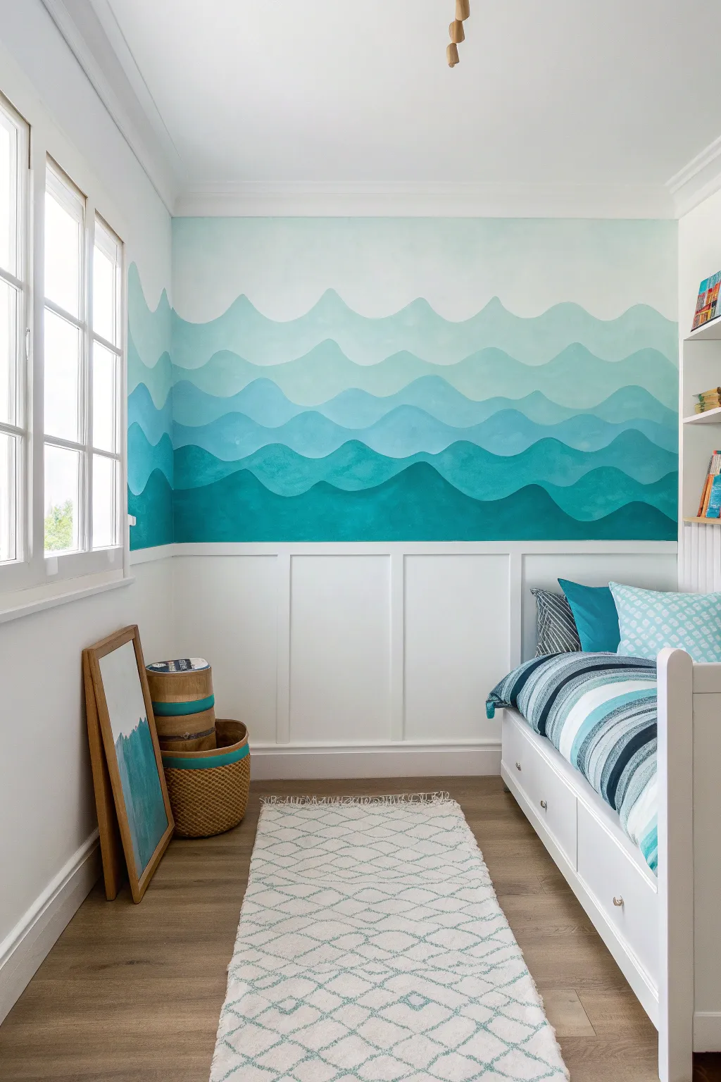
Transform a plain bedroom into a serene seascape with this rolling wave mural that utilizes a monochromatic color palette. The design moves from deep teal at the bottom to airy cyan at the top, creating a calming visual rhythm perfect for rest and relaxation.
Step-by-Step Guide
Materials
- Interior latex paint (White for base)
- Interior latex paint (Deep Teal/Dark Turquoise)
- Interior latex paint (Medium Aqua)
- Interior latex paint (Light Sky Blue)
- 2-inch angled sash brush
- 4-inch mini foam roller and handle
- Painter’s tape
- Pencil
- Large eraser
- Drop cloth
- Mixing cups or trays
- Damp rag
Step 1: Preparation & Planning
-
Prepare the surface:
Begin by clearing the wall area and laying down a drop cloth to protect your flooring. If your wall isn’t already white, apply a fresh coat of white satin or eggshell paint to the upper half of the wall where the mural will live, ensuring a bright, clean background for your sky. -
Tape off boundaries:
Apply painter’s tape along the top edge of your wainscoting or baseboard. Press the tape down firmly with a credit card or your thumb to prevent paint from bleeding underneath onto the trim. -
Sketch the wave guides:
Using a light pencil, freely sketch four distinct horizontal guidelines across the wall. These shouldn’t be straight lines; make them undulating and organic to mimic rolling water. Space them roughly 12-18 inches apart, getting slightly closer together near the top to mimic perspective.
Paint Consistency Tip
Add a floating medium or paint conditioner to your latex paint. This extends the drying time and makes the paint flow smoother, helping you achieve those long, uninterrupted brush strokes on the curves.
Step 2: Painting the Gradient
-
Mix the darkest shade:
Pour your Deep Teal paint into a tray. If the color feels too intense straight out of the can, I like to temper it with just a drop of the Medium Aqua to bridge the transition with the next layer. -
Cut in the bottom wave:
Using your angled sash brush, carefully paint the top edge of the lowest wave section following your pencil line. Focus on making a smooth, continuous curve rather than short, choppy strokes. -
Fill the bottom section:
Once the edge is defined, switch to the mini foam roller to fill the area between the wainscoting tape and your painted wave line. Apply two coats if necessary for full opacity, letting it dry for at least 2 hours between coats. -
Mix the second tier color:
For the next layer up, use your Medium Aqua paint. To ensure harmony, mix a small amount of the Deep Teal from step 4 into this new batch; this links the color story together. -
Paint the second wave:
Repeat the cutting-in process with the brush along the second pencil line. Paint downward slightly to overlap the top edge of the dark teal layer below. Don’t worry about a perfect seam; the overlap actually adds depth. -
Fill the second band:
Roll out the rest of this second section. Be careful as you approach the boundary of the dark teal layer below; use the brush to tidy up that meeting point so the lighter color sits crisply -
Create the third color:
Pour out the Light Sky Blue paint. Again, mix a teaspoon of the Medium Aqua into this batch to maintain that subtle gradient transition. -
Apply the third wave:
Cut in the third wave crest with your brush, painting smoothly along the pencil guide. Extend the paint down to meet the Medium Aqua band, keeping your hand steady for those curved peaks. -
Mix the final lightest shade:
For the highest wave band, take your Light Sky Blue and mix it with roughly 50% white paint. This should be barely tinted, looking almost like sea foam against the white wall. -
Paint the top crest:
Apply this final, lightest band at the top. The top edge of this wave meets the plain white wall, so ensure this line is particularly smooth as it will be very high contrast.
Wobbly Lines?
Don’t stress over perfect curves. If a wave looks uneven, widen the band slightly to correct the shape. The organic nature of water means “mistakes” just look like natural movement.
Step 3: Finishing Touches
-
Inspect and touch up:
Step back to the other side of the room to view the waves as a whole. If any curves look jagged or uneven, use a small artist’s brush to carefully smooth out the humps. -
Erase visible guides:
Once the paint is completely dry (wait at least 4-6 hours), gently erase any pencil marks that might still be visible at the very edges of your paint lines. -
Remove tape:
Slowly peel off the painter’s tape along the wainscoting while pulling it at a 45-degree angle away from the painted surface to ensure a sharp, clean line.
Step back and enjoy the calming rhythm of your new coastal-inspired feature wall
Graphic Dash Pattern Hallway
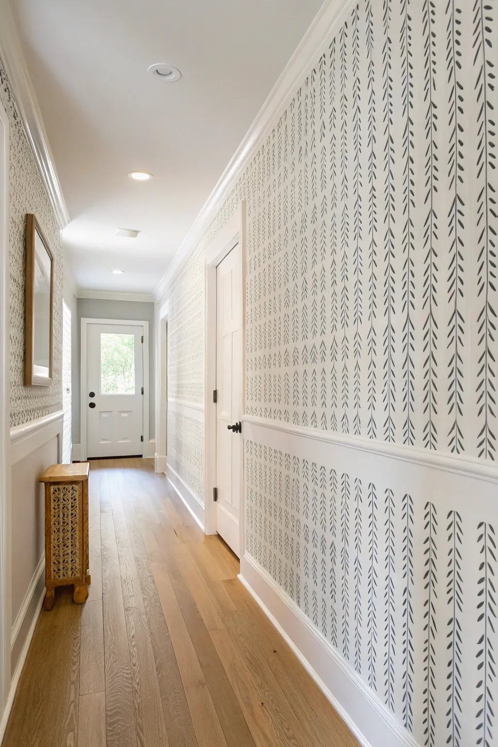
Transform a plain hallway into a visually stunning corridor with this hand-painted graphic pattern that mimics the delicate look of hanging vines or stylized dashes. This technique creates a bespoke wallpaper effect using nothing but a fine brush and a steady rhythm.
Detailed Instructions
Materials
- High-quality white latex paint (satin or eggshell)
- Black or charcoal grey acrylic or latex paint
- Small round tip artist brush (size 4 or 6)
- Painter’s tape (low tack)
- Laser level or long spirit level
- Pencil
- Measuring tape
- Clean rag or sponge
- Step ladder
Step 1: Preparation and Mapping
-
Prepare the base:
Ensure your wall surface is clean, dry, and free of dust. If you are starting fresh, apply two coats of your white base color (satin or eggshell finish works best for durability in hallways) and allow it to cure for at least 24 hours. -
Protect trim:
Apply painter’s tape carefully along the chair rail, crown molding, and baseboards to ensure crisp edges at the top and bottom of your mural space. -
Determine vertical spacing:
Decide on the density of your vines. In the example, the vertical columns are spaced roughly 4 to 6 inches apart. Measure the total width of the wall and divide by your desired spacing to see how many columns fit evenly. -
Mark vertical guides:
Using a laser level as your guide, lightly mark vertical pencil lines from the chair rail to the ceiling at your determined intervals. These lines will serve as the ‘spine’ for each vine column.
Uneven Spacing?
Don’t panic if your columns drift. Because this is an organic vine pattern, you can gently curve a column back toward the center or add ‘stray’ leaves to fill gaps without it looking like a mistake.
Step 2: Painting the Pattern
-
Load your brush:
Dip your round artist brush into the black or charcoal paint. You want the paint to have an ink-like consistency, so if it’s thick latex, thin it slightly with a few drops of water to help it flow smoothly. -
Practice your stroke:
Before hitting the wall, practice on a piece of cardboard. The stroke is a quick, downward flick—start with pressure to create the wider top of the leaf/dash, and lift as you pull down to create a tapered point. -
Start the center spine:
I prefer starting at the top of a column and working down. The ‘spine’ isn’t a solid line; it’s implied. Paint very thin, short vertical dashes along your pencil line, leaving small gaps between them. -
Add the leaves:
At the top of each small vertical dash, paint two diagonal strokes—one angling down to the left, one to the right. They should connect to the central spine dash, creating an upside-down ‘V’ or arrow shape. -
Maintain rhythm:
Repeat this pattern—vertical dash, left angled dash, right angled dash—moving down the pencil line. Don’t worry about making them identical; slight variations in size and angle add to the organic, hand-drawn charm. -
Complete the first column:
Continue the pattern all the way down to the chair rail. Step back occasionally to ensure the density of the pattern feels consistent from top to bottom. -
Advance across the wall:
Move to the next marked pencil line and repeat the process. Work column by column across the hallway.
Step 3: Finishing Touches
-
Detail check:
Once all columns are painted, scan the wall for any areas that look too sparse. You can gently add a tiny extra leaf or extend a line slightly to balance the visual weight. -
Erase guidelines:
Allow the paint to dry completely (wait at least a few hours). Then, very gently use an eraser to remove any visible pencil marks from your vertical guides, being careful not to rub the fresh paint. -
Remove tape:
Slowly peel away the painter’s tape at a 45-degree angle. If any paint bled under the tape onto the trim, wipe it immediately with a damp rag or touch it up with trim paint later. -
Clear coat (optional):
For high-traffic hallways, you might consider applying a clear, water-based matte polycrylic over the wall to protect your artwork from scuffs, though this is optional if you used durable paint.
Gradient Effect
Mix a slightly lighter grey paint and use it for every other column, or designate the top half of the wall for darker strokes and fade to lighter grey strokes near the bottom for a subtle ombré look.
Step back and admire how a simple repeated stroke has completely redefined the architectural character of your hallway
Leaf Stamp Faux Wallpaper
Transform a plain wall into a lush, tropical sanctuary using a custom stamping technique that mimics expensive wallpaper. By combining large, bold block-printed leaves with delicate, hand-sketched accents, you’ll achieve a sophisticated, organic look with inviting depth.
Step-by-Step Tutorial
Materials
- High-density foam sheet or linoleum block
- Carving tools (lino cutter or craft knife)
- Small roller (brayer)
- Deep forest green acrylic or latex paint
- Metallic gold paint pen or fine-liner brush
- Cardboard or poster board (for mounting the stamp)
- Painter’s tape
- Level and chalk line
- Drop cloth
- Scrap paper for testing
Step 1: Stamp Creation
-
Draft the master leaf:
Sketch a large, symmetrical palm or monstera-style leaf onto a piece of paper first to perfect your shape. The design should feature a central vein with curved lobes extending outward. -
Transfer to foam:
Trace your paper design onto the high-density foam sheet. If you want the visual texture seen in the photo, plain craft foam works well, but high-density foam holds finer details better. -
Carve the negative space:
Using your carving tool or craft knife, carefully cut away the areas around the leaf veins and the outline. Remember, whatever you cut away will remain the wall color; the raised foam is what will print green. -
Refine the texture:
To mimic the distinct woodblock look in the image, gouge out thin lines within the leaf lobes. These striations shouldn’t be perfect; a little irregularity adds to the hand-crafted charm. -
Mount the stamp:
Glue your carved foam shape onto a sturdy piece of cardboard or mounting block. This provides a rigid backing so you can apply even pressure against the wall.
Uneven is Better
Don’t stress if the stamp doesn’t transfer perfectly opaque every time. The speckled, faded areas enhance the faux-wallpaper aesthetic.
Step 2: Applying the Greenery
-
Plan your grid:
Determine the spacing of your leaves. Use a chalk line or a level and light pencil marks to create vertical guidelines, ensuring your columns of leaves stay straight as they travel up the wall. -
Load the paint:
Pour your forest green paint into a tray. I prefer using a brayer to roll a thin, even layer of paint onto the foam stamp rather than dipping it, which prevents globs and drips. -
Test print:
Press your stamp onto scrap paper several times. This primes the foam and helps you figure out exactly how much pressure creates that lovely, slightly speckled texture without smudging. -
Start the first column:
Begin at the top of your wall in the first column zone. Press the stamp firmly against the wall, rocking slightly to ensure the edges transfer, then peel it back straight. -
Alternate the pattern:
For the next column, offset the vertical position of the leaves so they sit in the gaps of the first column (a ‘drop match’ pattern). This prevents grid-like rigidity. -
Complete the stamping:
Continue across the wall, reloading ink for every single print to maintain consistent color intensity. Allow the green paint to dry completely.
Level Up: Shadow Play
Mix a slightly lighter green and stamp it slightly offset over the dark green once dry to create a dual-tone, shadowed effect.
Step 3: Adding Golden Details
-
Practice freehand leaves:
The secondary leaves are delicate outlines. Practice drawing small, almond-shaped leaves with internal veins on paper until you feel confident in your strokes. -
Fill the gaps:
Look for empty spaces between the large green prints. Use your metallic gold paint pen or a fine liner brush with gold paint to draw floating leaves in these voids. -
Vary the direction:
Draw some gold leaves pointing up, others pointing down or sideways. This random rotation mimics falling leaves and breaks up the visual weight of the heavy green stamps. -
Add texture lines:
Inside each gold leaf outline, draw quick, hatched lines for veins. Keep your wrist loose; these shouldn’t look like architectural diagrams but rather like quick sketches. -
Final review:
Step back and check for any awkward empty spots. Add a few more tiny gold accents if needed to balance the composition.
Step back and admire your custom botanical oasis, knowing you created a designer look with simple tools and a steady hand
Color Wash for Soft Depth
Transform a plain wall into a dreamy, atmospheric skyscape using soft color washing techniques. This project layers delicate shades of blush, peach, and cream to create billowing clouds that add romance and depth without overwhelming the space.
Detailed Instructions
Materials
- Interior latex paint (matte finish) in white (base)
- Interior latex paint or acrylics in blush pink, soft coral, and terracotta
- Glaze medium (clear)
- Large sea sponge or synthetic wool sponge
- Wide softness bristle brushes (4-inch)
- Small round blending brushes
- Painter’s tape
- Drop cloths
- Mixing buckets or trays
- Lint-free rags
- Water spray bottle
Step 1: Preparation and Base Layer
-
Protect the area:
Begin by clearing the room or moving furniture to the center. Lay down drop cloths to protect your flooring and apply painter’s tape to the ceiling line, baseboards, and door frames to ensure crisp edges. -
Prime the surface:
If your wall isn’t already white, apply a coat of high-quality matte white interior paint. A matte base is crucial because it absorbs the glaze layers better than eggshell or satin, allowing for softer blending. -
Mix your glazes:
Prepare your color washes. In separate containers, mix your blush, coral, and terracotta paints with the clear glaze medium. I usually aim for a ratio of 1 part paint to 4 parts glaze for translucency, but adjust according to the glaze manufacturer’s instructions. -
Prepare a white wash:
Don’t forget to mix a pure white glaze as well. This will be your ‘eraser’ and highlighter, helping you blend the colored areas back into the background for that misty look.
Step 2: Creating the Atmosphere
-
Wet the sponge:
Soak your sea sponge in water and wring it out thoroughly. It should be damp but not dripping. This helps the glaze transfer smoothly without leaving harsh imprints. -
Apply the darkest tone:
Start with your deepest terracotta or dark blush shade. Dip the sponge lightly and dab it onto the wall in organic, patchy clusters. Focus on the lower sections and corners where shadows might naturally fall, leaving large open spaces. -
Soften the edges:
Immediately use a damp lint-free rag to blot the edges of your sponge marks. Use a circular motion to blur the paint outward, ensuring there are no hard stops where the color meets the white wall. -
Layer the mid-tones:
While the first layer is still tacky, introduce the lighter blush pink using a fresh sponge or clean part of the same sponge. Overlap this color slightly with the darker patches and extend it further up the wall.
Fixing Muddy Colors
If colors start blending into a muddy brown, stop immediately. Let the wall dry completely. Once dry, you can layer fresh, clean color over the muddy spot without it mixing further.
Step 3: Building the Clouds
-
Introduce the white:
Now, take a large soft-bristle brush dipped in your white glaze mixture. Paint large, billowing shapes adjacent to and slightly over the pink areas. This creates the body of the clouds. -
Blend the transitions:
Using a clean, dry blending brush, gently sweep back and forth over the area where the pink and white glazes meet. This ‘cross-hatching’ motion mixes the wet glazes on the wall, creating a seamless dreamy gradient. -
Mist for movement:
If the paint feels too stiff or is drying too fast, lightly spritz the area with your water bottle. The water will cause the pigment to run slightly, adding organic texture. -
Add highlights:
Load a sponge with thicker, unthinned white paint. Stipple this onto the upper crests of your painted clouds to mimic sunlight hitting the tops. It adds dimension and pops against the softer glazed background. -
Deepen the shadows:
Go back in with a small amount of the darkest color mixed with a tiny bit of grey or brown if you have it, tucking it under the white billows to distinctively separate the cloud formations.
Metallic Lining
For a magical touch, trace the very top edges of a few main clouds with a thin line of metallic gold or silver leaf paint to catch the light.
Step 4: Final Details
-
Step back and assess:
Walk to the other side of the room. Cloud murals often look chaotic up close but resolve into shapes from a distance. Look for areas that seem too heavy or too empty. -
Refine the shapes:
Use your blending brush to feather out any harsh lines you spot. If a pink area feels too intense, wash over it with a very thin layer of the white glaze to knock it back. -
Dry brush texture:
With a nearly dry brush and a tiny amount of white paint, lightly whisk over the tops of the clouds in upward, curving strokes to simulate wispy vapor. -
Clean up:
Once fully satisfied, remove the painter’s tape carefully. Pull the tape away from the painted edge at a 45-degree angle to prevent peeling.
Enjoy the serene, custom atmosphere you’ve created in your space
Dry-Brush Haze Gradient
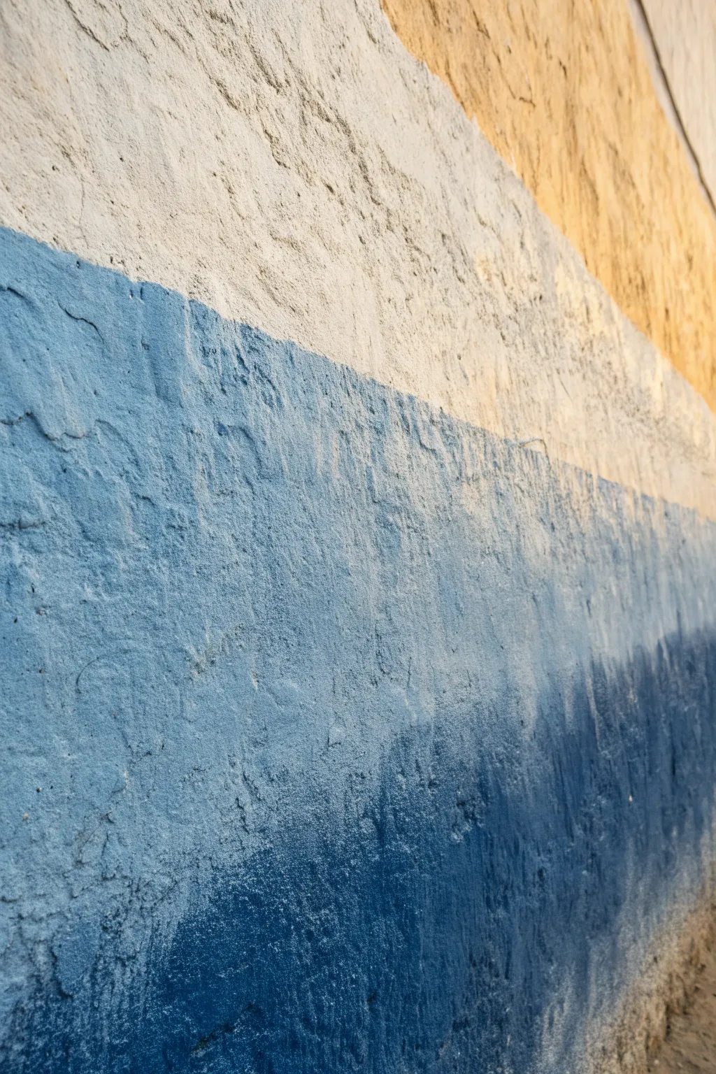
This technique transforms a plain textured wall into a dreamy, coastal landscape using a rough, dry-brush gradient method. The result is a tactile, organic transition of colors that mimics the horizon where sand meets sea.
Step-by-Step
Materials
- Matte latex interior paint (Warm Tan, Off-White, Steel Blue, Navy Blue)
- Wide block brush (4-6 inches)
- Medium sash brush
- Painter’s tape
- Drop cloths
- Mixing trays
- Clean rags
- Stir sticks
Step 1: Preparation & Base Layers
-
Clear and Protect:
Start by clearing the wall area and laying down drop cloths to protect your flooring from paint splatter. Apply painter’s tape to adjacent walls, ceilings, or baseboards to keep edges crisp. -
Assess Texture:
Examine your wall’s texture; this technique works best on stucco, popcorn, or roughly plastered walls because the paint catches on the high points. -
Apply the Warm Top Band:
Pour your Warm Tan paint into a tray. Using the wide block brush, paint the upper section of the wall. Fill in the texture thoroughly for a solid base coat. -
Create the White Band:
While the tan layer dries, wash your brush or switch to a clean one. Paint the band directly below the tan using the Off-White paint. Don’t worry about a perfect line between them yet.
Texture Traps
On heavy textures like stucco, don’t overload your brush for the blending steps. Too much paint fills the holes and ruins the dry-brush look.
Step 2: Developing the Haze
-
Blend the Upper Transition:
Dip a nearly dry brush into a small amount of Off-White paint. Lightly drag it upward over the bottom edge of the dry Tan section. -
Feather the Edge:
Use quick, horizontal cross-hatching motions to feather the white paint into the tan, letting the wall texture break up the stroke. -
Apply the Mid-Tone Blue:
Load your brush with Steel Blue paint. Apply this color below the white band, covering a significant middle portion of the wall. -
Create the Blue-White Haze:
Before the Steel Blue fully dries, take a clean brush with a tiny amount of Off-White and lightly brush downward into the blue to soften the transition. -
Dry-Brush Upward:
I like to reverse direction here: take a very dry brush with a hint of Steel Blue and lightly skim over the lower part of the white band to create depth.
Oceanic Shimmer
Mix a clear glaze with a pinch of metallic pearl powder and dry-brush it over the transition lines for a sun-glinting-on-water effect.
Step 3: Deepening the Horizon
-
Apply the Dark Base:
Paint the bottom section of the wall with your Navy Blue paint. Ensure you push the paint deep into the crevices of the wall texture for a solid, grounding look. -
Rough Transition:
Where the Navy meets the Steel Blue, avoid painting a straight line. Instead, use uneven, jagged strokes to simulate a natural, organic boundary. -
Scumble the Colors:
Using a technique called scumbling, use a brush with very little paint (Navy) and scrub it in circular motions over the dried Steel Blue boundary. -
Highlight the Texture:
Dip a brush lightly into the Steel Blue again. Hold the brush almost parallel to the wall and drag it lightly over the Navy section. -
Catch the High Points:
This ‘drag’ technique ensures paint only lands on the raised texture bumps, leaving the dark Navy in the recesses for a rich, two-tone effect. -
Final Micro-Blending:
Look for any harsh lines that distract from the hazy effect. Use a clean, dry rag to gently rub and blur wet edges if needed. -
Cleanup:
Once you are satisfied with your gradient, carefully remove the painter’s tape while the paint is still slightly tacky to prevent peeling.
Step back and enjoy the calming atmosphere your new textured gradient brings to the room
Painted Nook That Wraps Around
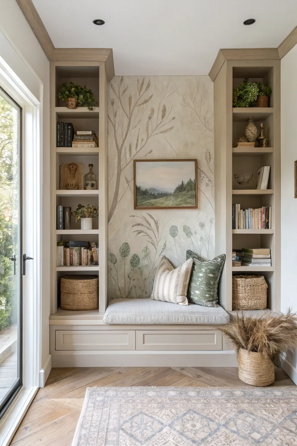
Transform a simple alcove into a serene countryside retreat with this hand-painted botanical mural. Using a soft, neutral palette and sketch-like strokes, you’ll create an illusion of depth and whimsy that feels both vintage and fresh.
Detailed Instructions
Materials
- Interior latex paint (soft beige or off-white for base)
- Acrylic paints (various shades of sage green, olive, taupe, cream, and charcoal)
- Glaze medium
- Pencil (HB or lighter)
- Large eraser
- Assorted brushes (1-inch flat brush, round brushes sizes 4-8, fine liner brush)
- Sea sponge or clean rag
- Painter’s tape
- Drop cloth
- Step ladder
- Reference images of tall grasses and seed heads
Step 1: Preparation & Base Coat
-
Clear and Clean:
Remove all cushions, decor, and shelving contents from the nook. Wipe down the walls with a damp cloth to remove dust, ensuring a clean surface for adhesion. -
Surface Protection:
Apply painter’s tape along the ceiling line, floor trim, and the vertical edges where the bookshelves meet the back wall. Lay down your drop cloth to protect the bench and floor. -
Apply the Base:
Roll on two even coats of your soft beige or off-white interior latex paint. Allow the first coat to dry completely for about 2-4 hours before applying the second. This creates that ‘canvas’ look.
Keep It Fluid
Add a drop of water or flow improver to your acrylics. This helps long brushstrokes (like grass stems) glide smoothly without breaking mid-line.
Step 2: Creating Atmosphere
-
Mix the Glaze:
Mix a small amount of taupe acrylic paint with clear glaze medium in a 1:4 ratio. You want a translucent wash, not an opaque color. -
Cloudy Texture:
Using a dampened sea sponge or rag, lightly dab the glaze mixture onto the wall in random, organic patches. Focus slightly more on the edges to create a vignetted, aged parchment effect. -
Softening the Edges:
While the glaze is still wet, take a dry, clean brush and lightly feather out the edges of your sponged areas to ensure there are no harsh lines. Let this background layer cure overnight.
Step 3: Sketching the Composition
-
Plan the Layout:
Visualize three main elements: a tall, sweeping tree branch on the left, mid-height grasses on the right, and lower seed pods near the bottom. The center should remain relatively open to frame artwork. -
Drafting the Tree:
Lightly sketch the main trunk of the tree starting from the bottom left, curving upward and branching out across the top third of the wall. Keep the lines faint so they are easy to cover. -
Adding Grasses:
Sketch long, sweeping curves on the right side to represent tall grasses. Vary the heights and angles to mimic natural movement in the wind.
Mistake Correction
Did a leaf go rogue? Since key elements are organic, you can often just paint over the error with your background wall color once dry, then try again.
Step 4: Painting the Foliage
-
Mixing Botanical Greens:
Create a palette of muted greens by mixing olive and sage with a touch of gray or brown. Avoid bright, primary greens to maintain the vintage aesthetic. -
Painting the Tree Trunk:
Use a medium round brush and a watery brownish-taupe mix to paint the tree trunk. Use long, fluid strokes, lifting the brush at the end of branches to taper them naturally. -
Adding Leaves:
Switch to a smaller round brush (size 6). Dip it in a sage green mix and press the belly of the brush against the wall, pulling slightly to create simple, almond-shaped leaves along the branches. -
Creating Depth:
Once the first layer of leaves is dry, mix a slightly lighter cream-green shade. Paint a second layer of leaves overlapping some of the first ones to create density and volume. -
Detailing the Grasses:
Use the liner brush with a dark charcoal-green mix to paint the thin stems of the grasses. Use your whole arm to sweep the brush upward for smooth, non-jittery lines. -
Seed Heads and Pods:
For the round seed pods at the bottom, use a dry-brush technique with a darker green-gray. Stipple (dot) the paint in circular shapes to give them a fuzzy, textured appearance. -
Whispy Accents:
Mix a very watery cream or white paint. Using the finest liner brush, add tiny flyaway hairs on the seed pods and highlight the tips of the grass blades.
Step 5: Finishing Touches
-
Review and Refine:
Step back to view the mural as a whole. I prefer to take a photo with my phone to see the composition objectively. Add small sprigs or leaves to fill any awkward gaps. -
Erase Guidelines:
Once the paint is meticulously dry (give it at least 24 hours), gently erase any remaining visible pencil lines with a large white eraser. -
Protective Coat (Optional):
If the nook will see heavy traffic or kids, roll on a clear, matte polycrylic sealer to protect your artwork without adding unwanted shine.
Now you have a tranquil, custom backdrop ready for cushions and quiet reading afternoons
Trompe-l’Oeil Garden Window
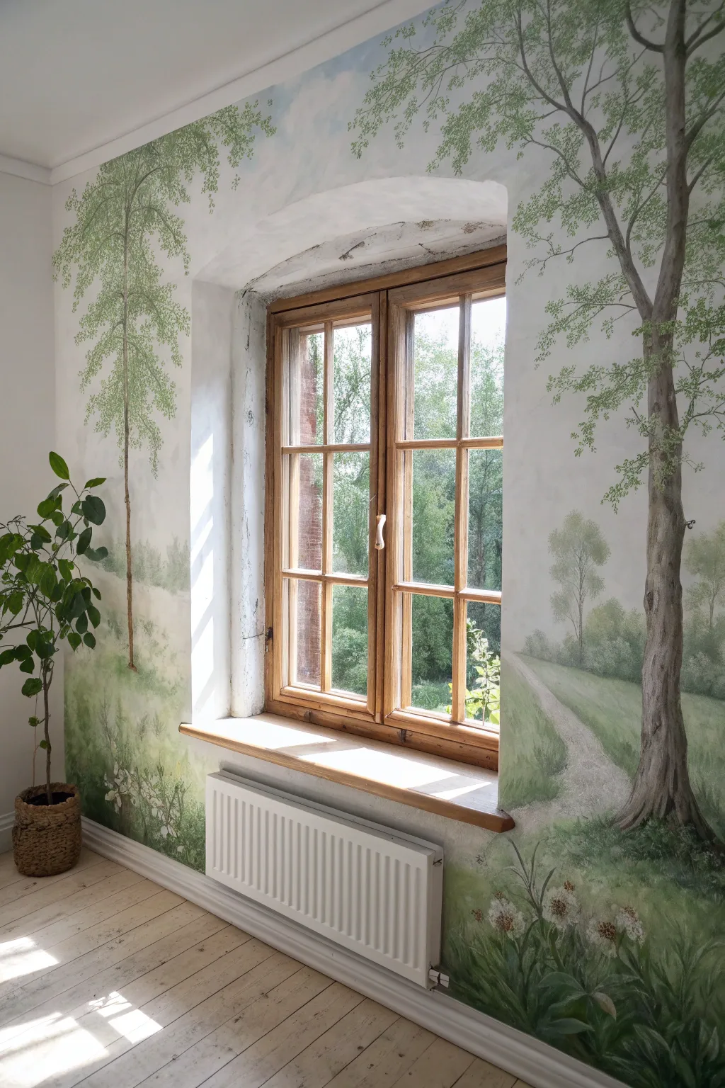
Transform a plain wall into a serene forest clearing that seamlessly extends the view from your window. This mural uses soft greens and atmospheric perspective to create depth, making your room feel like an extension of the natural world outside.
Detailed Instructions
Materials
- Interior latex wall paint (white or off-white base)
- Acrylic mural paints (colors: Sap Green, Olive Green, Burnt Umber, Raw Sienna, Titanium White, Sky Blue)
- Wide painter’s tape
- Drop cloths
- Large blending brush (3-4 inch)
- Medium filbert brushes
- Fine liner brushes for details
- Sea sponge
- Pencil and eraser
- Mixing buckets or large palette tray
- Glazing medium (optional)
- Stepladder
Step 1: Preparation and Base
-
Prepare the space:
Clear furniture away from the window wall. Tape off the window trim, baseboards, and the ceiling line carefully. Lay down drop cloths to protect your flooring. -
Priming the canvas:
Ensure the wall is clean and dry. If the existing color isn’t a neutral white or very light cream, apply a fresh coat of base paint to create a blank canvas for your landscape. -
Rough sketching:
Lightly sketch the main elements with a pencil. Mark the placement of the large foreground tree on the right and the slender birch-like tree on the left. Outline the horizon line slightly below the window sill level and sketch the winding path on the right.
Trees look flat?
Focus on your light source. Since there is a real window, paint highlights on the side of the tree facing the window and shadows on the opposite side to trick the eye.
Step 2: Sky and Background
-
Painting the sky:
Mix Sky Blue with plenty of White. Using a large brush, scrub in the sky area at the top, fading it down towards the horizon. I like to keep this very loose and cloudy, not solid blue. -
Distant trees:
Mix a pale, desaturated grey-green to represent the distant forest line. Paint soft, hazy tree shapes along the horizon. Keep edges blurry to suggest distance; this atmospheric perspective is key to depth. -
The middle ground:
Mix a slightly stronger, warmer green. Block in the grassy fields below the horizon line, using horizontal brushstrokes to emphasize the flatness of the land in the distance.
Add local flora
Level up by researching native plants from your specific region. Painting accurate local wildflowers in the foreground makes the mural blend perfectly with the window view.
Step 3: Major Trees
-
Trunk structure:
Mix Burnt Umber, Raw Sienna, and a touch of White. Using a medium filbert brush, paint the main trunk of the large tree on the right. Make the base wider and taper it as it reaches the ceiling. Add the slender left-hand tree trunk simultaneously. -
Adding texture to bark:
While the trunk paint is tacky, streak in darker Umber for shadows on the side away from the window light, and lighter cream tones on the side facing the window to mimic natural light hitting the bark. -
Branching out:
Extend branches from the main trunks using a thinner brush. Ensure they taper nicely at the ends. Allow them to reach up and over the window arch to frame the view.
Step 4: Leafy Details
-
Canopy base layer:
Mix a mid-tone green. Use a sea sponge or an old scruffy brush to dabbing clusters of leaves onto the branches. Don’t overfill; leave ‘sky holes’ so the wall color shows through. -
Leaf highlights:
Mix a lighter yellow-green. Dab this lightly on top of your leaf clusters, focusing on the tops of the branches where sunlight would hit. -
Foreground grass:
At the bottom of the wall, use vertical, flicking strokes with various shades of green to create tall grasses. Make the grass nearest the floor the most detailed and distinct. -
Defining the path:
Paint the path using a pale beige or grey-sand color. Use horizontal strokes that get narrower as the path recedes into the painting, reinforcing the perspective.
Step 5: Finishing Touches
-
Wildflowers:
Using a small detail brush, dot in white and cream wildflowers near the floor in the foreground grass. Group them in subtle clusters rather than evenly spacing them. -
Shadow integration:
Add subtle shadows on the ground under the trees using a watered-down dark green or brown glaze. This grounds the trees so they don’t look like they are floating. -
Final assessment:
Step back to the center of the room. Check if the perspective lines of the path and horizon generally align with your eye level. Add any final highlights to the tree bark to make it pop. -
Cleanup:
Remove the painter’s tape carefully while the paint is fully dry to ensure crisp lines against the woodwork.
Enjoy your peaceful new view, bringing the calm of a country garden directly into your living space regardless of the weather outside
Moody Night-Sky Constellations
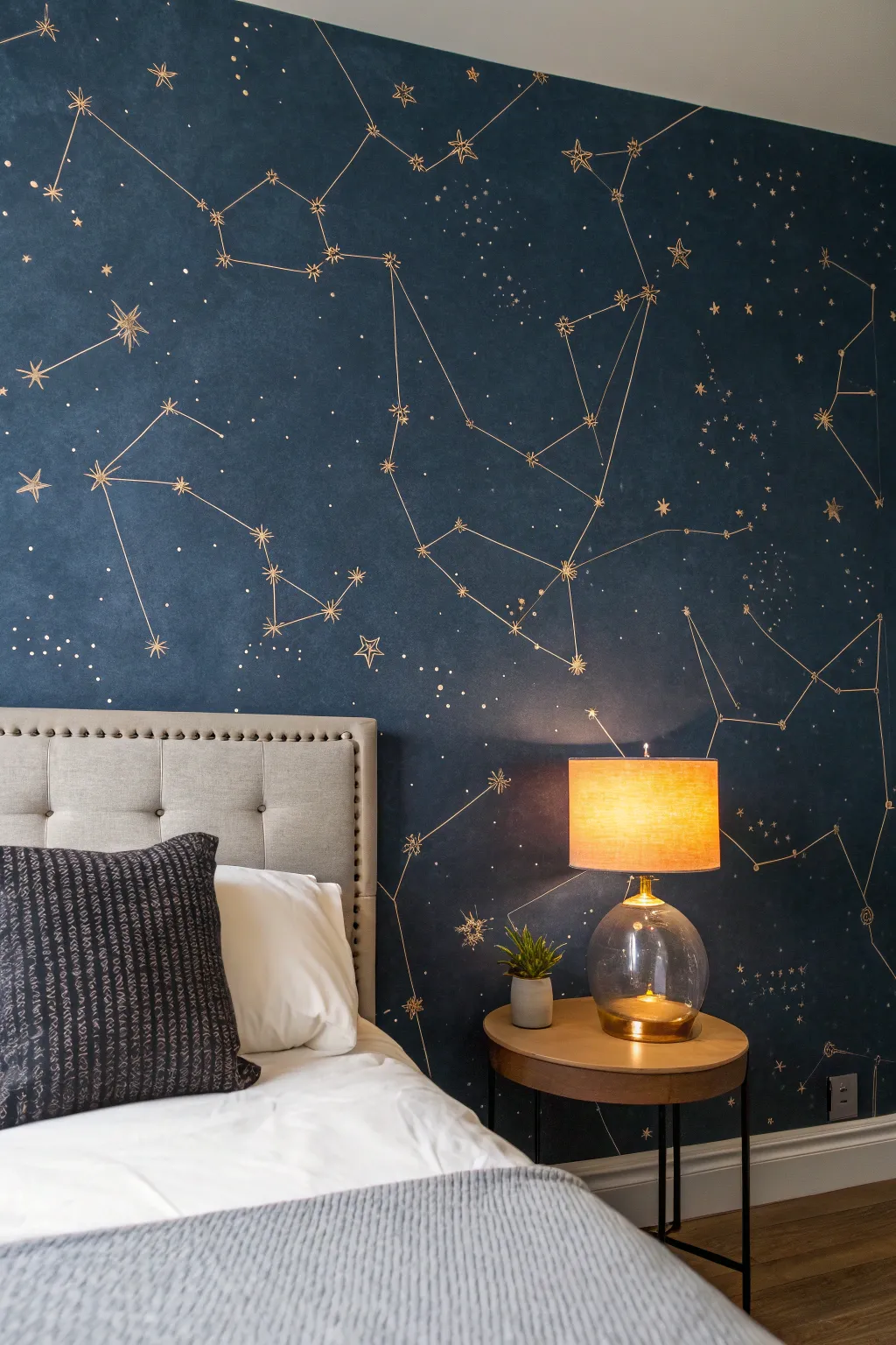
Transform a plain bedroom wall into a captivating window to the cosmos with this moody, sophisticated mural. The deep navy backdrop pairs beautifully with metallic gold lines to create a restful yet inspiring focal point.
Step-by-Step Guide
Materials
- Deep navy blue interior latex paint (matte or eggshell finish)
- Metallic gold acrylic paint or paint pen
- White chalk
- Painter’s tape
- Drop cloths
- Roller and tray
- Angled sash brush (for cutting in)
- Fine liner brush (size 0 or 00)
- Small round brush (size 2)
- Ruler or straight edge (long)
- Reference images of constellations
- Sharp pencil
- Damp microfiber cloth
Step 1: Preparing the Canvas
-
Clear and Prep:
Move furniture away from the wall to give yourself plenty of workspace. Lay down drop cloths to protect your flooring. -
Clean the Surface:
Wipe down the wall with a damp cloth to remove dust and oils. This ensures your base coat adheres perfectly without peeling later. -
Tape Edges:
Apply painter’s tape along the ceiling line, baseboards, and adjacent walls to ensure crisp, clean edges for your dark background color. -
Apply Base Color:
Using the angled sash brush, cut in the edges with your deep navy blue paint. Then, use the roller to fill in the rest of the wall. This dark color will likely need two coats for opaque, rich coverage. Let the paint dry completely between coats, usually 4-6 hours.
Fixing Wobbly Lines
If a line goes astray, quickly wipe it with a damp Q-tip while wet. If dry, touch up with a small brush and the original navy wall paint.
Step 2: Mapping the Stars
-
Research Patterns:
Look up real star charts or choose your favorite constellations like Orion, Ursa Major, or Cassiopeia. You can also invent your own artistic arrangements if you prefer a looser look. -
Sketch with Chalk:
Lightly sketch the position of your main stars using white chalk. Chalk is perfect here because it wipes away easily if you need to adjust placement without damaging the navy base. -
Draft Connecting Lines:
Use your ruler and chalk to lightly draw the straight lines connecting your star points. Stand back frequently to check the balance and flow of the composition across the whole wall. -
Add Scatter Stars:
Mark spots for smaller, background stars in the negative spaces between constellations to make the sky feel full and organic.
Step 3: Painting the Gold
-
Paint Main Stars:
Dip your small round brush into the metallic gold paint. Paint the major stars first. For variety, paint some as simple dots and others as 4-pointed or 5-pointed star shapes. -
Detail Starbursts:
For the larger ‘hero’ stars, use the fine liner brush to pull thin rays outward from the center, creating a twinkling starburst effect. -
Connect the Dots:
Using the fine liner brush and your metallic gold, carefully paint over your chalk lines connecting the constellations. I find that resting my pinky finger on the wall (dry spots only!) helps stabilize my hand for straighter lines. -
Handling Line Breaks:
If your brush runs out of paint mid-line, reload and start slightly back over the existing line to blend the stroke seamlessly. Don’t worry if lines aren’t laser-perfect; the hand-painted quality adds charm. -
Create Stardust:
Dip the very tip of your liner brush or a toothpick into the gold paint and dot tiny specks in clusters. These ‘stardust’ areas look great concentrated near the larger constellations. -
Clean Up Draft Lines:
Once the gold paint is fully dry (wait at least overnight to be safe), gently wipe away any visible white chalk marks with a slightly damp microfiber cloth.
Glow in the Dark
Mix a clear glow-in-the-dark medium with your gold paint, or dot it purely over the stars for a secret night-time surprise.
Step back and admire your personal galaxy, ready for peaceful dreaming beneath the stars
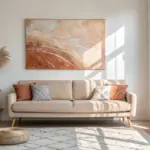
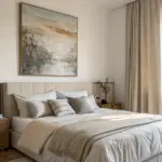
Have a question or want to share your own experience? I'd love to hear from you in the comments below!