
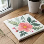
Flower prints are one of my favorite ways to turn a handful of blooms into instant art—no fancy drawing skills required. If you’re craving fresh texture, juicy color, and that satisfying “stamp-and-reveal” moment, these flower print ideas will keep your sketchbook busy.
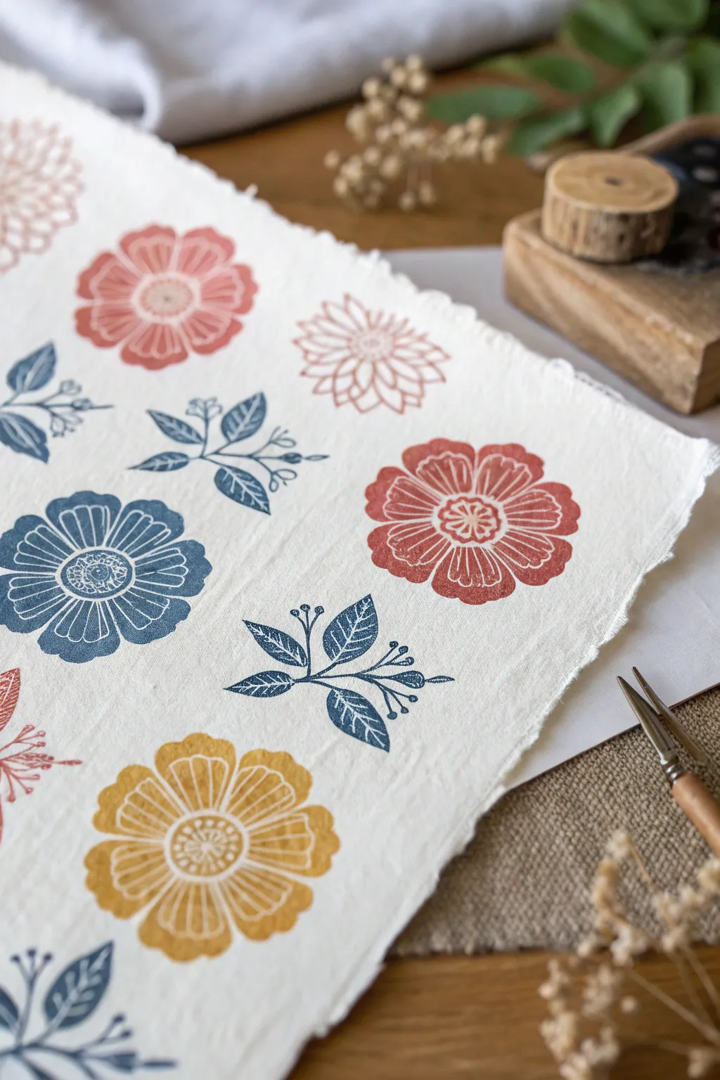
Daisy-Style Stamps for Clean Petal Shapes
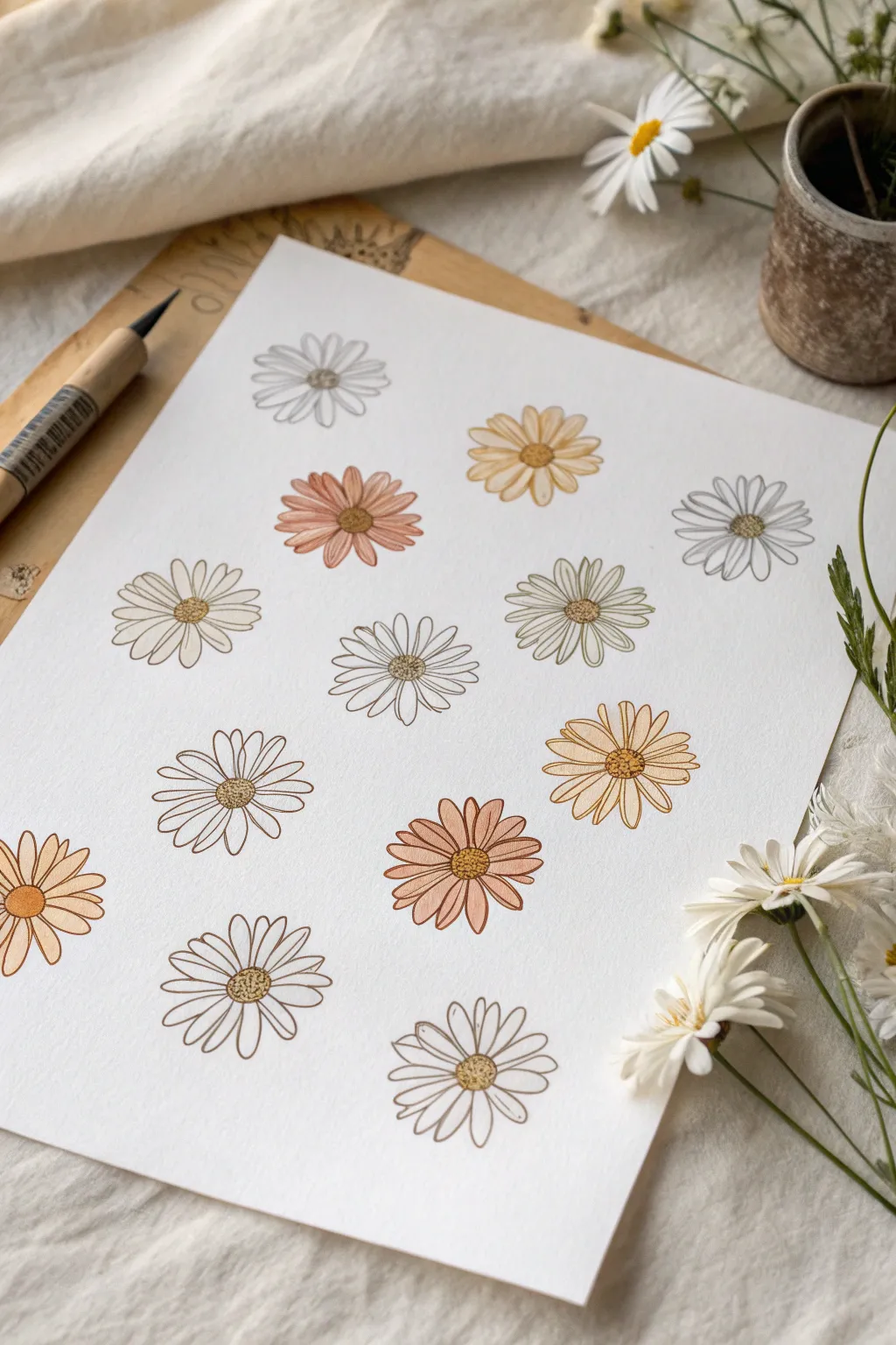
Achieve uniform yet organic floral motifs with this clever stamping technique that uses custom-carved rubber blocks for distinct petal shapes. The resulting print features a lovely array of daisies in soft, earthy tones, perfect for framing or use as custom wrapping paper.
Step-by-Step Guide
Materials
- Soft-cut carving block (linoleum or rubber)
- Linocut carving tool with V-gouge and U-gouge blades
- Pencil and eraser
- Heavyweight mixed media or watercolor paper (smooth texture)
- Stamp pads in various earthy colors (mustard yellow, terracotta, olive green, slate blue, warm brown)
- Fine-point black fineliner pen (0.3mm or 0.5mm)
- Scrap paper for testing
Step 1: Carving the Stamps
-
Draft your design:
Sketch a simple 8-to-12 petal daisy shape directly onto your carving block using a pencil. You can draw just one master daisy or create variations in size. -
Outline the petals:
Using your V-gouge tool, carefully carve along the pencil lines of your petal outlines. Move the block, not the tool, to navigate the curves smoothly. -
Clear the negative space:
Switch to a wider U-gouge blade to remove the rubber material outside of the flower shape. Carve away enough depth so the background won’t pick up ink. -
Refine the center:
Decide if you want a solid center or an open one. For this project, carve out a small circular area in the middle of the flower to leave it negative (white). -
Test the impression:
Ink up your stamp with a light color and press it onto scrap paper. Check for any raised ridges in the negative space that need trimming.
Step 2: Printing the Pattern
-
Plan the layout:
Lightly mark grid intersection points on your final paper with a pencil if you want precise alignment, or eyeball it for a more organic feel. -
Ink the first color:
Start with your lightest color, like the pale grey or cream. Tap the ink pad onto the stamp surface repeatedly to ensure even coverage. -
Stamp the first motifs:
Press the stamp firmly onto the paper at scattered intervals. Apply even pressure with your fingertips over the back of the stamp without rocking it. -
Clean and switch colors:
Wipe the stamp clean with a damp cloth or baby wipe before switching to the next hue, perhaps the mustard yellow. -
Fill the page:
Continue stamping in different colors—terracotta, olive, light brown—until your pattern is complete. I find that leaving slightly irregular spacing adds charm. -
Let the ink set:
Allow the stamped page to dry completely for at least 15-20 minutes to prevent smudging during the next step.
Uneven Ink Coverage?
If your stamp prints appear patchy, your paper might be too textured. Try placing a fun foam sheet under your paper to provide a bit of ‘give’ while stamping.
Step 3: Adding Fineline Details
-
Outline the petals:
With a fine-point black pen, loosely trace the outline of each stamped petal. The line doesn’t need to be perfect; slight deviations create a hand-drawn look. -
Draw the centers:
Fill the empty center circle of each flower with tiny stippled dots (pointillism style) to simulate pollen texture. -
Add inner details:
Draw short, swift lines radiating from the center of each petal outward to suggest veins and depth. -
Review and refine:
Step back and look at the composition. If any flower feels too flat, add a few more stippled dots to the center for contrast.
Pro Tip: Ghost Prints
Stamp once on scrap paper before stamping your final sheet. This ‘second generation’ print creates a softer, more vintage faded look perfect for backgrounds.
Once the ink is fully dry, your botanically inspired print is ready to be framed or gifted.

All-Over Floral Pattern “Wrapping Paper” Prints
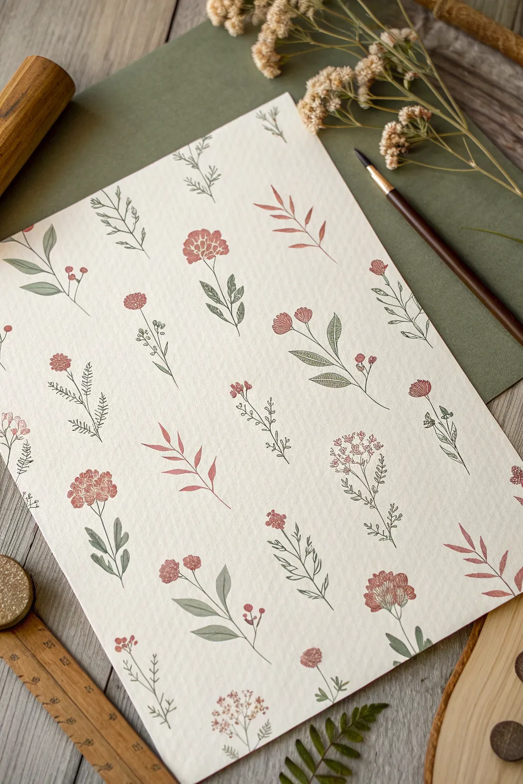
Transform plain paper into bespoke gift wrap with this delicate all-over floral pattern project. Utilizing soft, earthy tones and fine linework, this repetitive motif mimics the charm of vintage botanical illustrations while maintaining a hand-crafted warmth.
Step-by-Step Tutorial
Materials
- Soft-carve linoleum blocks or rubber stamping material
- Linoleum cutter tool with V-gouge and U-gouge blades
- Heavyweight textured paper (cream or off-white, roughly 140gsm)
- Ink pads or block printing ink (Rust Red, Sage Green, Deep Olive)
- Pencil and tracing paper
- Fine-point permanent marker or archival pen (sepia or dark grey)
- Ruler
- Spray bottle with water (optional, for paper stretching)
Step 1: Designing the Motifs
-
Sketch your flora:
Begin by sketching 4-5 distinct botanical elements on a scratchpad. Aim for a mix of shapes: one full bloom (like a chrysanthemum), a sprig with buds, a leafy fern-like branch, and a tall, slender stem. Keep the designs roughly 1-2 inches in height. -
Transfer to carving block:
Place tracing paper over your sketches and trace the outlines. Flip the tracing paper onto your rubber carving block and rub the back with a spoon or bone folder to transfer the graphite design onto the rubber. -
Carve the outlines:
Using your finest V-gouge tool, carefully carve along the transferred lines. Remember to carve away from your body for safety. You want to remove the ‘negative space’ so the design stands raised. -
Clear the background:
Switch to a wider U-gouge to clear away the larger areas of rubber around your design. Don’t worry about getting it perfectly smooth; slight texture in the background can add to the rustic, stamped look. -
Refine the details:
Go back in with the fine V-gouge to add internal details, like the veins on the leaves or the individual petals on the main flower. Keep these lines shallow and delicate.
Step 2: Planning the Layout
-
Test prints:
Ink up your stamps on scrap paper first. This helps check if you’ve carved deeply enough. If you see unwanted stray marks, trim them away with your cutter. -
Mark grid points:
Lightly mark your final paper with a pencil to create a loose diagonal grid. This doesn’t need to be rigid, but having small dots will help you space the flowers evenly without them clustering too much. -
Determine spacing:
Aim for about 2-3 inches of space between motifs. This ‘breathing room’ is crucial for the delicate, airy aesthetic seen in the reference image.
Uneven Ink Coverage?
If your stamp prints look patchy, check your work surface. Place a foam sheet or a stack of newspapers under your paper to provide a bit of ‘give’ for a cleaner impression.
Step 3: Printing the Pattern
-
Start with the hero flower:
Take your main floral stamp (the largest bloom) and tap it onto the rust-red ink pad. Press it firmly onto the paper at random intervals, following your diagonal grid loosely. Rotate the stamp slightly each time so they don’t all face the same direction. -
Add the greenery:
Switch to the sage green ink for your leafy sprigs. Stamp these in the negative spaces left between the red flowers. I like to let the stems of these point in different directions to create a sense of organic movement. -
Layer in secondary elements:
Using a deeper olive or brownish-green ink, stamp the taller, thinner stems. These can overlap slightly with other elements, but try to give them their own space to shine. -
Fill gaps with buds:
If you have large empty spots, use your smallest bud stamp (perhaps in a lighter pink or muted red) to fill the void without overcrowding the composition. -
Hand-drawn accents:
Once the ink is fully dry, take your fine-point archival pen. Add tiny, delicate details that might have been too hard to carve, such as extra-fine stamens, thin connecting stems, or subtle shading lines on the leaves. -
Erase guidelines:
Wait until the ink is completely set—usually about an hour—before gently erasing your pencil guide marks to avoid smudging.
Stamp Cleaning Tip
Clean stamps immediately after use with a baby wipe or mild soap and water. Dried ink accumulates in the fine crevices, eventually ruining the crisp detail of future prints.
Now you have a custom sheet of beautifully patterned paper ready to wrap a special gift or frame as art

Layered Flower Prints for Color Mixing
Capture the charm of a cottage garden with these delightful botanical prints on textured paper. Using rubber blocks and simple carving tools, you’ll create reusable stamps to build your own custom floral pattern in earthy reds, blues, and ochres.
Detailed Instructions
Materials
- Soft-cut rubber carving block or linoleum
- Linoleum cutter tool with V-gouge and U-gouge blades
- Pencil and tracing paper
- X-Acto knife or craft knife
- Block printing ink (water-soluble) in rust red, muted blue, and mustard yellow
- Brayer (rubber roller)
- Plexiglass sheet or smooth tray for inking
- Handmade cotton rag paper or heavy textured cardstock
- wooden baren or large spoon
Step 1: Designing & Carving
-
Draft your motifs:
Begin by sketching three distinct designs on paper: a large open-faced flower (like a zinnia or cosmos), a smaller spiky chrysanthemum shape, and a leafy sprig. Keep the lines relatively bold, as very thin lines can be tricky to carve. -
Transfer to block:
Place tracing paper over your sketches and trace the lines with a soft pencil. Flip the tracing paper graphite-side down onto your rubber block and rub the back firmly to transfer the image. -
Cut out the shapes:
Before carving the details, use your craft knife to cut broadly around the outline of each flower and leaf shape, separating them into individual stamps. This makes them easier to handle. -
Carve the outlines:
Attach the fine V-gouge blade to your cutter tool. Carefully carve along the pencil lines of your design, always pushing the tool away from your body for safety. These carved lines will remain white in the final print. -
Clear the negative space:
Switch to a wider U-gouge blade to remove the larger background areas around your design. You don’t need to make this perfectly smooth; leaving shallow ridges can add a nice handmade texture to the background. -
Refine the details:
Go back in with the V-gouge to add texture to the petals, such as center veins or shading lines, and ensure the center of the flowers has distinct stamen dots or circles.
Pro Tip: Test First
Always stamp on a piece of scrap paper first. This ‘proof’ print helps verify that you’ve carved away all unwanted debris and shows if you are applying the right amount of ink.
Step 2: Inking & Printing
-
Prepare the paper:
Lay your handmade paper on a flat, clean surface. If the paper has a very rough deckled edge, ensure you have enough workspace so the edges don’t catch on anything. -
Roll out the first color:
Squeeze a small amount of rust-red ink onto your inking tray. Use the brayer to roll it out until you hear a ‘velcro’ sticky sound, indicating an even, thin layer of ink. -
Ink the main flower:
Take your large flower stamp and tap it lightly but firmly onto the rolled-out ink, ensuring the raised surface is fully coated but ink hasn’t flooded the carved grooves. -
Print the focal points:
Press the red stamp onto the paper. Apply even pressure with your hand or a baren, but be careful not to wiggle the block. Lift straight up to reveal the print. Repeat this sporadically across the page to establish your main pattern anchors. -
Clean and switch colors:
Clean the brayer and tray (or use a fresh spot). Roll out the muted blue ink. I like to print the blue flowers next, placing them near the red ones but leaving space for foliage. -
Add secondary motifs:
Using the same blue ink, stamp the leafy sprig motif. Rotate the stamp each time you print to make the vines look like they are growing in different directions, filling the gaps between flowers. -
Introduce the third color:
Prepare the mustard yellow ink. Use this for the third flower design or to re-stamp the main flower shape in a new hue to add variety to the composition. -
Fill the composition:
Continue stamping until the paper feels balanced. Don’t be afraid to let some stamps go off the edge of the paper slightly; this makes the pattern feel continuous and professional. -
Check for gaps:
Step back and look at the overall arrangement. If there are large empty white spaces, use the leaf stamp or a small portion of a flower stamp to fill them in.
Level Up: Gradient Petals
Put two ink colors side-by-side on the tray and roll the brayer over the seam to blend them. This creates an ombré effect on a single flower stamp for a stunning dimensional look.
Step 3: Finishing
-
Dry thoroughly:
Water-based block printing inks can stay tacky for a while, especially on heavy textured paper. Lay the print flat in a safe area and allow it to dry completely, ideally overnight.
Once dry, your botanical art print is ready to be framed as a unique piece of wall decor or gifted to a friend
Ombre Flower Prints Across a Page
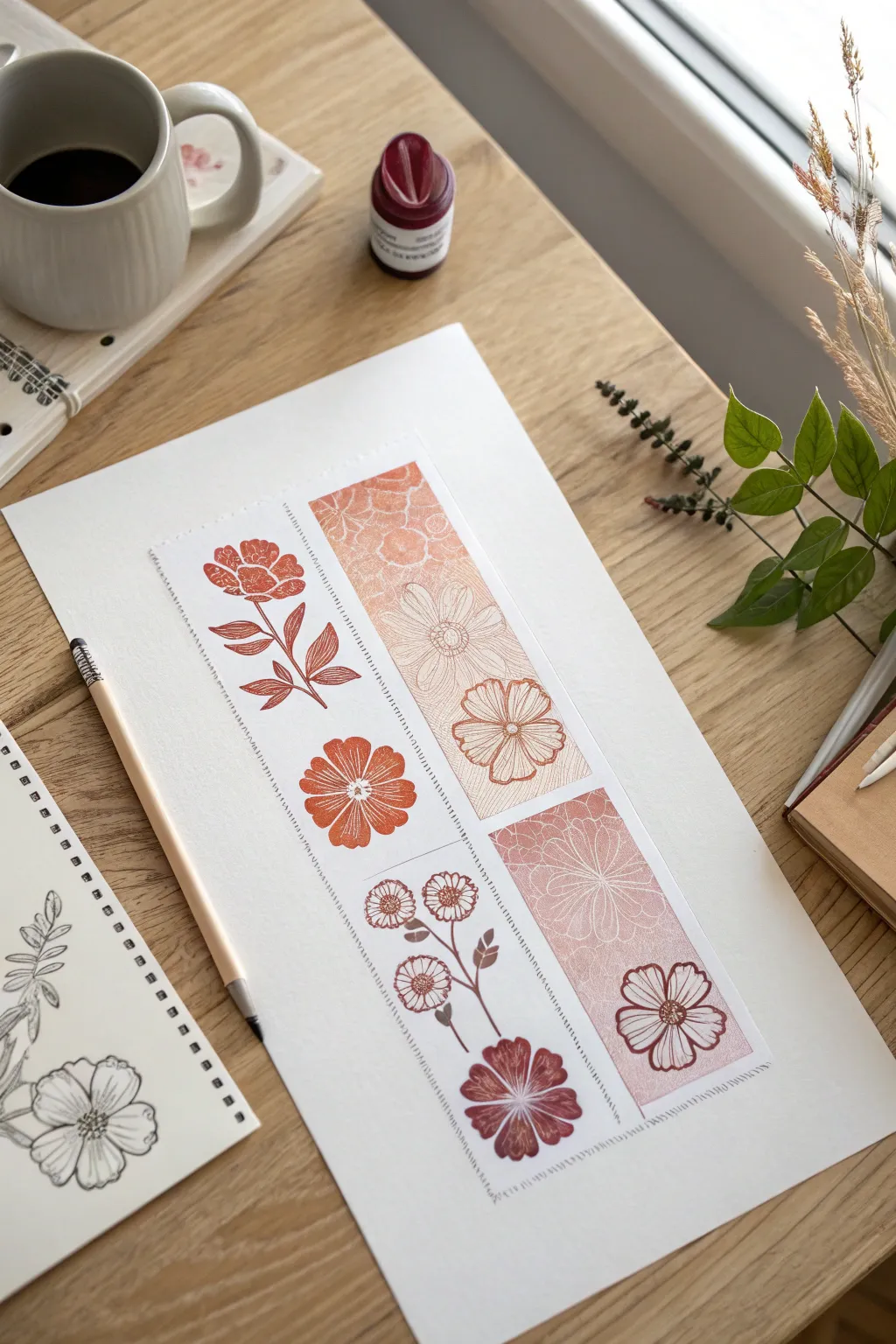
This elegant project combines the precision of linocut-style printing with the softness of a watercolor gradient. By creating a distinct vertical panel featuring alternating positive and negative space floral motifs, you’ll achieve a sophisticated, modern botanical illustration perfect for framing.
Detailed Instructions
Materials
- High-quality watercolor paper (cold press, 300gsm)
- Rubber carving block or soft linoleum
- Carving tools (u-gouge and v-gouge)
- Block printing ink (burnt sienna or terracotta)
- Ink roller (brayer)
- Pencil and eraser
- Ruler
- Masking tape or washi tape
- Glass or acrylic palette for rolling ink
- Fine liner pen (brown or sepia, optional for touch-ups)
Step 1: Planning and Carving
-
Sketch the layout:
Begin by lightly drawing a long vertical rectangle in the center of your paper using a ruler. This will define the boundaries of your print. -
Design the motifs:
On a separate piece of paper, sketch four distinct floral designs sized to fit within your rectangle’s width. Aim for variety: a stemmed flower, a single bloom, a cluster of small flowers, and a large open petal design. -
Transfer to block:
Transfer your sketches onto your rubber carving block using the pencil rub method or carbon paper. You will need to carve four separate stamps. -
Carve the negative space:
For the ‘positive’ stamps (where the flower is colored), carefully carve away the background around the flower outlines using your u-gouge. -
Carve the positive space:
For the ‘negative’ stamps (where the flower is white on a colored background), carve out the flower lines themselves, leaving the background intact. This contrast creates visual interest. -
Refine the details:
Switch to a smaller v-gouge to carve the delicate stamens and vein details inside the petals. Take your time here, as clean lines allow the gradient to show better.
Use Extender for Transparency
Mix transparent extender medium into your ink for the lighter sections. It reduces opacity without changing hue, making the gradient glow.
Step 2: Creating the Ombre Background
-
Tape the boundaries:
Use masking tape to precisely mask off the vertical rectangle on your final paper. Press the edges down firmly to prevent ink bleeding. -
Prepare the gradient ink:
Place a dollop of burnt sienna ink on your palette. Next to it, place a dollop of transparent extender or a lighter peach ink. -
Roll the gradient:
Use your brayer to roll back and forth between the two colors, blending them slightly in the middle of the roller to create a smooth transition from dark to light. -
Apply the base layer:
Roll the inked brayer directly onto two of your carved blocks (the ones designed with a solid background). Ensure the gradient aligns so the lighter tones meet in the center of the vertical composition. -
Print the background blocks:
Press the background-heavy stamps onto the paper within the taped area. I find using a clean baren or the back of a spoon helps apply even pressure.
Patchy Ink Coverage?
If stamps look too speckled, your block might be too dry. Add a drop of oil or retarder to the ink, or roll the brayer more times to warm it up.
Step 3: Stamping and Detailing
-
Ink the floral silhouettes:
Ink your remaining two stamps—the ones where the flower itself carries the color. Use the darker end of your ink gradient for these to ensure they stand out. -
Stamp the focal flowers:
Position these stamps in the alternating open spaces of your vertical column. Press firmly to transfer the texture of the ink. -
Remove the tape:
Once the ink is dry to the touch, slowly peel back the masking tape at a 45-degree angle. This reveals the crisp, clean edges of your vertical panel. -
Add stitched details:
Using a ruler and a fine sepia pen or the very edge of a detail brush, create a dashed ‘stitched’ line effect along the vertical borders of the print. This mimics a sewn tag look. -
Refine with pen:
If any stamped lines are too faint, you can carefully enhance the stamens or petal edges with your fine liner pen, keeping the work subtle.
Now you have a beautifully textured botanical print that balances bold shapes with delicate colors
BRUSH GUIDE
The Right Brush for Every Stroke
From clean lines to bold texture — master brush choice, stroke control, and essential techniques.
Explore the Full Guide
Negative Space Flower Prints With a Painted Wash
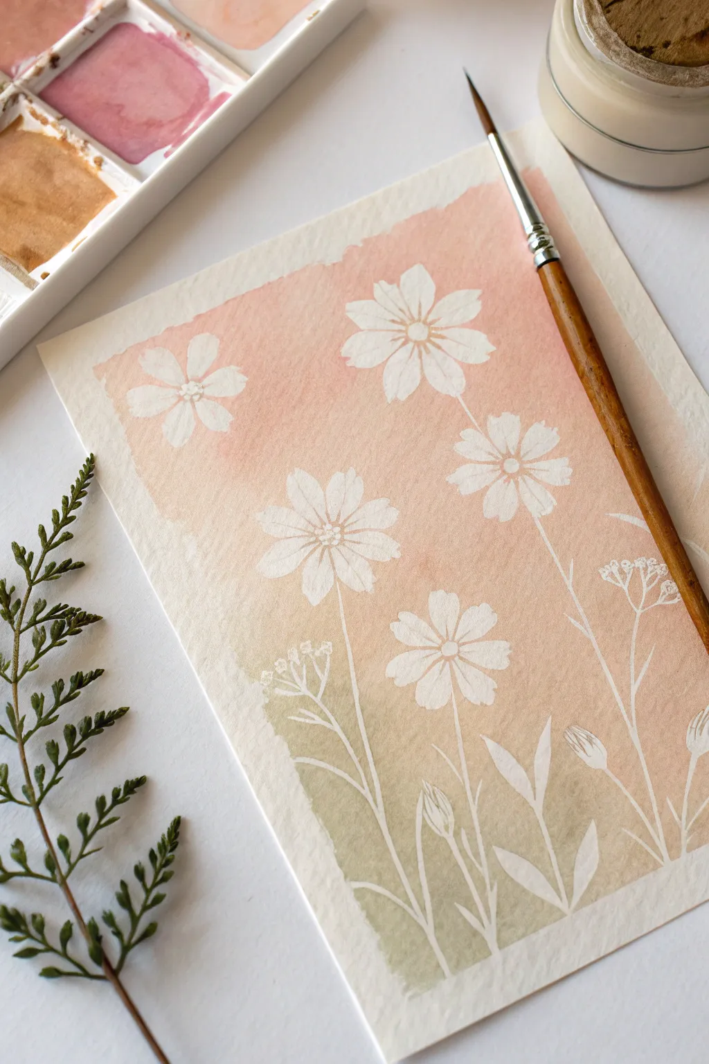
Capture the delicate beauty of cosmos flowers using a clever masking technique that lets the white of the paper shine through. This project combines negative space drawing with a soft, blended watercolor wash for an ethereal, sun-drenched effect.
Step-by-Step Guide
Materials
- Cold press watercolor paper (A5 size or larger)
- Masking fluid (drawing gum)
- Fine-tip applicator, nib pen, or old brush for masking fluid
- Watercolor paints (Peach/Coral, Soft Pink, Olive Green)
- Round watercolor brush (size 6 or 8)
- Jar of clean water
- Rubber cement pickup or clean fingers
Step 1: Planning and Protecting
-
Sketch lightly:
Start by very lightly sketching the outlines of five cosmos flowers scattered across your paper. Vary the heights and angles—some facing forward, some tilted. Add thin stems flowing downward and small leaves along the bottom. -
Prepare the masking fluid:
Shake your masking fluid bottle gently. If you are using a brush to apply it, dampen the bristles first and rub them on a bar of soap; this protects the bristles from getting ruined by the sticky fluid. -
Line the petals:
Carefully trace over your pencil lines with the masking fluid. Start with the flower centers, drawing small dots, then outline each petal. Do not worry about filling in the petals perfectly; the outline is most important. -
Fill the shapes:
Fill in the rest of the petal shapes and the flower centers with masking fluid. The goal is to cover every part of the paper you want to remain white. Keep the layer relatively thin but consistent. -
Add stems and foliage:
Trace the thin lines of the stems and the leafy shapes at the bottom. You can add a few extra buds or wispy leaves now, even if you didn’t sketch them, for a spontaneous look. -
Allow to cure:
Let the masking fluid dry completely. It must be solid to the touch and usually turns a yellowish or rubbery color. Impatience here will smear the fluid and ruin the paper surface.
Step 2: Painting the Wash
-
Pre-wet the paper:
Using your large round brush and clean water, gently wet the rectangular area around your flowers. You want the paper damp but not soaking wet. I find this helps the colors flow seamlessly together. -
Mix your colors:
Prepare a watery mix of coral/peach intricate and a soft olive green on your palette. You want the colors to be pale and translucent, not thick or opaque. -
Start the gradient:
Load your brush with the coral paint. Start applying it at the top of the paper, painting right over the dried masking fluid. Let the color fade slightly as you move down past the top flowers. -
Blend the transition:
While the peach paint is still wet, rinse your brush fast and pick up the olive green. Introduce the green near the bottom stems, working your way upward to meet the peach section. -
Create soft edges:
Where the pink and green meet in the middle, use a clean, slightly damp brush to gently encourage them to bleed into each other, creating a muted brownish-neutral transition rather than a hard line. -
Refine the edges:
Paint loosely around the outer edges of your composition to create a rough, painterly border. Don’t try to make straight lines; the jagged edge adds character. -
Let it dry completely:
Allow the paint to dry thoroughly. The paper must be bone dry before you remove the mask, or you risk tearing the surface.
Soap Saver
Always coat your brush bristles in dish soap or bar soap before dipping into masking fluid. This creates a barrier that prevents the fluid from drying deep in the brush and ruining it forever.
Step 3: The Reveal
-
Remove the mask:
Once dry, gently rub the masking fluid with a rubber cement pickup or your clean finger. Rub in one direction to peel the latex away, revealing the crisp white paper underneath. -
Clean up lines:
Brush away the rubbery crumbs. If any pencil marks are still visible inside the white shapes, erase them gently with a kneadable eraser. -
Add subtle details:
Water down your peach paint until it is very faint. Use a fine brush to add tiny dots or lines inside the flower centers to give them just a hint of dimension without overpowering the white silhouette.
Paper Tearing?
If the paper tears when removing the mask, you likely didn’t let the paint dry long enough. The paper fibers are weak when damp. Wait another 20 minutes or use a hairdryer on low heat.
Enjoy the satisfying moment of peeling away the mask to see your pristine white blooms emerge from the soft background wash
Mini Flower Prints for Gift Tags and Labels
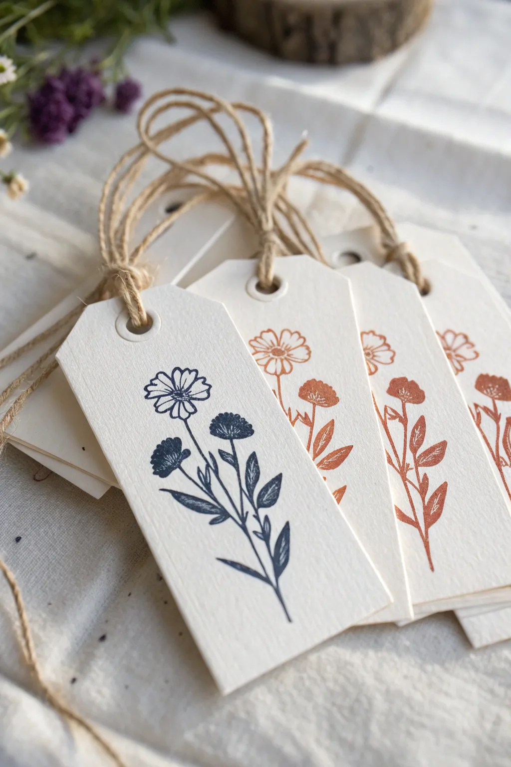
Add a touch of handmade charm to your gifts with these beautifully simple stamped tags featuring delicate wildflowers. The combination of textured paper, earthy ink tones, and natural jute twine creates an elegant, organic aesthetic perfect for any occasion.
Detailed Instructions
Materials
- High-quality thick watercolor paper or textured cream cardstock (300gsm recommended)
- Rubber stamp set featuring wildflower or botanical stems (daisy/coneflower variety)
- Pigment ink pads in Navy Blue and Terracotta/Rust Orange
- Paper trimmer or guillotine cutter
- Corner rounder punch (optional)
- Pencil and ruler
- Single-hole punch (1/4 inch standard size)
- White paper reinforcement rings (matte finish)
- Natural jute twine
- Scissors
- Scrap paper for testing
Step 1: Preparing the Tag Base
-
Measure and mark:
Begin with your sheet of textured watercolor paper. Using your pencil and ruler, lightly mark out rectangular tag shapes. A standard size of 2 inches by 4 inches works beautifully for a balanced look. -
Cut the rectangles:
Using a paper trimmer or guillotine cutter for crisp, straight lines, cut out your rectangular strips based on the measurements you just made. -
Shape the top corners:
To create the classic tag shape, you need to clip the top corners. Measure about 0.5 inches down from the top right corner and 0.5 inches inward. Cut diagonally connecting these points. -
Review symmetry:
Flip the small triangle piece you just cut off and use it as a template on the top left corner. This ensures both sides match perfectly. -
Optional corner rounding:
If you prefer a softer look for the bottom corners, use a corner rounder punch on just the bottom two edges, leaving the angled top edges sharp. -
Create the eyelet:
Punch a hole in the center of the top area, roughly half an inch from the top edge. Center it carefully between the two angled cuts.
Smudged Impressions?
If your stamped lines look blurry or too thick, you are likely pressing too hard into the ink pad. Use a light, tapping motion to ink the stamp surface, not the background rubber.
Step 2: Stamping the Design
-
Test your stamp:
Before committing to your final tags, stamp your image (or images) onto a piece of scrap paper. This helps you check the ink coverage and orient yourself with the stamp’s alignment. -
Ink the blue flower:
Take your wildflower stamp and tap it firmly and repeatedly onto the Navy Blue pigment ink pad. Ensure the entire design, especially the thin stems, is evenly coated. -
Stamp the focal tag:
Position the stamp over your first paper tag. Align the bottom stem so it doesn’t run off the bottom edge, and press straight down with firm, even pressure. Do not rock the stamp. -
Lift carefully:
Hold the paper down with one finger while lifting the stamp straight up to avoid smudging the lines. Let this tag sit aside to dry completely. -
Clean the stamp:
Thoroughly clean your rubber stamp with a wet wipe or stamp cleaner to remove all traces of navy ink before switching colors. -
Switch to terracotta:
Repeat the inking process using the Rust Orange ink pad. I find that tapping the pad onto the stamp (rather than the stamp onto the pad) gives me better control over the ink volume. -
Create the set:
Stamp the remaining tags with the rust color, aiming for consistency in placement across the batch. -
Dry time:
Pigment inks stay wet longer than dye inks, which gives them that rich color. Allow the tags to dry for at least 10-15 minutes to prevent smearing.
Step 3: Assembly and Finishing
-
Add reinforcement:
Once the ink is fully dry, stick a white paper reinforcement ring around the punched hole on the front of each tag. This adds a subtle, professional detailed finish. -
Cut the twine:
Cut lengths of natural jute twine, approximately 8 to 10 inches long for each tag. -
Looping method:
Fold a piece of twine in half to create a loop. Push this folded loop through the tag hole from the front to the back. -
Secure the tie:
Thread the two loose ends of the twine through the loop you just pushed through and pull them tight. This creates a secure ‘larks head’ knot that sits neatly at the base of the hole.
Add Watercolor Detail
Use a very fine watercolor brush to lightly tint just the petals of the stamped flower with a diluted wash of matching color for a hand-painted effect.
Now you have a set of charming, artisanal tags ready to elevate your gift wrapping with a personal touch

PENCIL GUIDE
Understanding Pencil Grades from H to B
From first sketch to finished drawing — learn pencil grades, line control, and shading techniques.
Explore the Full Guide
Border and Frame Flower Print Compositions
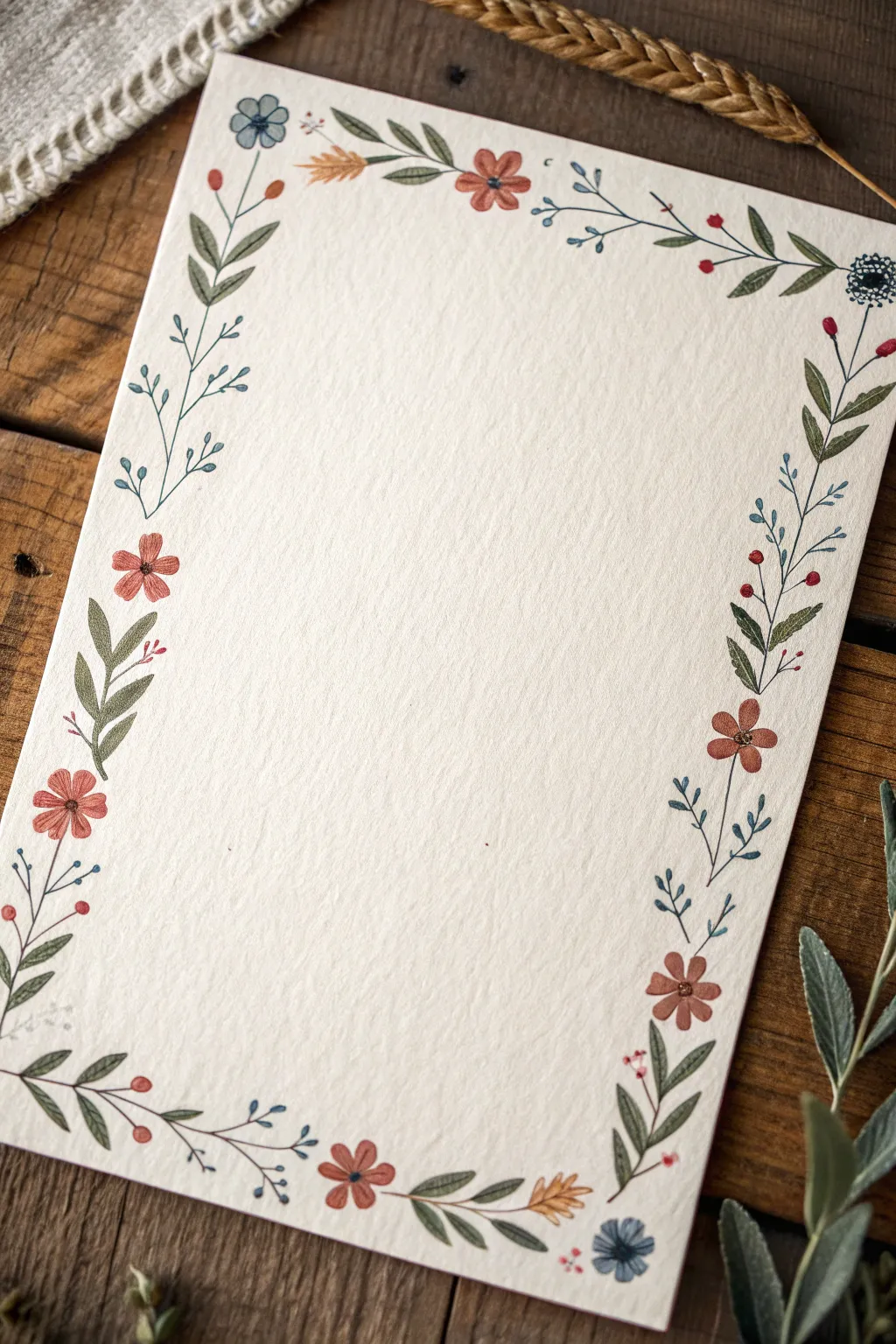
Bring a touch of nature to your correspondence with this delicate wildflower border, featuring a harmonious mix of rust-colored blooms, dusty blue accents, and leafy vines. The hand-painted aesthetic on textured paper creates a warm, vintage feel perfect for invitations or personal stationery.
Step-by-Step Guide
Materials
- Cold press watercolor paper (A5 or A4 size, 300gsm for texture)
- Watercolor paints (Rust Orange, Burnt Sienna, Prussian Blue, Sap Green, Olive Green)
- Small round brushes (Size 0 and 2)
- Pencil (HB or H)
- Kneaded eraser
- Clean water cup
- Palette or mixing plate
- Paper towel
Step 1: Planning and Sketching
-
Define the boundary:
Begin by lightly marking the outer edges of your paper where you want the design to sit, leaving about a half-inch margin from the edge to ensure the design feels framed, not crowded. -
Sketch the vine structure:
Using your HB pencil, draw a very faint, sweeping line that meanders around the perimeter. Don’t make it a straight box; let the line wave slightly to mimic organic vine growth. -
Placement of main blooms:
Mark small circles where your larger, rust-colored flowers will go. Aim for asymmetry—perhaps one in the bottom left corner, one midway up the right side, and one near the top center to guide the eye. -
Adding leaf clusters:
Sketch the general direction of the larger leaf clusters. These should fan out from the main vine, filling the empty spaces between your flower markers. -
Refining the sketch:
Lightly draw the smaller blue sprigs and tiny red buds. Once you are happy with the layout, use your kneaded eraser to roll over the paper, lifting the graphite until the lines are barely visible
Dry Brush Texture
For the ‘wheat’ looking sprigs, use less water on your brush. The rough paper texture will grab the pigment, creating a natural, grainy look.
Step 2: Painting the Foliage
-
Mixing green hues:
Create two shades of green on your palette: a warm Olive Green and a cooler, darker Sap Green to add depth to the foliage. -
Painting the main leaves:
Using a size 2 brush, paint the larger leaves. Press the belly of the brush down and lift as you pull outward to create a tapered leaf shape. Use the Olive Green for these. -
Adding the stems:
Switch to your size 0 brush or the very tip of the size 2. Connect your leaves with thin, delicate stem lines using the darker Sap Green mix. -
Incorporating blue sprigs:
Mix a watery Prussian Blue. Paint thin, branching stems that shoot off from the main vine, adding tiny teardrop shapes at the ends to represent buds or small leaves. -
Creating variety:
I like to vary the pressure on the brush here; some stems should be barely there, while others can be slightly thicker to anchor the design.
Personalize It
Swap the rust and blue for sage and lavender for a spring look, or use deep burgundy and gold for an autumn variation.
Step 3: Adding Blooms and Details
-
Painting the rust flowers:
Mix Rust Orange with a touch of Burnt Sienna. Paint the five-petal flowers using simple, rounded strokes that meet in the center, leaving a tiny white space in the middle if possible. -
Adding blue florals:
Using a slightly more saturated Prussian Blue, paint the small floral clusters. These can be simple three-petal shapes or tiny circular blooms scattered near the corners. -
Painting the buds:
Dip your smallest brush into a concentrated red-orange mix. Dotted along the thin blue sprigs, add tiny specks or balls to represent berries or unopened buds. -
Detailing the centers:
Once the rust flowers are completely dry, use a dark brown or black mix to add a small dot or star shape in the center of each bloom for definition. -
Layering leaf veins:
If your larger leaves have dried flat, take a slightly darker green and paint a single thin line down the center of a few selected leaves to suggest a central vein. -
Balancing the composition:
Step back and look at the border as a whole. If there are large gaps, add a tiny floating leaf or a loose blue petal to fill the void without overcrowding. -
Final drying:
Allow the entire piece to dry completely before attempting to erase any remaining pencil marks, ensuring you don’t smudge the pigment.
Now you have a beautifully framed space ready for your favorite quote or a heartfelt letter
Bouquet Silhouettes Built From Flower Stamps
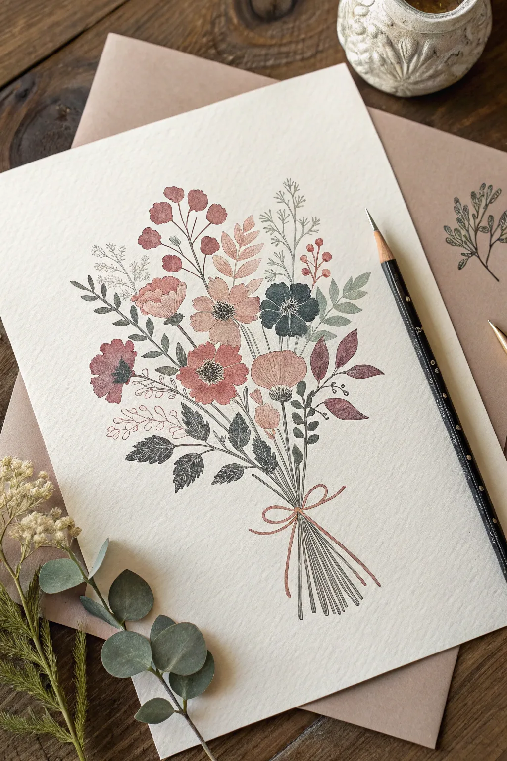
Blend the precision of rubber stamps with the soft touch of hand-coloring in this elegant botanical project. By layering stamped flower silhouettes and connecting them with hand-drawn stems, you’ll create a cohesive bouquet that feels both vintage and fresh.
Step-by-Step
Materials
- Textured cream cardstock or mixed media paper
- Assorted floral rubber stamps (various sizes and shapes)
- Ink pads in muted tones (dusty rose, sage green, indigo, terra cotta)
- Fine-point black or dark grey illustration pen
- Colored pencils or watercolor markers (optional for shading)
- Scrap paper for masking
- Pencil and eraser
Step 1: Planning and Layout
-
Lightly sketch the structure:
Begin by using a pencil to very faintly draw the central axis and the stems’ convergence point near the bottom of the page. This ‘imaginary vase’ line will help keep your bouquet balanced. -
Test your color palette:
On a scrap piece of paper, stamp each of your chosen ink colors. Ensure the dusty pinks, deep blues, and sage greens harmonize well together before committing to the final paper.
Step 2: Stamping the Blooms
-
Start with the focal flowers:
Ink up your largest flower stamps first. I prefer to use the terra cotta or dusty rose shades for these central blooms. Press them firmly onto the paper, placing them near the center but slightly offset for a natural look. -
Add secondary blooms:
Select medium-sized stamps and ink them in contrasting colors like deep indigo or slate blue. Place these around your focal flowers, leaving enough gaps for foliage. -
Create depth with masking:
If you want a flower to appear ‘behind’ another, stamp the front flower onto a sticky note, cut it out, and place it over the stamped image on your artwork. Then stamp the second flower partially over the mask. -
Incorporate foliage stamps:
Using sage or olive green ink, stamp leafy branches and ferns. Arrange them so they fan out from the center, directing the eye outward and filling the background. -
Fill gaps with filler flowers:
Take your smallest stamps—tiny berries or sprigs—and stamp them in lighter shades near the top and outer edges to give the bouquet an airy, delicate feel.
Stamp Off Technique
For a softer, vintage look, ink your stamp and press it once onto scrap paper before stamping your final project. This ‘second generation’ impression creates a lovely faded effect.
Step 3: Connecting the Elements
-
Draw the stems:
Using your fine-point illustration pen or a sharp colored pencil, carefully draw lines extending from the bottom of each flower head down toward the convergence point you marked earlier. -
Refine the stem cluster:
As the lines meet at the ‘handle’ of the bouquet, allow them to cross and overlap naturally. Don’t make them perfectly straight; a slight curve adds organic movement. -
Add stem ends:
extend the lines below the convergence point to create the cut ends of the stems. Vary the lengths slightly so it doesn’t look too uniform.
Smudged Ink Edges?
If you accidentally rock the stamp and get a rim of ink, turn it into a leaf or petal using your fine-point pen. Disguise the mistake by incorporating it into the floral design.
Step 4: Detailing and Finishing
-
Enhance the centers:
Use your fine-point pen or a dark colored pencil to add tiny stippled dots or small circles to the centers of the stamped flowers. This adds definition and draws the eye. -
Add hand-drawn leaves:
If any area looks too sparse, sketch in simple, open-outline leaves or wispy branches directly with your pen to bridge the gap between stamped images. -
Draw the ribbon:
At the narrowest part of the stem cluster, sketch a simple bow using a terra cotta or pink colored pencil. A loose, double-loop bow keeps the style relaxed. -
Shade the ribbon:
Lightly color inside the ribbon loops, pressing harder at the knot and the folds to create dimension. -
Erase guidelines:
Once the ink is completely dry, gently erase any visible pencil marks from your initial layout structure. -
Final assessment:
Step back and look at the overall balance. If the bouquet feels top-heavy, you can hand-draw a few more loose sprigs or leaves near the bottom to weigh it down visually.
Now you have a timeless floral print ready to be framed or gifted to a friend


Loose Stem Drawing Over Printed Flowers
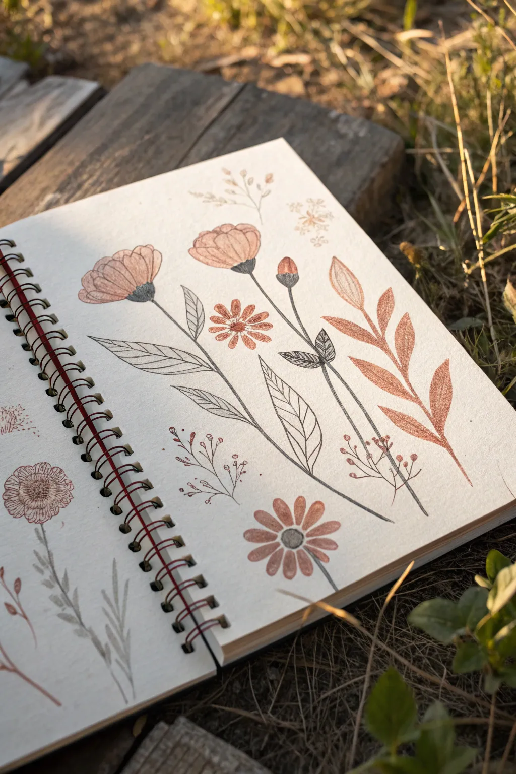
This project combines the soft texture of stamping with the precision of fine-line drawing to create a botanical study that feels both vintage and modern. By layering ink outlines over blocked-out shapes, you achieve a delightful depth that traditional sketching can’t quite capture alone.
Step-by-Step Tutorial
Materials
- Spiral-bound sketchbook (heavyweight or mixed-media paper recommended)
- Stamp pads in muted tones (terracotta, dusty rose, sage green)
- Foam stamps or carved rubber erasers (custom shapes)
- Fine liner pens (black, sizes 0.1mm and 0.3mm)
- Graphite pencil (HB or 2B)
- Kneaded eraser
- Ruler (optional)
- Scrap paper for testing stamps
Step 1: Preparation & Layout
-
Plan your composition:
Before putting any ink to paper, visualize where your main floral elements will sit. You want a balanced spread across the right-hand page, leaving negative space for the stems. -
Test your stamps:
On a piece of scrap paper, stamp out your shapes using the terracotta and dusty rose inks. This helps you gauge how much pressure is needed for a solid but textured imperfection. -
Lightly mark positions:
Use your graphite pencil to mark tiny dots where the center of each flower head will go. This ensures your final composition won’t drift off the page as you work.
Step 2: Stamping the Base Layers
-
Stamp the main blooms:
Load your round or petal-shaped stamps with the lighter pink or peach ink. Press them firmly onto your marked spots to create the solid color base for the poppy-like flowers at the top left and center. -
Add the smaller accents:
Using a smaller circular stamp or even a fingerprint, add the small round flower centers in a slightly deeper shade like terracotta. Let these overlap slightly with where your stems will eventually connect. -
Create the foliage base:
If you have leaf-shaped stamps, use a muted brownish-orange ink to stamp the large, leafy branch on the right side of the page. Angle it outward as if reaching for sunlight. -
Stamp the bottom details:
Add the lower daisy-like flower head near the bottom center using the same technique. I like to let these ink layers dry completely—usually about 10–15 minutes—before drawing over them to prevent smudging.
Stamp Fix
If a stamped image comes out too patchy, don’t re-stamp directly on top. Instead, use colored pencils in a matching shade to lightly fill the gaps.
Step 3: Drawing the Stems & Details
-
Outline the leaf branch:
Start with the large stamped leaf branch on the right. Using a 0.1mm fine liner, draw a minimal central vein up the spine of the leaves, but leave the edges soft and unlined for a ‘loose’ look. -
Draw the main stems:
Switch to your black fine liner. Draw long, confident, slightly curved lines extending downward from your stamped flower heads. Don’t use a ruler; the slight wobble of a hand-drawn line adds organic charm. -
Add flower bases:
Where the stem meets the flower head (the receptacle), draw a small, darkened U-shape or cup. Fill this in with hatched lines or solid black ink to ground the flower. -
Sketch the leaves:
Unlike the stamped leaves on the right, the leaves attached to the central stems are drawn solely with pen. Sketch elongated, lance-shaped leaves branching off the main stems. -
Detail the leaf veins:
Inside your hand-drawn leaves, add fine diagonal hatching lines. These shouldn’t be perfect drawings of veins, but rather stylized shading that suggests texture. -
Detail the flower petals:
Go back to your main stamped flowers. Gently outline parts of the petals with broken, delicate lines. You don’t need to outline the entire stamped shape; just suggest the edges. -
Add separation lines:
Draw curved lines inside the stamped flower bloobs to differentiate individual petals. This turns a flat circle of ink into a dimensional flower cup. -
Create the center textures:
For the daisy-like flowers, use stippling (tiny dots) or small circles in the very center to mimic pollen texture. Use a slightly thicker 0.3mm pen if you want these to stand out.
Paper Texture
Try this on textured watercolor paper. The ‘peaks and valleys’ of the paper will make the stamp ink break up more, adding an instant vintage, distressed look.
Step 4: Final Touches
-
Fill empty spaces:
Assess the negative space. If an area looks too empty, draw delicate, twiggy sprigs with tiny buds using just your fine liner. These act as filler foliage. -
Ground the stems:
Ensure all your stems fade out or connect logically towards the bottom of the page. You can extend a few lines all the way to the page edge for continuity. -
Erase guidelines:
Once the ink is totally dry, gently run your kneaded eraser over the page to pick up any remaining graphite marks from your initial planning.
Now you have a stunning botanical page that beautifully merges blocky color with delicate line work
Monochrome Flower Prints for Modern Minimal Style
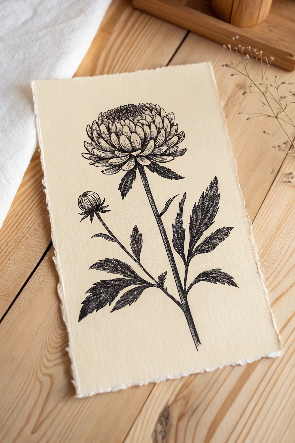
Capture the timeless elegance of classic botanical illustrations with this detailed ink drawing on textured paper. The high contrast of black ink against creamy, deckle-edged paper creates a striking monochrome piece perfect for modern minimal decor.
Step-by-Step Guide
Materials
- Heavyweight textured paper (beige/cream, approx 300gsm)
- Fine liner pens (0.05, 0.1, 0.3, and 0.5 sizes)
- Graphite pencil (HB or 2H)
- Kneaded eraser
- Ruler (optional for stem alignment)
- Paper tearing ruler or deckle edge ruler (optional)
Step 1: Preparation & Sketching
-
Prepare the paper:
Begin by tearing your paper to the desired size. To achieve that organic, torn look shown in the image, fold the paper deeply and wet the crease slightly with a brush before carefully pulling apart, creating a soft, fibrous edge. -
Draft the main forms:
Using your HB pencil, lightly sketch the primary centerline for the stem. At the top, draw a loose oval to represent the main flower head, and a smaller circle to the left for the secondary bud. -
Outline petals:
Inside the top oval, start defining the chrysanthemum petals. Begin from the center, drawing small, tightly packed scoops, and work outward with progressively longer, curved petal shapes. -
Refine the composition:
Sketch the stems leading down from the flower and bud. Add the serrated leaf shapes branching off the main stem, ensuring they have jagged, saw-tooth edges typical of chrysanthemum foliage.
Fixing Smudges
Smudged the ink? Don’t panic. Use a white gel pen to carefully draw over the mistake. Once dry, you can stipple over the white correction with black ink to blend it back in.
Step 2: Inking the Outlines
-
Define the flower head:
Switch to a 0.3 pen. Carefully trace over your pencil lines for the petals. Notice how the petals curl inward; use smooth, confident strokes to capture their curved tips. -
Ink the stems and leaves:
Continue with the 0.3 pen to outline the stems and the jagged leaves. Keep your hand steady but allow for slight natural variations in line weight to mimic organic growth. -
Detail the bud:
Outline the small bud on the left. Draw the sepals (the green parts under the flower) flaring out slightly, enclosing the tight ball of unbloomed petals. -
Erase pencil guides:
Wait at least 15 minutes for the ink to dry completely. Gently use the kneaded eraser to lift away all graphite lines, leaving a clean stark outline.
Step 3: Shading & Texturing
-
Establish core shadows:
Using a 0.1 pen, begin adding shading to the center of the main flower. Use very short, dense lines (hatching) to darken the deepest recesses between the inner petals. -
Texture the petals:
For the outer petals, draw fine lines running from the base of each petal toward the tip, fading out halfway. This indicates the curved form and striations of the flower. -
Shade the stems:
Switch to a 0.05 pen for delicate work. Shade one side of the main stem using vertical hatching lines to give it a cylindrical, rounded volume. -
Detail the leaf veins:
Draw the central vein in each leaf leaf. From there, use short, flicking strokes to shade the leaf surface, concentrating darker ink near the center vein and leaving the jagged edges lighter.
Vintage Look
To age your print, brew strong black tea and lightly brush it over the paper before drawing. Let it dry completely. This adds a warm, antique patina ideal for botanical art.
Step 4: Depth & Final Touches
-
Deepen the contrast:
Take your 0.5 pen—the thickest one—and selectively re-line the darkest areas, specifically where the leaves meet the stem and the deeply shadowed underside of the flower head. -
Stipple the center:
Return to the flower center. Use a stippling technique (lots of tiny dots) with the 0.1 pen to create a fuzzy, pollen-heavy texture right in the middle. -
Enhance leaf shadows:
Add cross-hatching (overlapping lines) to the darkest parts of the leaves. This extra layer of ink makes the foliage look dense and lush. -
Refine the bud:
Add curved hatching lines to the round part of the bud to emphasize its spherical shape, keeping the top highlighted and the bottom shadowed. -
Final assessment:
Step back and look at the overall balance. If any area looks too flat, I usually add a few more excessively wrong fine lines to curve around the form.
Frame your botanical study in a floating glass frame to show off those beautiful deckled edges.
Metallic Accent Flower Prints for Shine
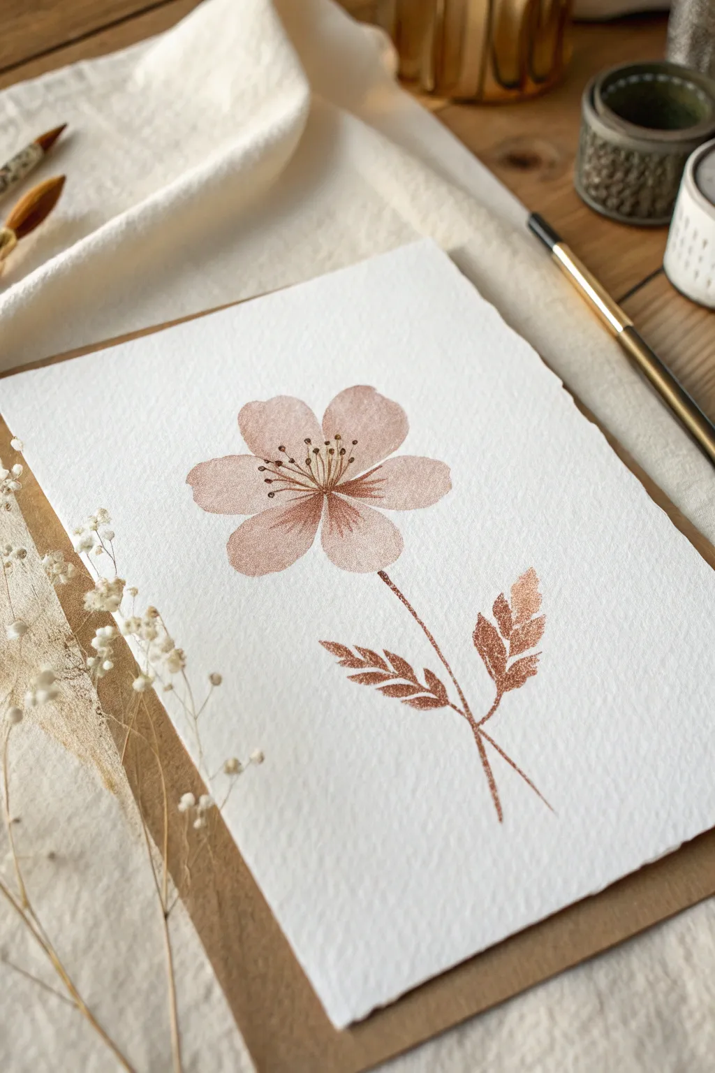
Capture the delicate beauty of a pressed flower preserved in copper tones with this elegant metallic print project. This technique uses metallic watercolor or ink to create a warm, shimmering focal point that catches the light beautifully on textured paper.
Step-by-Step Guide
Materials
- Cold press watercolor paper (deckled edge preferred)
- Metallic copper or rose gold watercolor paint
- Fine round paintbrush (size 2)
- Medium round paintbrush (size 6)
- Pencil (HB or H)
- Kneaded eraser
- Paper towel
- Water jar
- Palette or mixing dish
Step 1: Planning and Sketching
-
Paper Selection:
Begin by selecting a high-quality sheet of cold press watercolor paper. The rough texture is crucial for catching the metallic pigment. If your paper doesn’t have a deckled edge, you can gently tear the edges against a ruler for that rough, handmade look. -
Positioning the Stem:
Lightly sketch the main stem line. Start from just below the center of the page and draw a slightly curved line downward toward the bottom right corner. -
Mapping the Flower Head:
At the top of your stem, lightly draw a small circle to mark the center of the flower. Around this center, sketch five oval shapes to represent the petals. Keep the spacing fairly even, allowing them to touch slightly at the base. -
Adding Leaf Guides:
Sketch two extending lines from the lower part of the stem—one branching left and one branching right—to mark where your leaves will sit. -
Lightening the Sketch:
Take your kneaded eraser and gently roll it over your sketch lines. You want the graphite to be barely visible so it doesn’t dirty the translucent metallic paint later.
Boost the Shine
If your paint dries looking dull, lightly buff the dry painted surface with the back of a spoon. This burnishing technique aligns the mica particles for maximum reflection.
Step 2: Painting the Petals
-
Preparing the Paint:
Activate your copper or rose gold metallic watercolor with a few drops of water. Mix it until it reaches a creamy consistency, like melted ice cream, to ensure the shimmer is concentrated. -
First Petal Wash:
Using your size 6 brush, load it with the metallic paint. Start with the top petal, filling it in with a smooth wash. Keep the edges soft and slightly irregular to mimic a natural bloom. -
Working Around the Clock:
Paint the remaining four petals in a clockwise direction. If adjacent wet petals touch, the colors will bleed into each other—this is lovely, but if you want distinct petals, wait for one to dry before painting its neighbor. -
Creating Texture:
While the paint is still damp on the petals, I like to drop a tiny bit of more concentrated pigment at the base of each petal near the flower center. This adds depth without outlining. -
Drying Time:
Allow the flower head to dry completely. Metallic paints can smudge easily while wet, so patience is key here.
Try Mixed Medals
Mix silver into your copper paint for the leaves, or use gold for the flower center. Using two different metallic tones creates a sophisticated, jewelry-like effect.
Step 3: Stems and Details
-
Painting the Stem:
Switch to your size 2 brush for finer control. Load it with the paint and carefully trace your stem line. Use very light pressure to keep the line thin and delicate. -
Painting the Leaves:
For the leaves, use short, dab-like strokes to create a feathery, fern-like texture rather than painting a solid shape. Start from the leaf stem and flick outward. -
Adding Leaf Density:
Go back over the leaves to fill in any gaps, making the base of the leaves slightly darker than the tips to suggest volume. -
Drawing the Stamens:
Ensure the flower head is totally dry. Using the tip of your fine brush with highly concentrated paint, draw fine lines radiating from the flower center outward into the petals. -
Adding Anthers:
At the end of each stamen line, make a tiny dot. Press slightly harder to deposit a small bead of metallic pigment for extra texture. -
Defining the Center:
Add a few darker, concentrated dots right at the very center of the flower where all the petals meet to anchor the design.
Step 4: Finishing Touches
-
Final Inspection:
Hold the paper at an angle to the light. The metallic sheen should reveal any spots you missed. Fill in any patches that look inconsistent. -
Mounting Preparation:
Once fully dry, you can mount the artwork onto a backing board or craft paper frame to enhance the rustic aesthetic shown in the inspiration image.
Place your finished piece near a window where natural light can dance across the metallic pigments throughout the day
Ghost Prints From Second Press Impressions
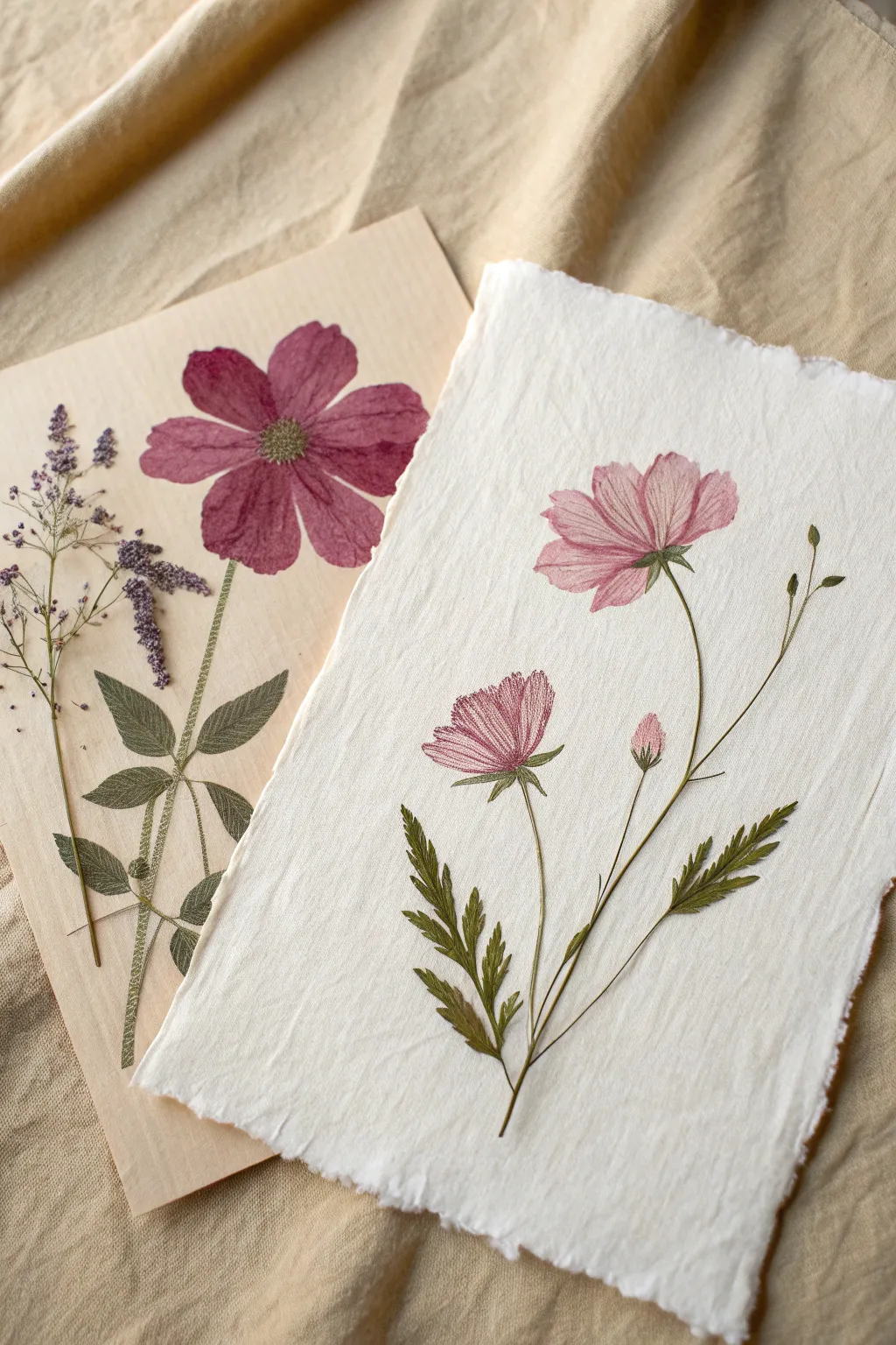
Discover the ethereal beauty of ghost printing, where a single inking yields two distinct artworks. This technique captures the vibrant first impression on smooth wood veneer and a softer, watercolor-like second impression on textured handmade paper.
Step-by-Step Tutorial
Materials
- Fresh Cosmos flowers (and varied foliage like ferns or delicate weeds)
- Block printing ink (pink, green, dark purple)
- Brayer (rubber roller)
- Glass plate or plexiglass for rolling ink
- Paper 1: Thin wood veneer sheet or smooth heavy cardstock
- Paper 2: Handmade cotton rag paper with deckled edges
- Clean tweezers
- Wooden spoon or baren
- Newsprint or scrap paper
Step 1: Preparing the Botanicals
-
Selecting specimens:
Choose flowers like Cosmos that are relatively flat but have distinct petals. Avoid bulky centers; if necessary, carefully slice the back of the flower center to flatten it without destroying the structure. -
Pressing lightly:
Place your fresh flowers and leaves between two heavy books for just 30 minutes. This doesn’t dry them out but creates a flatter surface that accepts ink more evenly than a rounded, fresh stem. -
Palette preparation:
Squeeze a small amount of pink, green, and purple ink onto your glass plate. Use your brayer to roll them out until you hear a ‘velcro’ sizzle sound, indicating the perfect ink consistency.
Smudged definition?
If your ghost print looks like a blob, you used too much ink on the first roll. The initial layer should be thin so only the vein structures remain for the second press.
Step 2: Inking the Floura
-
Applying color:
Place a flower face-up on a piece of scrap paper. Run the inked brayer over the flower petals. Be purposeful: ink usually sticks best if you roll from the center outward. -
Adding detail:
For multi-colored effects, use a small paintbrush or a second mini-brayer to apply green ink specifically to the stems and leaves, keeping the pink restricted to the blooms. -
Transferring the plant:
Using clean tweezers, carefully lift the inked botanical. Be gentle to prevent tearing the delicate petals. Place it inked-side down onto the smooth wood veneer sheet.
Watercolor Hybrid
After the ghost print dries, lightly wash over the petals with watercolor paints in a matching shade. The ink acts as a resist, creating beautiful depth.
Step 3: The First Press (The Bold Print)
-
Cover and press:
Place a clean sheet of newsprint over the botanical on the veneer. This protects your rubbing tool and keeps the plant from shifting. -
Burnishing:
Firmly rub over the area with a wooden spoon or baren. This first press removes the majority of the pigment, creating a crisp, bold image on the wood veneer. -
Removing the plant:
Lift the newsprint, then very carefully peel the flower off the veneer with tweezers. Set the printed veneer aside to dry.
Step 4: The Second Press (The Ghost Print)
-
Immediate transfer:
Don’t re-ink the flower! Take that same plant, which still holds residue ink, and place it face-down onto your textured handmade paper. -
Arranging the composition:
Since this is the ghost print, I find the arrangement matters even more. Position it gracefully, perhaps slightly off-center for an organic feel. -
Heavy burnishing:
Cover with clean newsprint again. You will need to press significantly harder this time than you did for the first print to force the remaining ink into the nooks of the textured paper. -
Checking the transfer:
Lift a corner of the newsprint and the flower petal carefully to check the transfer. If it’s too faint, lay it back down and rub vigorously with the edge of the spoon. -
The reveal:
Remove the botanical completely. You should see a softer, more veined, and textured image compared to the first print—this is your ghost print. -
Enhancing details (Optional):
Sometimes ghost prints are very faint. You can use a very fine brush with a tiny bit of watered-down ink to reconnect a broken stem line, but try to keep the petals natural. -
Repeat for foliage:
Repeat the entire process with your fern or weed sprigs. Ink them, print once on the veneer (left side of the image), and print the ghost image on the handmade paper (right side). -
Drying:
Oil-based inks can take a few days to fully cure. Lay your prints flat in a safe, dust-free area until dry needed to the touch.
Enjoy the unique character of your dual prints, seeing how one moment in nature can yield two beautiful perspectives
Abstract Flower Print Collage With Cut-Out Stamps
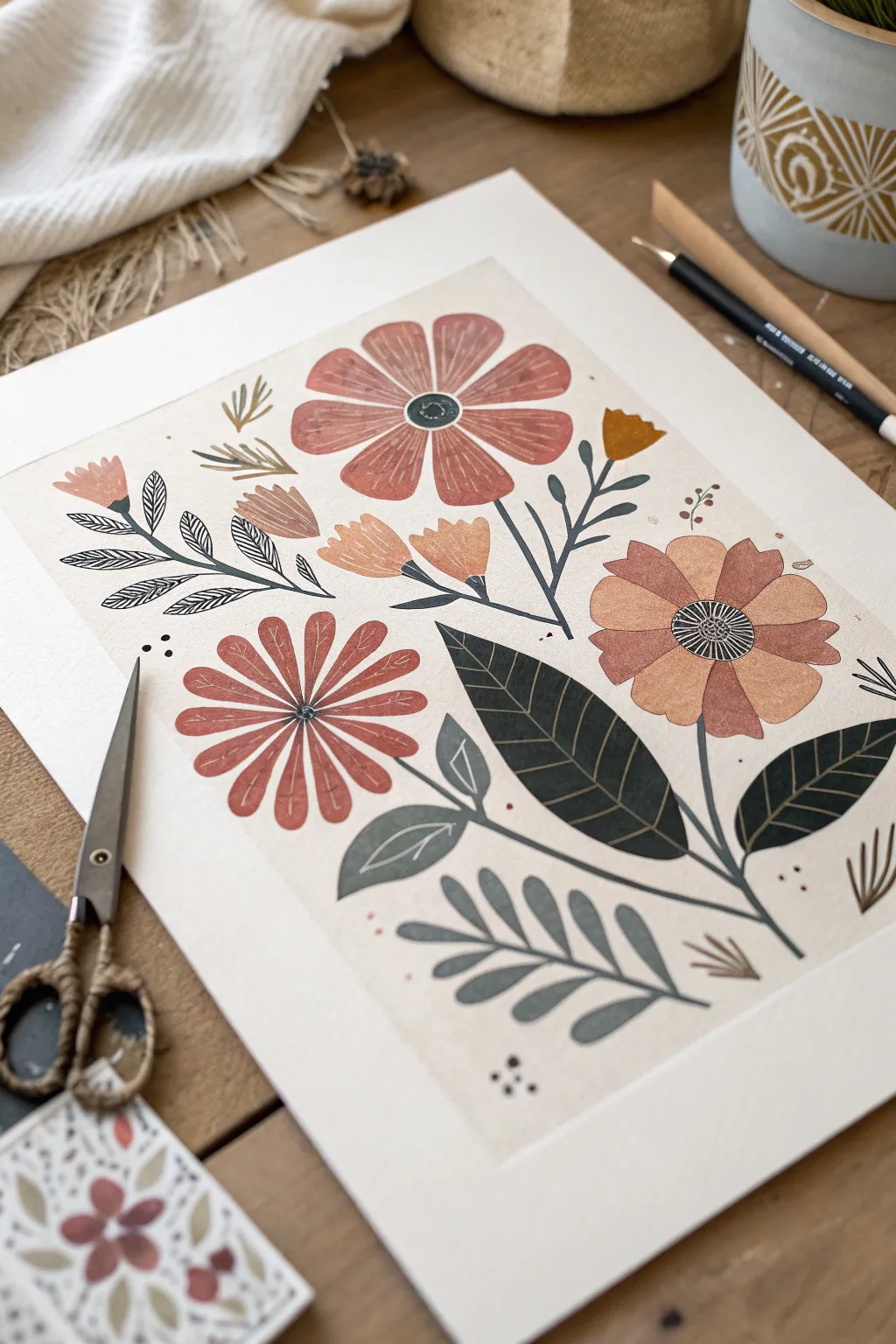
Embrace a warm, organic aesthetic with this multi-layered floral print that mimics the charm of block printing and paper cut-outs. By layering muted terracotta, ochre, and deep teal tones, you’ll create a botanical composition that feels both vintage and refreshingly modern.
Step-by-Step Guide
Materials
- Heavyweight mixed media or watercolor paper (cream)
- Small rubber carving block or linoleum sheet
- Linoleum cutter set (V-gouge and U-gouge)
- Craft knife or precision scissors
- Block printing ink or heavy body acrylics (Terracotta, Ochre, Deep Teal, Charcoal)
- Foam brayer or sponge daubers
- Pencil and eraser
- Fine-point black ink pen (archival)
- Scrap paper for testing
- Smooth surface or glass palette for rolling ink
Step 1: Designing and Carving
-
Sketch your key shapes:
Begin by sketching the separate components of the flowers on your carving block. You need three distinct flower head shapes: a large wide-petaled bloom, a spiky daisy-like bloom, and a tulip-shaped bud. -
Plan the foliage:
Draw outlines for the leaves. Create a mix of shapes—broad lance-shaped leaves for the bottom right and smaller, fern-like fronds for the bottom center. Don’t worry about the stems yet; we will draw those later. -
Carve the outer outlines:
Using your linoleum cutter with a V-gouge, carefully carve away the negative space around your flower and leaf shapes. Go slowly around curves to keep the edges crisp. -
Add texture details:
Switch to a smaller gouge tool to carve distinct interior lines. For the large terracotta flower, carve radiating lines from the center. For leaves, carve out the central veins so the paper color will show through. -
Cut out the stamps:
Once carved, use a craft knife to physically cut the rubber shapes out of the block completely. This allows you to place them freely on the paper like puzzle pieces.
Patchy Prints?
If your stamped images look too patchy or faint, your paper might be too textured. Try placing a foam mat under your paper when stamping to help cushion the impression.
Step 2: Printing the Composition
-
Prepare your palette:
Squeeze out your ink or acrylics onto your palette. Mix a dusty rose/terracotta, a warm ochre yellow, and a muted teal green. I like to keep the colors slightly desaturated for a vintage look. -
Test your prints:
Apply ink to your stamps using a brayer or sponge dauber and make a few test prints on scrap paper. This helps you gauge how much pressure is needed for a solid impression. -
Map out the layout:
Lightly mark the center of your final paper with a pencil to guide your placement. Imagine an invisible triangle structure where the three main flower heads will sit. -
Print the focal bloom:
Ink the large, wide-petaled flower stamp with the terracotta color. Press it firmly onto the upper center of your paper. Lift it straight up to avoid smudging. -
Add secondary flowers:
Using the ochre ink, stamp the tulip-shaped buds to the left and just below the main flower. Ink the second large flower shape in a soft orange-brown and place it on the right side. -
Print the lower bloom:
Clean your stamp or grab your third flower design. Ink it in a darker red-orange shade and stamp it in the lower left area to balance the composition. -
Stamp the foliage:
Using the deep teal or charcoal ink, stamp the large lance-shaped leaves near the bottom right. Rotate your fern-like leaf stamp and print it in the bottom center using a muted grey-green. -
Fill gaps with small details:
If you have tiny carved bud or leaf shapes, stamp them in the remaining open spaces using lighter shades of yellow or green to connect the main elements.
Collage It Up
Instead of stamping directly on the final paper, stamp onto separate colored papers, cut the flowers out with scissors, and glue them down for a true decoupage 3D effect.
Step 3: Drawing Components
-
Dry thoroughly:
Allow the stamped ink to dry completely. If the ink is wet, your pen lines will bleed or smear, ruining the crisp effect. -
Draw the stems:
Take your fine-point black pen or a thin brush with black ink. Draw smooth, confident lines connecting the floating flower heads and leaves to created a unified plant structure. -
Add leaf vein details:
On the stamped leaves that are solid blocks of color, use a white gel pen or thin light grey paint to draw veins over the top, mimicking the negative space carving. -
Detail the flower centers:
Draw intricate centers for your flowers. For the top bloom, draw a small circle with white dots. For the right bloom, draw a detailed cross-hatching pattern in black ink. -
Embellish with extra leaves:
Draw additional leaves directly onto the paper with your black pen to add contrast. Look at the left side of the composition; adding line-drawn leaves next to stamped ones creates great visual interest. -
Final touches:
Add tiny dots or small seed clusters floating around the flowers using your black pen to soften the white space and finish the piece.
Frame your botanical artwork in a simple wooden frame to highlight those earthy tones you just mastered


Have a question or want to share your own experience? I'd love to hear from you in the comments below!