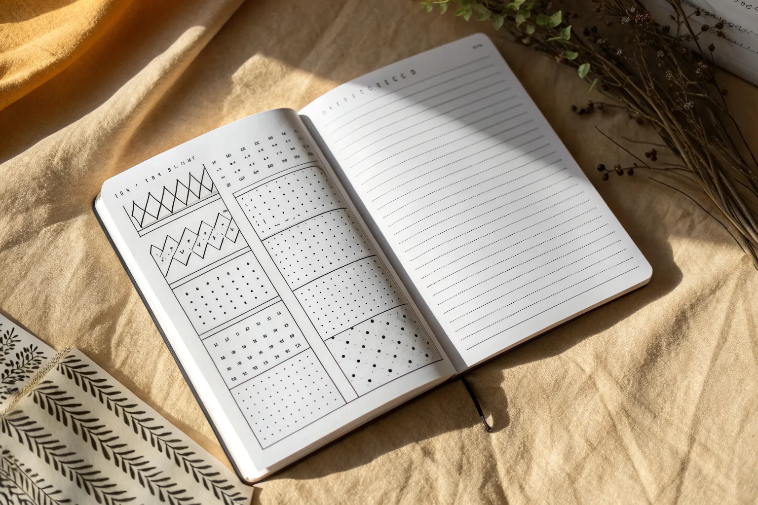
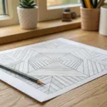
When I’m stuck, I go back to line design—because one simple stroke can turn into pattern, texture, and even optical illusion. Here are my go-to line design ideas for building a mini library of marks you can reuse in bigger drawings anytime.
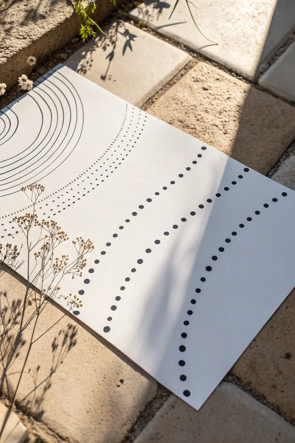
Line Types Cheat Sheet
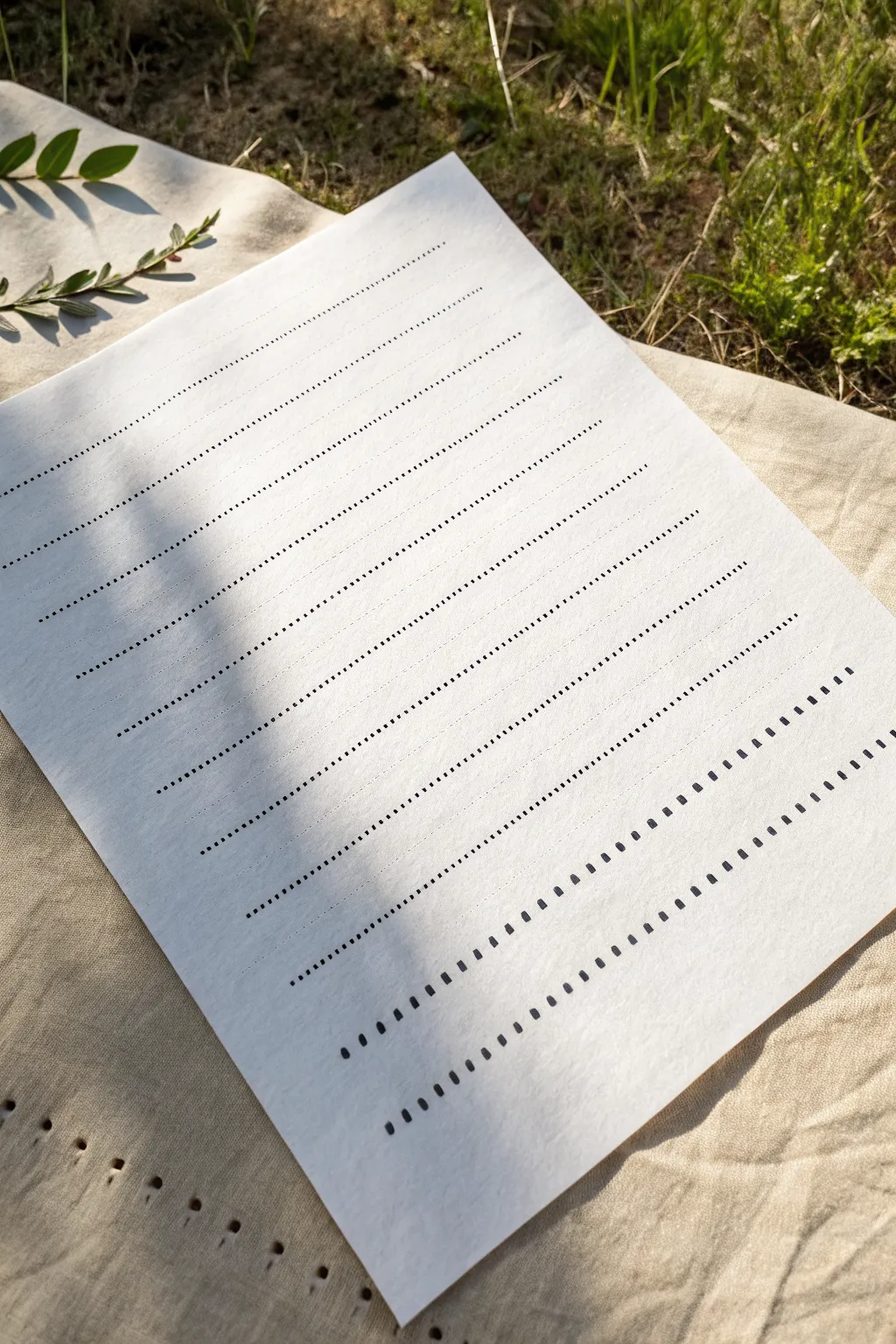
Master the satisfying rhythm of ink on paper with this clean, minimalist line practice sheet. This project is perfect for testing new pens or simply enjoying the meditative process of creating uniform, repetitive patterns.
How-To Guide
Materials
- High-quality white paper (mixed media or smooth cardstock)
- Fine liner pens (sizes 0.3mm, 0.5mm, and 0.8mm)
- Ruler (clear acrylic is best)
- Pencil (HB or H)
- Eraser (kneaded or vinyl)
Step 1: Preparation and Layout
-
Paper Selection:
Choose a sheet of paper with a bit of tooth but smooth enough for ink. A bright white shade contrasts beautifully with black ink. -
Marking Margins:
Using your pencil and ruler, lightly mark a 1-inch border around the entire page to frame your work. -
Setting Guidelines:
Within your borders, measure and lightly draw horizontal guide lines spaced about 3/4 inch apart. These will keep your ink rows straight. -
Checking Spacing:
Step back and ensure your pencil lines look parallel. Adjust any that seem slanted before you start inking.
Smudge Alert
If ink smears when erasing pencil lines, the ink wasn’t fully dry. Wait longer, or use a piece of scrap paper under your hand to protect the work.
Step 2: Fine Dotted Lines
-
Starting Subtle:
Begin at the top with your finest pen (0.3mm). Place the pen tip on the first pencil line. -
Creating Micro-Dots:
Create a row of tiny, distinct dots. Try to keep the space between each dot exactly equal to the width of the dot itself. -
Varying Density:
For the second row, use the same pen but space the dots slightly further apart, creating a lighter visual weight. -
Increasing Size:
Switch to a 0.5mm pen for the next few rows. Repeat the dotting motion, focusing on consistent pressure so each dot remains circular, not messy.
Steady Hand Trick
Exhale slowly as you draw each line. Holding your breath can actually cause shakiness, while steady breathing promotes smoother hand movement.
Step 3: Dashes and Heavy Elements
-
Transition to Dashes:
Move down to the middle section. instead of dots, draw short, 2mm dashes along the guide line. -
Spacing the Dashes:
Keep the gaps between dashes tight. The white space should be shorter than the ink mark itself. -
Heavy Line Preparation:
For the bottom section, switch to your thickest pen (0.8mm or a brush pen tip). -
Bold Rectangles:
Draw small, vertical rectangles or ‘chunky’ dashes. Press firmly to fill them in completely as you go. -
Alternating Rhythm:
On the final row, try an alternating pattern: one heavy dash, a wide space, then another heavy dash.
Step 4: Finishing Touches
-
Ink Drying Time:
Let the paper sit undisturbed for at least 15 minutes. Heavy ink spots take longer to dry than fine lines. -
Erasing Guides:
Gently gently run your eraser over the whole page to lift the pencil guidelines. -
Spot Cleaning:
Check for any pencil residue near the heavier ink marks and carefully erase around them. -
Final Inspection:
Brush away any eraser shavings to reveal your crisp, clean line study.
You now have a beautiful reference sheet that demonstrates the power of simple repetition and line weight

Grid Sampler Squares
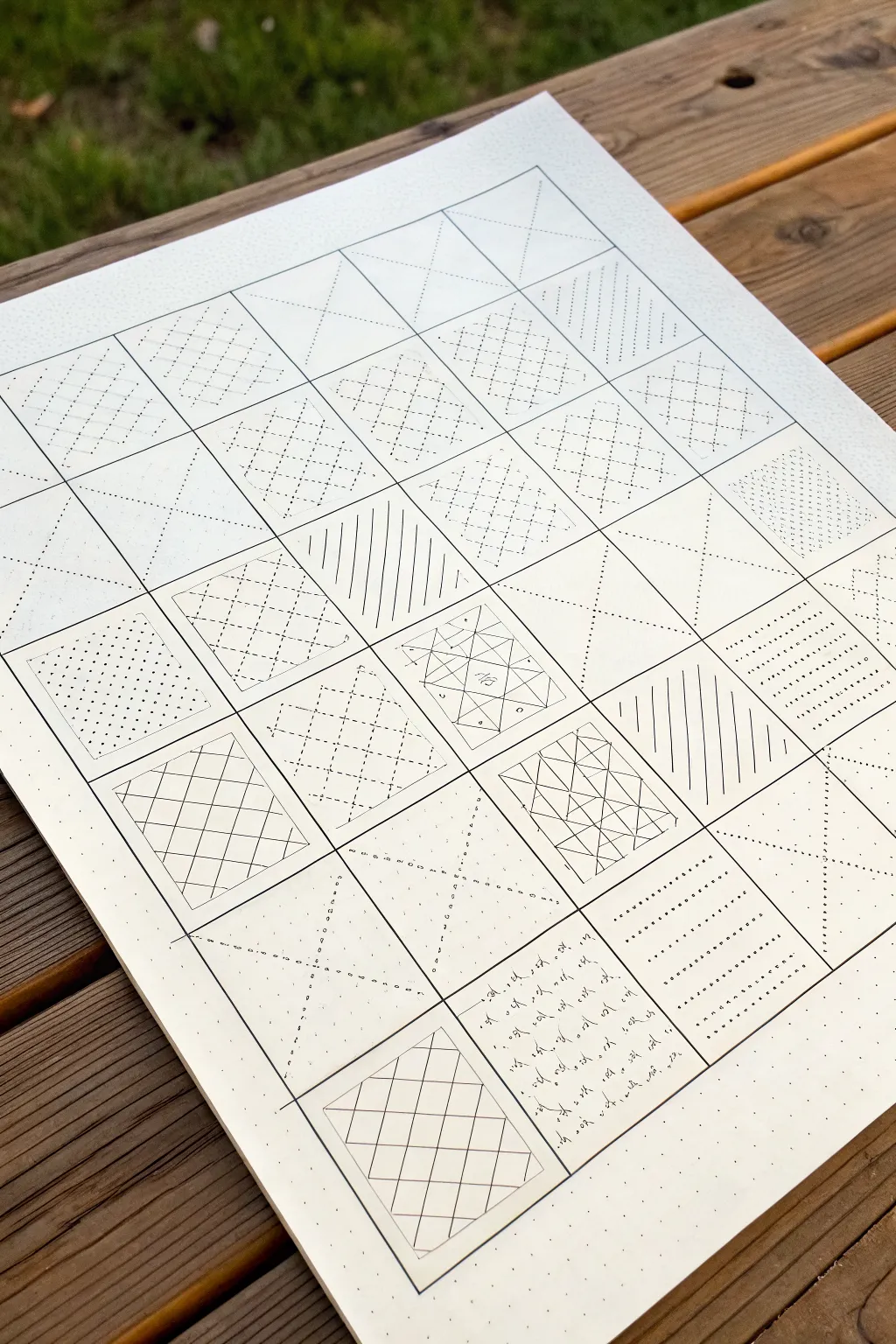
Master the fundamentals of geometric pattern drawing with this satisfying grid sampler project. By repeating simple line motifs across a structured layout, you’ll create a beautifully organized reference sheet that explores density, direction, and texture.
Step-by-Step Guide
Materials
- High-quality Bristol board or thick drawing paper (A4 or A3 size)
- Fine-liner pens (black, sizes 0.1mm, 0.3mm, and 0.5mm)
- Ruler or straight edge (transparent is best)
- Pencil (HB or 2H for light guidelines)
- Eraser (kneaded or high-polymer)
- Compass (optional, for circular variations)
Step 1: Preparation & Grid Layout
-
Establish the outer boundary:
Begin by lightly drawing a large rectangle on your paper using a pencil. Leave a generous margin of about 1-2 inches around the edges to frame your work. -
Create the heavy grid:
Divider your large rectangle into smaller, equal squares. Based on the reference, a 6×6 or 5×7 layout works well. Draw these primary grid lines firmly with a pencil first, or go straight to ink if you are confident. -
Add the dot matrix:
Inside every square, create a subtle guide system. I find a 5×5 or 7×7 grid of tiny dots within each large square helps immensely with spacing. You can lightly pencil these in or use a specialized dot-grid ruler. -
Ink the main structure:
Trace over your main grid lines with a 0.5mm pen to create strong, defined boundaries between your pattern zones. Let the ink dry completely before erasing any pencil construction lines.
Clean Lines Tip
Wipe the edge of your ruler with a tissue every few lines. Ink builds up on the plastic edge and can smudge across your paper when you slide the ruler.
Step 2: Basic Linear Patterns
-
Vertical and diagonal stripes:
Select a square to begin. Using your ruler and a 0.3mm pen, fill the box with evenly spaced vertical lines. In the neighboring box, try diagonal lines. -
Cross-hatching basics:
In a new square, draw a diagonal grid. Start with lines running bottom-left to top-right, then cross them with lines running top-left to bottom-right to create diamonds. -
Dashed line variations:
Experiment with line weight and continuity. Recreate the cross-hatch pattern in another square, but instead of solid lines, use short, consistent distinct dashes. This mimics the look of traditional Sashiko stitching. -
The ‘X’ motif:
Dedicate a column to exploring the ‘X’. In one square, draw a single large X from corner to corner using dotted lines. In another, fill the square with rows of small, floating X shapes.
Step 3: Complex & Geometric Fillers
-
Double-line grids:
Create a more intricate lattice by drawing sets of double parallel lines. Leave a wider gap between the sets to create a ‘street’ effect, varying the angles for visual interest. -
Triangular subdivisions:
Draw an ‘X’ through a square to divide it into four triangles. Fill each triangle with lines parallel to its outer edge, creating a concentric perception effect. -
The starburst pattern:
Locate the center of a square. Draw lines radiating outward to the edges and corners. You can connect the tips of these radials with straight lines to form geometric webs. -
Chaotic vs. Controlled:
Use one square to break the rigidity. Fill it with randomized text or tiny, scattered scribbles, contrasting heavily with the precise geometric squares around it. -
Dotted fields:
Fill a square entirely with stippling (tiny dots). Vary the density, making it darker in one corner and fading to light in the opposite corner to imply depth.
Add Color Accents
Once the black ink is dry, use a single accent color (like red or gold) to fill in specific shapes within the patterns, creating a modern focal point.
Step 4: Finishing Touches
-
Review line weights:
Look over the entire piece. If some patterns look too faint, carefully re-trace key lines with a slightly thicker nib to bring balance to the composition. -
Clean up:
Once you are absolutely certain all ink is dry—I usually wait at least 30 minutes to be safe—gently erase the underlying pencil dot matrix and guide lines. -
Final cropping (optional):
If you want a crisp edge, use a craft knife and ruler to trim the paper right up to the heavy outer border line.
Now you have a comprehensive library of patterns ready to be applied to future illustrations or simply framed as a study in precision

Pattern Wheel Circle
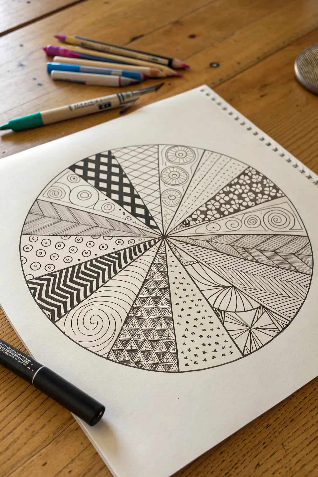
This meditative drawing exercise divides a simple circle into twelve unique sections, each filled with a distinct and intricate line pattern. The result is a striking black-and-white sampler that explores texture, contrast, and geometric rhythm.
Detailed Instructions
Materials
- White sketchbook paper or drawing cardstock
- Compass (or a circular object to trace)
- Ruler or straight edge
- Pencil (HB or lighter)
- Eraser
- Black fineliner pens (0.3mm and 0.5mm recommended)
- Black marker or brush pen (for filling dark areas)
Step 1: Setting the Structure
-
Draw the main circle:
Start by using your compass to draw a large circle in the center of your page. If you don’t have a compass, carefully trace a bowl or plate. -
Divide into sections:
Using a ruler, draw a vertical line straight through the center, followed by a horizontal line to create four quadrants. Then, divide each quadrant into three roughly equal wedges, creating 12 pie slices total. Keep these pencil lines light.
Pro Tip: Contrast Balance
Alternate heavy, dark patterns (like the checkerboard) with light, airy ones (like the dots) so your wheel doesn’t look too cluttered in one spot.
Step 2: Filing the Patterns: Top Hemisphere
-
Top Center: Circles & Stippling:
In the slice just to the right of the top vertical line, draw three or four stacked circles. Give them inner rings like target signs, and fill the background space with tiny stippling dots. -
Top Left: Checkerboard:
Move to the slice left of the vertical center. Sketch a grid that warps slightly with the wedge shape. Fill alternating squares with solid black ink to create a bold checkerboard effect. -
Top Far Right: Floral Grid:
In the wedge at the 2 o’clock position, draw a grid of diagonal lines. At every intersection, draw a small four-petaled flower shape, darkening the negative space around the petals. -
Top Far Left: Bubbles:
For the 10 o’clock wedge, draw random circles of varying sizes—some large, some tiny fillers. Add a small dot or ‘C’ shape inside the larger ones to imply volume. -
Top Right: Dotted Lines:
Between the ‘Circles & Stippling’ and ‘Floral Grid’ sections, create a lighter texture. Draw simple, straight lines radiating from the center, composed entirely of small dots. -
Top Left Diagonal: Cross-Hatch Grid:
In the remaining top-left slice, draw diagonal lines crossing each other to form diamonds. Leave them open and airy for contrast against the heavy checkerboard nearby.
Troubleshooting: Smudged Ink
If you smudge a line, don’t panic! Turn the smudge into a shadow or thicken the line to hide it. Zentangle patterns are forgiving of mistakes.
Step 3: Filling the Patterns: Bottom Hemisphere
-
Horizontal Right: Swirls:
In the slice directly at 3 o’clock, draw a series of spirals or swirls that flow outward from the center point, filling the wedge with curved energy. -
Horizontal Left: Wood Grain:
Opposite the swirls, at 9 o’clock, draw a ‘leaf vein’ or wood grain pattern. Draw a central spine line, then fill both sides with closely spaced diagonal lines. -
Bottom Left: Chevron Zippers:
Move downwards to the 7-8 o’clock area. Draw thick chevron stripes (zig-zags). I prefer using a thicker pen here to fill in the dark stripes solidly. -
Bottom Right: Herringbone:
In the 4-5 o’clock area, create a herringbone texture. Draw a central line down the wedge, then stack ‘V’ shapes tightly all the way down. -
Bottom Center Left: Organic Waves:
Next to the chevrons, draw smooth, flowing curves that mimic hills or waves. Add a single swirl at the bottom for visual interest. -
Bottom Center: Triangle Mosaic:
In the 6 o’clock position (the bottom-most wedge), draw a grid of small triangles. Inside each triangle, scribble a tiny, messy loop or knot to give it an intricate, ancient look. -
Final wedge: Radiant Arches:
In the last remaining slice (around 5 o’clock), draw a ‘sunrise’ pattern at the bottom with radiating lines, and fill the top half with horizontal stripes.
Step 4: Finishing Touches
-
Inking the borders:
Once all patterns are drawn, take your 0.5mm pen and trace the main 12 spokes and the outer circle circumference firmly to define the boundaries. -
Erase guidelines:
Wait at least 15 minutes for the ink to fully cure, then gently erase all remaining pencil marks to reveal the crisp black-and-white design.
Now you have a stunning geometric sampler that showcases a dozen different drawing techniques in one cohesive piece.
Decorative Line Borders
Transform a blank planner page into a structured masterpiece with these hand-drawn dividers and vegetative borders. This layout combines botanical motifs with geometric precision to create elegant sections for your notes or daily logs.
Step-by-Step Guide
Materials
- A5 Spiral-bound journal or notebook (dot grid or lined paper)
- Fine liner pen (0.3mm or 0.5mm, black)
- Precision ruler
- Pencil (HB or H)
- Eraser
Step 1: Setting the Frame
-
Define the vertical margins:
Using a ruler and pencil, lightly mark two vertical lines about 1cm inward from both the left and right edges of your page. These will serve as the spines for your main decorative borders. -
Sketch the arrow-leaf border:
Starting at the top of the left vertical line, draw pairs of angled lines branching outward, resembling arrow fletching or stylized leaves. Continue this pattern all the way down the spine. -
Mirror the border design:
Repeat the exact same branching arrow/leaf pattern on the right vertical guideline. Try to keep the spacing between the ‘leaves’ consistent with the left side for symmetry. -
Ink the structural borders:
Trace over your pencil borders with your fine liner pen. I find it helpful to rotate the notebook slightly to get the most comfortable angle for these repetitive strokes.
Steady Hands
Exhale as you draw long straight lines. This steadies your hand and prevents the jittery wobble that happens when holding your breath.
Step 2: Drafting the Horizontal Dividers
-
Plotting the spacing:
Lightly mark horizontal guidelines with a pencil where you want your dividers to sit. Aim for equal spacing, leaving enough room between them to practice the different designs. -
The Dotted Line:
For the first divider, draw a straight, solid horizontal line. Immediately above it, place small, evenly spaced dots floating just over the line. -
Solid Dots:
Create the second divider by drawing bold, solid circles. Start with a medium-sized dot, then alternate slightly smaller dots in between, or keep them uniform like the example. -
Dashing & Dots:
Draw the third divider. Start with a solid line section, then transition into a pattern of dashes and small dots. This creates a playful, Morse-code aesthetic. -
Open Circles:
Draw a straight baseline. Hovering slightly above it, draw a row of small, open circles (o) across the width of the page. -
The Vine Divider:
Draw a straight horizontal line. From the center point, draw tiny leaves branching out in opposite directions, getting smaller as they reach the ends of the line. -
Graduated Dots:
Draw a straight line. Above it, create a pattern of dots that start large in the center and gradually become tiny specks as they extend outward to the sides. -
Triangle Flag Banner:
Draw a straight baseline. On top of it, draw a series of small, sideways triangles pointing to the right, resembling a string of pennant flags. -
Heart String:
Draw a line segments broken up by small hearts. Draw a short line, a small solid heart, a short vertical dash, and repeat. Add tiny arrows at the very ends. -
Botanical Arrow:
Draw a straight line with a small ‘x’ or arrow tail at the ends. Along the line, distribute simple two-leaf sprigs, spacing them out widely for a minimalist look.
Add Color
Use mild highlighter colors to fill in the open circles or trace over the straight baselines for a subtle pop of color behind the black ink.
Step 3: Finishing Touches
-
Erase pencil guides:
Wait at least 5-10 minutes to ensure the ink is totally dry, then gently erase all your pencil baselines and margin guides. -
Clean up details:
Inspect your lines. If any solid dots look uneven, carefully round them out. Add tiny serifs or extra weight to any lines that look too faint.
Now you have a library of decorative borders ready to organize your next journal spread
BRUSH GUIDE
The Right Brush for Every Stroke
From clean lines to bold texture — master brush choice, stroke control, and essential techniques.
Explore the Full Guide
Parallel Line Gradients
Embrace the crisp, rhythmic beauty of classical music notation by creating your own bespoke staff paper from scratch. This project focuses on drawing incredibly precise, parallel lines to form clean musical staves, resulting in a minimalist aesthetic that is perfect for calligraphy or journaling.
Step-by-Step
Materials
- High-quality cream or off-white cardstock (A4 or letter size)
- Fine-point technical drawing pens (0.3mm and 0.5mm, black)
- An 18-inch clear acrylic ruler
- Pencil (HB or H for light marks)
- White eraser
- Flat, clean work surface
- Painter’s tape or masking tape
Step 1: Preparation and Layout
-
Secure the paper:
Start by placing your sheet of cream cardstock on a completely flat, hard surface. Use small pieces of painter’s tape on the very corners to hold the paper still; this prevents it from shifting while you measure. -
Determine margins:
Decide on your page margins. I usually prefer a generous 1-inch margin on the sides and slightly more at the top and bottom to frame the staves nicely. Mark these boundaries lightly with a pencil. -
Calculate staff spacing:
A standard musical staff consists of five lines. You need to decide how much vertical space you want between each staff system. A gap of 0.5 to 0.75 inches between sets of five lines usually looks balanced. -
Mark vertical reference points:
Along the left and right margins of your paper, make tiny tick marks with your pencil for every single line you intend to draw. Consistency is key here—standard staff lines are typically spaced about 2-3mm apart. -
Verify alignment:
Place your ruler across the paper connecting the left and right tick marks. ensuring your ruler is perfectly horizontal. Double-check that your measurements are identical on both sides before you pick up a pen.
Clean Rulers Only
Wipe the edge of your ruler with a tissue after every 2-3 lines. Ink build-up on the ruler’s edge is the #1 cause of smears.
Step 2: Inking the Staves
-
First line confidence:
Select your 0.3mm technical pen. Align the clear rule just slightly below your first set of pencil marks so the ink won’t bleed under the edge. Draw your first horizontal line with a steady, even speed. -
Complete the first staff:
Continue down, drawing the remaining four lines of the first staff set. Keep your pen strictly vertical against the ruler’s edge to maintain a consistent line width. -
Check for smudging:
Lift the ruler straight up after each line rather than sliding it. This prevents dragging wet ink across the porous cardstock, which can ruin the crisp effect. -
Spacing the systems:
Move down to the next set of tick marks, leaving that larger gap you calculated earlier. This negative space creates the ‘gradient’ rhythm effect discussed in the article introduction. -
Continue the pattern:
Repeat the process for the remaining staves down the page. Take a break halfway through if your hand feels shaky; tension creates wobbly lines. -
Review line weight:
Inspect your lines. If you want the top and bottom lines of each staff to feel slightly heavier—a common engraving style—carefully re-trace them or switch to your 0.5mm pen for just those specific outer lines.
Step 3: Finishing and Styling
-
Let it dry completely:
Patience is essential. Allow the ink to dry for at least 15 to 20 minutes. Technical ink can look dry on the surface while still being wet underneath. -
Erase guidelines:
Gently erase your pencil tick marks along the margins using a clean white eraser. Hold the paper taut with one hand and erase away from the center to avoid crinkling the edge. -
Inspect margins:
Check the edges where you erased to ensure no graphite smears remain. The paper should look pristine and the lines sharp. -
Create the setting (optional):
To mimic the photo’s aesthetic for display, gently curl the paper’s corners or place it on a textured white fabric in natural sunlight to emphasize the paper’s grain.
Vintage Fade
Instead of black ink, use a sepia or dark grey micron pen. It gives the sheet music an aged, antique manuscript look instantly.
Enjoy the satisfaction of seeing your perfectly ordered lines ready for musical notes or artistic calligraphy
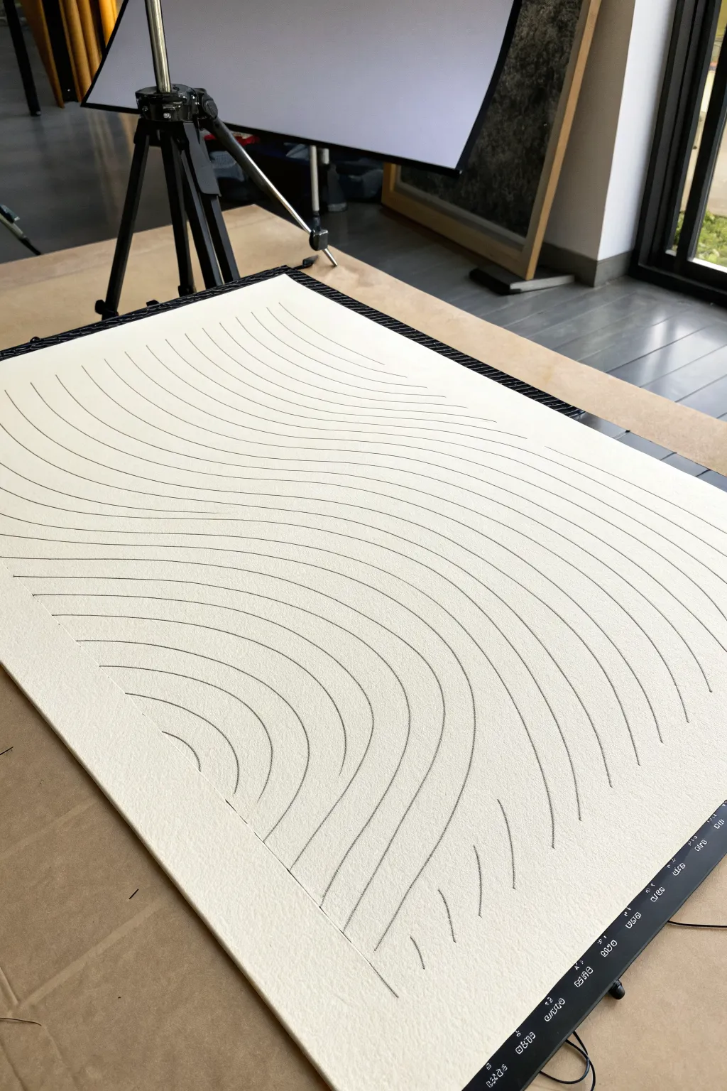
Wavy Lines and Ripples
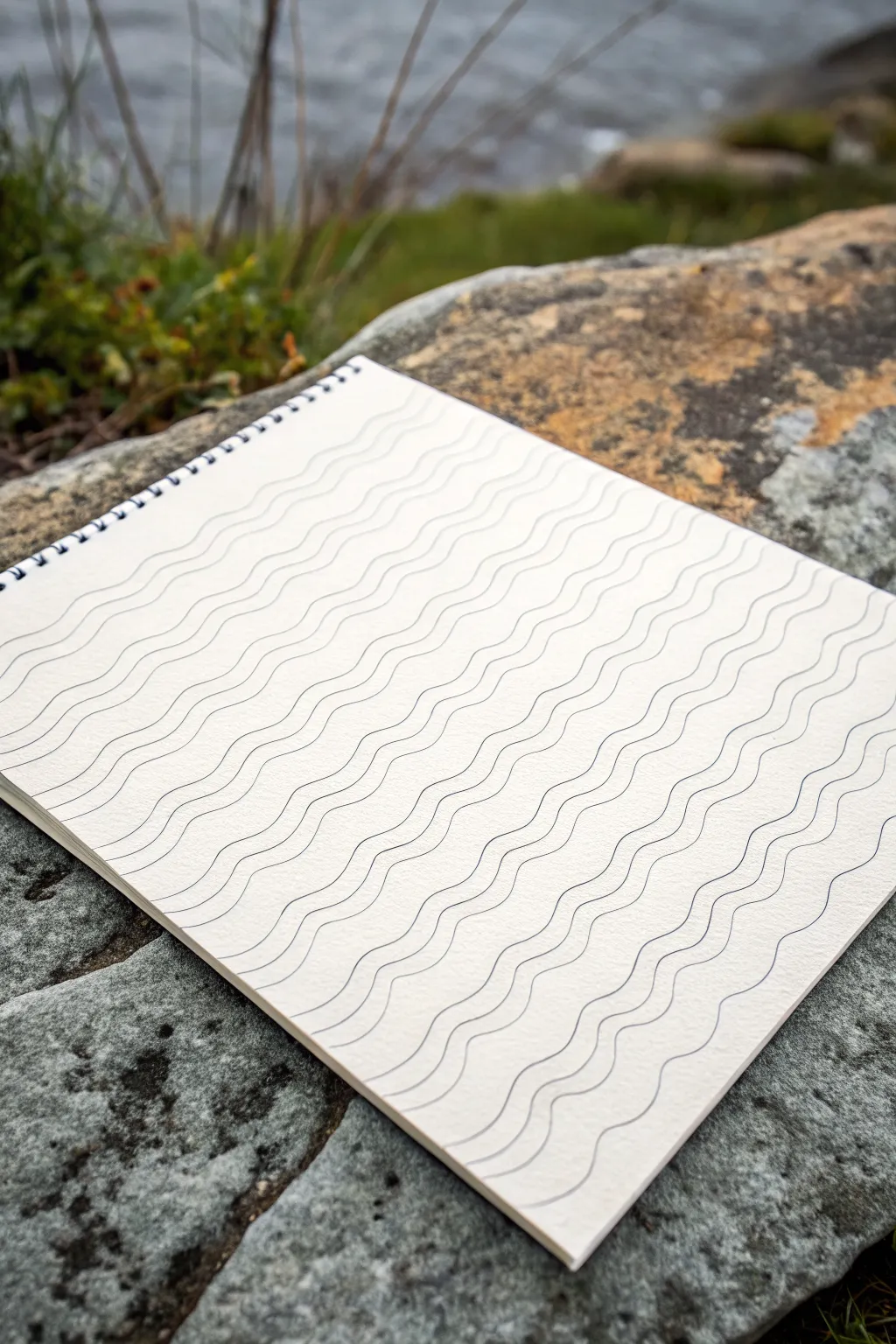
Capture the soothing rhythm of ocean waves with this simple yet meditative line art exercise. By repeating gentle, undulating curves across the page, you’ll create a mesmerizing texture that feels both organic and structured.
Detailed Instructions
Materials
- Spiral-bound sketchbook (heavyweight paper preferred)
- Fine-liner pen (0.3mm or 0.5mm, black or dark blue)
- Pencil (HB or 2B)
- Eraser
- Ruler (optional, for guidelines)
Step 1: Preparation & Guidelines
-
Observe the flow:
Before putting pen to paper, study the reference image or look at actual water. Notice how the waves aren’t sharp zig-zags but smooth, rolling curves. -
Set the angle:
Decide on the direction of your waves. In the example, the lines flow diagonally from the top left towards the bottom right. Lightly mark the starting point of your first wave near the top corner with a pencil. -
Draw the master line:
Using your pencil, sketch the very first wavy line across the page. This ‘master line’ will dictate the rhythm for the entire piece. Keep the peaks and troughs gentle and consistent. -
Check spacing:
Roughly visualize how far apart your lines will be. You don’t need to measure exactly, but aiming for a consistent gap of about 5-8mm creates a clean, optical effect.
Step 2: Inking the Waves
-
Begin inking:
Switch to your fine-liner pen. I find a 0.5mm tip works best for visibility without being too bold. Carefully trace over your pencil master line. -
Commit to the stroke:
Try to draw primarily with your shoulder rather than just your wrist. This helps keep the long curves smooth and prevents shaky, hesitating marks. -
Start the second line:
Move down slightly from your first inked line. Instead of drawing a new wave from scratch, simply ‘echo’ the line above it. Follow the contour of the previous curve exactly. -
Maintain the gap:
Focus your eyes on the white space between the lines rather than the line itself. Trying to keep that white ribbon of space consistent in width is the secret to a uniform pattern. -
Work across the page:
Continue adding lines one by one below the previous one. Slow down as you approach the edges of the paper to ensure the lines exit cleanly off the page. -
Handle irregularities:
If one line accidentally gets too close or too far from the previous one, don’t panic. Gently correct the spacing over the course of the next 2-3 lines by making the curves slightly shallower or deeper until the rhythm is restored. -
Fill the lower section:
As you move down the page, the repetitive motion should become quite relaxing. Ensure the bottom-most lines maintain the same flow, even as they get shorter in the corner. -
Complete the top corner:
Go back to your initial master line and fill in the small triangular section above it (the top left corner) with parallel curves moving upward until the space is filled.
Wrist Mechanics
Rotate your sketchbook! Position the paper so your hand pulls the pen naturally toward your body. It’s much easier to draw smooth curves pulling down than pushing away.
Step 3: Finishing Touches
-
Let the ink set:
Give your drawing a few minutes to ensure the ink is completely dry. Smudging straight lines is frustrating enough, but smudging a full page of curves is worse. -
Erase guidelines:
Gently erase your initial pencil master line and any other guide marks you might have made. Use a soft eraser to avoid roughening the paper texture. -
Review consistency:
Scan the page for any spots where the lines might appear too thin. You can very carefully thicken a line segment to balance the visual weight, though usually, imperfections add to the hand-drawn charm.
Add Depth
Vary your line weight to create a 3D effect. Press harder on the ‘down’ slope of the wave and lift slightly on the ‘up’ slope to simulate shadow and light on water.
Enjoy the calm satisfaction of seeing your completed sea of lines

PENCIL GUIDE
Understanding Pencil Grades from H to B
From first sketch to finished drawing — learn pencil grades, line control, and shading techniques.
Explore the Full Guide
Zigzag and Chevron Bands
Transform a blank sketchbook page into a mesmerizing tapestry of geometry with this multi-patterned design. Combining thick black linework with soft peach accents creates a striking contrast that feels both modern and traditional.
Step-by-Step Guide
Materials
- Sketchbook with quality paper (mixed media or sketch)
- Black fineliner (0.5mm and 0.8mm)
- Black brush pen or broad marker
- Peach or terracotta colored marker/pen
- Ruler
- Pencil
- Eraser
Step 1: Planning the Layout
-
Establish the boundaries:
Begin by lightly penciling a vertical rectangle on your page to define the total area of your design. This ensures your lines don’t trail off unevenly at the top and bottom. -
Mark the columns:
Using your ruler and pencil, divide the main rectangle into six vertical columns of varying widths. The fourth column from the left should be the widest, meant for the boldest zigzags, while the far left should be narrowest for the border detail.
Keep it Steady
Don’t rush the long vertical lines. If your hand gets shaky, use a ruler for the straight borders, but let the zigzags retain a slight hand-drawn wobble for character.
Step 2: Drafting the Patterns
-
Sketch the left border:
In the furthest left column, lightly sketch a ladder-like pattern with horizontal ticks. -
Draw the primary zigzag:
Moving to the second column, pencil in a continuous sharp zigzag line running from top to bottom. -
Create the triangle row:
In the third column, sketch a series of small, uniform triangles stacked vertically, pointing to the right. -
Outline the central complex band:
The wide fourth column is the focal point. Sketch two parallel zigzag lines that mirror each other, leaving enough space between them for heavy filling later. -
Plan the spacer line:
The fifth column is just a thin separator; draw a simple straight line here. -
Draft the nested chevrons:
In the final right-hand column, sketch large, nested V-shapes (chevrons) pointing to the right.
Metallic Pop
Try swapping the peach marker for a gold or copper metallic pen. The shimmer against the matte black ink creates a stunning, luxurious effect.
Step 3: Inking the Black Elements
-
Ink the ladder detail:
Using a 0.5mm fineliner, go over the far-left ladder pattern. Keep the horizontal ticks short and crisp. -
Define the first zigzag:
Switch to a slightly thicker pen (0.8mm) to ink the single zigzag line in the second column. Add a small black dot in every ‘valley’ on both sides of the line. -
Ink the central bold band:
Take your black brush pen or broad marker. Carefully trace the two parallel zigzags in the wide central column. -
Fill the central band:
This is where the contrast happens. On the *inner* side of the left zigzag, draw a thinner line that follows the shape. On the *right* zigzag, thicken the line substantially to create a bold, heavy visual weight. -
Add central details:
Inside that central wide column, between your two main zigzag lines, use your fineliner to add a column of small, evenly spaced dots running down the middle. -
Ink the dividing line and chevrons:
Draw the straight vertical line in column five. Then, ink every *other* chevron in the far-right column with black, leaving space between them for color. -
Add the final black border:
Draw a straight, solid black line separating the central zigzag band from the column of triangles to its left.
Step 4: Adding Color and Finishing
-
Color the triangles:
Using your peach or terracotta marker, carefully fill in the column of small triangles. I find it helps to outline the shape first before filling the center to keep edges sharp. -
Color the spacer line:
Trace over the penciled line in the fifth column (between the bold zigzag and the chevrons) with the colored marker to create a solid colored vertical bar. -
Fill the chevrons:
In the far-right column, use the colored marker to draw V-shapes in the spaces between the black chevrons. Add smaller V-details inside the colored ones for extra intricacy. -
Erase pencil marks:
Wait at least 10 minutes to ensure all ink is completely dry. Gently erase all visible pencil grid lines and sketches to reveal the clean design.
Step back and admire the rhythm created by your contrasting horizontal and vertical energies
Spiral and Coil Variations
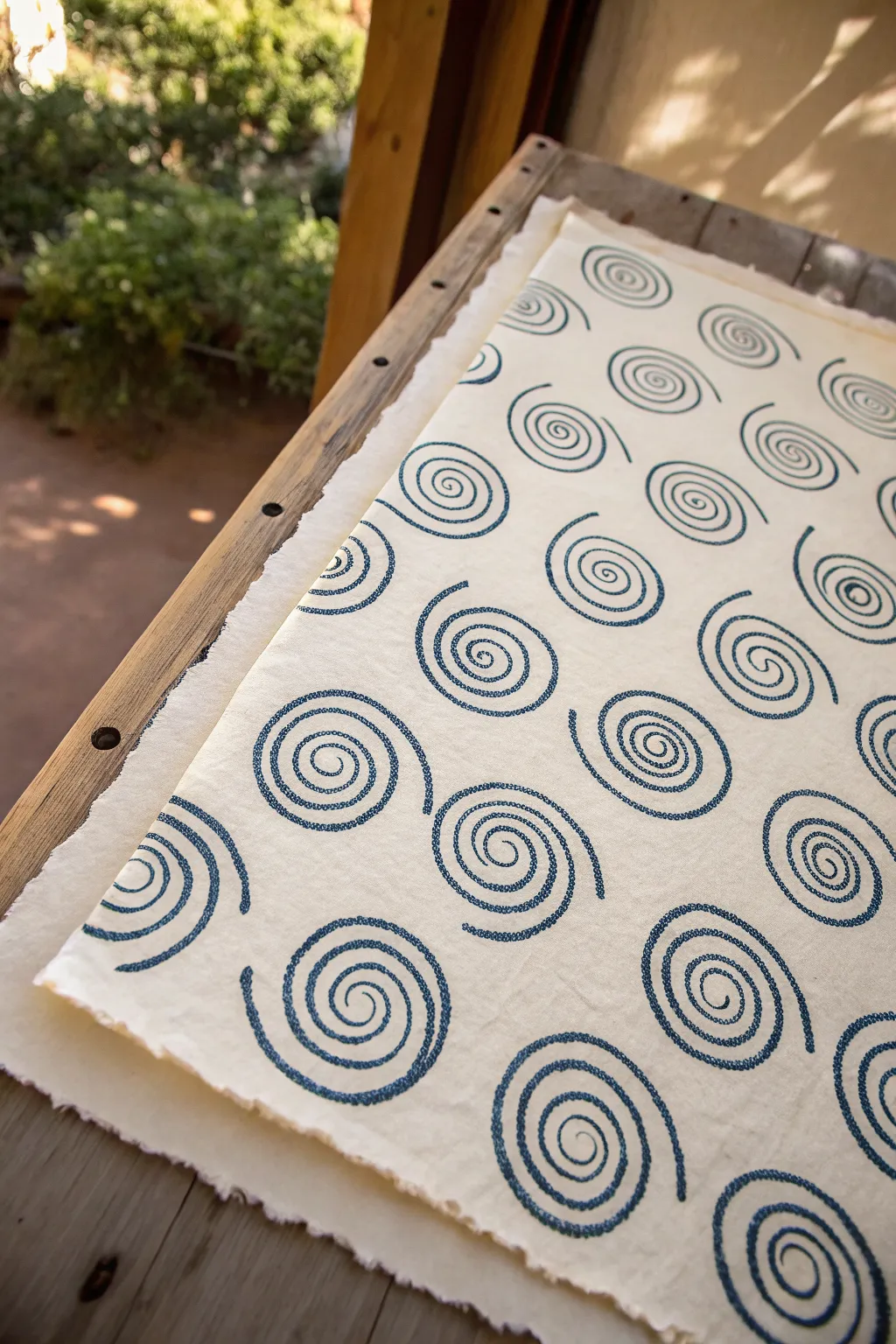
This project creates a mesmerizing, rhythmic pattern using simple spiral motifs printed onto textured handmade paper. The unique characteristic of these lines is their stippled, dotted texture, achieved through a relief printing technique that breaks up the solid line into organic segments.
Step-by-Step Tutorial
Materials
- Sheet of heavy, handmade paper or watercolor paper (rough tooth)
- Soft-cut linoleum block or carving rubber
- Linoleum cutter set (V-gouge and U-gouge)
- Dark blue block printing ink (water-based or oil-based)
- Brayer (rubber roller)
- Inking plate or piece of glass
- Pencil
- Tracing paper
- Ruler
- Baren or a wooden spoon (for burnishing)
Step 1: Designing the Block
-
Draft the spiral pattern:
Begin by drawing a simple, open spiral on a piece of paper. The line should be consistent in thickness, curving outward gently about 3-4 times from the center. -
Create the stipple texture:
Instead of leaving the line solid, go over your drawing and break the line into small, dashed segments or irregular dots. This mimics the texture seen in the reference image and gives the final print an organic, hand-drawn feel. -
Transfer to block:
Trace your stippled spiral design onto tracing paper. Flip the tracing paper over onto your soft-cut lino block and rub the back to transfer the graphite image.
Clean Lines Pro Tip
If you get unwanted ink marks from the background area, wipe the carved recessed areas of the block with a Q-tip before printing to keep the negative space crisp.
Step 2: Carving the Stamp
-
Outline the design:
Using a fine V-gouge tool, carefully carve away the negative space immediately surrounding your spiral line. You want the raised surface to be just the dotted/dashed line itself. -
Clear large areas:
Switch to a wider U-gouge to clear away the background rubber outside the spiral. You don’t need to go too deep, just enough so that the ink won’t catch on the background when printing. -
Add texture to the line:
I like to take a small cutter and make tiny nicks across the raised line of the spiral itself. These imperfections are crucial—they create that ‘stitched’ or ‘beaded’ look rather than a flat, solid ribbon of color. -
Trim the block:
Cut the rubber block down so it is a square or rectangle just slightly larger than the spiral design. This makes placement much easier later.
Ombré Level Up
Create a gradient by puting two ink colors (like dark blue and teal) side-by-side on your inking plate. Roll the brayer to blend the middle for a multi-colored spiral.
Step 3: Printing the Pattern
-
Prepare the paper:
Lay your handmade paper on a flat, clean surface. The rough, deckled edge of handmade paper adds a lot of character to this project. -
Plan your grid:
Lightly mark small pencil dots on your paper to serve as center points for your spirals if you want a perfect grid, or trust your eye for a more organic arrangement. -
Charge the ink:
Squeeze a small amount of dark blue ink onto your inking plate. Roll the brayer back and forth until you hear a sticky, sizzling sound, indicating the ink is evenly distributed. -
Ink the block:
Roll the inked brayer over your carved stamp. Apply a thin, even coat. Because the design relies on texture, avoid over-inking, which can fill in the small carved details. -
Print the first spiral:
Press the block firmly onto the paper. Apply even pressure with your hand or use a baren to rub the back of the block. -
Lift and repeat:
Carefully peel the block away from one corner to reveal the print. Re-ink the block before every single impression to ensure color consistency. -
Vary the orientation:
As you move across the paper creating rows, rotate the block 90 or 180 degrees every few prints. This ensures the spirals don’t look like identical clones and adds movement to the composition. -
Check spacing:
Keep the spacing between the spirals relatively generous. The white space is just as important as the blue ink for letting the pattern breathe. -
Dry completely:
Allow the paper to dry flat for at least 24 hours (or longer for oil-based inks) before handling or framing.
Once dry, your handmade paper will feature a timeless pattern that feels both ancient and modern


Broken and Dashed Rhythms

Capture the elegance of classical notation by hand-drawing intricate sheet music across a spiral-bound notebook. This project focuses on the visual rhythm of staffs, notes, and rests, transforming musical symbols into a striking linear design.
Step-by-Step Tutorial
Materials
- A5 or A4 spiral-bound sketchbook with cream or off-white paper
- Fine liner pens (sizes 0.1mm, 0.3mm, and 0.5mm, black ink)
- Ruler (preferably clear plastic)
- Pencil (HB or 2H for light drafting)
- Eraser (kneaded or high-quality vinyl)
- Reference sheet music (optional, for authentic notation patterns)
Step 1: Setting the Stage
-
Plan your layout:
Open your sketchbook to a fresh spread. Visualize how many staves (sets of five lines) you want on each page. For this aesthetic, leaving generous margins at the top and bottom creates a cleaner, more professional look. -
Draft the staff lines:
Using a sharp pencil and a ruler, lightly mark the vertical spacing for your staves. Aim for about 1 cm of height for each staff, with 2-3 cm of blank space between them to accommodate notes that extend above or below the lines. -
Draw the parallel lines:
Carefully rule five parallel horizontal lines for each staff using your pencil. Keep your pressure extremely light so these guide lines can be easily erased later if needed, or simply trace over them directly with ink.
Smudge Control
Work from top-left to bottom-right (if right-handed) to avoid dragging your hand through wet ink. Place a scrap piece of paper under your drawing hand as a shield.
Step 2: Inking the Foundation
-
Ink the staves:
Switch to your 0.1mm fine liner. Place your ruler back over your pencil lines and draw the final ink lines. Move slowly to ensure consistent thickness and avoid smudging the ruler against wet ink. -
Add clefs and time signatures:
At the beginning of each staff on the left side, draw your treble or bass clefs using a 0.3mm pen for slightly more weight. Add time signature numbers (like 4/4 or 3/4) right after the clef. -
Draw measure bars:
Use your ruler to draw vertical vertical lines (bar lines) across the staves to divide the music into measures. Space them irregularly to mimic the natural flow of a real composition.
Pro Tip: Line Variation
To mimic engraving plates, switch pen sizes often. Use thick nibs for beams/note heads and ultra-fine nibs for staff lines and stems to create visual depth.
Step 3: Composing the Melody
-
Sketch note placement:
Lightly sketch the positions of your note heads with a pencil. Vary the height to create a visual ‘melody’ that moves up and down the staff, rather than staying on a single line. -
Draw the note heads:
Use the 0.5mm pen to fill in the note heads. They should be slightly oval-shaped and tilted upward to the right. Make sure they sit clearly either on a line or in the space between lines. -
Add the stems:
With the 0.3mm pen and a ruler, draw thin vertical stems connected to the note heads. Remember the rule: if the note is below the middle line, the stem goes up on the right; if above, the stem goes down on the left. -
Design beams and flags:
Connect groups of eighth or sixteenth notes with thick horizontal beams. I find that thickening these beams slightly adds a nice graphical weight to the page. For single notes, add a curved flag to the stem.
Step 4: Adding Details and Accents
-
Incorporate rests:
Break up the flow of notes by drawing different types of rests—quarter rests (squiggles) and whole rests (small rectangles hanging from a line). These negative spaces are crucial for the ‘broken rhythm’ aesthetic. -
Add expressive markings:
Using your finest 0.1mm pen, draw ties (curved lines connecting notes), slurs, and staccato dots. These delicate curves contrast beautifully with the rigid straight lines of the staves. -
Letter the titles and tempo:
At the top of the page, hand-letter a title in a serif font. You can also add small Italian tempo markings like ‘Allegro’ or ‘Andante’ above the first staff for authenticity. -
Clean up the page:
Wait at least 15 minutes to ensure all ink is completely bone dry. Then, gently erase any remaining pencil sketches, being careful not to crumple the paper. -
Final inspection:
Check for any lines that need a slight touch-up or thickening. Authentic handwritten scores often show slight variations in ink density, so don’t worry about perfect uniformity.
Now you have a beautifully composed piece of visual music that celebrates the timeless art of notation.
Contour Lines With Line Weight
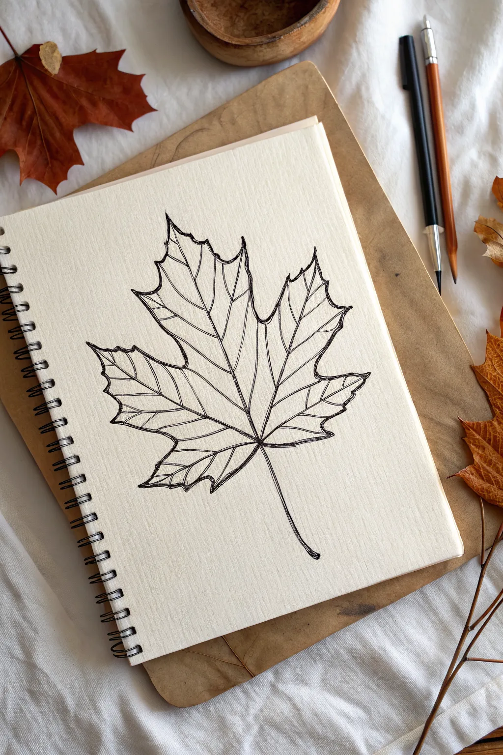
This project explores the delicate beauty of autumn through a contour line study of a maple leaf. By varying line weight and focusing on natural veins, you’ll create a drawing that feels both organic and structured, perfect for a cozy sketchbook session.
How-To Guide
Materials
- Spiral-bound sketchbook (heavyweight paper preferred)
- Black fine liner pen (01 or 03 size)
- Black brush pen or thicker felt tip marker
- Pencil (HB or 2B)
- Eraser
- Real or reference maple leaf
Step 1: Planning the Structure
-
Establish the central axis:
Begin with your pencil. Lightly draw a slightly curved vertical line to represent the main stem and the central vein of the leaf. This anchors your composition. -
Map the primary veins:
From the point where the stem meets the blade, sketch four radiating lines outward—two on each side—to create the main skeleton of the maple leaf. -
Outline the lobes:
Roughly sketch the general shape of the five main lobes around these skeletal lines. Don’t worry about the jagged edges yet; just focus on getting the proportions of the leaf correct. -
Detail the serrated edges:
Now, refine the perimeter. Using your pencil, draw the jagged, saw-toothed edges typical of a maple leaf. Aim for variety in the sharp points to make it look natural rather than perfectly symmetrical.
Step 2: Inking the Contours
-
Ink the outer perimeter:
Switch to your fine liner pen. Carefully trace over your pencil outline for the outer edge of the leaf. Use a confident, continuous stroke where possible, but allow for slight wobbles to mimic organic texture. -
Draw the main veins:
Ink the central vein and the four primary radiating veins you mapped out earlier. Extend these lines all the way to the tips of the main lobes. -
Add secondary veins:
Branching off from the main veins, draw smaller secondary veins. Let these lines curve gently toward the jagged edges of the leaf, creating a web-like network. -
Connect the veins:
Draw faint, delicate lines creating connections between the secondary veins. This cross-hatching effect simulates the microscopic structure of the leaf surface.
Fixing Wobbly Lines
If a line goes astray, don’t restart. Thicken the line slightly to hide the wobble, or turn the mistake into a new vein or fold in the leaf. Nature is imperfect.
Step 3: Adding Line Weight & Depth
-
Thicken the primary lines:
Using a slightly thicker pen or by doubling up your strokes, go back over the main five skeleton lines. I like to make the base of these veins thicker near the stem and let them taper off as they reach the leaf tips. -
Accentuate the perimeter:
Selectively thicken parts of the outer outline. Focus on the ‘valleys’ between the lobes or the underside of the curves to suggest shadow and weight. -
Clean up the drawing:
Once the ink is completely dry, gently erase all the underlying pencil marks. This reveals the stark contrast of the black lines against the cream paper. -
Elongate the stem:
Refine the stem at the bottom. Adding a second line close to the first gives it dimension, and a tiny darkened oval at the very bottom suggests where it detached from the branch. -
Add final texture:
Look at the spaces between the veins. Add a few very broken, faint lines or dots to suggest the undulating surface of a dried leaf without overwhelming the drawing.
Level Up: Watercolor Wash
Once the ink is waterproof and dry, glaze a thin wash of burnt sienna or ochre watercolor over the sketch. The black lines will pop against the warm autumn tones.
Now you have a crisp, permanent record of autumn to keep in your sketchbook all year round
Weaving and Lattice Illusions
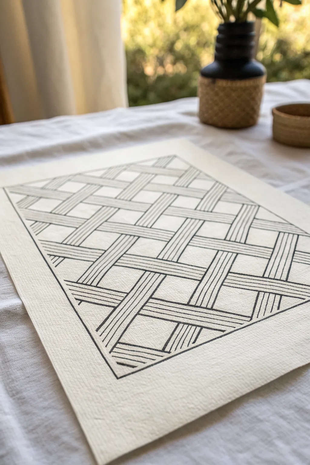
This deceptively simple line drawing creates a stunning 3D effect of woven fabric strips using just a few pens and a ruler. The high-contrast black ink on textured paper mimics a traditional basket weave, making it a sophisticated addition to any minimalist gallery wall.
Step-by-Step Guide
Materials
- Heavyweight textured art paper (watercolor or mixed media paper works well)
- Pencil (HB or 2H)
- Good quality eraser
- Long clear ruler (12-18 inches)
- Fine liner pen (01 or 03 size)
- Medium felt-tip pen or marker (05 or 08 size)
- Masking tape or painter’s tape
Step 1: Setting the Framework
-
Paper preparation:
Begin by securing your textured paper to a flat work surface with masking tape. This prevents the paper from shifting while you work with the ruler. -
Define the border:
Using your ruler and pencil, lightly draw a large rectangle in the center of the page. Leave a generous margin of white space around the outside to frame the design effectively. -
Grid layout:
Inside your main rectangle, you need to establish the diamond grid. Lightly mark intervals along the border—I usually space these about 1.5 to 2 inches apart depending on how dense I want the weave. -
Diagonal guides:
Connect these marks diagonally across the page in one direction to create a series of parallel lines. Ensure you keep your pencil pressure very light, as these lines will need to be erased later. -
Cross-hatching:
Repeat the process in the opposite direction to create a grid of diamonds. The intersection of these lines will become the centers of your woven squares.
Grid Logic
Draw a tiny arrow on a sticky note pointing to your ‘over’ direction. Move it along the paper as you work to keep your brain from flipping the weaving pattern accidentally.
Step 2: Creating the Weave Structure
-
Defining the strips:
Now, turn those single guide lines into ‘ribbons’. Draw a parallel line on either side of your original grid lines. The width of these ribbons determines the chunkiness of your weave. -
Determining over and under:
Pick a starting intersection. Decide which direction is ‘over’ and which is ‘under’. This is crucial: if a strip goes OVER at one intersection, it must go UNDER at the next. Mark these lightly with a pencil dot to keep track. -
Inking the outlines:
Switch to your medium felt-tip pen. Carefully trace the edges of the strips based on your over/under plan. Stop your line abruptly where a strip dives ‘under’ another one. -
Completing the structure:
Finish inking the entire lattice structure. Double-check your logic as you go—mistakes in the weaving pattern are hard to hide once inked. -
Erase guidelines:
Wait for the ink to interface fully with the paper fibers and dry completely. Once safe, gently erase all the initial pencil grid lines, leaving just the clean outlines of the woven shapes.
Step 3: Adding Texture and Detail
-
Prepare for filling:
You will now fill each woven strip with parallel lines to simulate thread texture. Switch to your finer liner pen (01 or 03) for this step. -
First strip direction:
Start with all the strips running in one diagonal direction. Place your ruler inside the inked outline and draw straight, evenly spaced lines running the length of the visible segment. -
Consistent spacing:
Try to fit 3-5 internal lines per strip width. These lines should follow the direction of the strip itself, reinforcing the sense of movement. -
Second strip direction:
Rotate your paper or body and repeat the process for the opposing diagonal strips. The lines inside these strips should run perpendicular to the first set. -
Re-inking the border:
Take your medium pen again and go over the main rectangular border of the design, ensuring it’s crisp and traps all your interior line work neatly. -
Final cleanup:
Inspect the drawing for any stray pencil marks one last time. If you notice any gaps where lines meet the border or intersections, carefully connect them with the fine point pen.
Variation Level Up
Instead of straight lines inside the strips, try stippling (dots) or curved lines. This changes the texture from ‘flat ribbon’ to something resembling tubes or rope.
Step back and admire how simple distinct lines transform into a complex, tactile optical illusion
Brick and Tile Line Textures
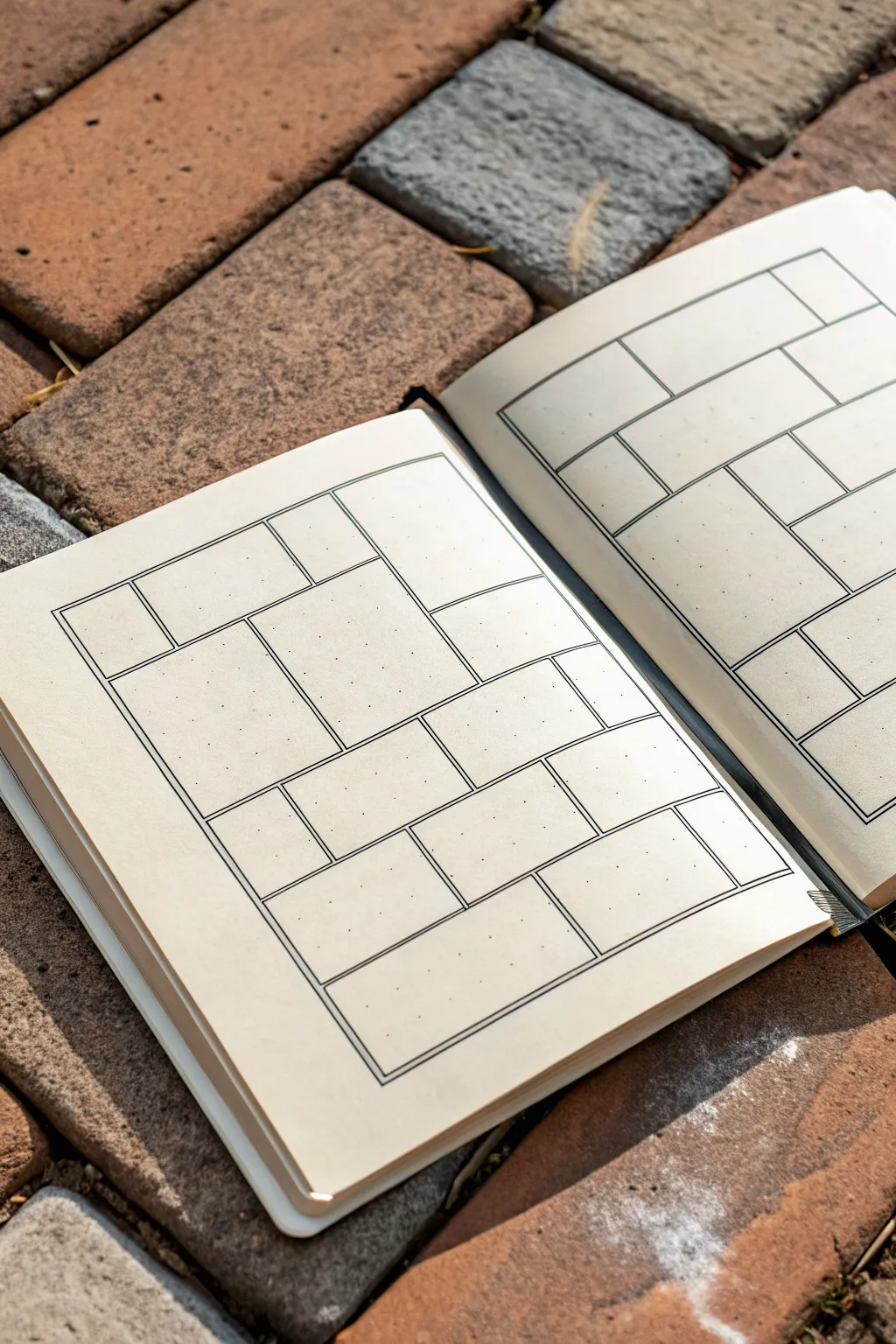
This project transforms a simple dot-grid notebook spread into an architectural study of form and space using clean line work. The resulting layout mimics the interlocking pattern of masonry, creating partitioned spaces perfect for planning, doodling, or organizing thoughts.
Step-by-Step
Materials
- A5 Dot-grid notebook
- Fine liner pen (0.3mm or 0.5mm, black)
- Ruler or straight edge
- Pencil (HB or 2B)
- Eraser
Step 1: Planning and Foundation
-
Observe the surface:
Begin by analyzing the dot grid on your page. These dots will serve as your coordinate system, ensuring every brick is perfectly rectangular and aligned. -
Define the perimeter:
Using your pencil and ruler, lightly sketch a large rectangular border that sits about half an inch from the edge of the paper. This framing box will contain your entire brick pattern. -
Rough in the large shapes:
Inside your border, lightly pencil in the largest rectangles first. Look for balance—place a large vertical block on one side and counterbalance it with a horizontal one on the other. -
Add variance:
Fill the remaining gaps with smaller squares and medium rectangles. The goal is an interlocking look, like a Tetris game or a stone wall, avoiding grid-like uniformity. -
Create the gutters:
This is crucial for the ’tiled’ look: sketch a second, smaller shape inside every single rectangle you just drew. Leave a consistent 2-3mm gap between this inner shape and the outer boundary lines.
Step 2: Inking and Definition
-
Test your pen:
Before committing to the page, make a quick stroke on a scratch piece of paper to ensure the ink flows smoothly without skipping. -
Ink the outer perimeters:
Switch to your fine liner. Carefully trace over the pencil lines that define the *boundaries* between the bricks. These should look like a single, continuous grid initially. -
Ink the inner shapes:
Next, trace the inner rectangles you penciled in step 5. This creates the ‘double line’ effect that visually separates the bricks from one another. -
Check your corners:
Pay distinct attention to where lines meet. You want crisp, sharp 90-degree angles, not rounded edges or lines that overshoot their intersection. -
Clean up:
Allow the ink to dry completely. I usually give it at least five full minutes to prevent smearing. Then, gently erase all visible pencil marks.
Wobbly Lines?
If your ruler slips, don’t panic. Thicken the line intentionally to mask the error, or turn the mistake into a ‘chipped brick’ by adding small jagged details for character.
Step 3: Refinement and Usage
-
Assess the weight:
Look at your lines. If the outer boundary lines feel too thin compared to the inner boxes, carefully go over the main divider lines one more time to thicken them slightly. -
Optional texture:
For a more worn stone look, you can add tiny stippling dots in the corners of a few bricks, though leaving them clean creates a more modern aesthetic. -
Repeat on the facing page:
For a full spread effect, mirror or create a complementary pattern on the right-hand page. Try varying the size of the bricks so the two pages don’t look identical.
Add Depth
Use a light grey brush pen to add a drop shadow to the bottom and right inside edges of each ‘brick.’ This simple trick instantly makes the tiles pop off the page in 3D.
You now have a structured, geometric spread ready to be filled with daily tasks or color.
Wood Grain Line Flow
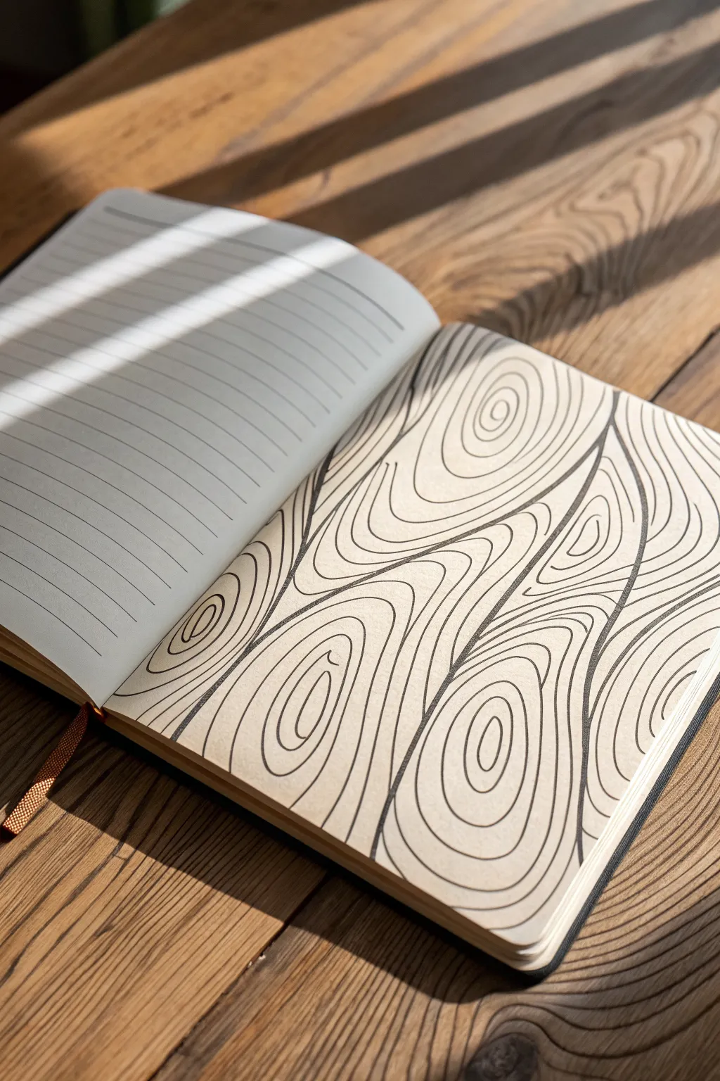
Transform a blank notebook page into a mesmerizing study of nature’s patterns with this wood grain line art tutorial. By using simple, flowing lines that ripple and curve around focal points, you will create a surprisingly realistic texture that feels both structured and organic.
Step-by-Step Guide
Materials
- Blank journal page or sketchbook paper
- Fine-liner pen (0.3mm or 0.5mm)
- Thicker graphic marker or brush pen (optional for emphasis)
- Pencil (HB)
- Eraser
Step 1: Setting the Flow
-
Establish focal knots:
Start by lightly sketching small, imperfect oval shapes with your pencil. Place two or three of these scattered across the page; these will be the ‘knots’ of the wood where the grain originates. -
Draw the primary grain lines:
Using your pencil, draw long, wavy lines that run the length of the page. Let them curve gently around your knot placements, avoiding any perfectly straight paths to keep the look natural. -
Refine the flow:
Add a few more guiding lines between your primary ones. Think about how water flows around a rock in a stream—the lines should separate to hug the knots and then converge back together on the other side.
Shake It Up
Intentionally wobble your hand slightly while drawing the long lines. Perfectly straight lines look artificial; shaky lines look like genuine organic fiber.
Step 2: Inking the Wood
-
Define the knots first:
Switch to your fine-liner pen. Draw the center of your first knot, making a small, irregular circle or oval. Draw a second ring around it, keeping the gap between lines consistent but not mechanically perfect. -
Expand the centers:
Continue drawing concentric rings outward from the knot center. As the rings get larger, let them become slightly more oval and stretched out, rather than circular. -
Create the V-shape divergence:
Where the lines flowing around a knot meet the vertical grain lines, you’ll often see a ‘V’ shape or a divergence point. Create these shapes carefully, allowing a line to split into two to accommodate the width of the knot. -
Fill the vertical grain:
Begin drawing the long, vertical lines that run from the top edge to the bottom edge. Follow your pencil guides, keeping your hand relaxed to allow for natural wavers and wobbles. -
Navigate the curves:
When your pen approaches a knot, curve the line smoothly around the outer rings you previously drew. The line should hug the shape without touching it. -
Manage line spacing:
Try to keep the white space between your black lines relatively uniform. However, slight variations in width can actually enhance the organic feel, so don’t stress over precision. -
Merging the patterns:
As you move away from the knots, let the curved lines slowly straighten out again to merge with the vertical flow. It helps to look ahead at where your line needs to end while you are drawing.
Color Wash
After the ink dries, paint a light wash of brown watercolor or diluted coffee over the page. The varying opacity will make the ‘wood’ look realistic and warm.
Step 3: Detailing and Finishing
-
Add character lines:
To make the wood look aged, introduce a few ‘floating’ lines that start and stop in the middle of a wider gap. These mimic cracks or partial grain lines found in real timber. -
Varied line weight:
For added depth, go back over specific curves—particularly the underside of the knots—to thicken the line slightly. I find this subtle shadow effect makes the grain pop off the page. -
Check for gaps:
Scan the entire page for any awkward large white spaces. If you find one, fill it with a simple, contoured line that follows the shapes of its neighbors. -
Erase guidelines:
Once the ink is completely dry (give it a few minutes to avoid smudging), gently erase all your pencil sketches. -
Final assessment:
Look at the overall composition. If any area looks too flat, you can add tiny perpendicular tick marks or dots to suggest texture within the grain.
Enjoy the meditative rhythm of these flowing lines as your paper turns into timber
Topographic Map Lines
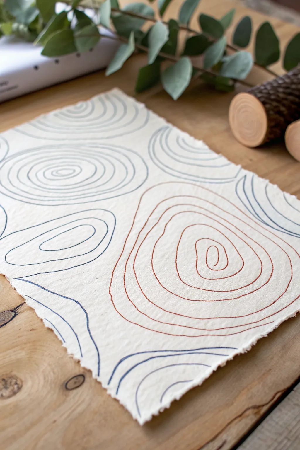
Capture the natural beauty of elevation maps with this minimalist line art project on textured paper. Using fluid, concentric shapes, you’ll create a soothing composition that mimics the contours of rolling landscapes.
How-To Guide
Materials
- Heavyweight handmade cotton rag paper (deckled edge)
- Fine liner pens (sizes 05 and 08)
- Rust brown ink pen or marker
- Slate blue or grey ink pen or marker
- Pencil (HB)
- Kneaded eraser
- Flat work surface
Step 1: Planning the Layout
-
Prepare your paper:
Lay your handmade cotton rag paper on a clean, flat surface. If the paper has a strong texture or curl, you can gently flatten it under a heavy book for an hour before starting. -
Visualize the peaks:
Imagine where the ‘peaks’ of your topographic map will be. In the example, there is a large central formation and several partial formations entering from the edges. -
Sketch the anchor points:
Lightly use your pencil to draw small, central loops or spirals in three to four random spots on the page. These will serve as the centers of your concentric circles. -
Draft the outer boundaries:
loosely sketch the outermost lines of each section. Allow these lines to bump against each other, creating invisible ‘valleys’ between the rising shapes.
Pro Tip: Line Variation
Vary your pen pressure slightly as you draw. On textured paper, lighter pressure creates a ‘broken’ line that adds vintage character.
Step 2: Drawing the Blue Contours
-
Start the first blue section:
Pick up your slate blue pen. Choose one of your corner or side sketches to start with. Begin at the center-most smallest loop. -
Work outwards:
Draw the next ring around your center loop. Keep the line wobbly and organic rather than trying for a perfect circle; imperfections make it look more like natural terrain. -
Maintain spacing:
Continue adding rings radiating outward. Try to keep the gap between lines somewhat consistent, about 3-5mm, but let them pinch closer together and drift apart occasionally to simulate steep and gentle slopes. -
Incomplete shapes:
For shapes near the edge of the paper, draw lines that run directly off the deckled edge and pick up again or simply disappear, implying the landscape continues beyond the frame. -
Drawing the second blue zone:
Move to another section of the paper and repeat the process with the blue pen, creating a second distinct hill or depression.
Level Up: Gold Leaf
Trace just one single contour line in every group with a gold leaf pen or metallic paint to add a stunning geological vein effect.
Step 3: Adding the Rust Accents
-
Switch colors:
Take your rust brown pen. This warmer color will create a beautiful contrast and visual hierarchy in the piece. -
Create the focal point:
Locate your largest open space, likely near the bottom right or center. Draw a tight, small spiral or loop as the peak. -
Expand the rust lines:
Draw concentric rings around this new center. I find it helpful to rotate the paper physically as I draw to keep my hand angle comfortable and the lines smooth. -
Navigate the boundaries:
As your rust lines get larger, they will approach the blue lines you already drew. Stop your rust line just before it touches a blue line, leaving a small negative space ‘valley’ between the colors. -
Fill remaining gaps:
Look for empty pockets between your main shapes. You can add partial curved lines (either blue or rust) in these voids to connect the composition visually.
Step 4: Finishing Touches
-
Check line weight:
If any lines look too thin or faint due to the paper’s texture, go over them a second time very carefully to thicken them up. -
Erase pencil marks:
Wait at least 15 minutes to ensure all ink is completely dry. Then, gently dab—don’t rub—with a kneaded eraser to lift any visible pencil guidelines without damaging the paper surface. -
Flatten final piece:
Handmade paper often buckles with ink application. Place the finished art between two sheets of clean tracing paper and weigh it down with books overnight.
Frame your topographic abstraction in a floating frame to show off those beautiful deckled edges
Bulge and Pinch Illusions
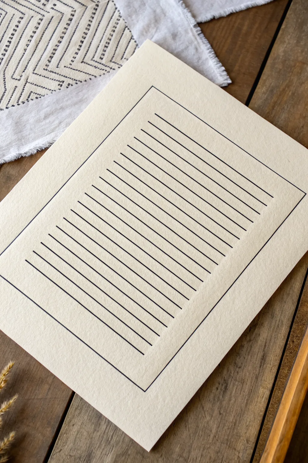
This project creates a clean, sophisticated base for optical illusions using nothing but precise straight lines. By establishing a perfect rectangular boundary and evenly spacing horizontal strokes, you create a structured canvas ready for further artistic distortion.
Step-by-Step Tutorial
Materials
- Cream or off-white cardstock (heavyweight)
- Fine liner pen (0.5mm or 0.8mm, black)
- Ruler (preferably clear acrylic with grid lines)
- Pencil (HB or lighter)
- Eraser (kneaded or high-quality vinyl)
- Drafting triangle or T-square (optional but helpful)
Step 1: Planning the Layout
-
Paper Preparation:
Begin by selecting a high-quality sheet of cream cardstock. Wipe the surface gently with a drafting brush or clean cloth to remove any paper dust that might snag your pen tip later. -
Measuring Margins:
Decide on the margin width you want for your frame. For the look in the example, measure about 1.5 to 2 inches in from each edge of the paper and make tiny, faint tick marks with your pencil. -
Drafting the Perimeter:
Connect your tick marks using a ruler and pencil to draw a light rectangle. This will serve as the outer boundary for your line work. -
Calculating Line Spacing:
Measure the vertical height of your inner rectangle. Divide this length by the number of lines you want (approximately 20-25 lines looks balanced). Calculate the gap needed between each line. -
Marking Intervals:
Place your ruler along the left vertical line of your penciled rectangle. Mark the spacing intervals lightly with a pencil all the way down. Repeat this process on the right vertical line to ensure your horizontal lines stay perfectly level.
Smudge Prevention
Tape a penny to the underside of your ruler. This lifts the edge slightly off the paper, preventing the ink from bleeding under the ruler as you draw.
Step 2: Inking the Design
-
Tracing the Frame:
Switch to your black fine liner pen. Carefully trace over your penciled rectangle border first. Keep consistent pressure on the pen to ensure the line weight remains uniform around the entire perimeter. -
Setting the Ruler:
Align your ruler with the top pair of tick marks inside the frame. If using a see-through ruler, double-check that it is parallel with the top border of the frame. -
Drawing the First Line:
Draw your first horizontal line from the left border to the right border. Start and stop precisely on the border line—don’t let the stroke overshoot or fall short. -
Maintaining Consistency:
Move the ruler down to the next set of marks. I find it helpful to wipe the edge of the ruler with a tissue occasionally to prevent ink smudging as you slide it down the page. -
Completing the Field:
Continue drawing horizontal lines one by one, moving from top to bottom. Patience is key here; rushing can lead to slanted lines or uneven ink flow. -
Checking the Bottom:
As you approach the bottom of the frame, ensure your final line leaves a gap equal to the spaces above it. The symmetry is crucial for the optical effect.
Step 3: Finishing Touches
-
Drying Time:
Let the ink sit for at least 15 to 20 minutes. Fine liner ink can look dry on the surface while still being wet underneath, especially on smooth cardstock. -
Erasing Guidelines:
Gently erase any visible pencil marks. Hold the paper taut with one hand while erasing to prevent the paper from buckling or creasing under friction. -
Final Inspection:
Inspect the line ends where they meet the border. If any gaps are too noticeable, very carefully touch them up with the tip of your pen, but be wary of making the junction too heavy.
Curve Distortion
Before inking, pencil a large circle in the center. Gently curve the horizontal lines upward or downward within that circle to create a 3D sphere illusion.
Now you have a pristine geometric foundation ready for display or further experimentation
Lines That Flow Around Dots
This minimalist project combines sweeping concentric arcs with precise stippling to create a sense of movement and rhythm. The play between solid lines and dotted pathways results in a modern, soothing piece perfect for framing.
How-To Guide
Materials
- High-quality white cardstock or Bristol board (A3 or similar size)
- Black fine liner pen (0.5mm or 0.8mm)
- Black brush pen, marker, or round paintbrush with India ink
- Large compass or a makeshift string compass
- Pencil (HB or lighter)
- Eraser
- Ruler
Step 1: Planning the Curves
-
Anchor Point:
Begin by finding a large, flat surface to work on. Orient your paper vertically. To achieve the large arcs shown in the top left, you might need to place your compass point off the paper itself. Tape a piece of scrap paper to the top-left corner of your work surface to serve as this anchor point. -
Pencil Sketching:
Using your compass on the anchor point, lightly sketch the first set of concentric circles in the top left corner. Space them evenly, perhaps 1cm apart. -
Dotted Path Guides:
For the dotted sections, don’t draw solid lines. Instead, use your compass to lightly mark curved guidelines where the dots will eventually sit. Create a sweeping curve that starts near the middle-left and flows down towards the bottom right. -
Secondary Curves:
Sketch a second, wider set of curved guidelines for the larger dots that sweep across the bottom half of the page. These should echo the curve of the smaller dots but with much wider spacing.
Use a String Compass
If a metal compass isn’t large enough for the wide arcs, tie a string to a pencil and pin the other end to your anchor point to draw perfect large-scale curves.
Step 2: Inking the Solid Lines
-
Tracing the Arcs:
Select your fine liner pen. Carefully trace over the pencil lines for the solid concentric circles in the top left corner. Keep your hand steady and move from your shoulder, rather than your wrist, for smoother curves. -
Line Variation:
To add visual interest, you can thicken specific lines slightly by going over them a second time, or simply leave them uniform for a cleaner look. -
Checking Consistency:
Pause to ensure your line weights are consistent. If a line looks shaky, thicken it slightly to mask the wobble.
Step 3: Creating the Stippled Effects
-
Small Dot Technique:
Switch to a slightly thicker pen tip if available. Following the tighter curve guide you penciled earlier, start placing small, consistent dots. I find it helpful to start the row, then go back and place the second and third rows of dots next to the first to maintain spacing. -
Graduating Size:
As you move outward from the solid lines into the white space, you can let the dots become slightly more spaced out to create a fading effect. -
Large Dot Preparation:
For the prominent, larger dots in the lower section, you may want to use a circle template or a small circular object (like a hole punch guide) to trace small circles first, ensuring they are uniform. -
Filling Large Dots:
Using the black brush pen or India ink, carefully fill in these larger circles. Work slowly to keep the edges crisp and round; perfectly circular dots are key to this clean aesthetic. -
Spacing Check:
Ensure the gap between each large dot is consistent along the curve. The white space between them is just as important as the black ink.
Metallic Accent
Replace one row of black dots with gold leaf or metallic gold paint pen. The shimmer adds a luxurious, modern twist to the monochrome palette.
Step 4: Finishing Touches
-
Drying Time:
Let the ink dry completely. India ink and brush pens can take a little longer than fine liners, so give it at least 20-30 minutes to be safe. -
Erase Guidelines:
Once fully dry, gently erase all visible pencil marks. Be particularly careful near the large ink dots to avoid smudging. -
Final Inspection:
Look for any uneven edges on your large dots or gaps in your lines. Use your finest pen to sharpen up any fuzzy edges for a professional finish.
Now your artwork is ready to be displayed in a simple frame to highlight the clean lines
Moiré and Interference Waves
This minimalist project explores the hypnotic power of repetition, using simple parallel curves to create a flowing, fabric-like texture on paper. The result is a calming, abstract piece that plays with optical movement through subtle interference waves.
Step-by-Step Tutorial
Materials
- High-quality watercolor paper (cold press for texture)
- Fine liner pen (0.1mm or 0.2mm, archival ink)
- Large drafting compass or flexible curve ruler
- HB Pencil
- Quality eraser (kneaded preferred)
- Masking tape or painter’s tape
- Large flat surface or drafting board
Step 1: Preparation & Mapping
-
Secure the paper:
Tape your watercolor paper down to your work surface. Since this design relies on precision, ensuring the paper doesn’t shift while you work is critical. -
Define the boundaries:
Lightly mark a rectangular border about 1-2 inches from the edge of the paper with your pencil. This will frame your waves and keep the design centered. -
Establish the primary curve:
Using a flexible curve ruler or simply freehanding a very light guide, draw a single, gentle ‘S’ curve horizontally across the middle of your paper. This will serve as the spine for your entire pattern. -
Mark spacing guides:
Along the left and right vertical borders, make small tick marks every 5mm (or your desired spacing). These marks ensure your lines start and end at consistent intervals.
Step 2: Drawing the Waves
-
Begin the first ink line:
Take your fine liner pen and carefully trace over your central pencil guide. Move your arm, not just your wrist, to keep the line smooth and fluid. -
Establish the rhythm:
Move slightly above your first line. Attempt to mirror the curve exactly, maintaining a consistent distance from the previous line. Don’t worry if it’s not machine-perfect; the hand-drawn variance adds character. -
Work outwards:
Continue drawing lines above the center, one by one. As you move further away from the original curve, let the wave naturally flatten out slightly or exaggerate, depending on the optical effect you want. -
Check your flow:
Pause occasionally to look at the piece from a distance. If a section looks too crowded, adjust your next line slightly to open the space back up. -
Draw the lower section:
Return to the center and begin working downwards. Follow the underside of that original guide curve, repeating the process until you reach the bottom border marks. -
Maintain constant speed:
Try to draw each line at a steady pace. Hesitation often causes ink blobs or shaky sections, whereas a confident, steady hand yields cleaner curves.
Breath Control
Treat this like meditation. Exhale slowly as you draw each long line. This relaxes your arm muscles and significantly reduces shakes compared to holding your breath.
Step 3: Refining & Finishing
-
Let the ink cure:
Allow the drawing to sit for at least 15-20 minutes. Archival ink dries quickly, but on textured watercolor paper, it can settle into the grooves and stay damp longer than expected. -
Erase pencil guides:
Gently erase your border lines and the initial central guide curve. I find a kneaded eraser works best here as it lifts the graphite without damaging the paper surface. -
Inspect line ends:
If you used masking tape for a border, carefully peel it away. If you drew freely, check the ends of your lines. You can leave them raw for an organic look or use a ruler to draw a sharp vertical frame line to cap them off. -
Enhance line weight (optional):
If you want more depth, go back and thicken specific curves—usually closer to the ‘valleys’ of the wave—to create a shadow effect, though the single-weight line has its own elegant purity. -
Final assessment:
Brush away any eraser crumbs and examine the flow. The beauty of Moiré-style patterns is that small imperfections disappear into the vibration of the whole image.
Gradient Effect
Switch pen sizes as you move away from the center (e.g., 0.5mm to 0.05mm). This creates a fading depth effect, making the waves look 3D.
Now step back and engage with the soothing optical movement you have created on the page


Have a question or want to share your own experience? I'd love to hear from you in the comments below!