If you want cute oil pastel drawings that look impressive without a ton of detail work, you’re in the perfect medium. I’m sharing my favorite easy ideas that lean on juicy color, simple shapes, and that dreamy pastel blend.
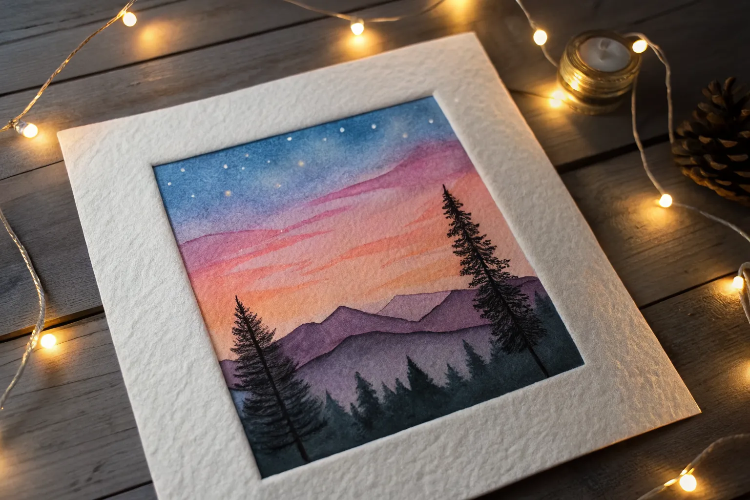
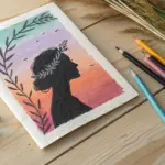
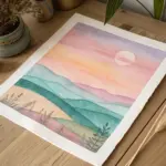
Sunset Gradient With a Black Silhouette
Capture the serene beauty of twilight with this vibrant gradient landscape. Featuring a bold black tree silhouette against a dreamy purple-to-orange sky, this project is a perfect introduction to smooth oil pastel blending.
Step-by-Step
Materials
- Oil pastels (dark purple, magenta/pink, orange, yellow-orange, black)
- Thick drawing paper or mixed media paper
- Masking tape or painter’s tape
- Tissue paper or cotton swabs for blending
- Graphite pencil (optional for sketching)
- Fine tip black marker or black gel pen (optional for tiny details)
Step 1: Preparation & Sky Base
-
Secure your paper:
Begin by taping down all four edges of your paper to a flat surface. This creates a crisp, clean white border when you finish and keeps the paper from shifting while you blend. -
Map the horizon:
Lightly sketch a sloping line for the hill about one-third of the way up from the bottom. This helps you know where to stop your sky colors. -
Apply the darkest sky tone:
Start at the very top of the paper with a deep violet or dark purple oil pastel. Color heavily in horizontal strokes, covering about the top quarter of the sky area. -
Transition to pink:
Below the purple, apply a magenta or deep pink shade. Overlap the purple section slightly to make blending easier later. -
Add the warm tones:
Continue downwards with a bright orange, followed by a lighter yellow-orange near the horizon line you sketched. Ensure each color band overlaps the one above it.
Clean Colors Pro Tip
Keep a paper towel nearby to wipe your pastel sticks clean. Oil pastels pick up other colors easily, and a dirty yellow stick can streak dark purple into your bright sunset.
Step 2: Blending the Gradient
-
Soften the top transition:
Using a folded tissue or your finger, rub the boundary between the purple and pink vigorously. Use circular or horizontal motions to melt the wax and merge the colors. -
Blend the middle section:
Move down to the pink and orange transition. Use a fresh spot on your tissue to avoid dragging dark purple into the bright orange areas. -
Finish the sky gradient:
Blend the orange into the yellow-orange at the bottom. Aim for a seamless look where you can’t tell exactly where one color ends and the next begins. -
Refine the sky:
If I notice any patchy spots, I like to go back over them with the pastel and blend again until the saturation is rich and even.
Level Up: Starry Night
Once the sky is blended, scratch tiny dots into the upper purple section with a toothpick or add white gel pen dots to create early sparkling stars.
Step 3: Creating the Silhouettes
-
Fill the ground:
Take your black oil pastel and color in the entire hill area below your horizon line. Press firmly to get a solid, opaque black coverage. -
Texture the grass:
Along the top edge of the hill, use short, flicking upward strokes with the black pastel to mimic wild grass blades caught in the light. -
Draw the main trunk:
Position your main tree on the right side of the slope. Draw a thick trunk that tapers as it goes up, branching out into main limbs. -
Add branch details:
For finer branches, use the sharp edge of the pastel or switch to a black charcoal pencil or marker if your pastel is too blunt. Create a network of intricate, reaching twigs. -
Create foliage clusters:
Use a stippling motion (tapping dots) with the black pastel at the ends of the branches to suggest clumps of leaves without drawing individual ones. -
Add distant bushes:
Draw two smaller, rounded shapes further down the slope to the left. Give them rough edges to look like bushy vegetation. -
Final touches:
Check your black areas for any white paper showing through and fill them in. Sign your name in white or scratch it into the black wax with a toothpick. -
Reveal the border:
Gently peel away the masking tape. Pull it away from the drawing at a 45-degree angle to ensure a crisp, clean edge.
Step back and admire the stark contrast of your silhouette against that glowing sky


Big Moon Night Sky With Soft Glow
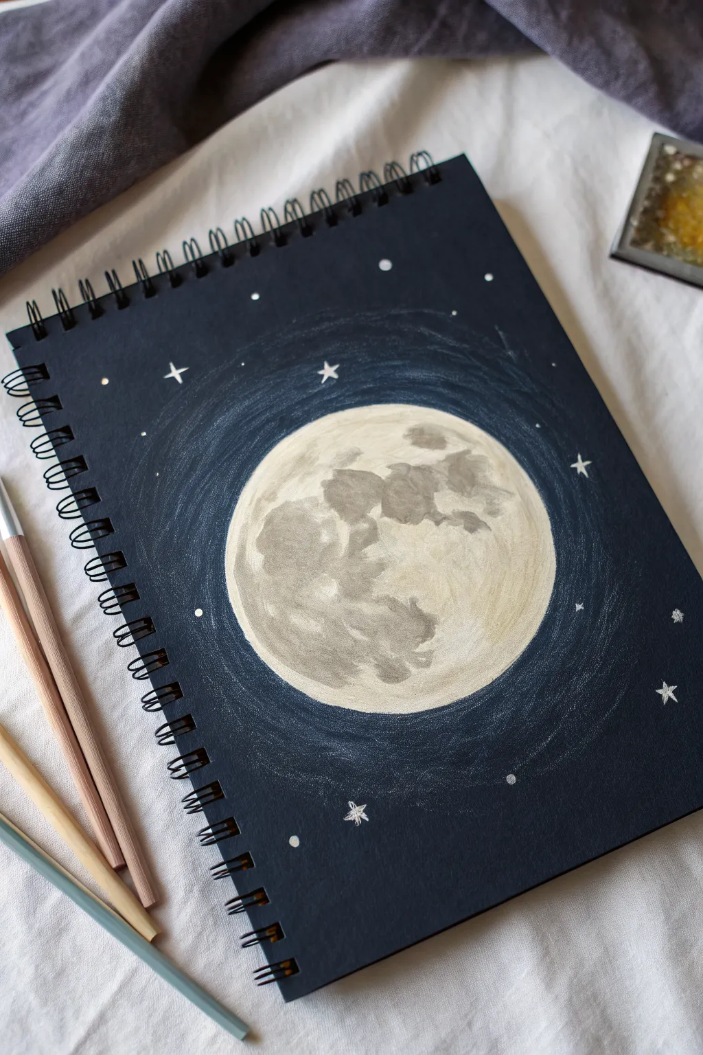
Capture the serene beauty of a full moon shining in a deep night sky with this simple yet striking drawing. Using colored pencils or pastels on dark paper creates a wonderful contrast that makes the moonlight pop right off the page.
Step-by-Step Tutorial
Materials
- Black or dark blue sketchbook paper (heavyweight is best)
- Cream or off-white colored pencil/pastel
- Light warm grey colored pencil/pastel
- Dark cool grey colored pencil/pastel
- White gel pen or fine-tip white paint marker
- Blending stump or tissue (optional)
- Circular object to trace (like a cup or lid)
Step 1: Setting the Sphere
-
Trace the foundation:
Place your circular object in the center of the dark page. Using your cream or off-white pencil, trace lightly around it to create a perfect circle. -
Fill the base layer:
Gently color in the entire circle with the cream pencil. Apply light, even pressure so you don’t saturate the paper’s tooth immediately; you want a soft base layer. -
Establish the light source:
Decide where the brightest part of the moon will be (usually the right or top-right side feels natural). Add a second layer of cream pigment there to intensify the brightness.
Step 2: Texturing the Moon
-
Map the maria:
Using a light warm grey pencil, lightly sketch irregular, cloud-like shapes across the moon’s surface. These represent the ‘maria’ or lunar seas. -
Deepen the shadows:
Switch to your dark cool grey pencil. Go over the shapes you just drew, darkening the centers of the larger blotches but leaving the edges softer and sketchier. -
Blend the transitions:
Take your cream pencil again and color lightly over the edges where the grey spots meet the light background. This helps blur the harsh lines for a realistic, cratered look. -
Add high-contrast details:
For the darkest craters, press a bit harder with the dark grey pencil in small, specific areas inside the shadowed patches. -
Smooth the surface:
If I want a dreamier look, I gently rub the entire moon surface with a clean finger or a tissue to soften the pencil strokes and blend the greys into the cream.
Smudge Alert
Work from the center outward to avoid dragging your hand through the moon’s surface. Place a scrap piece of paper under your drawing hand to protect your work.
Step 3: Creating the Atmosphere
-
Begin the halo:
With a white or very pale blue pencil, start drawing circular scribbles around the outside of the moon. -
Layer the glow:
Keep your strokes loose and messy. Draw multiple rings, letting the lines overlap. The concentration of lines should be denser near the moon and sparser as you move outward. -
Extend the light:
Continue these concentric scribbles until the halo extends about an inch or two from the moon’s edge, fading into the dark paper. -
Soften the inner edge:
Go back to the very edge of your moon circle. Lightly color over the distinct outline with your halo color to make the moon appear to be glowing from within, rather than having a hard border.
Level Up: Color Tint
Instead of pure grey for shadows, try a very dark purple or midnight blue. It adds a rich, artistic depth and makes the moon look colder and more mysterious.
Step 4: Starry Details
-
Dot the stars:
Switch to a white gel pen or paint marker. Place random dots scattered across the dark background. Vary the spacing so it looks natural. -
Add distinct stars:
Choose 5 to 7 spots to draw tiny ‘plus’ signs or four-pointed stars using the pen. These larger stars add variety and sparkle to the composition. -
Create distant shimmer:
Add tiny, barely-there pinpricks of white in clusters to suggest distant galaxies or the Milky Way. -
Final highlights:
Add a few tiny white dots inside the moon’s craters to suggest reflected sunlight hitting the peaks of the lunar mountains.
Enjoy the peaceful atmosphere your celestial drawing brings to your sketchbook
Easy Ocean Horizon With Sun Reflection
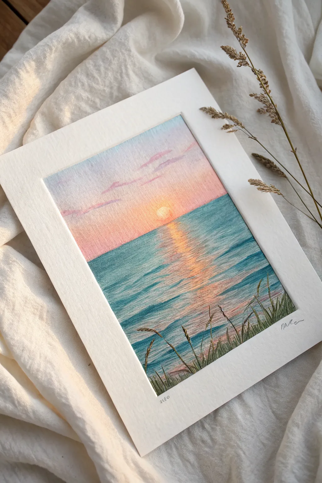
Capture the serene beauty of a coastal sunset with this soft and dreamy oil pastel landscape. You’ll learn how to blend a seamless sky gradient and create shimmering water reflections that glow with warmth.
How-To Guide
Materials
- Oil pastels (soft, artist-grade preferred)
- Textured blending paper or pastel paper (white or cream)
- Masking tape
- Paper towels or blending stumps
- Palette knife or credit card edge (for scraping)
- White or cream mat board for framing (optional)
Step 1: Setting the Scene
-
Tape the borders:
Start by taping down your paper to a flat surface using masking tape. This not only holds the paper steady but creates that crisp, clean white border you see in the final piece. -
Establish the horizon:
Lightly sketch a horizontal line across the middle of your paper using a pale blue or gray pastel. This separates your sky from the sea. Don’t press too hard; you want this line to disappear later.
Step 2: Painting the Sky
-
Blue upper sky:
At the very top of the paper, apply a layer of light, powdery blue. Use horizontal strokes. Fade this color out as you move about one-third of the way down toward the horizon. -
Pink transition:
Below the blue, introduce a soft pastel pink or lilac. Allow it to slightly overlap with the blue above to start the blending process naturally. -
Warm horizon glow:
Near the horizon line, layer in a warm peach or light orange. This creates the glow of the setting sun. Apply the color densely right at the line for vibrancy. -
Blend the gradient:
Using a clean finger or a paper towel, gently rub the sky colors horizontally. Smooth the transitions where the blue meets pink and the pink meets peach until the gradient is soft and cloud-like. -
Add cloud whisks:
Take a slightly darker lilac or purple pastel and gently streak in a few thin, horizontal clouds in the upper sky. Smudge them slightly so they look wispy rather than rigid. -
Define the sun:
Use a white or very pale yellow pastel to draw a small circle right above the horizon line in the center. Press firmly to make it opaque against the peach background.
Muddy colors?
Clean your fingers or blending stump between every color change. If pastels get dirty, wipe the stick on a paper towel before applying it to the paper.
Step 3: Creating the Ocean
-
Base water color:
Start coloring the ocean section with a teal or turquoise blue. Apply the strokes horizontally, leaving a vertical gap in the center underneath the sun for the reflection. -
Deepen the water:
Layer a darker cerulean blue over the teal in the horizontal areas, especially near the bottom corners, to give the water depth and dimension. -
Sun reflection base:
In that central gap you left, apply vertical strokes of the same peach and orange tones used in the lower sky. Let these colors streak slightly into the blue water area. -
Intensify the shimmer:
Add bright white and yellow highlights directly down the center of the reflection. Use short, choppy horizontal strokes to mimic light catching on the waves. -
Create ripples:
Take your dark blue pastel and draw thin, wavy horizontal lines across the water, cutting through the reflection area slightly. This breaks up the light and makes the surface look like moving liquid.
Scratch Technique
For ultra-fine grass blades, use a palette knife or a toothpick to scratch through the top layer of pastel, revealing the paper or underlayer.
Step 4: Foreground Details
-
Drafting grass blades:
Using a dark olive green or deep brown pastel, draw thin lines flicking upward from the bottom right corner. Vary the lengths and angles to make the grass look natural and wind-blown. -
Adding texture:
Add smaller, shorter strokes at the base of the tall grass to simulate a dense patch of coastal vegetation. I find layering a bit of black here adds helpful contrast. -
Drawing seed heads:
At the tips of the tallest grass blades, dab small V-shapes or dashes to create the textured seed heads of the wheat or beach grass. -
Final highlights:
Use a sharp edge of a white or cream pastel to add tiny highlights to the tips of the grass where the sunset light would catch them. -
Clean finish:
Gently peel away the masking tape to reveal your clean edges. Sign your name in the corner for that professional touch.
Place your finished piece in a mount to instantly elevate its delicate charm
Tiny House Under a Pink Sky
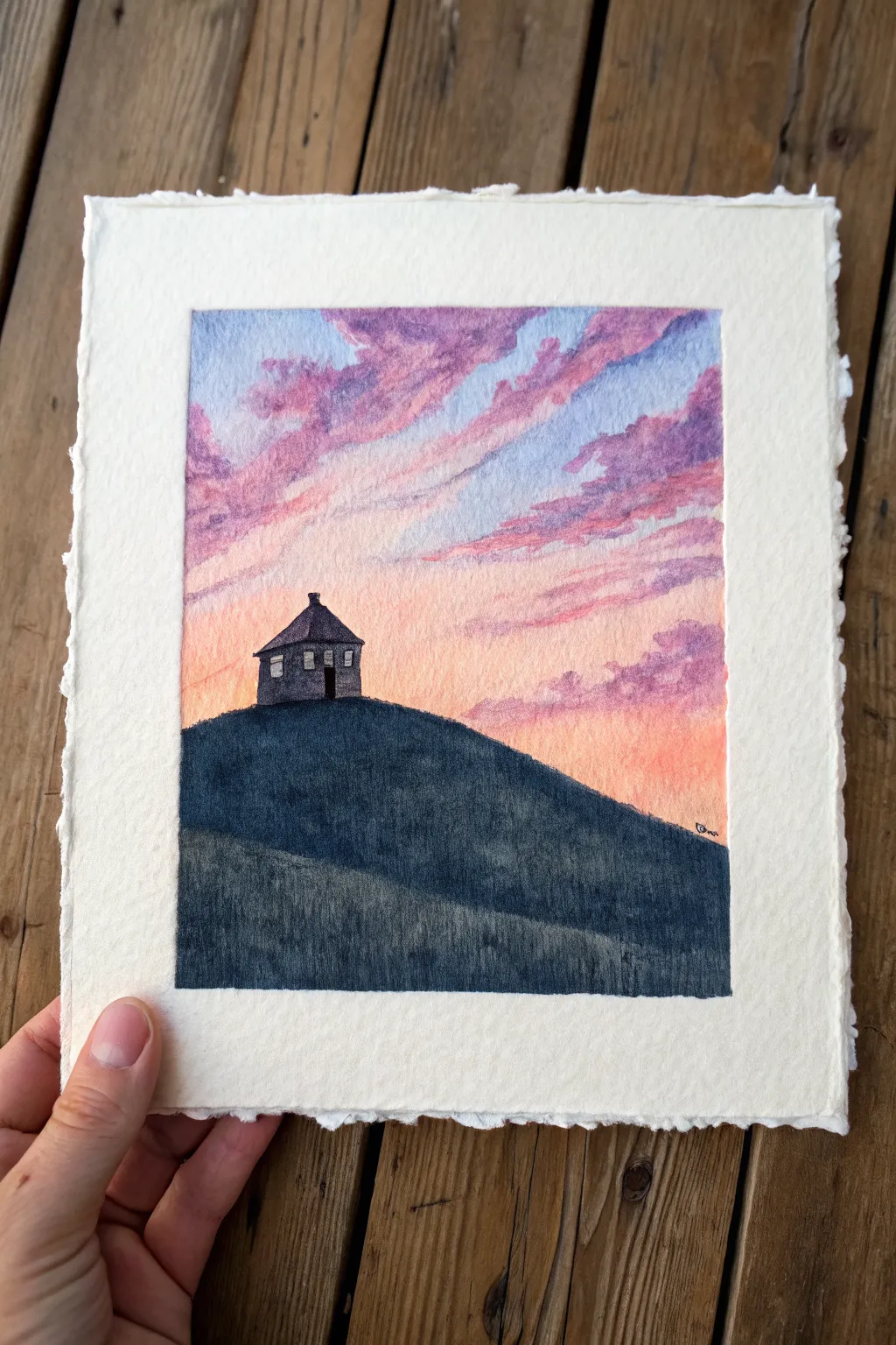
Capture the serenity of a lone cottage perched atop a rolling hill against a breathtaking cotton-candy sky. This project focuses on gradients and distinct silhouettes to create a cozy, atmospheric landscape.
Step-by-Step Guide
Materials
- Heavyweight watercolor paper or mixed media paper with deckled edges
- Oil pastels (soft, artist grade recommended)
- Blending stumps (tortillons) or cotton swabs
- Paper towels
- Pencil (HB or lighter)
- Masking tape (optional)
Step 1: Setting the Scene
-
Outline the Composition:
Begin by lightly sketching the large, curved hill shape. It should dominate the bottom third of your paper, sloping slightly upwards from left to right. -
Sketch the House:
Draw the tiny house silhouette at the very peak of the hill. Keep it simple: a boxy shape with a pitched roof and a small chimney on the side. -
Mark Colors:
Very faintly, mark where your sky colors will go. Sketch loose, diagonal cloud shapes drifting from the top right toward the bottom left to guide your coloring later.
Clean Colors Pro Tip
Keep a scrap piece of paper nearby to wipe your pastel sticks clean between colors. Dirty tips will muddy your bright sunset gradients immediately.
Step 2: Creating the Sky
-
Base Layer of Orange:
Start near the horizon line (just above the hill) with a pale peach or light orange pastel. Apply it lightly, leaving some white paper showing through for luminosity. -
Adding Pinks:
Move upwards into the main sky area using a soft pink. Scribble this color in diagonal bands, mimicking the direction of windswept clouds. -
Introducing Purples:
Layer a lavender or light violet shade between the pink bands and towards the top corners of the paper. This creates the depth of a fading sunset. -
Deepening the Blue:
At the very top right and interspersed with the purple, add touches of periwinkle or light blue to suggest the encroaching night sky. -
Initial Blend:
Use your finger or a paper towel to gently smudge the sky colors. Rub in the direction of the clouds (diagonally) to maintain the movement, not in circles. -
Refining Clouds:
Go back over your blended sky with heavier pressure using the pink and purple pastels to define the cloud edges. Make these strokes slightly rough to look organic.
Fixing Muddy Skies
If your sky colors blend into a grey mess, stop blending. Scrape off the top layer with a palette knife and re-apply fresh, unblended color on top.
Step 3: The Hill and House
-
Underpainting the Hill:
Color the entire hill area with a deep indigo or dark blue. Apply heavy pressure here to cover the tooth of the paper thoroughly. -
Adding Texture:
Layer a bit of dark green or black over the indigo, especially at the bottom edge, to create a rich, shadowy earth tone. -
Defining the Silhouette:
Carefully color in the house shape with your darkest black or charcoal pastel. Ensure the edges are crisp against the colorful sky. -
Adding Windows:
Use a white pastel or a scraping tool to pick out two tiny squares for windows. If the black is too thick, simply dab a tiny dot of white paint or gel pen instead. -
Creating Depth:
Add a lighter band of dark grey or muted blue across the middle of the hill to suggest a second ridge or a change in terrain slope. -
Final Blend:
Gently smooth the dark hill colors with a blending stump, ensuring the transition between the hill’s edge and the sky is sharp and clean. -
Touch Ups:
Clean up any smudges on the white border if you masked it, or embrace the deckled edge look by ensuring the color fades naturally at the paper’s limits.
Now you have a peaceful miniature landscape ready to display or gift
BRUSH GUIDE
The Right Brush for Every Stroke
From clean lines to bold texture — master brush choice, stroke control, and essential techniques.
Explore the Full Guide
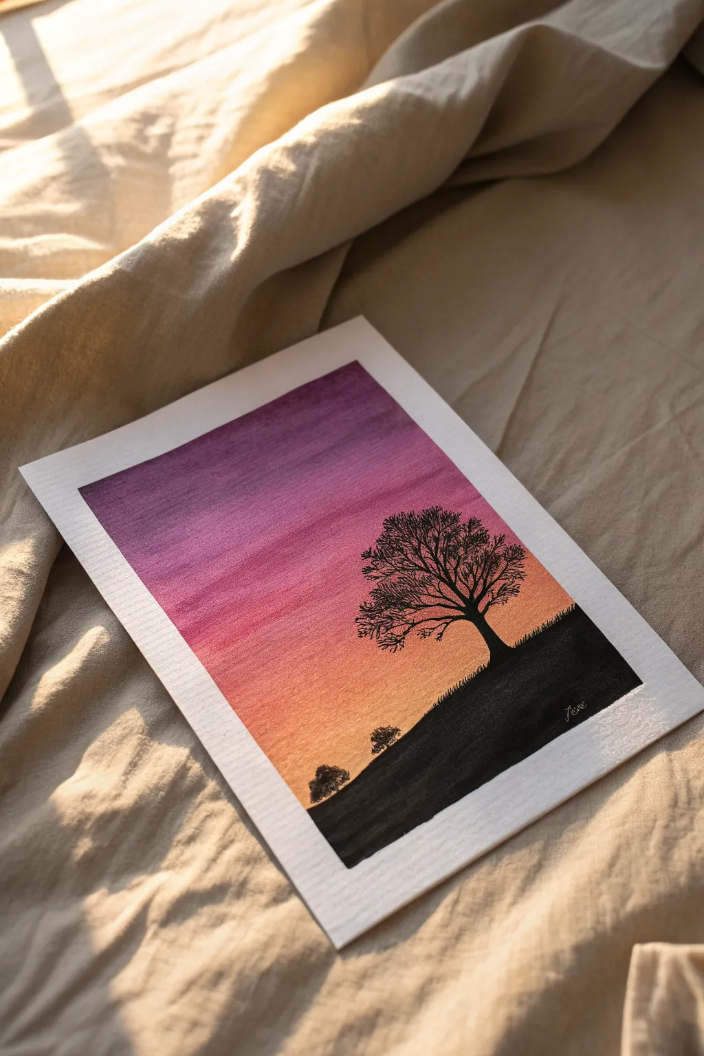
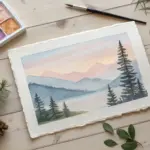
Swing on a Tree Branch Silhouette
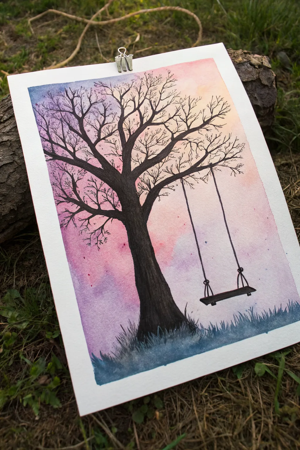
Capture the nostalgic feeling of a summer evening with this silhouette painting, featuring a beautiful gradient sky and a stark black tree. While this looks like intricate ink work, the soft background offers a perfect canvas for practicing your blending techniques before adding the bold, high-contrast details.
Step-by-Step Tutorial
Materials
- Watercolor paper
- Oil pastels (purple, pink, peach/light yellow)
- Black oil pastel or soft black charcoal pencil
- Paper towel or blending stump (tortillon)
- Masking tape
- Black fine-liner pen (optional, for tiny twigs)
- Small stiff bristle brush (optional)
Step 1: Setting the Sky
-
Prepare your canvas:
Start by taping down the edges of your watercolor paper to a drawing board or table. This creates that crisp, clean white border you see in the final piece and keeps the paper from shifting while you blend. -
Map out the colors:
Visualize the sky gradient diagonal across the page. Apply a light yellow or peach oil pastel in the top right corner, keeping the pressure light and sketchy. -
Add the mid-tones:
Moving diagonally toward the bottom left, scribble in a band of pink pastel. Overlap it slightly with the yellow area to ensure a smooth transition later. -
Deepen the sky:
Fill the bottom left section with a purple or violet pastel. The colors should look rough right now, sitting as texture on top of the paper’s grain. -
Blend the gradient:
Using a folded paper towel or your fingertip, rub the pastels into the paper. Start from the lightest color (yellow) and work your way into the pink, then the purple. This prevents dragging dark pigment into your bright sunlit area.
Smooth Operator
For a watercolor-smooth look with oil pastels, dip your finger or paper towel in a tiny drop of baby oil before blending. It melts the binder instantly.
Step 2: Drawing the Silhouette
-
Draft the trunk:
Grab your black oil pastel. Establish the base of the tree trunk slightly left of the center. Draw upward, letting the trunk taper slightly as it gets taller. -
Create the main branches:
Extend thick lines outward from the top of the trunk. Make them twist and turn organically rather than drawing straight lines; old trees have character and knobby joints. -
Add secondary branches:
From your main thick branches, split off into smaller V-shapes. I find that quick, confident strokes make the branches look more natural and less stiff. -
Detail the twigs:
For the finest outer twigs, sharpness is key. Use the sharp edge of the pastel or switch to a black fine-liner pen if your pastel is too blunt. Fill the upper canopy with these delicate, web-like lines. -
Anchor the tree:
At the base of the trunk, use vertical, flicking strokes to create the illusion of grass blades. Use a dark blue or mix a little purple into the black pastel here to give the ground some atmospheric depth.
Step 3: Adding the Swing
-
Position the ropes:
Find a sturdy, horizontal branch on the right side. Draw two straight vertical lines coming down. Keep them parallel, but let them have a tiny bit of slack so they don’t look like rigid metal poles. -
Draw the seat:
Connect the bottom of the ropes with a slightly curved rectangular shape for the wooden seat. A transparent or slightly 3D perspective makes it look inviting. -
Secure the knots:
Add small, triangular knots where the rope meets the wood seat and where it ties to the branch above. This small detail adds a surprising amount of realism. -
Final touches:
Add a few tiny stray specks or dots around the tree branches to suggest falling leaves or distant birds. -
The reveal:
Gently peel away the masking tape at a 45-degree angle to reveal your clean white border.
Smudge Alert
Black oil pastel is notorious for smudging into the sky. Keep a clean sheet of paper under your hand as a rest while you draw the tree details.
Now you have a serene little landscape that captures the peaceful end of a day
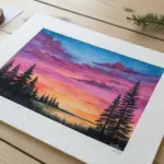
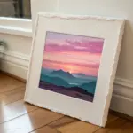
Candy-Color Mountain Layers
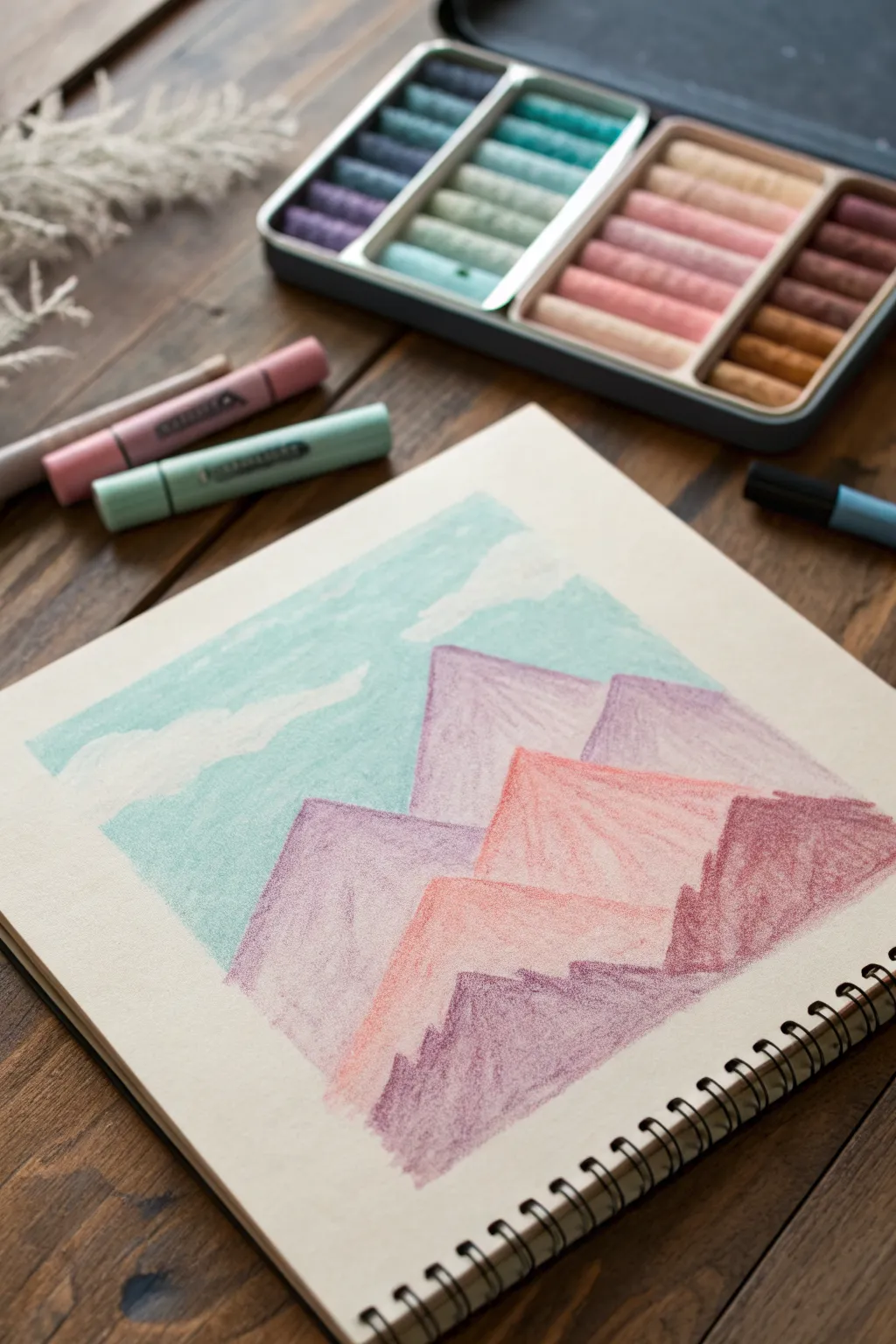
Create a dreamy landscape of soft, rolling mountains using a soothing candy-colored palette. This beginner-friendly oil pastel project focuses on layering geometric shapes and gentle blending to achieve a serene, illustrative feel.
Detailed Instructions
Materials
- Oil pastels (sets with pastel tones: teal, lavender, peach, maroon)
- Sketchbook or heavyweight drawing paper (slight texture is good)
- Masking tape or painter’s tape
- Tissue or blending stump
- Cotton swabs (optional for small details)
Step 1: Setting the Scene
-
Prep the border:
Start by taping off a clean square or rectangle on your paper with masking tape. Press the edges down firmly so you get that crisp, professional border when you peel it off later. -
Sketch the layers:
Use a very light colored pastel (like a pale grey or peach) to gently outline your mountain ranges. Draw three or four zig-zag lines across the page, creating overlapping triangles that get larger as they move closer to the bottom. -
Outline the sky:
Mark out where your clouds will be in the top section. Instead of drawing the clouds, draw the negative space around them—the blue sky shapes—so you can leave the paper white for the fluffy parts.
Step 2: Painting the Sky
-
Fill the blue:
Take a light teal or soft cyan pastel. Color in the sky area around your cloud shapes. Use light, horizontal strokes to keep the texture uniform. -
Soften the edges:
Use your finger or a cotton swab to gently smudge the teal pastel right up to the edge of your white cloud shapes. This creates a soft, dreamy transition rather than a harsh line. -
Add white highlights:
If you want brighter clouds, layer a white oil pastel heavily over the empty paper spaces, blending slightly into the teal to create a fluffy look.
Clean Colors
Keep a paper towel nearby to wipe your pastel sticks. Oil pastels pick up other pigments easily, and a dirty yellow stick will muddy your bright peach mountains instantly.
Step 3: Layering the Mountains
-
Base layer: Back range:
Select a soft lavender or light purple pastel. Color in the mountain peaks furthest in the back. Apply the color lightly at the top of the peaks and press slightly harder near the base of this shape. -
Texture the back range:
Use vertical, downward strokes to mimic the slope of a mountain. Don’t blend this layer perfectly smooth; leaving some grain shows the paper texture and adds interest. -
Define the peaks:
Use a slightly sharper edge of the pastel to outline the tops of these purple mountains so they stand out clearly against the teal sky. -
Middle layer: The focal point:
Choose a bright peach or coral color for the middle mountain range. This is your pop of warmth. Fill in this shape solidly, overlapping the bottom of the purple mountains. -
Gradient effect:
I like to add a touch of light pink to the very tips of these peach mountains to make them look like they are catching the sunlight. -
Foreground layer:
For the closest range at the bottom, pick a deeper color like a muted maroon or reddish-brown. Fill this area in with confident, heavy strokes to ground the composition. -
Create separation:
If the layers blend together too much, take your white pastel and draw a very thin, faint line along the ridge of the foreground mountains to separate them from the peach layer behind.
Sunset Variation
Swap the teal sky for a pale yellow fading into orange, and change the mountains to shades of blue and indigo for a cool-toned sunset alternative.
Step 4: The Final Polish
-
Refine the edges:
Go back over any mountain peaks that look fuzzy. A crisp peak makes the graphic style really pop. -
Clean up stray marks:
Check the sky area for any accidental smudges of purple or maroon. You can usually scrape these off gently with a fingernail or cover them with white pastel. -
The reveal:
Slowly peel away the masking tape. Pull it away from the drawing at a 45-degree angle to prevent ripping the paper. Reveal your perfect, crisp edges.
Enjoy the calm satisfaction of seeing your colorful landscape come together neatly.

PENCIL GUIDE
Understanding Pencil Grades from H to B
From first sketch to finished drawing — learn pencil grades, line control, and shading techniques.
Explore the Full Guide
Cute Rainbow and Puffy Clouds
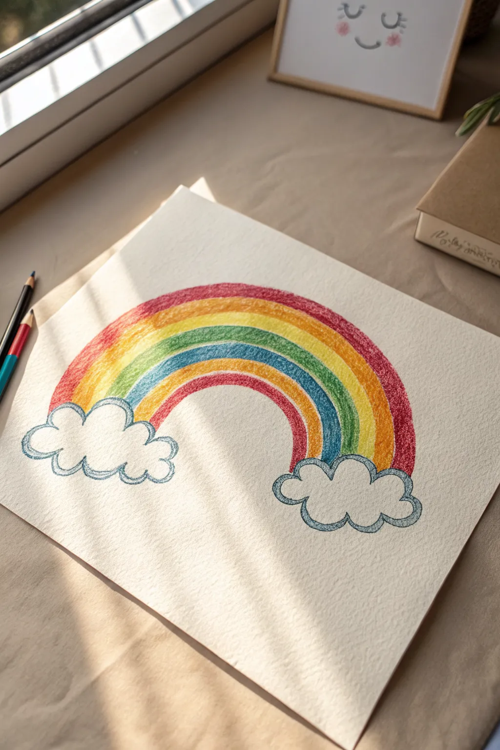
Brighten up your sketchbook with this classic, cheerful motif featuring a vibrant arc of colors ending in soft, billowy clouds. The textured paper and layered oil pastels give this simple subject a wonderfully tactile and fuzzy finish.
Step-by-Step Guide
Materials
- Heavyweight textured drawing paper (watercolor paper works well)
- Set of oil pastels (Red, Orange, Yellow, Green, Blue, Purple, Dark Blue)
- Graphite pencil (HB or 2B)
- Eraser
- Tissue or blending stump (optional)
Step 1: Sketching the Outline
-
Mark the Cloud Positions:
Begin by lightly marking two spots near the bottom left and bottom right corners of your paper where you want your clouds to sit. Keep them roughly level with each other. -
Draw the Cloud Shapes:
Using your pencil, sketch the outline of two fluffy clouds. Use a series of connecting ‘C’ curves or scallops to create that puffy, cartoonish look. Don’t worry about making them identical; asymmetry adds charm. -
Establish the Inner Arch:
Draw the bottom-most arch of the rainbow connecting the inner tops of your two clouds. This will be the guide for your first color stripe. -
Outline the Outer Arch:
Sketch the top-most arch to define how thick your rainbow will be. This helps ensure you have enough room for all six bands of color without running off the page. -
Divide the Bands:
Lightly draw the remaining dividing lines between the inner and outer arches until you have six distinct lanes for your colors. Keep your pencil pressure very light so the graphite won’t show through the pastel later.
Step 2: Adding Vibrant Color
-
Apply the Red Band:
Start with your red oil pastel on the very top arch. Color in the band using short, vertical strokes that follow the curve. Press firmly to get rich, opaque coverage on the textured paper. -
Fill the Orange Band:
Move to the second band and color it with orange. I like to let the orange slightly overlap the bottom edge of the red to create a tiny bit of natural blending between the stripes. -
add the Yellow Band:
Fill the third lane with bright yellow. As you color, try to keep your stroke direction consistent with the curve of the rainbow to maintain a neat appearance. -
Color the Green Band:
Use a medium green shade for the fourth band. If your pastel tip is getting blunt, rotate it to find a sharper edge for staying within the pencil lines. -
Apply the Light Blue Band:
Fill the fifth band with a sky blue or light azure color. Because light blue can be easily overpowered, be careful not to drag the green pigment down into this section. -
Finish with Purple:
Color the final, smallest arch with purple or violet. Ensure this band connects cleanly to the tops of your cloud outlines.
Smudge Patrol
Oil pastels smudge easily! Place a clean sheet of scrap paper under your drawing hand while you work to prevent dragging colors across the white background.
Step 3: Defining the Clouds
-
Outline the Clouds:
Select a dark blue or slate blue pastel. Carefully trace over your initial pencil lines for the clouds. Use a confident, heavy pressure to create a distinct, waxy border. -
Thicken the Cloud Borders:
Go over the cloud outline a second time to thicken the line slightly. This emphasis makes the clouds look sturdy enough to hold up the rainbow. -
Add Inner Cloud Details:
Draw a few smaller, curved lines inside the main cloud shape, near the bottom scallops. These simple marks suggest volume and fluffiness without needing to color the whole cloud. -
Clean Up Edges:
Check the connection points where the rainbow bands disappear into the clouds. If there are gaps, fill them in carefully with the appropriate color. -
Final Texture Check:
Look for little white speckles of paper showing through your rainbow bands. Go back and press firmly over these spots to fully saturate the paper tooth with pigment.
Make It Sparkle
For a magical touch, use a white oil pastel or a white gel pen to add tiny dots or ‘stars’ on top of the colored bands, giving the rainbow a shiny, glossy look.
Now you have a cheerful piece of art that perfectly captures a sunny day mood
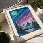
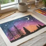
Mini Galaxy Circle Drawing
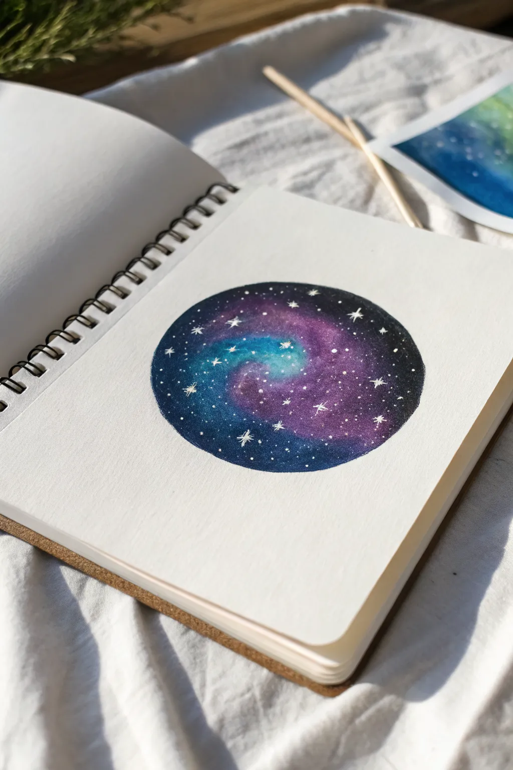
Capture the magic of the cosmos in a perfect, bite-sized circle. This project blends deep space violets, calming teals, and stark black into a dreamy swirl, finished with twinkling white stars.
Step-by-Step
Materials
- Sketchbook with thick paper or mixed media paper
- Compass or a circular object (like a cup or tape roll) for tracing
- Oil pastels (Black, Deep Violet, Light Purple, Teal/Turquoise, White)
- White gel pen or fine white paint marker
- Paper towel or blending stump (tortillon)
- Pencil
- Masking tape (optional)
Step 1: Setting the Shape
-
Trace your circle:
Place your circular object or compass near the center of your sketchbook page. Use a pencil to lightly trace a perfect circle. Keep the line faint so it doesn’t show through the lighter colors later. -
Clean the edges:
If you want a super crisp edge, you can carefully place masking tape around the outside of your circle, masking off the negative space. Alternatively, just be mindful to color carefully up to the line.
Clean Fingers, Clean Art
Oil pastels smudge easily! Keep a damp cloth nearby to wipe your hands between colors, especially before touching the white page around your circle.
Step 2: Layering the Colors
-
Start the spiral center:
Begin with your teal or turquoise oil pastel. Draw a small, slightly curved shape in the center of the circle to represent the bright core of the galaxy. -
Add first transition layer:
Surround the teal center with a light purple or magenta shade. Apply it roughly in a spiral motion moving outward, letting it overlap slightly with the teal edges. -
Deepen the tones:
Switch to a deep violet or dark blue pastel. Continue the spiral pattern moving further out toward the edge of the circle. Apply more pressure here to get rich pigment. -
Fill the void:
Use your black oil pastel to fill in the remaining outer edges of the circle. Bring the black inwards to meet the deep violet, creating a vignette effect that frames the galaxy.
Step 3: Blending the Cosmos
-
Soften the transitions:
This is where the magic happens. Use a paper towel wrapped around your finger or a blending stump to smudge the colors where they meet. -
Blend inward out:
Start blending from the lighter center (teal) moving into the purple. Clean your finger or tool before moving to the dark sections so you don’t drag black pigment into the bright center. -
Smooth the black edges:
I like to firmly rub the black outer ring in circular motions to ensure the paper tooth is completely covered and the background looks deep and solid. -
Check for gaps:
Look closely at your drawing. If you see too much white paper showing through the texture, add another layer of pastel on top and blend again for a creamy finish.
Make it Sparkle
For a magical touch, use a metallic silver or iridescent glitter pen for the center stars instead of plain white. It catches the light beautifuly.
Step 4: Adding the Stars
-
Prepare for stars:
Before adding stars, ensure the oil pastel layer isn’t too thick or waxy, or pens might clog. You can gently dab the surface with a clean tissue to pick up excess oil if needed. -
Dot the background:
Take your white gel pen or paint marker and add tiny dots scattered across the black and purple sections. Vary the spacing so it looks natural and random. -
Create major stars:
Select 3 to 5 spots to add larger sparkle shapes. Draw a small cross or four-pointed star shape at these points to represent closer, brighter stars. -
Add the galactic dust:
Using the white pastel or gel pen, gently tap varying concentrations of tiny dots along the spiral path of the galaxy to mimic clusters of distant stars. -
Final touches:
Clean up the edges of your circle with an eraser or by carefully scraping away any stray pastel marks with a craft knife or fingernail to keep that perfect geometric shape.
Now you have a tiny window into deep space right in your sketchbook


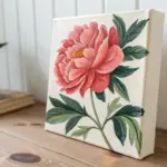
Flower Bouquet in a Mason-Jar Shape
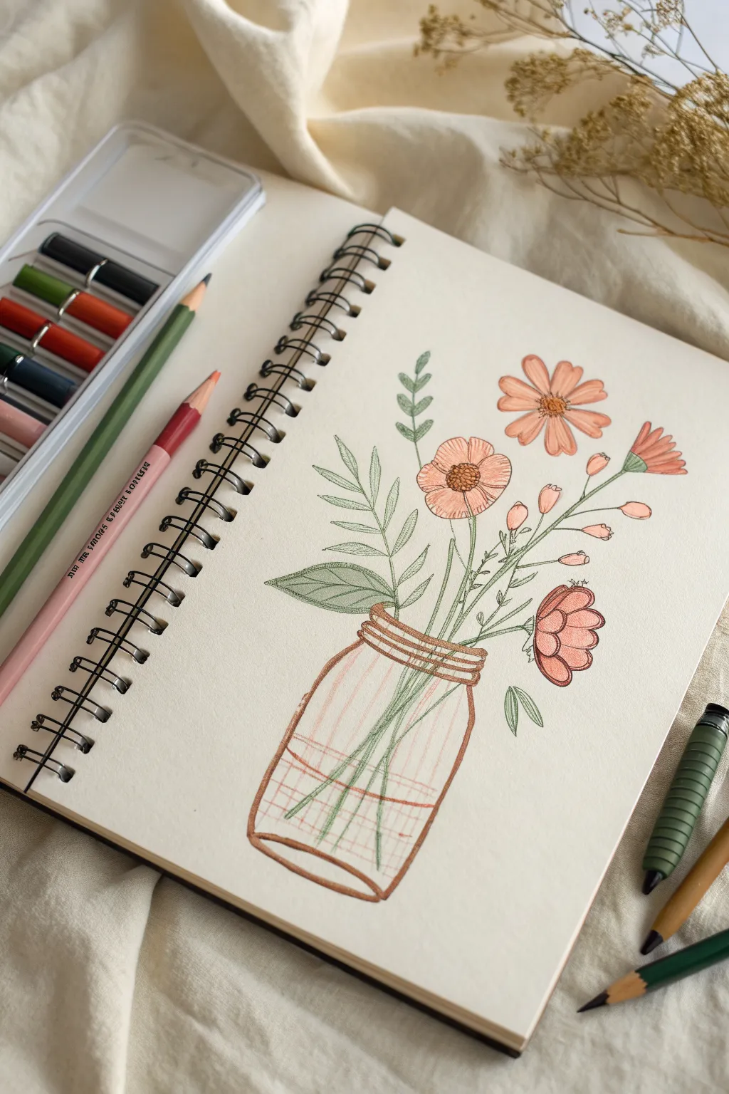
This charming sketch captures the simplicity of wildflowers arranged in a classic mason jar using soft, warm tones. The combination of delicate line work and gentle shading creates a clean, botanical illustration perfect for your sketchbook.
Detailed Instructions
Materials
- Spiral-bound sketchbook (heavyweight paper recommended)
- Set of oil pastels (specifically peach, coral, sage green, forest green, and brown)
- Fine-point black ink pen (archival quality)
- Graphite pencil (HB or H)
- Kneaded eraser
- Cotton swab or blending stump
- Ruler (optional)
Step 1: Sketching the Foundation
-
Outline the jar:
Begin by lightly sketching the mason jar shape near the bottom center of your page. Draw an oval for the base and a slightly narrower opening at the top, connecting them with gently curved sides to mimic glass. -
Add the rim detail:
At the top of the jar, sketch a few horizontal bands to handle the threaded rim where a lid would screw on. Keep these lines loose. -
Map out the stems:
Draw four or five main stem lines rising from the jar. Crisscross them inside the glass area to show depth and transparency. -
Position the flowers:
Lightly sketch circles and ovals where the flower heads will go. Place the largest blooms first—one tilted right, one facing forward—and scatter smaller buds higher up.
Smudge Control
Oil pastels transfer easily. Place a spare sheet of paper under your drawing hand to prevent smearing your work or transferring oils to the clean white space.
Step 2: Adding Color
-
Color the jar rim:
Using a brown oil pastel, trace over your pencil lines for the jar’s neck. Press firmly to mimic the darker glass threads. -
Define the glass shape:
Outline the rest of the jar in the same brown pastel. I like to keep the line weight slightly uneven to suggest a hand-drawn, rustic feel. -
Add glass reflections:
Inside the jar, lightly draw vertical and horizontal grid-like strokes with a very pale peach or translucent white pastel to imply the curve of glass without fully coloring it in. -
Color the leaves:
Switch to your sage green pastel. Fill in the fern-like leaves on the left with broad, flat strokes, tapering them at the ends. -
Draw the stems:
Use a sharper edge of the green pastel to trace the stems. Ensure the green continues visually inside the jar, layering over the faint grid lines you made earlier. -
Base layer for petals:
Take your peach or light coral pastel and gently fill in the petals of the main daisy-like flowers. Leave small white gaps toward the center for highlights. -
Deepen the accents:
Use a slightly darker orange or terracotta pastel to add shading to the tips of the petals and the smaller buds on the right side. -
Detail the centers:
For the flower centers, dab a textured circle using brown and deep yellow pastels. Use a stippling motion to create a pollen-like texture.
Make it Pop
Add ‘water’ to the jar by coloring the bottom third with a very light blue pastel, blending it horizontally before drawing the green stems on top.
Step 3: Defining Details
-
Ink the outlines:
Wait until the pastel is set, then take your fine-point black pen. Carefully outline the petals, adding tiny creases and veins to give them life. -
Define the leaves:
Add a central vein to the larger green leaves with your pen, and outline the smaller sprigs for crisp definition against the paper. -
Enhance the jar:
Go over the primary shape of the jar with the ink pen, but skip sections of the line to keep the glass looking airy and light. -
Texture the centers:
Add small cross-hatching or dots in ink over the brown flower centers to intensify the contrast and detail. -
Final blending:
If any pastel areas look too sketchy, use a cotton swab to gently smudge the pigment into the paper tooth for a smoother finish. -
Clean up:
Use your kneaded eraser to lift any stray graphite marks that are still visible around your colorful artwork.
Now you have a lovely botanical illustration blooming right out of your sketchbook page
Butterfly With Bright Layered Wings
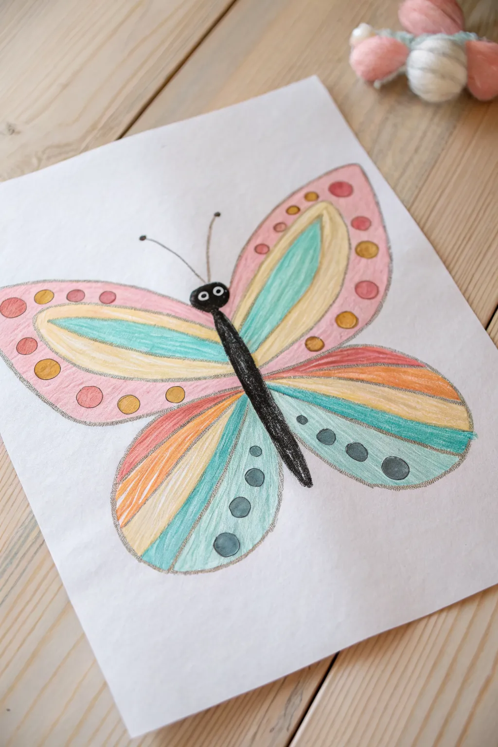
This vibrant butterfly drawing uses soft, layered colors to create a charming effect perfect for beginners. The design features a symmetrical wing structure filled with rainbow hues and playful dots.
Detailed Instructions
Materials
- White drawing paper or mixed media paper
- Oil pastels (black, pink, yellow, teal/turquoise, orange)
- Pencil (for sketching)
- Eraser
- Paper towel or blending stump (optional)
- Fixative spray (optional)
Step 1: Sketching the Outline
-
Draw the body:
Begin in the center of your page by drawing a long, slender oval for the butterfly’s body. It should be slightly thicker at the top for the head and taper down to a point. -
Add the head and antennae:
On top of the body, draw a slightly wider, rounded shape for the head. Add two thin, curved lines extending outwards for antennae, topping each with a tiny dot. -
Create the upper wings:
Start the upper wings from the ‘shoulder’ area of the butterfly. Draw a large, curved shape extending up and out, almost like a rounded triangle or a large petal. -
Mirror the upper wing:
Sketch the same shape on the left side, trying to keep them roughly symmetrical. It doesn’t have to be perfect; unique wings have character. -
Draw the lower wings:
From the bottom of the upper wing, draw a smaller, rounded lobe that curves back in to meet the lower part of the body. Repeat on the other side. -
Divide the wing sections:
Lightly sketch internal lines within each wing to create bands or stripes. These will guide where your different colors go later.
Clean Colors
Keep a paper towel handy to wipe the tip of your pastels. This stops colors from muddying when you switch between pink and yellow sections.
Step 2: Adding Color Blocking
-
Color the upper wing tips:
Take your pink oil pastel and color the outermost section of the upper wings. Press firmly to get a nice, opaque layer of pigment. -
Fill the middle bands:
Move inward to the next section of the upper wing. Fill this long, curved stripe with a bright yellow pastel. -
Add the teal accents:
Color the innermost section of the upper wings (closest to the body) with a teal or turquoise pastel. I find coloring in the direction of the wing curve makes it look smoother. -
Start the lower wings:
For the bottom wings, start near the body with a bright orange stripe. -
Continue the lower pattern:
Add a stripe of yellow next to the orange, followed by a stripe of teal. Finish the outermost edge of the lower wing with a light blue or mint green shade.
Smudge Control
If you accidentally smear black pastel onto a bright color, don’t rub it! Gently scrape the top layer off with a fingernail or plastic card.
Step 3: Defining Details & Contrast
-
Black out the body:
Using your black oil pastel, carefully color in the main body and head. Be cautious near the edges so you don’t smudge black into your bright wing colors. -
Add the eyes:
Once the black body is done, use a white pastel (or a white gel pen if the pastel is too waxy) to add two small circles for eyes, finishing them with tiny black pupils. -
Create the spots:
On the pink sections of the upper wings, draw small circles using orange and yellow pastels. On the lower teal wings, add dark grey or black dots. -
Trace the outlines:
Gently outline the entire butterfly and the internal wing sections. You can use a dark grey or silver pastel for a softer look, or black for high contrast. -
Outline the antennae:
Carefully trace over your pencil lines for the antennae using a fine black pastel edge or a black marker. -
Clean up edges:
Check for any stray marks. If the pastels have smudged outside the lines, you can carefully scrape them away with a craft knife or cover them with white pastel.
Your colorful butterfly is now ready to fly off the page
Birds on Power Lines at Dusk
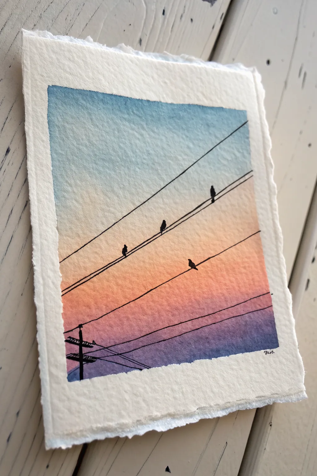
Capture the peaceful transition of day into night with this serene watercolor gradient featuring a silhouetted utility pole. The textured deckled paper adds a wonderful vintage postcard feel to the simple yet striking composition.
Step-by-Step Guide
Materials
- Cold press watercolor paper (with deckled edges preferred)
- Masking tape or painter’s tape
- Watercolor paints (Cerulean Blue, Yellow Ochre, Cadmium Red, Alizarin Crimson, Dioxazine Purple)
- Flat wash brush (3/4 inch or 1 inch)
- Fine detail brush (size 0 or 1)
- Black ink pen or very dark black watercolor/gouache
- Ruler
- Jar of clean water
- Paper towels
Step 1: Setting the Sky
-
Prepare the Paper:
Tape down your watercolor paper to a hard board. Since this piece features a distinct white border with deckled edges, place your tape about half an inch inside the paper’s edge to create a clean rectangular frame. -
Wet on Wet:
Using your large flat brush, apply a clean coat of water to the entire rectangular area inside the tape. The paper should be glisten, but make sure there are no large puddles. -
Start with Blue:
Load your brush with a watery mix of Cerulean Blue. Apply this to the top third of the paper, using horizontal strokes. Let the color naturally fade as you move downward. -
Transition to Warmth:
Clean your brush thoroughly. Pick up a pale, watery Yellow Ochre and apply it just below the blue, allowing the two colors to touch slightly and blur, creating a soft green-grey transition zone. -
Building the Sunset:
While the paper is still damp, mix a soft orange using Cadmium Red and a touch of yellow. Paint this band below the yellow section, blending upwards gently. -
Deepening the Horizon:
Move into a reddish-pink hue by using Alizarin Crimson. Apply this band below the orange, intensifying the color saturation slightly as you move down the page. -
The Purple Base:
For the bottom-most section, use Dioxazine Purple. Blend this into the pink above it to create a rich, twilight effect at the bottom of the composition. -
Let it Dry:
This step is crucial. Allow the paper to dry completely. If you touch it and it feels cool, it’s still wet. I often use a hairdryer on a low setting to speed this up, but air drying is safest.
Tape Tactics
To prevent the tape from tearing your delicate watercolor paper, stick the tape to your clothes or pants first to remove some tackiness before applying it to the page.
Step 2: Adding the Silhouettes
-
Sketch the Lines:
Once the paint is bone dry, use a ruler and a very light pencil to mark where your power lines will go. Angle them diagonally from the bottom-left toward the top-right. -
Draw the main wires:
Using a fine black ink pen or a detail brush with black gouache, trace over your pencil lines. Vary the pressure slightly; real wires often have a tiny bit of slack. -
Position the Pole:
In the bottom left corner, draw the vertical utility pole. It should be cropped by the frame, crossing the bottom border tape line. -
Add Crossbars:
Add the horizontal cross-arms to the pole. Use thick, blocky shapes for the transformers and insulators to give them weight. -
Connect the Chaos:
Draw finer, slightly curved lines connecting the pole’s crossbars to the main diagonal wires you drew earlier. This web of lines adds realism. -
Shape the Birds:
Choose spots on the wires for your birds. Start with a small oval for the body and a smaller circle for the head above the wire. -
Refine the Silhouettes:
Add tiny details to the birds like beaks and tail feathers. Make sure they are fully filled in with solid black to contrast against the sunset. -
Second Wire Layer:
Add a parallel set of wires below the first ones if your composition feels empty, adding a bird or two on the lower levels for balance. -
The Reveal:
Once the black ink or paint is 100% dry, slowly peel away the masking tape at a 45-degree angle. This reveals the crisp edge and the beautiful deckled paper texture outside the frame.
Level Up: Starry Night
Before removing the tape, flick a stiff toothbrush loaded with white gouache over the blue section to add tiny stars appearing as the sun sets.
Now you have a tranquil twilight scene that perfectly captures the beauty of an urban sunset
Cozy Chubby Cat Face Portrait
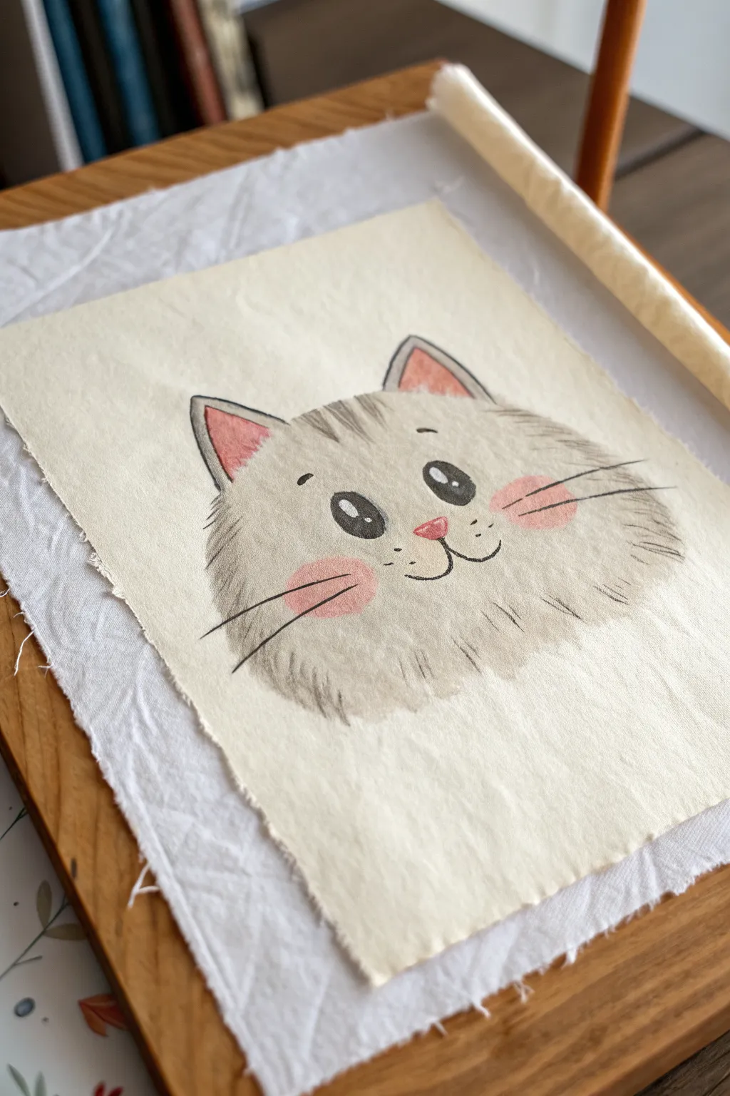
Capture the irresistible charm of a smiling grey kitty with this simple yet expressive oil pastel portrait on textured paper. The soft, blended grey fur and sweet pink accents create a warm, inviting piece perfect for a nursery or art journal.
Detailed Instructions
Materials
- Textured fine art paper (heavyweight, off-white/cream, deckled edge optional)
- Oil pastels (Grey, White, Black, Salmon Pink, Dark Pink)
- Blending stump (tortillon) or cotton swabs
- Pencil (HB or light grey) for sketching
- Painter’s tape or masking tape (optional)
- Fixative spray (optional)
Step 1: Sketching the Outline
-
Prepare your surface:
Since oil pastels can smudge, clear a flat workspace. If your paper is loose, you might want to tape the corners down lightly to a board, though the reference image shows a lovely loose sheet. -
Sketch the head shape:
Using a very light touch with your pencil, draw a wide, flattened oval shape. This will be the main mass of the cat’s head. Keep the bottom slightly flatter than the top for that chubby cheek look. -
Add the ears:
Draw two triangles on top of the head. Curve the outer edges slightly so they don’t look too sharp. Inside each triangle, sketch a smaller triangle for the inner ear. -
Place the features:
Mark light positions for the eyes, nose, and mouth. The eyes should be wide apart and slightly above the center line to make the forehead look cute and small.
Smudge Control
Oil pastels love to smear! Place a scrap piece of paper under your drawing hand while you work on the details to keep the clean background paper spotless.
Step 2: Coloring the Base Layer
-
Fill the grey fur:
Take your grey oil pastel and fill in the head shape. Don’t press too hard yet; use consistent, short strokes that follow the direction of fur growth—outward from the center of the face. -
Soften the edges:
Extend your grey strokes slightly past your pencil outline to create a fluffy texture. This ensures the cat doesn’t look like a solid cutout but has a soft, furry silhouette. -
Add inner ear color:
Use the salmon pink pastel to fill in the inner triangles of the ears. This soft contrast brings warmth to the drawing immediately. -
Initial blending:
Use your finger or a blending stump to gently rub the grey pastel. I find that rubbing in small circles helps smooth out the paper grain while maintaining that cloudy, soft appearance.
Step 3: Adding Details and Texture
-
Create the cheeks:
With the salmon pink pastel, draw two oval blush spots on the cheeks, just below where the eyes will go. Blend the edges of these spots into the grey fur so they look natural. -
Draw the nose:
Using the darker pink or pressing harder with the salmon shade, draw a small inverted triangle for the nose. It should sit right between the blush spots. -
Detail the eyes:
For the eyes, use the black pastel. Draw two large, solid black ovals. Be very careful here, as black oil pastel is hard to erase. -
Add the shine:
Once the black eyes are down, take a clean white pastel (or a white gel pen if your pastel is too blunt) and add two small white dots in the upper right of each eye for a reflective sparkle. -
Define the mouth:
Using a sharp edge of the black pastel or a black colored pencil (oil-based works best), draw the ‘3’ shape for the mouth connected to the bottom of the nose.
Make It Creative
Give your cat some personality by drawing a simple bowtie or a flower crown on its head using bright primary colors to contrast with the soft grey fur.
Step 4: Refining the Fur
-
Add forehead stripes:
Add characteristic tabby markings by drawing three or four short, slightly darker grey or black strokes on the top of the forehead, between the ears. -
Texture the fur:
Go back over the grey areas with a sharp grey pastel, adding quick, flicking strokes around the outer edges and cheeks specifically. This layers unblended texture over the blended base for a realistic fur effect. -
Draw the whiskers:
With a steady hand and a sharp black pastel or pencil, draw three long whiskers on each side, extending out from the blush cheeks. -
Add eyebrows:
Place two small, floating eyebrows above the eyes to give the cat a sweet, surprised expression. -
Final touches:
Clean up any accidental smudges on the background paper with a kneaded eraser. If you want more contrast, deepen the ear outlines slightly with the black pastel.
Now you have a charming little feline friend ready to brighten up your desk or wall
Cute Whale in a Gradient Sea
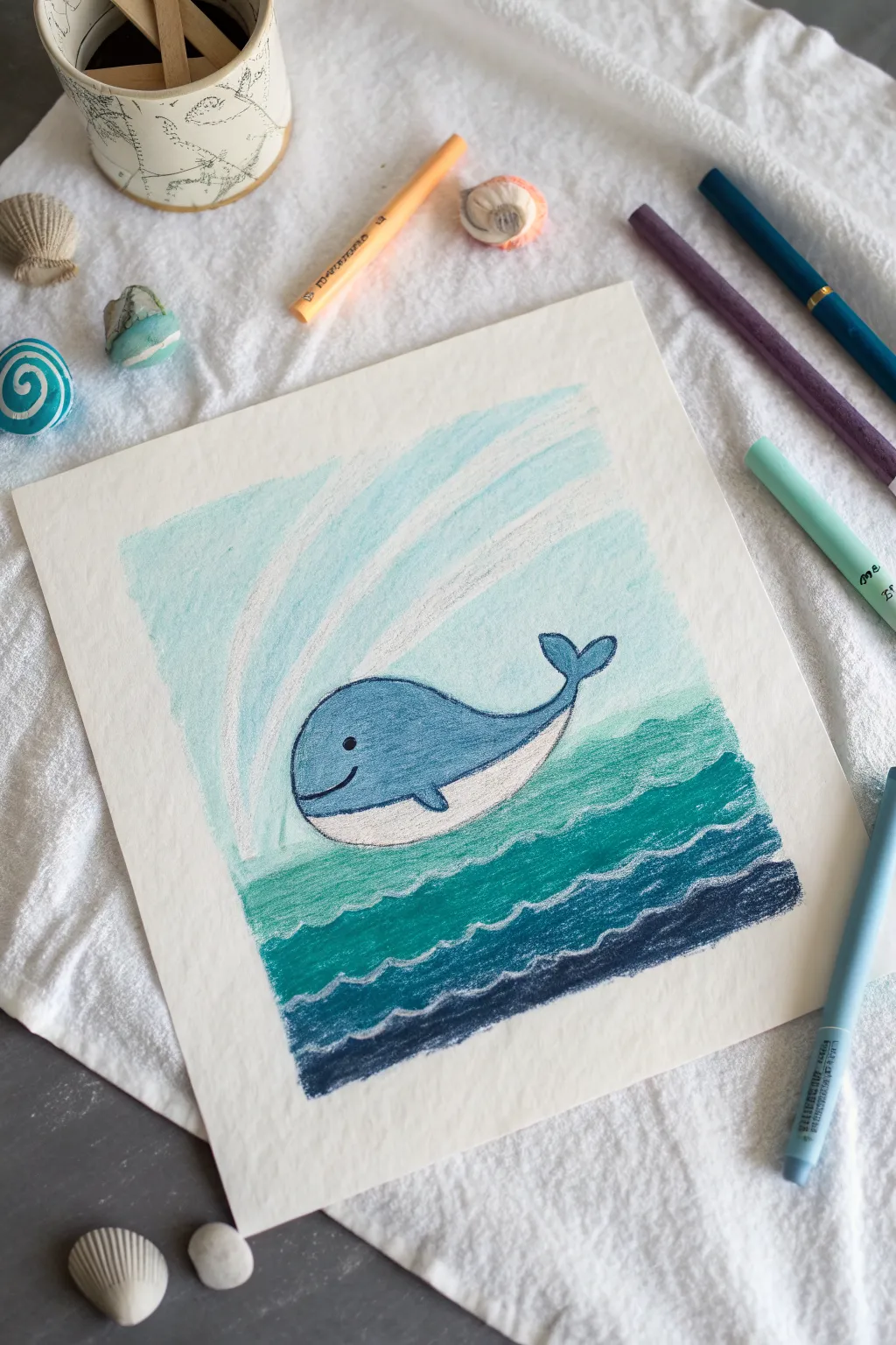
This charming little whale brings a splash of joy with its simple shapes and soothing colors. You’ll master a beautiful gradient technique to create a layered ocean effect that looks impressive but is surprisingly easy to achieve.
How-To Guide
Materials
- Oil pastels (dark blue, teal/turquoise, light blue, white, black)
- Thick drawing paper or mixed media paper
- Masking tape or painter’s tape
- Paper towel or blending stump (optional)
- Pencil (for sketching)
Step 1: Preparation & Sketching
-
Prepare your canvas:
Start by taping down the edges of your paper to your work surface. This keeps the paper from shifting and creates a clean, professional border once you peel it off at the end. -
Sketch the main shape:
Lightly draw a large, rounded oval shape in the center of your paper for the whale’s body. It should look a bit like a kidney bean, slightly curved upward. -
Add the tail:
Draw a curved tail coming off the right side of the body, ending in two flukes that look like heart halves. -
Define the belly:
Draw a curve along the bottom of the whale to separate the grey-blue top from the white underbelly. -
Sketch the face:
Add a simple dot for the eye and a small curved smile near the front of the whale. -
Outline the spout:
Lightly sketch three curved lines spraying upward from the top of the whale’s head to indicate the water spout.
Step 2: coloring the Whale
-
Fill the body:
Take a medium blue pastel and color in the upper part of the whale’s body. Press firmly to get solid, opaque coverage inside your pencil lines. -
Color the belly:
Use a white pastel to fill in the bottom belly section. If you accidentally smudge blue into it, just wipe the pastel stick clean and go over it again to keep it bright. -
Outline the features:
Use a black oil pastel or a dark blue one to carefully outline the entire whale, including the separation line for the belly. Draw the eye and the smile now too. -
Add the fin:
Draw a small, curved triangle shape on the side of the body for the flipper and color it blue, outlining it in black to make it pop.
Smudge Patrol
Oil pastels transfer easily. Place a spare sheet of paper under your drawing hand as a shield to prevent smearing colors you’ve already laid down.
Step 3: Creating the Background
-
Start the deep ocean:
At the very bottom of the page, color a horizontal strip using your darkest blue pastel. Create a wavy, undulating line on the top edge of this strip. -
Add the middle waves:
Above the dark blue, add a strip of teal or turquoise. Overlap it slightly with the dark blue below and create another wavy line on top. -
Create the lighter water:
Color the section just below the whale with a lighter turquoise or seafoam green, following the same wavy pattern. -
Define the wave crests:
Take your white pastel and draw squiggly lines perfectly along the top edge of each colored wave layer. This mimics the white foam of the ocean. -
Color the sky:
For the sky behind the whale, use a very pale blue. Coloring lightly here gives it an airy feel. I find that leaving some white paper showing through adds texture. -
Highlight the spout:
Use your white pastel to trace over the spout lines you sketched earlier. Make them thick and bold so they stand out against the pale sky. -
Final touches:
Check your drawing for any gaps. If you want a smoother look, you can gently blend the sky area with your finger or a paper towel.
Make it Sparkle
Scratch tiny dots or stars into the wet pastel of the dark blue water using a toothpick or wooden skewer to reveal the white paper underneath.
Peel off your tape carefully to reveal those crisp edges and enjoy your serene ocean scene
Frog on a Lily Pad at Sunset
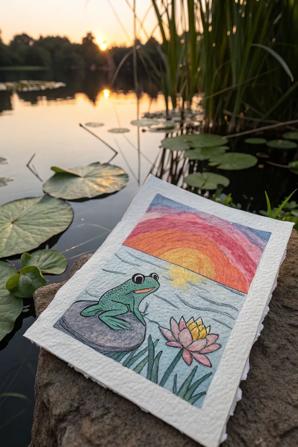
Capture the serenity of a pond at dusk with this charming mixed-media illustration featuring a friendly frog perched on a rock. Using a combination of crayon or oil pastel and ink, you’ll create a textured sunset sky that contrasts beautifully with clean line art.
Detailed Instructions
Materials
- Thick, textured drawing paper or watercolor paper (roughly A5 size)
- Black waterproof fine-liner pen (0.5mm or 0.8mm)
- Oil pastels or wax crayons (colors: orange, red, yellow, pink, blue, white)
- Colored pencils or fine-tip markers (green, grey, pink)
- Masking tape or washi tape
- Pencil and eraser for sketching
- Ruler
Step 1: Preparation & Sketching
-
Create the border:
Begin by taping down the edges of your paper with masking tape. This will not only hold your paper steady but also create that crisp, clean white border shown in the final piece. -
Establish the horizon:
Approximately one-third of the way down from the top, use a ruler to draw a light horizontal line. This separates your colorful sunset sky from the water below. -
Sketch the frog:
On the left side, sketch a rounded rock shape sitting partially in the water. Perch a simple frog on top: start with an oval body, add two large circles for eyes, and bent legs ready to hop. -
Add the flora:
In the lower right corner, draw a lotus flower with pointed petals opening upward. Add a few tall, thin grass blades rising from the water around the flower and the rock.
Smudge Patrol
If pastel dust gets on the clean border or the frog, don’t wipe it with your hand! Use a clean kneaded eraser to lift the pigment straight up off the paper.
Step 2: Coloring the Sky
-
Start with the sun:
Using a yellow oil pastel or crayon, draw a semi-circle rising from the horizon line near the center. Color it in solidly. -
Layer the sunset colors:
Create arched bands of color radiating from the sun. Start with orange directly above the yellow sun, then transition into a band of pink or red. -
Finish the sky gradient:
Fill the top corners with a soft blue or purple tone to represent the coming night. Don’t worry about staying perfectly inside the lines; the texture adds character. -
Blend the sky:
Use your finger or a paper towel to gently smudge the transition between the color bands, creating a smoother gradient for that soft sunset glow.
Step 3: Adding Details & Inking
-
Outline the main subjects:
Take your black waterproof fine-liner and carefully trace over your pencil sketches. Outline the frog, the rock, the lotus flower, and the grass blades. -
Color the frog:
Using a green colored pencil or marker, fill in the frog’s body. I like to add a tiny bit of texture here by using small dots for warts on his back. -
Detail the rock:
Color the rock with grey. Add some darker shading near the bottom where the rock meets the water to give it weight and dimension. -
Bring the flower to life:
Color the lotus petals with pink, darkening the tips slightly. Use a bright yellow for the center of the flower. -
Draw the water ripples:
With your black pen, draw horizontal, slightly wavy lines across the water area. These should be sparse near the horizon and slightly more frequent near the foreground objects. -
Re-establish the horizon:
Trace over the horizon line with your pen, but skip over the area where the sun sits, so the sun appears to be sinking behind the water.
Make it Sparkle
After the drawing is completely finished, use a white gel pen to add tiny highlights to the frog’s eyes and the tips of the water ripples for a wet look.
Step 4: Final Touches
-
Create the reflection:
Use a light yellow pastel or pencil to scribble a soft reflection directly below the sun on the water’s surface. -
Fill the water:
Lightly shade the rest of the water with a very pale blue pencil or pastel, keeping the strokes horizontal and leaving some white of the paper showing for sparkle. -
Reveal the border:
Gently peel away the masking tape. Pull it away from the drawing slowly at a 45-degree angle to prevent tearing the paper surfacing.
Now you have a peaceful sunset scene perfect for a greeting card or wall art
Scratch-Art Stars With Sgraffito Lines
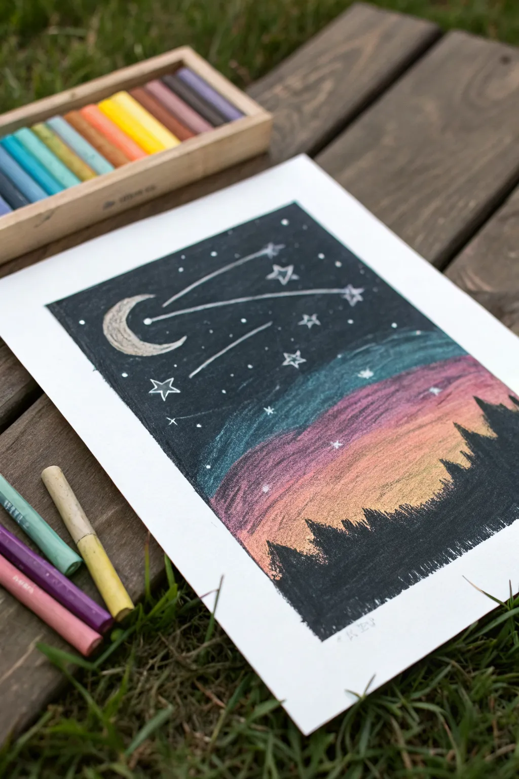
Capture the magic of a starry night over a forest using the sgraffito technique. By layering rich black oil pastel over vibrant sunset colors and scratching away the top layer, you’ll reveal glowing stars and shooting comets effortlessly.
How-To Guide
Materials
- White drawing paper or mixed media paper
- Oil pastels (black, dark blue, hot pink, orange, yellow)
- Masking tape or painter’s tape
- Wooden skewer, toothpick, or empty ballpoint pen (for scratching)
Step 1: Setting the Scene
-
Prepare your paper:
Tape down all four edges of your paper to a flat work surface. The tape creates that crisp, professional white border you see in the final piece and keeps the paper from shifting while you work. -
Start the sunset:
Begin at the bottom third of the paper with your yellow oil pastel. Color a horizontal band solidly, pressing firmly to ensure no white paper shows through. This will be the glowing horizon. -
Add warmth:
Directly above the yellow, add a band of orange. Slightly overlap the yellow area as you color to help the hues mix naturally. -
Transition to dusk:
Above the orange, apply a thick layer of pink or magenta. Again, overlap the orange slightly. Use your finger to gently smudge the seam where the pink meets the orange for a smoother gradient. -
Cool down the sky:
Add a band of teal or light blue above the pink. This transition color is crucial before moving to the dark night sky. Blend the edge where the blue meets the pink to create a soft, purplish transition. -
Complete the underlayer:
Fill the rest of the top section with a dark blue or indigo, merging it with the teal layer below. The entire rectangular area should now be covered in vibrant, thick pastel pigment.
Clean Scratching
Wipe the tip of your scratching tool on a paper towel frequently. Built-up black pastel on the tool can smear back onto your drawing and muddy the bright colors you are trying to reveal.
Step 2: Layering the Darkness
-
Apply the black layer:
Take your black oil pastel and color over the top two-thirds of the artwork. You want to cover the dark blue, teal, and even some of the pink areas completely. Press hard—the black needs to be opaque. -
Create the silhouette:
As you bring the black layer down, stop abruptly in a jagged, uneven line over the yellow and orange section. Do not cover the very bottom; leave the bright sunset colors exposed to create the illusion of a glowing horizon behind trees. -
Refine the tree line:
Use the edge of the black pastel to draw small, vertical spikes along that bottom edge. These spikes simulate the tops of pine trees silhouetted against the light. Vary their heights to make the forest look natural. -
Smooth the night:
Rub your finger gently over the black sky area to smooth out the texture. This packs the pigment down and makes it easier to scratch cleanly in the next phase.
Step 3: Scratching the Magic
-
Outline the moon:
Using your scratching tool (like a toothpick or skewer), gently scrape away a crescent moon shape in the upper left corner. The underlying blue or teal color will peek through, making the moon glow. -
Draw shooting stars:
Scratch two or three long lines stretching across the sky to represent comet tails. At the head of each line, scratch a small circle or star shape. -
Add detail to the comets:
For the comet tails, I like to scratch a second, thinner line parallel to the main one. This adds a sense of motion and specific celestial style. -
Create scattered stars:
Use the sharp point of your tool to scratch tiny dots randomly throughout the black sky area. Cluster a few together to suggest distant constellations. -
Draw larger stars:
Scratch a few larger, five-pointed star shapes scattered among the dots. Don’t worry about them being perfect; rustic shapes add charm to this style. -
Reveal color accents:
Scratch a few tiny ‘x’ shapes or distinct stars lower down, near the pinkish area of the sky. This will reveal the warm pink underlayer, making these stars look different from the cool blue ones higher up. -
Reveal the final piece:
Slowly peel away the masking tape, pulling it away from the drawing at a 45-degree angle to prevent tearing the paper. Brush off any excess pastel crumbs gently.
Cosmic Dust
Use a white gel pen or a bit of white correction fluid to add tiny bright white dots over the black area. These will pop even more than the scratched stars.
Admire how the hidden colors underneath bring your night sky to life without any complex blending.
Bookmark Triptych With Tape Borders
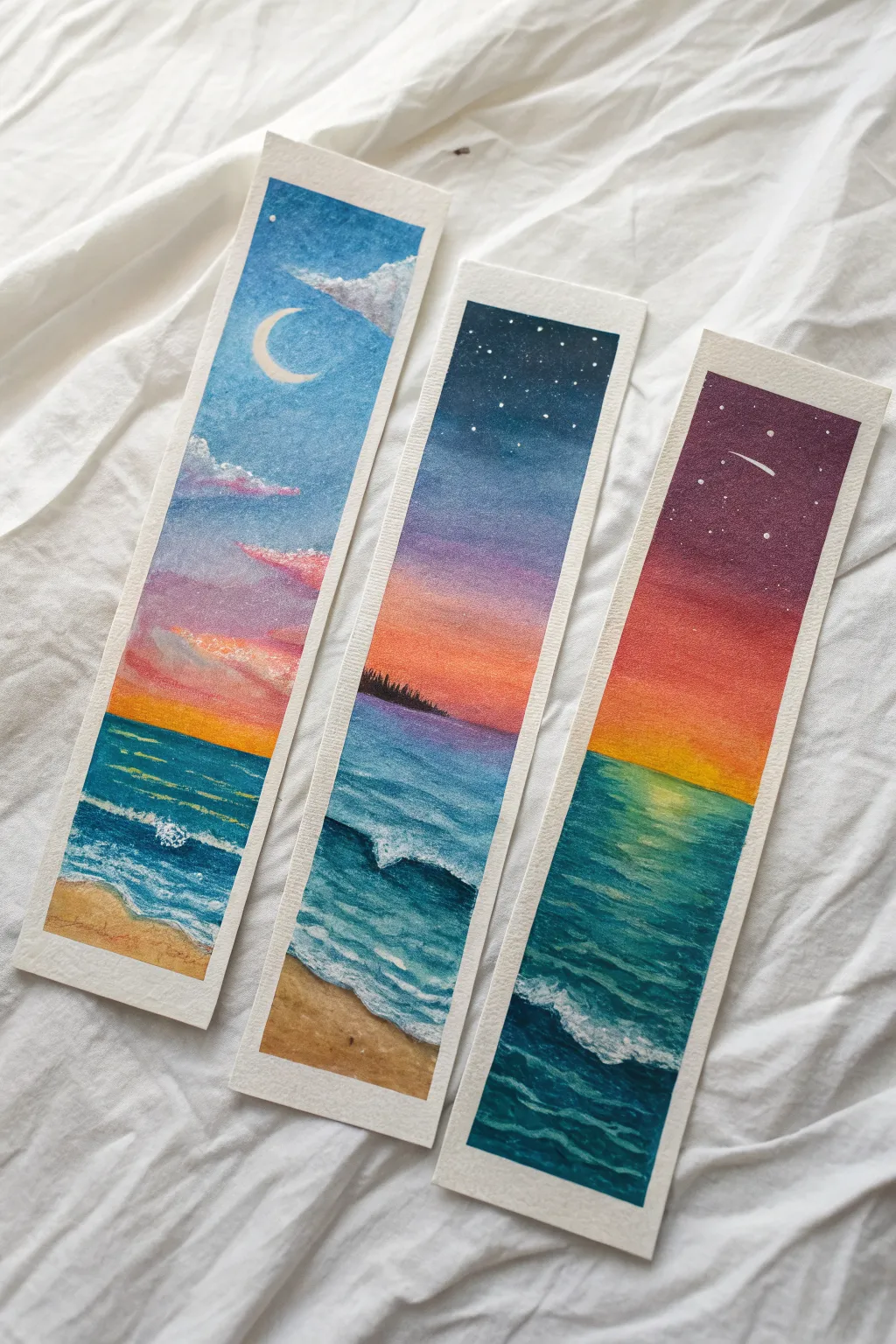
Create a stunning set of three landscapes that capture the transition from sunset to starlight over the ocean. This oil pastel triptych uses vibrant color blending and masking tape borders to create clean, professional-looking bookmarks.
Step-by-Step
Materials
- Oil pastels (student or artist grade)
- Heavyweight watercolor paper or mixed media cardstock
- Paper towels or blending stumps (tortillons)
- Masking tape or washi tape
- White gel pen or correction fluid
- Ruler
- Scissors or craft knife
- Scrap paper for testing colors
Step 1: Preparation & Sky Gradients
-
Prepare your canvas:
Cut your watercolor paper into three equal vertical strips, approximately 2 inches by 6 inches each. Adhere them to your work surface using masking tape along all four edges of each strip to create a crisp white border. -
Define the horizon lines:
Lightly sketch a horizontal line about one-third of the way up from the bottom on all three bookmarks to separate the sky from the sea. On the middle strip, add a small, distant landform shape on the left horizon. -
Base layer for the left sky:
On the left bookmark, start at the top with a medium blue. Transition into lighter blue, then blend soft pinks and touches of orange just above the horizon line to mimic early sunset. -
Base layer for the middle sky:
For the center strip, use a deep midnight blue at the very top. Blend this down into a medium blue, then a rich purple, fading into vibrant orange and yellow right at the horizon line. -
Base layer for the right sky:
On the right strip, create a dramatic nightfall look. Start with very dark purple or indigo at the top, blending into a warm reddish-purple, and finishing with a bold orange band at the horizon. -
Blend the sky gradients:
Use a folded paper towel or your fingertip to rub the oil pastel colors together. Work from the lightest colors to the darkest to keep the bright yellows and oranges clean.
Clean Smudges
Keep a scrap paper nearby to wipe your pastel sticks clean between colors. Dirty yellow sticks will ruin a bright sunset instantly!
Step 2: Ocean & Sand
-
painting the water base:
Fill the ocean area below the horizon with a mix of teal, turquoise, and deep blue. Apply the colors darker near the horizon and lighter as you move toward the bottom of the paper. -
Add the sandy beach:
On the left and middle bookmarks, use a warm beige or ochre color at the very bottom to create the shoreline. Blend the edge where the sand meets the blue water slightly for a wet-sand look. -
Detailing the water texture:
Use a dark blue or Prussian blue pastel to draw thin, horizontal strokes across the water to represent distant waves. Vary the pressure to create depth. -
Refining the shoreline:
Draw more distinct, curved lines of white or very pale blue where the water meets the sand to suggest the foam of crashing waves.
Step 3: Atmospheric Details
-
Create the left moonscape:
On the first bookmark, use a white pastel to carefully draw a crescent moon in original blue sky area. Add fluffy clouds using white and light grey, blending the bottom edges into the pink sunset colors. -
Silhouette the island:
On the middle bookmark, fill in the small landform on the horizon with black oil pastel. Use the tip of the pastel or a toothpick to scratch tiny vertical lines along the top edge to simulate pine trees. -
Add stars to the night skies:
For the middle and right bookmarks, use a white gel pen or a dot of correction fluid to tap tiny stars into the darker upper sections of the sky. Vary the size of the dots for a realistic effect. -
Draw the shooting star:
On the right bookmark, draw a small white streak with the gel pen to create a shooting star cutting through the purple sky. -
Highlight the water reflections:
Add touches of yellow or orange pastel specifically on the water directly beneath the sun’s position on the horizon to show light reflecting on the waves. -
Finalize ocean foam:
Use your white pastel with heavy pressure to create distinct, thick white caps on the waves in the foreground of all three bookmarks. Texture corresponds to movement, so make these strokes energetic.
Make It Sparkle
For a magical touch, sprinkle a tiny bit of fine eco-glitter onto the wet white paint of the stars or wave foam before it dries completely.
Step 4: Finishing Touches
-
Clean up edges:
Taking care not to tear the paper, slowly peel away the masking tape at a 45-degree angle. This reveals the crisp, clean borders around your artwork. -
Seal the artwork:
To prevent the oil pastel from smudging when used as a bookmark, lightly spray the surface with an oil pastel fixative or place a sheet of wax paper over them when pressing inside a heavy book.
Slip these beauties into your favorite novel or gift them to a friend who loves the sea

Have a question or want to share your own experience? I'd love to hear from you in the comments below!