When I’m in the mood to draw but don’t want the pressure of shading or details, I lean hard into easy outline drawings—just clear lines that instantly read. Here are my go-to drawing outline ideas you can knock out fast and still feel proud of.
Heart Doodles and Variations
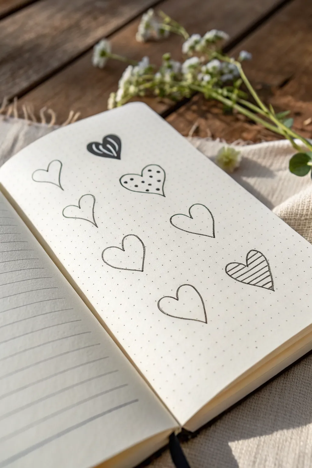
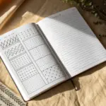
This simple yet charming project uses a dotted grid notebook to create a clean, repetitive pattern of hand-drawn hearts. The varying fill styles turn basic outlines into a playful study of texture and line work.
Step-by-Step Guide
Materials
- Dotted grid bullet journal or notebook
- Fine liner pen (black, 0.3mm or 0.5mm)
- Pencil (optional for sketching)
- Eraser
Step 1: Planning the Layout
-
Visualize the grid:
Look at your dotted page and imagine a 3×3 grid layout, though we will only be filling certain spots to create a staggered, airy look. Notice how the hearts in the example aren’t perfectly aligned in columns but float freely. -
Mark the positions:
Using a pencil, lightly mark the center point for about seven or eight hearts scattered across the page. Aim for an organic flow rather than rigid rows.
Grid Guide
Use the faint dots on the paper as anchors. For example, make the top dip of every heart land exactly between two dots to keep relative sizing consistent.
Step 2: Drawing the Base Outlines
-
Draw the first curve:
Start with a simple open heart near the top left. Place your pen tip on a dot, curve up and to the left, then swoop down to the bottom point. -
Complete the shape:
Return to the starting top center point and mirror that movement to the right, meeting the first line at the bottom tip. Don’t worry about perfect symmetry; a little eccentricity adds character. -
Repeat the outlines:
Continue this process for all the planned hearts on the page. Draw about 7-8 total hearts, leaving enough negative space around each one so they don’t look crowded. -
Vary the shapes slightly:
Allow some hearts to be slightly wider or taller than others. This hand-drawn variation keeps the page from looking like a stamp pattern.
Step 3: Adding Patterns and Details
-
Create the striped heart:
Choose a heart near the bottom right to be your ‘striped’ variation. Draw diagonal parallel lines across the entire interior of the heart, keeping the spacing consistent. -
Double the outline:
Go over the outline of this striped heart one more time to thicken the border slightly, making it stand out. -
Create the polka dot heart:
Select a heart near the top middle. Fill the inside with small, evenly spaced dots. Try to stagger them like bricks on a wall rather than grid-aligning them. -
Draw the tribal heart:
For the top-most heart, draw two curved white lines inside the shape that follow the contour of the heart lobes. Fill the rest of the space with solid black ink, leaving those curved lines empty as negative space. -
Create the double-outline heart:
Pick a heart in the center or left side. Simply draw a second, slightly smaller heart inside the first one, following the original line as closely as possible. -
Leave some plain:
Leave the remaining 3-4 hearts as simple, single-line outlines. These ‘rest’ spaces balance the busy textures of the filled hearts.
Wobbly Lines?
If your hand shakes, try drawing the curves faster. A quick, decisive stroke is often smoother than a slow, careful one.
Step 4: Final Touches
-
Check line weights:
Look over your page. If any lines look too faint or shaky, carefully go over them again to build confidence in the stroke. -
Erase pencil marks:
Once you are certain the ink is completely dry, gently erase any pencil guide marks you made in the beginning.
Now you have a sweet, customizable pattern page ready for journaling notes or just enjoying the aesthetic simplicity


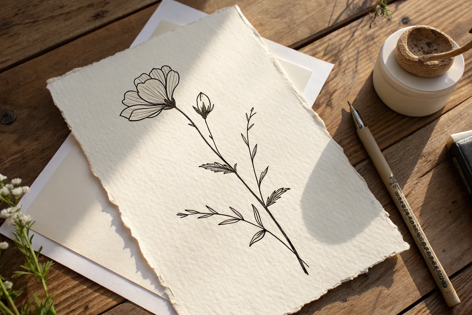
Simple Blossom Outline
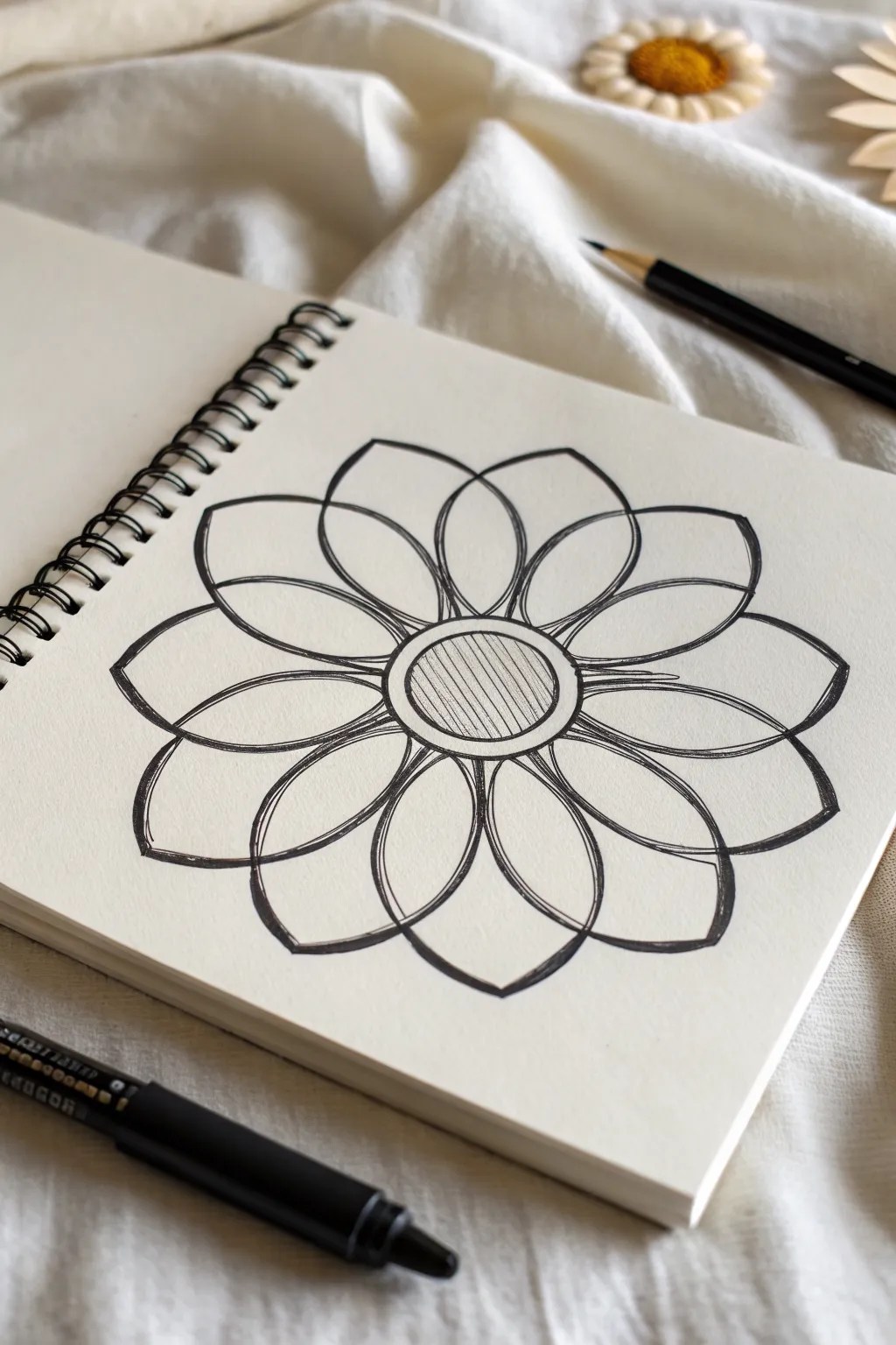
This minimalist flower mandala combines clean geometric lines with organic petal shapes for a relaxing and achievable sketch. The design features a hatched center surrounded by overlapping petal layers, creating a sense of depth and symmetry that looks stunning on crisp paper.
Step-by-Step
Materials
- Spiral-bound sketchbook with smooth drawing paper
- Pencil (HB or 2B for sketching)
- Black fine liner pen (0.5mm or 0.8mm)
- Eraser
- Compass or circular drawing template (optional)
Step 1: Setting the Composition
-
Establish the center:
Begin by lightly sketching a small circle in the middle of your page with a pencil. This will be the absolute center of your blossom, so try to keep it as round as possible. -
Draw the outer ring:
Sketch a second, slightly larger circle around the first one. This creates a rim or border for the flower’s center, giving it a bit more visual weight. -
Sketch the petal guides:
Still using your pencil, lightly draw eight evenly spaced lines radiating outward from the center circle, like the spokes of a wheel. These will help you keep your petals symmetrical. -
Draft the first petal layer:
Sketch a layer of eight petals. Each petal should start at the edge of the center ring, curve outward to a soft point, and return to the center. Use your guide lines to center each petal. -
Draft the second petal layer:
Now sketch a second layer of larger petals behind the first set. Position the tips of these outer petals exactly between the tips of the inner petals, so they peek out from behind.
Step 2: Inking the Outline
-
Ink the center:
Switch to your black fine liner. Carefully trace the two central circles. Try to use a confident, single stroke for the smoothest look, rather than short, sketchy marks. -
Outline the inner petals:
Trace the eight inner petals. At the base where they meet the center, make the line slightly thicker or double it up just a tiny bit to suggest a shadow or overlap. -
Outline the outer petals:
Trace the visible parts of the outer petals. Remember to stop your line when it hits an inner petal, creating the illusion that these larger petals are tucked behind the front row. -
Wait and erase:
Give the ink a minute to dry completely so it doesn’t smudge. Then, gently erase all your pencil guide lines and sketches to reveal the clean black and white design.
Wobbly circles?
If you struggle drawing perfect circles freehand, trace a small coin or bottle cap for the center. It gives you a perfect foundation without stress.
Step 3: Adding Detail and Depth
-
Double the outlines:
Go back over your petal outlines loosely. Don’t trace perfectly; instead, let the second line weave slightly or sit just inside the first one. This ‘sketchy’ style adds character and weight. -
Detail the petal interiors:
Inside each inner petal, draw a smaller, mirroring petal shape that floats in the middle. This creates a detailed ‘window’ effect within the flower structure. -
Hatch the center:
Fill the very center circle with straight, vertical lines. Keep the spacing tight and consistent to create a shaded texture that contrasts with the open white petals. -
Thicken intersections:
I like to go back to the points where petals overlap and add a tiny bit of extra ink in the corners. This small darkening mimics natural shadows. -
Final touches:
Review your lines. If any curves look too thin or shaky, smooth them out with one final confident pass of the pen to bold them up.
Line variation
Use a thicker pen tip (like 0.8mm) for the main outlines and a thinner one (0.3mm) for the hatching. This contrast makes the drawing pop instantly.
Enjoy the calm simplicity of your finished floral ink drawing.

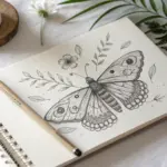
Minimal Leaf Sprig Outline
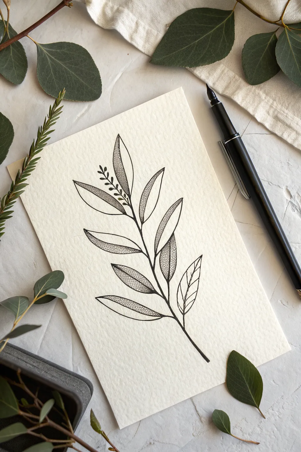
Master the art of negative space and texture with this delicate botanical illustration. Using simple lines and stippling techniques, you’ll create a sophisticated leaf sprig that looks beautiful on heavy textured paper.
Detailed Instructions
Materials
- Cold press watercolor paper or textured cardstock (cream or off-white)
- Black fine liner pen (01 or 03 size) or fountain pen with black ink
- Pencil (HB or 2H)
- Soft white eraser
- Ruler (optional)
Step 1: Sketching the Framework
-
Define the stem:
Start by lightly sketching a central curved line with your pencil to represent the main stem. Let it gently arc from the bottom right towards the top left to create a natural, organic flow. -
Mark leaf positions:
Along the stem, lightly mark short dashes where each leaf will connect. Stagger them on alternating sides of the stem, leaving a bit of space near the bottom for the ‘handle’ of the stem. -
Outline the leaves:
Sketch the basic leaf shapes using your pencil. Aim for a long, elliptical shape that comes to a point at the tip. Vary the angles slightly so they don’t look too rigid. -
Add the central veins:
Draw a center vein down the middle of each leaf. I like to curve this line slightly to match the bend of the leaf, giving it a sense of dimension rather than making it perfectly straight. -
Include the bud detail:
Near the top section of the stem, just below the highest leaf, sketch a small offshoot cluster. Draw tiny, teardrop-shaped buds branching off a miniature stem for added visual interest.
Ink Smearing?
Textured paper dries slower than smooth paper. If using a fountain pen or juicy gel pen, place a scrap piece of paper under your hand as a guard while you draw to prevent smudging.
Step 2: Inking the Outline
-
Trace the stem:
Switch to your black ink pen. Carefully trace over your pencil line for the main stem. Make the line slightly thicker at the bottom and taper it as you reach the top. -
Ink the leaf edges:
Go over your leaf outlines with a steady hand. Don’t worry if the line isn’t machine-perfect; a little waver adds to the organic, hand-drawn charm. -
Draw the veins:
Ink the central vein lines you sketched earlier. Ensure these lines connect clearly to the main stem. -
Ink the small buds:
Carefully outline the tiny bud cluster near the top, keeping these lines very fine and delicate. -
Erase pencil marks:
Wait several minutes to ensure the ink is completely dry, then gently erase all visible pencil sketches to reveal a clean outline.
Make it Pop
Instead of black dots, try using metallic gold ink for the stippling phase. The contrast between black outlines and shimmering gold texture adds an incredibly luxurious feel.
Step 3: Adding Texture and Shading
-
Choose the shading side:
Decide on a light source. For this piece, we will apply texture to only *one half* of each leaf (either the left or right side of the vein) to create a stylized, two-tone look. -
Start stippling:
Begin adding tiny dots (stippling) inside the chosen half of a leaf. Start near the central vein where the shadow would be darkest. -
Build the gradient:
Cluster your dots densely near the center vein and the base of the leaf. As you move toward the outer edge of the leaf, space the dots further apart to create a fading gradient. -
Maintain clean edges:
Keep your stippling strictly within the outline. I find it helps to do a row of dots right against the black ink line first to define the boundary. -
Vary the texture:
For one or two leaves, you can leave them entirely empty or just shade the very tip to break up the pattern and keep the composition dynamic. -
Shade the stem:
Add just a few tiny dots along one side of the main stem to give it roundness, ensuring it doesn’t look flat compared to the leaves. -
Check balance:
Step back and look at the overall contrast. If some leaves look too light, go back in and add another layer of dense dots near the veins to deepen the value.
Frame your botanical sketch or use it as a sophisticated greeting card front to impress your friends


Butterfly Wing Outline
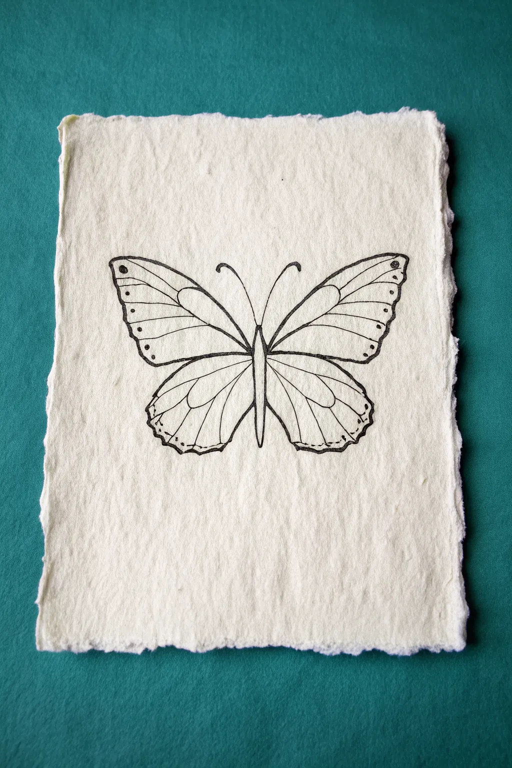
This project features a delicate butterfly line drawing created on beautiful textured, deckle-edge paper. The contrast between the crisp ink lines and the rough, organic surface of the paper gives this simple outline a timeless, vintage botanical feel.
How-To Guide
Materials
- Handmade paper with deckle edge (cream or off-white)
- Pencil (HB or H)
- Soft eraser (kneaded usually works best on textured paper)
- Fine liner pen (black, size 03 or 05)
- Ruler (optional, for symmetry checks)
Step 1: Preparation & Foundation
-
Center the body:
Start by lightly sketching a vertical line down the center of your paper to act as a guide for symmetry. Along this line, sketch a long, thin oval for the butterfly’s body, tapering it almost to a point at the bottom. -
Map the upper wings:
Draw two large, rounded triangular shapes extending outward from the upper part of the body. Angle them slightly upward, ensuring the left and right sides mirror each other in size and lift. -
Map the lower wings:
Below the upper wings, sketch two wider, more rounded shapes for the hindwings. These should slightly overlap underneath the top wings and curve inward toward the bottom of the abdomen. -
Refine the wing edges:
Go over your rough wing shapes and add the scalloped details. Instead of straight lines, use gentle wavy strokes to create the natural, fluttery edge of the butterfly wings.
Step 2: Detailing the Outline
-
Segment the upper wings:
Draw the main vein that runs parallel to the top edge of the upper wing. Below that, add the ‘cells’—the elongated oval shapes that sit near the body. -
Add radiating veins:
Sketch the straight veins that fan out from the central cells toward the wing edges. Keep your pencil pressure light here, as texturing handmade paper can sometimes grab the graphite. -
Detail the lower wings:
Repeat the vein process for the bottom wings. Create a large central loop near the body, then draw veins radiating downward and outward toward the scalloped edges. -
Add antenna:
At the top of the body head, draw two long, curving lines for the antennae. Curl the tips outward slightly for a classic look. -
Last pencil check:
Step back and check the symmetry. If one wing looks larger than the other, adjust your pencil lines now before committing to ink.
Handling Textured Paper
Handmade paper can snag fine pens. hold your pen more vertically than usual and pull the pen strokes toward you rather than pushing them away.
Step 3: Inking & Finishing
-
Trace the body:
Begin inking with the central body. Use confident strokes to define the head, thorax, and abdomen, leaving a small gap or thin line down the middle of the abdomen to suggest volume. -
Outline the main shapes:
Outline the outer perimeter of all four wings. Allow your pen to move slightly slower than usual to accommodate the bumpy texture of the handmade paper. -
Ink the veins:
Carefully trace the internal structural lines you penciled earlier. Draw these lines slightly thinner or lighter than the outer border if possible to create depth. -
Add decorative spots:
Place small dots along the outer margins of the wings. I find that varying the size—using tiny dots near the bottom and slightly larger circles near the top tips—adds nice variety. -
Thicken key lines:
Go back over the outer edges of the wings and the main structural veins to thicken them slightly. This weighted line work helps the drawing stand out against the textured background. -
Erase guidelines:
Wait at least 10 to 15 minutes for the ink to fully dry. The rough paper can hold wet ink longer than smooth paper. Once dry, gently dab—don’t scrub—with your kneaded eraser to lift the pencil marks.
Add a Splash of Color
Dilute watercolor or weak tea can be painted into the wing sections for a subtle, aged tint that won’t overpower the line work.
Now you have a charming piece of insect art that looks like it was discovered in an old naturalist’s field journal
BRUSH GUIDE
The Right Brush for Every Stroke
From clean lines to bold texture — master brush choice, stroke control, and essential techniques.
Explore the Full Guide
Cute Cat Face Outline
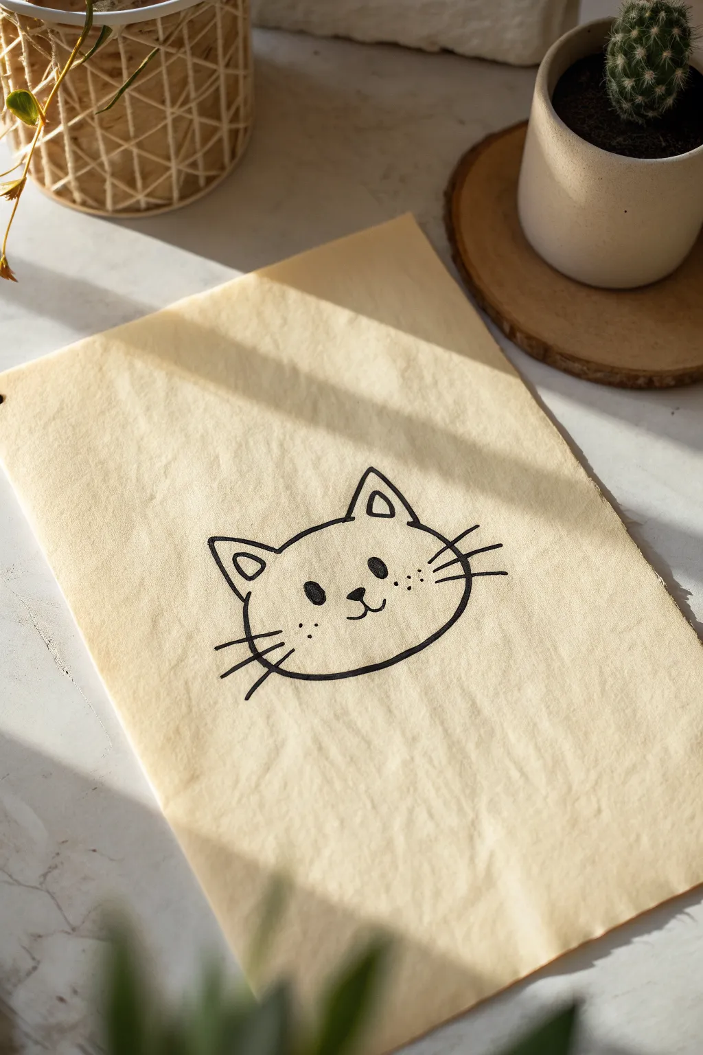
This charmingly simple cat illustration captures a sweet expression using bold, confident lines on textured paper. The minimalistic style makes it perfect for beginners, focusing on clean shapes and cute details.
Step-by-Step
Materials
- Textured parchment paper or beige drawing paper
- Fine-tip black marker or drawing pen (0.5mm)
- Medium-tip black marker (1.0mm) for thicker outlines
- Pencil (HB or 2B)
- Eraser
Step 1: Planning the Shape
-
Light sketch:
Start by lightly sketching a wide oval shape with your pencil. This doesn’t need to be perfect; think of it more like a slightly flattened bun shape. -
Adding ears:
Draw two triangles on top of the oval. Place them fairly wide apart to give the cat a sweet, open expression. -
Refining the contours:
Connect your ears to the main head shape. I like to make the bottom of the face slightly flatter than the top for a more grounded look. -
Face placement:
Mark the center of the face lightly. This will help you position the nose and eyes symmetrically in the next phase.
Smooth Line Secret
Draw curves using your shoulder, not just your wrist. This creates smoother, more confident lines and reduces shakiness in the long jawline curve.
Step 2: Inking the Outline
-
Tracing the left ear:
Switch to your medium-tip black marker. Start at the bottom left of the ear and draw up to the point, then curve gently down. -
Top of head:
Draw a smooth, slightly curved line connecting the inner base of the left ear to the inner base of the right ear. -
Right ear and cheek:
Outline the right ear, then continue that line down to form the right side of the face. Keep your wrist loose to get a fluid curve. -
Completing the jaw:
Draw the bottom curve of the face, connecting the right cheek back over to the left side. It’s okay if the line has a little character or isn’t perfectly smooth. -
Left cheek:
Finish the main outline by connecting the bottom jaw line up to the base of the left ear. -
Inner ear detail:
inside each ear triangle, draw a smaller, somewhat rounded triangle to create depth.
Add Some Personality
Give your cat a unique look by adding accessories like a small bow on one ear, a collar at the neck, or even drawing a tiny fish bone bubble above its head.
Step 3: Drawing the Features
-
The eyes:
Using the medium marker, draw two solid black ovals for eyes. Place them relatively far apart, aligned horizontally. -
Nose and mouth center:
Draw a small, inverted soft triangle for the nose right between the eyes, but slightly lower. Draw a short vertical line straight down from the bottom tip of the nose. -
The smile:
From the bottom of that vertical line, draw two curves upward—one to the left and one to the right—to create the classic ‘3’ mouth shape. -
Freckle details:
Switch to your fine-tip pen. Add three small dots in a triangular formation on each cheek area, just outside the smile lines.
Step 4: Final Touches
-
Whiskers right:
Using quick, confident flicks of the medium marker, draw three straight lines extending outward from the right cheek. -
Whiskers left:
Repeat on the left side, trying to keep the length and angle roughly symmetrical to the right side. -
Clean up:
Once the ink is completely dry—give it a minute or two—gently erase your pencil guidelines so only the clean ink remains.
You now have a delightful feline friend drawn in a timeless style.
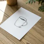
Coffee Mug With Steam Outline

Capture the cozy comfort of a warm drink with this simple yet expressive line drawing. Using bold ink lines and minimal shading, you’ll create a classic coffee mug silhouette complete with rising steam.
Step-by-Step Tutorial
Materials
- Spiral-bound sketchbook
- Pencil (HB or 2B)
- Eraser
- Fine liner pen (0.5mm or 0.8mm)
- Ruler (optional)
Step 1: Penciling the Structure
-
Draw the rim:
Begin by sketching a flattened oval (ellipse) near the center of your page. This will serve as the opening of the mug. Keep your pencil pressure light so these lines are easy to erase later. -
Establish the body:
From the widest points of your oval, draw two vertical lines straight down. These determine the height of your mug. I personally like a slightly tall, standard mug shape, but you can make yours shorter for a teacup look. -
Curve the base:
Connect the bottom of the two vertical lines with a curve that mirrors the bottom curve of your top oval. This rounded bottom gives the mug realistic volume. -
Add the handle shape:
On the right side, sketch a C-shape attached to the side of the mug cylinder. Draw a smaller C-shape inside it to verify the handle has thickness. -
Draft the steam:
Lightly sketch three wavy, organic lines rising from the center of the oval. These should curve gently upward and taper off at the top.
Ink Confidence
Don’t correct a wobbly line by drawing over it again; it just makes it look messy. Embrace the wobble or make the line intentionally thicker.
Step 2: Inking the Outline
-
Ink the rim:
Switch to your fine liner pen. Trace over your pencil oval carefully. To show the thickness of the ceramic, draw a second, slightly smaller curve just inside the front edge of the rim. -
Define the liquid:
Inside the rim, draw a slightly curved line across the ‘coffee’ level. Fill in this inner oval section with solid black ink to represent the dark liquid. -
Outline the body:
Trace the vertical sides and the bottom curve. Try to keep your hand steady for a clean, bold look. -
Ink the handle:
Go over your C-shapes for the handle. Make sure the connection points where the handle meets the mug body look deliberate and connected. -
Trace the steam:
Ink the wavy steam lines. Start slightly thick at the base and lift your pen as you move upward to let the line taper naturally.
Step 3: Shading and Finishing
-
Add vertical hatching:
To give the mug a cylindrical feel, add a series of short, vertical hatch lines on the right side of the mug body, just under the handle. -
Curved hatching details:
Add a few curved hatch lines near the bottom right edge, following the curve of the base. This suggests a shadow wrapping around the rounded form. -
Handle shading:
Draw tiny hatch lines on the bottom interior curve of the handle to show depth. -
Cast shadow:
Draw three to four horizontal lines extending from the bottom right of the mug base. These should vary in length to imply a shadow on the table surface. -
Clean up:
Wait at least sixty seconds to ensure the ink is completely dry. Once safe, gently erase all remaining pencil marks to reveal your crisp illustration.
Make it Yours
Customize the mug by drawing a simple pattern, like polka dots or a heart, on the side before adding the hatching shading.
Now you have a charming coffee sketch perfect for a journal or greeting card

PENCIL GUIDE
Understanding Pencil Grades from H to B
From first sketch to finished drawing — learn pencil grades, line control, and shading techniques.
Explore the Full Guide
Mountain Range With Sun Outline
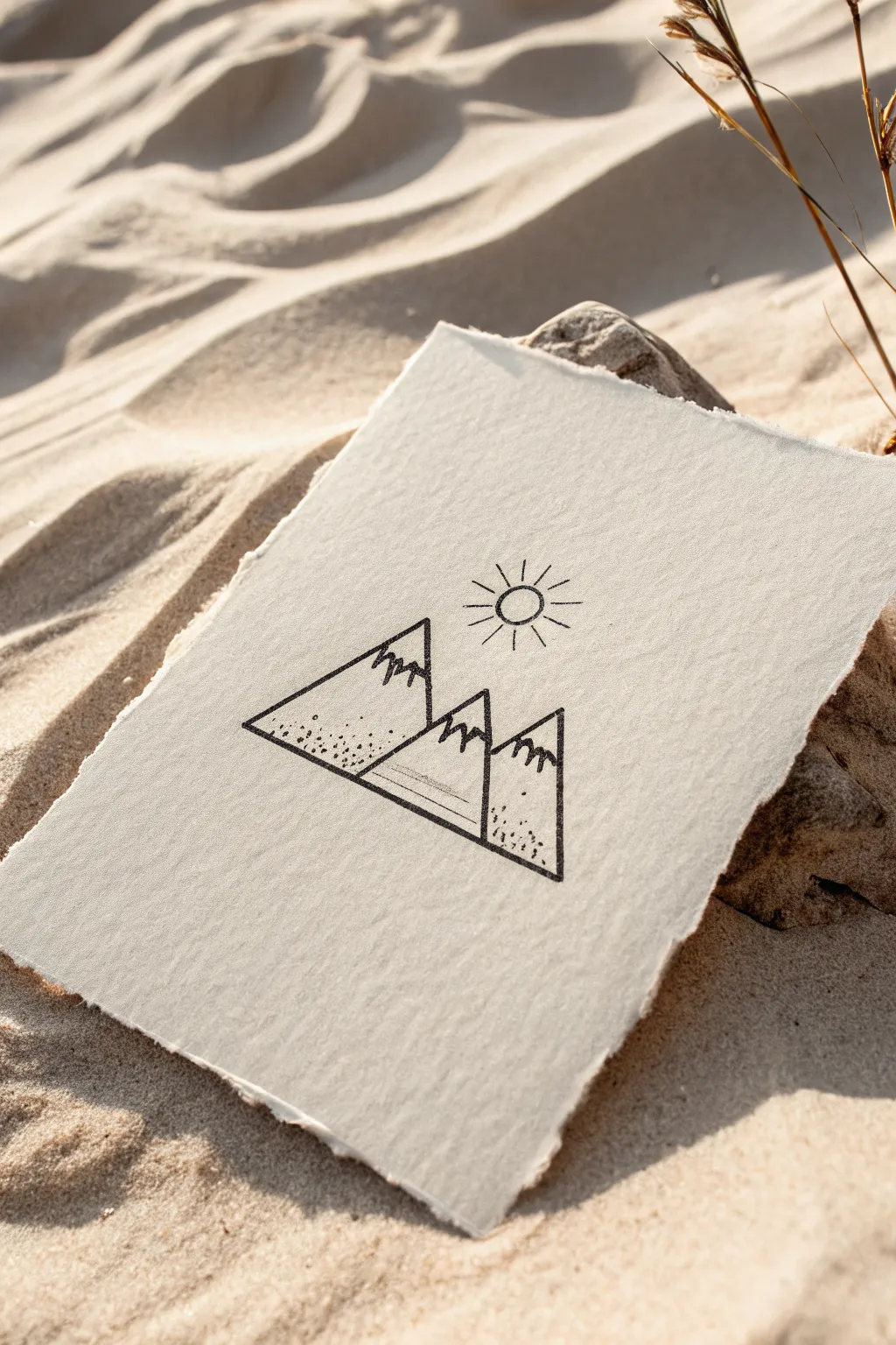
Capture the serenity of the outdoors with this clean, geometric mountain landscape. Using simple linework and subtle textures on handmade paper creates a charmingly rustic yet modern piece of art.
How-To Guide
Materials
- Heavyweight textured paper with deckled edges (like cotton rag paper)
- Fine liner pen (01 or 03 size, black ink)
- Thicker graphic pen (05 or 08 size, black ink)
- Pencil (HB or H)
- Soft eraser
- Ruler (optional, but helpful for crisp lines)
Step 1: Planning the Layout
-
Establish the horizon:
Begin by lightly sketching a horizontal baseline with your pencil. This will determine the bottom width of your mountain range. It doesn’t need to run edge-to-edge; keep it centered to leave breathing room on the sides. -
Draft the first peak:
Draw a large triangle on the left side of your baseline. Make the left slope long and the right slope slightly steeper. This will be your primary mountain anchor. -
Add the middle peak:
Sketch a second, taller triangle directly next to the first one. Let the left side of this new triangle intersect with the right slope of your first mountain, creating a sense of depth. -
Complete the range:
Draw the third and final triangle on the far right. This one should be similar in height to the first one, balancing the composition. Ensure its base aligns with the others. -
Position the sun:
Hover your pencil above the central peak’s summit. Lightly sketch a small, perfect circle for the sun, centered slightly between the middle and right peaks.
Uneven Lines?
If your hand shakes, embrace it. On textured paper, a slightly wobbly line looks organic and intentional. Just keep the pen moving at a steady speed.
Step 2: Inking the Mountains
-
Outline the main shapes:
Switch to your thicker graphic pen (05 or 08). Trace the main triangular outlines of the mountains confidently. I find it helps to pull the pen toward you rather than pushing it away for straighter lines. -
Define the overlaps:
Pay close attention to where the mountains overlap. Stop your line when you hit the slope of the mountain in front, so the foreground peak clearly sits ahead of the background peak. -
Create the snowcaps:
Using the same thick pen, draw jagged, zig-zag lines near the top of each triangle. These don’t need to be uniform; variety makes them look more like rugged snow lines. -
Ink the sun:
Carefully trace the circle of the sun. If you aren’t confident doing this freehand, trace a small coin or button. -
Draw the sun rays:
Add short, straight lines radiating outward from the sun. Space them evenly around the circumference, keeping them roughly the same length for a graphic look.
Step 3: Adding Textural Details
-
Switch pens:
Change to your finer liner pen (01 or 03). The contrast in line weight is the secret to making this drawing pop. -
Add stippling texture:
On the bottom left corner of the first mountain, add a cluster of small dots. Keep them dense near the corner and let them spread out and fade as they move upward and inward. -
Texturize the other peaks:
Repeat this stippling process on the bottom right corners of the middle and right mountains. This suggests rocky terrain or shadows at the base. -
Detail the central slope:
On the shaded side of the central peak (the lower left area), draw fine horizontal hatching lines. Keep these lines thin and parallel to show shadow without overpowering the shape.
Paper Choice Matters
For this specific look, use cotton rag or cold-press watercolor paper. The rough ‘tooth’ breaks up the ink line slightly, giving it that vintage character.
Step 4: Finishing Touches
-
Check line connections:
Look closely at your corners and intersections. If any ink lines don’t quite meet, extend them carefully with the fine pen to close the gaps. -
Let the ink set:
Wait firmly for at least 5-10 minutes. Textured paper can hold ink longer than smooth paper, and smudging at this stage is heartbreaking. -
Erase guidelines:
Gently erase your initial pencil sketches. Hold the paper taut with one hand so the textured surface doesn’t buckle under the eraser.
Now you have a serene piece of mountain art perfect for a desk frame or a thoughtful card
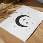
Crescent Moon and Stars Outline
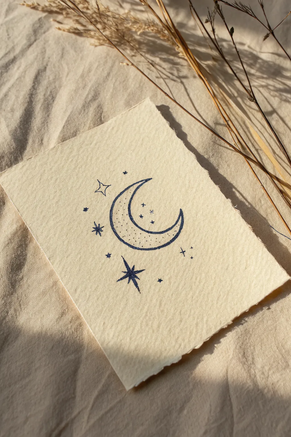
Capture the magic of the night sky with this minimalist line art project featuring a crescent moon surrounded by twinkling stars. The textured paper and deep blue ink give it a charming, hand-crafted feel perfect for a journal insert or wall art.
Step-by-Step Tutorial
Materials
- Cream or off-white watercolor paper (cold press creates texture)
- Deep indigo or navy blue fine liner pen (01 or 03 size)
- Pencil (HB or 2H)
- Kneaded eraser
- Ruler (optional)
- Deckle edge ruler or scissors (optional for finishing)
Step 1: Preparation & Sketching
-
Paper selection:
Begin with a small rectangular piece of cream-colored cold press watercolor paper. The heavy texture is crucial for achieving that rustic, speckled line look seen in the reference. -
Outline the crescent:
Lightly sketch a large ‘C’ shape in the center of your paper with a pencil. Make the curve deep and elegant, ensuring the bottom tip curves upward nicely. -
Refine the moon shape:
Sketch the inner curve of the moon to connect the two tips. The moon should be thickest in the lower-middle section, tapering to sharp points at the top and right tips. -
Place the main stars:
Position your largest star sketch below the moon to the left. Draw a simple cross, then add diagonal lines between the arms to create an eight-pointed star shape. -
Add secondary elements:
Sketch a four-pointed star (diamond style) to the upper left of the moon. This balances the composition against the larger lower star. -
Plan the scatter layout:
Lightly mark small dots or tiny crosses where you want the smallest filler stars to go. Keep them somewhat random but clustered around the moon’s curve.
Texture Trick
Don’t press too hard with your pen. Skimming the surface of cold-press paper allows the ‘valleys’ of the paper grain to stay white, creating a natural vintage texture.
Step 2: Inking the Moon
-
Initial moon outline:
Using your navy blue fine liner, carefully trace the outer edge of your moon pencil sketch. Go slowly to let the pen ink interact with the paper’s texture. -
Inner curve:
Trace the inner curve of the crescent. If your line breaks slightly due to the paper texture, leave it; that adds to the vintage character. -
Review line weight:
Go over the moon’s outline a second time to slightly thicken the line. I find that a bolder line here helps separate the main subject from the delicate stars. -
Stipple the interior:
Inside the moon shape, begin adding tiny dots (stippling). Concentrate the dots heavily at the bottom curve of the moon to create a shadow effect. -
Fade the stippling:
As you move upward toward the top tip of the moon, space the dots further apart until they fade into empty space, giving the moon dimension.
Make it Shine
Once the blue ink is dry, use a metallic gold gel pen or fine brush with gold watercolor to add tiny highlights inside the large solid star or along the moon’s curve.
Step 3: Detailing the Stars
-
Ink the large star:
Outline the large eight-pointed star below the moon. Fill in the shape completely with your blue ink for a solid, bold look. -
Define the open star:
Ink the four-pointed diamond star at the top left, but leave the interior empty (white) to contrast with the solid star below. -
Create starbursts:
Draw the medium-sized stars using a simple asterisk (*) shape or a cross with a dot in the center. Refer to your sketch for placement. -
Add tiny fillers:
Draw the smallest details: simple dots, tiny plus signs, and very small five-point stars scattered around the moon. -
Final clean up:
Wait at least 10 minutes for the ink to fully dry. Gently erase all visible pencil marks with a kneaded eraser to avoid damaging the paper surface. -
Create deckled edges:
To mimic the torn look in the photo, place a ruler against the paper edge and tear the excess paper away slowly towards you, leaving a rough, fibrous border.
Now you have a serene piece of celestial art ready to display or gift


Tiny House With Tree Outline
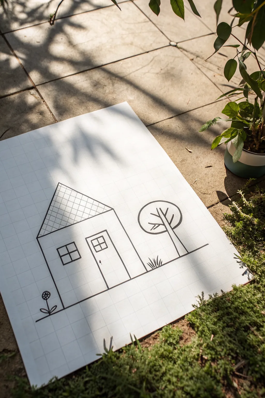
This charming, architectural-style sketch uses the structure of grid paper to create neat, clean lines without needing a ruler. It features a cozy tiny house and stylized nature elements for a balanced, minimalist composition.
How-To Guide
Materials
- Grid paper or graph paper (white)
- Black fine-liner pen (0.5mm is ideal)
- Pencil (HB or 2B)
- Eraser
- Ruler (optional, for longer straight lines)
Step 1: Setting the Scene
-
Establish the ground line:
Begin near the bottom third of your paper. Draw a long, horizontal straight line across the page to represent the ground. You can follow one of the horizontal grid lines to keep it perfectly level. -
Draft the house box:
On the left side of your ground line, draw a vertical rectangle for the base of the house. Use the grid squares to count your height and width—aim for a square or slightly tall rectangle shape. -
Add the roof slope:
From the top corners of your rectangle, draw two angled lines that meet at a central point above the middle of the house. This forms a classic triangle roof shape.
Grid Guide
Use the grid squares to measure proportions. For example, make the door exactly 2 squares wide and the window 2×2 squares.
Step 2: Structural Details
-
Draw the door frame:
Inside the house outline, slightly to the right of center, draw a vertical rectangle for the door using grid lines as guides. It should touch the bottom ground line. -
Create the window:
To the left of the door, add a square window. Keep it level with the top of the door frame for a balanced look. -
Divide the panes:
Inside the square window, draw a cross to create a simple four-pane look. Do the same for the top half of the door to make a windowed door style. -
Add the doorknob:
Place a tiny dot or small oval on the right side of the door, just below the window pane section.
Steady Hands
If your circle or long lines are shaky, try drawing rapidly; faster strokes tend to be straighter and smoother than slow ones.
Step 3: Roof Texturing
-
Draw diagonal lattice:
Inside the roof triangle, draw diagonal lines slanting from left to right, spaced evenly apart. -
Cross-hatch the roof:
Now, draw diagonal lines slanting the opposite way (right to left) across the first set. This creates a diamond-shaped grid pattern that mimics roof tiles or shingles.
Step 4: Nature Elements
-
Plant the tree trunk:
To the right of the house, draw two vertical lines rising from the ground for the tree trunk. The right line can extend up further than the left one to form the first branch. -
Outline the tree canopy:
Draw a large, perfect circle resting on top of the trunk lines. Since you are using grid paper, you can count squares from a center point to help keep your circle symmetrical. -
Branch out:
Inside the circle, draw a few ‘V’ shapes extending from the top of the trunk to suggest branches spreading out within the canopy. -
Add grass tufts:
Directly under the tree and between the house and tree, draw small, spiked ‘V’ shapes or zig-zags coming up from the ground line to represent tufts of grass. -
Sprout a flower:
On the far left side of the house, draw a short vertical stem. Add two overlapping ‘football’ shapes at the base for leaves. -
Finish the bloom:
Top the stem with a small circle. Draw lines radiating from the center of that circle to the outer edge, like a bicycle wheel, to create the flower petals.
Step 5: Final Touches
-
Ink the lines:
Once you are happy with your pencil sketch, carefully go over all lines with your black fine-liner pen. I find it helpful to rotate the paper slightly for easier hand movement on the long straight lines. -
Clean up:
Wait at least five minutes for the ink to dry completely to avoid smudging. Then, gently erase any visible pencil marks underneath your ink.
Now you have a neat, graphically pleasing little scene that showcases the beauty of simple lines
Hand Heart Gesture Outline
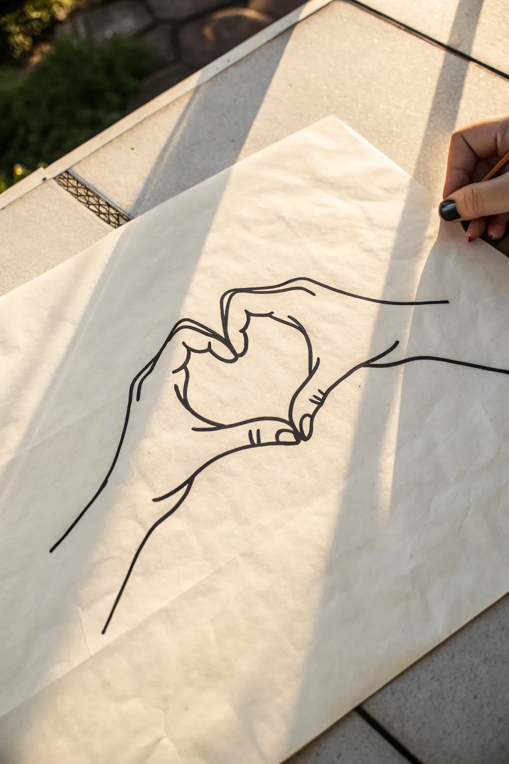
Capture a sweet gesture with this clean, minimalist line drawing of hands forming a heart. Using bold, confident strokes on simple paper, you’ll create a striking piece of contour art that looks effortlessly stylish.
Step-by-Step
Materials
- Smooth, off-white sketch paper or newsprint
- Pencil (HB or 2B)
- Eraser
- Black fine liner pen (0.5mm or 0.8mm)
- Black permanent marker or brush pen (for bolder lines)
Step 1: Sketching the Framework
-
Map the central heart:
Start very lightly with your pencil in the center of the page. Draw a rough, floating heart shape to establish the negative space that will be formed between the fingers. -
Outline the thumbs:
Drawing outwards from the bottom point of your invisible heart, sketch the curves of the thumbs meeting. The right thumb should hook underneath, while the left thumb sweeps down to meet it. -
Shape the index fingers:
Move to the top of the heart shape. Sketch the left index finger curving down to meet the right index finger. These fingers create the upper arches of the heart. -
Add the remaining fingers:
On the right hand, lightly indicate the middle, ring, and pinky fingers stacked below the index finger. Do the same for the left hand, ensuring they look relaxed and naturally curved. -
Connect the wrists:
Extend lines downwards and outwards from the base of the hands to form the wrists and forearms. Keep these lines long and sweeping to anchor the composition.
Confident Lines
For smoother lines, lock your wrist and move your whole arm. Creating the long swoops of the wrist and forearm in one go prevents shaky, jagged edges.
Step 2: Refining the Anatomy
-
Define the knuckles:
Go back over your finger outlines and add small bumps to indicate knuckles. I find that slightly exaggerating these joints makes the hands look more realistic and less like rubber gloves. -
Add fingernail details:
Sketch small, rounded trapezoids on the tips of the thumbs and visible fingers to suggest fingernails. Don’t close the shapes completely; leave them slightly open for a sketchier feel. -
Refine the contact points:
Look closely at where the fingers touch. Ensure the fingertips press against each other slightly, flattening the curves just a bit to show the pressure of the gesture. -
Check proportions:
Step back and look at your sketch. Make sure the wrists aren’t too thick or thin compared to the hands, and that the heart shape in the negative space is clear.
Wobbly Fingers?
If your fingers look like sausages, check the joints. Adding slight indentations at the knuckles and slight bulges between them adds instant anatomical structure.
Step 3: Inking the Final Lines
-
Start the main contours:
Switch to your black marker or brush pen. Begin with the outer contour of the left wrist, moving up the arm and around the pinky finger in one confident, slow stroke. -
Trace the inner heart:
Carefully ink the space where the fingers meet to form the heart. This is the focal point, so keep your line weight consistent here. -
Detail the finger joints:
Add small crease lines at the knuckles and where the thumbs bend. These distinct little marks give the drawing character and volume without shading. -
Ink the nails and wrinkles:
Switch to a slightly thinner fine liner if you have one, or just use a lighter touch. Outline the fingernails and add tiny creases on the knuckles. -
Complete the wrists:
Finish the drawing by inking the long lines of the arms, letting them trail off slightly at the edges of the paper for an artistic, open-ended look. -
Let the ink set:
Allow the ink to dry completely for at least a few minutes. Smudging fresh marker is the easiest way to ruin a clean line drawing. -
Clean up:
Gently erase all your underlying pencil sketches. Be thorough but careful not to crumple the paper as you rub.
Now you have a timeless, hand-drawn gesture ready to frame or gift to a loved one
Easy Eye With Lashes Outline
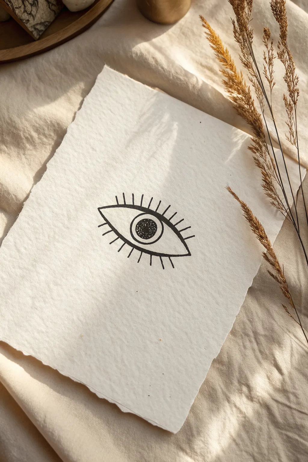
This striking, minimalist eye illustration proves that simple lines can create a powerful image. Using textured paper adds a lovely, organic feel to the stark black ink, making it perfect for modern wall art or a handmade card.
Step-by-Step Guide
Materials
- Deckle-edged textured paper (medium weight)
- Black ink fine liner pen (0.5mm or 0.8mm)
- Pencil (HB or H)
- Kneaded eraser
- Ruler (optional, just for spacing)
Step 1: Sketching the Foundations
-
Paper preparation:
Begin by selecting a piece of textured paper with a deckle edge if you want that rustic, handmade look from the photo. Place it on a smooth surface, ensuring good lighting. -
Find the center:
Lightly mark the center of your paper with your pencil to help position the eye symmetrically. -
Draw the upper lid curve:
Sketch a smooth, gentle arc for the upper eyelid. It should be relatively flat, not a high semi-circle, spanning about 3-4 inches across. -
Add the lower lid curve:
Connect the ends of your upper arc with a lower curve. This one should be slightly deeper and rounder than the top line, forming an almond shape. -
Outline the iris:
Draw a perfect circle in the center of the eye shape. Note that in this stylized design, the top and bottom of the circle don’t touch the eyelids; it floats in the middle. -
Add the pupil:
Inside the iris, draw a smaller circle for the pupil. Keep it centered to maintain that focused stare.
Ink Bleed Tip
Textured paper is porous! Test your pen on a scrap piece first. If it bleeds, switch to a pigment liner or move your hand faster.
Step 2: Inking the Outline
-
Trace the almond shape:
Using your black fine liner, carefully go over the pencil lines of the upper and lower eyelids. Use confident strokes to keep the line weight consistent. -
Ink the iris:
Trace the outer circle of the iris. If your hand shakes slightly, don’t worry—the textured paper helps hide minor imperfections. -
Ink the pupil:
Trace the inner pupil circle. Make sure this line is clean before you begin the filling process. -
Stipple the pupil:
Instead of coloring the pupil solid black, use a stippling technique. Dot your pen repeatedly inside the small circle until it appears dark gray or nearly black, giving it texture. -
Refine the corners:
Ensure the points where the upper and lower lids meet are sharp and clearly defined.
Step 3: Adding the Lashes
-
Mark lash positions:
Before inking, use your pencil to lightly mark where the lashes will go. This design features straight, spoke-like lashes rather than curved ones. -
Top eyelashes:
Draw the top lashes using the fine liner. Start from the eyelid line and draw straight lines upward. Make the center lashes the longest and slightly shorten them as you move toward the corners. -
Spacing the top lashes:
The example shows about 9-11 distinct lashes on top. Keep the spacing relatively even for that graphic, stylized look. -
Bottom eyelashes:
Repeat the process for the bottom lid. Draw straight lines extending downward. These are traditionally drawn slightly shorter than the top lashes. -
Final check and erase:
Wait for the ink to dry completely. I like to give it an extra minute just to be safe, then gently use the kneaded eraser to lift away any visible pencil guidelines.
Uneven Circles?
If freehand circles are tricky, trace a coin or a spool of thread for the iris to get that perfect geometric shape.
Now you have a piece of striking, modern art ready to be framed or gifted
Micro Landscape in a Circle

This minimal micro-landscape captures the peaceful essence of camping under the stars using clean lines and simple geometry. The design relies on high-contrast blue ink against beautifully textured handmade paper for a rustic, artisanal look.
Step-by-Step Tutorial
Materials
- Handmade deckle-edge paper (cotton rag preferred)
- Fine liner pen (Navy Blue, 0.5mm tip)
- Pencil (HB)
- Compass or small circular object (e.g., a jar lid)
- Eraser (kneaded preferred)
- Ruler
Step 1: Planning the Layout
-
Prepare your canvas:
Place your handmade paper on a flat, clean surface. Since deckle-edge paper can be bumpy, I recommend taping the corners gently with low-tack tape to keep it from shifting while you sketch. -
Draw the boundary:
Using a compass or a small circular object like a spice jar lid, lightly trace a perfect circle in the center of the paper using your HB pencil. Keep this line very faint as it will be inked later. -
Draft the tent:
Find the rough center of the lower half of your circle. Lightly sketch a triangle for the front of the tent. Add a second angled line coming off the right side to create the three-dimensional side panel of the structure. -
Add landscape elements:
Draw diagonal ground lines extending from the bottom corners of the tent to the circle’s edge. Then, lightly sketch vertical lines on either side of the tent to mark the trunks of the pine trees.
Ink Bleed Prevention
Handmade paper is porous. Test your pen on a scrap piece first. If it bleeds, use a slightly faster hand speed when drawing your final lines.
Step 2: Inking the Structure
-
Trace the circle:
Switch to your navy blue fine liner. Carefully trace over your pencil circle. Go slowly to manage the texture of the paper; if the pen skips due to the rough surface, pause and re-dot rather than dragging hard. -
Define the tent:
Ink the main triangle of the tent. Draw the center vertical line for the opening, but leave the flap area open for now. Ink the side panel line to complete the tent outline. -
Create the tent poles:
Extend two small lines crossing at the very top of the tent to represent the crossed wooden poles sticking out. -
Fill the entrance:
For the tent opening, draw the flaps pulled back and fill the dark triangular entrance with solid blue ink. I find using small, tight hatching strokes helps saturate the paper better than scribble filling.
Step 3: Adding Details
-
Draw the trees:
Ink the vertical tree trunks first. Starting from the top of the trunk, draw downward-sloping branches in a zigzag or tiered pattern. Keep the branches simpler near the top and wider near the bottom. -
Ground the scene:
Go over the diagonal ground lines. Instead of a single straight line, you can add a slight wobble to mimic uneven earth. -
Texture the ground:
Add a few small horizontal dashes in the foreground space below the tent. This simple stippling effect suggests grass or dirt without cluttering the sleek design. -
Sketch the moon:
In the upper left quadrant of the sky, draw a crescent moon. Ensure the crescent is thin and sharp. -
Add the stars:
Place two small four-pointed stars in the sky—one near the moon and one on the opposite side to balance the composition. Use simple crossed lines or tiny diamond shapes. -
Final dot:
Place a single small dot in the center of the sky area to act as a distant star, completing the celestial arrangement. -
Erase guidelines:
Allow the ink to dry completely for at least 15 minutes. This paper absorbs ink slowly, and smudging is a risk. Once dry, gently dab your kneaded eraser over the lines to lift the pencil marks without damaging the paper surface.
Circle Corrections
If your hand wobbles while tracing the circle, don’t try to fix it with a second line. Instead, thicken the entire circle outline slightly to hide the mistake.
Frame this delicate piece in a floating glass frame to show off those beautiful edges
Layered Wave Lines Outline
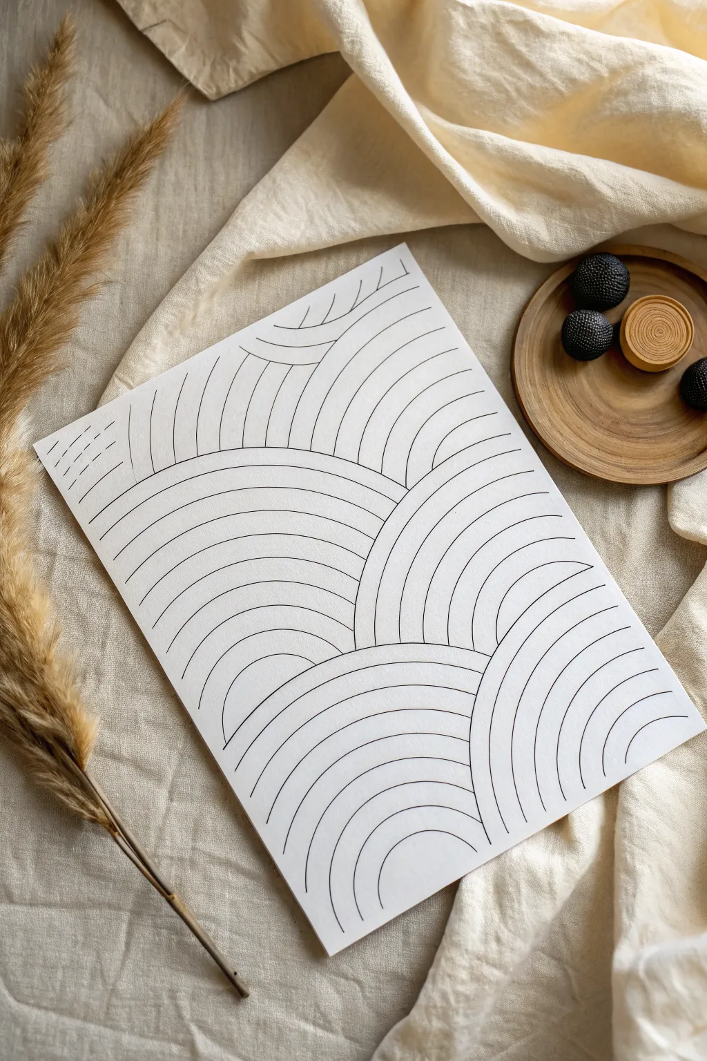
This soothing, geometric line art uses simple repetition to create a beautifully complex pattern of overlapping arches. It mimics the calming rhythm of waves or rolling hills, offering a meditative drawing experience perfect for beginners.
How-To Guide
Materials
- Smooth white heavyweight paper or cardstock (A4 or A5)
- Fine liner pen (Black, 0.5mm or 0.8mm)
- Pencil (HB or 2H)
- Eraser
- Compass or circular object (optional, for guidelines)
Step 1: Setting the Foundation
-
Visualize the layout:
Before putting pen to paper, look at your blank sheet. Imagine the composition as a series of hills stacking on top of each other. You want to start from the bottom right and work your way up towards the top left to create that sense of depth. -
Draft the bottom arch:
Using your pencil lightly, draw a large semi-circle starting at the bottom right corner. This doesn’t need to be perfect; it just marks the outer boundary of your first ‘wave’ cluster. -
Sketch the middle layer:
Draw a second, slightly larger semi-circle shape that originates from the left side of your first shape. Let it rise higher up the page, essentially sitting ‘behind’ that first hill. -
Map the upper sections:
Continue sketching these large dome shapes until you reach the top of the paper. You should have about 4-5 main sections sketched out lightly in pencil, creating a tiered landscape effect.
Wobbly Lines?
Don’t stress over perfect arcs. If your hand shakes, embrace it! Organic, slightly imperfect lines often make this pattern look more natural and hand-drawn.
Step 2: Inking the Waves
-
Start the first line:
Switch to your fine liner pen. I find a 0.5mm tip gives the crispest result here. Go to the bottom-most arch section you sketched. Draw the smallest, innermost semi-circle right at the base. -
Build the first cluster:
Draw a second parallel line above the first one, maintaining an even spacing of about 5-8mm. Keep your wrist loose to get a smooth curve. -
Complete the bottom section:
Continue adding parallel arches, expanding outward until you hit the pencil boundary of this section. Ensure lines end cleanly where they would technically touch the ‘ground’ or the paper edge. -
Begin the adjacent section:
Move to the arch section immediately to the left or above your finished one. Start its innermost curve. The key here is to stop your ink line exactly when it touches the outer line of the previous section, creating the illusion of overlap. -
Maintain consistent spacing:
As you fill this second shape with parallel lines, try to keep the gap between lines consistent with your first section. This uniformity is what makes the pattern look cohesive. -
Work upwards:
Repeat this process for the middle layers. Always draw the full curves, letting them ‘disappear’ behind the arches that are supposed to be in the foreground. -
Handle the top corners:
As you reach the top left, your curves might become flatter or get cut off by the paper edge more drastically. Just follow the natural trajectory of the curve off the page.
Add Pop
Fill every alternating stripe with black ink or a pastel color. This creates a bold, high-contrast look reminiscent of distinct rainbows or topographic maps.
Step 3: Refining the Details
-
Check line weights:
Look over your drawing. If some lines look too thin or shaky, go over them carefully a second time to thicken and smooth them out, but don’t overwork it. -
Connect gaps:
Inspect the intersections where one set of waves meets another. Make sure the lines actually touch the boundary line of the foreground shape; tiny gaps can break the illusion of depth. -
Erase pencil marks:
Once the ink is completely dry—give it a few minutes to be safe—gently erase all your original pencil guidelines. -
Clean up:
Brush away the eraser dust carefully so you don’t smudge the fresh ink.
Now you have a piece of modern, minimalist art ready to be framed or gifted
Continuous One-Line Face Profile
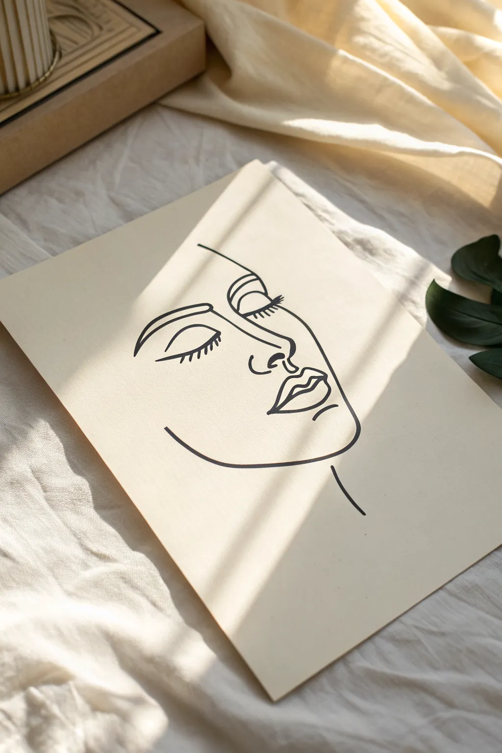
Capture the calm elegance of a sleeping face with this simple yet sophisticated outline drawing. Using confident, flowing strokes, you’ll create a piece of modern art that relies on negative space as much as the ink itself.
Step-by-Step Guide
Materials
- High-quality cream or off-white cardstock (A4 or similar size)
- Black fine-liner pen (0.5mm tip)
- Black brush pen or thicker marker (for varying line weight)
- HB Pencil
- Soft eraser
- Ruler (optional for centering)
Step 1: Planning the Profile
-
Set the workspace:
Clear a flat, well-lit surface. Tape down the corners of your cream cardstock lightly if it has a tendency to curl, ensuring it stays perfectly flat while you work. -
Visualize the center:
Look at the center of your page. The majority of the face will occupy the middle and lower-right quadrant. You can lightly mark the center point with your pencil if it helps orient you. -
Rough sketch: The forehead:
With your HB pencil, very lightly sketch a sloping curve starting near the top left-center. This curve will act as the hairline and brow connection. -
Rough sketch: The nose:
Continue your pencil line down from the brow, forming the bridge of the nose. Curve it outward slightly, then hook it underneath to define the nostril area. -
Rough sketch: The lips:
Below the nose, sketch the fullness of the lips. This style exaggerates the upper lip’s contour and keeps the bottom lip simple and rounded. -
Rough sketch: The jawline:
Draw a strong, sweeping curve starting from below the chin area, moving upward and outward to suggestion the cheek and jawline, stopping before you reach the ear area. -
Placement of eyes:
Lightly mark the position for the closed eyes. The left eye (viewer’s left) should be just below the brow line, and the right eye sits closer to the nose bridge.
Step 2: Inking the Outline
-
Test your pens:
On a scrap piece of paper, test both your fine-liner and your thicker marker to ensure the ink flows smoothly without skipping. -
Begin with the brow:
Using the thicker marker or brush pen, trace the left eyebrow. Start with a firm pressure and lift slightly at the end to taper the line. -
Draw the eyelids:
Switching to the fine-liner for precision, carefully draw the curves of the closed eyelids. Keep these lines smooth and arched. -
Add lashes:
With the fine-liner, add small, quick flicks downward from the eyelid curves to create eyelashes. I like to vary the length slightly for a more natural look. -
Define the nose profile:
Go back to your thicker pen. Trace the bridge of the nose, ensuring the line is confident. Pause briefly at the tip to change direction for the nostril. -
Detailed nostril:
Use the fine tip to add the small loop or curve that defines the side of the nostril, connecting it visually to the heavier nose line. -
Sculpt the lips:
Use the thicker pen for the lips. Outline the cupid’s bow sharply, then sweep down. Leave a small gap between the upper and lower lip lines to keep the drawing airy. -
Trace the jaw:
Execute the jawline in one smooth, confident motion with the thicker pen. This is the longest continuous stroke, so breathe out as you draw to keep your hand steady. -
Add the neck:
Draw a single, floating line below the jaw to suggest the neck. It doesn’t need to connect to the head; isolation makes it look more artistic.
Jittery Hands?
Don’t worry if your lines aren’t perfectly straight. A little wobble adds ‘organic’ character to line art. If you mess up a curve, just thicken the line slightly to hide the deviation.
Step 3: Refining
-
Check line weights:
Look over the drawing. Use the thicker pen to go over any areas that feel too thin, specifically along the cheekbone or the underside of the refined jawline. -
Let it dry:
Wait at least 15 minutes for the ink to dry completely. Smudging black ink on cream paper is difficult to fix, so patience is key here. -
Erase guidelines:
Gently erase your initial pencil sketch. Hold the paper taut with one hand while erasing with the other to prevent the paper from buckling.
Paper Choice Matters
For that warm, gallery-style aesthetic shown in the photo, avoid stark white printer paper. Choose a textured cardstock in ‘ivory’, ‘cream’, or ‘bisque’ tones.
Frame your new minimalistic masterpiece or lean it against a wall for an instant touch of modern elegance

Have a question or want to share your own experience? I'd love to hear from you in the comments below!