
When you’re craving fresh pencil sketch ideas, it helps to have a mix of classic go-tos and a few playful twists that keep your graphite practice interesting. Here are my favorite sketch prompts that let you explore line work, shading, and texture without needing a complicated setup.
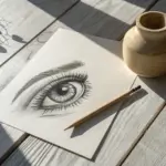
Realistic Eye Close-Up
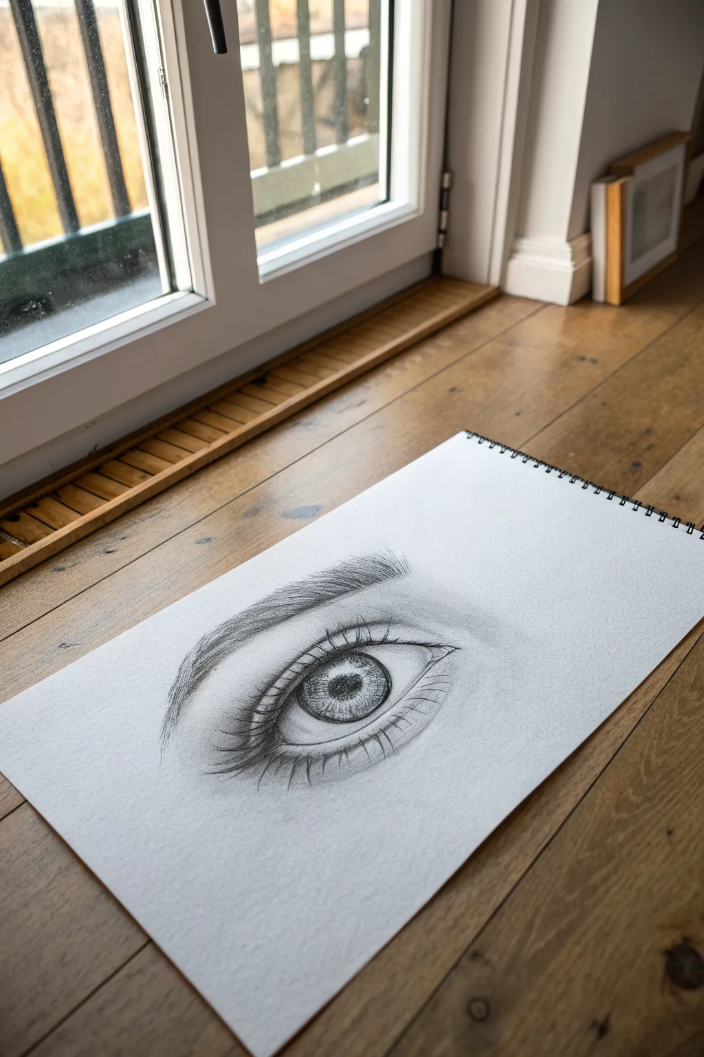
Master the art of graphite realism with this striking close-up of a human eye. You’ll create incredible depth through subtle shading, delicate eyelash strokes, and intricate iris detailing that seems to gaze right back at you.
How-To Guide
Materials
- High-quality sketchbook paper (smooth or medium tooth)
- Graphite pencils (H for outlines, HB for mid-tones, 2B/4B for darks)
- Mechanical pencil (0.5mm, HB or 2B) for fine details
- Kneaded eraser
- Blending stump or torture
- Soft tissue or cotton swab
Step 1: Structural Outline
-
Draw the basic almond shape:
Begin with a light H pencil. Sketch a gentle, horizontal almond shape. Keep the upper curve slightly more pronounced than the lower curve to create a natural, relaxed eye shape. -
Place the iris satellite:
Draw a large circle for the iris. Ensure the top third of this circle is cut off by the upper eyelid line, as the full iris is rarely visible unless the subject is surprised. -
Mark the pupil and highlights:
In the exact center of your iris, draw a smaller circle for the pupil. Immediately mark out a small, irregular shape (often rectangular or oval) near the pupil to reserve pure white paper for the reflection highlight. -
Define the tear duct and lids:
Extend the inner corner into a small, fleshy tear duct curve. Add a second line slightly above the top lash line to indicate the eyelid crease, following the same curve. -
Block in the eyebrow:
Lightly sketch the general shape of the eyebrow above the eye. Don’t draw individual hairs yet; just establish the arch and thickness.
Step 2: Shading and Depth
-
Darken the pupil area:
Switch to a 4B pencil. Fill in the pupil, pressing firmly to get a deep black, but carefully avoid the highlighted reflection shape you marked earlier. -
Detail the iris spokes:
Using a sharp HB or mechanical pencil, draw lines radiating from the pupil outward toward the iris edge like bicycle spokes. Vary the length and pressure to create a fibrous texture. -
Shade the iris rim:
Darken the outer ring of the iris. Blend slightly inward so there is no harsh outline, just a soft gradient moving toward the center. -
Add the drop shadow:
The upper eyelid casts a shadow on the eyeball. Lightly shade the top portion of the iris and the white of the eye (sclera) just under the upper lid using a blending stump for softness. -
Shade the sclera:
The white of the eye isn’t flat white. Add very faint shading to the corners of the eyeball to make it look spherical, leaving the center area brightest.
Uneven Shading?
If your skin shading looks scratchy, use a blending stump in small circular motions. Don’t press too hard; layer gently. A final dab with a kneaded eraser can lift excess graphite.
Step 3: Skin and Hair Texture
-
Contour the eyelids:
Shade the crease above the eye. Use an HB pencil to lay down graphite, then smudge with a tissue to create smooth skin transitions without visible pencil strokes. -
Draw upper eyelashes:
Using a mechanical pencil or sharp 2B, flick curved lines upward from the upper rim. I find it helps to start the stroke with pressure and lift off quickly at the tip to create a tapered hair. -
Group the lashes:
Natural lashes often stick together. Draw some hairs crossing over others or originating from the same point to create realistic clumps rather than a picket fence look. -
Add lower eyelashes:
Repeat the process for the lower lid. These hairs should be shorter, sparser, and slightly lighter in tone than the upper lashes. -
Detail the eyebrow hairs:
Fill in your eyebrow guide with short, angled strokes. Follow the natural growth direction: upward at the inner corner, turning horizontal across the arch, and downward at the tail. -
Final contrast check:
Go back with your darkest pencil (4B) to deepen the pupil, the lash roots, and the darkest part of the eyebrow. Use the kneaded eraser to pick out tiny highlights in the tear duct and iris texture.
Pro Tip: Reflections
Make the eye look wet by adding a tiny secondary highlight in the tear duct area. Keep your eraser extremely sharp or pointed to lift out this miniscule dot of white.
Step back and admire the intense gaze you have captured on the page


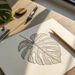
Leaf Study With Veins and Edges
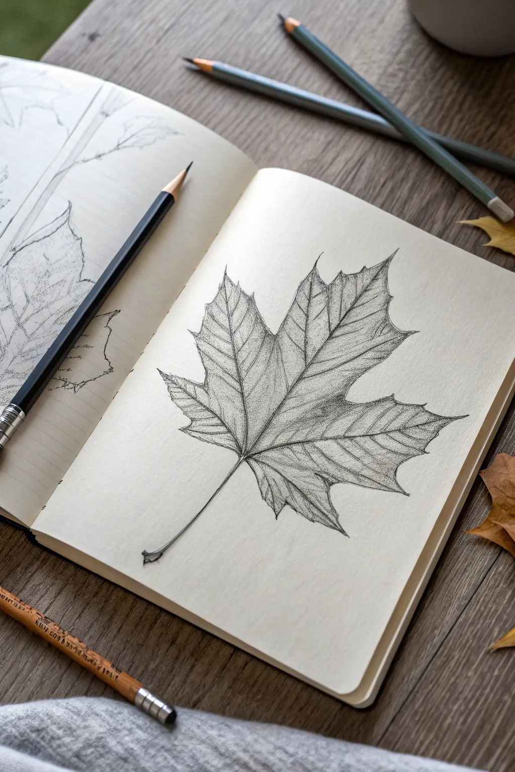
Master the art of botanical observation with this realistic leaf study that focuses on capturing intricate vein networks and delicate edge details. You will learn to build up graphite layers to create depth, making the leaf appear to lift right off the sketchbook page.
Step-by-Step Guide
Materials
- High-quality sketchbook paper (smooth or medium grain)
- Set of graphite pencils (HB, 2B, 4B, 6B)
- Kneaded eraser
- Precision mechanical pencil (0.5mm) for fine veins
- Blending stump or tortillon
- Paper tissue for softening
Step 1: Laying the Composition
-
Mark the boundaries:
Begin by lightly marking the top, bottom, and extreme side points of your leaf on the page using an HB pencil. This ensures your drawing stays centered and proportional. -
Draw the main axis:
Sketch a swooping, slightly curved line down the center to represent the primary midrib of the leaf and the stem. -
Map the lobes:
From the connection point near the stem, sketch five main directional lines radiating outward to define where the main lobes of the maple leaf will sit. -
Outline the silhouette:
Connect the tips of your radiating lines with a faint, geometric outline to establish the general shape of the leaf before adding any detail.
Step 2: Refining Shape and Edges
-
Carve the serrations:
Using a sharpened HB or mechanical pencil, go over your outline and draw the characteristic jagged, serrated edges of the leaf. -
Vary the edge pressure:
As you draw the serrations, press slightly harder in the ‘valleys’ between points and lighter on the tips to simulate light hitting the edge. -
Define the stem:
Thicken the bottom stem, flaring it slightly where it was attached to the branch, and give it a woody texture with tiny, broken lines. -
Clean up the guides:
gently erase your initial geometric guide lines with a kneaded eraser, leaving only the clean serrated outline.
Smudge Patrol
Graphite loves to smear. Place a scrap piece of paper under your drawing hand to protect your finished work while you shade the lower sections.
Step 3: Structured Veining
-
Draw primary veins:
Rework the central midrib and the main veins traveling into each lobe, making them double-lined at the base and tapering to a single line near the tips. -
Add secondary veins:
Branching off the main veins, sketch the secondary network. Keep these lines very light and angular, roughly mirroring each other. -
Create the micro-network:
For extreme realism, use your sharpest pencil to faintly suggest the tiny tertiary veins between the secondary ones, resembling a spiderweb texture.
Autumn Texture
To make the leaf look dried or crunchy, avoid smooth blending. Instead, use cross-hatching and stippling to create a brittle, uneven surface texture.
Step 4: Shading and Texture
-
Establish a light source:
Decide on a light direction (the reference suggests top-left), meaning shadows will fall on the bottom-right sides of the veins and lobes. -
Base shading:
Using the side of a 2B pencil, apply a light, even layer of graphite over the leaf surface, avoiding the veins themselves to keep them highlighted. -
Deepen the shadows:
Switch to a 4B pencil and darken the areas where the leaf surface dips near the veins. I like to imagine the leaf is like a landscape of hills and valleys. -
Blend for smoothness:
Use a tortillon or blending stump to gently rub the graphite, smoothing the texture but being careful not to smudge your crisp vein lines. -
Lift highlights:
Take your kneaded eraser and pinch it into a fine point. Dab or stroke along the tops of the veins to lift pigment and make them pop against the darker leaf tissue. -
Darkest accents:
Use a 6B pencil to add high-contrast darks in the deepest crevices and right under the overlapping folds of the lobes to enhance the 3D effect. -
Final edge check:
Review the outer contour one last time, sharpening any serrated tips that got fuzzy during the blending process.
Now you have a beautifully rendered botanical study that captures the organic complexity of nature.


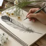
Feather Texture Practice
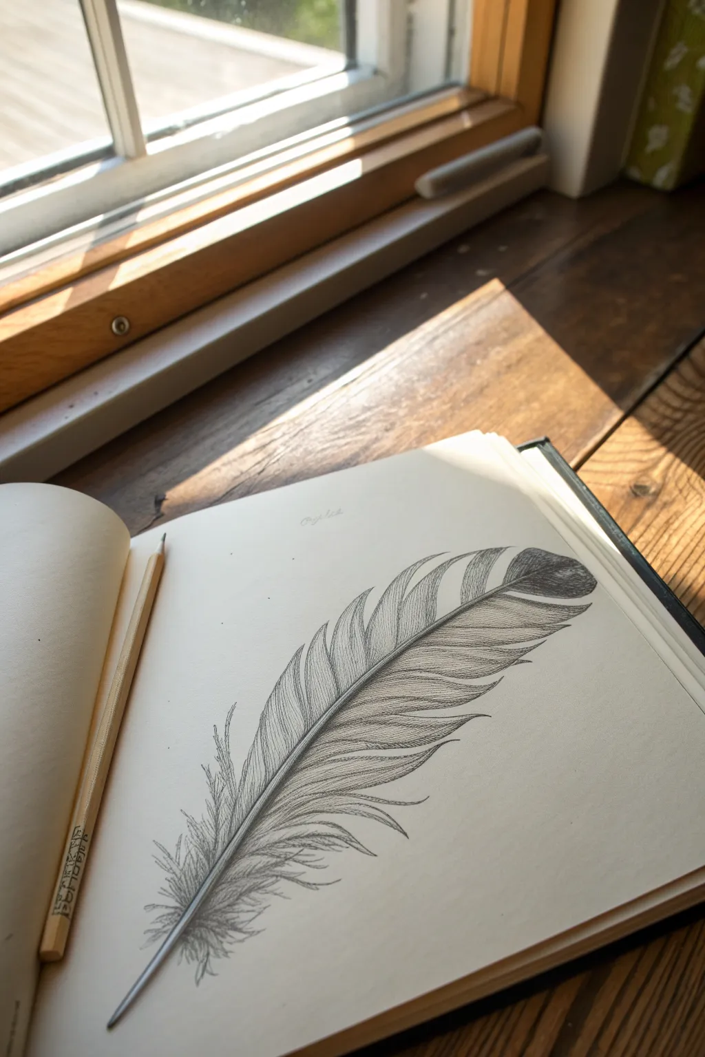
Mastering the delicate nature of a bird’s feather is a fantastic exercise in patience and line control. In this study, you’ll focus on separating individual barbs and capturing the soft gradient from the central shaft to create a lighter-than-air effect.
Detailed Instructions
Materials
- Sketchbook with smooth or medium-tooth paper
- HB graphite pencil (for initial outlines)
- 2B or 4B graphite pencil (for shading and depth)
- Fine-point mechanical pencil (optional, for details)
- Kneaded eraser
- Blending stump or tissue
- Ruler (optional, for the shaft guide)
Step 1: Laying the Foundation
-
Establish the curve:
Start by lightly drawing a long, gentle S-curve across your page with your HB pencil. This will serve as the central shaft (rachis) of the feather. -
Thicken the shaft:
Go back over your initial line and add a second line right next to it, tapering it to a very fine point at the top tip and leaving it slightly thicker at the bottom quill (calamus). -
Define the outer shape:
Lightly sketch the general silhouette of the feather around the shaft. Don’t worry about individual hairs yet; just focus on the overall oval or teardrop shape, keeping it slightly asymmetrical. -
Mark the splits:
Look closely at your reference or the example image. Notice where the feather separates naturally. Mark these triangular gaps lightly along the edge of your silhouette to remind yourself not to draw lines there later.
Step 2: Developing the Texture
-
Start the barbs:
Using a sharper point, begin drawing the individual barbs extending from the central shaft outward. Start from the top where the barbs are shortest and tighter. -
Directional flow:
Ensure your pencil strokes curve upwards and outwards. The angle should be steep near the top and become more perpendicular to the shaft as you move down. -
Fill the upper section:
Continue filling in the top half of the feather. Keep your lines close together but distinct—you want texture, not a solid block of grey. -
Create variation:
As you draw the barbs, vary your pressure slightly. Press harder near the shaft and lift off as you reach the edge to create a wispy, natural look. -
Mind the gaps:
When you reach the areas you marked as splits earlier, stop your lines abruptly or curve them slightly inward to show the separation in the vanes. -
Tackle the downy base:
At the very bottom of the feather, near the quill, change your stroke style. Instead of structured parallel lines, use scribbly, chaotic, and soft strokes to represent the fluffy down feathers.
Uneven Strokes?
If your feather lines look too mechanical or uniform, try holding the pencil further back on the barrel. This loosens your wrist and creates more organic, tapered strokes.
Step 3: Refining and Shading
-
Darken the shaft base:
Switch to your softer pencil (2B or 4B). Darken the shadow side of the central shaft to make it look cylindrical and round rather than flat. -
Add core shadows:
Identify the darker bands in the feather pattern, particularly near the top tip and along the middle section. Gently layer darker strokes over your existing lines in these areas. -
Deepen the contrast:
I find that adding a very dark accent right where the barbs meet the shaft helps ‘pop’ the structure. Use the sharp tip of your 4B pencil here. -
Soft blending (optional):
If parts look too scratchy, lightly dab—don’t rub hard—with a blending stump or tissue to soften the transition between light and dark areas. -
Highlight recovery:
Take your kneaded eraser and pinch it into a wedge. Dab away graphite along the top of the central shaft to create a crisp highlight. -
Final fluff:
Add a few stray, loose hairs sticking out from the main shape, especially near the bottom, to break the perfection and add realism.
Try Watercolor
Once the sketch is done, add a light wash of diluted watercolor over the drawing. The graphite will create a beautiful resist effect, adding a soft tint to your feather.
Take a moment to appreciate the delicate texture you’ve built up on the page


Cute Pet Portrait in Simple Shapes
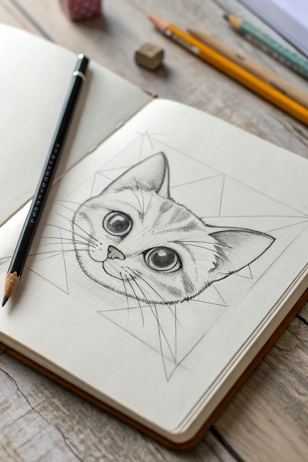
Capture the charm of a feline friend by combining structured geometric guides with soft, realistic shading details. This sketch focuses on expressive, oversized eyes and delicate fur textures, framed artfully within a constellation of faint pencil lines.
Step-by-Step Tutorial
Materials
- High-quality sketchbook paper (smooth or light grain)
- H pencil (for initial guidelines/underdrawing)
- HB or 2B pencil (for main outlines and mid-tones)
- 4B or 6B pencil (for dark pupils and deep shadows)
- Kneaded eraser
- Precision eraser or eraser shield
- Blending stump (tortillon)
Step 1: Setting the Geometric Foundation
-
Draw the central axis:
Begin with a sharpened H pencil and very light pressure. Draw a vertical line down the center of your page to act as the symmetry guide for the cat’s face. -
Construct the main triangle:
Sketch a large, inverted triangle. The top horizontal line will span the width of the ears, and the bottom point marks where the chin will rest. Keep these lines faint, as they are part of the artistic ‘scaffold’ visible in the final piece. -
Add intersecting shapes:
Overlay a second, upright triangle that intersects the first one, creating a star-like hexagram shape. This adds that trendy geometric aesthetic seen in the reference image. -
Place eye markers:
Draw a horizontal line across the center of the inverted triangle. On this line, sketch two large circles for the eyes, ensuring they are spaced evenly from the center axis.
Step 2: Outlining the Features
-
Define the head shape:
Switch to an HB pencil. Inside your geometric frame, lightly sketch the contour of the cat’s head. Focus on round cheeks and pointed ears that align with the upper corners of your initial triangle. -
Sketch the nose and mouth:
Place a small, soft triangle for the nose just below the eye line. From the bottom of the nose, draw two curving lines outward to form the mouth, creating a slight smile. -
Detail the eyes:
Refine the eye circles. Add the inner corners (tear ducts) pointing downward towards the nose. Sketch large, round pupils inside, leaving small white circles near the top right of each pupil for highlights. -
Outline the ears:
Darken the ear outlines. Add inner lines to show the fold of the ear cartilage, giving them depth and structure.
Uneven Eyes?
Turn your drawing upside down to check symmetry. If one eye looks skewed, lightly erase and adjust the shape while inverted—it tricks your brain into seeing the forms objectively.
Step 3: Shading and Texture
-
Darken the pupils:
Use a 4B or 6B pencil to fill in the pupils. Press firmly to get a deep black, but be extremely careful to leave the highlight circles completely white. -
Shade the iris:
With an HB pencil, shade the iris around the pupil. Use short, radiating strokes from the pupil outward to mimic the texture of an eye. Keep the area under the upper eyelid slightly darker. -
Contour the eyes:
Thicken the upper lash line with a 2B pencil to make the eyes pop. Add faint crease lines above the eyes to imply eyelids. -
Start the fur texture:
Using the tip of your pencil, add short, quick strokes to suggest fur on the forehead. Follow the direction of hair growth—upward and outward from the center. -
Define the tabby markings:
Sketch the characteristic ‘M’ shape on the forehead using clustered pencil strokes. Add stripe details on the cheeks, keeping the strokes loose and feathery. -
Shade the nose:
Lightly shade the nose pad, leaving the top edge slightly lighter. Darken the nostrils for depth. -
Add chin and cheek fluff:
Along the bottom jawline, use broken, jagged lines rather than a solid contour to simulate fluffy fur. I find this makes the cat look much softer and less cartoonish.
Keep it Clean
Place a scrap sheet of paper under your drawing hand. This prevents your palm from smudging the graphite you’ve already laid down, keeping those white areas crisp.
Step 4: Final Touches
-
Draw the whiskers:
Use quick, confident flicks of the wrist to draw long whiskers. Ensure they originate from the muzzle pads. Press harder at the root and lift off the paper at the tip for a tapered look. -
Refine geometric lines:
Go back to your initial geometric frame. You can choose to darken these lines slightly with a ruler for contrast, or leave them faint and ghostly. -
Clean up highlights:
Use a precision eraser or the sharp edge of a generic eraser to lift out any smudges in the eyes or on the white parts of the snout. -
Deepen contrast:
Do a final pass with your darkest pencil (4B/6B). Reinforce the darkest areas—usually the pupils, nostrils, and corners of the mouth—to anchor the drawing.
Step back and admire how the crisp geometric lines perfectly balance the soft, organic charm of your kitten sketch.

PENCIL GUIDE
Understanding Pencil Grades from H to B
From first sketch to finished drawing — learn pencil grades, line control, and shading techniques.
Explore the Full Guide
Bird on a Branch Value Study
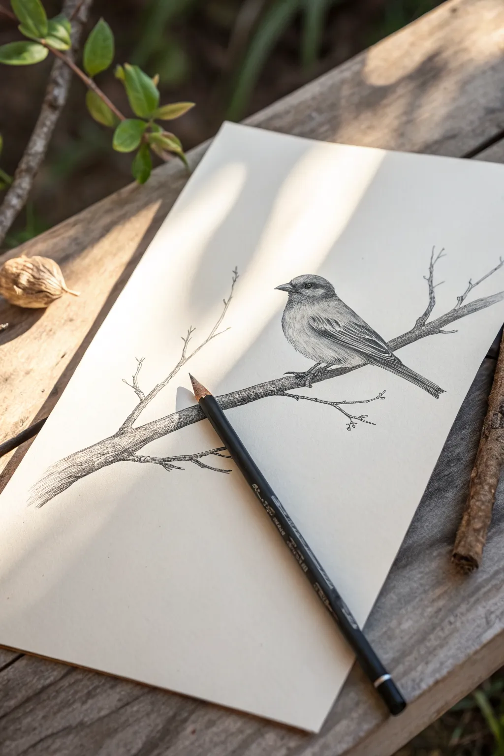
Capture the delicate texture of feathers and bark with this detailed pencil study. You will create a realistic composition featuring a small bird perched on a wizened branch, focusing on light, shadow, and fine linework.
Step-by-Step
Materials
- Smooth heavyweight drawing paper
- HB graphite pencil (for initial layout)
- 2B and 4B graphite pencils (for shading)
- Fine-point mechanical pencil (0.5mm, optional for details)
- Kneaded eraser
- Blending stump or tortillon
- Pencil sharpener
Step 1: Planning and Structure
-
Establish the branch angle:
Begin by drawing a faint diagonal line across the lower third of your paper. This will serve as the core axis for the main branch, angling slightly upward from left to right. -
Block in the bird shape:
Lightly sketch an oval shape sitting atop the branch line to represent the bird’s body. Add a smaller circle overlapping the top of the oval for the head. -
Refine the contour:
Connect the head and body shapes with smooth, curving lines. Sketch a small, triangular beak pointing left and mark the tail extending downward past the branch. -
Detail the branch structure:
Thicken the initial branch line, giving it an uneven width to simulate organic growth. Add two or three smaller, twig-like offshoots extending upward and outward from the main limb.
Keep it Sharp
Feather texture relies on precision. Sharpen your pencil frequently, or rotate the pencil slightly in your hand every few strokes to maintain a fresh edge.
Step 2: Defining the Bird
-
Place the eye:
Draw the eye as a small circle within the head. Leave a tiny white spec near the top sector of the eye to represent the highlight, which brings the bird to life. -
Map the wing feathers:
Sketch the major feather groups on the folded wing. Use long, sweeping curves that follow the contour of the bird’s back down toward the tail feathers. -
Shade the darks:
Switch to your 4B pencil. Darken the pupil around the highlight and shade the area just in front of the eye (the lores) to create depth. Darken the underside of the tail feathers. -
Texture the head:
Using short, rapid hatching strokes with an HB pencil, build up the texture on the crown and cheeks. Follow the curvature of the head to simulate soft downy feathers. -
Define the flight feathers:
Sharpen your 2B pencil to a fine point. Draw the individual edges of the wing feathers with firm, distinct lines, adding deeper shadows where the feathers overlap. -
Build body volume:
Lightly shade the bird’s belly using curved hatching strokes. Keep the pressure light in the center to suggest a rounded form catching the light.
Step 3: Rendering the Branch
-
Establish tree bark texture:
Return to the branch and use rough, irregular strokes running horizontally along the length of the wood. Vary your pressure to create the illusion of rough bark. -
Add core shadows:
Darken the underside of the main branch significantly with the 4B pencil. This anchors the bird and gives the wood a cylindrical, three-dimensional weight. -
Refine the twigs:
Go over the thin, twiggy offshoots with confident, dark lines. Add tiny nubs or buds at the tips to make them look distinct and brittle. -
Ground the bird:
Add a cast shadow explicitly where the bird’s feet grip the branch. Sketch the small claws hooking over the bark, ensuring they look like they are bearing weight.
Background Atmosphere
For a softer look, lightly rub graphite powder into the background with a tissue, then erase out leaf shapes to suggest a distant forest canopy.
Step 4: Final Polish
-
Assess values:
Step back and look at your drawing. Deepen the darkest blacks in the wing feathers and the eye to increase the overall contrast. -
Clean up highlights:
Use your kneaded eraser to lift off any graphite smudge from the background or the highlighted chest area of the bird to keep the image crisp.
Now you have a timeless nature study that captures the quiet stillness of the outdoors
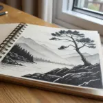
Simple Mountain Landscape With Atmospheric Depth
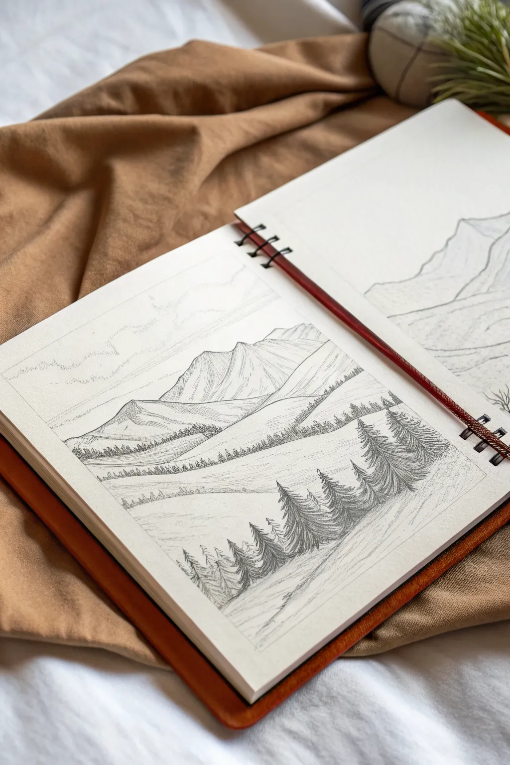
Capture the serenity of a mountain vista with this detailed pencil sketch that emphasizes depth and scale. By layering rolling hills and varying the size of your pine trees, you will create a convincing sense of distance that draws the viewer’s eye deep into the landscape.
Step-by-Step Guide
Materials
- Sketchbook or drawing paper (medium tooth)
- H pencil for initial layout
- HB or B pencil for general shading
- 2B or 4B pencil for dark accents
- Kneaded eraser
- Pencil sharpener
Step 1: Laying the Groundwork
-
Define the horizon:
Start with your H pencil. Lightly sketch a sweeping diagonal line about one-third of the way up from the bottom of the page. This will be the main slope where your foreground trees stand. -
Sketch the middle ground:
Above your first line, draw two or three more gentle, rolling curves. These shapes represent distant hills and valleys. Keep these lines faint as they are just guides for now. -
Outline the mountains:
In the upper third of the paper, sketch the jagged outlines of two major mountain peaks. Let them overlap slightly to create a sense of scale. -
Suggest the sky:
Very lightly sketch a few horizontal, uneven lines in the sky area to indicate faint cloud layers. These should be barely visible.
Step 2: Building the Mountains
-
Establish light direction:
Decide on a light source—in this case, coming from the upper left. This means the right sides of the mountains will be in shadow. -
Initial mountain shading:
Using an HB pencil, apply light, diagonal hatching to the shadowed side of the mountain peaks. Keep the strokes close together but not too dark yet. -
Refine the ridges:
Darken the dividing ridge lines where the light meets the shadow. Use sharper, slightly heavier strokes here to make the peaks look rugged. -
Add texture:
Add vertical striations down the mountain faces to mimic rock formations. I find that broken, uneven lines work best to suggest natural erosion.
Tip: Keep Points sharp
A sharp pencil is crucial for the tiny distant trees. Rotate your pencil slightly every few strokes to maintain a fine point without constant sharpening.
Step 3: Creating Depth with Trees
-
Middle ground tree line:
Along the curved hill line just below the mountains, sketch a row of very tiny, vertical triangular scribbles. These represent a distant forest. They should be small and uniform. -
Approaching the foreground:
On the next hill line down, draw slightly larger tree shapes. Use short, vertical strokes to suggest pine tree clusters, but don’t worry about individual branches yet. -
Foreground tree placement:
Switch to your 2B pencil. On the closest bottom slope, lightly mark the vertical center lines for your largest foreground pine trees. Place them on the right side to frame the view. -
Detailing the large pines:
Using short, downward strokes, build the branches of the foreground trees. Start narrow at the top and flare out wider at the bottom. Press harder to create dark contrast. -
Adding smaller foreground trees:
Sketch a few smaller pine trees to the left of the main cluster, varying their heights to keep the composition natural and interesting.
Smudging Trouble?
If your hand smears the graphite, place a clean scrap sheet of paper under your drawing hand. This acts as a shield and keeps your crisp lines clean.
Step 4: Atmosphere and Final Touches
-
Deepen the shadows:
Take your 4B pencil and darken the shadowed sides of the foreground trees. This high contrast pulls them forward visually, separating them from the lighter background. -
Shade the ground:
Lightly shade the ground around the base of the foreground trees using horizontal hatching. This grounds the trees so they aren’t floating. -
Soften the distance:
Use your kneaded eraser to tap lightly on the distant middle ground hills. Lightening these areas increases the atmospheric perspective, making them look further away. -
Define the clouds:
Go back to the sky and use very soft, scribbly strokes to define the bottom edges of the clouds, leaving the tops open and airy. -
Final assessment:
Scan your drawing for balance. If the mountains feel too light compared to the trees, add a second layer of hatching to the mountain shadows.
Now you have a serene mountain landscape with a wonderful sense of distance suitable for framing
BRUSH GUIDE
The Right Brush for Every Stroke
From clean lines to bold texture — master brush choice, stroke control, and essential techniques.
Explore the Full Guide
Portal Bridge Perspective Trick
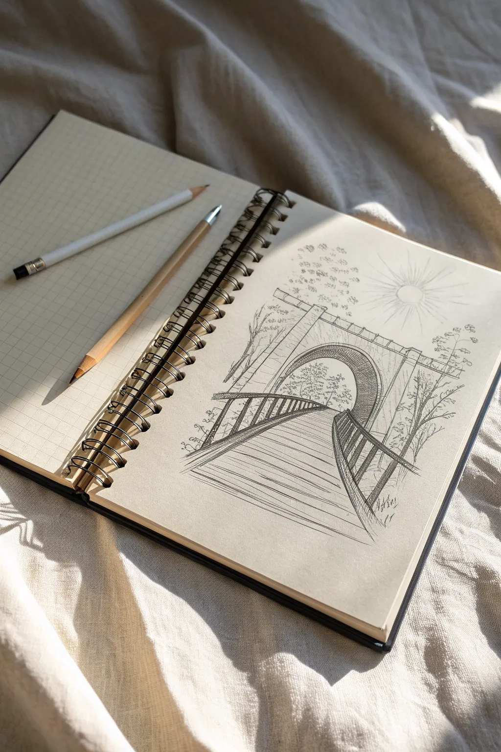
This perspective exercise creates a mesmerizing optical illusion where a wooden boardwalk seems to vanish into a massive stone archway. Using basic one-point perspective principles, you’ll sketch a scene that feels both structural and dreamlike on toned paper.
Detailed Instructions
Materials
- Spiral-bound sketchbook with toned/tan paper
- Graphite pencil (HB or B for sketching)
- Fine-point black ink pen or mechanical pencil
- Ruler or straight edge
- White colored pencil or white gel pen (optional for highlights)
- Eraser
Step 1: Planning the Structure
-
Establish the horizon:
Start by drawing a faint horizontal line across the middle of your page. This is your eye level. -
Place the vanishing point:
Mark a single small dot right in the center of your horizon line. Every major diagonal line in this drawing will converge here. -
Outline the portal:
Draw a large archway centered over the vanishing point. Keep the lines sketchy and light; you want the top rounded and the sides straight down to the ground. -
Draft the bridge boundaries:
From the bottom corners of your page, draw two diagonal lines that meet exactly at your vanishing point. These form the outer edges of the boardwalk. -
Add the railing guides:
Draw two more diagonal lines slightly inside the first ones, also converging at the center dot. These will become the tops of your handrails.
Wonky bridge lines?
If your boardwalk looks twisted, check your vanishing point. Every single diagonal line on the bridge must align perfectly with that center dot. Use a ruler to verify.
Step 2: Building the Details
-
Draw the arch dimensions:
Give the stone arch depth by drawing a second, smaller inner curve. Connect the bottom corners of the inner and outer arches with short diagonal lines leading toward the vanishing point. -
Sketch the planks:
Draw horizontal lines across the boardwalk path. Space them wider apart at the bottom of the page and closer together as they recede into the tunnel to exaggerate the distance. -
Construct the railings:
Add vertical posts along your railing guide lines. Like the planks, these posts should be taller and further apart in the foreground, getting smaller and closer together as they move away. -
Detail the stonework:
Using your fine-point pen or sharp pencil, draw small brick patterns on the face of the archway. Keep the bricks irregular to make it look old and weathered. -
Add nature elements:
Sketch loose, organic tree shapes on either side of the bridge and faintly inside the portal itself to suggest a world beyond.
Level Up: Atmospheric Depth
Make distant objects lighter and sketchier. Keep the foreground bridge lines bold and dark, but let the trees inside the tunnel fade out to create realistic depth.
Step 3: Shading and Finishes
-
Shade the tunnel interior:
Darken the inside of the archway significantly. I find that cross-hatching works well here to create a deep shadow, making the tunnel feel cavernous. -
Texture the wood:
Add light wood grain lines on the boardwalk planks. Ensure these grain lines conform to the perspective, flowing toward the center. -
Define the shadows:
Add cast shadows under the railing posts and beneath the archway rim to ground the structure. -
Draw the sun:
In the upper right corner, sketch a simple circle with radiance lines extending outward to balance the composition. -
Final darkening:
Go over your main structural lines—the bridge edges and the arch outline—with firmer pressure to make the drawing pop against the background.
Now you have a dynamic sketch that draws the viewer’s eye straight into the mysterious path you’ve created
Three-Panel Mini Sketch Series
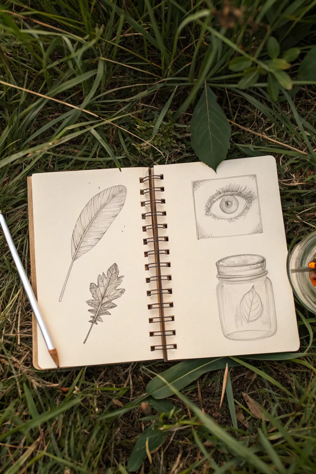
Capture the delicate beauty of the outdoors with this set of four nature-inspired pencil sketches. These studies—a feather, an oak leaf, a detailed eye, and a terrarium jar—focus on texture and shading to bring simple subjects to life.
How-To Guide
Materials
- Spiral-bound sketchbook (cream or off-white paper recommended)
- Graphite pencils (HB for outlines, 2B and 4B for shading, H for light details)
- Fine-point mechanical pencil (optional, for lashes and veins)
- Kneaded eraser
- Ruler (for the eye frame)
- Blending stump or cotton swap
Step 1: Left Page: Feather & Oak Leaf
-
Outline the feather:
Start near the top left of the page. Draw a long, slightly curved central shaft (rachis) that tapers to a fine point at the top. Sketch the overall oblong shape of the vane around it, keeping the bottom quill exposed. -
Add feather texture:
Using short, diagonal strokes, fill in the vane. Draw lines moving outward and upward from the central shaft to the edge. Leave a few small gaps along the edge to mimic natural separation in the barbs. -
Define the quill:
Darken the central shaft, making it thicker at the base and vanishingly thin at the tip. Add a slight shadow to one side of the quill to give it roundness. -
Draft the oak leaf shape:
Below the feather, sketch a central vein line for the leaf. Draw the lobed outline of an oak leaf, creating rounded protrusions on either side. Don’t worry about perfect symmetry; nature is rarely perfect. -
Detail the leaf veins:
Draw secondary veins branching from the center line into each lobe. Keep these lines lighter than your outline. -
Shade the leaf:
Apply light shading to the body of the leaf using hatch marks. I like to darken the areas near the central vein and the edges of the lobes created by the undulating surface to suggest depth.
Step 2: Right Page: The Eye
-
Create the frame:
On the top half of the right page, use a ruler to draw a neat square box. This acts as a viewfinder for the eye sketch. -
Sketch the eye placement:
Lightly draw the almond shape of the eye in the center of the box. Add the circular iris and the smaller pupil in the center. Mark a small highlight circle usually near the top right of the pupil; keep this stark white. -
Detail the iris:
Shade the pupil almost black. For the iris, draw radial lines from the pupil outward like spokes on a wheel. Darken the outer rim of the iris for contrast. -
Add lashes and skin folds:
Draw curved lines for the upper eyelid crease. Add eyelashes using quick, flicking motions—press down, then lift up quickly to create a tapered hair. Ensure the upper lashes are longer and thicker than the lower ones. -
Add subtle background shading:
Lightly shade the corners of the box around the eye to give the drawing context within the frame, fading out toward the pupil.
Uneven Shading?
If your pencil strokes look too scratchy, use a blending stump or a cotton swab to gently rub the graphite. This smooths out texture, perfect for the glass jar and the eye shading.
Step 3: Right Page: The Jar
-
Construct the jar:
Below the eye, draw an oval for the jar’s opening. Draw two vertical lines down for the sides, connecting them with a curved line at the bottom that matches the curvature of the top oval. -
Draw the rim:
Add the threaded rim details by stacking a few narrow ovals or curved bands at the top of the jar. Use horizontal hatching to suggest the metal texture. -
Insert the leaf inside:
Sketch a simple, teardrop-shaped leaf resting inside the jar. Because the glass distorts light, you can keep the leaf details slightly softer than the oak leaf on the opposite page. -
Render the glass:
This is crucial: draw vertical reflection lines along the sides of the jar. Shade the bottom curve heavier to show the glass thickness. Leave distinct vertical highlights unshaded to represent the glossy surface. -
Final touches:
Review both pages. Strengthen any outlines that got lost and use your eraser to clean up smudges outside the drawings.
Add Realism
Use a white gel pen to add sharp highlights over the pupil and the glass jar after shading. This high-contrast reflection immediately makes the sketch look glossy and realistic.
Now you have a charming collection of nature studies preserved in your sketchbook.


One-Line Sketch With Layered Shading
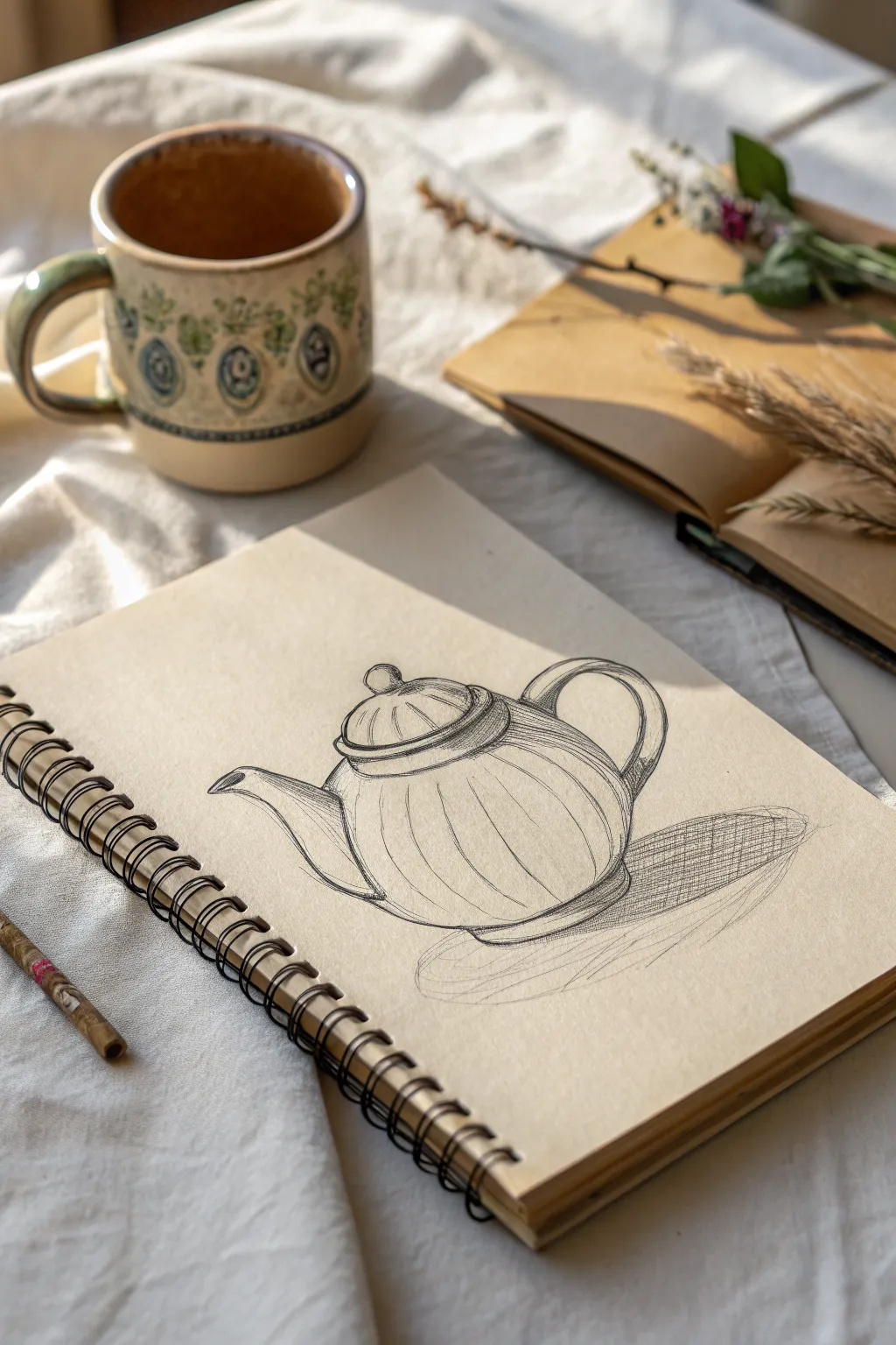
This charming sketch combines bold, confident contour lines with soft, cross-hatched shading to bring a simple teapot to life. The technique focuses on capturing the volume of the object through rounded hatching rather than blending, giving it a classic, illustrative quality.
Detailed Instructions
Materials
- Spiral-bound sketchbook with off-white or cream textured paper
- Graphite pencil (HB or B for sketching)
- Softer graphite pencil (2B or 4B for shading and bold lines)
- Kneaded eraser
- Pencil sharpener
Step 1: Basic Structure
-
Establish the central axis:
Begin by lightly drawing a vertical line down the center of your page to guide the symmetry of the teapot. -
Define the main body:
Sketch a large, slightly flattened oval intersecting the centerline. This forms the primary volume of the teapot’s belly. -
Add the lid shape:
Draw a smaller oval stacking on top of the main body for the lid. Make sure it arches upward like a dome. -
Position the spout and handle:
Lightly gesture the curve of the spout extending from the left side and the C-shape of the handle on the right. Keep these lines faint for now so they are easy to adjust.
Curve Your Hatching
Don’t draw straight lines for shading on a round object. Slightly curve your hatch marks to match the object’s form. This ‘contour hatching’ makes flat drawings look 3D immediately.
Step 2: Refined Contours
-
Outline the lid details:
Define the knob on top of the lid with a small circle. Draw the rim where the lid meets the pot using two parallel curves to show thickness. -
Shape the spout:
Firm up the lines of the spout, giving it a slight ‘S’ curve. Ensure the opening is clearly defined and points slightly upward. -
Carve out the handle:
Draw the inner and outer curves of the handle. Notice how the handle attaches to the body; widen the attachment points slightly for realism. -
Create the fluted body:
Draw vertical, curved lines running from the neck of the pot down to the base. These lines should bow outward to mimic the roundness of the form, creating a pumpkin-like ribbed texture. -
Define the base:
Sketch a narrow oval at the very bottom to create a sturdy foot for the teapot to sit on.
Step 3: Inking and Shading
-
Strengthen the outline:
Switch to your softer, darker pencil (2B or 4B). Go over your initial structural lines with a confident, continuous stroke. Vary your pressure—press harder on the bottom curves to suggest weight. -
Hatch the ribs:
Add light, curved hatching lines inside the ribbed sections. Follow the contour of the pot; if the pot curves right, your hatch lines should curve slightly right. -
Shadow the lid:
Add short, vertical hatch marks under the rim of the lid to create a cast shadow, emphasizing that the lid sits on top of the pot. -
Darken the recessed areas:
Apply denser cross-hatching to the area where the spout and handle meet the body. This deepens the crevices and adds dimension. -
Ground the object:
Sketch a large, flat shadow underneath the teapot. Use long, horizontal cross-hatching strokes here to indicate a flat surface, extending the shadow to the right side. -
Refine the cast shadow:
Darken the shadow closest to the base of the teapot to show where the object touches the table, fading the graphite out as the shadow stretches away. -
Add final highlights:
Use your kneaded eraser to lift off graphite on the highest points of the curved ribs and the top of the lid knob. This creates a highlight effect. -
Clean up stray marks:
Gently erase any remaining construction lines that distract from the main form warmth of the cream paper.
Try Sepia or Charcoal
Swap the graphite pencil for a sepia fineliner or a charcoal stick. The warm brown tones of sepia look especially cozy on cream paper and evoke a vintage sketchbook vibe.
Now you have a cozy, dimensional sketch that captures the warmth of tea time.
Draw With an Eraser: Mist and Glow
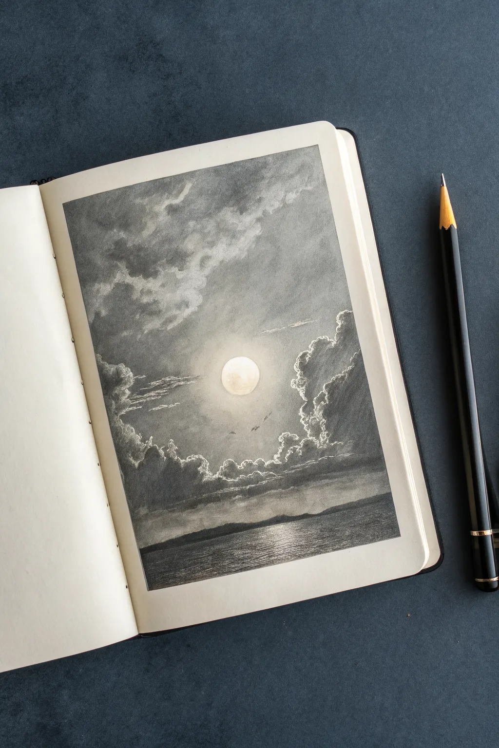
This atmospheric seascape study focuses on capturing the ethereal glow of moonlight breaking through heavy clouds. By laying down a dark graphite base and lifting highlights out with an eraser, you’ll create a dramatic sense of depth and luminosity that white paper alone can’t achieve.
Step-by-Step
Materials
- Sketchbook with smooth, heavy paper
- Graphite pencils (2B for initial sketch, 4B and 6B for darks)
- Graphite powder or a soft graphite stick
- Blending stumps (tortillons)
- Soft tissue or chamois cloth
- Kneaded eraser (essential for this technique)
- Electric eraser or precision eraser pen (optional but helpful)
Step 1: Laying the Atmosphere
-
Establish the horizon:
Lightly sketch a straight horizontal line about one-third of the way up from the bottom of your page to separate the sky from the sea. -
Create a graphite base:
Using a soft graphite stick or graphite powder and a chamois cloth, cover almost the entire page in a mid-tone gray wash. It doesn’t need to be perfectly even; a little texture adds to the stormy effect. -
Position the moon:
Visualize where your moon will be—roughly in the center of the sky. Keep this area slightly lighter than the rest if possible, but don’t worry about keeping it pristine white yet. -
Rough in the clouds:
With a 4B pencil held loosely on its side, scumble in the large cloud masses. Focus on the corners and edges, leaving the area around the moon softer to create that halo effect later.
Clean Erasers Matter
Graphite transfers quickly. Knead your eraser constantly to reveal a clean surface, or wipe your hard eraser on scrap paper. Dirty erasers will only smudge gray mud rather than lifting bright highlights.
Step 2: Sculpting the Sky
-
Reveal the moon:
Take your kneaded eraser and shape it into a firm ball. Press and twist directly in the center of your light patch to lift the graphite completely, creating a crisp, bright moon. -
Create the halo:
Gently dab the area immediately surrounding the moon with a clean part of your kneaded eraser to create a soft, diffusing glow. -
Define cloud edges:
Use a precision eraser or the sharp edge of a standard eraser to ‘draw’ the bright, silver linings of the clouds. These highlights should be on the edges facing the moon. -
Darken the shadows:
Switch to a 6B pencil. Deepen the shadows in the clouds furthest from the light source, particularly in the upper corners and the thick bank of clouds near the horizon. -
Blend the transitions:
Use a large blending stump to soften the transition between the dark cloud bellies and the lighter mist. Avoid blending over your crisp erased highlights. -
Add wispy details:
Sketch a few thin, horizontal stratus clouds cutting across the moon’s glow using a lighter 2B pencil. This adds scale and realism.
Add Subtle Birds
To give the sky immense scale, add two or three tiny, V-shaped silhouettes of birds flying near the light. Keep them very small; if they are too big, the clouds will look like cotton balls.
Step 3: The Sea and Shore
-
Establish the distant land:
Draw a silhouetted landmass along the horizon line using firm pressure with a 4B or 6B pencil. This should be one of the darkest values in the drawing. -
Base tone for water:
Ensure the water area is a consistent dark gray. Use horizontal strokes to reinforce the flatness of the water surface. -
Erase the reflection:
Use your eraser to pull out horizontal streaks of light on the water directly beneath the moon. Make the strokes wider closer to the bottom of the page and narrower near the horizon. -
Refine water texture:
Between your erased highlights, add sharp, thin dark lines with a sharp 4B pencil to suggest ripples and waves interacting with the light.
Step 4: Final Touches
-
Boost contrast:
Step back and assess your values. Re-darken the darkest corners of the sky and the land silhouette to make the moon pop even more. -
Clean brights:
Do a final pass with your eraser on the brightest cloud rims and the moon itself to ensure the paper white is as bright as possible. -
Soften edges:
Finally, lightly smudge the outer edges of the drawing to create a vignette effect, focusing the viewer’s eye toward the glowing center.
Now you have a moody, atmospheric landscape that truly glows from within the paper
Have a question or want to share your own experience? I'd love to hear from you in the comments below!