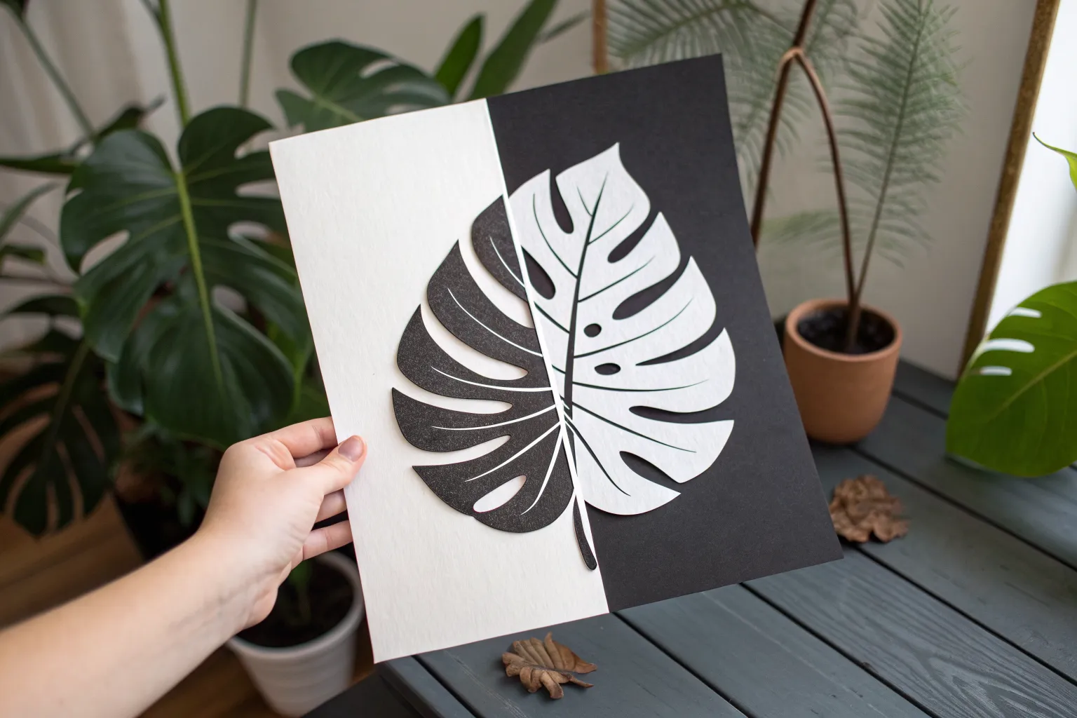
If you’ve ever stared at an image and suddenly the “background” pops forward, you’ve already felt the magic of positive space and negative space. These easy projects keep things high contrast and beginner-friendly, so you can play with that satisfying figure-ground flip without overthinking it.
Faces or Vase Illusion
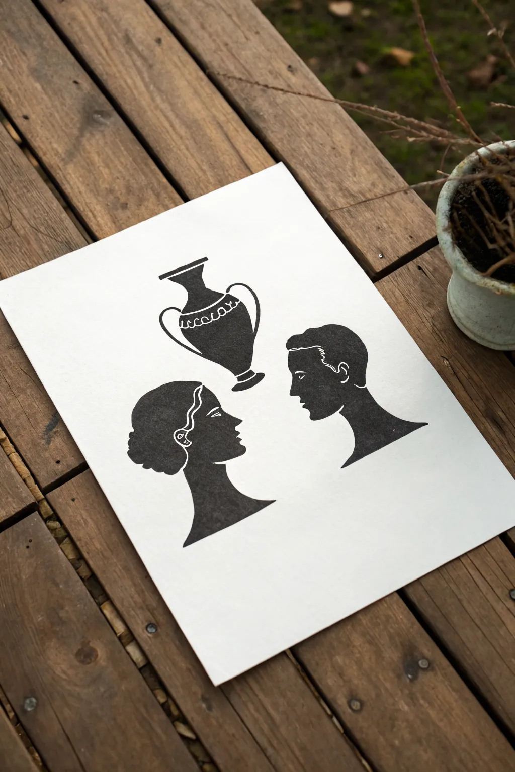
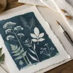
Recreate the classic Rubin’s vase optical illusion with a stylish Grecian twist using accessible block printing techniques. This project plays with positive and negative space, resulting in a striking black-and-white print that looks deceptively complex but relies on simple carving methods.
Step-by-Step
Materials
- Soft-cut lino block or rubber carving block (approx. 4×6 inches)
- Linoleum carving tool set (V-gouge and U-gouge)
- Black water-soluble block printing ink
- Brayer (rubber roller)
- Smooth white printmaking paper or cardstock
- Pencil
- Tracing paper
- Baren or wooden spoon
Step 1: Planning and Transferring
-
Sketch the profiles:
Begin by drawing two faces in profile facing each other on a piece of scrap paper. It helps to draw a centerline first to ensure the negative space between them forms a symmetrical vase shape. -
Refine the vase shape:
Look at the space *between* your drawn faces. Adjust the noses, chins, and foreheads until that central gap clearly resembles a classic urn or vase silhouette. -
Add separate elements:
Above your profile drawing, sketch a standalone version of the vase. This separates the illusion into its component parts, reinforcing the theme of the artwork. -
Trace onto tracing paper:
Once satisfied with your design, go over your lines with a dark pencil onto tracing paper. Make sure to capture the hair details and the decorative band on the vase. -
Transfer to the block:
Place your tracing paper face-down onto your lino block. Rub the back firmly with a bone folder or the back of a spoon to transfer the graphite image onto the rubber surface.
Clean Lines Tip
Warm the lino block slightly with a hairdryer or by sitting on it for a minute before carving. Warm material cuts much smoother than cold rubber.
Step 2: Carving the Block
-
Outline fine details:
Using your smallest V-gouge, carefully carve along the transferred pencil lines. Start with the intricate areas like the hair waves, the facial features inside the profiles, and the pattern on the vase. -
Carve the negative space:
Switch to a wider U-gouge to clear away the background. Remember, whatever you carve away will remain white; whatever you leave flat will print black. -
Define the profiles:
Here is the critical part: you are carving away the *background*, leaving the two head shapes and the vase shape as raised, flat islands. Ensure the edges of the faces are sharp and clean. -
Add white line details:
For the hair and ear details, you are carving *into* the positive shape. Use a steady hand to carve thin lines representing hair strands and facial definitions. -
Detail the vase:
Similarly, carve the decorative band and patterns into the standalone vase shape. I prefer to do this slowly to avoid slipping and cutting through a line I meant to keep. -
Clear the perimeter:
Remove all the remaining rubber around your shapes to ensure a clean background. You can cut the excess rubber block away with a craft knife if the border is large. -
Clean the block:
Brush away any loose carving debris. You can use a piece of tape to pick up tiny crumbs that might interfere with the ink.
Step 3: Inking and Printing
-
Prepare the ink:
Squeeze a small line of black block printing ink onto a glass plate or tray. Use your brayer to roll it out until it sounds sticky—like velcro separating. -
Ink the block:
Roll the inked brayer over your carved block. Apply the ink in thin, even layers, rolling in multiple directions to ensure the raised surfaces are fully coated without flooding the carved grooves. -
Position the paper:
Carefully align your printmaking paper over the inked block. Once the paper touches the ink, do not shift or slide it. -
Burnish the print:
Using a baren or the back of a wooden spoon, rub the back of the paper in circular motions. Apply firm, consistent pressure over the entire image area. -
The reveal:
Peel back one corner of the paper to check ink coverage. If it looks good, slowly pull the paper off the block to reveal your graphical illusion. -
Dry the print:
Set your finished artwork aside in a safe, flat place to dry completely. Water-soluble inks usually dry within an hour or two depending on humidity.
Try This Variant
Print on colored cardstock or try gradient inking (combining two colors on the roller) for a cool ombré effect on the silhouette.
Now you have a striking piece of optical art that invites viewers to look twice


Half-and-Half Split Page
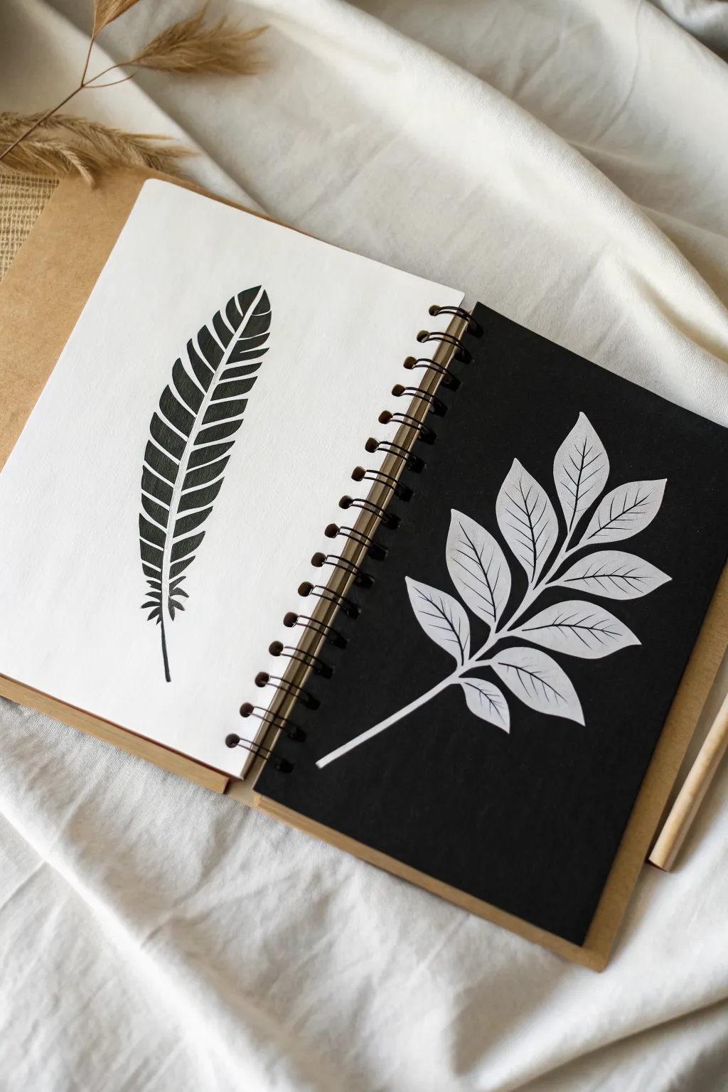
This striking sketchbook spread plays with the fundamental concept of positive and negative space by mirroring natural forms. On the left, a bold black feather rests on white, while the right page inverts the scheme with delicate white leaves popping against a deep black background.
Step-by-Step Guide
Materials
- Spiral-bound sketchbook (mixed media paper preferred)
- Black ink fineliners (0.5mm and 0.8mm)
- Thick black marker or brush pen
- White gel pen (opaque high-quality brand)
- White paint pen (fine tip) or white gouache with a fine brush
- Black acrylic paint or black gesso (optional)
- Pencil (HB or H)
- Eraser
- Ruler (optional for layout)
Step 1: Preparation & The Dark Page
-
Choose your pages:
Open your sketchbook to a fresh spread. The left side will remain white, while the right side needs to be completely black. If your sketchbook doesn’t have black paper inserts, you’ll need to create one. -
Create the black background:
If painting the right page, slide a piece of scrap paper under the sheet to protect the pages beneath. Apply an even coat of black acrylic paint or black gesso. I find gesso gives a nice matte tooth that takes white ink beautifully. -
Double-check coverage:
Ensure the black coverage is solid and opaque right up to the spiral binding and edges. Let this dry completely before attempting to draw on it—patience here prevents ruined pens later. -
Sketch the feather’s spine:
On the left (white) page, lightly sketch a curved line with your pencil to act as the central spine (rachis) of the feather. -
Outline the feather shape:
Lightly draw the outer boundary of the feather. It should be an elongated oval shape that tapers near the top, with a few jagged interruptions along the edges to suggest individual barbs splitting.
White Ink Troubles?
If your white gel pen skips or drags on painted paper, the surface might be too rough. try a white paint marker instead, shaking it well to keep the pigment flowing smoothly.
Step 2: The Positive Space Feather
-
Inking the spine:
Using your 0.5mm black fineliner, carefully trace the central spine line. Make it slightly thicker at the base and taper it to a hairline at the very tip. -
Defining the barbs:
Instead of coloring a solid block, draw the individual segments of the feather. Start from the spine and draw outward-curving lines that meet your pencil outline. Leave very narrow gaps between segments to replicate the natural separation of feathers. -
Filling the blacks:
Switch to your thick black marker or brush pen. Fill in the segments you just outlined. Ensure the black is deep and solid. -
Adding texture details:
With the 0.5mm fineliner again, add very small, wispy lines at the very base of the feather stem. These fluffy ‘afterfeathers’ add realism and soften the start of the drawing. -
Erasing guides:
Wait for the ink to feel cool and dry to the touch. Gently erase any visible pencil lines, being careful not to smudge the heavy black ink.
Add a Geometric Twist
Try framing both drawings inside identical geometric shapes, like triangles or circles, to emphasize the mirrored effect even more.
Step 3: The Negative Space Leaves
-
Drafting the leaves:
On your fully dry black page, use your pencil to sketch the stem and leaf placement. Draw a central stem rising diagonally, with paired leaves branching off symmetrically. -
Outlining in white:
Take your white gel pen or fine paint marker. Test the flow on a scrap paper first. Carefully outline the stem and the outer edges of each leaf. The line should be clean and continuous. -
Drawing the veins:
Inside each leaf shape, draw a single central vein line. From there, add diagonal veins branching outward. Keep these lines thinner than the outside border if possible. -
Filling or shading:
For this specific style, we aren’t filling the leaves solid white. Instead, use delicate hatching lines or simply leave the black paper showing through as the ‘color’ between the white veins. -
Reinforcing brightness:
If the white ink looks translucent against the dark background, go over the main stem and outer outlines a second time. This builds opacity and makes the design pop. -
Cleaning up:
Very gently erase your pencil marks on the black page. Be extremely cautious, as some white pens can smear or fade under heavy eraser pressure.
Now you have a beautifully balanced spread that explores the power of simple contrast


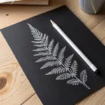
Simple Object Silhouette Fill
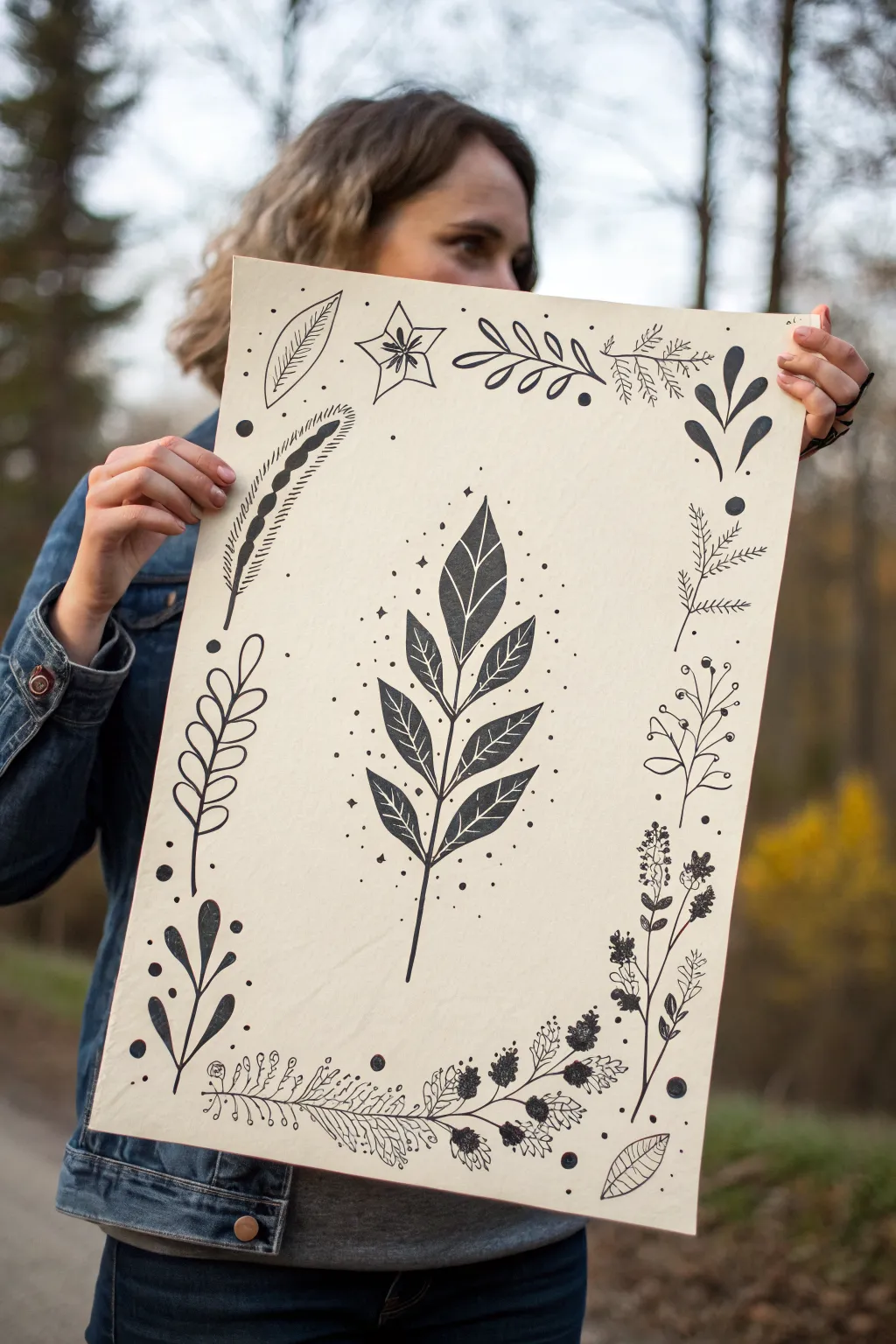
This elegant project plays with positive and negative space by framing a bold central silhouette with a delicate, hand-drawn botanical border. The result is a striking nature-inspired poster that looks like a vintage science illustration but requires simple tools to create.
Step-by-Step Guide
Materials
- Large sheet of heavyweight cream or beige paper (A3 or 11×17 size)
- Black ink fine liner pens (various sizes, e.g., 0.1, 0.3, 0.5)
- Black brush pen or thick marker
- Pencil and eraser
- Ruler
- Reference images of leaves and flowers (optional)
Step 1: Planning the Layout
-
Sketch the central guide:
Start by lightly sketching a vertical line down the exact center of your paper using a ruler. This will be the spine of your main leaf sprig. -
Outline the main stem:
Project layout is key here. Lightly pencil in the shape of the large central leaf sprig. Draw the main stem and mark where each individual leaf will sit, extending upwards and slightly outwards. -
Draft the border boundary:
Lightly mark a rectangular boundary about an inch or two from the edge of the paper. You won’t draw a solid line here, but use this as a ‘fence’ to keep your border elements contained. -
Sketch border elements:
Roughly pencil in a variety of botanical shapes around the perimeter. Mix different types: fern-like fronds, rounded berries on stems, spiky leaves, and small floral clusters.
Step 2: Creating the Central Silhouette
-
Define the leaf shapes:
Refine your penciled leaves on the central sprig. Make them pointed and symmetrical, like bay leaves. Ensure there is a small gap of negative space between the leaf edge and the center vein. -
Start the ink fill:
Using your thicker marker or brush pen, carefully outline the first leaf at the bottom of the stem. It’s crucial to keep your hand steady for a crisp edge. -
Fill in the shading:
Color inside your outline solidly with black ink. Leave a thin, white line down the center of each leaf to represent the vein—this ‘negative space’ detail adds instant dimension. -
Complete the central sprig:
Work your way up the stem, outlining and filling each leaf. I find it helpful to rotate the paper as I work to avoid smudging the fresh ink with my hand. -
Add delicate details:
Once the heavy black leaves are dry, use a fine liner (0.1 or 0.3) to add tiny dots or ‘stardust’ around the central sprig to soften the transition to the empty background.
Smudge Patrol
Place a scrap piece of paper under your drawing hand while you work. This acts as a shield to prevent oils from your skin transferring to the paper and stops wet ink from smearing.
Step 3: Drawing the Floral Border
-
Switch to fine liners:
For the border, put away the thick marker. Depending on the element, choose a 0.3 or 0.5 pen to create varied line weights. -
Ink the bottom detail:
Start at the bottom center. Draw the detailed fern or floral garland that anchors the design. Use short, repetitive strokes for texture on the fern fronds. -
Draw stylistic variations:
Move clockwise around the border. Draw some elements as simple outlines (open leaves) and fill others in completely solid (black silhouette leaves) to create visual rhythm. -
Create texture with pattern:
For larger open leaves in the corners, draw internal veins or stripes. For the berry clusters, color the berries solid black but keep the stems thin and delicate. -
Balance the composition:
As you reach the top, ensure you have a mix of heavy black shapes and light, airy line drawings. Add small dots or circles to fill any awkward empty gaps between plants.
Antique Effect
Want a vintage look? Before drawing, lightly stain your paper with tea or coffee and let it dry flat. This creates a parchment-like background.
Step 4: Finishing Touches
-
Erase pencil lines:
Wait at least 15 minutes to ensure all ink is completely bone dry. Gently erase all your initial pencil guides, being careful not to buckle the paper. -
Review contrast:
Step back and look at the artwork. If the central leaf feels too heavy, you can thicken lines on the border elements to balance the visual weight.
Hang your botanical poster in a simple wooden frame to celebrate the beauty of nature’s silhouettes
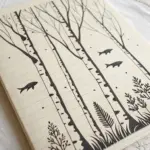
Tree Branch Silhouette Study
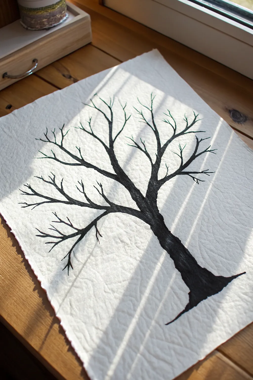
Capture the stark elegance of winter with this high-contrast silhouette study on textured paper. The focus is on the intricate network of twisting branches, using bold black ink to create a striking negative space composition.
Detailed Instructions
Materials
- Heavyweight textured paper (watercolor cold press or handmade cotton rag)
- Black India ink or high-quality black gouache
- Fine liner brush (size 0 or 00)
- Medium round brush (size 4 or 6)
- Pencil (HB or lighter)
- Kneaded eraser
- Water formatting container
- Paper towel
Step 1: Planning the Structure
-
Prepare the paper:
Begin by selecting a sheet of heavy, textured paper. If you want that beautiful, uneven edge seen in the photo, you can tear the edges carefully using a ruler or use specialized deckle-edged paper. -
Sketch the trunk:
Using an HB pencil, very lightly sketch the main trunk. Start wide at the bottom right corner and curve it gently upward toward the center, tapering slightly as you go up. -
Map the primary branches:
Draw three to four main branches extending from the top of the trunk. Keep your lines loose and organic; trees rarely have perfectly straight lines. -
Add secondary branches:
Split each main branch into smaller offshoots. Think of the letter ‘Y’ as a guide, but vary the angles and lengths to make it look natural. -
Refine the composition:
Step back and look at your sketch. Ensure the branches reach toward the edges of the paper to fill the negative space without looking crowded. -
Lighten the sketch:
Take your kneaded eraser and gently roll it over the pencil lines. You want the graphite to be barely visible, just enough to guide your brush without showing through the ink later.
Step 2: Inking the Silhouette
-
Load the medium brush:
Dip your medium round brush into black India ink or gouache. Ensure the consistency is fluid but opaque—smooth like heavy cream. -
Anchor the base:
Start painting at the very bottom of the trunk. Press down firmly to create a wide base, mimicking the roots entering the ground. -
Fill the trunk:
Work your way up the trunk using long, confident strokes. I find it helpful to paint the outline first and then fill in the center to keep the edges sharp. -
Paint main branches:
Switch to a slightly lighter touch as you move into the main branches. Let the brush naturally taper the lines as you pull away from the trunk. -
Switch brushes:
Once the thickest parts are done, switch to your fine liner brush (size 0 or similar) for better control over the delicate upper sections. -
Extend the reach:
Paint the secondary branches, ensuring smooth connections where they join the main limbs. A slight thickening at the joint helps it look realistic.
Ink Flow Hack
If your brush drags on the textured paper, add a tiny drop of water to your ink. It helps the paint glide into the paper’s crevices for sharper lines.
Step 3: Detaling and Refining
-
Create fine twigs:
Using just the very tip of your fine brush, add the smallest twigs at the ends of the branches. A shaky hand can actually be an advantage here, creating natural irregularities. -
Check for gaps:
Look for areas that feel too empty. Add tiny, intersecting twigs in these negative spaces to creating a dense, web-like effect. -
Refine edges:
Go back over the main trunk and larger branches. If any edges look ragged or uneven where they shouldn’t be, smooth them out with the fine brush. -
Deepen the black:
If your ink dried a bit transparent in the thick trunk area, apply a second coat to ensure a solid, matte black silhouette. -
Final drying:
Allow the artwork to dry completely flat. If the heavy ink causes the paper to buckle slightly, you can press it under a heavy book once it is 100% dry.
Metallic Accent
Once fully dry, trace just the upper edges of the branches with a gold or silver gel pen to mimic sunlight hitting the wood.
Display your finished study near a window to let natural light play across the texture of the paper
BRUSH GUIDE
The Right Brush for Every Stroke
From clean lines to bold texture — master brush choice, stroke control, and essential techniques.
Explore the Full Guide
Mountain and Reflection Mirror
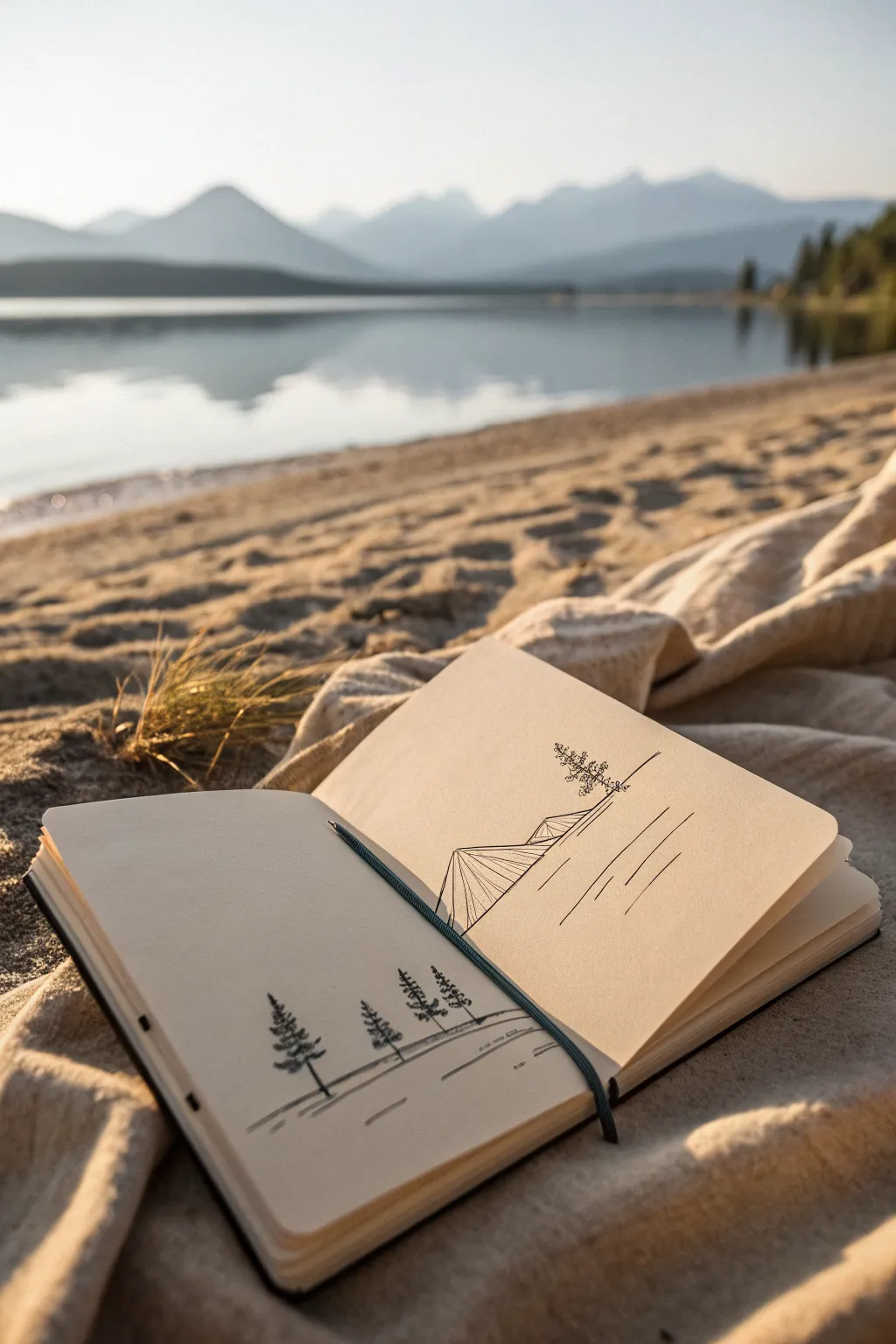
This serene, double-page sketchbook spread uses clean lines and open space to capture the essence of a tranquil lake scene. By drawing a simple geometric mountain peak on one page and its reflection on the opposing page, you create a cohesive image that spans the binding.
Detailed Instructions
Materials
- Hardcover sketchbook (plain, unlined paper)
- Black fineliner pens (sizes 0.1, 0.3, and 0.5)
- Pencil (HB for sketching)
- Eraser
- Ruler
Step 1: Planning the Composition
-
Find the horizon line:
Open your sketchbook to a fresh two-page spread. Visualize the center fold as your horizon line, where the mountain meets the water. -
Sketch the mountain triangle:
Using your pencil and ruler, lightly draw a large, uneven triangle on the right-hand page. The base should sit slightly above the center fold, leaving a gap for the ‘shoreline’. -
Draft the reflection:
Directly below the mountain, mirror the triangle shape on the bottom half of the page. It doesn’t need to be mathematically perfect, but the peak should point downwards. -
Position the trees:
On the left-hand page, lightly sketch three or four vertical lines near the bottom edge to mark the placement of your pine trees.
Step 2: Inking the Mountain
-
Outline the peak:
Switch to your 0.5 fineliner. Trace the outer edges of your top mountain triangle. Instead of a single straight line, add tiny jitters to mimic rocky terrain. -
Create dimension:
Draw an internal line splitting the mountain triangle, running from the peak down to the base. This separates the sunlit side from the shadowed side. -
Add vertical texture:
With a thinner 0.1 pen, draw vertical hatching lines on one side of the internal divider. Keep these lines close together to create a shadow value. -
Detail the peak:
Add a few small, jagged triangles near the summit to suggest snow caps or craggy rocks. -
Draw the distant tree:
Right at the base of your mountain on the right page, sketch a tiny, singular pine tree using small scribbles for foliage. This gives the mountain a sense of massive scale.
Uneven Lines?
Don’t panic if your lines wobble. In nature drawing, slightly shaky lines actually look more organic and realistic than perfect ruler-straight edges
Step 3: Creating the Reflection
-
Ink the mirrored shape:
Trace the downward-pointing triangle. -
Reflect the details:
Recreate the internal split line and the vertical hatching you did on the top mountain, but keep the lines slightly looser here. -
Add horizontal ripples:
Using the 0.3 pen, draw horizontal lines cutting through the reflection triangle. These breaks in the lines suggest water ripples disturbing the image. -
Extend the water lines:
Draw a few floating horizontal lines to the right of the reflection to suggest the calm lake surface extending outward.
Add Stippling
To add texture without more lines, use tiny dots (stippling) on the shadowed side of the mountain. It creates a grainy, rocky look perfect for peaks
Step 4: Foreground Elements
-
Ink the pine trees:
Move to the left page. Using the 0.5 pen, draw the trunks of your foreground trees. -
Add foliage:
Start at the top of each trunk and scribble erratic, zigzagging lines downward, getting wider at the base to form the classic conical pine shape. -
Ground the trees:
Draw a distinct horizontal line beneath the trees to represent the near bank. -
Add foreground shadows:
Sketch a few short, diagonal hatching lines under the ground line to give the bank depth. -
Erase and clean:
Wait for the ink to dry completely to avoid smudging, then gently erase all your initial pencil guidelines.
Close your sketchbook on this peaceful scene and enjoy the simple beauty of your line work
Two-Value Animal Silhouette
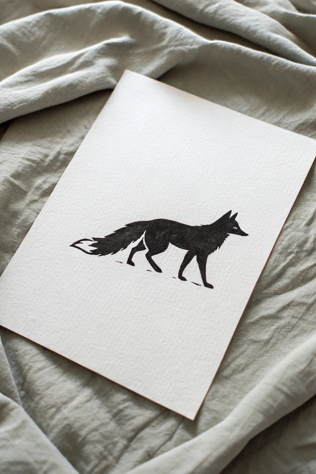
This elegant project captures the essence of a fox using just two strong values: deep black ink and the creamy white of textured paper. By strategically leaving small areas unpainted, you create the illusion of form and detail through negative space.
Step-by-Step Guide
Materials
- Heavyweight watercolor paper or printmaking paper (300gsm)
- Black India ink or high-quality black gouache
- Pencil (H or HB)
- Kneadable eraser
- Small round paintbrush (size 0 or 1)
- Medium round paintbrush (size 4 or 6)
- Palette or small dish
- Paper towels
Step 1: Planning and Sketching
-
Prepare your paper:
Cut your heavyweight paper to your desired size. A simple A5 or 5×7 inch rectangle works beautifully for this intimate subject. -
Analyze the pose:
Visualize the fox’s walking stance. Notice the low-slung head, the extended brushy tail, and how the legs are positioned to suggest forward movement. -
Begin the outline:
Using your H pencil, very lightly sketch the overall contour of the fox. Keep your lines incredibly faint, as you won’t want to erase much later on the textured paper. -
Mark the negative spaces:
This is the most critical step. Lightly outline the specific areas that will remain white: the tip of the tail, the inner ear, the small eye slit, and the gap separating the back leg from the tail. -
Refine the edges:
Go back over your contour to add texture. Instead of a smooth line, use small, jagged strokes on the neck, back, and tail to simulate fur texture before you start painting.
Step 2: Inking the Silhouette
-
Prepare your medium:
Pour a small amount of India ink into your palette. If you are using gouache, mix it with just enough water to make it creamy and opaque, but not runny. -
Start with the details:
Dip your smallest brush (size 0 or 1) into the ink. carefully outline the negative space areas first—around the eye, the ear, and the tail tip—to preserve them. -
Define the face:
Fill in the delicate snout and head area with the small brush, ensuring the ears are sharp and pointy. -
Outline the body:
Switch to your medium brush if the area allows, or stick to the small one for control. Paint the jagged fur texture along the spine and the top of the tail. -
Fill the core:
With the boundaries established, fill in the main body of the fox. Work relatively quickly so the ink dries evenly without streak marks. -
Handle the legs:
Paint the legs with care. Pay close attention to where the legs join the body; leave a hairline gap of negative space if needed to show which leg is in the foreground, though a solid silhouette works too. -
Texture the tail:
When painting the tail, use a ‘dry brush’ technique slightly at the edges. Wipe most ink off your brush and drag it to create a feathery, furry look. -
Add ground shadows:
using a very small amount of ink, add two or three tiny, broken horizontal lines underneath the feet. This grounds the fox so it doesn’t look like it’s floating.
Fixing Ink Bleeds
If ink bleeds into a white area, wait for it to dry fully. Then, use opaque white gouache or a white gel pen to touch up the mistake and restore the clean edge.
Step 3: Finishing Touches
-
Let it dry completely:
Allow the artwork to sit undisturbed. India ink can look dry on the surface while still being wet underneath, so give it at least 20 minutes. -
Clean up sketch lines:
Once you are absolutely certain the ink is dry, gently dab (don’t scrub) with a kneadable eraser to lift any visible graphite marks. -
Assess the contrast:
Step back and look at your piece. If the black looks patchy or grey in areas, apply a second coat of ink carefully over the solid sections for a true, deep silhouette.
Golden Hour Glow
Add a level of sophistication by applying gold leaf to the negative space of the moon or sun behind the fox, contrasting the flat black ink.
Frame your striking silhouette with a wide mat to let the negative space breathe and draw the viewer’s eye.

PENCIL GUIDE
Understanding Pencil Grades from H to B
From first sketch to finished drawing — learn pencil grades, line control, and shading techniques.
Explore the Full Guide
Word Art in Negative Space
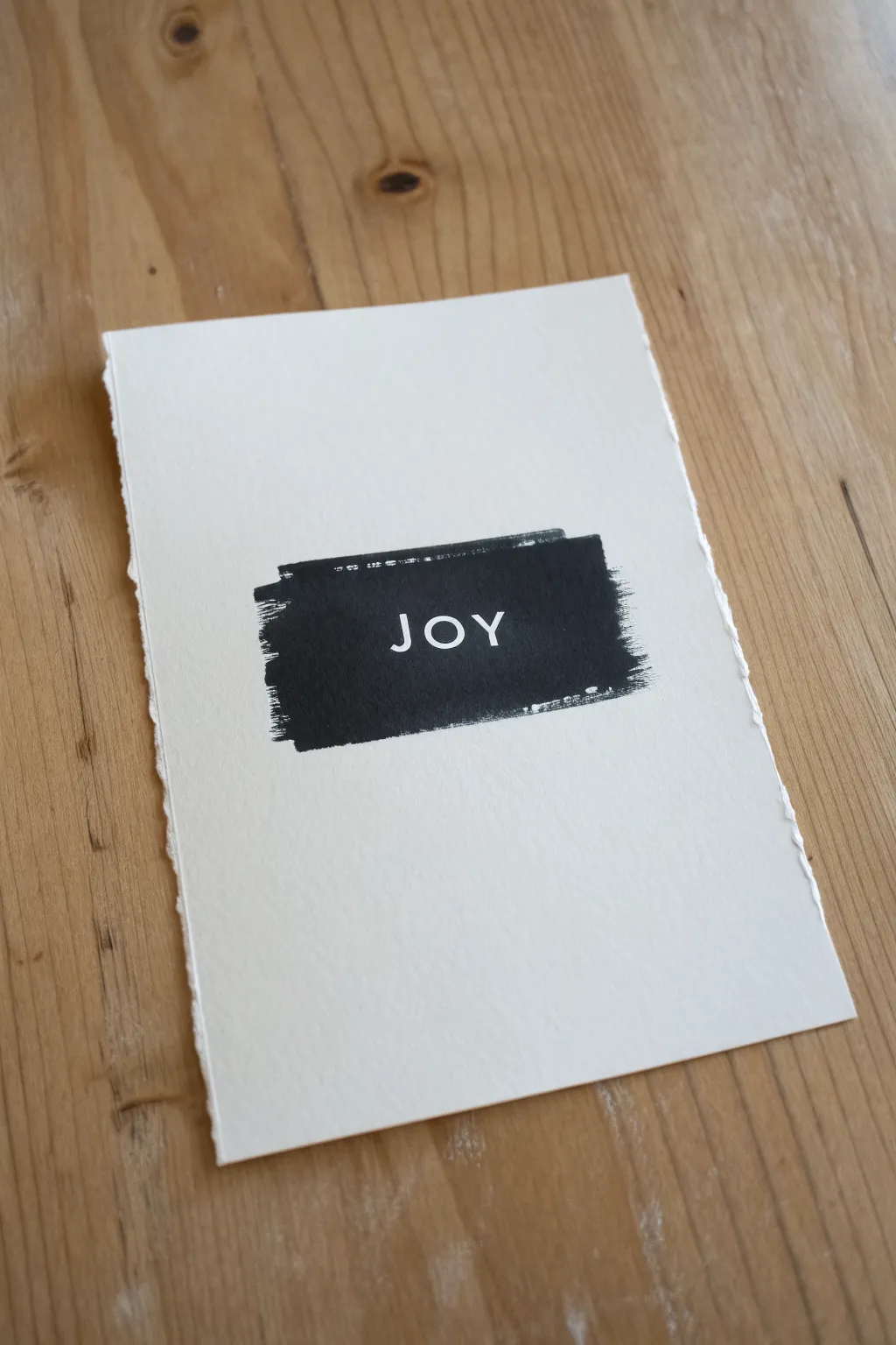
This minimalist project plays with the dramatic contrast between stark black ink and creamy white paper to create a striking centerpiece. Using a resist method or careful negative painting, you’ll capture a single, powerful word within a textured, painterly frame.
Step-by-Step Guide
Materials
- Heavyweight watercolor paper or printmaking paper (300gsm+)
- Black acrylic paint, gauche, or India ink
- Flat bristle brush (roughly 1 inch wide)
- Removable masking fluid (drawing gum) OR vinyl letter stickers
- Ruler
- Pencil
- Paper towel or scrap paper
- Eraser
Step 1: Preparation & Lettering
-
Paper selection:
Begin by selecting a piece of heavy, textured paper. To achieve the beautiful raw look seen in the example, you can tear the edges against a ruler rather than cutting them to create a soft, deckled finish. -
Position framing:
Lightly mark the center of your paper with a pencil to guide your composition. You’ll want your word to sit right in the visual center. -
Drafting the text:
Sketch the letters ‘JOY’ (or your chosen word) lightly in pencil. Keep the font simple and sans-serif for the best legibility against the textured background. -
Blocking out the word:
If you are using vinyl letter stickers, carefully apply them over your pencil marks now, pressing down firmly on the edges to prevent paint bleed. -
Applying masking fluid:
Alternatively, if hand-lettering, use a fine brush or a dipping pen to fill in your penciled letters with masking fluid. I like to apply it fairly thick to ensure it peels off easily later. -
Setting the mask:
Allow the masking fluid or stickers to settle. The fluid must be completely dry to the touch—usually about 15-20 minutes—before any paint touches the paper.
Sticky Situation?
If the paper tears when removing masking fluid/tape, your paper might be too soft. Try a heavier 100% cotton rag paper, or dull the tape’s adhesive on clothing first.
Step 2: Painting the Texture
-
Loading the brush:
Squeeze a small amount of black acrylic paint onto your palette. Dip your flat bristle brush into the paint, but do not overload it. -
Off-loading for texture:
Wipe the excess paint off onto a paper towel or scrap paper. You want the brush to be ‘thirsty’ or semi-dry to achieve those jagged, scratchy edges. -
The first stroke:
Position your brush horizontally above the word. Drag the brush across the paper in a single, confident horizontal sweep, covering the top portion of the letters. -
Building the block:
Repeat this horizontal dragging motion, working your way down until the entire word is covered. Ensure you extend the block slightly past the letters on the left and right. -
Enhancing the edges:
If the edges look too neat, use your nearly dry brush to flick outward slightly at the start and end of your strokes. This emphasizes the ‘dry brush’ aesthetic. -
Checking coverage:
Look closely at the letter area. While the edges should be rough, the center where the letters are needs to be solid black to define the word clearly. -
Drying time:
Let the black paint dry completely. Acrylics dry fast, but give it at least 30 minutes to be safe, as peeling the mask too early can ruin the crisp lines.
Texture Master
Use a stiff hog-hair brush rather than soft synthetic ones. The stiff bristles naturally create those beautiful scratchy ‘raake’ marks at the edges of the paint block.
Step 3: The Reveal
-
Removing the mask:
Once dry, use a rubber cement pickup or your clean finger to gently rub the masking fluid. It should ball up and roll off, revealing the white paper underneath. -
Peeling stickers:
If you used vinyl stickers, use a craft knife or tweezers to lift the edge very carefully, peeling slowly to avoid tearing the paper surface. -
Cleanup:
Gently erase any visible pencil marks remaining inside the white letters or around the painted block. -
Final assessment:
Inspect the letter edges. If a little paint bled through, you can touch it up carefully with a white gel pen or high-opacity white gouache.
Display your new artwork on a small easel or frame it to add a minimalist touch to your space

Have a question or want to share your own experience? I'd love to hear from you in the comments below!