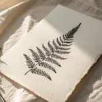
When you want something relaxing and satisfying, stippling is such a sweet spot: just tiny dots building into light, shadow, and texture. These easy stippling art ideas are all about simple shapes and big payoff, so you can get a finished piece without feeling overwhelmed.
Dot Gradient Swatch Strip
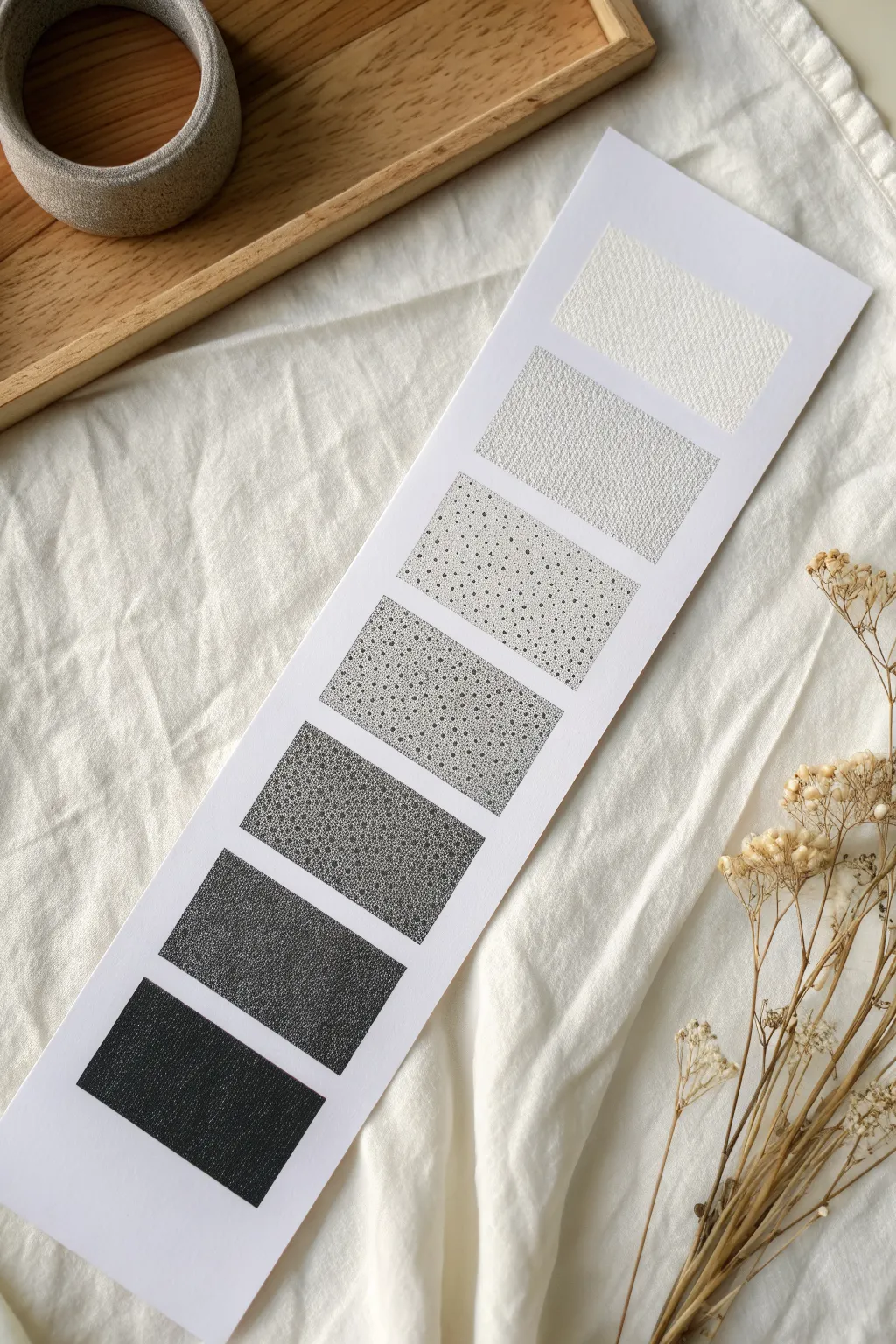
This classic swatch strip exercise is the perfect introduction to the art of stippling, teaching you how to control value simply by altering dot density. The result is a clean, minimalist bookmark or reference sheet that demonstrates a seamless transition from pure white to solid black.
Step-by-Step
Materials
- High-quality white cardstock or Bristol paper (cut to a strip approx. 3×10 inches)
- Fine liner pens (sizes 0.1, 0.3, and 0.5 recommended)
- Ruler
- Pencil (HB or lighter)
- Eraser (kneaded preferred)
- Masking tape or painter’s tape
Step 1: Preparation & Layout
-
Measure the strip:
Cut your cardstock into a long, vertical rectangle. A width of about 2.5 to 3 inches works well, with a length of 8 to 10 inches depending on how many swatch boxes you want. -
Mark the segments:
Using your ruler and pencil, lightly mark the vertical center of the paper. Then, measure out seven equal square or rectangular sections spaced evenly down the strip. Leave a small gap (about 1/4 inch) between each box for a clean, gallery-style look. -
Draw the boundaries:
Lightly pencil in the borders of your seven boxes. Press very gently so these lines can be easily erased later without damaging the paper surface. -
Secure the paper:
Tape the top and bottom edges of your paper strip to your work surface. This prevents shifting while you are stippling, which can get repetitive.
Keep it Vertical
Hold your pen completely vertical (90 degrees) to the paper. Slanted angles create small dashes or “tails” instead of perfect round dots.
Step 2: The Light Values
-
Leave the top blank:
The very top box represents pure highlight. Leave this box completely untouched to show the natural white of the paper. -
Start the second box:
For the second box, pick up your finest pen (0.05 or 0.1). Create a very sparse field of dots. Keep them random and avoid distinct patterns. You want this to look like a whisper of grey. -
Texture the third box:
Move to the third box. Using the same fine pen, increase the amount of dots. Imagine this as a light grey tone. The dots should not touch each other yet; just reduce the white space between them slightly.
Try Colored Gradients
Use this same technique with colored fineliners. Try blending two colors by overlapping their stippled density in the middle boxes.
Step 3: Building Mid-Tones
-
Establish the middle ground:
For the fourth box (the middle one), switch to a slightly thicker pen if you have it, like a 0.2 or 0.3, or just increase your density with the fine pen. Cover the area evenly until it reads as a medium grey from a distance. -
Check for clusters:
Pause and squint at your fourth box. Look for accidental clumps of dots or open white rivers. Fill in empty gaps to ensure a uniform texture. -
Darken the fifth box:
In the fifth box, the dots should start becoming very dense. You can allow them to occasionally overlap. I find that working in small circular patches helps build density evenly here.
Step 4: Deep Shadows & Details
-
Create the sixth box:
For the second-to-last box, use a 0.5 pen. You need serious coverage here. The dots should be heavily packed, leaving only tiny pinpricks of white paper showing through. -
Fill the final void:
The bottom box is your absolute black. While you could color it in solid, stippling it to black creates a rich, velvety texture. Pack the dots so tight that the paper is fully saturated with ink. -
Refine the edges:
Go back along the pencil borders of each box with your pen. Don’t draw a solid line; instead, stipple strictly along the edge to create a crisp, defined boundary without an outline. -
Final assessment:
Step back and view the strip as a whole. You might notice the jump between box 3 and 4 is too abrupt. Add a few more dots to box 3 to smooth the transition if needed. -
Clean up:
Wait at least 15 minutes to ensure the ink is bone dry—stippling pools a lot of ink. Gently erase your pencil guidelines to reveal the floating geometric shapes.
Hang this strip near your workspace as a handy value reference guide for future ink drawings

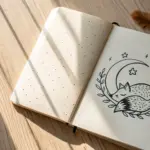
Crescent Moon Texture Study
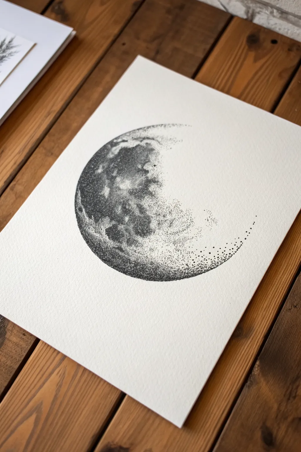
Master the art of creating volume and texture using only dots with this atmospheric crescent moon study. By varying the density of your stippling, you’ll build a realistic cratered surface that seems to fade magically into the white of the page.
Detailed Instructions
Materials
- High-quality watercolor paper or bristol board (heavyweight, textured)
- Fine liner pens (sizes 005, 01, 03, and 05)
- Pencil (HB or 2H)
- Compass or circular object for tracing
- Kneaded eraser
- Reference photo of the moon
Step 1: Preparation & Outline
-
Set up your workspace:
Begin by placing your paper on a clean, flat surface. Ensure you have good lighting, as stippling requires focus on small details. Tape down the corners if needed to prevent the paper from shifting. -
Draw the outer boundary:
Using your compass or a circular object, lightly draw a perfect circle in the center of your page. Keep this line extremely faint, as you want it to disappear under the ink later. -
Sketch the inner curve:
Freehand the inner curve of the crescent inside your circle. Unlike the perfect outer edge, this line should feel slightly organic and uneven to represent the rugged terrain of the moon’s surface. -
Map out major craters:
Lightly sketch irregular shapes within the crescent area to mark where the major dark ‘seas’ (maria) and large craters will be. These guides will help you organize your density zones.
Step 2: Building the Foundation
-
Start the edge with dots:
Pick up your 03 pen. Instead of tracing the pencil line, begin stippling along the outer left curve of the moon. Place dots closely together to define the sharp edge without drawing a solid line. -
Establish the darkest zones:
Switch to a thicker 05 pen for the deepest shadows. Focus on the large crater shapes you sketched earlier, filling them with dense cluster of dots. Don’t make it solid black yet; just create a heavy gray tone. -
Create the mid-tones:
Using a 01 pen, start filling the space between your dark craters. Spread the dots out slightly more here. Creating a smooth transition between the dark patches and these lighter areas is key. -
Fade into the terminator line:
As you move toward the inner curve (the terminator line where light meets dark), space your dots much further apart. Use the 005 pen here for the most delicate touch. -
Dissolving the edge:
The unique feature of this piece is the ‘disappearing’ right side. Allow the dots to scatter widely into the white space on the right, breaking the boundary of the crescent shape completely.
Wrist Saver
Stippling can be tiring! Hold the pen vertically and tap from your wrist, not your whole arm. Take breaks every 10 minutes to stretch your fingers.
Step 3: Refining Texture & Depth
-
Deepen the contrast:
Go back to the left side with your 05 pen. Layer more dots over the darkest areas until they are nearly solid black. This high contrast makes the moon look three-dimensional. -
Add crater details:
Use the 005 pen to add tiny, precise rings inside the lighter areas. These small circles of dots suggest smaller impact craters and surface dust. -
Blend the gradients:
Look for any harsh lines where dark meets light. Use the 01 pen to bridge these areas with intermediate spacing, softening the transitions so the surface looks rolling and dusty. -
Check the perimeter:
Verify that the outer left edge is crisp and defined by high-density stippling. If it looks fuzzy, add a tight row of micro-dots right at the border. -
Scatter the trailing particles:
On the far right tail of the crescent, place a few intentional, solitary dots extending outward. I find this gives the illusion that the moon is made of loose particles or is fading into mist. -
Erase guidelines:
Wait at least 15 minutes for the ink to fully cure. Gently roll a kneaded eraser over the entire drawing to lift the pencil sketch without smudging the ink.
Cosmic Splash
Dilute a tiny drop of white acrylic ink or gouache and flick a stiff brush over the dried drawing to add bright white stars on top of the dark moon craters.
Step back and admire how thousands of tiny points have come together to form a celestial body with weight and gravity


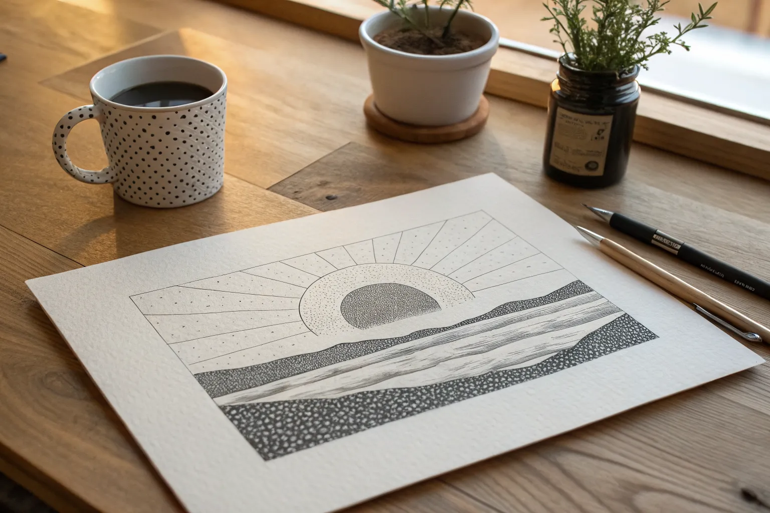
Radiant Sun With Dot Rays
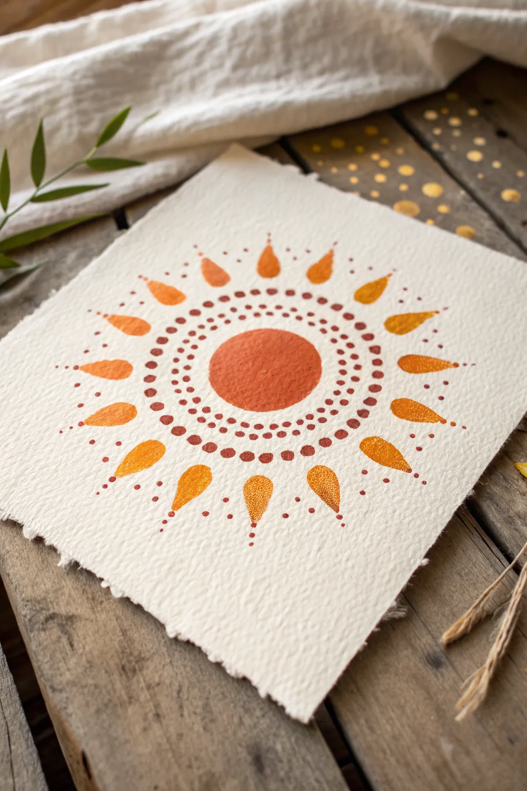
Create a warm, glowing sunburst using simple stippling and dot painting techniques on beautiful textured paper. This radiant design combines earthy oranges and yellows in a meditative pattern that feels both modern and ancient.
How-To Guide
Materials
- Heavyweight watercolor paper with deckle edge (300 gsm or similar)
- Acrylic paints or gouache (Burnt Sienna, Cadmium Orange, Yellow Ochre, Deep Yellow)
- Dotting tools or the handle end of paintbrushes (various sizes)
- Fine detail paintbrush (size 0 or 00)
- Pencil for sketching
- Compass or round object for tracing
- Palette for mixing paint
- Paper towel
Step 1: Planning the Layout
-
Center the design:
Begin by finding the center of your paper. Using a compass or a small round object (like a spice jar lid), lightly trace a circle in pencil about 1.5 to 2 inches in diameter. This will be the main body of the sun. -
Mark the ray guidelines:
Lightly sketch a larger concentric circle around the first one to mark where your rays will end. Then, make faint tick marks evenly spaced around the outer circle to indicate the position of each of the 16 teardrop-shaped rays.
Paint Consistency Check
If your dots have pointy peaks (like chocolate kisses), your paint is too thick. Add a drop of water to smooth it out. If they run flat immediately, let the paint sit for a minute to thicken slightly.
Step 2: Painting the Core
-
Fill the central sun:
Load a medium brush with Burnt Sienna or a deep reddish-orange paint. Carefully paint inside your center pencil circle, ensuring a solid, opaque fill. While the paint is wet, you can dab it texturedly for a stippled look or keep it smooth. -
Create the first dot ring:
Mix a small amount of dark reddish-brown paint. Using a small dotting tool or a fine brush tip, place a tight ring of small dots immediately surrounding the central painted circle. Keep these dots very close to the edge but not touching it. -
Add the second concentric ring:
Switch to a slightly lighter orange-brown color. Create a second ring of dots just outside the first one. Try to align these dots in the gaps between the dots of the previous ring for a staggered effect. -
Expand with a third ring:
Continuing outward, create a third ring using a similar earthy tone. Ideally, spacing between rings should remain consistent to maintain the mandala feel. -
Final inner ring:
Add a fourth and final ring of dots, perhaps using a slightly larger dotting tool size. This ring defines the boundary before the rays begin.
Step 3: Creating the Radiant Rays
-
Outline the teardrops:
Using a pencil very faintly, sketch the teardrop shapes radiating outward from your dot rings. Aim for roughly 16 rays, evenly spaced. -
Paint the gradient rays:
Mix a vibrant yellow-orange. Paint in the teardrop shapes. For visual interest, I like to alternate the shades slightly—painting every other ray a deeper orange and the ones in between a lighter golden yellow. -
Add texture to the rays:
Once the ray base coat is dry, take a fine brush with a slightly lighter or darker shade than the base. Stipple tiny dots inside each teardrop to give them a shimmering, textured appearance similar to the photo. -
Dot the ray tips:
Dip a fine tool into dark reddish-brown paint. Place a single, distinct dot at the pointed tip of each teardrop ray, extending the design outward. -
Create the outer trails:
Below each tip dot you just placed, add a trail of 2-3 increasingly smaller dots moving away from the sun. This creates a tapering effect, making the light look like it’s fading into the paper.
Metallic Magic
Swap the yellow ochre paint for gold metallic gouache or acrylic. The shimmer adds a stunning, celestial quality to the rays when they catch the light.
Step 4: Detailed Embellishments
-
Add intermediate spacers:
Look at the spaces between the teardrop rays near the center. Place a single small reddish-brown dot in the V-shape gap between the bases of the rays. -
Extend the spacers:
From that spacer dot, add two or three tiny micro-dots extending outward between the rays, acting as miniature secondary rays. -
Outer perimeter accents:
For a final flourish, add a tiny floater dot of orange near the very tip of the longest ray extensions, giving the piece an expansive, open feel. -
Erase guidelines:
Allow the artwork to dry completely—give it at least an hour to be safe. Gently erase any visible pencil marks, being careful not to rub over the painted dots.
Display your radiant sun on a small wooden easel or frame it to bring a permanent burst of warmth to your space
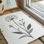
Floating Leaf With Vein Dots
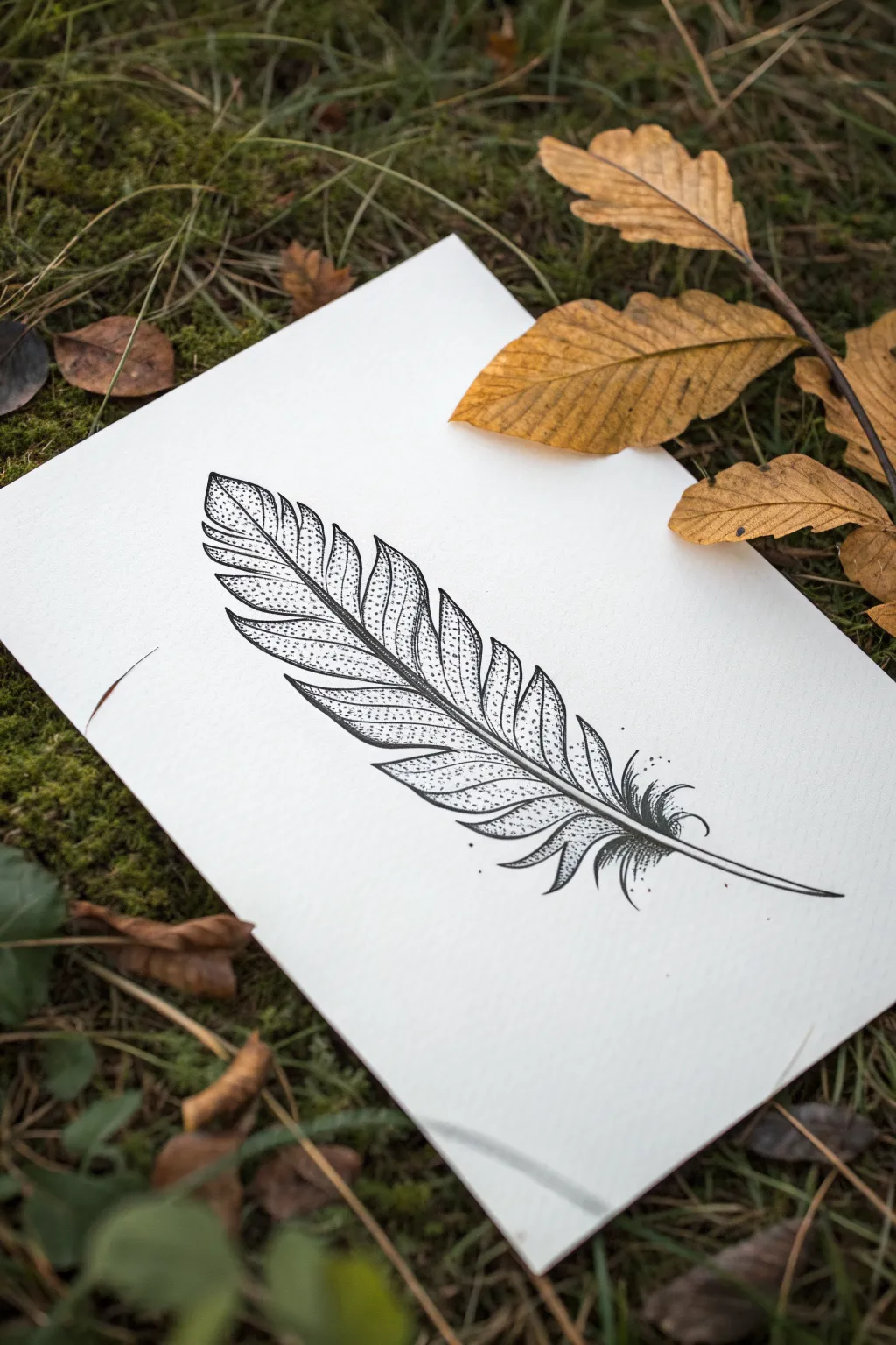
Capture the delicate intricate beauty of nature with this black-and-white feather illustration that masters the balance between solid lines and stippled texture. This project creates a striking contrast by using tiny dots to build volume and shadow within a clean, defined outline.
Step-by-Step Guide
Materials
- High-quality smooth bristol or cardstock paper (white)
- Fine liner pens (sizes 0.05, 0.1, and 0.5 mm)
- HB or 2B Pencil
- Soft hi-polymer eraser
- Ruler (optional for reference)
Step 1: Sketching the Framework
-
Draft the central quill:
Begin by lightly drawing a curved line for the central quill (rachis). Start at the bottom left and sweep upwards towards the top right, creating a gentle ‘S’ curve or simple arch to give the feather movement. -
Outline the vane shape:
Sketch a loose, elongated oval shape around your central line. Feathers aren’t perfect ovals, so taper it to a point at the top and leave it wider near the base. -
Define the barbs and notches:
Refine the outer edge by drawing deep, V-shaped notches. These gaps separate the feather into distinct sections (barbs). Vary the size of these sections—some broad, some narrow—to mimic a natural, weathered look. -
Thicken the quill:
Go back to your central line and double it to give the quill thickness. It should be widest at the base and taper to a needle-point thinness at the tip.
Ink Bleeding?
If your dots are bleeding into inconsistent blobs, switch to a smoother, heavier paper like Bristol board. Rough paper sucks up ink too fast and spreads it.
Step 2: Inking the Outlines
-
Trace the main structure:
Switch to your 0.5 mm fine liner. Carefully ink over your pencil lines for the outer edges of the feather segments and the central quill. -
Add separation lines:
Draw curved lines connecting the central quill to the notches on the outer edge. These lines separate the individual barb sections. Keep these strokes smooth and confident. -
Detail the base:
At the very bottom of the feather, draw loose, fluffy strokes that curve outward instead of connecting back to the main shape. This represents the downy afterfeather. -
Erase pencil marks:
Wait until the ink is completely dry—I usually give it at least five minutes to prevent smudging—then gently erase all underlying graphite sketches.
Add a Splash
Once the black ink is 100% dry, wash a single, transparent watercolor tone (like slate blue or burnt sienna) roughly over the drawing for a modern mixed-media look.
Step 3: Stippling for Texture
-
Start strong at the quill:
Using your 0.1 mm pen, begin placing dots densely right along the central quill. This area should be the darkest to show where the barbs attach and curve inward. -
Fade the gradient outward:
As you move away from the central quill toward the middle of each feather segment, space your dots further apart. This creates a gradient from dark shadow to a lighter highlight. -
Shade the segment edges:
Add concentration of dots along the clear separation lines between the feather segments. This gives each section a glorious 3D effect, making them look like they are overlapping slightly. -
Switch to the finest pen:
Change to the 0.05 mm pen for the lightest areas. Add very sparse, delicate stippling in the center of the larger segments to prevent the paper from looking too starkly white. -
Create directional flow:
Ensure your dots seem to follow the curve of the barbs. Even though they are points, arranging them in subtle rows that curve outward helps reinforce the feather’s shape.
Step 4: Final Touches
-
Deepen the shadows:
Review your work. Where the feather segments meet the central quill, add a second layer of dense stippling using the 0.1 mm pen to really punch up the contrast. -
Detail the downy base:
For the fluffy base of the feather, use fewer dots and more short, flicking lines to suggest a softer, hair-like texture compared to the stiff upper variety. -
Clean up stray marks:
Check for any pencil residue one last time and brush away eraser shavings. Your crisp, stippled feather is complete.
Step back and admire how thousands of tiny points came together to create something so soft and uniform
BRUSH GUIDE
The Right Brush for Every Stroke
From clean lines to bold texture — master brush choice, stroke control, and essential techniques.
Explore the Full Guide
Tiny Succulent Rosette
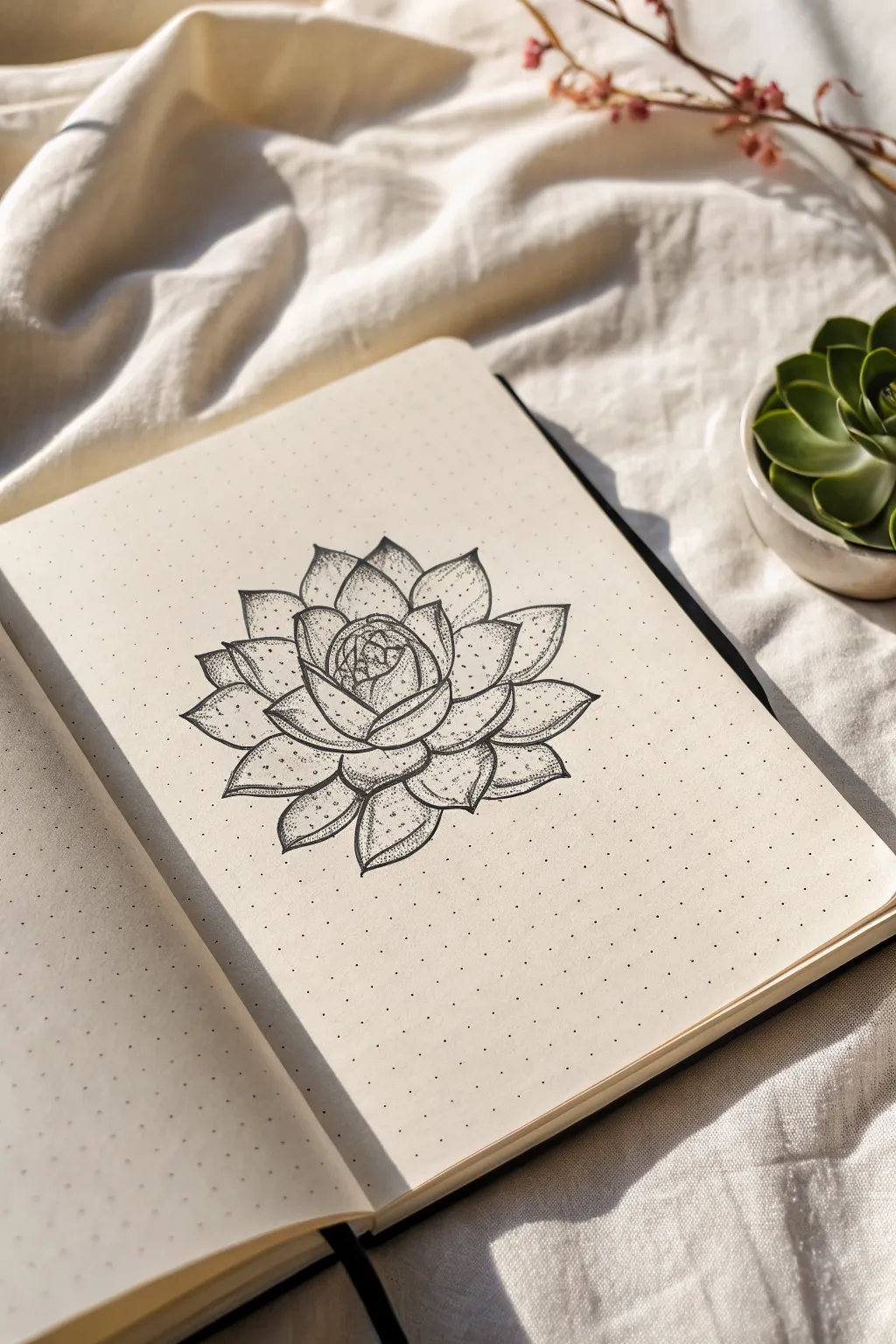
Capture the delicate beauty of a succulent using nothing but fine lines and tiny dots. This soothing project teaches you how to build dimension petal by petal, resulting in a minimalist botanical illustration perfect for your journal.
How-To Guide
Materials
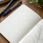
- Dot grid notebook or sketchbook
- Pencil (HB or H)
- Eraser
- Fine liner pen (01 or 03 size)
- Ultra-fine liner pen (005 size) for stippling
Step 1: Drafting the Shapes
-
Find the center:
Begin by lightly marking the center point of your page. Since you are using dot grid paper, you can easily use the dots to help align your composition. -
Draw the core:
Sketch a small, tight bud shape in the center. Imagine this as a tiny, closed rose—draw two or three overlapping, curved lines that hug each other tightly. -
Add first layer of petals:
Surround the core with three slightly larger petals. These should be somewhat triangular but with soft, rounded tips, pointing outwards. -
Expand the rosette:
Continue adding layers of petals, working in a spiral or alternating pattern. Draw the next ring of petals in the gaps between the previous layer’s tips. -
Widen the outer leaves:
As you move to the outer edges, make the petals broader and flatter. These represent the older leaves at the bottom of the succulent that spread out horizontally. -
Refine the symmetry:
Step back and check the overall balance. Succulents are naturally geometric, so adjust any petals that look too large or lopsided to create a pleasingly round shape.
Step 2: Inking the Outline
-
Trace the main lines:
Using your 01 or 03 fine liner, carefully trace over your pencil sketch. Focus on confident, smooth strokes for the petal edges. -
Define overlapping areas:
Pay special attention to where petals overlap. Ensure the lines of the petals in front clearly stop the lines of the petals behind them, creating depth. -
Add gentle center folds:
For the larger outer petals, draw a very faint, partial line or a slight dip at the tip to suggest the central vein or curve of the leaf. -
Let the ink set:
Allow the ink to dry completely for a minute or two to prevent smudging. -
Erase pencil guides:
Gently erase all visible pencil marks, leaving you with a clean, crisp outline.
Uneven Dots?
If your dots start turning into tiny dashes or commas, you are moving your hand too fast or holding the pen at an angle. Slow down and hold the pen vertical.
Step 3: Stippling for Texture
-
Start shading the core:
Switch to your ultra-fine 005 pen. Begin stippling (adding dots) at the very base of the center bud where the petals are most tightly packed. -
Build density at the base:
For each petal, concentrate your dots at the bottom (where it tucks under the petal above it). Place dots close together here to create a dark shadow. -
Fade outward:
As you move toward the tip of the petal, space the dots further apart. This gradient effect mimics the natural curve of the succulent leaf. -
Leave highlights:
Leave the tips and the very centers of the petals nearly empty of dots. This creates a high-contrast highlight that makes the leaves look plump and fleshy. -
Shadow the overlaps:
Go back to areas where one petal casts a shadow on another. Add a dense cluster of dots right along that edge to separate the layers visually. -
Refine the gradient:
I find it helpful to squint at the drawing now to see the overall contrast. Add intermediate dots where the transition from dark to light feels too abrupt. -
Add detail to tips:
If your succulent species has pointy tips, add a tiny cluster of dots right at the very apex to define the sharp point. -
Final assessment:
Do a final pass to deepen the darkest crevices near the center. The higher the contrast between the dark base and light tip, the more 3D your drawing will appear.
Pro Tip: Depth Control
Think ‘sunlight’. Imagine a light source hitting the top of the rosette. The deepest shadows should be where the light can’t reach—deep inside the overlaps.
Enjoy the meditative rhythm of stippling as your flat drawing transforms into a dimensional botanical piece
Easy Sunflower Center Pattern
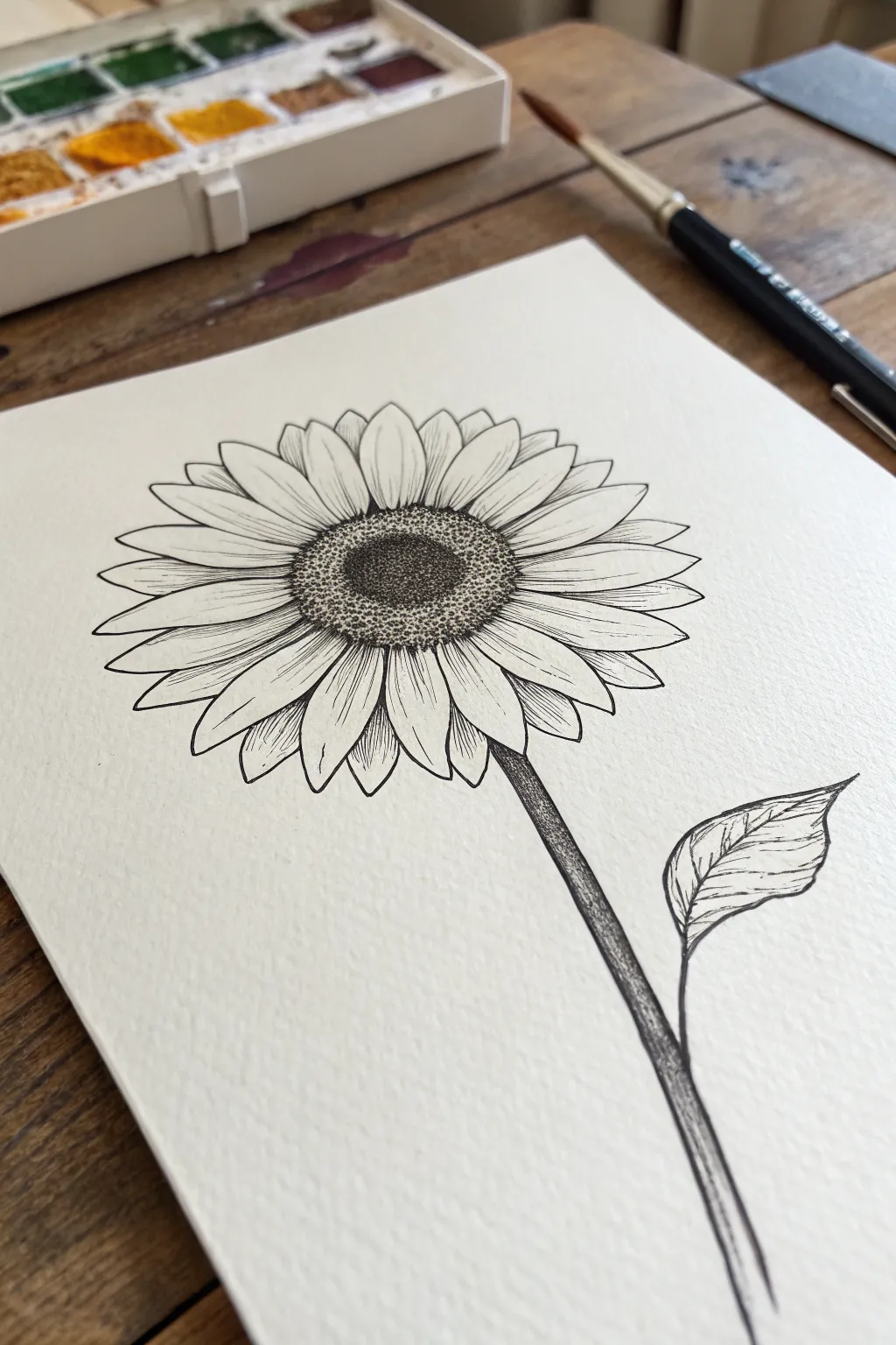
This elegant tutorial captures the classic beauty of a sunflower using nothing but black ink and patience. The focus of this project is the textured center created with fine stippling, which provides a stunning contrast against the delicate, lined petals.
Step-by-Step Tutorial
Materials
- Fine-grain or cold-press watercolor paper
- Fine liner pen (0.3mm or 0.1mm)
- Pencil (HB or 2H for sketching)
- Soft eraser
- Ruler (optional)
Step 1: Sketching the Framework
-
Outline the center:
Begin by lightly sketching a slightly flattened oval shape for the flower’s center. This shouldn’t be a perfect circle; an oval gives the flower dimension and perspective. -
Add petal guides:
Drawing lightly with your pencil, sketch the longer, primary petals radiating outward from the center oval. Make them slightly irregular in length and curve to keep it looking organic. -
Fill in secondary petals:
Sketch a second layer of smaller petal tips peeking out from behind the gaps of the primary petals. This creates the dense, lush look of a real sunflower. -
Draw the stem:
Add a long, gently curved line extending downwards from the flower head for the stem. -
Add the leaf:
About halfway down the stem, sketch a single, broad leaf pointing to the right.
Uneven Dots?
If your stippling looks messy or uneven, try holding the pen completely vertical. Angled strokes can create dashes instead of dots
Step 2: Inking the Outlines
-
Trace the center:
Switch to your fine liner pen. Carefully trace the oval outline of the center. Don’t worry if the line is slightly jagged; texture is good here. -
Define the petals:
Ink the outlines of the petals. At the tip of each petal, include a tiny ‘V’ shape or slight indentation, as sunflower petals art rarely perfectly pointed. -
Add central petal veins:
Draw a central vein down the middle of each primary petal. Keep your hand loose so the lines taper off gently near the tip. -
Texture the petals:
Add delicate, fine hatching lines radiating from the base of the petals (where they meet the center) outward. This adds shadow and depth. -
Ink the stem outlines:
Draw the two parallel lines for the stem, making sure they connect cleanly to the base of the flower head. -
Detail the leaf:
Outline the leaf shape and draw a central vein. Add smaller veins branching off, giving them a slight curve to match the leaf’s contour.
Step 3: Stippling the Center
-
Establish the dark core:
Now for the stippling. In the very middle of your center oval, begin placing dots very close together. This area should be the darkest, almost black, to represent the deepest depth. -
Create the transition zone:
As you move outward from the dark core, start spacing your dots slightly further apart. This creates a gradient from dark to light. -
Define the outer ring:
Around the outer edge of the center (where it meets the petals), increase the density of your dots again slightly. This creates a distinct rim, separating the seeds from the petals. -
Blend the gradients:
Look at the transition between your dark core and lighter ring. Add intermediate dots to smooth out the gradient so there are no harsh lines, just a soft fade.
Add Watercolor
Once the ink is waterproof-dry, lightly glaze yellow over the petals and brown over the center for a soft, mixed-media look
Step 4: Final Shading
-
Shadow the stem:
Use vertical hatching lines along one side of the stem to give it a cylindrical 3D form. I prefer to keep the light source on the left, shading the right side. -
Darken petal overlaps:
Wherever a petal overlaps another, add a few tiny hatching lines to cast a small shadow on the petal underneath. -
Erase pencil lines:
Wait at least 10 minutes to ensure the ink is totally completely dry, then gently erase all your initial pencil sketches.
Take a moment to admire the texture you have built up one dot at a time.

PENCIL GUIDE
Understanding Pencil Grades from H to B
From first sketch to finished drawing — learn pencil grades, line control, and shading techniques.
Explore the Full Guide
Mushroom Cap Speckle Shading
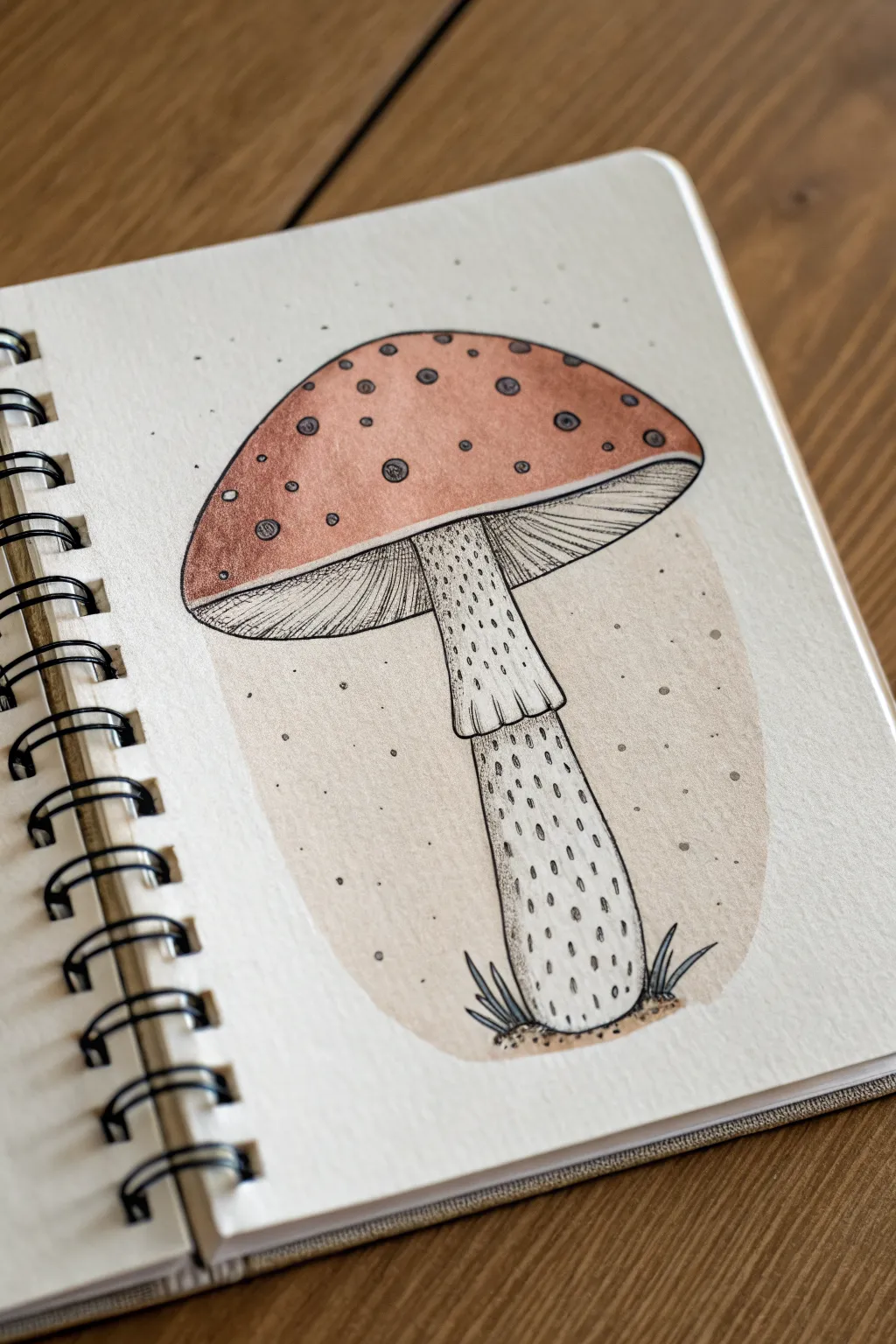
Capture the earthy charm of the forest floor with this stylized mushroom illustration. By layering warm metallic paints underneath crisp ink detailing, you’ll create a piece that feels both rustic and refined.
Step-by-Step
Materials
- Spiral-bound sketchbook (mixed media paper recommended)
- Pencil (HB or 2B) and eraser
- Fine liner pen (black, 0.3mm or 0.5mm)
- Watercolor paints or fluid acrylics (Bronze/Copper, Beige/Tan)
- Small round paintbrush
- White gel pen (optional for small highlights)
Step 1: Sketching the Structure
-
Outline the cap:
Begin by drawing a wide, shallow semi-circle near the top of your page. Connect the ends with a slightly curved line dipping downwards to form the mushroom cap’s underside. -
Add the stem:
Draw the stem centering from the bottom of the cap. Make the top section slightly wider, then create a wavy, skirt-like ring about a third of the way down. Extend the rest of the stem downwards, widening it slightly at the base. -
Sketch the spots:
Lightly sketch uneven circles of various sizes across the top of the cap. These will be the signature spots of the mushroom. -
Ground the figure:
At the very bottom of the stem, sketch a few rough, jagged shapes to represent grass blades and a small mound of dirt. -
Draw the background blob:
Lightly trace a large, irregular oval shape behind the mushroom. It should encompass the stem and the lower part of the cap, floating in the center of the page without touching the edges.
Step 2: Applying Color
-
Paint the background:
Using a very diluted beige or tan watercolor, fill in the large background oval. Keep the wash light and even, painting right up to but not inside your pencil sketch lines for the mushroom. -
Color the cap:
Mix a rusty bronze or copper color. Paint the entire top of the mushroom cap, carefully painting *around* the circular spots you sketched earlier, leaving them the white of the paper. -
Fill the spots:
Once the bronze paint is tacky or dry, use a slightly darker, sheer wash of brown or grey to fill in the circular spots. This gives them a slightly shadowed, recessed look compared to the bright paper. -
Wash the stem:
Take your dirty rinse water or an extremely diluted grey-brown mix and lightly tint the stem and the underside of the cap. You want this to be barely off-white, mostly just removing the harsh brightness of the paper. -
Dry completely:
Let the wet media dry fully before touching the paper with ink to prevent bleeding.
Keep it clean
When painting around the spots on the cap, rotate your sketchbook. It is much easier to pull the brush toward you for precision than to push it away at awkward angles.
Step 3: Inking details
-
Outline the main shapes:
Use your fine liner to go over the main pencil outlines of the mushroom cap, stem, and skirting. Keep your line weight consistent. -
Detail the spots:
Outline each spot on the cap. Add small, concentric c-shapes or dots inside each spot to give them texture and dimension. -
Draw the gills:
Underneath the cap, draw fine curved lines radiating from the stem outward to the edge of the cap. These lines should mimic the curve of the cap’s bottom edge. -
Texturing the skirt:
On the skirt-like ring around the stem, add vertical dashed lines. I find varying the length of these dashes helps the texture look more organic. -
Stipple the stem:
Add texture to the main stem using stippling. Create small, vertical dashes/dots, concentrating them more heavily on the sides to suggest a cylindrical shadow. -
Ink the ground:
Outline the grass blades and add stippled dots around the base of the stem to represent dirt and soil.
Metallic Magic
Swap the rusty bronze paint for a metallic gold or copper watercolor. The shimmer will add a magical, fairytale quality to your mushroom illustration.
Step 4: Final Touches
-
Add background speckles:
using your fine liner, add random dots floating in the beige background shape and just outside the mushroom cap to integrate the subject with the background. -
Erase pencil lines:
Once the ink is absolutely dry, gently erase any visible pencil marks to clean up the illustration.
Now you have a charming woodland study perfect for your nature journal
Cactus With Dot Spines
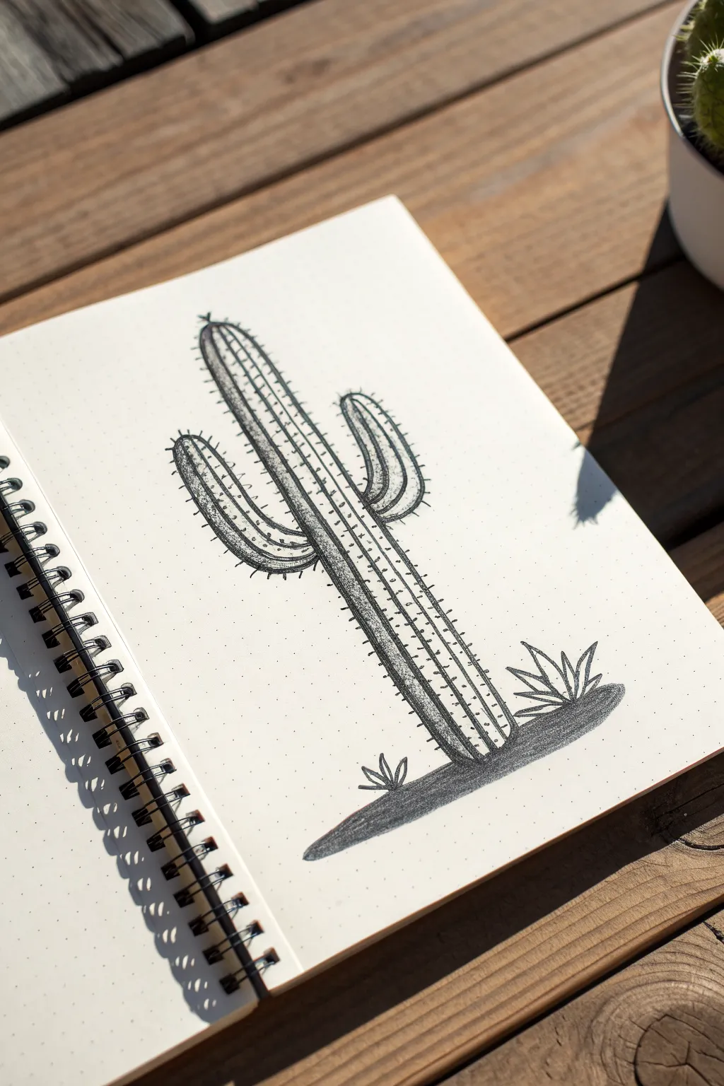
This classic Saguaro cactus drawing uses a mix of clean line work and precise stippling to create depth and texture. The stark contrast of black ink against dot grid paper gives it a crisp, modern botanical illustration vibe that looks harder than it actually is.
Step-by-Step Guide
Materials
- Dot grid notebook or paper
- Pencil (HB or 2B)
- Eraser
- Fine liner pen (01 or 02 size)
- Thicker drawing pen or marker (05 size or brush pen)
- Ruler (optional)
Step 1: Sketching the Skeleton
-
Establish the baseline:
Start by drawing a faint horizontal line near the bottom of your page using your pencil. This will serve as the ground level for your cactus. -
Draw the main trunk:
Sketch a tall, vertical column rising from the center of your baseline. Make the top rounded like a dome. Using the grid dots often helps keep your vertical lines straight without needing a ruler. -
Add the first arm:
On the left side of the trunk, about halfway up, sketch an ‘L’ shaped arm that curves upward. Keep the thickness consistent with the main trunk, though slightly thinner. -
Add the second arm:
Sketch a second arm on the right side, placed higher up than the left one. This one should look a bit like a curved ‘U’ shape emerging from the side. -
Sketch the ribs:
Lightly draw vertical lines running down the length of the trunk and both arms. These lines represent the ribs of the cactus. Aim for 3-4 lines inside the main trunk and 2-3 inside the arms. -
Add ground details:
Sketch a small, flat oval shape at the base for the shadow. Add a few small, spiky plant shapes on either side of the cactus base to balance the composition.
Hold It Upright
Keep your pen vertical when stippling. Slanted dots look like dashes. Straight up-and-down motion creates perfect circles.
Step 2: Inking the Outline
-
Outline the main shape:
Switch to your fine liner pen (01 or 02). Carefully trace over your pencil sketch of the cactus outline. Use confident, single strokes rather than feathery ones for a clean look. -
Ink the ribs:
Trace the internal vertical rib lines. Try to keep these lines slightly thinner or lighter than your outer perimeter lines if possible, but a consistent weight works too. -
Add the spines:
along the outer edges of the cactus and the arms, draw small clusters of short ticks or dots. Place them at regular intervals to simulate the prickly spines. -
Detail the ribs:
Add tiny ticks or small dots along the internal rib lines as well. This creates the illusion of spines growing from the ridges. -
Erase pencil marks:
Wait a minute or two for the ink to dry completely, then gently erase all your underlying pencil sketches so you have a clean slate for shading.
Step 3: Stippling and Shading
-
Start the ground shadow:
Using a slightly thicker pen or marker, fill in the oval shadow at the base. You can use a solid black fill or very dense cross-hatching to anchor the drawing. -
Begin stippling the trunk:
Switch back to your fine liner. Start placing dots on the left side of each vertical rib section. This establishes a light source coming from the right. -
Build density:
Add more dots closer to the line on the left side of each rib section. The dots should be densely packed near the line and gradually spread out as they move toward the center of the rib. -
Shade the arms:
Repeat this stippling process on the arms. Remember to shade the undersides of the curved arms more heavily to key the three-dimensional form. -
Enhance contrast:
Go back over the darkest areas—specifically the left side of the main trunk and under the arms—and add another layer of dots. I prefer to work in layers like this to avoid making it too dark too quickly. -
Finish with ground plants:
Outline the small spiky plants at the bottom. Leave the tops of the leaves white and add a little shading near their base where they meet the ground.
Add Pop of Color
Once the black ink is fully dry, use a watercolor brush marker to add a faint stripe of pale green highlight on the un-shaded side of the ribs.
Now you have a striking botanical piece that perfectly balances negative space with intricate detail


Feather Fade With Soft Dots
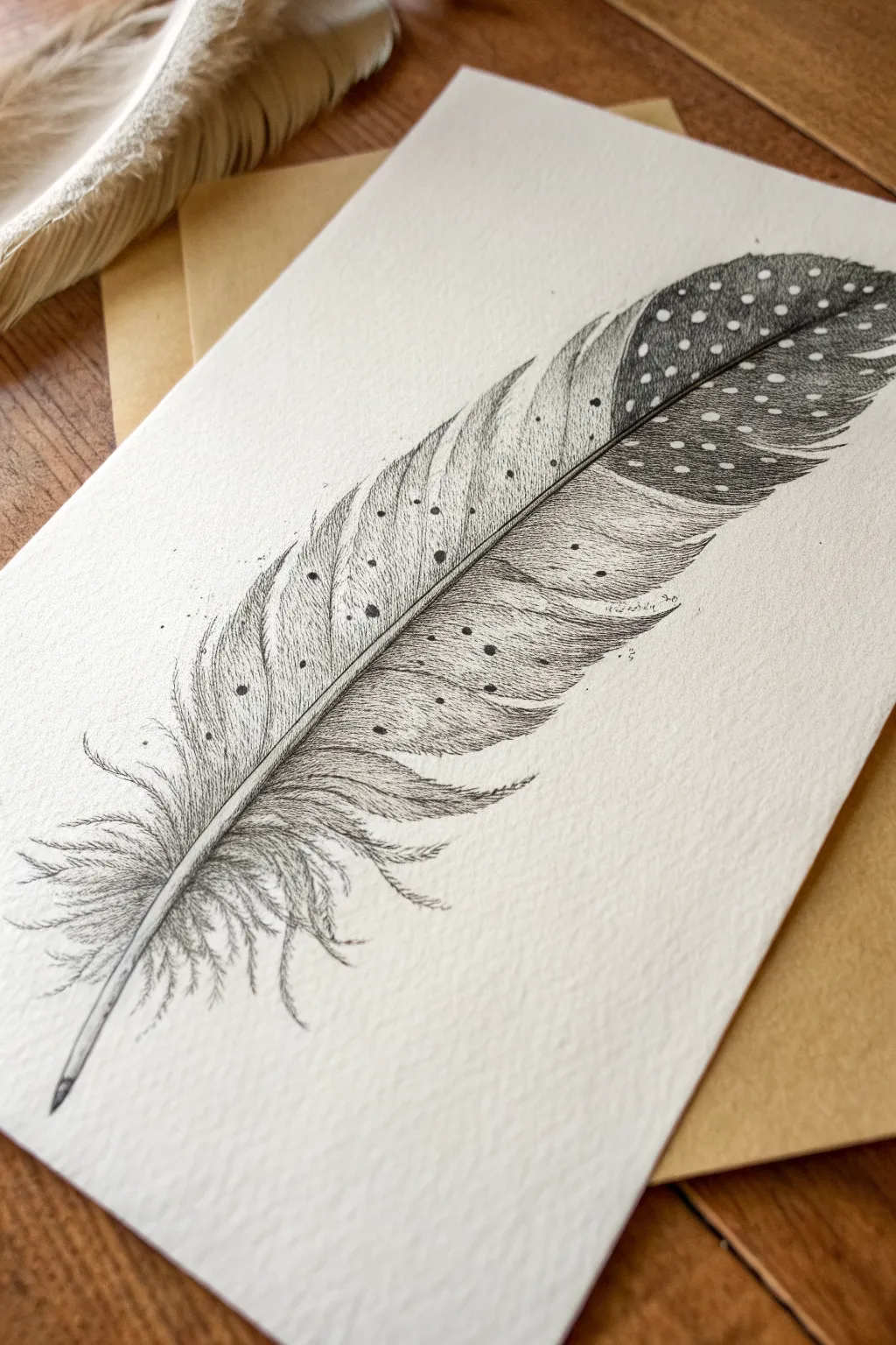
This elegant project captures the delicate texture of a spotted feather using fine liners and careful stippling. By combining sweeping strokes for the barbs and dense dot work for the pattern, you’ll create a realistic illustration with beautiful depth and contrast.
Detailed Instructions
Materials
- High-quality textured watercolor paper or heavy cardstock (white or cream)
- Fine liner pens (sizes 005, 01, and 03)
- Graphite pencil (HB or 2H)
- Kneaded eraser
- Reference photo of a guinea fowl or spotted feather (optional)
Step 1: Sketching the Form
-
Draw the central shaft:
Begin by lightly sketching a curved line for the quill (rachis) with your pencil. Start from the bottom left and arch gently toward the top right to mimic the natural curve seen in the reference. -
Outline the feather shape:
Sketch the outer boundary of the feather. Keep the shape wider near the top third and taper it down towards the quill base. Don’t worry about individual barbs yet; just get the general silhouette. -
Mark the spotted areas:
Lightly circle where the white spots will be on the upper, darker portion of the feather. These will remain un-inked, so it is crucial to place them now to avoid accidentally drawing over them later. -
Define the quill thickness:
Thicken the central line slightly, tapering it to a fine point at the top tip. The base of the quill should be visible and hollow-looking.
Rest Your Hand
Stippling can fatigue your wrist quickly. Take frequent breaks to stretch your hand, which also helps keep your dot spacing intentional rather than rushed.
Step 2: Inking the Structure
-
Ink the central shaft:
Using an 01 pen, carefully trace the central shaft. Leave a tiny sliver of white space down the center of the shaft in some areas to suggest a highlight, giving it roundness. -
Start the lower barbs:
Switch to your finest pen (005). At the base of the feather, draw loose, wispy strokes that curve outward and downward. These ‘downy’ feathers should look soft and disjointed, unlike the structured top. -
Draw main vane structure:
Moving up the feather, draw fine lines extending from the shaft to the edge. Follow the natural angle—barbs usually point diagonally upward. Keep your hand relaxed to allow for slight waviness. -
Break the edge:
As you reach the outer edge of the feather, let some lines separate. Real feathers often have splits or gaps, which adds realism to your drawing.
Add a Color Wash
Before inking, lay down a very pale wash of tan or cream watercolor. Once dry, ink over it to give the feather a vintage, antique specimen look.
Step 3: Stippling and Shading
-
Begin stippling the dark tip:
Using the 03 pen, begin placing dots densely around the white circles you marked earlier in the top section. The stippling should be darkest right against the white spots to make them pop. -
Create the fade:
As you move from the dark, spotted tip down toward the middle of the feather, create a gradient. Space your dots further apart so the dark gray transitions into the lighter area seamlessly. -
Detail the spots:
Switch to the 005 pen for the edges of the white spots. Use tiny, sparse dots just inside the border of the imaginary circle to make the spots look fuzzy and organic rather than like perfect cutouts. -
Shadowing the shaft:
Add a line of very fine stippling or hatching right next to the central shaft on the ‘shadow’ side. I find this anchors the vanes to the quill and adds instant dimension. -
Adding texture to the body:
Scatter larger dots randomly across the middle, lighter section of the feather. These mimic natural pigmentation marks or dust. -
Refine the downy base:
Go back to the fluffy base feathers. Add a few darker strokes where the fluff overlaps to create localized shadows, ensuring the base doesn’t look flat.
Step 4: Finishing Touches
-
Clean up sketch lines:
Once the ink is completely dry, gently roll your kneaded eraser over the piece to lift the initial graphite sketch. Be careful not to smudge the ink. -
Assess contrast:
Step back and look at the tonal values. If the top dark section looks too pale, go back in with the 03 pen and add another layer of dense dots between the white spots. -
Add stray details:
Draw one or two tiny, floating dots or broken lines near the feather’s edge to suggest microscopic bits of dust or loose barbs.
Now you have a beautifully textured feather illustration ready to display or gift.
Seashell Spiral With Dot Shadow
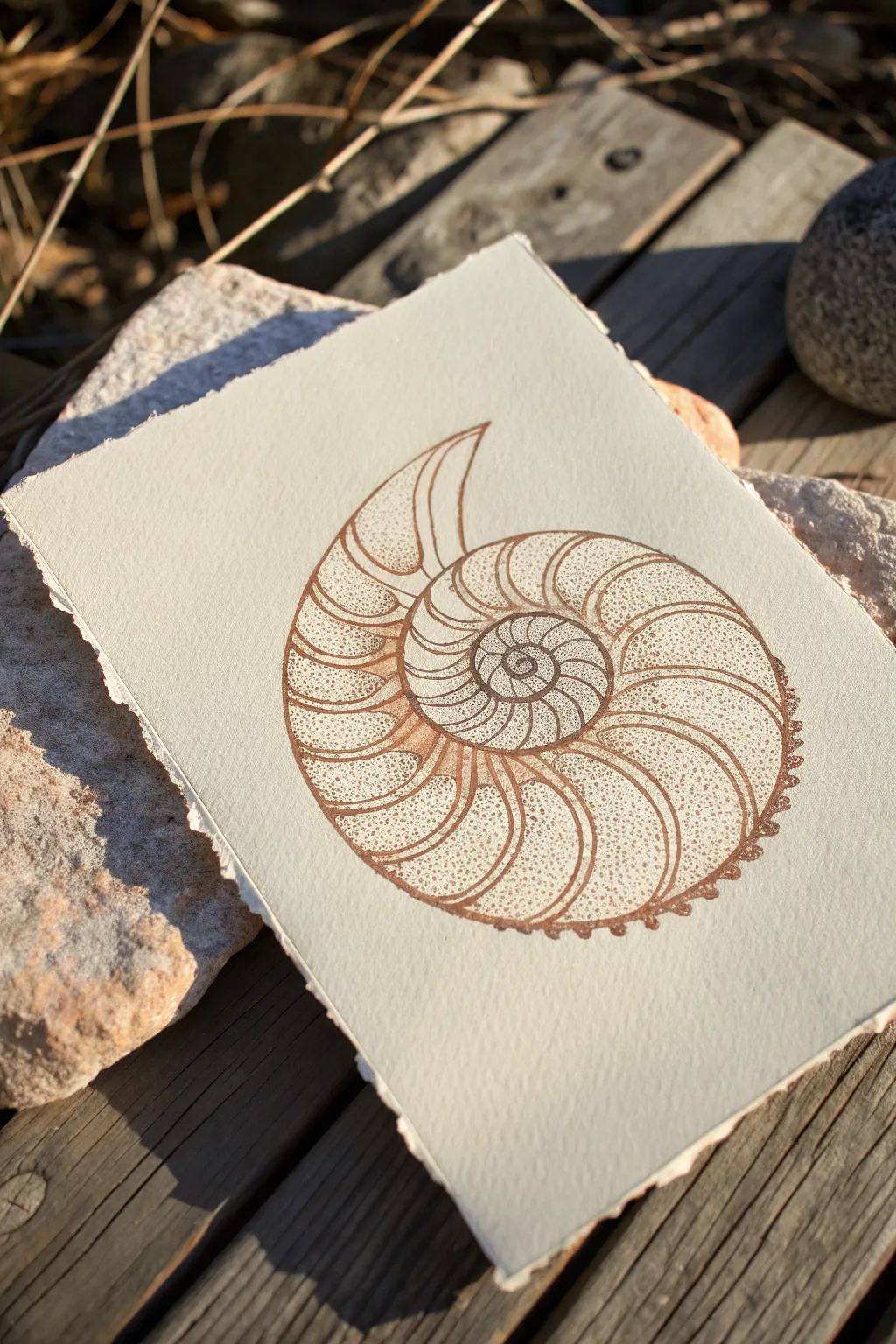
Capture the timeless elegance of the sea with this nautilus shell study, rendered in warm sepia tones. Using stippling to create soft, sandy textures against crisp contour lines, this project is a perfect meditation on spiral geometry.
Step-by-Step Tutorial
Materials
- Heavyweight watercolor paper or mixed media paper (deckle edge optional)
- Pencil (HB or H)
- Eraser
- Fine liner pen (Sepia or brown, 0.1mm and 0.3mm)
- Ruler
Step 1: Drafting the Spiral
-
Establish the curve:
Begin lightly in pencil by drawing a small circle in the visual center of your paper. This will be the origin point of your spiral. -
Expand the nautilus shape:
Draw a continuous, expanding curve that spirals outward from your center circle. Let it loop around roughly three times, widening significantly as it reaches the outer revolution to form the classic ammonite shape. -
Mark the chambers:
Along the spiral path, lightly sketch curved transverse lines that divide the shell into chambers. These lines should curve gently backward, following the shell’s natural growth pattern. -
Double the lines:
Go back over your chamber dividers and add a second line right next to the first one. This creates a thin channel or ‘rib’ for each section, rather than a single wire-thin line. -
Detail the outer edge:
Along the very outer rim of the shell, sketch small, semi-circular bumps or scallops. These give the shell an organic, fossilized texture.
Step 2: Inking the Structure
-
Outline the main spiral:
Switch to your 0.3mm brown fine liner. Carefully trace the main continuous spiral line you sketched earlier, ensuring a smooth, confident stroke. -
Define the ribs:
Trace the double lines of the chamber divisions. The space between these parallel lines will remain white, creating a highlight effect. -
Ink the scalloped edge:
Trace over the small bumps on the outer rim. You can make these lines slightly thicker or press a bit harder to give the shell weight. -
Erase pencil guides:
Once the ink is completely dry—I usually give it a full five minutes to be safe—gently erase all underlying pencil marks to reveal the clean line art.
Inking Flow Pro Tip
Keep your wrist loose when drawing the initial spiral. A stiff hand creates a wobble.
Step 3: Stippling and Texture
-
Start the stippling basics:
Switch to your finer 0.1mm pen. Begin placing small dots inside the chambers. Start near the inner ‘rib’ lines where shadows naturally gather. -
Creating the gradient:
Cluster your dots densely near the divider lines and the inner curve of each chamber. As you move toward the center of a chamber, space the dots further apart to show the curvature catching the light. -
Texturing the center:
For the very center spiral (the smallest part), use extremely dense stippling. This area is deep and recessed, so it requires more ink to push it into the background. -
Refining the ribs:
Add a few tiny dots strictly on the boundary lines of the ‘ribs’ to soften the transition between line and white space, but keep the inside of the ribs mostly clear. -
Shadowing the rim:
Add a concentration of dots along the bottom outer edge of the shell. This grounds the object and simulates a light source coming from above. -
Enhancing the outer bumps:
Place a tiny crescent of dots inside each scallop on the outer rim. This gives those small bumps dimension rather than looking flat. -
Final assessment:
Step back and look at the overall contrast. If the shell looks too flat, go back into the deepest crevices and double the amount of dots to deepen the sepia tone.
Vintage Paper Hack
Brush the paper edges with strong tea or watered-down coffee and let dry for an aged, fossil-like look.
Now you have a beautifully textured shell study that captures the delicate geometry of nature
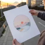
Circle-Frame Mini Mountain Scene
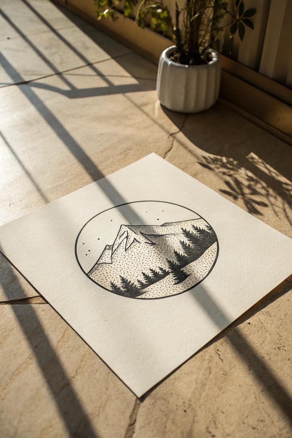
Capture the serenity of an alpine night with this minimalist stippled landscape. Using a simple circular border creates a focused, porthole-like view into a world of textured mountains and silhouette pines.
Step-by-Step Guide
Materials
- Fine liner pens (sizes 0.1, 0.3, and 0.5)
- Pencil (HB or H)
- Eraser
- Compass or a round object to trace (approx. 3-4 inches diameter)
- Ruler
- Square sheet of high-quality drawing paper or cardstock (cream or white)
Step 1: Planning the Composition
-
Draw the Circle:
Begin by using your compass or tracing a circular object centered on your square paper. This circle acts as the boundary for your tiny world, so keep your pencil pressure light for easy erasing if needed. -
Sketch the Mountain Peak:
Lightly sketch a large, jagged triangle shape slightly off-center within the circle. Add a second, lower ridgeline overlapping in front to create depth. -
Add the Tree Line:
Draw a sloping line across the bottom third of the circle where your trees will go. This foreground should curve slightly upward on the right side to balance the composition. -
Ink the Border:
Take your 0.5 pen—a slightly thicker nib works best here—and carefully trace over your pencil circle. Keep a steady hand to ensure the frame is crisp and solid.
Uneven Dots?
If your stippling looks messy, slow down and lift almost vertically. Hitting the paper at an angle creates ‘tails’ or dashes instead of round dots.
Step 2: Inking Outlines
-
Outline the Mountains:
Switch to a 0.3 pen to outline the main mountain ridges. Don’t make the lines perfectly straight; let your hand wobble slightly to mimic rocky terrain. -
Define Shadows:
Draw jagged, vertical lines down the face of the mountain to separate the sunlit side from the shadowed side. Usually, having the light source come from one specific side (like the right) helps guide these lines.
Go Celestial
Instead of random stars, stipple a specific constellation like the Big Dipper or Cassiopeia in the sky for a personalized hidden detail.
Step 3: Stippling the Texture
-
Start the Mountain Shading:
Using your finest 0.1 pen, begin stippling the shadowed side of the mountain peaks. Place dots densely near the ridge line and spread them out as you move down the slope. -
Create Gradient:
The key is patience; add more dots to the darkest crevices to create a gradient effect. The sunlit side of the mountain can remain mostly white, perhaps with just a few scattered dots for texture. -
Texturing the Ground:
Move to the bottom area below the mountains but behind where the trees will be. Add a light dusting of stippling here to suggest a snowy or grassy field, keeping the dots fairly sparse.
Step 4: Adding the Forest
-
Draw Tree Trunks:
With your 0.3 or 0.5 pen, draw simple straight vertical lines for the tree trunks in the foreground. Make the ones in the front taller and thicker than those in the back. -
Flesh Out the Pines:
Using short, scribbly, zig-zag motions, build the branches of the pine trees. Start narrow at the top and flare out wider towards the bottom of each trunk. -
Fill in the Silhouettes:
Color these trees in completely black. The solid black contrast against the delicate stippled mountain is what makes this style pop. -
Layer the Forest:
Add a second row of smaller tree shapes behind the main ones if you have space. I find this really helps push the mountains further into the background.
Step 5: Finishing Touches
-
Add the Stars:
In the open sky area at the top of the circle, place a series of small, random dots for stars. Group a few together and leave open space elsewhere for a natural look. -
Dry and Erase:
Wait at least 5-10 minutes for the ink to dry completely. Once safe, gently erase all remaining pencil guidelines to reveal the clean, sharp contrast of the drawing.
Now you have a tranquil mountain scene ready to frame or gift
Simple Cloud Puff With Misty Stippling
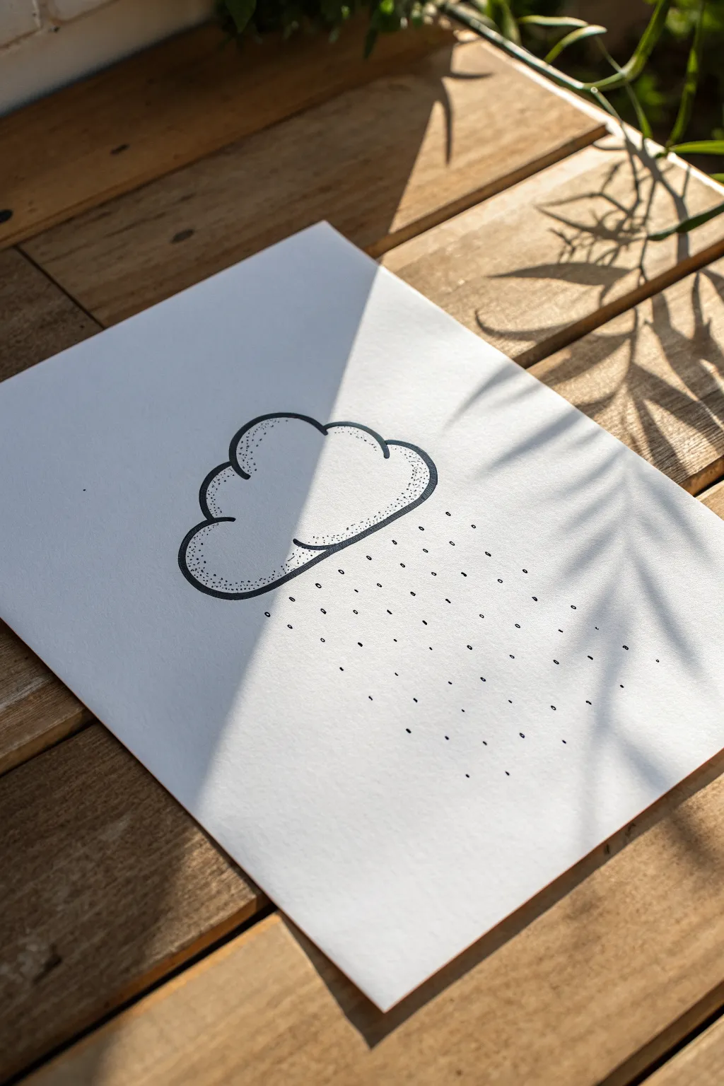
Capture the gentle mood of a rainy day with this minimalist black and white ink drawing. Using basic lining and strategic stippling, you’ll create a cloud that feels soft and pillowy with just a few well-placed dots.
How-To Guide
Materials
- Smooth white bristol or drawing paper
- Pencil (HB or H for light sketching)
- Eraser (kneaded is best)
- Black fineliner pen (0.5mm for outlines)
- Black fineliner pen (0.1mm or 0.05mm for stippling)
- Ruler (optional, if you want perfectly straight rain)
Step 1: Sketching the Shape
-
Establish the cloud base:
Begin by lightly sketching a horizontal, slightly curved line for the bottom of the cloud using your pencil. Keep it loose and faint so it’s easy to erase later. -
Draw the fluffy peaks:
Add a series of rounded humps on top of your base line. Aim for asymmetrical sizes—maybe one large hump in the middle-left and a smaller one trailing off to the right—to make it look more organic. -
Connect the shape:
Close the loop by connecting the bottom curve to the upper humps, ensuring the transitions are smooth rather than sharp corners. -
Refine the outline:
Step back and look at your pencil sketch. Adjust the curves until the cloud looks puffy and balanced.
Keep it Vertical
When stippling, hold your pen completely vertical (90 degrees). Slanting the pen creates tiny dashes instead of round dots, which ruins the clean gradient effect.
Step 2: Inking the Outline
-
Trace with the thicker pen:
Take your 0.5mm fineliner and carefully trace over your pencil lines. The line weight should be consistent and bold. -
Add inner details:
Draw one or two partial curves inside the cloud shape, near the bottom edge. These suggest overlapping fluff and give the cloud 3D volume. -
Let the ink set:
Wait a moment for the ink to dry completely to avoid smearing. -
Erase pencil guides:
Gently erase all the underlying pencil sketch lines so only the crisp black ink remains.
Make it a Storm
Add a jagged lightning bolt coming from the bottom of the cloud using yellow watercolor or a gold gel pen for a pop of unexpected color.
Step 3: Adding Shadow with Stippling
-
Switch to the finer pen:
Use your 0.1mm or 0.05mm pen for the shading phase. The smaller tip allows for more subtle gradients. -
Identify shadow areas:
Focus your attention on the bottom curves of the cloud and the underside of the inner detail lines. This is where shadows naturally gather. -
Start with dense dots:
Place dots tightly together right along the bottom ink lines. They should be close enough that they almost merge, creating a dark strip of shadow. -
Fade upward:
As you move slightly upward into the white space of the cloud, start spacing your dots further apart. I find a random tapping motion works better than trying to make rows. -
Create the gradient:
Continue spreading the dots out until they disappear completely into the white center of the cloud. This transition from dense to sparse creates the ‘misty’ effect. -
Check the volume:
Ensure the stippling follows the curve of the cloud’s bumps. This reinforces the roundness of the shape.
Step 4: Creating the Rain
-
Plan the rain path:
visualizing where the rain would fall beneath the cloud. It doesn’t need to be a perfect grid, but a general downward direction is key. -
Draw the first drops:
Using the 0.5mm pen (or whichever you used for the outline), simply tap the paper to create small dots or very tiny dashes for the rain. -
Vary the density:
Place the rain dots somewhat randomly. Avoid creating perfect straight lines unless you want a very stylized look; randomness feels more like nature. -
Fill the space:
Continue adding drops until the area below the cloud feels occupied but not cluttered. Leave plenty of white space between drops. -
Final assessment:
Look at the overall balance. If the rain looks too light on one side, add a few more dots to even it out.
Now you have a charming, minimalist piece of weather art ready to display
Animal Silhouette With Stippled Fill

Transform a plain tea towel into a woodland masterpiece using a clever reverse-stippling technique. Instead of drawing dots, you’ll be removing them from a block print stamp to create this charming, celestial-inspired fox silhouette.
Step-by-Step
Materials
- Soft carving block (linoleum or rubber meant for stamp making)
- Linoleum carving tools (V-gouge and U-gouge)
- Pencil and paper
- Transfer paper (graphite paper)
- Fabric Ink (navy or dark blue)
- Rubber brayer (roller)
- Glass or acrylic sheet (for rolling ink)
- Plain cotton or linen tea towel (pre-washed)
- Iron (for heat setting)
- Craft knife
Step 1: Design and Transfer
-
Sketch your silhouette:
Begin by drawing a simple fox outline on paper. Focus on distinct features like the pointed ears, snout, and bushy tail, keeping the overall shape solid and recognizable. -
Refine the details:
Add lines for the neck fur and tail tip texture within your sketch. These will be carved out later to add definition to the silhouette. -
Prepare the block:
Cut your carving block down to a size slightly larger than your fox drawing using a craft knife. -
Transfer the image:
Place the transfer paper face down on the block, then place your drawing on top. Trace heavily over your lines to transfer the graphite onto the rubber surface.
Reverse Stippling Tip
Don’t carve perfect circles for the dots. Gouging out tiny, irregular chips creates a more organic, twinkling texture than using a drill or hole punch.
Step 2: Carving the Texture
-
Outline the shape:
Using your finest V-gouge tool, carefully carve along the exterior outline of the fox. This creates a safety channel that prevents slipping when you remove the larger background areas. -
Clear the background:
Switch to a wider U-gouge to remove all the rubber material outside the fox shape. Cut away enough depth so the background won’t pick up ink. -
Carve internal lines:
Use the V-gouge again to carve out the specific details like the ear interior, the zig-zag neck fur, and the tail tip lines. Remember, whatever you carve away will remain white. -
Begin stippling:
To create the ‘stippled’ look, use a fine pointed carving tool or even a sharp pick. Plunge the tool vertically into the rubber to create small divots across the fox’s body. -
Vary density:
Make the dots denser near the top of the back or legs to suggest shading or a starry night effect, and sparser in the middle of the body. -
Clean up edges:
Trim the excess rubber block closely around the fox shape with a craft knife to minimize the risk of ink smudges on the fabric boundaries.
Step 3: Inking and Printing
-
Prepare the fabric:
Lay your pre-washed tea towel flat on a hard, smooth surface. Tape the corners down if necessary to prevent shifting. -
Charge the roller:
Squeeze a line of fabric ink onto your glass sheet. Roll the brayer back and forth and lift it occasionally to distribute a thin, even layer of ink on the roller. -
Ink the block:
Roll the inked brayer over your carved fox block. Apply light, even pressure to ensure the raised surface is covered without flooding the tiny stippled holes. -
Position the stamp:
Carefully hover the block over your desired spot on the towel. Once you commit, press it straight down without wiggling. -
Apply pressure:
Press firmly on the back of the block. I like to stand up and use my body weight here to ensure a solid, crisp transfer of the ink. -
Reveal the print:
Lift the block straight up by its edges. Check the print quality; the stippled dots should appear as the jagged white specks showing the fabric color. -
Final cure:
Allow the ink to dry completely according to the manufacturer’s instructions. Once dry, heat set the design by ironing it (usually on the reverse side) to make it washable.
Uneven Ink Coverage?
If the print looks patchy, slide a thin foam mat or a stack of newspapers underneath your fabric. This slight cushion helps the stamp make better contact.
Once heat set, your custom-printed textile is ready to be used in the kitchen or gifted to a friend
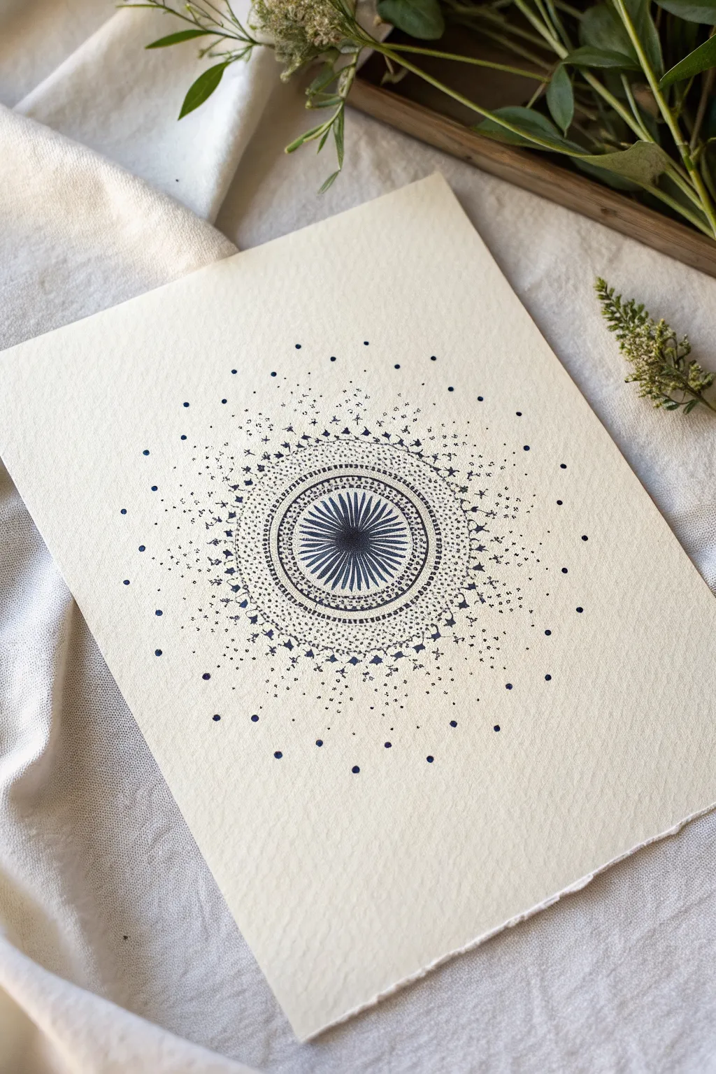
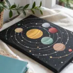
Abstract Galaxy Dot Burst
Have a question or want to share your own experience? I'd love to hear from you in the comments below!