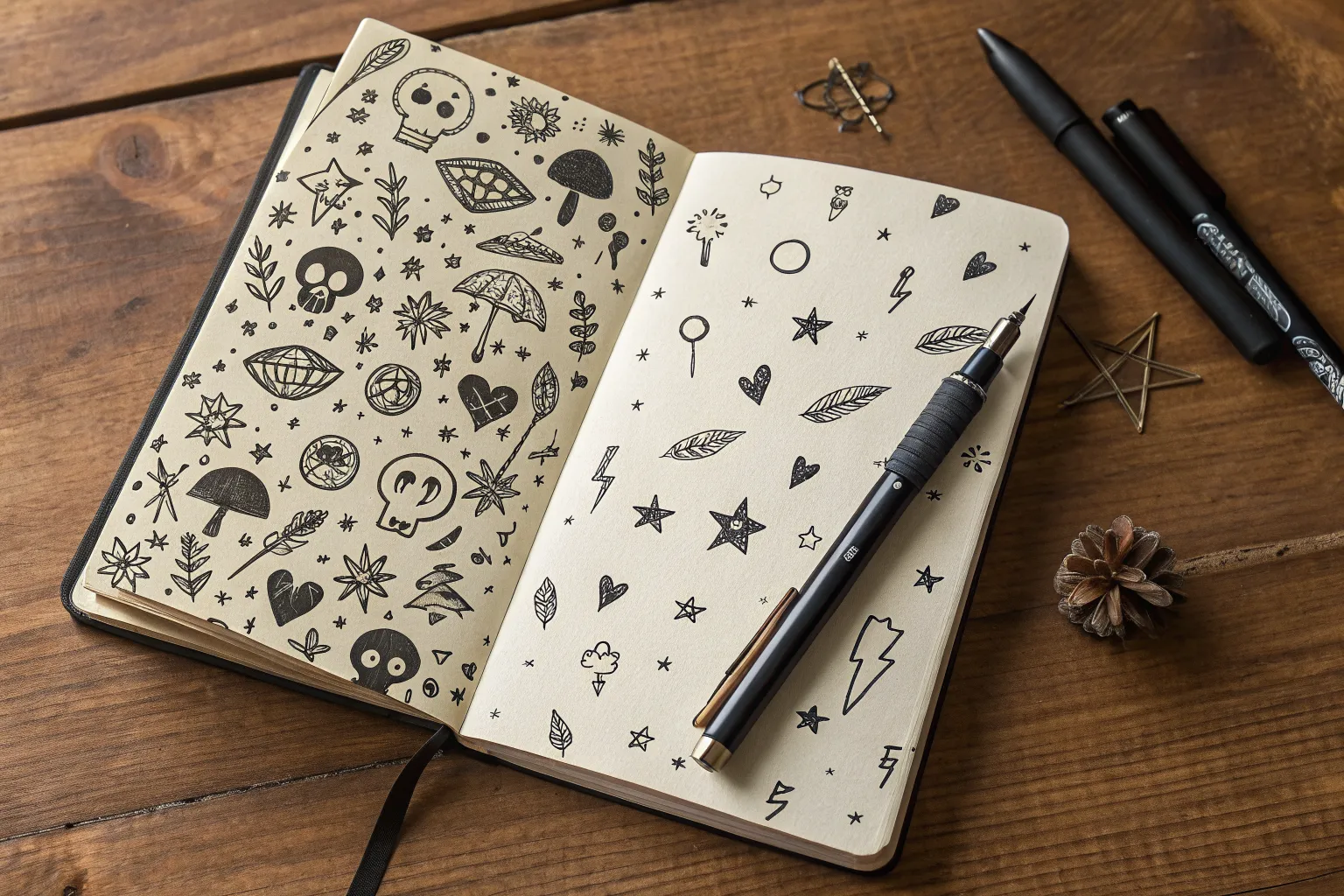
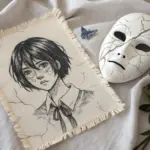
When I’m craving that raw, messy grunge aesthetic, I fill a page like a chaotic little world—rough lines, moody icons, and zero perfection pressure. These grunge aesthetic drawings ideas are all about scribbles, scratches, and that “found in an old notebook” vibe you can build one doodle at a time.
Skulls, Bones, and Rough Shading
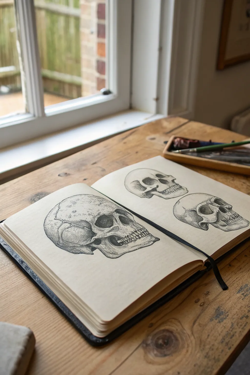
Master the art of grunge aesthetic with these detailed anatomical skull studies, featuring intricate stippling and cross-hatching techniques. This project captures the raw, scientific feel of vintage medical illustrations while adding a darker, artistic edge perfect for your sketchbook.
Step-by-Step
Materials
- Heavyweight sketchbook (smooth or vellum finish)
- HB graphite pencil
- Kneaded eraser
- Fine liner pens (sizes 0.05, 0.1, 0.3, and 0.5)
- Ruler (optional for proportion checks)
- Anatomy reference photos
Step 1: Drafting the Foundations
-
Establish the cranium shape:
Start on the left page with your HB pencil. Draw a large, slightly flattened circle to represent the main cranium of the primary skull. Keep your hand loose and pressure light so these lines can be erased later. -
Map the jawline:
Attach a U-shaped jawbone below the circle, extending it slightly forward to create a profile or three-quarter view. This creates the basic ‘keyhole’ shape of the skull structure. -
Locate facial features:
Lightly sketch horizontal guidelines for the eye sockets, nasal cavity, and teeth alignment. Place the eye socket as a deep, irregular recess and mark the triangular nasal opening just below it. -
Refine the outline:
Tighten your pencil sketch by defining the zygomatic arch (cheekbone) and the brow ridge. Add the separation line for the jaw connection and sketch in the individual teeth shapes, ensuring they curve with the jaw. -
Repeat for secondary skulls:
On the right page, sketch the basic forms for two smaller skulls. Try varying the angles—one facing slightly downward and the other in a deeper profile view—to practice different perspectives.
Uneven Ink Flow?
If your pens skip over pencil lines, try erasing the graphite until it’s barely visible before inking. Graphite wax can sometimes clog fine nibs.
Step 2: Inking the Outlines
-
Define the main contour:
Switch to a 0.3mm fine liner. carefully trace the outer perimeter of your pencil sketch. Use broken or slightly jittery lines in some areas to mimic the natural imperfections of bone, rather than a perfect, smooth vector line. -
Detail the sutures:
Using a thinner 0.1mm pen, draw the cranial sutures—wiggly, zigzagging lines that look like cracks running across the top and back of the skull. This is a crucial detail for that vintage medical look. -
Outline cavities and teeth:
Outline the eye sockets and nasal cavity with the 0.3mm pen. Switch back to the 0.1mm pen for the teeth to keep them distinct but delicate, ensuring they don’t look like solid blocks.
Add an Aged Look
Before drawing, lightly wash the paper with diluted coffee or tea and let it dry. The sepia tone instantly makes the skull study look antique.
Step 3: Shading and Texturing
-
Establish deepest shadows:
With a 0.5mm pen, fill in the darkest recesses: the back of the eye socket, inside the nasal cavity, and the gap behind the jaw. Leave small patches of white paper within the black to suggest depth and dimension. -
Begin stippling:
I find stippling meditative, though it takes patience. Using a 0.05mm or 0.1mm pen, start placing dots densely near the shadow edges—under the cheekbone and around the temple. As you move toward the light source, space the dots further apart. -
Layer cross-hatching:
For the darker mid-tones on the side of the cranium and jaw, layer fine distinct lines over each other in opposing directions. This cross-hatching creates volume and a classic engraving style texture. -
Texture the bone surface:
Add tiny, random specks and short, faint scratches across the lighter areas of the forehead and cheek. This prevents the bone from looking like smooth plastic and adds to the grunge aesthetic. -
Detail the teeth roots:
Use extremely light vertical hatching lines near the gum line of the teeth to show the curvature and roots. Keep the chewing surfaces mostly white to show highlights. -
Balance the composition:
Apply the same shading steps to the two smaller skulls on the right page, perhaps making one slightly lighter in tone to create variety across the sketchbook spread. -
Final clean up:
Wait at least 10 minutes for the ink to cure completely. Gently erase all remaining graphite guidelines with a kneaded eraser to reveal the stark black ink work.
Now you have a striking set of anatomical studies ready to serve as the centerpiece of your grunge aesthetic sketchbook collection
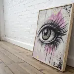
Weeping Eyes and Smudged Mascara Lines
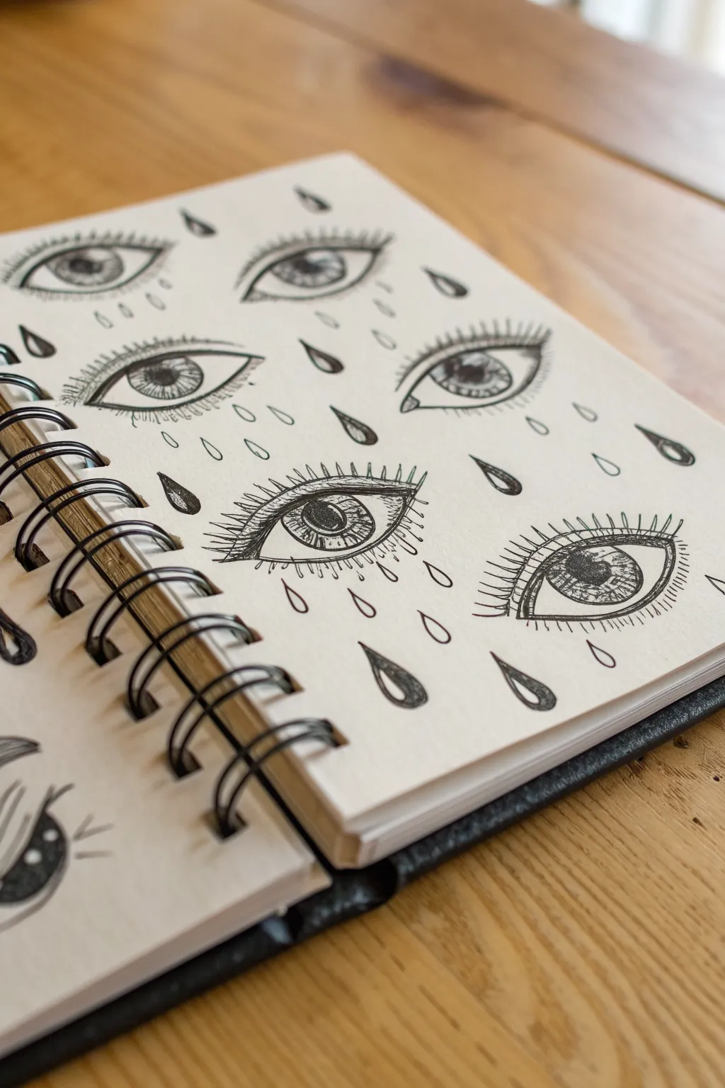
Capture a moody, surreal vibe with this repetitive pattern of detailed, weeping eyes drawn in black ink. The contrast between precise lash lines and falling teardrops creates a striking grunge aesthetic perfect for filling a sketchbook page.
Step-by-Step Guide
Materials
- Sketchbook with cream or off-white paper
- HB pencil
- Kneaded eraser
- Fine liner pen (0.1mm) for details
- Fine liner pen (0.3mm or 0.5mm) for outlines
- Fine liner pen (0.8mm or brush pen) for filling black areas
Step 1: Planning the Layout
-
Establish the grid:
Visualize a loose grid on your page to keep the eyes evenly spaced. Lightly mark rough center points for each eye with your pencil, creating a staggering brick-lay pattern for visual interest. -
Sketch basic almond shapes:
Using very light pencil strokes, draw the outline of each eye. Focus on the classic almond shape, keeping the curves smooth. Don’t worry about identical perfection; slight variations add character. -
Add iris placement:
Sketch a perfect circle within each almond shape for the iris. To make the eyes look alert, ensure the top and bottom of the iris are slightly tucked under the eyelid lines. -
Mark tear locations:
Lightly sketch teardrop shapes floating around and below the eyes. Place some near the corners and others falling freely in the negative space between the rows.
Step 2: Inking the Eyes
-
Outline the lids:
Switch to your medium-weight pen (0.3mm or 0.5mm). Trace over your pencil outlines for the upper and lower eyelids. Make the upper lid line slightly thicker to suggest shadow and lash density. -
Draw the iris structure:
Carefully outline the iris circle. In the direct center, draw a smaller black circle for the pupil, leaving a tiny white speck uncolored for a highlight reflection. -
Detail the iris texture:
With your finest pen (0.1mm), draw radiating lines from the pupil outward to the edge of the iris. These fine spokes create a realistic, fibrous texture. -
Add the crease:
Draw a thin, floating line above the upper eyelid to indicate the eyelid crease. This small detail adds essential dimension. -
Draw the tear ducts:
At the inner corner of each eye, add a tiny ‘C’ shape or small triangle to denote the tear duct (caruncle).
Uneven Eyes?
Don’t stress symmetry. In a grid pattern like this, small imperfections disappear into the overall texture. If one eye looks wonky, distract the viewer by adding an extra heavy lash line or a dark tear.
Step 3: Lashes and Tears
-
Create the upper lashes:
Using quick, flicking motions, draw the upper eyelashes. Start from the lid line and flick upward and outward. Group them slightly to look more natural rather than perfectly spaced pickets. -
Add lower lashes:
Draw shorter, sparser lashes on the bottom lid. Be careful not to overdo these; a few distinct strokes are often enough. -
Outline the teardrops:
Ink the outlines of your scattered teardrops. Vary their shapes slightly—some plump, some elongated—to simulate movement. -
Fill the teardrops:
Using a thicker pen, fill in roughly half of the teardrops completely black for high contrast. For the others, leave them empty or add just a tiny crescent shadow at the bottom. -
Add heavy shadows:
Choose a few specific areas to darken heavily, such as the very corners of the eyes or underneath the upper lash line. This grunge style benefits from bold, dark blacks.
Add Color Accents
Once the black ink is dry, use a red watercolor pencil or diluted red ink very lightly around the rims of the eyes or the tear ducts to give the piece a raw, irritated, emotional look.
Step 4: Final Touches
-
Erase pencil marks:
Wait at least five minutes to ensure the ink is totally dry. Gently rub your kneaded eraser over the entire page to lift the graphite without smearing your lines. -
Enhance shading:
Scan the drawing for balance. If an eye looks too glorious, I like to stipple (add tiny dots) around the iris or corners to create a grittier texture. -
Review contrast:
Check the solid black tears. If the ink looks patchy, go over them a second time for a deep, opaque black.
Now you have a striking page of staring eyes ready to haunt your sketchbook


Bleeding Hearts and Safety Pins
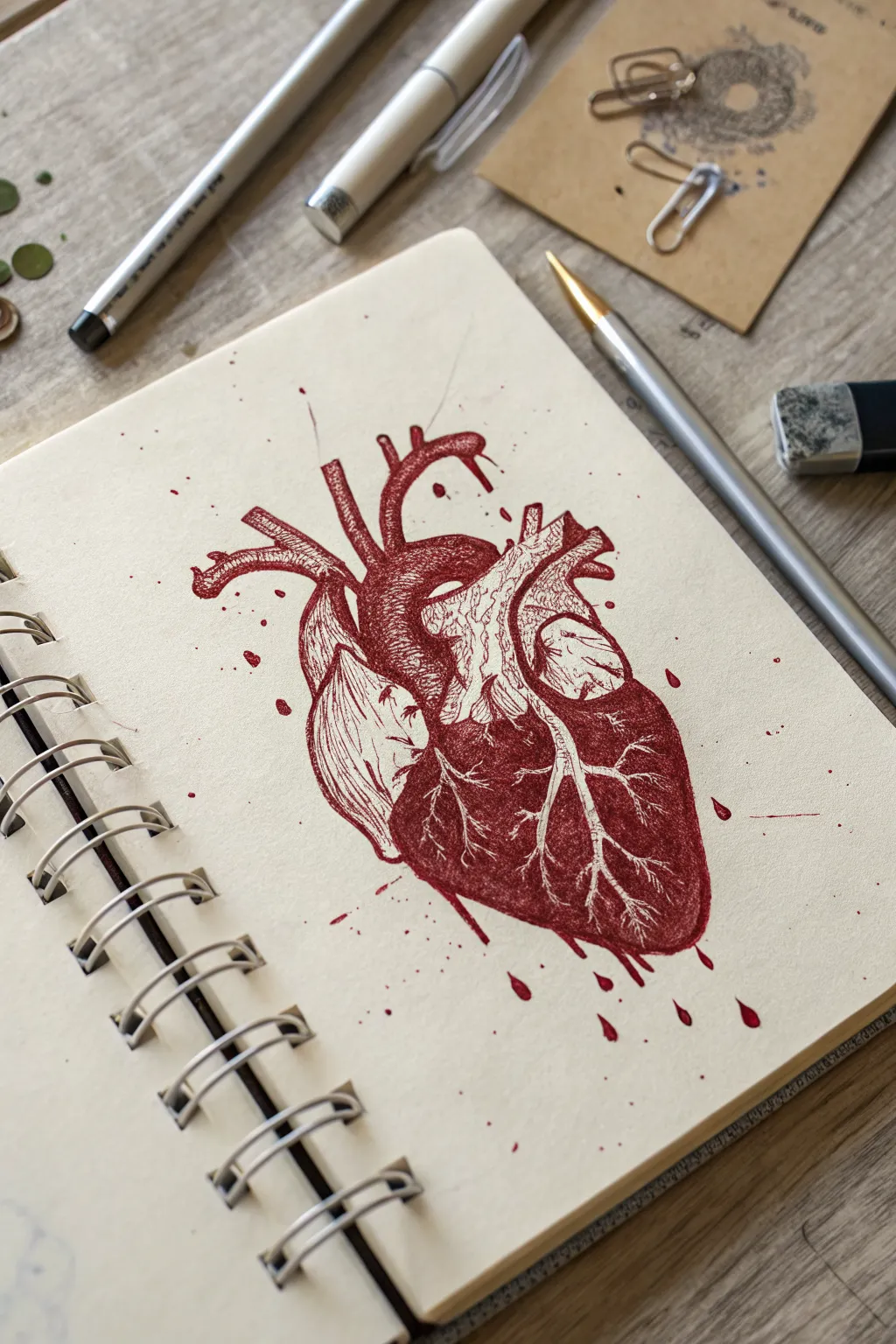
Capture the raw intensity of biological forms with this striking anatomical heart study. Using deep crimson ink on toned sketchbook paper, you’ll create a piece that feels vintage, scientific, and slightly rebellious all at once.
How-To Guide
Materials
- Heavyweight sketchbook with cream or off-white paper (spiral bound)
- HB graphite pencil
- Kneaded eraser
- Fine liner pen (0.1mm or 0.3mm) in dark red or maroon
- Ballpoint pen in standard red
- Soft synthetic brush (optional for washes)
- Water container (if using washes)
- Paper towel
Step 1: Skeletal Sketching
-
Establish the central mass:
Begin by lightly sketching a large, tilted oval shape in the center of your page to represent the bulk of the heart. Keep your pencil pressure very light so these lines can be erased later. -
Define the chambers:
Divide the oval to mark the vague territories of the ventricles and atria. The left ventricle (which appears on the right side of the drawing) should taper down to a point at the bottom apex. -
Add the vasculature:
Map out the major arteries at the top. Sketch the aorta arching over the center and the pulmonary artery branching outward. Don’t worry about perfect anatomical precision; focus on the flow and the branching shapes. -
Refine the outline:
Go back over your rough shapes to create a more defined outline. Add the subtle bumps and curves that give organic tissue its character, paying attention to the indent (interventricular sulcus) running diagonally down the front.
Step 2: Inking the Anatomy
-
Initial outline:
Switch to your dark red fine liner. Carefully trace your refined pencil lines, but keep the line weight somewhat broken and sketchy rather than perfectly solid to maintain that grunge aesthetic. -
Erase pencil guides:
Once the initial ink is dry, gently roll your kneaded eraser over the drawing to lift away the graphite, leaving only the clean red framework. -
Map shadow areas:
Using the ballpoint pen, start hatching the darkest areas. Look for the deep crevices between the arteries and the underside of the heart lobes. I find ballpoint offers a great textural grit that fine liners sometimes miss. -
Texturing the muscle:
Use short, directional strokes to mimic muscle fibers. On the left ventricle, curve your hatching lines around the form to emphasize its roundness. -
Creating the fatty tissue:
Leave the area running diagonally down the center largely unshaded. This represents the fatty tissue where the coronary arteries sit. Use tiny, sparse stippling dots here instead of lines.
Ink Flow Tip
For realistic varied tones, let your ballpoint pen ‘clog’ slightly or build up ink on the tip, then press harder in shadow areas for sudden, dark blobs of texture.
Step 3: Deepening the Values
-
Layering cross-hatching:
Return to your darkest shadow areas with the fine liner. Apply cross-hatching (lines intersecting perpendicularly) to build up a deep, rich crimson tone, especially on the lower right ventricle. -
Drawing the veins:
Inside the lighter diagonal strip, carefully draw the coronary veins. These should look like lightning bolts or tree roots—thin, branching lines that are lighter than the surrounding muscle tissue. -
Negative space detailing:
Define the veins by darkening the area *around* them, rather than drawing the veins themselves heavily. This negative space technique makes them pop forward. -
Enhancing the aorta:
Add vertical shading lines to the cylindrical tubes of the aorta and pulmonary artery at the top to give them a 3D tubular appearance.
Level Up: Mixed Media
Dilute a tiny drop of watercolor or coffee and wash over the entire page before drawing. The wrinkles and stains will amplify the grunge medical journal vibe.
Step 4: Grunge Effects
-
Splatter preparation:
To achieve the messy, organic look, you’ll need a loose ink consistency. You can scribble heavily on a scrap piece of plastic with your pen, then pick up that ink with a wet brush. -
Flicking the ink:
Hold your brush (or a juice-laden pen tip) over the drawing and tap it to create controlled splatters. Focus these drops near the arteries and the bottom tip of the heart. -
Adding drips:
Draw small teardrop shapes falling from the bottom of the heart to simulate dripping blood. Fill them in solid red. -
Stray marks:
Add a few erratic, quick lines extending outward from the arteries to suggest movement and energy, breaking the clean silhouette. -
Final contrast check:
Step back and look at your values. If the heart looks too flat, go back in with the ballpoint pen and aggressively darken the deepest shadows one last time.
Now you have a visceral piece of art that perfectly balances anatomical study with raw emotion


Cassettes, CDs, and Scribbled Track Lists
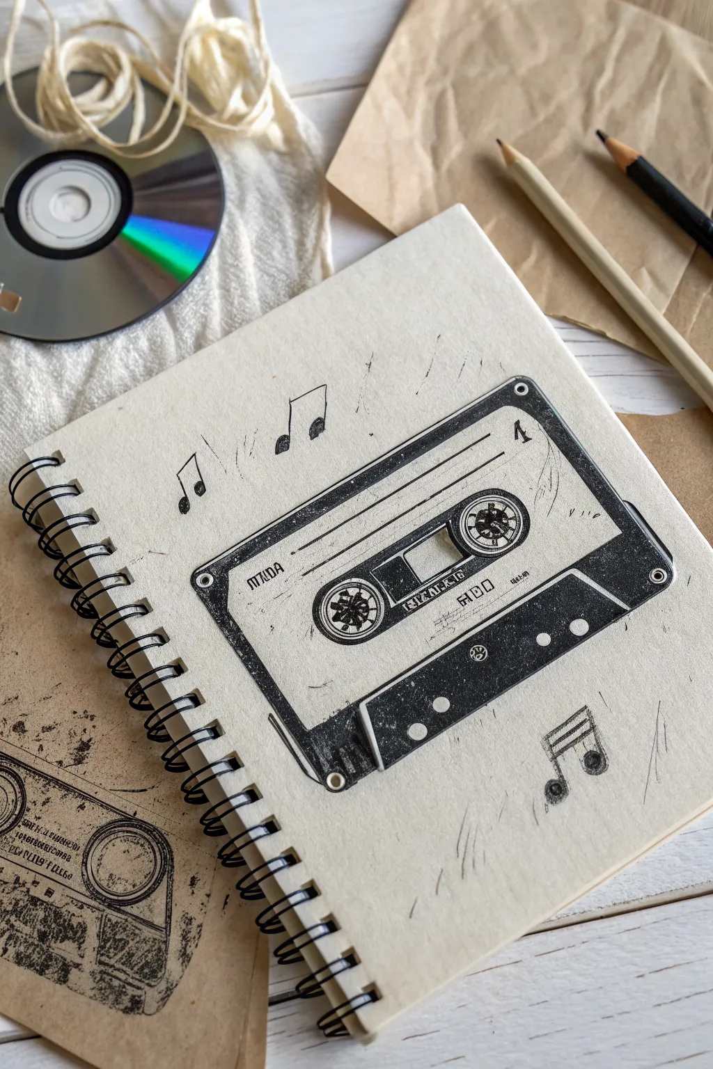
Capture the nostalgic vibe of analog music with this grunge-inspired cassette tape drawing. Using simple linework and shading techniques, you’ll create a textured, vintage-style illustration that feels like a forgotten doodle from the 90s.
Step-by-Step Guide
Materials
- Spiral-bound sketchbook (cream or off-white paper)
- Black graphical fineliners (0.1mm, 0.3mm, 0.5mm)
- Soft graphite pencil (2B or 4B) for shading
- Ruler or straight edge
- Circle template or compass (optional)
- Eraser
Step 1: Drafting the Structure
-
Establish the perimeter:
Begin by lightly sketching a large rectangle in the center of your page using a pencil and ruler. This will be the main body of the cassette tape. Keep your lines faint so they can be easily erased or inked over later. -
Add the inner trapezoid:
Draw the signature trapezoid shape at the bottom-center of the rectangle where the magnetic tape is exposed. This shape is slightly wider at the top than the bottom. -
Create the label area:
Sketch a smaller rectangle inside the main body, leaving a uniform border around the edges. This defines the sticker label area of the cassette. Divide this inner rectangle horizontally with a thin strip for the window. -
Position the reels:
Using a circle template or a steady hand, draw two circles inside the center window strip. Inside these circles, add the small sprockets—the little teeth that turn the tape reels. -
Detail the corners:
Add small circles in the four corners of the outer rectangle to represent the screws that hold the plastic casing together.
Stamp Effect
To get that speckled, printed look on solid black areas, dab the ink with a paper towel while it’s still slightly wet to lift tiny spots of pigment.
Step 2: Inking and Texturing
-
Outline the main body:
Switch to your medium-thickness fineliner (0.3mm or 0.5mm). Trace over your main rectangular outline. Instead of perfectly straight lines, allow for slight wobbles or breaks to enhance the grunge aesthetic. -
Fill the dark zones:
Identify the solid black areas, primarily the bottom trapezoid section and the outer rim border. Fill these in carefully with the pen. Don’t make it a solid block of ink; leave tiny specks of white paper showing through to simulate a worn, printed texture. -
Stipple the shading:
For the greyish areas on the cassette label, use a stippling technique. Dot your pen repeatedly to build up value. Denser dots create darker shadows, while sparser dots mimic lighter grey tones. -
Detail the reels:
Use your finest pen (0.1mm) to ink the complex sprockets inside the reel circles. Keep these lines sharp and mechanical. -
Add text and markings:
Hand-letter small details like ‘SIDE A’, ’60’, or brand names. Mimic a blocky, stamped font. If the letters look a bit uneven or gritty, even better. -
Create the grunge texture:
Take a tissue or your finger and smudge a bit of graphite over the inked black areas to dirty up the white paper slightly. I like to add random scratches and specks around the edges using quick, short pen strokes.
Level Up: Tape Spill
Draw a loop of magnetic tape spilling out from the bottom trapezoid, tangling into the words of a song title written in cursive below.
Step 3: Musical Elements
-
Draw floating notes:
Sketch a few musical notes (eighths or sixteenths) floating around the cassette. Place them at slight angles to suggest movement and rhythm. -
Fill the note heads:
Ink the note heads solid black, but keep the stems and flags sketchy. You can double up the lines on the stems for a loose, hand-drawn feel. -
Add scribble lines:
Surround the cassette and notes with very faint, rapid pencil or pen strokes. These should look like accidental scratches or background noise, reinforcing the messy, analog theme. -
Final weathering:
Use your eraser to lift some pigment from the black inked areas if the ink is dry, or rub a bit harder on the paper grain to create a distressed look.
Now you have a piece of music history preserved in ink, ready to anchor your grunge aesthetic journal spread

PENCIL GUIDE
Understanding Pencil Grades from H to B
From first sketch to finished drawing — learn pencil grades, line control, and shading techniques.
Explore the Full Guide
Electric Guitar Doodles with Amp Noise Marks
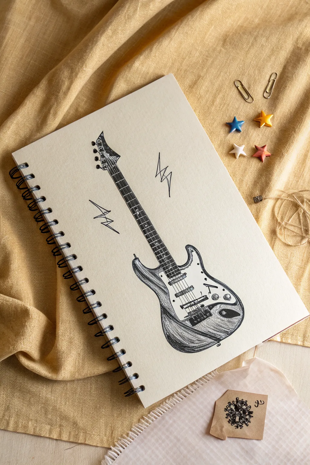
Capture the raw energy of rock and roll with this detailed ink drawing of an electric guitar. The high-contrast shading and scratchy texture give it a perfect grunge vibe, enhanced by jagged lightning bolts that suggest loud, crackling feedback.
Detailed Instructions
Materials
- Spiral-bound sketchbook (cream or off-white paper)
- HB graphite pencil
- Kneaded eraser
- Fine liner pens (sizes 0.1, 0.3, and 0.5)
- Ruler (optional)
- Reference photo of a Stratocaster guitar
Step 1: Drafting the Structure
-
Map out the axis:
Start by lightly drawing a diagonal line across the page with your pencil. This will serve as the central axis for the guitar’s neck and body, giving the drawing a dynamic, tilted composition. -
Block in the body shape:
Sketch the main body of the guitar at the bottom of your axis. Stratocasters have a distinctive double-cutaway shape with curvy contours, so keep your pencil lines loose and rounded. -
Define the neck and headstock:
Draw parallel lines extending upward from the body for the fretboard. At the top, sketch the angular, asymmetrical headstock shape, which is iconic for this type of guitar. -
Locate key components:
Lightly mark the placement of the bridge, the three pickups, the volume/tone knobs, and the input jack. Don’t worry about details yet; just get the positioning right.
Uneven Ink Flow?
If your hatching looks too uniform, try changing your grip. Holding the pen further back creates looser, more erratic lines perfect for grunge textures.
Step 2: Refining the Outline
-
Ink the main contours:
Switch to your 0.3 fine liner. Carefully trace the outer silhouette of the guitar body and headstock. Use confident, slightly broken lines to begin establishing that sketchy, grunge aesthetic. -
Draw the pickguard:
Outline the pickguard shape on the body. This is a crucial layer that sits on top of the main body but underneath the electronics. -
detail the hardware:
Using the 0.1 pen, draw the tuning pegs on the headstock and the bridge assembly at the base of the body. These small mechanical parts need precision. -
Add the pickups:
Draw the three rectangular pickups in the center of the pickguard. Add the six small circular magnets inside each rectangle.
Step 3: Adding Texture and Strings
-
Strings installation:
Draw six straight lines running from the bridge to the tuning pegs. A ruler can help here, but a steady hand adds more character. I prefer lifting the pen slightly near the bridge to prevent smudging. -
Mark the frets:
Draw horizontal lines across the neck for the frets. Remember that the space between frets gets smaller as you move closer to the guitar body. -
Shade the fretboard:
Use your 0.5 pen to darken the fretboard. Instead of solid black, use dense cross-hatching or stippling to suggest the wood grain texture while leaving the strings white (negative space). -
Structure the body shading:
Start shading the darker parts of the guitar body (outside the pickguard) using directional hatching. Follow the curve of the guitar with your pen strokes to emphasize its volume.
Amp It Up
Use a white gel pen to add highlights back over the darkest inked areas, simulating stage lights hitting the glossy guitar finish.
Step 4: Grunge Details & Final Touches
-
Deepen the contrast:
Go over the darkest shadow areas again with the 0.5 pen, particularly the sides of the body and underneath the knobs, to make the instrument pop off the page. -
Add textural scratching:
Use the 0.1 pen to add erratic, scratchy hatching lines on the body. This mimics the ‘relic’ look of a worn-in texturized surface. -
Draw the knobs and jack:
Ink in the volume and tone knobs, adding small curved lines to show their cylindrical shape. Darken the recessed input jack area completely. -
Insert noise marks:
On either side of the guitar neck, draw jagged lightning bolt shapes or ‘Z’ lines. Keep these sharp and angular to contrast with the guitar’s curves. -
Clean up:
Once the ink is completely dry, gently erase the underlying pencil structure lines with your kneaded eraser to reveal the crisp ink work.
Now you have a rock-solid illustration ready to make some noise in your sketchbook
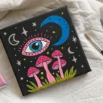
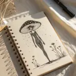
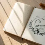
Mushrooms and Starry Doodles
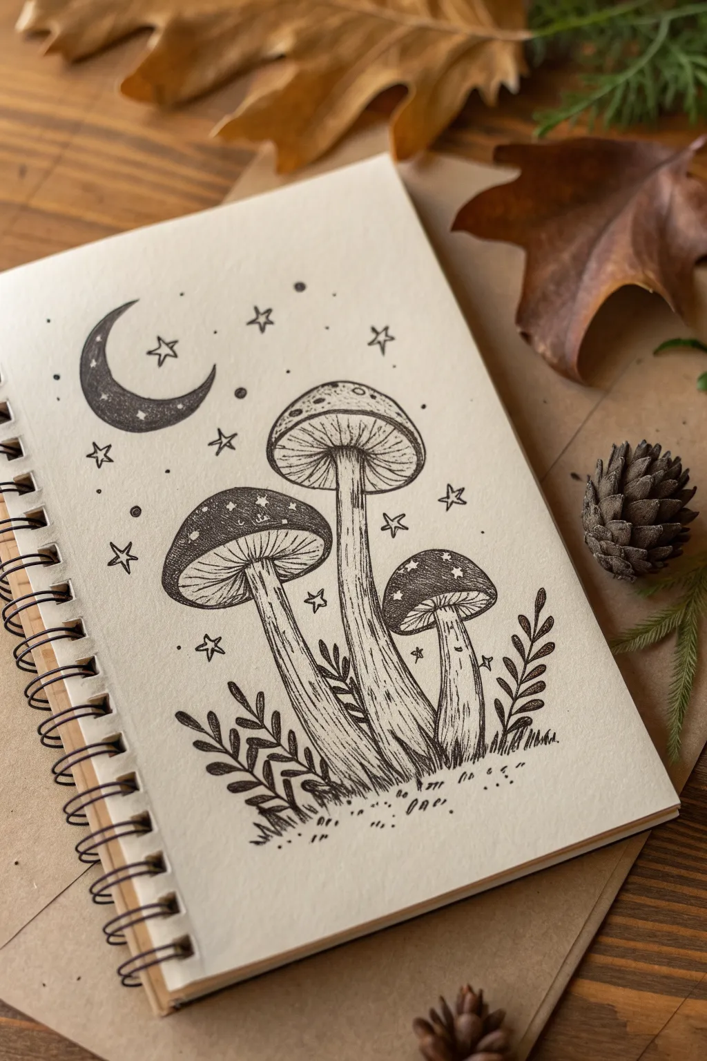
Capture the magic of a forest floor at midnight with this enchanting black ink drawing. Featuring detailed mushroom caps, a crescent moon, and delicate stars, this sketch relies on simple line work and stippling to create a textured, grunge-inspired aesthetic.
Step-by-Step
Materials
- Sketchbook with cream or off-white paper (medium weight)
- Pencil (HB or 2B)
- Eraser (kneaded preferred)
- Fine liner pens (sizes 0.1, 0.3, and 0.5)
- White gel pen (optional for highlights)
Step 1: Penciling the Composition
-
Sketch the moon:
Start in the upper left quadrant of your page. Lightly draw a crescent moon shape. Keep the curve smooth and ensure the bottom point curls slightly upward to frame the composition. -
Position the mushroom caps:
Draw three oval domes for the mushroom caps. Place the largest one in the center, slightly higher up. Place a medium-sized cap to its left, slightly lower, and the smallest cap to the right, sitting the lowest of the three. -
Add the stems:
Drop curved, slightly wavy lines down from the center of each cap to create the stems. The central stem should be the longest and thickest. Flare them out slightly at the base where they meet the ground. -
Draw foliage guidelines:
Sketch simple, sweeping lines extending outward from the base of the mushrooms to indicate where the leafy ferns will go. Add a rough ground line beneath the stems.
Stippling Rhythm
Keep your hand relaxed while stippling. Don’t press hard; let the pen tip barely touch the paper. Fast, light taps create cleaner dots than slow, heavy presses.
Step 2: Inking the Main Lines
-
Outline the caps:
Switch to your 0.5 pen. specific the outer shape of the mushroom caps. Draw the bottom rim of each cap as a double line to show thickness, curving upward into the cap structure. -
Ink the stems:
Trace over your stem sketches with the 0.5 pen. Instead of perfectly straight lines, use slightly jittery or organic strokes to give the texture of natural fiber. I find that lifting the pen occasionally near the base adds a nice grassy effect. -
Detail the moon:
Outline the crescent moon shape clearly. Use the 0.3 pen to fill the moon with dense stippling (tiny dots) concentrated at the bottom and fading toward the top tip, creating a gradient shadow.
Step 3: Adding Texture and Detail
-
Draw the gills:
Underneath the caps, use your 0.1 pen to draw fine, curved lines radiating from the stem connection point out to the rim. Keep these lines close together to represent the gills. -
Decorate the caps:
On top of the caps, draw small, irregular spots. Leave these white while you stipple around them with the 0.3 pen to darken the cap surface, making the spots pop. -
Shade the stems:
Use vertical hatching lines along the sides of the stems with the 0.1 pen. This rounds out the form. Keep the center of the stems mostly clear to act as a highlight. -
Ink the foliage:
Using the 0.3 pen, draw the small leaves along the guide lines you made earlier. Darken the stems of these plants and add little veins to the leaves. -
Ground the sketch:
Add short, sharp strokes at the base of the mushrooms to simulate grass blades and uneven terrain. Dot the ground area with sparse stippling for a gritty, earthy look.
Level Up: Aged Paper
Before drawing, lightly stain your paper with cold coffee or a wet tea bag. Let it dry flat for a vintage, parchment-like background that suits the grunge style perfectly.
Step 4: Final Celestial Touches
-
Draw the stars:
Scattered around the mushrooms and moon, draw several five-pointed stars. Vary their sizes—some large, some tiny. -
Add cosmic dust:
Place single dots and tiny circles randomly in the negative space between the main elements. This fills the void and ties the magical theme together. -
Clean up:
Once the ink is completely dry (wait at least five minutes to avoid smudges), gently erase all your pencil guides.
Now you have a moody, mystical illustration ready to adorn your journal or wall
BRUSH GUIDE
The Right Brush for Every Stroke
From clean lines to bold texture — master brush choice, stroke control, and essential techniques.
Explore the Full Guide
Alien Faces and Flying Saucers
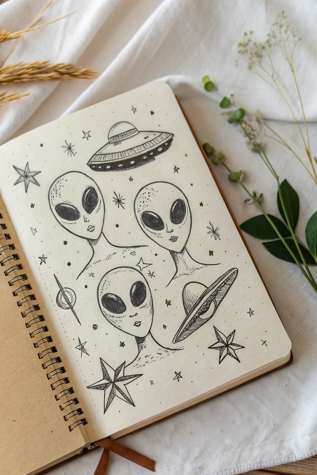
Capture a moody, extraterrestrial vibe with this pen-and-ink sketchbook spread featuring classic alien faces and retro-style flying saucers. The combination of clean linework and stippled shading gives the drawing a gritty, grunge aesthetic perfect for filling blank pages.
Step-by-Step Tutorial
Materials
- Sketchbook with cream or off-white paper (smooth texture preferred)
- HB pencil for sketching
- Kneaded eraser
- Fine liner pens (sizes 0.1, 0.3, and 0.5)
- Black brush pen or thick marker (optional for filling large areas)
Step 1: Drafting the Composition
-
Map out the heads:
Start with your pencil. Lightly sketch three inverted egg shapes to form the alien heads. Place two near the center and one slightly lower to create a triangular composition. Don’t press too hard; you want these lines to disappear later. -
Define facial features:
Refine the jawlines, making them narrow and pointed. Draw a vertical line down the center of each face to help with symmetry. Sketch large, tilted oval shapes for the eyes, leaving plenty of space for the forehead. Add tiny, barely-there marks for the nose holes and small, thin mouths. -
Add the saucers:
In the open spaces near the top and right side, sketch two flying saucers. Use flattened ellipses (ovals) stacked on top of each other—a wider disc on the bottom and a dome on top. Add rings or details to the disc edges. -
Sketch celestial fillers:
Fill the gaps between the main subjects with simple star shapes, both 5-pointed and 4-pointed. Add a small planet with a ring on the left side to balance the weight of the drawing.
Ink Smearing?
If your fine liner smears when erasing pencil lines, waiting longer is key. Also, try dabbing with the eraser instead of rubbing vigorously to protect the ink.
Step 2: Inking the Outlines
-
Trace the main lines:
Switch to your 0.3 fine liner. Carefully trace over your pencil lines for the alien heads and necks. Keep your hand steady to create smooth, continuous curves for the skulls. -
Ink the saucers:
Outline the UFOs. For the rings around the saucers or the separate sections of the ship, use confident strokes. You can break the lines slightly in some areas to give it a weathered, sketched look rather than a perfect technical diagram. -
Detail the stars:
Ink the stars with sharp points. For the larger stars, draw a line down the center of each point to give them a faceted, 3D appearance. -
Erase pencil marks:
Wait for the ink to become completely dry to the touch. Gently run your kneaded eraser over the entire page to lift all the graphite, leaving only your clean ink lines.
Cosmic Color
Add a pop of eerie color by outlining the drawing with a neon green or purple highlighter, creating a glowing aura around the aliens and ships.
Step 3: Creating Texture and Depth
-
Fill the alien eyes:
This is a high-contrast step. Using a 0.5 pen or a brush pen, fill in the large oval eyes completely black. Leave small white slivers or dots as highlights to make the eyes look wet and reflective. -
Start stippling:
Switch to your finest pen (0.1). Begin adding texture to the alien heads using stippling (lots of tiny dots). Concentrate the dots heavily at the very top of the forehead and around the temples. -
Shade the features:
Continue stippling under the chin and along the neck to create shadow. Place a light dusting of dots on the cheeks and nose bridge to suggest contour without drawing hard lines. -
Shade the UFOs:
Use parallel hatching lines to shade the underside of the flying saucers. This gives them weight and makes them look like they are hovering. Add vertical hatch marks on the domes for a metallic sheen. -
Texture the stars:
Return to your faceted stars. Fill one side of each star point with dense hatching lines. This creates a shadow effect that makes the stars pop off the page. -
Add floating dust:
To enhance the grunge space atmosphere, randomly place tiny dots and small ‘x’ marks throughout the negative space. This mimics cosmic dust or distant stars. -
Final touches:
Review your work. If the alien heads look too flat, I usually add a few more layers of dots to the shadowed side of the face to deepen the contrast against the paper.
Enjoy the mysterious atmosphere of your new sci-fi sketchbook spread
Chain, Padlock, and Metal Hardware Studies
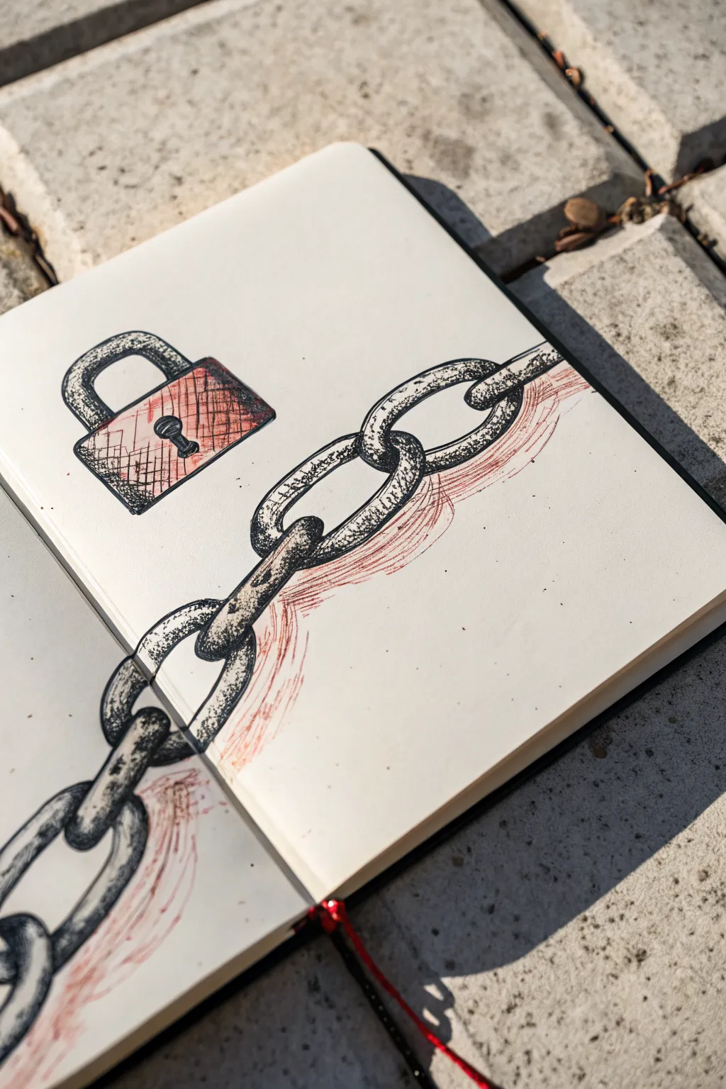
Capture the raw, industrial feel of metal with this heavily textured sketchbook study. By combining precise ink lines with stippled shading and loose, smudged red accents, you’ll create a striking visual metaphor that spans across two pages.
Step-by-Step
Materials
- Sketchbook (flat-lay style works best)
- HB or 2B Graphite pencil
- Eraser (kneaded preferred)
- Fine liner pens (sizes 0.1, 0.3, and 0.5)
- Black brush pen or thick marker
- Red colored pencil or charcoal stick
- Blending stump or tissue
- Ruler (optional)
Step 1: Laying the Foundations
-
Map the Composition:
Open your sketchbook flat. Draw a very light diagonal guideline stretching from the bottom left corner of the left page upward to the middle-right of the right page. This will be the path for your chain. -
Sketch the Links:
Using your pencil, sketch oval shapes along the guideline. Alternate their angles—one oval flat, the next slightly narrower as if seen from the side—to create the illusion of interlocking links. -
Connect the Chain:
Refine the ovals by erasing the intersecting lines where one link passes behind another. Pay attention to the thickness of the metal; ensure the rings look heavy and substantial, not like thin wire. -
Draft the Padlock:
On the upper open space of the right page, sketch the padlock body as a square or rectangle. Add the U-shaped shackle at the top. Don’t worry about perfect symmetry; a slightly rough look fits the grunge aesthetic. -
Keyhole Detail:
Place the keyhole in the center of the padlock body. Draw a small circle with a triangle shape tapering downward from it.
Step 2: Inking and Outline
-
Initial Inking:
Switch to your 0.5 fine liner. Trace over your pencil outlines for both the chain and the lock. Use a shaky, deliberate hand rather than trying to make smooth vector lines; breaks in the line art add character. -
Adding Weight:
Go back over the bottom edges of the links and the lock with the larger pen or brush pen to thicken the lines. This immediately suggests a light source coming from above. -
Refining the Connection:
Pay special attention to the page fold. If drawing across the gutter, ensure the ink connects visually when the book is laid flat, even if the pen skips slightly over the binding. -
Erase Guidelines:
Once the foundational ink is completely dry, gently erase all graphite pencil marks to clean up the page.
Stippling Sanctuary
Patience is key for stippling. Don’t rush or the distinct dots will turn into messy dashes. Keep your wrist loose and tap vertically.
Step 3: Texturing and Grunging
-
Stippling Shadows:
Using the 0.3 or 0.1 fine liner, start adding texture. Use the stippling technique (dots) concentrated heavily where links overlap and on the sides of the padlock to create depth. -
Cross-Hatching the Lock:
On the face of the padlock, draw loose, scratchy cross-hatching lines. Keep them vertical and horizontal to mimic brushed metal texture. -
Surface Imperfections:
Add tiny random scratches, nicks, and pits to the metal links using your finest pen. This makes the metal look aged and used. -
Deepening Shadows:
Revisit the darkest areas (inside the keyhole and between links) with your thickest black marker to create high contrast.
Metallic sheen
Add highlights with a white gel pen on the top curves of the chain links. It makes the ‘metal’ pop against the gritty paper.
Step 4: Atmosphere and Color
-
Apply Red Accent:
Take your red colored pencil or charcoal. Lightly scribbling horizontally behind the chain and padlock. Don’t color ‘inside the lines’—this layer represents rust, blood, or atmospheric grime. -
Current of Color:
Intensify the red pressure slightly right underneath the chain links to ground them, almost like a colored shadow. -
Smudge and Blur:
Use a blending stump or your finger to vigorously smudge the red pigment outward. I find this creates a ghostly, motion-blur effect that contrasts beautifully with the sharp ink lines. -
Final Grit:
If desired, flick your pen nib to splatter a few tiny droplets of black ink near the padlock for extra texture.
Now you have a rugged, industrial spread that captures the raw energy of urban sketching


Graffiti Tags and Marker Drips
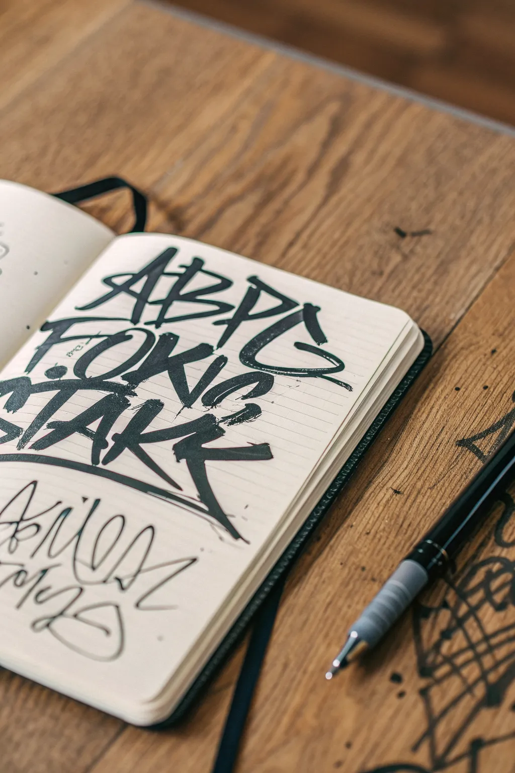
Master the raw, energetic style of street tags right in your sketchbook with this bold lettering project. By combining chisel-tip markers with aggressive, angular strokes, you’ll create a layered composition that captures the gritty essence of urban graffiti culture.
Detailed Instructions
Materials
- Sketchbook or heavy paper notebook (lined or blank)
- Black alcohol-based marker with a wide chisel tip
- Fine-liner pen or thin marker (0.5mm or 0.8mm)
- Scrap paper (for testing stroke width)
Step 1: Deconstructing the Letterforms
-
Analyze the grid:
Visualize your page as a canvas for three distinct lines of text. The top line will be slightly condensed, the middle line dense, and the bottom line typically features elongated tails or kick-outs. -
Practice the angle:
On scrap paper, hold your chisel tip marker so that the flat edge is at a consistent 45-degree angle. This creates the classic ‘ribbon’ effect found in calligraphy and graffiti tags. -
Plan the first word:
Mentally map out ‘ABPG’ (or your chosen four-letter word) for the top row. The letters should lean slightly to the right to imply forward momentum and speed.
Ink Bleed Control
Heavy markers bleed through standard paper. Place a sheet of thick cardstock under your current page to protect the rest of your notebook.
Step 2: Executing the Main Tag
-
First stroke confidence:
Begin the top line with a sharp, upward diagonal stroke for the ‘A’. Don’t hesitate; speed creates cleaner lines than slow, shaky movement. -
Connecting the letters:
Draw the subsequent letters (‘B’, ‘P’, ‘G’) close together. Allow the horizontal crossbars to extend slightly beyond the letter widths, creating stylized serifs. -
The middle layer:
For the second line (‘FOKIS’), position the letters directly beneath the first, almost touching the bottom of the top row. This density is crucial for the ‘block’ feel. -
Overlapping technique:
Let some vertical strokes on the second line slightly overlap or tuck behind the letters above. I find this creates a nice sense of depth without needing drop shadows. -
Anchoring the bottom:
Start the third line (‘TAKK’) with a very heavy horizontal bar for the ‘T’. This acts as a roof for the bottom section. -
Elongated kicks:
On the final letter ‘K’ of the main block, drag the bottom leg further down and to the right, letting the ink taper off naturally as you lift the pen. -
Adding style elements:
Go back and add small, disconnected horizontal dashes or dots near the ‘O’ and between word gaps to fill negative space and add texture.
Drip Effect
To get a grungy drip look, press the nib down hard at the bottom of a vertical stroke and hold for 2 seconds to pool the ink.
Step 3: Contrasting Styles
-
Switching tools:
Swap your thick chisel marker for a finer tip pen. The visual weight difference is key to making the page look like a real blackbook entry. -
Loosening the wrist:
For the bottom script, stop moving your whole arm and switch to using just your wrist. This section requires flowy, curved movements rather than rigid blocks. -
Continuous line work:
Attempt to write the bottom tag in a single continuous stream or very long segments. Loop the ‘L’s and ‘O’s broadly. -
Underlining:
Finish the thin tag with a swift, jagged underline that zags back and forth, framing the bottom of the composition. -
Peripheral details:
If you’re feeling bold, add a few stray sketch lines or a quick geometric doodle on the far right edge of the paper to make the spread feel lived-in and authentic.
Now you have a dynamic, urban-style page that captures the raw energy of street art
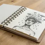
Glitchy Portraits with Broken Linework
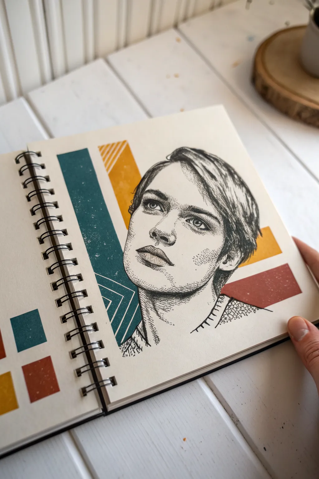
Combine clean geometric design with textured ink techniques in this striking mixed-media sketchbook spread. By juxtaposing bold blocks of color against a delicate, stippled portrait, you’ll create a modern grunge aesthetic that feels both nostalgic and edgy.
Detailed Instructions
Materials
- Sketchbook (heavyweight paper recommended)
- Pencil (HB or 2B) and eraser
- Fine liner pens (0.05mm, 0.1mm, and 0.5mm)
- Acrylic paints or Gouache (Teal, Mustard Yellow, Rust Red)
- Ruler
- Washi tape or masking tape
- Flat paintbrush
- White gel pen (optional)
- Sandpaper or textured stamp (optional for distress effect)
Step 1: Planning and Layout
-
Grid the background:
Start by lightly sketching the geometric layout. Use your ruler to mark out three large diagonal rectangular zones behind where the head will go. The largest block spans the left side, with two smaller accent blocks tilting to the right. -
Sketch the portrait:
Lightly sketch the outline of the face in the center of the page. The composition works best if the subject is looking slightly upward and to the left. Focus on the proportions of the eyes and jawline, but keep the pencil lines faint so they can be erased later. -
Define the borders:
Use masking tape or washi tape to block off the edges of your geometric shapes. This ensures your paint lines will be crisp and sharp against the untouched paper.
Ink Confidence
Don’t stress over perfect anatomy. If a line goes astray, turn it into a shadow or a stylized ‘glitch’ mark. The grunge style thrives on imperfections.
Step 2: Color Application
-
Paint the teal block:
Mix a deep, muted teal color. Apply this to the large vertical rectangle on the left side. Don’t worry if the coverage isn’t perfectly opaque; a little texture adds to the grunge feel. -
Add warm accents:
Paint the upper diagonal stripe with a mustard yellow and the lower right stripe with a rust red. Let these layers dry completely before moving on. -
Create the distress effect:
Once the paint is bone dry, gently lightly sand parts of the painted areas or dab them with a dry, stiff brush to create white ‘noise’ or specks within the color blocks. This mimics a vintage print texture. -
Add geometric lines:
Using a white gel pen or thin white paint, draw three diagonal lines at the bottom of the teal block to create a chevron pattern.
Level Up: Collage It
Instead of painting the geometric shapes, cut strips of colored construction paper or vintage magazine pages and glue them down before drawing the face over them.
Step 3: Inking the Portrait
-
Outline the features:
Switch to a 0.1mm fine liner. Carefully go over the main contours of the face—the eyes, nose, lips, and jawline. Keep your hand loose; broken or jittery lines actually help the aesthetic here. -
Stipple the shadows:
For the shading, avoid traditional hatching. Instead, use stippling (tiny dots). Concentrate dots heavily under the chin, around the eyes, and on the side of the nose. -
Build the gradient:
Gradually spread the dots out as you move toward the highlighted areas of the cheekbones and forehead. This transition from dense dots to open space creates the illusion of volume. -
Detail the eyes:
Use your 0.05mm pen for the eyes. The iris should have radiating lines, and the pupil needs to be solid black to draw the viewer’s focus. -
Texture the hair:
Use fluid, sweeping strokes for the hair, but break them up occasionally. Combine long lines with short, flicked marks to suggest individual strands and highlights. -
Add darker values:
Go back in with a 0.5mm pen to darken the deepest shadows—nostrils, corners of the mouth, provided depth to the hair roots. I like to add a few extra dark dots in the stippled areas to increase contrast. -
Draw the collar:
Sketch the clothing collar loosely. Instead of full lines, use a jagged or ‘stitched’ line style to match the glitchy theme. -
Erase pencil marks:
Wait until the ink is completely dry to prevent smudging. Gently erase all remaining pencil guidelines from the face and background.
Step 4: Finishing Touches
-
Create the color palette:
In the bottom left corner of the page, paint small square swatches of the teal, yellow, and red you used. This balances the composition and adds a ‘studio sketchbook’ vibe. -
Add final noise:
Using your finest pen, add tiny stray dots or scratches around the edges of the portrait where it overlaps the color blocks, integrating the drawing with the background.
Now you have a stunning, layered portrait that perfectly captures the moody, imperfect beauty of the grunge aesthetic


Have a question or want to share your own experience? I'd love to hear from you in the comments below!