If you love the calm, fresh vibe of a green background, you’re in for a seriously fun painting session. I’m sharing my favorite canvas painting ideas where green does the heavy lifting—setting the mood first, then letting your subject pop.
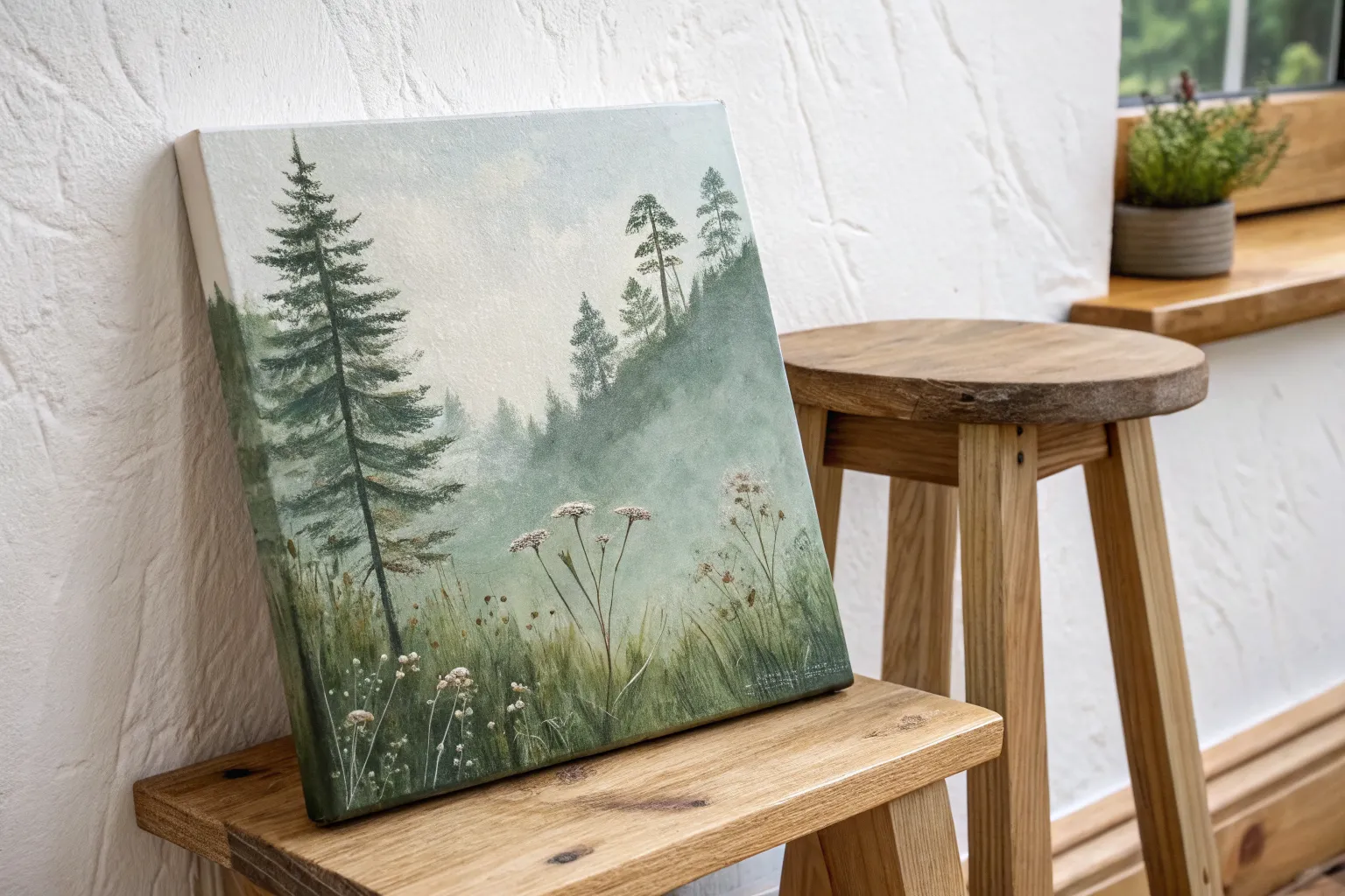
Misty Forest Silhouette on Emerald Gradient
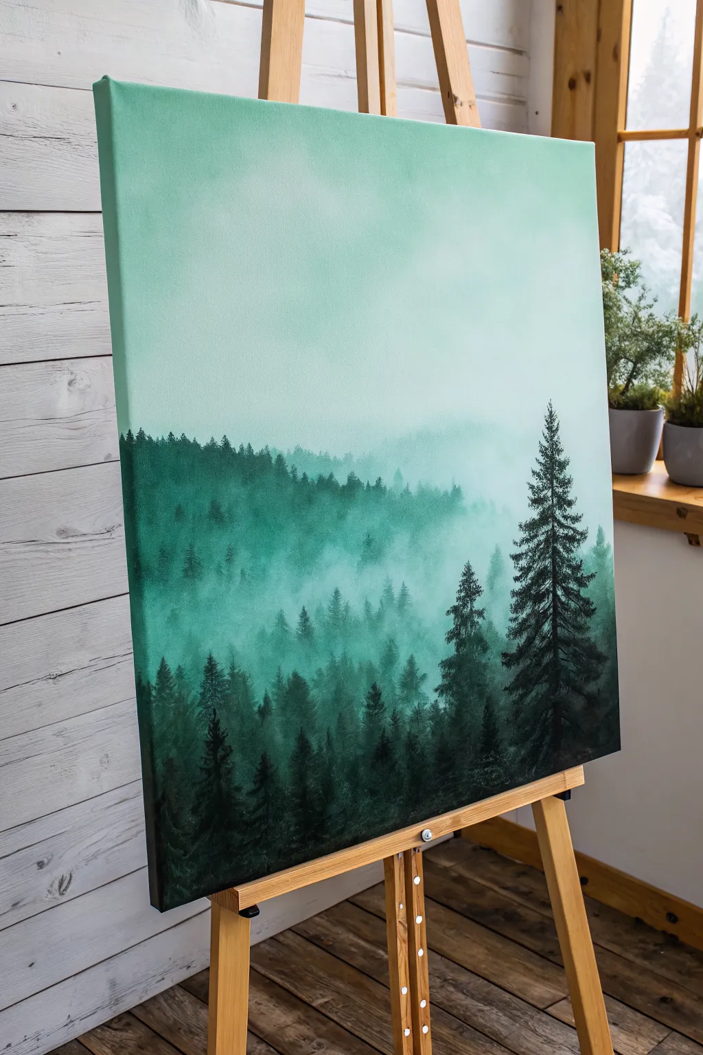
Capture the serenity of a fog-covered mountain range with this atmospheric acrylic painting. You’ll master smooth gradient blending and creating depth through silhouette layering, transforming a blank canvas into a tranquil misty woodland.
Detailed Instructions
Materials
- Large stretched canvas (e.g., 18×24 or 24×30 inches)
- Acrylic paints: Titanium White, Emerald Green, Phthalo Green, Mars Black
- Large flat brush (2-3 inch) for background
- Medium round brush
- Small liner or detail brush
- Palette or mixing plate
- Water cup and paper towels
- Slow-drying medium or retarder (optional but recommended)
Step 1: Creating the Atmospheric Gradient
-
Prepare the palette:
Begin by squeezing out generous amounts of Titanium White and a small amount of Emerald Green. You will need a lot of white to create the soft, airy upper sky. -
Mix the lightest tone:
Mix a large pile of very pale mint green. It should be almost white with just a whisper of green tint. Apply this to the top third of your canvas using the large flat brush, using long, horizontal strokes. -
Establish the mid-tone:
Add slightly more Emerald Green to your white mixture. Blend this new shade into the wet edge of the top section, working your way down to the middle of the canvas. -
Deepen the gradient:
Continuing downward, introduce a touch of Phthalo Green to your mix for richness. Paint the bottom third of the background, ensuring the transition from light to dark is seamless. -
Smooth the blend:
While the paint is still wet, take a clean, slightly damp large brush and lightly sweep back and forth across the transition lines to remove any harsh stripes. If the paint dries too fast, a retarder helps keep it workable.
Keeping It Moist
Keep a spray bottle of water handy. A fine mist over your canvas helps the acrylics stay wet longer, making that smooth, foggy gradient blending much easier.
Step 2: Layering the Distant Trees
-
Mix the fog color:
Create a ‘fog’ color by mixing your background green with a significant amount of white. It should be just slightly darker than the background canvas color. -
Paint the furthest ridge:
Using a worn round brush, tap in the shape of a distant tree line about halfway down the canvas. Keep the tops soft and indistinct; you don’t want sharp details here. -
Fade the bottom edge:
As you move down from the tree tops of this first layer, blend the paint into nothingness using a clean, dry brush to simulate thick fog sitting at the base of the trees. -
Darken the next layer:
Add a bit more Phthalo Green to your mix to make it slightly darker. Paint a second ridge of trees slightly lower than the first, partially overlapping the previous layer. -
Vary the heights:
Ensure the tree line isn’t perfectly straight. Make some trees taller and some shorter to create a natural, organic rhythm across the horizon.
Step 3: Adding the Foreground Silhouettes
-
Mix the darkest shadow green:
Combine Phthalo Green with a small amount of Mars Black. Do not use pure black; the deep green undertone keeps the painting vibrant. -
Paint the foreground tree line:
Along the bottom quarter of the canvas, paint the darkest, nearest tree canopy. Use a stippling motion with your round brush to create texture. -
Structure the main tree:
Choose a focal point on the right side for the prominent pine tree. Use a liner brush to paint a thin, straight vertical line for the trunk, extending high into the lighter sky area. -
Add pine branches:
Switch to a small round brush. Starting from the top of the trunk, dab paint in downward-sloping zig-zag patterns to create the boughs, getting wider as you move down. -
Add a secondary tree:
Paint a slightly smaller, less detailed pine tree next to the main one using the same deep green-black mixture to balance the composition. -
Detail the treetops:
Use your smallest brush to add tiny, sharp points to the tops of the foreground trees along the bottom edge, making them look realistic against the mist. -
Refine the mist:
I like to take a dry brush with a tiny amount of the pale background color and very subtly gaze over the bottom of the dark trees to make them look like they are emerging from low-lying fog.
Fixing Harsh Lines
If your gradient dries with stripes, wait for it to fully dry. Then, mix a glazing medium with your color and apply a thin, transparent layer to bridge the gap.
Step back and admire the deep, moody atmosphere of your personal forest landscape

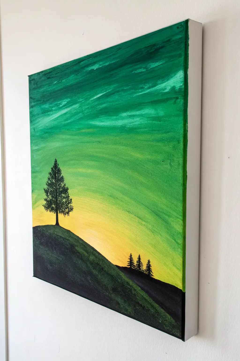
Pine Tree Line Against a Glowing Green Sky
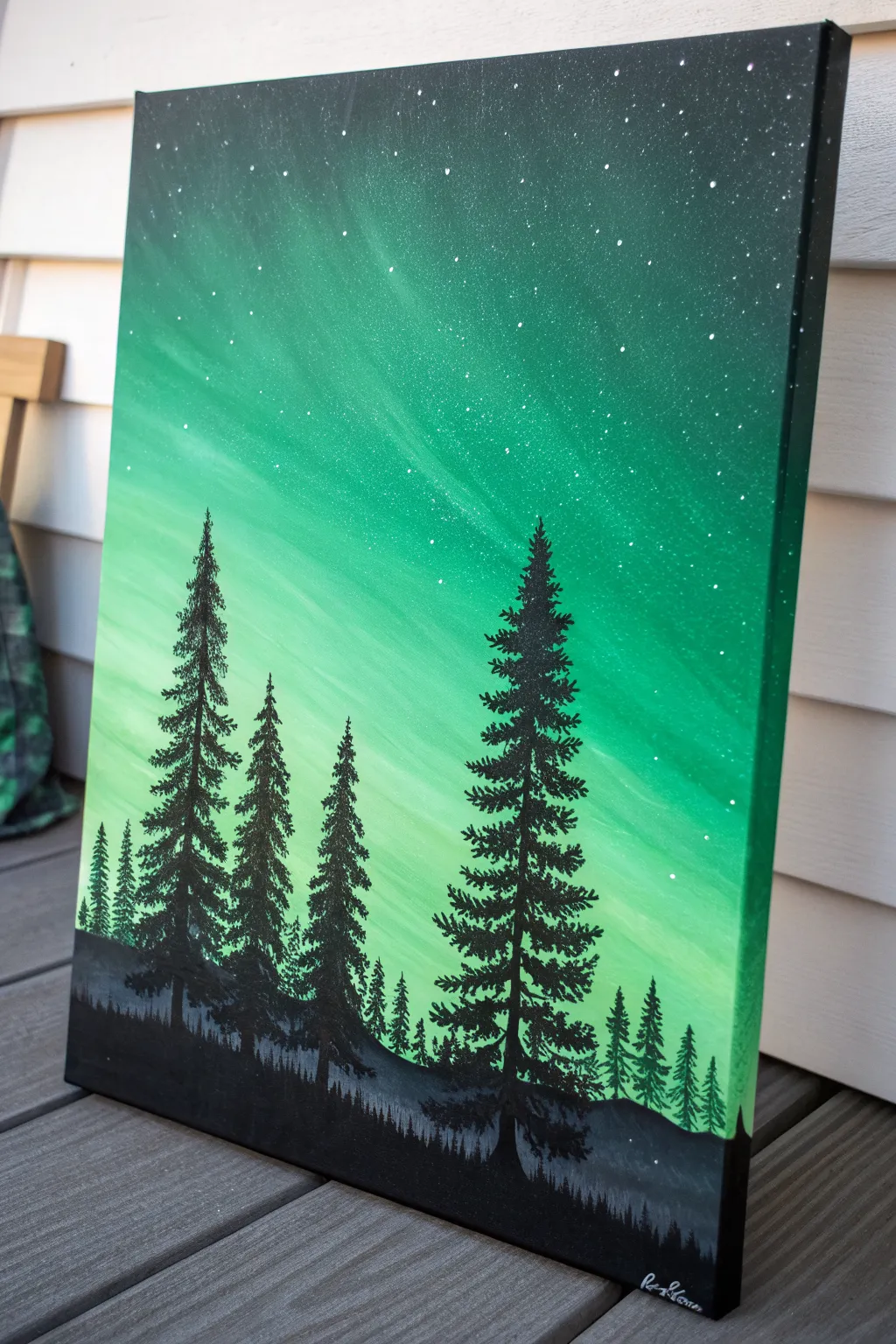
Capture the ethereal beauty of the aurora borealis with this glowing green landscape painting. By blending vibrant emerald tones and adding stark black silhouettes, you’ll create a stunning contrast that makes the night sky come alive.
Step-by-Step
Materials
- Stretched canvas (vertical orientation)
- Acrylic paints: Phthalo Green, Viridian Green, Lemon Yellow, Titanium White, Mars Black
- Wide flat brush (1-2 inch)
- Medium flat brush
- Small fan brush
- Detail liner brush
- Palette
- Cup of water
- Paper towels
- Old toothbrush (optional)
Step 1: Creating the Aurora Sky
-
Prepare the gradient:
Squeeze out your greens, yellow, and white onto the palette. You want a range of values from deep forest green to pale lime. Start by wetting your wide flat brush slightly to help the paint flow. -
Paint the darkest corners:
Mix Mars Black with a little Phthalo Green to get a very deep, near-black green. Apply this to the top corners and edges of the canvas, using broad sweeping strokes. -
Establish the mid-tones:
Without washing the brush fully, pick up pure Phthalo Green or Viridian. Blend this into the dark edges, working your way slightly inward and downward. Keep your strokes diagonal or slightly curved to mimic the movement of light. -
Introduce the light:
Wipe off your brush. Pick up a mix of Viridian and Lemon Yellow. Paint this into the center area, blending it wet-into-wet with the darker greens you just laid down. -
Create the glowing core:
Mix a generous amount of Titanium White with a tiny dot of Lemon Yellow. Apply this to the lower-middle section of the sky where the light source seems strongest. -
Blend the sky:
Use a clean, dry soft brush to gently sweep back and forth over the transition lines between colors. This softens the edges and creates that hazy, atmospheric aurora look. -
Add streaks of light:
Using the edge of a medium flat brush and your lightest yellow-white mix, pull a few faint, diagonal streaks upward from the light source to suggest shifting curtains of light. Let the background dry completely.
Fixing Muddy Skies
If your green sky gets muddy while blending, stop immediately. Let the canvas dry completely, then apply a fresh layer of color on top. Wet-on-dry blending is safer.
Step 2: Adding the Stars
-
Prepare splatter paint:
Mix Titanium White with a little bit of water until it reaches an ink-like consistency. -
Create the star field:
Dip an old toothbrush or a stiff bristle brush into the watery white paint. Use your thumb to flick the bristles, spraying fine mist over the upper, darker portion of the canvas. -
Add focal stars:
If you want a few brighter stars, use the very tip of your detail liner brush to place individual white dots, varying their size slightly for realism.
Step 3: Painting the Foreground
-
Block in the ground:
Load a medium flat brush with pure Mars Black. Paint a solid, uneven horizon line at the bottom of the canvas. This doesn’t need to be flat; slight hills add interest. -
Paint distant trees:
Mix a dark grey (Black + a touch of White) and paint a faint, low line of jagged shapes just above your black horizon. This creates a sense of depth, suggesting a forest far in the distance. -
Start the main trees:
Switch to your detail liner brush and pure Mars Black. Paint a straight vertical line for the trunk of your first large tree. Make the line slightly thicker at the bottom. -
Form the tree top:
At the very top of the trunk, dab tiny, short horizontal strokes to create the pointed tip of the pine. -
Build the branches:
Work your way down the trunk, making your strokes wider as you descend. Use a zigzag motion or quick dabbing technique to mimic pine needles. Leave gaps between branches so the green sky shows through. -
Vary the tree sizes:
Repeat the tree process for three or four distinct trees. In my painting, I place a tall dominant tree on the right and a group of varied heights on the left for balance. -
Add detail to the base:
Where the trees meet the ground, use the brush to tap in some textured grass or small bushes in black, blending the trunk base seamlessly into the horizon. -
Final touches:
Check your black silhouettes. If the paint looks thin or streaky after drying, apply a second coat of Mars Black to ensure they are solid and opaque against the bright sky.
Snowy Highlights
Once the black trees dry, add tiny dabs of white or light blue on the top edges of the branches to simulate moonlit snow resting on the pines.
Step back and admire the stark contrast of your silent forest against that vivid green sky
Tropical Palms on Lime-to-Teal Blend
Create a serene tropical escape with this vibrant canvas painting featuring striking black silhouettes against a smooth gradient background. The transition from zesty lime green to deep teal creates a perfect sunset or sunrise glow that makes the palm trees pop.
Step-by-Step Tutorial
Materials
- Stretched canvas (11×14 or similar size)
- Acrylic paints: Titanium White, Lime Green, Teal/Turquoise, Black
- Large flat brush (for background)
- Medium round brush (for tree trunks)
- Small detail brush or liner brush (for palm fronds)
- Cup of water
- Paper towels
- Palette or paper plate
Step 1: Creating the Ombré Background
-
Prepare the palette:
Squeeze out generous amounts of your Teal, Lime Green, and White paint onto your palette. You’ll want plenty of paint to ensure a smooth blend without the acrylic drying too fast. -
Paint the top section:
Using your large flat brush, apply the Teal paint across the top third of the canvas. Use long, horizontal strokes that go all the way from the left edge to the right edge. -
Paint the bottom section:
Rinse your brush thoroughly (or grab a clean one) and apply the Lime Green paint to the bottom third of the canvas, painting upwards toward the middle. -
Blend the middle:
While the paint is still wet, mix a little Teal and Lime Green on your palette to create a mid-tone. Apply this to the center section of the canvas where the two colors meet. -
Smooth the transition:
With a clean, slightly damp brush, work back and forth over the meeting points of the colors. Use rapid horizontal strokes to blur the lines until you have a seamless gradient. I like to keep a very light touch here to avoid lifting the paint off. -
Paint the edges:
Don’t forget to wrap your background colors around the sides of the canvas for a finished, gallery-ready look. -
Let it dry completely:
Allow the background to dry fully before moving on. This is crucial because wet background paint will muddy your crisp black silhouettes.
Gradient Not Smooth?
If paints dry too fast to blend, mist the canvas lightly with water or add a slow-drying medium to your acrylics to extend working time.
Step 2: Painting the Silhouettes
-
Plan the composition:
Visualize where your four trees will go. Note that the tallest ones are on the right, and the shortest is on the left, creating a nice asymmetrical balance. -
Draft the trunks:
Using a medium round brush and black paint mixed with a tiny drop of water (for flow), paint the four trunk lines. Make them slightly curved and organic, not perfectly straight poles. -
Thicken the bases:
Go back over the bottom portions of the trunks to make them slightly wider at the base where they meet the ground, tapering thinner as they go up. -
Start the frond spines:
Switch to your small detail brush. For each tree, paint 5-7 curved lines radiating outward from the top of the trunk. These are the main spines of the palm leaves. -
Add the leaves:
Using the very tip of your detail brush, flick short, quick strokes downward from each spine line. These strokes should be feathery and taper to a point to mimic palm leaves. -
Layer the foliage:
Repeat the flicking motion for all the spines. Ensure some leaves overlap others to create a sense of density in the canopy. -
Create the ground cover:
With the medium brush or a fan brush, stipple distinct black shapes along the very bottom edge of the canvas to create silhouette bushes and grass. -
Add texture to the ground:
Tap the brush tip gently along the top edge of your black ground area to mimic the uneven, leafy texture of scrub brush and wild grass. -
Connect the scene:
Ensure the bottom of each tree trunk blends seamlessly into the black ground cover so the trees look anchored. -
Final touches:
Check for any transparent spots in your black paint. Apply a second coat to the silhouette areas if needed to make them solid and opaque.
Make It Pop
Add a tiny, bright white or pale yellow circle near the horizon line before painting the trees to simulate a setting sun behind the silhouettes.
Hang your finished piece in a well-lit spot to verify the gradient looks smooth and the blacks are solid


Mountain Layers in Monochrome Greens
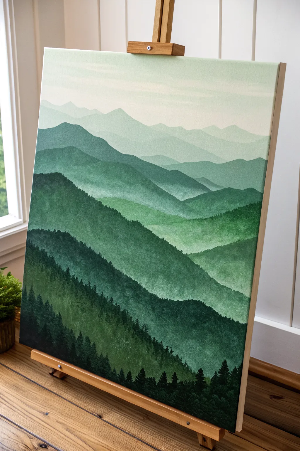
Capture the serene beauty of distant peaks with this monochromatic landscape that relies on a single color family. Using atmospheric perspective, you’ll layer increasingly lighter shades of green to create a stunning sense of depth and vastness on your canvas.
Step-by-Step
Materials
- Stretched canvas (vertical orientation, e.g., 18×24 inches)
- Acrylic paints: Phthalo Green, Hooker’s Green, Titanium White, Mars Black
- Large flat brush (1-2 inch)
- Medium filbert brush
- Small round or liner brush
- Palette or mixing plate
- Cup of water
- Paper towels
- Pencil (optional)
Step 1: Planning and Sky
-
Establish the horizon:
Begin by deciding where your highest, furthest mountain peak will sit. Lightly sketch a few wavy, intersecting horizontal lines across the canvas to map out your mountain ranges. Aim for 5-7 layers total. -
Mix the sky color:
On your palette, mix a large amount of Titanium White with a tiny speck of Phthalo Green. You want a very pale, almost white, minty hue. -
Paint the background:
Using your large flat brush, paint the top portion of the canvas above your highest mountain line. Use long, horizontal strokes to ensure a smooth, gradient-like finish. -
Soften the transition:
While the sky is still wet, you can blend in a hint more white near the very top edge to create a soft fade, simulating sunlight or morning mist.
Mist Master
To enhance the misty effect, lightly dry-brush a tiny amount of your sky color at the base of the distant mountains where they meet the layer below.
Step 2: Layering the Mountains
-
Mix the furthest range:
Add just a slightly larger drop of green to your sky mixture. This layer should be barely darker than the sky itself to push it far into the distance. -
Paint the first peaks:
Fill in the shape of the most distant mountain range. I find using the filbert brush helps create those soft, rolling edges along the ridgeline. -
Darken the mix:
For the next layer down, add more green to your puddle. You want a distinct step down in value, but keep it soft and misty. -
Create the second range:
Paint the next band of mountains, overlapping the previous one. Ensure the bottom of this shape covers the top of where the next layer will begin. -
Continue the gradient:
Repeat this process, adding progressively more green (and perhaps a touch of black for richness) as you move down the canvas. The middle layers should be a true, mid-tone forest green. -
Add texture:
As you get to the closer mountain ranges, start using a rougher brushstroke. Instead of flat color, dab the brush slightly to suggest the texture of distant trees.
Step 3: Foreground and Details
-
Prepare the darkest green:
For the bottom-most mountain layer, mix Hooker’s Green with a little Mars Black. This needs to be a deep, rich shadow color. -
Paint the foreground base:
Fill in the bottom heavily with this dark mixture. Let the brushstrokes represent the steep slope of a nearby hill. -
Start the pine trees:
Switch to your small round brush or liner brush. Using the dark black-green mix, paint vertical lines sticking up from the bottom slope to serve as tree trunks. -
Add tree foliage:
Using a stippling motion (tapping the tip of the brush), add foliage to your tree trunks. Start narrow at the top and get wider near the base of each tree. -
Vary the heights:
Ensure your trees aren’t all the same height. Create clusters of tall pines and shorter saplings to make the forest look natural. -
Detail the ridge:
Add tiny, distant tree tops along the ridgeline of the second-to-last mountain layer. Just mere specks of texture will trick the eye into seeing a dense forest. -
Final touches:
Review your values. If a layer dried too dark or too light, you can apply a thin glaze of color to correct it, but let the underlayer dry completely first.
Values Too Similar?
If your mountain layers blend together, let them dry, then repaint the edge of the lighter mountain with a sharply defined, paler line to separate them.
Step back and admire how simple color mixing can create such a vast landscape
BRUSH GUIDE
The Right Brush for Every Stroke
From clean lines to bold texture — master brush choice, stroke control, and essential techniques.
Explore the Full Guide
Green Sky Sunset With Black Hills
Capture the moody serenity of a green-hued sunset with this striking acrylic canvas project. By blending vibrant emeralds into soft yellows, you will create a glowing backdrop for a stark, high-contrast landscape silhouette.
Step-by-Step Tutorial
Materials
- Stretched canvas (square or rectangular, e.g., 12×12 or 16×20 inches)
- Acrylic paints: Phthalo Green or Emerald Green, Cadmium Yellow Medium, White, Mars Black
- Large flat brush or wash brush (2-inch)
- Medium flat brush
- Small round detail brush
- Fan brush (optional, for blending)
- Palette or paper plate
- Cup of water and paper towels
Step 1: Painting the Sky Gradient
-
Prepare the canvas:
Ensure your canvas is clean and ready. If you are using a raw canvas, apply a coat of gesso first, but a standard pre-primed store-bought canvas is perfect for this. -
Lay down the horizon light:
Squeeze out a generous amount of Cadmium Yellow and a touch of White. Using your large flat brush, paint the bottom third of the canvas in horizontal strokes, keeping the yellow brightest near where the hill line will eventually be. -
Introduce the green:
Without cleaning your brush thoroughly, pick up a small amount of your bright green paint. Begin blending this into the yellow slightly above the horizon area. -
Create the mid-tone transition:
As you move upward, gradually add more green to your mix. The goal is a smooth ombre effect where the yellow fades into a lime green and then a true green. -
Darken the upper sky:
For the top third of the canvas, switch to pure green mixed with a tiny dot of black or dark blue if you have it, to create a deep forest green. Apply this to the very top edge. -
Blend the sky layers:
With a clean, slightly damp brush (or a dry fan brush), gently sweep back and forth horizontally across the transition lines between the yellow, light green, and dark green to soften the edges. -
Add atmospheric texture:
While the paint is still wet, you can add dynamic streaks. Load a little extra white usage mixed with yellow and streak it through the middle section to suggest thin clouds or light rays. -
Let the background set:
Allow the sky completely dry. This is crucial because painting black over wet yellow or green will result in a muddy mess rather than a crisp silhouette.
Pro Tip: Better Blending
If your acrylics dry too fast while blending the sky, mix in a drop of ‘slow drying medium’ or retarder to keep the paint workable for longer.
Step 2: Creating the Land and Trees
-
Outline the hillside:
Using a medium flat brush loaded with Mars Black, paint a sloping curve starting from the bottom left corner and swooping down toward the bottom right. This creates your main hill. -
Fill the silhouette:
Fill in the entire area below your curve with solid black paint. You may need two coats to ensure no canvas shows through. -
Add texture to the hill:
I like to mix a tiny drop of green into the black and dry-brush it lightly over the top curve of the hill. This gives the suggestion of grass catching the faint light. -
Position the main tree:
Switch to your small round brush. Draw a vertical line on the crest of the hill on the left side to serving as the trunk of your focal pine tree. -
Build the tree branches:
Using a dabbing motion with the tip of your brush, start at the top of the trunk and work your way down. Create varied, irregular branches that get wider as they near the bottom. -
Detail the needles:
Go back over the branches with very light tapping motions to simulate the texture of pine needles. Leave small gaps so the sunset sky peeks through the foliage. -
Add the distant trees:
On the lower right side of the slope, paint three much smaller vertical lines. These will be the distant forest line. -
Foliage for distant trees:
give these smaller trees the same treatment, just with less detail. They should look like small, jagged triangles compared to the main tree. -
Paint the edges:
Don’t forget to extend your painting around the sides of the canvas (gallery wrap style). Continue the sky gradient and the black hill around the edges for a finished look. -
Final touches:
Inspect the painting for any pinholes of light in the black area and cover them up. Once fully dry, you can sign your name in the corner with a contrasting color.
Troubleshooting: Muddy Colors
If blending green and yellow turns brownish, wash your brush completely before moving between the dark green top and the bright yellow bottom.
Hang your new landscape on a well-lit wall to really let those emerald tones glow
Full Moon Over a Green Night Wash
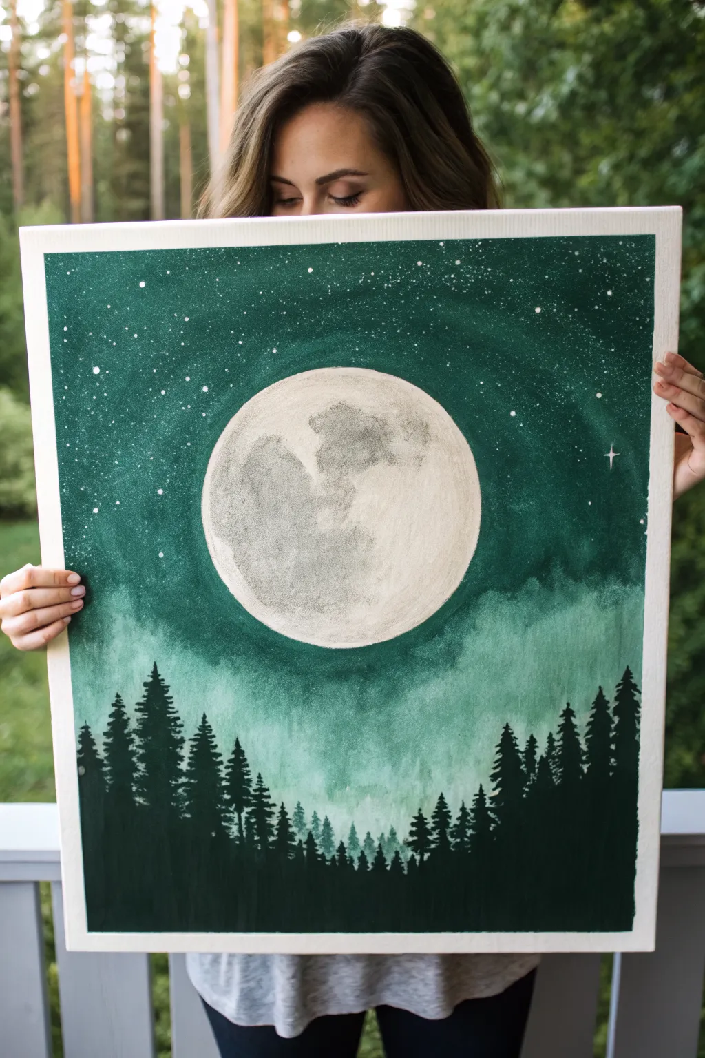
Bring the magic of a forest night into your home with this stunning acrylic painting featuring a hyper-realistic full moon. The deep emerald greens create a moody atmosphere, while the bright lunar crater details and starry flecks make the canvas glow.
Detailed Instructions
Materials
- Large stretched canvas (e.g., 18×24 or 20×30 inches)
- Acrylic paints: Phthalo Green, Mars Black, Titanium White, Raw Umber
- Large flat wash brush (2 inch)
- Medium filbert brush
- Small round detail brush (size 0 or 1)
- Sea sponge or crumpled paper towel
- Circular stencil or large plate (for the moon outline)
- Pencil
- Palette and water cup
- Old toothbrush (for stars)
Step 1: Setting the Scene
-
Outline the moon:
Center your circular object (like a large dinner plate or mixing bowl) on the canvas. Use a pencil to lightly trace a perfect circle in the middle-upper section of the canvas. This reserves the white space for your moon later. -
Mix your base green:
On your palette, mix a generous amount of Phthalo Green with a touch of Mars Black. You want a deep, rich forest green that isn’t quite black but is very dark. -
Paint the upper sky:
Using your large flat wash brush, paint the area around the moon and the top portion of the canvas. Apply the paint smoothly, carefully cutting in around the pencil edge of your moon circle so you don’t ruin the shape. -
Create the misty transition:
As you move down the canvas below the moon, start mixing Titanium White into your green mixture. Create a gradient that gets lighter and more misty as you reach the bottom third of the canvas. -
Add a cloud wash:
While the paint is still slightly wet, use a damp sea sponge or a clean rag to dab softly at the lighter green areas beneath the moon. This creates a soft, cloud-like texture that looks like fog rolling through the night air.
Uneven Moon Edge?
If you struggle to paint a perfect circle freehand, cut a stencil from freezer paper. Iron it lightly onto the canvas (shiny side down) to create a temporary seal, paint the moon inside, then peel.
Step 2: Designing the Moon
-
Base coat the moon:
Once the green background is completely dry, fill in the moon circle with a coat of plain Titanium White. Let this dry; if the canvas texture still shows through too much, add a second coat. -
Mix grey tones:
Prepare a light grey (White + tiny dot of Black) and a slightly darker, brownish-grey (White + Black + dot of Raw Umber). These will be your crater colors. -
Sponge on texture:
Dip a small piece of sea sponge or a crumpled paper towel into your light grey mix. Dab off the excess paint, then gently pounce it over the moon’s surface to create a general uneven texture. -
Define the mare (dark spots):
Using the darker grey-brown mix and a filbert brush, paint the distinct shapes of the lunar maria (the ‘seas’). I find it helpful to look at a reference photo of the full moon to get these shapes accurate. -
Soften the edges:
While the dark grey paint is wet, use a clean, dry brush to gently feather the edges of the dark spots into the lighter background. You want soft transitions, not hard cartoon-like lines.
Glow Up
Mix a tiny amount of glow-in-the-dark pigment into your Titanium White for the moon and stars. Your painting will reveal a hidden magic when the lights go out at night.
Step 3: Stars and Silhouette
-
Mask the moon:
Cut a circle out of paper the same size as your moon and place it over the painted moon to protect it. Alternatively, just hold a piece of cardboard over the moon for the next step. -
Create the stars:
Dilute a dime-sized amount of Titanium White with water until it’s inky. Dip an old toothbrush into it, and using your thumb, flick the bristles to spray fine white specks across the upper green section of the canvas. -
Add bright stars:
Use your smallest round detail brush to manually paint a few larger, brighter stars. Add a tiny ‘plus sign’ shape to one or two of them to create a twinkling effect. -
Mix the tree color:
Mix a very dark color for the trees using mostly Mars Black with a little Phthalo Green. This ensures the trees feel part of the environment rather than just flat black cutouts. -
Paint tree trunks:
Starting at the very bottom edge, paint vertical lines of varying heights using a medium round brush. Make some taller to reach up into the ‘mist’ area, and keep others short. -
Add pine branches:
Switch to a fan brush or a small flat brush turned on its edge. Start at the top of a trunk line and tap downwards in a zigzag motion, getting wider as you go down, to create the pine tree shape. -
Layer the forest:
Fill the bottom edge completely with black to ground the forest. Ensure trees overlap nicely; put some taller trees in the foreground and smaller ones ‘behind’ them to create depth. -
Final touches:
Once everything is dry, remove any masking paper. If the edge of your moon looks a bit messy against the green sky, use a steady hand and your smallest brush to tidy up the border with fresh paint.
Hang your masterpiece in a spot with good lighting to let those deep greens really shine

PENCIL GUIDE
Understanding Pencil Grades from H to B
From first sketch to finished drawing — learn pencil grades, line control, and shading techniques.
Explore the Full Guide
White Daisies on Fresh Spring Green
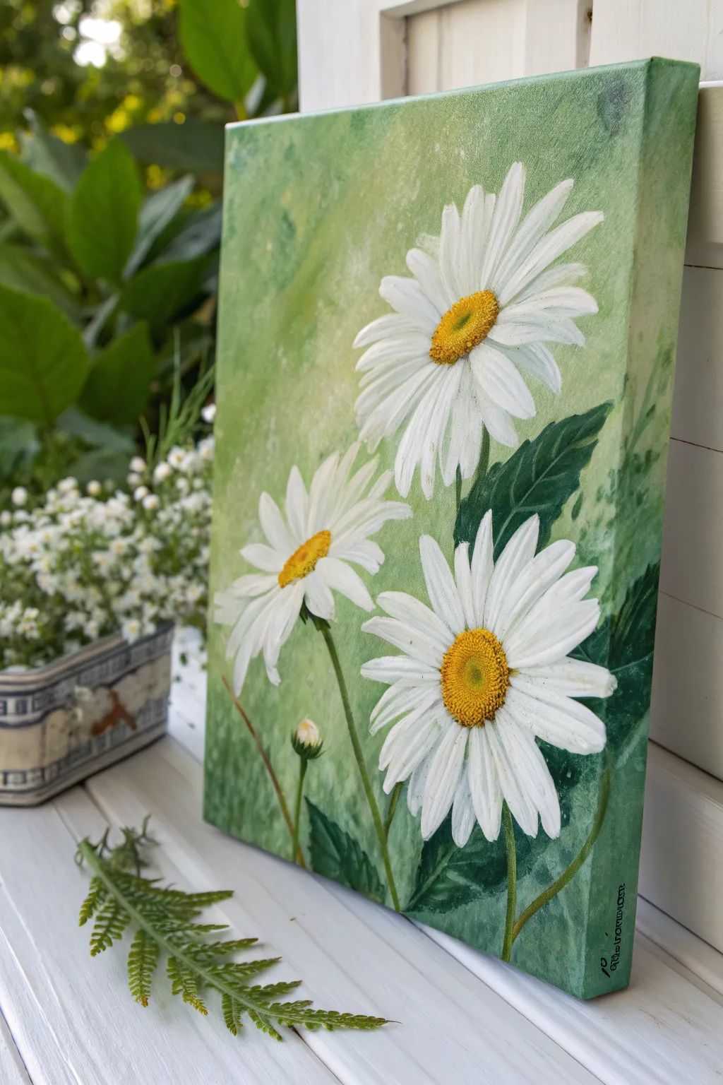
Capture the freshness of a garden in bloom with this vibrant acrylic painting featuring three white daisies against a textured green backdrop. The soft, mottled background makes the crisp white petals and golden centers pop, bringing a cheerful slice of nature indoors.
Step-by-Step Tutorial
Materials
- Stretched canvas (approx. 11×14 or similar aspect ratio)
- Acrylic paints: Titanium White, Sap Green, Phthalo Green, Cadmium Yellow Medium, Yellow Ochre, Burnt Umber
- Gesso (optional, for priming)
- Large flat brush (1 inch)
- Medium filbert brush
- Small round brush
- Palette knife or sponge (for texture)
- Palette
- Water cup and paper towels
Step 1: Creating the Textured Background
-
Prime the Surface:
If your canvas isn’t pre-primed, apply a coat of white gesso and let it dry completely to ensure a smooth painting surface. -
Mix Your Base Greens:
On your palette, mix a generous amount of light, fresh green. Combine Sap Green with plenty of Titanium White and a touch of Yellow Ochre to warm it up. -
Establish the Backdrop:
Using the large flat brush, cover the entire canvas in a wash of this light green mixture. Don’t worry about perfect smoothness; a little direction variation adds interest. -
Add Texture and Variation:
While the base is still slightly tacky, mix a slightly darker green and a very pale, almost white green. Use a sponge or a scrunched-up paper towel to dab these colors randomly across the canvas, creating a mottled, soft-focus effect. -
Paint the Edges:
Don’t forget to extend your background green colors around the sides of the canvas for a polished, frameless look.
Muddied Centers?
If your yellow centers turn green against the background, let the area dry completely, apply a coat of white primer first, then repaint the yellow.
Step 2: Drafting and Blocking the Daisies
-
Sketch the Placement:
Once the background is dry, lightly use the small round brush with watered-down white paint or a chalk pencil to mark the centers of your three main flowers. Place the largest one high on the right, and the other two lower down. -
Define the Petal Direction:
Draw faint lines radiating outward from the centers to guide where the petals will flow. Notice how the top daisy faces slightly left, while the bottom right one faces forward. -
Block in White Petals:
Using the filbert brush and Titanium White, paint the basic shapes of the petals. Start from the tip of the petal and stroke inward toward the center. -
Layer the Petals:
Let the first layer dry, then apply a second coat of white to ensure opacity against the green background.
Step 3: Adding Depth and Leaves
-
Paint Dark Leaves:
Mix Phthalo Green with a tiny bit of Burnt Umber to get a deep, rich shadow green. Use the medium brush to paint the large, jagged leaves tucked behind and around the flower heads. -
Add Stems:
Use the small round brush and a mix of Sap Green and White to draw the slender stems extending downward from the flower heads. -
Create Leaf Veins:
Mix a lighter green shade and use the tip of your small brush to add subtle veins to the dark leaves for realistic texture. -
Shadowing the Petals:
Mix a very faint grey-blue or grey-green wash. Glaze the undersides and overlapping areas of the white petals to give them three-dimensional volume.
Dew Drop Effect
Add tiny transparent dots on a petal using clear gloss gel or a mix of white and grey to simulate fresh morning dew drops.
Step 4: The Golden Centers and Final Details
-
Base the Centers:
Fill the round centers of the daisies with a solid coat of Yellow Ochre. -
Add Highlight and Shadow:
Stipple (dot) Cadmium Yellow on the upper sun-hit side of the center, and stipple a mix of Burnt Umber into the bottom edge to create a rounded, fuzzy look. -
Refine Petal Edges:
Use your smallest brush with pure Titanium White to clean up the edges of the petals and add bright highlights to the tips. -
Paint the Tiny Bud:
Don’t forget the small un-opened bud near the bottom left. Paint a small green oval with just a peek of white petals emerging at the top. -
Final Contrast Check:
Step back and see if you need to deepen the green shadows right next to the white petals to make them pop even more.
Hang your new floral masterpiece in a spot that needs a permanent splash of spring cheer
Bamboo Stalks in Jade Mist
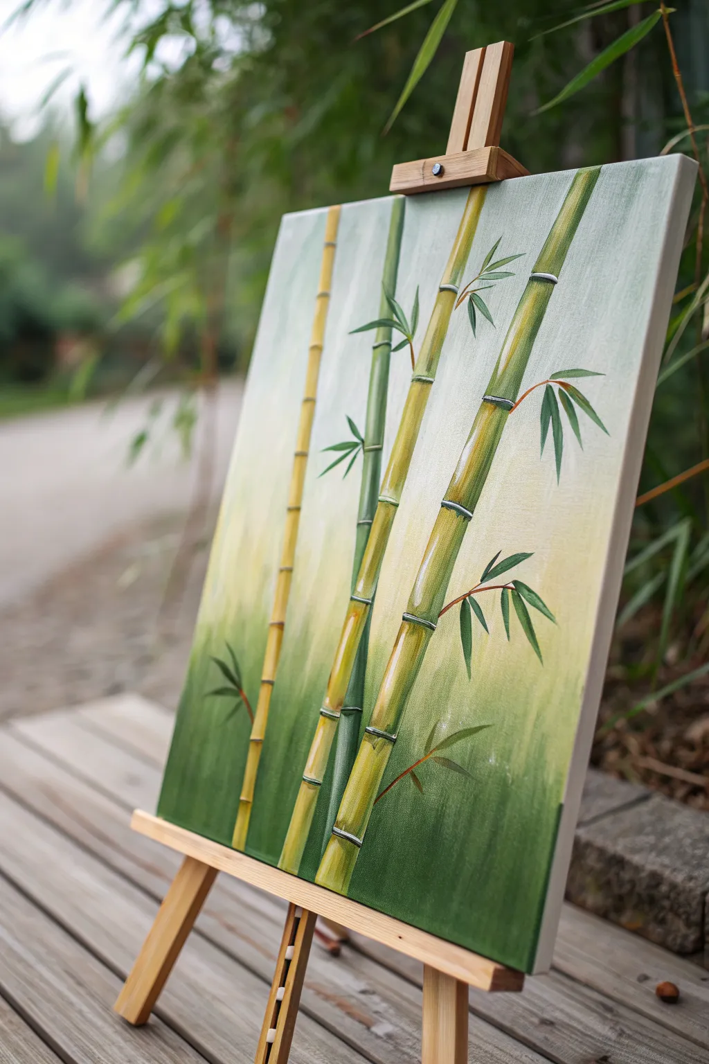
Capture the serene elegance of a bamboo grove with this calming acrylic painting project. You’ll layer soft gradient backgrounds with crisp, segmented stalks to create a piece that feels both structured and organic.
Step-by-Step
Materials
- Stretched canvas (12×16 or similar vertical format)
- Acrylic paints: Titanium White, Sap Green, Hooker’s Green, Yellow Ochre, Burnt Umber, Cadmium Yellow Medium
- Large flat brush (1-2 inch) for background
- Medium flat or filbert brush (size 6-8)
- Small round brush (size 2-4) for leaves
- Fine liner brush (size 0-1) for details
- Palette for mixing
- Water cup and paper towels
- Easel (optional but helpful)
Step 1: Setting the Scene
-
Prepare the gradient palette:
Mix three main puddles for your background: a deep, rich green (Hooker’s Green + tiny bit of Burnt Umber), a mid-tone yellowish-green (Sap Green + Yellow Ochre + White), and a very pale, creamy white (Titanium White + touch of Yellow Ochre). -
Apply the bottom layer:
Using your large flat brush, apply the deep green mixture to the bottom third of the canvas. Use horizontal strokes to ensure even coverage, moving quickly so the paint stays wet. -
Blend the middle section:
Without washing your brush fully (just wipe off excess), pick up the mid-tone yellowish-green. Paint the middle third of the canvas, brushing downward into the wet dark green to create a soft, seamless transition. -
Finish the top gradient:
Clean your brush and pick up the pale creamy white mixture. Paint the top third of the canvas, blending downward into the mid-tone green. The goal is a misty, vertical ombré effect where the top feels light and airy. -
Dry completely:
Let this background layer dry fully before proceeding. If you rush this step, the crisp bamboo lines will muddy up with the background.
Smooth Cylinders
When highlighting the stalks, use a dry wide brush to gently blend the highlight into the base color horizontally. This keeps the look round, not striped.
Step 2: Constructing the Stalks
-
Map out the composition:
Lightly sketch four main vertical lines using a pencil or a brush with very watered-down green paint. Vary the spacing between them; notice how the stalks in the reference image lean slightly rather than standing perfectly straight. -
Mix the bamboo base color:
Create a warm, bamboo stalk color by mixing Yellow Ochre, Cadmium Yellow, and a touch of Sap Green. You want a color that stands out against the background but harmonizes with it. -
Paint the main segments:
Using a medium flat brush turned on its edge (or a filbert), paint the bamboo stalks in segments. Paint a long, thin rectangle, leave a tiny gap, and then paint the next segment above it. This gap will eventually be the ‘node’ or joint. -
Vary the stalk colors:
For the stalk furthest back (the thinner, darker one), use more Hooker’s Green in your mix to make it recede relative to the brighter front stalks. -
Add shadows:
While the stalk paint is still slightly tacky or dry, mix a darker version of your base color (add a little Burnt Umber). Glaze this down the left side of each stalk segment to create cylindrical volume. -
Add highlights:
On the opposite side (the right side) of each segment, brush on a highlight of Light Yellow mixed with White. This contrast creates the 3D roundness of the bamboo.
Asian Seal Signature
Instead of a standard signature, paint a small red square in the corner with your initial inside it using white or black, mimicking a traditional chop seal.
Step 3: Nodes and Leaves
-
Paint the nodes:
Switch to your small round brush or liner brush. Mix a distinct line color using White and a tiny dot of Green. Paint thin, slightly curved horizontal lines across the gaps you left between segments. -
Detail the joints:
I like to add a tiny dark shadow line right below each white node line to make the joint look raised. It emphasizes that classic bamboo texture. -
Stem branches:
Using a liner brush and reddish-brown paint (Burnt Umber thinned with water), pull very fine, arched lines growing out from the nodes. These are the thin stems that hold the leaves. -
Practice leaf shapes:
Bamboo leaves have a specific shape: narrow at the base, widening, and tapering to a sharp point. Practice a few on scrap paper using a ‘press-and-lift’ motion with your round brush. -
Painting the main leaves:
Load your round brush with deep Hooker’s Green. Paint clusters of leaves attached to the thin brown stems. Vary the direction; some should point down, others out to the side. -
Layering leaf colors:
To add depth, mix a lighter, yellowish-green. carefully add a few highlighted leaves in front of the darker ones, or add a highlight stroke to the top edge of existing leaves. -
Final touches:
Step back and look at the whole piece. If the background feels too plain, you can dry-brush a few very faint, ghostly leaf shapes in the background using a pale green to suggest distant foliage.
Once dry, your tranquil bamboo grove is ready to bring a touch of nature’s balance to your wall.


Fern Fronds Close-Up on Deep Green
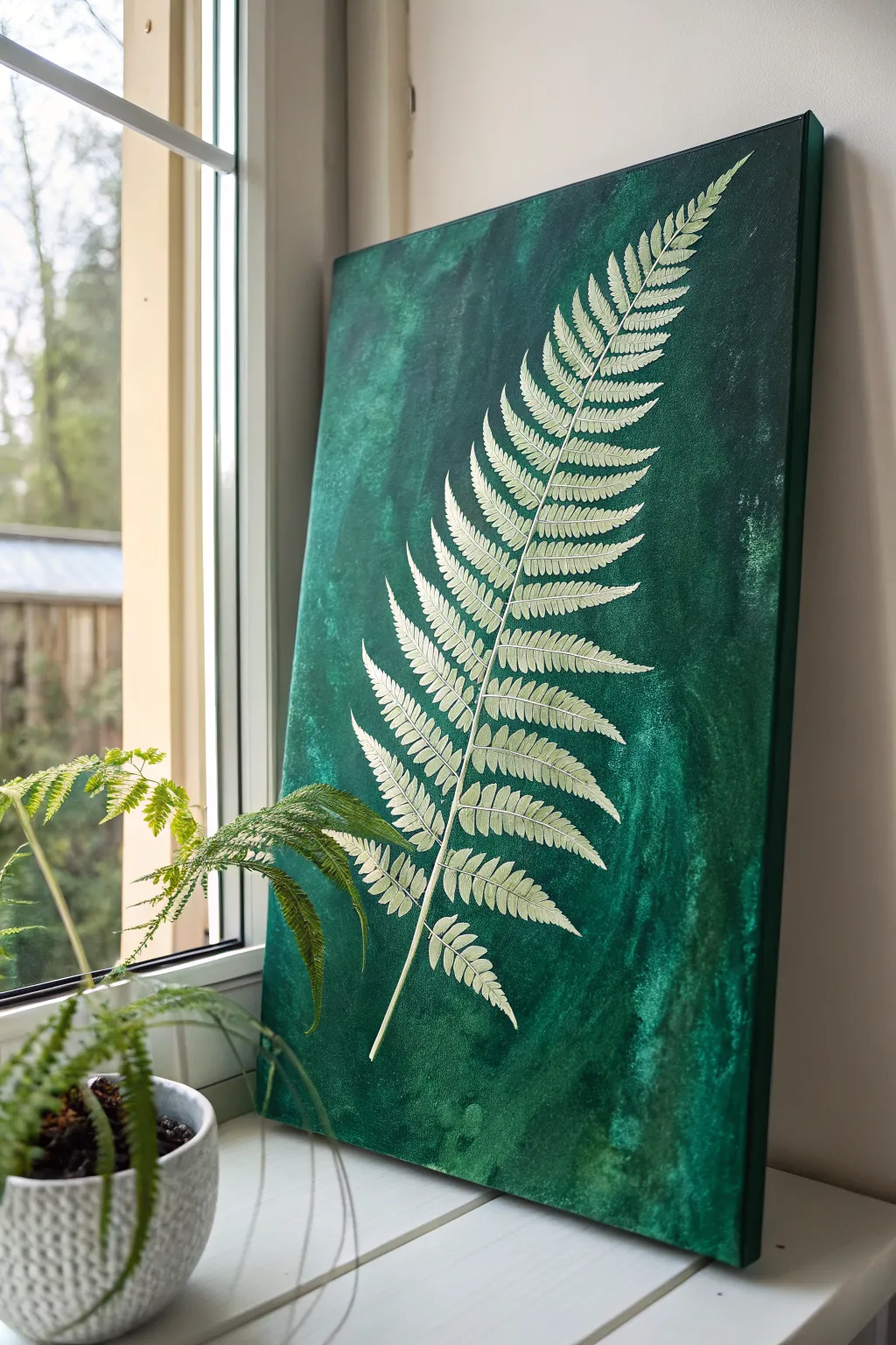
This elegant project captures the delicate structure of a fern frond, immortalized in light relief against a moody and textured emerald background. The contrast between the organic, mottled green wash and the crisp, possibly slightly raised, white fern creates a sophisticated botanical statement piece for any room.
How-To Guide
Materials
- Rectangular stretched canvas (e.g., 18×24 inch)
- Acrylic paints: Phthalo Green, Viridian Hue, Black, White
- Gesso (optional key for priming)
- Glazing medium or water for thinning
- Large flat brush or sponge applicator
- Fine detail liner brush (size 0 or 00)
- Basic tracing paper and pencil
- Carbon transfer paper (white/yellow prefered for dark backgrounds)
- Reference photo of a fern frond
- Palette and water cup
- Paper towels
Step 1: Preparing the Emerald Abyss
-
Prime the Surface:
If your canvas isn’t pre-primed, apply a coat of white gesso to ensure a smooth texture. This helps the subsequent layers of green paint glide on evenly without sinking too deeply into the fabric weave. -
Mix Your Base Green:
On your palette, combine Phthalo Green with a touch of Black to create a very deep, rich forest green. This will serve as the darkest value in your background. -
Apply the Base Layer:
Using a large flat brush, cover the entire canvas with your dark mixture. Paint the sides as well for a finished look that doesn’t require a frame later. -
Create Texture:
While the base layer is still slightly tacky, mix a lighter, brighter green using Viridian and a tiny drop of White. Dilute this slightly with water or glazing medium so it’s translucent. -
Color Washing:
Use a sponge or a crumpled paper towel to dab and sweep this lighter green glaze over the dark base. Use erratic, vertical motions to mimic organic growth and create the mottled, washed effect seen in the reference photo. -
Refine the Background:
Add patches of even darker green (Phthalo Green plus more Black) into the corners or random areas to deepen the moodiness. I find blending with a slightly damp brush helps smooth out any harsh edges between the shades. -
Complete Drying:
Allow the background to dry completely. This is crucial because any moisture will cause the transfer paper step to smudge or tear the paint.
Use Flow Aid
For those long, thin fern stems, mix a drop of acrylic flow improver or water into your white paint. It helps the paint glide off the liner brush smoothly without breaking the line.
Step 2: Drafting the Frond
-
Trace Your Reference:
Take your reference photo of a fern and trace the main spine and the general shape of the leaflets (pinnae) onto tracing paper. You don’t need every tiny serration yet, just the main structure. -
Position the Design:
Place your tracing paper onto the dry canvas. Arrange it diagonally so the stem starts at the bottom center-left and the tip reaches the top right corner, maximizing the dynamic movement. -
Transfer the Image:
Slide a sheet of white or yellow carbon paper under your tracing. Use a stylus or pencil to press firmly over your lines, transferring the skeleton of the fern onto the dark green background.
Uneven Brushing?
If the background looks too striped or brushy, dab it with a damp sea sponge while wet. This softens brushstrokes into a natural, moss-like texture perfect for botany.
Step 3: Painting the Fern Details
-
Mix the Fern Color:
Prepare your palette with Titanium White. To soften it slightly so it isn’t too jarring, add a microscopic dot of yellow or brown to warm it up, creating a bone-white or cream hue. -
Commit to the Spine:
Using your fine detail liner brush, paint the central stem (rachis) first. Keep the pressure consistent, starting thicker at the base and lifting the brush gently as you reach the delicate tip. -
Paint Leaflet Midribs:
Paint the center vein for each individual leaflet extending out from the main stem. This acts as a guide for the smaller leaves you are about to add. -
Detailing the Pinnules:
Now, careful work begins. Use the tip of your liner brush to dab small, angled strokes along those leaflet veins to create the tiny, serrated ‘leaves’ of the fern. -
Adding Texture:
Instead of filling the leaves solidly, use short, directional strokes that follow the growth pattern. This leaves tiny gaps of green showing through, enhancing the illusion of texture and delicacy. -
Second Pass Brightness:
Once the first layer of white is dry, go back over just the tips of the leaves and the highest points of the spine with pure Titanium White. This creates a subtle highlight that makes the fern appear to lift off the canvas. -
Clean Up:
Inspect your edges. If your green background needs touching up around the fern where your hand might have rested, use a small brush and your original green mix to tidy the negative space. -
Final Varnish:
Wait 24 hours for the acrylics to cure fully, then apply a satin varnish to seal the painting and unify the sheen between the dark background and the matte fern.
Hang your botanical masterpiece near a window to let natural light play off the rich green textures
Single Leaf Study on Olive Green
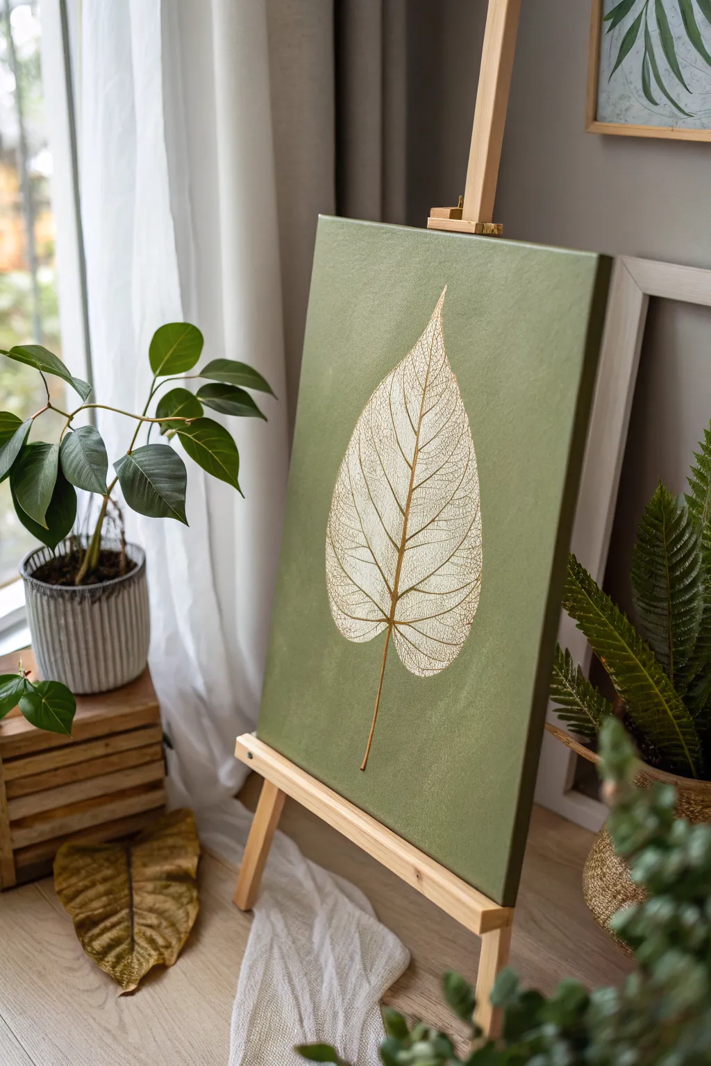
This elegant project focuses on the delicate beauty of a skeletonized leaf, rendered in white against a textured olive green background. The contrast between the rich, earthy base and the intricate, lacy veins creates a modern botanical statement piece perfect for any calm living space.
Step-by-Step
Materials
- Stretched canvas (e.g., 16×20 inches)
- Acrylic paint: Olive Green (or Sap Green mixed with a touch of Burnt Umber)
- Acrylic paint: Titanium White
- Acrylic paint: Unbleached Titanium or Cream (optional for warmth)
- Fine liner brush (size 0 or 00)
- Flat brush (1-inch width)
- HB Pencil
- Chalk or transfer paper (white)
- Reference image of a skeleton leaf
- Palette
- Water cup and paper towels
Step 1: Preparing the Background
-
Mix your base color:
On your palette, create a rich olive green. If you don’t have a premixed tube, combine Sap Green with a small amount of Burnt Umber or a tiny dot of black to desaturate it. Aim for a muted, earthy tone rather than a bright forest green. -
Apply the first coat:
Using your large flat brush, apply the paint to the canvas in smooth, even strokes. Ensure you cover the white canvas completely. -
Paint the edges:
Don’t forget to paint the sides of the canvas for a professional, gallery-wrapped finish that looks good without a frame. -
Add gentle texture:
While the first coat is still slightly wet, I like to apply a second layer using cross-hatching strokes (painting in ‘X’ shapes). This adds a subtle visual texture that mimics fabric or natural fibers. -
Let it cure:
Allow the background to dry completely. This is crucial because any moisture will cause your sketch to smudge or the white paint to turn muddy later.
Pro Tip: Better Flow
If your fine lines are breaking, mix a drop of acrylic flow improver or water into your white paint. It should have the consistency of heavy cream or ink for smooth lining.
Step 2: Sketching the Leaf
-
Establish the central vein:
Using a white chalk pencil or very light graphite, draw a gentle curve starting from the bottom third of the canvas, extending upwards. This will be the leaf’s primary spine or midrib. -
Outline the shape:
Sketch a large teardrop or heart shape around the spine. The leaf in the example has a wide base that tapers to a sharp, elegant point at the top. -
Map primary veins:
Draw the main veins branching out from the center spine. Keep them curved upward slightly, like ribs, spacing them somewhat evenly.
Level Up: Metallic Pop
For a glamorous twist, re-trace just the central spine and the thickest veins with a metallic gold paint pen after the white paint dries. It catches the light beautifully.
Step 3: Painting the Intricate Details
-
Paint the main structure:
Mix a small amount of Titanium White with a drop of water to improve flow. Using your fine liner brush, paint over your sketch of the central spine and the primary branching veins. -
Start the secondary veins:
from the primary veins, paint smaller branches connecting them. These don’t need to be perfectly straight; a little waiver adds to the organic feel. -
Create the skeleton effect:
This is the most time-consuming but meditative part. Begin filling the spaces between the veins with a fine, irregular mesh or web pattern. Think of it like drawing tiny, connected polygons. -
Vary line weight:
Ensure the central spine remains the thickest line, the primary branches slightly thinner, and the ‘mesh’ pattern the finest. You may need to go back and thicken the main spine slightly to help it stand out. -
Refine the edges:
The outer edge of a skeleton leaf is often jagged or incomplete. Instead of a solid outline, use the mesh pattern to create the exterior boundary of the leaf. -
Add warmth (optional):
To give the leaf an aged look, you can glaze a very watery wash of Unbleached Titanium or Cream over the dried white lines in specific areas to tone down the brightness. -
Paint the stem:
Extend the stem at the bottom. I usually mix a tiny bit of the background green into the white for the stem to make it look semi-translucent and grounded.
Step 4: Final Touches
-
Clean up:
If you made any mistakes with the white paint, wait for it to dry, then use your background olive green mix to carefully paint over the error. -
Remove sketch marks:
Once the painting is 100% dry, gently wipe away any visible chalk or pencil marks with a damp cloth or soft eraser. -
Varnish:
Apply a coat of matte or satin varnish to protect the surface and unify the sheen of the paint.
Hang your finished botanical study in a spot with good natural light and enjoy the serene atmosphere it brings to the room
Butterfly Accent on Green Bokeh Background
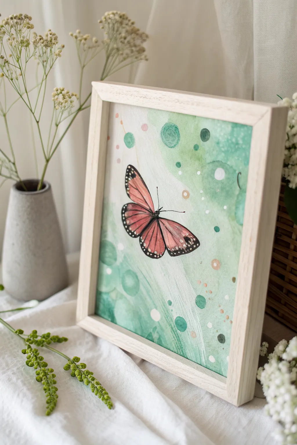
Capture the whimsical flight of a monarch-inspired butterfly set against a dreamy, abstract green backdrop. This watercolor project contrasts precise, illustrative details with soft, overlapping circles for a magical garden effect.
Step-by-Step Tutorial
Materials
- Watercolor paper (cold press, 300 gsm)
- Watercolor paints (Sap Green, Hooker’s Green, Crimson Lake, Cadmium Orange, Burnt Umber)
- White gouache or white acrylic paint
- Gold metallic watercolor or pen
- Round watercolor brushes (sizes 2, 6, and 10)
- Fine liner brush or 00 round brush
- Masking fluid (optional)
- Pencil and eraser
- Palette
- Water jars and paper towels
- Wooden frame
Step 1: Painting the Dreamy Background
-
Sketch the Composition:
Begin by lightly sketching the outline of the butterfly in the center-left area of your paper. Keep the lines faint so they disappear under the paint later. Mark a few scattered circles of varying sizes around the butterfly to plan your largest bokeh spots. -
Prepare the Palette:
Mix a few puddles of green watercolor. You’ll want a very watery, pale wash of Sap Green, a medium-density mix of Hooker’s Green, and a darker, more saturated green for depth. -
First Background Wash:
Using your size 10 brush and clean water, dampen the background area around the butterfly, avoiding the insect itself. While wet, drop in your palest green wash, letting it flow diagonally across the paper. -
Adding Soft Bokeh:
While the first layer is still damp but not soaking, drop circular shapes of the medium green paint into the wet background. The edges will bleed softly, creating that out-of-focus camera effect. -
Creating Hard-Edge Circles:
Let the paper dry completely. Now, mix a saturated green and paint distinct circles on top of the dry wash. Vary their sizes, placing some near the butterfly. -
Lifting Color:
To create transparent-looking bubbles, paint a circle with clean water, wait a few seconds, then dab it with a paper towel to lift the pigment, leaving a ghost circle. -
Sprinkling Details:
Mix a small amount of pinkish-orange water. Using a smaller brush, add tiny dots or faint speckles in the background to echo the butterfly’s color palette. -
Dry Time:
Allow the entire background layer to dry thoroughly before moving on to the butterfly to prevent bleeding.
Step 2: Illustrating the Butterfly
-
Base Wing Color:
Mix Cadmium Orange with a touch of Crimson Lake to get a soft coral-salmon hue. Fill in the butterfly wings carefully with your size 6 brush, keeping the paint relatively transparent. -
Deepening the Hue:
While the wings are still slightly damp, drop a more concentrated coral mix near the body of the butterfly to create a natural gradient that fades toward the wing tips. -
Painting the Body:
Switch to your smallest brush. Mix Burnt Umber with a tiny bit of black or dark blue to make a soft black. Paint the slender thorax and abdomen of the butterfly. -
Adding Wing Veins:
Once the orange base is bonedry, use your fine liner brush and the dark brown/black mix to paint the thin, delicate veins radiating across the wings. -
Defining the Edges:
Use the same dark mix to outline the wings with a thicker border. I find it helps to rest my hand on a scrap piece of paper to keep the lines steady. -
White Spotted Details:
Dip a fine brush or a toothpick into white gouache. Carefully place tiny white dots along the dark edges of the wings, particularly on the forewings and hindwing tips. -
Antennae and Legs:
Paint two very fine, curved lines for the antennae and barely-there lines for the visible legs.
Fixing “Cauliflowers”
If water blossoms form in your background wash, don’t panic. Gently scrub the edge with a damp, stiff brush to soften it, or turn it into a new bokeh circle.
Step 3: Final Touches
-
Adding Metallic Accents:
Using gold watercolor or a metallic pen, add small open circles or dots scattered among the green bokeh background for a touch of sparkle. -
White Highlights:
Add a few opaque white dots in the background to simulate light catching on dust motes or dew drops. -
Framing:
Once artwork is completely dry, place it into a light wooden frame to complement the organic, airy feel of the painting.
Pro Tip: Depth of Field
Make background circles overlap. Paint a dark green circle partially over a lighter, dried one to create instant visual depth and complexity.
Hang your new watercolor piece in a bright spot to enjoy the flutter of color every day
Hummingbird in a Green Garden Glow
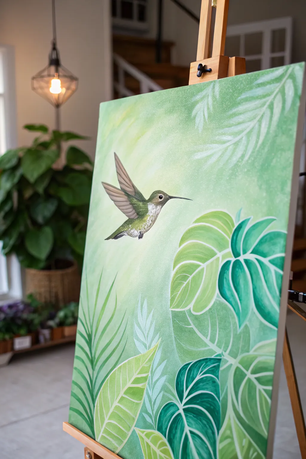
Capture the serene flutter of a hummingbird amidst a lush, leafy paradise with this acrylic painting tutorial. The artwork features a soft, light-filled gradient background that sets the stage for crisp, stylized tropical foliage and a detailed, jeweled bird.
Detailed Instructions
Materials
- Rectangular canvas (16×20 or 18×24 inches recommended)
- Acrylic paints: Titanium White, Sap Green, Phthalo Green, Yellow Ochre, Burnt Umber, Raw Sienna
- Large flat wash brush (2 inch)
- Medium flat brush (size 8)
- Small round detail brush (size 0 or 1)
- Angle shader brush (size 1/4 inch)
- Filbert brush (size 6)
- Slow-drying medium or retarder (optional)
- Clean water jar
- Paper towels
- Palette
- Chalk or pastel pencil for sketching
Step 1: Setting the Atmosphere
-
Mix the background base:
Begin by creating a very pale, buttery green. Mix a generous amount of Titanium White with a touch of Yellow Ochre and the tiniest speck of Sap Green. -
Apply the light center:
Using your large wash brush, paint an abstract, organic shape in the upper-left center of the canvas. This will be the light source, so keep it brushy and soft. -
Blend the gradient:
While the center is wet, mix a slightly darker, cooler green using White and Phthalo Green. Paint this around the edges, blending quickly into the lighter center to create a radiant glow. I like to use criss-cross strokes here for texture. -
Add subtle background foliage:
Mix a very watery, transparent white-green. With a filbert brush, loosely ghost in some palm frond shapes in the upper right corner. These should barely be visible, looking like they are in the distance.
Opacity Secret
If your white veins look too transparent against the dark leaves, paint the lines first with light grey, let dry, then go over them with white.
Step 2: Layering the Tropical Garden
-
Sketch the layout:
Once the background is completely dry, use white chalk to lightly outline the large leaves at the bottom and the hummingbird’s position. -
Block in the dark leaves:
Start with the deepest leaves (like the Monstera shapes on the right). Mix Phthalo Green and a touch of Burnt Umber for a rich jungle green and fill in these shapes solidly. -
Paint the mid-tone leaves:
For the lighter, broad leaves in the foreground, mix Sap Green with Yellow Ochre and White. Paint these shapes carefully, ensuring smooth coverage. -
Create the palm fronds:
Using a liner or small round brush and a fluid mid-green mix, stroke upwards to create the fern-like leaves on the left side, flicking the brush at the end of each stroke for a sharp point. -
Add leaf details:
Switch to your smallest detail brush and pure Titanium White (thinned slightly). Carefully paint the veins and outlines on the dark Monstera leaves to make them pop. -
Highlight the broad leaves:
On the lighter yellow-green leaves, paint veins using a very pale creamy green. Add a dry-brushed highlight to the center of each leaf section to give it dimension.
Step 3: Painting the Hummingbird
-
Base coat the bird:
Fill the hummingbird’s body with a mix of Sap Green and White. Use a grey-brown mix (White + Burnt Umber) for the wings. -
Define the feathers:
Using the detail brush, paint tiny, short strokes on the bird’s chest in white and pale green to simulate fluffy feathers. Layer these starting from the tail moving up to the neck. -
Wing structure:
Darken the top edge of the wings with Burnt Umber. Draw fine lines along the flight feathers to separate them. -
The jeweled eye:
Paint a small black dot for the eye, leaving a tiny white speck for the reflection. Paint the beak with a thin line of black ink or thinned black paint. -
Final shimmer:
Add tiny dots of pure white on the bird’s throat and the tips of the wings to make it look like it’s catching the sunlight. -
Clean up touches:
Step back and check your edges. If any green leaf paint went over the background, touch it up with your background color for a crisp finish.
Fixing Muddy Blends
If your background gradient gets muddy or streaky, let it dry completely. Apply a second thin layer of the colors, using a damp sponge to soften transitions.
Hang your masterpiece in a sunny spot and enjoy the eternal spring vibes
Koi Fish in a Green Pond Surface
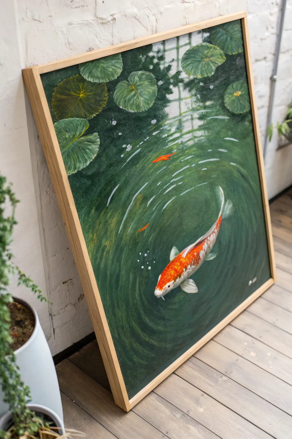
Capture the tranquil movement of a koi fish gliding through deep emerald waters with this acrylic painting tutorial. The focus on rippled water textures and vibrant lily pads creates a peaceful, immersive scene perfect for bringing a touch of nature indoors.
How-To Guide
Materials
- Large stretched canvas (square or rectangular)
- Acrylic paints (Phthalo Green, Hookers Green, Burnt Umber, Cadmium Orange, Titanium White, Raw Sienna, Black)
- Flow improver or glazing medium
- Large flat brush (for background)
- Medium filbert brush (for lily pads)
- Small round brush (for details)
- Fine liner brush
- Palette and water cup
- Chalk or pastel pencil for sketching
Step 1: Setting the Scene
-
Prime the background:
Begin by covering the entire canvas with a dark, murky base. Mix Phthalo Green with a touch of Burnt Umber and Black to create a deep, shadowy pond color. Use your large flat brush to apply this evenly. -
Establish light zones:
While the base is still slightly tacky or just dry, mix a lighter green using Hookers Green and a tiny bit of White. Roughly map out where the light hits the water, primarily in the center where the fish will go and near the top right. -
Create the reflection grid:
Notice the faint, architectural reflection in the upper right (likely a window or greenhouse roof). Mix a very transparent glaze of light grey-green and paint faint vertical and horizontal lines to mimic this reflection, keeping edges soft and blurred.
Top Tip: Depth
Don’t paint the fish entirely opaque. Glazing a thin layer of the background green over the tail makes it look submerged, while keeping the head bright makes it surface.
Step 2: Painting the Flora
-
Block in lily pads:
Using a medium filbert brush and a mix of Hooker’s Green and Raw Sienna, paint the basic oval shapes of the lily pads clustered at the top of the canvas. -
Add leaf details:
Once the pads are dry, use a lighter green mix to paint fine veins radiating from the center of each pad. Keep your strokes loose to follow the natural curve of the leaf. -
Deepen the shadows:
To make the lily pads float, paint a thin line of dark swaying shadow underneath each pad using your dark background mix. This separates them from the water surface. -
Highlight the edges:
Add a crisp, thin highlight of pale green or yellow-white to the rim of the lily pads where the light catches them.
Step 3: The Water Ripples
-
Draft the ripples:
With a piece of chalk, lightly sketch concentric circles radiating from the center-right area. These don’t need to be perfect circles; organic, slightly wobbling ovals look better. -
Paint the wave crests:
Load a small round brush with a mix of Titanium White and a drop of your green base. Paint the ‘tops’ of the ripples using broken, curved strokes. The lines should be thicker near the center and thinner as they move out. -
Add depth to ripples:
Underneath each white highlight stroke, add a stroke of the deep green-black shadow mix. This contrast creates the illusion of peaks and troughs in the water. -
Soften the water:
I like to use a clean, dry brush to very gently feather the edges of the ripple lines before the paint fully sets, making the movement look fluid rather than jagged.
Troubleshooting: Flat Water
If your water looks flat, you likely need more contrast. Don’t be afraid to use almost pure black for the ripple shadows and pure white for the highlights.
Step 4: The Koi Fish
-
Outline the fish:
Sketch the curved shape of the koi swimming diagonally across the ripples. Ensure the tail curves naturally with the movement of the water. -
Apply the base color:
Fill the fish shape with Titanium White. This underlayer is crucial to make the orange pop against the dark green background. -
Map the patterns:
Paint the vibrant orange blotches using Cadmium Orange. Leave patches of white showing through for the classic koi pattern, especially near the tail and fins. -
Detail the scales:
Mix a diluted grey-orange and use a fine liner brush to hint at scales. You don’t need to paint every single scale; just suggest the texture on the fish’s back. -
Paint the fins:
Use a translucent white-grey mix for the fins. They should look delicate and semi-transparent. Add tiny streaks of orange near the body connecting to the fin. -
Submerge the fish:
To make the fish look like it’s *in* the water, glaze a very thin, watery layer of the pond green color over the tail and back fins. This pushes those parts deeper than the head. -
Final bubbles:
Using pure Titanium White on the tip of a small brush or a dotting tool, place small clusters of bubbles near the fish’s mouth and heavily rippled areas.
Hang your finished piece in a well-lit spot where the green tones can remind you of a quiet garden pond
Underwater Scene in Sea-Green Haze
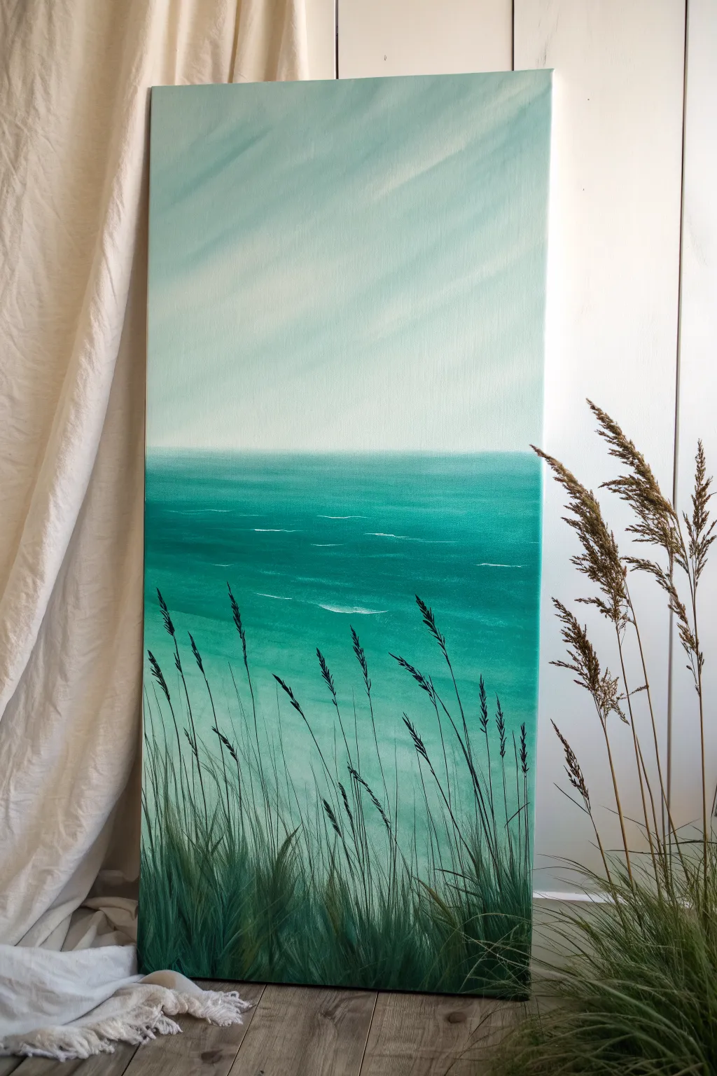
Capture the serenity of a quiet shoreline with this monochromatic seascape, featuring soothing teal gradients and delicate foreground grasses. This vertical composition relies on soft blending techniques to create a hazy, atmospheric finish perfect for calming any space.
Step-by-Step Tutorial
Materials
- Tall vertical stretched canvas (e.g., 12×24 or 15×30)
- Acrylic paints: Titanium White, Phthalo Green, Phthalo Blue (Green Shade), Mars Black, Unbleached Titanium
- Large flat wash brush (2-3 inch)
- Medium flat brush (1/2 inch to 1 inch)
- Small round detail brush
- Rigger brush or liner brush (for fine grass lines)
- Palette for mixing
- Water jar and paper towels
- Slow-drying medium or retarder (optional but helpful for blending)
Step 1: Sky and Atmosphere
-
Prepare the Sky Mix:
Begin by mixing a very large amount of Titanium White with a tiny touch of Phthalo Green and the smallest speck of Unbleached Titanium. This should be a very pale, almost white, minty green. -
Paint the Upper Sky:
Using your large wash brush, cover the top two-thirds of the canvas with this pale mixture. Apply the paint using long, diagonal sweeping strokes from top-left to bottom-right to imply soft light rays. -
Deepen the Horizon:
While the sky paint is still wet, mix a slightly darker version of your teal by adding a bit more green and a touch of blue to your white base. Blend this into the bottom third of the sky area, creating a smooth gradient that gets slightly darker as it approaches the horizon line. -
Create Diagonal Haze:
With a clean, dry large brush, gently sweep diagonally across the wet sky paint again. This helps soften the transition and reinforces those subtle diagonal calm ‘rays’ of light visible in the reference.
Wet-on-Wet Blending
For the hazy sky, keep a spray bottle handy to mist the canvas. Keeping the acrylics slightly damp allows for that seamless, dreamlike gradient.
Step 2: The Ocean Body
-
Establish the Horizon Line:
Mix a medium-value turquoise using Phthalo Green, a touch of Phthalo Blue, and White. Use a ruler or painter’s tape to ensure a perfectly straight horizon line about one-third of the way up from the bottom. -
Block in the Water:
Fill the area below the horizon with your medium turquoise mix. As you move closer to the bottom of the canvas, gradually add less white to the mixture to darken the water’s depth. -
Add Wave Motion:
Switch to a medium flat brush. Mix a slightly darker teal shade and paint horizontal streaks across the water, varying the length to suggest movement. -
Highlight the Swells:
Using a mix of Titanium White and a tiny drop of the water color, use the edge of your flat brush to add thin, horizontal highlights. Focus these ‘whitecaps’ slightly below the horizon and in the middle ground, keeping them sparse.
Step 3: Foreground Grasses
-
Mix the Darkest Green:
Create a deep, shadow green by mixing Phthalo Green with a small amount of Mars Black. You want this to look like a silhouette but still retain a greenish hue, not pure black. -
Establish the Base:
Using a medium brush, dab this dark mixture along the very bottom edge of the canvas to create a solid anchor for the grass clumps. Use upward, flicking strokes to start the base of the blades. -
Paint Tall Blades:
Switch to a rigger or liner brush. Thin your dark paint slightly with water for better flow. Paint long, sweeping lines upward, extending past the halfway point of the water section due to the vertical canvas format. -
Vary Height and Direction:
Ensure the grass blades aren’t uniform. Have some lean left, some right, and overlap them. I find it helpful to rotate the brush slightly as I pull upward to create variation in line thickness. -
Add Seed Heads:
On the tallest stalks, use a small detail brush to stipple small dots or dashes along the top few inches of the stem. This mimics the textured seed heads of seaside grasses. -
Layering Depth:
Once the dark layer is dry, mix a slightly lighter, warmer green (add a touch of Unbleached Titanium to your dark mix). Paint a few blades in the very front to create a sense of dimension and lighting. -
Final Grass Textures:
Using a fairly dry brush with the lighter green mix, gently scumble over the dense leafy areas at the bottom to suggest fullness and texture.
Add Metallic Shimmer
Mix a pearlescent medium or iridescent finish into your white paint for the water highlights to give the ocean a gentle, sun-kissed sparkle.
Step back and admire how the vertical lines of the grass contrast beautifully with the horizontal calm of your ocean view
Zen Stones on Moss Green Gradient
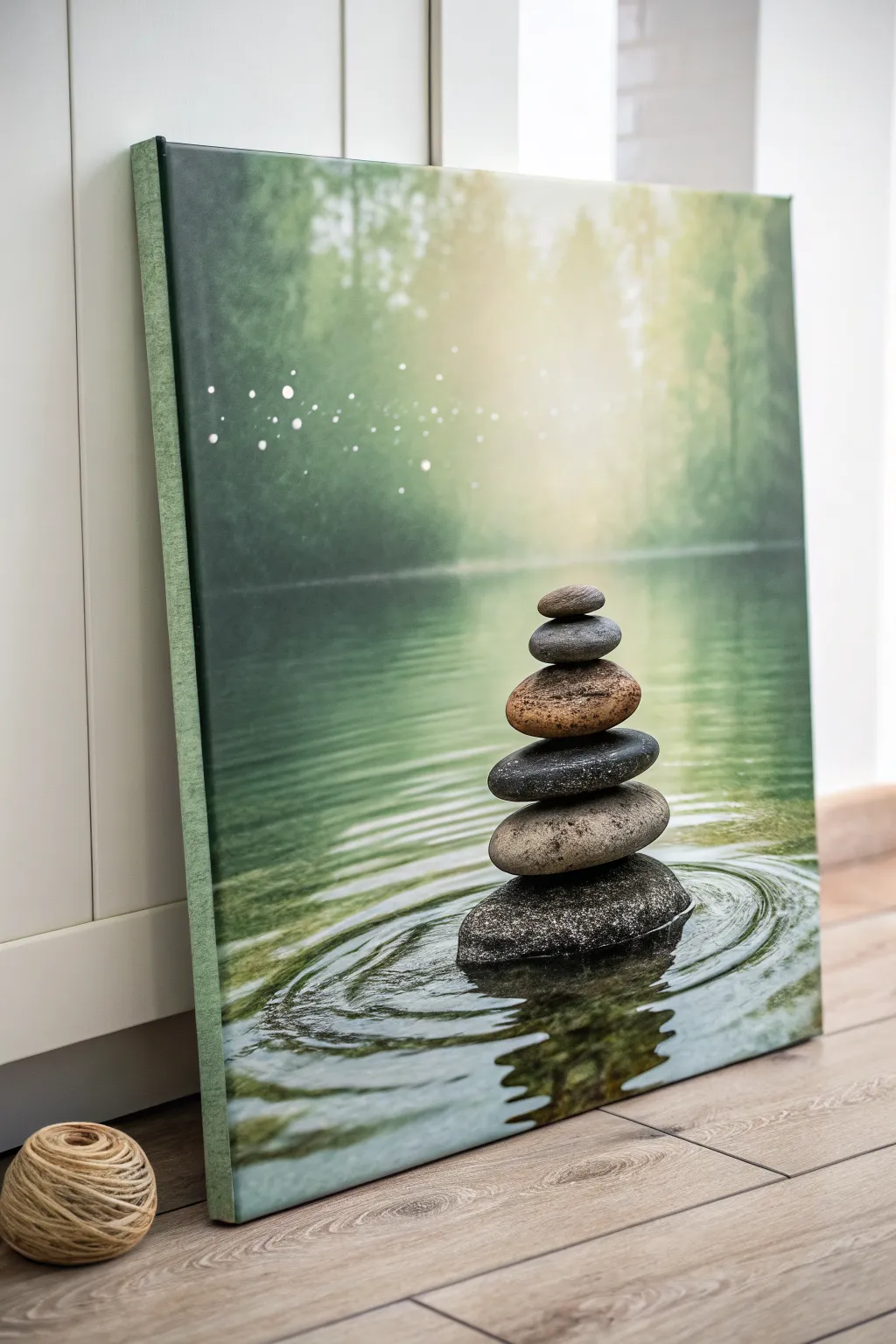
Capture the serenity of a quiet forest retreat with this peaceful canvas painting project. featuring a perfect balance of stacked river stones against a soft, misty background. The soothing green gradients and realistic water ripples create an instant sense of calm in any room.
Step-by-Step
Materials
- Rectangular stretched canvas (e.g., 16×20 inches)
- Acrylic paints: Titanium White, Mars Black, Sap Green, Phthalo Green, Burnt Umber, Yellow Ochre, Raw Sienna
- Large flat wash brush (2 inch)
- Medium filbert brush (size 8)
- Small round detail brush (size 1 or 0)
- Glazing medium
- Palette knife based simply for mixing
- Water container and paper towels
- Old toothbrush (optional for spatter)
Step 1: Setting the Scene
-
Prime the background gradient:
Begin by dampening your large flat brush slightly. Mix Sap Green with a touch of White and Phthalo Green to create a mid-tone forest green. Apply this to the top two-thirds of the canvas, brushing vertically. -
Add the light source:
While the paint is still wet, blend pure Titanium White with a tiny bit of Yellow Ochre into the upper center of the canvas. Radiate this light outward to create a soft, glowing focal point that fades into the darker green edges. -
Create the waterline:
Switch to a darker mix of Phthalo Green and a touch of Burnt Umber. Paint the bottom third of the canvas with horizontal strokes to establish the water surface, ensuring a soft transition line where the water meets the misty forest background. -
Suggest forest depth:
Using a dry brush technique with watered-down Sap Green, lightly scumble vertical shapes in the background to suggest distant tree trunks. Keep these incredibly soft and out of focus so they don’t distract from the stones later. -
Add magical bokeh:
Dip the handle of a small brush or a stylus into thinned Titanium White paint. Dot small circles of light into the upper left quadrant, varying the pressure to change the dot sizes. I like to soften a few of these with a clean, dry finger to make them look uniform with the misty atmosphere.
Fixing Muddy Water
If your water ripples look messy, let the paint dry completely. Glaze a thin layer of the dark water base color over the chaotic area, then repaint just the white highlight lines on top.
Step 2: Building the Stone Cairn
-
Sketch the stack:
Once the background is fully dry, lightly sketch the outline of six stacked stones with a piece of chalk or a very light pencil line. The largest stone goes at the bottom, tapering generally to the smallest on top. -
Base coat the stones:
Fill in each stone shape with a base color. Use shades of grey (Black + White) for most, but mix Burnt Umber and Raw Sienna for the third stone from the top to add that warm, earthy variety seen in the reference. -
Shadowing the rocks:
With a small filbert brush, apply dark grey or black to the bottom of each stone where it rests on the one below it. This creates weight and separation between the individual rocks. -
Texturing the surface:
Mix a little sand or simply use thick, unthinned paint with a sponge or old stiff brush to dab slight texture onto the stones. Vary the colors slightly—adding hints of blue to the grey, or ochre to the brown stone—to mimic natural granite and sandstone. -
Highlighting the stack:
Identify your light source coming from the top center. Paint crisp, white-tinted highlights on the upper right curves of each stone to make them look wet and smooth.
Step 3: Reflections and Ripples
-
Paint the stone reflection:
Directly below the bottom stone, paint an inverted, zigzagging reflection of the stack using darker versions of your stone colors. Keep these strokes horizontal and somewhat broken to represent moving water. -
Create the primary ripples:
Using your smallest round brush and watered-down White mixed with a tiny bit of Green, paint elliptical rings radiating out from the base of the stone stack. The lines should be thin and crisp. -
Add depth to ripples:
Right next to each light ripple line, paint a thin line of dark Phthalo Green mixed with Black. This shadow creates the trough of the wave, giving the water surface dimension. -
Enhance water sheen:
Glaze over the water area (avoiding the stone reflection) with a very thin layer of gloss medium mixed with a speck of Phthalo Green to deepen the liquid look. -
Final touches:
Add a final, bright white specular highlight on the very wettest part of the bottom stone and a few sharp sparkles on the crests of the nearest ripples.
Pro Trick: Perfect Ovals
For steady water ripples, don’t move your wrist. Lock your wrist and move your entire arm from the shoulder to create smooth, confident elliptical curves around the stone base.
Step back and breathe deeply as you admire the balanced stillness you have created on your canvas
Gold-Look Botanical Line Art on Dark Green
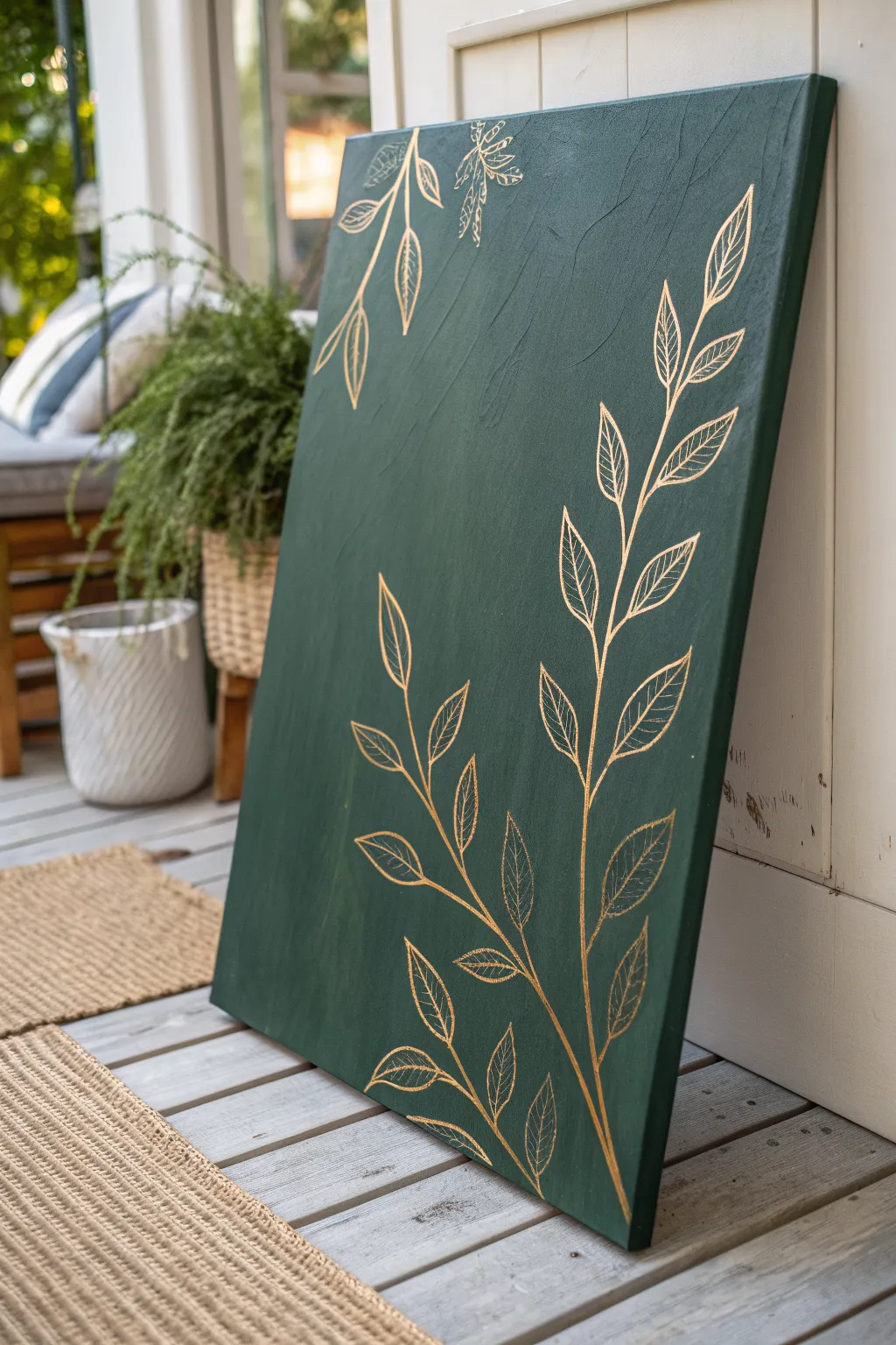
Capture the elegance of botanical prints with this stunning canvas project that combines deep, textural green with delicate metallic accents. The contrast between the dark, moody background and the shimmering gold line work creates a sophisticated piece perfect for adding a touch of nature-inspired luxury to any room.
How-To Guide
Materials
- Large stretched canvas (e.g., 24×36 inches)
- Dark forest green acrylic paint
- Gold paint pen (fine tip) or metallic gold acrylic paint and liner brush
- Wide flat paintbrush (2-3 inch)
- Pencil
- White eraser
- Ruler (optional)
- Small cup of water
- Paper towels
- Gloss or satin varnish (optional for finishing)
Step 1: Setting the Background
-
Prepare your workspace:
Lay down a drop cloth or newspaper to protect your floor or table. Ensure your canvas is clean and free of dust before you begin. -
Apply the first coat of green:
Squeeze a generous amount of dark forest green acrylic paint directly onto the canvas. Using your wide flat brush, spread the paint in long, varying strokes. -
Build texture purposefully:
Don’t aim for a perfectly smooth finish. Instead, allow the brush bristles to leave visible ridges and texture. Criss-cross your strokes slightly to create a subtle woven effect that adds depth. -
Paint the edges:
Remember to paint the sides of the canvas for a professional, gallery-wrapped took. Continue the same green color around the edges so it looks finished from all angles. -
Let it dry completely:
Allow the first layer to dry for at least 30-45 minutes. If the coverage looks patchy, apply a second coat using the same textured technique. -
Check for opacity:
Hold the canvas up to a light source. If you can see light peeking through the weave, you definitely need that second coat to achieve the deep, solid background required for the gold to pop.
Gold Skipping?
If the pen skips on the textured paint, press the tip down gently on a scrap paper to re-flow the ink, then move more slowly on the canvas to fill the gaps.
Step 2: Drafting the Design
-
Plan your composition:
Ideally, you want two distinct botanical elements. Plan for a large, sweeping branch rising from the bottom right corner, and a smaller branch cascading from the top left. -
Sketch the main stems:
Lightly use a pencil to draw the central curved line for your main bottom stem. Keep the curve gentle and organic, avoiding rigid straight lines. -
Add leaf skeleton lines:
Sketch small offshoot lines where the leaves will attach. Space them out somewhat evenly, alternating sides as you move up the stem. -
Outline the leaf shapes:
Draw simple almond or lance-shaped outlines for each leaf. Keep your pencil pressure very light so you don’t groove the paint or leave heavy graphite marks. -
Repeat for the top corner:
Sketch the smaller hanging branch in the top left corner, ensuring the leaves point downwards to simulate gravity.
Step 3: Gilding the Botanicals
-
Prime your gold pen:
If using a paint pen, shake it vigorously and press the tip on a scrap piece of paper until the gold ink flows smoothly. -
Trace the main stems:
Carefully trace over your pencil lines for the main stems first. Use a steady hand, but don’t worry about microscopic imperfections; they make it look hand-painted. -
Outline the leaves:
Go over the leaf outlines. I find it helpful to rotate the canvas physically so my hand is always in a comfortable drawing position. -
Add the central vein:
Draw a single line down the center of each leaf, stopping just short of the leaf tip. -
Detail the leaf veins:
Draw angled lines branching from the central vein to the leaf edges. Make these lines thinner or lighter if possible to differentiate them from the main outline. -
Check for consistency:
Step back and look at the painting. Thick up any lines that look too thin or faint, ensuring the gold reflects light evenly across the piece. -
Erase pencil marks:
Wait at least an hour for the gold ink to fully cure. Then, gently use a white eraser to remove any visible pencil lines. -
Seal the artwork (optional):
To protect the surface, apply a thin coat of clear varnish. Be careful not to smudge the gold if it isn’t fully waterproof, so a spray varnish is often safer than a brush-on one.
Pro Tip: Leaf Variety
Make your botanical art look more natural by varying the size of the leaves—make them larger at the base of the stem and smaller near the tip.
Hang your new masterpiece in a well-lit area where the light can catch those gold details and bring them to life
Geometric Blocks in Mixed Green Tones
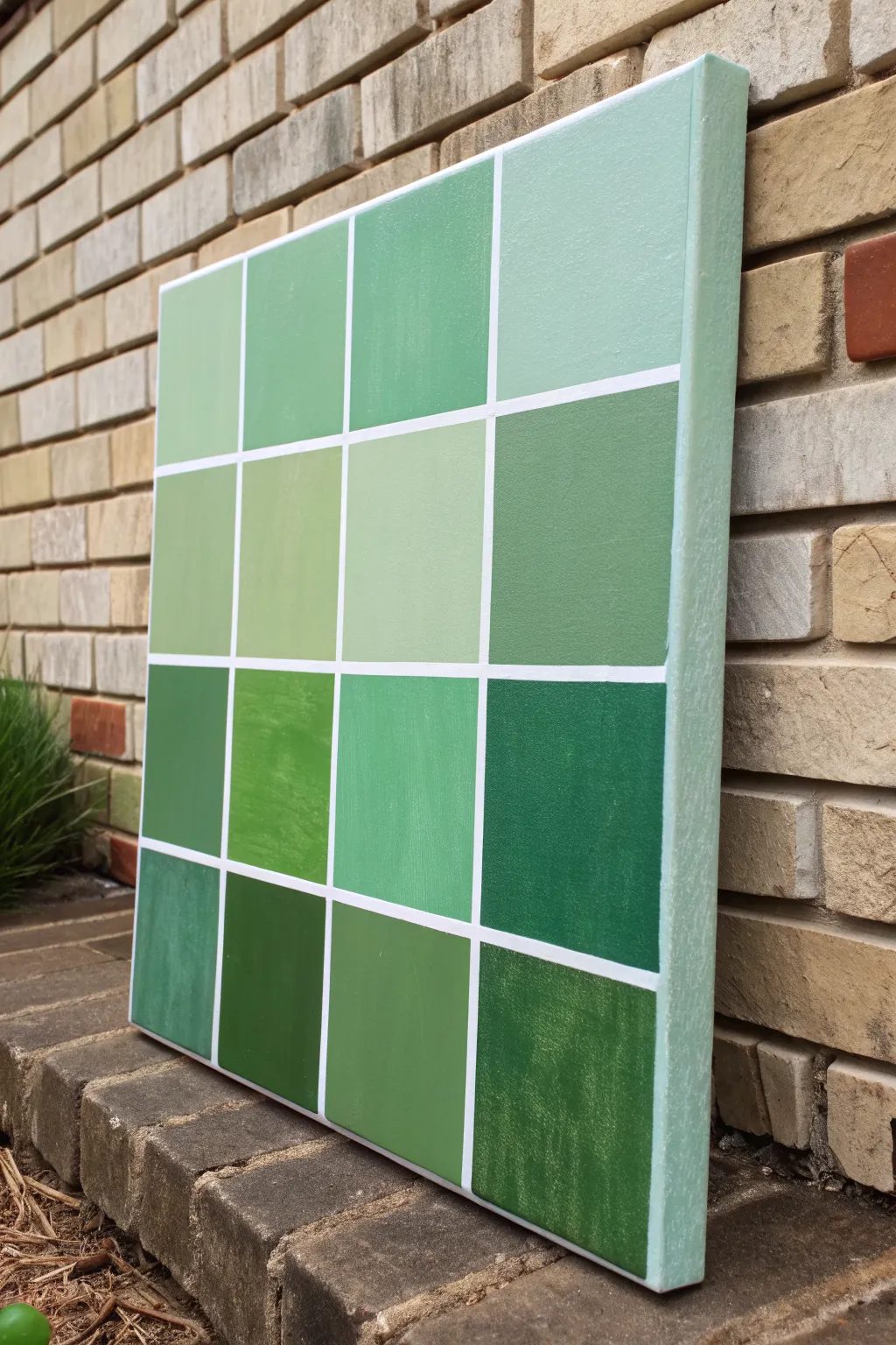
Bring the calming properties of nature indoors with this structured yet organic geometric painting. Featuring a sixteen-square grid of varied green tones, this project explores color mixing and precision to create a modern minimalist statement piece.
Step-by-Step Guide
Materials
- Square stretched canvas (approx. 16×16 or 20×20 inches)
- Acrylic paints: Phthalo Green, Hooker’s Green, Titanium White, Mars Black, and Yellow Ochre
- Painter’s tape or masking tape (1/4 inch width is ideal)
- Ruler or tape measure
- Pencil
- Flat shader brushes (medium and large sizes)
- Palette or mixing plate
- Palette knife (optional, for mixing)
- Cup of water and paper towels
Step 1: Preparation & Layout
-
Prime the surface:
Begin by ensuring your canvas is clean and taut. Even if it is pre-primed, you might choose to add a coat of gesso for a smoother texture, though the canvas tooth adds character. -
Base coat the edges:
Mix a very pale, minty green using a large amount of Titanium White with a tiny speck of Phthalo Green. Paint the sides of the canvas and overlap slightly onto the front face. -
Measure the grid:
Once the base coat is dry, measure your canvas dimensions. Divide the total width and height by four to determine where your grid lines will fall for a 4×4 layout. -
Mark the lines:
Lightly mark these intervals with a pencil on the top, bottom, left, and right edges of the canvas face. -
Apply the tape:
Run long strips of painter’s tape horizontally and vertically connecting your marks to create the grid. Press the edges of the tape down firmly to prevent paint bleed. -
Seal the tape (Optional):
For razor-sharp lines, I like to brush a very thin layer of white paint or matte medium over the tape edges. This seals any tiny gaps so the green paint won’t seep underneath.
Step 2: Mixing & Painting
-
Plan your palette:
The goal is variety. You need sixteen distinct green shades. Some should be cool (blue-leaning), some warm (yellow-leaning), some light pastels, and some deep forest tones. -
Mix the first batch:
Start by squeezing out your main greens. Create a mid-tone sage by mixing Hooker’s Green with White and a touch of Yellow Ochre. -
Paint scattered squares:
Choose 3-4 random squares on your grid and fill them with this first mix. Use a flat brush to get smooth coverage inside the taped lines. -
Create variations:
Modify your original mix. Add more Titanium White for a pastel block, or a dot of Black to deepen it. Paint another set of 2-3 random squares. -
Introduce warm tones:
Mix a fresh batch using Green and a larger amount of Yellow Ochre to create an olive or leafy hue. Apply this to a few empty squares to add warmth to the composition. -
Add cool tones:
Use the Phthalo Green mixed with White for a crisp, minty, cool tone. Fill in remaining spots, ensuring no two identical shades are right next to each other if possible. -
Check coverage:
Acrylics can be translucent. If the canvas texture shows through too much, let the first layer dry and apply a second coat to ensure solid, opaque color blocks.
Grid Perfection Pro Tip
Don’t measure the tape gaps! Instead, place tape strips down, then place a ‘spacer’ piece of tape next to it, then the next line. Peel up the spacer for perfect, equal gaps.
Step 3: Finishing Touches
-
Let it dry completely:
Allow the painting to dry fully. If you peel the tape while the paint is still wet and thick, you risk pulling up the paint film. -
The reveal:
Slowly peel away the painter’s tape at a 45-degree angle. This is the most satisfying part, revealing the crisp white canvas lines between your colorful blocks. -
Touch ups:
Inspect your white grid lines. If any green paint bled through, use a small detail brush and thick Titanium White paint to carefully cover the mistake. -
Varnish:
Once fully cured (usually 24 hours), apply a coat of satin or matte varnish to protect the colors and unify the sheen across the different paint mixes.
Bleeding Lines?
If paint bleeds under the tape, don’t panic. Wait for it to dry completely, then re-tape along the correct line and paint over the bleed with Titanium White.
Hang your new geometric masterpiece in a brightly lit room to let the subtle variations in green tones really shine
Palette-Knife Meadow Texture on Green Base
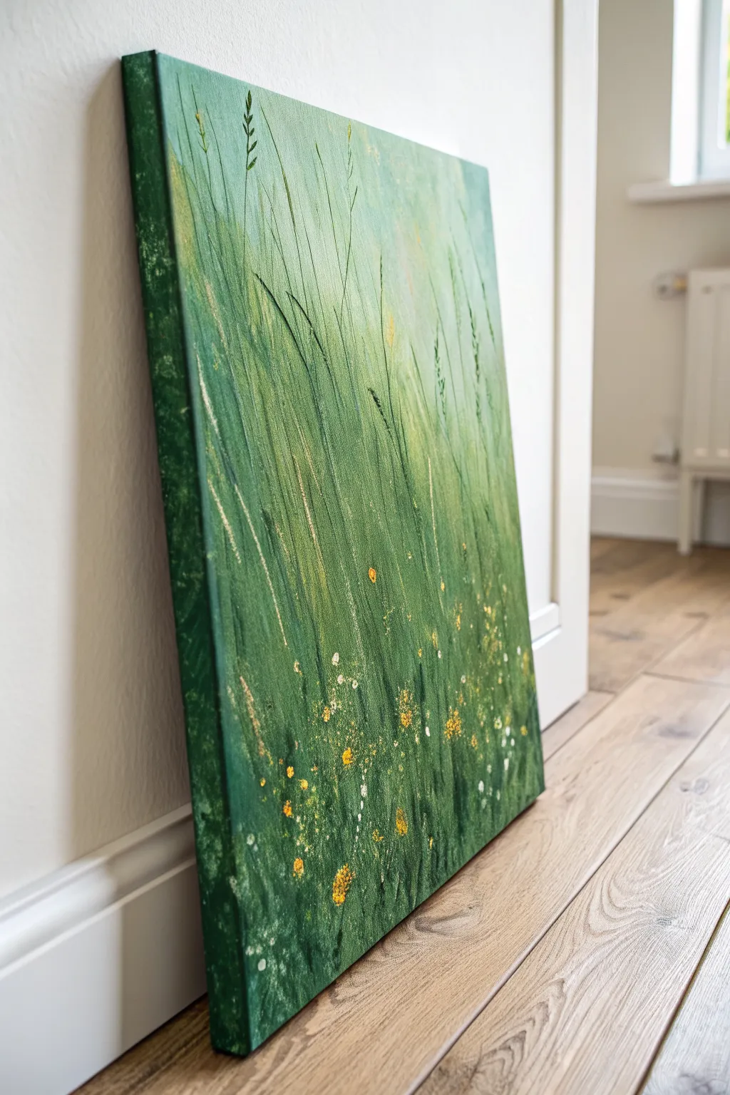
Capture the serene beauty of a windswept field with this textured acrylic painting on canvas. Using a rich palette of layered greens and rhythmic vertical strokes, you will create a lively, abstract interpretation of tall grasses dotted with tiny wildflowers.
Detailed Instructions
Materials
- Stretched canvas (e.g., 16×20 or 18×24 inches)
- Acrylic paints (Phthalo Green, Sap Green, Yellow Ochre, Lemon Yellow, Titanium White, Black)
- Medium and large flat paintbrushes
- Palette knife (trowel shape works best)
- Old toothbrush or splatter brush
- Texture paste or modeling paste (optional for extra depth)
- Liner brush (script liner)
- Palette for mixing
- Water cup and paper towels
Step 1: Setting the Background
-
Prepare the deep base:
Mix Phthalo Green with a touch of Black to create a very dark, moody forest green. Using a large flat brush, cover the entire bottom third of the canvas. -
Paint the canvas edges:
While you have this dark green mixture on your brush, continue painting deeply around all four sides of the canvas edges to create a professional, gallery-wrapped finish. -
Transition to mid-tones:
Clean your brush slightly. Mix Sap Green with a little Yellow Ochre. Paint the middle third of the canvas, blending it downward into the wet dark green base to create a soft gradient. -
Create the light source:
For the top third, mix White, Lemon Yellow, and a tiny dot of Sap Green. Paint this light, hazy lime color at the top, blending downward into the mid-tones. Let this base layer dry completely.
Knife Angle Trick
Hold your palette knife at a 45-degree angle for broad scrapes, but turn it 90 degrees (perpendicular) to stamp thin, crisp lines that look exactly like stems.
Step 2: Layering the Grass
-
Start the vertical movement:
Mix a medium grassy green. Using a dry flat brush, start making long, upward sweeping strokes from the bottom dark area into the middle section. Keep your wrist loose to mimic natural growth. -
Introduce texture:
If using modeling paste, mix it with Sap Green now. If not, use heavy body paint straight from the tube. Load the edge of your palette knife and scrape upward to create raised ridges of grass. -
Layering lighter greens:
Mix Lemon Yellow with Sap Green. Apply this lighter shade using the palette knife, focusing on the middle and upper sections where the ‘sun’ hits the grass. -
Varying stroke lengths:
I like to vary the pressure here; create some short, choppy strokes near the bottom for density, and long, elegant lines reaching toward the top for the tall stalks. -
Adding shadow definition:
Go back to your dark Phthalo Green mix. Use the very edge of the palette knife to slice thin, dark lines through the lighter areas, adding depth and shadow between the bright blades. -
Softening the top:
Use a nearly dry brush with your lightest yellow-white mix to feather out the tops of the grasses so they fade gently into the background rather than stopping abruptly.
Step 3: Detailing the Field
-
Painting individual stalks:
Switch to a liner brush with thinned dark green paint. Paint a few deliberate, distinct tall grass blades or wheat stalks that stand out from the textured mass. -
Highlighting stalks:
Clean the liner brush and pick up a creamy mix of White and Yellow Ochre. Add slight highlights to the tips of the tallest grasses you just painted. -
Dabbing clusters:
Mix a bright Golden Yellow. Using the tip of a small brush or the point of your palette knife, dab clusters of dots in the bottom half of the painting to represent flower heads. -
Adding white florals:
Repeat the dabbing process with Titanium White, placing these dots randomly among the yellow ones. Keep the dots irregular sizes for a natural look. -
Controlled splatter technique:
Dilute some White and Yellow paint with water until it’s milky. Dip an old toothbrush into it, point it at the canvas, and flick the bristles to create a fine mist of wildflower pollen. -
Larger accents:
Load a small round brush with thick yellow paint. Gently press and lift to create slightly larger, textured flower petals in the foreground area only. -
Final assessment:
Step back and look at the overall balance. If the bottom looks too uniform, add a few more dark vertical knife strokes to break it up before signing your work.
Golden Hour Glow
Mix a tiny amount of metallic gold paint into your yellow flower dabs. It won’t be obvious, but it will catch the light beautifully as you walk past the canvas.
Now you have a refreshing slice of nature to brighten up your home
Surreal Green Aurora Swirls With Stars
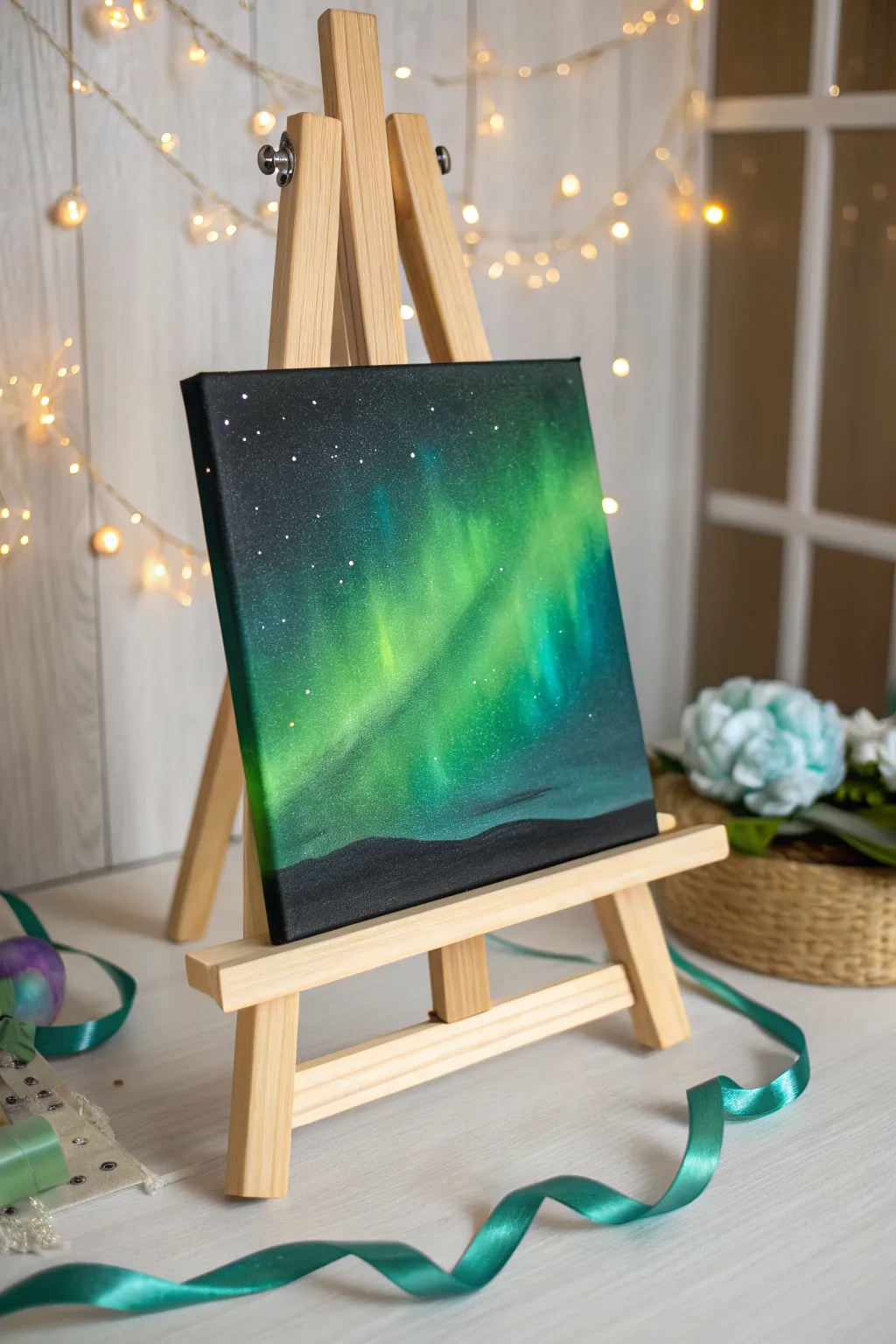
Capture the ethereal magic of the northern lights with this vibrant acrylic painting tutorial. You will create a stunning contrast between deep space blacks and luminescent greens to bring a cosmic swirl to life.
Step-by-Step Guide
Materials
- Small square canvas (e.g., 8×8 or 10×10 inches)
- Acrylic paints: Mars Black, Titanium White, Phthalo Green, Viridian, Teal, Lemon Yellow
- Large flat brush or foam brush
- Medium filbert brush
- Small blending mop brush or soft makeup brush
- Old toothbrush or splatter brush
- Cup of water and paper towels
- Palette or paper plate
Step 1: Setting the Night Sky
-
Prime the canvas:
Begin by covering the entire canvas with a solid coat of Mars Black acrylic paint. Use a large flat brush to ensure full coverage, painting the sides of the canvas as well for a finished look. -
Create the horizon guide:
While the black is still wet or just after it dries, visualize a low horizon line. Keep the bottom 10-15% of the canvas reserved for the ground, but don’t paint any details there yet; just keep it dark. -
Dry completely:
Let the black base coat dry fully. If the canvas texture is still showing through too much, apply a second coat of black to get a deep, opaque void.
Step 2: Painting the Aurora
-
Mix the base green:
On your palette, mix Phthalo Green with a tiny touch of Titanium White to create a semi-opaque dark forest green. This will be the outer edge of your glow. -
Apply the flow:
Using a medium filbert brush, paint a broad, diagonal band across the center of the canvas, moving from the bottom left toward the top right. Don’t worry about neatness; you want rough, organic shapes. -
Soften the edges:
Before the green paint dries, use a dry blending mop brush (or a clean, soft makeup brush) to gently swirl the edges of the paint into the black background. This creates that hazy, atmospheric glow. -
Brighten the mix:
Add more White and a bit of Teal to your green mixture. Apply this lighter color inside the first green band, focusing on the center of the swirl. -
Create vertical pillars:
Using a clean, dry brush, gently pull the wet lighter green paint upward in short, feathery strokes. This mimics the vertical ‘curtains’ of light often seen in auroras. -
Intensify the core:
Mix Lemon Yellow with a large amount of Titanium White and a tiny speck of Green. This should be a very pale, almost neon yellow-green. -
Add the highlight:
Paint a thin, concentrated streak of this pale mixture right in the heart of the aurora band where the light would be strongest. -
Final blend:
Use your blending brush to softly merge the pale yellow-green into the surrounding teals and greens. Work quickly so the acrylics blend wet-on-wet.
Muddy colors?
If your greens look dull against the black, let the first layer dry completely. Then apply a thin layer of white over the aurora shape before repainting the neon greens on top.
Step 3: Stars and Silhouette
-
Prepare the stars:
Dilute a small amount of Titanium White paint with water until it reaches an ink-like consistency. -
Splatter the galaxy:
Dip an old toothbrush into the thinned white paint. Test it on a paper towel first, then gently flick the bristles with your thumb to spray fine mist-like stars over the top and left sections of the sky. -
Add major stars:
Use the very tip of a detail brush or a toothpick to dot a few larger, brighter stars in the darker black areas for variety. -
Define the ground:
Switch back to pure Mars Black. Paint a solid, undulating landscape at the very bottom of the canvas, covering any messy paint drips from the aurora stage. -
Shape the hills:
Create soft, rolling hills rather than jagged mountains to keep the mood peaceful. Ensure the black silhouette is fully opaque against the bright green aurora. -
Add subtle depth:
I like to mix a tiny bit of dark grey and dry-brush just the very top edge of the hills slightly to suggest a faint reflection of the green light on the ground. -
Final drying:
Allow the entire painting to dry overnight before moving or framing it.
Add a Tree Line
Instead of rolling hills, use a fan brush with black paint to tap in jagged spruce tree silhouettes along the horizon for a classic alpine forest look.
Place your finished canvas on a mini easel and enjoy your own slice of the northern hemisphere night sky

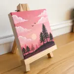
Have a question or want to share your own experience? I'd love to hear from you in the comments below!