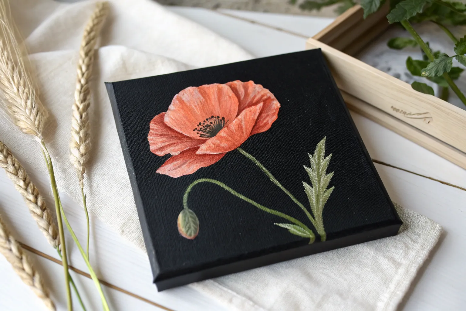
If you want paintings that look dramatic fast, a black background is basically your secret weapon. I love how it gives you instant depth, so even easy painting ideas can look bold and finished with just a few bright layers.
Starry Sky With Splatter Stars
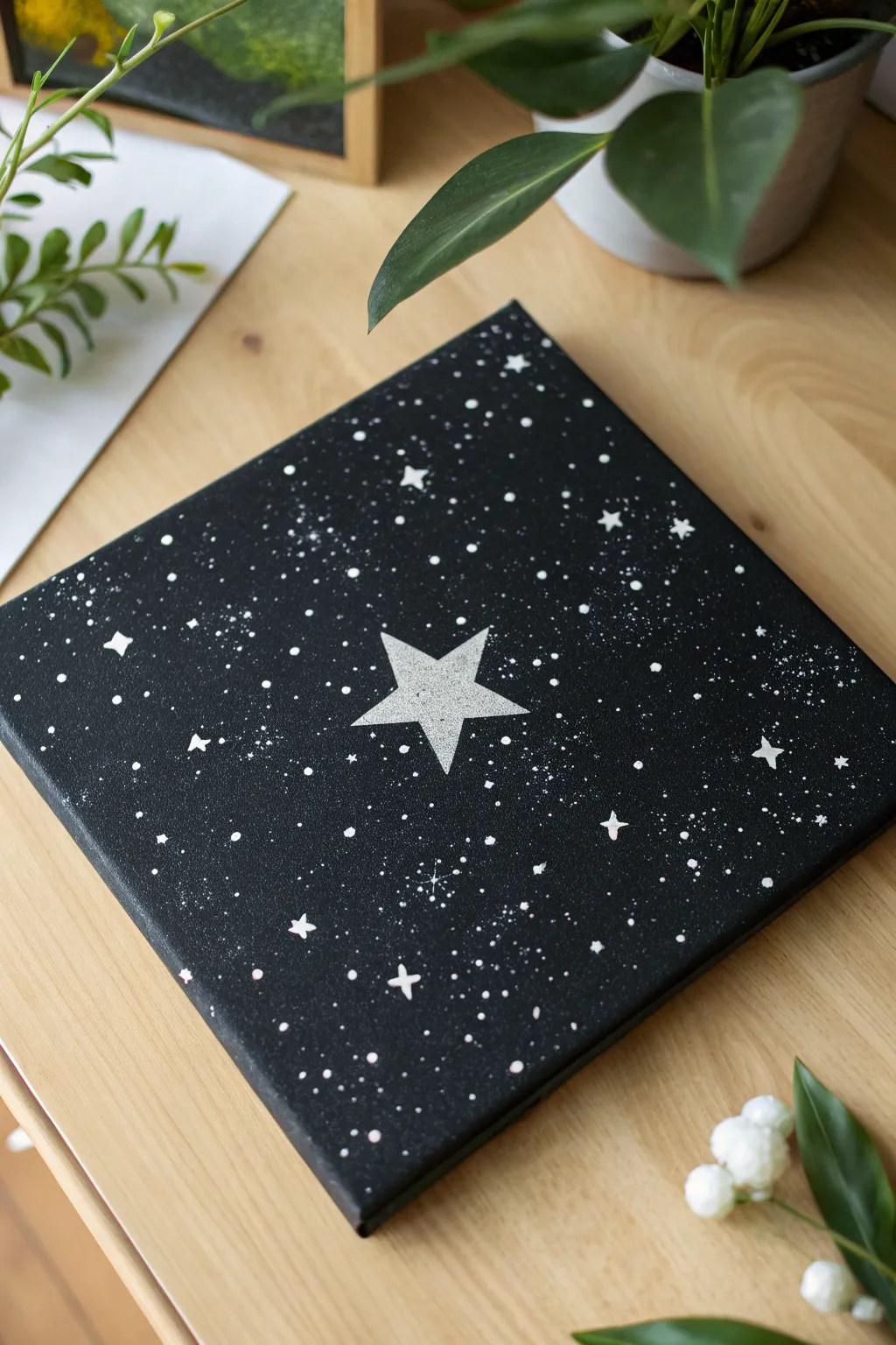
Transform a simple black canvas into a celestial masterpiece using basic splatter techniques and stencils. This project creates a striking contrast between the deep void of space and bright, sparkling starlight, focused around a bold central star shape.
How-To Guide
Materials
- Square stretched canvas (approx. 8×8 or 10×10 inches)
- Black acrylic paint (matte finish recommended)
- White acrylic paint (heavy body works best)
- Silver metallic acrylic paint (optional, for shimmer)
- Large flat paintbrush
- Old toothbrush or stiff bristle brush
- Cardstock or thick paper
- Scissors or craft knife
- Painter’s tape or stencil adhesive
- Small round detail brush (size 0 or 1)
- Palette or paper plate
- Water cup
- Paper towels
Step 1: Setting the Stage
-
Prepare the canvas:
Start with a clean, dry canvas. Even if you bought a pre-primed black canvas, applying a fresh coat of black acrylic paint ensures a deep, rich background without any white showing through the weave. -
Paint the edges:
Don’t forget the sides of the canvas. Extending the black paint around the edges gives the piece a professional, finished look suitable for hanging without a frame. -
Allow to dry completely:
Let the black base coat dry thoroughly. It must be bone dry, otherwise the stencil tape might peel up the paint later. -
Create the star stencil:
Draw a five-pointed star in the center of your cardstock. You want the negative space, so carefully cut out the star shape to create a mask. Alternatively, cut out the star shape itself if you want the star to remain black against a white background, but for this project, we are painting the positive shape white. -
Position the stencil:
Place your homemade stencil in the exact center of the canvas. Secure it firmly with painter’s tape or a light spray of stencil adhesive to prevent paint from bleeding under the edges.
Step 2: Creating the Galaxy
-
Mix the splatter paint:
On your palette, mix white acrylic paint with a small amount of water. You want a consistency similar to heavy cream—fluid enough to splatter but thick enough to stay opaque. -
Load the toothbrush:
Dip an old toothbrush into the thinned white paint. Test the splatter pattern on a scrap piece of paper first to get a feel for the density. -
Splatter the background:
Hold the toothbrush over the canvas and run your thumb across the bristles to flick paint. Focus more density around the corners and edges, leaving the center slightly less crowded. -
Add dimension with silver:
I like to repeat the splatter process with a tiny bit of metallic silver paint. This adds a subtle shimmer that catches the light differently than the flat white. -
Let the splatter dry:
Wait for the tiny droplets to dry completely. If you move to the next step while they are wet, you risk smudging your galaxy.
Splatter Control
To control where the splatter goes, hold the toothbrush closer to the canvas for dense clusters, or further away for a spread-out mist effect.
Step 3: The Main Event
-
Stencil the central star:
Using a sponge applicator or a flat brush, dab white paint into the stencil opening. Use an up-and-down dabbing motion rather than brushing side-to-side to keep lines crisp. -
Build opacity:
The first layer might look gray against the black. Let it dry briefly, then apply a second or third coat until you achieve a bright, solid white star. -
Remove the stencil:
Carefully peel away the tape and lift the cardstock while the paint is still slightly tacky but mostly set. This often results in the cleanest edge. -
Touch up edges:
If any white paint bled under the stencil, use a tiny brush with black paint to tidy up the star’s points.
Glow Up
Mix a tiny drop of glow-in-the-dark medium into your white paint for the central star. Your galaxy will look cool by day and magical by night.
Step 4: Final Details
-
Paint larger stars:
Using your small detail brush, paint a few medium-sized four-pointed shine marks (like a diamond shape) scattered randomly around the canvas. -
Add specific dots:
Dip the non-brush end (the handle) of your paintbrush into white paint and dot it onto the canvas to create perfectly round, larger stars among the splatters. -
Cluster the stars:
Group a few dots and sparkles near the points of the main central star to make it feel like it’s glowing or radiating energy. -
Seal the work:
Once fully cured (give it 24 hours), apply a spray varnish. A matte spray keeps the background velvety, while a gloss spray makes the stars pop.
Hang your new celestial painting in a spot that needs a little cosmic sparkle

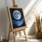

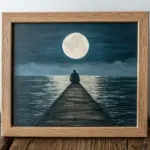
Big Full Moon With a Soft Halo
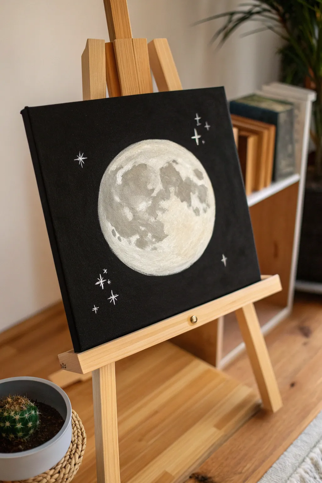
Capture the magic of the night sky with this striking full moon painting on a stark black background. The high contrast makes the textured lunar surface pop, creating an impressive piece of art that looks far more complex than it actually is.
Detailed Instructions
Materials
- Square stretched canvas (black primed, or white canvas painted black)
- Black acrylic paint (matte)
- Titanium White acrylic paint
- Grey acrylic paint (or mix black and white)
- Sponge dabber or small sea sponge
- Medium flat brush
- Small fine liner brush
- Compass or round object for tracing (plate/bowl)
- Chalk or white pastel pencil
- Palette for mixing
- Water cup and paper towels
Step 1: Preparation and Base
-
Prepare the canvas:
If you are starting with a standard white canvas, coat the entire surface with matte black acrylic paint. Ensure you paint the sides as well for a finished look. Allow this base coat to dry completely before proceeding. -
Trace the moon:
Once the background is dry, place a round object like a bowl or plate in the center of your canvas. Trace the outline lightly using a piece of chalk or a white pastel pencil. This guideline ensures your moon is perfectly circular. -
Fill the circle:
Mix a very light grey by combining a large amount of white with a tiny dot of black. Use your medium flat brush to fill in the moon’s circle. Don’t worry about making it perfectly opaque yet; a slightly uneven texture is actually desirable for the lunar surface.
Step 2: Creating Texture
-
Sponge the surface:
While the base layer is still slightly tacky, take a small sponge or a scrunched-up paper towel dipped in pure white paint. Dab it gently all over the moon to create a porous, crater-like texture. -
Map out the seas:
Look at a reference photo of the moon or the main image provided. Identify the darker patches (the lunar maria or ‘seas’). Using a medium grey paint, sketch out these abstract blobs roughly with a brush. -
Build the shadows:
Switch to your sponge again. Dip it into dark grey paint and dab over the areas you just mapped out. Keep the pressure light to maintain the textured look rather than painting solid blocks of color. -
Blend the transitions:
With a clean part of the sponge, verify that the edges between the dark grey seas and the lighter white surface are not too sharp. Gently dab over the transition lines to soften them. -
Add highlights:
Load a small amount of thick titanium white onto a dry brush or sponge. Dapple this brightest white onto the lightest parts of the moon, specifically the bottom right area as shown in the example, to simulate reflected sunlight. -
Refine the craters:
Use a very small brush with light grey paint to add tiny dots or squiggle shapes inside the white areas. These represent smaller craters and surface irregularities.
Fixing “Blobby” Seas
If your grey lunar seas look like solid blobs, dab a little white over the top while wet to break up the color. Real moons aren’t solid grey; they are translucent layers.
Step 3: Finishing Touches
-
Clean the edges:
If your painting went outside the chalk line, use a small brush with black paint to carefully ‘cut in’ around the moon, sharpening the perfect circle again. -
Paint the major stars:
Using a fine liner brush and thinned white paint, create the larger stars. Paint a vertical line crossed by a shorter horizontal line to create a twinkling cross shape. Add these in clusters of two or three. -
Add subtle stars:
Dip the tip of a toothpick or the handle end of a paintbrush into white paint. Dot these randomly around the black background to create distant stars. -
Create variation:
Vary the size of your star dots slightly. Some can be tiny pinpricks, while others can remain slightly larger circles to add depth to your galaxy. -
Final check:
Step back and look at your composition. If the moon needs more contrast, add one final round of white highlights to the brightest side once the previous layers are fully dry. -
Remove guides:
Once the entire painting is completely dry—I usually give it at least an hour—gently wipe away any visible chalk outline marks with a slightly damp cloth.
Pro Tip: Soft Halos
For a glow effect, try ‘dry brushing’ a tiny amount of white paint onto the black canvas right at the edge of the moon, fading it outward into the darkness.
Now you have a stunning piece of lunar art ready to display on your easel or wall
Moon Over Water With Simple Reflection
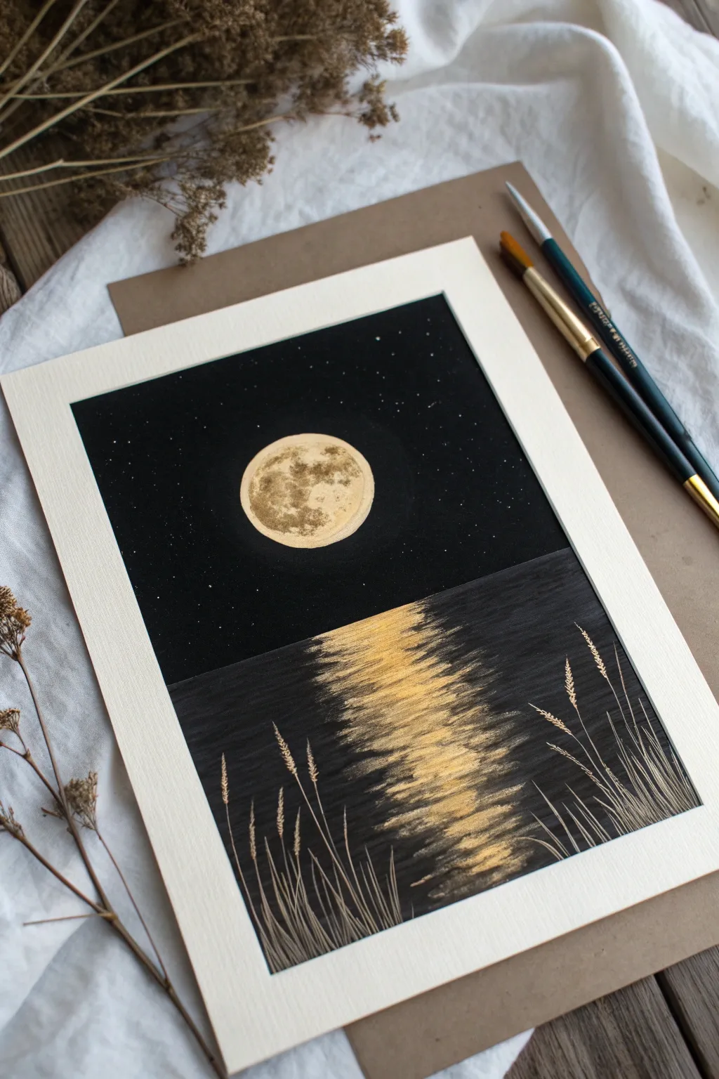
Contrast is the star of the show in this striking painting, where shimmering gold metallic paint meets a deep, matte black background. This project captures a serene moon hanging over calm waters, using simple techniques to create a glowing reflection that feels truly luminous.
Step-by-Step Guide
Materials
- Heavyweight watercolor paper or mixed media paper (approx. 5×7 inches)
- Black acrylic paint (matte finish works best)
- Metallic gold acrylic paint
- Flat shader brush (medium size)
- Small round detail brush (size 0 or 1)
- Old toothbrush (optional for stars)
- Masking tape or painter’s tape
- Palette (or paper plate)
- Pencil and a circular object for tracing (like a small jar lid)
- Cup of water and paper towels
Step 1: Setting the Scene
-
Prepare your canvas:
Begin by taping down the edges of your paper to a flat work surface using masking tape. This creates a clean, professional white border around the finished piece and keeps the paper from buckling. -
Establish the horizon:
Place a strip of masking tape horizontally across the painted area to separate the sky from the water. Place it slightly below the vertical center so the sky takes up a bit more space than the water. -
Paint the sky:
Using your flat shader brush, paint the upper section entirely black. Apply the paint smoothly in horizontal strokes to ensure even coverage. If the black looks streaky, let the first coat dry and apply a second one. -
Paint the water:
Once the sky is dry to the touch, carefully peel off the horizon tape. Now, paint the bottom section black as well. Use horizontal strokes again, as this mimics the natural flow of water. Let the entire background dry completely before moving on.
Oops! Uneven black paint?
If your black background looks patchy after drying, don’t worry. Apply a second thin coat of black perpendicular to your first strokes for a velvety, solid finish.
Step 2: The Moon & Stars
-
Outline the moon:
Place your circular object (like a spice jar lid or coin) in the center of the sky area. Lightly trace around it with a pencil. Make sure the graphite line is faint so it doesn’t show through the gold paint. -
Fill the moon base:
Load a small round brush with metallic gold paint. Carefully fill in the circle you just traced. Create a solid, opaque layer of gold. You might need two layers to make it really pop against the black darkness. -
Add moon texture:
While the gold is still slightly tacky or just after applying a fresh wet layer, use the tip of your brush to dab in a tiny bit of black or darker gold mixed with black. Stipple these darker spots gently to create craters and surface texture. -
Create the stars:
Dip an old toothbrush or a stiff bristled brush into white paint (or slightly watered-down silver). Run your thumb across the bristles to flick tiny specks onto the black sky area. Keep the spray light and distant.
Level Up: Texture
Mix a pinch of baking soda into your gold moon paint before applying it. This creates a real, raised crater texture that catches the light physically.
Step 3: The Golden Reflection
-
Start the reflection path:
Load your flat brush with gold paint, but wipe a little bit off on your palette so it isn’t dripping wet. You want a semi-dry brush for this effect. -
Paint horizontal glimmer:
Starting directly under the moon at the horizon line, make short, horizontal back-and-forth strokes. Keep these strokes narrow near the horizon and slowly widen them as you move down the page. -
Fade the edges:
As you drag the brush left and right, lift the pressure at the ends of the strokes. This creates a feathered edge where the gold light fades naturally into the black water. -
Build intensity:
Go back over the center line of the reflection with more gold paint. The reflection should be brightest and most solid in the very middle, becoming more broken and ‘sketchy’ toward the sides. -
Final reflection touches:
Add a few very thin, distinct horizontal lines of gold further out into the black water to suggest gentle ripples catching the light.
Step 4: Foreground Details
-
Draft the grasses:
Switch to your smallest detail brush (size 0). Mix a color that is slightly lighter than the black background—a dark grey or a muted metallic bronze works well. It needs to be subtle. -
Paint grass stems:
Paint long, sweeping lines starting from the bottom edge and curving upwards. Vary the heights and angles; nature isn’t perfectly straight so let some stems cross over each other. -
Add seed heads:
At the tips of the taller grass stems, use tiny dabbing motions to create the look of wheat or textured seed heads. I like to focus these details on the right and left sides, framing the central reflection. -
Highlight the grass:
Clean your detail brush and pick up a tiny amount of pure gold paint. lightly highlight just the tips or one side of the grass stems where the moonlight would naturally hit them. -
The reveal:
Wait until every part of the painting is bone dry. Then, slowly and carefully peel away the masking tape from the borders, pulling away from the painting to prevent tearing.
Frame your new moonlit masterpiece or gift it to someone who loves the night sky
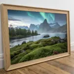
Pine Tree Silhouette Under a Night Sky
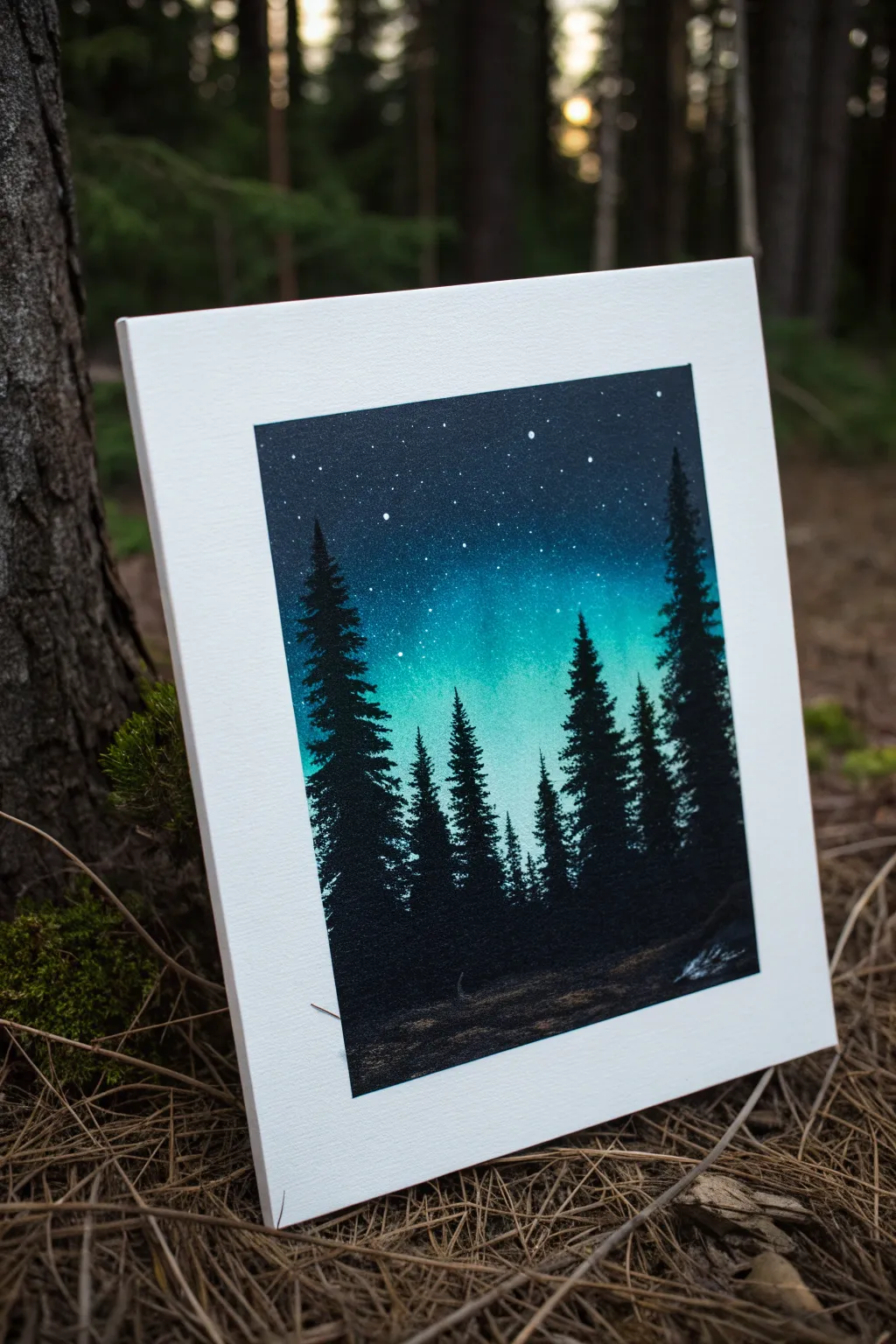
Follow the northern lights without leaving your home by painting this vibrant silhouette scene. This project uses simple blending techniques to create a glowing teal aurora that contrasts beautifully with sharp, black pine trees.
Step-by-Step
Materials
- Canvas panel or stretched canvas (8×10 inch recommended)
- Acrylic paints (Phthalo Blue, Teal/Turquoise, Titanium White, Mars Black)
- Sponge applicator or kitchen sponge
- Large flat paintbrush
- Fan brush or small round brush
- Old toothbrush (for stars)
- Palette for mixing paint
- Water cup and paper towels
Step 1: Creating the Aurora Background
-
Prep your palette:
Squeeze out generous amounts of your Phthalo Blue, Teal, White, and a small amount of Black onto your palette. You’ll need to work somewhat quickly while the paint is wet to blending properly. -
Start the dark sky:
Using a sponge or large flat brush, apply a mix of Phthalo Blue and a tiny touch of Black to the very top third of the canvas. Use horizontal strokes to get nice coverage. -
Blend downward:
Without cleaning your tool, pick up some pure Phthalo Blue and blend it into the dark area, moving downwards. As you reach the middle of the canvas, start mixing in your Teal paint. -
Create the glow:
For the brightest part of the aurora in the lower-middle section, mix Teal with Titanium White. Blend this lighter color up into the blue, creating a smooth transition. I like to keep the center quite bright to really make the trees pop later. -
Detail the aurora:
Use clean, vertical strokes with a dry brush over the wet transition areas to simulate the vertical pillars of light often seen in auroras. Keep this subtle. -
Darken the bottom:
Paint the bottom third of the canvas—where the ground will be—with a solid dark color. Use Mars Black or a very dark mix of blue and black. Blend the top edge of this dark area slightly into the teal sky so there isn’t a harsh line. -
Let it dry completely:
This step is crucial. The background must be bone dry before you add stars or trees, otherwise, the colors will muddy together. A hairdryer can speed this up.
Step 2: Adding the Stars
-
Prepare the star paint:
Mix a small amount of Titanium White with a few drops of water until it has an inky consistency. It should be thin enough to splatter but not so watery that it drips. -
Splatter technique:
Dip an old toothbrush into the thinned white paint. Hold it over the canvas and run your thumb across the bristles to flick tiny specks of paint onto the dark upper sky. -
Focus the stars:
Concentrate the splatter mostly on the darker, upper portion of the sky. Avoid putting too many stars in the bright teal area or the black ground. -
Add larger stars:
Use the tip of a small round brush or a toothpick to manually dot a few larger, brighter stars in the sky for variety.
Star Control
Test your toothbrush splatter on a piece of scrap paper first. This helps you gauge the spray pattern and ensure you don’t get large blobs on your sky.
Step 3: Painting the Silhouettes
-
Outline the ground:
With black paint and a brush, refine the ground line. It doesn’t need to be perfectly straight; a slightly uneven, bumpy line looks more like a natural forest floor. -
Establish tree trunks:
Decide where you want your trees. Paint thin vertical lines using black paint to mark the center trunk of each tree. Make them varying heights for a natural look. -
Start the foliage:
Using a fan brush or a small flat brush turned on its side, tap black paint starting from the top of a trunk. Use awkward, zig-zag motions. -
Widen the branches:
As you move down the trunk, make your tapping strokes wider. Pine trees are naturally triangular, so keep the top narrow and the base wide. -
Add texture:
Don’t make the trees solid black triangles. Leave small gaps between branches where the sky peeks through; this adds realism and dimension. -
Fill the forest:
Continue painting trees across the canvas. Overlap some trees in the foreground with those in the background to create depth. The trees on the edges can be taller to frame the composition. -
Ground the trees:
Ensure the base of each tree blends seamlessly into the black ground. You can tap the brush along the bottom to simulate bushes or undergrowth. -
Highlight the ground:
Mix a tiny bit of white/grey into your black and lightly dry-brush some texture onto the ground area. This suggests light reflecting off uneven terrain or fallen needles.
Winter Wonderland
After the black trees dry, lightly tap white paint on just the tops of the branches. This creates a snowy effect, perfect for a winter holiday scene.
Step back and admire your personal view of the northern night sky
BRUSH GUIDE
The Right Brush for Every Stroke
From clean lines to bold texture — master brush choice, stroke control, and essential techniques.
Explore the Full Guide
Sunflower Head With Chunky Petals
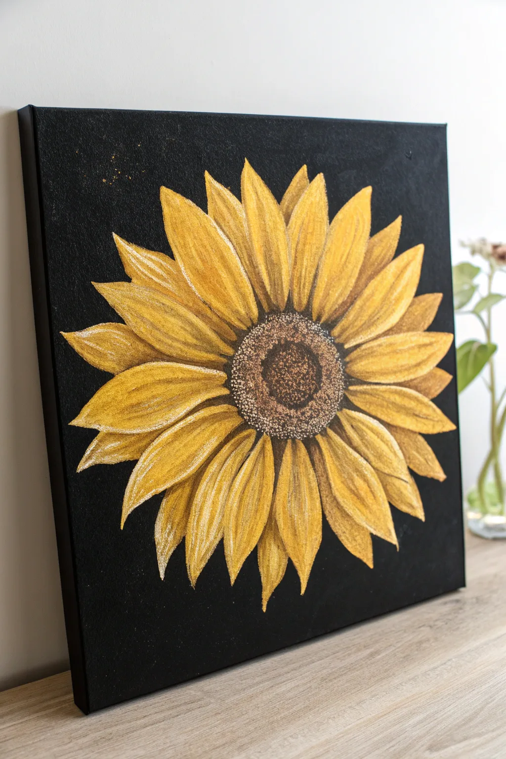
Brighten up any room with this striking sunflower painting that pops beautifully against a deep black background. The chunky petal style and textured center make this an approachable project for beginners looking to practice layering and shading.
Step-by-Step Tutorial
Materials
- Square stretched canvas (approx. 12×12 or 16×16 inches)
- Black acrylic paint (mars black or flowing black)
- Yellow ochre acrylic paint
- Cadmium yellow medium acrylic paint
- Titanium white acrylic paint
- Burnt umber (dark brown) acrylic paint
- Raw sienna (light brown) acrylic paint
- Flat shader brushes (medium and large)
- Round detail brush (small)
- Old scruffy brush or sponge for stippling
- Chalk or pastel pencil (white or grey)
Step 1: Preparing the Base
-
Base coat application:
Begin by covering the entire canvas with two coats of black acrylic paint. Ensure you paint the sides of the canvas as well for a finished gallery look. Let the first coat dry completely before applying the second to ensure solid, opaque coverage. -
Wait for drying:
Allow the black background to dry fully. It must be completely non-tacky before you start sketching, otherwise your chalk lines will dig into the paint.
Step 2: Sketching the Flower
-
Establish the center:
Using a white chalk pencil or pastel, lightly draw a medium-sized circle in the absolute center of your canvas. This will be the seed head. -
Drafting main petals:
Sketch the first layer of petals radiating outward from the center circle. Make these pointed and leaf-shaped. Don’t worry about perfection; organic variation looks more natural. -
Adding depth petals:
Draw a second layer of petal tips peeking out from behind the gaps of the first layer. These should look like triangles tucked between the main petals.
Chalky Mess?
If the chalk won’t wipe off easily, use a clean, damp Q-tip to gently erase the lines without scrubbing away your black background paint.
Step 3: Painting the Petals
-
Underpainting the petals:
Load a flat brush with yellow ochre. Fill in all the petal shapes, staying within your chalk lines. This foundational color won’t be bright yet, as yellow is transparent over black, but it sets the base. -
Building opacity:
Once the ochre layer is dry, apply a second coat. I find this creates a much richer final yellow than trying to pile on thick paint all at once. -
Adding brightness:
Mix cadmium yellow with a tiny touch of white. Paint this over the petals, leaving a thin rim of the darker ochre showing on the edges and near the center for natural shadow. -
Creating streaks:
Using a slightly dry round brush, pick up pure titanium white. Lightly drag streaks from the petal tips inward to mimic the fibrous texture of sunflower petals. Keep the pressure very light. -
Defining shadows:
Mix a small amount of raw sienna with your yellow. Carefully paint along the bottom edges of the ‘top’ petals where they overlap the ‘bottom’ petals to create separate visual layers.
Make It 3D
Mix a texture paste or modeling gel into your yellow paint for the petals. This will create actual physical grooves and ridges that catch the light.
Step 4: Painting the Textured Center
-
Dark center base:
Fill the center circle with dark burnt umber paint. While it is still slightly wet, dab a little black into the very center to creating a deepening effect. -
Stippling texture:
Take an old, scruffy brush and dip just the tip into raw sienna. Remove most of the paint on a paper towel, then ‘pounce’ or stipple the brush over the outer ring of the brown center. -
Highlighting seeds:
Clean your scruffy brush and pick up a mix of white and yellow ochre. Stipple this lightly over the very outer edge where the seeds meet the petals, creating a pollen-like ring. -
Inner details:
Add a few tiny dots of the lighter yellow mix into the darker center area to suggest light catching individual seeds, but keep the middle significantly darker than the edge.
Step 5: Final Touches
-
Cleaning up:
Once everything is fully dry, take a damp cloth and gently wipe away any visible chalk sketch lines. -
Refining edges:
If any yellow paint went too far over the lines, use a small brush with black paint to touch up the background and sharpen the petal tips. -
Splatter effect:
For a bit of magic, dilute a tiny bit of yellow ochre with water. Dip a brush in it and tap the handle against another brush to flicker tiny specks onto the top left corner of the black background.
Hang your bold botanical creation on the wall and enjoy the golden warmth it brings to your space
Pink Tulips With Two-Tone Strokes
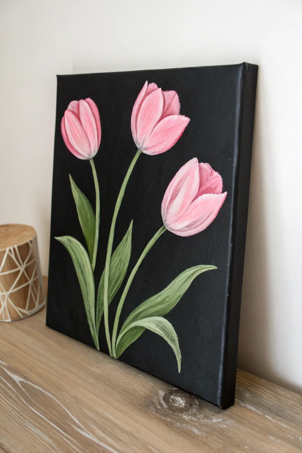
Contrast is the key to this elegant painting, where soft pink tulips pop dramatically against a deep matte black background. The simple yet striking composition uses visible brushstrokes to create texture and movement within the petals and leaves.
How-To Guide
Materials
- Stretched canvas or canvas board (approx. 11×14 inches)
- Acrylic paints: Mars Black, Titanium White, Magenta or Rose Pink, Crimson Red, Sap Green, Cadmium Yellow (for mixing)
- Wide flat brush (for background)
- Medium filbert brush (for flower heads)
- Small round brush or liner brush (for stems and details)
- Palette for mixing
- Cup of water and paper towels
- Chalk or pastel pencil (white or light grey)
Step 1: Setting the Stage
-
Prepare the background:
Begin by coating your entire canvas with Mars Black acrylic paint. Use a wide flat brush and apply the paint in smooth, even strokes, ensuring you cover the white canvas completely, including the sides. -
Second coat:
Once the first layer is touch-dry, apply a second coat of black if necessary to achieve a solid, opaque darkness. I find this creates a much richer foundation for the bright colors later. -
Allow to dry completely:
It is crucial that the black background is 100% dry before you proceed. If it’s wet, your pinks will turn muddy and grey. -
Sketch the composition:
Using a piece of white chalk or a light pastel pencil, lightly sketch three oval shapes for the tulip heads. Place the center one slightly higher than the others for a balanced composition. -
Add stems and leaves:
Draw simple curved lines extending down from each flower head to the bottom center, gathering them like a bouquet. Add long, lance-shaped leaves curving out from the base.
Step 2: Painting the Tulips
-
Mix your base pink:
On your palette, mix Magenta/Rose with a significant amount of Titanium White to create a soft, bubblegum pink. This will be the mid-tone for your petals. -
Block in the flower shapes:
Using a medium filbert brush, paint the basic oval shapes of the three tulips using your mixed pink. Don’t worry about petal details yet; just get the color onto the black canvas. -
Define individual petals:
Reload your brush with a slightly darker mix (more Magenta, less White). Paint curved strokes to define the separate petals—usually one central petal hugged by two side petals. -
Add highlights:
Clean your brush and pick up pure Titanium White mixed with a very tiny touch of pink. Paint streaks starting from the top tip of the petals, curving downward to mimic the shape of the flower. -
Create shadows:
Mix a small amount of Crimson Red into your pink to create a deeper shadow tone. Apply this near the base of the flower heads where the petals overlap to add depth. -
Streaky texture:
To achieve the painterly look seen in the reference, don’t over-blend your wet paint. Allow distinct streaks of white, light pink, and dark pink to sit side-by-side on the canvas.
Brushstroke Texture
For that streaky two-tone look, load your brush with two colors at once (e.g., pink on one side, white on the other) and make a single confident stroke.
Step 3: Stems and Foliage
-
Mix green base:
Combine Sap Green with a little White to create a muted, opaque green. If it feels too bright, add a tiny speck of red or black to tone it down. -
Paint the stems:
Switch to a small round brush. With a steady hand, paint the thin stems connecting the flower heads to the bottom edge. Keep the lines relatively consistent in thickness. -
Base coat leaves:
Fill in your leaf sketches with the base green mixture. Use long, sweeping strokes that follow the curve of the leaf from base to tip. -
Highlight the greens:
Mix a lighter green by adding more White and a touch of Cadmium Yellow. Apply this to the top edges and centers of the leaves where the light would hit. -
Detailing the leaves:
Using your smallest brush, drag thin lines of very pale green (almost white) along the length of the leaves to imply veins and texture, similar to the method used on the petals.
Paint Transparency?
If the black shows through your pinks too much, paint the flower shapes pure white first. Let it dry, then paint your pinks on top for vibrancy.
Step 4: Refining and Cleanup
-
Clean up edges:
If any pink or green strayed too far, take a small brush with your black background paint and carefully ‘cut in’ around the edges to sharpen the shapes. -
Final check:
Step back from your painting. Add any final touches of bright white to the tips of the petals or leaves if they need more contrast. -
Remove sketch lines:
Once the painting is fully dry, use a damp cloth or cotton swab to gently wipe away any visible chalk lines.
Hang your new floral piece in a bright spot to let those colors truly shine against the dark backdrop

PENCIL GUIDE
Understanding Pencil Grades from H to B
From first sketch to finished drawing — learn pencil grades, line control, and shading techniques.
Explore the Full Guide
Cactus Trio With Minimal Highlights
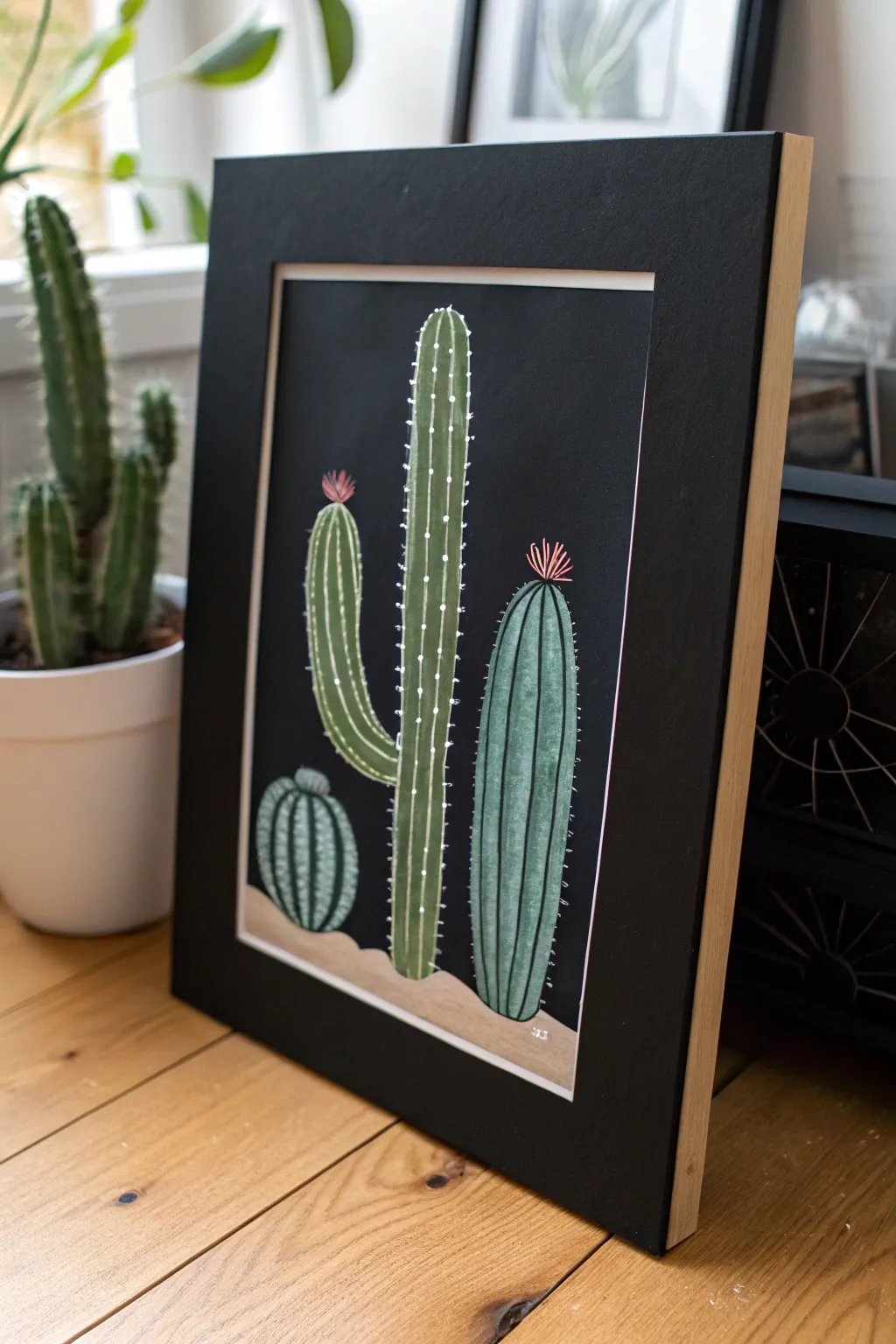
Contrast is king in this striking botanical study where vibrant greens pop against a dramatic black backdrop. Using simple vertical strokes and minimal highlighting, you’ll create a modern desert scene that looks polished and professional.
How-To Guide
Materials
- Black sturdy paper (cardstock) or canvas panel
- Acrylic paints (Forest Green, White, Black, Yellow Ochre, Burnt Sienna, Pink)
- Flat brush (medium size)
- Fine liner brush (size 0 or 00)
- Pencil for sketching
- Palette for mixing
- Cup of water
Step 1: Setting the Scene
-
Sketch the layout:
Begin by lightly sketching the outline of your three cacti directly onto the black background. Place a small, round barrel cactus on the bottom left, a tall saguaro-style cactus in the center with one arm, and a medium columnar cactus on the right. -
Add the ground line:
Sketch a gentle, wavy line beneath the cacti to represent the sand dunes. Don’t worry about being perfectly straight; a rocky desert floor is naturally uneven. -
Mix the sand color:
Combine white, a touch of yellow ochre, and a tiny dot of burnt sienna to create a pale, sandy beige. We want this to be opaque enough to cover the black paper. -
Paint the dunes:
Fill in the ground area with your sand mixture. You may need two coats for full coverage, letting the first layer dry completely before adding the second.
Step 2: Painting the Greens
-
Mix base green:
Create a mid-tone green by mixing forest green with a little white. This helps the paint stand out against the dark background while keeping a natural look. -
Fill the shapes:
Using your flat brush, paint the base layer for all three cacti. Paint in long, vertical strokes to mimic the plant’s natural texture. Don’t worry if the black shows through slightly; it adds depth. -
Add lighter stripes:
Mix a lighter shade of green by adding more white and a touch of yellow to your base mix. On the right-hand cactus, paint vertical stripes to suggest ribs. -
Define the small cactus:
For the small round cactus on the left, curve your brush strokes to follow its spherical shape, creating distinct segments with alternating lighter and darker green tones. -
Texture the tall cactus:
On the central tall cactus, use a slightly diluted lighter green to add uneven, vertical streaks. This gives it that organic, weathered look rather than being a flat block of color.
Paint Too Transparent?
If your colors look dull on the black paper, paint a layer of white over the cactus shapes first. Let dry completely, then paint your greens on top for vibrancy.
Step 3: Details & Highlights
-
Outline details:
I prefer to use a very fine liner brush with slightly watered-down black paint to subtly define the edges between the ribs on the right cactus, giving it more dimension. -
Paint the spines:
Using pure white paint and your finest brush, add the spines on the central cactus. Instead of lines, paint vertical rows of small dots running up the length of the stem and arm. -
Spike the others:
For the right-hand cactus, paint tiny, short horizontal dashes in white along the outer edges to represent prickly spines catching the light. -
Add the flowers:
Mix a soft pink color and paint a small tuft of spikes on top of the right cactus. Add a similar, slightly smaller flower on the arm of the central cactus. -
Highlight the flowers:
Add tiny streaks of white or pale pink to the tips of the flower petals to make them look like they are glowing in the desert sun. -
Final touches:
Check for any areas where the black background might be overwhelming your colors. If needed, do a final pass of very light green highlights on the sun-facing sides of the cacti.
Framing Tip
To get the crisp look from the photo, mount your finished black paper onto a piece of light wood or thick beige cardstock, leaving a border, before putting it in a black frame.
Step back and admire how the dark background makes your desert garden feel cool and modern
Fireflies in a Night Jar
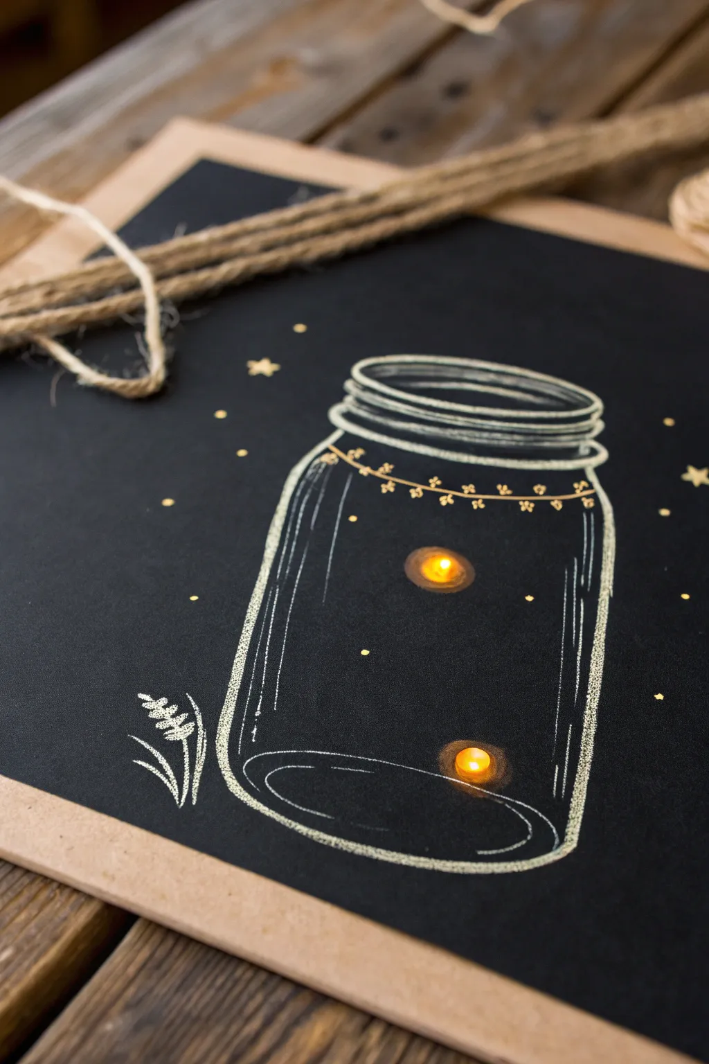
Capture the magic of a summer evening with this charming mixed-media project that combines illustration with real light. By sketching a vintage mason jar on black paper and adding battery-operated LEDs, you create a firefly scene that literally glows in the dark.
Step-by-Step Tutorial
Materials
- Black cardstock or art paper (heavyweight to hold the lights)
- White gel pen (Gelly Roll or similar opaque ink)
- White charcoal pencil or pastel pencil
- Small piece of cardboard or foam board (backing)
- 2 small yellow LED lights (balloon lights or individual wired LEDs with coin battery)
- Tape (masking or clear)
- Compass or round object to trace (optional)
- Pencil and eraser
- Ruler
Step 1: Sketching the Jar
-
Outline the basic shape:
Start by lightly sketching the mason jar shape using a regular pencil. Draw two vertical lines for the sides and slightly curved lines for the top and bottom to create a cylindrical 3D effect. The bottom curve should mirror the top opening. -
Draw the rim details:
At the top of your cylinder, sketch a series of stacked ovals or rings to represent the jar’s screw-top threads. These should be slightly wider than the jar’s body to look realistic. -
Inking the outlines:
Go over your pencil lines with a white charcoal pencil or pastel pencil. Use light pressure initially to keep the lines soft and chalk-like, which gives it that rustic blackboard aesthetic. -
Refine the glass threads:
Press harder with your white pencil on the rim area. Draw distinct, thick curves for the threading, leaving small gaps on the sides to suggest where the threads disappear around the back of the jar. -
Add glass reflections:
To make the jar look like glass, add long vertical highlight strokes down the left and right sides of the jar’s body. These lines shouldn’t be solid; break them up slightly to mimic light reflecting off a smooth surface. -
Detail the bottom:
Draw an inner ellipse at the very bottom of the jar. This creates the illusion of the thick glass base found on traditional mason jars.
Fixing Smudges
Black paper shows every smudge. Use a kneaded eraser to lift away unwanted charcoal dust without damaging the paper’s surface texture.
Step 2: Adding Charm and Atmosphere
-
Decorate with a garland:
Using a fine-tip white gel pen, draw a delicate string draped around the neck of the jar. Add tiny flower shapes or leaves hanging from this string for a whimsical touch. -
Sketch surrounding elements:
In the bottom left corner, use the charcoal pencil to sketch simple sprigs of grass or wheat. Use quick, upward strokes that taper at the end to keep the vegetation looking natural and breezy. -
Create background stars:
Dot the background with your yellow or gold gel pen to create distant stars. Vary the pressure to make some dots larger than others, and draw a few small five-pointed stars for variety.
Patterned Lid
Instead of a simple garland, try drawing a checkered fabric cover over the jar lid using cross-hatching to simulate a country-style jam jar top.
Step 3: Installing the Fireflies
-
Mark light positions:
Decide where your two main fireflies will be inside the jar. Mark these spots lightly with a pencil. Aim for an asymmetrical placement to keep the composition dynamic. -
Punch holes:
Carefully poke a small hole through the black paper at your marked spots. You can use a thick needle, a craft knife, or the tip of a sharp pencil, just ensure the hole is tight. -
Insert the LEDs:
Push the bulb of your small LED lights through the holes from the back of the paper so just the glowing tip pokes through to the front. -
Secure the backing:
Tape the battery packs or wiring flat against the back of the paper. I find that using masking tape here holds things securely without risking damage to the delicate wiring. -
Add a glow effect:
Back on the front side, use a bit of yellow pastel or a smudge of yellow chalk around the base of the protruding LED bulb. Rub it gently with your finger to create a soft, hazy halo of light on the paper. -
Final touches:
Mount your artwork onto a piece of cardboard or frame it in a shadow box to accommodate the bulk of the lights in the back. Turn on the switch and watch your jar come to life.
Flip the switch and enjoy the warm, magical glow of your captured fireflies all year round


White Birch Trees in a Snowy Night
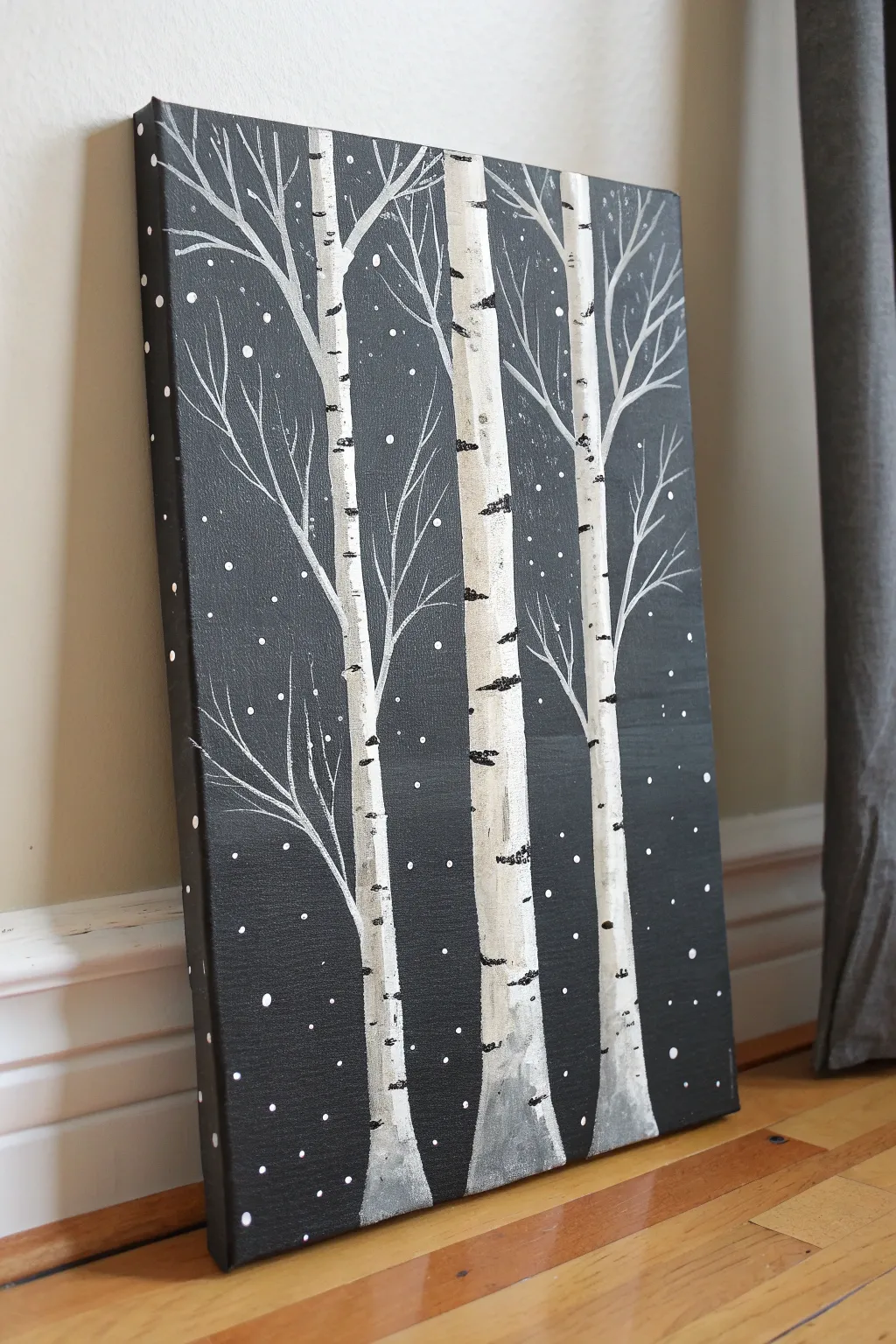
Create a striking contrast in your home decor with this minimalist winter scene. Using negative space and stark white on black, you will capture the serene beauty of birch trees standing tall in a gentle snowfall.
Step-by-Step
Materials
- Stretched canvas (e.g., 11×14 or 16×20 inches)
- Black acrylic paint (heavy body preferred)
- Titanium white acrylic paint
- Flat brush (1-inch width) for background
- Medium flat or filbert brush for tree trunks
- Fine liner brush for branches
- Old stiff brush or toothbrush for snow splatter
- Palette or paper plate
- Cup of water and paper towels
Step 1: Setting the Night Scene
-
Prepare the canvas:
Begin by covering the entire front of your canvas with a solid coat of black acrylic paint. Ensure you paint the edges and sides of the canvas as well for a polished, frameless look. -
Ensure opacity:
Let the first coat dry completely. If you can still see the texture of the canvas weave too clearly or if the black looks streaky, apply a second coat to create a deep, opaque void. -
Dry time:
Allow the background to dry fully before moving on. This is crucial so your white paint doesn’t mix with the wet black and turn into unintended gray mud.
Gray Paint Woes?
If your white paint turns gray on the canvas, the black background wasn’t fully dry. Let it dry completely, then apply another clean layer of white on top.
Step 2: Painting the Trunks
-
Map the trees:
Using a medium flat brush loaded with titanium white, plan out three main tree trunks. Start from the bottom edge and pull upward. Don’t worry about perfect straightness; natural curves look better. -
Vary widths:
Make the center tree the thickest and most prominent. The flanking trees can be slightly thinner to create a sense of depth and variety. -
Base shading:
While the white is still somewhat wet, you can lightly blend a tiny touch of gray or watered-down black at the very bottom of the trunks to ground them into the landscape. -
Solidify the white:
Birch bark is bright. You may need to go over your trunks with a second layer of white to ensure they pop against the dark background. I find dabbing the paint on rather than smooth strokes creates a nice bark-like texture.
Step 3: Adding Texture and Details
-
Create bark markings:
Dip the edge of a flat brush or a small detail brush into black paint. Create the signature horizontal birch markings by pressing the brush edge gently against the side of the white trunk and pulling inward slightly. -
Randomize patterns:
Distribute these black markings irregularly up the trunks. Some should be thin lines, others thicker blotches. Concentrate slightly heavier markings near the bottom and at points where branches will emerge. -
Add the branches:
Switch to your fine liner brush with thinned white paint (add a drop of water to improve flow). Paint branches extending upward and outward from the main trunks. -
Refine branch structure:
Think ‘Y’ shapes. Branches naturally split as they grow. Start thicker near the trunk and release pressure as you move out to create wispy, delicate tips. -
Branch overlap:
Don’t be afraid to let branches cross over each other or cross over the main trunks. This layering adds realism to the composition. -
Side details:
Paint a few smaller, twig-like branches coming from the sides of the canvas towards the center, hinting at other trees just out of view.
Add a Pop of Color
Make the scene festive by painting a tiny red cardinal sitting on one of the branches. The red will contrast beautifully against the monochrome palette.
Step 4: The Falling Snow
-
Prepare splatter paint:
Mix a small amount of white paint with enough water to make it the consistency of heavy cream or ink. -
Splatter technique:
Dip an old stiff brush or toothbrush into the mixture. minimal paint is best here. Hold it near the canvas and flick the bristles with your thumb to spray tiny droplets. -
Control the snow:
Add more splatter near the top specifically to simulate falling snow, but ensure coverage across the dark areas. Avoid over-splattering the tree trunks themselves if possible. -
Hand-painted flakes:
For variety, use the tip of a toothpick or the back handle of a paintbrush dipped in white to create a few larger, distinct snowflakes among the fine mist. -
Canvas edges:
Don’t forget to wrap a few branch lines or snow dots around the painted sides of the canvas to complete the 3D effect.
Once the snow has dried, hang your masterpiece to bring a quiet, wintry elegance to your room
Metallic Leaf Prints on Black
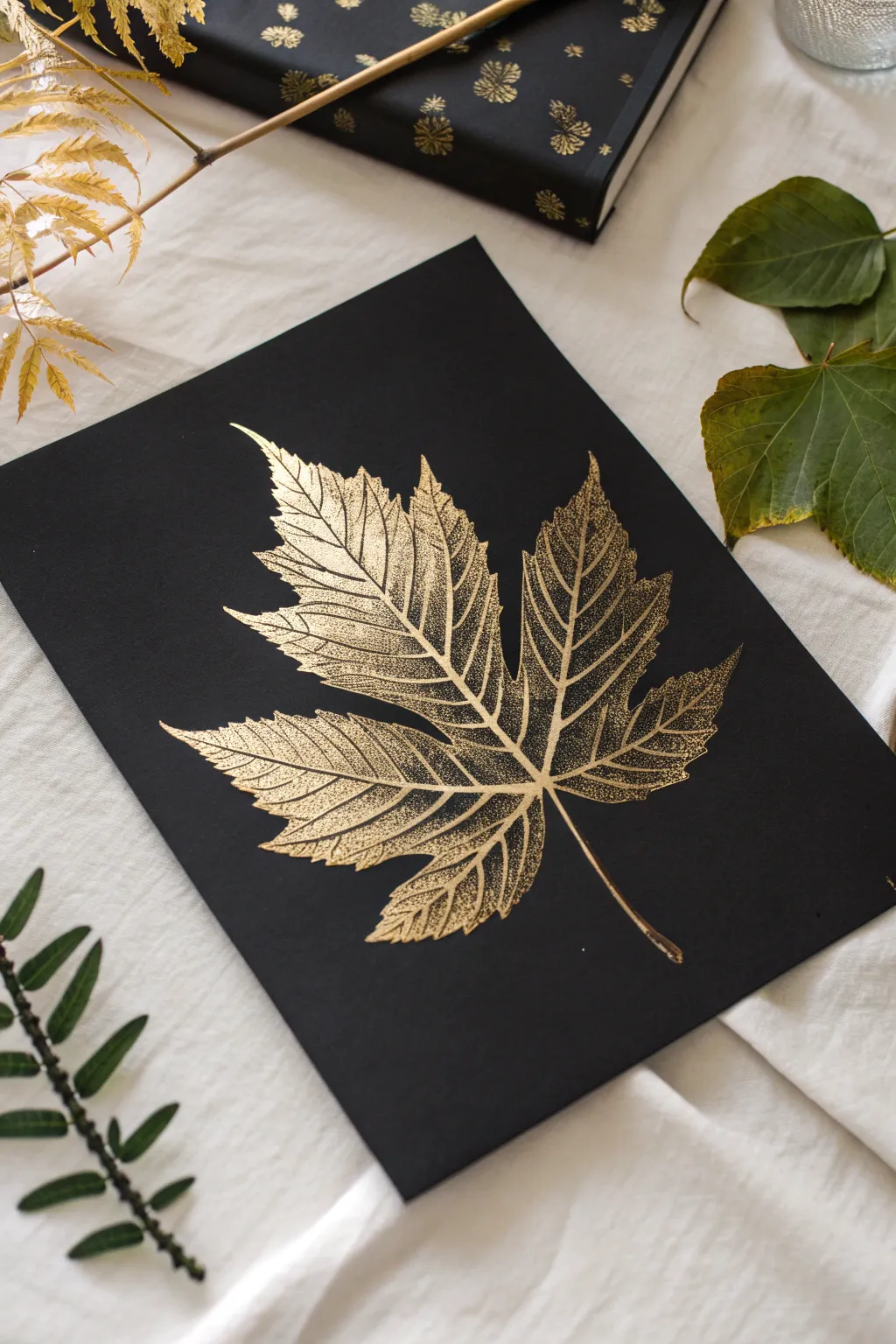
Capture the delicate structure of nature with this striking metallic leaf print on a deep black background. The contrast between the rich gold paint and the dark surface highlights every vein and edge, creating an elegant piece of botanical art.
Step-by-Step Tutorial
Materials
- Heavyweight black cardstock or mixed media paper (A4 size)
- Medium-sized fresh maple leaf (flat and not brittle)
- Gold metallic acrylic paint
- Small foam roller or flat sponge brush
- Scrap paper or newsprint
- Brayer (hard rubber roller) or a clean spoon
- Paper towels
- Artist tape (optional)
Step 1: Leaf Preparation
-
Select your specimen:
Choose a maple leaf that is fresh and flexible, not dry or crunchy. A fresh leaf will hold paint better and won’t crumble under pressure. -
Flatten the leaf:
If your leaf has curled edges, press it inside a heavy book for about an hour before starting. It needs to lie completely flat against the paper for a crisp print. -
Prepare the workspace:
Lay down scrap paper to protect your table. Place your black cardstock nearby, ready for printing. You may want to tape the corners down so it doesn’t shift.
Step 2: Inking the Leaf
-
Dispense the gold:
Squeeze a small amount of gold metallic acrylic paint onto a palette or a disposable plate. You don’t need a huge puddle, just enough to coat the roller. -
Load the roller:
Roll your foam roller or sponge brush into the paint until it is evenly coated but not dripping. Offload excess paint onto a clean part of the palette. -
Flip the leaf:
Turn your maple leaf over so the underside (the veiny side) is facing up. This side has the most texture and will produce the best print detail. -
Apply the paint:
Gently roll the gold paint over the entire surface of the leaf’s underside. Ensure you cover the stem and the very tips of the lobes. -
Check coverage:
Look closely at the leaf. You want a thin, even layer of gold. If the paint is too thick, it will squish out and blur the veins; too thin, and the print will be patchy.
Vein Definition
For sharper lines, use the underside of the leaf where the veins are most prominent. If the leaf is too smooth, the print will look flat.
Step 3: Creating the Print
-
Position the leaf:
Carefully pick up the leaf by the stem. Hover over your black paper to find the center, then gently lower it down, paint-side touching the paper. -
Cover with scrap:
Place a clean sheet of scrap paper directly on top of the maple leaf. This protects your hands and prevents the leaf from shifting while you press. -
Apply pressure:
Using a brayer or the back of a spoon, rub firmly over the area where the leaf is hidden. Work from the center outward to push the paint into the paper’s texture. -
Focus on details:
I always make sure to run a finger along the main veins and the outer edges of the leaf through the scrap paper to ensure those delicate shapes transfer clearly. -
Remove the scrap:
Lift the scrap paper straight up and set it aside. Be careful not to engage the underlying leaf yet.
Metallic Glaze
Once dry, lightly brush a highly diluted layer of clear glitter glue over just the main veins for extra sparkle that catches the light.
Step 4: The Reveal
-
Lift the stem:
Grasp the tip of the leaf stem. Slowly and steadily peel the leaf off the black paper. -
Inspect the print:
Check your print for clarity. If you see small gaps, embrace them; they add to the organic, weathered look of the artwork. -
Clean up edges:
If a smudge of gold accidentally landed where it shouldn’t be, quickly dab it with a slightly damp Q-tip before the paint dries. -
Let it cure:
Allow the metallic paint to dry completely. Since the layer is thin, this should only take about 15 to 20 minutes.
Frame your botanical print in a simple wood frame to let the gold shimmer take center stage
Dot Mandala in a Limited Palette
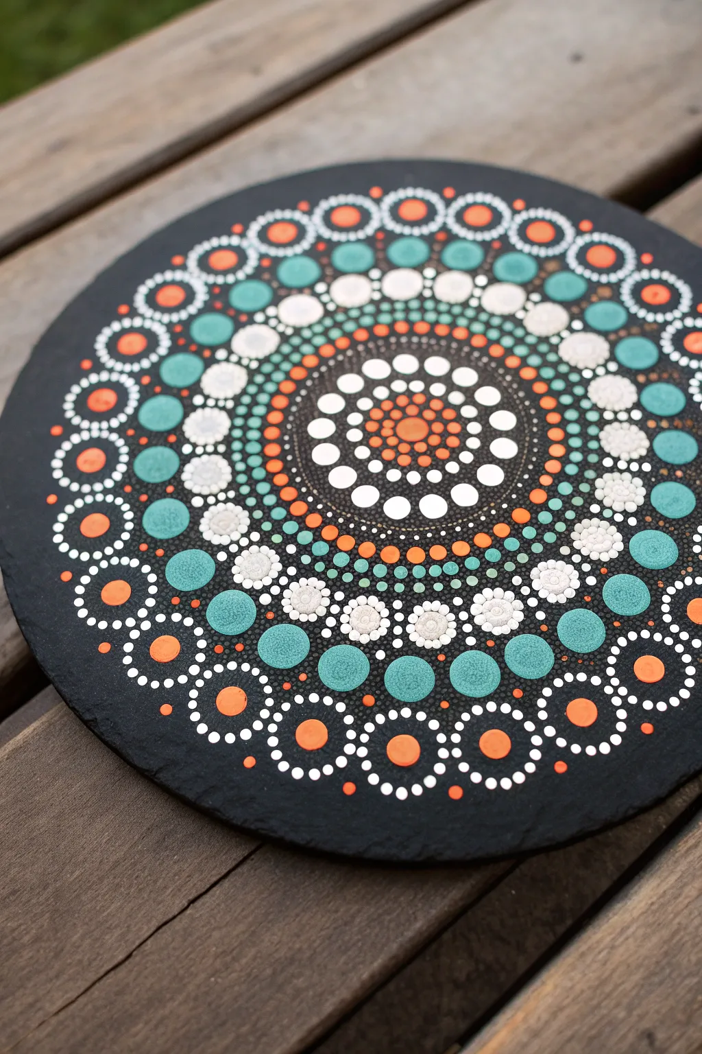
This project transforms a simple black slate circle into a mesmerizing geometric display using a restrained palette of teal, clay orange, white, and mint. The contrast between the dark, textured stone and the precise, smooth acrylic dots creates a visually satisfying piece perfect for a table centerpiece or wall art.
Step-by-Step
Materials
- Round black slate tile or coaster (approx. 8-10 inches)
- Acrylic paints: White, Teal, Mint Green, Terracotta/Clay Orange
- Dotting tools set (various sizes from pinhead to 8mm)
- White charcoal pencil or chalk pencil
- Ruler
- Compass
- Cotton swabs and damp cloth
- Clear spray sealant (matte or satin)
Step 1: Preparation and Center
-
Grid lines:
Begin by finding the exact center of your slate circle. Use a ruler to draw a horizontal and vertical line intersecting at the classic 12, 3, 6, and 9 o’clock positions. Lightly sketch diagonal lines between them to create an 8-point star guide. -
Concentric circles:
Using a compass and your white charcoal pencil, draw faint concentric circles starting from the center and moving outward. Space them about 0.5 to 0.75 inches apart to guide your dot placement. -
The center seed:
Dip your largest dotting tool into the terracotta orange paint. Place a single, confident dot directly on the center intersection. -
First ring:
Switch to a small tool and use the same orange paint. Place tiny dots closely around the central orange dot to create a tight ring. -
Second ring:
Using a slightly larger tool and white paint, place a ring of dots immediately outside the orange ring. These should nestle into the gaps of the previous row.
Uneven Dots?
If your dots are different sizes, you likely ran out of paint on the tool. Dip your tool freshly for every single dot to ensure consistent size and height.
Step 2: Building the Core Pattern
-
Expanding the orange:
Return to the orange paint with a medium tool. Create a ring of dots outside the white row, ensuring they are evenly spaced. -
White highlights:
Using a small tool and white paint, place a ring of dots around the orange ones. Then, walking the dots, add tiny decreasing white dots around the outer edge of this band. -
Teal introduction:
Load a medium tool with the dark teal paint. Place a ring of dots spaced slightly further apart, using your pencil guidelines to keep the distance from the center consistent. -
Mint green accents:
Using mint green, place dots between the teal ones, but slightly further out. This begins to open up the pattern. -
Complex white flowers:
With a large tool, place white dots in a wide ring. Once these are semi-dry, use a tiny tool to add a small dot of a different color (like mint or orange) into the center of each large white dot, creating a ‘top dot’ effect.
Step 3: The Outer Rim
-
Large teal statements:
Select your largest available dotting tool. Dip it generously in the teal paint and place large, bold dots around the outer third of the slate. -
Top dotting the teal:
I like to let the large teal dots dry completely before this step. Once dry, place a smaller mint green dot on top, followed by an even smaller white dot on top of that. -
The lace edge:
For the outermost decorative ring, create circular formations. Place a medium orange dot, and then use a tiny tool with white paint to ‘walk the dots’ around it—meaning, dip once and tap multiple times to create a diminishing trail of dots encircling the orange center. -
Filling the gaps:
Look for empty triangular spaces between your large circles. Fill these with tiny white or mint ‘filler dots’ to make the design look cohesive and dense. -
Cleanup:
Once the paint is fully cured (usually 24 hours), gently wipe away your white charcoal guidelines with a damp cloth or cotton swab.
Paint Consistency
For perfectly round peaks, your paint should be the texture of heavy cream. If it’s too thick, it leaves spikes; too thin, it runs flat. Mix in a drop of pouring medium.
Allow your beautiful slate mandala to dry completely before sealing it to protect those delicate dots
Shiny Bubbles With Simple Highlights
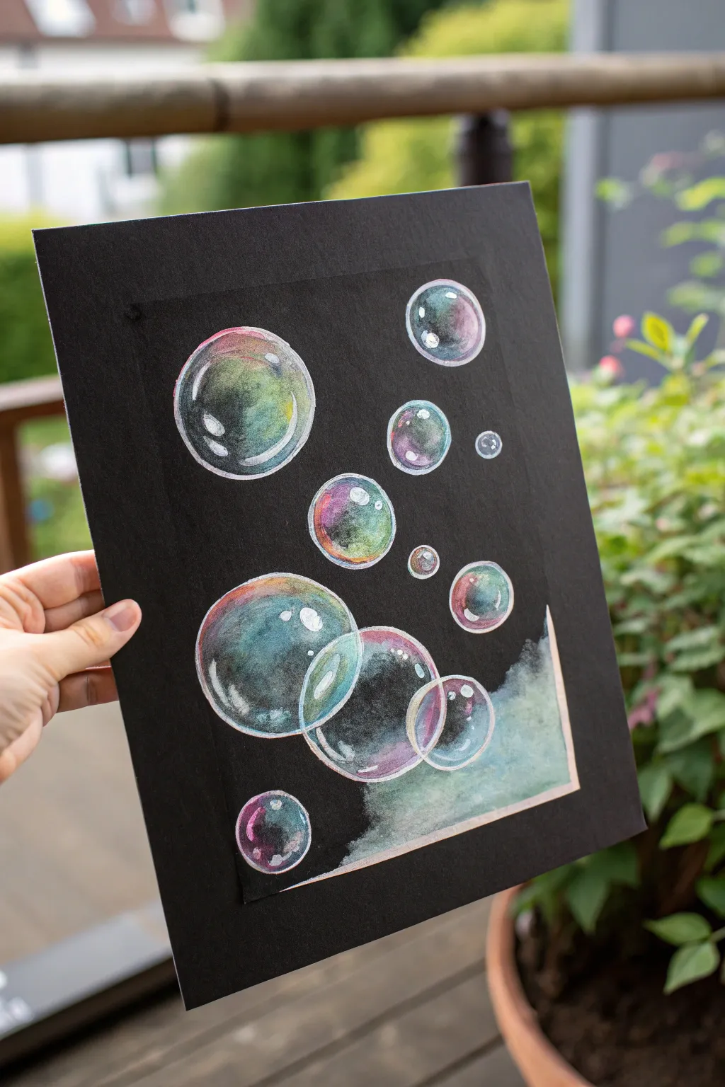
These luminous, floating bubbles pop right off the page thanks to the high contrast of the black background. Using simple circular forms and careful highlighting, you can create a realistic sense of transparency and shine.
Step-by-Step Tutorial
Materials
- Black watercolor paper (or mixed media paper)
- Painter’s tape
- Compass or circle stencils (various sizes)
- White colored pencil or chalk pencil
- Watercolor paints (or gouache) in teal, purple, pink, and yellow
- White gel pen (for bright highlights)
- Round watercolor brushes (sizes 4 and 6)
- Clean water and paper towels
Step 1: Preparation & Drawing
-
Tape the edges:
Secure your black paper to a flat surface using painter’s tape. Create a border to frame the artwork cleanly; this also keeps the paper flat while you paint. -
Sketch the outlines:
Using a white colored pencil, lightly draw circles of various sizes scattered across the paper. A compass works best for perfect circles, but tracing round household objects or using a stencil is just as effective. -
Create overlapping clusters:
Draw a few large circles overlapping each other near the bottom left to create depth. Add tinier circles floating away toward the top right to simulate movement.
Transparency Trick
Don’t fill the bubbles completely! Leave plenty of the black paper showing in the center of each circle. This negative space is crucial for convincing transparency.
Step 2: Adding Color
-
Moisten the first bubble:
Work on one bubble at a time. Take a clean, damp brush and wet the inside of your first circle slightly, but don’t soak it. -
Apply cool tones:
Drop in a small amount of teal or blue paint along the bottom left curve of the bubble. Let the pigment bleed slightly into the damp center. -
Add warm accents:
While the paper is still slightly damp, introduce a touch of pink or purple on the opposite side (top right) or blend it gently near the teal. Keep the center mostly black to show transparency. -
Incorporate yellow hints:
For an iridescent oil-slick effect, add tiny dabs of yellow or pale green near the edges where the colors meet the black. -
Paint the overlapping bubbles:
When painting the cluster at the bottom, ensure the lines where bubbles overlap remain distinct. I find using slightly different color dominances (one more pink, one more blue) helps separate them visually. -
Create the misty corner:
In the bottom right corner, use a very watery wash of teal and white. Apply it loosely and blot it with a tissue to create a cloudy, ethereal texture that fades into the black background.
Level Up: Metallic Pop
Use metallic silver or pearlescent watercolor paints for the highlights instead of plain white. It makes the soapy film look incredibly realistic.
Step 3: Defining & Highlighting
-
Reinforce the outlines:
Once the paint is completely dry, use your white colored pencil to go over the circular outlines again. Press harder on the sides receiving ‘light’ and softer on the shadowed sides. -
Add inner reflections:
Draw curved white lines inside the bubbles, mirroring the outer shape. These should be sketchy and broken lines, not perfect circles, to look like light reflecting on a sphere. -
Intensify the color rim:
If the watercolor dried too dull, use colored pencils (pinks, blues, greens) to gently shade directly over the dried paint at the edges of the bubbles to boost vibrancy. -
Apply primary highlights:
Using a white gel pen or opaque white gouache, add the brightest highlights. Place a strong, curved highlight on the top left of each bubble. -
Add secondary shine:
Add a smaller, subtler dot or dash of white on the bottom right of each bubble to indicate the light passing through. -
Detail the overlap:
Where bubbles overlap, carefully draw a thin white line to show which bubble is in front. The gel pen is perfect for this precision work. -
Final touches:
Add tiny sparkle dots or small stray bubbles in the background with the gel pen to fill any empty negative space. -
Reveal the border:
Wait until every element is 100% dry, then slowly peel away the painter’s tape at a 45-degree angle to reveal your crisp black framing.
Enjoy the satisfying contrast of your glowing bubbles against the deep black background
Palette Knife Abstract Pops of Color
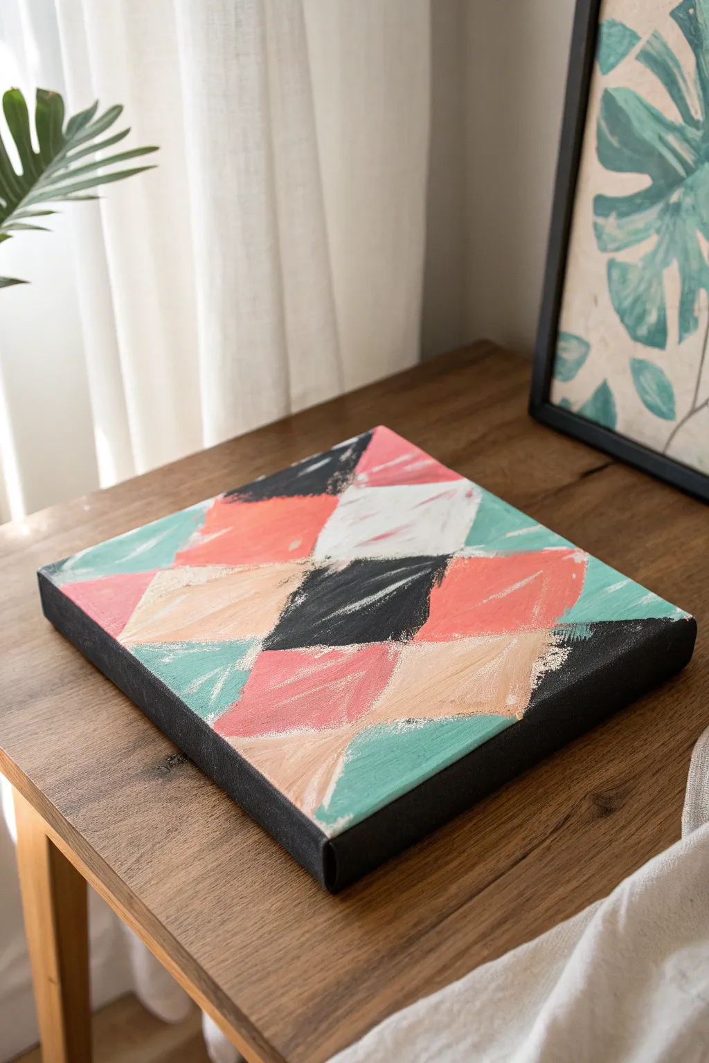
This abstract project uses the sharp edges of a palette knife to create a textured, modern harlequin pattern. By layering bright pops of coral, teal, and cream over a dark base, you’ll achieve a striking contrast that feels both structured and delightfully messy.
How-To Guide
Materials
- Square stretched canvas (e.g., 10×10 or 12×12 inches)
- Black acrylic paint
- Heavy body acrylic paints (Coral/Salmon, Mint/Teal, Titanium White, Beige/Buff)
- Wide flat brush or foam brush
- Palette knife (trowel shape or diamond shape works best)
- Painter’s tape (optional for guidelines)
- Pencil and ruler
- Paper plate or palette
Step 1: Preparing the Dark Base
-
Base coat application:
Begin by squeezing a generous amount of black acrylic paint directly onto your canvas. Using a wide flat brush or a foam brush, spread the paint evenly across the entire surface. -
Edge coverage:
Don’t forget to paint the sides of the canvas black as well. This creates a finished, gallery-wrapped look so you won’t need a frame later. -
Second coat check:
Let the first layer dry completely. If you can still see the white canvas texture showing through, apply a second coat of black for a solid, opaque background. -
Grid planning:
Once your black base is 100% dry, lightly map out a diamond grid using a ruler and pencil. Draw diagonal lines across the canvas in both directions. Don’t press too hard; you just need faint guides for placement.
Step 2: Applying Color with Texture
-
Loading the knife:
Squeeze your coral, teal, white, and beige paints onto your palette. Pick up a generous scoop of the coral paint on the back of your palette knife. -
First diamond shape:
Choose one of your pencil-grid diamonds. Place the knife flat against the canvas and drag it downwards or diagonally to fill the shape. Let the paint be thick and textured; imperfect coverage is part of the charm. -
Scraping technique:
For a rustic look, scrape lightly over the wet paint in a few spots to reveal the black background underneath. This adds depth and integrates the background color. -
Color blocking:
Wipe your knife clean and switch to the teal paint. Apply this color to adjacent diamonds, skipping spaces randomly to leave room for other colors. I like to keep colors separated so they don’t get muddy. -
Adding neutrals:
Fill the remaining designated spaces with white and beige paint. The beige softens the contrast, while the bright white adds a crisp highlight. -
Creating the black diamonds:
For the specific black diamonds in the pattern, apply fresh black paint over your base layer using the palette knife. The difference in texture between the flat base and the thick knife stoke adds subtle visual interest.
Keep it Clean
Wipe your palette knife with a paper towel completely between every single color switch to prevent muddy, grey mixtures.
Step 3: Refining and Layering
-
Touching up edges:
Use the edge of your palette knife to straighten the borders of your diamonds if they feel too messy. You want a balance between geometric structure and painterly looseness. -
Second layer pops:
If some colors dried darker than you expected, add a second swipe of paint on top of the first layer. This is especially helpful for the white and lighter beige sections. -
Dry brushing details:
Take a very small amount of white paint on a dry brush (or a clean knife) and lightly whisk it over the dried colored sections. This enhances the texture created by the palette knife marks. -
Check the perimeter:
Inspect the sides of the canvas again. If any colored paint accidentally smudged onto the black sides, touch it up with black paint for a crisp finish. -
Final drying time:
Allow the painting to dry flat for at least 24 hours. Because the palette knife leaves thick ridges of paint, the drying time is much longer than a standard flat painting.
Fixing Smudges
If you accidentally paint outside your diamond line, wait for it to dry completely, then paint over the mistake with black.
This bold geometric piece is ready to add a splash of color to your favorite shelf or gallery wall
Tape-Resist Geometric Light Beams
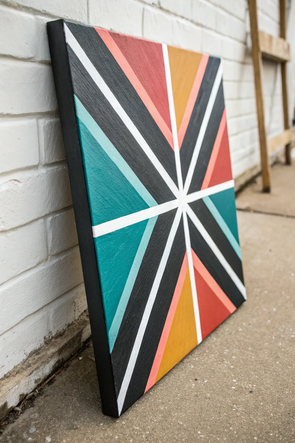
Transform a blank canvas into a stunning modernist statement piece using the simple magic of masking tape. This project features crisp white lines cutting through bold wedges of teal, terra cotta, mustard, and black for a dynamic, radiating effect.
Detailed Instructions
Materials
- Square stretched canvas (e.g., 12×12 or 16×16 inches)
- Acrylic paints (black, teal, light turquoise, mustard yellow, terra cotta, light coral/pink)
- Artist tape or high-quality painter’s tape (1/4 inch or 1/2 inch width)
- Flat paintbrushes (various sizes)
- White acrylic paint or matte medium (for sealing tape)
- Ruler or straight edge
- Pencil
- Palette or paper plate
- Cup of water and paper towels
Step 1: Setting the Structure
-
Base Prep:
Ensure your canvas is clean and free of dust. If your canvas isn’t pre-primed bright white, give it a quick coat of white gesso or heavy body white acrylic and let it dry completely. -
Find the Center:
Using a ruler, lightly mark the exact center point of the canvas with a pencil. You can find this easily by drawing faint diagonal lines from corner to corner; where they intersect is your center. -
Initial Taping:
Apply your first strips of tape. Start by running strips diagonally from corner to corner, crossing directly over your center mark and extending down the sides of the canvas. -
Adding Radials:
Add vertical and horizontal strips of tape, also crossing through the center point. Press the tape down firmly as you go. -
Subdividing:
Identify the larger triangular spaces created by your first tape lines. Place additional strips of tape starting from the center and radiating outward to split these sections, creating narrower wedges. -
Secure Edges:
Run your fingers or a clean cloth firmly over all tape lines to ensure adhesion, paying special attention to the center where multiple layers of tape overlap.
Crisp Line Secret
Always seal your tape! Painting the tape edges with the BASE color (white) first creates a barrier that prevents the colored paints from bleeding under.
Step 2: Sealing and Painting
-
The Secret Seal:
To get perfectly crisp lines like in the photo, paint a thin layer of white paint (or clear matte medium) over the edges of all your tape strips. This seals the gaps so colored paint can’t bleed underneath. -
Dry Time:
Let the sealing layer dry completely. It should protect the white canvas underneath perfectly. -
Planning Colors:
Squeeze out your acrylic colors: black, teal, light turquoise, mustard yellow, terra cotta, and light coral. Plan which wedge will receive which color to balance the composition, alternating darks and lights. -
Painting First Sections:
Start filling in the triangular sections. Use a flat brush to apply paint, brushing away from the tape edges toward the center of the shape to minimize forced bleed-through. -
Adding Depth:
For the black sections, you might need two coats to get that solid, opaque look. I always find a second coat makes the dark values truly pop. -
Painting the Sides:
Don’t forget the edges of the canvas! Carry the color from each wedge over the side and paint the canvas depth to give the artwork a professional, finished appearance. -
Checking Consistency:
Review your colored sections. If the yellow or coral looks streaky, apply a second coat once the first is dry to ensure solid blocks of color.
Metallic Shine
Replace one of the colors (like the mustard yellow or the light pink) with gold or copper metallic paint for a glamorous, light-catching accent.
Step 3: The Big Reveal
-
Wait, But Not Too Long:
Allow the paint to become touch-dry, but don’t let it cure fully for 24 hours just yet. Peeling while slightly flexible is often easier. -
Peeling Technique:
Start peeling the tape slowly at a 45-degree angle. Be gentle near the center point where the tape layers are thickest to avoid ripping the paint. -
Touch Ups:
Once all tape is removed, inspect your white lines. If any color bled through, use a tiny liner brush and white paint to touch up the mistakes. -
Finishing the border:
Paint the outer rim of the canvas black if you prefer a framed look, or leave the wrapped colors visible.
Hang your new geometric masterpiece in a spot where it can catch the light and brighten up the room

Have a question or want to share your own experience? I'd love to hear from you in the comments below!