If you’re running an art club, you want projects that feel exciting but still fit into real-life time limits, budgets, and cleanup. These art club ideas are my tried-and-true favorites for keeping everyone creating together—no matter their skill level.
Personalized Art Club Sketchbooks
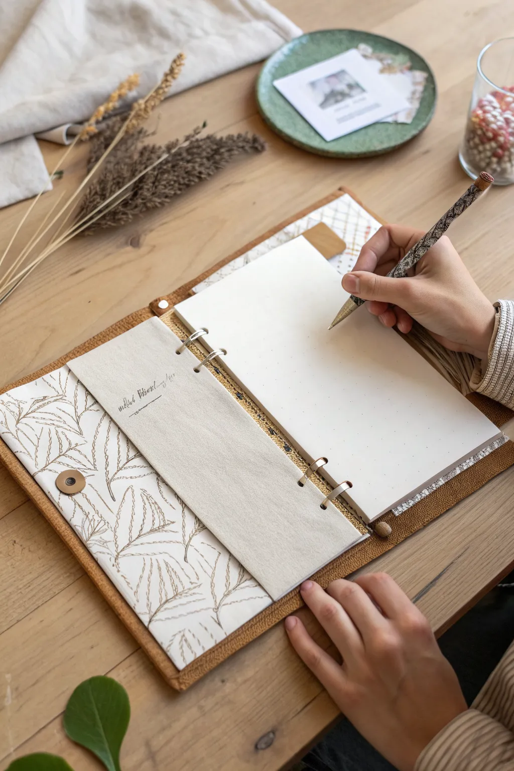
This project teaches you how to construct a beautiful, semi-rigid ring binder featuring a textured felt-like cover and a delicate botanical lining. With its custom fabric pockets and refillable page system, it functions perfectly as a personal art journal or sketchbook.
Step-by-Step Guide
Materials
- Heavyweight brown felt or compressed wool fabric (outer cover)
- Patterned cardstock or heavy paper with botanical print (lining)
- Plain linen or canvas fabric (inner pockets)
- Rigid chipboard or thick cardboard (for structure)
- A5 or personal size 6-ring binder mechanism (and matching screws)
- Fabric glue or strong PVA craft glue
- Sewing machine with heavy-duty needle (or strong thread for hand sewing)
- Snap button fastener kit
- Metal ruler and craft knife
- Bone folder
- Awl or heavy-duty hole punch
- Corner rounder (optional)
Step 1: Preparing the Cover and Structure
-
Cut the rigid core:
Begin by cutting your chipboard into three pieces: a front cover, a back cover, and a spine piece. The covers should be about 1/2 inch larger than your intended paper size on all sides, and the spine width depends on your ring mechanism size. -
Measure and cut the outer felt:
Lay your three chipboard pieces out on your brown felt, leaving a 1/4 inch gap between the spine and the covers to allow for folding. Cut the felt so it extends about an inch beyond the boards on all sides. -
Adhere the boards:
Spread a thin, even layer of strong craft glue on one side of each chipboard piece. Press them firmly onto the center of the felt piece, maintaining those crucial hinge gaps. -
Wrap the edges:
Apply glue to the overhanging felt edges. Fold them tightly over the chipboard edges, paying special attention to pulling the felt taut at the corners for a neat finish. Allow this to dry under a heavy book. -
Prepare the lining paper:
Cut your botanical patterned paper or cardstock to be slightly smaller than the total open width of your binder. You want about an 1/8 inch border of the felt cover showing around the edges. -
Create the hinges:
Before gluing the paper down, gently score the paper where the spine hinges will be to prevent cracking. I often reinforce the back of these fold lines with a strip of masking tape for durability.
Clean Corners Pro-Tip
When wrapping the felt over the board corners, trim the felt excess at a 45-degree angle before folding. This reduces bulk and keeps the corners sharp.
Step 2: Adding Pockets and Assembly
-
Sew the fabric pocket hem:
Cut a rectangle of your linen or canvas fabric for the inside pocket. Double-fold the top edge over and stitch a straight line across to create a clean, finished hem. -
Attach the pocket to the lining:
Position the fabric pocket on the left side of your botanical paper lining. Stitch the bottom and sides of the fabric directly onto the paper using a sewing machine with a slightly longer stitch length to avoid perforating the paper too much. -
Install the snap closure tab:
Cut a small strip of felt for the closure strap. Attach the ‘male’ part of the snap button to one end of this strap using your snap setting tool. -
Attach the closure counterpart:
Install the ‘female’ part of the snap button directly onto the front cover of the binder, measuring carefully to ensure the strap will reach comfortably. -
Secure the strap:
Glue and stitch the other end of the felt strap to the back cover of the binder, sandwiching it between the chipboard and the outer felt layer if you haven’t glued the lining yet, or simply stitch it securely to the back edge. -
Combine cover and lining:
Apply a generous amount of glue to the back of your paper lining (with the attached pocket). Press it firmly onto the inside of your felt-covered board structure. Use a bone folder to smooth it out, pressing firmly into the hinge gaps.
Step 3: Final Hardware Installation
-
Mark the mechanism placement:
Place your metal ring binder mechanism in the center of the spine. Use a pencil to mark the specific spots where the attachment screws need to go. -
Punch the holes:
Using an awl or a heavy-duty punch, create holes through the spine (through the felt, chipboard, and lining paper) at your marked spots. -
Install the rings:
Insert the screw posts from the outside of the spine spine towards the inside. Place the ring mechanism over the posts on the inside and screw the caps on tightly to secure it. -
Finish the edges:
If you want extra durability, run a decorative stitch around the entire perimeter of the binder, sewing through all layers. This binds the lining and cover together permanently. -
Add paper:
Fill your new binder with your preferred sketching paper, snapping the rings shut to complete the project.
Level Up: Elastic Loop
Sew a small loop of wide elastic facing outward into the right-hand seam before gluing the lining. This creates a hidden, integrated pen holder.
Enjoy sketching in your sturdy, custom-made journal that looks as good on the shelf as it feels in your hands.
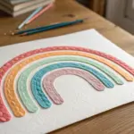
Step-by-Step Skill Mini Lessons
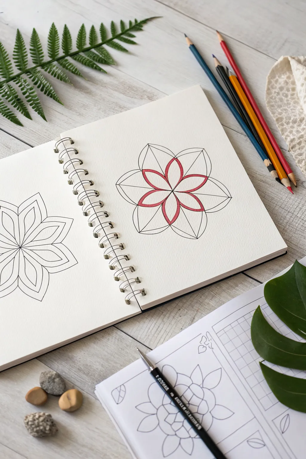
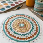
Learn to draw a perfectly balanced floral mandala using simple geometry and clean lines. This relaxing project combines precision drawing with soft colored pencil shading for a modern, elegant look.
Step-by-Step Guide
Materials
- Spiral-bound sketchbook (mixed media or heavy drawing paper)
- Pencil (HB or H for light guidelines)
- Black fine-liner pen (0.3mm or 0.5mm)
- Red colored pencil
- Compass (optional, but helpful for the initial circle)
- Ruler or straight edge
- Eraser
Step 1: Drawing the Base Structure
-
Find the center:
Begin by finding the approximate center of your page. Mark a small dot. -
Create guidelines:
Using your ruler, draw a very faint vertical line and a horizontal line crossing through your center dot to create a cross. -
Draw diagonal guides:
Draw two diagonal lines through the center as well, dividing the space into eight equal ‘pie slices.’ Keep these pencil strokes light so they are easy to erase later. -
Establish the outer boundary:
Sketch a circle lightly around the center point to define how large your flower will be. You can use a compass for perfection or freehand it for a more organic feel.
Step 2: Forming the Petals
-
Sketch the primary petals:
Starting from the center, draw four large petal shapes along the vertical and horizontal axes. These should look like pointed ovals or almond shapes that extend almost to your outer circle guideline. -
Add secondary petals:
Draw four more identical petals in the diagonal spaces between the first four. You should now have an eight-petaled flower shape. -
Define the geometric encasement:
Now, connect the tips of the petals with straight lines to create the geometric framing seen in the reference. Draw a line from the tip of the top vertical petal to the tip of the top-right diagonal petal. -
Complete the octagon:
Continue connecting the petal tips all the way around the shape until the flower is enclosed in an eight-sided polygon (octagon). -
Add inner details:
Draw a straight line from the center point out to each corner of your octagon. These lines should run perfectly down the center of each petal, bisecting them.
Keep It Clean
Place a clean sheet of scrap paper under your drawing hand while inking. This prevents the oils on your skin from smudging the pencil lines or smearing fresh ink.
Step 3: Inking and Coloring
-
Outline the design:
Take your black fine-liner pen and carefully trace over your pencil lines. Trace the eight loose curved petals first. -
Ink the geometric frame:
Use a ruler with your pen to ink the straight lines connecting the petal tips and the internal bisecting lines. -
Create the inner star:
Drawing inside the main petals, create a smaller, second set of petal shapes near the center. These should look like a smaller flower nestling inside the larger one. -
Erase guidelines:
Once the ink is completely dry, gently erase all the underlying graphite guidelines to leave a crisp black-and-white design. -
Start shading:
Take your red colored pencil and begin shading the smaller inner flower. I like to apply more pressure near the edges of the petals to create a defined outline effect. -
Add texture:
Use a cross-hatching or light scribbling motion to fill the red petals, leaving the texture slightly visible for an artistic, sketched look rather than a solid block of color.
Watercolor Wash
Instead of colored pencils, try using watercolor markers or a light paint wash for the inner petals. The translucency adds a beautiful stained-glass effect.
Step 4: Final Touches
-
Deepen the contrast:
Go back over the red outlines with slightly more pressure to make the inner flower pop against the black geometric lines. -
Clean up:
Brush away any eraser crumbs and check for any spots where the ink lines might need a touch-up or thickening.
This simple yet striking geometric design is a perfect warm-up exercise for your next art session

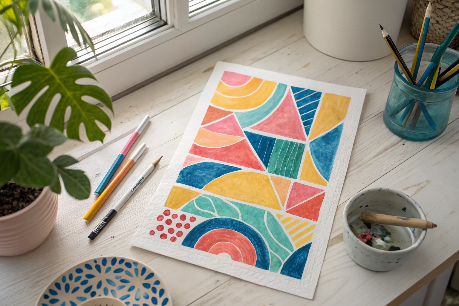
Tape-Resist Geometric Paintings
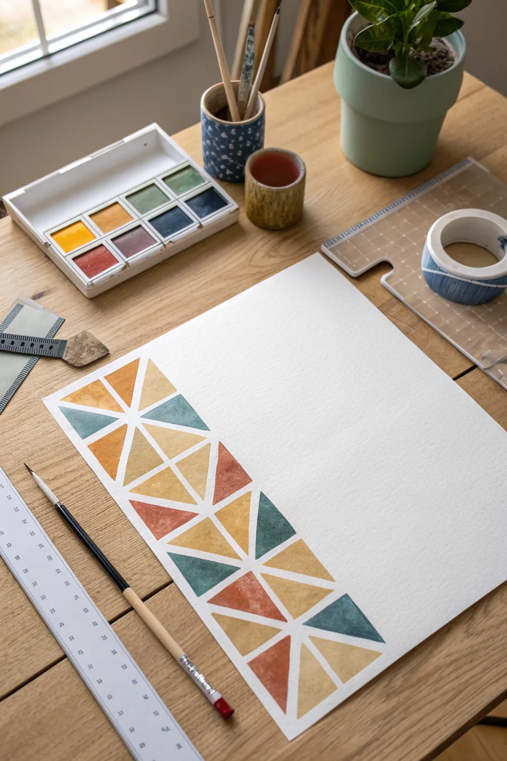
Create a clean, modern aesthetic with this simple yet satisfying geometric art project. By using the magic of painter’s tape, you’ll produce crisp white lines that separate vibrant triangles of watercolor in earthy, muted tones.
Step-by-Step Guide
Materials
- Cold-press watercolor paper (300 gsm)
- Painter’s tape or washi tape (approx. 5-6mm width)
- Watercolor paint set
- Round watercolor brush (size 6 or 8)
- Small cup of water
- Ruler
- Pencil
- Paper towels
- Palette
Step 1: Preparation & Mapping
-
Secure the paper:
Start by taping down your watercolor paper to a flat surface or drawing board. This prevents the paper from buckling when it gets wet and creates a clean border around your artwork. -
Draw guide lines:
Using your ruler and a pencil, lightly mark a vertical column on the left side of your paper, about 3-4 inches wide. This will define the area where your geometric pattern lives. -
Create the grid:
Within that vertical column, use your pencil to lightly sketch a series of stacked squares or rectangles. These don’t need to be perfectly identical, but keeping them roughly uniform helps the final look. -
Add diagonal divisions:
Draw X-shapes inside your squares to divide them into triangles. You can vary the angles slightly, but the goal is to create a network of triangular shapes that fit together like a puzzle.
Step 2: Applying the Resist
-
Tape the main borders:
Apply strips of your thin painter’s tape or washi tape over the main vertical pencil lines you drew first. Press the edges down firmly with your fingernail to ensure a tight seal. -
Tape the internal structure:
Now, apply tape over your horizontal divider lines. Again, verify that the tape is adhered well to the paper texture to prevent paint bleed. -
Create the triangles:
Finally, tape over the diagonal lines. You will need to cut the tape into smaller pieces to make sure intersections are clean and you aren’t taping over areas you intend to paint. -
Final sell check:
Run your finger or a bone folder over all the tape strips one last time. The success of this project relies entirely on the tape preventing paint from seeping under.
Bleeding Edges?
If paint seeped under the tape, wait for it to dry fully. Then, use a small flat brush with a tiny amount of white gouache or acrylic to carefully paint over the bleed and restore the crisp line.
Step 3: Painting
-
Mix your palette:
Prepare your colors. For the look in the photo, mix muted earth tones: a dusty teal, a warm ochre yellow, a terracotta orange, and a deep rust red. Add enough water to make the paint fluid but keep the pigment rich. -
Paint the first triangle:
Load your brush with the teal color and fill in a random triangle. Paint right over the tape edges—don’t be shy! This ensures the shape is fully filled when the tape is removed. -
Distribute colors:
Continue painting triangles, switching colors frequently. Try not to put two of the exact same color right next to each other. I like to visualize a balanced distribution before I commit to a color. -
Create texture:
Allow the paint to pool slightly in some areas of the triangles. As watercolor dries, these pools create beautiful natural gradients and ‘blooms’ that add character to the geometric shapes. -
Fill the column:
Work your way down the entire column until every exposed white triangle is filled with color. Be careful not to rest your hand in wet paint as you move down the paper.
Metallic Accent
Once the watercolor is dry and tape is removed, line the white gaps with a fine-tip gold or silver metallic pen for a sophisticated, glam finish that catches the light.
Step 4: Reveal
-
Let it dry completely:
This is likely the hardest step: wait. The paper must be bone dry before you touch the tape. If the paper is cool to the touch, it’s still damp inside. -
Peel the tape:
Start peeling the tape from the last piece you applied. Pull the tape slowly at a 45-degree angle away from the painted area. This prevents the paper from tearing. -
Clean up edges:
Once all tape is removed, use a clean white eraser to gently remove any visible pencil marks that might still be showing in the white ‘grout’ lines between your paint shapes.
Now you have a striking piece of geometric art that looks professionally designed

Pointillism Posters as a Team
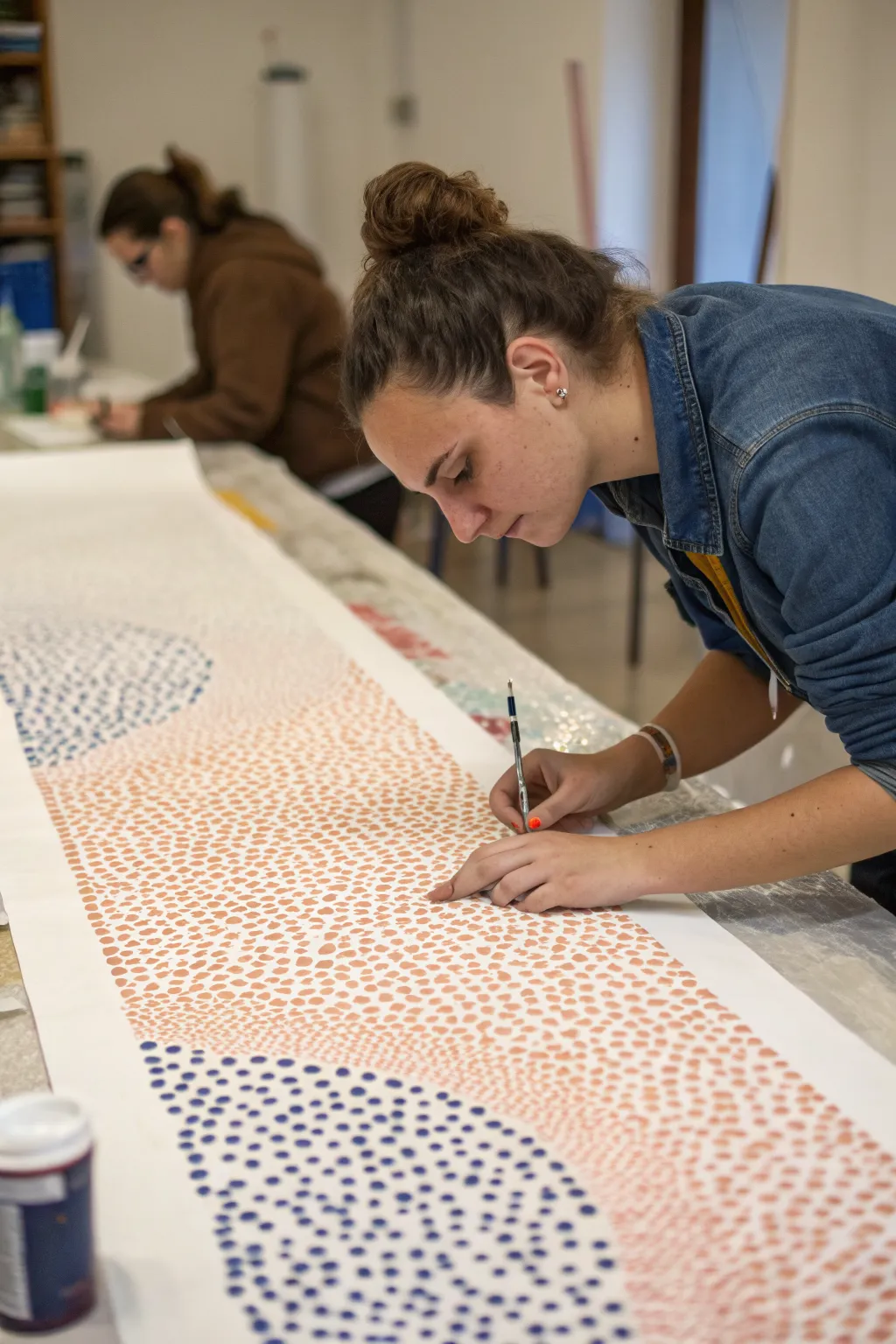
Bring your art club together with this large-scale pointillism project that transforms simple dots into flowing, organic waves. The result is a stunning, minimalist banner featuring drifts of coral pink and deep indigo blue that looks incredible when displayed.
Step-by-Step Tutorial
Materials
- Large roll of white butcher paper or seamless background paper
- Acrylic paints (coral pink, indigo blue)
- Small round brushes (size 2 or 4)
- Pencil
- Eraser
- Paper plates or palettes
- Masking tape
- Water cups
- Paper towels
Step 1: Planning the Flow
-
Prepare the workspace:
Clear a long table surface and unroll your paper to the desired length. Secure the corners and edges with masking tape so the paper doesn’t shift while multiple people are working on it. -
Draft the design:
Using a pencil, lightly sketch large, sweeping curves across the length of the paper to define your color zones. These don’t need to be perfect; they act as invisible boundaries for where your dot clusters will begin and end. -
Define negative space:
Decide on areas that will remain white. Lightly mark these ‘no-paint’ zones to ensure the final composition has breathing room and contrast.
Step 2: Applying the Dots
-
Mix your colors:
Pour your coral pink and indigo blue paints onto palettes. If the acrylic body is too thick, I like to thin it with just a drop of water so it flows off the brush tip more easily without losing opacity. -
Start the edges:
Begin painting dots along your penciled guidelines first. Keep these dots reasonably close together to create a distinct edge, but try not to make them look like a rigid line. -
Fill the interior:
Move inward from your edges, spacing the dots slightly further apart as you move toward the center of a color block. This creates a sense of density and movement. -
Vary the dot size:
Create visual interest by naturally varying the pressure on your brush. Press harder for larger, bolder dots and use just the tip for dainty, pin-prick details. -
Work in sections:
Have different team members tackle specific color zones. One person can focus on the blue waves while another works on the coral sections to prevent accidental smuding. -
Refresh paint often:
Reload your brush frequently to keep the dots crisp and round. If the brush gets dry, the dots will look scratchy and textured rather than solid.
Uneven Dots?
If your dots are looking more like ovals, you’re likely holding the brush at an angle. Hold the brush completely vertical—perpendicular to the paper—to get perfect circles every time.
Step 3: Refining the Composition
-
Blend visually:
Where two color sections might meet or come close, allow the dots to become sparse and scatter, rather than colliding abruptly. This creates a soft, airy transition. -
Check density:
Step back from the table periodically to view the mural from a distance. Look for areas that seem too empty or uneven and fill them in with a few extra strategic dots. -
Clean up edges:
Once the paint is dry, use an eraser to gently remove any visible pencil guidelines that weren’t covered by paint. -
Final drying:
Allow the entire banner to dry completely flat for at least an hour before attempting to roll it up or hang it.
Gradient Effect
Mix a middle shade (like a lighter pink or a soft purple) and use it between the main color zones to create a true gradient transition, rather than just using white space.
Now you have a massive, collaborative masterpiece ready to brighten up any hallway or art room wall
BRUSH GUIDE
The Right Brush for Every Stroke
From clean lines to bold texture — master brush choice, stroke control, and essential techniques.
Explore the Full Guide
Perspective Name or Quote Art
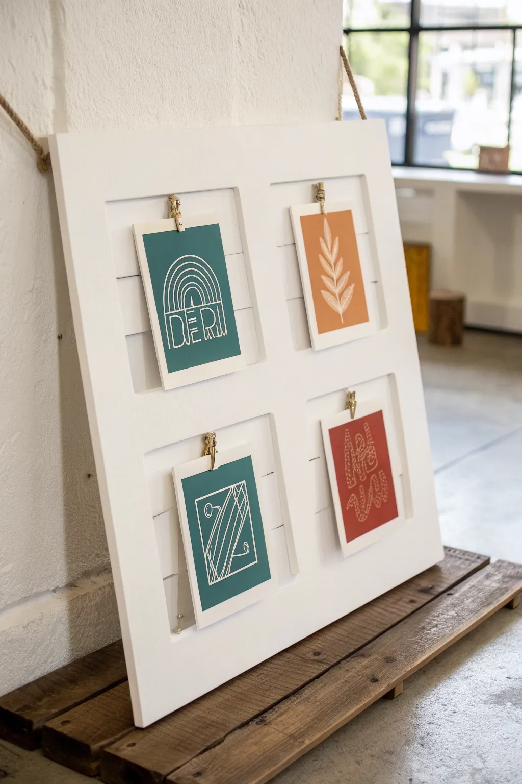
Transform a rustic window pane or build a grid frame to showcase your favorite minimalist line art or quotes. This versatile display uses clips for interchangeable artwork, making it perfect for rotating seasonal prints or student projects.
How-To Guide
Materials
- 4-pane wooden window frame (reclaimed or custom-built from 1×2 pine)
- White chalk paint or matte acrylic paint
- Paintbrush
- Sandpaper (medium grit and fine grit)
- 4 metal bulldog clips (gold or bronze finish)
- Super glue or strong epoxy
- Thick cardstock (white or cream)
- Acrylic paints (teal, terracotta, rust orange)
- White paint pen (fine tip) or white gel pen
- Thick jute rope
- Staple gun or heavy-duty screw hooks
Step 1: Preparing the Frame
-
Clean and prep the wood:
If using an upcycled window frame, remove any glass carefully and pull out old staples or nails. Give the entire surface a good scrub to remove dust and grime. -
Sand the surface:
Use medium-grit sandpaper to smooth out any rough patches or splinters. Follow up with fine-grit sandpaper to create a surface ready for paint. -
Apply the first coat:
Paint the entire frame with white chalk paint. I find that chalk paint adheres beautifully to older wood without needing primer. -
Allow to dry:
Let the first coat dry completely, usually about an hour depending on your humidity. -
Add a second coat:
Apply a second layer of white paint for solid, opaque coverage, ensuring you get into the corners of the grid. -
Distress lightly (optional):
Once fully dry, you can lightly sand the edges if you prefer a more rustic, farmhouse look, or leave it crisp white for a modern feel.
Clean Lines
For the crispest white lines on paper, pump your paint pen on a scrap surface first to ensure smooth flow before drawing.
Step 2: Creating the Artwork
-
Cut the paper:
Cut your cardstock into four equal rectangles sized to fit comfortably within the panes of your frame, leaving a generous gap around the edges. -
Paint the backgrounds:
Paint each cardstock rectangle a solid block color. Use teal for one, rust orange for another, terracotta for the third, and repeat a color or choose a complementary shade for the fourth. -
Dry the backgrounds:
Ensure the background paint is completely dry before attempting any line work to prevent smudging. -
Draft the designs:
Lightly sketch your line art with a pencil. Focus on simple shapes like rainbows, botanical leaves, abstract geometric lines, or short words. -
Ink the lines:
Trace over your pencil sketches with a white paint pen. Keep your hand steady and maintain consistent line thickness. -
Double-pass the lines:
Go over the white lines a second time to ensure they pop against the darker background colors.
Size it Up
Scale this up! Use a full-size vintage door with the panels painted as a massive statement piece for an entryway or large studio wall.
Step 3: Assembly
-
Position the clips:
Lay your frame flat and center a metal bulldog clip at the top of the header bar for each of the four pane sections. -
Glue the clips:
Apply a strong adhesive or epoxy to the back of each clip and press firmly onto the wood frame. Let this cure according to the glue instructions. -
Attach the hanger:
On the back of the frame, attach a length of thick jute rope to the top corners using a staple gun or screw hooks for a sturdy hanger. -
Mount the art:
Once the clip glue is fully set, simply clip your painted cardstock art into place.
Hang your new gallery board and enjoy rotating your miniature art collection whenever inspiration strikes
Mask-Making Theme Night
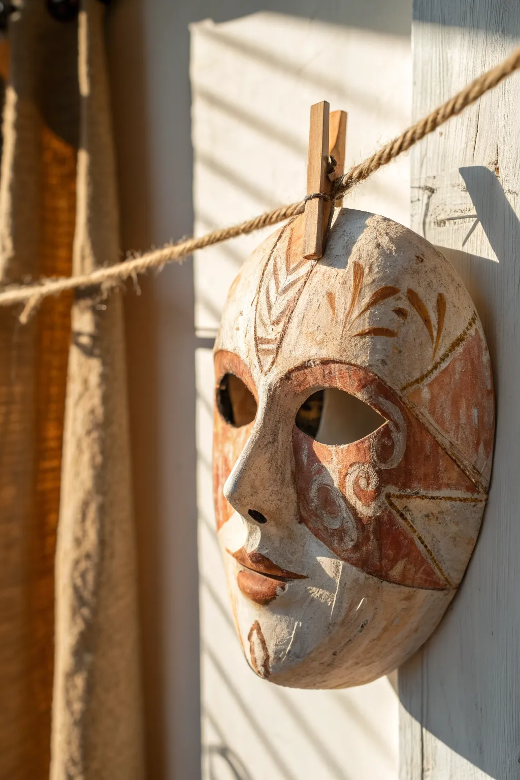
Evoke the spirit of ancient theater with this textural masterwork, which blends rustic charm with elegant detailing. The finish mimics aged plaster and terracotta, creating a wall hanging that feels like a rediscovered artifact.
Step-by-Step Guide
Materials
- Plastic face mask form (as a base mold)
- Rigid wrap plaster cloth (or newspaper strips + PVA glue)
- White gesso primer
- Fine-grit sandpaper (220 grit)
- Balsa wood or thick cardstock (for sculpting ridge details)
- Acrylic paints (White, Burnt Sienna, Raw Umber, Gold, Terracotta)
- Small flat brushes and variety of detail brushes
- Matte sealant spray or matte varnish
- Jute twine and wooden clothespin (for display)
Step 1: Building the Foundation
-
Prepare the workspace:
Cover your work area with plastic or newspaper. If you are using a plastic mask form, apply a very thin layer of petroleum jelly to it so your finished piece releases easily later. -
Apply the first layer:
Cut your plaster cloth into small strips. Dip them in warm water one by one and lay them over the mask form, smoothing out the mesh texture with your fingers as you go. -
Build thickness:
Apply 2-3 layers of plaster cloth, changing the direction of the strips with each layer to ensure structural integrity. Pay special attention to the nose and chin areas for reinforcement. -
Dry thoroughly:
Allow the mask to dry completely. This usually takes about 24 hours depending on humidity; it should feel room temperature and hard to the touch, not cool or damp. -
Release the form:
Gently pry the dried plaster shell off the plastic mold. Trim any rough or jagged edges with scissors to create a clean perimeter.
Step 2: Surface Prep & Sculpting
-
Sand for texture:
Lightly sand the surface with fine-grit sandpaper. You don’t want it perfectly smooth—leaving some bumps adds to the antiquity look—but knock down any sharp plaster spikes. -
Prime the surface:
Apply a coat of white gesso to the entire front of the mask. This seals the plaster and provides a bright, toothy ground for your paint colors. -
Sketch the design:
Using a pencil, very lightly map out the geometric zones shown in the reference: the triangles on the cheeks, the swooping curves around the eyes, and leaf-like motifs on the forehead. -
Create relief textures:
To mimic the carved look on the cheeks, I like to mix a little heavy body gel or thickened gesso and apply it along your pencil lines to create slightly raised borders.
Fixing Soft Spots
If a spot feels squishy after drying, layer a small patch of fresh plaster cloth over it and let dry again. Don’t paint until the shell is rock hard.
Step 3: Painting the Patina
-
Base coat wash:
Mix a watery wash of Raw Umber and apply it over the whole mask, then immediately wipe most of it off with a rag. This settles into the crevices and instantly ages the white gesso. -
Block in the terracotta:
Using Burnt Sienna or Terracotta paint, fill in the cheek triangles and the lip area. Use a dry-brush technique so the white/antique base shows through slightly, creating a worn ceramic look. -
Detail the eyes:
Paint the decorative swirls around the eye sockets using the terracotta shade, adding small spiral flourishes. Keep your hand loose to avoid looking too mechanical. -
Add floral motifs:
On the forehead, paint the leaf or wheat-stalk patterns using a mix of Gold and Raw Umber. These should look like faded gilding. -
Define the lips:
Paint the lips with a slightly darker mix of Burnt Sienna. Define the cupid’s bow sharply and add a thin line of dark brown in the center for depth. -
Highlight ridges:
With a very small brush, use dilute white paint to highlight the raised edges of your textured areas, making the ‘carved’ parts pop. -
Splatter and distress:
Flick a toothbrush dipped in watered-down brown paint lightly over the mask to create tiny speckles that resemble stone imperfections.
Pro Tip: Aging Wash
Brew extremely strong black tea or coffee. Brush this over the dry white gesso before painting for an authentic, warm bone-colored antique base.
Step 4: Finishing and Display
-
Seal the work:
Once fully dry, spray the entire mask with a matte sealant. Avoid glossy sprays, as they will ruin the natural, earthy aesthetic. -
Attach the twine:
String a length of jute twine horizontally across your display area. -
Hang the mask:
Carefully clip the top edge of the mask to the twine using a classic wooden clothespin, centering it for a casual, studio-style presentation.
Step back and admire the timeless character your mask brings to the room

PENCIL GUIDE
Understanding Pencil Grades from H to B
From first sketch to finished drawing — learn pencil grades, line control, and shading techniques.
Explore the Full Guide
Clay Texture Tiles for a Wall Grid
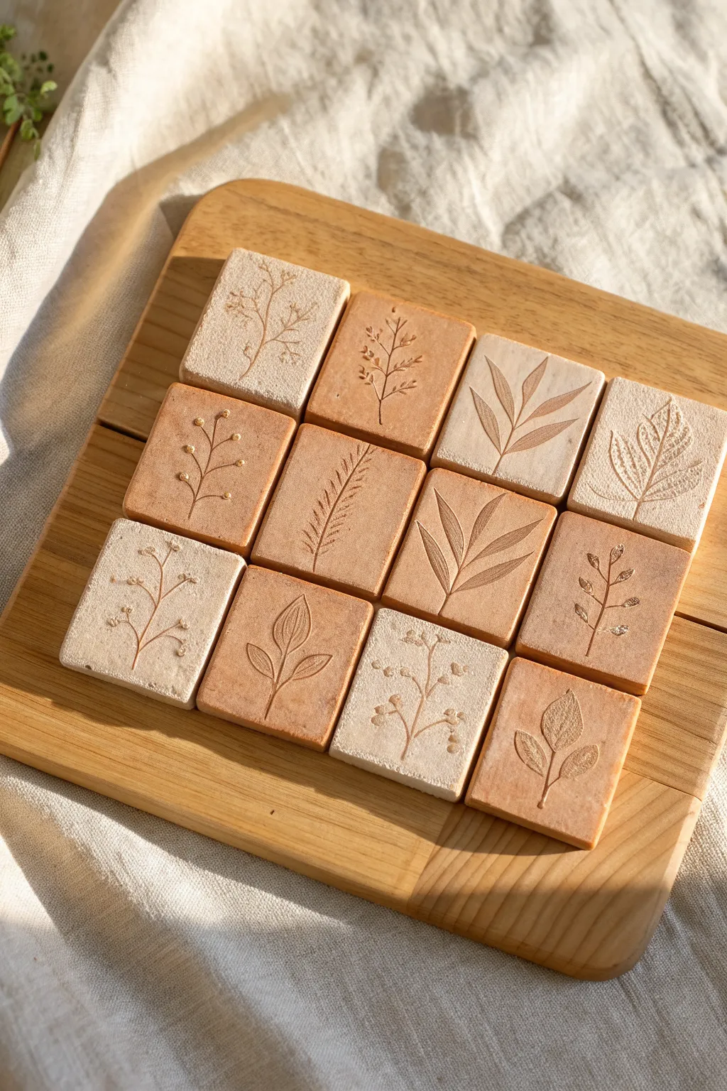
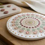
Capture the delicate beauty of nature with these alternating clay tiles featuring real botanical imprints. The contrast between stone-effect and terracotta clays creates an earthy, organic grid perfect for a wall display.
How-To Guide
Materials
- Stone-effect polymer clay (speckled beige)
- Terracotta or warm brown polymer clay
- Rolling pin or clay machine
- Square clay cutter (approx. 2 inches)
- Fresh or dried botanical sprigs (small leaves, ferns, herbs)
- Parchment paper
- Ceramic tile or glass sheet (for baking)
- Oven (for curing)
- Wooden display board or mounting adhesive
- Needle tool (optional)
Step 1: Preparation & Conditioning
-
Clean your workspace:
Before starting, wipe down your work surface and rolling tools with a baby wipe to prevent dust or lint from getting trapped in the clay, which will be very visible on the lighter colors. -
Condition the stone clay:
Break off a chunk of the stone-effect clay and knead it in your hands until it is soft, pliable, and warm. -
Condition the terracotta clay:
Repeat the kneading process with the terracotta clay. Wash your hands between colors so you don’t transfer the darker pigments onto the lighter clay. -
Roll out slabs:
Roll both clays out to an even thickness, roughly 1/4 inch thick. I prefer to use depth guides or playing cards on either side of the roller to ensure every tile is perfectly level.
Fresh vs. Dried
Fresh leaves are flexible and won’t crumble into the clay, leaving a cleaner impression than dried brittle leaves.
Step 2: Cutting & Imprinting
-
Cut the squares:
Using your square cutter, punch out six squares of the stone clay and six squares of the terracotta clay. If the clay sticks to the cutter, dip the rim in a little cornstarch first. -
Smooth the edges:
Gently run your finger along the cut edges of each square to soften any sharp ridges or loose bits left by the cutter. -
Select botanicals:
Choose small sprigs of greenery that fit nicely within the square borders. Fern tips, small leaves with prominent veins, and sturdy herbs like rosemary work beautifully. -
Position the greenery:
Place a botanical sprig onto the center of a clay square. Arrange it thoughtfully, perhaps slightly off-center or diagonal for visual interest. -
Roll the imprint:
Place a small piece of parchment paper over the leaf to prevent sticking. Gently roll over the leaf with your rolling pin just once with firm, even pressure to embed it into the clay. -
Reveal the texture:
Carefully lift the parchment paper, then find the stem of your plant and slowly peel the botanical out of the clay. Use a needle tool to help lift the stem if it’s embedded deep. -
Repeat the process:
Continue imprinting each square, varying the plants used for each one to create a diverse collection of textures.
Stuck Stems?
If a plant stem breaks off inside the clay, let the clay dry slightly, then use a ball of sticky tack to pull the debris out.
Step 3: Baking & Finishing
-
Arrangement check:
Lay out your raw tiles in the intended grid pattern to ensure you like the alternating color balance before baking. -
Transfer to baking surface:
Move the tiles onto a ceramic tile or a baking sheet lined with plain paper. -
Bake the clay:
Bake the tiles according to the specific temperature and time instructions on your package of polymer clay. Do not raise the temperature to speed it up, as this can burn the edges. -
Cool down:
Allow the tiles to cool completely in the oven with the door cracked open. This gradual cooling helps prevent cracking. -
Light sanding:
Once cool, inspect the edges. If there are any rough spots, gently stroke them with fine-grit sandpaper for a professional finish. -
Display setup:
Arrange the finished tiles on your wooden board or intended surface, alternating the light and dark colors in a checkerboard pattern.
Now you have a timeless botanical grid that brings a touch of the outdoors into your creative space
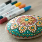
Rock Painting Story Sets
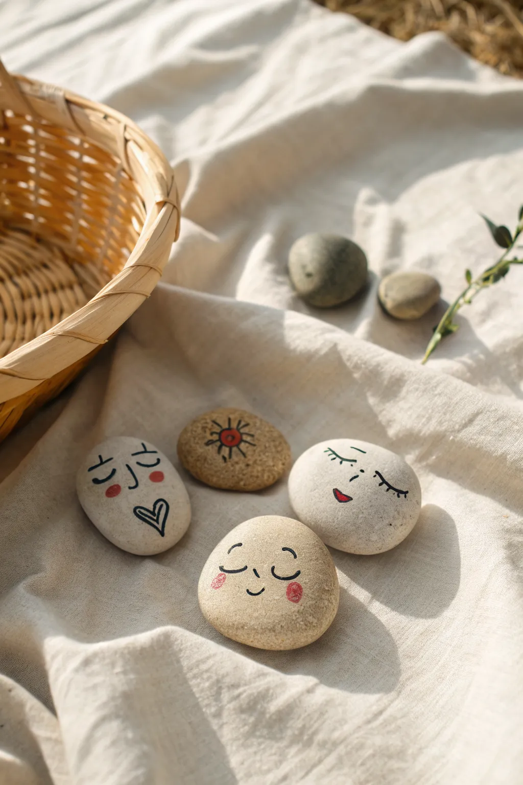
Transform smooth garden pebbles into a cast of charming, expressive characters with just a few strokes of ink and paint. This simple project emphasizes minimal lines and earthy textures to create a soothing story set perfect for imaginative play.
Step-by-Step Guide
Materials
- Smooth river stones (various lighter shades)
- Black fine-tip paint pen (e.g., POSCA or acrylic marker)
- Red or coral paint pen
- Clear matte varnish or sealant spray
- Soap and water
- Scrub brush
- Paper towels
Step 1: Preparation and Planning
-
Select your canvas:
Choose flexible, smooth stones that are light in color—beige, cream, or light grey work best for this minimal aesthetic. Look for shapes that naturally resemble heads or faces, favoring ovals or rounded triangles. -
Clean the surface:
Wash the stones thoroughly with warm soapy water and a scrub brush to remove any dirt, moss, or oils. This step is crucial because even invisible finger oils can prevent paint pens from adhering properly. -
Dry completely:
Pat the stones dry with a paper towel and let them sit in the sun or a warm breezy spot for at least an hour. The stone must be bone-dry, or moisture will get trapped under your artwork. -
Plan expressions:
Before uncapping your pens, lightly sketch different facial expressions on a piece of scrap paper. Think about simple emotions: sleeping, happy, surprised, or peaceful.
Step 2: Drawing the Features
-
Start with the eyes:
Using your black fine-tip paint pen, draw the eyes in the center-upper portion of your first stone. For a sleeping face, draw simple downward curves (U-shapes); for an awake face, try dashes or dots. -
Add eyelashes or details:
If you want a feminine or whimsical look, add three tiny flicks to the corners of the eye curves for eyelashes. Keep the lines very light and quick. -
Draw the nose:
Place a small, simple shape for the nose. A tiny ‘L’ shape facing downward or a barely-there dot works perfectly to keep the face cute and uncluttered. -
Create the mouth:
Below the nose, draw the mouth. A small upward curve creates a smile, while a heart shape or a small ‘o’ can look like a kiss or a whistle. I like to keep the mouth slightly off-center sometimes for quirkiness. -
Add decorative elements:
On one of the stones, try drawing a symbol instead of a face, like the sun with spiraling rays shown in the image, or perhaps a moon or star. This adds variety to your story set.
Ink Flow Tip
Test your paint pen on a scrap piece of paper or cardboard before touching the stone. This ensures the ink flows smoothly and prevents a sudden blob of paint from ruining your rock.
Step 3: Adding Color and Protection
-
Apply cheek color:
Using the red or coral paint pen, draw small circles or ovals on the ‘cheeks’ of your characters. For the heart-mouth character, fill in the heart shape with a pop of red. -
Create sun details:
If you drew a sun symbol, add a dot of red color to the center of the drawing to tie it visually to the other character stones. -
Let the ink set:
Allow the paint marker ink to dry completely. This usually takes only 10-15 minutes, but be patient to avoid smearing your crisp black lines. -
Seal the artwork:
To protect the faces from scratches during play, spray a thin, even coat of clear matte varnish over the top. Hold the can about 8-10 inches away. -
Final cure:
Let the sealant cure according to the manufacturer’s instructions—usually 24 hours—before handling the rocks or placing them in a basket.
Fixing Mistakes
If you smudge a line, don’t panic. While the paint is wet, quickly wipe it with a damp cotton swab. If it’s dry, you can sometimes gently scratch the error off with a toothpick.
Gather your new stone friends in a basket and enjoy the stories they inspire


Paper Bead Jewelry Bar
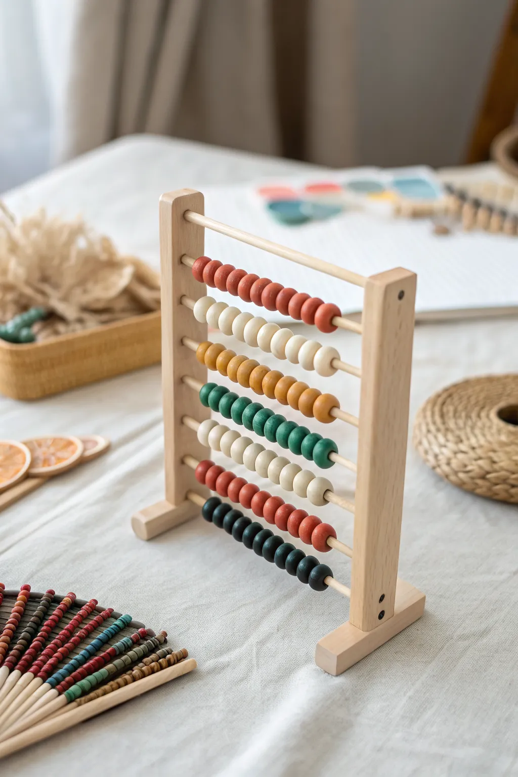
Transform humble strips of paper into a stunning, functional abacus that doubles as a minimalist sculpture. The smooth, matte-finish beads in earthy tones create a sophisticated look that defies their simple origins.
Step-by-Step Tutorial
Materials
- Construction paper or cardstock (rust red, cream, mustard, teal green, forest green, black)
- Wooden dowels (approx. 3/16 inch diameter)
- Wooden frame pieces (pre-cut craft wood or repurposed photo frame sides)
- Ruler and pencil
- Scissors or craft knife
- Paper bead roller or toothpick
- Mod Podge (Matte) or white PVA glue
- Small paintbrush
- Wood glue
- Fine-grit sandpaper
- Clear matte spray sealant (optional)
- Drill with bit matching dowel size
Step 1: Creating the Paper Beads
-
Measure and mark:
Begin by marking your paper into long, triangular strips. For the round, thick beads shown here, measure a base of about 0.75 inches (2 cm) and a length of at least 12 inches (30 cm). The longer the strip, the thicker the bead. -
Cut the strips:
Carefully cut out your triangular strips using scissors or a craft knife. Keep colors separated into piles: rust red, cream, mustard yellow, teal, and dark forest green. -
Start rolling:
Place the wide end of a paper strip into the slot of your bead roller or against a toothpick. Roll tightly and evenly, keeping the paper centered so the bead builds up a uniform, round shape. -
Secure the end:
When you have about an inch of paper left, apply a dab of white glue or Mod Podge to the tip. Finish rolling and hold it in place for a few seconds until it bonds securely. -
Repeat for all colors:
Continue rolling until you have enough beads for your design. The image features rows of roughly 10-12 beads, so aim for about 60-70 beads total across your color palette. -
Glaze the beads:
Brush a layer of matte Mod Podge over each bead to seal it. I prefer to slip them onto a spare skewer or toothpick stuck into foam while they dry to avoid smudges. -
Second coat:
Once the first coat is dry, apply a second coat for durability. For that ultra-smooth look in the photo, ensure your glue layer is thin and even. Let them cure completely, preferably overnight.
Loose Beads?
If beads unwind after gluing, secure the tip with a tiny piece of clear tape while the glue dries, then peel it off carefully before varnishing.
Step 2: Building the Frame
-
Prepare the side supports:
Cut two lengths of thicker wood for the vertical sides of the abacus (approx. 8-10 inches tall). Sand any rough edges smooth with fine-grit sandpaper. -
Mark drill holes:
Measure and mark evenly spaced points along the inside face of both vertical pieces. These marks will determine where your horizontal dowels sit. Ensure both sides match perfectly. -
Drill partial holes:
Using a drill bit that matches your dowel diameter, drill holes about halfway through the wood at your marked points. Create a ‘blind’ hole so the dowel doesn’t poke through the outer side. -
Cut dowels to length:
Cut your thinner wooden dowels to the desired width of your abacus. Test the fit by inserting them into the holes; they should be snug. -
Create the base:
Cut two small rectangular blocks of wood to serve as feet. Attach these perpendicularly to the bottom of your vertical supports using wood glue, ensuring the frame stands upright and stable.
Step 3: Assembly
-
Thread the first row:
Take your top dowel and apply a tiny drop of wood glue into the corresponding hole on the left vertical support. Insert the dowel. -
Add beads:
Slide your first set of beads (e.g., rust red) onto the dowel. Ensure they move freely; if the hole is too tight, you may need to gently ream the bead core with a small round file. -
Secure the right side:
Apply glue to the corresponding hole on the right vertical support. Carefully fit the other end of the dowel into this hole. Repeat this process, working row by row from top to bottom. -
Mix and match colors:
Follow the pattern shown: a row of red, then cream, mustard, teal/green gradients, and finally dark green/black. Alternatively, create your own unique color story. -
Clamp and dry:
Once all rows are assembled, use bar clamps or heavy rubber bands to hold the vertical sides tight against the dowels while the wood glue sets. -
Final seal:
Spray the entire wooden frame lightly with a clear matte sealant to protect the raw wood and give the project a cohesive, finished appearance.
Make It Interactive
Add texture to your sculpture by alternating paper types—try watercolor paper for a rough texture or magazine pages for a glossy, eclectic mix.
Place your handmade abacus on a desk or shelf to enjoy a piece of functional art that invites playful interaction
Fabric Art Day: Prints and Pens
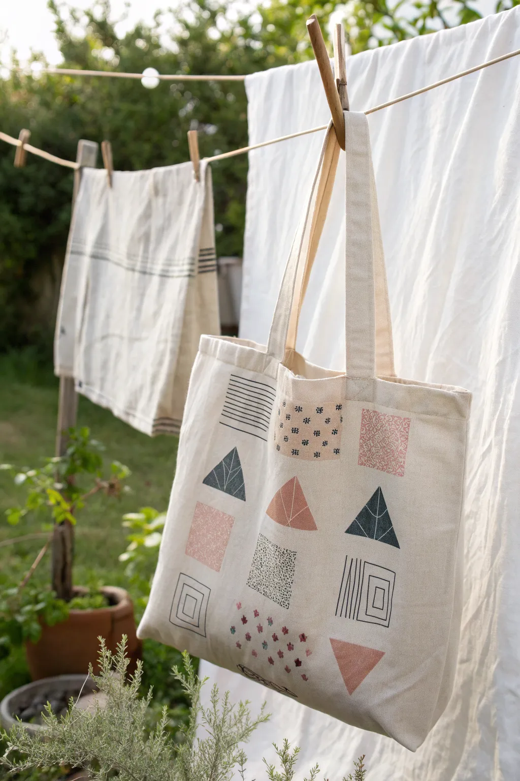
Transform a plain canvas tote into a piece of wearable art using a mix of block printing and fabric markers. This project combines simple geometric shapes with detailed patterns for a modern, minimalist accessory.
How-To Guide
Materials
- Plain canvas tote bag (washed and ironed)
- Fabric block printing ink (black, dusty pink, terracotta)
- Rubber carving block or pre-cut geometric stamps (triangle, square)
- Linocut carving tools (if carving your own)
- Brayer (roller) and inking plate
- Fabric markers or fine-tip textile pens (black, dark blue)
- Ruler
- Iron (for heat setting)
- Scrap cardboard (to place inside the bag)
- Pencil
Step 1: Planning and Preparation
-
Prep the canvas:
Begin by washing your tote bag to remove any sizing chemicals that might repel ink. Once dry, give it a good press with an iron to ensure a smooth, wrinkle-free surface. -
Insert a barrier:
Slide a piece of thick cardboard or several layers of newspaper inside the tote bag. This prevents ink from bleeding through to the back side while you work. -
Mark the grid:
Using a pencil and a ruler, lightly mark out a grid structure on the bag front. Based on the reference, you want roughly three columns and four rows. Small tick marks where the corners of the shapes will go are enough—you don’t need full heavy lines.
Clean Edges
Use masking tape directly on the rubber block to mask off areas you don’t want to print. This creates sharp geometric lines without needing to carve perfectly straight edges.
Step 2: Carving and Printing
-
Carve the shapes:
If you aren’t using pre-made stamps, cut your rubber block into basic shapes: a triangle and a square. For the ‘leaf’ triangle seen in the design, carve a central vein and angled side veins into one of your triangle blocks. -
Ink the roller:
Squeeze a small amount of terracotta or dusty pink ink onto your inking plate. Roll the brayer back and forth until the ink sounds ‘sticky’ and has a velvety texture. -
Print the solid shapes:
Ink up your uncarved square or triangle block and press it firmly onto the canvas in your chosen grid spots. I like to commit to one color at a time, stamping all the pink elements before washing the block. -
Switch colors:
Clean your blocks and brayer, then switch to a dark blue or black ink. Ink up your carved ‘leaf’ triangle and stamp it in alternating spots on the grid. Apply firm, even pressure to transfer the fine lines. -
Add texture blocks:
To create the speckled square, lightly dab ink onto a block using a sponge rather than a roller, or carve tiny chaotic divots into a square block to simulate a terrazzo texture. Stamp this in black.
Go 3D
Embroider over some of the drawn lines with embroidery floss in a matching color. Stitched lines add a beautiful tactile quality that contrasts with the flat ink.
Step 3: Drawing the Details
-
Dry the ink:
Allow the stamped portions to dry completely before reaching for your pens. Wet ink can smear easily if your hand brushes against it. -
Line drawings:
Using a fine-tip black fabric marker and your ruler, draw the linear elements directly onto the fabric. Create a square filled with horizontal stripes in the top row. -
Draw the concentric squares:
For the bottom-left design, draw a square, then a smaller one inside it, and a tiny one in the center. Repeat this concentric styling with the vertical line design on the bottom right. -
Add pattern details:
In the blank spaces of the grid, use your fabric pens to draw freehand patterns. Try small geometric flowers, cross-hatch marks, or tiny repeating crosses to mimic the printed look. -
Fill solid blocks:
If you printed a solid shape that looks too plain, use a contrasting fabric pen to draw patterns over the dry ink, like the white lines seen on the pink triangle.
Step 4: Finishing Touches
-
Erase guidelines:
Once all ink and marker work is totally dry, gently erase any visible pencil tick marks from your initial grid planning. -
Heat set:
Read the instructions on your specific ink and markers. Most require heat setting to become permanent. Usually, this involves ironing the design (with a cloth between the iron and the art) for 3-5 minutes.
Now you have a custom, eco-friendly tote perfect for carrying your sketchbook or groceries
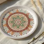
Scratch-Art Mandala Plates
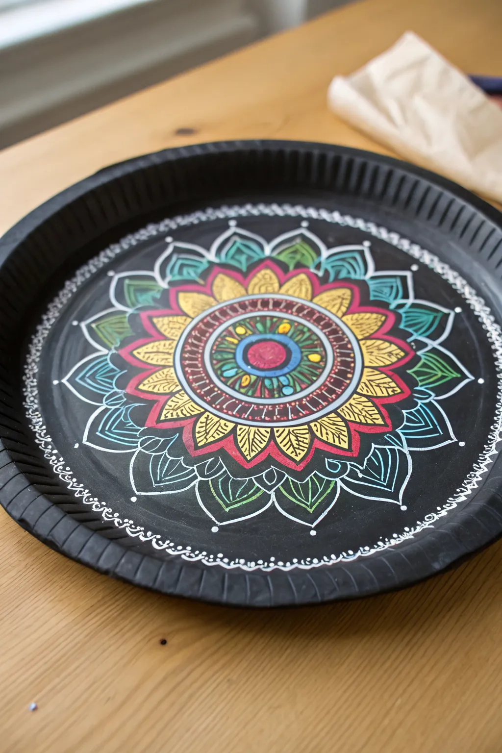
Transform a simple black paper plate into a vibrant masterpiece using paint markers to create a stunning, intricate mandala design. The contrast between the matte black background and the bright, rhythmic patterns creates a mesmerizing piece of art suitable for display.
Step-by-Step
Materials
- Sturdy black paper plate (with fluted rim)
- White paint marker (fine tip)
- Set of colored paint markers (yellow, red, teal, green, blue)
- Pencil (optional for sketching)
- Ruler or compass (optional for guides)
- Scratch paper for testing pens
Step 1: Setting the Foundation
-
Prepare the center:
Begin in the very center of the plate using a blue or teal paint marker. Draw a small, solid circle about the size of a dime to anchor your mandala. -
Add the first ring:
Switch to a red or pink marker. Draw a thick ring directly around your blue center circle, creating a bullseye effect. -
Create the decorative band:
Using a white fine-tip marker, draw two concentric circles around the red ring, leaving a gap of about half an inch between them. This will serve as a detailed band. -
fill the band:
Inside that new gap, use the white marker to draw small vertical ticks or lines all the way around, creating a ‘ladder’ effect. Add small colorful dots—alternating teal, yellow, and green—inside the space for extra detail.
Step 2: Building the Petals
-
Draw the first petal layer:
Using a yellow marker, draw small, pointed petal shapes radiating outward from your decorative band. They should look like sunflower petals. -
Detail the yellow petals:
Once the yellow ink is dry, use a black or fine-tip red marker to add subtle veins inside the yellow petals to give them texture. -
Add the secondary layer:
Behind and between the yellow petals, draw larger pointed petal shapes using a red marker. These should peak out from behind the first layer. -
Outline for contrast:
Go over the edges of your red petals with the white marker. This high-contrast outline is crucial for making the design pop against the black background. -
Create the third petal tier:
Draw the largest set of petals yet, extending toward the rim of the plate. Use a teal or light blue marker for the outline of these broad, leaf-like shapes. -
Inner leaf details:
Inside these large teal petals, draw smaller internal shapes or veins using white and green markers to fill the negative space without coloring it in completely.
Symmetry Hack
Lightly fold the paper plate in half and then in half again before starting. The creases give you perfect guide lines for 4 quadrants without erasing pencil later.
Step 3: Final Flourishes
-
Connect the outer ring:
Between the tips of your largest teal petals, draw simple white curved lines or scallops that connect them, creating a unified flow around the design. -
Add floating details:
Place small white dots at the very points of your largest petals and in the negative spaces between shapes to make the mandala feel expansive. -
Rim decoration:
Move your attention to the fluted rim of the plate. Using the white marker, draw a continuous chain of small loops or scallops along the inner edge of the rim. -
Embellish the rim:
Above your chain of loops, add tiny dots or dashes on the raised ridges of the plate’s rim. This integrates the texture of the plate into your artwork. -
Clean up lines:
Scan your artwork for any lines that need thickening. I find it helpful to go over the central white outlines one last time to ensure they are crisp and bright.
Ink Bleeding?
If your markers are feathering into the paper plate, the surface is too porous. Try sealing the plate first with a thin layer of matte black acrylic paint.
Now you have a striking geometric artwork that turns everyday tableware into a dazzling display
Origami Garland Installation
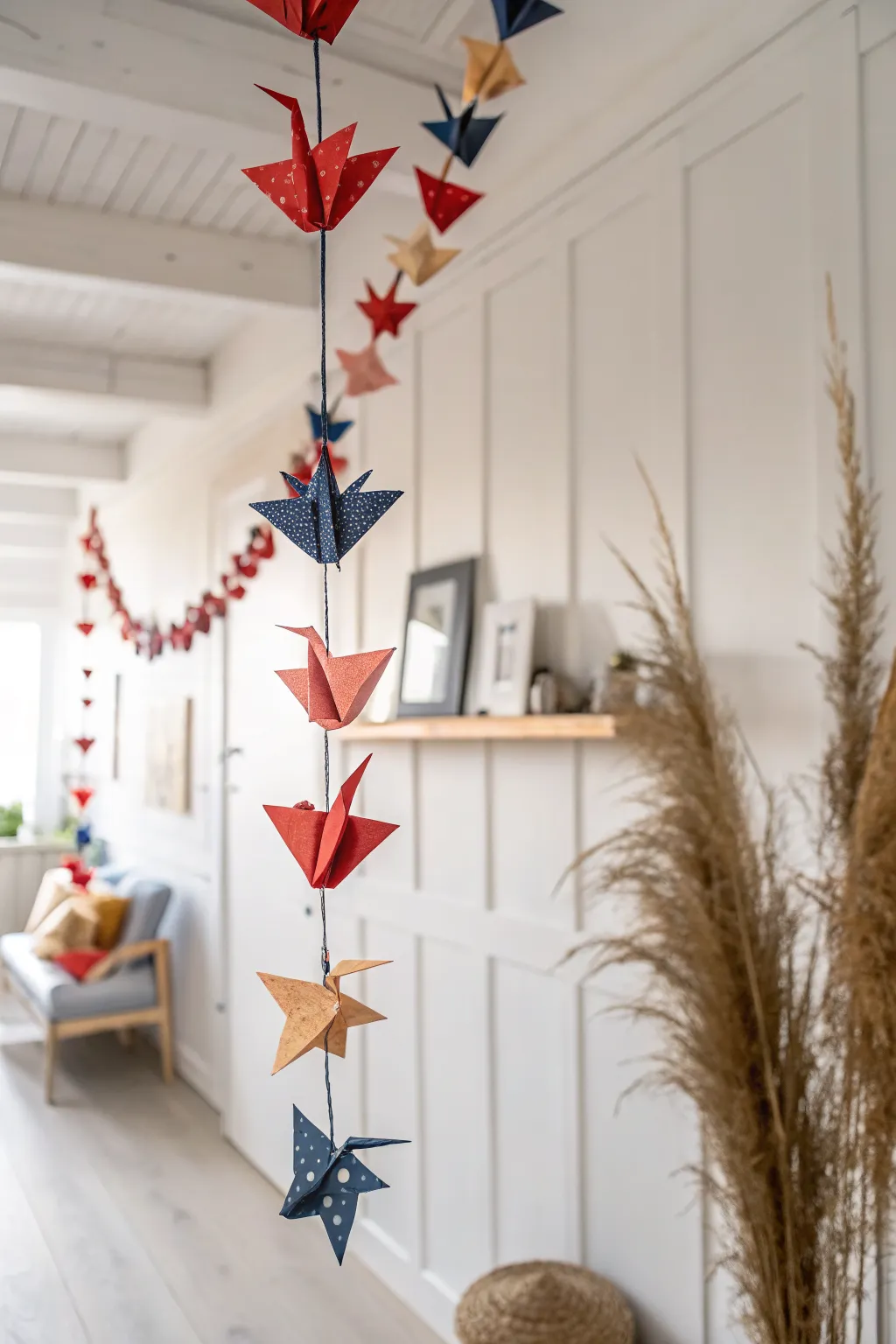
Transform a simple paper folding project into an elegant vertical installation that adds movement and color to any room. This garland features classic origami cranes in alternating patriotic and earth tones, strung delicately to create a floating effect.
How-To Guide
Materials
- Square origami paper (15x15cm or 6×6 inches recommended)
- Patterned paper in navy blue and red (polka dot or subtle print)
- Solid color paper in kraft/gold and matte red
- Strong sewing thread (navy blue or black)
- Embroidery needle or long sharp needle
- Scissors
Step 1: Folding the Cranes
-
The initial valley folds:
Begin with one sheet of square paper. Fold it in half diagonally to form a large triangle, crease firmly, and unfold. Repeat this on the other diagonal so you have an ‘X’ crease. -
The rectangle folds:
Flip the paper over. Fold the paper in half horizontally to make a rectangle, crease, and unfold. Repeat vertically. You should now have creases creating a star pattern meeting in the center. -
Forming the preliminary base:
Bring the four corners of the square together at the bottom. The paper should naturally collapse along your pre-made creases into a smaller diamond shape known as the ‘square base’. -
Creating the kite shape:
Position the square base with the open end facing you. take the top right edge and fold it inward to align with the center vertical crease. Repeat with the top left edge. -
Securing the top triangle:
Fold the top triangular point down over the two flaps you just folded. Crease this top fold very firmly, then unfold everything back to the square base. -
Executing the petal fold:
Lift the top layer of the bottom corner upwards. Use the crease you made in the previous step as a hinge. Gently press the sides inward to flatten the paper into a long, thin diamond shape. -
Repeating the petal fold:
Flip the model over and repeat the kite folds and the petal fold process on the other side. You should now have the classic ‘bird base’. -
Thoroughly narrowing the legs:
To make the neck and tail slender, fold the top right edge of the diamond inward to the center line. Do the same with the top left edge. Flip the model and repeat on the back. -
Forming the neck and tail:
Reverse fold the two thin ‘legs’ at the bottom upwards so they stick out at an angle between the wings. One side will be the head; the other is the tail. -
Finalizing the crane:
Fold the tip of one of the points down to create the bird’s head. Gently pull the wings apart to inflate the body slightly, giving it dimension. -
Batch production:
Repeat this folding process until you have 6-8 cranes. I suggest varying the paper types—mix the polka-dot navy, the matte red, and the kraft paper for visual interest.
Step 2: Assembly
-
Preparing the thread:
Cut a length of thread roughly 1.5 times the desired length of your finished garland. Thread your needle and tie a large, double knot at the very end to act as an anchor. -
Securing the bottom anchor:
Pierce the needle through the bottom center of the first crane’s body (where the legs meet) and bring it out through the center of the back (between the wings). -
Setting the spacing:
Decide on your spacing—about 4 to 6 inches between birds looks elegant. Measure up the thread from your first bird and tie a small, bulky knot exactly where the next bird should sit. -
Adding subsequent cranes:
Thread the second crane just like the first. Slide it down until it rests on the knot you just tied. This knot prevents the bird from sliding down onto its neighbor. -
Continuing the pattern:
Continue tying knots and threading cranes, alternating colors as you go (e.g., Navy, Gold, Red, Navy) until your garland reaches the desired length. -
Creating the hanging loop:
Once the final top crane is in place, leave about 6 inches of excess thread. Tie this loop securely so you can easily hang the installation from a ceiling hook or rod.
Crisp Paper Tip
Use a bone folder or the back of a spoon to flatten your creases. Sharp, crisp edges are the secret to professional-looking origami cranes.
Level Up: Crystal Accents
Add a clear glass bead or crystal to the thread in between each crane. The weight helps the garland hang straighter and catches the light beautifully.
Hang your garland in a spot with gentle airflow to watch the cranes slowly rotate.
Yarn Wrapping and Mini Weavings
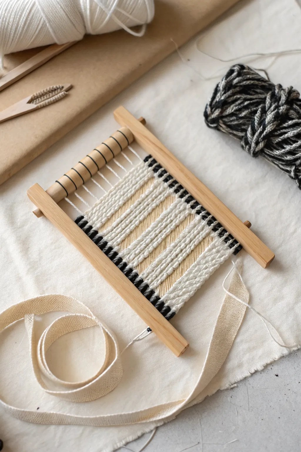
This charming mini weaving project creates a textural masterpiece on a small handheld loom suitable for beginners and seasoned crafters alike. By combining classic tabby weaving with bold, chunky color blocks, you will produce a modern, tactile piece of fiber art.
Step-by-Step Tutorial
Materials
- Small wooden frame loom with a rotating heddle bar
- White cotton warp thread (thin)
- Chunky white yarn (wool or cotton blend)
- Black yarn (medium weight)
- Light tan or cream cotton ribbon/fabric strip (approx. 1 inch wide)
- Scissors
- Large-eye tapestry needle (blunt tip)
- Ideally, a shed stick or shuttle (often comes with the loom)
Step 1: Setting Up the Loom
-
Warp the Loom:
Tie your thin white warp thread to the top left peg of the loom. Bring the thread down to the corresponding bottom peg, wrap it around, and bring it back up to the next top peg. -
Continue Warping:
Repeat this up-and-down motion across the entire width of the loom. Ensure the tension is firm—like a guitar string—but not so tight that it bows the wooden frame. -
Tie Off:
Once you reach the final peg on the right, secure the warp thread with a tight knot and trim the excess tail. -
Position the Heddle:
If your loom has a rotating heddle bar (the cylindrical piece at the top), ensure the warp threads sit correctly in the grooves. This mechanism will help you lift alternating threads later.
Loose Tension
Don’t pull the weft yarn too tight as you reach the edges. Keeping it slightly loose prevents the ‘hourglass’ effect where the middle shrinks inward.
Step 2: Weaving the Foundation
-
Start with Black Yarn:
Cut a length of black yarn. Thread your tapestry needle and begin at the bottom left corner. Weave ‘under-over-under-over’ across the warp threads. -
Create the First Row:
Pull the yarn through, leaving a small 2-inch tail at the start. Push the weft down firmly to the bottom of the loom. -
Build the Base:
Weave back in the opposite direction (over-under-over-under), ensuring you alternate the pattern from the previous row. Create about 4-6 rows of black to form a solid bottom border. -
Bubble the Yarn:
When laying down a row of weft, create an arc or ‘bubble’ with the yarn before beating it down. This prevents the weaving from pinching inward at the waist.
Warp Gap Fix
If you see large gaps of warp thread showing through your design, use a fork or a designated weaving comb to beat the weft rows down more aggressively.
Step 3: Adding Texture and Pattern
-
Switch to Chunky White:
Cut the black yarn (leave a tail to tuck later) and introduce the chunky white yarn. This heavier weight will create the raised, puffy texture seen in the center. -
Weave a Thick Center:
Weave approximately 8-10 rows of the white yarn using the standard plain weave. Because the yarn is thick, these rows will build up height quickly. -
Add Black Accents:
Switch back to the black yarn. Weave just 2-3 rows to create a thin, sharp divider line above the white section. -
Repeat the Pattern:
Return to the chunky white yarn for another block of texture. I prefer to make this section slightly larger than the first white block for visual interest. -
Final Black Stripe:
Add one last thin stripe of black yarn (another 2-3 rows) to mirror the earlier accent. -
Finish with White:
Complete the weaving with a final block of chunky white yarn at the top, filling the space until you are nearly at the heddle bar or top peg.
Step 4: Finishing and Mounting
-
Secure the Ends:
Flip the loom over. Use your tapestry needle to weave any loose yarn tails vertically into the back of your work to hide them. Trim any excess. -
Remove from Loom:
Carefully slide the warp loops off the top and bottom pegs. If the weaving is tight, you may need to gently wiggle them free. -
Tie Knots (Optional):
If the warp loops feel loose, you can tie them in pairs to secure the weaving, though the friction of the chunky yarn usually holds it well. -
Add the Ribbon Strap:
Take your cotton ribbon strips. Thread one strip through the top loops of your weaving and another through the bottom loops (or sew them to the back) to act as a decorative hanging strap or border.
Hang your mini weaving on a wall using the ribbon strap to add a cozy, modern touch to your space
Photo Cut-Out Mixed Media Portraits
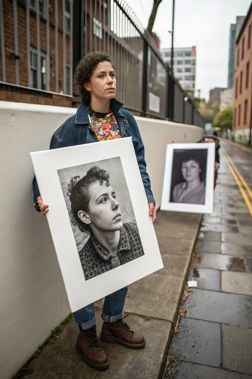
Create a striking illusion by blending photography with mixed media techniques in this large-scale portrait project. By isolating a black and white subject against a stark white background, you’ll produce a modern, gallery-worthy piece that plays with scale and visual impact.
Step-by-Step
Materials
- High-resolution digital camera or smartphone
- Large format printer or printing service access
- Heavyweight matte paper or fine art paper
- Large foam core board or rigid canvas panel (A1 or A2 size)
- Spray adhesive or heavy-duty mounting glue
- X-acto knife or precision craft knife
- Cutting mat or scrap cardboard
- Graphite pencils (HB, 2B, 4B)
- Charcoal sticks or pencils (optional)
- Fixative spray
- Ruler or straight edge
- Soft blending stumps or tissues
Step 1: Planning and Photography
-
Capture the Source Image:
Take a high-resolution portrait photograph against a simple background. For this specific look, have the subject look off-camera with a contemplative expression. Ensure the lighting is soft but has enough contrast to define the jawline and shadows. -
Digital Processing:
Import your photo into editing software. Convert the image to black and white, increasing the contrast slightly to make the darks richer and the highlights pop. This mimics the look of a charcoal drawing. -
Add Texture (Optional):
If you want the final print to look more like a drawing, apply a subtle ‘grain’ or ‘sketch’ filter digitally before printing. I find this helps bridge the gap between photo and illustration. -
Scale and Print:
Resize your image to fill about 60-70% of your final board size. Use a large-format printing service to print this on high-quality matte paper. Avoid glossy finishes as they will reflect light and ruin the drawn effect.
Seamless Merging
When drawing over the photo, focus on the ‘transition zones’ where shadows meet midtones. Blending these areas with a stump hides the digital nature of the print.
Step 2: Mounting the Portrait
-
Prepare the Base:
Lay your large foam core board or canvas panel on a flat, clean surface. Ensure it is free of dust or debris that could create bumps under the paper. -
Rough Cut:
Trim the excess whitespace from your large print, leaving about an inch of margin around the subject to make handling easier. -
Apply Adhesive:
In a well-ventilated area, apply a thin, even coat of spray adhesive to the back of your print. Wait a few seconds for it to become tacky. -
Position and Mount:
Carefully place the print onto the center of your board. Smooth it down from the center moving outward to push out any air bubbles, using a clean cloth or a brayer.
Add Dimensions
Instead of gluing the photo flat, mount it on a slightly smaller piece of foam core first, then mount that to the main board to create a floating 3D relief effect.
Step 3: Enhancement and Finishing
-
Creating the Border:
This style relies on a sharp, rectangular crop. Use a ruler to lightly mark a perfect rectangle around the subject, cropping tightly around the hair and shoulders but leaving ample white space on the board itself. -
Mixed Media Detail:
Using graphite or charcoal pencils, go over the darkest areas of the photo—like the hair texture, pupils, or collar folds—to add physical texture. This makes the print look less ‘flat’ and more like original art. -
Highlighting:
Use a white charcoal pencil or a clean eraser to lift highlight areas on the nose, forehead, and cheekbones, enhancing the three-dimensional effect. -
Final Trim:
You must decide if you want the photo to have a hard edge or fade out. For the look in the reference, use your X-acto knife and ruler to cut physically into the print if you want a raised effect, or simply draw a sharp border line. -
Clean the Negative Space:
The surrounding white board needs to be pristine. Use a kneaded eraser to pick up any stray charcoal dust or smudges from the white background area. -
Seal the Work:
Spray the entire piece with a matte fixative. This protects the charcoal enhancements and prevents the black ink from rubbing off during transport or display.
Now you have a bold, reflective piece that commands presence in any room it inhabits
Neurographic Line and Watercolor Calm-Down
Embrace a moment of stillness with this gentle, abstract watercolor exercise designed for relaxation. This project combines soft, flowing washes of pastel color with delicate botanical line work to create a composed and calming journal page.
Detailed Instructions
Materials
- Spiral-bound mixed media or watercolor sketchbook
- Watercolor paints (pan or tube)
- Small round paintbrush (size 4 or 6)
- Cup of clean water
- Paper towel
- Fine liner pen (dark grey or black, waterproof)
- Pencil (optional for sketching)
- Palette primarily consisting of muted pink, sage green, teal, and peach
Step 1: Planning and Base Washes
-
Observe your space:
Before painting, visualize the layout. Notice how the composition in the example anchors the top left and bottom right corners, leaving the center relatively open for text or negative space. -
Mix your palette:
Prepare your colors. You want very watery, transparent mixes. Create a dusty rose, a soft sage green, a deeper teal, and a barely-there peach. Test them on a scrap paper to ensure they are subtle enough. -
Paint the first arc:
Start at the bottom right corner. Load your brush with the dusty rose mixture and paint a broad, sweeping curve that hugs the corner. Keep the edges soft. -
Add a cooler tone:
While the first shape is still slightly damp (but not soaking), rinse your brush and pick up the sage green. Paint a smaller, nested curve inside the pink arc, allowing the colors to kiss and bleed slightly where they touch. -
repeat in the corner:
Mirror this process in the top left corner. Paint a sweeping teal or green curve coming down from the top edge, followed by a complementary stroke of pink. These opposing corners create balance.
Muddy colors?
If your pastel washes turn brown where they overlap, let each layer dry completely first. Wet-on-wet blends well, but wet-on-damp can overwork the paper.
Step 2: Layering and Texture
-
Deepen the contrast:
Once the initial washes are dry to the touch, mix slightly more saturated versions of your teal and rose paints. Add smaller, distinct strokes over the dried layers to create depth. -
Add floating shapes:
Paint a few isolated, organic blobs or soft triangular shapes near the edges of your main clusters. These act as connecting elements between the white space and the painted corners. -
Splatter texture:
I like to add a bit of unpredictability here. Load your brush with a saturated peach or brownish-pink, tap it against your finger, and let fine speckles fall onto the white space between the two painted corners.
Brush Tip
For those sweeping arcs, use the belly (thickest part) of the brush for the middle of the stroke and lift to the tip at the end for a tapered look.
Step 3: Botanical Details
-
Dry completely:
It is crucial to wait until the paper is bone dry before adding fine lines, otherwise, the ink will bleed into the watercolor paper fibers. -
Draw the main stem:
Using your fine brush with dark green paint (or a fine liner pen if you prefer ink), draw a thin, curving line originating from the bottom cluster, reaching up towards the center of the page. -
Add leaves:
Paint or draw simple, almond-shaped leaves attached to the stem. Use a darker blue-green for these to make them stand out against the pastel background washes. -
Vary leaf sizes:
Make the leaves near the bottom of the stem slightly larger and the ones near the tip smaller and more delicate to mimic natural growth. -
Connect the composition:
Add a few tiny dots or ‘berries’ floating near the leaves using a contrasting color like pink or gold to tie the botanical element back to the background washes.
Enjoy the peaceful rhythm of watching the colors settle into the page
Have a question or want to share your own experience? I'd love to hear from you in the comments below!