When I’m craving something bold and satisfying, I reach for a black marker—nothing beats that crisp, graphic punch on white paper. Here are my favorite black marker drawing ideas that keep things simple, striking, and super fun to build up fast.
High-Contrast Animal Silhouettes
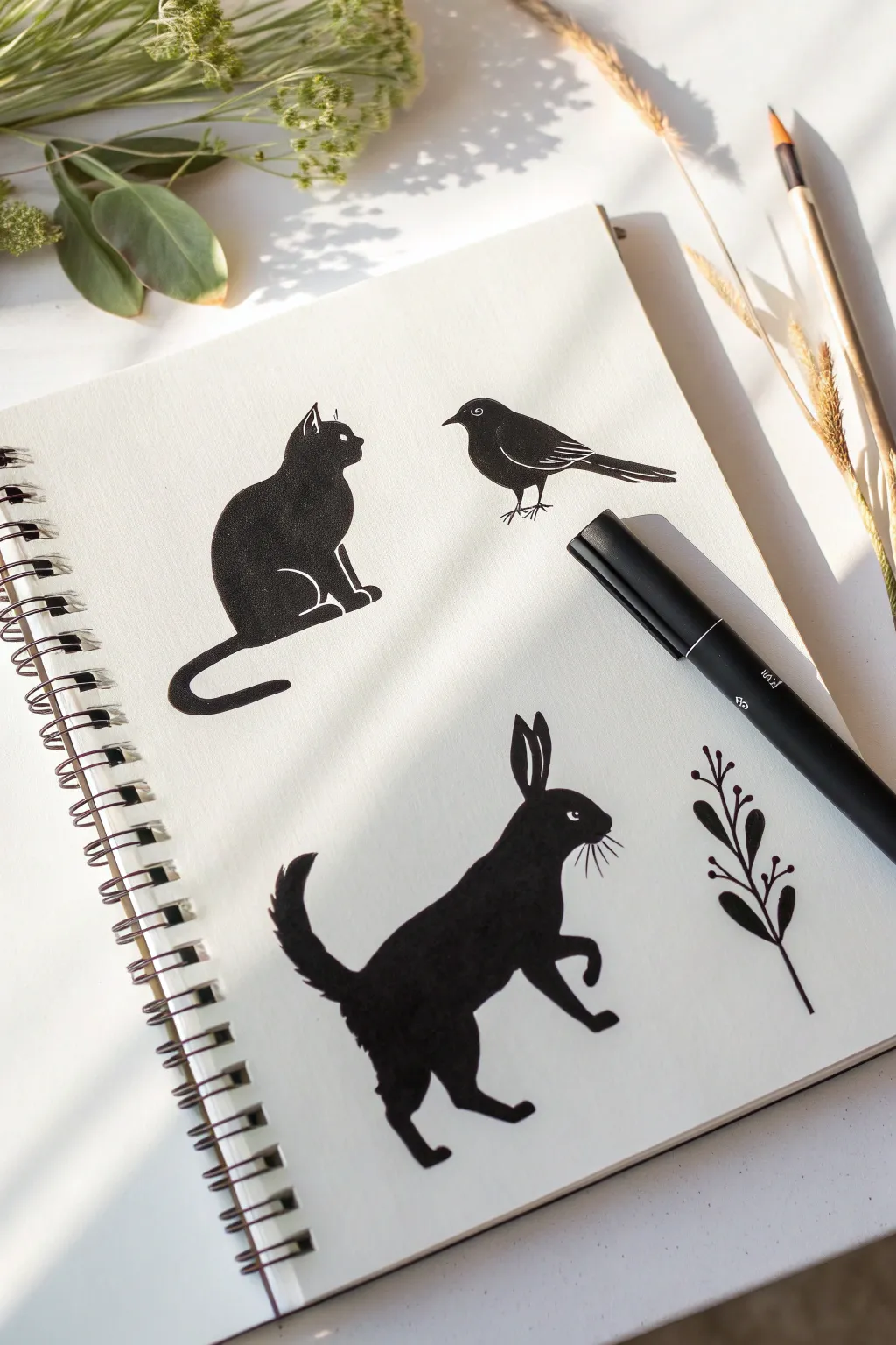
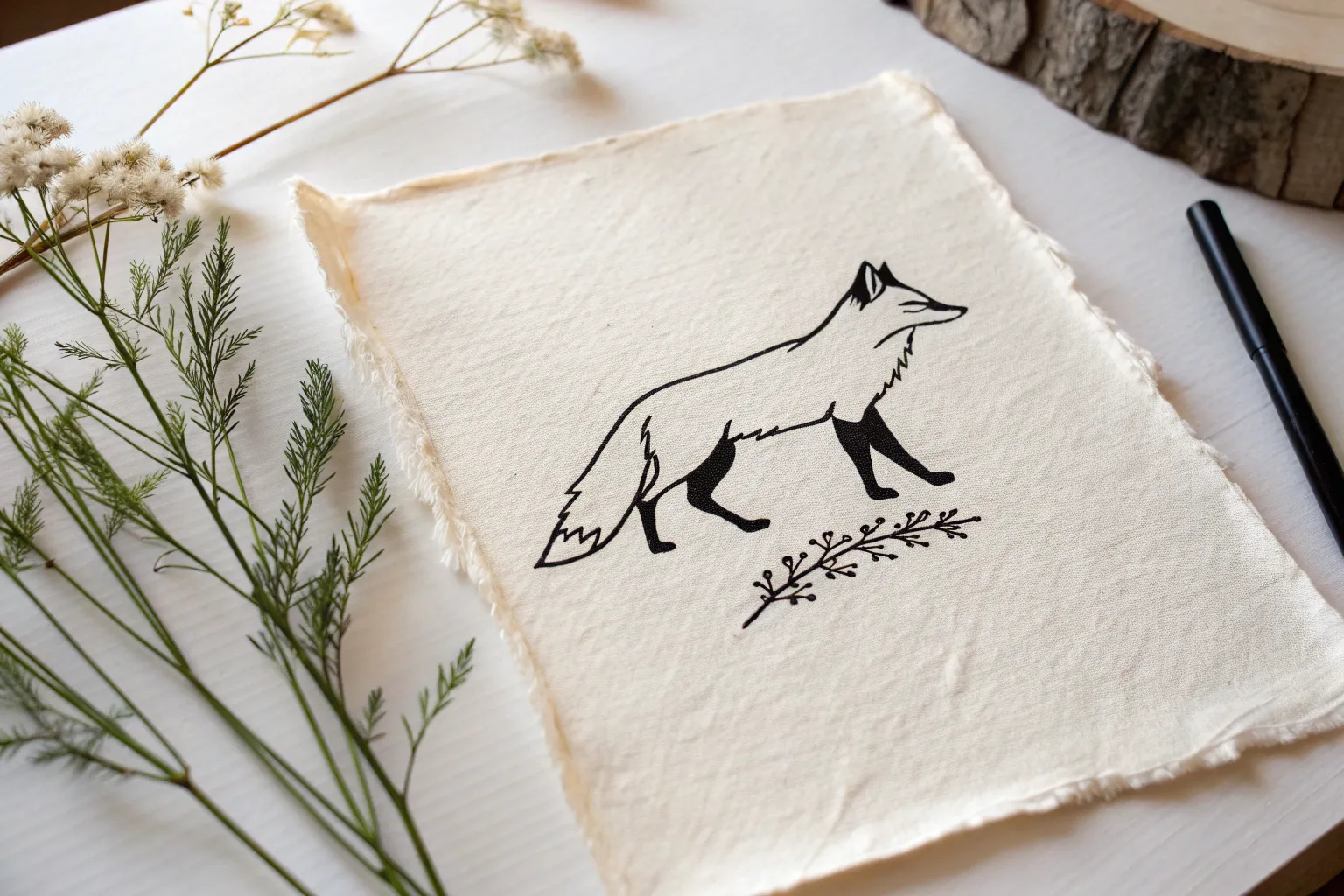
Capture the charm of woodland creatures using bold black ink and negative space. This project relies on strong, confident shapes and minimal white detailing to create striking, graphic illustrations.
How-To Guide
Materials
- Spiral-bound sketchbook (heavyweight paper recommended)
- Black brush pen or broad-tip marker
- Fine-liner black pen (0.3mm or 0.5mm)
- Pencil (HB or 2H)
- Eraser
- White gel pen (optional, for corrections)
Step 1: Sketching the Foundations
-
Plan your composition:
Visualize where your three animals and plant sprig will sit on the page. Leave plenty of white space between them to maintain that clean, minimal aesthetic. -
Outline the cat:
Start with the cat in the upper left. Lightly sketch a rounded triangle for the body and a circle for the head. Add triangular ears and a long, curved tail that sweeps underneath. -
Outline the bird:
To the right of the cat, sketch a simple oval for the bird’s body. Extending from the back, draw a rectangular shape for the tail feathers and a small triangle for the beak. -
Outline the rabbit:
Below the cat, sketch the rabbit. Draw a long oval for the body angled upward. Add a round head, two tall ears, and legs that suggest movement—one front paw lifted and back legs geared for a hop. -
Draft the botanical element:
In the bottom right corner, lightly draw a simple stem with alternating leaf shapes. Keep the leaves small and rounded to complement the animals. -
Refine the contours:
Go over your pencil sketches to firm up the outlines. Smooth out any rough edges, ensuring the silhouettes look fluid and natural before you commit to ink.
Step 2: Inking the Silhouettes
-
Outline with marker:
Using your black brush pen or broad marker, carefully trace the final pencil outline of the cat. Keep your hand steady to create a crisp edge. -
Fill the cat shape:
Fill in the cat’s body completely with black ink. Work in smooth strokes to avoid streak marks. Leave tiny, thin gaps of white paper where the legs meet the body to define the limbs. -
Define cat details:
While inking the head, leave a tiny sliver of white for the eye and the inner ear. If you accidentally fill these, don’t worry—you can fix it later. -
Ink the bird:
Move to the bird. Outline and fill the body solid black. Leave a small white circle for the eye and delicate white lines across the wing to suggest feathers. -
Add bird legs:
Switch to your fine-liner pen to draw the bird’s thin, stick-like legs and feet. A thick marker would look too heavy here. -
Fill the rabbit:
Outline and flood the rabbit shape with your broad marker. Similar to the cat, leave negative space (white paper) to define the eye, the separation of the ears, and the whiskers. -
Refine rabbit fur:
Use the tip of the marker or fine-liner to add tiny, jagged strokes on the rabbit’s tail for a fluffy texture. -
Ink the plant:
Trace the stem and leaves with the fine-liner or the very tip of your brush pen. Fill the leaves solid black, keeping the connections to the stem delicate.
Uneven Coverage?
If your black marker looks streaky or greyish offering drying, apply a second layer in the opposite direction. This cross-hatching technique ensures a deep, solid black.
Step 3: Final Touches
-
clean up pencil lines:
Wait until the ink is completely dry—I usually give it at least five minutes to prevent smudging. Gently erase all remaining visible pencil marks. -
Sharpen details:
Inspect your edges. If any lines look shaky, use the fine-liner to carefully smooth the silhouette’s perimeter. -
Add highlights:
If you lost any details while filling in the black, use a white gel pen to re-add the eyes or separate a leg from the body.
Try This Twist
Instead of solid black, fill your silhouettes with tiny patterns like polka dots, stars, or diagonal stripes for a whimsical, patterned folk-art style.
Flip the page and start a new collection of shapes now that you’ve mastered the art of the silhouette

Pandas and Other Patchwork Critters

This adorable panda illustration combines simple shapes with a clever stitched effect to create a character that looks like a fabric patch. It’s a perfect beginner-friendly project that turns basic circles and ovals into a charming piece of art using just a couple of tools.
Step-by-Step
Materials
- Dotted or grid journal paper (preferred for symmetry)
- Pencil (HB or H)
- Eraser
- Fine-liner black pen (0.3mm or 0.5mm)
- Thicker black marker or brush pen
- Compass or circular object (optional)
Step 1: Shaping the Head
-
Base Outline:
Start by drawing a large, slightly flattened oval in the center of your page. If you are using dotted paper, use the dots to help ensure the left and right sides are symmetrical. -
Ear Placement:
Attach two semi-circles to the top left and top right of the main oval. They should look like little buns resting on the curve of the head. -
Eye Patches:
Draw two large, bean-shaped ovals inside the face. These should slant slightly inward toward the center, mimicking the classic panda eye patches. -
Facial Features:
Place a small, rounded triangle in the lower center for the nose. Draw a simple anchor shape or a ‘w’ shape directly beneath it for the mouth.
Step 2: Adding the Stitching Details
-
Inner Border:
Lightly sketch a second oval inside the main head shape, keeping an even distance of about 3-4mm from the edge. -
Stitch Marks:
Along this inner oval, draw short, evenly spaced dashes with your pencil. This creates the ‘sewn’ look that gives the drawing its charm. -
Pupil Sketching:
Inside the large eye bean shapes, draw small circles for the actual eyes. Leave tiny white dots inside these circles for highlights.
Keep it Textured
Don’t worry if your black fill is slightly streaky or imperfect. This texture actually enhances the ‘fabric patch’ aesthetic, making it look more organic and hand-crafted.
Step 3: Inking and Filling
-
Inking the Outline:
Switch to your fine-liner pen. Carefully trace over the main outer oval of the head, keeping your hand steady for a smooth line. -
Defining the Dash Line:
Go over your pencil dashes with the fine-liner. I find it helpful to rotate the paper as I go to keep the dashes consistent. -
Inking the Face:
Trace the nose and mouth with the fine-liner. Do not trace the outlines of the eye patches or ears just yet—we will fill those directly. -
Filling the Left Ear:
Using your thicker black marker or the side of a brush pen, color in the left ear solid black. -
Filling the Right Ear:
Repeat the process for the right ear. You can leave faint textural streaks if you want a ‘colored pencil’ look, or go over it twice for solid black. -
Coloring the Patches:
Fill in the large bean shapes around the eyes with the thicker marker. Be very careful to work around the small circular eyes you sketched earlier; these need to stay white. -
Eye Detail:
Switch back to the fine-liner to carefully outline the small eye circles inside the black patches. -
Filling the Pupils:
Color in the pupils black, leaving that tiny speck of white uncolored for the ‘catchlight’ or sparkle in the eye. -
Nose Fill:
Fill in the nose triangle with solid black ink.
Fabric Texture
Use a light gray marker to add subtle cross-hatching inside the white face area. This mimics the weave of fabric or felt for a true patchwork effect.
Step 4: Final Touches
-
Erase Sketches:
Wait at least five minutes for the ink to dry completely. Gently erase all remaining pencil guidelines to clean up the drawing. -
Assessment:
Check for any uneven spots in your black fill areas and touch them up if necessary.
You now have a cute, stitched panda companion on your page ready for your bullet journal spread

Minimal Profile Portraits
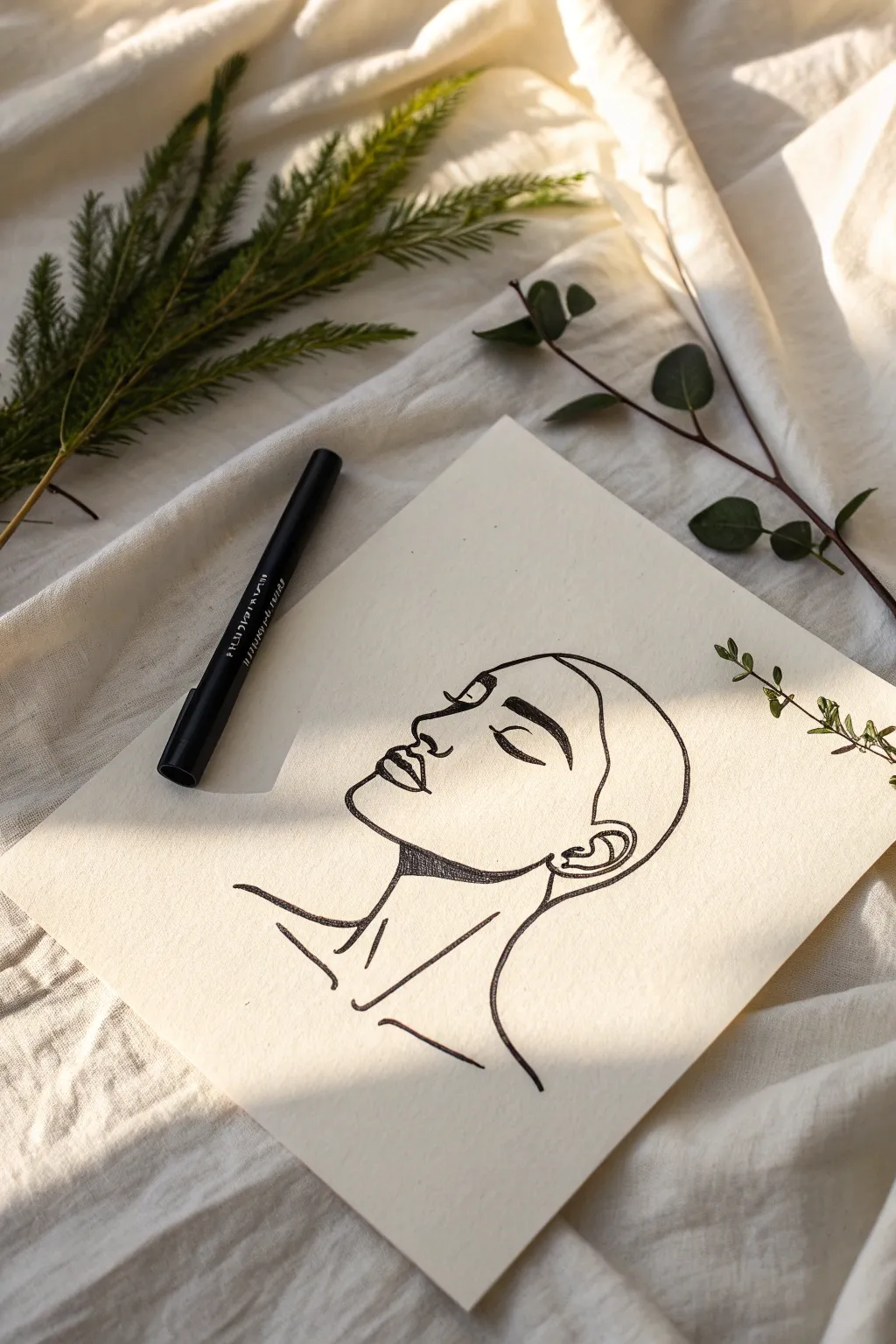
Capture the serenity of a quiet moment with this elegant minimalist line drawing. Using confident, flowing strokes, you will create a striking side profile that emphasizes emotion through simplicity and negative space.
How-To Guide
Materials
- Cream or off-white textured art paper (heavyweight sketch or mixed media paper works well)
- Black felt-tip drawing pen (medium nib, roughly 0.5mm – 0.8mm)
- Pencil (HB or 2B for sketching)
- Soft white eraser
- Ruler (optional, if you want guidelines for proportions)
Step 1: Sketching the Framework
-
Establish the head shape:
Begin lightly with your pencil. Sketch a rough oval tilted slightly back to represent the general volume of the head. This won’t be part of the final line, but it helps position the features. -
Mark the facial plane:
Draw a faint vertical line down the front of your oval where the face will be. Make small tick marks to divide this line for the eyebrows, nose base, and chin to ensure your proportions feel natural. -
Outline the profile:
Softly sketch the actual profile line. Start at the forehead, curve in for the bridge of the nose, out for the nose tip, and then curve around the lips and chin. Keep your pencil pressure very light so it erases easily later. -
Place the ear and neck:
Sketch a C-shape for the ear, aligning the top of it roughly with the eyebrow line. Extend two lines down for the neck—one from under the chin and one from behind the ear—curving them outward slightly toward the shoulders.
Shaky Lines?
Don’t connect every line perfectly. In minimalist art, a small gap between the jaw and ear or nose and lip can look intentional and artistic rather than accidental.
Step 2: Defining Features
-
Detail the eye:
Instead of a full eye, sketch a closed eyelid. Draw a curved arch for the crease and a simpler curve below it for the lash line. This conveys the peaceful, sleeping expression. -
Sketch the eyebrow:
Above the eye, block out a thick, structured eyebrow shape. It should be wider near the nose and taper off toward the temple. -
Refine the lips:
Give the lips more definition. Sketch the upper lip slightly fuller and define the corner of the mouth where it dips. -
Add neck structure:
Lightly indicate the collarbone and the prominent muscle (sternocleidomastoid) running from the ear to the center of the collarbone. These lines add anatomical elegance to the minimalism.
Step 3: Inking the Lines
-
Start the forehead:
Switch to your black marker. I find it best to start at the top of the forehead and pull the pen confidently towards yourself. Trace your pencil line for the forehead, stopping just as you dip into the nose bridge. -
Draw the nose and lips:
Continue the line down the nose, around the tip, and into the philtrum. Lift your pen, then carefully outline the upper and lower lips. Use a slightly heavier pressure on the bottom of the upper lip for shadow. -
Ink the chin and jaw:
Draw a smooth, continuous line from under the bottom lip, around the chin, and sweeping up the jawline toward the ear. Don’t connect it all the way to the ear; let the line fade slightly. -
Create the heavy brow:
For the eyebrow, don’t just outline it. Use small, dense strokes to fill it in solidly black, but leave the edges ever so slightly rough to suggest hair texture. -
Bold the eyelid:
Draw the closed eyelid with a single fluid stroke. Go over the lash line a second time to thicken it, mimicking the density of eyelashes. -
Detail the hairline:
Draw the hairline starting from the forehead, curving over the ear, and down the back of the neck. Keep this line smooth and clean, devoid of individual hair strands.
Pro Tip: Pivot Point
Draw from your shoulder, not your wrist. Lock your wrist and move your whole arm to get those long, smooth curves on the neck and head without jittery stops.
Step 4: Finishing Touches
-
Add shadow accents:
This is crucial for the style. Use hatching or solid black fill right underneath the jawline (on the neck). This ‘drop shadow’ creates instant depth and separates the head from the neck. -
Ink the neck lines:
Trace the neck muscle lines and collarbone indications. Keep these lines slightly thinner or broken compared to the profile outline to keep the focus on the face. -
Erase pencil marks:
Wait at least 5-10 minutes for the marker to be bone dry. Then, gently erase all underlying pencil sketches. Be careful not to smudge your fresh ink. -
Assess line weight:
Look at your drawing as a whole. If the profile feels too thin, carefully re-trace the outer boundary line (forehead to chin) to thicken it, making the silhouette pop.
Step back and admire the calm simplicity of your new profile portrait


Bold Lips, Eyes, and Brows Studies
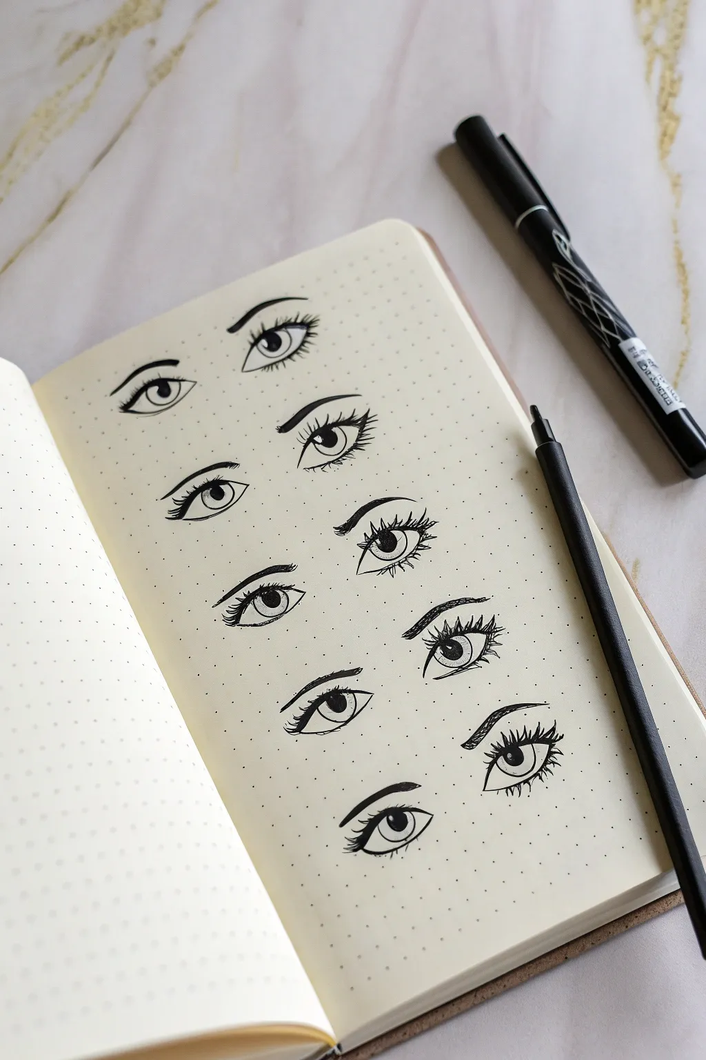
Practice the art of capturing emotion through a series of stylized eye and brow studies on dotted paper. This project breaks down complex expressions into simple lines and shapes, helping you master the subtleties of the gaze using just a few black ink pens.
Step-by-Step Guide
Materials
- Dotted grid notebook or journal (A5 size recommended)
- Fine liner pen (01 or 03 nib) for initial outlines
- Thicker graphic marker or brush pen for bold lines
- Pencil (optional, for sketching)
- Eraser
Step 1: Setting the Layout
-
Create a vertical guide:
Visualize a center line down your page. You will be drawing pairs of eyes, but staggered vertically. The left column of eyes will sit slightly higher or lower than the right column to create a dynamic, sketchbook feel rather than a rigid grid. -
Lightly sketch positions:
If you are worried about spacing, use a pencil to lightly mark where the center of each pupil will go. Aim for about five to six eyes in each column, using the dot grid to ensure they are evenly spaced vertically.
Step 2: Left Column: Soft & Classic
-
Draw the top lid curve:
Starting with the top-left eye, draw a smooth arch for the upper eyelid using your fine liner. Keep the heavy part of the curve towards the center. -
Add the iris and pupil:
Draw a perfect circle for the iris, partially tucked under the top lid. Inside, draw a smaller black circle for the pupil, leaving a tiny white fleck reserved for the highlight. -
Define the lower lid:
Sketch a softer, flatter curve for the bottom lid. Don’t let it touch the top lid at the outer corner; leave a tiny gap to keep the eye looking open. -
Add lashes:
Flick small, curved lines outward from the outer corner of the top lid. Keep them sparse for this first study. -
Draw the eyebrow:
Using a slightly thicker pen stroke, draw a smooth, arched eyebrow above the eye. Taper the tail end to a fine point. -
Repeat with slight variations:
Move down the left column. For the second eye, make the lashes thicker and longer. For the third, try a heavier, straighter brow to change the expression. -
Experiment with gaze:
For the bottom-most eye on the left, shift the iris slightly to the side, looking towards the right, and thicken the upper lash line significantly.
Uneven Eyes?
Don’t stress about symmetry! Since these are isolated studies, not pairs on a single face, slightly different sizes or angles actually make the page look more interesting.
Step 3: Right Column: Bold & Dramatic
-
Start the first right-side eye:
Align this slightly lower than your first left eye. Draw a more angular upper lid. -
Create intensity:
Draw the iris larger than the printed example, touching both the top and bottom lids, which creates an intense or surprised look. -
Thicken the lash line:
I prefer to switch to a slightly bolder pen here. Retrace the upper lash line to make it thick and dark, mimicking eyeliner. -
Add defined lower lashes:
Instead of a solid line for the bottom, use small, individual spikes to represent distinct lower lashes. -
Sculpt the brows:
Draw the eyebrows on this side with more texture. Use short, upward strokes to mimic hair hairs at the start of the brow, then transition to a solid line for the tail. -
Vary the brow shape:
As you move down the right column, try a ‘straight’ brow (popular in K-beauty) or a high-arched ‘villain’ brow to see how it affects the mood. -
Add eyelid creases:
Above each eye in this column, draw a thin, broken line parallel to the upper lid to indicate the eyelid crease. This adds depth.
Master the Sparkle
Determine your light source before drawing pupils. If the light comes from the top right, place the white highlight dot in the top right of every pupil for consistency.
Step 4: Final Details
-
Darken the pupils:
Go back over every pupil with your darkest black marker. Ensure the white highlights remain crisp and clean. -
Refine the lines:
Check for any jittery lines. Use the fine liner to smooth out curves or add tiny cross-hatching to the corners of the eyes for subtle shading. -
Erase guidelines:
Once the ink is completely dry (give it a few minutes to be safe), gently erase any pencil marks you made for positioning.
Fill the rest of the page with as many variations as you can imagine to complete your study sheet

PENCIL GUIDE
Understanding Pencil Grades from H to B
From first sketch to finished drawing — learn pencil grades, line control, and shading techniques.
Explore the Full Guide
Houseplants With Big Shadow Shapes
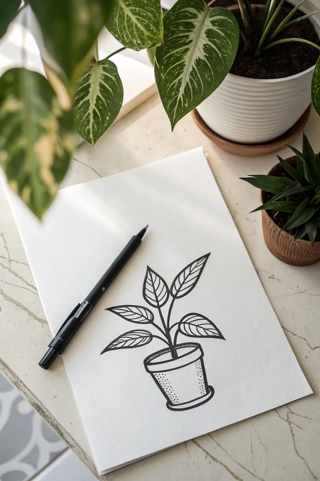
This minimalist black ink drawing captures the organic beauty of a houseplant with bold outlines and simple shading techniques. It’s a perfect exercise for practicing line confidence and creating volume through basic stipple textures.
How-To Guide
Materials
- Smooth white paper (bristol board or sketch paper)
- Black drawing pen (fine tip/fineliner, size 05 or 08)
- Graphite pencil (HB or 2B)
- Soft eraser
Step 1: Sketching the Guidelines
-
Map out the pot:
Start by lightly sketching the pot’s basic shape with your pencil. Draw a slightly flattened oval for the rim, then angle two lines downward for the sides, connecting them with a curved line at the bottom to match the rim’s curve. -
Add the saucer:
Beneath the pot, sketch a narrow, long oval shape that hugs the bottom curve. This creates the saucer the pot sits in. -
Mark the stem structure:
Draw a central, slightly curved line rising from the center of the pot. From this main stem, branch off three or four smaller lines to indicate where the leaves will attach. -
Outline leaf shapes:
At the end of each branch, lightly sketch large, pointed oval shapes for the leaves. Vary their angles so some point up and others tilt sideways for a natural look. -
Refine the composition:
Step back and look at your pencil sketch. Adjust the size of the leaves if they feel too small for the pot, or tweak the stem curve until the balance feels right.
Wobbly Lines?
Don’t panic if your lines aren’t perfectly straight. In botanical art, slight wobbles make the plant look organic and alive rather than plastic. Embrace the tremors.
Step 2: Inking the Outlines
-
Ink the main stem:
Using your black marker, trace over the main stem lines. Start from the soil line and pull the pen upward in smooth, confident strokes. I find it helps to draw ‘through’ the junction points rather than stopping and starting. -
Outline the leaves:
Carefully trace the heavy outline of each leaf. Use a consistent pressure to keep the line weight uniform. Make sure the tips of the leaves come to a clean point. -
Add central veins:
Draw single lines down the center of each leaf. These don’t need to be perfectly straight; a little wobble adds organic character. -
Draw leaf veins:
Add the angled veins branching from the center line to the leaf edge. Keep them spaced relatively evenly, mirroring them on both sides of the center vein. -
Define the pot rim:
Ink the oval rim of the pot. Give the rim a double line—one for the outer edge and one slightly inside—to create the illusion of thickness. -
Complete the pot and saucer:
Trace the sides and bottom of the pot, then finish with the saucer at the base. Ensure the bottom curves match the perspective of the rim.
Pro Tip: Line Weight
Use a slightly thicker pen (08) for the outer silhouette of the pot and leaves, and a finer pen (03 or 05) for the internal veins. This instantly adds professional depth.
Step 3: Adding Detail and Dimension
-
Erase pencil marks:
Once the ink is completely dry to the touch, gently run your eraser over the entire drawing to remove the graphite guidelines. -
Stipple the pot shadow:
To give the pot roundness, use stippling (small dots). concentrate a cluster of dots heavily on the left side of the pot and fade them out as you move toward the center. -
Shade inside the rim:
Add a dense row of dots or short hatched lines just under the inner rim on the back side. This cast shadow creates depth, showing that the pot is hollow. -
Texture the soil:
Add a few horizontal dashes or a small patch of stippling right at the base of the stem where it meets the pot to suggest soil surface. -
Thicken shadow lines:
Go back over the underside of the leaves or the bottom edge of the pot with a second pass of the marker. Thickening these specific lines subtly suggests weight and shadow. -
Final check:
Review your drawing for any broken lines that need connecting or areas where the stippling could be smoothed out with a few intermediate dots.
Now you have a crisp, modern botanical illustration ready to frame or scan
Doodle Sticker Icons Sheet
Fill a bullet journal page with this charming collection of tiny celestial and nature-inspired icons. Using simple lines and dots, creating this organized grid of stars, clouds, and hearts is a relaxing way to practice precision drawing.
Step-by-Step
Materials
- Dotted Grid Journal or Notebook
- Fine Liner Pen (Black, 0.3mm or 0.5mm tip)
- Pencil (optional for sketching)
- Eraser
Step 1: Planning and Layout
-
Prepare your grid:
Open your journal to a fresh dotted page. The dots will serve as your invisible guide, helping you keep the rows straight and spacing even without drawing pencil lines first. -
Visualizing the structure:
Mentally divide the page into roughly seven horizontal rows. You will be drawing from top to bottom, filling each row with related shapes before moving to the next.
Step 2: Row 1: Detailed Stars
-
Draw the first star:
Starting on the top left, draw a five-pointed star. Instead of connecting the lines precisely, leave small gaps and fill the inside with tiny stippling dots for texture. -
Add variety:
Move to the right and draw a slightly smaller, wonky five-pointed star, outlining it twice for a sticker-like effect. -
Leaf sprig:
Next, draw a vertical stem. Add four small, solid black leaves facing upward on either side of the stem. -
Right-side stars:
Finish the top row with two more five-pointed stars. Give one a double outline and the other a simple single line distinct shape.
Fixing Ink Blobs
If you smudge a star or heart, turn it into a solid black shape. If it’s already solid, carefully increase the outline size to smooth out the bumpy edge.
Step 3: Row 2: Hearts and Sparkles
-
Open hearts:
On the second row, draw three simple open heart outlines, spacing them evenly. Try to make the middle one slightly larger or narrower for organic variation. -
Solid heart:
Draw a fourth heart, but fill this one in completely with black ink. -
Sparkle cluster:
End the row with a sparkle doodle: draw a central cross and add smaller rays between the main arms. -
Vertical hearts sidebar:
On the far right edge of the page, beneath the sparkle, draw a vertical column of tiny descending hearts. Start with three open hearts and transition into three solid black hearts.
Consistency Trick
Count the grid dots! Use the journal’s dot grid to ensure your stars and hearts are roughly the same height and width for a cohesive sticker-sheet look.
Step 4: Row 3: Solid Stars
-
Outline stars:
Begin the third row with a simple five-pointed star outline. -
Fill them in:
Draw three solid black five-pointed stars in a row. Keep the points sharp and crisp against the white paper. -
Hollow star:
Finish this sequence with one more open star outline.
Step 5: Row 4: Galaxy Elements
-
Star variations:
Draw two solid black stars on the left side of this row. -
Tiny constellations:
In the center, create two clusters of ‘magic dust’ by combining tiny dots, small crosses, and microscopic star shapes. -
Crescent moon:
Draw a solid black crescent moon facing left. Add three tiny cross-stars next to it. -
Globe icon:
On the far right of this section, draw a circle. Add grid lines inside to represent a globe or disco ball.
Step 6: Row 5: Moons and Charms
-
Star and moons:
Draw one final solid black star on the left. Follow it with an open heart shape. -
Moon phases:
Draw a solid black crescent moon facing right, then an open heart, and finally another solid crescent moon facing left. -
Lantern doodle:
Between the heart and final moon, draw a small jar or lantern shape containing a tiny tree silhouette.
Step 7: Row 6: Weather and Nature
-
Fluffy clouds:
Draw two simple cloud outlines with bumpy bottoms. Under the first one, add two solid black dots for eyes. -
Heart:
Place a solid black heart in the middle of the row for balance. -
Rain cloud:
Draw a cloud on the far right. Underneath, add vertical dashed lines to represent rain.
Step 8: Row 7: Bottom Details
-
Final Clouds:
Draw a cloud near the bottom left corner. Draw a second cloud in the center with tiny star shapes falling from it instead of rain. -
Mushroom:
To the right of the snowing cloud, draw a mushroom cap with white spots (leave circles empty and fill the rest black). Add a thick stem. -
Simple cloud:
Finish the page with one last simple cloud outline on the bottom right.
Now you have a full sheet of whimsical icons ready to embellish your next journal spread.
BRUSH GUIDE
The Right Brush for Every Stroke
From clean lines to bold texture — master brush choice, stroke control, and essential techniques.
Explore the Full Guide
Hand-Lettering With Chunky Shadows

Learn to create bold, vintage-style typography with nothing but a black marker and some paper. This tutorial focuses on adding dimension to simple serif letters using a consistent drop shadow technique that makes the text pop off the page.
Step-by-Step Guide
Materials
- Cream or beige cardstock paper
- Fine tip black drawing pen (0.3mm or 0.5mm)
- Thicker black marker or brush pen
- Pencil (HB or 2H)
- Ruler
- Eraser
Step 1: Drafting the Layout
-
Prepare your paper:
Start with a piece of cream or beige paper to mimic the warm tone in the example images. If you want that torn edge look, carefully rip the left side of the paper against a ruler edge for a deckled effect. -
Draw guidelines:
Use your ruler and pencil to draw two light, horizontal parallel lines. These will serve as the cap height (top) and baseline (bottom) for your letters to ensure everything stays straight. -
Sketch the skeleton:
Lightly sketch the word ‘HELLO’ in simple block capitals first. Focus on getting the spacing between letters even. Leave a little extra room between them to accommodate the serifs and shadows later. -
Add serif details:
Thicken your sketch lines to create a bold font weight. Add short, horizontal strokes at the ends of your vertical lines to create the slab serifs. Keep these rectangular and blocky rather than tapered.
Consistent Angles
Use a 45-degree triangle ruler against your straight edge to ensure every single shadow line projects at the exact same angle.
Step 2: Inking the Outline
-
Trace the primary shape:
Switch to your fine tip black pen. Carefully trace around the perimeter of your pencil letters. Keep your hand steady and confident for crisp lines. -
Refine the connections:
Pay special attention to where the serifs meet the main stems of the letters. You want sharp corners, not rounded edges, to match the crisp typographic style. -
Let the ink set:
Allow the ink to dry completely for a minute or two. Smudging wet ink with an eraser is heartbreaking, so patience is key here. -
Erase pencil marks:
Gently erase your initial pencil guidelines and sketch marks, leaving just the clean, black outline of the word.
Step 3: Creating the Shadows
-
Determine light source:
To create a consistent shadow, imagine a light source coming from the top right. This means all your shadows will be projected to the bottom left of the letters. -
Draw shadow guides:
Using your fine pen again, draw small diagonal lines extending downwards and to the left from every outer corner of your letters. Keep these lines the same length. -
Connect the shadow lines:
Connect the ends of these diagonal lines with straight lines that run parallel to the original letter shape. This creates a ‘block’ that looks like it’s behind the letter. -
Be careful with interiors:
Don’t forget the inner spaces, like inside the ‘O’. The shadow here should appear on the top right interior edge, mirroring the exterior shadows logic. -
Fill the gaps:
Now, fill in the small triangular gaps that connect the main letter to the shadow outline. This connects the perspective and solidifies the 3D effect.
Hatching Effect
Instead of leaving the shadow empty, fill the shadow space with tight diagonal hatching lines for a vintage engraving look.
Step 4: Filling and Finishing
-
Review the fill:
Decide if you want a solid black shadow or an outlined shadow. For this specific look, we are keeping the shadow as an outline rather than filling it in solid black. -
Thicken the shadow line:
Go over the shadow lines one more time with a slightly thicker marker or simply double up your line weight. Making the shadow outline slightly bolder than the letter outline adds visual weight. -
Clean up edges:
Inspect your lines for any wobbles or gaps. Precise, mechanical-looking lines work best for this typeface style. -
Add texture (optional):
If you want to age the paper further, you can gently crinkle the corners or rub a little tea stain on the edges, although the clean lettering on beige paper stands out beautifully on its own.
Now you have a striking piece of hand-lettering perfect for cards or wall art
Zentangle Pattern Tiles
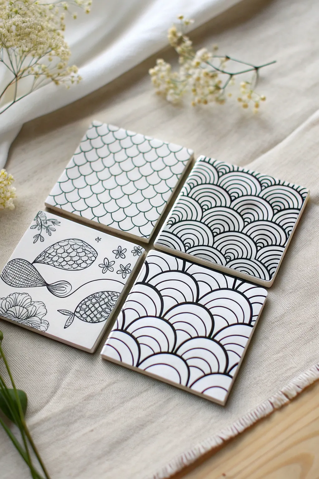
These four ceramic coasters showcase the elegance of high-contrast Zentangle patterns, featuring fish scales, stylized waves, and whimsical sea-inspired motifs. Using simple repetitive lines, you can transform plain white tiles into a sophisticated, cohesive art set.
Detailed Instructions
Materials
- 4 white square ceramic tiles (bisque or glazed)
- Black permanent marker or paint pen (fine point)
- Black permanent marker (ultra-fine point)
- Pencil (HB or lighter)
- Eraser
- Ruler
- Spray sealant or Mod Podge (glossy finish)
Step 1: Preparation & Planning
-
Clean surface:
Begin by wiping down your ceramic tiles with a damp cloth or a bit of rubbing alcohol to remove any dust or oils. Let them dry completely. -
Light scaffolding:
Using your pencil and ruler, very lightly draw guide lines if you feel uneasy about freehanding. For the grid-based scale pattern, a faint grid is helpful; for the wave patterns, marking the center point can help with symmetry.
Smudge Alert
Ceramic surfaces are non-porous, meaning ink sits on top longer. If you make a mistake, quickly wipe it away with a damp Q-tip before it sets.
Step 2: Tile 1: Standard Fish Scales
-
Base row:
Start at the bottom edge of the first tile. Draw a row of connected semi-circles (u-shapes) all the way across using the fine point marker. -
Offsetting rows:
For the second row, start your semi-circle at the peak of the curve below it, bridging the gap between two lower curves. Repeat this offset brick-laying pattern all the way to the top. -
Refining lines:
Go back over your lines to ensure they are crisp and even. The beauty of this pattern lies in the rhythm, so try to keep your curves consistent in size.
Step 3: Tile 2: Concentric Waves
-
Establishing the arches:
On the second tile, draw a row of large arches along the bottom edge. These should be wider than your fish scales. -
Adding internal lines:
Inside each large arch, draw 3-5 smaller, concentric arches that follow the same curve. Spacing is key here—keep the white space equal to the black line width. -
Stacking the pattern:
Create the next row by drawing new large arches in the valleys between the previous row’s peaks. Fill these with the same concentric lines, building the pattern upwards until the tile is full.
Go Colorful
Once the black outline is dry, use alcohol inks or specialized ceramic paints to fill in select scales or waves for a vibrantly colored set.
Step 4: Tile 3: Bold Contrast Waves
-
Drawing bold outlines:
For the third tile, we will use a similar wave structure but with thicker emphasis. Draw your base row of semi-circles using a slightly heavier hand or thicker nib. -
Varied spacing:
Instead of uniform concentric lines, alternate between thin lines and slightly thicker gaps. I find this creates a nice visual vibration compared to the previous tile. -
Connective curves:
As you move up the tile, allow the curves to overlap slightly or touch the peaks of the row below firmly to create a dense, darker appearance.
Step 5: Tile 4: Freestyle Sea Motifs
-
Sketching the fish:
On the final tile, lightly pencil in two abstract fish shapes swimming in opposite directions and some corner floral elements. -
Detailed filling:
Use the ultra-fine marker to fill the fish bodies with tiny scales or cross-hatching textures. Keep the lines delicate. -
Flowing separators:
Draw long, swooping ‘S’ curves across the tile to separate the fish and suggest water currents. Keep these lines smooth and uninterupted. -
Adding flora:
In the corners, doodle small floral clusters or sea-weed shapes, using the ultra-fine pen for the petals and details.
Step 6: Finishing Touches
-
Erase guidelines:
Once the ink is 100% dry (give it at least 20 minutes to be safe), gently erase any visible pencil marks. -
Seal the artwork:
To protect your work from moisture and drink condensation, apply a clear spray sealant or a coat of Mod Podge. Use light, even mists to prevent the ink from running. -
Adding feet:
Ideally, stick small felt pads or cork backing to the underside of the tiles to prevent them from scratching your furniture.
Enjoy using your custom hand-drawn coasters for your next coffee break or give them as a thoughtful handmade gift.


Geometric Mandalas in Thick Ink
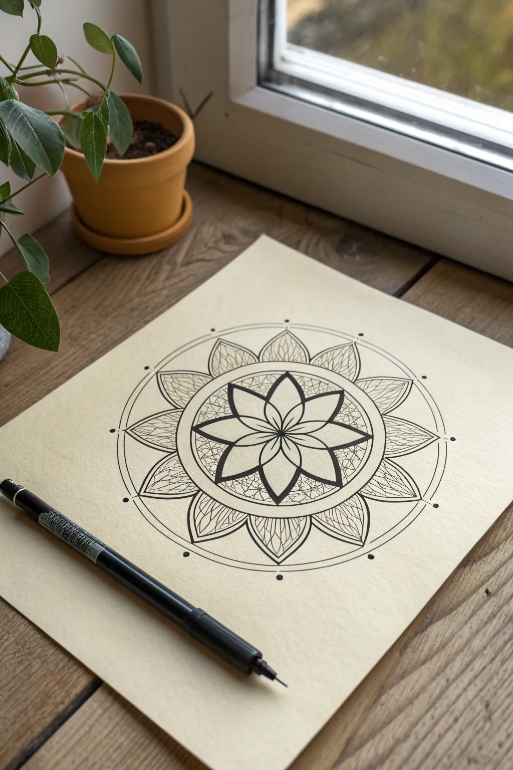
This striking mandala combines bold outlines with intricate textures to create a harmonious piece of geometric art. The contrast between the thick central flower and the delicate outer petals makes for a captivating focal point on cream-colored paper.
Step-by-Step Guide
Materials
- Cream or off-white smooth drawing paper (approx. 9×12 inches)
- Black fineliner pen (0.1mm or 0.2mm nib)
- Black drawing pen (0.5mm or 0.8mm nib) for thicker lines
- Compass with pencil attachment
- HB Drawing pencil
- Eraser
- Ruler
Step 1: Building the Foundation
-
Center point:
Begin by finding the exact center of your paper. Make a small, faint dot with your pencil to anchor the entire design. -
Primary circles:
Set your compass to a small radius (about 1.5 inches) and draw the first circle around your center point. Expand the compass slightly and draw a second, concentric circle just outside the first one. -
Outer boundaries:
Open your compass wider (about 3 inches from center) for the main flower boundary. Draw this circle, then add two more larger circles spaced closely together to form the outer rim of the entire mandala. -
Dividing the space:
Use a ruler to lightly draw a vertical and horizontal line through the center point, creating four quadrants. Bisect these angles to create eight equal pie-shaped sections.
Uneven Petals?
If your hand-drawn petals look asymmetrical, cut a master petal shape from scrap paper. Use this template to trace every petal around the circle for perfect uniformity.
Step 2: Inking the Core
-
Central flower petals:
Using the eight guide lines, sketch eight petals starting from the center point. They should curve outward and meet at a sharp point, stopping at the edge of your innermost circle. -
Thick outlines:
Switch to your thicker black pen (0.5mm or 0.8mm). Trace over your pencil petal lines carefully. I find that going over the line a second time really helps achieve that bold, graphic look seen in the photo. -
Inner details:
Inside the negative space between the petals, add small curved triangle shapes or simple lines to connect the petal tips, creating a secondary star-like pattern. -
Texture filling:
Switch to your finer 0.1mm pen. Fill the spaces between the bold petals with a dense ‘crackle’ or mosaic texture by drawing tiny, random geometric interlocking shapes.
Add Metallic Flair
Once the black ink is dry, use a gold or silver gel pen to trace strictly the inner veins of the outer petals. The metallic shine adds an elegant, hidden layer.
Step 3: Designing the Outer Ring
-
Outer petal framework:
Look at the space between your middle circle guides and the outer rim. Sketch a ring of larger, wider petals. Position the tip of each large petal so it aligns with the tips of the inner flower petals. -
Inking the rings:
With the thicker pen, trace the circular guides that enclose the central flower and the very outer rim of the mandala. -
Defining outer petals:
Ink the outlines of the large outer petals using a medium-weight line. Keep these lines clean and consistent. -
Intricate veining:
With the fine 0.1mm pen, draw a central spine inside each large outer petal. From this spine, draw delicate, curved veins branching out to the petal edges, resembling a leaf or insect wing. -
Adding dots:
On the outermost circle line, place a single bold black dot at the tip of each large petal and in the dip between them. This adds a nice rhythmic punctuation to the edge.
Step 4: Finishing Touches
-
Erase guidelines:
Wait at least 15 minutes for the ink to fully cure. Gently erase all visible pencil grid lines and circle guides. -
Contrast check:
Step back and assess the line weights. If the central flower doesn’t pop enough, thicken the outer perimeter of those central petals one last time.
Now you have a stunning geometric centerpiece ready for display or framing
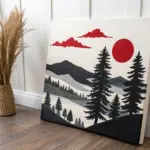
Negative Space Mountains and Sun
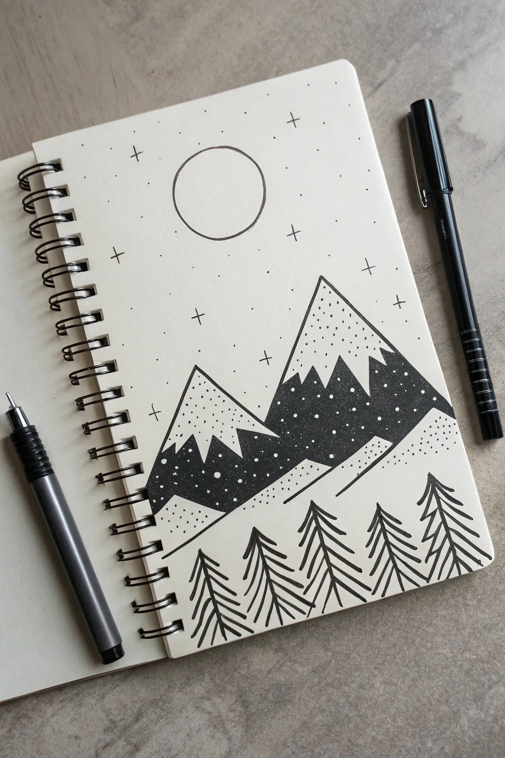
This minimalist ink drawing brings a serene mountain night scene to life using simple geometric shapes and clever negative space. By alternating solid black fill with delicate stippling, you’ll create depth and texture that pops right off the page.
Step-by-Step
Materials
- Spiral-bound sketchbook or drawing paper
- Fine liner pen (0.3mm or 0.5mm)
- Thicker black marker or brush pen (for filling)
- Pencil (HB or 2B)
- Eraser
- Ruler (optional)
Step 1: Planning the Layout
-
Sketch the mountains:
Start with a light pencil sketch. Draw two large triangles for the mountains in the middle ground. Place the right mountain slightly higher and overlapping the left one to create depth. -
Add snow caps:
Inside each mountain triangle, sketch a jagged, zig-zag line about a third of the way down from the peak. This line separates the snowy top from the shadowed base. -
Outline the foreground:
Draw angled lines at the base of the mountains to suggest sloping hills or ground. Keep these lines simple and angular. -
Position the moon:
In the upper center sky, draw a perfect circle for the moon. You can trace a small lid or coin if you want it perfectly round. -
Mark tree positions:
Lightly mark vertical lines in the foreground where your five pine trees will stand. Space them somewhat evenly across the bottom.
Step 2: Inking the Mountains
-
Outline the main shapes:
Using your fine liner, go over your pencil lines for the mountain triangles and the zig-zag snow lines. Don’t ink the bottom edge of the mountains yet. -
Fill the dark sections:
Switch to your thicker marker. Carefully fill in the bottom section of both mountains (below the zig-zag line) with solid black ink. Leave the snow caps white for now. -
Add snowy texture:
Once the black ink is dry, use a white gel pen or paint marker to add small dots over the black area, simulating falling snow against the dark rock. Alternatively, if you haven’t filled it yet, you can leave tiny pinprick circles uncolored, but adding white ink later is much easier. -
Detail the peaks:
Take your fine liner again. In the white ‘snow cap’ areas, add scattered stippling (little dots). Concentrate more dots near the bottom of the cap and fewer near the peak to create a gradient effect.
Smudge Prevention
Place a scrap piece of paper under your drawing hand. This acts as a barrier, preventing oils from your skin from smearing the fresh ink while you work on delicate details.
Step 3: Creating the Foreground
-
Draw tree trunks:
Draw the central vertical lines for your five trees with the fine liner. -
Add branches:
Starting from the top of each trunk, draw downward-sloping ‘V’ shapes or curved lines. Stack them closely together as you move down the trunk to create the stylized pine tree look. -
Vary the heights:
Make the trees slightly different heights or widths to keep the drawing feeling organic and not too rigid. -
Connect the landscape:
Draw two parallel angled lines ascending from left to right behind the trees but in front of the mountains, creating a mid-ground slope. -
Texture the slopes:
Add subtle stippling (dots) on this slope, concentrating them near the lines to suggest shadows.
White Gel Pen Trick
If you don’t have a white pen for the snowflakes on the black mountain base, use the tip of a toothpick dipped in white acrylic paint or correction fluid for opaque, crisp dots.
Step 4: Sky and Finishing Touches
-
Ink the moon:
Carefully trace your moon circle with the fine liner. Keep the line weight consistent. -
Add stars:
scattering small ‘plus’ signs (+) around the sky. Vary their sizes slightly. -
Add distant stars:
Fill the remaining empty sky space with tiny dots. Keep them random and sparse so the sky doesn’t look cluttered. -
Clean up:
Wait for all ink to be completely dry—I usually give it at least 5 minutes to be safe—then gently erase all underlying pencil marks.
Now you have a striking high-contrast landscape ready to display in your journal
Still-Life With Graphic Shadows
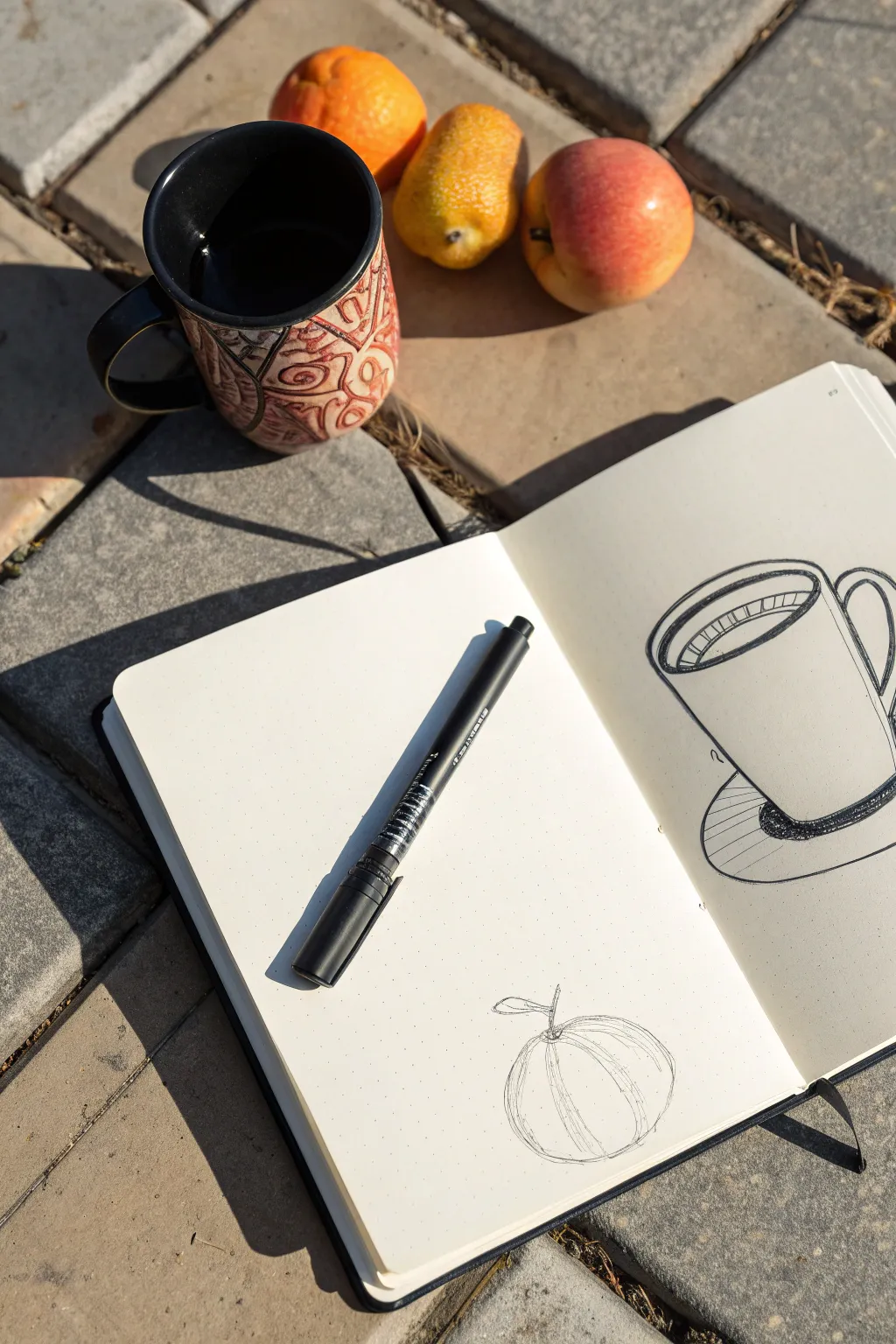
Capture the simple beauty of a quiet morning with this sketchy, high-contrast drawing project. Using nothing but a black marker, you’ll learn to translate everyday objects into bold graphic shapes and stylized shadows.
Detailed Instructions
Materials
- Sketchbook with smooth paper (white or cream)
- Black fine liner or drawing pen (0.5mm or 0.7mm)
- Reference objects: a mug and a piece of fruit
- Pencil and eraser (optional, for initial layout)
Step 1: Drawing the Mug
-
Initial outline:
Begin on the right-hand page of your spread. Draw a wide, slightly flattened oval for the rim of the mug. Don’t worry about perfect symmetry; a loose hand adds character. -
Body structure:
Drop two vertical lines down from the widest points of your oval. Typically, mugs taper slightly, so angle these lines inward very gently as you reach the bottom edge. -
Curved base:
Connect the two vertical lines with a curve that mimics the arc of the rim oval. If the bottom curve is too flat, the mug won’t look round. -
Adding the handle:
On the right side, attach a C-shape for the handle. Start near the top rim and end near the bottom third of the mug, drawing both the inner and outer curves to give it thickness. -
Double rim detail:
Inside the top oval, draw a second, slightly smaller oval. This creates the thickness of the ceramic rim. -
Liquid surface:
Draw a curved line inside the rim to indicate the coffee level. Add small vertical hatching lines along the inner back wall of the mug to suggest depth and shadow inside the cup. -
Drawing the saucer shadow:
Sketch a partial ellipse or circle underneath the mug to represent a saucer or shadow. Keep the lines quick and energetic. -
Deep contrast:
Now for the ‘graphic’ look. Identify where the mug touches the surface. Color this contact area in solid black with your marker to ground the object heavily.
Step 2: Drawing the Fruit
-
Basic shape:
Moves to the left-hand page for visual balance. Draw a loose, somewhat flattened circle. It doesn’t need to be perfectly round—natural fruit has bumps and divots. -
Segment lines:
Imagine the center point at the top of the fruit. Draw curved lines radiating from this center point down the sides, like the longitudes on a globe, to define the segments. -
Stem detail:
At the top center point, sketch a small, twisted stem. I find that making the stem slightly jagged makes it look more organic. -
Adding the leaf:
Extend a single, simple leaf shape from the stem area. Keep the line work thin and delicate here. -
Volume hatching:
Return to your segment lines. Strengthen some of them by going over the lines again or adding very faint, broken parallel lines next to them to suggest roundness. -
Refining the silhouette:
Examine the outer edge of your fruit drawing. If it looks too smooth, add a few heavier strokes on the shadow side (usually the bottom right) to give it weight.
Loosey Goosey Lines
Don’t try to draw one single perfect continuous line. Restate your lines loosely. Multiple sketchy lines often create more energy and movement than one rigid one.
Step 3: Finishing Touches
-
Reviewing line weight:
Look at both drawings together. Use your marker to thicken the outer perimeter lines of both the mug and the fruit. This makes the objects pop off the page. -
Cross-hatching shadows:
On the saucer area under the mug, add quick diagonal hatching lines. This differentiates the cast shadow from the solid black contact shadow you drew earlier. -
Final clean up:
If you used a pencil for the initial layout, wait for the ink to become completely dry and smudge-proof, then gently erase any visible graphite guidelines.
Add a Context Clue
Draw a jagged line across the background behind the objects to represent the edge of a table or the pavers shown in the photo.
Now you have a stylish layout that celebrates the quiet moments of your day
Stippling Shadows for Soft Form
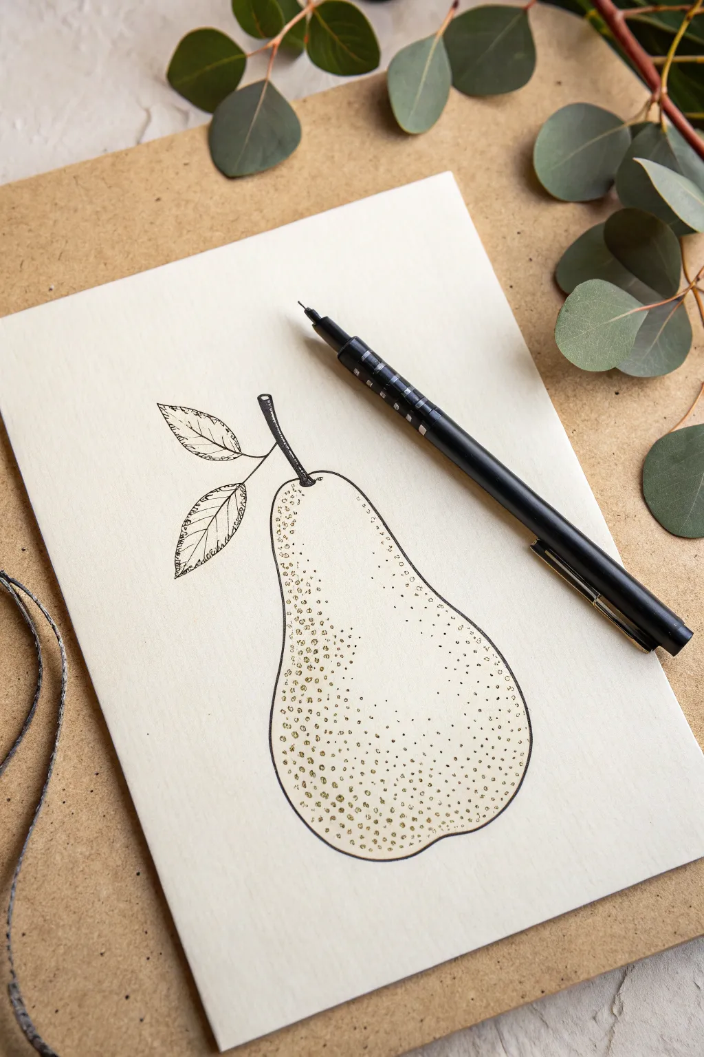
Master the art of texture with this elegant pear illustration, where thousands of tiny dots come together to build form and dimension. The contrast between crisp line work and soft stippling creates a sophisticated botanical look perfect for greeting cards or wall art.
Detailed Instructions
Materials
- Cream or off-white cardstock (smooth bristol or mixed media paper)
- Black fine-liner pen (0.3mm or 0.5mm for outlines)
- Black fine-liner pen (0.05mm or 0.1mm for shading)
- Pencil (H or HB)
- Soft eraser
- Ruler (optional)
Step 1: Sketching the Form
-
Draft the basic shape:
Start with a light pencil sketch of the pear. Think of it as two overlapping circles—a smaller one for the top and a larger, wider one for the bottom—connected by curved lines to form that classic bell shape. -
Add the stem:
Draw a slender, slightly curved stem emerging from the top center of the pear. Give it a bit of thickness rather than a single line, and detail the top with a jagged, cut edge. -
Position the leaves:
Sketch two leaves branching off the stem. Place one slightly higher and pointing left, and a second one slightly lower. Give them a realistic, slightly folded or curved appearance rather than making them flat ovals. -
Refine the outline:
Go over your pencil lines to firm up the final shape. Make sure the bottom of the pear has some natural asymmetry; real fruit isn’t perfectly round.
Pro Tip: Pen Angle
Hold your pen vertical to the paper while stippling. Slanted or rapid tapping can create ‘commas’ or dashes instead of clean, round dots.
Step 2: Inking the Outline
-
Trace the stem:
Switch to your thicker fine-liner (0.3mm or 0.5mm). Carefully ink the outline of the stem first. Use short hatching lines across the stem’s width to give it a woody texture. -
Outline the body:
Ink the main body of the pear. Keep your hand steady for a continuous flow, but don’t worry if the line wavers slightly—it adds to the organic feel. -
Detail the leaves:
Ink the outlines of the leaves. Instead of smooth curves, use tiny, jagged or serrated strokes to mimic the natural edge of a pear leaf. -
Veins and leaf texture:
Draw a central vein down each leaf. Add smaller veins branching outward. I like to keep these internal lines thinner or broken to prevent them from overpowering the leaf shape.
Step 3: Stippling and Shading
-
Erase pencil marks:
Wait for the ink to be completely dry, then gently erase all visible pencil sketches underneath your ink work. -
Start the stippling base:
Switch to your finest pen (0.05mm or 0.1mm). Begin placing dots primarily on the left side of the pear, which will be our shadowed side. Keep the dots relatively spaced out at first. -
Build the core shadow:
Increase the density of dots along the left curve and the bottom right curve. The more dots you place close together, the darker the value becomes. This ‘core shadow’ gives the fruit its roundness. -
Add textural speckles:
Pears naturally have lenticels (those tiny spots on the skin). Scatter clusters of dots across the central, lighter part of the pear to represent this texture, but keep them much sparser than the shadow areas. -
Create a highlight:
Leave a specific area on the upper right side almost entirely free of dots. This negative space acts as a highlight where the light hits the smooth skin. -
Deepen the contrast:
Go back to the very edge of the shadowed side (the left). Add a third pass of stippling here, making the dots distinct but tightly packed to create the darkest value on the drawing. -
Ground the object:
Add a slightly denser concentration of dots at the very bottom center of the pear to give it weight and suggest a slight curve inward. -
Final assessment:
Step back and look at the drawing. If the transition from shadow to light looks too abrupt, add a few widely spaced dots in the middle area to soften the gradient.
Level Up: Golden Touch
Once the black ink is dry, use a metallic gold gel pen to add a few accent dots over the sunlit areas for a shimmering, high-end finish.
With practice, your hand will find a rhythm, turning a simple collection of dots into a beautifully rounded fruit form
City Buildings With Heavy Block Shadows

Capture the charm of city architecture with this minimalist black ink drawing. Using clean lines and simple geometric shapes, you’ll create a stylized skyline that focuses on structure and window details.
Step-by-Step Tutorial
Materials
- White sketchbook or heavy drawing paper
- Fine-tip black fineliner pen (0.3mm or 0.5mm)
- Pencil (HB or 2H)
- Eraser
- Ruler (optional)
Step 1: Planning the Layout
-
Establish the horizon:
Start by lightly sketching a very faint pencil line across the bottom third of your page to represent the ground level where your buildings will sit. -
Outline the central skyscraper:
Draw a tall, rectangular box in pencil slightly to the right of the center. Add a tiered top section that narrows as it goes up, creating a classic skyscraper silhouette. -
Add supporting buildings:
Sketch a shorter, wider building to the left of your skyscraper. Then, add a medium-height building to the right, ensuring the structures slightly overlap or sit adjacent to create a dense city feel. -
Draft the foreground:
On the far left, pencil in a closer, shorter building front. Keep the lines vertical and parallel to the paper edges.
Steady Hands
Rest the side of your palm on a separate piece of scrap paper while drawing. This prevents smudging the fresh ink and stabilizes your hand for straighter architectural lines.
Step 2: Inking the Structures
-
Ink the main outlines:
Using your black fineliner, trace over the main vertical and horizontal outlines of the buildings. Use confident strokes, stopping cleanly at corners. -
Detail the skyscraper roof:
On the central tall building, draw the tiered roof details. Add a small spire or antenna at the very peak. -
Add roof textures:
For the shorter buildings, add hatched lines or small tiles on the roof sections to differentiate them from the walls. -
Erase pencil guides:
Once the main structural ink is dry, gently erase the pencil outlines to leave a clean slate for the windows.
Step 3: Adding Windows and Details
-
Create arched windows:
Focusing on the left-most building, draw rows of tall, arched windows. Split each arch vertically down the middle to simulate panes. -
Draw grid windows:
Move to the adjacent building and draw simple square grids. Keep the rows aligned horizontally. -
Detail the skyscraper facade:
For the main skyscraper, draw long, thin vertical rectangles for windows. Group them in pairs to emphasize the height of the structure. -
Sketch the right-side details:
On the building to the right, add rows of simple rectangular windows. You can vary the spacing slightly to add visual interest. -
Add architectural accents:
Draw faint horizontal lines between floors on the larger buildings to suggest molding or separation between levels. -
Thicken shadow lines:
Go back over the ‘shadow side’ of the buildings (choose either the left or right vertical line of each building) and thicken that line slightly to give the drawing weight. -
Refine the foreground:
Add a simple rectangular doorframe to the bottom of the left foreground building. -
Final check:
Scan the drawing for any disconnected lines or uneven gaps. Close up shapes where necessary to make the structures feel solid.
Wobbly Lines?
Don’t worry if lines aren’t perfectly straight. In architectural sketching, slight wobbles add character. If a line goes astray, just double-line it to make it look intentional.
Now you have a crisp urban scene ready to stand alone or serve as a base for watercolor
Optical Illusion Warp Grids
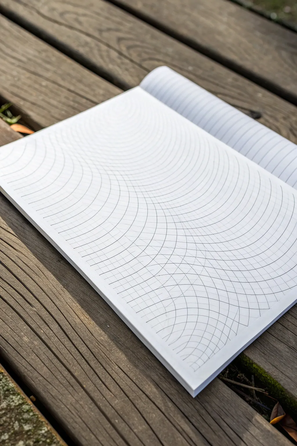
Transform a flat sheet of paper into a rolling, topographic landscape using nothing but simple geometric repetition. This optical illusion drawing relies on overlapping concentric circles to create a mesmerizing 3D effect that looks like hills and valleys.
Step-by-Step Guide
Materials
- White drawing paper or sketchbook
- Compass (with a sharp point and pencil holder)
- Pencil (HB or 2H for light lines)
- Fine-tip black marker or drawing pen (0.3mm or 0.5mm)
- Eraser
- Ruler (optional, for spacing guides)
Step 1: Setting the Foundation
-
Prepare your workspace:
Lay your sketchbook flat on a solid surface. Since you’ll be using a compass, ensure you have enough clearance around the paper to rotate the arm fully without bumping into obstacles. -
Mark your anchor points:
Decide where the peaks of your ‘hills’ will be. Using your pencil, make two lightly marked dots on the page. In the reference image, the centers are placed off the page edges—one roughly centered above the top edge, and one centered below the bottom edge. -
Set the initial compass radius:
Adjust your compass to a small radius, perhaps about 1 inch (2.5 cm). This will be the starting point for your concentric circles. -
Draw the first set of arcs:
Place the needle of your compass on your first anchor point (likely the invisible point above the top edge). Place the pencil tip on the paper and draw a smooth arc that spans across the page. -
Establish the grid spacing:
Widen your compass radius by a consistent amount—let’s say 1/2 inch spacing. I find it helpful to mark these intervals on the edge of the paper first to ensure my circles don’t start drifting in size. -
Complete the first hill:
Continue drawing concentric arcs from that first top anchor point, widening the compass each time until you have covered roughly two-thirds of the page with these downward-curving lines.
Steady anchor trick
If your anchor point is off the paper, tape a scrap piece of cardboard to your desk right next to your sketchbook. Place the compass needle there to protect your table.
Step 2: Creating the Intersection
-
Switch anchor points:
Now, move your compass needle to the second anchor point (the invisible one below the bottom edge of the paper). You are going to draw upward-curving arcs now. -
Start the opposing arcs:
Reset the compass to a small radius again. Draw the first upward arc at the bottom of the page. -
Build the second set:
Just as before, widen the compass incrementally and draw concentric arcs moving upward. These lines will cross over the first set you drew. -
Observe the interference:
As you continue adding these upward arcs, notice how they intersect with the downward arcs. This cross-hatching is what creates the ‘warped grid’ illusion. -
Fill the page:
Continue untill the entire page is filled with this intersecting mesh of curved lines. Keep your pencil pressure light so mistakes can be easily corrected.
Add depth with shading
To enhance the 3D effect, lightly shade the ‘diamonds’ formed by the grid. Make them darker where the curve tucks inward and lighter on the ‘peaks’ of the hill.
Step 3: Inking and Definition
-
Start inking the lines:
Take your fine-tip black marker. Carefully trace over your pencil lines. You don’t need a ruler here; the compass grooves usually help guide the pen, but a steady hand is key. -
Maintain consistent line weight:
Try to keep your speed consistent. Moving too slowly can cause ink bleed, while moving too fast might make the line jittery or skip. -
Prioritize the intersections:
Pay special attention where lines cross; crisp intersections sell the 3D effect better than muddy ones. -
Let the ink cure:
Once you have traced every arc, give the ink a solid 5-10 minutes to dry completely. Smearing fresh ink at this stage is heartbreaking. -
Erase guidelines:
Gently erase all the underlying pencil marks. Use a soft eraser and hold the paper taut to avoid crinkling your fresh artwork. -
Final touches:
Inspect the grid for any gaps in the lines or spots where the marker skipped. touch these up delicately to finish the piece.
Now you have a dynamic geometric landscape ready to confuse and delight the eye
Blackout Page Doodles With Cutout Shapes
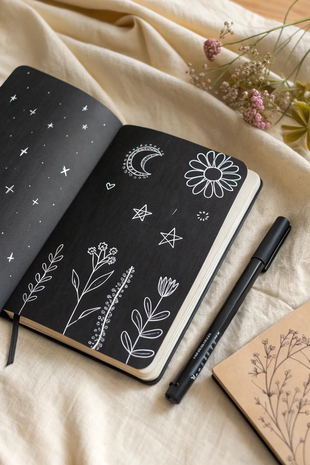
Transform a plain notebook spread into a striking high-contrast art piece using the blackout technique. This project combines celestial motifs with delicate botanical line art to create a moody, magical scene that pops against a deep black background.
How-To Guide
Materials
- Notebook or sketchbook (preferably with smooth paper)
- Black brush pen, permanent marker, or black acrylic paint
- White gel pen (size 08 or 10 for boldness)
- Pencil (optional)
- Eraser (optional)
- Scrap paper (to protect underlying pages)
Step 1: Preparation & Background
-
Protect your pages:
Before laying down any ink, slip a piece of scrap paper behind both pages you intend to work on. This prevents bleed-through onto the next fresh sheet. -
Establish the blackout base:
Using a broad black marker or brush pen, begin coloring the entire left page. Work in consistent strokes—either vertical or horizontal—to minimize streak marks. If you have black acrylic paint or gouache, that works wonderfully for a matte, opaque finish. -
Complete the spread:
Repeat the coloring process on the right page. Be thorough near the seam (the gutter) of the book, but careful not to ruin the binding. Ensure both pages are universally solid black. -
Allow thorough drying:
This is crucial: let the black background dry completely. Touch it lightly with a clean fingertip to test. If it’s cool to the touch or smudges, wait longer. Wet ink will clog your white gel pen instantly.
White Ink Flow Issues?
If your gel pen skips over the black marker, scribble quickly on your thumbnail or a rubber sole to clear the ballpoint. The waxy surface of some markers can sometimes clog the pen tip.
Step 2: Left Page: The Starry Void
-
Draw simple cross-stars:
Take your white gel pen and start drawing small crosses scattered randomly across the left page. Vary their sizes slightly to create depth. -
Add traditional star shapes:
Intersperse a few classic four-point or five-point stars among the crosses. Keep them sparse so the page doesn’t look cluttered. -
Fill with stardust:
Using the very tip of your pen, dot the empty black spaces. Create clusters of dots in some areas to mimic distant galaxies, and leave other areas more open.
Go Metallic
Swap the white gel pen for gold or silver metallic pens. The shimmer against the matte black background creates a stunning, luxurious effect perfect for night themes.
Step 3: Right Page: Celestial Elements
-
Sketch the crescent moon:
Near the top left of the right page, draw a crescent moon shape. I like to double-line the outer edge and fill the inside with tiny scallops or dots for a decorative, bohemian look. -
Draw the main daisy:
On the top right, draw a large, simple daisy. Start with a central circle, then add long, looped petals radiating outward. Keep the lines clean and confident. -
Add floating stars:
Draw two or three larger, open five-point stars in the middle section of the page. Add a small heart or tiny sparkle burst to fill any awkward gaps.
Step 4: Right Page: Botanical Garden
-
Plant the first stem:
At the bottom left, draw a simple leafy stem. Create a central line curving slightly left, then add small teardrop-shaped leaves in pairs all the way up. -
Draw the wildflower:
Next to it, sketch a taller, straighter stem that branches at the top into tiny clusters of flowers. These can be simple circles or little three-petaled shapes. -
Create the texture stalk:
For the third plant, draw a vertical stem and decorate it with tiny circles or dots running up both sides, resembling a sprig of lavender or berries. -
Add the tulip shape:
Finally, on the far right bottom, draw a stem topped with a tulip-like cup shape. Add vertical lines inside the bloom for detail, and finish with large, broad leaves at the base. -
Final touches:
Scan the entire spread for any black areas that need a touch-up or white lines that need a second pass to be fully opaque. Let the white ink dry completely before closing the book.
Enjoy your beautiful high-contrast journal spread, ready for your thoughts or just to be admired

Have a question or want to share your own experience? I'd love to hear from you in the comments below!