If you want cool oil pastel drawings that look dramatic without feeling intimidating, you’re in the right headspace. I lean on bold contrasts, juicy blends, and simple shapes that let the pastels do the heavy lifting.
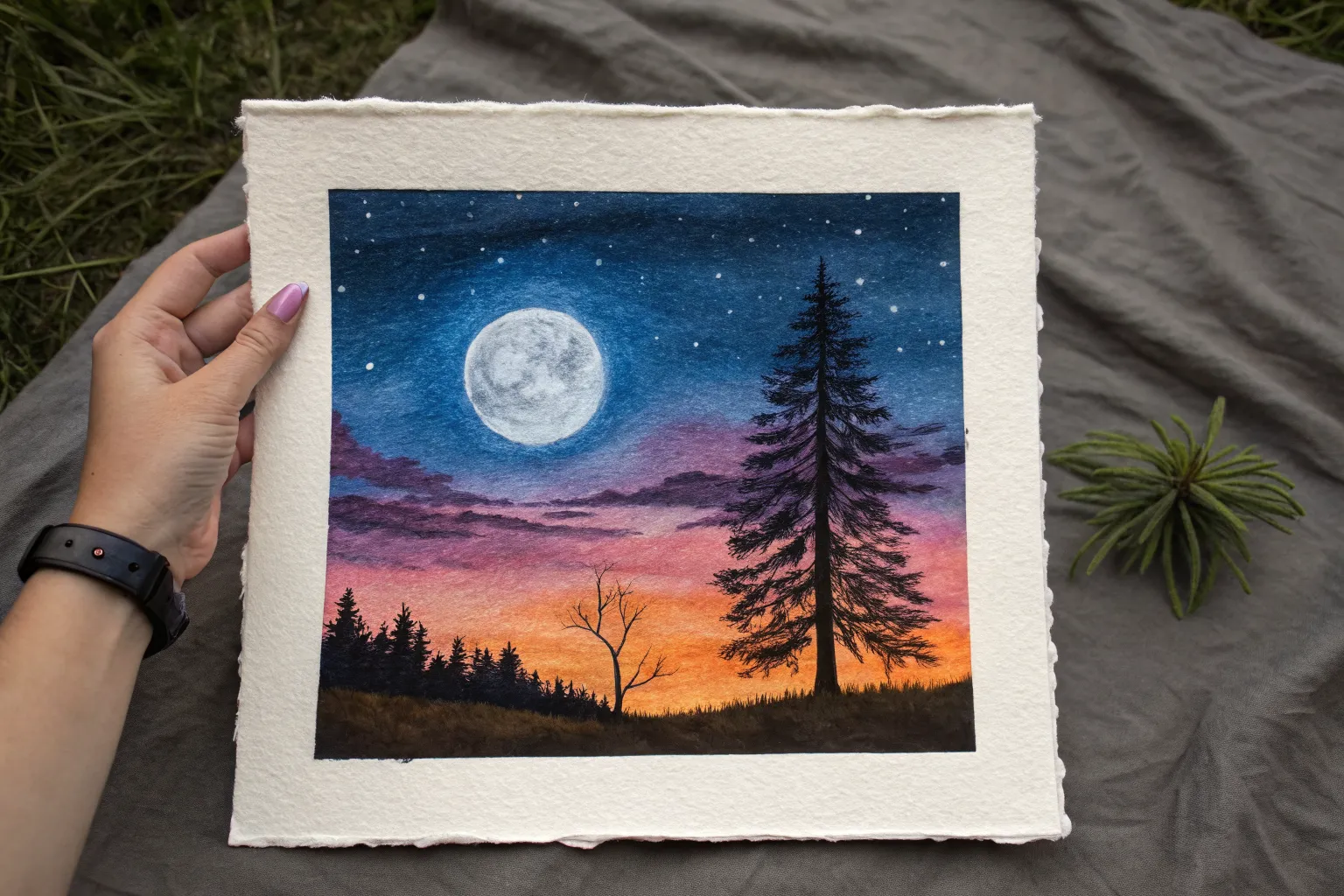
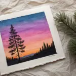
Ombre Sunset Sky With Tree Silhouettes
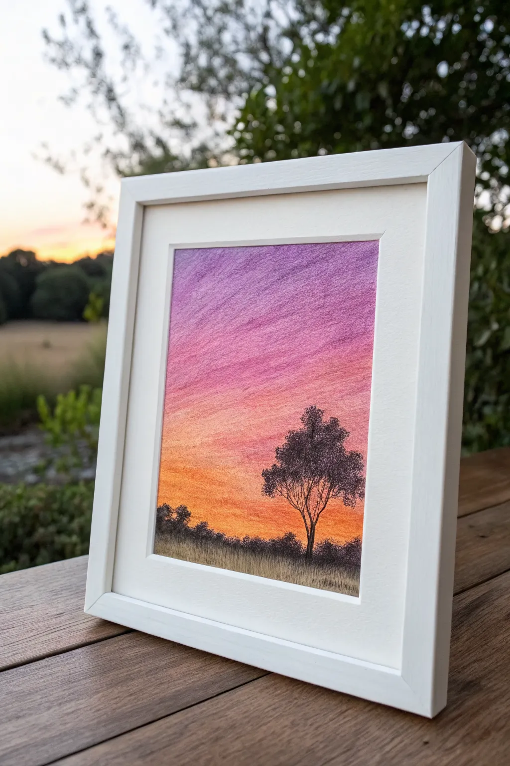
Capture the serene beauty of dusk with this vibrant oil pastel landscape, transitioning from deep purple to warm orange. The stark black silhouette of a gum tree against the glowing sky creates a dramatic contrast that is surprisingly simple to achieve.
Detailed Instructions
Materials
- Heavyweight textured paper or pastel paper
- Oil pastels (purple, magenta, pink, orange, yellow-orange, black)
- Paper towel or blending stump (tortillon)
- Masking tape
- Fixative spray (optional)
- Fine-point black drawing pen or oil pastel pencil (for details)
Step 1: Setting the Sky Gradient
-
Prepare your canvas:
Tape down all four edges of your paper to a flat work surface. This creates a clean white border for framing later and stops the paper from shifting while you blend. -
Establish the horizon line:
Mark a faint line about one-quarter of the way up from the bottom of result page. This will be where your grass ends and the sky begins. -
Apply the deepest purple:
Start at the very top of the page with a deep violet or purple pastel. Apply heavy pressure to get rich coverage, filling the top inch or so. -
Transition to magenta:
Directly below the purple, scribble a thick band of magenta or deep pink. Overlap it slightly with the purple above so the colors can mix. -
Add the mid-tones:
Continuing downwards, layer in a lighter pink or salmon color. Keep your strokes horizontal and consistent to mimic the natural flow of the sky. -
Introduce orange warmth:
Below the pink, color a band of bright orange. This creates the glowing ‘golden hour’ effect near the horizon. -
Finish the gradient:
Fill the remaining sky area down to your horizon line with a yellow-orange or golden yellow. This should be the brightest part of your artwork.
Muddy Colors?
If your sunset looks brown instead of vibrant, you likely over-blended purple into orange. Use a clean finger for each color zone and only blend slightly at the borders where hues meet.
Step 2: Blending the Atmosphere
-
Start blending from the top:
Using a folded paper towel or your fingertip, rub the purple section forcefully. Use small circular motions or horizontal swipes to smooth out the grainy texture. -
Merge the layers:
Work your way down into the pinks. Rub vigorously where the colors meet to blur the lines, creating a seamless ombre effect. -
Blend the warm tones:
Use a clean spot on your paper towel for the oranges and yellows to avoid muddying the bright colors with dark purple residue. Blend right down to the horizon line. -
Check for gaps:
If you see too much white paper showing through, simply layer more pastel on top and blend again until you have a smooth, saturated surface.
Step 3: Creating the Silhouettes
-
Draw the horizon ground:
Using a black oil pastel, fill in the bottom section below your horizon line solidly. This forms the dark earth foundation. -
Add grassy textures:
Use short, upward flicking strokes along the top edge of the black ground. This simulates tall grasses sticking up against the bright sunset. -
Sketch the main tree trunk:
Position your main tree slightly off-center to the right. Draw a thin, slightly crooked vertical line for the trunk, making it wider at the base. -
Branch out:
Draw several V-shaped branches extending from the top half of the trunk. Keep them thin and sprawling. -
Stipple the foliage:
Instead of drawing individual leaves, use a stippling motion (tapping the pastel tip) to create clusters of dark foliage on the branches. -
Detail the edges:
For fine twigs or distinct grass blades, I find swapping to a black charcoal pencil or fine tip marker works better than a chunky round pastel. -
Balance the composition:
Add a few smaller, lower bush shapes to the left side of the horizon to balance the visual weight of the large tree. -
Reveal the border:
Carefully peel away the masking tape at a 45-degree angle to reveal your crisp, clean edges.
Make it Sparkle
Once the blending is finished, scrape off tiny flecks of pastel in the upper purple area with a craft knife or toothpick to reveal white paper ‘stars’ in the evening sky.
Frame your vibrant twilight scene and enjoy the warm glow it brings to your space

Starry Night Sky on Black Paper
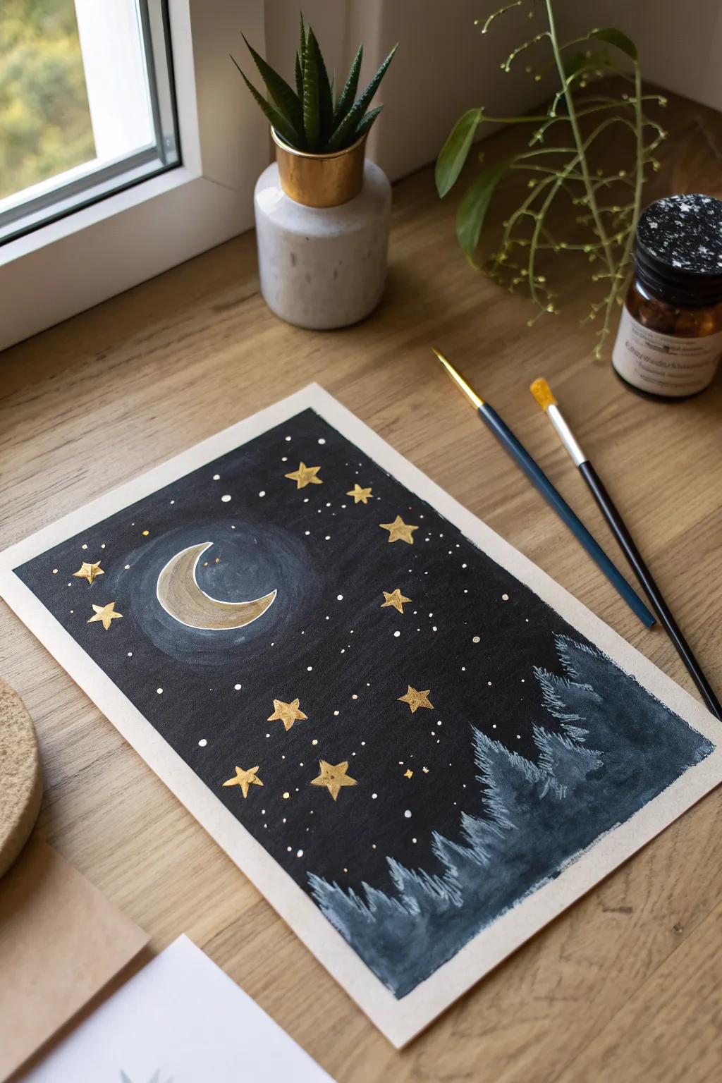
Capture the magic of a silent night with this striking high-contrast drawing. By using opaque colors on a deep black background, the golden moon and frosty trees seem to glow with an inner light.
Step-by-Step
Materials
- Heavyweight white drawing paper or mixed media paper
- Wide masking tape (washi or painter’s tape)
- Black gouache or acrylic paint (for the background base)
- Large flat paintbrush
- Fine detail paintbrush (size 0 or linear)
- Metallic gold paint or paint pen
- White gel pen or fine tip white paint marker
- Oil pastels or soft pastels (cool grey, slate blue, white)
- Ruler (optional)
Step 1: Setting the Scene
-
Prepare your canvas:
Begin by taping down the edges of your white paper onto your work surface. This creates that crisp, clean white border seen in the final piece and keeps the paper from buckling. -
Create the night sky:
Using your large flat brush, paint a solid, opaque rectangular field of black gouache or acrylic paint inside the taped area. Ensure the coverage is even and dark. -
Let it dry completely:
Wait for the black background to be fully touch-dry. Depending on the paint thickness, this might take 15-20 minutes. If the paper feels cool to the touch, it’s still damp.
Clean Edges Pro-Tip
Before painting, run a bone folder or your fingernail firmly along the inner edge of your masking tape to prevent paint from bleeding underneath.
Step 2: Celestial Elements
-
Outline the moon:
With a very light touch, use a pencil or a white pastel pencil to sketch the crescent moon shape in the upper left quadrant. Don’t press hard; you just need a faint guide. -
Paint the moon base:
Using a small round brush, fill in the crescent shape with a muted greyish-white paint or pastel. This creates a base for the metallic gold to shine against. -
Add the golden glow:
Once the base is dry, apply metallic gold paint over the crescent moon. I like to concentrate the gold pigment on the inner curve of the crescent for extra dimension. -
Create the halo effect:
Take a dry brush with a tiny amount of diluted white or pale blue paint. Gently swirl it around the moon to create the faint, circular halo visible in the reference. -
Draw the star shapes:
Using your gold paint and a fine detail brush, paint 5-pointed stars scattered randomly across the sky. Vary their sizes, making some slightly larger near the moon. -
Add gentle highlights:
If desired, add a tiny dot of white in the center of the larger gold stars to make them sparkle.
Step 3: The Frosty Forest
-
Block in the tree shapes:
Switch to your oil pastels or opaque paints in cool tones like slate blue and charcoal grey. Roughly sketch jagged, triangular shapes rising from the bottom edge. -
Layer the darks:
Fill the base of the trees with the darker grey or slate blue color. Use upward, vertical strokes to mimic the texture of pine needles. -
Add moonlit highlights:
Using a white or very pale blue oil pastel, gently streak the right-hand sides and tops of the trees. This suggests the moonlight is catching the frost on the branches. -
Blend the textures:
Use your finger or a paper stump to smudge the pastel slightly upwards, blurring the sharp edges to create a dreamy, misty forest effect. -
Refine the peaks:
Go back with a detail brush or sharp pastel edge to define the very tips of the tallest trees, ensuring they stand out against the black sky.
Level Up: Texture
Try using slightly diluted white acrylic paint and an old toothbrush to flick a fine mist of stars over the sky for a more natural galactic look.
Step 4: Finishing Details
-
Sprinkle distant stars:
Using a white gel pen or the tip of a toothpick dipped in white paint, dot tiny stars throughout the empty black spaces. -
Cluster the stars:
Group a few tiny dots together in areas to suggest distant galaxies or the Milky Way. -
Final check:
Review your painting for any black spots that need a second coat or stars that need brightening. -
The reveal:
Carefully peel away the masking tape while pulling it away from the painting at a 45-degree angle. This reveals your clean, sharp border.
Frame your starry masterpiece or gift it to someone who loves the night sky


Moonlit Ocean With Shimmering Reflection
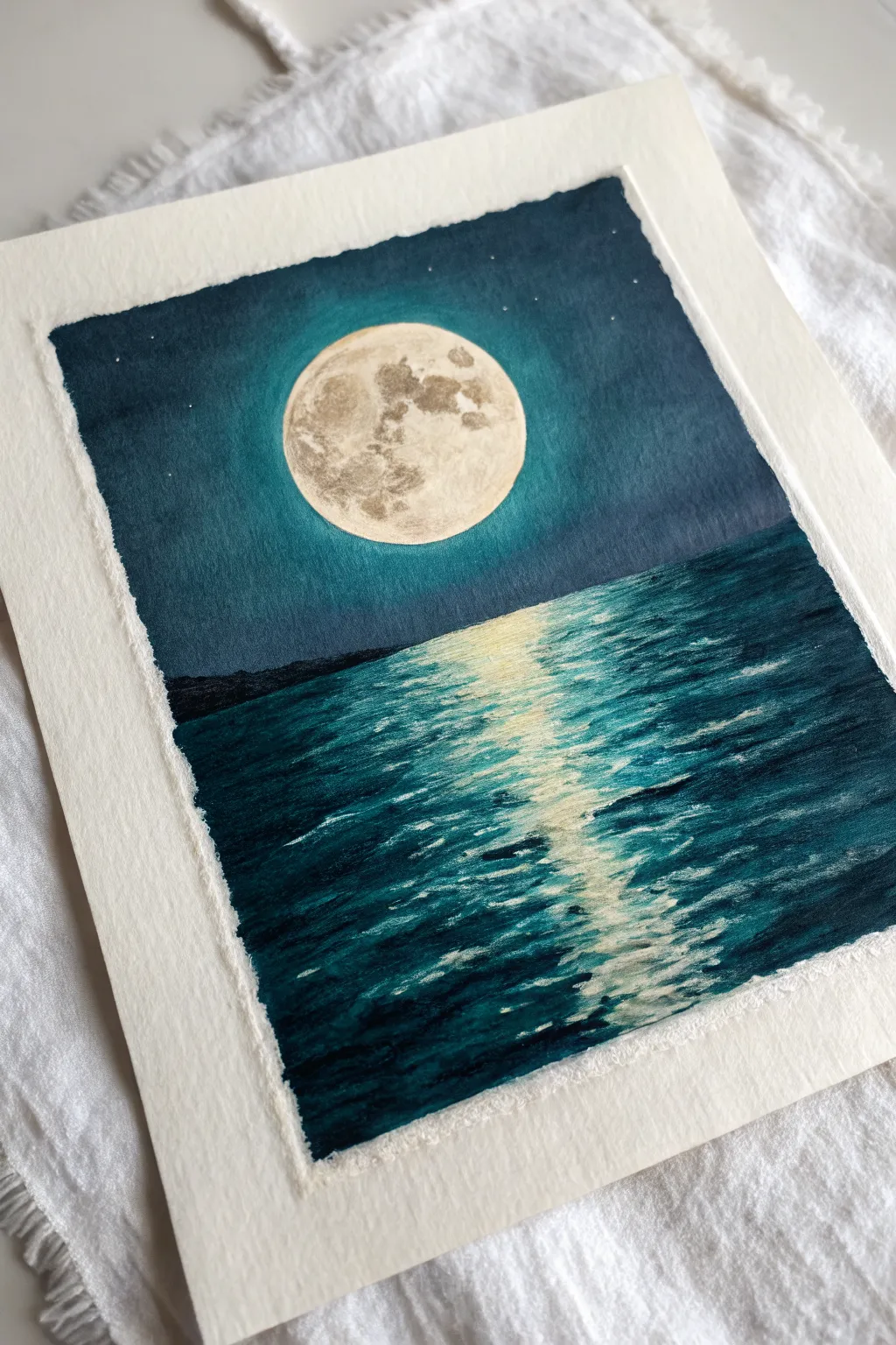
Capture the serene magic of a full moon reflecting over calm waters with this dramatic oil pastel project. The deep teal sky and shimmering white reflection create a striking contrast that looks impressive but is surprisingly simple to achieve.
Step-by-Step Guide
Materials
- High-quality oil pastels (specifically dark teal, navy blue, black, white, and cream/grey)
- Thick pastel paper or mixed media paper (textured surface is best)
- Masking tape
- Circular object (like a cup or jar lid)
- Graphite pencil
- Blending tools (tissue, cotton swabs, or blending stumps)
- Palette knife or credit card (for scratching texture)
Step 1: Preparation and Sketching
-
Tape the edges:
Begin by taping down all four edges of your paper with masking tape to a flat surface. This secures the paper during vigorous blending and creates that crisp, clean white border when you finish. -
Trace the moon:
Place your circular object in the upper center of the page. Lightly trace around it with a pencil to create a perfect circle for your moon. -
Mark the horizon:
Lightly sketch a straight horizontal line about two-thirds of the way down the page to separate the sky from the ocean.
Keep it Clean
Oil pastels smudge easily! Keep a paper towel nearby to wipe your fingers between colors. Place a scrap sheet of paper under your hand to avoid smearing the sky while working.
Step 2: Creating the Sky
-
Outline the moon aura:
Using a light teal or bright blue pastel, color a thick ring around the outside of your pencil circle. Do not color inside the moon yet. -
Fill the sky base:
Fill the rest of the sky area with a mid-tone teal or deep blue oil pastel. Apply heavy pressure to get good coverage, but leave the very corners empty for now. -
Darken the edges:
Layer a navy blue or black pastel into the top corners and along the far edges of the sky to create a vignette effect. This draws the eye toward the moon. -
Blend the sky gradient:
Use your finger or a tissue to blend the sky colors. Work in a circular motion, starting near the moon’s light aura and blending outward into the darker edges for a smooth transition.
Step 3: Drawing the Moon
-
Fill the moon:
Color inside your moon circle with a bright white oil pastel. Apply a thick, even layer. -
Add lunar craters:
Take a light grey or cream pastel and dab irregular spots onto the white surface. Use a cotton swab to barely smudge these spots, creating the look of craters and texture without making them too dark.
Pro Tip: Glowing Moon
To make the moon really pop, smudge a tiny bit of white pastel from the moon’s edge outward into the teal sky. This creates a soft, hazy ‘bloom’ or atmospheric glow.
Step 4: The Ocean Base
-
Define the horizon:
Draw a very dark, thick line across your horizon mark using black or midnight blue. You can make this slightly bumpy on the left or right to suggest distant land masses. -
Color the water:
Fill the ocean section with horizontal strokes of deep teal and navy blue. Unlike the sky, you want to keep these strokes visible and horizontal to mimic the movement of water. -
Darken the water edges:
Add black or dark indigo to the bottom corners and the far left and right sides of the water, leaving the center channel beneath the moon lighter.
Step 5: Reflections and Details
-
Start the reflection:
Using a cream or pale yellow pastel, draw short, horizontal dashes down the center of the water, directly under the moon. -
Layer bright white highlights:
Go over the center of your cream dashes with bright white pastel. Press hard to make the pigment sit on top of the blue water. Make the dashes wider near the horizon and narrower as they come toward the bottom. -
Scrape for texture:
I find this step crucial for realism: take a palette knife or the edge of a credit card and gently scrape horizontal lines through the white reflection. This reveals tiny bits of the dark blue underneath, looking like ripples. -
Add shimmer to the water:
Add very small, thin white flecks on the darker parts of the waves, just outside the main reflection path, to show scattered light. -
Add stars:
Use a white gel pen or a very sharp edge of white pastel to dot tiny stars in the darker corners of the sky. -
The reveal:
Gently peel away the masking tape at a 45-degree angle to reveal your crisp edges and finished moonlit scene.
Frame your moody seascape and enjoy the peaceful atmosphere it brings to the room
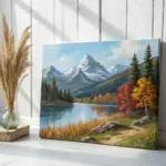
Mountain Range at Golden Hour
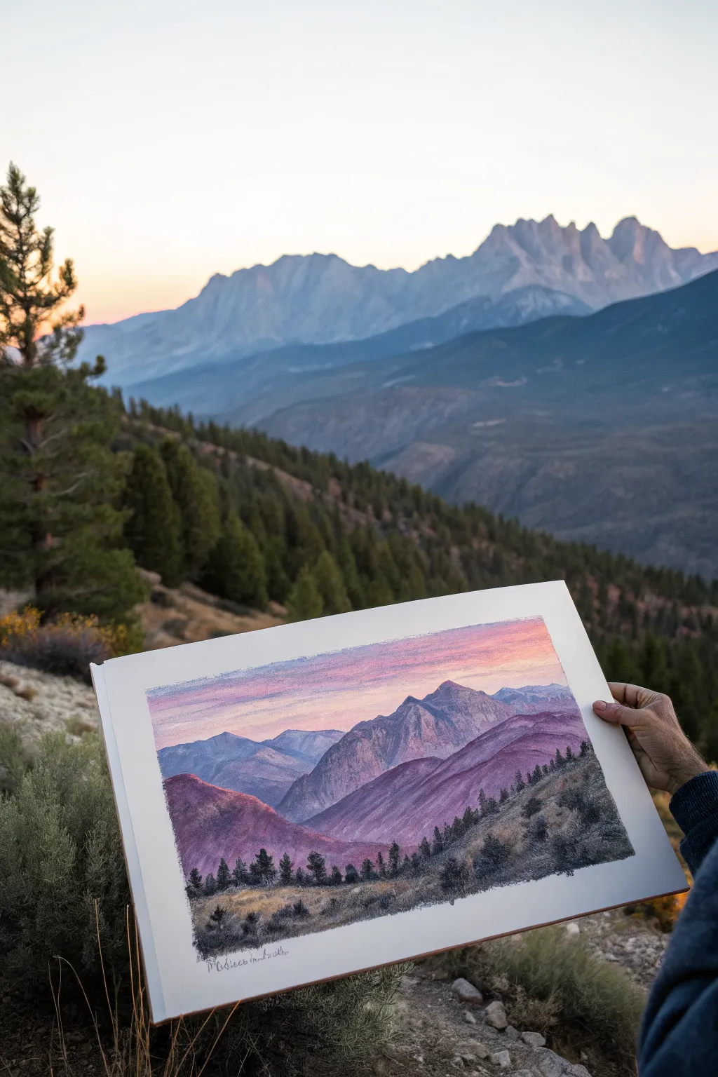
Follow along to capture the majestic sweep of a mountain range bathed in the soft, purple-pink light of late evening. This oil pastel tutorial focuses on atmospheric perspective, blending vibrant pinks into cool violets to create depth and drama.
How-To Guide
Materials
- Heavyweight textured paper or pastel card (A4 or similar)
- Oil pastel set (including indigo, violet, ultramarine blue, magenta, pink, peach, white, and earthy greens)
- Blending stump or tortillon
- Palette knife or credit card edge (for sgraffito)
- Paper towels for cleaning pastels
- Masking tape
Step 1: Setting the Sky and Atmosphere
-
Tape the edges:
Begin by taping down all four edges of your paper with masking tape. This secures the sheet and creates that crisp, professional white border seen in the reference photo. -
Base layer for the sky:
Start at the very top of the paper with a soft periwinkle or light blue pastel. Apply it horizontally, fading it out as you move about an inch down. -
Introducing the glow:
Below the blue, introduce a pale peach and light pink. Blend these horizontally into the white space, allowing them to overlap slightly with the blue above to create a soft transition. -
Intensifying the horizon:
Just above where your mountains will sit, lay down a streak of vibrant magenta or deep pink. This represents the last light hitting the atmosphere and will serve as the backlight for your peaks. -
Smooth the sky:
Use your finger or a paper towel to gently blend the sky colors horizontally. Be careful not to muddy the colors; wash your hands if moving from dark blue to light peach.
Step 2: Building the Mountain Layers
-
Outline the furthest range:
With a light violet or slate blue pastel, lightly sketch the silhouette of the most distant mountain range. Keep the shapes jagged but relatively flat to show distance. -
Fill the distant peaks:
Fill in these distant mountains with a mix of light blue and purple. Since they are far away, keep the values light to mimic atmospheric haze. I usually avoid heavy pressure here. -
Sketch the middle ground peaks:
Using a slightly darker violet and a medium blue, draw the outline of the larger, central mountain peaks. These should overlap the distant range, establishing depth. -
Add dimension to the central peaks:
Determine your light source (coming from the right/sunset). Apply pink and magenta highlights to the right-facing slopes of the central mountains, and deepen the left-facing slopes with violet and ultramarine. -
Create the foreground ridges:
For the rolling hills closest to the viewer, switch to deep purples, earthy reds, and dark magenta. These shapes should be larger and more sweeping than the jagged peaks. -
Blend the mountain forms:
Use a blending stump to smooth the transitions on the mountain faces. Blend the pink highlights into the purple shadows to create a rounded, 3D effect on the slopes.
Clean Color Tips
Oil pastels smudge easily. Always keep a damp cloth nearby to wipe your fingers before switching from dark shadows to light sky colors to avoid muddying.
Step 3: Foreground Detail and Texture
-
Establish the grassy hill:
At the very bottom, color the immediate foreground with olive green, ochre, and spots of charcoal grey. This area needs texture, so use short, upward strokes rather than smooth blending. -
Add the tree line:
Along the ridge where the foreground hill meets the purple mountains, use a dark green or black pastel to stipple in a line of distant pine trees. Keep them small and irregular. -
Detail the foreground trees:
In the immediate foreground on the right and left, draw larger pine trees using heavy pressure with black and deep green. Make the tops pointed and the branches irregular. -
Scraping for texture:
Take your palette knife or a credit card edge and gently scratch through the heavy layers of the foreground grass. This sgraffito technique reveals the paper tooth or underlying color, mimicking dry blades of grass. -
Final highlights:
Add tiny touches of white or light yellow to the tips of the foreground grass and the sharpest edges of the central mountain peak to make them pop. -
Clean and reveal:
Carefully peel away the masking tape to reveal your clean edges. Sign your work in the bottom corner with a fine liner or sharp pencil.
Level Up: Texture
Use the side of a broken pastel piece for the mountain surfaces. This ‘scumbling’ technique leaves small gaps of paper showing, mimicking rocky textures.
Step back and admire how the warm sunset colors bring your mountain range to life
BRUSH GUIDE
The Right Brush for Every Stroke
From clean lines to bold texture — master brush choice, stroke control, and essential techniques.
Explore the Full Guide
Simple City Skyline at Dusk
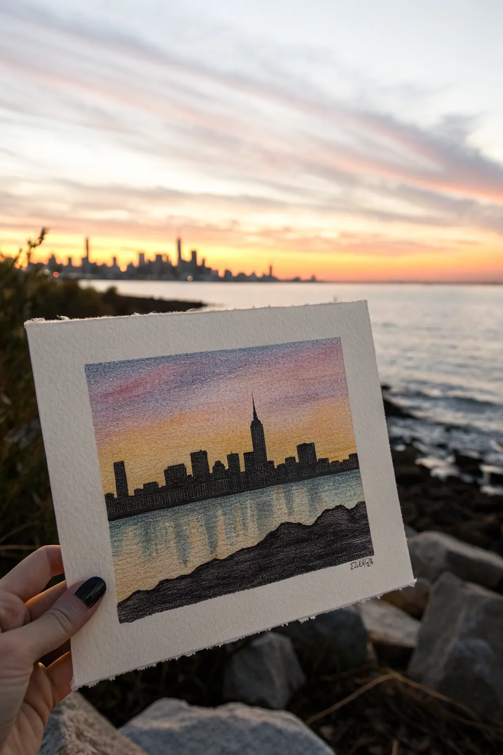
Capture the magic of twilight in the city with this textured, atmospheric drawing. By blending warm sunset gradients against a stark black skyline, you’ll create a stunning contrast that pops off the page.
Step-by-Step Tutorial
Materials
- Heavyweight textured paper (watercolor or mixed media paper, cold press appropriate)
- Oil pastels (colors: deep violet, pink/magenta, warm orange, golden yellow, light blue, white, black)
- Masking tape or painter’s tape
- Drawing board or hard surface
- Tissue or blending stump
- Fine liner pen (black, archival ink) or very sharp black pastel pencil
- Fixative spray (optional)
Step 1: Setting the Scene
-
Prepare your canvas:
Begin by taping down the edges of your paper to a flat board using masking tape. This creates that crisp, clean white border visible in the final piece and keeps your paper from shifting while you work. -
Establish the horizon:
Lightly sketch a straight horizontal line about one-third of the way up from the bottom of your drawing area. This separates the water from the sky and buildings. -
Map out foreground rocks:
Below your horizon line, sketch an uneven, jagged shape rising from the bottom right corner. These will be the shadowy rocks in the foreground, framing the water.
Step 2: Creating the Sky
-
Apply the top layer:
Start at the very top of the sky area with a dusty violet or purple oil pastel. Apply it using light, horizontal strokes, letting the texture of the paper show through slightly. -
Blend in warm pinks:
Just below the violet, layer in a band of pink or magenta. Overlap the colors slightly so they will mix easier in the next steps. -
Add golden light:
Transition into a warm orange and finally a bright golden yellow as you reach the horizon line where the buildings will sit. The colors should get lighter and warmer as they go down. -
Smooth the gradient:
Use your finger or a tissue to gently smudge the boundaries between the sky colors. Blend horizontally to maintain the layered cloud effect, creating a soft, dreamlike transition.
Use Texture to Your Advantage
Don’t over-blend! Let the paper’s rough grain show through the sky area. This natural ‘tooth’ mimics the look of scattered clouds perfectly.
Step 3: Reflecting on the Water
-
Mirror the sky:
In the water section below the horizon, apply the same colors in reverse order. Start with yellow just below the horizon line, moving into orange and hints of pink. -
Add water texture:
Overlay a touch of light blue or cool grey over the reflected colors to suggest the water’s surface. Keep your strokes vertical here to mimic the reflection of light on waves. -
Soft blending:
Unlike the sky, don’t blend this too smoothly. Keep the vertical stroke texture visible to give the impression of rippling water.
Add a Glittering Touch
For a magical night effect, lightly tap a metallic silver or gold gel pen onto the water reflections to make them shimmer against the dark waves.
Step 4: Building the City
-
Outline the skyline:
Using a black oil pastel or a sharp black pastel pencil, draw the distinct rectangular shapes of the buildings right on the horizon line. -
Identify landmarks:
Make sure to include a tall, recognizable spire, like the Empire State Building, slightly off-center to create a focal point. -
Fill the silhouettes:
Color in the building shapes completely with solid black. Press firmly to ensure the black is dense and opaque against the sunset background. -
Add window details:
Once the black is established, use a very fine tool—like a needle or the tip of a scratching tool—to scratch tiny dots or lines back into the black pastel visually revealing the color underneath, or use a white gel pen for tiny lights.
Step 5: Finishing Touches
-
Fill the foreground:
Color the jagged rock formation in the bottom foreground with deep black, perhaps mixing in a tiny bit of dark brown or grey for subtle texture. -
Refine the edges:
Check the edges of your buildings and rocks. If they look fuzzy, sharpen them carefully with your black pastel pencil or fine liner. -
Sign your work:
Add your signature in the bottom corner using a fine pen. -
Reveal the border:
The most satisfying part: slowly peel away the masking tape at a 45-degree angle to reveal the crisp, clean edges of your miniature masterpiece.
Enjoy the peaceful view you’ve created from the comfort of your desk
Lighthouse Beam Cutting Through Fog
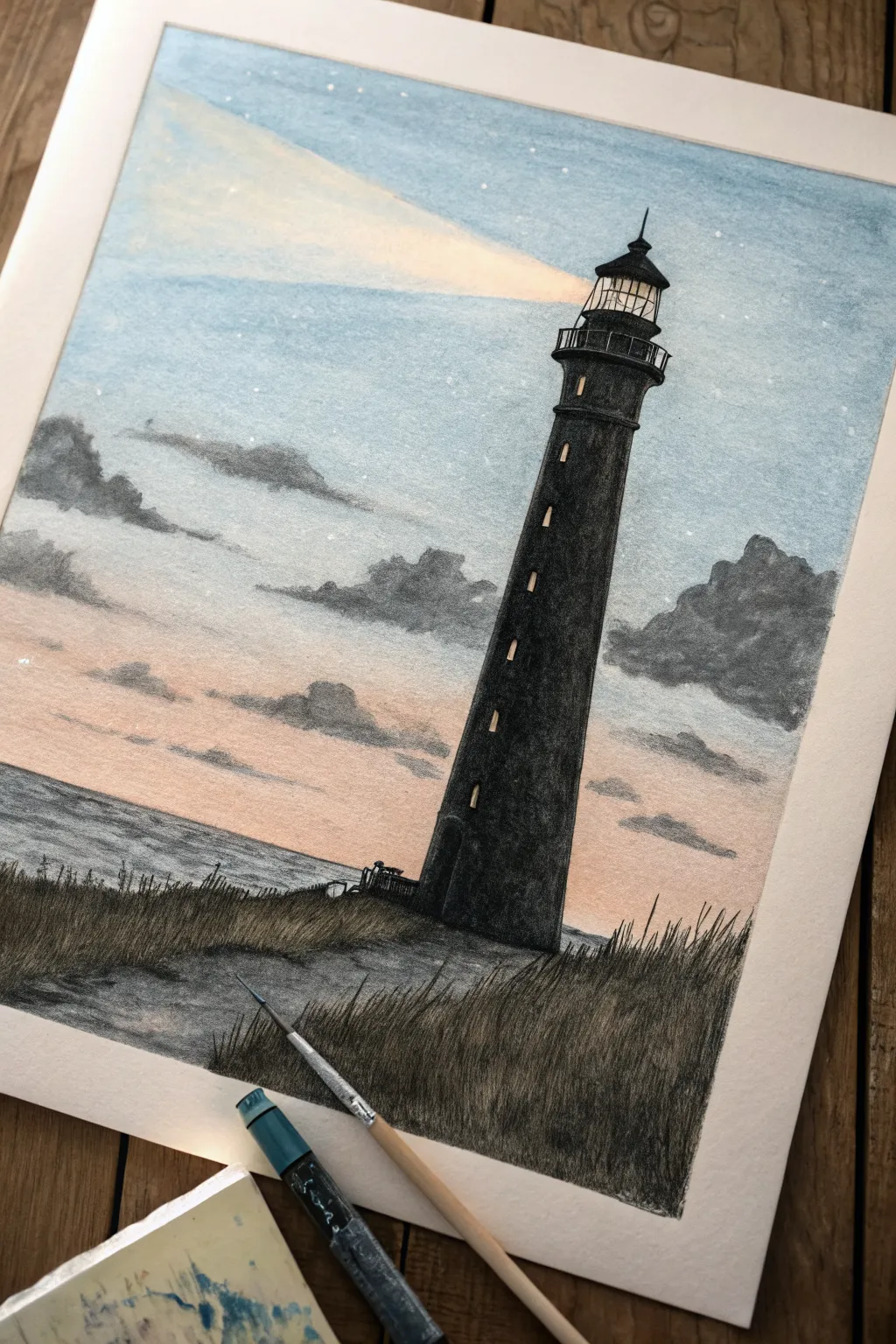
Capture the solemn beauty of a lone lighthouse standing against a soft twilight sky with this oil pastel project. The contrast between the stark black structure and the gentle, blended sky creates a striking atmospheric effect perfect for beginners and intermediate artists alike.
How-To Guide
Materials
- Heavyweight textured paper or mixed media paper
- Oil pastels (black, white, light blue, dark blue, peach/pale orange, yellow)
- Graphite pencil (HB) for sketching
- Blending stump or cotton swabs
- Masking tape
- Ruler
- Fine detail painting tool or very sharp pastel edge
Step 1: Planning and Sketching
-
Secure the paper:
Begin by taping down the edges of your paper to a hard surface. This creates a clean white border and keeps the paper from shifting while you blend. -
Establish the horizon:
Using a ruler, lightly draw the horizon line about a third of the way up from the bottom of the page. It doesn’t need to be perfectly straight if you want a more natural look. -
Outline the lighthouse:
Sketch the tall, tapering shape of the lighthouse on the right side of the composition. Start wide at the base and narrow it towards the top, adding the lantern room and cap detail. -
Map the foreground:
Lightly sketch the uneven, grassy dune in the immediate foreground, ensuring it overlaps the base of the lighthouse to ground it in the scene.
Step 2: The Atmospheric Sky
-
Layer the horizon colors:
Start applying color at the horizon line using a peach or pale orange pastel. Apply it lightly, leaving some texture of the paper visible. -
Add the upper sky:
Move to the top of the paper with a light blue pastel. Gradually darken the blue slightly as you move down, but stop before you hit the peach section. -
Create the light beam:
Before blending the blue completely, use a white or very pale yellow pastel to draw a wide, diagonal cone of light extending from the lighthouse lantern. -
Blend the transition:
Use a white pastel to bridge the gap between the blue sky and the peach horizon. Blend the colors together with your finger or a tissue to create a soft, foggy twilight gradient. -
Detail the clouds:
With a grey or muted dark blue pastel, gently scribble the shapes of clouds on either side of the lighthouse. Keep the edges soft and smudge them slightly for a misty appearance.
Clean Edges Pro Tip
For sharp architectural lines on the lighthouse, place a piece of paper over the sky area as a shield while you color the black tower. This prevents accidental smudges.
Step 3: Lighthouse and Ocean
-
Ocean texture:
Fill in the water area below the horizon with horizontal strokes of grey-blue. Don’t blend this too smoothly; let the stroke texture suggest ripples. -
Fill the structure:
Color the main body of the lighthouse with a solid black pastel. Press firmly to get a rich, opaque coverage that completely covers the paper grain. -
Define the lantern:
Carefully outline the railing and the cap of the lighthouse. Use the sharp edge of a black pastel or a pastel pencil for these finer lines. -
Add windows:
Using a sharp tool or the edge of a yellow pastel, add small vertical dashes up the side of the tower to suggest illuminated windows. -
Illuminate the lantern room:
Fill the glass area of the lantern room with bright yellow and white, ensuring the light feels like the source of the beam you drew earlier.
Add Depth with Texture
Don’t over-blend the ocean water. Leave some rough, horizontal strokes visible to mimic the movement of waves and catch the ambient light.
Step 4: Foreground Details
-
Base layer for grass:
Cover the foreground dune area with a mix of dark grey and black pastel to establish a shadowed ground. -
Scratch in texture:
I like to use a palette knife or a scraping tool to drag upwards through the black pastel, creating the initial texture of tall grass. -
Draw individual blades:
Take a sharpened black pastel or charcoal pencil and draw distinct, wild grass blades flicking upward and to the right, mimicking the wind. -
Add stars:
Finally, use a white gel pen or a tiny dot of white pastel to add scattered stars in the upper blue portion of the sky. -
The reveal:
Peel away the masking tape slowly and at an angle to reveal your crisp, clean borders.
Step back and admire the serene atmosphere you’ve captured in your coastal landscape

PENCIL GUIDE
Understanding Pencil Grades from H to B
From first sketch to finished drawing — learn pencil grades, line control, and shading techniques.
Explore the Full Guide
Pine Forest With Misty Layers
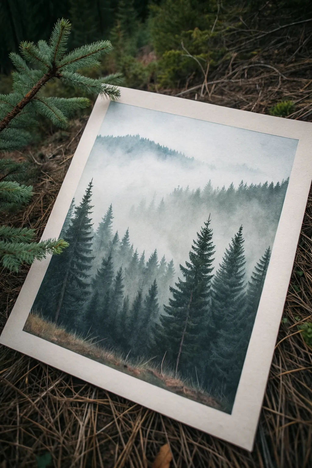
Capture the serene solitude of a foggy mountain morning with this atmospheric oil pastel landscape. By carefully layering shades of green and grey and utilizing smooth blending techniques, you will create a sense of depth that makes the trees appear to fade into the mist.
Step-by-Step
Materials
- High-quality oil pastels (specifically forest greens, teals, dark greys, white, and Payne’s grey)
- Textured paper (heavyweight pastel paper or mixed media paper, warm grey or cream toned preferred)
- Blending stumps or tortillons
- Paper towels or a soft cloth
- Cotton swabs
- Masking tape
- Fine-point pastel pencil or charcoal pencil (black) for details
- Fixative spray (optional)
Step 1: Setting the Scene
-
Prepare your canvas:
Begin by taping down the edges of your paper to a hard surface using masking tape. This secures the paper and creates that clean, professional border seen in the reference image. -
Sketch the horizon lines:
Lightly sketch the undulating lines of the mountains. Start from the top third of the paper for the distant peak, then layer two or three more ridge lines moving downward to establish where your different tree lines will sit.
Muddy colors?
If your greens are turning into grey mush, stop blending! Scrape off excess pastel with a palette knife and re-apply fresh, pure color on top without overworking it.
Step 2: Creating the Sky and Mist
-
Apply the sky color:
At the very top, apply a very light layer of pale grey or muted blue oil pastel. Keep the application light; we want the paper’s texture to help diffused the color. -
Blend the sky:
Use a paper towel or your finger to rub the sky pigment into the paper, ensuring a soft, even haze without distinct strokes. -
Establish the thickest mist:
Between the distant mountain ridges, apply a generous amount of white oil pastel. This represents the heavy fog sitting in the valleys. -
Soften the transition:
Blend the bottom edge of the white pastel downwards. The goal is to make the white fade into transparency, creating a ‘fog bank’ effect that will sit behind the trees.
Step 3: Layering the Forest
-
Paint the distant ridge:
For the furthest mountain layer, use a pale grey-green. Apply the pastel flatly to create a silhouette shape. Since these trees are far away, don’t worry about individual branches. -
Create the atmospheric fade:
I like to take a white pastel and lightly glaze over the bottom half of this distant ridge, blending it upward. This makes the mountains look like they are sinking into the fog. -
Start the middle ground:
Moving down to the next ridge, choose a slightly darker teal-green. Draw vertical strokes to suggest pine tree shapes, but keep them somewhat soft and blurry. -
Add depth to the middle layer:
Mix a bit of dark grey into the bases of these middle-ground trees, blending it upwards to give them volume before they disappear into the mist below. -
Re-establish mist layers:
Between the middle ground and the foreground, apply another horizontal band of white pastel details. Rub this vigorously with a blending stump to smoke it out.
Add morning dew
Use a white gel pen or very sharp white pastel pencil to add tiny, distinct dots of highlight on the closest branches to simulate morning frost or dew.
Step 4: The Foreground Pines
-
Establish the main tree trunks:
For the closest trees, use a sharp edge of a dark charcoal or black pastel to draw straight vertical lines for the trunks. These should be spaced irregularly to look natural. -
Build the branches:
Using a deep forest green, start at the top of a trunk and make short, downward-sloping strokes. Widen the strokes as you move down the tree to create the classic conical pine shape. -
Add shadow depth:
Layer deep Payne’s grey or black on the underside of the foreground branches. This high contrast against the white mist is crucial for the dramatic effect. -
Highlight the tips:
Touch the tops of a few foreground branches with a lighter sage green to suggest faint light catching the needles. -
Ground the forest:
At the very bottom, blend muted browns and ochres to create the grassy forest floor. Use upward flicks to suggest tall dead grass. -
Final blend:
Clean up the edges by gently blending the bottom of the largest trees into the grassy area so they feel rooted, not floating. -
Reveal the border:
Slowly peel away the masking tape at a 45-degree angle to reveal your crisp, clean edges.
Step back and admire the depth you’ve created with nothing but pigment and patience
Field of Wildflowers With Bold Strokes
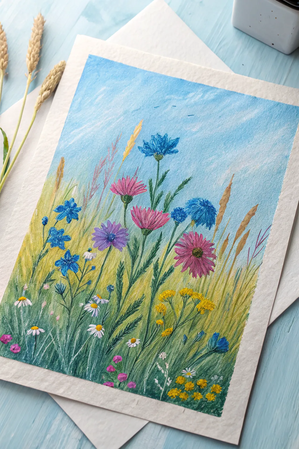
Capture the breezy charm of a summer field with this colorful oil pastel project. This tutorial guides you through layering vivid strokes to create a lively meadow scene filled with pink asters, blue cornflowers, and delicate daisies.
Step-by-Step Guide
Materials
- High-quality oil pastels (set with blues, greens, pinks, yellows, and white)
- Textured paper (pastel paper or mixed media paper, heavy weight)
- Masking tape
- Blending stump or cotton swabs
- Paper towel for cleaning pastels
- Palette knife or old credit card (optional for scraping/sgraffito)
Step 1: Setting the Sky and Background
-
Tape your borders:
Begin by securing your paper to your work surface with masking tape. This will create that crisp, clean white border shown in the finished piece. -
Apply the sky blue:
Using a light blue pastel, color the upper two-thirds of the paper. Use broad, horizontal strokes. Don’t press too hard yet; we want a light, airy coverage. -
Add cloud texture:
Layer strokes of white pastel over the blue, especially in the upper corners, blending them slightly with your finger or a paper towel to create soft, wispy clouds. -
Establish the horizon:
Transition into the field by applying a pale yellow-green horizontally where the grass meets the sky. Blend this upward slightly into the blue to create a soft, distant horizon line.
Muddy colors?
If your colors start blending into a brown mess, stop and clean your pastel stick on a paper towel. Apply a fixative spray between layers if the wax is moving too much.
Step 2: Building the Grassy Underlayer
-
Lay down the base greens:
Starting from the bottom, apply strokes of medium green and olive green upward. Use vertical, sweeping motions to mimic the direction of growing grass. -
Add depth with darks:
Interperse darker forest green strokes at the very bottom of the page and in the corners to create shadows and depth in the tall grass. -
Introduce golden tones:
Layer in streaks of yellow ochre and warm tan among the greens, reaching higher up into the blue sky area. These represent the dried, golden stalks of wild grains. -
Blend the field:
Gently smudge the background grass layers vertically. You don’t want a perfectly smooth blend; keeping some texture helps the scene look organic.
Step 3: Drawing the Main Flowers
-
Position the pink flowers:
Select a bright pink and a magenta pastel. Draw the star-burst shapes of the large pink blooms in the center-right area. Use short, outward strokes from a center point for the petals. -
Add the blue cornflowers:
Using a vibrant royal blue, add the cornflowers scattered on the left and upper right. Keep these shapes loose and slightly ragged, characteristic of cornflower petals. -
Detail the purple aster:
Draw the purple flower near the center using violet and lavender shades. Give it a distinct yellow or orange center simply by pressing a small dot of color. -
Create flower stems:
Switch to a sharp edge of your dark green or olive pastel. Draw thin, confident lines connecting your flower heads down into the grassy base. Vary the angles slightly so they don’t look like soldiers in a row.
Sharpen up
For thin stems and fine grass blades, stick your pastels in the fridge for 10 minutes. Cold pastels hold a sharp edge much better than warm, soft ones.
Step 4: Details and Highlights
-
Add white daisies:
Using a clean white pastel, press firmly to create small daisy petals in the lower left foreground. Add tiny yellow centers to finish them. -
Cluster the yellow filler:
In the lower right corner, use a bright yellow to dab small clusters of dots, creating the look of yarrow or goldenrod bushiness. -
Draw tall wheat stalks:
Use a golden yellow or light brown to add specific, detailed stalks of wheat or tall grass that rise above the flowers. Press harder here to make them stand out against the blue sky. -
Refine the foreground:
Go back into the bottom section with your darkest green and perhaps a touch of deep blue to define individual blades of grass in the immediate foreground. -
Scrape for texture:
I like to use a palette knife or the edge of a plastic card to gently scratch thin lines into the thick pastel layers. This reveals the underlayer and mimics fine blades of grass. -
Final highlights:
Add tiny touches of white or light pale blue on the tips of the grass blades and flower petals to simulate sunlight catching the foliage.
Now carefully peel off your tape to reveal the crisp border that frames your vibrant summer meadow


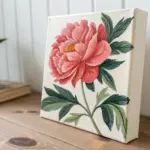
Glass Jar of Flowers With Thick Highlights
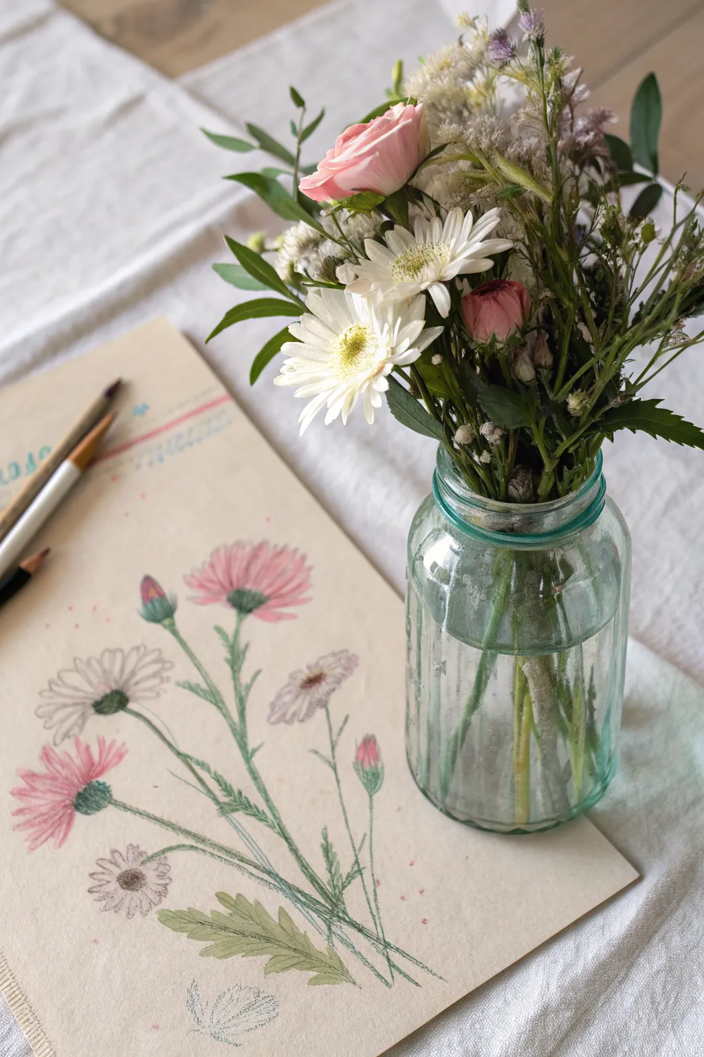
Capture the delicate beauty of fresh blooms with this airy and lighthearted floral study on textured paper. Using a mix of soft pastels or oil pastels, you’ll create a vintage-inspired botany illustration that focuses on gentle stems and vibrant petals.
Detailed Instructions
Materials
- Textured beige or tan paper (mixed media or pastel paper)
- Oil pastels (sets with pinks, whites, greens, and browns)
- Fine-point colored pencils (for outlining and details)
- Blending stump or cotton swab
- Kneaded eraser
- Reference flowers (optional)
Step 1: Planning the Composition
-
Light Sketching:
Begin by lightly sketching the main stems using a pale green colored pencil. Draw three primary stems curving upward from the bottom right corner, fanning out slightly as they reach the center of the page. -
Positioning Blooms:
Mark the positions of the flower heads with faint circles. Place a large bloom at the top center, a side-facing one on the left, and a smaller bud on the right side. -
Adding Leaves:
Sketch the outlines of the jagged, fern-like leaves near the base of the stems. Keep these lines loose and organic rather than stiff and geometric.
Step 2: Coloring the Flowers
-
Pink Petals Base:
For the pink flowers, select a soft rose oil pastel. Apply strokes radiating outward from the flower center, leaving the tips slightly lighter or fading into the paper. -
White Daisy Petals:
Use a white oil pastel for the daisy-like blooms. Press firmly to ensure the pigment sits on top of the beige paper, creating a solid, opaque look. -
Adding Depth:
Layer a slightly darker pink near the base of the rose petals to create a sense of curvature and depth. Do the same with a touch of grey or cream for the white petals to shadow them. -
Bud details:
Color the tight buds with a mix of deep pink at the tip and green at the base, blending the two colors where they meet.
Smudge Control
Oil pastels smudge easily. Place a clean sheet of scrap paper under your drawing hand to protect finished areas while you work on other details.
Step 3: Stems and Foliage
-
Defining Stems:
Go over your initial stem lines with a medium green oil pastel. I find that broken lines here can make the drawing feel more naturally sketched and less rigid. -
Leaf Texture:
Fill in the leaves with a sage green. Use short, feathery strokes that mimic the texture of the leaf veins, rather than coloring them in solid blocks. -
Dark Accents:
Use a dark green or charcoal colored pencil to add thin, sharp definition to the edges of the leaves and the joints of the stems.
Pro Tip: Mixed Media Magic
Don’t be afraid to mix oil pastels with colored pencils. The pencils cut through the wax for sharp details that pastels alone can’t achieve.
Step 4: Refining Details
-
Flower Centers:
For the centers of the open blooms, stipple small dots using a dark brown or dark green colored pencil to simulate the pollen texture. -
Pencil Outlines:
Take a sharp grey or black colored pencil and very loosely outline some of the petals. Don’t outline every single one; just enough to give them form. -
Adding Contrast:
Darken the green sepals right underneath the flower heads to make the pink and white petals pop against the stem. -
Grounding Leaves:
Add a few disconnected leaf sketches at the very bottom in a faint grey or pencil tone, suggesting fallen leaves or artistic rough work.
Step 5: Final Touches
-
Decorative Elements:
Add a few small pink dots scattered around the main flowers to add a playful, confetti-like atmosphere to the composition. -
Top Border:
Draw a faint horizontal line near the top of the paper with a colored pencil, perhaps adding a wash of blue or pink pastel above it to frame the drawing space. -
Clean Up:
Use a kneaded eraser to pick up any stray pastel dust or smudges on the background, keeping the negative space clean.
Now your botanical page is ready to be displayed or added to your art journal
Pet Portrait With Soft Fur Textures
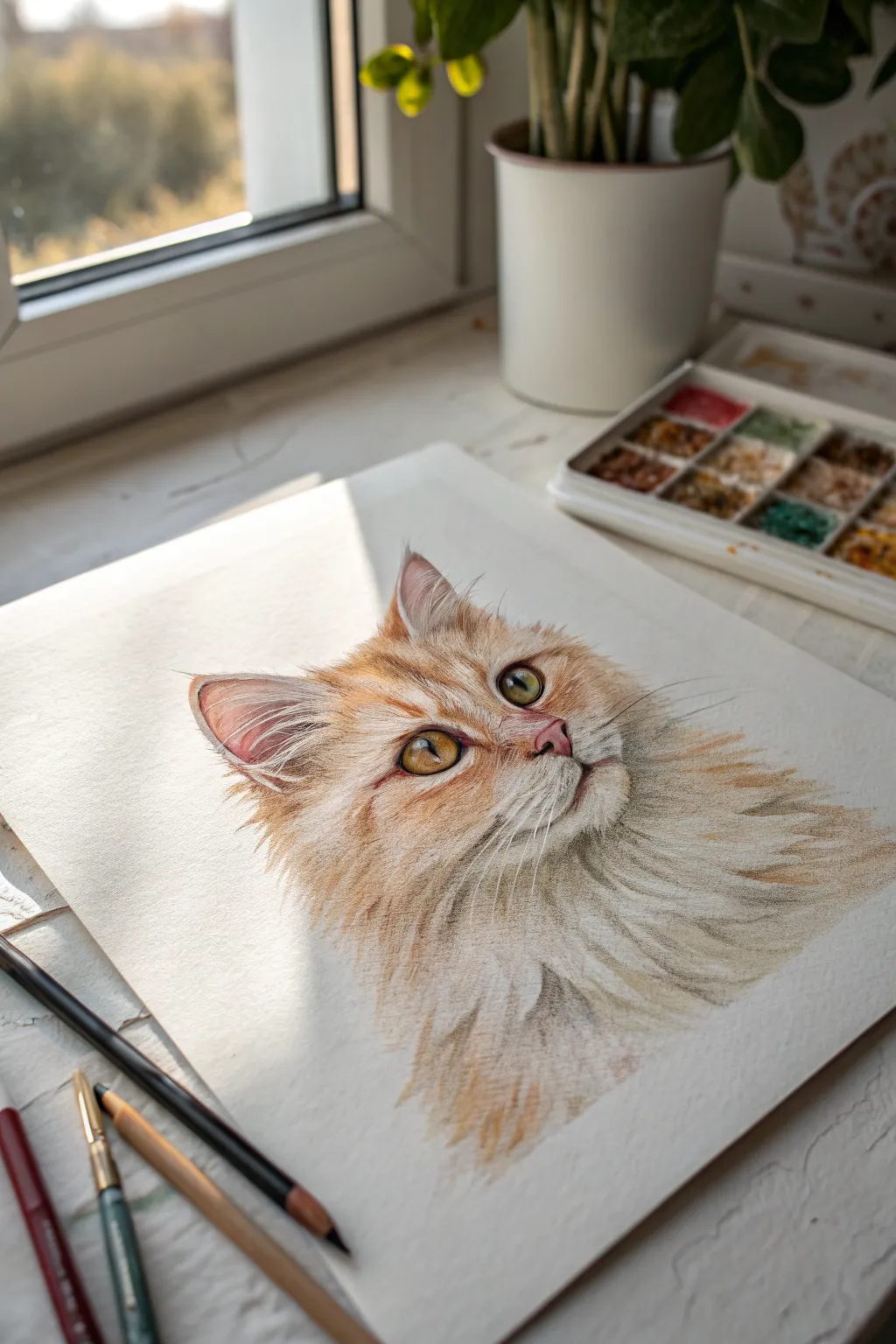
Capture the soft, glowing essence of a furry friend with this detailed oil pastel portrait. By layering warm oranges and creamy whites, you’ll create a lifelike fur texture that seems to bask in natural sunlight.
How-To Guide
Materials
- High-quality oil pastels (specifically burnt sienna, yellow ochre, orange, white, cream, brown, and black)
- Pastel paper or mixed media paper with a slight tooth (white or off-white)
- Graphite pencil (HB or 2H for sketching)
- Kneaded eraser
- Blending stumps or tortillons
- Fine-point pastel pencils or colored pencils (for crisp details)
- White gel pen (optional for whiskers)
Step 1: Sketching and Base Layers
-
Outline the features:
Begin with a very light graphite sketch of the cat’s head. Focus on getting the proportions of the eyes and nose correct, as these anchor the portrait. Mark the direction of the fur growth with faint arrows. -
Lay down the eye color:
Start with the eyes to bring the drawing to life immediately. Fill the irises with a blend of yellow ochre and a touch of light green. Add a dark pupil, but leave a small, pure white circle for the catchlight. -
Establish the nose:
Color the nose pad using a soft pink or salmon shade. Outline the nostrils gently with a darker terra cotta color to create depth without making it look too harsh. -
Map the fur zones:
Identify the lightest areas—the chin, muzzle, and chest. Block these in loosely with a white or cream pastel, applying light pressure to preserve the paper’s tooth. -
Add warm mid-tones:
Apply yellow ochre and light orange strokes around the eyes, forehead, and cheeks following your directional arrows. These strokes should be short and feathered.
Fixing Muddy Colors
If colors blend into a grey mess, stop rubbing. Scrape off the excess waxy layer gently with a palette knife, let the paper grain recover, and re-apply fresh color.
Step 2: Building Fur Texture
-
Deepen the oranges:
Introduce burnt sienna and richer orange tones into the darker areas of the fur, such as markings above the eyes and the shadows behind the ears. This adds volume to the face. -
Blend the underlayer:
Use a blending stump or your finger to gently smudge the base layers. This creates a soft, out-of-focus background for the crisp hairs you will add next. -
Define individual hairs:
Using the edge of your pastel or a sharp pastel pencil, start drawing distinct hairs over the blended base. Use quick, flicking motions. -
Create the ear fluff:
The inside of the ears requires delicate handling. Use long, sweeping strokes of cream and pale peach to suggest the wispy hairs protecting the ear canal, keeping the outer rim darker. -
Refine the eyes:
Return to the eyes to sharpen the edges. Outline the lids with a dark brown or black pastel pencil to make them pop against the fur.
Step 3: Highlighting and Detailing
-
Brighten the muzzle:
Layer thick, opaque white pastel over the muzzle area. I prefer to use a fresh edge of the pastel stick here to ensure the white sits cleanly on top of the cream underlayer. -
Add sunlit accents:
Look at where the light hits the cat’s forehead and chest. Add strokes of pure white and heavy cream to these high points to simulate sunlight striking the fur. -
Deepen contrast:
Strengthen the darkest shadows under the chin and around the neck ruff with dark brown. Avoid pure black here, as it can look unnaturally flat. -
Draw the whiskers:
Make sure your white pastel stick has a very sharp edge, or use a white gel pen or pastel pencil. Draw the whiskers in single, confident strokes that taper at the end. -
Clean up the edges:
Review the outer edges of the portrait. Use an eraser to clean up any stray smudges on the paper, letting the fur texture break the silhouette naturally.
Sgraffito Details
Use a needle tool or toothpick to scratch through top layers of pastel. This reveals the color underneath and creates incredibly fine, realistic strands of fur.
Step back and admire the soft, sunny gaze of your newly created cat portrait
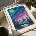
Aurora Curtains Above a Dark Horizon
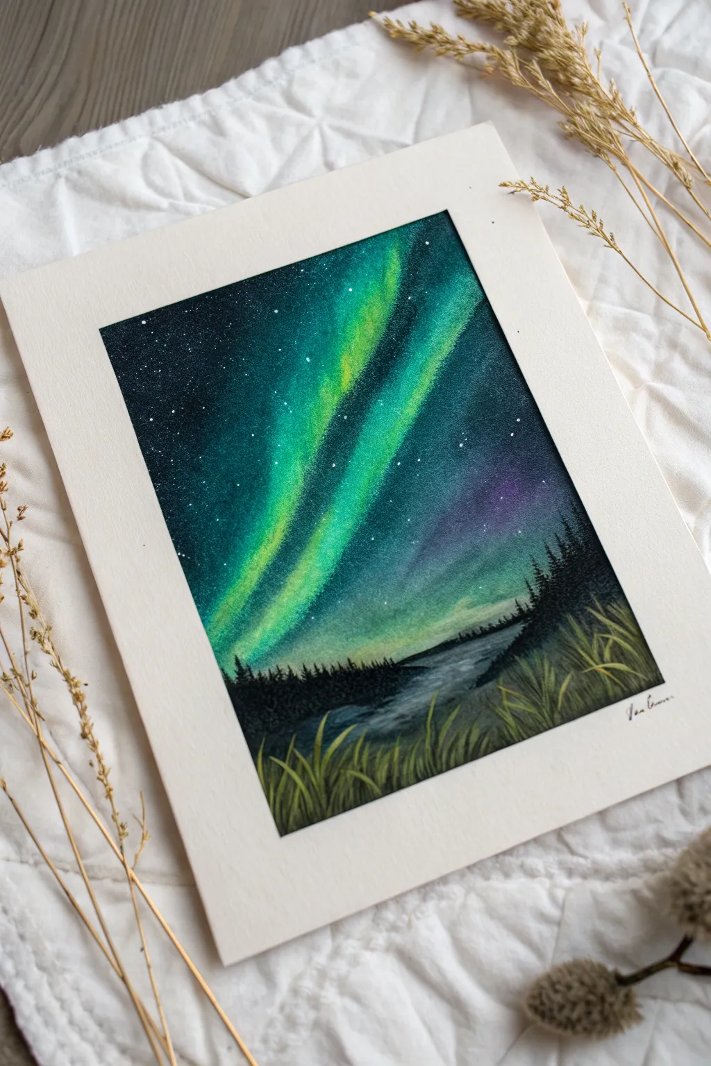
Capture the magic of the polar night with this vibrant oil pastel project, featuring sweeping curtains of emerald light dancing above a serene landscape. The high contrast between the glowing sky and the dark silhouette creates a dramatic, professional-looking finish.
Step-by-Step Guide
Materials
- Heavyweight mixed media paper or pastel paper
- Soft oil pastels (specifically: dark blue/indigo, black, emerald green, lime green, yellow, violet, and white)
- Blending tools (tissue paper, blending stump, or cotton swabs)
- Masking tape
- Scratch tool or palette knife
- White gel pen or opaque white paint marker
- Fixative spray (optional)
Step 1: Setting the Scene
-
Prepare your surface:
Begin by taping down all four edges of your paper to a work surface or board. This not only keeps the paper flat while you work but creates that crisp, clean white border seen in the final piece. -
Map the horizon:
Lightly sketch a low horizon line about one-third of the way up the paper. Indicate a river or lake shape flowing from the right side toward the center. -
Apply the dark sky base:
Start applying your darkest blue or indigo at the very top of the paper and the corners. Press firmly to get a solid laydown of pigment, but leave the center area where the lights will be empty for now.
Step 2: Creating the Aurora
-
Lay down the green base:
In the open central area, apply a medium emerald green in vertical, sweeping strokes that curve slightly. These should connect to your dark blue areas but act as the main body of the aurora. -
Add the bright core:
Inside the emerald green strips, add streaks of lime green and touches of yellow. These lighter colors represent the most intense part of the light curtain. -
Introduce purple accents:
Add patches of violet or purple near the horizon line or the edges of the green curtains to add depth and color complexity to the night sky. -
Blend the sky:
Use a folded tissue or your finger to blend the sky colors. I prefer to blend from light to dark to keep the yellow and lime green pure. Use vertical strokes to mimic the upward movement of the light pillars. -
Refine the darkness:
Go back over the top corners and the spaces between the light curtains with black oil pastel to intensify the contrast. Blend this gently into the adjacent blue and green areas for a smooth transition.
Muddy colors?
Clean your finger or blending tool immediately if switching from dark blue to yellow. Oil pastels blend easily, and dark pigments can instantly overpower your bright aurora lights.
Step 3: Landscape & Detail
-
Create the reflection:
For the water area, mirror the colors from the sky. Add horizontal streaks of dark blue, a hint of green, and white. Keep these strokes horizontal and somewhat blurry to suggest the movement of water. -
Draw the forest silhouette:
Using a sharp black pastel or a charcoal pencil, draw the distant tree line along the horizon. Use small vertical scribbles to suggest pine tree shapes against the glowing sky. -
Deepen the shadows:
Fill in the land masses on either side of the water with solid black. Ensure the coverage is dense so the ground looks properly silhouetted against the light. -
Make the stars:
Using a white gel pen or a fine white paint marker, dot tiny stars across the dark upper portions of the sky. Vary the pressure to make some stars appear brighter than others. -
Add foreground grasses:
With a dark green or olive pastel, draw sweeping grass blades rising from the bottom edge. Layer some lighter yellow-green blades on top to catch the ‘light’. -
Define the grass texture:
To make the grass look sharp, use a scratching tool or palette knife to scrape thin lines out of the dark foreground, revealing the paper underneath or creating texture. -
Final highlights:
Add a few more crisp, light green or yellow lines to the tops of the foreground grass to make them pop against the dark water. -
The reveal:
Carefully peel away the masking tape at a 45-degree angle to reveal your clean edges and frame the artwork.
Pro Tip: Glowing Edges
For a ‘glowing’ effect, lightly rub a tiny amount of white pastel over the transition line where the bright green aurora meets the dark blue sky, then blend softly outward.
Frame your northern lights scene or gift it to someone who loves the night sky
Giant Moon Behind a Tiny Silhouette Figure
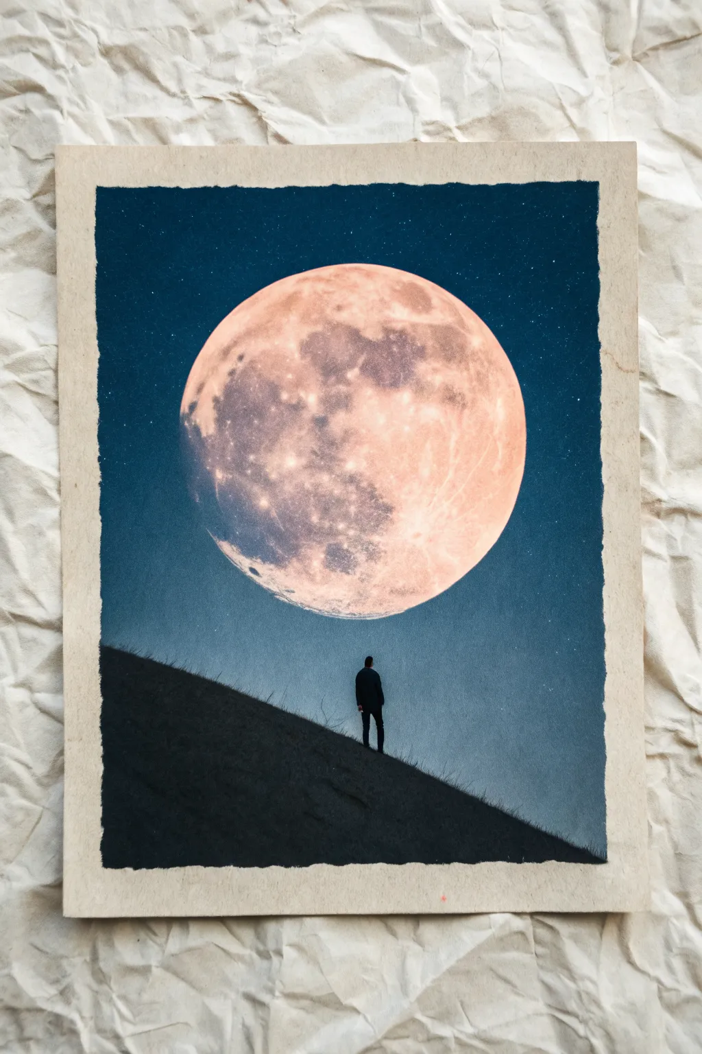
This striking oil pastel piece captures the quiet solitude of a tiny figure dwarfed by a massive, glowing moon. By mastering the contrast between the deep matte black of the foreground and the luminous texture of the lunar surface, you can create a truly atmospheric scene.
Step-by-Step
Materials
- Heavyweight mixed media or pastel paper
- Oil pastels (dark blue, black, white, pale orange, pink, light grey)
- Masking tape or painter’s tape
- Round circular object or compass (for tracing)
- Graphite pencil
- Blending stump or cotton swabs
- Tissue or soft cloth
- Fixative spray (optional)
Step 1: Setting the Scene
-
Prepare the borders:
Begin by taping down your paper to a flat surface. To achieve the rough, deckled-edge look seen in the reference, you can either tear the edges of your paper beforehand or apply masking tape unevenly along the sides to create a jagged border once peeled. -
Map out the composition:
Use a graphite pencil to lightly sketch a steep diagonal hill slope starting from the bottom left corner and rising towards the right. It should take up about a third of the vertical space. -
Create the moon outline:
Use a bowl, lid, or compass to trace a very large circle in the upper center of the page. The circle should dominate the sky area, hovering just above the hill line.
Smudge Patrol
Black oil pastel can easily contaminate the moon. Keep a damp cloth nearby to wipe your hands constantly, and place a scrap piece of paper under your hand while coloring the foreground.
Step 2: Painting the Sky
-
Apply the base blue:
Using a dark blue oil pastel, color in the sky area around the moon. Press firmly to get opaque coverage, but leave the moon circle and the hill shape completely blank for now. -
Deepen the atmosphere:
Layer a small amount of black pastel into the blue at the very top corners and edges of the sky to create a vignette effect. This draws the eye toward the center. -
Blend the sky:
Use a tissue or your finger to smudge the blue pigment smoothly. Ensure the color goes right up to the edge of your pencil line for the moon, keeping that edge crisp.
Make It Glow
To make the moon look like it’s glowing, gently rub a tiny amount of the pale orange pastel into the blue sky immediately surrounding the moon’s edge to create a subtle halo effect.
Step 3: Texturing the Giant Moon
-
Base layer for the moon:
Fill the entire moon circle with white oil pastel. Apply it somewhat thickly, as this will serve as the mixing ground for the other colors. -
Add warmth:
Lightly sketch patches of pale orange and soft pink over the white base. Focus these warmer tones slightly more toward the right side of the moon to suggest a light source. -
Create craters and texture:
Take a light grey or pale purple pastel and gently dab uneven, organic shapes onto the moon’s surface. I find that using a tapping motion rather than smooth strokes helps mimic the craggy lunar surface. -
Blend the surface:
Use a clean cotton swab or a blending stump to swirl the white, orange, and grey tones together. Do not over-blend; you want to maintain that blotchy, cratered texture. -
Highlighting the rim:
Add a final crisp line of pure white along the bottom right edge of the moon to make it pop against the blue sky.
Step 4: The Silhouette Foreground
-
Fill the hill:
Color the entire hill section with a deep black oil pastel. Press very hard to ensure there are no white paper specks showing through; it needs to be a solid silhouette. -
Adding the figure:
With a sharp corner of your black pastel or a black charcoal pencil for more control, carefully draw the tiny silhouette of a person standing on the slope. Start with a simple vertical line for the body and a dot for the head. -
Refining the figure:
Thicken the body slightly and add small legs to suggest a stride. The figure should be small to emphasize the scale of the moon. -
Adding simple grass details:
Use a toothpick or a sharp tool to scratch tiny upward ticks into the top edge of the black hill. This ‘sgraffito’ technique reveals a hint of the paper underneath and looks like grass blades against the sky.
Step 5: Final Touches
-
Create the stars:
To make the stars, scrape a little bit of white pastel into a powder and sprinkle it over the blue sky area, pressing it in with a clean finger. Alternatively, dot the sky with a white gel pen. -
Clean up edges:
If you used tape, peel it away slowly at a 45-degree angle. If you opted for torn edges, gently brush away any pastel crumbs. -
Seal the work:
Lightly mist the drawing with a fixative spray to prevent the heavy black foreground from smudging into the lighter moon area.
Now you have a moody, atmospheric piece that perfectly balances scale and shadow.
Tape-Masked Moon for a Crisp Circle
Capture the glowing magic of a full moon using a simple masking technique that guarantees a perfectly crisp edge. This oil pastel project contrasts deep, swirling night blues against the textured warmth of a lunar crater surface.
How-To Guide
Materials
- Sketchbook with textured paper (mixed media or pastel paper)
- Oil pastels (dark blue, prussian blue, black, white, pale yellow, ochre, light grey)
- Masking tape or painter’s tape
- Compass or a circular object (like a bowl) to trace
- Scissors / craft knife
- Paper towel or blending stump
Step 1: Setting the Scene
-
Prepare your borders:
Begin by taping down the four edges of your sketchbook page with masking tape. This creates a clean, professional border once the drawing is finished and holds the paper steady while you work. -
Create the moon mask:
On a separate piece of masking tape (or a sheet of adhesive masking paper), draw a perfect circle using a compass or by tracing a round object. Carefully cut out this circle. -
Place the mask:
Adhere the circular mask firmly to the center of your page. Press down the edges specifically to prevent pigment from sneaking underneath later.
Clean Edges Only
If the tape tears the paper upon removal, try heating it slightly with a hair dryer first to loosen the adhesive, or stick the tape to your clothes before applying to reduce stickiness.
Step 2: Creating the Night Sky
-
Apply the base darks:
Start coloring the area surrounding the masked moon. Use a dark blue or indigo oil pastel. Press firmly to cover the white of the paper, stroking outwards from the tape mask toward the paper edges. -
Add depth with black:
Layer black pastel lightly over the corners and the very outer edges of the sky to create a vignette effect, drawing the viewer’s eye toward the center. -
Introduce mid-tones:
Blend a lighter Prussian blue or a slate grey into the area immediately surrounding the moon mask. This creates a subtle ‘glow’ effect where the moonlight touches the atmosphere. -
Create texture:
Instead of smoothing everything perfectly, use circular or swirling strokes to mimic the movement of the night air. I like to leave some of these strokes visible for a painterly feel. -
Blend the sky:
Use a paper towel or your fingertip to smudge the sky layers together. Blend from the lighter area near the moon outwards to the dark corners to keep the colors clean.
Glow Up
To enhance the glowing effect, lightly rub a tiny amount of white or pale yellow pastel *over* the dark blue sky right at the edge of the moon circle, blurring the distinct line slightly.
Step 3: The Moon Reveal
-
Remove the mask:
This is the satisfying part. Very gently peel away the circular tape mask. Pull it slowly at a low angle to avoid tearing the paper, revealing a stark white circle in the middle of your dark sky. -
Base layer for the moon:
Fill the white circle with a very light layer of white oil pastel. This acts as a primer and helps subsequent colors blend more smoothly. -
Add warmth:
Lightly sketch in patches of pale yellow and cream. Focus these warm tones slightly more on one side to suggest a light source or atmospheric tint.
Step 4: Lunar Details
-
Map the craters:
Using a light grey or ochre pastel, gently dab in the shapes of the lunar maria (the dark spots on the moon). Look at a reference photo of the moon to get organic, random placement. -
Add texture:
Stipple (dot) the grey areas rather than coloring them in solid. This texture mimics the rough, cratered surface of the moon. -
Highlighting:
Go back in with your bright white pastel. Add heavy pressure to the brightest parts of the moon, blending the edges of your grey craters to soften them. -
Final blending:
Use a clean finger or a small blending stump to gently tap—not rub—the surface of the moon. This marries the yellow, grey, and white layers without losing that crater texture. -
The border peel:
Once you are happy with the contrast between your bright moon and dark sky, slowly peel/remove the four border tapes to reveal the crisp white frame around your artwork.
Enjoy the contrast of your bright lunar subject against the deep brooding sky
Desert Silhouettes Under a Violet Twilight
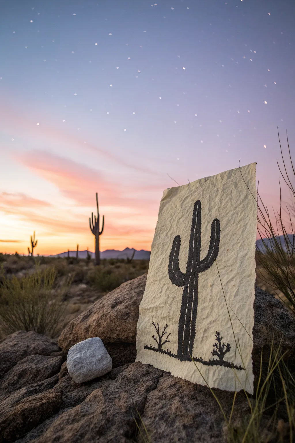
Capture the stark beauty of the desert with this unique drawing project that combines texture and silhouette. Using crinkled paper to mimic the rugged landscape, you’ll create a striking black oil pastel cactus that stands out against a creamy, tactile background.
Step-by-Step
Materials
- Heavyweight textured paper (watercolor or mixed media paper, cream or off-white)
- Black oil pastel
- Pencil (HB or 2B)
- Kneaded eraser
- Paper towel or blending stump (tortillon)
- Spray fixative (optional)
Step 1: Preparing the Surface
-
Cut the paper:
Start by cutting your heavyweight cream paper into a rectangular shape. The edges don’t need to be perfectly straight; a slightly torn or deckled edge adds to the rustic feel. -
Create texture:
Gently crumple the paper into a loose ball. Don’t crush it completely tight, just enough to create a network of veins and creases across the surface. -
Flatten it out:
Carefully unfold the paper and flatten it out on your work surface. Smooth it with your hands so it lays relatively flat but retains all those wonderful wrinkles.
Sticky Situation
If the crumpled paper keeps curling up while you draw, tape the corners down with gentle painter’s tape or masking tape to hold it flat while you work.
Step 2: Sketching the Outline
-
Mark the ground line:
Using your pencil very lightly, draw a low, slightly uneven horizontal line near the bottom of the paper to represent the desert floor. -
Draw the main trunk:
Sketch a vertical column for the main cactus trunk. It should be slightly thicker at the bottom and taper very subtly towards the rounded top. -
Add the arms:
Draw the iconic cactus arms. Place one lower on the left side curving upward, and another slightly higher on the right side curving upward creates a balanced composition. -
Sketch small vegetation:
Add two tiny, scruffy bushes or smaller cacti silhouettes on the ground line—one to the left of the main cactus and one to the right. -
Refine the shape:
Go back over your outlines to ensure the curves look organic. Saguaro cacti aren’t perfect pipes; give them a little wobble for character.
Desert Twilight
Before drawing the black silhouette, lightly rub purple and orange chalk pastels into the background to create a sunset sky effect behind the cactus.
Step 3: Applying Oil Pastel
-
Outline in black:
Take your black oil pastel and carefully trace over your pencil lines. The texture of the paper might cause skips, but just press firmly. -
Fill the ground:
Color in the ground line heavily. Use short, horizontal strokes to suggest rough earth. -
Fill the trunk:
Begin filling in the main trunk of the cactus. Work in vertical strokes to mimic the direction of the plant’s growth. -
Fill the arms:
Fill in the curved arms. Be careful at the joints where the arms meet the trunk to keep the silhouette sharp. -
Handle the texture:
As you color, the pastel will catch on the high points of the crinkled paper and leave white gaps in the crevices. I actually prefer to leave some of these gaps visible—it adds amazing depth. -
Detail the small bushes:
Fill in the small scrubby plants at the base. Use jagged, upward strokes to represent thorny branches.
Step 4: Refining and Texture
-
Deepen the blacks:
Go back over the main cactus body with a second layer of pastel. Press harder this time to deposit more pigment and reduce the paper show-through in the center areas. -
Define the ribs:
Use the edge of the pastel or a blending stump to gently scrape or push the pigment vertically, creating subtle vertical lines that hint at the cactus’s ribbed structure. -
Soften the edges:
If the outline looks too jagged from the paper texture, use your finger or a tortillon to gently smudge the very edge of the black silhouette into the paper fibers. -
Clean up stray marks:
Use your kneaded eraser to pick up any accidental black smudges from the background area. Keep the cream paper clean for high contrast. -
Optional fixative:
If you want to protect the drawing from smearing, lightly spray it with a fixative in a well-ventilated area.
Now you have a piece of textured desert art that looks like it was sketched right out in the wild
Mini Sky Studies in a Grid Layout
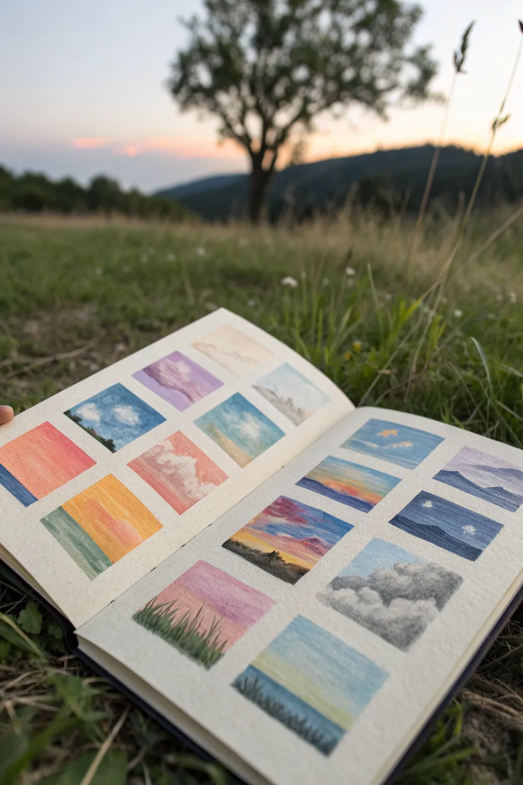
Capture the changing moods of the sky with this grid of miniature landscape studies. By working small, you can focus on color blending and atmospheric effects without the pressure of filling a large page.
Step-by-Step Guide
Materials
- Sketchbook with textured paper (mixed media or pastel paper recommended)
- Artist tape or low-tack masking tape
- Oil pastels (soft, creamy consistency is best for blending)
- Ruler
- Pencil
- Blending tools (tortillons, cotton swabs, or soft cloth)
- Paper towel for cleaning pastels
- Scissors or craft knife
Step 1: Preparing the Grid
-
Measure your page:
Open your sketchbook to a fresh spread. Measure the usable area of the page, deciding how many squares will fit comfortably while leaving borders. A 2×3 or 3×3 grid per page usually works well. -
Mark the boundaries:
Using your ruler and pencil, lightly mark the outer edges of where your grid will sit. Aim for equal margins on all sides to frame the artwork nicely. -
Create the tape grid:
Tear or cut strips of artist tape. Apply long horizontal strips first to define the top and bottom of your rows. Use the ruler to ensure they are perfectly straight. -
Define the columns:
Apply vertical strips of tape to create the columns. Press down firmly on all edges of the tape to prevent the oil pastel from bleeding underneath later. -
Burnish the edges:
Run your thumbnail or a spoon along the edges of the tape to ensure a tight seal against the paper texture.
Step 2: Blocking in Colors
-
Plan your palettes:
Decide on a unique color theme for each square before you start. You might want a sunset gradient in one, a stormy grey sky in another, and a bright blue midday sky in a third. -
Apply the base sky color:
Start with the lightest color for the sky in the first square. Apply the pastel with light to medium pressure, covering the top portion of the square. -
Add gradient tones:
Layer darker or complementary colors near the horizon line or the very top of the box. For a sunset, this might mean yellow at the bottom blending into pink and purple at the top. -
Blend the sky:
Use your finger or a cotton swab to smudge the colors together where they meet. I prefer using my finger for smoother transitions because the warmth helps soften the oil binder.
Muddy colors?
If your clouds turn grey or muddy, you’re likely over-blending. Wipe the pastel tip clean and apply a fresh, thick layer of white on top without smudging it further.
Step 3: Adding Clouds and Details
-
Create cloud forms:
With a white or light grey pastel, dab irregular shapes over the blended sky. Use a twisting motion to create fluffy, cumulus textures. -
Shadow the clouds:
Add tiny hints of grey or lavender to the bottom of the clouds to give them volume and dimension. Keep these marks very subtle. -
Define the horizon:
Sketch the ground element at the bottom of the square. This could be a solid silhouette for mountains, a flat green band for a field, or deep blue for water. -
Add distinctive features:
In some squares, add specific details like tiny pine trees, distant birds, or grass blades in the foreground. Use the edge of a harder pastel or a pastel pencil for fine lines. -
Texture the ground:
Use short, vertical strokes to mimic grass, or horizontal sweeping strokes to suggest the calmness of water. Don’t overwork these small areas.
Layering Pro Tip
Apply lighter colors first. It is much easier to layer a dark silhouette over a light sky than to try adding a bright sun over a dark blue background.
Step 4: Finishing Touches
-
Refine the edges:
Check the edges where the pastel meets the tape. If you need a crisp line, apply a final layer of color right up to the tape edge. -
Clean your hands:
Before moving to a new square with a different color palette, clean your hands thoroughly to avoid muddying the bright colors. -
Repeat for all squares:
Continue this process for every square in your grid, experimenting with different times of day and weather conditions for variety. -
Remove the tape:
Once all drawings are complete, slowly peel back the tape at a 45-degree angle, pulling away from the drawing area to reveal clean, crisp white borders.
Now you have a stunning collection of atmospheric moments captured on a single spread.
Sgraffito Stars Scratched Into Thick Layers
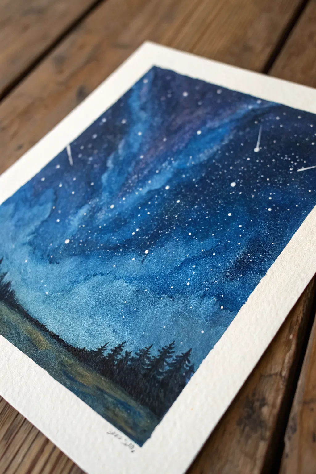
Capture the magic of a deep, endless galaxy with this stunning oil pastel project. By layering rich blues and scratching away tiny details, you can create a mesmerizing night sky that seems to glow right off the paper.
How-To Guide
Materials
- High-quality oil pastels (specifically white, light blue, medium blue, dark indigo/navy, and black)
- Thick pastel paper or mixed media paper (textured surface allows for better layering)
- Soft blending stump or clean tissues
- Sgraffito tool (or a toothpick/empty ballpoint pen)
- White gel pen or acrylic paint pen (optional for extra bright stars)
- Masking tape
Step 1: Setting the Stage
-
Prep your surface:
Begin by taping down the edges of your paper to a flat surface using masking tape. This secures your work and creates a crisp, professional white border when you’re finished. -
Establish the Milky Way:
Start by lightly sketching a diagonal, undulating path across the center of the paper using your white oil pastel. Keep the pressure light and the edges fuzzy; this will be the glowing core of your galaxy. -
Add the first glow:
Directly beside the white path, add strokes of your lightest blue pastel. Allow the colors to overlap slightly with the white so they can blend later.
Don’t Over-Blend
When creating the Milky Way texture, don’t blend perfectly smooth. Leaving some rough texture adds to the celestial, gaseous look of the galaxy.
Step 2: Layering the Sky
-
Mid-tone application:
Moving outward from the light blue, apply a medium blue shade. Fill in significant portions of the sky, but remember that oil pastels work best when you don’t fill the tooth of the paper perfectly on the first pass. -
Deepen the atmosphere:
Fill the rest of the upper sky and the corners with your darkest indigo or navy blue. The sky should get progressively darker as you move away from the central white band. -
Initial blending:
Using a blending stump or your finger, gently smudge the transition areas between colors. I like to blend from light to dark to prevent dragging dark pigment into the glowing center. -
Intensify the darkness:
Go back over the outer corners and the very top of the sky with a second layer of dark indigo, and perhaps a touch of black in the extreme corners to create depth. -
Create smooth transitions:
Blend the sky again thoroughly. The goal is a seamless gradient from the bright white-blue center fading out into the deep midnight blue. The friction from blending helps push the pastel into the paper’s texture.
Make It Sparkle
For a magical finish, sprinkle a tiny pinch of ultra-fine glitter over the wettest/stickiest parts of the pastel while blending for a subtle shimmer.
Step 3: The Sgraffito Technique
-
Prepare for scratching:
Ensure your sky layer is thick and waxy. Sgraffito works best when there is a substantial layer of pastel to scratch through. -
Scratch the stars:
Take your sgraffito tool (or a toothpick) and gently scratch small dots into the blue sky. This removes the top layer of pigment, revealing the white of the paper underneath to create stars. -
Vary sizes:
Make some scratches larger and others barely visible pinpricks. Cluster them more densely near the lighter ‘Milky Way’ band to mimic how stars concentrate in a galaxy. -
Add shooting stars:
Use a quick, confident flick of the scratching tool to create one or two streaks for shooting stars. A confident motion makes the line straighter and more dynamic. -
Enhance brightness (optional):
If scratching doesn’t make your stars bright enough, you can gently tap a white gel pen or acrylic marker over the scratched areas to make them pop.
Step 4: Grounding the Scene
-
Block in the ground:
At the very bottom of the paper, lay down a strip of dark colors for the ground. Use a mix of dark green, brown, and black to create an earthy, shadowed base. -
Draw the treeline:
Use a sharp edge of your black oil pastel to draw the silhouettes of pine trees. Start with a vertical line for the trunk, then dab small, downward-sloping strokes for branches. -
Vary tree heights:
Make the trees various heights to create a natural-looking forest horizon. Ensure the tops of the trees overlap the bottom of your galaxy sky. -
Blend the shadows:
Lightly blend the base of the trees into the ground color so they look rooted rather than floating on top of the grass. -
The reveal:
Carefully peel away the masking tape at a 45-degree angle to reveal your clean, crisp edges.
Step back and admire your own slice of the infinite cosmos captured in color
Have a question or want to share your own experience? I'd love to hear from you in the comments below!