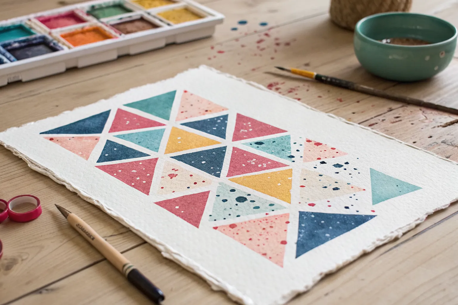
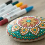
There’s something wildly satisfying about splatter paint—it’s messy, freeing, and instantly energizes a blank surface. The trick to making it look truly cool is adding just enough structure so the chaos turns into a design you’ll actually want to frame.
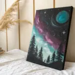
Toothbrush Mist Splatter for a Starry Look
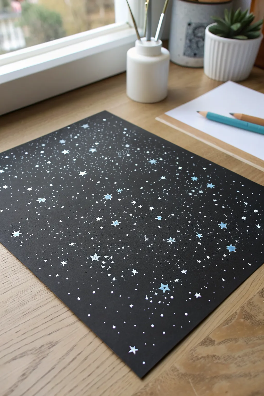
Capture the magic of a deep, star-filled galaxy using a simple toothbrush technique that creates an incredibly realistic mist effect. This project transforms plain black cardstock into a dense, shimmering celestial scene with layers of depth and detail.
Step-by-Step Tutorial
Materials
- Black cardstock or heavy mixed-media paper (A4 size or similar)
- White acrylic paint or white gouache
- Light blue acrylic paint (optional, for nebula effects)
- Old toothbrush
- Small round paintbrush (size 0 or 1)
- White gel pen (optional)
- Palette or small dish for mixing
- Water cup
- Scrap paper or cardboard (to protect your workspace)
Step 1: Preparation
-
Set up your workspace:
Lay down scrap paper or cardboard on a flat surface to catch stray splatter. This technique can get a bit messy, so cover a wider area than you think you need. -
Prepare the paint:
Squeeze a small blob of white acrylic paint onto your palette. Add a few drops of water to thin it down. -
Test consistency:
Mix the water and paint until it reaches the consistency of heavy cream or liquid yogurt. It needs to be fluid enough to fly off the bristles but thick enough to conform into opaque dots.
Flick Direction Matters
Always pull the bristles back toward yourself so the paint flicks forward onto the paper. If you push the bristles forward, the paint will spray back onto your shirt!
Step 2: Creating the Galaxy Base
-
Load the toothbrush:
Dip just the bristles of your old toothbrush into the thinned white paint. Tap off any excess drippy globs on the side of your palette. -
Test the spray:
Before hitting your final paper, do a quick test spray on your scrap paper to gauge the splatter size and ensure you aren’t releasing huge blobs. -
Apply the fine mist:
Hold the toothbrush about 3-4 inches above the black paper, facing down. Run your thumb firmly across the bristles, pulling them back and releasing them to flick a fine mist of paint. -
Build density:
Move your hand around the page as you flick to ensure even coverage. Create areas of higher density to mimic the ‘milky way’ look by spraying repeatedly in diagonal bands. -
Add variance:
Vary the distance of the brush from the paper. Holding it closer creates denser, slightly larger clusters, while holding it higher creates a faint, distant star field. -
Optional blue accents:
If you want to add depth, clean the toothbrush and repeat the process very lightly with thinned light blue paint, focusing on just a few localized areas. -
Dry layer one:
Let this base layer of mist dry completely for about 5-10 minutes. This prevents smearing when you add larger details.
Blobs Too Big?
If your splatter came out as large, watery drops instead of mist, your paint is likely too thin or your brush too wet. Thicken the mix slightly and blot the brush on a paper towel first.
Step 3: Adding Major Stars
-
Mix thicker white:
Prepare a small amount of white paint that is slightly thicker than your mist mix, or use a white gel pen for precision. -
Paint medium stars:
Using the tip of a small round brush or the gel pen, dot random medium-sized stars throughout the galaxy. Focus these in areas that look a bit empty. -
Create distinct constellations:
Find a few spots to place your largest stars. Draw a small cross or a five-pointed star shape to make them twinkle. -
Add feature stars:
I like to pick three or four of the largest stars and paint them light blue, just like in the reference image, to add visual interest and color hierarchy. -
Highlight the blue stars:
Once the blue stars are dry, add a tiny white dot in their absolute center to make them look like they are glowing intensely. -
Enhance density:
Look at the overall composition. If some areas still feel too stark, add tiny manual dots with the very tip of your brush to bridge the gap between the mist and the large stars.
Step 4: Final Touches
-
Review and refine:
Step back and look at the piece from a distance. If you accidentally made a splatter that’s too big or oddly shaped, turn it into a larger star or a planet. -
Let it cure:
Allow the entire artwork to dry completely flat. The thicker dots will take longer to dry than the mist.
Now you have a stunning piece of cosmic art perfect for framing or using as a background for hand lettering
Silhouette Stencil With Splatter “Texture”
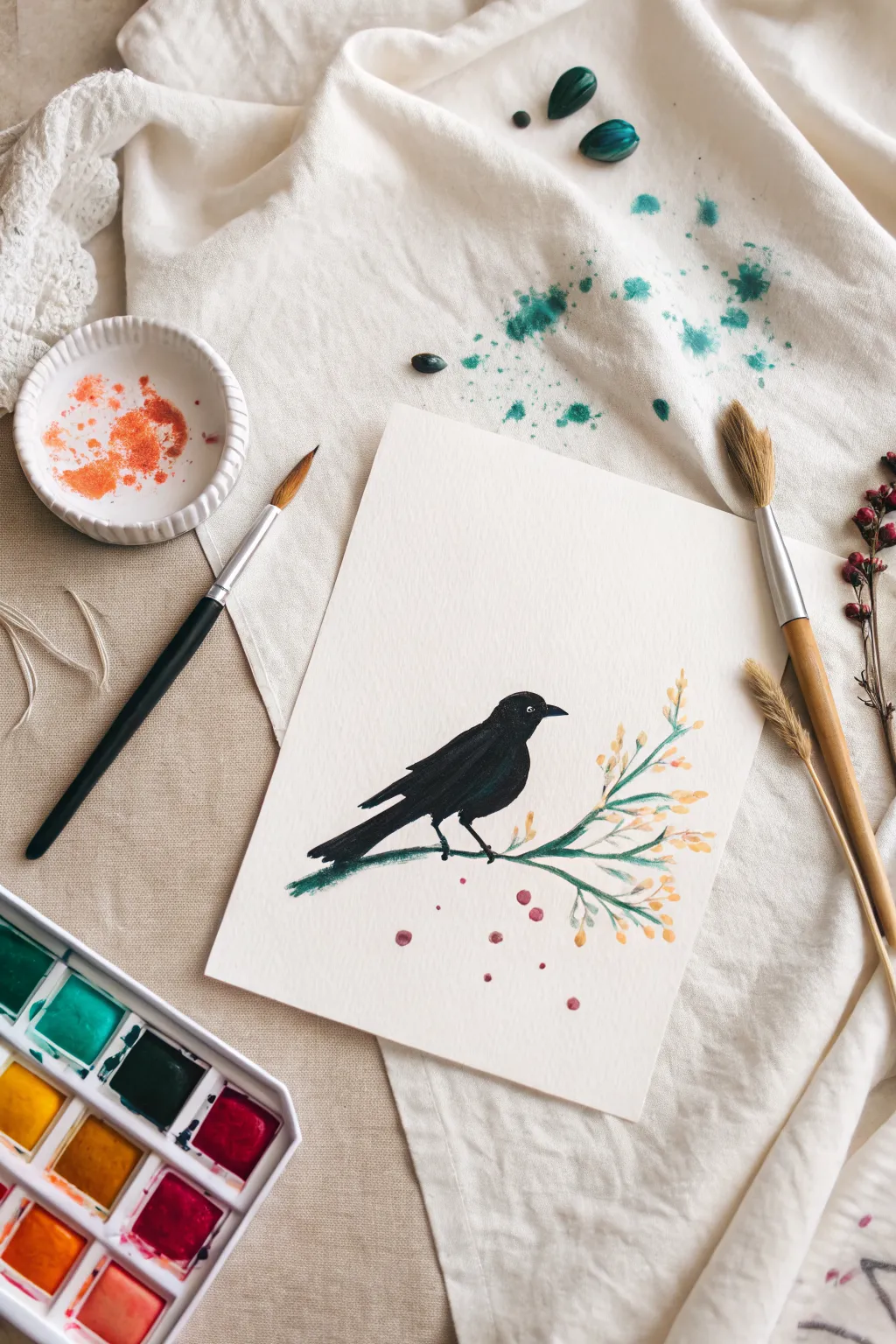
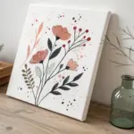
Capture the stark beauty of a blackbird perched amongst delicate blooms with this mixed-media watercolor project. This piece combines precise brushwork for the silhouette with loose, expressive splatters to create organic texture on natural paper.
How-To Guide
Materials
- Cold press watercolor paper (A5 or similar size)
- Watercolor paints (Black, Teal/Viridian Green, Yellow Ochre, Burnt Sienna, Crimson)
- Small round brush (size 2 or 4)
- Medium round brush (size 6 or 8)
- Small mixing dish or palette
- Paper towels
- Pencil (optional for sketching)
- Water cups
Step 1: Painting the Branch & Blooms
-
Mix the green:
Start by mixing a dark, earthy green. Combine Viridian Green with a touch of Burnt Sienna or Black to desaturate it. You want a color that feels natural, not fluorescent. -
Paint the main stem:
Using your medium round brush, paint a curved line sweeping up from the left side. Let the line tape off naturally towards the right edge. -
Add side branches:
While the main stem is still slightly damp, use the tip of your brush to pull smaller, thinner twigs branching off the main line. Vary their lengths for a natural look. -
Mix the floral color:
Clean your brush and pick up some Yellow Ochre. Mix in a tiny bit of orange or Burnt Sienna to warm it up. -
Dab the buds:
Using the very tip of your small brush, gently dab small clusters of yellow along the thinner twigs. Keep them loose; they don’t need to be perfectly round. -
Add berry accents:
Rinse your brush and switch to a diluted Crimson or pinkish-red. Add a few drop-like shapes falling from the branch or nestling near the yellow buds to act as berries. -
Create the splatter texture:
Load a wet brush with watered-down green or teal paint. Hold it over the branch area and tap the handle against another brush or your finger to flick tiny specks onto the paper. Keep this subtle.
Dry Brush Trick
For the tail feathers, wipe your brush slightly on a paper towel before painting. This creates a scratchy texture that looks just like real feathers.
Step 2: Creating the Silhouette
-
Outline the bird:
Once the branch is dry to the touch, use a pencil to lightly sketch the oval shape of the bird’s body and head sitting on the main branch. Keep the lines faint. -
Prepare the black paint:
Load your small brush with concentrated black watercolor. You want this paint to be opaque, so don’t dilute it too much with water. -
Paint the head and beak:
Start at the head. Carefully paint the curve of the skull and pull the paint out to form a sharp, pointed beak. -
Fill the body:
Work your way down the neck and fill in the main oval of the body. Ensure the belly rests naturally right against or slightly over the painted branch. -
Add the tail feathers:
Extend the paint downwards past the branch to create the long, rectangular tail feathers. Lift your brush at the end of the strokes to suggest layered feathers. -
Refine the wing shape:
Before the black paint dries completely, add a slightly darker layer or a second coat along the wing area to give the silhouette subtly different values. -
Paint the feet:
Using the finest point of your brush, draw two tiny legs gripping the branch. They should correspond with where the bird’s weight would fall. -
Add the eye detail:
While the black paint is wet, you can lift a tiny dot of paint out for the eye using a dry brush, or wait for it to dry completely and add a dot of white gouache or gel pen.
Make it Metallic
Once the black silhouette is fully dry, paint a thin glaze of metallic blue or purple over the wing to mimic the iridescence of a raven’s feathers.
Step 3: Final Touches
-
Add falling petals:
Mix a very watery red or pink wash. Paint a few loose, round shapes floating in the space below the branch to balance the composition. -
Background splatter (Optional):
If you want to mirror the reference photo’s styling, you can take a bold teal color and splatter it heavily on a separate scrap paper or cloth nearby, but keep the main artwork relatively clean.
Let the piece dry completely before erasing any visible pencil marks to ensure a crisp, clean finish


Tree Silhouette With Splatter “Leaves”
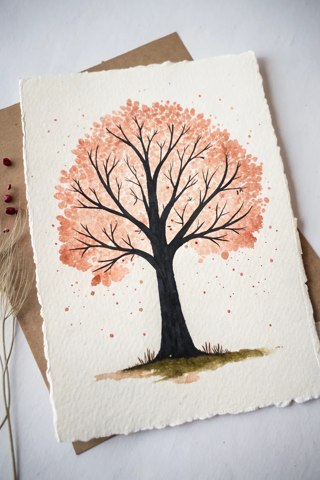
Capture the delicate transition of seasons with this elegant watercolor project. By combining a bold, dark silhouette with soft, stippled foliage, you’ll create a serene tree that feels both grounded and airy.
Step-by-Step Tutorial
Materials
- Cold-press watercolor paper (300gsm for texture)
- Black ink or concentrated watercolor paint
- Terra-cotta or peach watercolor paint
- Small round brush (size 2 or 4)
- Fine liner brush (size 0 or 00)
- Paper towel
- Jar of clean water
- Pencil (optional for sketching)
- Masking tape (to secure paper)
Step 1: Painting the Foliage
-
Prepare your palette:
Mix a generous amount of your terra-cotta or peach color. You want a consistency that is juicy but pigment-rich, somewhere between milk and cream. -
Create the canopy shape:
Load your small round brush with the peach paint. Gently dab the brush onto the upper half of the paper to start forming the tree’s crown. Don’t paint a solid block; leave plenty of white space between dabs. -
Build density:
Continue dappling to fill out a roughly circular or oval canopy shape. Cluster your dots closer together near the imagined center of the tree and leave them sparser at the edges to suggest individual leaves catching light. -
Add gentle splatters:
For a looser, more organic look, load your brush with watery paint and gently tap it against your finger over the paper. This creates tiny speckles around the main foliage mass, mimicking falling leaves. -
Let it dry completely:
This is crucial. The foliage layer must be 100% dry before you add the branches, otherwise the black ink will bleed into the peach color and create muddy blooms.
Step 2: The Trunk and Branches
-
Establish the trunk base:
Using your black ink or concentrated dark paint, paint the trunk’s base near the bottom center. Make it wider at the bottom to ground the tree. -
Draw the main trunk:
Pull the color upward with confident strokes. As you move higher, taper the trunk so it naturally becomes thinner as it reaches the foliage area. -
Branch out:
Once you reach the bottom of your peach canopy, start splitting the trunk into two or three main branches. Let these curve naturally upward and outward. -
Switch to the liner brush:
For the finer details, swap to your size 0 liner brush. This allows for delicate control over the thinner twigs. -
Weave through the leaves:
Paint thin branches extending into the peach foliage. Allow the lines to break occasionally; you don’t need to connect every single line perfectly. -
Add fine twigs:
Drawing from the main branches, add tiny, whisper-thin twigs that reach toward the outer edges of the canopy. I find that quick, flicking motions work best here to keep the lines sharp. -
Create depth overlap:
Paint some branches directly over the dried peach patches and some in the white spaces. This interplay creates depth, making it look like leaves are both behind and in front of the wood.
Muddy colors?
If your black trunk bleeds into the peach leaves, stop immediately. Use a hair dryer on a low setting to fully dry the paper before continuing with the dark ink.
Step 3: Grounding and Details
-
Paint the ground:
Mix a muddy green-brown shade. Using a damp brush, sweep a horizontal patch of color underneath the trunk to create the earth. -
Add grass texture:
While the ground paint is still slightly damp, use the liner brush with concentrated dark ink to flick upward short strokes, simulating blades of grass around the tree roots. -
Final splatters:
Dip a clean brush into clean water or very pale peach paint and flick a few final droplets around the base of the tree to tie the composition together. -
Review and refine:
Step back and look at the balance. If a spot looks too empty, add a tiny disconnected ‘leaf’ dot or a small twig to fill the space without overcrowding it.
Seasonal Shift
Change the vibe by swapping the color palette. Use vibrant greens for a summer oak, or bright yellows and fiery reds for a dramatic maple tree.
Frame your beautiful tree artwork with a wide mat to give the delicate details room to breathe
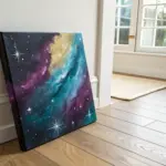
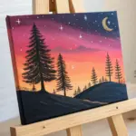
Splatter Galaxy With Layered Color Glows
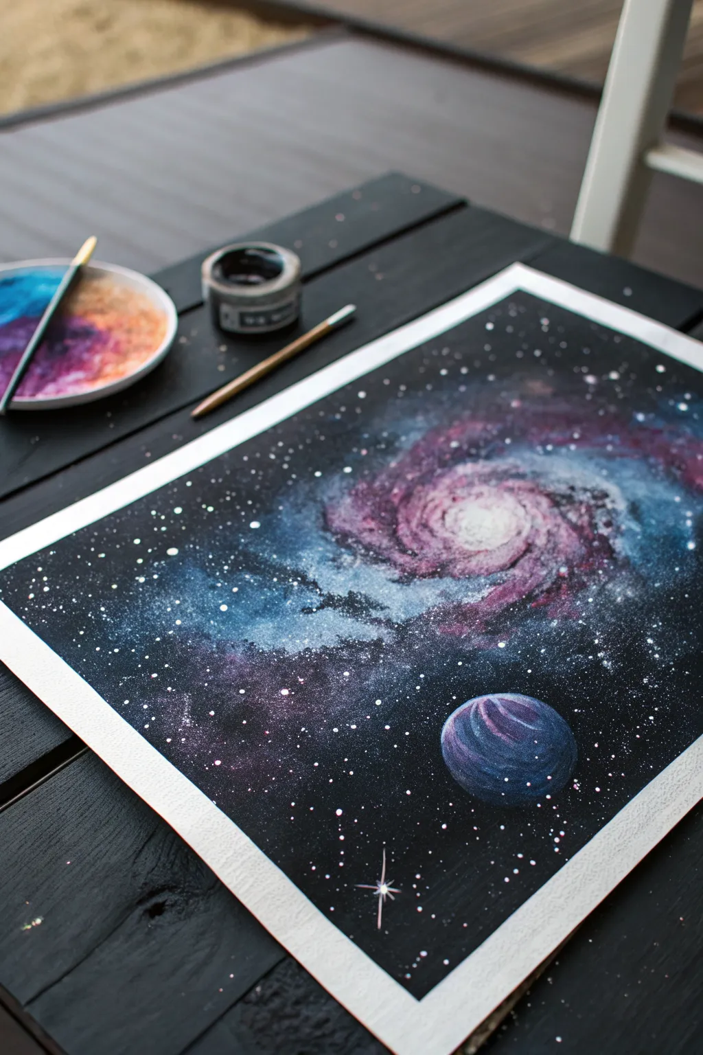
Capture the mysteries of the universe on paper with this vibrant galaxy painting featuring a luminous spiral and a textured planet. By layering watercolors or gouache against a stark black background, you’ll create a glowing effect that feels deep and infinite.
Detailed Instructions
Materials
- Heavyweight watercolor paper or mixed media board
- Masking tape
- Black acrylic paint or black gouache (for the background)
- Watercolor or gouache paints (Deep Blue, Violet, Magenta, White, Teal)
- Round brushes (sizes 4, 8) and a fine detail brush (size 0 or 1)
- Old toothbrush or stiff bristle brush (for splattering)
- Paper towels
- Jar of clean water
- Mixing palette
Step 1: Setting the Stage
-
Prepare the Surface:
Begin by taping down all four edges of your watercolor paper to a flat, movable board using masking tape. This creates a crisp white border and prevents the paper from buckling when wet. -
Sketch the Composition:
Lightly sketch the general shape of your spiral galaxy in the center and a circle for the planet in the bottom right corner with a pencil. Keep these lines very faint so they don’t show through later. -
Apply the Base Black:
Using a larger brush and black paint (acrylic or gouache works best for opacity), fill in the negative space around your sketched galaxy and planet shapes. Leave the spiral and planet areas perfectly white for now. -
Soften the Edges:
While the black paint near the galaxy edges is still slightly damp, use a clean, moist brush to feather the edges inward slightly. This creates a transitional zone where the darkness will blend into the colors later.
Fixing Muddy Colors
If your galaxy swirls turn brown or grey, stop and let the layer dry completely. Apply fresh, bright colors on top once dry. Don’t overmix wet paints on the paper.
Step 2: Painting the Galaxy Core
-
Establish the Glow:
Start with the center of the galaxy spiral. Dilute some magenta and white paint to create a soft pink wash. Apply this directly to the white paper in the center of the spiral. -
Add Cool Tones:
While the pink is wet, drop in swirls of teal and light blue around the outer arms of the spiral. Let these colors bleed naturally into the pink where they touch. -
Deepen the Spiral Arms:
Mix a deep violet color. Using a size 4 round brush, paint streaky, curved lines following the spiral shape. Leave gaps of the lighter underlying colors showing through to create the illusion of swirling gas clouds. -
Texture the Galaxy:
I prefer to use a slightly dry brush technique here. Dip your brush in undiluted deep blue or purple, dab off excess paint on a towel, and drag it over the galaxy arms to add texture and depth. -
Highlight the Core:
Add a concentrated dot of pure white gouache mixed with a tiny bit of yellow or pink right in the absolute center of the galaxy to mimic a blazing core.
Step 3: Creating the Planet
-
Base Coat the Planet:
Move to the circle you left empty in the corner. Paint the entire circle with a dark blue base color. -
Add Atmosphere:
While the blue base is still wet, swipe a curve of purple along the top left edge and a curve of lighter teal along the bottom right to imply spherical volume. -
Detail the Surface:
Once the planet is dry, use a fine brush with white or light pink paint to add thin, curved striations across the surface, giving the planet a gas-giant appearance.
Glitter Upgrade
Mix a tiny pinch of iridescent mica powder or fine glitter into your white splatter paint. The stars will shimmer realistically when the light hits the artwork.
Step 4: Stars and Splatter
-
Prepare the Splatter Mix:
Dilute white gouache or acrylic paint with water until it reaches the consistency of heavy cream. It needs to be fluid enough to fly off bristles but opaque enough to show up on black. -
Create the Starfield:
Load an old toothbrush or stiff brush with the white mixture. Aiming at the black areas of the paper, run your thumb across the bristles to flick tiny specks of paint. Vary the density, making it heavier near the galaxy. -
Add Hero Stars:
Using your smallest detail brush, hand-paint a few larger, brighter stars. Add cross-shapes to one or two of the biggest stars to create a twinkling lens-flare effect. -
Final Touches:
Inspect the transition between the black background and the colored galaxy. If it looks too harsh, gently stipple a little black paint over the outer edges of the colored swirling arms to blend them back into the void. -
Reveal the Border:
Wait until the painting is completely bone-dry. Carefully peel away the masking tape at a 45-degree angle to reveal your crisp, clean edges.
Frame your cosmic creation or gift it to a space-loving friend to enjoy the view.
BRUSH GUIDE
The Right Brush for Every Stroke
From clean lines to bold texture — master brush choice, stroke control, and essential techniques.
Explore the Full Guide
Monogram or Initial in Clean Negative Space
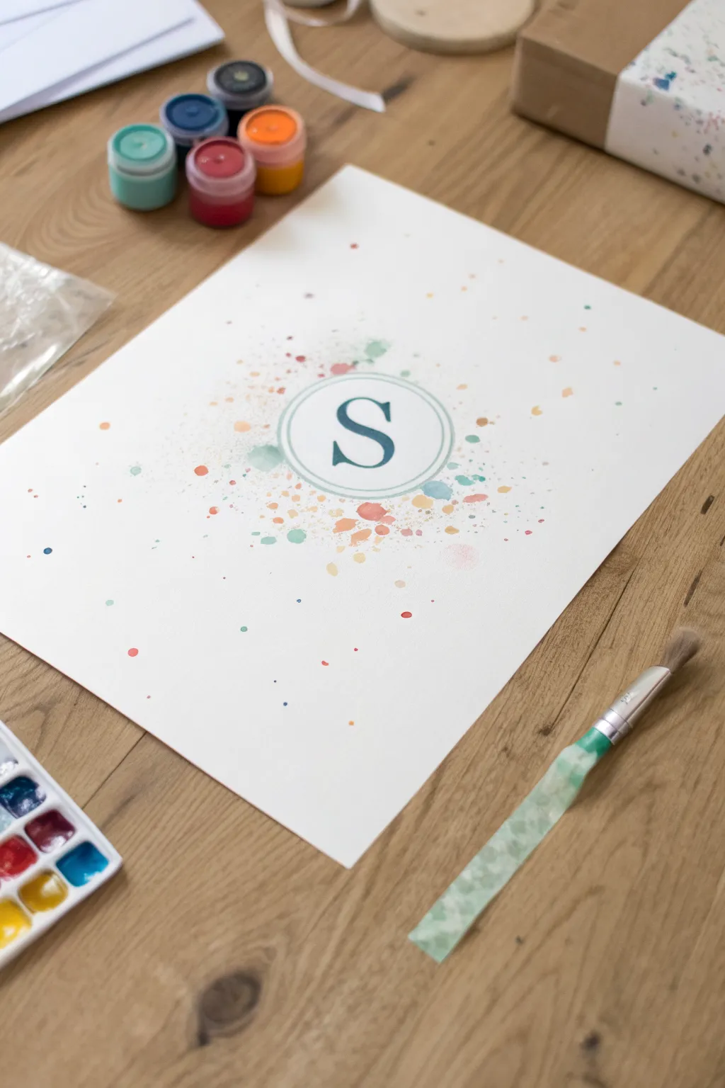
This elegant project combines the carefree energy of splatter art with the precision of a classic monogram. By masking off your initial, you create a striking negative space design surrounded by a gentle explosion of watercolor speckles.
Step-by-Step Tutorial
Materials
- Heavyweight watercolor paper or cardstock (A4 or similar)
- Adhesive vinyl or contact paper (for the stencil)
- Die-cutting machine or precision craft knife (X-Acto)
- Cutting mat (if using a knife)
- Watercolor paints (pan set or tubes)
- Small jars of tempera or gouache (optional, for opaque pops)
- Round watercolor brush (size 6 or 8)
- Stiff bristle brush (like an old toothbrush or hog hair brush)
- Paper towels
- Painter’s tape or washi tape
- Transfer tape (optional)
Step 1: Designing and Masking
-
Creating the design:
Begin by designing your monogram digitally or drawing it on scrap paper. You’ll need a bold serif letter (like the ‘S’ shown) centered inside two concentric circles to create that elegant border effect. -
Cutting the stencil:
Cut your design out of adhesive vinyl. If using a die-cutting machine, weed out the negative space so you are left with the letter ‘S’ and the ring shapes. If cutting by hand with a craft knife, work slowly on a cutting mat. -
Preparing the paper:
Tape down your watercolor paper to a flat work surface using painter’s tape. This prevents the paper from warping when it gets wet and keeps your workspace tidy. -
Applying the mask:
Carefully transfer your vinyl decal to the center of the watercolor paper. Use transfer tape if the design is delicate. Burnish the edges of the vinyl firmly with your fingernail or a credit card to ensure a tight seal—this prevents paint from bleeding underneath.
Pro Tip: Practice Run
Test your splatter technique on a scrap paper first. The amount of water on your brush drastically changes droplet size.
Step 2: Adding the Splatter
-
Mixing your palette:
Prepare your colors. You’ll want a mix of watery washes for soft spots and slightly thicker paint for opaque dots. The example uses teal, peach, mustard, and soft pink. -
First focused layer:
Load a round paintbrush with a watery teal color. Hold it directly over the vinyl stencil and tap the handle against your finger to release droplets. Keep this first layer concentrated closely around the masked area. -
Adding warmth:
Switch to a peach or coral tone. Clean your brush or use a fresh one. Splatter this color, allowing it to mix slightly with the teal but also extending a bit further out toward the edges of the paper. -
Creating varied textures:
For finer mist-like speckles, I like to switch to a stiffer brush or toothbrush here. Dip it in a diluted mustard yellow and flick the bristles with your thumb to create a spray of tiny dots. -
Adding opaque accents:
If you have gouache or opaque tempera, use the end of a paintbrush handle or a toothpick to dot a few deliberate, solid circles in accent colors. This adds dimension among the transparent watercolors. -
Building outward:
Continue adding splatters, gradually using less paint as you move away from the center. You want the design to feel like it’s fading out into the white space of the paper. -
Reviewing density:
Step back and look at the composition. Ensure the area immediately surrounding the vinyl sticker is densely covered so the shape will satisfy looking crisp when revealed. -
Drying time:
Let the paint dry completely. Because some droplets are thicker than others, give it at least 20-30 minutes. Do not rush this step, or you risk smudging.
Troubleshooting: Paint Bleed
If paint seeped under the mask, your vinyl wasn’t burnished enough. Fix small errors with a white gel pen or white acrylic paint.
Step 3: The Reveal
-
Removing the mask:
Once dry, use the tip of your craft knife or a pin to gently lift the edge of the vinyl sticker. Peel it away slowly at a sharp angle. -
Removing the center bits:
Don’t forget the inner circle mask and any internal pieces of the letter. Remove these carefully. -
Clean up:
If there was any minor bleeding under the sticker, you can gently scrape it away with an X-Acto knife or cover it with a tiny dab of white gouache.
Now you have a sophisticated piece of personalized art ready to frame and display
Splatter Diptych: Two Panels That Complete Each Other
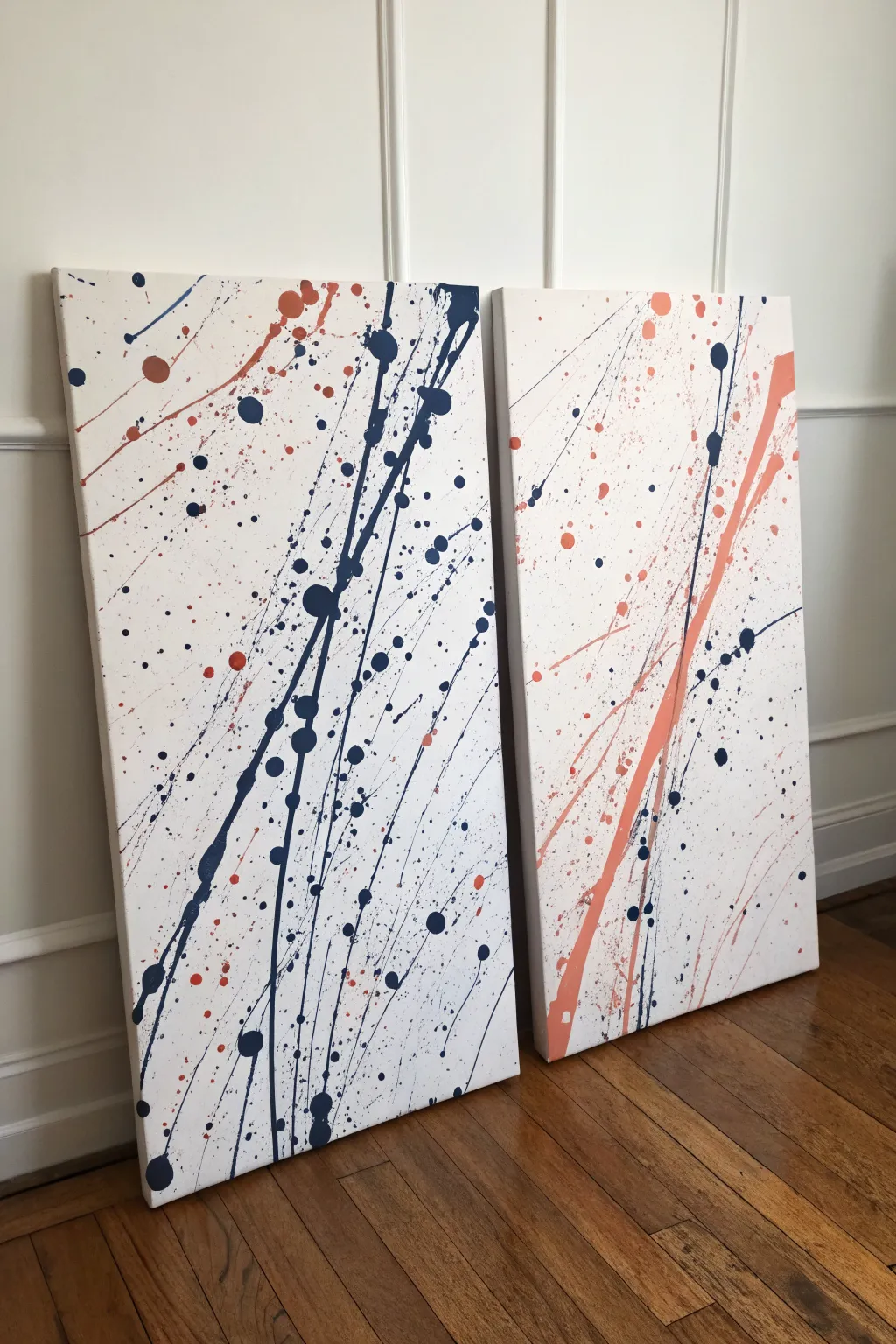
Embrace the energy of abstract expressionism with this dynamic two-panel splatter painting featuring a sophisticated navy and coral palette. By treating two canvases as a single surface during the creation process, you create a cohesive visual flow that jumps across the gap when displayed.
How-To Guide
Materials
- Two large rectangular stretched canvases (e.g., 24×48 inches)
- Acrylic paint (Navy Blue, Dark Gray/Black, Coral/Peach)
- Water for thinning paint
- Plastic cups or containers for mixing
- Assorted paintbrushes (medium round, small round, and a stiff bristle brush)
- Drop cloth or plastic sheeting (essential for this messy project)
- Masking tape (painter’s tape)
- Easels or prop blocks (optional, for leaning canvases)
Step 1: Preparation and Setup
-
Secure the workspace:
This project gets messy fast. Lay down a generous amount of plastic sheeting or a drop cloth on the floor. If you can work outdoors on a calm day, that’s even better. -
Position the canvases:
Place your two canvases side-by-side on the drop cloth or lean them against a covered wall. It is crucial to have them touching or very close together; this allows your paint lines to travel seamlessly from one canvas to the other. -
Mix the paint consistency:
Squeeze your navy blue, dark gray, and coral paints into separate cups. Add water gradually to each cup, stirring until the consistency resembles heavy cream or melted ice cream. It needs to be fluid enough to fling, but thick enough to hold an opaque shape.
Unwanted Drips?
If a drip goes rogue, don’t wipe it! Wiping creates a smear. Wait for it to dry completely, paint over it with white, and then re-splatter that area.
Step 2: Creating the Major Lines
-
Test the viscosity:
Before hitting the canvas, do a test fling on a scrap piece of cardboard to ensure your paint isn’t too watery or too clumpy. -
Start with the dominant dark lines:
Dip a medium round brush into the navy blue mixture. Stand back and use a full-arm motion to whip the paint across the canvases diagonally. Aim for long, continuous streaks that cross from the bottom left of the left canvas toward the top right. -
Add variance with gravity:
Load your brush heavily with navy paint and press it against the canvas at the top of a ‘line’ you just created, letting a drip naturally run down the path of the splatter. -
Introduce the coral accent:
Using a clean brush, repeat the long, whipping motion with the coral paint. Focus heavily on the right-hand canvas, creating a large energetic swoosh that intersects the space, while allowing smaller droplets to land on the left canvas for balance. -
Create the crossover:
Ensure at least one or two bold lines of each color physically cross the gap between the two canvases. This visual bridge is the key to the diptych effect.
Getting Long Lines
For those long, continuous whips of paint, try adding a drop of acrylic pouring medium or flow improver instead of just water. It keeps the paint elastic.
Step 3: Refining with Splatters and Details
-
Switch to the flicking technique:
For the medium-sized dots, load a smaller brush with paint. Instead of throwing your arm, hold the brush near the canvas and sharply tap the handle with your other hand or a stick. -
Layering the navy zones:
Concentrate a denser cluster of navy and dark gray splatters on the left canvas. I prefer to vary the distance I stand from the canvas here; standing closer creates tighter clusters, while stepping back spreads them out. -
Softening with coral spray:
Take a stiff bristle brush (like an old toothbrush or hog hair brush), dip it in the coral paint, and run your thumb across the bristles to create a fine mist or spray on the right canvas. -
Adding the ‘big’ drops:
Dip the handle end of a paintbrush into the navy paint and touch it directly to the canvas in random spot to create perfect, round circles. Do this sparingly to add weight to the composition. -
Check for balance:
Step back about six feet. Look for empty spaces that feel unintentional. If the left side feels too heavy, add a few stray navy specks to the far right side to pull the eye across.
Step 4: Finishing Up
-
Separate the panels:
Carefully pull the two canvases apart just an inch or so. Check the edges where they met; if paint has bridged across the sides, you may want to smooth that edge with a finger or brush so it wraps around neatly. -
Dry horizontal:
If you have very thick drips, lay the canvases flat on the floor to dry. This prevents gravity from pulling your beautifully placed splatters down into streaks you didn’t intend. -
Seal the work:
The different thicknesses of paint can dry with different sheens. Once fully cured (give it 24 hours), apply a clear spray varnish to unify the finish and protect the surface.
Hang your panels with a slight gap between them to let the negative space play its part in your composition

PENCIL GUIDE
Understanding Pencil Grades from H to B
From first sketch to finished drawing — learn pencil grades, line control, and shading techniques.
Explore the Full Guide
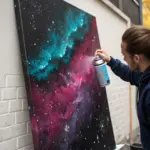
Controlled Chaos on Black: Neon Splatter Pops
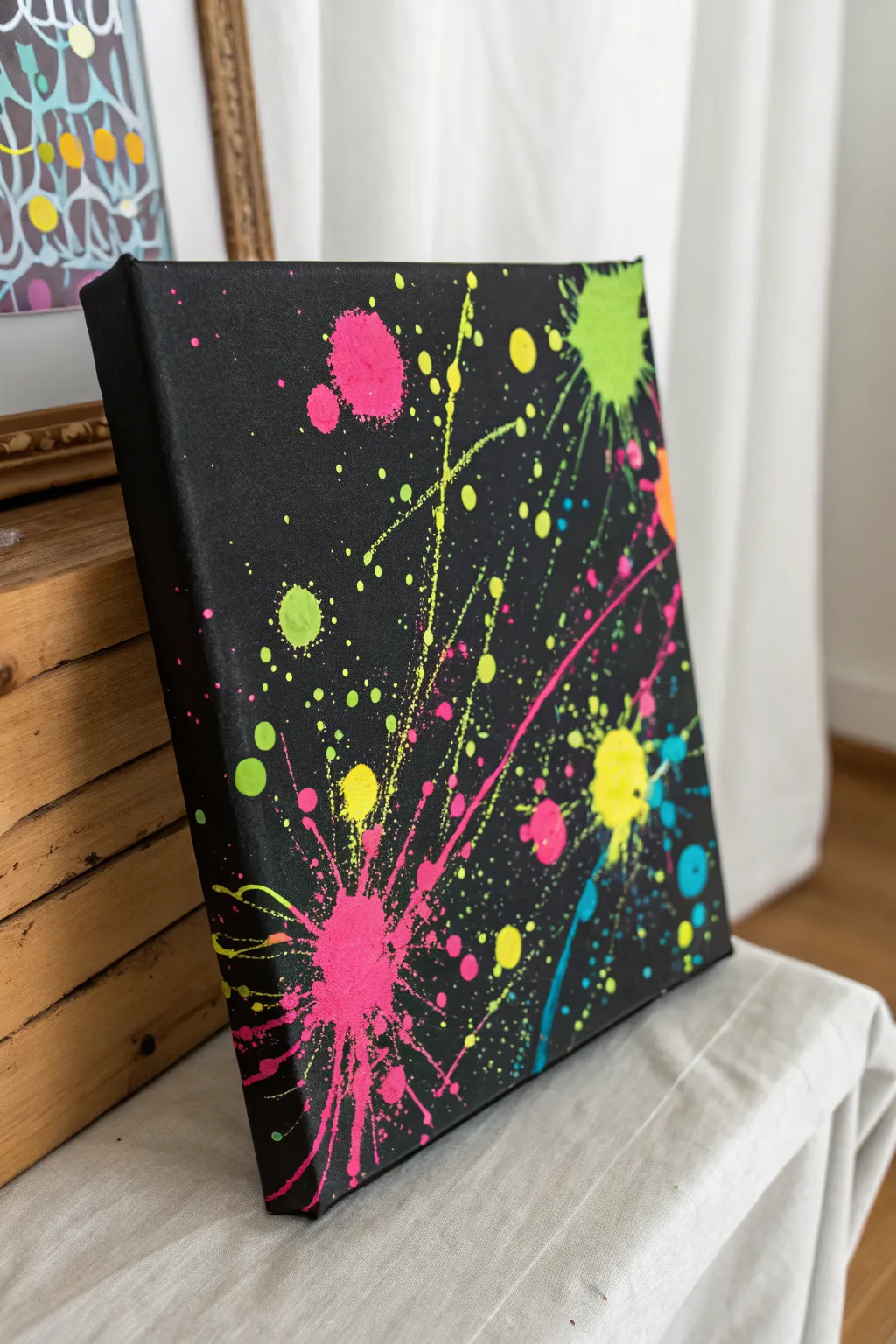
Transform a plain black canvas into an electric light show using vibrant neon paints to create a dynamic splatter effect. This technique combines bold, explosive splotches with fine, directional mist to mimic fireworks against a night sky.
Detailed Instructions
Materials
- Stretched canvas (black primed, or white primed + black acrylic)
- Black acrylic paint (matte finish preferred)
- Neon/fluorescent acrylic paints (hot pink, lime green, bright yellow, cyan)
- Stiff stencil brushes or old toothbrushes
- Palette knife or small spoon
- Various sized round brushes
- Water cup and paper towels
- Drop cloth or cardboard box (to contain mess)
Step 1: Setting the Stage
-
Prepare your workspace:
Splatter art is notoriously messy, so lay down a generous drop cloth or place your canvas inside a large cardboard box to catch stray paint. -
Prime the canvas:
If your canvas isn’t already black, apply two coats of matte black acrylic paint. Ensure full coverage so the neon colors will pop against the dark background. Allow this to dry completely before moving on. -
Plan your composition:
Looking at the reference, mentally map out where you want your major ‘explosions’ of color. There is a large pink burst at the bottom left and a green one at the top right, creating a balanced diagonal flow.
Step 2: Creating the Big Bursts
-
Mix your first color:
Start with the hot pink neon paint. Mix in a tiny amount of water—just enough to make the consistency like heavy cream, so it splatters easily but holds its shape. -
The flick technique:
Load a medium round brush with the pink paint. Aim for the bottom left quadrant and sharply flick your wrist toward the canvas to create larger droplets. -
Add impact splatters:
For the dense, central explosion shape seen in the pink area, load a palette knife or spoon with paint and forcefully fling it at a short distance onto the canvas. -
Repeat with green:
Clean your tools and switch to neon lime green. Focus this color on the upper right corner, using the flicking motion to create a counter-balance to the pink. -
Let it sit:
I like to let these major wet pools dry for about 10 minutes so subsequent layers don’t muddy into them.
Consistency check
Test your paint thickness on cardboard first. If it’s too thick, you get blobs; too thin, and the vibrant neon color becomes transparent and dull.
Step 3: Adding Detail and Texture
-
Create fine mist:
Dip an old toothbrush or a stiff bristle brush into yellow paint. Run your thumb across the bristles to spray a fine mist of stars across the center of the canvas. -
Directional lines:
To get those long, streaky lines shooting out from the center, thin your paint slightly more. Whip your brush quickly across the canvas surface without actually touching it. -
Layering blue accents:
Introduce small pops of cyan or blue. Keep these sparse, focusing them near the edges of the pink and green clusters to add depth. -
Enhance the density:
Go back in with your yellow paint and add medium-sized drops around the main clusters. This bridges the gap between the large splats and the fine mist. -
Check the balance:
Step back five feet. Look for any black voids that feel too empty and fill them with a light flick of green or pink to unify the composition. -
Dry thoroughly:
Because some paint globs are thick, leave the canvas flat to dry overnight. If you stand it up too soon, the heavy drips will run and ruin the explosive effect.
Glow Up
Use actual UV-reactive creative paints for this project. Once dry, hang the canvas near a blacklight bulb to make the artwork literally glow in the dark.
Once fully dry, you’ll have a striking piece of modern art that brings high-energy color to any room

Have a question or want to share your own experience? I'd love to hear from you in the comments below!