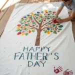
If you want a dad birthday painting that actually feels like him, the sweet spot is personal + doable, even if you’re not a “portrait person.” Here are my go-to ideas that turn your memories, inside jokes, and gratitude into art he’ll want to keep.
Classic Painted Dad Portrait
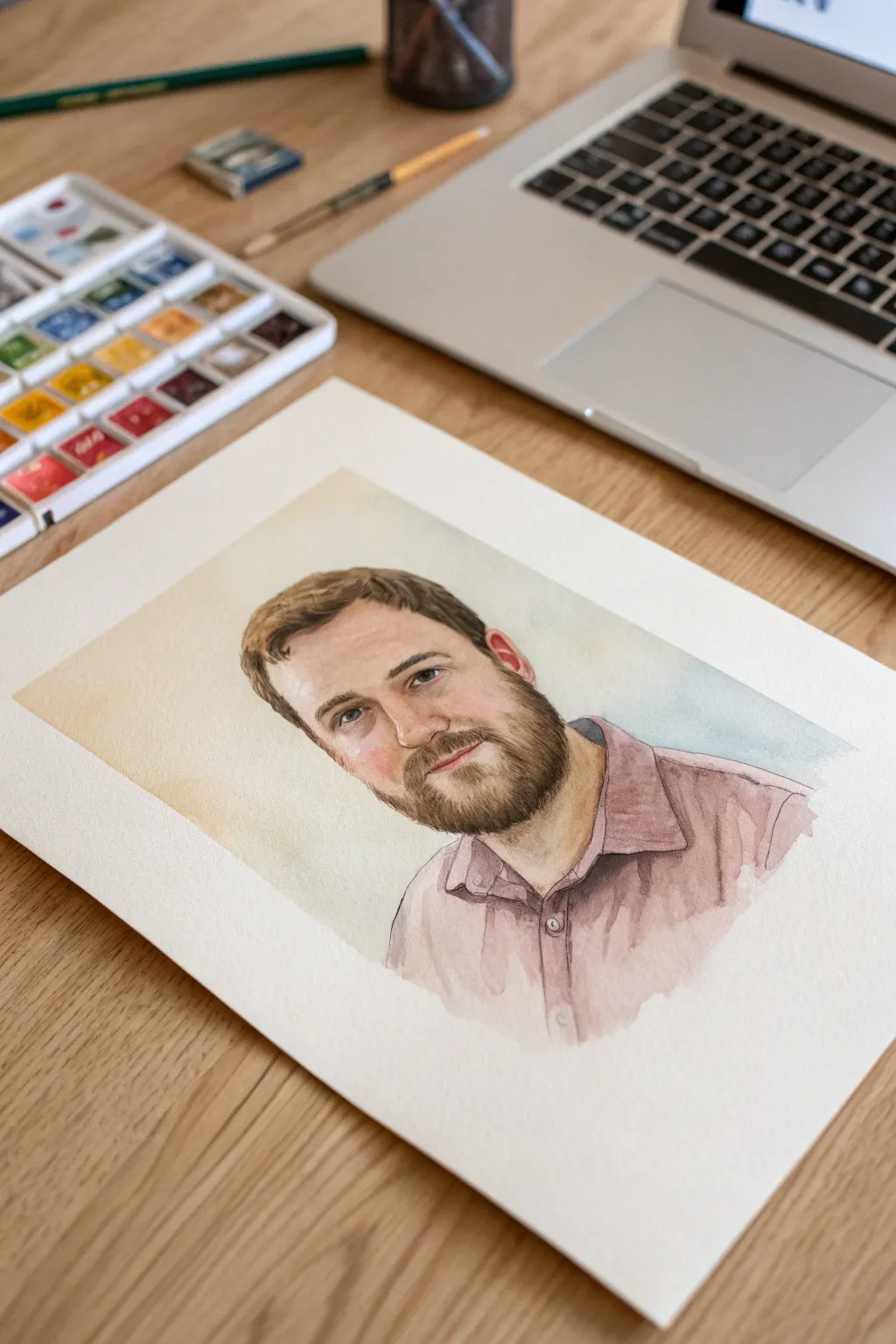
Capture Dad’s essence with this classic, realistic watercolor portrait that balances soft skin tones with detailed facial features. The gentle washes and precise layering create a warm, lifelike tribute perfect for a heartfelt birthday gift.
How-To Guide
Materials
- High-quality watercolor paper (140lb or 300gsm, cold press)
- Watercolor paint set (pan or tube)
- Pencil (HB or 2B) & kneaded eraser
- Synthetic round brushes (sizes 2, 6, and 10)
- Clean water jars
- Paper towels
- Reference photo of Dad
Step 1: Sketching & Preparation
-
Select the reference:
Choose a clear, well-lit photo of Dad where his head is turned slightly to three-quarter view, as this adds more dimension than a straight-on shot. -
Map out the proportions:
Lightly sketch the basic oval of the head and mark guidelines for the eyes, nose, and mouth using an HB pencil. Keep your touch very light so graphite doesn’t muddy the paint later. -
Refine the features:
Draw the specific shapes of the eyes, the bridge of the nose, and the outline of the beard and hair. Don’t shade with the pencil; just outline the areas where shadows will naturally fall. -
Define the clothing:
Sketch the collar and shoulders of the shirt, adding a few simple lines to indicate folds or wrinkles in the fabric. -
Lighten the sketch:
Roll a kneaded eraser over the entire drawing to lift excess graphite, leaving just faint ghost lines to guide your painting.
Step 2: First Washes & Skin Tones
-
Mix the base skin tone:
Create a watery mix of Yellow Ochre and a touch of Alizarin Crimson or Burnt Sienna to get a pale, flesh-colored wash. -
Apply the initial glaze:
Using a size 10 brush, paint the entire face area, avoiding the whites of the eyes. Let the water carry the pigment for a smooth, even layer. -
Drop in warmth:
While the first layer is still slightly damp, touch a hint of diluted red or rose into the cheeks, nose, and ears to simulate blood flow under the skin. -
Block in the hair base:
Mix a light brown using Burnt Umber and Yellow Ochre. Wash this over the hair and beard areas to establish the underlying color, ignoring individual strands for now. -
Shirt under-painting:
Mix a muted mauve or dusty purple. Apply a loose, watery wash to the shirt area, letting the edges fade out softly at the bottom for an artistic vignette effect.
Keep it Clean
Wait for the skin layers to be bone-dry before painting the beard. If the skin is damp, the sharp hair strokes will bleed into a blurry mess.
Step 3: Building Form & Detail
-
Deepen facial shadows:
Once dry, mix a slightly darker skin tone with a bit of blue or violet added for shadows. Paint the eye sockets, under the nose, and the side of the neck to create 3D form. -
Paint the eyes:
Switch to a size 2 brush. Carefully paint the irises with the appropriate eye color, leaving a tiny spot of white paper for the highlight. Outline the lid crease gently. -
Texture the beard:
Using a thicker mix of dark brown (Burnt Umber + Ultramarine), use short, flicking strokes with your smallest brush to build up the beard texture, following the direction of hair growth. -
Define the hair:
Repeat the flicking motion for the hair on top of the head, layering darker strokes over the lighter base to suggest volume and waves. -
Add shirt shadows:
Paint darker purple tones into the folds of the collar, the button placket, and under the collar itself to separate the shirt from the neck. -
Background wash:
Mix a very pale, watery yellow or ochre. Carefully paint a loose, abstract shape behind the head, softening the outer edges with clean water so it fades into the white paper. -
Final details:
Add the darkest accents—pupils, nostrils, and the deepest crevices of the beard/shirt—using a concentrated dark mix. I find stepping back here helps assess contrast.
Frame Worthy
Leave a generous white border around the painted vignette. This negative space acts as a natural mat, instantly making the portrait look professional.
Now stepping back, you can admire how the layers of color bring Dad’s familiar expression to life on the page

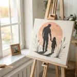
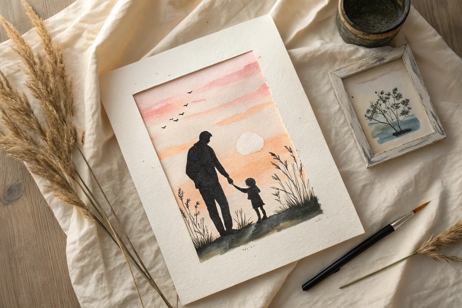
Father-Child Sunset Silhouette
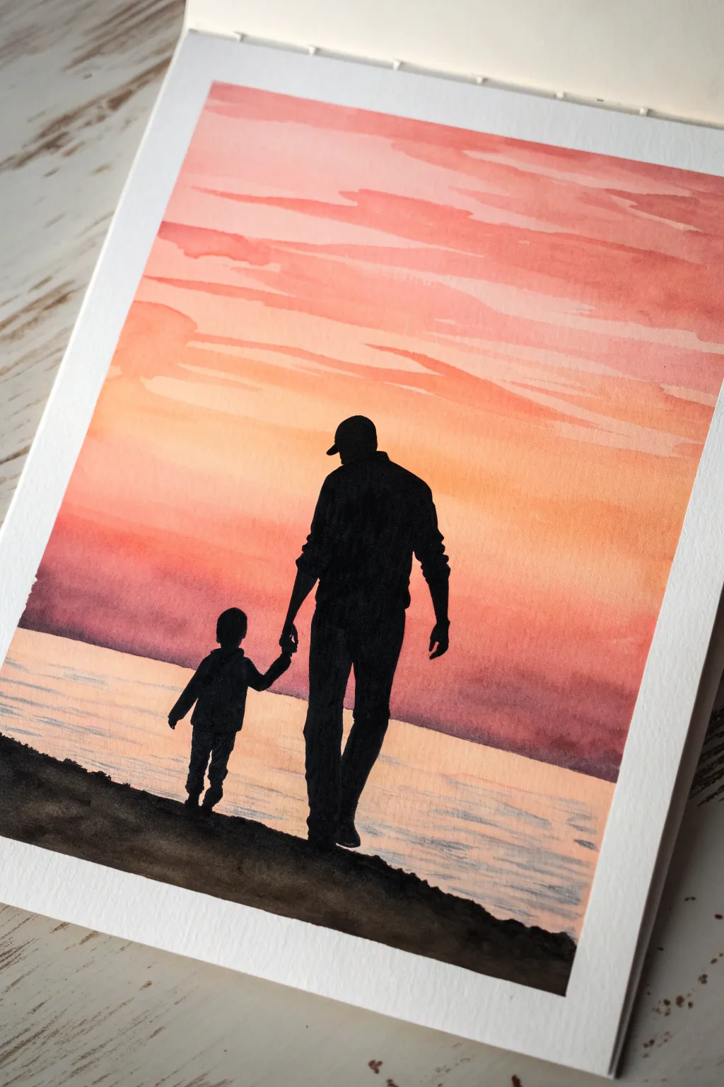
Capture the bond between father and child with this warm, glowing watercolor silhouette painting. This project uses a gradient wash technique to create a vibrant sunset sky that contrasts perfectly with the sharp, black figures.
Step-by-Step Tutorial
Materials
- Cold-press watercolor paper (300gsm)
- Watercolor paints (Coral, Orange, Yellow Ochre, Burnt Sienna, Payne’s Gray)
- Black acrylic paint or black gouache
- Flat wash brush (1 inch)
- Round brushes (sizes 4 and 0 for details)
- Masking tape
- Pencil and eraser
- Water cups and paper towels
- Palette
Step 1: Setting the Scene
-
Tape the edges:
Secure your watercolor paper to a board or table using masking tape along all four sides. This creates a crisp white border and prevents the paper from buckling when wet. -
Sketch the horizon:
Lightly draw a horizontal line about one-third of the way up from the bottom of the paper. This will separate the water from the sky. -
Outline the figures:
Using a light touch, sketch the outline of the father and child walking. Focus on the overall shapes rather than tiny details, as these will be filled in with solid black later.
Bleeding Lines?
If black paint bleeds into the sky, stop immediately. Let it dry fully, then use white gouache to cover the error before painting over it again.
Step 2: Painting the Sunset Sky
-
Prepare the sky wash:
Mix a watery coral or salmon pink color. Using your broad flat brush, apply this color across the top third of the paper using horizontal strokes. -
Blend downwards:
While the paint is still wet, pick up a warm orange tone. Continue painting downwards, slightly overlapping the pink to create a soft blend. The colors should naturally bleed into one another. -
Add warmth near the horizon:
As you approach the horizon line, switch to a lighter yellow ochre or pale orange. This mimics the bright glow of the sun just before it sets. -
Create cloud textures:
I like to load a round brush with slightly more concentrated pink or light purple paint while the paper is damp. Drag it horizontally across the upper sky to suggest soft, streaky clouds. -
Let the sky dry:
Allow the sky section to dry completely before moving on to the water. This ensures your horizon line stays sharp.
Personalize It
Customize the silhouettes to match the recipients! Add a ponytail for a daughter, a beard for dad, or even a small family dog walking alongside.
Step 3: Painting the Water
-
Starting the reflection:
For the water, use a diluted wash of possible purple or a darker coral tone. Start painting just below the horizon line, leaving slight gaps of white paper to represent sparkling reflections. -
Deepen the foreground water:
Gradually add a tiny touch of Payne’s Gray or brown to your mix as you paint closer to the bottom edge, suggesting depth in the water nearest the shore. -
Wait for full drying:
This step is crucial. The paper must be bone dry before you add the black silhouettes, otherwise the black paint will bleed into your beautiful sunset.
Step 4: Adding the Silhouettes
-
Paint the ground:
Load a round brush with black acrylic or gouache. Paint the uneven, rocky ground at the very bottom of the page, covering the bottom edge of your water wash. -
Fill the father figure:
Start filling in the father’s shape. Use the tip of your brush for the edges of the hat and clothing wrinkles, then fill the center with solid black. -
Paint the child:
carefully fill in the child’s silhouette. Pay close attention to the connection point where their hands meet to ensure it looks natural. -
Refine the edges:
Switch to your smallest size 0 brush. Clean up any jagged edges on the silhouettes and sharpen details like the bill of the cap or the shape of the shoes. -
Add ground texture:
Dab the brush along the top edge of the black ground to create the look of soil or rocks, breaking up the straight line.
Step 5: Final Touches
-
Check opacity:
Once the black paint dries, check if it looks solid. If it appears patchy or gray, apply a second coat of black for a true silhouette effect. -
Reveal the border:
Gently peel away the masking tape at a 45-degree angle, peeling away from your painting to avoid tearing the paper.
Now you have a touching piece of art ready to frame and gift for a special celebration
Big “DAD” Lettering With a Scene Inside
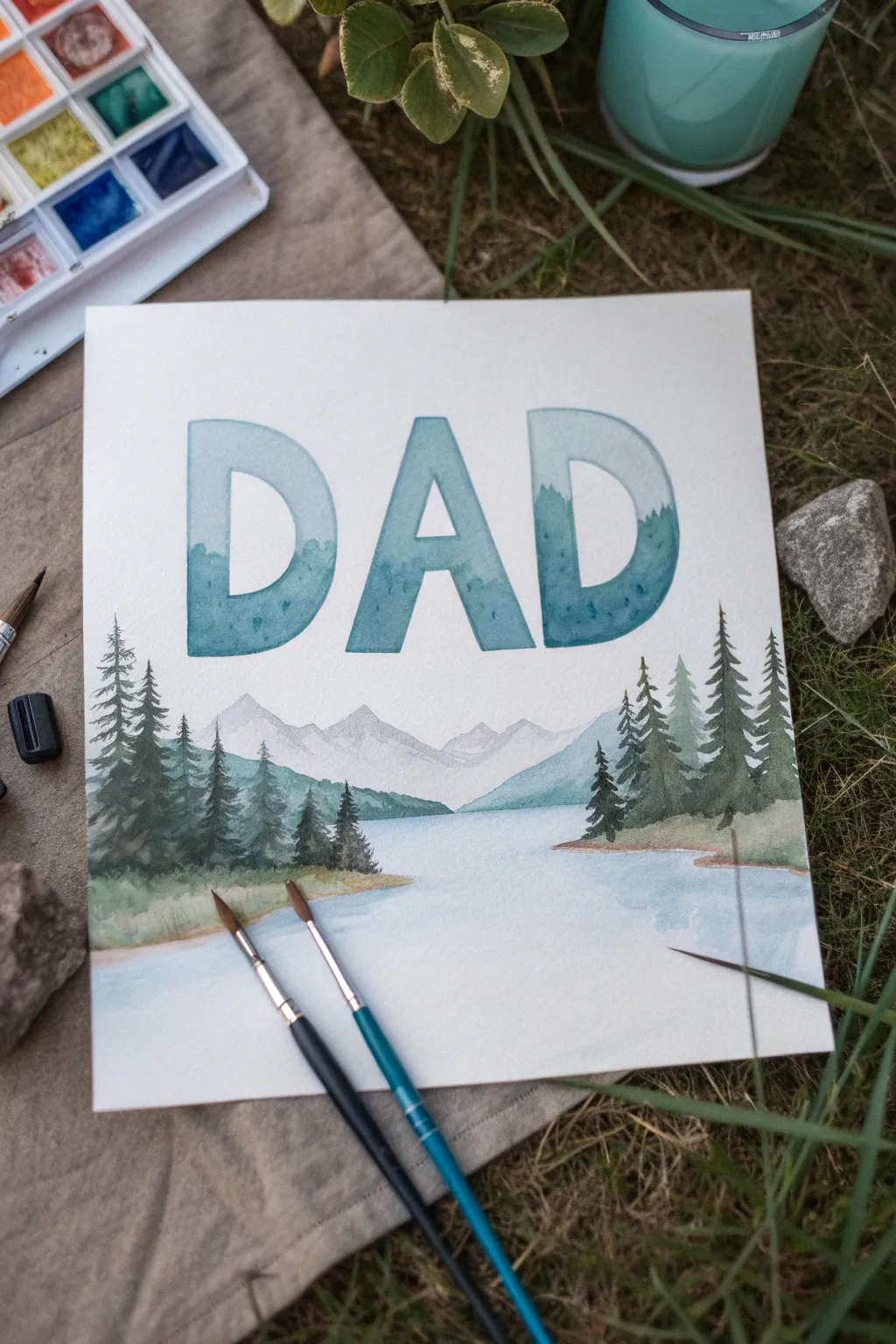
Create a meaningful tribute to your father with this tranquil watercolor landscape that blends typography and nature. Large, masked letters reveal a misty mountain scene that flows seamlessly into a serene lake and forest below.
How-To Guide
Materials
- Cold press watercolor paper (140 lb/300 gsm)
- Watercolor paint set (focus on blues, greens, and grays)
- Masking fluid or drawing gum
- Pencil and eraser
- Ruler
- Round brushes (sizes 2, 6, and 10)
- Jar of clean water
- Palette or mixing tray
- Paper towels
Step 1: Planning and Masking
-
Sketch the letters:
Begin by lightly sketching the word ‘DAD’ in large, block letters across the upper middle portion of your paper. Use a ruler to ensure the tops and bottoms align perfectly, leaving plenty of space below for the landscape extension. -
Sketch the horizon:
Lightly draw a horizon line that cuts through the bottom half of the letters. Sketch the outlines of distant mountains within the letters and trees along the sides that will break out of the letter boundaries. -
Apply masking fluid:
Carefully apply masking fluid around the *outside* of the letters, preserving the white of the paper surrounding the text. Also, mask the sky area *inside* the letters if you want the mountains to have a sharp upper edge against a white background, or leave it open if you plan to paint a sky within the text. -
Let it dry completey:
Allow the masking fluid to dry completely until it becomes transparent or yellowish and is no longer tacky to the touch. This seal is crucial for crisp edges.
Use A Soap Barrier
Before dipping your brush into masking fluid, coat the bristles in dish soap. This prevents the fluid from drying deep in the brush and ruining it forever.
Step 2: Painting the Letters and Background
-
Paint the gradient fill:
Mix a watery teal-blue wash. Working strictly inside the letter shapes, apply a gradient that is lighter at the top and gradually darker towards the bottom, mimicking an atmospheric sky or distant fog. -
Establish distant mountains:
While the first layer is still slightly damp but not soaking, drop in faint, jagged shapes of grey-blue mountains within the letters. Let the pigment bloom slightly for a hazy, distant effect. -
Define the mid-ground:
Once the previous layer is dry, mix a slightly stronger blue-green. Paint a second range of hills or mountains that sit lower within the letters, overlaying the distant ones to create depth. -
Add texture within letters:
Use a smaller brush to dab concentrated teal or deep green pigment into the bottom third of the letters, suggesting dense forests or shadows before the letters transition into the open scene.
Add a hidden message
Paint tiny, silhouette figures of a father and child fishing on the bank or standing near the shoreline to make the scene personal to you and him.
Step 3: Creating the Landscape
-
Paint the lake water:
Below the letters, wash in the lake area with a very pale, diluted blue. Leave some white space near the shoreline to suggest reflection and light. -
Paint back-layer trees:
Mix a muted, desaturated green. Paint the silhouette of distant pine trees along the horizon line on the left and right sides, making them smaller and lighter to push them into the background. -
Paint foreground trees:
Load a size 6 brush with a rich, dark emerald green. On top of the dry background layer, paint detailed pine trees on the far left and right edges. Use the tip of the brush for the top branches and press down for the wider bottom branches. -
Connect the scene:
Ensure the trees on the sides visually connect with the bottom edges of the ‘DAD’ letters, creating a cohesive flow where the typography feels rooted in the landscape.
Step 4: Refining Details
-
Define the shoreline:
Mix a light sandy brown or ochre. Carefully paint a thin, irregular strip of land at the base of the treeline where the forest meets the water. -
Add water reflections:
With a clean, damp brush, gently pull some of the dark green pigment from the base of the trees downwards into the wet lake area to create soft, vertical reflections. -
Remove the mask:
Checking that the paint is 100% dry, gently rub off the masking fluid with your finger or a rubber cement pick. Reveal the crisp white borders around your letters. -
Touch up edges:
If the paint bled slightly under the mask, use a tiny amount of opaque white gouache or a white gel pen to tidy up the letter edges. -
Final darkening:
Assess the contrast. If the foreground trees need more punch, glaze a final layer of very dark green (mixed with a touch of Payne’s Grey) onto the closest pine trees for dramatic effect.
Once dry, frame this piece simply to let the clean lines and serene colors speak for themselves as a heartfelt gift

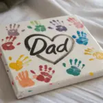
“Number 1 Dad” Birthday Badge
Celebrate Dad’s special day by awarding him this bespoke rosette badge, featuring a classic pleated ribbon border and crisp fabric appliqué. This tactile project combines simple sewing and assembly techniques for a professional-looking finish that he can wear with pride.
Step-by-Step
Materials
- White or cream felt sheet
- Gold or tan satin ribbon (1 inch wide)
- Navy blue grosgrain ribbon (1 inch wide)
- Burnt orange grosgrain ribbon (1 inch wide)
- Tan grosgrain ribbon (1 inch wide)
- Navy blue iron-on vinyl or fabric paint
- Orange fabric marker or embroidery floss
- Cardstock or thin cardboard
- Hot glue gun and glue sticks
- Fabric scissors
- Needle and orange thread
- Safety pin or brochure pin back
Step 1: Preparing the Center Medallion
-
Cut the base circles:
Begin by cutting a 2.5-inch circle from your cardstock to serve as the sturdy base. Use this template to cut a matching circle from your white felt. -
Design the number:
Cut a bold ‘1’ shape from navy blue iron-on vinyl, approximately 1.5 inches tall. If you don’t have vinyl, you can carefully paint this utilizing a stencil and fabric paint; just insure the edges remain crisp. -
Apply the central motif:
Center the ‘1’ on the white felt circle. Iron it in place according to the vinyl instructions, making sure it adheres fully to the textured felt surface. -
Add the laurel details:
Using an orange fabric marker or fine-tipped paint pen, draw two curved laurel branches flanking the number. Start from the bottom and work upwards, keeping the leaves simple and symmetrical. -
Stitch the border:
Thread your needle with orange thread. Create a running stitch or backstitch around the inner perimeter of the felt circle, about 1/8 inch from the edge, to frame the design perfectly. -
Mount the felt:
Apply a thin layer of hot glue to the cardstock circle and press the decorated felt piece firmly onto it, ensuring the edges align neatly.
Step 2: Creating the Ribbon Rosette
-
Pleat the gold ribbon:
Cut a length of gold satin ribbon roughly 12 inches long. Start folding it into box pleats or uniform ruffles, securing each fold with a tiny dab of hot glue as you go. -
Form the circle:
Shape your pleated ribbon strip into a circle that is slightly larger than your center medallion. Glue the ends of the ribbon together where they meet, hiding the seam within a pleat. -
Attach the backing:
Cut a second circle of cardstock, slightly larger than the first (about 3 inches). Glue the pleated ribbon ring onto this base so the pleats radiate outward evenly.
Pleat Perfect
Issues with uneven pleats? Use a fork tines to measure and fold consistent ribbon loops before gluing them down.
Step 3: Assembly and Tails
-
Prepare the tails:
Cut five strips of ribbon for the tails: two navy blue (4 inches), two burnt orange (3.5 inches), and one tan (4 inches). I find differing lengths add nice visual interest. -
Trim the ends:
Cut a ‘V’ notch into the bottom of the navy blue ribbons. For the orange and tan ribbons, cut the ends at a sharp 45-degree angle to prevent fraying and add variety. -
Arrange the ribbon stack:
Lay the ribbons out in a fan shape. Place the navy ribbons on the outside, then the orange, and finally the tan in the center. Glue them together at the top, overlapping slightly. -
Secure tails to rosette:
Glue the fanned ribbon tails to the back of the cardstock rosette base (the one holding the pleats), positioning them so they hang down from the bottom center. -
Final assembly:
Glue the finished center medallion (felt on cardstock) directly into the center of the pleated ribbon ring. Press down firmly to bond all layers. -
Add the hardware:
Flip the entire badge over. Glue a bar pin or safety pin securely to the upper back of the cardstock base using a generous amount of hot glue.
Clean Cuts
After cutting your ribbon tails, quickly run a lighter flame over the raw edges to seal them and prevent future fraying.
Now Dad has a handsome award to wear all day long on his birthday
BRUSH GUIDE
The Right Brush for Every Stroke
From clean lines to bold texture — master brush choice, stroke control, and essential techniques.
Explore the Full Guide
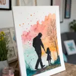
Back-View “Dad and Me” Portrait
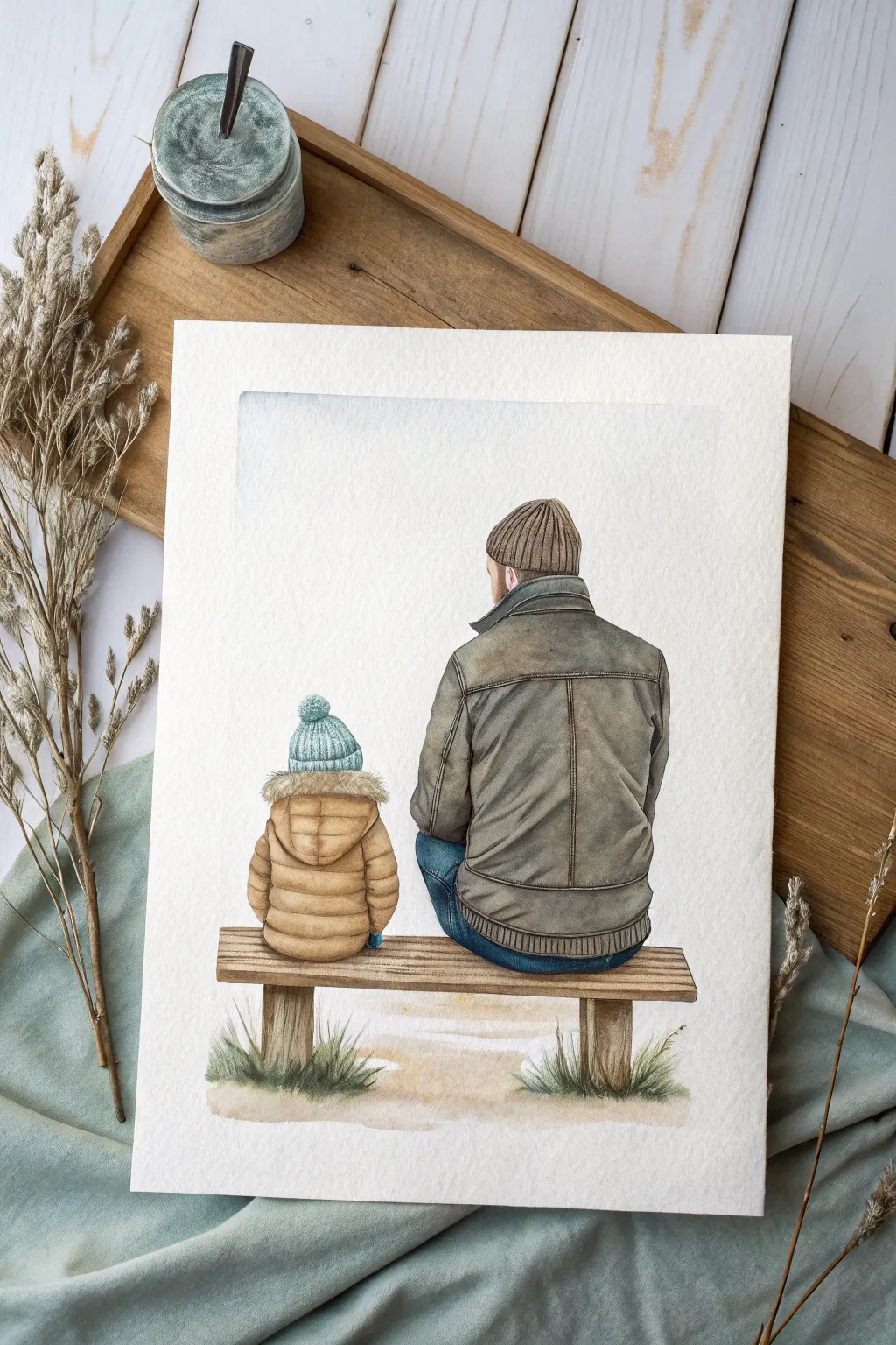
Capture the quiet connection between father and child with this heartwarming watercolor portrait. The painting features a tender back-view perspective, focusing on the textures of winter coats and the simple serenity of sitting side-by-side.
Step-by-Step Guide
Materials
- Cold press watercolor paper (300 gsm)
- Watercolor paints (Earth tones: Burnt Umber, Yellow Ochre, Payne’s Grey, Indigo)
- Round watercolor brushes (Size 2, 6, and 8)
- HB Pencil for sketching
- Kneaded eraser
- Masking tape
- Two jars of water
- Paper towels
Step 1: Sketching the Figures
-
Establish the composition:
Begin by lightly taping down your watercolor paper to a board to prevent buckling. With your HB pencil, mark the horizon line where the bench will sit, keeping it in the lower third of the paper to allow plenty of breathing room for the sky. -
Outline the father:
Sketch the larger figure first. Draw a broad, rounded shape for the torso and a smaller oval for the head. Add the rectangle of the folded collar and the lines of the beanie hat sitting snugly on the head. -
Add the child:
To the left, sketch the smaller figure. Ensure the height difference is significant to emphasize the parent-child relationship. Draw the puffy shape of the winter coat and the distinct pom-pom beanie. -
Draft the bench and details:
Draw the wooden slats of the bench underneath them. Add vertical lines for the coat seams and horizontal wrinkles where the fabric would naturally fold at the waist and elbows.
Dry Brush For Texture
For realistic leather or wood, wipe most paint off your brush on a paper towel before painting. The bristles will skip over the paper’s texture, creating a perfect worn look.
Step 2: Painting the Clothing
-
Base wash for the father’s jacket:
Mix a watery wash of Burnt Umber with a touch of Payne’s Grey to create a muted, leather-like brown. Using the size 8 brush, apply this to the father’s jacket, intentionally leaving small white gaps near the shoulders for highlights. -
Adding shadow and depth:
While the first layer is still damp, drop in a more concentrated mix of the same color into the creases, under the arms, and along the seams to create soft, diffused shadows. -
Painting the child’s coat:
For the puffy coat, mix Yellow Ochre with a tiny bit of brown. Paint the segmented ‘puffs’ individually. I like to let this dry briefly between segments so the colors don’t bleed into one big blob, preserving the puffy look. -
Painting the denim:
Using Indigo or a deep blue, paint the visible portions of the jeans. Keep the color darker where the legs meet the bench to ground the figures.
Make It Personal
Customize the colors of the coats and hats to match favorite real-life outfits dad and kid actually own. It adds a secret layer of sentimentality to the gift.
Step 3: Details and Texture
-
Knit textures:
Switch to your size 2 brush. For the hats, mix a slightly darker version of your base colors. Paint tiny vertical lines on the father’s beanie to mimic ribbing and small stippled dots on the child’s hat for a knit texture. -
Refining the leather jacket:
Once the jacket is fully dry, use a dry-brush technique with dark brown paint to add scratchy textures, simulating worn leather. Darken the collar and the waistband ribbing. -
Fur hood detail:
For the fur lining on the child’s hood, use a jagged, uneven stroke with a very pale brown mix. Keep the edges soft and feathery rather than outlining them sharply. -
Bench wood grain:
Paint the bench slats with a light brown wash. When dry, use the tip of your size 2 brush to draw thin, wobbling lines for wood grain and focused shadows between the planks.
Step 4: Final Touches
-
Grounding grass:
Mix a sap green with a little brown to desaturate it. Paint quick, upward flickering strokes at the base of the bench posts to suggest tufts of grass poking through the dirt. -
Soft earth wash:
Dilute some leftover brown paint significantly with water. Brush a very faint wash under the bench and grass to create the ground, fading it out into white paper as you move away from the center. -
Sky tint:
For a subtle atmosphere, wet the area above the figures with clean water. Drop in a minuscule amount of diluted blue-grey near the top left corner and let it diffuse downwards naturally. -
Review and refine:
Step back and assess contrast. If the painting looks too flat, add a final glaze of dark Payne’s Grey to the deepest shadow areas, such as where the figures sit on the bench.
Once dry, carefully peel off the tape to reveal your clean edges and a touching birthday tribute ready for framing
Dad’s Favorite Hobby Moment
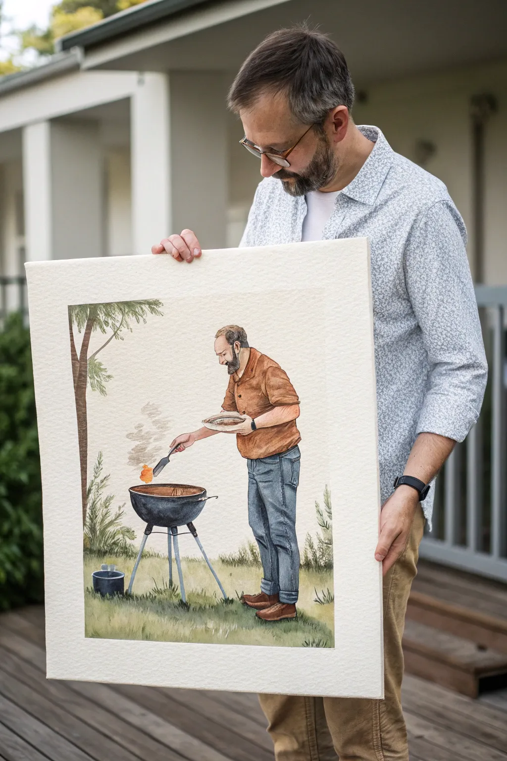
Immortalize the weekend grill master with this charming, character-driven watercolor portrait. The finished piece features a clean, illustrative style with soft washes and crisp details that perfectly capture Dad in his element.
Step-by-Step Tutorial
Materials
- Cold press watercolor paper (140lb/300gsm, large format roughly 18×24 inches)
- Set of watercolors (pan or tube)
- Round brushes (sizes 4, 8, and a fine liner for details)
- Wide flat wash brush (1 inch)
- Graphite pencil (HB or 2B) and kneaded eraser
- Ceramic palette for mixing
- Two water containers
- Masking tape and mounting board
Step 1: Planning and Sketching
-
Reference Gathering:
Start by finding a good photo of Dad grilling. If you don’t have one where he’s in this exact pose, combine a photo of his face with a generic reference of someone standing at a grill. -
Secure Your Paper:
Tape your large watercolor paper down to a board on all four sides. This prevents the large sheet from buckling when you add water later. -
Establish the Horizon:
Draw a faint horizontal line about one-third up from the bottom to separate the grassy yard from the background space. -
Blocking the Figure:
Sketch Dad’s main shapes lightly. Focus on the posture—leaning slightly forward toward the grill—and get the proportions of the torso and legs right before adding clothes. -
Adding Details:
Refine the sketch with specifics: the spatula, the round dome of the grill, the tripod legs, and the folds in his shirt and jeans. Keep pencil lines light so they don’t show through the paint.
Fixing Muddy Colors
If shadows on the shirt look muddy, let it dry completely. Then, glaze over with a pure, transparent color like Alizarin Crimson to unify the tone without adding opacity
Step 2: Painting the Figure
-
Skin Tones:
Mix a light wash of burnt sienna and a touch of red or yellow ochre for the skin. Paint the face and arms, leaving tiny white gaps for highlights on the nose or knuckles. -
Clothing Base Layers:
For the shirt, mix a warm terracotta or brown. Apply a wet wash, dropping in slightly darker pigment wet-in-wet where shadows would fall under the arm or belly. -
Denim Texture:
Paint the jeans using indigo mixed with a little payne’s grey. While the paint is damp, lift out pigment on the thighs and knees with a thirsty brush to create a worn denim look. -
Boots and Hair:
Use burnt umber for the shoes. For hair and beard, use small, textural strokes rather than a solid block of color to suggest fullness.
Step 3: The Grill and Scenery
-
Metallic Elements:
Paint the grill body with a mix of black and ultramarine blue. Don’t paint it solid black; leave streaks of white paper to represent the shiny metal surface reflecting light. -
Grill Smoke:
With a very dilute mix of grey, paint wispy, irregular shapes rising from the grill. Soften the edges with clean water so the smoke looks transparent. -
Burger Flip:
Add a pop of bright orange-brown for the burger or food item being flipped. This small splash of saturated color draws the eye to the action. -
Grassy Texture:
Using your flat brush, apply a variegated wash of sap green and olive for the ground. While wet, flick the brush upward to create grass blades near the feet. -
The Tree Trunk:
Paint the tree trunk on the left with a darker brown. I like to keep the edges slightly rough to mimic bark texture. -
Foliage Details:
Dab in loose, leafy shapes for the tree canopy and the bushes behind the grill using varied greens. Keep the background foliage softer than the foreground figure.
Personalize It
Add specific details unique to him, like a logo on the shirt, his favorite brand of beer on the grass, or the family dog sleeping near the grill legs
Step 4: Final Touches
-
Deepening Shadows:
Once everything is bone dry, mix a dark purple-grey. Paint cast shadows underneath the shoes and the grill legs to ground the objects. -
Fine Liner Work:
Use your smallest brush (size 0 or 1) to add crisp edges to the glasses, the watch strap, and the grill grate details. -
Highlight Check:
Step back and assess. If you’ve lost too many highlights, you can use a tiny bit of white gouache to bring back the shine on the grill lid or the eye.
Frame this large-scale watercolor with a wide white mat to give his hobby the gallery treatment it deserves

PENCIL GUIDE
Understanding Pencil Grades from H to B
From first sketch to finished drawing — learn pencil grades, line control, and shading techniques.
Explore the Full Guide
Painted Shirt-and-Tie Birthday Card
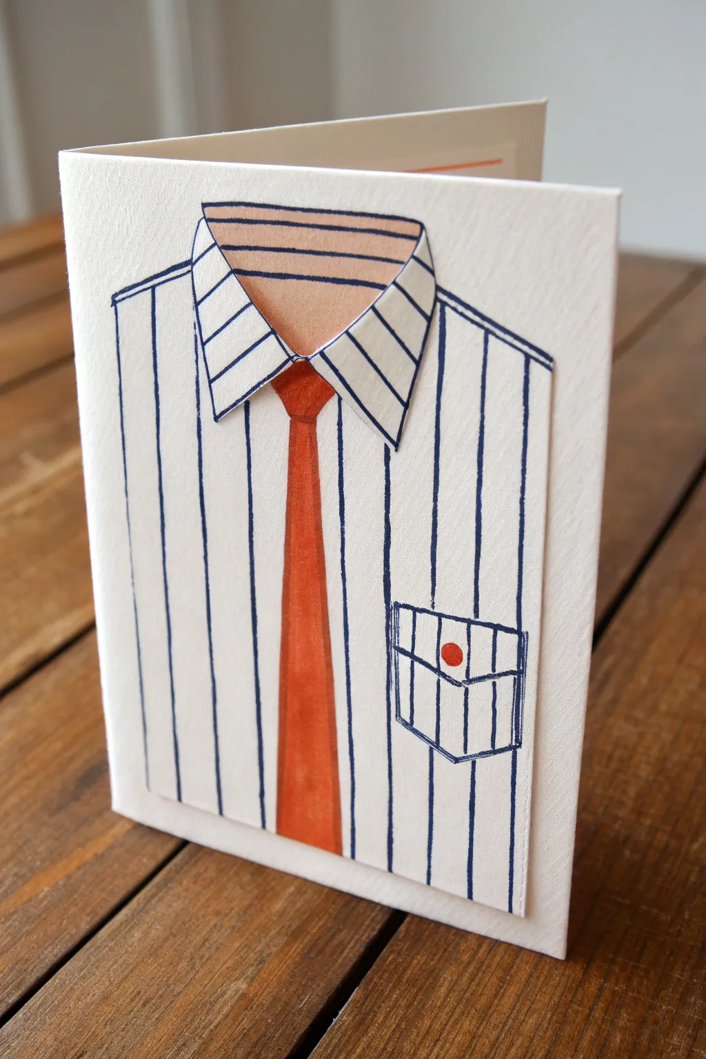
This charming handmade card features a classic pinstripe shirt design complete with a dimensional collar and a bold red tie. The clever use of cut paper layers gives the shirt realistic depth, making it a perfect, clean-cut greeting for Dad.
Step-by-Step Guide
Materials
- Heavyweight white cardstock (folded card base)
- Additional white cardstock sheet (for the shirt panel)
- Navy blue fine-tip marker or drawing pen
- Orange-red watercolor or marker (for the tie)
- Flesh-tone watercolor or marker (for the neck area)
- Ruler
- Pencil
- Scissors or craft knife
- Double-sided foam tape or glue dots
- Regular craft glue
- Cutting mat
Step 1: Preparing the Shirt Base
-
Measure the panel:
Cut a rectangular piece of white cardstock that is slightly smaller than your main folded card base. This will be the ‘shirt’ panel. -
Sketch the outline:
Using a pencil and ruler, lightly draw vertical lines down the entire length of the rectangular panel. Space them evenly, about half an inch apart. -
Draw the pinstripes:
Trace over your pencil lines carefully with a navy blue fine-tip pen. I find that pulling the pen toward you rather than pushing it away helps keep the lines straighter against the ruler. -
Add the pocket detail:
On the lower right side of the panel, draw a square pocket shape using the blue pen. Make sure the shirt’s vertical stripes continue ‘behind’ or through the pocket drawing. -
Detail the pocket:
Draw the folded flap of the pocket at the top. Add a small red circle in the center of the flap to represent a button using your orange-red marker.
Step 2: Creating the Collar and Tie
-
Cut the collar shape:
On a scrap piece of white cardstock, draw a shape resembling a shirt collar—a wide, shallow ‘V’ shape with pointed ends. -
Stripe the collar:
Draw diagonal pinstripes on the collar piece using the navy blue pen. The angle should be consistent on both sides, meeting in the middle. -
Outline the collar:
Go over the outer edges of the collar shape with the navy blue pen for a crisp definition. -
Sketch the neck area:
On the separate shirt panel, near the top center, lightly pencil in a curved area where the neck would be visible between the collar points. -
Color the neck:
Fill in a small curved section at the very top center of the shirt panel with a flesh-tone watercolor or marker to suggest the wearer’s neck. Add horizontal blue lines here to represent the back inside of the collar. -
Draw the tie knot:
Just below the neck area, sketch a small trapezoid for the tie knot. -
Draw the tie length:
Extend a long, tapering shape down from the knot to create the body of the tie. -
Color the tie:
Fill in the tie knot and body with the orange-red marker or watercolor paint. If using watercolor, let it dry completely before adding outlines. -
Outline the tie:
Once the color is dry, outline the tie shape with the navy blue pen.
Wobbly Stripes?
If your ruler slips and a line goes crooked, don’t panic. Thicken that specific stripe slightly to mask the error, or simply thicken all stripes for a bolder visual style.
Step 3: Assembly & Finishing Touches
-
Cut the center slit:
Carefully cut a vertical slit down the center of the shirt panel, starting from the top and stopping just below where the tie ends. This separates the left and right sides of the shirt front. -
Attach the collar:
Using foam tape for dimension, attach the separate collar piece to the very top edge of the shirt panel. -
Position the collar:
Ensure the collar points overlap the top of the tie slightly, creating a realistic layered look. -
Mount the shirt panel:
Apply glue to the back of the striped shirt panel and press it firmly onto the front of your folded card base. -
Add final definition:
Use the navy blue pen to deepen any outlines that need more contrast, particularly around the collar and tie knot. -
Check the edges:
Clean up any pencil marks with a gentle eraser to ensure the white cardstock looks crisp and clean.
Personalize the Pocket
Instead of just a button on the pocket, try drawing reading glasses peeking out, or paint a tiny pen clipped onto the pocket flap for a personal touch.
Your finished card is now a stylish, custom-tailored greeting ready to make an impression
His Catchphrase in Bold Brush Lettering
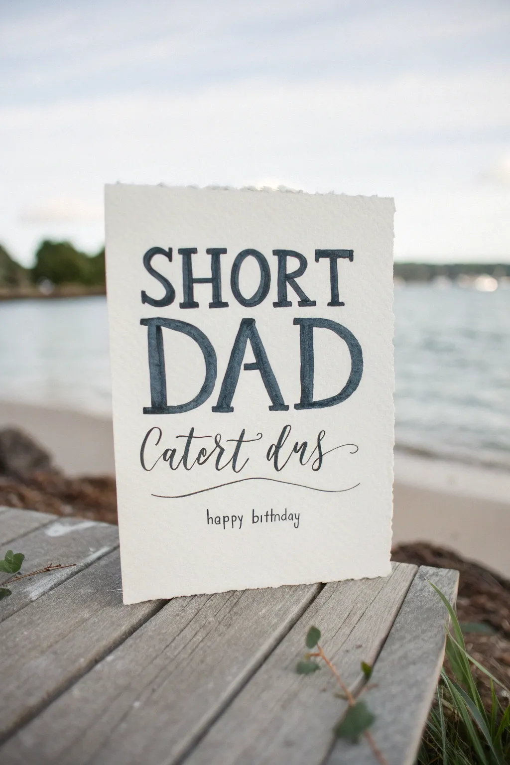
Capture a humorous family sentiment with this elegant yet playful watercolor card featuring hand-lettered text on deckled-edge paper. The contrast between bold serif letters and delicate script creates a modern, sophisticated look perfect for Dad’s birthday.
Step-by-Step Guide
Materials
- Cold press watercolor paper (300 gsm)
- Dark indigo or Payne’s Grey watercolor paint
- Flat shader brush (size 6 or 8)
- Fine liner brush (size 0 or 00) or brush pen
- Fine tip black drawing pen (0.3mm)
- Ruler
- Pencil (HB)
- Kneaded eraser
- Water jar
- Paper towel
Step 1: Preparation and Layout
-
Prepare the paper:
Cut your watercolor paper to your desired card size, roughly 5×7 inches when folded. For that authentic artisanal look shown in the photo, create a deckled edge by carefully tearing the paper against a ruler edge instead of cutting it with scissors. -
Fold the card:
Score the center line gently with a bone folder or the back of a butter knife before folding to ensure a clean, crisp fold without cracking the heavy paper fibers. -
Draft guidelines:
Using your ruler and HB pencil, lightly draw four horizontal guidelines. The top two are for ‘SHORT’, the middle two are for the larger ‘DAD’, and a lower guide for the script text. Keep these lines incredibly faint so they are easy to erase later. -
Sketch the letters:
Lightly sketch the word ‘SHORT’ in a serif style on the top line. Below it, sketch ‘DAD’ roughly 1.5 times larger than the first word. Add thick vertical strokes to the letters to simulate the bold brush look you’ll paint later. -
Sketch the script:
Below ‘DAD’, lightly pencil in the script phrase ‘Catch days’ (or your chosen phrase) in a flowing cursive style. Add a simple wavy line underneath and the small ‘happy birthday’ text at the very bottom.
Step 2: Painting the Bold Text
-
Mix your paint:
Prepare a puddle of dark indigo or Payne’s Grey watercolor. You want a high pigment-to-water ratio so the color is deep and almost opaque, but still fluid enough to flow smoothly. -
Paint the vertical strokes:
Using your flat shader brush, paint the thick vertical downstrokes of ‘SHORT’. Press the brush flat against the paper to get a consistent width. I usually hold my breath for a second here to keep my hand steady. -
Add the serifs:
Switch to the very tip of the flat brush or use a smaller round brush to add the thin horizontal serifs and crossbars to the letters in ‘SHORT’. Allow slight pooling of pigment for that characteristic watercolor texture. -
Paint ‘DAD’:
Repeat the process for the word ‘DAD’, using the full width of your flat brush for the main strokes. Because these letters are larger, you may need to reload your brush halfway through a stroke to maintain consistent color density. -
Refine edges:
While the paint is still damp, carefully tidy up any rough edges with the tip of your fine brush. If you want a more rustic feel, leave the natural brush variations visible. -
Let it dry completely:
Allow the bold lettering to dry fully before moving on. This is crucial—if you rest your hand on wet paint, you will smudge the main feature.
Uneven Coverage?
If your large letters look patchy as they dry, don’t overwork them. Let the first layer dry completely, then apply a second, thin glaze of the same color to even out the tone.
Step 3: Script and Details
-
Letter the script phrase:
Using a fine liner brush loaded with a slightly more diluted mixture of the same indigo paint, trace over your pencil sketch for the middle phrase. Apply more pressure on downstrokes and lift up for upstrokes to get line variation. -
Add the flourish:
With the same fine brush, paint the long, thin wavy underline beneath the script text. Try to do this in one continuous, confident motion to avoid shaky lines. -
Write the bottom text:
Switch to your fine tip black drawing pen for the ‘happy birthday’ text at the bottom. Use a simple, small sans-serif print to contrast with the other styles. -
Erase guidelines:
Once you are absolutely certain all paint and ink is bone dry (give it an extra 10 minutes just to be safe), gently roll a kneaded eraser over the pencil lines to remove them without damaging the paper surface.
Brush Control Pro Tip
For the crispest serifs on ‘DAD’, don’t paint using the brush tip. Instead, use the flat edge of your shader brush like a stamp to create perfect straight lines.
Your personalized, hand-lettered card is now ready to make a memorable impression.


Blueprint-Style “Best Dad” Layout
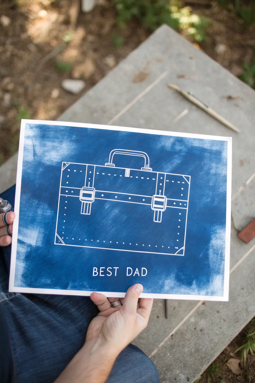
Recreate the classic charm of architectural blueprints with this striking monochromatic project. Using negative space and deep indigo hues, youll craft a sophisticated tribute featuring a vintage briefcase that any dad will appreciate.
Step-by-Step Tutorial
Materials
- Heavyweight mixed-media or watercolor paper (9×12 inches)
- White crayon, oil pastel, or masking fluid pen
- Indigo or Prussian Blue watercolor paint (or liquid watercolor)
- Wide flat wash brush
- Pencil and eraser
- Ruler
- Reference image of a briefcase
- Paper towels
- Masking tape (low tack)
Step 1: Preparation & Sketching
-
Secure Your Surface:
Begin by taping down all four edges of your paper to a smooth, flat work surface using low-tack masking tape. This creates a clean white border and prevents the paper from buckling when you apply the blue wash later. -
Draft the Dimensions:
Using a ruler and a light pencil touch, draw a large rectangle in the center of the page to represent the body of the briefcase. Ensure it is centered but leave room at the bottom for text. -
Add Structural Details:
Sketch the handle at the top center, making it curved with distinct attachment points. Add two vertical straps running down the front of the case, positioning them symmetrically. -
Detail the Hardware:
Lightly draw the buckles on the straps and the central clasp mechanism near the handle. Keep these shapes geometric—rectangles and squares work best for that technical blueprint look. -
Include Stitching Lines:
Draw faint dashed lines along the edges of the briefcase and straps to represent stitching. Don’t worry about perfection; slight irregularities add character. -
Draft the Text:
At the bottom of the page, lightly letter the words “BEST DAD” in a simple, sans-serif font. Use your ruler to keep the baseline straight and even.
Clean Lines Tip
Sharpen your white crayon or pastel with a craft knife periodically. A sharp point is essential for getting those crisp, blueprint-style dimension lines.
Step 2: Resist Application
-
Trace Main Outlines:
Take your white crayon or oil pastel and firmly trace over all your pencil lines. Press hard enough to leave a solid, waxy deposit on the paper, as this will repel the paint. -
Highlight the stitching:
Go back over your dashed stitching lines with the white medium. These small details are crucial for the realistic leather effect once the blue is applied. -
Fill in the Hardware:
For the buckles and clasps, you might want to color them in completely white or use heavy parallel lines to suggest a metallic sheen. -
Lettering Resist:
Carefully trace over your “BEST DAD” text. Ensure the letters are thick enough to remain legible against the dark background. Brush away any wax crumbs lightly with your hand.
Level Up: Hardware
For a mixed-media twist, use a silver metallic paint pen for the buckles and handle attachments after the blue paint has completely dried.
Step 3: The Blueprint Wash
-
Prepare the Paint:
Dilute your indigo or Prussian blue watercolor in a palette. You want a rich, deep saturation, so don’t add too much water—it needs to be dark enough to contrast with the white crayon. -
First Pass:
Using a wide flat brush, load it with paint and sweep it horizontally across the paper. Work quickly from top to bottom before the paint dries to avoid streak marks. -
Reveal the Design:
As you paint over the briefcase area, watch the wax resist instructions pop out in white. If paint pools on top of the wax, gently dab it with a paper towel, but don’t scrub. -
Build Depth:
Here I usually let the first layer dry for about five minutes. Then, if the blue isn’t deep enough, apply a second wash coat to achieve that classic blueprint intensity. -
Create Texture:
While the second coat is still slightly damp, you can lightly dab random areas with a crumpled paper towel. This creates a subtle mottled texture that mimics old paper or weathered fabric. -
Dry Completely:
Allow the painting to dry fully. This is critical before removing the tape to ensure crisp edges. -
Remove Tape:
Peel the masking tape away slowly at a 45-degree angle, pulling away from the painting to reveal your clean white border.
Frame this crisp indigo artwork in a simple white or light wood frame to let the bold blueprint design stand out on the wall
Painted Photo-Frame Border With Memories
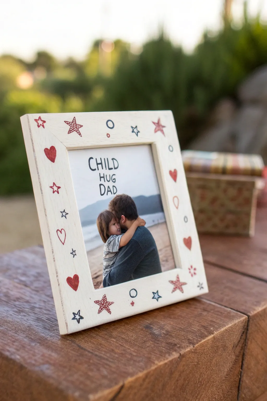
Transform a plain wooden frame into a heartfelt keepsake with simple, whimsical doodles. This charming project uses basic shapes like stars and hearts in a patriotic-inspired palette to frame a cherished memory perfectly.
Step-by-Step
Materials
- Unfinished or white wide-border wooden picture frame
- White acrylic paint (if frame is unfinished)
- Wide flat paintbrush
- Fine-point paint pens or permanent markers (Red, Navy Blue)
- Pencil for sketching
- Eraser
- Clear matte acrylic sealer spray
- Your favorite printed photo
Step 1: Preparation & Base Coat
-
Prepare your workspace:
Lay down some newspaper or a craft mat to protect your table from paint spills. -
Clean the frame:
Wipe down the wooden frame with a slightly damp cloth to remove any dust or debris, ensuring a smooth surface for painting. -
Apply the base color:
If your frame isn’t already white, use a wide flat brush to apply a coat of white acrylic paint. Brush in the direction of the wood grain for a seamless look. -
Let it dry completely:
Allow the first coat to dry fully. If the wood grain is still showing through, apply a second coat and let that dry as well. A solid, opaque white background makes the doodles pop best.
Marker Tip For Wood
Paint pens work better than standard permanent markers on painted wood. They sit on top of the acrylic paint layer rather than soaking in and bleeding.
Step 2: Sketching the Doodles
-
Plan your spacing:
visualization is key here. Before drawing, look at your frame and mentally divide the border into sections so your stars and hearts will be evenly distributed. -
Sketch the main motifs:
Lightly use a pencil to draw the larger shapes first. Sketch a few large stars and hearts randomly around the frame. Don’t worry about perfection; the hand-drawn look adds character. -
Add smaller details:
Fill in the gaps between your main shapes with smaller stars, tiny circles, and additional mini-hearts.
Smudged Ink?
If you smudge wet ink, wait for it to dry completely, then paint over the mistake with a tiny bit of your white base paint. Let dry and redraw.
Step 3: Inking the Designs
-
Outline the red stars:
Using a fine-point red paint pen or marker, trace over your pencil sketches for the stars. I prefer to start with these outlines to anchor the color scheme. -
Add texture to stars:
Select a few of the larger red stars and scribble inside them with a loose, cross-hatch or doodle pattern rather than coloring them in solidly. This gives distinct visual interest. -
Draw solid hearts:
Use the red marker to color in several hearts completely, making them bold and prominent against the white background. -
Create outline hearts:
For variety, leave some hearts as simple red outlines. This prevents the design from looking too heavy. -
Incorporate blue elements:
Switch to your navy blue pen. Trace the remaining star sketches and draw small blue circles scattered between the red shapes. -
Draw doodles inside shapes:
If you have larger open spaces, draw a tiny star inside a larger star outline for a playful ‘nested’ effect. -
Add tiny accents:
Dot small red circles or specks in any remaining empty patches to balance the composition.
Step 4: Finishing Touches
-
Erase pencil lines:
Once the marker ink is 100% dry (give it at least 10-15 minutes to be safe), gently erase any visible pencil marks. -
Seal the artwork:
Take the frame to a well-ventilated area and spray a light coat of clear matte acrylic sealer. This protects the doodles from fading or smudging over time. -
Insert the photo:
Once the sealer is dry, place the glass back into the frame, meaningful photo inside, and secure the back. -
Optional: Annotate the glass:
For an extra personal touch similar to the inspiration, you can use a black dry-erase or permanent marker to write a short message like ‘Child Hug Dad’ directly on the glass or the photo print itself.
Now you have a custom-designed frame ready to hold your favorite memory
“Dad Protects Us” Umbrella Silhouette
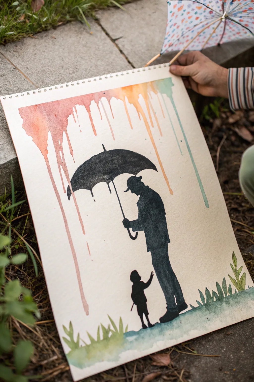
This touching artwork features a bold black silhouette of a father holding an umbrella over a child, set against a backdrop of colorful, dripping watercolor rain. It perfectly captures the theme of protection and love using a striking contrast between the fluid background and the solid figures.
Step-by-Step Guide
Materials
- Spiral-bound watercolor paper pad (A3 or similar large size)
- Watercolor paints (pan set or tubes)
- Large round watercolor brush
- Small detail brush
- Black acrylic paint or waterproof India ink
- Pencil for sketching
- Masking tape (optional)
- Cup of water and paper towels
Step 1: Creating the Rainbow Rain
-
Prepare your palette:
Mix up watery puddles of warm colors—reds, oranges, and yellows—and a cool teal or light blue. You want these colors to be quite fluid. -
Tilt the paper:
Prop your sketchbook up so it stands almost vertically. This gravity is essential for creating the natural drip effect. -
Load the brush:
Saturate your large round brush with plenty of water and your first color, starting with a reddish-pink on the left side. -
Apply the top edge:
Paint a thick, wet strip along the very top edge of the paper. Press the brush down so a pool of water forms. -
Encourage the drips:
Let gravity do the work. If the paint isn’t running down, gently touch the bottom of your wet strip with a loaded brush to break the surface tension. -
Shift colors:
Moving across the page to the right, seamlessly blend into orange, then yellow, and finally the teal blue, letting each section drip down naturally. -
Vary the lengths:
Some drips should run almost to the bottom, while others can remain short. You can stop a drip by gently dabbing the bottom with a dry paper towel. -
Complete drying:
Lay the paper flat to stop the flow once you are happy with the drips. Let this layer dry completely before moving on.
Clean Edges Trick
If you struggle with steady hands for the silhouette, use masking fluid or painter’s tape to block out the shape before applying the background drips.
Step 2: Painting the Silhouette
-
Sketch the outlines:
Lightly sketch the silhouette of the man in a coat and hat, holding an umbrella, and the small child reaching up. Ensure the umbrella is positioned directly under the ‘rain’. -
Outline the umbrella:
Using your black medium (acrylic provides the most solid opaque coverage), carefully outline the curved top of the umbrella. -
Fill the umbrella shape:
Fill in the rest of the umbrella canopy with solid black, ensuring the edges are crisp against the watercolor background. -
Add moisture details:
While the black umbrella paint is wet, you can drag a tiny bit down at the edges to mimic rain dripping off the fabric. -
Paint the father:
Switch to the father’s figure. Paint his hat and coat, paying attention to the posture—leaning slightly forward to cover the child. -
Define the connection:
Paint the umbrella handle connecting his hand to the canopy. I find a liner brush works best here for a straight, thin line. -
Paint the child:
Fill in the small child’s silhouette. Their arm should be reaching up, creating an emotional connection with the father figure. -
Ground the figures:
Ensure the feet of both figures align on a believable ground plane, slightly blending them into the grass area we will add next.
Step 3: Grounding the Scene
-
Mix green tones:
Prepare a few shades of green watercolor—some yellowish-green for highlights and darker earthy green for shadows. -
Paint the grass base:
Paint a loose, horizontal wash of green at the very bottom of the page, going right over the bottom of the black shoes to ‘plant’ them. -
Add grass blades:
While the base is damp, use a detail brush to flick upward strokes, creating blades of grass that vary in height and direction. -
Final touches:
Once everything is dry, erase any visible pencil marks and check if the black silhouette needs a second coat for total opacity.
Level Up: Personalize It
Instead of a generic child silhouette, use a profile photo of the actual child and trace their specific outline to make it truly one-of-a-kind.
Now step back and admire this heartwarming tribute that captures a beautiful moment in time
Night Sky “Best Dad in the Universe” Painting
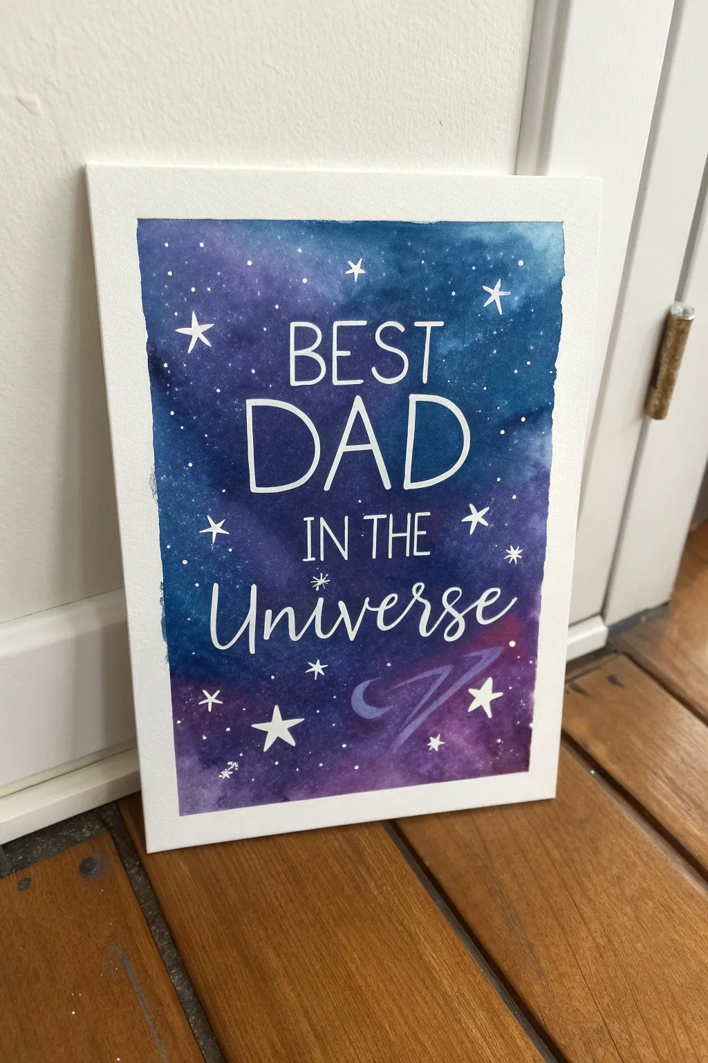
Celebrate the dad who means the world to you with this stunning celestial watercolor painting. Using a simple masking technique and wet-on-wet blending, you can easily create a vibrant galaxy backdrop that makes the message really pop.
Step-by-Step
Materials
- Watercolor paper (cold press, heavy weight)
- Painter’s tape or Washi tape
- Liquid masking fluid (or white crayon/oil pastel)
- Watercolor paints (Indigo, Prussian Blue, Purple, Violet, Black)
- Large round brush (size 10 or 12)
- Small detail brush (size 0 or 1)
- White opacity marker (POSCA) or white gouache
- Clean water jar
- Paper towels
- Pencil and eraser
- Ruler or straight edge
- Salt (optional, common table salt)
Step 1: Preparation & Masking
-
Tape the Edges:
Begin by securing your watercolor paper to a flat surface using painter’s tape. Create a clean border around the entire edge of the paper; this will give you that crisp white frame when you peel it off later. -
Sketch the Text:
Lightly sketch the words “BEST DAD IN THE UNIVERSE” in the center of the paper using a pencil. Use a ruler to keep your lines straight, but keep the lettering loose and casual. Leave plenty of space between the letters. -
Apply Masking Fluid:
Using an old brush or a masking fluid pen, carefully trace over your pencil lettering. The masking fluid will preserve the white of the paper. Let this dry completely before moving on to any painting.
Protect Your Brushes
Never use your good watercolor brushes for masking fluid! It ruins bristles instantly. Use a silicone applicator or a cheap craft brush rubbed on bar soap first.
Step 2: Creating the Galaxy Background
-
Wet the Paper:
Use your large brush to apply a coat of clean water over the entire area inside the tape. The paper should be glistening and damp, but not holding puddles of water. -
Start with Lighter Colors:
Drop in your lighter colors first, such as bright blue or light violet, onto the wet paper. I like to let the paint bloom naturally without overworking it. -
Add Deep Depth:
While the paper is still wet, start adding your darker hues like indigo, deep purple, and spots of black. Focus the darkest colors near the edges and corners to create a vignette effect. -
Blend and Texture:
Allow the colors to bleed into each other. If you want a starry texture, sprinkle a pinch of salt onto the wet paint while it’s still very damp, which will create unique crystal patterns as it dries. -
Dry Completely:
This is crucial—let the painting dry completely. The paper must be bone dry before you remove the masking fluid. You can use a hairdryer on a low setting if you are impatient.
Metallic Magic
Instead of plain white stars, try using metallic silver or gold watercolor paint for the larger stars. They will shimmer beautifully when the light hits the artwork.
Step 3: Details & Finishing Touches
-
Remove Masking Fluid:
Gently rub your finger or a rubber cement pickup tool over the hardened masking fluid to peel it away, revealing the crisp white letters underneath. -
Refine the Letters:
If any paint seeped under the mask or the edges look rough, use a white gel pen or thin white gouache to sharpen the edges of the letters. -
Splatter Stars:
Dilute some white gouache or acrylic paint with a tiny bit of water. Load a brush, hold it over the paper, and tap the handle against another brush to splatter creates tiny, distant stars across the galaxy. -
Paint Large Stars:
Using your smallest detail brush and pure white paint, manually paint a few larger, four-pointed or five-pointed stars scattered around the text for variety. -
Add the Swoosh:
Mix a semi-transparent light purple or blue. Paint a quick, gestural ‘swoosh’ or planetary ring beneath the word ‘Universe’ to add movement to the composition. -
Final Highlights:
Add tiny dots or sparkles inside the letters or on the swoosh using your white pen to make the artwork look magical. -
Reveal the Border:
Carefully peel off the painter’s tape. Pull the tape away from the center of the painting at a 45-degree angle to prevent ripping the paper.
Frame this cosmic masterpiece before gifting it to make the colors shine even brighter
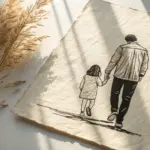
Minimal One-Line Dad and Baby Drawing
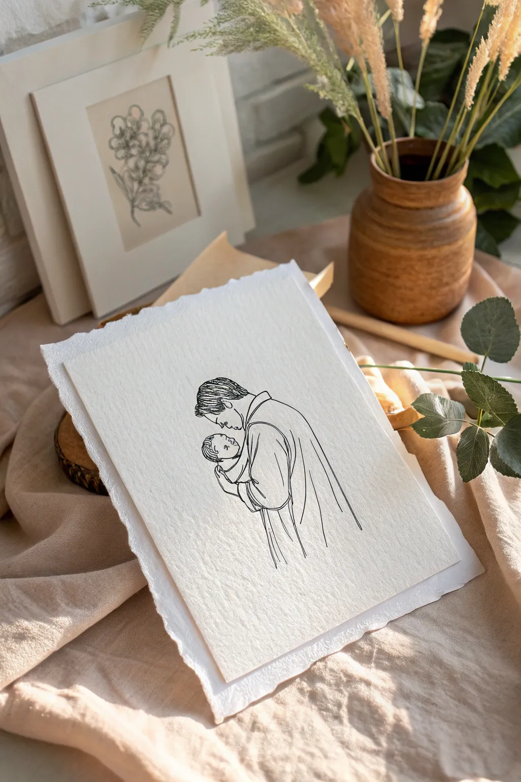
Capture the tender bond of fatherhood with this elegant, understated line drawing that speaks volumes through simplicity. The art features clean, flowing black ink lines on beautiful textured paper, creating a timeless keepsake perfect for a dad’s birthday.
Detailed Instructions
Materials
- High-quality cotton rag paper or cold-press watercolor paper (300 gsm)
- Fine liner pens (0.3mm and 0.5mm, black, waterproof)
- Pencil (HB or 2H)
- Kneadable eraser
- Tracing light box or transfer paper (optional)
- Ruler with deckled edge or tearing ruler (optional for edges)
- Reference photo of father and baby
Step 1: Planning and Sketching
-
Select your paper:
Begin by choosing a sheet of heavy, textured paper. The texture is crucial for this look, adding depth to the simple lines. A warm white or cream tone works best to give it that vintage, sophisticated feel. -
Prepare your reference:
Choose a reference photo where the father and baby are in profile or semi-profile, looking at each other or close together. Simplify the image in your mind or digitally by turning up the contrast to see the main contours. -
Create the rough sketch:
Using your HB pencil, lightly map out the basic shapes of the heads and shoulders. Keep your pressure extremely light so these lines can be easily erased later without damaging the paper’s surface. -
Refine the pose:
Focus on the connection point—where the dad’s chin meets the baby’s forehead or where the arms cradle the child. This interaction is the emotional center of the piece. -
Simplify the clothing:
Instead of drawing every fold, suggest the drape of the clothing with long, sweeping curves. Omit buttons, logos, or patterns to maintain the minimalist aesthetic.
Steadier Strokes
Draw from your shoulder, not your wrist. Locking your wrist and moving your whole arm creates smoother, more confident long lines, preventing shaky, jagged contours.
Step 2: Inking the Drawing
-
Test your pen:
Before touching the final paper, test your fine liner on a scrap piece of the same paper to ensure the ink flows smoothly over the texture without skipping. -
Outline the profile:
Start with the most delicate area: the father’s profile. Use the 0.3mm pen here. Draw the forehead, nose, and lips with a steady, deliberate hand, lifting the pen as little as possible. -
Draw the hair:
For the hair, use short, directional strokes that follow the natural growth pattern. Don’t outline every strand; just suggest the texture and volume at the crown and hairline. -
Ink the baby’s face:
Switch back to your finest tip (0.3mm) for the baby. Babies have softer features, so use slightly more curved lines for the nose and cheeks to emphasize roundness. -
Define the embrace:
Using the slightly thicker 0.5mm pen, draw the father’s arms and shoulders. The slightly heavier line weight here provides a visual anchor and a sense of strength to the figure. -
Add fabric details:
Add just two or three vertical lines dropping down from the shoulder or arm to suggest the robe or shirt hanging loosely. Let these lines trail off at the bottom rather than closing the shape. -
Review line continuity:
Look for any jarring gaps. If lines need to connect, do so carefully, but remember that in minimalist art, the empty space (negative space) allows the viewer’s eye to fill in the rest.
Step 3: Finishing Touches
-
Let the ink cure:
Wait at least 15 to 20 minutes for the ink to dry completely. Textured paper holds ink longer in the grooves, and smudging at this stage would be heartbreaking. -
Erase guidelines:
Gently roll a kneadable eraser over the drawing to lift the pencil marks. Avoid rubbing vigorously, as this can flatten the paper’s lovely texture or ghost the ink. -
Create the deckled edge:
To achieve the torn look shown in the image, place a ruler firmly along the edge of your paper. Tear the paper upward against the ruler’s edge slowly. I find wetting the fold line slightly with a brush helps it tear cleanly. -
Final inspection:
Check your edges and lines one last time. If the paper curled from handling, place it under a heavy book overnight to flatten it before presenting.
Make It 3D
Mount the torn-edge drawing onto a slightly larger piece of mat board using foam tape spacers. This creates a shadow behind the paper, emphasizing the beautiful torn edges.
This simple, heartfelt artwork is ready to be framed or gifted as is, serving as a beautiful reminder of fatherhood
Paint a Soundwave Birthday Message
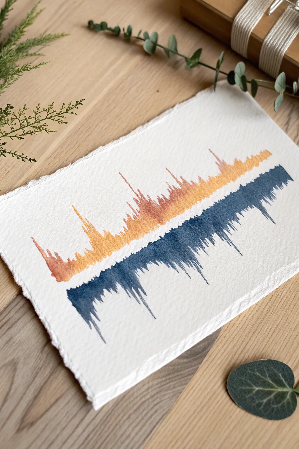
Transform a spoken message like ‘Happy Birthday, Dad’ into a visually striking piece of abstract art using watercolor. The warm amber and cool navy tones create a modern, sophisticated look on textured paper that feels both personalized and professional.
How-To Guide
Materials
- Heavyweight cold-press watercolor paper (300 gsm or higher)
- Ruler with a deckle edge (optional, for tearing paper)
- Audio recording software (smartphone voice memo app)
- Computer or tablet for viewing the waveform
- Watercolor paints (burnt sienna/gold ochre and indigo/Payne’s grey)
- Round watercolor brushes (sizes 2 and 4)
- Pencil (HB or H)
- Kneaded eraser
- Masking tape
- Two jars of water
- Paper towels
Step 1: Preparation & Design
-
Record your message:
Using a voice recorder app on your phone, record a short phrase like ‘I love you, Dad’ or simply ‘Happy Birthday’. Speak clearly and modulate your volume to create interesting peaks and valleys in the visual wave. -
Capture the waveform:
Take a screenshot of the recorded waveform. If your phone app doesn’t show a clear wave, you can upload the file to a free online audio editor or simply view it in your computer’s audio player. -
Prepare the paper:
To achieve the rustic, torn look shown in the photo, place a ruler firmly against the edge of your watercolor paper and tear distinct strips to create a deckled edge. Alternatively, buy pre-deckled watercolor paper. -
Tape it down:
Secure your paper to a flat surface using masking tape on the back or very lightly at the corners to prevent buckling when the water is applied. -
Sketch the centerline:
Using a ruler and a very light pencil touch, draw a horizontal line across the middle of the paper. This will serve as the anchor point where the two colors meet. -
Draft the waveform:
Lightly sketch the vertical lines of your soundwave. Don’t worry about drawing every single line perfectly; focus on replicating the general shape—where the spikes are tallest and where the silences are flat.
Pro Tip: Better Flow
Work quickly on each vertical stroke. A quick, confident flick of the wrist creates a sharper, more natural-looking ‘spike’ than trying to draw a slow, careful triangle.
Step 2: Painting the Wave
-
Mix your top color:
Create a warm, golden-orange mix. I like to combine burnt sienna with a touch of yellow ochre. You want enough water so it flows, but enough pigment that the color remains vibrant. -
Paint the upper spikes:
Using your size 4 brush, start painting the upward-facing lines of the waveform. Use jagged, vertical strokes that start thick at the centerline and taper off into fine points at the top. -
Add variance:
Switch to the smaller size 2 brush to add tiny, distinct vertical lines in the quieter sections of the wave. This variation in line thickness makes the wave look organic and authentic. -
Let the top dry:
Wait until the orange section is completely dry before moving on. This is crucial to prevent the blue paint from bleeding into the orange and creating brown sludge. -
Mix the bottom color:
Prepare a deep, moody blue using indigo mixed with a tiny bit of Payne’s grey or black. This creates a strong contrast against the warm top section. -
Paint the lower reflection:
Paint the downward-facing spikes directly below the orange ones. While soundwaves are technically symmetrical, doing this by hand adds a lovely artistic interpretation rather than a perfect mirror image. -
Create the drip effect:
For the longest spikes on the bottom, load your brush with a little extra water and pigment. Place the tip at the bottom of a spike and let gravity or a slight flick of the wrist drag the color down into a natural taper. -
Connect the center:
Carefully run the tip of your brush along the centerline to ensure the orange and blue sections meet without a white gap, but be careful not to scrub them together.
Step 3: Finishing Touches
-
Erase guidelines:
Once the paint is 100% bone dry (give it an hour to be safe), gently use a kneaded eraser to lift any visible pencil marks from the centerline or edges. -
Flatten the art:
If the paper has buckled slightly from the water, place the dry painting under a heavy book overnight to flatten it out perfectly before framing.
Troubleshooting: Bleeding
If the orange and blue bleed together at the center, you didn’t let the first layer dry enough. Stop, let it dry completely, and then carefully touch up the line with un-watered pigment.
Now you have a deeply personal abstract representation of your voice that serves as a timeless keepsake
Hidden Message Scratch-Reveal Painting
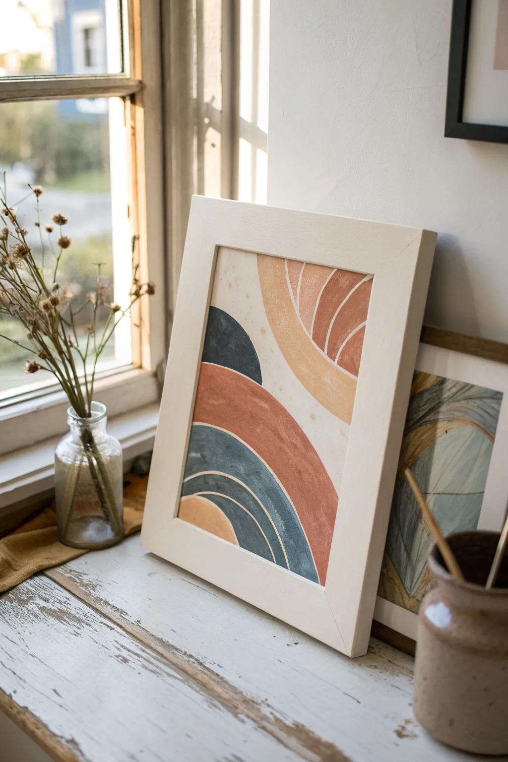
Capture the warmth of desert hues with this modern abstract painting featuring layered arches and organic curves. The design uses a soothing palette of terracotta, mustard, and dusty blue to create a piece that feels both grounded and artistic, perfect for a thoughtful handmade gift.
Step-by-Step
Materials
- Heavyweight watercolor paper or mixed media paper (A4 size)
- White or light wood frame
- Acrylic paints (terracotta, mustard yellow, dark teal/slate blue, cream/off-white)
- Paintbrushes (medium flat brush, small round brush)
- Pencil for sketching
- Clear dish soap (for the scratch-off medium)
- Metallic acrylic paint (gold or silver)
- Clear packing tape or white crayon (optional, for reveal layer prep)
- Palette for mixing
- Ruler (optional)
Step 1: Planning and Foundation
-
Prep the surface:
Begin by trimming your mixed media paper to fit your chosen frame. Lay it flat on a protected workspace. -
Establish the background:
Mix a generous amount of cream or off-white acrylic paint. Cover the entire paper with an even coat to create a warm, neutral base rather than stark white. Let this dry completely. -
Sketch the composition:
Lightly draw your composition with a pencil. Start with a large semi-circle shape rising from the bottom right. Draw a second, smaller mound shape on the bottom left. -
Add radiating lines:
Sketch additional curved bands radiating outward from these main shapes, creating a segmented, rainbow-like effect that fills the space organically.
Clean Lines Hack
To keep the separation between your colored arches crisp, wait for one color to dry completely, then use a strip of low-tack painter’s tape to mask it off before painting the neighboring section.
Step 2: Painting the Base Design
-
Apply the terracotta:
Load your flat brush with terracotta paint. Fill in the large, central arch band that sweeps across the middle of the composition. Apply the paint thickly enough to be opaque. -
Paint the mustard accents:
Using the mustard yellow, paint the upper right arch section and the smallest semi-circle at the very bottom left corner. -
Introduce the blue tones:
Mix a deep slate blue or teal. Fill in the shape on the left side that sits between the terracotta band and the mustard bottom. -
Refine the edges:
Use a smaller brush to tidy up the edges where different colors meet. The style is organic, so slight imperfections add character, but the shapes should be distinct. -
Add texture details:
Once the base blocks of color are dry to the touch, mix a slightly lighter version of your terracotta (add a touch of white). Use a small round brush to paint thin, curved lines inside the upper right section to mimic sun rays. -
Layer the second arch:
Paint thin, creamy-white curved lines over the blue section to simulate separation and movement within the dark shape.
Make it Interactive
Instead of a written message, hide a small doodle, a map to a hidden gift, or a QR code that links to a video message underneath the scratch-off layer for a modern twist.
Step 3: Creating the Hidden Element
-
Write the hidden message:
Choose a specific section for your hidden message, such as the large central cream area or underneath one of the colored bands. Write your birthday message directly on the dried paint with a permanent marker. -
Seal the message area:
Cover the written message completely with a strip of clear packing tape or rub a white crayon heavily over it. This creates a barrier so the top paint won’t stick permanently. -
Prepare the scratch-off mix:
In a small cup, mix two parts metallic acrylic paint (gold works well with this palette) with one part clear dish soap. Stir gently to avoid bubbles. -
Apply the scratch layer:
Paint this mixture over the taped area, concealing the message. You may need 2-3 coats, letting each dry fully, to make it completely opaque. -
Dry and assemble:
Ensure the entire painting, especially the scratch-off section, is bone dry—usually overnight is safest. I often place a heavy book on top to flatten the paper if it buckled. -
Frame the artwork:
Place the artwork into the frame behind the glass (or remove the glass if you want immediate access to scratch it). If using glass, remember the recipient will need to take it out to reveal the message.
Give this interactive art piece to Dad and hand him a coin to discover the secret sentiment hidden within the design

Have a question or want to share your own experience? I'd love to hear from you in the comments below!