If you’ve ever wanted something you can draw in seconds and then happily color for ages, scribble art is your new best friend. Here are my favorite easy scribble art ideas that start with one messy line and end with a bold, surprisingly polished look.
No-Touching Colors Challenge
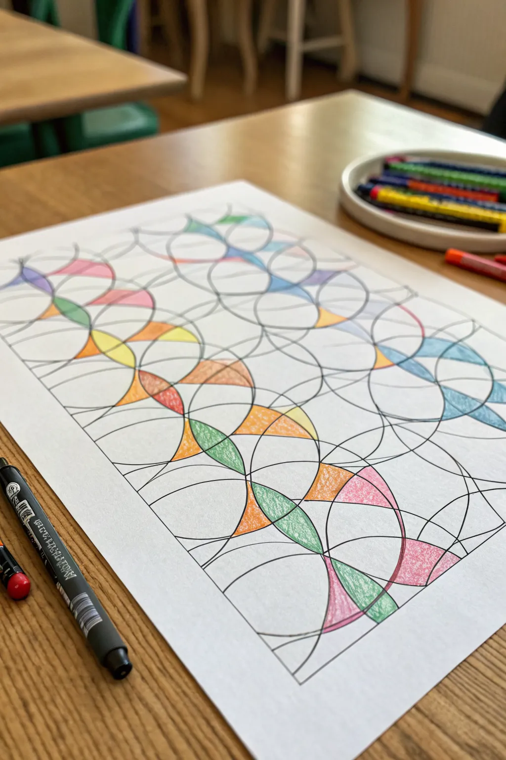
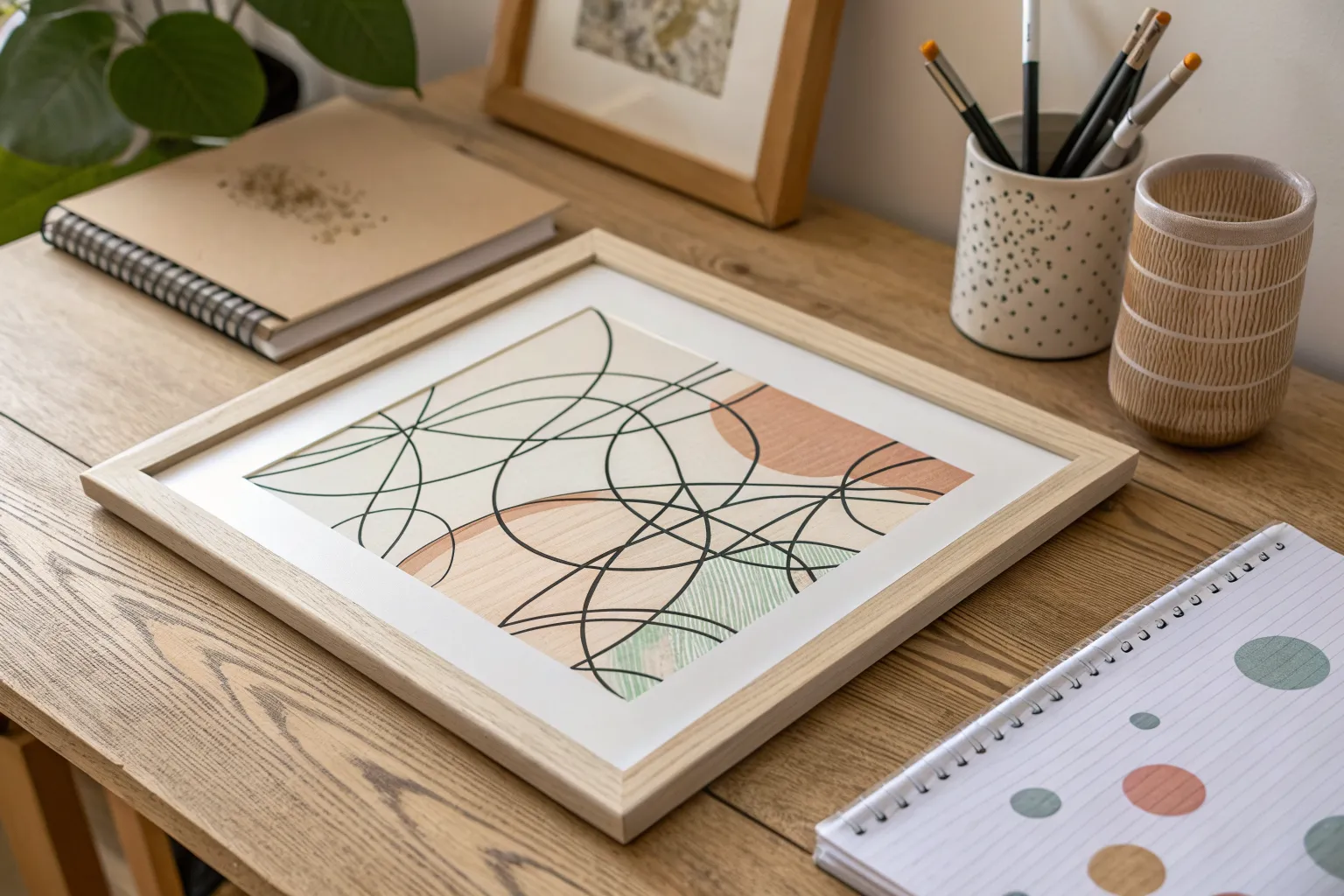
Transform simple looped motions into a sophisticated geometric artwork with this addictive drawing exercise. By methodically overlapping circular shapes and meticulously coloring the intersections, you’ll create a mesmerizing lattice that looks far more complex than it actually is.
Detailed Instructions
Materials
- White drawing paper (A4 or similar)
- Fine liner pen (black, 0.5mm or 0.8mm)
- Small circular object to trace (like a cup or tape roll) OR a compass
- Colored pencils or fine-tipped markers
- Pencil (optional, for drafting)
Step 1: Drafting the Structure
-
Prepare your workspace:
Lay your paper on a smooth, hard surface. If you’re using a thin paper, place a backing sheet underneath to prevent marker bleed-through onto your table. -
Establish the first row:
Using your black fine liner (or a pencil first if you’re nervous), trace your circular object starting at the top left corner. Don’t close the circle completely; stop just short or allow lines to pass through. -
create the overlap:
Move your object slightly to the right so it overlaps the first shape by about 30-40%. Trace again. Repeat this process across the entire top row of the paper. -
Start the second row:
Drop down to start a second row. Position your circular object so it overlaps the bottom of the first row’s shapes. This creates the vertical interlocking pattern. -
Continue the grid:
Fill the entire page with these overlapping circles. Try to keep the spacing somewhat consistent, creating a lattice of almond-shaped intersections and triangular gaps. -
Add variance with arcs:
Once the main grid is done, feel free to draw larger, sweeping arcs across multiple circles using a larger object or freehand. This breaks the perfect uniformity and adds visual interest. -
Clean up lines:
If you started with pencil, carefully trace over your lines with the black fine liner now. Ensure the ink is completely distinct and bold. -
Erase pencil marks:
Wait until the ink is fully dry—I usually give it a solid five minutes—then gently erase any underlying graphite sketches to keep the white space pristine.
Uneven Circles?
Don’t stress if your tracing slips. Wobbly lines add character to scribble art. Just thicken the black line slightly to hide any major tremors or gaps.
Step 2: The Coloring Challenge
-
Select your palette:
Choose 4-6 colors that harmonize well. Pastels or bright primaries work great against the stark white background. -
Identify target shapes:
Look for the ‘almond’ or ‘leaf’ shapes formed where two circles overlap. These will be your primary focus for coloring. -
Apply the first color:
Pick one color and fill in a specific section. Use light, even pressure if using pencils to get a smooth texture without harsh strokes. -
Use the no-touching rule:
As you move to an adjacent shape, ensure you switch colors. No two sections sharing a border line should have the same color. -
Create gradients:
For added depth, try shading darker at the pointed ends of the almond shapes and fading to white or a lighter shade in the center. -
Leave white space:
Don’t feel pressured to color every single shape. Leaving the larger background circles or random sections white makes the colored parts pop. -
Trace internal borders:
If your coloring went slightly over the lines, re-trace the black lines bordering the colored sections to crisp up the edges. -
Review balances:
Step back and look at the overall composition. Add a few more colored sections if one area looks too empty compared to the rest.
Pro Tip: Depth trick
Use a white gel pen to add tiny highlight dots or lines on top of your darkest colored sections. This makes the geometric shapes look like shiny stained glass.
Enjoy the meditative quality of watching your simple circles transform into a complex mosaic


Pattern-Filled Scribble Doodle
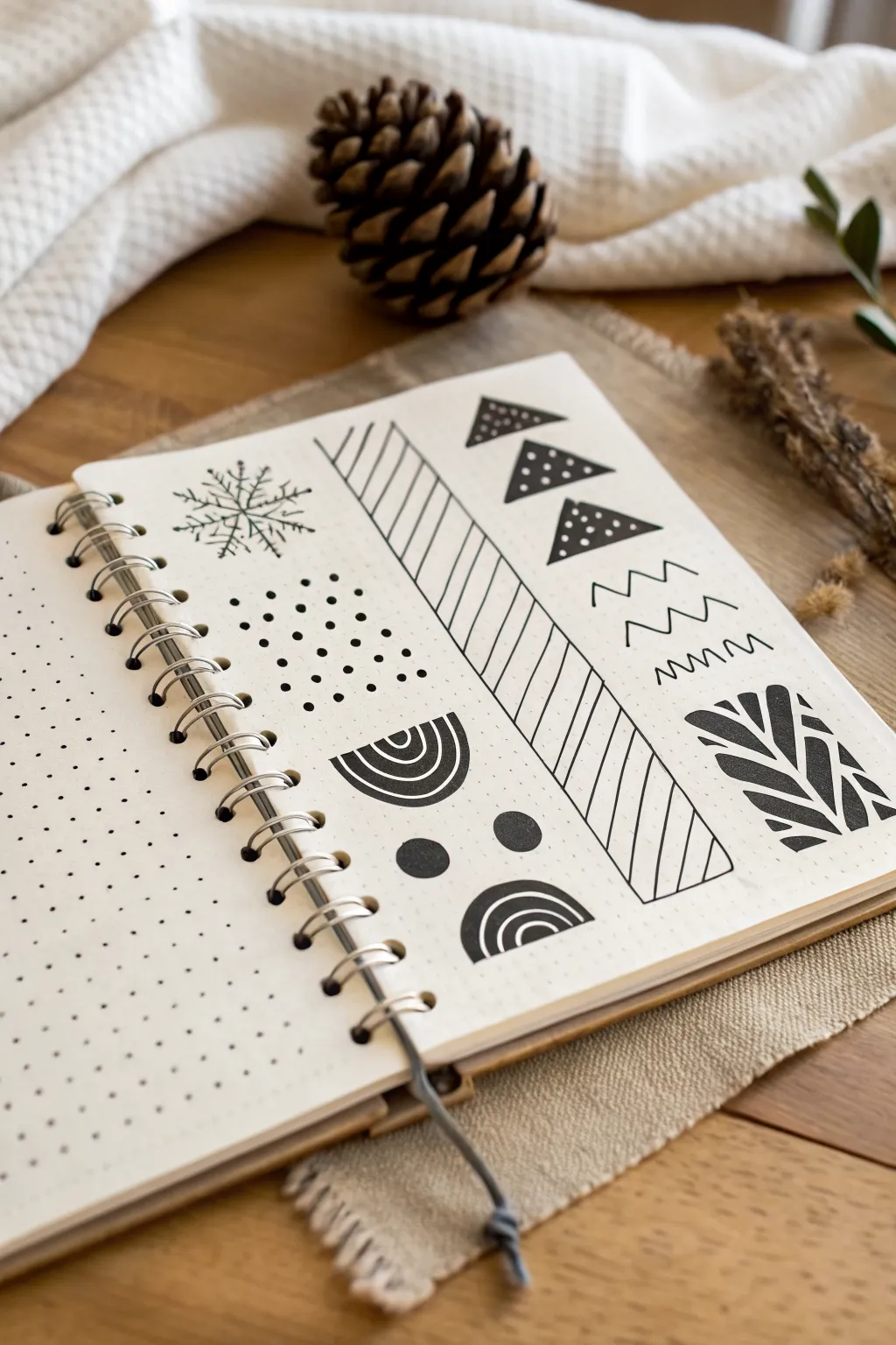
Transform a blank page into a structured masterpiece with these crisp, high-contrast geometric doodles. This collection of patterns acts as a perfect reference sheet or a warm-up exercise for getting comfortable with ink on dotted paper.
Step-by-Step Tutorial
Materials
- Dotted bullet journal or grid paper notebook
- Fine liner pen (0.3mm or 0.5mm)
- Thicker black marker or brush pen
- Ruler or straight edge
- Pencil (optional for sketching)
- Eraser
Step 1: Planning and Setup
-
Check your grid:
Before laying down permanent ink, orient your notebook so it lies flat. The dots on the page will be your primary guide for keeping lines straight and shapes symmetrical, so make sure you can see them clearly under good lighting. -
Divide the space (mentally or lightly):
Visualize the page being divided into vertical columns or segments. You don’t need to draw boundary lines, but having a general sense of where each pattern cluster will live prevents them from running into each other.
Step 2: Drawing the Linear Patterns
-
Draw the diagonal strip frame:
Using your ruler and fine liner, draw a long, thin vertical rectangle in the center of the right half of the page. This will house the diagonal stripe pattern. -
Fill the diagonal strip:
Starting from the top left corner of your new rectangle, draw diagonal lines downwards to the right. Try to keep the spacing consistent between each line, roughly two dot-widths apart. -
Add zigzag waves:
To the right of the diagonal strip, draw three variations of a zigzag line. Make the top one angular and sharp like mountains. -
Soften the lines:
Below the sharp zigzag, draw a softer, more wave-like line. For the third line, create a tighter, more frequent scribble pattern to show variety in texture.
Smudge Prevention
Place a scrap piece of paper under your drawing hand. This acts as a shield, preventing oils from your skin from touching the paper and stopping your hand from dragging wet ink.
Step 3: Creating Geometric Shapes
-
Outline the triangles:
At the top right of the page, draw three equilateral triangles stacked vertically. Point the top vertex to the right for a dynamic flow. -
Fill the triangles:
Switch to your thicker marker to color in the triangles completely black. Once the ink is dry, use a white gel pen or simply leave negative space (if you have excellent control) to create small white polka dots inside the black shapes. -
Create the polka dot field:
On the left side of the spread, below the top area, creates a rectangular field of dots. Use a medium-weight pen to tap dots in a staggered grid pattern, creating a classic repeating texture. -
Draw the semi-circles:
Near the bottom of the page, draw two semi-circles facing each other. Use your thicker marker to create the solid black outer arch shapes. -
detail the arches:
Inside the negative space of the arches, use your fine liner to draw concentric rainbows—small curved lines echoing the shape of the main arch. -
Add solid circles:
Between the two semi-circle motifs, draw two medium-sized solid black circles to anchor the design visually.
Level Up: Color Pop
Once the black ink is fully dry, take a mild highlighter (like a pastel grey or soft pink) and add drop shadows to one side of the geometric shapes to create a 3D sticker effect.
Step 4: Nature-Inspired Elements
-
Sketch the snowflake:
In the top left corner, start with a simple cross, then draw an ‘X’ through the center to make an eight-pointed star asterisk shape. -
Detail the snowflake branches:
On each of the eight lines, draw small ‘V’ shapes facing outward to create the feathery, crystalline look of a stylized snowflake. -
Block out the leaf pattern:
In the bottom right corner, visualize a rectangle. Instead of an outline, fill this space with bold, organic leaf shapes. Start with a central stem line using negative space. -
Fill the leaves:
I find it easiest to draw the shapes by coloring around them. Use your thick marker to block in heavy black areas, leaving thin white channels that form the veins of a palm leaf or fern.
Step 5: Final Touches
-
Review and refine:
Look over the whole page. If any of your solid black areas look patchy, go over them with a second coat of ink for a deep, opaque finish. -
Erase guidelines:
If you used any pencil marks for spacing earlier, gently erase them now, ensuring the ink is completely dry to avoid smudges.
You now have a chic reference page of patterns ready to decorate your future journal spreads.


Dot-and-Dash Texture Scribble
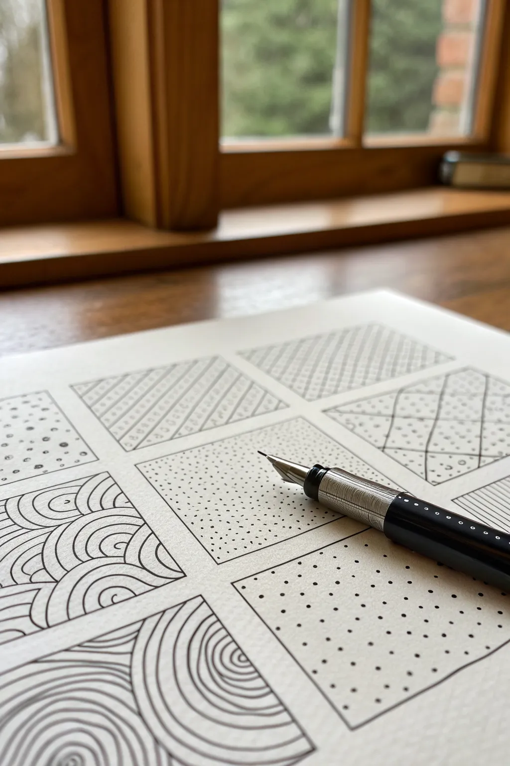
This meditative exercise involves creating a grid of varied textures, ranging from stippled gradients to flowing waves. It serves as both a relaxing warm-up and a reference sheet for future doodling or shading projects.
Step-by-Step Guide
Materials
- High-quality bright white paper (Bristol board or mixed media paper recommended)
- Ruler
- Pencil (HB or H)
- Fountain pen or fine liner (0.5mm tip)
- Eraser
Step 1: Setting the Grid
-
Prepare your workspace:
Clear a flat, well-lit surface. Ensure your paper is clean and free of oils from your hands, which can resist ink. -
Measure the outer bounds:
Decide on the overall size of your sampler. A 6×6 inch (or 15×15 cm) area works well. Lightly mark the corners with your pencil. -
Mark the intervals:
Divide your total width and height into three equal sections. Make small tick marks at these intervals along the edges. -
Connect the grid:
Using your ruler, lightly draw the horizontal and vertical lines connecting your tick marks to create a 3×3 grid of nine squares. -
Create padding:
Inside each of the nine grid squares, lightly draw a slightly smaller square, leaving about a 1/4 inch margin between the pattern area and the grid lines. This makes the finished boxes look neat and framed.
Smudged Ink?
If you smudge wet ink, don’t wipe it! Turn it into a feature by stippling over the smudge to hide it, or simply accept the wabi-sabi nature of hand-drawn art.
Step 2: Filing the Patterns
-
Start with Stippling:
In the center square, begin adding small dots with your pen. I find it best to work from one corner, clustering dots densely, and spacing them out as you move toward the opposite corner to create a gradient effect. -
Draw the Waves:
Move to the bottom-left square. Draw a series of concentric semi-circles starting from the bottom edge. Stack these arch shapes like fish scales until the box is full. -
Create the Rain Pattern:
In the top-left square, draw short, diagonal dashes. Keep the direction uniform, but vary the length slightly for an organic, rain-like texture. -
Execute the Basket Weave:
Select another empty square. Draw a patch of 4-5 vertical lines, then next to it, a patch of 4-5 horizontal lines. Alternate this checkerboard pattern across the entire box. -
Draft the Polka Dot Grid:
For the bottom-right square, use your ruler to pencil a faint grid. Place a bold ink dot at every intersection. Once the ink is totally dry, erase the pencil guidelines. -
Sketch the Curved Flow:
In the bottom-center square, draw long, sweeping curved lines that emanate from the bottom right corner, filling the space like ripples in a pond. -
Add the Netting:
In the middle-right square, draw wavy vertical lines spaced apart. Then, cross them with wavy horizontal lines to create a loose, organic net texture. -
Fill remaining squares:
Use the last two squares to experiment with variations. Try zig-zags or tiny circles. Keep your hand relaxed and let the pen do the work.
Step 3: Finishing Touches
-
Let the ink cure:
Wait at least 10-15 minutes to ensure the ink is completely dry. Fountain pen ink can sit on the surface of smooth paper longer than you expect. -
Erase guidelines:
Gently erase the pencil grid lines and the internal box borders. Hold the paper taut with one hand while erasing to prevent crinkling. -
Correct inconsistencies:
Inspect your patterns. If a stippled area looks too light, tab in a few more dots. If a line break is too obvious, carefully bridge the gap.
Gradient Challenge
Try creating depth in your patterns. Make lines thicker or pack dots denser on one side of a square to simulate a shadow or curved surface.
Enjoy the rhythmic satisfaction of seeing your blank page transform into a library of textures


Swap-and-Color Scribble Pages
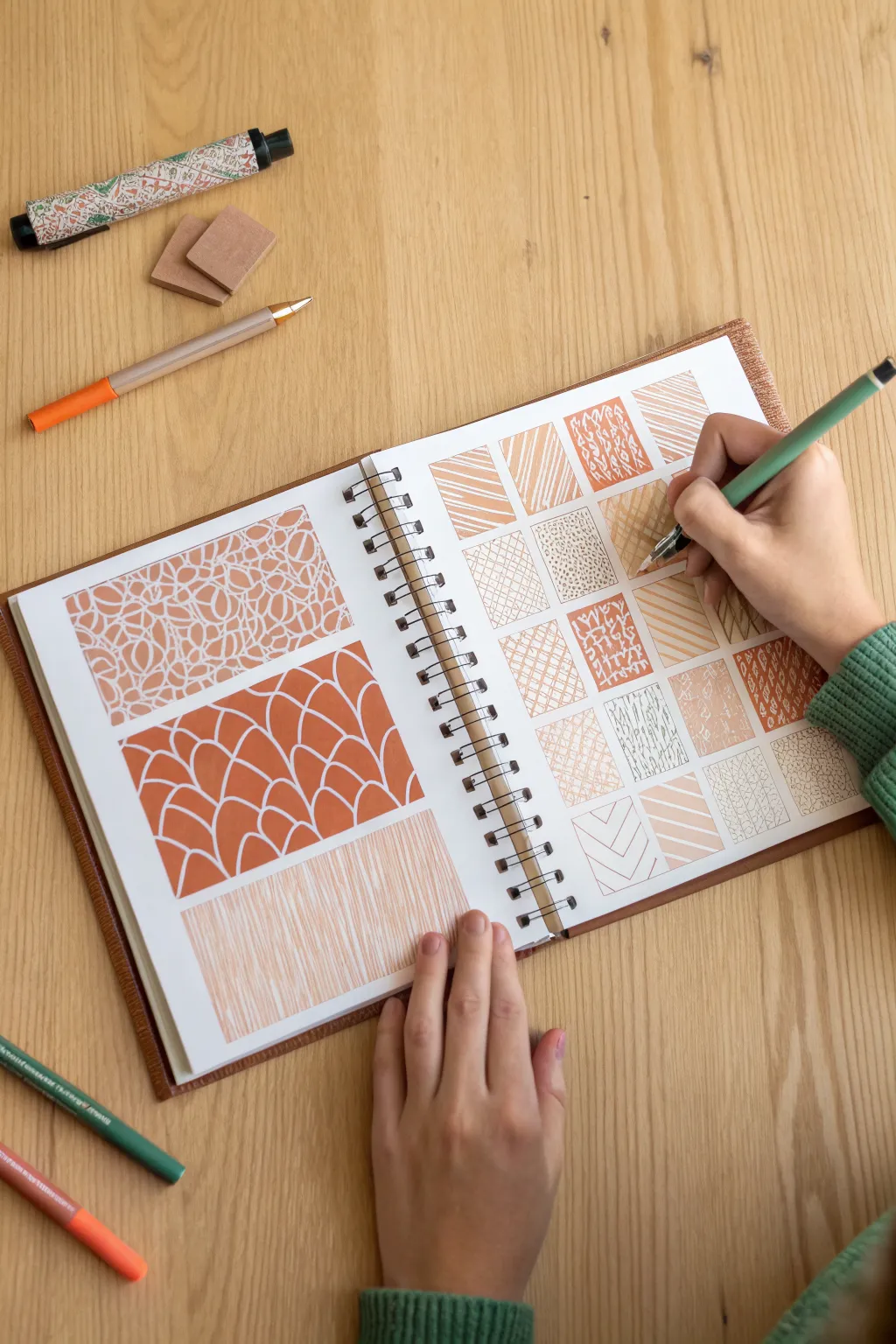
This soothing exercise transforms a simple sketchbook spread into a library of patterns using a warm, monochromatic palette. By combining large organic panels with a disciplined grid of swatches, you create a visually satisfying study of line and repetition.
Step-by-Step Tutorial
Materials
- Spiral-bound sketchbook (heavyweight paper recommended)
- Pencil (HB or H for light guidelines)
- Ruler
- Terracotta or burnt orange fineliner or gel pen
- Light peach or cream colored pencil (optional for shading)
- White gel pen (optional for corrections or highlights)
- Eraser
Step 1: Planning the Layout
-
Define the left page:
On the left-hand page of your sketchbook, use a ruler and pencil to draw three large, horizontal rectangles. Leave a comfortable margin between them so they don’t feel crowded. -
Create the right page grid:
On the facing right-hand page, map out a grid of smaller squares. Aim for about 4-5 squares across and 4-5 down, ensuring they are evenly spaced. Light guidelines help keep everything tidy. -
Refine the borders:
Once satisfied with the placement, go over your pencil boxes with the terracotta pen if you want distinct borders, or leave them as pencil guides if you prefer the pattern to define the edge.
Steady Hand Trick
Work from the top-left of the page down to the bottom-right (if right-handed) to avoid smudging your fresh ink lines as you fill the grid.
Step 2: Drawing Large Panels
-
Start the organic mosaic:
In the top large rectangle on the left, begin drawing irregular, stone-like shapes closely packed together. Leave thin channels of negative space between them. -
Fill the mosaic shapes:
Inside each ‘stone’ shape, draw a smaller outline or scribble markings to give it density. The goal is to create a sense of texture rather than perfect geometry. -
Draft the scale pattern:
For the middle rectangle, draw rows of overlapping semi-circles or arches, resembling fish scales or roof tiles. Make these large and bold. -
Thicken the scales:
Go back into the scale pattern and color in the background spaces between the arches, or thicken the lines themselves to create high contrast. I find that adding weight to the bottom of each curve adds nice dimension. -
Create the vertical rain:
In the bottom rectangle, draw dense, vertical lines. Vary the pressure and length slightly so it looks like falling rain or wood grain rather than a machine-made barcode.
Step 3: Filling the Texture Grid
-
Diagonal stripes:
Move to the grid on the right. In the first few squares, experiment with diagonal lines. Try thick stripes in one, thin scratching lines in another, and alternating directions in a third. -
Stippling and dots:
Dedicate a square to pure stippling. Tap your pen repeatedly to create a gradient of density—closer dots for darker areas, spaced out dots for lighter ones. -
Cross-hatching practice:
Fill a couple of squares with cross-hatching textures. Layer vertical lines over horizontal ones to build up a mesh-like appearance. -
Organic squiggles:
Let your hand loosen up for the next squares. Draw tiny, continuous loops or vibration-like squiggles that fill the box edge-to-edge. -
Geometric zig-zags:
In a remaining square, draw a chevron or herringbone pattern. Keep the angles sharp and consistent for a crisp look. -
Wood grain simulation:
Mimic the texture of wood in one square by drawing long, wavy lines with occasional knots or swirls.
Color Swap
Try this same layout with a navy blue pen on cream paper for a ‘blueprint’ aesthetic, or white gel pen on black paper for high contrast.
Step 4: Refining and Cleaning
-
Check for gaps:
Review your grid and large panels. If any areas look too sparse, go back in with your pen to add density or extra lines. -
Eraser guidelines:
Wait until the ink is completely dry—give it a good five minutes to be safe. Then, gently erase any visible pencil guidelines from your initial layout. -
Optional shading:
If you have a light peach pencil, you can add subtle shading behind some of the patterns to give the page a warmer, antique feel.
Now you have a beautiful reference library of textures to use in future art projects

PENCIL GUIDE
Understanding Pencil Grades from H to B
From first sketch to finished drawing — learn pencil grades, line control, and shading techniques.
Explore the Full Guide
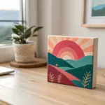
Cut-Out Scribble Art on Dark Background
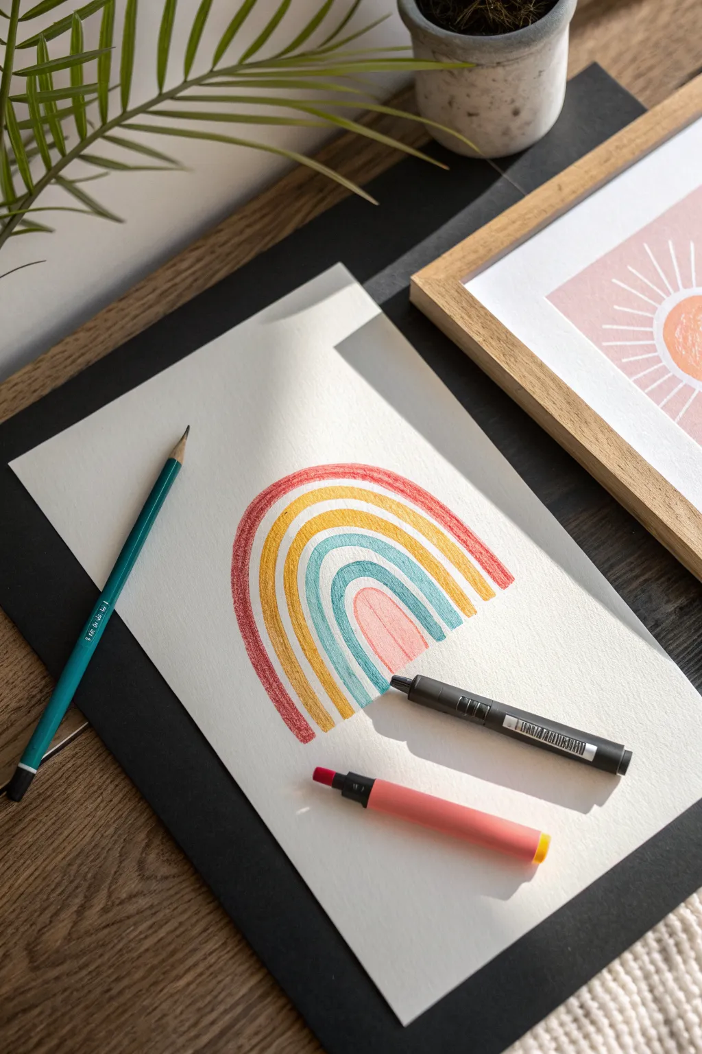
This minimalist yet striking project combines the simplicity of coloured pencils with bold negative space. By layering hand-drawn strokes on crisp white paper and mounting it against a dark backdrop, you create a modern piece of wall art perfect for a nursery or home office.
Detailed Instructions
Materials
- Heavyweight white drawing paper or cardstock
- Faber-Castell coloured pencils (teal, yellow ochre, terra cotta/rust)
- Black poster board or mounting card
- HB graphite pencil
- Ruler
- Scissors or craft knife
- Double-sided tape or gluestick
Step 1: Planning the Layout
-
Measure and cut:
Start by cutting your white drawing paper into a neat rectangle. A size of roughly 8×10 inches works well for this design, leaving enough room for the rainbow to breathe. -
Find the center:
Lightly mark the vertical center of your paper near the bottom edge with your graphite pencil. This will help you keep the arches symmetrical. -
Draft the inner arch:
Using a very light hand, sketch the smallest, innermost arch first. It doesn’t need to be geometrically perfect; a slightly organic, hand-drawn curve adds to the boho charm. -
Sketch the expanding arches:
Draw three more arches radiating outward from the first one. Leave a consistent gap of white space—about half the width of the colored bands—between each arch guideline to define the separation clearly.
Tip: Texture Talk
Use cold-press watercolour paper instead of smooth cardstock. The rougher ‘tooth’ catches the pencil pigment beautifully, enhancing the scribble effect.
Step 2: Adding Colour and Texture
-
Select your palette:
Choose an earthy, muted colour palette. I find that using a rust red, mustard yellow, teal blue, and a pale pink creates that trendy vintage aesthetic seen in the photo. -
Start with the outer band:
Begin colouring the largest, outermost arch with your rust-coloured pencil. Use vertical back-and-forth strokes that follow the curve of the arch. -
Build the scribble texture:
Don’t press too hard. The goal is to see the texture of the paper through the pencil strokes. Keep your lines dense but sketchy to achieve that ‘scribble art’ look. -
Colour the second band:
Move inward to the next arch, filling it with the mustard yellow pencil. Maintain the same vertical stroke direction as the first band for consistency. -
Apply the teal layer:
Fill the third arch with the teal blue pencil. Be careful to preserve the white gap between this blue band and the yellow one next to it. -
Finish the center:
Colour the smallest central arch with a soft pink or light peach shade. This anchors the design with a lighter tone. -
Refine the edges:
Go back over the very edges of each coloured band to neaten the curves, but don’t outline them with a hard line. Just slightly densify the colour at the boundaries. -
Erase guidelines:
Once the colouring is finished, gently erase any visible graphite marks from your initial sketch, especially in the white gaps between the rainbows.
Level Up: Metallic Pop
Add a thin line of gold leaf or metallic gold pen in the white negative spaces between the arches for a subtle, shimmering detail.
Step 3: Mounting and Finishing
-
Prepare the background:
Cut a piece of black poster board that is at least 2 inches larger on all sides than your white drawing paper. -
Apply adhesive:
Flip your rainbow drawing over and apply double-sided tape or a smooth layer of gluestick to the back, ensuring you get close to the corners. -
Center the artwork:
Carefully place the white paper onto the center of the black mounting board. Eye-balling it usually works fine, or measuring for precision if you prefer. -
Press and smooth:
Press down firmly from the center outward to eliminate any air bubbles and ensure a strong bond with the black background.
Display your new artwork near a window where natural light can highlight the textures of the pencil strokes
Hidden Hearts in a Scribble Maze
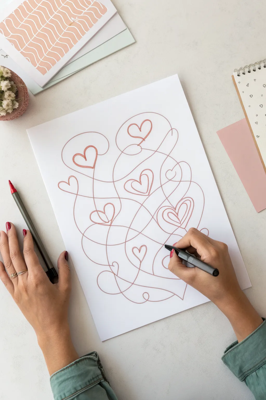
Transform a chaotic continuous line into a loving masterpiece with this simple yet meditative drawing exercise. By weaving loops and curves together without lifting your pen, you’ll create a maze of lines that reveals hidden heart shapes nestled within the abstract flow.
Step-by-Step
Materials
- White drawing paper or cardstock (A4 or US Letter)
- Fine liner pen or marker (terracotta or dusty pink)
- Pencil (optional for practice sketching)
- Eraser (optional)
Step 1: Planning the Flow
-
Visualize the composition:
Before putting pen to paper, imagine where you want your main hearts to sit. The charm of this piece is its spontaneity, but having a rough mental map helps ensure your hearts are evenly distributed. -
Start from the center:
Place your pen tip near the middle of the page. It’s often easier to work outward from a central point rather than starting at a corner, as it gives you room to expand in all directions.
Step 2: Creating the Continuous Line
-
Begin the first loop:
Draw a large, sweeping curve. Don’t worry about shape perfection yet; just focus on getting the ink flowing smoothly. -
Form the first heart:
Guide your line to create the dip of a heart shape. Instead of stopping at the bottom point, cross over your existing line to close the shape and continue moving. -
Loop outward:
Extend your line away from the first heart with a long, lazy curve. This connecting line acts as the ‘string’ tying your shapes together. -
Create a second heart:
Navigate your pen into a second heart shape. Try varying the size—make this one slightly smaller or tilted at a different angle for visual interest. -
Cross your lines confidently:
Let your connecting lines intersect freely. These intersections create the ‘maze’ look that makes the hearts feel hidden and discovered. -
Add a large loop:
Draw a big, open loop that doesn’t form a heart. This negative space gives the detailed areas room to breathe.
Smoother Curves
Draw from your shoulder, not your wrist. Locking your wrist and moving your whole arm creates far smoother, more confident curves and avoids shaky, jagged hearts.
Step 3: Adding Complexity
-
Integrate a double heart:
For a focal point, draw a heart shape and then immediately loop inside it to create a smaller inner heart before exiting the shape. -
Vary line direction:
If your lines have mostly been curving right, deliberately steer your pen to the left. Changing direction prevents the scribble from looking like a repetitive coil. -
Fill the corners:
Extend a long loop toward the edges of the paper. You don’t need to fill every inch, but touching near the margins makes the artwork feel complete. -
Incorporate tiny hearts:
Tuck a very small heart into a tight corner or intersection. These little details reward close viewing. -
Maintain a steady pace:
Keep your hand moving at a consistent speed. Too slow can make lines shaky, while too fast might make shapes messy. -
Connect the clusters:
Ensure that your separate clusters of hearts are joined by at least one major sweeping line so everything feels unified.
Oops, a Mistake?
If you botch a heart shape, don’t stop! Just turn that ‘mistake’ into an abstract loop or spiral and keep the line moving to the next spot. It’s part of the style.
Step 4: Finishing Touches
-
Avoid dead ends:
Check for any areas that feel empty. You can double back into these spaces if you haven’t lifted your pen, or just plan better for the next one. -
End the line:
Finish your scribble by letting the line trail off naturally at the bottom or edge of the design, rather than abruptly stopping in the middle. -
Review the balance:
Take a step back. I like to see if one side feels heavier than the other; if so, you might add a small disconnected doodle nearby, though continuous is best. -
Optional clean up:
If you used a pencil for a rough guide underneath (though freehand is more authentic), gently erase those marks once the ink is totally dry. -
Sign your work:
Add your signature or date in a small gap within the scribble for a personal touch.
This continuous line technique is a wonderful way to relax and produce unique art that looks deceptively complex.
BRUSH GUIDE
The Right Brush for Every Stroke
From clean lines to bold texture — master brush choice, stroke control, and essential techniques.
Explore the Full Guide
Scribble Mandala With Loopy Rings
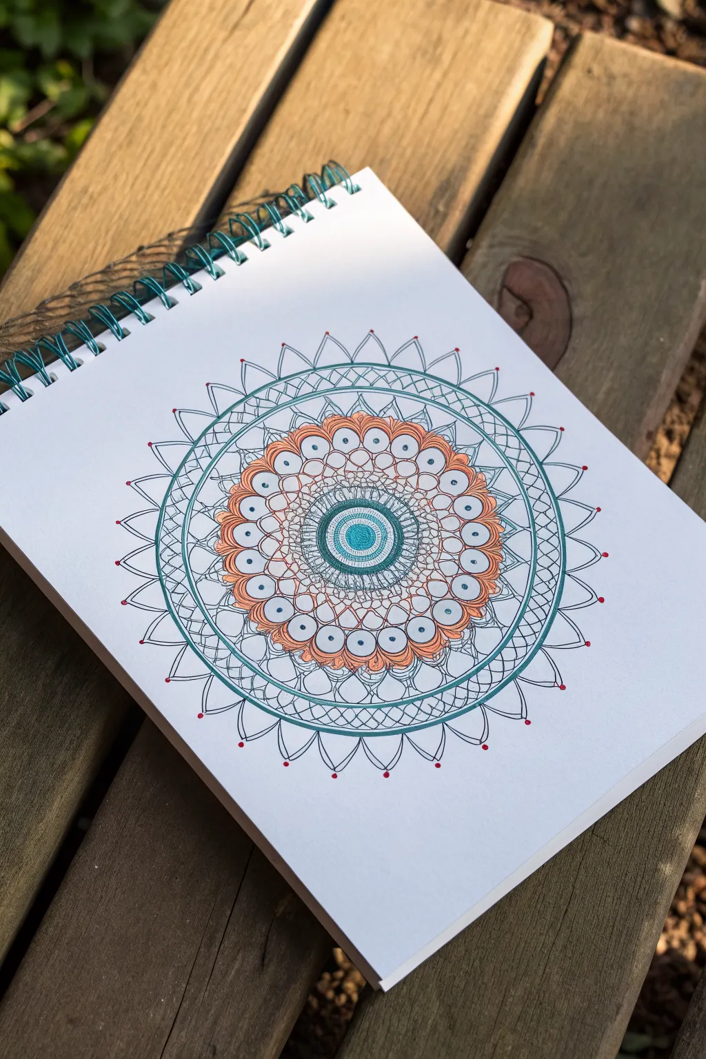
This soothing mandala design begins with a tight spiral core and expands outward with organic, petal-like loops and precise geometric circles. Combining earthy orange tones with cool teal accents, the finished piece feels like a structured garden bloom resting on the page.
Step-by-Step Guide
Materials
- White sketchbook paper (medium weight)
- Fine-liner pens (0.3mm or 0.5mm) in black, teal, and burnt orange
- Compass (optional but helpful for guidelines)
- Pencil and eraser
- Ruler
Step 1: Establishing the Core
-
Mark the center:
Find the center of your page. You can eyeball this or use a ruler to lightly mark a small dot with your pencil to anchor the entire design. -
Draw the central spiral:
Using a teal fine-liner, start at the center dot and draw a tight, solid spiral. Keep the lines very close together so the center looks like a filled circle of color. -
Add first concentric rings:
Switch to a black fine-liner. Draw a small circle immediately enclosing the teal spiral. Draw a second circle about 5mm outside the first one. -
Fill the first band:
In the space between your two black circles, draw tiny, straight radial lines all the way around, creating a textured ‘gear’ look. -
Create the second band:
Draw another black circle about 1cm further out. This band will remain empty for now, creating breathing room in the design.
Even Spacing Trick
Visualize the face of a clock. Draw petals at 12, 3, 6, and 9 first. Fill the gaps evenly to prevent your pattern from becoming lopsided.
Step 2: Creating the Loopy Petals
-
Draft the petal shapes:
I find it helpful to lightly sketch a guide circle with a pencil where you want the tips of your petals to end. This ensures your mandala stays symmetrical. -
Draw the scalloped edge:
Using the burnt orange pen, draw a series of connected ‘U’ shapes (scallops) around the outer black circle. Try to keep them uniform in width. -
Double the scallops:
Draw a second, slightly smaller ‘U’ shape inside each orange scallop. This creates a double-lined petal effect. -
Add the center dots:
Switch back to your teal pen. Place a small, solid dot inside every single orange petal loop.
Wobbly Lines?
Don’t panic if circles aren’t perfect. Go over the line a second time loosely. This intentional ‘sketchy’ look hides mistakes and adds character.
Step 3: Expanding with Geometry
-
Enclose the flower:
Draw a large black circle that touches the very tips of your orange petals, encasing the flower shape. -
Create the outer rim:
Draw two more black circles outside the flower enclosure. Space them about 5-8mm apart to create a distinct wide band. -
Cross-hatching the rim:
Inside this new wide band, draw diagonal zigzag lines that bounce back and forth between the inner and outer circle, creating a triangle pattern. -
Final outer ring:
Draw one last black circle just outside your zigzag band to seal the geometric section.
Step 4: Final Flourishes
-
Draw the spiked halo:
Around the outermost circle, draw large triangular points. Unlike standard triangles, curve the sides slightly inward so they look like thorns or sun rays. -
Detail the spikes:
Inside each large spike, draw a smaller, matching spike shape using a thinner line or lighter touch. -
Connect the tips:
Draw a very thin curved line connecting the tip of one spike to the tip of the next, creating a delicate web effect around the perimeter. -
Add red accents:
Using a red or dark orange pen, place a tiny dot at the very tip of every other spike. This subtle pop of color brings the whole piece to life. -
Erase guidelines:
Wait at least 10 minutes to ensure all ink is completely bone dry, then gently erase any visible pencil lines from your initial drafting.
Take a moment to admire how the simple repetition of lines built up into such a complex, harmonious design


Have a question or want to share your own experience? I'd love to hear from you in the comments below!