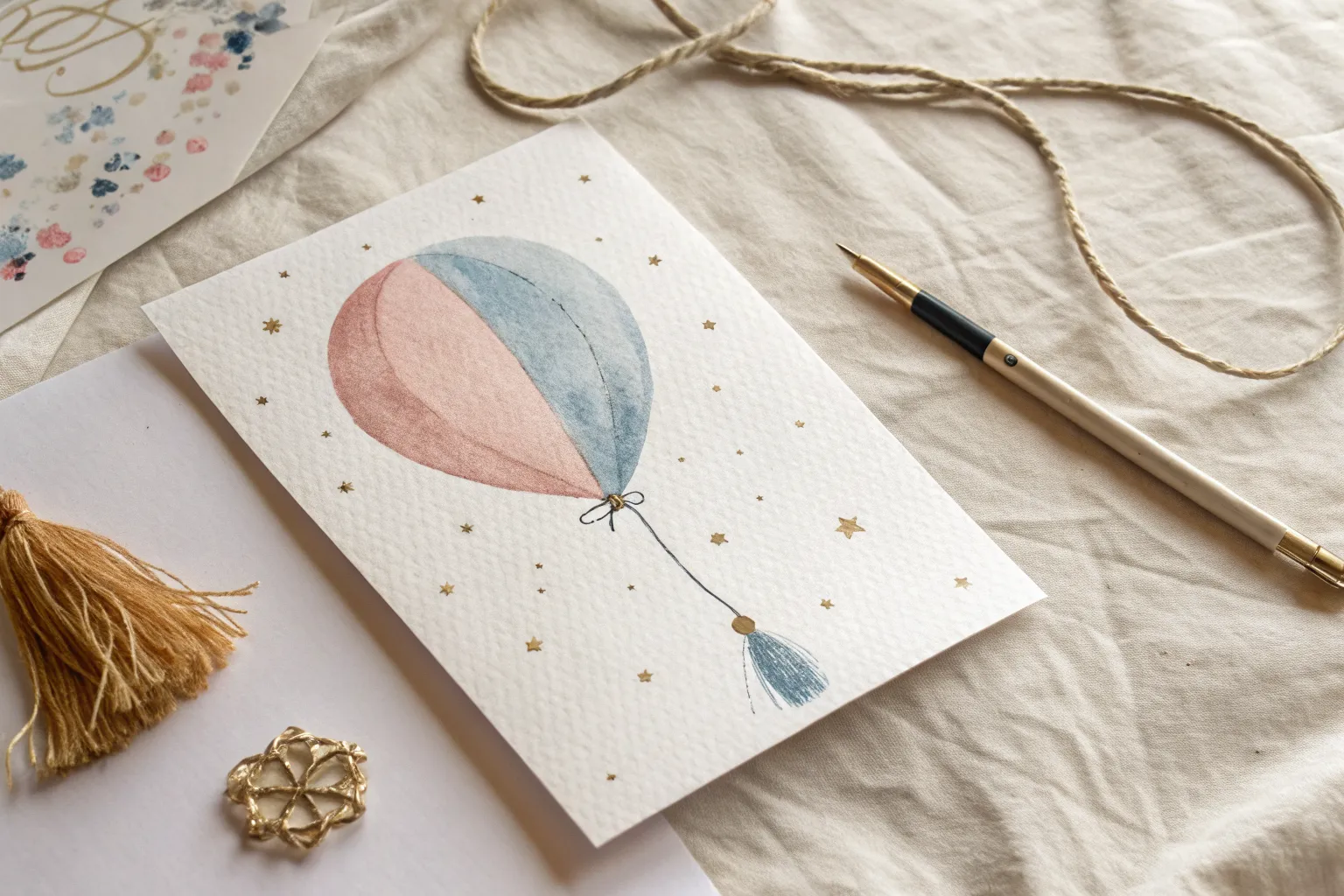
If you’re craving gender reveal drawing ideas that feel personal (not cookie-cutter), you’re in the right place. I love designs that build suspense with pink vs. blue storytelling—then deliver that sweet little “aha” moment.
Pink or Blue Hand-Lettered Quote

Create a charming keepsake for your gender reveal with this delicate watercolor hand-lettered piece. The soft gradient blends within the letters give the classic pink and blue theme a modern, artistic touch.
Step-by-Step
Materials
- High-quality watercolor paper (cold press, at least 140lb/300gsm)
- Pencil (HB or H)
- Kneaded eraser
- Watercolor paints (Alizarin Crimson or Rose for pink; Ultramarine or Pthalo Blue)
- Round watercolor brush (size 2 and size 4)
- Jar of clean water
- Paper towel
- Ruler
Step 1: Planning and Sketching
-
Measure your guidelines:
Start by finding the vertical center of your paper. Using your ruler, draw three horizontal baselines spaced evenly apart to support the three rows of text. -
Map out the letters:
Lightly sketch the word ‘PINK’ on the top line in block capitals. Aim for a slightly serif style where the ends of the strokes flair out just a bit. -
Sketch the middle row:
In the center space, draw the word ‘OR’ significantly smaller than the main text. Add a small serif flair to the ‘R’ leg for elegance. -
Draw the bottom row:
Sketch ‘BLUE’ on the bottom line, matching the size and width of ‘PINK’ above to create a balanced composition. -
Add decorative flourishes:
Draw simple, curved swashes extending from the left and right sides of the word ‘OR’ to fill the negative space. -
Lighten the sketch:
Take your kneaded eraser and gently roll it over the entire design. You want the pencil lines to be barely visible guides so graphite doesn’t muddy your transparent watercolor.
Fixing Bleeds
If two wet letters touch and bleed, dry your brush on a paper towel and touch the spot to ‘drink’ up the excess liquid. Let it dry completely before repainting the edge.
Step 2: Painting the Pink
-
Mix your pink tone:
Prepare a watery mix of your pink pigment on your palette. You want a medium transparency—not too thick, but distinct enough to read clearly. -
Paint the letter P:
Using the size 4 brush, stroke the vertical stem of the ‘P’ first. While the paint is still wet, add a tiny drop of more concentrated pigment to the bottom of the stroke to create a gradient. -
Finish the word PINK:
Continue painting ‘I’, ‘N’, and ‘K’. Work one letter at a time to manage the wetness. I like to lift my brush at the end of serif strokes to keep points sharp. -
Add variance:
Drop a little clean water into the top of the ‘K’ or ‘N’ while wet to create a ‘bloom’ effect, giving the letters that characteristic watercolor texture.
Step 3: Painting the Blue
-
Mix your blue tones:
Create two small puddles of blue: one very watery and pale for the ‘OR’, and one more saturated for ‘BLUE’. -
Paint the word OR:
Switch to your smaller size 2 brush. Carefully paint the ‘OR’ with the paler blue mix, keeping the lines delicate. -
Paint the word BLUE:
Switch back to the size 4 brush and load it with the saturated blue. Paint the letters B, L, U, and E, mimicking the technique you used for the pink row. -
Deepen the contrast:
While the blue letters are damp, touch the bottom of the letters with a slightly darker blue mix to weigh the letters down visually.
Add Some Sparkle
Once the paint is totally dry, outline the letters with a metallic gold gel pen or add tiny dots of gold ink inside the thickest parts of the letters for a festive pop.
Step 4: Final Details
-
Paint the pink flourishes:
Clean your brush thoroughly. Pick up a very pale, watery wash of the pink paint and fill in the curved swashes next to ‘OR’. -
Refine the edges:
Once everything is fully dry, inspect your edges. If any serif looks too soft, you can use a barely damp size 2 brush to gently shape the edge, but be careful not to lift too much color. -
Erase guidelines:
Wait until the paper is bone dry—cool to the touch usually means it’s still damp. Once truly dry, gently erase any remaining pencil marks.
Now you have a beautifully hand-lettered piece ready to frame or photograph for your announcement


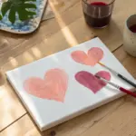
Half-and-Half Heart Reveal Drawing
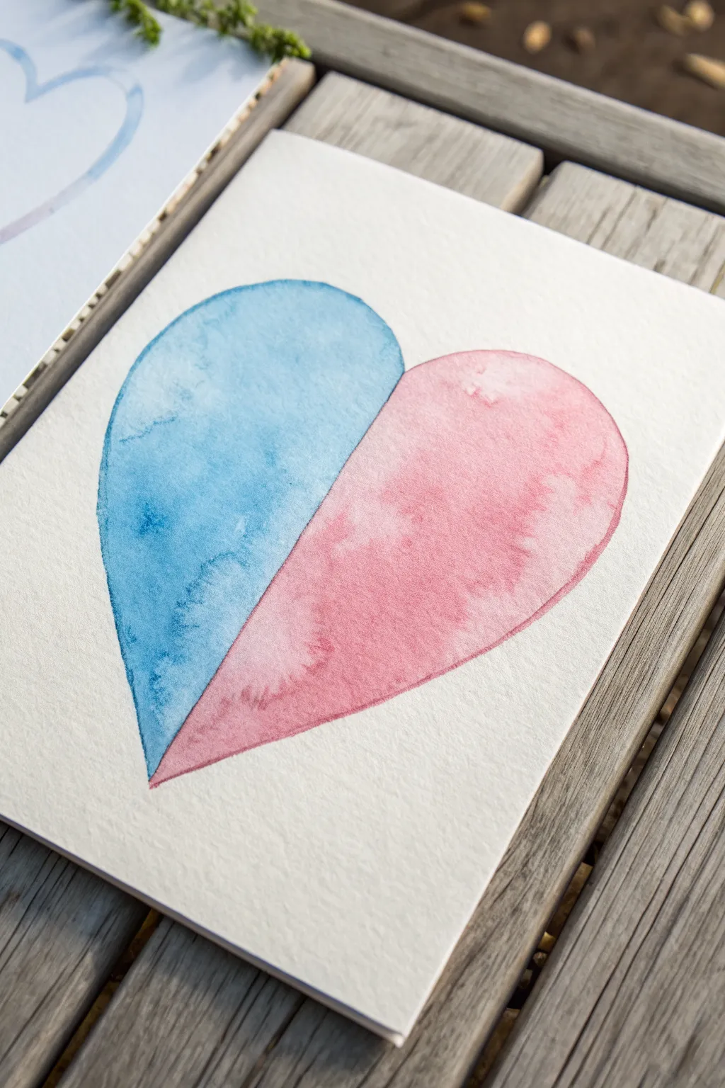
Capture the anticipation of a gender reveal with this elegant, minimalist watercolor heart. Featuring a distinct split design, one half glows in soft pink while the other mirrors it in calm blue, creating a balanced and artistic announcement piece.
Step-by-Step
Materials
- Cold Press watercolor paper (300 gsm recommended)
- Watercolor paints (Cerulean Blue and Rose Madder or similar)
- Round watercolor brush (size 6 or 8)
- Pencil (HB or lighter)
- Kneaded eraser
- Ruler
- Jar of clean water
- Paper towels
- Masking tape or painter’s tape
Step 1: Preparation and Sketching
-
Prepare your workspace:
Tape your watercolor paper down to a flat surface or drawing board using masking tape. This prevents the paper from buckling when it gets wet and creates a clean border if you paint to the edge. -
Mark the center line:
Using a ruler, lightly draw a vertical line down the center of your paper where you want the heart to be. This line will serve as the dividing boundary between the blue and pink sections. -
Sketch the heart outline:
Lightly sketch the outline of a large heart. Start from the top center point on your vertical line, curve up and out, then bring it down to meet the line again at the bottom point. Try to keep the two sides as symmetrical as possible, using the line as your guide. -
Clean up sketch lines:
Once you are happy with the shape, use your kneaded eraser to gently lift the graphite until the lines are barely visible. We don’t want heavy pencil marks showing through the translucent watercolor later.
Pro Tip: Hard Edges
For a razor-sharp center line, place a piece of masking tape over the dry blue side before painting the pink side. Peel it off gently only after everything is fully dry.
Step 2: Painting the Blue Half
-
Mix your blue wash:
Prepare a puddle of blue paint on your palette. Aim for a medium consistency—plenty of water to make it transparent, but enough pigment to be vibrant. A Cerulean or Cobalt Blue works lovely here. -
Pre-wet the paper:
Dip your clean brush into water and carefully paint the left half of the heart shape with just clear water. This ‘wet-on-wet’ technique helps the color flow smoothly. Be careful not to cross the center line. -
Apply the blue pigment:
Load your brush with the blue mix and touch it to the wet paper. Watch the color bloom and spread. Gently guide the pigment to the edges of your sketch. -
Create texture:
While the paint is still wet, you can drop in slightly more concentrated pigment in random spots to create the watery, mottled texture seen in the reference. I like to let gravity do some of the work here. -
Refine the center edge:
Use the tip of your brush to ensure a crisp, straight line right down the center divider. This sharp edge is crucial for the split effect. -
Dry completely:
Allow this blue half to dry completely before moving on. Use a hair dryer on a low setting or wait about 15-20 minutes. If you paint the next side while this is wet, the colors will bleed into each other.
Troubleshooting: Blooms
If you see ‘cauliflower’ blooms forming where paint dries unevenly, don’t panic. These often add character! To prevent them, avoid adding water into paint that has already started to dry.
Step 3: Painting the Pink Half
-
Mix your pink wash:
Clean your brush thoroughly and mix a puddle of pink or light red paint. A Rose Madder or Alizarin Crimson watered down creates a nice soft hue. -
Wet the right side:
Just as before, apply clean water to the right half of the heart. Be extremely careful near the center line—the water must not touch the dry blue paint, or it will reactivate it. -
Apply the pink pigment:
Drop your pink color into the wet area. Guide it gently to the outer curved edge and carefully up to the center line. -
Add variance:
Dab a little extra water or pigment in spots to encourage that beautiful watercolor texture, ensuring the wash isn’t perfectly flat. -
Define the boundary:
With a steady hand, paint clearly up to the center line. You want the pink and blue to kiss but not overlap. -
Final drying:
Let the entire piece dry completely. Resist the urge to touch it to check for dampness, as oils from your finger can mar the surface.
Once dry, you have a beautiful, handmade piece of art ready to frame or gift

Blue vs. Pink Baby Icon Banner
Celebrate your gender reveal with this charmingly rustic bunting featuring classic baby motifs in soft blue and pink. Made from durable unbleached cotton or linen, this banner combines a handmade textile feel with clean, stamped graphics for a professional finish.
Step-by-Step Tutorial
Materials
- Unbleached cotton or linen fabric (oatmeal color)
- Fabric paint or screen printing ink (pastel royal blue, rose pink)
- Thick jute twine or natural rope
- Stencils (baby bottle, rattle, stars)
- Stencil sponges or high-density foam brushes
- Sewing machine with white thread
- Fabric scissors or rotary cutter
- Ruler and chalk pencil
- Cardboard (for backing)
- Pins
- Iron and ironing board
Step 1: Preparing the Flags
-
Measure the triangles:
Begin by determining the size of your bunting flags. For the look in the photo, create a template that is roughly 6 inches wide at the top and 8 inches long. Trace these triangles onto your unbleached fabric using a chalk pencil. -
Cut the fabric:
Carefully cut out your triangles. If your fabric frays easily, handle the pieces gently. You will need an alternating number of flags for the blue and pink designs. -
Finish the edges:
Set your sewing machine to a tight white zigzag stitch or an overlock stitch. Sew along the two long diagonal sides of each triangle to prevent fraying and add a decorative, hemmed look. Leave the top edge raw for now as it will be covered by the twine. -
Press flat:
Once sewn, iron each flag flat. This step is crucial because a smooth surface ensures your stencil designs will be crisp and sharp.
Step 2: Applying the Designs
-
Prepare the workspace:
Lay a piece of cardboard or scrap paper underneath your first flag. This protects your work surface in case the fabric paint seeps through the weave. -
Position the main stencil:
Center your primary stencil—like the baby bottle shown—on the flag. Secure it lightly with tape if necessary to keep it from shifting. -
Load the sponge:
Dip your stencil sponge into the blue fabric paint. Dab off the excess paint onto a paper towel until the sponge is almost dry; I find this prevents the paint from bleeding under the stencil edges. -
Stipple the main icon:
Apply the paint using a vertical up-and-down dabbing motion (stippling) over the baby bottle stencil. Ensure even coverage, paying attention to small details like the bottle measurements and nipple. -
Add decorative elements:
While the blue paint is still on your sponge, position a small star stencil near the bottle. Stencil a large star above the bottle to the right, a smaller one to the left, and one below to balance the composition. -
Repeat for pink flags:
Switch to your pink paint and a fresh sponge. Repeat the process on the alternate flags using a different icon, such as a baby rattle, surrounded by pink stars. -
Allow to dry:
Let all the painted flags sit undisturbed until the paint is completely dry to the touch, usually about one to two hours depending on your paint brand. -
Heat set the paint:
Once dry, place a thin cloth over the painted designs and run a hot iron over them for a few minutes. This sets the ink, making it permanent and water-resistant.
Bleeding Edges?
If paint bleeds under the stencil, your sponge is too wet. Offload more paint onto a paper towel first. Also, ensure the stencil is pressed firmly against the fabric.
Step 3: Assembly
-
Arrange the pattern:
Lay out your jute twine on the floor or a large table. Arrange your flags in the desired order, alternating between the blue bottle design and the pink rattle design. -
Fold the top edge:
Fold the top raw edge of the first flag over the jute twine toward the back side of the fabric, creating a casing of about half an inch. -
Secure with pins:
Pin the flap securely in place, ensuring the twine is tucked snugly inside the fold. -
Sew the casing:
Using a straight stitch on your sewing machine, sew across the top of the flag to secure the fold. Be careful not to sew through the thick rope itself; the needle should pass through the two layers of fabric just below the rope. -
Continue attaching:
Repeat the folding and sewing process for all remaining flags, spacing them about 1-2 inches apart along the twine. -
Final trim:
Trim any loose threads from your sewing visible on the front or back of the banner.
Add Sparkle
Mix a tiny amount of textile medium and fine silver glitter into your blue and pink paints for a subtle shimmer that catches the sunlight.
Hang your finished bunting between trees or across a mantelpiece to add a sweet, personalized touch to the celebration


Watercolor Wash Countdown Card
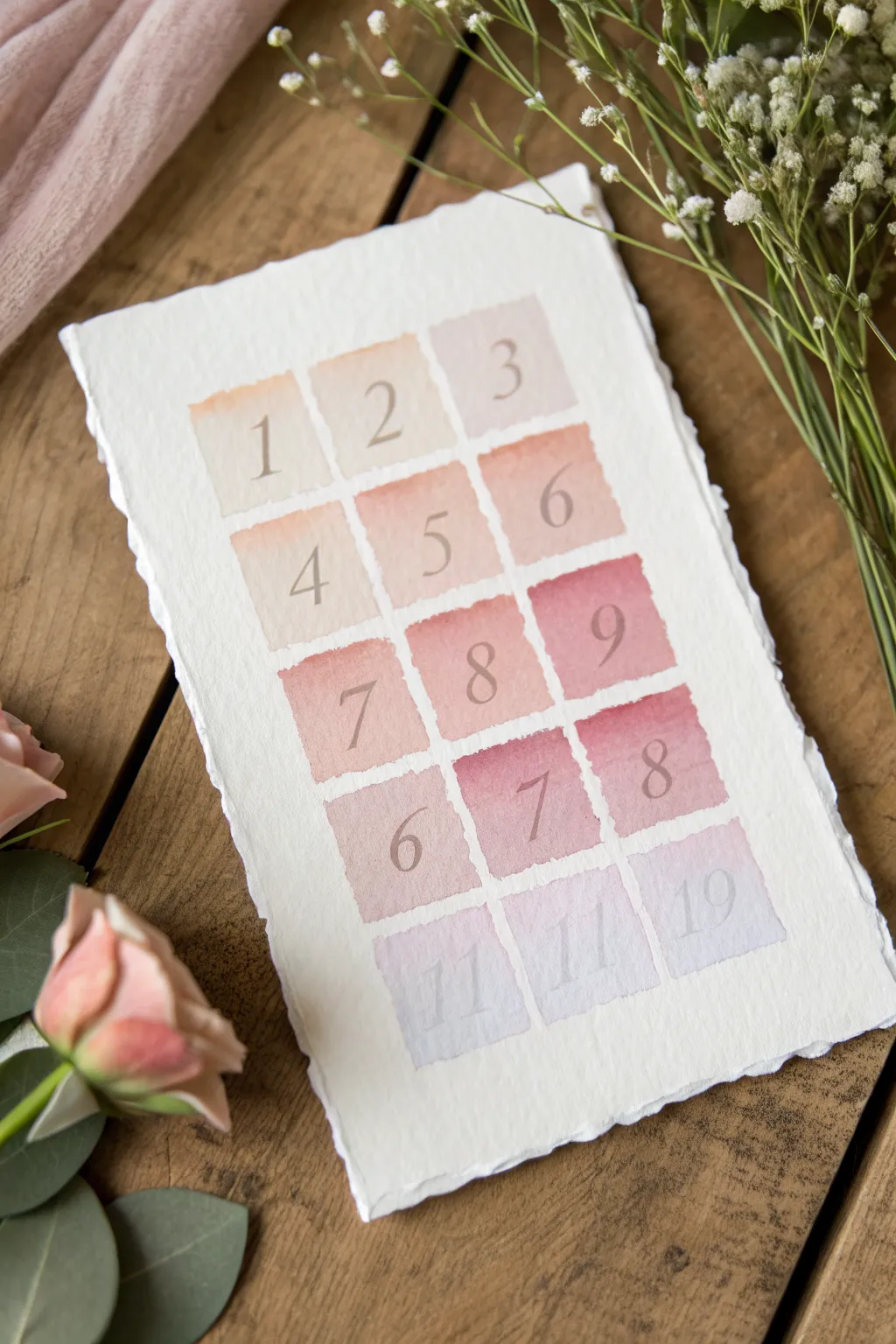
Create a delicate and suspenseful gender reveal element with this beautifully structured watercolor chart. Featuring handmade deckled-edge paper and a soft gradient from warm neutrals to a revealing pink or blue hue, this piece serves as both decor and an interactive guessing game.
Step-by-Step Tutorial
Materials
- Heavyweight cold-press watercolor paper (300gsm) or handmade deckle-edge paper
- Watercolor paints (Peach, Rose Madder/Alizarin Crimson, Ultramarine Blue, Burnt Sienna)
- Flat shader brush (size 6 or 8)
- Fine liner brush (size 0 or 1)
- Dilute white gouache or gray watercolor
- Ruler
- Pencil (H or 2H for light marks)
- Eraser
- Mixing palette
- Two jars of water
- Paper towels
Step 1: Preparing the Layout
-
Select your paper:
Begin with a sheet of high-quality watercolor paper. If you want the rustic look shown in the photo, tear the edges against a ruler to create a deckled effect, or use pre-made handmade cotton rag paper. -
Calculate the grid:
Measure the width of your paper. You will need a grid that is 3 columns wide and 5 rows high. Calculate the size of your squares (approx 1.5 inches each works well) and the spacing between them. -
Mark the grid lightly:
Using a very light hand and an H pencil, mark the corners of where each colored square will go. Don’t draw full dark lines, just faint dots or tick marks to guide your brush.
Step 2: Painting the Gradient Washes
-
Mix the first row color:
Create a very dilute, pale peach wash. Mix a tiny amount of Burnt Sienna with plenty of water to get a ‘barely there’ warm neutral tone. -
Paint the top row:
Load your flat brush and carefully paint the first three squares at the top. Keep the edges relatively crisp but allow for the natural organic wobble of watercolor. -
Deepen the mix for row two:
Add a touch more pigment to your peach mix, perhaps introducing a hint of rose. Paint the second row of three squares directly below the first, ensuring the color is slightly more saturated. -
Transition to pink (or blue):
For the third row, shift your color mixing. If it’s a girl, add Alizarin Crimson or Rose Madder. Ideally, this row should be a distinct soft pink (or soft blue) compared to the neutrals above. -
Paint the third row:
Lay down the wash for the middle row. Ensure your brush isn’t too wet to prevent puddling; you want an even, flat wash. -
Saturate the fourth row:
This is your boldest row. Add more pigment to create a deeper rose or crimson tone. Paint the next three squares, making them the visual anchor of the gradient. -
Cool down the final row:
For the bottom row, neutralize the color again slightly. I like to add a tiny drop of blue to the pink mix to create a soft violet or lavender tone, suggesting the end of the sequence. -
Allow to dry completely:
This is crucial. The paper must be bone dry before you add numbers, otherwise, the ink will bleed into the paper fibers. Wait at least 30 minutes.
Wet Edge Control
To keep square edges sharp without tape, load your flat brush fully but wipe one side on the palette. Use the ‘sharp’ corner of the brush to define the perimeter first, then fill the center.
Step 3: Adding the Typography
-
Sketch the numbers:
Lightly pencil in your numbers (1-15, or whatever countdown sequence you prefer) in the center of each square. Use a classic serif font style for an elegant look. -
Mix your lettering color:
Mix a neutral grey wash using Payne’s Grey or a mix of Burnt Sienna and Ultramarine. It should be darker than the background squares but not jet black. -
Letter row one and two:
Using the fine liner brush, carefully trace over your penciled numbers for the top two rows. Keep the pressure light on upstrokes and heavier on downstrokes. -
Letter row three and four:
Continue painting numbers 7 through 12. Steadiness is key here; rest your hand on a clean sheet of paper to avoid smudging the painting. -
Paint the final ghostly numbers:
For the bottom row (lavender squares), dilute your grey paint significantly with water or a bit of white gouache. You want these numbers to look faint and ethereal. -
Final erase:
Once the lettering is completely dry, gently erase any visible pencil guidelines to leave a clean, professional finish.
Metallic Level Up
For a luxe touch, swap the grey lettering paint for a fine metallic gold ink. The shimmer against the matte watercolor creates a beautiful, sophisticated contrast perfect for celebrations.
Display your chart on a wooden easel or flat lay to build excitement for the big reveal
BRUSH GUIDE
The Right Brush for Every Stroke
From clean lines to bold texture — master brush choice, stroke control, and essential techniques.
Explore the Full Guide
Confetti Pop Explosion Composition
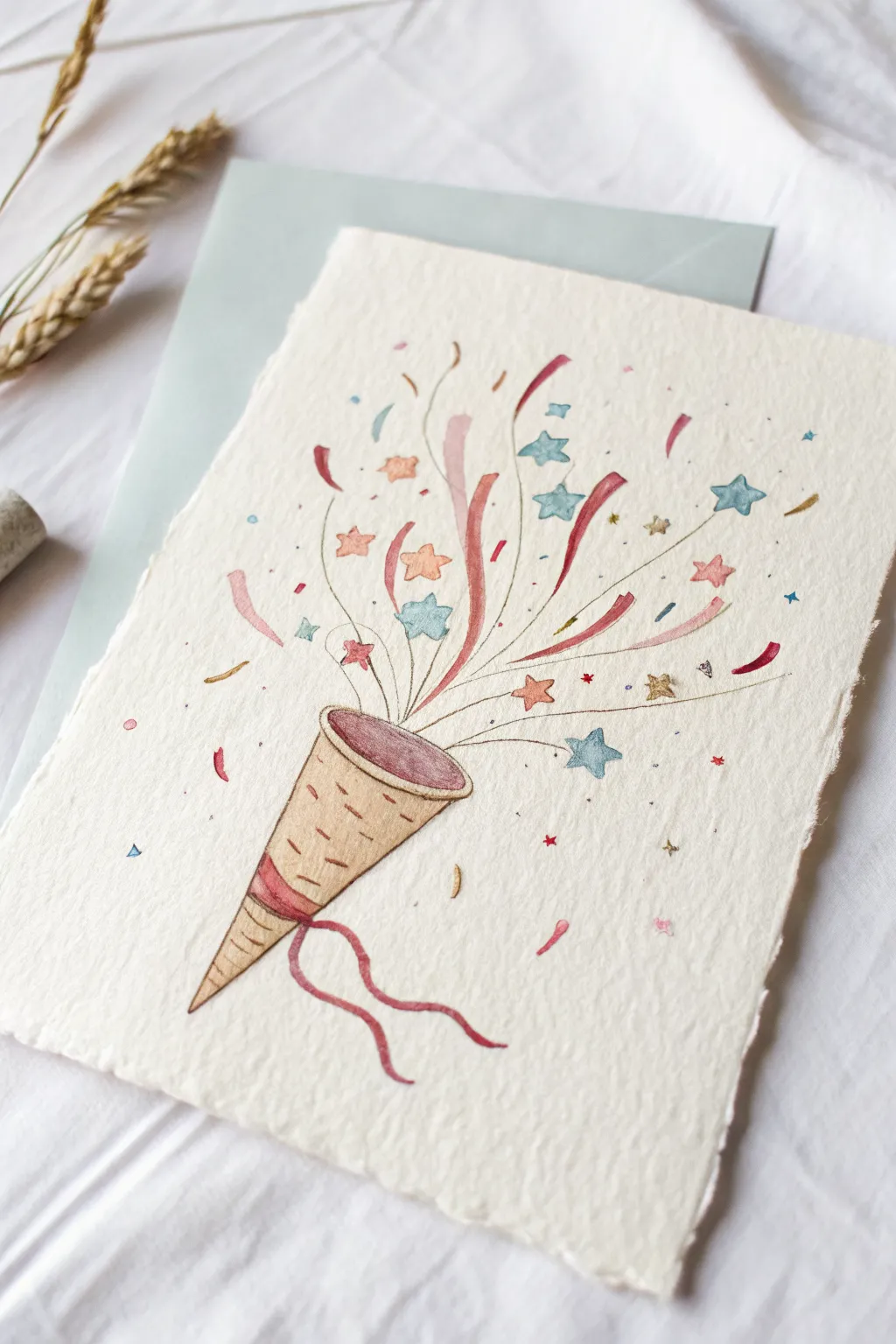
This joyful illustration captures the exact moment of a celebration with a hand-painted party popper bursting with colorful stars and streamers. Using delicate watercolor washes and fine lines, you’ll create a lively composition that feels both festive and elegant.
How-To Guide
Materials
- Cold press watercolor paper (textured, approximately 140lb)
- Watercolor paints (shades of ochre, burnt sienna, dusty pink, teal, red)
- Fine liner brushes (size 0 and 00)
- HB pencil and kneadable eraser
- Clean water and paper towels
- Optional: Metallic gold watercolor paint
Step 1: Drafting the Layout
-
Outline the cone:
Begin by lightly sketching the cone shape of the party popper in the bottom left quadrant. Angle it diagonally upward towards the right to suggest movement. -
Add cone details:
Draw the elliptical opening at the top of the cone and the decorative band near the pointed bottom. Sketch two wavy ribbons trailing down from this band. -
Sketch the explosion path:
Use very faint, sweeping curved lines radiating from the cone’s opening to map out where the confetti will flow. This helps maintain a sense of direction and energy. -
Position the large elements:
Lightly draw the larger streamers (long, twisting ribbon shapes) and the biggest stars along your flow lines. Vary their angles so they look tumbled. -
Fill with small confetti:
Sprinkle in smaller shapes—tiny circles, triangles, and smaller stars—around the main elements to create density near the opening that disperses further out.
Uneven Watercolors?
If your stars look blotchy, you might be using too much water on a small area. Dab your brush on a paper towel before painting small shapes to control the moisture.
Step 2: Painting the Popper
-
Base wash for the cone:
Mix a diluted yellow ochre or light beige. Apply a gentle wash to the body of the cone, leaving it slightly translucent to show the paper texture. -
Painting the interior:
Fill the elliptical opening with a muted reddish-brown or dusty rose color. Keep the color flatter here to suggest depth inside the tube. -
Detailing the cone pattern:
Once the base wash is mostly dry, use a smaller brush with a slightly darker brown (burnt sienna) to add small, broken horizontal dashes across the cone’s surface for texture. -
Coloring the ribbons:
Paint the decorative band on the cone and the two trailing ribbons in a deep red or rose shade. I like to lift a little pigment from the center of the ribbons while wet to create a highlight.
Step 3: Adding the Explosion
-
Painting large streamers:
Select 2-3 prominent streamers and paint them with the same rose/red tone used on the cone ribbons. Use a confident, sweeping stroke to keep the lines fluid. -
Adding teal stars:
Mix a soft, watered-down teal or light blue. Paint the largest stars, carefully filling in your pencil sketches. -
Adding warm stars:
Switch to a peach or light orange hue for the remaining medium-sized stars. Alternate these warm tones with the cool blues for visual balance. -
Connecting lines:
Using a very fine liner brush (size 00) and a diluted gray-brown paint, draw the thin, purely distinct motion lines that originate from the cone and shoot outward among the confetti. -
Micro-confetti accents:
Dab your brush to create tiny dots and triangles in various colors (red, blue, gold) throughout the explosion area to simulate the smallest bits of paper. -
Refining the edges:
Take a fine brush with darker brown paint and selectively outline parts of the cone and a few stars. Don’t outline everything completely; broken lines look more artistic.
Add Some sparkle
For a magical finish, mix a drop of metallic gold watercolor or ink and paint over the smallest yellow stars or add tiny gold speckles near the cone opening.
Let the piece dry completely before erasing any visible pencil marks to avoid smudging your lovely work
Silhouette Belly With Color Fill
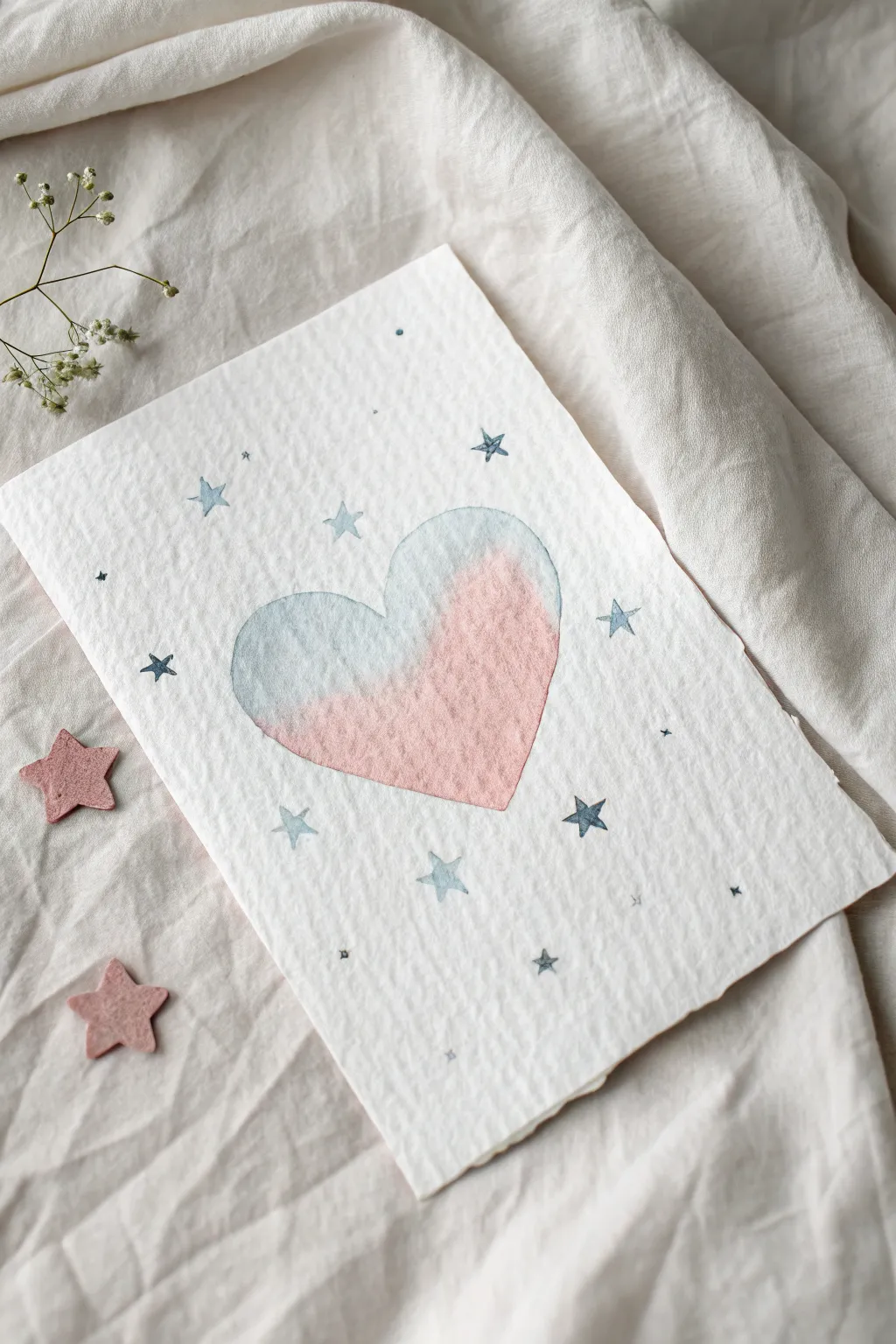
Capture the anticipation of a new arrival with this dreamy watercolor painting featuring a soft, dual-toned heart surrounded by a galaxy of tiny stars. The textured cotton paper adds a luxurious, organic feel that perfectly complements the delicate blue and pink wash.
Detailed Instructions
Materials
- Cold press watercolor paper (heavyweight, heavily textured)
- Watercolor paints (pastel pink and soft powdery blue)
- Round watercolor brush (size 6 or 8 for the heart)
- Small detail brush (size 0 or 1 for stars)
- Pencil (H or HB)
- Kneaded eraser
- Jar of clean water
- Paper towel
Step 1: Preparation & Sketching
-
Paper selection:
Choose a watercolor paper with significant tooth or texture. The rough surface is crucial for achieving the grainy, vintage look visible in the reference. -
Outline the heart:
Lightly sketch a medium-sized heart in the center of your paper using a hard pencil like an H. Keep your lines very faint so they don’t show through the translucent paint later. -
Plan the stars:
Randomly mark small dots or tiny ‘x’ marks around the heart to map out where your stars will go, ensuring an even distribution without making it look too uniform.
Pro Tip: Deckled Edges
To get the torn look shown in the photo, fold your paper repeatedly along a line, dampen the crease with water, and gently tear it against a ruler.
Step 2: Painting the Heart
-
Mix the blue:
Prepare a watery wash of soft powder blue. You want it to be transparent enough to see the paper’s texture underneath. -
Apply the first half:
Load your larger round brush with the blue wash and paint the left side of the heart. Bring the color about two-thirds of the way across, curving gently like a wave. -
Create a wet edge:
While the blue paint is still wet, rinse your brush and blot it slightly so it is damp but clean. -
Soften the transition:
Run the damp brush along the inner edge of the blue paint to feather it out, preventing a hard line from forming where the pink will meet it. -
add the pink:
Quickly mix a watery pastel pink. While the feathered blue edge is still slightly damp, paint the right side of the heart, allowing the pink to just barely touch and bleed into the blue. -
Refine the blend:
I like to tilt the paper slightly if the colors aren’t blending naturally, encouraging a soft, cloudy transition in the middle. -
Let it dry completely:
Wait for the heart to fully dry. The paper should feel room temperature to the touch, not cool.
Step 3: Painting the Galaxy
-
Switch brushes:
Change to your size 0 or 1 detail brush for the fine star work. -
Paint standard stars:
Using a slightly more saturated mix of the blue paint, create five-pointed stars scattered around the heart. Don’t worry about them being perfect geometric shapes; a little wobble adds charm. -
Vary the saturation:
Dip your brush in water to make a lighter blue, then paint a few more stars. This variation makes some stars look further away than others. -
Add tiny accents:
In the empty spaces between the stars, use the very tip of your brush to dot tiny specks of blue paint. -
Add micro-crosses:
Mix up your star shapes by adding a few tiny ‘plus sign’ stars or diamond shapes for variety.
Level Up: Metallic Magic
Once the watercolor is dry, add tiny dots of metallic silver or gold ink inside the center of the stars for a magical, shimmering effect.
Step 4: Finishing Touches
-
Check the edges:
Identify any stars that look a bit flat. You can drop a tiny amount of darker blue into the center of a wet star to give it dimension. -
Erase guidelines:
Once the painting is 100% bone dry, gently roll a kneaded eraser over the heart outline to lift any visible graphite marks. -
Final assessment-:
Step back and see if the composition feels balanced. If there’s a large empty gap, add one last tiny blue dot to fill it.
This sweet, celestial artwork makes for a beautiful keepsake or a gentle way to share your happy news

Have a question or want to share your own experience? I'd love to hear from you in the comments below!