
Whenever my sketchbook feels too quiet, I reach for interesting drawing ideas that start with something familiar and then twist it just a little. These prompts are meant to feel doable, but still give you that spark of surreal, imaginative fun.
Rose or Wildflower in Ink and Pencil
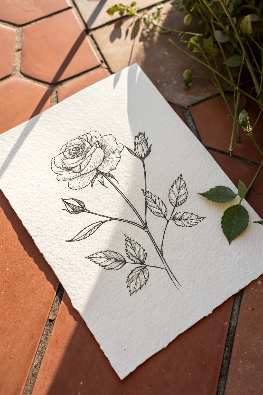
Capture the delicate elegance of a single rose using precise ink lines on thick, textured cotton paper. This project emphasizes botanical accuracy through careful contouring and shading techniques, resulting in a timeless black and white illustration.
How-To Guide
Materials
- Cold press watercolor paper (300 gsm or heavier)
- H or HB graphite pencil
- Kneaded eraser
- Fine liner pens (sizes 005, 01, and 03)
- Black pigment ink
- Ruler (optional)
Step 1: Penciling the Structure
-
Map the stem:
Begin by lightly sketching a central curved line for the main stem using your H pencil, angling it slightly from the bottom left toward the upper right. -
Place the bloom:
At the top of your stem line, draw a loose oval shape to represent the general size and placement of the main rose blossom. -
Add secondary stems:
Sketch two smaller lines branching off the main stem: one extending upward to the right for the rosebud, and another branching left for lower foliage. -
Define the petals:
Inside the main oval, sketch the spiral center of the rose. Working outward, draw large, overlapping C-shapes to act as the unfolding outer petals. -
Sketch the leaves:
Draw the leaf groupings (sets of three or five leaflets) along the stems. Use serrated, jagged lines for the edges to mimic the natural texture of rose leaves. -
Refine the bud:
At top of the right branch, draw a tight tear-drop shape for the closed bud and add the small sepals (leaf-like structures) hugging the base.
Don’t Smudge!
Place a scrap piece of paper under your drawing hand. This prevents skin oils from transferring to the paper and keeps your fresh ink from smearing.
Step 2: Inking the Contours
-
Outline the main shapes:
Switch to your 03 fine liner. Carefully go over your pencil lines for the main stem and the outer edges of the petals and leaves, using confident, broken strokes rather than one continuous heavy line. -
Detail the petal folds:
Using a thinner 01 pen, trace the intricate inner spirals of the rose bloom, allowing the lines to wiggle slightly to suggest the soft, organic texture of the flower. -
Serrate the leaves:
With the 01 pen, redefine the leaf edges with sharp, saw-toothed zigzags. Add a central vein down the middle of each leaflet. -
Erase pencil guides:
Once the ink is completely dry to the touch, gently roll a kneaded eraser over the entire drawing to lift the graphite sketches without damaging the paper surface.
Step 3: Shading and Texture
-
Hatch the stem shadows:
Using your finest 005 pen, add vertical hatching lines along the right side of the main stem to create cylindrical volume. -
Tone the leaves:
Fill the leaves with fine, diagonal shading lines. Leave the center of each leaf lighter to imply a slight shine or curve. -
Deepen petal shadows:
Where petals overlap, add small patches of cross-hatching with the 005 pen. Focus on the underside of the outer petals and the deep recesses of the spiral center. -
Texture the petals:
Draw very faint, curved lines running from the base of the petals outward. I find this helps follow the form of the flower and makes it look three-dimensional. -
Final sepals detail:
Add dark, dense vertical lines to the sepals beneath the main bloom and the bud to distinguish them from the softer petals. -
Review contrast:
Step back and check the balance. If the drawing feels flat, darken the deepest shadows (like under the bud or between leaves) with the 03 pen for more punch.
Uneven Lines?
If your lines feel too shaky, try pulling the pen toward you rather than pushing it away. Varying line weight actually makes botanical art look more organic.
Now you have a refined botanical illustration ready to be framed or gifted


Cozy Room Corner in One-Point Perspective
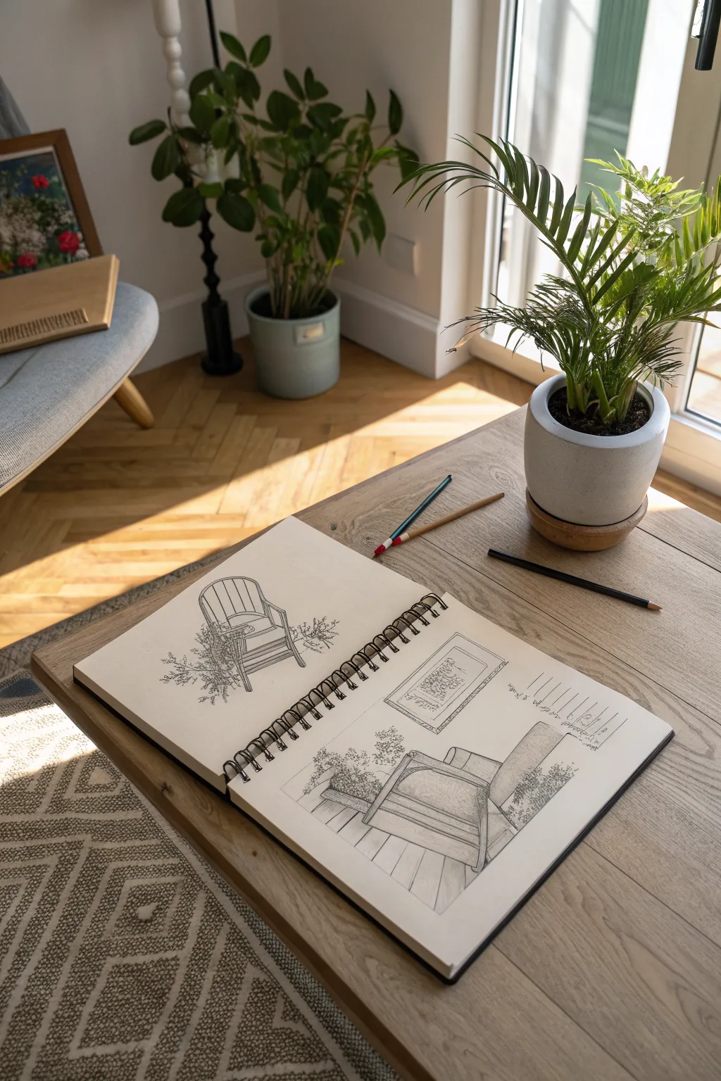
Capture the inviting atmosphere of a sun-drenched room with this detailed pencil sketch. This project focuses on establishing a realistic one-point perspective interior, complete with an armchair, rug textures, and leafy potted plants.
Detailed Instructions
Materials
- Spiral-bound sketchbook (heavyweight paper)
- Graphite pencils (HB for sketching, 2B and 4B for shading)
- Kneaded eraser
- Ruler or straight edge
- Fine-liner pen (optional for final outlines)
- Blending stump or tissue
Step 1: Planning and Structure
-
Establish the horizon line:
Begin by lightly drawing a horizontal line across the middle of your page. This represents your eye level and will anchor the entire perspective of the room. -
Mark the vanishing point:
Place a small dot roughly in the center of your horizon line. All receding parallel lines—like floorboards and wall edges—will converge at this single point. -
Block in the main shapes:
Using your HB pencil, lightly sketch the large geometric forms. Draw a large box for the armchair in the foreground and a rectangular shape on the wall for the framed artwork. -
Define the floor plane:
Draw lines radiating from your vanishing point toward the bottom edge of the paper to represent the floorboards. Keep these lines light so they can be adjusted or partially erased later. -
Construct the chair:
Refine the boxy shape of the chair. Curve the top of the backrest slightly and define the armrests. I find it helpful to draw through the furniture as if it were transparent to ensure the structure sits correctly on the floor.
Step 2: Adding Details and Texture
-
Detail the armchair:
Add the cushion details and the piping along the edges of the upholstery. Soften the geometric corners to make the chair look plush and fabric-covered. -
Sketch the rug:
Define the edges of the rug beneath the chair. Rather than drawing every thread, suggest the texture with short, irregular strokes at the fringe or edges. -
Draft the wall art:
Inside the wall rectangle, sketch a simple frame. For the interior of the picture, use loose, scribbled loops to suggest a botanical print or abstract design without getting bogged down in specifics. -
Add potted plants:
Sketch the pot shapes on the floor. For the foliage, use quick, organic cloud-like shapes initially to map out where the leaves will go. -
Refine the leaves:
Go back into your organic shapes and define individual leaves. Use jagged lines for fern-like textures or broader strokes for larger leaves, letting them overlap the furniture slightly for depth. -
Draw the window door:
On the side, sketch the vertical frame of the glass door. Ensure the top and bottom lines of the frame angle back toward your vanishing point.
Perspective Feels Off?
Check your vertical lines. In one-point perspective, all vertical lines (walls, chair legs, door frames) must remain perfectly straight up and down, not tilted.
Step 3: Shading and Final Touches
-
Start shading shadows:
Switch to your 2B pencil. Identify your light source (the window) and darken the side of the chair opposite the light. Cast a shadow on the floor beneath the chair and plants. -
Enhance the floorboards:
Darken the floorboard lines you drew earlier. Add faint wood grain texture by drawing imperfect, wavy lines within the planks, varying the pressure of your pencil. -
Deepen the contrast:
Use a 4B pencil to punch up the darkest areas, such as the deep folds of the cushions, the soil in the plant pots, and the shadows directly under furniture legs. -
Add textual elements:
If desired, add handwritten notes or a date on the side in a loose, cursive style to give it a sketchbook journal feel. -
Clean up highlights:
Take your kneaded eraser and lift off graphite on the tops of the armrests and the window frame to create crisp, bright highlights where the sun hits. -
Final assessment:
Step back and check your values. If the drawing feels flat, darken your darkest darks one last time to make the white paper pop.
Level Up: Ink Wash
After sketching, go over your lines with waterproof ink. Once dry, use a waterbrush with diluted gray ink to paint in the shadows for a professional architectural look.
Now you have a charming interior scene preserved in your sketchbook
Mountains With Layered Values
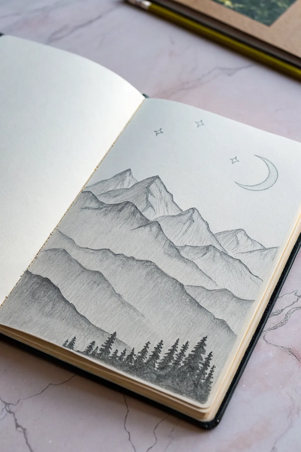
This serene mountain landscape relies on the simple yet powerful technique of atmospheric perspective, using layers of fading values to create depth. It’s a perfect beginner-friendly project that transforms basic sketching pencils into a misty, dimensional scene right in your sketchbook.
Detailed Instructions
Materials
- Sketchbook or drawing paper (medium tooth)
- Set of graphite pencils (HB, 2B, 4B, 6B)
- Kneaded eraser
- Pencil sharpener
- Blending stump or cotton swab (optional)
Step 1: Setting the Scene
-
Outline the furthest range:
Start with your HB pencil. Lightly sketch the outline of the most distant mountain range near the top third of your page. Keep the peaks jagged but somewhat small to indicate distance. -
Add the middle ranges:
Drawing downwards, sketch 2-3 overlapping layers of mountains. Each subsequent layer should be slightly taller and more jagged than the one behind it. Don’t worry about perfect lines; natural rock formations are irregular. -
Create the foreground slope:
Define the closest hill at the very bottom of the composition. This line should be relatively smooth compared to the rocky peaks, providing a base for your future trees. -
Sketch celestial elements:
In the upper right corner of the sky, lightly outline a crescent moon shape. Add three small, four-pointed stars nearby—one between the moon and the peaks, and two higher up.
Clean Lines Pro-Tip
Place a scrap piece of paper under your drawing hand while you work. This prevents your palm from smudging the mountains you’ve already shaded, keeping your sky and lower layers crisp.
Step 2: Building Atmospheric Depth
-
Shade the sky peaks:
Using the side of your HB pencil, shade the furthest mountain range. This should be the faintest layer of all. Keep your strokes diagonal and very light, leaving little white gaps to suggest snow or light hitting the peaks. -
Define the second layer:
Switch to a 2B pencil for the next range down. Shade these mountains slightly darker than the first set. Use vertical, downward strokes starting from the peak tips to mimic the flow of rock faces. -
Intensify the mid-ground:
For the third layer of mountains, press a bit harder with your 2B or switch to a 4B. The contrast should be noticeably distinct from the layer behind it. Focus on creating sharp, triangular shadows on the right side of the peaks to suggest a light source coming from the left. -
Create the darkest peaks:
On the lowest mountain range (just above the foreground hill), use your 4B pencil to create a deep, rich gray. Ensure the ridge line is crisp so it stands out against the lighter mountains behind it. -
Blend for texture:
Optionally, use a blending stump or your finger to gently smudge the graphite within the mountain shapes. I find this softens the graininess and makes the mist look more realistic, but be careful not to smear across the crisp ridge lines.
Level Up: Ink Wash
Swap pencils for micron pens and stippling for texture. Or, try watercolor pencils: draw as usual, then activate the graphite with a wet brush for a moody, wash-like finish.
Step 3: Foreground & Details
-
Start the tree line:
Switch to your darkest pencil, like a 6B. Along the bottom hill slope, begin drawing small, vertical lines to mark the trunks of the pine trees. Vary the heights slightly to make the forest look natural. -
Flesh out the pines:
Add foliage to the trees using a zig-zag or scribbling motion. Start narrow at the top of each trunk and get wider towards the base. Press firmly to make these the darkest element on the page, creating a silhouette effect. -
Fill the forest floor:
Shade the ground between and beneath the trees with the 6B pencil. Blend this dark graphite downwards to the bottom edge of the paper so the trees feel rooted rather than floating. -
Refine the moon and stars:
Return to the sky with a sharp HB pencil. Outline the crescent moon cleanly and lightly shade the inner curve. Outline the stars with crisp, thin lines. -
Final highlights:
Use your kneaded eraser to tap or lift small areas of graphite on the sunny side of the mountain peaks. This brings back the bright white of the paper and enhances the 3D effect.
Enjoy the calm feeling of looking at your finished mountain vista

Mini Landscape Inside a Circle
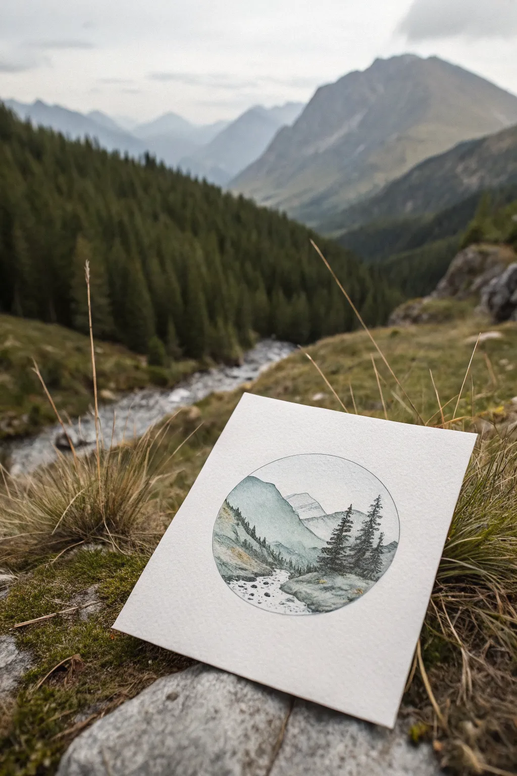
Capture the grandeur of a sweeping mountain valley within a delicate, circular frame. This project combines precise pen work with soft watercolor washes to create a serene miniature landscape.
Detailed Instructions
Materials
- Cold press watercolor paper (300 gsm)
- Pencil (HB or H)
- Compass or a small circular object (e.g., a jar lid)
- Fine liner pens (0.1, 0.05, and 0.03 sizes, waterproof ink)
- Watercolor paints (Payne’s Grey, Sap Green, Ultramarine Blue, Burnt Sienna)
- Small round watercolor brushes (sizes 0 and 2)
- Eraser (kneaded preferred)
- Water jar
- Paper towels
Step 1: Drafting the Composition
-
Establish the Frame:
Begin by drawing a perfect circle in the center of your watercolor paper using a compass or by tracing a circular object lightly with your pencil. Keep the line faint so it can be inked or erased later. -
Sketch the Horizon:
Lightly sketch the main mountain shapes within the circle. Start with the distant peak slightly off-center to key the composition. -
Add Middle Ground Hills:
Draw the sloping hills that lead down from the sides. Let them overlap to create depth, ensuring the left slope comes forward more prominently than the distant mountains. -
Map the River:
Sketch a winding river path starting narrow at the base of the mountains and widening as it flows toward the bottom edge of the circle. -
Place the Trees:
Mark positions for the foreground pine trees on the right side. Don’t draw individual needles yet; just indicate their height and triangular shapes.
Keep It Loose
Don’t fill every space with color. Leaving intentional white areas in the river and on mountain peaks mimics snow and rushing water beautifully.
Step 2: Inking the Details
-
Outline the Circle:
Carefully trace over your circle perimeter with a 0.1 fine liner to create a crisp boundary for your miniature world. -
Ink the Mountains:
Use a 0.05 pen to outline the distant peaks. Keep these lines very thin and broken in places to suggest distance and atmosphere. -
Detail the Foreground Trees:
Switch to a 0.1 pen for the pine trees on the right. Use short, jagged strokes to create the texture of branches, keeping the silhouette varied and organic. -
Texture the Left Slope:
Use a 0.05 pen to add tiny, vertical dashes on the left hillside, suggesting a dense forest of distant trees without drawing every single one. -
Define the Riverbanks:
Ink the edges of the stream with broken, uneven lines. Draw small ovals and circles in the riverbed to represent rocks and pebbles.
Step 3: Applying Watercolor
-
First Sky Wash:
Wet the sky area lightly with clean water. Drop in a tiny amount of diluted Ultramarine Blue near the top of the circle, fading it to clear water as you reach the mountains. -
Paint Distant Peaks:
Mix a very watery wash of Payne’s Grey with a touch of blue. Paint the furthest mountain, keeping the color pale to push it into the background. -
Layer the Hills:
Mix Sap Green with a little Payne’s Grey for a muted forest color. Apply this to the middle-ground slopes. I like to let the paint pool slightly at the bottom of the slope for natural shading. -
Deepen Foreground Greens:
Create a stronger, less diluted mixture of Sap Green and Payne’s Grey. Carefully paint the foreground pine trees, leaving small white gaps for highlights. -
Add River Tones:
Use a very dilute mix of blue-grey to drag some color through the water area, leaving plenty of white paper to represent foam and reflection. -
Warming the Earth:
Add a touch of Burnt Sienna to the riverbanks and the immediate foreground rocks to provide contrast against the cool blues and greens.
Metallic Magic
Once dry, use a gold gel pen or metallic watercolor to outline the circle frame or add tiny glints to the river for a magical touch.
Step 4: Refinement
-
Enhance Textures:
Once the paint is completely dry, go back in with your 0.03 pen. Add extremely fine stippling (dots) to the shadowed sides of the rocks and trees for extra dimension. -
Clean Up:
Gently erase any remaining pencil marks, being careful not to rub over areas where the ink might not be fully cured.
Now you have a tranquil mountain scene ready to display or gift
BRUSH GUIDE
The Right Brush for Every Stroke
From clean lines to bold texture — master brush choice, stroke control, and essential techniques.
Explore the Full Guide
Zentangle Fill Inside a Silhouette
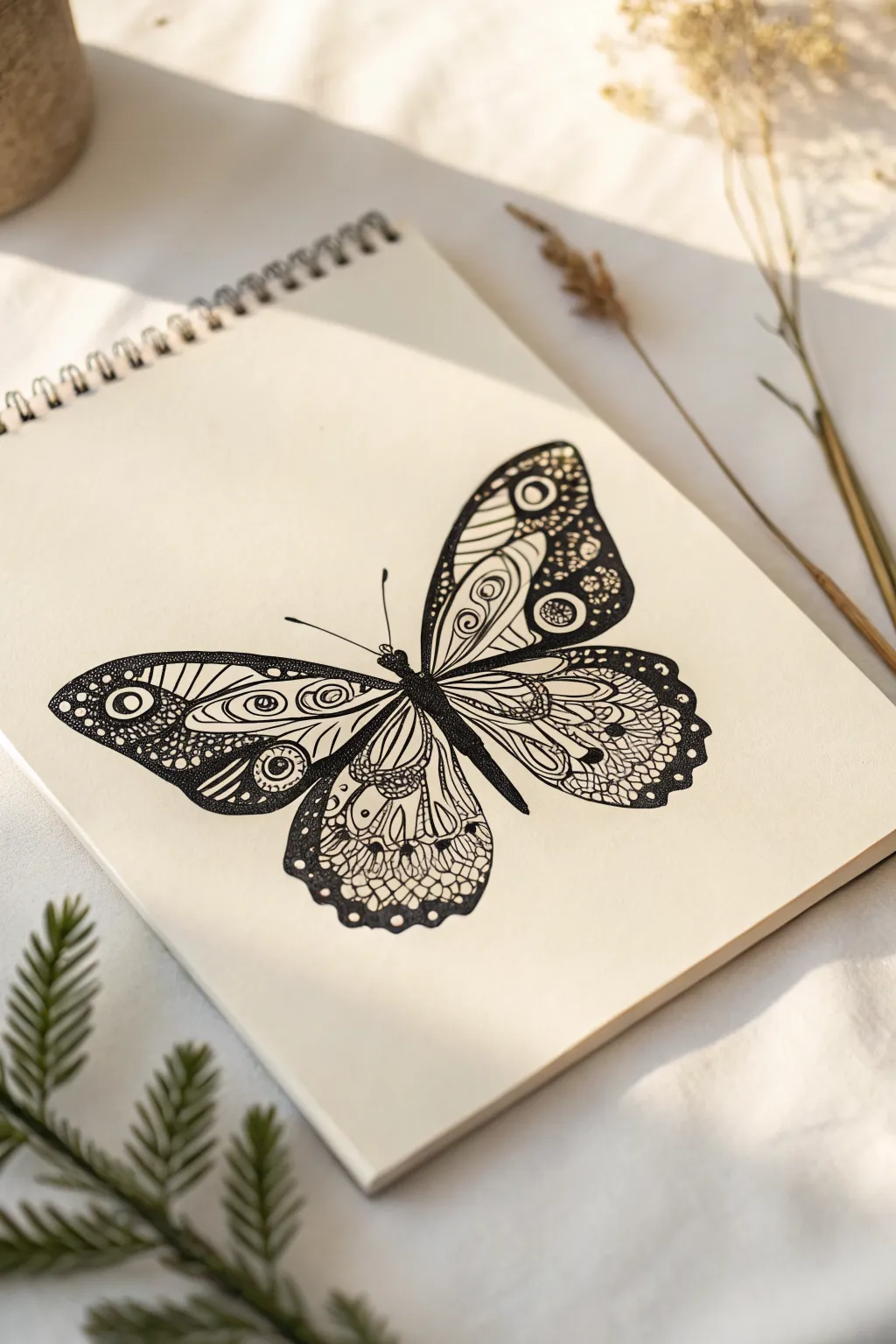
This project transforms a simple butterfly silhouette into a mesmerizing piece of art by filling its wings with intricate Zentangle-inspired patterns. The contrast between bold black areas and delicate stippling creates a stunning, decorative effect that looks far more complex than it actually is.
Step-by-Step Tutorial
Materials
- Sketchbook or high-quality drawing paper
- Pencil (HB or 2H)
- Eraser
- Fine liner pens (sizes 0.1, 0.3, and 0.5)
- Black brush pen or marker (for filling large areas)
Step 1: Drafting the Silhouette
-
Sketch the center body:
Begin lightly with your pencil. Draw a slender, segmented body for the butterfly in the center of your page. It should be slightly tapered at the bottom. -
Map out the upper wings:
Draw two large, rounded triangular shapes extending from the upper thorax. Keep the curves smooth and organic, ensuring the left and right sides are relatively symmetrical, though they don’t need to be mirror images. -
Add the lower wings:
Sketch two smaller, more rounded teardrop shapes extending from the lower body. Overlap them slightly behind the upper wings for a natural look. -
Define the main veins:
Inside each wing, draw the primary structural lines. These should radiate outward from the body like sun rays, creating large sections that you will later fill with patterns.
Uneven Wings?
Don’t stress about perfect symmetry. In nature, no butterfly is perfectly mirrored. If one wing is slightly different, balance it by making the fill patterns heavier on the smaller side.
Step 2: Inking the Structure
-
Outline the body:
Switch to your 0.5 fine liner. Trace over your pencil sketch of the body, filling it in completely with black ink to create a solid anchor for the wings. -
Trace the wing shapes:
Carefully ink the outer perimeter of the wings. I find using a steady, continuous stroke helps avoid shaky lines. -
Ink the structural veins:
Go over the internal vein lines you penciled earlier. You can make these lines slightly thicker near the body and taper them as they reach the wing edges. -
Create pattern zones:
Within the large wing sections, draw additional dividers. Think of these as creating ‘containers’ for your zentangle patterns—some can be long strips, others can be rounded pockets.
Step 3: Patterning and Details
-
Fill the upper wing tips:
Start at the top outer corners. Use your 0.8 or brush pen to color the very tips solid black, leaving small circles or ovals white to create ‘eyes’ in the pattern. -
Add concentric shapes:
In the spaces below the black tips, draw teardrops or ovals inside one another. Use the 0.3 pen here for finer control. -
Incorporate circular motifs:
Select a central section of the upper wing and fill it with rows of small circles or ‘pebbles.’ Fill the tiny gaps between the circles with black ink to make them pop. -
Draw scalloped edges:
Along the bottom edge of the lower wings, draw a scalloped or lace-like border. Fill the area above this border with a mesh or fishnet pattern. -
Stipple for shading:
Using your finest 0.1 pen, add tiny dots (stippling) inside the open sections of the wings. Concentrate the dots near the vein lines to create a gradient shadow effect. -
Add heavy contrast:
Identify areas in your pattern—like the corners of the lower wings—that feel too empty. Fill these sections with heavy black ink, leaving only thin white lines or small dots for detail. -
Refine the lines:
Go back over your main vein lines with the 0.5 pen to re-thicken them, ensuring they stand out against the intricate filler patterns. -
Add antennae:
Draw two long, slender antennae curving outward from the head. You can add a tiny dot at the end of each for a finished look. -
Clean up:
Wait at least 15 minutes to ensure the ink is totally bone dry, then gently erase all remaining pencil marks to reveal the crisp black and white contrast.
Ink Smear Prevention
Place a scrap sheet of paper under your drawing hand. This acts as a shield, preventing oils from your skin from warping the paper and stops your palm from dragging wet ink across the page.
Now you have a striking, highly detailed butterfly illustration that balances organic form with structured design
Mandala With Floral-Geometry Mix
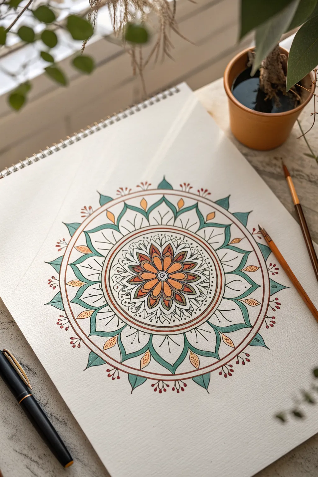
Discover the calming rhythm of combining organic floral shapes with precise geometry in this striking mandala. This piece features a warm central bloom radiating outward into cooling teal leaves, all bound together by crisp ink lines.
Detailed Instructions
Materials
- Heavyweight drawing paper or mixed media sketchbook
- Compass
- Protractor
- Ruler
- Pencil (HB or 2H)
- Eraser
- Fine liner pens (0.1mm, 0.3mm, 0.5mm)
- Watercolor paints or fluid acrylics
- Small round brushes (Size 0 and 2)
- Small palette for mixing
Step 1: Building the Grid
-
Find Center:
Begin by marking the absolute center of your page. Place your compass point here; it will anchor the entire piece. -
Draw Concentric Circles:
Draw your guide circles lightly with a pencil. Start with a small inner circle (about 1 inch diameter), followed by a medium circle for the flower petals, a slightly larger ring for the border, and finally, a large outer circle that will define the tips of the largest leaves. -
Create Sections:
Using a protractor, divide your circle into equal segments. For this design, dividing the circle into 12 or 16 equal wedged sections works perfectly to keep the petal symmetrical. -
Draw Radial Lines:
Use your ruler to draw straight lines through the center point based on your protractor marks, extending them to the outermost circle. These ‘spokes’ will help align every petal tip.
Step 2: Sketching the Design
-
Central Flower:
Sketch a central floral motif. Draw eight pointed petals radiating from the center, ensuring their tips touch the second guide circle. -
Secondary Layer:
Between the main orange petals, sketch smaller, darker shapes or ‘stamen’ details to add depth to the core. -
The Circular Border:
Define the distinct ring that encircles the central flower. This band should be uniform in width. Inside this band, lightly sketch a thin, continuous line aimed at separating colors later. -
Large Leaf Outlines:
Sketch the large, curved leaves that form the outer ring. These should start from the circular border and curve outward to meet the largest guide circle. -
Interlocking Details:
Between the large leaves, draw smaller triangular spikes or ‘sepals’ that peek out. Add small leafy shapes floating near the tips of the main leaves. -
Decorative Accents:
Finish the pencil sketch by adding stems with small berries or buds extending from the outer perimeter.
Uneven Petals?
If your petals look lopsided even with a grid, rotate your paper as you draw each one. Drawing the curve ‘away’ from your hand feel same every time.
Step 3: Inking the Lines
-
Bold Outlines:
Switch to a 0.5mm fine liner. Carefully trace the major structural lines: the central flower petals, the main circular border, and the primary outer leaves. -
Fine Details:
Use a finer 0.1mm or 0.3mm pen for the intricate details inside the central flower and the delicate veins within the leaves. I like to use a very light touch here so the lines don’t overpower the color. -
Erase Guides:
Once the ink is completely dry (test a small spot with your finger first), gently erase all pencil grid lines and circles to reveal a clean design.
Crisp Color Edges
For sharp paint lines, paint just shy of the ink line, then use a barely-damp clean brush to push the wet pigment right up to the border.
Step 4: Adding Color
-
Central Bloom:
Mix a warm terracotta orange. Paint the petals of the central flower, leaving the tiny inner details unpainted for now. -
Teal Leaves:
Mix a soft, muted teal color. Carefully fill in the large outer leaves. Use the tip of your brush to get crisp edges near the black ink lines. -
The Ring:
Return to your terracotta mix. Paint the thin outer ring of the circular border, creating a warm enclosure for the flower center. -
Leaf Accents:
Using a yellow-gold or light ochre, paint the small floating leaf shapes nestled between the large teal leaves. -
Berry Details:
Use a deep red or rust color to dot the small berries on the ends of the extending stems. -
Final Touches:
Add small dots of gold or dark grey in the very center of the mandala for a finishing focal point. Let the entire piece dry thoroughly.
Step back and appreciate the balance and harmony of your finished mandala geometry

PENCIL GUIDE
Understanding Pencil Grades from H to B
From first sketch to finished drawing — learn pencil grades, line control, and shading techniques.
Explore the Full Guide
Moon Hammock With a Tiny Figure

This whimsical doodle captures a moment of pure relaxation, featuring a tiny figure lounging in a hammock strung across a crescent moon. Using simple lines and dots, it creates a cozy, celestial scene perfect for your bullet journal or sketchbook.
Step-by-Step Tutorial
Materials
- Dotted notebook or bullet journal
- Fine liner pen (black, 0.3mm or 0.5mm)
- Pencil (HB for sketching)
- Eraser
- Ruler (optional)
Step 1: Sketching the Base Shapes
-
Establish the curve:
Begin with a pencil to lightly sketch a large ‘C’ shape. This will be the outer curve of your crescent moon. Use the notebook’s dots as invisible guides to keep the curve symmetrical. -
Close the moon shape:
Draw the inner curve of the moon, connecting the top and bottom points. Make this inner line slightly less curved than the outer one, creating a nice, thick crescent shape that tapers at the ends. -
Position the hammock:
Sketch a gentle U-shaped curve that hangs from the inner side of the moon. One end should attach near the lower tip, and the other should connect near the center of the inner curve. -
Add the figure:
Draw a small oval for the head resting against the back of the hammock. Add a simple curved line for the back and legs to show a figure sitting with their legs stretched out comfortably.
Keep it fluid
Don’t stress about perfect symmetry on the stars. Rotating the paper as you draw each point helps keep your hand relaxed and your lines straighter.
Step 2: Inking the Moon and Hammock
-
Outline the moon:
Switch to your fine liner pen. Carefully trace over your pencil lines for the moon. I find that lifting the pen slightly at the very tips keeps the lines crisp rather than blotted. -
Define the hammock structure:
Draw a second curve parallel to the hammock line you sketched earlier to give it some thickness. Connect the ends to the moon with small loops or knots. -
Create the netting:
Inside the hammock shape, draw vertical curved lines spaced evenly apart. Then, cross them with horizontal curved lines to create a grid or netting pattern. -
Ink the character:
Outline the tiny figure. Draw hair sweeping back from the face, a simple dot for an eye, and a small smile. Define the shirt and pants with simple lines, adding little feet poking out at the end.
Step 3: Adding Celestial Details
-
Draw the main clouds:
To the right of the moon, sketch a fluffy cloud using a series of connected bumps. Make the bottom of the cloud slightly flatter than the top for a classic cartoon look. -
Add floating clouds:
Draw smaller cloud shapes near the bottom left and bottom right corners to balance the composition. Vary their sizes to create depth. -
Hang a star:
Draw a vertical string hanging down from the bottom curve of the moon. At the end of the string, draw a five-pointed star dangling in space. -
Scatter background stars:
Fill the empty space around the moon with various star shapes. Mix classic five-pointed stars with simple four-pointed sparkles and tiny dots.
Make it yours
Try coloring the moon with a pale yellow highlighter or adding silver gel pen accents to the stars for a magical, shimmering effect.
Step 4: Refining and Finishing
-
Add texture lines:
Inside the crescent moon, add a few short, thin lines near the edges. These follow the curve of the moon and give it a sense of roundness and volume. -
Detail the clouds:
Add a few small curved lines inside the clouds to suggest fluffiness and volume, so they don’t look completely flat. -
Erase guidelines:
Wait for the ink to maximize dryness—smudges are the enemy here. Once safe, gently erase all your underlying pencil sketches. -
Final assessment:
Look at the overall balance. If a spot looks too empty, add a small dot or a tiny cross-star to fill the void without overcrowding the scene.
Now you have a peaceful little corner in your notebook to remind you to take a break and dream
Floating Head With Orbiting Thoughts
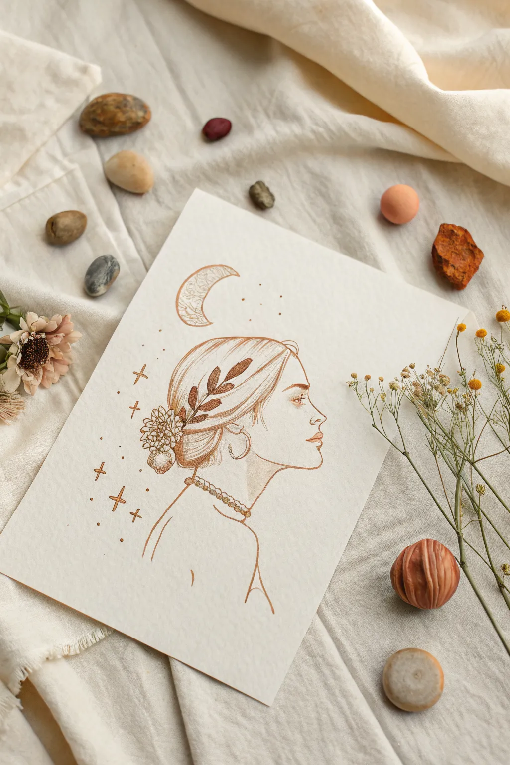
Capture a moment of quiet reflection with this delicate line art drawing featuring a side profile entwined with nature and celestial magic. Using warm sepia tones, you’ll create an ethereal illustration perfect for journaling or framing.
Step-by-Step Guide
Materials
- High-quality mixed media paper or hot press watercolor paper (A5 or similar)
- HB graphite pencil for sketching
- Kneaded eraser
- Fine liner pen (sepia or brown, 0.1mm and 0.3mm)
- Sepia or burnt sienna watercolor paint (optional for tinting)
- Small round brush (size 2)
- Gold gel pen or metallic watercolor (optional)
Step 1: Structural Sketching
-
Map the Head Shape:
Begin with a light pencil circle to represent the cranium. Below it, drop a curved line to indicate the jawline and chin placement. Keep your pressure extremely light so these guides can be erased completely later. -
Define the Profile Features:
Sketch the forehead leading into the nose bridge. Add the small indentation of the philtrum and the lips. The upper lip should protrude just slightly more than the lower lip. Sketch the chin curving back up toward the ear position. -
Place the Neck and Shoulders:
Draw the front of the neck curving down from the chin, and the back of the neck extending from the base of the skull. Suggest the slope of the shoulder and a hint of the collarbone with minimal lines. -
Draft the Hair Volume:
Outline the hair shape, sweeping it back into a low, gathered bun. I like to focus on the flow of the strands rather than drawing every single hair at this stage, creating a loose, organic shape.
Step 2: Inking the Profile
-
Trace Facial Features:
Switch to your 0.1mm sepia fine liner. Carefully ink the profile line you established. Use a broken line technique for the lips to keep them soft, emphasizing the corners and the center line rather than outlining them fully. -
Draw the Eye:
Place the eye just below the brow ridge. Draw the upper lash line thicker than the lower. Add the iris looking straight ahead or slightly upward, leaving a tiny white highlight for life. -
Refine the Ear and Jewelry:
Ink the ear shape, keeping it simple. Add the hoop earring hanging from the lobe, ensuring it looks like it has weight. -
Ink the Neck Details:
Go over the neck and shoulder lines. Ink the beaded necklace, drawing small uneven circles to suggest organic beads rather than perfect manufacturing.
Natural Hair Flow
Don’t draw straight lines for hair. Use ‘S’ curves that originate from the part or hairline and gather at the bun. Lift your pen at the end of strokes to taper them naturally.
Step 3: Botanical and Celestial Elements
-
Add the Floral Hairpiece:
Draw the detailed flower tucked into the bun base. Use small, clustered petal shapes. Extend a leafy branch upwards across the side of the head, overlapping the hair strands to integrate the nature element. -
Detail the Hair Strands:
Using long, sweeping strokes with the 0.1mm pen, fill in the hair texture. Follow the curve of the head, leaving gaps where the light would hit the hair to suggest volume and shine. -
Draw the Crescent Moon:
Above the forehead, draw a crescent moon shape. Fill the inside with a delicate, crackled texture or tiny swirling patterns to give it an antique look. -
Add Stars and Sparkles:
Scatter small four-pointed stars and tiny dots around the moon and the back of the head. Vary the sizes to create a sense of depth and twinkling.
Shaky Lines?
If your hand shakes while inking long curves like the profile, try drawing from your shoulder rather than your wrist. It creates smoother, more confident strokes.
Step 4: Finishing Touches
-
Erase Pencil Guidelines:
Wait until the ink is completely dry to avoid smudging. Gently run your kneaded eraser over the entire drawing to lift all graphite marks. -
Add Weight with Thicker Lines:
Switch to a 0.3mm pen to darken key areas: the underside of the jaw, the nape of the neck, and the deepest shadows in the hair bun. This adds contrast and dimension. -
Optional Watercolor Tint:
If you want a wash of color, dilute a tiny amount of sepia watercolor. Add very faint shading to the eyelid, the lips, and the shadowed side of the neck. -
Highlight with Gold:
For a magical finish, trace over the moon, stars, or the jewelry with a gold gel pen or metallic paint. This catches the light beautifully when the paper is turned.
Step back and admire the serene atmosphere you have created on the page


Melting Portrait or Skull Study
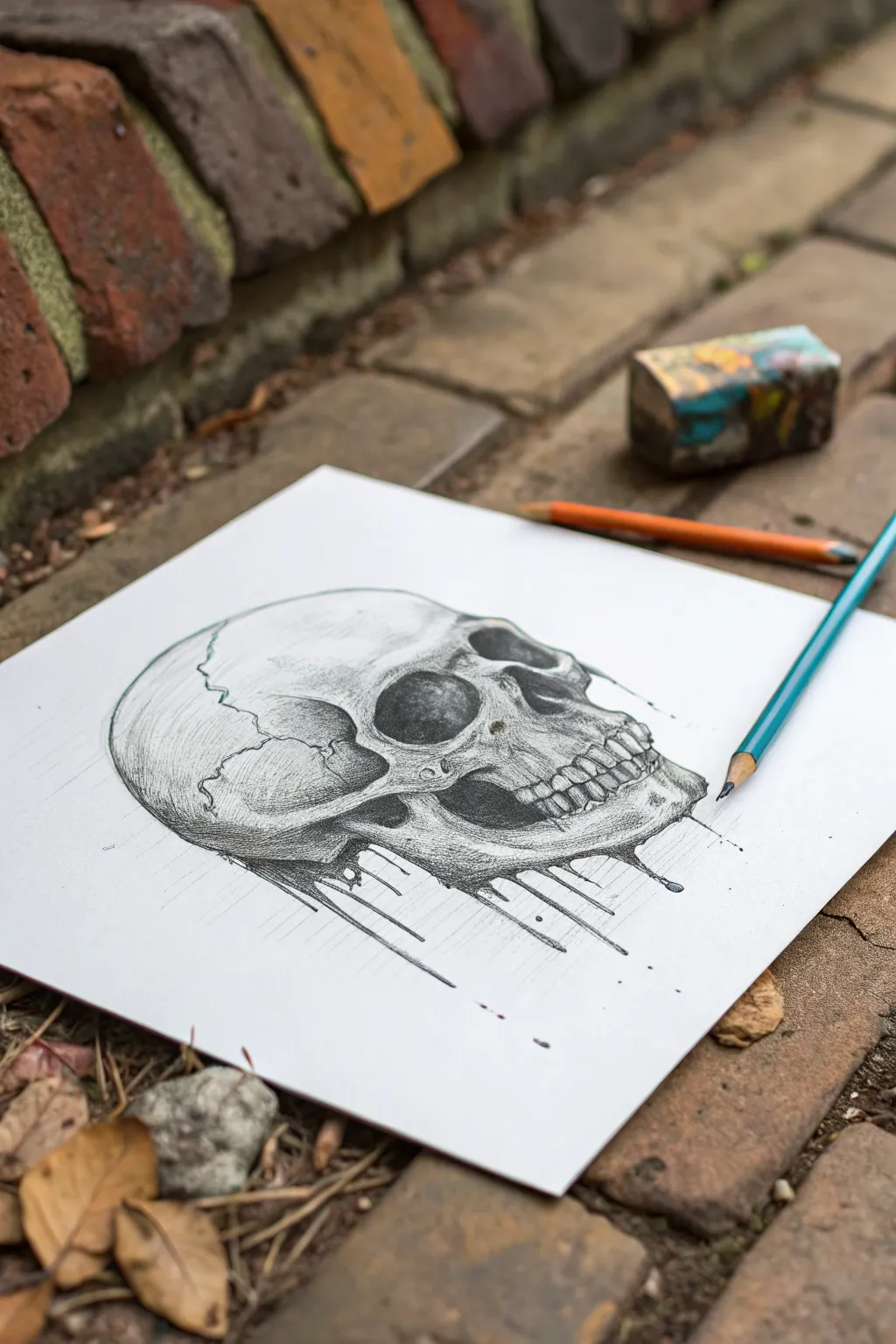
This striking pencil study combines anatomical precision with a surreal, melting twist. You will create a side-profile skull that dissolves into dark, inky drips, blending classical realism with modern illustrative style.
Step-by-Step
Materials
- Smooth bristol or drawing paper (heavyweight)
- Graphite pencils (HB, 2B, 4B, 6B)
- Blue colored pencil (for subtle accents)
- Kneaded eraser
- Precision eraser or eraser stick
- Blending stump (tortillon)
- Ruler (optional for drip lines)
Step 1: Structural Foundation
-
Gesture sketch:
Begin with an HB pencil, using light, loose strokes to map the overall cranium shape. Imagine a slightly flattened sphere for the brain case and a boxy shape for the jaw area. -
Profile refinement:
Refine the outline to capture the specific curves of the forehead, the brow ridge, and the occipital bone at the back. Keep your pressure very light so mistakes are easily erased. -
Feature placement:
Sketch the large, dark void of the eye socket (orbit) and the nasal cavity. Position the cheekbone (zygomatic arch) connecting the ear area to the nose. -
Mapping the sutures:
Draw the jagged, lightning-bolt lines of the cranial sutures across the top and side of the skull. These crack-like seams add crucial realism and texture. -
Teeth and jaw:
Sketch the upper and lower jawline. Instead of drawing individual teeth immediately, draw the arched band where the teeth sit, then divide it lightly to mark tooth width.
Step 2: Shading and Form
-
Base shading:
Switch to a 2B pencil. Lightly shade the side of the skull away from the light source to established volume. The back of the head and the area under the cheekbone should be darker. -
Deepening the hollows:
Use a 4B pencil to fill in the eye socket and nasal cavity. Don’t make it solid black yet; leave subtle variations to suggest depth inside the bone. -
Detailing the teeth:
Define the roots and visible crowns of the teeth. Shade the small gaps between them dark to make the teeth pop forward. -
Enhancing texture:
Use your HB pencil to add small pits, cracks, and surface imperfections on the bone, particularly around the brow and jaw. -
Suture definition:
Go back over the cranial sutures with a sharp 2B pencil, varying the line thickness to make them look organic rather than mechanical. -
General blending:
Gently smooth out your transitions with a blending stump, but carry care not to over-blend, which can transform the bone texture into looking like plastic.
Smudge Control
Graphite smears easily. Place a scrap piece of paper under your drawing hand to protect your pristine white background and keep the shading crisp.
Step 3: The Melting Effect
-
Initiating the drips:
At the bottom edge of the jaw and cranial base, stop drawing a solid outline. Instead, pull vertical lines downward using a 4B or 6B pencil. -
Varying drop lengths:
Draw some drips short and thick, and others long and thin. Add small teardrop shapes at the ends of the lines to simulate heavy liquid pooling. -
Connecting the flow:
Where the bone meets the drips, curve the shading downward to show the solid form turning into liquid. Darken the top of the drips significantly. -
Adding stray droplets:
Dot a few tiny, isolated black specks around the main drips to create a splattered, kinetic look. -
Linear accents:
extend faint, straight guide lines downward from the drip tips using a ruler and HB pencil, fading them out as they go down.
Gravity Effect
Make your drips follow gravity. Even if the skull is tilted, the liquid should flow straight down relative to the paper’s edge, not the bone.
Step 4: Final Contrast
-
Blackest blacks:
Take your 6B pencil and hit the deepest shadows one last time—inside the nose, under the cheekbone, and the core of the melting drips. -
Highlight recovery:
Use a precision eraser or the sharp edge of a kneaded eraser to lift out bright white highlights on the brow ridge and tooth enamel. -
Subtle color touch:
I like to take a blue colored pencil and lightly trace the very edge of the skull’s outline or shadow side. It adds a cool, graphical pop without overpowering the graphite.
Step back and admire the stark contrast between the solid bone and the fluid, dissolving base you have created


Have a question or want to share your own experience? I'd love to hear from you in the comments below!