If you’ve been craving modern art drawings that feel fresh but still totally doable, I’ve got you. These ideas are made to look wall-worthy without needing perfect realism—just curious lines, bold shapes, and a little creative bravery.
Cubist-Inspired Fragmented Portrait
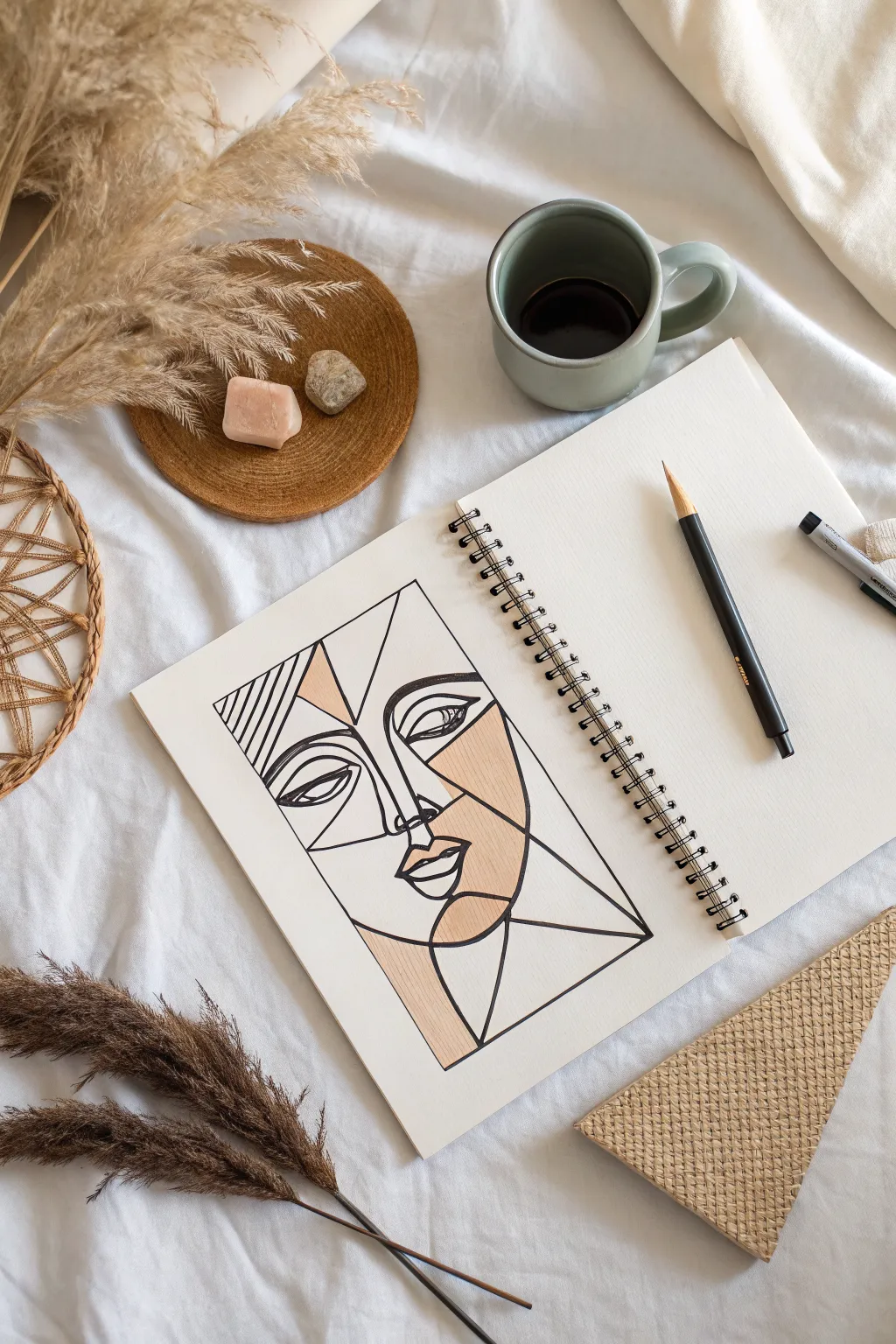
Channel the abstract spirit of Picasso with this calming line art project that breaks facial features into geometric planes. By combining bold black ink lines with soft, selective blocks of neutral beige, you’ll create a striking minimalist portrait perfect for a sketchbook or framed print.
How-To Guide
Materials
- A5 or A4 sketchbook (smooth or mixed media paper)
- HB pencil for sketching
- Eraser
- Black fine liner pen (0.5mm)
- Black brush pen or thicker marker (for bolder lines)
- Beige or tan colored pencil (or alcohol marker)
- Ruler (optional, but helpful for straight lines)
Step 1: Mapping the Framework
-
Define boundaries:
Begin by drawing a large rectangle in the center of your page using your pencil. This box will serve as the frame for your portrait, so ensure it is centered and has straight edges. -
Split the space:
Lightly sketch a vertical line that drifts slightly off-center to act as the nose bridge, dividing the face into two unequal halves. This asymmetry is key to the Cubist look. -
Angular eye placement:
Sketch two abstract eye shapes. On the left, draw a simple almond shape. On the right, create a more angular, sliced-open eye shape that sits slightly higher than the left one. -
Nose and mouth triangulation:
Connect the vertical nose line to a triangle at the bottom for the nose tip. Directly below, sketch the lips using geometric curves—think of them as two distinct shapes rather than one continuous form. -
Fracturing the face:
Draw diagonal lines radiating from the nose and eyes to the edges of your rectangular frame. These ‘shards’ create the fragmented, stained-glass effect.
Step 2: Inking the Lines
-
Initial outline:
Take your 0.5mm fine liner and carefully trace over the main structural lines of the face—the eyes, nose, and lips. Keep your hand steady but allow the lines to have a natural flow. -
Strengthening the frame:
Ink the outer rectangular border. I find that rotating the sketchbook to pull the pen toward you helps keep these long lines straighter. -
Refining the eyes:
Go back to the eyes and add a second, heavier line to the upper lids to simulate lashes. Draw the pupils as semi-circles looking in different directions for that abstract gaze. -
Line weight variation:
Switch to your thicker marker or brush pen. Re-trace specific lines—mainly the jawline, the side of the nose, and the outer frame—to add dramatic weight and contrast. -
Adding texture detail:
In the upper left corner section, draw a series of parallel diagonal lines. This ‘hatching’ adds visual interest without introducing new colors. -
Wait and erase:
Give the ink a few minutes to dry completely to avoid smudging. Once safe, gently erase all visible pencil sketches underneath your ink work.
Use a Ruler for Crispness
Even though this is an art piece, using a ruler for the outer frame and the long ‘fracture’ lines makes the organic curves of the face stand out much more.
Step 3: Adding Color and Finish
-
Selecting sections:
Choose 3-4 specific geometric shapes to fill with color. The goal is balance, so pick a section near the cheek, one near the forehead, and perhaps the chin or jawline. -
Applying the beige:
Using your beige colored pencil, lightly shade the first chosen section. Keep your pencil strokes going in one uniform direction for a neat, graphic appearance. -
Building saturation:
Go over the same beige section a second time, pressing slightly harder to deepen the tone and eliminate white paper specks. -
Balancing the composition:
Fill in the remaining chosen sections with the same beige tone. In the reference, the right cheek and a small triangle on the forehead are colored, creating a nice diagonal flow. -
Final line check:
Inspect your bold black lines. If the colored pencil has dusted over any black ink, carefully trace over those specific segments again to make them pop.
Fixing Smudged Ink
If you accidentally smudge wet ink, turn it into a shadow! Add a few stippling dots or hatch lines over the smudge to integrate the mistake into the texture.
Now you have a sophisticated piece of abstract art that looks complex but is built from simple shapes
Abstract Face With Color Blocking
Embrace the beauty of minimalism with this striking canvas wall hanging that combines fluid line art with soft, abstract color blocking. The raw, unbleached canvas texture adds a lovely organic warmth that perfectly complements the terracotta and sage color palette.
Step-by-Step Guide
Materials
- Unbleached cotton canvas or linen fabric (approx. 18×24 inches)
- Wooden dowel (1 inch diameter, cut to width)
- Acrylic paints (black, terracotta, muted pink, sage green, dark teal)
- Textile medium (optional but recommended)
- Round synthetic brushes (sizes 2 and 6)
- Flat brush (1 inch)
- Pencil and eraser
- Ruler
- Fabric glue or sewing kit
- Macramé cord or twine for hanging
Step 1: Preparing the Canvas
-
Cut and fray:
Cut your canvas or linen to your desired dimensions, leaving an extra 2 inches at the top for the dowel pocket. Gently pull on the loose threads along the side and bottom edges to create a uniform, raw fringe effect. -
Create the casing:
Fold the top edge of the fabric over by about 1.5 inches to create a loop for the dowel. Secure this flap using fabric glue for a no-sew option, or run a straight stitch across it if you prefer sewing. -
Insert the dowel:
Slide your wooden dowel through the newly created pocket. Tie a length of macramé cord or twine to both ends of the dowel to serve as the hanger.
Fixing Wobbly Lines
If your black lines get shaky or thick, wait for them to dry. Then, use a small angled brush with the background canvas color (mix white + tiny drop of yellow/brown) to ‘cut in’ and tidy the edges.
Step 2: Sketching the Design
-
Draft the layout:
Using a light pencil, sketch a rectangular border about 2 inches inward from the frayed edges. This frame will contain your artwork. -
Outline the profile:
Lightly sketch the continuous line profile of the face in the center. Focus on fluid curves for the nose, lips, and jawline without worrying about details yet. -
Add abstract shapes:
Draw the background shapes—a triangle behind the head, a swooping curve for hair, and organic leaf shapes at the bottom right. Keep these shapes loose and geometric.
Level Up: Texture
Make the terracotta cheek pop by mixing baking soda into your acrylic paint before applying. It creates a raised, plaster-like texture that looks amazing on canvas.
Step 3: Painting the Color Blocks
-
Mix your palette:
Prepare your acrylics. If painting on raw fabric, I find mixing in a bit of textile medium helps the paint move smoothly without stiffening the fabric too much. -
Apply the blush tones:
Using the terracotta shade and a flat brush, paint the oval shape on the cheek and the lips. Fill these shapes solidly for a bold look. -
Paint background elements:
Switch to your muted pink. Fill in the large triangle behind the head and the hair accents. Use smooth, confident strokes to keep the color even. -
Add nature motifs:
Use the sage green and dark teal to fill in the leaf shapes. For the botanical element on the left, use a stippling motion with a dry brush to create a speckled, textured effect rather than a solid fill. -
Let it cure:
Allow all the color blocks to dry completely. This is crucial so your black lines don’t bleed into the wet paint later.
Step 4: Detailing the Linework
-
Paint the main contours:
Load a size 2 round brush with black paint (thinned slightly with water for flow). Carefully trace your pencil sketch for the face profile, maintaining a steady, consistent line width. -
Define the features:
Paint the eye details, including the lashes and eyebrows. Use the very tip of the brush for the sharpest ends. -
Add decorative freckles:
Dip the back end of your brush (the handle) or a toothpick into black paint and gently dot it over the nose and upper cheek area to create stylish freckles. -
Outline the leaves:
Add the central vein and stems to your leaf shapes using the same black line work. You can let the line stray slightly from the color block for an artistic, offset print look. -
Erase guidelines:
Once the black paint is bone dry (give it at least an hour), gently erase any visible pencil marks from your initial sketch.
Hang your new masterpiece in a well-lit spot to enjoy the modern, earthy vibes it brings to your space

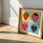
Pop Art-Style Object Study
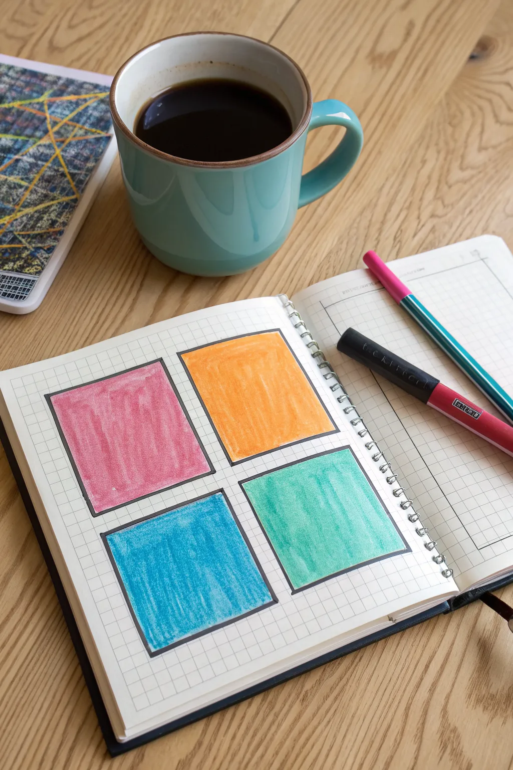
Capture the essence of pop art simplicity with this vibrant four-panel color study. Using bright markers and bold outlines on grid paper creates a satisfying, graphic look that feels both structured and spontaneous.
Detailed Instructions
Materials
- Grid paper notebook (spiral bound works well)
- Black felt-tip pen or fine-liner (medium thickness)
- Ruler
- Colored markers or felt-tip pens (Pink, Orange, Teal, Light Blue)
- Pencil (optional for layout)
Step 1: Planning and Outlining
-
Determine placement:
Open your grid notebook to a fresh page. Visualize a large square composed of four smaller, equal-sized quadrants centered on the page. Using the grid lines as a guide makes this spacing much easier. -
Count the grid units:
To ensure symmetry, count the grid squares. Aim for each colored box to be roughly 8-10 grid units wide and tall, leaving a gap of about 2 grid units between them for the ‘gutter’ space. -
Draw the first box:
Starting with the top-left quadrant, use your ruler and black pen to draw the first square frame. Press firmly to ensure a solid, crisp black line that sits clearly on top of the grid. -
Complete the grid:
Draw the remaining three boxes (top-right, bottom-left, bottom-right). Double-check your alignment with the ruler so the outer edges form a perfect larger rectangle. -
Let the ink set:
Give the black outlines a minute or two to dry completely. This prevents the colored ink from smearing into the black borders during the next phase.
Bleeding Paper?
If your markers bleed through the paper, place a scrap sheet of heavy cardstock behind your working page to protect the rest of the notebook.
Step 2: Color Blocking
-
Start with pink:
Take your pink marker and begin filling the top-left square. Instead of solid, flat coloring, use a rapid back-and-forth vertical motion to create a textured, sketchy fill. -
Add the orange square:
Move to the top-right box with your orange marker. Replicate that same vertical scribbling technique, keeping the strokes dense but allowing tiny flecks of the white paper to show through for texture. -
Fill the blue quadrant:
For the bottom-left square, switch to a bright medium blue. I like to start from the top edge of the box and work downward to keep the ink flow consistent. -
Finish with teal:
Complete the bottom-right square with a teal or seafoam green marker. Maintain the vertical stroke direction to keep the four distinct panels unified in style. -
Refine the edges:
Go back over the very edges of your colored areas near the black borders. If you missed any spots, fill them in carefully so the color meets the black line cleanly. -
Deepen the saturation:
If any square looks too pale, add a second layer of scribbles. Do this quickly while the paper is still slightly damp from the first pass to blend the strokes better.
Uneven Texture
For that perfect ‘scribble’ look, vary your pen pressure slightly. Don’t aim for solid coverage; the little white gaps add essential visual interest.
Step 3: Final Touches
-
Strengthen the border:
Examine your black outlines. If the coloring process lightened them or went slightly over, re-trace the black lines with your ruler to make them pop again. -
Check for bleed:
Verify that the colors haven’t bled into the gutter space between boxes. If you find a stray mark, a tiny touch of white gel pen can sometimes mask small errors. -
clean up:
Erase any faint pencil guide marks you might have made during the counting phase, ensuring the area around the artwork is crisp and clean.
Now you have a striking, colorful geometric study that brightens up your sketchbook
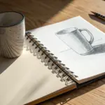
Geometric Still Life With Flat Shadows
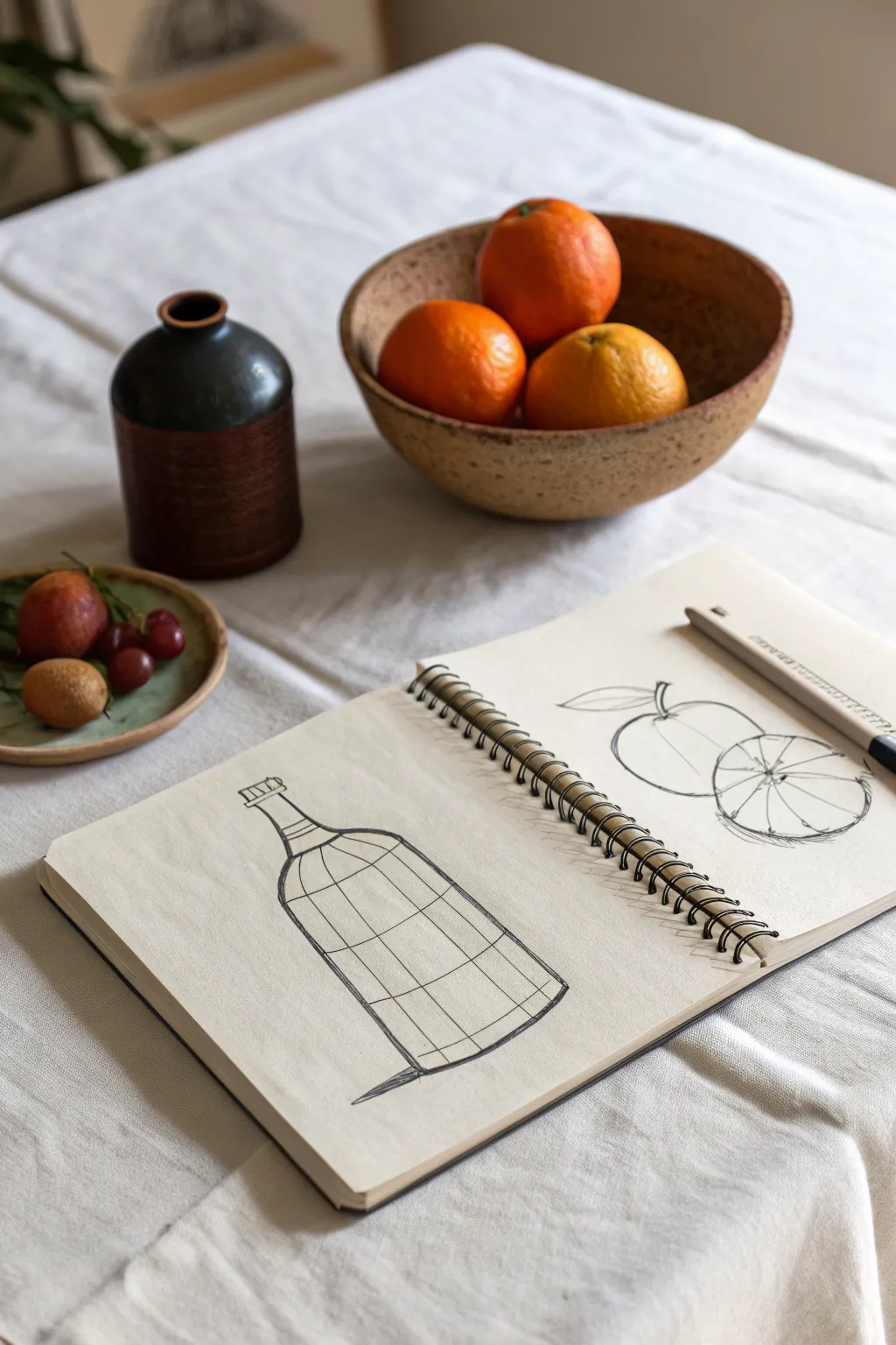
Capture the beauty of everyday objects by breaking them down into their structural essence. This dual-page sketchbook exercise explores the contrast between the rigid geometry of a bottle and the soft curves of citrus fruit.
Step-by-Step
Materials
- Spiral-bound sketchbook (heavyweight paper preferred)
- Fine-point black drawing pen (e.g., 0.5mm or 0.7mm)
- Pencil (HB for sketching)
- Eraser
- Ruler or straight edge
Step 1: Planning the Composition
-
Open the spread:
Lay your sketchbook flat. We will be using both pages: the left for a structural study of a vessel, and the right for organic fruit forms. -
Observe the subjects:
Notice the small dark ceramic bottle and the bowl of oranges in the reference. Visualize the bottle as a series of stacked cylinders and the fruit as simple spheres. -
Lightly sketch the bottle axis:
On the left page, draw a light vertical line with your pencil to act as the central axis for the bottle. This ensures symmetry.
Grid Looking Flat?
Ensure your horizontal grid lines curve! If you draw straight horizontal lines, the bottle will look like a flat shape rather than a rounded 3D cylinder.
Step 2: The Geometric Bottle (Left Page)
-
Define the silhouette:
Sketch the outer contour of the bottle. Start with the narrow neck, curve out for the shoulders, and drop straight down for the body. -
Add horizontal contours:
Instead of shading, we will use a wireframe technique. Draw horizontal curved lines across the bottle’s body. These essentially act as latitude lines, revealing the round volume of the form. -
Add vertical contours:
Now, draw vertical lines following the curve of the bottle’s surface. These should curve outward slightly as they move away from the center axis, creating a grid-like effect. -
Detail the cap:
Draw the small cap at the top with simple rectangular shapes, adding tiny vertical lines to suggest the threading or texture. -
Ink the outline:
Take your black pen and trace the main silhouette of the bottle. Use a confident, steady hand. -
Ink the grid:
Carefully ink the internal grid lines. You don’t need a ruler here; a slightly wobbly hand-drawn line adds character and warmth. -
Ground the object:
Add a small, sharp triangular shadow at the base of the bottle to anchor it to the ‘surface’ and give it weight.
Loose Lines
Don’t try to make the grid perfectly straight with a ruler. The charm of this style comes from the slight wobble of a freehand line.
Step 3: The Organic Fruit (Right Page)
-
Position the fruit:
On the right page, lightly pencil in two overlapping circles: one for the whole orange and one for the sliced half in the foreground. -
Refine the shapes:
Flatten the bottom of the circles slightly where they sit on the table. Add a small stem to the back fruit. -
Draw the leaf:
Extend a simple, almond-shaped leaf from the stem area. Keep the line work loose and fluid. -
Create the segments:
For the front slice, draw a slightly smaller circle inside the main outline to represent the rind. Divide the center into triangular wedges for the segments. -
Ink the fruit:
Go over your pencil lines with the black pen. Use a looser, more organic line quality here compared to the bottle. -
Texture the inside:
Inside the sliced fruit segments, add light, scratchy marks to suggest juice vesicles and texture. Don’t overdo it; keep it airy. -
Erase and finalize:
Let the ink dry completely for a minute or two. Gently erase all visible pencil guidelines to leave a crisp, high-contrast drawing.
Now you have a stylish study that balances mathematical precision with natural imperfection
BRUSH GUIDE
The Right Brush for Every Stroke
From clean lines to bold texture — master brush choice, stroke control, and essential techniques.
Explore the Full Guide
Abstract Expressionist Mark Party
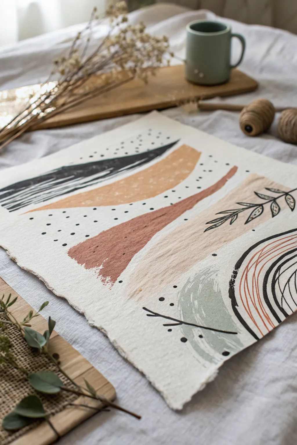
This abstract mixed-media piece combines sweeping organic forms with delicate line work for a grounded, earthy aesthetic. Using textured handmade paper adds a beautiful tactile quality that enhances natural tones like terracotta, sage, and mustard.
How-To Guide
Materials
- Heavyweight handmade cotton rag paper (deckle edge recommended)
- Acrylic paints (black, terracotta/rust, mustard yellow, sage green, beige/sand)
- Wide flat brush (approx. 1 inch)
- Medium round brush
- Fine liner brush or black ink pen
- Palette for mixing
- Water cup and paper towels
Step 1: Laying the Color Foundation
-
Prepare the palette:
Squeeze out your acrylics onto the palette. You want earthy, muted tones, so if your colors are too bright, tone them down by mixing in a tiny dot of black or brown. -
Paint the top dark sweep:
Load your wide flat brush with black paint. Starting near the top left, create a long, sweeping stroke that tapers off towards the right center. Use a dry-brush technique towards the end of the stroke to let the paper texture show through. -
Add the mustard curve:
Clean your brush thoroughly. Pick up the mustard yellow paint and paint a broad curved shape just below the black stroke, following a similar arc but slightly wider. -
Create the terracotta band:
Using the terracotta or rust color, paint a diagonal band flowing from the left-center downwards towards the right. Allow the edges to be somewhat rough and organic rather than perfectly straight. -
Layer the beige swoosh:
Mix a soft beige or sand color. Paint a large, gentle swoosh underneath the terracotta band, moving from right to left this time to create visual movement. -
Add the sage green anchor:
In the bottom right corner, paint a rounded, semi-circular field of sage green. Keep the paint application slightly sheer or dry-brushed to mimic a watercolor effect. -
Let it dry:
Allow all paint layers to dry completely. Since handmade paper is absorbent, this shouldn’t take too long, but touch the surface gently to ensure no paint lifts.
Step 2: Details & Mark Making
-
Start the constellations:
Dip the handle end of a small paintbrush or use a fine finish brush into black paint. Create a cluster of small dots scattered between the black and mustard shapes. -
Dot the middle section:
Add a looser, more sparse collection of black dots in the negative space between the mustard and terracotta shapes. -
Draw the botanical element:
Using a fine liner brush with thinned black paint (or an ink pen), draw a simple vine with leaves overlapping the beige swoosh on the right side. Keep the lines sketchy and loose. -
Add the bottom branch:
Draw a simple, bare branch structure overlapping the bottom sage green shape. Keep it minimal with just one or two offshoots. -
Create the heavy arch:
On the bottom right edge, paint a thick, curved black line that partially frames the composition, looking almost like a fragment of a circle. -
Add line texture:
Inside that bottom right area, next to the thick black arch, use a fine brush with rust-colored paint (thinned slightly with water) to draw several thin, curved parallel lines following the arch’s shape. -
Incorporate contrast lines:
Add a few more thin black curved lines intersecting or running parallel to the rust lines to build depth in that corner. -
Final assessment:
Step back and look at the balance. If any area feels too empty, add a few stray micro-dots or extend a line slightly to connect the composition visualy.
Paint Bleeding?
Handmade paper is very thirsty. If paint bleeds too much, apply a clear acrylic medium or gesso primer to the paper first to seal the fibers before creating your shapes.
Add Gold Accents
For a luxe touch, trace one of the organic shapes or add a few dots using gold leaf size and foil. The metallic shine contrasts beautifully with the matte paper.
Now you have a serene, modern composition ready to display in a floating frame
Op Art Wave Pattern Illusion
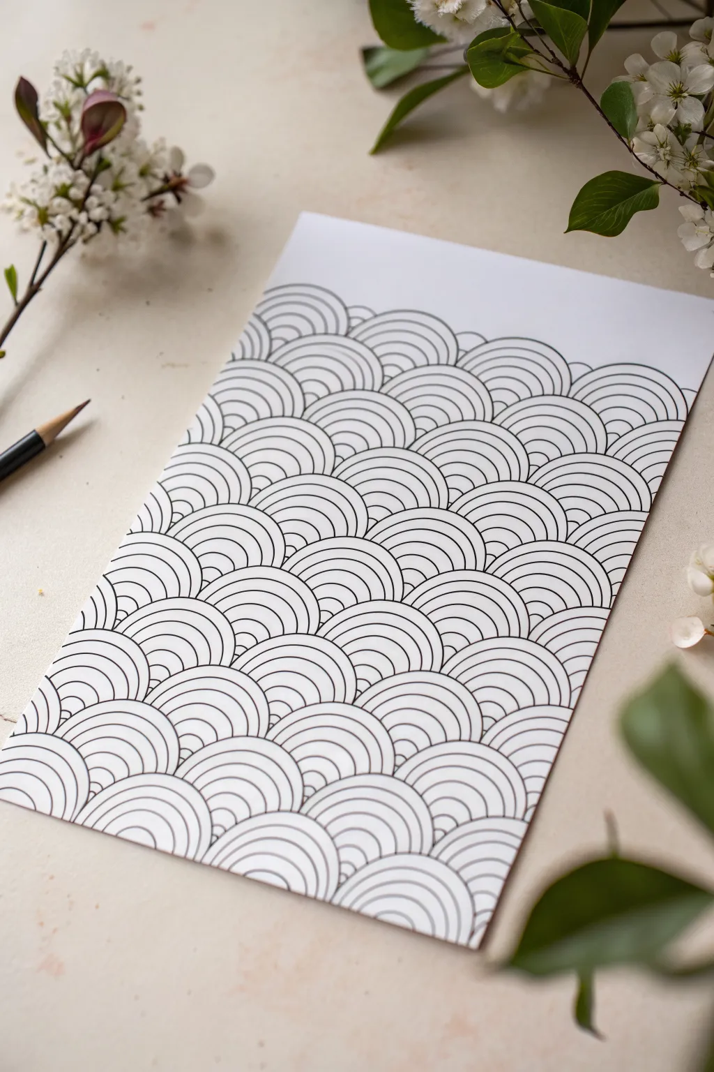
This mesmerizing, repetitive pattern, reminiscent of traditional Japanese Seigaiha waves, creates a stunning optical rhythm through simple geometry. By layering concentric semicircles, you’ll build an intricate textured surface that looks far more complex than the basic lines used to create it.
Step-by-Step Tutorial
Materials
- High-quality white drawing paper or cardstock (smooth bristol is ideal)
- Fine liner pens (0.3mm and 0.5mm) in black
- Compass with a pencil holder
- HB or 2H pencil
- Eraser
- Ruler
- Circle stencil (optional, for smaller variants)
Step 1: Setting the Grid
-
Establish the baseline:
Start at the very bottom edge of your paper. Use your ruler and pencil to draw a faint horizontal line straight across the width of the page to serve as your starting anchor. -
Mark your centers:
Along this baseline, use the ruler to mark small tick marks every 4 centimeters (or your preferred width). These will become the center points for your first row of semicircles. -
Offset the second row:
Measure about 2 centimeters up from your first line (half the width of your spacing) and draw a second faint horizontal guideline. -
Mark staggered centers:
On this second line, place your tick marks exactly halfway between the marks on the line below. This staggering is crucial for the interlocking scale effect. -
Repeat the grid:
Continue drawing horizontal guidelines spaced 2cm apart all the way up the page, staggering the center tick marks for each subsequent row. It should look like a grid of triangles.
Wobbly Arches?
If using a compass with a pen adapter feels unstable, pencil everything first. Only ink afterward using a very steady hand or by tracing a plastic circle template.
Step 2: Drafting the Waves
-
Prepare the compass:
Load your compass with a sharp pencil. Set the radius to exactly 2 centimeters—this should match the vertical distance between your guidelines. -
Draw the outer arches:
Place the compass needle on a tick mark on the bottom line. Draw a semicircle that touches the guideline above it. Repeat this for every mark on the bottom row. -
Fill the page with arches:
Move row by row up the paper. Place your needle on the staggered marks and draw the outer semicircles. Ensure each arch peaks exactly at the line above it, creating a field of ‘scales’. -
Start the inner details:
Tighten your compass radius slightly (e.g., reduce by 3-4mm). Go back to the bottom row and draw a second, smaller semicircle inside the first ones. -
Continue concentric reduction:
Reduce the compass radius again by the same amount and draw the next inner arch. I find it meditative to do the whole page at one size before adjusting the compass. -
Finish pencil work:
Repeat the reduction process until you have 4-5 concentric arches inside every single scale. The smallest arch should be close to the center point.
Pro Tip: Line Weight
Alternate between a thick nib for the top arch and a thin nib for the inner rings. This subtle variation adds immense depth and makes the ‘scales’ pop visually.
Step 3: Inking and Definition
-
Trace outer boundaries:
Switch to your 0.5mm pen for the outermost arch of each scale. This heavier line weight helps distinguish the individual overlapping shapes. -
Ink the inner lines:
Using the finer 0.3mm pen, carefully trace all the inner concentric arches. Keep your hand steady and rotate the paper if it helps you maintain a smooth curve. -
Watch the overlap:
Be incredibly careful where the waves overlap. The lines of a ‘lower’ wave should stop abruptly when they hit the boundary of an ‘upper’ wave. Do not draw through the shapes above. -
Check for consistency:
Scan across your rows to ensure you haven’t missed any inner lines. The pattern relies on density, so gaps are noticeable. -
Erase guidelines:
Wait at least 15 minutes for the ink to fully cure. Only then, gently erase the pencil grid lines and tick marks to reveal the crisp black and white contrast.
Step back and admire the vibrating effect of your precision work

PENCIL GUIDE
Understanding Pencil Grades from H to B
From first sketch to finished drawing — learn pencil grades, line control, and shading techniques.
Explore the Full Guide
Neurographic Lines and Color Cells
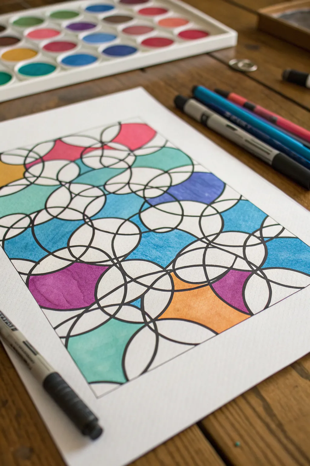
This project explores the relaxing and structured chaos of neurographic drawing, where overlapping circles create a stained-glass effect. By blending bold linework with vibrant pools of color like teal, magenta, and cornflower blue, you’ll produce a striking abstract piece that feels both organic and architectural.
Step-by-Step Guide
Materials
- Heavyweight white drawing paper or mixed media paper
- Pencil and eraser
- Black fineliner pens (various nib sizes, e.g., 0.5mm and 0.8mm)
- Wide-tipped black marker or brush pen
- Watercolor brush pens or vibrant alcohol markers
- Circle templates or household round objects (cups, lids, tape rolls)
Step 1: Laying the Framework
-
Prepare your paper:
Start with a clean sheet of heavyweight paper. Since we are using markers or watercolor pens, standard printer paper might bleed or buckle, so a thicker stock is essential for a crisp result. -
Trace the primary circles:
Using a pencil and your largest circular object (like a mug or wide tape roll), trace three or four large circles randomly across the page. Let them overlap significantly and even go off the edge of the paper. -
Add medium circles:
Switch to a slightly smaller circular object. Trace five to seven medium-sized circles, scattering them so they intersect the larger circles and fill in some of the larger gaps. -
Fill with small circles:
Using a small lid or stencil, fill the remaining open spaces with smaller circles. The goal is to create a dense network where almost every circle intersects or touches another. -
Review the composition:
Step back and look at your pencil sketch. If there are any large empty voids, add another small circle or draw a curved line to bridge the gap, ensuring total interconnectivity.
Step 2: Inking and Rounding
-
Ink the main lines:
Take your thicker black marker or 0.8mm pen and carefully trace over your pencil lines. Don’t worry about making perfect geometric circles; a slight wobble adds to the organic neurographic feel. -
Round the intersections:
This is the core neurographic technique: wherever two lines cross, draw a small curve in the ‘V’ shape of the intersection to smooth it out. Fill that tiny new triangular space with black ink. -
Thicken the connections:
Go over the intersections again to make the connections look fluid, almost like neurons or liquid merging. I like to thicken the lines slightly as they approach a junction to add visual weight. -
Connect floating elements:
If any circle feels isolated, draw a flowing, curved line extending from it to a neighbor or the page edge. Treat these new intersections with the same rounding technique. -
Erase pencil marks:
Once the ink is completely dry—give it a minute or so to prevent smudging—gently erase all the underlying graphite sketch lines to reveal a clean black-and-white web.
Rounding Smoothness
When rounding corners, think of a biological cell dividing or river tributaries merging. The transition should be a sweeping curve, not a hard angle.
Step 3: Adding Color
-
Select your palette:
Choose a color scheme of 3-5 distinct colors. The example here uses cool tones (teal, light blue, purple) punched up with accents of warm pink and orange. -
Identify color cells:
Look for ‘chains’ of shapes created by the overlapping circles. Instead of coloring every single segment, you will colour specific clusters to create larger, unified shapes. -
Apply the teal tones:
Start with a teal or turquoise marker. Fill in several non-adjacent sections, letting the color flow across a line boundary occasionally to merge two small shapes into one larger block of color. -
Add the blue and purple:
Introduce cornflower blue and deeply saturated purple into the composition. Focus on balancing the dark value of the purple against the lighter teal areas. -
Insert warm accents:
Use your pink and orange markers sparingly. Place these colors in areas that need a focal point, ensuring they don’t dominate the cool-toned background. -
Leave white space:
Crucially, leave about 40-50% of the segments white. This breathing room prevents the design from becoming too chaotic and makes the colors pop. -
Refine the edges:
Go back with your finest black pen (0.5mm) and touch up any edges where the marker might have feathered, re-establishing a crisp black boundary.
Shading Depth
Use a slightly darker shade of the same color pencil over your marker work at the edges of the shapes to create a subtle 3D, pillowy effect.
Now you have a balanced, meditative artwork that transforms simple geometry into an intricate, colorful web
Stained-Glass Botanical Drawing
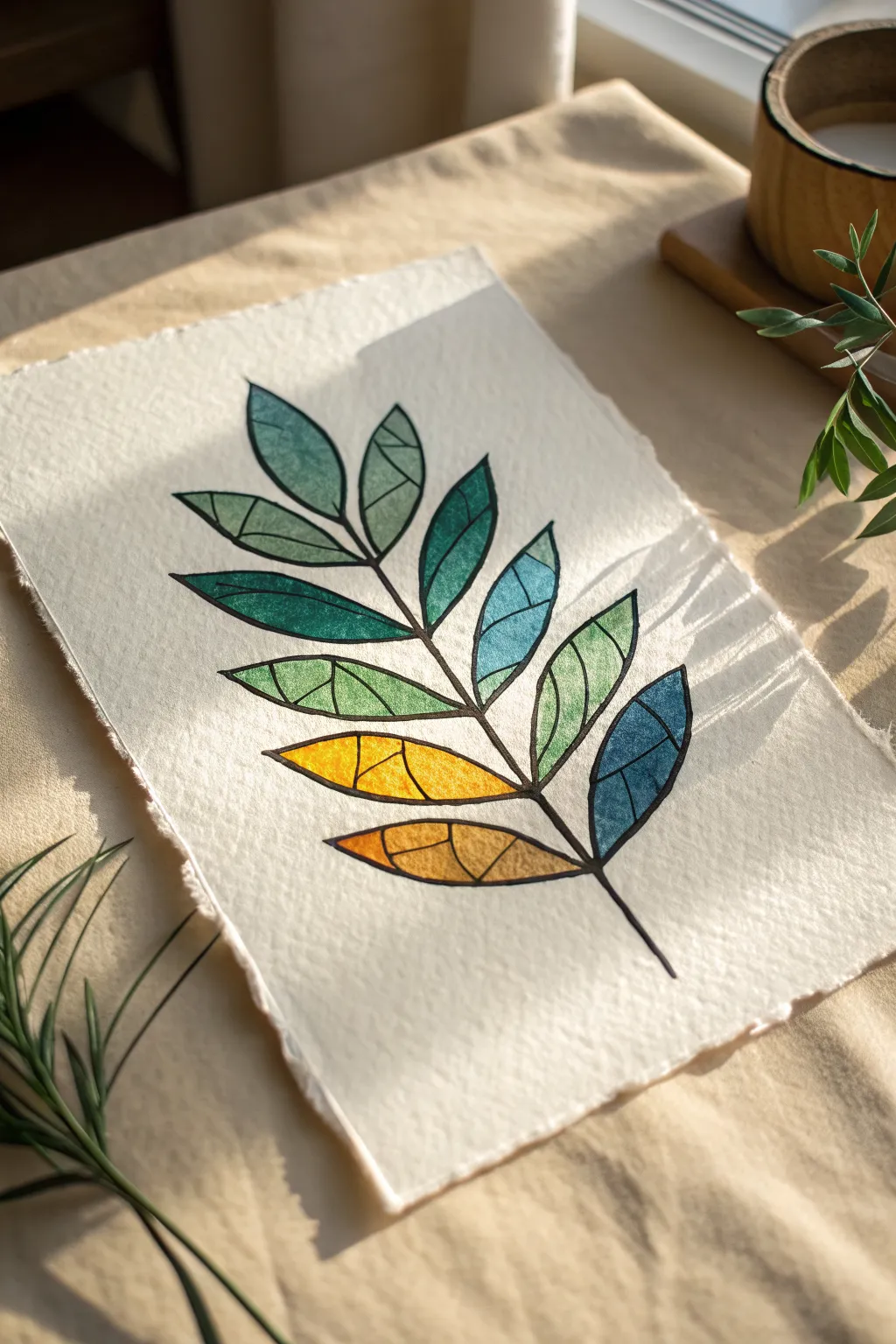
Capture the delicate beauty of stained glass on paper with this striking botanical watercolor project. The geometric segmentation of the leaves allows for beautiful color blocking and gradients that pop against the crisp black outlines.
Step-by-Step Tutorial
Materials
- Heavyweight cold press watercolor paper (300 gsm)
- Black waterproof fine liner pen (0.5mm or 0.8mm)
- Watercolor paints (pan or tube)
- Small round brushes (size 2 and 4)
- Ruler (optional)
- Pencil (HB)
- Eraser
- Clean water
Step 1: Sketching the Framework
-
Prepare the paper:
Start by tearing the edges of your watercolor paper against a ruler to create a soft, deckled edge look. This adds a rustic, handmade charm that complements the modern design. -
Draw the main stem:
Lightly sketch a central curved line with your pencil to act as the main stem of the branch. Keep the curve gentle and natural. -
Outline leaf shapes:
Sketch simple almond or pointed oval shapes coming off the stem in alternating pairs. Aim for about 8-10 leaves total, getting slightly smaller as you reach the tip. -
Add geometric segments:
Inside each leaf shape, draw 2-4 lines to divide the leaf into smaller geometric shards. Vary the angles—some vertical, some diagonal—to mimic the look of cut glass pieces.
Bleeding Lines?
If your black ink bleeds when painting, your pen isn’t waterproof. Stop, let it dry fully, and try painting carefully inside the lines without touching the black ink directly.
Step 2: Inking the Design
-
Trace the outlines:
Using a waterproof black fine liner, carefully trace over your pencil lines. The waterproof quality is crucial so the ink won’t bleed when you add paint later. -
Thicken the lines:
Go over the main stem and the outer edges of the leaves a second time to slightly thicken them. This creates a bold ‘lead came’ effect like real stained glass. -
Refine inner segments:
Trace the inner geometric lines with a steady hand. I like to keep these internal lines slightly thinner than the outer border for visual interest. -
Clean up:
Once the ink is completely dry—give it a few minutes to be safe—gently erase all visible pencil marks underneath.
Pro Tip: Highlight Hack
Leave a tiny sliver of white paper unpainted between the color and the black outline in a few spots. It looks like light catching the edge of the glass.
Step 3: Adding Color
-
Plan the gradient:
Visualize a color transition from cool tones at the top to warm tones at the bottom. Select a palette of deep teal, emerald green, lime green, yellow, and burnt orange. -
Paint the top leaves:
Start with the topmost leaves using a mix of deep teal and cool green. Paint each small geometric segment individually, letting the brush tip fill the corners. -
Create variation:
Within a single leaf, slightly alter the water-to-paint ratio for each segment. Make one segment darker and the next more translucent to create depth and texture. -
Transition to mid-tones:
As you move down the stem to the middle leaves, introduce brighter greens and lime tones. You can mix a little yellow into your green to smooth the transition. -
Paint the lower leaves:
For the bottom-most leaves, switch to warm yellows and earthy oranges. This mimics the natural turning of autumn leaves or a stylized sunset gradient. -
Add texture:
While the paint is still damp in some segments, you can drop in a tiny speck of clean water to create a bloom, adding that imperfect, organic glass texture. -
Dry and assess:
Let the first layer dry completely. If any segments look too washed out, add a second glaze of the same color to boost saturation.
Display your botanical art in a floating frame to show off those beautiful deckled edges


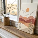
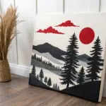
Modern Sunset Landscape in Blocks
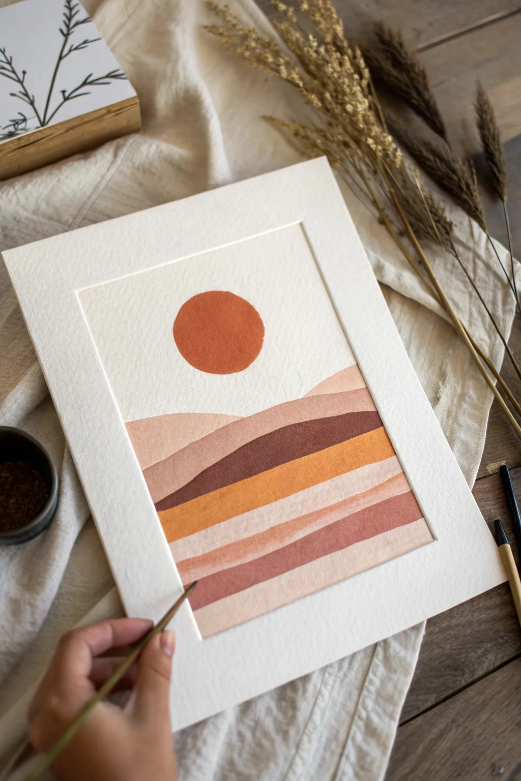
Capture the warmth of a desert sunset with this minimalist landscape painting, featuring sweeping color blocks in calming earth tones. The clean lines and textured paper give it a sophisticated, modern feel perfect for any gallery wall.
Step-by-Step
Materials
- Heavyweight watercolor or mixed media paper (cold press texture recommended)
- Gouache or acrylic paints (Terracotta, Burnt Sienna, Yellow Ochre, Buff Titanium, Burnt Umber, White)
- Flat shader brushes (medium and small sizes)
- Pencil for sketching
- Eraser
- Ruler
- Painter’s tape or masking tape
- Palette for mixing paint
- Compass or a circular object to trace (approx. 2-3 inches)
Step 1: Preparation & Sketching
-
Prepare your paper:
Begin by taping down the edges of your paper to a flat work surface. This creates a clean white border around your artwork and prevents the paper from buckling when wet. -
Define the painting area:
Use a ruler to lightly draw a rectangular border inside your paper if you want a specific framed look within the sheet, leaving a wide margin as seen in the example. -
Outline the sun:
Decide on the placement of your sun. Using a compass or by tracing a circular object like a jar lid, draw a perfect circle in the upper center of your composition. -
Sketch the horizon lines:
Lightly sketch the rolling hills. Start with the highest hill that overlaps the bottom of the sky, drawing a gentle, wavy line across the width of the frame. -
Layer the foreground:
Continue drawing wavy lines downwards to create layers of dunes. Vary the height and curve of each line to create visual interest, stacking about 5-6 distinct sections below the first hill.
Step 2: Painting the Landscape
-
Mix your sun color:
On your palette, mix a vibrant terracotta orange. You want this to be opaque and bold, so keep the paint relatively thick. -
Paint the sun:
Carefully fill in the circle using a small flat brush. Use the edge of the brush to keep the circumference crisp and clean. Let this dry completely before moving on to prevent smudging. -
Base coat the first hill:
Mix a soft, pale beige-pink using white and a tiny dot of terracotta. Apply this to the first hill section right below the sky area. -
Paint the second hill:
For the next layer down, mix a slightly darker, dusty rose color. Paint this section, carefully cutting in close to the line of the hill above it. -
Add a dark contrast layer:
Create a deep contrast by mixing Burnt Umber with a touch of terracotta. Apply this dark chocolate brown to the middle band of the landscape. This darker value anchors the composition. -
Brighten with ochre:
Mix Yellow Ochre with a little bit of white to create a warm mustard tone. Paint the section immediately below the dark brown layer to make it pop. -
Paint the lower dunes:
For the remaining bottom layers, mix variations of pale pink and sand. I like to alternate between lighter and slightly deeper tones to distinguish the layers clearly. -
Refine the edges:
Go back over any edges where the paint layers meet. If you have gaps, carefully fill them with the appropriate color using your smallest brush for a seamless look.
Clean Lines Pro Tip
For ultra-crisp horizon lines, you can apply thin strips of masking tape along your pencil curves. Paint one section, let dry, move tape, and paint the next.
Step 3: Finishing Touches
-
Check opacity:
Once the first layer is dry, check for any patchy areas. Gouache sometimes dries lighter or more transparent than expected, so apply a second coat if needed for solid, matte color. -
Clean up borders:
If any paint went over your pencil border lines, you can carefully touch it up with white paint (if your paper is white) or simply leave it for a hand-painted charm. -
Erase guidelines:
Ensure the paint is 100% bone dry. Gently erase any visible pencil marks remaining in the unpainted sky area or around the borders. -
Remove tape:
Slowly peel away the painter’s tape at a 45-degree angle away from the artwork to reveal your crisp, clean edges.
Level Up: Texture
Mix a tiny pinch of baking soda or fine sand into your paint for only the ‘dune’ sections. It adds a subtle, grainy texture that mimics real sand.
Now you have a serene, modern art piece ready to frame and bring warmth to your space
Abstract Cityscape With Broken Perspective
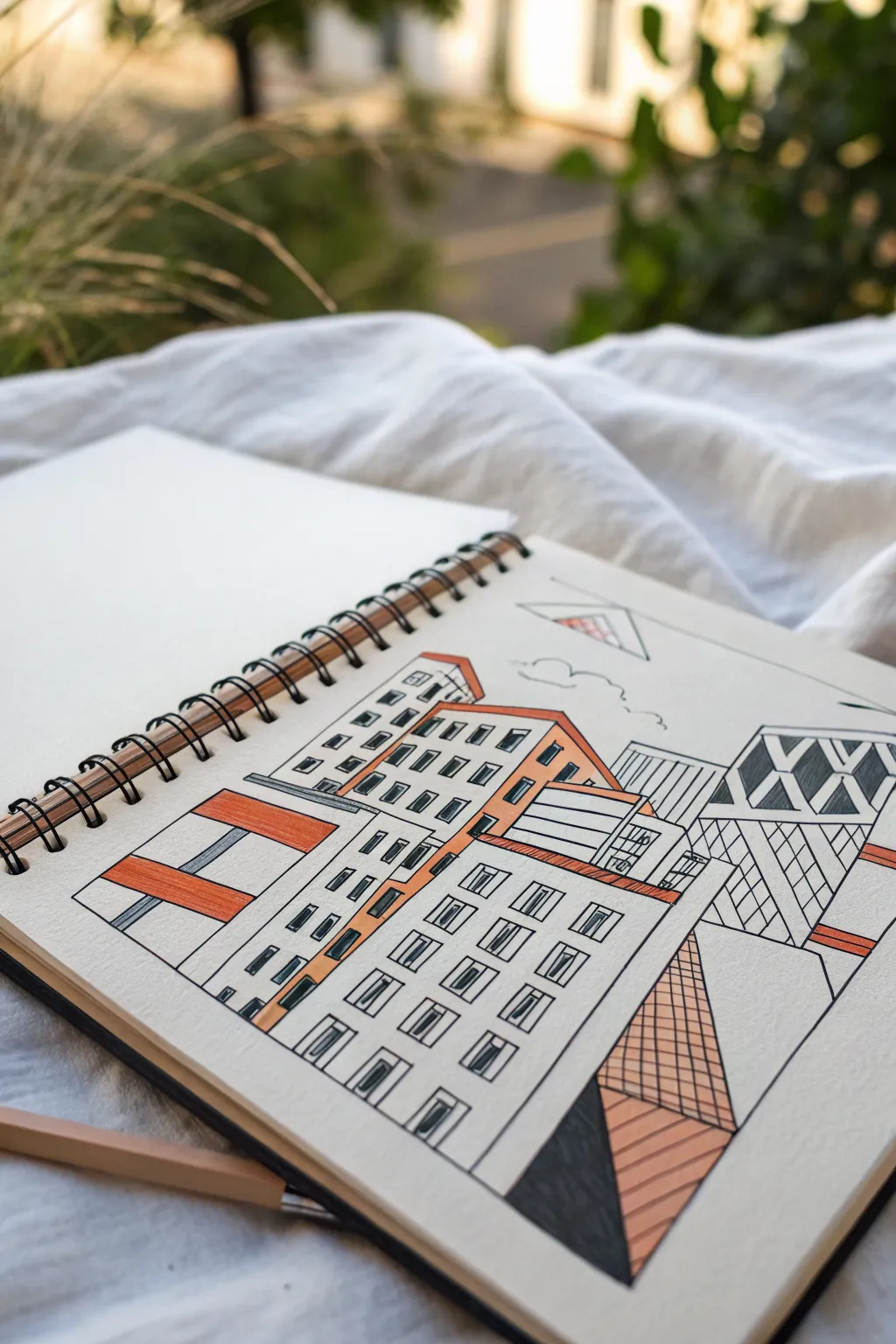
This stylized cityscape plays with multiple perspectives and geometric forms to create a modern, architectural illustration. Using bold ink lines and splashes of terracotta orange, you’ll build a composition that feels both structured and delightfully abstract.
Step-by-Step Guide
Materials
- Spiral-bound sketchbook (mixed media paper preferred)
- Fine liner pens (sizes 0.3mm and 0.5mm, black)
- Terracotta or warm orange marker/colored pencil
- Ruler or straight edge
- Pencil (HB or 2B)
- Eraser
Step 1: Planning the Layout
-
Establish the horizon line:
Begin by lightly sketching a loose horizon line with your pencil about two-thirds of the way down the page. This doesn’t need to be perfectly straight, as it’s just a guide for where your buildings will sit. -
Draft the central building:
Using your ruler, lightly pencil in a large, tilted rectangle in the center foreground. Add a smaller, pitched roof shape on top. This will be the main anchor for your composition. -
Add flanking structures:
Sketch a tall, narrow tower to the right, slightly overlapping or sitting behind your main building. Draw another blocky shape to the left that angles sharply inward, creating that ‘broken perspective’ look. -
Create background elements:
Pencil in a few rising geometric shapes behind the main cluster to suggest a dense city. Keep these simpler, like rectangles or triangles, to avoid overcrowding the drawing. -
Sketch the foreground geometry:
At the very bottom right, draw a large triangle that points upward. Divide this shape into two distinct sections with a diagonal line.
Uneven Lines?
Don’t stress about perfect straightness. If a line wobbles, go over it again to thicken it intentionally. This creates a loose, artistic ‘sketched’ style rather than a technical blueprint.
Step 2: Inking the Framework
-
Outline the main shapes:
Switch to your 0.5mm pen. Trace over your pencil outlines for the main buildings. Don’t worry if lines overlap slightly; it adds to the architectural sketch aesthetic. -
Define the windows:
On the central building, draw rows of small, square windows using the 0.3mm pen. I find it helpful to draw the vertical lines of the window grid first, then connect them with horizontal dashes. -
Add abstract details:
On the tall tower to the right, draw large ‘X’ shapes or diamond patterns instead of traditional windows. This breaks up the visual monotony. -
Erase pencil guides:
Once the ink is completely dry—give it a good few minutes to prevent smudging—gently erase all your underlying pencil sketches.
Add Atmosphere
Use a light gray marker to add drop shadows on one side of each building. This instantly adds 3D depth and makes your flat geometric shapes pop off the page.
Step 3: Adding Color and Texture
-
Color the central roof:
Take your terracotta marker or colored pencil and fill in the roof of the main central building. Apply the color evenly to make it pop against the white paper. -
Highlight the facade:
Add a vertical stripe of orange down the side of the central building, effectively framing the window grid you drew earlier. -
Fill the left block:
On the far left building, color in a large ‘H’ shape or rectangular blocks, leaving negative white space around them for contrast. -
Texture the foreground triangle:
In the bottom right triangle, create a cross-hatching grid pattern with your 0.3mm pen in one section. Fill the adjacent section with solid black or heavy dark shading. -
Add a color accent:
Color over the cross-hatched section of the triangle with your orange marker. The ink lines will show through, adding great depth. -
Draw the floating elements:
In the sky area above the buildings, use your pen to draw a small, floating triangle or kite shape. Add a tiny patch of orange inside it to balance the color distribution. -
Detail the background:
Use vertical straight lines to fill int the background skyscrapers. Keep the spacing consistent to suggest glass facades. -
Final touches:
Review your drawing for any gaps. You might want to thicken the outermost compositional lines with the 0.5mm pen to contain the scene boldly.
Enjoy the clean, modern look of your fractured perspective cityscape
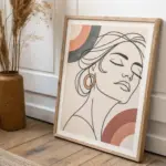
Pattern-Filled Silhouette Portrait
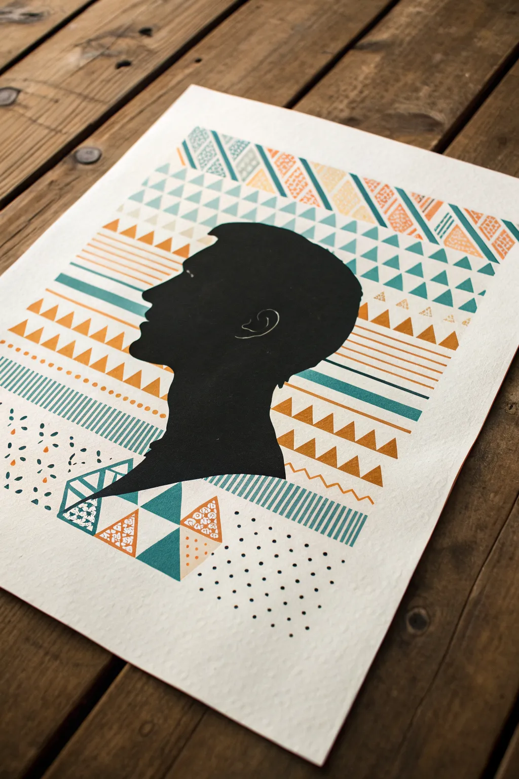
This striking mixed-media piece combines a classic profile silhouette with bold, contemporary geometric patterns. The contrast between the solid black portrait and the textured, patterned background creates a dynamic visual focal point perfect for modern decor.
Detailed Instructions
Materials
- High-quality watercolor paper or heavy cardstock (warm white or cream)
- Black construction paper or cardstock
- Pencil and eraser
- X-Acto knife or precision art scissors
- Self-healing cutting mat
- Archival glue stick or spray mount
- Painter’s tape or low-tack masking tape
- Acrylic paint or gouache (teal, mustard yellow, orange)
- Small flat artist brushes (size 2 and 4)
- Fine-point black ink pen (0.3mm or 0.5mm)
- White gel pen (optional)
- Ruler
Step 1: Creating the Silhouette
-
Select your subject:
Choose a clear side-profile photo of a person. High-contrast photos work best where the facial features are distinctly outlined against the background. -
Trace or sketch the profile:
Lightly sketch the outline of the head and shoulders onto your black cardstock. You can simply print your photo, cut it out, and trace around it for accuracy. -
Refine the edges:
Go over your pencil lines to smooth out any nervous jagged edges. Focus on getting the nose, lips, and chin shapes correct, as these define the person’s identity. -
Cut out the shape:
Place your black cardstock on a cutting mat. Using your X-Acto knife, carefully slice along the traced lines. I find creating long, smooth cuts yields a cleaner edge than many short chopping motions. -
Add inner details:
Use a white gel pen or a very fine stroke of silver ink to draw the inner ear detail on the black paper. Keep it minimal—just a suggestion of the ear shape.
Step 2: Designing the Geometric Background
-
Plan the layout:
On your main watercolor paper, lightly mark the center where the silhouette will sit. Don’t glue it yet; just know where the negative space needs to be. -
Establish the grid:
Using a ruler and pencil, draw faint horizontal guide lines across the paper. Space them unevenly to create bands of different widths for your various patterns. -
Draft the patterns:
Within the horizontal bands, sketch geometric motifs lightly. Create rows of triangles, chevrons, parallel lines, stripes, and dots. Vary the direction of the shapes to keep the eye moving. -
Paint the teal elements:
Mix a vibrant teal acrylic paint. Fill in specific rows of triangles and stripes. Use a flat brush to get crisp edges on the geometric shapes. -
Apply the warm tones:
Switch to your mustard yellow and orange paints. Fill in alternating rows of triangles and chevrons. The warm tones will pop beautifully against the cool teal. -
Add textured details:
Once the base shapes are dry, use a thinner brush to add internal textures. Paint tiny lines or stippling inside some of the larger triangles to mimic the look of fabric patterns. -
Incorporate ink work:
When the paint is fully dry, use your black fine-point pen to add rows of stippled dots or hatch marks in the empty spaces between the painted bands. -
Erase guide lines:
Gently erase any visible pencil lines from your initial grid. Be careful not to rub over the painted areas too vigorously.
Clean Cuts Only
If your silhouette edges look fuzzy or torn, change your X-Acto blade immediately. A dull blade drags paper rather than slicing it. Sand rough edges with an emery board if necessary.
Step 3: Assembly and Finishing
-
Position the silhouette:
Place your cut-out black profile back onto the center of the patterned background. Check that the patterns extend far enough to frame the face properly. -
Create the overlap:
Decide if you want the silhouette to act as a window or an overlay. In this style, the silhouette sits on top, obscuring parts of the pattern. Ensure the pattern feels continuous behind the head. -
Extend patterns if needed:
If the pattern feels too sparse near the neck or forehead, paint a few more geometric fragments that will peek out from behind the silhouette. -
Adhere the portrait:
Apply an even layer of glue or spray mount to the back of the black silhouette. Press it firmly onto the center of the background paper. -
Smooth the surface:
Place a clean sheet of scrap paper over the artwork and rub gently with your hand or a brayer to ensure the black paper lies perfectly flat without air bubbles. -
Final touches:
Inspect the edges where the black paper meets the background. If there are any gaps, you can add tiny painted dots or geometric shards to visually bridge the connection.
Go Digital
Scan your finished background and silhouette separately. In Photoshop, you can layer the pattern inside the silhouette instead of behind it for a totally reversed effect.
Frame your artwork in a simple wood frame to let the bold patterns take center stage
Two-Color Monochrome Mood Study
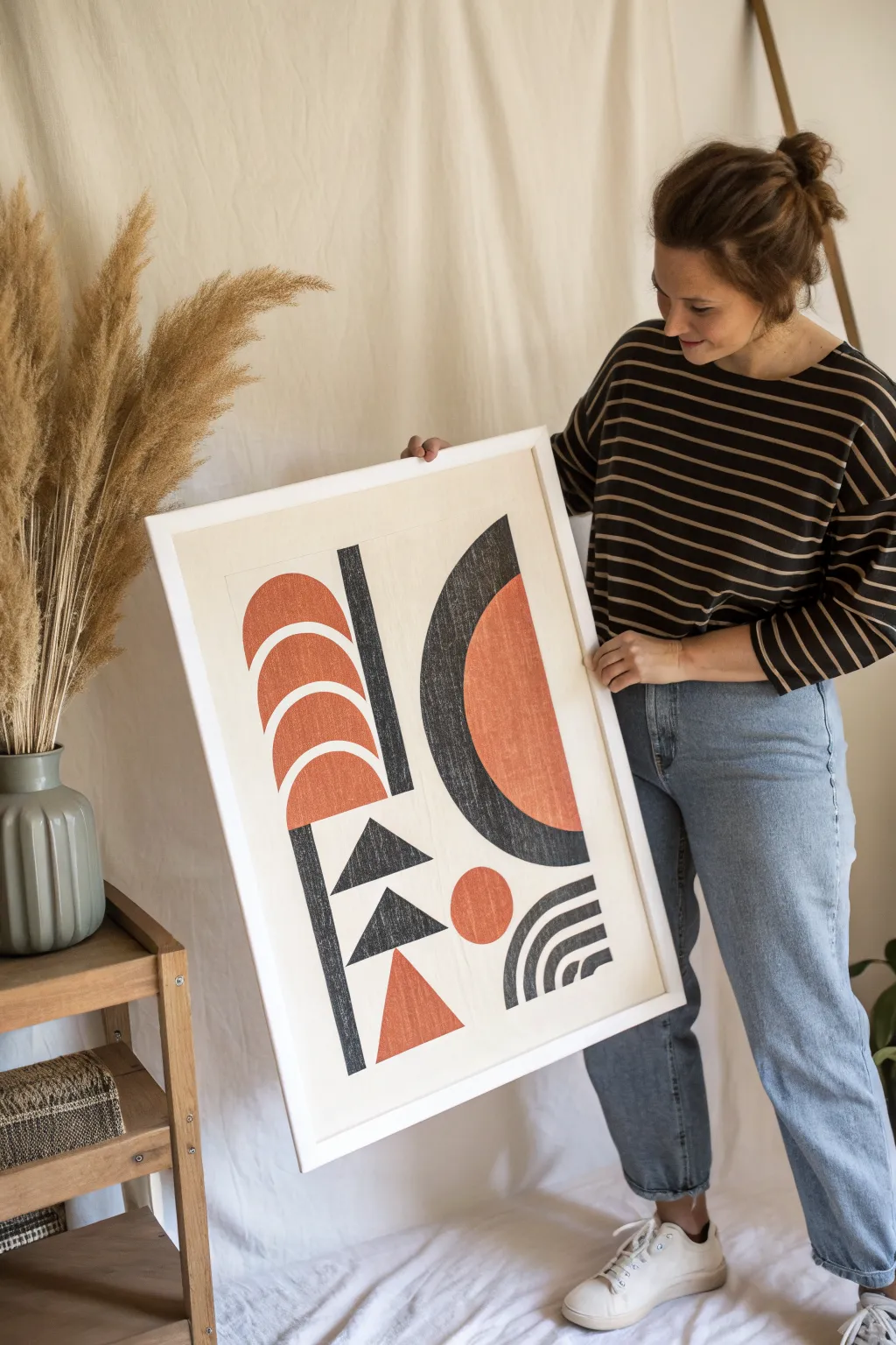
Using a striking balance of burnt orange and charcoal gray, this abstract piece explores weight and balance through simple geometric forms. The clean lines and bold block shapes create a retro-modern feel that adds architectural interest to any wall.
How-To Guide
Materials
- Large sheet of heavy mixed media paper or Bristol board (A2 size recommended)
- Pencil (HB)
- Ruler or T-square
- Compass or circular drawing templates
- Black ink marker or pigment liner (fineliner)
- Wide chisel-tip marker (charcoal gray)
- Wide chisel-tip marker (burnt orange/terracotta) or acrylic ink
- Kneaded eraser
- Artist’s tape (optional)
Step 1: Planning and Layout
-
Define the borders:
Begin by measuring a uniform border around your paper, leaving about two inches of white space from the edge. Lightly mark this boundary with your pencil to ensure your composition stays centered. -
Create the central axis:
This composition relies on a subtle vertical division. Lightly draw a vertical line slightly to the left of the true center. This will separate the left column of shapes from the larger right-hand section. -
Sketch the primary curves:
On the right side, use your compass to sketch a large semi-circle that dominates the space. Its flat edge should face left, running parallel to your vertical divider. -
Outline the stacking shapes:
On the left side, sketch the series of three arched semi-circles stacked vertically near the top. Below these, draft the two triangles pointing right, and the final triangle pointing up at the bottom. -
Add detail elements:
Sketch the tall, thin vertical rectangle that separates the left stack from the central white space. Then, draft the small circle and the quarter-circle with concentric arches in the bottom right corner.
Clean Curves Secret
Cut a stencil from cardstock for the repeated semi-circles on the left. Tracing a stencil ensures they are identical in size and curvature.
Step 2: Adding Color and Texture
-
Start with the orange forms:
Using your burnt orange marker or acrylic ink, fill in the three stacked arches on the upper left. I find it works best to outline the curve first, then fill the center to keep edges crisp. -
Fill the large semi-circle:
Color the inner section of the large right-hand semi-circle with orange. Leave a wide border around it for the gray section which will come later. -
Complete the accent shapes:
Fill in the small floating circle near the bottom center and the upward-pointing triangle at the very bottom left with the same orange hue. -
Begin the charcoal sections:
Switch to your dark gray or black marker. Carefully fill in the tall vertical bar standing between your left-hand arches and the center of the page. -
Create the large curve overlay:
Fill in the outer, crescent-moon shape that hugs the large orange semi-circle on the right. Ensure there is a clean, sharp boundary where the gray meets the orange. -
Darken the geometric accents:
Color the two triangles in the middle-left column with the dark gray. Ensure the points are sharp and precise. -
Detail the corner motif:
For the bottom right quarter-circle, draw thick curved bands rather than filling it solid. Alternate between dark gray bands and the white of the paper.
Step 3: Refining and Texture
-
Simulate texture:
To mimic the print-like texture seen in the inspiration, go back over your solid dry areas with a colored pencil of the same shade. Lightly scumble over the marker to add a ‘canvas’ grain effect. -
Check the edges:
Examine the spaces between shapes. If you want a crisper look, use a fine-tip black pen to extremely lightly outline the forms, or use white gouache to clean up any marker bleeding. -
Erase guidelines:
Once the ink is completely dry—give it at least 20 minutes to be safe—gently use your kneaded eraser to lift any visible graphite pencil lines. -
Final assessment:
Step back and look at the visual weight. If the black triangle stem looks too light compared to the heavy right side, add a second layer of marker to deepen the tone.
Level Up: Texture
Instead of markers, use block printing ink and improper rolling techniques. The patchy ink application will create an authentic vintage lithograph look.
Now perfectly balanced, your geometric study is ready to be framed in a simple white frame to let the shapes breathe
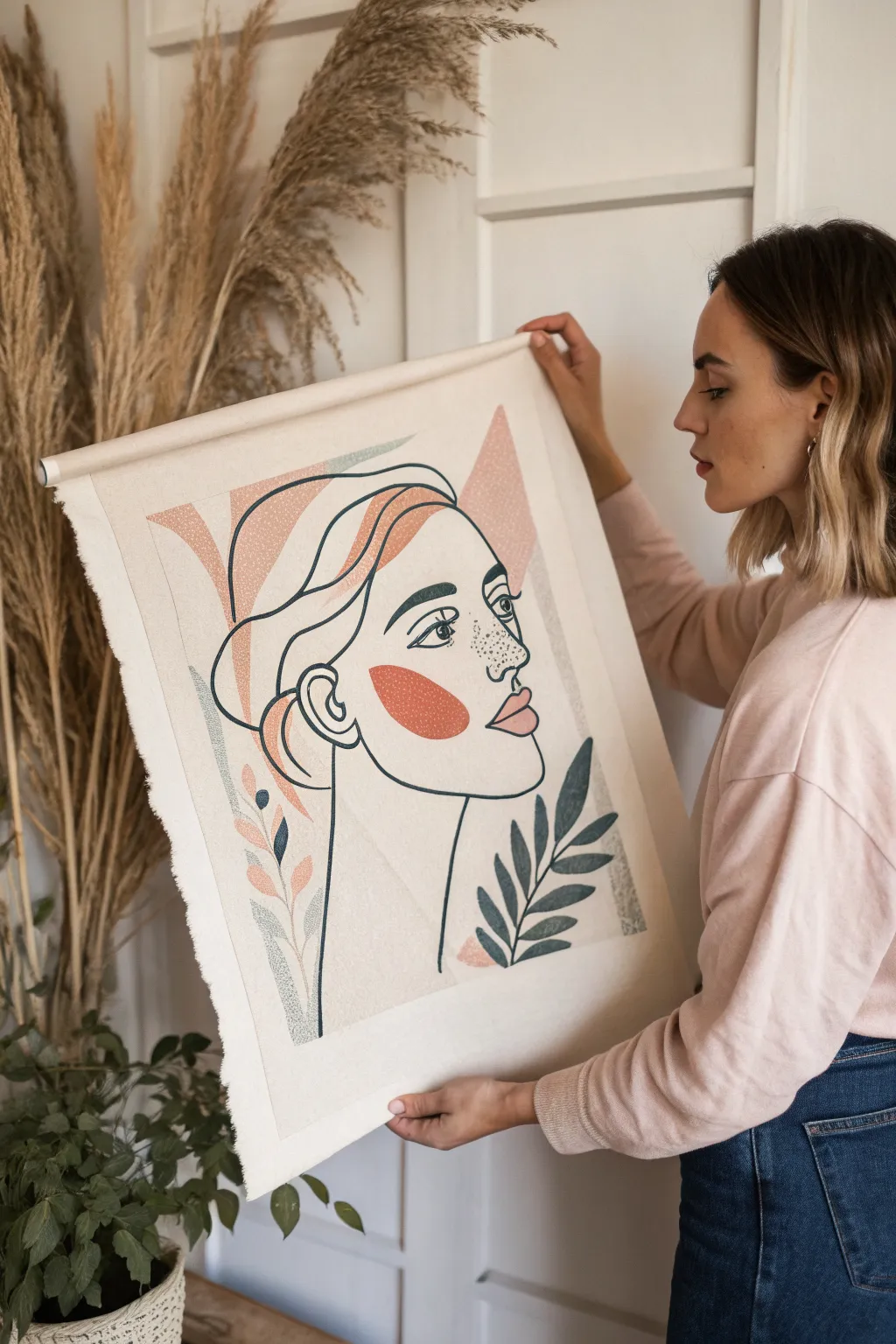
Abstract Hands in Negative Space
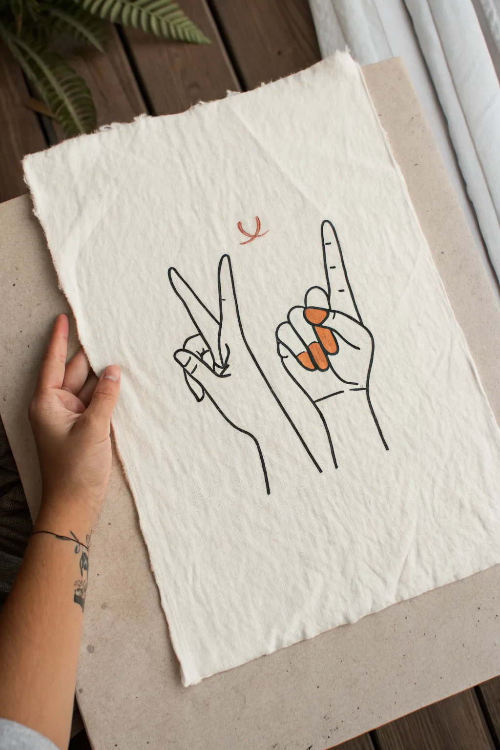
This minimalist project combines stark black linework with subtle pops of color on a rustic, raw-edged canvas. The result is a modern, graphic piece that celebrates hand gestures through clean lines and negative space.
Step-by-Step Tutorial
Materials
- Unprimed cotton canvas or heavy linen fabric (roughly A4 size)
- Black fabric marker or permanent fine-tip marker
- Orange or terracotta acrylic paint (or fabric paint)
- Small round paintbrush (size 2 or 4)
- Pencil (HB or 2B)
- Eraser
- Ruler (optional, for centering)
- Iron and ironing board
- Scissors
Step 1: Preparing the Canvas
-
Cut the fabric:
Cut a rectangular piece of your unprimed cotton canvas, approximately 9×12 inches. Don’t worry about perfect straight lines, as we want a raw look. -
Create deckled edges:
To achieve that rustic fringe seen in the photo, gently pull at the loose threads along all four sides of your fabric rectangle. Continue pulling threads until you have a soft, frayed edge about 1/4 inch deep all around. -
Press perfectly flat:
Iron your fabric piece to remove any creases or folds. A smooth surface is crucial for clean line drawings. Make sure the fabric is completely cool before starting to draw.
Step 2: Sketching the Composition
-
Establish the layout:
Using your pencil very lightly, mark the center of the canvas. You’ll want the two hands to sit slightly below the vertical center, leaning away from each other. -
Draft the left ‘Peace’ hand:
Start with the left hand. Sketch a wrist extending upward into a palm. Draw the index and middle fingers extending up in a V-shape. Curl the thumb over the ring and pinky fingers, which should be tucked into the palm. -
Draft the right ‘Pointing’ hand:
To the right, sketch the second hand. This one shows the palm facing forward. Draw the index finger pointing straight up. The thumb should be curled slightly inward over the curled middle, ring, and pinky fingers. -
Add the floating detail:
Centered above the space between the two hands, lightly sketch a small, abstract crescent or U-shape. This acts as a focal point or halo. -
Refine the lines:
Go over your sketch to ensure the proportions look right. The style is illustrative and flat, so focus on the outline rather than shading.
Ink Bleeding?
If your marker bleeds into the fabric grain, sketch your design first, then apply a thin layer of clear acrylic medium over the sketch lines. Let dry, then ink on top for sharp edges.
Step 3: Inking the Outline
-
Trace the main contours:
Take your black fabric marker or permanent pen. Begin tracing over your pencil lines with a steady, confident stroke. I generally find it easier to pull the pen toward me rather than pushing it away. -
Detail the fingers:
Add the small details, such as the fingernail on the left hand’s index and middle fingers, and the subtle crease lines on the knuckles and palms. These small lines give the hands dimension. -
Fill the detail lines:
Ink the small ‘U’ shape floating above the hands. Keep the line weight consistent with the hands for a cohesive look. -
Erase pencil guides:
Wait at least 15 minutes for the ink to fully set. Then, gently erase all visible pencil marks, being careful not to snag the fabric grain.
Make it a Scroll
Turn this into a hanging scroll by folding the top edge over a wooden dowel. Tie a piece of twine or leather cord to the ends of the dowel for a rustic, ready-to-hang finish.
Step 4: Adding Color Accents
-
Mix your paint:
Prepare a small amount of terracotta or muted orange acrylic paint. If the paint is too thick, thin it slightly with a drop of water so it absorbs into the fabric rather than sitting on top. -
Paint the fingernails:
Using your small round brush, carefully fill in the fingernails on the right hand (the pointing hand). The color goes on the thumb, middle, ring, and pinky nails. -
Paint the floating symbol:
Using the same brush, apply the terracotta color over the small ‘U’ shape floating above the hands. You can let the black outline remain visible or paint slightly over it for a more organic feel. -
Let it dry:
Allow the paint to dry completely. If you used fabric paint and intend to wash this piece, follow the manufacturer’s instructions for heat setting with an iron.
Hang your new canvas art using small clips or pins for an effortless, gallery-wall aesthetic
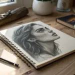
Glitch-Style Portrait Distortion
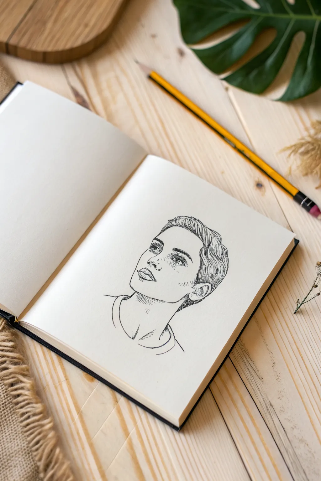
Capture a moment of quiet contemplation with this clean, ink-style portrait sketch. The drawing features crisp lines and minimal shading to create a striking, modern look perfect for filling your sketchbook pages.
Step-by-Step Guide
Materials
- Sketchbook with smooth, heavy paper
- HB pencil for initial outline
- Fine liner pen (0.3mm or 0.5mm, black)
- Thicker marker or brush pen (optional, for bold lines)
- Kneadable eraser
- Reference photo of a face looking upward
Step 1: Structural Foundation
-
Map the head shape:
Start lightly with your HB pencil. Draw an oval shape tilted slightly upward to represent the head. Because the subject is looking up, the chin will appear more prominent and the forehead slightly foreshortened. -
Guidelines for features:
Draw a vertical center line curving with the shape of the face. Add horizontal guidelines for the eyes, nose base, and mouth. Remember that when the head tilts back, the ears sit lower relative to the nose than in a straight-on view. -
Place the jawline:
Refine the jawline to be strong and defined. Connect it to the neck, which should look extended due to the upward gaze. Sketch the basic cylinder of the neck and the curve of the t-shirt collar.
Step 2: feature Sketching
-
Outline the eyes:
Sketch the eyes relying on the horizontal guideline. Since the face is angled, the far eye might appear slightly smaller or more closed. Focus on the upper lash line, as the gaze is directed upward. -
Define the nose:
Draw the bottom of the nose and the nostrils. With this angle, you see more of the nostrils and less of the bridge. Keep the bridge suggestion light or omit it entirely for a cleaner look. -
Shape the lips:
Sketch the mouth. The upper lip often appears thinner or curved downward in this perspective, while the lower lip is fuller. Leave small gaps in the line work to suggest highlights. -
Block in hair volume:
Outline the general shape of the short, textured hairstyle. Don’t draw individual strands yet; just focus on the main masses of hair and the hairline around the forehead and temples.
Wobbly Lines?
If your hand shakes, try ‘ghosting’ the stroke—move your hand in the motion of the line without touching the paper a few times before committing to the ink.
Step 3: Inking the Lines
-
Start the permanent lines:
Switch to your fine liner pen. Begin tracing your pencil sketch, starting with the most confident lines like the jaw and neck. Keep your hand steady but allow the line weight to vary slightly for a natural feel. -
Detail the eyes:
Carefully ink the eyes. Use short, dense strokes for the eyelashes to add depth without overwhelming the simple style. Darken the pupil but leave a tiny white spot for the catchlight. -
Refine facial contours:
Ink the nose and mouth. Avoid closing every shape completely; for example, the side of the nose bridge can often be left open. This ‘broken line’ technique keeps the face looking soft and not overly rigid. -
Add freckles and texture:
If you want the speckled look shown in the reference, gently tap the tip of your pen across the nose and cheeks. Vary the pressure to create dots of different sizes for realistic freckles.
Pro Tip: Line Weight
Use a thicker pen for the main outline (jaw, hair shape) and a thinner one for delicate details like eyes and freckles to create instant visual depth.
Step 4: Hair and Finishing Touches
-
Texture the hair:
Use flowing, S-shaped strokes to ink the hair. Follow the growth direction—sweeping back from the forehead and down around the ears. Group lines together to suggest clumps of hair rather than individual strands. -
Darken the ear area:
Add extra ink lines or light hatching around the ear and the hair just behind it. This shading grounds the hair and separates the ear from the rest of the head. -
Define the neck and collar:
Ink the neck muscles with long, sweeping lines. Draw the t-shirt collar with a double line to show the fabric’s thickness, adding a few small creases where the shirt drapes. -
Minimal hatching:
Add very sparse hatching marks for shadow in key areas: under the chin, beneath the lower lip, and inside the ear. Keep these lines diagonal and parallel. -
Clean up:
Once the ink is completely dry—I usually wait at least five minutes to be safe—gently erase all the underlying pencil marks with your kneadable eraser so only the crisp black lines remain.
Now you have a serene, minimalist portrait that perfectly captures a thoughtful mood suitable simply for practice or a framed gift
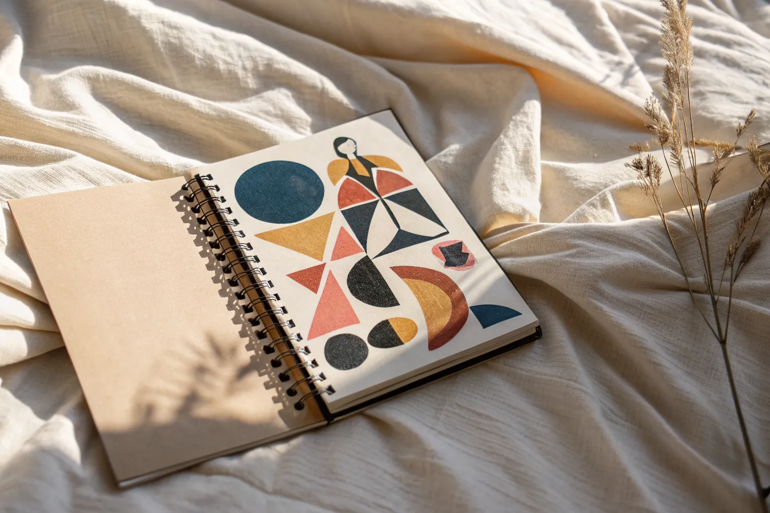
Memory Map as Abstract Drawing
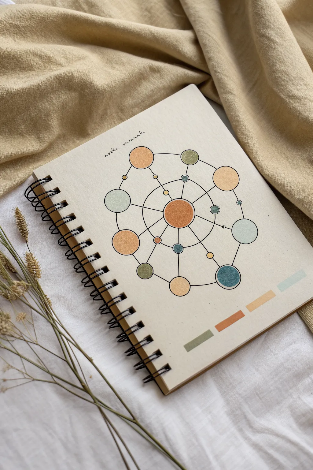
Transform a plain notebook into a personal artifact with this geometric memory map design. Using simple lines and circles in a cohesive earth-tone palette, you’ll create an abstract representation of connected ideas or moments that feels both modern and grounding.
Step-by-Step Tutorial
Materials
- Spiral-bound sketchbook or journal with a plain, light-colored cover (kraft or cream cardstock)
- Pencil (HB or H)
- Compass for drawing perfect circles
- Ruler
- Fine liner pen (black, 0.3mm or 0.5mm)
- Colored pencils or alcohol markers (terracotta, sage green, ochre, muted blue)
- Eraser (kneaded eraser preferred)
Step 1: Drafting the Structure
-
Find the center:
Begin by lightly measuring the width of your notebook cover to find the exact horizontal center. Make a tiny mark roughly in the middle vertical area, leaving some negative space at the top for optional text. -
Draw the central hub:
Place your compass point on your center mark. Draw a medium-sized circle (about 1.5 inches in diameter) to serve as the core of your design. Keep the pressure light so graphite lines don’t show through later. -
Create the orbital rings:
Expand your compass slightly and draw a larger concentric ring around the central hub. Then, expand it significantly more to draw the outermost boundary ring. These don’t need to be visible circles in the end, but they guide where your nodes will sit. -
Plotting the nodes:
Along the invisible outer ring, sketch 6-8 circles of varying sizes (dime to quarter-sized). Space them somewhat irregularly to keep the design organic. -
Adding inner connections:
On the inner rings or floating in the space between the center and the outer edge, add smaller circles. Think of these as satellite moons or connecting thoughts. -
Mapping the lines:
Use your ruler to draw straight lines connecting the central hub to the outer nodes. You can also connect outer nodes to each other, creating a web-like network. I find it looks best if lines pass through the centers of the circles.
Smudge Control
Place a scrap sheet of paper under your drawing hand while working. This prevents oils from your skin transferring to the paper and stops you from dragging graphite or wet ink across the clean cover.
Step 2: Inking and Coloring
-
Selecting the palette:
Choose 4-5 shades that harmonize well. This example uses an earthy scheme: rust orange, sage green, mustard yellow, and slate blue. Test them on a scrap piece of paper first. -
Filling the core:
Color in the central circle completely. Apply the color evenly; if using colored pencils, use small circular motions to build up opacity without distinct directional strokes. -
Coloring the nodes:
Fill in the surrounding circles, alternating colors so that no two adjacent circles share the same hue. Leave smaller circles for lighter or accent colors. -
Adding the color swatch bar:
At the bottom right corner of the cover, draw four small rectangles. Fill each one with the colors used in your diagram to create a pleasing artist’s palette detail. -
Inking the outlines:
Once the coloring is complete, take your black fine liner. Carefully outline every colored circle. Go slowly to ensure your circles remain round. -
Inking the connections:
Use the ruler and pen to ink the straight connecting lines. Start from the edge of one circle and stop exactly at the edge of the next, so you don’t cross through your colored shapes. -
Detailing the orbits:
If you drafted concentric rings earlier, trace segments of them now with the pen to connect certain nodes with curved lines instead of just straight ones.
Step 3: Final Touches
-
Erase pencil marks:
Wait at least 10 minutes to ensure the ink is bone dry. Gently run your kneaded eraser over the entire design to lift the graphite guidelines without smudging the pigment. -
Add a title:
In the negative space at the top, hand-letter a small title or date using a delicate cursive or simple serif font. ‘Notes’ or ‘Mind Map’ works perfectly here. -
Review and refine:
Check for any gaps in your coloring or faint lines in your inking. You can thicken the outer contour of the main circles slightly to make them pop against the background.
Add Texture
Instead of solid flat colors, try stippling (dots) or hatching (lines) inside the circles to give the diagram more depth and an architectural drafting feel.
Now you have a structured yet creative cover ready to house your next great idea
Have a question or want to share your own experience? I'd love to hear from you in the comments below!