When I’m painting something for my mom, I always aim for that sweet spot: simple to make, but full of meaning. Here are painting ideas for your mom that feel personal and gift-worthy, even if you’re keeping it beginner-friendly.
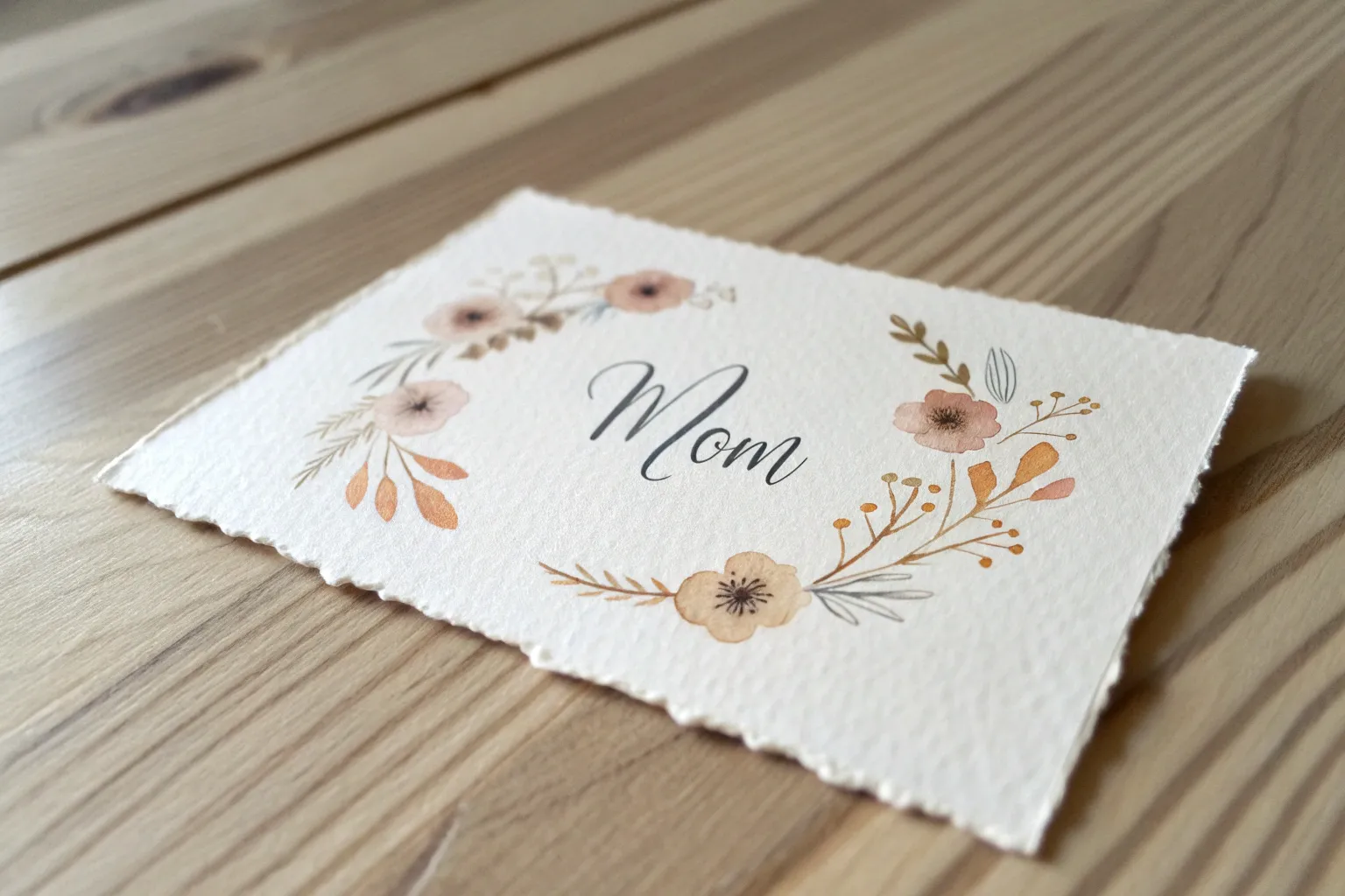
Classic Floral Bouquet for Mom
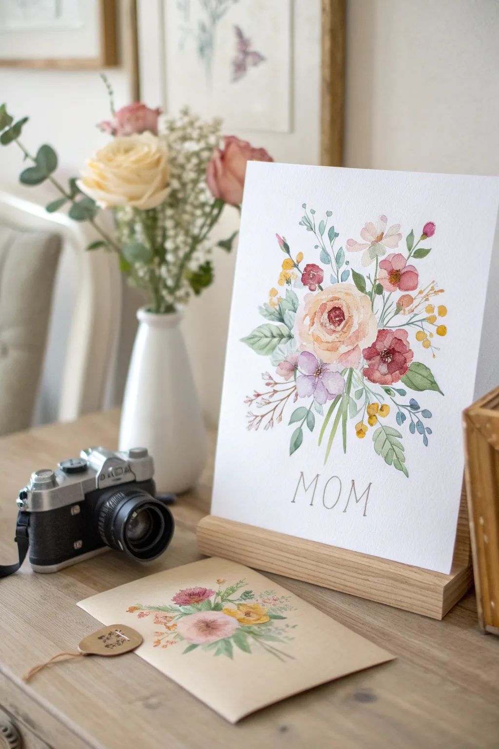
This tender watercolor piece focuses on a soft, peach-toned central rose surrounded by playful leaves and smaller accent blooms. The delicate color palette and hand-lettering create a timeless gift that feels personal and lovingly crafted.
How-To Guide
Materials
- Cold press watercolor paper (300 gsm)
- Round watercolor brushes (sizes 2, 6, and 8)
- Pencil (HB or H for light lines)
- Kneaded eraser
- Watercolor paints (Peach, Burnt Sienna, Olive Green, Sap Green, Magenta, Violet, Ultramarine Blue, Yellow Ochre)
- Jar of water and paper towels
- Masking tape (optional)
Step 1: Planning and Sketching
-
Lightly outline the composition:
Begin by lightly sketching a central oval shape where the main rose will sit, acting as your anchor. Add rough circles for the smaller flowers around it—one below, a few to the right, and small sprigs extending outward. -
Add delicate foliage lines:
Sketch the stems and leaf shapes radiating from the center. Keep your pencil pressure very light so the graphite won’t show through the translucent watercolor later. -
Mark the lettering:
Measure about two inches from the bottom edge of the paper. Lightly grid out the letters M-O-M to ensure they are centered and evenly spaced before you commit to painting them.
Muddy colors?
If your flowers are bleeding into the leaves, you’re working too fast. Let the flower shapes dry completely before painting a green leaf that touches them to keep edges crisp.
Step 2: Painting the Blooms
-
Start the central rose:
Mix a watery wash of peach with a tiny touch of yellow ochre. Using your size 6 brush, paint the outer petals of the main rose with loose, C-shaped strokes, leaving plenty of white space between them. -
Deepen the rose center:
While the outer petals are still slightly damp, drop a more concentrated mix of burnt sienna and peach into the very center of the rose to create depth and a focal point. -
Paint the lilac accent flower:
For the bloom directly below the rose, mix a soft violet using magenta and ultramarine. Paint four or five petals, keeping the wash very sheer. -
Add the reddish blooms:
Mix a deeper crimson pink for the flowers on the right side. Paint these with smaller, firmer dabs of the brush to suggest tighter clusters of petals. -
Create the bud details:
Using the tip of your size 2 brush, add small yellow and pink buds on the upper stems. These should be just simple dots and teardrop shapes.
Step 3: Leaves and Greenery
-
Mix your greens:
Prepare two green mixtures: a cool, blue-leaning green (mix sap green with a touch of blue) and a warmer olive green. I like to alternate between these to make the bouquet look organic. -
Paint the broad leaves:
Use the size 8 brush for the larger leaves at the base. Press the belly of the brush down and lift up to create a tapered point. -
Add floating sprigs:
Switch to a thin brush to paint the delicate, eucalyptus-style branches that float at the top. Use the cool green mix here for a soft, hazy look. -
Connect the stems:
Draw thin, pale green lines connecting your floating buds and flowers back toward the center of the bouquet. Don’t worry if lines break; broken lines add artistic character. -
Layering details:
Once the first layer of leaves is dry, go back in with a darker green to add veins or shadow areas where leaves overlap.
Make it shimmer
Once the paint is totally dry, use a metallic gold watercolor paint or a gold gel pen to outline the word MOM or add tiny specks to the center of the flowers for a premium finish.
Step 4: Finishing Touches
-
Letter the text:
Mix a neutral grayish-brown color. Using your smallest brush (size 0 or 2) or a fine-liner pen if you aren’t confident with a brush, carefully trace your ‘MOM’ pencil lines with thin, steady strokes. -
Add flower centers:
Dot the centers of the violet and red flowers with a concentrated mix of yellow ochre or dark brown to make them pop. -
Evaluate and erase:
Let the painting dry completely—give it at least 20 minutes. Then, gently use your kneaded eraser to lift any visible pencil marks from the sketch.
Frame this delicate piece in a simple wood stand or frame to make her day truly special


Heart and Hand-Lettered Mom
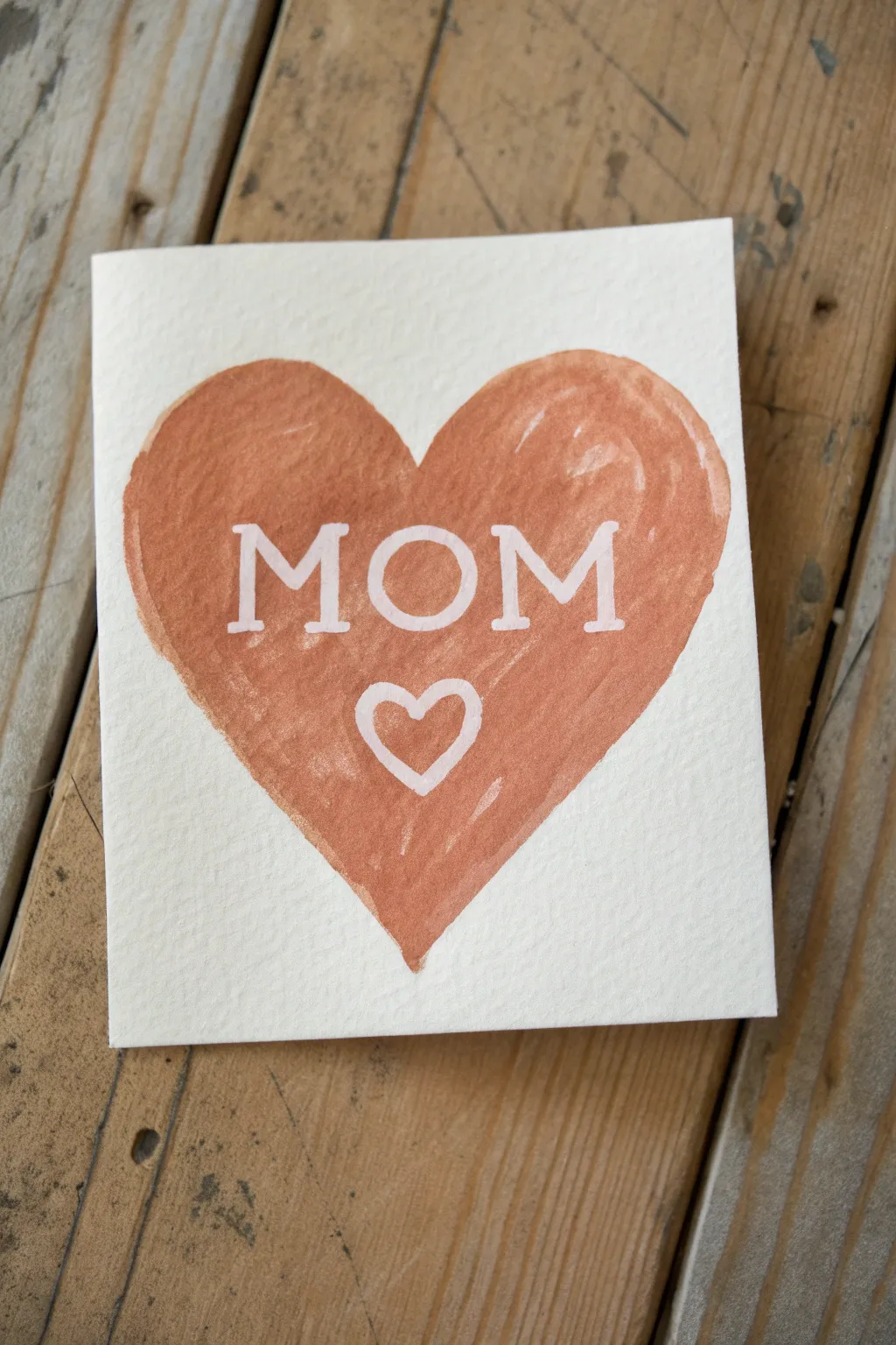
This rustic and charming card uses a simple masking technique to create crisp white lettering against a warm, earthy watercolor heart. It’s a beginner-friendly project that emphasizes texture and hand-drawn imperfections for a truly personal touch.
Step-by-Step
Materials
- Cold press watercolor paper (folded into a card)
- Masking fluid (drawing gum) or white crayon
- Fine-point brush or specialized masking fluid applicator
- Watercolor paints (Burnt Sienna or Terra Cotta)
- Medium round brush (size 6 or 8)
- Pencil and eraser
- Jar of water
- Paper towels
Step 1: Preparation & Masking
-
Prepare your paper:
Begin by folding a sheet of cold press watercolor paper to your desired card size. Ensure the fold is crisp using a bone folder or the back of a spoon. -
Draft the design lightly:
With a very light hand, use a pencil to sketch a large, symmetrical heart shape in the center of the card front. Inside this heart, block out the letters ‘MOM’ in a serif font and a smaller heart outline below it. -
Prepare the masking fluid:
Shake your masking fluid bottle gently. If you are using a brush, dampen it with soapy water first to prevent the gum from ruining the bristles. -
Mask the lettering:
Carefully paint the masking fluid over your penciled letters ‘MOM’. Use steady strokes to keep the serif edges sharp. -
Mask the small heart:
Continuing with the masking fluid, trace the outline of the small heart below the text. Make sure the line thickness matches the weight of your letters for visual consistency. -
Alternative masking option:
If you do not have masking fluid, you can firmly draw the letters and heart outline with a white wax crayon. The wax will repel the water-based paint later. -
Let it dry completely:
Allow the masking fluid to dry fully. It should feel transparent and tacky to the touch but not wet. Patience is key here to avoid smudging.
Don’t ruin your brush
Coat your brush bristles in dish soap before dipping into masking fluid. This creates a barrier that makes cleaning the sticky rubber gum much easier later.
Step 2: Painting the Heart
-
Mix your color:
On your palette, mix a rich earthy tone. I like to use Burnt Sienna with a tiny touch of Red Oxide to get that warm, terracotta hue seen in the example. -
Outline the main heart:
Load your medium round brush with the paint and carefully trace the outer edge of your large pencil-drawn heart shape. -
Fill in the shape:
Working quickly while the outline is still wet, fill in the rest of the heart with your paint color. -
Paint over the mask:
Brush the paint freely right over the masked letters and small heart. Don’t worry about staying outside the lines of the text; the mask protects the paper underneath. -
Create texture:
As the paint begins to settle, you can dab a slightly drier brush into the wet wash to lift small amounts of pigment, or add a second layer in spots to create the uneven, hand-painted texture. -
Let the paint dry:
Set the card aside until the paint is completely bone dry. The paper should feel uniform in temperature and not cool to the touch.
Add metallic flair
Once the masking fluid is removed, trace over the white letters with a gold or copper gel pen to give the card a shimmering, luxurious outline.
Step 3: Revealing the Design
-
Remove the masking fluid:
Once you are certain the paint is dry, use a rubber cement pickup tool or your clean finger to gently rub away the masking fluid. Start from the edge of a letter and peel carefully. -
Clean up residue:
Check closely to ensure no tiny bits of rubber remain clinging to the paper, as these can look like stray marks. -
Erase pencil lines:
Gently use a soft eraser to remove any visible pencil marks from your initial sketch, particularly around the outer edge of the painted heart. -
Assess the edges:
If the paint bled slightly under the mask, you can tidy up the white letters using a tiny amount of opaque white gouache or a white gel pen.
Now you have a heartfelt, handmade card ready for writing your personal message inside


Watercolor Wildflowers Card for Mom
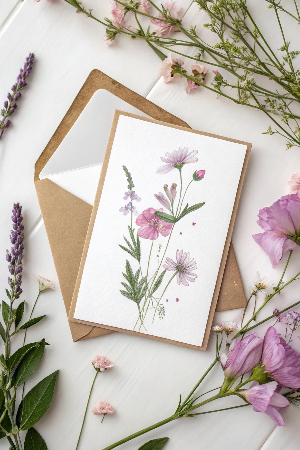
This delicate watercolor project captures the gentle beauty of a summer meadow with soft purples, pinks, and greens. The airy composition and loose, illustrative style make it a perfect, heartfelt greeting for Mom that feels both professional and personal.
Step-by-Step Tutorial
Materials
- Cold press watercolor paper (cut to 5×7 inches)
- Pencil (HB or H)
- Kneaded eraser
- Watercolor paints (Alizarin Crimson, Sap Green, Ultramarine Blue, Yellow Ochre, Purple mix)
- Round watercolor brushes (sizes 2, 4, and 0 for details)
- Cup of water and paper towels
- Brown kraft envelope (A7 size)
Step 1: Planning and Sketching
-
Prepare your paper:
Begin by trimming your watercolor paper to size. If you’re making a folded card, start with a 10×7 inch piece and score it down the middle, but for this mountable art card style, a single 5×7 sheet works beautifully. -
Lightly sketch the composition:
Use your HB pencil to draw faint guidelines. Sketch a central vertical axis for the main stems. Place the large pink bloom near the center, the tall lavender sprig to the left, and the daisy-like flowers floating near the top right and bottom right. -
Refine the shapes:
Add the basic shapes of the leaves. Notice how the leaves at the bottom are jagged and fern-like, while the upper leaves are slender and smooth. Sketch these lightly; you want the paint to define the edges, not the pencil.
Muddy Colors?
If your greens bloom too much into the pinks and turn brown, wait for the flower heads to be completely dry before painting the stems that touch them.
Step 2: Base Washes
-
Paint the central pink bloom:
Mix a watery wash of Alizarin Crimson with a touch of purple. Using a size 4 brush, paint the five petals of the central flower. Keep the edges soft and leave a small white gap in the center and between petals to prevent them from bleeding into a blob. -
Add the upper cosmos:
For the top daisy-like flower, mix a very pale lavender wash. Paint long, slender petals radiating from a center point. Keep this wash extremely transparent to make the flower look delicate and backlit. -
Paint the lower daisy:
Repeat the process for the bottom-right flower using a slightly darker purple tone. I find varying the saturation helps create depth. -
Lay in the lavender sprig:
On the left side, dab small spots of purple-blue mix for the tall flower spike. Leave irregular white spaces between the dabs to suggest individual tiny florets.
Pro Tip: Pencil Lines
Gently roll a kneaded eraser over your sketch before painting. It lifts the graphite so faint ghost lines remain, keeping the final watercolor looking clean.
Step 3: Stems and Foliage
-
Connect the stems:
Switch to a size 2 brush and mix Sap Green with a tiny bit of red to desaturate it. Paint thin, graceful lines connecting your flower heads to the bottom of the page. Vary the pressure to make the lines pulse slightly in thickness. -
Paint the jagged leaves:
For the lower fern-like leaves, use a darker green mix. Use the tip of the brush to create the serrated edges, pulling outward from the stem. Allow these to overlap the stem lines slightly. -
Add structural leaves:
Paint the broader, smooth leaves near the central pink flower. These act as an anchor for the composition. If your green paint touches the still-damp pink flower, let it bloom slightly—it adds to the charm.
Step 4: Details and Definition
-
Deepen the centers:
Once the base washes are dry, mix a concentrated yellow ochre and brown. Dot the centers of the daisy-like flowers. Add tiny stamen lines radiating outward using your size 0 brush. -
Enhance the pink bloom:
Mix a slightly darker pink and add fine veins to the central flower petals. Don’t outline them entirely; just suggest the texture near the center. -
Add shadow accents:
Using a dark green or indigo, add tiny shadows where stems cross or where leaves tuck behind flowers. This small step instantly adds dimension. -
Create the bud:
Don’t forget the small pink bud on the right. Paint a tight tear-drop shape in pink, and cup the bottom with a green sepal. -
Add splatter for texture:
Load your brush with a watery pink or purple mix and tap it against your finger to sprinkle a few tiny droplets around the flowers. This loosens up the composition.
Allow the card to dry completely, then slip it into a kraft envelope for a rustic, elegant finish your mom will cherish


Simple Portrait of Your Mom
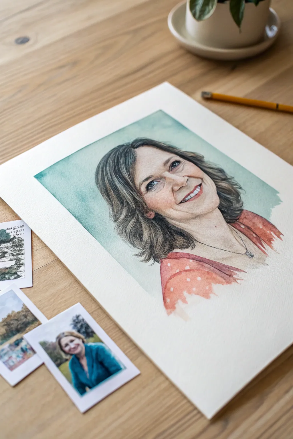
Capture the warmth and likeness of your mom with this delicate, realistic watercolor portrait set against a soft teal wash. The finished piece features gentle skin tones, detailed hair texturing, and a charming polka-dot blouse, making it a heartfelt and personalized gift.
Step-by-Step
Materials
- High-quality hot press watercolor paper (A3 or A4)
- Watercolor paints (Alizarin Crimson, Yellow Ochre, Burnt Umber, Ultramarine Blue, Phthalo Green, Burnt Sienna)
- HB or 2B graphite pencil
- Kneaded eraser
- Round watercolor brushes (Size 8 for washes, Size 2 and 0 for details)
- Masking fluid (optional, for highlights)
- Palette for mixing
- Two jars of water
- Paper towels
- A clear reference photo of your mom
Step 1: Sketching and Preparation
-
Select your reference:
Choose a photo where the lighting is soft and flattering, preferably with the subject looking slightly off-camera with a genuine smile. Print it out or have it ready on a tablet. -
Outline the initial shape:
Lightly sketch the contour of the head, neck, and shoulders using an HB pencil. Focus on getting the proportions correct rather than details at this stage. -
Refine facial features:
Carefully draw the eyes, nose, and mouth. Pay special attention to the smile lines and the shape of the teeth, keeping your pencil strokes very faint so they don’t show through the paint later. -
Map the hair flow:
Sketch broad directional lines for the hair to guide your brushstrokes later. Don’t draw individual strands; just outline the main clumps and waves. -
Clean up the sketch:
Use a kneaded eraser to lift any heavy graphite marks, leaving only the faintest guide lines visible on the paper.
Master the Glaze
Let each layer of paint dry 100% before adding the next. If the paper is cool to the touch, it’s still wet. Patience prevents muddy colors.
Step 2: Layering Skin Tones
-
Mix the base skin tone:
Combine plenty of water with Yellow Ochre and a tiny touch of Alizarin Crimson to create a very pale, watery tea-colored wash. -
Apply the first wash:
Using a size 8 round brush, paint the entire face and neck area (avoiding the eyes and teeth) with this pale wash. Let it dry completely. -
Build facial structure:
Mix a slightly darker skin tone by adding a bit more red and a touch of Burnt Sienna. Glaze this over the shadowed areas: under the chin, the sides of the nose, and the eye sockets. -
Add warmth to the cheeks:
While the previous layer is damp but not soaking, drop a small amount of watered-down Alizarin Crimson onto the cheeks and the tip of the nose for a natural flush. -
Deepen the shadows:
Mix a cool shadow tone using Burnt Umber and a tiny bit of Ultramarine Blue. Apply this selectively under the jawline and hair to create depth and separation.
Step 3: Hair and Clothing Details
-
Start the hair base:
Mix a light wash of Burnt Umber and Ultramarine Blue (vary the mix depending on hair color). Paint the overall shape of the hair, leaving white paper gaps for the brightest highlights. -
Paint individual strands:
Switch to a size 2 brush. I like to use a thicker mixture of dark brown/grey paint here to flick fine lines following the direction of the hair growth, building texture. -
Define the eyes and mouth:
Using your smallest brush (size 0), carefully paint the iris, pupil, and lash line. Use a reddish-brown mix for the lips, keeping the upper lip slightly darker than the lower. -
Paint the background wash:
Mix Phthalo Green with a lot of water to create a soft teal. Apply this loosely around the head, fading it out toward the edges of the paper for a vignette effect. -
Add the blouse base:
Paint the shirt area with a rusty orange-red tone. Work loosely here; the clothing doesn’t need as much detail as the face. -
Lift out the polka dots:
While the shirt paint is still slightly damp, use a clean, thirsty brush or the corner of a paper towel to lift out small circles of pigment to create the white polka dots. -
Sharpen final details:
Once everything is bone dry, add the final dark touches—the pupils, the nostrils, and the necklace chain—using a nearly dry brush for crisp, dark lines.
Personalize the Frame
Float mount the finished painting in a deep shadow box frame to show off the beautiful, deckled edge of the high-quality paper.
Sign your name gently in the corner and present this beautiful keepsake to your mom with pride
BRUSH GUIDE
The Right Brush for Every Stroke
From clean lines to bold texture — master brush choice, stroke control, and essential techniques.
Explore the Full Guide
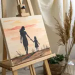
Mother-and-Child Silhouette Scene
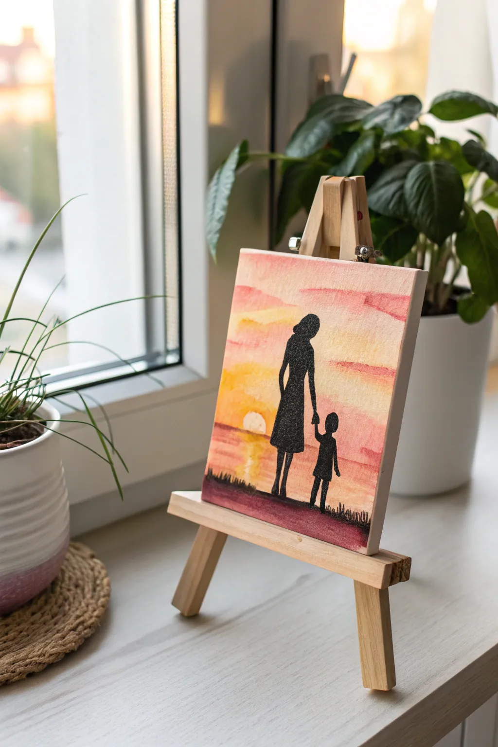
Capture the unbreakable bond between mother and child with this heartwarming silhouette painting. Using warm washes for the sky and bold black for the figures creates a stunning contrast that looks beautiful on any small easel.
Step-by-Step Tutorial
Materials
- Small square canvas board (approx 4×4 or 5×5 inches)
- Acrylic paints: Titanium White, Cadmium Yellow, Orange, Rose/Pink, Black
- Flat brush (1/2 inch)
- Small round detail brush (size 0 or 1)
- Pencil
- Cup of water
- Paper towels
- Carbon paper (optional for tracing)
- Miniature wooden easel for display
Step 1: Preparing the Sunset Sky
-
Prime the Surface:
Even though your canvas is likely pre-primed, adding a thin wash of white paint mixed with a tiny bit of water helps subsequent colors blend more smoothly. Let this base layer dry until it’s tacky but not fully set. -
Mix Your Sunset Gradient:
Prepare three separate puddles of paint: a pale yellow, a vibrant orange, and a soft rose pink. Dilute them slightly with water to achieve a semi-transparent, watercolor-like consistency. -
Paint the Horizon:
Start at the bottom third of the canvas with your rose pink color. Use horizontal strokes to create a base for the ground and water line, keeping the strokes loose. -
Apply the Middle Sky:
Moving upward, apply the orange paint across the middle section. While the paint is still wet, gently blend the bottom edge of the orange into the top edge of the pink to create a soft transition. -
Finish the Upper Sky:
Paint the top third of the canvas with your pale yellow mix. I like to add a touch of white here to make it luminous. Blend it downwards into the orange section. -
Add Cloud Textures:
While everything is still damp, take a clean, slightly dry brush and streak small amounts of the rose pink horizontally across the yellow and orange sections to mimic wispy clouds. -
Create the Sun:
Near the horizon line on the left side, lift a small circle of paint using a clean, damp brush or paper towel, or paint a small semi-circle of pure white mixed with yellow to represent the setting sun. -
Let the Background Dry:
This is crucial: allow the entire background to dry completely. If you paint the black silhouettes too soon, they will bleed into the sky and ruin the crisp edges.
Step 2: Painting the Silhouettes
-
Sketch the Outline:
Lightly sketch the figures of the mother and child with a pencil. Place the mother on the left and the child on the right, holding hands. If you aren’t confident in your drawing skills, print a silhouette template and use carbon paper to transfer it. -
Establish the Ground Line:
Switch to your black paint. Load your flat brush and paint a solid, uneven strip across the very bottom of the canvas to create the grassy ground they are standing on. -
Outline the Mother:
Using your small round detail brush and slightly thinned black paint (ink consistency flows best), carefully trace the outline of the mother’s dress and hair. -
Fill in the Mother Figure:
Once the outline is secure, fill in the shape with solid black paint. Ensuring the opacity is high so no sunset colors show through her dress. -
Detail the Child:
Repeat the process for the child figure. Pay tension to the connection point where their hands meet; this interaction is the focal point of the piece. -
Refine the Edges:
Go back over the edges of your silhouettes to sharpen them. Crisp lines are what make silhouette art effective. -
Add Grass Details:
Using the tip of your smallest brush using black paint, flick tiny vertical strokes upward from the ground line to simulate blades of grass. -
Create Water Reflections (Optional):
If you want the scene to look like it’s by a lake, mix a tiny bit of water into your black paint and add very faint, horizontal zigzag lines below the sun in the pink area. -
Final Inspection:
Check for any pinholes of light showing through the black paint and touch them up. Place the finished canvas on the mini easel to admire your work.
Pro Tip: Smooth Blacks
Black acrylic can sometimes look streaky. For a deep, matte finish, mix a tiny drop of dark blue into your black paint. It deepens the tone without changing the color perception.
Troubleshooting: Shaky Hands
If you struggle with fine lines for the silhouette, use a fine-tip permanent black marker or paint pen over the dry acrylic background instead of a brush.
This sentimental piece is now ready to be gifted and displayed on a desk or mantel
Handprint Flower Bouquet Keepsake for Mom
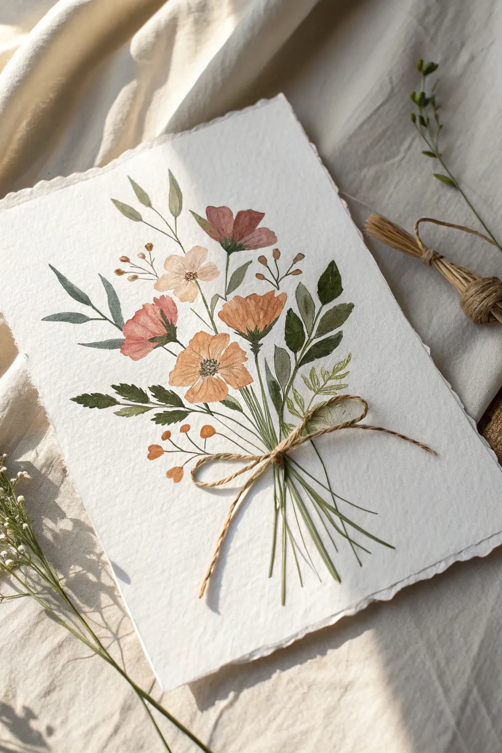
Capture the elegance of nature with this graceful watercolor bouquet featuring poppies, cosmos, and delicate greenery tied in a rustic bundle. The textured paper and soft, muted palette create a vintage botanical feel that makes for a timeless gift.
Detailed Instructions
Materials
- Cold-press watercolor paper (300gsm/140lb) with deckled edges
- Watercolor paints (shades of ochre, burnt sienna, dusty pink, olive green, sap green, indigo)
- Round watercolor brushes (size 2, 4, and 6)
- Pencil (HB or 2H)
- Kneaded eraser
- Jute twine or thin hemp string
- Strong craft glue or hot glue gun
- Palette for mixing
- Paper towels and water jars
Step 1: Planning and Sketching
-
Prepare the paper:
If your paper doesn’t already have deckled edges, you can create them manually. Fold the paper back and forth along a ruler and carefully tear it while wet, or use a deckle-edge ruler. This gives the piece its handmade, artisanal charm. -
Lightly map the composition:
Using an HB pencil, very faintly sketch the main stems radiating from a central binding point near the bottom third of the paper. Keep lines loose and minimal so they disappear later. -
Place the blooms:
Sketch small circles or ovals where the main flower heads will go—one large one in the center-left, a few taller ones near the top, and smaller fillers on the sides.
Step 2: Painting the Flowers
-
Mix the bloom colors:
Create a palette of warm, earthy tones. Mix burnt sienna with a touch of yellow for the orange poppies, and water down a dusty pink or mauve for the softer cosmos. -
Paint the central poppy:
Start with the main orange flower. Load a size 6 brush with the sienna-yellow mix and paint broad, petal-shaped strokes. Leave tiny gaps of white paper between petals to define them. -
Add the pink cosmos:
While the orange flower dries, paint the pink blooms near the left and top. Use a watery wash first, letting the pigment pool slightly at the base of the petals for natural shading. -
Detail the flower centers:
Once the petals are dry, switch to a size 2 brush. Mix a tiny amount of indigo or sepia and dot the centers of the open flowers to create stamens and texture. -
Create the upper buds:
For the unopened buds at the top, use a slightly more concentrated mix of the pink and mauve tones. Paint tight, teardrop shapes.
Muddy colors?
Wait for each flower to dry completely before painting adjacent leaves. Wet paint touching wet paint will bleed and turn brown.
Step 3: Adding Greenery and Stems
-
Mix varying greens:
To get a realistic look, you’ll need variety. Mix a cool, bluish-green (sage), a warm yellow-green (olive), and a deep forest green. -
Paint the main leaves:
Using the sage mix and a size 4 brush, paint the broad, pointed leaves on the left side. Use a ‘press and lift’ motion: touch the tip, press down to widen the stroke, and lift off to create a point. -
Add darker foliage:
Use the deep forest green for the leaves on the right side. This contrast adds depth to the bouquet. -
Paint filler sprigs:
With the olive green, add the delicate, fern-like fronds near the bottom right. Use the very tip of your smallest brush for these fine details. -
Connect the stems:
Draw long, thin lines from all flower heads and leaves down to the central gathering point. Ensure the lines intersect at roughly the same spot to make the ‘tying’ look realistic. -
Add berry accents:
Mix a muted brownish-orange. Paint small, round berries on thin, branching stems near the bottom left and top right to fill out the composition.
Add dimension
Once dry, use colored pencils to add fine veins to the leaves or outline specific petals for a mixed-media artistic touch.
Step 4: Finishing Touches
-
Extend the lower stems:
Paint the bottom section of the stems fanning out below where the string will go. Vary the lengths slightly so they don’t look too uniform. -
Dry completely:
Let the painting sit until absolutely bone dry. If the paper is damp, the glue in the next step won’t adhere properly. -
Tie the bow:
Cut a piece of jute twine about 8 inches long. Tie a small, neat bow separate from the paper first to get the shape right. -
Attach the twine:
apply a small dot of strong craft glue or hot glue directly over the painted intersection of the stems. Press your pre-tied bow onto the glue dot and hold firmly until set. -
Secure the tails:
I like to arrange the tails of the bow so they curve naturally. You can use a tiny speck of glue to tack the ends down if you want them to stay perfectly in place.
Now you have a beautifully textured piece of art that freezes a moment of spring in time

PENCIL GUIDE
Understanding Pencil Grades from H to B
From first sketch to finished drawing — learn pencil grades, line control, and shading techniques.
Explore the Full Guide
Fingerprint Heart Wreath for Mom
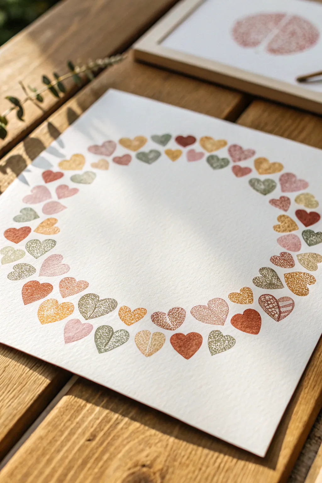
Create a sentimental keepsake that captures a moment in time with this delicate wreath made entirely of fingerprints. By arranging simple thumbprints into heart shapes, you can build a beautiful, organic circle of love that Mom will cherish forever.
Step-by-Step
Materials
- High-quality white cardstock or watercolor paper (heavyweight)
- Ink pads in various earth tones (rust, sage green, mustard yellow, dusty pink, terracotta)
- Scrap paper for testing
- Pencil
- Large circular object (like a dinner plate) or compass
- Eraser
- Baby wipes or damp paper towels
Step 1: Planning the Layout
-
Prepare your paper:
Start with a clean sheet of heavyweight cardstock or watercolor paper. The texture of the paper adds a nice quality to the print, so textured paper is a great choice here. -
Trace a guide:
Place a dinner plate or use a compass to lightly trace a large circle in the center of your paper using a pencil. This will serve as the invisible spine for your wreath. -
Mark spacing intervals:
Lightly mark small ticks around the circle’s circumference to get an idea of where your hearts will sit. They don’t need to be perfectly even, as a little variation looks more organic. -
Select your palette:
Open your ink pads and arrange them in the order you want to use them. I like to alternate between warm tones (rust, yellow) and cool tones (sage, grey-green) to keep the wreath balanced.
Clean Prints Only
Make sure your finger is completely dry after wiping it clean. A damp finger will repel the oil-based ink and create splotchy, uneven prints.
Step 2: Printing the Hearts
-
Practice the technique:
On a piece of scrap paper, press your thumb into an ink pad, then press it onto the paper at a 45-degree angle. Re-ink, then press again overlapping the bottom to create a V-shape heart. -
Start the first heart:
Choose a muted red or rust color for your starting point. Press your thumb onto the ink pad, ensuring good coverage but not a gloppy mess. -
Form the first shape:
Place your first thumbprint diagonally on your pencil line. Without re-inking if you want a textural look, or re-inking for solid color, place the second print to complete the heart shape. -
Clean in between:
Thoroughly wipe your thumb with a baby wipe before switching colors. Any residue will muddy the next color, especially when switching from dark to light inks. -
Add a contrasting color:
Switch to a sage green or mustard yellow ink. Place this next heart slightly rotated compared to the first one, following the curve of your pencil line. -
Build the circle:
Continue working your way around the circle. Try to vary the angle of each heart slightly—some facing inward, some outward, and some following the line directly—to create movement. -
Mind the spacing:
Keep the hearts relatively close together so the wreath looks full, but leave a tiny bit of breathing room between them so they don’t visually merge into blobs. -
Closing the loop:
As you approach your starting point, gauge the remaining space. You may need to slightly adjust the spacing of the last two or three hearts to make the circle close seamlessly.
Step 3: Refining the Details
-
Let it dry completely:
ink can take a little while to fully set, especially on textured paper. Give the artwork at least 30 minutes to ensure no smudging occurs during the next step. -
Erase the guide:
Here I prefer to use a kneaded eraser to gently lift the pencil line from the center of the wreath. Be extremely careful not to rub over the inked areas. -
Check for gaps:
Step back and look at the composition. If there are any awkward gaps, you can use the tip of your pinky finger to add tiny, subtle filler dots in a light color, though this is optional. -
Optional pen details:
If you want to add more definition, you can use a fine-tip pen to outline a few hearts or write a small message in the center of the wreath, but the raw fingerprint look is beautiful on its own.
Family Tree Twist
Use different family members’ fingerprints for different colors. Imagine a wreath made of prints from mom, dad, and all the kids mixed together.
Once framed, this simple yet deeply personal piece of art becomes a sophisticated reminder of the hands that hold the family together
Brush-Lettered Love Note for Mom
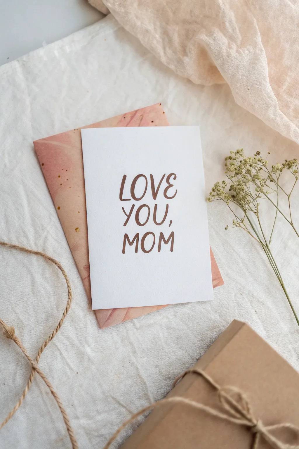
Simple yet deeply touching, this project combines the warmth of hand-lettering with soft, organic textures. You will create a clean, modern card featuring casual brush script paired with a custom-painted watercolor envelope liner for an elegant finish.
Detailed Instructions
Materials
- Heavyweight white cardstock (110lb or watercolor paper)
- Fudenosuke brush pen (hard tip) or small round paintbrush (size 2)
- Brown calligraphy ink or gouache
- Pink and peach watercolor paints
- Standard A2 size envelope (light kraft or cream)
- Decorative paper or additional cardstock for the liner
- Pencil and eraser
- Scissors or kraft knife
- Ruler
- Double-sided tape or glue stick
Step 1: Preparing the Card Base
-
Cut the paper:
Start by cutting your heavyweight white cardstock to a standard A2 card size. You’ll want a rectangle that measures 8.5 by 5.5 inches if folding, or simply cut a flat 4.25 by 5.5-inch panel if you prefer the postcard style shown in the photo. -
Establish guidelines:
Using a ruler and a very light pencil touch, draw three horizontal lines spaced evenly in the center of the card. These will serve as baselines for the words ‘LOVE’, ‘YOU,’, and ‘MOM’. -
Find vertical center:
Mark the vertical center point on each line to help you align the text symmetrically.
Step 2: Lettering the Message
-
Sketch the letters:
Lightly pencil in the words ‘LOVE YOU, MOM’ in a loose, all-caps sans-serif style. Aim for a distinct variation in letter height, giving the text a bouncy, playful rhythm rather than rigid alignment. -
Load your brush:
Dip your fine round brush into brown ink or gouache mixed to a creamy consistency. Alternatively, use a brown brush pen. I find dipping ink gives a slightly more organic texture. -
Letter ‘LOVE’:
Begin with ‘LOVE’. Apply slightly more pressure on the downstrokes to thicken them, and lift up for hairline thin upstrokes. Keep the ‘O’ slightly smaller or higher to enhance the bounce. -
Letter ‘YOU,’:
Move to the second line. Ensure the ‘Y’ tail dips gracefully. Remember to include the comma after ‘YOU’. The brush pressure should remain consistent with the first line. -
Letter ‘MOM’:
Finish with ‘MOM’ on the bottom line. The two ‘M’s act as strong anchors for the design, so keep their vertical strokes relatively straight. -
Erase guidelines:
Allow the ink to dry completely. This is crucial—if the ink is even slightly wet, it will smear. Once dry, gently erase the pencil guidelines.
Clean Lines Pro Tip
If you are nervous about freehand lettering, type the phrase in a font you like, print it out, and hold it against a window to trace onto your cardstock.
Step 3: Creating the Watercolor Accent
-
Prepare the liner paper:
Cut a piece of lighter weight paper slightly smaller than your envelope size. This will be the colorful textural backing visible behind the card. -
Mix your watery wash:
Dilute pink and peach watercolors heavily with water. You want a wash that looks translucent and cloudy, not opaque. -
Paint the abstract background:
Apply the wet paint to the paper in loose, sweeping motions. Let the pink and peach bleed into each other wet-on-wet to create soft gradients. -
Add speckles (optional):
While the wash is still damp, you can flick a tiny bit of darker reddish-brown paint from a stiff brush onto the paper to create subtle speckles, adding texture like in the reference image. -
Dry and flatten:
Let the painted paper dry fully. If it curls, place it under a heavy book overnight to flatten it out. -
Assemble the splash:
If using an envelope, slide this painted sheet inside as a liner and secure with glue. If displaying as a flat lay, simply angle the painted paper behind your white card.
Level Up Your Presentation
Wrap the finished card bundle with natural jute twine and tuck in a sprig of dried gypsophila (baby’s breath) for a fragrant, dimensional touch.
Your mom will cherish this beautiful, handmade token of affection for years to come


Mom’s Favorite Place Landscape
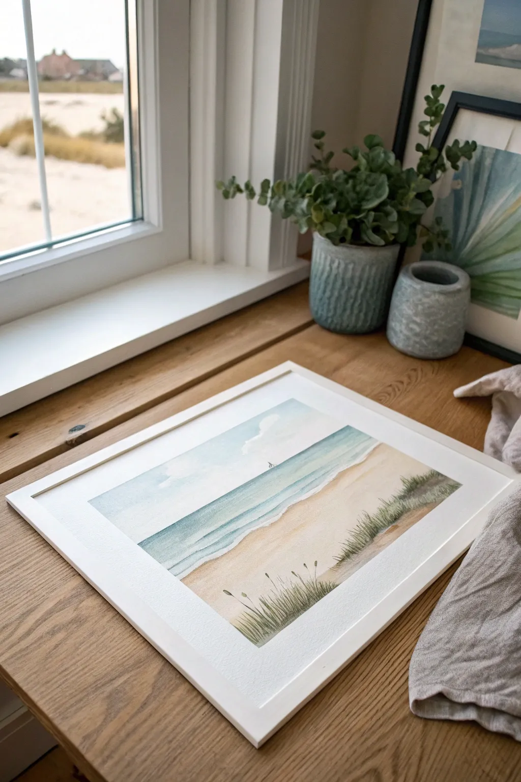
Capture the peace of a quiet beach day with this gentle watercolor landscape, perfect for reminding Mom of her favorite seaside retreat. The soft washes of turquoise and warm sand tones create a calming atmosphere that brings a breath of fresh ocean air into any room.
Step-by-Step Guide
Materials
- Cold press watercolor paper (140lb/300gsm)
- Watercolor paints (Cerulean Blue, Ultramarine, Burnt Sienna, Yellow Ochre, Sap Green)
- Masking fluid (optional)
- Flat wash brush (1-inch)
- Round brushes (sizes 4 and 8)
- Rigger or liner brush for fine grass
- Painter’s tape
- Two jars of water
- Paper towels
- Pencil and kneaded eraser
Step 1: Preparation and Sketching
-
Secure the paper:
Tape your watercolor paper down to a board on all four sides. This prevents buckling when the paper gets wet and creates that crisp, clean white border you see in the final piece. -
Pencil in the horizon:
Lightly sketch a horizontal line about one-third of the way down from the top of the paper. This will separate your sky from the ocean. -
Map the shoreline:
Draw distinct, gently curving lines for the water’s edge. The main shoreline should sweep diagonally from the bottom left upwards toward the right, creating a deeply welcoming perspective. -
Indicate cloud shapes:
Very faintly outline where you want your fluffy white clouds to sit. If you are nervous about maintaining the white paper, you can apply a thin layer of masking fluid here, but sketching lightly works just as well.
Step 2: Painting the Sky and Clouds
-
Wet the sky area:
Using your large flat brush, apply clean water to the sky portion of the paper, carefully avoiding the cloud shapes you sketched. -
Apply the blue wash:
Mix a watery wash of Cerulean Blue. While the paper is still glistening, drop this color into the wet sky area, letting it soften and fade as it nears the horizon line. -
Soften cloud edges:
With a clean, slightly damp brush, gently tickle the edges of your painted sky against the white cloud shapes. I find this creates that dreamy, fluffy look rather than a hard cutout. -
Add subtle shadows:
Mix a tiny touch of Burnt Sienna into your blue to make a soft grey. Paint this lightly along the bottom edge of the clouds to give them volume and dimension.
Muddy Waters?
If your sand color bleeds into the blue ocean, stop immediately. Wait for the blue section to be bone-dry before starting the sand. Patience is key for separation.
Step 3: Creating the Ocean
-
Mix turquoise tones:
Combine Cerulean Blue with a hint of Sap Green to get a lovely sea-glass turquoise. You’ll need a darker version for deeper water and a lighter, more watery mix for the shallows. -
Paint the horizon:
On dry paper (ensure the sky is fully dry first), paint a straight, crisp line along the horizon using the darker turquoise mix and a size 8 round brush. -
Wash down to the shore:
Gradually dilute your paint as you move downward. Switch to the lighter turquoise mix as you approach the shoreline, leaving thin strips of white paper to represent breaking foam. -
Define the waves:
While the ocean wash is still slightly damp, use a stronger concentration of blue to add horizontal streaks. These mimic the motion of rolling waves.
Master the Flick
For natural-looking grass, plant the base of your brush and flick your wrist upward quickly, lifting the brush off the paper at the end for a tapered tip.
Step 4: Sand and Dune Details
-
Wash the sand area:
Mix Yellow Ochre with a dot of Burnt Sienna and plenty of water. Paint the entire beach area, letting the color be slightly richer near the bottom foreground and paler near the water. -
Add wet sand details:
Where the water meets the sand, drop in a slightly darker mix of brown to show wet sand. This creates a realistic transition between land and sea. -
Paint the background grass:
Once the sand is completely dry, mix Sap Green with Burnt Sienna for a muted olive tone. Using a size 4 brush, use upward flicking motions to create the dense patch of dune grass on the right side. -
Create foreground blades:
Switch to your rigger or liner brush. Load it with a darker green-brown mix and paint long, sweeping blades of grass in the immediate foreground, letting them cross over each other naturally. -
Add seed heads:
Dot tiny oval shapes at the tips of a few tall grass blades using a warm brown tone to represent sea oat seed heads. -
Final touches:
If you wish, add a tiny distant sailboat on the horizon with a fine point brush. Remove your tape carefully at a 45-degree angle to reveal the crisp border.
Frame this peaceful scene in white or light wood to complete the airy, coastal aesthetic for your mom
Painted Coffee Mug Just for Mom
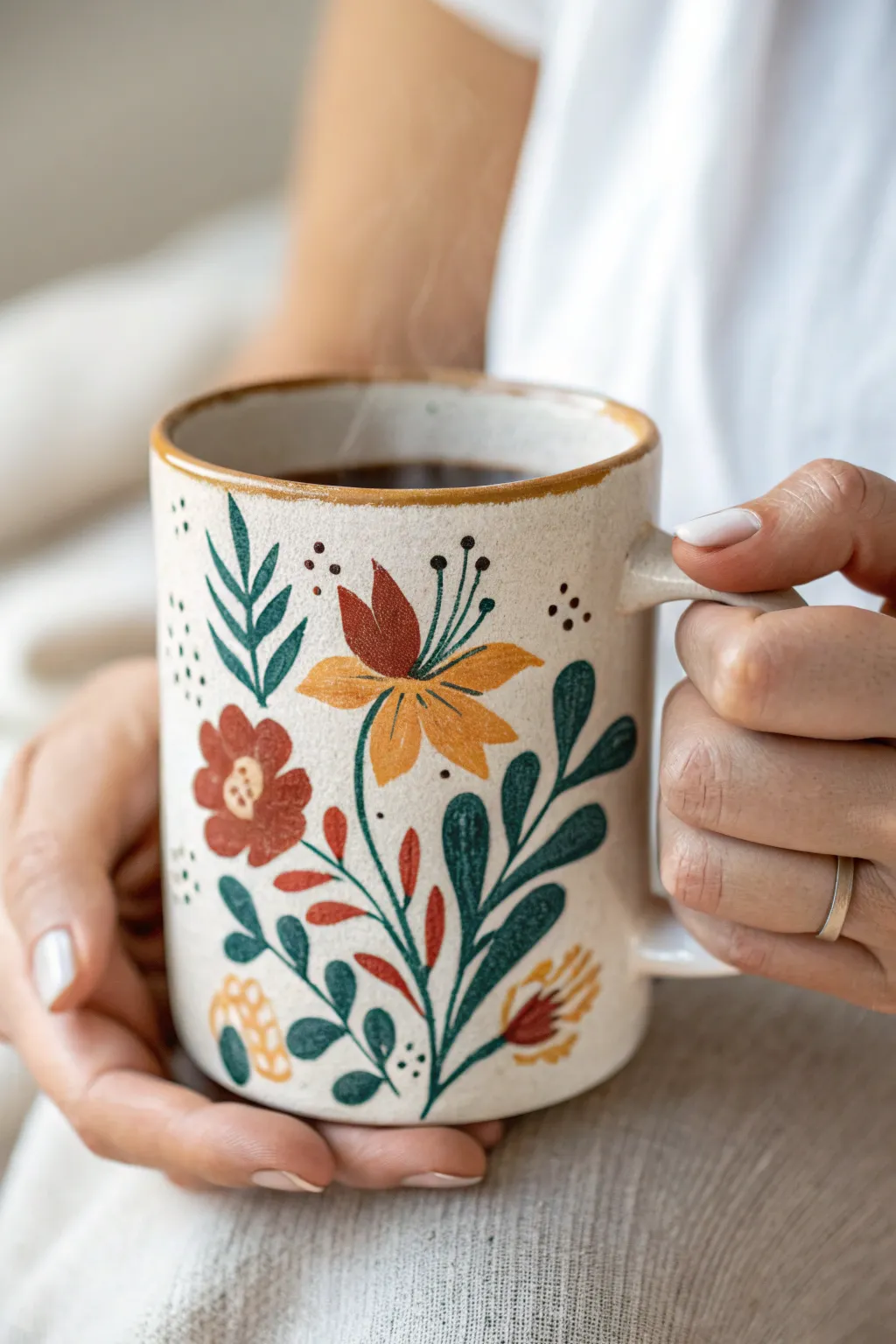
Treat Mom to a cozy, handmade gift with this charming painted mug featuring vintage-inspired botanical motifs. With its warm, earthen color palette and slightly rustic brushwork, this project mimics the look of hand-thrown pottery.
Step-by-Step Guide
Materials
- Plain white or cream ceramic mug (matte finish preferred)
- Ceramic or porcelain paints (rust red, ochre yellow, deep teal, olive green, cream/white, brown)
- Small round brushes (sizes 0, 2, and 4)
- Small liner brush (size 00 or 000)
- Rubbing alcohol and cotton pads
- Palette for mixing
- Oven (for curing)
Step 1: Preparation & Base Tones
-
Clean surface:
Wipe the exterior of your mug thoroughly with rubbing alcohol on a cotton pad. This is crucial as it removes any oils or fingerprints that would prevent the paint from adhering properly. -
Mix base cream:
Since we want a speckled, earthy pottery look, don’t start painting the flowers yet. Mix a small amount of white paint with a tiny drop of brown or ochre to create a warm cream tone. Dab this gently around the surface with a sponge or bristly brush if you want to add texture to a glossy mug. -
Speckle effect:
To achieve that stoneware aesthetic, dip a toothbrush or stiff brush into watered-down brown paint. Run your thumb over the bristles to flick tiny speckles across the mug’s surface. Let this dry completely before moving on to the main design.
Paint Consistency Pro-Tip
For smooth leaves, thin your acrylic enamel slightly with a drop of water. It helps the paint flow off the liner brush for sharper points without globs.
Step 2: Painting the Main Botanicals
-
Central stem:
Mix your deep teal with a touch of olive green. Using your size 2 round brush, paint a curved central stem rising from the bottom of the mug, branching slightly to the right. -
Large leaves:
Using the same teal mix, add large, teardrop-shaped leaves along the right side of the main stem. Press the brush down at the base and lift as you pull outward to create a tapered point. -
Left foliage:
On the left side of the stem, paint smaller, upward-reaching sprigs using a slightly lighter olive green for variety. -
Small filler leaves:
Tuck tiny, rounded teal leaves near the base of the design to balance the weight of the larger upper leaves.
Step 3: Adding the Blooms
-
Main flower petals:
For the prominent flower near the center, use ochre yellow. Paint three distinct, pointed petals radiating outward. Leave a small gap in the center. -
Accenting the flower:
Dip your brush into the rust red paint. Add a second layer of smaller, darker petals nestled behind or slightly overlapping the yellow ones to give the bloom dimension. -
Side posy:
To the left of the main stem, paint a simple round flower shape in rust red. Keep the edges soft and organic rather than perfectly circular. -
Lower buds:
Add small, comma-shaped buds in rust red and ochre near the bottom of the stem, emerging from the greenery.
Level Up: Texture
Mix a tiny pinch of baking soda into your ochre paint. This adds a gritty, matte texture to the flower petals, making them feel like real clay slip.
Step 4: Fine Details & Texture
-
Stamen lines:
Switch to your liner brush (000). Using the deep teal color, paint very thin, delicate lines curving out from the center of the main yellow and red flower. -
Pollen dots:
At the tip of each thin stamen line, place a tiny dot of brown or dark green paint. -
Leaf veins:
I like to use a lighter green or cream color to add quick, single strokes down the center of the largest teal leaves for highlights. -
Floating dots:
Using the back end of a small brush handle dipped in brown paint, add clusters of three to four small dots in the empty spaces around the floral design to fill the negative space. -
Rim finish:
Paint a thin, slightly uneven line of ochre or light brown along the very rim of the mug to mimic the exposed clay edge of handmade pottery.
Step 5: Curing
-
Dry time:
Let the mug sit undisturbed for at least 24 hours to ensure the paint is fully dry. -
Baking:
Place the mug in a cool oven. Turn the heat to 350°F (or per your paint manufacturer’s instructions) and bake for 30 minutes. Turn the oven off and let the mug cool completely inside before removing it.
Wrap this beauty in tissue paper and watch Mom’s face light up when she sees her new favorite morning mug
Painted Bookmark With a Note to Mom
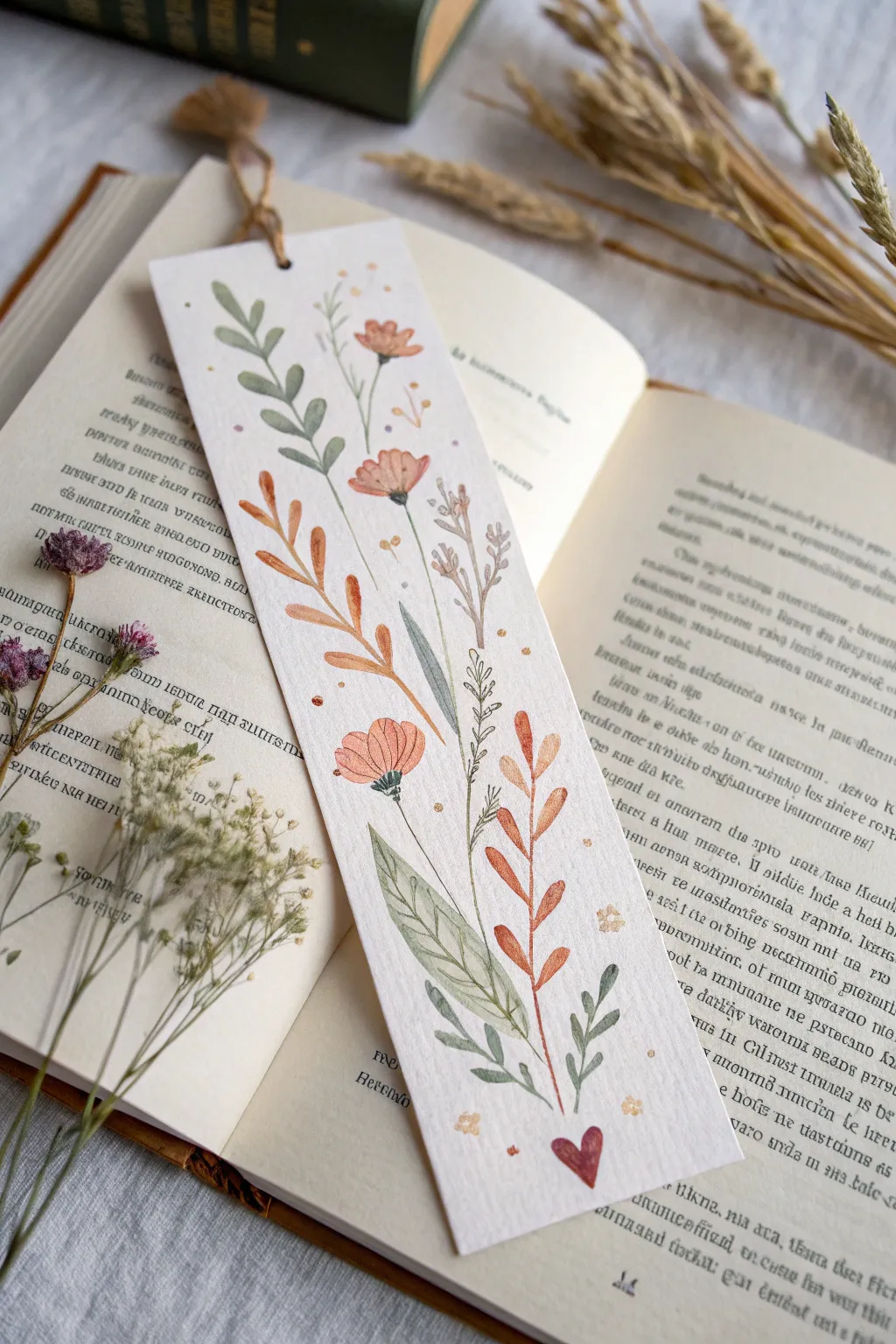
Hand-painting a bookmark transforms a simple slip of paper into a thoughtful keepsake that travels through every story your mom reads. This delicate floral design features loosely painted wildflowers in soft autumnal shades of sage, rust, and dusty pink, finished with a sweet little heart at the bottom.
Detailed Instructions
Materials
- Heavyweight watercolor paper (300gsm cold press is best)
- Watercolor paints (Sage Green, Burnt Sienna/Rust, Dusty Pink, brownish-green)
- Fine round watercolor brush (size 0 or 2)
- Small flat brush (optional, for washes)
- Pencil and eraser
- Hole punch
- Natural twine, ribbon, or jute cord
- Fine-liner pen (optional, if you prefer ink outlines over paint)
Step 1: Preparation and Sketching
-
Cut the paper:
Cut your watercolor paper into a standard bookmark rectangle, approximately 2 inches by 6 or 7 inches. Creating clean, straight edges with a craft knife and ruler gives it a professional feel. -
Plan the composition:
Lightly sketch the flower stems and leaves with a pencil. Aim for an organic vertical flow, where the tallest stems reach from bottom to top, crisscrossing slightly without becoming cluttered. -
Position the elements:
Place the three main flower heads: a larger pink bloom near the middle, a smaller bud near the top, and another bloom slightly lower. Leave space at the very bottom for a small heart.
Keep it Loose
Don’t worry about staying perfectly inside sketches. Off-register color (where paint colors outside the lines) gives this style its charm.
Step 2: Painting the Foliage
-
Mix your greens:
Create a muted sage green color. You can desaturate a bright green by adding a tiny touch of red or brown. -
Paint the top leaves:
Using the tip of your fine brush, paint the teardrop-shaped leaves on the tallest left-side stem. Press down to widen the belly of the leaf and lift up for the point. -
Add contrasting rust foliage:
Mix a warm rust or Burnt Sienna shade. Paint the branch on the left side that has longer, narrower leaves. Let the color vary slightly in transparency for a natural watercolor look. -
Paint the right-side foliage:
Using the same rust color, paint the leafy vertical branch on the right side. Make these leaves slightly fuller and more rounded than the previous ones. -
Create the large bottom leaf:
Mix a very watery, pale green. Paint the large, broad leaf at the base of the design. While it’s still wet, I like to drop in a slightly darker green along the center vein to create soft depth. -
Add background sprigs:
With a very pale brownish-grey, paint faint, delicate sprigs in the background behind the main flowers to add fullness without competing for attention.
Prevent Warp
If your paper curls after painting, let it dry completely, then place it under a heavy book overnight to flatten it out perfectly.
Step 3: Floral Details
-
Paint the flower heads:
Using a dusty pink or coral shade, paint the simple petals of the main flowers. Keep the paint somewhat transparent so the pencil lines (or ink lines later) will show through delicately. -
Define the flower centers:
Once the petals are dry, use a dark green or brown to paint the tiny base (calyx) of each flower where it meets the stem. -
Add delicate details:
Use the very tip of your smallest brush with dark paint to add stamens or tiny lines on the petals for texture. -
The finishing heart:
At the very bottom center, where the stems seem to originate, paint a small, solid heart in a deep red or rust color. -
Sprinkle magic dust:
Dip your smallest brush in yellow or gold paint and gently dab tiny dots around the upper flowers to mimic pollen or magical specks.
Step 4: Finishing Touches
-
Refine the lines:
If you want clearer definition, you can use a very fine waterproof pen or a tiny brush with dark paint to loosely outline some leaves and stems, but keep the lines broken and organic. -
Punch the hole:
Once the painting is completely dry, use a hole punch to create a centered hole at the top of the bookmark. -
Add the tassel:
Loop a piece of natural twine or jute cord through the hole. Tie a knot at the top to secure it, leaving the ends loose for a rustic finish. -
Write a note:
Flip the bookmark over and write a personal message, the date, or a favorite quote for your mom on the back.
Give this lovely bookmark to your mom tucked inside a new book you think she will love
Fingerprint Garden Flowerpot for Mom
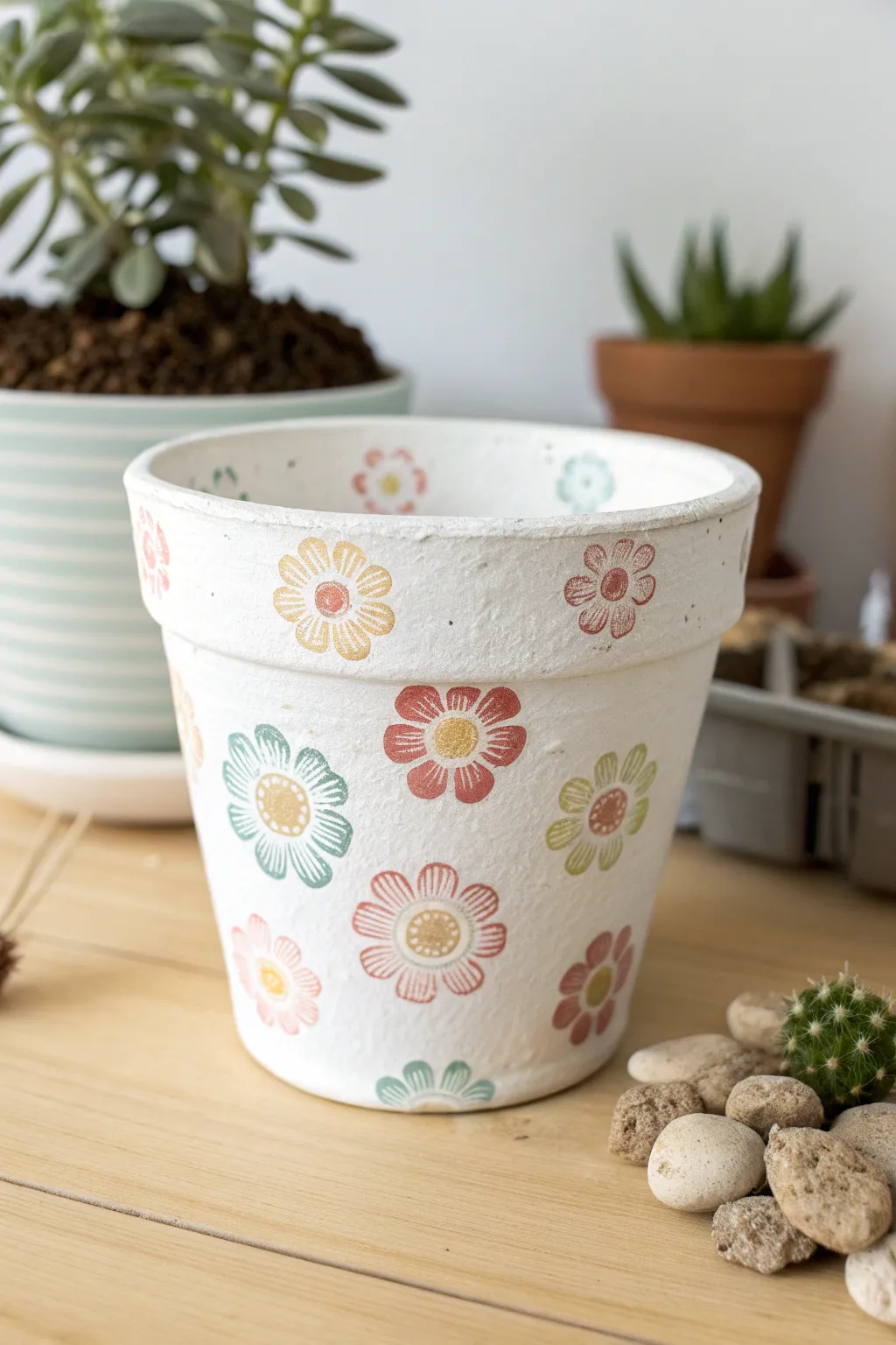
Transform a plain terracotta pot into a blooming garden gift for Mom using the simplest of tools: your fingers and a little paint. The finished result has a charming, handmade rustic feel, featuring colorful daisies scattered across a crisp white background.
Step-by-Step Tutorial
Materials
- Terracotta pot (4-6 inch size)
- White acrylic paint (matte finish)
- Acrylic craft paints in assorted colors (muted yellow, coral, teal, dusty pink)
- Wide flat paintbrush or foam brush
- Gold or metallic Sharpie marker (fine point)
- Small paper plate or palette
- Clear acrylic sealer spray (matte or satin)
- Damp paper towels
Step 1: Preparing the Canvas
-
Clean surface:
Begin by wiping down your terracotta pot with a damp cloth to remove any dust or manufacturing residue. Let it dry completely so the paint adheres properly. -
Base coat application:
Using a wide flat brush or foam brush, apply a coat of white acrylic paint to the entire exterior of the pot. Don’t forget to paint the inner rim down to the soil line for a polished look. -
Drying and recoating:
Allow the first coat to dry for about 15-20 minutes. If the terracotta color is still peeking through, apply a second or third coat until you have a solid, opaque white background. I find that three thin coats are better than one thick, drippy one. -
Final dry:
Let the white base coat cure fully for at least an hour before starting the decoration phase to prevent smudging.
Clean Prints Only
Apply paint thinly to your finger. Too much paint creates a slippery, globby circle rather than a nice textured print.
Step 2: Stamping the Garden
-
Palette setup:
Squeeze dime-sized amounts of your chosen flower petal colors (teal, coral, pink) onto your paper plate. Keep them spaced apart so they don’t mix unintentionally. -
Test prints:
Practice your stamping technique on a piece of scrap paper first. Dip your index finger into the paint, blot off the excess on a paper towel, and press down to create oval petal shapes. -
Creating the first flower:
Choose a spot on the pot and press your painted fingertip down five or six times in a circle to form the petals of your first flower. Leave a small gap in the center for the details later. -
Stamping variation:
Continue creating flowers around the pot, rotating the pot as you go. Vary the angles of the petals slightly to make them look organic and playful. -
Switching colors:
Wipe your finger clean with a damp paper towel before switching to a new color. Add flowers in different hues, spacing them out fairly evenly but creatively. -
Rim details:
Don’t forget the rim! Add smaller flowers or even just single petals along the top band of the pot for extra visual interest. -
Fill gaps:
Step back and look at your composition. If there are large white spaces, add a few more blooms to balance the design. -
Dry completely:
Allow the stamped flowers to dry thoroughly. This is crucial because wet paint will ruin the marker tip in the next step.
Thumbprint Creatures
Turn fingerprints into ladybugs or bees by using red or yellow paint and adding black marker legs and wings.
Step 3: Adding Details
-
Center circles:
Using a gold or metallic marker, draw a small circle in the negative space you left at the center of each flower. -
Petal definition:
Carefully draw thin lines or tiny loops inside the stamped painted petals with the fine-point marker. This gives the ‘fingerprint’ shapes a distinct floral look. -
Adding texture:
In the center gold circles, add tiny dots or a spiral pattern with a darker pen or contrasting paint color to mimic pollen. -
Clean up:
Check for any stray paint marks on the white background and touch them up with a tiny bit of white paint if necessary. -
Sealing:
Take the pot to a well-ventilated area and spray it with a clear acrylic sealer. This protects the paint from water damage when Mom waters her plant.
Now all that is left is to pot a succulent or Mom’s favorite herb to complete this thoughtful gift
Handprint Coaster Set for Mom
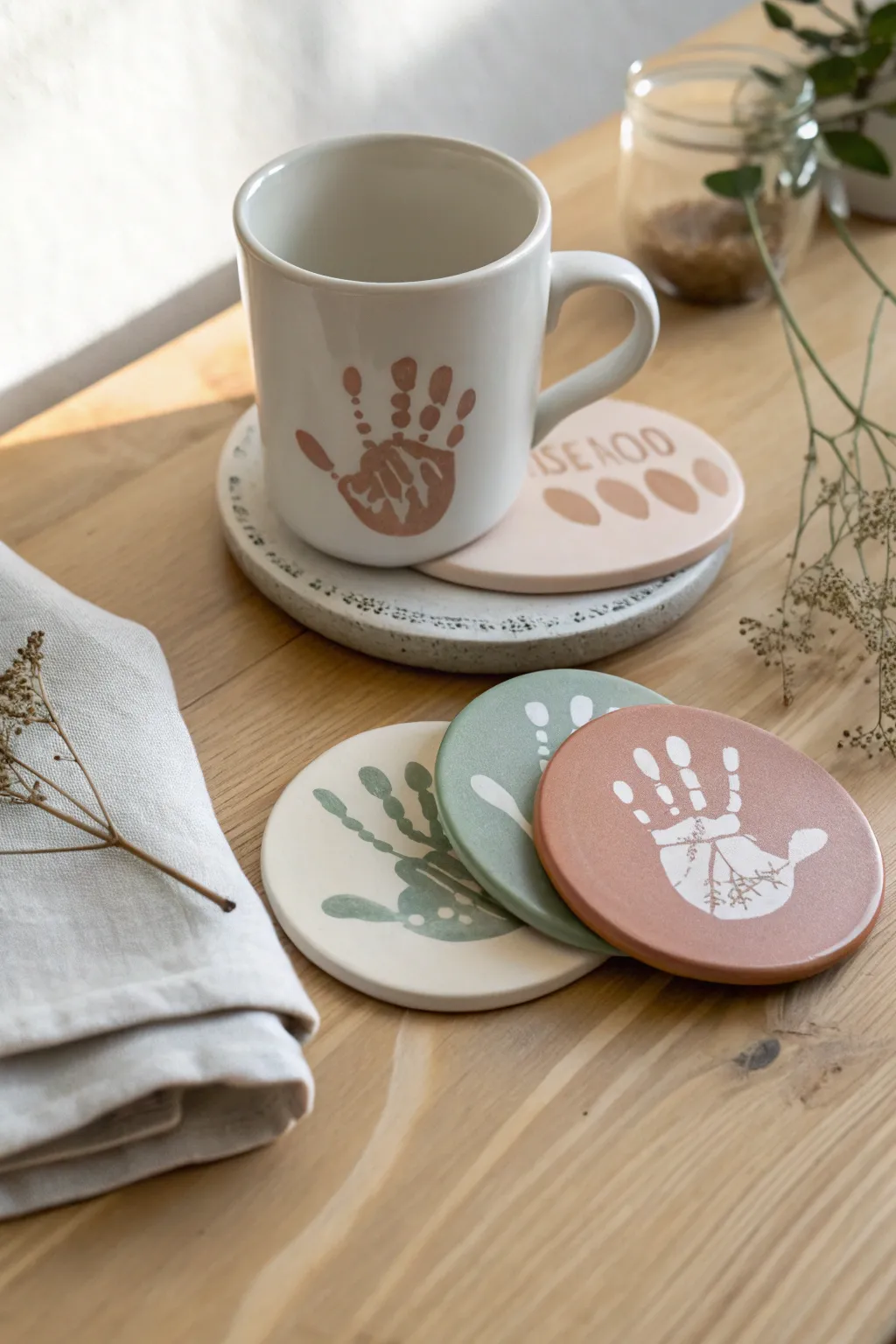
Capture a moment in time with these sophisticated coaster keepsakes featuring delicate handprint designs in muted, earthy tones. The set uses a clever negative-space technique to create a modern, minimalist look perfect for Mom’s coffee table.
Detailed Instructions
Materials
- Round unglazed ceramic bisque coasters (approx. 4 inches)
- White or cream ceramic paint (base coat)
- Acrylic or ceramic paints in terracotta, sage green, and beige
- Adhesive stencil vinyl or contact paper
- Craft knife or stencil cutter
- Small foam pouncers or sponge daubers
- Fine grit sandpaper (optional)
- Matte clear sealant spray
- Pencil
- Transfer tape
Step 1: Preparing the Base
-
Clean the surface:
Wipe down your ceramic coasters with a damp cloth to remove any dust or oils that might prevent the paint from sticking. -
Apply the base color:
For the coaster that will have a dark handprint on a light background, paint the entire surface with your cream or white ceramic paint. Aim for full, opaque coverage. -
Create colored bases:
For the reverse-style coasters (white handprint on colored background), paint one coaster fully in sage green and another in terracotta. -
Let it cure:
Allow these base coats to dry completely. I prefer to let them sit overnight if possible, as applying adhesive stencils to tacky paint will ruin the finish.
Bleeding Lines?
If paint bleeds under the stencil, wait for it to dry fully, then gently scratch away the excess with an X-Acto knife or toothpick for a clean edge.
Step 2: Creating the Stencils
-
Trace the hand:
Have the child spread their fingers comfortably on a piece of paper and trace the outline of their hand. Simplify the shape slightly if needed for a cleaner look. -
Transfer to vinyl:
Place your adhesive vinyl sheet over the drawing and trace the hand shape onto the vinyl backing. -
Cut the positive shape:
Carefully cut out the hand shape using a craft knife. You need two types of stencils here: the ‘positive’ hand shape (the actual hand cutout) and the ‘negative’ space (the vinyl sheet with a hand-shaped hole).
Step 3: Applying the Design
-
Design 1: Colored Hand on White:
Take the ‘negative’ stencil (the sheet with the hole) and apply it firmly to your dry cream-colored coaster. Smooth out any air bubbles along the edges of the fingers. -
Paint the accent Hand:
Lightly load a foam pouncer with terracotta paint. Dab excess paint off onto a paper towel before gently pouncing color into the stencil opening. Less paint prevents bleeding under the vinyl. -
Design 2: White Hand on Color:
For the sage and terracotta coasters, use the ‘positive’ vinyl hand cutouts. Place the sticker directly in the center of the painted coaster, pressing down firmly on all fingertips. -
Seal the edges:
To ensure crisp lines for these reverse designs, quickly paint a thin layer of the base color (sage or terracotta) over the sticker edges first. This seals the stencil. -
Apply the top coat:
Once the sealing layer is dry, you actually have two options: either paint a white layer over the whole coaster (revealing the base color when peeled) or simply leave the sticker as is if you want the hand to be the color of the vinyl material itself. For this look, a painted effect is best. -
Peel carefully:
Remove the vinyl stencils while the final layer of paint is still slightly tacky. Pull at a sharp 45-degree angle to keep the edges crisp.
Level Up: Texture
Mix a tiny pinch of baking soda into your paint before applying the handprint. It creates a ceramic-like texture that makes the print feel raised and authentic.
Step 4: Finishing Touches
-
Clean up imperfections:
If any paint bled under the stencils, use a tiny brush dipped in your base color or a craft knife to gently tidy up the lines. -
Stamp text (optional):
If you want to add text like ‘MOM’ or a name, use small alphabet stamps dipped lightly in paint. Practice on paper first to gauge the pressure needed. -
Sand for distress:
For a rustic, worn look like in the photo, very lightly run fine-grit sandpaper over the edges of the handprint once fully dry. -
Seal the deal:
Spray the coasters with a clear matte acrylic sealant. Apply two light coats rather than one heavy one to avoid drips. -
Add protection:
Stick small felt or cork pads to the bottom of the coasters to prevent them from scratching furniture surfaces.
Wrap these up with a ribbon for a personalized gift that she will cherish with every cup of coffee
Painted Frame for a Mom Photo
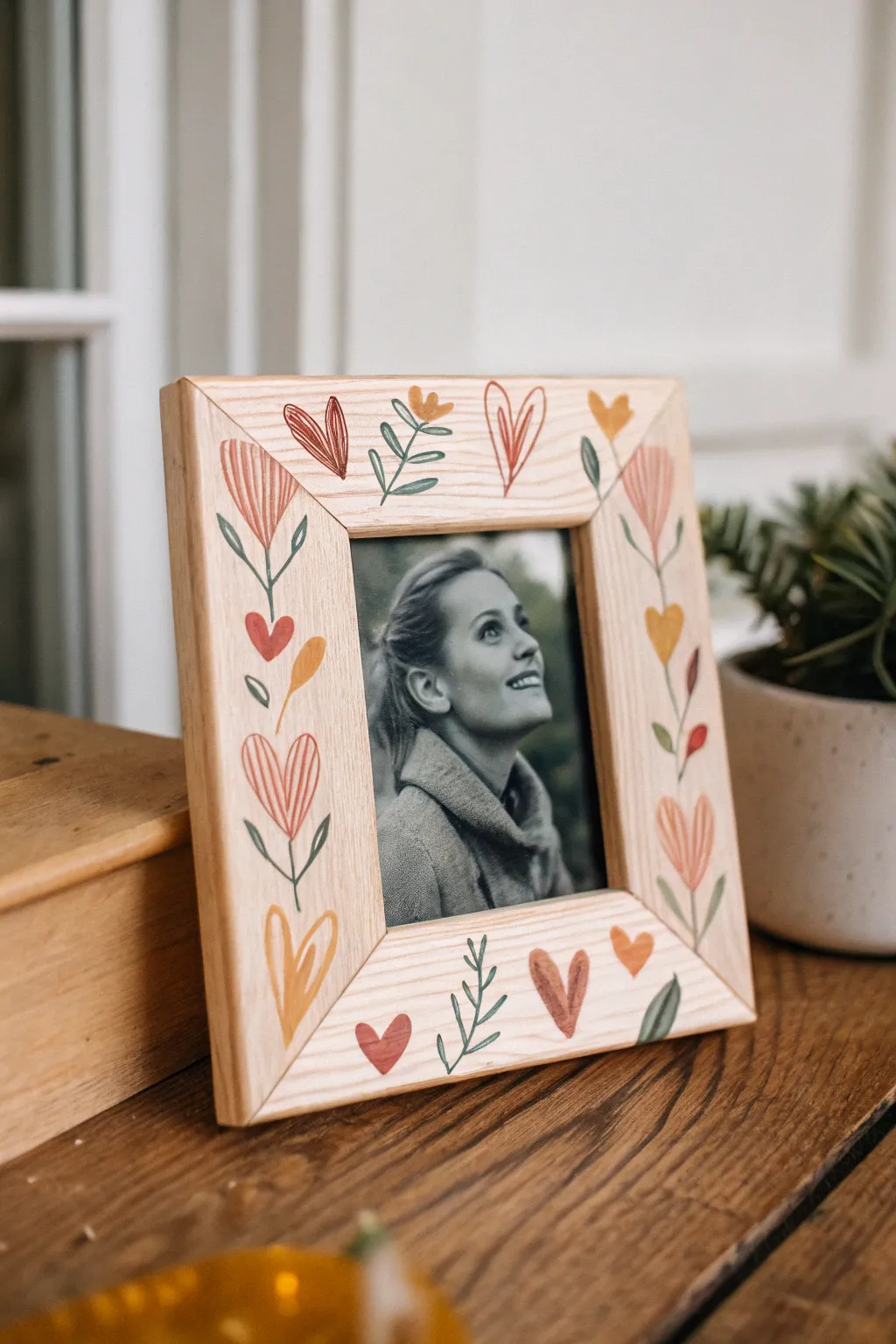
Show your mom some love with this charming hand-painted picture frame, featuring a delightful border of simple hearts, flowers, and vines. The naive, folk-art style makes it approachable for beginners while creating a warm, personalized gift perfect for holding a favorite black-and-white memory.
Step-by-Step Tutorial
Materials
- Unfinished wooden picture frame (light wood like pine or birch)
- Sandpaper (220 grit)
- Acrylic paints: warm red, coral pink, mustard yellow, sage green, and white
- Small round paintbrush (size 2 or 3)
- Fine liner brush (size 0 or 00)
- Pencil and eraser
- Water cup and palette
- Clear matte varnish or sealant spray
Step 1: Preparation & Planning
-
Prep the surface:
Start by lightly sanding your unfinished wooden frame with 220-grit sandpaper. You want the surface to be smooth so your paintbrush glides easily, especially since we aren’t using a base coat. -
Clean the dust:
Wipe away all the sanding dust with a slightly damp cloth or tack cloth. Let the wood dry completely for a few minutes before moving on. -
Remove the backing:
Take out the glass, backing, and any paper inserts from the frame. Set them aside safely so you don’t accidentally get paint on the glass. -
Visualizing the layout:
Look at the frame’s shape. This design works best by anchoring larger elements (like the heart-flowers) in the middle of the sides and using the corners for angled designs, creating a nice flow around the center photo.
Pro Tip: Steady Hands
Rest your pinky finger on a dry part of the frame while painting fine lines. It acts as a stabilizer, preventing shaky vines and helping you paint crisp stems.
Step 2: Painting the Foliage
-
Mix your green:
On your palette, mix a sage green. If your tube green is too bright, tone it down with a tiny dot of red or brown to get that earthy, organic look shown in the photo. -
Drafting the main stems:
Using your small round brush, paint thin, curving stems. Start at the bottom corners and curve upward, and frame the sides with vertical winding lines. Keep the pressure light to maintain thin lines. -
Adding leaves:
along your painted stems, add simple pairs of leaves. Press the belly of the brush down and lift up quickly to create a teardrop leaf shape. Vary the direction so they look natural. -
Corner details:
In the corners, you can add small sprigs of greenery that point inward toward the photo opening, helping to draw the eye to the center.
Level Up: 3D Texture
Use ‘puff paint’ or dimensional fabric paint for the center stripes of the flowers to give the frame a tactile, raised texture that feels special to touch.
Step 3: Adding Blooms & Hearts
-
Painting the tulip shapes:
Using a coral pink or warm red, paint the main flowers. These are essentially tulip shapes or inverted bells. Place a large one on the left and right vertical rails. -
Detailing the tulips:
Once the base color is tacky but not fully dry, I like to take a fine liner brush with a slightly darker red or white to add vertical stripes inside the tulip for texture. -
Adding the hearts:
Paint freehand hearts in the open spaces. Use different sizes—some large ones near the bottom corners, and smaller floating hearts near the top. -
Varying the heart styles:
Paint some hearts as solid shapes using the red or mustard yellow. For others, just paint the outline to keep the design airy and light. -
Mustard accents:
Dip your clean brush into mustard yellow. Add small solid yellow heart-shaped buds at the ends of some of the green stems you painted earlier. -
Adding the wildflower buds:
Paint tiny three-pronged flower shapes (like little crowns) in yellow or orange near the top edge of the frame to fill any gaps.
Step 4: Final Details & Finishing
-
Layering details:
Return to your large tulip flowers. Using the liner brush and your sage green, paint a thin line straight up from the base of the flower to connect it visually to the stem below if there’s a gap. -
Striped heart accents:
Identify a few of your larger heart outlines. Use a very fine brush and a lighter pink or white to add vertical hatching lines inside them, mimicking the style of the tulip flowers. -
Review and refine:
Step back and look at the frame. If a spot looks too empty, add a small single leaf or a tiny dot of color to balance the composition. -
Let it cure:
Allow the acrylic paint to dry completely. This usually takes about 20–30 minutes since we applied thin layers. -
Sealing the wood:
Apply a coat of clear matte varnish or spray sealant. This is crucial to prevent the raw wood from yellowing over time and to protect your artwork from dust. -
Assembly:
Once the varnish is dry to the touch, replace the glass, insert your favorite photo of Mom, and secure the backing.
Now you have a custom, heartwarming frame ready to showcase a cherished memory
Patterned Vase for Mom’s Flowers
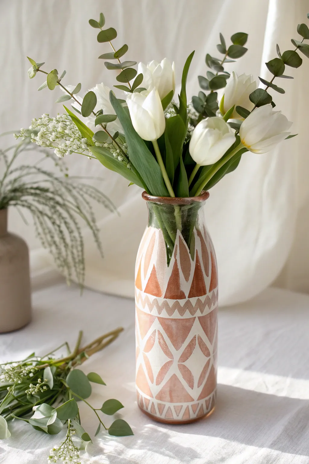
Transform a simple glass bottle into a trendy, boho-chic vase using warm terracotta tones and crisp geometric patterns. The transparent negative space creates a delicate, stained-glass effect that perfectly complements fresh spring blooms.
Step-by-Step
Materials
- Clean glass milk bottle or vase
- Rubbing alcohol
- Cotton pads
- Terra cotta or burnt sienna acrylic paint
- White multi-surface acrylic paint
- Medium flat synthetic brush
- Fine detail liner brush (size 0 or 1)
- Painter’s tape (optional)
- Palette
- Clear acrylic sealer spray (gloss or matte)
Step 1: Preparation and Planning
-
Clean the Glass:
Before painting, wipe the entire exterior surface of your glass bottle with rubbing alcohol and a cotton pad. This removes invisible oils and fingerprints, ensuring the paint adheres properly. -
Outline the Horizontal Bands:
Visualize where your main pattern sections will go. Using your liner brush and white paint, paint two thin, horizontal guide lines around the circumference of the bottle. One line should sit about a third of the way up from the bottom, and the second line just above the middle section.
Clean Lines Hack
If your hand feels shaky, use thin washi tape or painter’s tape to mark off the horizontal bands and triangles before painting. Peel it off while the paint is still slightly wet.
Step 2: Painting the Base Shapes
-
Create the Lower Diamonds:
In the bottom section, use white paint and the liner brush to sketch large diamond outlines. The points should touch the bottom edge of the vase and the lower horizontal guide line you just painted. -
Sketch the Upper Triangles:
Above the top horizontal line, sketch tall, slender triangles pointing upwards. Leave a little space at the very top of the neck clear of paint to keep the design balanced. -
Add Secondary Patterns:
In the middle band (between your two horizontal lines), paint a simple zigzag line that runs all the way around. This separates the diamond section from the triangle section. -
Fill with Terracotta:
Load your medium flat brush with the terracotta paint. Carefully fill in the negative spaces inside your white outlines. For the bottom diamonds, fill the inside of the shape. For the top triangles, fill the inside of the triangle shape. -
Second Coat Application:
Glass can be slippery, so the first coat might look streaky. Once the first layer is dry to the touch (usually 15-20 minutes), apply a second coat of terracotta to make the color opaque and rich.
Rustic Texture Upgrade
Mix a teaspoon of baking soda into your terracotta acrylic paint before applying. This creates a grainy, ceramic-like texture that looks and feels like real pottery.
Step 3: Refining Details
-
Clean Up Edges:
Switch back to your fine liner brush and fresh white paint. Go over the original outlines to sharpen them up, covering any spots where the terracotta paint might have wobbled over the line. -
Add Decorative Dots:
To add texture, dip the non-brush end of your paintbrush into the white paint. Dot the centers of the diamonds or the spaces between the triangles if you want extra detail, though the example keeps it sleek and simple. -
Paint the Rim:
Using the terracotta paint, carefully paint the very top rim of the bottle. This frames the flowers nicely. I like to stabilize my hand by resting my pinky against the neck of the bottle while I rotate it. -
Add Tiny Hatching:
Looking at the bottom band pattern, use the very tip of your liner brush to add small vertical hatch marks along the very bottom edge of the glass, creating a ‘grounded’ look for the pattern. -
Refine the Zigzags:
Return to the middle zigzag band. If the terracotta background looks messy there, paint white triangles into the gaps of the zigzag to make the pattern pop against the clear glass.
Step 4: Finishing Touches
-
Check for Transparency:
Hold the vase up to a light source. If you see any uneven patches in the terracotta paint, dab a little more paint on those specific spots to ensure solid coverage. -
Clean Mistakes:
If any paint ended up where it shouldn’t be, use a damp cotton swab or a toothpick to gently scrape it off the glass while it’s still relatively fresh. -
Cure:
Let the vase sit undisturbed for at least 24 hours. Most multi-surface acrylics need this time to cure fully to the glass surface. -
Seal (Optional):
For extra durability, take the vase outside and spray a light coat of clear acrylic sealer over the painted area. This helps prevent scratches when you wash it later. -
Final Presentation:
Fill with fresh water and arrange your white tulips and eucalyptus stems, ensuring the stems crisscross beautifully inside the clear neck.
Now you have a stunning custom vessel ready to gift to Mom
Family Tree With Mom at the Roots
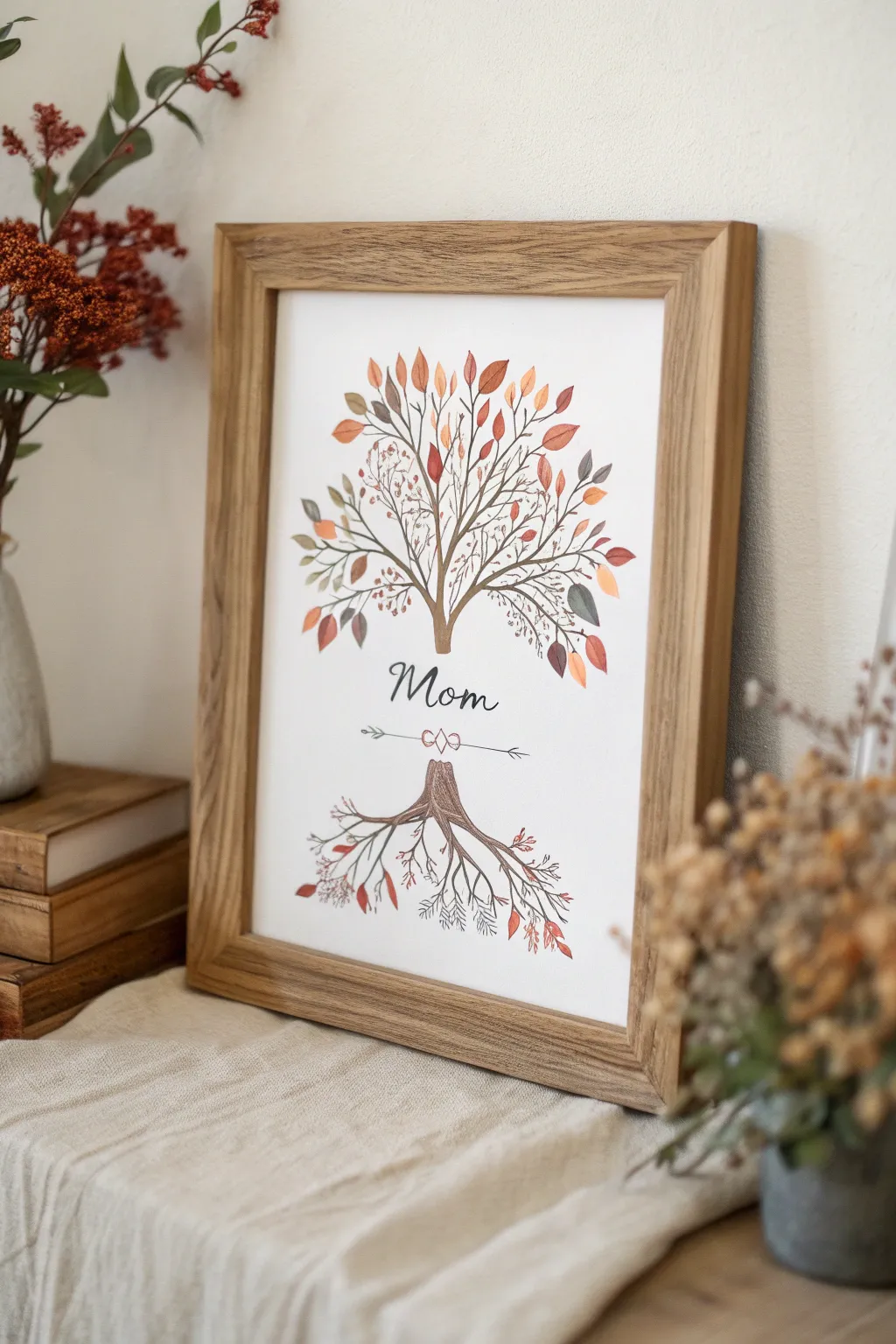
This elegant watercolor and ink illustration reimagines the traditional family tree by placing Mom at the heart of the design, bridging the roots and the flourishing branches above. The finished piece features a warm, autumnal palette perfect for a cozy home gift.
How-To Guide
Materials
- Hot press watercolor paper (8×10 or A4)
- Fine liner pens (sizes 005, 01, and 03 in brown and black)
- Watercolor paint set (focus on burnt sienna, sepia, ochre, rust red, olive green)
- Round watercolor brushes (size 2 and 4)
- Pencil (HB or H)
- Kneaded eraser
- Ruler
- Wooden frame (oak or light wood finish)
Step 1: Sketching the Layout
-
Mark the center:
Begin by lightly marking the vertical center of your paper with a pencil. This will guide the symmetrical feel of the composition. -
Define the sections:
Divide the vertical space into three zones: the top half for the canopy, a middle gap of about 2 inches for the text, and the bottom quarter for the root system. -
Draft the trunk and roots:
Lightly sketch a short, sturdy trunk base in the top zone that splits into many upward-reaching branches. Mirror this in the bottom zone with a central root system that fans downward. -
Sketch the text:
In the open middle section, lightly letter the word ‘Mom’ in a flowing script font. Below it, draw a horizontal arrow line with an infinity loop or heart knot in the center.
Step 2: Inking the Structure
-
Outline the main trunk:
Using a 03 brown fine liner, carefully trace over your pencil lines for the main trunk and the thickest part of the roots. Keep your lines slightly shaky or organic to mimic real bark texture. -
Draw primary branches:
From the trunk, extend 5-7 main branches upwards. Do the same for the roots, extending major roots downwards. Taper the lines so they get thinner as they move away from the center. -
Add twig details:
Switch to a delicate 005 brown pen. Draw lots of tiny, spindly twigs branching off the main limes. I find that addind little ‘Y’ shapes creates a natural, bushy look. -
Lettering:
Use a 03 or 05 black pen for the word ‘Mom.’ Use faux-calligraphy by thickening the downstrokes (any time your pen moves downward) to give it weight and elegance. -
Decorative arrow:
Trace the arrow and heart knot below the text with a 01 black pen. Keep these lines crisp and clean.
Bleeding Lines?
If ink runs when you paint, ensure your pens are waterproof (like Pigma Microns). If not, reverse the steps: paint the leaves first, let it dry completely, and then add the ink lines on top.
Step 3: Watercolor Application
-
Paint the trunk:
Dilute some sepia or light brown watercolor. Paint the trunk and thick roots, staying roughly within the inked lines but allowing for a little looseness. -
Mix autumn colors:
Prepare a palette of fall shades: reddish-orange, mustard yellow, muted olive, and rusty brown. Water them down significantly so they are transparent. -
Paint large leaves first:
Using a size 4 brush, paint distinctive leaf shapes (ovals and teardrops) scattered throughout the upper branches. Vary the colors, placing a red leaf next to a yellow one for contrast. -
Add delicate filler foliage:
Switch to a size 2 brush. Dab tiny clusters of dots or small dashes in lighter colors near the ends of the finest twigs to represent buds or smaller leaves. -
Emphasize the roots:
Mirror the top process on the bottom roots, but use slightly fewer leaves. Keep the colors earthy—more browns and muted reds—to suggest they are grounded. -
Create depth:
Once the first layer of leaves is dry, go back in and add a second, slightly darker layer of leaves behind the first ones to create volume in the tree.
Personalize the Roots
For a thoughtful twist, write the names of children or grandchildren along the branches in tiny script, or hide initials inside the leaves for Mom to find.
Step 4: Finishing Touches
-
Erase pencil marks:
Wait until the paint is bone dry—if the paper feels cool to the touch, it’s still damp. Gently erase all visible pencil sketches with the kneaded eraser. -
Enhance text details:
If the black lettering looks a bit faded against the white paper, go over the downstrokes one more time to ensure a rich, deep black. -
Connect floating leaves:
Use your 005 brown pen to draw tiny stems connecting any painted leaves that look like they are floating in space back to a branch. -
Framing:
Place the artwork into a light wood or oak frame to complement the organic, earthy tones of the painting.
Now you have a deeply personal piece of art ready to be wrapped and gifted.
Soundwave I Love You Mom Painting
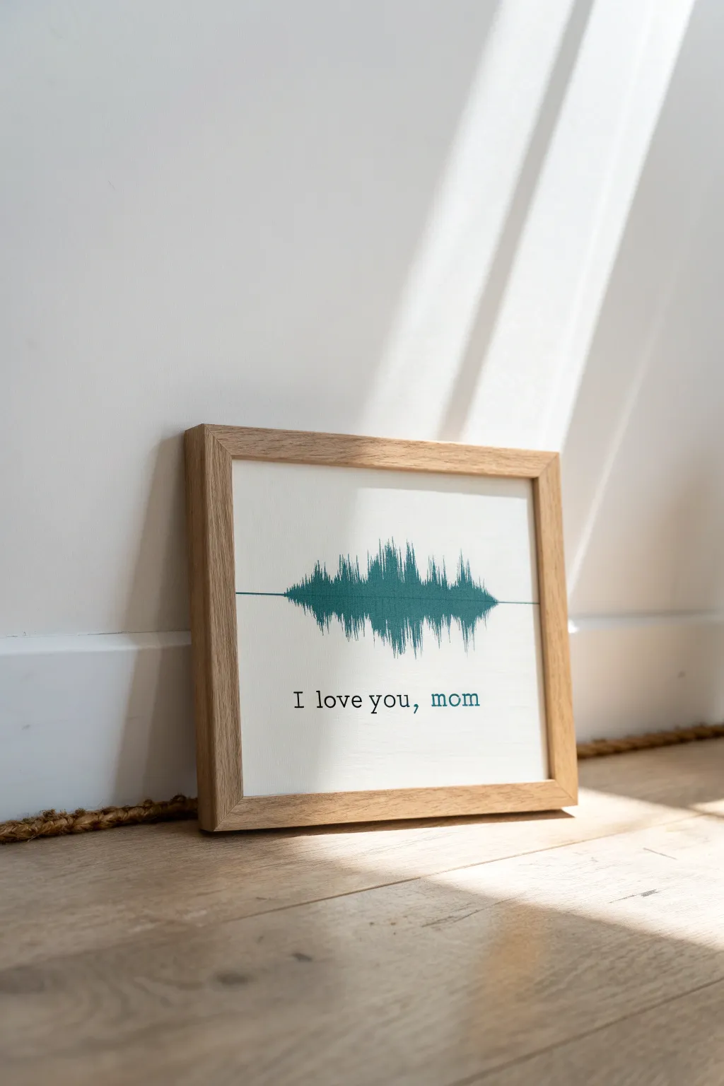
Convert a spoken “I love you” into a striking piece of modern decor that doubles as a sentimental keepsake. This project replicates a digital soundwave pattern in teal acrylic paint on canvas, creating a personalized visual representation of your voice.
Step-by-Step Tutorial
Materials
- Square stretched canvas (10×10 or 12×12 inches)
- Light wood floating frame to fit canvas size
- Recording device (smartphone)
- Computer with printer
- Soundwave generator software (free online tools work well)
- Graphite transfer paper
- Painter’s tape
- Fine liner paintbrush (size 00 or 0)
- Flat brush (small, size 2 or 4)
- Teal or deep turquoise acrylic paint
- Black fine-tip paint pen or permanent marker
- Pencil
- Ruler
Step 1: Generating the Wave
-
Record your message:
Use your smartphone’s voice memo app to record yourself saying “I love you, Mom.” Speak clearly and aim for a recording length of about 2-3 seconds for the best visual shape. -
Create the visual:
Upload your audio file to a free online soundwave generator. These tools will convert the audio peaks into a printable graphic. -
Adjust the design:
Resize the generated image so it fits comfortably within the width of your chosen canvas, leaving about 2 inches of white space on either side. -
Print the template:
Print your soundwave pattern onto standard paper. It doesn’t need to be in color, as this is just for tracing.
Step 2: Transferring and Painting
-
Prepare the canvas:
Wipe down your canvas to remove any dust. If the canvas texture is very rough, you might want to apply a layer of gesso first for a smoother painting surface, though the raw texture works fine here too. -
Find the center:
Use a ruler to lightly mark the horizontal center line of the canvas in pencil. This will keep your soundwave straight. -
Position the transfer paper:
Place a sheet of graphite transfer paper, dark side down, on top of the canvas. -
Secure the template:
Tape your printed soundwave template on top of the transfer paper, aligning the center of the wave with your pencil mark. -
Trace the outline:
Using a pencil or ballpoint pen, firming trace the outline of the entire soundwave graph. Don’t forget to trace the central horizontal line that runs through the peaks. -
Reveal the guide:
Remove the paper and tape to reveal the transferred graphite lines on your canvas. If any lines are faint, lightly reinforce them with a pencil. -
Paint the center line:
Load your fine liner brush with the teal paint. Carefully paint the thin horizontal line that runs through the center of the wave first to establish your anchor. -
Fill the vertical peaks:
Switch to your small flat brush or stick with the liner depending on the thickness of the bars. Here I prefer to work from left to right, painting each vertical bar of the soundwave carefully. -
Refine the edges:
Go back with the smallest brush to sharpen the tips of the soundwave peaks. Crisp edges are essential for that digital look. -
Let the paint cure:
Allow the teal paint to dry completely. This usually takes about 20-30 minutes for thin acrylic layers.
Clean Lines Only
If your hand shakes while painting the thin soundwave lines, use a ruler as a bridge. Rest your hand on the ruler (elevated slightly above wet paint) to stabilize your stroke.
Step 3: Adding Text and Framing
-
Stencil the text:
Decide on your text placement below the wave. You can use a stencil or simply write it out lightly in pencil first to ensure it is centered. -
Ink the letters:
Use a black fine-tip paint pen to trace over your lettering. A typewriter-style serif font adds a classic touch to the modern wave. -
Color the keyword:
For the word “mom,” switch back to your teal paint and a fine brush, or use a teal paint marker to tie the text color to the artwork. -
Erase guide lines:
Once all paint and ink are strictly dry, gently erase any visible graphite transfer lines or pencil marks. -
Frame the piece:
Place the finished canvas into a light wood floating frame to match the clean, Scandinavian aesthetic of the inspiration image.
Interactive Art
Print a QR code linking to the actual audio file you recorded. Glue it to the back of the canvas so Mom can scan it and hear your voice anytime.
Wrap this meaningful gift with a simple bow and get ready to see her smile when she hears the story behind the shape
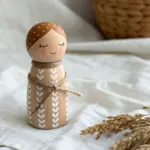

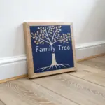
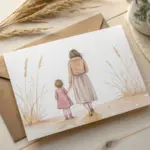
Have a question or want to share your own experience? I'd love to hear from you in the comments below!