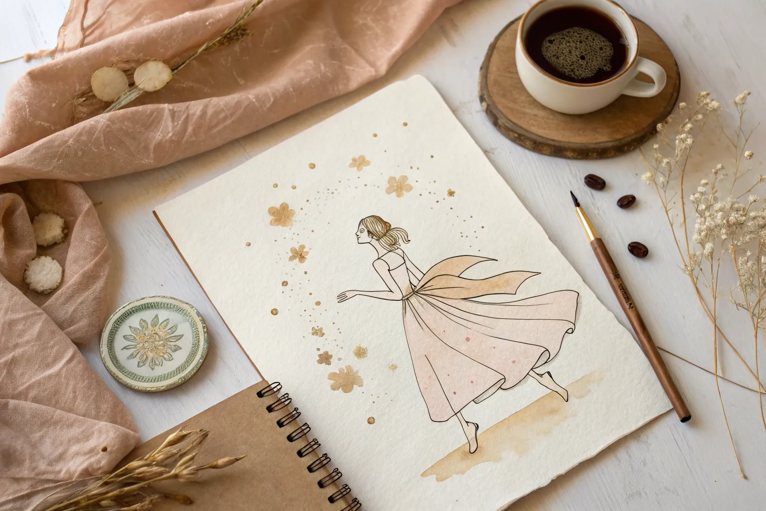
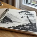
Spill art is one of my favorite ways to turn an “oops” moment into instant inspiration—because the spill shape gives you a starting point before your brain can overthink it. Grab some paper, let a little liquid chaos happen, and then riff on what you see until the stain becomes a finished drawing.
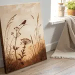
Tea Stain Botanical Sprigs
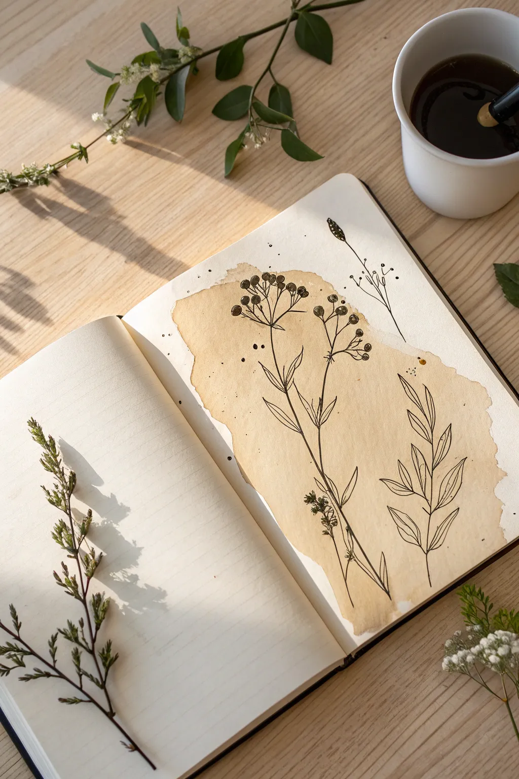
Embrace the beauty of accidental imperfecion with this rustic art project. By turning a simple coffee spill into the backdrop for delicate ink flora, you’ll create a sketchbook page that feels both vintage and organic.
Step-by-Step Guide
Materials
- Sketchbook with thick paper (mixed media or watercolor paper preferred)
- Strongly brewed coffee or tea (cooled)
- Small paintbrush or spoon
- Fine liner pens (0.1mm, 0.3mm, and 0.5mm)
- Pencil and eraser
- Paper towels
- Real plant sprigs (optional, for reference)
Step 1: Creating the Stain
-
Brew and Cool:
Brew a very strong cup of coffee or dark tea. The darker the liquid, the richer your background stain will be. Let it cool completely to avoid warping the paper unnecessarily. -
Protect Your Pages:
Place a piece of scrap paper or a plastic sheet underneath the page you are working on to prevent the liquid from bleeding through to the next sheet. -
Spill the Liquid:
Using a spoon or a brush, gently deposit a puddle of coffee onto the page. You want an organic, irregular shape, so don’t try to paint a perfect circle. Let the liquid pool naturally. -
Create Bloom Edges:
For that distinctive darker edge, let the puddle sit undisturbed for the drying process. As water evaporates, the pigment naturally migrates to the perimeter. -
Add Splatters:
Dip your brush or spoon back into the coffee and flick a few tiny droplets around the main puddle. These little satellite spots add character and texture. -
Dry Completely:
Allow the paper to dry fully. This is crucial—drawing on damp paper will cause your ink to bleed and ruin the crisp lines. I usually let it sit overnight to be safe.
Paper Buckling?
If your dried page is wavy from the liquid, sandwich it between two clean sheets of paper and place a heavy book on top overnight to flatten it out.
Step 2: Pencil Draft
-
Observe Your Subject:
Find a reference photo of wildflowers or use a real sprig like the one shown on the left page. Look for simple shapes: long stems, small oval leaves, and clustered berries. -
Draft the Main Stem:
Lightly sketch a central, slightly curved line rising through the middle of the stain. Let the drawing interact with the stain’s shape, perhaps following a curve of the coffee spill. -
Add Branching Lines:
Draw fainter lines branching off the main stem. Keep them thin and somewhat angular to mimic the natural growth of dried wildflowers. -
Position the Elements:
Sketch small circles for the berry clusters at the top and simple almond shapes for the leaves lower down. Don’t press too hard; you want these lines to be easily erasable.
Add Metallic Accents
Once the black ink is dry, use a gold gel pen or metallic watercolor to highlight the berries or leaf veins for a subtle, elegant shimmer.
Step 3: Inking the Botanicals
-
Outline the Stems:
Using a 0.3mm fine liner, trace over your pencil stems. Keep your hand loose; a slightly shaky line can actually look more natural and woody than a perfectly straight ruler line. -
Detail the Berries:
Switch to a 0.5mm pen to outline the small berries at the top. Fill some in solid black for contrast, and leave others merely outlined or with tiny dots inside for texture. -
Draw the Leaves:
Use the 0.1mm pen for the leaves to keep them delicate. drew the veins with a very light touch, starting from the base of the leaf and flicking outward. -
Add a Second Sprig:
To balance the composition, draw a different type of plant on the side, perhaps just leaves without berries. Ensure the lines overlap the edge of the coffee stain to integrate the art with the background. -
Incorporate Tiny Details:
Add very small dots or stippling near the base of the leaves and where stems join. This adds depth and suggests shadow without needing complex shading. -
Ink the Satellite Elements:
If you have stray coffee splatters, turn them into loose seeds or tiny floating pollen specks by adding a minuscule dot or line near them.
Step 4: Finishing Touches
-
Erase Sketches:
Once the ink is 100% dry (give it at least 15 minutes), gently erase all visible pencil marks. Be careful not to scrub the texture of the dried coffee stain too hard. -
Evaluate Contrast:
Step back and look at your drawing. If the coffee stain is very dark in some spots, go over your lines with the 0.5mm pen to ensure the drawing stands out clearly against the background.
Now you have a sketchbook page that beautifully merges accidental art with deliberate design, perfect for capturing the quiet mood of a coffee break.

Watercolor Puddle Mini Landscapes
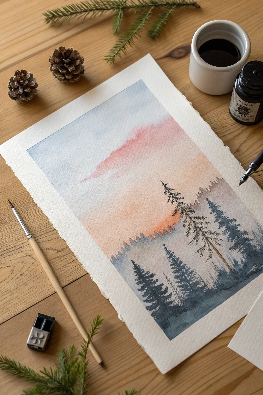
Capture the serene beauty of a twilight forest with this delicate watercolor and ink landscape. By combining soft watercolor washes for the sky with crisp ink detailing for the trees, you’ll create a striking sense of depth and atmosphere.
Step-by-Step Tutorial
Materials
- Cold press watercolor paper (deckled edge optional)
- Watercolor paints (Indigo, Payne’s Grey, Rose Madder, Burnt Sienna)
- Round watercolor brush (size 4 or 6)
- Black waterproof fine liner pen (0.1 or 0.3mm)
- Dip pen and black ink (optional, for organic lines)
- Masking tape
- Clean water
- Paper towels
Step 1: Setting the Sky
-
Tape the Edges:
Secure your paper to a flat surface using masking tape. This creates a clean border around your artwork and prevents the paper from buckling when wet. -
Wet on Wet Base:
With a clean brush, apply a gentle layer of clean water across the entire sky area, stopping about two-thirds down the page where the tree line will begin. -
Applying the Blue:
Load your brush with a watery mix of Indigo or a cool blue. Touch the upper left corner and let the color bleed diagonally downward towards the center, keeping it very faint. -
Adding the Warmth:
While the paper is still damp, mix a soft Rose Madder or pastel pink. Apply this starting from the center and moving diagonally down towards the right, creating a cloud-like drift that blends gently with the blue edge. -
Creating the Glow:
Near the horizon line (just above where your trees will go), drop in a hint of Burnt Sienna or warm orange to simulate the last light of the sun. Let this layer dry completely.
Bleeding Lines?
If your ink bleeds into the paint, the paper wasn’t fully dry yet. Wait longer or use a hairdryer on a low, cool setting before inking the trees.
Step 2: Layering the Background
-
First Mountain Layer:
Mix a very pale wash of Indigo and Payne’s Grey. Paint a jagged, uneven silhouette for the distant mountains. Keep this layer very transparent to push it into the background. -
Soft Background Trees:
While the mountain shape is damp but not soaking, use the tip of your brush to dot in small vertical shapes along the ridge to suggest distant treetops. -
Second Layer Intensity:
Once the first layer is dry, mix a slightly darker, more saturated version of your grey-blue. Paint a second range of hills or treeline slightly lower than the first to build depth. -
Adding Texture:
On this middle layer, dab your brush vertically while the paint is wet to create the illusion of a dense pine forest canopy. Let everything dry bone-dry before the next phase.
Step 3: Foreground and Details
-
Foreground Giants:
Switch to a darker, more concentrated mix of Indigo and a touch of green. Paint large, looming pine tree shapes on the bottom right and left, focusing on distinct branches rather than a block of color. -
Ink Outline – The Trunk:
Using your fine liner or dip pen, draw a thin, vertical line for the main trunk of the focal tree on the right side. Let the line break naturally; it doesn’t need to be perfectly straight. -
Ink Details – Branches:
Scribble quick, jagged lines extending outward from the trunk to form branches. Keep the strokes loose and downward-sloping to mimic the weight of pine boughs. -
Texture Integration:
Add tiny ink stippling or hatching marks at the base of the trees to ground them into the landscape and add shadow. -
Final Wash:
Run a very watery, dark wash along the absolute bottom edge of the paper to unify the foreground trees and anchor the composition. -
The Reveal:
Slowly peel away the masking tape at a 45-degree angle to reveal your crisp, clean borders.
Pro Tip: Atmospheric Haze
Lift a little pigment from the bottom of your distant tree layers with a thirsty brush or paper towel while wet. This mimics mist sitting in the valley.
Step back and admire the tranquil atmosphere of your misty pine forest

Splatter Starburst Idea Bursts
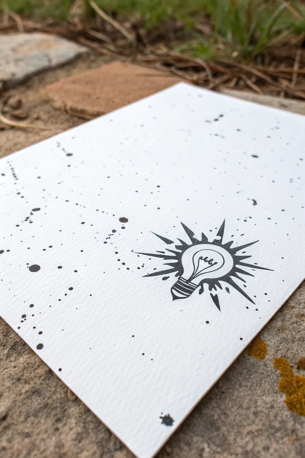
Capture the chaotic energy of a new idea with this striking black and white design. By combining controlled illustration with wild, random splatters, you create a dynamic contrast between the messy process of brainstorming and that brilliant moment of clarity.
How-To Guide
Materials
- Heavyweight watercolor paper or mixed media cardstock (white)
- Black India ink or liquid watercolor
- Fine liner pen (black, waterproof, size 05 or 08)
- Stiff bristle brush or toothbrush (for splattering)
- Pencil (HB)
- Eraser
- Paper towels
- Ruler (optional)
- Masking fluid (optional but recommended)
Step 1: Planning the Spark
-
Paper selection:
Begin with a sheet of high-quality, cold-press watercolor paper. The texture adds a wonderful dimension to the ink splatters later on. -
Sketch placement:
Lightly sketch the position of your lightbulb in the lower right quadrant of the paper. Avoid centering it perfectly; an off-center placement creates a more modern, dynamic composition. -
Draft the bulb shape:
Draw the classic pear shape of the bulb. Keep the lines simple and iconic rather than hyper-realistic. -
Add the filament:
Sketch a looping filament inside the bulb. A simple ‘m’ shape or a spiral works well to suggest the glowing wire. -
Base detailing:
Draw the threaded metal base of the bulb using a series of stacked, curved rectangles and a small point at the very bottom.
Ink Bleeding?
If your ink splatters are spider-webbing into the paper fibers, your mix is too watery or the paper quality is too low. Try using undiluted India ink on heavier 140lb paper.
Step 2: Inking the Illustration
-
Outline the drawing:
Using your waterproof fine liner, carefully trace over your pencil sketch. Make sure your lines are confident and solid. -
Thicken the outer lines:
Go back over the outer perimeter of the bulb and the base to give it a slightly heavier line weight, helping it stand out against the busy background to come. -
Draw the rays:
Draw sharp, triangular spikes radiating outward from the bulb. Vary their lengths and widths to create an explosive ‘burst’ effect rather than a uniform sun. -
Fill the rays:
Depending on your preference, you can leave the rays as outlines or fill them in partially. The example uses open outlines, which keeps the design feeling light. -
Prepare for splatter:
Erase all pencil marks gently once the ink is completely dry to prevent smudging. -
Protect the bulb:
If you want the inside of the bulb to remain pristine white, paint a thin layer of masking fluid over the bulb shape and let it dry. Alternatively, you can just cut a quick paper mask to hold over it while splattering.
Step 3: The Splatter Effect
-
Prepare the workspace:
Move to an outdoor area or cover your table extensively with newspaper. This part gets messy. -
Load the brush:
Dip a stiff-bristled brush or an old toothbrush into your black India ink. Shake off any huge drips before moving to the paper. -
Test the consistency:
Flick the bristles with your thumb over a scrap piece of paper first. You want a fine mist mixed with small distinct droplets, not large puddles. -
Directional splattering:
Hold the brush near the top left corner of the paper and flick toward the lightbulb. This creates a sense of movement, as if the ‘ideas’ are rushing toward the light. -
Layering density:
Create a denser cluster of dots in the corner and let them fade out as they get closer to the bulb. -
Add variety:
Dip a larger round brush in ink and tap the handle against a stick held over the paper to create a few larger, decorative drops among the fine mist. -
Remove masking:
Wait until the ink is bone dry—black ink takes longer than watercolor. If you used masking fluid, gently rub it away with your finger or a rubber cement pickup. -
Final touch-ups:
If the splatters look too disconnected, use your fine liner to add a few tiny dots manually near the bulb to bridge any gaps seamlessly.
Pro Tip: Masking Magic
Cut a sticky note into the shape of the lightbulb and stick it over your drawing before splattering. It seals edges better than a loose paper shield held by hand.
Now you have a brilliantly chaotic piece of art that perfectly illustrates the flash of inspiration

Spill-Only Shadows for Objects
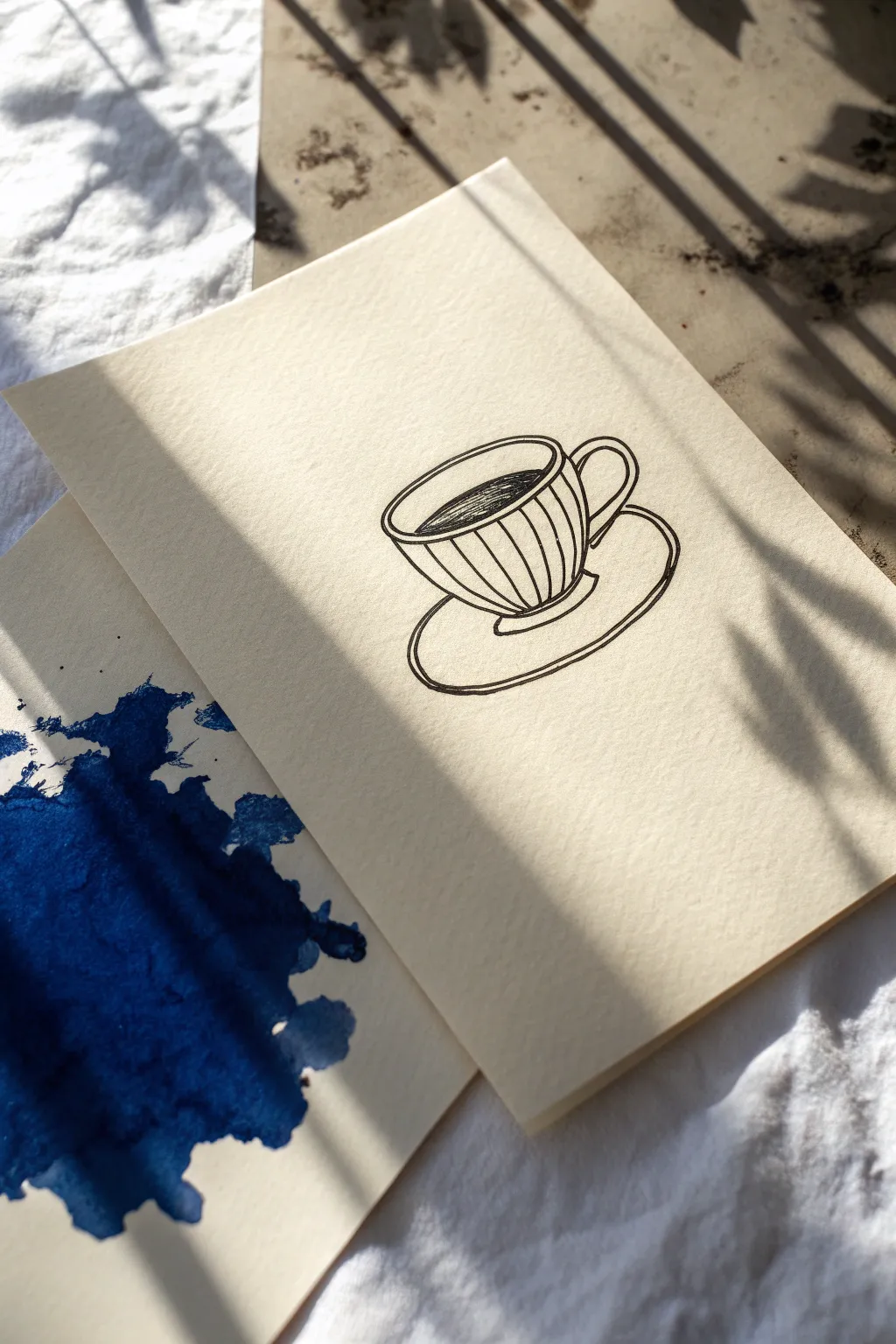
This minimalist project plays with negative space and suggestion by pairing a vibrant, abstract ink spill with a delicate line drawing. The result is a clever visual trick where the chaotic splash acts as a dramatic, colorful shadow for the serene coffee cup sketch.
Step-by-Step Guide
Materials
- Heavyweight watercolor paper or mixed media cardstock
- Deep blue watercolor paint or liquid ink
- Medium round paintbrush (size 6 or 8)
- Black fine-liner pen (0.3mm or 0.5mm)
- Pencil and eraser
- Paper towels
- Water cup
Step 1: Creating the Spill Shadow
-
Prepare your workspace:
Lay down some protective scrap paper or a craft mat, as liquid ink and watercolor can travel unexpectedly. -
Mix your pigment:
Load your brush heavily with deep blue watercolor or use liquid ink directly. You want a high concentration of pigment for a bold, saturated look rather than a wash. -
Drop the ink:
On the bottom sheet of watercolor paper, drop a generous puddle of your blue medium near the center-left area. -
Encourage the spread:
Tilt the paper slightly or use the handle of your brush to drag the ink outward in random directions. The goal is an organic, uneven shape. -
Add splatter details:
Flick your brush or tap it against your finger over the main puddle to create tiny satellite droplets and splatters around the edges. -
Let it puddle:
Allow the darker areas of the pigment to pool naturally. This creates that lovely variation in opacity when it dries. -
Dry completely:
Set this sheet aside to dry fully. It must be bone dry before you stack anything on top to avoid smearing.
Natural Texture
Don’t blot the wet ink puddle. Letting it dry naturally creates ‘coffee ring’ edges that add crucial visual interest.
Step 2: Sketching the Object
-
Position the top sheet:
Take your second sheet of paper and overlap it onto the dry spill sheet. Position it so the edge cuts across the blue spill, making the spill look like a shadow cast by the paper. -
Visualize the placement:
Determine where the teacup should sit on the top sheet so that the blue spill below feels like its shadow. -
Rough sketch:
Lightly sketch a wide oval for the rim of the cup using your pencil. -
Form the cup body:
Draw a curved U-shape extending down from the rim to form the bowl of the cup. -
Add the saucer:
Sketch a larger, flatter oval underneath the cup body to represent the saucer. -
Detail the handle:
Add a C-shaped loop on the right side of the cup for the handle.
Try This Twist
Match the spill color to the object! Try a brown ink spill for coffee, or a red wash for a glass of wine.
Step 3: Inking and Final Assembly
-
Outline the rim:
Using your fine-liner pen, trace the rim oval. Add a second, inner curve to show the thickness of the ceramic. -
Draw the stripes:
Draw vertical, slightly curved lines following the form of the cup to create a fluted texture. -
Ink the coffee:
Fill the inside of the cup with horizontal hatching lines to represent dark coffee, leaving a tiny bit of white space near the edge for reflection. -
Trace the remaining lines:
Go over the saucer and handle outlines with your pen, keeping the lines confident and smooth. -
Erase pencil marks:
Once the ink is completely dry, gently erase your initial pencil guides. -
Arrange the composition:
Place the drawing back over the spill sheet. I usually shift it slightly until the blue ‘shadow’ feels perfectly aligned with the cup’s perspective.
Now you have a striking piece of art that turns a happy accident into a deliberate design choice
BRUSH GUIDE
The Right Brush for Every Stroke
From clean lines to bold texture — master brush choice, stroke control, and essential techniques.
Explore the Full Guide
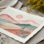
Layered Spills for Depth
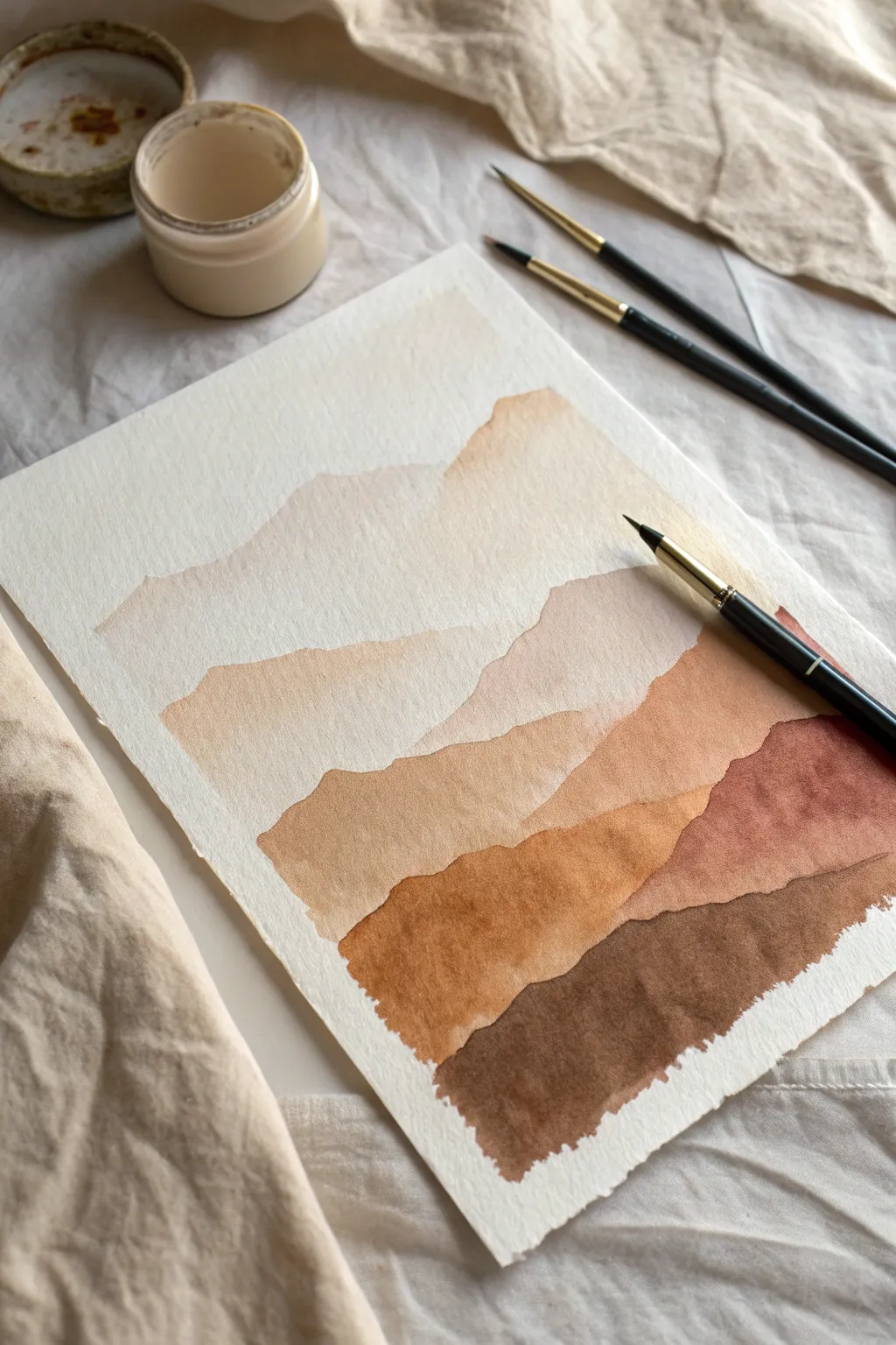
Learn to capture the serene beauty of rolling hills using controlled watercolor washes and organic paint edges. This project explores the power of tonal values, moving from airy creams to deep espresso browns to create a convincing sense of atmospheric depth.
Step-by-Step
Materials
- Cold press watercolor paper (300 gsm)
- Watercolor paints (Burnt Sienna, Raw Umber, Sepia, Yellow Ochre)
- Round watercolor brushes (Size 4 and 8)
- Jar of clean water
- Mixing palette
- Paper towels
- Masking tape
Step 1: Preparation and Palette
-
Secure the paper:
Begin by taping down your watercolor paper to a hard board or table surface using masking tape. This prevents the paper from buckling when it gets wet and creates a clean border around your artwork. -
Mix your base tone:
Prepare a large puddle of a very pale, watery wash on your palette. Mix a tiny amount of Yellow Ochre with plenty of water to create a soft cream color. This will be your lightest layer for the distant sky and peaks. -
Create the gradient range:
Pre-mix three additional puddles of paint, each progressively darker. Add Burnt Sienna for a warm mid-tone, mix in Raw Umber for a darker brown, and have pure Sepia ready for the foreground. Having these ready prevents panic while painting wet edges.
Creating the Bloom
To get that distinctive ‘watercolor bloom’ texture seen in the image, drop a tiny droplet of clean water into a drying layer. It pushes pigment away, creating organic edges.
Step 2: Painting the Distant Layers
-
Establish the sky:
Using your largest brush, load it with the palest cream wash. Paint the top section of the paper, but stop about one-third of the way down with an uneven, wavy line. This edge will simulate the furthest mountain ridge. -
Soften the first edge:
While the paint is still wet, you can tilt the paper slightly to let the pigment settle towards the bottom edge of the shape, creating a subtle ‘spill’ effect that looks like a natural ridge. -
Wait for complete dryness:
It is crucial to let this first layer dry completely before moving on. If you paint too soon, the layers will bleed together and you will lose the crisp mountain edge. -
Paint the second ridge:
Load your brush with a slightly more saturated beige mix (more pigment, less water). Paint a new mountain shape that overlaps the bottom of your first layer, starting slightly lower on the page. -
Create organic variance:
As you pull the brush across to create the ridge line, let your hand tremble slightly. This ‘shaky hand’ technique creates a more natural, rocky silhouette than a perfect straight line.
Hard Lines Between Layers?
If you are getting unwanted harsh lines within a single mountain shape, you aren’t working fast enough. Keep a ‘bead’ of water active at the bottom edge as you paint downwards.
Step 3: Building Depth and Contrast
-
Introduce warmth:
For the third layer, switch to your Burnt Sienna mix. Paint a range that starts lower than the previous one. I like to make this layer dip in the center and rise on the sides to create compositional balance. -
Manage the wet edge:
Ensure the bottom of this painted shape stays wet until you bring the wash all the way down to where the next layer will obscure it, or fade it out with water if you want a softer transition. -
Deepen the tones:
Mix a terracotta shade using Burnt Sienna and a touch of Raw Umber. Paint the fourth layer, focusing on the right side of the composition to create asymmetrical visual interest. -
Check transparency:
Watercolors dry lighter than they look when wet. If a layer looks too pale as it dries, you can carefully glaze a second coat over it, but only after it is 100% dry. -
Paint the foreground:
Load your brush with the darkest Sepia mix. Paint the final, bottom-most layer. This should be the most pigmented shape with the hardest edges to visually bring it to the front of the scene. -
Refine the edges:
Use the tip of your smaller size 4 brush to add tiny irregularities or ‘spills’ along the ridge of this dark foreground layer, mimicking rocks or vegetation.
Step 4: Final Touches
-
Assess the gradient:
Step back and look at the progression from light to dark. If the transition feels too abrupt between any two layers, you can add a thin glaze of the lighter color over the darker section to bridge the gap. -
Remove tape:
Once the paper is bone dry—touch it with the back of your hand to be sure—carefully peel the masking tape away at a 45-degree angle to reveal your crisp white borders.
Enjoy the calming process of watching these earthen tones settle into a tranquil abstract landscape.
Straw-Dragged Spill Tendrils
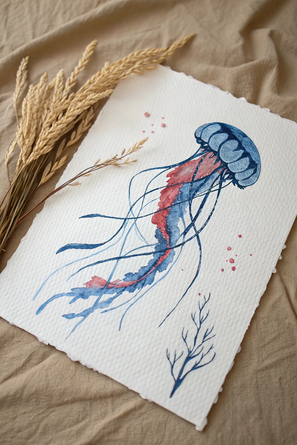
Capture the fluid elegance of marine life by combining traditional watercolor painting with guided spill techniques. This project uses straw-blown tendrils to create organic, unpredictable movement that mimics a jellyfish drifting in the current.
Step-by-Step Tutorial
Materials
- Heavyweight cold-press watercolor paper (300gsm with deckled edge)
- Watercolor paints (Indigo Blue, Alizarin Crimson)
- Round brushes (size 6 and size 2)
- Plastic drinking straw
- Clean water jar
- Paper towel
- Palette for mixing
- Pencil (optional for light sketching)
Step 1: Forming the Bell
-
Outline the cap:
Start by mixing a watery wash of Indigo Blue. Using your size 6 brush, paint the mushroom-cap shape of the jellyfish bell near the top right of your paper, leaving the bottom edge open and uneven. -
Add volume:
While the shape is still wet, drop in more concentrated Indigo Blue along the top curve and the segmented ridges of the bell. Let the pigment bloom naturally into the wetter areas to create shadows. -
Define segments:
Use a damp, clean brush to lift out a little pigment from the center of each bell segment, creating a highlighted, rounded appearance. -
Create the skirt:
Load your brush with a darker mix of blue and carefully paint the ruffled ‘skirt’ edge at the bottom of the bell. Keep the lines somewhat loose to suggest movement.
Step 2: The Spill-and-Drag Core
-
Prepare the puddle:
Mix a generous amount of Alizarin Crimson with water until it’s very fluid but still rich in color. Place a heavy puddle of this red paint directly underneath the center of the blue bell. -
Add blue contrast:
Immediately drop a smaller puddle of watery Indigo Blue right next to or slightly touching the red puddle. Do not overmix them; let them swirl on the paper. -
Gravity drag:
Tilt your paper steeply downwards so the mingled puddle begins to run down the center of the page. This forms the thick, central oral arms of the jellyfish. -
Guide the flow:
If the paint stops moving, use the tip of your size 6 brush to gently pull the puddle downward, encouraging it to twist and turn like a ribbon.
Air Control
For thinner, longer lines, hold the straw closer to the paper and blow harder. For softer, thicker branches, hold the straw higher up.
Step 3: Straw-Blown Tendrils
-
Load the tendrils:
Load your smaller size 2 brush with very wet Indigo Blue. Place a small bead of paint at the base of the bell’s skirt. -
Blow the path:
Position your straw just above the wet bead of paint and blow sharply downwards and outwards. Aim to send a thin, spindly line of paint shooting away from the main body. -
Repeat the process:
Repeat this action multiple times, creating fine, unpredictable lines that cross over the central red body. Vary the angle of your straw to create curves. -
Connect the lines:
If a blown line feels too disconnected, use the tip of your small brush to gently paint a connection back to the main body, smoothing the transition. -
Add red accents:
Mix a watery red wash and add a few blown tendrils using the same technique, allowing them to mingle with the blue lines for purple overlaps.
Salt Texture
While the main bell is still wet, sprinkle a few grains of coarse sea salt onto the blue paint. When dry, brush it off for a textured, underwater skin effect.
Step 4: Finishing Details
-
Paint long sweepers:
Using the size 2 brush, hand-paint a few extremely long, sweeping tentacles that frame the blown ones. Keep your wrist loose and let the line vary in thickness. -
Add the coral sprig:
In the bottom right corner, use the very tip of your small brush and Indigo paint to sketch a small, branching coral shape. Keep it minimal to balance the composition. -
Controlled splatter:
Dip your stiffest brush into the red mix. Tap the handle against a finger to flick tiny droplets of pink paint around the bell and lower tentacles for a bubbly effect. -
Final assessment:
Step back and look at the flow. I sometimes like to darken a few intersections where tentacles cross to add depth before setting it aside to dry completely flat.
Once the paint is fully dry, you’ll have a dynamic piece of marine art that looks effortlessly fluid

Have a question or want to share your own experience? I'd love to hear from you in the comments below!