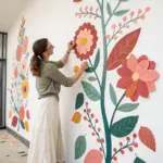
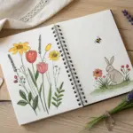
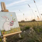
Spring is basically made for watercolor—everything turns into soft washes, bright buds, and that fresh pop of new green you can’t help but chase on paper. I pulled together my favorite spring watercolor painting ideas so you can pick one and start painting while your rinse water is still clean.
Cherry Blossom Branch Study
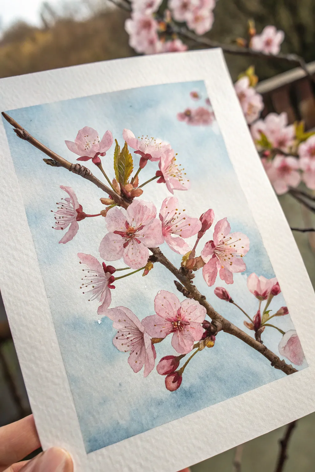
Capture the fleeting beauty of spring with this detailed watercolor study of a cherry blossom branch. The painting features soft pink petals, rusty-brown stems, and fresh green shoots set against a dreamy blue wash, perfect for preserving the season on paper.
Step-by-Step
Materials
- Cold press watercolor paper (300 gsm)
- Watercolor paints: Rose Madder or Quinacridone Rose, Burnt Umber, Sap Green, Ultramarine Blue, Yellow Ochre
- Round watercolor brushes: sizes 6 and 2 (or 0 for details)
- Pencil (HB) and kneaded eraser
- Two jars of water
- Paper towels
- Masking tape
Step 1: Preparation and Sketching
-
Prepare the surface:
Tape down all four edges of your watercolor paper to a board to prevent buckling. Ensure the tape is pressed firmly so paint doesn’t seep underneath. -
Lightly sketch the branch:
Using an HB pencil, draw the main diagonal line of the branch first. It should enter from the top left and extend toward the bottom right. Keep your lines very faint so they won’t show through the transparent petals later. -
Map out floral clusters:
Sketch the circles for the main open blossoms and smaller teardrop shapes for the buds. Don’t worry about every single petal yet; just get the placement and size relationship right. -
Refine the details:
Go back in and define the jagged edges of the petals and the knobby textures of the branch. Add the small, sharp leaves emerging near the stems. Gently erase any unnecessary construction lines with a kneaded eraser.
Keep it Loose
Don’t outline every single petal with paint. Leaving some edges lost or very pale creates a sense of light and prevents the flower from looking like a cartoon.
Step 2: Painting the Background
-
Wet the sky area:
With a clean size 6 brush and clear water, carefully paint the negative space around the branch and flowers. Work in sections if needed so the paper stays damp. -
Drop in the blue wash:
Dilute Ultramarine Blue heavily with water. While the paper is still wet, touch the blue into the damp areas, letting it bloom softly. Keep the color uneven—lighter in some spots, slightly deeper in others—to mimic a natural sky. -
Soften edges:
If the blue paint touches the pencil lines of the flowers, use a clean, damp brush to lift it away slightly or soften the edge so you don’t have hard blue outlines around delicate pink petals. Let this layer dry completely.
Cloudy Blooms?
If your pink bleeds into the blue background, the sky wasn’t dry enough. Let it dry fully, then gently lift the unwanted color with a damp, clean brush or paper towel.
Step 3: The Blossoms
-
First wash of pink:
Mix a very watery, pale wash of Rose Madder. Fill in the petals of the open flowers. For the buds, use a slightly more concentrated mix to show their tighter form. -
Add depth to petals:
While the first layer is still slightly damp, drop a stronger pink mix into the centers of the flowers and the base of the petals. This wet-on-wet technique creates a natural gradient from the dark center to the pale edges. -
Paint the closed buds:
The tight buds at the bottom and top need more pigment. Use a rich pink mix, leaving a tiny sliver of white paper on the highlighting side to give them volume. -
Petal details:
Once dry, use your smallest brush to add faint veins or folds on a few petals using a translucent pink glaze. Keep this subtle; you want the texture to feel whisper-light.
Step 4: Branch and Greenery
-
Base layer for the branch:
Mix Burnt Umber with a touch of Yellow Ochre. Paint the main branch and the smaller stems connecting the flowers. Vary the pressure on your brush to create thick and thin sections. -
Texturing the wood:
While the brown is damp, drop in darker brown (Burnt Umber with a tiny bit of blue mixed in) at the joints, knots, and underside of the branch to create shadow and cylindrical form. -
Leaves and sepals:
Mix Sap Green with a little Yellow Ochre for a fresh spring green. Paint the small leaves and the tiny sepals (the green parts at the base of the flowers). Add a touch of reddish-brown to the tips of the leaves for realism.
Step 5: Final Details
-
Stamens and anthers:
Wait until the flower centers are bone dry. With your smallest brush or a fine liner, paint thin filaments radiating from the center using a dark pink. Dot the ends with a thick mix of Yellow Ochre or white gouache mixed with yellow for the pollen. -
Deepen contrasts:
Look at the painting as a whole. Add tiny dark brown accents to the branch ‘elbows’ and deepen the shadows where flowers overlap stems to make them pop forward. -
Review and remove tape:
Check for any unwanted hard edges and soften them with a damp brush if necessary. Once the paper is fully dry, slowly peel off the masking tape at a 45-degree angle.
Now you have a permanent piece of spring to brighten up your wall all year round.

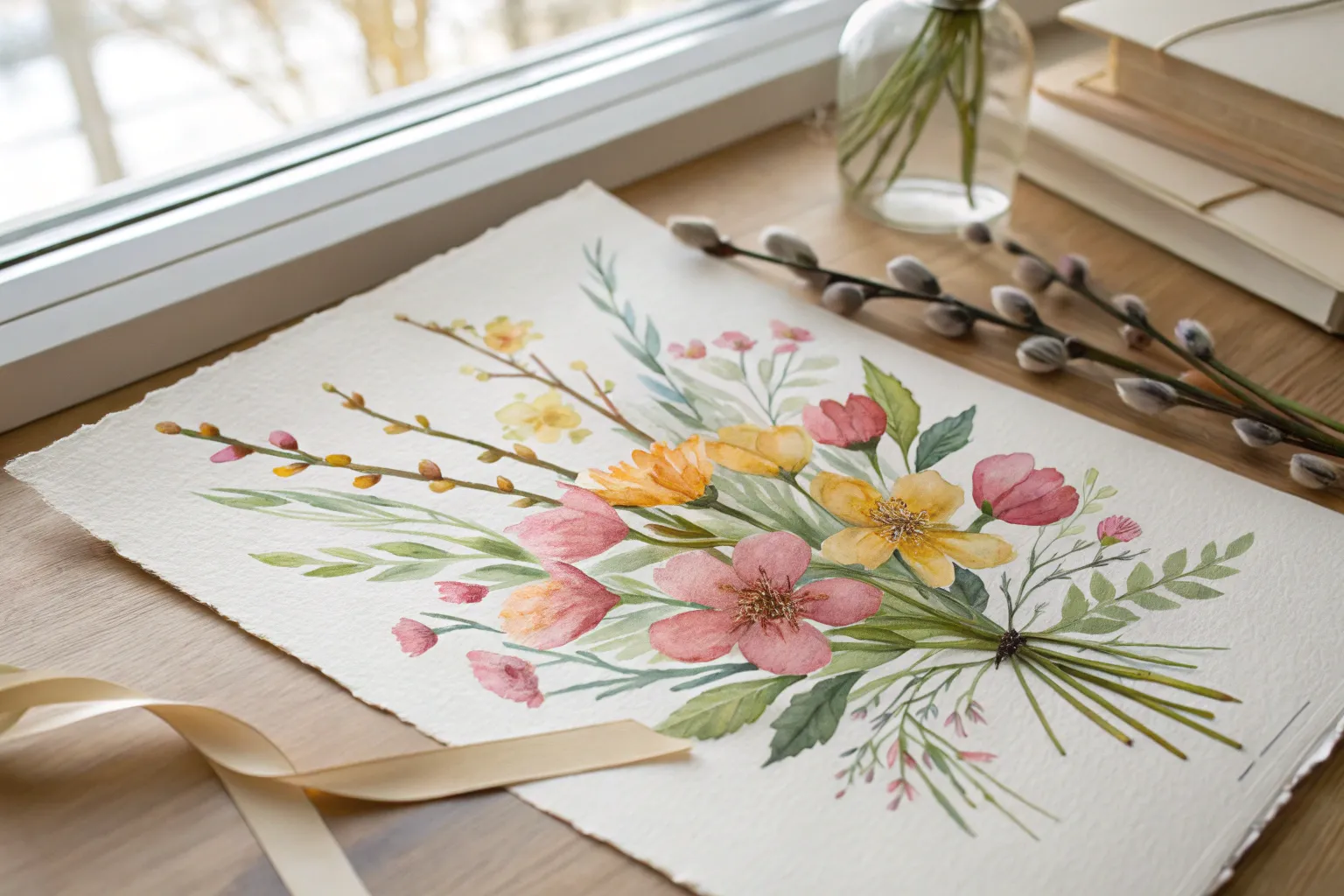
Daffodils and Daisies Mix
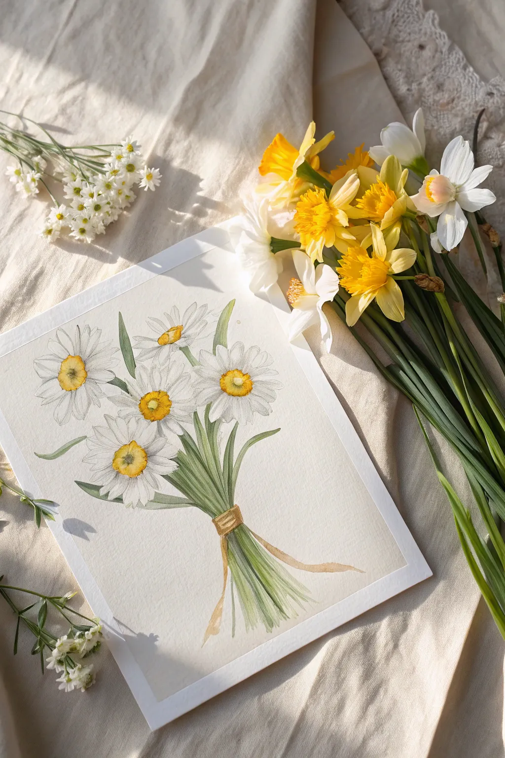
Capture the delicate beauty of spring with this light-filled watercolor study of white daisies and narcissus blooms. The composition features a gentle, hand-tied bouquet that balances soft petals with crisp green stems, perfect for practicing botanical layering.
Step-by-Step
Materials
- Hot press watercolor paper (smooth texture is key for these details)
- H or HB pencil for light sketching
- Kneadable eraser
- Watercolor paints: Lemon Yellow, Cadmium Yellow Medium, Sap Green, Olive Green, Payne’s Grey (or a dilute black), Burnt Sienna
- Round brushes: Sizes 2, 4, and 6
- Fine liner brush (size 0 or 00)
- Clean water jar and paper towels
Step 1: Sketching the Composition
-
Map the flower heads:
Begin by lightly drawing five or six circles to represent the positions of the main flower heads. Arrange them in a loose, fan-like shape, leaving space below for the stems. -
Define the centers:
Inside each circle, sketch small ovals or circles for the pollen centers. Make the central ones more circular and the side ones more elliptical to show perspective. -
Draft the petals:
Draw long, slender petals radiating from the centers. Keep the tips slightly rounded or jagged for realism. Don’t make them perfect; let some overlap or twist slightly. -
Add stems and ribbon:
Draw the stems converging at a single point below the blooms. Sketch a simple band around the bundle to represent the ribbon, then extend the stems slightly below it and add trailing ribbon ends. -
Clean up the sketch:
Use your kneadable eraser to lift graphite until ghost lines remain. Hard pencil lines will show through the transparent watercolor and ruin the delicate effect.
Step 2: Painting the Blooms
-
Yellow centers base:
Mix a watery Lemon Yellow and paint the flower centers. Leave a tiny sliver of white paper in the middle of each for a highlight. -
Deepen the centers:
While the yellow is still damp, drop concentrated Cadmium Yellow or a touch of Orange into the bottom edge of the centers to create a cup-like volume. -
Shadowing white petals:
Prepare a very dilute mix of Payne’s Grey with plenty of water. It should look like dirty water, not paint. Carefully stroke this onto the petals that are underneath others or near the center to imply shadow. -
Adding texture lines:
I find it helpful to use the tip of a size 2 brush with the pale grey mix to draw faint striations along the length of the petals, following their curve. -
Refining the cup shapes:
Once the centers are dry, use a heavier mix of yellow-orange to outline the rim of the ‘cup’ on the narcissus-style blooms, giving them that distinct trumpet definition.
Muddy Shadows?
If your grey shadows on the white petals look dirty, your mix is too dark or warm. Use a cool blue-grey and dilute it until it’s barely visible on white paper.
Step 3: Stems and Ribbon
-
Base layer for stems:
Mix Sap Green with a lot of water. Paint the stems from the flower head down to the ribbon binding. Keep the strokes fluid and continuous. -
Darkening the greenery:
While wet, drop a stronger Olive Green into the shadowed areas where stems overlap or disappear behind a flower. This separates the individual stalks. -
Painting the lower stems:
Paint the stems emerging from the bottom of the ribbon. Fan them out slightly and let the ends fade out into the white of the paper for a vignette look. -
Coloring the ribbon:
Use a dilute Burnt Sienna or Gold ochre to paint the ribbon wrap and the trailing tails. Leave the center of the knot lighter to show volume. -
Ribbon shadows:
Once the base ribbon color is dry, add a darker brown line along the edges and under the knot to give the fabric dimension.
Level Up: Texture
Sprinkle a tiny pinch of salt onto the damp yellow centers. Brush it off when fully dry to create a unique, pollen-like granulation texture.
Step 4: Final Details
-
Crisp outlining:
Switch to your smallest liner brush. Mix a medium-grey tone and very delicately outline the individual petals. Keep the line broken—don’t encourage a solid cartoon outline. -
Defining the flower centers:
Stipple tiny dots of dark yellow or brown around the perimeter of the yellow centers to simulate pollen texture. -
Enhancing stem contrast:
Add thin, sharp lines of dark green along one side of the stems to make them look round and fibrous. -
Final assessment:
Step back and look at your contrast. If the white petals look too flat, add a slightly darker grey shadow just where they meet the yellow center.
Allow your painting to dry completely before framing it to brighten up any room in your home
Soft Blue Spring Sky Gradients
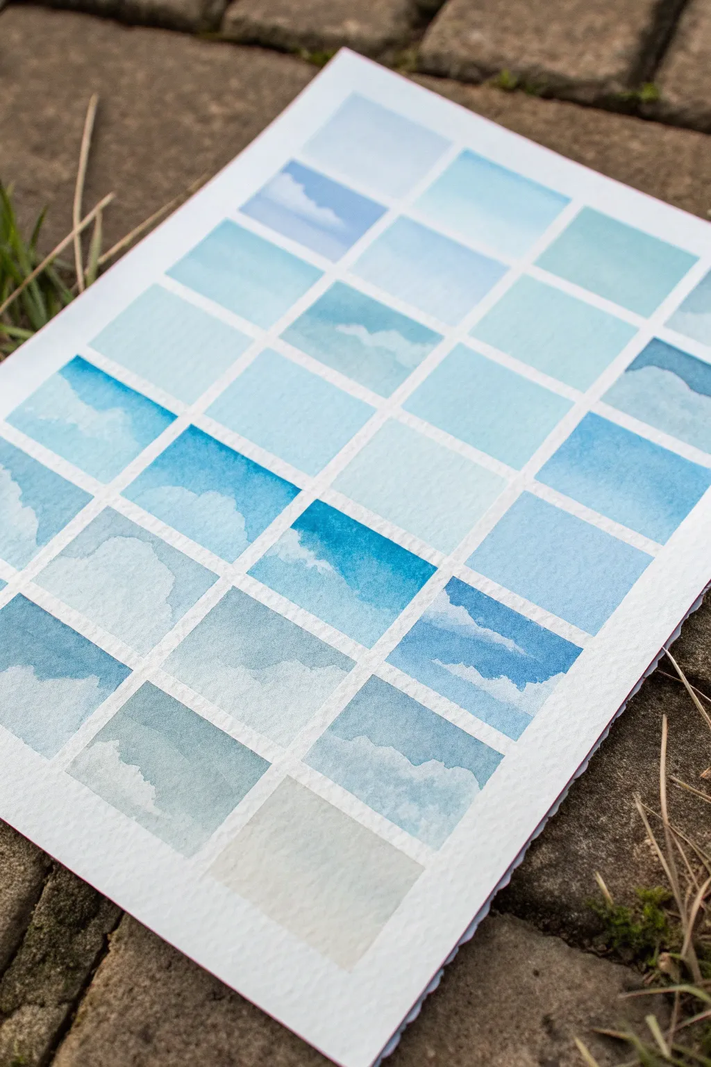
This meditative project captures the shifting moods of a spring day by creating a mosaic of tiny, unique sky studies. Through a grid of soft blue gradients and negative space clouds, you’ll explore the delicate range of watercolor washes.
Step-by-Step Tutorial
Materials
- Cold press watercolor paper (140lb/300gsm)
- Artist masking tape (1/4 inch or roughly 6mm width is ideal)
- Watercolor paints (Cerulean Blue, Cobalt Blue, Ultramarine, and a touch of Payne’s Gray)
- Round watercolor brushes (sizes 4 and 8)
- Pencil and ruler
- Two jars of water
- Paper towel or cotton rag
- Mixing palette
Step 1: Creating the Grid
-
Measure the layout:
Begin by lightly measuring a border around your paper with a pencil and ruler. Decide on the size of your squares; for this project, 1.5-inch squares work beautifully. -
Grid the paper:
Using your measurements, lightly draw the grid lines across the entire page. Ensure the spacing is even, leaving gaps for the tape lines that will separate each painting. -
Apply the tape:
Carefully run long strips of masking tape horizontally across the paper, covering your pencil grid lines. Press the edges down firmly with your fingernail or a bone folder to prevent paint seepage. -
Complete the taping:
Apply the vertical tape strips next. This creates a neat lattice of open squares where you will paint your individual sky scenes.
Bleeding Lines?
If paint bled under the tape, use opaque white gouache or a white gel pen to tidy up the edges. Next time, heat-set the tape with a hair dryer before painting.
Step 2: Painting the Skies
-
Prepare your palette:
Squeeze out small amounts of your blue pigments. Create a few puddles of varying dilution on your palette—some very watery and pale, others more saturated. -
Paint the first gradient:
Start in the top left square. Wet the paper slightly with clean water, then drop a light wash of Cerulean Blue at the top, fading it down to nearly clear water at the bottom for a simple gradient. -
Introduce clouds:
Move to the next square. While the paper is dry, paint around random, fluffy shapes to leave the white paper exposed. This negative painting technique creates the look of cumulus clouds. -
Use the lifting technique:
In another square, apply a solid wash of blue. While it is still wet but no longer shiny, use a thirsty (clean, damp) brush to lift out pigment, creating soft, wispy cloud shapes. -
Vary the blues:
As you progress through the grid, switch between your different blue pigments. Use Cobalt for a classic midday sky and Ultramarine for a deeper, cooler tone. -
Mix grays for depth:
For the bottom rows, I like to mix a tiny dot of Payne’s Gray or a touch of burnt sienna into the blue. This creates a moodier, storm-like atmosphere suitable for the lower squares. -
Tilt for smooth blends:
For squares that are pure gradients without clouds, tilt your board slightly after applying paint to help gravity pull the pigment down into a seamless fade. -
Layering clouds:
Try painting a very pale blue cloud shape, letting it dry, and then painting a darker blue sky around it. This adds dimension compared to leaving the paper purely white. -
Review contrast:
Step back and look at the grid as a whole. Ensure you have a good balance of dark, saturated squares and light, ethereal ones to keep the composition interesting.
Add Birds
Once fully dry, use a micron pen (005 size) to add tiny, distant bird silhouettes to just three or four random squares for a sense of scale.
Step 3: Finishing Touches
-
Let it dry completely:
Allow the entire sheet to dry thoroughly. The paper must be bone-dry and warm to the touch before you attempt to remove the tape. -
Remove the tape:
Peel the tape away slowly at a 45-degree angle, pulling away from the painted areas to avoid ripping the paper surface. -
Erase guidelines:
If any pencil lines are visible in the white grid separators, gently erase them with a kneaded eraser to leave crisp, clean white boundaries.
Enjoy the peaceful rhythm of peeling back the tape to reveal your tidy collection of atmosphere studies.


Songbird on a Flowering Twig
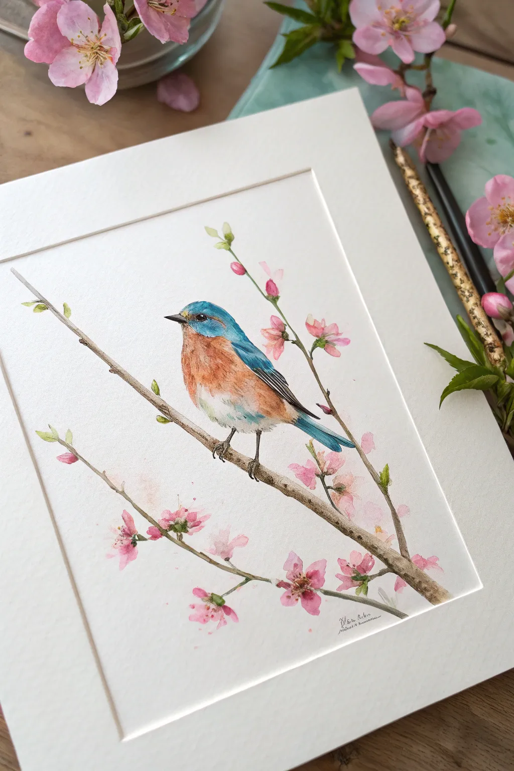
Capture the delicate beauty of spring with this vibrant watercolor study featuring an Eastern Bluebird perched among soft pink blooms. This project combines careful layering for the bird’s feathers with loose, organic strokes for the floral elements to create a balanced, naturalist illustration.
Step-by-Step Tutorial
Materials
- Cold press watercolor paper (300 gsm)
- Watercolor paints (Cobalt Blue, Burnt Sienna, Alizarin Crimson, Sap Green, Burnt Umber, Payne’s Grey)
- Round brushes (sizes 2, 4, and 00 for details)
- pencil (HB or H)
- Kneadable eraser
- Clean water and paper towels
- Masking fluid (optional, for eye highlight)
Step 1: Sketching and Composition
-
Map out the branch:
Begin by lightly sketching a diagonal main branch extending from the bottom right towards the upper left. Add a secondary, thinner twig branching off to the left creates a nice sense of balance. -
Sketch the bird form:
Draw the bird’s outline perched centrally on the main branch. Use simple ovals first: a rounder one for the head and an elongated oval for the body, connecting them with smooth neck lines. -
Refine and detail:
Refine the bird’s beak, wing placement, and tail feathers. Add small circles for the flower buds and open blossoms scattered along the twigs to create a natural, unforced arrangement. -
Clean the lines:
Gently roll a kneadable eraser over your sketch to lift excess graphite, leaving only faint guidelines so the pencil won’t dirty your watercolor washes.
Bleeding colors?
If the bird’s orange chest bleeds into the blue feathers, your paint was too wet. Let the blue layer bone-dry completely before painting the adjacent orange section.
Step 2: Painting the Bird
-
Base wash for the head:
Using a size 4 brush, apply a light wash of Cobalt Blue to the head, back, and wings. Keep the color damp and drop in a slightly concentrated blue near the crown for depth. -
Warm chest tones:
While the blue is drying so it doesn’t bleed, mix a watery wash of Burnt Sienna. Paint the chest area, letting it fade into white near the belly. A touch of yellow ochre near the top of the chest adds warmth. -
Feather texture:
Once the base layers are dry, switch to a size 2 brush. Use short, small strokes of darker blue (mix Cobalt with a touch of Payne’s Grey) on the wings to suggest individual flight feathers. -
Deepening the orange:
Glaze a second layer of Burnt Sienna over the chest to build intensity, using a damp brush to soften the edges where the orange meets the white belly feathers. -
The eye and beak:
Using your smallest brush (size 00) and a dark mix of Burnt Umber and Payne’s Grey, carefully paint the eye, leaving a tiny speck of white paper for the highlight. Paint the beak with a lighter grey wash. -
Feet and details:
Paint the small claws wrapping around the branch using a dark grey-brown mix. Ensure the grip looks convincing by slightly breaking the line of the branch.
Step 3: Branches and Blossoms
-
Painting the wood:
Mix Burnt Umber with a touch of blue to cool it down. Paint the branches with a size 2 brush, varying the pressure to make the line thickness fluctuate naturally. Leave tiny gaps where flowers will overlap. -
Adding texture to bark:
While the branch is still slightly damp, drop in darker brown pigment on the underside of the branch to create shadow and cylindrical form. -
Soft pink blossoms:
Prepare a very dilute mix of Alizarin Crimson. Paint the flower petals loosely, keeping the centers slightly white. For buds, use a more concentrated pink at the tip and fade it down to the stem. -
Flower centers:
Once the pink petals are dry, use a fine brush to add tiny dots of dark magenta, followed by tiny yellow touches for the stamens in the center of the open blooms. -
Fresh green leaves:
Mix Sap Green with a little yellow. Paint the small emerging leaves near the buds and branch tips. Use a single stroke for each leaf, pressing down and lifting up to create a point. -
Final adjustments:
Step back and assess your painting. I like to add a final, very dark glaze to the bird’s primary wing feathers and deepen the shadows under the bird on the branch to ground it.
Pro Tip: Eye Sparkle
If you accidentally painted over the white highlight in the bird’s eye, wait for the paint to dry and use a tiny dot of white gouache or a white gel pen to restore the life-like glint.
Once dry, frame your piece behind a white mat to let the vibrant blue and soft pinks truly sing
BRUSH GUIDE
The Right Brush for Every Stroke
From clean lines to bold texture — master brush choice, stroke control, and essential techniques.
Explore the Full Guide
April Rain Umbrella Scene
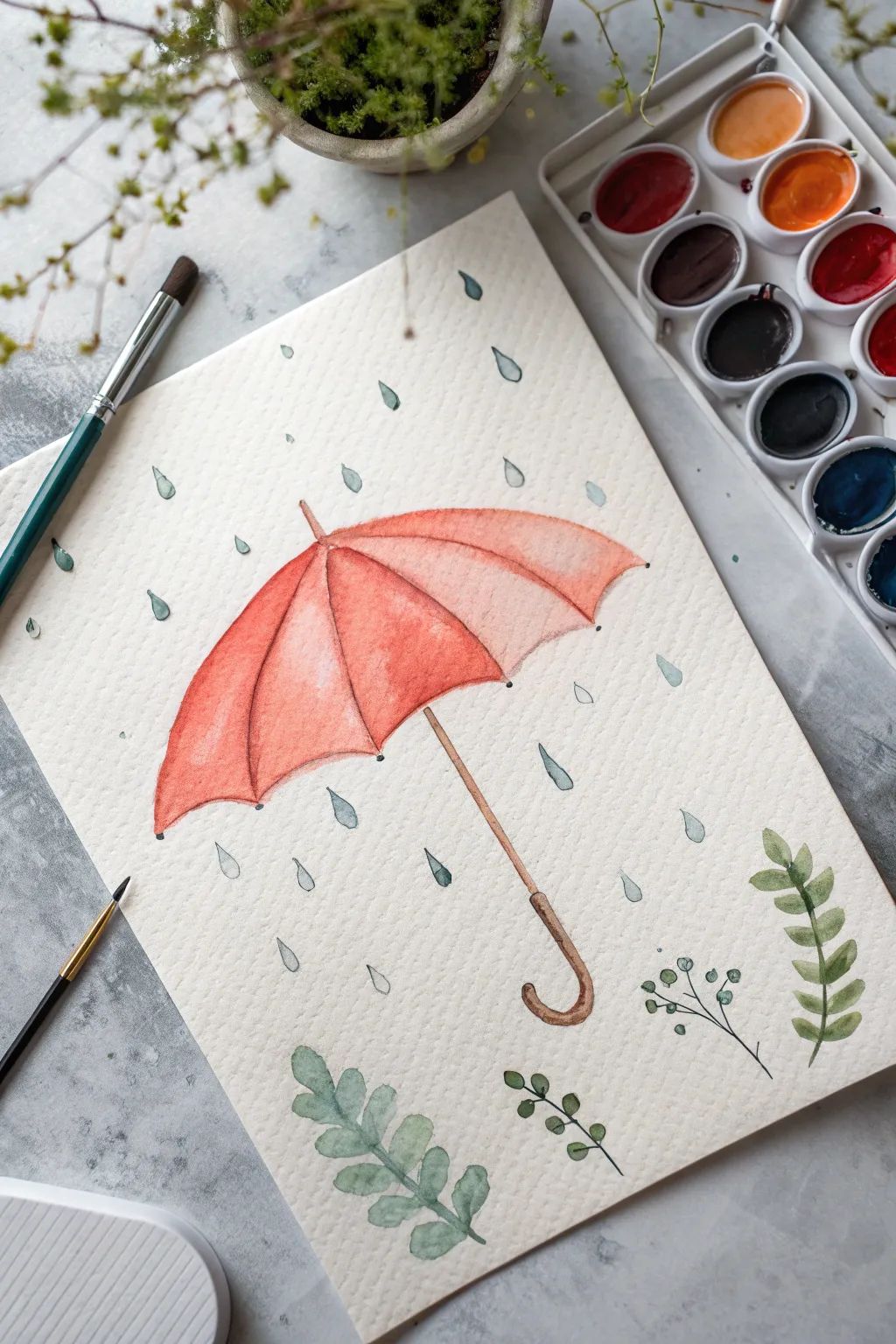
Capture the cozy essence of a rainy spring day with this charming watercolor illustration. Featuring a cheerful persimmon-colored umbrella and delicate falling rain, this project is perfect for practicing wet-on-dry techniques and simple botanical shapes.
Step-by-Step
Materials
- Cold press watercolor paper (A4 or slightly smaller)
- Watercolor paints (Vermilion/Orange red, Burnt Sienna, Payne’s Gray, Sap Green, Olive Green)
- Round brushes (Size 6 for washes, Size 2 for details)
- HB Pencil and kneaded eraser
- Jar of clean water
- Paper towels
- Palette
Step 1: Sketching the Composition
-
Outline the canopy:
Start by lightly sketching a wide arc in the upper center of your paper for the top of the umbrella. Connect the ends with a scalloped line to create the segments of the fabric. -
Add structure:
From the center point of your top arc, draw faint curved lines down to the points of the scalloped edge. These are the ribs of the umbrella that give it 3D form. -
Draw the handle:
Sketch the central shaft coming down from the middle scallop. Add a classic ‘J’ curve at the bottom for the handle, keeping the lines parallel and slender. -
Design the rain and greenery:
Lightly sketch teardrop shapes scattered randomly in use the background. At the very bottom, draw simple guidelines for three or four different plant sprigs.
Bleeding Colors?
If your umbrella segments bleed into each other, you didn’t wait long enough! Use a hair dryer on a low, cool setting to speed up drying between adjacent sections.
Step 2: Soaking in Color
-
Paint the first segments:
Mix a vibrant Vermilion or Orange-Red. Using your size 6 brush, paint the leftmost segment of the umbrella. I like to leave a tiny sliver of white paper unpainted along the rib line to act as a highlight. -
Continue the canopy:
Skip the adjacent segment and paint the third one to prevent colors from bleeding together while wet. Let these dry completely before filling in the alternating segments. -
Add depth and shading:
Once the base layer is dry, mix a slightly darker, more saturated version of your red. glaze this color near the top center and along the rib lines to create a curved, dimensional look. -
Paint the handle:
Switch to a size 2 brush and use Burnt Sienna (brown) to carefully fill in the handle shaft. Darken the color slightly at the bottom curve of the ‘J’ for shadow.
Step 3: Refining the Details
-
Define the rib tips:
Using a very fine point and dark grey or black, add tiny dots or caps at the end of each rib on the scalloped edge. -
Create the rain:
Mix a very watery wash of Payne’s Gray or a cool blue-grey. Paint the teardrop rain shapes. Vary the opacity slightly so some drops look closer than others. -
Paint the leafy fern:
For the bottom left plant, use a dusty sage green. distinct, oval-shaped leaves along a central stem. Keep the paint somewhat transparent. -
Add the vine details:
For the middle sprigs, use a fine liner brush and a dark olive green to paint thin, wandering stems with tiny round leaves attached. -
Finish the right sprig:
Paint the larger, pointed leaves on the right using a fresh Sap Green. Press down on the belly of the brush to widen the leaf and lift as you reach the tip. -
Final touches:
Erase any visible pencil lines gently with a kneaded eraser once the entire painting is bone dry. If needed, add a second layer of glaze to the umbrella’s darkest shadows.
Highlight Hack
Don’t stress about painting around highlights. Use a white gel pen or opaque white gouache at the very end to add crisp highlights to the rain drops and umbrella ribs.
Now you have a gentle rainy day scene that feels cozy rather than gloomy
Rain Boots and Puddle Reflections
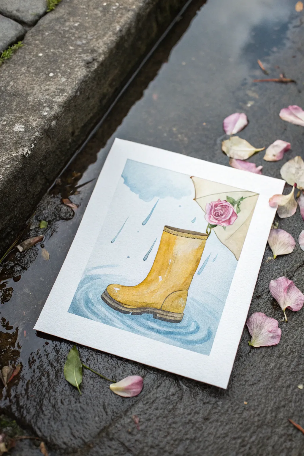
Capture the whimsy of a spring shower with this delightful watercolor painting featuring a classic yellow rain boot splashing in a puddle. The addition of a soft pink rose tucked inside adds a romantic, floral touch to the rainy day theme.
How-To Guide
Materials
- Cold press watercolor paper (300 gsm)
- Watercolor paints (Yellow Ochre, Cadmium Yellow, Ultramarine Blue, Alizarin Crimson, Burnt Sienna, Payne’s Grey)
- Round watercolor brushes (Size 4, 8, and a fine liner)
- HB pencil for sketching
- Kneaded eraser
- Two jars of water
- masking tape
- Paper towels
Step 1: Sketching the Elements
-
Outline the boot:
Begin by lightly sketching the central rain boot. Think of the leg as a slightly tapered cylinder and the foot area as a rounded oblong shape. Add the thick sole at the bottom. -
Add the rose and envelope:
Draw the triangular flap of an envelope peeking out from behind the top right of the boot. Sketch a simple rose shape resting against the boot’s opening, overlapping the envelope slightly. -
Define the puddle:
Draw ripples radiating outward from the base of the boot. These don’t need to be perfect circles; varying oval shapes create a better perspective.
Preserve the Highlights
Using masking fluid on the boot’s shiny spots before painting ensures the brightest whites remain crisp without needing gouache later.
Step 2: Base Washes
-
Paint the boot base:
Mix a bright yellow using Cadmium Yellow and a touch of Yellow Ochre. Apply this to the main body of the boot, leaving small patches of white paper untouched on the toe and shin for highlights. -
Shadowing the boot:
While the yellow is still damp, drop in a slightly darker mix (add a tiny bit of Burnt Sienna or orange) to the right side and bottom edge to create volume. -
First cloud layer:
Using a very diluted Ultramarine Blue, paint a soft, fluffy cloud shape in the upper left corner. Soften the edges with a clean, wet brush so it fades into the white paper. -
Envelope wash:
Paint the envelope flap with a very pale, watery wash of Yellow Ochre or a creamy beige tone. Let it interact slightly with the cloud edge if they touch, but keep it subtle.
Step 3: Details and Depth
-
Defining the sole:
Once the boot body is dry, paint the thick rubber sole using a dark mix of Payne’s Grey and Burnt Sienna. Keep the top edge of the sole crisp against the yellow. -
Painting the rose:
I like to start the rose with a pale wash of Alizarin Crimson. As it dries, add darker, concentrated swirls of pink in the center to suggest unfolding petals. -
Adding the stem:
With a thin brush and sap green (or a blue-yellow mix), paint the slender stem and a small leaf connecting the rose to the boot. -
Boot contours:
Strengthen the shadows on the boot using a brownish-yellow mix. Paint a thin line near the top rim to show the stitching detail found on rubber boots.
Floral Variety
Customize your painting by swapping the rose for a tulip, a daffodil, or a small bundle of wildflowers tucked into the boot.
Step 4: The Rainy Atmosphere
-
Creating the puddle:
Mix a watery blue-grey. Paint elliptical strokes around the base of the boot, following your pencil guides. Leave gaps of white paper between the ripples to represent light reflecting on the water. -
Deepening the water:
Add a stronger blue pigment right underneath the boot sole to anchor it to the ground and show the reflection’s depth. -
Painting raindrops:
Using a liner brush and diluted blue, paint varied vertical dashes falling from the cloud. Make them slightly diagonal to suggest wind. -
Splash details:
Add tiny teardrop shapes bouncing off the boot’s surface and near the puddle edges to indicate splashing water. -
Envelope details:
Add a very faint outline to the envelope flap and perhaps a tiny shadow underneath the rose where it rests on the paper. -
Final highlights:
If you lost any bright highlights on the boot during painting, you can reclaim them with a tiny touch of white gouache or a white gel pen for that ‘wet rubber’ look.
Now you have a charming piece of rainy-day art that celebrates the beauty of spring showers

PENCIL GUIDE
Understanding Pencil Grades from H to B
From first sketch to finished drawing — learn pencil grades, line control, and shading techniques.
Explore the Full Guide
Watering Can Pouring Sparkle
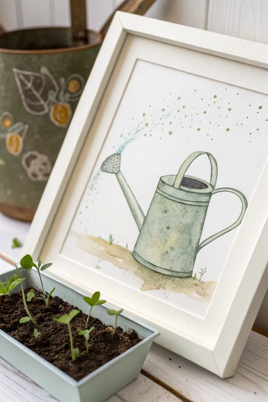
Capture the magic of early spring gardening with this delicate watercolor illustration. The soft, sage-green watering can pouring a stream of magical golden droplets makes for a charming, nursery-style art piece.
Step-by-Step Tutorial
Materials
- Cold press watercolor paper (300 gsm)
- Watercolor paints (sage green, paynes gray, yellow ochre, burnt sienna, cerulean blue)
- Metallic gold watercolor paint or gold ink
- Round watercolor brushes (sizes 2, 4, and 6)
- Pencil (HB or H)
- Kneaded eraser
- Two jars of water
- Paper towels
- White or light wood frame (optional)
Step 1: Sketching the Outline
-
Draft the basic shape:
Begin by lightly sketching a cylinder for the main body of the watering can. Don’t worry about perfect symmetry; a slight wobble adds character. -
Add the details:
Draw the long, thin spout angled upward on the left side, topping it with an oval rose (sprinkler head). Sketch a curved handle on the right side and a semi-circular handle over the top. -
Refine the lines:
Add the rim details around the top opening and a few horizontal bands around the body of the can to suggest metal ridges. Use your kneaded eraser to lighten the graphite until it’s barely visible.
Step 2: Painting the Watering Can
-
Base layer for the body:
Mix a watery wash of sage green with a tiny touch of grey. Using a size 6 brush, fill in the main cylinder, leaving a few white gaps for highlights to give it volume. -
Adding dimension:
While the base layer is still damp, drop in slightly more concentrated green pigment along the right side and under the rim to create a shadow indicating curvature. -
Paint the spout and handles:
Using a size 4 brush, paint the spout and handles with the same green mix. Remember to treat the handles as 3D objects by darkening the underside of the curves. -
Interior shadows:
Fill the oval opening at the top of the can with a dark mix of Paynes gray and Burnt Sienna to suggest depth inside the can. -
Vintage texture:
Once the green layer is dry, mix a dilute yellow ochre or rust color. Lightly dab this unpredictably over parts of the can—especially towards the bottom—to simulate rust and age. -
Refining the details:
With a size 2 brush and a darker green-grey mix, outline the ridges, the rim, and the separation between the spout and the body for crisp definition.
Uneven Wash?
If your main wash dries with hard edges (blooms), soften them with a slightly damp, clean brush while the paint is still workable, or embrace the texture for a vintage look.
Step 3: Add the Magic Sparkles
-
Grounding the subject:
Mix a loose, watery brown-green for the ground. Swipe a horizontal patch of color beneath the can, letting the edges fade out naturally. -
Painting the water stream:
Load a size 2 brush with very dilute cerulean blue. Paint a curved, dotted line emerging from the spout, mimicking the arc of pouring water. -
Adding the gold dust:
Switch to your metallic gold paint. Add tiny dots interspersed with the blue dots, allowing them to float upward and outward like magical pollen or fairy dust. -
Detailing the rose:
Go back to the sprinkler head (rose) on the spout. Use tiny dots of dark grey to depict the holes, ensuring you follow the curve of the surface. -
Final touches:
Add a few tiny blades of grass sprouting from the ground wash using a fine detail brush and sap green paint. I like to keep these minimal so they don’t distract from the main subject.
Make it Shine
For extra sparkle, wait for the painting to be 100% dry, then use a gold gel pen to add precise highlights on the water droplets and the metal ridges.
Frame your artwork in a simple white frame to let the delicate colors truly stand out on your wall
Potted Seedlings on a Windowsill
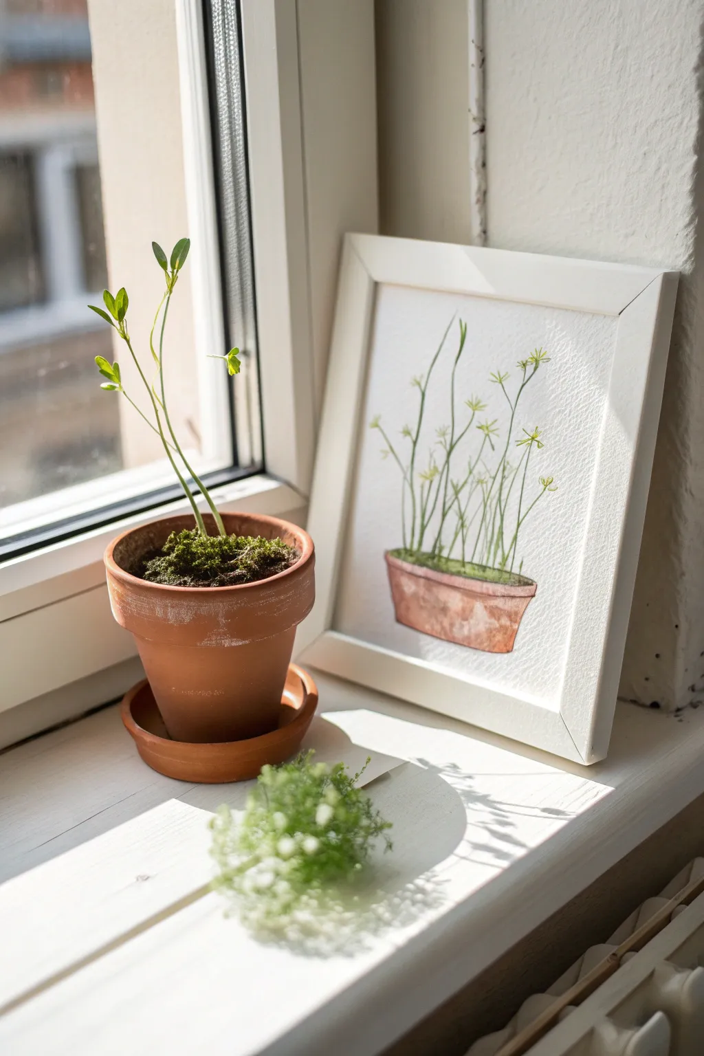
Capture the delicate promise of spring growth with this airy watercolor study of tall, spindly seedlings reaching for the light. The combination of loose, organic lines and a structured terracotta pot creates a charming balance perfect for framing.
Step-by-Step
Materials
- Cold press watercolor paper (300 gsm)
- Watercolor paints (Terracotta/Burnt Sienna, Sap Green, Lemon Yellow, Paynes Grey)
- Round watercolor brushes (sizes 2 and 6)
- Pencil (HB or H)
- Kneaded eraser
- Jar of clean water
- Paper towels
- White or light wood frame (to match the aesthetic)
Step 1: Sketching the Composition
-
Draft the pot shape:
Begin by lightly sketching the outline of the terracotta pot near the bottom of your paper. Draw an elongated oval for the rim, and taper the sides downwards to a slightly narrower base. -
Add the rim detail:
Create a second line just below the top oval to define the thickness of the pot’s rim. Keep your pencil pressure very light so graphite doesn’t smudge into the yellow paint later. -
Outline the stems:
Draw faint, vertical lines rising from the pot. Let them wander slightly—some straight up, others curving gently left or right—to mimic natural growth seeking sunlight. -
Mark leaf clusters:
At the top of the stems and at random midway points, make tiny marks or crosses where the small leaf bursts will go. This roadmap helps prevent overcrowding. -
Clean up:
Gently roll a kneaded eraser over your sketch to lift excess graphite, leaving just a ghost of an outline to guide your brush.
Wobbly Lines?
If your stems feel too shaky, try painting them faster. A quick, confident stroke is often smoother than a slow, careful one. Exhale as you pull the brush upward.
Step 2: Painting the Pot
-
First wash:
Mix a watery wash of Burnt Sienna or a terracotta hue. Using the size 6 brush, fill in the main body of the pot, leaving a few small patches white for highlights. -
Define the shadow:
While the first wash is still damp, drop slightly more concentrated pigment into the right side and bottom of the pot to create a natural curve and volume. -
Paint the rim:
Paint the rim with a slightly darker mix of the same color. I like to let the main body dry just a touch before doing this so the rim stays distinct. -
Add texture:
Once the pot is semi-dry, use a drier brush to scumble a little Paynes Grey or dark brown near the bottom or under the rim for an aged, earthy texture.
Pro Tip: Highlight trick
To make the terracotta pot look rounder, lift out a vertical strip of pigment on the left side with a clean, damp brush while the paint is still wet.
Step 3: The Greenery
-
Soil base:
Mix a dark Sap Green with a touch of brown. Paint the oval surface inside the pot rim to represent the mossy soil, dabbing the brush to create texture. -
Stem structure:
Switch to your size 2 brush. Mix a light, fresh green using Sap Green and Lemon Yellow. With a steady hand, meaningful strokes, paint the long vertical stems following your sketch lines. -
Varying greens:
While painting stems, occasionally dip your brush tip into a slightly darker green without rinsing. This creates natural variation in the stems rather than a flat, uniform color. -
Leaf bursts:
At the top of the stems, paint the tiny leaves. Use the tip of the brush to press and lift, creating small, teardrop-like shapes that radiate outward like a starburst. -
Adding depth:
Once the first layer of leaves is dry, add a few smaller, darker green leaves behind the lighter ones to create a sense of volume and density. -
Final details:
Mix a very pale yellow-green wash. Add tiny buds or lighter leaves near the tips of the tallest stems to suggest new growth catching the light.
Once dry, frame your artwork in a simple white frame and place it near a window to echo the light in your painting


Clover and Fresh Greenery Study
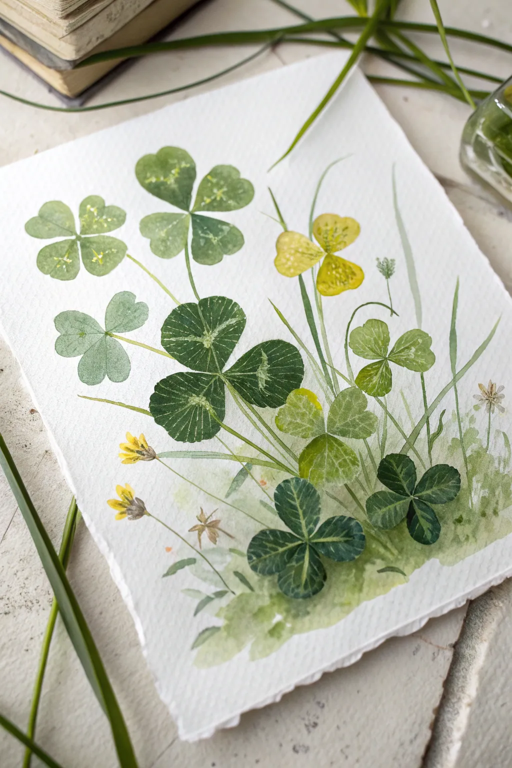
Capture the magic of spring with this delicate study of clovers and wild grasses. Using layers of translucent greens and subtle texturing, you’ll create an airy composition that feels like a lucky find in a sketchbook.
Detailed Instructions
Materials
- Cold press watercolor paper (300 gsm)
- Watercolor paints: Sap Green, Hooker’s Green, Lemon Yellow, Yellow Ochre, Burnt Umber, Indigo
- Round brushes: sizes 2, 4, and 6
- Finer detail brush: size 0 or 00
- Pencil (HB) and kneaded eraser
- Clean water and paper towels
- White gouache or white gel pen (optional for highlights)
Step 1: Planning and Base Layers
-
Light Sketching:
Begin by lightly sketching the main clover groupings. Place the largest four-leaf clover near the center-left as your focal point, and scatter smaller three-leaf clovers around it. Keep your pencil lines extremely faint so they disappear under the paint. -
Mixing Greens:
Prepare three distinct green puddles on your palette: a ‘fresh’ green (Sap Green + Lemon Yellow), a ‘deep’ green (Hooker’s Green + Indigo), and a ‘muted’ green (Sap Green + tiny touch of Burnt Umber). This variety is key to natural-looking foliage. -
The Focal Clover:
Start with the large, central four-leaf clover. Load your size 6 brush with the deep green mixture. Paint the heart-shaped leaves, leaving a very thin white gap between the four leaflets to separate them distinctively. -
Lighter Clovers:
While the first clover dries, paint the upper-left four-leaf clover using a much more watered-down version of your fresh green mix. This variation in value creates depth, making some leaves look translucent. -
Wet-on-Wet Variation:
For the lower-right clover leaf, try dropping a tiny amount of yellow into the wet green paint near the edge of the leaf. Let it bleed naturally to simulate sunlight hitting the delicate edges.
Pro Tip: Lifting Out
To create the pale patterns on clover leaves, wait until the paint loses its shine but is still damp. Gently wipe with a clean, damp brush to lift pigment away.
Step 2: Adding Variety and Grasses
-
Yellow Wood Sorrel:
Mix Lemon Yellow with a touch of Yellow Ochre. Paint the small, heart-shaped leaflets of the yellow clover-like flower (wood sorrel) near the top right. Keep the paint fluid and light. -
Grounding Wash:
Dilute your fresh green mixture heavily with water. Using a large brush, sweep a very loose, organic wash across the bottom third of the paper. This suggests a grassy bed without needing individual blades. -
Tall Grasses:
Switch to your size 2 brush. Using a swift, upward flicking motion, paint long, thin blades of grass shooting up from the bottom wash. vary the pressure to make the lines taper naturally at the tips. -
Tiny Wildflowers:
Using a size 0 brush and pure Yellow Ochre, dab small yellow blooms on thin stems near the bottom left. These add a nice pop of contrasting color against the sea of green.
Level Up: Deckled Edges
Tear the edges of your watercolor paper against a ruler before starting painting. This creates a vintage, handmade paper look that suits botanical studies perfectly.
Step 3: Detailing and Texture
-
Vein Work:
Once the large green clovers are completely dry, use your finest brush (size 0) with a slightly darker, concentrated green mix to paint the delicate veins radiating from the center of each leaflet. -
The Characteristic Chevron:
Many clovers have a faint white V-shape or chevron on their leaves. To achieve this, lift a little pigment with a damp, clean brush on the drying leaves, or paint around this area if you have excellent brush control. -
Stem Connections:
Connect all your floating leaves to the ground. Use the size 2 brush and a mix of Sap Green and Burnt Umber to draw thin, slightly curving stems that disappear into the bottom wash. -
Texture Splatter:
I like to load a brush with clean water or very diluted yellow paint and gently tap it over the semi-dry yellow flower area. This creates small blooms and interesting texture variations. -
Spatter Effects:
For an organic, earthy feel, pick up some watery green paint on a brush and tap the handle against your finger to spatter tiny droplets near the grassy base. -
Darkest Accents:
Mix your darkest green yet (add more Indigo). Paint the small, shadowed clover tucked low on the right side to anchor the composition visually. -
Final Highlights:
If your white paper highlights got lost, use a tiny dot of white gouache or a gel pen to restore the sparkle in the center detailing of the leaves.
Allow your painting to dry flat completely before framing this refreshing slice of nature.
Mushrooms After a Spring Rain
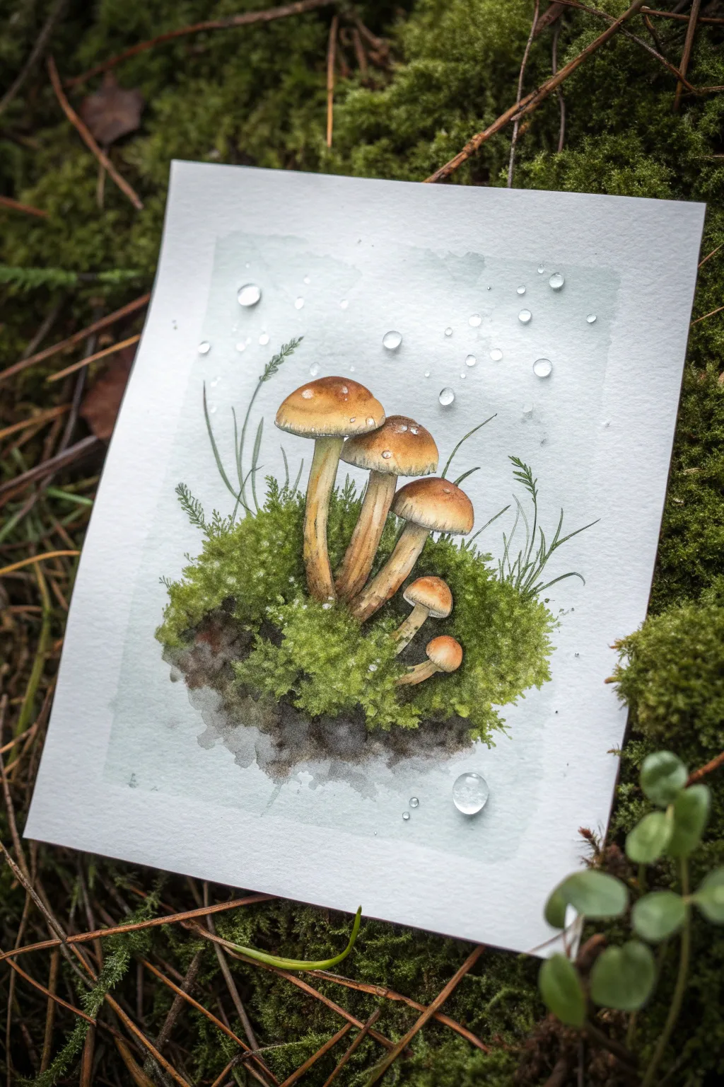
Capture the fresh, dewy essence of spring with this detailed watercolor study of mushrooms sprouting from a mossy bed. This project focuses on building translucent layers for the caps and creating convincing texture for the moss and water droplets.
Step-by-Step Guide
Materials
- Cold press watercolor paper (300 gsm)
- Pencil (HB or H for light lines)
- Kneaded eraser
- Watercolor paints (Burnt Sienna, Yellow Ochre, Sap Green, Olive Green, Sepia, Payne’s Grey, Burnt Umber, White Gouache)
- Round brushes (sizes 2, 4, and 6)
- Detail brush (size 0 or 00)
- Mixing palette
- Two jars of water
- Paper towels
Step 1: Sketching & Background Wash
-
Establish the composition:
Begin with a very light pencil sketch. Draw a central cluster of five mushrooms: one tall leader, two medium companions, and two small buttons tucked below. Outline the irregular mound of moss at their base. -
Add environmental details:
Sketch a few thin, grassy blades shooting up from the moss, some reaching higher than the tallest mushroom. Mark faint circles in the sky area where your water droplets will eventually go. -
Paint the atmospheric backdrop:
Mix a very dilute wash of Payne’s Grey with a touch of Sap Green. Wet the rectangular area behind your mushrooms (avoiding the mushroom shapes themselves) and drop in this pale, misty color. Let it fade to white at the edges.
Step 2: Painting the Mushrooms
-
Base coat for stems:
Mix Yellow Ochre with a tiny bit of Burnt Sienna. Paint the stems with a diluted wash, leaving them slightly lighter on the left side to suggest a light source. -
First layer on caps:
For the mushroom caps, use a mix of Burnt Sienna and Yellow Ochre. Paint the entire cap shape, keeping the color richer at the top center and fading out toward the edges. -
Deepening the cap color:
While the first layer is still slightly damp, drop in pure Burnt Sienna or Burnt Umber at the very top of each cap to create a rounded, 3D effect. Let this dry completely. -
Stem texture:
Using a size 2 brush and a mix of Sepia and Yellow Ochre, paint thin, vertical striations on the stems. These lines should be broken and organic, not perfectly straight, to mimic the fibrous texture. -
Shadows under the caps:
Mix a darker glaze using Sepia. Apply this delicately right underneath the rim of the caps where they meet the stems, and darken the gills area just slightly.
Drop of Magic
For ultra-realistic raindrops, keep the top edge of the droplet soft and blended, but make the bottom shadow edge sharp and crisp.
Step 3: Creating the Mossy Bed
-
Base green layer:
Wet the moss area at the bottom. Drop in varied greens—Sap Green for fresh spots and Olive Green for shadowed areas. Let the colors bleed together naturally. -
Adding earth tones:
While the green is damp, drop in concentrated Sepia or Burnt Umber at the very bottom edge of the mound to represent the soil and roots, grounding the composition. -
Stippling texture:
Once the base is dry, use a scruffy or dry brush with thicker Sap Green paint. Tap (stipple) the paper to create the fuzzy, dense texture of moss. -
Defining grass blades:
With your smallest detail brush (size 0), paint sharp, thin lines for the grass blades using a mix of Olive Green and Grey. Vary the pressure to make the tips taper off.
Muddy Greens?
If your moss looks muddy, let the paper dry completely. Then, glaze over it with a distinct bright yellow-green to bring the vibrancy back.
Step 4: The Raindrops & Highlights
-
Lifting color for droplets:
If you painted over your droplet circles, use a damp, clean brush to gently lift the pigment from those circular spots, revealing the white paper. -
Shading the droplets:
Paint a thin crescent shadow on the bottom right of each droplet using dilute Payne’s Grey. This gives them volume. -
Adding the catchlight:
Use a tiny dot of White Gouache on the top left of each droplet and on the wettest-looking parts of the mushroom caps. This is the reflection that makes them look wet. -
Final crisp details:
Review the painting for contrast. I often add a few tiny, dark dots into the moss or sharpen the edge of a mushroom cap with Sepia to make the image pop.
Now step back and admire the damp, earthy atmosphere you have created on the page
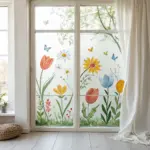
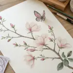
Butterfly Over Wildflowers
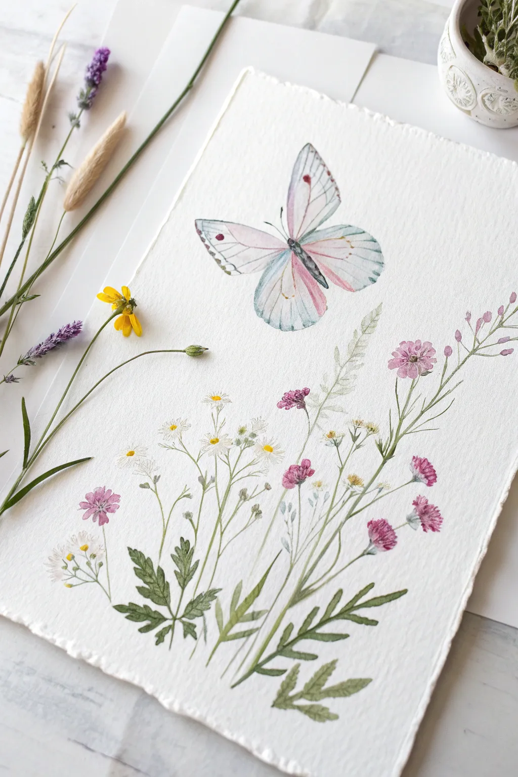
Capture the delicate beauty of a spring meadow with this soft and airy watercolor composition. Featuring a hovering butterfly in pastel hues above a scattering of pink and white wildflowers, this project emphasizes light washes and organic botanical shapes.
How-To Guide
Materials
- Cold press watercolor paper (deckled edge preferred for look)
- Watercolor paints (Sap Green, Alizarin Crimson, Cerulean Blue, Lemon Yellow, Paynes Gray)
- Round watercolor brushes (Size 2 and 6)
- Pencil (HB or 2H)
- Kneaded eraser
- Clean water jar
- Paper towels
Step 1: Sketching the Composition
-
Draft the stems:
Begin by lightly sketching the main cluster of stems radiating from the bottom center. Use curved, slightly erratic lines to mimic the natural growth of wildflowers, varying their heights. -
Outline the flowers:
Draw small circles and ovals at the tips of the stems to mark where the blooms will go. Add a few fern-like leaf shapes near the base to anchor the composition. -
Position the butterfly:
Sketch the outline of the butterfly just above the tallest blades of grass. Draw the teardrop abdomen first, then extend two large upper wings and two smaller, rounded lower wings. -
Lighten the lines:
Roll your kneaded eraser gently over the entire sketch. You want the graphite to be barely visible so it doesn’t muddy the transparent watercolor paint later.
Bleeding Colors?
If your pinks are running into your greens, you are painting too fast. Let adjacent sections dry completely before painting next to them, or use a hair dryer on a low, cool setting.
Step 2: Painting the Wildflowers
-
Greenery base layer:
Mix a watery Sap Green with a touch of yellow. Using a size 6 brush, paint the broad fern leaves at the bottom and the main stems. Keep the strokes fluid and don’t worry about staying perfectly inside the lines. -
Pink buds:
Dilute Alizarin Crimson with plenty of water to create a soft pink. Paint the small, clustered flower heads on the right side using a stippling motion to suggest petals. -
White daisies:
For the white daisies, leave the paper blank for the petals. Mix a tiny bit of Paynes Gray with water to create a very pale shadow and outline a few petals loosely to give them form. -
Daisy centers:
Once the areas around the daisies are dry, drop a small dot of Lemon Yellow mixed with a hint of brown into the center of each white flower. -
Adding depth to leaves:
Mix a darker green by adding a touch of Paynes Gray or blue to your green mix. With the size 2 brush, add veins to the larger leaves and paint the thinner, darker grass blades that weave through the flowers for contrast.
Add Metallic Magic
For a magical shimmer, use pearl or iridescent watercolor medium over the butterfly wings once the paint is fully dry to catch the light beautifully.
Step 3: Painting the Butterfly
-
First wing wash:
Wet the butterfly’s wings with clean water first. Drop in a very pale wash of diluted Cerulean Blue near the outer edges and bottom tips of the wings. -
Adding pink tones:
While the paper is still slightly damp, introduce a pale pink wash near the body of the butterfly, letting it bleed softly into the blue areas without overworking it. -
Defining the body:
Use a concentrated mix of Paynes Gray (almost black) and a size 2 brush to paint the butterfly’s narrow body and the delicate antennae. -
Wing veins and details:
Once the wings are completely dry, mix a watery grey-purple. Use the very tip of your size 2 brush to draw fine lines radiating from the body to the wing edges. -
Final spots:
Add the distinct small spots on the upper wings using a mix of crimson and brown. Make sure these are sharp and not blurry.
Step 4: Finishing Touches
-
Splatter texture:
Load a small brush with very watery green or pink paint. Tap the handle against your finger to create a few microscopic splatters around the blooms for an organic, unplanned look. -
Review and refine:
Step back and assess the painting. If any stems look disconnected, lightly connect them with a fine line of green. Ensure the butterfly feels balanced above the flora.
Allow your painting to dry flat completely before framing or displaying your slice of spring.
Have a question or want to share your own experience? I'd love to hear from you in the comments below!