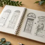
If you’ve ever stared at a blank page, story drawing ideas are my favorite way to get the pencil moving—because you’re not drawing “a thing,” you’re drawing what happens next. I love leaning on simple narrative sequences that make it easy to show character, setting, and a clear beginning-to-end arc.
Four-Panel Story Grid
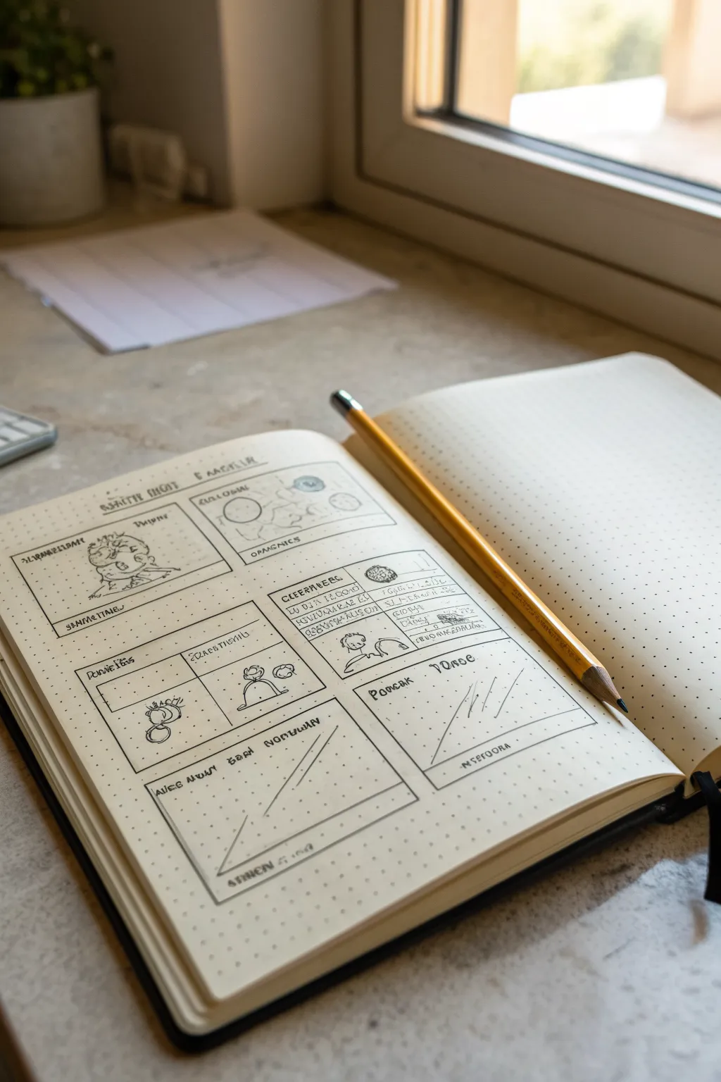
This project captures the raw, creative energy of planning a narrative sequence with a structured four-panel layout on dot grid paper. It mimics the look of a brainstorming session where initial ideas are penciled in with loose, expressive lines and geometric frameworks.
Step-by-Step Tutorial
Materials
- A5 Dot Grid Notebook (cream or white paper)
- Standard HB or 2B Graphite Pencil (yellow barrel for aesthetic)
- Ruler or Straight Edge
- Eraser
Step 1: Setting the Structure
-
Define the Frame Boundaries:
Begin by establishing the outer perimeter of your story grid. Using your ruler on the left-hand page, draw a large rectangle that leaves about an inch of margin on all sides. -
Divide the Grid:
Split this large rectangle into four equal quadrants. Draw a vertical line straight down the center and a horizontal line across the middle. These will be your main story panels. -
Create Header Zones:
At the very top of the page, sketch a thin horizontal bar for the main title. Inside each of the four panels, draw a smaller, thin rectangular box at the top; these will serve as spaces for scene descriptions or captions. -
Add a Breakdown Section:
Below the two right-hand quadrants, draw two additional square frames. These are slightly smaller and are intended for detailed breakdowns or alternate angles of the story beats.
Uneven Panels?
Count the dots! Since you are using dot grid paper, count the number of spaces between dots to ensure your center vertical and horizontal lines are perfectly positioned.
Step 2: Sketching the Narrative
-
Panel One: The Character Intro:
In the top-left panel, sketch a rough, circular character shape. Don’t worry about perfect anatomy; use loose, scribbly lines to suggest a figure sitting or interacting with an object. I like to keep the pencil pressure light here so adjustments are easy. -
Panel Two: The Environment:
Move to the top-right panel. Sketch two or three circles of varying sizes to represent planets or abstract thoughts. Connect them with faint lines to suggest a system or a relationship map. -
Panel Three: Action Sequence:
In the bottom-left panel, draw two small figures interacting. Use simple stick-figure mechanics—one figure reaching out, the other recoiling. Add a small looped shape to imply motion or sound. -
Panel Four: The Resolution:
For the bottom-right panel, focus on a single object. Draw a simple dome or hill shape with a rising sun or moon above it. Keep the lines minimal to suggest a peaceful conclusion.
Pro Tip
Don’t sharpen your pencil to a needle point. A slightly duller tip creates softer, more expressive lines that look better for rough storyboarding concepts.
Step 3: Adding Technical Details
-
Insert Faux Text:
Fill the caption boxes you created earlier with ‘lorem ipsum’ style scribbles. Use jagged, small zig-zags to imitate handwriting without actually writing words, giving it that conceptual draft look. -
Detail the Breakdown Boxes:
In the extra squares at the bottom, draw abstract graphs. In the left square, draw a diagonal line rising from left to right. In the right square, draw three parallel diagonal dashes. -
Reinforce the Linework:
Go back over the main panel borders with firmer pressure to make the grid pop against the dot background. This separates the ‘frame’ from the ‘sketch’ inside. -
Add Texture and Shading:
Lightly shade the background of the character in the first panel using diagonal hatching. This adds depth and differentiates the foreground figure from the empty space. -
Review and Refine:
Step back and look at the spread. If any grid lines look too shaky, straighten them out, but leave the interior drawings loose to maintain the sketch aesthetic.
Now you have a professional-looking storyboard draft ready for your next big idea


Classic Three-Beat Strip
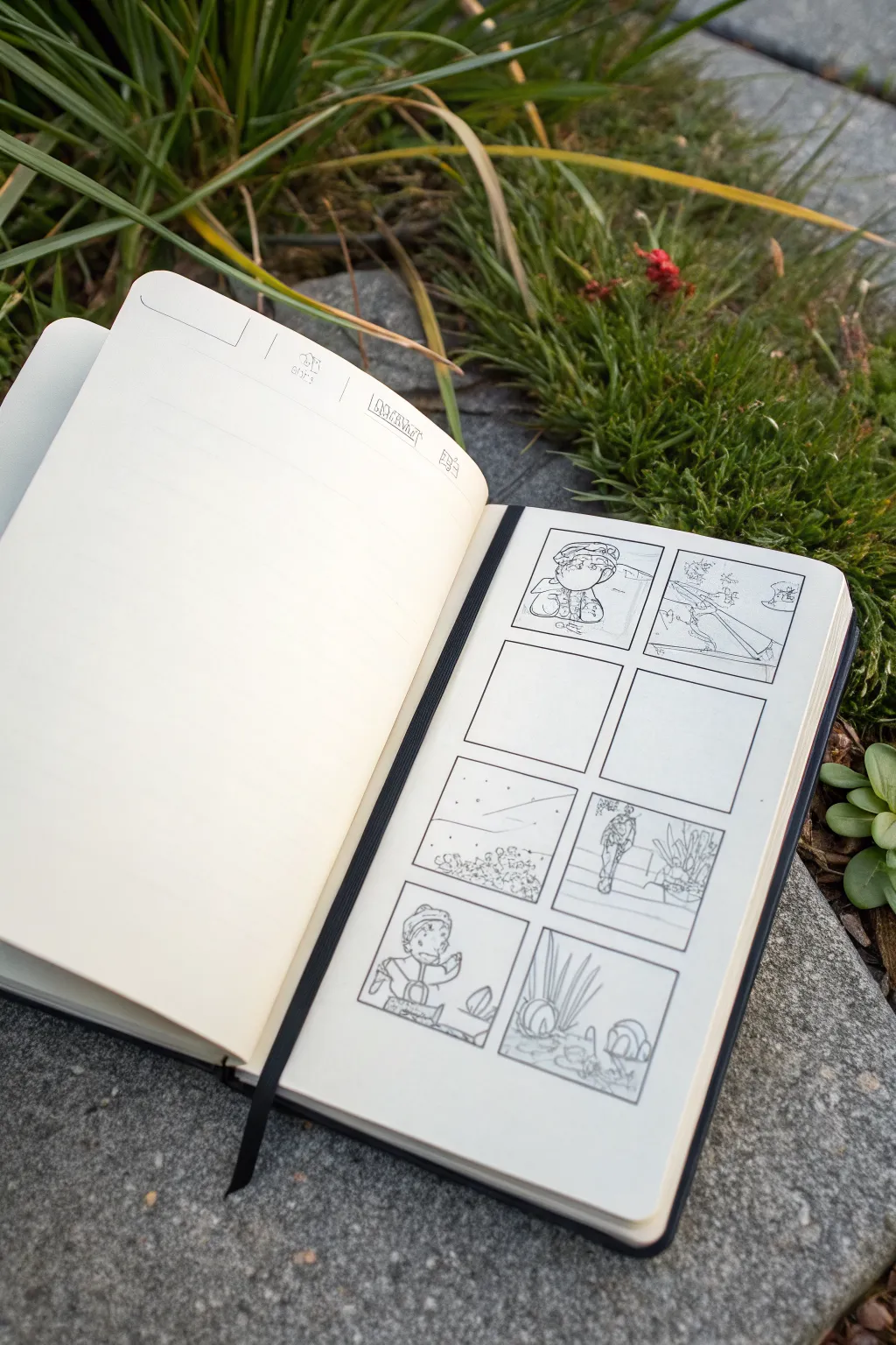
This project transforms a simple sketchbook spread into a multi-panel comic draft, capturing whimsical characters and environments in a classic storyboard format. It features a hand-drawn 2×4 grid layout with loose, expressive pencil work that feels organic and full of potential.
Detailed Instructions
Materials
- Pocket-sized sketchbook (blank or dot grid pages)
- H or HB graphite pencil
- Fine-tip black pen (0.1mm or 0.3mm)
- Ruler or straight edge
- Eraser
Step 1: Setting up the Grid
-
Measure the margins:
Open your sketchbook to a fresh, blank right-hand page. Using your ruler, lightly mark a margin of about 1-2 cm from the top, bottom, and side edges to ensure your panels stay centered. -
Divide the space:
Find the vertical center of the page and draw a light vertical line. Then, divide the height into four equal horizontal sections. This creates the skeleton for your 2×4 grid layout. -
Define the panels:
Using your fine-tip pen and ruler, ink the boxes. Leave a small gap (gutter) between each panel to separate the scenes clearly. Don’t worry if lines aren’t perfectly mechanical; a slight wobble adds charm. -
Create the header:
On the facing left page, draw a simple header area. You can add designated spots for date, weather, or location icons using fine lines, keeping the rest of the page open for notes or larger sketches.
Grid Consistency
Cut a piece of cardstock to the exact size of one panel. Use this as a tracing template to ensure every box on your page is identical without measuring every time.
Step 2: Sketching the Narrative
-
Drafting the first scene:
In the top-left panel, lightly sketch a character portrait using your pencil. Keep the lines loose, focusing on the expression rather than perfect anatomy. A beanie or hat adds distinct character silhouette. -
Adding subtle background:
Still in the first panel, sketch a horizon line behind the character to establish depth. I like to keep background details minimal here so they don’t compete with the face. -
Wide shot perspective:
Move to the top-right panel. Draw a wider landscape view, perhaps a path or a beach scene with a distant figure, to establish the setting. Use swift, horizontal strokes for the ground. -
Strategic spacing:
Leave the second row of panels completely blank. This ‘negative space’ is crucial—it acts as a pause in the visual pacing and can be filled later with dialogue, close-ups, or left empty for artistic effect. -
Atmospheric elements:
In the third row, left panel, sketch a starry sky or floating particles. Use small dots and short dashes to suggest movement or a change in time of day. -
Background texture:
At the bottom of this ‘sky’ panel, add a cluster of low-lying foliage or rocks using scribbly, circular motions to ground the ethereal sky elements. -
Full figure drawing:
In the third row, right panel, draw your character walking away or standing near vegetation. Sketch some tall, leafy plants in the foreground to create layers and depth. -
Return to character focus:
For the bottom-left panel, zoom back in on your character. Draw them interacting with an object, like holding a small item or pointing, to show action. -
Environmental details:
Finally, in the bottom-right panel, sketch organic details like tall grass blades and rounded stones. Using vertical, varying-length strokes mimics the texture of wild grass effectively.
Adding Dialogue
Use the empty middle panels to write brief script notes, dialogue snippets, or color swatches related to the scenes above and below them.
Step 3: Final Touches
-
Reinforce key lines:
Go back over your pencil sketches and darken the most important lines—usually the character outlines and foreground objects—to make them pop against the background. -
Clean up:
Gently erase any stray guidelines or smudges outside the panel borders to keep the page looking crisp and intentional.
Now you have a structured storyboard ready to fill with your own mini-adventures or daily observations
Horizontal Storyboard Walkthrough
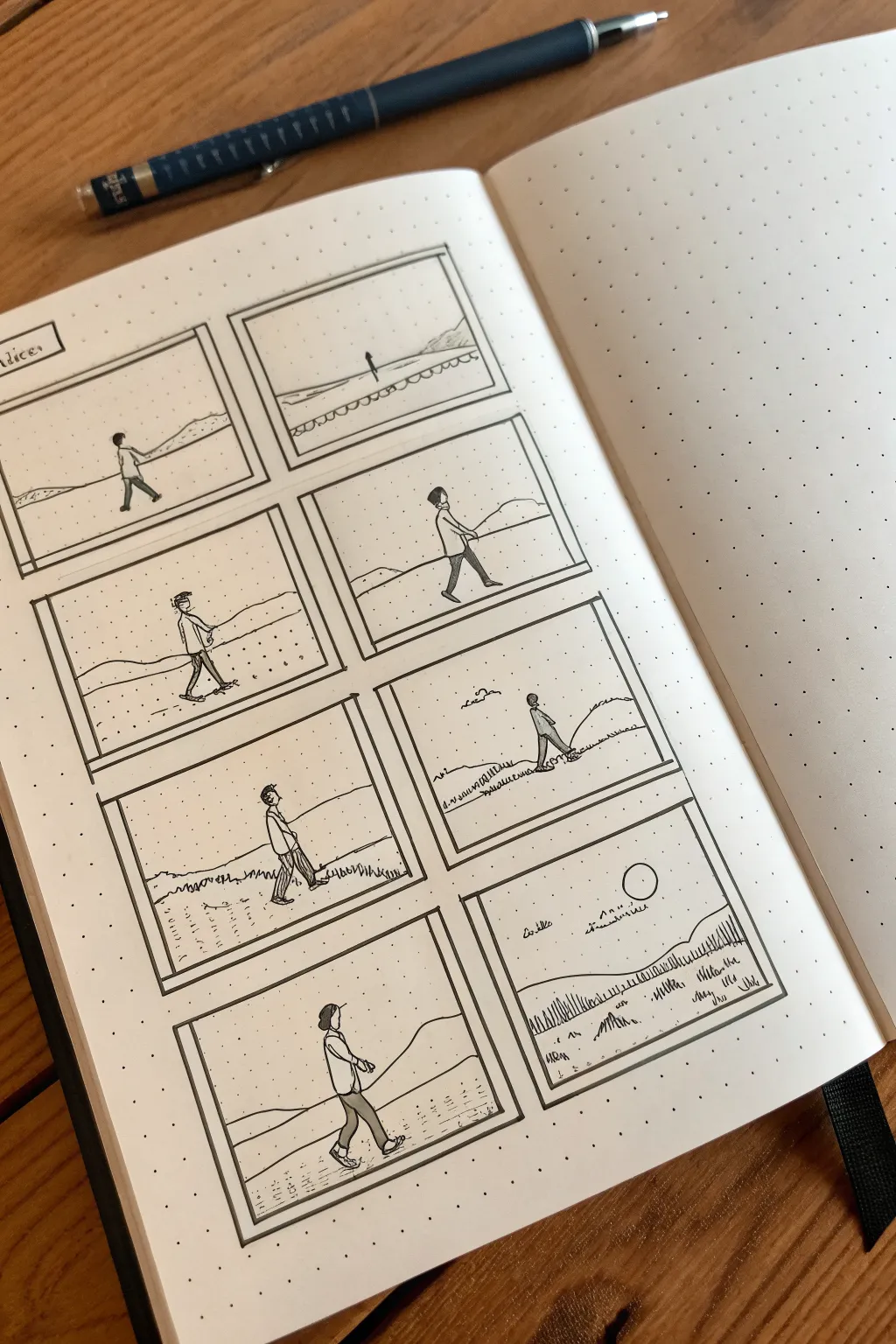
Capture a simple narrative of movement and solitude with this minimalist storyboard spread. Using clean lines and a dot grid notebook, you’ll sketch a character’s journey across a desolate landscape, panel by panel.
Step-by-Step
Materials
- A5 Dot grid notebook (e.g., Leuchtturm1917 or Rhodia)
- Black fine-liner pen (0.3mm or 0.5mm)
- Pencil (HB or similar for initial sketching)
- Eraser
- Ruler (clear plastic works best)
Step 1: Setting the Structure
-
Define the layout:
Start by identifying the space for your panels. You will need two columns of four rectangular boxes. Using your ruler and pencil, mark the corners of each box first to ensure they are evenly spaced on the dot grid. -
Draw the frames:
INK the panel borders using your fine-liner and ruler. Create a slightly double-lined effect on the left and top edges of each box to give them a subtle drop-shadow or depth, making the frames pop off the page. -
Establish the horizon:
Lightly sketch a horizon line in pencil across the panels. Don’t make it a straight line; vary the height slightly in each frame to simulate terrain changes as the character walks.
Step 2: Drafting the Narrative
-
Pencil the character:
Sketch a simple figure in each frame. Use a basic shape: a circle for the head and simple shapes for the torso and legs. The goal is to show a walking progression, so shift the leg positions (stride open, stride closed) in alternating panels. -
Adjust scale:
To create a sense of distance, draw the figure much smaller in the very first panel (top right) or second panel, placing them near the horizon line to show they are approaching from afar. -
Add landscape details:
Sketch rolling hills or dunes in the background. In the lower panels, add small vertical lines to suggest grass or vegetation in the foreground. -
The distinct circle:
In the bottom right panel, draw a clean circle in the sky to represent a sun or moon, setting the atmospheric tone for the end of the sequence.
Grid Guide
Use the dots! Count 6 dots down and 8 across for uniform boxes, leaving 2 dots of space between panels.
Step 3: Inking and Refining
-
Ink the horizon:
Go over your pencil landscape lines with the fine-liner. Keep your hand loose; a slightly wavering line looks more natural for terrain than a ruler-straight one. -
Outline the character:
Carefully ink your character sketches. Focus on the posture—a slight forward lean helps communicate the effort of walking. -
Add clothing details:
Refine the figure by adding a simple coat or shirt collar and defined pant legs. I find that leaving the face blank or minimalist keeps the focus on the action of walking. -
Texture the ground:
Add small stippling dots or tiny dashed lines on the ground area to suggest sand, dirt, or gravel. This adds texture without overcrowding the minimalist white space. -
Create depth with shading:
Add simple hatching (diagonal lines) on the shadowed side of the character’s legs and back. This grounds the figure so they don’t look like they are floating. -
Inking the vegetation:
For the bottom panels, ink the vertical grass strokes. Vary their height and group them in small clumps rather than spreading them perfectly even.
Dynamic Motion
Change the camera angle! Try drawing one panel as a close-up of just the feet walking to break the repetition.
Step 4: Final Touches
-
Erase pencil marks:
Wait until the ink is completely dry—give it a full minute—then gently erase all underlying pencil works to reveal the crisp black lines. -
Add handwritten elements:
If desired, add small, scribbly text or sound effects in the margins or within the frame to hint at wind or silence, keeping the handwriting loose and small. -
Review contrast:
Step back and look at the spread. If the character gets lost in the background, thicken the outline of the figure slightly to bring them forward.
You now have a serene, hand-drawn cinematic sequence right in your notebook

The Tortoise and the Hare Moments
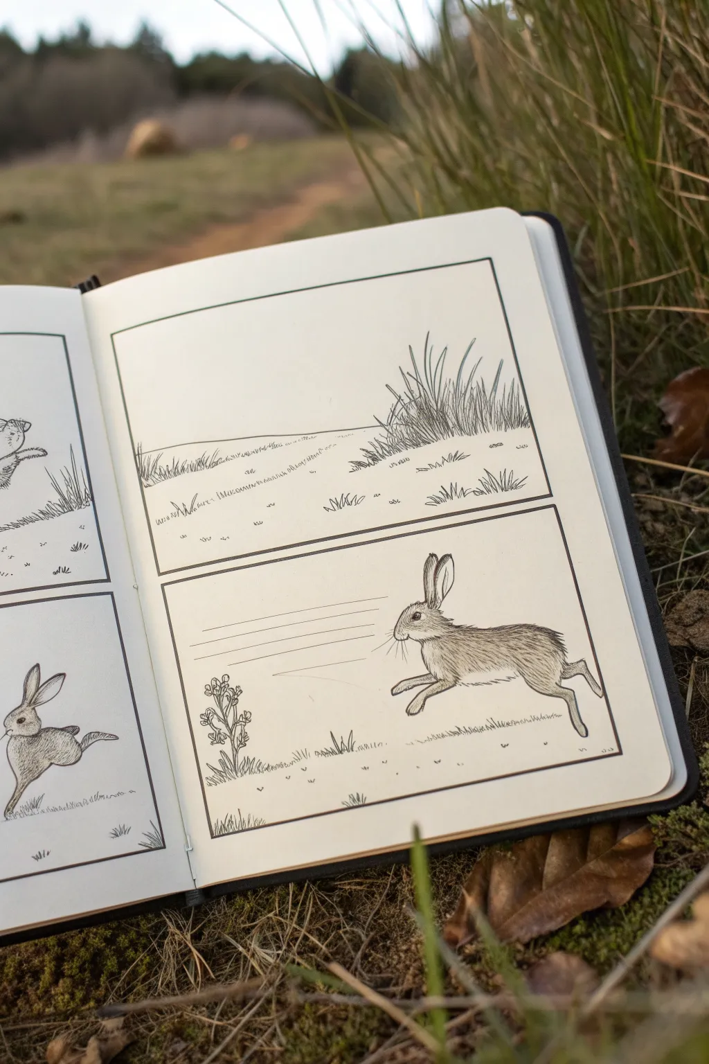
Capture the classic fable’s energy with this simple yet expressive comic-style nature study. Using fine lines and clean paneling, you’ll create a dynamic sequence that freezes the hare’s swift sprint in a moment of stillness.
How-To Guide
Materials
- Hardbound sketchbook (smooth or mixed media paper preferred)
- Pencil (HB or 2H for initial sketching)
- Ruler or straight edge
- Fine liner pens (sizes 0.1, 0.3, and 0.5)
- Eraser (kneaded preferred)
Step 1: Setting the Stage
-
Define the Panel layout:
Begin by lightly planning a two-panel layout on your right-hand page using a pencil and ruler. Draw two large rectangular boxes, one stacked above the other, leaving a small gutter of negative space between them. Ensure the lines are parallel to the page edges for a neat look. -
Ink the Borders:
Once satisfied with the placement, go over your panel borders with a 0.5 fine liner. Keeping these lines bold and consistent helps separate the artwork from the rest of the page.
Ink Smudging?
If your hand accidentally smudges wet ink, turn it into a shadow or texture. Add a few extra grass blades or cross-hatching over the smudge to camouflage the mistake seamlessly.
Step 2: The Silent Landscape
-
Establish the Horizon:
In the top panel, draw a gentle, slightly sloping horizon line about a third of the way up from the bottom border. Keep this line light and somewhat broken to suggest distant terrain rather than a solid wall. -
Cluster the Grasses:
On the right side of the top panel, sketch a cluster of tall, wild grasses. Use upward, flicking strokes that taper at the top to mimic natural growth. Vary the lengths and angles so they don’t look uniform. -
Add Distance Details:
Populate the mid-ground with smaller tufts of grass and low-lying vegetation. Use tiny, scratchy marks to indicate texture on the ground without overwhelming the white space. -
Inking the Landscape:
Switch to a 0.1 or 0.3 pen to ink the grass blades. Start from the base of each clump and flick upward quickly. Add cross-hatching to the base of the main grass cluster to give it density and shadow.
Step 3: The Running Hare
-
Gesture Drawing:
In the bottom panel, lightly sketch the hare’s body shape using oval forms. Place the main body oval in the center-right, a smaller circle for the head, and long, angular lines to map out the extended legs. -
Refine the Anatomy:
Connect your shapes to form the hare’s silhouette. Focus on the powerful back legs pushing off the ground and the front paws tucked in for aerodynamics. Don’t forget the characteristic long ears, pinned back slightly for speed. -
Add Environmental Context:
To the left of the hare, sketch a small, vertical plant or weed to anchor the scene. Add a few horizontal speed lines behind the hare’s head to visually suggest forward momentum. -
Outline the Subject:
With a 0.3 pen, carefully outline the hare. Use a slightly broken line rather than a solid continuous one; this helps precise fur texture later. Outline the small plant on the left as well. -
Texture the Fur:
Using your finest 0.1 pen, add fur texture. I find short, directional strokes that follow the curve of the muscle work best here. Concentrate denser strokes on the underbelly and hind legs to create shadow. -
Detailing the Face:
Add the eye, leaving a tiny white highlight for life. Dot the snout for whisker pads and draw long, sweeping whiskers extending backward. -
Grounding the Scene:
Add small dashes and grass tufts beneath the hare’s paws to show it isn’t floating in space. Ink the speed lines with very quick, confident horizontal strokes.
Dynamic Motion
To make the hare look faster, ensure the ‘speed lines’ behind the head are perfectly straight and thin. Use a ruler if your freehand lines are shaky; clean lines equal high speed.
Step 4: Final Touches
-
Erase Guidelines:
Wait until the ink is completely dry—smudging is heartbreaking at this stage—and gently erase all underlying pencil sketch lines. -
Assess Contrast:
Look at the overall balance. If the hare looks too pale, add another layer of hatching to the shadowed areas to make it pop against the background.
Now you have a lively comic strip showcasing nature’s speed on paper
BRUSH GUIDE
The Right Brush for Every Stroke
From clean lines to bold texture — master brush choice, stroke control, and essential techniques.
Explore the Full Guide
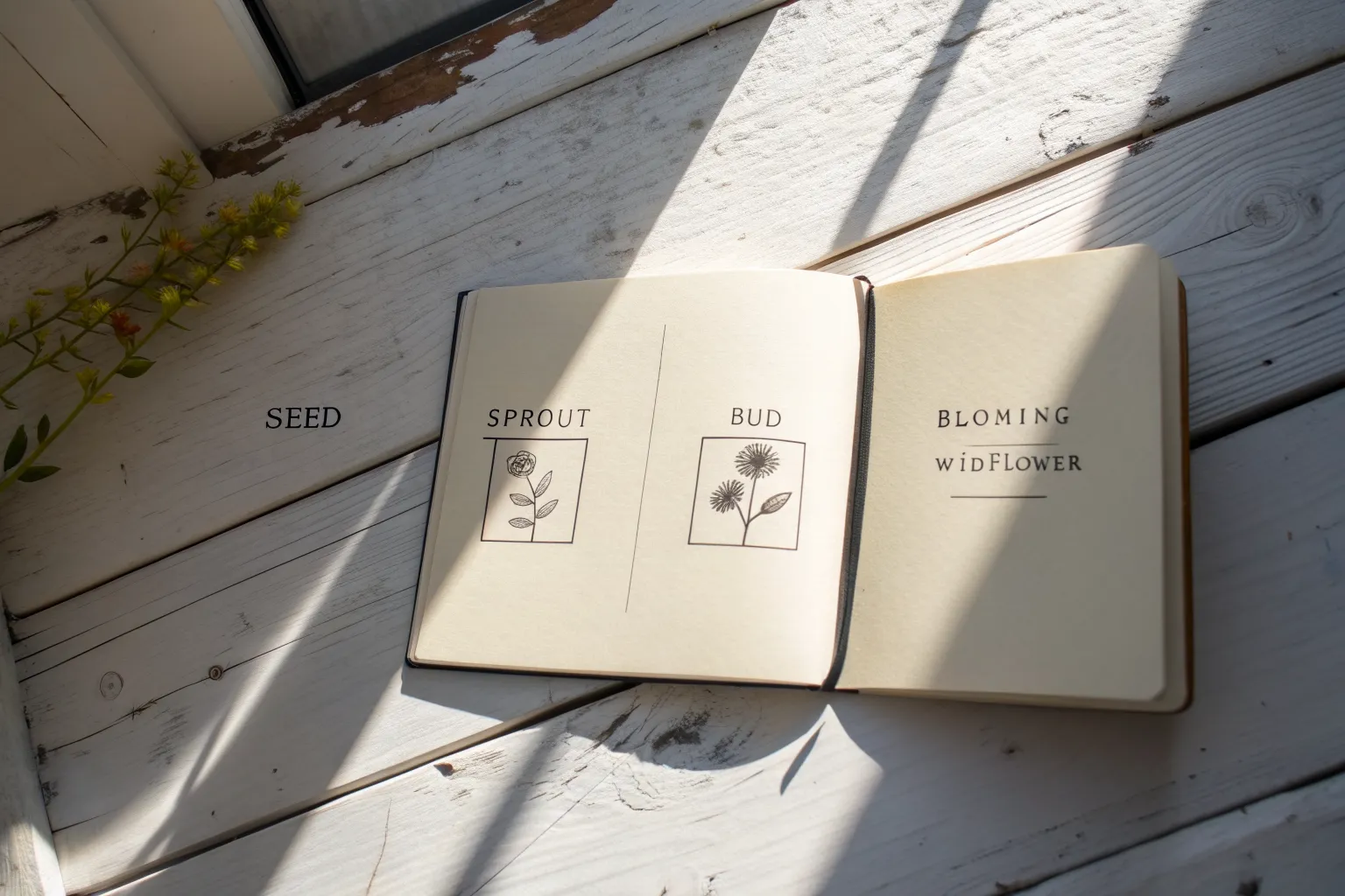
Seed-to-Tree Story Timeline
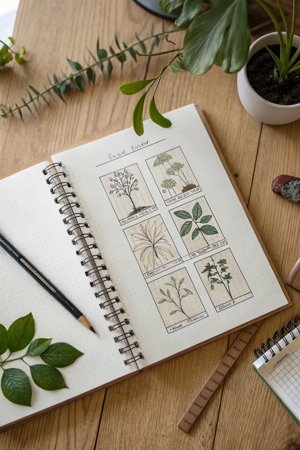
Capture the elegance of vintage scientific illustrations with this structured grid layout. This project creates a catalog of plant studies, featuring delicate ink lines and soft watercolor washes to document botanical growth stages.
Step-by-Step Tutorial
Materials
- Dotted or grid notebook (A5 size recommended)
- Fine liner pens (sizes 0.1 and 0.3, black waterproof)
- Pencil (HB or similar) for sketching
- Ruler
- Eraser
- Watercolor set or water-based markers (muted greens and browns)
- Small round paintbrush (size 2 or 4)
- Scrap paper for testing colors
Step 1: Setting the Structure
-
Calculated layout:
Begin by measuring the available space on your page. You need to create six identical rectangular boxes, arranged in two columns of three. Leave a generous margin at the top for your title and consistent spacing between each box—about 1 centimeter works well. -
Drafting the frames:
Lightly sketch these six rectangles with your pencil and ruler using the dots or grid on your paper as a guide to keep lines straight. Draw horizontal lines near the bottom of each rectangle to create small sections for labeling the plant names later on. -
Inking the grid:
Once satisfied with the layout, trace over your pencil lines using a 0.3 fine liner. Use the ruler to ensure crisp, clean edges for your frames, but keep the hand-drawn feel by not worrying if lines overlap slightly at the corners. -
Adding the header:
At the top of the page, draw a decorative line and lightly pencil in a title like ‘Tree Roots’ or ‘Botanical Study’ in a loose, cursive script.
Pro Tip: Vintage Look
For an aged, botanical textbook feel, use a cream or off-white paper instead of stark white. A light wash of diluted coffee over the dried drawing also works wonders.
Step 2: Plant Studies
-
First growth stage:
In the top-left box, sketch a young sapling with a thin trunk and sparse leaves. Focus on the branching structure; start with a central line and branch out in a ‘Y’ formation. -
Canopy development:
Move to the top-right box and sketch a taller, thinner tree species with high foliage, perhaps resembling an umbrella pine or similar silhouette. -
Leaf structure focus:
For the middle-right box, zoom in on a specific leaf cluster. Draw a central stem with oval-shaped leaves branching off in pairs to show detailed venation. -
Radial patterns:
In the middle-left box, draw a plant with radial symmetry, like a palm or fern. Start from a central point and extend long, slender leaves outward like a starburst. -
Simple stems:
In the bottom-left box, sketch a simple stem with alternating leaves. Keep the shapes organic and slightly irregular to look natural. -
Flowering or herb study:
Fill the final bottom-right box with a more complex herbaceous plant, showing smaller leaves and potentially budding flowers at the tips. -
Refining with ink:
Switch to your 0.1 fine liner for the delicate work. Trace your plant sketches. Use broken, shaky lines for bark texture and smoother, continuous strokes for leaves. Add tiny dots or hatching near the base of stems to suggest shadow and soil.
Dealing with Bleed
If your watercolors are warping the paper, let the page dry completely, shut the notebook, and place a heavy book on top overnight to flatten it out again.
Step 3: Adding Color & Detail
-
Base washes:
Using diluted watercolors or very light marker strokes, color the foliage. Stick to earthy olive tones and muted sage greens. I find it best to apply the color loosely, not worrying about staying perfectly inside the lines. -
Trunk tones:
Add a wash of pale brown or sepia to the trunks and stems. If your previous green layer is still wet, let the brown bleed slightly into it for a natural transition. -
Defining shadows:
Once the base layers are dry, add a slightly darker shade of green to the underside of leaf clusters or where leaves overlap to create depth. -
Textural details:
Return to your 0.1 pen. Add fine veins to the larger leaves and stipules using very light pressure. Strengthen the soil line at the base of each plant with scribbled textures. -
Scientific labeling:
In the small reserved sections at the bottom of each box, write illegible scribbles or Latin-sounding names in small block letters to mimic the look of old field notes. -
Final clean-up:
Wait for the ink and paint to be completely dry—give it a few minutes—and then gently erase any remaining pencil guidelines to leave the page looking crisp.
Now you have a beautifully organized botanical spread that captures the quiet beauty of nature study.
Speech Bubbles and Thought Bubbles
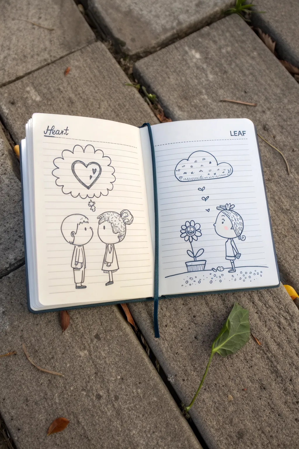
This charming sketchbook project uses simple line art and thoughtful details to tell a story across two pages. With clean ink lines and expressive thought bubbles, you’ll create a sweet narrative about connection and nature.
How-To Guide
Materials
- Small lined notebook or sketchbook
- Fine-point drawing pen (black ink, 0.3mm or 0.5mm)
- Pencil (HB or 2B)
- Eraser
- Ruler (optional)
Step 1: Planning and Preliminaries
-
Prepare the headers:
Begin by hand-lettering the titles at the top of your open notebook. On the left page, write ‘Heart’ in a looped cursive style. On the right page, print ‘LEAF’ in simple, capital block letters. -
Draw the divider lines:
Underneath your titles, draw a single dashed horizontal line across the top of each page to separate the header from the drawing space. -
Sketch the figures:
Using your pencil lightly, sketch the basic shapes for the characters. On the left, place a boy and girl facing each other. On the right, sketch a single girl looking at a flower pot. Keep the heads large and round in a cute ‘chibi’ style.
Smudge Alert
If your pen ink smears easily, place a scrap piece of paper under your hand while you draw to protect the rest of the page.
Step 2: Drawing the ‘Heart’ Page
-
Outline the boy:
Start inking the boy on the left. Draw a round head with a simple curved ear. Add his sweeping bangs and spiked hair at the crown. Outline a simple rectangular shirt and trousers, adding a small pocket detail. -
Outline the girl:
Ink the girl facing him. Give her a round face with messy, textured hair pulled into a high bun. Dress her in a simple A-line dress with a collar. Ensure their eye-lines meet. -
Add facial features:
Keep the faces minimal. Use small dots for eyes and a tiny curve for the nose. The simplicity conveys the innocence of the scene. -
Create the thought bubble:
Above their heads, draw a large distinct cloud shape. Instead of smooth curves, use a series of connected semicircles to form a fluffy border. Connect it to the boy’s head with three small bubbles. -
Draw the heart:
Inside the bubble, draw a large heart with a double outline for a sketchy look. Add two tiny floating hearts next to it for emphasis.
Add Color Pop
Use a single colored pencil, like red or pink, to fill in just the small hearts or the flower’s center for a striking minimalist accent.
Step 3: Drawing the ‘Leaf’ Page
-
Draw the ground and pot:
On the right page, draw a slightly curved, uneven line for the ground. Place a trapezoid shape for the flower pot sitting on this line. -
Inking the flower:
Extend a stem upward from the pot with two oval leaves at the base. Draw a sunflower-like blossom with round petals and a smiley face in the center disk. -
Ink the girl:
Draw the girl standing to the right of the flower. Give her short, choppy hair with a small bow clip. She should be dressed simply, similar to the figure on the left page, with her hands clasped behind her back. -
Create the rain cloud:
Draw the thought bubble above the flower. This time, shape it like a flat-bottomed rain cloud. Use simple loops for the top and a straight, dashed line for the bottom. -
Fill the cloud details:
Inside the cloud, add tiny scribbles, swirls, and dashes to represent rain or confusing thoughts. Keep the marks loose and chaotic. -
Connect with hearts:
Instead of bubbles, draw three small floating hearts ascending from the girl’s head toward the cloud, showing her affection for the plant.
Step 4: Final Touches
-
Add texture to the ground:
On the ‘Leaf’ page, add small circles and dots beneath the ground line to suggest soil/pebbles. Include a few fallen leaves or rocks near the pot. -
Erase pencil lines:
Wait until the ink is completely dry to avoid smudging. Then, gently erase all your preliminary pencil sketches to reveal the crisp black lines. -
Review and refine:
Check your line weights. If you want certain areas to stand out, like the outline of the heart or the hair, go over them once more to thicken the line slightly.
Now you have a whimsical, storytelling spread ready to inspire your next creative entry

PENCIL GUIDE
Understanding Pencil Grades from H to B
From first sketch to finished drawing — learn pencil grades, line control, and shading techniques.
Explore the Full Guide
Silent Story With Pure Expressions
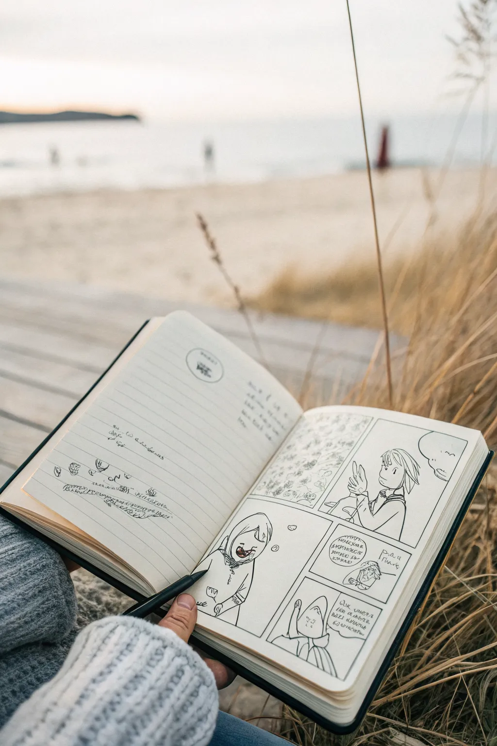
Capture the nuance of a silent narrative using nothing but facial expressions and body language in this comic strip study. This project focuses on clean linework and panel composition to tell a story without relying heavily on dialogue, perfect for a quiet moment of reflection.
Step-by-Step Tutorial
Materials
- A5 or A6 sketchbook (blank or lined)
- Fine liner pen (0.3mm or 0.5mm, black)
- Pencil (HB for sketching)
- Eraser
- Ruler (optional, hand-drawn lines add charm)
Step 1: Conceptualizing & Layout
-
Brainstorm the emotion:
Before putting pen to paper, decide on the micro-narrative. The goal here is a ‘silent story,’ so think about a sequence of reactions—surprise, realization, or quiet contemplation. Keep it simple. -
Pencil the grid:
On the right-hand page of your sketchbook, lightly sketch a four-panel grid. You don’t need a ruler if you want that organic, hand-drawn aesthetic shown in the example, but try to keep the spacing between panels (the gutters) relatively even. -
Draft the panel shapes:
Vary the sizes slightly to control pacing. Notice how the top right panel is larger for an establishing character shot, while the bottom panels are smaller for detailed reactions.
Loose Aesthetics
Don’t connect every line perfectly. Leaving small gaps in hair or clothing outlines keeps the drawing feeling airy and spontaneous.
Step 2: Drafting the Figures
-
Sketch the first character:
In the top right panel, lightly pencil your main character. Focus on the tilt of the head and the hand gesture. The character in the example is looking back, perhaps noticing something, with a simple, clean hairstyle. -
Add background texture:
For the top left panel, sketch a textured, abstract background. This could represent foliage, a crowd, or just visual noise. Use loose, small circles or squiggles to differentiate it from the clean lines of the character. -
Draft the lower panels:
Move to the bottom section. Sketch the character in a hooded outfit or a different pose to show a shift in time or perspective. Keep the facial features minimal—dots for eyes can be surprisingly expressive. -
Refine the expressions:
Go back over your pencil sketches and sharpen the expressions. A slightly open mouth or a raised eyebrow does the heavy lifting here since there is minimal text. I find that simplifying the nose helps keep the focus on the eyes.
Step 3: Inking the Story
-
Outline the panels:
Take your black fine liner and trace over your panel borders first. This establishes the boundaries of your comic. Don’t worry if the lines wobble a little; it adds to the ‘field sketch’ vibe. -
Ink the main character:
Carefully ink the character in the top right. Use confident, continuous strokes for the hair and clothing folds. Avoid ‘petting’ the line (short, feathery strokes) as this makes the drawing look fuzzy. -
Detail the texture panel:
Ink the textured panel on the left. Use stippling or small, rapid scribbles to create density without drawing every single leaf or detail. -
Ink the bottom sequence:
Proceed to the lower panels. Outline the hooded figure and the smaller inset panel. If there are speech bubbles, ink their outlines now, ensuring they don’t crowd the character’s head. -
Add ‘text’ textures:
Instead of writing legible words, use squiggles or alien-like symbols inside the speech bubbles. This emphasizes that the *feeling* of the speech is more important than the literal words.
Make it yours
Try using a sepia or dark blue ink instead of black for a softer, vintage field-journal look.
Step 4: Finishing Touches
-
Erase pencil lines:
Wait for the ink to become completely dry to the touch. Gently erase all underlying graphite sketches to leave a crisp, high-contrast black and white image. -
Populate the facing page:
On the left page, add some loose notes or tiny doodles to frame the main artwork. You can write stream-of-consciousness thoughts or just practice small icons like the eye or plant shapes shown in the reference. -
Add final weight:
Look at your inked lines one last time. Thicken the lines on the underside of the chin or the dark side of the hood to add a subtle sense of shadow and dimension.
Enjoy the quiet satisfaction of seeing your silent narrative come to life on the page
Map-to-Scene Journey Panels
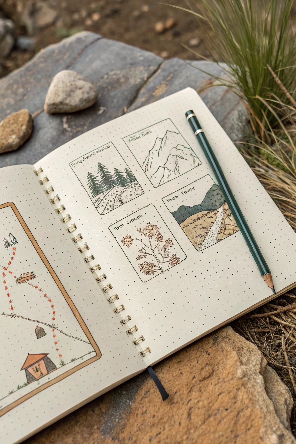
This project transforms a simple page spread into an adventure log by combining a schematic map on the left with detailed vignette illustrations on the right. The aesthetic mimics classic field notes or RPG journals, using delicate lines and muted colors to capture specific landmarks.
Step-by-Step Tutorial
Materials
- A5 dot grid notebook or sketchbook
- Fine liner pens (sizes 0.1mm and 0.3mm, black or sepia)
- Graphite pencil (HB or 2B)
- Colored pencils (muted greens, browns, and soft yellows)
- Ruler or straight edge
- Eraser
Step 1: Layout & Framework
-
Define the spread:
Begin with an open dot grid notebook. On the left page, lightly sketch a large, tall rectangle that takes up most of the page to serve as your map boundary. On the right page, mark out the positions for four smaller, equal-sized rectangular panels arranged in a 2×2 grid. -
Draft the borders:
Using a ruler and your fine liner (0.3mm), ink the borders of the four panels on the right page. Keep the corners sharp. For the map on the left, you can choose a double line border to distinguish it as the main navigation tool. -
Sketch the map path:
On the left page, lightly pencil a winding path starting from the bottom and meandering upwards. Along this path, mark small “X” spots or tiny symbols representing the locations you plan to draw in the detail panels on the right.
Smudge Prevention
If your fine liner smears when erasing pencil, wait at least 15 minutes before erasing. Test your pen on a scrap page first to see how fast it dries.
Step 2: Detailing the Journey Panels
-
Sketch the pine forest:
In the top-left panel, sketch a cluster of pine trees. Focus on the triangular shapes first, then refine the jagged edges of the branches. Add a sloping hill in the foreground. -
Sketch the mountain peaks:
Move to the top-right panel. Draw sharp, angular mountain peaks. Use broken lines to suggest snowcaps and rocky textures, keeping the composition simple but striking. -
Sketch the botanical specimen:
In the bottom-left panel, dedicate this space to flora. Sketch a detailed branch with leaves or flowers, like the clover-style plant shown. Keep the lines delicate to differentiate it from the landscapes. -
Sketch the valley path:
For the final bottom-right panel, draw a sweeping landscape with a road disappearing into the distance between hills. This creates a sense of depth and continuation. -
Ink the illustrations:
Switch to your thinner fine liner (0.1mm). Carefully go over your pencil sketches in the panels. Use stippling (dots) for the ground texture and short, directional strokes for grass and pine needles. -
Add handwritten labels:
At the top of each panel, neatly print the name of the location or specimen using a cohesive, slightly archaic font style. I find that extending the top horizontal line of letters like ‘T’ adds a nice fantasy touch.
Add Weather
Draw tiny diagonal lines in one panel for rain, or small cloud outlines in the mountain scene to suggest different weather conditions for each leg of the trip.
Step 3: Mapping the Route
-
Draw map icons:
Return to the left page. Draw miniature versions of the panel landmarks (a tiny tent, a small tree, a mountain icon) along the path you sketched earlier. -
Ink the path:
Ink the winding path using a dashed line or a series of small footprints. Connect the icons with this trail to show the progression of the journey. -
Add map details:
Add stylized map elements like a compass rose or purely decorative flourishes along the border to fill negative space.
Step 4: Coloring & Finishing
-
Apply base greens:
Using colored pencils, lightly shade the pine trees and grassy hills. Use a circular motion to keep the texture soft and avoid harsh lines. -
Add earthy tones:
Layer in browns and beiges for the mountain rocks, the dirt path, and the tent on the map side. Keep the colors desaturated to maintain the vintage field-guide look. -
Highlight the botanical:
Add a touch of distinct color (like a soft pink or yellow) to the flower or plant panel to make it pop against the landscapes. -
Map accents:
On the left map, use red or orange pencil to mark the path dots or footprints, making the route clearly visible against the neutral background. -
Clean up:
Once the ink is fully dry and you are happy with the color saturation, gently erase any remaining graphite pencil marks from the layout phase.
Now you have a charming visual record of an imaginary or real journey ready to be expanded.


Split-Screen Parallel Actions
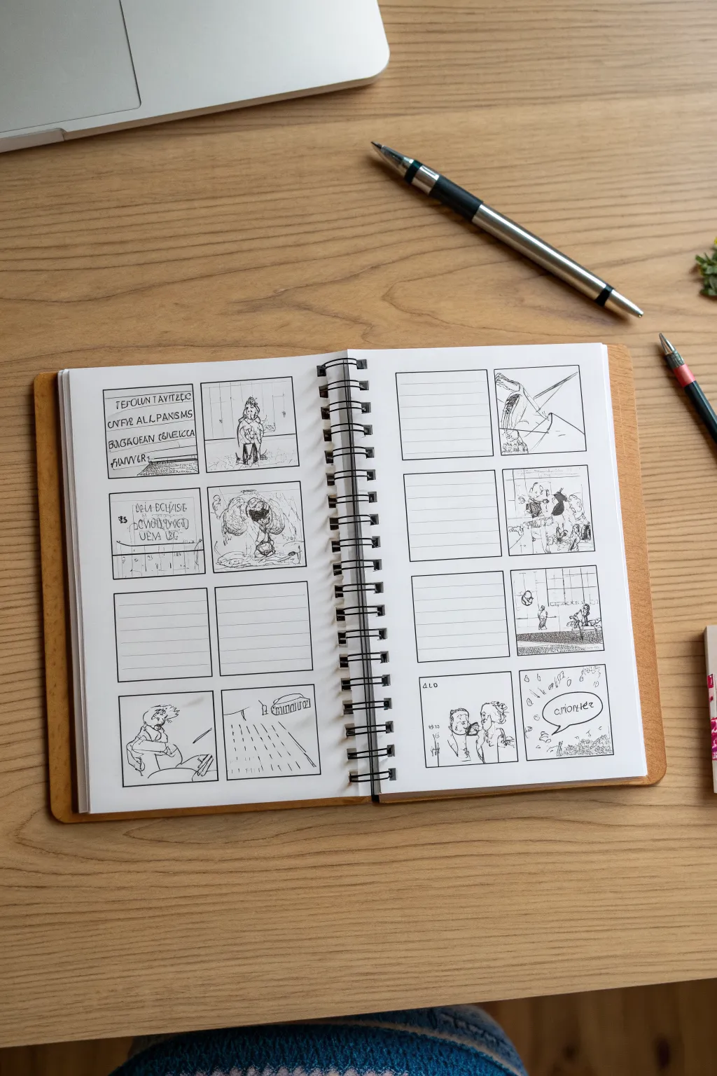
This project is a fantastic way to organize visual storytelling, creating a raw, hand-sketched storyboard spread directly in a notebook. The look is intentionally loose and approachable, blending simple grid structures with quick, gestural pencil sketches and handwritten notes.
Step-by-Step
Materials
- Spiral-bound sketchbook (A5 or similar size)
- Black fine-liner pen (0.3mm or 0.5mm)
- Black ballpoint pen
- Ruler (clear plastic is best)
- Pencil (HB or 2B)
- Eraser
Step 1: Setting the Structure
-
Define the margins:
Begin by opening your sketchbook to a fresh two-page spread. Using your ruler and a pencil, lightly mark out a uniform margin around the edges of both pages to keep your layout centered. -
Plan the grid:
Decide on a 2×4 layout per page. Lightly mark positions for two columns of four square boxes on each page. Ensure there is distinct spacing between the rows so the panels don’t feel crowded. -
Ink the frames:
Once you are happy with the pencil spacing, use your ruler and the fine-liner pen to draw the squares definitively. Press firmly for a clean line, but don’t worry if the corners overlap slightly—it adds to the hand-drawn charm. -
Create text areas:
In the left column of each page, instead of leaving the box empty for drawing, you’ll sometimes want ruled lines for dialogue. For these specific boxes, draw 4-5 horizontal lines inside the square using a thinner pen stroke. -
Erase guidelines:
Wait a moment for the ink to dry completely to avoid smudging, then gently erase all your initial pencil construction lines to leave a crisp black grid.
Smudge Prevention
Work from top-left to bottom-right (if right-handed) when inking to prevent your hand from dragging across wet ink and ruining crisp lines.
Step 2: Sketching the Narrative
-
Rough pencil undersketch:
Before committing to ink, sketch your scene ideas lightly in pencil within the empty boxes. Focus on simple shapes and composition rather than intricate details at this stage. -
Inking the figures:
Take your fine-liner to trace over your pencil sketches. Use loose, scratchy lines to depict characters. For the ‘Split-Screen’ effect, ensure the action in one panel visually relates to the panel next to or below it. -
Adding depth:
Add shading by hatching (drawing closely spaced parallel lines) in the darker areas of your mini-scenes. This helps separate the foreground characters from the background. -
Drafting dialogue:
On the lined panels you created earlier, write out your script or action notes. I find that using a handwriting style that is slightly stylized or all-caps makes it look more like a professional storyboard. -
Adding text bubbles:
For some direct dialogue, draw speech bubbles directly into the visual panels. Keep the bubble lines shaky or organic to match the sketch style, and write the text inside clearly.
Step 3: Final Touches
-
Refining details:
Go back over your sketches with the ballpoint pen to add darker accents or emphasize specific movements. This contrast makes the drawings pop off the page. -
Simulating screen text:
In the image, some panels have blocky, faux-digital text. Mimic this by drawing small rectangles or ‘button’ shapes at the bottom of a frame to suggest a screen interface. -
Final clean up:
Do a final pass with your eraser to remove any remaining graphite from your rough sketches, leaving only the permanent ink behind. -
Review the flow:
Step back and look at the whole spread. If any panel feels too light or empty, add a few more hatching lines or a background horizon line to balance the page.
Visual Hierarchy
Use a thicker pen nib for the panel borders and a thinner one for the internal drawings. This visual weight difference guides the eye naturally.
Now you have a dynamic, customized storyboard spread ready to fill with your next great visual idea


Have a question or want to share your own experience? I'd love to hear from you in the comments below!