If you love paintings that look like they’re in motion, swirl painting is basically instant joy. Here are my favorite swirl painting ideas—from classic fluid spirals to textured, tool-made twists that feel like you can almost hear them spinning.
Classic Cup-Pour Spiral
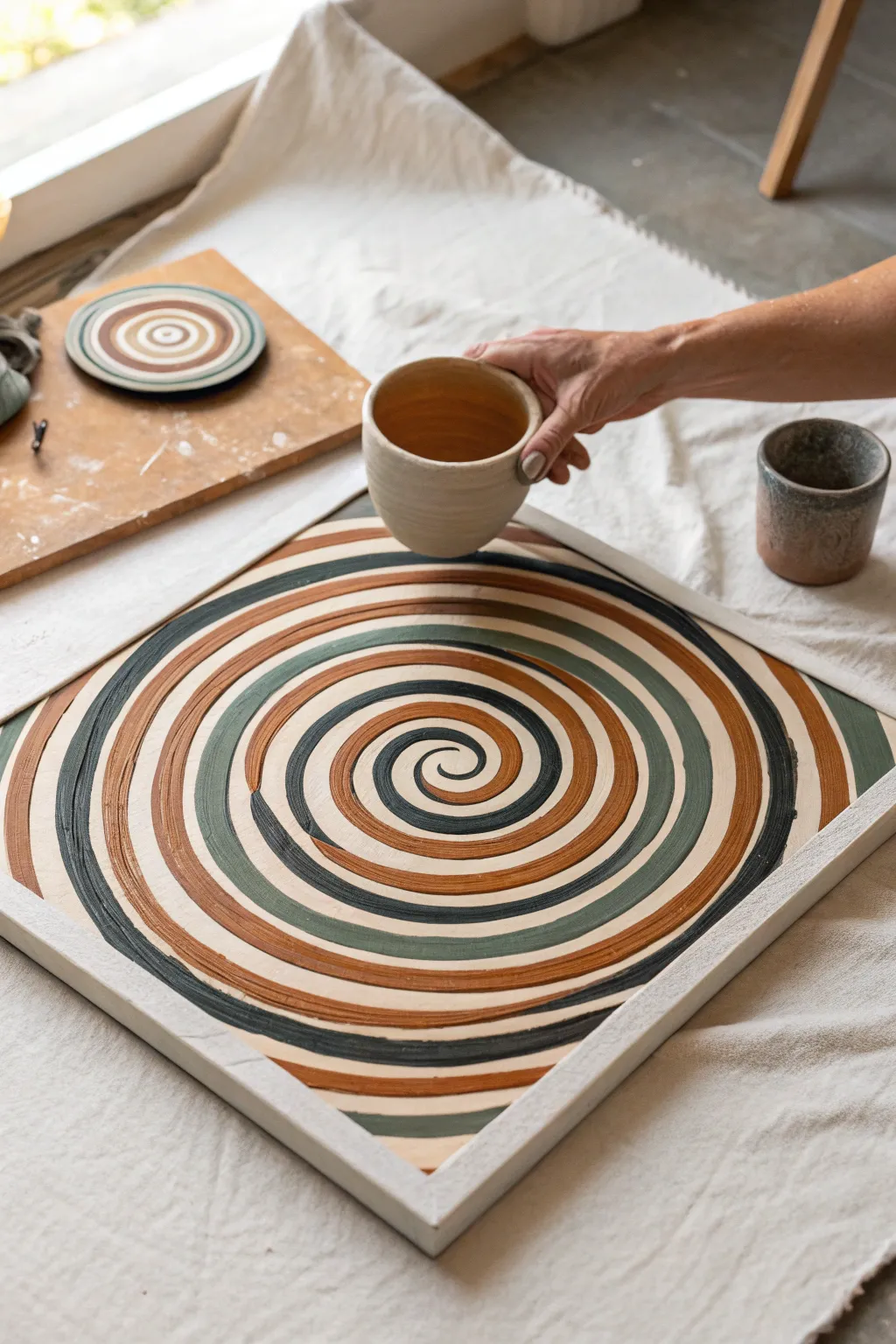
This project transforms a simple wooden tray into a mesmerizing optical illusion using warm, earthy tones and a steady hand. The design features a hypnotic spiral pattern that radiates outward, creating a sense of movement grounded by a natural color palette.
Step-by-Step Tutorial
Materials
- Square wooden framed tray or wood panel
- Gesso or white acrylic primer
- Matte acrylic paints (terracotta, olive green, dark charcoal, cream/off-white)
- Medium round paintbrush (size 6 or 8)
- Small round paintbrush for details (size 2)
- Pencil
- String or compass
- Ruler
- Palette or mixing plate
- Water cup and paper towels
- Matte varnish (optional)
Step 1: Preparation and Base
-
Prime the surface:
Begin by applying an even coat of gesso or white acrylic primer to the inside face of your wooden tray. This ensures your colors will pop against the wood grain and prevents the paint from soaking in too quickly. -
Sand for smoothness:
Once the primer is bone dry, lightly sand the surface with fine-grit sandpaper. You want the brush to glide smoothly when you start painting the spiral curves. -
Find the center:
Use a ruler to measure the width and height of the inner panel. Mark the exact center point lightly with a pencil. -
Draft the spiral guide:
Starting from the center mark, lightly sketch a spiral moving outward. You don’t need to draw every single line, but creating a faint guide for the main flow of the coil helps maintain proportion as the spiral expands.
Wobbly Lines?
Don’t panic if your curves aren’t perfect. Use a flat-edged brush loaded with the correction color to ‘push’ the paint back into a smooth line after the mistake dries.
Step 2: Painting the Spiral
-
Mix your palette:
Prepare your acrylic colors. You’ll need a warm terracotta orange, a muted olive green, a deep charcoal (almost black), and a soft cream color. Add a tiny drop of water to each to improve flow. -
Start the center coil:
Using your smaller round brush loaded with the dark charcoal paint, carefully paint the very center “eye” of the spiral. Keep the brush strokes fluid and follow the curve. -
Introduce the first color band:
Switch to your cream color. Paint a band following the dark center line. I find it helpful to rotate the entire tray as I pull the brush, rather than moving my hand around it. -
add the terracotta layer:
Pick up the terracotta paint with the medium brush. Paint the next band in the sequence, ensuring it nestles tightly against the cream line without mixing. -
Apply the olive tone:
Complete the first full rotation of the color pattern by adding the olive green band. Keep your pressure consistent to maintain a relatively uniform line width. -
Establish the repeating pattern:
Continue the sequence: Charcoal, Cream, Terracotta, Olive. As the spiral moves outward, let the bands naturally widen slightly, which enhances the optical effect. -
Manage the edges:
As you paint, keep a wet edge. If you need to stop, try to finish a complete color rotation so you don’t have to color-match dried paint later. -
Correcting wobbles:
If a line gets too thick or bumps into its neighbor, wait for it to dry completely. Then, use the adjacent color to carefully paint over the mistake and reshape the line.
Texture Boost
Mix a small amount of fine sand or baking soda into your terracotta paint before applying. This adds a physical grit that makes the piece feel like real pottery.
Step 3: Refinement and Finish
-
Fill the corners:
As the spiral reaches the corners of the square frame, the lines will disappear off the edge. Paint these partial arcs carefully to maintain the illusion that the spiral continues beyond the frame. -
Check for gaps:
Inspect the painting for any white primer showing through between the color bands. Use your smallest brush to touch up these gaps with the appropriate color. -
Texturize (optional):
To mimic the earthen look in the image, you can dry-brush a tiny amount of a lighter shade over the terracotta and green bands to give them a stone-like texture. -
Clean the frame:
If any paint strayed onto the raised wooden rim of the tray, wipe it off immediately with a damp cloth or gently sand it away once dry. -
Seal the work:
Allow the painting to cure for at least 24 hours. Because this is a tray that might hold items, apply a protective coat of matte varnish to shield it from scratches and moisture.
Place your favorite ceramic mug on your new art piece and enjoy the harmonious vibes
Two-Color High-Contrast Swirl
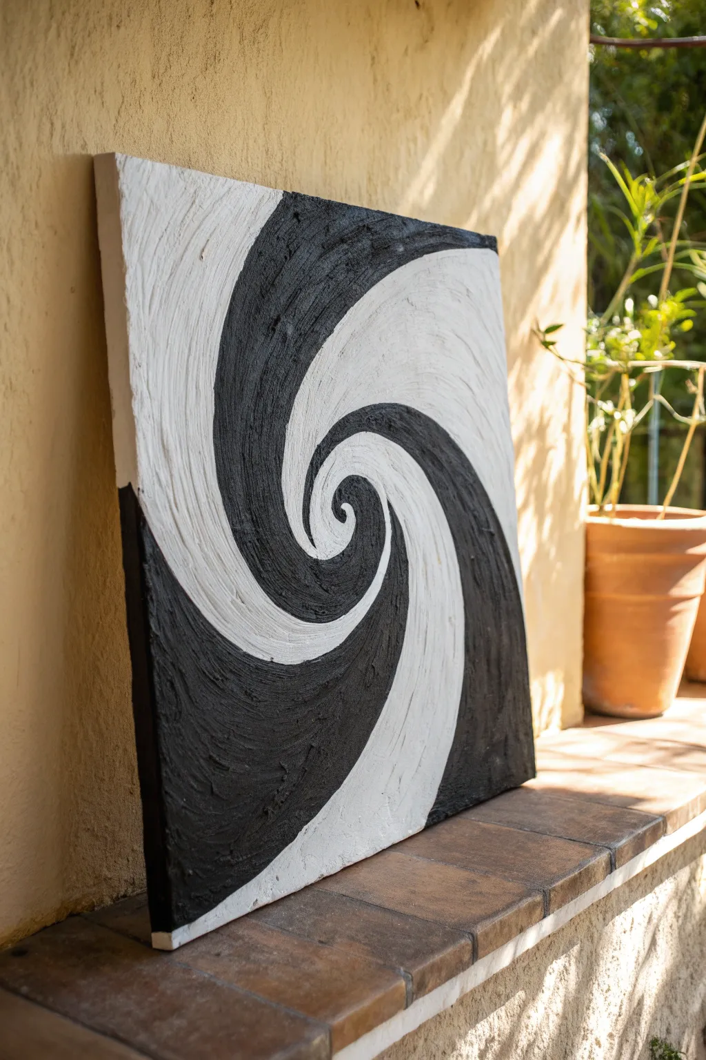
This striking optical illusion combines high-contrast minimalism with rich, tactile texture. Using just black and white acrylics and a thickening medium, you’ll create a hypnotic spiral that pulls the viewer in.
Step-by-Step
Materials
- Square stretched canvas (approx. 16×16 or 20×20 inches)
- Black acrylic paint (heavy body preferred)
- Titanium white acrylic paint (heavy body preferred)
- Texture paste or modeling paste
- Palette knives (one medium, one small for tightness)
- Pencil
- String and pushpin (for guide circles)
- Painter’s tape or masking tape
- Palette or mixing plate
- Paper towels
Step 1: Preparation & Mapping
-
Prepare the canvas:
Ensure your canvas is clean and taut. If the surface feels too slick, apply a thin coat of gesso and let it dry completely to give your heavy paints something to grip onto. -
Mark the center:
Find the exact center of your square canvas by measuring or lightly drawing an X from corner to corner. Mark this spot clearly with a pencil. -
Sketch the guides:
Using a pushpin in the center and a string attached to a pencil, lightly draw concentric circles radiating outward. These don’t need to be perfect, but they help keep your spiral balanced as it expands. -
Draft the spiral arms:
Starting from the center point, freehand sketch two curved lines that expand outward in a spiral shape. Imagine a comma shape growing larger as it spins to the edges; these lines will separate your black sections from your white sections.
Step 2: Creating the Texture Mix
-
Mix the white medium:
On your palette, mix a generous amount of Titanium White paint with an equal part of texture or modeling paste. You want a consistency similar to stiff cake frosting that holds peaks well. -
Mix the black medium:
Repeat the process with your black acrylic paint. Mixing in the paste might lighten the black slightly when wet, but high-quality pigment usually dries back to a deep charcoal or obsidian tone.
Muddy Edges?
If the black and white are blending into gray at the border, let one color dry for 20 minutes to ‘skin over’ before applying the wet contrasting color next to it.
Step 3: Applying the Swirl
-
Start the white center:
Pick up your small palette knife and scoop up some white mixture. Carefull apply it to the very center ‘eye’ of the spiral, keeping the layer thick. -
Apply the black center:
Wipe your knife or switch tools, and fill in the adjacent black starting section in the center. The two colors should touch but try not to blend them into gray. -
Expand outward:
Work your way out from the center, alternating between applying sections of black and white. I find it easiest to work on one color’s arm for a few inches, then switch to the other to ensure the spacing looks right. -
Create directional texture:
As you apply the thick paste, use the edge of your palette knife to scrape ridges into the paint. Crucially, these ridges should follow the curve of the spiral, enhancing the sense of motion. -
Keep edges sharp:
Pay close attention to where the black and white meet. Use the tip of a clean knife to push the paint into a crisp line, defining the high-contrast boundary. -
Fill the canvas corners:
As the spiral arms grow large enough to hit the edges of the canvas, carry the paint all the way over the sides. The texture should wrap around the frame for a professional, finished look. -
Build surface depth:
Go back over areas that look too flat. Dab and pull the knife upward to create small peaks, or drag it lengthwise for deep valleys, ensuring the texture remains heavy throughout.
Add Some Shine
Once fully dry, brush a high-gloss varnish over just the black sections. This creates a dual-texture effect where the black looks like wet tar against matte white.
Step 4: Finishing Touches
-
Check for gaps:
Inspect the canvas from different angles. Texture paste can sometimes leave small pockets of bare canvas; dab a little extra paint into any pinholes you spot. -
Clean the boundaries:
If any black has accidentally smeared onto a white ridge, wait until it is slightly tacky, then carefully scrape it off or paint over it with a dollop of fresh white. -
Paint the edges:
Ensure the sides of the canvas are fully coated in their respective colors—where the black arm hits the edge, paint the side black, and do the same for the white. -
Allow extensive drying time:
Because the application is so thick, this piece will take much longer to dry than a standard painting. Lay it flat in a dust-free area and let it cure for at least 24 to 48 hours.
Hang your textured masterpiece in a well-lit spot where shadows will play across the ridges of the spiral


Rainbow Ring Swirl
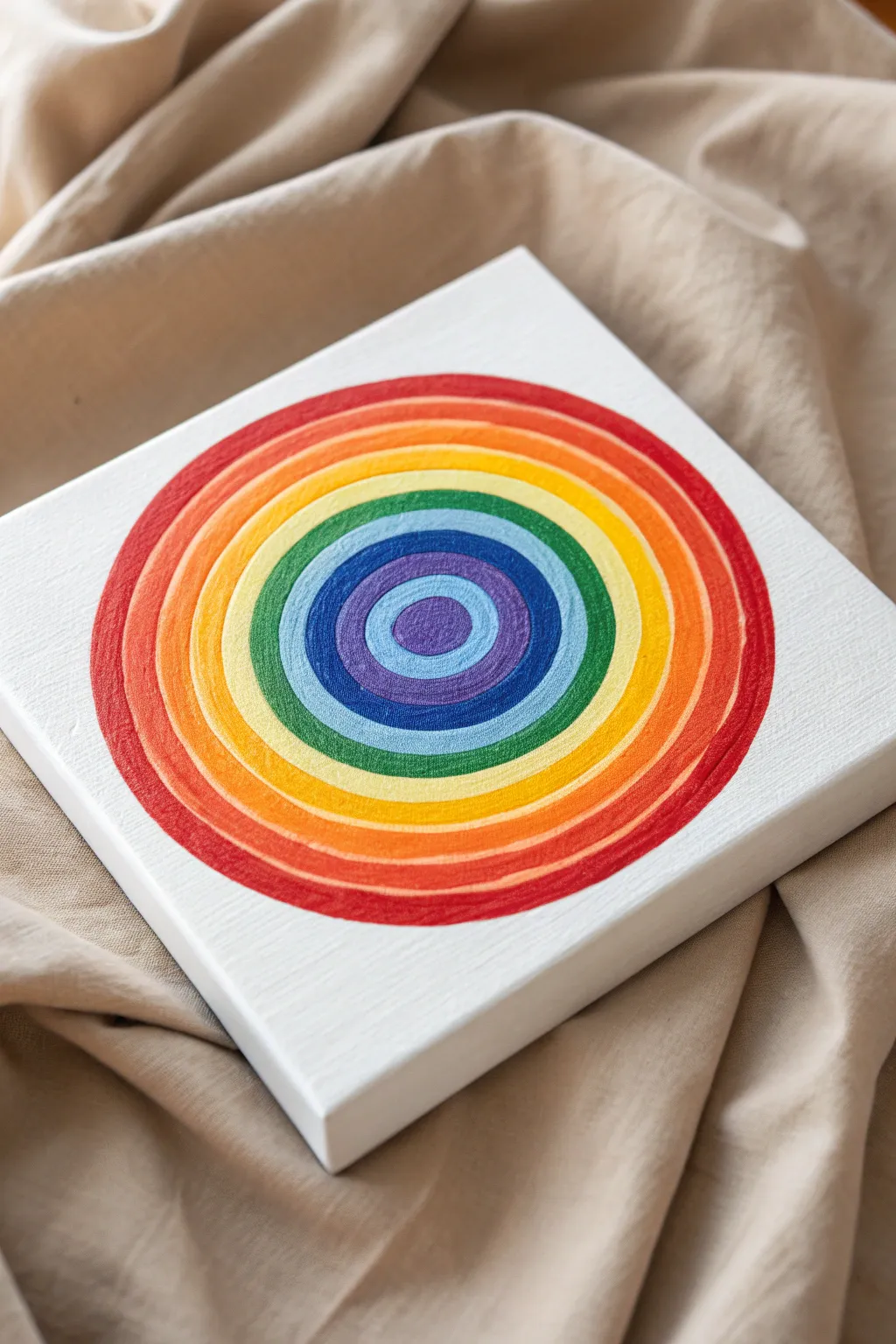
Bring a burst of color into any room with this hypnotic, hand-painted canvas featuring perfectly nested concentric rings. The vibrant gradient from a deep purple center to a bold red outer rim creates a satisfying and modern piece of geometric art.
How-To Guide
Materials
- Small square stretched canvas (e.g., 6×6 or 8×8 inch)
- Acrylic paints (purple, dark blue, light blue, green, yellow, orange, red)
- Set of round synthetic brushes (various sizes)
- Compass or round objects for tracing
- Pencil
- Palette or mixing plate
- Cup of water and paper towels
- Ruler (optional)
Step 1: Preparation and Sketching
-
Find the center:
Start by laying your canvas on a flat surface. Use a ruler to lightly mark the exact center point of the canvas with a pencil. This will be the anchor for your entire design. -
Draw the central circle:
Using a compass set to a small radius (about 1 inch depending on your canvas size), place the point on your center mark and draw the first circle. This will be the bullseye. -
Sketch the rings:
Widen your compass by roughly half an inch to an inch and draw a second circle around the first. Continue widening the compass in equal increments to create a series of concentric rings until you reach the edges of the canvas. You should aim for about 7 distinct sections including the center. -
Clean up lines:
Check your pencil lines. If any are too dark or messy, use a kneaded eraser to lighten them so they won’t show through the lighter paint colors.
Clean Edges Trick
Steady hand trouble? Use a flat edge brush instead of a round one. Angle the flat chisel edge along the curve—it acts like a calligraphy pen for smoother lines.
Step 2: Painting the Cool Tones
-
Start with the center:
Load a small round brush with purple paint. Carefully fill in the very center circle, using the edge of the brush to keep the boundary sharp against the pencil line. -
Mix the first transition:
For the next ring, you want a deep indigo or blue-purple. If you don’t have this exact shade, mix a little of your purple with dark blue on your palette. -
Paint the second ring:
Fill in the ring immediately surrounding the center with your dark blue or indigo mix. Rotate the canvas as you paint to maintain a consistent hand angle for the curves. -
Apply the true blue:
Clean your brush thoroughly. Paint the third ring with a bright, primary blue. Ensure the paint is opaque; if it looks streaky, let it dry and apply a second coat. -
Move to light blue:
For the fourth ring, use a lighter blue or cyan. This acts as a bridge between the deep blues and the upcoming green.
Step 3: Painting the Warm Tones
-
Green transition:
Paint the next ring with a grassy green. Work slowly around the curve, overlapping the pencil line slightly to ensure no white canvas peeks through between colors. -
Bright yellow ring:
Switch to a clean brush for the yellow paint to keep it bright. Fill in the ring outside the green. Yellow is often semi-transparent, so I usually plan on doing two or three layers here for full coverage. -
Orange layer:
Paint the next ring with a vibrant orange. By now, your circles are getting larger, so you might want to switch to a slightly larger brush to cover the area more smoothly. -
The final red rim:
Finish the design by painting the outermost ring with a bold red. Depending on your spacing, this ring might touch the edges of the canvas, creating a cropped circle effect. -
Touch ups:
Examine the painting for any gaps or uneven edges between the rings. Use a very fine liner brush to carefully neaten up the boundaries where colors meet. -
Final drying:
Let the entire piece dry completely flat for several hours to prevent any wet paint from running.
Level Up: Glossy Finish
Once fully dry, apply a coat of high-gloss varnish or clear resin over the circles. It makes the colors pop and gives it a professional ceramic-like shine.
Hang your colorful creation on a neutral wall to let those rainbow ripples truly shine.
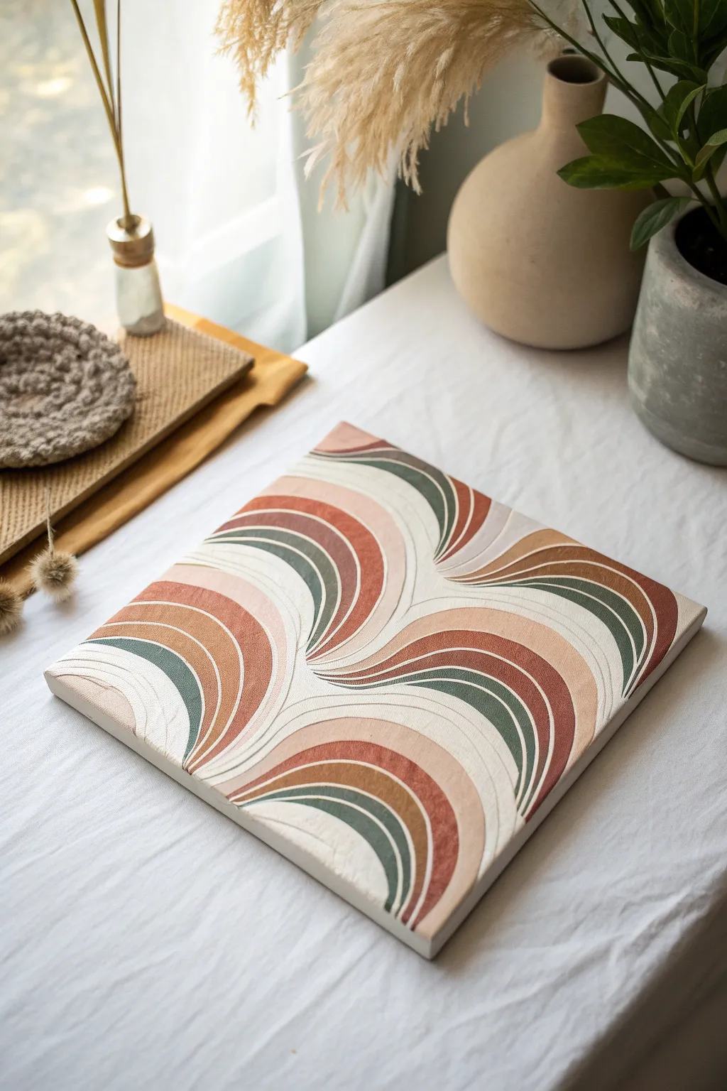
Tilt-to-Twist Spiral Flow
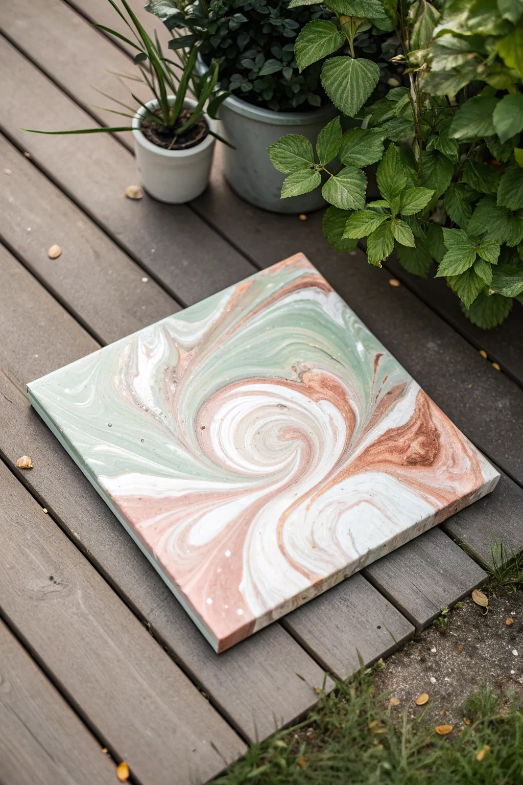
Embrace the calming, muted tones of nature with this elegant acrylic pour project. By combining soft sage greens, earthy terracottas, and crisp whites in a controlled spiral, you’ll create a mesmerizing piece that feels both organic and modern.
Step-by-Step Guide
Materials
- Square stretched canvas (roughly 12×12 or 10×10 inches)
- Acrylic pouring paints (Sage Green, Dusty Rose/Terracotta, White, and a warm Grey or Taupe)
- Pouring medium
- Silicone oil (optional, avoiding for a smoother finish like the photo)
- Plastic cups for mixing
- Stir sticks
- Large plastic bin or drop cloth (for catching drips)
- Water (for thinning if necessary)
- A level surface for drying
Step 1: Paint Preparation
-
Prepare your workspace:
Before opening any paint, cover your work surface with a drop cloth or set up a large plastic bin. Acrylic pouring is messy, and preparation saves cleanup time later. -
Select your palette:
For this natural look, choose colors that harmonize well. We are using a soft sage green, a muted dusty rose or terracotta, pure white, and a touch of taupe or warm grey for depth. -
Mix the pouring medium:
In individual cups, mix each paint color with your pouring medium. A standard ratio is often 1:1, but follow the specific instructions on your medium’s bottle. Stir thoroughly to combine. -
Check consistency:
Test the flow of your paints. When you lift the stir stick, the paint should flow off in a steady, thin stream—like warm honey—and create a small mound that disappears quickly into the cup. -
Adjust thickness if needed:
If the paint is too thick and clumpy, add water a few drops at a time. If it’s too thin and watery, add a little more paint. Consistency is key for clean lines.
Step 2: The Spiral Pour
-
Layer the cup:
Take a fresh, empty cup. Pour a small amount of white into the bottom. Gently pour the sage green down the side of the cup so it sits on top, followed by the terracotta, then the taupe. -
Repeat the layers:
Continue layering your colors in the same order until the cup is about three-quarters full. Try not to mix them; you want distinct layers resting on one another. -
Center the canvas:
Place your canvas on top of raised cups or blocks inside your catch bin so the edges are free-floating. -
Pour the puddle:
Slowly pour the contents of your layered cup into the absolute center of the canvas. Pour steadily in one spot, letting the paint form a growing puddle that pushes outward in rings. -
Create the spiral motion:
As you pour, you can impart a very slight, tiny circular motion with your wrist to encourage the paint to spiral, though the natural flow usually creates rings on its own.
Muddy Colors?
If your colors turn gray or brown, you likely over-tilted or poured too aggressively. Next time, tilt slower and stop manipulating the paint sooner.
Step 3: Tilting and Shaping
-
Begin the tilt:
Once all paint is on the canvas, pick it up carefully. Slowly tilt the canvas just a few degrees to one corner. Do not rush this; let the paint stretch gradually. -
Rotate the direction:
Before the paint runs off the edge completely, bring the canvas back to level, then tilt it toward the opposite corner. This back-and-forth movement stretches the central spiral. -
The circular twist:
To get that wrapped, twisted look seen in the photo, tilt the canvas in a slow, circular motion. Imagine trying to roll a marble around the rim of a plate without dropping it. -
Cover the corners:
Guide the paint all the way to the corners. I find it helpful to use a gloved finger to touch up any tiny dry spots on the corners if the paint doesn’t naturally flow there. -
Final composition check:
Look at the composition. If the center spiral has moved too far off-center and you want it back, gently tilt to guide it. Stop when you are happy with the flow lines.
Pro Tip
Use opaque paints for the green and terracotta layers, but a semi-transparent white. This adds visual depth between the swirls.
Step 4: Drying and Finishing
-
Pop air bubbles:
Use a torch lightly over the surface (keep it moving!) or a toothpick to pop any visible air bubbles that might mar the smooth finish. -
Check the underside:
Run a craft stick or finger along the underside edge of the canvas to remove dripping paint. This prevents ridges from forming as it dries. -
Let it cure:
Place the canvas in a dust-free area to dry. It needs to remain perfectly level for at least 24-48 hours. The colors will darken slightly as they dry.
Allow the piece to cure fully before displaying deeply and enjoying the organic movement you’ve captured
BRUSH GUIDE
The Right Brush for Every Stroke
From clean lines to bold texture — master brush choice, stroke control, and essential techniques.
Explore the Full Guide
Straw-Blown Swirl Bursts
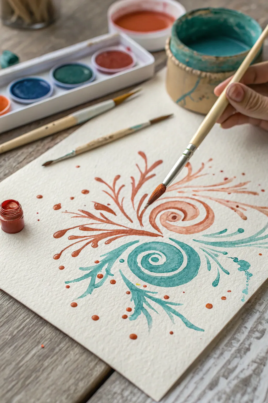
This elegant watercolor project combines tight, controlled spirals with free-flowing, organic tendrils that fan out like delicate seaweed. The contrast between warm terracotta and cool teal sets up a balanced, soothing composition perfect for practicing brush control.
Detailed Instructions
Materials
- Cold press watercolor paper (heavyweight/300gsm for texture)
- Round watercolor brushes (size 6 or 8 for main strokes, size 2 or 4 for details)
- Watercolor paints or fluid gouache (Rust/Burnt Sienna mixed with red, Teal/Turquoise)
- Two water jars (one for warm colors, one for cool)
- Paper towel or rag
- Mixing palette
- Pencil (optional for light sketching)
Step 1: Preparation & Planning
-
Prepare your palette:
Mix two distinct puddles of paint. For the warm tone, combine Burnt Sienna with a touch of Cadmium Red to create a rich terracotta. For the cool tone, use a Turquoise or mix Viridian Green with Phthalo Blue. -
Test consistency:
Ensure your paint is fluid but not watery. You want a ‘heavy cream’ consistency that holds its shape without running out of control, especially for the spiral centers. -
Visualize the placement:
Imagine two diagonal focal points. The warm swirl will sit slightly to the upper right, and the cool swirl will sit to the lower left, creating a balanced negative space.
Step 2: Painting the Warm Spiral
-
Start the center:
Load your medium round brush (size 6 or 8) with the terracotta mixture. Place the tip down and drag it in a tight, circular motion to form the central spiral eye, keeping the line width consistent. -
Widen the spiral:
As you spiral outward, apply slightly more pressure to the brush bristles to thicken the line, then lift slightly as you complete the outer curve of the shell shape. -
Create the main branches:
From the center spiral, extend three to four long, sweeping strokes outward to the left. Press down to widen the middle of the stroke and lift at the end for a tapered tip. -
Add secondary tendrils:
Switch to a smaller brush if preferred. Add smaller, curved branches sprouting from the main strokes, mimicking the growth of coral or ferns. Flick the brush briskly at the end for a sharp point. -
Form the upper burst:
Paint a few loose, detached strokes floating above the main spiral, creating an airy, exploded effect.
Fixing Wet Puddles
If a spiral pools too much liquid, dry off your brush on a towel and touch the tip to the puddle. The thirsty brush will lift the excess paint instantly.
Step 3: Painting the Cool Spiral
-
Anchor the lower swirl:
Clean your brush thoroughly or switch to a clean one. Load it with the teal mixture. Start this spiral below and to the left of the terracotta one, mirroring the motion but slightly offset. -
Extend the lower fronds:
Paint sweeping S-curves extending downwards and to the right. These should cradle the bottom of the composition. -
Create flow:
Ensure the teal tendrils curve in harmony with the orange ones above them, avoiding direct collisions but allowing their ‘energy’ to interact in the middle. -
Add texture strokes:
While the paint is still wet on the page, drop in a slightly more saturated version of teal into the thickest parts of the spiral for depth.
Level Up: Metallic Accents
Once fully dry, trace the very center of each spiral with a fine line of metallic gold paint or ink to add a shimmering, luxurious focal point.
Step 4: Details & Splatter
-
Add floating dots:
Using the tip of your smallest brush, dot small circles of terracotta paint around the outer edges of the warm burst to simulate spores or drifting particles. -
Incorporate speckles:
Repeat the dotting process with the teal paint around the lower section. Vary the size of the dots for a more natural look. -
Create controlled splatters:
Load a wet brush with watered-down teal paint. Hold it over the paper and tap the handle against a finger to send fine spray droplets onto the white space. -
Wait for drying:
Let the piece sit undisturbed. Because the paper is textured, the pooling paint in the spirals needs time to settle and dry evenly.
Allow the textured paper to dry completely flat to preserve the subtle variations in the watercolor pools
Comb-Dragged Ribbon Swirls
Embrace the calming flow of motion with this sophisticated wall art that combines muted earthy tones with rich, tactile texture. Using a specialized comb-dragging effect, you’ll create interlocking ribbon-like swirls that add a modern, organic touch to any space.
Step-by-Step Guide
Materials
- Square canvas (12×12 or larger)
- Modeling paste or thick texture medium
- Acrylic paints (Cream/Off-White, Terracotta, Burnt Sienna, Deep Olive Green, Slate Grey)
- Wide-toothed texture comb or spreading tool
- Palette knives (one medium, one small)
- Pencil
- Masking tape (optional)
- Matte varnish
Step 1: Preparation & Mapping
-
Prime the Surface:
Begin by applying a base coat of your cream or warm off-white acrylic paint to the entire canvas. This ensures no raw canvas shows through the texture later. -
Sketch the Flow:
Once the base is dry, lightly use a pencil to map out the general direction of your swirls. You don’t need to draw every line, just the major ‘S’ curves where the ribbons of color will flow and intersect. -
Mix the Texture:
In separate cups or on a large palette, mix your acrylic colors with modeling paste. You want a ratio of about 60% paste to 40% paint to ensure the mixture is stiff enough to hold ridges. -
Create Custom Shades:
I prefer to mix a few transitional shades here—blend a little olive with slate grey, or terracotta with white—to give the final piece more depth and complexity.
Step 2: Applying the Ribbons
-
Apply the First Cluster:
Choose a focal cluster, like the bottom right corner. Use a palette knife to apply a thick, generous layer of Terracotta paste in a curved swoop, following your pencil guide. -
Drag the Tool:
Immediately take your wide-toothed texture comb and drag it firmly through the wet paste. Follow the curve of the swoop to create evenly spaced, raised ridges. -
Clean Between Strokes:
Wipe your comb fully clean with a paper towel. This is crucial to prevent muddying the colors for the adjacent ribbon. -
Add Adjacent Color:
Next to the terracotta swoop, apply a band of the Deep Olive Green paste. Ensure the edges of the paste touch slightly but don’t over-blend them yet. -
Texture the Second Band:
Drag the comb through the green paste, mimicking the curve of the first stroke so they look like parallel ribbons flowing together. -
Build the Center Convergence:
Move to the center where swirls meet. Apply lighter Cream/Off-White paste here. This negative space acts as a highlight and breaks up the heavier colors. -
Create Intersections:
When creating a ‘hub’ where curves change direction (like the fan shapes seen in the design), carefully start your comb drag from a central point and curve outward, radiating like a fan.
Clean Comb Trick
Keep a shallow dish of water nearby. Dip and wipe your texturing comb between every single pass. This keeps the grooves sharp and prevents colors from muddying.
Step 3: Refinement & Finish
-
Fill the Gaps:
Work your way around the canvas, filling in remaining sections with alternating ribbons of Slate Grey and Burnt Sienna. Maintain a consistent thickness with the paste application. -
Sharpen Edges:
Use a small, clean palette knife or a toothpick to gently tidy up the boundaries between color bands if the paste smudged too much during combing. -
Check the Ridges:
Inspect the texture from the side. If any ridges collapsed, carefully re-drag the comb while the paste is still wet to re-establish the deep grooves. -
Paint the Sides:
Don’t forget the edges of the canvas. Extend the base cream color or continue the pattern onto the sides for a gallery-wrapped look. -
Long Dry Time:
Because the modeling paste is thick, let the artwork dry flat for at least 24-48 hours. The surface may feel dry to the touch sooner, but the underneath needs time to harden. -
Seal the Work:
Once fully cured, apply a coat of spray matte varnish. This seals the porous texture and protects dust from settling deep into the grooves.
Add Metallic Accents
For a luxe twist, mix a fine gold or bronze mica powder into one of the lighter paste colors. The shimmer will catch the light along the textured ridges.
Hang your textured masterpiece where the light can rake across the surface to highlight those beautiful ridges

PENCIL GUIDE
Understanding Pencil Grades from H to B
From first sketch to finished drawing — learn pencil grades, line control, and shading techniques.
Explore the Full Guide
Spin-and-Set Swirl Art
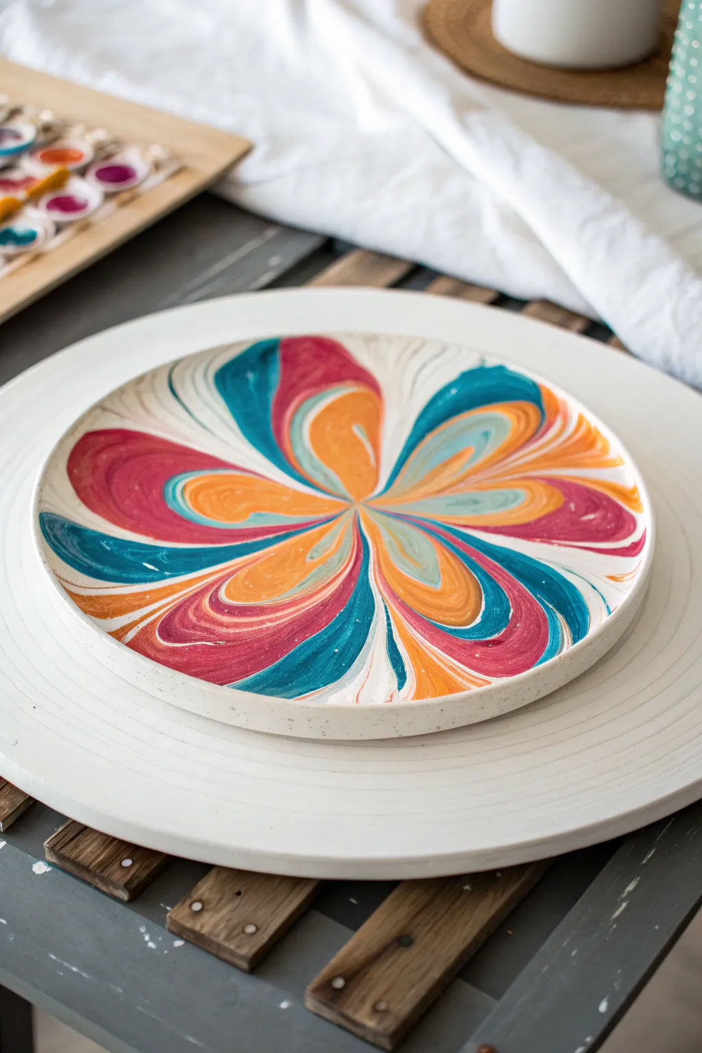
This project creates a stunning, mesmerizing floral effect using the centrifugal force of a pottery wheel or banding wheel. The result is a vibrant, symmetrical burst of teal, magenta, and orange that looks professionally glazed but is surprisingly simple to achieve.
Step-by-Step
Materials
- Bisque-fired ceramic plate or shallow bowl (flat bottom is ideal)
- Pottery wheel or a heavy-duty banding wheel
- Ceramic underglazes or fluid acrylics (teal, magenta, orange, white)
- Squeeze bottles or large syringes for paint application
- Clear glaze (if firing)
- Kiln (if using underglazes)
- Damp sponge
- Centering tool or ruler
Step 1: Preparation and Centering
-
Prepare your surface:
Wipe down your bisque-fired plate with a damp sponge to remove any dust. This ensures the paint or glaze adheres properly without crawling. -
Secure the plate:
Place the plate exactly in the center of your pottery wheel or banding wheel. Proper centering is crucial for the symmetrical flower effect. You can use clay lugs to hold it firmly in place if using a powered wheel. -
Prepare the paints:
Pour your chosen colors—teal, magenta, and orange—into squeeze bottles. If the consistency is too thick, thin slightly with a medium or water until it flows like heavy cream; you want it to move when spun but not be watery.
Step 2: Applying the Pattern
-
Start the spin:
Get the wheel spinning at a slow, steady speed. It doesn’t need to be fast yet; just enough to help you judge the placement. -
Create the center pool:
Deposit a generous puddle of white slip or paint directly in the absolute center of the plate while it spins slowly. This acts as a lubricant for the colored petals to glide over. -
Apply the first color ring:
Stop the wheel briefly. Squeeze a thick blob of orange right next to the center white pool. You don’t need to make a ring; just a consolidated blob will do. -
Layer the colors:
Directly next to or slightly on top of the orange, add a blob of teal, and then a blob of magenta. Repeat this alternating pattern (Orange, Teal, Magenta) in a tight circle around the very center of the plate. -
Connect the blobs:
Using a skewer or the nozzle tip, drag lightly through the blobs toward the center point to connect them, creating a star-like shape of wet paint in the middle.
Centering Success
Use tap centering to get it perfectly aligned. An off-center plate will cause lopsided petals that flow off one side.
Step 3: Spinning and Spreading
-
Increase wheel speed:
This is the magic moment. Gradually increase the speed of the wheel. Centrifugal force will begin pulling the paint outward from the center. -
Watch the bloom:
As the wheel spins faster, the blobs will stretch into long, elegant petals. Watch closely. The colors will marble slightly where they touch but remain distinct. -
Control the flow:
If the paint isn’t moving enough, add a few drops of water or pouring medium to the center while it spins. If it’s moving too fast, slow the wheel immediately. -
Stop at the rim:
Once the petal tips reach the inner edge of the rim, cut the power or stop spinning. Let the wheel come to a gradual halt so you don’t jar the wet design. -
Refine the edges:
If there are gaps near the rim where the paint didn’t reach, you can gently tilt the plate by hand to fill them in, or leave the negative space for contrast.
Metallic Pop
Add a thin line of gold luster or metallic paint between the color blobs before spinning for shimmering veins.
Step 4: Finishing Touches
-
Clean the rim:
If any paint splattered onto the raised rim where you want it to remain white/speckled, wipe it away immediately with a clean, damp sponge or a Q-tip. -
Dry thoroughly:
Let the piece dry completely. This layer of paint is thick, so I prefer to give it a full 24 hours to ensure no moisture is trapped. -
Clear glaze application:
Once dry (and bisque fired again if necessary for your specific materials), apply a clear glaze over the entire top surface to seal the design and make it food safe. -
Final firing:
Fire the piece in the kiln according to the clear glaze manufacturer’s instructions to reveal the glossy, vibrant final look.
Now you have a dynamic, colorful centerpiece that captures the energy of motion in static form
Galaxy Vortex Swirl
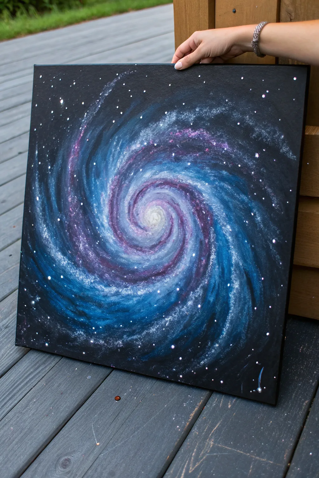
Capture the mesmerizing depth of outer space with this vibrant galaxy vortex painting. Using a dark background as your infinite canvas, this projects layers luminous blues, violets, and whites into a hypnotic spiral that draws the eye inward.
How-To Guide
Materials
- Square stretched canvas (black primed, or primed black yourself)
- Acrylic paints: Carbon Black, Phthalo Blue, Dioxazine Purple, Titanium White, Ultramarine Blue
- Large flat brush (1-2 inch) for background
- Medium filbert brush or angled shader
- Small round detail brush
- Old toothbrush (for stars)
- Palette knife (optional for mixing)
- Water cup and paper towels
Step 1: Setting the Void
-
Prep the canvas:
If your canvas isn’t already black, cover the entire surface with a solid coat of Carbon Black acrylic paint. Ensure you paint the edges for a finished look. -
Establish the center:
Once the base is bone dry, mix a small amount of Titanium White with a touch of water to make it translucent. Mark a small, faint dot in the exact center of your canvas to guide your spiral. -
Map the spiral arms:
Using a very diluted white or light grey mixture and a small round brush, sketch faint, sweeping curved lines radiating outward from your center dot. Create 3-4 main arms that curve dramatically like a pinwheel.
Cosmic Depth Trick
Add a tiny drop of neon pink or magenta to your white highlights in the spiral arms. It creates a subtle vibrancy that makes the galaxy pop against the cold blues.
Step 2: Layering the Nebula
-
Deep blue undertones:
Mix Phthalo Blue with a tiny bit of black to create a deep navy. Using a medium filbert brush, paint along your sketched spiral arms, keeping the strokes loose and feathered at the edges so they fade into the black background. -
Violet transitions:
While the blue is still slightly tacky or freshly dry, mix Dioxazine Purple with a little Ultramarine Blue. Apply this alongside the navy sections, blending them where they meet to create a rich, bruised-sky transition. -
Brightening the path:
Mix Phthalo Blue with Titanium White to create a vibrant medium blue. Apply this lighter color closer to the center of your spiral arms, layering it over the darker colors but leaving the dark edges visible for depth. -
Creating the glow:
Using a dry brushing technique with very little paint on your brush, lightly scumble pure Titanium White into the very center of the vortex. Move in a circular motion, softening the edges so the center looks like a glowing ball of light.
Step 3: Defining the Swirl
-
Strengthening the highlights:
Mix a pale lavender by combining Titanium White with a dot of Purple. Apply thin, broken streaks along the ridges of the spiral arms to suggest movement and gas clouds catching the light. -
Feathering edges:
Take a clean, slightly damp brush and gently soften the outer edges of your spiral arms. You want the galaxy to look like gas dissipating into space, not hard geometric shapes. -
Intensifying the core:
Return to the center eye of the storm. Add a concentrated dot of pure white right in the middle, and blend it outward slightly into the surrounding blues to create a blindingly bright galactic core.
Muddy Colors?
If your blues and purples turn grey, stop blending wet-on-wet. Let the bottom layer dry completely before glazing a thinner layer of the next color on top.
Step 4: Stardust and Details
-
Prepare splatter paint:
Dilute Titanium White paint with water until it reaches an inky consistency, like heavy cream. It needs to be thin enough to fly off bristles but opaque enough to show up on black. -
Testing the stars:
I always test clarity on a piece of scrap paper first. Dip an old toothbrush into the thinned white paint and run your thumb across the bristles to flick droplets. -
Creating the star field:
Splatter the stars over the canvas. Focus a denser concentration of ‘stars’ along the light spiral arms and fewer in the black void areas to emphasize the galaxy’s structure. -
Adding hero stars:
Use your smallest detail brush to manually paint a few larger, brighter stars. Place these strategically in the darker negative spaces to create balance. -
Final highlights:
If some spiral definition was lost during splattering, use the detail brush with watered-down white to re-emphasize the sharpest curves of the vortex arms. -
Dry and seal:
Allow the painting to dry overnight before applying a gloss varnish. The gloss will make the blacks look deeper and the colors more jewel-like.
Hang your masterpiece in a well-lit area to watch the swirling colors shift and shimmer


Ocean Whirlpool Swirl
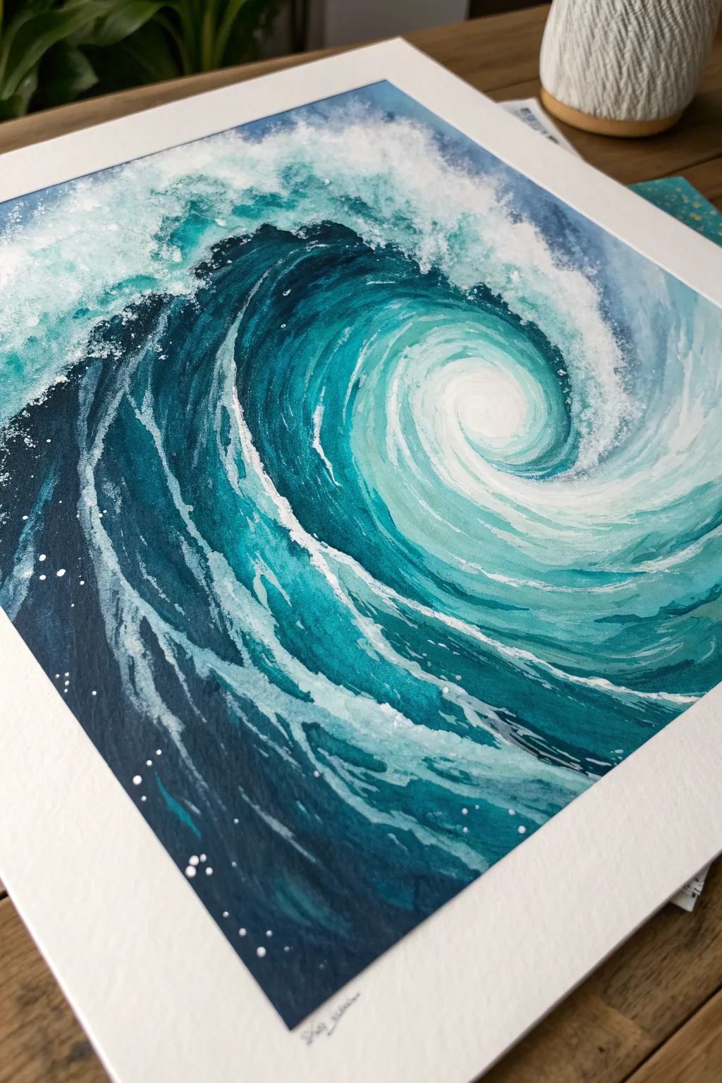
Capture the powerful, spiraling energy of the sea with this dynamic watercolor painting. Using a blend of deep indigos and bright turquoises, you’ll create a mesmerizing vortex effect that draws the viewer right into the eye of the storm.
Step-by-Step
Materials
- Cold press watercolor paper (300gsm/140lb)
- Watercolor paints (Indigo, Phthalo Blue, Turquoise, Viridian, White Gouache)
- Round brushes (sizes 4, 8, and 12)
- Masking tape
- Pencil (HB)
- Clean water jars
- Paper towels
- Small spray bottle (optional)
Step 1: Preparation and Sketching
-
Secure the Paper:
Begin by taping down all four edges of your watercolor paper to a board. This prevents the paper from buckling when it gets wet and creates that crisp white border seen in the final piece. -
Draft the Spiral:
Lightly sketch the main spiral shape with your pencil. Start from the center (slightly off-center looks more dynamic) and swirl outwards, defining the main crest of the wave and the darker trough.
Step 2: Painting the Base Layer
-
Wet the Paper:
Using your large brush, wet the entire spiral area with clean water. You want the paper glistening but not swimming in a puddle. -
Apply the Lightest Tones:
Load your medium brush with a watery Turquoise mixed with a tiny bit of Viridian. Drop this color into the center of the spiral and the upper highlight areas, letting it bloom softly. -
Deepening the Mid-Tones:
While the paper is still damp, mix Phthalo Blue with a touch of Turquoise. Apply this to the middle section of the wave body, following the curvature of your pencil lines. -
Establishing the Shadows:
Introduce your darkest mixture—Indigo and Phthalo Blue—into the deepest trough of the wave on the bottom left. Let these darks bleed slightly into the mid-tones for a soft gradient. -
Let it Dry:
Allow this initial wash to dry completely. The paper should be flat and cool to the touch before moving on to details.
Muddy Colors?
If your blues look dull, you probably over-mixed them on the paper. Let layers dry completely between glazes, or place colors side-by-side and let them touch naturally rather than scrubbing them together.
Step 3: Developing Texture and Form
-
Define the Ridges:
Switch to your size 8 brush. Mix a semi-opaque teal and paint defined strokes that follow the curve of the water, leaving small gaps to suggest movement on the water’s surface. -
Deepen the Contrast:
Using concentrated Indigo (less water, more pigment), paint the dark shadow underneath the main breaking lip of the wave. This high contrast makes the wave look tall. -
Layering Blues:
Add streaks of medium blue alongside your darker shadows. These streaks simulate the striations of water being pulled into the vortex. -
Softening Edges:
If any lines look too harsh, rinse your brush and run slightly damp bristles along the edge to soften it back into the background.
Pro Tip: Sea Salt
While the first watery layer of blue paint is still wet, sprinkle a pinch of table salt onto the paper. When it dries and you brush it off, it leaves amazing starburst textures that look just like sea foam.
Step 4: Creating the Foam and finish
-
Mixing Gouache:
Squeeze out some white gouache. It needs to be creamy, like melted ice cream, so it sits on top of the dark watercolor without disappearing. -
Painting the Crest:
With a smaller brush, dab the white gouache along the top edge of the wave. Use a stippling motion (rapid dots) to create a frothy, aerated look. -
The Center Swirl:
Paint the eye of the whirlpool with a blend of white gouache and pale turquoise, blending it outwards in a circular motion to make it look churned up. -
Adding Veins of Foam:
Using a very fine brush (or the tip of your size 4), drag thin, spider-web lines of white from the foamy crest down into the dark blue body of the wave. -
Dry Brush Texture:
Wipe most of the paint off your brush so it’s nearly dry. Drag this ‘dry brush’ with white paint quickly across the dark blue areas to suggest mist and surface spray. -
Splatter Effect:
I love this part for realism: load a brush with watery white gouache and tap the handle against your finger over the painting to create random sea spray droplets. -
Final Touches:
Use a few tiny dots of pure white gouache in the darkest indigo sections to represent sparkling highlights catching the light. -
Reveal:
Once everything is bone dry, carefully peel away the masking tape at a 45-degree angle to reveal your clean edges.
Frame your crashing wave or gift it to someone who loves the ocean, bringing a splash of coastal energy to their wall
Floral Petal Swirl Mandala
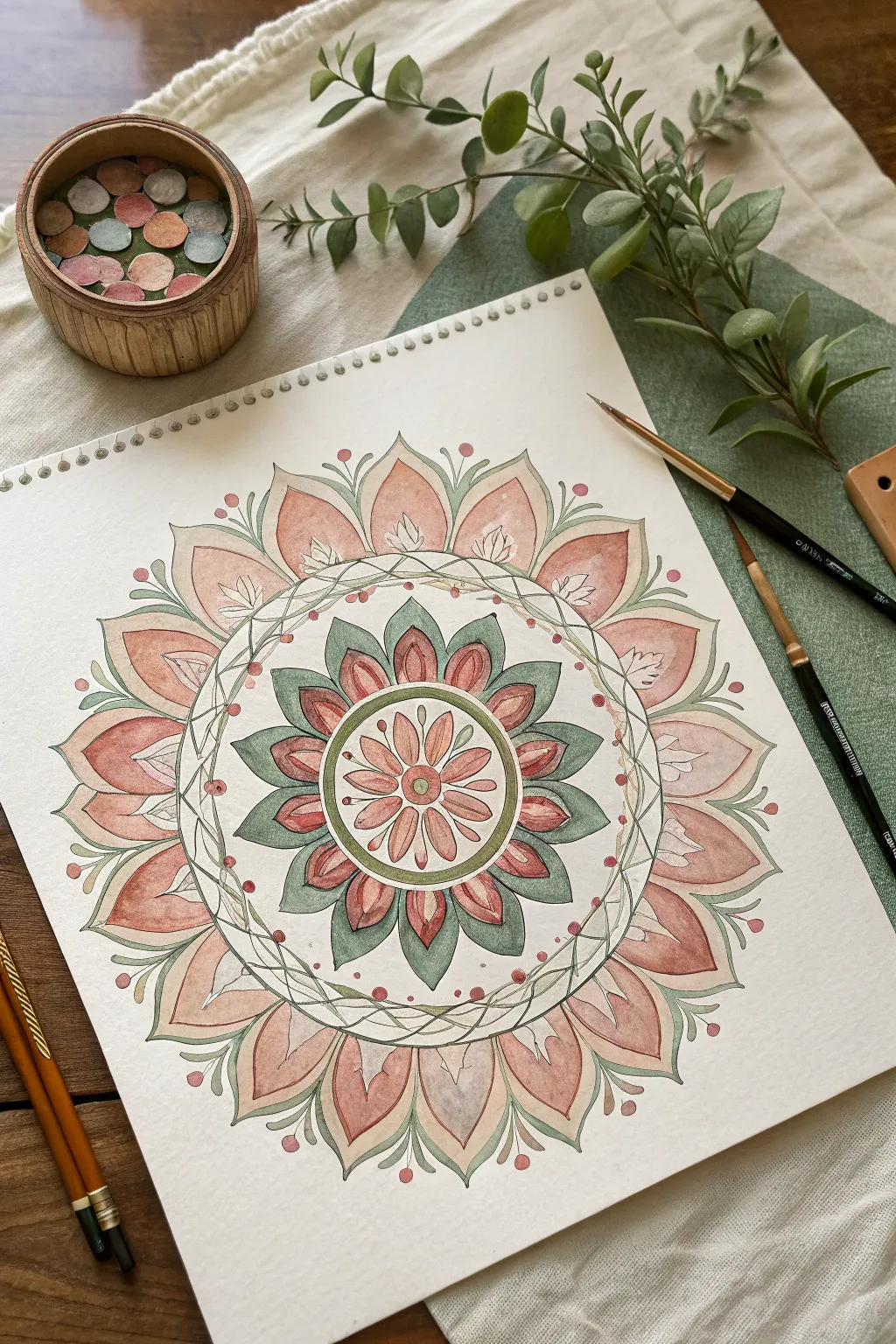
Embrace the soothing symmetry of nature with this delicate floral mandala, featuring layers of terracotta petals and sage green leaves. This project combines geometric precision with the soft, organic flow of watercolor washes for a truly relaxing creative session.
Detailed Instructions
Materials
- Cold press watercolor paper (spiral bound sketchbook recommended)
- Pencil (HB or H)
- Compass
- Ruler
- Fine liner pen (sepia or light grey, waterproof)
- Watercolor paints (Terracotta/Peach, Sage Green, Darker Green)
- Round watercolor brushes (sizes 2 and 6)
- Clean water and paper towels
Step 1: Drafting the Geometry
-
Find the Center:
Begin by finding the exact center of your paper. Make a tiny dot with your pencil. This will be the anchor for your entire mandala. -
Draw the Concentric Circles:
Using your compass, draw a series of lightly sketched concentric circles. Start with a small inner circle (approx. 1 inch diameter), then add three consecutively larger rings moving outward. Leave more space for the outermost ring where the large petals will lie. -
Mark Guidelines:
Use a protractor or just your eye to divide the circle into 8 or 16 equal pie-slice sections with light pencil lines. Vertical, horizontal, and diagonal lines help ensure your petals stay evenly spaced.
Uneven Petals?
Don’t fret if your petals aren’t identical clones. Variation adds organic charm. If spacing is tricky, use a protractor to mark degrees before sketching.
Step 2: Sketching the Design
-
Inner Flower:
In the central circle, sketch eight small, narrow petals radiating from the center dot. Add a second layer of slightly wider petal tips peeking out from behind them. -
Leafy Ring:
In the next ring outward, draw a series of pointed, leaf-like shapes. These should alternate: one pointing straight out, and the next tucked in between. -
Vine Border:
Create the vine barrier. Draw two thin, parallel circular lines. Inside this narrow track, sketch a gently undulating vine that weaves back and forth, crossing over itself periodically. -
Outer Petals:
For the largest outer ring, sketch wide, sweeping lotus-style petals. Ensure the tips touch the outermost guideline circle you drew earlier. -
Detailing:
Add small circles (berries) on stems between the outer petals and little veins inside the larger petals.
Make It Shimmer
Once the paint is totally dry, use a metallic gold pen or watercolor paint to outline the vine ring or add tiny dots to the flower center for elegance.
Step 3: Inking and Painting
-
Ink the Outline:
Go over your pencil sketch with a waterproof fine liner. Only ink the lines you want to keep; leave the structural circles pencil-only. I prefer a sepia pen here for a softer, more organic look than harsh black. -
Erase Guidelines:
Wait until the ink is completely dry—give it a few extra minutes just to be safe—then gently erase all pencil marks. -
Base Leaf Layer:
Load a size 6 brush with a watered-down sage green. Paint the leafy ring surrounding the center flower. Keep the wash sheer to let the paper texture show through. -
Central Flower Wash:
Mix a soft peach or pale terracotta color. Paint the innermost petals, starting from the center and lifting the brush as you reach the tip to keep it lighter. -
Outer Petals Gradient:
Wet one large outer petal with clean water first. Drop concentrated terracotta paint at the base of the petal and let it bloom upward toward the tip for a soft gradient effect. Repeat for all outer petals. -
Darker Accents:
Once the base green layer is dry, mix a darker, more forest-green shade. Paint the secondary leaves in the middle ring to create depth and contrast against the sage leaves. -
Vine Details:
Using your smallest brush (size 2), carefully trace the interweaving vines in the middle border with a muted green or brown mix. -
Berry Pops:
Dot the small circular berries floating around the outer petals with a saturated red-pink tone to make them pop against the white background. -
Final Touches:
Add tiny brush strokes of dark terracotta at the very base of the large petals to deepen the shadows and define the separation between layers.
Step back and admire how the soothing repetition of shapes creates a balanced and peaceful final piece
Watercolor Wet-on-Wet Swirls
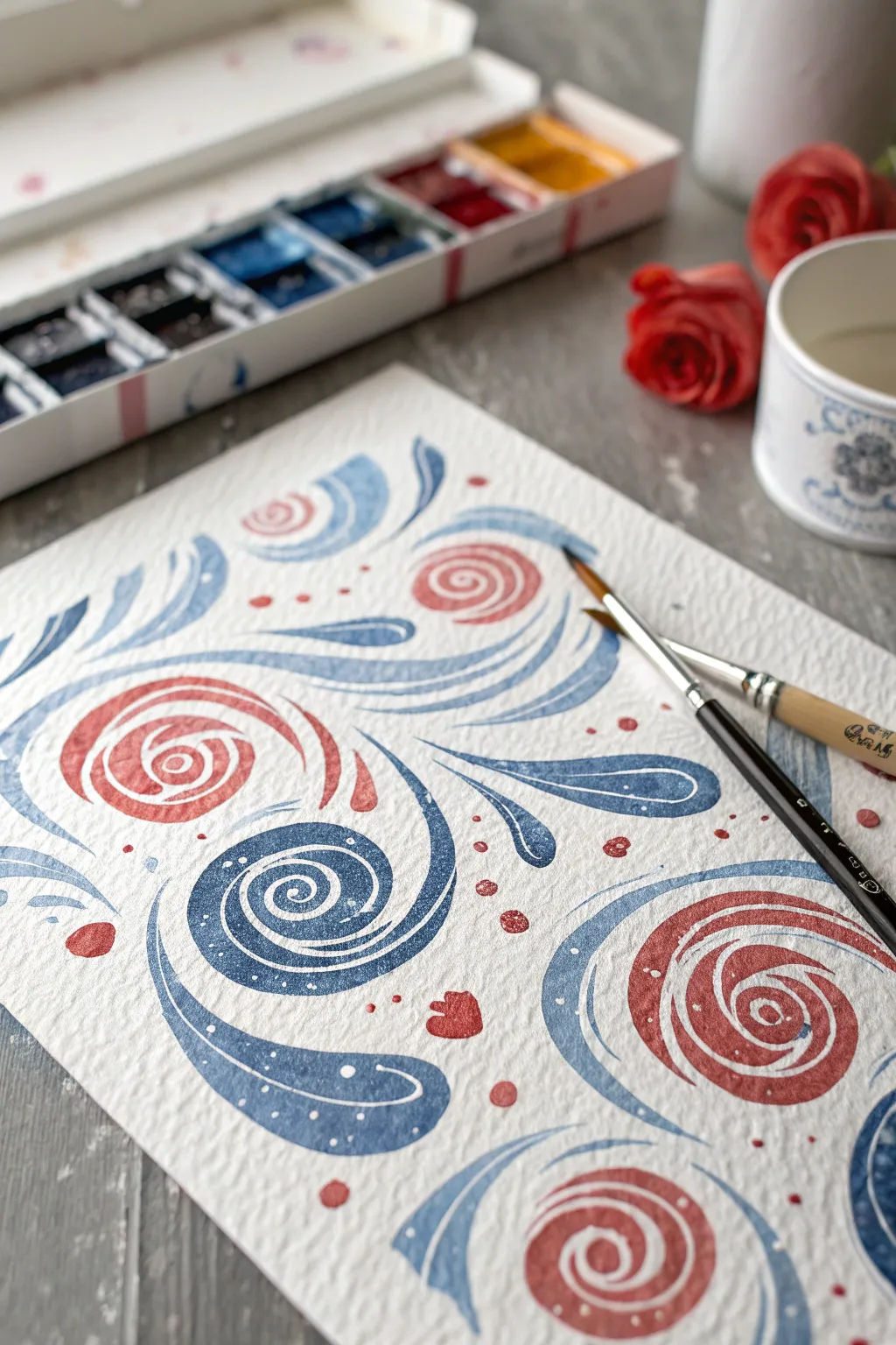
This project captures the charm of traditional folk art with a light, airy watercolor touch. Using a simple palette of coral red and denim blue, you’ll create a repeating pattern of stylized floral swirls and rosettes on textured cold-press paper.
Step-by-Step Guide
Materials
- Cold-press watercolor paper (300 gsm recommended for texture)
- Watercolor paints: Coral Red/Vermilion and Indigo/Prussian Blue
- Pointed round brush (size 6 or 8)
- Fine liner brush (size 0 or 1)
- Cup of clean water
- Paper towel
- Pencil (optional for light sketching)
Step 1: Planning and Preparation
-
Prepare the workspace:
Set up your paints, brushes, and water in a well-lit area. Because this style relies on fluid strokes, ensure you have enough elbow room to move your arm freely. -
Activate the paints:
Add a few drops of water to your coral red and indigo blue pans or tubes. Mix them in your palette until you have a creamy, milk-like consistency that flows easily. -
Visualize the layout:
Look at your paper and imagine a loose grid. You’ll want to stagger your main spiral elements so they don’t look too rigid. If you feel unsure, lightly pencil in circle guides where the main rosettes will go.
Step 2: Painting the Main Rosettes
-
Start the first red spiral:
Load your round brush with the coral red mixture. Choose a spot near the center-left to begin. -
Form the center:
Touch the tip of the brush to the paper and pivot it to create a tight inner coil. Keep your wrist flexible to maintain a smooth curve. -
Expand the spiral:
Continue painting outwards from the center coil, pressing down slightly on the brush belly to thicken the stroke, then lifting as you curve around to taper it. -
Add outer petals:
Paint a few curved, comma-like strokes hugging the outside of the main spiral to give it a rose-like appearance. Leave small gaps of white paper between strokes to keep the design airy. -
Paint the blue spiral:
Clean your brush thoroughly and switch to the indigo blue. Create a similar spiral shape diagonally adjacent to your red one, using the same coil-and-expand technique. -
Repeat across the page:
Continue alternating between red and blue large spirals across your paper. Aim for a balanced distribution, leaving generous negative space between them for the flowing leaves.
Uneven Edges?
If your spiral edges look ragged, your paper might be too rough. Try cold press with a finer grain, or use a synthetic brush which often holds a sharper point than natural hair brushes.
Step 3: Adding Leafy Swirls
-
Create the main blue sweep:
Using the blue paint, start a long, sweeping stroke that originates near a red flower and curves outward. Press down to widen the middle of the stroke and lift sharply at the end for a fine point. -
Add secondary curves:
Nestle smaller curved strokes inside or alongside the large sweep. These should echo the main curve, creating a layered, paisley-like effect. -
Balance with red:
Switch back to red and add smaller, decorative flourishes or simple curved lines in the gaps where blue elements dominate, ensuring color balance. -
Incorporate small details:
Use the very tip of your brush to add tiny, tear-drop shapes or simple dots floating around the main swirls. This mimics pollen or scattered seeds.
Level Up: Vintage Vibe
Once the painting is totally dry, lightly brush a weak wash of tea or watered-down yellow ochre over the entire paper to give the artwork an aged, antique parchment look.
Step 4: Refining and Texturing
-
Let the first layer dry:
Allow the main shapes to dry completely. The paper should feel room temperature to the touch, not cool. -
Switch to the liner brush:
Load your fine liner brush with a slightly more concentrated (less watery) mix of white gouache or very pale blue watercolor. I find white gouache works best for visibility on top of dark colors. -
Add inner highlights:
Carefully paint thin lines inside the widest parts of your blue swirls. Follow the curve of the original stroke to accentuate the flow. -
Dot the spirals:
Add tiny white or pale dots along the center lines of the red spirals or on the blue leaves for a decorative folk-art finish. -
Review and fill:
Step back and look for any awkward empty spaces. Fill these with small dots of red or blue to tie the composition together. -
Final drying:
Let the entire piece dry completely before erasing any visible pencil marks.
Frame your new folk art creation or scan it to use as a beautiful custom pattern for stationery
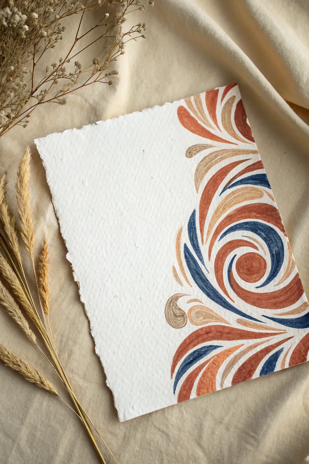
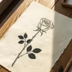
Negative Space Swirl Cutouts

Embrace the beauty of handmade textures with this elegant swirl design that balances rich, earthy colors against a stark white background. The combination of burnt sienna, navy, and metallic gold creates a warm, sophisticated palette perfect for deckle-edge paper.
Detailed Instructions
Materials
- Heavyweight cold-press watercolor paper with deckle edge (or handmade cotton paper)
- Watercolor or gouache paints (Burnt Sienna, Navy Blue, Metallic Gold/Bronze)
- Round watercolor brushes (Size 4 and 6)
- Pencil (HB or lighter)
- Kneaded eraser
- Palette for mixing
- Jar of clean water
- Paper towels
Step 1: Preparation & Sketching
-
Paper Selection:
Begin by selecting a high-quality sheet of handmade or cold-press watercolor paper. The rough texture and uneven ‘deckle’ edges are crucial for achieving the organic look shown in the example. -
Map the Composition:
Visualize the layout before you start. The design should hug the right vertical edge and curve into the bottom right corner, leaving the entire left side and top left corner as untouched negative space. -
Light Skeleton Sketch:
Using a very light hand and an HB pencil, draw a faint skeleton of the main swirl curves. Don’t draw the full thickness of the shapes yet, just single lines to establish the flow and direction of the spiral movement. -
Refine the Shapes:
Flesh out your skeleton lines into teardrop and petal-like shapes. These shapes should be tapered at both ends and thicker in the middle, resembling stylized leaves or flames flowing together. -
Clean Up:
Use a kneaded eraser to gently lift mostly all of the graphite, leaving only the faintest ghost lines to guide your brush. This ensures the pencil marks won’t show through the lighter metallic paints.
Uneven Edges?
If you struggle to get sharp tapered tips on your swirls, your brush might be too dry. Add a tiny drop of water to your mix to help the bristles snap back to a point.
Step 2: Painting the Swirls
-
Prepare Your Palette:
Mix your three core colors. You want a semi-opaque consistency for the gouache or watercolor to get that solid, illustrative look. I find mixing the burnt sienna with just a touch of water creates a creamy texture that flows well. -
Start with Burnt Sienna:
Load a size 6 round brush with the reddish-brown (burnt sienna) paint. Identify the largest, most dominant curves in your sketch and paint them first. Press down in the middle of the stroke to widen it, then lift up as you reach the tip to create a sharp point. -
Add the Navy Accents:
Switch to a clean brush and pick up the navy blue. Apply this color to the secondary curves that hug the red shapes. These often act as shadows or contrasting elements that help define the spiral motion. -
Painting the Spiral Core:
Locate the main focal point in the lower right quadrant—the tight spiral ‘eye’. Paint the central circle in burnt sienna, and carefully work the navy and sienna strokes around it to create the illusion of rotation. -
Dry Time:
Allow these first two colors to dry completely. If the paper feels cold to the touch, it is still damp. Waiting prevents the metallic gold from bleeding into the matte colors.
Pro Tip: Paper Prep
If using handmade cotton paper, tap the edges of your design lightly with a clean damp brush before painting. This helps the paint sink into the rough texture evenly.
Step 3: Metallic Details & Finishing
-
Apply the Gold:
Load a size 4 brush with metallic gold or bronze paint. Fill in the remaining shapes, which should act as highlights nestled between the darker colors. -
Watch the Edges:
Be careful not to let the gold paint touch the wet navy or sienna edges, or you might lose crisp definition. A tiny hairline of white paper between shapes can actually enhance the design. -
Balancing the Composition:
Step back and look at the density. If the right edge feels too sparse, add small, detached ‘floating’ petal shapes at the very top or bottom to taper the design off gently. -
Texture Check:
If you used gouache, the finish should be matte and velvety. If the color looks patchy, you can carefully apply a second layer once the first is bone dry to increase opacity. -
Final Erasure:
Once the painting is 100% dry (give it at least an hour), use your kneaded eraser to dab away any stray pencil marks that are still visible around the edges of the painted shapes.
Frame your piece in a floating frame to show off those beautiful deckle edges.
Have a question or want to share your own experience? I'd love to hear from you in the comments below!