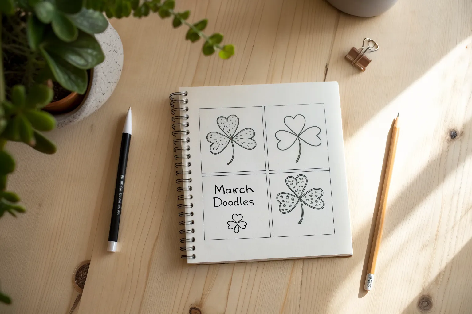
March is that sweet in-between month where winter loosens its grip and early spring starts peeking through. If you’re craving quick wins in your sketchbook, these easy March drawing ideas will keep your pencil moving without any pressure.
Rainbow and Pot of Gold
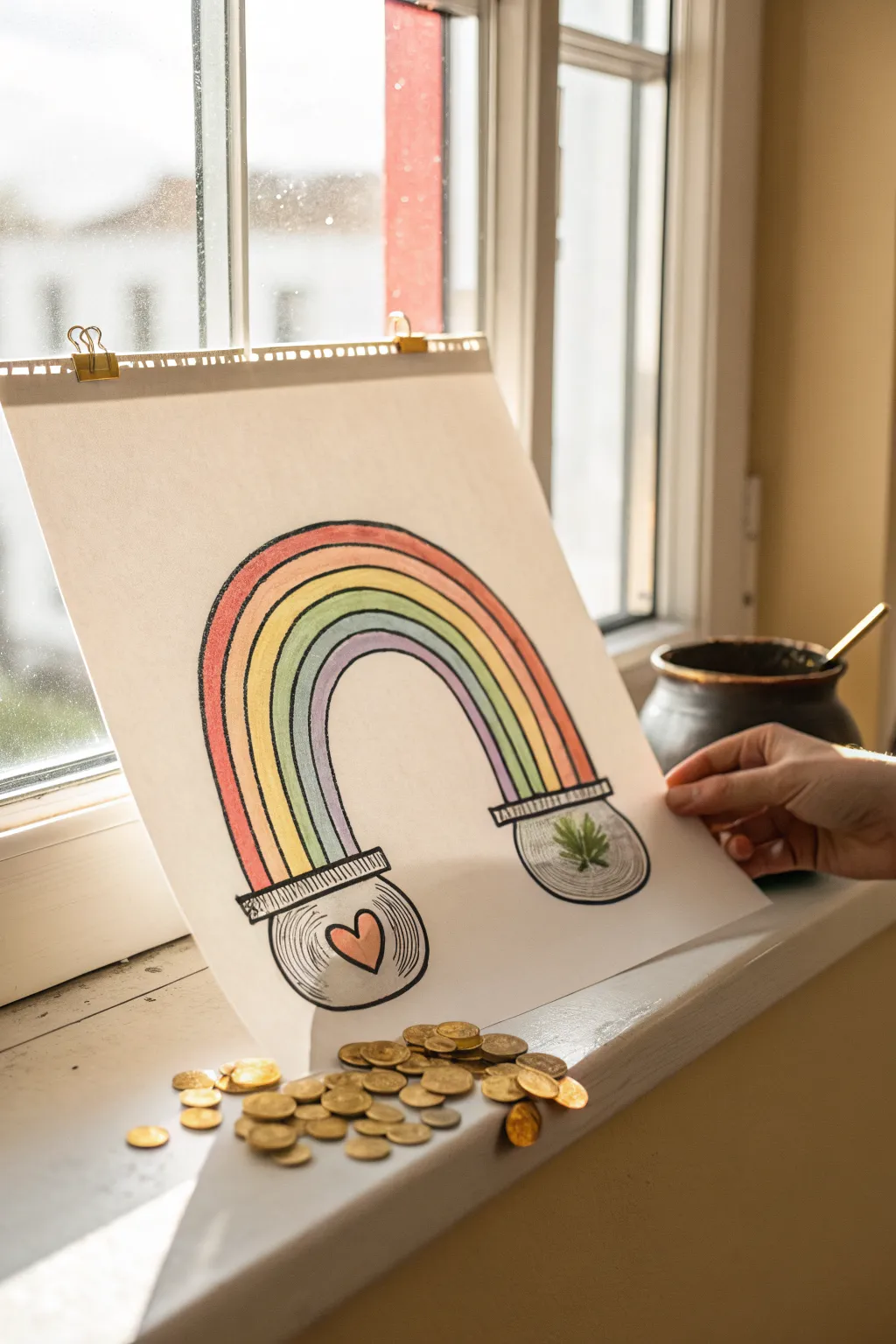
This charming illustration puts a twist on the classic pot of gold by connecting two distinct glass jars with a vibrant rainbow. The simple lines and cheerful colors make it a joyful project that transforms any sunny window ledge into a space for luck and love.
Step-by-Step
Materials
- Large white drawing paper or sketchbook sheet (A3 size recommended)
- Black fine-liner or drawing pen (0.5mm – 0.8mm)
- Colored pencils or markers (red, orange, yellow, green, blue, purple)
- Pencil and eraser for sketching
- Gold coins (chocolate or prop) for staging
Step 1: Sketching the Foundations
-
Draw the jar shapes:
Start near the bottom of your page. Lightly sketch two round, slightly flattened circles about 6–8 inches apart to serve as the bowls of your jars. -
Add the jar necks:
On top of each circle, draw a short, wide rectangular shape for the rim. I like to curve the bottom line of this rectangle slightly downward to give the jar a 3D glass look. -
Outline the rainbow arch:
Draw a large, high arch connecting the top of the left jar rim to the top of the right jar rim. This will be the top boundary of your rainbow. -
Complete the rainbow shape:
Draw a smaller, parallel arch inside the first one, creating a thick band. Connect this inner arch to the inner edges of the jar rims. -
Divide the bands:
Inside your rainbow shape, lightly sketch four more curved lines that follow the arch, dividing the space into five generous stripes for your colors.
Step 2: Inking and Details
-
Trace with ink:
Go over your pencil lines with a black fine-liner. Use a confident hand for the long curves of the rainbow to keep them smooth. -
Detail the jar rims:
Add small vertical hash marks along the rectangular rims of the jars to mimic the threading where a lid would screw on. -
Add glass reflections:
Draw curved hatching lines inside the belly of the jars, following the round shape. These lines suggest the transparent, reflective quality of glass. -
Draw the treasures:
Inside the left jar, draw a simple, bold heart shape. Inside the right jar, draw a multi-pointed star or leaf shape to represent a different kind of treasure. -
Erase pencil guides:
Once the ink is completely smudge-free, gently erase all the underlying pencil sketches to clean up the page.
Arch Anxiety?
If freehanding the rainbow arch is tricky, tie a string to a pencil. Hold the string end at the center point between jars and swing the pencil like a compass.
Step 3: Bringing Color to Life
-
Color the outer band:
Start with red for the outermost stripe of the rainbow. Use smooth strokes following the curve of the arch. -
Fill the rest of the rainbow:
Work your way inward with orange, yellow, green, and finally blue or purple for the innermost stripe. -
Tint the jar symbols:
Color the heart in the left jar a soft pink or red. For the star/leaf in the right jar, use a green or gold tone. -
Shade the glass:
Add very faint gray or light blue coloring near the edges of the jars to enhance the feeling of dimension without overpowering the clear glass look.
Interactive Art
Cut a slit along the top rim of the drawn jars. You can then slide real paper coins or notes into the slits, turning the drawing into a 3D piggy bank.
Step 4: Staging the Scene
-
Clip and display:
Use bulldog clips to hang your artwork against a window pane, allowing natural light to backlight the white paper. -
Add the gold:
Scatter a handful of gold coins on the sill directly beneath the paper, making it look as though the treasure has spilled out of the drawing.
Now you have a whimsical window display that brings a bit of magic to the room


Easy Leprechaun Face From Shapes
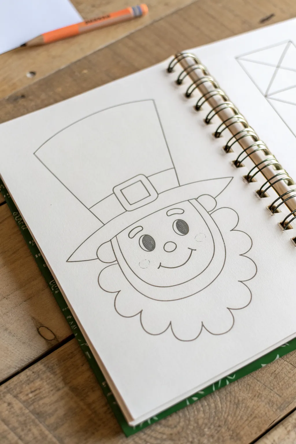
This charming project breaks down a classic leprechaun face into simple, manageable shapes perfect for beginner artists. The result is a clean, cheerful line drawing that captures the playful spirit of St. Patrick’s Day.
Detailed Instructions
Materials
- Spiral-bound sketchbook or drawing paper
- HB or 2B graphite pencil
- Eraser (kneaded or vinyl)
- Pencil sharpener
Step 1: Drafting the Head Shape
-
Start with a U-shape:
Begin by drawing a wide, rounded U-shape in the center of your page. This will act as the leprechaun’s chin and lower face. -
Close the face shape:
Draw a curved line connecting the top points of your U-shape. This creates a soft, rounded rectangle that forms the main structure of the face. -
Add the ears:
On either side of the head, sketched about halfway down the face, draw a simple semi-circle for the ears. Keep them aligned horizontally with each other.
Uneven Hat Troubles?
If the hat looks lopsided, draw a faint vertical centerline up from the nose through the hat. Use this guide to measure equal distances for the brim and top width.
Step 2: Building the Hat
-
Draw the brim base:
Just above the top curve of the face, draw a long, slightly curved horizontal line that extends past the width of the head on both sides. -
Complete the brim:
Connect the ends of that line back to the head with short diagonal lines, creating the wide brim of the hat. -
Create the hat structure:
Draw two diagonal lines extending upwards from the brim. Unlike a perfect cylinder, these lines should flare out slightly wider at the top than at the bottom for a cartoonish look. -
Close the top:
Connect the two rising lines with a gentle curve at the very top to finish the main hat shape. -
Add the hat band:
Draw a curved line across the hat, parallel to the brim and a short distance above it, to define the belt or band. -
Detail the buckle:
In the center of the band, draw a rectangle. Inside that rectangle, draw a smaller rectangle to create the look of a buckle.
Step 3: Designing the Beard
-
Start the beard outline:
Beginning near one ear, draw a series of connecting scallops or cloud-like bumps. -
Wrap around the chin:
Continue these bumpy curves all the way around the bottom of the chin, maintaining a fluffy texture, until you reach the ear on the opposite side. -
Define the inner beard line:
Inside the face shape, draw a smooth curve that parallels the chin line, running from ear to ear. This creates the visual separation between the smooth face and the beard hair.
Add Lucky Details
Make it festive by tucking a three-leaf clover into the hat band or coloring the finished drawing with bright greens and oranges markers.
Step 4: Facial Features
-
Position the nose:
Draw a small circle right in the center of the face for a button nose. -
Draw the eyes:
Above the nose, draw two upright ovals. Leave a small white highlight circle in the top right of each oval, then shade the rest of the oval in solidly with your pencil. -
Add eyebrows:
Placement is key for expression; draw two short, arched curves floating above the eyes. -
Create the smile:
Draw a wide, shallow U-curve under the nose. Add tiny tick marks at the ends of the smile for cheek dimples. -
Rosy cheeks:
Sketch very faint, small circles on the cheeks just outside the smile lines to suggest a rosy complexion.
Step 5: Refining the Drawing
-
Finalize outlines:
Go over your favorite lines with a slightly heavier hand to darken them and make the drawing pop from the page. -
Clean up:
Use your eraser to remove any stray sketch lines or overlapping marks that shouldn’t be visible, keeping the drawing neat.
You now have a delightful leprechaun character ready to bring some luck to your sketchbook


Lucky Top Hat and Coins
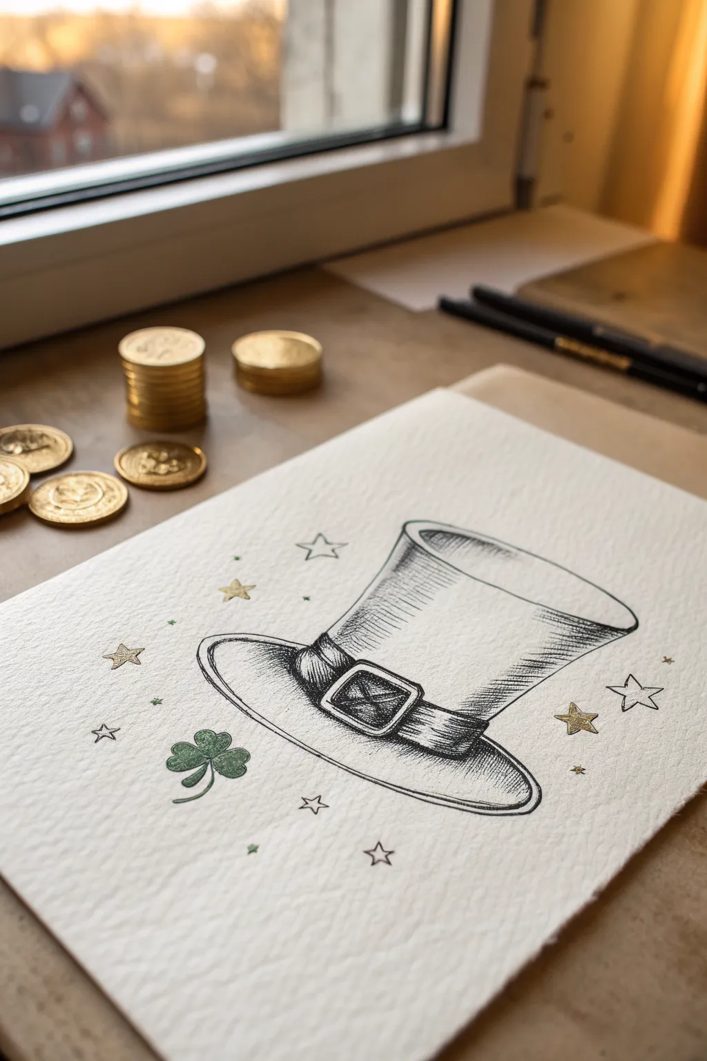
Celebrate St. Patrick’s Day with this charming ink illustration featuring a classic leprechaun hat and lucky charms. The project uses fine drawing pens to create rich texture and simple gold accents for a festive touch.
Step-by-Step
Materials
- Textured watercolor paper or mixed media paper
- HB graphite pencil
- Kneaded eraser
- Fine liner pens (sizes 0.1, 0.3, and 0.5)
- Metallic gold marker or gold gel pen
- Green colored pencil or fine liner
Step 1: Sketching the Outline
-
Establish the brim:
Begin by lightly drawing a wide, flattened oval shape near the bottom center of your paper. This will serve as the brim of the hat. -
Form the crown base:
Draw two slightly curved vertical lines rising from the inner part of the brim oval. Connect them at the top with another curve that mirrors the curve of the brim. -
Add the opening:
Sketch a smaller oval inside the top curve to create the illusion of the hat being open and hollow. -
Draw the band:
Create a curved band just above the brim. It should wrap around the cylinder of the hat, following the curvature of the crown. -
Detail the buckle:
Sketch a square buckle on the band, positioning it slightly off-center to the left. Draw a smaller square inside it to create the frame thickness.
Hatching Pro Tip
Follow the form! Curve your hatching lines slightly to match the rounded shape of the hat cylinder. Straight lines can flatten the object.
Step 2: Inking and Texture
-
Outline the main shapes:
Using a 0.3 or 0.5 pen, carefully trace over your pencil lines for the hat’s outer silhouette. Use confident, smooth strokes. -
Refine the buckle:
Ink the buckle details. I find that making the inner square corners slightly rounded gives it a more worn, realistic look. -
Start the hatching:
Switch to a finer 0.1 pen. Begin adding shading to the side of the hat opposite your light source using simple vertical hatch lines. -
Deepen the shadows:
Cross-hatch tightly on the left side of the hat crown and under the brim to create volume. Keep your lines parallel and evenly spaced. -
Texture the band:
Fill the hat band with dense, dark horizontal lines to differentiate its color from the felt of the hat. -
Shade the interior:
On the inside rim of the opening, add curved hatching lines that follow the oval shape, getting darker as they go deeper into the hat. -
Erase guidelines:
Once the ink is completely dry, gently remove all visible graphite marks with your kneaded eraser.
Make It Invite-Ready
Draw this design on the bottom half of heavy cardstock and fold it over to create custom St. Patrick’s Day party invitations.
Step 3: Magical Embellishments
-
Draw the clover:
To the left of the hat, sketch a small four-leaf clover stem and leaves. Ink the outline with your fine liner. -
Color the clover:
Fill in the clover leaves using a green colored pencil or pen to provide a soft pop of color against the black ink. -
Scatter the stars:
Draw various small five-pointed stars around the hat. Leave some as outlines and prepare others to be filled. -
Apply gold accents:
Use your gold marker to fill in select stars. If you have any small gaps in your line work, adding tiny gold dots can mask them beautifully. -
Add floating sparkles:
Draw tiny diamond shapes and dots with the 0.1 pen in the empty spaces to create a magical, floating atmosphere. -
Final assessment:
Review the drawing for contrast. Deepen the darkest shadows on the hat if needed to make the white highlights stand out more.
You now have a crisp, detailed seasonal drawing ready to display


March Lettering With Clover Accents

Celebrate the arrival of spring with this elegant yet simple bullet journal cover page featuring classic serif lettering. The design balances bold text with delicate green foliage and tiny clover doodles for a fresh, minimalist aesthetic.
Step-by-Step Tutorial
Materials
- A5 Spiral notebook or bullet journal (dot grid or blank)
- Black fine liner pen (0.5mm or 0.8mm)
- Black ultra-fine liner pen (0.1mm or 0.3mm)
- Sage green fine point marker or pen
- Olive green fine point marker or pen
- Pencil
- Eraser
- Ruler (optional)
Step 1: Drafting the Layout
-
Center the word:
Begin by lightly sketching the word ‘MARCH’ in the center of your page using a pencil. Aim for letters that are about 1.5 inches tall to serve as the focal point. -
Refine the letterforms:
Add small serifs—the little feet at the ends of strokes—to your sketched letters. Give the ‘M’ slightly flared legs and curve the tail of the ‘R’ gently for a classic look. -
Plan the accents:
Lightly sketch the placement of the decorative elements. Mark spots for two fern-like branches (one above the ‘M’, one below the ‘H’) and scatter small dots around the word to map out spacing.
Smudge Prevention
If your eraser smears the ink, the pen wasn’t fully dry. Use a kneaded eraser and a dabbing motion instead of rubbing to lift graphite safely.
Step 2: Inking the Typography
-
Outline the text:
Using your 0.5mm or 0.8mm black fine liner, carefully trace over your pencil letters. Keep your hand steady to create smooth, confident lines. -
Thicken the strokes:
Go back over the downstrokes (the vertical lines created when writing downward) to thicken them slightly. This faux-calligraphy technique adds weight and elegance to the word. -
Sharpen the serifs:
Use the finer point of your pen to crisp up the corners and serif details, ensuring the letters look polished rather than sketched.
Step 3: Adding Greenery Details
-
Draw the top fern:
Switch to your sage green pen. Above the ‘M’ and ‘A’, draw a small, curved line for a stem, then add short, angled dashes on either side to create a fern leaf effect. -
Draw the bottom fern:
Repeat the fern process with the olive green pen below the ‘H’, mirroring the angle of the top one for balance. -
Add tiny clovers:
Using the green pens, draw a few very small three-leaf clover shapes. Place one near the top right and another near the bottom left to guide the eye across the page. -
Sketch flower outlines:
With the ultra-fine black pen (0.1mm), draw tiny, simple five-petal flower outlines. Keep these open and uncolored for an airy feel. -
Include stem accents:
Add a few single-line loop accents or tiny sprout shapes in green or gold-brown ink to fill empty negative space without overcrowding.
Add Some Sparkle
Make the page magical by tracing over the green fern leaves with a clear glitter gel pen or adding tiny gold metallic dots.
Step 4: Finishing Touches
-
Scatter the confetti:
Using the black fine liner, dot the empty spaces around the word with small, solid ink dots. Vary the spacing to make it look like falling confetti. -
Check for balance:
Step back and look at your composition. If a specific area looks too empty, add one more tiny dot or a micro-leaf. -
Erase pencil lines:
Wait until the ink is completely dry—I usually give it at least five full minutes to be safe. Then, gently erase all underlying pencil marks.
Now you have a crisp, refreshing title page ready to welcome the new month
BRUSH GUIDE
The Right Brush for Every Stroke
From clean lines to bold texture — master brush choice, stroke control, and essential techniques.
Explore the Full Guide
In Like a Lion, Out Like a Lamb
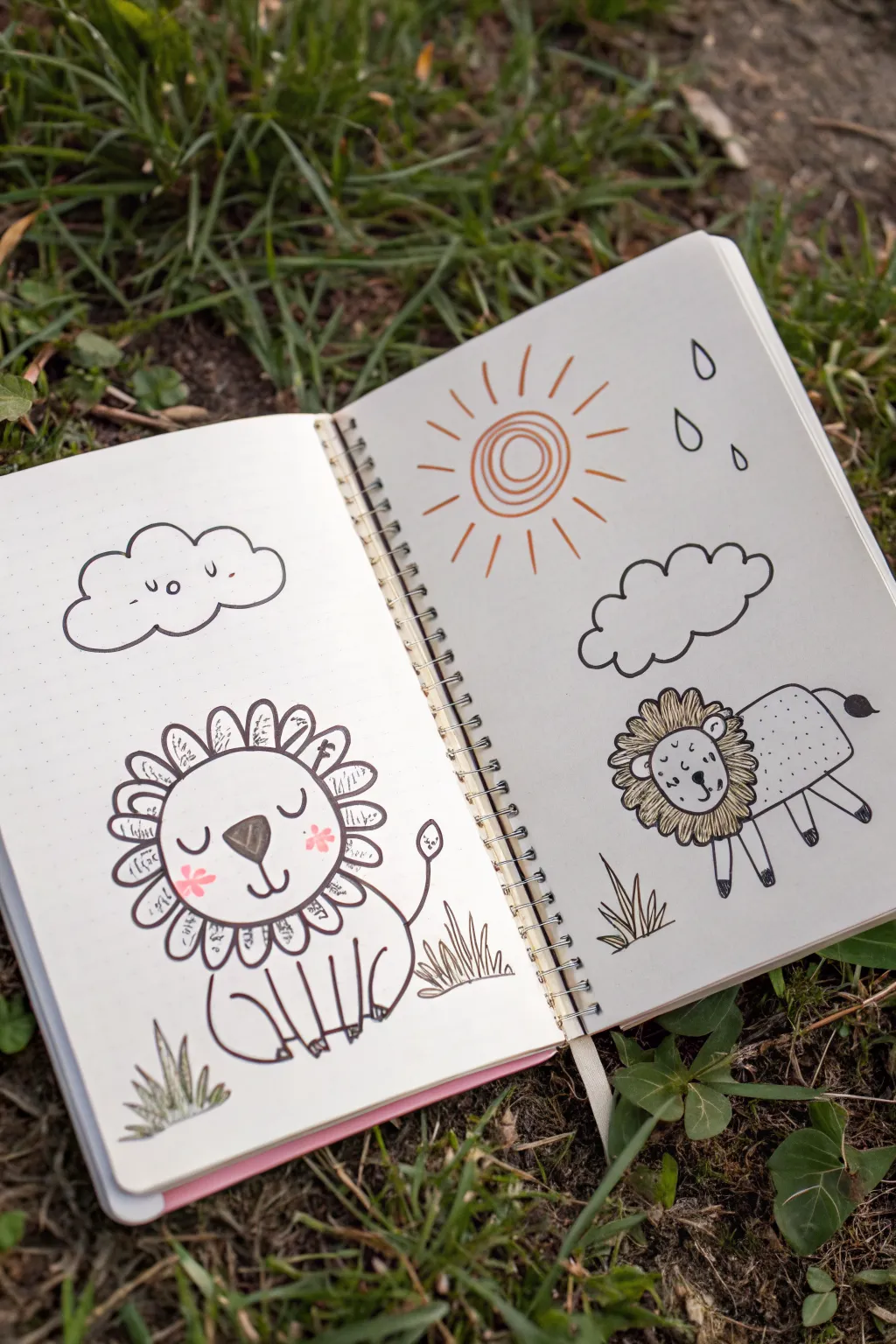
Celebrate the changing winds of March with this adorable double-page sketchbook spread featuring the classic proverb. On the left, a gentle lion basks under a cloud, while the right page showcases a fluffy lamb under varied weather, capturing the month’s unpredictable nature.
Step-by-Step
Materials
- Dotted or blank sketchbook
- Fine liner pen (black, approx. 0.3mm or 0.5mm)
- Pencil and eraser
- Orange or earthy-tone marker (for the sun)
- Pink marker or colored pencil (for cheeks)
Step 1: Drawing the Lion (Left Page)
-
Sketch the lion’s head:
Begin on the bottom half of the left page. Use your pencil to lightly draw a large circle for the lion’s face. Inside the circle, sketch a wide, upside-down triangle for the nose and a ‘W’ shape underneath for the mouth. -
Add facial details:
Draw two U-shapes for closed, peaceful eyes. Add small rosy circles on the cheeks. At the top of the head circle, add two small semi-circles for ears. -
Create the mane:
Draw a series of U-shaped petals all around the head to create a flower-like mane. Inside each petal, sketch a few tiny lines or scribbles to give it texture. -
Draw the body and tail:
Extend a curved line down from the right side of the mane for the back, loop it around for the haunch, and draw the front legs as simple vertical columns. Don’t forget a thin tail ending in a teardrop shape. -
Set the scene:
Under the lion, sketch short, jagged spikes to represent patches of grass. Above the lion, draw a fluffy cloud shape with a simple smiling face inside it (two dots for eyes and a small curve for a mouth). -
Ink the lion:
Trace over your pencil lines with the black fine liner. Fill in the nose completely black, leaving a tiny white highlight if you wish. Add the pink color to the cheeks now.
Mane Texture Tip
Vary the squiggles inside the lion’s mane petals. Some can be zigzags, others short dashes or loops, to make the hair look wild and organic.
Step 2: Drawing the Lamb (Right Page)
-
Outline the lamb’s shape:
On the bottom right page, start with a rectangular shape with rounded corners for the body. Attach a smaller circle to the top left of the body for the head. -
Add fluffy details:
Draw a ruff of fur around the lamb’s neck using jagged, zigzag lines. Give the face simple features: dots for eyes, a small nose, and floppy ears on the side. -
Draw the legs:
Sketch four simple legs coming down from the body. You can draw the feet as small black hooves. -
Weather elements:
Above the lamb, roughly in the center of the page, draw three concentric circles for the sun. Add radiating lines (rays) around the outside using your orange marker. -
Rain and clouds:
Next to the sun on the right, draw three small tear-drop shapes for raindrops. Below the sun and rain, draw another fluffy cloud shape outline. -
Ink the lamb side:
Go over the lamb’s lines with your black pen. Use stippling (small dots) on the lamb’s body to suggest a woolly texture. Darken the hooves and tail tip. -
Define the weather:
Ink the cloud outline and the raindrops. For the sun, outline the orange spirals with a very thin line if you want more definition, or leave it soft.
Make it Pop
Use a light gray brush pen to add simple drop shadows under the clouds and animals. This lifts them off the page for a subtle 3D effect.
Step 3: Final Touches
-
Add ground details:
Just like on the lion side, add a few clusters of spiky grass near the lamb’s feet to ground the drawing. -
Erase pencil marks:
Wait a moment for the ink to fully set so it doesn’t smear. Then, gently erase all underlying pencil sketches from both pages. -
Review and refine:
Look at the whole spread. If any lines look too thin, thicken them slightly to match the bold look of the lion. Add extra texture lines to the grass if needed.
Now you have a charming visual reminder that even the wildest month eventually settles down
March Showers Rain Cloud
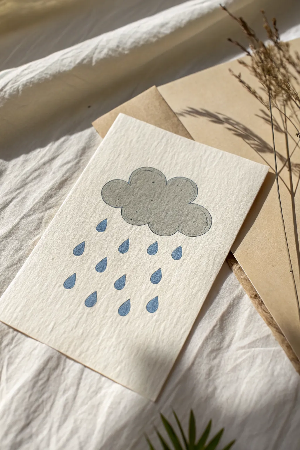
Capture the moody charm of early spring with this simple yet elegant rain cloud illustration. The textured paper and muted tones give this handmade card a wonderfully tactile and cozy feel.
How-To Guide
Materials
- Heavyweight textured cardstock (cream or off-white)
- Grey marker or watercolor paint (slate grey)
- Blue marker or watercolor paint (muted denim blue)
- Fine-point black fineliner pen (0.1mm or 0.3mm)
- Pencil and eraser
- Ruler
Step 1: Planning the Layout
-
Prepare your paper:
Begin by cutting your textured cardstock to your desired greeting card size. A standard A6 size works beautifully for this design. -
Lightly sketch the cloud:
Using a pencil with a very light touch, sketch a kidney-bean shaped cloud in the upper center of the card. Keep the curves bubbly and soft rather than rigid. -
Map out raindrops:
Beneath the cloud, lightly mark where your raindrops will fall. Aim for a staggered, random pattern rather than perfect straight lines to keep the look organic.
Bleeding Lines?
If ink feathers on the textured paper, switch to an archival pigment liner instead of a standard felt tip. These pens resist spreading on porous surfaces.
Step 2: Adding Color
-
Color the cloud base:
Fill in your cloud sketch with the grey marker or watercolor. If using marker, use broad strokes to minimize streakiness. For watercolor, a flat wash works best. -
Add visual depth:
I like to go over the bottom edge of the cloud a second time with the same grey tone while it’s still slightly damp or fresh. This creates a subtle shadow effect at the base. -
Draw the raindrops:
Switch to your muted blue color. Carefully draw tear-drop shapes over your pencil guides. Make the bottom of the drop round and drag the color up to a sharp point. -
Let it dry completely:
Before moving on to any ink outlines, ensure your paint or marker is 100% dry to prevent bleeding or smudging.
Step 3: Inking details
-
Outline the cloud:
Take your black fineliner and trace around the perimeter of the grey cloud. Don’t worry about being perfectly on the edge; a slightly offset line adds a charming, illustrative style. -
Create the inner shadow line:
Draw a second, thinner line inside the cloud shape, following the bottom curves. Stop this line about halfway up the cloud’s height. -
Add texture dots:
Place a few tiny dots randomly within the grey cloud area using the fineliner. This mimics the texture of the paper and adds interest. -
Outline the raindrops (optional):
For a crisper look, you can outline the blue raindrops with a very fine black line, though leaving them soft and colored-only works well too.
Add Sparkle
Once the blue raindrops are dry, create a wet look by adding a tiny dot of glossy accents or clear dimensional glaze to the center of each drop.
Step 4: Finishing Touches
-
Clean up sketches:
Once the ink is fully set, gently erase any visible pencil marks from your initial sketch. -
Press the card:
If using watercolor caused the paper to buckle slightly, place the finished card under a heavy book overnight to flatten it out perfectly.
Send this cozy card to a friend to brighten up a rainy spring afternoon

PENCIL GUIDE
Understanding Pencil Grades from H to B
From first sketch to finished drawing — learn pencil grades, line control, and shading techniques.
Explore the Full Guide
Umbrella With Raindrop Patterns
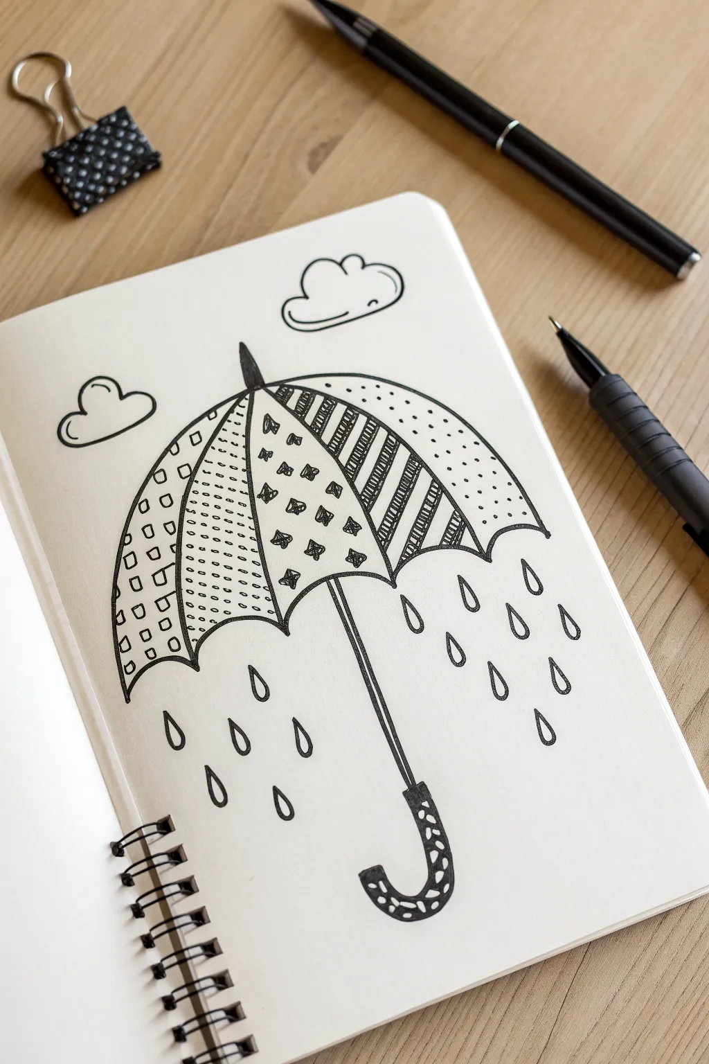
Celebrate those impending April showers a little early with this charming, patterned umbrella doodle. This simple black ink drawing uses repetitive Zentangle-inspired patterns to turn a rainy day subject into a relaxing, creative exercise.
Step-by-Step
Materials
- Sketchbook or drawing paper
- Pencil (HB or 2B)
- Eraser
- Fine-tip black drawing pen (size 01 or 03)
- Thicker black marker (optional, for filling)
Step 1: Sketching the Outline
-
Draw the main curve:
Start by drawing a large, gentle arch in the center of your page. This will be the top of the umbrella’s canopy. Keep your pencil pressure light so you can erase these lines later. -
Add the scallops:
Connect the two ends of your arch with a scalloped line. Draw five small, connected U-shapes (scallops) across the bottom to create the edge of the umbrella. -
Divide the canopy:
From the point where each scallop meets the next, draw a curved line upward to the very center top point of the arch. This divides the umbrella into triangular segments. -
Add the ferrule and handle:
Draw a small, pointed triangle shape emerging from the top center for the ferrule. Then, draw a long, straight double-line coming down from the center scallop for the shaft, curving it into a ‘J’ shape at the bottom for the handle. -
Sketch the clouds:
Draw two simple, fluffy cloud shapes floating above the umbrella—one slightly larger near the top right, and a smaller one to the left.
Ink Smearing?
If your pen smears when erasing, switch to a pigment liner or archival ink pen. These dry much faster and are usually waterproof compared to standard gel pens.
Step 2: Inking the Structures
-
Trace the main lines:
Switch to your fine-tip black pen. Carefully trace over your pencil outline of the umbrella canopy, including the internal dividing lines and the scalloped bottom edge. -
Ink the handle and top:
Ink the shaft and curved handle. For the handle’s grip area, draw a slightly thicker outline to define it as a separate section. Ink the small point at the top of the umbrella as well. -
Outline the clouds:
Go over your cloud sketches with fluid, confident lines. Don’t worry if they aren’t perfectly symmetrical; organic shapes look better.
Make It Pop
Use a light gray marker to add a shadow line along the right side of the umbrella and raindrops. This adds subtle 3D depth without needing full color.
Step 3: Filling Patterns
-
Pattern 1: The grid:
Starting with the far-left segment, draw a simple grid of small squares. I find it easiest to draw all vertical lines first, then cross them horizontally. Fill the center of each square with a tiny circle or dot. -
Pattern 2: The dashes:
In the second segment, fill the space with horizontal rows of short, dashed lines. Try to stagger them slightly like bricks in a wall for visual interest. -
Pattern 3: The stars:
For the third (middle) segment, draw small four-pointed stars or diamond shapes scattered randomly. Fill the inside of these shapes with black ink to make them pop. -
Pattern 4: The stripes:
In the fourth segment, draw thick diagonal stripes. Fill every other stripe completely with black ink to create a bold contrast. -
Pattern 5: The dots:
For the final segment on the right, keep it simple by filling it with random stippling dots. Vary the spacing slightly to keep it looking organic. -
Decorate the handle:
On the curved handle grip, add a few small, random circular shapes or ‘cells’ and color in the background space black, leaving the circles white.
Step 4: Finishing Touches
-
Draw raindrops:
Scatter teardrop shapes underneath the umbrella. Draw them at varying heights and slightly different angles to simulate falling rain. Keep the shapes simple—pointed at the top, round at the bottom. -
Erase pencil lines:
Wait a minute or two to ensure the ink is completely dry. Gently run your eraser over the entire drawing to remove any visible graphite sketches. -
Refine the lines:
Take a final look at your drawing. If any outer lines look too thin compared to the bold patterns inside, go over them once more to thicken the silhouette slightly.
Now you have a cozy rain-themed page ready for your journal or sketchbook
Rain Boots and Puddle Ripples
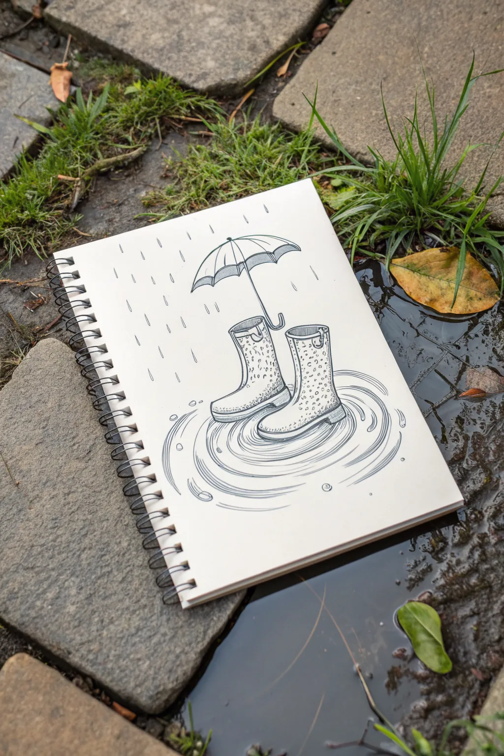
Capture the whimsy of a rainy spring day with this crisp ink illustration featuring patterned wellies and gentle ripples. The clean lines and minimal shading create a striking graphic look perfect for your sketchbook.
Step-by-Step Guide
Materials
- Spiral-bound sketchbook (medium weight paper)
- Pencil (HB or H for light sketching)
- Eraser (kneaded preferred)
- Fine liner pens (sizes 005, 01, and 05)
- Ruler (optional)
Step 1: Sketching the Framework
-
Position the boots:
Start by lightly sketching two uneven cylinders near the center of your page. Angle the left one slightly outward and the right one facing forward to give them a natural, stepped-in look. -
Shape the feet:
Attach the foot portion to each cylinder. Curve the toes slightly upward and define the heel; keep the shapes rounded and soft rather than boxy. -
Add boot details:
Sketch the thick soles at the bottom and the looped pull-tabs at the top cuffs. These small details instantly make the shapes recognizable as rain boots. -
Float the umbrella:
Draw a curved arch floating a few inches directly above the boots. Connect the ends with a scalloped line to form the umbrella canopy. -
Umbrella handle:
Draw a straight line coming down from the center of the canopy, ending in a ‘J’ curve that hooks right into the top of the left boot. -
Map the puddle:
Lightly sketch oval rings radiating outward from the base of the boots. These don’t need to be perfect circles; varying the width creates a sense of perspective.
Step 2: Inking the outlines
-
Outline the boots:
Switch to your 05 pen for the main contours. Trace your pencil lines for the boots, making the soles slightly thicker to show weight. -
Define the umbrella:
Ink the umbrella canopy and handle. Add the ribs of the umbrella by drawing curved lines from the top center point down to each scallop point. -
Erase preparatory lines:
Once the main ink lines are completely dry, gently erase your pencil sketch. This leaves a clean slate for the textures.
Wobbly Lines?
For smooth ripples, move your whole arm, not just your wrist. If a line goes astray, just thicken it slightly to make it look like a shadow.
Step 3: Adding Texture and movement
-
Draw the leopard print:
Using an 01 pen, fill the body of the boots with small, irregular ‘C’ shapes and spots. Leave some white space between them so the pattern doesn’t look too heavy. -
Detail the rain:
With the same 01 pen, draw short, vertical dashes falling from the sky. Vary their lengths slightly, and angle them just a bit to suggest wind direction. -
Create the ripples:
Using your finest pen (005), trace the puddle ovals. Break the lines occasionally so they aren’t continuous loops; this makes the water look fluid and moving. -
Add water droplets:
Draw tiny circles or teardrop shapes hitting the puddle surface and bouncing off the umbrella needed. I like to place a few ‘plop’ rings separate from the main puddle for realism. -
Shadow and depth:
Add very subtle hatching (fine parallel lines) on the inside of the boot cuffs and under the umbrella rim to create depth. -
Refine the water:
Add a few extra curved lines inside your main ripples to show reflection. Keep these lines very thin and confident. -
Final check:
Look over the drawing for any gaps. Darken the bottom edge of the soles one last time to ground the boots firmly in the scene.
Make it Pop
Use a white gel pen to add highlights on the wet boots and the top of the umbrella to make them look glossy and rain-slicked.
Now you have a charming rainy day scene that looks great regardless of the weather outside


Windy March Kite Sketch
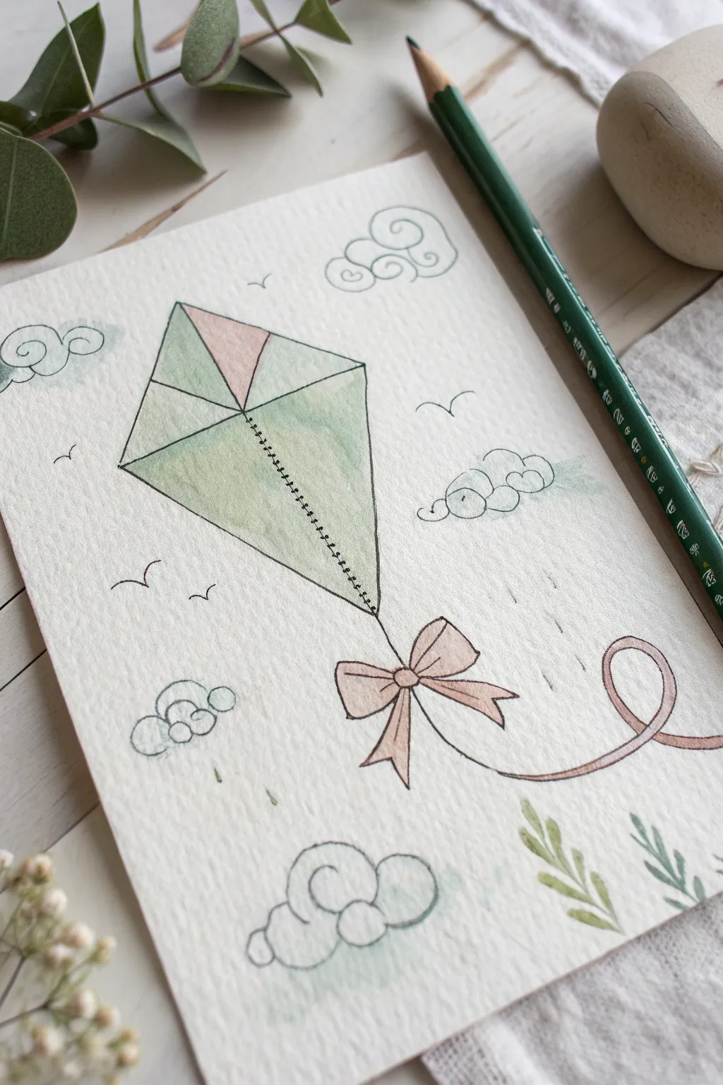
Capture the breezy spirit of March with this delicate watercolor and ink sketch featuring a classic diamond kite. Soft washes of sage green and blush pink bring the illustration to life against a backdrop of swirling doodle clouds.
How-To Guide
Materials
- Textured watercolor paper (cold press, A5 or greeting card size)
- H pencil for sketching
- Fine liner pen (black, waterproof, size 0.1 or 0.3)
- Watercolor paints (Sage Green, Blush Pink/Rose)
- Small round watercolor brush (size 2 or 4)
- Water cup and paper towel
- Eraser
Step 1: Sketching the Outline
-
Draw the central spine:
Begin by lightly drawing a vertical line slightly tilting to the right in the center of your paper. This will be the main spine of your kite. -
Add the crossbar:
Draw a shorter horizontal line crossing the spine about one-third of the way down from the top. Again, angle it slightly to match the kite’s tilt. -
Form the diamond shape:
Connect the four endpoints of your crossbar and spine with straight lines to create the classic diamond kite shape. -
Detail the kite panels:
Inside the diamond, draw lines from the center intersection out to the corners to define the separate fabric panels. -
Add the tail string:
Extend a curved, flowing line from the bottom point of the kite, looping it gently upward to the right to simulate movement in the wind.
Wobbly Lines?
Don’t stress about perfect straight lines. A slightly shaky hand actually adds charm and a whimsical ‘sketchy’ quality that fits this style perfectly.
Step 2: Inking the Details
-
Outline the kite:
Using your waterproof fine liner, carefully trace over your pencil lines for the kite’s outer shape. -
Create the stitched spine:
Instead of a solid line for the central vertical spine, draw tiny, evenly spaced horizontal hash marks along the line to mimic stitching. -
Draw the bow:
Where the tail string begins at the bottom tip, draw a cute bow with two loops and two trailing ribbons. Keep the lines loose and playful. -
Ink the ribbon tail:
Trace the long, curving tail line. You can make this a double line to give the ribbon some width, closing the end with a small curve. -
Add playful clouds:
Scatter 3-4 stylized clouds around the kite. Use swirling, spiral motions for the cloud interiors and bumpy scallops for the edges. -
Include flying birds:
Draw simple ‘v’ shapes in the background to represent distant birds carried by the wind. -
Erase pencil guides:
Wait ink to dry completely to avoid smudging, then gently erase all visible pencil marks.
Water Control
Test your color intensity on a scrap paper first. This style relies on very pale, watery washes, so dilute your paint significantly before applying.
Step 3: Adding Watercolor
-
Paint the main panels:
Load your brush with a watery mix of sage green. Paint the left and right panels of the kite, keeping the wash sheer so the paper texture shows through. -
Add a pink accent:
Clean your brush and pick up a soft blush pink. Paint the top triangular panel of the kite for a sweet pop of color. -
Color the bottom panel:
Return to the sage green and fill in the bottom triangular panel. I like to keep the edges slightly imperfect for a hand-drawn feel. -
Paint the bow and ribbon:
Using the blush pink mixture, carefully fill in the bow loops and the long trailing ribbon tail. -
Add subtle background touches:
With very diluted green paint, add tiny dabs or faint washes inside the doodle clouds and around the bottom corners to ground the composition. -
Incorporate leafy accents:
Paint simple leaf shapes in the bottom right corner using the green paint, letting the brush strokes define the leaves without ink outlines. -
Final drying time:
Let the entire piece dry flat. If the colors look too pale, you can add a second layer once the first is dry.
Now you have a charming piece of spring art ready to display or gift to a friend
Easy Tulip Bunch for Early Spring
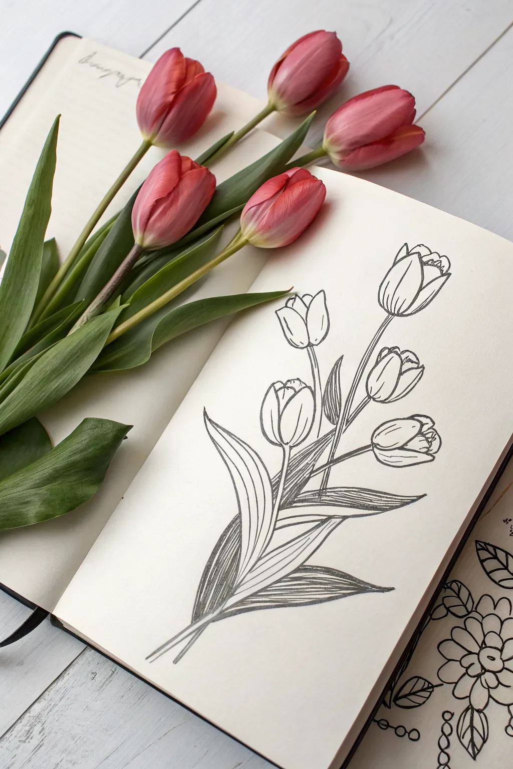
Capture the graceful simplicity of early spring with this elegant line drawing of a tulip bouquet. The sketch features clean outlines and hatched shading to give the leaves depth, perfect for a crisp March journal page.
Step-by-Step Tutorial
Materials
- A5 Sketchbook or heavy drawing paper
- HB pencil (for initial sketching)
- Fine liner pen (0.3mm or 0.5mm, black)
- Clean eraser
- Reference photo of tulips (optional)
Step 1: Planning the Composition
-
Establish the stems:
Begin with your pencil held lightly. Draw five long, slightly curved lines radiating from a single gathering point near the bottom center of the page. Let them fan out naturally, with the center stem reaching the highest. -
Mark the flower locations:
At the top of each stem line, sketch a simple egg shape or oval to represent where the flower heads will sit. Vary the heights slightly to create a natural, unforced arrangement. -
Outline the leaf shapes:
From the base where the stems gather, draw large, sweeping lance-shaped leaves. Make sure two long leaves curve outward at the bottom, and add a few shorter leaves tucked in between the stems.
Step 2: Drawing the Flowers
-
Refine the center tulip:
Starting with the tallest flower, draw the petals inside your oval guide. Create a central U-shape for the front petal, then add curved lines behind it to suggest the petals wrapping around. -
Draw the side blooms:
Move to the flowers on the left and right. Give them slightly different orientations; perhaps one faces more upward while another tilts to the side. Sketch the petal edges with smooth, confident curves. -
Detail the lower buds:
For the lower flowers, keep the shapes tighter, like buds that haven’t fully opened. Overlap the petals snugly to show their closed form. -
Connect stems to heads:
Thicken your initial stem lines, ensuring they connect seamlessly to the base of each flower head without any gaps.
Tip: Line Weight
Use a slightly thicker pen (0.5mm) for the main outlines of the petals and leaves, and a thinner pen (0.1mm or 0.3mm) for the shading lines to create beautiful contrast.
Step 3: Inking the Lines
-
Trace the main contours:
Switch to your fine liner pen. Carefully trace over your pencil lines for the flower petals, using a steady hand to create clean, continuous strokes. -
Ink the stems:
Go over the stem lines. I find it helpful to pull the pen toward me in one smooth motion rather than sketching short, feathery lines, which keeps the look crisp. -
Define the leaves:
Outline the leaves, paying attention to where they fold or twist. Let the lines taper off gently at the pointed tips. -
Erase pencil marks:
Wait a moment for the ink to dry completely to avoid smudging. Then, gently erase all the underlying graphite sketch lines to reveal the stark black-and-white art.
Trouble: Shaky Lines?
If your long stem lines look wobbly, try locking your wrist and moving your entire arm from the elbow instead. This produces much smoother, more confident curves.
Step 4: Adding Texture and Depth
-
Add petal details:
Inside the flower heads, add very short, faint lines near the tips of the petals to suggest the curl and texture of the tulip. -
Begin shading the leaves:
Choose a leaf to start with and draw a central vein line running from the base almost to the tip. -
Hatching the dark side:
On one side of the central vein, use closely spaced diagonal lines (hatching) to fill in the space. This creates a shadow effect and distinguishes the two halves of the leaf. -
Vary the hatching density:
For leaves that appear to be behind others, make your hatching lines closer together to create a darker tone, pushing those leaves into the background. -
Texture the stems:
Add a few very thin, vertical lines at the base of the stems where they bundle together to show shadow and cylindrical form. -
Final leaf detailing:
Check the remaining leaves. If a leaf twists, follow the curve of the leaf with your hatching lines rather than keeping them perfectly straight, which adds a sense of movement.
Now you have a timeless botanical illustration that captures the essence of spring in simple black and white.


Have a question or want to share your own experience? I'd love to hear from you in the comments below!