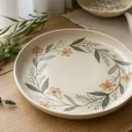
Whenever you’re stuck staring at a blank page, beginner easy drawings are the fastest way to get your hand moving and your confidence back. I pulled together these simple drawing ideas you can finish in minutes—no fancy skills, just cozy little wins.
Simple Cute Cat Face
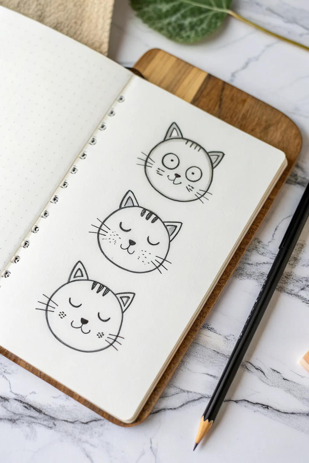
Master the art of simple expressions with these three adorable cat faces, perfect for bullet journals, sketchbooks, or handmade cards. Using basic shapes and minimal lines, you’ll create a charming vertical stack of feline moods ranging from wide-eyed curiosity to sleepy contentment.
Step-by-Step Tutorial
Materials
- Dot grid notebook or sketchbook paper
- HB or 2B Graphite pencil (for initial sketching)
- Fine liner pen (0.3mm or 0.5mm, black)
- Eraser
- Circle template or compass (optional)
Step 1: Planning and Sketching
-
Establish the positions:
Begin by deciding where your three cat faces will go. Lightly mark three center distinct points vertically down your page, leaving about 2 inches of space between each one to ensure they don’t look crowded. -
Draw the base shapes:
Using your pencil, sketch three circles of roughly equal size. If you’re using dot grid paper, use the dots as guides to keep them even—about 6 to 8 grid squares wide works well. Don’t worry about perfect circles; a little irregularity adds hand-drawn charm. -
Add the ears:
For each circle, sketch two triangular ears on top. Place them slightly wide apart rather than right at the apex of the circle. Create a smaller inner triangle within each main triangle to give the ears depth. -
Sketch the forehead markings:
Draw three small vertical dashes or stripes at the very top of each circle, right between the ears. This is a classic tabby cat marking that helps frame the face.
Placement Pro Tip
Draw faint vertical and horizontal crosshairs through your circles during the sketch phase. This ensures the eyes and nose are perfectly centered every time.
Step 2: Drawing the Expressions
-
Top Cat: The Eyes:
For the top cat, draw two large circles in the middle of the face. Place them close together but not touching. Inside each, add a tiny black dot for the pupil to create a startled or wide-awake look. -
Top Cat: Nose and Mouth:
Just below the eyes, draw a small, filled-in triangle pointing downward for the nose. Connect a ‘w’ shape or two curved lines extending from the bottom tip of the nose to form the mouth. -
Middle Cat: The Eyes:
For the middle kitty, draw two disconnected ‘U’ shapes for eyes. These should look like closed, happy eyelids. Adding tiny eyelashes to the outer corners is a nice touch for extra character. -
Middle Cat: Nose and Mouth:
Draw the nose slightly lower than the eyes, using a small heart or triangle shape. Connect this to a standard cat smile with a small vertical line leading into two upward curves. -
Bottom Cat: The Eyes:
Give the bottom cat a peaceful sleepy expression by drawing two small, slightly curved horizontal lines for eyes. They should look like shallow crescents curving downward. -
Bottom Cat: Nose and Mouth:
Place a solid triangular nose centrally below the eyes. Draw the mouth curves slightly wider and softer here to emphasize the relaxed, sleeping mood.
Step 3: Inking and Details
-
Outline the head shapes:
Switch to your fine liner pen. Carefully trace over your pencil circles. I find drawings look more organic if you don’t close the circle completely at the top where the ears attach; sketch the ear lines directly into the head curve. -
Ink the features:
Go over the eyes, noses, and mouths with your pen. Fill in the pupils and noses solid black to anchor the expressions and make the faces pop against the white paper. -
Add the whiskers:
Cat whiskers are essential. On the cheeks of each cat, draw three quick, straight lines fanning outward. Vary the angles slightly (up, straight, down) for a natural look. -
Texturize the cheeks:
For the middle and bottom cats, add some cuteness by drawing tiny dots or freckles near the whisker base. This simple texture breaks up the white space on the cheeks. -
Detail the ears:
Ink the inner triangles of the ears. You might want to use a thinner pen stroke here if you have one, or simply use a delicate touch to keep these lines lighter than the outer outline. -
Erase pencil lines:
Wait at least five minutes to ensure your ink is completely dry and smear-proof. Gently erase all visible graphite markings, leaving only your crisp ink lines behind. -
Add final shading (optional):
For a bit of dimension, you can use a very light grey marker or a soft pencil to add a tiny shadow under the chin of each cat, grounding the drawing.
Wobbly Circles?
Don’t stress if your circles aren’t perfect! A slightly squashed or uneven circle actually makes the character look friendlier and more whimsical.
Now you have a trio of expressive cats ready to decorate your next journal entry

Easy Puppy With Floppy Ears
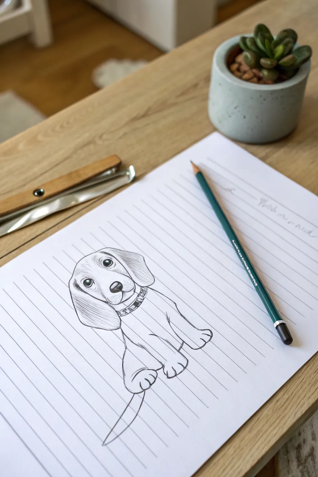
Grab a piece of lined notebook paper and bring this adorable, doe-eyed puppy to life with just a few simple pencil strokes. This sketch captures a sweet, cartoonish style featuring large, drooping ears and a wagging tail, perfect for a quick creative break.
Step-by-Step Guide
Materials
- Lined notebook paper (A4 or letter size)
- Graphite pencil (HB or 2B recommended)
- Eraser
- Sharpener
Step 1: Shaping the Head
-
Start the forehead:
Begin near the top-center of your page. Sketch a gentle, slightly curved horizontal line for the top of the head. -
Map the cheeks:
From the ends of your top line, draw two curves coming down and slightly inward to define the sides of the face, keeping them soft and round. -
Draw the muzzle:
Connect the cheek lines at the bottom with a wider U-shape to form the jaw and chin area. -
Add the nose:
In the center of the face, slightly lower than the eyes will be, draw a soft triangular shape with rounded corners. Shade it in dark, leaving a tiny white oval at the top for a highlight. -
Create the mouth:
Draw two small curved lines coming down from the bottom of the nose, like a sideways ‘3’, to create the signature puppy smile.
Step 2: Eyes and Ears
-
Outline the eyes:
Place two large circles above the nose, spacing them evenly. These should be quite big to get that classic ‘puppy dog’ look. -
Add highlights and pupils:
Draw a smaller circle inside the top right of each eye for a light reflection. Then, draw a smaller black pupil in the center, shading the iris area lightly but keeping the highlight pure white. -
Sketch the left ear:
Starting from the top left of the head, draw a long, drooping shape that hangs down to the cheek level. The bottom should be rounded. -
Sketch the right ear:
Repeat this on the right side, drawing a large flap that hangs down. I find adding a little fold line near the top makes it look more natural. -
Add ear texture:
Use light, directional strokes to shade the inside and bottom of the ears, giving them a sleek, furry texture.
Uneven Eyeliner?
If the eyes look mismatched, don’t erase the whole thing. Just thicken the outer line of the smaller eye slightly to balance their size without restarting.
Step 3: Body and Details
-
Draw the collar:
Directly under the chin, draw two parallel curved lines for a collar. Add small vertical dashes inside to suggest stitching or texture. -
Form the front legs:
Draw two long, slightly curved lines extending down from the collar. These are the front legs. At the bottom, flare them out slightly into rounded paws. -
Define the toes:
Add two small curved lines on each paw to create three toes. -
Add the back leg:
On the right side of the body, draw a curved line simulating the haunch of the seated leg, ending in a rear paw tucked behind the front one. -
Sketch the back leg (left):
Mirror a similar curve on the left side to show the other seated leg, keeping it partially hidden behind the front leg. -
Draw the tail:
Extend a thin, pointed tail coming out from the bottom left side. Make it look like it’s in motion with a slight curve. -
Final shading:
Add a few light pencil strokes on the chest and paws to suggest shadow and volume, reinforcing the 3D feel of the sketch.
Use the Lines
Use the blue notebook lines as grid guides! Rest the paws on one line and align the top of the head with another to keep proportions consistent easily.
Now you have a loyal little companion smiling up at you from your notebook page

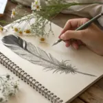
Tiny Bird on a Branch
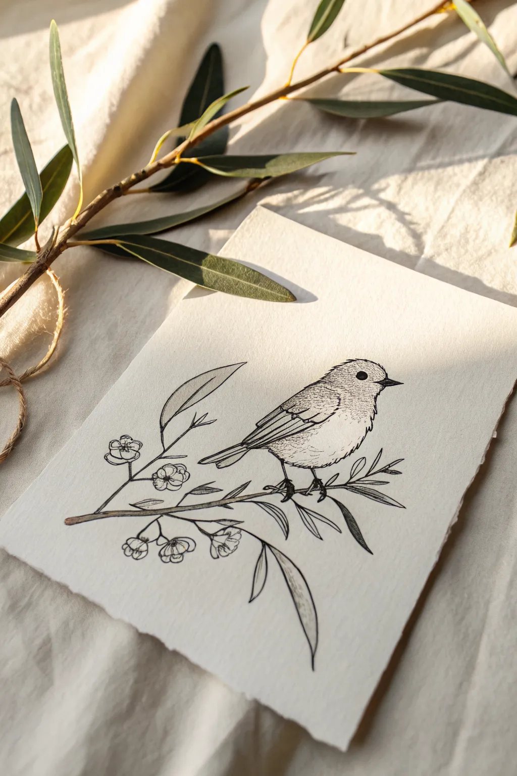
Capture the delicate charm of nature with this fine-line ink illustration of a small songbird perched among blossoms. Using simple stippling and confident line work on textured paper creates a timeless, vintage-inspired aesthetic perfect for greeting cards or framed art.
Step-by-Step
Materials
- Textured heavy-weight drawing paper (deckle edge optional)
- HB or 2H graphite pencil for sketching
- Kneadable eraser
- Fine liner pens (sizes 005, 01, and 03)
- Ruler (optional, if checking proportions)
Step 1: Conceptual Sketch
-
Map the main shapes:
Start with your graphite pencil. Draw a small, tilted oval for the bird’s body and a smaller circle overlapping the top right for the head. Connect these shapes with gentle curves to form a cohesive silhouette. -
Position the branch:
Lightly sketch a curved line running diagonally beneath the bird’s feet. This will be the main branch. Add smaller offshoot lines extending upwards and downwards where you plan to place leaves and flowers. -
Define the bird’s features:
Sketch a short, triangular beak on the right side of the head. Mark a small circle for the eye, aligned horizontally with the beak. Draw a simplistic wing shape tucked against the side of the body, angling downwards towards a short tail. -
Place the flora:
Sketch simple five-petal flower shapes at the ends of the smaller branch offshoots. Add long, tapered leaf shapes—one dominating the top left and a few draped below the branch—to balance the composition. -
Refine the outline:
Gently erase your geometric guides. Go over the pencil lines to clarify the bird’s belly curve, the specific angle of the tail feathers, and the distinct petals of the blossoms.
Step 2: Inking the Outline
-
Draw the eye and beak:
Switch to an 01 fine liner. Carefully fill in the eye, leaving a tiny white speck for the highlight. Outline the beak, making the top line slightly thicker than the bottom to suggest shadow. -
Outline the body:
Using broken, slightly jagged strokes, ink the outline of the bird. This technique mimics the texture of feathers rather than a smooth, solid line. -
Detail the wing:
Draw the primary feathers on the wing using straight, parallel lines that angle backward. Add a few scalloped lines near the shoulder of the wing to represent the covert feathers. -
Ink the branchwork:
With an 03 pen, trace the main branch. Vary your pressure to make the line thicker in some spots, mimicking bark texture. Use the thinner 01 pen for the delicate stems and flowers. -
Clean up the sketch:
Once the ink is completely dry (I usually give it a full five minutes), gently erase all remaining pencil marks with your kneadable eraser to reveal the clean line art.
Broken Lines for Feathers
Don’t draw the bird’s outline as one solid, continuous stroke. Using small gaps and broken lines creates the illusion of soft fluffiness and makes the drawing feel much more organic.
Step 3: Shading and Texture
-
Stipple the head:
Using your finest 005 pen, add tiny dots (stippling) around the top of the head and under the chin. Concentrate the dots closer together where shadows would naturally fall, dispersing them as you move toward the light. -
Texture the chest:
Add very short, fine dashes along the lower belly and chest. Keep these strokes minimal to maintain the appearance of soft, light-colored down. -
Deepen wing shadows:
Add hatching lines between the wing feathers to create separation and depth. Darken the area beneath the wing where it meets the tail to ground the form. -
Shadow the branch:
Add horizontal hatching lines along the bottom edge of the main branch. This gives the wood volume and makes it look cylindrical rather than flat. -
Detail the leaves:
Draw a central vein in each leaf. Add light shading on one side of the vein to give the leaves a slight curve or fold. -
Final floral touches:
Add tiny stamens to the center of the flowers using the 005 pen. Add a few dots on the petals near the center for subtle texture. -
Ground the bird:
Ensure the feet are firmly gripping the branch by darkening the tiny claws and adding a small shadow on the wood directly beneath the toes.
Ink Smudging?
Patience is key with fine liners. If you erase your pencil sketch too soon, the ink will streak. Wait until the ink feels cool and dry to the touch before using your eraser.
Now you have a charming, gallery-worthy illustration ready to display or gift
Butterfly With Easy Symmetry
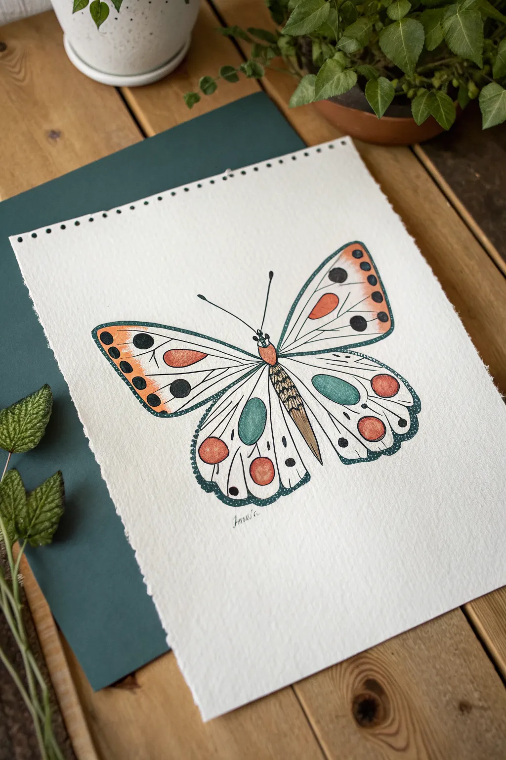
This charming project combines the precision of fine liner pens with soft washes of watercolor to create a stylized butterfly. The design focuses on gentle symmetry and simple geometric patterns, making it perfect for beginners learning to balance line and color.
Step-by-Step Guide
Materials
- Cold press watercolor paper (A5 or A4)
- Pencil (HB or H)
- Eraser
- Fine liner pens (Black, sizes 0.1 and 0.5)
- Watercolor paints (Orange, Teal/Green, Peach/Light Orange)
- Small round watercolor brush (size 2 or 4)
- Ruler (optional)
Step 1: Drafting the Structure
-
Establish the centerline:
Start by lightly drawing a vertical line down the center of your paper. This guide is crucial for maintaining symmetry. Draw a narrow, elongated oval shape over the center of this line to form the butterfly’s body. -
Map out the upper wings:
From the top third of the body, sketch two large, rounded triangular shapes extending outward and upward. Keep the lines light so they can be adjusted or erased later. -
Add the lower wings:
Draw two rounded shapes extending from the lower part of the body. These should be slightly smaller and more circular than the top wings, curving inward at the bottom. -
Sketch the internal patterns:
Inside the upper wings, lightly sketch a teardrop shape near the body and a dividing line running parallel to the top edge. For the lower wings, draw a large oval near the center.
Uneven Wings?
Use the ‘fold method’: lightly fold your paper in half, draw one side of the butterfly in pencil, then rub the back to transfer the graphite to the other side for perfect symmetry.
Step 2: Inking the Outline
-
Outline the main shape:
Using your 0.5 fine liner, carefully trace over your pencil lines for the main wing shapes and the body. Create a slightly distinct head and thorax segment at the top of the body. -
Draw the antennae:
From the head, draw two thin lines extending outward at an angle. Add tiny bulbs at the very ends of these lines. -
Detail the wing veins:
Switch to a finer pen (0.1) if you have one. Draw lines radiating from the body toward the outer edges of the wings, mimicking the veins of a leaf. -
Add the wing borders:
Draw an inner border line about 2-3mm inside the edge of all four wings to create a framing effect. -
Ink the spots:
Draw the specific circular markings: a row of small circles along the outer edges of the top wings, and larger circles near the bottom edge of the lower wings. -
Texture the body:
Add small, curved hatching lines across the lower abdomen to give the body some volume and texture. -
Erase pencil guides:
Wait a few minutes to ensure the ink is completely dry, then gently erase all your initial pencil sketches.
Step 3: Adding Color
-
Paint the orange accents:
Load your brush with a diluted orange watercolor. Fill in the teardrop shapes on the upper wings and the large circular spots on the lower wings. -
Add teal details:
Using a teal or muted green shade, paint the large oval shapes in the center of the bottom wings. I like to keep this wash fairly transparent so the paper texture shows through. -
Color the body:
Paint the upper thorax section with a light wash of peach or diluted orange. For the lower abdomen, use a very light brown or leave it unpainted if you prefer high contrast. -
Fill the edge spots:
Using a dark grey or black paint (or ink), fill in the small decorative dots along the outer edges of the upper wings and the secondary spots on the lower wings. -
Create the dotted border:
Dip your finest pen or a very small brush into dark teal or black. Carefully stipple tiny dots inside the narrow border space you created earlier around the wing perimeters.
Make It Shimmer
Once your watercolor is fully dry, paint over the wing veins or the decorative spots with a metallic gold or silver gel pen for a magical, light-catching effect.
Step 4: Final Touches
-
Intensify contrast:
Once the paint is dry, use your black pen to darken any areas that need more pop, specifically the pupils of the larger spots. -
Sign your work:
Add your signature or initials just below the butterfly in a small, delicate script.
Enjoy the calming process of watching your symmetrical creature come to life on the page
BRUSH GUIDE
The Right Brush for Every Stroke
From clean lines to bold texture — master brush choice, stroke control, and essential techniques.
Explore the Full Guide
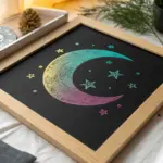
Smiling Sun and Crescent Moon
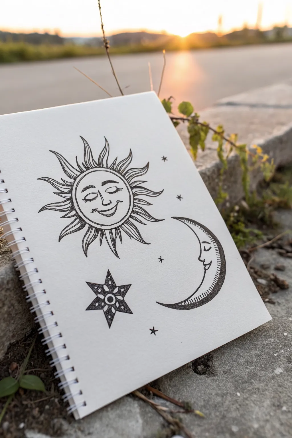
This whimsical fineliner drawing captures the classic duality of a smiling sun and a serene crescent moon, accompanied by sparkling stars. With clean lines and delicate shading, it creates a mystical yet friendly aesthetic perfect for decorating your sketchbook.
Step-by-Step Tutorial
Materials
- White sketchbook paper (smooth texture preferred)
- HB pencil
- Soft eraser
- Fine-point black pen (0.1mm or 0.3mm)
- Medium-point black pen (0.5mm)
- Ruler
Step 1: Drafting the Foundations
-
Position the main elements:
Visualize a triangle on your page. Lightly sketch a circle for the sun in the upper left, a large ‘C’ shape for the crescent moon in the lower right, and a smaller circle for the main star near the bottom left. -
Refine the sun’s circle:
Go back to your sun circle. Draw a second, slightly smaller circle inside the first one to create a rim. Sketch faint facial guidelines—a vertical line down the center and a horizontal line for the eyes. -
Sketch the sun’s rays:
Draw wavy, flamelike triangles radiating outward from the sun’s border. Try to vary their flow so they twist slightly, giving a sense of movement rather than stiff spikes. -
Outline the moon’s profile:
Refine the inner curve of your crescent moon to include a nose, a smiling lip, and a closed, peaceful eye. Add an inner border line parallel to the outer curve to give the moon thickness. -
Draft the six-pointed star:
For the bottom star, draw two overlapping triangles (one pointing up, one down) or simply sketch six points radiating from a center dot. Add small circles inside the star’s points for decoration.
Step 2: Inking the Outlines
-
Ink the sun’s face:
Switch to your 0.3mm pen. Carefully trace the sun’s eyelids, drawing thick lashes. Ink the nose and the wide, gentle smile. Add the small cheek lines at the ends of the mouth. -
Define the sun’s border:
Trace the two concentric circles surrounding the face. Keep your hand steady to maintain a consistent gap between them. -
Ink the sun rays:
Trace the wavy rays. Where the rays meet the circle, you can thicken the line weight slightly. Add a simple center line down the middle of each ray to suggest depth. -
Ink the moon:
Using the 0.5mm pen for a bolder look, trace the outer curve of the moon. Switch back to the thinner pen for the facial profile and the inner decorative border. -
Trace the star:
Ink the outline of the six-pointed star. Draw a small circle in the very center and a second ring of tiny dots around it.
Ink Flow Tip
Pull the pen toward you rather than pushing it away when drawing long curves like the moon. This gives you better control and keeps the line weight consistent.
Step 3: Refining and Shading
-
Hatch the moon:
Inside the separate rim of the moon (the back curve), draw short, straight hatch lines. Keep them closely spaced to create a shadowed, textured effect. -
Detail the star:
Fill in the background of the star with stippling (lots of little dots) or solid black, leaving the inner circles and patterns white for contrast. -
Add texture to the sun rays:
Use your finest 0.1mm pen to add very subtle, short lines at the base of each sun ray. This drawing technique adds a bit of dimension without overwhelming the design. -
Scatter tiny stars:
Look for empty spaces around your main drawings. Add simple four-point stars or small asterisks to balance the composition. -
Erase and polish:
Wait at least five minutes to ensure the ink is completely dry. Gently erase all your pencil guides, being careful not to crumple the paper.
Wobbly Lines?
If a circle looks uneven, don’t restart. Thicken the outline intentionally in that area to disguise the wobble, making it look like a stylistic choice.
Now you have a serene celestial page that captures the magic of the sky
Simple Mountain Range

Create a clean, minimalist landscape using simple geometric shapes and crisp lines. This tutorial guides you through sketching stylized mountains, hatching textures, and adding charming details like clouds and a sun.
How-To Guide
Materials
- Sketchbook or drawing paper
- Pencil (HB or 2B)
- Eraser
- Fine liner pen (black, 0.3mm or 0.5mm)
- Ruler
Step 1: Planning the Layout
-
Set the horizon line:
Start by lightly sketching a horizontal line near the bottom third of your page with your pencil and ruler. This will serve as the base for your mountains and separate them from the foreground lines. -
Map out the peaks:
Using your ruler, lightly draw three triangles of varying heights. Place the tallest triangle in the center slightly offset to the left, a medium one on the right, and a smaller one on the far left. Overlap the bases slightly. -
Create dimension:
To make the triangles look like pyramids, draw a vertical line down from the peak of each triangle to its base. This divides each mountain into two faces: a sunlit side and a shaded side. -
Sketch the reflection area:
Below the main horizontal line, lightly outline inverted triangles that mirror the shapes above. These don’t need to be perfect mirrors but should suggest the bulk of the mountains extending downward.
Uneven lines?
If your horizontal shading lines look uneven, lightly mark equal spacing dots along the spine of the mountain first, then connect them to the edge.
Step 2: Inking the Structure
-
Outline the mountains:
Switch to your fine liner pen. Carefully trace the outer edges of your three mountain peaks. Use the ruler if you want perfectly straight lines, or freehand it for a more organic feel. -
Refine the central spines:
Ink the vertical lines you drew down the center of each mountain. This establishes the sharp ridge of the peaks. -
Add horizontal shading:
On the left face of each pyramid, draw a series of horizontal lines from the spine to the outer edge. Space them evenly—about 2-3mm apart—to create a graphic shadow effect. -
Keep the right faces clean:
Leave the right-hand face of each mountain completely blank. This white space represents bright sunlight hitting the slopes and creates high contrast.
Step 3: Adding Texture and Details
-
Create the cross-hatch base:
In the area below the mountains, draw diagonal lines sloping down to the right. Keep these lines relatively close together. -
Finish the texture:
Now draw diagonal lines sloping down to the left over the previous set. This cross-hatching creates a darker, textured base that anchors the mountains. -
Add ground lines:
Using your ruler, draw 4-5 long, straight horizontal lines across the bottom of the page, underneath the cross-hatched area. These represent the ground or water surface. -
Draw the sun:
In the upper right corner, draw a small circle. Add a spiral inside it for interest, then surround it with short dashes radiating outward to represent sun rays. -
Sketch the clouds:
To the left of the central peak, draw a stylized cloud using a flat bottom line and three fluffy semi-circles on top. I find keeping the bottom line perfectly straight matches the geometric style.
Use tape for crisp edges
Place a strip of low-tack masking tape or washi tape along the main horizon line before drawing. This ensures your mountain base stays perfectly straight.
Step 4: Final Touches
-
Check line weights:
Look over your drawing. If any main structural lines look too thin compared to your shading, go over them once more to thicken and define them. -
Erase pencil marks:
Wait until the ink is completely dry to avoid smudging. Then, gently erase all your underlying pencil sketches to reveal the crisp ink work.
Now you have a striking geometric landscape ready to be admired

PENCIL GUIDE
Understanding Pencil Grades from H to B
From first sketch to finished drawing — learn pencil grades, line control, and shading techniques.
Explore the Full Guide
Heart Doodles in Five Styles

Transform a simple sheet of lined paper into a charming notepad with this series of hand-drawn hearts. These seven distinct doodle styles add a touch of personality to your daily lists without requiring advanced artistic skills.
Step-by-Step Tutorial
Materials
- White lined notepad or loose-leaf paper
- Fine-point black gel pen or pigment liner (0.5mm or 0.7mm)
- Pencil (optional for sketching)
- Eraser
Step 1: Setting the Layout
-
Define the placement:
Position your paper vertically. We will act as if the pink margin line exists invisibly on the left side, using it as an anchor for our vertical row of hearts. -
Determine spacing:
Eyeball the vertical spacing for seven hearts. You want them to sit roughly 3-4 lines apart so they don’t feel crowded. -
Sketch basic outlines (optional):
If you are nervous about symmetry, lightly sketch seven heart shapes in pencil first. Aim for a slightly elongated, hand-drawn look rather than perfect geometric precision.
Pro Tip: Line Weight
For a bolder look, go over the outer perimeter of each heart a second time to thicken the line, making the doodles pop against the page lines.
Step 2: First Trio: Outline, Nested & Solid
-
Draw the simple outline heart:
For the top heart, draw a classic single-line heart shape. Keep the lines smooth and connect them cleanly at the bottom point. -
Create the nested heart:
Below that, draw a slightly larger heart outline. Inside it, draw a smaller heart. Fill the space between the inner and outer heart with tiny, dense vertical hatch marks or scribbles. -
Draw the shadow heart:
For the third one, draw a heart shape and fill it in completely with black ink. To give it texture, I like to leave small specks of white negative space, creating a ‘sketchy’ or ‘chalkboard’ effect rather than a solid block of color.
Troubleshooting: Smudged Ink
If you are left-handed or your pen is wet, place a scrap piece of paper under your hand as a guard while you work your way down the page.
Step 3: Middle Pair: Simple & Patterned
-
Draw the open heart:
The fourth heart is a return to simplicity. Draw a clean, open heart outline similar to the first one, perhaps slightly varying the curve for a hand-drawn feel. -
Create the leopard print heart:
Draw the fifth heart outline. Inside, create a ‘leopard print’ pattern by drawing small, irregular ‘C’ shapes and blobs. Some should be open circles, others solid dots.
Step 4: Bottom Pair: Spotted Variations
-
Sketch the sixth heart:
Draw the outline for the sixth heart. This one will feature a variation of the previous pattern but deeper. -
Fill with dense spots:
Fill the interior of the sixth heart with tiny, solid black irregular triangles or heart-like blobs. Keep them spaced out so white space remains visible around each spot. -
Draw the final heart:
Create the last heart outline at the bottom of your column. -
Add floating hearts pattern:
Inside this final shape, draw tiny, miniature hollow hearts scattered randomly. Add a few small dots between them to fill any awkward gaps. -
Erase guidelines:
Once the ink is fully dry—give it a minute or two to prevent smudging—erase any pencil sketches you made in the beginning.
Now you have a customized page ready for your to-do lists or love notes
Five-Petal Flower Bloom
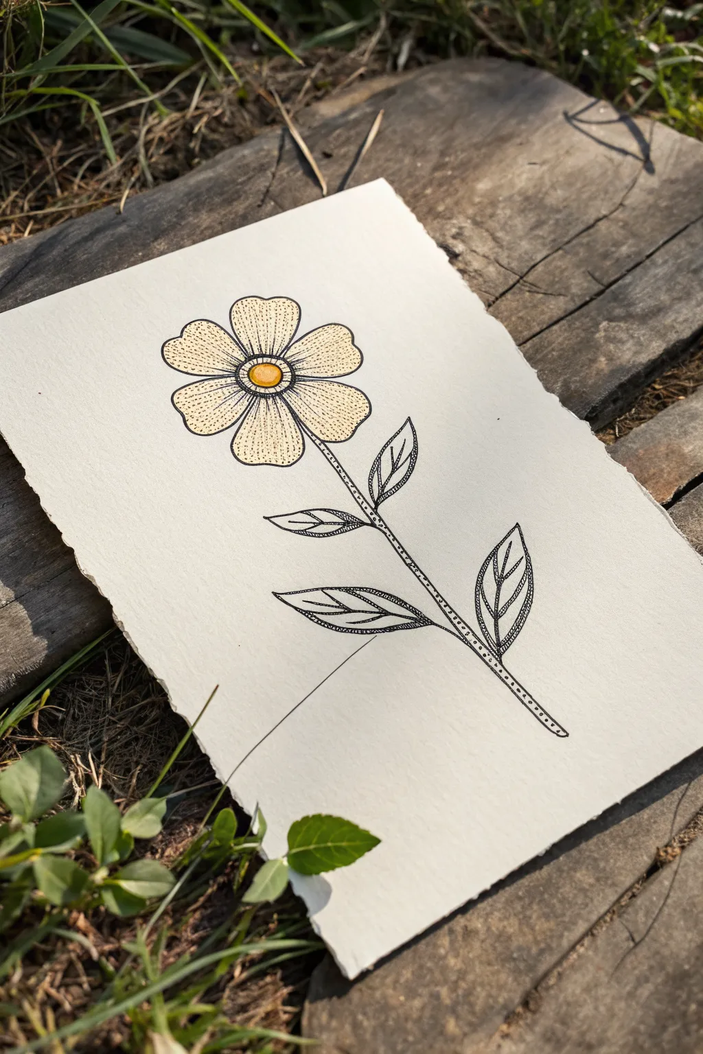
Create a delicate, botanical illustration that blends clean linework with intricate stippling textures. This project transforms a simple doodle into a sophisticated piece of art using nothing but fine liners and a touch of color.
Detailed Instructions
Materials
- Heavyweight textured paper (watercolor or mixed media paper with deckled edge)
- Pencil (HB or H for light sketching)
- Eraser (kneaded is best)
- Fine liner pen, size 01 or 03 (black waterproof archival ink)
- Fine liner pen, size 005 (for delicate stippling)
- Colored pencils or alcohol markers (cream/pale yellow and golden orange)
Step 1: Sketching the Structure
-
Lightly sketch the center:
Begin by drawing a small, simple circle in the upper third of your page. This will act as the flower’s center disk. Keep your pencil pressure very light so it’s easy to erase later. -
Add the first petal:
Draw one petal extending upwards from the center circle. It should be somewhat rounded at the top but narrow slightly as it connects to the center, like a curved teardrop. -
Complete the flower head:
Continue drawing four more petals around the center circle, spacing them evenly. Don’t worry about perfect symmetry; slight irregularities make it look more organic. -
Draw the stem:
Draw a long, slightly curved line extending downward from the flower head. Add a second parallel line right next to it to give the stem thickness. -
Add leaves:
Sketch pairs of pointed, lance-shaped leaves branching off the stem. Place two smaller ones near the top and two larger ones near the bottom.
Uneven Dots?
If your stippling looks messy, slow down. Lift the pen vertically after each dot rather than dragging it. Think ‘tap, tap, tap’ rather than scribbling.
Step 2: Inking the Outlines
-
Outline the center and petals:
Using your 01 or 03 size fine liner, carefully trace over your pencil lines for the flower head. I find that breaking the line slightly in places adds to that vintage, hand-drawn character. -
Detail the center disk:
Draw a second, slightly smaller circle inside the main center circle to create a rim. -
Ink the stem and leaves:
Trace the stem lines. When inking the leaves, refine the shapes to have a central vein line running down the middle of each leaf. -
Erase pencil marks:
Wait until the ink is completely dry to avoid smudging, then gently erase all visible pencil guidelines.
Step 3: Adding Texture & Color
-
Stipple the center:
Switch to your thinner 005 pen. Start adding tiny dots inside the very center of the flower. Pack them densely around the edges of the inner circle and more loosely near the middle. -
Shade the petals with dots:
Add stippling to the petals. Focus most of the dots near the base where the petal meets the center disk, fading them out as you move toward the tips. -
Add vein details to leaves:
Inside each leaf, draw delicate lines branching from the central vein outward to the leaf edges. Keep these lines thin and slightly curved. -
Texture the stem:
Add a solitary row of tiny dots running down the center or side of the stem to give it roundness and texture without solid black shading. -
Color the center:
Take your golden orange marker or pencil and fill in the very center circle. You can leave a tiny speck of white for a highlight. -
Tint the petals:
Use a pale cream or very light yellow pencil to gently color the petals. Apply the color lightly, allowing the paper texture to show through for a soft, aged look. -
Final inspection:
Step back and look at the contrast. If the petals need more definition, add a few more dots near the center to deepen the shadows.
Deckled Edge Look
To mimic the handmade paper shown, tear the edges of your heavy paper against a ruler instead of cutting with scissors for a rustic, raw edge finish.
Frame your delicate botanical drawing or gift it as a handmade card.


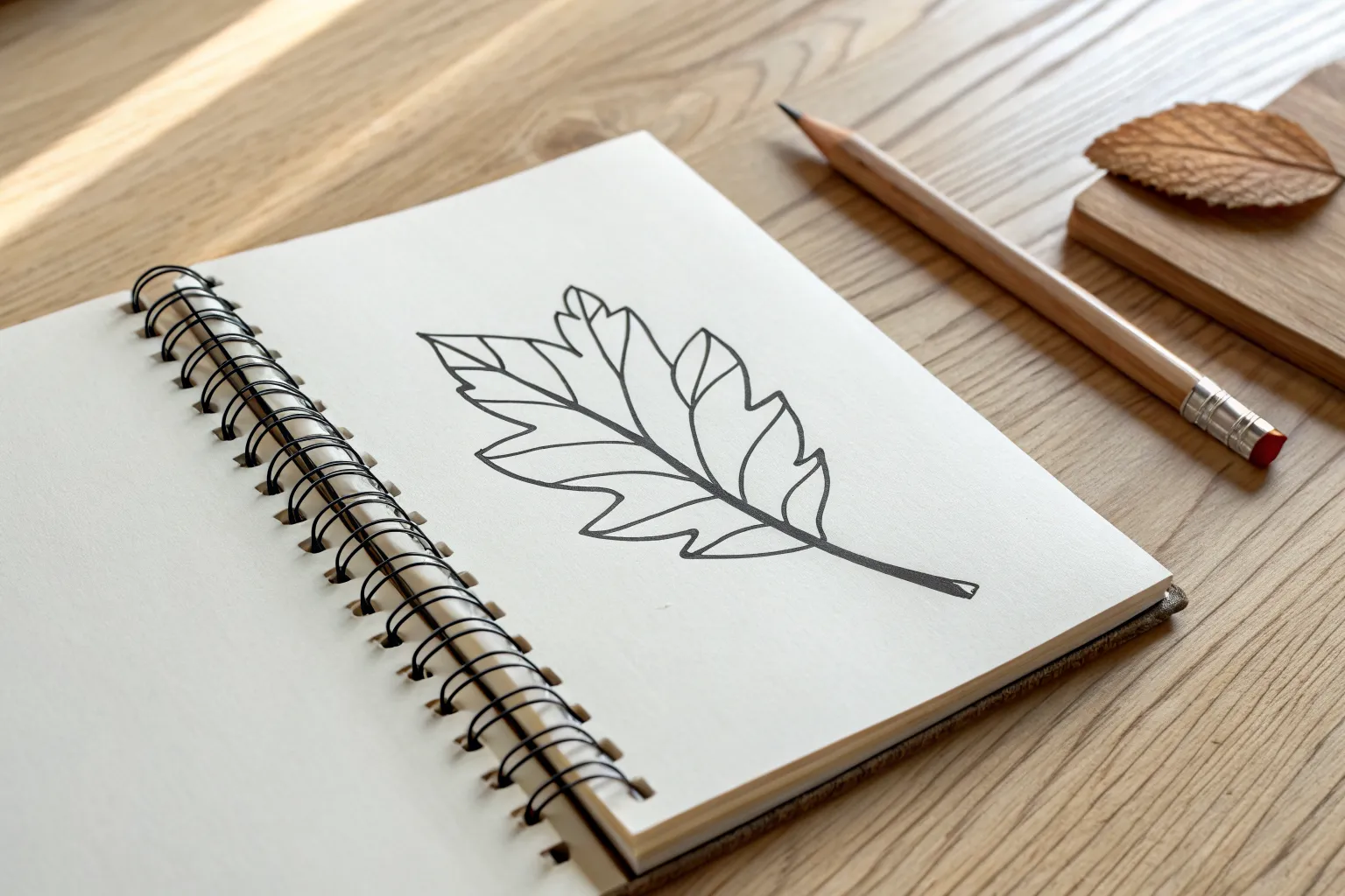
Three Basic Leaf Shapes
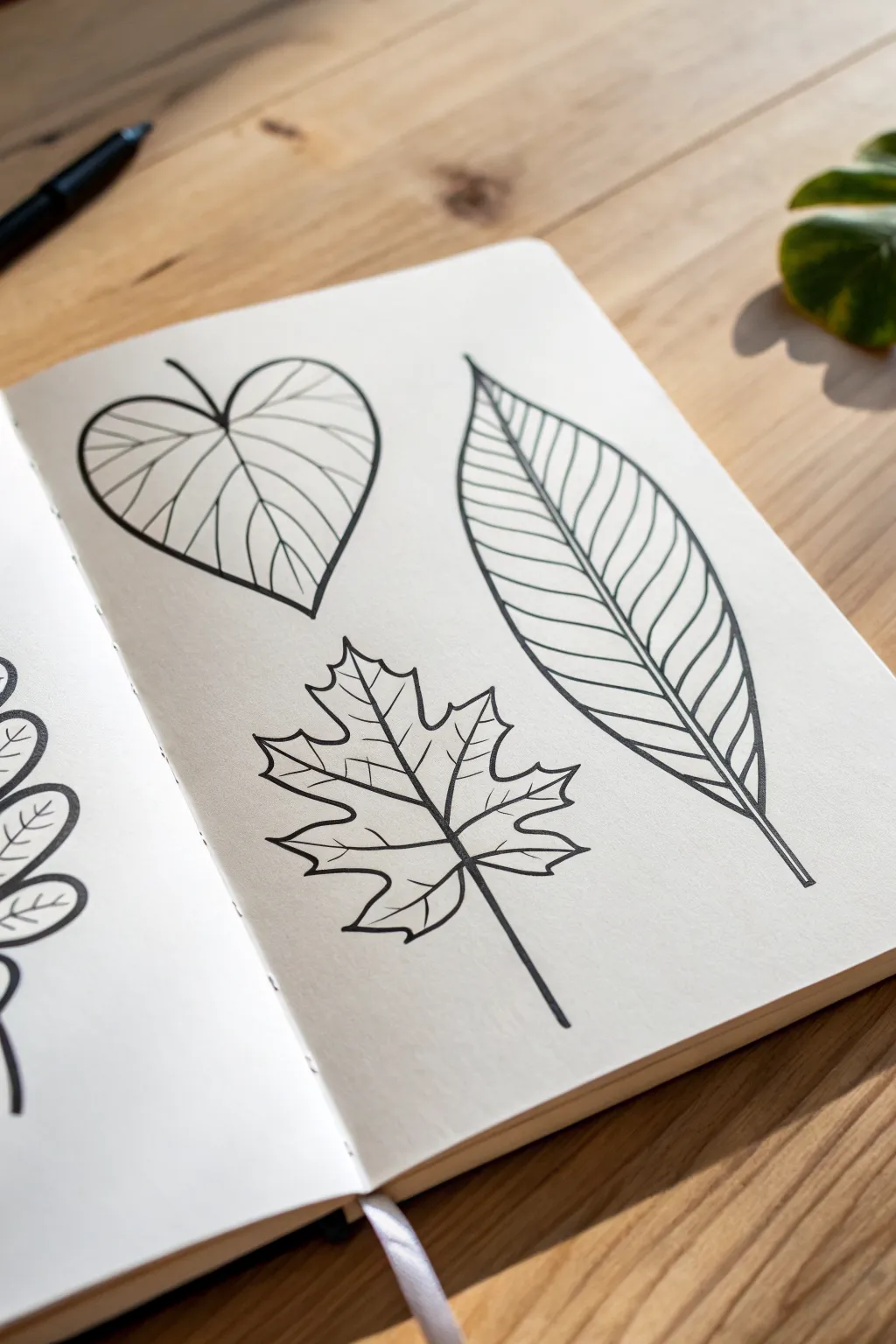
Master the fundamentals of botanical illustration with this clean, minimalist study of three distinct leaf structures. Using precise black ink lines, you will create a high-contrast composition that explores heart-shaped, lanceolate, and palmate forms.
Step-by-Step Tutorial
Materials
- Sketchbook with smooth, heavy paper (approx. A5 size)
- HB graphite pencil
- Soft eraser
- Fine liner pen (0.5mm tip, black ink)
- Fine liner pen (0.3mm or 0.1mm tip, black ink) for details
Step 1: Planning composition
-
Map out the positions:
Visualize three main zones on your page. The heart-shaped leaf will sit in the upper left, the long elliptical leaf on the mid-right, and the complex maple leaf in the bottom center. Lightly mark these centers with your pencil. -
Draft the central veins:
Draw the ‘skeleton’ lines first. Sketch a curved line for the heart leaf’s vein, a long sweeping arc for the right leaf, and a central vertical line intersecting with two diagonal lines for the bottom maple leaf.
Wobbly Lines?
Draw from your shoulder, not your wrist. If lines are shaky, try drawing faster—speed often smooths out the jitter in a long curve better than going slow.
Step 2: Drafting the outlines
-
Sketch the heart shape:
For the top-left leaf, lightly pencil a wide, rounded heart shape around the central vein. The top lobes should curve inward deeply where they meet the stem. -
Define the lanceolate leaf:
Sketch an elongated, tapered oval around the right-hand vein. Make sure it comes to a sharp point at the top and tapers gently at the base. -
Construct the maple leaf:
This is the most complex shape. Using your intersecting vein lines as guides, sketch the five pointed lobes. Draw jagged, saw-tooth edges along the perimeter of each lobe.
Step 3: Inking the structure
-
Ink the main veins:
Switch to your 0.5mm pen. Confidently trace over the central vein lines you penciled earlier. For the maple leaf, ensure the veins radiate cleanly from a single central point. -
Outline the heart leaf:
The line weight should be consistent here. Trace the outer edge of the heart-shaped leaf with a smooth, continuous motion. Add a tiny stem poking out from the top indentation. -
Outline the long leaf:
Ink the long oval shape on the right. Bring the bottom lines together to form a thin stem extending downward. -
Outline the maple leaf:
Trace the jagged edges carefully. Don’t rush the sharp corners; lift your pen slightly at the points if needed to keep the ink crisp. Extend the stem straight down from the base.
Go Digital
Scan your finished page and use the ‘threshold’ adjustment in Photoshop. This separates the black lines from the white paper for easy coloring prints.
Step 4: Adding texture and veins
-
Detail the heart leaf:
Switch to a finer 0.3mm or 0.1mm pen if you have one, or use a lighter touch with the 0.5mm. Draw curved secondary veins radiating from the center line outward, spacing them somewhat evenly. -
Detail the long leaf:
Add numerous parallel veins on the right-hand leaf. Start from the center line and curve them gently upward toward the outer edge. Keep the spacing tight and consistent for a textured look. -
Detail the maple leaf:
Add smaller veins branching off the main radiating lines of the maple leaf. Unlike the others, these should look more like a tree branch splitting into smaller twigs.
Step 5: Final touches
-
Wait for ink to set:
Allow the ink to dry completely for at least five minutes. Smudging wet ink with an eraser is heartbreaking after good work. -
Erase pencil marks:
Gently erase the underlying graphite sketches. Hold the paper taut with one hand and rub carefully to avoid crinkling the page. -
Review and refine:
Check your line work. If any lines look too thin or broken, go over them once more to ensure solid, black definition.
Now you have a trio of cleanly drawn leaves ready to be admired or colored
Mini Cactus in a Pot
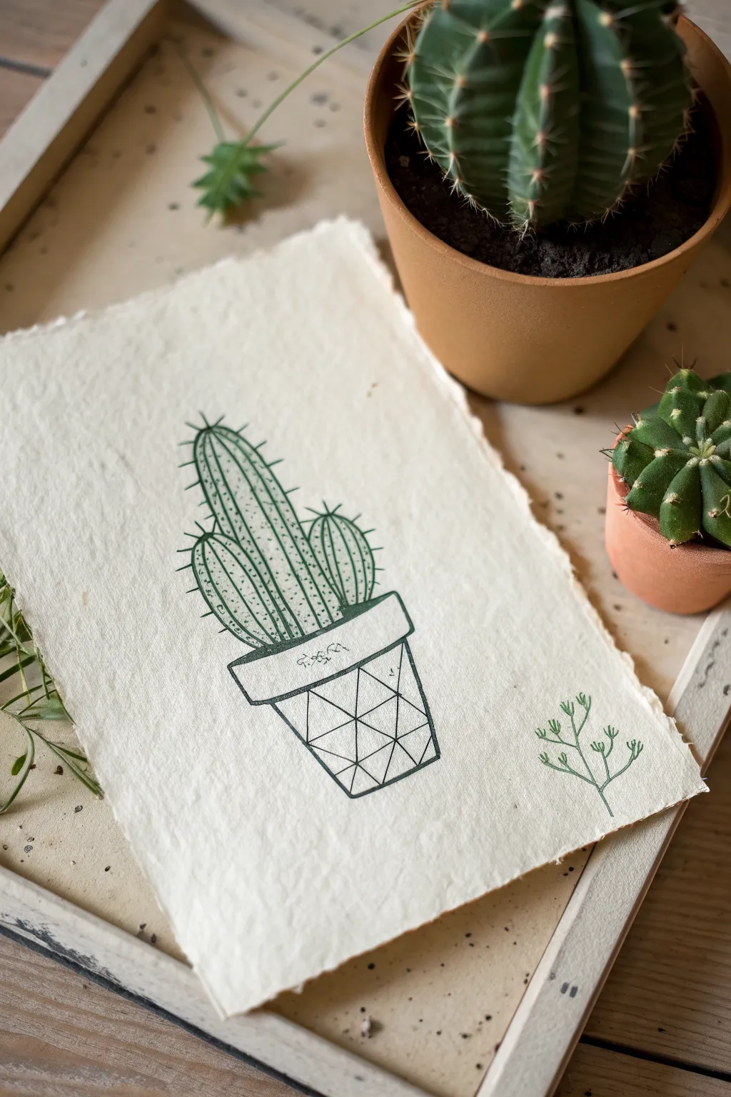
This charming project combines crisp, geometric line work with the organic texture of handmade paper. It features a stylized three-stemmed cactus resting in a modern pot, making it a perfect exercise in balancing structure with natural shapes.
Step-by-Step
Materials
- Textured handmade paper (deckle edge)
- Fine liner pen (dark green, 0.5mm)
- Fine liner pen (dark green, 0.1mm or 0.2mm for details)
- Pencil (HB or 2H)
- Soft eraser
- Ruler
Step 1: Drafting the Pot
-
Establish the pot shape:
Begin by lightly sketching the pot’s rim. Draw a narrow, horizontal rectangle slightly angled downward to create a 3D effect. Below this, draw the body of the pot, tapering it slightly as it goes down to the base. -
Draw the geometric grid:
Using your ruler, divide the tapered body of the pot into three vertical columns. Then, add a horizontal line across the center to create a grid of six roughly square sections. -
Create the triangles:
Inside the grid squares, draw diagonal lines connecting opposite corners to create the triangular pattern. Vary the direction of the diagonals to create a faceted, gemstone-like appearance.
Ink Control
On textured handmade paper, ink can bleed or feather. Test your pen on a scrap piece first and move your hand a bit faster to prevent ink pooling.
Step 2: Developing the Cactus
-
Sketch the main column:
Draw a tall, elongated oval shape rising from the center of the pot. Make the top slightly rounded and ensure the bottom is hidden behind the rim of the pot. -
Add side branches:
Sketch two smaller oval shapes attached to the main column. Place one lower on the left and another slightly higher on the right for a balanced, asymmetrical look. -
Define the ribs:
For each cactus part, draw vertical curved lines running from top to bottom. These represent the ribs of the cactus. Keep the spacing fairly even, but let the outer lines curve with the shape’s contour.
Add Color
Use diluted watercolor to fill the geometric shapes in the pot with different earth tones for a stained-glass or terra cotta mosaic effect.
Step 3: Inking the Outline
-
Outline the pot:
Switch to your thicker 0.5mm dark green fine liner. Trace over your pencil lines for the pot’s rim and outer silhouette, using confident, steady strokes. -
Ink the geometric pattern:
Carefully trace the internal geometric lines on the pot. I find it helpful to rotate the paper here so my hand is always pulling the pen in a comfortable direction. -
Trace the cactus body:
Inking the cactus outline requires a slightly looser hand. Trace the main shapes, stopping where parts overlap so lines don’t cross unnaturally through the foreground shapes. -
Ink the ribs:
Go over the vertical rib lines inside the cactus. Use a slightly lighter pressure here to keep these internal lines distinct from the heavy outer contour.
Step 4: Adding Texture and Details
-
Stipple texture:
Using the finer 0.1mm pen, add tiny dots along the shadowed sides of the cactus ribs (usually the right side of each rib). This stippling creates volume and texture without heavy shading. -
Draw spines:
With the fine pen, draw short, sharp lines extending outward from the ribs. Group them in small clusters of two or three along the vertical lines. -
Add rim detail:
Draw a small squiggly or decorative line on the front face of the pot’s rim to imply a label or texture. -
Include extra foliage:
To balance the composition, sketch a small, simple sprig of greenery in the bottom right corner of the paper using the fine pen. -
Clean up:
Wait at least five minutes to ensure the ink is completely dry on the textured paper. Then, gently erase all underlying pencil marks.
Frame this piece in a floating frame to show off the beautiful deckled edges of the paper
Fruit Trio: Apple, Banana, Berry
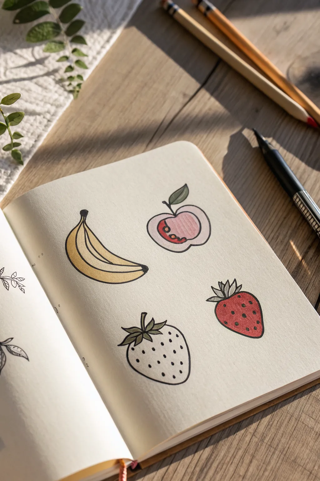
Create a charming set of stylized fruit illustrations perfect for journaling or doodling. This project uses simple lines and flat blocks of color to achieve a clean, modern aesthetic that looks great in any sketchbook.
Detailed Instructions
Materials
- Sketchbook or drawing paper (smooth texture preferred)
- Pencil (HB or similar) for initial sketching
- Eraser
- Fine liner pen (black, 0.3mm or 0.5mm)
- Colored pencils or alcohol markers (yellow, soft pink, red, sage green)
- White gel pen (optional for highlights)
Step 1: Planning the Composition
-
Lightly map placement:
Visualize the page layout. You want to arrange four fruits in a loose square format. Use your pencil to lightly mark the center point of where each fruit will go: top left for the banana, top right for the apple, bottom left for the white berry, and bottom right for the red strawberry. -
Sketch the banana shape:
Start with the banana in the top left. Draw a long, gentle curve for the spine. Add thickness to the body, tapering it at both ends. Don’t worry about perfect lines yet; just get the crescent shape right. -
Sketch the apple contour:
For the apple in the top right, draw a rounded heart shape. Since this is a cross-section view, make the outline slightly wider and softer. Sketch a small, curved stem coming from the top center dip. -
Outline the berries:
In the bottom right, draw a plump, rounded triangle for the classic strawberry shape. For the bottom left berry (the white strawberry), draw a similar shape but make it slightly wider and rounder at the bottom. -
Add leaves and stems:
Sketch a cluster of pointy leaves on top of both strawberries. For the apple, add a single, simple leaf attached to the stem, tilting to the right.
Step 2: Detailed Line Work
-
Define the banana:
Switch to your black fine liner. Outline the banana’s perimeter. Draw two internal curved lines running parallel to the shape’s curve to show the ridges of the peel. Add a solid black cap at the stem end. -
Ink the apple slice:
Trace the apple outline. Inside, draw a smaller, similar shape floating in the center to represent the core line. Draw two or three small teardrop shapes near the center for the seeds. -
Detail the strawberry leaves:
Ink the jagged leaves on the red strawberry. Make them spiky and upright. For the white berry on the left, make the leaves slightly longer and more flowing, perhaps curling downwards a bit. -
Complete the outlines:
Finish inking the main bodies of both berries. Once the ink is completely dry—give it a full minute—erase all your pencil guidelines to leave a clean black-and-white base.
Smudge Prevention
When inking over pencil sketches, always work from top-left to bottom-right (if right-handed) to avoid smearing fresh ink with your hand. Wait longer than you think for ink to dry before erasing.
Step 3: Adding Color
-
Color the banana:
Using a yellow marker or colored pencil, fill in the banana. Leave the very tip of the bottom end uncolored or lightly shaded to suggest distinctiveness. -
Shade the apple:
For the apple slice, use a very soft pink or pale peach. Focusing on the inner area (the flesh), create a textured look by using vertical strokes. Outline the seed area with a slightly darker red or pin, leaving the seeds themselves uncolored or coloring them brown. -
Fill the red strawberry:
Color the bottom right strawberry with a vibrant red. Apply the color evenly, but if you’re using pencils, you can press harder on the left side for a subtle shadow effect. -
Color the leaves:
Use a sage or olive green for all the leaves and the apple stem. This muted green creates a nice, cohesive look that isn’t too jarring against the bright fruit colors. -
Texture the white berry:
Leave the body of the bottom-left berry the color of the paper (white or cream). This negative space acts as the color itself.
Mix It Up
Expand your fruit salad by adding a slice of watermelon or a bunch of grapes using this same flat-color style. Try giving the apple slice realistic brown seeds for contrast.
Step 4: Final Touches
-
Add seeds to the red berry:
Take your black fine liner and dot small specks all over the red strawberry. Keep them somewhat random but evenly distributed. -
Add seeds to the white berry:
Do the same for the white berry using the black pen. Because the background is light, these dots will stand out sharply, giving it a cool graphic texture. -
Apply highlights:
If you have a white gel pen, add tiny dashes or dots on the red strawberry and the yellow banana to make them look shiny and fresh.
Now you have a vibrant little fruit collection that brightens up the page.
Fish Bowl Mini Scene
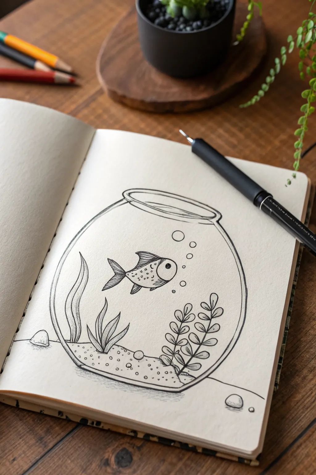
This charming, minimalist fishbowl sketch is perfect for beginners wanting to practice clean lines and simple textures. Using just a fine liner pen, you’ll create a peaceful underwater vignette with a playful goldfish and stylized plants.
Step-by-Step Guide
Materials
- Sketchbook with cream or off-white paper
- HB or 2B pencil for sketching
- Soft eraser
- Black fine liner pen (size 03 or 05)
- Black fine liner pen (size 01 for details)
Step 1: Drawing the Base Structure
-
Sketch the rim:
Start by lightly sketching an elongated oval near the top of your page. This will be the opening of the fishbowl. Keep your pencil pressure very light so these lines are easy to erase later. -
Outline the bowl:
Draw an even larger, almost complete circle starting from the sides of the oval rim. Imagine a sphere that has been slightly flattened at the bottom so it sits stably. -
Add dimension to the rim:
Create a lip for the bowl by drawing a second oval slightly larger and outside the first one. Connect this outer rim to the main bowl body with small curved lines. -
Define the water line:
Inside the bowl, just below the rim, sketch a gentle curve that follows the shape of the top opening. This indicates the surface level of the water. -
Sketch the gravel bed:
At the bottom of the bowl, draw an uneven, wavy line stretching from side to side to mark the top of the sand or gravel layer.
Steady Hands
For the smoothest glass outline, don’t move your wrist. Lock your wrist and move your entire arm from the elbow or shoulder to draw the large curves.
Step 2: Adding Life and Details
-
Position the fish:
In the center-left area, sketch a simple almond shape for the fish’s body. Add a triangular tail fin at the back and a small dorsal fin on top. -
Draft the plants:
On the left side of the gravel, draw two waving, ribbon-like strands of seaweed. On the right, sketch two stems with small, rounded leaves arranged in pairs. -
Ink the bowl outline:
Switch to your 05 fine liner. Carefully trace the external lines of the bowl, the rim, and the water line. I prefer using confident, continuous strokes here rather than sketchy dashes to keep it looking clean. -
Ink the fish:
Outline the fish with the 03 pen. Draw a large circle for the eye and fill in a small pupil, leaving a white highlight. Give it a small smile and define the gill curve. -
Texture the fish:
Using the 01 pen or very light pressure, add small dots on the fish’s body for scales and draw straight lines within the fins to show ribbing. -
Ink the seaweed:
Outline the ribbon plants on the left. Draw a line down the center of each leaf to give it dimension. -
Ink the leafy plant:
Go over the right-side plant. Ensure the leaves connect cleanly to their central stems. -
Create bubbles:
Draw a few circles of varying sizes rising from the fish towards the surface. Add tiny reflection marks inside 1-2 of them.
Make it Pop
Use a white gel pen to add a tiny highlight dot to the fish’s eye and a sleek reflection line on the curve of the glass bowl after the black ink dries.
Step 3: Final Textures and Cleanup
-
Draw the gravel:
Fill the bottom section with small, scattered circles and dots to simulate sand. Keep the density random—some areas clustered, some sparse. -
Add depth to the glass:
On the left side of the bowl interior, add a second curved line parallel to the outer edge. This subtle line suggests the thickness of the glass wall. -
Ground the object:
Sketch a faint horizon line outside the bowl to show the table surface. Add a small pebble stone to the left and right of the bowl for context. -
Shadowing:
Use light hatching (closely spaced parallel lines) underneath the bowl and the external pebbles to cast a shadow on the table. -
Erase pencil marks:
Wait until the ink is completely dry—give it a full minute. Then, gently erase all underlying pencil sketches to reveal the crisp black lines.
Enjoy the calm simplicity of your new aquatic sketch
Cartoon Eye in Three Steps
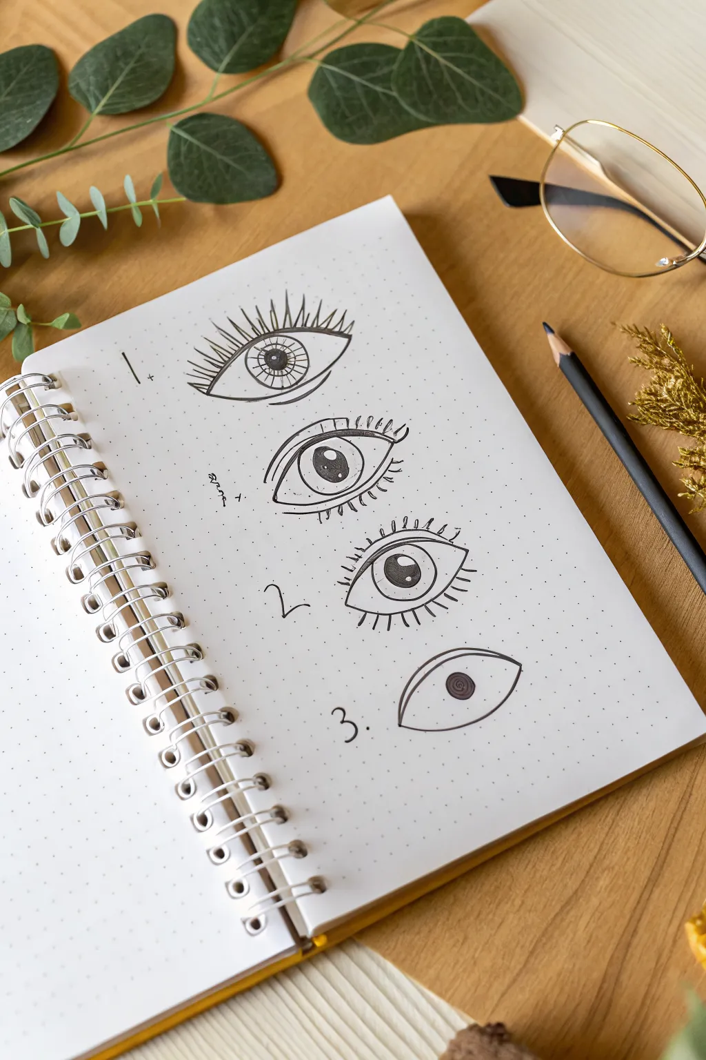
Master the art of drawing expressive cartoon eyes with this simple step-by-step breakdown perfect for bullet journals. Using a dot grid notebook, you will learn to create three distinct eye styles ranging from minimalistic to detailed.
Step-by-Step Tutorial
Materials
- Dotted grid notebook or journal
- Black fineliner pen (0.3mm or 0.5mm)
- Black graphite pencil (HB or 2B)
- Eraser
Step 1: Setting the Stage
-
Page orientation:
Begin by opening your dotted grid notebook to a fresh, blank page. Ensure the surface is flat and comfortable for drawing. -
Mental spacing:
Visualize the page divided into three vertical sections where you will place your numbered examples. Leave enough breathing room between each drawing so the page doesn’t feel cluttered.
Wobbly Lines?
If your arches are shaky, try drawing the curve by pivoting your entire arm from the elbow, rather than just moving your wrist. It creates smoother arcs.
Step 2: Style 1: The Realistic Lash Eye
-
Labeling:
Near the top left, write the number ‘1.’ followed by a small vertical line and plus sign for decoration. -
Upper lid arch:
Draw a wide, smooth arch for the upper eyelid. It should span about 6-8 dots in width. -
Lower lid curve:
Connect the ends of your arch with a gentler, shallower semi-circle for the lower lid, creating an almond shape. -
Iris outline:
Inside the eye shape, draw a perfect circle for the iris. It should touch both the top and bottom lids comfortably. -
Pupil and shine:
Draw a smaller circle in the absolute center for the pupil. Add a tiny circle near the top edge for a light reflection highlight. -
Radial details:
Fill in the pupil with solid black. Then, draw straight lines radiating outward from the pupil to the edge of the iris, like spokes on a wheel. -
Dramatic lashes:
Add long, sweeping eyelashes to the top lid. Make the center lashes the longest and angle them outward as you move toward the corners.
Add Pop Color
Use a colored pencil or mild highlighter to gently shade just the iris of the eyes. A touch of pale blue or green makes the black ink stand out beautifully.
Step 3: Style 2: The Cartoon Wide Eye
-
Numbering:
Move down about 8-10 dot rows and write the number ‘2.’ with a small wavy line decoration. -
Double lid line:
Start with the upper eyelid again, but this time draw a second arch just above it to indicate the eyelid crease. -
Main shape:
Complete the eye outline. This one should be slightly more rounded and open than the first style. -
Large iris:
Draw a large, prominent iris. Inside, place a pupil slightly higher up and add a larger white circle for a ‘wet’ look highlight. -
Short lashes:
Instead of long wisps, draw very short, uniform dashes along the top lid and bottom lid for a cute, doll-like lash effect.
Step 4: Style 3: The Minimalist Eye
-
Final label:
Drop down another section and write ‘3.’. -
Simple almond:
Draw a clean, unadorned almond shape. Focus on making the lines as smooth and continuous as possible. -
Floating iris:
Draw the circle for the iris but do not let it touch the bottom edge of the eye line; leave a tiny gap of white space. -
Swirl pupil:
Instead of coloring it solid, fill the center pupil with a tight, dark spiral scribble for a textured look. -
No lashes:
Leave this eye completely bare of eyelashes to maintain the minimalist aesthetic.
Now you have a reference sheet of eye styles ready to incorporate into your next character doodle
Doodle Pattern-Fill Shapes
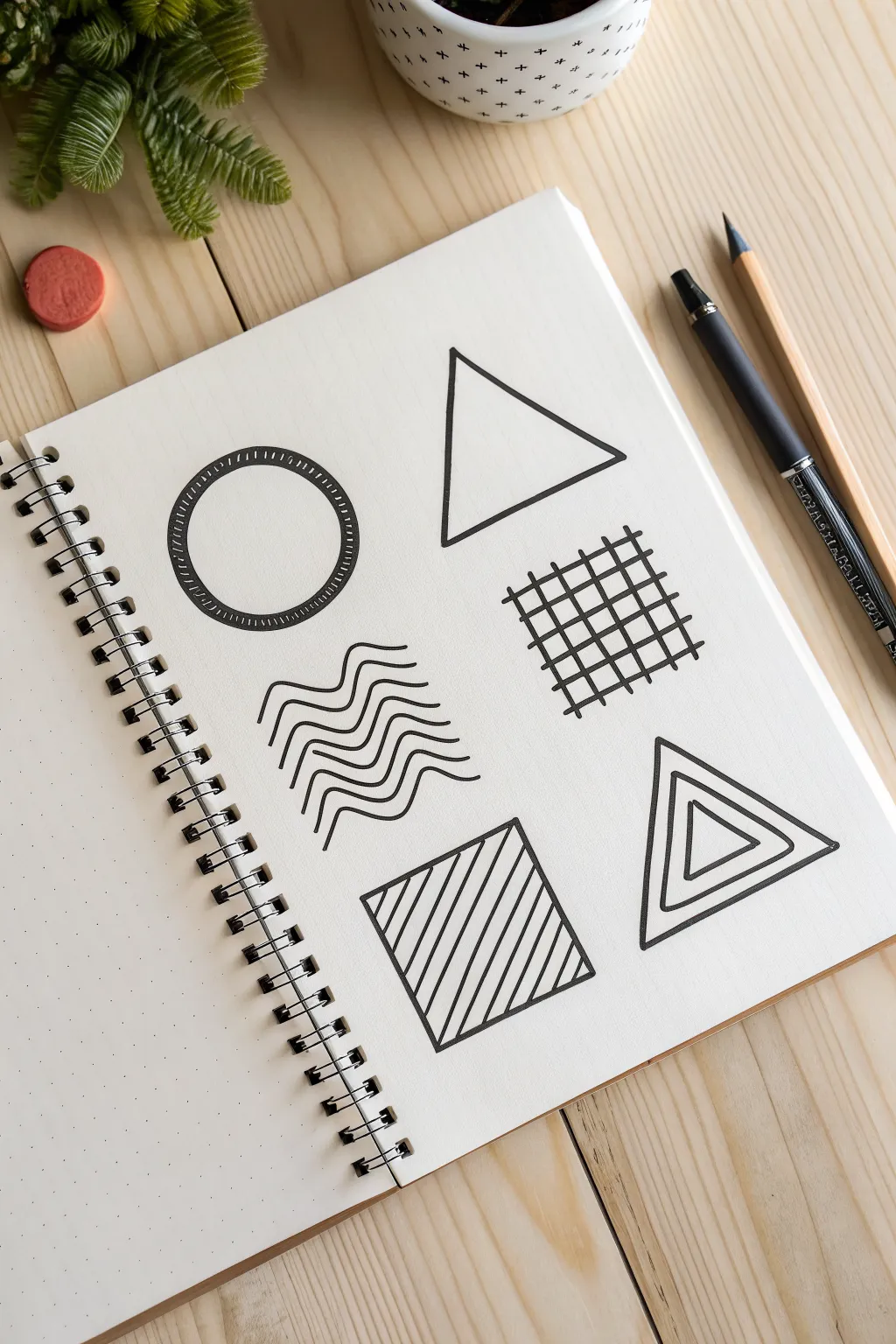
This simple exercise transforms basic geometry into striking doddle art using bold lines and repetitive patterns. It’s a perfect way to practice steady hand movements while creating a clean, modern aesthetic.
Step-by-Step Tutorial
Materials
- Dot grid notebook or sketchbook
- Fine-liner pen (0.5mm or 0.8mm)
- Pencil (for sketching)
- Eraser
- Ruler
Step 1: Planning the Layout
-
Sketch the circle:
Start in the top left area of your page. Using your pencil, lightly sketch a perfect circle. You can trace a small object like a spice jar lid or use a compass to get it just right. -
Outline the top triangle:
To the right of the circle, lightly draw an equilateral triangle. Use the dot grid to help align the base horizontally and position the peak directly in the center above the base. -
Mark the wavy zone:
Below the circle, lightly mark out a rectangular or square area where your wavy lines will go on the middle-left side. This helps ensure your lines don’t wander too far. -
Structure the square grid:
Opposite the waves, sketch a square tilted slightly on an angle (or keep it straight if you prefer) to serve as the boundary for your grid pattern later. -
Draw the bottom shapes:
Finally, sketch a square in the bottom left and a triangle in the bottom right. These will house the diagonal stripes and the concentric triangle pattern.
Steady Hands
For crucial curves like the circle, lock your wrist and move your entire arm from the shoulder. This creates smoother arcs than moving just your fingers.
Step 2: Inking the Outlines
-
Ink the main triangle:
Take your black fine-liner. Start with the top-right triangle. Place your ruler along your pencil lines and draw each side with a firm, confident stroke. -
Outline the patterned shapes:
Move to the bottom-left square and the bottom-right triangle. Ink their outer boundaries cleanly with your ruler. -
Create the circle’s border:
For the top-left circle, ink the pencil line carefully. Then, draw a second circle slightly inside the first one to create a thick band. I find sketching this inner circle lightly in pencil first helps keep the width consistent.
Step 3: Adding the Patterns
-
Hatch the circle:
Fill the space between your two circle lines with small, straight hash marks. Keep them closely spaced and perpendicular to the curves to create a ‘stitched’ or ‘ladder’ look. -
Draw the grid:
For the middle-right shape, draw a set of parallel lines going one direction, then cross them perpendicularly with another set. You don’t need an outer box for this one—let the grid itself form the square shape. -
Create the waves:
On the middle-left, draw your first wavy line horizontally. Use this as a guide for the next line below it, trying to mimick the peaks and valleys exactly. Continue until you have a stack of 5-7 distinct waves. -
Stripe the square:
Go to the bottom-left square. Place your ruler diagonally from corner to corner to draw the center line, then fill in the rest of the square with parallel diagonal lines, spacing them evenly. -
Finish with concentric triangles:
For the final bottom-right triangle, draw a smaller triangle inside the main one. Repeat this process, creating smaller and smaller triangles towards the center until the shape feels full. -
Erase and clean up:
Wait at least a full minute for the ink to set completely. Gently erase all your underlying pencil sketches to reveal the crisp black-and-white designs.
Color Pop
Once the black ink is totally dry, use a highlighter or watercolor wash to fill in just one section of each shape (like every other stripe) for a cool graphic effect.
Now you have a sleek page of geometric studies ready to be expanded into a full pattern sheet
Ribbon Banner With a Short Word
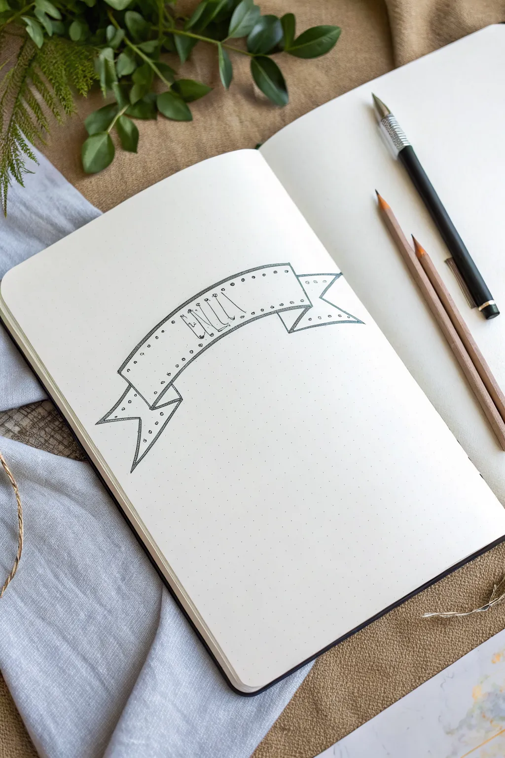
This minimalist banner design uses simple lines and dots to create a charming, slightly industrial look that is perfect for bullet journals. The dotted grid of the notebook acts as a perfect guide, making it incredibly easy to keep your angles consistent and your lettering straight.
Detailed Instructions
Materials
- Dotted grid notebook (A5 size recommended)
- Black fineliner pen (0.3mm or 0.5mm)
- Pencil (HB or H)
- Eraser
- Ruler (optional, but helpful for crisp lines)
Step 1: Drafting the Basic Shape
-
Establish the curve:
Begin by using your pencil to lightly sketch two parallel curved lines for the main body of the banner. Count about 4 or 5 vertical dots apart to determine the height of the banner. -
Close the center section:
Connect the two curved lines at the ends with short vertical lines. This creates the central ‘face’ of the ribbon where your text will go. -
Add the ribbon folds:
From the bottom corners of your central shape, draw short diagonal lines moving inward and downward. Connect these back up to the main banner body with small vertical lines to create the illusion of the ribbon folding backward. -
Sketch the tails:
Draw the swallowtail ends of the ribbon emerging from behind the folds. Sketch these flowing outward and downward, ending them with a V-cut shape for a classic banner look. -
Refine the tails:
Make sure the tails look symmetrical. Since you are using dot grid paper, count the dots to ensure the left tail extends out the same distance as the right tail.
Step 2: Inking the Outline
-
Trace top lines:
Switch to your black fineliner. Carefully trace over the top curve of the main banner and the top edges of the tails first. -
Trace bottom lines:
Next, ink the bottom curve and the bottom edges of the tails. I find it easier to pull the pen toward me for these long curves to keep them smooth. -
Define the folds:
Ink the vertical and diagonal lines that create the folded sections. Be sure to stop your lines precisely where they meet intersecting lines to keep the drawing clean. -
Double the border:
To give the banner some visual weight and dimension, draw a second line just inside the entire perimeter of the banner. Keep this inner line very close to the outer edge. -
Clean up:
Once the ink is completely dry—give it a full minute—gently erase all your pencil guides.
Pro Tip: Smooth Curves
When drawing the long curves of the banner, try to move your entire arm from the shoulder, rather than just your wrist. This prevents shaky, wobbly lines.
Step 3: Lettering and Details
-
Position the letters:
Using your pencil again, lightly sketch the word ‘NICE’ (or your chosen short word) in the center of the banner. The letters should essentially hang from the top line. -
Ink the stems:
Go over the letters with your fineliner. Draw simple, thin sans-serif lines for a clean aesthetic. -
Add hanging details:
At the top of each letter stem, draw a tiny circle or ‘stud’ that touches the upper border of the banner. This makes the letters look like they are bolted or hanging from the top edge. -
Draw the rivets:
Along the top and bottom borders of the banner strip, place small, evenly spaced dots between your double lines. These look like rivets or stitching. -
Detail the tails:
Don’t forget to continue the rivet pattern onto the ribbon tails. Add the dots along the V-cut edges as well. -
Shade the folds:
Use simple hatching (closely spaced parallel lines) to shade the small triangular areas where the ribbon folds back. This adds immediate depth. -
Final erase:
Do one last pass with your eraser to remove any remaining pencil marks from the lettering phase. -
Add movement lines:
Draw one or two very short, faint lines near the curves of the banner to suggest tension or movement. -
Review and refine:
Step back and look at the overall balance. If any lines look too thin, you can carefully retrace them to thicken the line weight slightly.
Level Up: Vintage Shade
Use a light gray brush pen or a very diluted watercolor wash to add a drop shadow underneath the banner. This will make it pop off the page.
Now you have a structured yet decorative header ready to highlight the most important part of your page
Tiny Window View Thumbnail
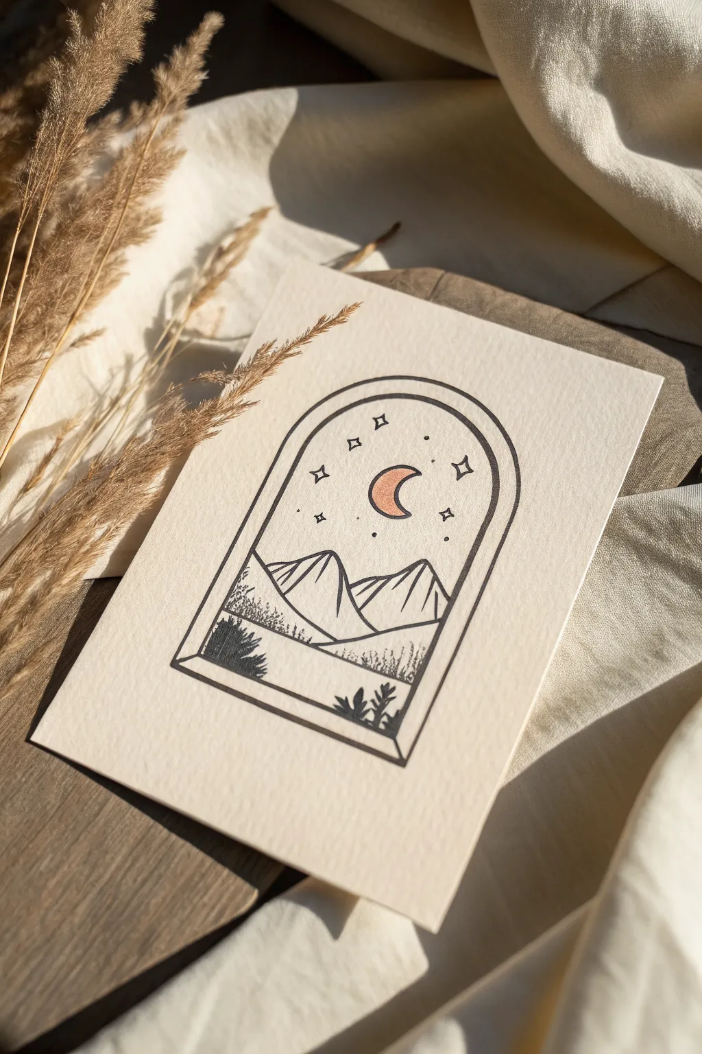
This minimalist ink drawing captures a serene mountain view through a stylized arched window, perfect for cards or small wall art. The simple line work contrasts beautifully with a single pop of metallic copper on the moon.
Step-by-Step Guide
Materials
- Heavyweight textured paper (cream or off-white)
- Black fineliner pens (sizes 0.1, 0.3, and 0.5)
- Pencil (HB or 2H suitable)
- Ruler
- Compass or circular object for tracing
- Metallic copper or gold gel pen/paint marker
- Eraser
Step 1: Drafting the Window Frame
-
Set the foundation:
Begin by lightly sketching a rectangle with your pencil to define the outer boundaries of your window. A size of about 2.5 by 3.5 inches works well for a standard card. -
Create the arch:
Use a compass or trace a round object to draw a semi-circle at the top of your rectangle. Ensure the sides connect smoothly to the vertical lines. -
Add dimension:
Draw a second, slightly smaller arch inside the first one to create the thickness of the window frame. Keep the spacing consistent. -
Build the sill:
At the bottom, draw a narrow, slanted rectangle jutting out slightly to create a 3D window sill effect. This grounds the frame and gives it perspective.
Uneven Arch Curves?
If your hand-drawn arch looks wobbly, draw only one side, fold a scrap piece of paper to trace that curve, and flip it to mirror the exact shape on the other side.
Step 2: Sketching the Scene
-
Outline the mountains:
Lightly sketch two main triangular peaks in the middle ground. Overlap them slightly so the one on the left sits in front of the right peak. -
Place the moon:
Position a crescent moon shape in the upper center of the sky area. Keep it relatively large so it can be a focal point later. -
Add celestial details:
Mark small crosses or diamond shapes around the moon to represent the larger stars. Add tiny dots for distant starlight. -
Foreground elements:
Sketch a rolling hill line in the immediate foreground, just above the window sill. Add rough shapes for small bushes or plants peeking up from the bottom.
Step 3: Inking the Frame & Mountains
-
Trace the outer frame:
Switch to your 0.5 fineliner. Carefully trace over the outer and inner lines of the arch. Use a ruler for the straight vertical sections to keep them crisp. -
Ink the mountains:
Use a 0.3 pen for the mountain outlines. Give the lines a slightly shaky or organic quality to mimic rocky terrain. -
Add mountain texture:
With a 0.1 pen, draw thin, diagonal hatching lines on one side of each peak to indicate shadow and slope. I like to keep these lines fairly widely spaced for a clean look. -
Define the horizon:
Ink the rolling hill line in the foreground with the 0.3 pen, separating the mountains from the closest ground.
Depth with Line Weight
Use the thickest pen (0.5 or 0.8) solely for the window frame. This heavy outline pushes the view backward, creating an instant sense of depth.
Step 4: Detailing & Finishing
-
Texture the flora:
Using light stippling (dots) and tiny scribbles, fill in the bushes on the left and the grassy texture along the bottom edge. Concentration of dots creates darker shadows. -
Ink the sky:
Go over your star shapes with the 0.1 pen. Make the ‘diamond’ stars sharp and the dot stars random in size. -
Gild the moon:
Take your metallic copper or gold pen and carefully fill in the crescent moon. Let the ink pool slightly for a rich, solid finish. -
Outline the moon:
Once the metallic ink is fully dry, outline the moon with the 0.1 black pen to make it pop against the paper. -
Erase pencil guides:
Wait at least 10-15 minutes for all ink to cure completely. Gently erase your initial pencil sketches, being careful around the metallic area.
Place your finished piece in a small frame or send it as a thoughtful greeting card to brighten someone’s day
Whimsical Floating Planet
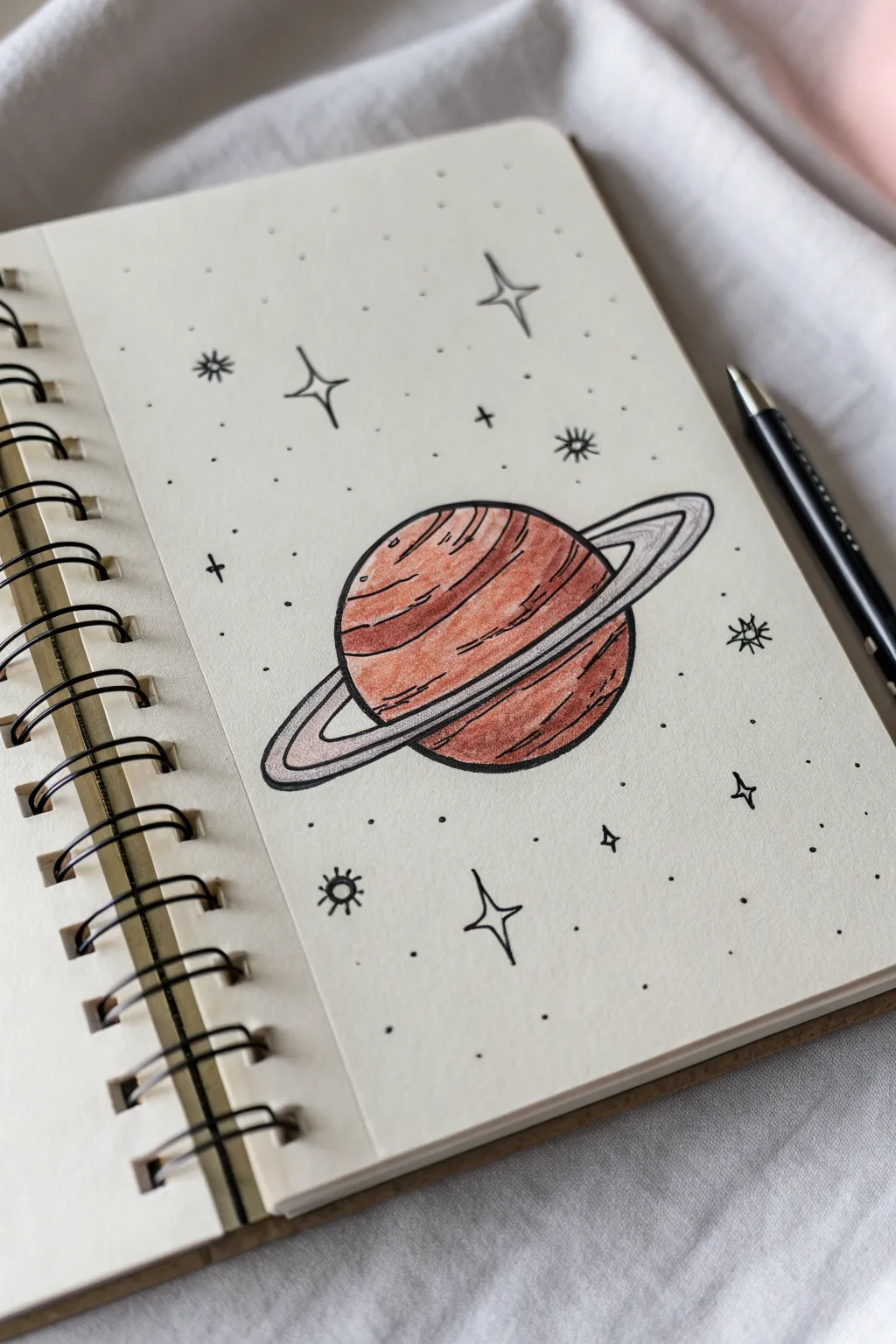
This charming sketch captures the simple wonder of the cosmos with a warm, layered planet surrounded by a scattering of dainty stars. It’s the perfect beginner project to practice clean line work and basic color blending in your sketchbook.
Detailed Instructions
Materials
- Spiral-bound sketchbook (smooth paper)
- Pencil (HB or H for sketching)
- Eraser
- Fine-liner pen (black, 0.3mm or 0.5mm)
- Colored pencils (terra cotta, brown, light peach)
- Silver or light grey gel pen/colored pencil
Step 1: Sketching the Foundation
-
Draw the Planet Body:
Start by drawing a circle in the center of your page. It doesn’t need to be geometrically perfect; a slight irregularity adds character, but aim for a nice, round shape about 2-3 inches wide. -
Add the Ring Axis:
Sketch a diagonal line passing through the center of the planet to help guide the angle of your rings. This line should be longer than the width of the planet. -
Sketch the Rings:
Draw an oval shape around the planet, using your diagonal line as the long axis. The oval should appear to go ‘behind’ the top right of the planet and ‘in front’ of the bottom left. -
Refine the Ring Shape:
We want these rings to have dimension, so draw a second, slightly smaller oval inside the first one. Connect the ends with curved edges so the ring looks like a flat disc rather than just wire lines. -
Erase Hidden Lines:
Carefully erase the part of the planet’s circle that should be hidden behind the front section of the rings. This immediately creates a sense of depth.
Wobbly Ovals?
If drawing the ring oval is hard, lighty trace the rim of a small cup first to get the curve right, then freehand the back half to flatten the perspective.
Step 2: Inking the Outlines
-
Trace Main Lines:
Using your black fine-liner, go over your pencil lines with a confident, steady hand. If your hand shakes a little, don’t worry—it adds a nice organic feel to the drawing. -
Add Texture Contour Lines:
Inside the planet’s surface, draw slightly curved horizontal lines to represent the atmospheric bands. These shouldn’t be straight; curve them slightly downward to match the spherical shape of the planet. -
Thicken the Ring Outline:
Go over the outer edge of the ring one more time to thicken the line slightly, making it stand out distinctively from the planet body. -
Trace Inner Ring Detail:
Draw a very fine line through the middle of the ring band itself, suggesting grooves or separation within the rings. -
Erase Pencil Marks:
Wait at least a full minute for the ink to dry completely. Then, gently erase all your initial graphite sketches so only the crisp black ink remains.
Step 3: Coloring and Details
-
Base Color Layer:
Take a light peach or soft terra cotta colored pencil and shade the entire planet lightly. Keep your strokes following the curve of the planet to reinforce the 3D shape. -
Add Deep Bands:
Using a darker brown or rust-colored pencil, color in alternating bands on the planet’s surface. Press harder near the edges and softer near the middle to create a subtle highlight effect. -
Shadowing the Rings:
Use a silver pencil or a very light grey to color the rings. Add a tiny bit of the darker brown right where the rings go behind the planet to cast a shadow. -
The Four-Point Stars:
Around the planet, draw several four-pointed stars (the classic ‘sparkle’ shape) with your black pen. Vary their sizes, placing larger ones further apart for balance. -
Adding Starbursts:
Draw a few small circles with radiating lines (‘sun’ shapes) to create different types of stellar bodies. These add nice variety to the background. -
Plotting Distant Stars:
Dot the empty spaces with simple black specks. Group some closer together and leave other areas sparse to mimic a real night sky. -
Final Touches:
Add tiny ‘plus’ signs (+) scattered among the dots. These act as twinkling distant stars.
Make It Pop
Use a white gel pen to add tiny highlight dots on the upper right side of the planet and the brightest part of the rings for a glossy, finalized look.
Now you have a little pocket of the universe captured right on your page


Have a question or want to share your own experience? I'd love to hear from you in the comments below!