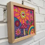
If you’re craving that groovy hippie vibe in your sketchbook without stressing over perfection, you’re in the right place. These ideas lean on simple shapes, bold outlines, and a little psychedelic flair you can build fast and color big.
Classic Peace Sign Doodles
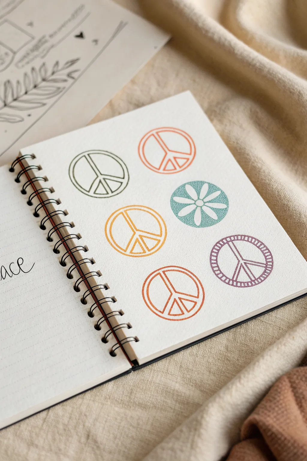
These simple yet charming peace sign doodles bring a retro, hippie vibe to any sketchbook page. Using a clean grid layout and a palette of muted, earthy tones creates a cohesive and aesthetic look.
Step-by-Step
Materials
- Spiral-bound sketchbook with off-white or cream paper
- Compass or circle stencil (approx. 2 inches diameter)
- Fine-point drawing pens (black or dark grey)
- Colored fineliners or colored pencils (earthy green, burnt orange, mustard yellow, teal, purple, rust)
- Pencil (HB)
- Eraser
Step 1: Planning the Layout
-
Visualize the grid:
Imagine a 2×3 grid on your sketchbook page. You want to place six circles evenly spaced apart. -
Draw the circles:
Using a compass or a circle stencil, lightly draw six circles in pencil. Aim for a diameter between 1.5 to 2 inches for each circle to match the scale. -
Check spacing:
Ensure there is roughly uniform space between the circles horizontally and vertically so the page feels balanced.
Clean Circles Tip
If you don’t have a stencil, trace the bottom of a small spice jar or a shot glass. It’s the perfect size for these doodles.
Step 2: Drawing the Peace Signs
-
Outline the first peace sign:
Start with the top-left circle. Switch to a dark olive green pen. Trace over your pencil circle carefully. -
Draw the center column:
Draw a straight vertical line down the center of the circle from the top edge to the bottom edge. -
Add the legs:
From the center point of that vertical line, draw two diagonal lines extending outward to the bottom left and bottom right edges. -
Create the thickness:
Now, draw parallel lines inside the ones you just made to give the symbol thickness, creating that classic peace sign structure. Leave negative space between the inner lines and the outer circle. -
Repeat with orange:
Move to the top right circle. Using a muted orange pen, replicate the same peace sign structure. I like to rotate the paper slightly if it helps keep the lines straight. -
Draw the yellow sign:
For the middle-left circle, switch to a mustard yellow pen. Draw the peace sign again, keeping the line weight consistent. -
Create the rust peace sign:
Identify the bottom-middle position (or bottom-left depending on your alignment). Use a reddish-brown or rust-colored pen for this one.
Step 3: The Unique Variations
-
The Floral Circle:
Focus on the middle-right circle. Using a teal or seafoam green pen, color in the background of the circle fully, but leave a white daisy shape uncolored in the center. -
Texture the background:
To mimic the textured look in the image, instead of solid coloring, use tiny stippling dots or small scribble strokes to fill the teal area around the white flower petals. -
Refine the petals:
Ensure the six petals of the daisy meet in the center. You can lightly outline them first if you’re worried about coloring inside the lines. -
The Patterned Peace Sign:
Move to the remaining circle (bottom right). Outline the main peace sign shape in a dusty purple. -
Hatch the border:
Instead of a solid line for the outer circle, draw two concentric circles and fill the space between them with tiny perpendicular hatch marks, creating a ladder-like border. -
Hatch the inner symbol:
Do the same for the inner peace lines—draw double lines and fill the gap with tiny hatch marks for a textured, stitched effect.
Wobbly Lines?
Don’t stress about perfect geometry. Hand-drawn wobbly lines actually add to the authentic, relaxed hippie aesthetic of this project.
Step 4: Finishing Touches
-
Erase guidelines:
Once the ink is completely dry (give it a few minutes to be safe), gently erase any visible pencil marks from your initial circles. -
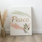
Add lettering:
On the opposite page or below the grid, write a word like ‘peace’ in large, loose cursive using a black fineliner. -
Review and refine:
Look over your doodles. If any lines look too faint, carefully go over them one more time to deepen the color.
Now you have a colorful, retro-inspired page filled with symbols of peace
Flower Power Daisies and Sunflowers
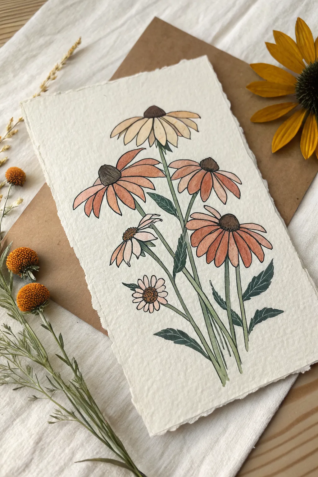
Capture the earthy soul of the hippie era with this delicate illustration of coneflowers and daisies. Combining fine liner details with soft watercolor washes creates a timeless, botanical print aesthetic perfect for wall art or greeting cards.
Step-by-Step Guide
Materials
- Heavyweight watercolor paper (300gsm, cold press)
- Fine liner pens (sizes 0.1, 0.3, and 0.5, black ink)
- Watercolor paints (Yellow Ochre, Burnt Sienna, Sap Green, Sepia, blush pink)
- Round watercolor brush (size 4 or 6)
- Pencil (HB) and kneaded eraser
- Ruler
- Jar of water and paper towels
Step 1: Sketching the Composition
-
Prepare the Paper:
Begin by tearing the edges of your watercolor paper against a ruler to create a soft, deckled edge. This adds a rustic, handmade feel that suits the vintage botanical style perfectly. -
Map out Stem Lines:
Using your pencil very lightly, draw five slightly curved lines radiating from the bottom center. These don’t need to be perfectly straight; a slight natural bend makes the flowers look more organic. -
Outline Flower Centers:
At the top of each stem, sketch the cone-shaped centers. For the top and right flowers, draw rounded domes. For the lower left flower, draw a smaller, flatter oval. -
Petal Guidelines:
Lightly sketch the drooping petals radiating from the centers. Coneflower petals tend to hang downward, while the smaller daisy at the bottom can have perky, open petals. -
Adding Leaves:
Sketch jagged, lance-shaped leaves attached to the lower parts of the stems. Keep the pencil lines faint so they won’t show through the paint later.
Natural Edges Pro Tip
To get perfectly feathery edges on your paper, paint a line of clean water where you want to tear, wait 30 seconds, then pull the paper apart gently.
Step 2: Inking the Details
-
Outline the Petals:
Switch to your 0.3 fine liner. Carefully trace over your petal sketches. Add small imperfections or slight waviness to the edges so they don’t look like rigid cutouts. -
Texture the Centers:
For the characteristic spiky centers of the coneflowers, use the 0.1 pen to draw tiny stippled dots or very short dashes, concentrating them on the shadowed side of the cone for depth. -
Stem and Leaf Definition:
Ink the stems with the 0.5 pen for a slightly bolder line. When outlining the leaves, use quick, jagged strokes to mimic the serrated edges typical of echinacea foliage. -
Erase Guidelines:
Once the ink is completely dry—I usually wait at least 5 minutes to be safe—gently erase all your pencil marks with the kneaded eraser to leave a clean black-and-white drawing.
Step 3: Watercolor Application
-
Paint the Top Flower:
Mix a very dilute wash of Yellow Ochre. Paint the petals of the topmost flower, keeping the color transparent and light to suggest it is fading into the light. -
Color the Middle Blooms:
For the two main orange-toned flowers, mix Burnt Sienna with a touch of pink. Apply this to the petals, dropping in slightly more pigment near the flower center where shadows would naturally fall. -
Small Flower Tints:
For the drooping flower on the left and the small daisy at the bottom, use a very pale blush pink or watered-down brown. These should look delicate and subtle compared to the main blooms. -
Darkening the Centers:
Paint the cone centers using Sepia or a dark brown. While the paint is still damp, dab a little concentrated black or dark brown on the shadowed side to enhance the 3D effect. -
Greenery Base Layer:
Apply a light wash of Sap Green to all stems and leaves. Don’t worry if you go slightly outside the lines; it adds to the illustrative charm. -
Leaf Shadows:
Once the first green layer is dry, mix a little dark blue or brown into your green to create a shadow tone. Paint one half of each leaf with this darker shade to create dimension.
Level Up: Tea Staining
Before drawing, soak your paper in strong black tea and let it dry. This creates an antique, parchment-like background that makes the colors pop.
Step 4: Final Touches
-
Adding Veins:
Using your finest 0.1 pen or a very dry brush with dark green paint, draw a central vein line down the middle of each leaf. -
Highlighting:
If any centers look too flat, use a white gel pen to add strictly one or two tiny dots of highlight on the sunlit side of the cones.
Now you have a charming piece of botanical art that captures the wild spirit of the garden

Groovy Smiley Faces

Capture the laid-back vibes of the 70s with this set of five distinct groovy smiley faces. Using clean lines and playful expressions, this simple ink drawing project is perfect for filling sketchbook pages or decorating journal covers.
How-To Guide
Materials
- Spiral-bound sketchbook with smooth paper
- Pencil (HB or 2B)
- Eraser
- Circular object for tracing (like a bottle cap or small jar lid) approx. 1.5-2 inches diameter
- Fine liner pen (black, 0.5mm tip)
- Thick marker or brush pen (black) for filling areas
Step 1: Layout and Structure
-
Plan the composition:
Visualize where your five faces will go on the page. You want a scattered, slightly random arrangement rather than a perfect grid to keep that loose, hippie feel. Aim for two near the top, two the middle, and one anchoring the bottom. -
Trace the base circles:
Place your circular object on the paper and lightly trace around it with your pencil. Draw five separate circles, leaving plenty of breathing room between them. -
Refine the circles:
Lift your tracing object. If any lines are sketchy or broken, lightly smooth them out with your pencil so you have a clear guide for inking later.
Shaky Circles?
If your hand shakes while tracing the circles, try ghosting the motion in the air a few times first. Alternatively, embrace the wobble—it adds to the hand-drawn, authentic aesthetic.
Step 2: Drafting the Expressions
-
Sketch the Classic Smile:
Starting with the top left circle, draw two small oval eyes. Below them, add a simple upward-curving line for a smile, placing small perpendicular tick marks at the ends of the smile for cheeks. -
Draft the ‘Dead’ Pan face:
Move to the top right circle. Instead of oval eyes, lightly sketch two ‘X’ shapes. Draw a wider, slightly crooked smile below them to give it a dazed look. -
Create the Wide Grin:
For the middle left circle, draw two curved arches for closed, happy eyes. Add a wide U-shape for the mouth, mimicking a big, open smile. Add small curved lines at the corners of the mouth. -
Sketch the Winking Tongue-Out face:
On the middle right circle, draw one arched line for a closed eye and a small oval for an open eye. Draw a smile that is slightly off-center, with a small U-shape hanging from it to represent a tongue sticking out. -
Draw the Starry Eyed face:
For the final bottom circle, lightly sketch two five-pointed stars where the eyes go. Add a simple curved smile below.
Techinicolor Trip
Once the black ink is totally dry, use yellow watercolor or highlighters to fill the faces. Leave the eyes and mouth zones white for a glossy, dimensional sticker effect.
Step 3: Inking and Finalizing
-
Ink the outlines:
Take your black fine liner or marker. Carefully trace over the five main circles first. Try to do this in one or two continuous strokes per circle to keep the line smooth. -
Thicken the lines:
Go over the circle outlines a second time to give them a bold, sticker-like weight. This makes the faces pop off the page. -
Ink the Classic face features:
Fill in the oval eyes completely solid black. Trace the smile line and the little cheek ticks carefully. -
Ink the ‘X’ eyes:
Trace the X shapes on the top right face. I like to make the lines of the X slightly thicker at the ends for a stylized look. Ink the smile below. -
Ink the Wide Grin features:
Trace the arched eye lines. For the mouth, trace the curve, and add a small emphasis on the corners to show the depth of the smile. -
Detail the Tongue-Out face:
Ink the winking eye and fill in the open eye dot. Outline the mouth and the tongue. You can leave the tongue white or fill it in depending on your preference, but the example keeps it essentially open. -
Finish the Starry face:
Outline the star shapes carefully. Fill them in solid black so they stand out clearly against the white background. Ink the final smile curve. -
Erase pencil marks:
Wait at least 5-10 minutes for the ink to dry completely to avoid smearing. Once dry, gently erase all underlying pencil graphic lines.
Enjoy your collection of expressive doodles and consider drawing them on sticker paper next time


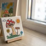
Trippy Mushrooms With Big Spots
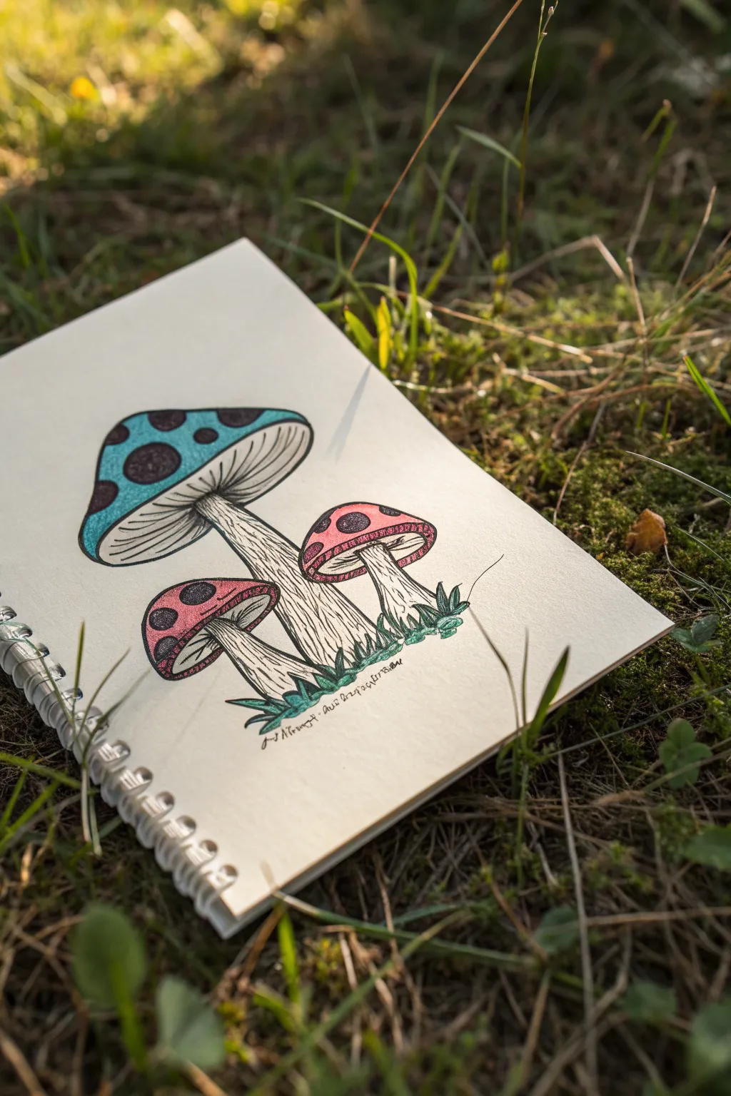
Capture the whimsical vibe of the forest floor with this charming illustration of three spotted mushrooms. The drawing combines crisp ink linework with soft color pencil shading for a classic, earthy sketchbook feel.
Step-by-Step Tutorial
Materials
- Sketchbook or drawing paper (heavyweight helpful)
- Graphite pencil (HB or 2B)
- Eraser
- Fine liner pen (black, 0.3mm and 0.5mm)
- Colored pencils (teal blue, pink/light red, dark green, black)
- Pencil sharpener
Step 1: Penciling the Composition
-
Establish the main mushroom:
Begin by sketching the largest mushroom slightly to the left of the center. Draw a large, wide dome for the cap and a thick, slightly curved stem extending downward. -
Add the smaller companions:
Sketch two smaller mushrooms nestled near the base of the large one. Place one on the left and one on the right, angling their caps slightly outward away from the center stem. -
Draw the gills:
Underneath each cap, draw a curve connecting the stem to the rim of the cap. Lightly sketch thin lines radiating from the stem to the cap edge to represent the gills. -
Sketch the spots:
Draw large, prominent circles on all the mushroom caps. These are a key feature, so make them big and irregular—some can even go off the edge of the cap. -
Add the grassy base:
Sketch small, jagged tufts of grass around the base of the stems to ground your mushrooms, giving them a place to grow.
Step 2: Inking the Outlines
-
Outline the main shapes:
Using your 0.5mm fine liner, carefully trace over the main pencil lines of the caps and stems. Keep your hand steady but allow for slight organic wobbles. -
Detail the gills:
Switch to a finer 0.3mm pen if you have one. Draw the gill lines under the caps. Instead of perfectly straight lines, use slightly curved strokes that follow the contour of the mushroom’s underside. -
Define the grass:
Ink the grass tufts at the bottom with quick, upward flicking motions to mimic blades of grass. -
Outline the spots:
Go over the circular spots on the caps. You don’t need to make them perfect circles; organic shapes look more natural for fungi. -
Erase pencil marks:
Once the ink is completely dry (test a small spot with your finger first), gently erase all the underlying graphite sketches.
Ink Smearing?
If your ink smears when coloring, ensure you are using waterproof archival ink pens. If not, wait at least 30 minutes before erasing or coloring over lines.
Step 3: Shading and Texturing
-
Add stem texture:
Using your fine pen, add vertical hatching lines running up the stems. I like to concentrate these lines near the top (under the cap) and the bottom to create a sense of roundness. -
Stipple the dark spots:
Inside the circular spots on the caps, use a stippling technique (lots of tiny dots) or very dense cross-hatching to fill them in dark black, leaving tiny flecks of white for texture. -
Deepen shadows:
Add extra ink lines where the smaller mushrooms overlap or sit behind the larger one to create depth and separation.
Magic Glow
Use a white gel pen to add tiny dots or stars inside the black spots or on the colored caps to give the mushrooms a magical, bioluminescent effect.
Step 4: Adding Color
-
Color the big cap:
Take your teal or light blue colored pencil. Fill in the main mushroom cap, pressing lightly effectively avoiding the black spots. -
Shade the blue cap:
Add a second layer of blue on the left side and bottom edge of the cap to suggest a light source coming from the top right. -
Color the small caps:
Use a pink or light red pencil for the two smaller mushroom caps. Again, fill in everything except the dark spots. -
Color the grass:
Use a dark green pencil to fill in the tufts of grass at the base. You can press harder here to make the base feel solid. -
Add subtle stem shadows:
Very lightly use a grey or black pencil to add faint shading to the sides of the stems, reinforcing the ink hatching you did earlier.
Now you have a whimsical forest sketch ready to be shared or expanded into a larger scene

PENCIL GUIDE
Understanding Pencil Grades from H to B
From first sketch to finished drawing — learn pencil grades, line control, and shading techniques.
Explore the Full Guide
Yin-Yang With Easy Pattern Fills
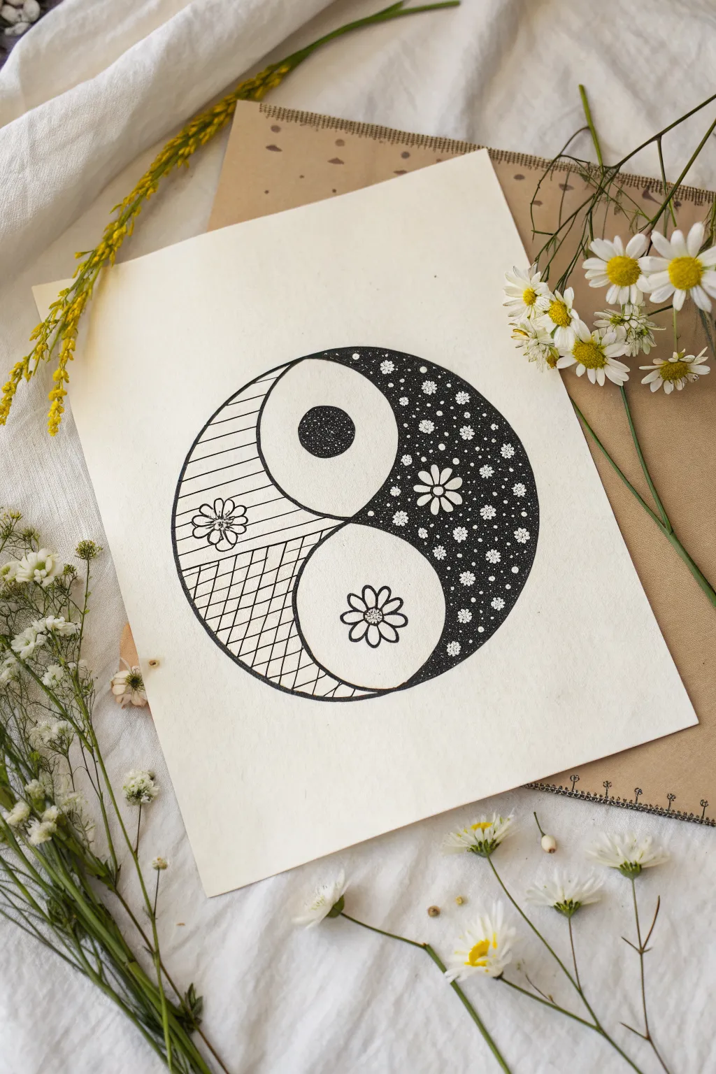
This project creates a unique twist on the classic yin-yang symbol by filling the segments with floral and geometric patterns instead of solid colors. The result is a delicate, nature-inspired drawing that perfectly fits a relaxed, hippie aesthetic.
Step-by-Step Guide
Materials
- High-quality drawing paper (smooth bristol or mixed media paper recommended)
- Pencil (HB or H for light lines)
- Compass or circle template
- Ruler
- Fine liner pens (sizes 005, 01, and 05)
- Eraser (kneaded eraser works best)
Step 1: Basic Structure
-
Draw the main circle:
Start by using your compass to draw a large, perfect circle in the center of your paper. This will be the outer boundary of your yin-yang. -
Create the S-curve:
Lightly sketch the S-shaped line that divides the circle. To get this accurate, you can find the center point, then imagine two smaller circles stacked vertically inside the main one—trace the right side of the top imaginary circle and the left side of the bottom one. -
Add the inner circles:
Draw the two smaller circles that sit within each teardrop shape. Use your compass to ensure they are identical in size and perfectly round. -
Ink the outline:
Once you are happy with your pencil sketch, trace over the main outer circle, the S-curve, and the two inner circles with a size 05 fine liner. Keep your hand steady for a smooth line.
Circle Mastery
If you don’t have a compass, trace household items like bowls, massive mugs, or jar lids to get perfect circular curves.
Step 2: The Dark Side (Right)
-
Draw the main flower:
Inside the right teardrop section (the ‘yin’ side), draw a simple daisy-like flower near the center curve. Use a size 01 pen for this. -
Fill the background space:
This section needs to look dark but textured. Using your thickest pen (05 or a small marker), carefully color in the background space around your flower. -
Add the stars:
As you color the background black, leave tiny circles uncolored to act as ‘stars’ or small pollen dots. Alternatively, color it solid black first and use a white gel pen later to add these dots. -
Detail the inner flowers:
Draw smaller flower shapes scattered through the black background. I find it easiest to draw the outlines of these tiny flowers first, then color around them carefully with the black ink so the white paper shines through as the petals. -
Texture the inner circle:
The small circle on this right side stays white but needs a centerpiece. Draw a single, symmetrical flower in the middle using a 01 fine liner.
Color Pop
Instead of black and white, use a deep navy blue or forest green ink for the dark side to give the piece a softer, earthy vibe.
Step 3: The Light Side (Left)
-
Divide the section:
On the left teardrop (the ‘yang’ side), use a pencil and ruler to draw a light horizontal line roughly aligned with the center of the main circle. -
Upper stripe pattern:
In the top half of this section, use a 01 pen and a ruler to draw horizontal stripes. Space them evenly, about 3-4mm apart. -
Lower grid pattern:
In the bottom half, create a grid texture. Start with diagonal lines going one way, then cross them with diagonal lines going the opposite way. Keep the lines close together for a tight hatch look. -
Add the floral accent:
Draw a flower that overlaps heavily with the horizontal stripes. Let the petals interrupt the lines, making the flower look like it’s sitting on top of the pattern. -
Detail the dark eye:
For the small inner circle on this left side, you’ll create a dark contrast. Use a stippling technique (lots of tiny dots) to fill the circle, leaving a slightly lighter ring or center to give it dimension. -
Solidify the center:
If the stippling looks too faint, darken the very center of this small circle with solid black ink, fading out into dots towards the edge.
Step 4: Refinement
-
Erase pencil marks:
Wait at least 10 minutes to ensure all ink is completely dry. Then, gently erase all visible pencil guidelines. -
Thicken the borders:
Go back over the main S-curve and the outer circle with your 05 pen to make the main shapes pop against the intricate patterns inside. -
Final touches:
Inspect your black fill areas. If there are streaky gray spots, go over them again to ensure a deep, opaque black.
Now you have a beautifully balanced piece of art that celebrates harmony and detail
Wavy Sun and Sleepy Moon Faces
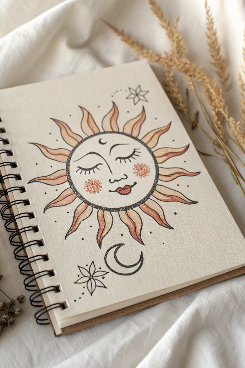
Capture the mystic energy of the cosmos with this serene sun face illustration, complete with gentle ombre rays and delicate star accents. This project combines crisp linework with soft, warm shading to create a dreamy, vintage-inspired page for your sketchbook.
Detailed Instructions
Materials
- Spiral-bound sketchbook (cream or off-white paper preferred)
- Fine liner pens (0.3mm and 0.5mm black)
- Colored pencils (peach, rust-orange, soft red)
- Graphite pencil (HB for sketching)
- Eraser
- Compass or circular object for tracing
Step 1: Planning the Celestial Layout
-
Find the center:
Start by lightly sketching a perfect circle in the center of your page using a compass or by tracing a round object like a mug rim. This will be the face of your sun. -
Map facial features:
Within the circle, draw a very faint vertical line down the center and a horizontal line slightly below the middle to help position the eyes and nose symmetrically. -
Sketch the rays:
Lightly pencil in wavy, flame-like triangles radiating from the circle. Vary their shapes slightly—some curving left, some right—to give that flowing, organic ‘hippie’ movement. -
Add floating elements:
Below the sun, sketch a crescent moon facing upward. Add a six-pointed flower-star in the top right and bottom left corners to balance the composition.
Stippling Success
When stippling the border ring, keep your pen vertical. Don’t rush or drag the nib; quick, deliberate taps create clean, distinct dots rather than dashes.
Step 2: Inking the Outlines
-
Outline the sun face:
Using your 0.5mm fine liner, carefully trace the main circle. For a textured look, I like to create a double line here—draw a second circle just inside the first, leaving a narrow ring of space. -
Fill the texture ring:
Inside that narrow ring you just created, use the 0.3mm pen to stipple tiny dots all the way around. This shading technique adds depth and frames the face beautifully. -
Draw the main features:
Switch back to the 0.5mm pen to draw the closed eyelids with long, sweeping lashes. Draw the nose and the smiling lips, thickening the line on the upper lip slightly for dimension. -
Ink the rays:
Trace your wavy ray sketches with the 0.5mm pen. Try to keep your hand relaxed so the lines flow smoothly rather than looking stiff. -
Detail the surroundings:
Ink the crescent moon and the geometric stars. Add small dots and tiny circles scattered around the rays to fill the negative space. -
Erase pencil marks:
Wait a few moments to ensure the ink is totally dry, then gently erase all your underlying graphite guidelines.
Gold Leaf Glamour
Use gold watercolor paint or metallic leaf glue on every other sun ray for a shimmering effect that catches the light when you turn the page.
Step 3: Adding Color & Detail
-
Rosy cheeks:
Draw two circular flower shapes on the cheeks using a thin red or orange fine liner. These act as stylized blush. -
Base layer for rays:
Take a peach or light orange colored pencil and gently shade the base of each sun ray (where it touches the face circle). Use light pressure to keep the texture soft. -
Ombre gradient:
Using a rust-orange pencil, color over the peach sections, fading out as you move toward the tip of the ray. Leave the very tips of the rays the color of the paper. -
Lip color:
Fill in the lips with a soft red or terra-cotta colored pencil. -
Cheek flush:
Lightly shade inside the flower-cheeks with your peach pencil to make them glow. -
Final touches:
Add a small crescent moon on the forehead and a few extra dots near the cheeks for character. Review your blacks and thicken any lines that need more weight.
Now you have a serene piece of celestial art that radiates warmth from your sketchbook page
BRUSH GUIDE
The Right Brush for Every Stroke
From clean lines to bold texture — master brush choice, stroke control, and essential techniques.
Explore the Full Guide
Rainbow Arches With Chunky Bands
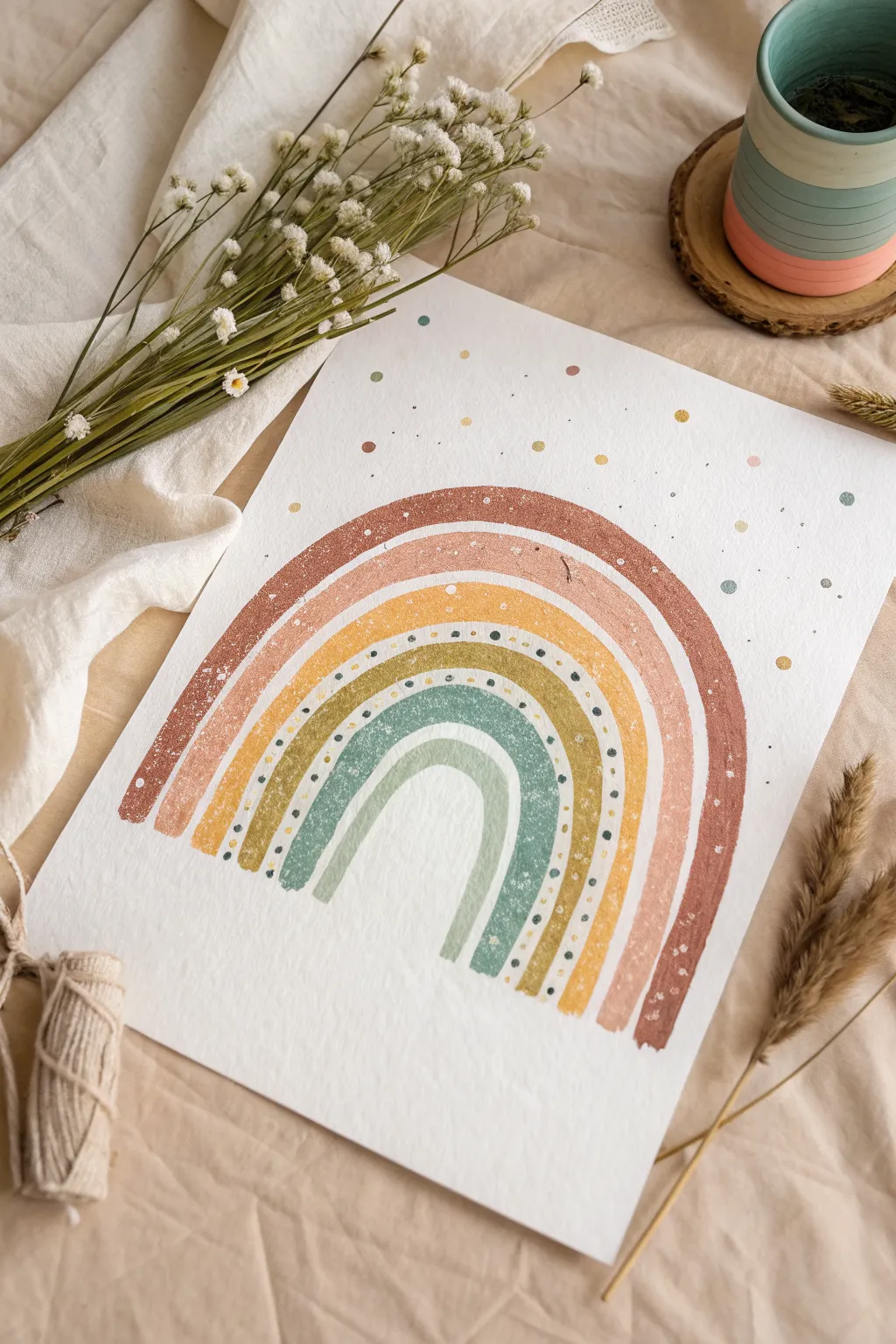
Embrace a relaxed, earthy vibe with this textured watercolor rainbow, featuring chunky bands in warm, muted tones. The gentle arches and playful speckled details make this piece feel organic and perfectly imperfect.
How-To Guide
Materials
- Cold press watercolor paper (A4 or similar size)
- Watercolor paints (terracotta, peach, mustard yellow, olive green, sage green)
- Round watercolor brushes (size 6 or 8 for bands, size 2 for details)
- Pencil
- Eraser
- Compass or round objects to trace (optional)
- Clean water
- Palette for mixing
- White opacity paint or white gel pen (optional for texture)
Step 1: Preparation and Sketching
-
Paper Setup:
Begin by taping down your watercolor paper to a flat surface using masking tape or washi tape. This prevents the paper from buckling when it gets wet and creates a clean border. -
Light Sketching:
Using your pencil, lightly sketch the rainbow arches. You can freehand these for a more organic ‘hippie’ look, or use a compass to mark out the spacing if you prefer symmetry. -
Defining the Bands:
Ensure you sketch out six distinct bands. The outermost band should be the thickest, while the innermost band can be slightly more delicate. Leave a small gap of white space between each band in your sketch.
Step 2: Painting the Arches
-
Mixing the Terracotta:
Mix a deep, warm terracotta color. Load your larger round brush and paint the outermost arch. Keep the edges slightly rough or ‘dry brush’ them slightly to create that textured, vintage feel. -
Adding the Peach Layer:
Mix a soft, muted peach or dusty rose shade. Paint the second band, being careful to leave a thin sliver of white paper between this band and the terracotta one. -
Mustard Yellow Arch:
Create a warm mustard yellow tone. Apply this to the third band. I like to vary the saturation slightly as I paint the curve to give it a hand-painted charm. -
Olive Green Band:
Mix an olive green shade. Paint the fourth band. This band is special because we will add detailed dots on top of it later, so aim for a fairly flat, even wash of color here. -
Sage Green Curve:
Mix a cooler, blue-green sage color for the fifth band. Paint this arch, following the curve of the previous bands. -
Inner Sage Arch:
For the final, smallest arch, thin out your sage green mixture with more water to make it lighter and more transparent. Paint this small semi-circle at the center. -
Drying Time:
Let the entire piece dry completely. The paper must be bone-dry before adding the next layer of details to prevent bleeding.
Pro Tip: Dry Brushing
For that rustic look, use less water on your brush for the outer bands. Letting the paper tooth show through the paint creates instant texture.
Step 3: Adding Texture and Details
-
Speckled Texture:
To mimic the gritty texture seen on the outer bands, you can do a light splatter. Load a stiff brush with slightly darker terracotta paint and flick the bristles to create tiny speckles on the red and peach bands. -
Scraping Technique (Optional):
If the paint is still slightly damp in some spots, you can gently scratch the surface with a dry toothpick to create white textured lines, mimicking the distressed look. -
Painting the Dots:
Take your smallest brush (size 2) and mix a dark grey or deep browntone. Carefully dab small dots along the center of the olive green (fourth) band. -
Spacing the Dots:
Try to space these dots evenly, following the curve of the rainbow. They define the shape and add a nice graphic element to the softness. -
Atmospheric Dots:
Using the leftover colors on your palette (terracotta, mustard, sage), paint scattered dots of various sizes in the empty white space above and around the rainbow. -
Final Micro-Splatter:
For a final cohesive touch, mix a very watery dark grey or black. Tap your brush firmly against your finger over the paper to create a fine mist of micro-dots across the whole sky area. -
Final Reveal:
Once absolutely everything is dry, carefully peel away the masking tape to reveal your crisp edges.
Level Up: Metallic Pop
Swap the mustard yellow paint for gold watercolor or ink. It adds a subtle shimmer that catches the light beautifully.
Hang your muted rainbow in a spot where you need a little calm and color
Easy Hippie Van Side View
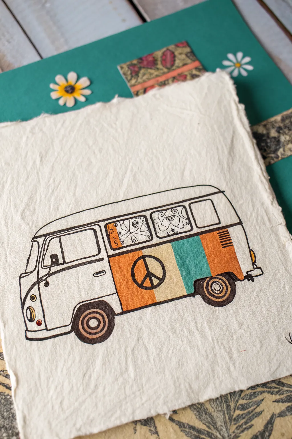
Capture the spirit of the 60s with this charming illustration of a classic VW bus on textured paper. The vintage color palette and iconic peace sign make this sketch an instant nostalgia trip perfect for journals or greeting cards.
Step-by-Step
Materials
- Textured handmade paper
- Pencil (HB or H)
- Eraser
- Fine liner pen (black, 0.5mm)
- Colored markers or watercolor pens (muted orange, teal, beige)
- Ruler (optional)
Step 1: Sketching the Outline
-
Establish the base shape:
Begin by drawing a long, horizontal rectangle with rounded corners for the main body of the van. Make the front end (left side) slightly curved and slanted backward to mimic the iconic bus nose. -
Add the roof line:
Draw a slightly arched line above your rectangle for the roof, connecting it smoothly to the front and back. It should look like a gentle cap sitting on the body. -
Define the windows:
Sketch a series of rectangles along the upper half of the body. Start with the driver’s side window, then add two passenger windows and a rear cargo window. Keep the lines somewhat loose to match the handmade feel. -
Add the wheels:
Draw two circles at the bottom of the van frame—one near the front door seam and one near the back. Add a smaller circle inside each for the hubcaps. -
Detail the front:
Sketch the split windshield detail if you want that classic look, and add the round headlight and smaller turn signal light on the front nose curve.
Step 2: Inking the Design
-
Trace the main lines:
Use your black fine liner to go over your pencil sketch. I like to keep my hand a little relaxed here so the lines aren’t perfectly straight, which adds character. -
Add window details:
Ink the window frames. For the middle windows, you can sketch in little curtain patterns—swirls or simple geometric shapes—to give it that lived-in camper feel. -
Drawing the side stripe:
Draw a horizontal line running the length of the bus, separating the top white section from the colorful bottom section. This line usually runs just below the windows. -
Create the peace sign:
In the center of the side panel, draw a large circle. Add the vertical line and the two downward diagonal lines to form the peace symbol. -
Clean up:
Once the ink is completely dry, gently erase all your underlying pencil marks so the drawing looks clean.
Ink Bleeding?
Handmade paper is very absorbent. Test your pens on a scrap edge first. If it bleeds, switch to colored pencils or crayons for the fill color instead.
Step 3: Adding Vintage Color
-
Color the stripes:
Using your markers, color the side panel in vertical blocks. Start with a muted orange block that contains the peace sign. -
Add the teal:
Next to the orange block, fill in a section with teal or turquoise. This classic color combination immediately screams ‘retro’. -
Finish the striping:
Add a final block of lighter beige or cream between the colors if you wish, or add another orange section at the rear. Fill the vents at the back with small black lines. -
Fill the wheels:
Color the tires with a dark grey or black, leaving the hubcaps light. You can add a touch of brown or orange to the center of the hubcap for extra detail. -
Shade the bumper:
Use a light grey marker or a very light touch with pencil to add a shadow to the front and rear bumpers to give them a metallic look. -
Tint the lights:
Add a small dot of yellow or orange to the front headlight and turn signal.
Level Up: Tie-Dye
Instead of solid blocks of color, use watercolors to create a miniature wash or tie-dye effect inside the peace sign panel for extra groovy flair.
Now you have a groovy piece of art that keeps the summer of love alive all year round


Round Hippie Glasses Sketches

Capture the laid-back vibe of the 60s with this clean, minimalist line drawing of classic round spectacles. The charm of this sketch lies in its simplicity and the delicate interplay of heavy outlines and fine details.
Step-by-Step Tutorial
Materials
- Sketchbook with cream or off-white paper
- Fine liner pen (size 0.5mm)
- Thicker drawing pen or marker (size 0.8mm or 1.0mm)
- Pencil (HB)
- Eraser
- Circular stencil or a small round object (like a bottle cap)
Step 1: Planning the Shapes
-
Position the lenses:
Start with your pencil to lightly map out the placement. Draw two circles side-by-side in the center of your page. Leave a gap between them about a quarter the width of one circle for the bridge. -
Connect the bridge:
Sketch a small, curved arch connecting the inner edges of your two circles to form the nose bridge. -
Map the temples:
Lightly draw diagonal lines extending from the outer edges of the circles toward individual vanishing points, indicating where the arms of the glasses fold back.
Step 2: Inking the Frames
-
Trace the outer rims:
Using your thicker pen (0.8mm or 1.0mm), trace over your pencil circles carefully. Go slowly to keep the line weight consistent and smooth. -
Thicken the bridge:
Ink the bridge connection, blending it seamlessly into the rims so it looks like one solid piece of metal or plastic. -
Add the hinges:
Draw small rectangular ‘nubs’ on the outer edge of each circle where the temples attach. Fill these in slightly to give them visual weight. -
Refine the circle shape:
If your initial circles look a bit shaky, go over them once more with the thick pen to correct any wobbles, making the frame look intentionally bold.
Wobbly Circles?
If you struggle with freehand circles, ghost the motion with your hand in the air several times before touching the pen to paper, or just trace a coin lightly with pencil first.
Step 3: Adding Detail & Depth
-
Draw the temples:
Switch to your finer pen (0.5mm). Draw the arms of the glasses extending backward. Notice how they cross behind the lenses in the drawing—capture that depth by stopping the line when it hits the rim and restarting it inside. -
Detail the nose pads:
Inside the gap between the lenses, draw small, bean-shaped nose pads using the fine pen. Add a tiny C-curve to show the metal arm holding the pad. -
Create the ear pieces:
At the end of the temple arms, draw the thicker plastic tips (earpieces). On the left side, shade the tip solidly black or add a stippled texture for a vintage plastic look. -
Define the hinge screws:
Add tiny squares or dots near the outer hinges to suggest the mechanical parts. -
Clean up:
Once the ink is completely dry, gently erase all your underlying pencil marks to reveal clean, crisp lines.
Make It 3D
Add a very thin, broken line on the inside of the lenses to suggest glass reflection. This subtle detail instantly makes the glasses look real rather than empty frames.
Step 4: Final Flourishes
-
Add a flower doodle:
To the right of the glasses, draw a small circle with the fine pen. Add simple straight lines radiating outward to create a dandelion puff or sun shape. -
Stem and leaves:
Draw a thin, slightly curved line down from the flower head, adding two simple leaf shapes near the bottom for a sweet, nature-inspired touch. -
Final heavy outline:
I like to take a look at the main circles one last time; if they need to pop more against the paper, trace just the outer edge again to make the frame look substantial.
Enjoy your groovy new artwork as a standalone piece or part of a larger retro collage
Easy Acoustic Guitar With Stickers
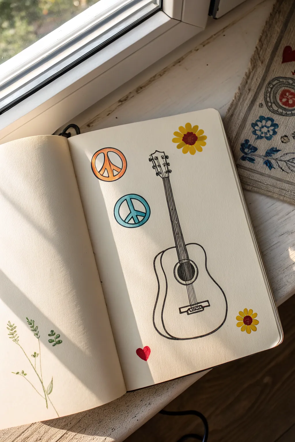
This charming sketchbook page combines a clean, illustrative acoustic guitar with colorful accents that evoke the feeling of stickers or pressed flowers. It’s a perfect beginner-friendly project that mixes simple line work with bold pops of retro color.
Step-by-Step Tutorial
Materials
- Sketchbook (heavyweight paper preferred)
- Pencil (HB or 2B)
- Eraser
- Fine liner pen (01 or 03 size, black)
- Thicker marker or brush pen (black)
- Colored markers or pencils (orange, teal, yellow, brown, red)
Step 1: Drafting the Guitar
-
Establish the body shape:
Start by lightly sketching a figure-eight shape for the guitar’s body. Make the bottom bout (the lower rounded part) significantly larger and wider than the upper bout to get that classic dreadnought look. -
Flatten the curves:
Refine the figure-eight by slightly flattening the bottom edge and the top shoulders of the body so it doesn’t look like a snowman. The ‘waist’ of the guitar should curve inward gently. -
Add depth:
To give the drawing a 3D effect, draw a second line mirroring the left side and bottom of the guitar body. This narrow strip represents the side wall of the instrument. -
Draw the neck and headstock:
Extend two parallel lines upward from the top of the body for the neck. At the top, flare them out slightly into a rectangular shape with wavy top edges to form the headstock. -
Locate the sound hole:
Draw a circle in the center of the upper body, right where the neck meets the body curves. Add two concentric circles around it for the rosette detail. -
Bridge placement:
Sketch a small rectangular shape below the sound hole. It should look like a thin bar with a slightly raised center section.
Step 2: Inking the Lines
-
Outline the body:
Using your fine liner, carefully trace over your pencil sketch of the guitar body. Keep your hand steady but don’t worry if the lines aren’t machine-perfect; a little waver adds character. -
Detail the headstock:
Ink the headstock shape. Add six small circles—three on each side—for the tuning pegs. Draw tiny lines connecting these pegs to the center of the headstock. -
Draw the strings:
Draw six straight lines running from the bridge, over the sound hole, and up the neck to the tuning pegs. I find using a ruler here helps keep everything crisp. -
Fill the sound hole:
Use your thicker black marker to fill in the innermost circle of the sound hole completely black. This creates instant depth and contrast. -
Finalize the bridge:
Ink the bridge rectangle. Add six tiny dots or small vertical dashes on the bridge to represent the bridge pins where the strings terminate. -
Erase guidelines:
Wait a few minutes for the ink to dry completely to avoid smudging, then gently erase all remaining pencil marks.
Pro Tip: String Spacing
Don’t stress about perfect spacing for the six strings. Drawing the two outer strings first provides boundaries, making it easier to space the inner four evenly.
Step 3: Adding the ‘Stickers’ and Details
-
Draw peace signs:
To the left of the guitar neck, draw two circles. Inside each, draw the classic peace symbol (a vertical line with two diagonal lines branching down). Vary their sizes for interest. -
Color the peace signs:
Use an orange marker to fill the top peace sign and a teal or light blue marker for the bottom one. Leave the inner shapes white for that graphic sticker look. -
Add flower accents:
Draw simple daisy shapes on the corners of the page—one near the top right, one near the bottom right. Give them rounded yellow petals. -
Detail the flower centers:
Color the centers of the flowers with a reddish-brown marker. Add a small red heart shape near the bottom left of the guitar body for a sweet finishing touch. -
Optional leaf sketch:
On the opposite page (left side), lightly sketch a simple, slender stem with small, paired leaves using a green pencil or fine liner to balance the composition.
Troubleshooting: Shaky Lines
If your long straight lines for the neck or strings look too wobbly, commit to the ‘sketchy’ style by going over them a second time loosely. It looks intentional!
Now you have a sketchbook page that radiates musical peace and creativity.
Hearts, Stars, and Sparkles Sticker Sheet
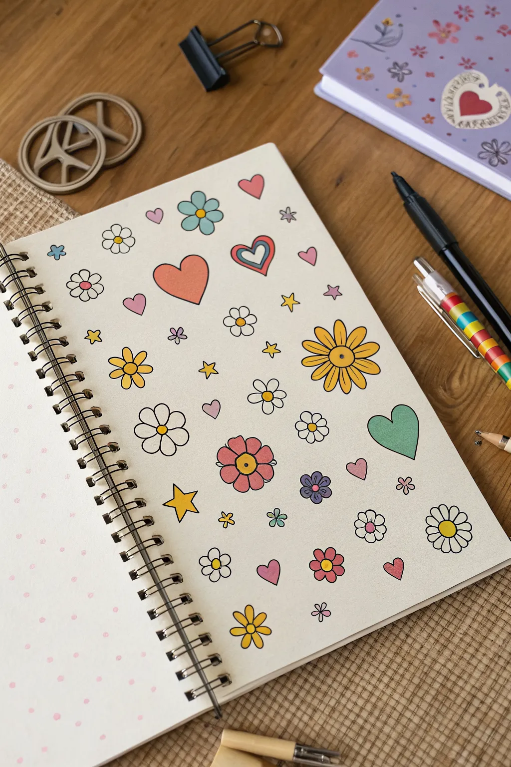
Channel the carefree spirit of the 60s and 70s with this vibrant collection of hand-drawn hippie motifs. This tutorialguides you through creating a sticker-sheet-style page filled with groovy flowers, funky hearts, and twinkling stars on dot grid paper.
Step-by-Step Guide
Materials
- Spiral-bound dot grid sketchbook or journal
- Fine-tip black fineliner pen (0.3mm or 0.5mm)
- Set of colored markers or felt-tip pens (muted/retro palette: mustard yellow, teal, coral pink, lavender)
- Pencil and eraser (optional for sketching)
Step 1: Planning and Layout
-
Start with the ‘Hero’ Elements:
Begin by lightly sketching or directly inking the largest motifs first to anchor your composition. Draw a large, simple heart in the upper center and a big, multi-petaled daisy on the middle-right side. These will serve as your main focal points. -
Space Out the Medium Flowers:
Surround your hero elements with medium-sized flower doodles. Place a five-petaled flower near the bottom left and a retro-style six-petaled daisy near the top left. Keep the spacing generous so the page doesn’t feel cluttered. -
Add Varied Heart Shapes:
Scatter different styles of hearts throughout the negative space. Try a nested heart (a heart within a heart) for variety, and tilt some of them at jaunty angles to give the page a sense of movement.
Step 2: Drawing the Details
-
Draw Simple Daisies:
Fill in smaller gaps with classic simple daisies. Start with a small circle center, then add 5-6 rounded petals radiating outward. Don’t worry about perfect symmetry; the wobble adds to the charm. -
Create Retro Stacked Flowers:
For the teal flower near the top, draw a central circle, then a layer of small petals, followed by a second layer of larger petals behind them. This layering effect is very characteristic of the style. -
Sketch the Stars:
Intersperse five-pointed stars into the remaining open areas. Alternate between traditional sharp-pointed stars and softer, more rounded stars to keep the texture interesting. -
Incorporate Tiny Filler Elements:
Look for any awkward empty spots and fill them with tiny accent drawings. Small single hearts, miniature four-petaled flowers, or little sparkles work perfectly here. -
Ink the Outlines:
If you started with pencil, carefully go over all your lines with a black fineliner. Use a consistent pressure to get a clean, bold look. I like to let the ink sit for a minute before erasing any pencil marks underneath to avoid smudging.
Bleed-Through Blues?
If your markers bleed through the paper, place a scrap sheet of cardstock underneath the page you are working on to protect the next fresh sheet.
Step 3: Adding Color
-
Color the Big Daisy:
Use a mustard yellow or gold marker to color the petals of your large daisy on the right side. Leave the center circle uncolored or use a contrasting orange for a pop. -
Fill the Hearts:
Color your hearts with shades of coral, pink, and mint green. For the nested heart, use two different colors—like blue on the outside and red on the inside—to emphasize the design. -
Brighten the Stars:
Select a bright yellow for your five-pointed stars. This helps draw the eye across the page and balances the heavier flower elements. -
Color the Retro Flowers:
For the multi-petaled flowers, use teal, muted purple, and soft pink. Try leaving the petals white and only coloring the center for some, or color the petals and leave the center white for others. -
Add the Green Heart:
Find a medium-sized heart, perhaps on the lower right, and fill it in with a solid, calm green. This breaks up the warm tones of the pinks and yellows. -
Detail the Smaller Blooms:
For the tiniest flowers, use a single color for the whole shape or just a dot of color in the center. This adds a delicate touch without overwhelming the design. -
Final Review:
Scan your page for any missed spots or uneven coloring. You can go back over areas to deepen the saturation if your markers look a bit streaky.
Sticker It Up
Draw these on adhesive label paper instead of a notebook. Cut them out individually to create your own custom sticker pack for decorating laptops or water bottles.
Enjoy flipping through your sketchbook and seeing this cheerful page of retro art
Groovy Bubble Lettering Words
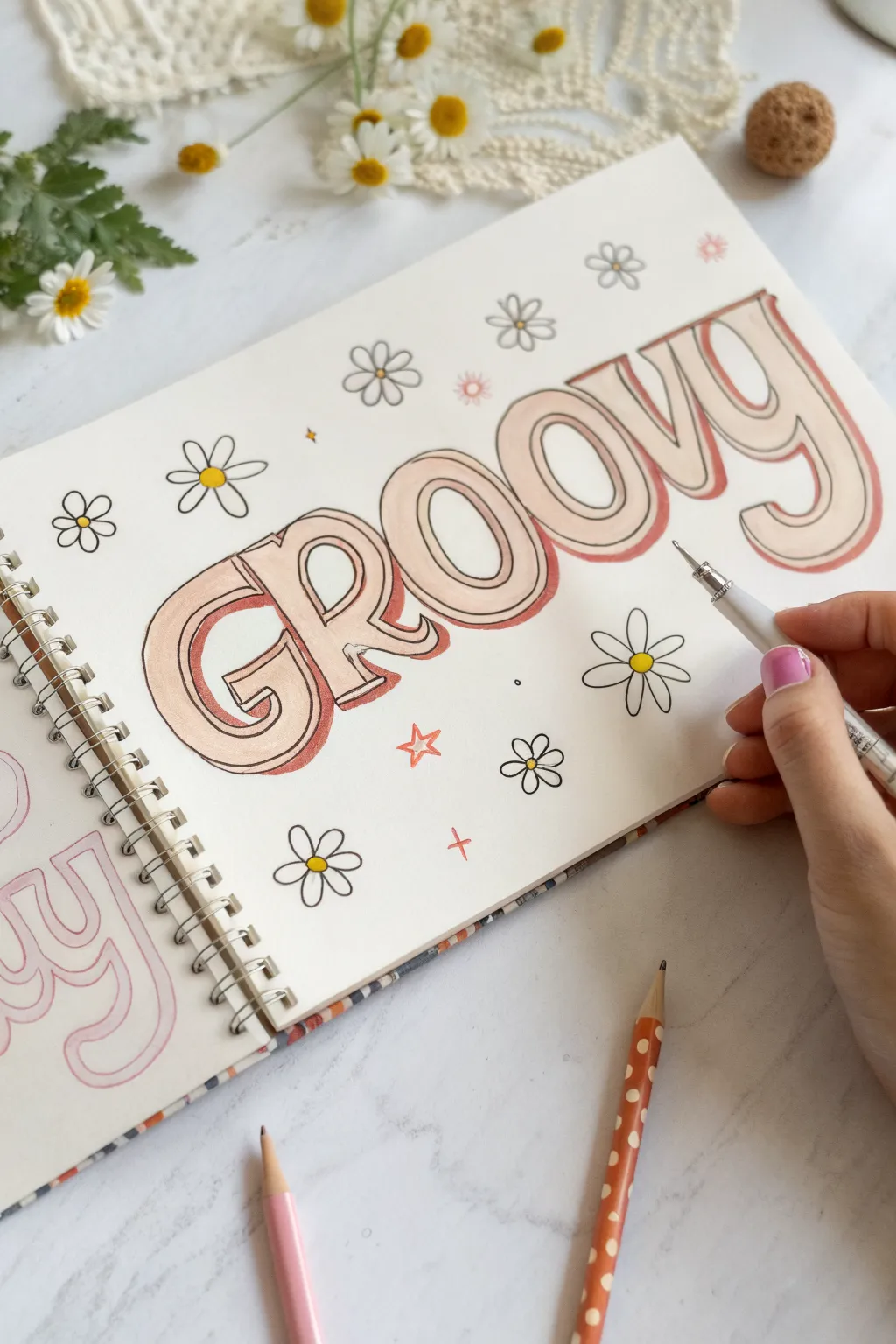
Transport yourself back to the 70s with this fun and simple hand-lettering project. Featuring bold, shadowed letters and whimsical daisies, this sketchbook page perfectly captures that nostalgic hippie aesthetic.
Detailed Instructions
Materials
- Sketchbook or drawing paper
- Pencil (light sketching)
- Eraser
- Light peach colored pencil or marker
- Rust/burnt orange colored pencil or marker
- Black fine-liner pen (0.3mm or 0.5mm)
- White gel pen (optional for highlights)
Step 1: Sketching the Bones
-
Pencil outline:
Start by lightly sketching the word ‘GROOVY’ in the center of your page with a pencil. Keep the spacing generous between letters. -
Identify the style:
Focus on a curvy bright style. The ‘G’ and ‘R’ should have rounded bottoms, and the ‘O’s should be perfectly oval, leaning slightly to the right for movement. -
Thicken the forms:
Draw around your skeletal lines to create thick, bubbly shapes. Make sure the width of the letter strokes is consistent. -
Add flair:
Extend the tails of the ‘R’ and the ‘Y’, giving them a slight upward curve at the end for extra character.
Clean Lines Tip
When inking long curves, try to move your whole arm rather than just your wrist. This prevents shaky lines and keeps the bubble letters looking smooth and professional.
Step 2: Defining the Letters
-
Internal lines:
Sketch a smaller, inner outline inside each letter. This creates a ‘hollow’ effect that we’ll color later. -
Inking the outline:
Take your black fine-liner and carefully trace over the outer pencil lines of your letters. -
Inner inking:
Ink the inner lines as well. Keep your hand steady to maintain even spacing between the inner and outer lines. -
Block shadow setup:
Visualize a light source coming from the top left. Sketch a 3D shadow block on the right and bottom sides of every letter curve. -
Ink the shadows:
Outline your 3D block shadows with the black fine-liner. I find it helps to rotate the sketchbook slightly to get the best angle for these curves. -
Erase guidelines:
Once the ink is completely dry, gently erase all the underlying pencil marks to leave a clean black-and-white design.
Step 3: Coloring and Details
-
Base fill:
Use the light peach pencil or marker to fill in the main face of the letters—the space between your inner and outer lines. -
Filling the shadows:
Take the darker rust-orange color and fill in the 3D block shadow areas you created on the right and bottom edges. This high contrast makes the letters pop. -
Drawing daisies:
Scatter simple daisy shapes around the word. Start with a small yellow circle for the center. -
Petal power:
Draw 5 or 6 looped petals around each flower center using your black fine-liner. -
Star accents:
Fill empty spaces with small hand-drawn stars. You can do simple five-point stars or small ‘plus sign’ sparkles. -
Color accents:
Use the rust-orange color to outline a few specific stars or add dots for visual balance.
Level It Up
Add white gel pen highlights on the upper left side of the peach letters and inside the rust shadows to make them look glossy and dimensional.
Enjoy your groovy new artwork and the peaceful vibes it brings to your sketchbook
Melting Smiley or Drippy Peace Sign

Capture a laid-back, retro vibe with this textured melting smiley face art piece. Using warm brown tones on watercolor paper creates a cozy, organic aesthetic perfect for minimal decor.
Step-by-Step Guide
Materials
- Cold press watercolor paper (textured)
- Brown watercolor paint (burnt sienna or sepia)
- Round watercolor brush (size 4 or 6)
- Fine liner brush (size 1)
- Pencil
- Compass or circular object (like a jar lid)
- Paper towel
- Water cup
Step 1: Sketching the Base
-
Trace the circle:
Begin by lightly tracing a circle onto your watercolor paper using a pencil and a circular object or compass. Keep the pressure very light so the graphite doesn’t show through the paint later. -
Add the face details:
Sketch two oval eyes slightly high in the circle and a wide, U-shaped mouth. The mouth should have small tick marks at the ends for that classic smiley look. -
Map out the drips:
Along the bottom arc of the circle, lightly draw 5 to 7 uneven drip shapes extending downward. Vary their lengths—some short, some long—and define how they connect to the main circle outline.
Uneven Drips?
If your drip outlines look shaky, wait for them to dry, then go over the outer edge with a fine-tip brown marker or pen to clean up the silhouette.
Step 2: Painting the Outline
-
Prepare your paint:
Mix a warm brown watercolor shade, like burnt sienna, with a small amount of water. You want a consistency that flows well but remains opaque enough to hold a sharp edge. -
Outline the top arc:
Using your medium round brush, carefully paint the outlining stroke of the top half of the smiley face. Aim for a consistent width, roughly 3-4mm thick. -
Connect to the drips:
Continue the outline down the sides, but instead of completing the circle at the bottom, transition smoothly into the drip shapes you sketched earlier. -
Fill the drip outlines:
Paint the outline of each drip. Don’t fill them in completely yet; just establish the thick border that defines the shape. Add a small detached droplet or two floating below the main drips for extra character. -
Refine edges:
While the paint is still damp, check your edges. If the textured paper caused any skipping, gently touch up those gaps for a smooth, continuous line.
Level Up
Use coffee instead of paint for the pale fill areas to add a genuine scent and an authentic aged-paper color to the artwork.
Step 3: Fading and Filling
-
Create a wash:
Dilute your brown paint significantly with water to create a very pale, transparent wash. -
Apply the inner tint:
Gently paint the interior of the drip shapes with this pale wash. I find this creates a nice gradient effect if you let it touch the still-damp darker outline, pulling a little pigment inward. -
Tint the lower face:
Brush a little of this pale wash along the bottom edge of the main circle interior, just above the drips, fading it out as you move upward toward the eyes. This gives the face a stained, vintage look.
Step 4: Painting Facial Features
-
Paint the eyes:
Switch back to your more opaque, darker paint mix. Fill in the two oval eyes completely, being careful to keep the edges crisp and oval-shaped. -
Paint the mouth:
Using the tip of your brush or a smaller liner brush, paint the smile line. Start from the center and sweep outward to ensure symmetry. -
Add the corners:
Add the small perpendicular tick marks at the corners of the mouth. Ensure the thickness of the mouth line matches the thickness of the outer circle for visual balance. -
Let it try:
Allow the piece to dry completely. If the paper buckles slightly, you can place it under a heavy book once it is bone dry. -
Erase pencil marks:
Once fully dry, gently erase any visible graphite lines that haven’t been covered by paint.
Now you have a groovy piece of art ready to frame or gift to a friend
Tie-Dye Swirls as Background Fills
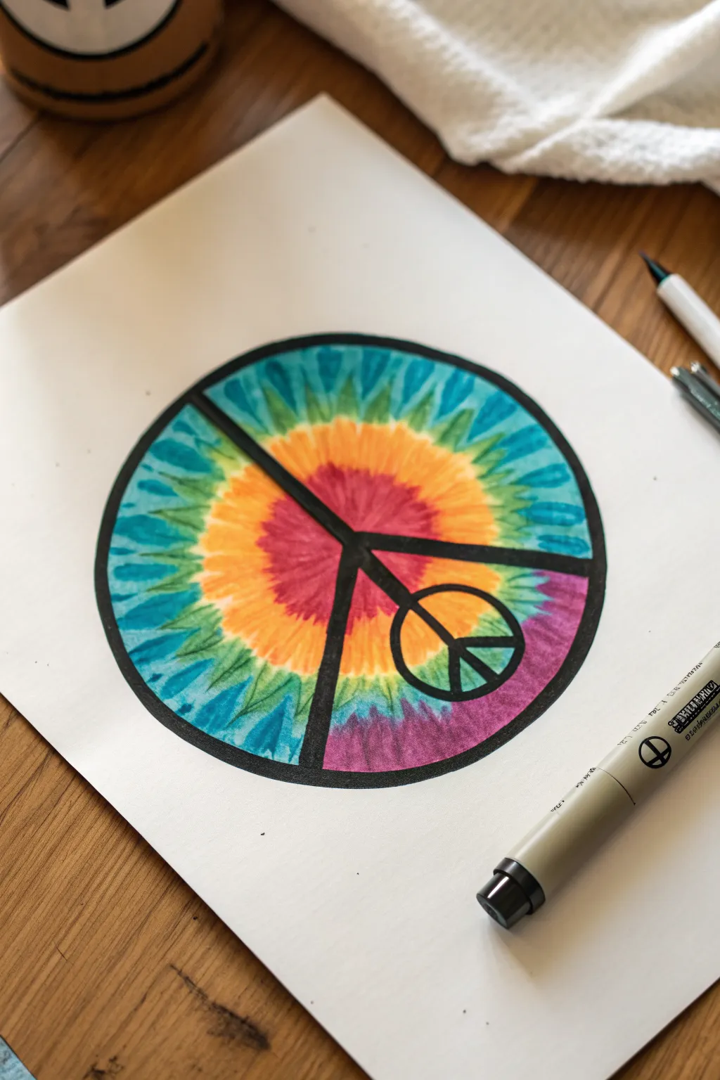
Capture the essence of the 60s with this vibrant drawing that combines a classic symbol with a colorful tie-dye technique. Using markers to mimic fabric dye creates a striking, radiant background that makes the bold black lines pop.
Step-by-Step
Materials
- High-quality white drawing paper or cardstock (smooth bristol works well)
- Pencil and eraser
- Compass or a circular object to trace (e.g., a bowl or lid)
- Ruler
- Black drawing pen (fine tip for outlines, thick chisel tip or brush pen for filling)
- Alcohol-based markers (yellow, orange, red, pink, purple, blue, turquoise, green)
- Scrap paper
Step 1: Drafting the Structure
-
Draw the main circle:
Start by positioning your compass in the center of the paper and drawing a large circle. If you don’t have a compass, trace a bowl or coffee can to get a perfect round shape. -
Sketch the inner lines:
Use your ruler to lightly draw a vertical line down the center. Then, draw two diagonal lines extending from the center point downwards to the rim, creating the classic peace sign ‘fork’ shape. -
Thicken the framework:
Turn those single lines into thick bars. Draw parallel lines on either side of your initial sketch lines to create a uniform thickness for the peace sign structure. -
Add the mini peace sign:
On the lower right diagonal leg of the main peace sign, draw a smaller circle overlapping the leg. Sketch the internal lines for this mini peace sign so it nestles perfectly onto the larger structure.
Bleeding Lines?
If your markers bleed outside the circle, simply thicken the outer black rim. A heavier outline can hide many mistakes and actually makes the artwork look bolder.
Step 2: Creating the Tie-Dye Fill
-
Start the center burst:
Begin coloring the tie-dye pattern from the center of the main circle, ignoring the black bars for now (you’ll color over them). Use a pink or red marker to create a jagged, starburst shape right in the middle. -
Add the orange ring:
Switch to an orange marker. Draw a jagged ring around the red center. Use outward strokes to mimic the bleeding effect of fabric dye, letting the orange slightly overlap the red. -
Layer the yellow:
Create the next ring using bright yellow. Keep the edges uneven and spiked. This layer acts as a glowing transition between the warm center and the cool outer edges. -
Transition to cool tones:
Next, use a green marker. Instead of a solid ring, try drawing jagged spikes that reach inwards toward the yellow, resembling a sunburst pattern. -
Fill the outer edges:
Move to your turquoise and blue markers. Fill the remaining space towards the rim of the circle with radial strokes. Vary the blues to create depth and texture. -
Detail the color bleed:
Go back in with your markers to blend the transitions. I find that overlapping the lighter colors onto the darker ones helps create that fuzzy, authentic tie-dye look. -
Color the bottom section:
Notice the bottom quadrant is purple? Use purple and pink markers to create a separate color zone at the bottom, blending it slightly into the green and blue areas near it.
Step 3: Finalizing the Linework
-
Outline the main circle:
Once the marker ink is dry, take your thick black pen. Carefully trace the outer perimeter of the large circle, creating a heavy, bold boundary. -
Define the structure:
Trace the internal lines of the large peace sign. Be sure to keep your lines straight and clean against the colorful background. -
Fill the black spaces:
Color in the thick bars of the main peace sign completely black. This high contrast covers any messy marker edges and brings the design together. -
Detail the mini sign:
Switch to a finer tip pen if necessary. Outline and fill the small peace sign on the lower right leg, ensuring the loop is open so the background pattern shows through. -
Clean up:
Wait a few minutes for the black ink to fully set, then gently erase any visible pencil marks that might still be showing through lighter areas.
Add Texture
Once the ink is dry, use a white gel pen to add tiny dots or ‘stitching’ lines along the tie-dye borders for extra fabric-like realism.
Now you have a groovy piece of art that looks just like a classic dyed shirt without the mess
Mandala Flower With Simple Repeats
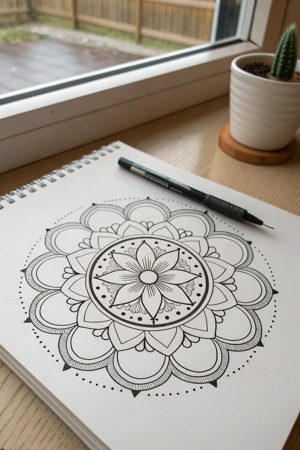
This soothing floral mandala brings together symmetrical petals and delicate dotwork for a mesmerizing effect. It’s a fantastic entry point into sacred geometry drawing, using simple repeating shapes that build up into something complex and beautiful.
Step-by-Step Guide
Materials
- White sketchbook paper (smooth grain)
- Fine liner pen (0.3mm or 0.5mm, black)
- Compass
- Protractor (optional)
- Pencil (HB or 2H for light lines)
- Eraser
Step 1: Setting the Foundation
-
Find the center:
Begin by marking a small dot in the very center of your page to anchor the entire design. -
Draw concentric circles:
Using your compass, draw a series of light guide circles. Start with a very small one for the center, a slightly larger one for the flower center, then expand outward with three more concentric rings, spacing them roughly equally to define the petal layers. Keep these pencil lines extremely faint. -
Divide the circle:
Lightly sketch lines dividing your circle into 8 equal sections like a pizza. This will ensure your flower petals remain symmetrical as you work around the center.
Steady Hand Trick
Rotate your sketchbook constantly as you draw. It’s much easier to pull your pen toward you in a consistent motion than to twist your wrist to draw curves at awkward angles.
Step 2: Drawing the Central Flower
-
Ink the core:
Switch to your fine liner. Draw a clean, solid circle over your smallest pencil guide. This is the heart of the flower. -
Draft the first petals:
Draw eight pointed, leaf-shaped petals extending from the center circle out to your first major guide ring. Each petal tip should align with one of your 8 dividing lines. -
Add petal details:
Inside each of the eight petals, draw a straight line down the middle. Then, carefully add fine parallel lines radiating from the center outward to create shading and texture. -
Create the border ring:
Draw a double circle around the tips of these petals. Fill the space between these two lines with small, evenly spaced dots to create a stippled border.
Step 3: Expanding the Mandala
-
Add secondary petals:
In the spaces between the first layer of petals (the ‘V’ shapes), draw small, rounded humps or scallops that touch the stippled border ring. -
Draw the main broad petals:
For the next layer, draw large, wide petals that curve gently. Base each one on the sections defined by your guide lines, creating a billowing flower shape. -
Layer the outer petals:
Behind the broad petals, sketch the final, largest layer of rounded petals. These should peek out from behind, creating depth. -
Define the outer edge:
Outline this final layer boldly. Then, draw a second line just inside the edge of each large outer petal to create a thin border. -
Fill with texture:
Inside these thin borders on the outer petals, draw tight, vertical hatch marks all the way around. This shading creates a nice contrast against the white paper.
Uneven Petals?
If your symmetry slips, don’t erase. Instead, thicken the outline of the uneven petal slightly to reshape it visually. The stippling and textured lines usually hide minor wobbly lines well.
Step 4: Final Flourishes
-
Add triangular accents:
At the very peak of each outer petal, draw a small, solid black triangle pointing outward. -
Draw the dot halo:
Working freely now, add a ring of small ink dots floating just outside the entire design. Try to follow the curvature of the petals. -
Refine the inner details:
Go back to the center band. Add subtle decorative flourishes or tiny leaves in the open spaces between the central star-flower and the stippled ring. -
Erase guidelines:
Once you are absolutely certain the ink is fully dry—I usually wait at least 15 minutes to be safe—gently erase all your pencil circles and dividing lines to reveal the crisp black and white art.
Now you have a centered, peaceful design perfect for coloring or leaving as a stark black-and-white piece
Cosmic Hippie Collage Icons
Create a charming cosmic spread in your journal featuring simple, clean-lined icons like mushrooms, celestial bodies, and rainbows. This beginner-friendly project uses fineliners and soft colors to achieve that classic minimal doodle aesthetic.
Step-by-Step
Materials
- Dotted or blank journal/sketchbook
- Black fineliner pens (sizes 0.3 and 0.5 recommended)
- Colored pencils or mild highlighters (pastel pink, yellow, mint green, orange, brown)
- Pencil for sketching
- Eraser
Step 1: Sketching the Layout
-
Prepare the page:
Begin with an open spread in your dotted journal. Using a light pencil, you’ll want to roughly plan where your larger elements will go to ensure the page feels balanced. -
Map out the Moon:
On the left page, sketch a large crescent moon shape. Keep the curve smooth and rounded. Inside the crescent, lightly mark out three or four circular craters of varying sizes. -
Sketch the Rainbow:
Below the moon, draw a simple arch for your rainbow using four concentric curved lines. Leave enough space between the lines so you can color them in easily later. -
Draft the Right Page Elements:
Move to the right page. Sketch a circle near the top center for the sun -
Add Mushrooms:
Toward the bottom right, sketch outline shapes for three mushrooms. Vary their caps—make one rounded, one slightly flatter, and maybe one tall and skinny. Don’t worry about details yet, just get the basic silhouettes. -
Plan the Filler:
Lightly scatter small stars, diamonds, and a small planet shape in the empty spaces between your main icons.
Step 2: Inking the outlines
-
Outline the Moon:
Using your 0.5 black fineliner, trace over your pencil lines for the crescent moon. For the craters inside, switch to a slightly thinner pen if you have one, or just use a lighter touch. -
Fill the Craters:
Color in half of the small crater circles with black ink to give them depth, or use stippling (tiny dots) inside them for texture. -
Define the Rainbow:
Carefully trace the rainbow arches. Try to keep your hand steady to make the curves parallel. If a line wobbles, just thicken it slightly to hide the bump. -
Ink the Sun:
On the right page, outline the central sun circle. Draw straight lines radiating outward for rays, alternating between long and short strokes for a playful look. -
Detail the Mushrooms:
Outline your mushroom caps and stems. Inside the caps, add tiny circles or spots for texture. On the stems, draw a few thin vertical lines to suggest fiber texture. -
Ink the Planet & Stars:
Trace the small planet and the scattered stars. For the four-pointed stars, draw a relaxed cross shape and connect the tips with curved inward lines. -
Erase Guidelines:
Wait at least five minutes to ensure the ink is completely dry, then gently erase all your pencil sketches so only the crisp black lines remain.
Steady Hands
Rest your wrist on a scrap piece of paper while drawing. This prevents smudging the ink you’ve already laid down and stabilizes your hand for smoother curves.
Step 3: Adding Soft Color
-
Color the Moon & Sun:
Take a yellow pencil or marker and fill in the sun circle. Leave the moon uncolored for a stark contrast, or shade it very lightly with pale grey. -
Rainbow Tones:
Fill the rainbow arches with alternating pastel colors. A combination of soft pink, mint green, and pale yellow works beautifully here. -
Mushroom Caps:
Color the mushroom caps using earthy tones like reddish-orange or soft brown. I like to leave the little spots inside the caps white to make them pop. -
Stem Shading:
Use a light beige or brown pencil to shade just the sides of the mushroom stems, leaving the center light to create a rounded, 3D effect. -
Star Accents:
Use your yellow and orange pencils to color in the scattered stars. You don’t have to stay perfectly inside the lines—a little overlap adds to the handmade charm. -
Connective Doodles:
Finally, use your finest pen to draw tiny squiggly lines or vines connecting some of the smaller stars, tying the composition together.
Add Sparkle
After coloring, use a white gel pen to add tiny highlights on the mushroom caps and the centers of the stars for a magical finish.
This simple spread is now ready to inspire your next journaling session
Psychedelic Frame Borders for Sketchbook Pages
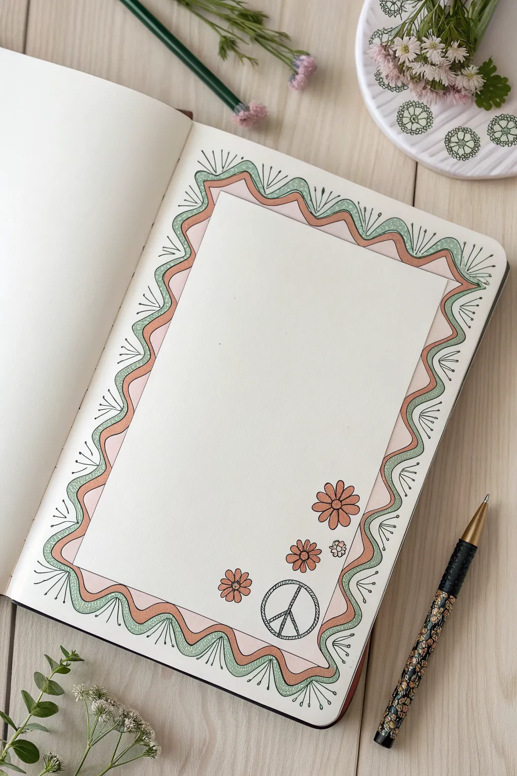
Transform a plain sketchbook page into a groovy canvas with this simple, wavy frame design. Featuring soft pastel tones and classic hippie motifs, this border creates the perfect space for journaling or doodling.
Detailed Instructions
Materials
- Sketchbook or drawing paper
- Pencil (HB or H)
- Eraser
- Fine liner pen (Black, 0.3mm or 0.5mm)
- Colored markers or pencils (Peach/Light Pink, Mint Green)
- Ruler (optional)
Step 1: Setting the Structure
-
Define the interior space:
Start by light penciling a rectangular box in the center of your page. This will be the negative space where you can write or draw later. Leave a generous margin of about 1.5 to 2 inches all around the edges. -
Draw the first wave:
Using your pencil, draw a continuous, free-flowing wavy line around the outside of your central rectangle. Let the peaks and valleys meander naturally, keeping them somewhat close to your pencil box but not touching it. -
Create the second wave:
Draw a second wavy line parallel to the first one, moving outward toward the edge of the page. Maintain a consistent gap between the two lines to create a ‘ribbon’ effect. -
Add the third wave:
Draw a third and final wavy line outside the second one. This creates two distinct bands or ribbons that will hold our color later. -
Clean up guidelines:
Once you are happy with the flow of your waves, erase the initial sharp rectangular guide box in the center, leaving just the wavy frame structure.
Smooth Moves
Draw the wavy lines by moving your whole arm from the shoulder, not just your wrist. This creates much smoother, more natural-looking curves.
Step 2: Inking lines and details
-
Ink the main waves:
Take your black fine liner and carefully trace over your three penciled wavy lines. Try to keep your hand steady for smooth curves. -
Add radiating lines:
Along the outermost wavy line, draw small, straight lines radiating outward into the white space. Place these at the ‘peaks’ of the waves (the parts pointing to the page edge). -
Detail the radiating lines:
At the tip of each radiating line, add a tiny dot or circle for a decorative touch. -
Add inner radiating lines:
Repeat the process on the innermost wavy line, drawing small sticks pointing inward toward the center of the page. Place these in the ‘valleys’ of the wave. -
Erase pencil marks:
Wait a moment for the ink to dry completely, then gently erase all remaining pencil lines to keep the page clean.
Step 3: Coloring and Embellishing
-
Color the inner band:
Select your peach or light pink marker. Fill in the inner wavy band completely. I find that long, smooth strokes help prevent streakiness here. -
Color the outer band:
Switch to your mint green marker or pencil. Fill in the outer wavy band, being careful to stay within the inked lines. -
Add texture to the green band:
Once the green ink is dry, use your black pen to add tiny stippling dots or subtle texture marks inside the green band to give it a slightly organic feel. -
Draw corner flowers:
In the bottom right corner of the central white space, draw three simple daisy-like flowers. Start with a circle center and add looped petals around it. -
Add the peace sign:
Near the flowers, draw a circle. Add a vertical line through the center, and two diagonal lines branching downward from the center point to the rim. -
Thicken the peace sign:
Go back over the peace sign lines to give them a ‘sketched’ or double-line look, making the symbol look bolder. -
Color the motifs:
Use the peach marker to color the flower petals and a contrasting color (or the green) for the centers to tie everything together.
Go Metallic
Trace the peace sign or the flower centers with a gold gel pen or metallic marker to give the page a subtle 1970s glam rock shimmer.
Now you have a beautifully framed page ready for your favorite quotes or daily thoughts
Have a question or want to share your own experience? I'd love to hear from you in the comments below!