If you’re craving indie painting ideas that feel bold, a little retro, and totally doable, you’re in the right headspace. I’m sharing easy concepts that look high-impact fast—think wavy lines, punchy color, and iconic indie-kid symbols you can repeat without stressing the details.
Wavy Checkerboard Background
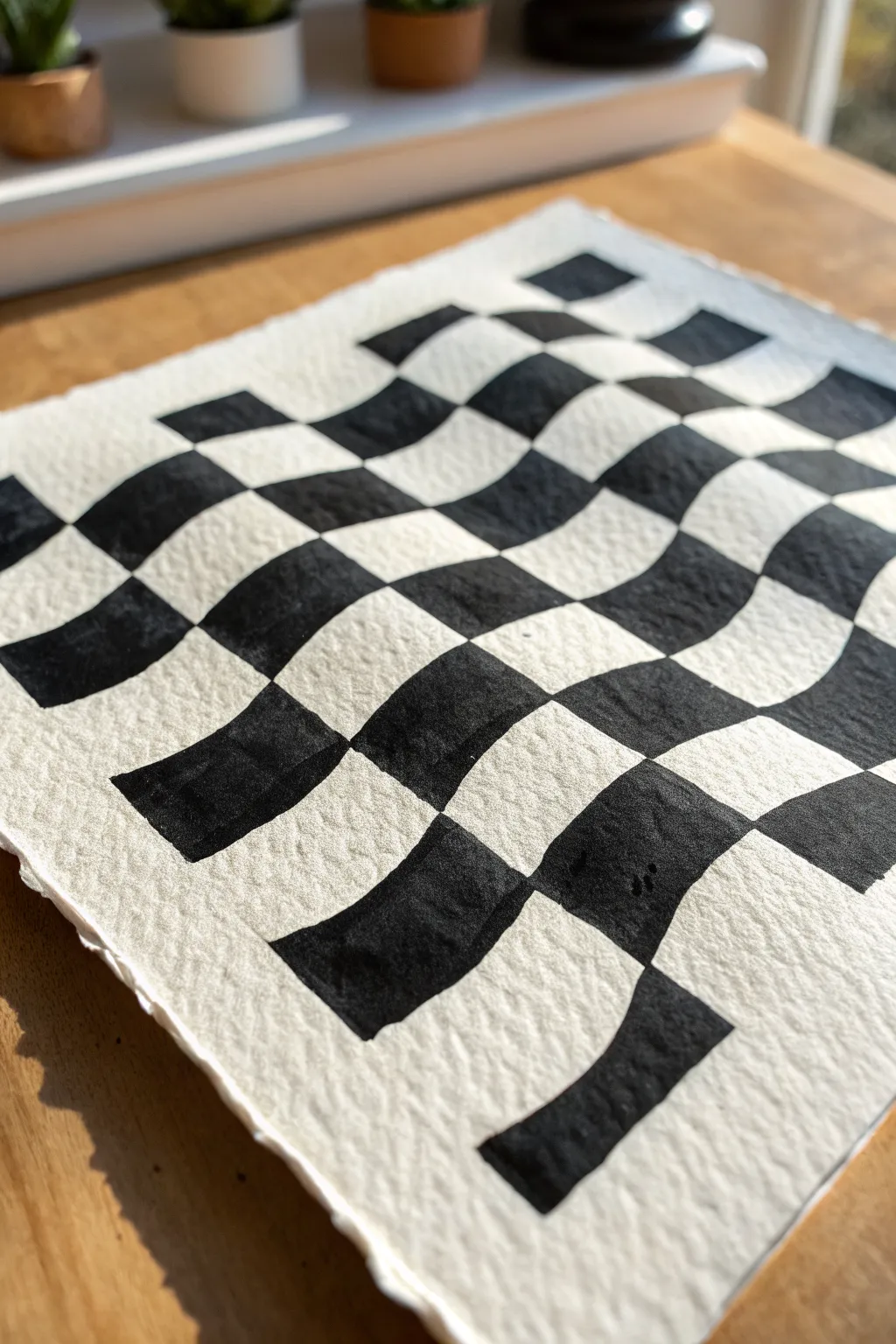
This trippy checkerboard design takes a classic pattern and gives it a surreal twist, making the grid appear to flow like fabric. Using high-texture paper adds a beautiful tactile quality that enhances the indie aesthetic.
Step-by-Step
Materials
- Heavyweight cold press watercolor paper (300gsm or higher)
- Black ink, gouache, or high-flow acrylic paint
- Pencil (HB or H)
- Eraser
- Ruler
- Small flat brush or angled shader brush
- Fine liner pen (optional, for edges)
- Water cup and palette
Step 1: Drafting the Grid
-
Prepare the paper:
Start with a piece of heavy watercolor paper. If you want that beautiful torn look shown in the reference, create deckled edges by folding and tearing the paper against a ruler instead of cutting it with scissors. -
Mark the vertical guides:
Using a ruler, lightly mark even intervals along the top and bottom edges of your paper. These ticks will tell you where your vertical lines should start and end. -
Sketch the wavy verticals:
Connect your top and bottom marks with flowing, S-shaped curves. Don’t use a ruler here; draw these freehand to create organic movement. Try to keep the curves parallel to each other so the ‘flow’ looks consistent. -
Mark horizontal intervals:
Along the left and right edges, make light tick marks to guide your horizontal rows. Space them relatively evenly, though they don’t need to be perfect. -
Draw the wavy horizontals:
Connect lines across the paper horizontally. Following the flow of your vertical waves, allow these lines to dip and rise slightly. The intersection of these two sets of distinct waves creates the distorted grid. -
Refine the grid:
Step back and look at your pencil grid. If any squares look too small or too large compared to their neighbors, adjust the lines now before breaking out the paint. -
Mark the black squares:
To avoid a headache later, place a tiny ‘x’ or dot lightly in every square that needs to be painted black. It is incredibly easy to lose track of the checkerboard pattern once you start painting.
Clean Lines Hack
Work slow. Since the lines are curved, you can’t use painter’s tape. Use a very small angled brush to cut in the curves before filling the center.
Step 2: Painting the Pattern
-
Outline the first square:
Start at the top left corner. Using your brush or a fine liner, carefully outline the edges of your first marked square. This crisp edge is key to the optical illusion. -
Fill the shape:
Fill in the outlined square with solid black. I prefer using gouache here because it dries matte and opaque, sitting nicely on the textured paper. -
Work diagonally:
Instead of going row by row, try painting in diagonal lines. This helps prevent wet paint from getting smudged by your hand as you move across the paper. -
Manage the corners:
Pay special attention where the black squares touch at the corners. They should meet at a precise point. Use the very tip of your brush to get these intersections sharp. -
Watch the texture:
Because cold press paper has bumps (called ‘tooth’), you might need to press your brush down firmly to push paint into the little crevices for solid coverage. -
Rotate your paper:
Don’t be afraid to turn the entire page as you work. It is often easier to pull a brush stroke toward you than to push it away or paint sideways. -
Check for gaps:
Hold the paper up to the light to see if any white speckles are showing through your black paint. Touch up these areas to ensure a deep, solid black. -
Erase pencil lines:
Once the paint is completely bone-dry—give it at least 20 minutes—gently erase the visible pencil marks in the white squares. Be careful not to smudge the dark paint.
Fixing Smudges
If you accidentally get black paint in a white square, let it dry fully, then paint over the mistake with opaque white gouache or acrylic.
Display your wavy optical illusion on a shelf or frame it to add a modern, graphic touch to your space
All-Seeing Eye Doodles
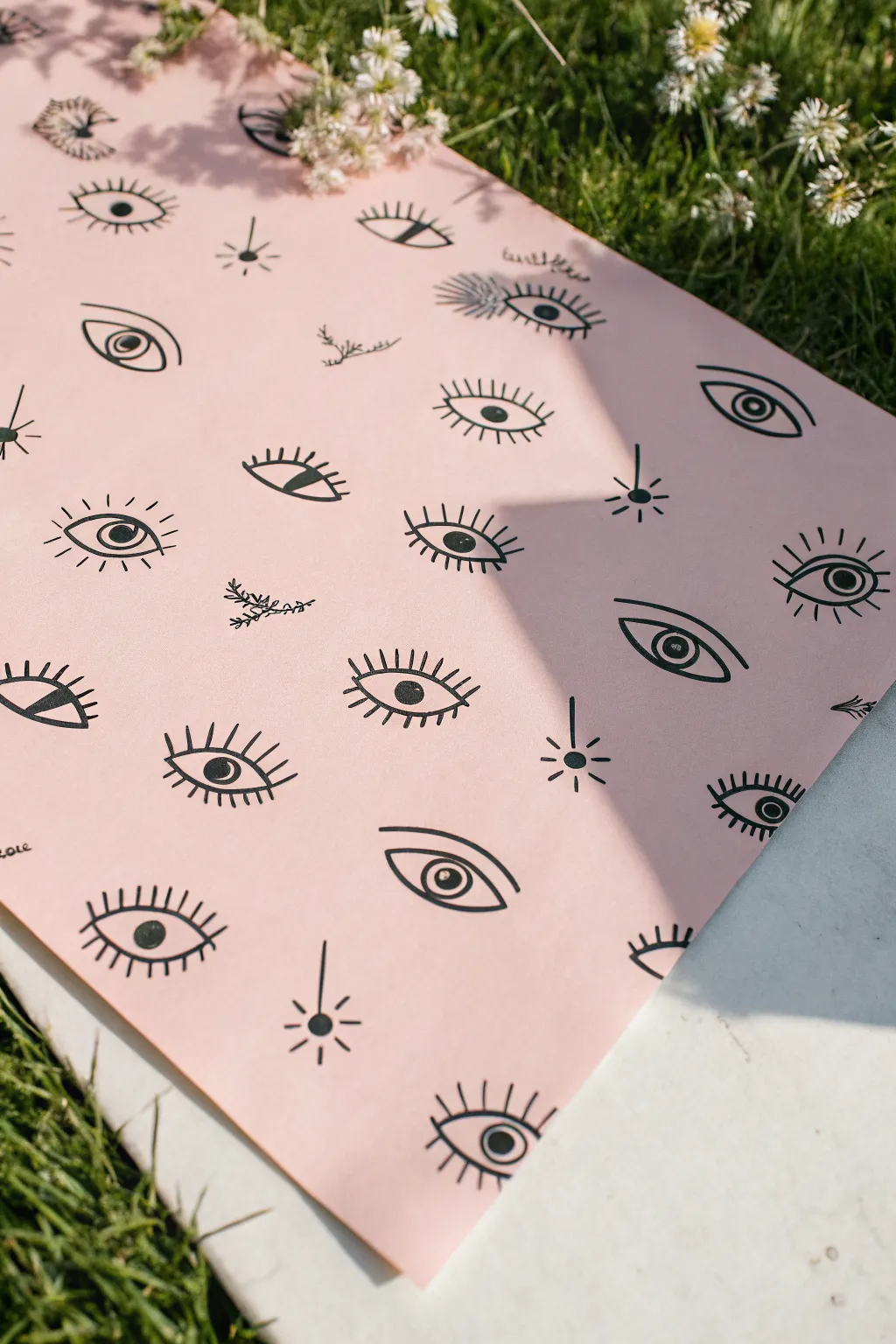
Bring a touch of cosmic energy to your space with this doodle-centric art project featuring a field of styled all-seeing eyes. The repeating motif on soft pink paper creates a modern, indie-inspired aesthetic that is deceptively simple to achieve.
Step-by-Step Tutorial
Materials
- Large sheet of pale pink cardstock or heavy drawing paper
- Thick black felt-tip marker or brush pen
- Fine-point black liner pen or pigment liner
- Pency
- Eraser
- Ruler (optional)
Step 1: Planning and Layout
-
Prepare your canvas:
Lay your large pink sheet on a flat, clean surface. Smooth out any curls if the paper came from a roll, perhaps weighing down the corners with books for a moment. -
Establish the rhythm:
Before committing to ink, visualize an alternating grid. You don’t need perfect measurements, but imagine rows where the eyes are roughly staggered like bricks to create an organic flow. -
Sketch the primary shapes:
Using your pencil very lightly, draw the basic football-shaped outlines of the eyes. Keep them relatively uniform in size but allow for slight hand-drawn variations to maintain the indie charm. -
Add variety:
Sketch a few variations in your pencil layer. Some eyes can be wider, some narrower. Leave plenty of negative space between them for the lashes and smaller filler doodles.
Step 2: Inking the Eyes
-
Outline the lids:
Take your thicker black marker and trace over your pencil outlines. Use a confident, sweeping motion for the upper and lower curves of the eye shape. -
Draw the irises:
Inside the eye shapes, draw the circles for the irises. Again, vary these slightly; some can be standard circles, while others can be half-hidden by the upper lid. -
Detail the pupils:
With the same marker, fill in the solid black pupils in the center of the irises. I like to leave a tiny sliver of white space in some of them as a highlight to make them look alive. -
Create the lashes:
Switch to your fine-point liner if you want differentiation, or stick to the bold marker for a uniform look. Draw straight lines radiating from the lids. For some eyes, only do top lashes; for others, do full lashes all around. -
Add double lids:
Above a few of the eyes, draw a floating arc parallel to the top lid. This small detail adds depth and anatomical suggestion to the simple doodles.
Ink Bleeding?
If your marker bleeds into the paper, switch to a pigment liner or a pen specifically labeled ‘archival ink.’ Test on a scrap piece of the same pink paper first.
Step 3: Adding Filler Elements
-
Draw starbursts:
Find the larger gaps between your eye motifs. Draw simple ‘sparkle’ shapes—a central dot with lines radiating outward like a compass rose or a simple cross. -
Insert botanical sprigs:
Look for other empty pockets of pink space. Sketch tiny, delicate branches with small leaves or buds using the fine-point liner. These soften the intense gaze of the repeating eyes. -
Add floating accents:
In the remaining negative space, add very small dots or tiny crosses. These act as confetti, tying the whole composition together.
Mix Up Designs
Make the pattern dynamic by varying the eye styles: try some with heavy lids, some looking sideways, and others with decorative dots under the lower lash line.
Step 4: Finishing Touches
-
Let it dry completely:
Give the ink a good 10-15 minutes to settle. Smudging a near-finished piece is heartbreaking, so patience is key here. -
Erase guidelines:
Gently run your eraser over the paper to remove any visible pencil sketches. Hold the paper taut with one hand while erasing to prevent wrinkling. -
Final assessment:
Step back and look at the pattern as a whole. If a specific area looks too empty, draw one last small star or dot to balance the visual weight.
Hang your new patterned art piece on the wall or use it as unique wrapping paper for a special gift
Groovy Sun With a Face
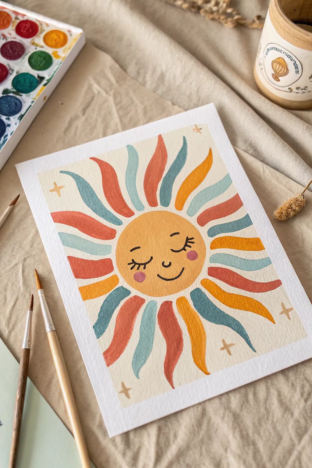
Warm up your space with this charming, vintage-inspired sun painting that radiates gentle positivity. With its soft, muted color palette and wavy, organic rays, this piece captures a cozy, indie aesthetic perfect for a bedroom wall or creative nook.
How-To Guide
Materials
- Cold press watercolor paper (A4 or 9×12 inch)
- Gouache or watercolor pan set (specifically yellow ochre, terracotta, teal/sage, muted orange)
- Round synthetic brushes (size 4 and 8)
- Pencil for sketching
- Kneaded eraser
- Fine liner or small detail brush (size 0) for facial features
- Paper towel
- Water jar
Step 1: Sketching the Layout
-
Center the Face:
Begin by lightly sketching a perfect circle in the direct center of your paper. You can trace a bowl or masking tape roll if you want it precise, but a hand-drawn circle adds to the organic indie charm. -
Map the Rays:
Lightly sketch wavy, flame-like shapes radiating outward from the circle. Aim for about 16-18 rays total, ensuring they vary slightly in curve and movement but maintain a consistent length. -
Add Facial Features:
Inside the central circle, sketch the sleepy face. Draw two curved lines for closed eyes with long lashes, a tiny ‘u’ nose, and a gentle smile. Don’t forget two small circles for the rosy cheeks. -
Scatter the Stars:
In the empty corner spaces, pencil in small four-pointed star shapes to balance the composition.
Step 2: Painting the Sun
-
Base Color for the Face:
Mix a warm yellow ochre or mustard shade. Using your size 8 brush, fill in the central circle. Keep the paint fluid but opaque enough to cover the white of the paper. -
Preserve the Sketch:
While painting the face, carefully paint *over* your pencil sketch for the features since gouache is opaque, but if using transparent watercolors, you might want to carefully paint around the features or deepen the pencil lines later. -
First ray color: Terracotta:
choose a muted terracotta or rusted red shade. Paint every third or fourth ray with this color, following the wavy sketch lines carefully with the tip of your brush. -
Second ray color: Teal:
Mix a soft teal or sage green. Fill in the next set of rays adjacent to your terracotta ones, ensuring the wet edges don’t touch if they are still damp. -
Third ray color: Mustard:
Using a similar yellow-orange tone to the face (but perhaps slightly darker or more orange), fill in the remaining rays to complete the pattern. -
Refining Edges:
Go back over the tips of the rays with your smaller brush to ensure they have sharp, tapered points.
Uneven Coverage?
If your gouache looks streaky, let the first layer dry completely, then apply a second thin layer. Don’t overwork wet paint, or it will lift the layer below.
Step 3: Details & Finishing Touches
-
Adding the Cheeks:
Once the yellow face is completely dry, mix a soft pink or coral. Paint the two small cheek circles. I find dabbing the brush gently creates a softer edge than drawing a hard circle. -
Defining the Eyes:
Using a very fine brush (size 0) or a black micron pen, carefully trace the closed eyelids and draw the eyelashes flicking outward. -
Nose and Mouth:
Paint the small ‘u’ shape for the nose and the curved smile line in the same dark brown or black tone. -
Painting the Sparkles:
Use a light gold or beige color to fill in the four-pointed stars you sketched in the corners. -
Erase Stray Lines:
Wait until the painting is bone dry—touch it lightly with the back of your finger to check. Then, gently use a kneaded eraser to lift any visible pencil marks around the rays.
Go Metallic
Once the paint is dry, use gold metallic watercolor or a gold leaf pen to outline the sun rays or fill in the corner stars for a magical, shimmering effect.
Hang your sunny creation in a spot that needs a little extra warmth and enjoy the retro vibes

Moon Face and Stars
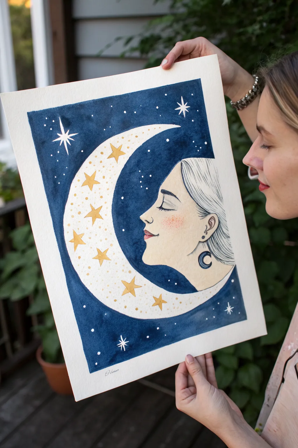
This dreamy watercolor illustration combines a serene profile portrait with celestial whimsy, featuring a moon-cradled face against a deep indigo sky. The contrast between the stark white paper, golden stars, and the dark wash creates a striking, magical effect perfect for indie art lovers.
Detailed Instructions
Materials
- Cold press watercolor paper (minimum 140lb/300gsm)
- Watercolor paints (Indigo, Payne’s Gray, Yellow Ochre, Burnt Sienna)
- Gold metallic paint or gold gouache
- Fine liner pens (black, 0.1mm and 0.5mm)
- White gel pen or white gouache
- Masking tape
- Pencil (HB) and eraser
- Round watercolor brushes (size 2, 6, and 10)
- Palette for mixing
Step 1: Drafting the Design
-
Tape the borders:
Begin by taping down all four edges of your watercolor paper to a board or table. This creates that crisp, professional white border shown in the reference and prevents the paper from buckling when wet. -
Sketch the moon shape:
Lightly sketch a large crescent moon shape on the left side of the paper. Instead of closing the inner curve, leave it open where the face will emerge. -
Profile placement:
Draw the profile of the face looking to the left, nestled inside the curve of the moon. Focus on a gentle brow, a soft nose, and closed eyes to convey peacefulness. -
Hair and details:
Sketch flowing hair tucked behind the ear, extending down to form the bottom curve of the moon shape. Add the ear detail and draw a small crescent moon earring. -
Star placement:
Plan the placement of the larger stars on the moon’s surface and the major stars in the background. Keep the pencil lines very faint so they disappear under the paint.
Step 2: Painting the Elements
-
Skin tone base:
Mix a very dilute wash of Yellow Ochre and a tiny touch of Burnt Sienna. Apply this wash gently to the face area, keeping it very pale and transparent. -
Blushing technique:
While the skin wash is still slightly damp, drop a slightly more saturated mix of pink or burnt sienna onto the cheek area and the tip of the nose to create a soft, natural blush. -
Golden stars:
Using your gold metallic paint or a yellow-gold watercolor mix, carefully paint in the geometric stars scattered across the moon’s surface. Let these dry completely before moving on. -
Moon texture:
Add tiny dots of the gold paint or a dilute yellow wash across the white space of the moon to give it a speckled, magical texture without filling it in completely.
Clean Edges Pro-Tip
For the crispest stars, reserve the white paper using masking fluid before painting the blue sky. Peel it off after the paint dries to reveal perfect white stars.
Step 3: The Night Sky
-
Mixing the indigo:
Prepare a large amount of deep blue paint. I recommend mixing Indigo with a little Payne’s Gray to get that rich, midnight shade visible in the reference. -
Outline the shapes:
Using a smaller size 2 or 6 brush, carefully paint the dark blue around the complex edges of the moon, stars, and hair. This ‘cutting in’ technique ensures clean edges. -
Filling the background:
Switch to your larger size 10 brush and fill in the rest of the background rectangle. Work efficiently to keep a wet edge, which prevents streak marks in the dark wash. -
Lifting pigment (optional):
If you want a slightly varied sky texture, touch the wet paint with a thirsty, semi-dry brush in a few spots to lift a little color, creating subtle nebulous clouds. -
Initial drying:
Allow the dark background layer to dry completely. This is crucial—if you touch it while damp, you’ll ruin the velvety texture.
Patchy Background?
If your dark blue background looks streaky, wait for it to dry 100%, then apply a second layer of the same indigo mix. Glazing evens out the tone wonderfully.
Step 4: Inking and Finishing
-
Facial features:
Once the paper is bone dry, use a 0.1mm fine liner to draw the eyelashes, eyebrow, nostril, and lips. Use a delicate hand here; the lines should be thin and elegant. -
Hair strands:
Use the fine liner to draw long, sweeping lines for the hair. Follow the curve of the head and let the lines flow naturally into the crescent shape. -
Earring detail:
Fill in the crescent moon earring with solid black ink or dark blue paint to make it pop against the pale skin tone. -
Bright stars:
Using a white gel pen or opaque white gouache, draw the sharp, four-pointed stars in the dark blue background. Add tiny white dots scattered around for distant stardust. -
Final touches:
Add a few tiny white dots or highlights to the gold stars on the moon for extra sparkle. Gently peel off the masking tape to reveal your crisp white border.
Sign your name in the bottom border and enjoy the peaceful vibe of your celestial portrait
BRUSH GUIDE
The Right Brush for Every Stroke
From clean lines to bold texture — master brush choice, stroke control, and essential techniques.
Explore the Full Guide
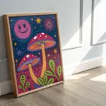
Neon Mushroom Cluster
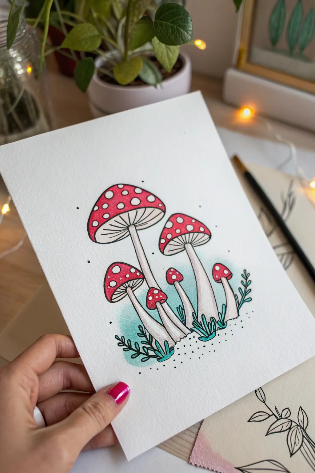
Capture the charm of the forest floor with this delightful illustration featuring a cluster of classic red-capped mushrooms. This project combines crisp linework with gentle shading to create artwork that feels both rustic and modern.
Step-by-Step Guide
Materials
- Heavyweight smooth drawing paper or mixed media paper
- Fine-tip black drawing pen (sizes 01 or 03)
- Red alcohol marker or watercolor paint
- Light warm grey marker or colored pencil
- Aqua green marker or watercolor paint
- White gel pen
- Pencil and eraser
Step 1: Sketching the Layout
-
Outline the Main Caps:
Begin with a faint pencil sketch to place your mushrooms. Start with the largest mushroom cap on the left, drawing a wide, rounded cone shape. Add a slightly smaller cap to its right, tilting it slightly for variety. -
Add Smaller Companions:
Sketch three smaller mushrooms nestled below the larger ones. Place one medium-sized cap on the left, and two tiny, slender ones peeking out between the stems on the right. -
Draw the Stems:
Extend long, slightly curved stems downward from the center of each cap. Make the stems wider at the base where they meet the ground and slightly thinner as they connect to the gills. -
Detail the Gills:
Underneath each cap, draw a curved line connecting the rim to the stem. Lightly sketch radiating lines from the stem to the cap edge to represent the gills.
Uneven Color Fix
If your marker strokes look streaky on the red caps, go over the area a second time in a circular motion while the ink is still wet to blend it smoother.
Step 2: Inking the Lines
-
Define the Outlines:
Using your fine-tip black pen, trace over your pencil lines. Use a steady hand to create smooth, continuous curves for the caps and stems. -
Add Gill Texture:
Carefully draw the lines for the gills. Keep these lines very thin and precise, radiating outward like spokes on a wheel. -
Draw Botanical Elements:
At the base of the stems, ink in small, stylized leafy sprigs. Use simple teardrop shapes for leaves on the left and thinner, vine-like strokes on the right. -
Erase Guidelines:
Once the ink is completely dry—give it a full minute so it won’t smudge—gently erase all your original pencil markings to leave a clean black-and-white drawing.
Level Up: Glow Effect
Use a white colored pencil to lightly shade around the outside of the white spots on the red caps. This creates a subtle, glowing halo effect.
Step 3: Adding Color
-
Color the Caps:
Fill in the top of the mushroom caps with a vibrant red marker or watercolor. Leave small circular areas blank if you want natural white spots, or color it solid and add spots later. -
Shade the Stems:
Using a very light warm grey marker or colored pencil, add shadows to the stems. Focus the shading on the right side of each stem and just under the cap to create cylindrical volume. -
Create a Soft Backdrop:
With an aqua green marker or diluted paint, add a soft wash of color behind the lower stems and leaves. Keep edges soft and irregular to give it an organic feel. -
Define the Leaves:
Add touches of the same aqua green to the small leaves at the base. You don’t need to fill them perfectly; a rough fill adds to the artistic style.
Step 4: Finishing Details
-
Brighten the Spots:
Use an opaque white gel pen to draw crisp white polka dots on the red caps. Vary the sizes of the dots for a more natural look. -
Highlight the Stems:
If you used a grey marker for shading, you can add tiny white lines or dots to the lightest side of the stems for extra dimension. -
Atmospheric Dots:
Add tiny black stippling (dots) around the base of the mushrooms and floating in the background air. Concentrate the dots near the bottom for a ‘grounding’ effect. -
Final Contrast Check:
Look over your piece. If any outline lines were dulled by the coloring process, re-trace them gently to make the artwork pop.
Step back and admire your charming woodland scene, ready to be framed or gifted
Daisy and Flower Power Grid
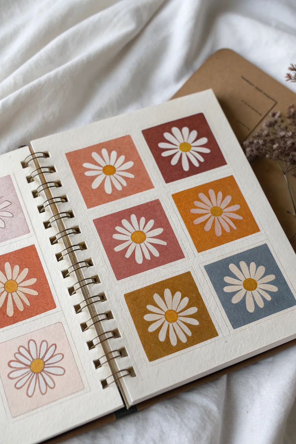
Capture the essence of retro flower power with this structured yet whimsical daisy grid. Using a warm, earthy palette and simple masking techniques, you’ll create a tidy collection of blooms that feels both nostalgic and modern.
Step-by-Step Tutorial
Materials
- Spiral-bound watercolor or mixed media sketchbook
- Washi tape or masking tape (low tack)
- Acrylic gouache or matte acrylic paints (terracotta, mustard, rust, muted blue, warm white, golden yellow)
- Flat shader brush (size 6 or 8)
- Round detail brush (size 2 or 4)
- Ruler
- Pencil
- Eraser
- Palette for mixing
Step 1: Planning the Grid
-
Measure the page:
Start by measuring the usable area of your sketchbook page. Decide how large you want your squares to be; in the example, they are roughly 2.5 to 3 inches square. -
Mark the layout:
Using a pencil and ruler, lightly mark out a 2×3 grid (or whatever fits your page best). Leave a consistent border—about 0.5 inches—between each square to create that clean, gallery-style look. -
Tape the borders:
Apply washitape or low-tack masking tape over your pencil lines to mask off the spaces *between* the squares. Press the edges of the tape down firmly with your fingernail or a bone folder to prevent paint from bleeding underneath.
Bleeding Lines?
If paint bled under the tape, wait for it to dry completely. Then, use a small flat brush with white acrylic (or the paper color) to carefully paint over the bleed and ‘erase’ the mistake.
Step 2: Painting the Backgrounds
-
Mix your palette:
Prepare your background colors. Aim for an ‘indie’ palette by mixing a touch of brown or grey into primary colors to desaturate them. You’ll need a different shade for each square in your grid. -
Paint the first square:
Load your flat shader brush with a terracotta or rust color. Paint the interior of the first taped-off square, ensuring you brush smoothly right over the tape edges for a crisp line. -
Fill the remaining squares:
Rinse your brush thoroughly and proceed to paint each remaining square with a different color—mustard, muted blue, deep mauve, etc. Try to balance the warm and cool tones across the grid. -
Let it dry completely:
Allow the background squares to dry fully. Acrylic gouache dries quickly and matte, which is perfect for this look. If the paint feels cool to the touch, it’s not dry yet. -
Remove the tape:
Slowly peel back the tape at a 45-degree angle. This is always the most satisfying part, revealing those perfect, sharp edges.
Level Up
Alternate the flower styles in your grid. Try painting some with thin, spiky petals and others with wide, rounded petals, or vary the center colors for a more eclectic look.
Step 3: Adding the Daisies
-
Mark the centers:
Lightly visualize or mark the exact center of each painted square with a tiny pencil dot to guide your flower placement. -
Paint the centers:
Using a round brush and golden yellow paint, paint a simple circle in the center of the first square. Repeat for all squares. I like to make these circles slightly imperfect to keep the hand-painted charm. -
Start the petals:
Switch to your white paint. Imagine the face of a clock; paint a petal at 12, 3, 6, and 9 o’clock first. This technique ensures your petals are evenly spaced around the center. -
Fill in the petals:
Paint the remaining petals in the gaps between your main four petals. Use a slightly teardrop shape, tapering in toward the yellow center. -
Refine the shape:
Go back over the white petals if the background color is showing through too much. A second coat makes the white pop beautifully against darker tones like the rust or blue. -
Detail the center:
Once the white petals are dry, add a tiny bit of texture to the yellow centers. You can dab a slightly darker ochre color on the bottom edge of the yellow circle to create a sense of dimension. -
Clean up:
Use a white gel pen or a very fine brush with background color to touch up any petals that might have gotten too wonky or touched each other.
Now you have a vibrant garden grid that brightens up your sketchbook

PENCIL GUIDE
Understanding Pencil Grades from H to B
From first sketch to finished drawing — learn pencil grades, line control, and shading techniques.
Explore the Full Guide
Hearts With Drips
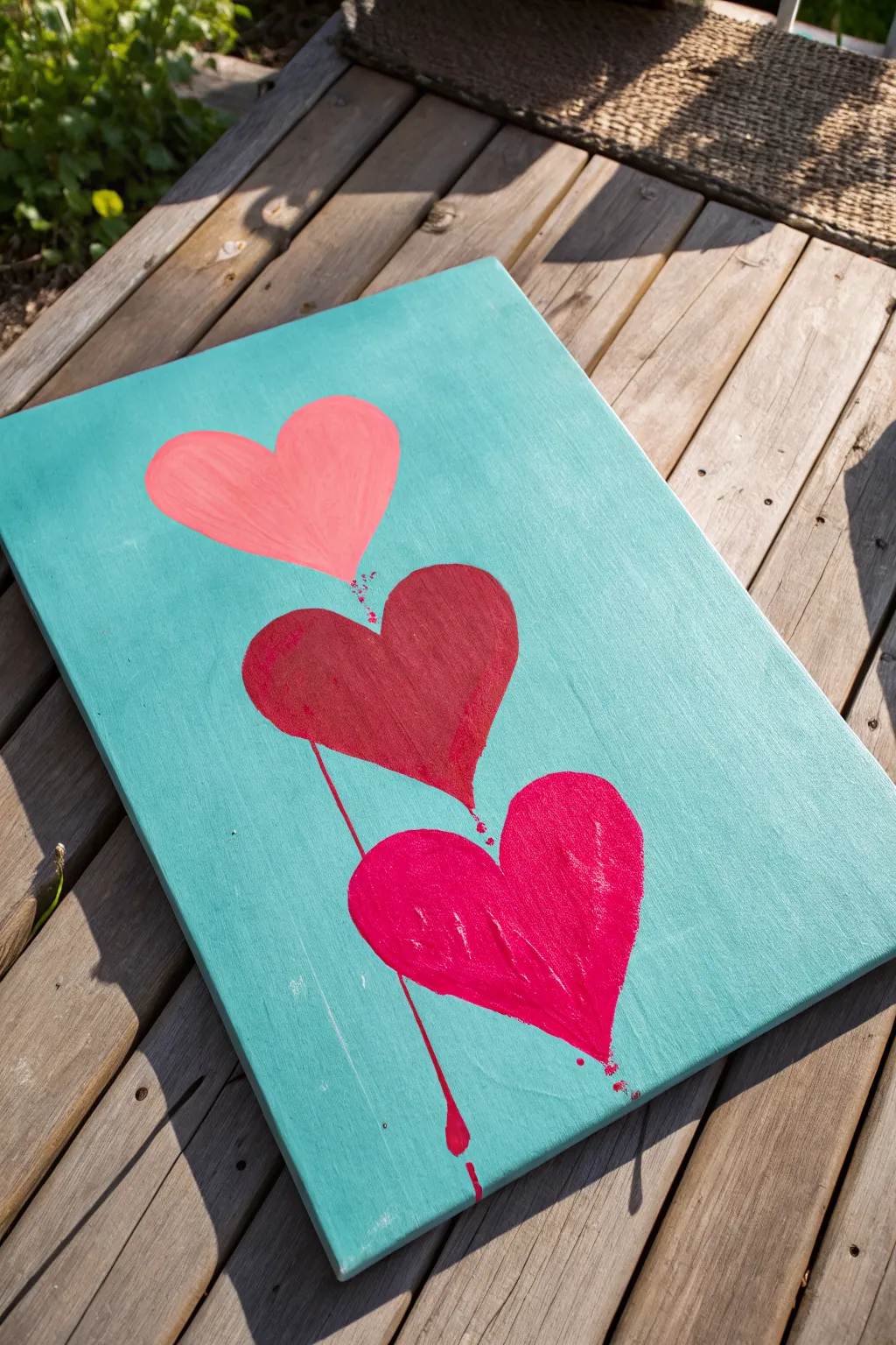
This charming canvas project combines clean lines with expressive drips for a fun, indie-style aesthetic. The cool turquoise background makes the three distinct pink and red hearts pop, creating a vibrant piece perfect for brightening any corner.
Step-by-Step
Materials
- Rectangular canvas (approx. 12×16 inches)
- Acrylic paint: Turquoise/Teal, Light Pink, Deep Red, Hot Pink/Magenta
- Wide flat brush (for background)
- Medium round brush (for hearts)
- Small liner brush or detail brush
- Pencil (optional)
- Cup of water
- Paper towels
- Palette or paper plate
Step 1: Setting the Stage
-
Prepare the background:
Squeeze out a generous amount of turquoise or teal acrylic paint onto your palette. Using your wide flat brush, apply the paint to the entire surface of the canvas. -
Keep specific strokes:
Paint in long, vertical strokes from top to bottom to minimize visible brush marks. Ensure the paint is opaque; add a second coat if the canvas texture shows through too much. -
Paint the edges:
Don’t forget to paint the sides of the canvas for a finished, professional look that doesn’t require a frame. -
Let it dry completely:
This step is crucial. Allow the background to dry fully before moving on so the heart colors don’t smudge or mix with the blue. If it feels cool to the touch, it’s still wet.
Drip Control
If the paint runs too fast, quickly blot the tip of the drip with a dry paper towel. If it’s too slow, add a tiny drop of water directly to the canvas on the line.
Step 2: Painting the Hearts
-
Plan placement:
Visualize three hearts stacked vertically down the center. You can lightly sketch the outlines with a pencil if you’re nervous about freehanding, but faint lines are key. -
Start the top heart:
Load your medium round brush with the light pink paint. Paint the top heart shape, keeping the curves smooth. This heart should be positioned in the upper third of the canvas. -
Paint the middle heart:
Switch to your deep red or maroon paint. Create the second heart directly below the pink one. I like to overlap the tip of the top heart slightly with the dip of the middle one, but leaving a small gap works too. -
Add the bottom heart:
Using the hot pink or magenta paint, fill in the final heart at the bottom. This one anchors the composition, so make it bold and full. -
Create texture:
While the paint is wet, you can create slight visible vertical brushstrokes within the hearts, mimicking the texture seen in the reference image. Don’t smooth it out perfectly.
Make It Glossy
Once the painting is 100% dry, paint a layer of high-gloss varnish just over the hearts and drips. This makes them look permanently ‘wet’ against the matte background.
Step 3: Adding the Drip Effects
-
Mix watery paint:
On your palette, take a small amount of the deep red paint (from the middle heart) and mix in drops of water until it has an inky consistency. -
Start the first drip:
Using a small liner brush loaded with the watery red paint, touch the bottom point of the middle heart. Let gravity help pull the paint down, or gently guide it into a thin line. -
Extend the line:
Drag this thin red line straight down so it passes behind or alongside the bottom heart. It creates a connecting visual thread. -
Create the bottom drips:
Now dilute some of the hot pink/magenta paint. Apply a loaded brush to the bottom point and lower curves of the lowest heart. -
Add the droplet:
Guide a long drip running off the bottom heart towards the edge of the canvas. At the end of the line, press the brush slightly harder to create a teardrop shape, mimicking a heavy drop of paint falling. -
Add splatter details:
Dip your small brush in the watered-down red paint again. Tap the handle against your finger near the canvas to create tiny, controlled splatters near the drip lines and heart connections. -
Refine the connections:
If the hearts feel disconnected, add tiny dots or very short drip marks between the top pink heart and the middle red heart to unify the stack. -
Final dry:
Let the artwork sit flat while drying so the drips don’t run further than intended. This usually takes about an hour depending on how thick the teardrops are.
Hang your new artwork where the bold colors can catch the light and add personality to your room
Swirly Tie-Dye Clouds
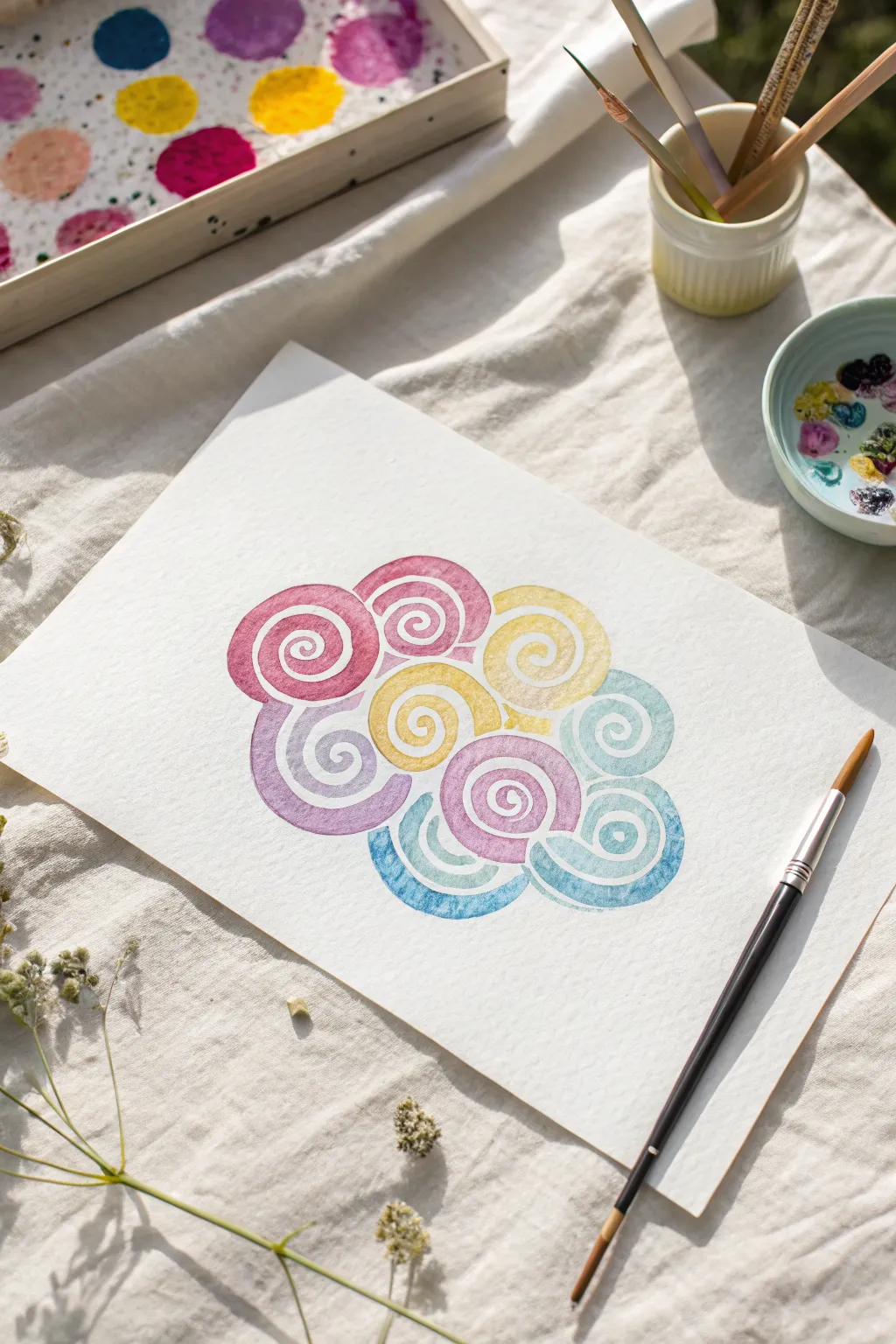
Capture the dreamy essence of floating clouds with this playful, swirling watercolor project. Using a simple repetitive spiral motif, you’ll build a vibrant, abstract form that feels light, airy, and full of movement.
Step-by-Step Guide
Materials
- Cold press watercolor paper (approx. 140lb/300gsm)
- Watercolor paints (Pink, Magenta, Yellow, Purple, Teal, Blue)
- Round watercolor brush (size 6 or 8)
- Clean water jar
- Paper towel
- Palette for mixing
Step 1: Preparation and Planning
-
Pre-mix your palette:
Before touching brush to paper, activate your watercolor pans or squeeze out tube paints onto your palette. You will need roughly six distinct colors: a warm pink, a deep magenta, a sunny yellow, a muted purple, a soft teal, and a sky blue. Add enough water to create a fluid, milky consistency for each puddle. -
Test the consistency:
On a scrap piece of paper, test your colors. You want them to be translucent but pigmented enough to show the spiral shape clearly. If the paint is too thick, the spirals will look heavy; if too watery, they might bleed uncontrollably.
Wrist Mechanics
Don’t plant your palm on the paper. Hover your hand and move your entire arm, not just your fingers, to create fluid, smooth rounded curves.
Step 2: Painting the Core Spirals
-
Start with the center top:
Load your brush with the magenta paint. Near the top-center of your paper, paint your first spiral. Start from the very center point and carefully swirl outward in a clockwise motion. Keep the lines relatively thick and the gaps between them distinct. -
Add a neighbor:
While the first spiral is still slightly damp, rinse your brush and pick up the warm pink. Paint a second spiral directly to the left, slightly touching the first one. Allowing them to barely touch encourages a tiny bit of color bleeding, which adds to the ‘tie-dye’ effect. -
Introduce yellow:
Switch to your yellow paint. Place a yellow spiral directly below and slightly nestled between the two pink/magenta spirals. Imagine you are stacking round polished stones; they should fit snugly together. -
Complete the top cluster:
Add another yellow spiral to the right of the magenta one you started with. Keep your wrist loose—imperfect, hand-drawn spirals look more organic and cloud-like than perfect geometric shapes.
Step 3: Expanding the Form
-
Transition to cool tones:
Now, introduce the purple shade on the left side, tucking a spiral underneath the pink one. I find that placing this darker, cooler color low helps anchor the ‘cloud’ visually. -
Add the center anchor:
Paint a large, central spiral using the magenta or a mix of pink and purple right in the middle of the cluster. This acts as the visual heart of the composition. -
Begin the blue edge:
Load your brush with the light teal color. Paint a spiral on the far right side, next to the yellow. The contrast between yellow and teal creates a fresh, energetic vibration. -
Layering the bottom:
Using the sky blue, paint a semi-circle spiral at the bottom right. Instead of a full circle, you can make this one slightly flatter to suggest the bottom edge of a cloud. -
Fill the gaps:
Look for empty spaces in your cluster. If there’s a small gap between the main spirals, paint a tiny partial spiral or a simple curved stroke to bridge them, using whichever neighboring color feels right.
Spirals Bleeding Too Much?
If colors represent merging into a muddy blob, paint every other spiral first. Let them dry, then fill in the gaps. This ‘checkerboard’ method keeps edges crisp.
Step 4: Refining and Drying
-
Check for puddles:
If any of your spirals have large puddles of water pooling in the curves, touch the very tip of a dry paper towel to the wet spot to lift the excess. This prevents ‘blooms’ or cauliflowering as it dries. -
Let it breathe:
Let the painting sit undisturbed for about 5 minutes. As the paint settles into the paper texture, the colors might soften slightly. -
Second pass (optional):
Once the first layer is visibly dry, you can go back over specific spirals with a second layer of the same color if you want them to be more vibrant. This glazing technique adds depth. -
Define edges:
If any spiral lines have merged too much and lost definition, wait until fully dry, then use a slightly drier brush with more concentrated pigment to re-state the spiral line on top. -
Final dry:
Allow the entire piece to dry completely flat. If the paper has buckled slightly, you can place it under a heavy book once it is bone dry to flatten it out.
Now you have a serene, colorful cloud that captures the relaxing flow of watercolor painting


Rainbow Lightning Bolts
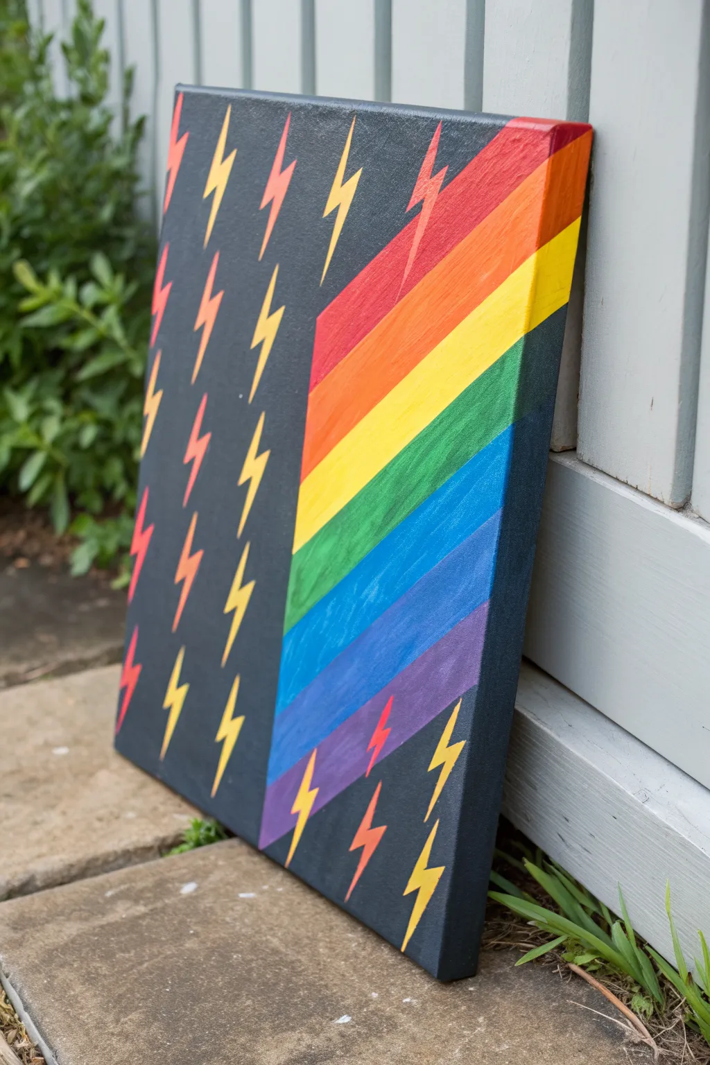
This striking canvas combines the edgy energy of lightning bolts with a bold, diagonal rainbow gradient for a truly eye-catching piece of indie art. The dark charcoal background makes the vivid colors pop, creating a modern graphic look that is surprisingly simple to achieve.
Detailed Instructions
Materials
- Rectangular canvas (approx. 16×20 inches)
- Acrylic paints (Dark charcoal grey or soft black, red, orange, yellow, green, light blue, dark blue, purple)
- Painter’s tape (low tack)
- Flat brush (1-inch width) for background
- Small flat brush or angle brush for stripes
- Detail round brush (size 2 or 4) for lightning bolts
- Pencil
- Ruler or straight edge
- Palette or paper plate
- Cup of water and paper towels
Step 1: Planning and Background
-
Prime the background:
Start by coating your entire canvas with a dark charcoal grey or soft black acrylic paint. Use the large flat brush for smooth, even coverage. Don’t forget to paint the sides of the canvas for a professional finish. -
Wait for thorough drying:
Allow the base coat to dry completely. Since we will be using tape on top of this layer, it must be bone dry to prevent peeling. I usually give it at least an hour or use a hair dryer to speed things up. -
Mark the diagonal:
Using your ruler and a pencil, lightly draw a diagonal line where you want the rainbow section to begin. In the reference image, the rainbow starts wider at the top right and tapers down toward the bottom left. -
Draft the lightning bolts:
Lightly sketch small lightning bolt shapes across the entire canvas using your pencil. Space them out randomly but evenly. Make sure some bolts cross over the line where the rainbow will be, as the pattern needs to look continuous.
Uneven Coverage?
Yellow and orange paints are notoriously translucent. If the dark background shows through, apply a coat of white paint first as a primer for the lightning bolts.
Step 2: Painting the Rainbow Segment
-
Tape the boundary:
Apply a strip of painter’s tape along the pencil line you drew for the diagonal. Place the tape on the ‘background’ side of the line so you can paint the rainbow area freely without worrying about a messy edge. -
Pencil in color zones:
Inside the rainbow area, lightly mark out seven distinct diagonal sections for your rainbow stripes: red, orange, yellow, green, light blue, dark blue, and purple. -
Paint the red and orange:
Starting at the top right corner, paint the red stripe using your smaller flat brush. Rinse well, then paint the orange stripe directly below it. Try to keep the lines between colors relatively straight, though a little overlap is fine. -
Continue the spectrum:
Work your way down with yellow, green, light blue, dark blue, and finally purple at the bottom left. Apply two coats if the dark background shows through the brighter colors like yellow. -
Remove the tape:
While the paint is still slightly tacky (or fully dry), carefully peel back the painter’s tape to reveal a crisp, sharp line separating the rainbow section from the dark background.
Crisp Lines Secret
To get a perfect tape line, brush a tiny bit of your base (charcoal) paint over the tape edge first. This seals the gap so no rainbow colors bleed underneath.
Step 3: Adding the Lightning Bolts
-
Identify background bolts:
Look at the lightning bolts sketched on the dark charcoal side of the canvas. You will paint these in alternating colors. -
Paint yellow background bolts:
Select about half of the bolts on the dark side and carefully fill them in with bright yellow paint using your detail brush. -
Paint red background bolts:
Fill the remaining bolts on the dark background with red paint. This creates a scattered, two-tone pattern against the charcoal. -
Handle the transition bolts:
For bolts that cross the diagonal line, stop your paint exactly at the line. The part of the bolt on the dark side should be red or yellow; the part inside the rainbow will take on the color of the stripe it sits on—but wait! The logic here is tricky. -
Correcting the rainbow bolts logic:
Actually, look closely at the project referencing the image: The bolts INSIDE the rainbow are not filled with a new color. Instead, the rainbow IS the fill color. The bolts inside the rainbow are ‘negative space’ or painted over? No, the reference shows the bolts continue the pattern but change color to match the background? Let’s clarify: The bolts in the rainbow section are painted a contrasting color to the stripe they are on? No, looking closer at the image, the bolts in the rainbow section are actually painted *red* and *yellow* but they are overlapping the rainbow stripes. Wait, actually, looking very closely at the bottom purple section, there is a red bolt. In the blue section, a yellow bolt. This means the bolt pattern simply sits ON TOP of everything. -
Let’s pivot: Painting bolts on top:
Disregard complex masking. The simplest way to recreate this look is to paint the bolts *over* the dried rainbow stripes. Take your red paint and fill in the sketched bolts that sit on top of the rainbow area. -
Add yellow bolts over rainbow:
Now do the same with yellow paint for the remaining sketched bolts over the rainbow section. You might need an extra coat here to ensure the yellow covers the dark blue or purple stripes beneath it. -
Touch up edges:
Inspect the point where the rainbow meets the dark background. If any paint bled under the tape, use a small brush and the charcoal paint to tidy up the line.
Hang your electric masterpiece on the wall and enjoy the vibrant pop of color it brings to your space
Cow Print Pop Background
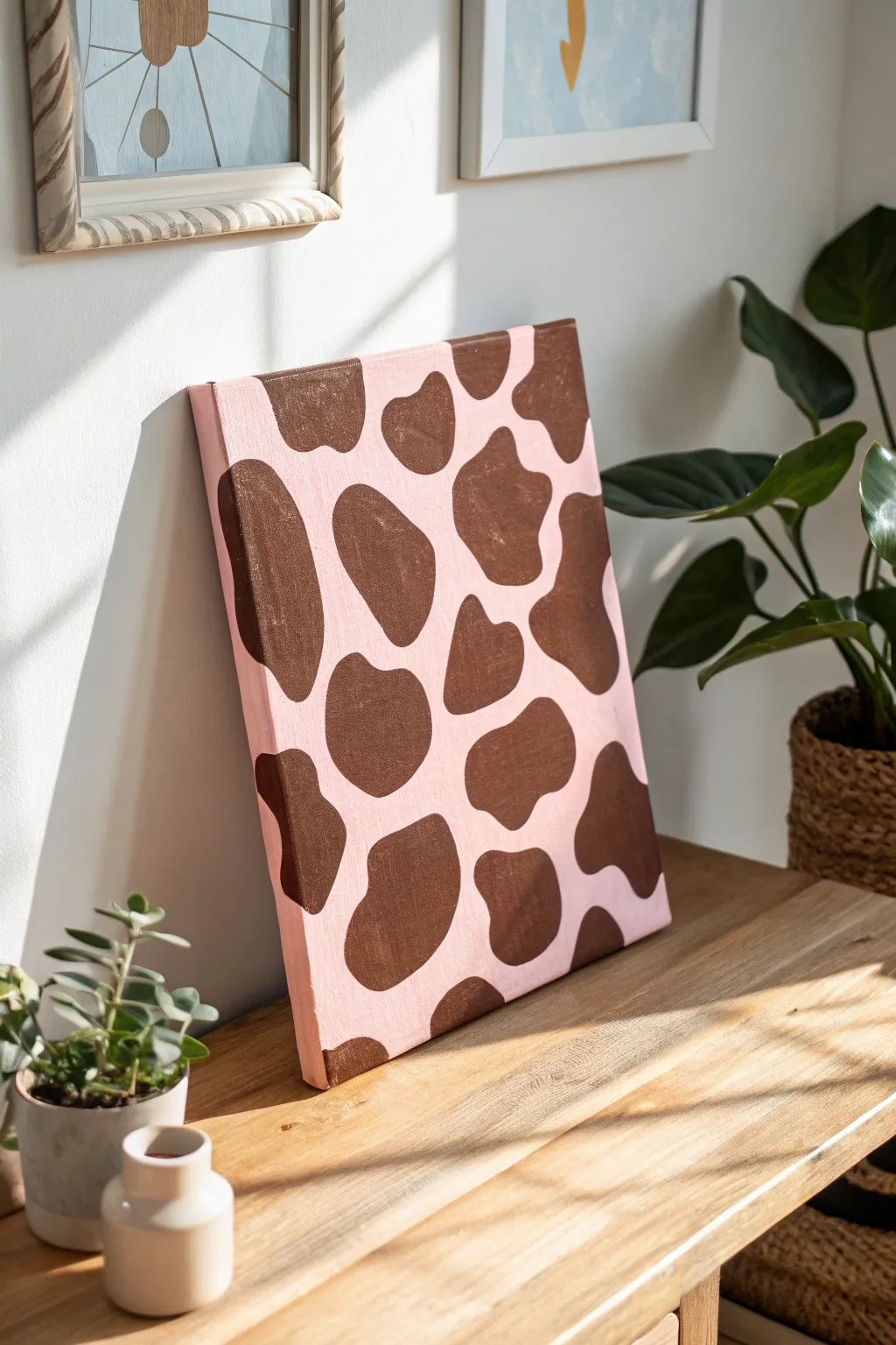
Give the classic animal print a soft, indiecore twist with this pink and brown cow print canvas. The combination of a pastel base with rich chocolate spots creates a trendy, minimalist piece of decor that’s surprisingly simple to paint freehand.
How-To Guide
Materials
- Stretched canvas (rectangular, e.g., 11×14 or similar)
- Acrylic paint (Light Pink/Baby Pink)
- Acrylic paint (Dark Brown/Chocolate Brown)
- Flat paintbrush (1-inch width for background)
- Round paintbrush (medium size, #6 or #8 for spots)
- Pencil or chalk (optional)
- Cup of water and paper towels
- Palette or paper plate
Step 1: Setting the Scene
-
Prepare your workspace:
Lay down some newspaper or a drop cloth to protect your table. Ensure your canvas is clean and free of dust before starting. -
Mix the base color:
Pour out a generous amount of light pink acrylic paint. If your pink is too vibrant, you can mix in a tiny drop of white to soften it into a pastel shade. -
Paint the background:
Using your large flat brush, cover the entire front surface of the canvas with the pink paint. Use long, smooth strokes to minimize brush marks. -
Don’t forget the edges:
Make sure to wrap the pink paint around the sides of the canvas. This gives the finished piece a polished, professional look even without a frame. -
Apply a second coat:
Let the first layer dry for about 15-20 minutes. If the canvas texture is still showing through too much, apply a second coat of pink for solid, opaque coverage. -
Let it dry completely:
Wait for the pink background to be fully dry to the touch. Painting wet-on-wet here will cause the brown to turn muddy.
Shape Tip
Cow spots rarely have sharp corners. Keep your brush moving in curves, and think of kidney bean or amoeba shapes for realistic variety.
Step 2: Creating the Cow Print
-
Prepare the brown paint:
Squeeze out your dark brown acrylic paint. You want a creamy consistency that flows easily but isn’t too runny. -
Sketch loosely (optional):
If you are nervous about freehanding, use a piece of chalk or a light pencil to faintly outline where your spots will go. Remember, cow spots are organic, irregular blobs. -
Paint the first spot:
Using the medium round brush, start painting your first brown spot. Create a wavy, uneven outline first, then fill in the center. -
Vary the shapes:
Make some spots large and stretched out, and others smaller and rounder. Avoid perfect circles or squares; wiggles and curves are key. -
Work off the edges:
Paint some spots that look like they are ‘falling off’ the edge of the canvas. This creates a continuous pattern effect rather than centering everything. -
Wrap the spots:
For the spots touching the edge, carry the brown paint around the side of the canvas to match the background wrapping you did earlier. -
Check the spacing:
Step back occasionally to look at the balance. You want a good amount of pink space between the brown shapes so it doesn’t look cluttered. -
Fill in the gaps:
If you see a large empty pink area, add a small, floating spot to balance the composition. -
Smoothen the edges:
Go back over the outlines of your brown spots to ensure the curves are smooth and clean. I tend to use the tip of the brush to sharpen any fuzzy edges. -
Apply second coat to spots:
Brown pigment can sometimes be translucent. Once the first layer of spots is dry, add a second coat of brown if you can see the pink showing through underneath.
Fixing Mistakes
If a brown spot gets too big or messy, let it dry completely, then paint over the error with your background pink and try again.
Now you have a funky, modern piece of art ready to brighten up your shelf or desk
Sticker-Style Mini Icons
Capture a trendy indie vibe with this collection of sticker-style icons painted entirely in shades of soothing blue. These simple, celestial motifs like eyes, hearts, and moons are perfect for filling a sketchbook page or turning into actual stickers.
Step-by-Step
Materials
- Cold press watercolor paper (A5 size or larger)
- Watercolor paints (Indigo, Prussian Blue, or Cerulean)
- Round watercolor brush (size 2 or 4)
- Fine liner watercolor brush (size 0 or 00)
- White gel pen or gouache for highlights
- Pencil (HB or H)
- Eraser
- Jar of water
- Paper towel
Step 1: Planning and Sketching
-
Prepare your palette:
Since this is a monochromatic piece, mix a puddle of your main dark blue paint. Create a second puddle that is much more watery to serve as your light wash. -
Plan the layout:
Visualize where your icons will sit on the page. You want them to feel floating and random but balanced, avoiding any large empty gaps. -
Sketch the central eye:
Lightly draw the almond shape of the eye near the center-top. Add the circle for the iris inside. -
Outline the main icons:
Sketch a heart shape below the eye, slightly to the right. Add a crescent moon near the bottom right and an outline of a small flower on the left. -
Add floating elements:
Fill the gaps with small stars, crosses, and dots. Keep your pencil pressure very light so the graphite doesn’t smudge into the paint later.
Fixing Wobbly Lines
If your outlines look shaky, wait for the paint to dry and go over the outer edge with a blue fineliner pen or a colored pencil to crisp up the edges.
Step 2: Painting the Base Layers
-
Paint the eye details:
Using your fine liner brush and the dark blue mix, outline the eye shape and fill in the pupil. Leave a tiny white spot in the pupil for a highlight. -
Fill the iris:
Using a slightly diluted blue, paint a ring around the pupil for the iris. Keep the outer edge of the eye clean and sharp. -
Paint the solid heart:
Load your round brush with the dark blue paint. Fill in the heart shape completely. Don’t worry about the dots yet; we will add those on top later. -
Create the crescent moon:
Paint the crescent moon shape using the dark blue. Use the tip of the brush to ensure the points of the moon are sharp and tapered. -
Do the outline heart:
For the smaller heart on the left, use a lighter wash of blue to paint just the outline. Then, fill the center with a very pale wash, leaving the outline visible.
Make It Glossy
Once the art is totally dry, apply a layer of clear nail polish or UV resin over just the icons to give them a raised, glossy, sticker-like finish.
Step 3: Adding Details and Accents
-
Paint the flower:
Using the medium blue shade, paint simple radiating petals for the flower. A dabbing motion works well here to create petal shapes organically. -
Add the stars:
Paint the solid five-point stars with your smallest brush. I find it easiest to paint a ‘V’ shape for the top point and then fill in the legs. -
Incorporate tiny filler shapes:
Scatter small ‘plus’ signs (+), tiny four-point stars, and dots around the main icons using your fine liner brush to tie the composition together. -
Let it dry completely:
Wait for all paint to be bone dry. If the paper feels cool to the touch, it is still damp. This is crucial before adding white detailing.
Step 4: Final White Highlight Work
-
Decorate the heart:
Take your white gel pen or opaque white gouache. Draw a smaller heart inside the dark blue heart, and add a dashed line following the curve of the shape. -
Ornament the eye:
Add a row of tiny white or blue dots underneath the eye outline to mimic lower lashes or decorative skin art. -
Details on the moon:
Draw tiny white lines or dots across the crescent moon to give it texture and visual interest. -
Erase pencil lines:
Once you are certain everything is dry (especially the gel pen ink), gently erase any visible pencil sketches to leave a crisp finish.
You now have a charming sheet of indie-style artwork ready to be framed or scanned for stickers
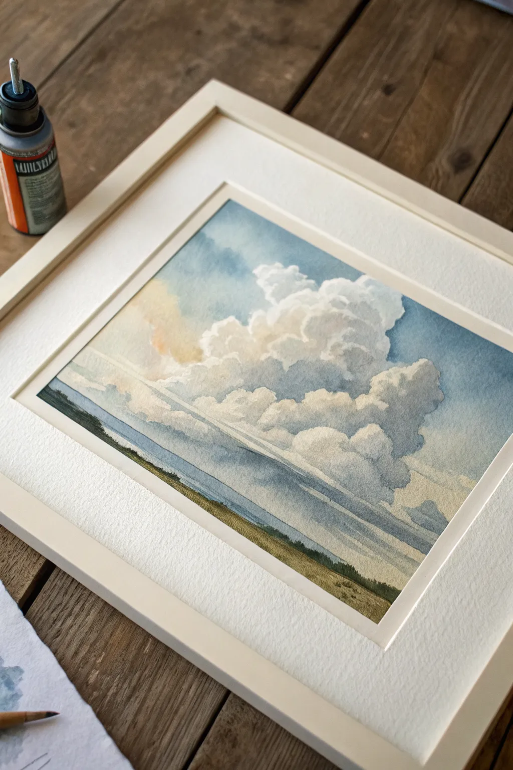
Trippy Wavy Hills Landscape
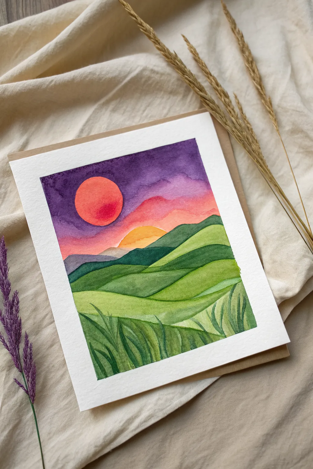
This vibrant watercolor landscape combines undulating green hills with a surreal, dreamy sky featuring a burning red sun. The stark contrast between the lush foreground and the electric purple sky makes for a striking indie art piece that feels both grounded and otherworldly.
Step-by-Step Tutorial
Materials
- Cold press watercolor paper (300 gsm)
- Masking tape
- Watercolor paints (Purple, Magenta, Red, Yellow, Deep Green, Sap Green)
- Round brushes (Size 4 and 8)
- Jar of clean water
- Paper towels for blotting
- Pencil and eraser
Step 1: Preparation and Sketching
-
Secure the paper:
Begin by taping down all four edges of your watercolor paper to a board or table. This creates that crisp white border seen in the final piece and prevents the paper from buckling when wet. -
Sketch the horizon:
Using a pencil very lightly, draw the rolling hills. Start about halfway down the page for the horizon line, creating flowing, wavy shapes. -
Define the sun:
Draw a perfect circle in the upper left quadrant for the large sun. If you don’t have a steady hand, trace around a small lid or coin. -
Outline the foreground:
Sketch the lower hills, making them curved and interconnected like fabric folds. Mark out the bottom section where the tall grass details will go.
Clean Edges Pro-Tip
To keep the hill layers from bleeding into each other, ensure one section is 100% dry before painting the adjacent one. Patience is key for those sharp lines.
Step 2: Painting the Sky
-
Wet the sky area:
With a clean, wet brush, apply a thin layer of water to the sky area, carefully avoiding the sun circle. This ‘wet-on-wet’ technique helps the colors blend seamlessly. -
Apply deep purple:
Load your brush with a deep, rich purple. Paint the top corners and edges of the sky, letting the color bleed downward but stopping before you reach the horizon. -
Blend in magenta:
While the purple is still damp, introduce a magenta or pink hue below it. Allow the purple and pink to touch and merge naturally on the paper. -
Add the sunset glow:
near the horizon line, switch to a warm peach or light orange color. Blend this upward into the pink, creating a smooth gradient from dark night to sunset. -
Paint the sun:
Once the sky is slightly drier (so it doesn’t bleed into the sun), paint the sun circle with a bright red-orange. Make the center slightly lighter than the edges for a glowing effect. -
Add the distant sun halo:
Paint a semi-circle shape emerging from behind the furthest hill in a soft yellow-orange, suggesting a second light source or reflection.
Step 3: Painting the Landscape
-
Paint the furthest hills:
Mix a muted, dark blue-green for the most distant hills. Paint them solidly, ensuring a hard edge against the sky. -
Layer the middle ground:
For the next wave of hills, use a medium ‘sap green’. Paint this section using long, sweeping strokes that follow the curve of your pencil lines. -
Add depth to the curves:
While the green is still wet, drop a darker green pigment into the ‘valleys’ or bottom edges of the hills to create shadow and dimension. -
Brighten the foreground:
For the closest hill sections, use a brighter, lime-green mix. This helps separate the foreground from the darker background hills. -
Create distinct sections:
Let each hill section dry completely before painting the one underneath perfectly crisp lines between the layers. I like to use a hairdryer on low heat here to speed things up.
Level Up: Metallic Pop
Once the painting is dry, use gold metallic watercolor or a gold paint pen to outline the sun or add shimmer to the crests of the waves for a magical touch.
Step 4: Adding Details
-
Start the grass texture:
Once the base green layers are fully dry, mix a dark forest green. Using the tip of your smallest brush, paint long, thin blades of grass in the bottom foreground section. -
Vary the grass direction:
Make the grass blades swoop in different directions—some curving left, some right—to mimic the movement of wind through a field. -
Add lighter highlights:
Rinse your brush and pick up a lighter yellow-green. Paint a few highlight strokes over the dark grass to give it volume. -
Final touches:
Check for any uneven edges and smooth them out. Once completely dry, slowly peel off the masking tape at a 45-degree angle to reveal the clean border.
Now you have a stunning, surreal landscape ready to frame or gift to a friend
Warped Polka-Dot Field
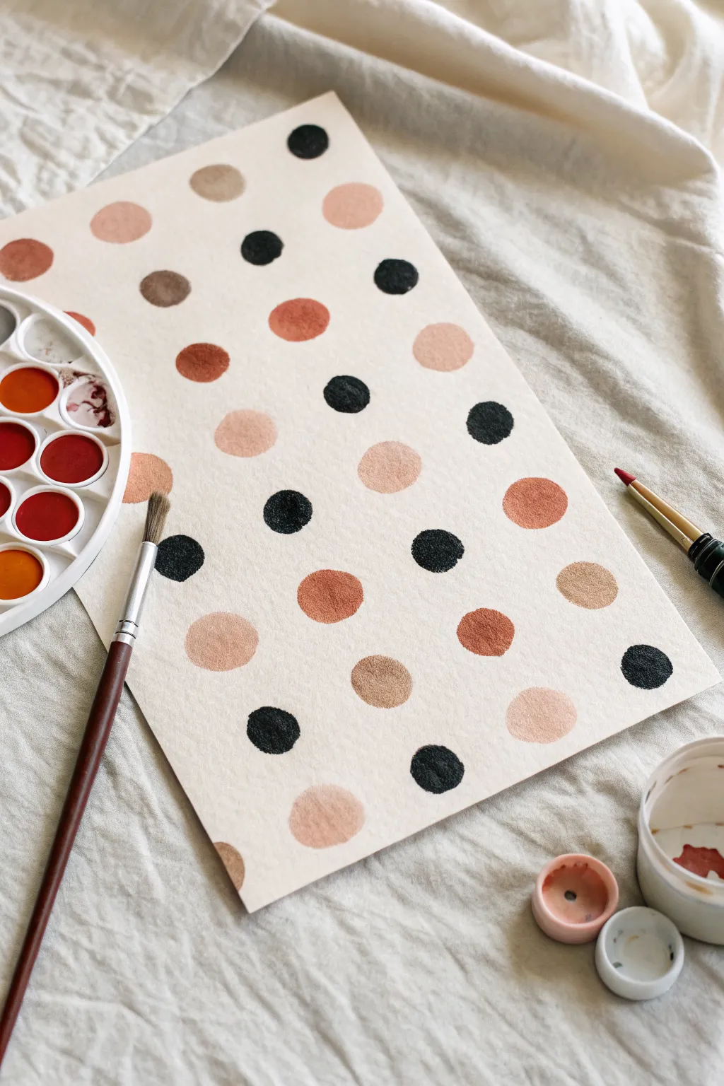
Embrace the beauty of imperfection with this relaxed watercolor study featuring a field of hand-painted, slightly irregular dots. Using a warm, grounded palette of terracotta, peach, and deep charcoal creates a modern, indie aesthetic that feels organic rather than manufactured.
Step-by-Step Guide
Materials
- Cold press watercolor paper (rough texture is ideal)
- Watercolor pan set or tubes
- Round watercolor brush (size 6 or 8)
- Two jars of water (one for rinsing, one for clean water)
- Paper towel or rag
- Masking tape (optional, for securing paper)
Step 1: Preparation & Palette
-
Setup:
Begin by securing your watercolor paper to a flat surface if you are worried about buckling, though for this loose style, letting the paper warp naturally adds charm. -
Activate Paints:
Add a drop of clean water to each of your chosen pans to wake up the pigment. You’ll want a color scheme of deep black, burnt sienna (terracotta), beige or ochre, and a soft peach. -
Test Consistency:
On a scrap piece of paper, test your paint consistency. You want a creamy, milk-like texture that flows easily but holds its saturation.
Pro Tip: The Brush Twirl
For perfectly imperfect circles, press the brush down fully and twirl the handle between your thumb and finger. This creates a natural round shape with lovely, textured edges.
Step 2: Painting the Light Tones
-
Start with Peach:
Load your round brush with the lightest peach color first. Place a few random dots across the page. Instead of drawing a circle and filling it in, try to press the belly of the brush down and swirl it slightly to create an organic, roundish shape. -
Vary sizes:
Make some peach dots slightly larger and others smaller. Irregularity is key to the ‘warped’ look. -
Add Beige:
Rinse your brush thoroughly. Pick up your beige or light ochre shade. Paint a new set of dots, scattering them in the empty spaces between the peach ones. -
Control the Moisture:
If a puddle forms in the center of a dot, you can dab just the very tip of a dry brush into it to soak up excess water, or leave it for a ‘bloom’ effect as it dries.
Step 3: Adding Depth
-
Introduce Terracotta:
Switch to your medium tone, the burnt sienna or terracotta. Begin filling in more gaps. These darker, warmer tones will anchor the lighter ones. -
Spacing and Flow:
Try to maintain a loose grid structure but don’t measure it. Let the rows wobble and drift naturally. -
Check Density:
Step back for a moment. Ensure you have a roughly even distribution of the warm tones before moving to the high-contrast elements.
Troubleshooting: Muddy Colors
If your dots are bleeding into each other, your paper is too wet or dots are too close. Let the first set of dots dry completely before painting adjacent ones to keep edges crisp.
Step 4: The Dark Contrast
-
Mix the Black:
Load your brush with a deep black or a mixture of Payne’s Grey and Burnt Umber for a rich, dark charcoal tone. You want this pigment quite saturated. -
Place Stickaccents:
Paint the black dots sparingly. These are the visual ‘pops’ of the piece. I find placing them near lighter dots creates a nice vibration of contrast. -
Embrace Texture:
Allow the texture of the cold press paper to show through. If the edge of a dot looks rough or ‘dry,’ leave it—that texture is desirable.
Step 5: Refinement
-
Assess Balance:
Look at the overall composition. If there is a large empty gap, mix a custom shade—perhaps blending the peach and terracotta—and add a dot there. -
Textural Touches:
While the paint is still damp on some dots, you can drop in a tiny hint of water to create a cauliflower-like texture as it dries. -
Final Dry:
Let the piece dry completely flat. The paint will lighten slightly as the water evaporates.
Now you have a chic, abstract pattern piece that looks great framed or scanned for digital backgrounds
Spray-Can Color Cloud
Capture the ethereal beauty of a summer sky with this soft, atmospheric project that blends watercolor washes with precise detailing. By layering transparent blues and warming creams, you’ll create a sense of depth and volume that brings these majestic cumulus clouds to life.
Step-by-Step
Materials
- Cold Press watercolor paper (140lb/300gsm)
- Watercolor paints (Cerulean Blue, Ultramarine, Yellow Ochre, Burnt Sienna, Sap Green)
- White gouache or white ink
- Spray bottle with water
- Round watercolor brushes (Size 4, 8, and 12)
- Masking tape
- Wooden board or hard surface
- Paper towels
- Gray or sepia fine-liner pen (optional for details)
Step 1: Preparation and Sky Base
-
Secure the paper:
Tape your watercolor paper down to a board on all four sides. This prevents the paper from buckling when we add water and creates that crisp, professional white border seen in the final piece. -
Sketch the horizon:
Use a pencil to lightly draw a very low horizon line, leaving about 80% of the paper for the sky. Sketch the basic, bubbling shapes of the large cumulus cloud formation in the center. -
Pre-wet the sky:
Using your largest brush, wet the sky area with clean water. You want the paper to be damp and glistening, but not forming puddles. -
First blue wash:
Mix a light wash of Cerulean Blue. Apply this to the upper corners and the very top edge of the paper, letting the color naturally diffuse downward. Leave the center mostly white for the main cloud. -
Define the cloud edges:
While the paper is still damp, carefully paint around the top of your pencil cloud shapes with a slightly stronger blue mix. This negative painting technique makes the white paper pop forward as the cloud top.
Pro Tip: Soft Edges
Keep two water jars: one for cleaning brushes, one for clean water. Use the clean water to soften paint edges on the paper without dirtying your whites.
Step 2: Building Cloud Volume
-
Warm undertones:
Mix a very dilute wash of Yellow Ochre with a tiny touch of Burnt Sienna. I find that dropping this warm cream color into the lower-left and shadowed parts of the cloud adds a lovely sunlit glow. -
Shadow shapes:
Create a soft gray-violet by mixing Ultramarine Blue with a touch of Burnt Sienna. While the previous layer is damp-dry (cool to the touch but not wet), paint the undersides of the cloud fluffs to give them volume. -
Softening edges:
Use a clean, damp brush to gently soften the hard edges of your shadows. You want the transitions within the cloud to be fluffy, not sharp. -
Deepening the sky:
Once the first sky layer is dry, add a second glaze of Ultramarine Blue to the background sky areas to push them further back, increasing contrast against the white cloud tops.
Level Up: Framing
Use a deep bevel mat board when framing. The extra thickness adds a gallery-quality shadow line that complements the atmospheric depth of the clouds.
Step 3: Landscape and Finishing Details
-
Distant water:
Paint a horizontal strip of steel blue right above the horizon line to suggest a distant body of water or atmospheric haze. -
Base ground layer:
Mix Sap Green with Yellow Ochre for a muted, natural grassy tone. Paint the land area in horizontal strokes, keeping the color lighter near the horizon and darker near the bottom edge. -
Adding texture:
While the ground layer is still setting, dab in thicker, darker green pigment (Sap Green mixed with a little violet) to suggest scrubby bushes and texture in the foreground. -
Mist layer:
If your clouds feel too heavy, lightly mist the paper with your spray bottle and lift a little pigment with a paper towel to create wisps of vapor. -
Final highlights:
Use white gouache or opaque white ink to reclaim the brightest white highlights on the very tops of the clouds if they got lost during painting. -
Remove tape:
Wait until the painting is bone dry—completely warm to the touch. Peel the tape away slowly at a 45-degree angle to reveal your clean edges.
Step back and admire the peaceful atmosphere you have captured on the page
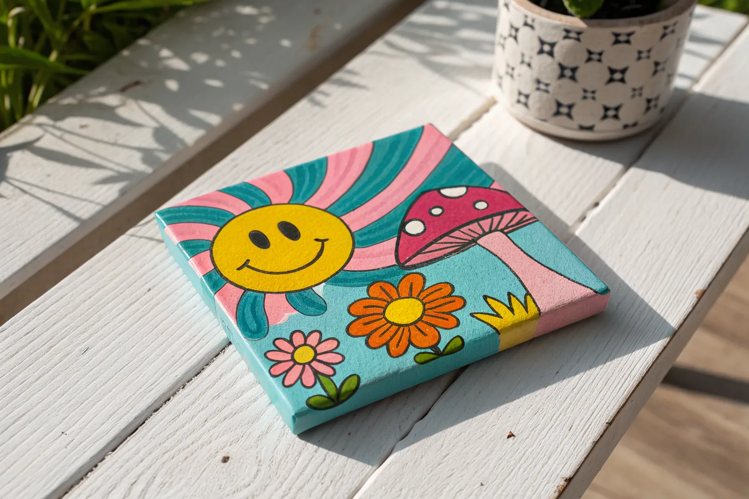
Smiley Face Tile Pattern
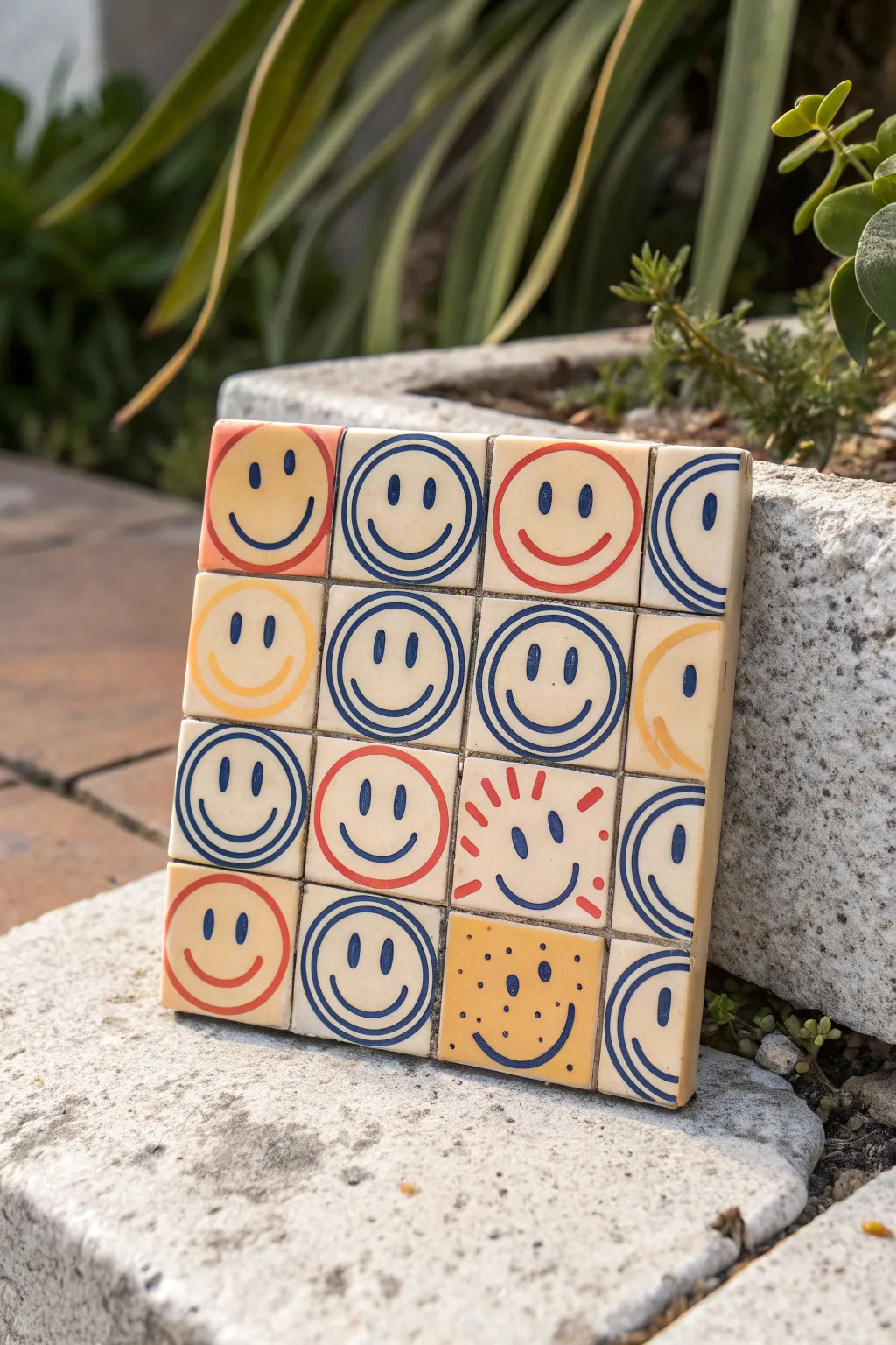
Transform a plain ceramic coaster or a set of mini tiles into a cheerful grid of personalities with this indie-style painting project. The result is a charmingly imperfect, retro-inspired mosaic that brings a pop of color and positivity to any shelf or table.
Step-by-Step Guide
Materials
- 1 large square plain ceramic coaster (approx. 4×4 inches) OR 16 small 1×1 inch ceramic tiles
- Acrylic paints (primary blue, warm red, sunny yellow, off-white/cream)
- Fine detail paintbrushes (size 0 and 00)
- Pencil and eraser
- Ruler
- Palette or small dish for mixing
- Clear spray sealant (matte or satin finish)
- Paper towels and water cup
Step 1: Preparation & Mapping
-
Clean the surface:
Begin by wiping down your ceramic surface with a damp cloth to remove any dust or oils. Let it dry completely to ensure the paint adheres properly. -
Establish the grid:
If you are using a single large coaster, use your ruler and a pencil to lightly mark out a 4×4 grid. You want sixteen equal squares. Draw the lines very faintly so they don’t show through the lighter paint later. -
Base coat (optional):
If your ceramic isn’t already a warm cream color, mix a bit of yellow and brown into your white paint to create a vintage off-white. Paint the entire surface and let it dry. -
Add faux grout lines:
Using a thin brush and a diluted gray-brown mix, paint over your pencil grid lines to simulate the separation between tiles. Keep these lines relatively thin but distinct.
Shaky circles?
Don’t panic! Since this is an indie style, wobbly lines add character. If a circle goes really wrong, wipe it immediately with a damp Q-tip or paint over the mistake with your cream base color once dry.
Step 2: Painting the Faces
-
Plan your layout:
Look at the reference image to note the pattern. It’s a mix of concentric circle faces particularly in blue, standard red outlines, and a few yellow variations. I find it helpful to sketch the face styles lightly in pencil first. -
Mix the signature blue:
Create a deep, denim blue on your palette. This color is used for the majority of the ‘concentric circle’ faces and the eyes on almost every tile. -
Paint the concentric circles:
Start with the tiles that feature the ripple effect (like the second one in the top row). Paint the outer blue circle first, staying close to the tile edge. Then paint a second, smaller circle inside it. -
Add the blue features:
Inside the smallest circle of your ripple faces, paint two small vertical ovals for eyes and a simple U-shape for the mouth. Repeat this eye and mouth style for the simple red and yellow faces as well. -
Create the red outliners:
Load your brush with warm red paint. On the designated tiles (like the top left corner), paint a large circle that fills the square. Add the smile curve in the same red, but keep the eyes blue for contrast. -
Paint the yellow accents:
Using a sunny yellow, paint the outline on the second row’s first tile. Notice the variation on the far right of the second row—this is just a partial face, like a close-up crop. Paint a large yellow curve for the cheek. -
Detail the ‘Sunburst’ tile:
Locate the tile in the third row, third column. Paint short red dashes radiating outward from where the face sits, resembling sun rays. The face itself here is simple with blue features. -
Detail the ‘Freckle’ tile:
For the bottom row, third column, paint the background a solid mustard yellow. Let it dry. Then, add the blue eyes and mouth, and dot tiny blue specks around the face for freckles. -
Execute the ‘Crop’ variations:
On the far right column, paint the blue concentric lines so they run off the edge of the tile, creating the illusion that the pattern continues beyond the coaster.
Step 3: Finishing Touches
-
Refine the lines:
Go back over any shaky lines with your detail brush. The charm is in the hand-painted look, so don’t worry about making them mechanically perfect circles. -
Clean up the grid:
If your face painting overlapped the faux grout lines, carefully touch up the grid lines with your gray-brown mixture to re-establish the separation between squares. -
Remove pencil marks:
Once the paint is 100% dry to the touch, gently erase any visible pencil sketch marks that weren’t covered by paint. -
Seal the artwork:
To protect your work from scratches or moisture, take the project to a ventilated area and apply a light coat of clear spray sealant. -
Final cure:
Allow the sealant to cure according to the manufacturer’s instructions before using it as a coaster or displaying it upright.
Magnetize It
Instead of one big coaster, paint this design on 16 individual 1-inch mini tiles. Glue a small magnet to the back of each one to create a rearrangeable mood board for your fridge.
Now you have a quirky, durable piece of art that smiles back at you every day
Eye in a Checkerboard Portal
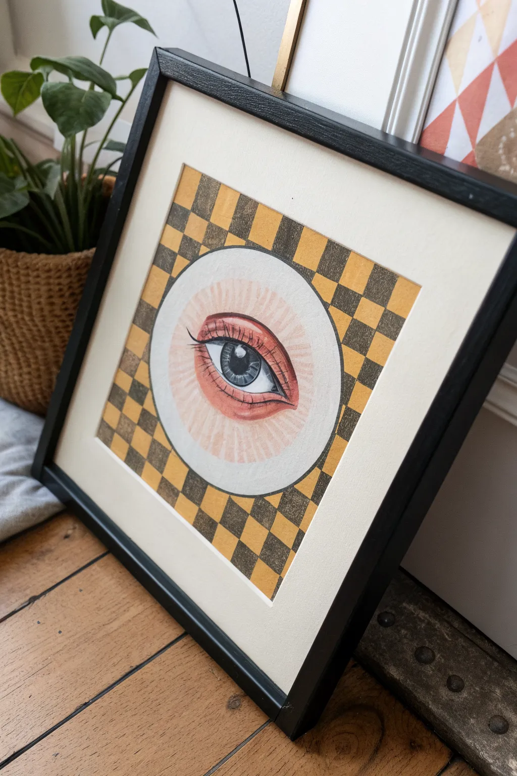
This striking indie-style artwork combines geometric precision with organic softness, featuring a realistic eye gazing out from a retro checkerboard pattern. The contrast between the rigid background and the delicate pencil work creates a surreal, portal-like effect that looks fantastic in a simple black frame.
How-To Guide
Materials
- Heavyweight drawing paper or mixed media paper (square format)
- Pencil (HB and 2B for sketching)
- Ruler
- Compass or a perfectly round bowl/plate
- Yellow ochre or mustard acrylic paint
- Dark grey or muted olive acrylic paint
- Flat shader brush (small to medium)
- Colored pencils (peach, pink, browns, black, white)
- Fine tip black liner pen
- Kneaded eraser
Step 1: Geometric Foundation
-
Map the center:
Begin by finding the exact center of your square paper. Use your compass (or trace a circular object) to draw a large circle right in the middle. This will be the ‘portal’ for the eye, so keep this area completely free of the background pattern. -
Grid the background:
Using a ruler, draw a grid across the entire page, skipping over the central circle you just made. Aim for squares that are about 1 inch wide. Press lightly with your pencil so the lines can be erased or painted over later without showing grooves. -
Mark the checkerboard:
Before you touch any paint, lightly mark every other square with a small ‘x’ to serve as a reminder of which ones need to be the darker color. It’s incredibly easy to lose track of the pattern once you start painting.
Uneven Grid?
If your painted squares look messy, outline the grid lines with a black marker or thin washi tape after the paint dries. This hides uneven edges and adds a bold, comic-book style.
Step 2: Painting the Pattern
-
Mix the colors:
Prepare your palette with a warm mustard yellow and a contrasting dark grey (or a very muted, dark olive green). You want opaque coverage, so don’t water the acrylics down too much. -
Paint the yellow squares:
Using a flat shader brush, which has a straight edge perfect for corners, fill in the light-colored squares first. Be very careful around the edge of the central circle to keep that curve sharp and clean. -
Fill the dark squares:
Once the yellow is dry to the touch, fill in the remaining squares with your dark grey mixture. I find that rotating the paper as I work helps me get better angles on the tricky spots near the circle’s edge. -
Clean up edges:
If your lines got a little wobbly, use a tiny liner brush to tidy up the grid intersections or the curve of the circle.
Step 3: Drawing the Eye
-
Sketch the outline:
Inside the white circle, lightly sketch the almond shape of the eye. Place the iris (the colored part) so the upper eyelid cuts slightly across the top of it, which makes the gaze look natural rather than startled. -
Add detail lines:
Draw the pupil in the center of the iris and mark out a small, rectangular or amorphous highlight shape near the pupil. Sketch the tear duct in the inner corner and the crease of the eyelid above the eye. -
Base layer coloring:
Switch to colored pencils. Lay down a soft peach or light pink base for the skin around the eye and the tear duct. Use a light grey to softly shade the ‘white’ of the eye (sclera) near the eyelids to give it roundness. -
Coloring the iris:
Fill the iris with a grey-blue tone, radiating your pencil strokes outward from the pupil like spokes on a wheel. Darken the outer ring of the iris for definition. -
Deepening skin tones:
Layer a reddish-brown or terracotta pencil into the crease of the eyelid and under the lower lash line. The reference image uses a sketchier, linear shading style here, radiating lines outward from the eye to create texture. -
Inking the lashes:
Use a fine tip black liner or a very sharp black pencil to draw the eyelashes. Start at the lash line and flick your wrist upward for a tapered look. Don’t make them too uniform; let them clump slightly or cross over each other. -
Defining the features:
Go over the main outline of the eye, the iris rim, and the pupil with black to make them pop. Ensure the pupil is the darkest point on the page. -
Radiating texture:
Using a very light touch with a peach or light brown pencil, draw faint lines radiating from the eye toward the edge of the white circle, enhancing the glowing, iris-like effect of the portal itself.
Surrealist Swap
Instead of a human eye, draw a reptilian eye, a realistic flower, or a galaxy inside the portal circle. The contrast between organic subject matter and the rigid grid is what key.
Pop your finished piece into a square frame to complete the polished, retro-indie look and hang it up
Three Mini Canvases, One Vibe
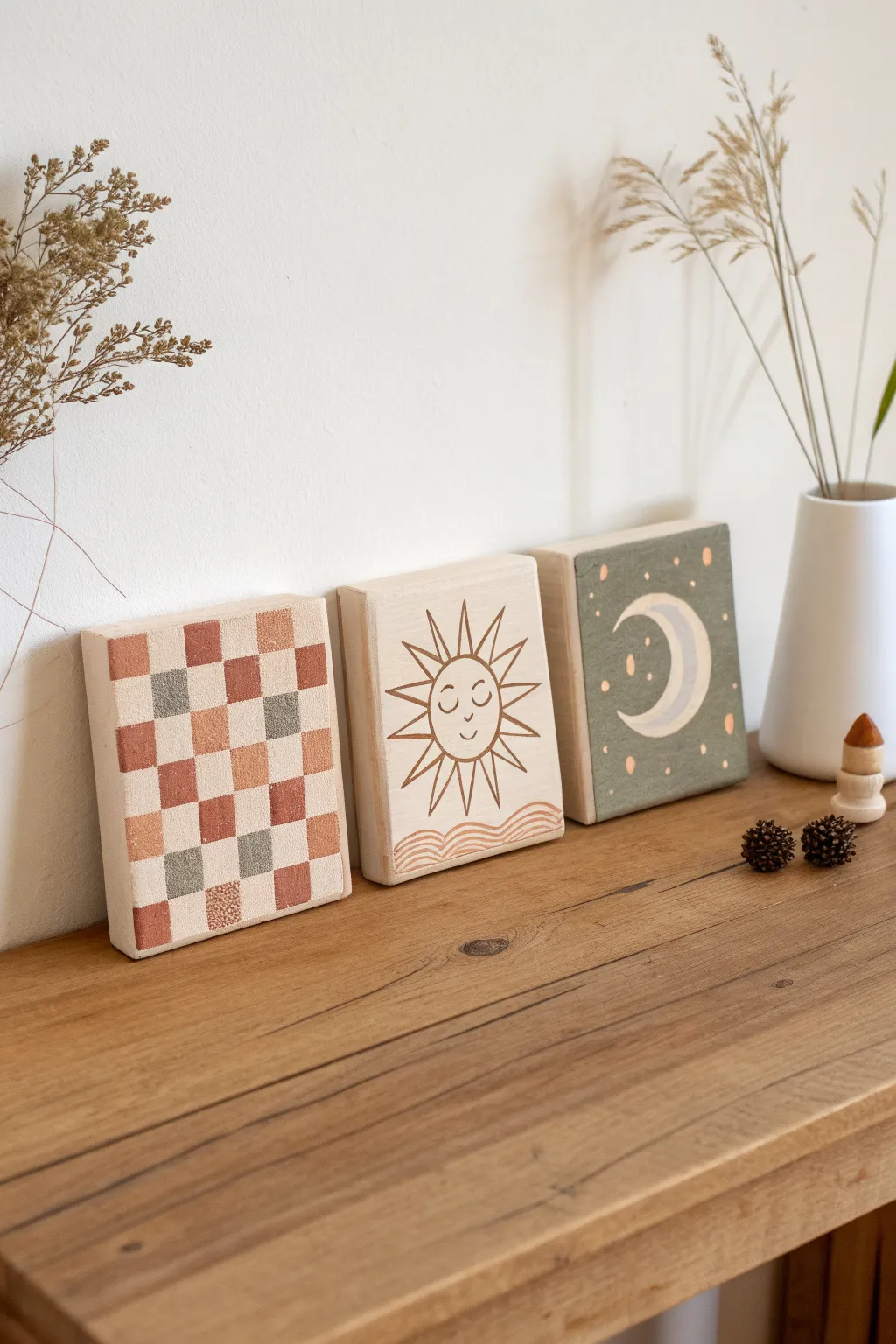
These charming, chunky wooden blocks bring a warm, indie aesthetic to any shelf with their earthy tones and simple motifs. The combination of geometric checkerboard, line-art sun, and celestial moon creates a cohesive yet varied display.
Step-by-Step Tutorial
Materials
- 3 square wooden canvases or chunky wood blocks (approx. 4×4 or 5×5 inches)
- Acrylic paints (terracotta, sage green, cream, light grey, warm brown)
- Fine liner detail brush (size 00 or 0)
- Flat shader brush (size 4 or 6)
- Pencil and eraser
- Ruler
- Painter’s tape (optional)
- Matte varnish or sealant
Step 1: Preparation & Planning
-
Sand the surfaces:
Begin by lightly sanding the front face of each wooden block to ensure a smooth painting surface. Wipe away any dust with a damp cloth. -
Prime selectively:
Decide which blocks need a base coat. For the moon block, you’ll paint the whole background, but for the sun and checkerboard, the natural wood grain serves as a lovely neutral base, so leave those bare for now.
Wobbly Lines?
If your fine lines are shaky, try resting your pinky finger on the dry part of the block to stabilize your hand while painting details.
Step 2: The Checkerboard Block
-
Grid the surface:
Use a ruler and pencil to lightly draw a grid on your first block. Aim for about 5 squares across and 5 down, keeping the spacing as even as possible. -
Mix your palette:
Prepare your terracotta, cream, and light grey paints. You want a muted, earthy palette, so tone down any bright colors with a touch of brown or white if needed. -
Paint the terracotta squares:
Using a small flat brush, fill in random squares with the terracotta paint. I like to scatter them unevenly to avoid a strict chessboard look. -
Add grey accents:
Next, paint a few scattered squares with the light grey or muted sage color. This adds depth and breaks up the warmth. -
Fill remaining squares:
Leave some squares as bare wood for texture, or paint the remaining ones in a soft cream color. Let the block dry completely.
Step 3: The Sun Block
-
Sketch the sun:
On the second bare wood block, lightly sketch a circle in the center. Add triangular rays radiating outward and a simple, sleepy face inside. -
Add the waves:
At the bottom of the block, sketch two or three wavy lines to represent water or rolling hills grounding the sun. -
Outline:
Using a fine liner brush and warm brown paint (thinned slightly with water for better flow), carefully go over your pencil lines. Keep the hand steady for crisp, thin strokes. -
Paint the waves:
Use the same warm brown or a slightly lighter terracotta shade to trace the wavy lines at the bottom.
Go 3D
Use textured puff paint or modeling paste for the moon or checkerboard squares to add tactile relief and interest to the flat surface.
Step 4: The Moon Block
-
Base coat:
Paint the entire front surface of the third block with a sage green acrylic paint. You may need two coats for full opacity. -
Sketch the crescent:
Once the green base is bone dry, lightly sketch a crescent moon shape in the center using a pencil. -
Fill the moon:
Paint the crescent moon with cream or off-white paint. Add a second layer if the green shows through. -
Add celestial details:
Use the tip of your smallest brush to add tiny dots and small starbursts around the moon. Use the terracotta color for some stars to tie it back to the first block. -
Refine the moon:
Paint a thin, inner line inside the crescent using a light grey or diluted brown to give the moon a bit of dimension.
Step 5: Finishing Touches
-
Clean up lines:
Check all three blocks for mistakes. Use an eraser to remove visible pencil marks once the paint is fully dry. -
Seal the art:
Apply a coat of matte varnish over all three blocks. This protects the paint and keeps the natural wood looking fresh without adding unwanted shine.
This trio allows you to experiment with patterns while keeping a beautifully unified style on your shelf
Color-Inverted Indie Icons
Create a stunning high-contrast art piece featuring playful indie motifs like eyes, hearts, and stars floating in a dark void. This project uses the negative space technique on black paper to make pastel colors pop.
Step-by-Step
Materials
- High-quality black cardstock or mixed media paper (A3 or 11×17 size)
- Posca paint markers (Pastel Pink and Pastel Mint Green/Aqua)
- Standard pencil (HB)
- White eraser
- Ruler (optional for spacing)
- Scrap paper for testing pens
Step 1: Preparation & Layout
-
Prepare your canvas:
Lay out your black cardstock on a clean, flat surface. Ensure your hands are clean to avoid transferring oils to the matte black surface. -
Test your colors:
On a piece of scrap black paper, test your pink and mint paint markers. Shake them well and pump the nibs until the paint flows opaquely. The goal is a solid, vibrant line that stands out against the dark background. -
Plan the composition sketch:
Using your pencil very lightly, sketch the rough placement of your largest icons first. Focus on the two large central eyes and the prominent hearts to anchor the design. -
Fill the gaps:
Lightly sketch the medium-sized elements like the sunbursts and larger stars in the empty spaces between your main icons, aiming for a balanced, scattered look rather than a rigid grid.
Smudge Alert
Work from the top left corner down to the bottom right (if right-handed) to avoid smearing wet paint with your palm as you draw.
Step 2: Drawing the Main Icons
-
Start with the central eye:
Take your mint green marker and draw the almond shape of the large central eye. Keep your hand steady and move the marker somewhat slowly to ensure full coverage. -
Add the iris details:
Inside the mint eye outline, switch to pink to draw the heart-shaped pupil. Add a second outline around the almond shape for extra visual weight. -
Outline the hearts:
Move to the heart shapes. Draw the main heart outlines in pink. For the ‘vibrating’ heart effect, draw concentric inner hearts, alternating drawn lines with black negative space. -
Draw the sunbursts:
Locate your sun sketches. Use the mint marker for the central circle and the rays. For the rays, use quick, confident strokes pulling away from the center. -
Create the second eye style:
For the upper right eye, draw the mint outlines for the lids and the iris. Add the lashes using single, deliberate strokes radiating upward.
Glow Up
Add tiny dots of white gel pen inside the colored lines or on the pupils to make the icons look like they are glowing neon lights.
Step 3: Adding Stars & Details
-
Draw large outline stars:
Find your spots for the distinct five-pointed stars. Draw these in pink, ensuring the lines connect cleanly at the points. -
Create double-lined stars:
Select a few star locations to feature the mint green color. Draw a star, and then carefully draw a second, slightly smaller star inside it to create a ‘hollow’ effect. -
Add solid star accents:
Identified by their solid color, draw smaller, filled-in stars in pink. These act as visual anchors to balance out the linear drawings. -
Incorporate mini elements:
Scatter tiny hearts and small dots (using the tip of the marker) throughout the empty black spaces. Alternate between pink and mint to keep the color balance even across the page. -
Draw the bottom eye:
For the eye at the bottom left, reverse the colors or style slightly—perhaps a mint outline with a distinct pupil design like a small flower or cross-hatch to add variety.
Step 4: Finishing Touches
-
Check opacity:
Look over your work. If any paint absorbed too much into the paper and looks dull, carefully trace over the line a second time once the first layer is fully dry. -
Erase guidelines:
Wait at least 15-20 minutes for the paint to cure completely. Then, gently erase any visible pencil sketch lines, being careful not to rub directly over the paint too hard. -
Flatten the artwork:
If the paint has caused the paper to buckle slightly, place the artwork under a heavy book overnight once it is 100% dry to flatten it out.
Hang your new cosmic creation on the wall for an instant burst of indie inspiration
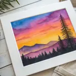


Have a question or want to share your own experience? I'd love to hear from you in the comments below!