When I’m in the mood for something moody but low-pressure, I reach for simple linework and let the gothic vibes do the heavy lifting. These ideas are all about black-and-white impact—quick to draw, easy to repeat, and perfect for filling a page with dark little treasures.
Classic Skull with Hollow Eyes
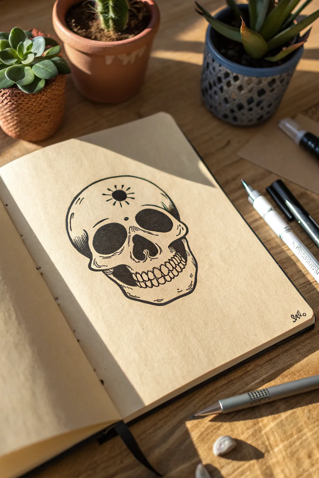
This striking skull illustration combines bold blackwork with delicate linework to create a classic gothic motif. The design features a distinctive third-eye sunburst symbol and deep, hollowed sockets that pop against the warm tone of kraft or parchment paper.
Step-by-Step Tutorial
Materials
- Slightly textured sketchbook paper (cream or tan toned works best)
- HB graphite pencil
- Kneadable eraser
- Fine liner pen (0.1mm or 0.2mm)
- Medium liner pen (0.5mm)
- Thick liner pen or brush pen (approx. 0.8mm or 1.0mm)
- White gel pen (optional for highlights)
Step 1: Pencil Structure
-
Map the cranium:
Start by lightly sketching a large circle for the main part of the skull. This doesn’t need to be perfect; think of it as a slightly flattened sphere. -
Add the jawline:
Below the circle, sketch a U-shape that tapers slightly inward. Connect this to the sides of the cranium to form the basic outline of the jaw and cheekbones. -
Place the features:
Draw faint guidelines intersecting the face. On the horizontal center line, sketch two large, slightly teardrop-shaped ovals for the eye sockets. In the center below them, add an upside-down heart shape for the nasal cavity. -
Outline the teeth:
Sketch a horizontal curve for the mouth line. lightly mark out individual teeth shapes—rectangular upper teeth and slightly smaller lower ones—following the curve of the jaw.
Sunburst Precision
To keep the forehead symbol symmetrical, draw a faint pencil crosshair first. Place the black dot at the intersection, then draw the rays along the invisible axes.
Step 2: Defining the Lines
-
Ink the outer contour:
Switch to your medium liner (0.5mm). Go over your pencil outline, but intentionally break the line in a few places to give it an organic, sketched feel rather than a rigid sticker look. -
Define the eye sockets:
Trace the eye sockets carefully. Notice that the inner corners dip slightly downwards. Keep your hand steady here, as these are focal points. -
Detail the nasal cavity:
Ink the nose shape. Use a few small, jagged strokes at the top edge of the cavity to suggest a skeletal texture where the bone bridges. -
Draw the teeth:
Using your fine liner (0.1mm or 0.2mm), ink the teeth. Don’t close every single gap perfectly; leaving small spaces between teeth at the root makes them look more natural and weathered.
Step 3: Filling and Shading
-
Fill the voids:
Using your thickest pen or brush pen, color in the eye sockets and the nasal cavity completely solid black. Ensure the ink coverage is opaque. -
Add initial depth:
With the 0.5mm pen, add heavy shading under the cheekbones and just behind the jaw hinge. I find color-blocking these shadow areas creates instant volume. -
Apply hatching texture:
Switch back to the fine liner. Add small, parallel hatch lines on the left temple, under the eye sockets, and along the bottom of the chin to suggest curvature. -
Stylize the cracks:
Draw a few squiggly, organic lines radiating from the temples or near the jaw to simulate bone fissures. Keep these lines very thin. -
Create the symbol:
In the center of the forehead, draw a small solid black circle. Carefully add short, straight rays radiating outward to form the mystic sunburst emblem.
Uneven Ink Lines?
If your lines feel too shaky, embrace it. Skulls look better with organic imperfections. Thicken the shaky line slightly to disguise the wobble as shadow weight.
Step 4: Final Touches
-
Erase guidelines:
Wait until the ink is completely dry to the touch to avoid smudging. Gently roll your kneadable eraser over the entire drawing to lift the original pencil sketch. -
Reinforce blacks:
Check your solid black areas. If the paper texture shows through too much, apply a second layer of ink to make the eyes look truly hollow. -
Add gentle stippling:
For subtle texture, add tiny dots (stippling) around the edges of the sunburst and near the teeth roots to soften the transition from white bone to shadow.
Your mystic skull is now complete, staring back from the page with dark, compelling intensity


Tiny Bat Flight Doodles
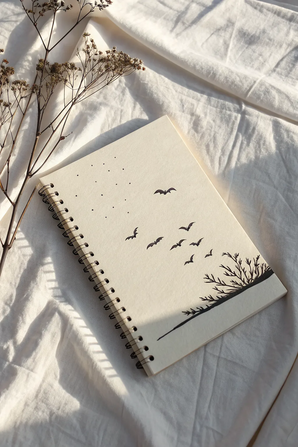
Transform a plain spiral journal into a subtle gothic piece with this minimalist ink illustration. Featuring a constellation of tiny dots and a sweeping flight of bats, this design adds a touch of darkness without overwhelming the page.
Step-by-Step Guide
Materials
- Blank spiral-bound notebook (cream or off-white paper cover)
- Fine-liner pen (black, size 01 or 03)
- Thicker felt-tip marker or brush pen (black)
- Pencil (HB or H)
- Eraser (kneaded preferred)
- Ruler (optional)
Step 1: Planning and Sketching
-
Plan the composition:
Visualize the layout on your notebook cover. The design flows diagonally from the bottom right to the top left, creating a sense of movement. -
Sketch the ground line:
Using your pencil, lightly draw a sloped horizon line starting near the bottom right edge and angling gently upward toward the left center. It doesn’t need to be perfectly straight; a slight organic curve looks more natural. -
Outline the branches:
Lightly sketch the shapes of the leafless bushes emerging from the right side of your ground line. Focus on creating jagged, sharp angles for the twigs to give them a spooky, barren feel. -
Mark bat positions:
Place small dots or faint ‘V’ shapes where you want your bats to be. I like to arrange them in an arc, starting small near the bushes and getting slightly larger and more spaced out as they fly upward. -
Draft the star field:
In the upper left quadrant, lightly mark a grid or random scattering of points where the ‘stars’ will go. Leaving this area open balances the visual weight of the bushes.
Ink Smearing?
If you’re left-handed or using a glossy cover, place a scrap piece of paper under your hand as a guard sheet while drawing to prevent smudging.
Step 2: Inking the Landscape
-
Draw the ground slope:
Switch to your thicker marker or brush pen. Trace over your pencil line for the ground, pressing firmly to create a bold, solid base for the drawing. -
Ink the main branches:
Using the same thicker pen, draw the main stems of the bushes. Extend them upward from the slope, tapering your strokes slightly at the ends. -
Add delicate twigs:
Switch to your fine-liner (01 or 03). Add smaller, sharper twigs branching off the main stems. Keep the lines crisp and angular. -
Fill the silhouette:
If your ground line has any gaps near the bottom edge of the notebook, fill them in with solid black to anchor the illustration.
Add a Moon
Use a white gel pen to draw a tiny crescent moon among the stippled stars for added contrast and a classic gothic night sky vibe.
Step 3: Drawing the Bats
-
Start with the nearest bats:
Begin with the bats closest to the bushes. These should be smaller and simpler, resembling elongated ‘M’ shapes. -
Define the wings:
For the mid-range bats, use your fine-liner to draw distinct wing shapes. The top edge is a curved arch, while the bottom edge has scalloped curves for the wing membrane. -
Create the focal bat:
For the largest bat at the top of the formation, detail the wings more carefully. Give them a sharp point at the tips and a small bump for the head in the center. -
Fill in the bats:
Carefully color the bats solid black. Ensure the edges remain sharp—fuzzy edges can make them look like birds instead of bats.
Step 4: Final Details
-
Create the stippled stars:
Using the tip of your fine-liner, press straight down to create the stars in the upper left. Don’t draw circles; just tap the pen to the paper. -
Vary dot density:
Keep the spacing relatively uniform, but you can group two or three dots slightly closer together to break up the grid pattern. -
Erase pencil lines:
Wait at least 10 minutes for the ink to cure fully. Gently erase all visible pencil marks with your kneaded eraser, being careful not to smear the ink. -
Review and refine:
Step back and look at the composition. If a branch looks too thin or a bat needs a sharper wingtip, make those tiny adjustments now.
Now you have a custom notebook perfect for recording your spookiest thoughts or sketches
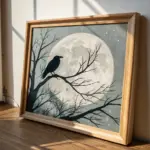

Minimal Black Cat with Moon Eyes
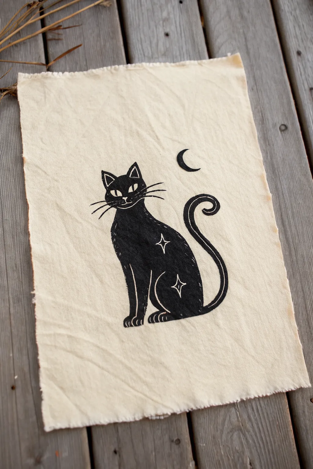
Create your own piece of rustic gothic art with this charming block-printed black cat, complete with starry details and a lunar companion. This project uses lino carving to achieve bold, solid shapes that look striking against natural, unbleached fabric.
Detailed Instructions
Materials
- Soft-cut lino block (approx 4×6 inches)
- Lino carving tools (V-gouge and U-gouge)
- Block printing ink (black, oil-based or water-soluble)
- Rubber brayer (roller)
- Unbleached cotton calico or muslin fabric
- Pencil and sketchbook paper
- Tracing paper (optional)
- Glass or acrylic palette for inking
- Wooden spoon or barren
Step 1: Designing and Transferring
-
Sketch the silhouette:
Start by drawing a simple, sleek cat silhouette on paper. Aim for smooth, continuous lines for the back and tail, as these carve easiest. Focus on the pose—a sitting cat with a curled tail creates a nice vertical composition. -
Add celestial details:
Draw the interior details that will remain white: the large almond-shaped eyes, the whiskers, the nose, and the two four-pointed stars on the flank and thigh. Don’t forget the crescent moon floating above the head. -
Transfer to block:
Place your drawing face down onto the lino block. Rub the back of the paper firmly with the back of a spoon or a pencil to transfer the graphite image. Alternatively, redraw the design directly onto the block, remembering that the final print will be a mirror image.
Clean Lines Tip
Warm your lino block with a hair dryer or by sitting on it for a few minutes before carving. Softer lino yields much smoother curves, essential for that sleek tail.
Step 2: Carving the Block
-
Outline fine details first:
Using your smallest V-gouge tool, carefully carve the outlines of the most delicate features: the stars, the eyes, and the whiskers. Move slowly here, as slips are harder to fix in these tiny areas. -
Define the perimeter:
Still using the V-gouge, carve along the outer line of the cat’s body and the moon. This creates a safety channel that protects your design when you switch to larger tools. -
Clear the background:
Switch to a wider U-gouge to clear away the negative space around the cat. You don’t need to go extremely deep, just enough so the background doesn’t pick up ink. I recommend carving in a consistent direction away from the cat design for a tidy look. -
Add texture (optional):
If you want the subtle scratchy texture seen on the cat’s chest or tail in the example, lightly graze the surface with a fine tool or sandpaper, but keep the main body smooth for solid black coverage. -
Clean the block:
Brush away all carving debris with an old toothbrush or dry paintbrush to ensure no stray crumbs interfere with your ink.
Make it a Banner
Attach a small twig or dowel to the top using simple twine loops to turn this fabric scrap into a hangable wall tapestry suitable for a gallery wall.
Step 3: Printing on Fabric
-
Prepare the fabric:
Cut your unbleached cotton slightly larger than your final desired size. Leave the edges raw and fray them slightly by pulling loose threads for that rustic aesthetic. Iron the fabric flat. -
Charge the roller:
Squeeze a small amount of black block printing ink onto your palette. Roll the brayer back and forth across the ink until you hear a sticky, velcro-like sound and the roller has a satin finish. -
Ink the block:
Roll the ink onto your carved block. Apply a thin, even layer first, then go over it again to ensure the solid black areas are fully saturated. Be careful not to fill in the fine whisker lines with too much ink. -
Position the print:
Place your inked block face up on the table, or place the block face down onto the fabric—whichever method you are more comfortable with. For precise placement like this, I usually prefer placing the fabric on top of the inked block. -
Transfer the image:
Using a barren or the back of a wooden spoon, rub the back of the fabric firmly in circular motions. Ensure you press down on every part of the design, especially the edges of the tail and ears. -
Peel and reveal:
Slowly peel one corner of the fabric back to check the coverage. If it looks spotty, lay it back down carefully and rub more. Once satisfied, peel the fabric entirely off the block. -
Set the ink:
Allow the print to dry completely. Depending on your ink type (oil takes longer than water-based), this could take 24-48 hours. Once dry, heat set the ink with an iron according to the manufacturer’s instructions to make it permanent.
Hang your finished celestial cat print on the wall for a touch of handmade magic

Simple Coffin Outline with Tiny Cross Details
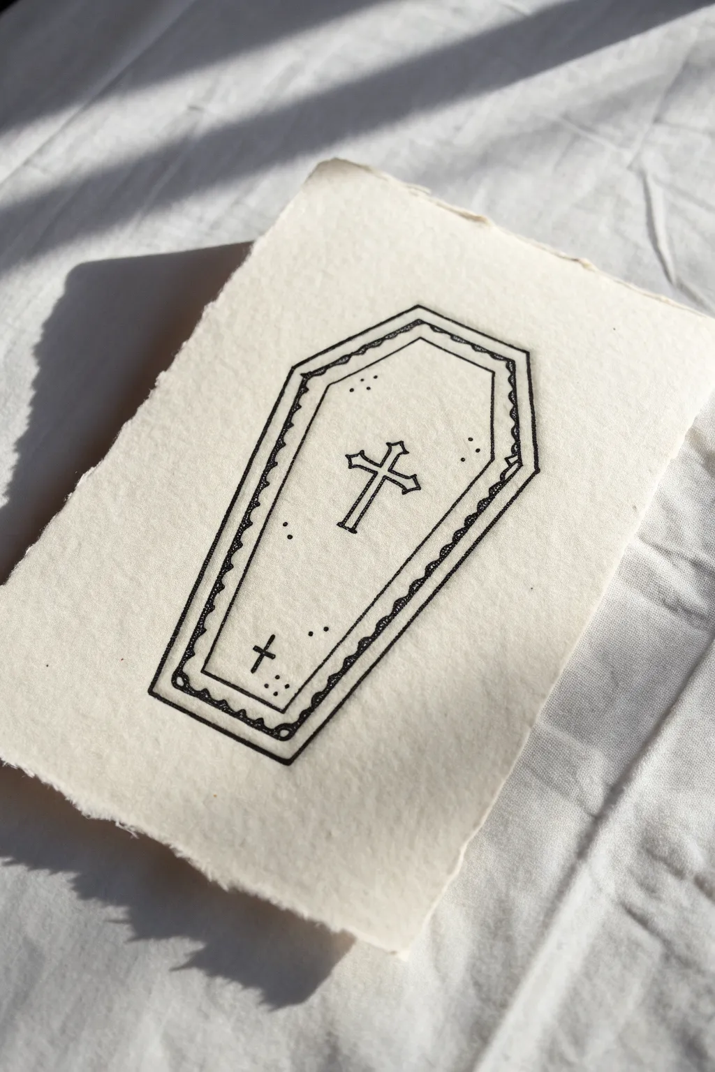
This striking yet simple drawing captures a classic gothic motif with clean lines and delicate details. The contrast of the crisp black ink against the soft, textured paper gives it an authentic, vintage feel perfect for stationary or wall art.
Step-by-Step Guide
Materials
- Heavyweight textured paper (cold press watercolor or handmade cotton rag)
- Fine liner pen (size 0.5 or 0.8 for outlines)
- Ultra-fine liner pen (size 0.1 or 0.05 for details)
- Pencil (HB or 2H)
- Ruler
- Kneaded eraser
Step 1: Drafting the Shape
-
Establish the centerline:
Begin by lightly drawing a vertical line down the center of your paper with a ruler. This will act as the spine of your coffin to ensure symmetry. -
Mark the width points:
Decide on the height of the coffin. Make a mark at the top, the bottom, and the widest point (usually about 1/3 down from the top). Measure equal distances from the centerline for the width at these spots. -
Connect the perimeter:
Using your ruler, connect the dots to form the classic hexagonal coffin shape. Draw this very lightly so it can be erased later. -
Create the inner border:
Sketch a second, smaller coffin shape inside the first one, maintaining an even gap of about 3-5mm from the outer edge to create a thick frame.
Wobbly Lines?
If your straight lines look shaky, try moving your arm from the shoulder rather than just your wrist. This locks the hand in place for a smoother, straighter stroke.
Step 2: Inking the Structure
-
Outline the exterior:
Switch to your thicker fine liner (0.5 or 0.8). Carefully trace the outer perimeter of the coffin shape. I prefer to pull the pen toward me for straighter lines. -
Outline the interior:
Trace the inner coffin shape with the same pen. Be mindful of corners; make them sharp and distinct rather than rounded. -
Draw the main cross:
In the upper center of the interior space, sketch a simple Latin cross. Use your ruler to ensure the arms are perpendicular to the vertical post. -
Thicken the cross:
Give the cross dimension by outlining around your stick figure cross, creating a hollow shape with distinct ends. -
Add the smaller cross:
Near the bottom left of the coffin interior, draw a tiny, simple cross using just single strokes. It should look like a miniature echo of the main centerpiece.
Vintage Dye
Before drawing, lightly stain your paper with cold tea or diluted coffee. Let it dry flat under a book for an aged, parchment-like appearance that suits the gothic vibe.
Step 3: Adding the Details
-
Create the wavy trim:
Inside the border gap between your two main outlines, draw a continuous scallop or wavy line pattern. Take your time here to keep the waves consistent in size. -
Enhance the perimeter:
Switch to your ultra-fine pen (0.1). Add tiny dots or small ticks along the exterior of the wavy line to add texture to the border. -
Stipple the top decoration:
Add a few clusters of small dots near the top corners inside the coffin. Keep these sparse and deliberate. -
Stipple the bottom decoration:
Mirror the dot clusters at the bottom, placing a few near the small cross to balance the composition. -
Erase pencil guides:
Wait until the ink is completely dry—give it a solid five minutes—then gently roll a kneaded eraser over the entire drawing to lift the pencil marks without smudging. -
Tearing the edges:
To achieve the ragged look in the reference, place a ruler firmly along the edge of the paper and tear the strip off towards you. Repeat for all four sides.
Now you have a piece of gothic art ready to be framed or gifted.

PENCIL GUIDE
Understanding Pencil Grades from H to B
From first sketch to finished drawing — learn pencil grades, line control, and shading techniques.
Explore the Full Guide
Cute Sad Ghost with a Dark Shadow
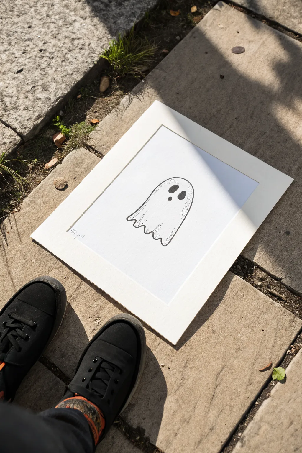
This charmingly spooky ghost drawing blends clean line art with classic stippling techniques to create depth and character. The minimalist black-and-white design gives it a crisp, modern gothic feel perfect for framing.
How-To Guide
Materials
- High-quality white drawing paper (bristol or hot press watercolor paper)
- Pencil (HB or H for light sketching)
- Kneaded eraser
- Fine liner pens (0.1mm, 0.3mm, and 0.5mm)
- Ruler
- White picture mount/mat board
Step 1: Sketching the Shape
-
Set your boundaries:
Begin by lightly marking the center of your paper to ensure your ghost will be perfectly positioned within the mat frame later. -
Draft the head:
Draw a smooth, rounded arch for the top of the ghost’s head. Aim for an elongated inverted ‘U’ shape that feels organic rather than perfectly geometric. -
Form the body:
Extend the lines down from the arch. Flare the bottom slightly outwards to give the draping sheet effect, making the left side a bit shorter than the right for perspective. -
Create the hem:
Connect the bottom edges with a wavy line. Create about 4-5 distinct scallops or waves to simulate the fabric folding at the ground. -
Place the features:
Lightly sketch two oval shapes for the eyes near the top third of the head. Add a small circle below and between them for the mouth—position these slightly off-center to imply the ghost is turning.
Ink Smudging?
If your hand smudges the ink while stippling, place a scrap piece of paper under your drawing hand to protect the work surface.
Step 2: Inking the Outlines
-
Trace the silhouette:
Using a 0.5mm fine liner pen, carefully trace over your pencil outline of the ghost’s body. Keep your hand steady for a clean, continuous line. -
Fill the features:
Outline the eyes and mouth with the same pen. Fill them in completely solid black. You might want to switch to a thicker marker for the fill if you have one, or just take your time layering ink. -
Erase guidelines:
Wait several minutes for the ink to dry completely to avoid smudging. Then, gently use the kneaded eraser to lift away all visible pencil marks.
Step 3: Shading with Stippling
-
Start strong at the base:
Switch to a 0.1mm fine liner. Begin placing dots densely along the bottom hem of the ghost, concentrating them near the inner corners of the waves. -
Build the gradient:
Gradually spread the dots upward from the hem. Space them further apart as you move higher to create a fading gradient effect. -
Shadow the side:
Apply a similar dot gradient along the right vertical edge of the ghost. Keep the dots dense right against the line art and disperse them inward toward the center. -
Add feature depth:
Add a very light scattering of dots around the eyes, particularly under them, to give the face a slight sense of dimension without darkening it too much. -
Refine the texture:
I find it helpful to squint at the drawing now to check the values. Add more dots to the darkest areas if the contrast isn’t strong enough.
Glow in the Dark
Trace the final outline with a glow-in-the-dark gel pen or apply a thin layer of glow paint over the white areas for a spooky night surprise.
Step 4: Finishing Touches
-
Add signature:
Sign your work small and subtly in the bottom left corner using the 0.1mm pen. -
Prepare the mount:
Place your white mat board over the drawing to check the composition one last time before securing it. -
Secure the art:
Use artist tape on the back of the drawing to hinge it to the mat board, ensuring the ghost sits squarely in the window.
Now you have a delightfully melancholic phantom ready to hang on your wall
Corner Spiderweb Frames
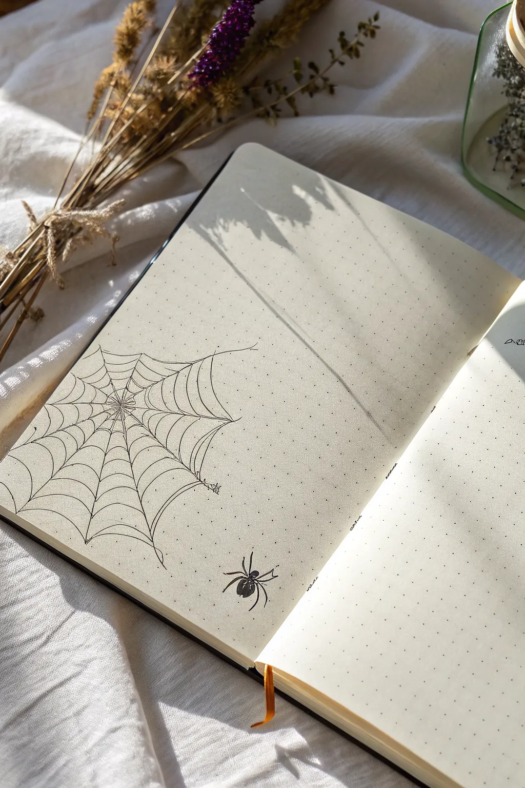
Embrace the spooky season or add a touch of gothic elegance to your bullet journal with this delicate fineline drawing. This design features an asymmetric spiderweb anchored in the corner, accompanied by a small, solitary spider, perfect for framing your daily notes without cluttering the page.
Detailed Instructions
Materials
- Dot grid notebook (A5 size recommended)
- Black fineliner pen (0.1mm or 0.2mm nib)
- Black fineliner pen (0.05mm nib for extra fine details)
- Pencil (HB or H)
- Eraser
- Ruler (optional)
Step 1: Planning the Web Structure
-
Define the anchor point:
Start by identifying the center of your web. Place a small dot with your pencil roughly 10-12 dots up from the bottom edge and 10-12 dots in from the left spine. This off-center placement creates a more natural, draped look. -
Sketch the main spokes:
Lightly sketch lines radiating outward from your center dot. Draw about 10-12 lines total. Some should extend all the way to the page edges (left and bottom), while the upper and rightmost lines should stop in free space to create the hanging effect. -
Create the anchor threads:
For the spokes that don’t touch the page edge, sketch long, curving ‘anchor’ threads that reach far out to imaginary points on the page. In the reference, the top-right thread extends significantly further than the others.
Pro Tip: The Wobble
Don’t use a ruler for the web lines. A slight wobble in your hand makes the silk look organic and real. Perfectly straight lines make it look like a diagram rather than a drawing.
Step 2: Weaving the Silk
-
Sketch the spiral structure:
Starting near the center, lightly sketch scalloped or curved lines connecting the spokes. Think of these as little ‘U’ shapes drooping between each radial line. -
Expand the spiral:
Continue adding concentric rings of these scalloped lines, moving outward. As you get further from the center, make the spacing between the rings slightly wider to mimic a real web’s tension. -
Vary the curves:
Make sure your connecting lines aren’t perfect. Let some droop lower than others. The outermost lines should look particularly loose and draped. -
Ink the spokes:
Switch to your 0.1mm or 0.2mm fineliner. Carefully trace over your pencil spokes. When you reach the end of a floating spoke, taper your pressure so the line ends gently rather than abruptly. -
Ink the webbing:
Trace the scalloped connecting lines. I prefer to pull the pen quickly for smoother curves. Connect them precisely to the spokes. -
Add floating threads:
Draw the long, loose anchor threads that extend beyond the main web structure. Keep your hand relaxed to get a slight, natural wobble in these long lines.
Step 3: Drawing the Spider
-
Position the spider:
Choose a spot in the open space to the bottom right of the web. Lightly sketch a small oval for the abdomen and a smaller circle for the head/thorax. -
Add the legs:
Sketch four legs on each side. The front two pairs should reach forward, and the back two pairs should extend backward. Giving them sharp joints adds to the creepiness. -
Ink the spider body:
Using the 0.2mm pen, outline the body shapes. Fill in the body solid black, but leave a tiny sliver of white paper on the abdomen to represent a shine or highlight. -
Ink the spider legs:
Carefully trace the legs. Make the segments closest to the body slightly thicker, tapering to a sharp point at the ends.
Level Up: Morning Dew
Use a white gel pen to add tiny dots along the web strands and on the spider’s back. This creates the illusion of glistening morning dew or rain droplets trapped in the silk.
Step 4: Finishing Touches
-
Erase pencil marks:
Wait at least 5-10 minutes to ensure the ink is completely dry. Gently erase all pencil guidelines, being careful not to buckle the paper. -
Add detail imperfections:
Using your 0.05mm pen, add tiny tick marks or extra little threads hanging off the main web to make it look old and abandoned. -
Connect the spider:
If you wish, draw a single, very straight vertical line from the spider reaching up towards the web or off the page, implying it is hanging.
Now you have a beautifully haunting corner piece ready to hold your daily tasks or thoughts
BRUSH GUIDE
The Right Brush for Every Stroke
From clean lines to bold texture — master brush choice, stroke control, and essential techniques.
Explore the Full Guide
Dripping Bleeding Heart Icon
This striking design combines the classic symbol of romance with a darker, organic aesthetic, featuring jagged branches and somber drips. The high contrast between the thick black outline and the deep crimson details makes for a bold statement piece perfect for a greeting card or sketchbook page.
Step-by-Step
Materials
- Heavyweight textured off-white paper (cold press watercolor or mixed media)
- Black India ink or permanent marker
- Deep red ink or fineliner pen
- Pencil (HB or lighter)
- Kneaded eraser
- Fine detail brush (if using bottled ink)
- ruler (optional)
Step 1: Sketching the Framework
-
Establish the curve:
Begin by lightly sketching a standard heart shape in the center of your paper using your pencil. Keep the lines faint so they are easy to remove later. -
Distort the shape:
Refine the heart by slightly flattening the top curves and elongating the bottom point to give it a sharper, more gothic silhouette. -
Map the veins:
Lightly draw a central V-shape growing upward from the bottom point inside the heart. Branch these lines out like lightning bolts or bare tree limbs. -
Plan the drips:
Sketch small tear-drop shapes falling from the bottom point and lower sides of the heart outline to indicate bleeding.
Bleeding Lines?
If your ink feathers into the paper grain too much, switch to a smoother Bristol board or use archival pigment liners, which are less prone to spreading on absorbent paper than liquid ink.
Step 2: Defining the Outline
-
Inking the border:
Using your thick black marker or a brush loaded with black India ink, trace over your pencil outline of the heart. -
Thicken the line:
Go over the outline a second time to create significant weight. The line should be bold and deliberately slightly uneven to mimic a rustic or decaying feel. -
Create the heavy point:
Add extra thickness specifically at the bottom point of the heart where the two curves meet, creating a sharp, dagger-like visual anchor. -
Add texture:
If I want a grittier look, I sometimes stipple the edges of the wet ink slightly so the line isn’t perfectly smooth.
Step 3: Adding the Crimson Details
-
Draw the main arteries:
Switch to your deep red ink or pen. Start at the bottom inner point of the heart and draw two thick lines branching upward and outward. -
Branching out:
From the main arteries, draw smaller, finer lines that fork and split. Keep these lines jagged and angular rather than curvy. -
Tapering ends:
Ensure that the tips of the red branches taper off into fine points near the top curves of the black outline without actually touching it. -
Inner bleeding:
Add tiny flecks or short strokes of red coming off the main branches to simulate smaller capillaries.
Sparkle & Shine
For a magical touch, mix a tiny amount of red glitter into your red ink or use a metallic red gel pen for the veins. It catches the light beautifully against the matte black.
Step 4: The Drip Effect
-
Form the droplets:
Fill in the sketched tear-drop shapes beneath the heart with the deep red ink. Make the top of the drop round and the bottom point sharp. -
Connect the flow:
Draw very thin, vertical lines connecting some of the droplets to the black outline, suggesting gravity is pulling thick liquid down. -
Vary the size:
Ensure your droplets vary in size; place a large, heavy drop directly under the main point, with smaller satellite drops to the sides. -
Add black accents:
Use your black ink to add tiny ‘spikes’ or small drips hanging off the main black outline to integrate the bleeding effect.
Step 5: Final Touches
-
Erase guidelines:
Wait until the ink is completely dry to the touch, then gently run your kneaded eraser over the entire image to lift any remaining pencil marks. -
Check contrast:
Look for any areas where the red overlaps the black. If the black looks faded, touch it up to ensure it remains the dominant, encapsulating border.
Now you have a beautifully dark piece of art ready to frame or gift to a fellow gothic soul
Crescent Moon with Sharp Stars

This minimalist, witchy artwork captures a starry crescent moon framed by geometric lines and sharp celestial elements. The design balances bold, solid black ink against delicate dotted details and crisp white space.
How-To Guide
Materials
- Smooth heavyweight drawing paper or sketchbook
- Pencil (HB or H)
- Circle compass
- Ruler
- Fine liner pen (0.1mm) for details
- Thick marker or brush pen (black) for filling
- White gel pen (optional, for corrections or stars)
- Eraser
Step 1: Planning the Structure
-
Define the center:
Begin by finding the approximate center of your page. Mark a small dot; this will be the anchor for your geometric layout. -
Draw the main guide axes:
Using your ruler, draw a large ‘X’ shape intersecting at your center dot. Sketch these lines lightly, as they are primarily guides for star placement. -
Create the circle guide:
Set your compass to a medium radius (about 2-3 inches). Place the needle on the center dot and draw a light, faint circle which will form the outer boundary for the dotted ring. -
Outline the crescent:
Draw the outer curve of the moon slightly smaller than your guide circle. Then, draw the inner curve to create a crescent shape. The moon should look like it is cradling the center point.
Clean Lines Hack
If you struggle drawing perfect stars, make a tiny dot for the center and five dots for the tips first, then connect them like a constellation before filling in.
Step 2: Inking the Moon
-
Outline the shape:
Switch to your thick marker or brush pen. Carefully trace the pencil outline of the crescent moon first to establish a clean edge. -
Fill in the black:
Fill the entire crescent shape with solid black ink. Work slowly near the edges to keep them crisp. -
Add negative space stars:
While the ink is wet, you can lift tiny specks if using ink wash, or clearer yet, wait until it’s fully dry and use a white gel pen to dot tiny stars inside the black moon body. -
Let it dry:
Allow the heavy black ink to dry completely to prevent smudging while you work on the surrounding details.
Add Gold Accents
For a luxe celestial look, use metallic gold ink for the central star or the dotted ring instead of black to make the design pop off the page.
Step 3: The Central Star
-
Draft the star:
In the center open space (the ‘belly’ of the crescent), use a pencil to sketch a five-pointed star. One point should aim straight up. -
Ink the outline:
Use a medium-thickness pen to outline the star. Keep the points sharp and precise. -
Fill the star:
Color in the central star completely black. It should visually balance the weight of the large moon.
Step 4: Geometric Details
-
Ink the crossing lines:
Take your ruler and a 0.1mm fine liner. Trace over your initial ‘X’ guide lines, but only extend them a short distance beyond the outer circle guide. -
Create the intermittent line effect:
Don’t draw a solid line through the whole image. Break the line where it intersects with the moon or the central star to make it look like it passes behind them. -
Draw the dotted circle:
Following your compass circle guide, use the fine liner to create a ring of small, evenly spaced dots. This circle should frame the entire composition. -
Add cardinal stars:
At the four points where your ‘X’ lines intersect the dotted circle, draw small five-pointed stars. Fill these in with black ink.
Step 5: Finishing Touches
-
Add secondary stars:
Draw four additional, slightly smaller stars on the dotted circle line, placed exactly halfway between the larger cardinal stars. -
Draw distant stars:
Scatter a few tiny four-pointed stars or simple distinct dots around the main design to add depth to the ‘sky’ area. -
Erase guidelines:
Once the ink is 100% dry, gently erase all remaining pencil marks. Be careful not to rub too hard over the dark black areas. -
Refine the white specks:
I usually go back with the white gel pen one last time to brighten the tiny stars inside the crescent moon if the black ink absorbed them.
Now you have a mystical piece of art ready to frame or lend atmosphere to your journal


Dagger and Rose in Simple Linework
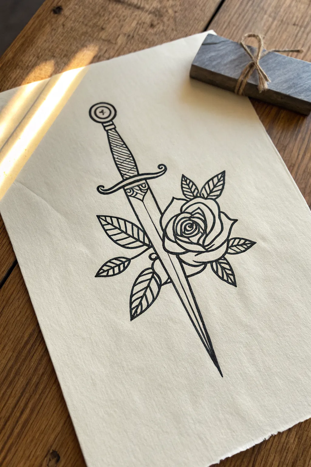
This striking illustration captures the timeless gothic romance of a dagger piercing a rose, rendered in clean, bold linework. It mimics the aesthetic of traditional flash tattoos using simple black ink on textured paper for an authentic, vintage feel.
Step-by-Step
Materials
- Cream or off-white drawing paper (medium tooth)
- HB graphite pencil
- Kneadable eraser
- Fine liner pen (size 0.3 or 0.5)
- Bold felt-tip marker or brush pen (black)
- Ruler
Step 1: Constructing the Skeleton
-
Establish the centerline:
Use your ruler and pencil to draw a faint straight line diagonally across your page. This will serve as the spine of the dagger to ensure the handle and blade align perfectly. -
Sketch the dagger handle:
At the top of your diagonal line, lightly sketch the pommel as a circle with an inner circle. Below this, draw the grip as a tapering cylinder that widens slightly towards the guard. -
Draft the crossguard:
Draw the crossguard (the piece between the handle and blade) as a thin, curved bar. The ends should curl slightly—one upward and one downward—creating a classic S-curve shape. -
Outline the blade shape:
Extend the initial diagonal line down to create the blade. Draw two lines originating from the guard that taper slowly to a sharp point at the bottom, mimicking a long triangular shape. -
Position the rose:
Sketch a rough, wobbly circle overlapping the blade slightly below the middle point. This circle acts as the placeholder for the main body of your rose bloom.
Pro Tip: Line Weight
Use a thicker pen for the main outline and a thinner pen for interior details like the leaf veins. This contrast defines the ‘traditional tattoo’ style.
Step 2: Developing the Forms
-
Define the rose center:
Inside your rose circle, draw a tight spiral shape. This represents the tightly packed petals at the very heart of the flower. -
Add blooming petals:
Surround the spiral with three or four larger, cup-shaped petals. Make the edges slightly uneven to look organic, rather than perfect geometric curves. -
Sketch the outer petals:
Draw the largest, outermost petals folding downward and outward. Ensure that where the dagger passes through the flower, you leave a gap in the petals so the blade looks like it is going behind or through them. -
Place the leaves:
Sketch five pointed oval shapes radiating from behind the rose. I like to group them in contrasting directions—two on the left, three on the right—to create dynamic balance. -
Refine the handle details:
Go back to the handle grip and add diagonal wrapping lines to simulate leather or wire binding. Draw a decorative scalloped pattern just under the crossguard on the blade itself. -
Adding the fuller:
Draw a straight line down the center of the blade (the fuller or blood groove), stopping before the tip. It creates dimension without needing shading.
Troubleshooting: Shaky Lines?
If your long straight lines look wobbly, ghost the movement with your hand in the air a few times before actually touching the pen to the paper.
Step 3: Inking and Finalizing
-
Outline the rose:
Switch to your fine liner pen. Trace your pencil lines for the rose petals, focusing on smooth, confident strokes. Vary the pressure slightly to give the petals weight. -
Ink the dagger profile:
Carefully ink the outline of the dagger. Use a ruler for the straight edges of the blade if you want a machine-perfect look, or freehand it for a more organic feel. -
Detail the handle grip:
Ink the diagonal wrapping lines on the handle. Make them darker near the edges and slightly broken in the middle to suggest roundness and highlight. -
Ink the leaves:
Outline the leaves and draw a central vein line down each one. Add simple diagonal hash marks along one side of each vein to suggest texture. -
Thicken the main lines:
Take a slightly thicker marker or brush pen and re-trace the outermost silhouette of the entire drawing. This ‘bold line’ technique makes the image pop off the page like traditional tattoo flash. -
Fill the details:
Fill in the small decorative semi-circles near the guard with solid black. Also, darken the very tip of the blade where the lines converge. -
Erase and clean:
Once the ink is completely dry—give it a few minutes to be safe—gently erase all underlying pencil sketches using your kneadable eraser.
Step back and admire your fiercely beautiful new piece of gothic art
Planchette Symbol Doodle
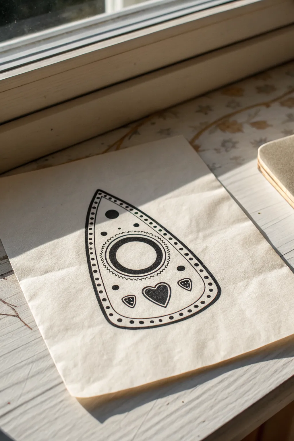
This project captures the occult charm of a classic planchette symbol using bold ink lines on natural paper. The resulting artwork has a stark, graphic quality that feels both vintage and handmade, perfect for a witchy aesthetic.
Step-by-Step Guide
Materials
- Light beige or off-white drawing paper (slightly textured)
- Pencil (HB or 2B)
- Eraser
- Fine-tip black ink fineliner (0.3mm or 0.5mm)
- Thicker black marker or brush pen
- Ruler (optional)
- Circle template or compass (optional)
Step 1: Sketching the Shape
-
Outline the base:
Start by lightly sketching the main teardrop shape of the planchette in pencil. Make sure the bottom is wider and curves gently upward to a pointed top. -
Refine the curve:
Adjust your sketch until the teardrop looks symmetrical. The sides should flow smoothly without any sharp angles except for the peak. -
Center circle placement:
In the middle of the widest part of the teardrop, sketch a large circle. This will be the viewing window. -
Inner ring detail:
Draw a slightly smaller circle inside the first one to create a thick ring shape. -
Outer decorative border:
Sketch a second teardrop line inside the main outline, leaving about a half-centimeter gap between them for the border design.
Steady Hands
For the border dots, breathe out as you place each one. This helps keep your rhythm steady and spacing consistent all around the edge.
Step 2: Adding Interior Details
-
Sunburst feature:
Around the central circle, lightly sketch small zigzag lines or triangles pointing outward to create a sunburst or saw-tooth effect. -
Main heart motif:
Below the central circle, draw a heart shape. Center it vertically within the bottom curve of the planchette. -
Side accents:
Add two smaller, inverted triangle shapes or guitar-pick shapes on either side of the heart. -
Upper circle details:
Above the main central circle, draw two small circles vertically aligned, getting smaller as they go up toward the point. -
Extra dot accents:
Place a few small circles strictly for decoration on the left and right sides of the central ring to balance the design.
Uneven Circles?
If your hand-drawn circles look wobbly, trace a bottle cap or coin for the main window, then freehand the rest for a rustic look.
Step 3: The Inking Process
-
Trace the main outline:
Using your thicker black marker, trace the outermost teardrop shape. Keep your hand steady to maintain a consistent line weight. -
Inner border line:
Switch to a slightly thinner pen if preferred, and trace the inner teardrop line. -
Fill the central ring:
Outline the two central circles. Use the thick marker to fill in the space between them, creating a solid black donut shape. -
Inking the sunburst:
Carefully trace the zigzag pattern around the central ring with a fine-tip pen for crisp points. -
Detailed motifs:
Outline and fill in the heart at the bottom. For the smaller side shapes, outline them and add a tiny dot or dash inside each one. -
Upper dots:
Fill in the solid black circles above the central window. -
Border dots:
Inside the channel between the outer and inner teardrop lines, carefully place a series of small, evenly spaced dots all the way around the perimeter.
Step 4: Finishing Touches
-
Let it dry:
Wait several minutes to ensure all the ink is completely dry. I usually give it extra time here just to be safe. -
Erase pencil lines:
Gently erase all visible pencil marks, being careful not to crumple the paper or smear any ink that might still be damp. -
Final inspection:
Check for any uneven lines or spots where the black fill needs to be more solid, and touch them up with your marker.
Display your mystical drawing near a window to catch the light and enjoy the graphic simplicity of your work
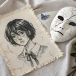
Goth Girl Face with Heavy Shadow Shapes
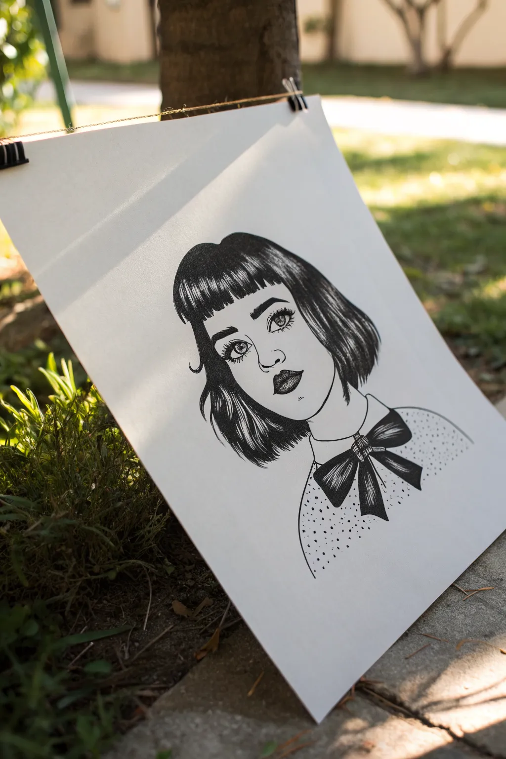
Capture the moody elegance of gothic style with this high-contrast ink portrait characterized by bold shadow shapes and delicate linework. This project focuses on clean contours and dramatic hair rendering to create a striking, stylized character.
How-To Guide
Materials
- Smooth bristol board or heavy drawing paper (A4 or A3)
- HB pencil for sketching
- Kneaded eraser
- Fine liner pens (0.1, 0.3, and 0.5 sizes)
- Black brush pen or broad marker for filling large areas
- Ruler (optional for shirt dot placement)
Step 1: Planning the Portrait
-
Basic Shapes:
Start with a light pencil sketch to establish the head shape. Draw an oval for the face, slightly tapered at the chin, and sketch the basic outline of the hair as a framing shape around the head. -
Facial Guidelines:
Draw faint horizontal lines through the center of the face for eyes and lower down for the nose and mouth. Position the eyes relatively large to give that stylized, doll-like appearance common in gothic art. -
Feature Placement:
Sketch the almond-shaped eyes, the small button nose, and full lips. Don’t worry about details yet; just get the proportions right. Add the outline of the neck and the collar of the shirt. -
Hair Architecture:
Map out the hair sections. Sketch the straight bangs across the forehead and the bob cut framing the cheeks. Instead of individual strands, think of the hair as ribbons or large clumps of volume.
Step 2: Initial Inking
-
Facial Outlines:
Using a 0.3 fine liner, carefully ink the outline of the face, neck, and ears. I like to keep these lines clean and unbroken for a smooth look. -
Eye Details:
Switch to a 0.1 pen for the delicate details inside the eyes, including the iris and pupil. Leave a small white circle in each pupil for a highlight to bring the character to life. -
Lashes and Brows:
Thicken the upper lash line significantly with the 0.5 pen. Draw distinctive, individually spaced lower lashes. Ink the eyebrows with short, directional strokes to mimic hair texture. -
Nose and Mouth:
Ink the nose with minimal lines—often just the nostrils and a hint of the tip are enough. Outline the lips, emphasizing the cupid’s bow.
Uneven Ink Flow?
If your markers streak or bleed, switch to smoother Bristol paper. Textured paper can drink up ink and cause feathering edges.
Step 3: Deepening Shadows and Hair
-
Lip Texturing:
Darken the upper lip almost completely or use heavy cross-hatching. For the bottom lip, use vertical hatching lines that curve with the lip’s volume, leaving the center lighter. -
Hair Outlines:
Go over the main outer shape of the hair with your 0.5 pen. Make sure the ends of the bob look sharp and slightly jagged. -
Establishing Sweeps:
Draw the major flow lines within the hair. This defines where the highlights will sit. The ‘shine’ will be a horizontal band across the bangs and a vertical band on the side hair. -
Filling the Hair:
This is the most critical step for that heavy shadow look. Using a brush pen or marker, fill in the dark areas of the hair, starting from the roots and tips and tapering inward toward the highlight band. -
Blending the Shine:
Where the solid black meets the white highlight band on the hair, use your fine liner to draw quick, tapered strokes. This creates a transition rather than a blocky stripe.
Add a Splash
Make the eyes pop by ignoring the black-and-white rule; paint just the irises a vibrant red or violet using watercolor or colored ink.
Step 4: Clothing and Final Touches
-
The Bow Tie:
Draw the large bow at the neck. Use the brush pen to fill the shadowy folds of the ribbon, leaving the edges and high points white for contrast. -
Clothing Pattern:
Ink the shoulders and shirt outline. For the texture, create a stippling effect or small dots scattered across the shirt. Keep them random but relatively evenly spaced. -
Adding Piercings:
If desired, add small circles for piercings on the nose or lip using your finest pen. -
Cleanup:
Once the ink is completely dry, thoroughly erase all underlying pencil sketches. Check for any lines that need thickening to balance the visual weight of the hair.
Your moody, stylized portrait is now ready to be framed or added to your sketchbook collection
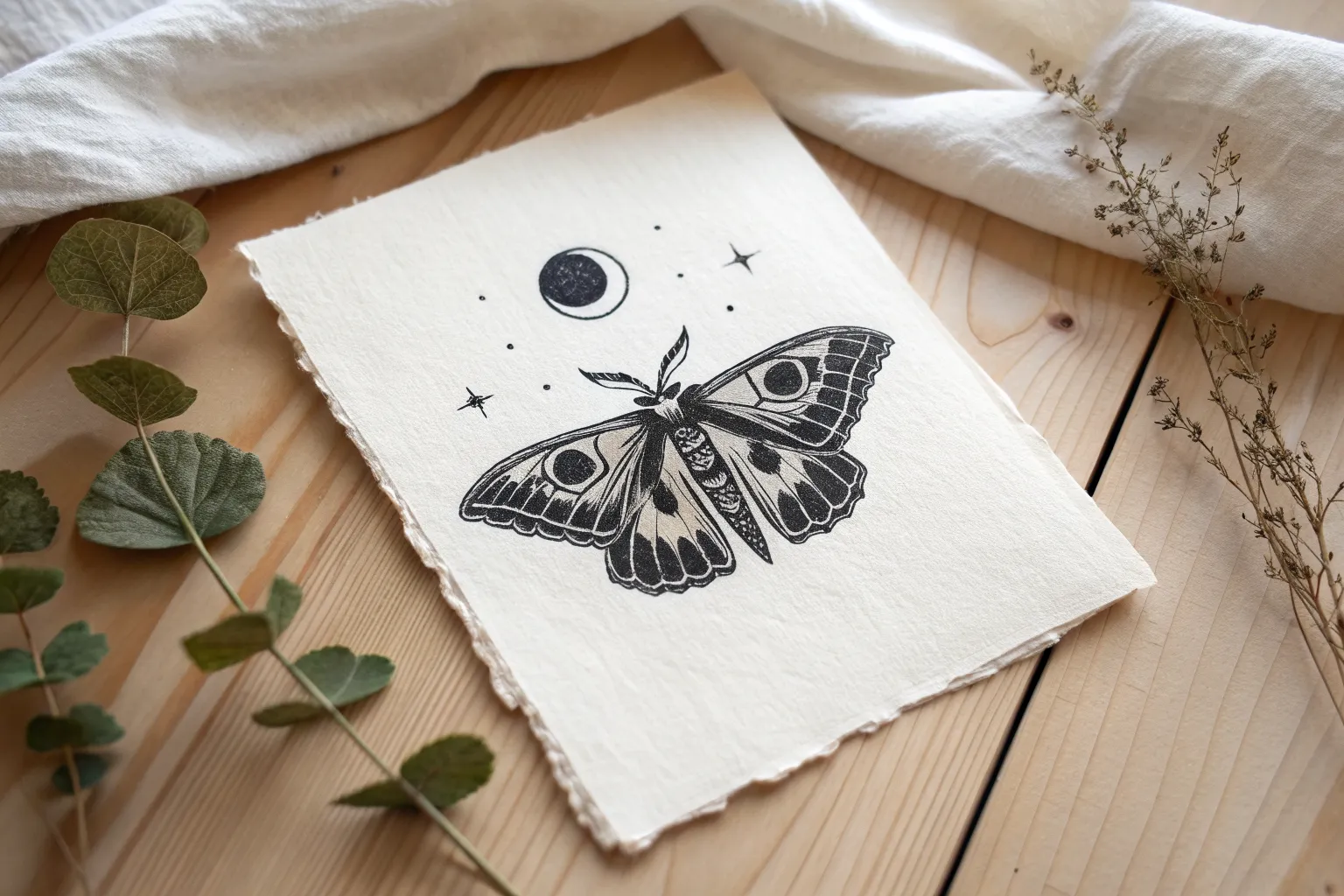
Death Moth with Skull Wing Marking
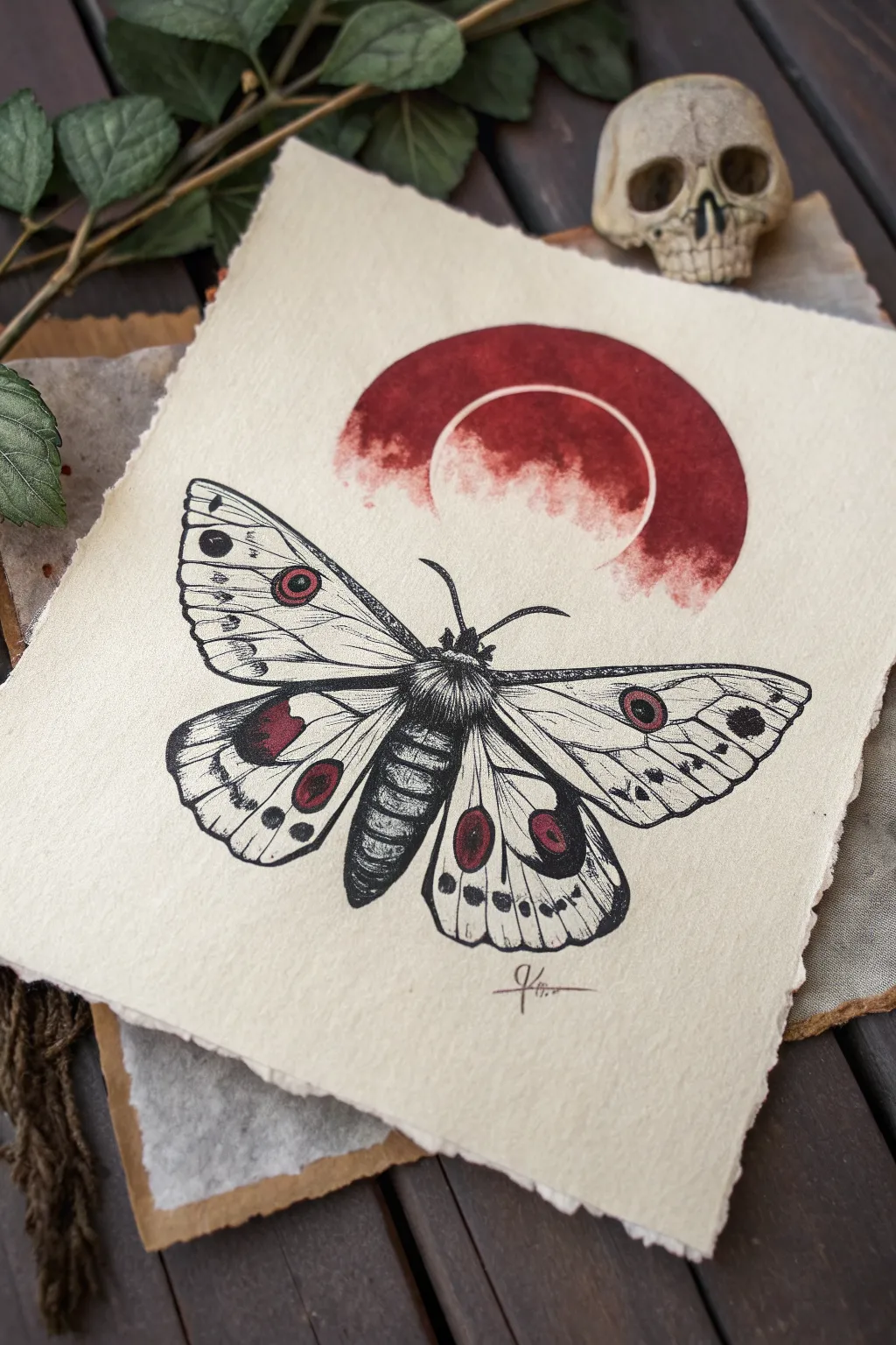
This striking illustration combines precise pen work with a bold watercolor wash to create a moody, gothic aesthetic. The contrast between the stark black stippling and the deep crimson moon creates a captivating focal point perfect for a dark academia gallery wall.
How-To Guide
Materials
- Heavyweight cold-press watercolor paper (300 gsm) or handmade cotton rag paper with deckled edges
- Micron pens (sizes 005, 01, 03, and 05) or fine liner pens
- Deep crimson or alizarin crimson watercolor paint
- Round watercolor brush (size 6 or 8)
- Pencil (HB or 2B) and kneaded eraser
- Compass or circular object for tracing
- Ruler
Step 1: Preparation & Sketching
-
Prepare the paper:
If you are using a standard sheet of watercolor paper, you can tear the edges against a ruler to create that vintage, deckled look shown in the reference. If you have handmade rag paper, simply orient it vertically. -
Map out the moon:
Near the top third of the paper, lightly trace a circle using a compass or a bowl. Inside this circle, draw a slightly smaller, concentric circle to mark the negative space where the white ring will be. -
Define the moth’s axis:
Below the moon shape, draw a light vertical line to act as the central spine of the moth. This ensures symmetry. Sketch the thorax and abdomen as an elongated oval and a segmented cone shape along this line. -
Outline the wings:
Lightly sketch the four wing shapes. The top wings should be triangular and sweep outward, while the bottom wings are more rounded and droop slightly. Ensure the tips of the top wings extend past the width of the bottom ones. -
Place the wing patterns:
Sketch the prominent eye-spots on the wings. There is a small circular mark on each upper wing and a larger, more dramatic teardrop or oval shape on the lower wings.
Bleed Control
To keep the moon sharp, apply painter’s tape or masking fluid over the inner circle area before painting the red wash. It guarantees a crisp white ring.
Step 2: Watercolor Application
-
Paint the crimson moon:
Mix a deep, blood-red watercolor. Carefully paint the outer ring of the moon shape you traced earlier. Leave the inner circle completely unpainted to create the white eclipse effect. -
Add texture to the wash:
While the red paint is still wet, you can dab it gently with a dry tissue in random spots to create a cloudy, uneven texture. Let the edges bleed slightly if you prefer a rougher look. -
Paint the wing accents:
Using the same red mix, carefully fill in the specific eye-spots on the wings. Note that on the lower wings, the red is only part of the spot, often bordered by black later. -
Let it dry completely:
Wait for all paint to be bone dry. If the paper feels cool to the touch, it is still wet. Painting ink over wet watercolor will ruin your pen.
Aged Aesthetic
Dip the finished paper in a weak tea bath or lightly brush the edges with distress ink to deepen the vintage, parchment vibe of the drawing.
Step 3: Detailing & Inking
-
Line the main body:
Switch to an 03 or 05 pen. Outline the furry thorax and the segmented abdomen. Use short, jagged strokes for the thorax to suggest hair or fur. -
Ink the wing outlines:
Trace your pencil outlines for the wings with an 03 pen. Keep the lines confident but organic; they don’t need to be perfectly smooth vectors. -
Add the veins:
Switch to a finer 01 pen. Draw the structural veins of the wings radiating from the body toward the edges. These should be thinner than the outside border. -
Stipple the fur:
Using your 005 or 01 pen, add dense dots (stippling) to the center of the thorax to build up a rich, dark texture that looks like velvet. -
Shade the abdomen:
Use horizontal hatching lines on the abdomen segments, leaving a small strip of white down the center to signify a highlight on the glossy exoskeleton. -
Darken the eye-spots:
With an 05 pen, color in the black areas surrounding the red spots on the wings. This high contrast makes the red pop. -
Add wing texture:
Use tiny dots and very short dashes along the edges of the wings and near the veins. This creates the illusion of the powdery texture moth wings have. -
Final touches:
Draw the antennae with a slight curve, thickening them near the base. Erase any remaining pencil lines carefully once the ink is totally dry, and sign your work at the bottom.
Frame your new creation in a simple black frame to let the red moon take center stage.
Barbed Wire and Chain Border Strips
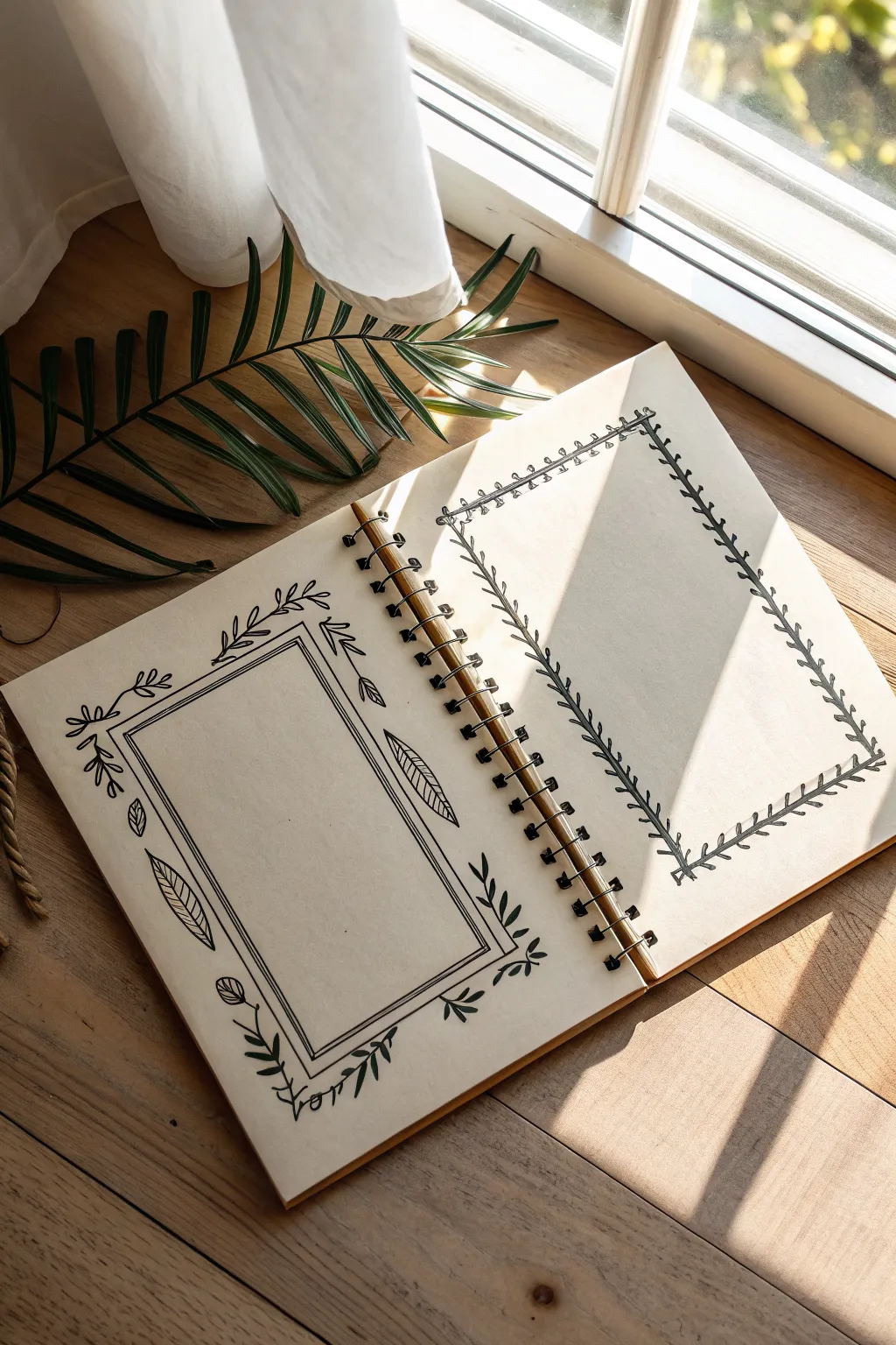
Embrace a contrasting aesthetic with this sketchbook spread, featuring delicate botanical vines on one page and an edgy barbed wire border on the other. This simple black ink project perfectly balances cottagecore charm with a touch of gothic grit.
Detailed Instructions
Materials
- Spiral-bound sketchbook (cream or tan paper recommended)
- Fine liner pen (0.3mm or 0.5mm, black)
- Thicker marker or brush pen (optional for filling)
- Pencil (HB or 2H)
- Eraser
- Ruler
Step 1: Planning and Layout
-
Prepare your workspace:
Find a flat surface with good lighting. Open your sketchbook to a fresh two-page spread. Having the spiral binding in the center allows you to work on the left and right compositions simultaneously. -
Lightly sketch the frames:
Using your pencil and ruler, lightly draw two rectangles, one on each page. Position them centrally but leave plenty of negative space around the edges for the decorative elements. -
Define the left frame structure:
On the left page, draw a second, slightly smaller rectangle inside the first one to create a double-line border. The space between lines should be about 3-5mm.
Ink Flow Tip
Work from the top-left corner down to the bottom-right (if you are right-handed) to prevent your hand from smearing fresh ink as you move across the page.
Step 2: Drawing the Botanical Border (Left Page)
-
Ink the main rectangle:
Switch to your fine liner pen. Carefully trace over your pencil lines for the double-frame on the left page. Don’t worry if the lines aren’t machine-perfect; a little wobble adds organic character. -
Sketch corner vines:
With a pencil, lightly sketch curved vine stems extending outward from the four corners of the frame. Make them flow naturally, curving slightly towards the center of the page edges. -
Add corner leaves:
Draw small, teardrop-shaped leaves along these corner vines using your pen. Keep the leaves simple and open. -
Create the side accents:
Midway down the vertical sides of the frame, draw large, elongated oval leaves. I like to add a central vein line and diagonal hatching inside these leaves for texture. -
Add bottom floral details:
At the bottom corners, draw stems that end in small, simple bud-like flowers. These should look like small circles with a line through them or tiny tulips. -
Finalize the botanical ink:
Go over all your pencil botanical sketches with the fine liner. Thicken the main stem lines slightly to give them visual weight compared to the delicate veins.
Step 3: Drawing the Barbed Wire Border (Right Page)
-
Draft the wire path:
On the right page, use your pencil rectangle as a guide. Sketch a slightly wavy line that follows the rectangular path. The waviness mimics the tension of wire. -
Add the barbs:
At regular intervals (about every inch), sketch small ‘X’ shapes or tiny knots directly on the wavy line to represent the barbs. -
Ink the main wire:
Using your fine liner, trace the wavy line. To make it look like twisted wire, you can add occasional small loops or breaks in the line. -
Define the barbs:
Ink the ‘X’ shapes. Make the ends of the X sharp and pointy. Add a small scribble or dot in the center of each X to show where the wire is knotted. -
Add thorns:
Along the main wire segments between the knots, draw small, sharp spikes pointing outward and inward. These shouldn’t be uniform; vary their direction for a dangerous, jagged look. -
Thicken the shadows:
Go back over the bottom and right sides of the wire knots with your pen to add a tiny bit of line weight, suggesting a shadow and giving the wire dimension.
Add Goth Texture
Use a technique called ‘stippling’ (lots of tiny dots) around the barbed wire knots to create a rusty, aged metal texture without needing colored ink.
Step 4: Finishing Touches
-
Let the ink dry:
Wait at least 5-10 minutes to ensure the ink is completely dry. This is crucial to prevent smudging your crisp lines. -
Erase pencil guides:
Gently erase all the underlying pencil marks from both pages. Hold the paper taut with one hand while erasing to avoid crinkling the page. -
Assess and Refine:
Look at both borders. If the botanical side feels too light, add a few more small leaves. If the barbed wire feels too thin, re-trace specific segments to darken them.
Your sketchbook spread now features a striking duality of soft nature and sharp edges, ready for your journaling or poetry


Have a question or want to share your own experience? I'd love to hear from you in the comments below!