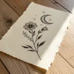
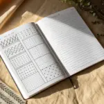
Fine line art is my go-to when I want something simple, elegant, and secretly a little challenging in the best way. If you love clean details and that crisp minimalist linework look, these ideas will keep your sketchbook (or digital canvas) happily busy.
One-Line Botanical Sprigs
Capture the delicate beauty of wildflowers with this elegant fine-line drawing project. Using simple shapes and steady linework, you’ll create a graceful composition of blooming sprigs and buds perfect for your bullet journal or sketchbook.
How-To Guide
Materials
- Dotted or blank sketchbook suitable for ink
- HB pencil
- Kneaded eraser
- Fine liner pen (0.3mm or 0.5mm)
- Ultra-fine liner pen (0.1mm or 0.05mm)
- Ruler (optional)
Step 1: Planning and Sketching
-
Analyze the composition:
Observe the two main stems: one is taller with open, five-petaled flowers, and the other is shorter with clusters of small, spherical buds. They cross near the bottom, creating a sense of interaction essentially forming a loose ‘V’ shape. -
Draw the main axis lines:
Using your HB pencil and very light pressure, draw two curved lines to represent the main stems. Start the left stem slightly lower, curving gently to the right. Draw the right stem starting near the same point but extending higher and curving left. -
Sketch the primary flower placement:
On the taller (right-leaning) stem, lightly sketch circles to mark where the two main open flowers will sit—one at the very top and one about halfway down on the left side. -
Position the leaf nodes:
Mark small dashes along the main stem where leaves will emerge. Space them out generously to keep the design airy, alternating sides as you move up the stem. -
Map out the bud sprig:
For the secondary stem on the right, sketch small branching lines that will hold the bud clusters. These branches should angle upward. Adding small circles at the tips will help you visualize the final bud placement.
Shaky Lines?
If your long stem lines look wobbley, try drawing from your shoulder rather than your wrist. Moving your whole arm creates smoother, more confident curves than pivoting from your hand.
Step 2: Inking the Blooms and Buds
-
Outline the top flower:
Switch to your 0.3mm or 0.5mm fine liner. Start with the center of the top flower, drawing a small, somewhat irregular circle. Around it, draw five petals. Keep the lines slightly imperfect to mimic organic nature. -
Detail the petal interiors:
inside the petals, add very brief, fine lines radiating from the center. This adds dimension without shading. Draw the stamen using tiny lines tipped with dots in the flower center. -
Ink the lower flower:
Move to the second open flower. Draw this one slightly angled away from the viewer, so the petals appear more oval-shaped. I usually start with the petal closest to me and work backward. -
Draw the berry buds:
On the secondary stem, ink the small buds. Draw these as small circles. To make them look like berries or closed buds, add a tiny ‘x’ or dot at the top of a few circles to suggest the sepal opening. -
Connect buds to branches:
Draw the thin stems connecting these buds to the main stalk. Keep your hand loose; these lines don’t need to be perfectly straight.
Step 3: Leaves and Stems
-
Draw the main stems:
Carefully trace over your pencil lines for the main stems. Use a confident, continuous stroke if possible to avoid shaky lines. If you need to lift the pen, try to do it at a leaf node intersection. -
Form the leaves:
Draw the leaves attached to the main stem. Use a pointed oval shape (lanceolate). The leaves should be simple outlines without serrated edges. -
Add leaf vein details:
Draw a central vein line down the middle of each leaf, stopping just short of the tip. Then, carefully add diagonal shading lines on just one half of the leaf. This technique creates a stylish, high-contrast look. -
Incorporate lower foliage:
Add a few smaller leaves near the base of the stems to ground the drawing. These can be simpler, perhaps skipping the internal shading if they are very small.
Add a Pop of Color
Create a modern look by coloring slightly outside the lines. Use a highlighter or watercolor in a soft pastel shade to add a loose block of color behind just the main blooms.
Step 4: Refining and Finishing
-
Add final textures:
Using your ultra-fine 0.05mm pen, add tiny dots (stippling) near the base of the petals or around the bud clusters if you want more depth. Less is more here. -
Check line weights:
Look over the drawing. If any main stem lines look too thin compared to the leaves, go over them once more to thicken them slightly, reinforcing the structure. -
Erase pencil marks:
Wait until the ink is completely dry—give it a few minutes to be safe. Then, gently roll the kneaded eraser over the page to lift the graphite sketch without damaging the paper surface.
Enjoy the calm simplicity of your new botanical page spread.

Minimal Wildflower Cluster
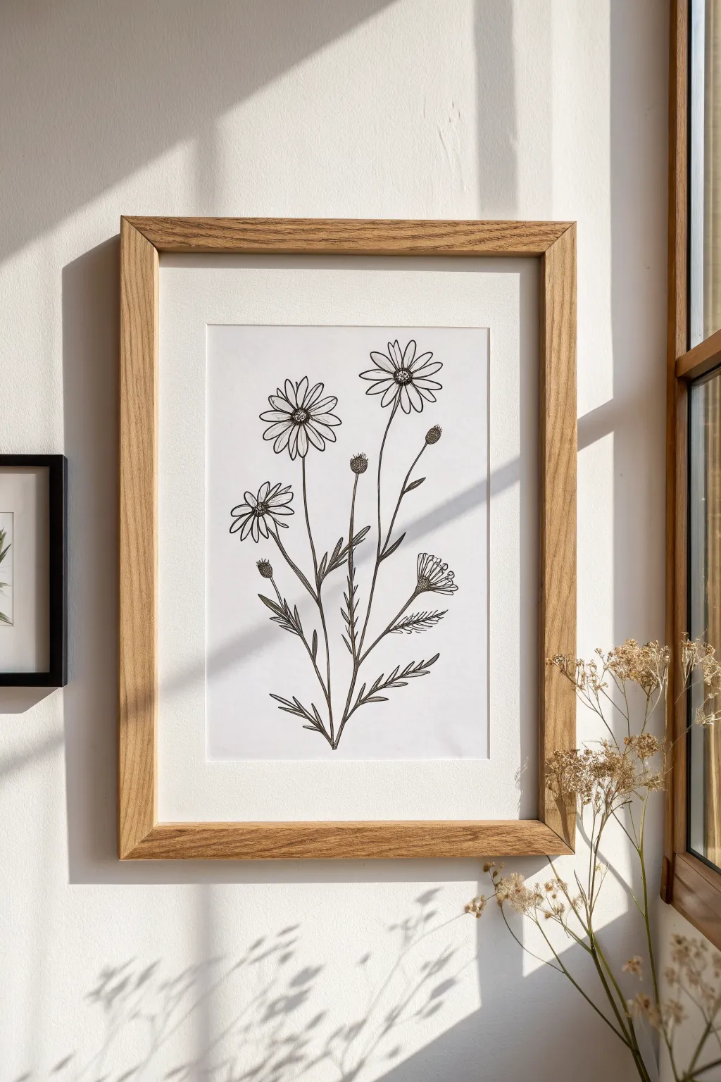
Create a serene botanical study that balances delicate detail with clean, confident lines, perfect for adding a touch of nature to a bright, modern space. This project focuses on capturing the organic flow of stems and petals using simple fine-line techniques.
Step-by-Step Tutorial
Materials
- Hot press watercolor paper or smooth Bristol board (approx. 9×12 inches)
- HB or 2H graphite pencil (for sketching)
- Kneaded eraser
- Fine liner pens (sizes 005, 01, and 03) – black, archival ink
- Reference photo of cosmos or daisy wildflowers (optional)
- Ruler
- Painter’s tape or drafting tape
Step 1: Planning Composition
-
Define the boundaries:
Begin by lightly taping your paper to your work surface to prevent shifting. Use your ruler and pencil to mark the outer borders of your drawing area, leaving a generous margin of white space to replicate the framed mat board look. -
Establish the main stems:
With your HB pencil, sketch three primary vertical lines radiating from a central point at the bottom. These don’t need to be perfectly straight; gentle curves mimic nature best. Let the center stem be the tallest, with the side stems flaring out slightly. -
Position the blooms:
At the top of each main stem, lightly sketch circles or ovals to mark where the flower heads will go. Place them at varying heights to create visual interest—one high on the right, one slightly lower on the left, and one midway. -
Add bud placements:
Draw faint lines branching off the main stems for the unopened buds. Sketch small, teardrop shapes at the ends of these shorter stems.
Ink Flow Secret
Pull the pen toward you rather than pushing it away. This maintains consistent ink flow and prevents the nib from snagging on the paper texture.
Step 2: Refining the Sketch
-
Draft the petals:
For the open flowers, sketch long, oval-shaped petals radiating from the center. Don’t worry about perfect symmetry; natural wildflowers have slightly irregular petals. Leave gaps between some petals to show depth. -
Sketch the centers:
Draw small, textured circles in the middle of your open blooms. Indicate a convex shape by curving the bottom line of the center circle slightly upward. -
Detail the buds:
Refine the teardrop bud shapes, adding a crisscross texture or small scales to the bottom ‘cup’ part of the bud. -
Add leaves:
Sketch narrow, lance-like leaves along the lower portions of the stems. Ensure they point upwards and outward, following the growth direction. -
Review and lighten:
Take a step back to check the balance of your composition. Once satisfied, use your kneaded eraser to gently lift the graphite until the sketch is barely visible, serving as a ghost guide for your ink.
Vintage Botanical Vibe
Try tinting the finished drawing with a very light wash of tea or coffee stain before framing to give the paper an aged, scientific specimen look.
Step 3: Inking the Wildflowers
-
Outline the petals:
Using the 01 fine liner, trace the flower petals. Use a confident, fluid motion. At the tips of the petals, you can create slight indentations or jagged edges for a realistic look. -
Texture the flower centers:
Switch to the 005 pen for delicate detail. Fill the flower centers with tiny stippled dots or very small circles, concentrating the ink at the bottom edge of the center to suggest shadow. -
Ink the stems:
Use the 03 pen for the main stems to give them structural weight. Draw these lines slowly to avoid wobbling. I like to lift the pen slightly at joints where leaves attach to keep the connection looking organic. -
Define the buds:
Outline the closed buds with the 01 pen. Use short, hatched lines properly spaced on the base of the bud to imply texture without making it too dark. -
Draw the leaves:
Outline your leaves with the 01 pen. Add a single central vein line down the middle of each leaf, stopping just short of the tip.
Step 4: Final Details
-
Add petal definition:
Using the 005 pen again, draw very faint, short lines starting from the center of the flower and moving outward into the petals. This indicates the folds and texture of the bloom. -
Detail the sepals:
Add tiny, jagged sepals (small leaves) at the base of the flower heads where they connect to the stems. -
Erase pencil marks:
Wait at least 15 minutes to ensure the ink is completely dry. Gently erase any remaining pencil lines with the kneaded eraser to leave a crisp black and white image. -
Assess contrast:
Look for areas that need more depth. If a stem looks too flat, thicken the line slightly on just one side (the shadowed side) with the 03 pen.
Frame your delicate masterpiece in light wood to complement its organic simplicity.
Tiny Celestial Symbol Set
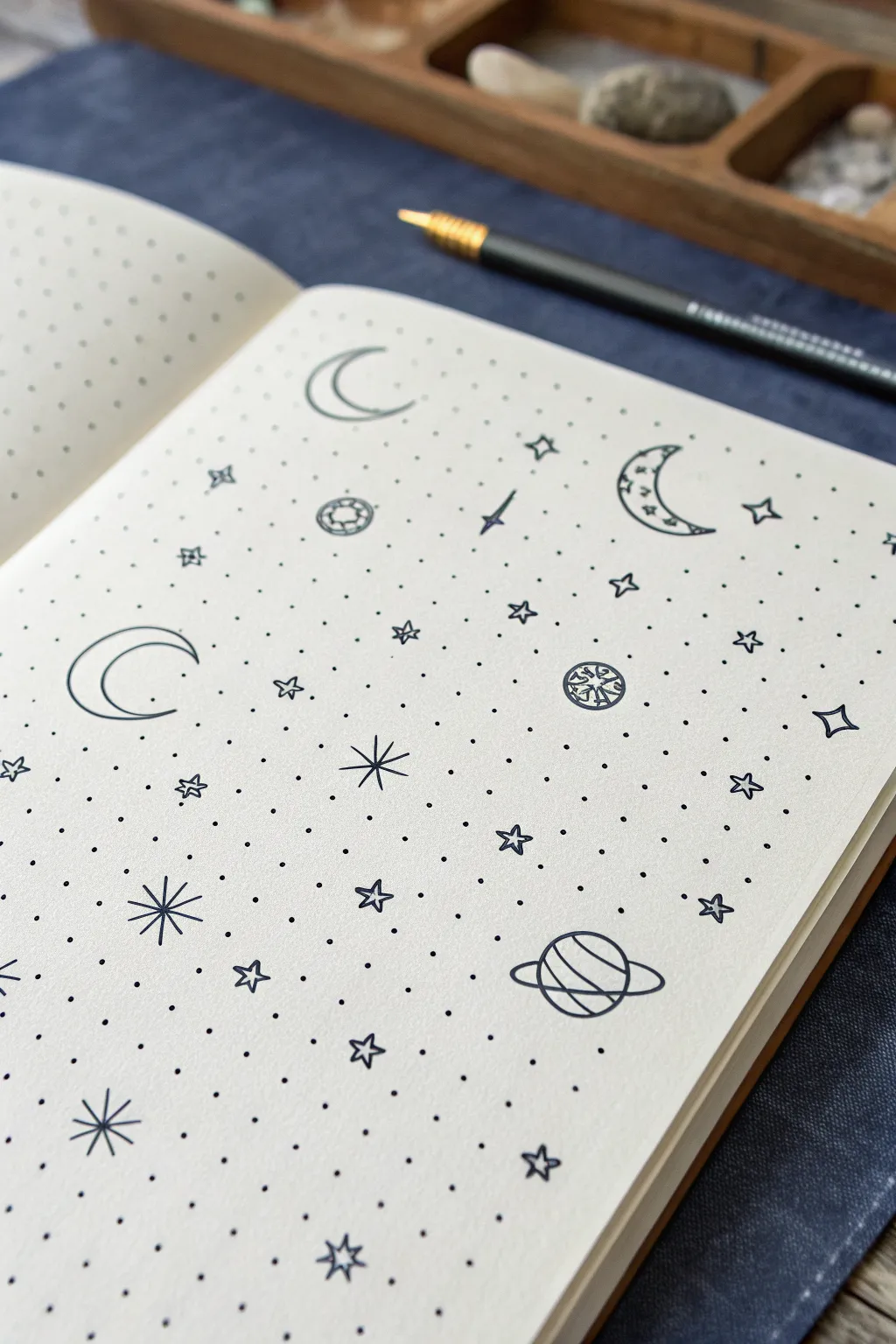
Transform a simple page into a galaxy of tiny celestial wonders with this delicate fine-line drawing project. Using the existing grid as your guide, you will scatter minimalist moons, stars, and planets to create a balanced, whimsical pattern perfect for bullet journals.
Detailed Instructions
Materials
- A5 Dot grid notebook or journal
- Fine liner pen (size 0.3mm or 0.5mm, black)
- Pencil (HB or H)
- Eraser
- Ruler (optional, for spacing checks)
Step 1: Setting the Sky
-
Prepare your workspace:
Since this design relies on negative space, open your dot grid notebook to a fresh, clean page. Ensure your wrist has room to move freely without smudging the ink. -
Plan the anchor elements:
Visualize a ‘Z’ pattern or a random scatter across the page. With a very light pencil touch, mark where your largest elements—the three crescent moons and the ringed planet—will sit. This prevents clustering everything in one corner. -
Draft the first crescent:
Start with the large crescent moon on the left. Use the grid dots to help form the curve, spanning roughly 4 dots in height. Draw the outer ‘C’ shape first, then the inner curve to connect the points. -
Draft the upper crescent:
Move to the top-center area. Sketch a slightly smaller, more open crescent moon facing upwards. Keep the lines smooth and even. -
Sketch the detailed moon:
On the upper right, draw a third crescent moon. Inside this one, lightly sketch 2-3 tiny stars or sparkles within the shape itself to give it a unique texture. -
Draft the ringed planet:
Near the bottom right corner, sketch a circle about 3 grid squares wide. Add a flattened oval ring around it. Draw lines across the planet’s body to represent gas bands, curving them slightly to show spherical volume.
Grid Guide Trick
Use the dots! Instead of freehanding, let the grid dots dictate the points of your stars. Connect dot-to-dot for perfectly symmetrical starbursts every time.
Step 2: Inking the Stars
-
Ink the major moons:
Switch to your fine liner pen. Trace over your pencil lines for the three crescent moons with a steady hand. For the detailed moon on the right, carefully ink the tiny stars inside before outlining the moon shape. -
Ink the planet:
Trace the planetary rings and the bands on the planet’s surface. Ensure the ring lines pass ‘in front’ of the planet by stopping the planet’s outline where the ring crosses it. -
Draw large starbursts:
Identify 3-4 empty areas. Draw large, eight-pointed stars (a vertical cross overlaying a diagonal cross). Extend the lines about 2 grid units outward from a central point. -
Add four-pointed stars:
Scatter 5-6 four-pointed stars throughout the gaps. Draw these by making a stretched diamond shapes with curved inward sides, like compass points. -
Create distinct planetoids:
Find two medium-sized gaps. Draw small circle shapes, but fill the interior with a unique texture. One could have a grid pattern, and another (like the one in the middle right) could have shattered geometric shapes inside. -
Fill with medium hollow stars:
Draw simple five-pointed star outlines in the remaining larger gaps. Don’t color them in; keep them as clear outlines to maintain the airy feel. -
Sprinkle the details:
Now, fill the remaining negative space with the smallest elements. Draw tiny diamonds, small ‘x’ crosses, and single dots to mimic distant stars. -
Add constellations:
Connect a few of your tiny dots or small stars with faint lines to suggest constellations, or draw small plus signs (+) for variety.
Step 3: Final Polish
-
Let the ink settle:
Wait for at least 5-10 minutes. Fine liner ink can smudge easily on smooth journal paper if not completely dry. -
Erase guidelines:
Gently erase all your initial pencil sketches. Hold the paper taut with one hand while erasing to prevent the page from crinkling. -
Review contrast:
Step back and look at the spread. If any area looks too empty, add a single black dot or a tiny hollow circle to balance the composition.
Level Up: Cosmic Dust
Use a white gel pen to add tiny dots inside the black shapes or on top of the inked lines for a magical, stardust effect that pops against the black ink.
Your page now reflects a quiet, organized night sky ready for journaling or simply admiring


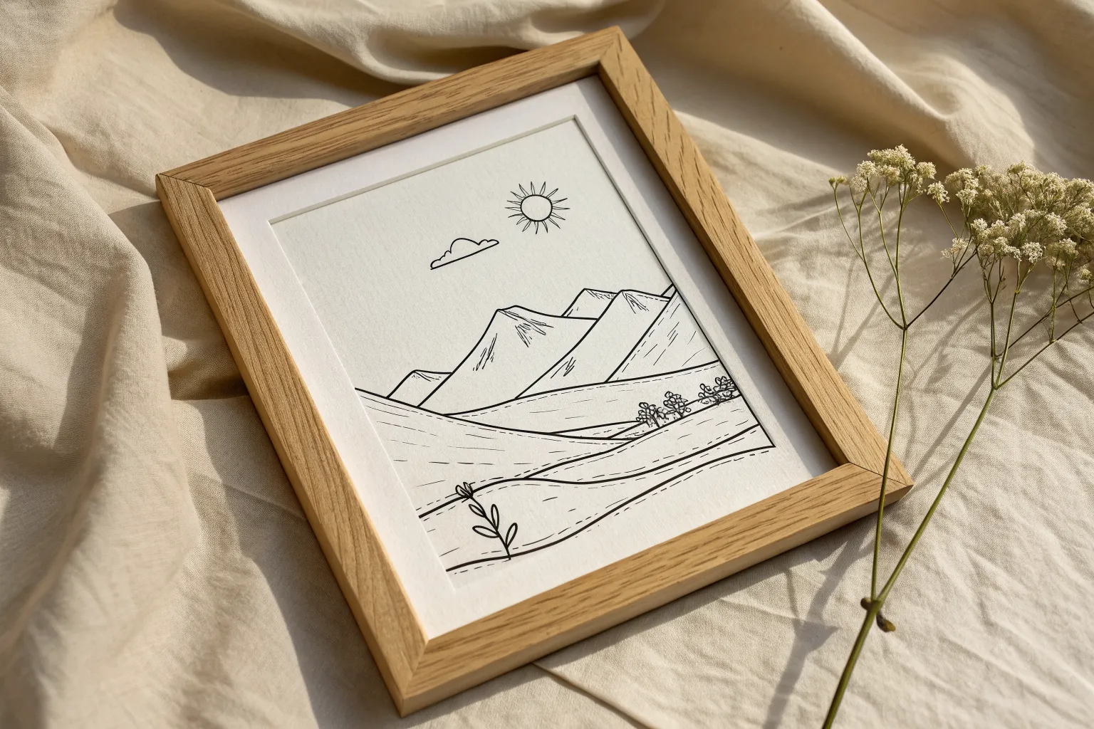
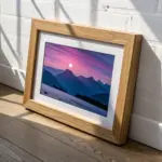
Simple Mountain Outline Landscape
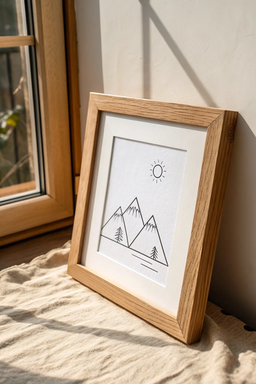
Capture the serenity of the outdoors with this clean and modern mountain landscape drawing. Using nothing more than crisp black ink and white paper, this project focuses on negative space and sharp angles to create an elegant piece of wall art that suits any minimalist decor.
Step-by-Step
Materials
- High-quality white drawing paper or cardstock (approx. 8×10 inches)
- Fine liner pen (0.5mm tip, black archival ink)
- Ultra-fine liner pen (0.1mm or 0.3mm tip) for details
- HB pencil
- Soft white eraser
- Ruler or straight edge
- Light wood frame with a wide white mat
Step 1: Planning and Sketching
-
Prepare the paper:
Cut your paper to fit the mat opening of your chosen frame. Lightly mark the center point with your pencil to help you balance the composition later. -
Draft the horizon line:
Using your ruler, lightly sketch a horizontal line across the bottom third of the paper. This line will serve as the base for your mountains and trees. -
Sketch the central peak:
Draw a large triangle roughly in the center, extending upward from your horizon line. Make the peak sharp but slightly asymmetrical for a natural look. -
Add flanking mountains:
Sketch two additional triangles overlapping the main peak—one to the left and one to the right. Vary their heights slightly so they sit lower than the central mountain, creating depth. -
Position the sun:
In the upper right quadrant of the sky, lightly trace a small circle using a coin or a circle stencil to ensure it’s perfectly round.
Wobbly Lines?
If your hand shakes while drawing long straight lines, try moving your entire arm from the shoulder rather than just your wrist. This stabilizes the motion for smoother results.
Step 2: Inking the Outlines
-
Trace the main triangles:
Switch to your 0.5mm fine liner. Carefully trace over the pencil lines of the three mountains. Start with the foremost mountains so their lines remain uninterrupted. -
Define the mountain overlapping:
When inking the central peak behind the others, stop your pen line exactly where it meets the edge of the foreground mountains. This creates the illusion that it is sitting behind them. -
Ink the sun:
Trace the circle outline for the sun carefully. Take your time to keep the line weight consistent. -
Add sun rays:
Draw very short, straight lines radiating outward from the sun’s circumference. Space them evenly around the circle, keeping them distinct and unconnected to the main circle. -
Create the horizon base:
Ink the straight horizontal line at the base of the mountains, extending it slightly past the outer edges of the mountain range to ground the scene.
Make It Golden
For a subtle pop of luxury, trace over the sun and the sun rays with a metallic gold gel pen or gold leaf pen instead of black ink. It adds warmth without breaking minimalism.
Step 3: Adding Details and Texture
-
Draw snow caps:
Using the finer 0.1mm pen, draw zigzag lines near the top peaks of each mountain. These jagged lines suggest snow and add visual interest to the spacious white triangles. -
Sketch the pine trees:
Switch back to the pencil briefly to position two small trees—one on the left slope, one on the right. A simple vertical line with downward-angled dashes creates a classic pine shape. -
Ink the trees:
Go over your tree sketches with the 0.3mm or 0.5mm pen. Use short, deliberate strokes for the branches to give them a slightly organic, needle-like texture. -
Add reflection lines:
Below the main horizon line, draw two parallel horizontal lines of varying lengths. This minimalist detail suggests water or a flat plain in the foreground. -
Erase guidelines:
Wait at least 15 minutes for the ink to cure completely. Once dry, gently erase all underlying pencil marks with a soft white eraser to reveal the clean contrast.
Step 4: Finishing Up
-
Inspect the lines:
Look closely for any faint gaps in your ink work. Carefully connect any loose ends to ensure the geometric shapes feel solid and deliberate. -
Clean the glass:
Before framing, wipe down the inside of the frame’s glass to remove any dust or fingerprints. -
Mount artwork:
Center your artwork behind the mat. Use a small piece of artist tape at the top edge to secure the paper to the back of the mat board. -
Frame the piece:
Place the matted artwork into the wooden frame and secure the back. I always double-check that no dust is trapped between the mat and the glass before closing it up.
Hang your finished piece in a well-lit spot to let the simplicity of the lines shine

PENCIL GUIDE
Understanding Pencil Grades from H to B
From first sketch to finished drawing — learn pencil grades, line control, and shading techniques.
Explore the Full Guide
Geometric Shapes With Hairline Precision
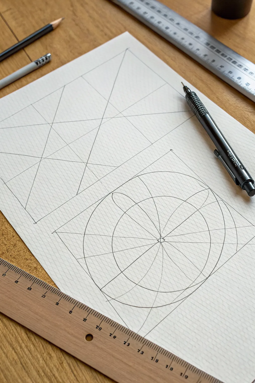
Master the satisfying discipline of drafting with this study in perspective and radial balance. Using nothing more than a mechanical pencil and a straightedge, you will construct a clean, minimalist composition that celebrates the beauty of intersecting lines.
Detailed Instructions
Materials
- Textured heavy-weight paper (white or off-white)
- Mechanical pencil (0.5mm or 0.3mm lead)
- HB or 2H lead refill
- Metal ruler or straightedge
- Drafting compass
- Eraser shield (optional)
Step 1: Planning the Layout
-
Paper preparation:
Begin with a fresh sheet of textured heavy-weight paper. The subtle grain will add depth to your lines. -
Define the boundaries:
Using your ruler, lightly mark out two distinct rectangular zones on your paper: a larger vertical rectangle at the top and a square or shorter rectangle directly beneath it. -
Leave breathing room:
Ensure there is an even margin of negative space around the edges and a clear gap between the two main shapes so they don’t feel crowded.
Smudge Prevention
Graphite smudges easily on textured paper. Place a clean sheet of scrap paper under your drawing hand to protect finished areas while you work.
Step 2: Drafting the Top Section
-
Establish the frame:
Darken the outline of the top rectangle using your straightedge. Keep your mechanical pencil upright to maintain a consistent line width. -
Find the vanishing points:
Visualize this section as an abstract perspective study. Mark two faint points on the horizon line—one far left and one far right—outside the main box if necessary. -
Draw the converging lines:
Connect various points on the vertical edges of your box to your imaginary vanishing points. -
Create intersections:
Allow these diagonal lines to cross each other. I find it helpful at this stage to draw lines that don’t meet at a single center, but rather crisscross to create dynamic shards of space. -
Vertical anchors:
Add one or two slightly angled vertical lines that slice through the diagonals, creating a sense of fractured planes.
Step 3: Constructing the Radial Base
-
Outline the lower box:
Draft the outline of the lower square section, ensuring it aligns perfectly with the width of the rectangle above it. -
Mark the center:
Lightly draw diagonal lines from corner to corner of this lower box to find the exact center point. -
Draw the primary circle:
Place your compass point on the center mark. Draw a large circle that almost touches the edges of the square. -
Add concentric details:
While the compass is positioned, draw a smaller inner circle and a tiny central hub circle to anchor the design. -
Draft the radial spokes:
Using your straightedge and the center point, draw lines radiating outward. Start with vertical and horizontal axes, then bisect those quadrants to create diagonal spokes. -
Create the ellipses:
This is the trickiest part. Sketch four large ellipses that overlap the main circle. Each ellipse should be centered on one of the radial spokes. -
Refining the curves:
If you don’t have an encompassing stencil, carefully freehand the curves of these ellipses, keeping your wrist loose to ensure smooth arcs. -
Intersecting geometry:
Let the lines of the ellipses pass through the circle and the square’s corners, emphasizing the transparency of the forms.
Need Ellipse Help?
If freehanding the ellipses is difficult, use a specifically sized washer or the inside of a roll of tape as a guide to get that perfect curve.
Step 4: Final Polish
-
clean up junctions:
Check the corners where your main frames end. Use the mechanical pencil to create sharp, deliberate termination marks or ‘ticks’ at the corners for a technical aesthetic. -
Erase guidelines:
Gently erase the initial ‘x’ you used to find the center of the bottom square, but leave the structural grid lines visible. -
Sharpen the contrast:
Go over your primary construction lines one last time with firm pressure to ensure they stand out against the paper’s texture.
Step back and admire the stark elegance of your precision drafting practice
Minimal Animal Silhouette Contours
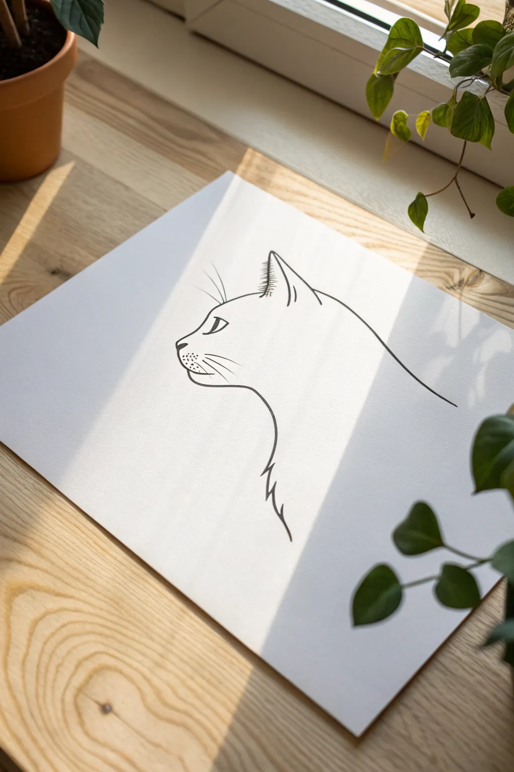
Capture the elegant essence of a cat using clean, sweeping lines in this minimalist ink project. The result is a striking, modern piece of wall art that balances negative space with defined contours.
How-To Guide
Materials
- High-quality bright white smooth Bristol board or heavy drawing paper (A4 or square)
- Pencil (HB or 2H for light sketching)
- Kneaded eraser
- Fine liner pens (sizes 0.3mm and 0.5mm, black)
- Ruler (optional, for placement)
- Reference photo of a cat profile
Step 1: Planning the Composition
-
Analyze the space:
Begin by looking at your blank sheet of paper. Visualize where the cat’s head will sit. For this minimal style, you want plenty of white space, so plan for the drawing to occupy the central area without touching the edges. -
Sketch the primary curve:
Using your HB pencil with very light pressure, draw a sweeping curve that represents the back of the neck and head. This is the ‘spine’ of your drawing and dictates the posture. -
Block in the nose:
At the end of your head curve, lightly sketch a simplified triangular shape for the nose. This anchor point helps you determine where the forehead ends and the muzzle begins. -
Mark ear placement:
Draw a loose triangle shape near the top of the head curve to indicate the ear. Don’t worry about details yet; just focus on getting the size and angle correct relative to the profile.
Step 2: Refining the Sketch
-
Define the muzzle:
Refine the pencil lines around the nose and mouth. The muzzle should be soft and slightly rounded, leading down into the chin. -
Add eye details:
Place the eye slightly back from the muzzle. Draw an almond shape that tilts slightly upwards. Add a small vertical slit for the pupil to give it that distinct feline look. -
Detail the ear:
Add a second line inside the ear triangle to show the fold of the ear. Sketch small, feathery strokes at the base and tip to suggest tufts of fur. -
Indicate neck fur:
Instead of a solid line for the throat and chest, gently sketch jagged, irregular lines moving downward. This suggests the fluffy texture of the cat’s coat without overworking the drawing. -
Review the flow:
Step back and look at your pencil sketch. The line from the nose, over the head, and down the back should feel continuous and fluid. Erase and adjust any stiffness now before inking.
Fixing Shaky Lines
If a long line looks wobbly, thicken it slightly in specific areas to vary the line weight. This makes the waiver look like an intentional artistic choice.
Step 3: Inking the Contours
-
Outline the main profile:
Switch to your 0.5mm fineliner. Start at the forehead and draw a confident, smooth line over the head and down the back. Try to keep your hand steady to avoid shaky lines. -
Ink the nose and mouth:
Carefully trace the muzzle. Use a slightly lighter touch here to keep the face looking delicate. Add a few tiny dots on the muzzle created where the whiskers will emerge. -
Define the ear:
Ink the outer shape of the ear. Switch to a 0.3mm pen for the inner ear details and the small tufts of hair at the ear tip to create variety in line weight. -
Create texture on the chest:
Back to the 0.5mm pen, ink the chest line. Use quick, deliberate flicks of the pen to mimic the jagged fur texture you sketched earlier. Lifting the pen at the end of the stroke tapers the line beautifully. -
Fill the eye:
Outline the eye shape carefully. Fill in the pupil solid black, leaving a tiny speck of white paper untouched for a highlight, which brings life to the drawing.
Level Up: Watercolor Wash
Once the waterproof ink is dry, add a loose, single-color watercolor wash behind the cat (like a soft grey or blue circle) to make the silhouette pop.
Step 4: Finishing Touches
-
Add the whiskers:
This is the most critical step for movement. Using the 0.3mm pen, draw long, sweeping curves outward from the muzzle dots. Commit to the stroke—speed helps create a smooth curve. -
Add eyebrow whiskers:
Don’t forget the few long hairs above the eye. Draw two or three gentle curves extending upwards from the brow area. -
Let the ink settle:
Wait at least 15 minutes for the ink to dry completely. Fineliner ink can smudge easily if erased too soon. -
Erase pencil marks:
Gently rub your kneaded eraser over the entire drawing to lift away the graphite guidelines, revealing the crisp black ink underneath. -
Final assessment:
Check for any lines that need a slight touch-up or thickening to balance the visual weight, especially along the back curve.
Frame your new minimalist artwork in a simple wood or black frame to highlight the elegance of the lines
BRUSH GUIDE
The Right Brush for Every Stroke
From clean lines to bold texture — master brush choice, stroke control, and essential techniques.
Explore the Full Guide
Dainty Butterfly Wing Details
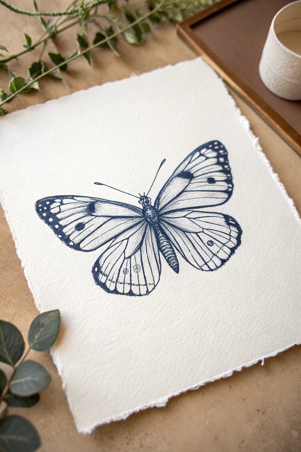
Capture the delicate beauty of a butterfly specimen with this fine-line ink illustration. Using stippling and hatching techniques on textured deckle-edge paper creates a timeless, vintage scientific study aesthetic.
Detailed Instructions
Materials
- Heavyweight cold-press watercolor paper or cotton rag paper (with deckled edges)
- Fine liner pens (sizes 0.05, 0.1, 0.3, and 0.5)
- Dark navy or indigo ink (if using dip pens, otherwise navy fine liners)
- HB pencil for sketching
- Kneaded eraser
- Ruler
Step 1: Drafting the Structure
-
Establish the centerline:
Begin by lightly drawing a vertical line down the center of your paper with an HB pencil to act as the body’s axis. This guide ensures your butterfly remains symmetrical. -
Sketch the body segments:
Draw an elongated oval for the thorax (the middle section) and a longer, segmented shape for the abdomen. Add a small circle for the head at the top. -
Map the upper wings:
Lightly sketch the large, triangular shapes of the forewings extending outward from the thorax. Keep the leading edges slightly curved and smooth. -
Map the lower wings:
Draw the hindwings below the forewings, giving them a more rounded, tear-drop shape. Ensure they tuck slightly behind the upper wings near the body. -
Refine the vein structure:
Lightly sketch the main veins radiating from the body to the wing edges. These lines act as the skeleton for your detailed ink work later.
Steady Hand Trick
Exhale as you draw long vein lines. Holding your breath can cause shakes, but exhaling steadily helps keep your movement fluid and controlled.
Step 2: Inking the Outline
-
Outline the body:
Switch to a 0.3 pen (preferably in dark navy/indigo) and trace the body shape. Use short, broken strokes to suggest a fuzzy texture on the thorax. -
Define the wing edges:
Carefully ink the outer perimeter of the wings with the 0.3 pen. For the tips of the forewings, create a slightly jagged or scalloped line where the pattern will be darkest. -
Ink the primary veins:
Use a finer 0.1 pen to trace the vein lines you sketched earlier. Keep your hand steady but allow for natural variations in line weight to mimic organic growth. -
Add the antennae:
Draw two long, slender lines curving outward from the head, ending in small monochromatic clubs. Use a swift, singular motion for the smoothest result. -
Erase pencil marks:
Once the ink is completely dry, gently roll a kneaded eraser over the entire drawing to lift the graphite guides without smudging the crisp lines.
Fixing Smudges
If you accidentally smudge wet ink, wait for it to fully dry. Then, use a white gel pen to carefully dot over the mistake, blending it into the paper texture.
Step 3: Detailing and shading
-
Darken the wing tips:
Using a 0.5 pen, fill in the darker patterned areas at the tips of the forewings. Leave small circle or oval voids empty to create the white spots. -
Begin stippling:
Switch to your finest 0.05 pen. Add tiny dots (stippling) along the sides of the abdomen and thorax to create cylindrical volume and shadow. -
Shade the wing roots:
Apply dense stippling near the body where the wings attach. This density adds depth and suggests the wings are overlapping slightly. -
Hatch the wing margins:
Use fine hatching lines along the outer edges of the hindwings. These lines should follow the curve of the wing, moving inward toward the center. -
Texturize the veins:
I like to run a very broken, dotted line alongside the main veins with the 0.05 pen. This softens the stark lines and adds a microscopic level of detail. -
Add inner wing spots:
Draw the small circular markings on the hindwings. Instead of outlining them solidly, use stippling to define their edges for a softer appearance. -
Final contrast check:
Step back and look at the overall balance. If the wing tips look too light compared to the body, carefully add another layer of ink to deepen the navy tone.
Frame your delicate specimen in a floating glass frame to highlight the textured edges of the paper
Fine Line Seashell Study
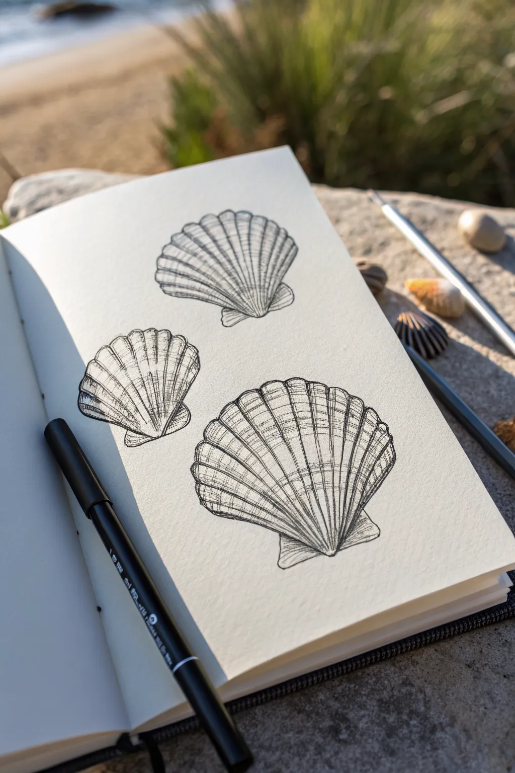
Capture the delicate beauty of the ocean with this fine line pen study of scallop shells. Using simple cross-hatching and contour lines, you will learn to create depth and texture on a stark white page without needing complex shading tools.
Step-by-Step
Materials
- Sketchbook with smooth or lightly textured paper
- Fine liner pen (01 or 03 size, black ink)
- Pencil (HB or 2B)
- Kneaded eraser
- Dotted or graph paper (optional for practice)
- Reference photo of scallop shells
Step 1: Pencil Under-Sketching
-
Establish the fan shapes:
Begin by lightly sketching three fan-like triangular shapes on your page. Position them slightly irregularly—one centered at the bottom, one to the upper left, and one to the upper right—to create a natural composition. -
Round the edges:
Soften the top edge of each triangle into a gentle arc. This curve represents the outer rim of the scallop shell. -
Add the hinge:
At the narrow bottom point of each fan, sketch a small, rectangular base with tiny outward-flaring wings. This is the shell’s hinge (umbo). -
Map the ribs:
Draw faint guide lines radiating from the center of the hinge out to the curved rim. These don’t need to be perfect, but they should fan out evenly like sun rays. -
Refine the outline:
Go over your pencil guides to darken the definitive outline of each shell, adding slight wobbles to the rim to mimic organic imperfections.
Wrist Mechanics
For smoother long lines, lock your wrist and move your entire arm from the elbow. This prevents the shaky, segmented look that often happens when just moving your fingers.
Step 2: Inking the Structure
-
Trace the main ribs:
Switch to your fine liner pen. Starting from the hinge, draw long, confident strokes outward along your pencil guide lines to the rim. Keep your wrist loose to ensure smooth curves. -
Define the rim:
Ink the outer scalloped edge. Instead of a smooth continuous line, use small, connected humps that correspond to where each rib meets the edge. -
Ink the hinges:
Trace the small rectangular bases at the bottom. Use a slightly heavier hand or go over the line twice here to ground the shell. -
Erase pencil marks:
Wait a moment for the ink to dry completely, then gently use your kneaded eraser to lift away all the graphite guidelines, leaving a clean ink skeleton.
Step 3: Adding Texture & Depth
-
Start horizontal hatching:
Create the ‘growth ring’ texture by drawing curved horizontal lines across the shell. These should follow the contour of the rim, curving slightly downward. -
Break the lines:
Don’t draw these horizontal lines all the way across. Instead, draw short, broken segments between the vertical ribs to create a weathered, natural look. -
Deepen the valleys:
To make the ribbed structure look three-dimensional, add distinct shading lines on just one side of each vertical rib. This creates a shadow and suggests the rib is raised. -
Darken the hinge area:
Add denser hatching near the bottom hinge. I like to pack the lines tighter here because this area naturally recedes and gathers more shadow. -
Add detail to the rim:
Place tiny vertical ticks or dots just underneath the top rim edge. This subtle detail gives the shell thickness and weight. -
Enhance contrast:
Select a few random areas on the shell surface to add cross-hatching (diagonal lines crossing your previous marks). This irregularity mimics surface wear and discoloration. -
Create cast shadows:
If you want the shells to feel grounded, add a few very short, dark strokes directly underneath the bottom hinge of each shell. -
Final assessment:
Step back and look at the composition. If any shell looks too flat, go back in and thicken the shadow side of the vertical ribs to increase the contrast.
Try Stippling
For a sandier texture, replace some of the hatching lines with tiny dots (stippling). Focus the dots near the bottom hinge to create a softer gradient shadow.
Enjoy the calm simplicity of your completed coastline study and consider drawing a few scattered pebbles nearby to finish the scene


Continuous Line Hands In Motion
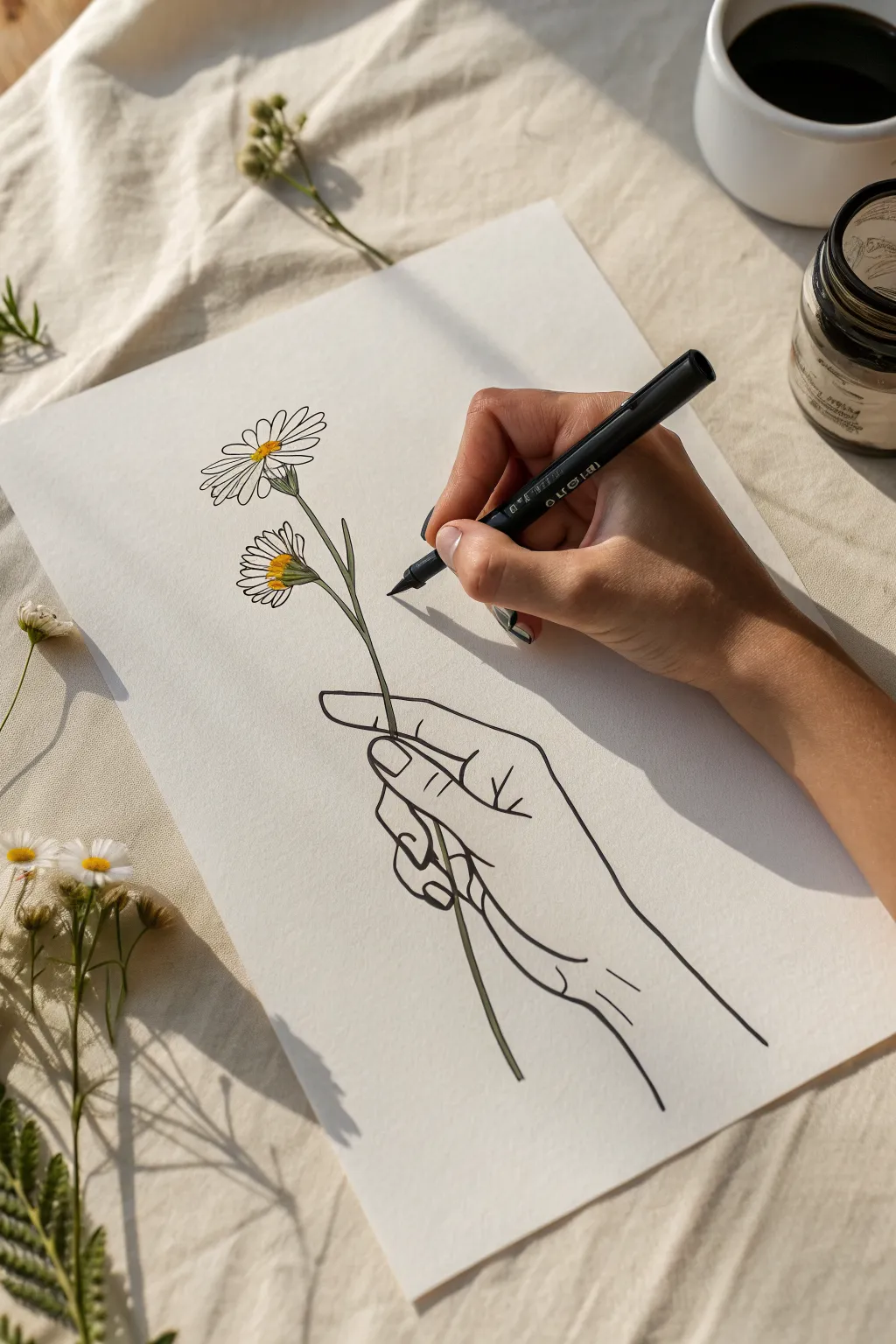
Create a serene and minimalist piece featuring a finely lined hand gently grasping two daisies. This project combines the precision of fine-line ink work with soft, selective touches of color for a modern, illustration-style finish.
Step-by-Step Tutorial
Materials
- High-quality white mixed media or drawing paper (smooth finish)
- HB pencil
- Kneaded eraser
- Fine liner pen (black, 0.3mm or 0.5mm)
- Fine liner pen (black, 0.1mm for details)
- Yellow art marker or colored pencil
- Sage green art marker or colored pencil
Step 1: Drafting the Composition
-
Mark the stem line:
Begin by lightly sketching a long, slightly curved vertical line with your HB pencil. This acts as the central spine for the flower stem and helps position the hand correctly on the page. -
Sketch the hand grip:
Draw the basic shapes of the fingers wrapped around the stem line. Locate the thumb pressing against the stem and the index finger curving over it, creating the primary grip point. -
Draft the lower fingers:
Sketch the remaining three fingers loosely curling underneath the stem. Keep the lines fluid and relaxed; we aren’t looking for anatomical perfection, but rather a stylized, elegant gesture. -
Outline the flowers:
At the top of your stem line, draw two oval guides for the flower heads. Place one slightly higher than the other to create natural variation. -
Define the petals:
Lightly pencil in the long, thin petals radiating from the centers. Don’t worry about making them identical; slight irregularities make the daisies look organic.
Fixing shaky lines
Did a long line go wobbly? Don’t toss it! Go over the line again slightly thicker to smooth the oscillation, or add small hatching marks to turn the wobble into intentional shading.
Step 2: Inking the Lines
-
Outline the hand:
Switch to your 0.5mm black fine liner. With a steady hand, trace over your pencil lines for the hand and wrist. Focus on clean, continuous strokes rather than short, scratchy ones to maintain that ‘fine line’ aesthetic. -
Detail the fingernails:
Add the fingernails using the thinner 0.1mm pen. Keep these shapes simple—just a curved line near the fingertip is often enough to suggest the nail bed without adding too much visual weight. -
Ink the stem:
Draw the stem lines, ensuring they pass ‘through’ the fingers logically. The line should stop where the fingers cover it and resume immediately on the other side. -
Trace the petals:
Carefully ink the flower petals. Allow some lines to overlap slightly near the center, and leave tiny gaps in the lines occasionally to keep the drawing feeling airy and light. -
Ink the flower details:
Use the 0.1mm pen to add tiny dots or short dashes inside the center of the flowers to create texture. -
Erase pencil guides:
Wait for the ink to dry completely. I usually give it an extra minute just to be safe, then gently erase all the underlying pencil graphite with a kneaded eraser.
Step 3: Adding Color Accents
-
Color the centers:
Take your yellow marker or pencil and fill in the center disks of the daisies. Apply the color somewhat loosely; it doesn’t need to stay perfectly within the lines. -
Add orange depth:
If you have a slightly darker yellow or orange, add a tiny crescent shape to the bottom of the flower centers to suggest dimension and shadow. -
Tint the stems:
Use a muted sage green to color the stems. A single stroke is usually best here so you don’t overwork the narrow space. -
Check the balance:
Step back and assess your drawing. If line weights feel too thin in certain shadow areas (like between fingers), thicken them slightly with the 0.5mm pen.
Try watercolor
For a softer look, replace markers with diluted watercolor. Paint the color ‘outside the lines’ slightly for an artistic, offset print effect that looks very modern.
Now you have a timeless piece of botanical line art ready to be framed or gifted
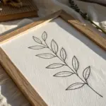
Botanical Wreath With Open Center
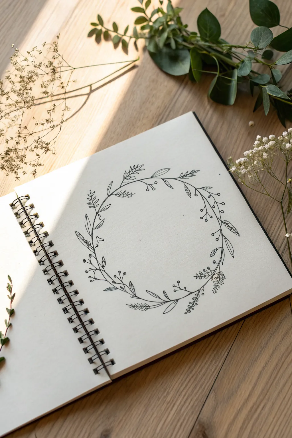
Capture the delicate beauty of nature with this fine line botanical wreath drawing. Featuring a balanced mix of leafy sprigs, berries, and feathery fronds, this minimalist design is perfect for framing a favorite quote or monogram in your sketchbook.
Step-by-Step
Materials
- Sketchbook with smooth, heavy paper
- HB graphite pencil
- Kneaded eraser
- Fine liner pen (01 or 03 size, black)
- Circle template or compass (optional)
Step 1: Planning and Foundation
-
Lightly sketch the base circle:
Begin by drawing a faint circle in the center of your page using your HB pencil. This will serve as the spine for your wreath. If you struggle with perfect circles, trace a bowl or use a compass, but keep the pressure very light so it erases easily later. -
Mark the flow:
Decide on the direction of your leaves. In the example, the stems generally flow in a clockwise direction. Lightly mark a few directional arrows or ticks on the circle to remind yourself which way the foliage should point. -
Draft the main stems:
Sketch the primary stems overlapping along the circle guide. Don’t make it one continuous line; instead, draw several shorter, curved segments that weave slightly in and out of the perfect circle shape to create an organic, natural feel.
Wobbly Circles?
If your circle looks uneven, don’t worry. Use leaves and berries to mask the lopsided areas. Extending a branch slightly outward or inward can visually correct the shape without redrawing.
Step 2: Drawing the Key Elements
-
Sketch the large leaves first:
Identify the placement for the larger, lance-shaped leaves. Sketch these loosely with your pencil, placing them at irregular intervals around the circle to anchor the design. -
Add feathery textures:
In the spaces between larger leaves, lightly sketch clusters of pine-needle or fern-like fronds. These add texture and break up the solidity of the broader leaves. -
Incorporate berry sprigs:
Draw thin, branching lines extending outward and inward from the main vine. Add small circles at the ends of these lines to represent berries or buds. -
Balance the composition:
Step back and look at your pencil sketch. Ensure the weights are balanced—if one side looks too heavy with leaves, add a few more wispy stems or berries to the opposite side to even it out.
Vary Line Weight
Use a slightly thicker pen (like a 0.5mm) for the main stems and larger leaves, and a thinner one (0.1mm) for vein details and delicate fillers to create instant depth.
Step 3: Inking the Design
-
Ink the main vine:
Switch to your fine liner pen. Carefully trace over your main stem lines first. Remember that nature isn’t perfect, so a slightly wavering line can actually look more authentic than a ruler-straight one. -
Detail the lance leaves:
Outline the larger leaves you sketched earlier. Add a central vein down the middle of each, but stop the line just short of the leaf tip for a lighter, airier look. -
Ink the feathery fronds:
For the fern-like sections, use short, quick strokes of the pen. Flick the pen outward from the stem to create sharp, tapered ends on each little needle. -
Draw the berries:
Ink the small circles for the berries. You can leave them open as simple outlines or fill them in solid black for more contrast depending on your preference. -
Add connecting details:
Draw the smaller connecting stems that join your leaves and berries to the main vine. Pay attention to how they attach; thickening the joint slightly where the stem meets the vine adds realism. -
Include tiny filler leaves:
Look for empty gaps along the wreath. Add tiny, single leaves or small teardrop shapes directly onto the main stem to fill these voids without overcrowding the design.
Step 4: Finishing Touches
-
Let the ink dry completely:
This is crucial—wait several minutes to ensure the ink is fully set. Smudging your hard work at this stage is heartbreaking. -
Erase the pencil guides:
Gently gently rub your kneaded eraser over the entire drawing to lift away the graphite circle and initial sketch lines. Hold the paper taut to prevent wrinkling. -
Refine the lines:
Once the pencil is gone, you might notice some lines need strengthening. Go back with your pen and carefully re-trace any areas that look too thin or broken. -
Add final texture dots:
I like to add a few tiny stippling dots near the base of the larger leaves or clustering around the berries to add a hint of shadow and depth.
Now you have a serene, circular frame ready to be filled with calligraphy or left as a beautiful standalone piece
Lineweight Gradient From Thin to Bold
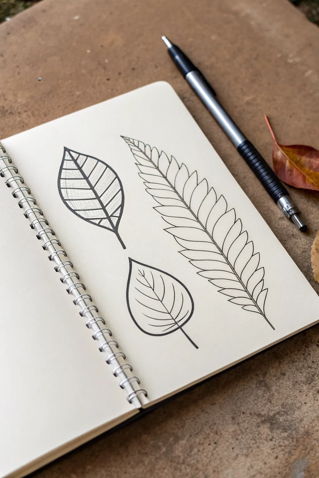
Master the subtle power of line weight with this botanical trio study. By intentionally alternating between delicate, fine strokes and bold, confident outlines, you will transform simple leaf contours into dynamic illustrations with depth and interest.
Detailed Instructions
Materials
- Sketchbook with smooth, heavy paper (min 160 gsm)
- Pencil (HB or H)
- Soft eraser
- Fine liner pen (01 or 03 size)
- Bold drawing pen (08 size or brush pen)
- Ruler (optional for symmetry)
Step 1: Planning the Layout
-
Map out the positions:
Begin with a light pencil sketch to place your three subjects. Position the fern-like frond as the largest element on the right, angling slightly diagonal. Place the two smaller broad leaves on the left side, stacked vertically with some breathing room between them. -
Sketch the spines:
Draw the central ‘spine’ or midrib for each leaf. For the large fern, create a long, gentle S-curve. For the two smaller leaves, draw straighter central lines to define their axis. -
Define the silhouettes:
Lightly pencil the outer shapes. Give the top-left leaf a pointed oval shape, the bottom-left leaf a rounded heart shape, and outline the general width of the fern frond without worrying about individual leaflets yet.
Step 2: Drawing the Top-Left Detailed Leaf
-
Section the leaf:
Divide the top-left leaf shape with horizontal veins spaced evenly apart. These should curve slightly to follow the leaf’s contour. -
Apply the bold outline:
Switch to your bolder pen (08 size). Trace the outer perimeter of the leaf and the central midrib with a thick, confident line. This establishes the strong silhouette needed for the high-contrast look. -
Inking the veins:
Using a thinner pen (03 or 05), trace the horizontal veins you sketched earlier. Keep these lines clean but significantly lighter than the outline. -
Add texture hatching:
Switch to your finest pen (01). Inside each horizontal segment, draw very closely spaced vertical hatching lines. I find it helps to lift the pen quickly at the end of each stroke to keep it airy. -
Vary the texture direction:
Notice how the hatching direction changes slightly in each section? Mimic this by tilting your lines to follow the curve of the leaf surface, creating a sense of volume.
Pro Tip: Pen Pressure
Don’t just switch pens; change pressure too. Pressing harder with a fine liner creates a slightly bolder line, while a light touch with a thick pen can taper edges beautifully.
Step 3: Drafting the Large Fern Frond
-
Sketch individual leaflets:
Return to your pencil. Along the long S-curve spine, sketch the pairs of leaflets. They should be longest in the middle of the frond and taper off at the tip and base. -
Define the jagged edges:
Give the leaflets their characteristic shape—broad at the base where they attach to the stem, and tapering to a sharp point. -
Ink the central stem:
Using a medium-weight pen (05), draw the central stem. Taper your pressure so the line is thicker at the bottom and razor-thin near the top tip. -
Outline the leaflets:
With a fine pen (03), trace the individual leaflets. Ensure the lines connect cleanly to the central stem without crossing into it. -
Add inner details:
Switch to your finest 01 pen. Draw a single, delicate line down the center of each individual leaflet, stopping just short of the tip. This is a classic example of using line weight hierarchy—bold stem, medium outline, fine detail.
Level Up: Stippling
Add depth to the bottom leaf by adding tiny dots (stippling) right where the veins meet the center stem. This creates a shadow effect without using solid black.
Step 4: Creating the Rounded Leaf
-
Ink the bold contour:
For the bottom-left leaf, use your boldest pen again to trace the teardrop/heart shape and the stem. Consistent line weight on the exterior helps ground the drawing. -
Draw the main veins:
With a medium-fine pen, draw curved veins radiating from the center line upward toward the leaf edges. -
Clean up:
Once the ink is completely dry—give it a full minute—erase all underlying pencil sketches to reveal the crisp black ink.
Now you have a striking botanical study that demonstrates how line variety brings flatness to life
Hatching-Only Shadows on Minimal Forms
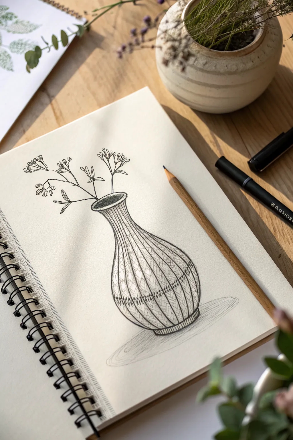
This project explores the elegance of form through simple contour lines and delicate hatching. By focusing on the texture of the vase and the airy quality of the stems, you’ll create a piece that feels both grounded and whimsical.
Step-by-Step Guide
Materials
- Sketchbook with smooth, heavy-weight paper
- HB or 2B pencil for sketching
- Fine-liner pen (0.3mm or 0.5mm, black)
- Thinner fine-liner pen (0.1mm or 0.05mm, black)
- Soft artist’s eraser
- Pencil sharpener
Step 1: Planning the Structure
-
Establish the centerline:
Start by lightly drawing a vertical axis line in pencil. This will ensure your vase remains symmetrical as you build its shape. -
Map the vase proportions:
Mark the top opening, the narrowest point of the neck, the widest part of the belly, and the base. Connect these points with loose, curved strokes to form the classic bulbous vase shape. -
Refine the rim and base:
Draw an oval for the lip of the vase to give it dimension. Repeat this slight curve at the bottom so the vase sits solidly rather than looking flat. -
Position the stems:
Sketch three main stems rising from the vase opening. Keep the lines angular and somewhat erratic to mimic dried florals or wildflowers, rather than perfect curves. -
Add floral clusters:
At the tips of the stems, lightly sketch small, cloud-like groupings for the flowers. Don’t worry about individual petals yet; just place the overall shapes.
Step 2: Inking the Outlines
-
Ink the vase silhouette:
Using your 0.3mm fine-liner, go over the outer pencil lines of the vase. Use confident, single strokes where possible to keep the line quality clean. -
Define the rim depth:
Ink the oval opening. Add an inner curve near the back rim to show the thickness of the glass or ceramic material. -
Trace the stems:
Switch to a slightly finer pen if available, or just use a lighter touch. Ink the stems, keeping them thin but distinct. -
Detail the blossoms:
Ink the flowers using tiny, open loop shapes and dashes. The goal is to suggest a cluster of tiny buds rather than drawing detailed blooms. -
Erase the guides:
Wait a moment for the ink to fully set, then gently erase all your initial pencil marks. I like to brush the eraser crumbs away carefully to avoid smudging.
Curve Control
When drawing the vertical contour lines on the vase, turn your sketchbook so your hand follows its natural arc. This makes drawing smooth curves much easier.
Step 3: Creating Texture & Dimension
-
Start the vertical contours:
Using the 0.3mm pen, draw long, vertical lines running from the neck of the vase down to the base. These lines should curve with the form of the vase, bulging out at the belly. -
Vary the line spacing:
Don’t make these lines perfectly parallel. Allow some to be closer together near the edges to suggest curvature and depth. -
Add diagonal hatching:
In the spaces between the vertical lines, add hatching strokes. Draw diagonal lines slanting one way on the upper half of the vase neck. -
Alternate the pattern:
As you move down to the belly of the vase, switch the direction of your diagonal hatching or change the density. This variety creates a woven or textured ceramic appearance. -
Darken specific bands:
Select two horizontal bands—one around the lower belly and one near the base—and increase the density of your hatching there. This creates a decorative ‘stripe’ effect. -
Deepen the interior:
Use tight cross-hatching or stippling inside the mouth of the vase to make it look dark and hollow. -
Ground the object:
Using the side of a pencil or very light gray marker, sketch a simple oval shadow underneath the vase to anchor it to the surface.
Try Watercolor
Once the ink is waterproof-dry, add a wash of diluted indigo or terracotta watercolor over the vase for a tinted glass or glazed pottery look.
Now you have a beautifully textured illustration that balances strong form with delicate details
Surreal Mashup: Flowers Growing From Objects
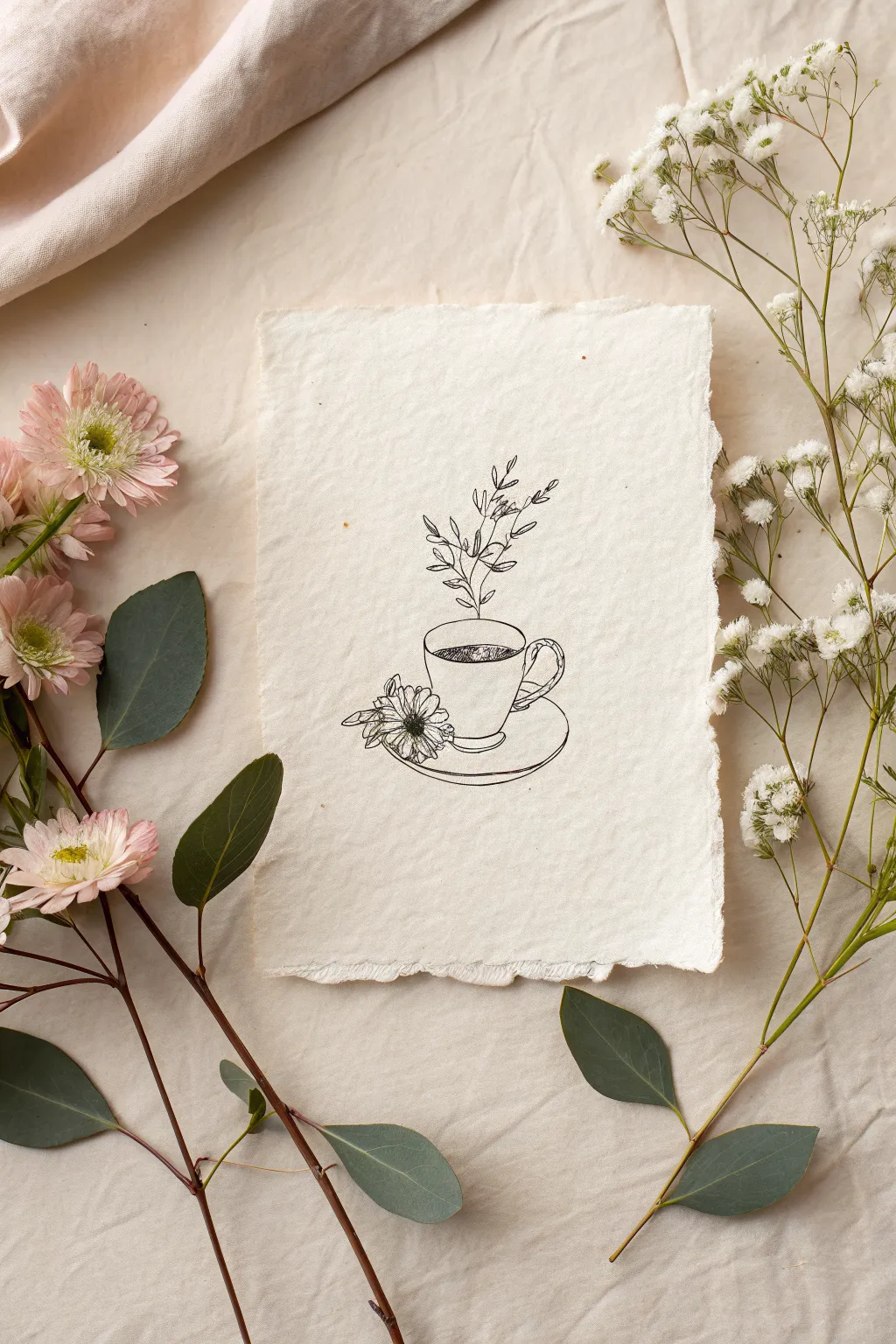
Blend the cozy comfort of a warm drink with the wild beauty of nature in this surreal fine-line drawing. Using simple ink techniques on textured handmade paper creates an organic, vintage aesthetic that feels both delicate and grounded.
Detailed Instructions
Materials
- Handmade cotton rag paper (deckled edge)
- Fine liner pen (01 or 03 nib size, black)
- Fine liner pen (005 nib size for details)
- HB pencil
- Kneaded eraser
Step 1: Planning and Sketching
-
Paper preparation:
Begin with a sheet of handmade cotton rag paper. If your paper captures lint easily, brush it off gently with a clean, dry brush to ensure your pen tip doesn’t snag later. -
Outline the saucer:
Using your pencil with very light pressure, draw a wide, flattened oval near the bottom center of the paper to represent the saucer’s rim. -
Refine the saucer shape:
Draw a second curve just below the front of the first oval to create the lip of the plate, and a smaller partial curve underneath that for the saucer’s base. -
Sketch the cup body:
Resting inside the top oval, lightly sketch a U-shape that is slightly wider at the top than the bottom. It should look like it is sitting on the saucer, not hovering above it. -
Add the handle:
On the right side of the cup, sketch a C-shaped loop. Make it look like a twisted rope or braided handle by adding small, diagonal intersecting lines within the loop shape. -
Position the flower:
To the left of the cup, resting on the saucer, lightly sketch a circle for the flower head and a few loose triangles for leaves poking out.
Bleeding Lines?
Handmade paper is porous. If ink bleeds, switch to a smaller nib size (005) and move your hand faster. Don’t let the pen linger in one spot.
Step 2: The Surreal Elements
-
Draft the rising stem:
Draw a straight, vertical line emerging directly from the center of the cup’s opening. This will be the main stem for your growing plant. -
Add foliage branches:
From that central vertical line, sketch smaller branches angles upward on alternate sides. Keep them sparse and delicate. -
Sketch the leaves:
Add small, almond-shaped leaves to the tips of your branches. Vary their sizes slightly to make the growth look organic rather than uniform.
Pro Tip: Organic Feel
Don’t connect every single line perfectly. Leaving tiny gaps in the leaves or flower petals adds airiness and prevents the drawing from looking too rigid.
Step 3: Inking the Drawing
-
Trace the cup and saucer:
Switch to your 03 pen. Carefully trace your pencil lines for the cup and saucer. Use a confident, continuous motion rather than short, scratchy strokes to keep the line work clean. -
Detail the handle:
Ink the braided handle. I like to focus on the overlapping segments here to give it that twisted rope texture. -
Ink the flower petals:
Outline the flower on the saucer. Use slightly jagged, uneven lines for the petal tips to mimic the texture of a real daisy or chrysanthemum. -
Define the liquid:
Draw an oval inside the rim of the cup to show the liquid level. Use tight, scribbled cross-hatching or stippling inside this oval to make the ‘coffee’ look dark and dense. -
Trace the plant:
Using the 01 or 005 fine liner for a more delicate touch, ink the vertical stem and leaves rising from the liquid. -
Add subtle shading:
Add very minimal hatching lines on the right side of the cup and under the saucer rim to suggest a light source coming from the left. -
Leaf detailing:
Draw a tiny center vein in just a few of the larger rising leaves, leaving the smaller ones as simple outlines. -
Erase guidelines:
Wait at least 10-15 minutes for the ink to fully cure on the textured paper. Then, gently roll the kneaded eraser over the drawing to lift the pencil marks without damaging the paper surface.
Frame your delicate illustration in a floating glass frame to show off the paper’s beautiful deckled edges
Abstract Flow Lines Like Wind or Water
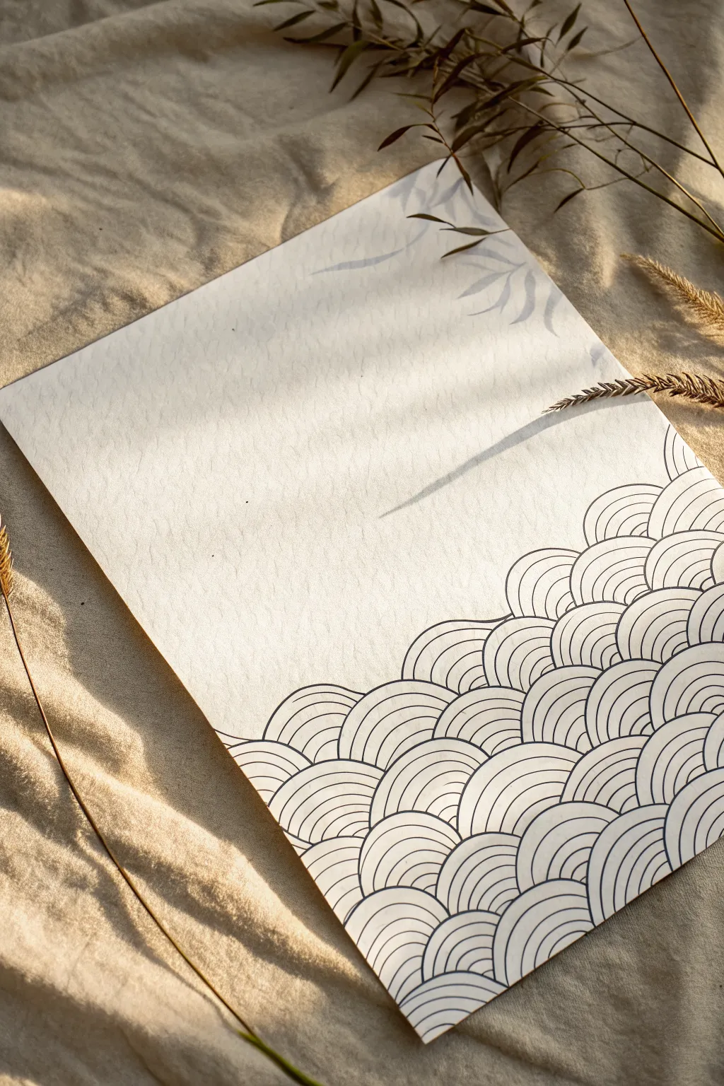
This project captures the soothing rhythm of the ocean with a traditional Japanese wave motif known as Seigaiha. Using precision lining techniques on textured paper, you will build overlapping concentric arcs that create a mesmerizing sense of movement and tranquility.
Step-by-Step Tutorial
Materials
- High-quality cold press watercolor paper or textured cardstock (A4 or letter size)
- Fine liner pen (black, 0.3mm or 0.5mm tip)
- Compass with a pencil attachment
- HB or 2H pencil
- High-quality eraser (kneaded or plastic)
- Ruler
- Painter’s tape (optional, for securing paper)
Step 1: Setting the Grid
-
Prepare your surface:
Begin by securing your textured paper to a flat work surface. If you want pristine edges, you can tape down the corners, but letting the paper sit naturally often works best for rotating it later. -
Mark the horizon line:
Decide how high up the page you want your waves to go. Lightly draw a horizontal line with your pencil and ruler about one-third or halfway up the page to act as the upper limit for your pattern. -
Create horizontal guidelines:
Starting from the bottom edge of the paper, use your ruler to measure and mark light horizontal lines spaced evenly apart—about 1 inch (2.5 cm) is a good height for each row of waves. Continue these until you reach your upper limit. -
Mark vertical centers:
On the bottom-most line, make tick marks every 2 inches across. On the line directly above it, stagger these marks so they sit exactly in the middle of the marks below (offset by 1 inch). Repeat this staggering pattern for every row up to the top.
Step 2: Penciling the Arcs
-
Set up your compass:
Insert your pencil into the compass and set the radius to exactly the distance between your vertical tick marks (1 inch if following the steps above). Ensure the lead is sharp for clean lines. -
Draw the base row:
Place the needle point on the first tick mark of the bottom line. Draw a semicircle arching upward. Move to the next tick mark and repeat, creating a row of touching hills. -
Draw the overlapping rows:
Move to the second row of tick marks (the staggered ones). Place your compass needle and draw the next set of semicircles. These should appear to emerge from behind the first row. -
Fill the pattern:
Continue working your way up the rows. Don’t worry about overlapping just yet; simply draw the full semicircles lightly in pencil for now to establish the skeleton of the design. -
Adjust the radius for inner rings:
To create the ‘ripple’ effect inside each wave, maintain the compass needle position but tighten the radius slightly (about 3mm smaller). Draw a smaller arc inside the main one. -
Complete the inner rings:
Repeat this reduction process 3 or 4 times for each wave unit until each semicircle is filled with concentric bands. I find it faster to do all large arcs first, adjust the compass once, do all medium arcs, and so on.
Steady Hands
Work from your shoulder, not your wrist, for smoother curves. Rotate the paper frequently so your hand is always drawing the arc in a natural, comfortable sweeping motion.
Step 3: Inking the Design
-
Test your pen:
Before touching the final paper, test your fine liner on a scrap piece of the same paper type to ensure the ink flows smoothly and doesn’t bleed into the paper texture. -
Outline the top-most row:
Begin inking starting from the very top row of waves. Trace the outer edge of the ‘highest’ waves first. This prevents your hand from smudging wet ink as you work downward. -
Ink the inner curves:
Carefully trace the concentric inner lines for that top row. Focus on keeping consistent spacing between the lines, using the pencil marks as a guide but trusting your hand for smoothness. -
Work strictly foreground to background:
Here is the critical part: When moving to the next row down, stop your pen line exactly where it meets the wave in front of it. The lower waves should act as the foreground, obscuring the bottom parts of the waves behind them. -
Maintain line weight:
Keep your pressure consistent. The beauty of this piece relies on the uniformity of the line thickness. If you pause, lift the pen cleanly to avoid creating ink pools. -
Fill the page:
Continue this process row by row, working downwards until you reach the bottom edge of the paper. Allow the pattern to run off the edges of the page for a natural, expansive look.
Fixing Wobbly Lines
If a curve gets shaky, don’t try to redraw it. Instead, slightly thicken the line weight of that specific arc section to smooth out the jitter visually.
Step 4: Final Touches
-
Let it dry completely:
Fine liners can look dry instantly but still hold moisture in the paper fibers. Wait at least 15 to 20 minutes to ensure the ink is totally set. -
Erase the guidelines:
Gently erase the pencil marks. Use a kneaded eraser if possible, dabbing or rolling it rather than scrubbing hard, to preserve the texture of the drawing paper. -
Inspect and refine:
Look closer at your intersections. If any lines stop a little short of touching the neighboring wave, carefully connect them with a very light touch of the pen.
Step back and admire the rhythmic calm of your new wave pattern artwork
Micro Icons Border for Journals and Prints
This charming border design combines simple botanical vines with celestial and geometric micro-icons to frame your journal page perfectly. Using a classic navy and rust-red palette, it creates a cozy, folk-art aesthetic that is both structured and whimsical.
Step-by-Step Guide
Materials
- Dotted grid notebook/journal
- Fine liner pen (0.3mm or 0.5mm, Navy Blue)
- Felt tip marker or brush pen (Rust/Terracotta Red)
- Ruler
- Pencil (HB or lighter)
- Eraser
Step 1: Setting the Structure
-
Pencil rough layout:
Begin by lightly sketching the main components with a pencil. Mark a vertical line about 1.5 inches from the left edge of the page. Then, lightly sketch a flowing ‘L’ shape curve starting from the bottom right corner, moving up the right side. -
Draw the margin divider:
Using your ruler and the rust-red marker, draw the vertical line on the left side. Leave a gap of about an inch at the top and bottom so the line floats rather than touching the page edges.
Step 2: The Left Margin Details
-
Add floating hearts:
In the left margin column, draw two solid hearts using your rust-red marker. Place one near the vertical center and one near the bottom. Vary their sizes slightly for interest. -
Draw navy hearts:
Switch to your navy fine liner. Draw a solid navy heart near the top of the column. This establishes your primary color balance. -
Ink the blue stars:
With the navy pen, draw a solid five-pointed star near the top heart and a simple outline star near the middle red heart. -
Add red star accents:
Using the rust pen, draw a solid five-pointed star under the middle red heart and another near the bottom. I like to keep the points slightly rounded for a softer look. -
Fill in micro details:
Scatter tiny navy details in the gaps: small outline hearts, tiny dots, and mini starbursts to fill the negative space without overcrowding it. -
Create the bottom botanical:
At the very bottom of the left column, verify you have space for a small leaf sprig. Draw a central stem in navy, adding simple oval leaves on either side.
Consistent Spacing
Use the dots of your journal grid as coordinates. For example, make every large star 2 grid squares high to keep sizes uniform.
Step 3: The Right Vine Border
-
Draw the primary stem:
On the right side of the page, use the navy fine liner to trace your penciled vine curve. Start from the bottom center and swoop up towards the middle right edge. -
Ink the leaves:
Add leaves to the vine. These should be simple, open outlines with a center vein line. Alternate the leaves, placing some individually and grouping others in pairs near the stem tips. -
Add detached sprigs:
Further up the right side, above the main vine, draw two separate, floating leaf sprigs. Angle them upwards to guide the eye toward the top of the page. -
Draw the pine branch:
At the very bottom interact with the main vine by drawing a small pine branch or ‘comb’ shape. Draw a curved line with short, straight bristles extending downwards.
Ink Smearing?
If your ruler smears the ink when drawing the long line, stick a few layers of masking tape to the underside of the ruler to lift it off the paper.
Step 4: Celestial Accents & Finish
-
The crescent moon:
At the top center of the page, slightly to the left of the vines, draw a simple crescent moon outline in navy blue. -
Scatter the stars:
Surround the moon and vines with your star mix. Draw a few small rust-red solid stars near the vine leaves. -
Add navy constellations:
Draw outline stars (pentagram style) near the moon and mixed into the vine area. Add tiny solid navy hearts and small circles to act as ‘stardust’. -
Balance the layout:
Look at the empty space between the border elements. If a spot feels too empty, add a tiny dot or a micro-star. -
Erase guidelines:
Once the ink is completely dry—give it a good five minutes to be safe—gently erase any remaining pencil marks to reveal a clean, crisp design.
Your page is now beautifully framed and ready for your daily logs or notes


Have a question or want to share your own experience? I'd love to hear from you in the comments below!