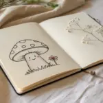
If you want your sketch to look impressive fast, go big and keep the shapes simple—it’s the easiest way to fill a page without drowning in tiny details. Here are my favorite big easy drawings that feel super doable, even on low-energy art days.
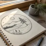
Mountain Range in a Triangle Frame
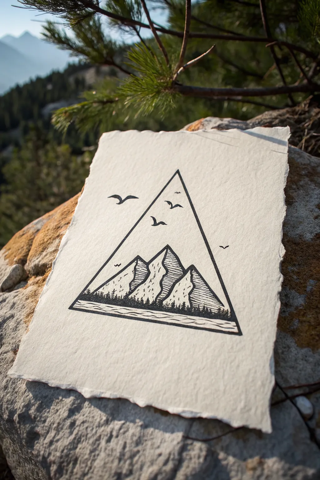
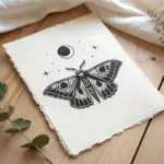
This minimalist ink drawing proves that framing a landscape within a bold geometric shape can create instant impact. The clean lines of the triangle contrast beautifully with the organic texture of the deckle-edged paper, resulting in a piece that feels both modern and rustic.
Step-by-Step
Materials
- Textured paper with deckle edges (watercolor or cotton rag)
- Ruler
- Pencil (HB or H)
- Eraser
- Fine liner pen (01 or 03 size)
- Thicker marker or brush pen (black)
- Scrap paper (for testing)
Step 1: Setting the Frame
-
Find Center:
Begin by finding the approximate vertical center of your paper. Make a small mark near the top where you want your triangle’s apex to be. -
Draw the Base:
Using your ruler, lightly sketch a horizontal line for the base of the triangle. Ensure it is centered relative to your top mark. -
Connect the Points:
Connect the top mark to the ends of your baseline to form a tall, isosceles triangle. Keep these pencil lines light, as they are just guides. -
Thicken the Frame:
Now, use your thicker black marker and the ruler to trace over your pencil triangle. Go over the lines carefully to create a bold, solid border that will contain your scene.
Step 2: Sketching the Peaks
-
Outline the Mountains:
Switch back to your pencil. Inside the bottom half of the triangle, sketch three jagged mountain peaks. The center peak should be the tallest, slightly overlapping the side ones. -
Define the Light Source:
Decide that your light is coming from the left. Draw a zig-zagging line down the center of each mountain peak to separate the illuminated left side from the shadowed right side. -
Add Foreground Trees:
At the very bottom, just above the triangle’s base, sketch a small, uneven horizon line of tiny vertical dashes to represent a distant pine forest. -
Sketch the River:
Draw two wavy, parallel lines below the tree line but above the frame’s bottom edge to create a stylized river or path. -
Place the Birds:
Lightly mark the positions for a few birds flying in the sky area. Draw them as simple ‘V’ or ‘M’ shapes.
Help! Shaky Lines?
If your ruler slips or lines wobble, don’t restart. Thicken the frame line slightly to hide the error. A variable width line actually adds character
Step 3: Inking and Detailing
-
Ink the Outlines:
Using your fine liner pen, trace the main outlines of the mountain peaks. Do not ink the zig-zag center lines yet. -
Create Texture:
On the ‘light’ (left) side of the mountains, use sparse, broken stippling or tiny dashes to suggest rock texture without darkening it too much. -
Shade the Shadows:
For the ‘shadowed’ (right) side of the peaks, use horizontal hatching. Draw closely spaced parallel lines that stop at the zig-zag center divide. -
Fill the Trees:
Use the fine liner to fill in the tiny trees at the bottom. Scribble vertical strokes densely to create a solid, dark silhouette against the base of the mountains. -
Define the Water:
Ink the wavy river lines. I like to add a few thinner, broken lines between the main waves to suggest current. -
Ink the Birds:
Trace over your bird sketches. Fill them in solid black to make them pop against the white sky. -
Final Cleanup:
Let the ink dry completely for a few minutes. Gently erase all remaining pencil marks, being careful not to smudge your work or damage the textured paper surface.
Add a Splash
Once the ink is fully waterproof-dried, try painting a faint watercolor wash of blue or sunset orange just inside the triangle for a pop of color
You now have a striking piece of geometric art ready to be displayed

Big Sun With Easy Rays
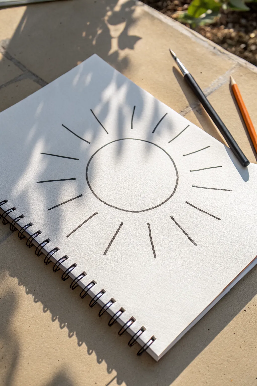
Capture the warmth of a sunny day with this effortlessly simple line drawing. Using bold, clean strokes, this project transforms a basic circle and lines into a striking piece of minimalist art that looks perfect in any sketchbook.
Step-by-Step Tutorial
Materials
- Spiral-bound sketchbook or heavy drawing paper
- Large circular object for tracing (like a bowl or roll of tape)
- Small circular object (optional, for inner reference)
- Black brush pen or thick marker
- Pencil (graphite)
- Eraser
- Ruler (optional)
Step 1: Planning composition
-
Position your paper:
Start with a clean page in your spiral-bound sketchbook. I prefer to angle the book slightly to match the relaxed vibe of the drawing. -
Find the center point:
Visualize the center of your page. Since this is a large, central motif, you want to ensure you have enough negative space around the edges for the rays to extend without running off the paper. -
Trace the central circle:
Place your large circular object (like a bowl rim or large tape roll) directly in the center. Lightly trace around it with a pencil to create your main sun body. Keep the pressure light so it can be adjusted if needed.
Step 2: Drafting the rays
-
Mark the cardinal directions:
Using your pencil, lightly sketch four short dashes outside the circle at the 12, 3, 6, and 9 o’clock positions. This helps keep your spacing even right from the start. -
Fill in the diagonals:
Add four more light dash marks exactly halfway between your cardinal points. You should now have eight evenly spaced guides surrounding your circle. -
Add intermediate guides:
Place one final mark in between each of your existing eight guides. This will give you a total of sixteen ray positions, which creates a nice, full sunburst effect. -
Sketch the ray lengths:
Lightly sketch the lines for the rays extending outward. Aim for them to be roughly the same length as the diameter of your central circle, but don’t worry if they vary slightly—it adds character. -
Check the gap sizing:
Look at the space between the circle and where the rays start. Ensure there is a consistent gap of about half an inch (or 1-2 cm) so the rays create a ‘floating’ effect rather than touching the sun.
Wobbly Circle?
Don’t tighten up your hand muscles. Instead of trying to draw the circle in one slow, continuous line, try two engaging ‘C’ shapes that meet. It often results in a smoother curve.
Step 3: Inking the design
-
Prepare your marker:
Switch to your black brush pen or thick marker. Test it on a scrap piece of paper first to ensure the ink flows smoothly and creates a solid, bold line. -
Ink the central circle:
Carefully trace over your penciled circle. Go slowly to maintain a smooth curve. If your hand shakes, try locking your wrist and moving your whole arm from the elbow. -
Evaluate the line weight:
If the line looks too thin, go over it a second time to thicken it up. A slightly imperfect or ‘organic’ circle works beautifully for this style, so don’t stress about mathematical perfection. -
Ink the first set of rays:
Start inking the rays at the 12, 3, 6, and 9 o’clock positions. Press firmly at the start of the stroke (near the circle) and lift slightly as you move outward to create a subtle taper. -
Complete the ray inking:
Work your way around the rest of the circle, inking the remaining penciled rays. rotate the sketchbook as you go so your hand is always in a comfortable drawing position. -
Add detail variants:
If I want a bit more handmade feel, I sometimes deliberately make a few rays slightly shorter or longer than their neighbors, breaking up the symmetry just a touch.
Style Tip: Varied Weights
For a more dynamic look, use a thicker marker for the central sun circle and a slightly thinner pen for the rays. This adds visual depth without complicating the drawing.
Step 4: Finishing touches
-
Let the ink dry completely:
Wait at least 5-10 minutes for the marker ink to set. Brush pens can pool slightly on smooth paper, and smudging it now would ruin the crisp look. -
Erase guidelines:
Gently erase all your original pencil marks. Hold the paper taut with one hand while erasing to prevent the page from crumpling. -
Final inspection:
Brush away the eraser dust and look for any spots where the black ink might look patchy. Fill those in carefully for a solid, high-contrast finish.
Now you have a bold, graphic sun illustration that brightens up your sketchbook page

Oversized Moon and Puffy Clouds
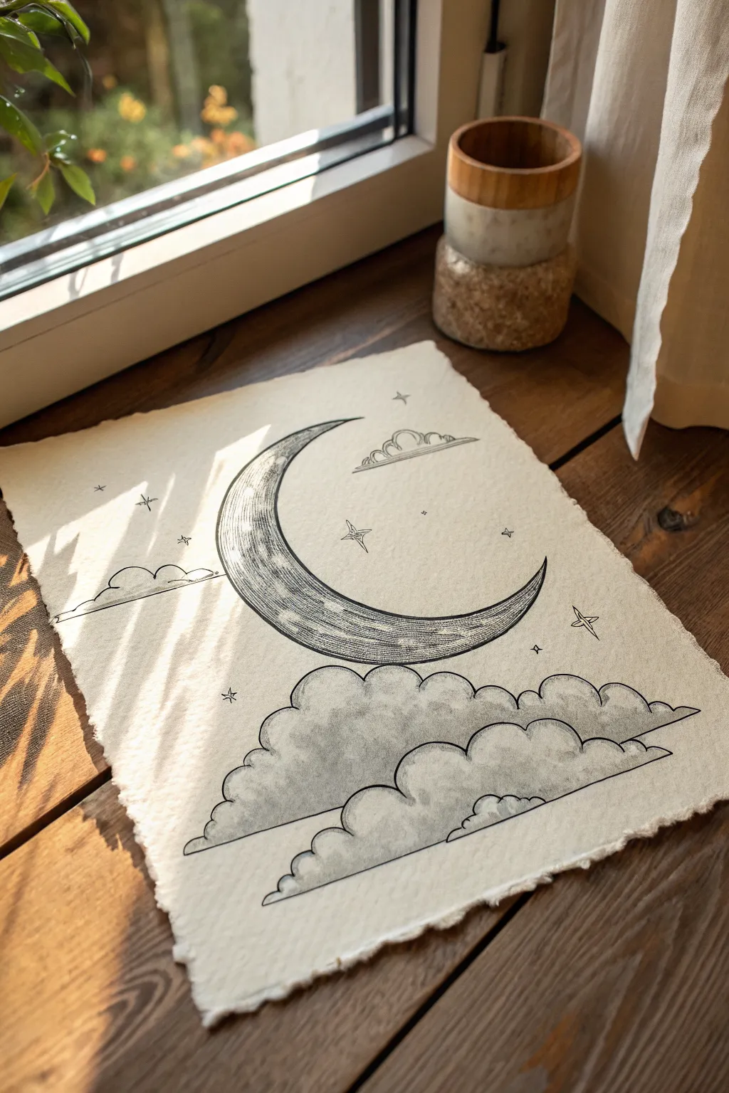
This whimsical celestial illustration combines a textured oversized crescent moon with delightfully puffy clouds on rustic handmade paper. The high contrast of black ink against the creamy, uneven surface of the paper creates a timeless, almost vintage storybook aesthetic perfect for framing.
Detailed Instructions
Materials
- Handmade sheet of cotton rag paper (approx. 8×10 or A4)
- Pencil (HB or 2B)
- Kneaded eraser
- Fine liner pens (sizes 005, 01, 03, and 05)
- Black ink brush pen or thick marker
- Ruler (optional)
- Circular object or compass for tracing
Step 1: Sketching the Layout
-
Prepare your paper:
Place your handmade paper on a flat, clean surface. Because the paper has a rough texture, you might want to tape the corners down lightly with painter’s tape to stop it from shifting while you sketch. -
Outline the crescent:
Using a light hand and your pencil, draw a large crescent moon in the upper center of the page. You can trace a round object for the outer curve and freehand the inner curve to get that sweeping, tapered shape. -
Map out the cloud base:
Below the moon, sketch a series of overlapping, rounded humps to form the cloud bank. Aim for two main tiers of clouds, with the bottom layer stretching wider than the top, creating a pyramid-like structure. -
Add floating elements:
Sketch a smaller, solitary cloud floating near the top right tip of the moon. Then, lightly mark positions for a few four-pointed stars and tiny dots scattered around the sky.
Ink Bleeding?
Handmade paper is absorbent. If lines look fuzzy, switch to pigment liners (like Microns) rather than liquid ink pens, and move your hand faster across the page.
Step 2: Inking the Moon
-
Define the moon’s outline:
Switch to an 03 or 05 fine liner. Carefully trace your pencil lines for the moon. The textured paper might cause the pen to skip slightly, but this adds to the organic charm, so don’t rush to fix every wobble. -
Create the inner border:
Draw a second line inside the crescent shape, running parallel to the outer edge, to create a thin border. -
Start the hatching:
With a thinner 01 pen, begin adding horizontal hatching lines across the body of the moon. Keep these lines relatively straight but allow them to break and vary in length. -
Deepen the shading:
To make the moon look round, densify the hatching lines near the inner curve and the pointed tips. Leave the center somewhat lighter to suggest a highlight. -
Add surface texture:
Using an 005 pen, add tiny stippling dots and small imperfections within the moon’s surface to mimic craters and the rough texture of lunar rock.
Step 3: Creating Fluffy Clouds
-
Outline the clouds:
Use an 03 pen to ink the outlines of your cloud banks. Emphasize the curves, making sure the ‘bumps’ of the clouds feel heavy and soft. -
Establish the cloud bottom:
Draw straight horizontal lines across the bottom of each cloud tier. This flattens them out and gives them a stylized, graphic look typical of vintage illustrations. -
shade the cloud volumes:
I prefer to use a technique called scumbling here. Take your 01 pen and make tiny, controlled scribbles or tight loops along the bottom edges of the cloud curves. This suggests shadow and volume. -
Build the gradient:
Continue scumbling upward from the bottom of each cloud hump, gradually making the marks lighter and farther apart as you reach the top of the curve. The tops of the clouds should remain mostly white paper. -
Detail the lonely cloud:
Repeat this outlining and scumbling process for the small floating cloud near the top right, keeping the shading subtle to show it is farther away.
Add a Golden Glow
Once the black ink is totally dry, use Gold watercolor or metallic ink to fill in the stars or trace a thin line along the lit edge of the moon for subtle sparkle.
Step 4: Finishing Touches
-
Ink the stars:
Draw the four-pointed stars with an 01 pen. Draw a cross first, then curve the lines inward to connect the points. Add a tiny dot in the center of the larger stars. -
Sprinkle stardust:
Use your finest pen (005) to dot small clusters of specks around the moon and clouds. Vary the pressure to create different sized dots. -
Erase pencil marks:
Wait at least 10-15 minutes for the ink to fully cure. Textured paper holds ink longer than smooth paper. Once dry, gently roll a kneaded eraser over the drawing to lift the pencil sketch. -
Final contrast check:
Step back and look at your drawing. If the moon needs more weight, go back with your 01 pen and add a second layer of cross-hatching to the darkest areas.
Now you have a serene piece of sky art ready to hang on your wall or gift to a stargazer


Single Big Flower Close-Up
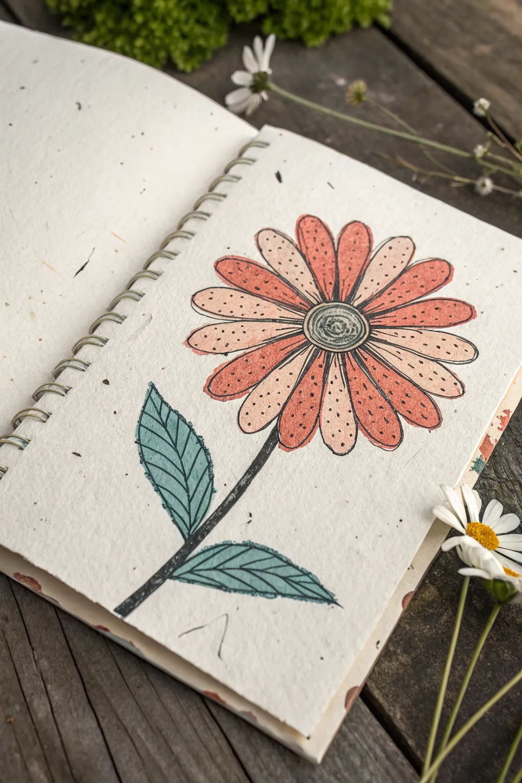
Capture the charm of traditional block printing with this hand-drawn daisy illustration. Using textured paper and a clever stippling technique, you’ll create a warm, vintage-inspired botanical that feels earthy and distinct.
How-To Guide
Materials
- Textured handmade paper (oatmeal or seeded)
- Black ink fineliner (0.5mm or 0.8mm)
- Black brush pen or thick marker
- Colored pencils (peach, rust orange, sage green)
- Pencil for sketching
- Eraser
Step 1: Sketching the Structure
-
Center Circle:
Begin by lightly sketching a small circle in the upper right quadrant of your page. This doesn’t need to be perfectly round; a slight oval shape looks more natural. -
Petal Guidelines:
Draw faint lines radiating outward from the center circle to mark the length of your petals. Aim for about 16 petals total. -
Petal Shapes:
Sketch the petal outlines around your guidelines. Make them long and rounded at the tips, ensuring they touch each other near the base. -
Stem and Leaves:
Draw a slightly curved stem extending from the bottom left petal down toward the bottom edge. Add two large, pointed oval leaf shapes attached to the stem.
Paper Matters
Use cold-press watercolor paper or recycled paper with visible fibers. The rough surface naturally breaks up your lines, instantly giving that stamped, rustic appearance.
Step 2: Inking the Outline
-
Inner Details:
Using your medium-thickness fineliner, ink the center circle. Draw a spiral inside it to mimic the texture of a flower head. -
Petal Outline:
Go over your pencil lines for the petals. To achieve that block-print look, don’t make the lines perfect—let them be slightly jagged or vary in thickness. -
Stem Thickness:
Ink the stem using a thicker brush pen or marker to give it weight. The texture of the paper will naturally create some rough edges, which adds character. -
Leaf Veins:
Outline the leaves and draw a central vein down the middle of each. Add smaller veins branching out towards the edges, keeping the lines bold. -
Erase Sketches:
Wait a moment for the ink to fully set on the textured paper, then gently erase all remaining pencil marks.
Step 3: Adding Color and Texture
-
Base Color – Dark Petals:
Select alternating petals to color with your rust orange pencil. I prefer to color lightly first, letting the paper’s grain show through. -
Base Color – Light Petals:
Fill the remaining petals with a pale peach or cream color. This creates a lovely striped effect on the flower head. -
Greenery:
Color the leaves with your sage green pencil. Apply a bit more pressure near the central vein to create subtle shading. -
Stippling Effect:
Take your black fineliner again. Add tiny dots all over the colored petals to mimic the porous look of a stamp print. -
Leaf Texture:
Add fine hatching lines or small ticks along the edges of the green leaves to suggest a rougher texture, similar to the petals. -
Center Depth:
Darken the spiral in the center with a bit of green pencil overlaid with black stippling to make it recede visually.
Stamp Style
Leave tiny slivers of white space between the black outline and your coloring. This ‘misregistration’ mimics the look of a handmade lino block print.
This simple technique turns a basic flower drawing into a piece of art that feels crafted and timeless
BRUSH GUIDE
The Right Brush for Every Stroke
From clean lines to bold texture — master brush choice, stroke control, and essential techniques.
Explore the Full Guide
Large Cat Face With Whiskers
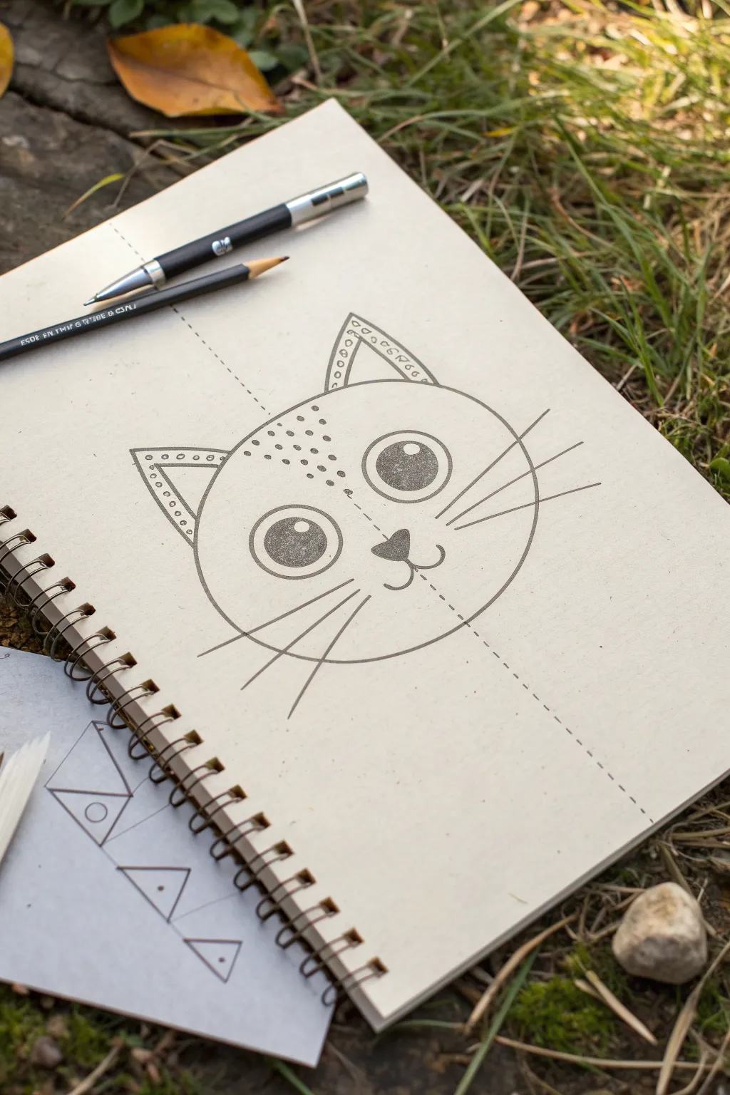
This charming, large-scale cat drawing is perfect for filling a sketchbook page with simple, confident lines. It relies on a central axis to help you balance the features, creating a delightfully stylized character with decorative ears and bold eyes.
Step-by-Step
Materials
- Sketchbook or heavyweight drawing paper
- Mechanical pencil or fine graphite pencil (HB or B)
- Black drawing pen or dark charcoal pencil for outlining
- Ruler or straight edge
- Eraser
Step 1: Setting the Foundation
-
Draw the central axis:
Begin by using your ruler to draw a very light, dashed line straight down the center of your page. This axis line will be your guide for keeping the face symmetrical, so extend it almost from the top to the bottom edge. -
Outline the head shape:
Draw a large, wide oval for the cat’s head. The center line should slice right through the middle of it. Keep this line relatively light for now, just in case you need to adjust the roundness of the cheeks. -
Mark ear placement:
At the top of the oval, mark two points equidistant from the center line where the ears will begin. Drawing lightly, add two large, soft triangle shapes for the ears, tipping them slightly outward.
Step 2: Building the Features
-
Position the eyes:
About halfway down the head oval, draw two large circles for the eyes. Try to space them evenly from that dashed center line. I find it helps to draw the left one first, then match the right one to it. -
Add the nose:
Directly on the dashed center line, slightly below the level of the eyes, draw a small, soft triangular shape pointing downward. This will be the nose. -
Draw the mouth anchor:
From the bottom tip of the nose triangle, drop a tiny vertical line. From there, curve two lines upward to the left and right to form a classic ‘w’ shape for the mouth. -
Define the pupils:
Inside each large eye circle, draw a slightly smaller circle, leaving a gap between it and the outer edge. Inside *that* circle, draw a small highlight bubble near the top right to give it life.
Symmetry Struggles?
If matching the eyes is hard, use a ruler to measure the distance from the center line to the edge of the first eye. Mark that same distance on the other side.
Step 3: Adding Details and Texture
-
Fill the eyes:
Using your dark pencil or pen, shade in the pupil area around that little highlight bubble. Make this the darkest part of your drawing to create focus. -
Detail the ears:
Inside the ear triangles, draw smaller triangles to mimic the outer shape. Decorate the space between the inner and outer ear lines with a row of small circles for a jewelry-like effect. -
Add forehead freckles:
On the left side of the forehead, draw a cluster of small dots. Arrange them loosely, perhaps denser near the center line and fading out as they move toward the ear. -
Draw the whiskers:
From the cheek area on the left, draw three long, straight lines radiating outward for whiskers. Repeat this on the right side, trying to match the angle and length.
Add Personality
Make the cat unique by changing the ear patterns. Instead of circles, try zig-zags, stripes, or solid black tips to give your feline a different style.
Step 4: Finalizing the Line Work
-
Darken the main outlines:
Go over your initial head shape, ears, and facial features with firm, confident pressure. If you are using a pen, trace your pencil lines now. -
Shade the nose:
Fill in the nose triangle with a solid dark tone, similar to the eyes. -
Enhance the dashed line:
Instead of erasing the center guide, re-draw over it with deliberate, darker dashes. It serves as a stylistic element here, showing the construction of the drawing. -
Clean up stray marks:
Gently erase any unintended smudges or light sketch lines that fall outside your final drawing, keeping the paper crisp.
You have framed a beautifully balanced illustration that highlights the elegance of simple geometry
Chunky Puppy Portrait
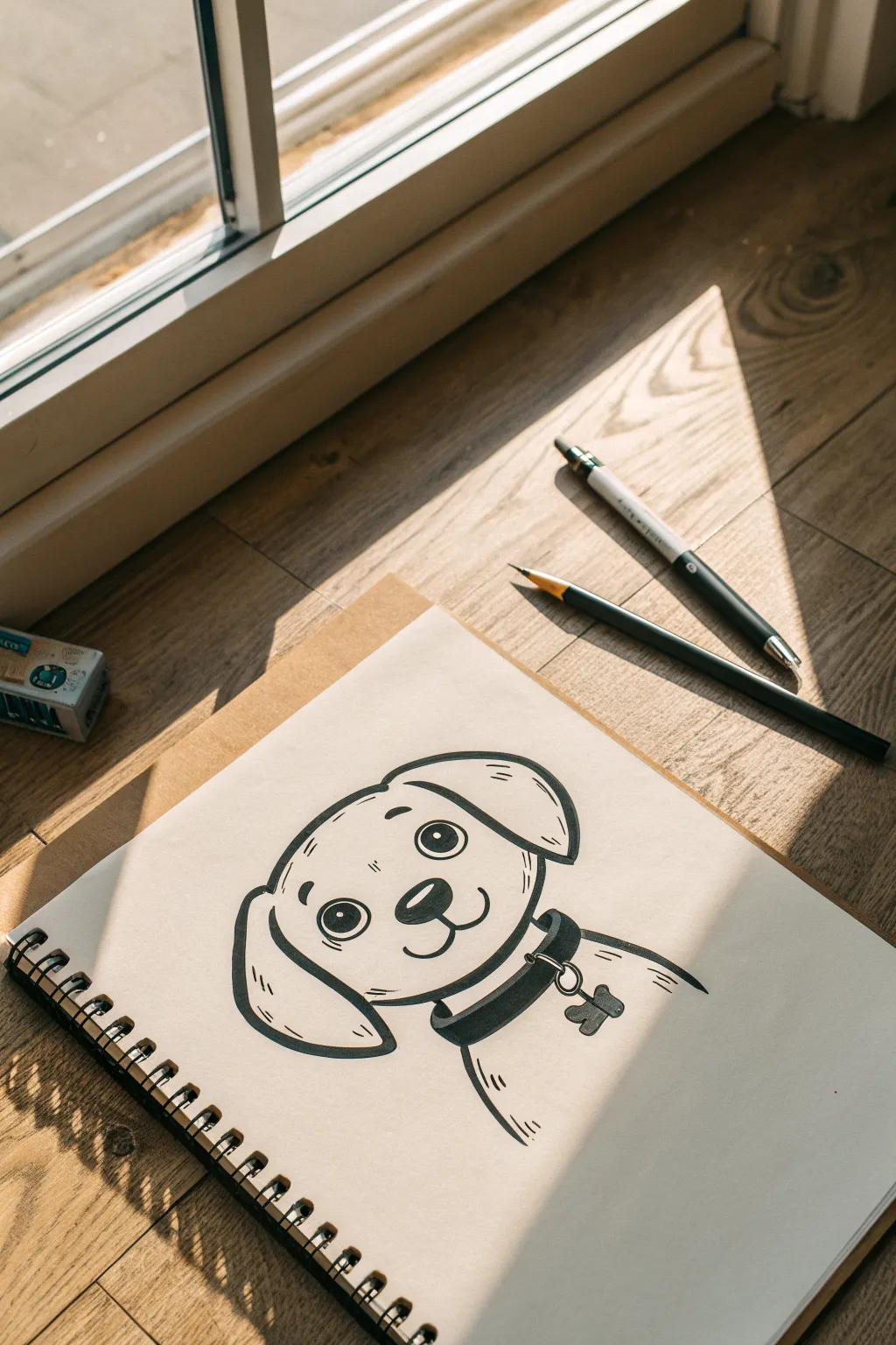
This adorable, bright-eyed puppy sketch is perfect for beginners who want to practice bold line work and expression. With its simple shapes and clean finish, you’ll capture the charm of a loyal furry friend in just a few minutes.
Step-by-Step Tutorial
Materials
- Spiral-bound sketchbook or heavy drawing paper
- HB Pencil (for sketching)
- Eraser
- Black felt-tip marker or fineliner pen (medium/bold tip)
- Flat work surface
Step 1: Basic Sketching
-
Outline the head:
Start lightly with your pencil. Draw a rounded, slightly flattened circle for the main part of the head. It should be shaped somewhat like a loaf of bread, wider at the cheeks and slightly flatter on top. -
Position the ears:
Add the ears on either side of the head. For the left ear, draw a floppy, teardrop shape hanging down. For the right ear, imagine the puppy perking up slightly and draw a folded shape that flips outward a bit at the top. -
Map out the face:
Draw a faint horizontal line across the middle of the face to guide your eye placement. Sketch two large circles for the eyes, resting them just above your guide line. -
Add the snout:
Below the eyes, sketch a soft, rounded triangle for the nose. Connect this to the mouth by drawing a small vertical line down from the nose, splitting into two curves that smile upward to form the muzzle. -
Sketch the collar:
Draw two curved lines below the chin representing the collar. Add a small circle dangling from the bottom line for the tag ring, and sketch a bone shape attached to it. -
Indicate the body:
Lightly sketch a curved line sloping down from the right side of the collar to suggest the puppy’s shoulder and back.
Highlight Hint
Make sure your white eye highlights are facing the same direction (e.g., top right) in both eyes. This ensures the puppy looks focused rather than cross-eyed.
Step 2: Inking and Details
-
Start inking the outline:
Take your black marker and carefully trace over your pencil lines for the top of the head. Use confident, smooth strokes rather than short, scratchy ones. -
Define the ears:
Trace the ears next. On the left ear, add two small tick marks near the bottom curve to suggest fur texture or a fold. -
Draw the eyes:
Ink the large circles for the eyes. Inside each eye, draw a smaller circle near the top right for a highlight, then fill in the rest of the pupil completely black. This gives that classic ‘puppy dog’ look. -
Eyebrows and details:
Add small, floating oval shapes above the eyes for eyebrows to give the face expression. I usually place them slightly angled to make the pup look curious. -
Nose and mouth:
Ink the nose, leaving a tiny sliver of white at the top for a shine, and fill the rest in black. Trace the mouth curves, adding small dimple marks at the ends of the smile. -
Add facial creases:
Draw faint, short lines on the forehead and cheeks—just a couple of dashes—to suggest dimension without cluttering the face. -
Complete the collar:
Trace the collar lines. Thickening the bottom line of the collar creates a nice shadow effect. Ink the ring and the bone tag, adding a tiny dot or heart inside the bone for decoration. -
Final body lines:
Trace the shoulder line on the right. Add two small hash marks at the bottom of this line to hint at fur texture.
Make It Yours
Customize the tag! Instead of a plain bone, draw a circle with your own pet’s initial inside, or change the ear shape to match a specific breed like a pointed husky ear.
Step 3: Finishing Touches
-
Erase pencil marks:
Wait about a minute to ensure the ink is completely dry so it doesn’t smudge. Gently erase all the underlying pencil sketches to reveal the clean, crisp artwork. -
Refine line weights:
Look over your drawing. If you want it to pop more, go back and thicken the outer contour lines of the head and ears, keeping the interior facial details slightly thinner.
Now you have a charming puppy portrait ready to be framed or gifted to a dog lover

PENCIL GUIDE
Understanding Pencil Grades from H to B
From first sketch to finished drawing — learn pencil grades, line control, and shading techniques.
Explore the Full Guide
Easy Turtle From Above
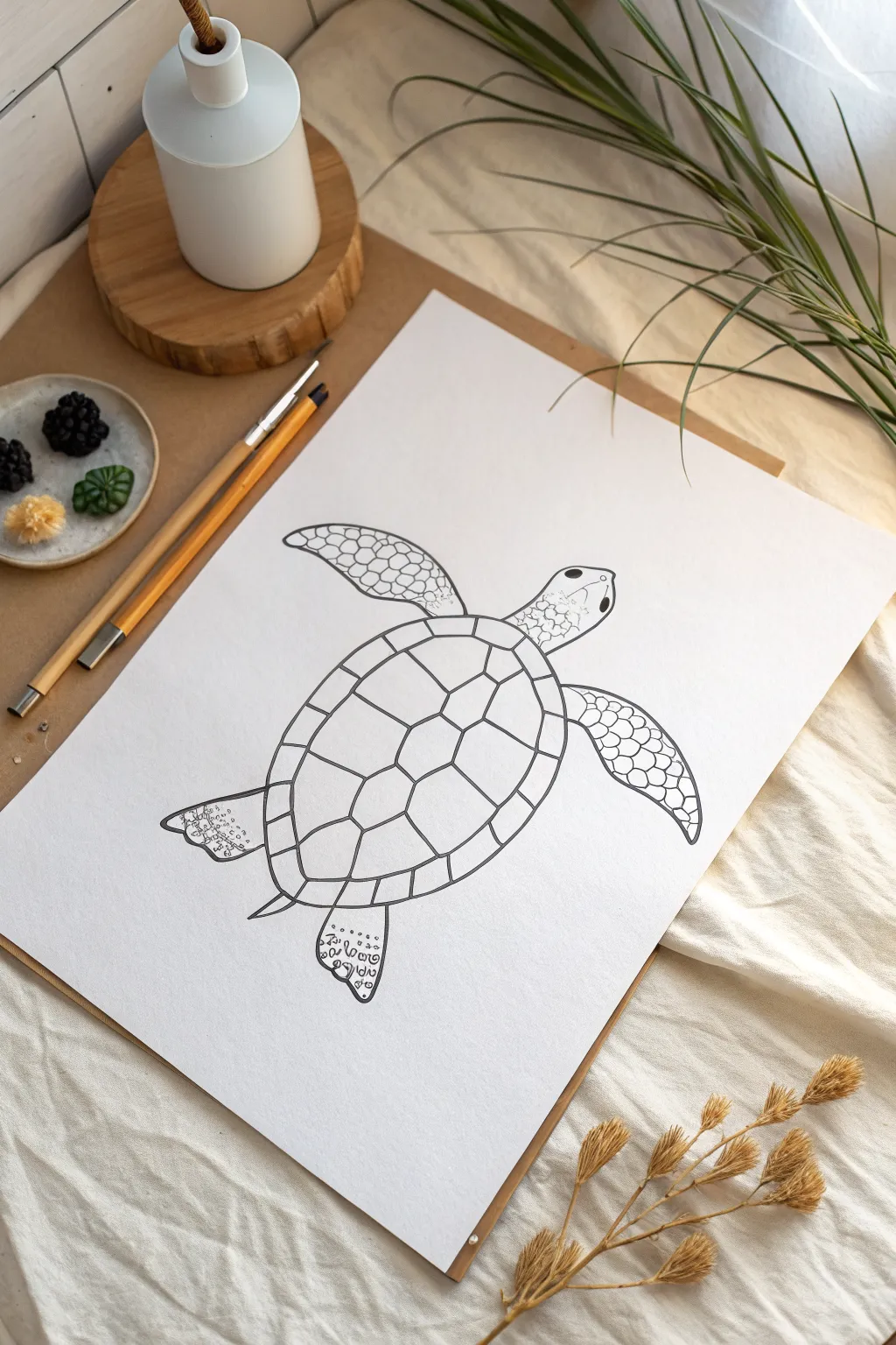
Capture the calm spirit of the ocean with this elegant line drawing of a swimming sea turtle. Using clean ink lines and meditative patterns, you’ll build up the shell and flippers to create a piece that feels both organic and structured.
Detailed Instructions
Materials
- High-quality white drawing paper or cardstock (A4 size)
- Pencil (HB or 2H for light sketching)
- Eraser (kneaded preferred)
- Fine liner pen (black, approx. 0.5mm)
- Ultra-fine liner pen (black, approx. 0.1mm or 0.3mm)
- Ruler (optional)
Step 1: Basic Structure
-
Outline the shell:
Begin in the center of your page by lightly sketching a large, vertical oval. This doesn’t need to be perfectly round; a slight egg shape (slightly narrower at the bottom) works well for a natural look. -
Add the head:
At the top of your oval, sketch a smaller, rounded shape for the head. It should connect smoothly to the top of the shell, tapering slightly towards the front where the mouth would be. -
Position the front flippers:
Draw two long, curved wing-like shapes extending from the upper sides of the shell. These are the powerful front flippers. Curve them backward slightly as if the turtle is propelling itself forward. -
Add the rear flippers:
Sketch two smaller, paddle-shaped flippers at the bottom of the shell. These should be shorter and wider than the front pair, angling downwards and slightly outwards. -
Connect the tail:
Draw a tiny, pointed tail peeking out from the very bottom center of the shell, right between the rear flippers.
Variation in Line Weight
Use a 0.8mm pen for the outermost silhouette and a 0.3mm for internal details. This contrast makes the drawing look professional and graphic.
Step 2: Refining the Lines
-
Define the shell border:
Draw a second oval inside the main shell shape, parallel to the outer edge. This creates the rim of the shell, often called the marginal scutes. -
Map the central scutes:
Down the vertical center of the inner shell area, sketch a column of three hexagon-like shapes. The top and bottom shapes can be slightly more irregular to fit the curve. -
Connect the side scutes:
Draw lines connecting the points of your central hexagons to the inner rim border. This creates the lateral scutes on either side, completing the classic tortoise-shell pattern. -
Divide the rim:
Using small, radial lines, divide the border rim into individual segments. Imagine these lines radiating outward from the center of the shell.
Step 3: Inking and Details
-
Ink the main outlines:
Switch to your 0.5mm fineliner. Carefully trace over all your pencil outlines—the silhouette, head, flippers, and the main lines of the shell. Keep a steady hand for clean, confident strokes. -
Detail the head:
Draw the eye on the side of the head using a small black oval with a tiny white highlight left un-inked. Sketch a simple line for the mouth and add a small nostril dot. -
Create head scales:
Use the finer (0.1mm or 0.3mm) pen to draw a mosaic of small, irregular shapes on the top of the head. Keep these shapes loose and organic, like cobblestones. -
Pattern the front flippers:
This is where I like to take my time. On the front flippers, draw rows of scale-like curves or small circles. Focus on the leading edge (the top curve) of the flipper for the most density. -
Refine the flipper tips:
As you move toward the tips of the front flippers, let the scales become smaller and more spaced out, eventually fading into the plain white of the paper. -
Texture the rear flippers:
Add textural elements to the rear flippers. Instead of full scales, use tiny circles, swirls, or random squiggles to give them a wrinkled, leathery appearance different from the front limbs. -
Thicken key lines:
Go back over the primary shell divisions with your thicker pen. Creating a slightly bolder line weight here helps the shell pop and separates the main scutes from the decorative details. -
Final cleanup:
Wait several minutes to ensure all ink is completely dry to the touch. Gently erase all underlying pencil sketch lines, being careful not to smudge the fresh ink.
Zen Doodling
Fill the shell scutes with zentangle patterns—stripes, dots, or swirls—instead of leaving them plain. It turns the sketch into abstract art.
Now you have a serene sea turtle drawing ready to be framed or gifted to an ocean lover
Whale Silhouette With Two Waves
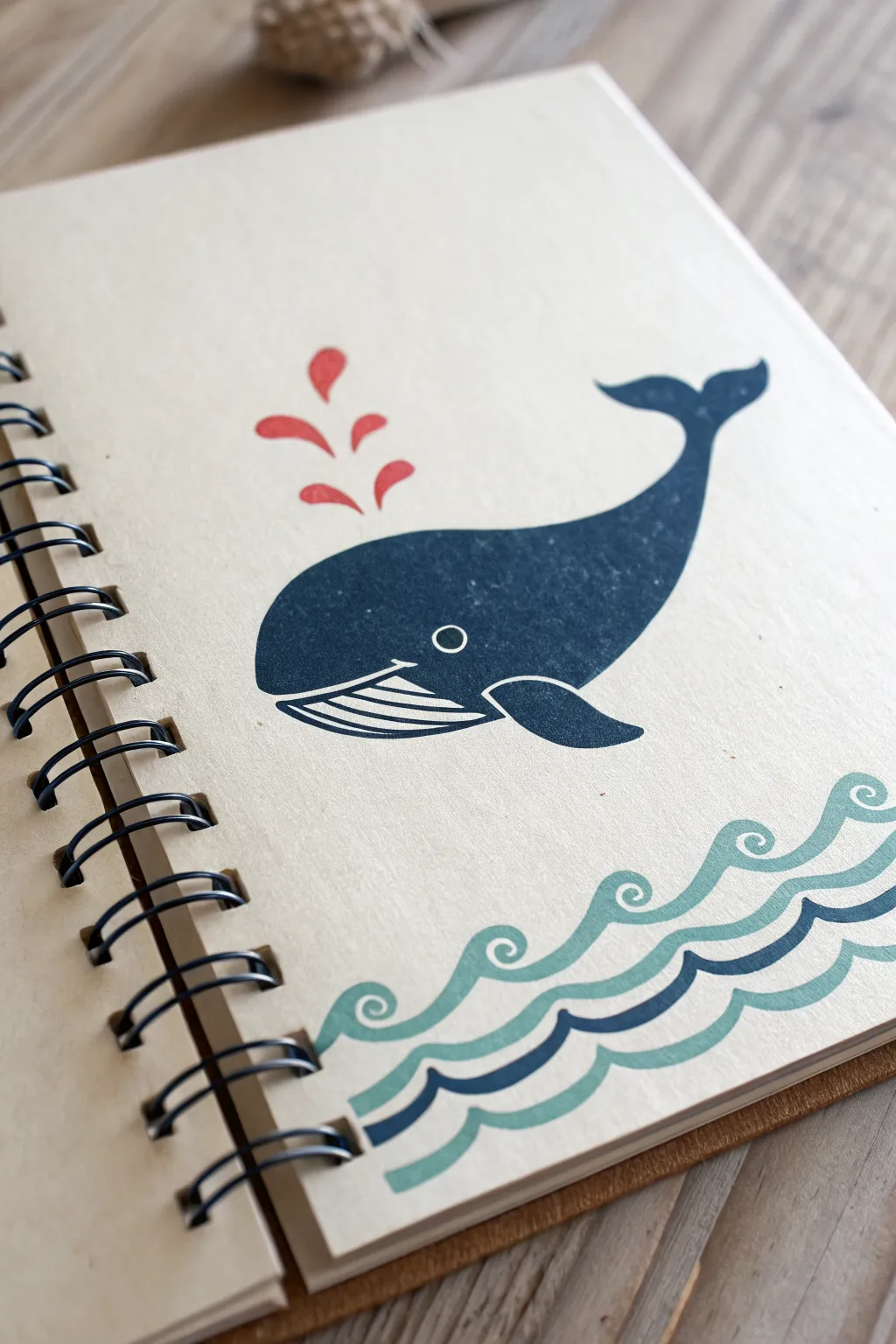
Transform a plain kraft paper notebook into a nautical treasure with this stylized whale design. The combination of deep blue silhouettes and playful wave patterns creates a clean, classic look that is surprisingly simple to achieve.
How-To Guide
Materials
- Spiral-bound notebook with kraft paper cover
- Navy blue acrylic paint (or marker)
- Teal or seafoam green acrylic paint (or marker)
- Red acrylic paint (or marker)
- White gel pen or fine white paint marker
- Pencil and eraser
- Small flat brush
- Small round detail brush
- Ruler
Step 1: Planning the Seascape
-
Lightly sketch the waves:
Using a pencil, draw two wavy lines across the bottom quarter of the notebook cover. Make the waves crest into small curls on the left side of each hump. -
Refine the wave shapes:
Thicken these lines into bands. I like to keep about a half-inch of space between the two wave bands to let the kraft paper show through. -
Outline the whale:
In the center of the remaining space above the waves, sketch a large oval shape for the whale’s body. -
Add the tail:
Extend the right side of the oval upward into a curved tail shape, finishing with a classic fluke (the tail fin) that looks a bit like a broad letter ‘Y’. -
Detail the belly:
Sketch a smaller fin on the bottom area of the oval, and draw a curved line separating the main body from the ribbed underside of the whale.
Paint Bleeding?
Kraft paper is absorbent. If your paint bleeds, use less water on your brush or switch to opaque paint markers (Posca pens work great) for sharper edges.
Step 2: Painting the Ocean Blues
-
Base coat for the whale:
Using the navy blue paint and a flat brush, fill in the main body of the whale. Be careful to paint around the belly area you marked off. -
Fill the tail:
Switch to a smaller round brush to get into the curves of the tail fluke, keeping the edges crisp and sharp. -
Paint the first wave:
Take your teal or seafoam green paint. Fill in the top and bottom wave bands, carefully following the curled tips of the waves. -
Paint the middle wave:
Use the navy blue paint again to fill in the middle wave band. This creates a nice contrast between the lighter teal waves. -
Let it dry completely:
Wait for about 10-15 minutes. The kraft paper can absorb moisture, so ensure the paint is fully dry to the touch before adding details.
Step 3: Adding the Final Details
-
Create the spout:
Above the whale’s head, paint four or five tear-drop shapes in red. Arrange them so they fan out slightly, looking like water spraying upward. -
Outline the belly details:
Using the navy blue paint and your finest brush (or a marker), draw the ribbed lines on the whale’s belly. It resembles a curved grid or a comb shape. -
Add the white mouth:
With a white gel pen or paint marker, draw a thin white line separating the dark blue body from the ribbed belly section. -
Draw the eye:
Use the white pen to draw a small, perfect circle for the eye on the main blue body. -
Highlight the fin:
Add a thin white outline to the front edge of the side fin to make it pop against the body. -
Clean up edges:
If any pencil marks are still visible, carefully erase them once you are absolutely certain the paint is 100% dry.
Make it a Set
Create a matching set of journals by drawing different sea creatures like a jellyfish or octopus on other notebooks using the exact same three-color palette.
Now you have a custom stationery piece ready for all your deep thoughts and daily notes


Giant Mushroom Cluster
Capture the charm of the forest floor with this delightful illustration of a spotted mushroom family. By combining crisp ink lines with soft washes of watercolor, you’ll create a piece that feels both illustrative and organic.
Step-by-Step Tutorial
Materials
- Hot press watercolor paper (smooth texture)
- Pencil and eraser
- Waterproof fine liner pens (0.1mm and 0.5mm)
- Watercolor paints (Orange, Brown, Black)
- Round watercolor brush (size 4 or 6)
- Cup of water and paper towel
Step 1: Sketching the Shapes
-
Map out the caps:
Begin by lightly sketching four distinct mushroom cap shapes. Make the largest one hover at the top, followed by a slightly smaller one on the right, a medium one on the left, and a tiny baby cap nestled in the center. -
Draw the stems:
Connect curved stems to the center of each cap. Draw the main central stem thick and tall, while the others can curve slightly outward to create a natural, clustered composition. -
Add cap details:
Lightly sketch the gills underneath the caps by drawing curved lines radiating from the stem connection point to the rim. Then, add small circles of varying sizes on top of the caps for the signature spots. -
Include tiny flora:
At the base of the cluster, sketch a few simple wildflowers on thin stems on the left and right sides to balance the composition.
Bleeding Lines?
If your black ink runs when you apply watercolor, your pen isn’t waterproof. Test your pen on a scrap piece of paper with water before starting your main project.
Step 2: Inking the Outline
-
Outline the main forms:
Using your 0.5mm waterproof pen, carefully trace over your pencil lines for the mushroom caps and stems. Keep your hand relaxed to allow for slightly organic, shaky lines rather than perfect geometry. -
Detail the gills:
Switch to a finer 0.1mm pen to draw the gills. Use quick, confident strokes that start at the stem and flick outward toward the cap’s edge, stopping just before touching the rim. -
Draw the spots:
Back with the 0.5mm pen, ink the circles on the caps. Leave these as open rings for now; we will paint around them later. -
Texture the stems:
Use the 0.1mm pen to add vertical texture lines running up the stems. These shouldn’t be solid lines, but broken, wispy strokes that suggest fibrous bark. -
Ink the ground and ground cover:
Draw the small flowers and grass blades with the fine pen. Add a jagged, rough outline for the patch of dirt beneath the stems. -
Erase pencil marks:
Once the ink is completely dry—wait at least one full minute to avoid smudges—gently erase all underlying pencil sketches.
Keep it Organic
Don’t worry about perfect ellipses or straight lines. Nature is imperfect. A slightly wobbly line on a mushroom stem often looks more realistic.
Step 3: Adding Color Washes
-
Mix your orange wash:
Dilute an orange watercolor paint with plenty of water. You want a translucent, peachy-orange tone rather than a thick, opaque color. -
Paint the caps:
Carefully fill in the mushroom caps with the orange wash. The key here is to paint *around* the circular spots, leaving the white of the paper visible for that classic toadstool look. -
Paint secondary spots:
While the orange is still wet on the brush, fill in some of the smaller spots on the caps solid orange, just for variety, leaving the larger ones white. -
Add stem shadows:
Mix a very watery light brown or beige. Paint the stems with a single wash. I like to add a second layer of this beige just along the right side of each stem to create a subtle shadow volume. -
Color the ground:
Using a diluted black or dark grey watercolor, fill in the jagged ground shape at the bottom. This dark base anchors the drawing and makes the light stems pop. -
Detail the tiny flowers:
With the very tip of your brush, add tiny dabs of orange to the centers of the small wildflowers.
Step 4: Final Touches
-
Enhance contrast:
Once the paint is fully dry, take your 0.1mm pen and add tiny stippling dots near the bottom of the orange caps for shading. -
Deepen the ground:
If the ground wash looks too pale, add a second layer of dark grey to ensure the mushrooms look firmly planted. -
Add ground movement:
Add a few quick horizontal hatch lines in ink just outside the painted ground area to suggest motion or uneven terrain.
Step back and admire your little forest scene, now ready to be framed or sent as a greeting card
Bold Potted Plant With Big Leaves
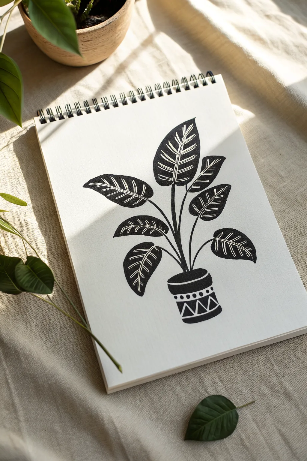
This stunning high-contrast drawing mimics the look of a linocut print without the need for carving tools. Using bold black ink and negative space, you’ll create a striking potted plant design that fills the page with graphic impact.
Detailed Instructions
Materials
- Spiral-bound sketchbook or heavy drawing paper
- Thick chisel-tip black permanent marker
- Fine-point black drawing pen (0.5mm or 0.8mm)
- Pencil (HB or 2B)
- Eraser
Step 1: Sketching the Framework
-
Map the pot:
Start near the bottom center of your page. Lightly sketch a pot shape that is slightly wider at the top rim than at the bottom base. Draw a curved line to define the rim, giving it a bit of dimension. -
Establish the stem system:
From the center of the pot, draw a central curved line reaching upwards. Branch off five to six smaller lines from this main stem to serve as the leaf stalks. -
Outline the leaf shapes:
At the end of each stalk, sketch large, pointed oval shapes. Make them generous in size—this project relies on big, bold leaves. Angle them in different directions for a natural, organic look. -
Detail the leaf veins:
Inside each leaf outline, draw a central spine line. Then, sketch paired, angled lines branching from the spine to the leaf edges. These need to be thick enough to remain white later, so treat them as thin shapes rather than single pencil strokes. -
Add pot decoration:
Sketch a geometric pattern on the pot. A band of triangles (zig-zags) near the bottom and a row of small circles just under the rim works perfectly.
Smudge Patrol
Thick markers smudge easily. Place a spare sheet of paper under your drawing hand as you color to act as a shield and keep your white areas pristine.
Step 2: Inking the Outlines
-
Trace with fine pen:
Take your fine-point pen and carefully trace the outer perimeter of every leaf and the entire pot. -
Define the negative space veins:
Go over your internal vein sketches with the fine pen. Crucially, you are drawing the *edges* of the veins, creating a channel of white space that you will preserve. -
Draw the stems:
Ink the stems, making them slightly thicker at the base where they meet the pot and tapering as they reach the leaves. I find it helpful to make the main central stem the thickest anchor. -
Inking the pot details:
Carefully outline the triangles and circles on the pot. These small shapes will remain white, so keep your lines clean.
Step 3: Filling and Refining
-
Start the heavy fill:
Switch to your thick chisel-tip marker. Begin filling in the solid black areas of the leaves. Work carefully around your preserved white veins. -
Refine leaf edges:
As you fill, you might want to switch back to the fine pen to get right into the sharp corners of the veins or the tips of the leaves without accidentally coloring over the white lines. -
Solidify the stems:
Go over your stems again with the thicker marker if needed to ensure they are solid black and stand out against the white paper. -
Fill the pot background:
Color in the body of the pot with the thick marker. Be extremely careful around the geometric patterns; color the space *around* the triangles and dots, leaving those shapes the color of the paper. -
Add rim definition:
Ensure the top rim of the pot is filled in solid black, leaving just a thin sliver of white space between the rim and the main body to separate them visually. -
Touch-ups:
Scan the drawing for any patchy areas in the black ink. Go over them one last time to get a deep, consistent matte black finish. -
Cleanup:
Once you are absolutely sure the ink is 100% dry, gently erase any visible pencil sketch lines that might be showing in the white areas.
Make It Pop
Instead of leaving the background white, carefully cut out your finished black plant and glue it onto bright yellow or deep terracotta colored cardstock.
Enjoy the dramatic contrast of your new botanical illustration
Simple Cozy Cabin

This charming line drawing captures the cozy essence of a secluded A-frame cabin nestled between towering pines. Using simple geometric shapes and refined ink details, you’ll create a crisp, architectural illustration perfect for a bullet journal or sketchbook.
How-To Guide
Materials
- Dot grid notebook or sketchbook
- Pencil (HB or H for light sketching)
- Fine liner pen (01 or 03 size, black ink)
- Eraser
- Ruler (optional but helpful for straight lines)
Step 1: Planning the Structure
-
Establish the base:
Begin by counting the dots on your grid paper to center your design. Lightly sketch a long horizontal line near the bottom of the page to serve as the ground level and the base of the cabin. -
Draft the main triangle:
From the center of your base line, extend a vertical guide line upward to determine the roof’s peak. Draw two long, steep diagonal lines connecting the top peak to the ends of your base line, forming a tall isosceles triangle. -
Create the roof overhang:
Sketch a second set of diagonal lines parallel to the outside of the main triangle. Connect these at the bottom corners to create the thick, distinct frame of the A-frame roof. -
Divide the floors:
Draw a horizontal line across the triangle, roughly one-third of the way up from the bottom. This separates the ground floor from the loft area.
Use the Grid
Don’t ignore the dots! Use them to ensure your roof slopes are perfectly symmetrical by counting dots from the center line outward.
Step 2: Adding Architectural Details
-
Sketch the windows:
In the top triangle section, center a square window. On the ground floor, sketch two smaller square windows on either side of where the door will go. -
Outline the door:
Draw a rectangular door frame in the center of the ground floor. Add a small set of stairs leading down from the threshold to the ground. -
Suggest vertical siding:
Lightly draw vertical lines across the front face of the cabin details. Keep them evenly spaced to represent wooden siding planks. -
Placement of trees:
Lightly sketch two tall, narrow triangles on either side of the cabin to mark the boundaries for your pine trees later.
Step 3: Inking and Refining
-
Define the roof frame:
Switch to your fine liner pen. Trace the heavy outer triangle of the roof with confident strokes. You might want to go over these lines twice to make the roof frame look thicker than the rest of the drawing. -
Ink the siding and trim:
Carefully ink the vertical siding lines, but avoid drawing through your window and door sketches. Outline the window frames and add cross-hatches inside them to create panes. -
Detail the door:
Ink the door frame and the window grid within the top half of the door. Add a tiny dot for the doorknob and define the horizontal steps leading down. -
Draw the trees:
Starting at the top of your tree guide lines, use quick, jagged, downward strokes to create pine needles. Keep the strokes tighter near the top and wider near the bottom, allowing some white space to show through for texture.
Wobbly Lines?
If your long roof lines look shaky, use a ruler for the main triangle, but freehand the interior details to keep the ‘sketchy’ charm.
Step 4: Final Touches
-
Ground the scene:
Add small tufts of grass along the base of the cabin and under the trees using short, upward flicks of your pen. Sketch a winding, broken line leading away from the stairs to suggest a path. -
Add nature shadows:
I like to add a few extra dark, concentrated hatch marks on the shadowed side of the trees (usually the side facing the cabin) to give them volume. -
Clean up:
Once the ink is completely dry (give it a full minute), gently erase all your pencil guides. -
Assess contrast:
Step back and look at the drawing. If the trees look too light, add another layer of jagged shading strokes to deepen the contrast against the white cabin.
Enjoy the peaceful simplicity of your finished architectural sketch
One-Point Road to the Horizon
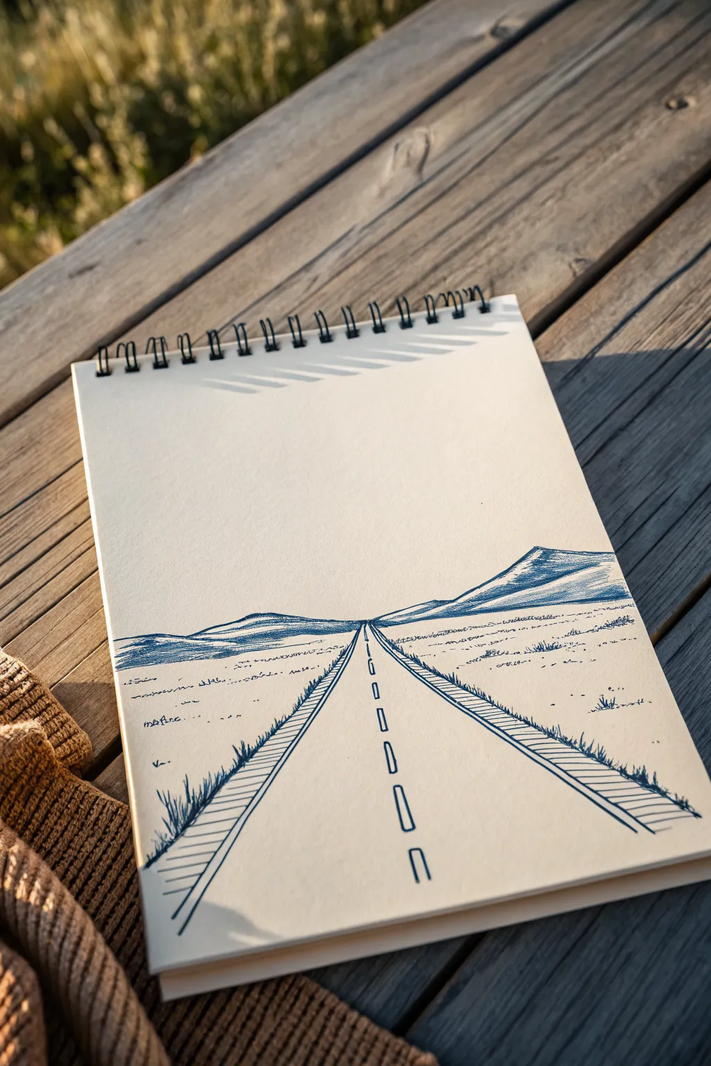
This classic one-point perspective drawing creates a sense of endless travel using simple lines and hatching techniques. By anchoring all your angles to a single vanishing point, you’ll create depth and distance with just a blue fineliner and a steady hand.
Step-by-Step
Materials
- Spiral-bound sketchbook (smooth paper recommended)
- Blue fineliner pen (0.5mm) or blue ballpoint pen
- Ruler or straight edge
- Pencil (optional, for initial guidelines)
- Eraser
Step 1: Setting the Scene
-
Find your vanishing point:
Visualize a single point right in the center of your page, slightly below the vertical halfway mark. This ‘vanishing point’ will be the destination where all your road lines meet. -
Draw the horizon line:
Using your ruler, lightly draw a horizontal line across the page that intersects your vanishing point. This separates the sky from the ground, though our mountains will soon cover parts of it. -
Outline the road edges:
Place your ruler at the vanishing point and angle it downwards to the bottom-left corner of the page. Draw a straight line. Repeat this on the right side, creating a large triangle shape that forms the main road. -
Create the road shoulder:
Draw a second set of diagonal lines parallel to the first road lines, about a centimeter (or half-inch) outward on both sides. These thin strips will become the grassy verge or shoulder of the road.
Depth Trick
Atmospheric perspective is key here. Make foreground lines thick and dark, while keeping horizon lines thin and faint to push them into the distance.
Step 2: Creating the Landscape
-
Sketch the distant mountains:
Above the horizon line, draw a simplified mountain range. On the right, create a larger, triangular peak that slopes down towards the vanishing point. On the left, draw a lower, rolling range. -
Add mountain texture:
Fill in the mountains using slanted hatching lines. Keep the lines close together on the shaded sides of the peaks to create volume, leaving the tops white to suggest sunlight hitting the ridges. -
Draw the center markings:
Starting near the vanishing point, draw small vertical rectangles for the road divider lines. As you move closer to the bottom of the page, make each rectangle progressively longer and wider to exaggerate the perspective.
Step 3: Detailing and Texture
-
Hatch the road shoulders:
Inside the narrow shoulder strips you drew earlier, add diagonal hatching lines. These should run perpendicular to the road edge or at a slight angle to differentiate the texture from the asphalt. -
Add grassy clumps:
Along the outer edges of the road, draw small, upward flicking strokes to simulate tufts of grass growing along the highway. Make the grass at the bottom of the page larger and more detailed. -
Texture the plains:
In the open space on either side of the road, add horizontal broken lines and tiny dots. These minimal marks suggest a flat, arid landscape without needing to draw every blade of grass. -
Distant vegetation:
As you get closer to the horizon line, make your texture marks smaller and fainter. I find that reducing pressure on the pen here really helps sell the illusion of extreme distance. -
Define the foreground:
In the immediate foreground (the bottom corners), allow yourself to be bolder. Add a few distinct, darker scribbles or darker grass tufts to ground the viewer.
Wobbly Lines?
If your road lines aren’t perfectly straight, don’t worry. Just add more grass tufts over the wobbly sections to camouflage them naturally.
Step 4: Final Touches
-
Strengthen the main lines:
Go back over the main diagonal lines of the road with your pen to make them crisp and dark. A solid, confident line here frames the whole composition. -
Clean up:
If you used a pencil for your initial horizon line or vanishing point guidelines, wait for the ink to be completely dry, then gently erase them. -
Check the balance:
Look at the overall drawing. If the mountains feel too light compared to the road, add another layer of cross-hatching to deepen the shadows.
Now you have a tranquil road stretching infinitely toward the mountains, perfect for daydreaming about your next road trip
Butterfly With Easy Symmetry
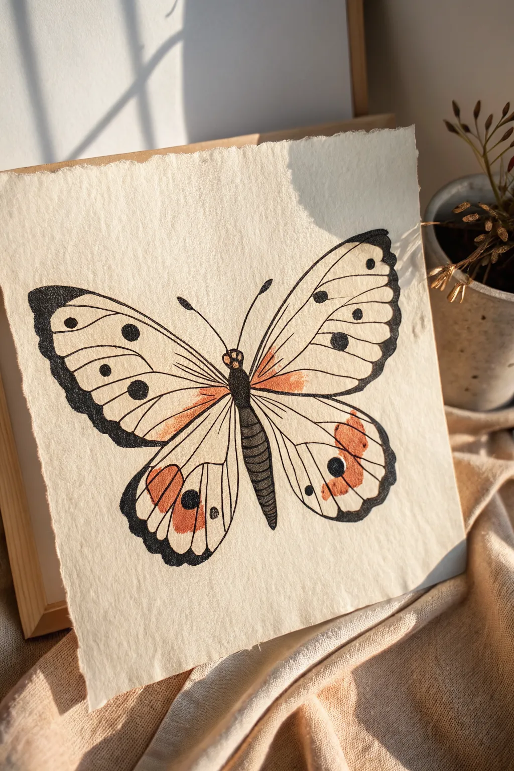
Capture the delicate beauty of nature with this ink and watercolor butterfly illustration on textured paper. The combination of clean linework and soft, washed-out orange hues gives it a timeless, scientific study aesthetic.
How-To Guide
Materials
- Cold press watercolor paper (gives that nice texture)
- Pencil (HB or lighter) and eraser
- Waterproof fine liner pens (0.3mm and 0.8mm)
- Watercolor paints (burnt sienna, yellow ochre)
- Small round watercolor brush (size 2 or 4)
- Ruler
Step 1: Drafting the Symmetry
-
Establish the centerline:
Begin by lightly drawing a vertical line down the center of your paper with a ruler. This will serve as the anchor for the butterfly’s body and ensure both wings act as mirror images. -
Sketch the body:
Along the centerline, sketch a long, slender oval for the abdomen and a smaller, rounded shape for the thorax (upper body). Add a tiny circle for the head at the top. -
Mark wing width:
Decide how wide you want the wings to span. Mark two points equal distance from the centerline on the left and right to define the wingtips. -
Outline the forewings:
Sketch the upper wings (forewings) first. They should curve upward from the thorax and sweep out to a rounded point, almost like a rounded triangle. Keep your pencil pressure very light so you can erase easily later. -
Outline the hindwings:
Draw the lower wings (hindwings) starting from under the forewings. These shapes are more rounded and teardrop-like, extending down past the abdomen. -
Define the veins:
Lightly sketch the main veins radiating from the body outward to the wing edges. These lines act as barriers for your pattern sections, so take your time placing them evenly.
Step 2: Inking the Structure
-
Inking the body:
Using your thicker 0.8mm pen, outline the body. Fill in the abdomen with horizontal hatching lines to create a segmented, insect-like texture, leaving the thorax solid black or heavily stippled. -
Main wing outlines:
Switch to the 0.3mm pen. Carefully trace your pencil outlines for the wings. I find it helpful to rotate the paper as I draw curves to keep the line smooth. -
Drawing the veins:
Ink the structural veins inside the wings. Keep these lines steady and continuous, connecting from the body to the outer edges. -
Thickening the edges:
Go back over the outer perimeter of the wings with the thicker 0.8mm pen to create a bold, defined border. This mimics the natural darkening often seen on butterfly edges. -
Adding the antennae:
Draw two smooth, sweeping curves coming from the head for antennae, thickening them slightly at the very tips.
Fixing Uneven Wings
If one wing looks larger, thicken the border of the smaller wing with your black pen. The extra weight visually expands the shape without needing to redraw.
Step 3: Adding Details & Color
-
Pattern details:
Draw the circular spots on the wings. Place larger spots near the outer edges of the forewings and distinctive eye-spots on the hindwings. -
Filling the blacks:
Use the thicker pen to fill in the dark decorative spots and the thick border areas. Leave the eye-spots on the lower wings empty for now. -
Erase pencil guides:
Once the ink is completely dry—give it a few minutes to be safe—gently erase all your pencil lines and the center guide. -
Mixing the wash:
Mix a watery wash of Burnt Sienna with a touch of Yellow Ochre. You want a translucent, earthy orange tone, not a thick opaque paint. -
Apply the inner color:
Paint the area of the wings closest to the body. Use a fairly wet brush and let the color fade out naturally as you move toward the middle of the wing. -
Painting the hindwing spots:
Using a slightly more saturated mix of the same orange, fill in the decorative patches on the lower hindwings. -
Final drying:
Let the watercolor dry completely. The textured paper will absorb the pigment beautifully, giving it that soft, antique look.
Tea Staining
For an authentic vintage scientific look, lightly brush the entire dried paper with cold black tea. It adds an aged beige tone that unifies the drawing.
Frame your symmetrical creation to add a touch of natural history to your wall
Back-View Hoodie Figure
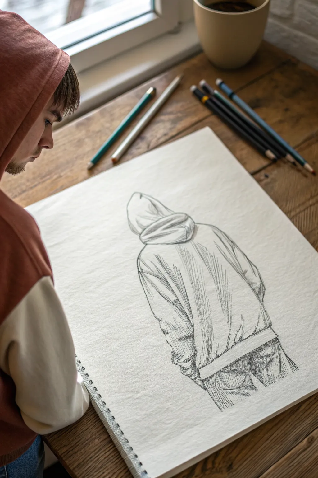
This sketching project captures a moody, contemplative figure wearing a hoodie, viewed from behind to emphasize clothing folds and posture over facial features. Using simple graphite techniques, you’ll learn how to build volume through shading and create realistic fabric texture.
Step-by-Step Tutorial
Materials
- Sketchbook or heavyweight drawing paper (A4 or larger)
- Set of graphite pencils (HB, 2B, 4B, 6B)
- Kneadable eraser
- Vinyl eraser
- Pencil sharpener
- Blending stump or tissue (optional)
Step 1: Laying the Proportions
-
Establish the vertical axis:
Begin with a very light vertical line using your HB pencil. This will serve as the spine and help center the figure on your page. -
Outline the hood shape:
Near the top of your axis, draw a rounded, slightly triangular shape for the hood. Think of it like a slumped cone. Keep the lines faint so they can be adjusted. -
Draft the shoulders:
Extend a line downwards and outwards from each side of the hood to form the slope of the shoulders. Since the figure is slouching slightly, keep these slopes gentle rather than rigid. -
Define the body block:
Sketch a large rectangle below the shoulders that tapers slightly inward at the bottom. This represents the main torso section of the oversized hoodie. -
Add the arm guides:
Draw loose, tubular shapes extending from the shoulder points down the sides of the torso to map out where the sleeves will hang.
Step 2: Structuring the Clothing
-
Refine the hood folds:
Inside the basic hood shape, draw a horizontal overlap line to show the layered fabric construction. Add a few curved lines where the fabric bunches at the neck. -
Sculpt the silhouette:
Switch to a 2B pencil and firm up the outer contour lines. Instead of straight lines, use slightly wavy, organic strokes to mimic soft fabric. -
Add the bottom hem:
Draw a distinct band at the bottom of the hoodie. This ribbed cuff usually pulls the fabric in slightly, so make it look snug against the imagined waist. -
Indicate the pockets:
Even though this is a back view, sketch the suggestion of jeans or pants pockets below the hoodie hem. Just a few curved lines will suggest the glutes and pocket seams. -
Create major wrinkle guides:
Lightly map out where the biggest folds will be. Look for V-shapes under the armpits and long vertical drapes down the back.
Messy Hatching?
If your shading looks scratches, try holding your pencil further back and using the side of the lead. Keep your wrist loose and avoid pressing too hard.
Step 3: Shading and Texture
-
Start cross-hatching:
Using your 2B pencil, begin applying diagonal hatch marks across the back of the hoodie. Keep your strokes loose and consistent in direction. -
Deepen the shadows:
Switch to a 4B pencil for darker areas. Focus on the deep creases under the hood and the armpits. I find that layering cross-hatching in opposing directions here builds nice depth. -
Emphasize the fabric tension:
Draw darker, sharper lines within your folds. Where the fabric pulls tight (like across the shoulders), keep lines sparse; where it bunches being the elbows, add more density. -
Texture the pants:
Use short, vertical strokes on the visible part of the pants to differentiate the denim texture from the smoother sweatshirt material. -
Refine the contour:
Go over the outermost outline with a 6B pencil to make the figure pop off the white page. Vary the line weight—make it thicker on the shadow side (usually the right) and thinner on the light side. -
Add final highlights:
Use your kneadable eraser to lift graphite off the high points of the folds—specifically on the shoulder blades and the top of the hood—to create bright highlights. -
Clean up:
Erase any initial construction lines that are still visible and clean up smudges around the figure for a crisp finish.
Make It Yours
Add a design, logo, or band name to the back of the hoodie. You will need to warp the text or image slightly to follow the folds of the fabric.
Now you have a stylish figure drawing with convincing weight and texture.
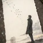
Silhouette in a Heart Frame

This tender illustration combines a wash of watercolor with a striking black silhouette to capture a quiet moment of contemplation. Using textured paper and gold accents adds a lovely vintage feel perfect for a thoughtful greeting card or framed gift.
Detailed Instructions
Materials
- Cold press watercolor paper or handmade deckled edge paper
- Watercolor paints (coral or salmon pink)
- Black drawing ink or a fine-tip black marker
- Gold metallic paint or gold paint pen
- Medium round watercolor brush
- Fine detail brush
- Pencil and eraser
- Container of water
- Paper towels
Step 1: Preparation & Sketching
-
Choose your paper:
Select a heavy, textured paper. The example uses a handmade paper with rough ‘deckled’ edges, which gives the piece an authentic, rustic charm. -
Outline the heart:
Using a pencil, lightly sketch a large, open heart shape in the center of your page. Keep the lines faint so they can be easily erased or covered later. -
Sketch the figure:
Inside the heart, lightly draw the outline of a figure sitting with their knees drawn up. Position them near the bottom point of the heart so they ground the composition. -
Map out celestial details:
Sketch a crescent moon in the upper left corner outside the heart, along with a scattering of five-pointed stars around the upper area.
Uneven Wash?
If your watercolor dries with harsh watermarks, try wetting the paper slightly more evenly next time, or re-wet the edge immediately with a damp brush to soften it.
Step 2: Painting the Heart
-
Mix your watercolor:
Dilute a coral or salmon pink watercolor paint. You want a semi-transparent consistency that allows the paper’s texture to show through, rather than a thick, opaque layer. -
Wet the shape:
With a clean, damp brush, apply a very thin layer of clean water inside your heart outline. This helps the pigment flow smoothly. -
Apply the color wash:
Load your medium round brush with the coral paint and fill in the heart shape. Work quickly but gently. -
Create texture:
I like to vary the pressure slightly or blot a few spots with a paper towel while wet to create tonal variation, making the heart look soft and clouded. -
Dry partially:
Let the heart layer dry until it is no longer shiny but still cool to the touch.
Add Dimension
Use a white gel pen to add tiny highlights on the silhouette’s shoulder or knee to suggest a light source coming from the moon.
Step 3: Inking the Silhouette
-
Outline carefully:
Using black drawing ink and a fine detail brush, or a high-quality black marker, trace the outline of your seated figure. -
Define the hair:
Pay attention to the hair texture; use small, stippling motions or tiny bumpy lines to create the look of curly hair on top of the silhouette. -
Fill the figure:
Fill in the entire body shape with solid black. Ensure the coverage is even and opaque so it contrasts sharply against the pink background. -
Add the ground shadow:
Paint a rough, scratchy horizontal shadow line underneath the figure using dry-brush strokes. This extends slightly outside the heart boundary, anchoring the figure to the ‘ground’.
Step 4: Gold Accents & Details
-
Paint the moon:
Using gold metallic paint or a gold pen, fill in the crescent moon shape you sketched earlier. -
Starry night:
Fill in the stars with the same gold. Vary their sizes slightly, making the larger ones feel closer and the smaller ones more distant. -
Final touches:
If I notice any pencil lines still visible around the moon or heart, I wait until the paint is bone dry before gently erasing them. -
Review and dry:
Step back and check your work. Let the entire piece dry completely flat to prevent the paper from buckling.
Once framed or gifted, this simple yet emotive piece serves as a beautiful reminder of solitude and love
Open Door to a Cloudy Sky
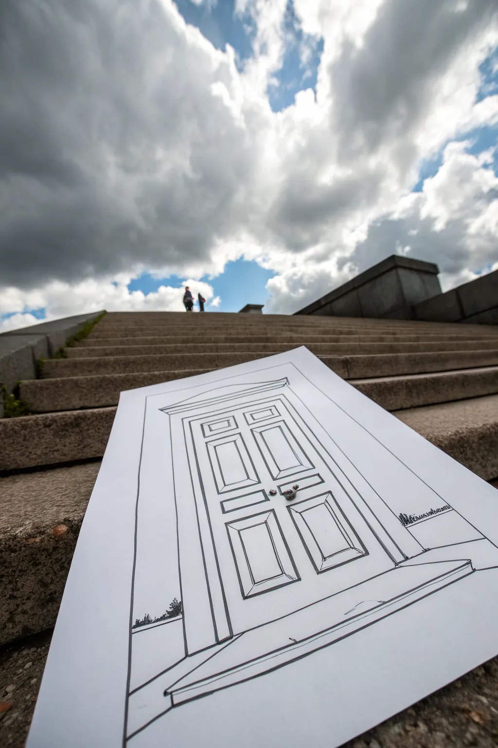
This clever photography project involves drawing a simple, classic door perspective and placing it within a real-world setting to create a surreal visual gateway. By matching the perspective lines of the drawing to the environment around it, you turn a flat sheet of paper into a believable opening to another world.
Step-by-Step
Materials
- Large sheet of white drawing paper or poster board (A2 or similar)
- Graphite pencil (HB or 2B)
- Large ruler or T-square
- Thick black permanent marker (chisel tip)
- Fine black liner pen (0.5mm or 0.8mm)
- Eraser
- Camera or smartphone
- Tape or small weights (stones) to hold paper in place
Step 1: Planning the Perspective
-
Scout your location:
Find a set of stairs leading upward toward the sky. This ‘worm’s-eye view’ effect is crucial for the final illusion. The stairs in the photo provide a strong linear context, so keep that in mind when choosing your spot. -
Rough layout:
Before drawing the details, place your blank paper on the stairs briefly. Look through your camera lens to see how the vertical lines of the stairs interact with your paper. You want your door to look like it stands vertically, even though the paper is lying flat on a slope. -
Establish the outer frame:
Back at your workspace, draw a large rectangle for the door frame using your pencil and ruler. Leave a generous margin of white space around the drawing; this white border is important for the photo composition later. -
Add the threshold:
Draw the bottom step or doormat area below the door. Notice how the lines flare out slightly at the bottom in the reference image? This forced perspective trick helps the drawing appear to lie flat when viewed from above.
Straight Edge Secret
Don’t press too hard against the ruler with felt-tip pens, as the bleed can smudge under the edge. Tilt the pen slightly away from the ruler’s edge for a clean line.
Step 2: Drafting the Door
-
Draw the inner frame:
Create the door jambs by drawing a slightly smaller rectangle inside your first one. Connect the corners with short diagonal lines to give the frame depth and dimension. -
Sketch the pediment:
Add a triangular or trapezoidal shape at the very top of the door frame. This classical architectural detail creates a sense of grandeur. -
Divide the panels:
Lightly mark a vertical centerline down the door. Then, pencil in six rectangular shapes for the panels—two small ones at the top, two long vertical ones in the middle, and two medium ones at the bottom. -
Add panel depth:
Inside each of your six panel rectangles, draw a smaller rectangle. Connect their corners just like you did with the main door frame. This beveling effect is key to making the door look solid rather than flat. -
Place the hardware:
Sketch a simple circle or oval for the doorknob and a small rectangle for the latch plate on the center vertical strip.
Make it 3D
Cut the very top edge of the paper along the outline of the door frame. When you place it on the stairs, the real sky becomes the background immediately behind the door top.
Step 3: Inking and Details
-
Initial outlining:
Switch to your thick chisel-tip marker. Trace the major structural lines—the outer frame and the main door outline. Use your ruler to keep these lines crisp and authoritative. -
Define the panels:
Use the finer liner pen for the interior details of the panels. The variation in line weight between the thick outer frame and delicate inner panels adds visual interest. -
Add texture:
I like to add very subtle hatching or double lines on one side of the beveled panels to suggest shadow. Decide on a light source (usually top-left) and be consistent. -
Corner details:
In the bottom corners of the paper, near the base of the door frame, sketch some loose, jagged grass blades or weeds using the fine liner. This helps ground the drawing. -
Clean up:
Once the ink is completely dry, erase all underlying pencil marks thoroughly. Any stray graphite can make the white paper look gray in outdoor lighting.
Step 4: The Installation Photo
-
Position the art:
Return to your staircase location. Place the drawing on the steps. If it’s windy, place small, unobtrusive pebbles on the corners or use rolled tape underneath to secure it. -
Find the angle:
Get low to the ground with your camera. You want the camera lens to be nearly level with the drawing, looking upward toward the sky. -
Align the shot:
Adjust your position until the lines of the drawing feel parallel to the steps. Wait for a moment when the sky is dramatic or someone is walking distant at the top for scale. -
Capture the moment:
Take several photos, experimenting with tilting the drawing slightly if the perspective needs correction. The goal is to make the door look like a portal the viewer could walk right into.
Now you have a surreal gateway captured in time, blurring the line between your sketchbook and the real world.
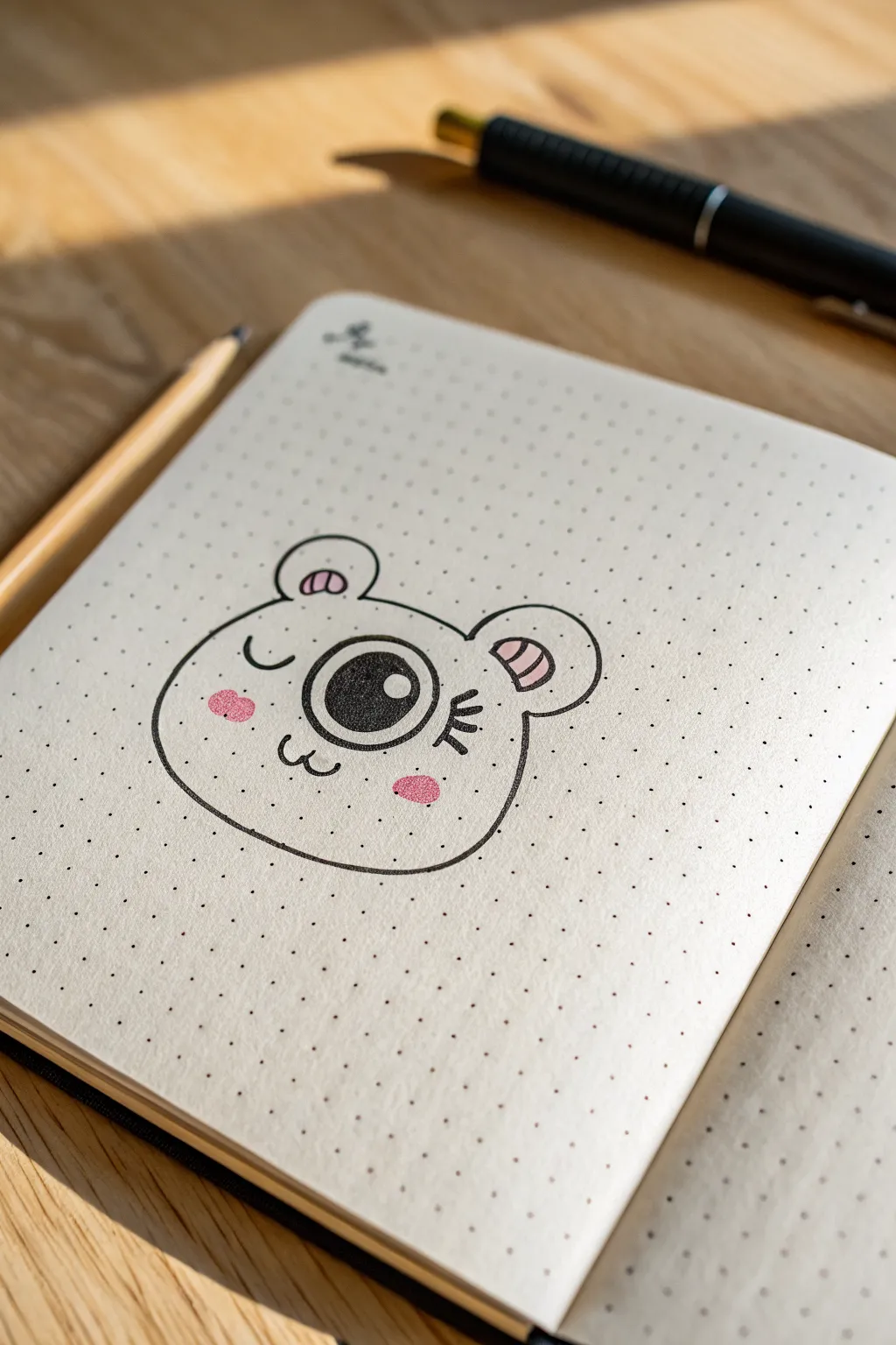
Peek-a-Boo Half Face on the Edge

This charming single-eyed character adds a touch of whimsy to any dotted journal page. With its playful wink and rosy cheeks, it’s a perfect beginner-friendly doodle that proves you don’t need two eyes to be expressive.
Step-by-Step Tutorial
Materials
- Dotted grid notebook or paper
- Black fineliner pen (0.5mm or 0.8mm)
- Pencil (HB or similar)
- Eraser
- Pink marker or highlighter
- Circle stencil (optional)
Step 1: Drafting the Outline
-
Establish the centerline:
Begin by lightly marking a vertical center point on your dot grid page. This will help you balance the ears and cheeks symmetrically. -
Draw the central eye:
Using your pencil, sketch a large, perfect circle right in the middle of your chosen area. Aim for a size that spans about two or three grid squares wide. -
Sketch the head shape:
Draw a wide, rounded ‘U’ shape underneath the eye circle to form the jaw and cheeks. Connect the top with a subtle curve over the eye. -
Add the ears:
Place two smaller semi-circles on the top corners of the head. Position them equidistant from the center eye so the character looks balanced. -
Draft the facial features:
Sketch a small ‘w’ shape directly under the eye for the mouth. Add a curved line on the left for a sleeping eye, and three eyelashes on the right for a winking effect.
Wobbly Circles?
Drawing perfect circles is tough! Use a coin, a bottle cap, or a circle stencil as a guide for the main eye to ensure it looks crisp and round.
Step 2: Inking the Drawing
-
Outline the head:
Take your black fineliner and carefully trace over the main head shape. Use a smooth, continuous stroke to keep the lines clean. -
Define the ears:
Ink the outer curves of the ears. Inside each ear, draw a smaller semi-circle at the bottom edge to create depth. -
Ink the main eye:
Trace the large center circle carefully. If you have a steady hand, do this in one go; otherwise, break it into two curved strokes connecting at the top and bottom. -
Fill the pupil:
Inside the main eye, draw a smaller circle for the pupil, leaving a tiny white dot near the top right for a highlight. Fill in the rest of the pupil completely black. -
Add the wink:
Draw three short, thick dashes radiating from the right side of the eye to represent eyelashes winking shut. -
Ink the sleepy eye:
On the left side, draw a simple downward curve (like a ‘u’) to create the closed, sleeping eye expression. -
Trace the mouth:
Go over the small ‘w’ mouth shape with your pen, ensuring the center point lines up directly under the main eye. -
Clean up:
Wait a minute for the ink to dry completely to avoid smudges. Then, gently erase all your pencil guide lines.
Step 3: Adding Color Accents
-
Color the cheeks:
Using a pink marker, draw small oval blushes on the cheeks, just below the eyes. -
Detail the ears:
Add small pink stripes or solid fill inside the inner ear shapes to give the character a soft, flushed look. -
Assess the balance:
Step back and check your drawing. If lines look too thin, go over the main outline one more time to thicken it slightly.
Adding Texture
Dot grid paper makes shadows easy. Use a light grey marker to trace one side of the character’s outline for a subtle 3D pop effect.
Now you have a cute cyclops friend watching over your notes
Have a question or want to share your own experience? I'd love to hear from you in the comments below!