
If you’ve ever stared at a blank page and wished for a clear plan, these easy sketches are meant for you. I put together step by step ideas that start with basic shapes and build up in small, totally doable stages.
Realistic Eye From an Almond Shape
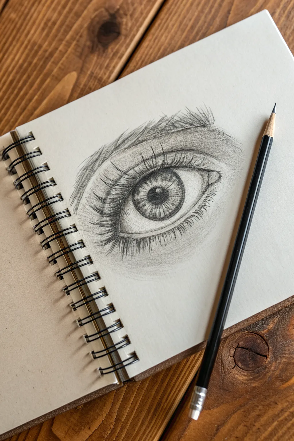
Create a striking and lifelike eye drawing that captures depth and emotion using simple graphite techniques. This tutorial guides you through building layers of shading to transform a basic almond shape into a realistic focal point.
How-To Guide
Materials
- Spiral-bound sketchbook (medium textured paper)
- Graphite pencils (HB for sketching, 2B and 4B for shading)
- Black drawing pencil or charcoal pencil (optional for deepest blacks)
- Blending stump or cotton swab
- Kneaded eraser
- Pencil sharpener
Step 1: Laying the Foundation
-
Outline the almond:
Begin with your HB pencil, drawing an almond shape lightly in the center of your page. Keep the inner corner (the tear duct area) slightly rounded and dipped downwards, while the outer corner tapers gently. -
Place the iris:
Draw a large circle inside the almond shape for the iris. The top and bottom of the circle should be slightly cut off by the upper eyelid and lower waterline, rather than floating in the middle, to look natural. -
Mark the pupil and highlight:
In the exact center of the iris, draw a smaller circle for the pupil. Immediately lightly sketch a small rectangular or square shape overlapping the pupil and iris—this is your highlight window. Preserving this white space now is crucial. -
Define the lids:
Sketch a curved line above the eye to indicate the upper eyelid crease. Add a faint line below the eye for the lower lid pocket. Draw a thin parallel line along the bottom rim of the almond shape to create the thickness of the waterline.
Smudgy Paper?
Place a scrap piece of paper under your drawing hand. This acts as a shield, preventing oils from your hand from smearing your graphite work as you move across the page.
Step 2: Shading and Depth
-
Darken the pupil:
Switch to a softer pencil (like a 4B) and fill in the pupil, making it the blackest part of the drawing. Be careful to work around your reserved highlight rectangle. -
Texture the iris:
Using a sharp 2B pencil, draw radial lines extending from the pupil outward toward the edge of the iris, like spokes on a bicycle wheel. Vary the length and pressure; some should be short and dark near the pupil, others longer. -
Add iris depth:
Darken the outer ring of the iris. Shade lightly around the top of the iris where the eyelid casts a shadow. I find that deepening this upper shadow instantly makes the eye look rounder. -
Shade the whites:
The ‘whites’ of the eye aren’t purely white. Lightly shade the corners of the eyeball (sclera) with an HB pencil, blending towards the iris to give the eyeball a spherical form. Leave the area near the iris lighter. -
Detail the tear duct:
Define the inner corner tear duct with small, fleshy curves. Use subtle shading here rather than harsh lines to keep it looking moist and organic.
Step 3: Lashes and Finishing Touches
-
Map the eyelash direction:
Before drawing dark lashes, visualize how they curve. Upper lashes curve upward and outward; lower lashes curve downward and slightly outward. -
Draw upper lashes:
Using a sharp 4B pencil, draw the upper eyelashes. Start at the eyelid line, press down, and flick your wrist upward to create a tapered end. Group them in small clumps rather than spacing them like a picket fence. -
Add lower lashes:
Draw the lower lashes, which are generally shorter and thinner than the upper ones. Ensure they grow from the outer edge of the waterline, not from inside the eye itself. -
Create the eyebrow:
Sketch the eyebrow shape above the eye. Fill it in using short, hair-like strokes that follow the direction of growth—usually upward at the start, then angling outward towards the temple. -
Refine skin texture:
Add very light shading around the eye socket, eyelid crease, and under-eye area to suggest skin volume. Use a blending stump to soften these skin tones so they don’t look like scratches. -
Final contrast check:
Look at your drawing from a distance. Deepen the pupil and the shadow under the upper lid if needed. Use a kneaded eraser to lift off any graphite that accidentally smudged into the highlight.
Pro Tip: Highlights
Use a white gel pen or white charcoal for the highlight if you accidentally shaded over it. A crisp, bright white dot makes the eye look wet and alive.
Step back and admire the soulful depth you have created on the page

Rosebud From a Simple Cup
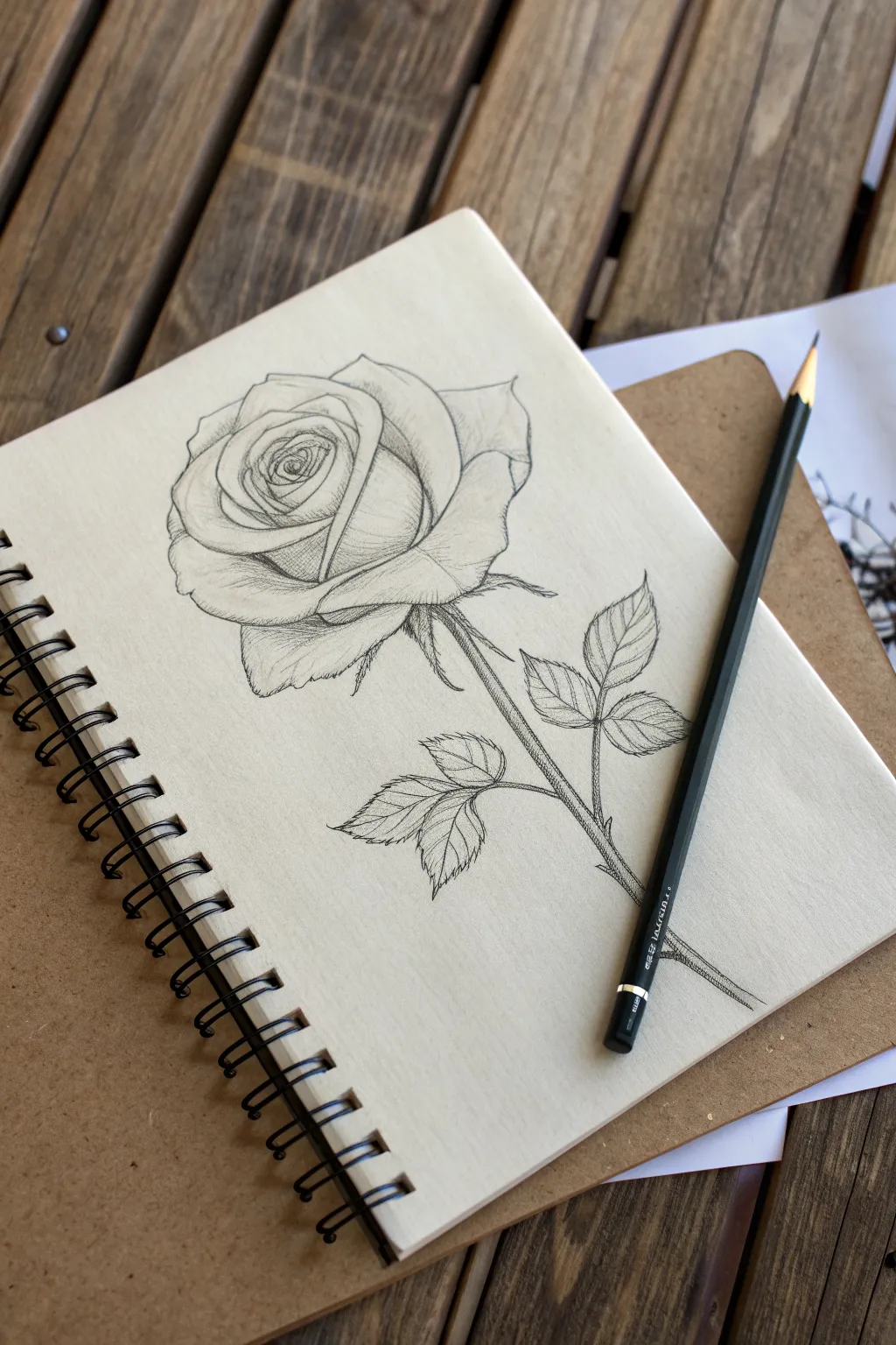
This elegant pencil drawing captures the unfolding beauty of a rose with delicate shading and crisp line work. By building layers of graphite, you can transform simple shapes into a realistic bloom that sits gracefully on the page.
Step-by-Step Tutorial
Materials
- Spiral-bound sketchbook (smooth or vellum surface)
- HB graphite pencil (for initial sketching)
- 2B or 4B graphite pencil (for shading and details)
- Kneaded eraser
- Pencil sharpener
Step 1: Basic Structure
-
Draw the cup shape:
Start by lightly sketching a simple U-shape or a cup form near the top center of your page. This will serve as the base for the main bloom. -
Add the center spiral:
Inside the cup, draw a tight spiral. This indicates the tightly packed petals at the very heart of the rose. -
Outline the outer petals:
Surround the cup shape with larger, curved lines that flare outward. Imagine these as petals peeling away from the center bud. -
Sketch the stem line:
Draw a long, slightly curved line extending downward from the base of the flower head to establish the stem’s direction. -
Place the leaf guides:
Add two single lines branching off the main stem to indicate where the leaf clusters will go.
Keep it Sharp
A very sharp pencil point is crucial for the fine hatching lines on the petals. Use a piece of sandpaper to refine your pencil tip between strokes.
Step 2: Refining the Bloom
-
Define the petal edges:
Go over your initial cup and spiral shapes, giving the petal edges a slightly wavy, organic unevenness rather than perfect curves. The edges should look soft and folded. -
Add the sepals:
Draw small, leaf-like triangles pointing downward right at the base of the flower head, where it meets the stem. -
Thicken the stem:
Add a parallel line to your initial stem guide to give it thickness. Draw small, sharp triangular spikes along the stem for thorns. -
Shape the leaves:
Turn your leaf guides into jagged, teardrop shapes. Notice how rose leaves often come in clusters of three or five; draw smaller leaflets attached to the main leaf stem. -
Erase guidelines:
Gently dab your kneaded eraser over the drawing to lift away the darkest initial construction lines, leaving only a faint guide for the shading phase.
Step 3: Shading and Texture
-
Establish the light source:
Decide where the light is coming from (usually top-left). This means shadows will fall on the bottom-right sides of the petals. -
shade the center:
Using a slightly sharper pencil, darken the deepest crevices inside the spiral center. I find getting these dark values in early helps anchor the rest of the drawing. -
Contour hatching:
Use fine, curved hatching lines on the petals. Follow the curve of the petal with your pencil strokes to emphasize the roundness of the bloom. -
Deepen the shadows:
Switch to a softer lead (like a 2B) to darken the areas under the petals where they overlap. This creates depth and separation between layers. -
Texture the leaves:
Draw a central vein down each leaf, then add smaller veins branching out. Shade half of each leaf slightly darker to show how they catch the light. -
Stem details:
Add vertical shading lines along one side of the stem to make it look cylindrical. Darken the tips of the thorns. -
Final clean-up:
Review the drawing for contrast. Strengthen the darkest darks one last time and erase any smudges around the outside of the flower for a crisp finish.
Try Sepia or Charcoal
Once mastered in graphite, try this sketch on tan paper using a white charcoal pencil for highlights and a dark sepia pencil for shadows.
With your shading complete, you have a timeless floral study ready to stay in your book or be framed on the wall


Easy Cat Face With Circle Guides
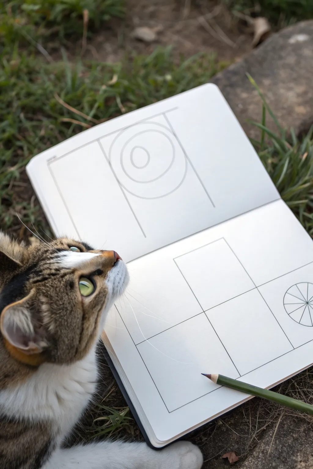
This beginner-friendly exercise breaks down complex forms into simple shapes, perfect for artists just starting their journey. You’ll create a foundational layout with clean lines and circular guides, setting the stage for easier drawing practice.
Step-by-Step Guide
Materials
- Sketchbook or drawing paper
- Graphite pencil (HB or 2B)
- Ruler or straight edge
- Compass or circular object for tracing
- Eraser
Step 1: Setting Up the Left Page
-
Define the frame:
Start on the left-hand page by lightly drawing a large vertical rectangle. This provides a boundary for your first study and helps keep your proportions contained. -
Divide the space:
Draw a horizontal line across the top section of your rectangle, creating a distinct upper panel. Add two vertical lines dropping down from this header to frame the central area where your circle guide will go. -
Draw the outer circle:
In the upper-middle section of your frame, use a compass or trace a small circular object to draw a perfect circle. Position it centrally between the vertical guide lines you just made. -
Add the inner detail:
Inside the first circle, draw a significantly smaller second circle. Place it slightly off-center to mimic the natural gaze of an eye or a lens aperture.
Step 2: Structuring the Right Page
-
Create the main grid:
On the opposite page, use your ruler to draw a large square that fills most of the page. Ensure your lines are straight and parallel to the paper’s edges. -
Bisect the square:
Draw a vertical line straight down the center of your large square to split it into left and right halves. -
Complete the quadrant:
Draw a horizontal line across the middle, perpendicular to your vertical line. You should now have four equal-sized smaller squares, perfect for practicing different facial features side-by-side. -
Sketch the corner guide:
In the bottom right corner of the page—outside your main grid—draw a small circle. This will serve as a reference wheel for checking angles. -
Divide the reference circle:
Draw lines through the center of this small circle like slicing a pie. Start with a vertical and horizontal line, then add diagonal lines to create eight equal wedges.
Wobbly Circles?
If you don’t have a compass, try resting your hand on the paper and spinning the paper itself while holding the pencil still.
Step 3: Refining the Lines
-
Clean up intersections:
Take your eraser and gently tidy up any lines that extend too far past your intended corners. Keeping the diagram neat helps visualize the next steps clearly. -
Darken key outlines:
Go back over the main structural lines of your squares and rectangles with slightly more pressure to make the primary forms stand out against the white paper. -
Soft check:
Step back and look at both pages together. Ensure your circles are round and your grid lines are perpendicular before moving on to filling them with drawings.
Practice Variation
Use the four boxes on the right page to draw the same cat eye from four different angles or expressions.
You now have a crisp, professional-looking template ready for your creative practice


Butterfly Wings With Symmetry Lines
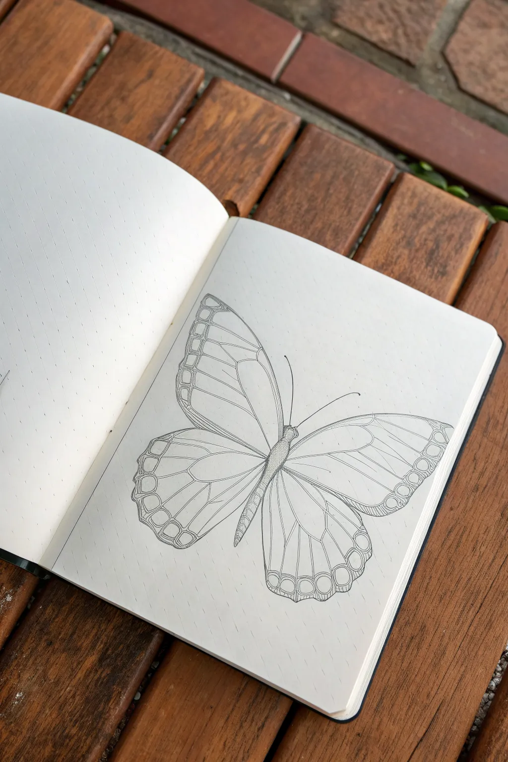
This elegant butterfly sketch relies on a precise, almost architectural style that breaks the wings down into manageable geometric segments. The crisp black lines against the cream paper create a classic scientific illustration look that is easier to achieve than it appears.
Step-by-Step Guide
Materials
- Dotted or grid journal notebook
- HB Graphite pencil
- Eraser
- Fine liner pen (01 or 03 size, black)
- Ruler (optional but helpful for symmetry)
Step 1: Establishing the Core Structure
-
Draw the central axis:
Begin by sketching a very light diagonal line in pencil to serve as the butterfly’s body axis. This helps orient the entire drawing on the page. -
Block in the body segments:
Along your axis line, draw a small oval for the head, a slightly longer, thicker oval for the thorax (chest), and a long, tapering cylinder for the abdomen. -
Map out the antennae:
From the head, sketch two long, sweeping curves extending outward. Keep them light and fluid, curving gently away from each other.
Use The Dots
Since you are working on dotted paper, count the dots to ensure your wings are perfectly symmetrical. Use them as coordinates for starting and stopping lines.
Step 2: Mapping the Wing Symmetry
-
Define the forewings:
Starting from the thorax, draw the large upper wings (forewings). Use a triangular shape with a rounded outer edge. Try to keep the left and right sides roughly symmetrical. -
Define the hindwings:
Draw the lower wings (hindwings) emerging from beneath the forewings. These should be more rounded, almost like teardrops that widen at the bottom. -
Add the marginal borders:
Sketch a parallel line just inside the outer edge of all four wing sections. This creates the border area where the decorative ‘cells’ will go later.
Step 3: Creating the Vein Network
-
Draw the main cell structure:
Inside the forewing, draw a large, elongated ‘cell’ shape near the top edge. This is the central vein structure from which other veins will radiate. -
Extend the radiating veins:
Draw straight or slightly curved lines extending from that central cell out toward the wing’s border. Space them somewhat evenly. -
Repeat for the hindwings:
Create a similar central cell structure in the lower wings and draw radiating lines fanning downward toward the scalloped edge. -
Detail the border segments:
In the border space you created earlier, draw small U-shaped or rectangular loops between each vein ending. These create the ‘stained glass’ effect on the wing tips.
Add Stippling
To add shade without color, use tiny dots (stippling) near the body and where the wings overlap. This adds instant volume and scientific realism.
Step 4: Inking and Refining
-
Outline the body:
Switch to your fine liner pen. Carefully trace the body outline. Add small, subtle hatch marks specifically on the abdomen to give it a segmented, 3D texture. -
Ink the main wing shapes:
Trace the outer silhouette of the wings with confident strokes. I find it helpful to pull the pen toward me to keep the line steady. -
Ink the internal veins:
Go over your pencil lines for the veins. Make these lines slightly thinner or lighter than the outer contour if possible to add depth. -
Detail the marginal cells:
Ink the small loops along the wing edges. You can double up the lines slightly here to make the border design pop. -
Finalize the antennae:
Trace the antennae with a swift, smooth motion to avoid shaky lines. Ensure they taper off nicely at the ends. -
Erase guidelines:
Wait at least five minutes for the ink to dry completely, then gently erase all remaining pencil sketches to leave a clean, crisp illustration.
Your butterfly is now ready to fly off the page, perfectly poised with its delicate geometric details

PENCIL GUIDE
Understanding Pencil Grades from H to B
From first sketch to finished drawing — learn pencil grades, line control, and shading techniques.
Explore the Full Guide
Leaf Sketch With Veins in Stages
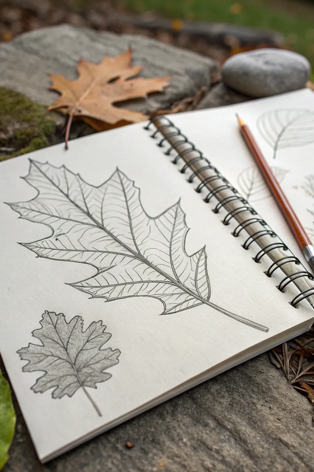
Capture the intricate beauty of autumn with this detailed pencil study of an oak leaf. By breaking down the veins and structure into simple stages, you will create a realistic drawing full of depth and natural form.
Detailed Instructions
Materials
- Spiral-bound sketchbook with smooth drawing paper
- HB or 2B graphite pencil (for initial outlines)
- 4B or 6B graphite pencil (for darker shading)
- Fine-point mechanical pencil (optional, for veins)
- Kneaded eraser
- Blending stump or tortilla
- Real oak leaf for reference (optional)
Step 1: Establishing the Shape
-
Draw the central vein:
Start by drawing a long, slightly curved line diagonally across your page. This will act as the spine (midrib) of your leaf and determine its overall flow and length. -
Mark the lobes:
Without drawing the full outline yet, place light dots or short dash marks where you want the tips of the leaf lobes to extend. An oak leaf typically has 5-7 main lobes. -
Create the basic outline:
Using very light pressure, connect your marks to drawing the perimeter of the leaf. Use wavy, organic lines rather than straight ones to mimic the natural edge of the leaf. -
Refine the lobes:
Go back over your outline and sharpen the points of the lobes. Make the indentations (sinuses) between the lobes deep and rounded, curving toward that central vein. -
Thicken the stem:
At the bottom of your central line, draw a parallel line very close to it to give the stem some thickness. Flare it slightly where it attaches to the leaf blade.
Keep it Sharp
For those fine tertiary veins, ensure your pencil is freshly sharpened. A dull tip will make the delicate web look muddy and thick.
Step 2: Adding the Vein Structure
-
Draw secondary veins:
From the central midrib, draw lines extending out toward the tip of each major lobe. These secondary veins should alternate sides rather than mirroring each other perfectly. -
Double the vein lines:
Just like the stem, give these veins thickness. Draw a second, very thin line right next to each vein line, tapering them to a single point as they reach the leaf edge. -
Add tertiary veins:
Now, sketch a network of smaller, finer veins branching off the secondary ones. These should look like a delicate web connecting the main structure. -
Curve the veins:
Ensure all your vein lines have a slight curve to them. This helps the leaf look somewhat three-dimensional, as if it is resting on a surface rather than being perfectly flat.
Try Watercolor Pencils
Sketch the outline in weak watercolor pencil (brown or ochre). Once drawn, lightly brush with water to turn your sketch into a painting.
Step 3: Shading and Definition
-
Darken the outline:
Switch to a slightly softer pencil or apply firmer pressure to go over your final perimeter. I like to vary the line weight—making it thicker in the corners of the lobes—to add visual interest. -
Shade the vein channels:
The veins usually sit slightly recessed in the leaf. Lightly shade the area immediately next to the primary veins to create a sense of depth and groove. -
Hatch across the leaf blade:
Using light, diagonal hatching strokes, fill in the spaces between the veins. Keep your pencil sharp to maintain a crisp texture. -
Respect the highlights:
Leave the top surfaces of the veins white or very light grey. This contrast between the white vein and the shaded leaf blade makes the structure pop. -
Deepen the shadows:
Use a 4B pencil to add darker tones in the deepest crevices of the leaf texture and along one side of the stem to suggest a light source. -
Add surface imperfections:
Draw tiny specks, spots, or small uneven marks on the leaf surface. Real leaves are rarely perfect, and these flaws add realism. -
Sketch the companion leaf:
If you wish to fill the page, draw a smaller, simplified version of the leaf in the bottom corner using the same steps but with less detail.
Now you have a crisply detailed botanical study preserved in your sketchbook
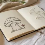
Tiny Mushroom With an Oval Cap
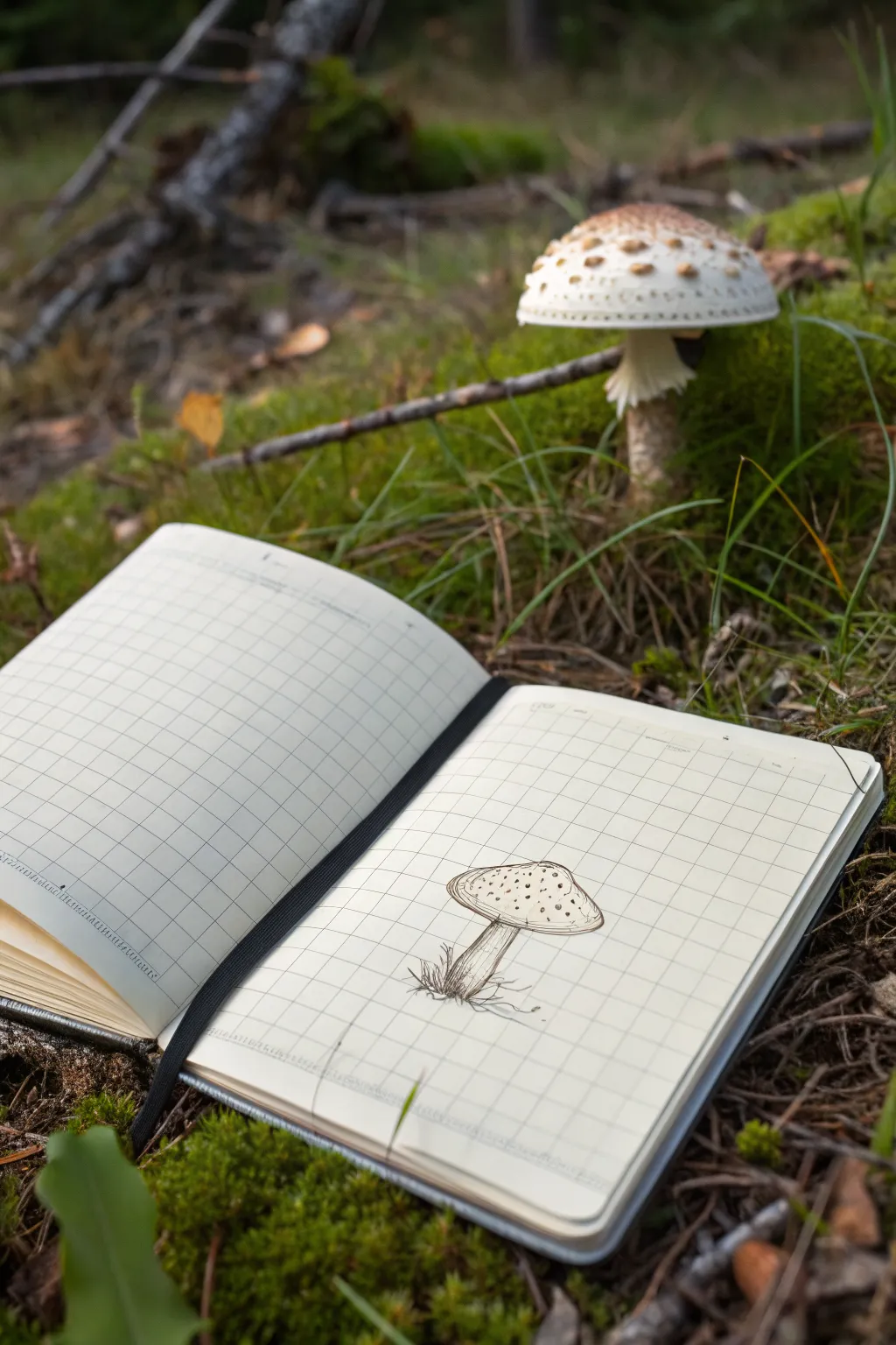
Capture the charm of woodland foraging with this delicate ink sketch of a spotted mushroom. Using a simple grid journal as your guide, you’ll build up organic shapes and fine textures to create a naturalistic yet stylized illustration.
Step-by-Step Guide
Materials
- Grid paper notebook or sketchbook
- Fine liner pen (0.1mm or 0.3mm black)
- Pencil (HB or 2B)
- Eraser
- Reference photo of an Amanita mushroom (optional)
Step 1: Planning the Shapes
-
Establish the stem axis:
Begin by lightly drawing a vertical centerline in pencil to determine the height and tilt of your mushroom stem. Let it lean slightly to the right for a more organic feel. -
Outline the cap shape:
Draw a wide oval at the top of your centerline. The top curve should be fuller and rounder, while the bottom curve is flatter to represent the underside of the cap. -
Define the stem width:
Sketch two lines running down from the center of the cap’s underside. The stem should be slightly thicker at the base where it meets the ground and taper gently as it goes up. -
Add the skirt:
Just below the cap, sketch a small, ruffled ring around the stem. This is the ‘skirt’ or annulus distinct to this mushroom type.
Grid Guide
Use the notebook’s grid lines to check symmetry. If the cap spans 4 squares wide, ensure the stem is centered at the 2-square mark.
Step 2: Inking the Outline
-
Trace the cap:
Switch to your fine liner pen. Carefully go over your pencil oval, but give the line a slightly wobbly, imperfect quality to mimic natural textures. -
Create the cap rim:
Draw a second, inner line very close to the bottom edge of the cap oval. This creates a sense of thickness for the mushroom’s rim. -
Ink the stem:
Trace the vertical lines of the stem. Interrupted or broken lines work well here to suggest a rough surface rather than a smooth pole. -
Detail the skirt:
Ink the ruffled ring on the stem using short, jagged strokes to show the delicate, torn texture of the veil remnant.
Field Notes Style
Add handwritten notes next to the sketch, like the date, location, or imaginary species name, to make it look like a vintage botanical journal.
Step 3: Adding Texture and Detail
-
Draw the spots:
On the top surface of the cap, draw small, irregular circles or ovals. In my drawings, I like to concentrate a few more spots near the center top, scattering them more loosely toward the edges. -
Stipple the cap:
Add tiny dots between the main spots on the cap. This stippling adds depth and suggests the textured surface of the fungal skin. -
Detail the underside:
Draw very fine, short lines radiating from the stem toward the rim on the underside of the cap to suggest the gills. -
Texture the stem:
Add vertical hatching lines along one side of the stem to create a shadow. This simple shading gives the stem roundness and volume. -
Ground the mushroom:
At the base of the stem, draw quick, scribbly grass blades and small angular shapes to represent dirt or moss. This anchors your drawing so it isn’t floating. -
Add root details:
Extend a few wavy, thin lines out from the very bottom of the dirt mound to suggest the mycelium or roots interacting with the soil.
Step 4: Finishing Touches
-
Deepen shadows:
Go back over the darkest areas, like the underside of the skirt and the base of the stem, with a few extra ink strokes to increase contrast. -
Erase guidelines:
Wait for the ink to be completely dry to the touch to avoid smudging. Then, gently erase your initial pencil sketch lines.
Now you have a charming botanical study resting on your page, ready for a wash of watercolor or to be left as a crisp ink drawing
BRUSH GUIDE
The Right Brush for Every Stroke
From clean lines to bold texture — master brush choice, stroke control, and essential techniques.
Explore the Full Guide
Easy Mountains Using Layered Triangles
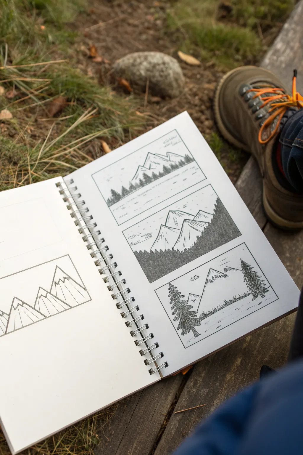
Create a charming trio of mountain scenes that explores different shading techniques and compositions within simple rectangular frames. This project focuses on drawing stylized peaks and pine trees, perfect for practicing depth and texture in your sketchbook.
How-To Guide
Materials
- Spiral-bound sketchbook or drawing paper
- Fine liner pen (01 or 03 size)
- Pencil (HB or 2B)
- Ruler
- Eraser
Step 1: Setting the Composition
-
Draw the frames:
Using your ruler and pencil, lightly draw three equal-sized rectangles stacked vertically on your page. Leave about an inch of breathing room between each box to keep the layout clean. -
Ink the borders:
Trace over your pencil lines with a fine liner pen to create crisp borders for your landscapes. Let the ink dry for a moment before erasing the graphite guidelines underneath.
Step 2: Top Frame: The Distant Range
-
Sketch the peaks:
In the top box, draw a horizon line about a third of the way up. Above this, sketch a jagged mountain range using simple triangles that overlap slightly. -
Add a treeline base:
Just above the horizon line, draw a dense row of tiny vertical scribbles or dashes. This implies a distant forest at the foot of the mountains without needing individual detail. -
Ink the outlines:
Go over the mountain outlines with your pen. Don’t worry about shading this one too much; keep the lines thin and delicate to suggest distance. -
Detail the sky:
Add a few very small, simple cloud shapes near the top border to balance the empty space.
Fixing Smudges
If you accidentally smudge wet ink, turn it into a feature. Extend the smudge into a shadow, a cloud line, or add extra texture hatching over it to hide the mistake.
Step 3: Middle Frame: Contrast and texture
-
Draw larger peaks:
In the middle box, draw fewer but larger mountain peaks that take up more vertical space. Focus on sharp, angular summits. -
Create the foreground slope:
Draw a diagonal line sloping down from the right side towards the left, covering the bottom portion of the mountains. This will be a closer, forested hill. -
Shade the foreground:
Fill this foreground slope entirely with dense, vertical hatching lines. I like to keep these strokes tight and dark to create strong contrast against the white mountains behind them. -
Texture the mountains:
Add simple vertical lines down the sides of the mountain peaks to suggest ridges and shadows, leaving the ‘sunny’ sides white. -
Add sky elements:
Sketch a few small birds or simple clouds in the sky area to complete the scene.
Add a Pop of Color
Once the ink is fully dry, use a single watercolor wash or a colored pencil in blue or green to fill just the sky or just the trees for a stylish accent.
Step 4: Bottom Frame: Framing with Trees
-
Establish the horizon:
Draw a horizon line near the bottom of the third box, leaving space for a foreground. -
Place the central peak:
Draw one or two large, dominant mountain peaks in the center background. -
Add foreground trees:
On the far left and right sides of the foreground, draw tall pine trees. Use zig-zag motions that get wider as you move down the trunk to create the foliage. -
Define the tree details:
Make sure the trees overlap fast of the background mountain to create a sense of depth. Darken the branches to make them pop. -
Add texture and ground:
Sketch some small horizontal dashes on the ground to suggest grass or water ripples, and add light texture lines on the mountain face.
Now you have a trio of mountain studies that looked complicated but were built from simple shapes and lines
Sun and Clouds as Simple Doodles
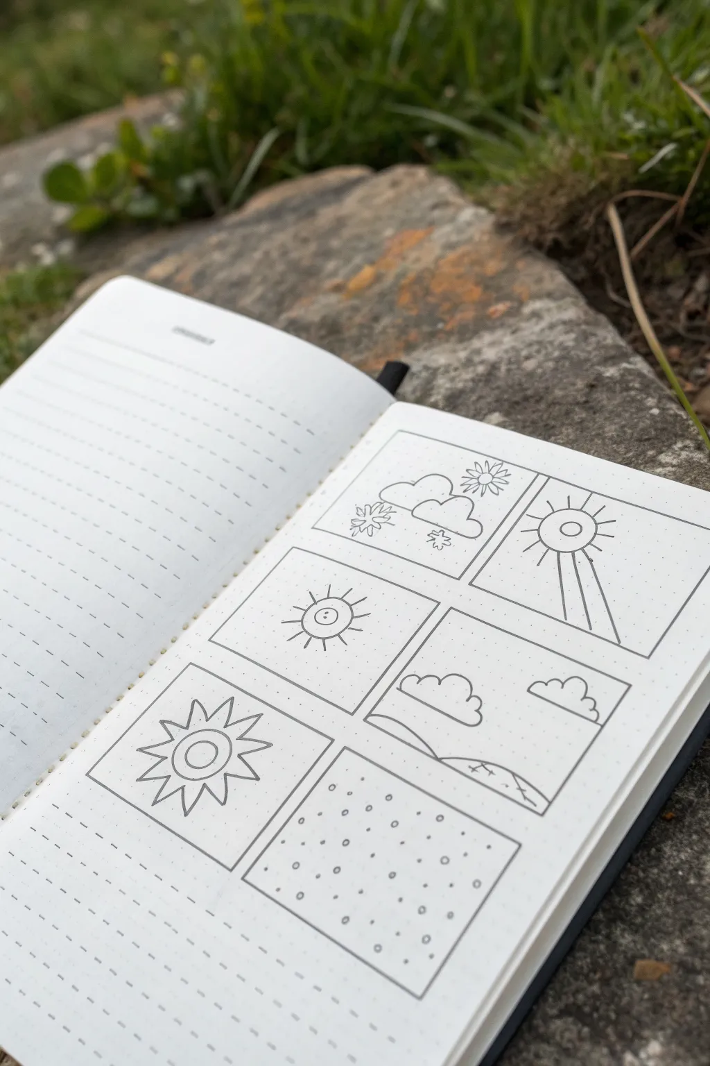
Capture the beauty of changing skies with this charming set of six minimal weather illustrations. Using clean lines and simple shapes, you’ll create a delightful panel of suns, clouds, and atmospheric patterns on dot grid paper.
Detailed Instructions
Materials
- Dot grid notebook or journal
- Fine liner pen (0.3mm or 0.5mm, black)
- Pencil (HB or H)
- Eraser
- Ruler
Step 1: Setting the Grid
-
Map out your frames:
Begin by counting the dots in your notebook to create six equal rectangular frames. A 2-column by 3-row layout works perfectly here. Use your pencil to lightly mark the corners of each box to ensure they are evenly spaced. -
Draw the borders:
Using a ruler and your fine liner pen, carefully draw the solid outlines for all six boxes. The dot grid acts as a perfect guide to keep your lines straight and corners crisp.
Use the Grid
Count the dots! A dot grid is your secret weapon for symmetry. If your sun needs 8 rays, use the cardinal directions (dots directly above, below, left, right) first.
Step 2: Top Row: Mixed Skies
-
Cloudy day sketch:
In the top-left box, start by drawing two fluffy cloud shapes near the center-left. Make their bottoms flat and tops bumpy. -
Adding elements:
Tuck a small sun behind the right cloud with simple radiating lines. Add a few small snowflakes falling beneath the clouds to suggest a wintry mix. -
Radiant sun:
Move to the top-right box. Near the top center, draw a circle with a smaller circle inside it. -
Sunbeams:
Draw straight lines radiating outward from the sun. Make the bottom three lines much longer, extending all the way to the bottom edge of the frame to create a dramatic spotlight effect.
Step 3: Middle Row: Simple Scenes
-
Sunny character:
In the middle-left box, draw a central circle. Give it character by adding two tiny dots for eyes. -
Classic rays:
Surround this face with short, straight lines for rays. I find that alternating slightly different lengths adds a nice playful touch. -
Landscape view:
For the middle-right box, draw a rolling horizon line across the bottom third. Add a large, fluffy cloud on the left and a smaller floating cloud on the right to balance the sky.
Make it Pop
Add a wash of pale watercolor or highlighter in yellow and blue to define the suns and clouds without overpowering the delicate line work.
Step 4: Bottom Row: Pattern Play
-
Spiky sun:
In the bottom-left box, draw two concentric circles in the middle. Instead of straight lines, draw a zigzag pattern all around the outer circle to create triangular rays. -
Snow pattern:
Finally, in the bottom-right box, fill the entire space with a pattern of small circles and dots. Space them randomly but evenly. -
Adding texture:
Go back to the snow pattern and darken some of the smaller dots to create depth and variation in your snowy texture.
Step 5: Final Touches
-
Check line weight:
Scan over your drawings. If you want the frame borders to stand out more, retrace them once just to thicken the lines slightly compared to the doodles inside. -
Erase guidelines:
Once you are certain the ink is completely dry, gently erase any pencil marks from your initial grid planning to leave a clean finish.
Enjoy flipping through your journal and seeing these sunny doodles brighten up the page


Coffee Mug Still Life From a Cylinder

This sketching exercise focuses on drawing a simple coffee mug seen from slightly different angles, starting with basic geometric cylinders. The clean, minimalist pencil work captures form and volume without needing heavy shading, making it perfect for beginners.
Step-by-Step Tutorial
Materials
- Spiral-bound sketchbook (smooth or medium tooth paper)
- Graphite pencil (HB or 2B)
- Fine-point black pen or darker pencil for final lines (optional)
- Vinyl eraser
- Ruler (optional)
Step 1: Planning the Layout
-
Define the grid:
Visualize a grid of four squares on your sketchbook page. Lightly sketch four square frames to contain each mug drawing, leaving even spacing between them. -
Establish the cylinder bases:
Inside each square, lightly sketch a vertical cylinder shape. Start by drawing a central vertical axis line to keep the object symmetrical, then mark the top and bottom limits. -
Draw the rim ellipses:
At the top of each cylinder, sketch a narrow ellipse. I like to keep these fairly flat to represent an eye-level or slightly above eye-level perspective. -
Add the bottom curves:
Mirror the curve of the top ellipse at the bottom of the cylinder. The bottom curve should be slightly more rounded than the top ellipse due to perspective.
Wobbly Ellipses?
Draw through the form. Sketch the entire oval lighter and faster, using your whole arm, then darken only the visible front curve.
Step 2: Refining the Mug Shapes
-
Outline the body:
Connect the outer edges of your top and bottom ellipses with straight vertical lines. For the bottom-left mug, you might slightly taper the sides inward near the bottom for variety. -
Position the handles:
Decide where the handle goes for each mug. In the top-right sketch, place a ‘C’ shape curve on the right side. For the bottom-left, place it on the right side lower down. -
Thicken the handles:
Give the handles dimension by drawing an inner curve parallel to the outer handle line. Connect these lines to the body of the mug. -
Create the rim thickness:
Draw a second, slightly smaller ellipse inside the top opening to show that the ceramic has thickness. This is crucial for realism. -
Add the saucer (Top Right):
For one of the sketches, draw a wider, flatter ellipse underneath the base of the mug to represent a saucer.
Step 3: Detailing and Weight
-
Clean up construction lines:
Use your eraser to gently lift away the initial axis lines and the parts of the ellipses that would be hidden behind the solid form of the mug. -
Darken the main contours:
Go over the visible outlines with a firmer hand or a darker pencil grade. Vary your line weight—make the lines thicker on the shadowed side (usually the bottom right) to suggest weight. -
Add surface contour lines:
Sketch light, vertical curved lines following the form of the cylinder on the mug body. These simple hatched lines help emphasize the roundness of the object. -
Refine the handle attachments:
Pay attention to where the handle meets the body. Add tiny curve marks at the join points to simulate the smooth glaze transition. -
Shadow basic shapes:
Add very light hatching on the side of the mug opposite your light source. Keep this minimal; the style here is about clean lines rather than full shading. -
Ground the objects:
Add a small horizontal shadow or line beneath each mug so they don’t look like they are floating in space.
Pro Tip: Perspective Check
The bottom curve of a cylinder should always be more round (deeper) than the top ellipse. If they are identical, the object will look flat.
Now you have a clean study sheet of coffee mugs ready for watercolor or ink
Donut With Icing Using Two Ovals

Expand your sketching repertoire by drawing six distinct donut styles on a single page, exploring different icing drips and topping patterns. This simple exercise helps you practice creating form and texture through minimalist line work.
Step-by-Step Guide
Materials
- Spiral-bound bullet journal or sketchbook (dotted or plain paper)
- Fine liner pen (black, 0.3mm or 0.5mm)
- Pencil (HB or 2B) for initial sketching
- Eraser
Step 1: Setting Up the Layout
-
Title the page:
Start by writing ‘Deck 1’ at the top left of your page in a loose, casual script. Over on the right side, add a small banner or bubble containing the word ‘Stericd’ or a similar decorative title of your choice, purely for visual balance. -
Create a vertical divider:
Visualize a vertical line splitting your page in half. You can lightly pencil this in if you need a guide, but keeping it imaginary works well for a freehand look. -
Number the slots:
Write the numbers 1, 2, and 9 down the left column, spacing them evenly apart. In the right column, write 2, 5, and 6. These numbers give the page a cataloged, study-sheet feel.
Step 2: Foundational Shapes
-
Draw the outer circles:
Next to each number, draw a medium-sized circle. It doesn’t need to be perfectly round—a slightly organic shape often looks tastier. Repeat this for all six spots. -
Add the donut holes:
Draw a smaller circle in the center of each larger circle. Try to keep them relatively centered, but slight variations add character.
Making It Pop
Vary your line weight: use a thicker pen for the outer donut shape and a thinner one for the delicate sprinkles.
Step 3: Designing the Left Column
-
Doodle 1: The Wavy Dip:
For the first donut, draw a wavy line across the bottom third of the donut shape. This represents a classic chocolate or glaze dip. -
Refine the dip line:
Ensure the wavy line connects cleanly to the outer edges of the circle, making it look like the icing is hugging the dough. -
Doodle 2: The Sprinkled Classic:
On the second donut, draw a wavy icing line similar to the first one. Inside the icing area, add tiny circles and little dots scattered randomly to represent sprinkles and sugar crystals. -
Doodle 9: The Half-Dip:
For the bottom left donut, draw a wavy line intersecting the donut hole slightly lower than before. Fill the bottom section with dense stippling (lots of tiny dots) to suggest a textured coating like coconut or crumbs.
Add Some Color
Use pastel markers to color just the icing sections, leaving the ‘dough’ part white for a high-contrast pop art look.
Step 4: Designing the Right Column
-
Doodle 2 (Top Right): The Ring Drizzle:
For the top right donut, draw a wavy, flower-like icing edge that goes all the way around the central hole. Inside this icing area, draw small, evenly spaced circles for a uniform sprinkle pattern. -
Doodle 5: The Stripe Drizzle:
Move to the middle right donut. Draw slightly curved horizontal lines across the entire donut surface to mimic a zigzag icing drizzle. Make the lines slightly thicker or double them up to give the drizzle some volume. -
Doodle 6: The Side Stripes:
For the final donut on the bottom right, draw horizontal stripes again, but leave gaps or vary the line weight significantly. Add a couple of tiny dots between the stripes for extra detail.
Step 5: Final Touches
-
Inking the lines:
Go over your pencil sketches with your fine liner pen. Move confidently to keep the lines smooth rather than shaky. -
Erase guidelines:
Once the ink is completely dry—I usually wait about five minutes just to be safe—gently erase any visible pencil marks to clean up the page.
Now you have a charming reference sheet of donut designs ready to decorate your next journal spread
Sliced Avocado From an Egg Shape
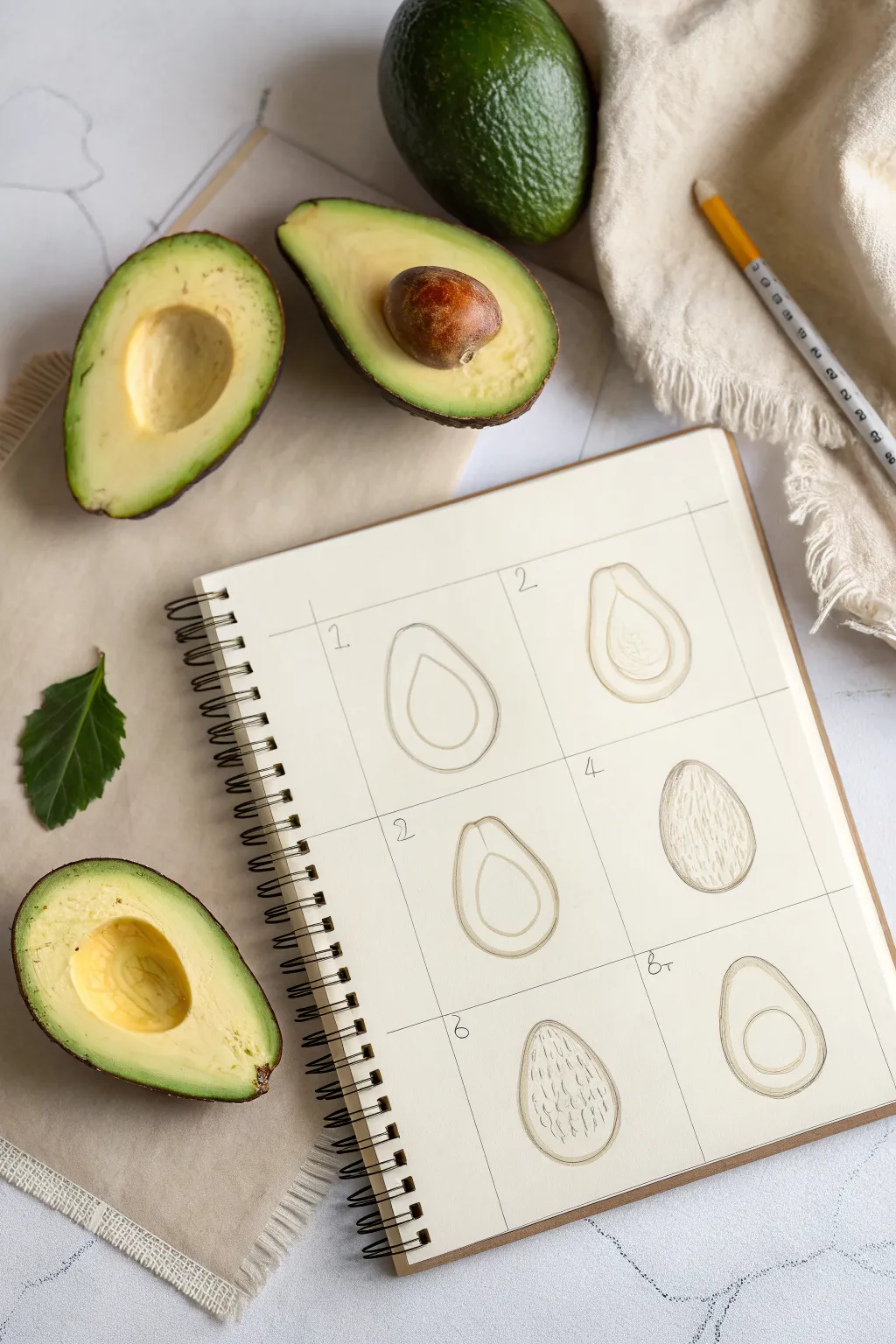
Learn how to transform a simple egg shape into a realistic sliced avocado with this structured sketching exercise. This step-by-step breakdown simplifies the organic form into manageable stages, perfect for filling a sketchbook page.
How-To Guide
Materials
- Spiral-bound sketchbook or drawing paper
- Graphite pencil (HB or 2B)
- Ruler
- Eraser
- Fine-liner pen (optional for final outlines)
Step 1: Preparation
-
Grid Setup:
Start by using your ruler to draw a large rectangle on your sketchbook page. Divide this rectangle into six equal squares—two columns of three rows. This grid will help you track the progression of your drawing. -
Numbering:
Lightly number the boxes from 1 to 6 in the top left corner of each square. While not strictly necessary, it helps keep your practice organized.
Shape Trouble?
If your avocado looks too much like a perfect pear, widen the bottom curve. Avocados are usually squatter and rounder at the base than pears.
Step 2: Basic Structure
-
The Outer Egg (Box 1):
In the first box, draw a simple egg shape or oval that is slightly narrower at the top. Keep your pencil pressure light. -
Inner Guideline (Box 1):
Inside that first egg shape, draw a smaller, identical egg shape. This creates the thickness of the avocado skin and flesh. -
Refining the Shape (Box 2):
Move to the second box. Repeat the double-egg shape, but this time, slightly flatten the bottom curve to make it look less like a perfect oval and more like a natural fruit. -
Adding the Pit Area (Box 2):
Draw a faint circle in the lower-middle section of the inner shape. This indicates where the large seed sits.
Pro Tip: Depth Check
To make the seed cavity look deep, thicken the line on the bottom edge of the hole. This creates a tiny shadow that suggests depth.
Step 3: Detailing the Flesh
-
Shaping the Cavity (Box 3):
In the third box, refine the circle you drew for the pit. Instead of a full circle, outline the empty cavity left behind when the pit is removed. -
Flesh Texture (Box 3):
Lightly sketch some curved lines inside the flesh area, following the contour of the outer peel. This hints at the creamy texture. -
Skin Texture (Box 4):
For the fourth step, focus on the back of the avocado if you were drawing it whole or showing the skin texture. Fill the egg shape with short, vertical, scratchy lines to simulate rough avocado skin.
Step 4: Variations
-
The Empty Half (Box 5):
In box five, draw the clean cut version again. Draw your outer egg shape and the inner oval. -
Adding the Pit Hole (Box 5):
Draw a clean, firm circle in the lower center. This represents the sleek, empty hole where the seed was. -
The Seeded Half (Box 6):
For the final box, replicate the shape from box five, but draw the pit protruding slightly. Instead of an empty circle, shade the seed to make it look three-dimensional and round. -
Final Touches:
Go back over your favorite outlines with a slightly darker stroke to define the forms. Erase any stray grid lines if you prefer a cleaner page look.
Now you have a complete study of avocado forms ready to be colored or inked
Cute Penguin From an Egg Body

Learn how to turn a simple egg shape into an adorable, wide-eyed penguin with this easy sketching tutorial. The cartoon style allows for plenty of personality, making it perfect for doodlers of any skill level.
Step-by-Step Tutorial
Materials
- Spiral-bound sketchbook or drawing paper
- HB or 2B graphite pencil
- Fine-point black pen or darker pencil for outlining
- Orange or gold colored pencil
- Eraser
Step 1: Building the Basic Shape
-
Draw the main body:
Start by drawing a large, slightly squat oval shape in the center of your page. This will serve as the penguin’s main body, resembling a large egg balanced on its wider end. -
Add the wing outlines:
On the left side of the oval, sketch a long, curved teardrop shape pointing downwards for the first wing. Repeat this on the right side, but slightly higher up to give the penguin a bit of a jaunty pose. -
Sketch the feet:
At the bottom of the egg shape, draw two small, three-toed feet. They should look like little triangles with scalloped edges pointing outward. -
Create the face mask:
Inside the upper part of the oval, draw a heart-shaped curve that dips down slightly in the center. This line separates the dark head feathers from the white face area.
Keep it Light
Draw your initial egg shape very lightly. You will be erasing parts of this guideline as you define the wings and feet, so pressing hard early on makes cleanup difficult.
Step 2: Adding Facial Features
-
Draw the eyes:
Place two large circles within the white face area you just defined. Keep them relatively close together to enhance the cute factor. -
Add pupils and highlights:
Inside each eye circle, draw a smaller circle near the top right for a highlight, then a larger pupil shape. Leave the highlight white and shade the rest of the pupil darkly. -
Position the beak:
Right between the eyes, draw a small diamond shape for the beak. Add a horizontal line across the middle to show the mouth opening. -
Suggest cheeks:
Lightly sketch small ovals or little scribble patches just under the eyes to act as blushing cheeks. -
Top it off:
Add two or three tiny, curved lines sticking up from the very top of the head to represent a little tuft of feathers.
Uneven Eyes?
If the eyes look lopsided, draw a faint horizontal guideline across the face first. Place the center of each eye on this line to ensure they align perfectly.
Step 3: Texturing and Details
-
Define the belly:
Draw a large U-shape inside the body that follows the curve of the outer egg shape. This creates the separation for the penguin’s white tummy. -
Add cross-hatching:
Inside the tummy area, draw very light diagonal lines going one way, and then cross them with diagonal lines going the other way. This creates a subtle texture without being overwhelming. -
Refine the outline:
Go over your main pencil lines with a slightly heavier hand or a darker pencil. Make the outer edge of the body and head nice and bold. -
Shade the dark feathers:
Fill in the area outside the face mask and belly (the back and top of the head) with soft pencil strokes. I usually follow the curve of the body while shading to make it look rounder. -
Darken the wings:
Shade the wings similarly to the head, perhaps adding a few stronger lines along the tips to suggest feathers.
Step 4: Final Touches
-
Color the beak:
Take your orange or gold colored pencil and gently fill in the diamond-shaped beak. -
Color the feet:
Use the same orange pencil to fill in the feet at the bottom. -
Accent the cheeks:
Add a tiny touch of red or pink to the cheek marks you sketched earlier for extra character. -
Ground the figure:
Sketch a few quick, horizontal lines underneath the feet to create a simple ground shadow so your penguin isn’t floating in space. -
Cleanup:
Gently erase any stray construction lines that are still visible, being careful not to smudge your shading.
You now have a charming little penguin pal ready to waddle off the page
Sea Turtle Shell With a Hex Grid
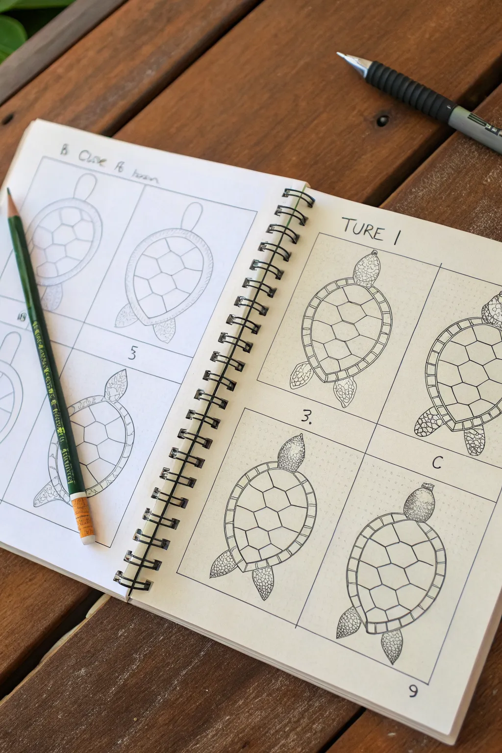
Master the art of drawing a sea turtle’s shell using a structured hexagonal grid method. This approach breaks down complex organic patterns into manageable geometric shapes, resulting in a crisp, clean illustration perfect for nature journals.
Step-by-Step
Materials
- Spiral-bound sketchbook or drawing paper
- Pencil (HB or 2B for sketching)
- Fine liner pen (black, 0.3mm or 0.5mm)
- Ruler (optional, for grid alignment)
- Eraser
Step 1: Basic Structure
-
Outline the shell:
Begin by drawing a large, slightly elongated oval in the center of your page. This will serve as the carapace (top shell) of your turtle. Keep the lines light so they can be adjusted later. -
Add the head and tail:
At the top center of the oval, sketch a smaller, rounded shape for the head. At the bottom point directly opposite, add a small, pointed triangle for the tail. -
Sketch the flippers:
Draw the front flippers extending from the upper sides of the shell. They should curve backward slightly. Add the rear flippers near the tail, making them shorter and more rounded than the front pair.
Grid Guide
Draw your hexagons lightly first! If the central stack is crooked, the whole shell looks wobbly. Use a ruler for the centerline if needed.
Step 2: The Hexagonal Grid
-
Define the central column:
Lightly draw a vertical centerline down the shell. Along this line, sketch a column of three large hexagons stacked vertically. The middle one should be the widest, while the top and bottom ones can taper slightly to fit the oval shape. -
Connect the sides:
From the points of your central hexagons, draw lines extending outward toward the shell’s edge. These will form the pentagon-like shapes that make up the costal scutes involving the sides of the shell. -
Create the shell border:
Draw a second, inner oval line just inside the main shell outline. This creates a rim or border around the entire carapace. -
Divide the rim:
Add small perpendicular lines all around this rim, dissecting it into small rectangular segments. These are the marginal scutes.
Make It Pop
Use a thicker pen for the outer silhouette and a thinner pen for the internal shell details to create instant visual hierarchy.
Step 3: Inking and Detailing
-
Ink the main lines:
Using your fine liner pen, carefully trace over the main pencil lines of the shell, head, and flippers. I find it helpful to rotate the sketchbook as I draw curves to keep my hand in a natural position. -
Define the scutes:
Ink the hexagonal grid pattern on the shell. Make these lines deliberate and smooth. Trace the small segmented border around the shell edge as well. -
Detail the head:
Instead of a simple outline, fill the head shape with small, irregular pebble-like shapes to mimic scales. Keep them tightly packed but not touching. -
Texture the flippers:
Apply the same pebble-scale texture to the flippers. You can make the scales slightly larger near the center of the flipper and smaller near the edges for a realistic look. -
Add final shading:
If you want extra depth, add tiny stippling dots or hatching lines on one side of each shell segment to suggest a slight curve or dome shape. -
Erase guidelines:
Wait for the ink to dry completely to avoid smudging. Then, gently erase all the underlying pencil sketches to reveal your clean line art.
Now you have a structured, scientifically inspired turtle drawing ready for coloring or display
Little Bird on a Branch With Two Ovals
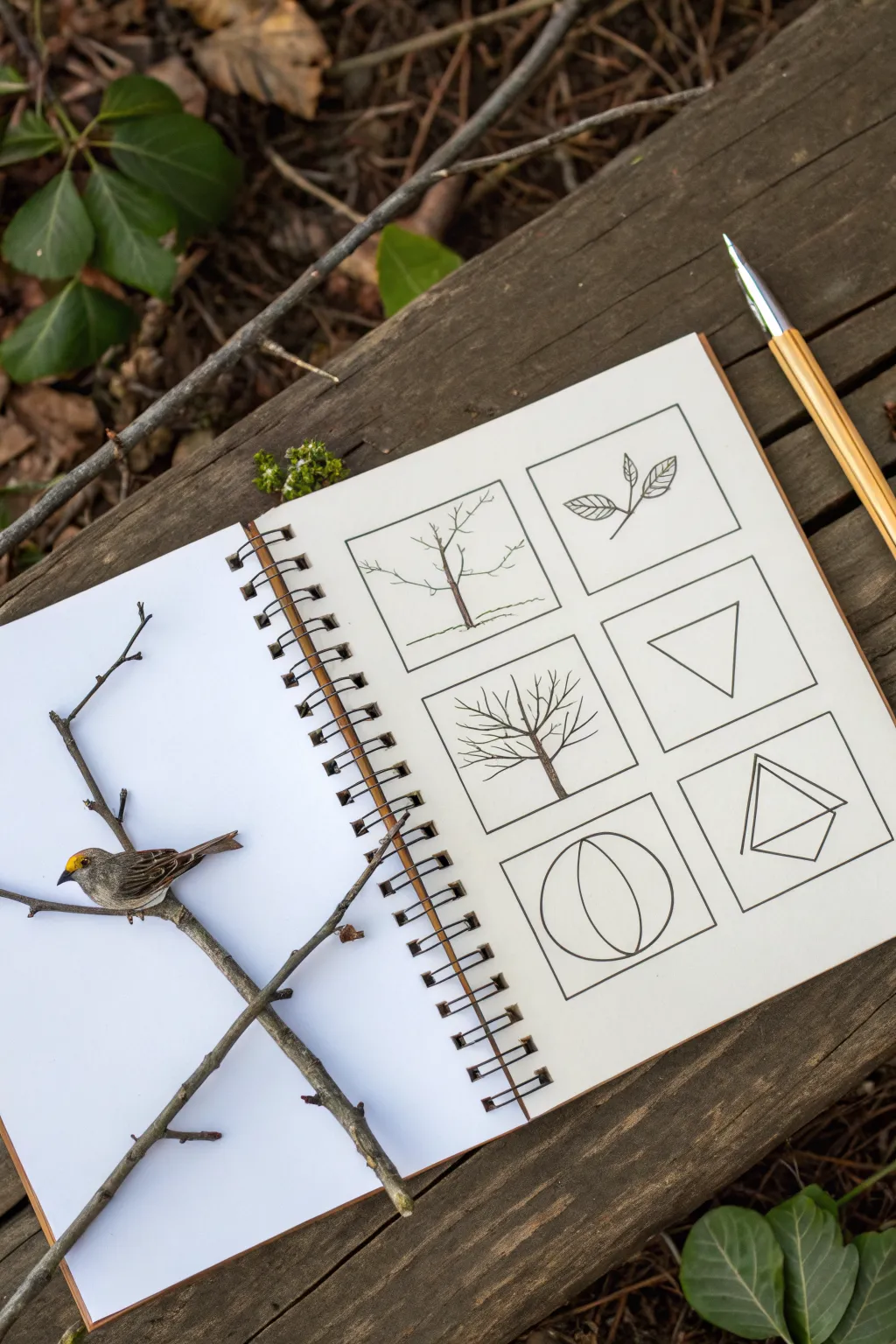
Capture the essence of natural forms by breaking them down into simple geometric shapes in this structured sketchbook exercise. You’ll create a clean, gridded layout of botanical and abstract drawings that teaches you to see the underlying architecture of trees and leaves.
Detailed Instructions
Materials
- Wire-bound sketchbook with heavy paper
- Fine-liner pen (black, 0.3mm or 0.5mm)
- Ruler or straight edge
- Pencil (HB for sketching)
- Eraser
- Real twigs and a small bird figurine (optional, for photo staging)
Step 1: Setting the Grid
-
Measure the layout:
Begin on the right-hand page of your sketchbook. Use your ruler to lightly mark out six equal squares in a 2×3 grid arrangement. Keep the spacing consistent between the squares. -
Ink the frames:
Once you are satisfied with the pencil layout, use your black fine-liner and ruler to draw the final solid outlines for the six square frames. -
Erase guidelines:
Wait a moment for the ink to dry completely to avoid smudging, then gently erase any visible pencil marks.
Wobbly Lines?
If your straight lines aren’t perfect, don’t worry. A slightly wavering hand-drawn line adds character and warmth that a strictly digital or ruler-drawn line lacks.
Step 2: Botanical Subjects
-
Draft the bare tree:
In the top-left square, sketch a simple deciduous tree without leaves. Start with a central vertical line for the trunk and branch out into a Y-shape. -
Detail the branches:
Add smaller twigs extending from the main branches, keeping the lines thin and somewhat jagged to mimic natural growth. Add a simple horizon line at the base. -
Draw the leaf sprig:
In the top-right square, draw a single diagonal stem. Attach three or four simple oval-shaped leaves. -
Add leaf veins:
Draw delicate center lines and angled veins inside the leaf outlines to give them dimension and texture. -
Sketch the full tree:
Moving to the middle-left square, draw a tree with a fuller canopy structure. Create a fan-like shape with main branches radiating from a central trunk point. -
Refine the canopy:
Fill in the tree with numerous smaller branches reaching upward, creating a distinctive winter-tree silhouette.
Step 3: Geometric Abstractions
-
Draw the inverted triangle:
In the middle-right square, draw a simple inverted triangle. This shape often represents the simplified form of a canopy or a leaf. -
Create the circle study:
In the bottom-left square, draw a large circle. Bisect it with two curved vertical lines that taper at the top and bottom, creating a sphere-like volume. -
Draft the geometric solid:
In the final bottom-right square, draw a triangle. Below it, draw a slightly skewed square or diamond shape attached to the base to create a 3D prism effect. -
Final inking:
Go over all your internal pencil sketches with the black fine-liner. Use a steady hand, and I typically avoid using a ruler for the nature subjects to keep them organic.
Add Color Washes
Use diluted watercolor to fill the geometric shapes or the tree trunks. A soft green or brown wash brings the minimalist black-and-white grid to life.
Step 4: Styling the Scene
-
Position the props:
To recreate the photo’s aesthetic, find a Y-shaped twig and lay it across the open left page of the sketchbook. -
Place the bird:
Carefully balance a small bird figurine or model onto the twig so it appears to be perching. Ensure the lighting casts soft shadows to integrate the props with the page.
Now you have a beautiful study page that transforms complex nature into clean, pleasing design elements
Hand Gesture Line Art With Ghost Guides
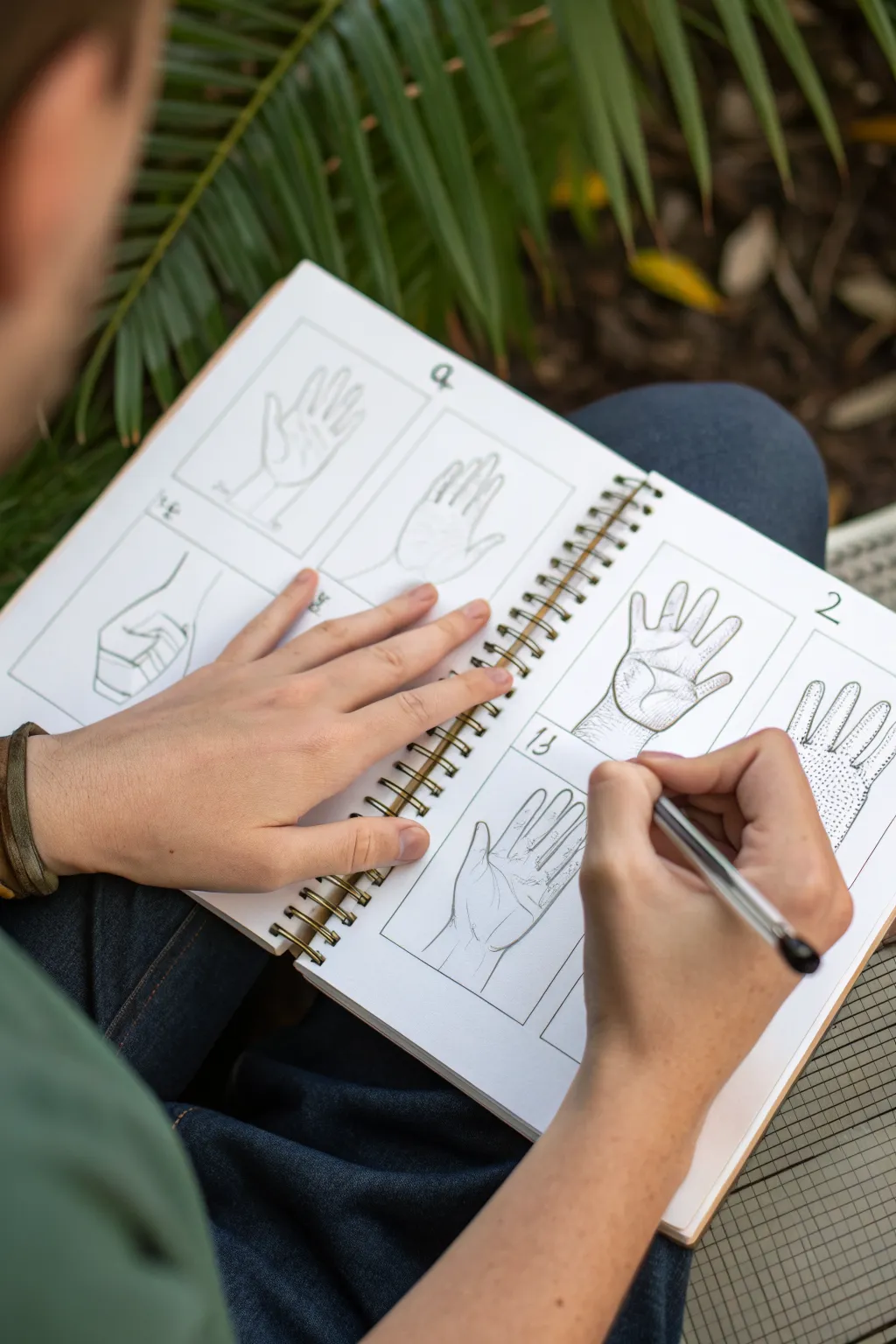
Master the art of drawing hands with this structured approach that breaks complex forms into manageable shapes. This exercise focuses on capturing multiple hand gestures using clean line work and subtle dotted texturing to indicate volume.
How-To Guide
Materials
- Spiral-bound sketchbook or drawing paper
- Pencil (HB or H for initial guides)
- Fine-liner pen (black, 0.3mm or 0.5mm)
- Eraser
- Ruler
Step 1: Setting Up the Grid
-
Layout preparation:
Begin by dividing your sketchbook page into a grid of six equal rectangles. Use your ruler to ensure the lines are straight and the boxes are uniform in size. -
Drawing the frames:
Trace over your pencil grid with the fine-liner pen to create crisp borders for each drawing. Allow the ink to dry completely before erasing any stray pencil marks. -
Numbering the panels:
Add small numbers (1, 2, 3, etc.) in the corner of each box to organize your study sequence, just like in the reference.
Fixing Wonky Fingers
If fingers look like sausages or noodles, check the joint lengths. The middle phalanx is shorter than the base, and the tip is shortest.
Step 2: Drafting the Basic Shapes
-
Simplifying the palm:
Start the first hand gesture (an open palm) by lightly sketching a square or trapezoid shape with your pencil. This represents the main body of the hand. -
Mapping the fingers:
Draw faint lines radiating from the top of the palm shape to indicate the direction of each finger. Mark the joints with small circles to help visualize where the fingers bend. -
Adding the thumb:
Sketch a triangular wedge on the side of the palm for the thumb base, followed by two segments for the thumb itself. -
Fleshing out the form:
Draw the outline of the fingers around your guide lines. Keep the lines loose and light at this stage, focusing on the silhouette rather than details.
Level Up: Grid Method
Draw faint grid lines over your own hand references, then replicate that grid in your sketchbook box for perfect proportions.
Step 3: Refining and Inking
-
Defining the outline:
Once you are happy with the pencil sketch, take your fine-liner. Draw the final contour of the hand with confident, continuous strokes. Focus on the subtle curves where the fingers meet the palm. -
Adding life lines:
Draw the major creases of the palm—the life line, head line, and heart line. Keep these lines slightly thinner or broken to suggest skin texture. -
Detailing the fingernails:
Sketch small, curved shapes at the tips of the fingers for nails. Don’t close the shape completely; accurate nails are often just a suggestion of a curve.
Step 4: Creating Texture with Stippling
-
Understanding volume:
Identify the areas of the hand that are shadowed or receding, such as the side of the palm or the spaces between fingers. -
Applying stippling:
Instead of cross-hatching, use small dots (stippling) to create shade. Cluster the dots closely together in the darkest areas and spread them out as you move toward the highlights. -
Texturing the wrist:
For the wrist area, use a slightly denser stippling pattern to ground the drawing and separate the hand from the arm.
Step 5: Capturing Different Gestures
-
The side view:
Move to the next box. Draw a hand from the side view using the same block-in method. Focus on the wedge shape of the hand’s thickness. -
The relaxed pose:
In a fresh box, sketch a hand with fingers slightly curled. Pay attention to how the knuckles form a gentle arch. -
Fist variations:
Try drawing a loose fist. I find it helpful to draw the thumb wrapping over the fingers last to ensure the underlying structure makes sense. -
Finishing touches:
Review your inked drawings. Strengthen any outer lines that feel too thin to separate the hand clearly from the background white space. -
Cleanup:
Wait for all ink to be totally dry, then erase all underlying pencil guides to leave a clean, professional-looking study sheet.
Fill the remaining boxes with your own hand poses to complete your study reference sheet
Crystal Cluster Built From Faceted Blocks

Create a striking crystal formation using simple geometric shapes and careful ink detailing. This sketch focuses on building complex prisms from basic block structures and creating texture through hatching.
Step-by-Step Guide
Materials
- Sketchbook or drawing paper (heavyweight preferred)
- HB or 2H pencil for under-drawing
- Fine liner pens (sizes 0.1, 0.3, and 0.5)
- Ruler or straight edge (optional)
- Kneaded eraser
Step 1: Constructing the Framework
-
Establish the main spire:
Begin by lightly sketching a tall, vertical rectangle in the center of your page with your pencil. Make it slightly wider at the bottom than the top. -
Add the main faceted tip:
Draw a triangle on top of the rectangle, but instead of a simple point, truncate the tip or add an extra facet line to give it a 3D prism look. -
Sketch the supporting crystals:
Draw three to four medium-sized rectangular blocks leaning against the central spire. Angle them slightly outward to create a natural cluster effect. -
Ground the formation:
Add smaller, jagged shapes at the very base. These act as the ‘root’ crystals or bedrock that the larger structures grow from. -
Define the facets:
On the tops of your supporting blocks, draw the pointed, multi-sided caps. Connect the corners of these caps down the length of the rectangles to create the vertical edges of the crystal faces.
Wobbly Lines?
Don’t stress if your lines aren’t perfectly straight. Slight wobbles actually make the crystals look more organic and natural rather than computer-generated.
Step 2: Inking the Outlines
-
Trace the primary edges:
Switch to your 0.5 pen. Carefully go over the outer silhouette of the entire cluster to verify the overall shape. -
Define internal separation:
Ink the lines where one crystal overlaps another. Ensure these lines stop cleanly where the forms intersect so the depth remains clear. -
Ink the facet lines:
Use a slightly thinner nib, like a 0.3 pen, for the internal vertical lines and the geometric facets on the tips. This subtle weight difference adds dimensionality. -
Erase the guides:
Once the ink is fully dry, gently rub your kneaded eraser over the sketch to lift all the graphite, leaving only the crisp ink lines.
Level Up: Cosmic Dust
Add tiny floating geometric shards or stippled dots around the top of the cluster to give it a magical, levitating energy effect.
Step 3: Texturing and Shading
-
Identify light source:
Choose a direction for your light (usually top-left or top-right). Mark mentally which faces of the crystals will be in shadow. -
Hatch the central spire:
On the shadowed side of the main crystal, use your 0.1 pen to draw tight horizontal or cross-hatched lines. I find keeping these lines somewhat loose adds a nice organic feel. -
Add vertical striations:
Crystals often have vertical grooves avoiding the edges. Draw fine, broken vertical lines down the length of the clearer faces to suggest this texture. -
Deepen the contrast:
Select specific facets, particularly the smaller side faces, and fill them with dense cross-hatching or even solid black to make the highlights pop. -
Texture the base:
Use small scribbles or stippling (dots) for the rough rocks at the bottom, distinguishing them from the smooth crystal faces above. -
Refine the edges:
Go back with your 0.5 pen and re-thicken any outer lines that got lost during shading to ensure the cluster stands out from the page.
Now you have a sharp, geometric sketch ready to be the centerpiece of your page
Mini Mandala Using a Circle Grid
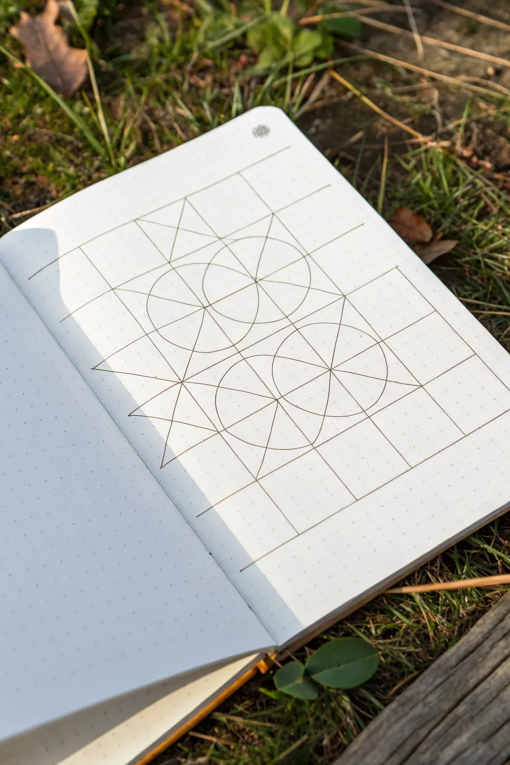
This precise geometric sketch explores the beautiful interplay between straight lines and perfect circles. Using a dotted grid notebook as your guide, you will construct a balanced framework that can serve as the foundation for a complex mandala or stand alone as a minimalist art piece.
Step-by-Step
Materials
- Dotted grid journal or notebook
- Ruler or straight edge
- Compass with a sharp pencil point
- Fine liner pen (0.3mm or 0.5mm, black or sepia)
- Pencil (HB or 2H for light guidelines)
- Eraser
Step 1: Setting the Grid Framework
-
Define the perimeter:
Begin by counting out your grid dots. You want to establish a large rectangle that is 16 dots wide and 24 dots tall. Use your ruler and pencil to lightly mark the four corners of this space. -
Create the main squares:
Divide this large rectangle into a grid of squares. Each major square unit should span 8 dots by 8 dots. Draw horizontal and vertical lines to create a 2×3 grid of these large squares. -
Add diagonals:
In the central two squares of your 2×3 grid, draw diagonal lines connecting opposite corners. These ‘X’ shapes will help you find the absolute center of each square for compass placement. -
Intersecting center lines:
Draw vertical and horizontal lines through the exact center of those same squares (crossing through the ‘X’ you just made). You now have a ‘star’ radiating from the center of your drawing area.
Step 2: Adding Circular Elements
-
Calibrate your compass:
Set your compass width to encompass exactly 4 grid dots (half the width of your main squares). This ensures your circles will touch the edges of the squares perfectly. -
Draw the first circle:
Place the needle of your compass firmly in the center intersection of the upper-middle square. Swing a complete circle; it should graze the four sides of that square unit. -
Draw the second circle:
Move the compass needle to the center intersection of the lower-middle square. Draw a second identical circle directly below the first one. -
Add the overlap circles:
Now place your needle on the vertical line exactly halfway between the centers of your two existing circles. Draw a third circle that overlaps the first two, creating a detailed vesica piscis pattern in the middle. -
Create side semi-circles:
Keep the same compass radius. Place the needle on the far left and far right intersections of the central horizontal line. Draw semi-circles that curve inward towards the center of the design.
Slipping Compass?
If your compass needle slips on the smooth paper, put a small piece of clear tape over the center dot before piercing it. This adds grip and protects the page.
Step 3: Inking and Definition
-
Ink the straight lines:
Switch to your fine liner pen. Carefully trace over your initial pencil grid lines. I prefer to do all vertical lines first, let them dry for a moment, and then do the horizontal ones to avoid smudging. -
Ink the structural diagonals:
Use your ruler to ink the diagonal ‘star’ lines that cut through the circles. These lines create the ‘slices’ of your pie shapes. -
Ink the curves:
If you have a compass adapter for your pen, swap it in now. Otherwise, carefully trace the pencil circles freehand, going slowly to maintain a smooth arc. -
Connect the outer points:
Draw straight diagonal lines connecting the outer points of your star shapes to the corners of the grid, creating the sharp triangular points visible on the left side of the design. -
Clean up:
Once you are absolutely certain the ink is dry, gently erase all remaining pencil guidelines to leave a crisp, clean geometric diagram.
Level Up: Sacred Geometry
Color in the overlapping sections with watercolor pencils to highlight the ‘Flower of Life’ petals hidden within the intersecting circles.
Now you have a mathematically perfect foundation ready for intricate doodles or coloring


Have a question or want to share your own experience? I'd love to hear from you in the comments below!