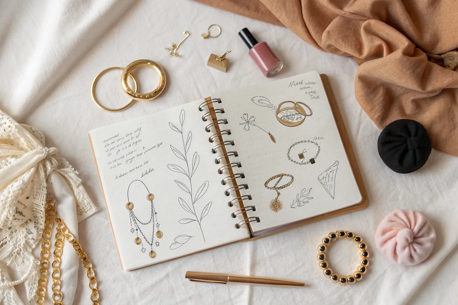
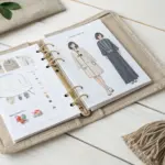
Accessories are my favorite shortcut for turning a simple sketch into a full-on character moment—one necklace, one hat, and suddenly there’s a story. Below are a bunch of accessories drawing ideas you can use as mini studies, reference sheets, or full character design upgrades.
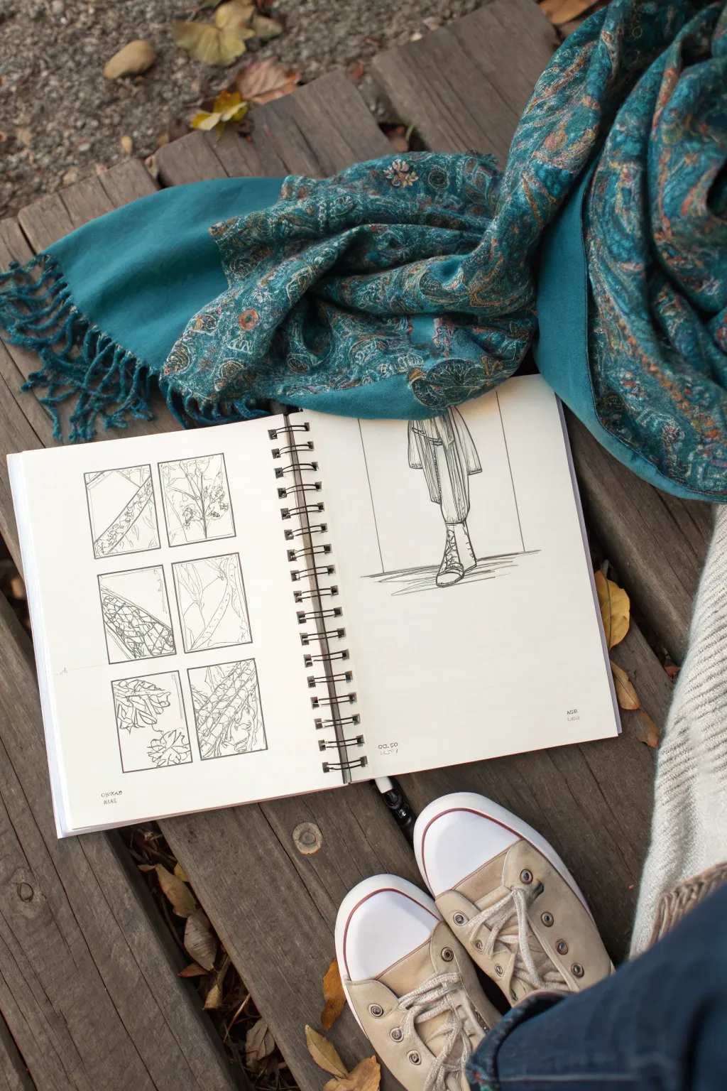
Necklaces and Chokers Reference Sheet
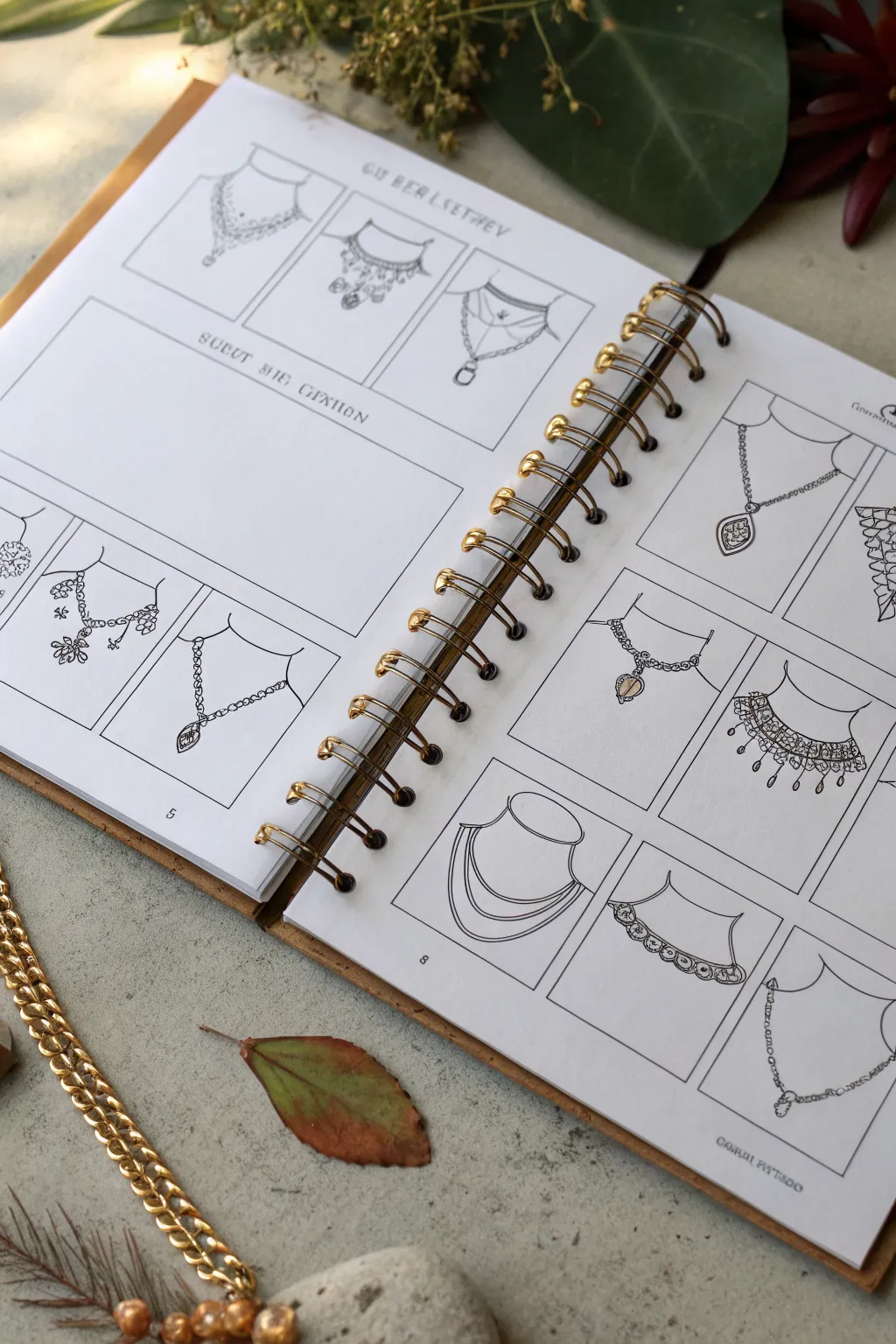
Create a stunning reference spread for your jewelry design portfolio with this detailed necklace sketching guide. This project focuses on drawing clean, varied line art of chokers and necklaces arranged neatly in a grid layout to showcase different styles and drapes.
Detailed Instructions
Materials
- Spiral-bound sketchbook (A4 or A5 size with smooth paper)
- Ruler or T-square
- Pencil (HB or 2H for drafting)
- Fine liner pen (0.1mm and 0.3mm, black ink)
- Eraser
- Optional: Compass or circle stencil for neck curves
Step 1: Setting Up the Grid
-
Define the Margins:
Open your sketchbook to a fresh two-page spread. Using your ruler and a light pencil touch, mark a consistent margin around the edges of both pages to frame your work. -
Create Layout Boxes:
Divide each page into a grid of rectangular boxes. The reference image shows a mix of single square boxes for pendants and wider rectangular spaces for text or banners. Aim for about 6-8 boxes per page. -
Add Text Areas:
Designate a large rectangular area on the left page for a title or notes section. Keep this space clear of grid lines to allow for writing later. -
Draft Necklines:
lightly sketch a simple ‘U’ shape or scoop neckline within each small grid box. This curve represents the person’s neck and shoulders, providing a consistent base for every necklace design.
Steady Hands
Drawing chains can be tedious. Instead of drawing every individual link, use a dotted line or a jagged zig-zag line to suggest the texture of a chain without the hand cramps.
Step 2: Designing the Styles
-
Sketching Chokers:
Start with the top row. Draw choker-style necklaces that sit high on the neckline curve. Use simple parallel lines to mimic bands of fabric or metal. -
Adding Pendants:
For the next set, draw thin chains dropping down from the neckline curve. Add geometric shapes like teardrops, diamonds, or ovals at the bottom to represent pendants. -
Complex Layers:
I like to mix it up by drawing layered necklaces. Sketch multiple drooping curves of varying lengths within a single box to show how chains would stack. -
Intricate Details:
Select a few designs to be statement pieces. Sketch small circles for pearls or tiny jagged lines for lace textures along the collarbone area. -
Drape Mechanics:
Ensure gravity looks real. The chains should hang with a natural curve, dipping lowest in the center. Avoid straight lines unless the material is rigid like a metal collar.
Add Some Shine
After inking, use a metallic gold or silver gel pen to re-trace just the highlight areas of the jewelry. It adds a subtle dimension that catches the light.
Step 3: Inking and Finalizing
-
Outline the Boxes:
Switch to your 0.3mm fine liner. Carefully trace over your grid boxes to create crisp, permanent frames for your sketches. -
Inking the Jewelry:
Use the 0.1mm pen for the jewelry details. This finer tip helps distinguish dainty chains from the heavier border lines. Trace your pencil sketches with confident strokes. -
Adding Weight:
Go back over the main pendants or thick choker bands to thicken the line weight slightly. This adds contrast and makes the jewelry pop against the white paper. -
Text Elements:
In the designated text areas or at the top of the page, hand-letter titles or categories (like ‘Chokers,’ ‘Pendants,’ or ‘Evening Wear’). Keep the font simple and architectural. -
Erase and Clean:
Once the ink is completely dry (test a small spot first!), gently erase all underlying pencil guidelines and the base neckline curves, leaving only the floating jewelry. -
Detailing Clasps:
Add tiny circles or loops at the top ends of the chains where they disappear off the ‘neck’ to imply clasps or continuation around the back.
Your organized spread of accessory designs is now ready to inspire your next creation


Rings and Hand Jewelry Close-Ups
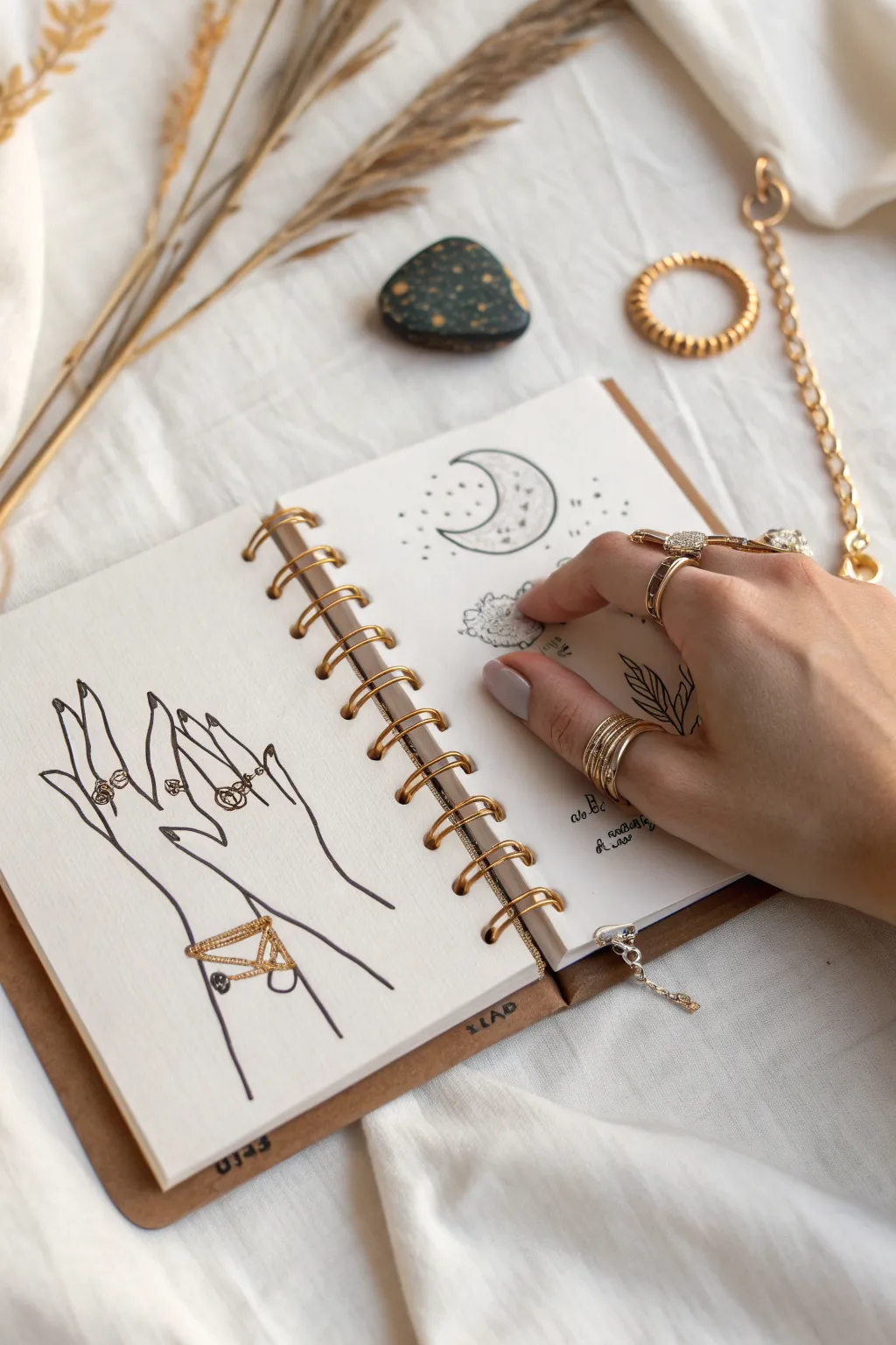
Capture the delicate beauty of jewelry design with this refined sketchbook spread, featuring graceful hand illustrations adorned with rings and mystic celestial motifs. This project combines clean line art with subtle gold accents to create a chic, fashion-forward aesthetic.
Detailed Instructions
Materials
- Spiral-bound sketchbook (smooth paper)
- Fine liner pen (black, 0.1mm and 0.3mm)
- Pencil (HB or 2B)
- Kneaded eraser
- Gold gel pen or gold metallic marker (fine tip)
- Ruler (optional)
- Reference photo of hands (optional)
Step 1: Drafting the Layout
-
Plan the composition:
Visualize your double-page spread. The left page will focus on a pair of stylized hands showcasing rings and bracelets, while the right page will feature celestial doodles like moons and scattered stars. -
Sketch the primary hand shapes:
Using a light pencil, gently sketch the outline of two hands on the left page. Position them so the fingers are elongated and graceful, with one hand slightly overlapping or interacting with the other. -
Refine the fingers:
Pay close attention to the joints and fingernails. Keep the lines sleek and slightly stylized rather than hyper-realistic to maintain a fashion illustration feel. -
Sketch the moon motif:
On the top right page, lightly sketch a crescent moon shape. Add a few smaller circles and dots around it to represent stars or constellations.
Step 2: Inking the Foundation
-
Outline the hands:
Switch to your 0.3mm black fine liner. Carefully trace over your pencil lines for the hands. Use confident, sweeping strokes for the fingers to avoid shakiness. -
Detail the fingernails:
Draw the fingernails with simple, oval shapes. I find keeping these minimal helps the focus remain on the jewelry we’ll add later. -
Ink the celestial elements:
Trace the crescent moon on the right page. Use a stippling technique (dots) inside the moon to give it texture and depth, concentrating the dots near the curves for shading. -
Add scattered stars:
Ink tiny dots and small star shapes around the moon. vary the spacing to make it look organic and magical. -
Erase pencil guides:
Once the ink is completely dry—wait at least five minutes to be safe—gently use your kneaded eraser to lift all visible pencil marks.
Smudge Alert
Gel pens, especially metallics, take longer to dry than standard ink. Place a scrap piece of paper under your drawing hand to prevent smearing your fresh gold lines.
Step 3: Accessorizing with Gold
-
Draw the rings base:
Using the 0.1mm fine liner, draw the outlines of rings on various fingers. Mix stackable thin bands with larger statement pieces. -
Add the bracelet structure:
Draw a geometric bracelet cuff on the wrist of the lower hand. Use straight lines to create a triangular or caged design. -
Apply gold accents:
This is the fun part. Take your gold gel pen and fill in the jewelry outlines. For the rings, you can fill them completely or trace the bands for a glinting effect. -
embellish the bracelet:
Trace over the bracelet lines with the gold pen. Add tiny dots of gold at the intersections of the bracelet design to mimic gemstones or rivets. -
Add gold to celestial doodles:
On the right page, add tiny touches of gold to the center of some stars or lightly outline the inner curve of the moon for a cohesive look. -
Create background atmosphere:
Use the 0.1mm pen to add very subtle texture or tiny doodles like leaves or clouds near the moon to fill empty space without overcrowding. -
Review and refine:
Look over the spread. Re-darken any black lines that might have been faded by the eraser, and ensure your gold ink pops against the white paper.
Level Up: 3D Shine
After the gold ink dries, add a tiny dot of white gel pen on the highest point of each ring or bracelet band to create a realistic gleam or highlight.
Now you have a stylish jewelry spread ready to inspire your next accessory choice


Bracelets and Watches in Perspective
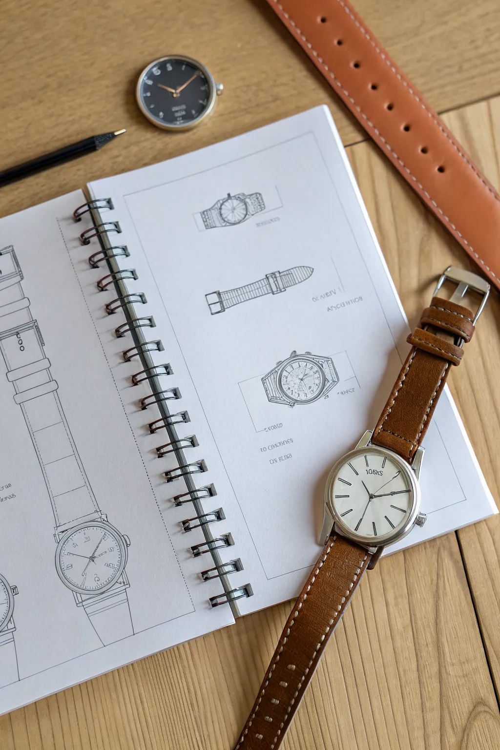
Master the art of technical illustration with this study of timepieces, focusing on clean linework and accurate perspective. This project creates a professional-looking design spread that balances detailed diagrams with structural outlines.
Step-by-Step Guide
Materials
- Spiral-bound sketchbook (smooth cartridge paper)
- Mechanical pencil (0.5mm HB or H)
- Fine-point black fineliner (0.1mm and 0.3mm)
- Ruler (clear plastic is best)
- Circle template or compass
- Eraser (kneadable and precision)
- A real watch for reference
Step 1: Planning the Layout
-
Define the frame:
Start by lightly drawing a rectangular border inside your sketchbook page using your ruler. This ‘page within a page’ creates a professional blueprint aesthetic. -
Establish center lines:
For the main vertical strap drawing on the left, draw a long, faint center line from the top almost to the bottom. This axis is crucial for symmetry. -
Block in the shapes:
Use simple geometric shapes to mark where the other components will go on the right page: a rectangle for the top view, a long thin rectangle for the strap, and a square for the angled watch face.
Step 2: Drafting the Components
-
Construct the main strap:
On the left column, sketch the width of the watch strap. Use horizontal lines to mark the segmented padding of the leather, ensuring they curve slightly to suggest volume. -
Detail the main dial:
At the bottom of your vertical strap, draw the circle for the watch case. I find using a circle template here gives a much cleaner result than a compass for small technical drawings. -
Draw the top elevation:
On the top right, sketch the watch head ‘side-on’. Focus on the thickness of the case and the small crown on the side. -
Draft the isolated strap:
Below the top elevation, draw a detailed view of the buckle end of the strap. Include the small holes and the metal tongue of the buckle. -
Create the perspective view:
For the angled watch in the middle right, start with an ellipse rather than a circle to show perspective. Add thickness to the bottom right edge to make it 3D.
Wobbly Ellipses?
If your perspective circles look lumpy, draw a square in perspective first (a trapezoid), then fit your ellipse inside it touching the midpoints of the four sides.
Step 3: Refining and Inking
-
Tighten the pencil lines:
Go back over your rough shapes. Define the lugs (where the strap meets the watch) and the stitching lines on the leather borders. -
Add dial details:
Lightly mark the hours. For the perspective watch, remember that the spaces between numbers will appear narrower on the sides due to the angle. -
Ink the main outlines:
Switch to your 0.3mm fineliner. Carefully trace the major structural lines of the watches and straps. Use a ruler for the long straight sections of the straps. -
Add technical annotations:
Use the fine 0.1mm pen to add small dimension lines and faux-technical notes next to the drawings. You don’t need real measurements; scribbled text mimics the look perfectly. -
Texture the strap:
Add tiny dashed lines just inside the edge of the strap outlines to represent stitching. Keep these very consistent in spacing.
Pro Tip: Line Weight
Use a thicker pen line for the outer silhouette of the watch and a thinner line for internal details like hands or stitching. This adds instant depth.
Step 4: Shading and Finishing
-
Erase guidelines:
Once the ink is completely dry (give it a thorough minute), gently erase all your initial pencil construction lines. -
Shade the metal:
Using your pencil again, add light parallel hatching to the metal parts of the watch case to suggest reflections. -
Add volume to leather:
Shade the edges of the leather straps slightly darker than the center. This gradation makes the strap look padded and rounded. -
Detail the dial face:
Draw the hands with precision. Sketching them at 10:10 is a classic watchmaker’s standard as it frames the logo nicely. -
Final touches:
Add a few very light construction lines extending from the perspective drawing (like a bounding box) to emphasize the ‘work in progress’ design vibe.
Enjoy the satisfaction of seeing your technical schematics come to life on the page


Eyewear Shapes on a Face Grid
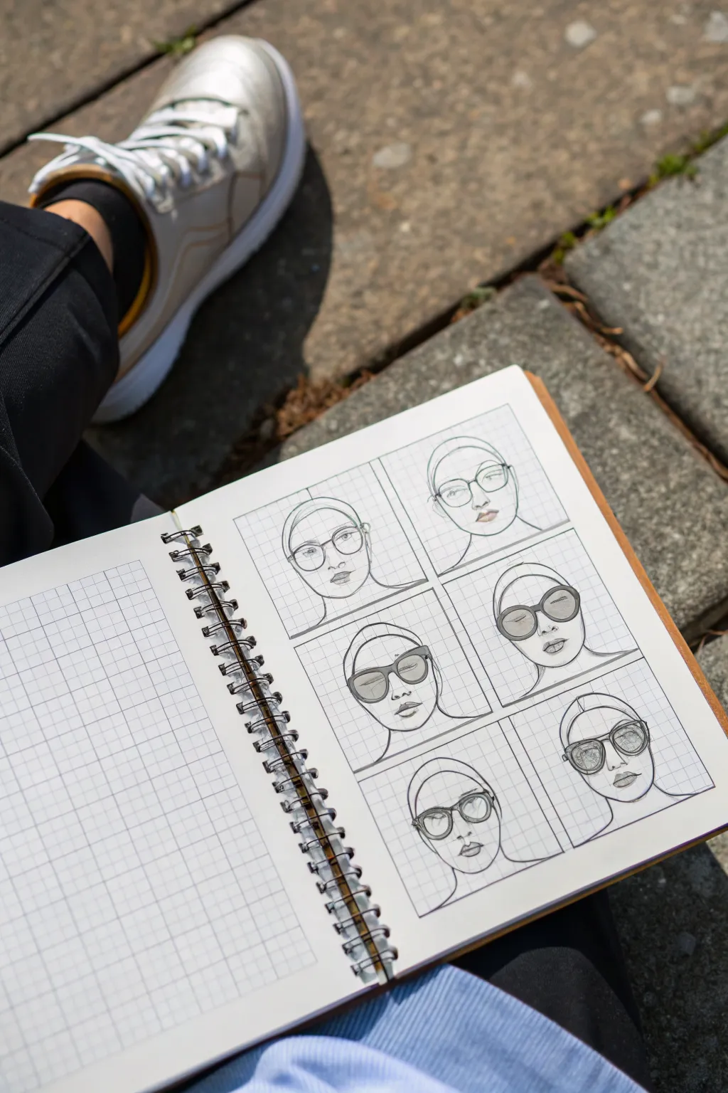
Master the art of eyewear design by sketching multiple frame shapes over a consistent facial template. This grid-based approach helps you compare styles like cat-eye, round, and aviator side-by-side with satisfying precision.
Step-by-Step Tutorial
Materials
- Spiral-bound grid notebook (graph paper)
- Mechanical pencil (HB or 2B)
- Fine liner pen (black, 0.3mm or 0.5mm)
- Drawing compass (optional for circles)
- Eraser
- Ruler
Step 1: Setting Up the Grid Layout
-
Define the frames:
Start by identifying a 2×3 layout on your grid page. Use your ruler to draw six equal rectangular boxes, leaving a small gap between each one to serve as a border. The grid lines will act as your guide for symmetry. -
Establish the centerline:
Locate the vertical center of each box and draw a light guideline straight down the middle. This axis is crucial for keeping the face and the glasses perfectly symmetrical. -
Sketch the head shape:
In the first box, lightly sketch an oval head shape. The top should be rounded for the skull, tapering down to a chin. Repeat this same basic head shape in all six boxes. -
Add guide lines for features:
Draw faint horizontal lines across all faces to mark where the eyes, nose, and mouth will sit. I find it helpful to place the eye line right in the center of the head oval.
Symmetry Hack
Count the grid squares from the center line! If the left lens starts 2 squares from the center, the right lens must start exactly 2 squares away too.
Step 2: Drawing the Face Template
-
Draw the features:
Sketch a simple nose and pair of lips on your first face using the guide lines. Keep the expression neutral so the focus remains on the eyewear. -
Outline the head covering:
Draw a smooth line across the forehead and down the sides to suggest a swim cap or hijab-style covering, which neatly frames the face and removes the complexity of drawing hair. -
Refine the jawline:
Darken the jaw and chin lines to give the face structure. Make sure the chin isn’t too pointy or too square. -
Duplicate the face:
Repeat these facial features across all five remaining boxes. Try to keep them as identical as possible so the only changing variable is the glasses.
Shaky Lines?
If your circles look wobbly, try ghosting the motion with your hand a few times before touching the paper, or use a stencil for perfect geometric shapes.
Step 3: Designing the Eyewear
-
Sketch Round Frames:
In the first box, draw large, perfectly round lenses. Use the grid squares to count the distance from the center line to ensure both lenses are the same size. -
Create a Cat-Eye Shape:
For the next design, draw frames that sweep upwards at the outer corners. The top rim should arch slightly above the eyebrow line. -
Draft Oversized Sunglasses:
In the third box, create a bold, thick-rimmed shape that covers a significant portion of the cheekbones. Shade the lenses lightly with your pencil to suggest dark glass. -
Draw Oval Shades:
Sketch horizontally elongated oval frames. These should sit slightly lower on the nose bridge. Shade these lenses completely dark for a high-contrast look. -
Design Heavy Square Frames:
Create a boxy, thick frame shape with slightly rounded corners. Make the rim width substantial to give it a ‘chunky’ aesthetic. -
Sketch Wire-Rimmed Aviators:
For the final box, draw thin, teardrop-shaped lenses with a double bridge across the nose. Keep the lines very delicate to mimic metal wire.
Step 4: Inking and Refining
-
Ink the outlines:
Take your fine liner pen and carefully trace over the final pencil lines. Start with the face contours and features before moving to the glasses. -
Detail the frames:
Go over the eyewear shapes with a steady hand. If a frame is meant to look thick (like plastic), draw both the inner and outer edge of the rim. -
Add lens shading:
For the sunglasses, use tight hatching or cross-hatching with your pen to darken the lenses. Leave a tiny white oval in the upper corner of each lens to represent a light reflection. -
Erase pencil marks:
Once the ink is completely dry, gently erase the underlying grid sketches and guidelines to reveal the clean, crisp illustrations.
Now you have a stylish reference sheet for varied eyewear designs.

PENCIL GUIDE
Understanding Pencil Grades from H to B
From first sketch to finished drawing — learn pencil grades, line control, and shading techniques.
Explore the Full Guide
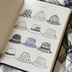
Hat Shapes and Head Fit Guide
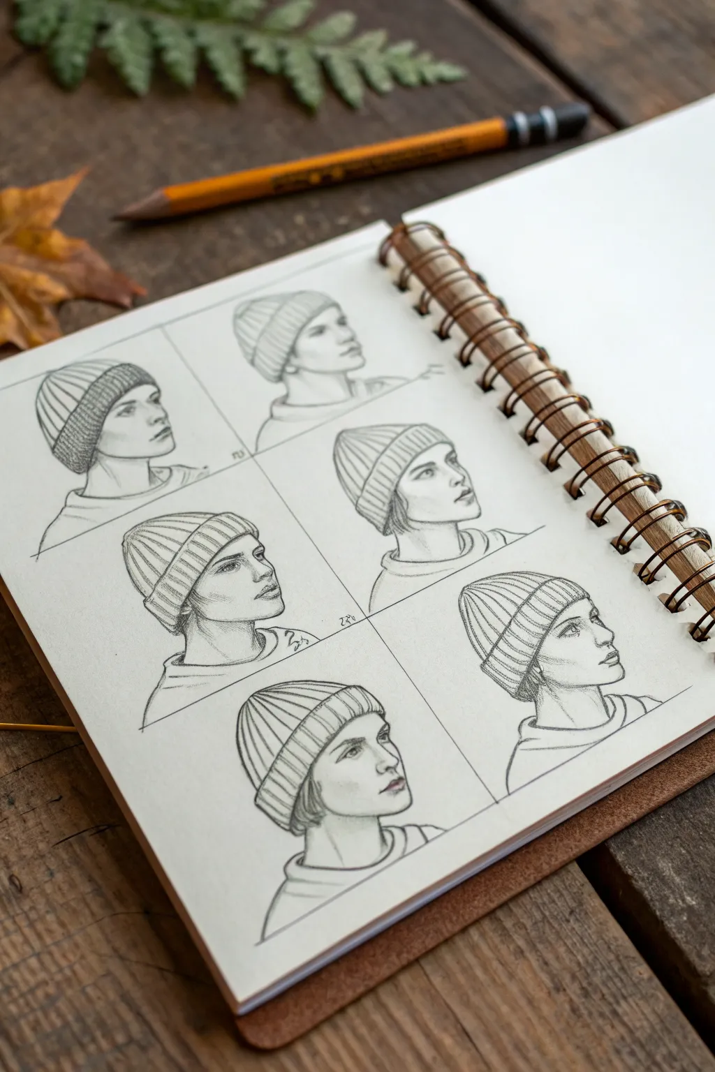
Learn to draw realistic knit hats and facial profiles by practicing this set of six head studies. This exercise focuses on how soft fabric drapes over skull anatomy and captures slight variations in head tilts.
Step-by-Step
Materials
- Sketchbook with smooth or medium-tooth paper (spiral bound shown)
- Graphite pencils (HB for sketching, 2B/4B for shading)
- Kneaded eraser
- Pencil sharpener
- Blending stump (optional)
- Ruler (optional for layout)
Step 1: Layout and Head Construction
-
Prepare the grid:
Start by lightly dividing your sketchbook page into a 2×3 grid using an HB pencil. You don’t need harsh lines; just faint guides to keep your six portraits evenly spaced and sized. -
Basic head shapes:
In the center of each grid box, lightly sketch a simple oval or specific cranial shape to represent the head. Keep these marks very faint, as the hats will eventually cover the top half of these shapes. -
Establish the necklines:
Add the neck and shoulder lines for each bust. Vary the angles slightly—some looking straight ahead, some tilting upward—to create the dynamic composition seen in the reference. -
Profile guidelines:
Draw a vertical centerline for the face and horizontal guidelines for the eyes, nose, and mouth. Since these are profiles, place the main vertical line close to the side edge of the oval. -
Sketching facial features:
Lightly block in the profiles. Focus on simple shapes for the nose, lips, and chin. Don’t worry about perfect realism yet; just get the proportions correct relative to the head size.
Volume Check
A common mistake is drawing the hat too tight. Always draw the full skull first, then add the hat ‘hovering’ slightly above it to show the fabric’s thickness.
Step 2: Defining the Hats
-
Positioning the brims:
Draw the bottom cuff of the beanie across the forehead, covering the ears. Curve this line around the cylindrical form of the head to show volume, rather than drawing a flat straight line. -
Building the crown geometry:
Sketch the top dome of the hat. Remember that a thick knit beanie sits *above* the skull, not directly on the scalp. Leave a gap between your initial head outline and the top of the hat to imply fabric thickness. -
Indicating the fold:
Draw the distinct separation line where the brim folds up over the main body of the hat. This fold usually sticks out slightly further than the rest of the hat. -
Adding ribbing guidelines:
Lightly sketch directional lines flowing from the brim upward toward the crown. These will guide your texture strokes later and ensure the knit pattern follows the curve of the head.
Flat Beanie Texture?
If your ribbing looks flat, ensure your texture lines curve around the form. If they are straight vertical lines, the hat will lose its roundness.
Step 3: Shading and Texture
-
Refine facial contours:
Switch to a slightly sharper pencil. Clean up the profile lines, defining the jawline, eyelids, and nostrils with confident strokes. I like to keep the facial shading minimal to let the line work stand out. -
Hair details:
Add small tufts of hair peeking out from under the beanie near the ears or nape of the neck. Keep these loose and wispy to contrast with the structure of the hat. -
Drawing the knit texture:
Use repetitive, closely spaced parallel lines to create the ribbing on the cuff. Follow the curve of the forehead—curving up at the edges and down in the center—to enhance the 3D effect. -
Refining the crown texture:
Repeat the texture on the upper part of the hat, but curve lines inward toward the top center point of the beanie, mimicking how the fabric gathers. -
Deepening shadows:
Use a 2B or 4B pencil to darken the deepest shadows: specifically under the brim of the hat, beneath the jaw, and in the folds of the fabric. -
Highlighting:
Use your kneaded eraser to tap or lift graphite from the center of the hat brim and the cheekbones. This creates a soft highlight that suggests a light source hitting the roundest forms. -
Defining the neckline:
Sketch the collar of the sweaters or shirts at the base of the neck. Use simple C-curves to suggest the dimension of the clothing opening. -
Final clean up:
Erase any remaining construction lines from your initial grid or the skulls beneath the hats. Reinforce the outer contour lines of the profiles for a crisp, finished look.
Step back and appreciate how simple linework can effectively communicate the weight and warmth of winter accessories
Hair Accessories: Clips, Bands, and Bows
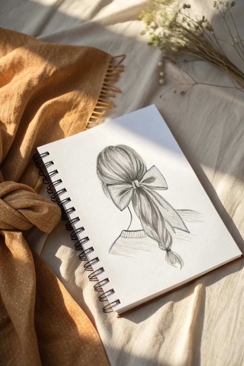
Capture the elegance of a classic hairstyle with this graphite study, focusing on the soft flow of hair strands and the crisp structure of a ribbon bow. This tutorial breaks down complex textures into simple strokes, creating a lovely, romantic sketch perfect for your daily journal.
How-To Guide
Materials
- Spiral-bound sketchbook (medium to smooth tooth)
- Graphite pencils (HB for sketching, 2B and 4B for shading)
- Kneaded eraser
- Precision mechanical eraser (optional for highlights)
- Blending stump or tortillon
- Pencil sharpener
Step 1: Drafting the Basic Shapes
-
Outline the head shape:
Begin with your HB pencil using very light pressure. distinct from the neck, draw a soft, rounded oval shape to represent the back of the head. Don’t worry about individual hairs yet; just focus on the volume. -
Position the bow:
About two-thirds of the way down the head shape, sketch the central knot of the bow as a small rectangle or tumbled square. This will be the anchor point for the entire hairstyle. -
Block in the loops and tails:
From the center knot, draw two large, triangular shapes flourishing outwards for the bow loops. Add two long, flowing ribbon tails draping downwards. Keep these lines loose to capture the movement of fabric. -
Define the ponytail flow:
Sketch the general direction of the hair gathering into the knot, and then the ponytail flowing out from underneath the bow. Curve the ponytail slightly to the right to give the drawing a natural, relaxed feel.
Uneven Shading?
If your hair texture looks too solid or flat, you likely over-blended. Go back in with a sharp 4B pencil to redraw individual dark strands and lift bold highlights with your eraser.
Step 2: Building Hair Texture
-
Establish the flow lines:
Switching to a slightly sharper point, draw long, sweeping curves that follow the contour of the skull, all converging towards the central bow knot. These primary lines act as a guide for the hair grain. -
Add density to the crown:
Using your 2B pencil, begin filling in the hair on the head with clusters of strokes. Vary your pressure to suggest depth—darker near the knot where hair is gathered tight, and lighter near the top where light reflects. -
Detail the ponytail:
For the hair beneath the bow, use long, undulating strokes. Group the strands into sections rather than drawing every single hair. Notice how the ponytail narrows near the bottom; indicate a hair tie or small band near the very end. -
Create the wispy ends:
At the bottom of the ponytail, let your pencil strokes flick outward quickly to create a feathered, realistic texture for the hair tips. -
Refine the shoulders:
Sketch the simple contour of the neck and the shoulders. Add a ribbed texture pattern (small vertical hash marks) to suggest a sweater neckline, which grounds the figure.
Step 3: Shading and Fabric Detail
-
Sculpt the bow loops:
Return to the bow with your 2B pencil. Shade the inner creases where the fabric folds into the knot. Leave the tops of the loops largely white to mimic the sheen of satin or stiff ribbon. -
Add dimension to the tails:
Draw faint vertical lines running down the length of the ribbon tails to show the fabric’s grain. Darken the edges of the ribbon to make it pop against the hair underneath. -
Deepen the shadows:
Switch to your 4B pencil fo the darkest areas. I like to focus specifically on the area directly under the bow loops and inside the deepest folds of the ribbon knot for maximum contrast. -
Enhance hair separation:
Use the dark 4B pencil to add thin, sharp lines between the major clumps of hair in the ponytail. This negative space convinces the eye that there are layers of depth. -
Blend softly:
Take your blending stump and very gently smudge the mid-tones of the hair. Do not over-blend; you want to maintain the linear texture, just soften the transitions between light and dark. -
Lift the highlights:
Using the sharp edge of a kneaded eraser or a mechanical eraser, stroke through the hair on the crown of the head and the highest point of the ponytail to pick up graphite. This creates a brilliant shine. -
Final touches:
Reinforce the outer outline of the bow and the silhouette of the hairstyle with a crisp, dark line to clean up the edges and complete the sketch.
Try a Pattern
Customize the accessory by adding a pattern to the bow. Small polka dots, plaid grids, or floral motifs can be drawn lightly over the shaded ribbon to change the character of the piece.
Take a moment to admire the flow of the lines and the softness of the shading you have achieved
BRUSH GUIDE
The Right Brush for Every Stroke
From clean lines to bold texture — master brush choice, stroke control, and essential techniques.
Explore the Full Guide
Scarves and Neck Wrap Folds
Capture the intricate details of textile patterns and the structured flow of clothing folds in this sketchbook study. This project combines close-up texture swatches with a stylistic figure drawing to explore how fabric behaves and looks.
Step-by-Step Guide
Materials
- Wire-bound sketchbook (A4 or similar size)
- Fine liner pens (0.1mm, 0.3mm, 0.5mm)
- HB or 2B graphite pencil
- Eraser (kneaded or soft vinyl)
- Ruler
Step 1: Planning the Layout
-
Define the grid:
On the left page, use your ruler and pencil to lightly draw a 2×3 grid. These six rectangles will house your texture studies. Aim for boxes about 2-3 inches square with even spacing between them. -
Frame the figure:
On the right page, lightly sketch a tall, narrow rectangular frame in the center. This will act as the boundary for your outfit drawing, giving the page a clean, editorial look. -
Ghost in the subject:
Inside the right-hand frame, lightly pencil in the basic shapes of legs and feet. Since the focus is on the clothing, you only need to draw from the waist down.
Clean Lines
When drawing long coat lines, lock your wrist and move your entire arm from the shoulder. This prevents shaky lines and creates that confident ‘fashion illustration’ look.
Step 2: Drawing the Outfit
-
Draft the coat shape:
Sketch a long coat or tunic shape over the legs. Focus on straight, vertical lines to suggest a heavy material that hangs well. Let the hem hit just below the calf. -
Add the footwear:
Draw boots on the feet. Sketch the laces using crisscross patterns and define the sole. The boots ground the figure, so give them a solid, slightly chunky silhouette. -
Ink the outlines:
Switch to a 0.3mm or 0.5mm fine liner. Go over your pencil lines for the coat and boots. Use confident, continuous strokes for the long vertical lines of the clothing. -
Add fold details:
With a finer pen (0.1mm), add small vertical lines near the waist and hem to suggest pleats or gentle gathering. Don’t overdo it; keep the lines sparse to maintain a clean aesthetic. -
Ground the figure:
Draw horizontal scribbles beneath the feet within the frame to create a shadow or floor, giving the figure a sense of place so it isn’t floating.
Step 3: Detailing the Texture Swatches
-
Select your motifs:
For the left page, choose six different fabric patterns or nature textures to analyze. The example uses organic, leafy, and floral motifs similar to the scarf. -
Ink the frames:
Use your thicker pen and ruler to ink the borders of your six grid boxes. This makes them pop against the white page. -
Sketch the first textures:
In the top two boxes, draw diagonal compositions. Imagine zooming in on a specific part of a leaf or a paisley pattern. Focus on the veins and outlines. -
Vary the density:
For the middle boxes, try a slightly denser pattern. I find that alternating between simple lines and complex cross-hatching helps balance the visual weight of the page. -
Complete the bottom row:
Fill the final two boxes with larger, more abstract shapes. Think of crumpled fabric or zoomed-in knit textures. -
Refine with hatching:
Go back through all six boxes with your 0.1mm pen to add shading. Use hatching (parallel lines) to create depth inside the leaves and pattern segments.
Add Color Accents
Use a single colored pencil (like teal or ochre) to lightly shade specific areas in your texture boxes or the boots to tie the sketch to a real-life accessory.
Step 4: Final Touches
-
Erase guidelines:
Once the ink is completely dry—give it a full minute—gently erase all underlying pencil marks from both pages. -
Add subtle text:
If you wish, add tiny, neat annotations or dates at the very bottom corner of the pages using your thinnest pen.
Now you have a stylish study page that effectively breaks down complex patterns into manageable art.
Belts and Buckles With Detail Variations
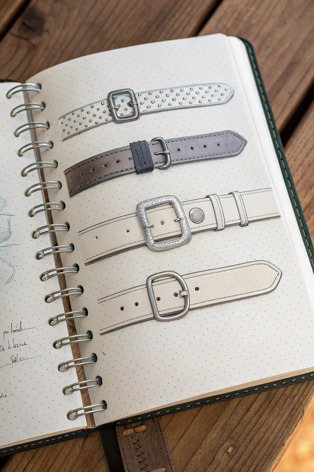
Learn to render four distinct styles of leather watch straps using alcohol markers and fineliners. This project focuses on texture, lighting effects, and metallic finishes to bring accessories to life on dotted grid paper.
Detailed Instructions
Materials
- Dotted grid sketchbook or mixed media paper
- Mechanical pencil (0.5mm, HB lead)
- Kneaded eraser
- Black fineliners (0.1, 0.3, and 0.5mm)
- Cool Grey alcohol markers (C1, C3, C5, C7)
- Warm Grey alcohol markers (W1, W3)
- White gel pen (0.8mm or 1.0mm)
- Ruler
Step 1: Drafting the Outlines
-
Set vertical guides:
Begin by establishing the width of your straps. Use the dots on your grid paper to ensure uniform width for all four straps, spacing them evenly down the page. -
Sketch the top strap (Ostrich):
Draw the basic rectangular shape for the first strap. Sketch a rectangular buckle at the left end. Lightly pencil in small, staggered circles across the surface to represent the quill bumps of ostrich leather. -
Sketch the second strap (Smooth):
Below the first, draw a slightly tapered strap shape ending in a point. Add a rectangular keeper loop (the piece that holds the excess strap) near the buckle. Mark lines along the edges for stitching. -
Sketch the third strap (Wide Buckle):
Create a wider strap design. Draw a large, square buckle with rounded corners. Add two keeper loops to the right of the buckle and a circular rivet detail between them. -
Sketch the bottom strap (Canvas/Suede):
Draw the final strap with a rounded poin at the end. Sketch a simple D-shaped buckle. Keep the lines clean and minimal.
Fixing Bleeds
If your marker bleeds outside the lines, wait for it to dry completely. Then use your white gel pen to ‘paint’ over the unexpected ink, essentially whiting it out.
Step 2: Inking and Base Colors
-
Refine with fineliners:
Go over your pencil outlines with a 0.3mm fineliner. Use a ruler for the straight edges of the straps but freehand the curves of the buckles to keep them looking organic. -
Ink the holes and details:
Use a 0.1mm pen to draw the adjustment holes on the straps. Ink the stitching lines on the second and bottom straps with broken, dashed lines. -
Base coat the top strap:
Apply a very light cool grey (C1) over the first strap, leaving small white highlights on the tops of the ‘bumps’ you sketched earlier. -
Color the middle straps:
For the second strap, use a medium grey (C3 or C5) for the main leather and a darker grey (C7) for the keeper loop. For the third strap, leave it mostly the paper’s white color or use a subtle W1 warm grey for a creamy look. -
Base coat the bottom strap:
Apply a light warm grey (W1) to the bottom strap to suggest a canvas or suede texture.
Step 3: Shading and Texture
-
Shade the ostrich texture:
On the top strap, take a C3 marker and dab shadows underneath each little bump circle. This creates immediate dimension. -
Add depth to the grey strap:
On the second strap, use your C5 marker to darken the edges, creating a cylindrical form. Blend towards the center. I find it helpful to wait a moment for the ink to settle before blending. -
Render metallic buckles:
For all buckles, map out high-contrast reflections. Leave strip of white paper for the highlight, then place a dark grey (C7) right next to it, blending out to a mid-tone grey. This mimics chrome. -
Detail the crystal buckle:
For the third strap’s large buckle, stipple tiny dots of dark grey to suggest a paved crystal or textured metal surface.
Add Cast Shadows
To make the straps lift off the page, draw a thin, soft grey shadow running parallel underneath each strap, slightly offset to the right.
Step 4: Final Highlights
-
Add bright whites:
Use your white gel pen to add sharp highlights on the metal buckles, rivet, and the tongue of the buckles. -
Enhance the texture:
Dot the white gel pen onto the top of the ostrich bumps on the first strap to make them pop. -
Finalize stitching:
Run the white gel pen lightly over the stitching areas on the darker grey strap to make the thread look distinct.
Enjoy admiring your collection of highly detailed accessories rendered right in your sketchbook


Bags and Purses From Three Angles
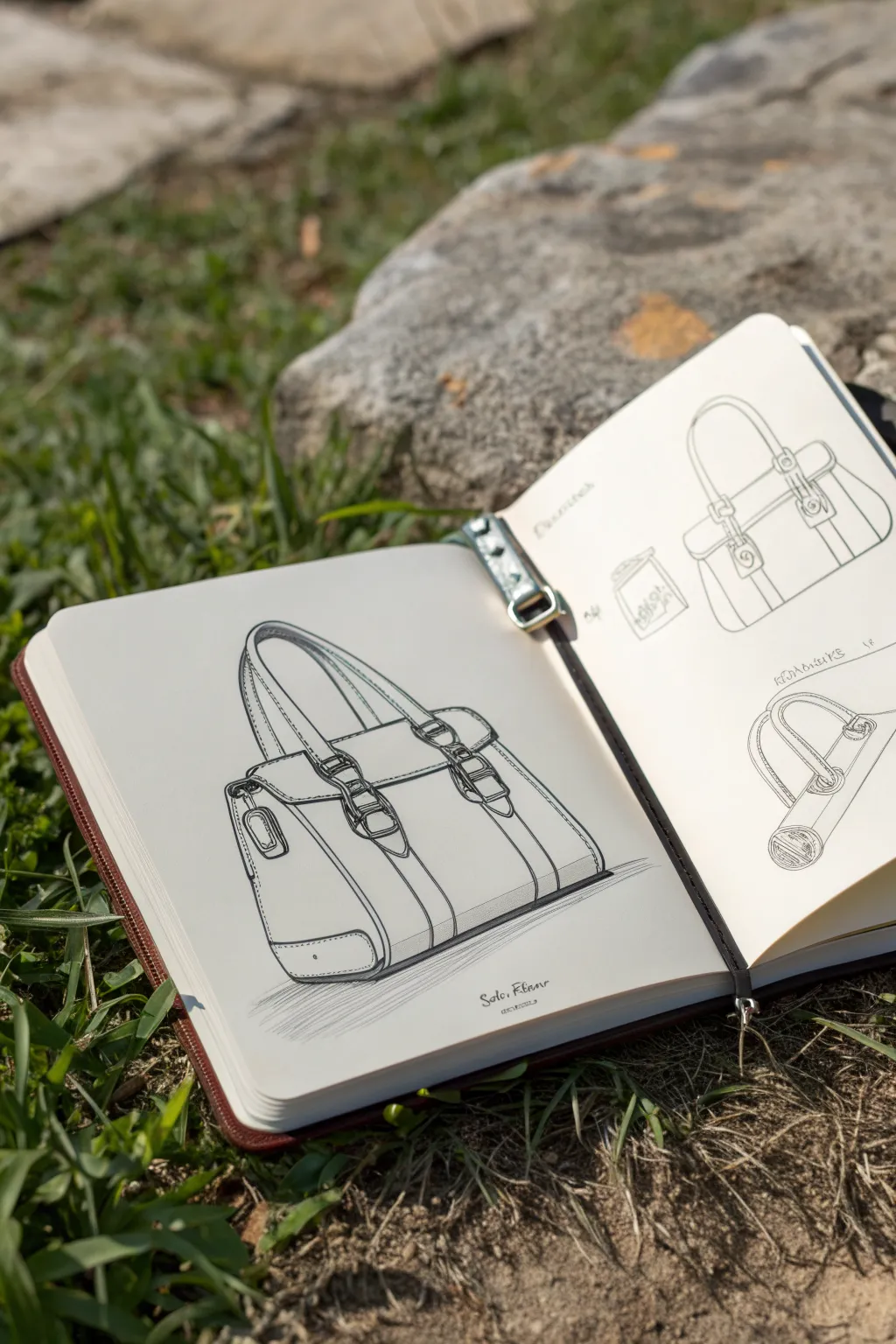
Master the art of technical fashion illustration with this detailed guide on sketching a structured handbag. You will learn to construct form, add realistic hardware details, and use hatching techniques to bring depth to your design.
Step-by-Step
Materials
- Sketchbook with smooth, heavy-weight paper
- HB or 2B pencil for initial guidelines
- Fine liner pens (0.1mm, 0.3mm, and 0.5mm)
- Kneaded eraser
- Ruler or straight edge
Step 1: Structural Foundation
-
Establish the horizon line:
Begin by lightly marking a horizon line across your page to determine the viewer’s eye level. For this bag, place it slightly above the center so we look down onto the object. -
Draft the main box form:
Using your pencil and ruler, draw a rectangular prism (a 3D box) in two-point perspective. The front face should be larger, angling slightly away to the right, while the side panel angles sharply to the left. -
Define the bag’s taper:
Modify your box by slightly angling the side vertical lines inward as they go up. Most handbags aren’t perfect rectangles; they taper toward the opening. -
Sketch the flap and opening:
Draw a curved line across the upper third of the front panel to indicate the bag’s flap. Ensure this curve wraps around the side perspective lines to show volume.
Wobbly Lines?
If your long lines look shaky, try drawing from your shoulder rather than your wrist. You can also use a ruler for the inking phase, but skip slight sections to keep the look organic.
Step 2: Adding Details and Hardware
-
Position the straps:
Lightly sketch two parallel bands running vertically down the front of the bag. These will become the structural straps. -
Draw the buckles:
Where the flap meets the vertical straps, sketch the buckle shapes. Use simple ovals and rectangles first to get the placement right before refining the metal prongs. -
Form the handle:
Arch a handle over the top. Start with a single centerline to get the curve right, then thicken it by drawing lines on either side, ensuring it connects visibly to the back of the bag. -
Refine the side profile:
On the left side panel, draw the small metal attachment loop and the reinforcing leather patch near the bottom corner. -
Soften the edges:
Go over your rigid geometric lines and soften the corners. Leather is pliable, so round off the bottom corners of the bag and the edges of the flap.
Creative Twist
Instead of hatching, use stippling (tiny dots) for shadows to create a suede texture, or use a gray alcohol marker for the shading to give the bag a smooth, modern leather look.
Step 3: Inking and Definition
-
Ink the main outlines:
Switch to your 0.5mm fine liner. Carefully trace over your finalized pencil lines for the outer silhouette of the bag. Keep your hand steady but allow for slight line width variation to suggest weight. -
Detail the stitching:
With a thinner 0.1mm pen, draw dashes along the edges of the straps, flap, and handle. Keep the spacing consistent to mimic machine stitching. -
Define the hardware:
Ink the buckles and metal loops. Leave tiny white gaps or breaks in the ink line on the curved metal parts to suggest a high-shine reflection. -
Erase pencil guides:
Once the ink is completely dry, gently run your kneaded eraser over the entire drawing to lift away the graphite construction lines.
Step 4: Shading and Texture
-
Add drop shadow:
Using the 0.3mm pen, hatch a series of parallel diagonal lines underneath the bag. I find it helpful to fade these lines out as they move away from the object to anchor it to the ground. -
Shade the side panel:
Apply vertical hatching lines to the side panel of the bag. Since this side is turning away from the light source, it should appear darker than the front. -
Enhance depth under the flap:
Add small, tight hatching lines right underneath the edge of the flap and behind the straps to create a cast shadow effect. -
Texture the leather:
Add very sparse, broken lines on the roundest parts of the bag handle and the bottom corners to suggest the subtle grain of the leather without overworking it. -
Final contrast check:
Look for the darkest areas—usually the deep recesses inside buckles or the bottom edges—and darken them with a second pass of hatching to make the drawing pop.
Now you have a professional-looking fashion illustration ready to be the star of your portfolio
Gloves and Hand Accessories Study
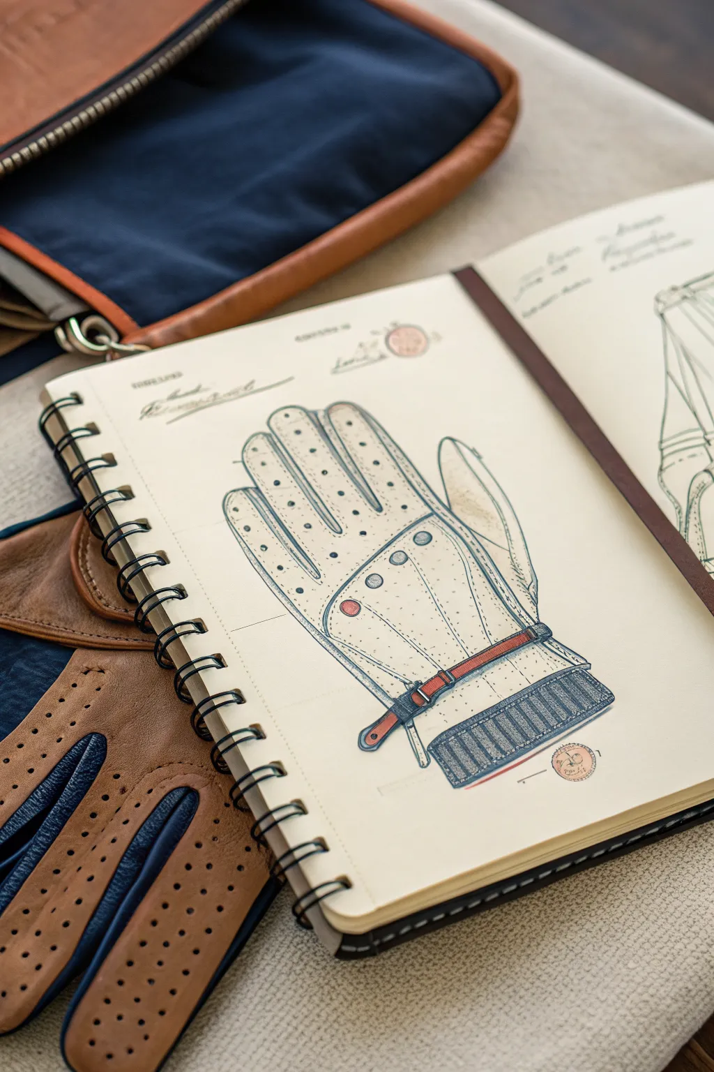
Capture the timeless elegance of classic motoring accessories with this detailed technical study of a driving glove. This project combines precise line work with subtle shading to create a professional design illustration that feels both engineered and artistic.
Step-by-Step
Materials
- Spiral-bound sketchbook (cream or off-white paper)
- H lead pencil for preliminary sketching
- Fine liner pens (0.1mm, 0.3mm, 0.5mm, black)
- Colored pencils (red, brown, grey, light blue)
- Ruler
- Eraser
Step 1: Drafting the Structure
-
Establish the bounding box:
Begin by lightly tracing a rectangular shape with your H pencil to define the overall size of the glove on the page. Leave extra space at the bottom for the cuff. -
Block in the fingers:
Divide the top section of your rectangle into four vertical columns. Sketch rounded finger shapes, keeping the middle finger longest and the pinky shortest, mirroring your own hand’s proportions. -
Add the thumb:
Draw the thumb extending from the lower right side of the palm area, angling it slightly outward as if the glove is lying flat. -
Refine the silhouette:
Go over your blocked shapes to create a smooth, continuous outline. Note how the fabric curves between the fingers rather than meeting at sharp points.
Clean Circles
For the knuckle vents and snap buttons, use a circle template or a stencil if you have a shaky hand. Perfect circles make the drawing look like a professional technical schematic.
Step 2: Detailing the Design
-
Mark the keyholes and knuckle vents:
Lightly sketch the large, distinctive keyhole opening on the back of the hand. Add the row of four circular knuckle vents just below the finger joints. -
Draft the wrist strap:
Draw a horizontal band across the wrist area. Add the closure tab extending to the left, and include the small buckle hardware on the right side. -
Create the ribbed cuff:
At the very bottom, draw a wide rectangular band. Fill this with vertical lines to represent the elasticated ribbing usually found on these gloves. -
Map the perforation pattern:
Using your ruler as a guide if needed, mark light center lines down each finger. Along these lines, mark evenly spaced dots where the ventilation holes will go.
Aged Paper Look
Before drawing, lightly wash your paper with diluted tea or coffee and let it dry. This gives the page an authentic vintage patent aesthetic that suits this subject perfectly.
Step 3: Inking and Definition
-
Ink the main outline:
Switch to your 0.5mm fine liner. Carefully trace the outer silhouette of the glove. Use confident, single strokes rather than feathery lines for a clean technical look. -
Define the seams:
Use the 0.3mm pen to draw the internal stitching lines. Draw these parallel to the finger outlines, staying just inside the edge to show the seam allowance. -
Ink the perforations:
With the 0.1mm pen, carefully ink the small circles down the fingers. I find that drawing tiny circles is often cleaner than just dotting the pen, as it gives the holes dimension. -
Detail the stitching:
Add small, evenly spaced dash marks along all your seam lines to represent the thread. Keep the rhythm consistent to mimic machine sewing. -
Texture the cuff:
Go back to the ribbed cuff section. Use vertical hatching lines to create shadow and depth in the grooves of the elastic fabric.
Step 4: Color and Finish
-
Color the strap accents:
Use a brown or rust-red colored pencil to fill in the wrist strap. Press firmly for the strap itself but fade out slightly at the edges to show roundness. -
Add metallic touches:
Color the snap button and the knuckle vents with a light grey pencil. Leave a tiny white spot on each to represent a metallic reflection. -
Shade the leather:
Very lightly shade the sides of the fingers and the palm area with a pale cream or light grey pencil to suggest the volume of the leather. -
Include technical notes:
To enhance the ‘design study’ aesthetic, write small notes or measurements near the cuff using a cursive or architect-style script. -
Stamp seal (Optional):
Draw a small circle in the corner and sketch a faint logo inside using reddish-brown pencil to mimic a wax seal or approval stamp.
Now you have a sophisticated rendering that pays homage to classic automotive style
Shoe Accessories: Laces, Buckles, and Charms
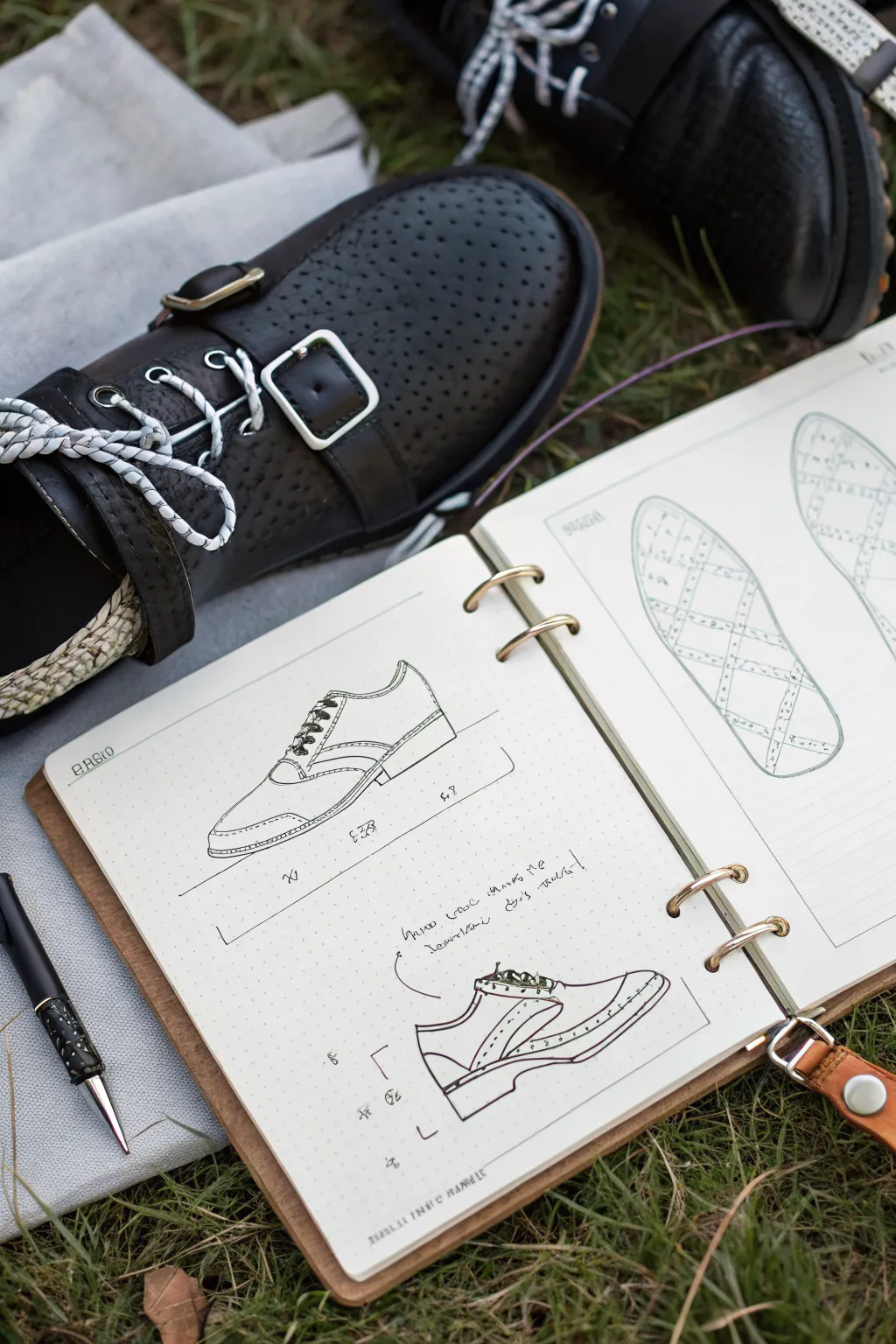
Capture the essence of footwear design with this detailed tutorial on creating technical shoe sketches. You will learn to draw precise side profiles and sole patterns, mimicking the professional look of a designer’s notebook.
Step-by-Step Tutorial
Materials
- A5 or A4 sketchbook with dotted or grid paper
- Fine liner pen (0.3mm or 0.5mm, black)
- Mechanical pencil (HB or B)
- Eraser
- Ruler
- Reference shoe (optional but helpful)
Step 1: Planning the Layout
-
Prepare your workspace:
Begin with an open sketchbook, preferably one with a dotted grid to help with proportions. Ensure you have a clear view of both the left and right pages. -
Draft the top profile layout:
On the left page, use your mechanical pencil to lightly mark a horizontal baseline about a third of the way down the page. This will be the ground line for your primary shoe profile. -
Draft the bottom profile layout:
Mark a second baseline near the bottom third of the page for the secondary, more detailed construction sketch.
Step 2: Drawing the Primary Profile
-
Outline the silhouette:
Lightly sketch the overall shape of the shoe on the top baseline. Start with the heel curve, move along the dipping ankle line, and sweep down to the toe box. Keep your pencil strokes faint so they can be erased later. -
Define the sole unit:
Draw the thickness of the sole. Add a small heel block if the design calls for it, ensuring the bottom line is perfectly flat against your baseline guide. -
Add construction lines:
Sketch the internal lines that define the shoe’s panels—the toe cap, the eyelet tab (where laces go), and the heel counter. These should follow the curvature of the shoe’s form. -
Sketch the lacing system:
Draw small, angled shapes for the laces crisscrossing the tongue area. Don’t worry about perfect detail yet; just capture the rhythm of the laces. -
Ink the primary profile:
Using your fine liner, go over your pencil lines. Use confident, single strokes for long lines like the sole. For the upper stitching details, use broken or dashed lines to represent thread.
Wobbly Lines?
If your long lines are shaky, try drawing from your shoulder rather than your wrist, or use a ruler for the straightest sections of the sole.
Step 3: Drawing the Technical Breakdown
-
Sketch the lower shoe profile:
On the bottom baseline, repeat the silhouette process but focus on a slightly different angle or emphasis, perhaps showing a cutaway or specific stitching detail. -
Emphasize construction points:
Draw small arrows or callout lines pointing to specific features like the collar padding or the welt stitching. -
Add handwritten notes:
Scribble some design notes near the callout lines. It doesn’t need to be legible text if you’re just going for the aesthetic—loose, cursive loops mimic the look of quick designer thoughts. -
Ink the breakdown sketch:
Ink this drawing with a slightly looser hand than the top one. I like to let lines overlap slightly here to give it that ‘work in progress’ energy.
Add Realistic Texture
Use stippling (lots of tiny dots) on the leather parts of the shoe drawing to mimic the perforated texture seen in the reference photo.
Step 4: Designing the Sole Patterns
-
Outline the sole shape:
On the right-hand page, draw two long ovals that mimic the footprint of a shoe. One can represent the left foot and the other the right, or just different design variations. -
Create the grid pattern:
Lightly pencil a diamond or grid pattern across the entire interior of the sole outline. Use your ruler if you want it mechanically precise. -
Detail the tread:
Ink the grid lines. You can make the lines double-width or add small dots inside the diamonds to suggest texture or grip nodes. -
Add dimension:
Thicken the outer boundary line of the sole to suggest the rubber’s edge. This adds weight to the drawing.
Step 5: Final Touches
-
Erase pencil marks:
Once the ink is completely dry, gently erase all underlying pencil sketches to clean up the page. -
Add measurement lines:
Draw thin, straight lines with dimension markers (like ‘<--->‘) below the profiles to simulate technical specifications. -
Review and refine:
Check for any line weight inconsistencies. You might want to thicken the ground line to firmly plant the shoe on the page.
Now you have a professional-looking design spread ready to be filled with your next creative idea
Layered Accessories on a Character Turnaround
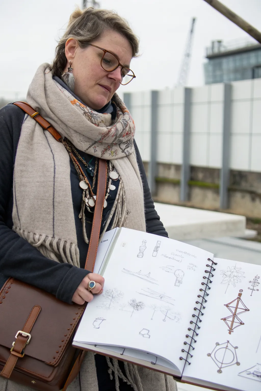
Capture the raw energy of initial ideas with this tutorial on creating a concept sketchbook spread. You’ll learn how to balance loose graphite brainstorming with structured, inked diagrams to showcase your design evolution.
How-To Guide
Materials
- A4 Spiral-bound sketchbook (heavyweight mixed media paper)
- H or HB graphite pencil for underdrawings
- B or 2B graphite pencil for shading
- Fine liner pens (0.1mm, 0.3mm, 0.5mm, black)
- Brown or sepia fineliner or colored pencil (optional for contrast)
- Kneaded eraser
- Ruler or straight edge (optional)
Step 1: Loose Concepting (Left Page)
-
Establish the horizon:
Begin on the left page by lightly sketching a few horizontal lines using your H pencil to stabilize your composition. These don’t need to be perfectly straight; they act as a ground plane for your objects. -
Draft basic volumes:
Visualize your accessories or objects as simple geometric shapes—cylinders, cubes, and spheres. Sketch these shapes lightly, focusing on their mass rather than details. -
Add organic elements:
For the tree-like structures seen in the reference, use loose, scribbled circular motions to suggest foliage. Keep your hand relaxed to maintain a sketchy, energetic feel. -
Refine the forms:
Switch to a slightly softer B pencil. Go over your geometric shapes, darkening the contour lines that define the object’s true edge. Leave construction lines visible; they add character to a concept sketch. -
Annotate ideas:
Write short notes or labels next to specific elements using a quick, architectural handwriting style. These notes explain function or material and fill negative space effectively. -
Create small vignettes:
Scatter smaller, isolated draw-overs of specific details—like a lantern top or a joint connection—around the main sketches to show zoomed-in thinking.
Smudge Control
Place a scrap piece of paper under your drawing hand. This acts as a shield, preventing oils from your skin from smearing your fresh graphite or ink work.
Step 2: Structured Diagrams (Right Page)
-
Plan the layout:
On the facing page, plan for fewer, more detailed drawings. Lightly block out the positions for three or four vertical structures using your H pencil. -
Draw the central axis:
For symmetrical objects like the totems or fixtures shown, draw a vertical centerline first. This ensures your design remains balanced as you build outwards. -
Build the framework:
Sketch the primary diamond or triangular shapes that make up the body of the accessory. Keep these lines light until you are happy with the proportions. -
Ink the outlines:
Pick up a 0.3mm or 0.5mm pen. Carefully trace your pencil lines, committing to the shape. I personally prefer a sepia or brown ink here for a vintage technical drawing aesthetic, though black works perfectly too. -
Add weight to joints:
Thicken the lines where structural elements meet. Drawing small circles or dots at these intersections mimics rivets or knots, adding instant mechanical believability. -
Detail with fine lines:
Switch to your finest 0.1mm pen. Add interior details like cross-bracing, wire tension lines, or texture hatching inside the main shapes. -
Circle motifs:
The reference features prominent circular designs. Use a compass or a steady hand to ink these circles cleanly, overlapping them with the linear structures for visual interest. -
Erase construction lines:
Once the ink is completely dry—give it a few minutes to be safe—gently roll your kneaded eraser over the page to lift the graphite guidelines without damaging the paper surface.
Make it Pop
Use a white gel pen to add small highlights on the inked joints or metallic parts. This tiny addition of contrast makes the diagram look three-dimensional.
Now you have a professional-looking concept spread that beautifully communicates both loose ideas and refined mechanics.
Accessory Theme Packs for Instant Style
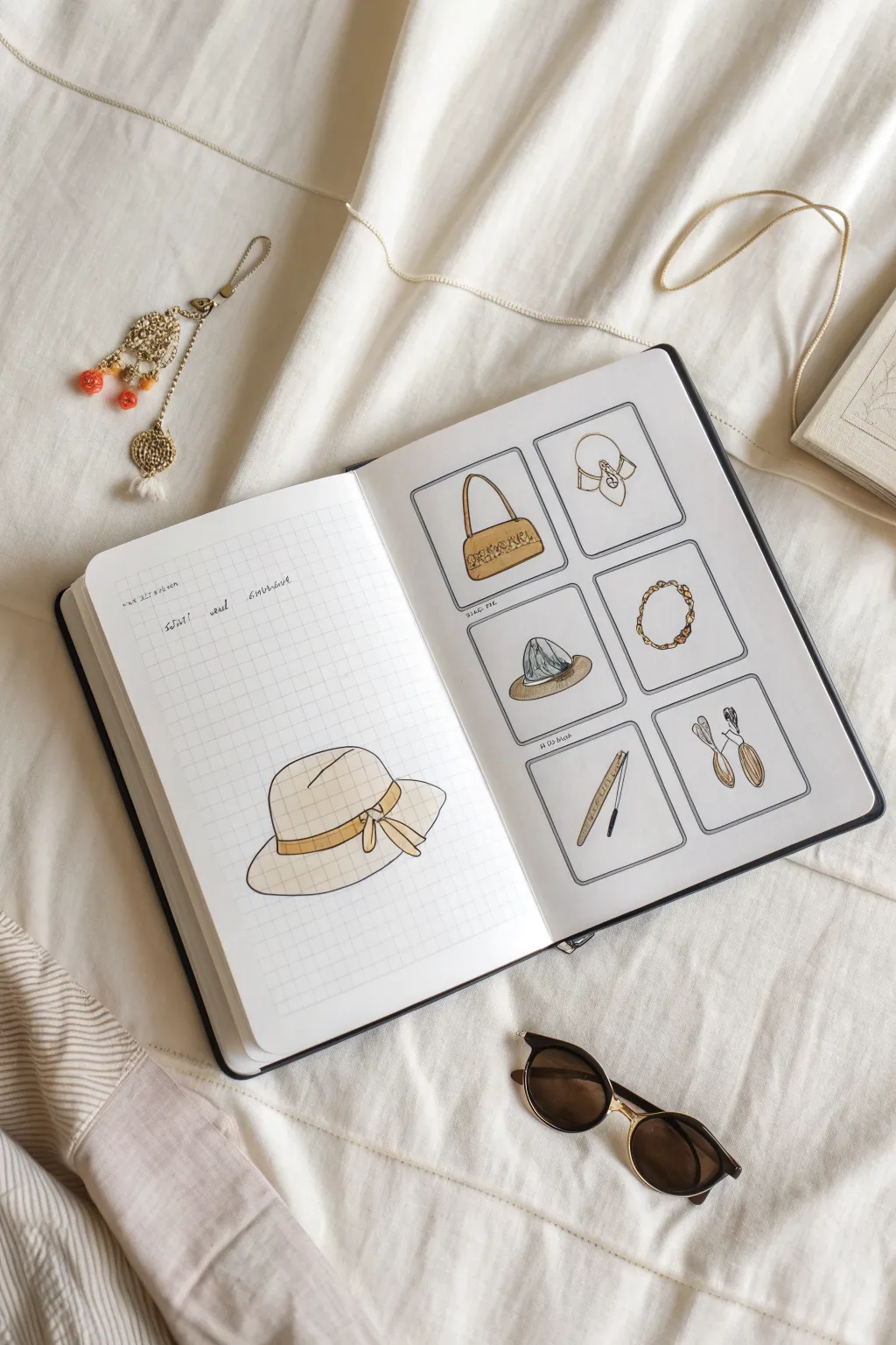
Capture the essence of your style with this structured yet whimsical sketchbook layout featuring a curated collection of fashion accessories. The spread combines a focal point illustration on the left with a neat gallery of thumbnail sketches on the right, perfect for exploring different textures and shapes.
Step-by-Step Tutorial
Materials
- A5 Sketchbook or Bullet Journal (Grid paper on one side preferred, or draw your own)
- Fine liner pens (0.1mm, 0.3mm, and 0.5mm)
- Pencil (HB or H for sketching)
- Eraser (kneaded preferred)
- Colored pencils or mild markers (tan, light brown, grey, gold)
- Ruler
Step 1: Setting the Layout
-
Prepare your pages:
Open your sketchbook to a fresh spread. If your book isn’t already grid-lined on the left, you can lightly sketch a grid background or leave it plain for a cleaner look. -
Draft the gallery frames:
On the right-hand page, use a ruler and pencil to measure out six equal squares. Arrange them in two columns of three. Leave spacious margins between them to mimic a Polaroid or gallery wall effect. -
Ink the frames:
Trace over your pencil squares with a 0.5mm fine liner. Go slowly to keep the lines clean, or use rounded corners for a softer, less rigid aesthetic. Let the ink dry completely before erasing any pencil guides.
Wobbly Frame Lines?
Don’t stress if your boxes aren’t perfect squares. Retrace the lines loosely a second time to create a deliberately ‘sketchy’ double-line border that hides mistakes.
Step 2: The Focal Point: Wide-Brim Hat
-
Sketch the crown:
On the left page, start drawing a sun hat. Begin with the crown (the top part), drawing a rounded dome shape that sits slightly off-center on the lower half of the page. -
Add the brim and ribbon:
Draw the wide brim extending outwards, using a slightly wavy line to suggest soft material. Sketch a band around the base of the crown and add a floppy bow on the right side. -
Refine the line art:
Go over your sketch using a 0.3mm pen. Keep the lines for the hat itself fairly consistent, but you can use broken lines on the brim edge to imply texture. -
Apply base color:
Using a light cream or beige marker or pencil, color the entire hat. Keep the strokes in one direction to maintain a neat appearance. -
Add pattern details:
Once the base is dry, take a fine brown pen and draw a loose plaid or grid pattern over the hat to match the reference. Follow the curve of the hat’s form with your lines to create volume. -
Color the ribbon:
Fill in the hatband and bow with a darker shade, like mustard yellow or gold, to make it pop against the neutral hat.
Level Up: Fabric Swatches
Glue actual tiny snippets of fabric or ribbon next to your drawings to create a mixed-media mood board that captures real textures alongside your art.
Step 3: The Gallery Collection
-
Sketch the thumbnails:
Move to the right page. In each box, lightly sketch a different accessory. Top row: a structured handbag and a tied neck scarf. Middle row: a bucket hat and a chain necklace. Bottom row: a drafting tool or pen and a pair of drop earrings. -
Ink the handbag:
Outline the bag with a 0.1mm pen. Add tiny details like the stitching or buckle. Color it with a warm tan shade. -
Detail the scarf:
Draw the folds of the scarf using fluid lines. Leave the majority white or very pale, but add small accents in gold or brown at the knot. -
Texture the bucket hat:
For the middle-left box, draw the bucket hat. Use quick, short strokes with a grey pencil to mimic a denim or heavy fabric texture. -
Draw the chain:
For the necklace, draw small interlocking ovals. I like to dot a little yellow or gold ink on random links to simulate light catching the metal. -
Define the bottom accessories:
Ink the drafting tool and earrings in the final row. These objects are slender, so keep your pen pressure very light. -
Add shading:
Use a light grey marker or pencil to add drop shadows underneath each item inside the boxes. This grounds the illustrations and stops them from feeling like they are floating.
Step 4: Finishing Touches
-
Lettering:
Above the large hat on the left page, write a few descriptive words or the date in a small, cursive script. Beneath each box on the right, you can add tiny captions like ‘silk scarf’ or ‘gold chain’. -
Final clean up:
Wait at least five minutes to ensure all ink is dry, then gently erase any remaining pencil sketches across the entire spread.
Now you have a stylish visual inventory of your favorite accessories ready to inspire your next outfit
Tiny Accessory Icons for Sticker Sheets
These charming, bite-sized icons are perfect for decorating your bullet journal or creating custom sticker sheets. The clean, monoline style makes them accessible for beginners while looking polished and professional on the page.
Step-by-Step
Materials
- A5 dot grid notebook or dotted paper
- Fine liner pen (0.3mm or 0.5mm is ideal)
- Pencil (HB or 2H)
- Good quality eraser
- Ruler (optional, for spacing)
Step 1: Preparation and Planning
-
Grid Layout:
Begin by mentally dividing your dot grid page into invisible rows. Use the dots as anchors, leaving about 2-3 dot spaces between each icon horizontally and 2-3 rows between them vertically. This breathing room is crucial for the clean aesthetic. -
Pencil Sketching:
Using a light hand, sketch the basic geometric shapes for each icon. For round items like the hoop or camera lens, focus on centering them within a 4-dot square area.
Steady Hands Tip
Exhale slowly while drawing long curves or circles. This stabilizes your hand and prevents the shaky lines common when holding your breath.
Step 2: Row 1: Simple Shapes
-
Embroidery Hoop:
Draw the embroidery hoop as two concentric circles. Add a tiny semi-circle and loop at the very top for the screw mechanism. -
Crown & Star:
Sketch a simple three-point crown next. Follow this with a classic five-point star, keeping the lines crisp and unconnected in the center for a modern look. -
Leaf Heart:
Draw a heart shape, but split it down the middle with a vertical line. Add small diagonal veins to transform the lobes into two leaves meeting at a stem.
Level Up: Sticker Time
Draw these on adhesive sticker paper instead of a notebook. Color them with markers, cut them out, and you have a custom sticker sheet for your planner.
Step 3: Row 2: Fashion Items
-
Round Glasses:
Create two perfect circles spaced slightly apart. Connect them with a small arch for the bridge and add small lines extending outward for the temples. -
Pocket Watch:
Draw a circle with a small loop on top. Inside the circle, add a smaller, messy scribbled circle to represent the complex gear mechanism without drawing actual gears. -
Cherry Charms:
Draw an inverted ‘V’ shape for stems, ending in small solid black circles. Add a small loop at the intersect to make it look like a hanging charm. -
Tote Bag:
Outline a square tote bag. Add a heart in the center and a large arch handle on top. I find drawing the handle first helps center the bag body.
Step 4: Row 3: Detailed Objects
-
Stacked Hat:
Draw a winter hat with a pom-pom on top. Add horizontal stripes across the body of the hat to suggest a ribbed texture. -
Hourglass:
Create two triangles touching at their points vertically. Close the top and bottom with flat rectangles for the wooden stands. -
Business Bag:
Draw a structured rectangular bag with a flap. Add a small buckle detail and a short, curved handle on top. -
Bow Tie:
Start with a small square knot, then flare out two triangles to the left and right. Add a line inside each triangle to show the fabric fold.
Step 5: Row 4: Capture & Celebrate
-
Vinyl Record:
Draw a large circle with a much smaller circle in the exact center to create a vinyl record icon. -
Camera:
Outline a rectangle with rounded corners. Place a large circle in the middle for the lens, adding a smaller circle inside it. top it off with a shutter button and flash box. -
Ginkgo Leaf:
Draw a thin stem blossoming into a fan shape. Add vertical lines radiating from the stem base to the fan edge for texture. -
Gift Box:
Sketch a 3D cube or flat square. Draw a cross to represent ribbon, and top it with a fluffy two-loop bow.
Step 6: Row 5: Finishing Touches
-
Striped Bag:
Draw a tote bag similar to the earlier one, but fill the body with vertical stripes. Keep the lines evenly spaced. -
Stopwatch:
Create a circle with a double rim. Mark tiny dashes for numbers and add two hands pointing to a specific time. -
Botanical Branch:
Draw a central curved stem. Populate it with small, pointed oval leaves on alternating sides, getting smaller toward the tip. -
Inking:
Once satisfied with all pencil sketches, go over them with your fine liner. Keep your wrist steady and rotate the notebook if it helps with curves. -
Clean Up:
Wait at least 5-10 minutes for the ink to dry completely to avoid smudging. Gently erase all underlying pencil marks to reveal the crisp black lines.
Now you have a library of adorable miniature icons ready to brighten up any page planning session


Have a question or want to share your own experience? I'd love to hear from you in the comments below!