
Beige abstract art has this quiet, glowy magic—it feels minimal, but it never has to feel boring. If you love a calm, modern look, these beige abstract art ideas will give you tons of ways to build depth with tone, texture, and simple shapes.
Soft Tonal Washes and Gradients
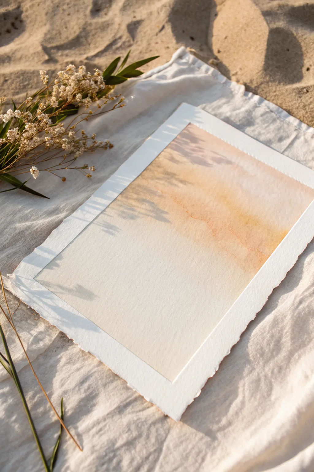
Capture the warmth of golden hour with this incredibly soft and minimal watercolor wash. Using gentle gradients of beige, peach, and terracotta, you’ll create a serene piece that embodies the calming essence of sun-drenched sand.
Step-by-Step Guide
Materials
- Cold-press watercolor paper (300 gsm or heavier)
- Watercolor paints (burnt sienna, yellow ochre, unbleached titanium)
- Wide flat wash brush (1 inch or larger)
- Masking tape or painter’s tape
- Clean water jar
- Paper towels
- Ruler (optional for tearing edges)
Step 1: Preparation & Paper
-
Sizing the paper:
Decide on your desired dimensions. For that beautiful organic look seen in the photo, you will want to create deckled edges manually if your paper doesn’t have them. -
Creating deckled edges:
Place a ruler firmly along the line where you want the edge to be. Firmly tear the dry paper upwards against the ruler’s edge to create a soft, fibrous border. -
Repeat for all sides:
Continue this tearing process on all four sides of the sheet until you have a uniform, rough-hewn rectangle. -
Taping down:
Secure your paper to a hard board or table using masking tape. Leave about a half-inch margin covered by the tape to create that crisp white interior frame later. -
Securing the seal:
Run your fingernail or a bone folder firmly along the inner edge of the tape to prevent paint from bleeding underneath.
Wet-on-Wet Wisdom
Work quickly! The magic of this seamless gradient relies on the paper staying damp. If an edge dries mid-stroke, you’ll get a hard line instead of a soft fade.
Step 2: Mixing the Palette
-
Base tone:
Mix a large puddle of Burnt Sienna with plenty of water. You want a very transparent, tea-like consistency. -
Adding warmth:
Into a separate part of your palette, mix Yellow Ochre with a touch of the Burnt Sienna to create a warm, golden sand color. -
Creating the softest tint:
Prepare a third mixture using mostly water and a tiny hint of Unbleached Titanium or a very dilute peach tone for the lightest areas.
Step 3: Painting the Gradient
-
Pre-wetting the sky:
Using your large wash brush and clean water, gently wet the top right corner of the paper, extending diagonally down toward the center. -
Initial color drop:
While the paper is glistening but not soaking wet, load your brush with the Burnt Sienna mix. Touch it to the top right corner, letting the pigment bloom naturally. -
Softening the edge:
Immediately rinse your brush and slightly damp off the excess water. Use this damp brush to pull the color downwards diagonally, encouraging a fade. -
Introducing gold:
While the first layer is still wet, drop the Yellow Ochre mixture into the middle of the transition zone. This creates that lovely varied ‘cloud’ texture. -
The fade out:
Switch to your lightest mixture (or just clean water). Drag the paint from the middle diagonal down towards the bottom left, letting the color disappear completely into the white of the paper. -
Refining the wash:
I find it helpful to tilt the board slightly to help the pigments flow and blend, but avoid overworking the paper surface. -
Adding texture:
For a subtle organic effect, you can lightly spatter a tiny bit of clean water into the semi-dry paint at the top right, creating soft blossoming blooms.
Level Up: Salt Texture
While the wash is still wet, sprinkle a pinch of table salt into the darker top corner. When dry, brush it off for a stunning, sandy crystal texture.
Step 4: Finishing Touches
-
Drying time:
Let the painting dry completely. The paper must be bone dry before you touch the tape, or it will rip. -
Peeling the tape:
Slowly peel the masking tape away from the paper at a 45-degree angle. This reveals the crisp, clean edge contrasting against the loose wash. -
Flattening:
If the paper has buckled slightly from the water, place the finished (dry) artwork under a heavy book overnight to flatten it out.
Now you have a piece of minimal art that brings a breath of warm, coastal air into any room

Minimal Shapes on a Warm Beige Ground
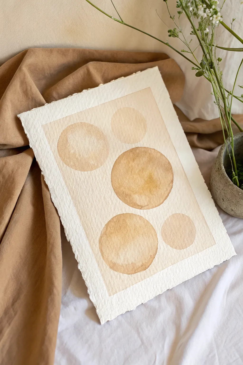
Capture the warmth of a desert afternoon with this minimalist watercolor study featuring floating spheres in varied tones of ochre and sienna. The composition relies on transparency and the beautiful, rough texture of cold-press paper to create a soothing, organic aesthetic.
Detailed Instructions
Materials
- High-quality cold press watercolor paper (300 gsm or heavier)
- Masking tape or painter’s tape
- Watercolor paints (Yellow Ochre, Burnt Sienna, Raw Umber)
- Large round watercolor brush (size 10 or 12)
- Clean water jar
- Paper towels
- Palette for mixing
- Pencil (HB or lighter)
- Circular objects to trace (cups, lids) or a compass
- Deckle edge ruler or tearing straightedge (optional)
Step 1: Preparation and Layout
-
Prepare paper edges:
To achieve the rustic look shown in the reference, create deckled edges on your paper. You can do this by folding and carefully tearing the paper against a ruler, or simply by wetting a line with a brush and gently pulling the paper apart along that wet edge. -
Tape the border:
Place your paper on a flat surface. Using masking tape, create a rectangular border about 1 to 1.5 inches from the edge of the paper. Press the tape down firmly to prevent paint from seeping underneath later. -
Draft the composition:
Lightly sketch five circles of varying sizes. Arrange them slightly off-center to create visual interest: place a medium circle top-left, a smaller one top-right, a large focal circle in the center-right, a large one bottom-left, and a small one bottom-right. -
Lighten the guides:
Once your layout is set, take a kneadable eraser and gently lift most of the graphite, leaving only the faintest ghost lines to guide your painting. This ensures no pencil marks show through the translucent paint.
Step 2: Mixing the Palette
-
Create a wash base:
On your palette, mix a large puddle of very dilute Yellow Ochre. This will be the base tone for the background rectangle. It should be the consistency of weak tea. -
Prepare circle tones:
Mix three separate puddles for the circles: one slightly stronger Yellow Ochre, one Burnt Sienna diluted to a medium tone, and a mix of the two for valid warmth. Keep them quite watery to encourage the bloom effect.
Uneven Drying?
If you get ‘backruns’ or unsightly blooms where you don’t want them, try lifting excess water with the thirsty edge of a dry brush or the corner of a paper towel while the paint is still wet.
Step 3: Painting the Background
-
Wet the background:
Using clean water, brush over the entire area inside the tape *except* for the circles. Paint carefully around the circular shapes you sketched. -
Apply the background wash:
While the paper is damp but not soaking, load your brush with the dilute Yellow Ochre mix. Wash it over the wet area. This technique, called wet-on-wet, creates a smooth, diffused look. -
Soften edges:
If I notice any hard lines forming where the background wash meets the unpainted circles, I use a damp, clean brush to gently soften them just a tiny bit, though crisp edges are also fine for a graphic look. -
Let it dry completely:
Allow the background layer to dry fully. The paper must be bone dry before you start the circles, or the colors will bleed into each other.
Coffee Staining
For an even earthier, antique look, you can substitute the Yellow Ochre paint with strong brewed coffee. It creates beautiful natural sepia tones and smells great while you work.
Step 4: Painting the Orbs
-
Paint the first circle:
Start with the large central circle. Load your brush with the Burnt Sienna mix. Carefully fill the circle shape, allowing the water to pool slightly in some areas. -
Add texture:
While the paint is still wet, drop a tiny hint of darker pigment (more concentrated Sienna) into the bottom curve of the circle to imply weight and shadow. -
Paint adjacent circles:
Move to the top-left circle using the lighter Yellow Ochre mix. Be careful not to let your hand rest on the wet central circle. -
Vary the saturation:
For the bottom-left circle, use a mix that is slightly warmer. Painting each orb with a slightly different water-to-paint ratio adds depth and keeps the minimalist piece from looking flat. -
Create the cauliflower effect:
For that distinctive watercolor texture seen in the reference, touch a clean, wet brush into the center of a drying circle. This pushes the pigment to the edges, creating a beautiful rim. -
Complete the small circles:
Fill in the final two smaller circles using your palest wash. These should look delicate and almost fade into the background.
Step 5: Finishing Touches
-
Final drying time:
Let the entire piece dry completely flat. If the paper has buckled slightly, you can place a heavy book on it (protected by a clean sheet of paper) *after* it is 100% dry. -
Remove the tape:
Very slowly peel the masking tape away from the paper. Pull the tape at a 45-degree angle away from the painted area to ensure a crisp, clean border without ripping the paper surface.
Now frame your serene abstract composition to bring a touch of calm minimalism to your wall


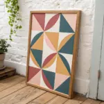
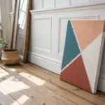
Black Line Accents Over Beige Forms
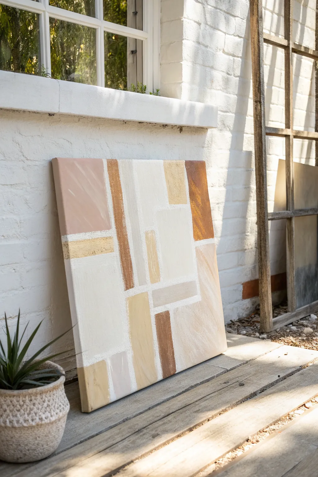
Embrace the warmth of desert hues with this structured yet organic abstract piece. Combining rigid geometric composition with soft, textured edging creates a modern statement that feels grounded and serene.
How-To Guide
Materials
- Large square gallery-wrapped canvas (approx. 24×24 or 30×30 inches)
- Acrylic paints (Titanium White, Unbleached Titanium, Raw Sienna, Burnt Umber, Yellow Ochre, Burnt Sienna)
- Painter’s tape (various widths, 0.5 inch to 1 inch)
- Flat synthetic brushes (1-inch and 2-inch sizes)
- Small palette knife or old credit card
- Modeling paste or texture medium
- Pencil
- Ruler or T-square
- Paper palette or mixing board
Step 1: Planning the Grid
-
Prime the Surface:
Even if your canvas is pre-primed, apply a fresh coat of Titanium White over the entire surface. This ensures a clean, bright base for your colors to sit on. -
Map the Design:
Using a pencil and ruler, lightly sketch out your geometric layout. Focus on creating a mix of large vertical rectangles and smaller horizontal blocks to keep the eye moving. -
Create Texture Lines:
Before painting any color, we want to establish those gritty white dividers. Mix Titanium White paint with a generous amount of modeling paste until it holds peaks. -
Apply the Masking:
Place painter’s tape primarily over the areas where your ‘color blocks’ will eventually go, leaving thin gaps where the white grid lines should be. -
Build the texture:
Use a palette knife to scrape the white texture paste mixture into the gaps between the tape. Don’t smooth it out completely; let it look rough and organic like stone grout. -
Remove Tape:
While the paste is still slightly tacky but set, carefully peel off the tape to reveal raised, textured white grid lines. Let these cure completely, preferably overnight.
Step 2: Blocking in Color
-
Mix Your Palette:
Prepare your earth tones. Create a spectrum ranging from pale cream (White + Unbleached Titanium) to deep rust (Burnt Sienna + touch of Umber). I usually mix four or five distinct shades before starting. -
Identify Light Zones:
Start with your lightest cream color. Paint the largest central blocks, using a flat brush. Paint right up to, and slightly against, your textured white ridge lines. -
Mid-Tone Application:
Move to the tan and sand colors (Yellow Ochre mixes). Apply these to the medium-sized rectangles, keeping your brushstrokes vertical to mimic the grain of wood or fabric. -
Adding Depth:
Fill in the remaining accent blocks with your darker Sienna and Umber tones. These darker values anchor the composition, so space them out to balance the visual weight. -
Feather the Edges:
As you paint near the white texture lines, use a ‘dry brush’ technique. Wipe most paint off your brush and drag it lightly near the borders so the color fades slightly before hitting the white line.
Clean Lines Pro-Tip
To prevent paint bleeding under tape, seal the tape edge with a thin layer of matte medium first. This creates an invisible barrier for crisp lines.
Step 3: Refining and Layering
-
Second Coats:
Acrylics often dry darker or more transparent than they appear wet. Apply a second coat to any blocks that look streaky, particularly the darker browns. -
Scumble for Texture:
To get that weathered look shown in the top-left block, take a lighter shade (like cream) on a dry brush and lightly scumble it over a dried darker block (like rose or tan). -
Highlight the Grid:
If painting the blocks caused any accidental smudges on your white texture lines, touch them up now with pure white paint on a small detail brush. -
Optional Distressing:
For a more vintage feel, you can very lightly sand patches of the painted blocks with fine-grit sandpaper to reveal the canvas weave beneath. -
Final Varnish:
Once absolutely dry (give it 24 hours), seal the piece with a matte varnish to protect the colors without adding unwanted shine.
Level Up: Metallic Touch
Mix a tiny amount of gold leaf or metallic bronze paint into one of the tan blocks. It catches the light subtly without overpowering the earthy vibe.
Hang your new textural masterpiece in a well-lit spot to let the shadows play off those raised grid lines
Geometric Color Blocking in Greige Neutrals
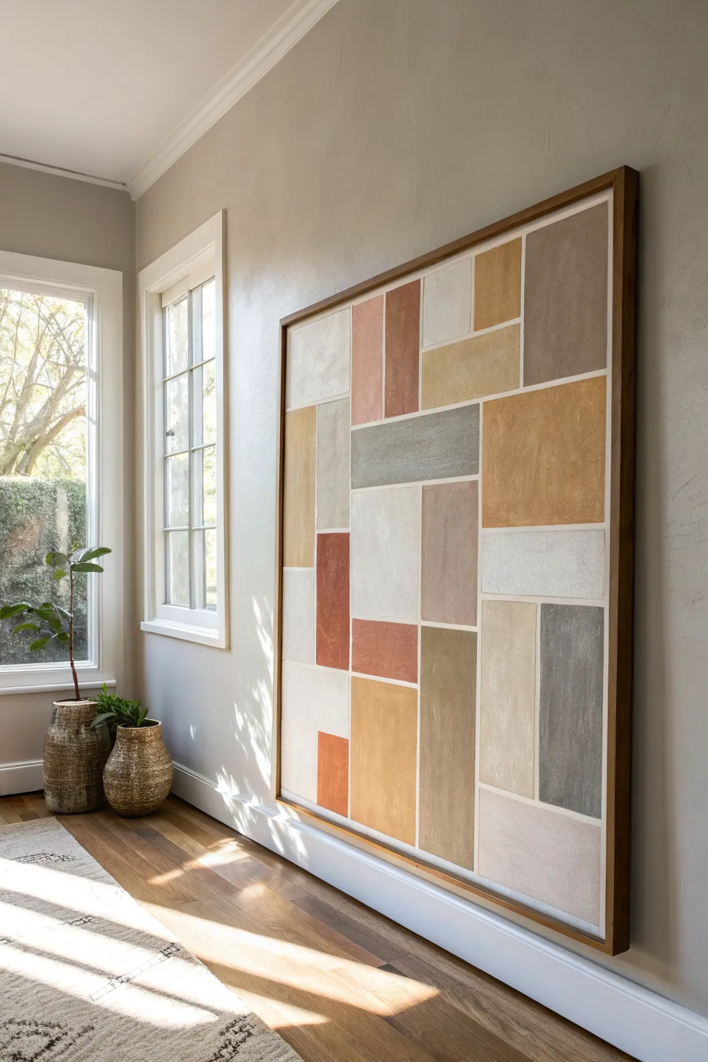
This large-scale abstract artwork brings a sense of grounded calm to any room through its use of warm, organic neutrals arranged in a geometric grid. The textured, matte finish mimics the look of classic frescoes, creating a sophisticated statement piece that feels both现代 and timeless.
Detailed Instructions
Materials
- Large canvas (36×48 inches or larger)
- Acrylic heavy body paints (burnt sienna, raw umber, olive green, ochre yellow, slate blue, titanium white)
- Matte gel medium or texture paste
- Painter’s tape (various widths, 1/4 inch recommended)
- Large flat brushes (2-inch and 1-inch)
- Palette knife
- Yardstick or long straight edge
- Pencil
- Floater frame (optional)
Step 1: Planning and Mapping
-
Prime the Surface:
Begin by applying a generous coat of titanium white acrylic mixed with a small amount of texture paste to your entire canvas. This creates a slightly gritty, plaster-like base layer that will give the final colors that earthy, matte appearance. -
Draft the Grid:
Once the base is visibly dry, lightly sketch your geometric layout using a pencil and a yardstick. Aim for an asymmetrical balance of vertical and horizontal rectangles; avoid making every box the same size to keep the composition dynamic. -
Tape the Lines:
Apply thin painter’s tape (1/4 inch works beautifully here) directly over your pencil lines. Press the edges of the tape down firmly with your fingernail or a palette knife to prevent paint bleed later. -
Seal the Tape:
To ensure perfectly crisp white lines later, paint a very thin layer of your white base color over the tape edges. This seals any tiny gaps so the colored paint won’t seep underneath.
Stone Effect
Mix baking soda into your acrylic paint for a grainy, stone-like texture that feels incredibly high-end and natural.
Step 2: Color Application
-
Mix Master Batches:
Prepare your palette by mixing your main color groups: a terracotta (burnt sienna + white), a muted mustard (ochre + white + tiny dot of raw umber), a grey-blue (slate + white), and an olive tone. Mixing them with a bit of matte medium now helps maintain a uniform sheen. -
Apply the First Tone:
Start with your darkest color—perhaps the terracotta or slate grey—and paint specific blocks scattered mostly around the focal points of the composition. Use a flat brush and apply the paint relatively thinly. -
Layering Neutrals:
Move on to your beige and cream tones. I prefer to mix slightly different variations of beige for adjacent blocks subtly distinguishing them without high contrast. -
Adding Texture:
For the larger blocks, switch to a palette knife. Mix your paint with more texture paste and scrape it onto the canvas within the taped lines. This creates physical depth and mimics the look of stone. -
Fill Remaining Blocks:
Continue filling in the grid with your remaining colors (muted greens and yellows). Ensure every taped section is filled, brushing inwards from the tape to avoid pushing paint under the edges.
Step 3: Refining and Finishing
-
Create Varied Opacity:
Once the first layer is tacky, go back over some lighter blocks with a dry brush and a slightly lighter shade of the same color. This scumbling technique adds that weathered, vintage feel. -
The Reveal:
Wait until the paint is dry to the touch but not fully cured (usually about 45 minutes). Carefully peel back the tape at a sharp 45-degree angle to reveal the crisp white grid lines beneath. -
Touch Up:
Inspect your white lines. If any paint bled through, use a small detail brush and white paint to tidy up the edges for a clean, architectural finish. -
Varnish:
Apply a spray matte varnish over the entire piece. Do not use gloss, as the charm of this style relies heavily on a flat, chalky finish. -
Framing:
Install the canvas into a simple wooden floater frame, preferably in a medium oak or walnut stain, to complement the warm earth tones of the painting.
Metallic Accent
For a luxe twist, apply gold leaf to just one or two small rectangles in the grid before removing the tape.
Now you have a stunning, large-scale piece of geometric art that anchors your space with warmth and sophistication
BRUSH GUIDE
The Right Brush for Every Stroke
From clean lines to bold texture — master brush choice, stroke control, and essential techniques.
Explore the Full Guide
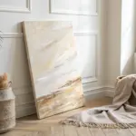
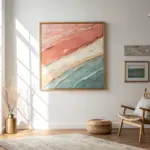
Large Statement Canvas in Layered Beiges
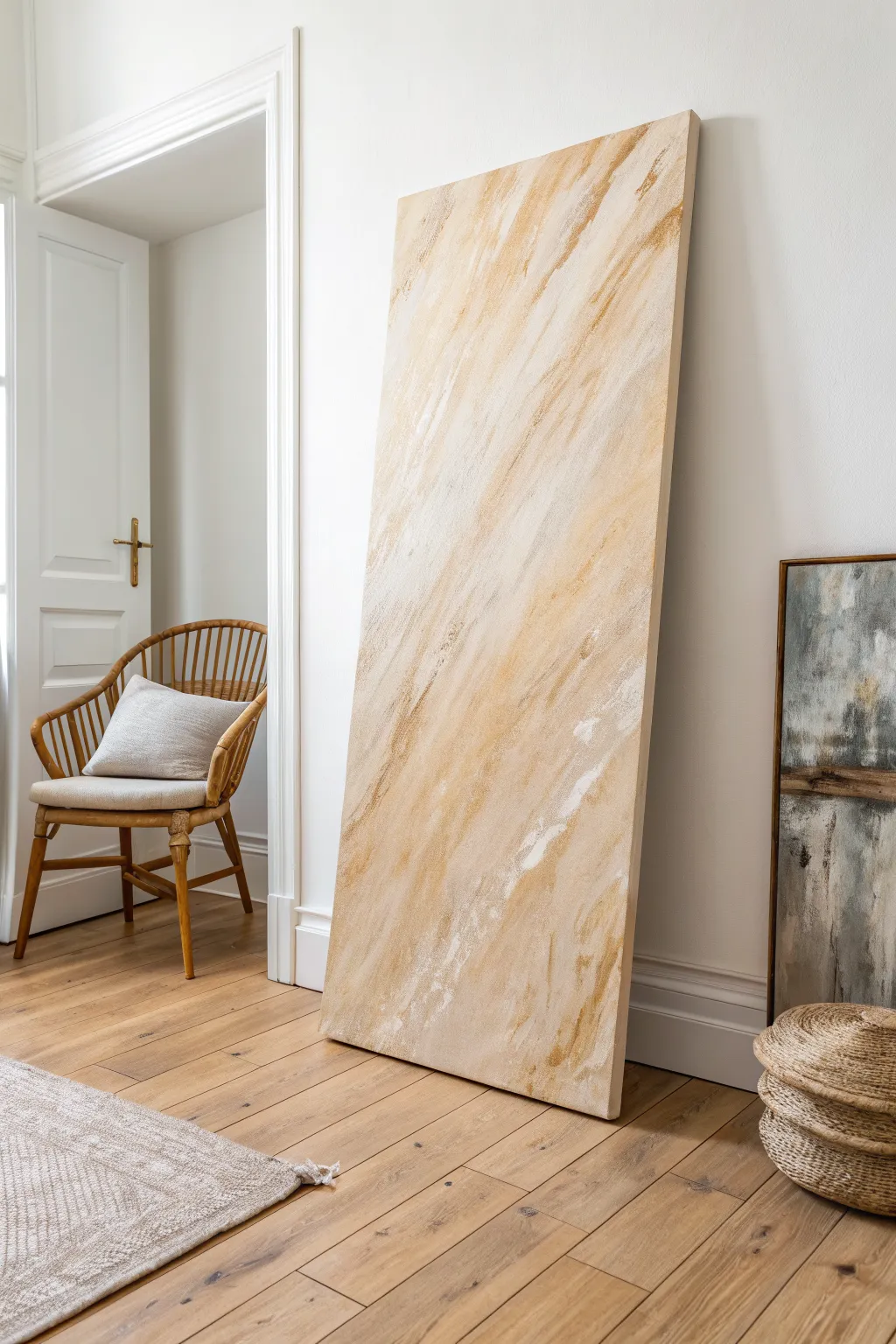
Capture the serene, windswept movement of desert sands with this grand textural piece. Using distinct diagonal strokes and a warm palette of ochre and cream, this layered acrylic painting adds sophisticated height and tranquility to any room.
Step-by-Step Tutorial
Materials
- Large stretched canvas (at least 36 x 72 inches)
- Heavy body acrylic paint (Titanium White)
- Heavy body acrylic paint (Unbleached Titanium or Buff)
- Heavy body acrylic paint (Yellow Ochre or Raw Sienna)
- Acrylic glazing medium
- Modeling paste (optional for extra texture)
- Large flat paintbrush (4-inch width)
- Wide palette knife or drywall taping knife
- Spray bottle with water
- Drop cloth
- Paper towels or rags
Step 1: Base Preparation
-
Set the Stage:
Lay down your drop cloth in a well-ventilated area. This canvas is large, so placing it flat on the floor or leaning it securely against a protected wall works best for applying leverage. -
Apply the Ground Layer:
Squeeze a generous amount of Titanium White and a touch of Unbleached Titanium onto the canvas. Use your large 4-inch brush to cover the entire surface, blending them directly on the canvas for a slightly off-white, matte base. -
Initial Texture:
While the base layer is still tacky, use a clean, dry brush to drag across the paint in a diagonal direction—choose top-left to bottom-right to match the inspiration. This establishes the ‘grain’ for future layers. -
Dry Completely:
Allow this foundation to dry fully. Since the paint is thick, give it at least 2-3 hours. It needs to be non-reactive when we add the next washes.
Keep Edges Rough
Don’t over-blend! When using the palette knife, allow the paint to skip and drag naturally over the canvas weave. This ‘broken color’ effect mimics natural stone.
Step 2: Building the Diagonal Drift
-
Mix Warm Tones:
On a palette, mix Yellow Ochre with a significant amount of glazing medium (about 1:4 paint to medium ratio). You want a translucent, honey-colored glaze. -
First Glaze Application:
Apply this glaze in broad, sweeping diagonal strokes following your initial texture. Don’t cover the whole canvas; leave patches of the white base showing through. -
Soften the Edges:
Immediately wipe a dry paper towel or rag lightly over the glaze while it’s wet. This lifts some pigment and blurs hard lines, creating that weathered, sweeping look. -
Deepen the Shadow:
Mix a small amount of Raw Sienna with the glaze. Apply this darker tone sparingly in thin streaks within the yellow areas to create depth and shadow. -
Feather Out:
Use a dry 4-inch brush to feather out the ends of your darker strokes so they disappear seamlessly into the lighter background.
Colors Look Muddy?
This happens if you layer wet paint over wet paint too quickly. Ensure the underlying ochre glaze is completely dry before dragging the white texture layer over it.
Step 3: Enhancing Texture and Contrast
-
Prepare Heavy Texture:
Mix Titanium White paint with an equal part of modeling paste. We want a thick, frosting-like consistency that will stand up on the canvas. -
Palette Knife Application:
Load the edge of a wide palette knife or drywall taping knife with the white mixture. This tool is crucial for getting those flat, scraped effects seen in the original. -
The Scraping Technique:
Technique is key here: hold the knife at a low angle and scrape the white mixture diagonally over the dried ochre layers. Press firmly so the paint ‘breaks’ over the canvas weave, creating distressed patches. -
Layering Beiges:
Repeat the scraping process using Unbleached Titanium (beige) straight from the tube. Apply this near the white areas but let them overlap slightly to create color vibration. -
Create Negative Space:
If an area looks too heavy or solid, immediately scrape it back down with a clean palette knife to reveal the darker glazes underneath.
Step 4: Final Details
-
Dry Brushing Highlights:
Once the textured layers are touch-dry, dip a small, stiff brush into pure Titanium White. Wipe almost all the paint off on a rag. -
Accentuate the Grain:
Lightly flick this dry brush over the textured ridges. This catches only the highest points of the impasto, simulating light hitting stone or sand. -
Evaluate from a Distance:
Step back about 10 feet. Check the diagonal flow. If the movement feels interrupted, add a long, faint wash of water and ochre to connect the disparate sections. -
Final Cure:
Let the painting cure for at least 24 hours before moving it. The thick modeling paste layers need time to harden completely to the core.
Prop your massive new masterpiece against the wall to bring an instant sense of architectural scale and warmth to your living space
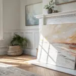
Organic Blob Shapes With Soft Edges
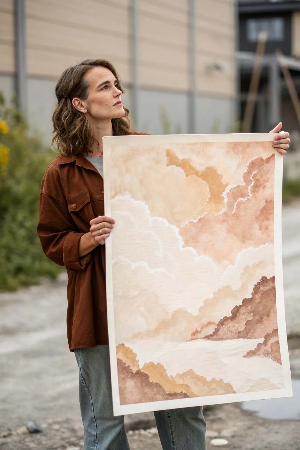
Capture the serene beauty of rolling clouds and misty mountains with this large-scale watercolor project. Through layering translucent washes of terracotta, sand, and taupe, you’ll build an organic composition that feels both grounded and dreamy.
Step-by-Step
Materials
- Large sheet of heavyweight watercolor paper (minimum 300gsm, cold press textured)
- Watercolor paints (Burnt Sienna, Yellow Ochre, Raw Umber, Sepia)
- White gouache or white watercolor paint
- Large round watercolor brushes (size 12 and 16)
- Large flat wash brush (2 inch)
- Clean water jar
- Paper towels
- Masking tape
- Mixing palette
Step 1: Preparation and Base Washes
-
Secure your surface:
Begin by taping down all four edges of your large watercolor paper to a sturdy board or table. This prevents buckling when the paper gets wet. -
Mix your palette:
Create three main puddles of color on your palette: a pale sandy beige (watered down Yellow Ochre), a rusty terracotta (Burnt Sienna), and a deeper brown (Sepia). Keep them very fluid. -
Paint the first sky layer:
Using your large wash brush, lightly wet the upper third of the paper with clean water. Drop in the palest beige color, letting it bloom naturally to create a soft atmospheric background. -
Form the upper irregular shapes:
While the paper is still slightly damp but not soaking, switch to a round brush. Paint large, organic blob shapes near the top right using a mix of terracotta and beige. Keep the edges irregular to mimic drifting clouds. -
Soften the edges:
Immediately rinse your brush and run a damp, clean brush along some of the bottom edges of these shapes to let the pigment fade smoothly into the white space below.
Fixing Water Blooms
If accidental ‘cauliflower’ back-runs appear in drying paint, simply embrace them! In this organic style, these textures look like natural rock formations or cloud density.
Step 2: Building the Middle Layers
-
Allow for drying:
Let the first layer dry completely. This is crucial for achieving the hard edges that define the ‘mountains’ or distinct cloud layers. -
Create the central band:
Mix a slightly stronger concentration of your terracotta paint. Start painting a diagonal band of fluffy shapes across the middle of the paper, leaving significant white space to the left. -
Introduce texture:
While this middle layer is wet, dab a paper towel lightly on a few spots to lift pigment, creating a misty, uneven texture within the blobs. -
Layer overlapping shapes:
Once the central band is semi-dry, paint a new, lighter beige shape that partially overlaps the darker one. The transparency of watercolor will create a beautiful third color where they intersect. -
Define the negative space:
Pay careful attention to the white unpainted areas. These negative spaces act as the brightest clouds or mist, so shape your painted blobs to carve out interesting white gaps.
Add Metallic Accents
Once the painting is dry, trace the very edges of the white negative space with fine gold ink or gold leaf for a luxurious, shimmering finish that catches the light.
Step 3: Deepening Shadows and Details
-
Mix the darkest tone:
Combine Sepia with a touch of Burnt Sienna to create a rich, dark earth tone for the foreground elements. -
Paint the lower formations:
At the bottom right and bottom left corners, paint jagged, mountain-like shapes. Use the tip of your brush to give the top edge a trembling, organic line quality. -
Add white highlights:
Take a small amount of white gouache. I like to dilute it slightly so it isn’t completely opaque, then paint thin, jagged lines along the upper ridges of the darkest brown shapes to define the edges. -
Blend the foreground:
Soften the bottom-most edges of these dark shapes with water so they fade out at the very bottom of the paper, grounding the composition. -
Incorporating fine veins:
Using your smallest brush and the white gouache mixture, add very delicate, lightning-like marbling or veins into the large terracotta section in the upper right. -
Final assessment:
Step back and look at the overall balance. If any edges look too harsh where they should be soft, scrub them gently with a damp stiff brush to feather them out. -
Remove binding:
Once the paper is 100% bone dry, carefully peel off the masking tape at a 45-degree angle to reveal a crisp white border.
Hang your masterpiece in a brightly lit room to let the translucent layers glow.

PENCIL GUIDE
Understanding Pencil Grades from H to B
From first sketch to finished drawing — learn pencil grades, line control, and shading techniques.
Explore the Full Guide
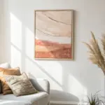
Sand Dune-Inspired Beige Wave Forms
Capture the warmth and stillness of a desert landscape with this gentle acrylic painting project. Using soft gradients of blush, beige, and terracotta, you will build rolling dunes that feel both expansive and peaceful.
Detailed Instructions
Materials
- Large canvas or high-weight watercolor paper (approx. 18×24 inches)
- Acrylic paints: Titanium White, Unbleached Titanium (Beige), Burnt Sienna, Raw Umber, Alizarin Crimson, Yellow Ochre
- Large flat brush or sponge brush
- Medium filbert brush
- Small fine liner brush or fan brush
- Mixing palette
- Cup of water and paper towels
- Pencil for sketching
- Optional: Texture paste for foreground details
Step 1: Setting the Scene
-
Prime the Surface:
Begin by applying a thin, even coat of white gesso if your canvas isn’t pre-primed. Let it dry completely to ensure a smooth base for your gradients. -
Sketch the Dunes:
Lightly sketch the horizon line about two-thirds up the canvas. Draw flowing, S-shaped curves to map out the main dune ridges, creating a sense of distance and movement. -
Mix the Sky Tone:
Create a very pale, warm sky color by mixing a large amount of Titanium White with a tiny dot of Unbleached Titanium. It should be barely off-white. -
Paint the Sky:
Apply this pale mix to the top third of the canvas, brushing horizontally. As you move down toward the horizon, blend in just a whisper of Alizarin Crimson to create a soft, hazy glow.
Smooth Gradients
Use a retarder medium in your acrylics to slow drying time. This keeps the paint movable longer, allowing you to blend that perfect, seamless ombré on the dunes.
Step 2: Painting the Dunes
-
Mix the Base Sand Colors:
Prepare three distinct sand tones on your palette: a light highlight (White + Yellow Ochre), a mid-tone pinkish-beige (White + Burnt Sienna + Alizarin Crimson), and a shadow tone (Burnt Sienna + Raw Umber). -
Block in the Furthest Dunes:
Using the mid-tone mix, paint the distant dunes near the horizon. Keep these shapes flat and slightly hazy to push them into the background, adding a touch of white to fade them out. -
Establish the Shadow Side:
Identify the sharp ridge lines of your main dunes. Paint the side facing away from the ‘light source’ (the left in this example) with your darker shadow tone. Use sweeping strokes that follow the curve of the dune. -
Paint the Sunlit Slopes:
On the opposite side of the ridge lines, apply the light highlight mix. I find it helpful to blend the wet paint slightly where the light meets the shadow for a softer, wind-blown look, or keep it sharp for a crisp crest. -
Add Depth with Gradients:
While the paint is still workable, introduce subtle variations. Add a hint of pink to the transition areas and deepen the shadows at the bottom of the dunes with a touch more Raw Umber. -
Refine the Ridgelines:
Use a clean, damp filbert brush to sharpen the crests of the dunes. The contrast between the light slope and dark shadow is what gives the painting its three-dimensional volume.
Texture Twist
Mix fine sand or specialized gritty texture gel into your foreground paint mix. This adds real tactile dimension to the bottom of the painting.
Step 3: Foreground and Details
-
Texture the Foreground:
For the closest sand area at the bottom, switch to a darker, warmer brown mix. Apply the paint used a stippling motion or a dry brush technique to suggest the coarseness of sand. -
Mix Grass Colors:
Create a dark, greenish-brown mix using Yellow Ochre and Raw Umber. You want this to be semi-fluid, so add a drop of water if the paint feels too stiff. -
Paint Base Grasses:
Using a fan brush or a fine liner brush, flick swift, upward strokes from the bottom corner to create clumps of dry desert grass. Vary the height and direction for naturalism. -
Add Grass Highlights:
Mix a lighter golden wheat color. Determine where the light hits the grass clumps and add thin, bright strokes on top of the darker base layer. -
Final Adjustments:
Step back and assess the composition. Glaze over any areas that feel too harsh with a very watered-down Unbleached Titanium to harmonize the colors. -
Varnish and Frame:
Once fully dry (give it at least 24 hours), apply a matte varnish to protect the surface without adding unwanted shine. Place in a light wood frame to complement the neutral palette.
Now you have a serene, minimalist landscape ready to bring warmth to your walls
Scumbled Brushwork for a Foggy Beige Haze
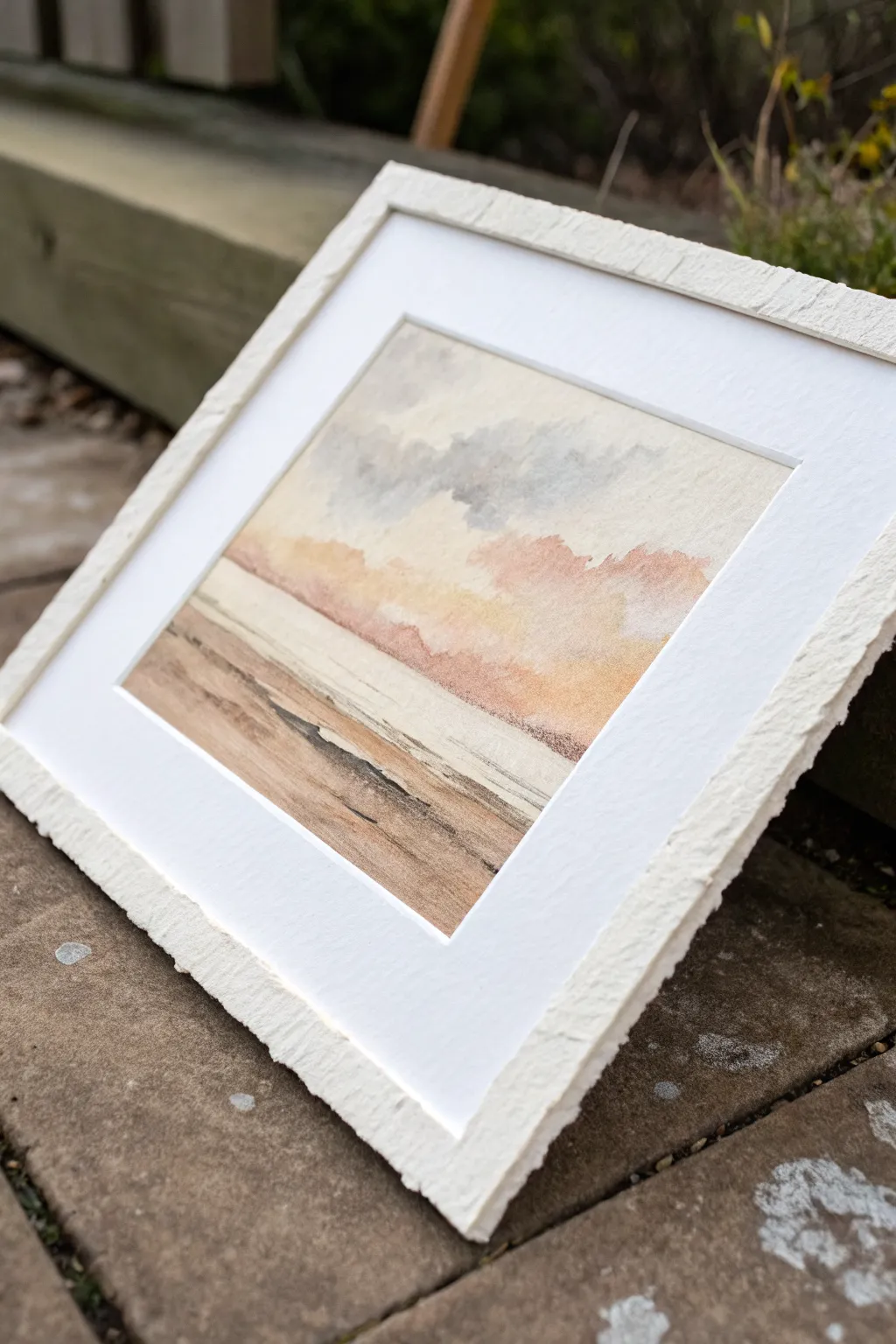
Capture the serene mood of a foggy coastline with this scumbled watercolor landscape, where soft hazes of beige and blush pink meet textured sands. This project emphasizes delicate brushwork and subtle layering to create a dreamy, atmospheric piece perfect for minimalist decor.
Detailed Instructions
Materials
- Cold press watercolor paper (300 gsm)
- Watercolor paints (Yellow Ochre, Burnt Sienna, Payne’s Grey, Alizarin Crimson, Sepia)
- Round watercolor brushes (Size 4, 8, and a flat wash 3/4 inch)
- Clean water jar
- Paper towels
- Painter’s tape or masking tape
- Painting board
- Textured mat board for framing
Step 1: Preparation and Sky
-
Secure the paper:
Tape your watercolor paper down firmly to a painting board on all four sides. This ensures the paper stays flat when wet and creates a clean, professional border. -
Mix the sky colors:
Prepare a very dilute mixture of Payne’s Grey for the moody upper sky, and a soft, watery mix of Yellow Ochre with a tiny touch of Burnt Sienna for the lower horizon glow. -
Wet-on-dry application:
Using the flat wash brush, apply the diluted Payne’s Grey to the top third of the paper. Keep the paint very watery so it appears like a faint grey mist rather than a storm cloud. -
Add warmth:
While the grey is still slightly damp, wash the brush and pick up the yellow-beige mixture. Apply this across the middle of the paper, letting the bottom edge of the grey bleed softly into this warm zone. -
Create the pink haze:
Mix a very small amount of Alizarin Crimson with Yellow Ochre to create a muted peach-pink. Use a size 8 round brush to scumble this color horizontally where the sky meets the horizon, creating that foggy, colorful haze seen in the center. -
Scumbling texture:
To scumble properly, blot your brush slightly on a paper towel so it isn’t dripping wet. Drag the side of the brush gently over the paper’s tooth to create broken, misty edges on the pink clouds.
Dry Brush Control
Test your dry brush stroke on a scrap piece of paper first. If the line is solid, blot more paint off. You want a scratchy, broken texture.
Step 2: Horizon and Sea
-
Define the horizon line:
Once the sky is mostly dry, paint a distinct, straight line across the paper using dilute Sepia mixed with plenty of water. This separates the sky from the water. -
Paint the water:
Use a very pale wash of the beige sky color to fill in the water area immediately below the horizon. Keep this area very light and flat to represent calm water reflecting the light. -
Add subtle ripples:
Wait for the water wash to dry completely. Using a size 4 brush and a slightly darker mix of the beige-grey, paint incredibly thin horizontal lines to suggest distant waves.
Step 3: Beach and Foreground
-
Base layer for sand:
Mix Burnt Sienna with Yellow Ochre. Apply this to the bottom third of the paper using broad, horizontal strokes. I like to leave small gaps of white paper showing through to simulate light hitting the sand. -
Deepen the foreground tones:
While the base sand layer is still wet, drop in stronger Burnt Sienna and Sepia tones near the bottom corners and along the shoreline edge to create depth. -
Dry brush texture:
Once the sand layer is dry, load a size 4 brush with thick, pigment-heavy Sepia. Wipe most of the paint off onto a towel until the brush is nearly dry. -
Create beach debris:
Drag the dry brush quickly and lightly horizontally across the foreground. The bristles will skip over the paper texture, leaving ragged dark marks that look like driftwood, seaweed, or wet sand ridges. -
Define the shoreline:
Use the fine brush to paint a darker, irregular line where the water meets the sand. Vary the thickness of this line to make it look organic. -
Final dry:
Allow the painting to dry fully before carefully peeling away the painter’s tape at a 45-degree angle. -
Mounting:
Place your finished artwork behind your textured mat board to complete the rustic, gallery-style aesthetic.
Deckle Edge Mock-up
For a rustic finish, skip the scissors. Fold your paper and run a wet brush along the crease, then carefully tear it to mimic a handmade deckled edge.
Enjoy the calming atmosphere your new coastal abstraction brings to the room

Have a question or want to share your own experience? I'd love to hear from you in the comments below!