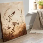
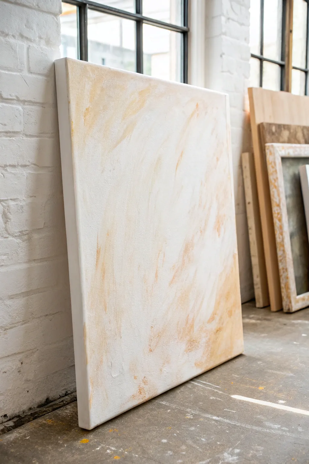
When I want a room to feel instantly calmer, I reach for beige painting ideas—they’re subtle, but they quietly pull everything together. The magic is in tone-on-tone layering and texture that creates depth without shouting for attention.
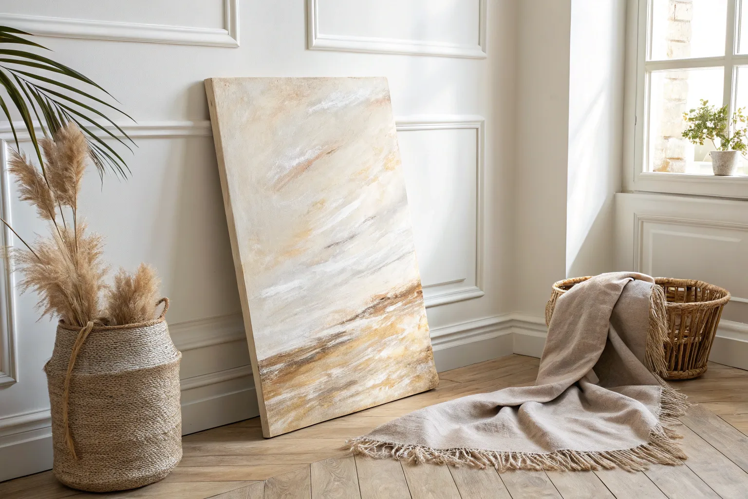
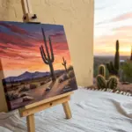
Soft Beige Gradient Wash
Capture the warmth of a sun-drenched landscape with this soft, abstract gradient painting. Using gentle washes and textured layering, you will create a piece that feels both grounded and ethereal, perfect for bringing a calm atmosphere to any room.
How-To Guide
Materials
- Large stretched canvas (e.g., 24×36 inches)
- Acrylic paints: Titanium White, Unbleached Titanium, Raw Sienna, Burnt Sienna, Yellow Ochre
- Modeling paste or texture medium
- Large flat brush (2-3 inches)
- Medium round brush
- Palette knife
- Spray bottle with water
- Mixing palette or paper plates
- Rags or paper towels
Step 1: Base Texture & Foundation
-
Prime the Surface:
Begin by applying a thin layer of titanium white mixed with a touch of unbleached titanium across the entire canvas. This kills the harsh white of the raw canvas and provides a warmer undertone for your layers. -
Create Texture:
Mix a dollop of modeling paste with a small amount of white paint. Using your palette knife, scrape this mixture randomly across the canvas, focusing slightly more density just below the centerline where your ‘horizon’ will be. Keep the texture relatively flat but noticeable. -
Let it Cure:
Allow the texture paste to dry completely. This usually takes a few hours or overnight depending on the thickness. It must be hard to the touch before painting over it.
Step 2: Building the Gradient
-
Mix the Lightest Tone:
On your palette, mix a large amount of Titanium White with a tiny drop of Yellow Ochre and Unbleached Titanium. You want a very pale, creamy sand color. -
Apply the Sky:
Using your large flat brush, paint the top third of the canvas with this lightest mixture. Use horizontal strokes that go all the way off the edges. -
Mix the Mid-Tone:
Add a bit more Raw Sienna to your previous mixture to create a warm, toasted beige. It should be distinct from the top color but still in the same family. -
Blend the Transition:
Apply this mid-tone to the middle section of the canvas. While the paint is still wet, lightly spritz the boundary between the top and middle colors with water. Brush back and forth horizontally to blur the line. -
Form the Horizon Base:
Mix Burnt Sienna with a touch of Raw Sienna for a deeper, reddish-brown earth tone. Paint a horizontal band just below the middle of the canvas, roughly where you added extra texture earlier. -
Create the Lower Wash:
For the bottom third, return to a lighter mix similar to your mid-tone beige. Paint this area, blotting it gently with a rag while wet to reveal some of the canvas texture underneath.
Fixing Muddy Colors
If your gradient looks muddy or grey, let it dry completely. Then, apply a thin layer of the intended pure color over the top. Wet-on-wet blending often causes muddiness; layering dry paint fixes it.
Step 3: Refining the Horizon
-
Darken the Horizon Line:
Takes pure Burnt Sienna on the edge of your palette knife. Gently drag the knife horizontally across the horizon band you painted earlier. allow the paint to catch on the dried modeling paste ridges. -
Soften With a Wash:
Dilute some White and Unbleached Titanium with water until it’s milky. I like to graze this very thin glaze over the top half of the painting to harmonize the gradient and soften any harsh brushstrokes. -
Add Depth Highlights:
Mix a small amount of white with the tiniest bit of orange or red to get a warm highlight color. Dry brush this sparingly right above the dark horizon line to suggest light hitting the earth. -
Rough Up the Edges:
Use a nearly dry brush with the dark Burnt Sienna mix to feather the edges of the horizon line slightly upward and downward, so it doesn’t look like a solid stripe. -
Final Blending:
Take a clean, slightly damp large brush and do one final soft sweep over the very top and very bottom edges of the canvas to ensure a smooth fade-out. -
Inspect and Adjust:
Step back five feet. If the horizon feels too heavy, glaze over it with a thin wash of the lighter beige. If it feels too weak, add a few more knife scrapes of Burnt Sienna. -
Seal the Work:
Once fully dry (give it 24 hours), apply a matte varnish to protect the surface without adding unwanted gloss, preserving the earthy, matte aesthetic.
Glazing Secret
For that ethereal glow, mix glazing liquid (or water) with a tiny dot of white paint. Apply this translucent layer over the whole piece at the end to unify the different tan shades.
Hang your new abstract masterpiece in a well-lit spot to let the textures catch the changing daylight throughout the day
Organic Beige Arches and Curves
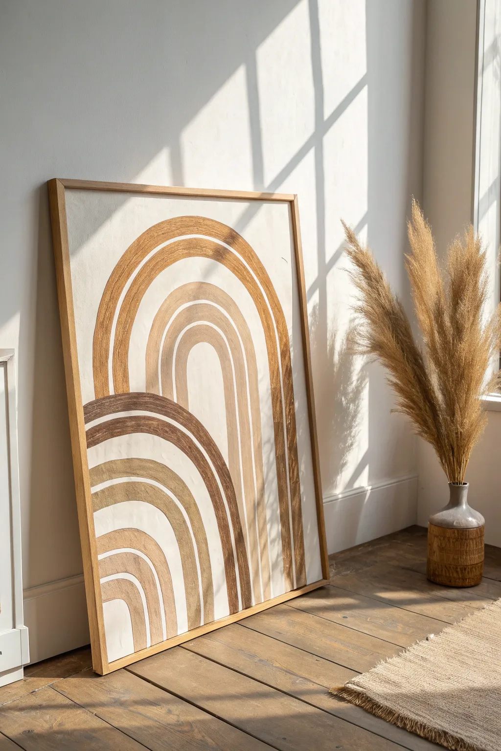
Bring warmth and organic beauty to your walls with this large-scale abstract painting featuring interlocking arches in soothing beige and taupe tones. The textured, brushstroke-forward style adds depth and a handcrafted feel that perfectly complements modern minimalist decor.
Step-by-Step
Materials
- Large wooden framed canvas or art board (approx. 24×36 inches)
- Acrylic paints (Titanium White, Unbleached Titanium, Raw Sienna, Burnt Umber, Yellow Ochre)
- Wide flat synthetic brushes (1 inch and 2 inch)
- Pencil
- String and pushpin (for compass trick)
- Mixing palette or paper plates
- Texture medium (optional, for added dimension)
- Painter’s tape (optional)
- Easel or flat work surface
Step 1: Preparation and Sketching
-
Prepare the canvas:
Start by ensuring your canvas is clean and taut. Even if it’s pre-primed, I like to apply a fresh coat of white gesso or a mix of Unbleached Titanium and White to create a warm, neutral base color. Let this base coat dry completely before proceeding. -
Plan your composition:
Observe the reference image. There are two main arch clusters: a taller one on the right and a lower, wider one on the left that seems to tuck behind the first. Visualizing this overlapping relationship is key. -
Create a makeshift compass:
To get consistent curves without them looking too rigid, tie a piece of string to a pencil. You’ll stick a pushpin into the canvas (or just hold the string down firmly) at the center point where you want your arch legs to begin. -
Sketch the right arch:
Find the center point for the tall right-side arch set. Hold your string stationary at the bottom center and swing the pencil to lightly sketch the outermost curve. Shorten the string slightly and sketch the inner curves, leaving about an inch or two of space between each line for the stripes. -
Sketch the left arch:
Repeat the process for the lower left arch set. Position its center point further to the left. Sketch these curves so they visually intersect with the right set, stopping your pencil lines where the two shapes meet to create the illusion of depth. -
Extend vertical lines:
Use a ruler or straight edge to draw straight vertical lines down from the ends of your curved arches to the bottom of the canvas, completing the rainbow-like shapes.
Fixing Wobbly Lines
If a curve goes astray, don’t wipe it! Let it dry completely, then paint over the mistake with your background color. It serves as ‘white-out’ and lets you try the curve again cleanly.
Step 2: Mixing and Painting
-
Mix your palette:
Prepare four distinct shades of beige and brown. Mix White with Raw Sienna for a light sand color. Mix Burnt Umber with a touch of White for a deep cocoa. Create a mid-tone taupe and a golden-beige using Yellow Ochre. Keep the colors earthy and muted. -
Add texture (optional):
If you want the visible brushstrokes shown in the example, mix a little modeling paste or heavy gel medium into your acrylic paints now. This helps the paint hold ridges. -
Paint the outermost right arch:
Load a 1-inch flat brush with your golden-beige mix. Start with the largest curve on the right. Paint following the curve of the arch in long, continuous strokes. Don’t worry about perfect edges; a little wavering adds organic charm. -
Fill the adjacent stripes:
Switch to a lighter sand color for the next stripe inward. Leave a thin gap of the background color showing between stripes to separate them naturally. -
Paint the core of the right arch:
Continue moving inward on the right arch set, alternating between your mid-tone taupe and lighter creams. Ensure the paint is opaque enough to cover the pencil lines. -
Start the left arch cluster:
Move to the lower left arch. Use your darkest cocoa brown for the outermost stripe here to create separation and contrast against the lighter arch behind it. -
Complete the left arch bands:
Fill in the remaining inner stripes of the left arch using your lighter beige tones. Be careful where the designs touch; paint cleanly up to the edge of the previous arch to maintain the overlapping effect. -
Refine the edges:
Once the main colors are blocked in, use a smaller flat brush to neaten up any wobbly edges that look unintentional. However, avoid making them too sharp—the soft, hand-painted look is desirable for this style. -
Touch up the background:
If you accidentally painted over the ‘gap’ lines too much, take your original background color and carefully repaint the negative space between the colored arches to crisp them up.
Keep it Fluid
Add a drop or two of water to your paint mix. This improves flow for long, continuous arch strokes, preventing the brush from dragging or skipping halfway through the curve.
Step 3: Finishing Touches
-
Double check opacity:
Acrylics can dry darker or more transparent than they appear wet. Step back and see if any lighter stripes need a second coat for solid coverage. -
Erase guidelines:
Once the painting is 100% dry, gently erase any visible pencil marks that weren’t covered by paint, especially in the negative spaces. -
Varnish or seal:
Apply a matte varnish to protect the artwork. Avoid glossy finishes, as the matte look enhances the organic, earthy vibe of the piece. -
Frame the piece:
Place your canvas into a light oak or natural wood floating frame to mimic the aesthetic in the inspirational image.
Hang your new masterpiece in a sunlit spot to let the natural textures and shadows play across the canvas
Beige-and-White Negative Space
Embrace the beauty of subtlety with this large-scale abstract piece, where soft beige undertones peek through sweeping washes of white. The technique relies on layering and texture to create a sense of depth and movement without overwhelming the viewer.
How-To Guide
Materials
- Large square gallery-wrapped canvas (36×36 inches or larger)
- White acrylic gesso
- Titanium White acrylic paint
- Raw Sienna acrylic paint
- Yellow Ochre acrylic paint
- Large blending brush or 2-inch chip brush
- Palette knife or plastic scraper
- Spray bottle with water
- Rags or paper towels
- Matte medium
Step 1: Setting the Warm Foundation
-
Prepare the workspace:
Since you are working with a large canvas, set it up on a sturdy easel or flat on a drop cloth. Ensure you have plenty of room to move around the piece. -
Mix the base tone:
Create a warm, diluted beige mixture on your palette. Combine a large amount of water with Raw Sienna and a touch of Yellow Ochre to create a fluid wash. -
Apply the chaotic wash:
Using your large brush, slap this watery beige mixture onto the canvas in random, sweeping motions. Don’t worry about coverage; you want patches of intense color and areas of bare canvas. -
Add texture marks:
While the beige wash is still wet, use the edge of your palette knife to scrape through the paint in quick, diagonal dashes. This creates physical texture that will show up later. -
Let it drip:
Spritz the canvas with water to encourage the beige paint to run and pool which adds organic movement to the background layer. -
Dry completely:
Walk away and let this base layer dry fully. The next steps will muddy if the bottom layer is wet.
Too much white?
If you covered up too much beige, don’t panic. Use fine-grit sandpaper to gently sand back the top white layers. This reveals the beige underneath and adds incredible weathered texture.
Step 2: Creating Negative Space
-
Prepare the white overlay:
Mix Titanium White paint with a generous amount of matte medium. This makes the white slightly translucent rather than completely opaque. -
Begin the white wash:
Start applying the white mixture from the center of the canvas, pushing it outward toward the edges using a large, dry brush. -
Feather the edges:
As you reach the areas where you want the beige to show through—mostly the corners and edges—lift pressure on the brush to feather the white paint out delicately. -
Scumble the surface:
Use a technique called scumbling: load a dry brush with a small amount of heavy body white paint (no medium this time) and scrub it lightly over the dried beige textures. This catches the high points of the canvas. -
Reintroduce warmth:
If I find I’ve covered too much beige, I like to mix a very faint glaze of Raw Sienna and dab it back into specific areas using a crumpled rag for a soft, clouded effect. -
Blend violently:
Before the white layers dry, take a clean, dry chip brush and sweep it diagonally across the entire canvas to blur any harsh brushstrokes into a consistent flow.
Add a metallic hint
Mix a tiny drop of gold metallic ink into your initial beige wash. It won’t sparkle loudly, but it will catch the light subtly beneath the white layers for a magical effect.
Step 3: Final Textures
-
Knife work:
Load a palette knife with pure Titanium White. Apply it thickly in the center of the white negative space, smoothing it like icing to create a solid visual resting point. -
Distress the edges:
Use a damp cloth to gently rub away some of the white paint near the perimeter, revealing the darker, dried beige wash underneath. -
Side coverage:
Don’t forget the deep sides of your gallery-wrapped canvas; paint them solid white to give the piece a clean, finished look. -
Final assessment:
Step back about ten feet. You are looking for a balance where the white feels dominant but the beige feels like it’s glowing from within. -
Varnish:
Once the painting has cured for at least 24 hours, apply a coat of matte spray varnish to protect the surface without adding unwanted shine.
Hang this serene piece in a well-lit room where the natural light can play off the subtle textures you’ve created
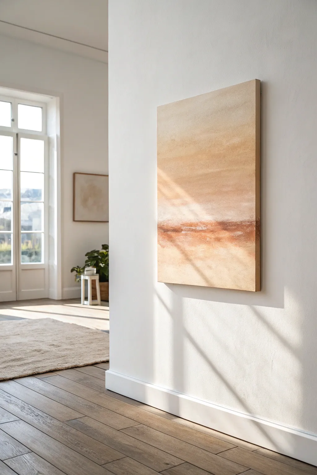
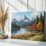
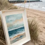
Greige Horizon Landscape
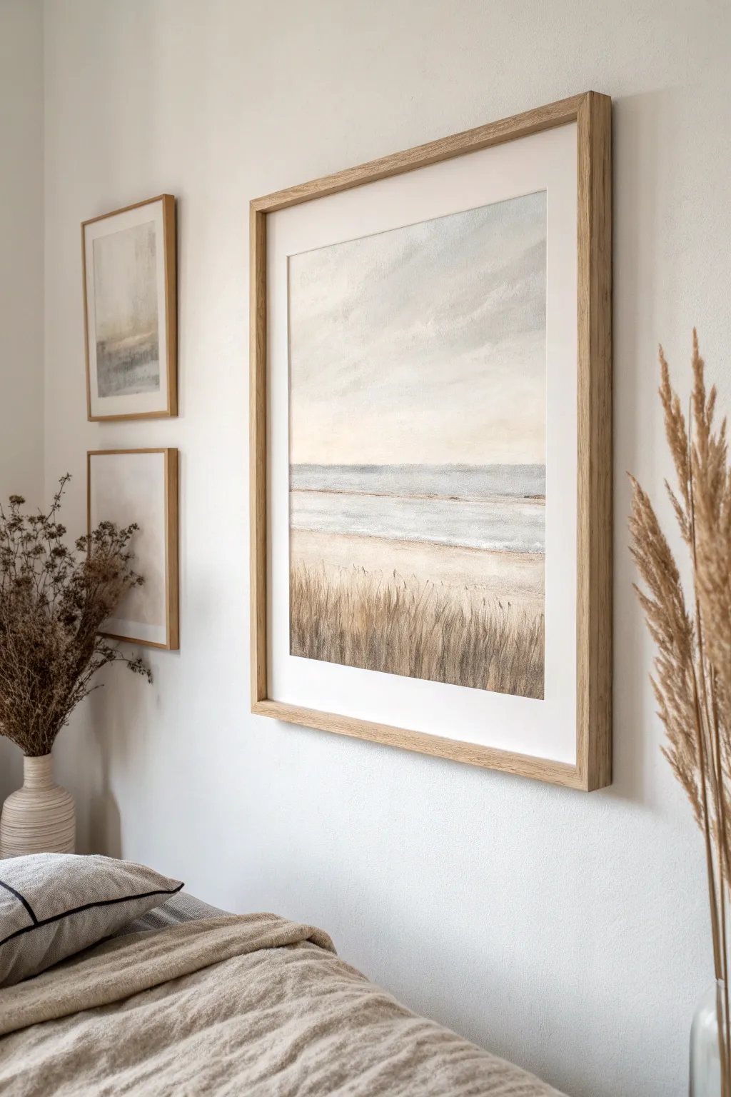
Capture the tranquil mood of a secluded beach with this muted landscape painting, where soft greige tones meet hazy ocean blues. This piece brings a sense of calm sophistication to any room by layering textures to mimic dry coastal grasses and cloudy skies.
Detailed Instructions
Materials
- Heavyweight watercolor paper or primed canvas board (18×24 or larger recommended)
- Acrylic paints: Titanium White, Unbleached Titanium, Raw Sienna, Burnt Umber, Payne’s Grey, Cerulean Blue
- Large flat brush (2-inch)
- Medium filbert brush (size 8 or 10)
- Small fine liner brush (size 1)
- Fan brush (optional, for grass texture)
- Palette knife
- Water container and paper towels
- Painter’s tape
- Light wood frame with mat board
Step 1: Setting the Scene
-
Prepare the Surface:
Begin by taping down the edges of your paper or canvas to a board to prevent buckling and ensure clean margins. If using a canvas, apply a coat of gesso if it isn’t pre-primed, creating a smooth starting point. -
Establish the Horizon:
Mix a very faint wash of Payne’s Grey and Titanium White. Draw a light, straight horizontal line across the canvas, slightly below the halfway mark. This divides your composition into sky and sea/land segments. -
Base Coat the Sky:
For the upper section, mix a large amount of Titanium White with the tiniest touch of Unbleached Titanium and a whisper of Cerulean Blue. Use your large flat brush to apply broad, sweeping horizontal strokes, keeping the color very pale and misty.
Pro Tip: Palette Harmony
Mix a tiny dot of Unbleached Titanium into every single color you use—even the blues. This unifies the painting and ensures that classic ‘greige’ warmth throughout.
Step 2: Building the Atmosphere
-
Create Cloud Depth:
While the sky base is still slightly damp, mix a darker grey using White and Payne’s Grey. Use the filbert brush to scumble in soft cloud formations near the top, blending the edges gently so there are no harsh lines. -
Paint the Ocean Band:
Mix Cerulean Blue with Payne’s Grey and White to create a muted slate-blue. Paint a horizontal band immediately below the horizon line. I like to keep this darker at the horizon and lighten it gradually as it moves downward toward the shore. -
Add Surf Lines:
Load a smaller flat brush with pure Titanium White. Drag faint, broken horizontal lines across the water section to suggest gentle waves or surf breaking in the distance. Keep these marks loose and imperfect. -
Lay the Sand Foundation:
Mix Unbleached Titanium with Raw Sienna. Apply this sandy beige color to the bottom third of the painting, brushing horizontally. Let this section encroach slightly onto the blue water to create a shoreline.
Level Up: Texture Gel
Mix smooth molding paste or texture gel into your sand-colored paint before applying. It physically builds up the surface, making the beach feel real to the touch.
Step 3: Developing Texture
-
Deepen the Foreground Shadows:
To give the beach weight, mix Burnt Umber into your beige mixture. Apply this darker earth tone to the very bottom edge of the canvas, blending it upwards into the lighter sand to create a subtle gradient. -
Dry Brush Texture:
Wipe most of the paint off a stiff brush. Dip it lightly into Unbleached Titanium and drag it swiftly over the sand area. This ‘dry brushing’ technique catches the tooth of the canvas, simulating grainy sand texture. -
Start the Grass Layer:
Mix Paint thinner or water with Burnt Umber to create an inky consistency. Using your fine liner brush (or the edge of a fan brush), flick upward strokes starting from the bottom of the canvas. -
Vary the Grass Heights:
Ensure your grass strokes vary in length; some should reach nearly up to the water line, while others stay low. Natural variability is key to realism here. -
Add Mid-tone Grasses:
Mix Raw Sienna with a little White. Paint a second layer of grass blades over the dark ones. These lighter strokes represent slightly dried or sun-lit stalks.
Step 4: Final Details
-
Highlight the Reeds:
For the final grass layer, use nearly pure Titanium White on your liner brush. Add sparse highlights to the tips of the grasses where the light would catch them, giving the foreground dimension. -
Refine the Horizon:
Check your horizon line. If the sky paint overlapped the sea messily, use a ruler or tape to redefine that crisp edge with a steady hand and a small brush of dark blue-grey. -
Soften Transitions:
Look at where the sand meets the water. Glaze a very watered-down white over this transition zone to make the shoreline look wet and reflective rather than like a hard cutout. -
Final Inspection:
Step back five feet. Look for any areas that feel too flat. A quick dab of palette knife texture with thick white paint in the clouds or surf can add that missing tactile element. -
Frame and Mount:
This style leans heavily on presentation. Once fully dry, mount your artwork behind a clean white mat board and place it in a light oak or natural wood frame to echo the sandy tones.
Hang your finished landscape in a well-lit spot where natural light can play off the subtle textures you created
BRUSH GUIDE
The Right Brush for Every Stroke
From clean lines to bold texture — master brush choice, stroke control, and essential techniques.
Explore the Full Guide
Beige Clay-Inspired Color Fields
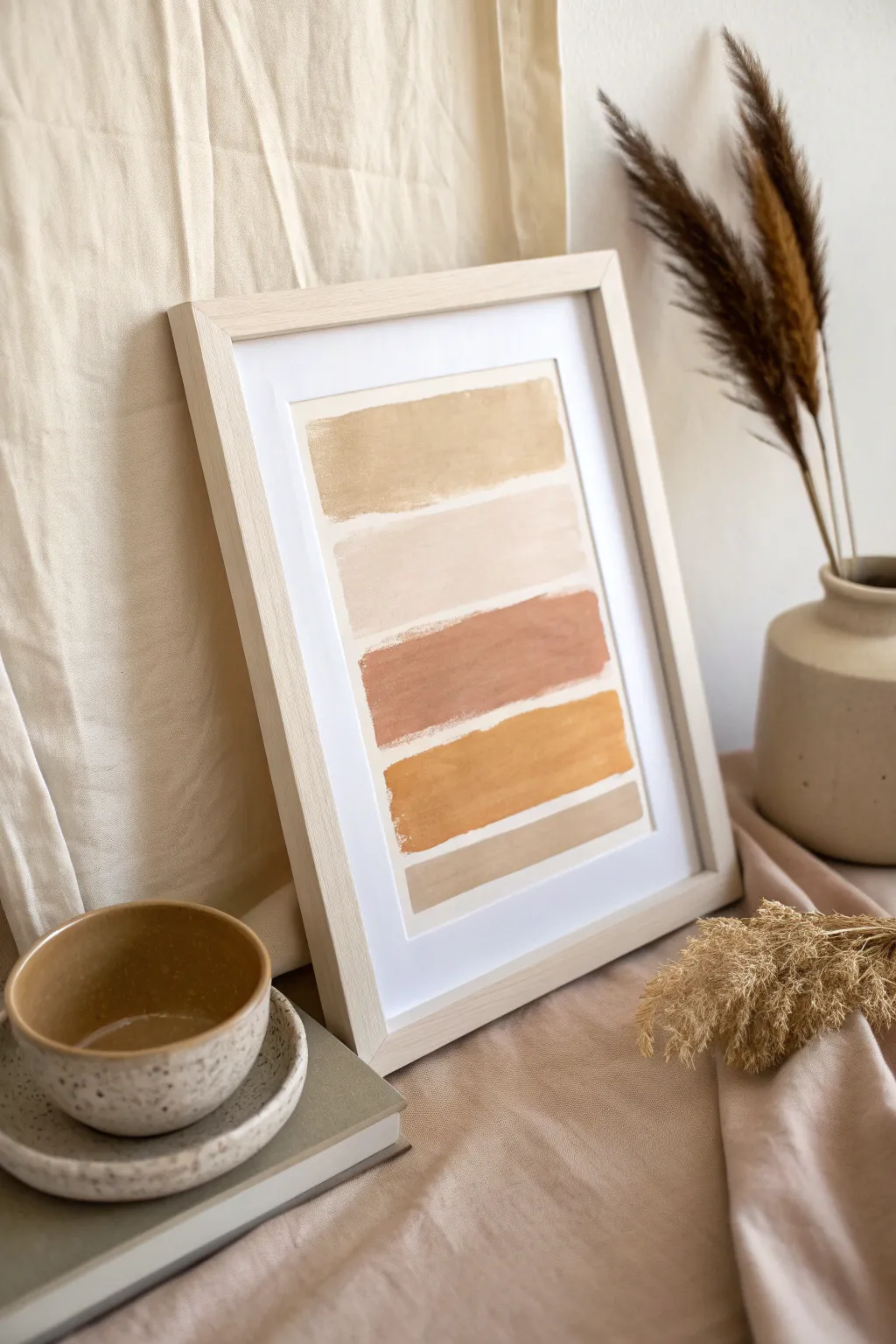
Capture the warmth of sun-baked earth and pottery with this minimalist five-stripe painting. Using simple blocks of color in varying organic hues, you will create a soothing, modern piece that brings a grounded, natural feel to any space.
Step-by-Step Guide
Materials
- Heavyweight watercolor paper or mixed media paper (approx. A4 size)
- Acrylic paints (Titanium White, Yellow Ochre, Burnt Sienna, Raw Umber, Unbleached Titanium)
- Flat shader brush (approx. 1 inch wide)
- Palette for mixing
- Painter’s tape or masking tape
- Jar of water
- Paper towels
- Light wood frame (A3 size with mount)
Step 1: Preparation & Palette
-
Prepare your surface:
Begin by securing your paper to a flat work surface using masking tape on all four corners. This prevents the paper from buckling when it gets wet with paint. -
Define the boundaries:
Since the artwork features a clean white border, use masking tape to mark out a rectangle in the center of your paper. Press the edges down firmly to ensure crisp lines later. -
Mix the base cream:
On your palette, squeeze out a generous amount of Titanium White and mix in a tiny drop of Unbleached Titanium or Yellow Ochre to create a warm, off-white base. You’ll use this to lighten all your other colors. -
Create the color range:
Prepare four distinct puddles of color: a pale sand (White + Raw Umber), a creamy beige (White + Unbleached Titanium), a terracotta rust (Burnt Sienna + White), and a mustard yellow (Yellow Ochre + White).
Uneven Edges?
If paint bleeds under the tape, wait until completely dry. Then, use a small flat brush with pure white acrylic (or white gouache) to carefully touch up and straighten the outer line.
Step 2: Painting the Color Fields
-
Start at the top:
Load your flat brush with the pale sand mixture. Paint a horizontal band at the very top of your taped area. Don’t worry about making the bottom edge perfectly straight; a slightly organic, hand-painted edge adds character. -
Second band: Cream:
Rinse your brush thoroughly and dry it on a paper towel. Pick up the creamy beige color and paint a second stripe directly below the first one. -
Leave breathing room:
As you paint this second stripe, try to leave a hairline gap of white paper between it and the top stripe. This separation keeps the colors distinct. -
Third band: Terracotta:
Clean your brush again. Apply the terracotta rust color as the third stripe. This is the darkest, most saturated hue in the composition, serving as a visual anchor in the middle. -
Fourth band: Mustard:
Move downwards to paint the fourth stripe using the mustard yellow mixture. I like to let the brush texture show slightly here to mimic the rough feel of raw clay. -
Final band: Earth:
For the bottom stripe, mix a little more Raw Umber into your original sand color to make it slightly darker. Paint this final band at the bottom of the rectangle.
Step 3: Finishing Touches
-
Check for opacity:
Look closely at your stripes. If any look too streaky or transparent, wait for the first layer to dry and apply a quick second coat for a more solid, matte finish. -
Refine the edges:
While the paint is wet, you can gently feather the inner edges if you want a softer look, or leave them blocky for a graphic style. -
Let it dry completely:
Allow the painting to sit undisturbed for at least 30 minutes. The acrylics need to be fully dry to the touch before you handle the paper. -
The reveal:
Carefully peel away the painter’s tape slowly and at a 45-degree angle. This ensures you get those satisfyingly crisp outer edges without tearing the paper. -
Mount and frame:
Place your dry artwork behind the mount of your light wood frame. Center it carefully so the white border is even on all sides.
Make it Organic
Instead of straight lines, mix baking soda into your paint for a gritty, textured finish that mimics real pottery glazes.
Hang your new desert-toned masterpiece in a bright corner to bring a sense of calm warmth to the room
Minimal Line Face on Beige Ground
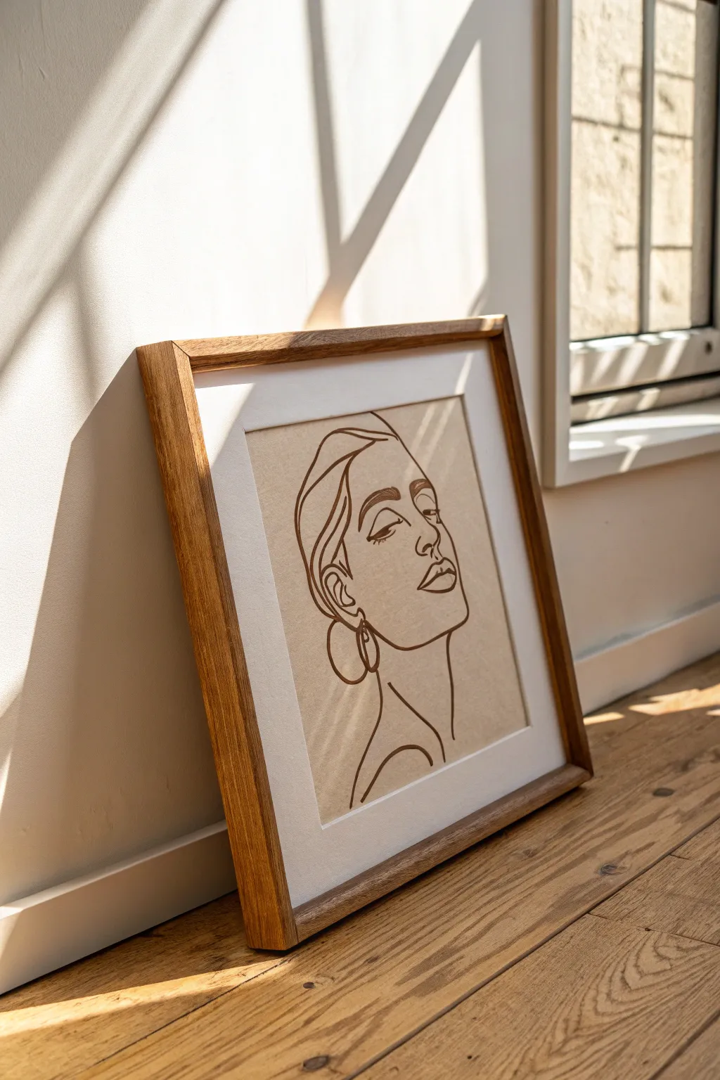
Capture the essence of simplistic beauty with this elegant line art project on a textured beige background. This piece combines fluid, organic lines with neutral tones to create artwork that feels both modern and timelessly sophisticated.
Step-by-Step Tutorial
Materials
- Textured beige paper or unstretched primed canvas sheet (A3 size or similar)
- Pencil (HB)
- Eraser (kneaded is best)
- Dark brown or burnt umber acrylic paint
- Fine liner brush (size 0 or 1) or a brown paint marker
- Wooden frame (oak or walnut finish)
- White mat board (sized to fit frame)
- Masking tape
- Palette or small dish
- Water cup
Step 1: Preparation & Sketching
-
Select your surface:
Choose a beige paper with a bit of tooth or grain visible. This texture adds depth to the simple line work. If using canvas, ensure it is primed beige or paint a white canvas with a wash of ‘Unbleached Titanium’ and let it dry completely. -
Determine placement:
Lay your mat board over your paper to visualize the window where the art will sit. Lightly mark the corners of the opening with a pencil so you know your boundaries. -
Map the head shape:
Start sketching very lightly. Draw a loose oval shape tilted slightly to the right to define the general mass of the head and neck. Keep these initial marks faint. -
Define the profile:
Sketch the forehead, nose, and lips on the right side of your oval. The style is stylized, so focus on the flow of the line rather than anatomical perfection. The nose bridge should be straight and elegant. -
Add facial features:
Place the eye closed with a heavy upper lash line. Add the eyebrow with a simple, arched shape. Draw the lips plump but with minimal detail—just the outer contour and a line for the mouth opening. -
Sketch the hair and neck:
Use sweeping aesthetic curves to suggest hair tucked behind an ear. Outline the ear simply, adding a large hoop earring shape hanging from the lobe. Extend the neck line down into a curve representing the shoulder. -
Refine the lines:
Go over your sketch to finalize the distinct path you want your paint to follow. Erase any confusing scribble lines so you have a clean ‘map’ for painting.
Step 2: Painting the Lines
-
Prepare the paint:
Squeeze out a small amount of dark brown acrylic paint. I like to add a drop or two of water to improve the flow; the consistency should be like heavy cream or ink—fluid enough to glide but opaque. -
Practice your strokes:
On a scrap piece of paper, practice using your fine liner brush. Try to maintain varying pressure: press harder for thick lines (like the eyebrow or hair curves) and lift slightly for thin flourishes. -
Start with the face profile:
Begin painting at the forehead, moving down the nose. Commit to the stroke. If your hand shakes, embrace the organic look—wobbly lines often add character to this minimalist style. -
Paint the eye and brow:
Carefully paint the eyebrow first to anchor the face. Then, do the closed eyelid with a single, confident curved stroke. -
Complete the outline:
Continue painting the hairline, ear, and jawline. Remember to connect lines fluidly where possible, but lifting the brush between sections helps prevent smudging. -
Add the accessory detail:
Paint the hoop earring. Make this line slightly bolder to draw attention as a focal point. Paint the neck and shoulder line last. -
Touch up:
Inspect the lines for any spots where the opacity looks weak. Carefully re-apply paint over those areas if needed, but avoid making the lines too thick.
Fixing Wobbly Lines
If a painted line goes astray, wait for it to dry completely. Use a toothpick to gently scrape away the excess paint, or dab a tiny bit of beige paint over the mistake to mask it.
Step 3: Finishing & Framing
-
Let it dry completely:
Allow the paint to dry for at least an hour. Acrylic dries fast, but thick sections need time. -
Erase pencil marks:
Once totally dry to the touch, gently use your kneaded eraser to pick up any visible pencil guidelines. Rub lightly to avoid damaging the paper surface. -
Mount the artwork:
Place the artwork face down on the back of the mat board. Align it carefully, then secure the top edge with masking tape or framing tape to create a hinge. -
Assemble the frame:
Clean the glass of your wooden frame. Place the matted artwork inside, followed by the backing board, and secure the clips.
Level Up: Texture
Mix a small pinch of baking soda into your brown acrylic paint before applying. This creates a subtle gritty texture that mimics raised ceramic glaze when dry.
Place your framed masterpiece near a window to let the natural light highlight the texture of the paper and the fluidity of your lines

PENCIL GUIDE
Understanding Pencil Grades from H to B
From first sketch to finished drawing — learn pencil grades, line control, and shading techniques.
Explore the Full Guide
Beige Speckle and Fleck Minimalism
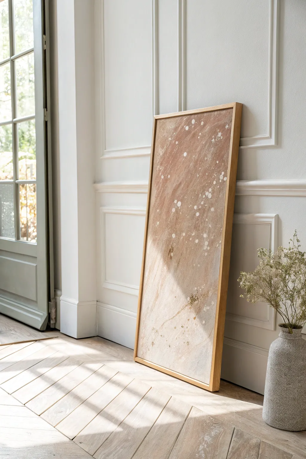
Capture the organic warmth of sandstone and riverbeds with this textured abstract piece. By layering earthy acrylic washes with intentional splatter techniques, you will create a soothing, nature-inspired focal point that blends seamlessly into neutral interiors.
Step-by-Step Guide
Materials
- Large rectangular canvas (e.g., 24×48 inches)
- Acrylic paints: Titanium White, Raw Sienna, Burnt Umber, Unbleached Titanium
- Texture paste or molding paste (optional for grit)
- Wide flat brush (2-3 inches)
- Medium round brush
- Old toothbrush or stiff bristle brush
- Palette knife
- Water spray bottle
- Floetrol or pouring medium
- Light oak floating frame
- Drop cloth
Step 1: Creating the Base Texture
-
Prepare the workspace:
Lay down your drop cloth in a well-ventilated area. This project involves splattering, so ensure you have ample protection for your floors and surrounding furniture. -
Mix the base tone:
In a mixing tray, combine Raw Sienna with a generous amount of Unbleached Titanium to create a warm, sandy beige. I like to add a touch of Burnt Umber to deepen the tone slightly, aiming for a natural stone color. -
Apply the first wash:
Using the wide flat brush, cover the entire canvas with your mixed beige. Don’t worry about perfect opacity yet; visible brushstrokes add to the organic aesthetic. -
Add texture (optional):
While the first layer is wet, mix a small amount of texture paste into your remaining beige paint. Apply this randomly across the canvas with a palette knife, scraping it thin in some areas to create a gritty, stone-like surface. -
Create color variation:
Mix a watery wash of Burnt Umber. While the base is still slightly damp, brush this darker tone into the corners and randomly across the middle, using the spray bottle to let the colors bleed and soften into each other. -
Let it dry:
Allow the base layers to dry completely. This is crucial so your upcoming splatters sit on top rather than muddying into the background. A hair dryer can speed this up.
Step 2: Layering the Splatters
-
Prepare the white paint:
Mix Titanium White with a pouring medium or water until it reaches the consistency of heavy cream or melted ice cream. It needs to be fluid enough to fly off a brush, but thick enough to hold an opaque shape. -
Test your technique:
Before hitting the canvas, practice your flicking motion on a piece of cardboard. Test both a toothbrush (for fine mist) and a loaded round brush (for larger droplets) to understand the range of marks you can make. -
Apply large droplets:
Load your round brush heavily with the white mixture. Stand back and flick your wrist sharply toward the canvas to create the larger, distinct spots seen in the reference. Aim for an asymmetrical cluster, perhaps denser at the top right. -
Create the fine mist:
Dip an old toothbrush into the white paint. Hold it near the canvas and run your thumb across the bristles to spray a fine mist of white specks. Focus these around the larger droplets to create depth. -
Add directional flow:
If you want a cascading look, angle the canvas slightly upright while the largest drops are wet, allowing gravity to pull a few of them down into subtle drips. -
Refine with detail:
Inspect the composition. If a splatter looks too perfect or isolated, use a small brush to add a tiny companion dot nearby, breaking up the uniformity. -
Final drying:
Let the artwork sit undisturbed overnight. Thick droplets of acrylic can simulate dryness on the outside while staying wet inside, so patience is key here.
Natural Texture
Mix a teaspoon of fine, clean sand or baking soda into your base coat paint. This adds microscopic grit that catches the light and makes the ‘stone’ effect look incredibly real.
Step 3: Finishing and Framing
-
Seal the artwork:
Once fully cured, apply a coat of matte varnish. This unifies the sheen of the different paint thicknesses and protects the surface from dust. -
Install the frame:
Place your canvas into a light oak floating frame. Secure it from the back using offset clips or the hardware provided with your frame kit. -
Display placement:
Lean the finished piece against a wall for a casual, studio look, or hang it in a well-lit area where the textural details can catch the light.
Metallic Accent
For a luxe twist, mix a tiny drop of gold ink into your white splatter mix. It will be invisible from afar but will shimmer beautifully when the light hits it.
Enjoy the calm atmosphere this grounded, earthy piece brings to your living space

Have a question or want to share your own experience? I'd love to hear from you in the comments below!