Black and grey paintings have this quiet power—like they can be bold and calming at the same time. If you’re craving something modern, moody, and surprisingly versatile, these black and grey painting ideas will keep your brush moving.
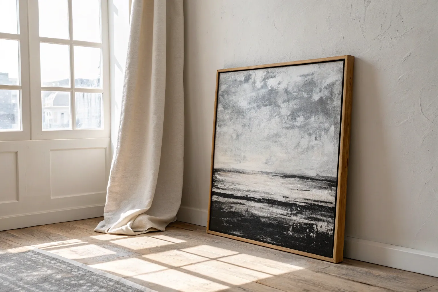
Moody Black and Grey Abstract Canvas
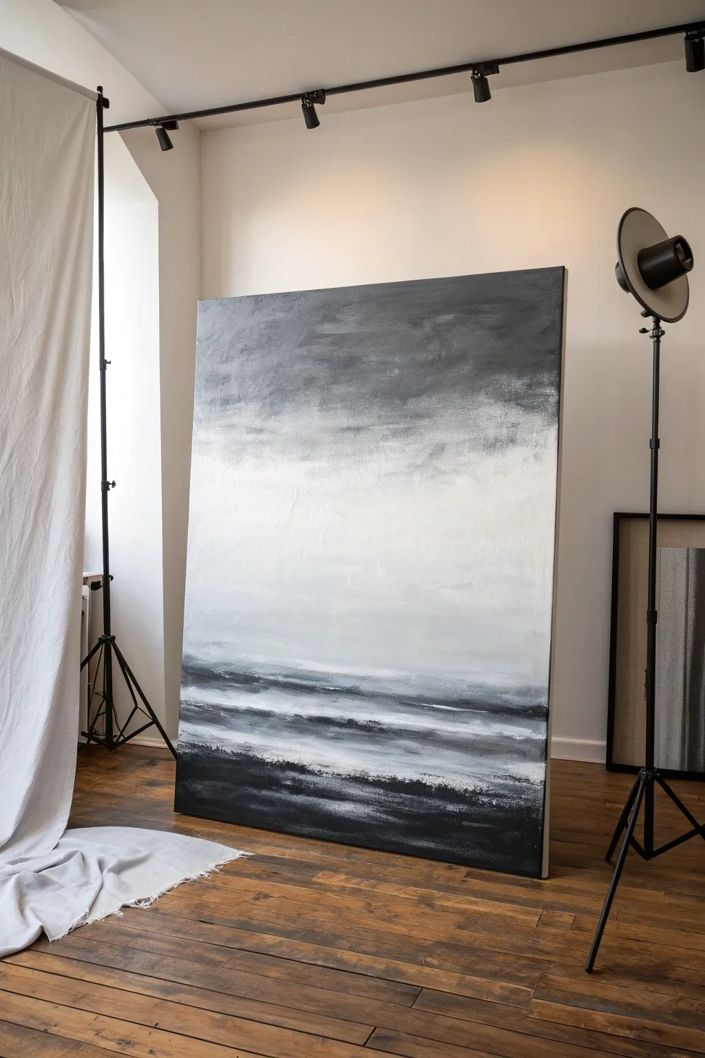
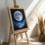
This large-scale abstract landscape captures the brooding beauty of a storm front meeting the sea. Using a limited palette of black, charcoal, and white, you’ll create atmospheric depth and dramatic texture that commands attention in any room.
How-To Guide
Materials
- Large stretched canvas (at least 36×48 inches)
- Black acrylic paint (Mars Black or Carbon Black)
- Titanium White acrylic paint
- Grey acrylic paint (Neutral Grey or mix)
- Wide flat paintbrush (3-4 inch)
- Medium round brush
- Palette knife or painting spatula
- Spray bottle with water
- Paper towels or rags
- Easel or drop cloth for floor work
Step 1: Setting the Scene
-
Prepare your canvas:
Since this is a large canvas, ensure it is stable on a sturdy easel or, preferably, laid flat on a drop cloth if you want to control drips. Give the entire surface a quick mist of water to help the paint move fluidly. -
Map out the horizon:
Visualize the canvas in thirds. The bottom third will be the heavy, dark ground or sea; the middle third is the light, misty horizon; and the top third returns to darkness for the sky. -
Apply the base white:
Load your wide brush with Titanium White. Start in the center section, painting broad horizontal strokes. Don’t worry about perfect coverage yet; just establish the light source in the middle.
Step 2: Building the Sky
-
Introduce the grey:
While the white is still wet, mix a light grey on your palette. Begin blending this above the white section, moving upward. Use long, sweeping horizontal motions to create a seamless transition. -
Darken the upper edge:
Dip your wide brush into the black paint. Start at the very top edge of the canvas and pull the color downward. Let the brush run out of paint as you reach the grey area to create a natural fade. -
Blend the sky gradient:
With a slightly damp, clean brush, blend the boundary between the black top and the grey middle. Use soft, feathery strokes to mimic distant clouds or fog. -
Add texture to the heavens:
Take a paper towel, scrunch it up, and dab lightly into wet grey paint. Press this randomly into the upper dark section to create subtle cloud-like texture and break up the solid black.
Muddy Greys?
If your grey transitions look muddy rather than misty, your brush is likely too wet or dirty. Rinse thoroughly and dry completely between blending dark and light sections.
Step 3: Creating the Foreground
-
Establish the dark base:
Moving to the bottom third of the canvas, applying a heavy coat of black paint. Keep your strokes horizontal and somewhat rough to simulate water or rugged earth. -
Layering the waves:
Mix a charcoal grey. Using a palette knife or the edge of your large brush, drag lines of this grey horizontally across the black bottom section. -
Create separation:
I like to leave a small gap of pure white or very light grey between the sky section and the dark foreground. This distinct ‘horizon line’ adds immediate depth and perspective. -
The misty transition:
Using a dry brush with a tiny amount of white paint, lightly scumble the area where the dark bottom meets the light middle. This creates a foggy effect, softening the harsh line.
Palette Knife Tip
For organic ‘wave’ textures, hold the palette knife almost flat against the canvas and pull quickly. Let the friction of the canvas weave grab the paint unevenly.
Step 4: Detailing and Depth
-
Knife work for texture:
Load a palette knife with thick Titanium White. In the bottom black section, scrape horizontal lines to represent whitecaps or cresting waves. Vary the pressure: push hard for thin scrapes and light for thick deposits. -
Intensify contrasts:
Step back and assess your values. If the top sky looks too light, glaze over it with a watered-down black wash. If the center feels dull, add a fresh layer of bright white to make it pop. -
Soften harsh lines:
Use a dry, soft brush to gently blur any areas in the sky that look too streaky. The goal is an ethereal, vaporous look. -
Add dark accents:
Return to the bottom section with pure black on a smaller brush. Add deep shadows underneath the white crests you created with the palette knife to make them stand out. -
Final atmosphere check:
Spray a fine mist of water over the transition zone in the center. While wet, use a clean rag to lift off bits of paint, revealing the canvas texture for an organic, weathered field. -
Seal the work:
Once fully dry (give it at least 24 hours due to the thick layers), apply a matte or satin varnish to unify the sheen of the different paint thicknesses.
Hang your masterpiece in a minimalist space and enjoy the moody atmosphere you’ve created

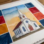
High-Contrast Geometric Blocks
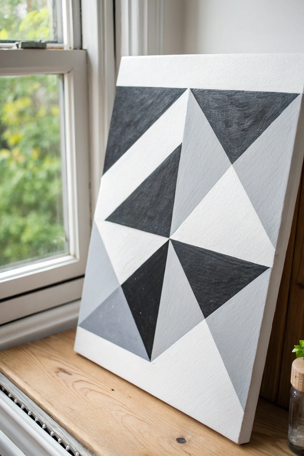
Achieve a modern, striking look with this high-contrast geometric painting that explores the relationship between negative space and bold forms. The sharp triangular zones in black, white, and grey create visual movement without needing a complex color palette.
Step-by-Step
Materials
- Square stretched canvas (approx. 16×16 or 20×20 inches)
- Acrylic paints: Carbon Black, Titanium White, Neutral Grey
- Painter’s tape or masking tape (low-tack is best)
- Flat synthetic brushes (various sizes, e.g., ¾ inch and ½ inch)
- Ruler or straight edge
- Pencil (HB or lighter)
- Eraser
- Palette or paper plate
- Jar of water and paper towels
Step 1: Planning and Mapping
-
Prime the Surface:
Even though canvases often come pre-primed, apply a fresh coat of Titanium White across the entire surface to ensure a clean, bright base. Let this dry completely before moving on. -
Establish the Grid:
Using your ruler and pencil, lightly mark the exact center point of the canvas. This central intersection is crucial as all principal diagonal lines will radiate from or cross through this point. -
Draft the Main Diagonals:
Draw diagonal lines connecting opposite corners, forming a large ‘X’ across the canvas. Press lightly with your pencil so the graphite doesn’t smudge into your white paint later. -
Create the Sub-Triangles:
Divide the main triangular quadrants further by drawing horizontal and vertical lines that intersect the existing diagonals. Refer closely to the reference image to see how the large triangles act as containers for the smaller geometric shards. -
Label Your Colors:
To avoid confusion during painting, lightly write a small letter in each shape indicating its intended color: ‘B’ for black, ‘W’ for white, and ‘G’ for grey.
Step 2: Taping and Painting
-
Tape the First Batch:
Apply painter’s tape along the pencil lines for your first set of shapes. Focus on non-adjacent shapes first; you can’t paint two touching triangles simultaneously without the colors bleeding. -
Seal the Edges:
Press the edge of the tape down firmly with your fingernail or a palette knife. For ultra-crisp lines, I recommend painting a thin layer of the *base* color (white) over the tape edge first to seal it. -
Apply the Black Paint:
Load your flat brush with Carbon Black. Paint the designated black sections using smooth strokes that start on the tape and move inward, ensuring solid opaque coverage. -
Paint the Greys:
Mix a mid-tone grey or use a pre-mixed tube. Apply this to the designated grey sections from your first batch, keeping the texture flat and consistent. -
Remove Tape While Damp:
Carefully peel back the tape while the paint is still slightly tacky, not fully dry. Pull the tape away from the wet paint at a 45-degree angle to prevent lifting chunks of acrylic. -
Allow to Dry:
Let this first layer dry completely. If the black looks streaky, it might need a second coat once the first is dry to touch.
Seal with Medium
Instead of white paint, use clear matte medium to seal your tape edges. It dries invisible and ensures the crispest possible lines without altering your colors.
Step 3: Finishing the Composition
-
Tape the Secord Batch:
Once the first shapes are fully cured, tape off the remaining adjacent shapes. The tape will now go over the dry painted sections, so ensure the paint is truly hard to the touch. -
Fill Remaining Colors:
Paint the remaining black and grey triangles. For the white sections, simply apply fresh white paint if the background needs refreshing or leave the primed canvas exposed if it looks clean. -
Peel and Assess:
Remove the final strips of tape to reveal the complete geometric pattern. Check for any small bleeds or uneven edges. -
Touch Up Lines:
Using a small, fine-detail brush, carefully correct any ragged edges. Use white to clean up grey or black spills, and black to sharpen the dark corners. -
Erase Pencil Marks:
Once the painting is 100% dry (give it a few hours), gently erase any visible pencil lines that weren’t covered by paint.
Uneven Coverage?
If your black paint looks patchy or greyish, it likely needs a second coat. Let the first layer dry completely before re-applying to avoid lifting wet paint.
Hang your finished canvas near a window to see how the changing light plays off the angled shapes
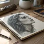
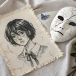
Black and Grey Minimalist Line Art
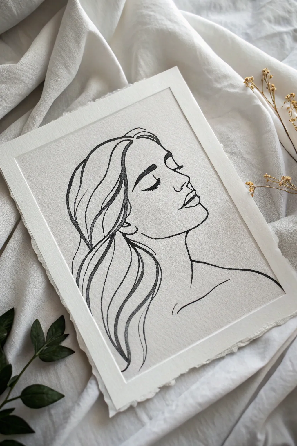
Capture the elegance of simplicity with this emotive line art portrait, focusing on sweeping curves and delicate facial features. This project celebrates negative space and utilizes varying line weights to create depth and movement without the need for shading.
Step-by-Step Guide
Materials
- High-quality textured watercolor paper (cold press, 300gsm)
- H or HB pencil for sketching
- Kneaded eraser
- Fine liner pens (sizes 0.1, 0.3, and 0.5)
- Brush pen or soft charcoal pencil (for bolder hair lines)
- Painter’s tape
- Ruler
Step 1: Preparation and Sketching
-
Prepare the paper:
Begin by securing your textured paper to a flat work surface using painter’s tape deeply on the back or just at the corners if you want that raw, deckled edge look visible. Ensure the paper is perfectly flat. -
Rough placement:
Using your harder pencil (H or HB), lightly mark the general composition. Draw a loose oval for the head tilted slightly back to establish the angle of the pose. -
Map facial features:
Draw faint guidelines for the eyes, nose, and mouth. The nose should be the most prominent protrusion, while the chin is soft and rounded. -
Refine the profile:
Sketch the actual profile line now. Focus on the gentle dip of the forehead, the straight bridge of the nose, and the small, delicate curve of the upper lip. -
Sketch the hair flow:
Instead of drawing individual strands, sketch large, ribbon-like shapes that represent the hair. I like to make these sweeping S-curves to suggest movement and volume. -
Define the neck and shoulder:
Add the long, elegant line of the neck and a simple, subtle curve for the shoulder and collarbone. Keep this area very sparse.
Step 2: Inking the Features
-
Start with the eyes:
Switch to your 0.3 fine liner. Carefully outline the closed eyelid. Emphasize the lashes with quick, short flicks at the outer corner to create a fluttery effect. -
Shape the eyebrow:
Use the same pen to outline the eyebrow. Fill it in with directional strokes that mimic hair growth, keeping it bold and defined but not solid blocks of black. -
Trace the profile:
Use a steady hand to trace your pencil line for the face’s profile. Vary your pressure slightly; lighter on the forehead, slightly firmer under the chin. -
Detail the lips:
Ink the lips, leaving a tiny gap in the center line to suggest softness. The bottom lip should be just a curved line indicating shadow, rather than a full outline. -
Add anatomy hints:
Draw the nostril utilizing a small C-shape and a very fine line for the side of the nose. Add the ear with simple, abstract curves.
Keep it Clean
Place a clean sheet of scrap paper under your drawing hand while you work. This prevents oils from your skin transferring to the paper and stops you from smudging fresh ink.
Step 3: Creating Flow and Finish
-
Bold hair outlines:
Switch to your thicker brush pen or a 0.5 marker. Trace the major outer curves of the hair. The variation in line thickness here is crucial for the ‘calligraphic’ look. -
Inner hair details:
Using a thinner pen (0.1 or 0.3), add the inner swoop lines of the hair. These should follow the flow of the main shape but end abruptly to keep the style airy. -
Neck and shoulder:
Ink the neck and shoulder line with a single, confident stroke. Try not to lift your pen to ensure a smooth, continuous look. -
Collarbone accent:
Add the collarbone line. It should not connect to the shoulder or neck lines; let it float freely to suggest structure without rigidity. -
Erase guidelines:
Allow the ink to dry completely. This might take 10–15 minutes depending on your pen type. Gently erase all pencil marks with the kneaded eraser to avoid damaging the paper texture. -
Deckled edge effect (optional):
If your paper didn’t come with deckled edges, you can gently tear the edges of the paper against a metal ruler to create that raw, artistic border shown in the image.
Add a Splash
For a modern mixed-media twist, add a single abstract shape of watercolor (like a blush pink or soft sage circle) behind the profile before you start the final inking process.
Frame your minimalist masterpiece in a floating glass frame to show off those beautiful textured edges


Black and Grey Portrait With Strong Values
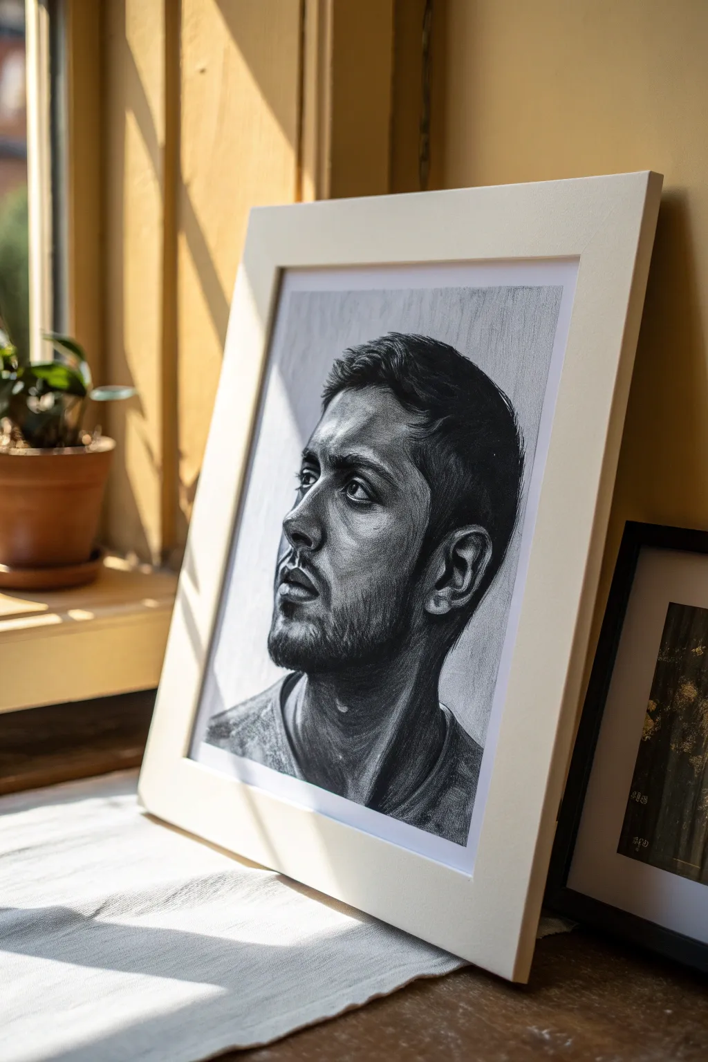
Capture the thoughtful intensity of a human subject with this charcoal and graphite study that emphasizes strong directional lighting and rich value contrast. By focusing on the interplay between deep shadows and bright facial highlights, you’ll create a striking, realistic portrait.
Step-by-Step Guide
Materials
- High-quality drawing paper (Bristol smooth or medium-tooth)
- Graphite pencils (HB, 2B, 4B, 6B)
- Compressed charcoal stick or pencil (for darkest blacks)
- Kneaded eraser
- Precision eraser or eraser stick
- Blending stumps (tortillons)
- White gel pen (optional for extreme highlights)
- Fixative spray
- White mat board and frame
Step 1: Structural Foundation
-
Map the head shape:
Begin with a light HB pencil to sketch the basic cranial mass. Draw an oval slightly tilted back to represent the head, and attach a cylindrical shape for the neck. Keep lines faint so they can be erased later. -
Establish the centerline:
Draw a curved vertical line down the front of the face to mark the profile angle. This centerline is crucial for aligning the nose, lips, and chin correctly in a three-quarter view. -
Place feature guidelines:
Mark horizontal lines for the eyes, the base of the nose, and the mouth. Ensure these lines wrap around the form of the face to maintain perspective. -
Sketch the profile edge:
Refine the outline of the face, carefully observing the negative space around the forehead, the bridge of the nose, and the protrusion of the lips. Pay special attention to the angle of the jawline. -
Draft the features:
Lightly draw the almond shape of the eye, the nostrils, and the lips. Don’t worry about shading yet; just focus on getting the accurate shapes and proportions locked in.
Step 2: Developing Values
-
Apply base shadows:
Switch to a 2B pencil and lightly fill in the areas that will be in shadow. In this portrait, light comes from the front-left, so the back of the head, neck, and the recessed area around the eye socket need initial darkening. -
Deepen the blacks:
Use a 4B pencil or charcoal pencil to establish the darkest points immediately. This usually includes the pupil, the nostrils, and the deepest crevices of the hair. Establishing ‘true black’ early helps you gauge the other values correctly. -
Model the eyes:
Work on the iris and pupil, leaving a tiny spot of white paper for the catchlight. I find that getting the eye right early on brings the drawing to life and motivates the rest of the process. -
Sculpt the nose and cheek:
Build up layers of graphite on the side of the nose and the cheekbone. Use soft, circular strokes to avoid harsh lines, letting the paper tooth hold the graphite. -
Blend for smoothness:
Take a blending stump and gently smudge the graphite in the skin areas to create a smooth transition between the light and mid-tones. Be careful not to over-blend; you still want some texture.
Don’t Be Afraid of Dark
Beginners often work too lightly. To get realistic volume, your darkest shadows need to be nearly pitch black to make the highlights pop forward.
Step 3: Texture and Details
-
Detail the hair:
Using a sharp 4B or 6B pencil, draw the hair in clumps rather than individual strands. Follow the direction of growth, starting from the crown and flowing outward. Darken the roots and tips to create depth. -
Render facial hair:
For the beard and stubble, use quick, short flicks of the pencil. Vary the pressure to make some hairs look thicker than others. Let these strokes overlay the skin shading you did earlier. -
Refine the ear:
The ear is a complex maze of shadows. Use high contrast here—deep darks in the canal and under the folds, with bright highlights on the cartilage ridges. -
Texture the skin:
Use a sharp HB pencil to add very subtle details like pores or creases around the eyes and mouth. This adds realism and prevents the face from looking like plastic. -
Define the neck and clothing:
Shade the neck strongly, particularly under the jaw, to push it back in space. Sketch the collar of the shirt loosely to suggest fabric folds without distracting from the face.
Color Pop
Once the graphite drawing is done, use a soft colored pencil to add a single subtle hue (like blue) only to the iris for a striking focal point.
Step 4: Final Touches
-
Enhance highlights:
Use your precision eraser or a kneaded eraser formed into a point to lift out graphite. Reinforce the bright highlights on the bridge of the nose, the forehead, and the cheekbone. -
Check values:
Step back and squint at your drawing. Darken any mid-tones that look washed out and clean up any smudges in the background area. -
Frame the artwork:
Once sealed with fixative spray, mount the drawing behind a wide white mat and place it in a simple white frame to mimic the clean aesthetic of the reference image.
Hang your finished portrait in natural light to let the graphite textures truly shine
BRUSH GUIDE
The Right Brush for Every Stroke
From clean lines to bold texture — master brush choice, stroke control, and essential techniques.
Explore the Full Guide
Animal Portrait in Charcoal Tones
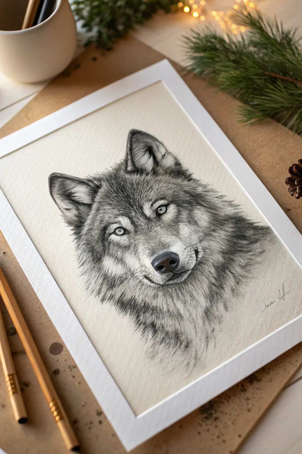
Capture the wild spirit of nature with this detailed charcoal and graphite study of a wolf’s gaze. Working on toned paper allows for striking contrasts, using the paper’s natural warmth as a mid-tone while building up deep shadows and bright highlights.
How-To Guide
Materials
- Cream or off-white toned drawing paper (heavyweight)
- Graphite pencils (HB, 2B, 4B)
- Charcoal pencils (soft, medium, hard)
- White charcoal pencil or white pastel pencil
- Kneaded eraser
- Precision eraser (rendering stick)
- Blending stumps or tortillons
- Fixative spray
- White mat frame for mounting
Step 1: Laying the Foundation
-
Establish the proportions:
Begin with a very light HB pencil sketch. Draw a circle for the head and a smaller muzzle shape extending forward. Mark the eye line about halfway down the head. -
Refine the contour:
Sketch the triangular ears, ensuring the left one is slightly angled back. Define the ruff of the neck fur and the nose shape. Keep your lines faint so they disappear later. -
Map the features:
Place the eyes carefully on your guide line. The wolf’s expression relies heavily on the slant of the eyes and the pupil placement. Outline the nose leather and mouth line.
Muddiness Troubleshoot
If fur looks muddy, you’re blending too much. Fur needs distinct strokes. Lift the smudge with a kneaded eraser and re-apply fresh, crisp lines on top.
Step 2: Building Values
-
Start the eyes:
Using a sharp charcoal pencil, outline the eyes and fill in the pupils, leaving a tiny speck of white paper for the catchlight. Lightly shade the iris with graphite, radiating outward from the pupil. -
Define the nose:
Fill the nostrils with your darkest charcoal. Use a 2B graphite pencil to texture the top of the nose, fading into the lighter bridge area. This establishes your darkest values early on. -
Fur direction mapping:
Take a moment to look at your reference. With an HB pencil, draw light directional arrows or flow lines to remind yourself which way the fur grows—outward from the nose and up the forehead. -
Layering the undercoat:
Using the side of a 2B pencil, lay down a soft, hazy layer of grey over the darker fur areas (ears, neck ruff, forehead markings). Blend this smooth with a stump.
Step 3: Creating Texture
-
Detailing the ears:
Switch to a sharpened charcoal pencil. Draw short, dark strokes inside the ears to simulate the shadowed depth. Leave the outer edges lighter to show thickness. -
Forehead texture:
Using short, rapid flicking motions with a 4B graphite pencil, build the fur on the forehead. The strokes should be shortest between the eyes and get longer towards the ears. -
Developing the muzzle:
On the snout, switch to very fine, light strokes. I find the 2B pencil works best here to avoid making the muzzle look too heavy or dark. -
Deepening the shadows:
Go back in with soft charcoal to punch up the contrast. Darken the area just under the ear, the corner of the mouth, and the pattern markings around the eyes. -
The neck ruff:
Use longer, sweeping strokes for the neck fur. Allow the pencil pressure to fade at the end of each stroke to create a tapered, soft hair look.
Level Up: Eye Tint
Use a tiny amount of diluted yellow-ochre watercolor or colored pencil on just the iris of the eyes. This subtle pop of color adds incredible intensity.
Step 4: Highlights and Finishing
-
Lifting lights:
Take your kneaded eraser and pinch it into a sharp wedge. gently ‘lift’ graphite from the lighter areas of the fur to create negative highlights. -
Adding white fur:
Sharpen your white charcoal pencil to a fine point. Add crisp white hairs over the grey mid-tones, focusing on the muzzle, the inner ear, and the chest area. -
Enhancing the eyes:
Add a final touch of white pencil to the lower rim of the eye and brighten the catchlight if it got smudged. This brings the wolf to life. -
Whiskers:
With a confident, quick hand, draw the long whiskers on the muzzle. Use the white pencil for whiskers against dark fur, and dark graphite for whiskers against light paper. -
Final assessment:
Step back from the drawing. Darken any blacks that look grey and use a clean blending stump to soften any fur transitions that look too harsh. -
Protect and Fram:
Mist lightly with fixative spray. Once dry, mount the drawing behind a clean white mat to emphasize the warm tones of the paper.
Now you have a powerful wildlife portrait that balances fierce intensity with quiet observation
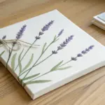
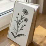
Black and Grey Floral Study
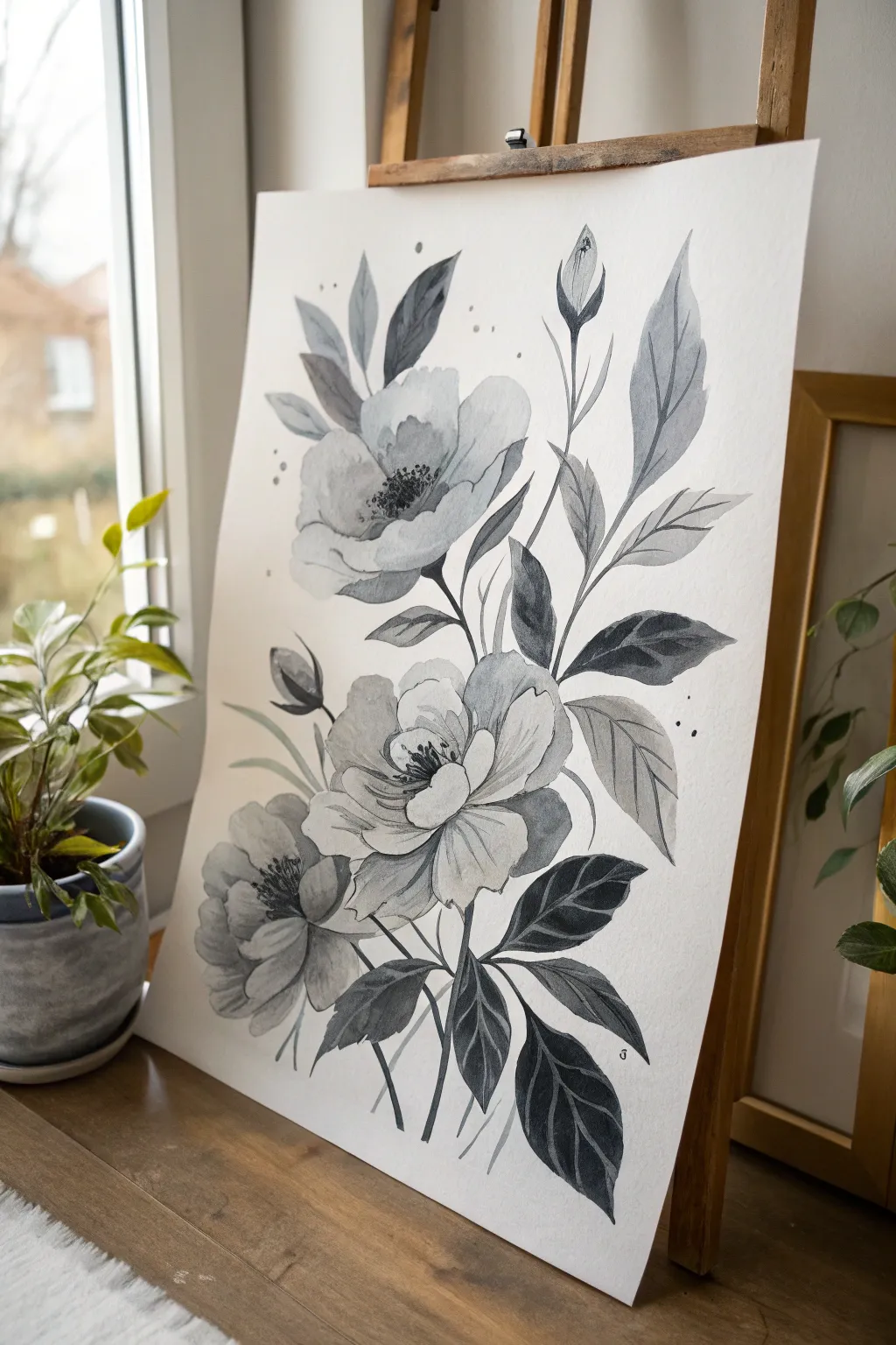
This project captures the delicate balance between striking contrast and soft transparency using a single color: black. By mastering water control, you will create a stunning floral study that features airy, translucent petals alongside bold, dramatic foliage.
Detailed Instructions
Materials
- Cold Press Watercolor Paper (140lb/300gsm)
- Black Watercolor paint (Lamp Black or Payne’s Grey)
- Round watercolor brushes (Size 4, 8, and a fine detail brush)
- HB Pencil
- Kneaded eraser
- Two jars of water
- Paper towels
- Mixing palette
Step 1: Sketching the Composition
-
Establish the layout:
Begin with a very light hand, sketching the placement of the three main flowers. Place the largest bloom slightly off-center near the bottom, a second bloom just above it, and the third, smaller bloom facing upward near the top left. -
Define the petals:
Refine the shapes of the flower heads. Unlike rigid circles, give the petals organic, ruffled edges. Keep your pencil lines faint so they disappear under the translucent watercolour washes later. -
Add stems and buds:
Draw long, slender stems flowing upwards. Add two distinct flower buds: one tightly closed near the middle-left and a slightly taller, more slender bud reaching up on the right side. -
Sketch the foliage:
Map out the leaves. Notice how some leaves cluster near the base while others extend outward on their own stems. Draw pointed, serrated shapes that frame the flowers without crowding them.
Water Control Tip
Keep separate water jars for rinsing dark pigment and wetting your brush for light washes. Dirty water will turn your delicate grey petals muddy instantly.
Step 2: Painting the Blooms
-
Prepare your washes:
On your palette, create three puddles of black paint: a very watery, pale grey (tea consistency), a medium grey (milk consistency), and a deep, saturated black (cream consistency). -
Base layer for petals:
Starting with the top flower, wet a single petal with clean water. Drop a tiny amount of the pale grey wash into the wet area, letting it bloom outward. Leave the edges of the petal white to create highlights. -
Building petal depth:
While the first petal is still damp but not soaking, touch the base of the petal (where it meets the flower center) with a slightly darker grey. This creates a natural shadow and volume. -
Repeat for all blooms:
Continue this process for all three flowers, working petal by petal. I find it helpful to jump between flowers so wet petals don’t touch and merge accidentally. -
Painting the flower centers:
Once the petals are completely dry, use your smallest brush and the darkest black mixture to stipple tiny dots and fine lines in the center of the open blooms. This creates the stamens and adds a focal point.
Step 3: Contrasting Foliage
-
Base layer for leaves:
For the leaves, we want more boldness. Load your size 8 brush with the medium grey wash. Paint the leaf shape, ensuring the tips are sharp and crisp. -
Adding gradients:
While a leaf is still wet, drop the concentrated black paint into one side or the base of the leaf. Tilt the paper slightly to let the dark pigment flow, creating a moody gradient. -
Painting the stems:
Use a steady hand and a size 4 brush to paint the stems. Use the medium grey mix, but vary your pressure to make the lines look organic—thicker at the joints and thinner as they extend. -
Varying leaf tones:
Don’t make every leaf the same darkness. Paint some ‘background’ leaves with a paler wash to push them visually behind the main subject, creating depth in your composition.
Add Metallic Flair
Once the painting is dry, trace the very edges of a few key petals or leaf veins with silver or gold metallic watercolor for a sophisticated, modern touch.
Step 4: Final Details
-
Defining veins:
Once the dark leaves are fully dry, you can use a very sharp white gouache pencil or a fine brush with opaque white paint to add subtle vein lines. Alternatively, if you haven’t painted the leaves too dark, use your darkest black to paint negative veins. -
Adding texture:
Look at the buds and stems. Add tiny, thin strokes of dark black to indicate shadows or texture on the sepals (the green parts cupping the buds). -
Splatter adjustments:
Load a brush with watery black paint and gently tap it against another brush handle over the paper to create subtle splatters. This adds a loose, artistic feel to the negative space. -
Final assessment:
Step back and look at the overall contrast. If the flowers look too washed out, glaze a very watery layer of grey over the shadowed areas to deepen the form without losing transparency.
Allow your painting to dry completely before erasing any visible pencil marks to avoid smudging the pigment

PENCIL GUIDE
Understanding Pencil Grades from H to B
From first sketch to finished drawing — learn pencil grades, line control, and shading techniques.
Explore the Full Guide
City Skyline in Rainy Greys
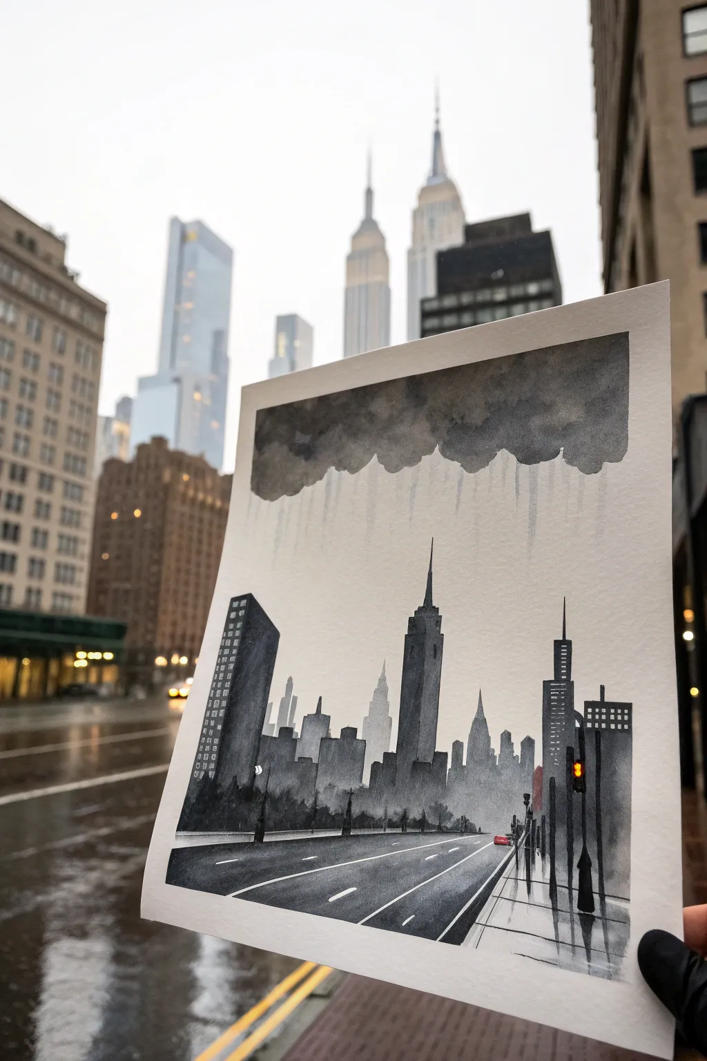
Capture the moody atmosphere of a rainy city day with this striking watercolor painting that balances sharp architectural silhouettes against soft, weeping clouds. Using a limited palette of greys and blacks, you’ll learn to create depth through value changes and evoke wet weather with controlled drips.
Step-by-Step Guide
Materials
- Cold Press Watercolor Paper (140lb/300gsm)
- Black Watercolor Paint (e.g., Lamp Black or Neutral Tint)
- White Gouache (optional, for highlights)
- Flat Wash Brush (1 inch)
- Round Detail Brushes (sizes 2 and 6)
- Pencil and Ruler
- Masking Tape
- Jar of Water
- Paper Towels
Step 1: Preparation and Sketching
-
Secure the paper:
Tape down all four edges of your watercolor paper to a board using masking tape. This creates a crisp white border and prevents buckling when the paper gets wet. -
Establish the horizon:
Draw a faint horizontal line about one-third of the way up from the bottom of the page. This will act as your ground level for the buildings. -
Outline the architecture:
Lightly sketch the skyline shapes. Focus on geometric blocks for the buildings. Include a prominent spire in the center (like the Empire State Building) and a taller, angled building on the left foregound. -
Perspective lines:
Draw diagonal lines converging from the bottom corners toward a vanishing point near the center of the horizon line to map out the road and sidewalk edges.
Step 2: The Grey Sky
-
Mix your grey:
Create a medium-grey wash by diluting your black paint with plenty of water on your palette. You want a watery consistency. -
Paint the cloud mass:
Using your flat brush, paint a heavy, undulating cloud shape across the top third of the paper. Keep the bottom edge uneven and bumpy. -
Create the rain effect:
While the cloud paint is still wet, load your brush with clean water or very diluted grey. Gently touch the bottom edge of the cloud and drag lines vertically downward. Let gravity pull the pigment down to create soft rain streaks. -
Dry completely:
Allow this section to bone-dry before moving on to ensure the buildings remain crisp.
Bleeding edges?
If paint seeps under your tape, use opaque white gouache to touch up the edges after the painting is dry. For next time, ensure you firmly burnish the tape edge with a fingernail before painting.
Step 3: Building the City
-
Far background layer:
Mix a very pale, watery grey. Paint the silhouettes of the furthest buildings. These should barely be visible, mimicking atmospheric distance. -
Mid-ground skyscrapers:
Once the pale layer is dry, mix a medium-dark grey. Paint the buildings that sit in the middle distance, including the central spire. These shapes should be darker than the background but lighter than the foreground. -
Foreground Giants:
Load your brush with concentrated black paint with very little water. Paint the large building on the far left and the structures on the far right. The high contrast brings them forward. -
Add windows:
While the paint is wet on the foreground buildings, you can lift out tiny squares with a dry brush, or wait until dry and paint small white or light grey rectangles to suggest windows.
Add Texture
For a grittier urban feel, lightly splatter clean water droplets onto the semi-dry road area. This creates ‘blooms’ that look remarkably like oil slicks or puddles on asphalt.
Step 4: Ground and Details
-
Asphalt wash:
Paint the road surface with a smooth, medium-dark grey wash. Make your brush strokes follow the diagonal perspective lines you drew earlier. -
Reflective wetness:
While the road wash is still damp, drop in slightly darker horizontal streaks to suggest reflections on wet pavement. -
Road markings:
Once the asphalt is totally dry, use white gouache or undiluted white watercolor to paint thin lane markers and the sidewalk edge. -
Street level details:
Switch to your smallest round brush. Use thick black paint to add lamp posts, traffic lights, and tiny silhouetted figures on the sidewalk. -
The pop of color:
Adding a tiny touch of color makes the monochrome pop. Use a dab of red (or mixed red gouache) to paint a small car taillight or stoplight near the horizon line. -
Final reveal:
Wait until everything is completely dry, then carefully peel away the masking tape to reveal your clean white border.
Frame this moody cityscape in a simple black frame to emphasize the atmospheric perspective you have achieved
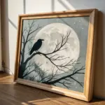
Smoky Background With Sharp Black Subject
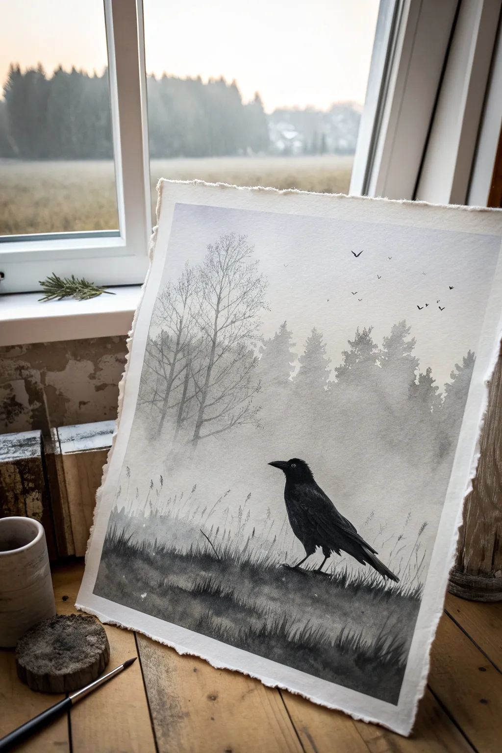
Capture the quiet mystery of a foggy morning with this monochromatic watercolor study. By contrasting soft, smoky washes with crisp, dark silhouettes, you’ll create a striking atmospheric scene that draws the eye straight to the subject.
Step-by-Step Guide
Materials
- Cold Press Watercolor Paper (300 gsm or heavier, preferably with deckled edges)
- Watercolor Paint: Payne’s Grey or Lamp Black
- Large Flat Wash Brush (1 inch)
- Round Brushes (Size 4 and Size 8)
- Rigger or Liner Brush (Size 0 or 1)
- Painters Tape or Masking Tape
- Board for mounting paper
- Two jars of water
- Paper towels
- Pencil (HB or lighter) and kneaded eraser
Step 1: Preparation and Sketching
-
Prepare the Paper:
Begin by securing your watercolor paper to a board. If you want that beautiful deckled edge look shown in the reference, tape the paper down from the back using rolled loops of tape, rather than taping over the front edges. -
Sketch the Composition:
Lightly sketch the horizon line about one-third of the way up from the bottom. Outline the shape of the crow in the lower right foreground. Keep your pencil lines extremely faint so they disappear under the transparency of the paint later. -
Position the Trees:
Roughly mark where your main tree line will sit in the background. Don’t draw every branch; just indicate the vertical placement and the general mass of the foliage.
Preventing Muddy Washes
If your grey washes look streaky or ‘cauliflower’ edges appear, you likely added water to paint that was already partially dry. Wait for layers to fully dry before retouching.
Step 2: Creating the Smoky Atmosphere
-
Pre-wet the Sky:
Using your large flat brush and clean water, wet the entire paper above the horizon line, carefully painting *around* the crow sketch. The paper should be glistening but not forming puddles. -
The First Wash:
Dilute your black or Payne’s Grey to a very pale, watery consistency. Drop this mist color into the wet sky area, letting it bloom softly. Keep the area near the horizon slightly lighter to suggest distance. -
Soft Background Trees:
While the paper is still damp (but not soaking), mix a slightly stronger mid-grey value. Using a round size 8 brush, dab in the shapes of the distant pine trees against the horizon. -
Diffusing edges:
Because the paper is damp, the tree edges should fuzz out naturally. If they look too sharp, rinse your brush, dry it slightly on a paper towel, and gently soften the edges manually to enhance that foggy effect. -
Adding the Mid-Ground Skeleton Trees:
While the background is barely drying, switch to the rigger brush with a slightly darker grey mix. Paint the thin, skeletal deciduous trees on the left side. Painting them while the background is still settling helps push them back into the mist. -
Dry Completely:
This is crucial: Let the painting dry completely before moving on. The paper must be bone-dry to achieve sharp foreground details in the next phase.
Level Up: Salt Texture
Sprinkle a pinch of table salt onto the damp grey wash in the foreground field. As it dries, the salt pushes pigment away, creating a stunning frost-like crystal texture.
Step 3: The Sharp Foreground
-
Painting the Crow’s Base:
Mix a rich, deep black paint with very little water—almost an ink consistency. Carefully fill in the silhouette of the crow. Start from the beak and work your way down to the tail feathers. -
Adding Feathers and Texture:
Before the black silhouette fully dries, lift out a tiny highlight for the eye using a clean, damp brush or a white gel pen later if needed. Use the tip of your small round brush to flick out feather textures on the wing and tail. -
Grounding the Bird:
Paint the uneven ground beneath the crow using a dark grey wash. Allow the bottom edge of the wash to be rough and uneven to simulate dirt and grass clumps. -
Building the Grass:
With your rigger brush and dark grey paint, pull quick, upward strokes from the ground area. Vary the pressure to make thick-to-thin grass blades. Some should overlap the bottom of the crow’s feet to settle it into the landscape. -
Layering Grass Depths:
Add a second layer of grass using a slightly lighter, watered-down grey. I like to paint these slightly behind the darker blades to create a sense of depth and density in the field. -
Flying Birds:
Using the very tip of your smallest brush or a fine liner pen, add tiny ‘V’ and tick shapes in the sky area to represent a distant flock of birds. Keep them random and varied in size.
Step 4: Final Details
-
Splatter Texture:
Load a toothbrush or stiff brush with clean water and flick tiny droplets onto the dark foreground grass. Count to ten, then dab them up with a tissue. This lifts the pigment to create texture. -
Final Contrast Check:
Stand back and assess your values. If the crow has dried too light (watercolor lightens as it dries), add a second coat of intense black to ensure it remains the focal point.
Once dry, you can mount your painting to let the raw edges show, completing the atmospheric aesthetic


Drips and Splatter in Greyscale
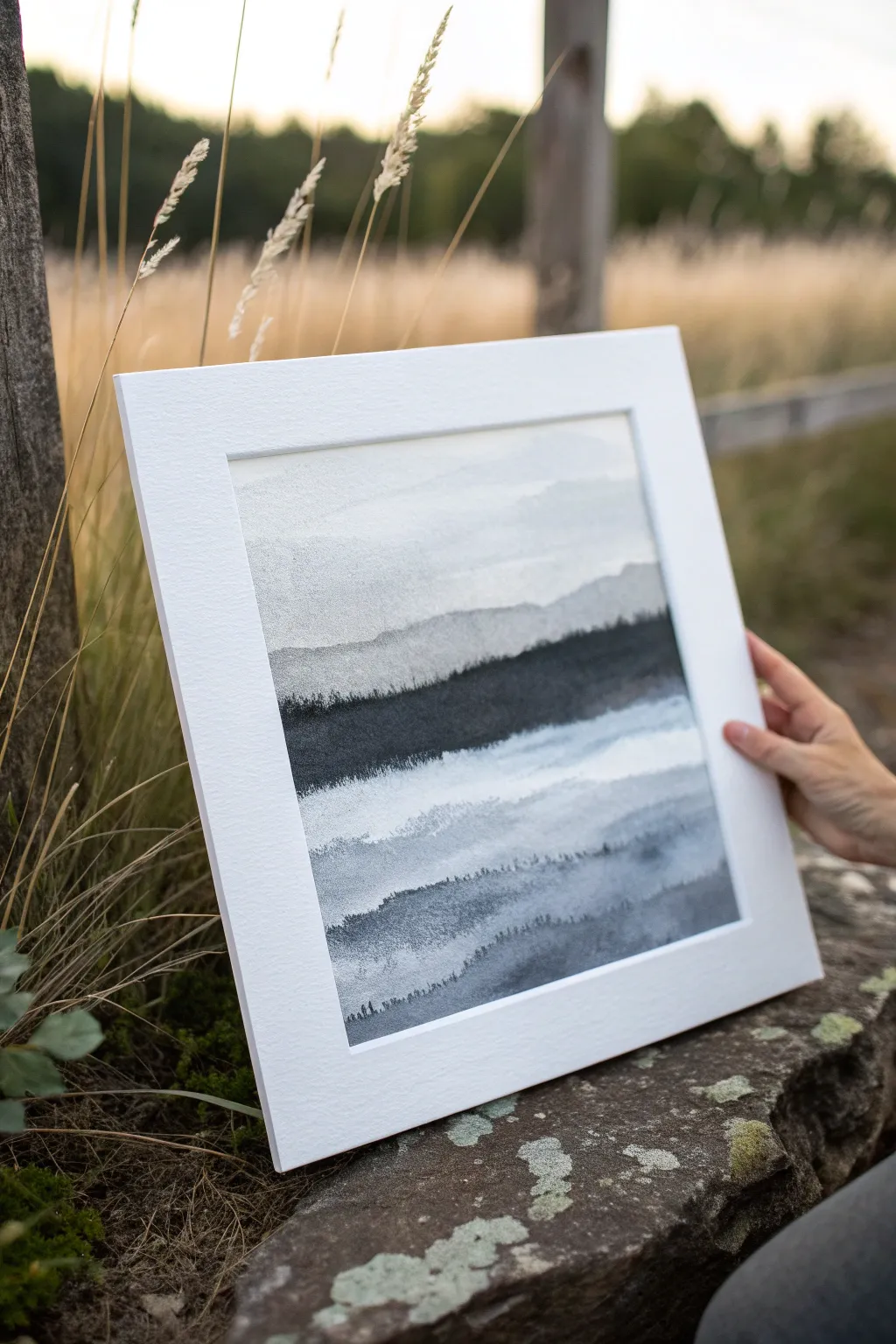
Capture the serene solitude of a foggy mountain range with this layered watercolor landscape. Using only shades of black and grey, you’ll create depth and atmosphere through simple wash techniques and careful layering.
Step-by-Step Guide
Materials
- Cold Press Watercolor Paper (140lb/300gsm)
- Black Watercolor Paint (or India Ink)
- Flat Wash Brush (1 inch)
- Round Brush (Size 6 or 8)
- Small Detail Brush (Size 0 or 1)
- Two Water Containers (clean and rinse)
- Paper Towels
- Painter’s Tape
- White Mat Board (for framing)
Step 1: Preparation and Sky
-
Secure the paper:
Tape your watercolor paper down to a flat board on all four sides. This prevents the paper from buckling when wet and creates a crisp white border for later framing. -
Mix a pale wash:
In your palette, dilute a tiny drop of black paint with plenty of water to create a very faint, watery grey. Test it on a scrap piece of paper; it should look like dirty water. -
Paint the sky:
Using the large flat wash brush, sweep this pale grey across the top third of your paper. Make the strokes horizontal and slightly uneven to mimic distant cloud cover. -
First partial dry:
Let this sky layer dry until it is no longer glistening but feels cool to the touch. It doesn’t need to be bone dry yet.
Step 2: Building the Distant Range
-
Create the furthest peaks:
Mix a slightly darker shade of grey—just a step up from your sky color. With your round brush, paint a jagged, organic line across the paper, overlapping the bottom edge of the sky. -
Fill the shape:
Immediately fill in the area below that jagged line with water, pulling the pigment down to create a soft gradient that fades to white at the bottom. -
Soften the edges:
While the paint is wet, you can lift color with a thirsty brush or paper towel in random spots to suggest mist rolling over the peaks. -
Let it dry completely:
This step is crucial. Allow this first mountain layer to dry completely before touching the paper again, or the layers will bleed together into a murky mess.
Bloom Patrol
If you see ‘cauliflower’ or back-run blooms forming where water pushes into drying paint, don’t panic. In landscapes, these often look like natural clouds or rocky textures
Step 3: Adding the Middle Ground
-
Darker mid-tones:
Prepare a medium-grey wash. Paint a second mountain range below the first one, ensuring the top edge is distinct and crisp against the lighter layer behind it. -
Suggest trees:
While painting the top edge of this middle layer, use the tip of your round brush to create tiny, vertical ticking marks. These irregular bumps suggest a distant treeline. -
Create horizontal mist:
As you fill in the body of this mountain shape, run a damp, clean brush horizontally through the wet paint. This lifts pigment and creates streaks of white mist cutting through the hills. -
Dry thoroughly:
Once again, let the painting dry completely. You can use a hairdryer on a low, cool setting to speed this up.
Tint the Mist
For a subtle mood shift, mix a tiny drop of Indigo or Payne’s Grey into your black washes. This cools down the temperature without breaking the monochrome feel
Step 4: The Darkest Foreground
-
Mix the darkest value:
Create a rich, near-black concentration of paint. It should be thick enough to be opaque but fluid enough to flow off the brush. -
Paint the main ridge:
Establish the prominent dark ridge in the center of the composition. Use confident, horizontal strokes to block in this heavy shape. -
Add tree details:
Switch to your small detail brush. Along the top edge of this dark ridge, paint tiny, precise vertical lines to represent distinct pine trees standing against the lighter background. -
Fade the bottom:
Before the dark ridge dries, use clear water to fade the bottom edge out, creating another band of mist that transitions into the lower section of the painting. -
Final foreground accents:
At the very bottom, paint faint, ghostly shapes of hills using a watery grey wash to ground the composition. -
Detail the textures:
I like to take a predominantly dry brush with dark pigment and drag it lightly over the dry paper in the darker areas to add texture and roughness.
Step 5: Finishing Touches
-
Remove the tape:
Once the paper is 100% dry, carefully peel away the painter’s tape at a 45-degree angle away from the artwork to reveal your clean edges. -
Mat the artwork:
Place your finished piece behind a white mat board. This enhances the contrast of the greyscale tones and gives it a professional gallery look.
Step back and admire the depth you’ve created with just water and a single color.
Marbled Black and Grey Flow Painting
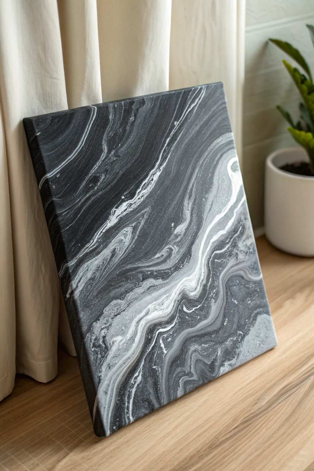
Channel the elegance of polished stone with this sophisticated fluid art project that mimics the natural veining of black marble. Using just a few shades of acrylic, you will create a high-contrast statement piece that looks incredibly luxurious despite the simple pouring technique.
How-To Guide
Materials
- Square stretched canvas (12×12 or similar)
- Black acrylic paint
- White acrylic paint
- Metallic silver acrylic paint (optional for sheen)
- Acrylic pouring medium (e.g., Floetrol or Liquitex)
- Plastic cups for mixing
- Stir sticks
- Hairdryer or straw
- Silicone oil (optional for cells)
- Drop cloth or large garbage bag
- Latex gloves
Step 1: Mixture Preparation
-
Set up your workspace:
Fluid art gets messy, so cover your entire table with a drop cloth or garbage bag. Place your canvas on top of four upside-down cups to elevate it, allowing the paint to drip freely off the edges without sticking the canvas to the table. -
Mix the base black:
In a large cup, mix your black acrylic paint with the pouring medium. You want a ratio of about 1 part paint to 2 parts medium. Stir slowly to avoid creating too many air bubbles. The consistency should be like warm honey. -
Prepare the contrast colors:
In separate, smaller cups, mix your white paint and metallic silver with the pouring medium using the same 1:2 ratio. For a true grey, mix a drop of black into a small amount of white in a third cup. -
Check consistency:
Lift your stir stick from the cup. The paint should flow off in a continuous stream without breaking immediately. If it’s too thick, add a few drops of water; if it’s too thin, add a touch more paint.
Air Control
When using a hairdryer to move paint, use a funnel attachment to concentrate the air, or tape a small piece of cardboard to the nozzle to direct the flow more precisely.
Step 2: Creating the Dirty Pour
-
Apply the black base:
Pour a generous amount of your black mixture onto the center of the canvas. Use a palette knife or a flat stick to spread it roughly towards the corners, ensuring the canvas is damp with paint but not flooding. -
Layer the dirty cup:
Take a fresh empty cup. Pour a layer of black, followed by a smaller splash of white, then a drizzle of silver, and finally the grey mixture. Repeat this layering process until the cup is about half full. Do not stir this cup. -
Pour the ribbon:
Start pouring the contents of your layered cup slowly across the canvas in a diagonal or wavy motion. I like to wiggle my wrist slightly as I pour to encourage more organic lines rather than straight stripes.
Step 3: Tilting and Refining
-
Initial tilt:
Gently lift the canvas and tilt it slowly from side to side. Watch how the paint stretches. The goal is to cover the entire surface, letting the black base interact with the white veins you just poured. -
Stretch the veins:
Continue tilting until the paint runs over the edges. Try not to over-tilt, or your distinct white lines will become muddy grey. You want to maintain that high contrast between the deep black and bright white. -
Use air for movement:
If you have clumps of white that look too heavy, use a hairdryer on the ‘cool’ and ‘low’ setting to gently push the white paint outward, feathering it into the black to create wispy, smoke-like effects. -
Detail with a straw:
For finer control, use a drinking straw to blow on specific areas. This creates small, intricate veins and breaks up any large blobs of color that look unnatural. -
Check the corners:
Ensure all four corners are fully coated. If they aren’t, use your finger to dab some of the dripping paint from the table onto the corners to cover the bare canvas. -
Remove drips:
Run a clean popsicle stick or your finger along the underside edge of the canvas frame to scrape off the dripping paint. This prevents the paint from pulling off the top of the canvas as it dries. -
Pop bubbles:
Use a culinary torch briefly over the surface (keep it moving constantly) to pop any air bubbles trapped in the paint, or prick them gently with a toothpick.
Silver Veining
Mix metallic silver powder into your white paint instead of using silver paint. This creates a shimmering, geode-like effect that sparkles when light hits the dried veins.
Step 4: Drying and Sealing
-
Level drying:
Leave the canvas on the raised cups to dry. It is crucial that the surface is perfectly level, or the paint will slowly slide off one side while you aren’t looking. -
Allow cure time:
Let the painting dry undisturbed for at least 24 to 48 hours. Acrylic pours dry on the surface first but stay wet underneath for days. -
Apply varnish:
Once fully cured (after a few weeks), apply a high-gloss varnish. This will deepen the black tones significantly and give it that authentic polished stone appearance.
Hang your new faux-marble masterpiece in a well-lit spot to show off those dramatic, flowing contrasts.
Triptych in Black and Grey Values
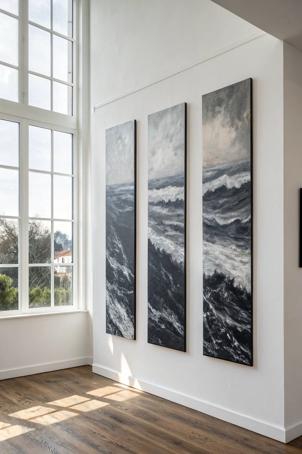
Capture the raw power of a turbulent ocean with this dramatic three-panel painting. Using a restricted palette of black, white, and grey, you will build layers of texture to create crashing waves that flow seamlessly across three separate canvases.
Step-by-Step
Materials
- 3 tall rectangular canvases (e.g., 24×60 inches each)
- Heavy body acrylic paints (Mars Black, Titanium White, Payne’s Grey)
- Gesso (optional for priming)
- Large flat brushes (2-3 inch)
- Medium filbert brushes
- Palette knifes (assorted sizes)
- Sea sponge or rag
- Water spray bottle
- Easels (or wall space) to hold all three canvases
Step 1: Preparation and Sky
-
Setup the Triptych:
Arrange all three canvases side-by-side with a small gap between them, exactly as they will hang. This is crucial for ensuring the horizon lines and wave patterns connect visually across the gaps. -
Prime the Surface:
If your canvases aren’t pre-primed, apply two coats of gesso to ensure a smooth, durable surface for heavy paint application. -
Establish the Horizon:
Lightly sketch a horizon line using a neutral grey mix. Place it slightly above the center point, carrying the line across all three panels to unify the composition. -
Paint the Upper Sky:
Mix a cloudy grey using white and a touch of Payne’s Grey. Apply this to the top third of the canvases using a large brush, using sweeping, crisscross strokes to create atmospheric movement. -
Darken the Horizon Sky:
Blend a darker grey into the wet paint near the horizon line. I like to use a dry rag here to smudge the transition, making the storm look like it’s brooding in the distance.
Mist Master
Use a spray bottle to lightly mist the canvas while blending the sky. This keeps acrylics workable longer and creates soft, foggy transitions.
Step 2: Building the Ocean Structure
-
Block in Deep Waters:
Using Mars Black and dark grey, block in the darkest areas of the water. Focus on the troughs between the waves, creating diagonal shapes that suggest the rolling motion of the sea. -
Map the Crests:
With a lighter grey mixture, rough in the shapes of the major wave crests. Make sure the largest wave shapes span across the panel gaps to reinforce the triptych effect. -
Create Mid-Tones:
Mix a medium charcoal tone and fill in the transition areas between the black troughs and light crests. Don’t worry about details yet; focus on volume and form. -
Add Texture with Palette Knife:
Load a palette knife with thick black and dark grey paint. Scrape it firmly over the dark water areas to create rough, organic textures that mimic choppy water.
Go Metallic
Mix a small amount of silver or pearl medium into your white paint for the wave crests to give the water a shimmering, luminescent quality.
Step 3: Crashing Waves and Details
-
Form the Whitecaps:
Mix Titanium White with a tiny dot of grey (pure white can look too stark initially). Use a filbert brush to paint the tops of the crashing waves, using short, curved strokes to show the water curling over. -
Create Sea Spray:
Dab a natural sea sponge into thinned white paint. Lightly stipple along the tops of the waves and at the base where the water crashes, creating a misty spray effect. -
Refine the Foreground:
In the bottom third of the canvases, use chaotic, multi-directional strokes with black and white to depict the churning, foamy water closest to the viewer. -
Enhance Contrast:
Go back in with pure Mars Black to deepen the darkest shadows right underneath the white foam. High contrast is the secret to making the water look wet and deep. -
Connect the Panels:
Step back often to view the whole piece. Ensure a wave crest ending on the left panel visually ‘continues’ onto the middle panel. Adjust the lines if necessary so the flow is uninterrupted. -
Final Highlights:
Use a small palette knife to apply thick, pure Titanium White impasto highlights on the very tips of the waves for a tactile, 3D finish that catches the light.
Hang your masterpieces with precise spacing to let the storm flow across your wall
Have a question or want to share your own experience? I'd love to hear from you in the comments below!