
When I need to explain a big idea fast, I lean on simple business drawings that turn strategy into something you can literally see. These business drawing ideas are my go-to prompts for filling a page with confident, useful visuals—no complicated rendering required.
Lightbulb Idea Sketch

Capture the classic symbol of innovation with this crisp, illustrative lightbulb sketch on natural-toned paper. The bold lines and simplified shapes give it a charming, hand-drawn infographic style perfect for bullet journals or meeting notes.
Step-by-Step Tutorial
Materials
- Spiral-bound notebook with tan or kraft paper
- Fine-point black gel pen or ink rollerball (0.5mm or 0.7mm)
- Pencil (optional for sketching)
- Eraser
Step 1: Drafting the Bulb Shape
-
Start the bulb curve:
Begin near the top center of your page. Draw a large, upside-down ‘U’ shape to form the main glass dome of the lightbulb. Keep the curve smooth and rounded. -
Narrow the neck:
As you bring the lines down from the dome, curve them inward slightly to create the tapered neck of the bulb, stopping before they touch. -
Add a highlight line:
Inside the dome, on the upper left side, draw a curved line parallel to the outer edge. This negative space creates a simple reflection effect. -
Draw the filament support:
In the center of the bulb, draw a thin ‘V’ shape that extends down toward the neck. Connect the points of the V with a tiny horizontal line for the base. -
Sketch the filament loops:
At the top of your ‘V’ shape, draw three tiny loops (like cursive ‘e’s) connecting the two prongs. This represents the glowing filament.
Ink Flow Tip
On kraft paper, ink can absorb quickly. Move your pen slightly slower than usual to ensure lines are saturated and dark.
Step 2: Adding the Base and Rays
-
Create the screw base:
At the bottom of the neck opening, draw three slightly curved horizontal lines stacked closely together to mimic the metal threading. -
Cap it off:
Draw a small, solid black semi-circle or rounded rectangle at the very bottom of the threads for the electrical contact point. -
Thicken key lines:
Go back over the outer contour of the bulb. I like to make this line slightly bolder than the interior details to help it pop off the page. -
Position the rays:
Imagine a circle surrounding the bulb. Make small marks where you want your ‘glow’ lines to go, spacing them relatively evenly. -
Draw the radiance:
Draw short, straight lines radiating outward from the bulb. Keep them disconnected from the main drawing, floating just outside the glass shape.
Step 3: Surrounding Icons
-
Outline the star:
To the right of the bulb, draw a standard five-pointed star. Don’t worry about perfect symmetry; the hand-drawn look is part of the charm. -
Texture the star:
Fill the star with vertical hatching lines. Vary the line weight slightly to give it a wood-grain or sketched texture. -
Draft the chart axes:
Below the bulb, draw an ‘L’ shape for a graph. Add small tick marks along both the vertical and horizontal axes. -
Add chart data:
Draw a zig-zag line rising upward inside the chart area. Add arrows to the ends of the axes to imply growth. -
Draw the circle detail:
Place a small circle hovering above the chart line. Inside, draw three dots connected by lines, resembling a molecular structure or network. -
Add arrows:
Draw two small arrows pointing out from that circle detail, emphasizing expansion or output. -
Final touches:
Check your ink density. If any areas look patchy, carefully re-ink them for solid, confident blacks against the tan paper.
Add Pop
Use a white gel pen to add highlights inside the bulb or on the star to make the drawing dimensional.
You have illuminated your page with a classic symbol of creativity and insight

Growth Chart With Up Arrow
Visualizing your goals is a powerful motivator, and this minimalist growth chart spread is the perfect way to track that upward trajectory. Using the structure of a dot grid notebook, this clean, line-art style graph turns abstract progress into a concrete, encouraging visual.
Step-by-Step Guide
Materials
- A5 Dot Grid Notebook (cream or white paper)
- Black Fine Liner Pen (0.3mm or 0.5mm)
- Black Felt Tip Pen (0.8mm or 1.0mm) for thicker lines
- Ruler (ideally clear plastic)
- Pencil (HB or 2B)
- Eraser
Step 1: Setting the Coordinates
-
Map the axes:
Begin by counting the dots to ensure your graph is centered. Using your pencil and ruler, lightly draw a vertical line (Y-axis) about 15-20 dots high on the left side of the right-hand page. -
Draw the baseline:
From the bottom of your vertical line, draw a horizontal line (X-axis) extending to the right, spanning about 15-20 dots as well. This creates your basic ‘L’ shape frame. -
Plan the tick marks:
Mark out evenly spaced intervals along both axes using the grid dots as a guide. I usually space them every 3 or 4 dots to keep the layout uncluttered.
Grid Power
Don’t guess measurements! Count the dots between tick marks to ensure perfect mathematical distribution.
Step 2: Sketching the Growth Line
-
Determine the start and end:
Mark a starting point near the bottom left (but not at zero) and an end point high up on the top right. This ensures your arrow has a satisfying upward slope. -
Create the jagged peaks:
Lightly sketch a zig-zag line connecting your start and end points. Aim for an overall upward trend, but include a ‘dip’ in the middle to represent realistic non-linear growth. -
Thicken the arrow body:
To create the double-line effect, sketch a second zig-zag line exactly parallel to your first one, just a few millimeters below it. -
Form the arrow head:
At the very top of your upper line, draw a standard triangular arrowhead. Connect the lower parallel line to the base of this arrowhead to close the shape.
Step 3: Inking and Definition
-
Trace the axes:
Switch to your finer black pen (0.3mm). Place your ruler over your pencil lines and carefully ink the vertical Y-axis and horizontal X-axis. -
Add axis arrows:
Draw small, neat arrowheads at the top of the Y-axis and the far right of the X-axis to indicate direction. -
Ink the tick marks:
Go over your tick marks on the bottom axis. Draw small vertical dashes crossing the main line. -
Add the axis labels:
Underneath the horizontal axis, write your labels (like dates, months, or milestones) in small, simple handwriting. For the numbers on the vertical axis, keep them small and aligned to the left of the line. -
Ink the main growth line:
Now, switch to the thicker felt tip pen (0.8mm) or carefully double-trace with the fine liner. Outline the entire double-line arrow shape you sketched earlier. -
Refine the corners:
Pay special attention to the sharp corners of the zig-zag. Make sure the lines meet cleanly without overshooting. -
Ink the decorative dots:
Along the Y-axis (vertical), draw a few solid blue or black dots somewhat randomly near the line to add a bit of artistic flair, mimicking data points. -
Optional label:
At the end of the X-axis label, you can add a small descriptive word in a script font, like ‘growth’ or ‘income’, to define what the chart tracks.
Color Pop
Use a light highlighter or watercolor brush pen to fill inside the double-arrow shape for a splash of energy.
Step 4: Finishing Touches
-
Let the ink settle:
Give the ink a good few minutes to dry completely. Bullet journal paper can sometimes be less absorbent, and smudging at this stage is heartbreaking. -
Erase the structure:
Once dry, gently erase all visible pencil marks, being careful not to crumple the page. Use a soft, white eraser for the cleanest results. -
Final check:
Inspect your lines. If the main arrow doesn’t pop enough, go over the outline one more time to thicken it and correct any wobble.
Now you have a structured yet hand-drawn visual to inspire your next big project

Handshake Deal Doodle

Master the art of business symbolism with this striking ink drawing on kraft paper. The high contrast of black ink against the warm, tan background creates a classic, vintage woodcut aesthetic that signifies a successful agreement.
Step-by-Step Tutorial
Materials
- Tan or kraft paper sketchbook (smooth texture preferred)
- Pencil (HB or 2B for sketching)
- Kneaded eraser
- Fine liner pens (Black, sizes 0.1, 0.3, and 0.5mm)
- Brush pen or thick marker (Black, for filling areas)
- Ruler (optional)
Step 1: Structural Sketching
-
Outline the Hand Shapes:
Begin by lightly sketching the basic shapes of two hands meeting. Draw two ovals for the palms and sketch lines indicating the fingers interlocking. The left hand enters from the side, while the right hand comes slightly from above. -
Define the Wrists:
Add the wrist sections. For the left hand, draw a standard suit cuff shape. For the right hand, sketch a wider, rectangular cuff that will later become the decorative crown element. -
Refine the Grip:
Carefully refine the fingers. Pay attention to how the thumb of the left hand wraps over the top of the right hand’s grip. Sketch the knuckles and the visible fingernails. -
Add the Iconography:
Above the hands, use a compass or a steady hand to draw a perfect circle. Inside, sketch a bold checkmark. Add small dash marks radiating from the top of the circle to suggest impact or success.
Ink Bleeding?
Kraft paper is absorbent. If lines look fuzzy, switch to a pigment liner or archival ink pen, which sits on top of the fibers better than standard water-based markers.
Step 2: Inking the Outlines
-
Main Contour Lines:
Switch to your 0.5mm pen. Go over the main outline of the hands and the circle. Keep your lines confident and smooth. -
Detailing the Suit Cuff:
On the left wrist, ink the cuff shape. Draw a small circle for the button. Don’t fill it in yet; just establish the boundaries. -
Creating the Crown Cuff:
On the right wrist, draw the decorative pattern. The design looks like a crown, with peaks and small leaf-like shapes inside triangular sections. Ink these details carefully with a 0.3mm pen. -
Erase Guidelines:
Once the main ink lines are completely dry, gently erase the pencil sketches underneath. This gives you a clean slate for the shading phase.
Step 3: Shading and Texture
-
Woodcut Style Shading:
The style here mimics a woodcut print. Use the 0.3mm pen to draw parallel hatching lines on the back of the hands to suggest fingers and tendons. Don’t cross-hatch; keep lines running in one direction along the form. -
Deep Shadows on the Grip:
Deepen the shadows where the fingers interlock. Use thicker, closer lines here to show depth and pressure between the hands. -
Filling the Suit Sleeve:
Use your brush pen or thick marker to fill in the majority of the left suit sleeve. Leave thin white slivers (negative space) to suggest fabric texture and folds. -
Adding Suit Texture:
In the black area of the suit, ensure the texture lines follow the curve of the arm. This makes the sleeve look cylindrical rather than flat. -
Detailing the Crown Sleeve:
Return to the right cuff. Use the 0.1mm pen to add tiny hatched shadows inside the ‘crown’ triangles, giving them a slight metallic or embroidered dimension. -
Enhancing the Checkmark:
Fill in the checkmark and the circle outline with the 0.5mm pen. Make the lines thick and bold so they stand out as the focal point. -
Radiating Lines:
Trace over the small dashes above the circle. Taper the ends slightly so they look like swift strokes. -
Final Cleanup:
Check for any uneven line weights. I usually reinforce the outermost perimeter of the entire handshake with a final pass of the 0.5mm pen to make it pop off the paper.
Add a Color Pop
Use a white gel pen to add highlights on the knuckles and the checkmark icon. This high contrast against the tan paper brings the drawing to life.
Now you have a professional piece of art that perfectly symbolizes partnership and success


Rocket Launch Startup Symbol
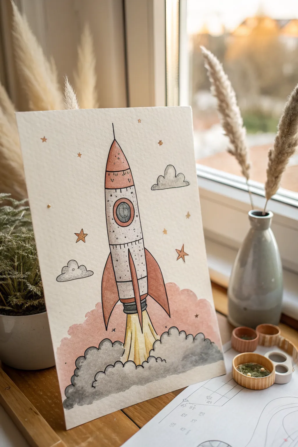
This whimsical mixed-media piece captures the energy of a startup launch with soft watercolor washes and distinctive ink outlines. The vintage color palette of muted reds, greys, and yellows gives the rocket a nostalgic yet hopeful feel.
Step-by-Step Tutorial
Materials
- Heavyweight watercolor paper (300gsm cold press recommended)
- Pencil (HB or H) and kneaded eraser
- Waterproof fine liner pens (black, sizes 01 and 05)
- Watercolor paints (Payne’s Grey, Burnt Sienna/Light Red, Yellow Ochre)
- Small round brushes (size 2 and 4)
- Gold or metallic pen/paint for star details
- Clean water and paper towels
Step 1: Sketching the Framework
-
Establish the centerline:
Begin by lightly drawing a vertical line down the center of your paper. This guide is crucial for keeping your rocket symmetrical. -
Draft the fuselage:
Draw the main body of the rocket as a tall, slender bullet shape centered on your guide line. Add a horizontal curve near the top for the nose cone and another near the bottom for the engine section. -
Add wings and details:
Sketch three fins: two curving out from the sides and one central fin going straight down. Draw a circular porthole in the upper third of the body. -
Outline the exhaust:
Below the rocket, lightly sketch the blast shape—flames shooting straight down—and billowing, cloud-like smoke plumes rolling outward at the base.
Step 2: Applying Ink Lines
-
Inking the main contours:
Using your 05 waterproof pen, trace over your pencil lines for the rocket’s body and fins. Keep the lines confident but not perfectly rigid; a little wobble adds character. -
Detailing the structure:
Switch to a finer 01 pen to add rivets (small dots) along the seams of the metal plates and lines on the nose cone. Add concentric circles inside the porthole. -
Defining the smoke:
Outline the smoke clouds at the bottom with bumpy, irregular curves. I like to keep these lines slightly looser than the rocket itself to suggest movement. -
Erase pencil guides:
Once the ink is completely dry—give it a few minutes to be safe—gently erase all underlying pencil marks and the center guide line.
Bleeding Ink?
If your black lines smear when you paint, stop immediately. Your pen isn’t waterproof. Let it dry 24h or trace loosely with a light grey watercolor pencil instead.
Step 3: Watercolor Washes
-
Painting the fins and nose:
Mix a watery Burnt Sienna or muted red. Paint the nose cone and the three fins, letting the color pool slightly at the edges for a natural gradient. -
Coloring the fuselage:
Use a very diluted wash of grey or a dirty cream color for the main body of the rocket. It should look off-white, not stark white. -
Adding the blast:
Paint the flames shooting directly down from the engine with Yellow Ochre, fading into white near the center to simulate intense heat. -
Creating the smoke clouds:
Mix a medium Payne’s Grey. Paint the smoke clouds at the base, keeping the top edges wet. While wet, drop in slightly darker pigment at the bottom of the clouds to create volume and shadow. -
Background atmosphere:
Wash a very faint, soft pink or red hue behind the smoke and lower rocket area to suggest the glow of liftoff. Keep the edges rugged and indefinite.
Level Up: Galaxy Dust
Load a stiff brush with white gouache or acrylic. Flick the bristles to splatter tiny white stars over the background for a deep space effect.
Step 4: Final Details
-
Deepening shadows:
Once the first layers are dry, dry-brush a little dark grey along the sides of the rocket body to make it look cylindrical and 3D. -
Porthole reflection:
Paint the porthole glass with a blue-grey, leaving a small sliver of white paper unpainted to act as a reflection highlight. -
Stippling texture:
Take your fine pen again and add tiny dots (stippling) on the rocket body, particularly near the edges, to simulate a metal texture. -
Adding stars:
Draw small five-pointed stars scattered around the sky. Paint them with gold metallic paint or a yellow wash for a magical finish.
Now you have a charming piece of art perfect for inspiring new ventures

PENCIL GUIDE
Understanding Pencil Grades from H to B
From first sketch to finished drawing — learn pencil grades, line control, and shading techniques.
Explore the Full Guide
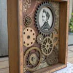
Gears and Cogs Operations
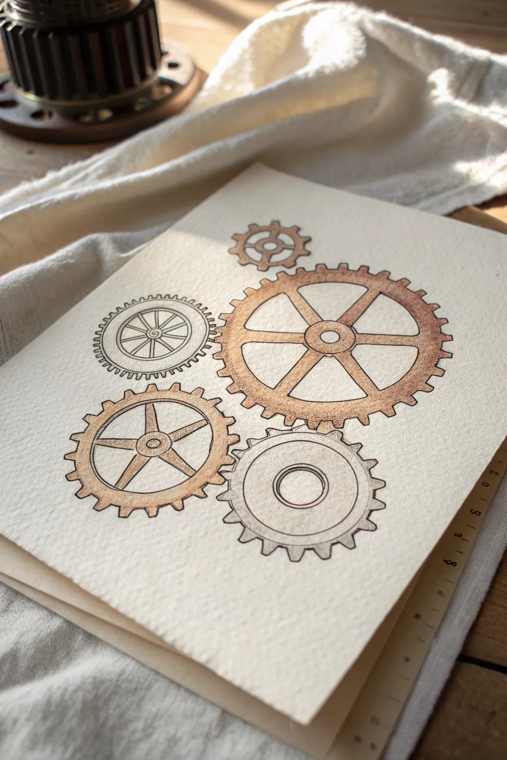
This elegant illustration captures the concept of operational synergy using a cluster of five distinctive gears. The combination of fine ink lines and warm, metallic watercolor washes on textured paper creates a vintage blueprint aesthetic that feels both professional and artistic.
How-To Guide
Materials
- Cold press watercolor paper (cream or natural white, roughly 140lb/300gsm)
- Pencil (HB or 2H)
- Eraser (kneaded)
- Circle templates or a compass
- Ruler
- Fine liner pens (Black or Dark Sepia, sizes 0.1, 0.3, and 0.5)
- Watercolors (Burnt Sienna, Raw Umber, Sepia)
- Metallic watercolor paint (Bronze or Copper)
- Small round brushes (Size 2 and 4)
- Water container and paper towel
Step 1: Planning the Mechanism
-
Paper Preparation:
Begin with a sheet of high-quality, textured watercolor paper. The rough surface adds character to the simple shapes. Tape the edges down if you want to prevent buckling, although the washes here are light. -
Mapping the Centers:
Using a pencil, lightly mark the center points for five gears. Arrange them in an organic cluster: a large dominant gear on the right, two medium gears below and to the left, and two smaller gears tucked around the top left. -
Drafting the Perimeters:
Use a compass or circle templates to draw the outer and inner circles for each gear. Focus only on the main rings first—don’t worry about the teeth yet. Ensure the circles are close enough that their future teeth will visually interlock. -
Designing Spoke Styles:
Vary the internal designs for visual interest. For the largest gear, sketch six tapering spokes. For the bottom-left gear, draw five straight spokes. Leave the bottom-right gear solid with just a central hub, and give the top-left gear a double-ring design.
Step 2: Inking the Structure
-
Drawing the Teeth:
Switch to a 0.3 fine liner. Carefully draw the gear teeth around the outer circles. Square teeth work well for the large gear, while slightly angled or rounded teeth add variety to the smaller ones. I find rotating the paper as I go helps keep the spacing consistent. -
Inking the Hubs:
Outline the inner circles and hubs. For the tiny top gear, use a simple four-spoke design. Ensure your lines are deliberate and clean, but don’t stress about machine-perfect straightness; a little wobble adds hand-drawn charm. -
Adding Details:
Use a finer 0.1 pen to add internal details, like the concentric rings inside the top-left gear or the small circle in the center of the spokes. These thin lines create depth without overwhelming the main shapes. -
Erasing Guides:
Once the ink is completely dry—give it a few minutes to be safe—gently crave away all the graphite pencil marks with a kneaded eraser. This cleans the canvas for the color application.
Uneven Teeth?
If your gear teeth spacing gets wonky, don’t erase. Instead, darken the ‘valley’ between the teeth with extra ink shading. It hides the sizing error and adds dimension.
Step 3: Adding Depth and Color
-
First Wash – The Large Gear:
Mix a watery wash of Burnt Sienna with a touch of metallic Copper. Apply this to the rim and spokes of the large right-hand gear. Keep the wash uneven to simulate tarnish or light reflection. -
Gradient Shading:
While the paint is still damp on the large gear, drop a tiny bit of darker Sepia into the corners where the spokes meet the rim. This wet-on-wet technique creates soft, natural shadows. -
Coloring the Lower Left Gear:
Paint the five-spoke gear on the bottom left using a similar mix but leaned slightly more towards raw umber or a dull gold. Leave the center hub slightly lighter to make it look raised. -
Subtle Washes:
For the bottom-right solid gear, use a very pale, diluted wash of grey or cool brown. You want this gear to feel metallic but distinct from the copper-toned ones. The top-left gear can remain nearly white or have just a hint of shading on the teeth. -
Defining the Hubs:
Use a slightly more concentrated metallic paint to fill in the smallest central circles (the pivot points) of each gear. This draws the eye to the mechanics of the drawing. -
Final Contrast:
Once the watercolor is bone dry, take your 0.5 pen and re-trace just the outer-most edges of the gears where they would cast a shadow (usually the bottom and right edges) to give them weight.
Pro Tip: Metallic Pop
Mix a tiny amount of iridescent medium or bronze watercolor into your brown ink before dipping a dip pen. This creates outlines that catch the light subtly.
Now you have a sophisticated industrial illustration ready to represent seamless business operations.
Cash Flow Stream of Coins

Visualize financial growth with this clean and minimalist line art sketch featuring stacked coins and rising graphs. Using simple cylindrical forms and hatched shading, you’ll create an elegant representation of Return on Investment (ROI) perfect for business journals or planners.
Step-by-Step
Materials
- Spiral-bound sketchbook with white paper
- Fine-liner pen (black or dark brown, roughly 0.3mm or 0.5mm)
- Pencil (HB for sketching)
- Eraser
- Ruler (optional, but helpful for graphs)
Step 1: Drafting the Layout
-
Establish the baseline:
Start by lightly sketching a horizontal guideline near the bottom third of your page with your pencil. This ensures your coin stacks will sit on a level plane. -
Sketch the coin cylinders:
Draw three vertical cylinder shapes side-by-side using the baseline. Make the leftmost cylinder the shortest, the middle one slightly taller, and the right one the tallest to indicate growth. -
Outline the graph bars:
Above and slightly to the right of the coins, sketch three vertical rectangles. Mirroring the coins, these should also step up in height from left to right. -
Placement of text and arrow:
Above the graph bars, lightly write ‘ROI’ in a loose script. Draw a sweeping curved line underneath the text that ends in an arrow pointing up and to the right.
Clean Lines
When doing the diagonal hatching inside the graph bars, rotate your notebook. It’s much easier to draw consistent parallel lines when pulling the pen toward you.
Step 2: Drawing the Coins
-
Define the top coin:
Switch to your fine-liner pen. On the first stack, distinctively draw the top oval. This is the face of the top coin. -
Create the stack layers:
Below that top oval, draw a series of curved, parallel lines that mimic the bottom curve of the oval. These represent the thickness of the stacked coins. -
Close the sides:
Connect the edges of these curved lines with short vertical strokes to form the sides of the stack. Don’t worry if the lines are slightly loose; it adds to the sketched charm. -
Repeat for taller stacks:
Move to the middle and right stacks, repeating the process. Add more curved layers to these cylinders to visually represent a higher value or quantity of coins. -
Add movement lines:
Draw tiny, faint scratch marks near the base of the coin stacks to ground them on the paper.
Add Dimension
Use a light grey marker or a dash of gold watercolor on the coin edges to make the illustration pop and add a subtle 3D effect to the sketch.
Step 3: Inking the Graph & Details
-
Outline the bars:
Go over your pencil rectangles with the fine-liner. I like to keep the corners slightly sharp but not ruler-perfect to match the organic feel of the coins. -
Fill with hatching:
Fill each bar with diagonal hatching lines. Keep the spacing relatively consistent and draw them quickly for a confident look. -
Add directional cues:
Draw small, downward-pointing arrows above each bar graph, pointing towards the top of the bar. -
Ink the main curve:
Trace over your main arrow curve with a slightly thicker line or by going over it twice. Ensure the arrowhead is bold and clearly pointing upward. -
Letter the heading:
Carefully ink the ‘ROI’ text. Keep the lettering thin and casual. -
Erase guidelines:
Wait several minutes for the ink to fully cure to avoid smudging. Once dry, gently erase all underlying pencil sketch marks.
Now you have a professional yet artistic representation of growing value ready for your notebook
BRUSH GUIDE
The Right Brush for Every Stroke
From clean lines to bold texture — master brush choice, stroke control, and essential techniques.
Explore the Full Guide
Customer Feedback Speech Bubbles

Capture the essence of playful communication with this simple yet charming cardstock illustration. Featuring a variety of hand-drawn speech bubbles and celestial motifs, this project uses fine liners and soft markers to create an inviting layout perfect for journaling or business brainstorming.
How-To Guide
Materials
- Cream or off-white cardstock paper
- Fine liner pen (black, 0.3mm or 0.5mm)
- Brush pens or highlighters (pastel pink, sage green)
- Pencil
- Eraser
- Ruler (optional, if you want precise spacing)
Step 1: Sketching the Layout
-
Plan the positions:
Begin by lightly sketching the placement of your main elements with a pencil. Visualize the center area where the question mark bubble will go, and arrange the other shapes loosely around it to ensure a balanced composition. -
Draft the central bubble:
Draw the central speech bubble shape. It should be roughly circular but slightly wider than it is tall, with the tail pointing down and to the left. -
Add surrounding bubbles:
Sketch the other primary shapes: a circular bubble above the center, a thought bubble at the bottom, a green heart bubble to the left, and a pink round bubble to the right. -
Sketch the icons:
Inside your bubble outlines, lightly pencil in the symbols: a large question mark in the center, a five-pointed star in the top bubble, and a heart in the left bubble. -
Fill the gaps:
Now, sketch the smaller decorative elements in the negative space. Add a few scattered stars of varying sizes, small floating hearts, and a couple of tiny flower-like asterisk shapes.
Smudge Alert
Wait at least 5 minutes before erasing pencil lines. If your fine liner smears, switch to a waterproof archival ink pen for the outlining phase.
Step 2: Adding Color
-
Color the top star:
Using a pastel pink marker, color in the star inside the top speech bubble. Keep the stroke light so the color doesn’t bleed too much. -
Fill the heart bubble:
Switch to your sage green marker. Fill the entire background of the speech bubble on the left, carefully coloring around the heart shape so the heart remains the color of the paper. -
Color the heart center:
Now take the pink marker again and fill in the heart shape inside the green bubble you just colored. -
Create the pink bubble:
For the round bubble on the right, use the pink marker to fill the entire shape. I generally like to do this in vertical strokes to give it a slightly textured, hand-colored look. -
Add pink accents:
Use the pink marker to color the single floating heart near the top left and the small star near the bottom right. -
Detail the flowers:
With the tip of your pink marker or a very fine pink pen, trace the small asterisk-flower shapes scattered between the bubbles.
Add Depth
Use a light grey marker to add a simple drop shadow to one side of each bubble. This makes them look like stickers floating on the page.
Step 3: Inking and Definition
-
Outline the center:
Take your black fine liner and carefully trace over your pencil lines for the central speech bubble. Ink the large question mark inside, making the top curve thick and bold. -
Define the top bubble:
Ink the outline of the top bubble. Then, draw a second outline around the pink star inside to make it pop against the background. -
Outline the green bubble:
Trace the outer edge of the green bubble. Inside, ink the outline of the pink heart so there is a crisp black border separating the pink heart from the green background. -
Ink the thought bubble:
For the bottom thought bubble, use a scalloped line to create the fluffy cloud edge. Draw the three small descending circles indicating the thought trail, and leave the interior empty. -
Finish the pink bubble:
Outline the pink bubble on the right. Add a small curved motion line or shadow line just underneath it and to the right to give it a bit of dimension. -
Trace remaining elements:
Ink the remaining stars and small hearts. For the stars, you can double-trace the lines loosely to give them a sketchy, energetic vibe. -
Erase guidelines:
Wait several minutes to ensure the ink is completely dry. Gently run your eraser over the entire page to remove visible pencil marks, leaving just the crisp ink and color.
Now you have a charming page of icons ready to illustrate your feedback process
Marketing Megaphone Burst

This dynamic ink sketch captures the energy of amplification with a classic megaphone design surrounded by radiating sound bursts. The drawing uses strong hatching techniques to create depth and texture, making it a perfect exercise for practicing linework and shading.
Step-by-Step Tutorial
Materials
- Spiral-bound sketchbook (smooth or mixed media paper)
- Graphite pencil (HB or 2B)
- Eraser
- Fine liner pens (0.1mm, 0.3mm, and 0.5mm) or a quality black ballpoint pen
- Ruler (optional)
Step 1: Basic Structure
-
Establish the axis:
Begin by lightly sketching a diagonal central line with your pencil. This axis will determine the angle of the megaphone, pointing upwards and to the right. -
Draft the cone:
Draw an oval at the top end of your axis line for the mouth of the megaphone. Further down the axis, draw a smaller, narrower oval for the back of the horn, and connect them with slightly curved lines to form the cone shape. -
Add the handle and base:
Sketch a rectangular block attached to the underside of the narrower end of the cone. Extending down from this block, draw the handle shape, slightly curved for a comfortable grip, ending with a small flared base. -
Refine internal details:
Inside the large main oval, draw a smaller concentric oval to show the rim thickness. In the center of the opening, sketch the small cylindrical mouthpiece mechanism.
Clean Ellipses
Turn your sketchbook as you draw the ovals. Rotating the paper allows your hand to follow its natural arc, resulting in smoother, more symmetrical curves.
Step 2: Inking the Outline
-
Define the rim:
Using a 0.3mm or 0.5mm pen, carefully trace the outer and inner ovals of the megaphone’s mouth. Keep your hand steady to maintain a clean ellipse. -
Outline the body:
Ink the outer lines of the cone and the cylindrical back section. Notice how the back section has a band; draw parallel curved lines to define this structural ring. -
Detail the handle:
Go over your handle sketch with the pen. Add the trigger mechanism detail on the front side of the grip and define the rectangular mounting bracket that connects the handle to the body. -
Erase pencil guides:
Once the ink is fully dry—give it a minute to avoid smudging—gently erase all your underlying graphite marks.
Step 3: Shading and Texture
-
Hatch the inner cone:
This is where the depth happens. Use a 0.1mm pen to draw fine, curved hatching lines inside the mouth of the megaphone. Start from the center mechanism and flick outward, or create concentric curved strokes to follow the cone’s shape. -
Shadow the exterior:
On the underside of the main cone, apply parallel hatching lines. I find that following the curve of the object helps emphasize its roundness. Make the lines denser near the bottom to indicate shadow. -
Block in the back section:
The rear cylinder and the band around it should be darker. Use cross-hatching (layering lines in opposing directions) to create deep shadows here, leaving small slivers of white for highlights. -
Texture the handle:
Use vertical hatching lines along the handle grip to simulate a textured surface. Darken the back of the handle significantly to ground the object. -
Deepen the darkest areas:
Go back with your 0.5mm pen and fill in the deepest crevices, like the interior of the mouthpiece and the trigger area, to add high contrast.
Make it Pop
Use a yellow highlighter or watercolor wash over just the ‘sound burst’ lines and sparkles to visually represent a specific message or loud noise.
Step 4: Finishing Touches
-
Add the sound burst:
Draw radiating lines exploding from the mouth of the megaphone. Vary their lengths—make the ones in the center longer and the outer ones shorter. Use a flicking motion so the lines taper at the ends. -
Create atmosphere:
Scatter small plus signs and dots around the megaphone. This ‘confetti’ effect adds a sense of magic and movement to the illustration. -
Ground the object:
Draw horizontal hatching lines directly beneath the handle. These lines shouldn’t touch the object but rather float below it to suggest a floor surface.
Now you have a bold visual metaphor ready to announce your next big idea

Have a question or want to share your own experience? I'd love to hear from you in the comments below!