
If you’re craving fresh California drawing ideas, I’ve got a studio-full of sketches inspired by the state’s coastlines, cities, and wild landscapes. Grab your favorite pencil and let’s chase that sun-soaked California vibe—from simple outlines to bold, unexpected map-based art.
Simple California Outline with Coastal Details
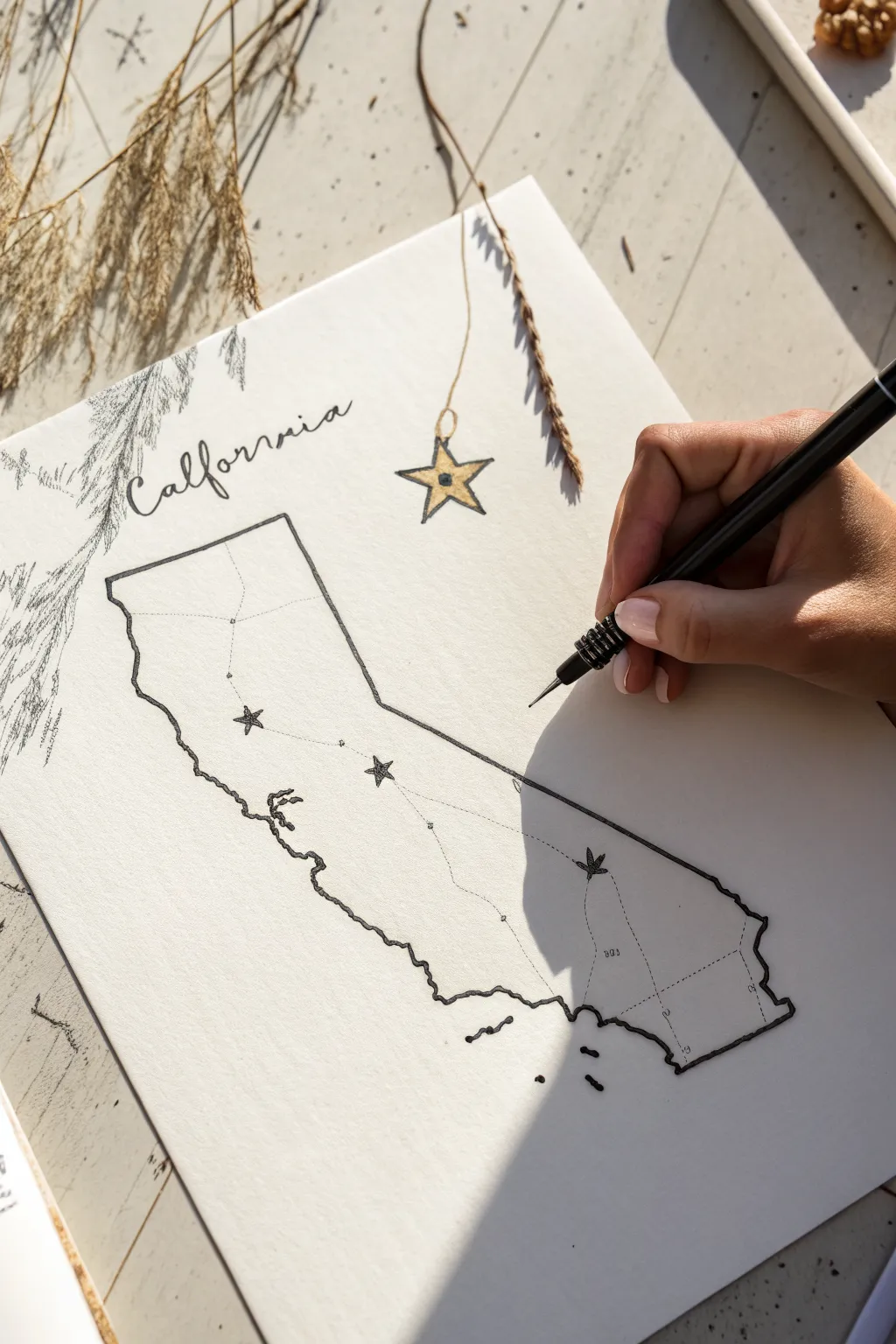
This minimalist ink drawing celebrates the Golden State with a clean outline and charming rustic details. The combination of delicate linework, hand-lettering, and subtle gold accents creates a lovely piece of wall art or a personalized journal spread.
Detailed Instructions
Materials
- High-quality white drawing paper or cardstock
- Pencil (HB or 2B)
- Eraser
- Fine liner pen (black, 0.3mm or 0.5mm)
- Gold gel pen or metallic marker
- Reference map of California
- Dried florals or grasses (optional for styling)
Step 1: Drafting the Outline
-
Sketch the state shape:
Begin by lightly sketching the outline of California with your pencil. Focus on capturing the distinctive ‘bend’ of the coast and the straight eastern border. Don’t worry about perfect geographical precision; a stylized look works well here. -
Add the title:
In the upper left empty space, lightly pencil in the word ‘California’ using a loose, cursive script. Leave plenty of breathing room around the letters. -
Place the ornament:
To the right of the title, sketch a five-pointed star hanging from a string. This adds a festive or decorative touch to balance the composition. -
Mark locations:
Identify 3-4 key locations you want to highlight inside the state. Mark these with small light dots for now. You can connect them with faint lines if you plan to show a road trip route.
Tracing Trick
Struggling with the shape? Print a map of California, tape it to a window behind your drawing paper, and lightly trace the outline to get the proportions right.
Step 2: Inking the Drawing
-
Trace the coastline:
Switch to your black fine liner. Starting at the top left, trace your pencil outline. Use a slightly jagged, wiggly motion for the coastline to mimic the rugged geography of the Pacific edge. -
Ink the borders:
For the straight borders (north, east, and south), use a ruler if you want precision, or keep it freehand for a warmer, organic feel. I usually prefer freehand to match the coastal vibe. -
Letter the title:
Carefully go over your ‘California’ lettering. Vary your pressure slightly to create thick and thin strokes if you’re using a flexible nib, or simply double up on the downstrokes to simulate calligraphy. -
Detail the islands:
Don’t forget the Channel Islands off the southern coast. Just a few small specks or dashes in the ocean area will suffice to represent them. -
Draw internal icons:
At your marked locations, draw small stars. For the central location, you might draw a slightly larger, different shape, like a cannabis leaf or a different star style, if that matches your theme. -
Connect the dots:
Draw very fine dotted or dashed lines connecting your location markers to suggest a journey or connection between cities.
Smudged Ink?
If you accidentally smudge wet ink, turn it into a shadow or a stylized cloud. Alternatively, cover it with a small gold star or dot to incorporate it into the design.
Step 3: Adding Accents & Finishing
-
Color the hanging star:
Use your gold gel pen or marker to fill in the hanging star ornament you sketched earlier. Add a small loop at the top and a squiggly line leading up to the paper edge to look like a string. -
Add decorative foliage:
In the top left corner, use quick, feathery strokes with your black pen to draw pine branches or dried grass visuals coming into the frame. This frames the ‘California’ text beautifully. -
Erase pencil lines:
Wait until the ink is completely dry—give it a few minutes to be safe. Gently erase all visible pencil marks from your initial sketch. -
Final touches:
Review your line work. If the state outline feels too thin in places, go over it once more to bold it up, especially along the bottom edge to ground the drawing.
Frame your map simply or pin it to a mood board to enjoy your customized geography art


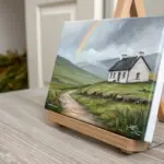
California Silhouette Filled with Mini Doodles
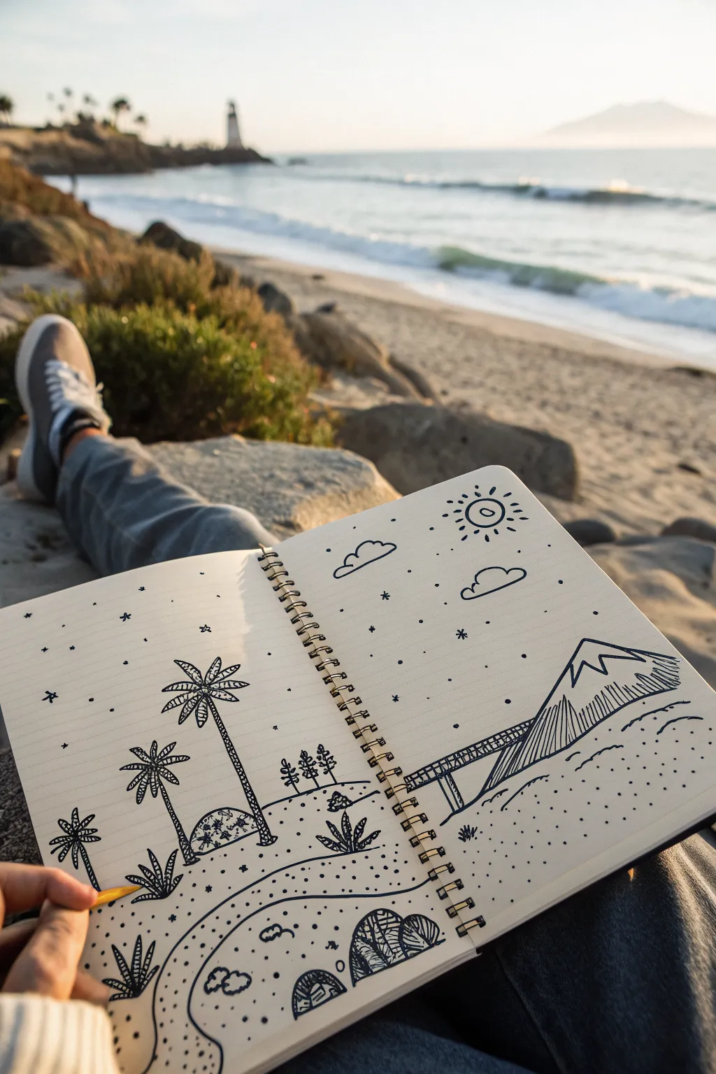
Capture the laid-back vibe of the coast with this playful line art landscape that spans across two sketchbook pages. This drawing uses bold, simplified shapes and doodle-style patterns to create a charming, whimsical beach scene.
Step-by-Step Tutorial
Materials
- Spiral-bound sketchbook (medium textured paper)
- Black fineliner (0.5mm)
- Black fineliner (0.1mm for details)
- Pencil (HB or 2B)
- Eraser
- Yellow pencil or marker (optional accent)
Step 1: Setting the Scene
-
Planning the layout:
Open your sketchbook to a fresh spread. Lightly sketch a horizon line with your pencil about one-third up from the bottom, letting it slope gently to designate the shoreline. -
Sketching the mountain:
On the right page, draw a large, triangular mountain peak. Create a jagged, uneven line near the top to represent snow-capped heights. -
Adding the pier:
Connect the base of the mountain to the center of the spread with a long, rectangular pier shape extending into the imaginary water. -
Positioning the palms:
On the left page, lightly mark the positions for two tall palm trees. Place the taller one closer to the spine and the shorter one toward the left edge to create depth. -
Foreground and sky elements:
Map out a few rolling hills in the immediate foreground on both pages. Add simple cloud shapes and a sun circle in the sky on the right page.
Smudge Prevention
Place a scrap piece of paper under your drawing hand as you work across the page. This prevents oils from your skin from smearing the fresh ink or pencil lines.
Step 2: Inking the Structures
-
Inking the mountain:
Using your 0.5mm pen, trace over your pencil lines for the mountain. Use vertical hatching lines to shade the lower section of the mountain, leaving the snow cap white. -
Drawing the pier details:
Outline the pier and draw small vertical lines underneath it to represent the support pilings. Add cross-hatching to the walkway for texture. -
Creating the palm trunks:
Draw the trunks of the palm trees. Instead of straight lines, use stacked, curved segments or a cross-hatched pattern to mimic the rough texture of palm bark. -
Inking palm fronds:
For the leaves, draw five or six main curved spines radiating from the top of the trunk. Add jagged, saw-tooth edges to each spine to create the look of palm fronds. -
Adding ground vegetation:
Draw scattered desert plants in the foreground using spiky, fan-like shapes. Group them in threes or fours for a natural look.
Step 3: Adding Doodle Details
-
Defining the dunes:
Ink the rolling dunes in the foreground using smooth, flowing lines that span across both pages, connecting the scene. -
Texturing the sand:
Switch to your 0.1mm pen. Add stippling (small dots) across the sandy areas, concentrating them near the lines of the dunes to suggest shadow and texture. -
Pattern-filling rocks:
Draw a few rounded boulders in the foreground. Fill them with interesting patterns like stripes, circles, or cross-hatching to give them a stylized ‘doodle’ feel. -
Sky elements:
Ink the clouds with simple outlines. Draw the sun with a circle and radiating short lines or dashes. -
Stars and atmosphere:
Scatter small asterisks, dots, and tiny diamond shapes throughout the sky to fill the negative space without overcrowding it.
Pro Tip: Line Weight
Use the thicker pen for the main outlines (trees, mountain) and the thinner pen for textures (dots, sand). This contrast makes the drawing pop.
Step 4: Finishing Touches
-
Optional color accent:
If you want a pop of interest, use a yellow pencil to lightly color the tip of the pencil actually drawing the scene (as a meta reference) or just fill in the sun. -
Clean up:
Wait at least five minutes for the ink to fully cure. Gently erase all visible pencil sketches underneath your ink work. -
Final assessment:
Look at the overall balance. If the sky feels too empty, add a few more stippled dots or a small bird silhouette.
Close your sketchbook knowing you’ve captured a perfect little slice of coastal paradise.
Golden Gate Bridge Sketch in Soft Fog

Capture the moody atmosphere of San Francisco’s most iconic landmark with this soft graphite sketch. By balancing sharp architectural lines against blended, fog-like smudging, you’ll create a drawing that feels both structured and ethereal.
Step-by-Step Guide
Materials
- Sketchbook with smooth heavyweight paper
- Set of graphite pencils (HB, 2B, 4B, 6B)
- Mechanical pencil (0.5mm HB)
- Blending stump (tortillon)
- Soft tissue or chamois cloth
- Kneadable eraser
- Precision eraser (stick eraser)
- Ruler
Step 1: Laying the misty foundation
-
Establish the horizon:
Begin by lightly marking the horizon line about two-thirds down the page. This won’t be a hard line, but a guide for where the water meets the distant hills. -
Create the atmospheric base:
Take a 2B pencil and hold it sideways, shading the sky and water area very lightly. The goal isn’t to make it dark, but to remove the stark white of the paper. -
Blend for fog:
Wrap a soft tissue around your finger and rub the graphite shading in circular motions. This creates the smooth, misty gray background that defines the mood. -
Sketch the distant hills:
Using an HB pencil, sketch the outline of the Marin Headlands on the left. Shade them with medium pressure, getting lighter as the hill descends into the ‘fog’ layer near the water. -
Soften the hill transition:
Use your blending stump to smudge the bottom edge of the hill directly into the white of the fog. It should look like the mountain is disappearing into a cloud.
Step 2: Constructing the bridge
-
Place the towers:
Draw two vertical axes for the bridge towers. The closest tower (right) should be significantly taller and thicker than the distant one to show perspective. -
Draft the main cables:
Lightly sketch the draped curve of the main suspension cables connecting the two towers. Use a confident, sweeping stroke rather than short, scratchy lines. -
Detail the tower structure:
Switch to your mechanical pencil for precision. Draw the horizontal cross-braces and the ‘X’ bracing inside the tower legs. Keep lines clean and geometric. -
Draw the road deck:
Use a ruler to draw the road deck extending from the left hill, through the towers, and off the right side. The deck should have a slight upward curve. -
Add vertical suspender cables:
Draw the thin vertical lines connecting the main draped cable to the road deck. These should be very fine; I find a sharp mechanical pencil works best here. -
Darken the foreground tower:
Go over the nearest tower with a 4B pencil to punch up the contrast. The dark silhouette against the pale sky is crucial for depth.
Smudge Control
Place a scrap sheet of paper under your drawing hand. This prevents your palm from smearing the soft graphite fog and keeps the sky pristine.
Step 3: Foreground and Final Touches
-
Outline the highway:
Sketch the curving highway in the immediate foreground. Use sweeping curves that lead the viewer’s eye into the frame from the bottom right. -
Shade the road surface:
Shade the asphalt of the foreground road using horizontal strokes with a 2B pencil. Blend slightly with a tissue to smooth the texture. -
Add road markings:
Use your precision stick eraser (or the sharp edge of a regular eraser) to lift out the white lane lines on the highway. -
Draw foreground foliage:
Using a 6B pencil, stipple dark, irregular shapes in the bottom corners to represent bushes and trees. These should be the darkest values in the drawing. -
Insert tiny cars:
Draw small, rectangular shapes on the highway to represent cars. Add a tiny drop shadow under each to ground them. -
Refine the water:
Add faint horizontal streaks in the water with an HB pencil to suggest gentle ripples. Draw a tiny boat silhouette in the distance for scale. -
Final atmosphere check:
Use a kneadable eraser to gently lift a few horizontal streaks of graphite across the bridge legs, simulating wisps of fog passing in front of the structure.
Make It Moody
For a stormier look, use charcoal powder on a cotton ball for the sky. It creates deeper, more dramatic blacks than graphite can achieve.
Now you have a serene, atmospheric tribute to the Golden Gate ready to stay in your sketchbook
San Francisco Hills and Bay Line Drawing
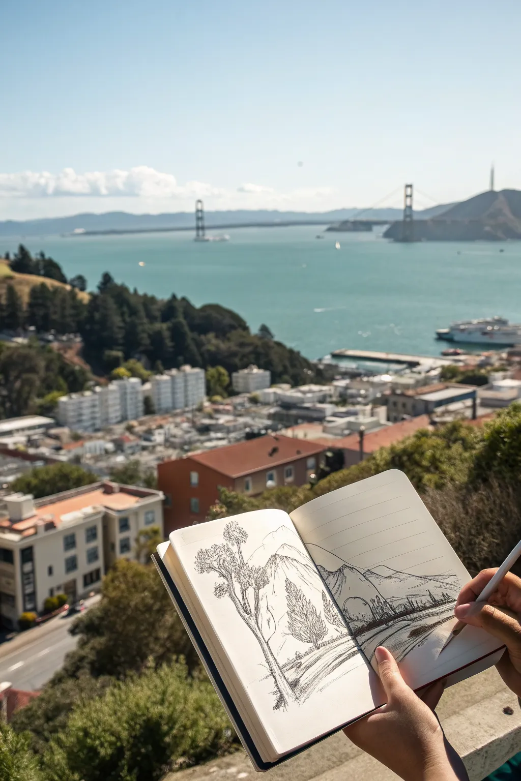
Capture the iconic San Francisco skyline with this relaxed pen and ink sketch that balances foreground nature with distant landmarks. This drawing focuses on expressive line work and hatching to create depth without needing photo-realistic precision.
Step-by-Step Tutorial
Materials
- Hardcover sketchbook (A5 or similar size)
- Fine liner pens (sizes 0.1, 0.3, and 0.5)
- Graphite pencil (HB or 2B)
- Kneaded eraser
- Reference photo of San Francisco Bay
Step 1: Laying the Foundations
-
Establish the horizon:
Begin with your pencil to lightly map out the composition. Draw a faint horizon line across the right-hand page, roughly one-third of the way down from the top edge. This will anchor your water and distant hills. -
Map the foreground tree:
On the left page, sketch a tall, slender tree trunk that leans slightly into the center of the book. Add two main clusters for the foliage—one lower down and one near the top—using loose, cloud-like shapes to represent the bulk of the leaves. -
Outline the bay and cliffs:
Draw the sloping line of the cliffs extending from the right page toward the center gutter. Ensure these lines overlap slightly to suggest distance; the cliff closest to you should start lower on the page and rise up, blocking the view of the water’s edge behind it. -
Position the bridge:
Lightly pencil in the Golden Gate Bridge towers in the distance. They should be small to indicate scale. Place one tower emerging from the far headlands and the other standing in the water. -
Sketch the distant mountains:
Behind the bridge and water, draw the undulating silhouette of the Marin Headlands. Keep these lines simple and less detailed than your foreground elements to push them into the background.
Loose is Better
Don’t connect every single line. Leaving small breaks in your outlines, especially on distant hills, lets the eye fill in the gaps and keeps the sketch looking airy.
Step 2: Inking the Foreground
-
Ink the tree trunk:
Switch to a 0.5 pen for the main tree on the left. Outline the trunk with broken, somewhat jagged lines to suggest rough bark. Don’t make the lines perfectly straight; let them wander to show organic growth. -
Detail the foliage:
Using a 0.3 pen, fill in the foliage clusters. Instead of drawing individual leaves, use a scribbling motion or tight loops (scumbling) to create texture. Leave some white space within the clusters so they don’t look like solid blobs. -
Add a secondary tree:
Just to the right of the main trunk, ink a smaller, cone-shaped pine tree. Use short, upward flicking strokes to mimic pine needles, building density closer to the center of the tree. -
Ground the trees:
Draw the grassy slope where the trees stand. Use long, sweeping lines that curve downward toward the bottom right, suggesting the steep hill of the viewpoint.
Add a Wash
Use a water brush and a tiny drop of watercolor (blue or gray) to add a quick wash over the water and sky for instant atmosphere without covering your line work.
Step 3: Developing the Background
-
Ink the cliffs:
Outline the cliffs on the right page with a 0.3 pen. Use confident, single lines for the ridge edges. Add vertical hatching marks down the side of the cliff faces to show steepness and shadow. -
Refine the bridge:
Switch to your finest 0.1 pen for the bridge. Carefully trace the vertical towers and the sweeping suspension cables. I find that lifting the pen slightly at the end of the cable lines makes them feel thinner and more distant. -
Draw the waterline:
Add a few horizontal lines near the base of the cliffs where the land meets the water. These should be perfectly straight to contrast with the organic shapes of the hills. -
Create distant texture:
For the far mountains, use very sparse hatching or stippling with the 0.1 pen. You want these to look pale and atmospheric compared to the bold foreground tree.
Step 4: Shading and Final Touches
-
Shadow the tree trunk:
Return to the main tree with a 0.3 pen. Add vertical hatching lines along the right side of the trunk to suggest a light source coming from the left. -
Add contrast to foliage:
Deepen the shadows in the bottom sections of the leaf clusters by going over your scumbling again. This extra weight helps the tree pop against the white page. -
Enhance the terrain:
Add patches of short grass strokes on the foreground hill. Focus these near the bottom of the page and fade them out as you move up, implying that detail is lost with distance. -
Erase pencil guides:
Once the ink is completely dry—give it a good few minutes—gently rub the kneaded eraser over the entire drawing to lift the original graphite lines. -
Final assessment:
Look at the overall balance. If the foreground feels too light, add a few thicker lines to the bottom of the tree trunk or the nearest grassy ridge to anchor the scene.
Now you have a timeless travel sketch that perfectly captures the breezy height of the San Francisco hills
BRUSH GUIDE
The Right Brush for Every Stroke
From clean lines to bold texture — master brush choice, stroke control, and essential techniques.
Explore the Full Guide
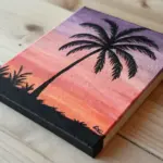
Palm Trees Against a California Sunset
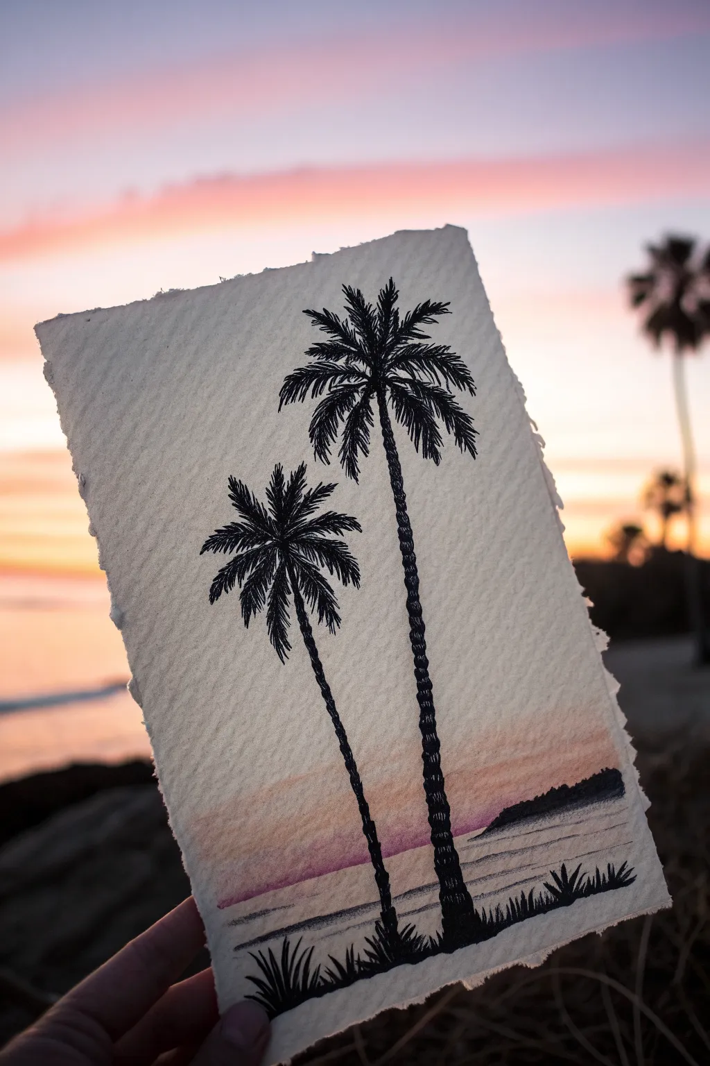
Capture the magic of a California evening with this mixed-media piece that combines a soft, watercolor wash with crisp, black fineliner details. The contrast between the dreamy, blended sky and the sharp palm silhouettes creates a striking depth that looks professional yet is surprisingly approachable.
Step-by-Step Guide
Materials
- Cold press watercolor paper (deckled edge preferred)
- Watercolor paints (pink, orange, purple/indigo)
- Flat wash brush (1/2 inch or 3/4 inch)
- Water container and paper towels
- Fine liner pens (sizes 0.1, 0.3, and 0.5, waterproof black)
- Pencil (HB or lighter)
- Kneaded eraser
Step 1: Setting the Scene
-
Prepare your paper:
Start with a piece of heavy watercolor paper. If yours doesn’t have the rough, torn look shown in the image, you can carefully tear the edges yourself against a straight ruler to create that faux-deckled effect. -
Sketch the horizon:
Using a very light touch with your pencil, draw a horizon line across the bottom third of the paper. This doesn’t need to be perfectly straight; a slight organic curve adds character. -
Outline the distant land:
On the right side of the horizon, sketch a low, sloping shape to represent a distant hillside or peninsula jutting into the water. -
Position the trees:
Lightly mark the placement of the two palm trees. Draw a tall, slightly leaning line for the right tree and a shorter, leaning line for the left tree to establish their trunks.
Natural Deckle Hack
To get soft, torn edges without special paper, paint a line of water where you want the tear, wait 30 seconds, and pull the paper apart gently along the wet line.
Step 2: Painting the Sunset Gradient
-
Wet the sky area:
Dip your flat brush in clean water and dampen the paper above the horizon line. You want it shiny but not pooling with water. -
Apply the soft light:
Load your brush with a very diluted peachy-orange tone. Sweep this across the middle section of the sky, leaving the very top white or extremely pale. -
Add the sunset glow:
While the paper is still damp, introduce a soft pink or lavender hue near the horizon line. Let these colors bleed slightly into the peach tone above. -
Paint the water:
Clean your brush and mix a very faint grey-purple wash. Paint horizontal strokes below the horizon line to suggest the ocean surface, leaving occasional white streaks for reflections. -
Darken the distant land:
Mix a stronger purple or indigo color and fill in the distant land shape on the right. This should be darker than the sky but lighter than the sharp black ink you’ll use later. -
Let it dry completely:
This is crucial—wait until the paper is bone dry. If it’s cool to the touch, it’s still damp. Painting ink over damp paper will cause bleeding and ruin the crisp silhouette effect.
Blotchy Sky Fix
If your watercolor sky dries with hard edges or ‘blooms’, simply re-wet the entire sky area gently with clean water and lift the excess pigment with a tissue.
Step 3: Inking the Silhouettes
-
Draw the trunks:
Using a 0.5 pen, trace over your pencil lines for the trunks. I prefer to use short, jagged scribbles or small horizontal dashes all the way up to create the texture of palm bark rather than straight lines. -
Start the fronds:
Switch to a slightly thinner pen (0.3). From the top center of the trunk, draw 5-7 curved spines radiating outward like a firework explosion. -
Add the leaves:
With a 0.1 pen, draw quick, sharp strokes hanging down from each spine. These strokes should be denser near the center and wispy at the tips. -
Detail the second tree:
Repeat the process for the smaller tree. Vary the direction of the fronds slightly so the two trees don’t look like carbon copies. -
Ground the trees:
At the base of the trunks, use the 0.5 pen to draw spiky, upward-pointing grass blades. Vary the heights to make it look natural and wild. -
Fill the foreground:
Add more grass clumps along the bottom edge of the paper, particularly in the corners, to frame the composition and ground the scene. -
Final shading:
Add a few horizontal ink lines in the darker, distant landmass to suggest texture, and perhaps a few very thin lines in the water area to define gentle waves.
Step 4: Finishing Touches
-
Erase pencil lines:
Once you are absolutely certain the ink is dry, gently dab (don’t scrub) with a kneaded eraser to lift any remaining visible pencil marks. -
Assess contrast:
Step back and look at your silhouettes. If the trunks look too transparent, go back over them with another layer of scribbled ink texture to make them a solid, deep black.
Hold your finished piece up against the light to see how perfectly your hand-painted sunset captures the mood of the real thing
Los Angeles Hillside Sign and Skyline Sketch

Capture the iconic atmosphere of a Los Angeles hillside with this ink and pen sketch, juxtaposing a winding road against a distant city skyline. This project focuses on simple line work and perspective to create a depth-filled scene straight from a travel journal.
Step-by-Step Tutorial
Materials
- A5 Sketchbook (dotted or blank pages)
- Green felt-tip pen (fine point, around 0.5mm)
- Black fineliner (0.1mm and 0.3mm)
- Pencil (HB for sketching)
- Eraser
Step 1: Planning the Composition
-
Establish the horizon:
Begin by lightly penciling a horizon line about one-third of the way up from the bottom of the right-hand page. This will separate your foreground road from the distant hills. -
Draft the winding road:
Pencil in a curving road that starts wide at the bottom center and narrows as it winds slightly to the left, disappearing behind a small hill in the middle ground. -
Outline the signpost:
On the right side of the page, sketch a large rectangular billboard on two tall stilts. Angle it slightly to match the perspective of the road. -
Sketch the distant mountains:
Draw loose, undulating lines behind the sign and road to represent the layered mountain ranges. Keep these lines simple, as they will be in the background.
Step 2: Inking the Foreground
-
Ink the road edges:
Switch to your black 0.3mm fineliner. Go over your pencil lines for the road, but keep the lines somewhat broken or sketchy to suggest dirt or rough asphalt rather than a perfect highway. -
Detail the sign:
Ink the billboard frame and the two support poles. Inside the rectangle, add the text ‘URBAN L.A.’ or similar scribbled text to mimic the reference, using a loose, graffiti-style font. -
Add the palm tree:
On the left side, just above the curve of the road, draw a solitary palm tree. Start with a thin, curved trunk and use quick, outward flicking strokes for the fronds. -
Create rock texture:
At the base of the palm tree, draw a large boulder or hillock. Use short, vertical hatching lines on the shadow side to give it volume and weight.
Smudge Prevention
Place a scrap piece of paper under your drawing hand while working. This prevents oils from your skin transferring to the paper and stops you from dragging wet ink across the page.
Step 3: Background and Atmosphere
-
Ink the horizon line:
Trace the distant mountain lines with the 0.1mm fineliner. A thinner line here helps push these elements into the distance compared to the bolder foreground. -
Add vegetation:
Scrub in some loose scribbles and small vertical lines along the mid-ground hills and the base of the sign to represent chaparral and scrub brush. -
Populate the sky:
Using the 0.1mm pen, add a few tiny dots in the sky area. Connect some with faint lines if you want to suggest constellations, or leave them as solitary stars appearing at dusk. -
Add utility poles/lines:
Draw very faint, thin vertical lines in the distance for utility poles, connecting them with draped lines to add realistic clutter to the horizon.
Add Depth with Gray
Use a light gray brush marker (like a Tombow N75) to add shadows to the side of the rocks and under the sign. This adds immediate 3D volume without needing complex hatching.
Step 4: Current Text and Color
-
Header text:
On the left-hand page, write ‘LOS ANGELES’ (or a stylized variation like the reference) in all caps at the very top. Space the letters widely for a relaxed, journal aesthetic. -
Green highlights:
Take your green felt-tip pen and add small ‘v’ shapes or dots specifically in the foreground area below the road. This suggests low-lying plants. -
Road texture:
I like to add just a hint of green stippling along the center of the dirt road to show where grass might be growing through tires tracks. -
Final shading:
Use the black fineliner to add more cross-hatching to the darkest areas, specifically under the palm tree and the base of the bushes on the right. -
Clean up:
Once the ink is completely dry, gently erase all remaining pencil guidelines to leave a crisp, clean architectural sketch.
Close your sketchbook knowing you’ve captured a simplified, evocative piece of the California landscape

PENCIL GUIDE
Understanding Pencil Grades from H to B
From first sketch to finished drawing — learn pencil grades, line control, and shading techniques.
Explore the Full Guide
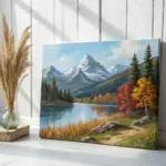
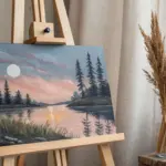
Sierra Nevada Peaks and an Alpine Lake
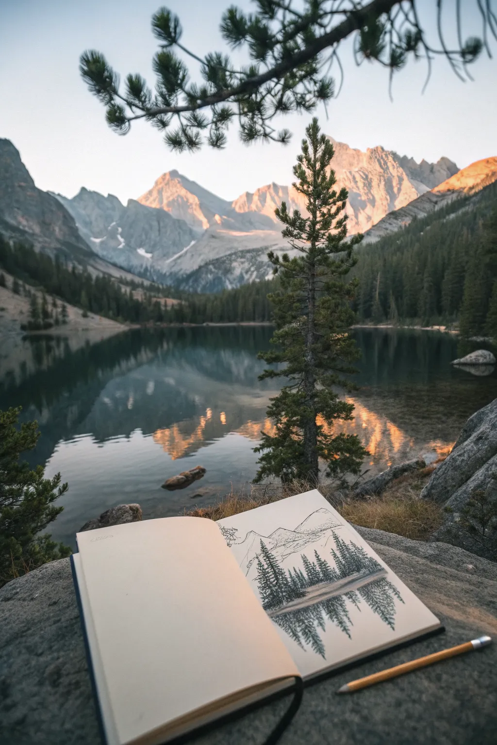
Capture the serene beauty of the High Sierras with this graphite study of pine trees mirroring over an alpine lake. This project focuses on creating realistic textures for evergreen foliage and mastering the vertical symmetry needed for convincing water reflections.
Detailed Instructions
Materials
- Hardbound sketchbook (smooth or vellum surface)
- Graphite pencils (HB, 2B, 4B)
- Fine liner pen (0.1mm, optional for mountain outlines)
- Kneaded eraser
- Yellow pencil (standard #2 works well for the photo aesthetic)
- Small blending stump or tissue
Step 1: Establishing the Horizon and Layout
-
Mark the waterline:
Start by lightly drawing a horizontal line across the lower third of your page using an HB pencil. This will serve as the base for your trees and the start of the reflection. -
Define the mountain silhouette:
Above the waterline, sketch faint, jagged triangles to represent the distant Sierra peaks. Keep these lines very light and minimal, as the focus will be the foreground trees. -
Indicate tree placement:
Draw vertical lines extending up from the waterline to mark where your main pine trees will stand. Vary the heights to create a natural rhythm. -
Mirror the verticals:
Extend those same vertical lines downwards into the water area. Make these reflection guidelines roughly the same length as the trees above.
Step 2: Rendering the Pine Trees
-
Start the foliage:
Switch to a 2B pencil. Starting at the top of your first tree line, use short, scribbly, horizontal strokes to create the needle clusters. -
Build the tree shape:
As you move down the trunk, widen your strokes to form a triangular pine shape. Leave small gaps of white paper showing through to suggest branches and air. -
Fill the forest line:
Repeat this process for the other trees. For trees that are further back, press lighter and use smaller strokes to create depth. -
Darken the shadows:
With a 4B pencil, go back into the thickest parts of the trees (near the trunk and bottom) and add deep shadows to give the trees volume.
Uneven Reflections?
If your reflection looks crooked, turn your sketchbook upside down. Drawing the reflection as if it were a real upright tree helps your brain process the symmetry better.
Step 3: Creating the Reflection
-
Begin the mirrored foliage:
Using the 2B pencil again, start drawing the reflected trees upside down, following your vertical guidelines. -
Apply vertical distortion:
Unlike the crisp trees above, use vertical, downward strokes for the reflection. This mimics the way water distorts and elongates the image. -
Soften edges:
I find that slightly blurring the edges of the reflected trees helps distinguish them from real objects. Don’t make the outlines too sharp. -
Add water texture:
Draw very thin, horizontal lines cutting through the vertical reflection strokes. This creates the illusion of ripples on the lake surface.
Smudge Control
Place a scrap piece of paper under your drawing hand. This prevents the oils in your skin from smearing the graphite as you work across the page.
Step 4: Final Touches and Atmosphere
-
Ground the shoreline:
Darken the original horizon line where the trees meet the water. This ‘grounding line’ should be the darkest part of your drawing. -
Refine the background:
If your mountain lines faded too much, gently re-state them with a sharp HB pencil or a very fine pen, keeping them delicate to simulate atmospheric distance. -
Add foreground details:
Suggest a grassy bank in the immediate foreground with a few quick, upward flicks of the pencil. -
Clean up highlights:
Use your kneaded eraser to lift off any graphite smudge from the sky area or the white gaps in the water, keeping the contrast crisp.
Now you have a stunning travel sketch that captures the quiet majesty of the mountains without needing a full paint kit
California Poppy Botanical Drawing
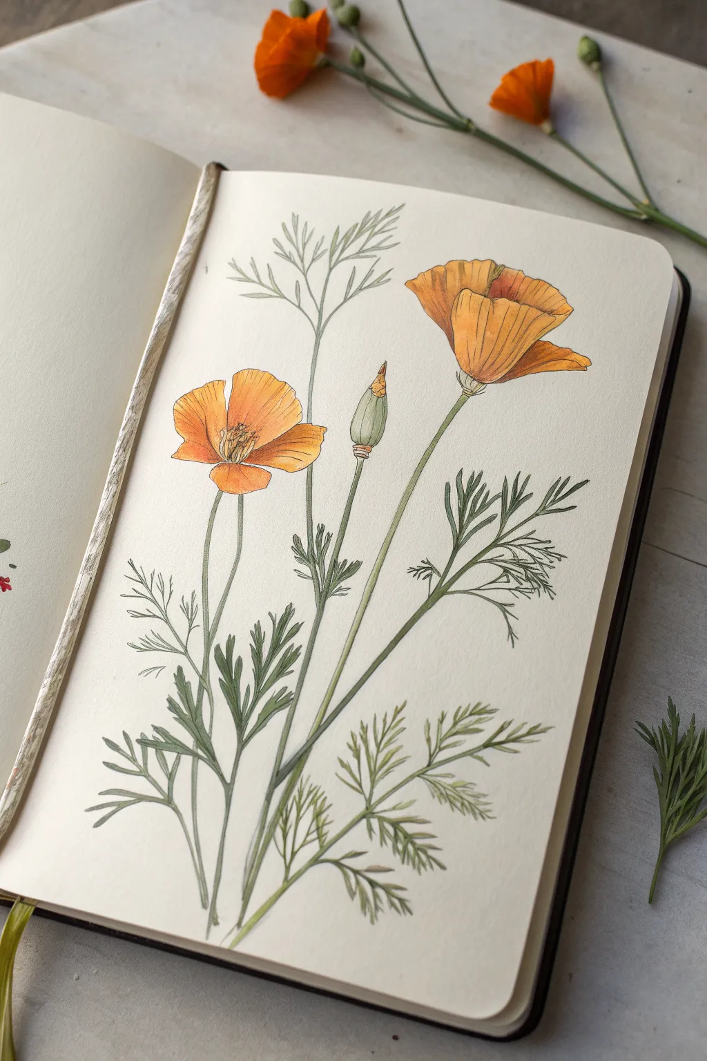
Capture the delicate beauty of California’s state flower with this elegant botanical illustration. This project combines precise line work with soft watercolor washes to create a realistic yet artistic study of poppies in various stages of bloom.
How-To Guide
Materials
- Hot press watercolor paper (smooth finish)
- HB pencil and quality eraser
- Waterproof fine liner pens (0.1mm and 0.05mm, sepia or black)
- Watercolor paints (Cadmium Orange, Yellow Ochre, Sap Green, Olive Green)
- Small round watercolor brushes (sizes 2 and 4)
- Palette for mixing
- Jar of clean water
Step 1: Structural Sketching
-
Main stem placement:
Begin with a very light pencil line to establish the central poppy stem. Curve it slightly to the right to give the plant a natural, organic posture rather than a rigid straight line. -
Flower positioning:
Mark the positions of the three main floral elements: the large open bloom at the top right, the smaller upward-facing flower on the left, and the tightly closed bud in the center nestled between them. -
Outline the petals:
Lightly sketch the fan-shaped petals of the main right-hand flower. Notice how the petals overlap; the front petals should appear shorter due to foreshortening, while the back petals fan out broadly. -
Detail the second flower:
Sketch the left-hand flower, ensuring the petals form a cup shape. Draw the center clearly, indicating where the stamens will burst forth. -
Draw the bud:
Sketch the conical shape of the flower bud. Add the distinctive ‘cap’ (calyx) at the base where it connects to the stem, giving it a slightly pointed tip. -
Map the foliage:
California poppy leaves are fern-like and deeply divided. Sketch fine, branching lines extending from the lower stems. Keep these lines loose and airy; don’t worry about perfect symmetry.
Step 2: Inking and Outline
-
Initial inking:
Using a 0.1mm waterproof pen, carefully trace your pencil lines. For the petals, use a broken or slightly wavering line to mimic the papery texture of poppy petals rather than a stiff, solid wire. -
Refining the leaves:
Ink the foliage with quick, confident strokes. The leaves taper to fine points, so lift your pen at the end of each segment to keep the tips sharp. -
Adding texture lines:
Switch to your finer 0.05mm pen. Add very delicate vertical striations on the petals, following the curve of the flower form. This guide helps define the volume before painting. -
Erase guidelines:
Wait until the ink is completely dry to the touch to avoid smudging. Gently erase all underlying pencil sketch marks to leave a clean, crisp drawing.
Petal Perfection
Real poppies have wrinkles! Don’t smooth everything out. Let your watercolor pool slightly in the petal folds to create natural-looking texture.
Step 3: Watercolor Application
-
Base wash for petals:
Mix a diluted wash of Yellow Ochre. Apply a light, even layer to all petal areas. I like to keep this initial layer very pale to let the paper’s luminosity shine through. -
Building intensity:
While the base is still slightly damp, drop in concentrated Cadmium Orange at the base of the petals and along the shadow edges. Let the color bleed naturally upward for a soft gradient. -
Defining petal segments:
Once the first layer is dry, use a smaller brush to paint thin, darker orange streaks along the petal veins. This reinforces the texture you hinted at with the ink lines. -
Painting the stems:
Mix a soft Olive Green with plenty of water. Paint the stems with a single, steady stroke. Keep the color lighter on one side to suggest a light source. -
Leaf coloration:
Paint the intricate leaves using Sap Green mixed with a touch of grey to desaturate it slightly. Use the tip of your size 2 brush to delicately fill the narrow leaf segments. -
Shadows and depth:
Add a second layer of darker green to the areas where leaves overlap or twist away from the viewer. This adds dimension and prevents the foliage from looking flat. -
The bud detail:
Paint the bud with a gradient: green at the base blending into a hint of orange at the very tip, suggesting the petals are just about to break through. -
Flower centers:
For the center of the open flowers, use a concentrated dot of yellow-orange for the stamens, and add tiny brown stippling marks with your pen to create depth.
Add a Specimen Tag
Enhance the scientific feel by writing the Latin name ‘Eschscholzia californica’ in neat cursive or small caps at the bottom of the page.
Now you have a timeless botanical record of these vibrant wildflowers suitable for framing or a nature journal


Wine Country Vineyard Rows in One-Point Perspective
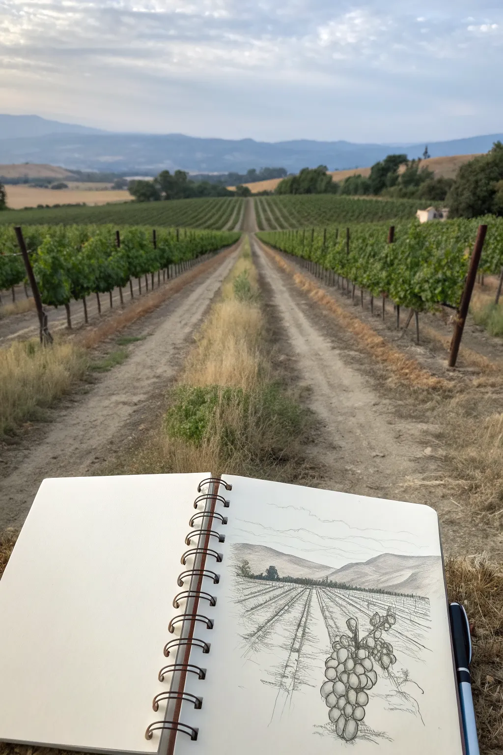
Capture the classic California wine country aesthetic with this crisp pen and ink sketch that emphasizes depth and perspective. This project breaks down seemingly complex rows of grapevines into manageable lines and textures, creating a striking scene that invites the viewer right into the landscape.
Step-by-Step Tutorial
Materials
- Spiral-bound sketchbook (heavyweight paper preferred)
- Pencil (HB or 2B)
- Eraser
- Fine liner pens (sizes 0.1, 0.3, and 0.5)
- Ruler (optional but helpful for the horizon)
Step 1: Setting the Scene
-
Establish the horizon:
Begin by lightly sketching a horizontal line roughly one-third down from the top of your page. This line represents eye level and will anchor the distant mountains. -
Mark the vanishing point:
Place a small dot right in the center of your horizon line. This is your vanishing point, where all the vineyard rows will appear to converge. -
Sketch the mountains:
Above the horizon line, draw the rolling contours of the distant mountains. Keep these shapes organic and soft, overlapping them slightly to create a sense of distance. -
Lay out the rows:
Using your pencil, radiate light guide lines from the vanishing point outward toward the bottom edge of the paper. These lines will determine the path and width of your vineyard rows.
Step 2: Inking the Foundation
-
Outline the mountains:
Switch to a 0.1 or 0.3 fine liner. Carefully trace over your pencil lines for the mountains. Keep the line weight light to push them into the background. -
Add atmospheric shading:
Use very fine hatching strokes within the mountain shapes to suggest shadow and form. Keep these strokes minimal to maintain the feeling of distance. -
Define the path:
Ink the central dirt path leading to the vanishing point. Use broken, sketchy lines rather than solid ones to suggest the rough texture of dirt and gravel. -
Draw the vine posts:
Along your radiated guide lines, lightly pencil in vertical lines for the posts holding the vines. These posts should get shorter and closer together as they move toward the horizon.
Distance Control
Use your thinnest pen (0.05 or 0.1) for distant details and a bolder pen (0.5 or 0.8) for foreground elements. This line weight variance instantly creates massive depth.
Step 3: Detailing the Vegetation
-
Scribble the foliage:
Using a loose, scribbling motion with your 0.3 pen, draw the leafy tops of the vines along the rows. Focus on the general shape rather than individual leaves. -
Vary the texture:
Make the foliage lines denser and darker at the bottom of the rows to imply shadow, and lighter at the top where the sun hits. -
Ink the foreground dirt:
Add texture to the ground between the rows with short, horizontal dashes and stippling. Concentration should be heavier near the bottom of the page and fade out as you go up. -
Create depth with contrast:
Go back in with a 0.5 pen and darken the undersides of the closest vines. This contrast pulls the foreground forward.
Wonky Perspective?
If your rows look tilted, re-check your vanishing point. Ensure every single diagonal line for the rows allows a straight ruler path back to that central dot.
Step 4: The Foreground Feature
-
Placement of the cluster:
In the bottom right corner, lightly sketch a large grape cluster and a few vine leaves. This serves as a detailed focal point for the composition. -
Draw the grapes:
Ink the grapes using overlapping circles and ovals. Don’t close every circle perfectly; broken lines can make them look more organic and shiny. -
Add volume to fruit:
Add small hatched shadows on roughly one side of each grape to verify the light source and give them roundness. -
Detail the large leaves:
Draw the jagged edges of the foreground grape leaves with a slightly purposeful, wiggly line. Add the main veins inside the leaves for structure. -
Final clean-up:
Wait several minutes to ensure all ink is completely dry, then gently erase all your initial pencil guide lines to reveal the crisp ink drawing.
With the ink dry, you now have a captured moment of vineyard tranquility on your page.
Pacific Coast Highway Cliffside Road View
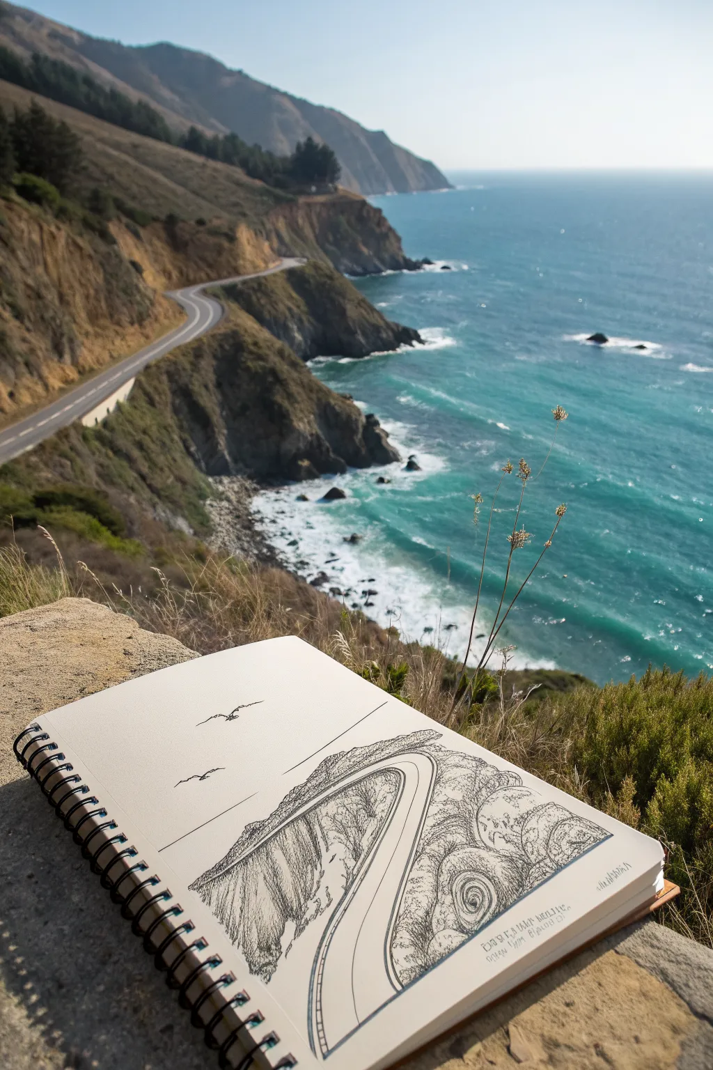
Capture the iconic curves of California’s Pacific Coast Highway with this fine-line ink drawing tutorial. The stark contrast of black ink against crisp white paper perfectly highlights the dramatic cliffs and sweeping roadway.
How-To Guide
Materials
- Wire-bound heavy sketching paper (A5 or A4 size)
- Fine liner pens (sizes 0.1, 0.3, and 0.5)
- Pencil (HB or H)
- Kneaded eraser
- Ruler (optional)
Step 1: Laying the Roadwork
-
Establish the Horizon:
Begin lightly with your pencil. Draw a straight horizontal line across the page, roughly one-third of the way up from the bottom, to separate the sea from the sky. -
Draft the Cliff Edge:
Sketch a diagonal, jagged line coming from the bottom left corner, angling upward toward the middle right. This defines the primary cliff face. -
Curve the Highway:
Draw the road’s outline. Start wide at the bottom center and curve it sharply upward and to the right, narrowing significantly as it recedes into the distance to create perspective. -
Define the Cliff Top:
Add the upper boundary of the cliff above the road. This line should be rougher and mimic organic rock formations. -
Ink the Road Lines:
Switch to your 0.5 pen. Carefully trace the outer edges of the road. Draw the double yellow line (as two thin parallel lines) down the center, following the curve. -
Add Road Details:
Use a 0.1 pen to draw the guardrail posts along the outer edge of the curve. Keep these small and evenly spaced.
Step 2: Texturing the Landscape
-
Texture the Cliff Face:
With the 0.3 pen, use vertical hatching lines on the large cliff area on the left. Vary the length and density to suggest vertical rock strata and shadows. -
Detail the Vegetation:
On the top of the cliff, use short, scribbly strokes to create the texture of coastal scrub and bushes. Keep these loose to contrast with the straight road lines. -
Create Ocean Swirls:
Below the cliff edge on the right, draw circular, swirling patterns with the 0.1 pen. These represent the churning water and crashing waves against the rocks. -
Deepen the Shadows:
I find that adding cross-hatching to the darkest crevices of the cliff really makes the drawing pop. Use the 0.1 pen for this subtle shading. -
Refine the Water:
Add more delicate, wavy lines radiating out from the swirls to show the movement of the open ocean.
Clean Lines
Keep a scrap piece of paper under your hand while drawing to prevent oils from your skin smudging the pencil or wet ink.
Step 3: Final Touches
-
Draw the Birds:
In the sky area, use the 0.3 pen to draw two or three simple ‘M’ shapes or flattened ‘V’ shapes to represent seagulls gliding on the wind. -
Clean Up:
Wait at least ten minutes for the ink to dry completely. Gently erase all visible pencil guidelines with the kneaded eraser. -
Add Handwritten Notes:
If desired, write a small caption or date in the bottom right corner using your finest pen. A slightly messy, architectural handwriting style works well here. -
Reinforce Key Lines:
Look over the drawing. If the road needs to stand out more, go over the outer edge one last time with the 0.5 pen to thicken the line weight.
Add Depth
Use a thicker ink line for foreground elements (like the bottom of the road) and a thinner line for distant cliffs to exaggerate atmospheric perspective.
Now you have a permanent memory of these stunning coastal views captured in your sketchbook
Retro California Lettering with Coastal Icons
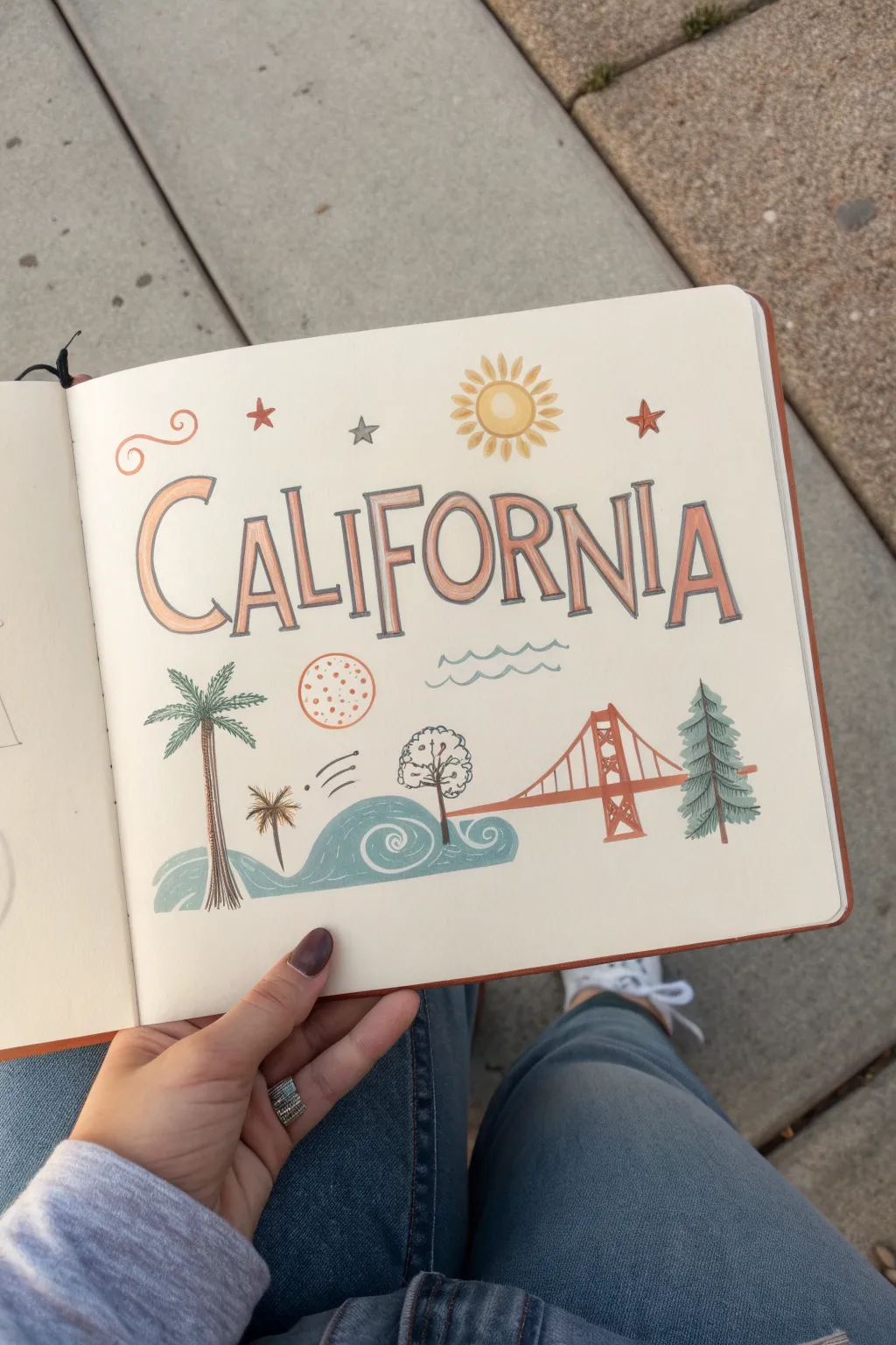
Capture the laid-back essence of the West Coast with this charming sketchbook layout featuring vintage-style lettering and classic Californian icons. The design combines warm, dusty sunset tones with teal accents for a nostalgic, beachy aesthetic.
Detailed Instructions
Materials
- Sketchbook with smooth, thick paper
- Pencil (HB) and eraser
- Fine liner pens (black or dark grey, 0.3mm and 0.5mm)
- Alcohol markers or watercolor brush pens (dusty orange, light yellow, teal/grey-blue, dark green)
- White gel pen (optional for highlights)
- Ruler
Step 1: Planning and Lettering
-
Sketch the baseline:
Begin by lightly drawing a horizontal guideline across the center of your page with a pencil and ruler. This will serve as the anchor for your main ‘CALIFORNIA’ lettering. -
Map out the letters:
Lightly sketch the word ‘CALIFORNIA’ in tall, condensed capital letters. Vary the height slightly—make the ‘C’ and ‘A’ at the ends a bit larger or swooping to frame the word. Aim for a retro serif style. -
Outline in ink:
Go over your pencil sketches with a 0.5mm fine liner. Instead of just tracing, draw a double outline for each letter to create open shapes that you can color in later. -
Add drop shadows:
To give the letters dimension, draw a thin drop shadow on the right side of each vertical stroke using your fine liner. Keep the lines crisp and consistent. -
Color the text:
Fill in the letters with a dusty orange marker. If you’re using alcohol markers, work quickly to avoid streakiness. Leave the drop shadows uncolored or fill them with a light grey for contrast.
Fixing Bleeding Ink
If your markers bleed outside the lines, thicken the outline slightly with your black pen to cover the mistake, or use a white gel pen to clean up the edges.
Step 2: Drawing the Sky Elements
-
Draw the sun:
Above the ‘FOR’ section of your lettering, draw a simple circle. Add short, radiating petal-like rays around it. Color the center yellow and the rays a soft orange. -
Add stars and swirls:
In the upper left corner, draw a decorative red swirl. Scatter a few small five-point stars and asterisks in red and grey around the lettering to fill empty negative space.
Layering Colors
For a richer look, layer your markers. Go over the bottom half of the letters a second time with the same orange marker to create a subtle gradient effect.
Step 3: Creating the Coastal Scene
-
Sketch the Golden Gate Bridge:
On the lower right, draw the iconic suspension bridge structure. Start with the vertical tower, then add the sweeping suspension cables. Use a rust-red or dusty orange marker to line the main structure. -
Draw the stylized waves:
To the left of the bridge, sketch a rolling stylized wave shape that curls inward. Use a teal or grey-blue marker to fill the shape, leaving thin white lines or using a white gel pen later to define the swirl inside the wave. -
Add the palm tree:
On the far left, draw a tall, slender palm tree trunk. Top it with starburst-style palm fronds. Use a dark brown for the trunk and a muted green for the leaves. -
Include the redwood tree:
Balance the palm tree by drawing a coniferous redwood tree on the far right, partially behind the bridge. Use short, downward strokes with a dark green marker to create a pine needle texture. -
Add decorative icons:
Fill the space between the lettering and the landscape with small doodles: a textured orange circle representing an orange or sun, and simple wavy blue lines for the ocean breeze.
Step 4: Refining and Detailing
-
Refine outlines:
Go back over your colored illustrations with the 0.3mm fine liner. Add definition to the bridge cables, the bark on the palm tree, and the edges of the waves. -
Add texture to the landscape:
I like to add small dots or stippling to the orange circle and the sand area to give it a vintage print feel. -
Erase guidelines:
Once the ink is completely dry—give it a few extra minutes just to be safe—gently erase your pencil guidelines.
Close your sketchbook and enjoy your custom piece of travel art


Have a question or want to share your own experience? I'd love to hear from you in the comments below!