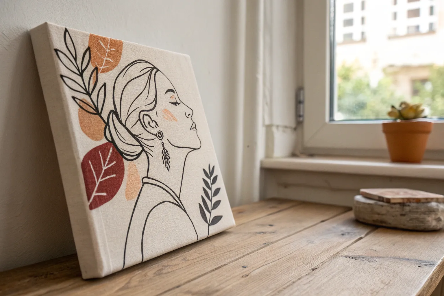
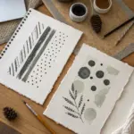
Whenever I’m staring at a blank canvas, I like to remind myself it’s not pressure—it’s permission. Here are my favorite canvas project ideas that look super polished on the wall, even if you’re keeping it simple.
Easy Abstract Brushstroke Canvas
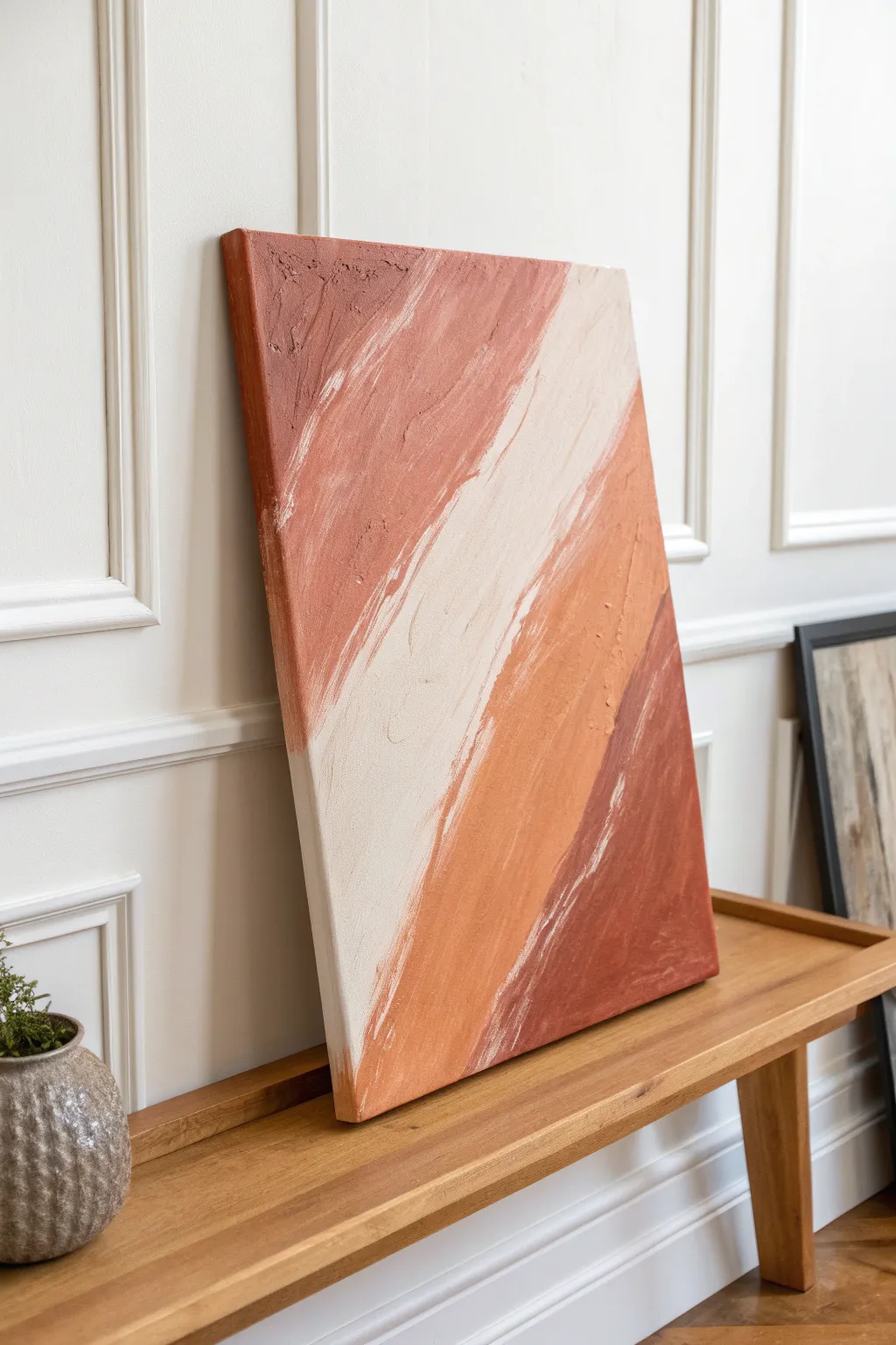
Embrace the effortless beauty of abstract art with this warm, earth-toned project that focuses on sweeping motion and texture. The design relies on bold diagonal color blocking and intentional brushstrokes to create a piece that feels both modern and organically grounded.
Step-by-Step
Materials
- Large stretched canvas (e.g., 24×36 or larger)
- Modeling paste or thick texture medium
- Acrylic paints (Burnt Sienna, Terra Cotta, Warm White, Sand/Beige)
- Large flat paintbrushes (2-inch and 4-inch)
- Palette knife
- Disposable plates or paint palette
- Drop cloth or masking paper
- Painter’s tape (optional)
Step 1: Preparation and Planning
-
Set up your workspace:
Lay down your drop cloth to protect your surface. This project involves some vigorous brushing, so ensure you have plenty of elbow room. -
Map the composition:
Mentally divide your canvas into four broad, diagonal bands moving from the top left down to the right. You don’t need to sketch these lines perfectly; a rough idea is enough to guide your painting. -
Mix your base texture:
Mix a generous amount of modeling paste with white acrylic paint. This creates a textured base that will hold brushstrokes much better than paint alone. -
Prime with texture:
Using a wide brush or palette knife, apply a thin, uneven layer of your textured white mix across the entire canvas. This initial layer ensures no raw canvas shows through.
Tip: Embrace Imperfection
Don’t overwork the blending. The charm lies in the visible streaks and ‘accidental’ white spaces where the brush dragged across the canvas texture.
Step 2: Mixing the Earth Tones
-
Create the darkest shade:
For the bottom-right corner, mix Burnt Sienna with a touch of Terra Cotta. You want a deep, rich clay color. -
Mix the mid-tone rust:
Create a secondary color by lightening your Terra Cotta with a bit of Sand paint. This will act as the transitional orange-brown hue. -
Prepare the lightest tone:
Mix a large batch of Warm White with just a hint of Sand. This creamy off-white will be the central highlight of the piece. -
Mix the upper accent color:
For the top-left section, create a muted dusty rose or lighter terracotta shade by mixing your mid-tone rust with more white.
Level Up: Metallic Pop
Once the paint is fully dry, dry-brush a tiny amount of gold leaf paint along the textured ridges of the white stripe for a subtle hint of luxury.
Step 3: Painting the Layers
-
Start with the dark corner:
Load a 4-inch brush with your darkest clay color. Apply it to the bottom-right corner using long, confident diagonal strokes moving upward. -
Build the texture:
Don’t smooth the paint out too much. Allow the bristles to leave ridges and valleys in the paint, which adds to that raw, organic look. -
Apply the mid-tone band:
Pick up your rust color and paint the next diagonal band adjacent to the dark corner. Overlap the edges slightly while the paint is wet to create a soft, natural blend. -
Add the cream highlight:
Clean your brush thoroughly or grab a fresh one. Paint the wide central band with your creamy off-white mix, brushing diagonally from bottom-left towards top-right. -
Complete the top corner:
Fill the remaining top-left corner with your dusty rose mixture. Keep your stroke direction consistent with the other layers.
Step 4: Refining and Drying
-
Create dry-brush transitions:
I like to take a nearly dry brush with a small amount of the lighter cream color and lightly sweep it over the edges where colors meet. This creates that scratchy, blended transition. -
Add texture highlights:
Use a palette knife to scrape a little extra thick paint onto the center of the colored bands, adding physical height to the artwork. -
Detail the edges:
Don’t forget to paint the sides of the canvas so the art wraps around for a finished, gallery-style look. -
Allow to dry:
Because of the texture medium and thick application, let the canvas dry flat for at least 24 hours. If you hang it too soon, the heavy paint might sag.
Now you have a stunning, large-scale piece of abstract art ready to warm up any room in your home
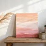
Sunset Gradient Sky Canvas
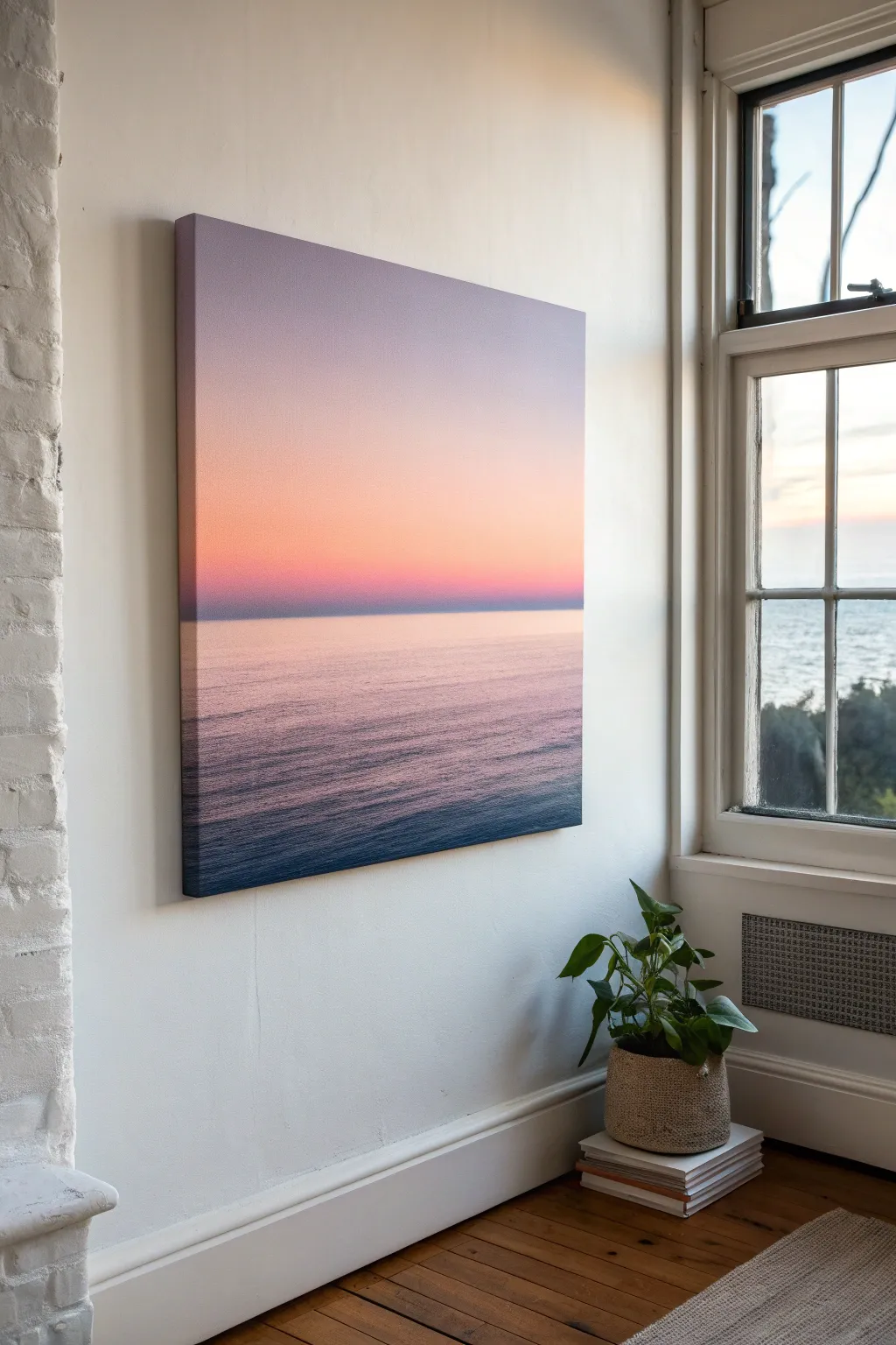
Capture the tranquil beauty of twilight with this gradient seascape canvas that brings calm energy to any room. Using smooth blending techniques, you will create a seamless transition from a soft lavender sky down into deep ocean waters.
How-To Guide
Materials
- Large square or rectangular stretched canvas
- Acrylic paints (Titanium White, Lavender, Peach/Coral, Magenta, Ultramarine Blue, Phthalo Blue)
- Wide flat wash brushes (2-3 inches)
- Medium flat brush
- Spray bottle with water (misting setting)
- Palette or disposable plate
- Paper towels
- Ruler or painter’s tape (optional for horizon)
Step 1: Painting the Sky Gradient
-
Prepare the canvas:
Start by misting the entire canvas very lightly with water. This helps the acrylics blend more smoothly and keeps the paint workable for longer, which is crucial for a soft gradient. -
Apply the top color:
Mix a soft lavender shade using white and a touch of purple. Using your widest brush, paint the top third of the canvas with horizontal strokes, ensuring full coverage. -
Introduce the middle tone:
While the lavender is still wet, mix a peach or soft coral color. Apply this directly below the lavender section, overlapping slightly where they meet. -
Blend the sky transition:
Clean your brush or grab a fresh dry one. Gently sweep back and forth horizontally where the lavender and peach meet to create a seamless, soft blur. I find that wiping the brush on a paper towel between strokes keeps the colors from getting muddy. -
Deepen the horizon:
Toward the bottom of the sky section (just above your intended horizon line), mix a slightly deeper magenta-purple into your peach tone to suggest the intensity of the setting sun’s afterglow. -
Create the horizon haze:
Paint a very thin, misty line of your lightest peach-white mix right at the horizon level. This creates atmospheric perspective, making the horizon look distant and glowing.
Step 2: Creating the Ocean
-
Define the horizon line:
You can use a piece of painter’s tape for a sharp line, or freehand it with a flat brush for a more natural look. Paint a straight horizontal line across the canvas where the sky meets the water, slightly darker than the sky above. -
Mirror the sky:
Immediately below the horizon, apply a wash of the same pinkish-peach tone used in the lower sky. The water reflects the sky, so keep this area light and warm. -
Transition to cool tones:
As you move down the canvas, gradually mix Ultramarine Blue into your pink mixture to create a muted violet. Apply this in horizontal bands, moving downward. -
Deepen the foreground:
For the bottom third of the canvas, switch to Phthalo Blue mixed with a touch of black or deep purple. This darker value anchors the painting and creates depth. -
Blend the water gradient:
Just like with the sky, use a clean, slightly damp wide brush to feather the transitions between the pink reflection, the violet middle water, and the deep blue foreground.
Stay Wet
Acrylics dry fast! Keep a spray bottle handy and mist the canvas lightly every few minutes. This keeps the paint open longer, allowing for those buttery, seamless gradient blends.
Step 3: Adding Texture and Detail
-
Add subtle ripples:
Switch to a medium flat brush. Using a mix of white and pale pink, paint very thin, horizontal dashes in the pink reflection area to simulate gentle waves catching the light. -
Darken wave troughs:
In the darker blue foreground, use your darkest blue mix to paint thin, horizontal lines. These act as the shadows between the swells of water. -
Soften the water texture:
If the lines look too sharp, lightly glaze over them with a very watered-down wash of the local water color to integrate the ripples back into the surface. -
Final horizon check:
Step back and check your horizon line. Ensure it is perfectly straight. If needed, use a straight edge and a fine brush to sharpen the separation between sea and sky. -
Paint the edges:
Don’t forget to wrap your painting around the sides of the canvas. Continue the horizontal lines and gradient colors onto the edges for a professional, frameless finish. -
Varnish and seal:
Allow the painting to dry completely for at least 24 hours. Because specific drying times vary by brand, check your bottle, then apply a satin or gloss varnish to protect the colors and unify the sheen.
Metallic Touch
Mix a tiny amount of iridescent medium or pearl white paint into the water reflections. It will make the ocean surface shimmer subtly when the light hits the canvas.
Hang your finished piece in a well-lit spot to fully enjoy the calming transition of colors

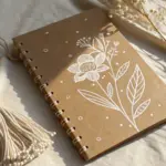
Simple Floral Bouquet Canvas
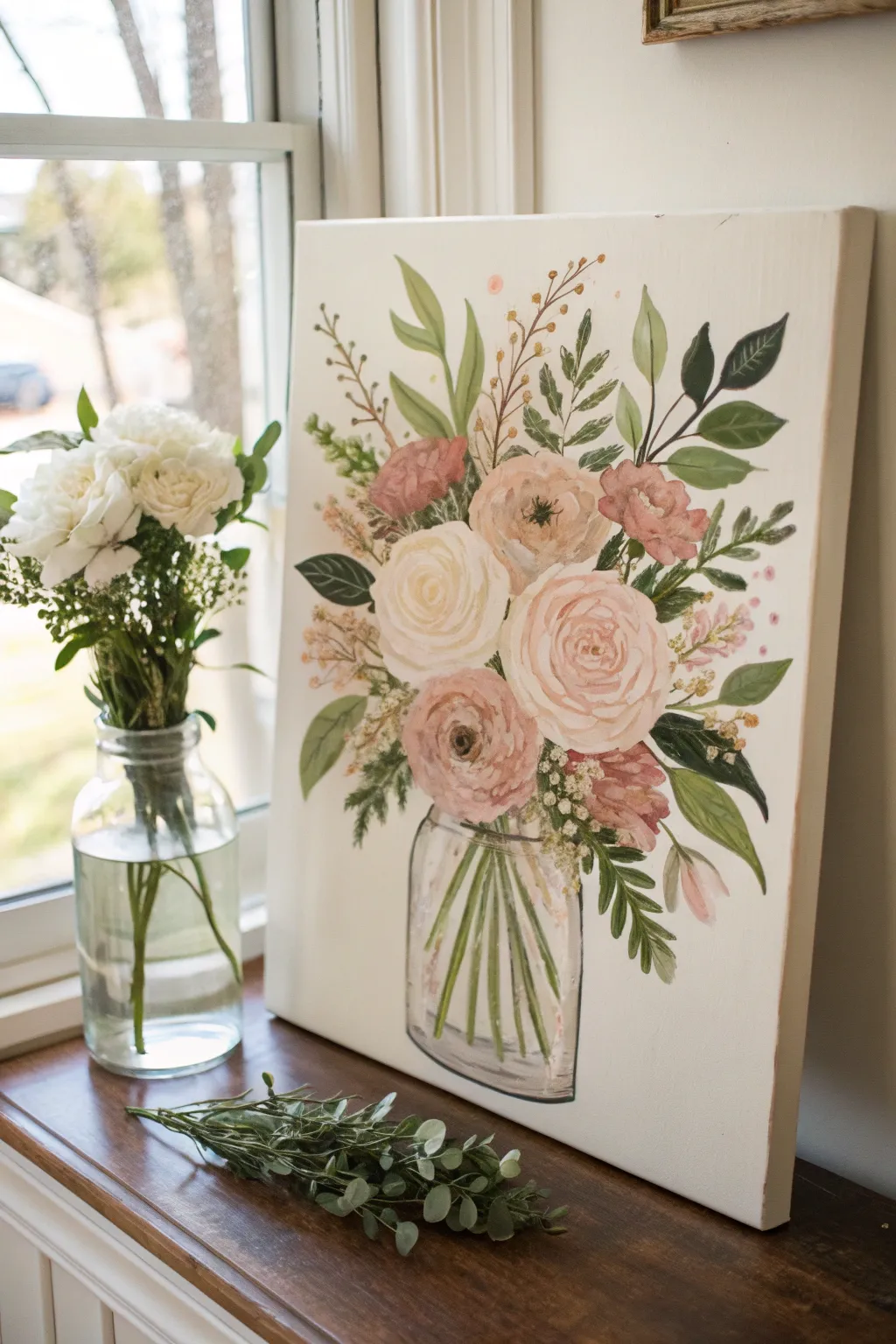
Capture the delicate beauty of a fresh arrangement with this soft, romantic floral painting. Using acrylics on a vertical canvas, you’ll create a lovely bouquet of blush roses and greenery sitting in a transparent glass mason jar.
Step-by-Step Guide
Materials
- Rectangular stretched canvas (16×20 or similar vertical aspect ratio)
- Acrylic paints: Titanium White, Burnt Umber, Hooker’s Green, Sap Green, Cadmium Yellow, Alizarin Crimson, Red Oxide, Black
- Assorted brushes: 1 inch flat brush, medium filbert, #4 round brush, and a fine liner brush for details
- Pencil and eraser
- Palette for mixing
- Cup of water and paper towels
Step 1: Planning and Background
-
Prime the Surface:
Since most store-bought canvases are white, mix a very tiny amount of Burnt Umber or a warm beige into a large dollop of Titanium White. Paint the entire canvas with this off-white, creamy shade to give it a warmer, vintage feel compared to the stark white gesso. -
Sketch the Composition:
Lightly sketch the outline of your mason jar at the bottom center of the canvas. It doesn’t need to be perfectly symmetrical; a hand-drawn look adds charm. -
Map the Blooms:
Draw loose circles or ovals floating above the jar where your main flowers will go. Make the central rose the largest, with slightly smaller blooms clustered around it. -
Add Stem Lines:
Draw faint lines connecting your floating flower circles down into the jar opening. Add sweeping curves extending outward for the taller greenery sprigs.
Jar Transparency Pro-Tip
To make the jar look truly transparent, ensure you paint the stems inside the jar slightly lighter and more blurred than the stems above the rim.
Step 2: Painting the Jar
-
Block in the Water:
Mix a very watery grey-blue using a speck of Black, White, and water. Apply this inside the jar area, keeping it translucent so the background color still peeks through. -
Define the Glass Rim:
Using a small round brush and a darker grey mix, paint the rim of the jar and the subtle curves of the threading at the neck. -
Create Green Stems:
Combine Sap Green with a touch of White. Paint the stems inside the jar, crisscrossing them slightly to look natural. Some should stop in the ‘water’ and others can go all the way to the bottom. -
Add Glass Reflections:
With pure White and a liner brush, add sharp vertical highlights along the sides of the jar and curved highlights on the shoulder to mimic light hitting glass.
Level Up: Texture Medium
Mix impasto or modeling paste into your acrylic paint for the flower petals. This will create raised, 3D brushstrokes that mimic real petals.
Step 3: Creating the Blooms
-
Base Coat the Roses:
Mix a soft blush pink using White, Alizarin Crimson, and a tiny bit of Yellow. Paint the solid base shapes for your roses. -
Underpaint Darker Flowers:
For the darker reddish-brown flowers (like the one at the top left and bottom right), mix Alizarin Crimson with Red Oxide and paint their base shapes. -
Rose Petal Shadows:
Take a slightly darker shade of your pink mix. Starting from the center of the bloom, paint ‘C’ shaped strokes that cup around each other to define the inner petals. -
Rose Petal Highlights:
Mix a very pale pink (mostly White). Paint broad, loose ‘C’ strokes on the outer edges of the roses to represent the large, open petals catching the light. -
Detail the Darker Blooms:
Add layers to the darker flowers using a lighter dusty rose color. Keep these strokes smaller and choppier to suggest a different texture, perhaps like a carnation or peony. -
Flower Centers:
For open flowers, dab a small cluster of dark brown or black dots in the very center, then overlay tiny yellow dots for pollen.
Step 4: Foliage and Filler
-
Paint Large Leaves:
Mix Hooker’s Green with a touch of Burnt Umber for a deep forest green. Paint the large, broad leaves using a medium filbert brush, pressing down to widen the stroke and lifting up to create a point. -
Add Lighter Greenery:
Mix Sap Green with White and Yellow. Paint the lighter, more delicate sprigs and fern-like leaves extending high out of the bouquet. -
Create Berry Sprigs:
Using a liner brush and brown paint, draw fine twigs sticking out. Add small dots of Red Oxide or mustard yellow to the ends to create berries or buds. -
Add Baby’s Breath:
I like to use an old, splayed brush for this part. Dip it in plain White and lightly stipple (dab) tiny clusters of dots between the main flowers to add delicate filler texture. -
Final Refinements:
Step back and look at your composition. If there are empty gaps, add a few extra green leaves or a floating petal to balance the bouquet.
Hang your new masterpiece in a bright room to enjoy those everlasting blooms year-round
Geometric Tape-Resist Canvas
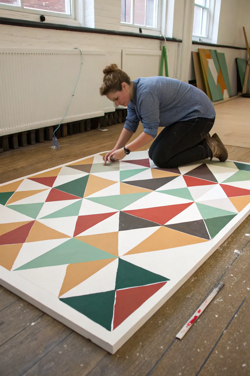
Transform a blank canvas into a stunning modern statement piece using crisp white lines and bold triangles. This approachable technique relies on painters tape to create structure, making it perfect for beginners who want professional-looking results.
Step-by-Step Tutorial
Materials
- Large primed artist canvas
- Painter’s tape (various widths, 0.25-0.5 inch distinct lines recommended)
- Acrylic paints (Mustard Yellow, Sage Green, Deep Emerald, Rust Red, Charcoal Grey)
- Flat artist brushes (1-2 inch width)
- White acrylic paint or gesso (optional)
- Ruler or straight edge
- Pencil
- Drop cloth or floor cover
Step 1: Planning and Taping
-
Prepare your workspace:
Lay down a drop cloth or tarp on a large, flat floor area. This canvas is substantial, so painting horizontally on the floor is often more manageable than using an easel. -
Sketch the grid:
Using a pencil and a long ruler, lightly mark out a loose grid or intersecting diagonal lines across the canvas. You don’t need to be mathematically perfect; a slightly organic geometric feel works beautifully. -
Apply the tape:
Run long strips of painter’s tape along your pencil lines. Ensure the tape goes all the way over the edges of the canvas to create a clean wrap-around effect. -
Intersect and divide:
Create smaller triangles by crossing your main lines with shorter strips of tape. Vary the size of the shapes to keep the composition dynamic. -
Seal the tape edges:
Press down firmly on all tape edges. For ultra-crisp lines, I like to paint a thin layer of white paint or clear matte medium over the tape edges first to seal them against bleeds.
Step 2: Painting the Shapes
-
Plan your palette:
Squeeze out your chosen acrylic colors onto a palette. Aim for a mix of warm tones like mustard and rust, balanced by cool sage and emerald greens. -
Assign colors:
Look at your taped canvas and mentally assign colors to different triangles, ensuring no two adjacent shapes share the same color unless you want them to merge. -
Paint the first color:
Start with your lightest color, perhaps the mustard yellow or sage. Fill in scattered triangles across the canvas using a flat brush. -
Apply darker tones:
Move on to the rust red and deep emerald sections. Apply the paint somewhat thickly to ensure solid coverage without brushstrokes showing through. -
Add the contrast:
Fill the remaining shapes with your darkest charcoal grey or chocolate brown. This anchors the design and makes the lighter colors pop. -
Leave some white space:
Consider leaving a few triangles unpainted (white) if you want a lighter, airier feel, though fully filling the shapes creates a bolder look.
Seal for Sharpness
Before adding color, paint a thin layer of white over the tape edges. This fills tiny gaps, so any bleeding matches the background, keeping lines razor-sharp.
Step 3: Finishing Touches
-
Check coverage:
Once the first coat is touch-dry, inspect for transparency. Acrylics often darken as they dry, so you may need a second coat on lighter colors like the yellow. -
Let it dry partially:
Wait until the paint is dry to the touch but not fully cured. Removing tape too late can sometimes peel up the paint skin. -
The reveal:
Slowly and carefully peel back the painter’s tape at a 45-degree angle. This is the most satisfying part as the crisp white lines emerge. -
Clean up edges:
If any paint bled under the tape, use a small detail brush and white paint to tidy up the lines. -
Final cure:
Allow the entire canvas to dry flat for at least 24 hours before hanging or sealing with a varnish.
Metallic Accent
Replace one color group (like the charcoal) with metallic gold or copper paint. It catches the light and adds a luxe, modern texture to the flat geometry.
Hang your massive geometric masterpiece and enjoy the modern energy it brings to the room
BRUSH GUIDE
The Right Brush for Every Stroke
From clean lines to bold texture — master brush choice, stroke control, and essential techniques.
Explore the Full Guide
Acrylic Paint-Pour Canvas
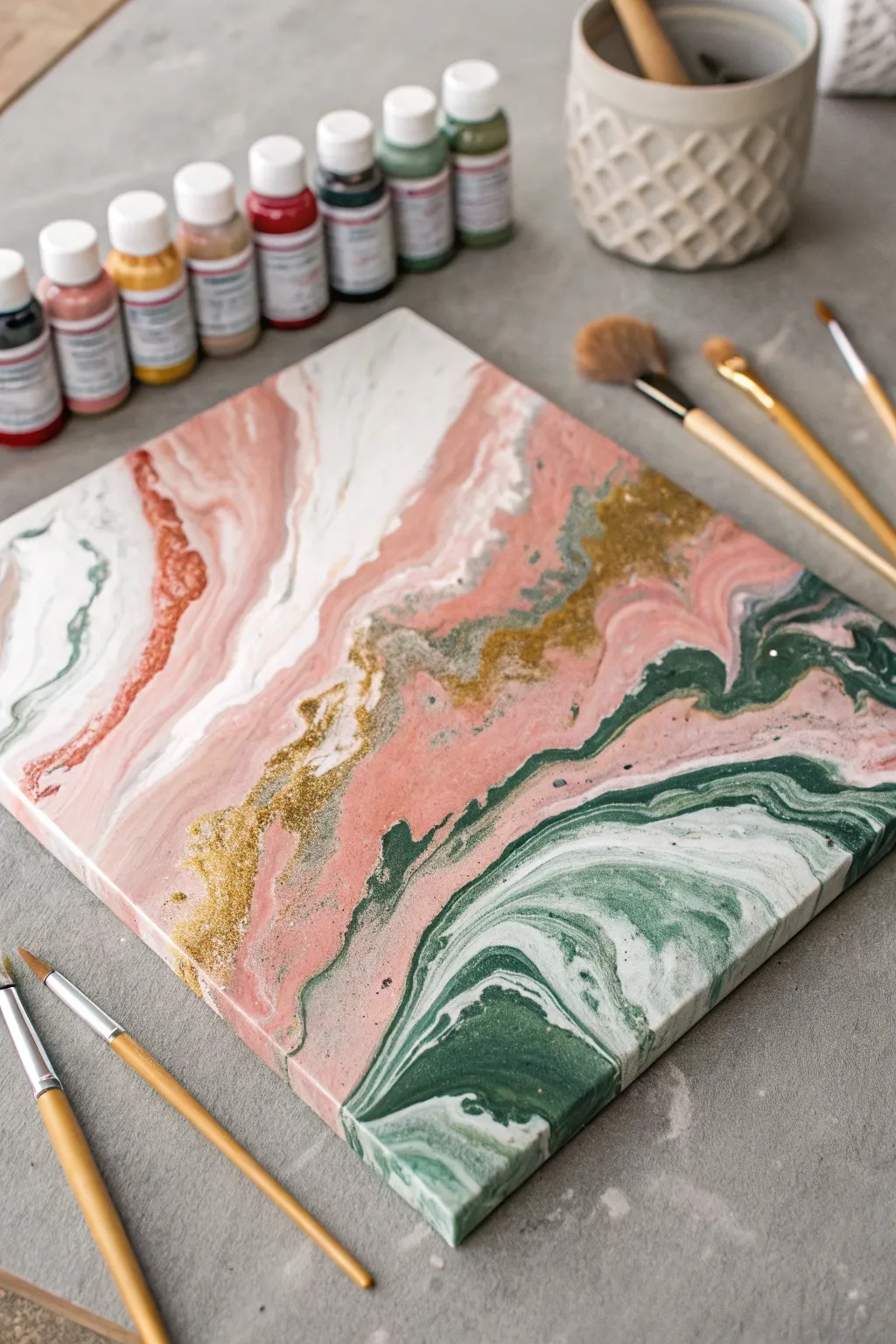
This elegant fluid art project combines soft blush pinks with deep forest greens and striking gold accents for a sophisticated marble effect. The organic flow of the paint creates mesmerizing patterns that look high-end but are surprisingly achievable for beginners.
Step-by-Step
Materials
- Rectangular stretched canvas (e.g., 11×14 or 16×20 inches)
- Acrylic pouring paints: White, Muted Pink/Rose, Forest Green
- Gold metallic acrylic paint or fine gold glitter medium
- Pouring medium (like Floetrol or Liquitex)
- Plastic cups for mixing
- Wooden stir sticks
- Plastic drop cloth or garbage bag
- Gloves
- Hairdryer (optional, for moving paint)
- High-gloss varnish (for sealing)
Step 1: Preparation & Mixing
-
Prepare your workspace:
Fluid art is messy, so cover your entire table with a plastic drop cloth. Elevate your canvas on four upside-down cups (one under each corner) to allow excess paint to drip off freely without pooling underneath. -
Mix the base colors:
In separate cups, mix your white, pink, and green acrylic paints with pouring medium. Aim for a ratio of about 1:1 or follow the bottle instructions. The consistency should be like warm honey—fluid enough to flow but thick enough to hold color separation. -
Prepare the gold accent:
Mix your gold metallic paint with medium in a smaller cup. If you are using glitter, mix fine gold glitter into a clear pouring medium or gloss varnish now, ensuring it’s well-distributed. -
Check consistency:
Lift your stir stick from the paint. The stream should flow continuously and create a slight mound on the surface that disappears within a second or two. Adjust with a few drops of water if too thick.
Muddy colors?
If your pink and green are turning brown where they meet, your paint was likely too thin or you over-tilted. Next time, slightly thicken the paint and stop tilting sooner.
Step 2: The Pour Technique
-
Create a white base:
Pour a generous amount of the white mixture onto the canvas. Use a palette knife or a flat stick to spread it thinly across the entire surface, ensuring the edges are wet. This ‘wet canvas’ helps the colored paints glide smoothly. -
Apply the dirty pour:
There are many ways to pour, but for this marbled look, I prefer a ‘dirty pour’ or ribbon pour. Layer your colors (pink, white, green, and gold) into a single large cup. Do not stir them. Pour the paint slowly onto the canvas in diagonal, wavy lines. -
Manual tilting:
Gently lift the canvas and tilt it slowly from side to side. Let the paint stretch and flow. Watch as the colors interact; don’t rush this part. Aim to cover the corners without losing too much of your favorite patterns off the edge. -
Create negative space:
If the design looks too busy, pour a little extra white paint along one edge and tilt the canvas again to wash over some areas, creating calm ‘breathing room’ within the composition.
Step 3: Refining the Details
-
Add definition:
Dip a small brush or stick into the dark forest green and drag thin veins through the pink or white areas to enhance the marble effect. Be very gentle to avoid mixing mud. -
Enhance the gold:
If the gold got lost during tilting, drizzle thin lines of your gold glitter mixture along the boundaries between the green and pink sections. This adds that crucial sparkle seen in the reference image. -
Use air for movement:
For soft, wispy edges similar to the photo, use a straw or a hairdryer on the ‘cool/low’ setting to gently blow the paint in specific areas. This feathers the colors together beautifully. -
Check the edges:
Walk around the table and ensure all sides and corners are fully covered with paint. Use your finger to dab paint onto any bald spots on the canvas sides.
Add texture
While the paint is wet, sprinkle loose coarse gold glitter or crushed glass pieces into the gold veins for a 3D geode effect that catches the light.
Step 4: Drying & Finishing
-
Pop air bubbles:
Look closely for tiny bubbles rising to the surface. You can pop these with a toothpick or by quickly passing a chef’s torch over the surface (keep it moving constantly). -
Initial drying:
Leave the painting undisturbed in a dust-free area for at least 24-48 hours. Acrylic pours dry slowly. Do not move it, or the pattern might shift. -
Evaluate the texture:
Once fully dry, the glitter areas might feel slightly textured. Wipe the surface gently with a dry cloth to remove any dust that settled. -
Apply varnish:
To achieve that glass-like finish and protect the colors, apply 2-3 coats of high-gloss varnish. Let each coat dry completely before adding the next.
Hang your stunning abstract canvas in a well-lit spot to watch the metallic gold shimmer as you walk by
Minimal Two-Color Color-Block Canvas
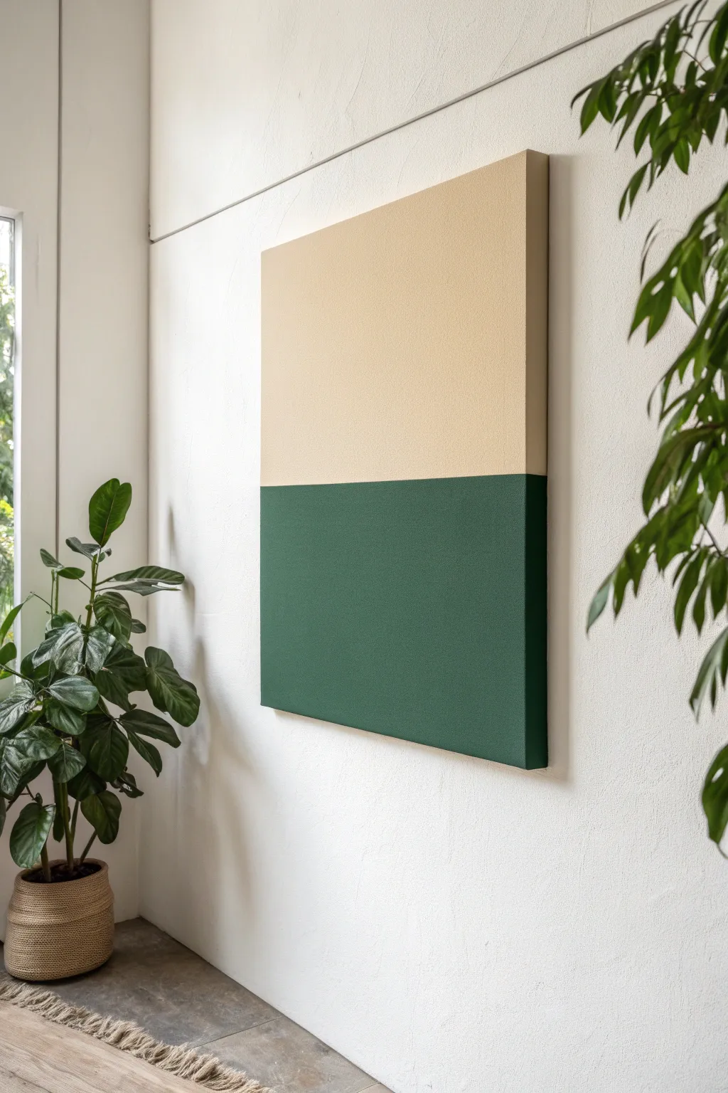
Embrace the calming power of clean lines with this two-tone color-block canvas. By pairing a warm, earthy beige with a deep forest green, you create a sophisticated statement piece that feels both modern and organic.
Detailed Instructions
Materials
- Large gallery-wrapped canvas (approx. 24×30 inches)
- Acrylic paint (deep forest green)
- Acrylic paint (warm beige or sand)
- Gesso (optional, for priming)
- Wide painters tape (low tack)
- Flat synthetic paintbrushes (2-3 inch width)
- Small roller brush (optional, for smoother texture)
- Ruler or T-square
- Pencil
- Matte varnish or sealant
Step 1: Preparation & Planning
-
Prepare the workspace:
Lay down a drop cloth or old newspapers on a flat surface to protect your floor or table from paint drips. -
Prime the canvas:
If your canvas isn’t pre-primed, apply an even coat of white gesso and let it dry completely to ensure the colors pop later. -
Measure the midpoint:
Using your ruler or T-square, carefully measure top to bottom deeply to find the exact horizontal center of your canvas. -
Mark the horizon line:
Make very light pencil marks on the left and right edges, then connect them with a faint line across the front, ensuring it’s perfectly level.
Bleeding Lines?
If paint bled under the tape, wait for it to dry fully. Then, place a new piece of tape over the ‘good’ side and paint a tiny correction layer of the proper color over the mistake.
Step 2: Applying the Base
-
Tape the line:
Apply a strip of painter’s tape directly along your pencil line. I prefer to place the tape on the bottom half first so I can paint the top section without obstruction. -
Seal the tape edge:
Press the edge of the tape down firmly with your fingernail or a credit card to prevent paint from bleeding underneath. -
Paint the top section:
Load your wide brush with the beige paint and apply it to the top half of the canvas using long, horizontal strokes. -
Cover the sides:
Don’t forget to wrap the color around the top edge and the upper side edges of the canvas frame for a professional gallery look. -
Apply a second coat:
Let the first layer dry to the touch, then add a second coat of beige to ensure solid, opaque coverage without streaks. -
Let it cure:
Allow the top section to dry completely—usually at least an hour—before moving on to the next step to avoid ruining the finish.
Step 3: Adding Contrast
-
Re-tape the boundary:
Once the beige paint is fully dry, gently remove the old tape. Now, apply a new strip of tape over the dry beige paint, aligning the bottom edge perfectly with your original line. -
Seal the new edge:
To ensure a crisp line, paint a very thin layer of the beige paint over the edge of the new tape. This seals the gap so any bleed-under matches the top color. -
Paint the bottom section:
Apply the deep forest green paint to the bottom half, stroking away from the tape initially to minimize pressure on the seal. -
Finish sides and bottom:
Paint the bottom edge and lower side edges of the canvas with the green to complete the wrapped effect. -
Layer up the dark tone:
Darker acrylics can sometimes be translucent, so apply 2-3 coats of green until you achieve a rich, solid hue. -
Remove tape while damp:
Carefully peel back the painter’s tape while the final coat of green is still slightly tacky, pulling at a 45-degree angle to get that razor-sharp line.
Add Texture
Mix a little baking soda or fine sand into your acrylic paint before applying. This creates a tactile, plaster-like finish that adds depth to the minimalist blocks.
Step 4: Finishing Touches
-
Touch up edges:
Inspect the center line. If there are any small bleeds, use a tiny detail brush to correct them with the appropriate color. -
Apply varnish:
Once the entire piece is bone dry (wait 24 hours), apply a clear matte varnish over the whole canvas to unify the sheen and protect the surface.
Hang your new masterpiece in a well-lit spot to enjoy the calming balance of your work

PENCIL GUIDE
Understanding Pencil Grades from H to B
From first sketch to finished drawing — learn pencil grades, line control, and shading techniques.
Explore the Full Guide
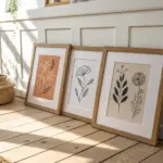
Ombre Stencil Motif Canvas
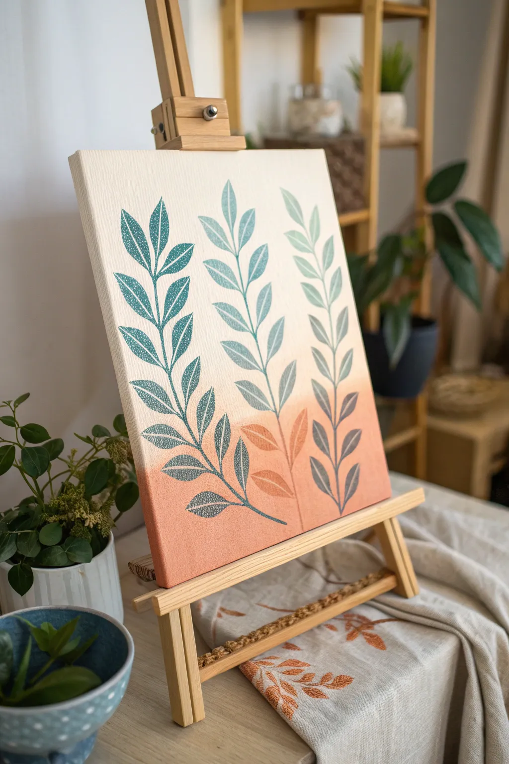
Bring the warmth of a sunset into your home with this serene botanical canvas featuring a soft, blended background and crisp stenciled leaves. The gentle ombre transition from cream to terracotta creates a modern, calming focal point for any shelf or desk.
Step-by-Step
Materials
- Rectangular stretched canvas (approx. 9×12 inches)
- Acrylic paints: Titanium White, Cream/Off-White, Terra Cotta/Warm Peach
- Large flat brush or sponge applicator
- Botanical leaf stencil (3-stem design or single stem used thrice)
- Stencil adhesive spray or painter’s tape
- Stencil brush or high-density foam roller
- Teal or deep sage green acrylic paint
- Paper plate or palette
- Paper towels
Step 1: Preparing the Ombre Base
-
Set up your palette:
Begin by squeezing out generous amounts of your Cream (or Titanium White mixed with a drop of yellow ochre) and your Terra Cotta paint onto your palette. -
Paint the top section:
Using a large flat brush, apply the Cream paint to the top two-thirds of the canvas. Don’t worry about the bottom edge being perfect. -
Apply the base color:
While the top is still wet, apply the Terra Cotta paint to the bottom third of the canvas, brushing horizontally. -
Blend the transition:
Where the two colors meet, use long, horizontal sweeping strokes to blend them. I like to keep the brush slightly damp to help the acrylics merge smoothly without harsh lines. -
Create the mid-tone:
If the transition looks too abrupt, mix a little Cream and Terra Cotta on your palette to create a mid-tone peach and apply it directly to the blend line. -
Refine the gradient:
Continue brushing back and forth across the transition zone until you achieve a soft, seamless fade from light to dark. Extend the paint around the sides of the canvas for a professional finish. -
Let it cure:
Allow the background to dry completely. This is crucial—if the paint is tacky, the stencil adhesive might lift it.
Bleed Prevention
Always offload your brush onto a paper towel first! The brush should feel almost dry to the touch before it hits the canvas to ensure crisp edges.
Step 2: Stenciling the Design
-
Prepare the stencil:
Spray the back of your leaf stencil with a light coat of repositionable stencil adhesive. Let it get tacky for a few seconds. -
Position the design:
Place the stencil on the dried canvas. If using a single stem stencil, start with the center stem to ensure balanced spacing. Press down firmly, especially around the delicate leaf tips. -
Load the paint:
Dip your stencil brush or foam roller into the Teal or Deep Sage paint. Offload almost all the paint onto a paper towel until the brush feels dry. -
Apply paint to the center:
Using a vertical dabbing or swirling motion, apply the paint through the stencil. A “dry brush” technique prevents paint from bleeding under the edges. -
Check coverage:
Lift a small corner carefully to check the opacity. If it’s too faint, lay it back down and add a second light layer rather than one heavy, wet layer. -
Repeat for side stems:
Carefully remove the stencil. If you are reusing the same stencil, wipe it clean quickly. Position it to the left and then the right of the center stem, ensuring they curve slightly outward if the design allows. -
Stencil the sides:
Repeat the painting process for the side stems. You can vary the paint density slightly—making the tips a bit lighter—to add depth. -
Add detail (optional):
Once the stencil work is dry, you can use a fine liner brush and the Terra Cotta paint to add tiny dots or subtle texture over the teal leaves for a distressed look, though this is optional.
Golden Touch
After the paint dries, use a metallic gold marker to trace just one side of a few leaves to add a subtle, light-catching shimmer.
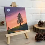
Place your finished artwork on a mini easel to instantly warm up a corner of your room
Quote Typography Canvas
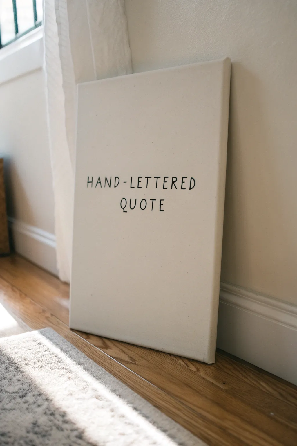
Embrace the beauty of simplicity with this clean, typographic canvas art piece that fits perfectly into any modern or minimalist decor. This project focuses on mastering spacing and lettering to create a bold statement using nothing but sharp black lines on a crisp white background.
Detailed Instructions
Materials
- Pre-stretched canvas (16×20 or similar vertical size)
- White gesso or acrylic primer
- Wide flat paintbrush
- Pencil (HB or lighter)
- Large T-square or ruler
- Eraser (kneaded preferred)
- Black paint pen (medium or broad tip) or script liner brush with black fluid acrylic
- Paper for practice sketching
- Painter’s tape (optional)
Step 1: Preparation & Base Coat
-
Prime the surface:
Begin by applying a fresh coat of white gesso to your pre-stretched canvas. Even if the canvas came pre-primed, an extra layer creates a smoother surface that is much easier to write on. Use a wide flat brush to apply it evenly. -
Smooth the texture:
While applying the gesso, brush first vertically and then horizontally to minimize canvas weave texture. Let this layer dry completely, usually for about 30 to 60 minutes. -
Plan your layout:
Grab a piece of scratch paper roughly the same size as your canvas. Sketch out your chosen phrase—in this case, ‘HAND-LETTERED QUOTE’—to determine the best spacing. Pay attention to the break between the words.
Uneven Ink Flow?
If the paint pen skips over the canvas texture, don’t press harder. Instead, slow your drawing speed down significantly to let the ink saturate the weave fully.
Step 2: Measuring & Sketching
-
Find the center:
Using your T-square or ruler, lightly mark the vertical center line of the canvas with a pencil. This will be your anchor for centering the text. -
Mark baselines:
Measure where you want your two lines of text to sit. Lightly draw two horizontal baselines across the canvas. Leave generous negative space at the top and bottom to maintain that airy, modern look. -
Define letter height:
Draw faint ‘cap height’ lines above your baselines to ensure all letters are uniform in size. About 1.5 to 2 inches tall works well for a standard canvas size. -
Sketch the letters:
Using a very light touch, pencil in your letters. Start from the center of the word and work outward to ensure perfect centering. For ‘QUOTE’, start with the ‘O’ on the center line. For the top line, estimate the visual center between the hyphen. -
Refine the forms:
Go back over your faint sketches and refine the shapes. Add small serif lines (the little feet) to the ends of the strokes to match the style in the photo. Keep the lines thin and consistent. -
Check alignment:
Step back and look at the canvas from a distance. Check that the hyphen is centered and the second line feels balanced beneath the first. Make any necessary eraser adjustments now.
Step 3: Inking & Finishing
-
Test your marker:
Before touching the canvas, press your black paint pen onto scrap paper to get the ink flowing smoothly. Consider using a medium tip to get a solid line without needing multiple passes. -
Outline the letters:
Begin inking over your pencil marks. I find it helpful to pull the pen toward me rather than pushing it away for steadier lines. Keep your wrist stiff and move your arm to keep straight lines straight. -
Detail the serifs:
Carefully add the small perpendicular serif lines at the ends of your main strokes. Don’t overthink these; a simple short dash is all you need for this quirky, hand-drawn font style. -
Fill and thicken:
If your lines look too thin or shaky, go over them a second time to add subtle weight. Ensure the ‘Q’ has its distinctive tail crossing the baseline. -
Let the ink cure:
Allow the paint pen or ink to dry completely. This can take anywhere from 15 minutes to an hour depending on the brand of marker used. -
Erase guidelines:
Once you are absolutely certain the black ink is dry, gently erase the visible pencil guidelines. A kneaded eraser is best here as it lifts graphite without damaging the paint surface. -
Final inspection:
Inspect the letters for any tiny gaps or jagged edges. Use the paint pen to do final touch-ups, ensuring the black is opaque and crisp against the white background.
Spacing Hack
Count the characters (including spaces) in your line. Find the middle character and draw that one first on the center line, then work outward to the left and right.
Now you have a striking, personalized piece of art ready to lean casually against a wall or hang in a hallway


Photo Memory Canvas Collage
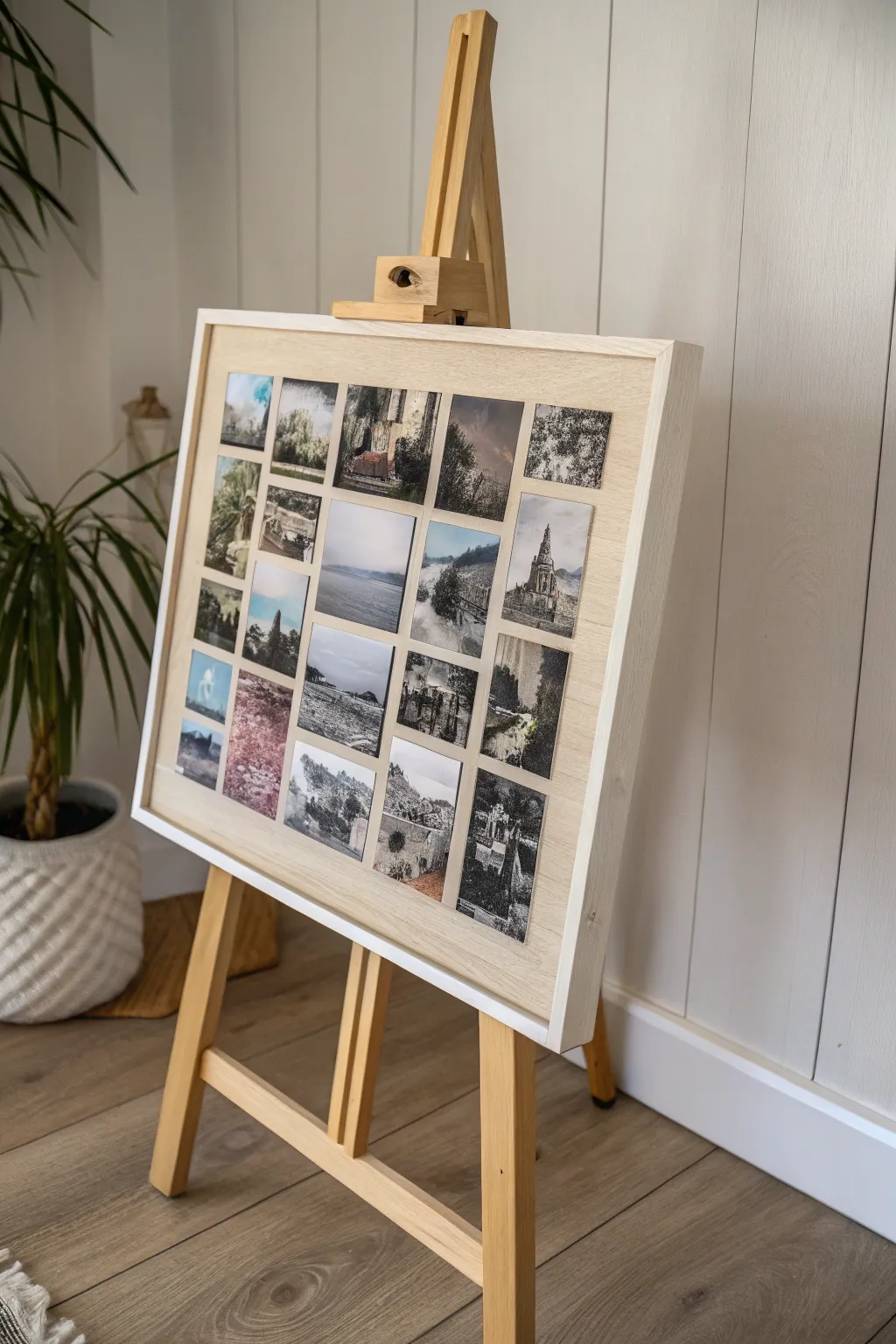
Transform a collection of disparate memories into a cohesive gallery display with this structured yet rustic collage project. By mounting square prints onto a light wooden backdrop, you create a modern, grid-style focal point that looks right at home on an artist’s easel.
How-To Guide
Materials
- Large wooden panel or canvas board (approx. 20×24 inches)
- Light wood floating frame (sized to fit panel)
- 20-25 square photo prints (matte finish recommended)
- Ruler or T-square
- Pencil
- Double-sided archival photo tape or spray adhesive
- Soft cloth or brayer roller
- Wooden display easel
- Self-healing cutting mat (optional)
- Craft knife (optional)
Step 1: Preparing the Foundation
-
Select the base:
Choose a light-colored wooden panel or a sturdy canvas board as your mounting surface. If using raw wood, give it a light sanding to ensure a smooth surface for adhesion. -
Optional priming:
If you want a lighter background than the natural wood, apply a very thin wash of white acrylic paint mixed with water. Wipe it back immediately with a rag to let the grain show through, then let it dry completely. -
Frame alignment:
Before attaching any photos, test the fit of your board within the light wood floating frame. It helps to mount the board into the frame now so you can visualize the exact borders available for your grid. -
Secure the frame:
Use small brads or framing points to secure the backing board into the frame. Ensure it is tight and doesn’t rattle.
Pro Tip: Consistent Gaps
Cut a small block of wood or rigid cardboard to the exact width of your desired spacing. Use this physical spacer between every photo instead of measuring each time.
Step 2: Planning the Layout
-
Curate your images:
Select roughly 20 to 25 photos that share a similar color palette or theme. Black and white, sepia, or desaturated nature shots work particularly well for this organic look. -
Trim to size:
Ensure all your photos are perfectly square. Create a template using cardstock to verify uniformity, or carefully trim them on a cutting mat. -
Dry run arrangement:
Lay your framed board flat on a table. Place your photos on top without glue to determine the best arrangement. I find it helpful to snap a quick photo on my phone once I like the layout so I don’t forget the order. -
Calculate spacing:
Measure the total width of your photo row and subtract it from the board’s inner width. Divide the remaining space by the number of gaps to find your exact margin size.
Level Up: Texture & Depth
Instead of standard photo paper, print your images on canvas sheets or textured watercolor paper. This adds a tactile quality that matches the rustic wood frame.
Step 3: Mounting the Gallery
-
Mark the grid:
Using a pencil and a T-square, very lightly mark horizontal and vertical guidelines where the corners of your photos should sit. Keep these marks faint so they are easily erased later. -
Apply adhesive:
Apply strips of double-sided archival tape to the back of your first photo. Focus on the corners and the center to prevent curling. -
Place the anchor photo:
Start with a corner photo or the top-left image. Align it carefully with your pencil guides and press it down gently. -
Continue the row:
Work horizontally across the first row, using a spacer (like a scrap piece of wood cut to your margin width) to ensure the gap between each photo is identical. -
Check alignment:
Step back after the first row to ensure it looks level. If using repositionable spray adhesive, you have a moment here to nudge things straight. -
Fill the grid:
Complete the remaining rows, checking your vertical alignment against the row above as you go. -
Secure the bond:
Once all photos are placed, lay a clean sheet of paper over the collage. Use a brayer roller or a soft cloth to rub firmly over each image, ensuring strong adhesion without damaging the photo surface. -
Display:
Place your finished framed collage onto a wooden easel. Adjust the easel’s height and tilt to catch the best light in your room.
Now you have a stunning, gallery-worthy display that makes your favorite memories the center of attention
Magazine Paper Collage Canvas
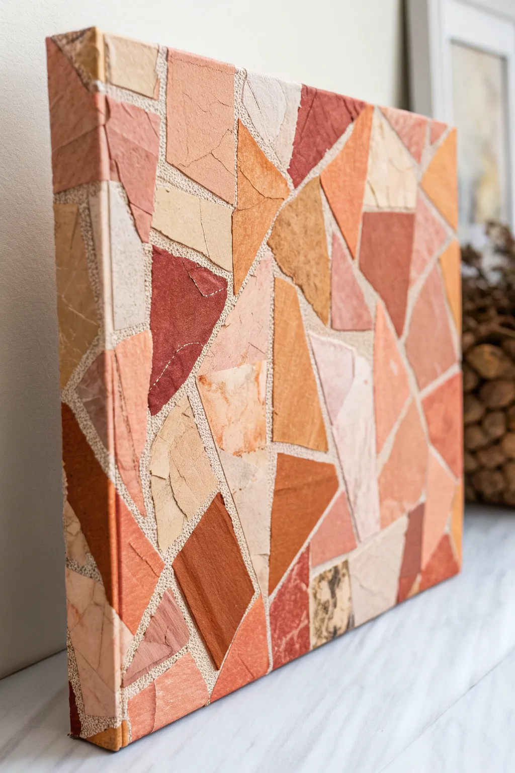
Transform glossy magazine pages into a sophisticated, textured art piece that mimics the look of natural stone tile. This mosaic canvas uses a warm, earthy palette of rust, ochre, and cream to create a geometric design that feels both organic and modern.
Step-by-Step Guide
Materials
- Stretched canvas (square or rectangular)
- Old magazines with high-quality paper
- Mod Podge (Matte finish)
- Foam brush or wide flat brush
- Scissors
- White acrylic paint (optional, for priming)
- Ruler or straight edge
- Pencil
- Bone folder (optional)
- Clear acrylic sealer spray (matte)
Step 1: Preparation & Sorting
-
Prime the Surface:
If your canvas is raw or very absorbent, give it a quick coat of white acrylic paint. This ensures the background between your paper ’tiles’ looks clean and intentional, acting as your ‘grout’ lines later. -
Hunt for Colors:
Go through your magazines and tear out full pages that feature solid blocks of color or interesting textures. Look specifically for earthy tones: terracotta, burnt sienna, sandy beige, soft peach, and deep browns. -
Sort by Shade:
Organize your torn pages into piles based on color families. Having a dedicated pile for your darkest accents versus your lighter neutral fillers makes the assembly process much faster. -
Create Texture (Optional):
If you can’t find enough specific textures, feel free to crumple some of the paper and then smooth it back out. This adds a vein-like, stone effect to the final pieces.
Step 2: Cutting & Shaping
-
Cut Base Strips:
Take your selected pages and cut them into wide, random strips. They don’t need to be uniform; irregularity adds to the charm. -
Form Triangles and Polygons:
From your strips, cut out various geometric shapes. Focus on triangles, trapezoids, and irregular shards. Aim for pieces that are roughly 1 to 2 inches in size for a balanced look. -
Refine the Edges:
While straight scissor cuts work well, you can also tear some edges manually if you prefer a rougher, more rustic stone look. For this specific project, crisp geometric edges usually provide a cleaner mosaic effect. -
Check Quantity:
Cut about 20% more pieces than you think you need. It is always better to have extra options when trying to fit a tricky corner space.
Pro Tip: Faux Grout
For a distinct grout look, paint the canvas a dark charcoal or grey before starting. Since the gaps are visible, the dark background creates intense contrast.
Step 3: Assembly
-
Dry Layout:
Before gluing, lay your canvas flat and arrange a small section of your shapes without adhesive. This helps you get a feel for the spacing. You want a consistent, narrow gap between pieces to simulate grout. -
Apply First Adhesive Layer:
I usually start in one corner. Apply a thin but consistent layer of Mod Podge directly onto a small section of the canvas. -
Place the Paper:
Press your first paper shape into the wet adhesive. Smooth it down from the center outward to push out any trapped air bubbles. -
Build the Pattern:
Continue placing shapes next to each other, maintaining that consistent gap. Treat it like a puzzle where pieces don’t quite touch. Mix your colors so you don’t have large clumps of a single shade. -
Wrap the Edges:
Don’t stop at the front! Extend your pattern around the sides of the canvas. You can fold a single piece of paper over the corner for a seamless look, gluing it securely to the side frame. -
Trim Overhang:
If any paper hangs off the back edge of the canvas frame, trim it flush with scissors once the glue is tacky but pliable.
Troubleshooting: Bubbles
If a large bubble forms under a glued piece, prick it with a fine needle to release the air, then press it flat with your finger while the glue is still wet.
Step 4: Sealing & Finishing
-
Smoothing Check:
Once the entire canvas is covered, run your hand (or a bone folder) over the surface to ensure no edges are curling up. Add tiny dabs of glue under any stubborn corners. -
Let it Cure:
Allow the project to dry completely for at least 2-3 hours. The paper should feel dry to the touch and not cool or damp. -
Top Coat Application:
Brush a final layer of Matte Mod Podge over the entire surface. This seals the paper and unifies the sheen. Don’t worry if it looks milky; it will dry clear. -
Final Protection:
For extra durability, especially against UV fading, finish with a light mist of clear acrylic sealer spray once the top coat is fully cured.
Hang your new textured masterpiece in a well-lit spot to let those earthy tones warm up the room
Textured Plaster-Like Relief Canvas
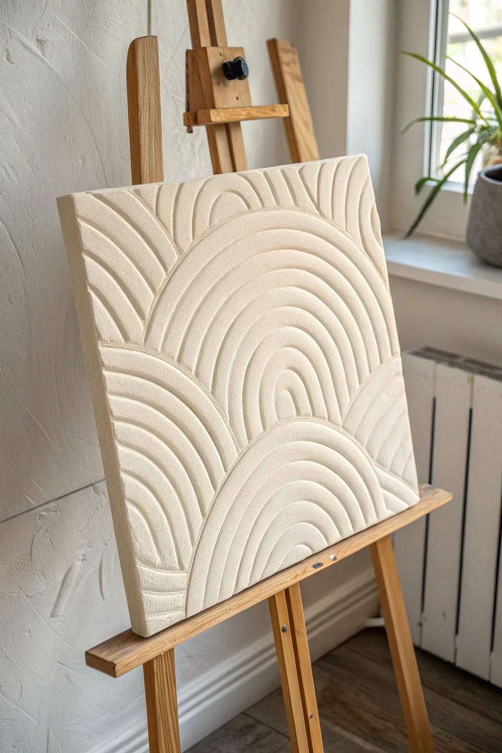
Embrace the soothing minimalism of this monochromatic relief art, where light and shadow play across carved concentric arches to create visual depth. Using simple texture paste, you can sculpt an elegant, plaster-like design that adds a high-end architectural feel to any space.
Step-by-Step Guide
Materials
- Stretched canvas (square, e.g., 16×16 inches)
- Modeling paste or drywall joint compound (lightweight)
- Wide putty knife or palette knife
- Notched trowel or a DIY cardboard comb tool
- Pencil
- Compass or round objects for tracing
- Fine-grit sandpaper
- White acrylic paint (matte)
- Matte spray varnish or sealer
- Painter’s tape or masking tape
Step 1: Drafting the Design
-
Prepare your canvas:
Ensure your canvas is taut and clean. Place it on a flat, stable work surface rather than an easel for the application steps to maintain even pressure. -
Map out the horizon line:
Lightly draw a horizontal line across the canvas where you want your main arches to begin. In the reference image, this line is slightly below the center, creating a grounded composition. -
Sketch the primary arches:
Using a compass or by tracing circular objects like bowls or plates, lightly sketch large semi-circles starting from your horizontal line. Draw one large central arch flanked by partial arches on the sides. -
Add secondary arches:
Sketch smaller arch sets below the horizon line or overlapping slightly to mimic the layered look seen in the photo. Keep pencil lines faint so they don’t show through later.
Step 2: Applying the Base Texture
-
Mix your paste:
Open your modeling paste or joint compound. If it feels too stiff, mix in a tiny yearly drop of water to make it spreadable like frosting, but ensure it remains thick enough to hold peaks. -
Spread the first layer:
Using a wide putty knife, apply a generous, even layer of paste over the entire canvas surface. You want a thickness of about 1/4 inch to allow for deep carving. -
Smooth the surface:
Gently glide your knife over the wet paste to create a relatively flat, smooth top surface. I find dipping the knife in water helps prevent dragging. -
Let it firm up slightly:
Wait about 10–15 minutes. The paste should lose some of its wet sheen and become firm enough to hold a carved shape without slumping back into the grooves.
Cracking Up?
If hairline cracks appear while drying, don’t panic. Mix a small amount of fresh paste with a drop of water and smooth it into the cracks with your finger, then lightly sand once dry.
Step 3: Carving the Relief
-
Create your varied combing tools:
If you don’t have a specific texture comb, cut pieces of sturdy cardboard or an old credit card. Cut notches into the edge to create teeth of different widths for variation. -
Carve the central rainbow:
Starting at the center of your sketched large arch, press your notched tool into the paste and drag it in a smooth, curved motion to create the concentric grooves. -
Define the side arches:
Repeat the carving process for the arches on the left and right. Clean your tool frequently between passes to keep the grooves sharp and debris-free. -
Work the lower section:
Carve the inverted or lower arches found at the bottom of the canvas. Pay attention to where the lines meet; allow them to abut cleanly against the upper arches. -
Clean up the transitions:
Use a small palette knife or a toothpick to gently remove any crumbs of paste that gathered where different arch sets intersect or overlap. -
Smooth the edges:
Run your palette knife along the outer edges of the canvas to scrape off any overhanging paste for a crisp, finished border.
Sandstone Effect
Mix fine sand or clean baking soda into your white paint before the final coat. This adds a gritty, stone-like micro-texture that makes the relief look like carved limestone.
Step 4: Finishing Touches
-
Allow to dry completely:
Let the artwork dry flat for at least 24 hours. Thicker areas like the ridges might take up to 48 hours. The color will lighten as it dries. -
Sand imperfections:
Once fully dry, take a piece of fine-grit sandpaper and very gently sand down any sharp jagged peaks or rough crumbs. Be careful not to flatten your beautiful texture. -
Seal the surface:
Apply a coat of white matte acrylic paint if you want a uniform, bright white finish, or leave it natural for an off-white plaster look. -
Apply varnish:
Finish with a spray of matte varnish to protect the porous texture from dust and moisture without adding unwanted shine.
Hang your new sculptural piece in a spot with changing daylight to really see the texture come alive
Painted-Plus-Stitch Canvas Art
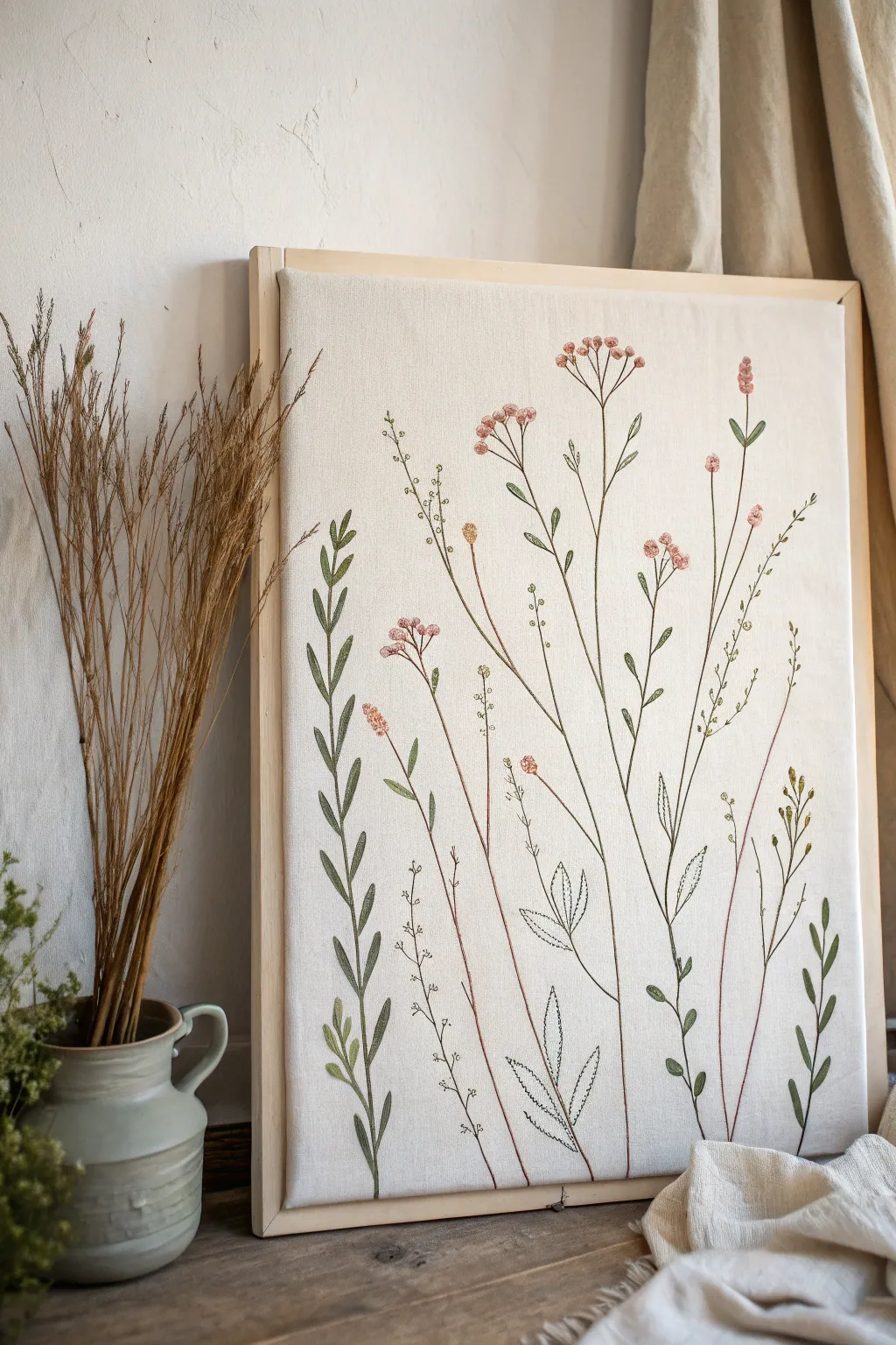
Merge the delicate charm of botanical illustration with the texture of fiber art in this elegant mixed-media piece. By combining fine-line painting or ink drawing with simple embroidery stitches on a stretched canvas, you create a dimensional, airy meadow scene that feels both modern and timeless.
How-To Guide
Materials
- Rectangular stretched canvas (e.g., 16×20 inches)
- Fine-tip permanent fabric markers or acrylic ink pens (olive green, muted brown)
- Embroidery floss in earthy tones (sage green, dusty pink, rust, cream)
- Embroidery needle (sharp tip for piercing canvas)
- Pencil for sketching
- Small paintbrush (optional, for watercolor effects)
- Thimble (highly recommended for canvas work)
Step 1: Preparation and Sketching
-
Plan your composition:
Observe the reference image to understand the varied heights. You want a natural, staggered look where stems reach different levels, mimicking a real meadow. Some stems should be tall and slender, others shorter and leafier. -
Lightly sketch the stems:
Using a regular pencil, very faintly draw the main vertical lines for your plant stems on the canvas. Keep the lines somewhat organic and wavy rather than ruler-straight. -
Mark leaf and bloom placement:
Add small ticks or circles where you plan to place leaves and flower heads. Pay attention to the negative space; avoid clustering everything in the center.
Step 2: Inking the Foundation
-
Trace stem lines:
Go over your pencil sketches with fine-tip fabric markers or acrylic ink pens. Use a muted olive green for the leafy stems and a brownish-rust tone for the thinner, drier-looking stalks. -
Draw base leaves:
For the flat, non-stitched leaves (like the fern-like fronds on the bottom right or the outlined leaves in the middle), draw them directly onto the canvas with your pen. Vary the pressure to create tapering lines. -
Create dotted textures:
Add small stippled dots along some of the thinner stems using a brown fine-point pen. This adds a delicate, airy texture reminiscent of baby’s breath or dried grasses. -
Dry completely:
Ensure all ink is fully dry before starting any needlework to prevent smudging your hand or staining the embroidery floss.
Canvas Toughness
Stitching through primed canvas can be tough. Use a sharp chenille needle and keep a pair of pliers handy to help pull the needle through if it gets stuck in the gesso layer.
Step 3: Stitching the Foliage
-
Prepare your thread:
Cut a length of sage green embroidery floss. I prefer using 3 strands for the leaves to give them visible texture without being too bulky to pull through the primed canvas. -
Satin stitch the leaves:
Focus on the bold, leafy plant on the left side. Use a satin stitch to fill in the leaf shapes, stitching horizontally or at a slight angle across the leaf width to create solidity. -
Backstitch the stems:
For the main green stems, use a backstitch over your drawn lines. This adds a raised, cord-like texture that contrasts beautifully with the flat drawn elements. -
Add floating leaves:
On the right side, stitch individual detached chain stitches (lazy daisy) for the small, dispersed leaves. Keeps them looking light and fluttering.
Add Watercolor
Before stitching, dilute acrylics or use watercolors to add soft, amorphous washes of green and pink behind where the flowers will go for a dreamy, painterly underlayer.
Step 4: Adding Floral Details
-
French knot clusters:
Thread your needle with dusty pink or rust floss. Create clusters of French knots at the tops of the tallest stems to mimic small berry-like blooms or buds. -
Stitch the delicate pinks:
For the flat-topped flower clusters, use small straight stitches radiating outward from a center point, then add tiny French knots at the tips for pollen texture. -
Layering textures:
Intersperse small, single straight stitches in cream or pale beige among the pink flowers to add depth and highlight. -
Outline stitching:
Find the drawn leaf outlines near the center bottom. Use a very dark green or charcoal thread to backstitch strictly the outline, leaving the inside of the leaf the color of the raw canvas for an illustrative feel.
Step 5: Finishing Touches
-
Clean up the back:
Secure all thread tails on the back of the canvas with knots or by weaving them under existing stitches. Trim any excess bulk so it doesn’t create shadows on the front. -
Erase guidelines:
If any pencil marks are still visible around the stitching, gently dab them with a kneading eraser. Be careful not to rub the ink or fray the thread.
Hang your mixed-media botanical piece in a spot that receives soft light to highlight the gentle relief of the stitching
Button Mosaic Shape Canvas
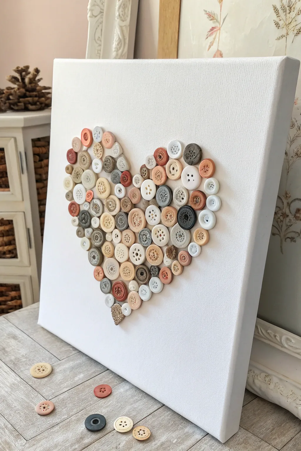
Create a charming, tactile centerpiece for your gallery wall with this vintage-inspired button art. Using a mix of creamy off-whites, warm beiges, and soft browns, you can assemble a textured heart that feels both cozy and elegant on a stark white background.
Detailed Instructions
Materials
- White stretched canvas (approx. 12×12 inches or 16×20 inches)
- Assorted buttons (varied sizes; wooden, cream, white, beige, brown)
- Clear craft glue or hot glue gun with glue sticks
- Pencil
- Paper template (heart shape)
- Scissors
- Tweezers (optional, for precise placement)
- Eraser
Step 1: Preparation & Layout
-
Prepare your workspace:
Clear a flat table where the canvas can remain undisturbed for a few hours. Lay out all your buttons and sort them roughly by color—light creams, warm woods, dark browns, and soft pinks. -
Make the heart template:
Cut a heart shape out of paper that fits nicely within the borders of your canvas. Leave a generous white margin around the edges, ideally about 2-3 inches on all sides. -
Trace the shape:
Center your paper heart on the canvas. Use a pencil to lightly trace the outline. Keep the line extremely faint so it won’t be visible later, or erase over it lightly until it’s barely a ghost image. -
Dry run arrangement:
Before gluing, pour your buttons onto a tray or the table next to the canvas. I like to start picking out the largest, most unique buttons first to see where they might look best. -
Create the perimeter:
Select medium-sized buttons to define the outer edge of the heart first. Place them dry (without glue) along the pencil line to ensure the shape looks symmetrical and pleasing.
Sticky Situation
Use a low-temp glue gun if possible. High-temp glue can leave noticeable globs and strings that are harder to hide between the tiny button gaps.
Step 2: Adhering the Base Layer
-
Glue the outline:
Once you are happy with the perimeter buttons, lift them one by one, apply a small dot of glue to the back, and press them firmly onto the canvas, covering your pencil line. -
Fill the center – large anchors:
Identify the largest buttons in your collection—the big wooden discs or oversized coat buttons. Glue roughly 5–7 of these into the central area of the heart. -
Create color balance:
Distribute your colors evenly. If you glue a dark brown button on the top right, try to place another dark one on the lower left to keep the visual weight balanced. -
Add medium fillers:
Begin filling in the gaps around the large anchor buttons with medium-sized buttons (standard shirt-button size). Fit them snugly together like puzzle pieces. -
Check for gaps:
Step back and look at the canvas from a distance. You will likely see white canvas showing through the spaces between the round buttons.
Step 3: Layering & detailed work
-
Second layer strategy:
To give the artwork depth and hide the white gaps, you will now start overlapping buttons. Choose smaller buttons for this second layer. -
Covering the holes:
Place small buttons directly over the empty spaces where the first layer of buttons meet. A dab of glue on the edges of the underlying buttons will hold the new one in place. -
Introduce texture:
Look for buttons with interesting textures—ribbed edges, four-holes, or domed tops. Add these now to the top layer to catch the light. -
Tiny accents:
Use your tiniest buttons (like tiny shirt collar buttons or pearls) to fill any remaining visible gaps. Tweezers are very helpful here to place them without getting glue on your fingers. -
Refine the edge:
Check the outer perimeter again. If the edge looks jagged, glue small buttons on top of the outer rim to smooth out the curve of the heart shape. -
Clean up glue strings:
If using hot glue, you’ll likely have fine ‘spiderwebs’ spanning across the buttons. Wait until everything is completely cool, then gently pull these away or use a hairdryer on low heat to melt them away. -
Erase stray marks:
Inspect the canvas around the heart. If any pencil lines from your initial tracing are still visible, gently erase them now, being careful not to bump your artwork. -
Final inspection:
Check for loose buttons by gently tilting the canvas. Re-glue any that shift slightly.
Make It 3D
Add serious dimension by stacking buttons! Glue a tiny pearl or bead into the center of your largest, flat buttons for a layered, flower-like effect.
Hang your textured heart in a spot that gets good side lighting to really show off the lovely layers and shadows.
Faux Torn “Busted” 3D Canvas Illusion
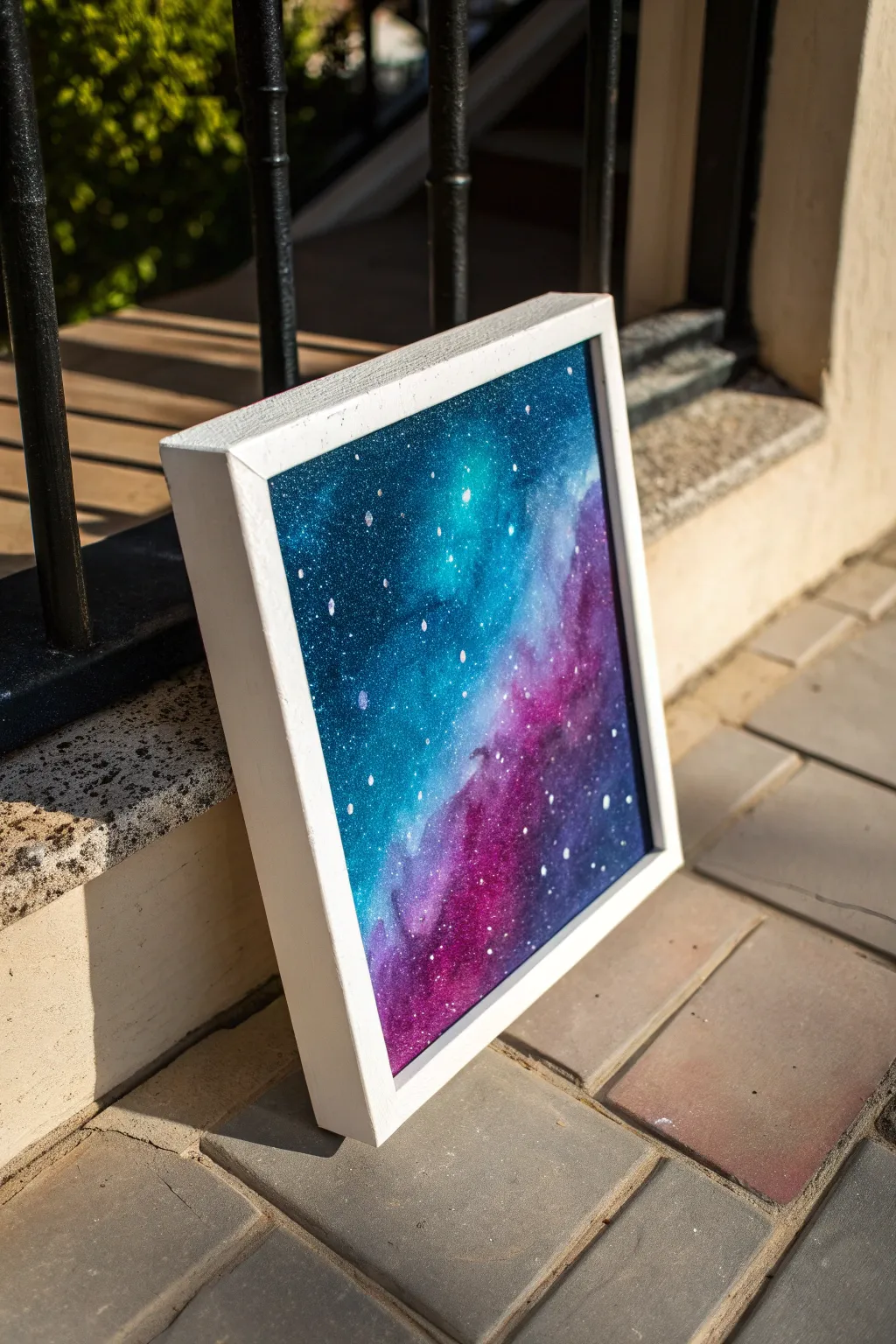
Capture the ethereal beauty of deep space with this vibrant galaxy painting on a framed canvas. Blending rich teals, purples, and starry whites creates a mesmerizing window into the universe that looks striking on any wall.
How-To Guide
Materials
- Square stretched canvas (approx. 10×10 or 12×12 inches)
- White wooden floating frame (sized to fit canvas)
- Acrylic paints (Phthalo Blue, Turquoise, Dioxazine Purple, Magenta, Titanium White, Black)
- Sponge applicators or kitchen sponge pieces
- Soft blending brush
- Stiff bristle brush (for spattering)
- Water cup and palette
- Paper towels
- Sealant or gloss varnish (optional)
Step 1: Setting the Background
-
Prime with darks:
Begin by covering your entire canvas with a mix of black and a touch of Phthalo Blue. This doesn’t need to be perfectly smooth, as some texture adds depth to the space scene. -
Create the first nebula cloud:
While the base is still slightly tacky or just dry, sponge on a diffuse cloud of Phthalo Blue in the upper left corner, extending diagonally toward the center. -
Add warmer tones:
On the opposite diagonal (lower right), sponge on Dioxazine Purple. Let this color meet the blue in the middle, but don’t overmix them just yet. -
Deepen the contrast:
Go back in with pure black around the very edges and corners of the canvas to create a vignette effect, pushing visual focus toward the colorful center.
Muddiness Troubleshoot
If your purple and blue mix into a dull grey in the middle, let the layers dry completely. Then, glaze over the dull spot with a thin layer of transparent magenta to restore vibrancy.
Step 2: Building the Nebula
-
Intensify the teal:
Mix Turquoise with a tiny bit of white to create a glowing cyan. Sponge this directly into the center of your blue section to create a ‘hot spot’ of light. -
Brighten the purple:
similarly, mix Magenta with the purple and sponge this into the lower right section. I like to dab this color slightly over the dark purple edges to soften the transition. -
Blend the meeting point:
Where the blue and purple zones meet in the middle, use a clean, slightly damp sponge to dab gently. This encourages the colors to marry creates a smooth, foggy gradient. -
Highlighting:
add touches of Titanium White to your lightest turquoise and magenta mixes. Apply these sparingly to the very centers of the nebula clouds for maximum luminosity. -
Softening touches:
Use a soft, dry blending brush to lightly sweep over the textured sponge marks if they look too rough. This creates that gaseous, ethereal nebula look.
Pro Tip: Depth trick
Create ‘distant’ stars by doing a light spatter layer before your final nebula highlights. Then do a second, brighter spatter layer at the very end for 3D depth.
Step 3: Stars and Finishing
-
Prepare the stars:
Dilute a small amount of Titanium White paint with water until it reaches an inky, fluid consistency. -
The flicking technique:
Dip a stiff bristle brush or an old toothbrush into the thinned white paint. Test the spray on a paper towel first to ensure you don’t get large blobs. -
Create the starfield:
Hold the brush over the canvas and use your thumb to flick the bristles, spraying a fine mist of white dots across the dark background. -
Add major stars:
Use a fine liner brush to manually paint a few larger, brighter stars in the lightest areas of the nebula. You can add a tiny cross shape to one or two for a twinkling effect. -
Dry and seal:
Allow the painting to dry strictly for at least 24 hours. Once cured, apply a coat of gloss varnish to make the dark colors pop and protect the surface. -
Frame it up:
Place the finished canvas into a white floating frame. Secure it from the back according to the frame’s instructions to complete the polished, gallery-ready look.
Hang this sparkling celestial window in a spot with good lighting to really see the colors glow
Have a question or want to share your own experience? I'd love to hear from you in the comments below!