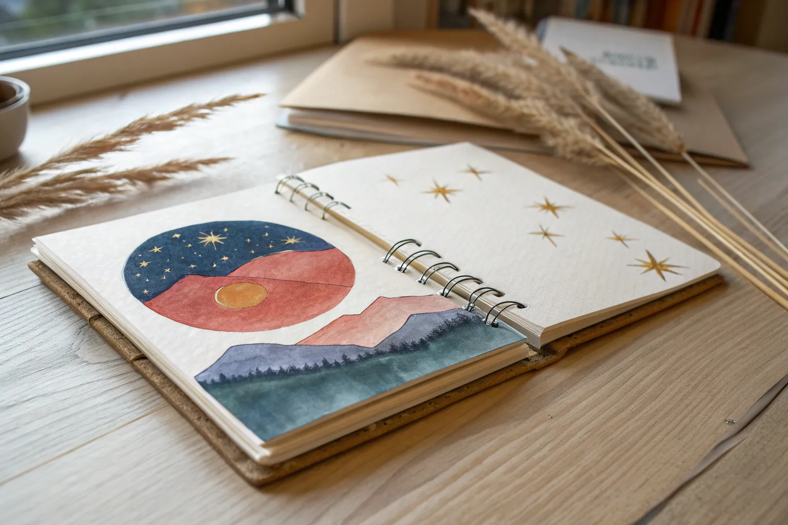
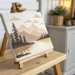
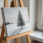
When you’re craving creative painting ideas, it helps to have a mix of go-to classics and a few “how did I not think of that?” prompts in your back pocket. These are the kinds of projects I pull out in my studio when I want something approachable, visually striking, and genuinely fun to paint.
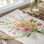
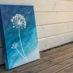
Loose Watercolor Florals
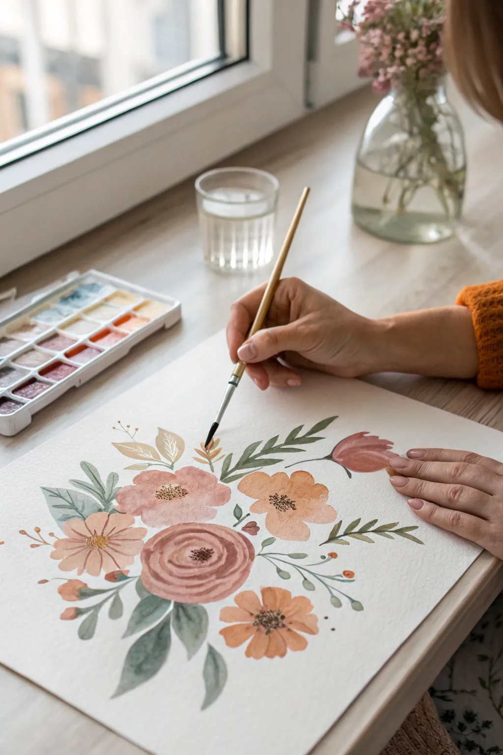
Capture the soft, organic beauty of nature with this loose floral watercolor tutorial. By combining warm, earthy tones with muted greens, you’ll create a bouquet that feels both vintage and fresh, perfect for framing or gifting.
Step-by-Step
Materials
- Cold press watercolor paper (300 gsm)
- Watercolor paints (Peach, Burnt Sienna, Yellow Ochre, Sap Green, Payne’s Gray)
- Round watercolor brushes (Size 6 for petals, Size 2 for details)
- Jar of clean water
- Paper towel or cloth
- Plastic or ceramic mixing palette
Step 1: Painting the Central Rose
-
Mix the rose color:
Start by mixing a dusty rose shade. Combine a bit of Burnt Sienna with a touch of Peach and plenty of water to keep it translucent. -
Create the center spiral:
Using the tip of your size 6 brush, paint a small, broken “C” shape or spiral in the lower-middle of your paper. This forms the tight bud of the rose. -
Add surrounding petals:
Dip your brush in clean water to slightly dilute the pigment on your bristles. Paint larger, crescent-shaped strokes around the center bud, leaving small white gaps between strokes to define the petals. -
Expand the bloom:
Continue painting wider, concentric strokes outward. As you move to the outer edges, use more water and less pigment to make the flower look soft and open.
Step 2: Adding Supporting Flowers
-
Paint the peach blossoms:
Mix a warm Peach tone with a hint of Yellow Ochre. To the left and right of your main rose, paint simple five-petal flowers. Start from the center and press the belly of the brush down, lifting at the end to create a petal shape. -
Create the upper pink bloom:
Above the central rose, add a soft pink flower using a watered-down crimson or pink mix. Keep the edges irregular and fluid, allowing the color to pool slightly for texture. -
Add the tulip shape:
On the upper right side, paint a tulip-like shape using a deeper reddish-brown tone. Paint two overlapping strokes that meet at the top but stay slightly open -
Paint the small orange accents:
Using a more concentrated orange mix, dab small circular blooms or buds near the bottom edges of the composition to balance the weight.
Fixing “Blooms”
If water backflows and creates cauliflower edges (blooms) where you don’t want them, wait until it’s dry and soften the edge with a damp, clean brush.
Step 3: Leaves and Greenery
-
Mix muted greens:
Create a natural green by mixing Sap Green with a tiny drop of Payne’s Gray or Brown. This desaturates the color for a more realistic, vintage look. -
Paint large leaves:
Tuck large, broad leaves under the main rose and peach flowers. Use the ‘press and lift’ technique: touch the tip to paper, press down to widen the stroke, and lift again to form a point. -
Add delicate stems:
Switch to your size 2 brush. Draw thin, curving stems extending outward from the floral cluster. Keep your hand loose and grip the brush higher up the handle for flowy lines. -
Incorporate filler foliage:
Along the thin stems, paint small, paired leaves. Vary the pressure to make some leaves purely linear and others slightly fuller. -
Add ethereal floating leaves:
Mix a very watery, pale green-blue. Paint a few ‘ghost’ leaves in the background areas. These should be very transparent to create depth without distracting from the main blooms.
Add Metallic Accents
Once the painting is 100% dry, use metallic gold watercolor or a gel pen to add tiny dots to the flower centers for a subtle shimmer.
Step 4: Final Details
-
Darken the centers:
Once the main flowers are damp but not soaking wet, drop concentrated brown or dark orange pigment into the very center of the peach flowers. Let it bleed slightly for a natural gradient. -
Add stamen details:
Wait for the paint to dry completely. With the size 2 brush and a thick mix of dark brown, paint tiny dots or fine lines in the center of the open flowers to represent stamens. -
Define the rose:
If the central rose looks too flat after drying, use a slightly darker mix of the original rose color to add thin shadow lines between a few inner petals. -
Connect floating elements:
Ensure all buds have a stem connecting them to the main bunch. Paint very fine, hair-thin lines to anchor any floating colorful bits. -
Final assessment:
Step back and look at the composition. If an area feels empty, add a small green sprig or a tiny bud, but remember that white space is part of the charm.
Allow your painting to dry completely on a flat surface before erasing any pencil marks or framing your beautiful bouquet


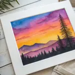
Sunset Gradient With Silhouettes
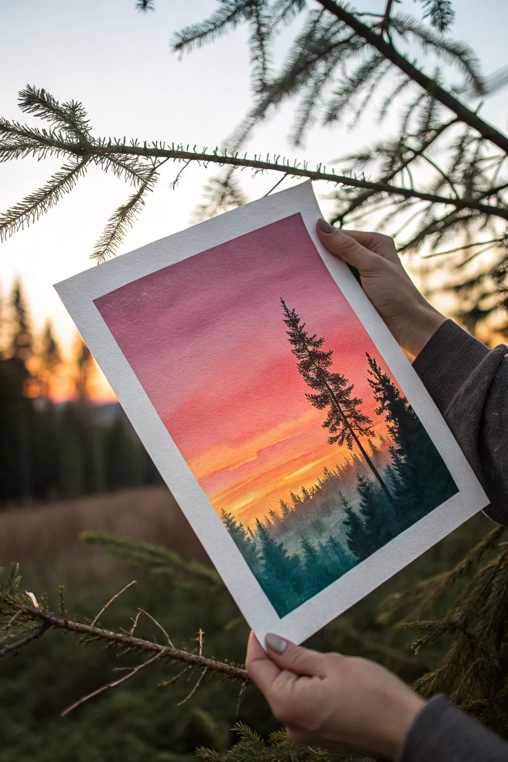
Capture the serene beauty of twilight in the forest with this vibrant watercolor project. By blending a seamless gradient from dusky pink to warm orange and layering crisp pine silhouettes, you’ll create a painting that glows with natural light.
Step-by-Step Guide
Materials
- Cold press watercolor paper (140lb/300gsm)
- Masking tape
- Watercolors (Alizarin Crimson, Cadmium Yellow, Payne’s Grey, Indigo)
- Wide flat wash brush
- Medium round brush (size 6 or 8)
- Small liner or detail brush (size 0 or 1)
- Two jars of water
- Paper towels
- Palette for mixing
Step 1: Creating the Sky Gradient
-
Prepare your surface:
Begin by taping down all four edges of your watercolor paper to a rigid board. This creates a clean white border and prevents the paper from buckling heavily when wet. -
Pre-wet the paper:
Using your large flat wash brush and clean water, dampen the entire surface of the paper. It should look glossy and reflective, but there shouldn’t be puddles of standing water. -
Mix the dusk color:
On your palette, mix a watery consistency of Alizarin Crimson with a tiny touch of Indigo to mute it slightly. This will be your upper sky color. -
Apply the top layer:
Starting at the very top of the paper, brush the pink-red mixture across the wet surface. Let the water help the pigment flow downward naturally. -
Transition to orange:
Clean your brush and load it with Cadmium Yellow mixed with a little red to make a soft orange. Apply this directly below the pink, overlapping slightly so the colors blend on the paper. -
Create the horizon glow:
Switch to pure, diluted yellow near the lower middle section. This represents the last light of the sun; keep this area bright. -
Add misty base:
For the bottom third, mix a very faint, watery wash of Indigo. Apply this while the yellow is still slightly damp to create a soft, foggy transition where the forest floor will be. -
Let it dry completely:
This step is crucial. The paper must be bone dry before you start the trees, or the sharp lines will bleed into the sky. Use a hairdryer on a low setting if you’re impatient.
Gravity Assist
Prop your board up at a slight angle (about 30 degrees) while painting the sky. Gravity will pull the pigment down, creating a smoother, stripe-free gradient blend.
Step 2: Painting the Silhouettes
-
Mix the forest darks:
Create a rich, dark mixture using Indigo and Payne’s Grey. I find adding a tiny bit of the Alizarin Crimson from the sky helps harmonize the shadows with the light. -
Paint distant trees first:
Using a slightly diluted version of your dark mix and a medium round brush, paint a jagged, uneven treeline roughly one-third up from the bottom. These should look misty and less detailed. -
Darken the foreground:
While the bottom area is still slightly damp, drop in more saturated pigment at the very bottom edge to ground the painting. -
Start the main subject:
Once the background layer is dry, load your small detail brush with the darkest, most opaque paint mixture. Draw a thin vertical line for the trunk of the tallest tree on the right. -
Build the branches:
Start at the top of your trunk line. Use a dabbing motion to create the pine needles, getting wider as you move down the tree. -
Keep it irregular:
Nature isn’t perfect. Leave small gaps between some branches to let the sunset show through, and make the silhouette asymmetrical. -
Add companion trees:
Paint a second, smaller tree slightly to the right or left of the main one. Varying height and thickness adds realistic depth to your composition. -
Connect the foreground:
Blend the bottom of your sharp tree trunks into the dark foreground wash so they don’t look like they are floating. -
Final reveal:
Wait until the painting feels cool to the touch (completely dry) before carefully peeling off the masking tape at a 45-degree angle.
Splatter Stars
Once the sky is dry, cover the bottom tree area with scrap paper. Flick a toothbrush loaded with white gouache or opaque white watercolor over the pink sky for early evening stars.
Now step back and admire how the dark silhouettes accentuate the glowing warmth of your painted sky


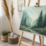
Calm Mountains in a Limited Palette
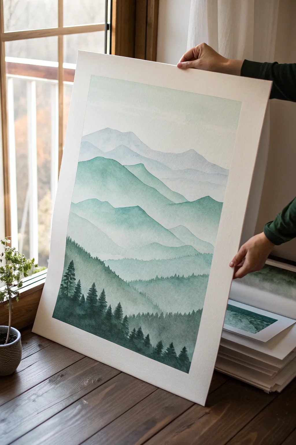
This serene watercolor landscape uses atmospheric perspective to create depth, fading from crisp, dark evergreens in the foreground to soft, hazy peaks in the distance. The varied shades of teal, sage, and forest green evoke a calm morning in the mountains.
Detailed Instructions
Materials
- Cold press watercolor paper (large format, ideally 18×24 inches or larger)
- Watercolor paints: Indigo, Phthalo Green, Burnt Umber, Payne’s Grey, and Prussian Blue
- Large flat wash brush (1-inch)
- Medium round brush (size 8)
- Small liner or detail brush (size 2)
- Masking tape
- Jars of clean water
- Paper towels
- Mixing palette
- Pencil (HB or H)
Step 1: Preparation and Sketching
-
Secure the paper:
Tape your large sheet of watercolor paper securely to a board or table surface using masking tape. This prevents buckling when the paper gets wet and creates a crisp white border. -
Sketch the mountain ranges:
Lightly sketch five distinct layers of mountain ranges with an H pencil. Start with high, distant peaks near the top third, and create successively lower, closer ridges moving down the page. Keep the lines faint so they don’t show through the final paint. -
Prepare your mixtures:
Pre-mix three puddles of paint. You’ll need a very watery, pale blue-grey for the sky/distant mountains, a mid-tone sage green for the middle ground, and a deep, saturated forest green (Indigo + Phthalo Green) for the foreground.
Step 2: Painting the Distant Layers
-
Wash in the sky:
Using your large flat brush and plenty of water, paint a very faint wash of pale blue-grey at the very top of the paper, fading it out into pure water as you reach the first mountain line. -
First mountain layer:
While the sky is still slightly damp but not soaking, mix a tiny amount of pigment into your water to create the ghostly silhouette of the furthest mountain range. Paint this shape, letting the bottom edge fade out with clean water. -
Allow to dry:
Let this layer dry completely. If you paint too soon, the edges will bleed and you’ll lose the distinct ridge lines that create depth. -
Second mountain layer:
Slightly darken your mix with a touch more blue and grey. Paint the second ridge down. The top edge must be crisp against the previous layer, but soften the bottom of this shape with water to create a misty transition.
Water Control is Key
Keep two jars of water: one for rinsing dirty brushes and one for adding clean water to paint. This ensures your pale, misty layers don’t get muddy.
Step 3: Middle Ground and Saturation
-
Introduce green tones:
As you move to the third mountain layer, begin mixing in your sage and teal greens. The color should be noticeably stronger than the hazy mountains above but still somewhat transparent. -
Create texture:
Paint the third ridge using a ‘wet-on-dry’ technique for the top edge to keep it sharp. Use side-to-side strokes to suggest the rolling nature of the hills. -
Fourth layer depth:
For the fourth layer, increase the pigment-to-water ratio. Mix Phthalo Green with a touch of Payne’s Grey. Paint this section with more confidence, allowing the color to pool slightly at the bottom edge before softening it. -
Add tree suggestions:
While the paint on the fourth layer is still damp, use a clean, slightly dry brush to lift out tiny vertical streaks along the ridge line, hinting at distant forests without painting individual trees.
Add Morning Highlights
Once the painting is totally dry, use white gouache or a white gel pen to add tiny touches of mist or frost on the tips of the dark foreground evergreens.
Step 4: Foreground Details
-
Mix the darkest shade:
Create your darkest value yet: a deep, rich mix of Indigo, Phthalo Green, and a small touch of Burnt Umber to earth it down. It should be the consistency of heavy cream. -
Establish the foreground shape:
Paint the solid shape of the closest hill at the bottom. The color should be dense and opaque compared to the upper layers. -
Detailing the tree line:
Switch to your size 2 liner brush. Along the top ridge of this dark foreground shapes, paint tiny, vertical lines to mark tree trunks. -
Fleshing out the pines:
Using the tip of the small brush, stipple outwards from the trunks in a zigzag motion to create pine boughs. Vary the heights, making some trees tall and prominent, and clustering others. -
Adding texture to the base:
While the foreground trees allow for high detail, use a dry brush technique to drag some of that dark paint downwards into the hill mass, suggesting dense forest canopy and texture. -
Final drying and tape removal:
Allow the painting to dry fully (at least one hour). Carefully peel away the masking tape at a 45-degree angle to reveal your crisp white border.
Step back and admire the tranquil depth created by your carefully layered washes

Easy Birch Trees With Texture
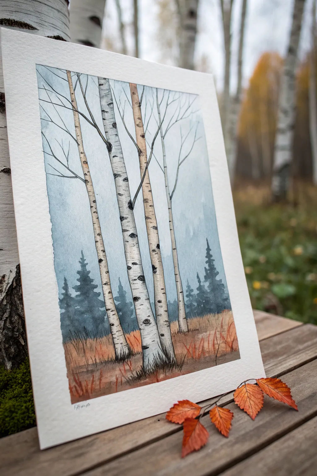
Capture the stark beauty of an autumn forest with this pen and wash birch tree tutorial. By combining fluid watercolor washes with crisp ink detailing, you’ll create a serene landscape that perfectly balances soft atmosphere with defined texture.
Step-by-Step Tutorial
Materials
- Cold press watercolor paper (300 gsm)
- Watercolor paints (Payne’s Grey, Burnt Sienna, Yellow Ochre, Indigo)
- Black waterproof fineliner pens (sizes 0.1 and 0.5)
- Round watercolor brushes (size 4 and 8)
- Masking tape
- Pencil and eraser
- Paper towels
- Jars of clean water
Step 1: Sketching and Preparation
-
Secure the paper:
Tape down all four edges of your watercolor paper to a board using masking tape. This creates a crisp white border and prevents buckling when the paper gets wet. -
Outline the trunks:
Lightly sketch four vertical birch trunks using a pencil. Vary their thickness slightly and give them a gentle lean or curve so they don’t look rigid. Let two overlap slightly for depth. -
Add branches:
Draw thin, Y-shaped branches extending from the upper parts of the trunks. Keep the lines faint, as you’ll ink over them later. -
Mark the horizon:
Lightly indicate a horizon line about one-third of the way up the paper, separating the foreground grass from the distant tree line.
Smudge Prevention
Wait at least 15 minutes after inking before you start painting. Even waterproof pens can smear if the ink hasn’t fully set on the paper fibers.
Step 2: Inking the Details
-
Ink the main outlines:
Using a 0.5 waterproof fineliner, trace over your pencil lines for the tree trunks. Use a slightly shaky hand to mimic the natural texture of bark rather than drawing perfectly straight lines. -
Draw the iconic markings:
Add the characteristic horizontal lenticels (black dashes) on the birch bark. Make some small dashes and some larger, eye-shaped knots, especially where branches split off. -
Add delicate branches:
Switch to a finer 0.1 pen for the thin upper branches. Extend them outward like intricate veins, fading into nothingness at the tips. -
Ground the trees:
At the base of the trees, sketch short, vertical jagged lines to simulate grass clumps growing around the roots. Once the ink is fully dry, gently erase all pencil marks.
Level Up: Golden Leaves
For late autumn vibes, spatter tiny droplets of yellow ochre or gold paint near the upper branches to suggest a few remaining fluttering leaves.
Step 3: Painting the Atmosphere
-
Wet the sky area:
With clean water and your size 8 brush, wet the sky area around the trees, being careful not to paint inside the trunk outlines. -
Apply the background wash:
Mix a watery wash of Indigo and a touch of Payne’s Grey. Drop this color into the wet sky area, letting it be darker at the top and fading to almost white near the horizon line. -
Paint the distant forest:
While the sky is damp (but not soaking), mix a thicker, darker blue-grey using Indigo. Paint jagged, silhouette tree shapes along the horizon line for a misty evergreen forest effect. -
Soften the edges:
I like to use a clean, damp brush to blur the bottom edges of these distant trees, making them recede into the fog.
Step 4: Adding Warmth and Texture
-
Base coat for the grass:
Mix Burnt Sienna with a little Yellow Ochre. Paint the grassy foreground area with loose, horizontal strokes, working around the base of the trees. -
Add grassy texture:
While the ground layer is still damp, drop in stronger, unmixed Burnt Sienna near the bottom edge. Use a dry brush technique to flick upward strokes, suggesting tall, dried autumn grass. -
Shadowing the trunks:
Birch bark is white, but it needs shadow to look round. Mix a very pale, watery grey. Paint a thin strip of shadow down the left side of each trunk. -
Deepen the markings:
Once the trunks are dry, use a tiny amount of black or dark grey paint to reinforce the darkest parts of the bark knots and lenticels you inked earlier. -
Foreground details:
Use your Burnt Sienna mix to paint a few distinct, taller blades of grass in the immediate foreground, overlapping the bottom of the tree trunks slightly. -
Final reveal:
Wait until the painting is completely bone dry. Carefully peel away the masking tape at a 45-degree angle to reveal your crisp white border.
Enjoy the quiet elegance of your finished birch forest landscape
BRUSH GUIDE
The Right Brush for Every Stroke
From clean lines to bold texture — master brush choice, stroke control, and essential techniques.
Explore the Full Guide
Bold Abstract Brushstroke Canvas
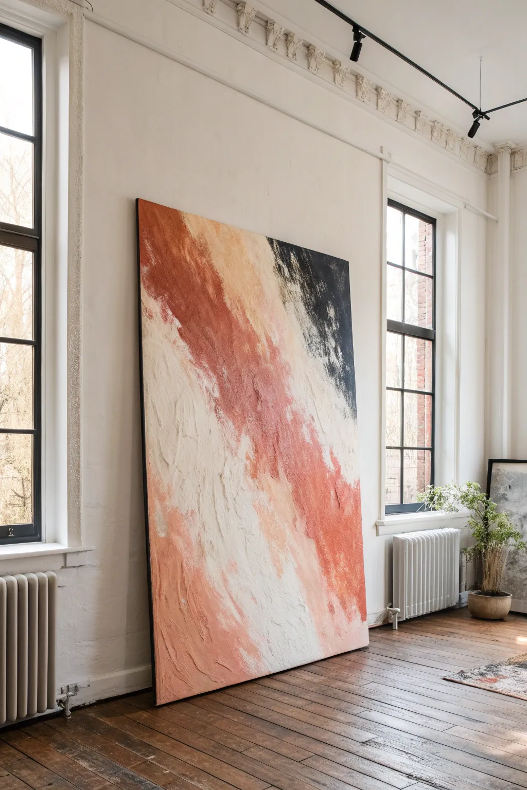
Embrace the drama of scale with this oversized abstract canvas, featuring bold diagonal movements of rust, cream, and charcoal. Its textured, impasto-style surface adds depth and a modern, gallery-worthy presence to any room.
Step-by-Step
Materials
- Large stretched canvas (at least 48×60 inches)
- Heavy body acrylic paints: Burnt Sienna, Terra Cotta, Titanium White, Unbleached Titanium, Mars Black
- Modeling paste or texture medium (large tub)
- Large palette knives (various sizes, including a 4-inch trowel)
- Wide flat brush (3-inch or larger)
- House painting brush (chip brush)
- Drop cloth
- Easel or large flat workspace
- Spray bottle with water
Step 1: Preparation & Base Texture
-
Set the Stage:
Lay down your drop cloth. Because of the canvas size, you might find it easier to work with it leaning against a wall or lying flat on the floor to manage the heavy texture application. -
Mix the Texture:
In a separate container, mix a generous amount of modeling paste with a small dollop of Titanium White acrylic. This ensures the paste dries opaque and bright rather than semi-translucent. -
Apply the Foundation:
Using your largest palette knife or trowel, spread a thin, uneven layer of the white paste mixture across the entire canvas. Don’t aim for smoothness; let the ridges and valleys remain to create a base grain. -
Create Directional Flow:
While the base layer is wet, drag your trowel diagonally from top-left to bottom-right. This establishes the directional energy of the piece before any color is added. -
Dry Completely:
Let this base layer dry fully. Depending on the thickness of your paste, this could take anywhere from 4 to 24 hours. It must be solid to the touch before proceeding.
Step 2: Color Blocking
-
Mix the Rust Tones:
On your palette, create a gradient of rust colors. Mix Terra Cotta with a touch of Burnt Sienna for depth, and another batch of Terra Cotta mixed with Unbleached Titanium for a peachy highlight. -
Apply the Main Streak:
Load a large brush with the darkest rust mix. Paint a wide, diagonal band starting from the upper left quadrant, sweeping down toward the bottom right. Keep the edges rough. -
Add Peachy Transitions:
While the rust paint is still tacky, introduce the lighter peach mix along the edges of the dark band. Use a clean dry brush to feather these colors together softly. -
The Cream Expanse:
Mix a large amount of Unbleached Titanium with Titanium White. Apply this to the large central diagonal area, letting it overlap slightly with the rust tones to create a natural blend. -
Introduce the Charcoal:
Mix Mars Black with a tiny drop of Burnt Sienna to warm it up. Apply this decisively to the top right corner, keeping the stroke angular and strictly confined to that upper wedge.
Cracking Up?
Thick modeling paste can crack if it dries too fast. Keep the painting away from direct sunlight or heaters, and let it dry slowly in a cool room to prevent fissures.
Step 3: Structuring & Refining
-
Heavy Body Application:
Now, switch to your palette knife. Mix your acrylic colors directly with more modeling paste (about a 50/50 ratio) to create a thick, sculptural paint. -
Sculpt the Rust:
Apply the thickened rust mixture over your painted rust area. Press the knife flat against the canvas and pull downwards to encourage a ‘dragged’ texture that mimics worn stone. -
Layering the Whites:
Repeat the process with the cream mixture in the central band. I like to apply this layer quite thickly, allowing the knife to skip over the dried base texture for jagged, organic edges. -
Black Contrast:
Apply the thickened black mix to the top corner. Use the edge of the knife to scratch into the wet black paint, revealing tiny hints of the underlayer for visual interest. -
Blending Zones:
Where the white meets the rust, use a clean palette knife to gently pull the white mixture over the rust edge. This creates an interesting, layered transition rather than a perfect gradient. -
Soften the Texture:
If any peaks looks too sharp, lightly mist them with water and drag a dry chip brush over them to knock down the height while maintaining the visual grit. -
Final Assessment:
Step back about six feet. Look for areas that need more color density or texture balance. Add small dabs of pure Titanium White to the brightest points of the cream section. -
Sealing:
Once the painting has cured for at least 48 hours, apply a matte varnish with a wide brush or spray can to unify the sheen and protect the textured surface.
Level Up: Metallic hint
Mix a dime-sized amount of gold leaf adhesive into the rust paint. Once dry, press gold foil onto just the highest peaks of the texture for a subtle, expensive shimmer.
Hang your massive new creation and enjoy how the shifting daylight plays across those deep textures
Tape-Resist Geometric Landscape
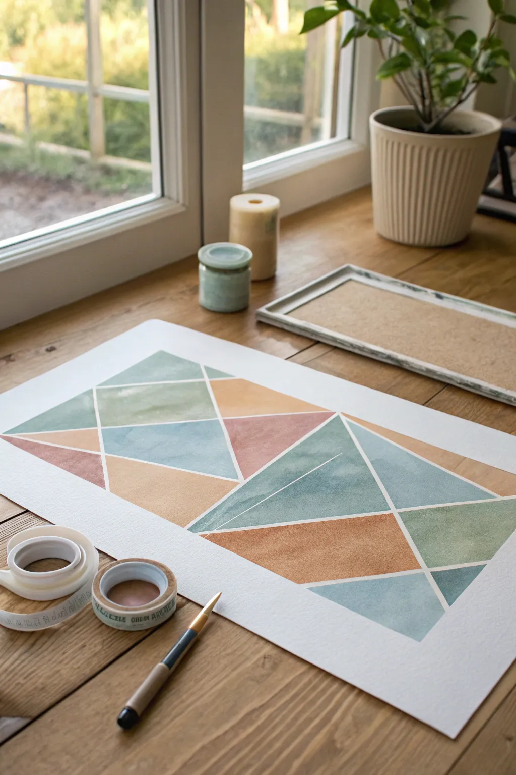
Achieve crisp lines and soft gradients with this modern watercolor project. By creating a fractured geometric landscape using tape resist, you’ll produce a stunning mosaic of earthy blues, greens, and ochres perfect for minimalist decor.
Step-by-Step Guide
Materials
- Heavyweight watercolor paper (300gsm/140lb or similar, hot or cold press)
- Painter’s tape or dedicated drafting tape (low tack)
- Watercolor paints (Payne’s Grey, Sap Green, Burnt Sienna, Yellow Ochre, Indigo)
- Round watercolor brushes (Size 6 and 10)
- Water container
- Paper towels
- Ruler (optional, but helpful for straight tape lines)
- Hair dryer (optional, for speeding up drying)
Step 1: Preparation & Taping
-
Surface Preparation:
Lay your watercolor paper on a flat, clean surface. While you can tape it down to a board, this project works well loose since the geometric tape structure adds some stability. -
Create the Border:
Apply strips of tape along all four outer edges of the paper to create a clean white frame. Press down firmly to stop paint from seeping underneath. -
Designing the Fracture Lines:
Begin placing long strips of tape diagonally across the paper. Think about intersecting triangles; I like to start with two large V-shapes meeting near the center to anchor the composition. -
Subdividing Spaces:
Add smaller strips of tape to break up the larger shapes. Aim for variety in triangle sizes, but don’t over-clutter the paper—leave some areas larger for nice color washes. -
Sealing the Edges:
Run your fingernail or a bone folder along the edge of every piece of tape. This is the most crucial step for achieving those razor-sharp white lines later.
Bleeding Lines?
If paint bleeds under the tape, your tape likely wasn’t pressed down enough. Next time, try painting a layer of clear matte medium over the tape edges first to seal them completely.
Step 2: Painting the Mosaic
-
Mixing Your Palette:
Prepare puddles of your colors: a muted teal (Indigo + Sap Green), a warm terracotta (Burnt Sienna + pinch of Ochre), and a dusty sage green (Sap Green + heavy water). -
Start with Light Washes:
Load your larger brush with the lightest sage green. Select 3-4 random triangles across the composition and fill them in, painting right over the tape edges. -
Adding Warm Tones:
Clean your brush and switch to the ochre or terracotta mix. Paint a few adjacent triangles, being careful not to let wet paint jump over the tape bridge if the neighboring shape is still very wet. -
Focus on Gradient Effects:
For some of the larger blue sections, try a gradient. Apply concentrated color at one corner of the triangle and use clean water to pull the pigment across to the other side for a fade effect. -
Balancing the Composition:
Step back and look at your color distribution. Ensure you don’t have all your dark colors in one corner. Distribute the blues and burnt siennas evenly to keep the eye moving. -
Letting it Set:
Allow this first layer to dry completely. If the paper feels cold to the touch, it is still wet deep down. -
Second Layer Depth:
Go back into a few of the darker geometric shapes with a second coat of paint to increase opacity and reduce the paper texture showing through.
Tape Removal Tip
Never pull tape upwards or quickly. I always pull the tape back onto itself slowly and at an angle. This puts less tension on the paper fibers and prevents tearing.
Step 3: Finishing Touches
-
Final Drying Phase:
Wait until the painting is bone dry. This is critical; peeling tape from damp paper will rip the surface and ruin your hard work. -
Starting the Reveal:
Pick a corner of the tape and peel it back slowly. Pull the tape away from the painted area at a 45-degree angle, keeping it close to the paper surface. -
Removing Internal Tape:
Gently remove the inner geometric strips. If a piece of tape resists, try warming it slightly with a hair dryer to loosen the adhesive. -
Checking the Lines:
Inspect your white lines. If any paint bled under the tape, you can sometimes gently scratch it away with an X-Acto knife or cover it with a tiny bit of white gouache. -
Flattening the Art:
If the paper has buckled slightly from the water, place the finished (dry) artwork under a heavy book overnight to flatten it out before framing.
Now you have a striking piece of modern geometric art ready to frame or gift.

PENCIL GUIDE
Understanding Pencil Grades from H to B
From first sketch to finished drawing — learn pencil grades, line control, and shading techniques.
Explore the Full Guide
Northern Lights Over Dark Pines
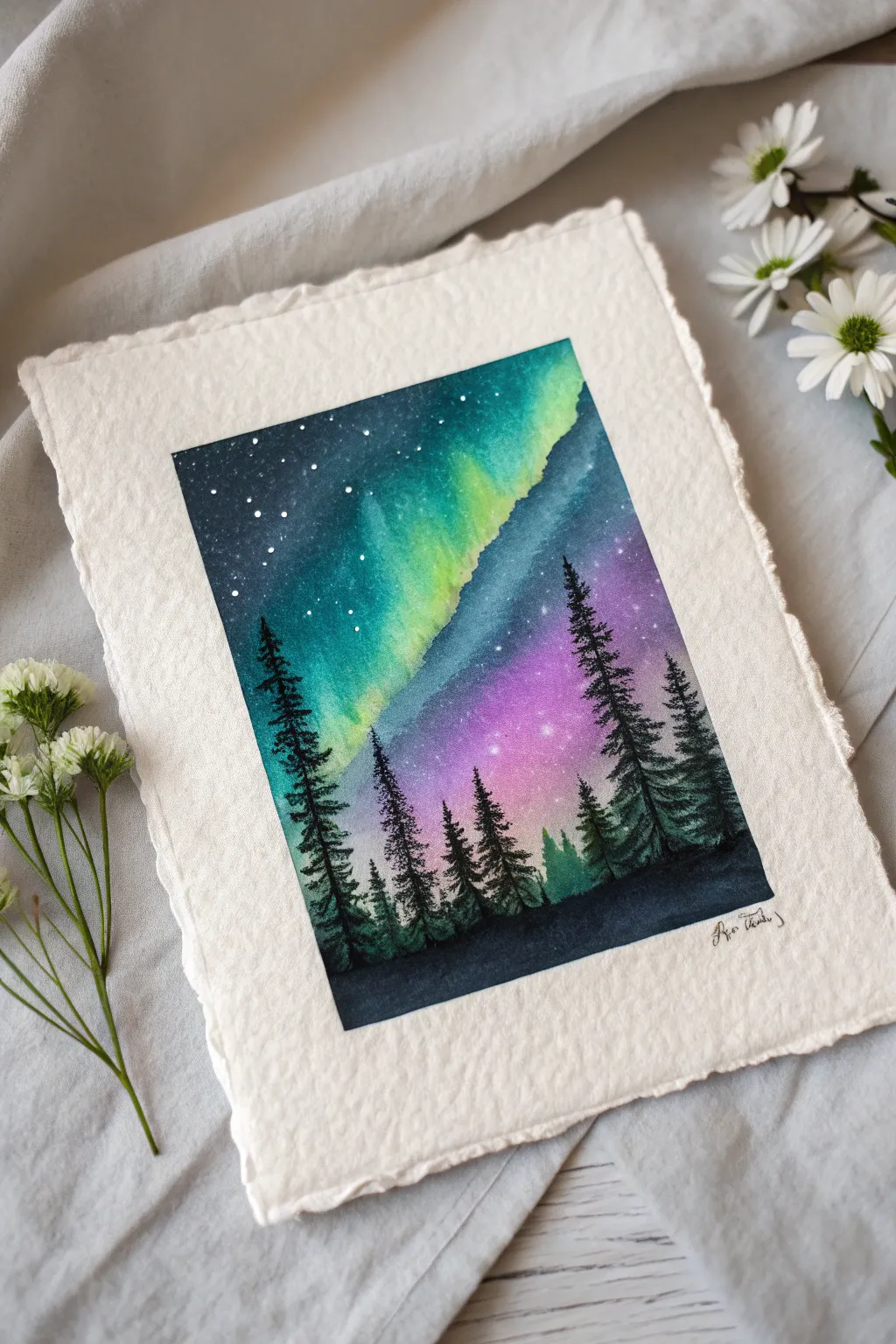
Capture the magic of the polar skies with this vibrant watercolor piece featuring dancing northern lights over a silent pine forest. Using wet-on-wet techniques, you will blend emerald greens and cosmic purples to create a luminous night sky that seems to glow from within.
Step-by-Step
Materials
- Cold press watercolor paper (deckle edge optional)
- Masking tape
- Watercolor paints (Indigo, Turquoise, Hooker’s Green, Dioxazine Purple, Magenta, Lamp Black)
- White gouache or white gel pen
- Flat wash brush (3/4 inch)
- Round brushes (sizes 6 and 2)
- Rigger or liner brush
- Jars of clean water
- Paper towels
- Palette for mixing
Step 1: Setting the Sky
-
Prepare your surface:
Begin by taping down your paper to a flat board with masking tape. This creates a crisp border and prevents the paper from buckling when wet. Ensure the tape is pressed down firmly along the edges. -
Wet the paper:
Using your large flat brush, apply a clean coat of water across the entire area where the sky will be. The paper should be glistening with a sheen, but not have puddles of water sitting on top. -
Lay the green foundation:
While the paper is wet, load a round brush with a mix of Turquoise and Hooker’s Green. Paint a diagonal, sweeping band across the middle-left section, allowing the paint to bloom softly into the wet paper. -
Add the purple glow:
Quickly rinse your brush and pick up Magenta mixed with a touch of Purple. Apply this to the lower right section below the green band, letting the edges touch and blend naturally where they meet. Do not overwork the area where colors overlap to keep it muddy-free. -
Deepen the night sky:
Mix a strong, dark Indigo or Prussian Blue. Apply this to the top left corner and the upper areas surrounding the green band to represent the deep night space. Soften the edges where the dark blue meets the green aurora to create a glowing effect. -
Intensify the contrast:
While everything is still damp, drop concentrated dark blue or purple into the outer corners to create a vignette effect. This pushes the bright center colors forward. Let this layer dry completely before moving on.
Muddy colors?
If your green and purple mix into a brown mess, let one color dry slightly before adding the other, or leave a tiny gap of clean wet paper between them to let them merge on their own.
Step 2: Stars and Silhouette
-
Splatter the stars:
Cover the bottom third of your painting (where the trees will go) with a scrap piece of paper. Dilute white gouache with a little water on a brush, then tap the handle against another brush to flick tiny droplets across the dark blue sky. -
Add specific stars:
For more prominent stars, use a fine tip brush or a white gel pen to place specific bright dots in the darker areas of the sky. I like to vary the sizes slightly to add depth. -
Paint the horizon:
Mix a dense black using Lamp Black or a mix of Indigo and Burnt Umber for a rich, dark tone. With a size 6 round brush, paint an uneven, rolling hill shape across the bottom of the paper. -
Start the trees:
Switch to a smaller round brush or a liner brush. Draw vertical lines of varying heights rising from the black horizon to serve as the trunks for your pine trees. -
Detail the branches:
Using the tip of your brush, stipple small horizontal dashes starting from the top of a trunk and working downward. Make the dashes wider as you go down to create the classic conical pine tree shape. -
Layering the forest:
Paint the tallest foreground trees first with the darkest black paint. Then, mix a slightly lighter grey-black and paint smaller trees in the background gaps to create a sense of distance and density. -
Refine the edges:
Use a very fine liner brush to add tiny, stray branches at the very tips of the trees. These delicate details make the silhouettes look organic and realistic against the bright sky. -
Final dry and reveal:
Allow the black paint to dry completely. Once dry, carefully peel away the masking tape at a 45-degree angle away from the painting to reveal your crisp, clean edges.
Create a ‘bloom’
While the sky is still wet, drop tiny spots of clean water into the green section. This pushes pigment away, creating soft, light-filled ‘blooms’ that look like shifting light.
Frame your new celestial landscape or gift it to someone who loves gazing at the night sky
Galaxy Night Sky With Splatter Stars
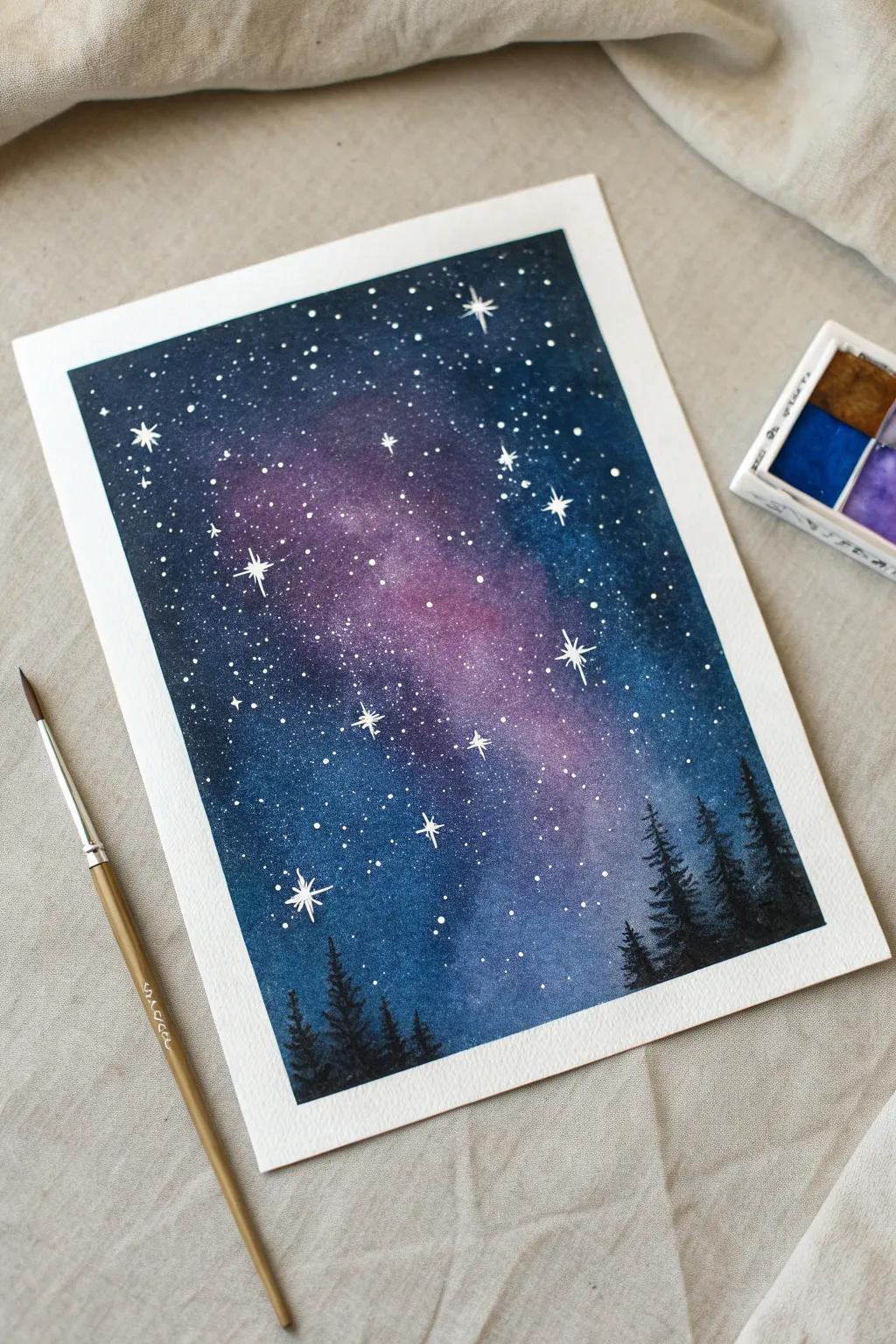
Capture the ethereal beauty of a starry night with this vibrant watercolor galaxy tutorial. This project combines wet-on-wet blending techniques with simple splatter effects to create a luminous, dreamy atmosphere.
Step-by-Step Tutorial
Materials
- Cold press watercolor paper (block or taped down)
- Watercolor paints (Indigo, Prussian Blue, Violet, Magenta, Black)
- White opacity paint (gouache, acrylic, or gel pen)
- Round brushes (large size 10-12, small size 0-2)
- Clean water jar
- Paper towels
- Old toothbrush (optional for splattering)
- Masking tape
Step 1: Setting the Sky Foundation
-
Prep your surface:
Tape down all four edges of your watercolor paper to a board or table to prevent buckling and create a crisp clean border. -
Wet the paper:
Using your largest clean brush, apply a generous layer of clear water across the entire paper surface until it glistens uniformly. -
Create the nebula core:
While the paper is wet, drop in bright magenta or violet paint in a diagonal, irregular cloud shape through the center of the page. -
Soften the nebula edges:
Gently dab clean water around the edges of the pink shape to encourage the pigment to bloom outward softly. -
Add first layer of blue:
Load your brush with a bright blue like Prussian Blue and paint around the pink nebula, letting the colors touch and bleed slightly where they meet.
Starry Trick
Cover the bottom tree area with a scrap piece of paper while splattering white paint so your forest silhouettes stay dark and don’t look like they have snow on them.
Step 2: Building Depth and Contrast
-
Deepen the corners:
While the paper is still damp, mix a darker shade using Indigo or a touch of Black and apply it to the four corners and outer edges. -
Blend the transition:
Use a damp, clean brush to gently blend the dark edges inward toward the lighter center, creating a glorious gradient effect. -
Intensify colors:
If the colors look faded, drop more concentrated pigment into the wet areas, reinforcing the deep blues at the edges and the vibrant pinks in the center. -
First drying phase:
Allow this base layer to dry completely. The paper must be bone dry before the next step to prevent muddying.
Step 3: Stars and Silhouette
-
Splatter the stars:
Dilute white gouache or acrylic paint with a tiny bit of water. Load a brush or toothbrush and flick the bristles to spray fine white specks across the galaxy. -
Paint larger stars:
Using a fine detail brush and thick white paint, carefully draw a few four-pointed stars by painting a cross shape with tapered ends. -
Highlight brightest stars:
Add a tiny solid white dot to the center of your four-pointed stars to make them glow intensely. -
Paint tree line outlines:
With black watercolor or gouache and your smallest brush, paint a jagged, uneven line near the bottom to establish the forest floor. -
Detail the evergreens:
Create pine trees by painting a vertical line, then using short, downward stippling motions to create branches that get wider toward the bottom. -
Vary tree heights:
Paint trees of different heights to create a natural, organic look, clustering taller ones on the sides to frame the galaxy. -
Final drying:
Let the black silhouettes dry completely before touching the artwork. -
Reveal the border:
Slowly peel away the masking tape at a 45-degree angle to reveal the crisp white edge that frames your night sky.
Make it Sparkle
Mix a tiny amount of iridescent medium or silver watercolor into your white paint for the stars. When the light hits the artwork, your galaxy will literally shimmer.
Enjoy the peaceful feeling of your own personal slice of the cosmos


Black Glue Lines With Soft Washes
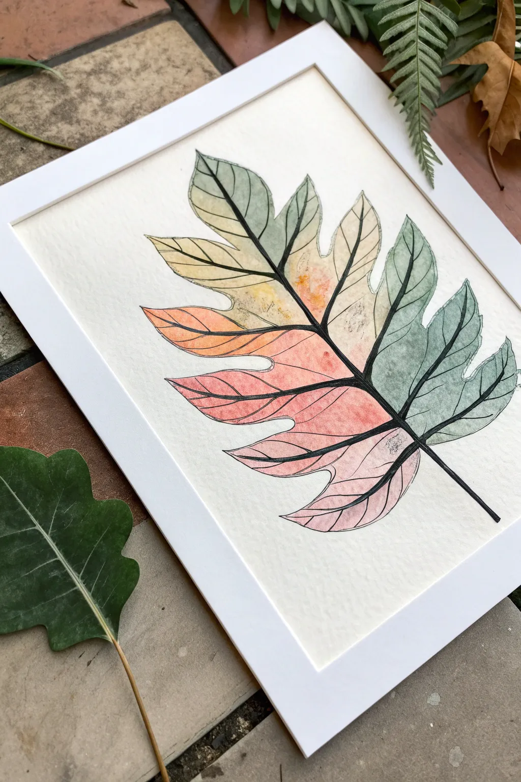
Capture the delicate transition of seasons with this striking watercolor resist project. By combining bold, raised black lines with soft, blending washes of color, you’ll create a stained-glass effect that makes the simple leaf form pop off the page.
Step-by-Step
Materials
- Cold press watercolor paper (A4 or larger)
- Black glue (or white PVA glue mixed with black acrylic paint)
- Pencil
- Watercolor paints (pan or tube)
- Soft watercolor brushes (round size 6 and 10)
- Squeeze bottle with fine precision tip
- Paper towels
- Water cups
- Painter’s tape or masking tape
- Drawing board or thick cardboard
Step 1: Preparation & Drawing
-
Secure the paper:
Begin by taping down your watercolor paper to a board using painter’s tape on all four sides. This prevents buckling when we add the water later. -
Sketch the leaf shape:
Using a pencil, lightly sketch the outline of a large, lobed leaf. Think of a breadfruit or monstera leaf shape with deep indentations. -
Add the central vein:
Draw a strong central line running from the bottom stem up to the tip of the leaf. -
Draw the secondary veins:
From the center line, sketch veins extending out toward the tip of each leaf lobe. Keep these lines smooth and flowing. -
Prepare the black glue:
If you don’t have pre-made black glue, mix roughly one part black black acrylic paint with two parts white PVA glue in your squeeze bottle. Shake thoroughly to combine. -
Trace with glue:
Carefully trace over your pencil lines using the squeeze bottle. Apply steady pressure to create a consistent, raised bead of black glue. I find it helpful to pull the bottle toward me rather than pushing it away. -
Let the glue cure:
Allow the glue outline to dry completely. This is crucial; the glue acts as a dam for the paint, so it must be fully set. Depending on humidity, this can take several hours or overnight.
Clogged Tip?
If your glue bottle sputters, don’t force it over the art. Clear the nozzle with a sewing pin or paperclip to restore a smooth flow and prevent blobs.
Step 2: Watercolor Application
-
Pre-wet the paper:
Working one section at a time (e.g., the top left lobe), lightly wet the paper inside the glue lines with clean water. -
Start with green tones:
On the right side of the leaf, drop in a watery wash of sage green or deeply muted teal. Let the color flow naturally to the edges of the black glue. -
Introduce warm transitions:
For the middle sections, mix a soft yellow ochre or pale orange. Paint the area adjacent to the green sections, allowing for a slight overlap if you want a blended look, or keep them distinct like stained glass. -
Create the gradient effect:
Moving toward the bottom left, switch to warmer hues. Drop in varying concentrations of coral, rose, and soft red. The wet-on-wet technique allows these colors to bloom softly. -
Deepen the contrast:
While the paint is still damp, touch a slightly more saturated pigment to the corners near the central vein to add depth and dimension. -
Paint the background (optional):
For this specific look, leave the background stark white to emphasize the colors. If you accidentally got paint outside the lines, dab it generally with a damp paper towel. -
Final drying:
Let the watercolor paint dry completely before removing the tape. Peel the tape away slowly at a 45-degree angle to keep your edges crisp.
Pro Tip: Test Run
Practice your glue lines on scrap paper first. Getting the right speed-to-pressure ratio takes a moment to master before committing to the final piece.
Once framed, the bold black lines create a sophisticated contrast that makes the gentle watercolor hues truly sing.
Salt-Bloom Watercolor Skies
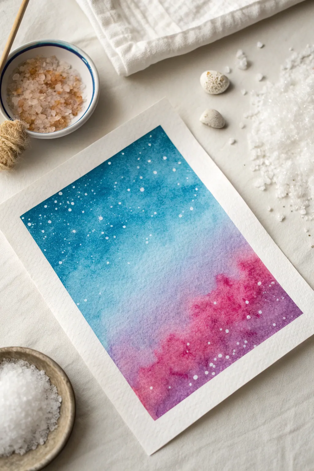
Capture the magic of a starry cosmos or a snowy twilight using nothing more than watercolor pigment and common table salt. This project relies on the chemical reaction between wet paint and salt crystals to create stunning, organic textures that look effortlessly complex.
Detailed Instructions
Materials
- Cold-press watercolor paper (300 gsm)
- Watercolor paints (Phthalo Blue, Dioxazine Purple, Quinacridone Magenta)
- Medium round brush (size 8 or 10)
- Clean water jar
- Paper towels
- Painter’s tape or washi tape
- Coarse sea salt or kosher salt
- White gouache or acrylic ink (optional for extra stars)
- Old toothbrush (optional)
Step 1: Setting the Stage
-
Secure the paper:
Tape your watercolor paper down on all four sides to a hard board or table. This prevents buckling and creates that crisp, clean white border when you peel it off later. -
Prepare your palette:
Pre-mix puddles of your three main colors: a deep blue, a vibrant purple, and a bright pink. You want the paint to be fluid but rich in pigment, not too watered down, or the salt won’t react effectively. -
Wet the surface:
Using your clean brush, wet the entire rectangle of paper with clear water. It should see an even sheen across the surface, but avoid creating large pools or puddles.
Salt Dissolving?
If salt vanishes without leaving marks, your paper was too wet. If spots are barely visible, it was too dry. Aim for a ‘damp sheen’ sweet spot.
Step 2: Creating the Gradient
-
Apply the blue:
Load your brush with the blue paint and apply it to the top third of the wet paper. Use horizontal strokes and let the pigment flow naturally into the wet surface. -
Transition to purple:
While the blue is still wet, introduce the purple paint in the middle section. Gently brush the boundary where the blue and purple meet to encourage a soft blend. -
Add the pink base:
Paint the bottom third with your magenta or pink hue. Allow it to touch the purple edge, watching as the colors bleed into one another to create new violet tones. -
Intensify the clouds:
To create the cloud-like formation seen at the bottom right, drop in concentrated dabs of pink and purple into the bottom corner while it is still very wet. Let these ‘blooms’ expand on their own.
Step 3: The Salt Reaction
-
Check the moisture:
This is the crucial moment. Wait until the sheen on the paper has turned from wet and glossy to satin-like. If it’s too wet, the salt dissolves; too dry, and nothing happens. -
Sprinkle the magic:
Taking a pinch of coarse salt, sprinkle it randomly over the top blue section to mimic distant stars. Focus on scattering closer clusters in the darker areas for contrast. -
Add texture to the clouds:
Drop a few larger grains of salt into the wettest pink/purple ‘cloud’ area at the bottom. The salt will push the pigment away, creating light, feathery blooms. -
Wait patiently:
Allow the painting to dry completely. Do not assist it with a hair dryer, as the force of the air can blow the salt crystals around and smear the pattern. I usually leave mine for at least an hour.
Black Silhouettes
Once dry, paint a solid black silhouette of a pine forest or mountain range along the bottom edge to give your abstract sky a sense of heavy scale.
Step 4: Finishing Touches
-
Remove the salt:
Once the paper is bone dry and warm to the touch, gently rub off the salt crystals with your fingers or a clean, dry rag. You will reveal beautiful, lighter starburst patterns underneath. -
Assess the stars:
Your salt created a soft, distant star effect. If you want sharper, brighter stars in the foreground, we will add those manually. -
Prepare splatter:
Mix a small amount of white gouache with a drop of water until it has a creamy consistency. Dip an old toothbrush or a stiff brush into the mixture. -
Splatter the sky:
Hold the brush over the top blue section of the painting and tap the handle (or flick the bristles) to spray fine white dots over the salt texture. -
Final reveal:
Wait for the white splatter to dry, then carefully peel away the painter’s tape at a 45-degree angle to reveal your clean edges.
Now you have a celestial masterpiece that captures the unpredictable beauty of watercolor chemistry
Negative-Space Botanicals on Dark Ground
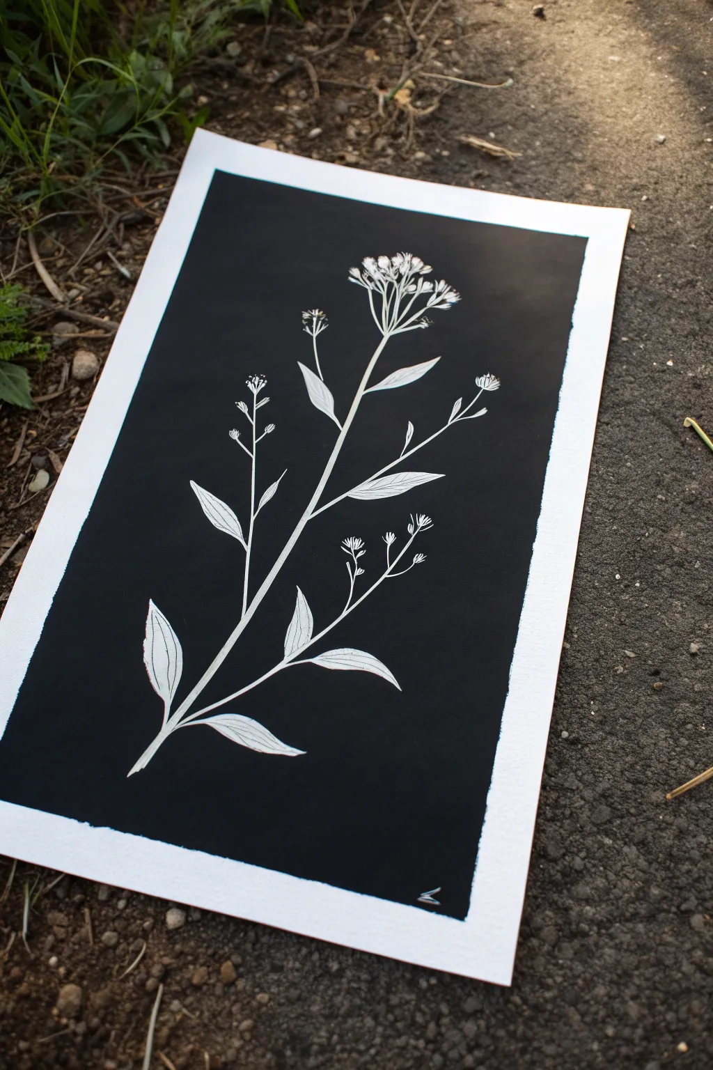
Capture the delicate beauty of wildflowers against a stark midnight backdrop with this striking negative-space painting method. The high contrast of white on deep black creates a dramatic, modern botanical illustration perfect for framing.
How-To Guide
Materials
- High-quality watercolor paper (cold press, 300lb is best to prevent warping)
- Black India ink or high-flow black acrylic paint
- Liquid masking fluid (drawing gum)
- Small fine-line brush or a dip pen for masking
- Medium flat brush (approx. 1/2 inch to 3/4 inch)
- Graphite pencil (HB or 2B)
- Kneaded eraser
- Rubber cement pickup tool or a clean finger
- Paper towels
- Artist tape
Step 1: Preparation and Sketching
-
Secure the paper:
Begin by taping down all four edges of your watercolor paper to a sturdy board or work surface. This creates a clean white border later and keeps the paper flat when wet. -
Lightly sketch the stem:
Using your graphite pencil, draw a very faint, sweeping curved line to act as the central stem. Keep the pressure minimal so you don’t groove the paper. -
Add leaf structures:
Branching off the main stem, sketch simple, elongated leaf shapes. Aim for an asymmetrical arrangement to mimic nature, placing some leaves lower and some higher. -
Detail the blossoms:
At the top of your stem and branch tips, draw the flower clusters. These look like small umbrellas of tiny buds; keep the shapes simple and graphic rather than hyper-realistic. -
Refine the drawing:
Go back over your sketch to ensure the lines are clear. The final image relies on the silhouette, so make sure your leaves have nice, pointy tips and the stems aren’t too thick.
Step 2: Masking the Subject
-
Prepare the masking fluid:
Shake your masking fluid gently. If using a brush, coat the bristles in bar soap first to protect them, as masking fluid ruins brushes quickly. -
Outline the stems:
Carefully paint or draw the masking fluid directly over your pencil lines for the main stem. Use a steady hand to keep the width consistent. -
Fill in the leaves:
Move onto the leaves, filling in the shapes completely with the masking fluid. Ensure the edges are crisp, as this defines the final white shape. -
Mask the delicate flowers:
For the tiny flower buds at the top, just dab small dots of masking fluid. This stippling effect creates a nice texture for the seed heads. -
Detail interior veins (Optional):
If you want fine white veins inside the leaves, ensure your masking layer is solid. If you want black veins, leave tiny hairline gaps in the masking fluid—though for this project, I recommend masking the whole lead solid first. -
Let it cure completely:
Allow the masking fluid to dry entirely. It should turn yellowish or transparent and feel tacky but not wet. Patience is key here to avoid smearing.
Brush Saver Tip
Never use your best watercolor brushes for masking fluid! The latex clumps are impossible to remove. Use a silicone applicator or a cheap craft brush you don’t mind ruining.
Step 3: The Dark Wash
-
Load the dark medium:
Pour out your black India ink or high-flow acrylic. Using the medium flat brush, load it generously with pigment. -
Apply the background:
Start painting over the entire paper, going right over the dried masking fluid. Work quickly to ensure an even, opaque coat of black. -
Ensure full coverage:
Check for any streaks or light spots. You want a solid, velvety black field. If using ink, one coat usually suffices; acrylic might need a second pass. -
Dry thoroughly:
Let the black layer dry completely. It must be bone dry before the next step, or you risk tearing the paper surface or smudging the ink.
Go Metallic
For a luxe variation, paint the background with a deep navy acrylic, then brush gold ink or watercolor over the white revealed areas for a shimmering effect.
Step 4: The Reveal
-
Remove the mask:
Once the paint is totally set, use a rubber cement pickup (or a clean finger) to gently rub the edge of the masking fluid. It creates friction and will start to peel away. -
Peel carefully:
Slowly pull up the long strands of rubbery mask. This is the most satisfying part, watching the bright white paper emerge from the black ink. -
Clean up edges:
If any pencil lines are still visible on the white paper, gently erase them now with a kneaded eraser. -
Add fine details:
Take a very fine black pen (like a Micron 01) and draw delicate veins inside the white leaves or add tiny specks to the flower heads for extra dimension. -
Remove the tape:
Peel away the artist tape from the borders. Pull the tape away from the center of the artwork at a low angle to keep sharp, crisp white edges.
Step back and admire the stark, elegant contrast of your botanical silhouette against the void
Metallic Accents on Black Paper
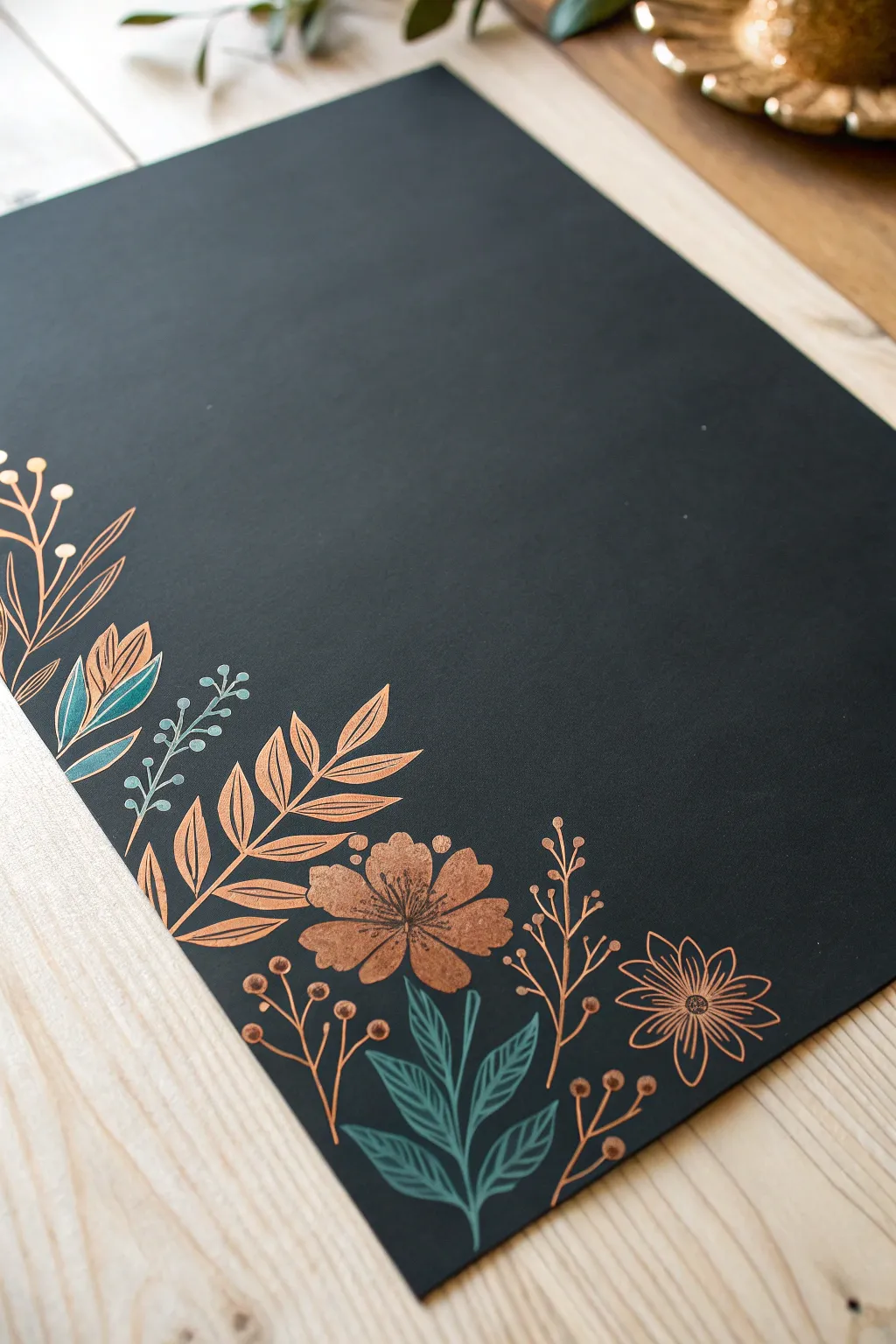
This elegant project transforms plain black cardstock into a sophisticated piece of art using shimmering metallic markers. The contrast between warm copper, cool teal, and the deep matte background creates a striking botanical corner design perfect for menus, invitations, or wall art.
How-To Guide
Materials
- High-quality black cardstock or mixed media paper (heavyweight)
- Metallic brush pen (Copper/Rose Gold)
- Metallic or opaque gel pen (Teal/Sage Green)
- Pencil (HB or lighter)
- Soft eraser
- Ruler (optional)
- Scrap black paper for testing
Step 1: Planning and Sketching
-
Prepare your surface:
Lay your black cardstock on a clean, flat surface. Ensure it is free of dust or oils from your hands, as these can resist certain inks. -
Map the corner composition:
Visualize an L-shape starting at the bottom left corner. The design should extend roughly one-third up the left side and one-third across the bottom edge. -
Sketch the main stems:
Using a pencil very lightly, draw the curved spines of the main leaves and the placement of the large focal flowers. Keep these lines faint so they don’t show through the metallic ink later. -
Mark focal points:
Indicate where the large copper flower will sit near the corner, and the smaller spiky flower to its right. This anchors your composition.
Keep it flowing
Work from the top-left to bottom-right (if right-handed) to avoid dragging your hand through wet metallic ink, which smudges easily.
Step 2: Drawing the Metallic Elements
-
Test your pens:
Before touching the final paper, scribble on your scrap black paper to ensure the ink is flowing smoothy and the opacity is strong. -
Start with the large flower:
Using the copper brush pen, draw the center of the main flower. Radiate five or six broad, rounded petals outward. Fill them in solidly with the metallic ink to create a rich copper texture. -
Add the spiky flower:
Moving to the right, draw the smaller flower using thinner strokes. Create a small center circle and draw sharp, narrow petals radiating outward, leaving the center open or lightly detailed. -
Draw the main fern leaves:
Create the large, fern-like leaves extending upward on the left side. Draw a central stem, then add paired, pointed leaves growing outward. I find it easiest to turn the paper as I work to keep the angle comfortable. -
Add delicate sprigs:
In the spaces between the larger elements, draw thin, branching stems with small dots at the tips using the copper pen. These look like metallic berries and add airiness to the dense design. -
Create the leafy base:
Draw similar copper branching leaves along the bottom edge, ensuring they flow naturally from the corner outward to the right.
Add dimension
Once the copper ink is dry, add white gel pen highlights to the tips of the leaves or the center of the flowers for extra sparkle.
Step 3: Adding Cool Tones and Details
-
Introduce the teal accent:
Switch to your teal or sage green pen. Locate the empty spaces beneath the main copper flower and along the left border. -
Draw the bottom foliage:
Create a cluster of pointed, veined leaves at the very bottom center. Draw the outline first, then fill in the veins, leaving some black negative space for contrast. -
Add accent leaves:
Intersperse a few teal leaves among the copper ones on the left side. This dual-tone effect prevents the design from looking flat. -
Draw the berry stems:
Use the teal pen to draw thin, vertical stems with tiny circular buds on the left side, nestled between the larger copper fern leaves. -
Add fine details to the copper:
Once the large copper flower is fully dry, use a fine-tip black pen or a very dark grey marker to add subtle stamens or center details if desired, though the solid copper looks great on its own.
Step 4: Finishing Touches
-
Check balance:
Step back and look at the composition. If there are awkward gaps, add tiny copper dots or small floating leaves to balance the visual weight. -
Let it cure:
Metallic inks can take longer to dry than standard markers. Let the piece sit undisturbed for at least 10-15 minutes to prevent smudging. -
Erase guidelines:
Gently erase any visible pencil marks. Be very careful rubbing over the metallic areas, as vigorous erasing can dull the shine.
Enjoy the luxurious contrast of your finished metallic botanical art.

Have a question or want to share your own experience? I'd love to hear from you in the comments below!