When you’re craving dope drawing ideas, it’s usually not about drawing “pretty”—it’s about making something that hits hard and looks unapologetically cool. Here are my go-to prompts for edgy, surreal, and street-inspired sketches that feel like they belong on a wall, a deck, or a notebook cover.
Tag + Doodle Sticker Sheet
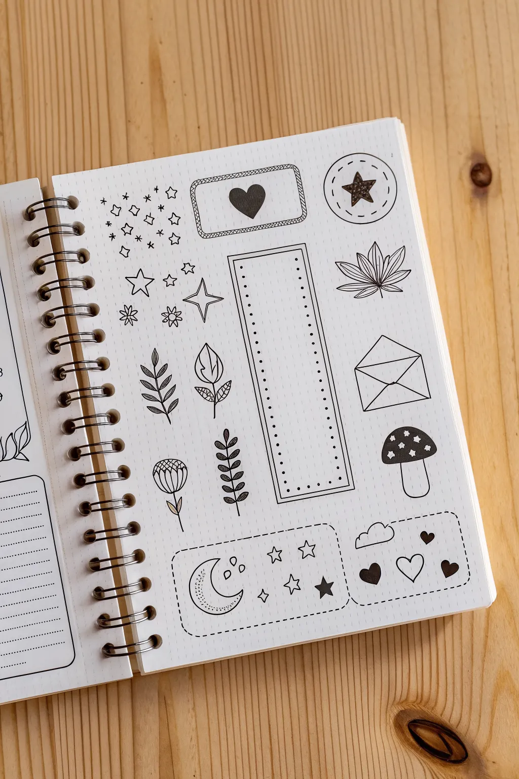
Fill your journal with this charming collection of celestial and botanical micro-illustrations. The high-contrast black ink on dot grid paper creates a clean, sticker-like aesthetic perfect for decorating planners or just practicing linework.
How-To Guide
Materials
- Dot grid notebook or loose dot grid paper
- Fine liner pen (01 or 03 size)
- Thicker marker or brush pen (black)
- Ruler
- Pencil
- Eraser
Step 1: Planning the Layout
-
Setup lightly in pencil:
Before committing to ink, sketch the basic placement of your elements using a hard pencil (like 2H) so the lines are faint. I find it helpful to count the dots to ensure things like the central rectangular tag are perfectly centered. -
Draw the main geometric frames:
Using your ruler and pencil, outline the three main container shapes: the horizontal rectangle at the top center, the circle at the top right, and the tall vertical list box in the middle. -
Add boundary lines:
Sketch the dashed boundary lines for the two rectangular sections at the bottom of the page. This helps balance the composition before you fill them with details.
Ink Smudge Savior
If you accidentally smudge wet ink, turn it into a feature! Draw tiny stars or dots over the smudge to camouflage it as part of the galaxy theme.
Step 2: Inking the Geometric Elements
-
Ink the top rectangle:
Take your fine liner and trace the top horizontal rectangle. Give it a double border by drawing a second line just inside the first, adding diagonal hatch marks between them for a rope-like texture. -
Create the circle badge:
Draw the circle in the top right corner. Add a dashed line just inside the solid circle to give it a sewn patch effect. -
Outline the vertical list:
Use your ruler to ink the tall vertical rectangle in the center. Similar to the top box, create a double border. -
Add the dot list:
Inside the vertical frame, draw a column of small dots down the left and right sides to turn it into a checkbox list or tracker.
Step 3: Drawing the Botanical Doodles
-
Draw the fan leaf:
To the right of the vertical list, start the fan-shaped leaf. Draw a central vein, then radiate five pointed leaf shapes outward. Add a central line to each leaflet for detail. -
Create the sprigs:
On the left side of the list, draw the two leafy branches. For the bottom one, use small teardrop shapes for leaves attached to a central stem. The one above it uses slightly larger, more open leaf shapes. -
Draw the flower bud:
Below the leafy sprigs, sketch a simple tulip-like flower bud. Draw a U-shape for the head, add vertical lines for petals, and a thin stem. -
Add the vine details:
To the right of the flower, draw a vertical vine with small, dark leaves. Color these leaves in fully black to create contrast against the lighter line drawings.
Double-Line Trick
When doing the double border on the vertical tag, draw the inner rectangle first. It’s easier to frame a box than to squeeze one inside.
Step 4: Adding Charming Icons
-
Draw the envelope:
On the right side, below the fan leaf, draw a simple envelope rectangle with a triangular flap. Add intersecting lines to show the fold. -
Draw the mushroom:
Under the envelope, draw a mushroom cap (a semi-circle) and a thick stem. Add small circles and stars on the cap. -
Fill the mushroom cap:
Carefully color the background of the mushroom cap black, leaving the stars and dots white. -
Create the heart badge:
Inside the top horizontal rectangle, draw a solid black heart in the center. -
Star power:
Inside the top right circle, draw a five-pointed star. Shade it with heavy scribbles for a textured, hand-drawn look.
Step 5: Finishing Touches
-
Scatter the sparkles:
Fill the empty space in the top left with a mix of tiny four-pointed stars, open stars, and simple asterisks. Vary the sizes to make it look like stardust. -
Ink the bottom containers:
Go over your bottom pencil sketches with a dashed ink line to create two distinct ‘sticker’ areas. -
Fill the moon box:
In the bottom left dashed box, draw a crescent moon with a sleeping face profile. Add some texture inside the moon with stippling (dots) and surround it with a few stars. -
Fill the hearts box:
In the bottom right dashed box, draw a playful cloud at the top left. Then, add a mix of solid black hearts and outlined hearts. -
Erase guidelines:
Wait at least 5-10 minutes to ensure the ink is totally dry, then gently erase all remaining pencil marks.
Enjoy using your new doodles to add personality to your daily planning
Skull With Smoke and Florals
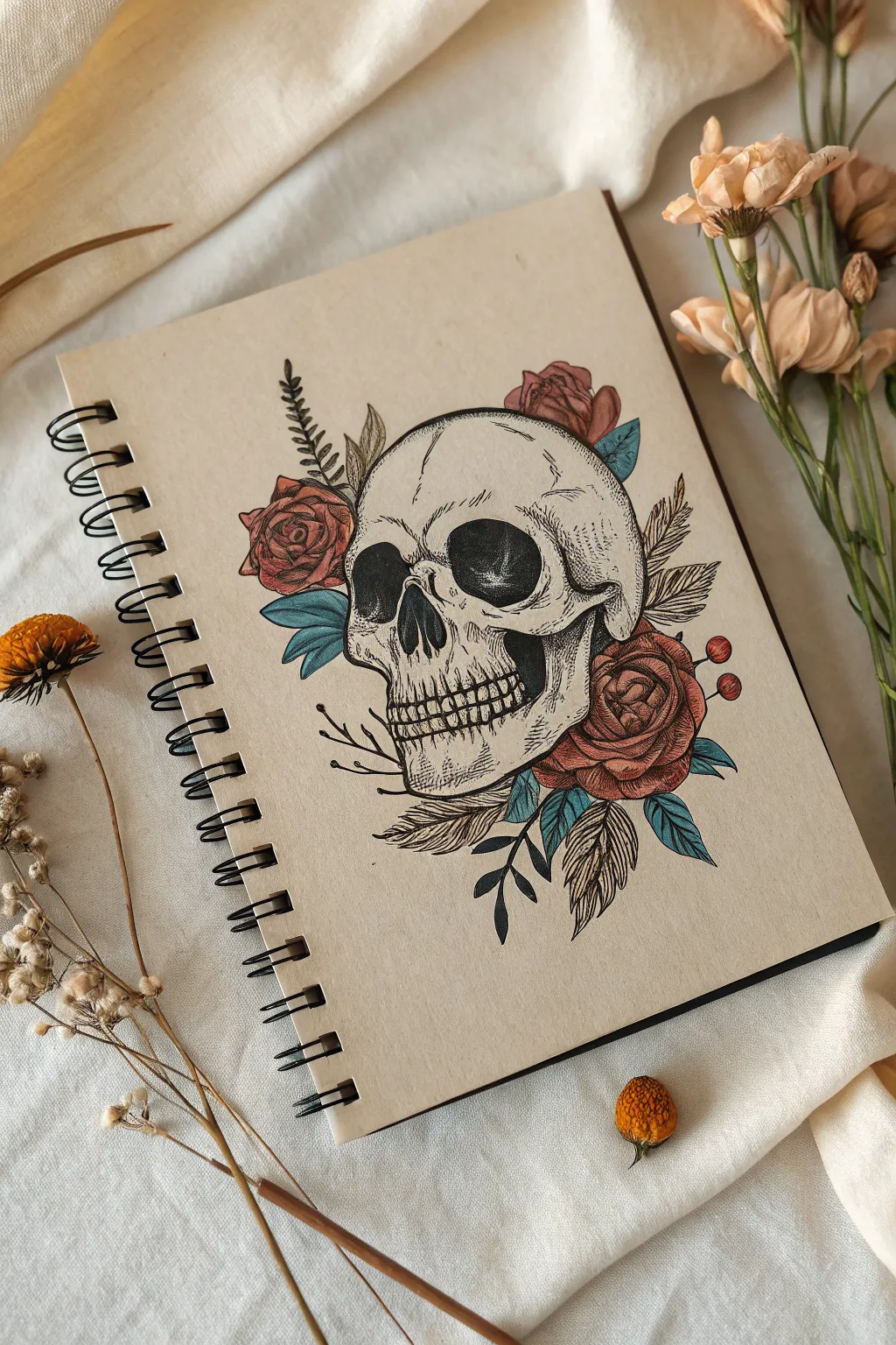
This striking illustration blends the macabre elegance of a skull with the vitality of blooming roses and foliage. The sketch uses fine linework and muted colors on tan toned paper to achieve a classic, tattoo-inspired aesthetic.
Detailed Instructions
Materials
- Spiral-bound sketchbook with tan/kraft paper
- HB graphite pencil
- Kneadable eraser
- Fine liner pens (sizes 0.1, 0.3, and 0.5)
- Colored pencils (muted red, teal blue, white, ochre)
- White gel pen (optional)
Step 1: Conceptual Layout
-
Block in the skull shape:
Start by lightly sketching a large, rounded cranial shape in the center of your page using your HB pencil. Add a smaller, boxier shape below it for the jaw, leaving space for the nasal cavity and eye sockets. -
Place the features:
Divide the face with a vertical centerline. Sketch two large, somewhat irregular ovals for the eye sockets and an upside-down heart shape for the nose cavity. Mark the separation between the upper and lower teeth. -
Add floral placeholders:
Indicate where the flowers will go. Sketch rough circles for the roses—one tucked behind the top right of the skull, another on the left cheekbone, and a large one at the lower right jawline. -
Sketch the foliage:
Draw flowing lines extending from the flower clusters to represent stems and leaves. Include a mix of fern-like fronds and standard rose leaves to create variety in texture.
Step 2: Refining the Pencil Work
-
Detail the skull:
Refine the outline of the cheekbones and brow ridge, making them look bony and uneven. Sketch the individual teeth, making sure they look slightly imperfect and aged rather than perfectly straight. -
Define the rose petals:
Inside your rough flower circles, start drawing the center of the roses with tight, spiraling lines. Expand outward with overlapping, curved petals that open up as they reach the edge of the flower. -
Sharpen the leaves:
Go over your foliage lines, adding serrated edges to the rose leaves and defining the individual leaflets on the fern/feather-like elements.
Uneven Eyes?
Drawing symmetrical eye sockets is hard. If one looks off, thicken the black outline on the smaller one to balance the visual weight without redrawing the whole skull.
Step 3: Inking the Outline
-
Outline the main shapes:
Switch to a 0.5 fine liner. Carefully trace the outer perimeter of the skull, the main shape of the roses, and the stems. Keep your hand steady but allow for slight organic variations in line weight. -
Fill the dark voids:
Using the 0.5 pen or a brush pen, completely black out the eye sockets and the nasal cavity. Leave small, subtle white gaps near the edges if you want to suggest depth or reflected light. -
Detail with finer pens:
Switch to a 0.3 or 0.1 pen for the delicate details. Ink the teeth, the veins in the leaves, and the interior petals of the roses. Use broken lines for cracks in the bone to make them look weathered.
Add a Glow
Use a white gel pen to add tiny, high-contrast glints on the wettest looking parts of the drawing, like the eyes or tips of leaves.
Step 4: Shading and Texture
-
Stippling the skull:
I find this step meditative: use your 0.1 pen to add dots (stippling) around the temples, under the cheekbones, and near the teeth roots. Concentrate the dots heavily in shadow areas and disperse them as you move toward the light. -
Hatching the flowers:
Add shading to the roses using hatching lines. Follow the curve of each petal with your strokes. Place the darkest shadows deep inside the folds of the bloom. -
Erase pencil guides:
Once the ink is completely dry, gently run your kneadable eraser over the entire drawing to lift the original graphite sketch, leaving only clean ink lines.
Step 5: Adding Color
-
Color the roses:
Take a muted red or dusty rose colored pencil. Fill in the flowers with light pressure, darkening the pressure in the shadowed areas where the petals overlap. -
Tint the leaves:
Use a teal or muted blue pencil for the leaves. This unnatural color choice gives the piece a stylish, neo-traditional tattoo vibe. Press harder at the base of the leaves for dimension. -
Highlight the bone:
Since the paper is tan, use a white colored pencil to add highlights to the brightest parts of the skull—the forehead, brow ridge, and chin. This makes the form pop off the page. -
Final accents:
Add tiny red berries if desired, and use a touch of ochre or light brown in the recesses of the skull to deepen the aged look.
Now you have a beautifully stylized illustration that balances life and death on the page

Third Eye Close-Up
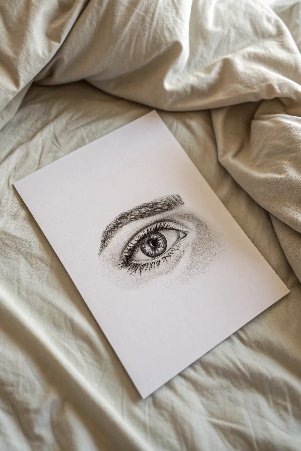
This project captures the intense gaze of a single eye using fine liner pens and stippling techniques. The result is a striking, high-contrast drawing that balances realistic textures with stylized, crisp lines.
How-To Guide
Materials
- Smooth bristol board or heavy drawing paper (A5 size)
- Graphite pencil (HB or H)
- Kneaded eraser
- Fine liner pens (sizes 0.05, 0.1, 0.3, and 0.5)
- White gel pen (optional for highlights)
Step 1: The Sketch
-
Outline the basic shape:
Begin with a very light pencil sketch of the almond shape of the eye. Don’t press hard; these lines are temporary guides. Include the circular iris, leaving a slightly flattened top where the lid covers it, and mark the pupil in the center. -
Map the eyelids:
Sketch the crease of the upper eyelid, which runs parallel to the eye shape but slightly wider. Lightly indicate the lower lid line and the tear duct area. -
Rough in the eyebrow:
Draw the general shape of the eyebrow above the eye. Instead of drawing individual hairs yet, just outline the area where the brow will sit to ensure the arch is correct.
Step 2: Inking the Eye
-
Define the pupil:
Switch to your 0.5 fine liner. Carefully outline the pupil and fill it in completely black, but leave a small, distinct white circle or rectangle near the top for the catchlight reflection. This light spot is crucial for life. -
Outline the iris:
Use a 0.3 pen to trace the outer edge of the iris. Make this line slightly thicker at the top where the shadow of the eyelid would fall. -
Detail the iris texture:
Switch to a 0.05 or 0.1 pen. Draw fine lines radiating from the pupil outward toward the edge of the iris, like spokes on a wheel. Vary the length and density; some lines should stop halfway, others should reach the edge. I like to layer these lines to build depth. -
Add depth to the iris:
Darken the outer ring of the iris with short, inward strokes using the 0.1 pen. Add a bit more shading directly under the top eyelid shadow to make the eye look round.
Uneven Stippling?
If your dot shading looks patchy, don’t rush. Hold the pen vertical to the paper and tap gently. Rushing creates ‘commas’ instead of dots. Go back and fill gaps slowly.
Step 3: Lashes and Brows
-
Draw the upper lashes:
Using a 0.3 pen, start drawing the upper eyelashes. Start from the lash line and flick your wrist upward and outward. The lashes should curve and clump slightly together, not stick straight up. Make the base of each hair thicker than the tip. -
Add lower lashes:
Use a finer 0.1 pen for the lower lashes. These are sparser, shorter, and clump together more noticeably than the top ones. Ensure they originate from the outer edge of the lower waterline, not directly from inside the eye. -
Create the eyebrow:
With the 0.1 pen, draw the eyebrow hairs. Follow the natural growth direction—hairs near the nose grow upward, while hairs toward the tail grow outward and downward. Use quick, confident strokes and build up density slowly.
Pro Tip: Lash Direction
Never draw lashes straight. Look in a mirror: lashes curve and overlap. Draw ‘J’ or ‘C’ curves, and varying their angles slightly makes them look much more realistic.
Step 4: Shading and Texture
-
Stipple the eyelid crease:
Instead of shading with solid lines, use stippling (tiny dots) to create the shadow in the eyelid crease. Use a 0.05 pen and cluster dots densely in the deepest part of the fold, spreading them out as you move away. -
Shade the eyeball:
The white of the eye isn’t perfectly white. Add very light, sparse stippling or tiny hatching lines in the corners of the eye and under the top lid to show the spherical shape. -
Define the skin texture:
Add subtle texture under the eye and around the tear duct using extremely light dots with your finest pen. This mimics skin pores and shadows without looking like heavy wrinkles. -
Deepen the contrast:
Go back with your 0.5 pen and darken the lash line and the darkest parts of the eyebrow draft. Contrast is what makes black and white drawings pop. -
Clean up:
Wait at least 10 minutes for the ink to fully dry. Gently erase the underlying pencil sketch with your kneaded eraser to reveal the clean ink work.
Now you have a striking, realistic eye study that demonstrates the power of simple ink lines


Snake Wrapped Around a Dagger
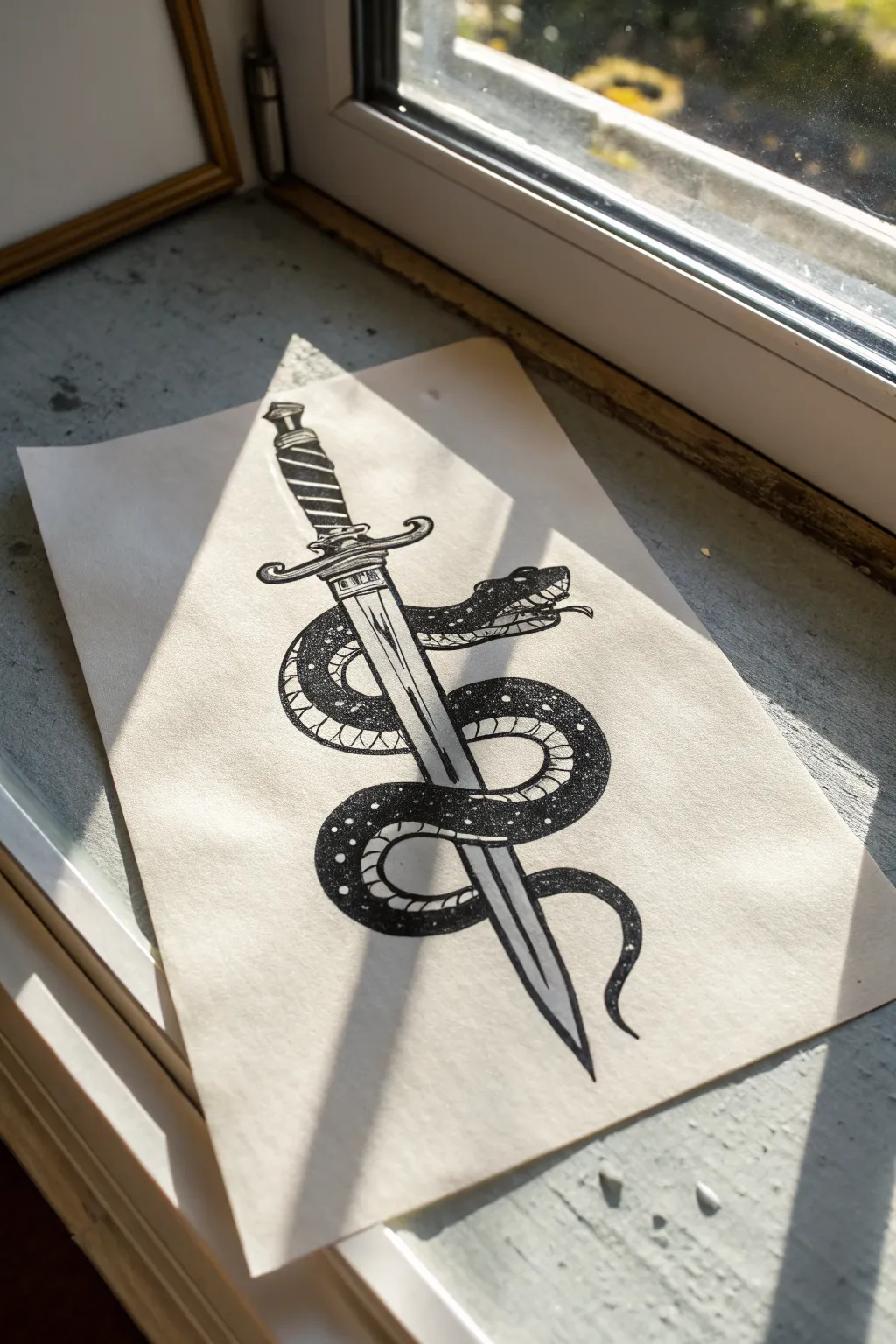
This striking black-and-white illustration captures the timeless edgy aesthetic of classic tattoo flash art. You’ll combine clean linework with intricate stippling to create a textured, celestial looking snake coiling around a sharp dagger.
Step-by-Step Guide
Materials
- Smooth white bristol board or heavyweight drawing paper
- HB or H graphite pencil (for sketching)
- Kneaded eraser
- Fine liner pens (sizes 0.1, 0.3, and 0.5)
- Black brush pen or broad marker (for filling)
- Ruler
Step 1: Drafting the Structure
-
Establish the Center Line:
Begin by using a ruler to draw a straight, vertical line down the center of your paper. This will serve as the spine of the dagger to ensure perfect symmetry. -
Sketch the Dagger Shape:
Lightly sketch the handle and pommel at the top. Moving down, draw the cross-guard horizontally across your center line, then extend two straight lines downward to form the tapering blade, meeting at a sharp point. -
Map the Snake’s Path:
Draw a flowing ‘S’ curve that winds around the blade. Start near the cross-guard for the head, loop behind the blade, cross over the front, loop behind again, and finish with the tail curling at the bottom. -
Flesh Out the Serpent:
Add width to your guide line to create the snake’s body. Make the section nearest the head slightly thicker, tapering gradually down to the tail. Erase the parts of the dagger that are hidden behind the snake’s body so the overlap is clear. -
Detail the Features:
Refine the snake’s head with an open mouth, a forked tongue, and an eye. On the dagger handle, sketch spiral grips, and add a central ridge line down the blade.
Ink Bleeding?
If your marker bleeds into the white spots, use a white gel pen or opaque white gouache to reclaim those crisp, starry highlights on the snake’s back.
Step 2: Inking the Outlines
-
Define the Main Lines:
Switch to a 0.5 fine liner. Carefully trace the outer contour of the dagger and the snake. Use confident, steady strokes to keep the lines crisp. -
Add Secondary Details:
Use a slightly thinner 0.3 pen for inner details, such as the ridges on the handle, the center line of the blade, and the mouth details of the snake. -
Create the V-Belly Scales:
Along the underside of the snake (the belly), draw evenly spaced curved lines that look like ribs. This distinguishes the belly from the top scales. -
Border the Top Scales:
Draw a dividing line running along the side of the snake’s body to separate the belly from the back. This ‘lateral line’ is crucial for the shading phase. -
Clean Up:
Once the ink is completely dry, gently erase all penciled guidelines. Before brushing away the eraser crumbs, check to make sure you haven’t smudged any wet ink.
Step 3: Shading and Texture
-
Blacking the Back:
This style relies on high contrast. Use your black brush pen or broad marker to fill in the entire top section of the snake (the back), but leave small, random circular spots white. These will look like starry speckles or highlights later. -
Refining the Spots:
Go back with a 0.1 pen and carefully round out the edges of the white spots left in the previous step, making them look intentional and celestial rather than messy gaps. -
Stippling the Belly:
Using the 0.1 pen, add dotwork shading to the belly scales. Concentrate the dots near the edges where the body curves away, fading out toward the center to create a rounded, 3D effect. -
Shading the Blade:
Add minimal shading to the blade to keep it looking metallic. Use short, parallel scratchy lines near the cross-guard and the edges to suggest reflection and depth. -
Finishing Touches:
Add final stippling dots to the dagger handle to give it grip texture. Check your heavy black areas for any unevenness and darken them for a solid, opaque finish.
Pro Tip: Volume Control
When drawing the belly scales (scutes), curve the lines slightly toward the tail. This small perspective trick makes the snake look cylindrical rather than flat.
Now you have a bold piece of art that looks straight out of a classic tattoo portfolio

PENCIL GUIDE
Understanding Pencil Grades from H to B
From first sketch to finished drawing — learn pencil grades, line control, and shading techniques.
Explore the Full Guide
Hands Throwing a Bold Gesture
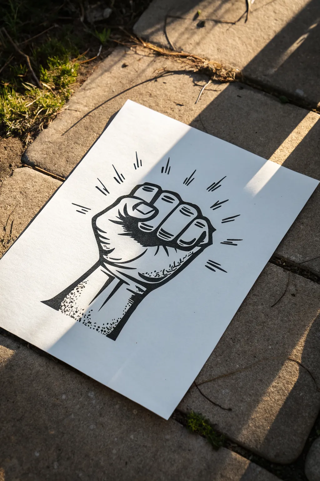
Capture the raw energy of a classic protest symbol with this bold, graphic illustration. By mimicking the look of a linocut print using stark black ink, you will create a striking piece that emphasizes strong shadows and explosive movement.
Step-by-Step
Materials
- Smooth bristol board or heavy sketching paper (A4)
- HB Pencil
- Kneaded eraser
- Fine liner pen (0.1mm or 0.3mm)
- Thick black marker or brush pen (for filling)
- Ruler (optional)
Step 1: Constructing the Core Shape
-
Establish the wrist:
Start near the bottom left of your page. Draw two parallel lines extending diagonally upward to the right to form the wrist and forearm, keeping them fairly thick to suggest strength. -
Block in the palm:
At the top of your wrist lines, sketch a rough square shape. This box will serve as the heavy palm section of the fist. -
position the fingers:
Draw four rectangular shapes curving over the top of the palm box. Make the middle finger the highest point, creating a slight arch to the knuckles. -
Add the thumb:
Sketch the thumb wrapping across the front of the index and middle fingers. It should look like a thick band locking the fist in place.
Linocut Logic
Think like a printmaker: don’t shade with gradients. Use solid black and pure white shapes only. This creates that specific ‘stamped’ aesthetic.
Step 2: Refining the Linework
-
Define the knuckles:
Go over your sketch, rounding off the harsh corners of the fingers. Add small gaps between the fingers where they fold into the palm to create depth. -
Detail the thumb crease:
Draw the nail bed on the thumb and the wrinkle where the thumb joint bends. This detail is crucial for making the hand look tense and clenched. -
Outline the palm texture:
Add curved lines on the fleshy part of the palm below the pinky finger. These lines should follow the roundness of the muscle. -
Draw the forearm tendons:
Sketch two strong, vertical lines visible on the forearm. These represent the tendons popping out due to the tightness of the clench.
Wobbly Lines?
If your long lines are shaky, try drawing rapidly from your shoulder rather than your wrist. Speed often smooths out the stroke.
Step 3: Inking and Shading
-
Start the main outline:
Switch to your thick marker or brush pen. Trace the entire outer perimeter of the hand with a heavy, consistent line weight to separate the subject from the background. -
Fill the deep shadows:
Identify the darkest areas: directly under the curled fingers, the crease of the palm, and the side of the wrist. Fill these entirely with black ink. -
Add finger separation:
Use your fine liner to draw the separation lines between fingers. Keep these thinner than the outline to ensure they don’t look like gaps. -
Create the heavy shadow band:
Draw a thick, jagged shadow shape running across the middle of the palm and under the thumb. This mimics the high-contrast look of woodblock printing. -
Texture the wrist:
On the left side of the forearm, stipple small dots or use a dry-brush effect if using a brush pen. This adds a gritty texture that fades into the white of the arm.
Step 4: Action Lines and Final Touches
-
Clean the sketch:
Once the main ink feels dry to the touch, gently erase all underlying pencil marks with your kneaded eraser so the black pops. -
Draft the motion lines:
Using a pencil, lightly mark short, radiating lines extending outward from the knuckles. Vary their lengths slightly, but keep them roughly evenly spaced. -
Ink the energy bursts:
Go over the radiating marks with your medium-thickness pen. Make the lines thicker specifically at the base (closest to the hand) and taper them to a sharp point outward. -
Add secondary motion:
Draw a second, smaller set of floating lines slightly further out. These detached floating strokes suggest vibration and impact. -
Final assessment:
Step back and look for balance. If the hand feels too light, thicken the bottom shadow on the wrist slightly to anchor the image.
Now you have a dynamic symbol of strength ready to hang on your wall or scan for a digital print
Broken Statue Head With Neon Cracks
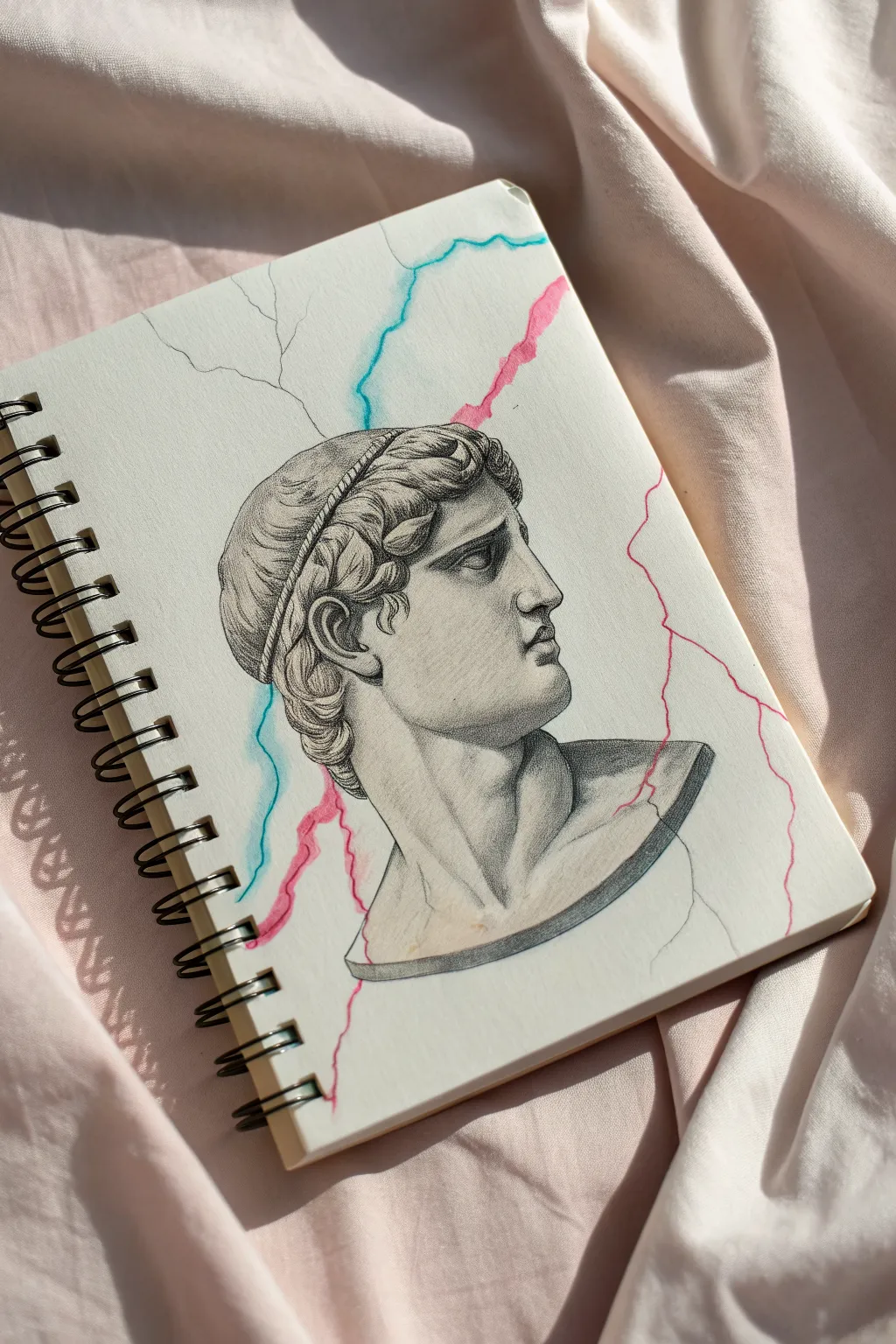
Merge the timeless elegance of classical sculpture with a modern, electric twist in this striking sketchbook piece. You’ll combine realistic graphite shading with vibrant ink lines to create the illusion of a statue breaking apart with neon energy.
How-To Guide
Materials
- Spiral-bound sketchbook (medium tooth paper)
- Graphite pencils (HB, 2B, 4B)
- Fine-point eraser or kneaded eraser
- Blending stump (tortillon) or cotton swab
- Neon pink gel pen or fine liner
- Neon blue gel pen or fine liner
- Ruler (optional for proportion checking)
Step 1: Drafting the Classical Profile
-
Establish the Head Shape:
Start with an HB pencil and a very light touch. Draw a rough oval for the cranium and a jawline extending down to mark the chin. Keep these initial lines barely visible so they can be erased easily later. -
Map Facial Features:
Lightly sketch a horizontal line for the eye level and a vertical line for the ear placement. Mark the nose bridge, the lips, and the curve of the chin in profile. Accuracy here is key to the classical look. -
Add the Headband and Hair:
Draw the distinct band wrapping around the head. Sketch the hair in clumps rather than individual strands, focusing on the wavy texture tucked under the band and curling at the nape of the neck. -
Define the Neck and Shoulders:
Extend lines down for the thick, muscular neck. At the base, draw a curved line to represent the bottom of the bust sculpture, giving it that chopped-off statue appearance rather than a realistic body fade.
Clean Edges
Keep a piece of scrap paper under your drawing hand. This prevents your palm from smudging the graphite shading while you work on the intricate neon details.
Step 2: Detailed Graphite Shading
-
Refine the Outline:
Switch to a sharpened 2B pencil. Go over your sketch with cleaner, more confident lines, defining the sharp nose, the heavy eyelid, and the curls of hair. Erase your initial construction guidelines. -
Shade the Face:
Using the side of your pencil, apply soft shading to the cheek hollow, under the jaw, and beneath the brow. I like to focus on the ‘core shadow’ along the jawline to give the face volume. -
Detail the Hair texture:
Darken the recesses between the hair clumps with a 4B pencil. Leave the tops of the curls lighter to represent highlights. This high contrast makes the hair recreate the look of carved marble. -
Render the Neck Muscles:
Add shading to the sternocleidomastoid muscle—the big muscle running from the ear to the collarbone. This adds tension and realism to the pose. -
Sculpt the Bust Base:
Darken the bottom edge of the sculpture significantly. Use cross-hatching or heavy pressure to make the cut-off point look solid and heavy, grounding the floating head. -
Blend for Smoothness:
Take your blending stump and gently smooth out the graphite on the skin areas. Marble is smooth, so you want to eliminate rough pencil strokes on the face while keeping the hair slightly more textured.
Step 3: The Neon Fracture
-
Plan the Crack Path:
Visualize where the energy bolt will travel. It should enter from the top edge, pass behind or through the head, and exit the bottom. Lightly dot this path with a pencil first if you are nervous about using ink immediately. -
Ink the Blue Lightning:
Using your neon blue pen, draw a jagged, wandering line starting from the top center. Let the line tremble and branch slightly as it moves down toward the neck area. -
Ink the Pink Lightning:
Take the neon pink pen and create a second fracture line. This one can run parallel or intersect the blue one. In the reference, it hugs the right side of the page and cuts through the shoulder. -
Integrate the Cracks:
Where the neon lines touch the graphite drawing, don’t just draw over it. Stop the ink line at the edge of the statue and restart it on the other side, or weave it through carefully to show depth. -
Add Subtle Vignetting:
For a final touch, add very faint, faint pencil cracks radiating from the main neon lines into the white space, connecting the colorful energy to the rest of the paper.
Ink Not Flowing?
If neon gel pens skip over graphite, try drawing the colored lines first, or lightly erase the graphite path before inking to ensure the paper grabs the ink.
Step back and admire how the jarring colors make the classical features pop off the page
BRUSH GUIDE
The Right Brush for Every Stroke
From clean lines to bold texture — master brush choice, stroke control, and essential techniques.
Explore the Full Guide
Masked Portrait With Glitch Lines
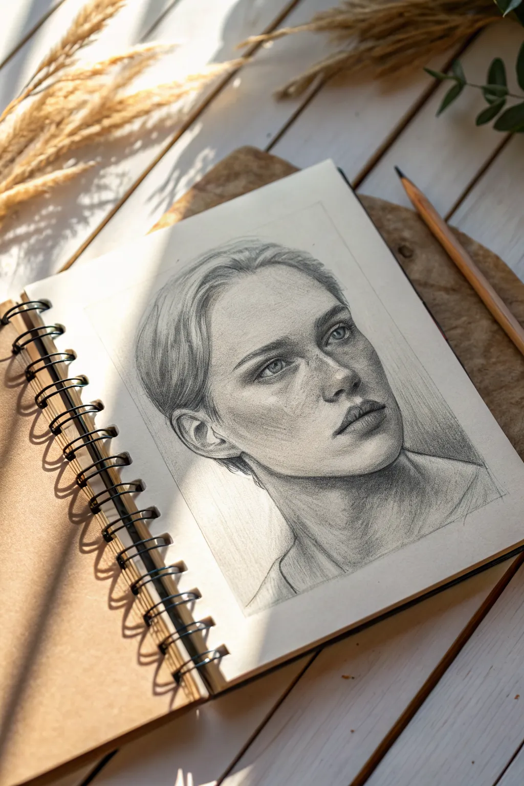
This tutorial guides you through creating a soulful, realistic portrait in graphite, focusing on capturing emotion through subtle shading and delicate textures. The result is a striking black-and-white study that balances fine detail with expressive, sketchy edges.
Step-by-Step Tutorial
Materials
- Spiral-bound sketchbook (medium textured paper)
- Graphite pencils (HB, 2B, 4B, 6B)
- Mechanical pencil (0.5mm, HB)
- Kneaded eraser
- Blending stump or torture
- Tissue or soft cloth
- Sharpener or craft knife
Step 1: Laying the Foundations
-
Map the head shape:
Start with a light HB pencil. Sketch a basic oval for the head and a gentle curve for the neck line. Keep your hand loose and don’t press hard; these are just guidelines. -
Place facial features:
Draw faint horizontal lines to mark the placement of the eyes, nose base, and mouth. Sketch a vertical center line to help with symmetry, noting the slight three-quarter turn of the head. -
Draft the eyes and brows:
Lightly sketch the almond shapes of the eyes. Add the arch of the eyebrows above them. Pay attention to the distance between the eyes; it’s usually the width of one eye. -
Refine nose and mouth:
Mark the bottom of the nose and the nostril wings. Sketch the line of the mouth, focusing on the Cupid’s bow and the fuller bottom lip. Keep lines faint. -
Outline the hairline:
Sweep loose lines back from the forehead to indicate the hairline. Don’t draw individual strands yet; just map out the volume of the hair pulled back.
Muddy Shading?
If your shadows look grey or smeary, you might be over-blending. Switch to a fresh tortillon and stop smudging. Layer graphite strokes instead to build clean tone.
Step 2: Building Form and Tone
-
Establish the shadows:
Switch to a 2B pencil. Lightly shade the darker areas: under the brow bone, the side of the nose, beneath the lip, and the hollow of the cheek. Use the side of the lead for soft strokes. -
Detail the eyes:
Sharpen your mechanical pencil for precision. Draw the iris and pupil, leaving a small white circle for the catchlight. Darken the upper lash line to ground the eye. -
Blend for skin texture:
Use a tissue or blending stump to gently smudge your initial shading on the face. This creates a smooth skin base. Avoid over-blending; you want to keep some paper texture visible. -
Deepen the contrast:
With a 4B pencil, go back into the darkest shadows—pupils, nostrils, and corners of the mouth. This step brings the drawing to life by adding depth. -
Sculpt the lips:
Shade the upper lip darker than the bottom lip. Add tiny vertical cracks on the lips for realism using a sharp HB point, then soften them slightly with the stump. -
Define the nose structure:
Build shading on the side of the nose bridge and the bulb. Keep the bridge itself lighter to indicate bone structure catching the light.
Highlight Pop
For ultra-bright highlights in the eyes or on moist lips, use a tiny dot of white gel pen or white gouache. It adds an incredible spark of life immediately.
Step 3: Adding Texture and Final Details
-
Create hair volume:
Using a 4B or 6B pencil, draw long, sweeping strokes following the direction of the hair growth. Darken the roots and the area behind the ear to create depth. -
Refine hair strands:
I like to switch back to the mechanical pencil here to add flyaways and individual strands over the darker masses. This creates a realistic, layered look. -
Add freckles and imperfections:
Lightly tap the pencil tip across the nose and cheeks to create subtle freckles. Vary the pressure so some are darker than others for a natural effect. -
Shade the neck:
Add shading under the jawline and down the neck muscles (sternocleidomastoid). Cross-hatch lightly to suggest form without drawing heavy outlines. -
Enhance highlights:
Take your kneaded eraser and pinch it into a point. ‘Lift’ graphite off the tip of the nose, the cheekbones, and the forehead to create bright highlights. -
Final touches:
Check the overall balance. Does the ear need more definition? Is the hairline too harsh? Soften edges where necessary and strengthen the darkest blacks one last time with the 6B.
Enjoy the satisfaction of seeing a personality emerge from simple pencil strokes on the page
Retro Tech Turned Into a Monster
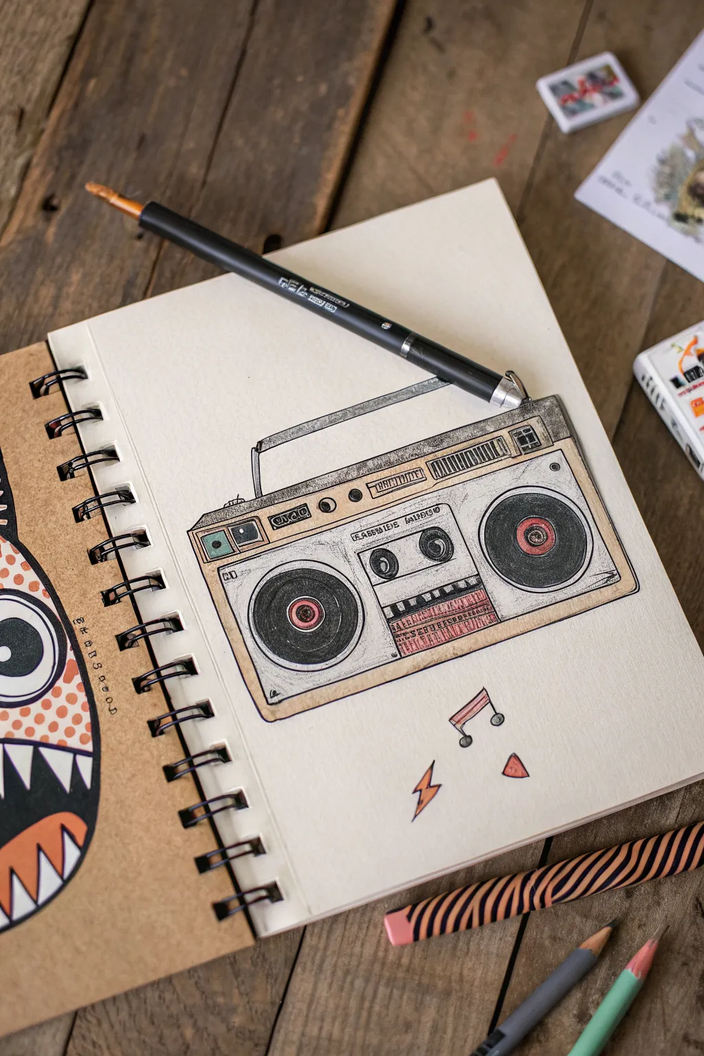
Capture the nostalgic vibe of the 80s with this clean, illustrative drawing of a classic boombox. Using fine liners and simple colored pencils, you’ll create a stylized piece of retro tech that pops off the page with character.
How-To Guide
Materials
- Spiral-bound sketchbook (heavyweight paper recommended)
- H or HB graphite pencil for sketching
- Eraser (kneaded or vinyl)
- Fine liner pens (black, sizes 0.1, 0.3, and 0.5mm)
- Colored pencils (cream/beige, light grey, dark grey, red)
- Ruler or straight edge
Step 1: Planning the Structure
-
Block in the main shape:
Start lightly with your pencil. Draw a large rectangle in the center of your page to represent the body of the boombox. Keep your lines faint so they can be erased later. -
Add dimension:
Create a 3D effect by drawing a slightly smaller rectangle inside the first one for the faceplate. Then, add thin diagonal lines connecting the corners to give the device some depth. -
Position the speakers:
Sketch two large circles on the left and right sides of the faceplate for the main woofers. Inside each, draw a smaller concentric circle for the speaker cones. -
Draft the cassette deck:
In the center space between the speakers, draw a rectangle for the tape deck window. Add two small circles inside for the tape reels. -
Add controls and handle:
Sketch a long, thin rectangle across the top for the tuner display. Draw the handle as a U-shape extending from the top of the unit.
Step 2: Inking the Lines
-
Outline the main body:
Switch to your 0.5mm fine liner. carefully trace over your pencil lines for the outer box and the handle. Use a ruler if you want absolute precision, or freehand it for a looser, illustrative look. -
Define the speakers:
Ink the speaker circles. For the inner cones, use a slightly thicker line weight or go over the line twice to emphasize depth. -
Detail the interface:
Use a finer 0.1mm or 0.3mm pen for the smaller details like buttons, knobs, and the frequency lines on the tuner display. -
Add texture:
Create texture on the speaker grilles or side panels using simple hatching lines or stippling dots. This gives the drawing a mechanical feel. -
Erase guidelines:
Once the ink is completely dry—I usually wait at least five minutes to be safe—gently erase all your graphite pencil marks.
Clean Edges
When doing the beige fill, outline the area with the colored pencil first, then fill inwards. This creates a crisp border that looks like a professionally printed illustration.
Step 3: Applying Color
-
Base coat the body:
Take a cream or beige colored pencil and lightly shade the entire face of the boombox. Keep the pressure even to avoid harsh streaks. -
Color the speakers:
Use a dark grey or black pencil to fill in the speaker cones. Press harder near the edges and lighter towards the center to suggest concavity. -
Accentuate with red:
Use a red pencil for small details like the center of the speakers, power indicators, or the graphic equalizer bars below the tape deck. -
Add metallic touches:
Use a light grey on the handle and buttons to simulate chrome or metal. Leave tiny white slivers uncolored to represent reflective highlights. -
Enhance contrast:
Go back over the darkest areas, like the tape window and speaker centers, with a second layer of dark grey or black to make the colors pop.
Make It Glossy
Use a white gel pen to add sharp little highlight dots on the speaker centers and chrome switches. It instantly makes the drawing look shiny and finished.
Step 4: Final Touches
-
Draw musical elements:
In the empty space below the boombox, sketch a few floating music notes and a lightning bolt shape. -
Color the floating elements:
Fill these shapes with red and orange to tie the composition together. -
Add shadows:
Lightly shade a drop shadow underneath and to the right of the boombox using a light grey pencil to ground the object on the page.
Now you have a stylish piece of retro tech preserved in your sketchbook.


Cartoon Character With X Eyes
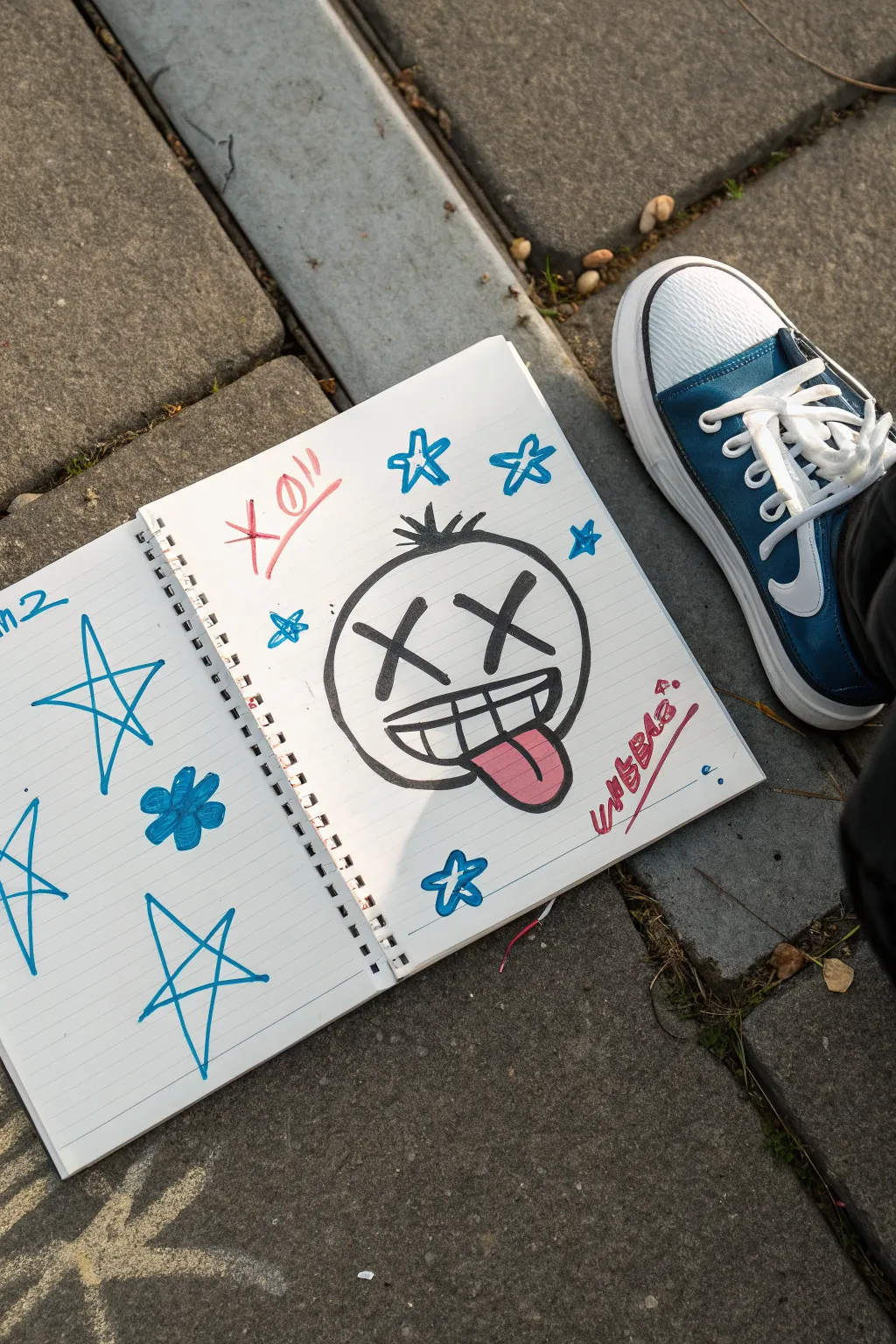
This street-style sketchbook page features a bold, graffiti-inspired cartoon face with classic ‘X’ eyes and a cheeky tongue-out expression. Surrounding the main character are loosely drawn stars and scribbles, creating a casual, sticker-bomb aesthetic perfect for filling up empty pages.
Step-by-Step
Materials
- Spiral-bound lined notebook
- Thick black alcohol marker or permanent marker (chisel tip works best for outlines)
- Blue felt-tip marker or highlighter
- Red felt-tip marker
- Pink or light red marker (for the tongue)
Step 1: The Main Character
-
Draw the head shape:
Start on the right-hand page. Using your thick black marker, draw a large, imperfect circle. It doesn’t need to be geometrically perfect; a slightly squashed or organic shape adds to the grunge style. -
Add the hair tuft:
At the very top center of the head, draw a small cluster of spikes. Three or four short, triangular strokes flaring outward work perfectly to give the character a bit of personality. -
Create the signature eyes:
Inside the upper half of the circle, draw two large ‘X’ shapes. Make the bars of the X thick and bold. Place them relatively wide apart to create an open, dazed expression. -
Outline the mouth:
Below the eyes, draw a wide, horizontal D-shape for the open mouth. The top line should curve slightly upwards at the corners to suggest a grin. -
Draw the teeth:
Draw a horizontal line straight through the middle of the mouth. Then, add vertical lines across it to create a grid of teeth. Don’t worry about spacing them perfectly evenly. -
Add the tongue:
Draw a U-shape extending down from the bottom right side of the mouth, overlapping the chin line slightly to make it look like the tongue is hanging out. -
Clean up lines:
Go over the main outer circle again with your black marker to thicken the line weight, making the character pop off the page.
Step 2: Color & Accents
-
Color the tongue:
Fill in the tongue shape using your pink or red marker. I find a singular flat layer looks best here to keep the cartoon vibe strong. -
Add surrounding stars:
Switch to your blue marker. Draw several five-pointed stars around the head. Draw them quickly and loosely—leave the corners rounded or unconnected for a sketchier look. -
Fill the stars:
Select a few of the smaller stars and color them in completely with the blue marker, leaving the larger outline stars empty for variety. -
Red scribbles:
Using a red marker, add energetic scribbles or text near the corners of the page. You can write a short tag, a date, or just abstract jagged lines like ‘XO!!’ to balance the composition. -
Left page doodles:
Don’t forget the opposite page. Draw three large, open star outlines in blue marker. Vary their sizes, placing the largest one centrally. -
Add a flower doodle:
In the spaces between the large stars on the left page, draw a simple five-petal flower shape and fill it in solid blue. -
Final touches:
Review your spread. If any black lines look thin compared to the others, thicken them up now to ensure contrast against the lined paper.
Ink Bleed Fix
Using permanent markers on notebook paper often bleeds through. Slide a piece of scrap cardboard behind your current page to protect the rest of your book.
Add Dimension
Use a light grey marker to add a simple drop shadow to one side of the character’s head and the stars. This makes the doodles lift off the 2D surface.
Now you have a sketchbook spread full of attitude and street-art flair
Melting Face With Dripping Shadows
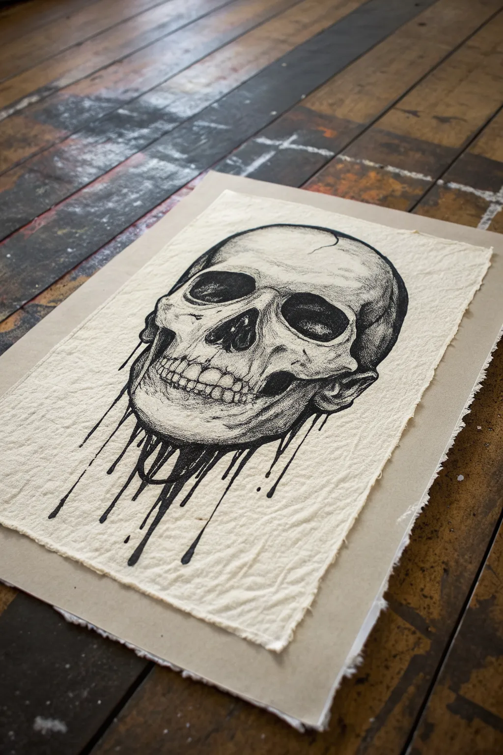
This project combines precise anatomical drawing with a surreal, fluid twist, resulting in a striking high-contrast piece. Using stippling and hatching techniques on textured handmade paper creates a gritty, vintage medical illustration aesthetic.
Detailed Instructions
Materials
- Handmade cotton rag paper (deckled edge)
- Graphite pencil (HB or 2H)
- Kneaded eraser
- Fine liner pens (0.05, 0.1, 0.3, 0.5mm)
- Brush pen or thick marker (black)
- Ruler (optional for finding proportions)
- Skull reference photo
Step 1: Sketching the Foundation
-
Rough Layout:
Begin with a light pencil sketch on your textured paper. Draw a large oval for the cranial mass and a smaller, boxier shape below for the jaw area. Keep your pencil pressure extremely light so you don’t groove the soft paper. -
Proportion Check:
Mark the eye sockets halfway down the total height of the skull. Position the nasal cavity just below the eyes, centered. These landmarks are crucial for a realistic look before you add the surreal elements. -
Refining Contours:
Outline the zygomatic arches (cheekbones) and the jawline. Instead of closing the bottom of the jaw with a solid line, leave it open and jagged where the dripping effect will eventually begin. -
Adding the Teeth:
Sketch the upper and lower teeth lightly. Don’t worry about perfect individual teeth yet; just focus on the arch shape and the separation between the upper and lower set. -
Drafting the Drip:
Sketch vertical, elongated tear-drop shapes extending downward from the base of the skull. Vary their lengths—some short, some extending far down the page—to create a natural fluid motion.
Step 2: Inking and Shading
-
The Darkest Darks:
Switch to your thickest pen or brush pen. Fill in the eye sockets and the nasal cavity completely black. This instantly establishes the high contrast needed for this style. -
Outlining:
Use a 0.5mm fine liner to trace your main pencil contours. For the ‘melting’ bottom section, make the lines slightly uneven to mimic thick, viscous liquid. -
Structural Hatching:
With a 0.3mm pen, add hatching lines to the side of the skull and under the cheekbones to define the form. Follow the curve of the bone with your strokes rather than drawing straight lines. -
Stippling Detail:
Grab your 0.1mm pen for the texture work. Add clusters of dots (stippling) around the teeth, the brow ridge, and the temples. This creates a grainy gradient that transitions from the white paper to the darker ink areas. -
Texturing the Cranium:
Add subtle cracks and fissures to the forehead area using very broken, shaky lines. Include a few patches of light stippling on the top of the skull to show its rounded 3D form.
Ink Bleed Awareness
Handmade paper is very absorbent. Test your pens on a scrap piece first! If it bleeds too much, switch to pigment liners or sketch faster to limit ink saturation.
Step 3: The Melting Effect
-
Filling the Drips:
Return to your brush pen or thick marker to fill in the dripping shapes at the bottom. Ensure the ink is fully opaque black. -
Connecting Shadows:
Use the 0.5mm pen to draw lines extending from the jaw bone seamlessly into the black drips. This transition is key; the bone should look like it is dissolving into the ink. -
Splatter Details:
Add a few tiny, detached droplets floating near the ends of the main drips. This adds movement and makes the liquid look more dynamic. -
Deepening Shadows:
Go back in with a 0.05mm pen to deepen the darkest crevices between the teeth and under the cheekbones. Layering hatching over stippling here builds incredible depth. -
Final Cleanup:
Wait at least 15 minutes for the ink to dry completely, as textured paper is absorbent and holds wet ink longer. Gently erase visible pencil lines with a kneaded eraser.
Distress It Further
Try lightly staining the paper with cold coffee or black tea before you start drawing. This enhances the antique, skeletal vibe and pairs perfectly with black ink.
Now you have a beautifully macabre piece of art ready to frame or display
Portal Diamond With a Watcher Eye
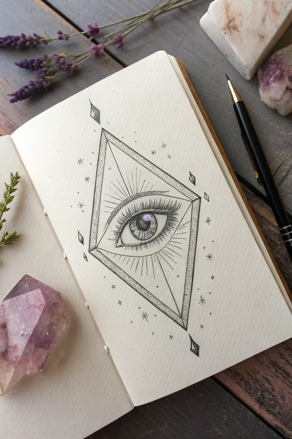
Enhance your sketchbook with this striking geometric design featuring a detailed, realistic eye framed within a sharp diamond prism. This project blends precise linework with stippling techniques to create a mystical, tattoo-inspired illustration.
How-To Guide
Materials
- Smooth sketchbook paper or bristol board
- HB pencil for sketching
- Ruler or straight edge
- Fine liner pens (sizes 0.05, 0.1, and 0.5)
- Kneaded eraser
- White gel pen (optional for highlights)
Step 1: Constructing the Framework
-
Establish the centerline:
Begin by drawing a faint vertical line down the center of your page using your ruler and HB pencil. This will ensure your diamond shape remains symmetrical. -
Draw the primary diamond:
Mark the top and bottom points on your centerline, then mark the extensive width points. Connect these four dots with your ruler to form a tall, elongated diamond shape. -
Add the inner dimension:
To give the frame depth, draw a second, slightly smaller diamond inside the first one. Keep the spacing consistent, roughly 3-4mm apart. -
Create the side facets:
From the top and bottom tips of the inner diamond, draw lines connecting to the *outer* side corners. This creates the faceted, prism-like appearance. -
Position the eye:
Lightly sketch the general almond shape of the eye right in the center of the diamond. Ensure the iris is perfectly circular and rests slightly under the upper eyelid.
Uneven Dots?
If your stippling looks messy, slow down and hold the pen perpendicular to the paper. Tap straight down rather than at an angle to avoid creating comma shapes.
Step 2: Inking the Structure
-
Outline the diamond:
Switch to a 0.5 fine liner. Carefully trace over your ruler lines for the outer and inner diamond shapes. I like to keep a steady hand here or even use the ruler with the pen for crispness. -
Stipple the frame:
Using a 0.1 or 0.05 pen, start stippling (dotting) the space between the double lines of the diamond frame. Concentrate the dots near the corners for shading and let them fade out toward the centers. -
Create the floating crystals:
Draw small, floating diamond shards above and below the main tip, and a few on the sides. Ink them with the 0.1 pen, shading one half of each shard solid black for contrast.
Go Cosmic
Add a wash of watercolor inside the diamond frame. Pale purples or blues can make the portal look like a window into a galaxy.
Step 3: Detailing the Eye
-
Outline the eyelids:
Using a 0.1 pen, ink the upper and lower eyelids. Double the line on the upper lid to show the crease, and add a small tear duct in the inner corner. -
Define the iris and pupil:
Ink the circle of the iris. Draw a smaller circle in the absolute center for the pupil and fill it in solid black, leaving a small white circle for the light reflection. -
Texture the iris:
Draw tiny, radial lines extending from the pupil outward and from the iris edge inward. It helps to vary the length of these lines to mimic realistic eye muscle texture. -
Draw the lashes:
With a 0.05 pen, flick curved lines upward for the top lashes. Start with pressure at the root and lift off quickly for a tapered tip. Repeat with shorter, sparser strokes on the bottom lid. -
Add shading to the eye:
Use very fine stippling or hatching on the upper part of the eyeball (sclera) right under the lashes to create a shadow cast by the lid.
Step 4: Background & Final Touches
-
Radiate the energy:
Using a ruler and a 0.05 pen, draw very thin lines radiating outward from the eye toward the diamond boundaries. Keep them broken and varying in length. -
Add celestial elements:
Scatter small starbursts and dots around the outside of the diamond. Use simple cross shapes for stars and tiny circles for distant planets. -
Erase pencil marks:
Once the ink is completely dry, gently run your kneaded eraser over the entire drawing to lift the graphite guidelines. -
Sharpen the contrast:
Go back with your 0.5 pen and re-trace the outermost diamond line if it needs to look bolder against the delicate inner details. -
Optional highlights:
If you have a white gel pen, add a single sharp dot to the pupil reflection to make the eye look wet and alive.
Close your sketchbook knowing you have captured a piece of mystical vision on paper
Impossible Architecture Stair Maze
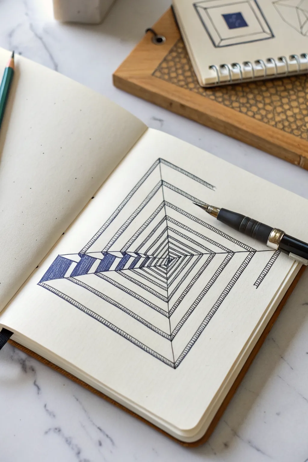
This mind-bending optical illusion creates a mesmerizing maze of stairs that seem to spiral endlessly downward into a void. Using precise line work and shading, you’ll construct an ‘impossible’ architectural feature that plays with depth and perspective.
Detailed Instructions
Materials
- Square sketchbook or drawing paper
- HB pencil for sketching
- Ruler or straight edge
- Fine-point black drawing pen (0.3mm or 0.5mm)
- Eraser
Step 1: Laying the Geometric Foundation
-
Establish the center point:
Find the approximate center of your page and mark a small dot. This won’t be part of the final drawing, but it will help anchor your spiraling squares. -
Draft the central square:
Using your pencil and ruler, lightly draw a small square around your center point. Rotate it slightly so it looks like a diamond shape relative to the page edges. -
Expand the spiral:
Draw larger concentric diamond shapes around the first one. Aim for about 7-8 layers moving outward. Keep the spacing consistent between each layer. -
Connect the corners:
Draw straight diagonal lines connecting the corners of all your nested squares. These lines will form the spines of your staircase structure.
Wobbly Lines?
If your hand shakes while inking long straight lines, don’t hesitate to use the ruler with the pen. Just wipe the ruler edge frequently to avoid smearing wet ink.
Step 2: Constructing the Staircase illusion
-
Define the path width:
Starting from the outermost square, draw a second parallel line just inside the perimeter of each square layer. This creates the ‘walkway’ surface for your stairs. -
Create the riser blocks:
On the left side of the spiral, you need to create the visual ‘drop’. Draw short vertical lines down from the corners of the walkway path to give the stairs 3D height. -
Sketch the stair treads:
Along the main spiral lines, sketch small, repetitive ‘L’ shapes or zig-zags that designate individual steps. I find it easiest to start large on the outside and get smaller as I move inward. -
Refine the impossible loop:
Check your corners. The illusion relies on the corners connecting seamlessly. Ensure the top of one flight of stairs meets the bottom of the next flight at a 90-degree turn.
Go Deeper
Try rotating the paper 45 degrees while drawing the initial squares to create a different orientation, or create a second connecting spiral for a dual-path illusion.
Step 3: Inking and Detailing
-
Outline the main structure:
Switch to your fine-point pen. Carefully trace the main structural lines of the spiral, ignoring the smaller step details for a moment. Use a ruler to keep these lines crisp. -
Ink the stair treads:
Go back and ink the small horizontal lines that represent the texture of the stairs along the main paths. Keep these lines consistently spaced. -
Hatch the side walls:
On the vertical faces of the stairs (the ‘risers’ visible on the left side), use vertical hatching lines to darken them. This shading is crucial for the 3D effect. -
Deepen the shadows:
Add a second layer of cross-hatching to the deepest parts of the spiral near the center. This gradation draws the eye inward. -
Clean up the drawing:
Once the ink is completely dry—give it a minute or two—gently erase all your pencil guidelines to reveal the clean impossible geometry. -
Add final contrast:
If any outer edges look weak, thicken them slightly with the pen to make the structure pop off the page.
Now you have a perplexing architectural drawing that invites the viewer to climb forever
Anatomical Heart Covered in Tags
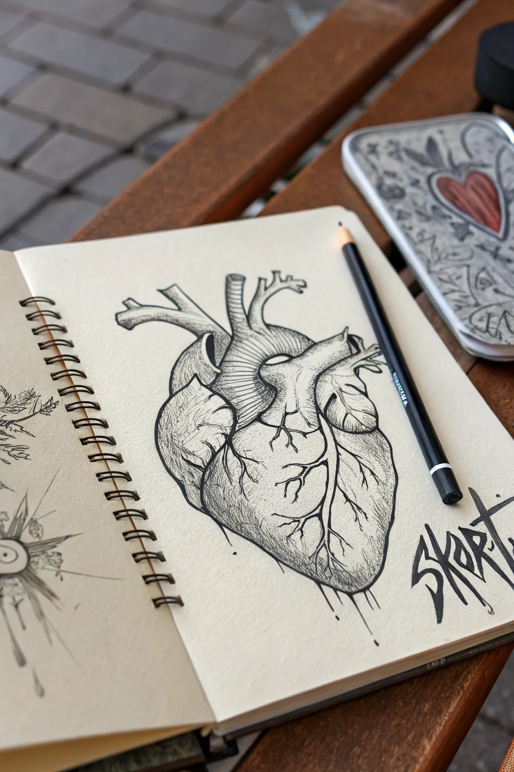
Capture the intricate beauty of biology with this gritty, illustrative anatomical heart drawing. Using fine liners on tanned paper creates a moody, scientific aesthetic that is perfectly juxtaposed with sharp graffiti tags.
Step-by-Step
Materials
- Spiral-bound sketchbook (tanned or cream paper)
- H or HB graphite pencil
- Kneaded eraser
- Fine liner pens (Black, sizes 0.1mm, 0.3mm, and 0.5mm)
- White gel pen (optional for highlights)
- Reference image of an anatomical heart
Step 1: Structural Sketching
-
Establish the Core Shape:
Start by lightly sketching a large, tilted oval in the center of your page using your H or HB pencil. This will serve as the main body of the ventricles. -
Add the Aorta and Arteries:
At the top of the oval, sketch the distinctive arch of the aorta curving to the left. Add the pulmonary artery crossing in front of it and the superior vena cava entering from the top right. -
Define the Atria:
Sketch the smaller, ear-shaped auricles (appendages of the atria) on either side of the major vessels to flesh out the top heavy section of the heart. -
Map the Veins:
Draw faint guiding lines across the surface of the ventricles to indicate where the major coronary arteries and veins will branch out like tree roots. -
Refine the Outline:
Go over your shapes to create a confident, definitive outline. Clean up any messy construction lines with your kneaded eraser so the drawing looks clean before inking.
Step 2: Inking the Foundation
-
Outline the Main Form:
Switch to a 0.5mm fine liner. Carefully trace the outer perimeter of the heart. Use a slightly jagged or broken line in some areas to mimic organic tissue texture rather than a perfectly smooth plastic look. -
Ink the Vessels:
Trace the aorta and pulmonary arteries. Add small wrinkles where the tubes bend to suggest flexibility and dimension. -
Details the Roots:
Switch to a 0.3mm pen to ink the branching veins on the surface. taper your strokes so the veins get thinner as they spread toward the bottom tip of the heart. -
Erase Pencil Guidelines:
Wait a moment for the ink to fully set, then gently erase all remaining graphite visibly. This prevents smudging and leaves a stark black-on-tan contrast.
Keep It Flowing
When drawing veins, rotate your paper so you are pulling the pen toward your hand. This gives you more control over the tapering lines.
Step 3: Shading and Texturing
-
Hatching the Shadows:
Using a 0.1mm pen, begin hatching (drawing parallel lines) on the shadowed sides of the aorta and the undersides of the atria. Keep lines close together for darker shadows. -
Contouring the Ventricles:
Add curved hatching lines that follow the roundness of the heart muscles. This directional shading helps the heart look 3D and pumped full rather than flat. -
Stippling for Texture:
I like to add tiny dots (stippling) near the vein intersections and the bottom apex. This adds a porous, fleshy texture to the drawing. -
Deepening Values:
Go back in with the 0.3mm pen and cross-hatch (layering lines perpendicularly) in the deepest recesses, such as where the arteries overlap, to create high contrast. -
Adding the Drip:
Draw a few vertical lines extending downward from the bottom tip of the heart, adding small droplets at the ends to give the piece a raw, graffiti-inspired vibe.
Pop of Color
Use a single red watercolor wash or a red colored pencil strictly inside the arteries to make the black ink work stand out intensely.
Step 4: The Graffiti Finish
-
Lettering Structure:
To the right of the heart, sketch out a sharp, angular tag. The letters ‘SKT’ or similar sharp shapes work well. Keep the lettering aggressive and tight. -
Blocking in the Tag:
Fill in your graffiti letters solidly with the 0.5mm pen or a black marker. Make the edges sharp and decisive. -
Final Touches:
Add a few stray ink splatters or dots around the main drawing and the tag to unify the composition and enhance the sketchbook aesthetic.
Close your sketchbook knowing you’ve mastered a blend of biological precision and street art style

Have a question or want to share your own experience? I'd love to hear from you in the comments below!