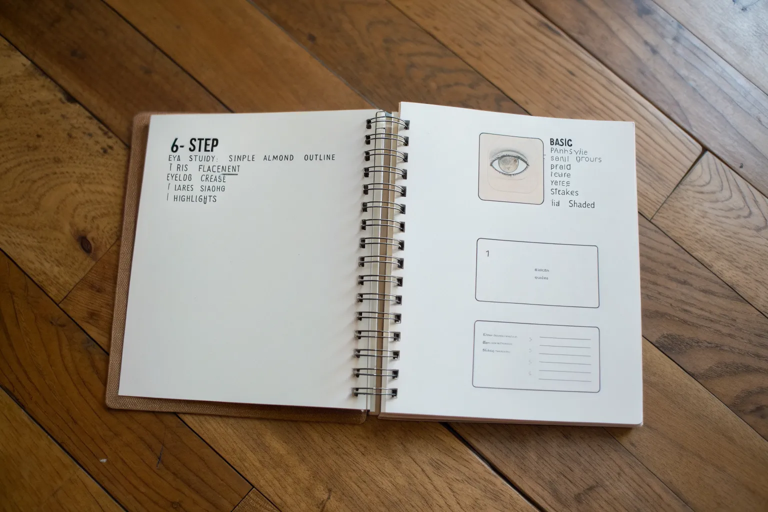
Whenever you’re stuck on what to draw, I swear the fastest fix is a tiny step-by-step tutorial you can finish in one sitting. Here are my go-to drawing tut ideas that feel like little wins, while quietly building real skills.
Lips and Mouth Expressions Cheat Sheet
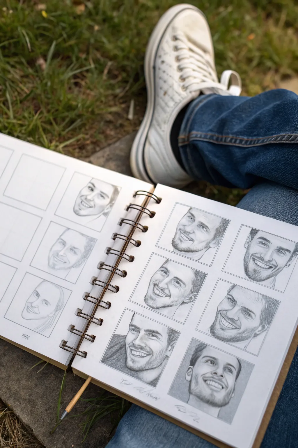
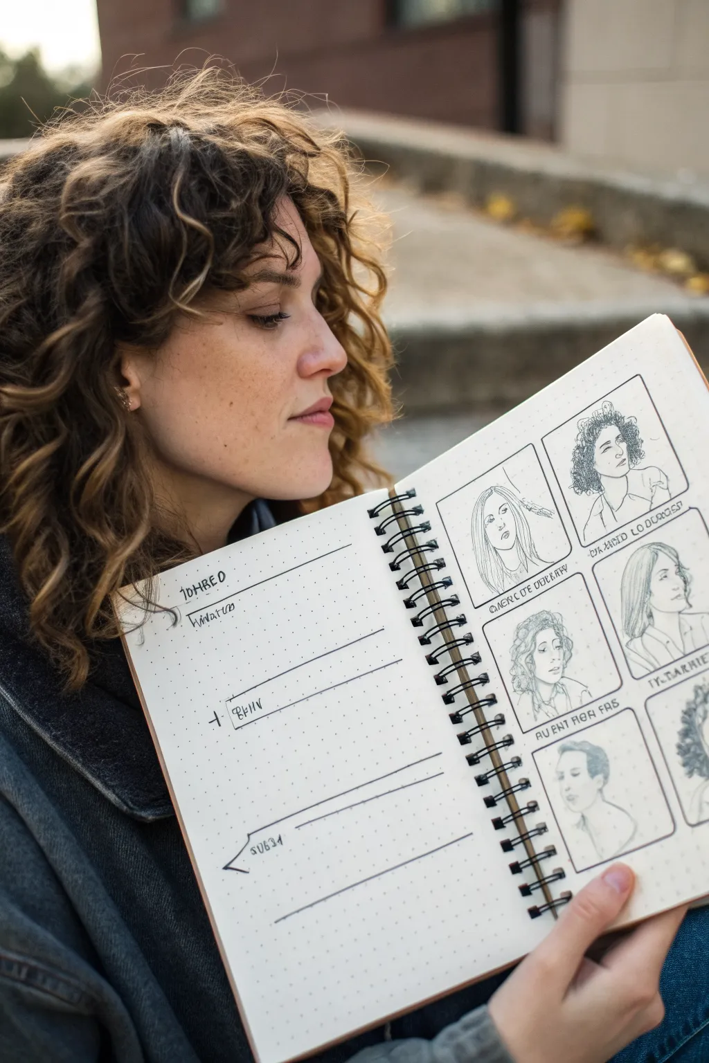
Master the nuances of joy with this disciplined yet rewarding sketchbook exercise featuring a grid of smiling male portraits. By repeating a similar expression across different facial structures, you’ll sharpen your understanding of how teeth, lips, and cheeks interact during a smile.
Detailed Instructions
Materials
- Spiral-bound sketchbook (heavyweight cartridge paper)
- Graphite pencils (HB, 2B, 4B)
- Mechanical pencil (0.5mm, HB lead)
- Ruler
- Kneaded eraser
- Blending stump (tortillon)
- Reference photos of smiling faces
Step 1: Setting the Framework
-
Grid Layout:
Open your sketchbook to a fresh two-page spread. Using a ruler and an HB pencil, lightly mark out a grid of squares. Aim for about 3-4 inches per square, leaving consistent white space between them to frame each portrait cleanly. -
Initial Face Shapes:
Within each square, lightly sketch the basic oval shape for a head. Vary the angles slightly—some facing forward, some in three-quarter view—to challenge your perspective skills. -
Guidelines:
Draw faint vertical center lines and horizontal eye lines on each oval. Since this is a smile study, pay special attention to the nose-to-chin distance, ensuring there is enough room for an open mouth.
Teeth Looking Like A Fence?
Don’t outline every tooth! Instead, shade the gums above and the negative space below. Let the teeth be defined by the shadows surrounding them rather than lines.
Step 2: Designing the Features
-
Placing the Mouth:
Sketch the basic shape of the lips for each portrait. Avoid drawing individual teeth at this stage; instead, draw the overall shape of the dental arch or the gap between the lips. -
Blocking Eyes and Nose:
Add the eyes and nose loosely. Because the focus is the smile, keep these features supportive. Notice how a smile pushes the cheeks up, often narrowing the eyes, so sketch the lower eyelids slightly higher than usual. -
Defining the Jawline:
Refine the jaw and chin contours. A broad smile stretches the skin, often widening the face slightly at the cheeks and changing the jaw shape, so adjust your outlines accordingly.
Pro Tip: Eye Connection
A genuine smile reaches the eyes. Ensure you create small crinkles at the outer corners of the eyes (crow’s feet) and lift the lower lover lid to convey true happiness.
Step 3: Refining the Smiles
-
Teeth Structure:
Lightly indicate the separation of teeth. I find it best to focus on the gum line and the bottom edges of the upper teeth rather than drawing lines between every single tooth, which can look unnatural. -
Corner Shadows:
Use a sharp mechanical pencil to darken the corners of the mouth. This is the deepest area of the mouth cavity and anchors the smile, creating depth immediately. -
Lip Contours:
Define the upper and lower lips. remember that the upper lip usually casts a shadow on the teeth, while the lower lip often catches highlight. Keep the lines soft.
Step 4: Shading and Depth
-
Base Shading:
Using a 2B pencil, apply a base layer of shading to the skin. Focus on the ‘smile lines’ (nasolabial folds) running from the nose to the mouth corners, but keep them subtle so the subjects don’t look aged. -
Modeling the Cheeks:
Shade the rounded forms of the cheeks. The highlight should sit high on the cheekbone, emphasizing the lift caused by the smiling muscles. -
Facial Hair Texture:
For male portraits like these, layer in facial hair texture using short, directional strokes with a sharp 2B or 4B pencil. Stubble helps define the jawline without needing a hard outline. -
Deepening Values:
Return to the mouth with your darkest 4B pencil. Darken the negative space inside the mouth behind the teeth to make the white of the teeth pop forward. -
Blending and Softening:
Use a blending stump or tortillon to smooth out the skin shading, particularly around the forehead and cheeks. Be careful not to smudge your crisp dental details. -
Final Highlights:
Use a kneaded eraser to lift pigment for highlights on the tip of the nose, the very top of the cheeks, and a small glint on the lower lip to make the smile look moist.
Now you have a dynamic reference sheet demonstrating the versatility of human expressions.


Head Construction: Sphere and Jaw Method
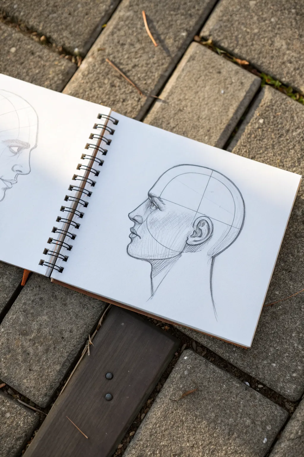
Master the fundamentals of portrait drawing by constructing a clean, anatomical profile using geometric shapes. This study focuses on the sphere and jaw method to achieve perfect proportions and a striking, realistic look on standard sketchbook paper.
How-To Guide
Materials
- Sketchbook or drawing paper (medium tooth)
- H or HB pencil for initial construction
- 2B or 4B pencil for shading and defining
- Kneaded eraser
- Pencil sharpener
Step 1: Laying the Geometric Foundation
-
Draw the cranial sphere:
Begin by drawing a clean, medium-sized circle in the center of your page. This represents the cranium. Keep your pencil pressure very light, as these lines are just guides. -
Bisect the sphere:
Draw a faint horizontal line slicing through the middle of the circle, then add a vertical line dividing it into quadrants. This helps establish the tilt and orientation of the head. -
Slice the side plane:
Inside the larger circle, draw a smaller, concentric circle that occupies about two-thirds of the height. Slice off the sides of this inner circle with vertical lines to represent the flat plane of the temple. -
Drop the jawline:
From the center of the side plane, drop a vertical line down to determine the jaw’s length. Extend a curved line from the bottom of the cranium sphere forward to create the chin, connecting it back to the ear area. -
Establish facial planes:
Draw a slightly curved vertical line down the front of the face profile. Mark horizontal guides for the brow line, bottom of the nose, and the mouth placement based on your sphere divisions.
Step 2: Mapping Features
-
Place the ear:
Locate the ear in the lower back quadrant of your side plane circle. The top of the ear should align roughly with the brow line, and the bottom with the base of the nose. -
Profile the nose:
Sketch the triangular wedge of the nose protruding from the front line. Follow the angle of the bridge down to a rounded tip, keeping the shape simple for now. -
Indicate the eye socket:
Carve out the hollow for the eye socket slightly below the brow ridge. Place the eyeball as a sphere inside this socket, viewed from the side, appearing nearly triangular. -
Shape the lips:
Draw the profile of the lips, ensuring the upper lip projects slightly further forward than the lower lip. Mark the corner of the mouth, which usually aligns with the front of the pupil. -
Refine the chin and neck:
Strengthen the chin’s curve. Draw the neck lines, starting the back of the neck from the base of the skull and the front of the neck tucking under the chin.
Proportions feel off?
Double-check the placement of the ear. If the ear is too far forward or back, the entire jawline will distort. It should sit behind the jaw’s vertical midpoint.
Step 3: Refining and Shading
-
Clean up contour lines:
Switch to a softer pencil (like a 2B) to darken the final outlines. Define the brow ridge, the slope of the nose, and the intricate curves of the ear cartilage. -
Hatch the side plane:
Apply diagonal hatching across the side of the face (the temple and cheek area). This shading separates the side of the head from the front face, adding three-dimensionality. -
Shade the jaw and neck:
Add shadow under the jawline where the head meets the neck. I usually use vertical or slightly angled strokes here to distinguish the neck cylinder from the face. -
Detail the eye:
Darken the iris and pupil, leaving a tiny speculate highlight if desired. Add the thickness of the eyelids and the lashes. -
Enhance structural shadows:
Deepen the shadows in the ear’s crevices, under the nose, and beneath the lower lip. This contrast makes the features pop. -
Final Erasure:
Gently use your kneaded eraser to lift away the initial construction lines (the original circle and crosshairs) that are no longer needed, leaving a clean, constructed head.
Hatching Technique
Keep your hatching lines uniform in direction. Consistent strokes create a sense of a flat plane, while curved strokes suggest rounded volume like the cheek.
With these construction steps complete, you have a solid anatomical base ready for further detailing or character design


Hair Flow Map: Straight, Wavy, Curly
This spread combines organized planning with targeted texture practice, featuring a grid of portrait studies that deconstruct different hair types. The left page offers space for notes and observations, while the right page serves as a comparative gallery for mastering straight, wavy, and curly flows.
Detailed Instructions
Materials
- A5 wire-bound sketchbook (dotted or plain paper)
- Fine liner pens (0.1mm, 0.3mm, and 0.5mm)
- HB or 2B pencil for sketching
- Eraser (kneaded preferred)
- Ruler
Step 1: Setting Up the Spread
-
Grid layout:
Begin on the right-hand page. Using your ruler and pencil, lightly map out four equal rectangular boxes. Leave a comfortable margin between them and around the edges of the paper so the spread feels breathable. -
Inking the frames:
Once you are happy with the spacing, trace over your pencil rectangles with a 0.5mm fine liner. To give it a hand-drawn sketchbook aesthetic, you can freehand these lines slowly rather than using a ruler, allowing for slight wobbles. -
Adding labels:
Beneath each frame, sketch guideline blocks for text. Write descriptive labels like ‘Natural Curl’, ‘Straight Flow’, or ‘Wavy Texture’ in a condensed, capitalised font. Ink these carefully with a 0.3mm pen. -
Planning ease:
On the left-hand page, draw three horizontal lines spaced evenly down the page to create writing sections. Add headers like ‘Observations’ or ‘Technique’ to mirror the structured feel of the right page.
Troubleshooting: Flat Hair?
If the hair looks like a helmet, you likely outlined the whole shape too heavily. Break up the outer contour with loose, unconnected strokes to suggest airiness.
Step 2: Sketching the Foundations
-
Head shapes:
Inside each of the four frames on the right page, lightly sketch a basic oval head shape. Keep the features minimal; dots for eyes and a simple line for the nose and mouth are sufficient since the focus is hair. -
Hairlines:
Mark the hairline for each portrait. Vary them slightly—make one higher, one with a widow’s peak, or one tucked behind an ear—to create variety in how the hair will fall. -
Directional arrows:
Before drawing strands, lightly draw arrows floating above the head shapes to indicate the light source and the primary direction of hair growth. This mental map is crucial for realistic flow.
Step 3: The Curly Texture (Top Right)
-
Volume blocking:
For the curly style, outline a large, cloud-like shape around the head. Curly hair takes up more space than straight hair, so don’t be afraid to go big with the volume. -
S-curves and loops:
Using your 0.1mm pen, start drawing tightly packed loops and ‘S’ shapes. Avoid drawing individual strands; instead, draw clumps of curls that interlock. -
Flyaways:
Add tiny, broken energetic lines around the perimeter of the hair shape to represent frizz and flyaways, which gives curly hair its characteristic softness.
Pro Tip: Line Weight
Use the 0.5mm pen for the face outline and main hair shape, but switch to the ultra-fine 0.1mm for individual strands. This contrast creates depth instantly.
Step 4: The Straight & Sleek (Top Left)
-
Gravity lines:
For the straight style, draw long, continuous strokes starting from the part line and pulling down. Following the gravity of the hair is key here. -
Creating shine:
As you ink, lift your pen pressure in the middle of the hair length. This creates a break in the lines that simulates a band of light reflecting off smooth hair. -
Ends and tucks:
Use slightly jagged, uneven strokes at the bottom to show the ends of the hair. If tucking hair behind the ear, ensure the lines curve sharply around the ear shape before falling straight again.
Step 5: Wavy and Tucked Styles (Bottom Row)
-
Soft waves:
In the bottom left frame, draw long, loose ‘S’ curves. Unlike the tight curls, these should be elongated. Focus on the rhythm of the wave, ensuring the hair bunches slightly where it curves focusing on weight. -
Short or tied back:
For the final frame, try a style pulled away from the face or cut short. Use short, decisive strokes that follow the skull’s curvature closely.
Step 6: Final Touches
-
Deepening shadows:
Switch back to your 0.3mm pen and darken the areas where hair meets the neck, tucks behind ears, or overlaps. This ambient occlusion pops the form. -
Clean up:
Wait at least five minutes for the ink to fully cure. Here I prefer to gently dab the eraser rather than scrub, lifting the pencil guidelines without smudging the fine ink lines.
Now you have a structured reference guide for hair textures that you can expand on in future studies


Ears Made Easy With Simple Shapes
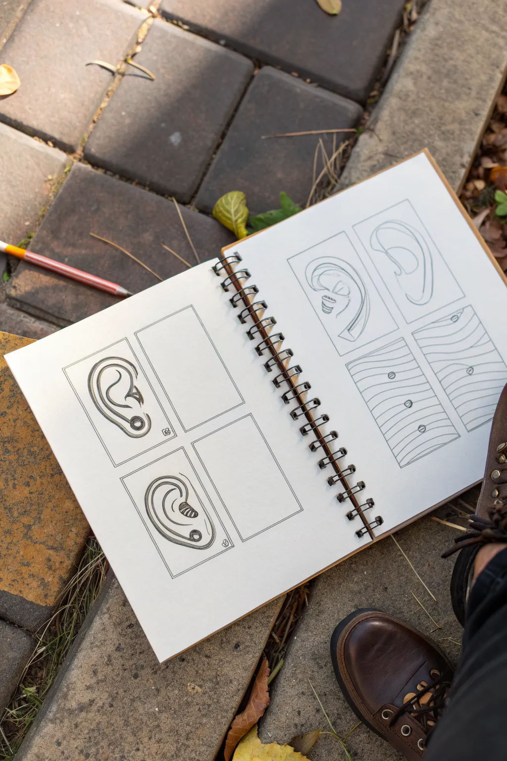
Master the intricate curves of the human ear by breaking it down into manageable, geometric components. This study page demonstrates four distinct approaches to drawing ears, ranging from realistic contours to stylized line work.
Step-by-Step Guide
Materials
- Sketchbook or drawing paper
- HB or 2B graphite pencil
- Ruler or straight edge
- Eraser
- Fine liner pen (optional for final outlines)
Step 1: Preparation & Layout
-
Draw the frames:
Begin by drawing four equal-sized rectangular frames on your sketchbook page. Use a ruler to ensure your lines are crisp and parallel. Arrange them in a 2×2 grid or spaced out across two pages as shown in the reference. -
Lightly sketch placements:
Within each frame, lightly mark the center point. This will help you position your ear drawings so they don’t drift too far to one side. Keep these initial marks very faint.
Step 2: Drawing Ear 1: The ‘Question Mark’ Method
-
Create the outer curve:
In the first frame (bottom left in the example), start by drawing a large ‘C’ shape or a reversed question mark. This forms the outer helix of the ear. -
Add inner details:
Draw the inner y-shape (antihelix) inside the upper curve. Connect it down towards the earlobe. Think of this as a smaller curve nesting inside the larger one. -
Define the tragus:
Sketch the small bump (tragus) near the center opening of the ear. It often looks like a small triangle pointing backward. -
Darken key areas:
Go back over your lines, thickening the outer rim and the deep shadow inside the ear canal to give the drawing volume and depth.
Uneven Curves?
If your curves feel shaky or stiff, try drawing from your shoulder rather than your wrist. This allows for smoother, more continuous arcs essential for organic shapes like ears.
Step 3: Drawing Ear 2: The Stylized Loop
-
Draw the main loop:
Move to the second frame (bottom center/right). Draw a large, simplified loop shape that resembles a kidney bean or a distorted oval. Keep the lines fluid. -
Spiral the inside:
Inside the loop, start a spiral line from the bottom curve, winding it upwards into the center. This mimics the natural flow of the ear’s cartilage without needing complex anatomy. -
Add stylistic shading:
Instead of realistic shading, use small hatched lines or scribbles to indicate depth in the darkest part of the ear swirl.
Go 3D
Take the ‘Topographical’ concept further by shading the valleys of your wavy lines. This creates a powerful 3D illusion of an ear emerging from a flat surface.
Step 4: Drawing Ear 3: The Contoured Profile
-
Outline the profile:
In the third frame (top right page), draw a tall, slender ear shape seen from a slightly angled profile. The top should be wider than the tapered bottom lobe. -
Map the ridges:
Draw the interior ridges using confident, continuous lines. Focus on the C-shape of the antihelix and the deep recession of the concha (the bowl of the ear). -
Refine the lines:
I find it helpful here to use varied line weight—press harder on the underside of curves to suggest shadow, and keep lines lighter where the light would hit.
Step 5: Drawing Ear 4: Topographical Textures
-
Draw wavy guidelines:
For the final frame (bottom right page), we are trying something abstract. Fill the rectangle with horizontal, wavy lines. Imagine you are drawing a topographic map or ripples in water. -
Insert ear landmarks:
Identify key points where parts of an ear would emerge—like the top helix, the tragus, and the lobe. Draw small circles or ovals at these specific intersections on your wavy lines. -
Connect with flow:
Subtly adjust the wavy lines around these ‘landmark’ circles so the lines appear to flow over bumps, giving the suggestion of a 3D surface underneath.
Step 6: Final Touches
-
Clean up:
Gently erase any stray guidelines or smudges outside your rectangular frames. Sharp, clean borders make the sketches look professional. -
Assess contrast:
Take a step back and check your contrast. If the drawings feel flat, darken the deepest recesses of the ears (the ear canals) to really make the forms pop.
Practice these simple forms regularly to build muscle memory for more complex portraits.

PENCIL GUIDE
Understanding Pencil Grades from H to B
From first sketch to finished drawing — learn pencil grades, line control, and shading techniques.
Explore the Full Guide
Cute Animal Heads Using Basic Shapes
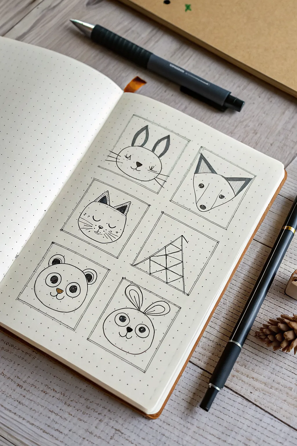
Capture the charm of simple line art by drawing six adorable animal faces (and one geometric surprise) within neat square frames. This project is perfect for bullet journal enthusiasts looking to practice basic shapes and create a minimalist spread.
Detailed Instructions
Materials
- Dot grid notebook or journal
- Pencil (HB or similar)
- Eraser
- Fine liner pen (0.3mm or 0.5mm, black)
- Ruler or straight edge
- Optional: Colored pencils (brown)
Step 1: Setting the Grid
-
Map out the squares:
Using your pencil and the dot grid as a guide, lightly sketch six squares arranged in two columns of three. A 6×6 dot spacing works well for these frames. -
Ink the frames:
Take your black fine liner and trace over your pencil squares. To achieve that sketchy, organic look, don’t use a ruler here. Let the lines be slightly loose and extend just a tiny bit past the corners.
Step 2: Top Row: Bunny and Fox
-
Sketch the bunny head:
In the top left square, draw a large circle that fills most of the space. Add two tall, narrow ovals on top for ears. -
Detail the bunny face:
Draw a small inverted triangle for the nose and sweeping curves for the mouth. Add two small dots for eyes with long, confident whiskers extending past the cheeks. -
Sketch the fox head:
In the top right square, draw a large inverted triangle with rounded corners. Add two smaller triangles on top for ears. -
Refine the fox features:
Draw the nose at the bottom point. Place the eyes wide apart near the top edge. Draw inner triangles for the ears and shade them in lightly with hatch marks.
Wobbly Lines?
If your frame lines aren’t straight, embrace it! Go over them a second time loosely. This creates a deliberate ‘sketchy’ style that hides mistakes.
Step 3: Middle Row: Cat and Geometry
-
Outline the cat:
In the middle left square, draw a wide oval shape. Add two pointed triangles for ears on top. -
Add feline details:
Draw sleepy eyes using two small ‘U’ curves. Add a tiny nose, mouth, and three whiskers on each side. Shade the inner ears with dark cross-hatching to create depth. -
Draw the geometric tree:
In the middle right square, draw a large triangle. Divide it horizontally with two lines, then add diagonal lines to create a faceted, stained-glass appearance.
Level Up
Add a drop shadow to the squares using a grey mildliner or marker. Draw a thick grey line along the right and bottom edge of each box for a 3D effect.
Step 4: Bottom Row: Panda and Bear
-
Frame the panda:
In the bottom left square, draw a perfect circle. Add two semicircles on top for ears. -
Create the panda masking:
Draw large ovals around the eyes, then add the pupils inside. Shade the ears thoroughly with your black pen. -
Draw the bear outline:
For the final square on the bottom right, sketch another circle, slightly wider at the cheeks. Add taller, rounded ears. -
Finish the bear face:
Draw two large circular eyes with highlights. Add a small snout area and a simple smile.
Step 5: Final Touches
-
Ink all sketches:
Carefully trace over your pencil animal drawings with the fine liner. I like to keep the pen pressure light for the whiskers to make them look delicate. -
Erase guidelines:
Wait until the ink is completely dry to avoid smudging, then gently erase all remaining pencil marks. -
Add highlights:
If you have a brown colored pencil, lightly color the panda’s nose or add tiny blush marks to the bunny’s cheeks for a pop of warmth.
Now you have a charming grid of characters ready to brighten up your daily notes
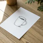
Everyday Objects Built From Forms
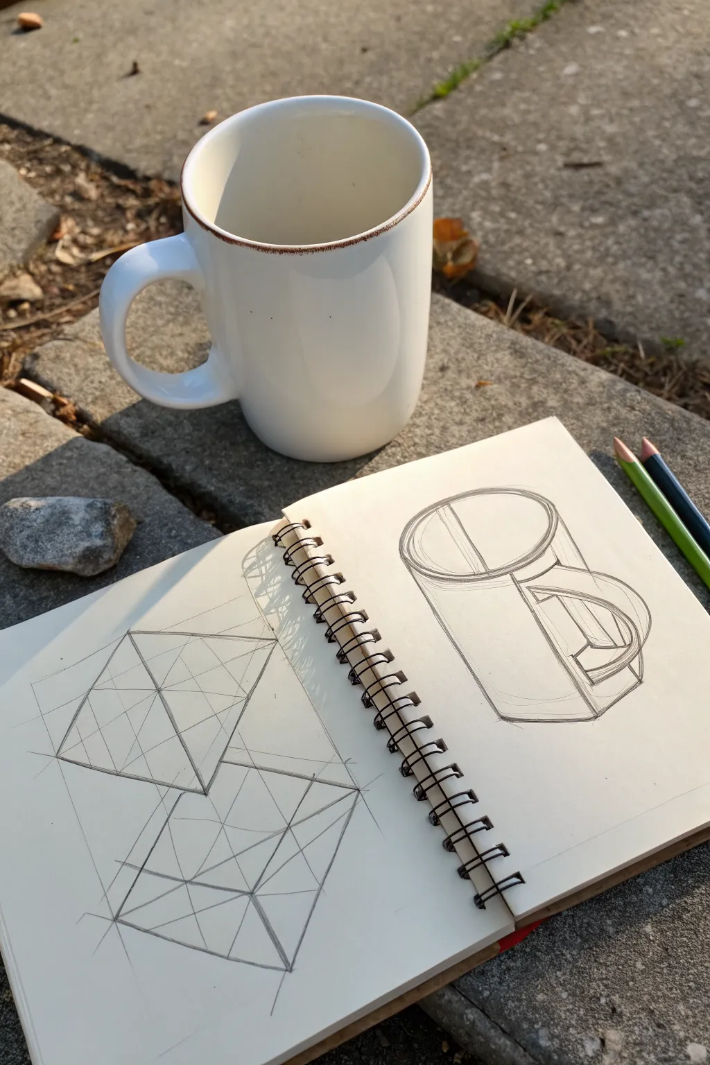
This tutorial breaks down the process of drawing a classic coffee mug by first understanding its underlying geometry through cube studies. You’ll learn to construct solid forms using perspective lines before refining them into a realistic everyday object.
Step-by-Step Guide
Materials
- Spiral-bound sketchbook (medium weight paper)
- Graphite pencils (HB and 2B)
- Eraser (kneaded or vinyl)
- Straight edge or ruler (optional)
- A simple white mug for reference
Step 1: Warm-up: Perspective Cubes
-
Establish the horizon:
On the left page of your open sketchbook, lightly draw a horizontal line across the page to represent your eye level. -
Draw the leading edge:
Draw a vertical line near the center of the page. This will be the corner of the cube closest to you. -
Connect to vanishing points:
From the top and bottom of your vertical line, sketch light construction lines extending outward to imaginary vanishing points on the far left and right of your horizon line. -
Define the sides:
Draw two more vertical lines on either side of the first one to determine the width of the cube’s left and right faces. -
Close the top:
From the tops of these new side verticals, draw lines crossing over to the opposite vanishing points to form the top plane of the cube. -
Find the center:
Draw an ‘X’ across the top and side squares connecting opposite corners. This helps find the true center of each face for accurate geometric division. -
Second cube study:
Repeat this process below the first cube, perhaps changing the angle slightly so you are looking down on it more steeply.
Wobbly Ellipses?
Draw through the form! Instead of stopping at the edges, draw the entire oval lightly several times with your arm moving from the shoulder, not the wrist.
Step 2: Constructing the Mug
-
Analyze the subject:
Look at your real mug. Instead of seeing ‘a cup,’ try to see a cylinder combined with a rectangular prism for the handle. -
Axis line:
On the right page, draw a light vertical line to serve as the central axis of the mug. This ensures symmetry. -
Top ellipse:
Draw a horizontal oval (ellipse) perpendicular to your axis line. Since you are looking down at the mug, keep the oval relatively open, not too flat. -
Bottom ellipse:
Draw a second, slightly more rounded ellipse at the bottom of the axis. The bottom curve should be slightly deeper than the top curve due to perspective. -
Connect the sides:
Draw straight vertical lines connecting the widest points of the top ellipse to the bottom ellipse. -
Block in the handle:
I find it helpful to draw a boxy shape extending from the side of the cylinder first. Don’t curve it yet; just establish the top and bottom attachment points and the outward reach. -
Refine handle curves:
Inside your handle ‘box,’ sketch the actual curves of the handle, paying attention to the thickness of the ceramic. -
Add rim thickness:
Draw a smaller ellipse inside the top opening to show the thickness of the mug’s rim. -
Design details:
Sketch the horizontal band near the rim if your mug has one, following the curve of the ellipse. -
Clean up lines:
Darken the final object lines with a 2B pencil. You can leave the light construction lines visible as they add to the ‘study’ aesthetic of the sketch.
Level Up: Shadow Mapping
Observe where the light hits the mug and lightly hatch the side facing away from the light source to give the cylinder instant volume and weight.
Keep your sketchbook open and practice these foundational shapes anytime you have a few minutes to spare
BRUSH GUIDE
The Right Brush for Every Stroke
From clean lines to bold texture — master brush choice, stroke control, and essential techniques.
Explore the Full Guide
Texture Swatches You Can Copy Fast
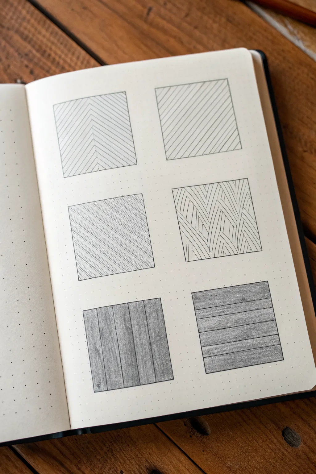
This practice exercise involves filling six neat squares with distinct linear patterns, ranging from simple geometric hatching to more organic wood grain effects. It is a fantastic way to warm up your hand and explore how simple lines can create depth and surface interest on dot-grid paper.
Step-by-Step Tutorial
Materials
- A5 Dot grid notebook or sketchbook
- Fine liner pen (0.3mm or 0.5mm, black)
- Graphite pencil (HB or B)
- Ruler or straight edge
- Eraser
Step 1: Setting up the Framework
-
Outline the grid:
Begin by counting out dots to create six equal-sized squares. A 6×6 dot grid or 8×8 dot grid works perfectly for these swatches. -
Draw the boxes:
Use your ruler and a fine liner pen to ink the outlines of all six squares. Ensure the lines are crisp and corners meet neatly. -
Erase guidelines:
If you sketched the boxes lightly in pencil first, wait for the ink to dry completely, then gently erase any graphite marks.
Step 2: Geometric Top Row
-
Start the chevron pattern:
For the top-left square, find the vertical center line. Draw diagonal lines slanting downward from the center to the bottom left corner. -
Complete the chevron:
Mirror these lines on the right side, slanting downward from the center to the bottom right, creating a ‘V’ or herringbone effect. Keep the spacing consistent. -
Diagonal hatching:
Move to the top-right square. Using your ruler, fill the entire box with evenly spaced diagonal lines running from bottom-left to top-right. -
Maintain parallel spacing:
Focus on keeping the white space between each ink line identical for a uniform look.
Steady Hand Trick
For the long straight lines, lock your wrist and move your entire arm from the elbow. This produces straighter lines than pivoting from your wrist.
Step 3: Mixed Middle Row
-
Cross-hatching layer one:
In the middle-left square, draw a series of very fine diagonal lines. I prefer to make these lines slightly thinner or closer together than the previous box. -
Add opposing lines:
Draw a second set of diagonal lines intersecting the first set, but at a very shallow angle almost parallel to the first, creating a dense, textile-like weave. -
Sketch the woven guide:
For the middle-right square, lightly sketch vertical zigzag columns in pencil to guide your pattern direction. -
Fill the weave:
Fill each zigzag section with curved lines following the flow of the column. Alternate the direction of the curve for adjacent columns to mimic a braided texture.
Uneven Spacing?
If your hatch lines start getting closer or further apart, stop and mark small dots along the border ruler as anchor points before continuing.
Step 4: Wood Grain Bottom Row
-
Vertical plank outlines:
On the bottom-left square, switch to your pencil. Draw vertical lines of varying widths to represent separate wooden planks. -
Add vertical grain:
Fill each ‘plank’ with loose, vertical pencil strokes. Press harder in some areas to create darker grain lines and knots. -
Horizontal plank outlines:
For the final bottom-right square, revert to drawing horizontal lines to create stacked wooden boards. -
Texture the horizontal boards:
Shade these boards horizontally with the pencil. Add small knots by drawing elongated ovals and allowing the surrounding grain lines to flow around them. -
Refine the shading:
Go back over both wood squares and darken the dividing lines between the planks to make them pop visually.
Now you have a reference sheet of textures ready to apply to your next architectural sketch or doodle
One-Page Grid of Mini Drawing Tuts

This project creates a clean, structured template perfect for breaking down drawing tutorials into manageable steps. The minimalist aesthetic, with its fine lines and centered symbols, provides an inviting space to practice sequential art or mini-illustrations.
Detailed Instructions
Materials
- Spiral-bound sketchbook or notebook (dot grid or blank paper recommended)
- Fine-point black pen (0.3mm or 0.5mm)
- Ruler
- Pencil
- Eraser
Step 1: Setting the Framework
-
Measure the outer boundary:
Begin by determining the size of your main grid. Measure a large rectagle or square that fits comfortably on your page, leaving a generous margin on all sides to keep the layout feeling open and uncluttered. -
Draft the perimeter:
Using your pencil and ruler, lightly sketch the outer perimeter of your large square. Keep your pressure light so these guidelines can be easily erased or adjusted later. -
Divide into quadrants:
Find the vertical and horizontal center points of your large square. Draw a vertical line and a horizontal line through the center to divide the space into four equal quadrants. -
Add spacing channels:
To create the distinct separation seen in the photo, draw a second line parallel to your vertical center line, spaced about 2-3mm to the right. Do the same for the horizontal line, spacing it slightly below the original center line. This creates a small ‘gutter’ between the panels. -
Subdivide the quadrants:
Within each of the four main quadrants, lightly mark a 3×3 grid structure. You don’t need to draw every line fully if you want a cleaner look, but the image shows a full grid within each quadrant. Draw two evenly spaced vertical lines and two horizontal lines inside each of the four panels.
Clean Corners Pro Tip
Lift your pen vertically at the end of each line rather than dragging it back. This prevents ink pooling at the corners, keeping your grid intersections sharp.
Step 2: Inking the Structure
-
Ink the main borders:
Switch to your fine-point black pen. Carefully trace the outer perimeter of the four separate quadrants. Notice that the ‘gutters’ or channels we drew in pencil are left empty—ink only the boxes themselves, not the space between them. -
Ink the internal grids:
Go over the internal 3×3 grid lines within each quadrant. You might want to use a slightly lighter touch or a thinner pen nib here if you have one, to differentiate the internal guides from the panel borders. -
Clean up the lines:
Wait a moment for the ink to set completely. Once you are sure it’s dry, gently erase all the underlying pencil marks to reveal a crisp, clean black grid.
Step 3: Adding the Symbols
-
Mark the centers:
Locate the exact center square within the 3×3 grid of each quadrant. This is where the symbols will live. -
Draw the division symbol:
In the top-left quadrant’s center square, draw a small division sign (÷). I like to make the dots distinct circles rather than just points for a playful look. -
Draw the psi-like symbol:
In the top-right quadrant, draw a symbol resembling a lowercase Greek letter ‘psi’ or simplified trident shape—a vertical line with a small U-shape crossing the bottom third. -
Draw the number 4:
In the bottom-left quadrant, draw a handwritten number ‘4’ in the center square. Keep the style simple and consistent with the other line weights. -
Draw the plus sign:
Finally, in the bottom-right quadrant, place a plus sign (+). Ensure the crossbars are aligned with the grid lines for a satisfying symmetry. -
Final review:
Check your line work for any small gaps. If a corner didn’t quite close, carefully touch it up with the very tip of your pen.
Level Up: Color Coding
Use a different colored pastel fineliner for the internal 3×3 grid lines vs the black outer borders. This makes the structural guide visually distinct from the frame.
Now you have a perfectly organized template ready to be filled with your next step-by-step drawing lesson


Have a question or want to share your own experience? I'd love to hear from you in the comments below!