If you love page layouts that feel a little magical and a lot practical, Dutch door spreads are such a fun drawing challenge. I’m sharing my favorite dutch door drawing ideas that blend cute visuals with layouts you’ll actually want to use all week.
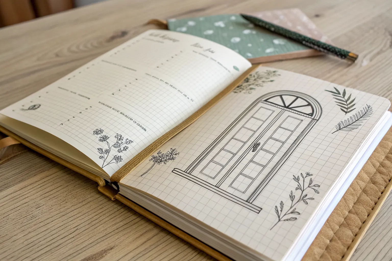
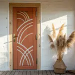
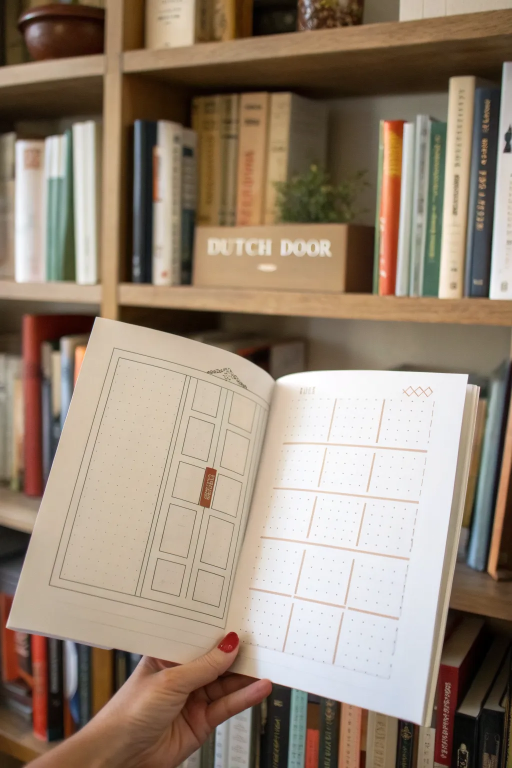
Mood Tracker With Color-Reveal Window
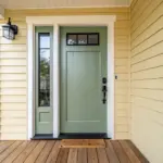
This elegant door illustration serves as a creative mood tracker, inviting you to color in the window panes as your days pass. The clean lines and minimal aesthetic make it a peaceful addition to any bullet journal layout.
Step-by-Step
Materials
- Spiral-bound sketchbook or bullet journal (heavyweight paper recommended)
- Fine liner pens (0.1mm, 0.3mm, and 0.5mm)
- Ruler or clear geometric drawing triangle
- Pencil (HB or 2H)
- Eraser
- Color palette reference card (optional)
- Beige or brown watercolor or marker (for the threshold)
Step 1: Drafting the Structure
-
Define the perimeter:
Begin by lightly sketching a large vertical rectangle in pencil centered on your page. This will be the outer frame of your door. -
Sketch the inner frame:
Draw a slightly smaller rectangle inside the first one to create the door jamb. Leave a consistent gap of about 5-8mm between the lines. -
Add the door slab:
Draw the actual door slab inside the jamb. Add a subtle diagonal line at the top right corner connecting the sharp corners to suggest a tiny bit of depth, making the door look slightly recessed. -
Divide the panels:
Lightly mark a horizontal line across the middle of the door to separate the top window section from the bottom solid panels. -
Draw the bottom panels:
Sketch two vertical rectangles in the bottom half. These should be framed by molding, so draw a ‘double box’ for each panel to simulate the raised or recessed wood detail.
Wobbly Lines?
Don’t stress if your lines aren’t machine-perfect. Slight wavers add organic charm to the illustration. If a mistake is big, thicken the line slightly to hide it.
Step 2: Creating the Window Grid
-
Outline the window section:
In the top half of the door, sketch two large rectangular areas aligned vertically with the bottom panels below. -
Add the mullions:
Divide each of these top rectangles into four smaller panes using a cross shape. Use your ruler to ensure the vertical and horizontal bars (mullions) have a little thickness to them, rather than just single lines. -
Detail the glazing bars:
Refine the window panes by giving each small square a double outline. This creates the illusion of the wooden frame holding the glass in place.
Step 3: Inking and Hardware
-
Ink the main lines:
Switch to a 0.5mm fine liner. Carefully trace over the main vertical and horizontal structural lines of the door frame and the outer edges of the door itself. -
Ink the details:
Use a finer 0.1mm or 0.3mm pen for the intricate details, such as the inner molding lines on the bottom panels and the window glazing bars. This line weight variation adds sophistication. -
Draw the handle:
On the left side of the door, sketch a modern, rectangular lever handle. Add the rectangular backplate first, then the horizontal lever extending from it. -
Add the hardware details:
Ink the handle, adding a tiny keyhole or screw detail on the plate. Don’t forget hinges on the right side if you want extra realism, or keep it minimal without them. -
Erase pencil marks:
Wait for the ink to dry completely to avoid smudging. Gently erase all your underlying pencil sketches, leaving crisp black lines.
Make it Interactive
Cut the door edges (top, right, bottom) so the page actually opens like a door! You can then hide a monthly summary or a quote on the page underneath.
Step 4: Finishing Touches
-
Ground the drawing:
Create a threshold or floor area. Draw a horizontal line extending slightly past the door frame on both sides at the bottom. -
Apply the wash:
Using a beige watercolor wash or a light brown marker, fill in the area below the door to create a ‘floor’ or ground effect. I like to keep the edges rough and painterly for an artistic look. -
Add subtle color hints (optional):
If you wish, add tiny accents of gold or brass color to the hinges or handle to make them pop against the monochrome drawing. -
Prepare your key:
If using this as a tracker, create a separate color key (like the swatch card shown) to correspond to different moods, ready to fill in one window pane each day.
Now you have a structured and elegant framework ready to track your month in color
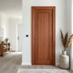
Border-Framed Dutch Door Illusion
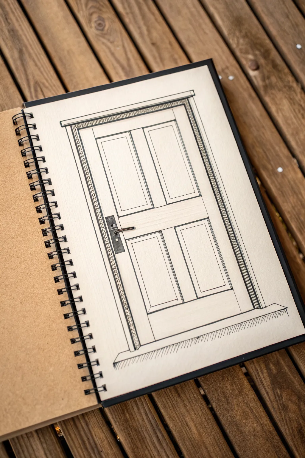
Capture the charm of classic carpentry with this crisp architectural sketch of a paneled door. Using fine liners on toned paper creates a warm, rustic aesthetic that emphasizes clean lines and rigorous perspective.
Detailed Instructions
Materials
- Spiral-bound sketchbook with tan or toned paper
- HB pencil
- Ruler or straight edge
- Fine liner pens (sizes 005, 01, and 05)
- White gel pen (optional)
- Eraser
Step 1: Drafting the Structure
-
Establish the Outer Frame:
Begin with your HB pencil and a ruler to draw a tall, vertical rectangle in the center of your page. Leave plenty of breathing room at the top and bottom. This will serve as the extreme outer boundary of the door frame. -
Define the Door Shape:
Inside your first rectangle, draw a slightly smaller rectangle to represent the actual door slab. Ensure the gap between the two rectangles is even on the top and sides, creating the jamb. -
Mark the Midpoint:
Measure halfway down the door slab to find the horizontal center rail. Draw two horizontal lines here to define the thickness of this central rail, which separates the top panels from the bottom ones. -
Draft the Vertical Stile:
Draw a vertical strip directly down the center of the door, extending from the top rail to the bottom. This central stile divides the door into left and right sections. -
Outline the Panels:
You should now have four quadrant spaces. Within each quadrant, lightly pencil in a smaller rectangle. These will become the recessed panels of the door.
Step 2: Inking the Foundation
-
Trace Main Verticals:
Using your 05 fine liner, carefully ink the longest vertical lines of the door frame and the door edges. Using a thicker pen here helps the main structure pop forward. -
Ink the Top Molding:
Draw the header or cornice above the door frame. Extend it slightly past the width of the frame on both sides to create a small overhang, giving it a classic architectural look. -
Detail the Frame Texture:
Switch to a 01 fine liner. Inside the door jamb (the space between the door and the wall frame), draw tight, diagonal hatching lines. This instantly adds depth and suggests a shadow or different material grain. -
Hardware Placement:
On the left side of the central rail, sketch a rectangular backplate for the handle. Add the horizontal lever handle extending to the right. Ink this carefully, perhaps filling the backplate with dark ink to make it look like iron.
Uneven Lines?
Don’t worry if your ruler slips. Embrace the ‘wobbly’ architectural sketch style! You can fix mistakes by going over the line again to create a deliberate ‘sketchy’ double-line effect.
Step 3: Adding Dimension
-
Panel Bevels:
To make the four panels look recessed, draw a second rectangle inside each panel outline. Then, connect the corners of the inner and outer panel rectangles with short angled lines. -
Inking the Panels:
Go over your panel pencil lines with the 01 pen. I prefer to stop my lines just short of the corners sometimes to keep the sketch feeling loose and hand-drawn rather than computer-generated. -
Add the Plinth:
At the very bottom, draw a wide, flat rectangle for the threshold or floor area. Extend it wider than the door frame itself to ground the drawing. -
Floor Texture:
Use quick, vertical flicking motions with your finest pen (005) underneath the threshold. This vertical hatching simulates the floor surface or carpet and anchors the heavy door.
Add Highlights
Use a white gel pen to add tiny reflection lines on the top edges of the moldings and the metal door handle. This makes the drawing pop off the toned paper.
Step 4: Final Polish
-
Erase Guidelines:
Wait until the ink is completely dry to avoid smudging. Gently run your eraser over the entire drawing to remove the initial graphite structure. -
Reinforce Weights:
Look at your drawing from a distance. If the outer border feels weak, go over it again with the 05 pen to thicken the line weight. -
Subtle Wood Grain:
If you want more texture, add very faint, sparse vertical lines on the door stiles and rails to suggest wood grain, but keep it minimal to maintain the clean look.
Now you have a beautifully drafted door sketch that serves as a perfect study in perspective and line weight.
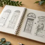
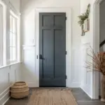
Staggered Tabs for Sections and Lists
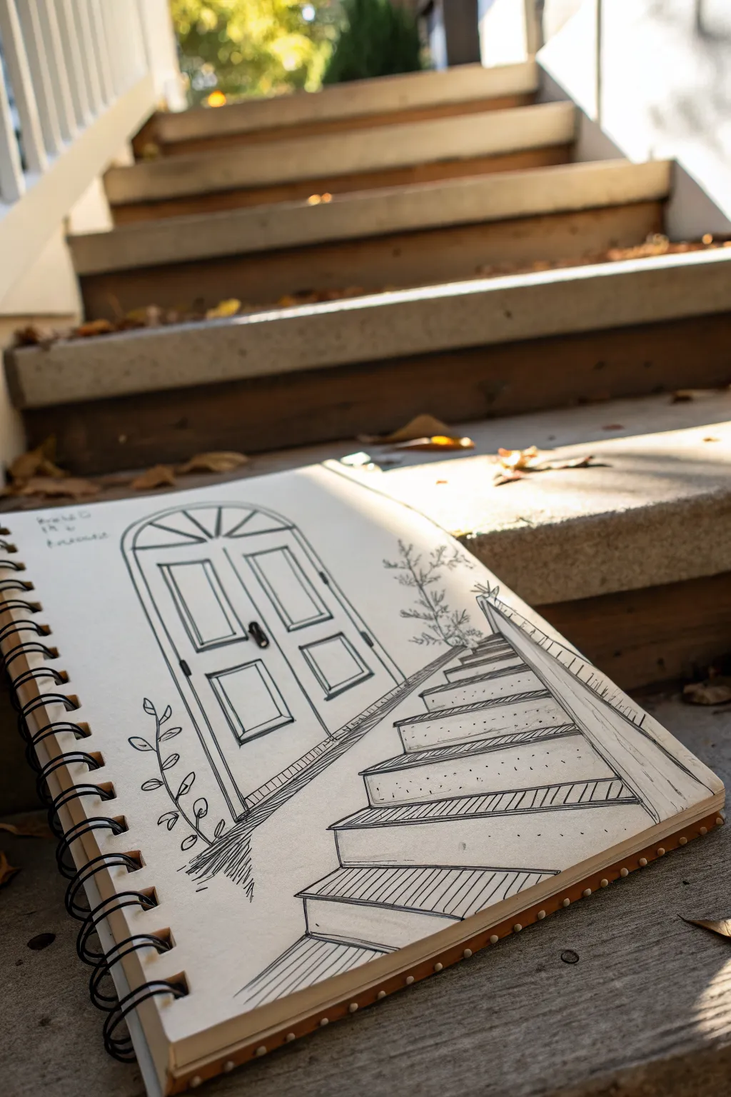
Capture the charm of an entryway with this clean line art study that blends strong architectural perspective with delicate botanical details. Using simple fineliners, you’ll create a welcoming scene featuring ascending stairs leading to a classic arched door.
Step-by-Step Guide
Materials
- Spiral-bound sketchbook (mixed media or heavy drawing paper)
- HB pencil for initial guidelines
- Eraser (kneaded preferred)
- Ruler or straight edge
- Black fineliners (sizes 005, 01, and 05)
- Real-life reference or photo of stairs
Step 1: Laying the Foundations
-
Establish the horizon line:
Begin by lightly sketching a horizontal line across your page with your HB pencil; this will determine your eye level for the perspective. -
Draft the vanishing point:
Mark a vanishing point on your horizon line. For this specific angle, place it slightly to the upper left to make the stairs recede dramatically. -
Block in the door shape:
Draw the basic rectangle for the door on the left side of the page, capping it with a semi-circle arch. Keep these lines light so they can be adjusted. -
Map the staircase treads:
Using your ruler, draw faint diagonal lines from the vanishing point to define the top and bottom edges of the staircase. Sketch horizontal lines between these diagonals to indicate the front edge of each step. -
Define the risers:
Connect your horizontal tread lines with vertical lines to create the height (risers) of each step, ensuring they look like solid blocks.
Fixing Wonky Perspective
If your stairs look slanted, check your vertical lines. In 1-point perspective, all vertical lines must be perfectly parallel to the side of the paper.
Step 2: Inking the Structure
-
Ink the door frame:
Switch to your 05 fineliner for the main outlines. Trace the arched doorway, double-lining the arch to create a frame, and adding a vertical line down the center for double doors. -
Detail the door panels:
Draw recessed rectangular panels on each door face. Use a thinner 01 pen here to make the interior details feel lighter than the main frame. -
Outline the stairs:
Go over your pencil lines for the stairs with the 05 pen. Be deliberate with your strokes, particularly on the nosing (the edge) of each step to give it defined weight. -
Add texture to the risers:
Use the 01 or 005 pen to add hatching or vertical shading lines on the risers (the vertical part of the step). This shading differentiates the vertical surfaces from the horizontal treads. -
Stipple the concrete:
Dot the horizontal surfaces of the stairs randomly with your finest pen to mimic the texture of concrete or stone.
Step 3: Refining and Decorating
-
Draw the handrail:
Sketch a diagonal structure on the right side of the stairs to represent a low wall or handrail, following your initial perspective lines. -
Add the botanical element:
On the left side, near the door base, draw a simple vine with ovate leaves climbing upward. Keep the lines organic and curved to contrast against the rigid architecture. -
Sketch the upper shrubbery:
Draw a small, scraggly plant peeking out from behind the top right of the stairs using jagged, irregular strokes for branch texture. -
Finalize door hardware:
Thicken the door handle with the 05 pen. Add small shadows underneath the handle and inside the panel corners to create depth. -
Enhance shadows:
Add extra hatching lines beneath the lip of each stair tread. I always find this step crucial for making the stairs look like they are popping off the page. -
Clean up coordinates:
Once the ink is completely dry—give it a few minutes—carefully erase all your pencil guides and vanishing point marks.
Add Seasonal Flair
Customize the entry for different seasons by drawing pumpkins on the steps for autumn or a wreath on the door for winter.
With your sketch complete, you now have a lovely architectural study that invites the viewer to step right in
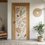
Bookshelf Dutch Door With Hidden Reading Log
This creative bullet journal spread incorporates simulated architectural elements with a functional reading log hidden behind a clever cut-away. By mimicking the look of a classic bookshelf, you create an inviting dashboard for organizing your monthly reading goals.
Step-by-Step Guide
Materials
- Dot grid notebook or bullet journal
- Fine liner pen (0.3mm or 0.5mm, black)
- Ruler or straight edge
- Pencil and eraser
- Scissors or craft knife
- Cutting mat (if using a craft knife)
- Mildliner or light marker (soft brown or beige)
- Small sticker or washi tape (optional, for the spine label)
Step 1: Planning the Structure
-
Sketch the outer frame:
Begin on the left-hand page of your spread. Using your pencil and ruler, lightly sketch a large rectangle that fills most of the page, leaving a roughly 1-inch margin on all sides. This will be the main frame of your bookshelf illustration. -
Define the Dutch door cut:
Decide where you want the vertical ‘door’ to open. In this design, the right half of the left page will be cut away. Mark a vertical line about 2/3 of the way across the page where you intend to trim the paper later. -
Outline the bookshelf:
Within your main rectangle on the left page, sketch a tall, narrow bookshelf structure. Use double lines to create the thickness of the wood for the outer casing and the inner vertical divider.
Step 2: Drawing the Bookshelf Details
-
Add the shelves:
Horizontal lines are next. Draw about four or five horizontal shelves inside your bookshelf frame. Make sure to double up these lines as well to give the shelves visual weight and dimension. -
Draw the paneling detail:
On the portion of the page that will remain (the ‘door’), draw rectangular panels below the middle shelf to mimic lower cabinet doors. Keep the lines clean and parallel to the bookshelf frame. -
Inking the lines:
Once you are happy with the pencil sketch, go over your lines with the black fine liner. Use the ruler to ensure crisp, straight edges for the woodwork. I find that holding the pen nearly vertical helps prevent smudging against the ruler. -
Erase pencil marks:
Wait until the ink is completely dry—usually just a minute or two—and then gently erase all the underlying pencil sketches to clean up the drawing. -
Add the spine label:
Draw a tiny vertical rectangle on the center divider of the bookshelf illustration. Color it in with a rust-colored marker or stick a piece of washi tape there to act as a decorative label.
Clean Cuts
Use a fresh blade in your craft knife for the cleanest edge. A dull blade can tear the paper fibers rather than slicing them smoothly.
Step 3: Creating the Interior Grid
-
Setup the right page:
Move to the facing right-hand page. This will be your main log. Using the dot grid as a guide, count out spacing for three columns of boxes. -
Draw the box grid:
Draw a grid of 12-15 square boxes. Use a light touch with your fine liner or switch to a lighter colored marker for a softer look. Leave a small gap between each box. -
Add accent corners:
To make the grid look less rigid, create small dot accents or tiny corners inside each box using the dot grid pattern of the paper. -
Create the title area:
At the top right corner of the page, draw a small decorative element, like three interlocking diamonds or a simple banner, to serve as a header.
Level Up: Hidden Stats
Use the back of the cut ‘door’ flap to write down your reading goals or a ‘To Be Read’ list, maximizing the hidden space.
Step 4: The Dutch Door Finish
-
Prepare for the cut:
Place your cutting mat behind the left-hand page to protect the rest of the notebook. If you don’t have a mat, a piece of thick cardboard works well. -
Execute the cut:
Carefully cut along the vertical line you marked earlier on the left page, removing the excess paper on the right side of that sheet. This reveals the grid on the underlying page while keeping the bookshelf illustration on the left. -
Final touches:
Check the cut edge for any jagged bits and trim if necessary. Now, when you flip the ‘door,’ your bookshelf transforms into an organized reading tracker.
Now you have a charming, interactive spread ready to be filled with your literary adventures

PENCIL GUIDE
Understanding Pencil Grades from H to B
From first sketch to finished drawing — learn pencil grades, line control, and shading techniques.
Explore the Full Guide
City Building Facade With Cut Archway
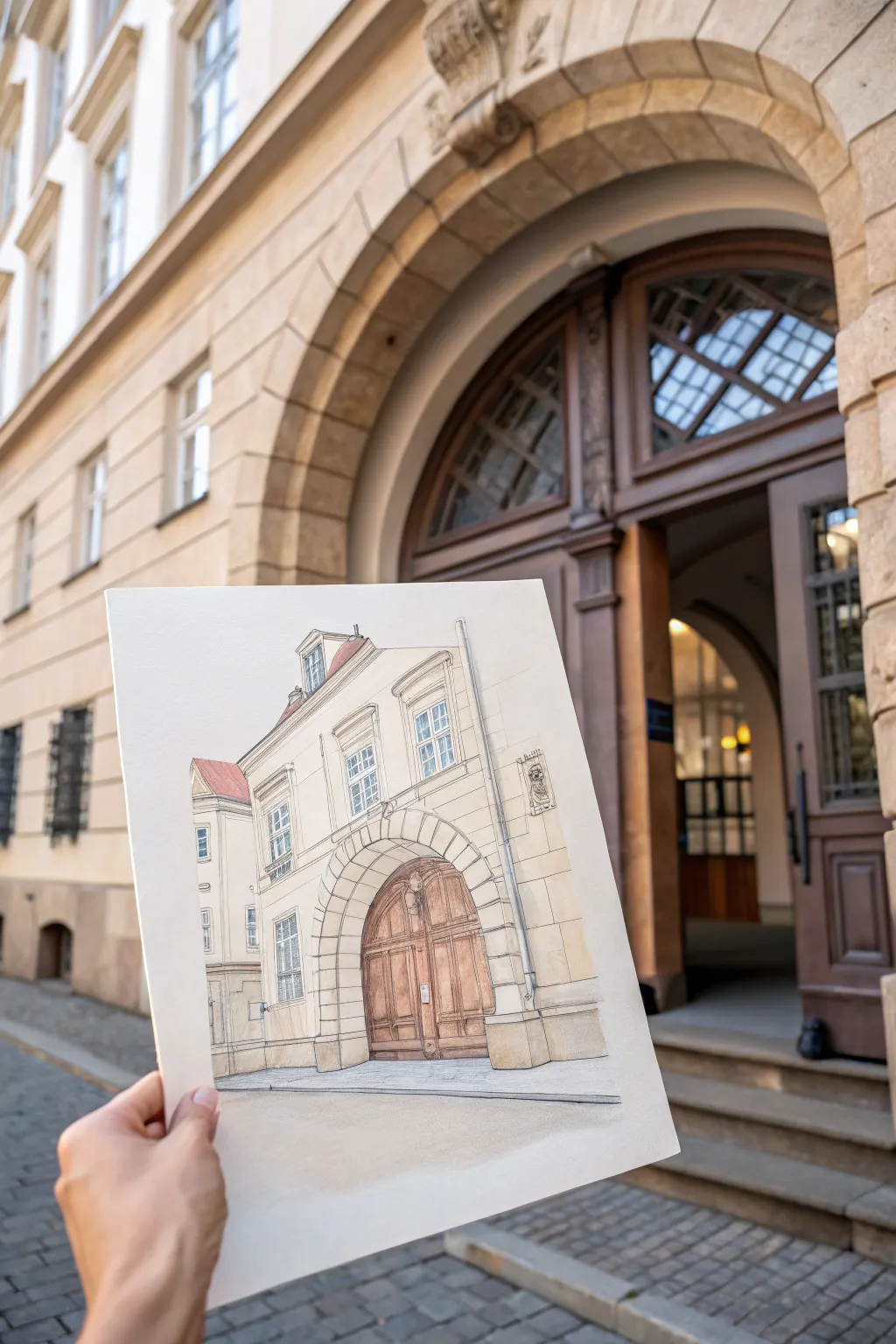
Capture the charm of historic architecture with this detailed pen and wash tutorial featuring a grand arched doorway and classic facade. This project focuses on nailing the perspective of a street-level view while keeping the colors light and airy for that effortless urban sketch aesthetic.
Step-by-Step Tutorial
Materials
- Hot press watercolor paper (smooth texture, A4 or similar)
- HB or 2H graphite pencil for underdrawing
- Kneadable eraser
- Waterproof fineliner pens (0.1mm, 0.3mm, and 0.5mm, black or sepia)
- Watercolor set (pan or tube)
- Round watercolor brushes (size 4 and size 8)
- Ruler (optional, for perspective lines)
- Paper towels and water cup
Step 1: Drafting the Foundations
-
Establish the horizon line:
Begin by lightly drawing a horizontal line across the lower third of your paper. This represents your eye level and is crucial for getting the perspective of the archway correct. -
Block in the main shapes:
Using your pencil, sketch a large rectangle for the main facade. Locate the center and draw the large arch shape at the bottom. Don’t worry about details yet; just focus on the height-to-width ratio. -
Adding receding lines:
Draw the side of the building receding into the distance. Since we are looking up slightly, the angled rooflines and window ledges should slope downwards towards a vanishing point on your horizon line. -
Placement of windows and details:
Mark the positions of the upper windows, the dormer on the roof, and the distinct stonework (rustication) around the arch. Keep these lines very faint so they are easy to ink over or erase later.
Fixing Wonky Arches
If your arch looks lopsided, draw a vertical centerline through it. Measure equal distances out from that line to mark the width on both sides before inking the curve.
Step 2: Inking the Structure
-
Outline the main silhouette:
Switch to your 0.5mm waterproof pen. Carefully trace the outer edges of the building, the roofline, and the main curve of the arch. Use confident, slightly broken lines to suggest age and texture rather than rigid perfection. -
Detailing the windows:
Use a finer 0.1mm pen for the delicate window panes and frames. I prefer to make these lines very thin to prevent the windows from looking too heavy or cartoonish. -
Texturing the stonework:
With a 0.3mm pen, draw the individual stone blocks surrounding the archway (the voussoirs). Add small ticks and dots on the facade to represent the texture of the plaster or stone surface. -
Drawing the wooden door:
Use vertical strokes with the 0.3mm pen to indicate the wood planks of the large door. Add the horizontal beams and the small metal hardware with a bit more pressure to create contrast. -
Clean up the sketch:
Once the ink is completely dry—give it a few minutes to be safe—gently erase all the visible pencil underdrawing with your kneadable eraser.
Loose Lines
Don’t hold your pen too tight near the tip. Grip it further back on the barrel to encourage looser, more energetic lines that capture the ‘sketch’ feel better.
Step 3: Applying the Wash
-
Mixing the facade color:
Mix a very watery wash of Yellow Ochre with a tiny touch of Burnt Sienna. You want a warm, creamy beige tone. Test it on a scrap piece of paper first to ensure it’s pale enough. -
First wash layer:
Apply this beige mix loosely over the entire building facade, leaving the windows and the wooden door unpainted. It’s okay if you go outside the lines slightly; it adds to the sketchy character. -
Painting the roof:
Mix a diluted Light Red or English Red. Paint the visible sections of the roof tiles. While it’s still damp, drop in a slightly darker red near the bottom edges for shadow variation. -
Coloring the door:
Create a warm brown using Burnt Umber and a little Alizarin Crimson. Paint the door, carefully going around the metal hardware if you drew it in detail. Let the paint pool slightly at the bottom of the door panels for natural shading. -
Adding shadows:
Mix a transparent grey using Ultramarine Blue and Burnt Sienna. Once the previous layers are dry, paint shadows under the window ledges, inside the top of the archway, and under the roof eaves to give the building three-dimensional form. -
Window reflections:
Use a very pale, diluted mix of Cobalt Blue for the glass. Don’t fill the whole window; just do a quick diagonal swipe across the panes to suggest reflection. -
Grounding the sketch:
Finally, add a quick wash of warm grey (diluted neutral tint) at the base of the building to represent the sidewalk and cast shadow, anchoring your building so it doesn’t look like it’s floating.
Step back and admire your architectural sketch, noticing how the shadows bring the flat drawing to life.


Have a question or want to share your own experience? I'd love to hear from you in the comments below!