If you’re craving easy watercolor wins you can copy without overthinking, you’re in the right headspace. I pulled together beginner-friendly ideas that look impressive fast, using simple shapes, soft blends, and a few comfy little tricks like silhouettes and wet-on-wet washes.
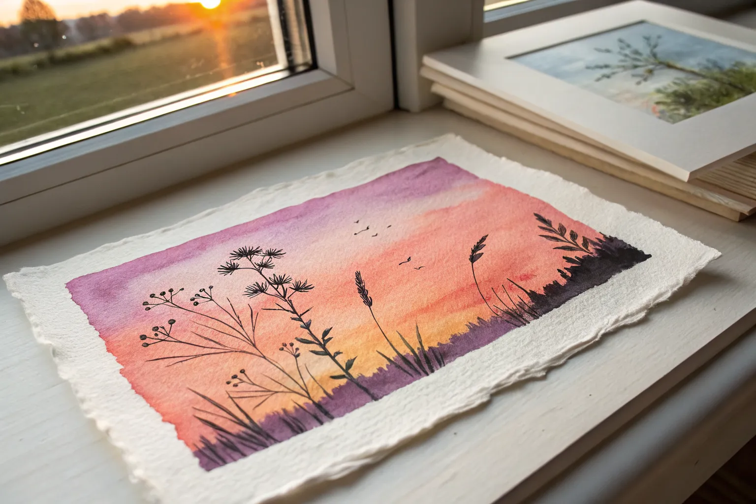
Sunset Gradient With Palm Silhouette
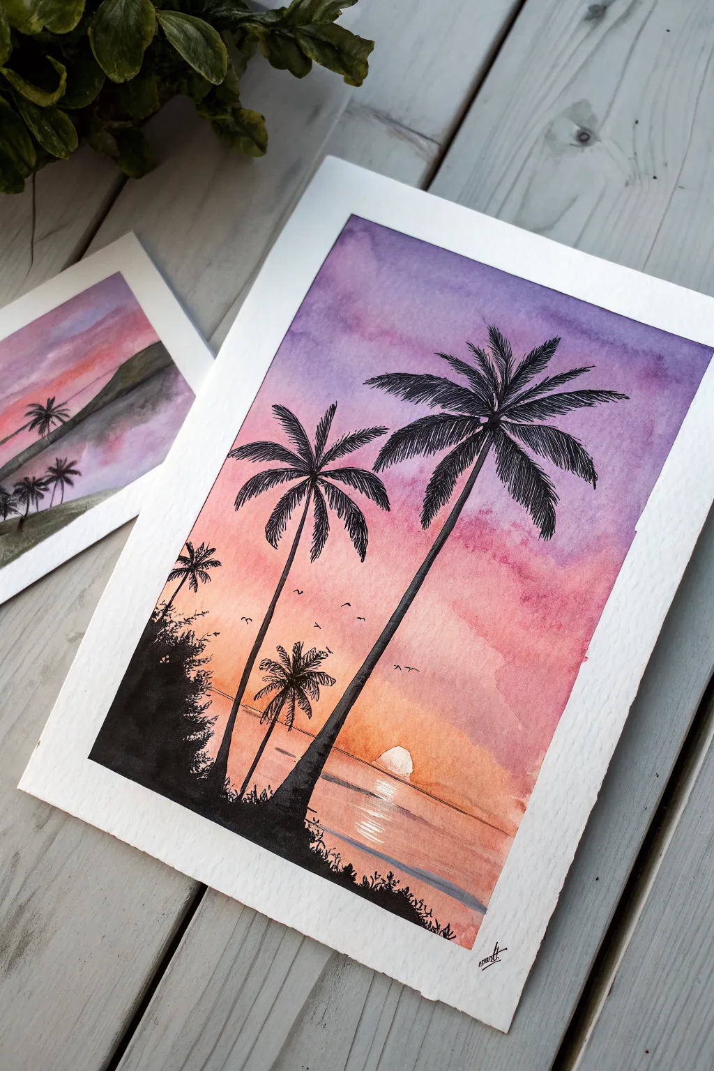
Capture the serene beauty of dusk with this vibrant watercolor project that blends a dreamy gradient sky with crisp, high-contrast silhouettes. The striking transition from purple to orange creates a perfect backdrop for the detailed black palm trees.
How-To Guide
Materials
- Cold press watercolor paper (300gsm recommended)
- Watercolor paints (Purple/Violet, Alizarin Crimson or Pink, Orange, Yellow)
- Black ink or black gouache for silhouettes
- Pencil and eraser
- Masking tape
- Flat wash brush (large)
- Round brush (size 4 or 6)
- Fine liner brush or rigger brush
- Jar of clean water
- Paper towels
Step 1: Preparing the Sky Gradient
-
Secure the paper:
Tape down all four edges of your watercolor paper to a board. This prevents warping and creates a crisp white border around your finished piece. -
Pre-wet the sky area:
Using your large flat brush and clean water, apply a gentle wash over the entire paper surface. The paper should be glisten with moisture but not have puddles. -
Apply the purple layer:
Load your brush with a watery purple mix. Start at the very top of the paper, painting horizontal strokes across the width, letting the color naturally diffuse downwards about one-third of the way. -
Blend in the pink:
While the purple is still damp, rinse your brush and pick up a vibrant pink or crimson. Apply this directly below the purple, brushing back and forth where they meet to create a soft, seamless transition. -
Add the warm horizon:
Clean your brush again and introduce an orange hue below the pink. As you reach the horizon line (about the bottom third of the paper), mix in a little yellow to make it glow brightest where the sun will be. -
Create the water line:
Continue the orange and pink gradient downwards to the bottom of the page to represent the water, but leave a small, rough circular shape unpainted near the horizon line for the sun if possible, or lift the paint out later.
Fixing Back-Runs
If cauliflower-like blooms appear in your sky, you likely added water to semi-dry paint. Wait for it to dry, then gently scrub with a damp stiff brush to soften the edge.
Step 2: Painting the Sea and Sun
-
Refine the sun:
If you painted over the sun area, use a clean, damp brush or a twisted paper towel to lift the paint while it’s still wet, creating a soft white circle just above the water line. -
Add water ripples:
Using a smaller round brush and a slightly darker mix of orange and purple, paint thin, horizontal lines across the water area. Leave the area directly under the sun lighter to suggest a reflection path. -
Dry completely:
This is crucial: Let the background dry 100%. If the paper is cool to the touch, it’s still damp. I usually wait an extra ten minutes just to be safe, as bleeding black ink will ruin the effect.
Use White Gel Pen
For extra sparkle, use a white gel pen to draw crisp highlights on the water ripples directly under the sun once the painting is completely dry.
Step 3: Drawing the Silhouettes
-
Sketch the layout:
Lightly sketch the position of the palm trees with a pencil. Place a large one on the right and a smaller one to the left to create depth. Mark the darker land mass on the bottom left. -
Paint the trunks:
Switch to black gouache or ink for maximum opacity. Using a steady hand and a round brush, paint the long, slender trunks. They should be slightly wider at the base and taper as they go up. -
Add the main fronds:
At the top of the trunk, paint the central spines of the palm leaves curving outward. Imagine a firework explosion shape—some go up, some out, and some drape downwards. -
Detail the leaves:
Using your finest liner brush, use quick, flicking motions to paint the individual leaves hanging from the central spines. Keep these strokes sharp and jagged for realism. -
Fill the foreground:
Paint the rocky land mass in the bottom left corner with solid black. Use a stippling motion (dabbing the brush tip) along the top edge to simulate bushes and foliage texture. -
Add smaller vegetation:
Draw tiny palm saplings or grasses growing out of the black foreground. Vary their heights and angles to make the scene look organic. -
Paint the birds:
With the very tip of your fine brush, add a few tiny ‘V’ shapes or tick marks in the sky area between the trees to represent distant birds. -
Final touches:
Check your density. If the black looks greyish when dry, apply a second coat to ensure a true silhouette effect. Once fully dry, peel off the tape slowly at an angle.
Frame your tropical masterpiece and enjoy the warmth it brings to your space


Soft Mountain Wash With Simple Peaks
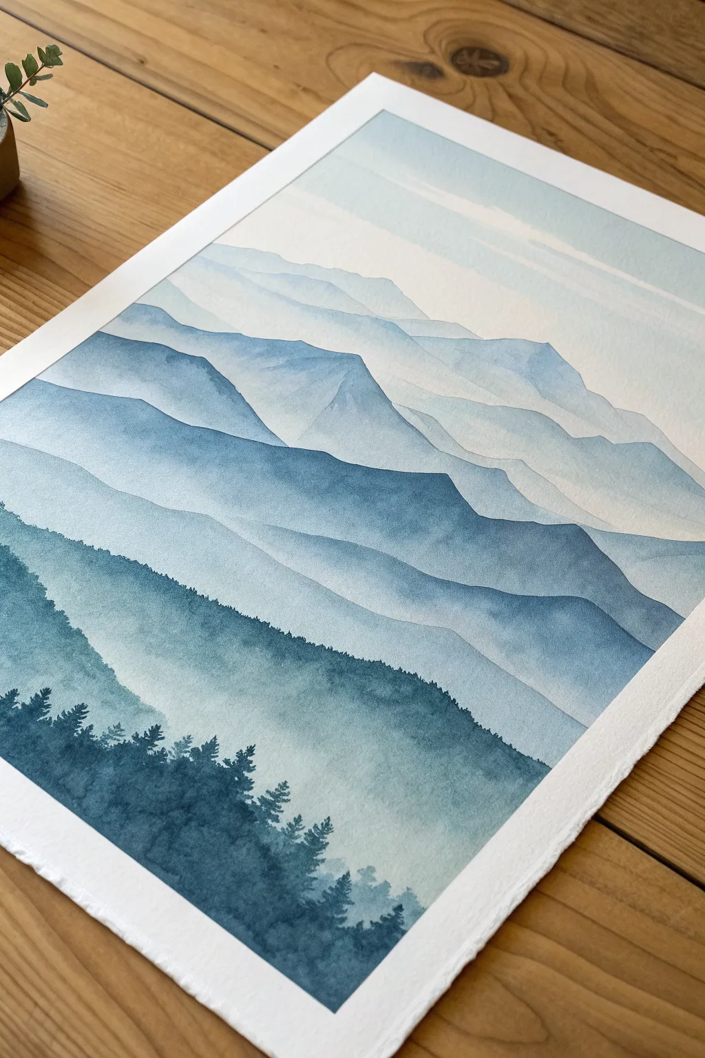
This serene landscape captures the beauty of atmospheric perspective, using a single color to create depth and distance. By layering varied saturations of indigo or Prussian blue, you will build a misty mountain range that feels both vast and intimate.
Step-by-Step Guide
Materials
- Cold press watercolor paper (140lb/300gsm)
- Watercolor paints (Indigo, Prussian Blue, or Paynes Gray)
- Large flat wash brush or mop brush
- Medium round brush (size 6-8)
- Small detail brush (size 0-2)
- Masking tape
- Two jars of water
- Paper towels
- Mixing palette
Step 1: Preparation and Sky
-
Secure the paper:
Tape doown all four edges of your watercolor paper to a board or table. This creates that crisp white border seen in the final piece and prevents the paper from buckling when wet. -
Mix your lightest wash:
Prepare a very watery, pale puddle of your chosen blue. It should be barely tinted, almost like clearer water with a drop of milkiness. -
Establish the sky:
Using your large wash brush, apply this pale wash across the top third of the paper. You can drag the brush horizontally, leaving some white gaps to suggest faint, high-altitude clouds. -
First faint peaks:
While the sky is drying, pencil in very faint guidelines for your mountain ridges if you aren’t confident freehanding them. Keep the lines extremely light so they don’t show through the transparent paint.
Step 2: Building the Distant Ranges
-
Paint the furthest mountains:
Mix a wash slightly darker than your sky. Paint the silhouette of the most distant mountain range. Use the side of your round brush to create jagged but soft peaks. -
Fade the bottom:
Immediately rinse your brush and drag clean water along the bottom edge of this painted shape. This softens the transition, creating a misty look as it fades into the white paper below. -
Wait for complete dryness:
It is crucial to let this layer bone-dry before touching the paper again. Creating the distinct ‘hard edge’ separation between layers relies on the previous layer being 100% dry. -
The second layer:
Mix a slightly more saturated blue—essentially adding a bit more pigment to your puddle. Paint the next ridge down, overlapping the first one. -
Vary the ridge line:
Ensure this new mountain line doesn’t just copy the one above it. Make some peaks higher and valleys lower to create natural variation. -
Create the mist gradient again:
Just like before, use a clean, damp brush to drag the bottom edge of this fresh paint downward, fading it out to almost clear water.
Uneven Gradients?
If your fade marks look streaky, your brush might be too dry. Load it with clean water and work quickly before the paint edge sets.
Step 3: Mid-Ground and Depth
-
Darkening the mixture:
As you move forward in the landscape (down the paper), your paint mix needs less water and more pigment. Prepare a medium-strength blue for the middle mountains. -
Painting the middle ridge:
Paint the next distinct mountain shape. I like to tilt my board slightly at this stage to help the pigment settle towards the bottom of the wash. -
Add texture:
While this layer is still wet, you can drop in tiny touches of darker pigment near the top ridge line to suggest shadows or crags, but keep it subtle. -
Repeat the gradient:
Soften the bottom edge again. This repetitive process of ‘paint top edge, fade bottom edge’ is the secret to the foggy mountain effect. -
The darkest mountain layer:
For the final large mountain shape before the trees, use a very rich, strong blue mix. Paint the silhouette, covering the faded area of the previous layer. -
Creating the final basin:
Fade this dark layer downward, but instead of fading to white, let it fade into a medium blue wash that will serve as the background for the forest.
Make it Sparkle
Once dry, flick a toothbrush loaded with white gouache or opaque white watercolor over the sky area to create a subtle starry night effect.
Step 4: Foreground Forest
-
Initial tree silhouettes:
Switch to your smallest detail brush. Using your most concentrated, creamiest paint mixture (very little water), begin painting small vertical lines along the bottom left edge for tree trunks. -
Foliage technique:
Using a stippling motion or small dabs, tap the brush side-to-side down the trunk lines to create pine branches. They should be narrow at the top and wider at the base. -
Cluster the trees:
Group these trees densely in the bottom left corner, creating a solid dark mass, and let the tops of individual trees poke out along the ridge line. -
Filling the foreground:
Continue adding trees across the bottom, allowing them to become slightly sparser or lower as they move toward the right side of the paper. -
Final reveal:
Once the painting is completely dry to the touch, carefully peel away the masking tape at a 45-degree angle to reveal your crisp borders.
Step back and admire the depth you created with just a single color and the patience of layering


Minimal Ocean Horizon With Wet-on-Wet Sky
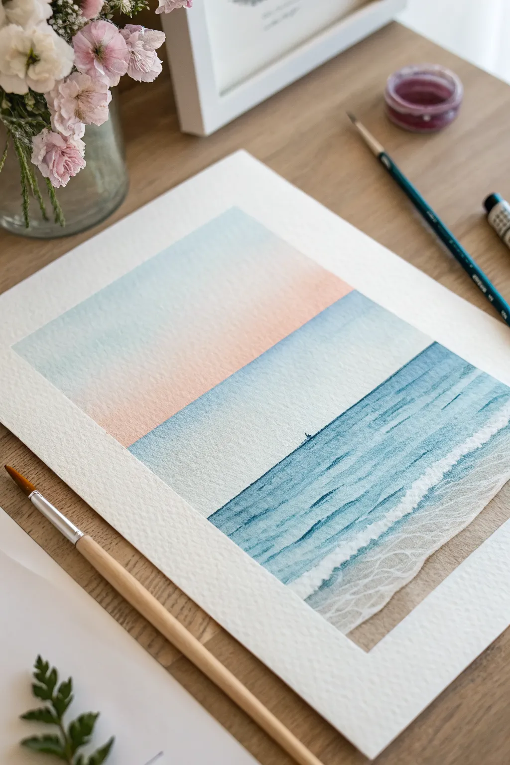
Capture the serenity of a quiet shoreline with this minimalist watercolor study. By combining soft wet-on-wet washes for the sky with dry-brush textures for the waves, you will create a peaceful scene that balances fluid color with gentle detail.
Step-by-Step Tutorial
Materials
- Cold press watercolor paper (approx. 140lb/300gsm)
- Masking tape
- Watercolor paints: Cerulean Blue, Cobalt Teal, Paynes Gray, Peach or Rose Madder
- Round brushes (sizes 8 and 4)
- Fine detail brush (size 0 or 1)
- White gouache or white ink
- Two jars of water
- Paper towels
- Mixing palette
Step 1: Preparation and Sky
-
Tape the borders:
Begin by taping down all four edges of your watercolor paper to a hard board or table. Press the tape down firmly to ensure crisp, clean edges for that polished, framed look later. -
Define the horizon:
Lightly sketch a horizontal line across the paper, positioning it slightly below the vertical center. This splits the composition into a larger sky area and the ocean below. -
Pre-wet the sky area:
Using a large clean brush, apply a layer of clear water to the entire sky section above your horizon line. The paper should glisten but not have puddles. -
Apply the top blue gradient:
Load your brush with a watery mix of Cerulean Blue. Start at the very top edge and paint horizontally, letting the color naturally diffuse downwards into the wet paper, fading as it reaches the middle. -
Introduce the warmth:
While the paper is still damp, pick up a soft Peach or diluted Rose Madder. Paint just above the horizon line, blending upwards to meet the fading blue, creating a soft, dreamy transition. -
Let the sky dry:
Allow this layer to dry completely before touching the ocean area. The paper must be bone dry to keep the horizon line sharp.
Step 2: Painting the Ocean
-
Establish the water base:
Mix a cool, fresh ocean color using Cobalt Teal with a touch of Paynes Gray to mute it slightly. Paint a flat, even wash from the horizon line down to about an inch from the bottom tape. -
Create the shoreline:
For the sandy bottom, mix a very pale brown or diluted ochre. Paint the remaining bottom strip, blending it slightly into the wet teal paint where they meet to suggest shallow water. -
Wait for the base to settle:
Let this ocean layer dry. I find it helpful to wait until the paper is no longer cool to the touch. -
Darken the deep water:
Mix a stronger, more concentrated version of your teal and blue mix. Using horizontal strokes, layer this color over the top half of the ocean section to suggest depth near the horizon. -
Suggest waves with dry brushing:
Using a slightly drier brush and the same dark teal mix, drag the brush horizontally across the middle ocean section. The texture of the paper will break up the stroke, mimicking the look of choppy waves.
Preventing Blooms
If you see ‘cauliflower’ blooms in your sky, you likely added water back into drying paint. Once a wash starts to lose its shine, stop working on it and let it dry completely.
Step 3: Finishing Details
-
Add white highlights:
Dip a fine detail brush into white gouache or ink. Paint thin, broken horizontal lines along the darker waves to simulate foam catching the light. -
Paint the shore foam:
Where the water meets the sand, paint a thicker, uneven white line to represent the main shore break. Soften the bottom edge of this white line with a damp brush to make it look like receding foam. -
Detail the sea foam pattern:
On the sandy section at the bottom, use very diluted white paint to draw a delicate, net-like pattern. These organic, connected loops mimic the lacy foam left behind by waves on the sand. -
Add a tiny focal point:
For a sense of scale, create a tiny silhouette exactly on the horizon line using concentrated Paynes Gray. Just a small vertical speck can look like a distant sailboat. -
Reveal the edges:
Once the painting feels totally dry, carefully peel away the masking tape at a 45-degree angle to reveal your crisp white borders.
Golden Hour Glow
Level up by swapping the cool blue sky for a warm yellow-to-pink gradient. Reflect these warm tones in the wet sand area for a cohesive sunset effect.
Step back and enjoy the calming simplicity of your new coastal artwork

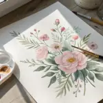
Loose Wildflower Bouquet in a Tiny Vase
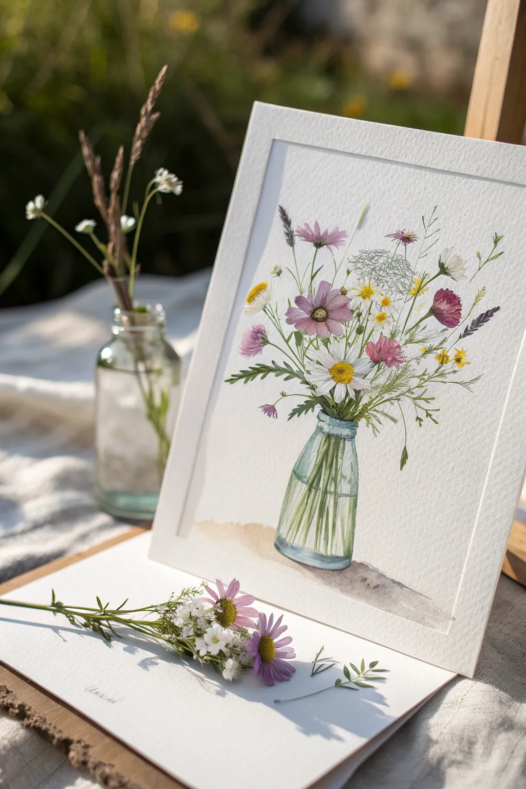
Capture the delicate charm of a summer meadow with this detailed watercolor study of wildflowers in a glass bottle. The painting balances precise botanical details with the soft, transparent qualities of water and light, making it a perfect exercise for refining your fine brushwork.
Step-by-Step Guide
Materials
- Cold press watercolor paper (300 gsm)
- Pencil (HB or H for light lines)
- Kneadable eraser
- Watercolor paints: Alizarin Crimson, Sap Green, Cobalt Blue, Lemon Yellow, Burnt Umber, Payne’s Grey
- Round brushes: Size 6 (for washes), Size 2 and 0 (for details)
- White gouache or white gel pen (for highlights)
- Jar of clean water
- Paper towel
Step 1: Planning the Composition
-
Sketch the bottle:
Begin by lightly sketching the outline of the small glass bottle at the bottom center of your paper. Focus on symmetry for the neck and shoulders, but keep the lines faint so they don’t show through the transparent glass later. -
Map out the stems:
Draw the main stems radiating out from the bottle neck. Intersect them inside the bottle to show they are submerged. This crisscross pattern is crucial for a realistic glass effect. -
Place the flower heads:
Lightly sketch circles and ovals to indicate where the main blooms will sit. Position the large white daisy and pink cosmos as your focal points, then scatter smaller buds and leaves around them for a balanced, airy arrangement. -
Refine the details:
Go over your sketch to define the petal shapes and leaf structures. Use a kneadable eraser to lift off any excess graphite, leaving only the faintest guide for your paint.
Muddy Water?
If your stems inside the bottle look muddy, wait for the stem paint to dry completely before glazing the blue ‘water’ layer over them. Patience prevents bleeding.
Step 2: Painting the Blooms
-
First wash for pink flowers:
Mix a watery Alizarin Crimson. Paint the petals of the pink cosmos flowers, keeping the wash very diverse—lighter near the center and slightly more saturated at the tips. Leave tiny white gaps between petals to prevent them from merging into a blob. -
The white daisy center:
While the pink dries, paint the center of the main daisy using Lemon Yellow mixed with a touch of Burnt Umber for depth. Stipple the paint with the tip of your size 2 brush to create a textured, fuzzy look. -
Shadowing the white petals:
Use a very dilute mix of Cobalt Blue and a tiny bit of Grey to paint delicate shadows on the white daisy petals. You aren’t painting the petals white (the paper does that); you are just defining their form with shadows. -
Yellow filler flowers:
Dot in the small yellow filler flowers using pure Lemon Yellow. Keep these loose and organic, grouping them in small clusters. -
Detailing the pink blooms:
Once the pink base layer is dry, mix a slightly stronger crimson. Use your size 0 brush to paint fine lines radiating from the flower centers outward, mimicking the vein texture of the petals. -
Adding the thistle/buds:
Mix Alizarin Crimson with Cobalt Blue to make a soft purple. Paint the small, pointed buds and the thistle-like element on the upper left.
Level Up: Texture
Sprinkle a tiny pinch of salt onto the pink cosmos petals while they are still wet. When dry, create a mottled texture that mimics delicate flower veins.
Step 3: Greenery and Stems
-
Main stems:
Load your size 2 brush with Sap Green. Carefully trace the stems you sketched earlier. Vary the pressure to make the lines slightly uneven and natural, not rigid like wire. -
Feathery leaves:
For the fern-like foliage, use the tip of your smallest brush. Flick the brush quickly outward from the stem to create thin, tapering leaves. Keep the green mix somewhat transparent. -
Darker accents:
Mix a little Payne’s Grey into your green to get a darker shade. Add shadows to the underside of leaves and where stems overlap to create depth. -
Queen Anne’s Lace:
For the delicate white umbrella flower at the top, use a very pale grey-green wash to suggest the structure, then stipple tiny dots.
Step 4: The Glass Bottle
-
Base water tint:
Mix a very pale, watery Cobalt Blue with a hint of Sap Green (teal color). Paint the water level inside the bottle, ensuring you paint *over* the stems inside. The stems should look viewed through the tinted water. -
Glass edges:
Using a slightly stronger teal mix, outline the rim and the bottom of the bottle. Soften the inner edge with a clean, damp brush so the color fades into the center. -
Refraction details:
I like to add stronger green stripes to the stems *inside* the water to show magnification. It makes the glass look thick and realistic. -
Grounding shadow:
Mix Burnt Umber with a lot of water. Paint a soft, amorphous shadow shape underneath the bottle to ground it, fading the edges out into nothing. -
Final highlights:
Once everything is bone dry, use white gouache or a gel pen to add sharp, bright highlights to the bottle’s shoulder and rim. This is the magic step that makes the glass look shiny.
Step back and admire your everlasting bouquet, beautifully preserved on paper.
BRUSH GUIDE
The Right Brush for Every Stroke
From clean lines to bold texture — master brush choice, stroke control, and essential techniques.
Explore the Full Guide
Juicy Citrus Slice With Easy Color Layers
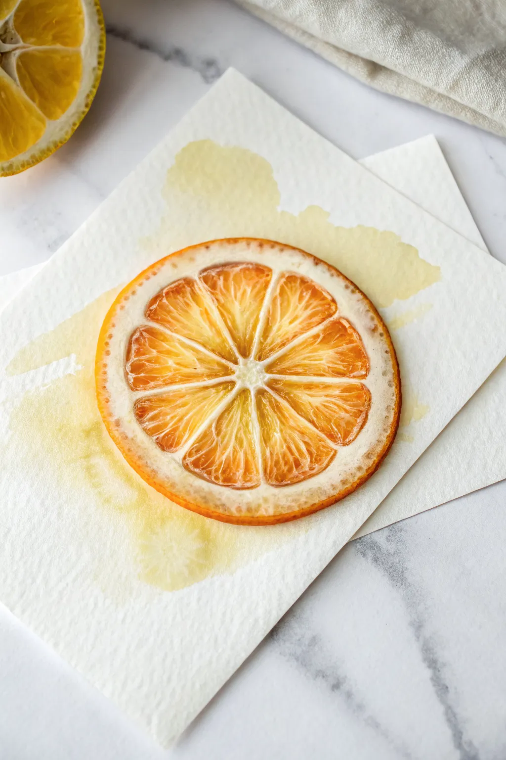
Capture the refreshing transparency of a sliced orange with this vibrant study in warm tones. Using simple wet-on-wet and glazing techniques, you’ll build up glowing layers to create a realistic, juicy texture on textured paper.
Detailed Instructions
Materials
- Cold press watercolor paper (300 gsm)
- Round watercolor brush (size 6 or 8)
- Fine detail brush (size 0 or 2)
- Watercolor paints (Cadmium Orange, Lemon Yellow, Burnt Sienna/Reddish-Brown)
- Clean water jar
- Paper towels
- Pencil and eraser
- Masking fluid (optional)
Step 1: Sketching and Initial Wash
-
Outline the shape:
Begin by lightly drawing a perfect circle on your paper. You can trace a cup or jar lid to get it exact. -
Define the segments:
Find the center point of your circle and draw faint lines radiating outward like spokes on a wheel, creating the triangular segments. -
Create the pith boundary:
Draw a slightly smaller circle inside the first one to mark the white pith area; round off the corners of each triangular segment so they look organic, not geometric. -
Paint the background stain:
Mix a very watery, pale yellow wash. Paint a loose, abstract shape behind where your slice sits, extending outward to suggest juice splatters. Let this dry completely.
Muddy colors?
If your orange looks dull, you may be overworking the paper while it’s wet. Allow layers to dry completely before adding new details to keep colors crisp and translucent.
Step 2: Building the Fruit segments
-
Base layer for segments:
Load your brush with a diluted orange-yellow mix. Paint into each triangular segment, being careful to leave the thin channels between them white. -
Wet-on-wet infusion:
While the segments are still damp, drop in slightly more concentrated orange paint near the outer rounded edge of each triangle. -
Create the gradient:
Let the darker pigment naturally bleed toward the center, creating a soft gradient from the rind inward, but keep the very center point pale. -
First drying phase:
Allow this layer to dry fully. The paper should feel neutral to the touch, not cool.
Step 3: Adding Texture and Detail
-
Paint the rind:
Using a mix of orange and a tiny touch of Burnt Sienna, paint the thin outer ring of the peel. Keep the edge crisp but the color varied. -
Detailing the pulp:
Switch to your fine detail brush. Mix a vibrant, saturated orange and paint thin, vein-like lines inside the segments. -
Simulating juice sacs:
Make these lines radiate from the center but curve them slightly to mimic the directional flow of the juice sacs. -
Darkening the edges:
Add deeper reddish-orange touches to the corners of the segments where they meet the pith to create depth and shadow. -
Softening harsh lines:
If any detail lines look too stark, rinse your brush and run a slightly damp bristle over them to soften the edges.
Try a full bowl
Once comfortable, arrange slices of limes, lemons, and blood oranges across the page. Vary the sizes and overlap them slightly for a transparent layering effect.
Step 4: Final Glazes and Contrast
-
Pith shadowing:
Mix a very diluted, dirty yellow-beige. Apply this sparingly to the ‘white’ pith area to give it form, rather than leaving it stark white. -
Enhancing the crust:
Take your darkest burnt orange mix and dap small dots or texture marks along the very outer edge of the rind for realism. -
Final color pop:
I like to add a final glaze of bright lemon yellow over the center of the segments to make the ‘juice’ look glowing and fresh. -
Review and refine:
Step back and check your contrast. If the white gap lines got painted over, you can gently lift color with a damp brush or use white gouache to reclaim them.
Give your painting a final check to ensure those white veins really pop against the vibrant orange pulp
Tiny Birds on a Wire at Dusk
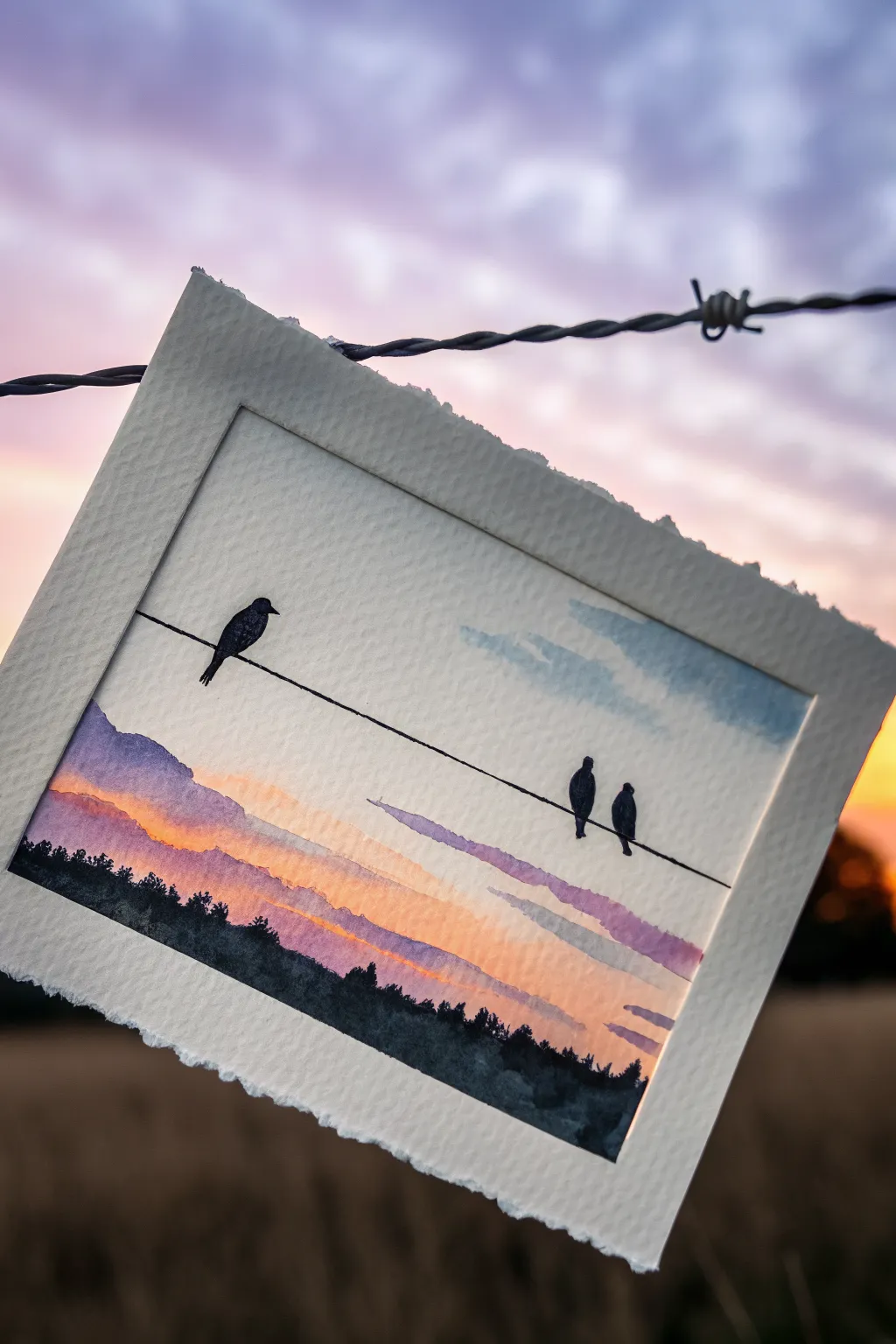
Capture the serene beauty of twilight with this simple yet striking watercolor landscape. Using a wet-on-wet technique for the sky enables soft, dreamy transitions between colors, perfectly setting the stage for the crisp silhouettes of birds perched on a lone wire.
Step-by-Step
Materials
- Cold press watercolor paper (approx. 5×7 inches)
- Masking tape
- Watercolor paints (Indigo, Purple/Violet, Alizarin Crimson, Cadmium Yellow, Payne’s Gray)
- Flat wash brush (1/2 inch)
- Round brush (size 4 or 6)
- Fine liner brush or black waterproof fine-liner pen
- Jar of clean water
- Paper towels
- Pencil and ruler
Step 1: Setting the Scene
-
Prepare the Paper:
Cut or tear your watercolor paper to size. If you want that beautiful deckled edge look seen in the photo, fold the paper back and forth deeply several times before carefully tearing it along the fold. -
Establish the Horizon:
Lightly sketch a very low horizon line about an inch from the bottom of the paper. This will mark where your dark treeline sits later. -
Draw the Wire:
Using a ruler, draw a single diagonal line stretching across the paper. Aim for a gentle slope, starting slightly higher on the left and angling down towards the right.
Clean Lines Pro Tip
For the telephone wire, you don’t have to paint it freehand. Use a waterproof archival ink pen instead of a brush to get that perfectly thin, unwavering line without the stress.
Step 2: Painting the Sunset Sky
-
Wet the Sky Area:
With your flat brush and clean water, dampen the entire paper area above your horizon line. The paper should be shiny but not forming puddles. -
Apply the Yellow Glow:
Load your brush with Cadmium Yellow. Paint a horizontal band just above the horizon line, letting the pigment bloom softly into the wet paper. -
Add Warm Transition:
While the yellow is still wet, introduce a streak of Alizarin Crimson or orange just above it to create that fiery sunset transition. -
Layering the Clouds:
Switch to a purple or violet mix. With a round brush, gently dab in horizontal cloud streaks above the orange layer. Let them bleed slightly for a wispy look. -
Painting the Upper Sky:
At the very top of the paper, apply a very pale wash of diluted blue or gray, keeping it extremely light to maintain an airy feel. -
Drying Time:
Allow the sky to dry completely. This is crucial; if the paper is damp, your sharp lines in the next steps will blur.
Level Up: Metallic Magic
Add a touch of magic to your sunset by mixing a tiny bit of gold watercolor or ink into the yellow band of the sky for a shimmering golden hour effect.
Step 3: Creating the Shadows
-
Paint the Treeline:
Mix a dense, dark color using Indigo and Payne’s Gray. Use your round brush to paint the treeline at the bottom, dabbing the brush tip to create uneven, leafy textures along the top edge of the trees. -
Add Distant Mountains:
Using a more diluted, lighter purple wash, paint a soft mountain shape rising on the left side, sitting just behind your dark treeline. -
Detail the Wire:
Using a fine liner brush with black paint or a waterproof black pen, trace over your pencil line for the wire carefuly. I find holding my breath for a second helps keep the line steady. -
Outline the Birds:
Sketch three small oval shapes sitting on the wire. Place one bird on the left facing right, and a pair on the right side sitting closely together. -
Fill the Silhouettes:
Fill in the bird shapes with solid black or very dark concentrated paint. Give them small beaks and tails that dip slightly below the wire. -
Final Touches:
Add tiny details to the treeline if it looks too flat, perhaps pulling a few taller tree shapes up against the sunset.
Now you have a tranquil evening scene to display or gift to a nature lover

PENCIL GUIDE
Understanding Pencil Grades from H to B
From first sketch to finished drawing — learn pencil grades, line control, and shading techniques.
Explore the Full Guide
Simple Lighthouse Silhouette by the Sea
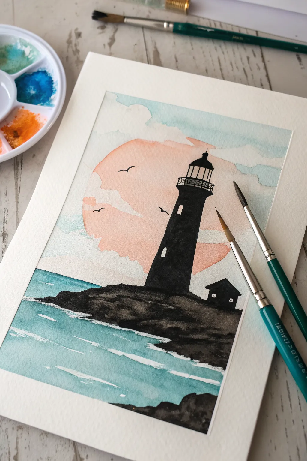
Capture the calm beauty of dusk with this high-contrast lighthouse silhouette set against a soft, pastel sunset. The bold black shapes create a striking foreground while the gentle watercolor washes behind give the piece a dreamy, peaceful atmosphere.
Step-by-Step Guide
Materials
- Cold press watercolor paper (approx. 140lb/300gsm)
- Masking tape or washi tape
- Watercolor paints (Turquoise/Teal, Peach/Salmon, Black/Payne’s Gray)
- White gouache or white gel pen (for highlights)
- Round watercolor brushes (sizes 2, 4, and 8)
- Pencil (HB or H)
- Palette for mixing
- Two jars of water
- Paper towels
Step 1: Preparation and Sketching
-
Secure the paper:
Tape down all four edges of your watercolor paper to a board or table with masking tape. This creates that clean white border shown in the final piece and prevents buckling. -
Sketch the horizon:
Using your pencil lightly, draw a straight horizon line about one-third of the way up from the bottom of the page. -
Outline the sun:
Draw a large, partial circle rising from behind where your lighthouse will be. Don’t worry about making it perfect; a loose shape feels more organic. -
Draft the silhouette:
Sketch the outline of the rocky ground on the horizon line and the vertical shape of the lighthouse tower. Add the small keeper’s house to the right. -
Add structure details:
Lightly mark where the lighthouse lantern room, railing, and windows will go, but keep the lines faint since you’ll paint over them heavily later.
Pro Tip: Masking Fluid Magic
Use masking fluid for the white sea foam strips and the tiny windows before painting. Rub it off at the very end for shocking bright white details without needinggouache.
Step 2: Painting the Sky and Sun
-
Mix the sun color:
Prepare a watery wash of peach or salmon pink on your palette along with a separate puddle of clear water. -
Paint the sun shape:
Fill in the large circular sun area with your peach wash. While it’s wet, I like to lift a few irregular spots with a clean, damp brush to suggest clouds drifting across the face of the sun. -
Add the sky wash:
Mix a very dilute turquoise or light blue. Paint the sky area around the sun, letting the blue touch the damp peach edge slightly for a soft blend, but try not to let them mix too much or it may turn muddy. -
Create cloud textures:
Leave gaps of unpainted white paper in the blue sky area to represent fluffy clouds. You can soften the edges of these white gaps with a damp brush. -
Wait for drying:
Let this entire sky layer dry completely. The paper must be bone dry before you start the silhouette to ensure crisp lines.
Troubleshooting: Bleeding Edges
If your black lighthouse bleeds into the sky, the background wasn’t dry enough. Let it dry fully, then sharpen the edge with opaque black paint or a fine waterproof ink pen.
Step 3: Painting the Sea
-
Mix the ocean color:
Prepare a stronger mix of turquoise or teal. It should be slightly more saturated than your sky color. -
Paint the water base:
Fill the area below the horizon line with the teal paint. Apply it in horizontal strokes. -
Lift wave highlights:
While the paint is still wet, use a clean, thirsty brush to lift horizontal lines of paint, revealing lighter paper underneath to suggest the movement of waves. -
Add whitecaps (Optional):
If you want clearer white lines like in the example, leave thin strips of dry white paper unpainted as you fill in the blue, or wait until dry and add them with white gouache later. -
Dry thoroughly:
Ensure the water section is totally dry before moving to the black foreground.
Step 4: The Silhouette Foreground
-
Prepare the dark paint:
Mix a very concentrated black or Payne’s Gray. It needs to be opaque enough to cover the background washes. -
Paint the rocks:
Fill in the rocky ground shape at the bottom. Use a jagged, uneven top edge to simulate rough terrain. Ensure the bottom edge meets the water cleanly. -
Fill the lighthouse body:
Switch to a smaller round brush (size 4) and carefully paint the main tower of the lighthouse solid black. -
Paint the house:
Fill in the small house silhouette next to the tower, giving it a pointed roof shape. -
Refine the lantern room:
Use your smallest brush (size 2) to paint the intricate top of the lighthouse. Paint the railing and the dome cap carefully. -
Suggest windows:
Leave tiny rectangular or arched spaces unpainted on the tower and house to look like lit windows. If you accidentally paint over them, dot them in with white gel pen later.
Step 5: Finishing Details
-
Add flying birds:
With the tip of your smallest brush, paint small ‘v’ shapes in the sky to represent seagulls flying near the sun. -
Enhance sea foam:
Using white gouache or a white pen, draw thin, broken horizontal lines along the water’s surface to maximize the look of rippling waves. -
Final check:
Review the painting for any light patches in your black silhouette that need a second coat for opacity. -
Peel the tape:
Once strictly dry, peel the masking tape away slowly at a 45-degree angle to reveal your crisp white border.
Now you have a serene coastal scene perfect for framing or gifting.
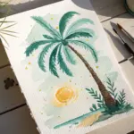
Bright Hot Air Balloon Over Rolling Hills
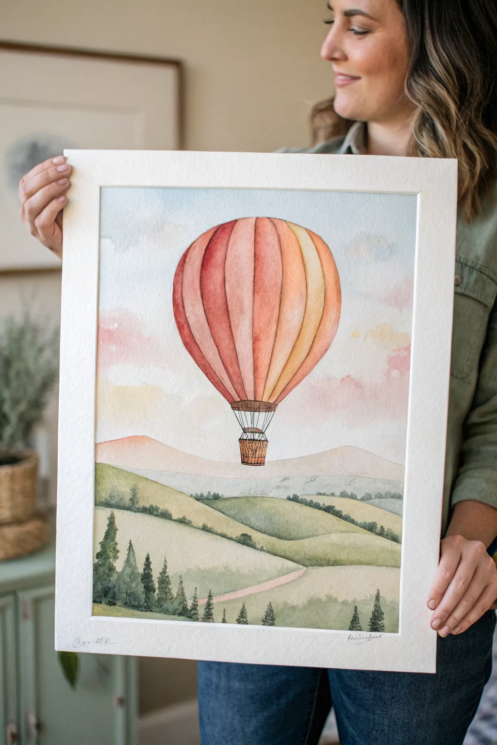
This serene watercolor landscape captures the spirit of adventure with a vibrant hot air balloon drifting over soft, rolling hills. The gentle gradients and dreamy color palette make it a perfect project for mastering wet-on-wet techniques and creating atmospheric depth.
How-To Guide
Materials
- Cold press watercolor paper (140lb/300gsm)
- Watercolor paints (Alizarin Crimson, Cadmium Orange, Yellow Ochre, Sap Green, Payne’s Gray, Burnt Sienna)
- Round brushes (sizes 4, 8, and 12)
- Fine liner brush or Micron pen (0.1 or 0.3)
- Pencil (HB) and eraser
- Two water jars
- Paper towels
- Masking tape
Step 1: Sketch and Sky
-
Prepare your surface:
Tape down all four edges of your paper to a board. This creates that crisp white border seen in the photo and prevents buckling when you apply washes. -
Light sketch:
Using an HB pencil, lightly sketch the large oval shape of the balloon in the upper center. Draw the basket below it. Then, sketch three to four undulating lines across the bottom third of the paper to represent the rolling hills. -
Wet the sky area:
With your largest clean brush, apply a layer of clean water to the sky area, carefully working around the balloon shape. The paper should be glistening but not forming puddles. -
Paint the sky:
Drop in a very diluted wash of blue near the top corners. While the paper is still wet, add touches of pale pink and faint violet near the horizon line to create soft, fluffy cloud suggestions. Let the colors bleed naturally.
Step 2: The Hot Air Balloon
-
Base segments:
The balloon is divided into vertical gores (segments). Paint the strips using alternating warm colors: crimson red, burnt orange, and yellow ochre. Leave a tiny sliver of dry white paper between each stripe to prevent them from bleeding into one another. -
Adding volume:
While the stripes are damp, drop a slightly darker, more concentrated version of the same color on the left side of each stripe. This creates a rounded, 3D effect, assuming the light source is coming from the right. -
Second layer:
Once the first layer is dry, you can glaze over the stripes again if you want more vibrancy. This is where I like to deepen the shadows on the far left side of the balloon. -
The basket:
Use a small brush and Burnt Sienna to paint the woven basket. Create texture by using short, horizontal and vertical strokes. Use a dark brown or Payne’s Gray for the ropes attaching the basket to the balloon.
Bleeding Colors?
If your balloon stripes are running together, you didn’t wait long enough or leave a gap. Let it dry completely, then use a damp, stiff brush to ‘lift’ the excess paint back to white.
Step 3: Rolling Hills and Foreground
-
Distant mountains:
Paint the furthest range of hills using a very pale, watery mix of purple or cool gray. This atmospheric perspective makes them look far away. Let this dry completely. -
Middle ground hills:
Mix Sap Green with a touch of Yellow Ochre. Paint the middle hills with this lighter, warm green. Use a broad, sweeping stroke to mimic the curve of the land. -
Foreground green:
For the closest hill in the foreground, use a more saturated Sap Green mixed with a tiny bit of blue or Payne’s Gray to make it darker and richer. Paint around the winding path area. -
The winding path:
Fill in the path with a very dilute wash of watered-down Burnt Sienna or blush pink, keeping it light so it stands out against the green grass.
Magic of Texture
Sprinkle a tiny pinch of salt onto the wet paint of the foreground hills. As it dries, the salt absorbs pigment, creating a speckled, starry texture that looks just like wildflowers or uneven grass.
Step 4: Pine Trees and Details
-
Mixing tree color:
Create a deep, dark forest green by mixing Sap Green, Payne’s Gray, and a touch of red (to neutralize it). You want a strong value contrast here. -
Foreground trees:
Using a size 4 brush or fine liner, paint the pine trees in the foreground. Start with a thin vertical line for the trunk, then use jagged, downward strokes to create the branches. -
Varying height:
Group the trees in clusters, making sure to vary their heights. Some trees should overlap the hill behind them to connect the layers of the painting. -
Distant trees:
Using a slightly lighter/more watered-down green mix, dab tiny tree shapes onto the ridges of the middle-ground hills. These should have much less detail than the foreground trees. -
Final inking:
Once everything is bone dry, use a very fine liner brush or a waterproof pen to add delicate outlines to the balloon basket and ropes for crisp definition.
Peel off your tape carefully to reveal those crisp edges and enjoy your peaceful landscape


Cute Cactus in a Pot With Two Shadows
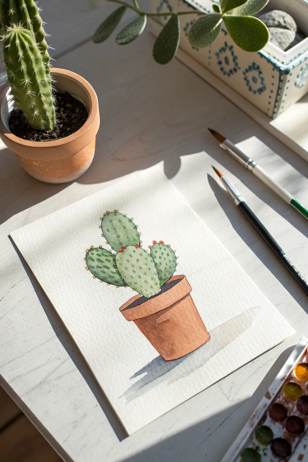
This charming watercolor project captures the simple beauty of a prickly pear cactus sitting in a classic terracotta pot. The illustration features clean lines, soft greens, and a distinct shadow that gives the piece a lovely sense of dimension on the page.
Step-by-Step
Materials
- Cold press watercolor paper (300 gsm recommended)
- Pencil (HB or H for light sketching)
- Kneaded eraser
- Waterfall palette or watercolor pans
- Round watercolor brushes (size 4 and size 0/1 for details)
- Jar of clean water
- Paper towels
Step 1: Sketching the Composition
-
Outline the pot:
Begin by lightly sketching the terracotta pot near the bottom center of your page. Draw an oval for the rim, slightly angled to show perspective, and then a tapered cylinder shape below it for the body of the pot. -
Draw the rim details:
Refine the rim by adding an inner line to the oval to show thickness. Ensure the back edge of the rim loops behind where the cactus will sit. -
Sketch the cactus pads:
Draw the main cactus pad emerging centrally from the soil area. Add two smaller pads growing from the first one—one extending to the left and one to the right, creating a balanced, organic arrangement. -
Mark the shadow:
Lightly outline the cast shadow shape extending to the right of the pot. This guides your painting later and ensures the shadow falls naturally. -
Clean up lines:
Take your kneaded eraser and gently roll it over the sketch to lift excess graphite. You want the lines to be barely visible so they don’t show through the transparent watercolor.
Step 2: Painting the Cactus
-
Base wash for the pads:
Mix a light, watery sap green. Paint the cactus pads using a wet-on-dry technique. Keep the wash fairly even, but you can drop in a tiny bit more pigment near the bottom of each pad for subtle shading. -
Adding texture while wet:
While the green paint is still damp, dab in slightly darker green spots randomly across the pads. This creates the soft, mottled texture characteristic of a prickly pear. -
Let it dry completely:
Allow the green layer to dry fully. If you paint next to it now, the colors might bleed into the pot area.
Muddy colors?
Wait for layers to dry 100% before painting adjacent areas. If wet green touches wet orange, they will bleed into brown. Use a hair dryer on low heat to speed this up.
Step 3: Painting the Pot
-
Mix the terracotta color:
Create an earthy orange-brown hue by mixing burnt sienna with a touch of yellow ochre or red. -
Paint the pot body:
Fill in the body of the pot. Load your brush with more pigment for the left side and bottom to suggest roundness, and use a slightly more watery mix for the center to create a highlight. -
Paint the rim:
Paint the rim of the pot using the same terracotta mix. Make the underside of the rim slightly darker to show the shadow it casts on the pot body. -
Darken the soil area:
For the soil visible inside the rim, use a very dark brown or dark grey mix (like burnt umber mixed with ultramarine blue) to create depth around the base of the cactus.
Make it bloom
Instead of small buds, paint fully opened bright yellow or pink flowers on top of the cactus pads to add a vibrant splash of color to the composition.
Step 4: Details & Shadows
-
Add cactus spines:
Using your smallest detail brush (size 0 or 1), mix a brownish-green or dark yellow. Paint tiny dots or small dashes in regular patterns across the dried cactus pads. -
Paint the red buds:
Add tiny pops of red or dark orange on the very tops of the pads to represent small flower buds or fruits. -
Outline details:
I like to use a very fine brush with a slightly darker green to loosely outline the edges of the cactus pads. This defines the shape and gives it that illustrative look. -
Cast the shadow:
Mix a watery, cool grey (diluted Payne’s grey or a mix of blue and brown). Paint the shadow shape extending to the right of the pot. Soften the edge furthest from the pot with a clean, damp brush for a natural fade. -
Final touches:
Review your painting. If the pot needs more contrast, layer a second coat of terracotta on the shadowed side once the first layer is totally dry.
Once dry, frame your cheerful cactus art near a window or give it to a plant-loving friend
Cozy Mushrooms in a Little Cluster
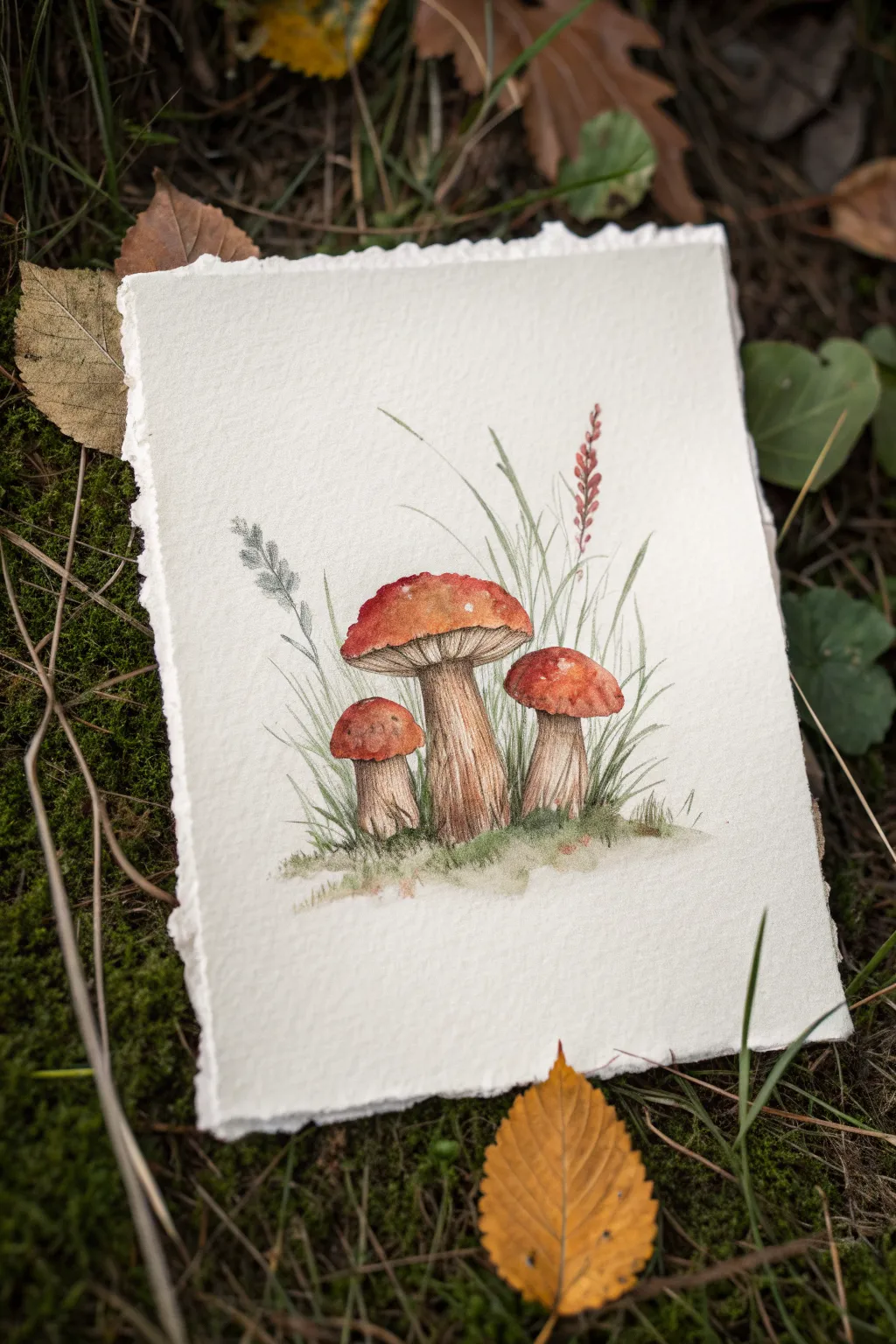
Capture the earthy charm of autumn with this detailed study of three bolete mushrooms nestled in wild grass. The combination of warm, rusty tones and delicate ink detailing creates a cozy, botanical illustration feel.
How-To Guide
Materials
- Cold press watercolor paper (rough texture preferred)
- Watercolor paints (burnt sienna, yellow ochre, sap green, raw umber, crimson)
- Fine liner pen (0.1 or 0.05, waterproof, grey or sepia)
- Round brushes (size 4 for washes, size 0 or 1 for details)
- Pencil (HB) and kneaded eraser
- Paper towels and two jars of water
Step 1: Sketching the Composition
-
Outline the shapes:
Start with a light pencil sketch. Draw three mushrooms: a large central one, a medium one to the right, and a smaller one to the left. Their caps should be rounded domes, slightly flattened on top. -
Add the stems:
Sketch thick, sturdy stems for each mushroom. The central stem should be the thickest, widening slightly at the base where it meets the ground. -
Indicate foliage:
Lightly draw vertical lines behind the mushrooms to represent grass blades. Add a taller, spindly plant on the right side and a textured stalk on the left to frame the composition.
Step 2: Painting the Mushrooms
-
Base wash for caps:
Mix burnt sienna with a touch of crimson. Apply a wet wash to the mushroom caps, leaving the very top edge slightly lighter to suggest highlights. -
Deepen the color:
While the paint is still damp, drop concentrated burnt sienna into the bottom edges of the caps. This creates a rounded, 3D effect as it dries. -
Paint the gills:
Mix a very watery raw umber. Carefully paint the underside of the caps (the spongy gill area) using short vertical strokes, keeping the color pale. -
Base wash for stems:
Use a mix of yellow ochre and raw umber diluted with plenty of water. Paint the stems, keeping the center lighter than the edges. -
Add stem texture:
Once the base is dry, use a size 0 brush with a slightly darker brown mix to paint fine vertical lines on the stems, mimicking their fibrous texture. -
Define the base:
Darken the very bottom of the stems where they meet the earth with a touch of sepia or raw umber to ground them.
Muddy colors?
If your mushroom caps bleed into the stems, ensure the first section is bone dry before painting an adjacent area, or leave a hair-thin white gap between them.
Step 3: Creating the Environment
-
Initial grass wash:
Mix sap green with a little yellow ochre for a natural look. With your size 4 brush, paint loose upward strokes around the base of the mushrooms to start the mossy ground. -
Tall grass blades:
Switch to your smaller brush. Using quick, flicking motions, paint thin blades of grass rising behind and between the mushrooms. Vary the green shades by adding water or a touch of brown. -
Paint the background plants:
Paint the tall stalk on the right with a reddish-brown hue for the buds. For the left stalk, use a muted grey-green to suggest a different plant variety. -
Soften the ground:
I like to take a damp, clean brush and gently blur the bottom edge of the grass painting so it fades softly into the white paper rather than ending abruptly.
Go Botanical
Label the species in Latin at the bottom in neat cursive script (e.g., ‘Boletus edulis’) to mimic a vintage scientific textbook illustration.
Step 4: Ink and Fine Details
-
Ink the stems:
Once the paint is completely dry, use your fine liner pen to draw broken vertical lines up the mushroom stems, emphasizing the fibrous look. -
Outline the caps:
Add a delicate, broken outline to the mushroom caps. Don’t make the line solid; let it skip specifically where the light hits the top. -
Texturize the gills:
Add very fine stippling or tiny vertical dashes underneath the caps to enhance the spongy texture of these bolete mushrooms. -
Detail the grass:
Use the pen to draw thin, sharp blades of grass amongst the painted ones. This contrast between soft watercolor and sharp ink adds depth. -
Final foliage touches:
Add intricate details to the background plants, defining the small buds on the right stalk and the leaves on the left. -
Splatter texture:
Load a toothbrush or stiff brush with diluted brown paint and gently flick it over the bottom area to create touches of dirt and grit.
Step back and admire your little cluster of forest fungi, ready to bring a touch of woodland magic to your wall
Easy Koi Fish Shapes in a Pond Wash
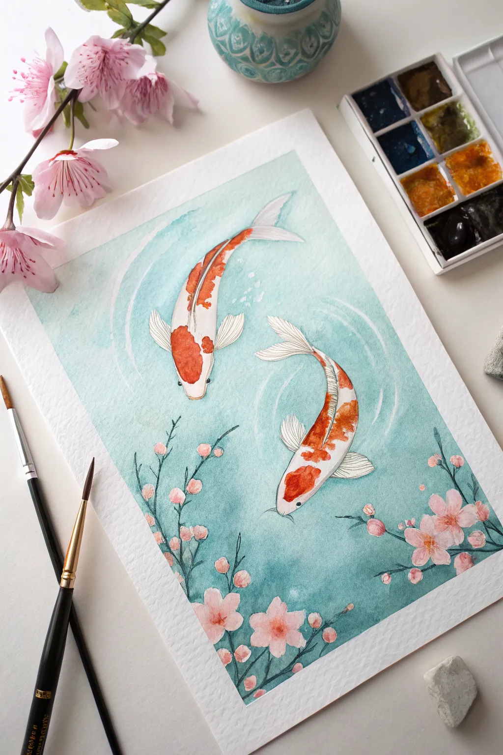
Capture the serene movement of two koi fish gliding through a gentle pond with this beginner-friendly watercolor project. Using a simple wet wash technique for the water and delicate strokes for cherry blossoms, you’ll create a piece that feels both peaceful and vibrant.
Step-by-Step Guide
Materials
- Cold press watercolor paper (taped down)
- Watercolor paints (Turquoise/Teal, Orange-Red, Pink, Brown/Black)
- Round brushes (Size 8 for washes, Size 0 or 1 for details)
- Masking tape (or painter’s tape)
- Pencil and eraser
- Clean water jar
- Paper towel
- White gel pen or gouache (optional)
Step 1: Preparation and Sketching
-
Secure the paper:
Begin by taping down all four edges of your watercolor paper to a hard board or table. This creates that clean, crisp white border you see in the finished piece and keeps the paper from buckling. -
Outline the fish:
Lightly sketch two curved fish shapes in the center. One should be swimming upwards and slightly left, the other curving downwards to the right. Keep the shapes fluid—think of elongated teardrops that curve at the tail. -
Add floral details:
Sketch a few branches reaching up from the bottom edge. Add small circular clusters for the cherry blossoms along these branches. Keep your pencil lines very faint so they don’t show through the paint later.
Step 2: Painting the Pond Wash
-
Wet the background:
Using your larger brush and clean water, carefully wet the area around the fish and flowers. Try to paint right up to your pencil lines without going inside them, creating a barrier. -
Apply the teal color:
Load your brush with a watery teal or turquoise mix. Drops touches of color onto the wet paper and let it bloom. I like to keep the area around the fish slightly lighter to make them pop. -
Create depth:
While the paper is still damp but not soaking, drop slightly darker, more concentrated teal paint near the corners and around the floral stems to suggest deeper water. -
Add ripples:
Before the wash completely dries, use a clean, slightly damp brush to ‘lift’ faint curved lines around the fish heads, suggesting water movement or ripples. -
Let it dry completely:
Walk away and let this layer bone dry. If the paper is cool to the touch, it’s still wet.
Clean Edges Trick
To prevent paint bleeding under your tape, run a clean, damp brush or a bone folder firmly along the tape edge before painting to activate the adhesive seal.
Step 3: Bringing the Koi to Life
-
Base layer for fish:
Paint the bodies of the fish with a very pale, watered-down wash of orange or cream. Leave the fins and tails white for now. -
Add the orange markings:
Once the base is dry, mix a vibrant orange-red. Paint distinct blotches on the head and back of the koi. On the top fish, focus on the head and spine; on the bottom fish, create patches along the curve of the body. -
Detail the fins:
Using your smallest brush, mix a very faint grey or diluted brown. Carefully draw thin, delicate lines on the white fins and tails to show their ribbed texture. -
Outline the body:
With a fine liner brush and dark brown or black paint, outline the entire fish body, the eyes, and the markings. Keep the line weight varied—thicker on the shadow side, thinner elsewhere.
Water Control Fix
If you accidentally paint inside the fish shape while doing the background, quickly dab it with a clean, dry paper towel to lift the color before it stains.
Step 4: Blossoms and Finishing Touches
-
Paint the stems:
Using a dark green or brownish-black, paint thin, spindly lines over your branch sketches. Let the lines break occasionally for a natural look. -
Color the flowers:
Paint the cherry blossoms with a soft pink. Make the centers slightly darker or more saturated pink while the paint is wet to create a natural gradient. -
Add floral centers:
Once the pink is dry, use a tiny dot of brown or deep red in the very center of each flower. -
White highlights:
For a magical touch, use a white gel pen or opaque white gouache to add tiny highlight dots in the fish eyes and faint rippling lines in the water if the earlier lifting wasn’t visible enough. -
Reveal:
Wait until everything is absolutely dry, then slowly peel away the masking tape at a 45-degree angle to reveal your clean white border.
Frame your serene pond scene or scan it to use as a beautiful greeting card
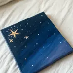
Night Sky Galaxy Wash With Splattered Stars
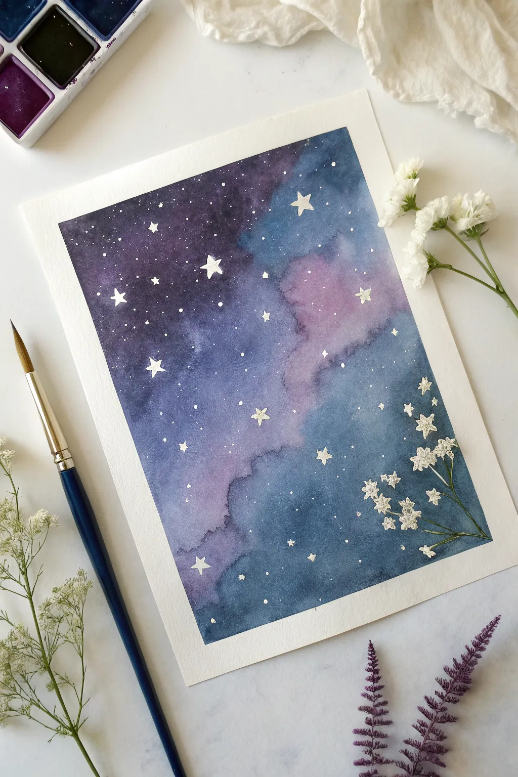
Capture the magic of a starry night with this dreamy watercolor painting that blends deep indigo hues with soft purple clouds. The wet-on-wet technique creates beautiful, unpredictable textures perfect for a celestial scene.
Detailed Instructions
Materials
- Watercolor paper (cold press recommended, approx. 300gsm)
- Painter’s tape or washi tape
- Watercolor paints (Indigo, Purple, Violet, Prussian Blue)
- Round watercolor brushes (size 8 for washes, size 2 for details)
- White gouache or white ink
- Jars of clean water
- Paper towels
- Hairdryer (optional for speeding up drying)
Step 1: Setting the Stage
-
Prepare the paper:
Begin by taping down all four edges of your watercolor paper to a board or table. This not only creates a crisp, clean border around your galaxy but also prevents the paper from buckling when you add lots of water. -
Pre-wet the surface:
Use your larger round brush to apply a layer of clean water across the entire rectangular area inside the tape. You want the paper to be glistening and evenly damp, but not so soaked that puddles form.
Muddy Colors?
Work quickly while the paper is wet to avoid over-mixing. If you brush back and forth too many times, purple and yellow tones will turn brown. Let the water do the mixing for you.
Step 2: Creating the Galaxy Wash
-
Drop in the lightest color:
Start with a soft violet or light purple. Gently dab this color into the center-right area of the wet paper. Let the paint naturally bloom and spread outward; these softer patches will become the glowing nebulas. -
Add mid-tones:
While the paper is still wet, load your brush with a brighter purple or magenta mix. Drop this color around the edges of your first wash, letting them kiss and blend together without overworking them. -
Introduce deep blues:
Now, mix a strong indigo or Prussian blue. Begin applying this to the outer corners and edges of the paper. Work inward, allowing the dark blue to mingle with the purples but leaving that lighter central area somewhat intact for contrast. -
Deepen the night sky:
To get that intense, deep space look, drop highly concentrated indigo or Payne’s gray into the wettest dark areas. I like to tap the brush gently to deposit pigment without disturbing the paper fibers. -
Tilt and blend:
If the transitions look too harsh, you can gently tilt your board to help the wet paint flow together. Watch how the colors migrate creates natural-looking cloud formations. -
Refine the edges:
Check the edges near the tape. Ensure the dark paint goes right up to the tape line so your final border is sharp and distinct. -
Let it dry completely:
This is crucial. The paper must be bone dry before the next step. If it feels cool to the touch, it’s still damp. Use a hairdryer on a low setting if you are impatient, but air drying often yields smoother gradients.
Metallic Magic
Instead of plain white gouache, use metallic silver or gold watercolor for your stars. They will shimmer beautifully when the light hits the painting from different angles.
Step 3: Adding the Stars
-
Mix white splatter:
Dilute a small amount of white gouache or opaque white watercolor with water until it reaches a milky consistency. It needs to be fluid enough to flick, but thick enough to stay opaque. -
Splatter techniques:
Load a brush with the white mixture. hold it over the painting and tap the handle against another brush or your finger. This creates a fine mist of tiny distant stars across the galaxy. -
Paint larger stars:
Using your smallest detail brush (size 0 or fine liner), manually paint a few distinct five-pointed stars. Scatter these randomly; avoid making them too uniform or arranged in a grid. -
Vary star sizes:
Add some medium-sized dots among the tiny splatters using the tip of your brush. Varying the scale of these dots adds depth, making some stars appear closer than others. -
Dry the stars:
Allow the white gouache to dry completely. Because gouache sits on top of the paper, it can smear easily while wet, so give it a few minutes.
Step 4: Finishing Touches
-
Peel the tape:
Slowly peel away the painter’s tape. Pull it away from the painting at a 45-degree angle to minimize the risk of tearing the paper. This reveal is always the most satisfying part. -
Add floral elements (optional):
In the example image, real dried baby’s breath flowers are laid over the painting for photography. You can either glue dried pressed flowers onto the corner for a mixed-media piece or paint delicate white floral silhouettes in the bottom right corner using your gouache.
Step back and admire your own slice of the cosmos, framed perfectly by those crisp white edges
Geometric Shapes Using Masking Tape Lines
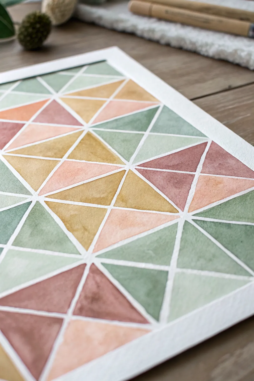
Using simple masking tape, you can create crisp, clean lines that transform basic watercolor washes into a sophisticated geometric pattern. This project plays with a warm, earthy color palette of ochres, terra-cottas, and sage greens to create a calming, modern aesthetic.
How-To Guide
Materials
- Cold press watercolor paper (minimum 140lb/300gsm)
- Artist’s masking tape or washi tape (1/4 inch width works best)
- Watercolor paints (Sage Green, Yellow Ochre, Terra Cotta/Burnt Sienna, Cream/Buff Titanium)
- Flat shader brush (size 6 or 8) and a small round brush
- Clean water and paper towels
- Ruler and pencil
- Rigid backing board (optional)
Step 1: Preparation & Taping
-
Secure the paper:
Begin by taping down all four edges of your watercolor paper to a rigid board or your work surface. This creates a clean white border around the final piece and prevents the paper from buckling when wet. -
Create the grid foundation:
Using a ruler and pencil, lightly mark a grid of squares across your paper. Aim for squares that are roughly 2 to 3 inches wide. These lines will guide your tape placement. -
Apply vertical and horizontal tape:
Place long strips of masking tape directly over your horizontal and vertical pencil lines. Press the tape down firmly, especially along the edges, to ensure a tight seal against the paper. -
Add diagonal divisions:
Now, add diagonal tape lines inside each square. Alternate the direction of the diagonals (some going bottom-left to top-right, others top-left to bottom-right) to create variety in the triangular shapes. -
Seal the edges:
Run a bone folder, the back of a spoon, or your fingernail firmly along every single edge of the tape. This is the most crucial step to prevent paint from bleeding underneath and spoiling your crisp white lines.
Bleeding Lines?
If paint bleeds under the tape, use opaque white gouache or a white gel pen to touch up the lines after the paint is fully dry. It acts like an eraser for watercolors.
Step 2: Painting the Triangles
-
Mix your palette:
Prepare four distinct puddles of paint: a dusty sage green, a warm yellow ochre, a muted terra cotta (reddish-brown), and a very pale peach or cream tone. Keeping the mixes quite watery will help achieve that translucent watercolor look. -
Start with the green:
Choose random triangles scattered across the grid and fill them with the sage green. I usually try to make sure no two green shapes are touching each other directly. -
Create variation within triangles:
While the green paint is still wet, you can tap a slightly darker pigment into one corner of a triangle. This creates a subtle gradient as it dries, adding depth to the flat shape. -
Apply the ochre tones:
Switch to your yellow ochre mix. Fill in approximately a quarter of the remaining empty triangles, aiming for a balanced distribution across the page. -
Add the terra cotta warmth:
Fill the next set of triangles with your terra cotta or reddish-brown hue. Be careful painting near the tape edges; brush away from the tape toward the center of the shape to avoid forcing paint under the adhesive. -
Finish with pale tones:
Fill the final remaining white triangles with your palest cream or peach color. This light tone acts as a highlighter and keeps the composition feeling airy. -
Let it dry completely:
Allow the painting to dry undisturbed. The paper must be bone-dry to the touch—coolness indicates there is still moisture trapped in the fibers.
Pro Tip: Clear Base
Before painting color, paint a layer of clear water or white acrylic over the tape edges. This seals the tape gaps so any ‘bleed’ is invisible, keeping your colors crisp.
Step 3: Reveal & Refine
-
Peel the tape slowly:
Once you are certain the paint is dry, begin peeling the tape. Pull it away slowly at a sharp 45-degree angle, close to the paper surface, rather than pulling straight up. Start with the diagonal pieces first. -
Remove the grid tape:
Carefully remove the long horizontal and vertical tape strips next. This is the most satisfying part, watching the clean white grid emerge from the chaos. -
Check for bleeds:
Inspect the white lines. If a little paint has snuck under the tape, you can often gently lift it while it’s fresh using a damp, clean brush and a paper towel dabbing motion.
Once the tape is fully removed, you are left with a stunning, structured piece of art ready for framing
Three Bookmark Panels for Quick Wins
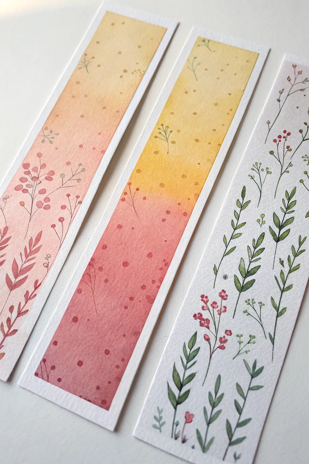
Create a charming set of three watercolor bookmarks that explore different techniques from smooth gradients to delicate line work. This trio moves from a warm, speckled wash design to a fully detailed floral pattern, perfect for practice or gifting.
Step-by-Step Tutorial
Materials
- Cold press watercolor paper (300 gsm)
- Watercolor paints (Yellow Ochre, Burnt Sienna, Alizarin Crimson, Sap Green)
- Small round brushes (size 2 and size 4)
- Masking tape or washi tape
- Paper towels
- Jar of clean water
- Fine liner brush or very fine liner pen (optional)
- Ruler and pencil
Step 1: Preparation and Base Washes
-
Cut and Tape:
Begin by cutting your watercolor paper into three strips, each approximately 2 inches wide and 6-7 inches long. Tape them down to your board, leaving about a 1/4 inch white border around the edges of the painting area. -
Golden Hour Gradient (Left Bookmark):
For the left bookmark, mix a watery wash of Yellow Ochre and Alizarin Crimson to create a soft peach. Start painting from the bottom with a saturated mix, and gently add more water as you move upward to fade the color out near the top. -
Sunset Blend (Middle Bookmark):
For the middle bookmark, we are doing a two-tone gradient. Start at the top with a pure, watery Yellow Ochre. Paint down to the midway point. -
Sunset Blend Continued:
While the yellow is still wet, mix a reddish-pink using Alizarin Crimson. Start from the bottom and paint upward, letting the red meet the yellow in the middle. Gently blend where they touch for a smooth orange transition. -
White Background (Right Bookmark):
The right bookmark relies on the white paper itself, but if your paper isn’t bright enough, you can add an extremely pale, almost invisible wash of cool gray. I essentially leave this one blank to dry completely. -
Drying Time:
Allow the first two bookmarks to dry completely. The paper must be bone-dry before adding the next layers to prevent bleeding.
Clean Edges
Peel your tape away from the paper, not toward it. This prevents the paper from ripping and keeps those crisp white borders intact.
Step 2: Adding Texture and Sprigs
-
Speckling the Background:
On the left and middle bookmarks, load your brush with a slightly darker version of your background colors. Tap the brush against your finger to splatter subtle dots across the gradient for texture. -
Painting the Ferns:
On the left bookmark, use a size 2 brush and a reddish-brown mix to paint loose fern-like leaves rising from the bottom left corner. Keep the strokes fluid and vary the height. -
Adding Berries:
Switch to a darker red tone. Add small, round berries to the tips of wispy stems on the left bookmark. Keep these shapes loose and not perfectly circular. -
Middle Bookmark Details:
For the center panel, paint very faint, tiny sprigs using a thin mix of brown or dark orange. These should be sparse, floating in the yellow and red sections like distant foliage.
Bloom Prevention
If your gradients create ‘cauliflower’ edges, you likely added water back into a drying wash. Wait for it to dry fully, then glaze over.
Step 3: Detailed Botanical Pattern
-
Green Leaf Stems:
Moving to the right text-free bookmark, mix a vibrant Sap Green. Using your finest brush tip, paint several vertical, slightly curved stems rising from the bottom. -
Adding Leaves:
Press the belly of your brush down and lift up to create teardrop-shaped leaves along these green stems. Vary the green shades by adding a touch of brown or blue for depth. -
Floral Stems:
Intersect the green leafy stems with thin, delicate brown or reddish lines intertwined among them. These will hold the small flowers. -
Painting Flowers and Buds:
Dot small clusters of red or pink at the ends of the thin brown stems. You can group three dots together to imply a flower bud or berry cluster. -
Defining the Bottom Edge:
Ensure the bottom edge of the botanical bookmark looks ‘grounded’ by having the stems originate from naturally different heights near the tape line, rather than a straight line. -
Final Touches:
Review all three panels. If the speckles on the gradient bookmarks look too faint after drying, add a few accent dots with a fine liner or darker paint. -
The Reveal:
Once everything is completely dry, slowly peel away the masking tape at a low angle to reveal the crisp white borders.
You now have a beautiful set of handmade bookmarks ready to save your place in your next favorite read
City Skyline Silhouette With Reflected Lights
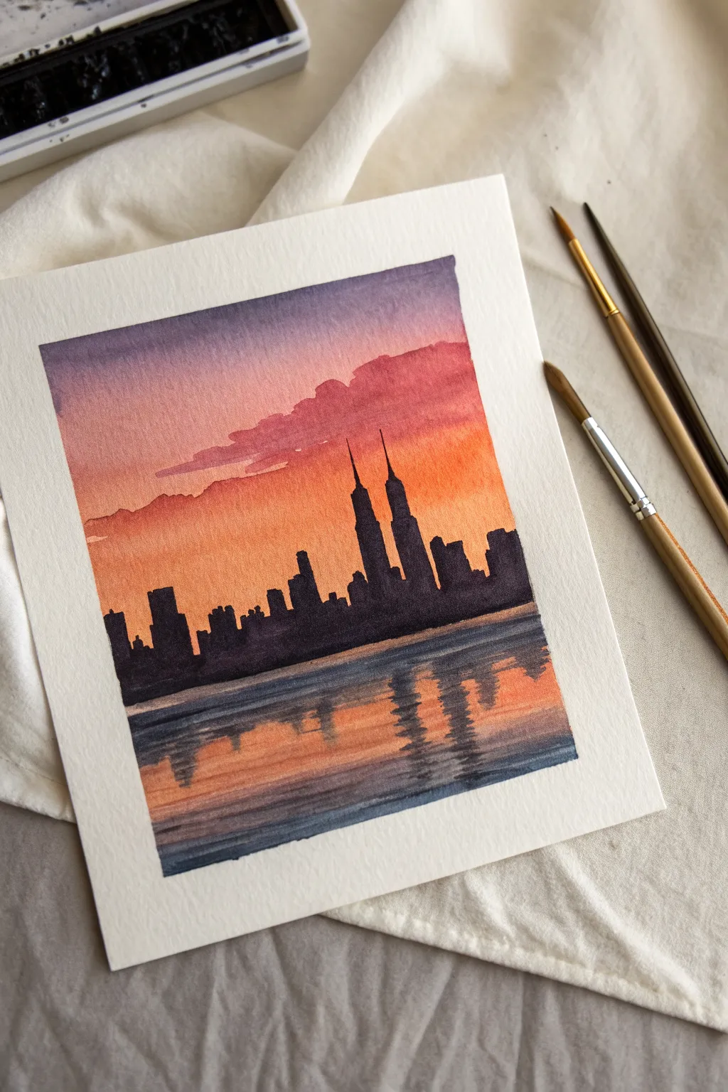
Capture the magic of twilight in the city with this vibrant watercolor project. You’ll master a stunning sunset gradient and learn how to paint convincing water reflections beneath a stark architectural silhouette.
Step-by-Step
Materials
- Cold press watercolor paper (approx. 5×7 inches)
- Watercolor paints (Purple, Indigo, Alizarin Crimson, Orange, Yellow Ochre)
- Flat wash brush (3/4 inch)
- Round brush (size 4 or 6)
- Detail brush (size 0 or 1)
- Masking tape
- Jar of clean water
- Paper towels
- Mixing palette
Step 1: Preparation & Sky Gradient
-
Secure the paper:
Tape down all four edges of your watercolor paper to a board or table. This creates that crisp white border seen in the final piece and keeps the paper flat while it’s wet. -
Pre-wet the sky area:
Use your large flat brush to apply a layer of clean water to the top two-thirds of the paper. Avoid the very bottom third where the water reflection will be. -
Apply the purple canopy:
Load your brush with a watery mix of purple and a touch of indigo. Paint a horizontal band across the very top edge, letting the color bleed downwards slightly into the wet paper. -
Blend in the pinks:
Clean your brush and pick up Alizarin Crimson or a reddish-pink. Apply this directly below the purple, gently overlapping the edges so they merge softly without creating a hard line. -
Add the warm horizon:
Switch to a vibrant orange mixed with a little yellow ochre. Paint the remaining sky area down to where you want your horizon line to be, blending it upward into the pink. -
Create distinct clouds:
While the sky is still damp (but not soaking), mix a slightly thicker purple-red. Use a round brush to dab in horizontal cloud shapes across the transition between purple and orange. -
Dry completely:
This is crucial: allow the sky layer to dry 100% before moving on. The paper should feel room temperature to the touch, not cool.
Muddy Skies?
If your purple and orange turn brown where they meet, you likely over-blended. Next time, use a transition color like pink or red between them and use fewer brushstrokes.
Step 2: The Water Reflection
-
Establish the water base:
Re-wet the bottom third of the paper with clean water. I like to mirror the sky colors here, painting horizontal strokes of orange at the top (near the horizon) and purple at the bottom. -
Darken the foreground water:
While the bottom area is wet, add deeper indigo or dark blue horizontal streaks to the very bottom edge to suggest depth and ripples. -
Let the water layer set:
Allow this base water layer to dry completely. It needs to be dry so the dark reflections we add later will stay sharp.
Step 3: The Skyline Silhouette
-
Mix your darkest value:
Create a very concentrated, creamy mixture of indigo and purple (or black). You want this paint to be opaque and bold for the silhouette. -
Paint the horizon line:
Using a round brush, draw a straight line across the paper where the sky meets the water. This anchors your city. -
Shape the buildings:
Start blocking in rectangular shapes of varying heights. Keep the edges relatively straight to mimic architecture. -
Add key landmarks:
In the center-right, paint two taller, distinct towers with spire-like tops. These will be the focal point of your composition. -
Vary the rooflines:
Switch to your smaller detail brush to refine top edges. Add tiny antennas, steps, or slanted roofs to make the silhouette look realistic rather than like simple boxes. -
Fill in the city mass:
Ensure the entire skyline shape is filled in with your solid dark mix, leaving no white gaps inside the buildings.
Pro Tip: Testing Opacity
Test your silhouette color on a scrap paper first. It should be thick enough to cover the background colors entirely in one coat without needing a second layer.
Step 4: Reflections & Details
-
Start the vertical reflections:
Using the same dark mixture but slightly watered down, paint vertical lines dragging downwards from the base of the buildings into the water area. -
Create the ripple effect:
Instead of straight lines, use a zigzag motion with your brush. The reflections should be broken horizontal strokes stacked vertically beneath each building. -
Mirror the heights:
Make sure the length of the reflection corresponds to the height of the building above it. The tall twin towers should have the longest reflections. -
Soften edges optionally:
If a reflection looks too harsh, quickly run a clean, damp brush over it horizontally to soften firmly before it dries. -
Final reveal:
Wait for every drop of paint to dry completely. Carefully peel away the masking tape at a 45-degree angle to reveal your clean, crisp borders.
Enjoy the peaceful contrast of your solid city against a glowing sunset sky
Negative-Space Animal Shape With Color Splash
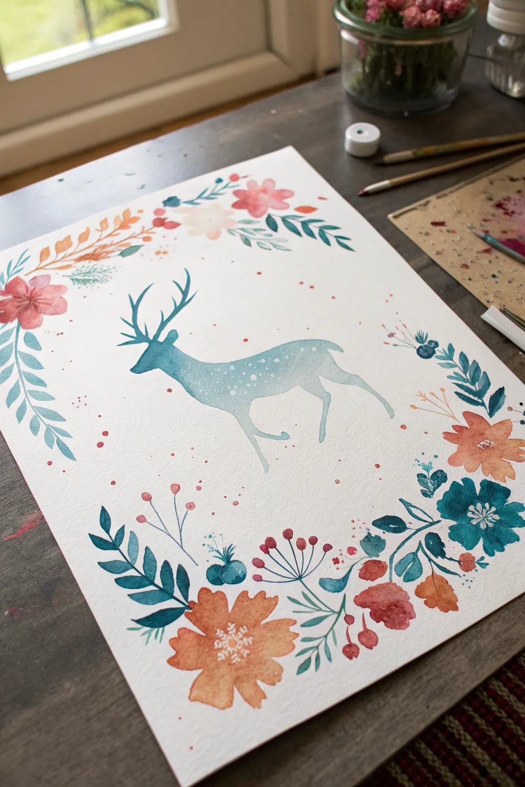
Capture the delicate beauty of the forest with this charming watercolor project featuring a graceful deer silhouette surrounded by a vibrant floral wreath. The soft blend of warm corals and cool teals creates a balanced, modern illustration perfect for framing or gifting.
How-To Guide
Materials
- Cold press watercolor paper (A4 or slightly larger)
- Watercolor paints (teal, prussian blue, coral, orange, burnt sienna)
- Round brushes (size 2, 6, and 8)
- Hard pencil (HB or H) and kneaded eraser
- Jar of clean water
- Paper towels
- White gouache or white gel pen (optional for details)
Step 1: Planning and Sketching
-
Lightly sketch the deer:
Begin by lightly sketching the outline of a leaping or walking deer in the center of your paper. Keep your pencil lines extremely faint so they won’t show through the translucent paint later. Focus on capture the elegant curve of the neck and the branching antlers. -
Mark the floral boundary:
Draw a large, loose oval or rectangle shape around the deer to serve as a guide for your floral border. You don’t need to draw every individual flower yet, just a general path to ensure the wreath stays balanced around the central subject. -
Refine the composition:
Take a moment to check your spacing. Ensure there is enough breathing room between the deer’s antlers/legs and where the flowers will begin.
Clean Edges Pro Tip
For the sharpest deer silhouette, outline the shape first with very dilute paint, then fill it in immediately. This acts as a barrier to keep the wet wash contained.
Step 2: Painting the Deer
-
Prepare the teal wash:
Mix a watery puddle of teal or turquoise paint. Ensure you have enough mixed to cover the entire body of the deer without stopping to remix, which prevents unwanted drying lines. -
Apply the first layer:
Using a size 6 or 8 brush, fill in the deer’s body with the teal wash. Start from the head and work your way down to the tail and legs. Keep the edges crisp and careful. -
Drop in color variation:
While the body paint is still wet, touch a slightly more saturated blue or darker teal into the lower belly and chest area. Let the colors bleed naturally to create a soft, gradient shadow effect. -
Lift out highlights:
I like to use a clean, thirsty brush to gently lift a tiny bit of pigment from the top of the back or nose to suggest light hitting the fur. Do this quickly before the paint sets. -
Paint the antlers and legs:
Switch to a smaller size 2 brush for the delicate antlers and thin legs. Use a slightly more concentrated paint here to ensure these fine lines are distinct and sharp. -
Add the spots:
Once the body wash has started to dry but isn’t bone dry, use a very small brush to drop in tiny dots of clean water or white gouache along the back to create the fawn’s spots. This mimics a negative space effect. -
Let it dry completely:
Allow the deer layer to dry fully before moving on to the surrounding flowers to avoid smudging.
Level Up: Metallic Magic
Mix a small amount of gold watercolor or metallic ink into the splatter phase for a magical, shimmering forest effect that catches the light.
Step 3: Creating the Floral Wreath
-
Paint main coral flowers:
Mix a warm coral or orange shade. Paint loose, five-petaled flowers at the corners and bottom center of your border guide. Keep the paint fluid and let the petals touch and bleed slightly for a soft look. -
Add secondary blooms:
Using a lighter pink or varied orange tone, add smaller flowers interspersed between the large ones. Vary the size and orientation to make the wreath feel organic. -
Insert teal foliage:
Using the same teal from the deer, paint leaves and fern-like fronds curving out from the flowers. This color repetition ties the central subject to the border perfectly. -
Paint dark blue accents:
Mix a deeper Prussian blue or indigo. Add smaller, high-contrast leaves or tiny berry clusters near the main flowers to add depth and visual weight to the wreath. -
Incorporate line details:
With your smallest brush (size 2), draw thin stems connecting floating buds or berries to the main wreath structure. Add delicate veins to some of the larger leaves. -
Add splatter texture:
Load a brush with watery pink or orange paint and tap it against your finger to splatter small droplets around the flowers and the deer. This adds energy and whimsy to the piece. -
Final white details:
Once everything is perfectly dry, use white gouache or a gel pen to add tiny stamens to the center of the orange flowers or extra highlights on the berries for a finishing pop.
Allow your painting to dry completely flat before framing this piece of forest magic


Have a question or want to share your own experience? I'd love to hear from you in the comments below!